Transcripts
1. Introduction to this Class: Hello everyone. My name is Robert marsupial and welcome to my class how to draw a comic book style phase on an angle. We'll first start by structuring the head. I'll show you how to divide it into equal one-thirds and how to place the major landmarks to create your mannequin. This is the method designed by Andrew Lomas and I find this to be the most helpful and informative way to not only draw the characters, but reach consistency throughout your designs. Then from there we'll start placing in the features of the face, the shape of the hair. So again, using those landmarks that we defined earlier in the lessons. And this will allow us to draw more freely and create the character that we want. And keep in mind, this is a stylized representations so there'll be no reference you can play around with any concepts you light. Then in the next lesson we'll focus on line wait in line clarity as we clean up the work. Also talked to you about how to keep your focal points in mind, even in something as simple as a face. Then to finish things off eight the work. So this can be nice for really making that final pass on the work and then making winds as tight as possible and writing it for your comic style art. So I hope you find these lessons and formative and plan to do. I can't wait to see your work as always, keep drawn, keep em VO1 and bye for now.
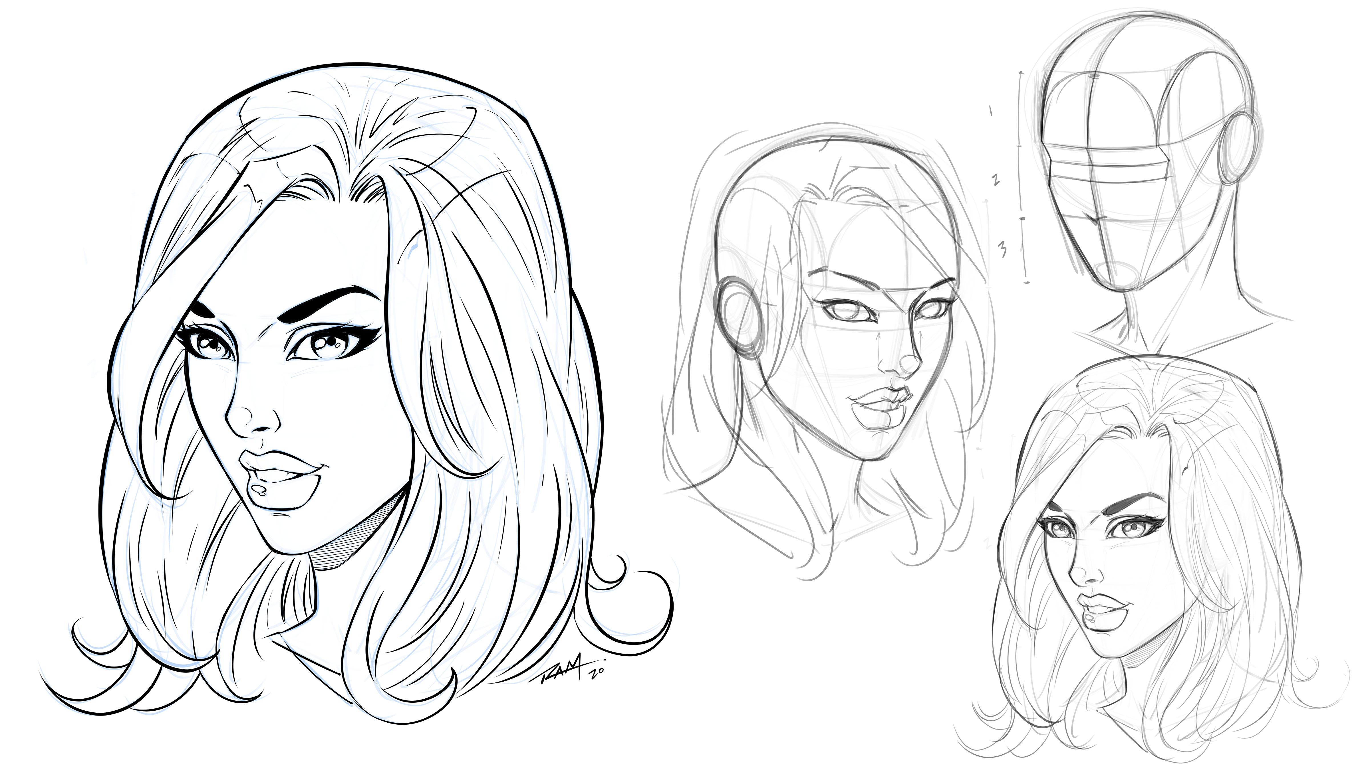
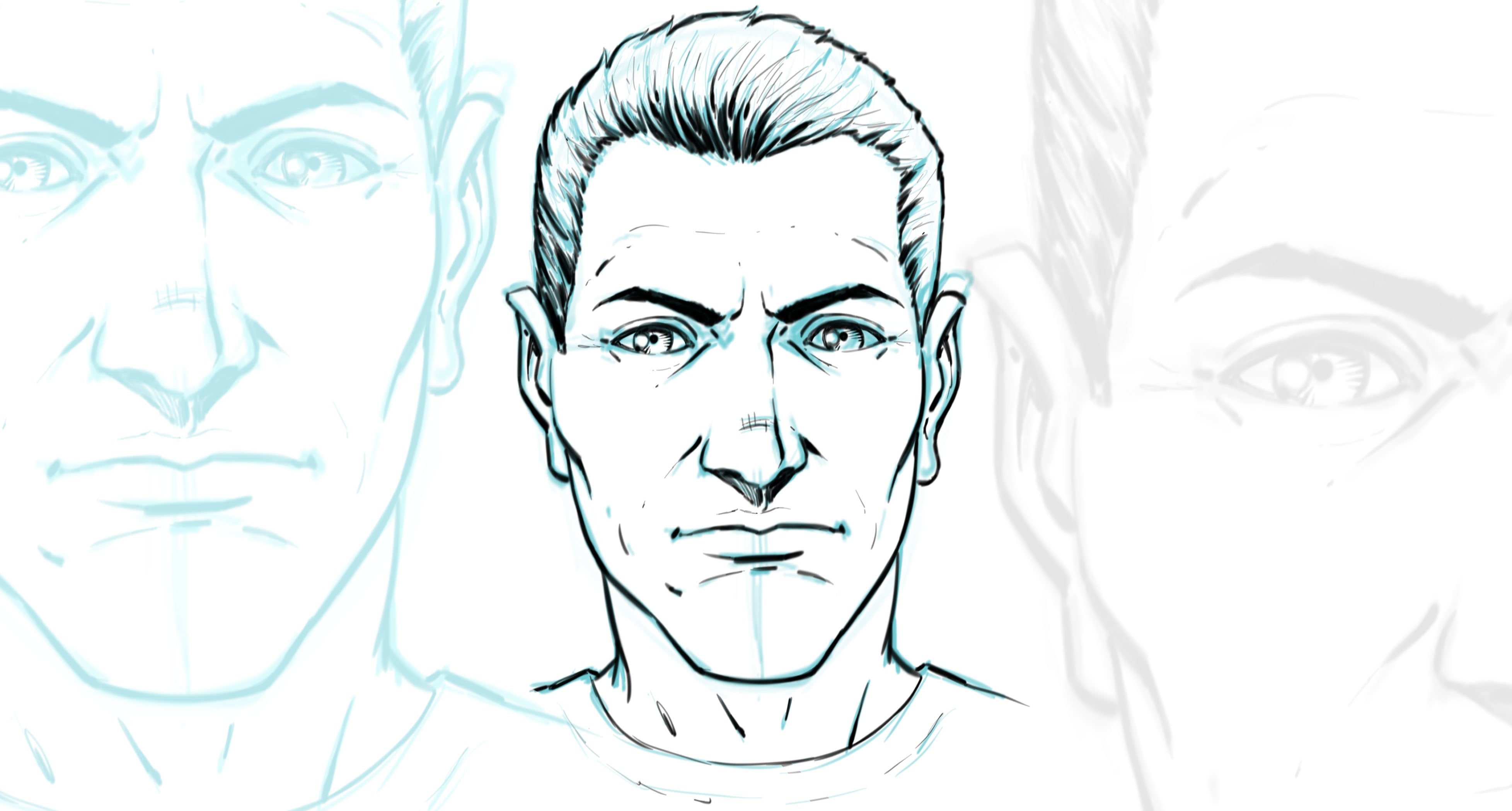
2. Structure of the Head: Alright, so the first thing we're gonna do is start with the structure of the head. So what I wanna do is use the Andrew luminous method. And just keep in mind that even though I call this Sandra Lamaze method and much of what I'm going to write a show you comes from that. I do deviate a little bit. I think that we all start to extrapolate or evolve the methods that we're learning, that we learn. So it's not always an exact science and it's not always the exact method. But I do reference Andrew luminous because he's won that developed this. And it's extremely an integral part of what I do for constructing heads almost every single time. So I start with the circle and then I slice off the sides. So the oval that you see right here to the right represents the part that I would perceive as being sliced off. We're drawing this head on an angle. So I need to tilt that, draw an oval segment that into four sections. And then as I work to the front of the face, I'm going to divide this into equal 100. So I used the starting point of the oval to the side or the ellipse and bring that over and almost in a way where I'm picturing, wrapping around the major plane change of the face. That gives me my three relatively equal segments. And then now you see me drawing the center line to the face and the head shape. So this, I really want to stress that this can be maneuvered any way that you need. And you're going to, you're going to take what you learn here and then you're going to transform it into all different character types. So for the female character, I tend to make the Chen more pointed and I like putting that little oval doubt the changes to give me a bit of a thought process on making sure that it becomes more rounded than pointed. Sometimes I will go for appointed Chen on more stylized representation, but just so you know, that's what that ovals therefore. So a lot of this is just preliminary buildup and giving myself some shapes and some forms to get the ball rolling and try to gain some understanding of what I might be able to work with on the page. So it's really, I'll always say this. It's kinda like training wheels. You know, you put the stuff there and then allows you to draw through it more freely and it gives you that confidence of training hills or, you know, just something to rely upon and balance upon. So here if you notice I've kind of made a indentation where the eyes are gonna be placed. Now, again, this isn't something that you have to do. I've seen lots of artists do it without this. It's just that extra little assistants and guide for that one specific area. And I think that when you really pay attention to these guides and realize that there's all sorts of ways that you can develop these on your own. Marks that you might need to make that balance out inconsistencies in your work. So for instance, you might have a problem with aligning eyes. That's one of my problems. So I'm obviously going to try to allow myself or give myself more guides in those areas just to balance out that shortcoming that I have for seeing that. So if you notice in your work that each time you get done, there's that inconsistency in that problem area. Just try to develop some new guides for yourself. And think of these as major plane changes. So if you see I am defining the plane change the side of the face. I've given myself a center line for us to work from. So again, think of plane changes, guides, and, you know, basic structure. And if you notice now that we've got the one-thirds and plays, it'll give us placement of the nose. And that's what this little triangular like shape is right there. And then I've also put that mark at the top or the hairline would be. And then here I can show you that if you were to bring these over to the side, each one of these are approximately 1 third of the face. And that's probably the biggest thing that I think is helpful in this area of the work is to really define and get that into place. And the rest of it becomes much easier from there. So let's go ahead and wrap up right here. We'll head over to the next lesson and continue to define this character. So with that, let's move forward.
3. Features of the Face: Okay, so again, now we have our structure in place and our guidelines, and we can start to soft erase this and draw through it. And we're going to now place our facial features. Again. Try to think of this as a sort of mannequin that you would drip close over, something like that. It's not a hard and fast rule. It's just basically that guide and that assistance so that we can now draw more freely and get some alignment, some consistency to our work. A lot of people will say things like this don't really matter, but where I feel it really helps is consistent storytelling in your work. If I was to just draw without this, I think my characters would look quite different from page to page, or this kind of gives me that assistance. Now notice in the center of the brow, that top, that bro line of putting an upside down triangle. So something I like to do a really like basic primitive shapes. Again for consistency and ease of illustrative purposes. So for the bridge of the nose, just a curve, an oval for the tip of the nose, another curve under that. And then make sure that the nostrils are a little bit higher than the center of the nose as it comes down and meets the face. And then the sides of the nostrils will actually give you general placement and starting the starting point of the eyes. And then I like to draw an upward angle. This is the upward curve in angle that you see for the eyes isn't actually the eye itself. It's actually a reference point that I'll almost ignore when I draw the dyes themselves. But I like that. That slant upward for the eyes, especially the female eyes. For the model. If I really look at it like a stretched out M or a bird with its wings out. But the main thing with the mouth and with anything with the angle of the face is constantly paying attention to the center line and then condensing one side or the other. And probably the trickiest part about a face that sorts of angle away from our view is that we have to learn to omit the other side or shaped them off in a way where you don't see the very end of it. Because it's now curved away from our view. And that's, that's a subtlety and a trickiness that you only get the hang up, I think by doing this over and over. Because it's almost like it's almost so subtle that it's easy to mistake and easy to draw when it shouldn't be visible. Same thing with the side of the aisle. See that when we get to that, you have to kind of squish, are convinced that I, that's furthest away from our view. And sometimes you start to see the eyeball itself, the side of the eyeball more than you see the connection point of the top eyelid and the bottom eyelid or where the eyelashes meat and converge. So again, this reference point for the eye. I put that angle in there because I would like to make sure that the tear duct is lower and that the area where the top and bottom eyelid meet that point to the bag is higher and that's where I put that little flip up to the eyelash. Also make sure to really think spherically about this area of the phase. It's a tricky thing and easier to overlook. But, you know, there's an eyeball and they're right, and that's a sphere. So you have to try to really get that rounded feeling going to the bottom eyelid. And then also, I know this is a part where a lot of traditional artists kind of feel left out when I flip the work like that. But I have to continue to do it. The main thing is that I know that in my own work, if I don't flip the work or looking at the work of a more Canum paper, I gotta look at the work in a mirror. If I don't do that, I'll end up with some very inconsistent areas in my facial structure. And it seems to be even more evident when I'm trying to draw a pretty or cute face. So I have to, I have to flip the work and I really suggest that you do it as well. Again, if you're not working digitally, that means holding your work up in a mirror or even taken a picture with your phone, and then using the phone's app or the camera app to flip the work. Very, very important. It helps you spot a lot of flaws in your work. Okay, and then here I want to start defining the side plane of the head a little bit more. So you see I've moved that air around a couple times, actually quite a bit lower than where I started. But again, I do want to stress and hopefully you see by now that I'm still maneuvering the work. In fact, I think that a big part of feeling comfortable about drawing characters from your imagination and different style of characters with confidence just comes into realizing that you don't have to get it perfect on your first try, you just want to get close. And then when you start to do that, you start to realize how you can sculpt the work. So I'm constantly thinking of this like a ball of clay or something that I can Mm-hm. Maneuver and adjust and warp into, into the right shape, the shape or a series of shapes that I need. Now keep in mind with the eyes, that they're about 1 third across the width of the eye. But I like to make them a little bit bigger for animated stylistic characters so that iris is probably a bit bigger. I mean, you can see the proportions are exaggerated here and that's the style and the look that I wanted to go for. So now what the hare, it's very stylized. What I'm going for here, and that's something I'd like to do is just kind of throw lines on the page. And all I'm thinking about is kinda like ribbon like forms. And the thing that I'll always stress here is that I'm not drawing the actual lines or at least not thinking about the lines individually. I generally I'm thinking about two lines in conjunction with one another. So I'm thinking about the form that I'm creating with each piece. I think that's very important with hair. Because if not, you can just get into a repetitious kinda behavior of throwing all these lines and, and it can look very stringy and just not come out as effective as you might need. So let's stop here. We'll head over to the next lesson and continue to define this character. So what that, let's move forward.
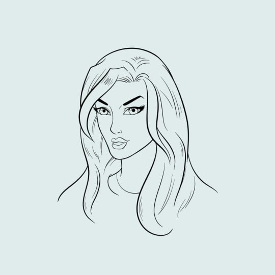
4. Refining the Features: Okay, so now we can solve two races and refine the character. And, you know, you can see that it's pretty recognizable at this point, that we have a female character looking back at us and flowing hair. But we could still make some pretty significant changes. So I really suggests like when you do things like this to save incremental steps on the work. Because this right here could be a mannequin that you could turn into a little more than a mannequin now, but you could turn it into so many different characters, even at this point, it just as the basic foundation in place. So at this point I'm definitely trying to think more about line clarity and refinement, obviously. Line weight, things like that. But there's still lots of room to develop who this might be. So again, it's just all the structures in place, all the features or where they need to be. But there's still things you're gonna see me maneuver and adjust as I go. So like what the eyebrows, hair, I like to draw those end as a larger shape. Some people will sketch them and like they're sketching the hair, that's another way to do it. I think that a lot of times when you draw and shapes First, it's easier and it's, you can always go back and again, when I say sculpt, you can adjust the edges and sculpt the edges to be a little bit more loose and organic versus a big solid cutout shape. But again, for me, the shape way of thinking for this stuff, drawing the silhouettes, drawing the shapes makes things easier for me anyways, and hopefully for you as well. Same thing with the hair. I'm going to draw n what looks like strands to the hair. But I am trying to keep in mind the bigger bulk of form even as it kind of flows and wraps around other areas of the hair. Now the only drawback to that way of thinking was something like the hair as you can come up with things that look a bit like a helmet. So you do have to be careful of that. You really have to try to soften it up in ways. Because again, it can come across as like one big shape that's too too much, like a helmet or something like that and you don't want that obviously. So for the eyes here you can see the one eye is higher. As I mentioned before, I struggle in this area of my work. But the good thing is I'm finally aware of it so I can fix it as I go, or hopefully fix it as I go. Now, luckily, not everybody's faces perfectly symmetrical. So I could just say that's intentional, but I know that wouldn't be the truth. So basically, I give myself ways to align it and by flipping the work back and forth, I generally spot it definitely better than if I don't flip the work, I won't see it nearly as well. And then from that point I tried to correct as I go, doesn't always happen, but it's just something that I have to be aware of in my own work. We all have our strengths and weaknesses. But again, the best thing is when you at least start to spot these areas in your work so that you can do something about it. And notice that the AI that's furthest away from us is smaller, more convinced from left to right. Also, the more the head turns away from us, the more we're going to see the, again the side of the eyeball and less of the eyelashes. Now for a comic style, I tend to just throw this big solid eyelash that's on the top and a solid eyelash on the bottom. They converge together and make a big point. I tend to do that so heavily that it's not as noticeable. But again, when you pay attention to your photo reference, look for that area of the eye. When we start to turn away from the camera, you'll see the side of the eye. And sometimes the side of I will actually block the side of the face. So it's, it's learning those little parts of realism and then trying to incorporate that into your stylized approach that I think really kind of sells it really makes it look like, you know, more about what's going on. Now. Obviously a very animated, stylistic, cartoony kind of look. None of those things really matter as much. I don't think they can be there, but it typically gets overshadowed with just pure style and exaggeration. So it's finding that balance. And again, that really is how you develop your style is picking and choosing your, you know, what you want to see you in there and you know where you get your motivation from, I guess. Now the Irises are generally 1 third the width of the eye from left to right. But I tend to make them a bit bigger. Again, that's a stylistic choice and that exaggeration that I like to see in my own work. And then probably the toughest part of this as pupil placement. In the tricky thing to it, the iris is if to pay attention that when a character is looking at you, the iris is more spherical or more circular light. But then as they're looking away, it becomes more of an ellipse. So really pay attention to photos and look for things like that and then incorporate them into your work. Again, style can outweigh all of those things. It doesn't necessarily have to be evident in your work. But I think it's important for certain things. So what the drop shadow to the I, I tend to think about the shadow that the brow and even our hair could be casting, but it's mainly from the brow. And I make sure to put that shadow and with a curve. And then I put the highlight right to the bottom of that shadow. And that's really just a repetitive thing that I do with almost every character, but definitely every female character that I draw. And then the glare on the same side of the lips as the eyes. So keeping a consistent idea going for the light and shadow, even though this isn't a heavily shadowed character, every little bit kinda helps and it's good to be aware of it. So what the eyebrows, I tend to fill these in as a solid and then I can add a couple little stray hairs if I want. But the neat thing about it is even if you do fill them in and then say this ends up being a character with lighter hair and you don't want it dark eyebrows, it's pretty easy in the color to just select it and then color those same colors. Hair and it actually has a pretty nice look that way. So at this point, I'm really just trying to pick this apart and, you know, kind of pull it all together. The hair shape, I think that it's important here to really fight the helmet kinda look, you can get if you keep the HER2 solid of a shape to solid of a form. So you have to cut into it and overlap some of these. I don't want to say strands again because I tried to think of these as forms, not strands of hair. But you do have to have some overlap and some curls and some clips, unless the hair is just really, really straight. But even at that point, when I'm drawing a character with very straight hair, I still curve it at the bottom and show the separation at the bottom again because you don't want that look of a solid shape for the hair. So now I will just erase him back some of the construction lines. And yet it's all pretty much here now. It's just a matter of finishing it up and refining the work. So at the top of the hair, I I kind of point to the the part and the hair, but I try not to overdo detail that. So when I first would draw characters, I would detail the center part of the hair way too much. And it just looked really weird. It's almost amazing that I didn't notice it when I was doing it, I just thought, well, I know there's a part here, I have to illustrate that and I would over illustrate it. So a big part of doing stuff like this is allowing yourself to put just enough information. And so sometimes less is more, right? And it's very much that way with female characters, stylistic characters. You want to kind of get used to hinting to areas and putting down just enough information to make it read well. And then kind of seeing how that works and how that all fits together. Sometimes we can try to put more detail onto something because we think it looks cool or because we're really trying to explain what we're illustrating. And it can really hurt female characters, it can hurt youthful characters. It's just like lines in the phase. You may want to put lines in the face to show like this action or this expression and things like that. But if you overdo it, you can actually make the character unwittingly look, or maybe mistakenly look older than the new meant to. So it's things like that and that also applies to beauty. So when you're trying to draw something pretty and beautiful, yet less is more so just be careful with, you know, your need to over detail and over render something. And then here's a good example. I mean, I definitely could render a lot more into the hair, but I'm trying to hold back from that and just add the lines in the line weight that I need to get the job done. Now, if this is going to be colored, then I really don't even need to add as much as I have. There's just so many things that you can do with color to bring this all together. And, and a lot of times with the hair, I think that's one of the areas where you can actually almost do better with the color than you can do with over rendering and adding too many lines. That's why you'll see a lot of colorist that will take hair and will actually select all that line work in the interior of it. And they'll colorize it back with a color that's close to the hair itself. So the lines are still there. They don't erase them out. But the colorize them back in. It actually looks more natural. Softens it up. So and then with the eyelashes just kind of giving these little decorative points, you know, it's a stylistic way that I do these eyelashes. Not anything that's too complex, but just adds a little bit more refinement to it. So again, starting with those shapes first and then just adding a little bit more to them. And you see here I'm almost wanting to add some lines to the phase, but then I quickly kind of stop because it just, again, it can really hurt the look of beauty on a, on a female phase. And that's about it. So we're going to stop here, we're going to head over to the next lesson and continue on. So with that, let's move forward.
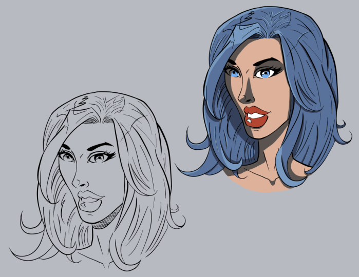
5. Inking the Features: Okay, so now I'm going to ink the work, and I've just converted this to a blue line. Now I am using clips studio paint, but I'm obviously not showing the interface and these lessons, I want it to be more about the process. And this can be done with anything even if you're working traditionally, It just means a light table or converting your pencils to blue line. You can even print those on Bristol board with the right printer and an ink right over top of it. So the main thing I go for one, inking a character like this is clean lines. So you're going to see me try to fill in the larger shapes of shadow and this case the shape of the eyelashes, the eyebrows, things like that. I'm going to rotate the canvas as I move because there's certain lines that I just do better, pulling in a certain direction. And since I'm going for cleanliness, then I want to really assist myself in that way on a rotate the page and pulled downward to get the cleanest lines that I can. Now, if this was a different type of character, like something a little bit more eerie and monstrous than I probably wouldn't worry so much. I would just text, tries it and have fun with it, not try to get any sort of clean lines going. But for a female character, I'm, again, I'm going more for clean lines, flowing lines. Curves. Curves generally denote beauty. So, and that applies to the hair, that applies to really anything with female character. Now it doesn't mean you can't use angles. Obviously some of the coolest styles that I'm a fan of have lots of angles and the way that they create the female characters. But I think that there are certain areas where you just have to have that balance of angles and curves. And I think the eyes are very important to have a certain amount of curvature. Obviously, you can't draw iris as it says, as an angle. I don't think I've ever seen that. Maybe there's a style where they've done that. But generally you're going to have some nice rounded shapes for the eyes and even the eyelashes and the shape of the white of the eye. We see just like that filling that end makes it a lot more pronounced. And I actually like that look a lot like the big heavy eyelashes. That's why you see I pretty much do that part first. Almost always gravitate towards the eyes first. I just feel like they're part that you have to get right the most. And it'll windows to the soul and they're very much the focal point of any character. So what the nose you can see I added some line weight there, so I had to get really thin to the middle of the nose and then heavier to the tip and then heavier again to the bottom of the nose. And I had this little point there that I end up taken away, but I thought it looked cool stylistically, but then it became more of a distraction. So you'll see by the end of it, I actually get rid of that, but but I think that you have to do stuff like that. You have to try things and experiment. And then. Ultimately, if you keep looking at it and it becomes a distraction and get it out of there. But you have to, you have to try new things. You have to develop ideas as you go. A big part of something you'll hear a lot of artists talk about their work in comics and work in different professional ways for a living. They talk about when do you practice? You know, I'm so busy working. When do I develop my style by practicing and things like that? And a lot of times what you have to do if you become so busy creating this stuff, which is, you know, hopefully we all do right, that's the goal that you basically have to practice as you're creating it. And that's a, that's a strange thing to get used to because imagine practicing right in the middle of a book, right in the middle of a story. But you have to do that. You have to evolve your style. But you just do it incrementally in very small ways. And again, you do it in ways where if it works, then you can push forward and do that. But if it becomes a distraction, obviously, you can't change the look of a character dramatically right in the middle of a book. So then you have to obviously make that decision and get it out of there. But it can be a tricky thing. But I feel like you have to constantly explore new ideas. You don't wanna get bored of what you're doing. And you don't want to feel like you're not improving. So you see the main thing here is gone for line weight. Adding heavier Generally the rule for line weight too, just so you know, it's heavier lines to the base, to the shadow side of the form. But that's not always the way that I do it. And I've learned this from watching lots of different artists that I admire. And I think the bigger role, if there is a rule, is that the line should go from being thin to thick to thin to thick. That there should be movement in the line, that there should be a consistent use of thick that then, that basically it's just more impressive than a boring straight line. Now some styles do really well with that. So I don't mean to imply that those styles are boring. But what I've seen in my own work is that I'm better off just kind of maneuvering that line from thick that then and playing around with different variations of it. That it tends to just make things look more interesting. And that coupled with then there's certain areas that I almost always do the same thing and that would be like on the bottom of the bottom lip, I'm gonna put a heavier shadow, the bottom of the Chen, I'm gonna make a heavier line. And so it generally for me goes with either the shadow side and or the largest curve. And then the other rule, and I will call this one a rule, is always make things that are closer to the viewer. So for foreshortening arms coming out towards camera, hands coming out towards camera. I always put a heavier lying around those areas of the illustration. So that's probably the only one where I would say it's an always type thing. But but again, I do tend to make it heavier around the shadow side. And you'll see for the cheek care, I wanted to have this nice pronounced heavier cheekbone or side of the face there. So I make that heavier now. Also, it's because I want there to be some separation from. The lines that I'm going to introduce into the hair. I don't want those to blend n and compete basically with the side of the face. So there's that as well. There's when you're trying to control the focal point of different things. And again, that's why I said that I really liked those heavy eyelashes around her eyes because then that becomes the most pronounced area that with her eyebrows becomes the most pronounced the area of the face. And it doesn't have to compete with any other part of the illustration for dominance. So again, just thinking about things like that can really help, you know, help you decide where you need to put your shadows, your light source, you're heavier line weight, things like that. So now just sculpting into the, the eyelash shapes. Again, I find this to be much easier to first get those that base shape and place and then add the eyelashes after the fact. It it tends to help me make it look more consistent if I do that because if I just say draw, I'll say it was inking one I and I think every aspect of the eye, the pupil, the iris, the eyelashes, the eyebrow for instance. And then I move over to the other. I, I find that I have a lot more error and the way that I create things. So it's easier for me to kinda go back and forth and try to gauge the progress that way. Now I'm doing a little bit of a cheat here, so I'm just taking the brush and making it a bit larger and then dabbing it. And luckily it makes a perfect circle. So I can use that for my reference point in a sense. And I couldn't do the same thing for the iris, but I'm taking the harder road here for it just to show that you don't want to cheat all the time. It's sometimes you cheat and other times you challenge yourself to just draw it the way that you would draw it. I think that's important with digital art because there are so many ways I could have easily generated these eyes, would just tools inside of the software. But then it kind of makes me a little lazy in and I, so I try to be aware of that and take some shortcuts and then practice freehand techniques as well. And plus, I feel like since the iris has already dropped on are the pupils, I should say, sorry. The pupils already dropped in soap as a perfect shape. I can kind of use those as my get my gauge. So I'm looking at the pupil as I draw the shape of the iris, which I still managed to not get perfect circles from irises brought. And I just kind of go with it. But it's one of those things where if you've got something close enough as a reference point, you generally can pay more attention to that area and do a little bit better. So again, this rounded drop shadow on the iris. I think when I originally started doing this, I used to put a straight line across this area and then I realized one day, wait a second. All these fancy artists that I admire, they're doing rounded shapes there and then I start doing it and made more sense. Likewise with the glare, I remember I used to put the glare a lot lower on the eye and then I started realizing and photos that the glare is on the highest point of the eyes. So if you picture the rounded, the roundedness of an eyeball, it's right in the middle is the highest point. And that generally coincides with right about where that shadow is. So just another thing where when you pay attention to photography and again, other artists at more or more advanced than you, you'll start to see these things and then you kinda have this moment where it's like, oh, of course, I had been doing that wrong this whole time. And then you adjust. And then that becomes your new way of doing things and you adopt that into your style. So again, that glare, I'm also beating up the side of the iris, the line weight on the side of the eyes as well, on the side of the iris. And so now I feel like this part is, you know, it looks pretty good. I like the way it's heading. I like the impact that the face has. So will conclude here we'll head over to the next lesson and we'll start refining this a bit more and get the hair ANC then. So with that, let's move forward to our next lesson.
6. Inking the Hair: Okay, so now we're gonna ink the hair and basically this is sped up twice a speed, so double, double the speed. And also it's really is, it's going to be repetitive. So I didn't want to bore you with this, but it's just going to be throwing the lines and trying to get the curves that I see or want to see for different areas of the hair. Most of the work is there in front of you. I'm going to add line weight in. Not really any shadow, but I kind of look at line way to shadow at this point because if it's a character with a lighter color hair, I let the line weight kinda be the shadow and then the color colorist, even if it's myself, would come back and add this, you know, these effects into the hair. But for lighter colors, I'll leave that open and again, let the color kind of fill that in. I remember what I said about heavier line weight on things that are closer to the viewer. So this flip of hair that's in front of her face, I'm picturing that this is closer to us, closer to the viewer. And that's why I put that nice heavy line weight to the left of it. So it's a combination of, you know, again, like not having it blend together. Ok, so putting line weight and areas where it will separate from the thinner lines that basically they imply other bits of hair, but they also kind of just resembled texture. So, so, but if the, all the lines were the same thickness, then it would fight for dominance and it would kind of blend together a little bit. So you'll see I'm going to use thinner lines, at least a little bit thinner for areas on the interior of the hair. And then for the outside forms or forms that kind of come in front of other forms. I'm going to use a little bit thicker lines. Now also tend to use a layer. No, this isn't something traditional artists will use as much harvest, so you're going to use white out. You can draw a line and then if it overlaps in area you don't like, you can use your like whiteout pen, pasta mixed with good white out pen. And you can wipe out those areas. But for digital, I'll just add a layer, throw those lines, and then erase them back if they interfere with a different aspect of the artwork. Now, the other thing is this, when I say throw the lines, I really recommend that you throw a line. So I mean, like not just placing your risks on the canvas and flicking your risks. Now obviously this is, depends upon how close you are to the artwork, how big your screen is. But when I say throw the lines, I start using more of the full motion of my wrist and little bit of my my elbow basically like I start moving from my elbow out in flinging my forearm, I guess, or sometimes not flinging it as well. I'll I'll do a couple of things, either flinging the line, throwed line, or I will slowly pull the line. Typically, I do better with throwing the line. But there are certain motions that I can put a line in a nice slow, consistent motion and still give it him after. But I think that when I started really experimenting with throwing lines. Again, more for my elbow and even from my shoulder, I started getting a lot better feeling to the hair because here has a lot of energy. And, and even this illustration, I haven't taken this nearly as far as I could have and probably showed up. Like, you can really have fun with the hair. You can have it flowing in the wind, right? And you can have the hair rolling and flowing in front of, in front of and behind itself in different different areas. And it can be very dynamic and very energetic. But I don't think that you can do that as well by just trying to draw every aspect of the hair. Bye, bye draw. I mean, we really kind of bear down in your hinging upon your wrist and you're trying to illustrate in a very tight method. So I feel like throwing the wind is just perfect for hertz away that it needs to be done. In, again, that is going to be subject to, you know, how close you are to your screen. And if you zoom back really far, you can throw a line from your wrist. But it's going to be a very small version of the illustration. Me personally, this is larger on away comps and tq. So I'm actually working on a pretty big canvas right now. So that's why I keep saying that phrase of throwing the lines. But again, it's getting a flow and energy to the hair that otherwise is harder to do if you don't think of it that way. And again, that's where when I started to do that, I immediately started to feel better about that portion of my illustration. And notice to him like doing little zig-zag patterns. I'm trying to stylize the line work as I go, mainly because I feel like if I make all the lines to consistent everywhere, it gets boring, you know, I don't want that overly repetitive vibe to the work. I'm trying to make it look stylized and fun. And again, give it a certain energy. And then putting a nice heavy line to the top there. So a weighted line just to kind of encapsulate that. But a hair. And then probably finish off the shadow under the jaw. And then a heavier weighted line on the cheek. Again. Nom kind of analyzing this and going, okay, where can I add this little bit of extra line weight to control the focal point and to control the separation of the face. So I don't want to face blending into the hair. And that's what's kinda tricky too, because if you just put line weight, heavy line weight everywhere, it does start to blend in. And you'll see at the very end, I respect that up point on the nose too because it's just a bit distracting. So that's really it. This is, this is how I would illustrate this style of artwork. I can't wait to see what you come up with. Hopefully you've been drawing along and you're getting the character that you want and learning the things that you hope to learn from this class. I would love to know what you think. So let me know if you have any questions and I can't wait to see your artwork. So as always, keep drawing and keep them fun. And I will talk to you soon.
 Robert Marzullo, Online instructor of Figure Drawing and Comic Art