Transcripts
1. Welcome to The Sketchbook Fillers' Club!: Hi, I'm Dylan Mierzwinski. I'm a professional illustrator
and work from home with my husband and
dog in Dayton, Ohio. I am a college dropout and got fired from my graphic
design job in 2016. So I turned to my sketchbook, practiced a whole lot, and have worked for myself
full time since then. This class is about how to
fill a sketchbook because sketchbooks are at
the very heart of my success and joy as an artist. They're breeding
grounds for ideas, reliable places to
improve our skills and safe spaces to take
a breath and be present. Lots of people see the
polished end results of projects I work on, but all of those exist thanks to the space I take up
in my sketchbooks. More importantly, I want
people to know that you don't need to be a working
artist to be an artist, to have a sketchbook
practice you love. This class is for all people. But starting can be scary and continuing can
be daunting, right? So in this class,
I'll walk you through four gentle but
powerful guidelines and share seven start
to finish demos to help you fill up your
sketchbook in an easy, personal, and repeatable way. You'll get to see how I use
markers, guash, paint pens, colored pencils,
and more to fill blank pages with color,
curiosity, and expression. I don't want this to be the only sketchbook
class you ever take. I mean, they're so fun, but I do think
this one will blow your sketchbook
practice wide open. I don't care what materials or skills you're working with. Let me show you how you can start where you are and become a proud lifetime member of
the sketchbook Fillers Club.
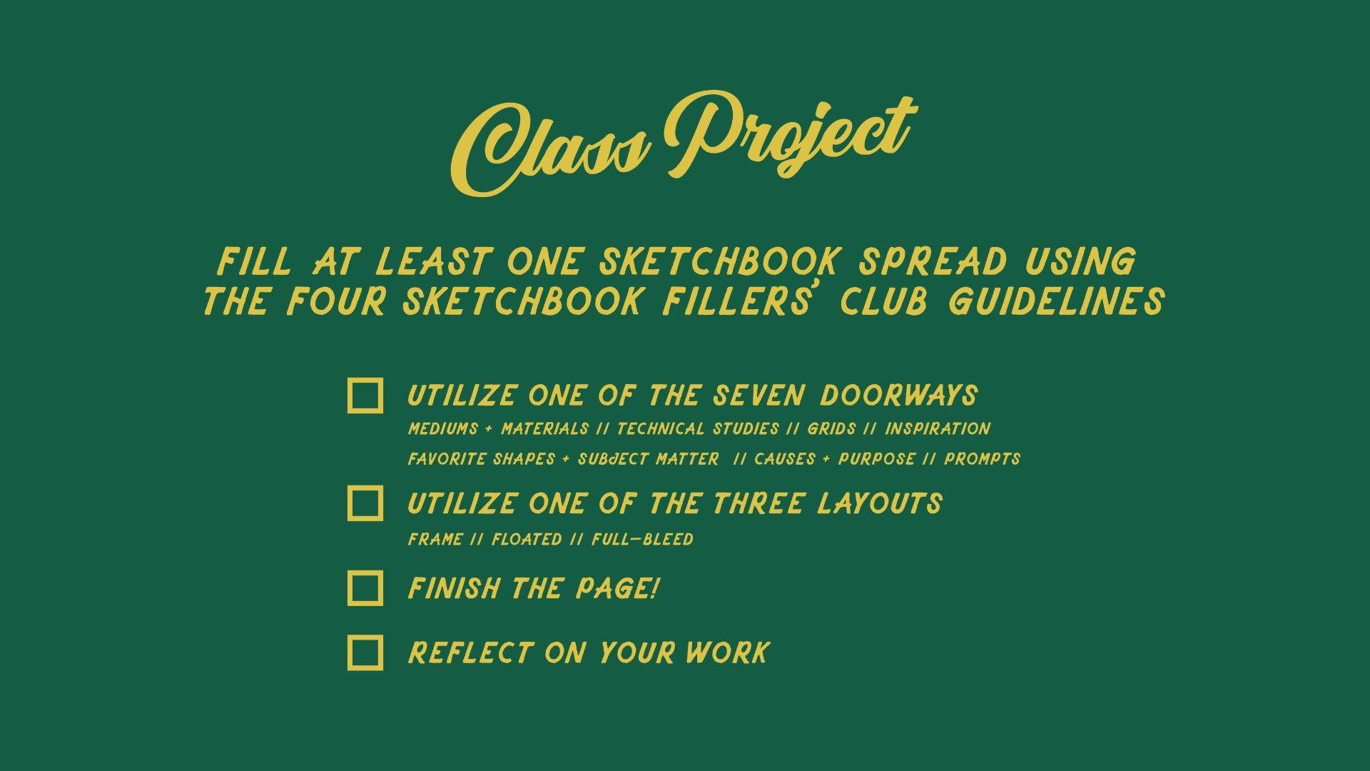
2. Class Project: To get the most out of what
I share in this course, your project objective is to fill at least one
sketchbook spread of your own utilizing one of the seven doorways and one of the three layouts I
share in this class. It's okay that you don't
know what that means yet. That's what the rest
of this class is for. Don't forget to finish the page, even if you think it's dumb and to reflect on what
you like and dislike, especially if you
think it's dumb. You'll see how I do just that
in later demonstrations. I've created some class
resources for you, including a breakdown of the four guidelines,
a materials list, a printable reference to fill out and keep
in your sketchbook, and a few more demo
specific resources, too, which are all available
as a downloadable PDF. Now, let's chat about
the materials list.
3. Materials: Let's talk about materials. In this class, you'll
see me use a variety of tools, including posca pens, which are markers of various tip sizes that
dispense acrylic paint, Tambo dual brush pens, which are water based
markers that have a brush tip on one side and a small bullet
tip on the other. I enjoy them because they
come in lots of colors. They last a while,
and they don't feel too precious to
be creative with. Orandach colored pencils, which I love because
they produce a highly pigmented render and feel soft in
a good way to me. Holbein Artist squash, which is an opaque and matte
watercolor paint. I love it because
you can work in layers and go from
dark to light, a Pentel brush pen
with black ink, which I love for its dynamic
and textured line quality, a good old pencil and eraser, which I love because
sketching first usually means I enjoy the rest
of the process a lot more. I'll be working in a
moleskin art sketchbook, which I like to pair with binder clips to hold
the pages down. It isn't my exclusive
sketchbook choice, just the one I've
been using lately, but I have included alternatives
in the class resources. And lastly, when I'm
working with Guash, I also use a paint
palette to mix on, a water cup, paint brushes,
and a paper towel. In the class resources PDF, you'll find a written
list of everything I just mentioned. Here's
what's important. You don't need all the
materials and colors that I do to successfully follow
along with this class. On the contrary, I
wanted to show you a variety of mediums so that you can see
it's not the medium. It's the practice in showing up. Of course, you are welcome to follow along with me exactly, but you should still feel
free to swap in colors and mediums that feel more exciting
and accessible to you. A common pitfall for us creatives is to use
the convenient excuse. I'll begin once my new or
better supplies arrive. But really, it's a stalling
to not face the blank page, and the sooner you
can break that habit, the sooner you'll be
filling sketchbooks with confidence
and satisfaction. I recommend starting with
whatever you or your kids have, and you can always
add supplies in later once you're rolling
along in your practice. That all said, here
are the basics that you will need to follow
along with this class. A pencil and eraser, a color tool in at least
three to five colors, a black ink tool like
a pen or a marker, and a sketchbook, which
come in all shapes, sizes, and price points. Choose one that feels comfortable
and not intimidating. When I'm creatively blocked, I love to buy a real
cheap sketchbook, as it feels less precious
and allows me to start, which is actually the
most precious thing. So I've included alternatives
in the class resources. Now let me break down these
four awesome guidelines so we can get to
sketchbooking together.
4. Guideline 1: Find Your Doorway: I'm sure you're
anxious to get to the art making,
and very shortly, I'm going to be
filling a bunch of sketchbook spreads based
on these guidelines. But first, let's
talk about what they are so that we're
on the same page. The first guideline is to find your doorway to make
starting easier. Dorways are personally easy
ways to begin practicing. For example, some watercolrist
love to begin by painting simple leaf shapes or circles of color that
gently bleed together. It isn't difficult or novel. It's an easy low bar
to reach that makes starting easier like walking
through an open doorway. My belief is practice itself is the doorway
to everything. And practice for artists looks like showing up and
facing blank pages, trying a lot of things, making a lot of work,
doing some reflecting. These things do make us better. And for most of us,
once we get going, we really get into
the flow of things. But starting is the
hardest part, right? Our brains really want
us to stay still. They use tools like comparison, negative self talk, confusion,
distraction, and more. Themore, practice takes courage. Whether you're
painting a stupid, smiley face or expressing your activism for
an important cause, you meet yourself on the page, and courage is required. Dorways help ease
us into practicing. They help us muster the
courage to get started. And not only that, when
practicing is satisfying, engaging and fun, like doorways
allow, we practice more. Our skills improve, and we enjoy the process
all the while. Here are the seven
doorways that I'll soon be demonstrating walking
through in this course. Mediums and materials,
technical studies, grids, favorite shapes and
subject matter, inspiration, causes and
purpose, and prompts. I'll explain each
of these in a bit, but just know it can be so
many other things, too. You physical setting, like
tidying a small space, dirting a small space, lighting a candle,
turning on music, changing into soft pants. Although we likely have a
few doorways in common, doorways are unique
to each artist. So it's important to
be on the lookout for what feels personally exciting, easy, or natural.
And here's a hint. You won't have to
try to your doorway. If you have to try to your
doorway, it's a window. Don't climb through
windows, find the door. In fact, doorways can also morph into windows
and vice versa. What was easy yesterday might feel insurmountable
today and what felt too hard yesterday might suddenly feel fun
and no big deal today. So always be
checking in with who you are and what
feels good today. Find today's doorway.
So now it's your turn. I want you to write
down your answers to the following questions as your answers are your doorways. I recommend writing them down in the front or back
of your sketchbook or on a sticky note on the next blank page
to keep them handy. Alternatively, I provided
these questions with examples and a printable
resource that you can fill out, cut out, and tape into your sketchbook so you can
always find your doorway in. And keep in mind, I'm going
to demonstrate these. So if you're a little unsure
right now, don't worry. I want you to try to answer these questions anyway to
get your wheels turning. Okay. Ready? One, what mediums or materials
feel comforting or exciting to you right now?
What's calling your name? For this one, I
like to actually go physically look at my
supplies to feel that spark. Two, are there any technical
studies like color charts, value scales or mark making that sound fun
and helpful today? Three, does a basic grid feel
like a fun starting spot? Four, do you have any favorite shapes or subject matter that
feel inspiring? Five, what artwork or existing things in the world
are inspiring to right now? Six, are there any causes big or small that feel important to highlight with
your art today? Seven, are there any
existing prompts or books you can use that
feel exciting to follow? Like I've said,
you're going to see me demonstrate all
seven of these coming up soon and just know
that you are welcome to follow along with me or tailor it to fit
your preferences.
5. Guideline 2: Use a Layout: Second guideline is to use basic layouts to make
any work look better. Take this example. I'm
going to draw a shape. On this piece of
paper, it looks fine. It just looks like a
scribble on a page. But if I frame it, suddenly it looks a touch
more purposeful. There's a lot of explanations
for this phenomena. For one thing, framing
artwork contextualizes it. It creates a boundary
that tells the brain, this is something to
pay attention to. But also it plays on
psychological importance, meaning when we display something with effort
and formality, it seems inherently more valuable to whoever
is perceiving it. Sort of like my favorite
Robert Frost quote. No tears in the writer, no tears in the Reader. In this case, you're the
writer and the reader, the displayer and the perceiver, and taking a little care
with how you lay out your work will make you
perceive it as more valuable. The main point here is to be thoughtful about how things
are placed on the page. Using layouts instead of just plopping things
down haphazardly, can impact how it
looks on the page, even if the art
itself isn't supreme, making it easier to face
our work without cringing, which ultimately
makes practicing easier and more
likely to happen. And remember, practice is
the doorway to everything. There are three types of
layouts that I like to lean on, but keep in mind,
you can collect more and add them to your
arsenal as you keep going. These are just the ones
that I find helpful. The first layout type
is a framed layout, where you use drawn
lines or tape to create neat rectangles
to hold the artwork. This draws 100% on the framed artwork phenomenon
I talked about earlier. Put it in a frame, and suddenly it's something
worth looking at. I like to use thin washi tape or a pencil to make these boxes. But in the past, I also have
made templates to trace the frames more efficiently and to standardize a
series of pieces. Like in this sketchbook,
where I have four warm up boxes followed by a larger box for the
realized sketch. You may find that
drawing and preparing the frames on the pages
itself is a doorway to beginning and
something you can easily do to set yourself up for
filling the pages later. You'll get to see me use the framed layout in two
upcoming demonstrations. The second layout type
is my favorite and most used and is called
a floated layout. With this layout type,
objects are more organically placed on the page with comfortable halos of
padding and space, which provide rest as our eyes move from
object to object. Floated layout can
have anywhere from a single subject
floating on the page with surrounding white space to many subjects floating
all over the page. The islands can be
arranged neatly in a grid or more organically. What I love about this
layout type is I can start the page anywhere
and build it as I go. I don't need to have a vision or a composition ahead of time, just awareness of what
space is left to fill, which also helps
build my skills with improvising compositions and being thoughtful
with shapes. Floated layouts also
unite and allow for exploration of really disparate inspiration and subject matter. For example, this page of
totally random objects feels united by the thoughtful
spacing and color palette. You'll get to see me use the floated layout in three
upcoming demonstrations. And the final layout type
is a full bleed layout. It means there are no
boundaries on the page and also little to no white
space or blank paper. The subject or subjects take center stage and cover
the page entirely. I like full bleed pages
as a way to break up a sketchbook of floated
and framed layouts. It's like a
centerfold that grabs my attention and snaps me awake. Full bleed layouts are
visually impactful and tend to be the most challenging for me to take on and finish, so I lean on them only when I feel like my creativity
is bursting, or it sounds fun to
sink into a spread. You'll get to see me use the full bleed layout in two
upcoming demonstrations. And don't forget layouts
can be combined. A full bleed page
can sit next to a sparse floating page or
a tight set of frames. The main thing you
check in with is what layout type is right for
you today and following it. I've provided a
quick breakdown with examples of each layout type
in the class resources. As I've teased, you'll also see these layouts in action in
the later demonstrations. For now, just know that
this is a decision that gets made after you've
decided what your doorway is.
6. Guideline 3: Finish the Page!: The third guideline is
simply to finish the page. If I quit, every time I had
the thought, Oh, my God, I ruined this or Oh, my God, I suck so bad, I wouldn't have any filled
sketchbooks to show you. I wouldn't have my
entire art career. A lot of the time, what we
perceive as being failed or bad is simply unfinished or we're holding too
tightly to a vision, a darling that's
ultimately limiting what the page could be and where
the practice can take us. Do yourself a favor and don't judge or dismiss a
piece until it's done. The action step here,
once you have found your doorway and landed on a layout is to finish the page. Even if you're sure even if
you're sure it's terrible. Finish the page,
even if you think it's proof that
you are terrible. We can only approve
upon what exists. So finish making it exist before deciding what
to do about it. Additionally, when you're
in the trenches and you want to quit,
asking yourself, what is the most
wrong with this piece will help you focus in on where
to begin problem solving.
7. Guideline 4: Reflect Briefly: The fourth and final
guideline is to spend a little time
reflecting on what you made. If you finish a
sketchbook spread and then simply turn the page, you are leaving gold stuck
between those pages, gold that you took
the time to mine, gold that is
specifically for you. I'm not talking about a
full fledged critique. I'm talking about
taking 30 seconds to look at the work and ask
yourself, What do I like? What doesn't work, and to
write down a few notes. As we talked about
in guideline three, that harsh judgment
that we have while creating is often a red herring. It is unhelpful. When I'm in the
process of making something or I've just
finished something, my brain says things like, see? I'm the worst. How could I have ever thought I'd
be good at anything? Time to get in line to be
a servant for a robot. But if I instead ask myself
to actually write down a few notes about what I like and don't like about the piece, suddenly I become constructive, discerning, curious, less. Active reflection. The act of looking at your work and
writing down a few notes for yourself for the future is the fastest and most
reliable way to improve your work and better
enjoy what you create. Instance, my initial judgment of this entire spread
was I had ruined it. I mean, I liked it, but had the general sense
I messed it up. But when I actively reflected, it turned out I just felt this orchid was
overworked and too heavy. I actually like
the colors and how the other floor on
the page is rendered. It's got a charming
wonkiness to it. That's a huge
difference between, I've likely ruined this, and that orchid is a
little bit overworked. And guess what? That orchid
is a little overworked. That's a golden doorway
that I mind from this page, and it provides hints as to what might be helpful
practice for me. Maybe I'll pay
closer attention to how other artists
render orchids. Maybe I'll go on an
orchid rendering tear, or I'll just be more mindful next time of holding
back when I want to keep getting in
there with the marker or brush to not overwork things. But I won't know
to do any of those if I don't take a minute
to just reflect on it. If you're going to make the art, do yourself a favor and check in with what's
working and what's not. Write it down. These notes themselves are doorways
to your next work. Additionally, if you do a lot of full bleed work
and you don't want to comment directly on the page, you could do a review page every few spreads and
collect the things you like, the lessons you learned,
and whatever else. Like, I show on
this page where I mentioned loving
layering markers, sketching first and grids, but I disliked pulling my
tape off too fast and ripping the paper using
uninspired colors and colored pencils
that are too hard. Also pulled out some
color palettes and ideas that I felt were ready
to be developed further. You'll get to see me
reflect at the end of each of the seven demonstrations
coming up here shortly. And by the way, if you were
right all along and you get to the end and it's just
bad work and you hate it, you can learn from
it and then paint over it entirely and
do something else on top or rip the page out or just turn the
page and move on. Sometimes my old ugly
spreads are the very markers I need to recognize and
appreciate growth in myself, which motivates
me to keep going. So don't cover and
rip them all out. And remember, at
the end of the day, it's a single sketchbook spread. It's not a big deal. So that's
it the four guidelines. One, find your doorways
to make starting easier. Two, use basic layouts to
make any work look better. Three, finish the page, and four, spend a little time reflecting on what you made. Let me show you how
they work in action, starting with the doorway
of mediums and materials.
8. UGH...Let's chat UGLY WORK: Let's get something
out of the way. An essential element to every artist's success and
longevity is ugly work. Ugly work is what
it sounds like. It's the ugly, childish,
overworked, underworked, cliche, say work we make that we think reveals we
are silly little frauds. I will repeat it is an essential element to every single artist's career
that you have ever admired. One time in a chat with
some fellow artists, an artist named Diana Lisa
Robinson said, You know, when a musician is learning
to play their instrument, they hit 1 million false notes, but those just float up into the sky as they
attempt it again. Our false notes as artists are visible and on the page,
so there's more evidence, but it's just as normal
and essential as all the false notes a musician plays to learn to strike
the correct ones. I started out as an
untalented beginner. I make mountains of ugly work, and thanks to that, I also make a lot of work
I really love. Please Please don't compare your artwork to mine
or anyone else's. Lean on the guidelines instead. I give you full permission
to fill your sketchbook with the worst art known to mankind to treat it
like a junk drawer, where it's not always pretty, but it's full of great
and useful stuff, fun stuff, random stuff that we never get rid of because
who knows what Tamara holds. I give you full
permission to treat your sketchbook as a test
kitchen and not a restaurant. However, you need
your permission, too. So in the class resources, please find a permission slip. You can read, print, and sign to remember you are an artist because you said
so. Now, let's begin.
9. Demo 1: Mediums + Materials: Color Swatches: Welcome to Demo one.
The doorway I'll be demonstrating first is
mediums and materials. This is when we let the medium, art supply or tool itself
beckon us to begin. Take a look at the
supplies you have and notice what feels exciting
to pick up and use. Today, I was looking
at my supply shelves, and as I scanned my eyes
over my jars and trays, I noticed a little excitement
towards my Posca pens. Remember, doorways are easy and tend to feel
like no big deal. Whereas right now, when I see my tray of watercolor tubes, I feel a little resistance, a little fussy, a
little disinterested. That's a window or a wall that I'm not going
to climb today. My favorite way to ease into a medium and material spread is to make a color swatch chart. That is when you make
a visual reference of all the colors you
have of a given medium. In fact, I often break in
new sketchbooks by making a color swatch chart in the back of the book
with a floated layout, which is why I
thought it might be a good starting spot
for this class. I've made plenty of color swatch charts
throughout the years, and they never cease
to be relaxing, enjoyable, and helpful
later as references. If your medium or tool of choice is only in black
or a single color, instead of color swatches, you can swatch out
different ways to make marks with the tool. The point is to let the
medium itself be the muse. Today, instead of my usual
floated layout of swatches, I feel more interested in making a framed layout and creating
neat boxes to color inside. Once you've picked
out your medium, grab your materials and choose the layout you'd like for
swatching or marking. The materials I'll be
using for this demo are Posca pens, a pencil, a ruler, a special
rough sand like eraser from Tambo
that I wanted to try out and my sketchbook. But of course, your setup
may look a little different. With guidelines one
and two followed, it's time to focus on starting
and finishing the page. Although the execution
of this page is simple and I only need to draw boxes
and color inside of them, I like to do a little prep
work to make it go smoothly. First, I want to gather
all the colors of posca pens I have so I can see how many boxes
I'll need to draw. In this case, I have 29 colors, which I'll round up to 30 to make drawing
the frame easier. Then I sort the Poskas into
color groups like pinks, reds and purples,
yellows and oranges, greens, blues, and neutrals. I'll write down an ordered list to reference when coloring. And now I'm ready to
draw my frame layout. First, I'll use my ruler
and pencil to draw a frame. I have 29 posca colors, so I'm going to
round up and divide my frame into 30 spaces. I'll start by first
dividing it into thirds, and I'm not measuring here, but you are welcome too. Then I'll rotate my sketchbook
and divide the frame in half and then divide
each side into five. Again, not measuring,
but you are welcome too. With my structure set up, I'm going to X out the extra space so I can
remember to not color there, and I'm ready to grab my paskas. I've got my sticky
note handy so I can reference the order I
liked the colors to be in, and then I'll arrange my
paskas in that order. And like I said, there's a
little setup to this one, but then it's just coloring boxes and just kind
of floating away. I'm going to use
my binder clips to hold my pages taut while I work. They are such a helpful tool. I highly recommend them. My first color is coral pink, so I uncap and start coloring. I quickly realize the
consistency is a little watery, so I'm going to stop to shake and charge the pen
on a paper towel, and that's where
you push the tip into the body to
dispense more paint, and then I can continue on
with much more even coverage. Next, instead of going to the
second color on the list, I'm going to skip
to the third x to give that first one a
little bit of time to dry. If I go in while
the paint is wet, there's a good chance they'll
bleed together a bit, and I want my lines to be
a little bit more crisp. So I've got my red paska
and I'm coloring along. I get a little hasty at the end and veer
into the second box, but I think it'll be okay. Paskas are mostly opaque, and I should be able to cover it with color two once
that red dries. Next up, I'll skip to box
five and straw yellow. And while I don't want
to waste your time showing me shaking these
things every time, I do want you to know that
I am shaking and charging these bad boys as I'm using them. Now I know what
you're thinking. She's going to jump
to box seven wrong. I get impatient, and
I go to box two, so I can try to correct that red line with the
pink that goes there. It covers on the first pass, which is very satisfying. Box four, I only have this red wine color
in a smaller tip, so you'll notice it
takes me a little longer and my strokes are a little
tighter to get coverage. These little observations are an additional pro of
doing these color charts. They kind of force you
to spend time with your medium so that you
can get to know it better. Onto box six, yellow. I want to point out
that although this is edited for length
and watchability, I'm really taking my time
and enjoying the process. I'm listening to
a murder podcast. I'm falling into the flow of the paint coming from
the tip of the pen. And back to skipping
to allow for dry time, I'll head to box eight and
color with bright yellow. And while that dries, I can see a lot of thin areas
in my first box. So I'm going to touch it
up to get that full color. While coloring
with light orange, I decided to charge the
pen right on the page, which resulted in kind of
a tiny puddle of paint, but it was actually nice to use the pen to smooth
it around the area. The final color in
this column is orange, followed by a quick touch up between light orange
and bright yellow. With my first column of
colors swatched out, I'm going to swap out my
colors for greens and blues. Since I'm left handed,
I'm going to go ahead and rotate my
sketchbook just in case some of the thicker areas of
paint are still drying in column one and move ahead
with my light green. This is the first color
that's going over a crease, and so I'm just taking my
time and going over it from a few angles to make sure
I'm covering it entirely. And next up, I'll skip to green. Then I'll skip to aqua green. And one thing I've noticed
about these paskas, especially since I
don't use them often, is they tend to get
these little, like, scratchy bumps made of old paint and paper and dust
stuck to the tips. I just kind of scrape them
off with my fingernail or the cap or a paper
towel and keep going. And really, friends, it's
this process until the end, sticking to my color order list, picking gunk off the pens, and coloring the right boxes. Now, when I get over to white, which I like to
sample to see how it contrasts against
the page color, I accidentally get a little
splatter on the page. I'm lucky it landed on a
part I had yet to color, so I was able to get
in right quick with a paper towel and mop it up
with a firm little swipe. Had it gotten onto one of those pretty colored boxes,
I'd still wipe it up, but then I would let
the area dry all the way and then color on top
with the correct color. With all my colors swatched out, I thought it might be
nice to use the 30th box to swatch the widths of the
different tip sizes I have. One other thing
with paskas is they sometimes leave those
little bumps on the page. So when that happens, I let them dry and scratch them off. In this case, I wanted to
test drive the sand like eraser I got from Tambo to see if it would remove
some of the burs, which it did, but I was too scared to go full out
while filming this demo, so some were lovingly
left behind. I'll do a quick touch up
on aqua green and then use my pencil to label each color
and the pen tip widths. I could have used
a white gel pen to write the names
right on the boxes, but I was really loving the clean and neat areas of color. So I made do, and I wrote
the names around the frame. This spread in real time, took me just over an
hour to complete. With the page finished, I've completed three guidelines, and now it's time for
number four, reflecting. You're welcome to
reflect mentally, but I find physically
writing notes makes me more constructive and
keeps the wisdom available. In either case, the
task is the same. You ask yourself, What
do I like about this? What did I like about making it? What do I dislike? When I reflect on this piece,
here's what comes up. Pascas are very
satisfying to color with. The medium dries a lot better
than I think it's going to. Also, I love the red, the pink, the red wine, the straw yellow, all the greens and sky blue. So I'm going to star those. I'm also intrigued to Google
how to correctly charge the pasca pens in
case other artists have any tips to not puddle
paint over the page. See that? That's a
new doorway forward I created by simply showing up today and taking
time to reflect. To recap, for this demo, I utilized the mediums
and materials doorway. In this instance, I was
drawn to my Posca pens and enjoyed spending time creating a framed layout to
house a color chart. I finished the page and
reflected on my favorite colors, the medium itself, and
what I could learn next. See you in the next
lesson for demo two.
10. Demo 2: Tech Studies: Layered Marker Trios: Welcome to demo two.
The doorway I'll be demonstrating today
is technical studies. Technical studies are the basic drills that
help us develop specific skills like making value scales or
practicing mark making. Think of it like a
basketball player doing three point drills. It's a focused and
repetitive process with an aim to increase
proficiency or get better. These studies can vary widely based on your mediums
and your interests. For example, as an illustrator, I'm often studying and
practicing drawing letter forms. It's not rare for me to
fill up pages drawing different letter forms or taking notes on what I'm
learning about lettering. To pick your text study, first think of a medium or
skill you'd like to improve. And then ask yourself, if it sounds fun to
work on that today. Really, this is about doorways, and I find technical studies to be a particularly
hot and cold one. Some days it just sounds
downright boring to do a drill, but other days, it sounds
like a happy relief, A, walking through a doorway. And that's why it's so
important to check in. Do any technical studies
feel fun to do today? If not, you can skip it. But if yes, go for it. Today, the technical study that feels like a doorway to me, and if I'm being
honest, feels like a permanent doorway of mine
is color mixing charts. Now, unlike the
first demo where I swatched down colors straight
from my paint marker, color mixing charts
take various forms and allow exploration of how colors
and mediums mix together. In fact, one of my
technical study successes was a day back in January 2024, where I decided to layer my markers to create
interesting color mixes, and it blew my marker
practice wide open. Suddenly, I had way
more colors to use, and the effect was sort of
this inky misprint goodness that I couldn't get enough of. So today, I'm going
to do a handful of layered marker studies to try to find some
minimal palettes that I like in a floated layout. The type of study I'm
going to do today is something I learned from
Illustrator Lindsey Stripling. It's a technique that I
saw her use with Corona ache No Color crayons in
a class of hers I took. You start by picking three
colors and then color them in an overlapping
triangle to see how the colors look
interacting as a palette. Instead of doing a
full spread today, I'm going to do my technical
studies on the left side, which is a great approach when I don't have as
much time to spend. In fact, this entire page from start to finish took 17 minutes, and I was really taking my time. Feel free to follow along with the type of
study I'm doing, even if your color medium
is different from mine. Or, of course, you can follow your own medium and
technical study of choice. Once you've got your
technical study picked out, grab your materials and
choose a fitting layout. The materials I'll be using for this demonstration are
Tambo dual brush markers, a pencil, eraser,
and my sketchbook. But of course, your setup
may look a little different. With guidelines one
and two followed, it's time to focus on starting
and finishing the page. I want to draw some very
simple guidelines to keep my floated color
studies neat on the page. So I'm first deciding
how many I want to do. Six feels a little sparse, so I'm going to do
eight color studies. So I draw a basic grid with
a line down the middle. Then I'll divide each
side into quarters. In order to pick
each trio of colors, I'm going to get out
my color swatches, which are separate cards that show each color
marker I have. While it's handy to have
a color swatch chart in my book to have on the go, having standalone
color swatches is so helpful for building
strong palettes. As I flip through the cards, I'm on the lookout for colors
that grab my attention and pairing them with colors that might interact in
an interesting way. The first three I land
on are 55673 and 873, so I'll grab those markers now. I'll start by jotting
down the color codes, and with my first
color, in this case, yellow, I'll draw a thick
side of a triangle. Then I'll use my second color to draw a second side
of the triangle, overlapping the first color at the top for a really
pretty yellow orange. Finally, I'll use my cool pink to draw the base
of the triangle, overlapping both
colors at each end. See how this study provides a harmonious palette
of six colors, seven if you layer
all three colors together. Let's do another one. For the second one, I'm
going to swap out 873 4603, a lavender color, as I want to see how the yellow
and purple will interact. Did you know that violet and yellow sit across each
other on the color wheel, and any colors that are
opposite each other, when mixed, create a
neutralized color. Sure enough, as soon as that purple crosses the yellow ink, I get a really awesome
mustardy yellow. This is a great example
of joy in the process. Seeing this bright yellow
become grainier and dirtier from this layered color
feels so satisfying to me. But maybe for you, it's
a pink or a deep blue. The point is to be mindful
during the process so you can actually receive that moment
of joy or satisfaction. For my third study, I
land on 55, 803 and 276. I write the number codes
and draw my triangle. The first two studies had values that were
pretty close together, but as I choose trios
that have light, medium, and dark colors,
I'm going to take more care to draw my
triangles from light to dark. The marker tips clean
themselves as you use them, but if I can help it, I still
try to layer light to dark. My fourth study, I land
on a punchier palette of 743905 and 528. I love that even though the blue layers to make
much darker colors, those dark colors are still distinguished
from each other, with the pink turning the
blue into a purple and the warm red turning it into a deep neutral closer to brown. For my fifth study, I
land on 98, 228 and 817. And this palette feels more balanced than the previous ones. For study six, I
bring in a neutral 52 and group it with 26 and 873. For study seven, I wanted
to play with primaries, so I choose 26, 528 and 856. I am feeling pretty
obsessed with the retro rainbow hues that
this palette produces. For my final study, I go with
a little RGB or red, green, blue action and land
on 526177 and 873. With my studies
done, I can erase my guidelines and date the page. This spread in real
time, including flipping through swatches,
took 17 minutes. With the page finished, I've completed three guidelines, and now it's time for
number four, reflecting. You're welcome to
reflect mentally, but I find physically
writing notes makes me more constructive and keeps
the wisdom available. In either case, you want to ask yourself, What do
I like about this? What did I like about making it? What do I dislike? What did I dislike
about making it? When I reflect on this piece, here's what comes up for me. These two first palettes would be really
pretty for flowers, and I love the boldness
of the third and fourth. F feels balanced, and I'm intrigued at making
a repeat with it. Six could use another layer of color or a slightly darker gray. I'm obsessed with seven, and I'm soothed by eight. There's not really anything
constructive here, except it was good for me to
layer from light to dark. Now I've got some fresh
color palettes to use, which in themselves are
doorways for the future. See how once you
find one doorway, it's so easy to keep
finding more of them. To recap, for this demo, I utilize the technical
studies doorway. In this instance, I was
drawn to making a color mixing chart with layered
markers and a floated layout. I finished the page, and I reflected on
each color mix. I will see you in the next
lesson for demo three.
11. Demo 3: Grids: Quilt Blocks: Welcome to Demo
three. The doorway I'll be demonstrating
today is grids. This is when you
start by drawing a grid and go from there. R. That's the magic. You can keep it simple
and draw a basic grid and fill each square with something like I've done here
with letter forms. You can also enjoy
stylizing grids themselves and turning them into interesting
geometric patterns. You can also take it a
step further and use the grid as an underlying
framework for a design, like I've done with
this trio of patterns, which were all drawn
on the same size grid. In this spread, I started with 1 " squares and began
sketching in birds and picture frames and flower vases until the grid was full,
and then I colored it in. You can explore neat grids, but also wonky grids, like in this petite
checkerboard pattern. To use a grid as
your own doorway, grab your materials,
choose your layout, whether floated,
framed or full bleed, and draw some intersecting lines with a ruler or free hand. You can set a goal like fill each square
with a flower head, or you can just start
with the first opening or intersection
and go from there. This is a great
tool for stretching your creativity and
generating ideas. For my page, I'm
actually inspired by this color palette
I found during my technical studies
in demo two. So I'm going to use it
as a doorway to fill my grid with hand
drawn quilt blocks and a casually framed layout. I find drawing and painting quilt blocks to be meditative, relaxing, and a great
way to explore color. Feel free to follow along
with my drawn quilt process, or you can follow
your own grid whims. If you're setting a
focus for your grid, you can do that now and go
ahead and choose a layout, and then it's time to
grab your materials. The materials I'll be using for this demo are Tambo
dual brush pens, corona ache colored pencils, a pencil and eraser,
in my sketchbook. But of course, your setup
may look a little different. With guidelines one
and two followed, it's time to focus on starting
and finishing the page. I've gone ahead and
grabbed my markers from the technical
studies that I liked, and I also added
another marker and two colored pencils as I wanted a few colors to soften and lighten the
palette a little bit. Now I'm ready to draw my frame. Instead of using a ruler
like I did for Demo one, I'm just going to
go ahead and draw four lines freehand to make the frame a little
bit more casual. And next, I'll divide my frame into a grid with
free hand lines. Now I'm going to draw
simple quilt block designs in each grid spot. My favorite quilts are
comprised of simple blocks. So I start with a block of half square triangles and alternate them
throughout the grid. My hands are a little shaky
at first as I warm up, so I erase and redraw
until I'm happy. For my alternating blocks, I go with what I think is
called a broken dishes block. And even this part of the
process is satisfying to me. Don't forget to slow down and enjoy the drag of your
pencil across the paper. With my blocks drawn, I'm ready to just start
coloring block one. At this point, I have no plan, just a color palette
and shapes to color. I start with a neutral
colored pencil and pair it with my gold marker. I think I'm going
to layer color on top of the gold. I'm
just not sure yet. In the second block, I start coloring with the
same gold color. And you can see me hesitate as I consider where to
drop down color. It's something that
I've learned to do from many ugly sketchbook spreads where I let my hand become possessed without any
sort of plan or thought. And so while I won't stew in confusion and
perfectionism about it, I do take a moment to consider
where I drop my pen down. I bring my blue down
in the center and also layer on top of the gold to create a
rich forest green. I pick my gold back up and
fill in the remaining space. I'm not sure this is how I'll repeat it for the other blocks, but I can't know until I try. Back to my first block,
I decide to layer both colors on top of the
gold to create a rich black. If you're wondering, why doesn't she just use a black marker, it's because they just
aren't quite the same. Black straight from the tube
or barrel can be a bit flat, which is sometimes
what you want, whereas mixed and layered
blacks from combining all three primary
colors are complex and rich and show a bit
of lovely variation. And these are the
qualities I love in layering my markers anyway, so I want to take advantage of it for my darkest values, too. For my third block, instead
of doing ivory and black, I decided to pair the black with a burnt orange made
of the red and gold, as I really love
seeing it come alive when I was layering the
colors for the first block. Both the black and the burnt
orange have gold as a base, so I'm using gold first
for the whole thing. And notice how I'm drawing each individual triangle instead of coloring the whole square. And this is because
I tend to like when imperfections allow for spots
of paper to poke through, which you can sort of see in the second quilt block once I move my hand out of the way. By drawing each
shape individually, I get these imperfect
seams where the shapes and colors
touch and overlap, and that's really
satisfying to me. Onto Block four. I can no longer resist the urge to use
this pink colored pencil, which I added to the
palette to pair with red, as red and pink is one of my very favorite
color combinations. When I colored the
other block with this design, I
used three colors, gold, green, and blue, but I think I'd like the rest
of them to be two toned. It's funny watching myself first outline the
shape and then color the center is that's how my sisters showed me the color and coloring books
when I was younger. First outlining the
shape by pressing hard, and then we would color a little lighter
inside of the shape. Just a sweet callback to
my early artist years. To block five, and I'm
really considering the overall pattern I want
to make with these blocks. And I'm thinking of creating a diagonal or sideways V with the ivory and
black squares, and then can alternate the
orange and black ones. And it's okay if you can't
envision what I'm envisioning. That's my plan for now. I really love the combo of
gold and green and Block two, so that's what I'm going
to do for block six here. Green is blue layered on gold, so the base for the entire
block will be gold. And so far, I've been
working left to right, but I'm going to skip to box
nine because I'm nervous. I'll forget the pattern
I just decided on. So I fill this square
with ivory and black. Next up is the
very center block, and I haven't used blue in a
bit, so I want to use that. And even though I
just decided to use two colors for
this style of block, I want to make the very
center square special, and so I grab the
red to contrast the center triangles and
make the corners gold. Onto the next block, and I know from my
pattern that it's going to be a black
and orange block. See these white diagonal lines that are peeking
through the triangles. That's what I'm talking
about withdrawing each shape of the quilt
block separately. Even if they're the same color. I just really love the
texture it creates. Keeping on my merry way, I create another gold
and green block. I decide to differentiate
the center broken dishes blocks by layering marker on top of the ivory
colored pencil, which tactile wise feels
so dreamy, by the way. And that little shift is
just what I'm looking for. And then this block can
have the same look, and that will help balance these center blocks with the ones on the
sides and corners. I hope my sharing my
thinking is helpful. When I watch art classes, I can feel a little bit dismayed when I
don't understand how the teacher is making
creative decisions or why they're doing
what they're doing. If I wanted to continue
with symmetry, this block would be pink and red to balance out the
green and golds. But I find I like casual
symmetry where the piece is balanced and mostly symmetrical but not perfect and predictable. So I think I can throw a pink and red block down
here to balance out the one in the upper left and can fill this block with red and gold
to keep things interesting. For my bottom right block, I'm finishing the
pattern of alternating the ivory and black blocks with the orange
and block blocks. Oops. Left a pencil
line off this block. I bet a bunch of you
caught it while I was sketching and couldn't
stop staring at it. Sorry about that. Like
I mentioned before, I already knew I
wanted this to be my second pink and red block
to balance the other one. And for the last
block, I'll finish out the pattern with
black and ivory. I've made a few
real life quilts, and adding the binding
is my favorite part. And so I thought
it would be cute to color on some binding. I use some space at the
bottom to swatch and label my color palette and space
at the top to add the date. And then, you know, I get this urge as I often do
to add some stripes, so I grab my blue marker and flick some stripes around the
edge of the quilt binding. This spread in real
time took 35 minutes. With the page finished, I've completed three guidelines, and now it's time for
number four, reflecting. You're welcome to
reflect mentally, but I find physically
writing notes makes me more constructive and keeps
the wisdom available. In either case, you want to ask yourself, What do
I like about this? What did I like about making it? What do I dislike? What did
I dislike about making it? When I reflect on this page,
here's what I think of. I loved drawing these. You know, these colors
really make my soul happy. I love the addition of the
pink to play off the red. I a little bit regret the strips on the
binding. Not quite sure. And lastly, I could see
this piece turning into a repeat for my portfolio
with some supporting designs. But that's a doorway
for future me. To recap, for this demo, I utilize the grids doorway
by coloring quilt blocks into a framed layout and floating my color
swatches below. I finished the page
and reflected on how much satisfaction I got
from making this piece, as well as noting its
potential for my portfolio. I'll see you in the next
lesson for demo four.
12. Demo 4: Fave Shapes: Flowers: Welcome to Demo four.
The doorway I'll be demonstrating today is favorite shapes and
subject matter, and it's all about
your particular, reliable, easy go to favorites. The simplest version
of this is like how some watercolorists
like to warm up by painting stems and leaves or geometric shapes
that touch and overlap. The shapes and subject matter are what pull us into practice. For example, florals are one of my most go to subject
matter doorways. When I'm unsure, when I don't
know what I want to make, I'll just find a few
reference images, pick a few colors,
and just start. But I also love
painting furniture and inky castles and drawing my art supplies and
cute packaging. So allow all of your unique
intersections to come into play and start by listing a few of your go to
favorite things. If you're drawing a blank, go walk around and look
at your belongings. What's on your T shirts? What shapes do you like?
What makes you laugh? What have you loved
since you were little or love now as an adult? Or you can start by
picking up your medium, any medium and letting yourself doodle for 5 minutes.
What comes out? This is one of those doorways
where you may find it helpful to write it down in
the back of your sketchbook. So when you're stuck, you can take a look and remind yourself, Oh, yeah, I love rockets, and I can draw them
all live long day or triangles or that single eye we all used to doodle in
the margin of our papers. Whatever is a
reliable thing that you like to return to
time and time again. As it's one of my
very favorites, I'm going to draw some flowers, and I'm going to do
it in a full bleed, brightly colored spread. That sounds really
fun to me right now. Now, unless your subject
matter is very simple, like geometric shapes
or mark making, you may find it
helpful to go ahead and find some reference
photos to work from. I know I do, so I went ahead and I've gathered some
floral reference images. I've supplied these
same images in the class resources,
and later on, I will share how
to get access to hundreds of floral images
like these for free. I flowers are a
doorway for you too. You can use reference
images from royalty free websites
like Unsplash. But keep in mind, when you're working personally
in a sketchbook, all images are free to use. Even copying artwork
that you love. As long as you don't
try to then publish it as your own or sell
it or distribute it, using other work as a doorway
is an excellent way to ease into your practice and to learn a lot about the
work that you love. In the next demo, I'm
going to show you how to create something new
from inspiration. But for this demo, copy, steal, and repeat your
favorites over and over. Feel free to follow along with
my flower spread process. But of course, you
can also watch my process and apply it to
your own subject matter. Once you've got
your favorite shape or subject matter picked out, choose a layout
that feels fitting or fun and grab your materials. The materials I'll be using for this demo are Tambo
dual brush pens, corona ache colored pencils, a pencil and eraser,
and my sketchbook. But of course, your setup
may look a little different. With guidelines one
and two followed, it's time to focus on starting
and finishing the page. I'm starting out with
my marker swatches, and I'm looking to pull
some colors that will work for the flowers and
foliage I'm going to draw. I don't pick a palette
ahead of time, it can get a little out of hand, and I end up using nearly every color and
hating the result. My best advice for
color is to let yourself play and to
trust your instincts. In fact, if you're out
of touch with your gut, forming color palettes
is a great exercise for getting in touch with the
sensations of your intuition. I land on some pinks, reds, greens, and a blue. I pull out my colored
pencil swatches to add in a lighter value color and
settle on a light orange. And as I'm grabbing
my materials, I decide to add in a dark
green colored pencil, too. I'm going to first loosely
sketch the entire layout, beginning with one
of the garden roses, followed by another
one to his right. And notice how I'm
not drawing details, just circles to represent
where the flowers will go. I start adding in
some smaller shapes, starting with a Clarkea bloom and then some hypericubrries. To balance the top
left of the sketches, I'll add some big spots
for my chrysanthemums. And now I'm moving
into the bunches of sweet William, which, like the Clarkea
and hypericumbries, balance out the larger scale of the garden roses and mums. All the marks and shapes
I'm drawing are very basic. I'm just looking
to cover the page and shapes to make
a composition. Now it's time to fill in some of these spaces with foliage, starting with some
sprigs of eucalyptus, which are really just a bunch of ovals that are squashed
and stretched. I have a little space
in this corner, so I draw a generic
stem of leaves. In this upper right corner, I put a cluster of circles
to represent parrot tulips. I anchor them and give them a little movement with the
direction of their stems. As I'm moving around
the composition, I'm looking to fill
any sparse areas with foliage of varying shapes. With my rough sketch done, I'm ready to go in
and refine some of these sketches to
have more details, starting with these
chrysanthemum leaves which get lively pointy edges. I move into the
chrysanthemum placeholders and work out their petal shapes. Move into the garden
rose placeholders and work on their petals
and flower centers. Next up are the
little parrot tulips, which benefit from simple
centers and a few petal lines. And with that, my
detailed sketch is done, and I'm ready to start coloring. There is not a right
spot to start, start. I do so by grabbing my dark green colored pencil and start with a
eucalyptus stem. One thing I love about
colored pencils is being able to get lots
of values from one tool. So while I pressed hard to get a nice solid dark
green in the stem, I'll vary the greens on the leaves by varying the
pressure on the pencil. I move across the
page to balance the eucalyptus with the
hypericumbry leaves, pressing hard and leaving negative space for stems
and berries to sit on top. I'm worried less about
accurately representing the foliage colors and more concerned with distributing
the color across the design. As I move over to my
sweet William foliage, I grab my marker and use
the pen tip to create uniform bursts of lines to create the movement I see
in the reference photo. Using repetitive
marks like this helps the eye group this part of
the picture together as one, helping to distinguish it from the other types of
foliage on the page. I'll flip my marker over to the brush side and start adding some of this
coral color to the tulip stems
and some leaves in the bottom right corner to balance the coral
in the bottom left. I grab a green marker and color one of the
background leaves before returning to my
dark colored pencil and more eucalyptus leaves. The green markers I chose
are pretty close in value and hue to the green
colored pencil I chose. So I get my swatches back out to add in an
additional color. I narrow it down
between a beautiful, bright chartreuse and a
more calming sage color, and on most days, that
chartreuse would have won, but this wasn't most days, and the sage was the winner. I use it in long strokes to vary the greenery
in the bouquet. Wanting to balance the sage green on the right
side of the piece, I also add a sage stem
to the bottom left. Next, I grab my
darker green marker and start coloring the
foliage in the upper right. I contrast the leaf
with its own center and the adjacent leaf by
pairing the green with coral. I got a little curious
and tested to see how the sage green would look layered on top of
the orange leaf, creating a texture
of little lines. I'll then use that same
sage green to start coloring in chrysanthemum
leaves and again, working to distribute the color nicely throughout the design. My lush composition
is really filling in. I grab my dark green marker
and start filling in the negative space around the berries, flowers and leaves. To fill in some of
the white space, I color lightly with
my colored pencil, coloring in the
directions to match the directions of the
flowers and stems. I grab my coral marker and
color in some of the berries, and then I grab my dark
green colored pencil and add little berry butts
and circle some of the berries to
emphasize their shapes. Using my green marker,
I'll go around and add some details to
help the foliage pop. Now I'm ready to start
in on these flowers, beginning with using pink to create some shapes
inside the garden rose. I'm being thoughtful
with the marks I'm making and I'm letting
negative space play a role. Before drawing the second rose, I erase my pencil lines so that they won't show
through as heavily. You can see, other
than the foliage, I'm really not focused
on details yet, just getting a layer of
color across the page. Next, I grab my red marker and set in on those
chrysanthemums. I forget to color the third one, but don't worry, I come
back for him later. I have an idea for
some simple details, so I grab a green
marker and make tiny repeated marks to help emphasize the center
of the flowers. Then I color the rest of the center with my
lighter colored pencil. I grab my dark red marker and
head to the sweet William. I like to do a dynamic mix with some of the shapes colored
in and some outlined, and then I'll color in
the outlined shapes with my brighter red marker. For the clerkia, I'm
going to use my light orange colored pencil to color
the center of the flower, followed by the pen tip of my dark red to draw the details. And then I can use
the brush side to color the rest of the flower. Next, I spend a little time with my green marker and colored
pencil to refine the foliage, stopping to sharpen
my pencils as needed. I also spend some
time coloring in the negative space
with my darker color to add some weight
to the bouquet. Moving on to the parrot tulips, and I'm ready to use
that blue I picked out. I start by drawing
some center marks and petals and
color around them. This gives a simple illusion of light without having
to switch colors. To balance all that blue, I go to the left side of my page and color in some of
the negative space. And not really knowing
where to end it, I just end up adding in some stripes to
mimic the foliage. I grab my sage marker and layer some more lines
on top of coral, orange stems and leaves. There's a lot of negative
space around the tulips, so I grab my dark
green colored pencil and draw some rounded
leaves behind them. I grab my dark red marker and draw some center
marks for the roses. Then I just kind of circle around the flower
a little wildly. And then for no good reason, I add a little bright red into. Now notice my forgotten
chrysanthemum and grab my bright red marker
to draw his petals like his brethren and also get in
behind the lower one with the green marker to add
a little weight and shadow down where the
flowers are closer together. My final step is to
color the background. I start by using my
coral orange color, and then I get the urge to cover it with my dark
green colored pencil, which I love the result of. So I color the rest of the
background in the same way, starting with the coral orange and layering the
colored pencil on top. With a few final touches,
she is all done. This spread in real time took me an hour and 10
minutes to complete. With the page finished, I've
completed three guidelines, and now it's time for
number four, reflecting. You're welcome to
reflect mentally, but I find physically
writing notes makes me more constructive and keeps
the wisdom available. When I reflect on a
full bleed piece, I will either put the notes
on the page before or after the spread or I'll write them on a sticky note and keep
it in the sketchbook. In either case, you
want to ask yourself, what do I like about this? What did I like about making it? What do I dislike? What did I dislike
about making it? When I reflect on my floral
piece, here is what comes up. Sketching first allowed me to be expressive with coloring, which I really enjoy. I love the palette, and I might want to jot
it down before I forget. I love the areas where
pencil is on top of marker and how refreshing the
blue feels in this palette. In fact, my favorite part might be the blue stripes, which, if you remember,
were just a way to transition out of the
improvised blue area. I do dislike how the
two pink flower centers and petals are rendered, and I wonder how I
could have drawn them differently, like, more simply. Notice how I don't have
a proposed solution for how to render these flowers
any differently. That's okay. Reflection is simply about
gathering the thoughts and reactions to what is happening right now that
could easily be forgotten. Maybe those flowers are a
doorway for future, Dylan. To recap, for this demo, I utilize the doorway of favorite shapes and
subject matter. In my case, flowers. I gathered reference
photos and colored them in an expressive
foblei layout. I finished the page and
reflected on the areas of the piece I love and an area I felt could
use improvement. See you in the next
lesson for demo five.
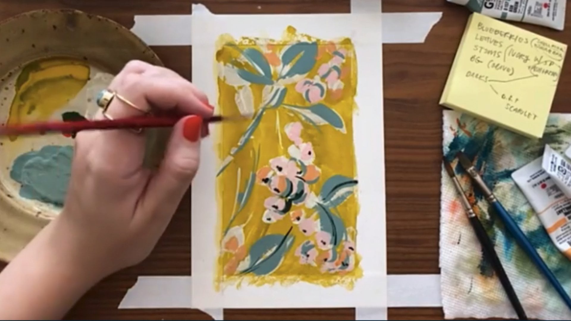
13. Demo 5 Pt 1: Inspiration: Visual Note Taking + Sketching: Welcome to Demo
five. The doorway I'll be demonstrating
today is inspiration, as in using the
things you love right now as your starting point
to make something new. It's different from
favorite shapes and subject matter as
shown previously, in that inspiration
is often changing. And as a doorway, allows us space in our
sketchbook to break down and understand what is lighting us up and then
make something new from it. Subject matter, on the other
hand, like in demo four, is really about identifying
the shapes and types of work that you can reliably go back to, no
matter the weather. For example, I went
through a phase where I was very inspired by
painting still lifes, whereas painting simple
fruit shapes are a more reliable
subject matter doorway that feels fun to me, no matter what phase I'm in. Still lifes were an inspiration
at one point in time, while fruit is a favorite
shape in subject matter. This demo is actually going to generate two full
sketchbook spreads, the first where I capture my current inspiration
and break it down using visual note taking
in a casual floated spread, and another where I draw from my captured inspiration to make a custom spread of gouache badges and pennants
in a neater floated layout. You don't know what
you're inspired by right now or how to use it, this visual note taking
demo is going to blow your mind and show you exactly how to effectively
use this doorway. For example, these visual notes were taken as I was
looking at lamps I loved, and then from those, I created
these lamps of my own. Like, I know what lamps I
kind of like generally, but it wasn't until I broke down my collected inspiration
that I could see what kind of lamps
I'm really drawn to, allowing me to make a sketchbook spread of lamps that I really, really love that are on my own. This folk piece in my
portfolio was created from these simple visual notes I took while observing folk art. Thanks to the step of
visual note taking, I'm able to harness my inspiration without
ripping off my inspiration. You could feel an
entire sketchbook of just visual notes that you take from things that
are inspiring to you, which not a bad idea. Anyway, to get started, you want to begin by
collecting a little folder, digital or physical of things that are feeling
inspiring to you right now. And this doesn't have
to take a long time. I suggest even setting a 15
minute timer to focus you. During this process, you
want to be on the hunt for inspiration, not admiration. For example, I'm pretty obsessed
with Live Potter's work. I love staring at it, and I feel very
intimidated to begin. Like, maybe I should give up before starting.
That's admiration. However, when I see
Natalie Lite's work, which I'm also obsessed with, it makes me crave touching my
brush. That's inspiration. Here's another example.
I really admire moody traditional landscape
paintings. I love them. I hang them in my house, but they do not inspire me
to go to my sketchbook. I do not desire to paint this way myself. That's admiration. On the other hand, on Pinterest, I noticed I was pinning
a lot of badges, buttons, matchbooks,
and pennants. And immediately, my
brain started firing ideas for color combinations and fun things my own could say. This is inspiration, and this is the stuff that we
want to be collecting. Instead of asking
yourself, what do I love, ask yourself what
makes me want to create and use it as your lens for what
treasures to collect. If you're feeling inspired
by badges and pennants, too, feel free to follow along
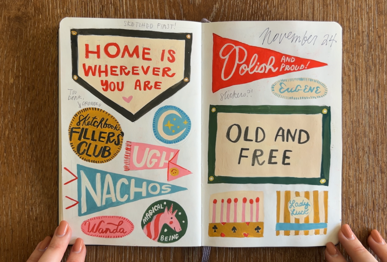
with me to make your own. I've gone ahead and shared my Pincher sport of inspiration
in the class resources, but of course, you can watch my process and apply it
to your own inspiration. Once you've got your
collected inspo, you can gather your materials. Keep in mind you likely won't know the layout
you'll want for your main piece until
after taking visual notes. But that's just fine.
We at least know our visual notes will be in
a casual, floated layout. The materials I'll be using for the first part of this demo, the visual note taking part
are a pentel brush pen, Coronh luminance colored
pencils, and my sketchbook. The materials I'll be using for the second
part of this demo, the spread of pennants and badges are a pencil
and two erasers, Holbein artist Guash
the pigeon letters round brushes in size six, in size two, a palette
for mixing paint, a water cup, a paper
towel, and my sketchbook. But of course, your setup
may look a little different. With guidelines one
and two followed, it's time to focus on
starting and finishing the page or in this
case, all four pages. Let's get into
visual note taking. Off screen, I have
my Pintras board pulled up of collected
inspiration. And with my pentel
brush in hand, I'm starting by looking at
a collection of badges. And the first note
I want to take is for the idea of
badges themselves. So I draw a circle and
label it as a badge. I love the stitching
around the border, so I jot that down, too. Now, I don't want to draw any of these specific badges
in their entirety. So I leave myself a general
note that an icon can go in the center and an accomplishment can
be lettered around it. In a different
part of my spread, I begin writing ideas for the content of my
badges and pennans. I love the stargazer idea from these badges,
so I write it down. And by writing it in a space separate from the
actual badge drawing, I'm helping to loosen the
ideas from each other. It's like finding big, pretty rocks and
breaking them down into smaller pieces and throwing all the pieces in
a bucket together. Stargazer gives me an idea for moon over, so I write that down. The small addict badge sparks my love for nachos,
so I write that down. The young and free badge sparks
an idea for a badge that says old and free and also
one that says old spirit. Next up is this dog button, and what I love most about
it is the color palette. So in a third spot of my spread, I'll use my colored pencils to jot down the pink
and yellow duo. There's a lot I love
about this matchbox. But first, I want to
simply note the idea of drawing a match
box or a match book. So under my basic badge, I draw a box of matches. In a fourth part of my spread, I make an area to start
capturing motifs. In this case, a little
horse that actually reminds me of some full
courses I've painted before. So I draw one. I also love the banner
shape for lettering, and I draw that in
the motif area. The last thing I
want to note from this beautiful match box
is the color palette. You may remember my
love of pink and red from the grid and
quilt block demo. Next up is a classic pennant, which I first capture in the basic shape
area of my spread, making sure to note
the little ties. I draw a second
pennant to capture the idea of an icon with
lettering around it. This tutorial I pinned
for making a real pennant had a good tip for fitting
the letters inside shapes. So I draw that among the
other shapes and layouts. With this pennant, I like
that the icon takes up the entire left side with the lettering
fully to the right. I've long loved the
suits of cards, and so I draw those
in the motif area. This little butter
pennant reminds me of a butter hat that
my husband got me, so I butter down on the
content area of my spread. These pennants are simple, but there's a lot
I like about them. First, I like the idea of using a last name for the
concept of the pennant. I also love the big script
taking up the layout. I love the stripes on the edge. And finally, the simple and bold color palettes
really speak to me. Now it's time to add a banner to the basic shape
area of my spread, including the cute
little Gromets. In the content area, I add a note about
inspirational reminders. Next, I jot down the smart vertical layout
of this pennant. These mini pennants also provide an alternative to the
long wide triangle, so I jot that down too. I also love the AC pennant, but I'm more likely to say Ugh, so I add that to
my content area. I love the red and white stripes
of this vintage pennant, and so I add that to
my color palettes. And this is how I continue on until my page is full of ideas. And I encourage you
to do the same, whether you're looking at
the Pintresbard that I provided or your own
collection of inspiration. This visual note
taking spread in real time took me 20
minutes to complete. And now I'm inspired
and ready to make my own spread of
badges and pennants. If you haven't already,
take a moment to look at your visual notes and decide
what layout you're using. I'm going to start by sketching, and I encourage you to flip back and forth
to your notes often, as you will see me doing
to help fill the page. The very first shape I sketch is a big old banner in the
top left of the spread. I put it here because
that flat top edge nicely aligns with
the top of the book, and the raw edge shape leaves
room for other shapes. Next, I sketch a symbol
rectangle banner, placing it a little lower on the page to stagger it with
the banner in the top left. Right now my goal is to fill
up the pages with shapes. So I look back at my notes to see what other basic
shapes I collected that can be used and decide on a classic pennant
in the bottom left. This third big shape really nicely balances
the other two. I want one more pennant, so I balance a second one in the upper
right of my spread. Instead of doing a match box, I decide to draw two squares to fill this space down here for a classic matchbook of which I can show the outside
and the inside design. Looking at my notes,
I remember circle and oval badges and begin filling them in the
available space. In the awkward
space I have left, I go for the folded or
creased pendant shape, followed by another circle. I could put another oval badge or even a backwards
pennant up here, but I go for a
scribbly date instead. With my composition of
shapes all sketched out, I'm ready to start adding my own spin and details to each. I take it one badge at a time, referencing my visual notes
and trying out ideas. When something
doesn't work, like this Bob Dylan
quote, which I love, but I felt I was trying a
little too hard to be cool, so I erased it and replaced
it with something else. Sketchbooks aren't about
knowing, they're about finding. For my oval badges, I decide to honor my grandpa,
Eugene and my grandma, Wanda, and this is where pieces really become ours because, yes, this entire page
is inspired from beautiful works by other
people and existing things, yet none of those
people would have made this particular collection. I think it's a great testament to visual note taking and how our inspiration is the ultimate doorway to
expressing ourselves. And now my sketch is done. I'll take a break and come back tomorrow to
begin painting her.
14. Demo 5 Pt 2: Inspiration: Painting Badges + Banners: So it's a new day with terrible lighting, and
I'm ready to paint. This part of the process is the most meditative because I just get to essentially color in the coloring book lines
I drew for myself. I'm squeezing out some guash. I've got white, flame
red, yellow ochre, and primary yellow,
primary cyan, emerald green, and black. And while I will generally describe what I'm doing
throughout the process, the point of this
class isn't really to teach you how to
paint with guash. It's just to help share
helpful guidelines for filling sketchbook pages. So I'm not going to get too
into the weeds about it, but if you'd like to know more, I recommend my course
getting to know your paint. First up, I'm using red
right from the tube with some water and headed for my
Polish and proud pennant. The main thing I want
you to see here is I'm painting around my
pencil lettering and not over the pencil
lettering so that I can see them more clearly when I
go over them later in white. Next, I mix a pink
from white and red and go to paint the
Wanda badge in the same way. But before I get in
there, I'm going to use my eraser to lighten my
pencil lines a little, as I sketched quite darker than usual so that it
would show up on camera. I first go around
with my bigger brush to fill in most of the space, and then I switch to
my smaller brush to fine tune the negative
space for the lettering. I'm now using the same pink to paint the background
of my UG pennant. And notice how I'm
not worrying about finishing each badge
entirely before moving on. Instead, I'm going
to cover the page in a first layer of paint
and add details on top. I mix up a green with emerald black and yellow ochre and fill in the border of
my old and free banner. During visual note taking, a lot of the palettes I liked
were simple and bright, so I'm carrying that
over to this page. I use the same green to fill
out the magical being badge, similar to how I balance the shapes during
the sketching phase. Right now I'm trying
to balance the colors. The pinks on the left balance
the red on the right, and the green at the bottom left begins to balance the
green on the right. I mix a little ochre
into my black to soften it and paint the
border from my home banner. I can't wait to paint
those little gold gromets, but I must be patient and
let the paint dry so that the gold can really pop on the black instead
of mixing with it. I mix up some yellow ochre and start filling
in my matchbooks. I lighten my pencil
lines and use the same ochre for the base of my sketchbook
fillers club badge. But partway through,
I realize I can paint over the pencil
lines and still see them. So I do that instead of
trying to paint around the tiny little script forms
for the word sketchbook. Next up, I mix a retro teal
from primary cyan, white, ochre, and a touch of black and start painting in the base
of my nachos pennant. Then I use the same teal to fill in my star and
crescent moon badge. Finally, I mix an
ivory from white with primary yellow and a touch of red to fill in the
neutral spaces. The mix is translucent enough that I can see
my sketches through, so I can cover these
areas pretty quickly. With my first layer
of paint down, I'm ready to take a
break and come back tomorrow to finish all
the cutie details. Ah, a fresh day with much better light and a second camera that's actually recording
for the most part. I start by spraying my paint
pallet with water as gouache is just opaque watercolor and can be reanimated after drying. I start with my teal color, my tiny brush, and the lettering on my
grandpa's name badge. I move from right to left to cut back on left
handed smudgies. With the same teal,
I head down to my Lady Luck matchbook
to paint the lettering. It's Oh, it's, um, it's kind of hard to see
with my hand in the way. If only there were
another camera, boom. Finally, camera B
is in the works as I take my time around
this tiny script. I darken my teal by adding
more primary can to it and add my little
badge stitches around my sun and moon badge. Next, I mix up some red
in color in the hearts and diamonds on the matchbook
and the match heads, too. Similar to the first layer, I'm trying to distribute
my colors across the page, so I use my red to
accent my UG badge. I mix up a thick ivory and add the script lettering to my
Polish and proud pennant. I can clean up some of
the smaller letters with red paint after
I let the white dry. Next is the ivory
nacho lettering. Followed by the
Ivory ug letters. And really, friends, I go on
jumping from badge to badge, filling in tiny details, taking it slow, until
my page is done. I lose track of time.
I melt into it. When I'm all done, I
erase my pencil lines, and if I'm being honest, I sit and stare for a long time. This badge, banner,
and pennant spread in real time took me 2.5
hours to complete. With my pages filled, I've completed three guidelines, and now it's time for
number four, reflecting. You're welcome to
reflect mentally, but I find physically
writing notes makes me more constructive and keeps
the wisdom available. In either case, you want to ask yourself, What do
I like about this? What did I like about making it? What do I dislike? What did
I dislike about making it? When I reflect on my badges and pennants, here
is what comes up. I really enjoyed getting to paint without worrying
about composition. So sketching first rules
for me once again. Something I dislike
is the sketchbook fillers club badge is
a little hard to read. If I could change it, this yellow could
be brighter to make the black lettering pop more or a dirtier yellow
with ivory lettering. I also didn't leave enough room for the apostrophe at the end. I would love to turn
these into stickers, and so that could be a
doorway for future Dylan. To recap, for this demo, I utilize the doorway
of current inspiration. I collect pieces that
inspired me into a Pintres board and
reviewed that inspiration using visual note taking and a casual floated layout to break down what I was
seeing into details. I then use those visual
notes to inspire a neater floated layout of custom guash buttons,
badges, and pennants. I finished the page and
reflected on the enjoyment of sketching first a spot for improvement and an
idea for the future. See you in the next
lesson for demo six.
15. Demo 6: Causes: Love Thy Neighbor: Welcome to Demo six. The doorway I'll
be demonstrating today is causes and purpose. Causes and purpose are an excellent well
of creative juice. They can be small
and personal causes like expressing petty
feelings or say, shining a light on a rude piece of furniture in your house that you often stub your toe
on or knock your shin on. Or, you know, I have
long atan arms. I'm always knocking my
knuckles on things. This is a cause I
really understand. That's something you can
speak on in your sketchbook, for the fun of it,
for the hell of it, because who else is going to? Or it can be something bigger. For example, in my
country, America, we have never been so
divided and quite frankly, outright, hateful to each other, at least in my lifetime. Right now, every single person
I know, myself included, knows a handful of people that they would
deem evil idiots. And unfortunately, I think we have to find
a way to unite you guys, even though we are all
someone's evil idiot. And so I thought that
it would be nice to do a cross stitch style
sampler piece that says love thy neighbor
in a full bleed layout. Not because I think it will
necessarily change the world, but because if I died tomorrow, this is a worthy use
of my life moments, reminding myself, reminding
us to love our fellow humans. Reflect a little on something
that feels so meaningful to you that it's worth facing that blank page
and filling it up. It can be a small stand. It can be a big stand. Take a stand, man. Feel free to follow along
with me to create your own love thy neighbor piece or use your own cause
to guide your spread. And once you've got
your cause or purpose, choose a layout that feels fitting and grab your materials. The materials I'll be using for this demo are a
pencil and eraser, Holbein Artist guash, the pigeon letters round
brush in size ten, and a Yasu tomo fusion
round brush in size five, a palette for mixing, a water cup, paper towel, posca pens, a sticky
note, and my sketchbook. But of course, your setup
may look a little different. With guidelines one
and two followed, it's time to focus on starting
and finishing the page. I'm starting out this
full bleed piece by sketching a
simple border shape, something sort of
whimsical that feels comforting like my grandma's
cross stitch samplers. Now I'm ready to
paint the background. I'm envisioning a
warm ivory color for the center background and a warm peachy pink
for the border. I squeeze a good bit of white
gouache onto my palette, along with some primary
yellow and red. I'll use white, a little yellow, and a dab of red
to make my ivory, and I'll start spreading
it on the page, switching to a larger brush that can hold on to more paint. Then I'll use a slightly
different ratio of white, red and yellow to make my pink. I have a lot of thick
paint on my brush, so I dab it around to
different parts of the page before adding more water to the mix and spreading
it all around. It is very satisfying. I give my background
time to dry, which doesn't take too long with guash, only a few minutes. And I'm grabbing a
sticky note to write out Love thy neighbor
to make sure I, A, know how to spell it and B, to see how to stack the letters. Now, earlier I peeked at
my color swatch chart from Demo one to help pick
colors for this piece, and I landed on pink, red, green, a lighter green, khaki green and yellow. And then I just sort of throw myself into it without a plan. I have a very loose vision
in my head of the words, love thy neighbor
made up in tiny Xs, taking center stage
of the design. But I got so excited that
I just kind of began. And pretty quickly,
things get a little wonky and I start
to feel frustrated. So I decided to reset. I let the paskas dry and mix up more ivory paint
to cover my mistake. I needed a perfect patch, I would do another layer
once this one dries, but since I'm going over top
of it with a similar design, I think one coat is enough. Plus, I don't need to be
perfect in my sketchbook. I just want to
keep moving today. This time, I grab my pencil and lightly sketch out
where the letters will go. And then I get back to
drawing my little Xs. It still isn't perfect. I kind of veer off course, but I'd rather have it be wonky than the total complete
mess that it was. Then I grab my pink
posca pen and draw a jagged little
heart shape to take the place of the O in
the word neighbor. It feels like something is
missing at the top here, so I grab my yellow posca pen
and decide to draw a bow. To balance that out, I
grab my red and draw some simple and
symmetrical flower heads followed by green to
add into their stems. I'm really improvising
my composition as I go, and so I lean on more
symmetrical flowers for balance. I did not follow my pencil
line for my letter G, so I'll lightly
erase those lines, taking care to not
disturb the paint. Grab my red pasca and start drawing Xs over the heart shape. This is the smallest
red paska I have, and I'm struggling a bit
to make each X clear, but that's okay. I keep on. I want to add in some more
flora around the piece, so I grab my khaki
green paska pen and add a border of vines, which leads to drawing these little strawberries at the ends. I keep this pattern going
around the entire border. With the border filled out, I grab my pink and red paskas
and add Xs to the flowers, and then I follow
suit with the greens. For the dots on
the strawberries, I add little khaki green Xs. The corners felt a little bare, so I add some simple flowers. And then I get this urge to use the yellow and not really thinking through where that
yellow might be best used, I just kind of start
coloring around the letters. But this is what
sketchbooks are for taking those little weird alleys
and seeing if they lead anywhere cool.
Spoiler alert. This one doesn't, in my opinion, but I'm still glad
I took a look. It was really fun to color with the yellow that I
had that urge for. Finally, I grab my green and add a few detail lines
to my border vines. This spread in real time
took me an hour to complete. With my pages filled, I've
completed three guidelines, and now it's time for
number four, reflecting. You're welcome to
reflect mentally, but I find physically
writing notes makes me more constructive and keeps
the wisdom available. In either case, you want to ask yourself, What do
I like about this? What did I like about making
it? What do I dislike? What did I dislike
about making it? When I reflect on my
loveth neighbor piece, here's what comes up. To be so honest, I was flying pretty high on the
first five demos, but then I feel Hmm. Ah, yes, embarrassed and
disappointed with this piece. This is the time that it is most helpful to reflect,
to learn from it. I do actually like
the cross stitch love thy neighbor concept and the style of the little
stitched letters. The frame, I guess, feels
a little too rushed. In fact, the whole piece could
have benefited from, like, a more thoughtful sketch, and the yellow around the
letters is not working for me. The border also just feels
a tad spidery and dark. And this is a fabulous example of the power of
reflection because my initial reaction
was to just re film the demo and act
like it didn't happen. Really, I was so embarrassed
that I almost did that. But that's not helpful for
either of us because this is how it is sometimes when you're working
in your sketchbook. Thanks to reflecting, I saw that I really
love the concept, just not the execution. So I took the piece to my iPad where I could play a little more and ended up with a portfolio piece that
I'm pretty obsessed with. I was able to solve
the pain points I called out during
my reflection, which ended up being a
really helpful guide. My sketchbook piece
was enjoyable to make, improved my painting and Posca pen skills and was ultimately the bridge
to a portfolio piece. This wasn't the only
solution, though, which is why reflection
is so helpful. On another day, maybe it
would have felt better to just repeat the
piece and try it again, sketching a little bit more thoughtfully before committing. On another day, maybe I would have felt satisfied that I gave the concept a go
and would have felt better just turning the
page and moving on. You never know until you ask. To recap, for this demo, I utilize the doorway of
causes and purpose to make a full bleed love thy neighbor piece with
Guash and Posca pens. I finished the page, and although I wasn't thrilled, I reflected on what
wasn't working for me, leading to the
piece being used as a concept for a portfolio piece. See you in the next lesson
for our final demo.
16. Demo 7: Prompts: Favorite Corner: Welcome to Demo seven. The final doorway I'll be
demonstrating is prompts. There are so many art prompt resources out there for artists from challenges shared on social media to books that
teach you how to do things. You can even make your
own custom prompts by jotting down your various
doorways on pieces of paper, keeping them in a
little container, and pulling a few when you
need a place to start. For my spread today,
I'm going to utilize a prompt from my
most popular class, Illustrated Journaling
14 Days of Prompts, as it's one of my personal
favorites to revisit. The prompt is favorite corner, which I'll complete
with a floated layout. Creating artwork in
response to prompts, especially ones that I revisit, creates a really,
really awesome time capsule that is so
enjoyable to look back on. For example, here are my favorite corner
entries through the years in different
homes in which we glipped. You are welcome to follow along to share your own
favorite corner, but I've also shared some of my other favorite sources of prompts in the class materials. You may also want to do a
quick search for prompts that includes some keywords
that are specific to you, like gardening art prompts
or beginner gouache prompts. Once you have your prompt, gather your materials and
choose a fitting layout. If you are following
along with me, the next step is to pick your favorite corner of
your current dwelling. It doesn't have to
be a literal corner, just an area that brings you joy and snap a few
photos as reference. Mine is the sun room or
a house here in Ohio, and so I made sure to take
a few photos as reference. The materials I'll be using for this demo are a sticky note, a pencil and eraser, Tambo dual brush pens, corona ache luminance
colored pencils, a pen tail brush pen, a Pilot Precise V five RT, which is just a pen
and my sketchbook. But of course, your setup
may look a little different. Guidelines one and two followed, it's time to focus on starting
and finishing the page. With my reference images
pulled up off screen, I write down a list
of the details I want to include in my
favorite corner spread, including the chair and pillows, the windows, the three plants, the old light fixture, the lamp with the wavy
shade, a floor tile, my space heater, and my
hobbies like journaling, books to read, and my AirPods. Learning my lesson from demo
six, causes and purpose, I am for sure going to
sketch in pencil first, beginning with writing the prompt along the
bottom of the page. The biggest element on my list
is the chair and pillows, so I begin to sketch
it down in the corner. When I'm done, I cross it
off the list and keep going. I use the straight edge of
the sketchbook crease to line my window against and draw a hanging plant
in front of it, even though the plant in real life is fake
and comically small. I want the light fixture
to really have a nice, prominent place, so I draw it larger in scale
above the chair. And that's a really fun part
of these floated layouts is getting to play with
scale to adjust emphasis. I left myself an
awkward space that I think I can fill with a
square for the floor tile. I use this vertical space below the window to add
in my space heater, which isn't necessarily cute, but is honestly the MVP of
the sun room in cold seasons. I use the room to the right of the space heater to house
the remaining two plants. I only have the lamp
and my hobbies left, and I decided to put the lamp
close to the light fixture, filling an awkward
space with a cord. I use my final space to
fit in an open journal, some books, and my airpods. With my sketch complete, I went through my marker and colored pencil
swatches and chose a palette that is reflective of the items as they
are in real life. I grabbed my materials and pick the chair as my first
object to work on. Unlike the floral demo or
the badges and banners demo, where I developed the
piece altogether, I'm going to take this
11 motif at a time. I work up the chair in stages, first coloring the base, then adding the pillows, and finally adding some
of the wood details. I layer colored pencil on top of the marker to create the
chair design and texture. Next, I use my pentel brush
to color in the floor tile, leaving the stars the
white of the page. Next, I grab my
neutral colored pencil and start drawing
the light fixture, which is milk glass with
little bumps all over it. So I take care to create that texture with
negative space. I use markers to mimic the brass and top it off with
the pentel brush details. I focus on the lamp and use a warmer buttery
yellow pencil for the shade as if the light
is turned on at night. I erase my pencil
lines a bit so that they don't mix with that
lighter yellow color. I color the base,
the finial and cord, and then use a colored pencil to create light lines
on the lamp shade. For the plant, I
use a marker for the stems and a colored
pencil for the soft ferns. And again, it doesn't have
to stay true to life. I draw my space heater. I draw my foe plant, playing with positive
and negative space, so it isn't too
heavy on the page. I draw Joyce's beautiful basket and layer the basket
weave on top in marker. I layer yellow and
chartreuse into the leaves to give the illusion of sunlight bouncing around. I keep my hoppy icons simple, re using my palette colors
to balance things out. I go over the prompt name with my Pentel brush and switch to a regular pen to add labels and
fill awkward gaps. My chair feels like
it's floating, so I grab my smoky
colored pencil and scribble in some shadows, adding them under
the plants too. This spread in real time, took
me 50 minutes to complete. With my pages filled, I've completed three guidelines, and now it's time for
number four, reflecting. You're welcome to
reflect mentally, but I find physically
writing notes makes me more constructive and keeps
the wisdom available. In either case, you want to ask yourself, What do
I like about this? What did I like about making it? What do I dislike? What did
I dislike about making it? When I reflect on my
favorite corner spread, here's what comes up. Is a really great snapshot of a place I spend so
much of my time. I love the spread overall, and especially the chair, the light fixture, and the way the faux
plant is rendered. I especially enjoyed the marker and colored pencil layered
on top of each other, which is a doorway
I would definitely like to keep exploring. To recap, for this demo, I utilize the
doorway of prompts, in this case, a
favorite corner prompt, which I colored with markers and colored pencil in
a floated layout. I finished the page
and reflected on the details I love and want to take with me to
future spreads. With all seven demos done
and doorways walked through, let's do a little review.
17. Quick Review!: The spirit of guideline four, let's take a moment to reflect on all we've
done together. First, I set a goal for you to complete at least one sketchbook spread using one of
the seven doorways and one of the three layouts. Though hopefully
you'll try them all. Then I told you about the
available class resources, and we briefly
discussed materials. Next, we dove into
the four sketchbook fillers club guidelines, the heart of this class. Number one, find your doorway
to make starting easier. Number two, use basic layouts to make any work look better. Number three, finish the page, and number four, spend a
little time reflecting. Then we got into the demos. For Demo one, I demonstrated the doorway of
mediums and materials by making a color
swatch chart in a framed layout of MyPoscapens. For Demo two, I demonstrated the doorway of technical studies by layering markers in a floated layout to find
interesting color palettes. For demo three, I demonstrated the doorway of starting
with a grid by drawing a colorful quilt in a loosely framed layout with
color pencils and markers, inspired by a color
palette from Demo two. For demo four, I demonstrated the doorway of
favorite shapes and subject matter by filling a full bleed layout with flowers done with marker
and colored pencil. For Demo five, I demonstrated
the doorway of inspiration by taking visual notes of my inspiration and
painting gouache badges, banners and pennants
in a floated layout. For Demo six, I demonstrated the doorway of causes
and purpose by creating a love thy neighbor design in a full bleed layout with
posca pens and gouache. For demo seven, I demonstrated the doorway of
prompts by following my Illustrated
journaling prompt of favorite corner in
a floated design with marker and colored pencil. So how did it go for
you? Which doorways called your name and which
ones felt more like windows? I personally found technical
studies, the grid quilt, my inspired banners and badges, and my prompted favorite
corner pages to be my favorite to work on
and final result wise. Whereas the unplanned nature of speaking on my cause
left me feeling a little dissatisfied during the process and with
the sketchbook result, though it did lead to a
portfolio piece I love. Take a little time to reflect
on how it went for you. Then find your next
doorway and show up again.
18. Thank you! Want Flower Pics?: Thank you for hanging out
with me so I could share my deep love and best
practices for sketchbooking. I can't wait to see how
you take it and run. If you would like to
keep creating with me, you may want to check
out my other courses. If you would like instant
access to hundreds of floral reference images
that you may use personally and
professionally for free, you can sign up for my
monthly newsletter. And I also work with
artists one to one and in groups if you feel like that is the
right path for you. Until then, happy sketchbooking. And hey, welcome to the club.
 Dylan Mierzwinski, Illustrator & Lover of Flowers