Transcripts
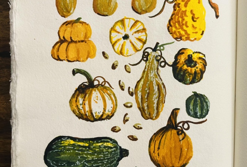
1. Introduction: We're going to be drawing some really cute pumpkins and gourds. If you draw some and they turn out wonky, ugly or not what we are thinking, this time has not been wasted because we're taking time to just sit down. We're creating. It's important, it's good for us, and so I want you to let the pressure go. Hi, I'm Dylan Mierzwinski. I am an illustrator and an artist in Phoenix, Arizona, and a very proud Skillshare teacher. For today's live class, we are going to be using Tombow Dual Brush markers to make a layout of festive and autumnal pumpkins and gourds. We're talking cute little orange pumpkins, cute little white pumpkins, cute little green ones with stripes, or drawing them. There's just nothing like the feeling of fall coming around. Even here in Phoenix when I don't get cooler temperatures and I don't get to wear sweaters, the start of fall is so exciting. It's a really nice time to just take a deep breath, sit down, we're using markers, they're fun, they're accessible, and we're just going to create some art for us and for the season. We're going to be using basic drawing paper, some markers, a pencil, and a ruler today. The best part is if you don't have the exact markers I'm using, the same colors, you can still follow along. I want you to walk away from this with two things. I want you to feel calmer and a little more zen than you did before you started and I also want you to have cute pumpkins and gourds on a piece of paper, because even as fall goes away, you can take this process and you can make flowers, you can do cookies, you can do houses. You can really do anything. Just so you know, this class was recorded live so that I could interact with the audience while I was drawing along. Ready? Let's do it. Let's draw some pumpkins.
2. Class Materials: Hello everybody. My name is Tiffany Chow, and I work on Skillshare's community team. I'm going to be the host for today's live class. Without further ado, we can go ahead and get started. Sure. Hello, I'm Dylan. I also prefer the pronouns she, her, and hers, if you were curious. I'm an illustrator and I'm a very, very proud Skillshare teacher. So that's that. Even as a professional, I need time like this. Even though I'm the one leading this right now, I love attending live demos in classes because it's so nice just to have somebody walk you through something. You don't have to think about, "What am I going to draw? How am I going to do it?" You can just sit down and do it and show up, and so it's going to be really good. We are going to be working from reference photos. I also provided some extra reference photos in case the ones I collected aren't what you're into, and then I also provided an actual layout of how we are going to be laying the pumpkins out on the page with a little grid. The reason I did that is the first thing we're going to do is we're going to be penciling down those shapes. You don't have to, and really, that's the theme of this whole thing. I'm going to be showing you how I like to do things, how it feels comfortable to me so that I can do a successful demonstrate in front of you. But if I suggest something and it doesn't feel right, if you want to make pink pumpkins, if you end up wanting to draw cats this whole time, that's fine. Whatever you're going to do, I want you to do it. Okay. Materials list is there, but it's really helpful to just make a quick color chart of your markers so that you're not depending on the cap color. As you can see, I have two or three light colors and these are totally different colors, but you can't tell by the cap color. So it's really nice to just have a quick reference, so that if I'm like, "Wait a minute, I need my pink color." I can look down and see what color that's going to be. These are the colors that I'm going to be using today. I have three neutral colors and I might not use all three of them. It's just, I had these neutrals and they are a little bit different. These ones are just 990. It's like a lighter version of 942, whereas 910 is a little bit more pink. You can see I have two oranges here, and three sage-y greens. In some cases, like I said, if you don't have all these, it's okay. You could draw all of the pumpkins orange if you wanted to. So really, really, I want to try and get you to just use what you have. I'm just going to pull up the reference photo on my page. I'm just using really inexpensive 50-pound drawing paper. It's just a Strathmore sketchbook, 50-pound, like I said, 74 grams per meter squared. It's a 9 by 12 book. The drawing we're doing today is in a portrait orientation, and so that's how it's laid out on there. But like I said, make it work for what you've got going on.
3. Sketching Your Layout: To get started, let's go ahead and sketch out our general layout. The first thing I'm going to do is just really lightly draw my center guides so that I can successfully get that reference photo down. I'm going to be drawing a little bit darker in pencil than I would in real life so that you can see what I'm getting down. But there's no magic here. I'm looking at the paper, I'm looking at the quadrant I'm working in, and I'm just trying to mimic what I see there. That odd-looking one comes up above that center line, comes about halfway here. You can see that's a really imperfect shape and that's fine because I just need to get the general placement down. Even I right now, I know that this doesn't need to be perfect right now for it to turn out and I still feel that pressure on myself to get it perfect. It's like a constant weeding process to try and get yourself to stop trying to make things so perfect. There's a question from the audience still in, do you typically plan your layouts in this way before drawing? I do on days when I'm really doubting myself. Yes. There are some days where my art resistance is just really high and I feel like I don't know what to draw, I don't know how to do this. So taking the time to find reference photos and lay them out is a way for my brain to go, I at least know it'll work. I know that I'm not going to get into this and find out that everything is off center really badly or whatever the case may be. So I work differently all the time just based on what my feelings are. But this is definitely a way that I like to work when I just need a little help. It's nice to work with what your strengths and weaknesses are, and for me, composition on the fly has always been one of my weaker points. Maybe it'll improve and maybe it has improved over time but I just know my discomfort with it is there. Let's see, can you read? Yeah, you can see. I know this part is really light, I promise you'll be able to really see once we lay color down. But the stage really makes things hopeful and we can adjust as we go. We can do anything. This is our piece of paper and the nice thing about this is, let's say you're drawing along right now and you're just trying to keep up with what I'm doing, you might miss a few steps or you might not love the final result. But once you do it once, you can always come back and do it again. After this course, if you really liked it, but you are in the I need to follow along madness then you can slow down and try it again. I'm just erasing these three little pumpkins up here because in looking at my layout, I can see the third one is really supposed to come over here in order to make this vertical one fit. So it doesn't really matter what the shapes look like, but that placement is really important to finish this off and help it feel balanced. Maybe I'll put that one in first, since that's the one that really determines that space. Last little bumpy guy over here. Stem up there. I don't need to draw in the pumpkin seeds. They just fill that inner space in there. I think I'm ready to get in here with some color. I'm just going to erase these center lines so that they're not as obvious. One thing that I do, let's say that you're sketching right now and your lines are still darker than you want them to be, you can take any eraser. It works best with a kneaded eraser and you can just lightly go over the whole thing and that will make it so that your lines are still visible to you, but they get a lot lighter than they were with the first pass. Also, here's a pro tip for you. When I was starting out as an illustrator, I thought that pencil lines and all of those things were a big no-no in illustration work that it would have to be cleaned up so that none of them are seen but now I know that clients love seeing that, they love the realness of the process and seeing leftover pencil lines and stuff like that, as long as they're not distracting. Let's draw some pumpkins.
4. Layering Colors: Now, let's start layering in some color. I'm going to start with this guy down here, which is going to be our big orange classic. When someone says pumpkin, that's what I think of. The way that we're going to do this, since markers layer on top of each other, I can't color in a dark color and then take a light marker and color on top of it with wash, and expect it to show up. They layer. Is that an additive process then? Probably. When you're working like this, with watercolors or markers, you want to work lightest to darkest. In this case, with each pumpkin, we're going to look at the photos and look at what is the brightest or lightest color that makes up that pumpkin and that's the first one we're going to lay down, then we'll layer the darker accent colors on top. This guy, I'm going to use my lighter orange color because I can always layer either with the same color on top of itself to make darker values, or I can use the other darker orange I have. This way, this really pretty light orange is going to shine through whatever we layer on top of it. If you've taken my illustrated journal course or participating in the workshop, that's halfway done right now with mine and Jessica Swift's Illustrated Journaling course, then you know that I like to color in bold streaks instead of just coloring haphazardly, unless I'm trying to get some form of texture across. The reason for that is because I love the streakiness of the markers. However, they can create chaos and everything. Even though I like the streakiness, if I color in all these different directions, it's going to add a lot of noise. I don't always want to do that. I want the streakiness in the markers, but I want to rain it in a little bit. Working in long streaks like that gives it that uniformity. I'm going to go ahead and grab my darker orange color. Oops, that is not the one. [inaudible] There's one question. If you don't mind restating which number that first orange was. Sure the first one was 933. Sorry, I thought I pulled all the colors I needed before hand. I think I forgot one. Maybe it is this orangy one I want. Oh no, 985 is there. See, that's why you can't trust the cap color. I was looking at the wrong one. I actually I wanted to use this lighter 985 first. If I put it down next to it, you can see it's a little brighter. It's been done already. No worries, we'll roll with the punches. Basically, all you need to do is darken this pumpkin. Right now, it's just one flat color. Even though this color is lighter, it is an additive process. Any streak I add on top is going to change the tone and the value of what's been laid down first. It's probably not coming across the screen, but what I just laid down, I now have these really cool two values and two colors working together. I'm going to get in with my 905. It's a warm red orange color. It's this one right here. I'll get in where that pumpkin is darker in the reference photo, which is around the left and down the bottom side. I'm just going to build up the different values with my darker markers. There's little stripes, so I can accent those stripes by using the point of my brush and bringing those in. We're just going to slowly build those layers up. Even if I layer the same color on top of itself, it still makes a difference, so I'm able to just let a few areas of that first color shine through. Now, it looks like we have some interesting values. Then when I'm really ready to sucker punch that value, I'm going to use this dark purple color. It's 679. It's beautiful. It's a cool dark purple. I'm going to really punch in where those darkest values are. I like to drag the brush pen. That's one of my favorite things about Tombows. The brush pen, you can get really thick bold strokes and you can get really organic expressive strokes just based on how you're holding it. I mean, it's a pumpkin. We only used a few colors and yet it's just so interesting. It's so weighted down now with those values there. I just need to add the stem up here. I'm using a brown that is 977 to hold on to the texture of the stem. Again, I'm not going to perfectly color over that orange. I'm going to leave a little bit of the orange to show through, then I'll also go ahead and build up a darker value on that side of the stem, which is what I see when I look at the reference. We got a pumpkin. There he is and he's so cute. He's so cute.
5. Using Values: Let's talk really quickly about how to show different light and dark values no matter what colors you're using. Let's move on to this guy. This little one in the reference photo is a light sage-y green and then a dark green, and so from my color chart, I'm going to use the lightest green I have for the main circle. That's my lightest color that I'm going to want to show through, and then I'm going to add on top of that with 158 or 177. I think I didn't list both of those in the references because they're so close. I'll probably end up using 177 because it's darker, and then I'll also probably bring in that 679 again for the darker values. Again, so if you don't have these exact colors, what you want to look at is value. If you're doing all pink and purple pumpkins, your pink color is probably going to be lighter than the purple, and so lay the pink down first and then you can add on top with darker pinks and darker purples. I'm just going to go ahead and color this in. Oh, it just happened. Do you know what just happened? I felt myself relax. My hands aren't shaking, I'm feeling it. We've got a pumpkin down. It's totally cute. We're going to be okay. There's a really interesting texture. If you look really close at that pumpkin, the dark stripes aren't solid. That greenie underneath pokes through. I'm going to mimic that for some interest and some texture. You could make it really bold and just do some big bold green lines and get a more graphic look. But since most of these gourds and pumpkins are really smooth, I really want to take advantage of any of that natural texture that they're giving me. Then I'm trying to decide if I think before I go in with a 679 to go on top, I'm going to go with the brown first because I think that one will be darker than the green but not as dark as the purple. I'm adding little dots, and adding little streaks, just anything that makes this look more interesting than a green circle. Now I'll go in with my 679 and I'm going to be really thoughtful about it. If I get in here and do too much, which is an easy tendency to do, then it just becomes a black ball of nothing. But if I'm really thoughtful then I can really create some interest with this darkest value I'm adding in. I did one, two, three, four little touchdowns with that, and that's all I'm going to do for that. Now, look how cute. Now, they're friends. Now, they're two little pumpkin friends. That's great.
6. Adding Different Textures: Now let's talk about how to change your coloring technique to represent different textures. Let's move on to this really bumpy guy in the middle. This one's really fun because of how much texture it has and not texture but form, the actual 3D form of it. If you're looking at the picture, it's really bumpy. It has a lot of little sections that are coming out of it. We're going to try and mimic that with our marker textures. Since this pumpkin is really light in color, all of these pencil lines are going to show. I'm just taking some time to really lighten them up so that they don't distract. I like pencil lines when they're just a nice little touch, but if they're distracting from the shape, then they're not doing their job. So again, we're going to start with the lightest color. This is a neutral color. I'm using color 990. This one, you can see on my color chart. It's just a really nice, pretty light beige color. Then move this again. Feel like half of my art-making time is just moving things around on my desk. This is again why these brushed tips are so awesome. I'm basically just going to draw the form. As I do, I'm going to make sure that it's not totally smooth. I'm making it a little lumpy so that I can start introducing the idea of those bumps. This time instead of coloring in perfect long streaks like we did here to show that that's a smooth pumpkin, I'm going to work in kind of half-moon or C shapes and the reverse of that, just so that I can already start introducing that texture. These little techniques are how we can really stretch our materials to go a long way. I'm not sure how much is showing up on the camera. But the texture between that light, see if I can see, that this texture is so different from those smooth streaks of the pumpkin down here. We're going to be able to accentuate that with more colors. The next thing we see is that big, beautiful, those orange stripes in their light orange. I'm going to use my lighter orange color, which is 985. It's got almost a marigold-yellow cap. Again, we're going to use the brush tip to give that really great organic shape in all the textures. Instead of just one solid straight down here, I'm going to meander with my brush and I'm going to change the pressure with which I'm pushing down. I'm going to try and draw around these little knobbies that I see. I'm exaggerating it more from what I see in the picture. But that's okay because I really like that this gourd is so textured and so weird. I'm going to use my creative liberty to run with it how I see. There was a question actually, would you say that you prefer to use markers in a particular instance over other media or what usually makes that decision for you? Yeah. It's just honestly, it's just what I feel like. It's funny. My friends and I mean, maybe if you follow me on Instagram, you know this too, I have a very contentious relationship with watercolor. We break up and get back together all the time. It's just because there are some times when I'm in my studio when bold, thick wash just sounds too heavy and it just is like, how am I going to get all that out. I just want something lighter. I just want something quicker. It really is a feeling of what materials do I want in my hand right now. What I love about markers is they feel accessible to me. When I was a child, these were my art supply when I was a kid. I loved Crayola markers and I always had them. For me, they don't feel precious. It's like, that's my kid art supply, I can pick those up. But the joy is that Tombow is an art supply and they come in all these beautiful colors. For me, markers are a way that I can feel expressive and I know how to draw with them, like I know how to create shapes with them. That's when I reach for them. You can see I'm just going in with my darkest colors and I'm really trying to be choosy about where I'm laying down my values, but I really just want to create that bumpy form. I went away from the reference photo. I ended up giving it way more bumps. You don't really see those divisions in the reference photo, but I'm not worried about it. I am now going to go in with my darker beige color. Look how similar these cap colors look. They're totally different values. I'm just going to help accentuate some of the darker areas so that I can bring in some of those sections. I don't want to go too far, which is so easy. I overdo things all the time. So I'm just going to leave it for right now and we're going see how it looks as we create the rest of the pumpkins.
7. Using Undertones: Next I'm going to show you how different undertones can really change the look of your work. I think next I'm going to work on the big squashy gourd that's down here, the really green one. This one's fun because it has some really lighter, almost like ogre colors and light sage colors in there. Since I love a bold look and since this is so vibrant, I'm actually going to use a bright yellow for the undertone of that, at least in some spots. I'm not going to color the whole thing in yellow, but just where those highlights are, I think it would be really cool to have this totally bright yellow showing through. We can color over it if we don't like it. But I'm looking at the test project I did and I think I did yellow. I can't remember, but this is just something that is calling to me right now like let's have that yellow come through. I'll also use my lighter sage green color to fill in the rest of the base shape here. It's so pretty when the shapes overlap each other and you get that third color. The sagy green just overlapped that bright yellow to make just a really nice warm green color. That's what I love about markers too. I really love the look of misprints in printing like on a printing press, and I don't get to work with those things all the time, but I can work with markers and I can layer markers and get that same effect. Now I have my darker greens, I have this dark green number 177. I'm looking at value, but I'm also looking at the stripes and the texture that's on the squash. I don't want to do perfect streaks. I'm doing broken streets so that I can have that texture show through in this color. Actually what I'm going to do is, whenever I want to protect and preserve some of either the white of the page or a lighter color, I actually go ahead and color or draw a little shape that I can color around. I'm just going to use the skinny end of my marker. I'm just drawing little circles that mimic that texture that's on there, and now I know I can color around those and I'm not going to accidentally color it all in and then realize that I didn't leave any of that background showing. I'll do this with lettering. I did a lot in my last class where I have labeled some things. I'll preserve the lettering and then color around it. Again, I don't want these streaks or these strokes to be as long and smooth because I really want that speckled texture and that feeling to be coming through. I'm coloring around those little circles I drew, but I'm doing it in much shorter strokes. Have this middle green that I said I wasn't sure if I'm going to use, it's 15A, but I'm going to use it as just another tone, since I have it. In this I'm doing more just like dashes and dots down the length of it. If you get to a point where you realize you're not looking at the reference photo anymore, that's totally cool. That means that you've locked in on your own vision and idea of how you want to render it. On the contrary, if you find yourself leaning on the reference photo the entire time, that's fine too. It's just what feels right to you. I like where this bright yellow is showing through, but it's random in that tone isn't anywhere else. I'm going to layer on top of these darker colors just to bring that yellow green out a little more, and that really helped the vibrancy of it. Now the only thing that I really noticed in looking at these is that this one doesn't have these dark values that this one does. The contrast isn't quite set off, and so I'm going to grab my darkest purple color, my 679 and I'll just set it off by adding some of that. It also helps unite the color palette. I don't know if you can see, but even though I pencil these, and I have this guy ended up too close to the edge and there's a weird space here. To fix that, I'm just going to extend the the top of it. Easy-peasy.
8. Using Muted Colors: Now, let's work on this muted pumpkin so that I can show you how to be more subtle with the colors. This one again is another smooth pumpkin and the lightest color is that neutral. I'm just going to go ahead and not spend too much time, but just use my long strokes to fill in where that shape's going to be. With this pumpkin in particular, it's really important, or I have found it is more successful if you really watch yourself on not doing too much color here. The reason this pumpkin is so pretty is because it's mostly neutral and just has these pops of really pretty orange and green in there. We don't want to do too much to it. I'll be using my oranges. I have my 933, I have my lighter one, which is 985. I'll probably use my medium green color on this one, which is 158, and I'm just going to switch it up as I am moving through here. Again, I'm just looking at the reference photo. I see that there's a strong stripe here. You see one over here. Again, this is where the tip of the dual brush is just awesome because you can push down and get a really bold line and then just lift up the pressure and get a much more organic interesting line. I'm just using the tip of my brush now. I'm just going to put some orange speckles along these crevices. If you do happen to have a few shades, like if you have more than one orange, I would challenge you to take advantage of them because it's amazing just what it adds to have two oranges in there over one or what it is to layer the orange on top of itself to make a new color. It really adds a lot. Now, my green, I see more of the green coming up on the bottom, whereas the orange was stronger on top. So maybe I'll weigh the pumpkin down by putting the green color down here at the bottom. That's also the great thing about pumpkins and gourds is by nature, they're super weird looking. So you can't really draw them wrong. I need some more speckles in there, but I think not having the stem is throwing me off a little bit. I want to know what that balance is going to look like. It has a curved stem but in the space that I left in the way I drew this pencil line, I'm going to follow my pencil line more. I like that I drew this break in the stem. That's where you can use your creative liberty. It's like the reference photo may say one thing, but if the space that's on your page says another, you can do what you need to do to make it work. I want to be very careful about not adding too many dark colors to this one, but it does still need it. I think what it needs most right now though is just a few more streaks like creating value with this darker or the lighter color we laid down. I think it just needs a little bit more dimension to help show the form of the pumpkins, so I'm adding in some darker values near the bottom and the top to show that round shape. I'm going to be very light-handed with my purple. Just put some in here. Again, if you ever are not sure where to stop with the pumpkin, just stop for now and move on to another one, and then you can develop the piece as a whole.
9. Continuing to Color: Let's put all these tips and tricks together to finish up the rest of these gourds. The rest of the pumpkins are going to be exactly what we did here. We're going to look at them, we're going to determine what that lightest color is that we want to show through, we're going to color with that. Then we'll determine based on the values in the photo and the colors that we see, what markers we want to layer on top of that to create the form. I think one thing is I just want to take some time to darken some of these areas or connect them more. Some of the shapes were looking too disparate and too detached from each other. That's better. I drew some really rough shapes for the stack of pumpkins here. I'm just going to lighten up my pencil lines. They'll mostly be covered by the dark orange, the bright orangish color above. I helped myself out a little. Now with this one, I want to use the yellow trick again. These pumpkins are a little bit more vibrant than the darker red pumpkin we drew down here. I'm going to do the yellow trick again so that, that can shine through on these pumpkins in some of the highlighted areas. When you're painting, this idea is called the under painting. Even if you paint layers on top of your under painting, there's something about those values that shines through that's really gives you depth to your colors. These ones, I'm also just going to use my long streaks because they're the smooth pumpkin shape. Also just a tip, if you end up using this method you know what to say for your portfolio. Even though I took the time to pencil these shapes out for the test project and for this one I'm doing right now live, I'm still not going to nail all of the spacing. Like there's a weird spot and here that I wasn't anticipating. Maybe this pumping could be moved down into the right a little bit. If you have photoshop skills, this the best of both worlds. You get to sit down and draw with markers. But then you can totally get in Photoshop and just inch this over to the left a little and rotate this up a little. It's fun to combine your skills in that way too. For the darker colors on this, I'm going to bring my red back out, my 905, just like I did here. I'm just going to go and start drawing in some of the crevice lines and just some of the darker values to help accentuate the form of these pumpkins. I mentioned it in the description with the materials, I don't personally use Tombows this way but they are water soluble. You can use water to blend them and manipulate them. I really like this bold graphic look. But if you're not into it, you can definitely introduce an experiment with water to see how you like that. Tombow posts about that. They show you can, I'm sure you could check their blog. I bet they have stuff on that about it. I'm bringing my dark purple color again to set up that contrast, help unite all the pumpkins. You can see the values get stuck in those crevices. I'm going to try and accentuate them that way. This top guy needs a little stem. Let's make him a little purple stem. I think we're good there. We've got Mr. Stripy in the middle. This one's going to be pretty similar to this one and this one, where we're going to do the lighter color first and then we'll just draw those stripes right on top. It's fun. You'll notice not all of these pumpkins are facing the same way. This one is a bird's eye view from the top, whereas these ones are from the side, this one is laying on its side. You can really have fun with layouts to decide how things are going to fit best. Since this one is from above, I'm actually going to color it in a starburst. Again because you can see the streaks of the markers and anything we can do to subtly help the form is good. It'll also be nice when we're drawing those stripes that the stripes will be going the same way the underlying streaks are. This one just has a little stem, but since it's a bird's eye view, you can't totally see all of it. I'm just going to draw a simple shape with the skinny part of my marker just to show that there is a stem there. I'm going to use my really light orange color. This is my 985 to just draw on these stripes. They're not perfect straight. I'm going to drag my brush and do a zigzag all the way down. Dillon, we've got a question from the audience. Let's hear it. Do you ever use fine liners on things like this or do you like to leave your illustrations without those fine lines? That's a great question. If I know I wanted to have black lines and it needs accent lines, then I'll go ahead and add it right on here. You can use a fine liner. I don't know if it's because I hold my pencil or my pen like a gorilla or what the deal is, but fine liners they always get clogged for me. You're supposed to hold them up right. I just hate how dry they feel. I love my Pilot Precise V5. It's not a fine liner, it's not archival ink, it's not water proof. A fine artist would use, but I just love the ink in it, so that's what I use because I'm more of an illustrator and I can make that work. But yes, you could absolutely draw on top of it with the fine liner, though sometimes what I'll do if I'm not sure. In this piece, I probably wouldn't add black lines because I've already done so much of the texture and value work with my different colors and with the markers, and so I don't feel it needs black line work on top of it. But let's say I wasn't sure, sometimes I'll use tracing paper and draw the lines on the tracing paper and then scan them in separately and see how it looks digitally to see if I want to commit to doing that or if I just want to keep them separate for digital purposes. We're going to work on this guy over here that's got a really fun on, this is the only pumpkin where we get to combine the orange and the green and so it's a really good bridge pumpkin. Again, I like that, do you see how I've got yellow showing through here? I've got yellow showing through here. I want to create a triangle with that yellow so that it doesn't seem random in its dispersed throughout it. In this pumpkin happens to have a really bright highlights on it. I'm just going to color part of this pumpkin in with yellow so that I can bring those colors through. Really quickly to the fine line question, how I decide, do I want to draw lines today are not, again, it's similar to when I'm picking my medium. It's just what I feel that day, some days I'm feeling really brave and I'm covering this whole thing and ink right now. Then other days I'm just more unsure and I can't tell how things are going to look and you can just check in with yourself to see what feels right on that day and it might not be what you do every day. This pumpkin has really distinct little chunks to it. I'm letting my markers there will be a little bit rougher because I want to show that there's a lot going on. Now this one we're going to use greens to start bringing it down, adding contrast. First, I'm going to add that little stem. Then I'm going to use the point of my marker just to draw and accentuate the crevasses. This really bumpy guy up here, I'm coloring all with yellow because it's a lot lighter than the other oranges I have on the page, so this one, I'm actually going to let a lot of the yellow shows through. I'm going to use the oranges on top for the bumps and for the value. Again, I'm just going to use my half-moon, C shapes, I want to use this one. I'm going to use my C shapes to create that, all those bumpys. I want to preserve more yellow on this side where it's lit up and less on the other side where it's darker. Do you see how that just lit this whole thing up now instead of just colors on the page? It looks like light is happening, like luminance is happening. That's so cool and so exciting. I'm going to use a darker brown color and there's just a few of the bumps that are like really distinguished. I'm going to go ahead and curve those out, not too many, just enough to help that texture still come through. When I was a kid, the bumpy gourds, these bumpy ones really grossed me out, they were pretty much disgusting aliens that I did not want to admit existed on the same Earth as me, it was a real thing. Very happy that I now appreciate them for their weirdness. I'll leave that one for now. There's a few areas where there's a little bit of weird whitespace and I know we're going to add some pumpkin seeds in here. But the great thing about pumpkins in gourds as they sometimes grow like these curly binds. If there is weird space, we can fill those later with binds and leaves. You can even put lettering in if you wanted. Let's do this pack of three at the top. Again, these are lighter one, so I'm going to go back over and just lighten up my pencil marks because I want the really beautiful light pink color to be the star of the show, not the darker pencil lines going around the outside. Now I'm going to use color 910. It's a really light, pretty pink color. If you don't have as many neutrals, you can just keep using whatever light neutral you've been using for the others. But if you do happen to have it, it's nice to add some variation to the page. These ones are pretty simple there, pretty smooth, there's a little bit of value going around the edges, but for the most part, there's nothing too complex happening here. I'm just going to fill them with that color. Then I'm going to adjust, add in my own details to make them more interesting. I love stripes and so maybe I'll. First let me get the awesome value going around the edges, really nice, clear shadows and you know what's cool? Is I took these reference photos. These are all from different photographers on Unsplash, which is a royalty-free image site, it's amazing. They're all from different people, they're all from different lighting situations. It's maybe the light wouldn't make sense in what way would these have shadows on these sides but these ones don't. But it just doesn't matter, some of those things don't matter once you get in and just start rendering them artistically. Don't get too caught up in the reality of things. Add some stripes is to these. Otherwise, if I don't add some type of speckle or texture to them, then they're just going to float away like they're too light at the top of the page, they need something to ground them. That's pretty cute. Bringing my brown and just to have some more interesting colors there. Hey, so we got all of our pumpkins in.
10. Finishing Touches: Now, let's add some final details to fill in the space and balance out the overall composition. I'm going to go ahead and fill in my pumpkin seeds real quick. Those are simple. I'm just going to do something similar and just draw the shapes. I'm going to use all three neutrals to draw the seeds just to help pull the palette together a little bit more, but you're welcome to just choose one color for the background of them. I might throw two in here just because of the space that I have. I can continue the seeds down, even though that's not how I laid them out in the reference photo. Now, I'm just going to layer in with all the neutrals just to add some interests and then we can come in with the darkest color and just add a few outlining details. I know some of these lighter effects aren't showing up on camera, but they look great in person. Okay, and I'm just going to use my darkest purple color and I'm just going to really lightly and incompletely outline the pumpkin seed shape because I want them to at least be seen as pumpkin seeds, but if they're not, it's okay. I don't want to draw too much attention to them. I don't want them to command the eye, but I also don't want them to just look like random brown lumps. So it's just the balancing act. One time, I had an illustration client and I had to draw barley seeds versus oat seeds, and all these different seeds, and they had to be differentiated, and let me tell you, seeds all look alike when you draw them so that just brought back some nightmares. Okay. I think we've got our pumpkins down. Oh, one more thing, I told you about the vines. So up here, what if we did some pretty curlies like that? Right here. That can make our use of the space look a little bit more intentional. This guy, I really wish my Photoshop eyes would just want to cut this out and move it over, but it's okay, and you know what, one final touch. This guy just needs a stem. He doesn't have one in the picture, but he gets one. It's what I've decided. We'll give him a little eye too. I think that's it guys. I think that's it. That's our little gourds and pumpkins. We did it.
11. Q&A: Now let's hear some questions from the students in the audience. If you were to recommend a starter marker path, like a set of colors or colors that folks should try to amass in the beginning of their marker journey, what would you recommend? I can only recommend the way that I did it. When I started looking, I was overwhelmed by how many there were. I'm not really a color pack person. I feel there's never the color, I just want to customize my own pack. I would recommend picking out if you have a few favorite colors, if you know you love blues or you know you love pinks. I would start by just picking out a few singles. I get mine from Blick, and on the site, they just list each color. The color isn't always a great representation, but it's a good start. You can at least pick, start with a few pinks, start with a few greens, get a neutral, and just start with a handful and you can always add to it. The great thing about Tombow's is they're not cheap, it's not like you can just buy a million of them. I get we all have our budget limitations. But they're a few dollars a piece instead of $7-$10 a piece, which some of the more expensive art markers can be. Start small, start with the few that you're just going to love just as is, some of the colors that make you sing. I can share some of my favorites and then grow from there. I recommend Googling. Google Tombow Dual Brush color chart and check the Google images because people color their own color charts and then take pictures and upload them. Again, it's not always a great representation. You might get them and it might be slightly different, but at least it starts you out. Some of my favorite colors, I love 055, it's that bright yellow that we were using, 873 is a bright, you know what? Is it near me? No, it's not. I have a color chart that I have colored in. That's my favorite. I also love 912. If you've taken my illustrated journal class, you know 912 is my favorite pale peachy mauve pink. 533 is a beautiful cornflower blue. I could keep going on. The hues are so good. You'll be able to, it's just fun. Don't be overwhelmed by it. It's a fun choice, not a right or wrong choice. One last question from the audience. You mentioned Unsplash to go for reference photos. Are there other places that you go when you're feeling uninspired to maybe get that little jolt of inspiration? If I just need a jolt, if I just need something to get me going, but I'm not going to use it as a reference photo, then I love Pinterest or Instagram or wherever, just looking at other people's work. But be careful because your mood, sometimes that inspires us and sometimes it spirals us. Sometimes we see what other people are doing, and we're like, "Well, I suck, I'm not going to start today. Everything's terrible." If you're in that place, don't look at other people's work. Go for a walk and notice if any leaves are standing out for you. It's one of those things where you really have to check with yourself to see what you need that day. What I love about Unsplash is you have the rights to use those photos how you want. So if I end up using it as a reference photo in my illustration work, I don't have to worry about accidentally taking the rights that don't belong to me, ripping off another artist's work. So sometimes Unsplash is a safe place to go just to even get the jolt of inspiration. Because I know if I do see something that really inspires me, I'm not going to be stealing from someone by using it. Inspiration is where you find it. If you're overloaded on screens, don't go on Pinterest. Go get a physical magazine. Go look at your bookshelf. Go look at the clothes in your closet. What colors do you have in there? If you find that you've got all neutrals, maybe buy some neutral markers and see how those feel. You can really do go off of the hints you have around you.
12. Final Thoughts: Thank you so much for spending your time drawing pumpkins and gourds with me today. First of all, I just want to congratulate you because you showed up today. That matters really big time. It really does. It's not just fluffy words of part yourself on the back. It means that despite feeling nervous or maybe having a lot of really great stuff to watch on Netflix, part of you knew that showing up for your creativity was important and valuable, and I'm proud of you for that because, I mean guys, yesterday, I had a totally throwaway procrastination resistance day. I didn't do anything yesterday. It was terrible. It felt so bad. But I'm here. I showed up today and you showed up today, and it really does matter. We would all love to see your work, so please don't forget to upload your project to the project gallery so that we can see what you're doing, and so you can see what others are doing. Even if you're following along stroke for stroke on how I'm doing this, yours is just isn't going to look like mine, and mine is just not going to look like yours. That's what's exciting. So I really love getting to see your work after this, to see as the evidence of your creative decision-making is there. We get to see it and it's really exciting to see how people interpret things. If you liked using markers, and this was your first time with me and you haven't taken any of my classes, I would recommend checking out my illustrated journal course, 14 days of prompts. It's a really low-key, low-pressure way to start drawing and start figuring out your style and getting some stuff on the page. So I recommend that. Thanks again, guys. If you want to know of any new classes coming out by me, check out my profile here on Skillshare and give me a follow. Bye for now.
 Dylan Mierzwinski, Illustrator & Lover of Flowers