Transcripts
1. Hello & Welcome: Have you ever seen these stunning time-lapse videos about the drawing
process on the iPad? What if I tell you, you can also do this? And you say: but I can't draw.
Than: welcome to my class, the power of Procreate. Hi, my name is Nici, and I started drawing
just six years ago. I've always been
creative in my life, but more with different
handicrafts than with drawing. Six years ago, I wanted to
sew some clothes for my kids, and thanks to social media, I came across a posting where somebody described how to
design my own fabric for sewing. This posting changed
my whole life. I had an office job
during the days and used every free minute to train my new
design skills. And guess what? Today, I'm a licensed and
teaching illustrator and pattern designer. So you never know! I started with procreate a
bit more than two years ago. And this was the second milestone
in my creative journey. Since then, I hardly ever
draw on any other medium than on my iPad. Procreate comes up with a lot of cool features that
supports your magically. Let me show you. I'll guide you slowly through all the basics and all
the possibilities. And by the way, you learn how to impress with just
simple drawing objects. In this class, you'll learn
about dealing with layers using the Liquify tool and Assisted Drawing
and many more. By the end of this class, you will have a collection of three joyful illustrations. This class is best suited for beginners in procreate
and in drawing. But if you're a more
experienced artist who wants to learn
about Procreate, you are also welcome for sure. Feel free to put more details in your drawings and follow
your own personal style. I want you to enjoy this
class with no pressure. Your goal shouldn't be to
create the perfect masterpiece, but to have fun. Are you ready? I'm glad you are here. Grab your equipment,
and let's get started.
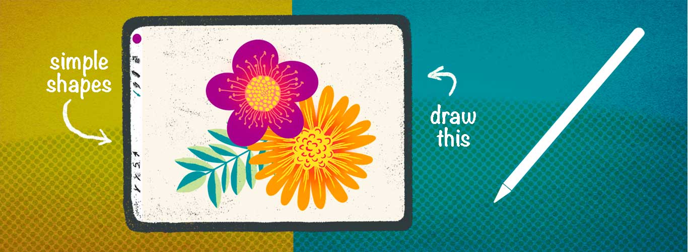
2. Your Projects: We are going to create
three different projects. In Project one, we
will warm up by using different brushes to get a
feeling for the pencil and for drawing on the screen. Then we are going
to play around with marbling techniques and create a unique pattern which
we can add to a text. Project two is a fun one. We will draw a
fruity Mandala and use Procreate's magically
drawing assistant. We will make simple fruit shapes and add some texture on top. With this simple trick, your illustration gets more
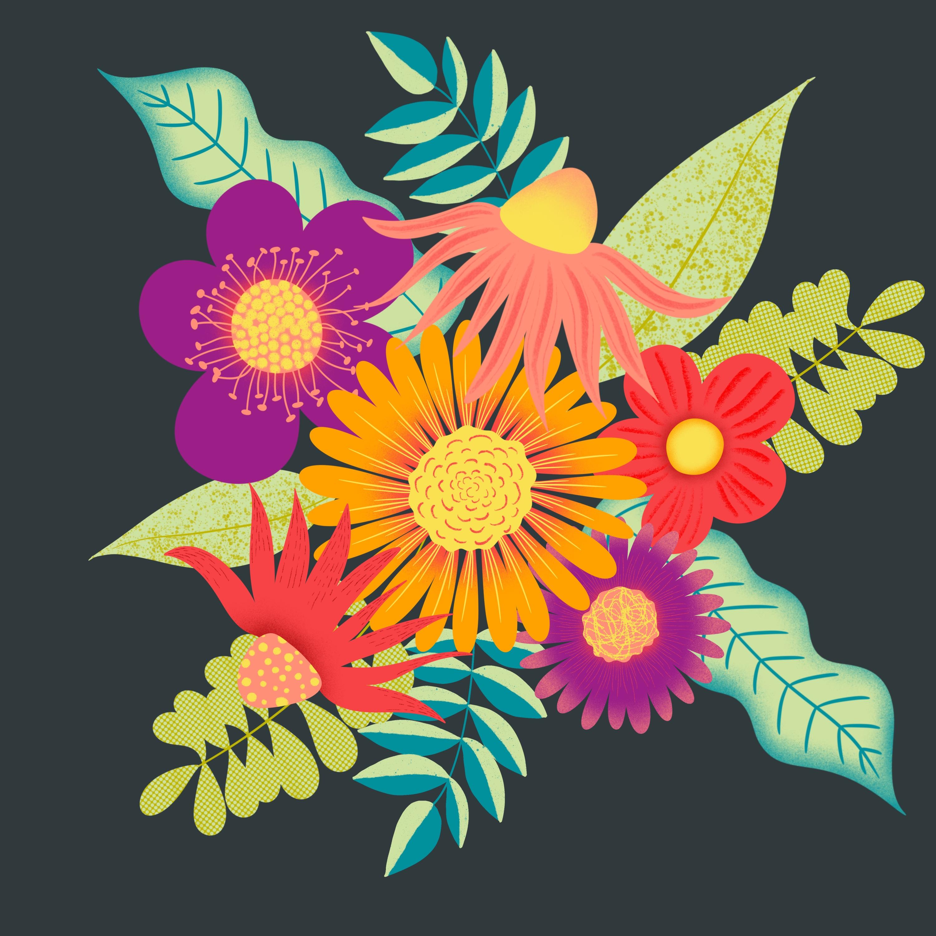
character and personality. And finally, protects
three is a classic. We will draw a colorful
floral bouquet ready to use for upcoming Mother's
Day or a birthday card. I'd like to encourage
you to upload your finished pieces
to the projects gallery by clicking the green
Create Project button in the projects
and resources tab. I'd love to see it and
give you feedback. If you have any questions, please reach out in the
discussion section.
3. Helpful supplies: Drawing on the iPad is a totally different feeling
than drawing on paper. You have to get used of it. Especially if
you're new to this. There are some possibilities to help you with your first steps. The iPad screen is stick
straight and slippery. You have two ways to
overcome this problem. One a screen protector
and two a little hat for your pencil tip. Let's talk about the
screen protector first. There are a lot of
products out there, from cheap to expensive
and summarized: You have to try it out yourself and find
your ideal support. Bulletproof glass protects
your iPad screen optimally, but it doesn't help
you with the slippery. And it reflects the light a lot. I use a mat foil instead. It's very cheap and a link you all my products in
the resources section. With a mat protector the iPad is less slippery and it simulates a drawing
on paper feeling. Another big advantage is
that it's anti glare, so you can use your
iPad also outsides. I mean, it's not a
miracle product. If it's very sunny, the sunlight reflects
also on this foil, but it's much better
than on a class. Another possibility is a
silicon tip for your pencil. You can put it on
and off quickly and it gives you a smooth
feeling while drawing. Especially in my beginnings, this helped me a lot to get used to drawing on the screen. Pen tips come in multi packs
and have different colors. They are very cheap. I love to spread the
world with color. And funny gadgets are
always nice to look at. If you like, you
can put a dress on your pencil or give him an ergonomic grip.
4. Warm up: In this video, we are
going to talk about the Procreate surface and
how to navigate here. And then we're going
to test some brushes. When you open Procreate, you come to the gallery. Here, you can find all of your
created artwork so far. And I tell you all about
organizing your work later on. Let's warm up first. In the top right corner, you can find the little plus icon. Click this and you
can create a new Canvas. There are different
options pre-installed, and I tell you
later on, for now, simply select Screen Size
and a new canvas opens, which is in the dimension
of your screen size. In Procreate, you can navigate
with your pencil and also with your finger
or more fingers. With two fingers on the screen, you can zoom out, zoom in. You can turn your Canvas in different angles and positions. When you quickly pinch two fingers together
on the screen, the Canvas positions
100 percent to screen again. But I prefer making
my canvas a bit smaller. So I can see all of my borders. Now, click on the
little brush icon on the top right corner. There we have the brushes library. There are a lot of great brushes
that are pre-installed. And they are categorized
in different mediums. We can find ink brushes, brushes for sketching or calligraphy, or
different textures. Some brushes have crisp borders, others are more loose,
some are transparent. And often the brushes
are sensitive by pressure or the angle
of your Apple pencil. On the top right corner, you have a little dot. In my case, it's black, but in your case, it may have another color. Click this circle, and you
will come to the color tool. I suggest using the view
disk. On the outer ring you can choose your color. In the middle circle you can choose the saturation
from light to dark. Over there, on the left, you can select the
size of your brush. And on the bottom, the opacity of your brush. And I suggest that you
take some time now to try out different brushes and colors and this size
settings and opacity. And maybe you can find
your favorite brushes. You have made your first steps now. Meet me in the next video to start with our first project.
5. Liquify tool: In this video, we start with our first project and we'll
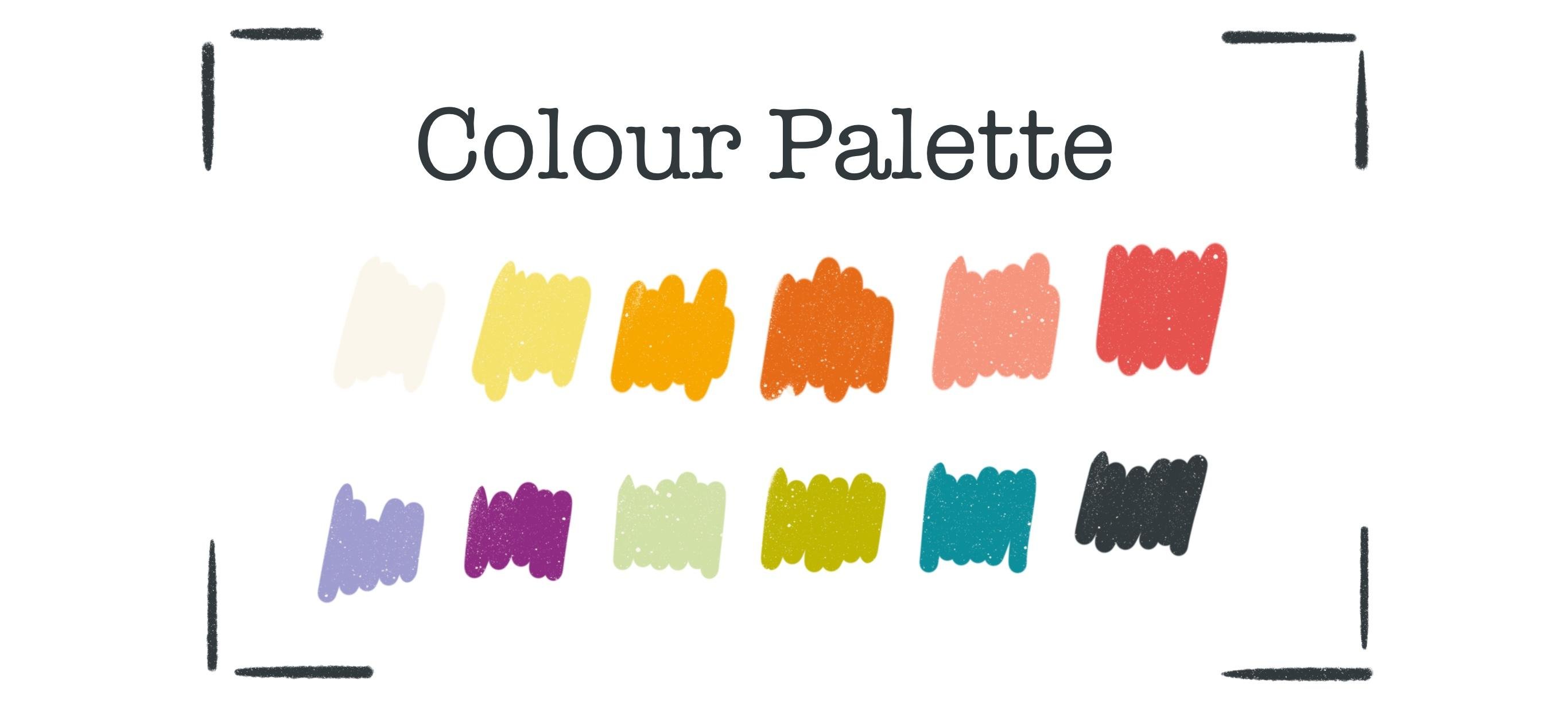
talk about the Liquify tool. I've created a fun
color palette for you, which you can download in the resources and
project section. Save it somewhere on your iPad. And if you click on
the downloaded file, it will automatically
import into procreate. You can find this palette
under the colored dot. Under Palettes. And normally it installs at the bottom of
all your palettes. And you can see, I have
a lot of palettes as I love to try out
color combinations. And there are three little dots. And when you hold them, you can shift your
palette to the top. OK. There we have our color palette, but feel free to choose
whatever colors you like. Okay, let's start with our first project, the
marbling technique. And if you'd like to
keep your scribbling, your first scribblings, then go back to the gallery
and create a new canvas. But in my case, I don't want to keep this. And there's a cool little trick, how you can get lost of
all of your scribbles. You can swipe quickly with three fingers over your canvas. And your layer gets cleared totally and your
scribbles or deleted. Remember, if you'd
like to undo this, you can always go back
with the little arrow. But in my case is it's
okay to delete it. Okay. Our first step in
our first project is to fill your layer with these
colors or colors you like. Quickly. Fill in your Canvas with different dots. You can get loose with this. Your dots don't have to be
in a specific form. Okay. Have you filled all of your canvas with
different colors? Now, let's start
with the fun part. Over there on the left, you have the little magic wand icon. Click it and
down that list you find liquify. And here you have
different settings how we can mix and match these
different spots together. The size controls, how big is the area that
gets liquified. The pressure determines how strong your chosen effect will be depending on the pressure
you take on your pencil. Distortion give some chaotic
elements into your effect. And momentum means how long the liquification goes on
after you lift your pencil. Let's play around with
the different options. With push you can push color to
the left and to the right, or somewhere you like. You can even swirl it a bit. And you have the twirl
settings left and right. And if you keep your
pencil on the screen, you get this little
twirlings. When you reduce the pressure the twirling gets even slower and not so strong
as the other time. You can pinch together. Or you can expand. With the crystals... I take the pressure up. ...you get this nice little... I don't know how to describe -
electronic vibes maybe. And I don't know what
edges does exactly. I don't use that too much. When you click reconstruct and
click on a specific area, all the changing
you have made in this specific area
of the brush size, gets back again to
where you came from. Play around till you
find something you like. Under adjust you can undo your
steps in a slow way. Till the beginning.
If you press reset, all of your changing, get lost and you can't redo it! And you have
to start again! If you'd like, you can get
out of this liquify mode by clicking either the magic wand
tool or the pencil. There, you're back.
And you can for example add some more color. I think I will add some
black here and there. And try again to liquify. Okay. I like what I've created. Now. It's time for
some extra lessons. And I tell you all about
layers in the next video.
6. ALL about LAYERS: In this lesson, I tell
you all about layers, what they are, and
why we use them. What actions can be taken on layers and what the ****
is a clipping mask? In Procreate, we work
in different layers. And what that means,
let me demonstrate you. I choose to inka brush, in inking and make
a dot on the canvas. And then with... take
the green one, a second dot. Okay. What if I like now the dark dot in
front of the green dot? Then the only way would be, no, there are two ways. You can take the black again
and draw over the green one. But it wouldn't be the same then before. The second method would
be to take the eraser and delete the green part and then draw the black again. But it's also not very
comfortable to work that way. Okay, Let's try an other technique. I go back till I have my black dot. And here comes the Layer menu. Over there on the top right, you find the two
overlapping squares. Click that. And here is the Layer menu. We have our black dot on layer one. There is the background layer. This is a special layer
in which you only can choose the color
of your background. Or you can turn it off or on. That's all. And we can create with the little plus on
the top right corner another layer that
opens above layer one. And now we can choose
the green color, make the dot again. And then we have total control. We can, with the little
checkmark on the right, we can turn off a layer. Or with a long
press on the layer, we can shift them. We can even take the green dot. And here's a little arrow. And we can shift
the dots around. Or rotate it, flip it, make it smaller, without changing the black dot. Cool, isn't it? And we have also the possibility, here
is on the right, the little "N" click that. The "N" stands for normal, which means that the layer, the view of the layer
is in normal mode. And here you have
different blending modes. And with these blending modes, you can create some unexpected versions
of your illustrations. You have to try it out. On the top. You have the opacity, which is in this
case at the max. You can also take this
little blue dot and swipe it to the left
to reduce the opacity. Now you can also see the
black dot shining underneath. Let's take the opacity
back again to maximum. There are several more options
you have on your layers. You can click on
this little preview. Here you have the menu. You can rename your layer. I like to rename this
not with the pencil, but with my fingers. Here is the keyboard. Let's type green
And layer one. Rename. Black, okay. You can also clear your layer, which means that you delete
all that is on that layer. And you can merge it down. So the two dots
are on one layer. When you swipe the marked
layer to the left, you have other options. Here, you can delete the whole layer or you
can duplicate it, for example. And take the second dot
and shift it to the right. Or you can lock the layer. And now you are
not able to change this layer until you unlock it. So if you try to draw
again on this layer, which doesn't work, and there's
a warning saying you have to locked
layer selection. You can open your Layers menu. And then with the swipe
to the left again, can unlock this again. Then you can draw again on this layer. This is very helpful in
case you have, let's say, some sketching and don't want to draw on your
sketching by mistake. You can lock this layer and make your painting
on a separate layer. Okay, I delete my
second "green" again and show you an other cool trick. When you click on
the green preview again, you can choose the
option clipping mask. And what that does is very cool. It clips your layer
to the layer below. And now only the parts
of the green are visible that are overlapping
with the black shape. You can always turn off the clipping mask and the
green dot is here again. And you can turn on the
clipping mask again. And you can go further
with your drawings. But now you can only draw within the shape
of the black dot. And the brush stroke stops automatically when you cross the border of the black shape. That's a very helpful function. And I use this all the time. Now that you know
all about layers, let's get back to our
project number one and clip our marbling pattern
to a fun text.
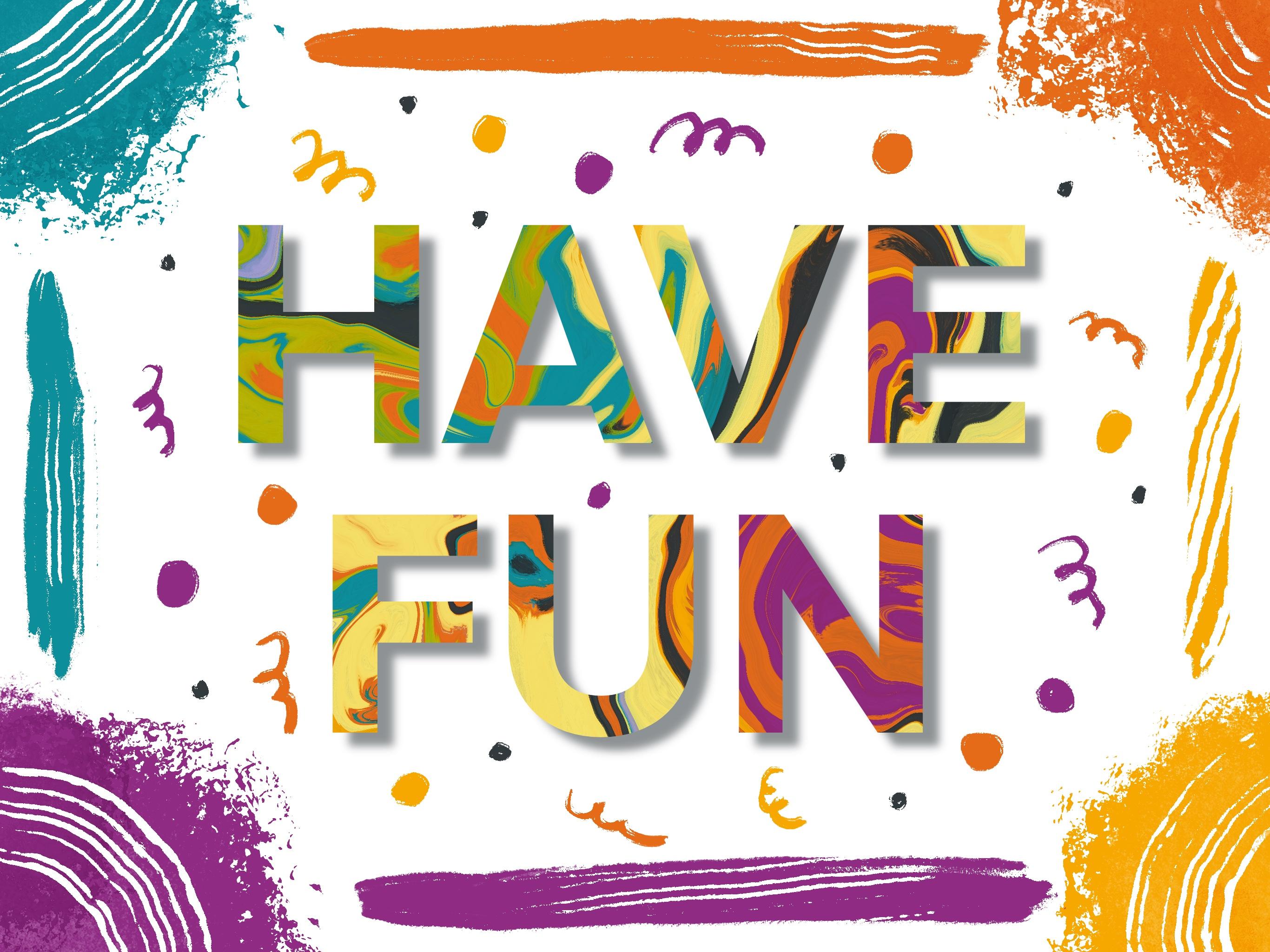
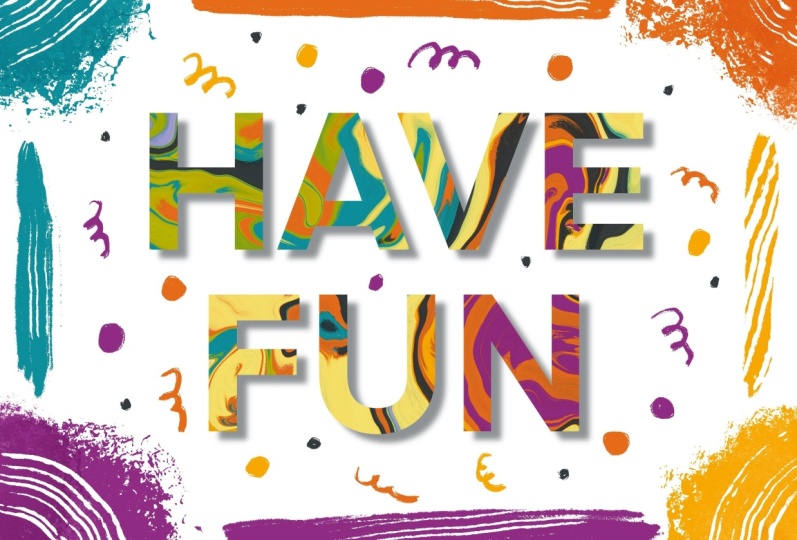
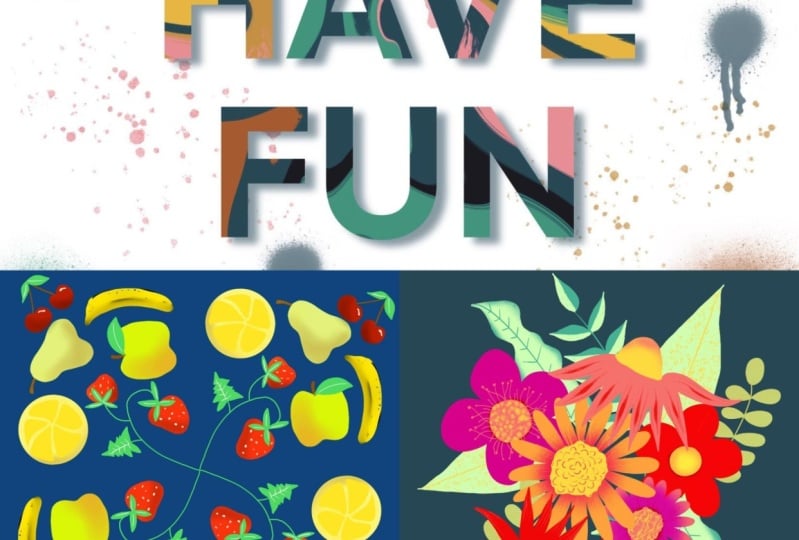
7. Add text: In this video, you'll gonna
learn how to add some text and fill the text
with our marbling pattern. Let's use this Clipping
Mask technique to fill this nice pattern
in a fun lettering. And the little wrench icon
on the top-left under add, you find add text. Type "have fun". When you double-click
on the text, you can select it all. And when you click
here on the bottom, the double AA, you come
to the fonts menu. On the left, you can choose from different
pre-installed fonts. I suggest using a font that is quite bold and has crisp borders, so our pattern fits in the best. And I suggest taking
the "Eina 01". Make it bold. And do you remember
with the two fingers, you can always zoom
out of your canvas. And I'd like to zoom out now. So I can see all of my canvas. Now take the little blue dots
in this text field and make your text field bigger. Till the border. Double-click again to
select all of the text. And again the AA, you come back to your menu. And now I think the bold. And now take the size up. And I like to make it uppercase. With one finger on the side, you can move your lettering and move it till it's centered. And than click done. And now we have the Layers
menu over there on the right. And use the clipping
mask technique. Therefore, take the layer one
with our marbling pattern, shift it to the top. Press on the preview. And then choose clipping mask. And there we have
our fun lettering. And in the next video, we'll fill up the gaps with some details to finalize
our fun lettering.
8. Add details to your lettering: In this video, we'll create
a little shadow under our text and use the
gaussian blur for that. We'll learn about when
our text gets rasterized and draw some details in to
finalize our project one. Okay, that's quite cool. But I think there's
room for improvement. For example, I don't like this big gap
between the two words. And you can change
this when you go to your Layers menu and choose
the layer with the lettering, you come direct to
your text menu. Double-click on the text
again to select all. And then with the AA, you come back to
your fonts menu. Here in the middle,
you have the leading. And when you take the little blue dot and
move it to the left, the gap gets smaller. Click Done. Okay, much better. With the little arrow
on the top left you can select the
whole lettering. And with one finger,
you can again move it till it's
about in the middle. Okay, press the button again. And now let's
decorate the border. If you like. You can create a little shadow
behind your lettering. So you can create a nice 3D effect. Click the Layer menu and
swipe the layer to the left. There you can
duplicate the layer. This is the layer where
the pattern is clipped on. This is a layer behind. When you click the move tool, you can move your lettering
a bit right and down. So the sun is from here. And we take the shadow this way. Press the arrow again. If you'd like, you can make your shadow a bit more blurry. So it's not that hard. For this choose the
Magic Wand Tool. And click Gaussian blur. When you turn on
the Gaussian blur, the text layer gets
rasterized automatically, which means that your layer
is not a text layer anymore, but it's an image. So if you like to change
your text after that, the only possibility
would be to write the text again or copy
from the layer above. And when you swipe with
your pencil to the right, at the moment is zero per cent. And when they swipe
to the right, the percentage goes up and the borders of the
letters get blurry. I like my shadow at about
six per cent. Fine. When you click on
your layer again. And do you remember?
Under the little "N"? You can reduce your opacity
and then make it a bit less, about 55 percent.
Much better. But there's always
room for improvement. I suggest decorating our borders with simple spots and stripes. And let's see what will happen. I choose different colors, and make some big spots
in the corners. I think this might be
a nice one for that. So let's create a
new layer that is on top and make the decoration. Now I'd like to make
some striped borders. And if you like, you can add some more confetti
and streamers. If you've made a
spot or streamer, you don't like very much, you always have the possibility
to use the eraser tool. And the eraser is the opposite
of the brush tool. You can also choose from different brushes to
erase with. So for example, you can choose this
striped brush, which I don't know how
to pronounce and erase some parts of your borders. Or decoration. Or you take a more solid brush and erase the whole dot. Congratulations. You've finished
your first project and I love to see
what you've created. So please upload it to
the project gallery. And I give you feedback. Now that you've finished
your first project, it's time for some
extra lessons now. And I tell you all about how to export your artwork
in the next video.
9. ALL about EXPORT: In this lesson, you'll
learn all about exporting your artwork and how to create some amazing
time-lapse videos. For sure, you can also export
your work and create, for example, a jpeg you can upload to your social media. Or make a PSD file and export
it to Photoshop. You'll find the
exporting functions under the little wrench
icon, under share. There you have the
possibilities. You can download, for example the procreate file to save it somewhere on your Cloud
or somewhere else. You can make a PSD document, a PDF, or a JPEG. Just click on it. And you can airdrop it to your Mac. You can save it in
your Media Gallery, or you can save the
file as a JPEG. We've done so many steps
till now and the surprise is, all you've done so far was
recorded automatically. And here under the wrench icon, there is the video section. And you can make a
time-lapse replay. And you can see in short form the steps you've
done to create this artwork. And you can also export
this video to upload it, for example, to social media. So go to the video. And here is the export
time-lapse video. And here you have the
possibility to save the video in full length or only the first thirty seconds. The reason why this
video was recorded is because this little bar is turned to the right,
that's activated. This is the
time-lapse recording. You can always take
this recording off. But be aware, you get asked if you'd like to delete the existing video
that was recorded till now. Or when you click "Don't purge", the video gets saved
in the background. And now, when you now
take further steps, they won't get recorded. And when you take it on again, the recording will go further. Now you know how to
export your work and how to create these
amazing time-lapse videos. Meet me in the next lesson for a dive deep into
Canvas settings.
10. ALL about CANVAS SETTINGS: In this lesson, we talk
all about Canvas settings. We talk about how to choose the perfect
size for your artwork and how this decision relates to the amount of
layers you have. And finally, we talk
about color profiles. When you create
complex illustrations with a lot of
colors and details, you'll probably create a lot of layers to have the total
control over your designs. The more layers you use, the more possibilities you have depending changes on your work. By clicking the little plus
icon on the top right corner. You create a new canvas. There you have a few
pre-installed possibilities. And here you can see some
that I've created myself. On the top right corner, you have this little
black rectangle with the little plus in it. And when you click that, you come to your
Canvas settings. Under dimensions, you can
choose the size of your Canvas. You can select between pixels, inches,
centimeters, millimeters. And let's say, for demonstration, we create 3,000 by 3,000. And here you have to DPI. Dpi means dots per inch, and it describes
the image quality. I never work under 300 DPI. And in case you would
like to print out your artwork or license
it on products, you shouldn't go under
these 300 DPI. Depending on your width and height and your DPI, you have a certain amount
of maximum layers, in this case, 55. I always like to create as big as I can to have good-quality. But I also need a good
number of layers. So these settings are quite important and you have
to choose wisely. Under color profile, you find
two main color profiles. RGB and CMYK. RGB are the colors that are given on screens
on your computer, your iPad, or your phone. And it's a bright color palette. And CMYK is how printers
interpret colors. These profiles
include less colors, and they are also not as
saturated as the colors in RGB. I normally go with sRGB, with this one. And if I sell or license
a certain designed to a company which uses
a CMYK profile, I can always change to that. When you create an
artwork in CMYK, changing later to
RGB wouldn't work. It wouldn't make a difference. But it's always okay to make
it the other way from RGB to CMYK. And here under
time-lapse settings, you can set the quality for the time-lapse video that is
recorded in the background. And here, under Canvas settings, you can choose now your background color or you
can always make that later, or you can turn off
your background. In this lesson, you learned
all about Canvas settings. Meet me in the next lesson
to explore the color tool.
11. ALL about COLOR TOOL: In this lesson,
we're going to talk all about the color tool. How to create your own
color palettes with the color picker and
the harmony tool. When you click on the colored dot in
the top right corner, you come to your color tool. We've already talked
about the palettes. You can organize your
palettes by holding the three little dots and
shifting them around. And of course, you can create
your own color palettes. Click the little plus icon
on the top right corner. And there you have
different options. For now, let's click
"Create new palette", and an empty palette opens. You can create your own color
palette by when you go to your disk menu and
choose a specific color. This is chosen. And by clicking here
in your color palette, you save this
specific color. And you can go on to choose colors and click
them in your palette. Here is your palette.
You can of course, rename it by clicking on
the little untitled word and tip some "test" or whatever you like
to name your palette. And you can also delete a
swatch you've already saved, or move it around. Or you can move the whole
palette to another place. Let's take the green back again. If you like, you can share your created color palette as I shared my "greenhorns"
palette with you. And therefore you have to click
on the three little dots. And here is the Share button. And the palette exports. And you can save it somewhere on your iPad or in your Cloud. Let's delete our
created color palette and create a new one. Imagine you've found a photo
or an image on social media, or you took a photo you
like because of its colors. And you like to save these
colors from this image. Then go to the little
wrench icon and click "Add". And you can insert
a file or photo. I take the file. Because I saved in downloads this little image, which
I found on Pinterest. And I like it,
because of its colors. They are quiet in my
style and they are bold and sunny and they
give a good mood. And now you can take the
colors from this image. Go to your Color tool. When you take one finger and
press it long on your image, you see this circle and this tiny little plus
within the circle, there you choose your colors. I like this sunny gold. And I can save it in my palette. And choose a turquoise. Save it. And the light blue. I think the turquoise
is quite too bright. So I delete it again
and take another one. Better. It's a nice color palette. And let's rename it by clicking on the untitled palette and type sunny, whatever, waves. Okay, and now you can share it. And there are also
some other options. Here, on the bottom line, you already have
seen the disk menu and you can also choose
the classic view. We are, you can here choose your color. And here in the square,
your saturation. And of course you can also click it in
your active palette. And here is a little history. It's also helpful sometimes where you have
your last 10 colors you have used
and you can always clear it. So it's empty again. But I don't know why
I should do this. If you have a specific
color you'd like to use and you have the hex
code from that color, you can go to value. And here is the possibility
to type in your hex code. Or, and this is very helpful sometimes, you can go to harmony. And if you have
problems to choose specific colors
or you don't know which colors harmonize together. You can go to the harmony
tool and choose for example a Color And then you have, we have triadic view. We choose the little blue. There you have the two colors that are harmonizing in that triadic
way with the blue one. And you can save
it by clicking on that and save it
to your palette. Or you can choose
a different option instead of triadic. There are also complimentary. So you have the complement
color to your lime green or split complimentary. So, here you can
click through and see what the
different options do. Now that you know
how to pick colors. Meet me in the next
lesson to talk about how to drop
them in your artwork.
12. ALL about COLOR DROP: In this lesson, we go further
with picking some colors and then we drop it
into some shapes. And in this way, we can also change colors
of existing artwork. In this way, you can also drop the colors
from your drawings. So we have now the
orange chosen. And if you like to draw
further with the yellow one, you can go, instead of going to the palette and
choosing the other color. You can hold on this yellow and paint
with that. Or on the green. And here comes another cool function: When you have a closed shape,
and that's important, but more later. You can simply take your
color from your color tool and turn it in and
your shape is filled. That's also a huge time-saver. As said, it is important to
close your shape. So for example, if you draw your
circle, but leave a tiny little bit open and you take the
color and drop it in. It fleets over the borders
because it's not closed. So close it, do it again. And now the color has filled. If you'd like to use a
more textured brush, like the little pine
under drawing. Let's make it bigger. And you try to drop it in. Oops, what happened? We've closed our shape. It's totally closed everywhere. But the color fleets
over the borders. Let's go back and try again. When you drop your color in, leave it there on the screen. And there we have to threshold. And at the moment, I have 94 percent threshold. Move your pencil to the left and the
percentage goes down. And now the circle shows again. And if you have it at
about 86 per cent, the overfleeding stops. Dropping your color in, when you use a
textured brush may not have a satisfied result. Because you have your textured outer line, but not in the middle. So to be honest, if I like to use that texted brush, I will draw it in. It can feel quite meditative to fill in with the pencil. With this color drop function, you can also change the colors
of your drawing shapes. So in that case, we have the yellow
dot over there. And I would like to
make it green now. So go to your Color
tool, choose the green. Go back and drop that in. And you've changed your color. Are you ready for an other
cool information? So I said with the color tool, you can click in and you have your history where
you can choose the color before Or the last time we had the
yellow and now we choose the green when we
hold long on the colored dot, it changes to
the color we had before. In the last both lessons you
learned so much about colors. In the next video, we'll explore the
amazing drawing assist.
13. ALL about ASSISTED DRAWING: In this lesson, we talk
about assisted drawing. How to set up your drawing guide to
use the symmetry tool. Procreate offers a lot
of functions that help you save your time and go quicker in your
drawing process. Imagine you would like to
draw a beautiful butterfly. So the one-half of the butterfly is the same as the other
half, but it's mirrored. And there you have to
function in Procreate. The drawing assistant. Go to the little
wrench icon, under Canvas. You can choose the
drawing guide. Turn it on. Okay, and you see now this little
grid in the background. Here is edit drawing guide. And here you can make some
selections. At the moment, the 2D Grid option is chosen. That shows, you have a little
grid in the background. It's only a guide. So you can click Done. And you have this
little grid here. And the layer is empty. But you can draw now on the
grid to have some guide. And turn the drawing guide
off, and the grid is vanished. So that's one possibility to guide you. Or you can choose
the symmetry tool. And this is the exciting one. Here you can on the top choose the color of
your mirror axis. Choose a color you don't use
much in your illustrations. So you can see it on the canvas. But I leave mine black, so you can see it the best. You can also turn on the opacity or the
thickness of your guide, but it's okay to
leave it quite thin. And here are the options. On the bottom, right. At the moment, the
vertical axis is chosen. Which means when you draw in the right half of this canvas, all your draw here is
mirrored in the other half. Or you can choose
horizontal, or quadrant. So all you throw in one... It doesn't matter in
which half you draw. So all you draw in one, in one rectangle is mirrored in the other three rectangles. And you have the radial option, which is quite amazing if
you like to draw mandalas. Let's try out the vertical
option. Click Done. And here you have
your mirror axis. So all you draw here, for example, let's draw some
kind of butterfly. And all you draw here is the same on the
other side, but mirrored. Of course you can
draw here too, and it mirrors here. So that offers quite a
lot of options you draw with that. Let me show some
examples from my work. Do you remember
the three fingers swiping quickly on your Canvas? You can clear your canvas. Let's go back to editing
our drawing guide. Go back to your options. And there's a little
more option here. Here's the rotational symmetry. When you turn it on, let's see what that does. I try to create
a butterfly again. Okay. Can you see? It shifts all you've drawn here
is mirrored in this way. So it shifts to the other
side, not flipping. And go back to your
drawing guide. And let's try out the quadrant. Click Done. Let's draw here, or here. Or you can go from the center. It's quite amazing
to watch, isn't it? And that offers so many possibilities. Before we go over to our second project, let me introduce you, in the next video to the
quick shape function.
14. ALL about QUICK SHAPE: In this video, let's
talk about how to draw perfect shapes with the
quick shape function. If you are like me and
have a shaky hand, you will love what I
show you the next. So if you like to draw a straight
line with the shaky hand, it may look like this. Procreate comes up with
the quick shape function, which means, let's delete
this terrible line. When you draw the
line and remain with your pencil on the
canvas, on the screen. The quick shape function activates and it straightens
your line. Let me show you. Draw your line.
Remain on screen. And the line turns straight. Amazing, isn't it? I love that and I
use that all the time. If you'd like to draw
a straight line that's perfect parallel to
your borders, you can also do this. So draw it about parallel
and then it turns straight. And when you take one
finger and click, I remain still
with my pencil on the screen, and hold
one finger on screen, the line goes perfect
parallel to your border. But there are not only lines you can create with quick shape, you can also create circles. Make some kind of circle. Hold the pencil and it turns
not straight, but curvy. We leave it here.
And there we have the ellipse with the
little triangle. Click here. And you have
the possibility to, there are four little
blue dots in here. You can shift them around, turn it bigger or
smaller, or move it. You can move it somewhere else. Or you can switch to circle. It jumps back to your first
position where you've drawn the circle and
makes the circle perfect. Let's see in the next video. And let's create a
fruity Mandela together.
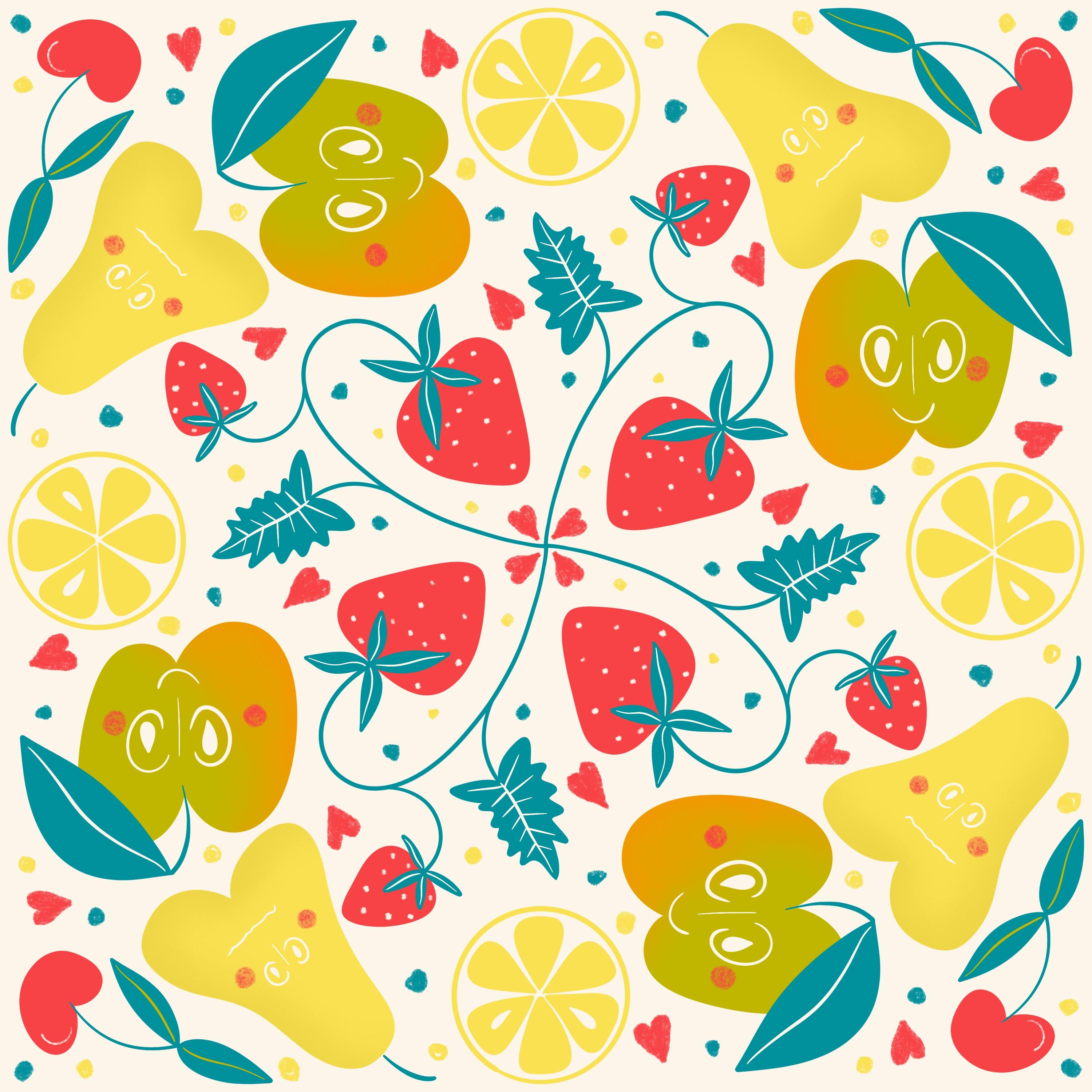
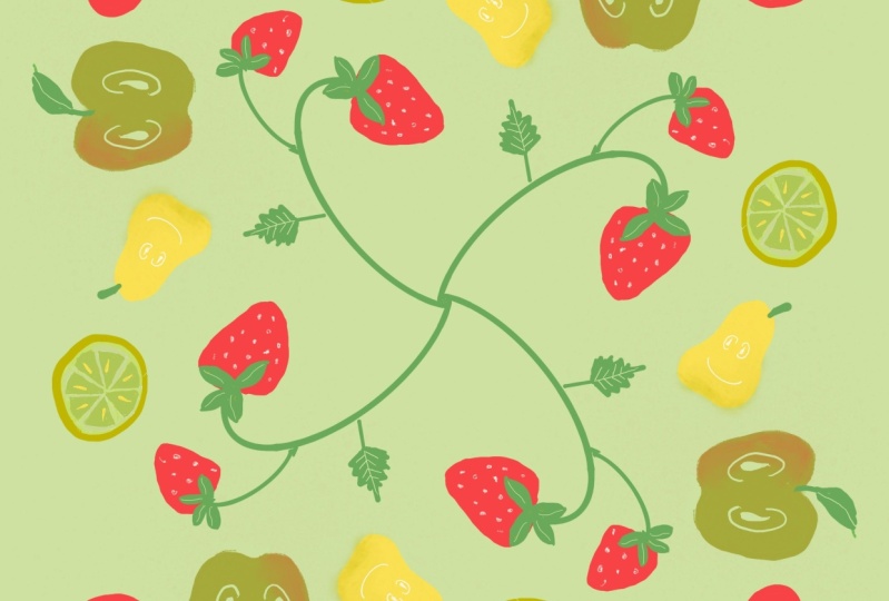
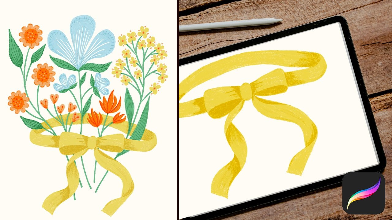
15. Sketch a Fruity Mandala: It's time for project 2. Let's create a fruity
Mandala together. In this video, I'd
like to create the sketch for our
fruity Mandela and I suggest not creating it in a rectangle Canvas
like our last protect, but in a square form. So it's more typical
for the Mandala. Therefore, click the little
plus icon on the top right. And by clicking the
black rectangle, you can create your very
own Canvas setting. And I suggest typing
3,000, by 3,300, with DPI. If you have an iPad than mine, then the maximum amount of layers may be
different from mine, but I have 55. Click Create. Let's turn on our
drawing assistant. Click the little wrench icon. Drawing guide on, edit
drawing guide, choose symmetry. And in the options,
the quadrant. And I like to create it
rotational symmetry. Click Done. I like to make my
sketches with a dark color. And with sketching,
the 6B pencil. Okay. Let's check the
size of the brush. That's good. I like to draw a little
strawberry field in the middle. And therefore, I
take my pencil from the center and
make a little bow. It doesn't matter if
it's perfect or not. In the next video, we will use the sketch
only for a drawing guide and draw on another layer are
nearly perfect illustration. So, and there we make a strawberry. A kind of rectangle
with round corners. And make some zig
zags for the leaves. And some dots. Cool. We can add another smaller
strawberry over here and add some leaves. And I make a triangle
with zigzag borders. And you can also go
over this mirror axis. Because we had the rotational
mirroring activated. So it turns over the next axis, OK. Let's add an apple over there. Like that, kind of open ellipse. And the second on
the other side. And the stem. If you like, you can
add a leaf on the apple. And we can add
a pear over there. Take the eraser and roughly erase what you
don't want to have. Go to brush. Make a little stem. Let's add an orange over there. So, make a circle. Leave the pencil on the
screen to make it perfect. And we can make some, I don't know what
this is called, but you know, you see what I'm doing. And the corner is still free. And there we can add a cherry. Let's add a cherry. Make it somewhere here. And the cherry. Okay, and let's add
a leaf that turns down, and maybe a small
one in the corner. I don't like this leaves. I go, I undo them. And maybe I undo the cherry. Make only one cherry with the stem. And two smaller leaves.
I think it's better. Okay, that's pretty. Let's meet in the next video
to create our illustration.
16. Illustrate the Mandala: Okay, Let's draw
our illustrations now. Therefore, go
to your Layers menu. And here is the sketch. And I like to have the
sketch with less opacity. So it doesn't disturb me too
much while drawing over it, or better said under it. So I leave it on the
top so I can always see my sketch and
I draw underneath. To not draw on our sketch
layer by mistake. We can lock that layer. Swipe to the left on the layer. And there you can lock it. And let's create
another layer and take it underneath
the sketch layer. When I create this
kind of illustrations, I always create one
layer for one color. So let's take Layer 2
as our green layer, where we only fill
in our green parts, the leaves and the stems, for example. Let's begin with
the green ones. I think I like to
take the turquoise instead and make the
leaves with the turquoise. But you can also choose
this green or this, or some other
green you like. And I choose the studio
pen under inking. So it's a solid brush
with clear strokes. And I prefer drawing
the shapes with clear strokes and then
adding the texture over the shape
instead of drawing with a textured brush
the whole illustration. Do you remember from the
assisted drawing video, you have to turn on your Drawing Assist on
every single layer. So if you draw
without activating, you draw only one stroke. And when you go to
Drawing Assist, it works. Okay. So I take my studio
brush a little smaller, about eight per cent. Yeah, it's a good size. And then draw, try to
draw a straight bow for the strawberry. It's always a good choice to
draw as quick as you can. So there's not much time
to get your hand shaking. And our sketch, I said
it's only a rough sketch. So if it don't make it perfect on your sketch,
that's totally fine. So here in the center there's
a little dot, I fill it. We don't want to have this. Make it nice. Okay. Draw the leaves from
the strawberry. If you like, you can draw within the shapes
to add the color. If you'd like to have
some meditation. Or you can color drop it. And here is another cool trick. Drop the color in and over
there is continue filling.. Oh, you have to do
this very quick. Okay, I go back. Show you again, drop in, continue filling and the color
drop is still activated. And now you only have to
click within the shape. And the color drops
in there too. And when you're done, click the check mark. OK. Let's draw the stem
for the other strawberry. And also the leaves. Color drop, again. Continue... Cool. And I see some white
spots in these corners. So even if you take your
thresholds quiet to the maximum, these corners will still remain. So I always check after
filling, if there are some spots and simply
draw over them. Let's draw the leaf. Double-check the corners. I don't like top. Refine it a bit. And there is the leaf
on the apple. And also the stem. I do it in this color. The studio pen,
which we've chosen is a sensitive brush by
pressing the pencil. So if you only
draw slightly, it's a small size. And when you press heavy, it gets bigger. So it's cool for the stems, you can make it small
at the beginning and press harder and make it
a bigger size on the end. And the leaf. We can also make the leaf a bit
overlapping over the apple. Think this would look
pretty. I think it's better. So, we close this gap over
there and fill it with the leaf. Drop in. Check. Fine. And the cherry. You can also make a bow
with the quick shape. So make it, hold and
the bow makes perfect. It's an arch, and you
can edit it also. Make the leaves. And there is the stem for the pear. Let's choose the
background color the next, I think it would be best to take these
cream on a background. Cool. We add an other layer and go further with
another color. Remember, always click
on the drawing assist. And this time, we draw
the strawberries. And I choose this red one, and draw over the strawberries. Fill in. And you'll see, we have covered the leaves. This is because we've made the layer over the leafs
layer, over the green layer. And let's shift the red
layer under the green one. And there we have our leaves. Take the other strawberry. And there is the cherry, which might also be red. Let's make the apple next.
I choose this lime green, create another layer. Turn the drawing assist on. An draw the apple. Let's create the pear next. And the lime. Let's turn off our
sketching layer now. We can check if our Mandala works. And I think,
it looks quite pretty. Meet me in the next video to add some details and
textures on top.
17. Add details to the Mandala: Let's add some amazing
textures and details to finalize our fruity Mandala. Go to your Layers menu. And I like to have my
details on a separate layer. Turn the drawing assist on. And I like to have the
spots in the strawberries. So I take the layer
over my red layer and draw with the same
as the background layer. You can also erase this part. But I like to draw it in. So maybe I would like to
change the color later. Okay, and I think I like to have,... Let's use our
pencil, our 6B pencil, which we used for the sketch
and make the dots with that. And for the cherry, we can make a kind of blending over there,
from the sunlight. Okay, I think, we have done the red layer. So let's go further with our green layer and
there is the apple. Let's see what we can
do with the apple. Maybe, the apple
needs some texture. So we can turn on. Oh, I forgot. For sure. We have to turn on the Drawing
Assist and additional, we can turn on the
clipping mask. And I think I like to have some, some shading on the bottom. And maybe I take the red color. Let's try out, and I use this quite often, the spray paints and the medium nozzle. Than go outside the shape,
because it's quite big. You can always reduce
the opacity on this layer. But you can also try out the
different blending modes. See what this does. I like this one. Make it bigger. Let's go to the pear. I create another layer that's
above the yellow layer. Turn drawing assist on and
choose the clipping mask. And this time I choose
the lime green. I use again the spray
paints and the medium nozzle and create a texture. On this side. And also
on the bottom. And for now, I leave
to lime as it is. And I go over to my leaves
layer to add some details. So, create a layer
above our leaves layer. Turn on drawing assist and
already the clipping mask. And then I take again inking, studio pen and create
some veins in the leaves. And the leaves for the strawberries, I think I add the texture with the color from the background. So I switch the background
color and make here the veins. Make it a bit curvy. So it's more interesting. Let's add some more details in the strawberry leaves. If you like, you can
add some more details. So let's create a layer on the top and
make the core in the apple. Oh, what have I forgot? I forgot to turn on
the Drawing Assist. Maybe make the second one
the other way around, to create some more interest. I'd love to see what you've created, especially
your details. And I suggest that
you upload it to your project gallery
so I can see it. I'd love to see it. Now that you've finished
your project 2, It's time for another lesson. Let's talk about gestures
in the next video.
18. ALL about GESTURES: Let's talk about some basic
gestures in this video. And how you can avoid making unexpected speckles
on your artwork. When you click on the
little wrench icon, you have on the top,
the preferences. Click on there. And
there, down there, you can change here a lot. But down there, you have
the gesture controls. Click on that. And if you go down this list,
you have general. And in your case maybe this bar for enabled
painting with finger is on. And in my case, I'd like to
turn this off. And this means, I can't draw, choose a color, I can't draw with my finger,
only with my pencil. So I can't make, when I go with my
hand over the screen, I can't produce any unexpected
dots here and there. To show the difference,
I turn it on, Done. So maybe I lean my
hand on the screen and create some
speckles with the back of my hand. I turn this off and make all
my drawings with my pencil. The gestures, you can take on the screen and not
involved in this. So your gestures always work. For example, with the fingers swiping
quickly over the canvas, it clears the layer.
There are some more other gestures,
I like to show you now. For example, I said, when I make
a brush stroke, you can undo it with
this little arrow. And you can also
undo it with two of your fingers clicking.
And it's done. And if you like to redo it, you can take three fingers. Click, and it's here again. And when you make more strokes. And you'd like to undo, you can do it by clicking with two fingers over and
over and over and over. Or you can do it by holding your fingers long and it
undoes in a quick way. And redo, also the same. You can hold long with three
fingers and all gets redone. The next video is all about selecting and transforming
some elements.
19. ALL about SELECT & TRANSFORM: In this lesson,
we're going to talk about how to select elements, to transform them and how
you can cut and paste. Let's say you would like to
move only this one stroke. So you can go to this
icon on the top-left. Choose freehand. And then you can
go around to shape, take the Move tool, and then you can
shift your selection. You can also, by taking
the little blue dots, make it bigger, smaller, or with the green
dot over there, you can rotate your stroke. And here are some more options,
for example, when you take one blue dot, it resizes by uniform or you
can resize by freeform. So, we can make it in this
direction and this separately. You can also flip it, or
rotate it with 45 degrees. If you like to
duplicate the stroke, you have also the possibility to take again this
little wrapping icon. Go over your shape. And then with three
fingers swiping down. Then there is another
menu which you can, in which you can choose your
copy and paste functions. You can cut it out the stroke. You can copy it. You can copy all of your
layer or you can duplicate. Try this. And now
it's duplicated. That means it took the stroke and made a second copy
on a single layer. So you can move it down. There you have the two strokes. Or, you can select it again, take your three fingers, swipe down and you can
say cut and paste. So this takes the stroke from your main layer and
moves it to a separate layer. We are done with all the theory now. Let's use the
next few lessons to create our third and
largest project, where we sum up all we have learned.
20. Sketch Florals: Let's go over finally to
our project number three. In this video, we're going to sketch some floral elements. Take the plus icon,
create a new canvas and I suggest taking
the same than before. So, somewhere in
your listings might be the 3,000 by 3,000 pixels. For the floral bouquet we need some blooms and
we need some leaves. Let's try out some
blooms shapes first. So therefore, again,
take your, under sketching, the 6B pencil and a dark color and try to create
different blooms shapes. And we start easy. So, for example, you can draw a circle
in the middle. And the basic one
might be a kind of a daisy with five leaves. And a more advanced
one might be ... as a guide, you can make
a circle in the middle. And I'd like to make it
a bit more unstructured. You can erase your inner line, guideline, or leave it. It's just a sketch. I choose this form and
shifted a bit down. Than draw a circle around this. Make it perfect. And by clicking here, I can shift it. So this is in the middle. And my circle around
is just a guide. And now I make the petals. So let's make smaller one, a big one, but slim. I create the top first. And then the bottom. I always do it this way. So I can't insert some
shifting to one direction. They don't need to be exactly. So make it, or try to
make it randomly. And we can create a third
one, a more advanced one. I make a triangle on the top and make the pedals
turning down. Again, try to make it randomly. The pedals can overlap
and differ in size. Now that we have the basic
shapes for our blooms, we need some leaves to
fill up our bouquet. For that, turn off your layer with
the blooms and create a new layer. And then let's draw some leaf shapes.
I make one big. And then one with
thick round leaves. And again, try to
make it randomly so the leaves don't have to be perfect and vary in size or in direction
of the small leaves. I like it a bit smaller, so we don't need to make it
that big on that canvas. The move tool. Take the blue dot on the corner and make it
a bit smaller, shift it. Okay. Then I'll make another one with more round
leaves. Like that. Let's create another one. A long leave with curvy
shapes on the edges. Okay. That's all for now. We have finished our sketching
for the floral bouquet. Meet me now in the next class to
create the illustrations.
21. Illustrate Leaves: In this video we're gonna illustrate
our leaves elements. For that, go to our Layers menu
and reduce the opacity. If you like, you can
lock your layer and then create another layer
that's behind that layer. And I choose the turquoise and choose my
inking, the syrup brush, and take this middle leaf and outline it and fill
it with the turquoise. Okay, now that you've
created this leaf, go further with adding
some texture and details. So create a layer that's above and clip it to that layer
with the clipping mask. And then I suggest taking this light green color and
choose a textured brush. So, for example, the dry ink
and make it big. And now we can go
over the leaves and paint half of each leaf
with this light green. Make it somewhere
around the middle. Where you divide into dark
green and light green. And if you draw over
the shape by mistake, you can always choose the
eraser and erase that part. Remember, your illustration
doesn't need to be perfect. If you like, you can turn
off your sketch layer. So you see your
illustration better. And take the eraser and erase
some of the light green that went over. Cool. There we have our first leaf. To get a good organized
illustration, I suggest making groups, where you group all
of your layers that are for one element, together. Therefore, you can
choose this layer, here is the texture for the leaf, and the second layer by
swiping to the left. Now you have selected both layers and then you
can group them together. And now you can rename
that group and say, take it with the
keyboard and say leaf turquoise. And now you can turn it
off because it's finished. And go over to the next leaf. Let's make this big leaf now. I take the, leave the light green. Go back to my studio pen
and create the shape. Whoops. Oh, okay. Have you seen? I've drawn by mistake over
the sketch layer. So it's good to lock it. I've forgotten to
create a new layer. I turn off the sketch again, create a new layer and clip it. And make some texture
with the lime green. Try the flicks. Oh, nice, that works. And we've done the leaf number
two. Go to your two layers, layer seven, and swipe
the layer to the right. And you can group
this, rename it, leave light and big. And turn it off. Create a new layer. And let's draw over this. And I think, I take again this
light green, studio brush. Turn that layer off. I don't like this little corner. So I zoom in and make it nice. Create a layer
above and clip it. And let's choose the turquoise
and make the veins. And I like to have my leaf
turquoise at the border. So for that, I choose
my spray paints. That's one of my favorite
brushes, and medium nozzle. And go somewhere
near the border. To create this effect. Go to your layers. And again, select both of
the layers and group them. And the last one is this.
And I take the lime green. Create a new layer, grab the studio pen. So now that we've drawn
all of our leaves, you can unlock
your leaves layer, and if you like, you can turn it
off or delete it. Create a layer that's above. Clip it to the layer. And here I like to
add, with the light green, maybe, here are the textures, the rosettes. Try to press only a bit. And you have this nice
little texture in it. So I like my stem without
this texture. Therefore, I take the eraser
and erase over the stem. Take the two layers, grouped them, and rename it. And there we have our leaves. Meet me in the next video
to illustrate our blooms.
22. Illustrate a simple Daisy: Okay, Let's illustrate
our blooms now for that, turn off all the leaves layers and groups. Turn on
your blooms sketch. I turn it to the top and make the opacity
down and lock it. So create a new layer. And let's start with
the simplest one. I suggest taking yellow. And we take again
our studio brush, studio pen, sorry. And draw over. This time, I don't make a perfect circle
because in nature, this part of the flowers
are also not too perfect. And then create a layer
that's underneath, and make our petals. Turn off our sketch layer. And now we can make
some textures. Let's add a layer
above this yellow dot. Clip it. And let's
choose the orange. And our spray paints,
medium nozzle. Then we create another layer and take it under the yellow dot. And I tried to create a kind of shadow that's from the petal and the middle of the flower. And now I want some more texture over
the red pedal. And therefore, I take this color, coral. Choose, maybe our sketching, 6B pencil and make some stripes
to the border. And this time I take my pen, the angle of my pencil
a bit to the side. To make the stripes
more subtile. Instead of holding the
pencil big, straight. You have this. But if you take it more to
the side, It's more subtile. Isn't that a sweet little daisy? If you like, you can also try the different
blending modes. That's fine too. I think I leave this. Cool. Now, I group all of
my layers again. This one, this one,
this, and this. Group it. And say Red Daisy. Turn it off and turn the
sketch layer on again. And I think we should draw two different colors from each sketch to have
a nice bouquet. Create a new layer. And I think I choose
this lilac. Go back to my studio
brush, inking, studio pen. This time, I make the
middle a bit different. I choose this coral, make it a bit bigger. Then I turn my studio
pen a bit down. Four per cent maybe, and make some, I don't know. I ran out of words
with my botanic. So, these little blooms shapes and make a dot and then
make it around the middle. So this might look nice. Make it in different directions. They can overlap. Okay, fine. And now let's make, with the yellow, a layer above little dots within the middle. And I choose the
dry ink for this. I turn the sketch layer off. I clip it. For better effect, we can do like in
the version before, create a little shadow that's underneath this middle. We have done our second bloom.
Let's group our layers. And name it. In the next video, we're gonna illustrate
the second bloom shape.
23. Illustrate a Coneflower: Our next bloom. Let's pick this one. So create a new layer. And I choose the yellow. And go back to our studio pen
and outline this top shape. Fill the color in. I check, if there are spots. And on an other layer, and I suggest taking
the layer down, we can create the petals. I choose the coral. Be aware that you close
all of your shapes, even if it's
underneath your bloom. So the color, when you
drop it in, can't ran out. I turned my layer off. I see there's some white spot. Perfect. Now I create a shadow
on this yellow shape. Then, I like to make a
stripe in the middle of each petal and I take the red, and choose gloaming. It's a nice texture. And I draw very slightly. I don't like the first one. It's too much. And
now I can go back the three steps and
also undo this one. But it's this one I don't like. And therefore, you can go to your to this icon,
the ribbon icon. And we can select this one. And do you remember three
fingers swiping down, opens our cut and paste,
copy and paste menu. And here you have the cut. Now we've cut it out
and can draw it again. I reduce my brush to six percent and try to make some smaller
ones on the sides. Nice. Let's group
together our layers. I don't know how you
call this flower in English, in German we call "Sonnenhut". And I simply type that. It's only important that I
know how my file is organized. Turn it off and draw again a Sonnenhut. I
stay with this red color. Jump back to my studio pen. I create another layer for the top head. I choose the coral. Then I take another
layer, clip it. And choose my yellow. And again, go back
to the dry ink under inking and make some dots in this. Let's turn off our sketch layer
to see our petals better and create a layer above. And now I like to
make some stripes on the end of each petal and
go to my 6B pencil. And choose the lilac. Let's make a shadow
underneath our coral shape. I don't like that to
much that lilac. I try to check
the blending modes. Oh, that's better. Linear Burn. Cool. Group that together. So there's only this one
with the lot of petals left. And we're going to illustrate
that in the next video.
24. Illustrate a detailed Daisy: For that, create a new layer. I think, I stay with the lilac. And switch back to
my studio brush. And make the petals. Let's draw the middle with this, this coral. I turn off my sketching and take
another layer and clip it. Let's try the leather wood
under artistic. I like that. And, maybe above that lilac, we can take the
coral again and take our spray paints, medium nozzle. Again and again.
I love this one. And color in the forth part of the petals and I
like to create also a shadow that's
beneath that coral. And for that I
think try the red. Make it more subtile. Not too much, but a bit. So it's kind of glowing. And now we can take the red, we can leave the red
and take our sketching, our 6B pencil to make
again, some random stripes. But I think maybe this
coral is a bit too much. So we have selected the layer with the texture and we can take our eraser and erase
with the spray paints. Let's try it out. Make it big. And erase parts of that drawings. I think it's better now. Okay, group the,
group all the layers. Turn it off and do
this bloom again. And this time, I try to make, I try to leave some room
between the petals. Fine. Let's draw the middle. And I leave my studio pen
and make it a bit smaller. Five percent around, and make three stripes
in every petal. OK, fine. Let's add some shadow
underneath this light yellow. And in the middle, I stay with the red. And grab our 6B
pencil again and make some,
sorry, wrong layer. The layer above and make
some half circles. And we're done. We have created all
of our illustrations. Let's group that and meet in the next video to
arrange the bouquet.
25. Arrange a Floral Bouquet: Look, we have created some
amazing blooms and leaves with only simple shapes
and amazing details. So to create our floral bouquet, we go out to the gallery and duplicate our Canvas by swiping to the left and
here are the options. Duplicate. I always like to make
a separate artwork for my drawings and then a
separate for my arrangement. And that's because
we probably re-size our elements and to not lose some quality of
the original drawings, I create, I'm on the
safer side to create a separate artwork for
that and to arrange it, to have them all nicely organized and to be able
to arrange it better, we can merge some layers down so we can
organize it better. I delete my sketch layer. I cannot delete
because it's locked. Unlock and delete. And here is this flower. And I merge it
down to one layer. So if I like to change, to make some changing, I already have my
original drawing artwork. And you can merge them
down by taking the, the first layer and the last layer and
swiping it together. Okay, and we have one layer. And I shift it above this
group and delete the group. I like to start a set
with our yellow bloom. I turn off all layers now
except the yellow bloom and turn in one-by-one
to arrange it. Okay. This one I chose for my
center of the bouquet. And I make it a bit smaller. The next, I take this one and make it somewhere
down here and resize it. Make it smaller than yellow one. I take my snapping tool off for this and rearrange
the other elements till it's a nice bouquet. And I duplicate my leaves
to have more to fill in. Duplicate. And to make it a bit different from the
other version, I flip it. So it's mirrored. It curves in the
other direction. Our last step is to choose
a background color. Maybe this creme. Or if you'd like to
have it more contrasty, you can take the
dark one. Happy birthday!
26. Look what you have created!: Congratulations, you've made
it to the end of the class, and I hope you have
created three artworks, you really like. You've definitely learned a lot about procreate and
you should be proud. I am proud of you. So please upload your artwork to the gallery and let me see, what you have created. So what's next now, I suggest you take
your new skills and train and train and
make steps further. You will see when time passes, you will get better. And in the meantime, I promise you to work on
another amazing class. And I hope we see again.
Bye.
 Nicole Gabriel, Procreate Artist