Transcripts
1. Intro: As an artist, you probably have a special relationship
to mother nature. All that flowers and colors and lights that support us to
create beautiful artwork. The change of the seasons guides us to a
never ending source of inspiration. Have you ever wondered
how to capture the subtle, ever changing beauty of the seasons in your
digital artwork? Well, today you are
in for a treat. We are going to explore the
enchanting world of light and how it transforms the
landscapes throughout the year. Hi, I'm Nicole and I love the changing of the
seasons and the procreate app. Since 2020, I create all my illustrations and
pattern designs on my ipad. There's no surprise here, this class is in Procreate.
All you need to have to
participate is an ipad, a pencil, and of course,
the procreate app. This class is for
intermediate users. I don't teach you
any basics here. If you are a beginner,
I'd like to refer you to my power of
procreate class. Please check it out in
my teacher profile. Back to the seasons.
In this class, you will learn how to
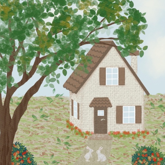
illustrate a scene with a charming house in
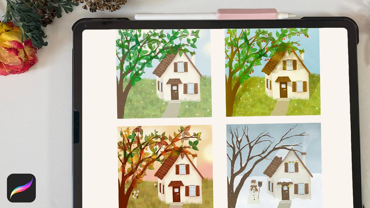
the four seasons spring, summer, autumn and winter. As a bonus, we turn the
lights off and create a magical night scene.
The best part of it, there is no need to redraw or recolor your illustration
for the special seasons. We are going to create
a basic illustration and add some more layers
on top for every season. We'll work with the magic
of the blending modes of the layers to create
a special mode, subtle lights and
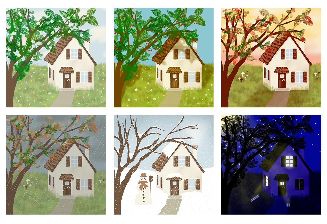
shadows, or a glow. By the end of this class, you will have not one, but six finished artworks, all created from a
single illustration. To assist you with
a quick start, I support you with
brushes you can use to fill in some blossoms,
grass or snowflakes. You can work with my color
palette if you like, or come up with your own colors. This class is designed to unlock your creativity and take your digital drawing
skills to the next level. Let's dive into
the creative world of illustrating light
in the seasons. Are you excited? I know
I am. Let's get started.
2. Your Project: In this class, we are going to create one basic
illustration with a house and its surroundings
and transfer it into spring, summer, autumn and winter, one night scene,
and one rainy scene. Your project consists
of these six artworks. I'd like to encourage you to upload your
finished pieces to the Projects and Resources tab by clicking the blue
Submit Project button. I'm looking forward to see
and comment on your artwork. If you have any questions, please reach out in the discussion section.
I'm here for you.
3. Resources: In this class, we
are going to dive deep into the magic
of the seasons and how we can transfer that special moods
into an illustration. Different seasons
affect the quality and the direction of the light. When it comes to illustrating
for a new project, I like to start with
some references. I have collected some picks
in a Pinterest board, which I link you below. Here you can explore light and shadow, colors and mood that are typical
for the seasons. In the Resources tab, you can also find
the downloadables for this class. I have created a color palette for
you which you can use. Of course, you can come up
with your own colors as well. I provide you with a set
of brushes you can use to quickly fill your illustration
with some details. Feel free to use them. Okay, let's meet
in the next video to start with the sketch.
4. Fast Track: my basic illustration: M. This class is
not a quick one. I know it's a lot to do
here to help you to come quicker to the part where I tell you about all the
blending techniques. I provide you with the procreate file of
my basic illustration. You can download it from
the resources section. Please don't use
this illustration to create any
commercial projects. However, you are, of course, allowed to share your finished
artwork on social media. Please tag me in that case so I can see what
you've made out of it. If you use my basic
illustration, you can skip the
next four videos and go directly to the video
that's called spring.
5. Sketching: In this video, I'd
like to invite you to draw a rough sketch
for your illustration. I'd like to draw on
a square canvas. My canvas has the setting 3,000 by 3,000 pixels and 300 DPI. Here you can see a time
lapse of my sketching. I want you to draw a simple
house with of course, windows and a door, and a roof that is overlapping
on the sides of the house. Please draw a bare tree that
is in front of the house. We can play around
with shadows later on. In the background, I only divide it in two halves
for the grass and the sky. In the next video,
we will fill in some color to receive our basic illustration
for our project.
6. Basic Illustration: In this video, we
are going to create the basic illustration
for our scene. This is the sketch.
I always like to make my sketch layer to multiply mode and
reduce the opacity. Then I lock it, I can't draw on
this layer anymore. Then I create another layer
and take it underneath. Our sketching layer is always on the top and we can
always see the sketch. First, I'd like to
change the background. I'd like to have
this light blue. Then I draw the house. I suggest to take a light color. You will come to the
best result when you draw the house
in a light color. I'd like to draw my illustration
with the dry ink brush. And then I try not to be too exact with
this illustration, but you can follow your style. I go up with the size and draw, not drop the color in, but draw
it to have my texture. But again, you can
use a brush you like and you can go with a solid
one and drop the colors in. It depends on your style. Okay, an important thing
for this class is to use as many layers as you can. To be as flexible as we can. I take another layer for
the side of the house. I don't be exact with this shape because the roof will come on top of the house. Okay. And the next is, oh, I also draw the chimney. It's okay to leave
the chimney on the same layer than the
site because they are far away and we can save the
amount of layers. Okay. Next I take this light brown for the roof and I'd like to make some ending of the roof at the top of the chimney. Okay. And then I make another layer. I make the door next
and take this again. I stay in the whole illustration
with my dry ink brush. There's no need to follow
exactly your sketchings. Then I go to the windows. For that, I take this light
blue from the background. Another layer. And I
draw the glass of the the window, the side window. No need to be exact. We will erase some
parts later on. Here too. To make it a bit
more interesting, I'd like to divide the
windows into six parts. I take the studio pen
to make clear strokes, it's a bit too thick, go to 6% and erase it. And this time I make it
a bit more perfect. This is for the frame of the window. I'd like
to make an exact finishing. Then I erase somewhere
around in the middle. Take it in three parts. About. Again, I don't want to
be too exact today, but it's your choice. I think we can go up with
the size and erase 10% Okay. The next one. And the one on the side, I go down with the size to 6% because we have to calculate the angle
from the side window. You can see it is not exact, but I think this
creates more interest when the illustration is not
too perfect. For the door I think I'd like to erase
more from the blue. We have a small stripe
from the house, this light cream color, to create some frame. Let's draw this roof
next over the door. I think we can make
it on the same layer then our top roof and
this light brown color, I think I'd like to
have it a bit more down so it crosses the door. Okay. Again, I'd like to make
this curvy ending. We are behind the door, change it later in a minute. The door is behind the roof. And then I create another layer to stay safe for
the blinds of the windows. I'd like to have a bit of a
gap between the window and, and the blinds. I turn of
my sketching for a moment, so that
you have some kind of frame from the window. I love the texture of the
dry ink brush. Okay. And I copy that layer. Flip it and go to
the other side. Okay. And I flatten
that one layer. And then we can duplicate this one and go up to this window. Okay, nice. And then I duplicate again. And we can also use
it for the site, I reduce the width. Then let's use the distort tool to fit it to the, to this side. Back to free form. Okay, I think that's good. And we need a door handle. Create another layer and
take my cream color. I turn off the
sketching layer for a moment and I think it's okay. In the next video, we will care for the
details in the house.
7. House Details: I go to the side
of the house and create another layer and
clip it to this part. Then I'd like to, let's use the
brown color, light brown. I always like to use from the spray paints, the medium nozzle, that's
one of my favorite. Maybe go up a bit to 30% round and then create a shadow. We can care for this
curve later on. Maybe it's too much,
I think it's okay. And then make the same for the top to create more interest. I clip it to this front side of the house and then go up
with the size to about 30, 40% and make some
basic textures. We make a basic shadow
with 7% around. We can go to the top and make a basic
shadow for the roof, also on the other side. Okay, also for the, I change to
the clipping mask from the side of the house
and make it again here, the shadow. It doesn't depend on the,
this basic shadow, doesn't depend on the season. So you will probably
have it the whole year. Okay? And then that roof also. Okay? Okay. And we erase it in that
part of the window. Again, go back to
this layer and I erase this texture here so we
can see our frame window. Fine. And now let's
make the details. Let's start with the roof. The tiles I'd like to draw
in with this dark brown. And I like to to make the tiles with
the detailed liner. And this is one from a set I've
bought from Lisa Bardot. It's from her gouache
paint box set. I share the link in
the resources tab. This is not an affiliate link. It's just a brush set
I bought and love. Instead, you can try
out the blackburn under drawing or the ink brush under inking. I merge my layers from the
blinds of the windows. I go to this roof layer
and create one layer on top and clip it to the roof. Now I create the top. Let's make some loose bow shapes. You can make it
exact if you want, but I don't feel
that exact today. I like to make it
rough and lose. Okay. And then on the bottom, be exact with the finishing, I think I like to have this
in the dark brown too, the front from the roof. And then the roof over the door. It's on the same layer, oops. So we can draw it in here. Mm hmm. Okay. I think now we can't see what's the roof
and what's the door. We can go to this layer where we created this
shadows and try to, this is the one, to change the
blending mode to multiply. I make the shadow a bit darker, a bit more, and go to
the medium nozzle. Press again. I have to create
the shadow before my door or go down
with the door here. Okay, and now we can
make this darker shadow. Okay, there's no bow here. And the detailed liner. No, that's the dark brown. Fine. Now I'd like to make a line also here
on the top of the roof. Now let's create some details in the blinds of the windows. I go to this blind layer and create on top also
with the clipping mask. And I'd like to make a frame, don't be too exact, and then make some stripes. It's an old house. And on the top also, of course, you can copy
these details in this one, but I'd like to draw it twice
to have some variation. Fine, and the site, I also like to create
some details in the door, and I create a layer on top of the door and go to my
light brown. Light brown. Okay, I think I stay with that. Let's turn on again
our sketching layer. I'd like to combine
all my layers from the house and group it. Name it. I don't like
to name all my layers, but I always name my groups. Okay, let's say house. Done.
8. Outdoor Details: Add a layer on top. Let's make the stairs. For that, I'd like to choose this
cream, dark cream color. I go with my dry ink again, I think I like to draw only one, we can always change it later, a little bit smaller. And then I'd like to draw
this path from the door, from the house on another layer behind
the stair, the step. I stay with this
cream color and, and make it a bit shaky. Now we can't see our step. We create another layer on
top of the step and clip it. I'd like to go back
to the cream color, light cream and
the medium nozzle, and then draw to define the step. Okay, and also on the
top a bit, only subtle. Okay, and the path we can go back to
this dark cream, create a layer on
top and clip it. We have the same color
then on the path, but when you go
to multiply mode, you can draw on top,
it's the same color, but with this blending
mode it occurs dark. We can make some
texture in this. For that, I'd like
to go to textures, and here are the rosette, Try to make it with one stroke. Okay, I think that's good. Oops. Here it is. Okay, let's turn off
the sketching layer. I think it's fine. But I go with my path
behind the house. Okay, so that's a
nice finishing. And the step, I group it and, step, and I shift this group in the house group and combine this two from
the path in a group. We have it nicely organized. Okay. Next one, our three. Let's create another
layer and turn it on top. Underneath the sketching
layer, and I go back to my brown and the dry ink. And draw the tree and we care about what's
behind and on top, later on. Now it's time for the leaves
of the tree. Don't like it here. I've provided you with a set of stamp
brushes and here are some leaves. I'd
like to choose this dark green and
loosely make some leaves. This brush, it depends on, it
varies in the size of the leaves and
also on the opacity. Maybe go up a bit 30% and make it loose. It also varies in the
colors, in the color way. Let's create, oops, I've
made it in the tree, no. It's important to create a separate layer
with the leaves. I'll tell you later on
why this is important. Okay, and here and there, I'd like to create another layer and create
some more leaves. I tell you later on
why this is important. Okay. And a third layer to make a rich tree. Okay, I think we have it cool. Let's care about our meadow. First, we group our
tree layers and name it tree and then
go to the meadow. Create another layer and turn it to the bottom
behind our house. And also the path. I'd like to draw it
with this light green. I didn't name this group, Let's name it path. First, I'd like to choose a solid
brush like the monoline, for example, in the calligraphy. And make the background
of the meadow a bit shaky, then fill the color in. It's the basic shape of our meadow. And now create a layer on top. And choose from the brushes
that I've provided you, the grass brush, now you can
stay with this light green. You can stamp the brush,
stamp the grass in. It's also a brush that
varies in the colors, the hue and saturation. Okay, And to make it
a bit more realistic, let's create another
layer on top and make some grass in front of the house here. That's too much. No, let's turn off the sketching
layer to see it better. I don't like it on the path, so I erase it here and there, and also here. But I leave, no, erase it here also. No need to be too
exact with this. Okay. And I go back to the
back grass layer and make it here better. We can't see the edge of the basic layer. To blend this edge of the
back green layer, we can choose this layer and go to the
adjustments and gaussian blur, make it a bit blurry. I think 10% are good and we
don't have this edge anymore. We have a nice meadow. We are done with the
basic illustration. Now let's meet in the
next video to make a spring landscape out of
this basic illustration.
9. Spring: Okay, let's evoke
spring in this scene. I go back to my gallery and
duplicate this illustration. So we have the spring,
summer, autumn, winter, and another one for the night scene. Okay, let's start. I name this spring. We don't change
the illustrations, but we add some more layers. Okay, go to the spring scene.
To make it even more spring, let's add some
blossoms in the tree. Go to the tree and create
another layer on top. I choose the light cream. In the brush set
I've provided you, you can find the blossoms. You can stamp here and there. It varies in the size. And make as much blossoms
as you'd like to have. Okay, I think it's enough. Of course, we need to have some more blossoms
in the meadow, in the grass, and create
another layer. And for that I have the daisies
and you can stamp it, in the grass here and there. And you can also make some blossoms, some daisies with
this bright yellow or any color you like, you can also make it as
detailed as you'd like to. Okay, I think that's good. What else for the spring scene? I think I like to
add some clouds in the sky behind the house. Somewhere here, I'll go to the first layer over the background color
and choose the cream. I like to have my medium nozzle brush, make it a bit smaller, no, a bit bigger and make some clouds here and there. I you like you can also use this gaussian blur tool
to make it more subtle, but I think in my
case it's okay. That's it for the spring scene. I think the first one is done. Let's go to the
next illustration. Go out and name this one summer, and meet in the next video
to create the summer scene.
10. Summer: Let's create the Summer!
Go in this scene. What's typical for summer
is the brightness. The sky is more blue
than in other seasons. The shadows are more because
the sun is shining brighter. We can create, I think we don't
need the sketch layer anymore. Unlock it and delete it. Create a layer on top
of all of your layers. And choose this
light yellow, color the whole layer with that yellow. Now, wait for the magic, click on this little N to change
the blending mode. Now let's choose Color Burn. TaDa! You have a more saturated scene. You can also go a bit down
to make it not that strong, but you can play around
with how much you like it. I leave it to the maximum, I leave it at the maximum. You can see on the
video the best, the difference between
this scene and that scene. It's much brighter now
and more like summer. And we also change the
background color, the sky. No, go to the classic view and shift this dot a bit to the right side to make
it more saturated. I think that that's
a good color for the summer sky. Okay. Of course, there are also
blossoms in the meadow. I go here to the grass and
on top with the cream, go to the daisies
and draw them in how much you like to. Maybe some bigger
ones because there was a lot of time to grow
from spring to summer. Tip a little harder to
make the blossoms bigger. Okay. Why not draw some
cherries in the tree? It's a cherry tree! Go to the top and choose the red and the dry ink and create some lose cherries, red dots here and there. There are also single cherries. As much as you like to have, there's no twig. Okay,
add one here and here. It mustn't be the most
realistic tree in the world. Okay, let's call it
finished. And the green one, to make the little stems. I stay on the same layer
than the cherries. Reduce my size to 3% and draw little stems. Okay. If you like, you can play around with
the order of the layers. For example, you can go with the cherries behind
this top leaves layer. Maybe you like it
more in that way. I think that's good. Okay. And the most
important thing for summer is the dark shadow. I'd like to have the shadow from this cherry tree and
reflect it on the house. The light is shining
through the tree. For that, I'd like to
duplicate that tree, flatten it, go behind. Now, I'd like to alpha lock it, make it in this
dark brown color, fill the layer, so the shadow is dark. Now I'd like to shift
it a bit to the side, maybe a bit in the
angle, I turned off my snapping tool, in the angle. Okay. Turn off the alpha lock and go to the multiply and reduce the opacity. I leave it to 77% and
go to the gaussian blur, and go up to 8%. Okay. I think I'd like to have it more distorted. Okay. And of course the shadow
make it a bit less, 50%. Of course, the shadow
is only on the objects, on the grass and on the house, but not in the sky. You can't have a
shadow in the sky. We have to delete the shadows
that are only in the sky. For that, select this
roof layer. Select it, invert it. Now, everything
is selected that is not the roof. And now we can go to the
shadow tree layer and choose the studio pen and delete the shadow from the sky. And choose the free hand tool and select this part. Swipe with three fingers down
and cut the shadow out. Now we need to erase
it from that part also. And for that, you can go and select this grass layer. Select, invert, and go back to the shadow layer and
also erase it from here. Okay, and I think we have it with the shadow. Let's create some sun rays
from the top left. Create a layer behind
this top yellow layer. And go to this bright yellow with the
medium nozzle brush. Go a bit down and create some, that's too small, some sunrays. At the moment,
they are not fine. We changed this later. Okay, go to the blending
modes and go to add and reduce the
opacity very low. To 15, 16% I think. And to make it more subtle, you can also use
the gaussian blur. A bit. Maybe 5%. I go up with the opacity a
bit, 20%. Okay. And I think we are done
with the summer scene. I like that bright colors
and the cherries and the sunlight that is reflecting and is shining through the tree and
reflecting on the house. Oh, we also have
to add a shadow, of course, behind the house. So the house is also
creating a shadow. Sorry for that. Okay, for that go behind the house. This dark brown with the medium nozzle,
make some shadow. Of course, we have to delete a part that is over the grass. Select the grass layer again, Invert it and go back to the shadow from the house
and erase that part. Okay. Reduce the opacity to what
we have behind the tree, 50%. 50% and multiply. Maybe you can go to the
gaussian blur to make it a
bit more blurry. Okay, and now let's call it finished and meet in
the next video to create my favorite season,
the Golden Autumn.
11. Autumn: Okay, let's draw the autumn. I named my canvas, Autumn. Always stay organized. Now, what is typical
for the autumn? I think there are a lot of
great colors in autumn. You have the yellow and the red leaves and
a golden sunlight. The sky is also often
in pinks or orange. Let's start with the background. I like to have my background
in this light yellow. At the moment, this looks weird, but hold on, I will
show you the trick. Okay? And then I create a layer on top of
the background layer and go to my pink
and the medium nozzle brush, quite big and make some, some gradient shading
in the background, maybe it's a bit too much. Okay, and now, like
in the summer scene, I add a layer on
top of all layers. And take my pink in this canvas, in this layer and turn
the blending mode to color burn. A golden light. Let's add some clouds on top
of this background pink. I stay with the
medium nozzle with 25%, and make some shading
to break this yellow a bit. Okay, I think that's good. We can also make a
sun down on the side, add a layer on top of the clouds and choose this bright yellow. And I stay with the medium nozzle, and create the part of the sun on the side. And turn the blending
mode to add. To make it a bit more subtle, you can choose the
gaussian blur tool. I go up quite a lot and make the sun a bit smaller. Uniform. Make it smaller, I make it more blurry. Gaussian blur. Up up up. Okay. Yes, I like that. So, and another typical thing for autumn is the
coloring of the leaves. If you like, you can first turn one layer
of the leaves off. Check where is the
nicest arrangement, because in autumn, many
leaves are fallen down. I think I like
this version best. Okay, now you can create a layer on top of
this leaves layer. And clip it with the clipping
mask to that leaf layer. Use the colors light yellow and red and the browns
and draw them, I suggest to take, let me see where it
is, the old beach under artistic
has a nice texture. And I turn off this other layer to see
where my leaves are from that layer and I draw
it in here and there. It mustn't be exact, just make some marks
and go to the red, and see where leaves need some more saturation. Okay, we use the smudge tool later on to blend the
colors all together. It really doesn't
matter where you set exactly your colors. I take this light brown, you can leave some
of the greens. Okay. And now, as said take the smudge tool
and with a long click, you have the same old beach
brush on the smudge tool. Now you can blend the colors. Okay, I like it now. Let's make the same with, with the other layer
of the leaves. I turned this layer off
to see my leaves better. Oh. Okay. Then smudge it. Okay, That's it. Turn the leaves on again. Beautiful. It's a bit kitschy this autumn scene, but hey, we don't want to
draw a superalistic scene. Let's stay with the kitschy. I delete this one
leaves layer because we have it saved on the
original artwork in the spring scene. And one thing what's left. What's typical
for the autumn are some mushrooms. To add more interest to
this beautiful scene. I create a layer on top
of the grass layer. You can find mushrooms, a stamp brush in my
collection of brushes. Choose a color you like. I think I like them white. Let's stamp some mushrooms
in here and there. That's also a pressure sensitive
stamp brush. The harder you tip the bigger the
mushroom gets. Okay. Don't make too much. And I like one with
this light brown. No, I think I take the
dark brown better. Yes. And there is one thing left. So in this scenery, we have the sun from
behind the house. We have to create a shadow, a long shadow from the house that is
falling on the ground. Let's create a layer
behind the house. But over the pathway, I think I stay with this dark brown and go
back to my medium nozzle. Create a shadow in that direction, okay. You can make it strong. And turn the blending
mode into multiply. I turn the shadow
on top because we have this grass layer where
also the shadow might be. Now we have to erase some
parts that are in the house. On the house, I go to my house and select this
front of the house. This layer. Select.
And go to the shadow layer. And then swipe
with three fingers down and cut the shadow. And the same with the side
of the house. Select it. Go to the shadow layer. Three fingers down, cut. Okay. And now the same on this step. We leave it on the path, but the step, here is it. Cut. Okay. I think
now it's nice. And I reduce the opacity to 44%. Okay. And we can also create, go down to 10%, some shadows, some light shadows in
front of the mushrooms. To be exact, they
also draw a shadow. Okay. And that's it. We have a
beautiful autumn scene, but there is not always
beautiful color in autumn. Sometimes the sky turns
gray and it rains. Let's meet in the next video, and let's draw exact this.
12. Autumn Rain: Okay, let's draw the rain, and this is a quick one. For that, we copy we duplicate our autumn scenery, name it Rain and go in. First of all, we turn off our sunlight. And the background color, we change it to this gray color. Instead of the pink. I go to the classic view, choose this gray tone and
go down till you have a very dark gray and drop it in. And now we turn the
blending mode to multiply and reduce the opacity to let's say 20% I think I go to normal mode for
this top layer, normal mode. Okay, now we can switch off
the layer with the shadow. I don't like the bright
colors in the leaves. I go to this colored, leaves color layer and play with the
blending modes here also. Let's turn it to lighten. Yeah, I think it's
better in that way. Now let's create a layer behind this gray layer and
draw the rain in. I've provided you
with a rain brush and I choose this cream
color for the rain. And it's a stamp brush. I turned it to the maximum you can stamp in
rain as you'd like to have. Okay, I think that's enough. One thing left, the clouds are too bright and
too light in the scenery. We also play with the
blending mode here. Yes, choose the difference and reduce the
opacity quite low. About 25% That's it. That's our rain scenery. Let's meet in the next
video and draw the winter.
13. Winter: Okay, let's go to the last
scene and create some winter. And I named it Winter. The canvas, always stay
organized, go in. I don't know anything
about your hometown. In my hometown, in my childhood, they always
used to fall some snow, but nowadays there
is hardly any snow. But I like the imagination
of a snowy winter. Let's draw some snow
here in. First what's typical for winter is
that the tree turns bare. I delete all my leaves layers and create a layer on
top of all layers. Choose not this cream color, but a pure white. Go to the studio pen
and draw the snow in. I like to draw it here and we delete later on these parts from the house, from the side. I also draw it on the step and bit on the pathway. We cleaned up, but not
too much. On this side here, make it a bit bumpy. Okay. I turn this layer
behind the tree layer. The tree is always in front. Okay. And we can delete
this top grass layer. To delete the snow that is overlapping on
the sides of the house, I go to my house layer
select it and go back to the snow layer, and with the studio pen, erase that parts from the side but
not from the bottom, that are overlapping. It's okay here. And from that side, also choose the side
house shape layer. Go to the snow and
erase that part. I don't like it
here on the step, so stay with the studio
pen and make here a bit. I frame the stairs
a bit with the snow, also here in the edge between
the path and the step. And here, I don't like it here. Make it bit straight. Yes, we have to delete
it here. From the roof. So go to this roofs layer, select, go
back to the snow, and delete it from here. Oops, not painting. Delete from here. Okay, fine. Now let's draw the
snow on the roof. I stay on that layer and I make some bowery shape. And I leave the front of the, the dark brown because
that's the front of the house, of the roof. Fill it in and here on the side, we can also see the snow, make it a bit higher, shaky. And we also have some
snow on that roof. Yes. And of course there
is snow in the tree, but for that I have to create another
layer that's on front, that's before the
tree, over the tree. Because we can cover some parts of the
twigs with the snow. Make it random, here
and there some snow. And here in the, in the corners, in the edges of two twigs, you can make more snow. Here the twigs are overlapping. You have to think about
which kind of twigs are in front and which are
behind. Make a decision. In my case, I like to have
this parts of the tree, they are the most in front. For example, I draw
snow here and it's over that twig. And here also. It's on the top. And here, this one is behind that. You have to pause the snow here with that twig and
make it here again. And also, this one is on top, so it's right here. Maybe here also. And pause it here on that twig and go further here
on the other side. Okay, that's fine. Now let's create, because
it's winter, it's cold, some smoke from the chimney. I create a layer on top and go to the
medium nozzle. What else? And go to 44%. It's behind the tree, so we have to take
it behind the tree. The tree is in
front of the house. Okay. Make it a bit bigger. Yes. And on top of all layers, take this gray and stay
with the medium nozzle and we make some dark
shadows in the sky. I go up to 80% and
color a bit of the top. With that, I turn my blending mode to multiply. Slowly the
sun turns down. Okay, to create some more magic, I create another
layer and go behind that top gray layer and let's
create some snowflakes. I think I like to have the snowflakes with
the cream, cream color. Go to my seasons
brush set and choose the snow and go up to 100% and
stamp some snow in. When you think the
flakes are too subtle, you can always duplicate
that snow layer, it's more saturated, and reduce it to one
layer, flatten it down. Okay, one last thing. If you'd like to have it
more magical or more fun, you can draw a snowman here
on the side of the tree. I create a layer
behind the snow. I draw the snowman with
the cream color, so we can see it in
front of the white snow. Go to the dry ink and I
speed this up for you. Okay, that's it,
we are done with our magical snowy scenery. Let's meet in the next
video for some bonus. In this time, we turn off the lights and create
a magical night scene.
14. Night: In this bonus video, I show you how to create
a magical night scene with glowing lights and
some reflecting lights. I name my canvas
night and go in. First, delete this sketch. I create a layer
on top, and drop this navy blue in.
We turn the light off. The blending mode
is linear burn. We can reduce the opacity
to 90% to see it better. I hope you can see it on
the video. I reduce it. You can leave it, you can
stay with the 90% but I reduce it to 80 so you can
see it better on the video. Okay, and what we would
have in this night scene is we turn the light on in the house so we have
this glowing windows. For that, we have to cut out the windows from
the top blue layer. Go to the house group, and here is the layer
with the windows. I select that, Go back
to the blue layer. Three fingers, and cut out. We have turned the light on. For more interest, we can close the
blinds of that window, for example, Go to the two, select the two blinds layers together. And go to this wrapping icon. And select first
that one side and move that to the middle. And the same with the other. Move to the middle. You mustn't close it, just leave a gap
between the two. Okay, of course we have to
turn off this light again. Go to that layer
with the windows, and select that window. Swipe down and cut that out. And then go to this
top layer with the navy blue draw in
the color we cut out. Next, let's draw a moon
on the top left corner. I draw it on the top
of the blue layer. Choose this bright yellow. I take the medium nozzle.
What else? Draw the moon and some rays that are from the moon going to the ground. Of course, that is
not very realistic. We take this blending mode
to add to make it more glow. This moon layer is
behind the tree, but we can't shift
it behind the tree. Because then we have a problem with the blending
modes with the layers. When we shift it down, the blue layer, you can't
see the moon anymore. We have to have it on top and cut the parts out
that are the tree. For that, we can reduce all these tree
layers to one layer. We flatten it. Now we
can select the tree and go back to the moon
layer and cut it out. We have the sun rays, but they are behind the tree. The moon rays, not the sun rays, sorry, I think the rays are
too strong here. Let's erase some parts
with the medium nozzle. Go up to make it more subtle. Okay, it's better now. Next let's add a layer on top and draw in some stars. We go to add here and stamp the stars in, only small ones here and there shining
behind the tree. We can also create
the diamond stars. Some of them, that's too big. Okay, that's enough.
And if you like, you can go to the gaussian blur and make the stars a bit blurry. Okay. Fine.
Of corse the light from the window will
reflect on the ground. So we have to turn
this light down. I choose again, this layer with the windows where
we have the light. And select the free hand tool. Take this side window first, three fingers down. I duplicate it. It's on a separate layer. Take it on top. And now take the move tool, take it down and rotate it and go somewhere in this angle. It depends on the light
source in the house. Maybe the light source is here
in the middle of the room. And then the light
reflects in that, in that angle to the ground. And we do the same with
this light in in the door. Duplicate it. Okay. And I shift it somewhere maybe somewhere here when the
light is here in the room, this will reflect
in that direction. And here in that direction, it mustn't be too realistic, but we have to
follow some physics. Okay, go with that to the top. I think we don't need
the reflection of that because this might be
outside of our canvas. We stay with these
two reflections, We reduce it to one layer. Okay, now we have these
two shapes on the ground. The reflecting light is not as strong as the
original light source, of course, and it's not with the sharp edges that
are on the window. I'd like to have a bit
of a blur on that. Maybe 4%, I think that's enough. Now we can select that. Go back to the blue
layer and cut that out. We have the reflection. I think it's a bit too strong the light. I'd like to have it more subtle. Take the medium nozzle
brush and this blue color. Let's draw some parts in again, so it's not that strong. I think that's better. Okay. Now to make it
even more magical, let's create some glow
around the windows and some rays that are from the light
sources in the window, in the windows to the
reflection on the ground. For that, we could draw
it on that moon layer. But I like to stay safe and create it
on a separate layer. Go to this bright yellow, make the layer to add
stay with the medium nozzle around 20%. Now we can make some glowing light around. Okay, now let's draw some rays from the light source to
the reflection, subtle, to connect that two points. Okay, I go up with the opacity of my blue
layer to see if I like it. Maybe here needs
some more glow. Okay. And a final thing we can add is that sometimes the moonlight, that is shining through the tree maybe reflects in some
parts of the tree, in some leaves. For that, go to that blue layer again
and take the eraser with the dry ink and delete some
parts from that blue layer where maybe the sunlight reflects. Here on the edges of the leaves. Only subtle, small parts, maybe from the tree also. And here. And you can see there is so much more
interest in the tree. I stay for a while in that tree, erased that parts, and
I speed that up for you. And one last thing. The blinds on that window, I think they are not
closed very much. So we can also delete some parts here and maybe some stripes. Irregular stripes
from the blinds. Yes. Isn't that nice? I love my night scene and
I hope you do too.
15. Thank You: Oh wow, what a journey! We've gone through a
whole intense year. I hope you've
enjoyed learning to illustrate the light in
the different seasons. Please upload your
project to the gallery. I'd love to see it even if
it's only one or two seasons. This class was full of tips and tricks depending
light and shadow. I hope that you can transfer that knowledge to
your own projects. If you have any questions, please don't hesitate
to reach out to me. I'm really excited about this class and want you to
take the maximum out of it. You can either write in
the discussion section, e mail me or dm me on Instagram. I'm here for you in any way. If you liked this class and want to help me to gain
more visibility, the best thing you can
do is to leave a review. Thank you so much for going with me through sun and
rain and snow. See you next time. Bye!
 Nicole Gabriel, Procreate Artist