Transcripts
1. Welcome: Hi, everyone. Today, we are
going to play with color. Now, this is not a traditional
color theory class with strict charts
and color wheels. Instead, we will
explore the range of just a few colors
with freedom and fun. I'm Amy Murray,
artist and teacher, and I'm excited to share
a technique with you that I've been using every
week to explore color. We'll start with a
little structure using three non traditional
primary colors. Then we'll mix secondary colors and continue
building from there. As we move through the process, we'll begin to
discover all sorts of nuanced colors hidden in
just three paint tubes. This process has really helped me to get unstuck when I feel like I am just using the same colors over and
over again in my artwork. It might also be the
perfect class for you if you feel intimidated
by color theory, overwhelmed by too
many art supplies, or you just want to experience
joy as you mix colors. Class is really
about learning to see color in a more
intuitive way. Instead of memorizing rules, you'll start to see
how tiny changes can create a whole new mood and tone within
your color palette. I also hope this
class helps you feel a little more freedom and
confidence with your materials. You do not need
dozens of tubes of paint to create a beautiful,
expressive color palette. You'll finish this class
with a full page of color swatches as you create
your own unique color story. So let's gather a few supplies, talk about our project, and start painting together.
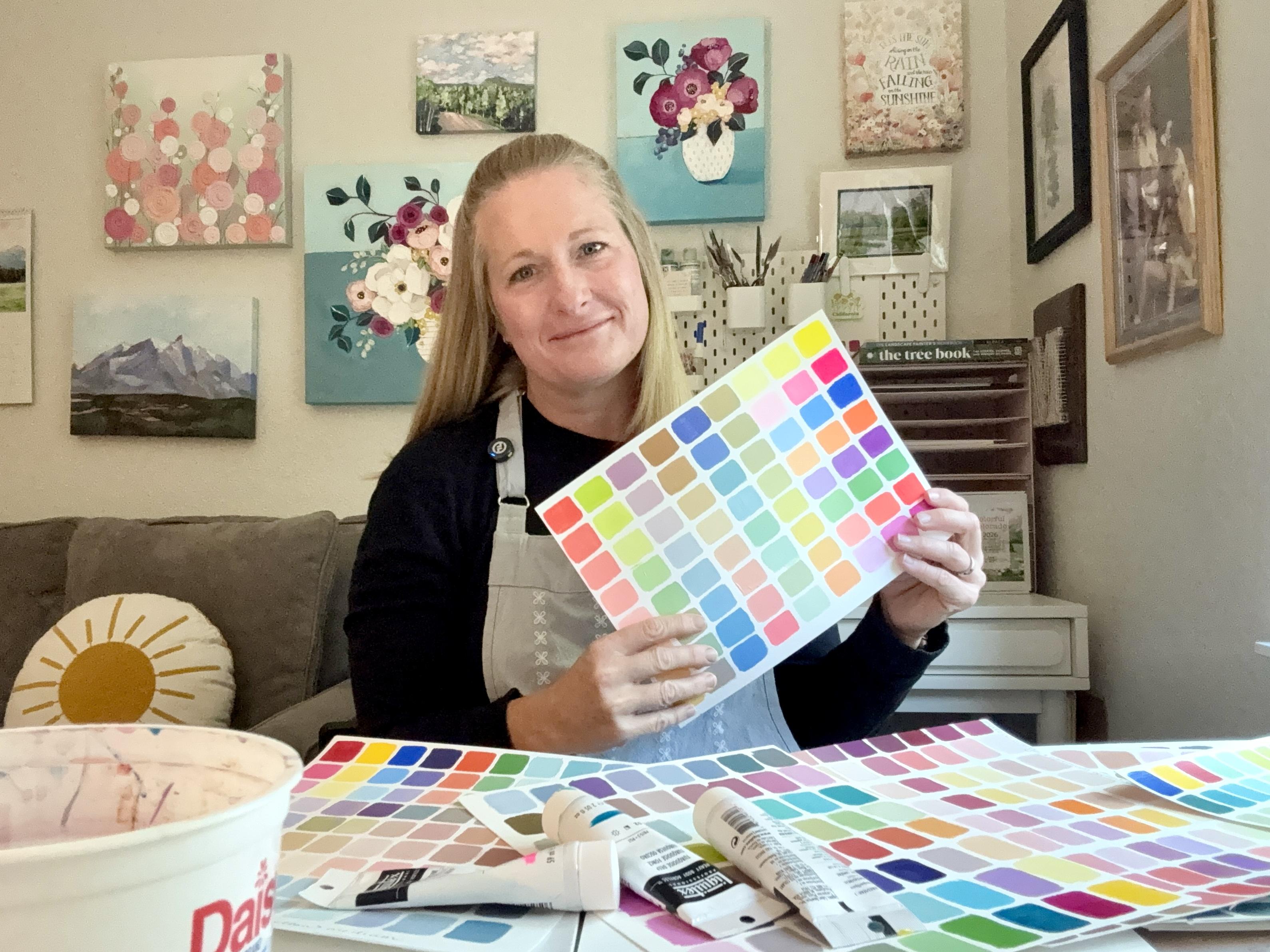
2. Our Class Project and Resources: Okay, let's talk about
our class project. You will end this class with a full sheet of
colorful rectangles. Think of this as your
own personal color study using just three tubes
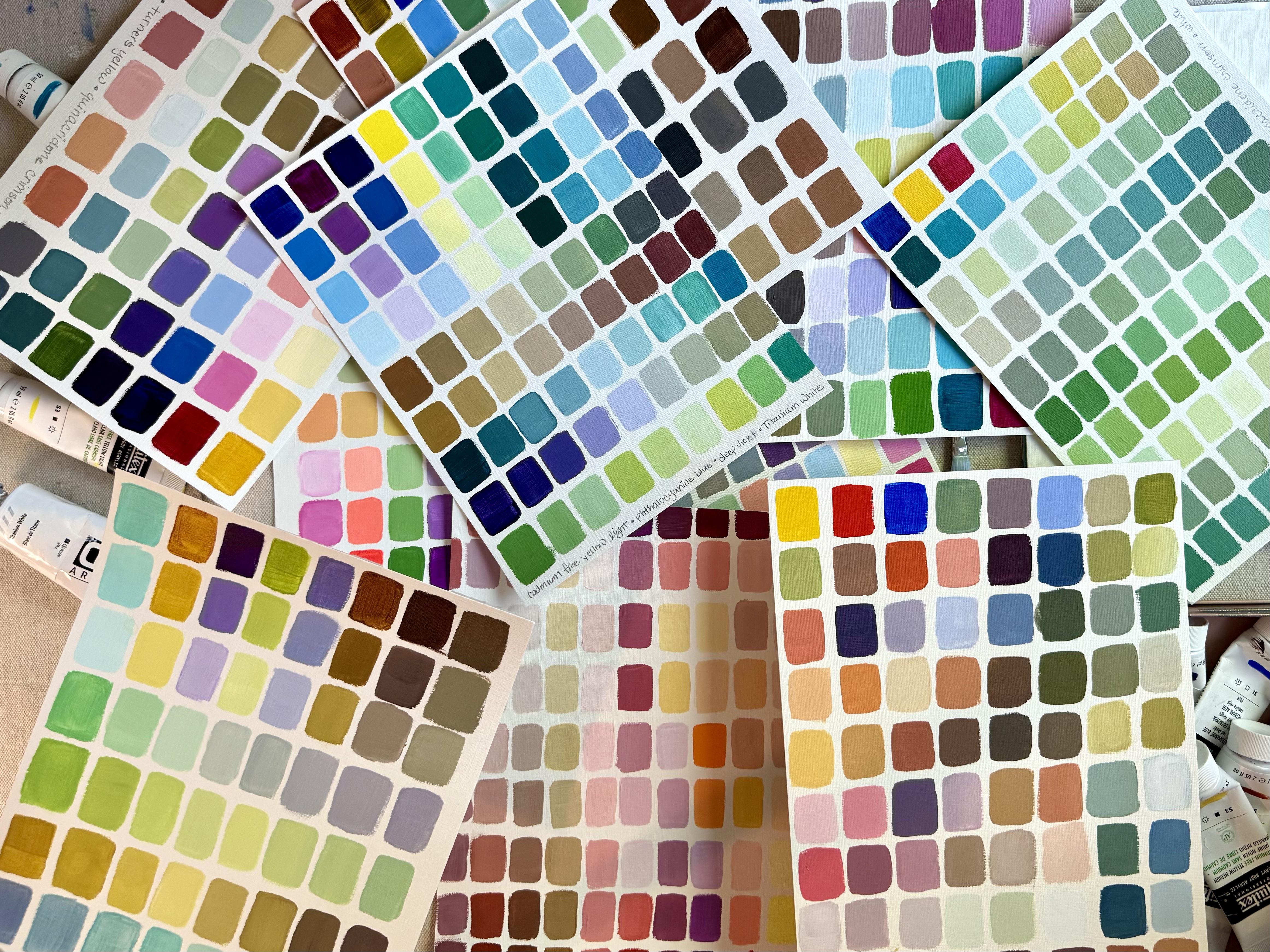
of paint plus white. I have a lot of examples of these color studies
because I try to do this each week to help
me kind of get out of my color rut and really explore some new colors and
color combinations. So we will paint one
of these in class, but you might find yourself like me making a
new one every week. We'll begin the project by choosing a limited
color palette, and then build a collection of color mixtures by
lightning each color, mixing secondary
colors, and gradually exploring the little shifts and surprising shades that
emerge along the way. By the end of the class, you'll have your
unique color study. We will be sure to label all
of the colors that you use so that you can save this and use it as a reference
for future art. My hope is that
you will also gain a deeper understanding of
value and color relationships, more confidence in
color mixing and an appreciation for just how far you can stretch a
limited color palette. Are no perfect mixtures here. The goal is to explore and discover new color
combinations along the way. You might choose a
traditional yellow, red, blue combination and see what colors you
can mix from there. You might mix an entire page of green values just from
these three colors. Or you might focus on, you know, warm, pinks,
peaches, and purples. Truly, it's up to you. When you finish, you can upload your project to
the class gallery. I would love to see
what you paint, and I love to see how these all turn out so
differently from one another. I've included a couple
resources that you can view or download in the
resource section to help you along the way. First, you'll find some
color combinations that you can choose from
if you're feeling stuck. These are just a couple
recommendations. You truly have the
freedom to use whatever colors
you have on hand. Second, you'll find a list
of warm versus cool colors. You can use this to
create a warm palette, a cool palette,
or a mix of both. Warm versus cool colors is really not something
to get hung up on. This is only here as a resource to kind of help you make your own
choices along the way. If you have any
questions or comments, please feel free to post them
in the class discussion. I am happy to chat with
you through this process.
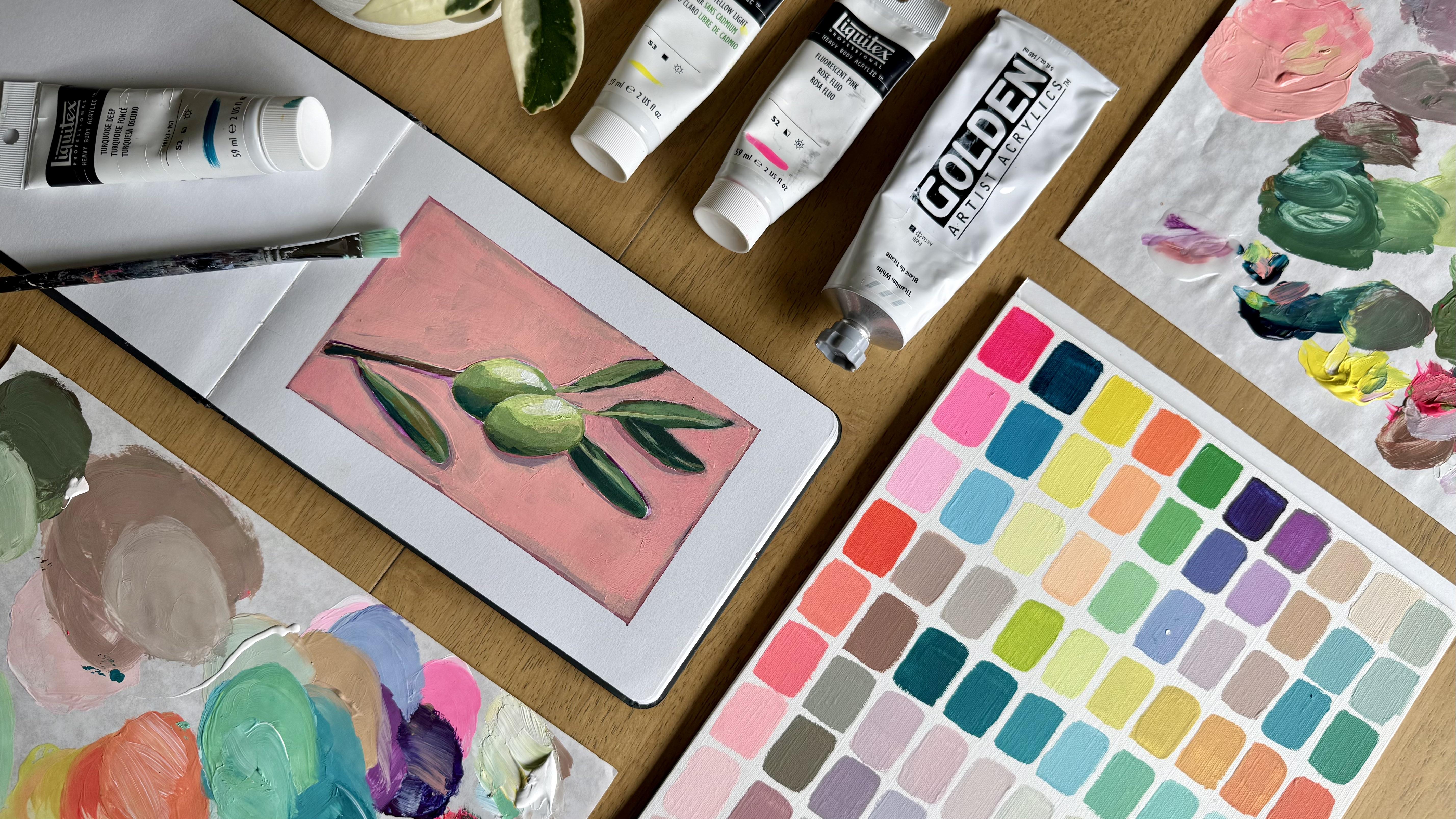
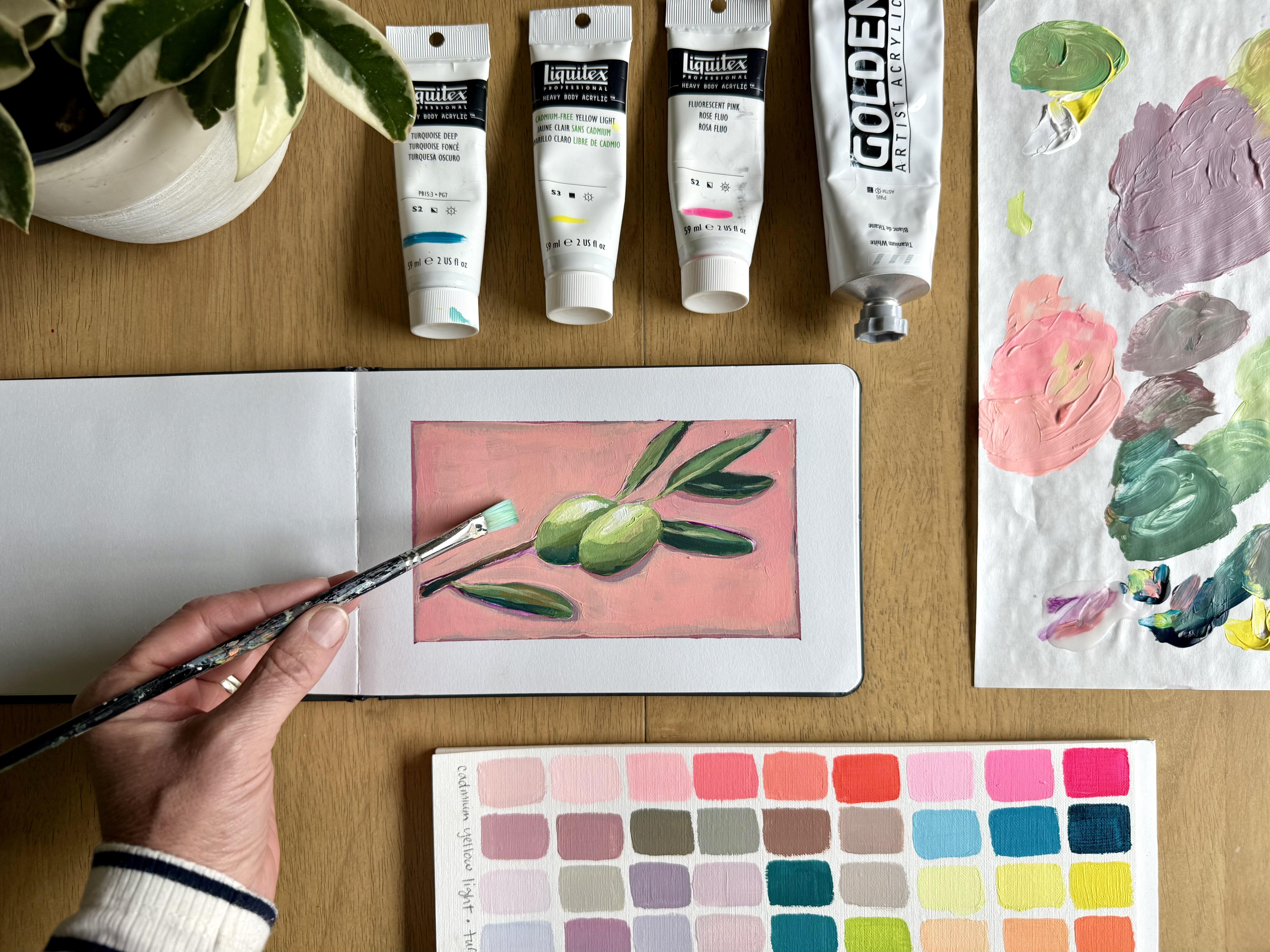
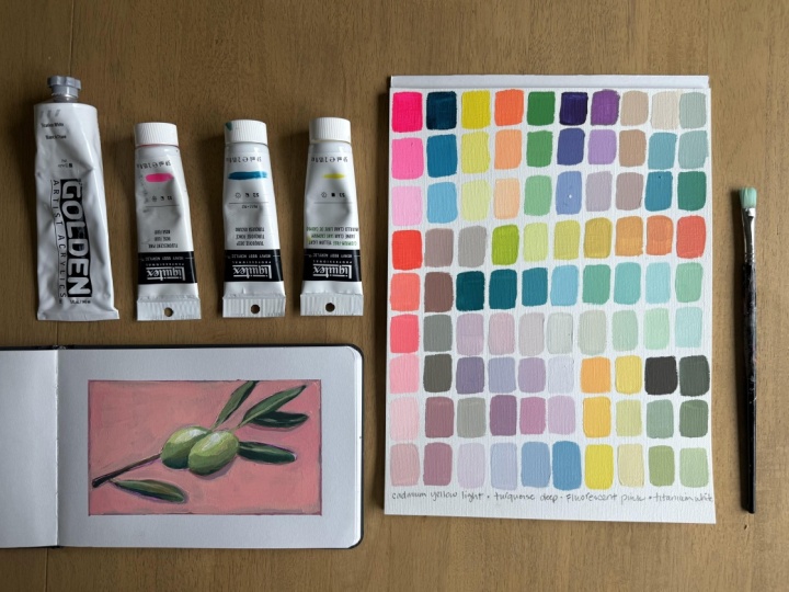
3. Gather Your Supplies: To paint your color study, you will need just
a few supplies. The first is a
surface to paint on. I am using this paper made
for oil and acrylic painting. It's pretty thick and sturdy and has kind of a canvas
finish on the top of it. But you are welcome
to use cardstock, canvas or whatever
you have on hand. Next, you'll need a
surface to mix on. I like to use these
disposable paper palettes, but you can use whatever
kind of palette you prefer or even a paper
plate works just fine. You'll also need a
square paint brush. The one I'm using is about
three fourths of an inch. You'll also need water
and a towel for cleanup. And last, of course,
you'll need your paint. For your paint, you can choose
three colors plus white. These can be a
traditional primary, red, yellow, and blue. Or you can pick something a
little more non traditional, but still along
those same lines. I'm using instead of a
red fluorescent pink, instead of a traditional blue, I'm going to use
this turquoise deep, and I am using a pretty
traditional yellow. This is cadmium yellow light. Feel free to get creative
with your color choices. Maybe you replace your
blue with a purple or you replace your yellow with an ochre or a
yellow green shade. The choice is really up to you. Now that we've gathered our supplies, let's
start painting.
4. Let's Paint! Primary and Secondary Colors: Okay, as we begin painting, we will start by squeezing out each of our
three paints, white, fluorescent pink,
deep turquoise, and cadmium yellow light, or whatever paints
you are using. I will begin by making a
rectangle of each pure color so that we can see exactly what it looks like straight
from the paint tube. We are then going to
take that pure color and lighten it twice
by adding white. So we'll have the color
straight from the tube, and then a lightened
medium value, and finally a third lighter
value of that color. I'm going to repeat this
process with all three colors, and this just gives
me a basic range of the colors that
I'm starting with. You'll notice that I'm going
to speed up my camera during this process because it did take me a full hour to
paint this page. So we are just going to speed that up a bit here
for class purposes, but feel free to create yours in as much
time as you need. Okay. After I use my colors
straight from their tubes, I'm going to mix my
secondary colors. What this means is I will mix about equal amounts of
two colors at a time. So I'm starting with
my pink and my yellow, and I get this beautiful
vibrant orange. Then I will do the same
thing as before and use white to lighten this
value a couple times. I will repeat this by
mixing yellow and turquoise together to get a
beautiful, vibrant green. Then I'm going to lighten it twice using the same process. We will repeat this one
last time as we mix the final two colors pink and turquoise to get a
nice, deep purple. Then you guessed it, Lighten that value twice. So this first three by six
grid shows us the very basic primary and
secondary colors that we can mix using our
limited color palette. But if we stopped here, we would be missing
out on the range of nuanced colors that can
come from these paints, and we really wouldn't grasp the extent of the color
range that's possible here. So we're not going to stop here. This is where it
starts to get fun.
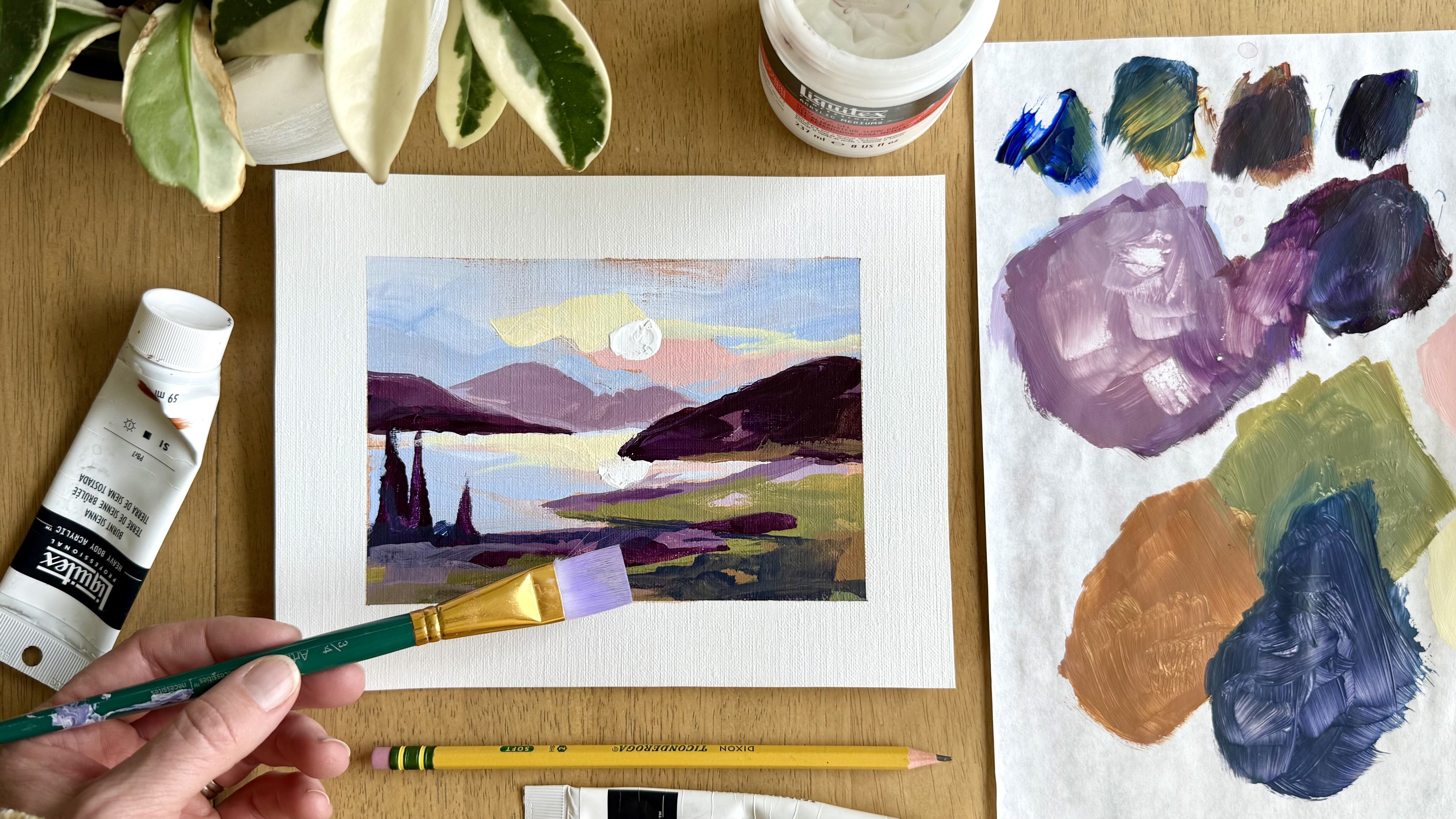
5. Have Fun and Explore : Those first color mixes are really the most structured
part of this process. And at this point,
we get to have a little more freedom and explore some intuitive
color mixing. Now, I love purple, so I'm going to begin by
exploring some purples. The original purple that I mixed leaned heavy in
the blue direction, so I'm starting by creating a warmer purple with
more pink in it. None of this is
an exact science, and as I move along, I will explain my
thought process to you and you can see the way I'm mixing these
colors on my palette. But please don't feel
like you need to mix these exact colors yourself. I actually encourage you to
do your own exploration using the same thought process with
your own intuitive colors. For instance, as
I'm mixing purple, I might take that purple and alter it a little bit
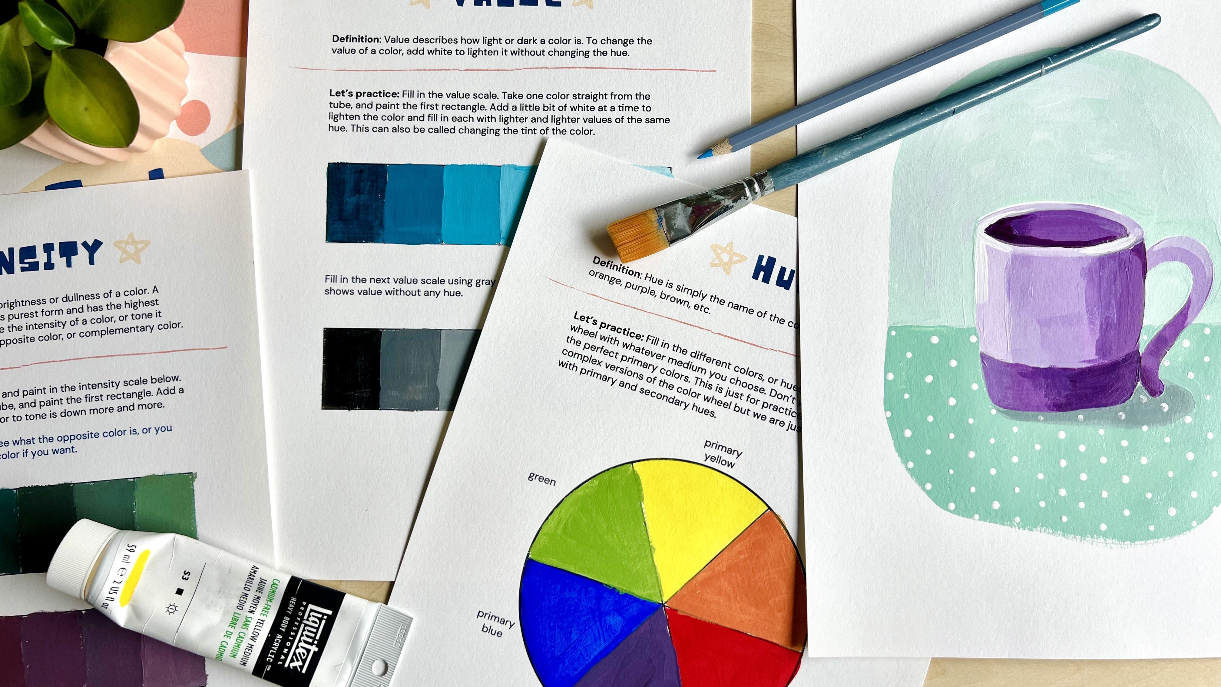
by toning it down. Tone down a color, you simply add the opposite. So to create purple, I mixed pink and blue, and to tone it down, I'm just going to add that third color yellow
in just a small amount. You can think of
toning down a color as quieting down the
brilliance of it, which is a great way
to give more depth and interest to any art
that you're creating. If every color is
fully saturated, nothing ends up looking
interesting in the artwork. So you need those toned down, muted colors to contrast from those brilliant colors
straight from the tube. So as you can see, I'm toning down the purple
and warming it up, which helps us end up in more of a golden range of colors. And I will just continue
to play with that color, altering it a little bit and creating a new rectangle
with the new color. And that really is the
whole process here. We're just making
slight alterations to explore a new range of color
in each section of our page. I then decided to take that
neutral golden color and add a little bit of blue to
move into a blue green range. You'll notice I add even more
blue to each new rectangle to create some beautiful but also tone down turquoise colors. So this turquoise does
look different than the turquoise that came
straight out of my paint tube. The next color you want to
explore is totally up to you. I'm choosing a bright coral, which is mostly fluorescent pink with a little bit
of yellow added in. And then I will lighten
it up and tone it down as I move through this
section of my color study. One tip I like to give
artists as you're trying to make your
color very light is to start in a fresh place on your mixing palette with white and add in just a
little bit of your color. This is much easier and uses
way less paint than trying to add enough white paint to lighten a very
saturated color. As I move through coral
to more of a light pink, I begin to tone down
the color into more of a mauve shade by adding
just a bit of turquoise. I love dusky pinks, so these colors really speak to me in this
section of my page. As I add more turquoise
to the dusky pinks, I start to explore some
neutral grays and browns. Some may call it mud, but
I call it useful neutrals. Every landscape I paint looks better with some
beautiful neutrals. Okay, I'm going to shift to a really vibrant charteru screen by using mostly yellow and
just a touch of turquoise. Then as I lighten this
and add a bit of pink, I move into some really
nice green golds and work my way back around to a fiery orange as I keep adding the
fluorescent pink. One of the really fun and
interesting things about this process is watching
a color move from Chartres green to a
brilliant fiery orange within seven squares
of color shifting. And you'll notice I did not restart or completely
wash my brush, so these colors just
flow naturally from one to another into a totally
different color range. All right, I don't think I've given turquoise
enough attention. So I'm going to start by mixing a dark value of my turquoise and just a tiny bit of yellow and then work
into some lighter blues, sea greens and minty
green shades here. This is another one of
my favorite colors. So mixing this turquoise
and teal section always makes me
feel really happy.
6. Keep Painting: When I look at my page so far, I see a lot of darker
and medium values. So I would like to
create a section next in extremely light values, just to get a full range of
colors throughout the page. So you'll see I'm mixing some very light blues and then even some
light dusky pinks. This gives a nice contrast to
the dark values on my page. It's hard for me to
leave purple alone, so I'm returning to some
pretty toned down purples and even some purple grays
These are so pretty. I may even lean in the
direction of a periwinkle, more of a purply blue here. Next, I am going to
focus on some yellow. Yellow is hard for
me because once you mix too much of another
color into the yellow, it's not yellow anymore. We're going to give it a go
here and start with a bright yellow and move into
some deeper golden, maybe even slightly ochre
shades by adding in a bit of pink and toning it down with just the tiniest
bit of turquoise. Too much turquoise will
turn it green very quickly. So the key with mixing your
yellows is to add very, very little of any of the
other colors you're using. Alright, I am running
out of space. I'm down to my last
corner of the page, and I need to do something that I typically do on
every single color study, but I just noticed I
haven't done it yet, and that is to mix all three of my primary colors together in
their most saturated form. So when I do this here, I get a deep brownish green. The turquoise is just such
a strong color that it does make this combination lean
in a green direction. As I add white to lighten
this most saturated color, I get some really unexpected
and beautiful olive greens. This is one reason I love an exercise like this
because I would never look at these three
original colors and think to mix an olive green. In fact, I would probably
go get a tube of olive green paint and just
squeeze some out of that. But by doing an entire
page of color exploration, we see mixes and combinations that we would
never have thought possible. And we see that we
don't need to go buy those extra five or ten
or 20 tubes of paint. Okay, so I finished
my last square in this beautiful toned down
olive green section. And I am loving the outcome
of this color study. The last step that
I do every time I do this exercise is
to write the names of the original colors
on the bottom of the page because it is so
easy to forget this later. This allows you to
save your color study as a reference sheet
for future art. I like to pull out one of
these pages and maybe select three to five of
the tiny rectangles as a color palette
for a painting. Nice thing about
that is that all of these colors
will relate to each other because they all came from the same three
parent colors. As a bonus, I'm
going to show you an example of how
I might do this.
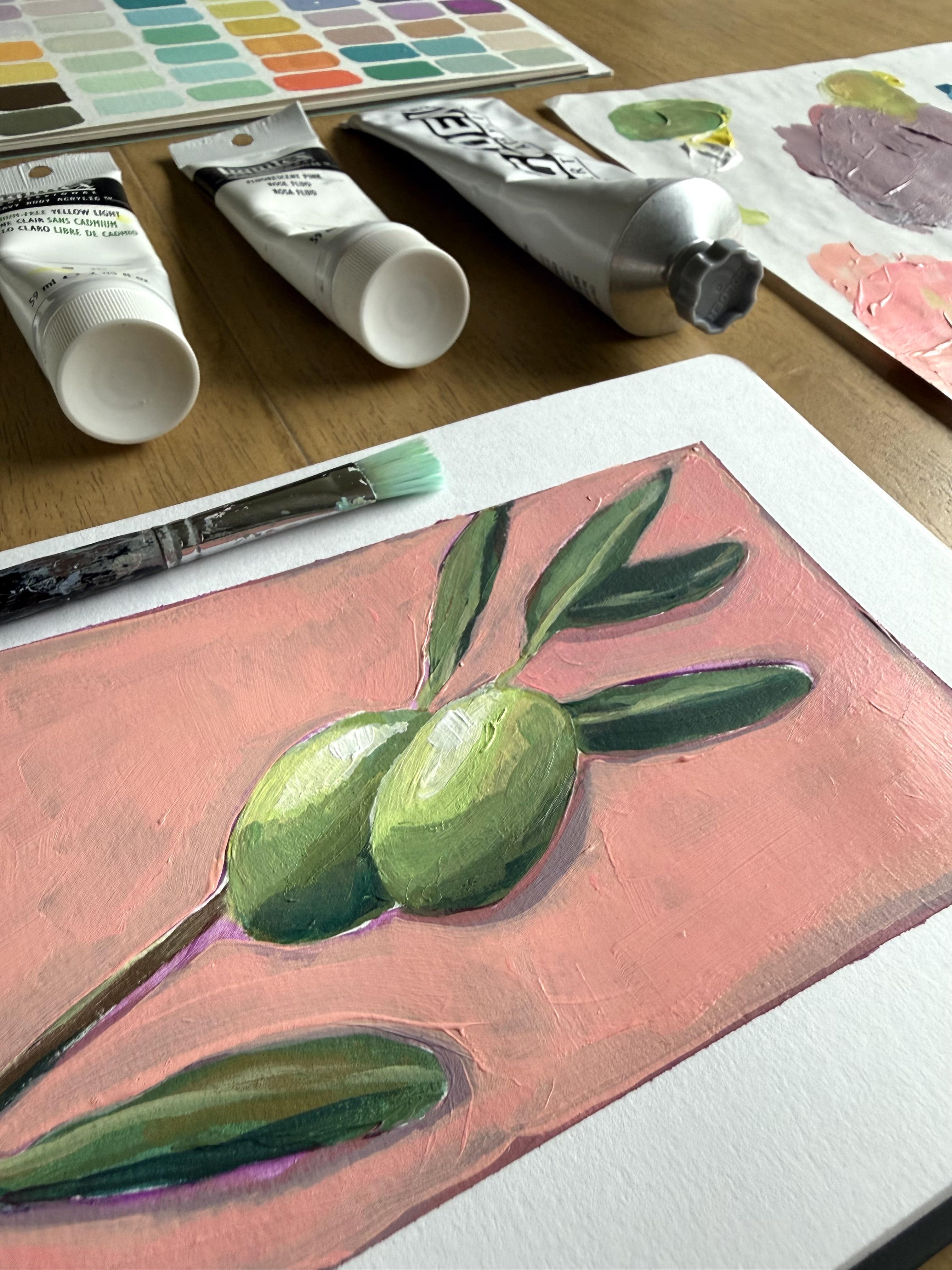
7. Surprise! A Bonus Project: Alright, I'm going to give
you a little bonus and show you how I might use
my color study to create a quick painting in my
sketchbook using colors selected from these tiny
rectangle choices here. This is a ten
minute painting and just a fun way to give
these new colors a try. So I'm taping off a
space in my sketchbook. I'm a sketchbook taper. Not everyone is. Do
what you like here. Alright, I have to tell you, I really love those
olive green shades that I mixed at the very
end of my color study. So that is inspiring me to
paint some green olives. Now, I'm going to speed this along and just let you
watch the process, but I also encourage
you to give it a try. When you look at
your color study, think of a subject that just jumps out at you
from those colors, something that inspires you, and paint a quick
sketch of that. Alright, I painted
my olives by leaves, and then I made my
background first purple, then some of those
dusky pink shades. And then after it dried, I actually went back
and lightened up the background a bit so that those olives
would really pop. So that's just a
little fun bonus, not required, but I do
encourage you to give it a go. You can even post this
in the project gallery, along with your color
study, if you would like.
8. Thanks for Painting Along: Thank you so much for
exploring color with me today. I hope that you felt joy and freedom as you
mixed your colors. I hope this process
gave you permission to approach color
with curiosity. Sometimes we think we need
more supplies, more rules, complicated
techniques when often the most interesting
discoveries happen when we just slow down and allow ourselves to use our intuition and just play with the color. Also hope that this
class makes the idea of color theory a little
less intimidating. I would love to see
your finished project. So I encourage you to upload your personal color study in the class gallery so we
can see how it turned out. For more classes and resources, you can find me
on the socials at Amy Lynn Murray or visit my
website at amyynmurray.com. Thank you again for
painting with me today. I believe there is an
artist in everyone, and I hope this class
inspires you to keep finding joy as you
create your own art.
 Amie Murray, Painter + Art Educator