Transcripts
1. Welcome: In this class, we
are going to paint a finished landscape together. But here's the thing.
We are going to do that using only
30 brushstrokes. Trust me, it's harder
than it sounds. And if you are like me and you tend to overwork
your paintings, this challenge might be
exactly what you need to break free from that.
I'm Amy Murray. I've been a professional
artist for 14 years, and in that time,
I have sold over 1,500 of my own
original paintings. One of my biggest struggles
over the years has been to release myself from
painting all of the teeny, tiny details in my art and really embrace my own
expressive style. I'm guessing there are a lot of other artists
out there like me, and that's why I
created this class with a 30 paint stroke
challenge for us. For this class, you will need just five acrylic paint colors. One brush, an acrylic medium, a piece of paper to paint on, a mixing palette, and
some water for cleanup. This class, we won't be painting quick or
messy, but instead, we will focus on painting fewer, more thoughtful brush
strokes as we focus more on the contrast between
light and dark values. We won't get caught up
in all of the teeny, tiny details of the landscape. The beauty of this
painting will be in the interesting brushwork
and the overall composition. You can either paint along
with me step by step and make the exact painting that I'm making or you can
use this method, along with your own
reference photo to create a totally
different painting. Either way, I hope that
you'll learn to paint with more freedom and also more
intention at the same time. Okay, are you ready
to give it a try? Before we get our paints out, let's talk quickly about
the class project.
2. Project: The project for this class
is a finished five by seven or similar sized landscape using only five paint colors, one paint brush, and
exactly 30 brushstrokes. When you're done, you can
upload your painting to the class project gallery and
share a few things with us. First, you can share
your color palette, especially if
you're using colors that are different than mine. It's always fun to see different color variations
that artists choose. Second, add a photo
of your painting a bonus if you show us the one paint brush that
you use to paint it. And third, if
you're comfortable, you can share one
thing that you noticed or you learned by limiting
your brush strokes. In the resources
section of this class, I have included a printable
supply list and a sketch of our landscape that you can print and trace directly onto
your paper if you'd like. Okay, let's talk
about the supplies you'll need for this class. And I promise it's not too much.
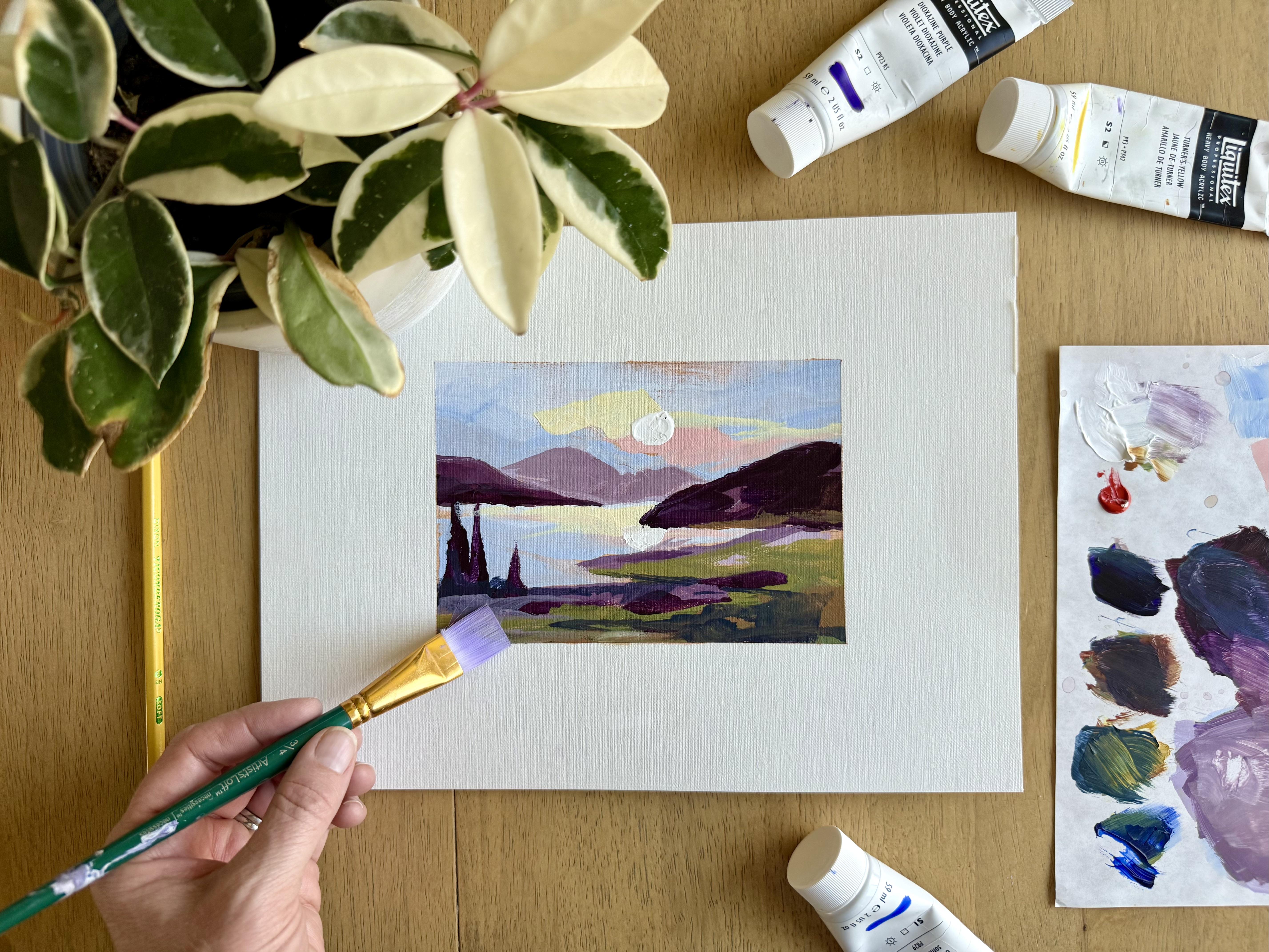
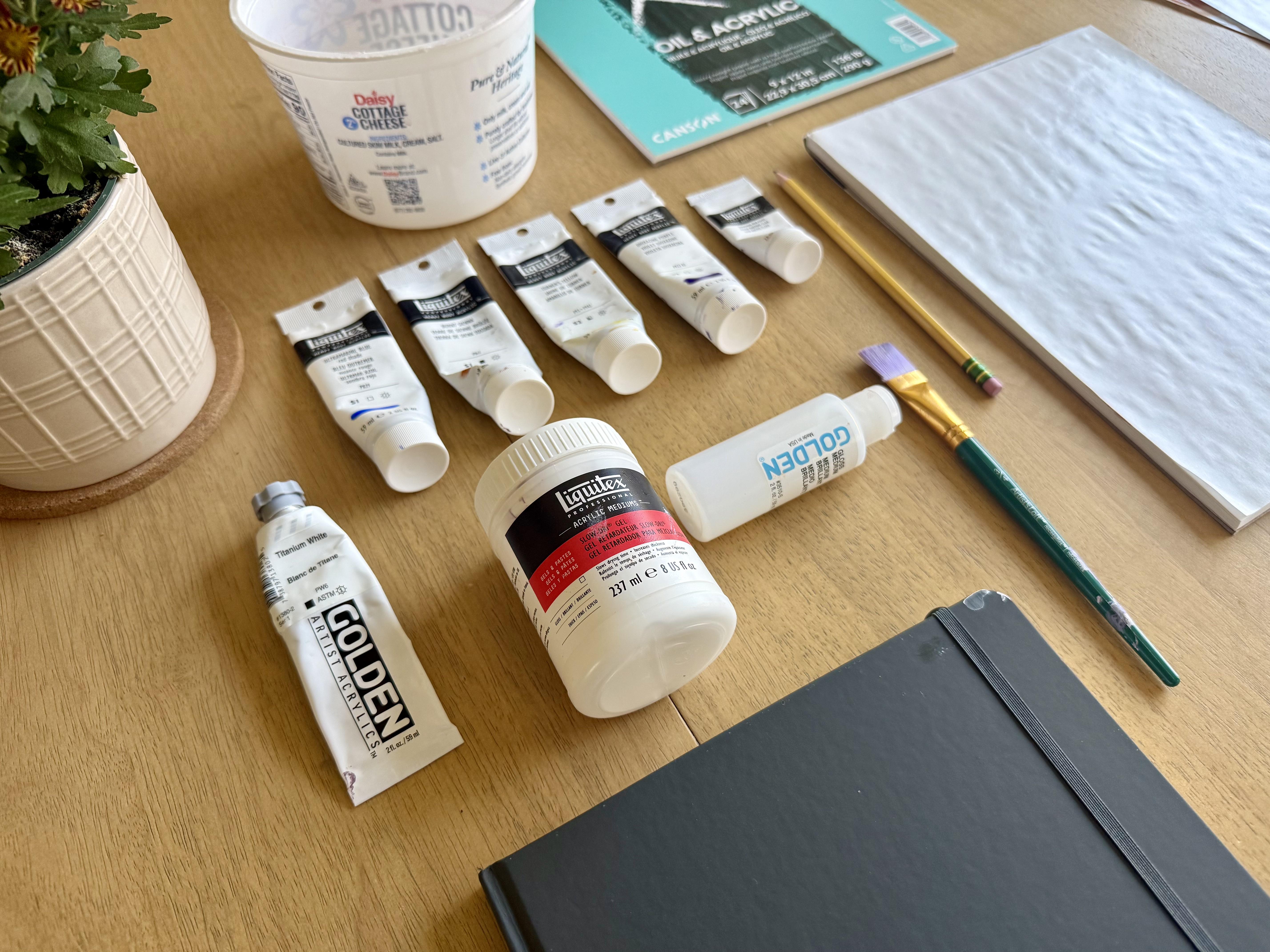
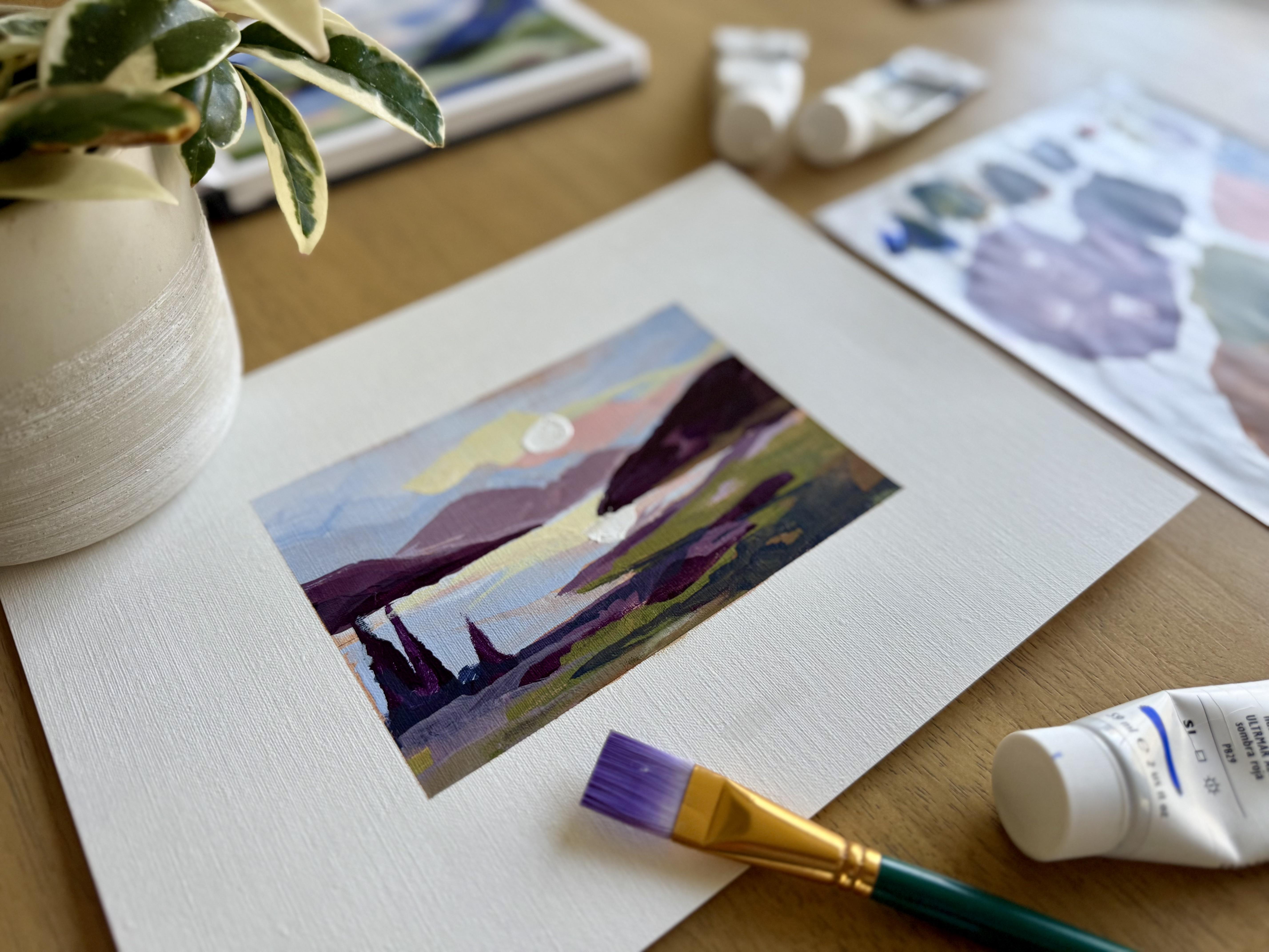
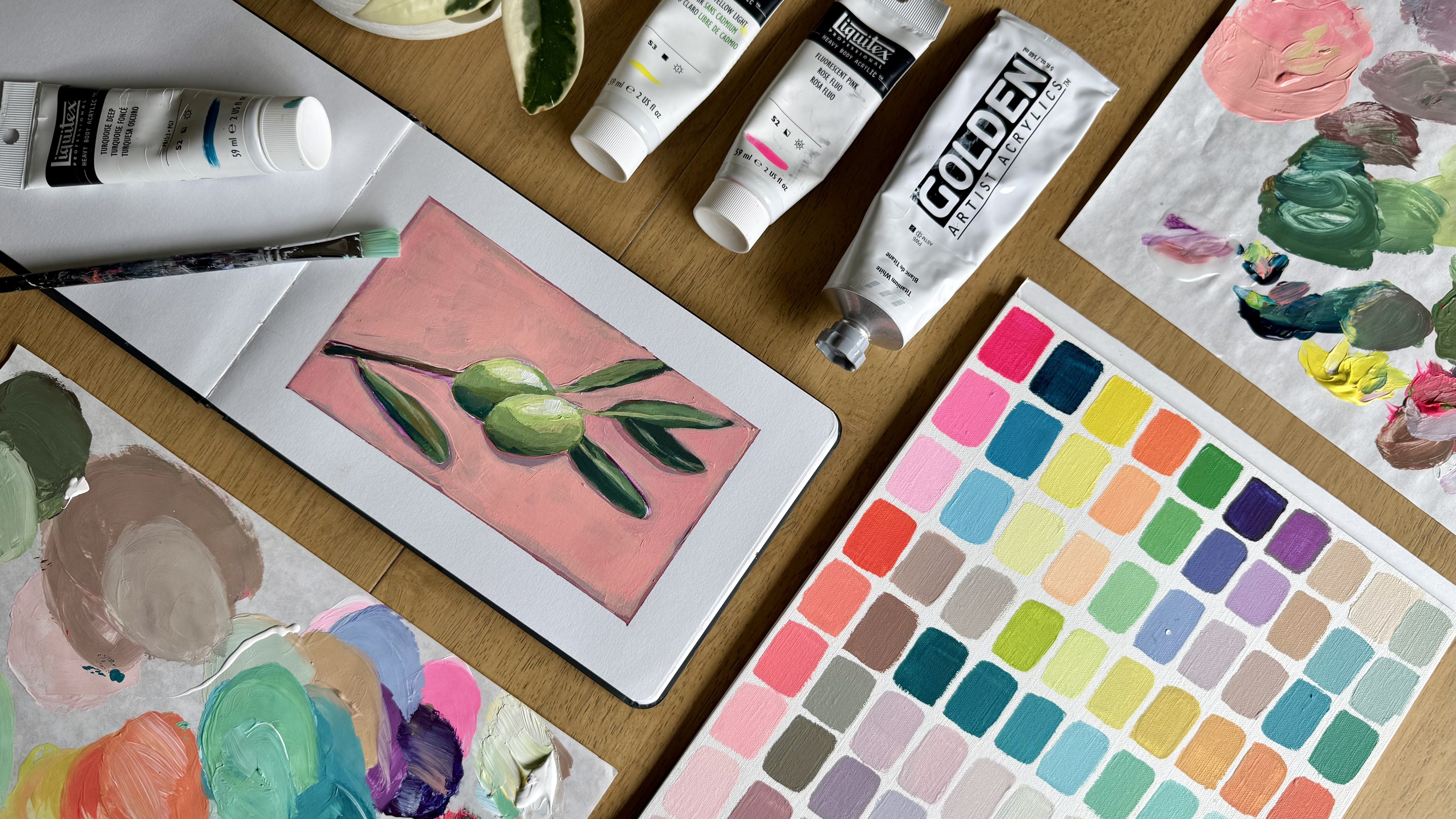
3. Supplies: For this class, you will
need just a few supplies. First, we are going to select five tubes of acrylic
or gouache paint. I'm painting an acrylic, but any opaque
paint will give you the same outcome as the
acrylic paints I am using. The colors I'm using are
number one, ultramarine blue. This is a pretty
standard primary blue. Second, I'm using
naphthal red light. This is a red that mixes
with white to make a really beautiful,
bright, warm pink. Number three is Turner's Yellow, and this is a yellow that has more of a muted
golden feel to it. It gives a warm fall feel
to the painting as a whole. Color number four
is Burnt Sienna. This is my favorite
color for underpainting. And color number five
is Dioxazine Purple. I love this purple, but if you don't
have it, don't fret. You can always mix
a purple using red, blue, and a little bit of white. You should also add white
to your color palette, but we're not going to count
that in our five colors. This combination gives me three versions of
a primary blue, red, yellow, plus two of my favorite colors that are
a little bit harder to mix. Again, don't worry if you don't have these exact same colors. You can pick something
close or even choose an entirely new five
color palette of your own. You might like to have an acrylic medium to thin your paint a bit and
help it spread smoothly. I'm using a slow dry gel medium, but you could use something like a glass medium or matte medium, whatever you have on hand. You'll need a
surface to paint on. I'm using acrylic paper. And I have already
prepared my paper by taping off an approximate
five by seven rectangle to paint inside of. Next, you get to pick
one paint brush. I am using this three fourths
inch rectangle brush. I can get a nice thin
line using the top part, and I can also cover a big surface area
using the side of it. You'll also want
to make sure you have a cup of water for rinsing, a rag or paper towel,
and, of course, a palette or even a paper plate to mix your paint colors on. Remember, there is
a printable page in the class resource section that lists all of these colors
and supplies for you. Now that we have gathered
all of our supplies, we will start the project with a quick sketch and
underpainting layer.
4. Sketch + Underpaint: Before we jump into painting, we'll take a minute to
sketch out our scene. This isn't about drawing
all the details. It's about placing big shapes and finding a good balance
in the composition. If you'd like to save time, I've included this sketch
in the class resources, so you can trace it
right onto your paper. As I look at my reference photo, I'm going to keep it
loose and simple. Just a very quick guide for
the overall composition. Feel free to pause this at any time and give yourself an extra
minute if you need to. Once you're happy
with your sketch, the next step is to mix a thin burnt sienna wash
for the underpainting. I'm mixing mine with an
acrylic medium to thin it out. If you don't have any
acrylic medium available, you can use a little
bit of water with acrylic to thin it
out the same way. I'm just going to put a
nice solid layer of this. I'm not worried about
differentiating between values, and I'm not worried
about, you know, if some parts of the
underpaint look lighter, some look darker,
that is A okay. It does not have to be uniform. Underpaint acts as a warm layer that will unify all the colors that you paint on top of it. Essentially, it ties
everything together, and it also takes away the intimidation that
artists can often feel when you are just staring at a bright white paper and
trying to start painting. This is a 32nd step that really makes a difference in the result of your painting. One important thing about our
sketch and underpainting, we are not counting this
in our 30 brushstrokes. These are your warm up layers. It's just a warm foundation to set the mood for the rest
of the colors to come. We're going to let this dry briefly before we start
our 30 stroke painting.
5. Challenge Rules + Mindset: While we let this
underpaint layer dry, let's take a minute to
talk about the rules and the mindset behind this challenge before
we jump into painting. Okay, first, let's clarify
what counts as a brush stroke. For this exercise, a brushstroke is anytime
you lift your paint brush. So a brush stroke can
be one long line. A brush stroke can be one
big zig zag movement, or it can even just
be one little blip of paint as long as your
brush stays on the paper. This is a fun way to
give you freedom to create all sorts of shapes
with one brushstroke. You may even want
to grab a piece of scratch paper and just practice making some
different brushstrokes. The strategy we will use as we paint is to move through the
painting color by color, not area by area. For example, we might start
with a light sky blue. Then think about
everywhere else in the painting that the
same color might appear. Then we'll move on
to the next color. Remember, we're going
to think in values and relationships
rather than detail. Lastly, I encourage you to
be patient in this process. Are not painting quick, but we are painting
thoughtfully and taking time to pause and
think about our brush work. Alright, let's move on and begin our 30
brushstroke painting.
6. Brushstrokes 1-9: Alright, we are ready to
start our 30 brushstrokes. I am going to start by mixing
a light blue for the sky. I'm using quite a bit of white
and a little of my blue. I'm also just going to
put the tiniest touch of burnt sienna into
that light blue to tone it down just a bit. I'm going to add a little
bit of acrylic medium, but still keep it pretty thick. And my first paint
stroke is going to be just kind of a sky defining interesting
line across the page. There is Brushstroke number one. I'm also going to
take a little bit of this lighter blue and add it to the lake to show where that sky would
reflect in the lake. Next, I'm going to saturate this blue just
a little bit more. Still adding a tiny bit of burnt sienna to tone
it down just a bit. And then with this
more saturated blue, I'm going to add another
painttroke to the sky. Maybe define this bottom
portion of the sky. As you can see, my
paint strokes are not quick or haphazard. I'm actually putting
thought into where I want this color
to live in the sky. So I'm holding my paint brush a little bit farther
back and just letting it make more
interesting brush strokes. So that is brush
stroke number three, and then I will
take some more of this darker blue
and define a little bit more of the reflection
in I'm not lifting my brush, so it's still the
same brush stroke. I'm showing where the rest
of that lake shore is. The next color I'm going to
mix is a lighter purple. And remember, as we do this, we are going color by color, not area by area. So to unify the
purple with the blue, I'm actually just mixing it
straight into that sky blue. I'm going to tone
down this purple with some of that
burnt sienna, as well, and that'll warm it up and take away some of the brightness. I'm going to define this mountain range that's
sort of in the background. You'll notice the blue has
not dried all the way, so it's mixing in just
slightly with the purple. And that is totally okay. Nothing needs to be perfectly
defined on this painting. I may, while I have
this lighter purple, add a little bit of that to the foreground to kind of live underneath some other colors that
we'll put down there. So that is paint
stroke number six. Next, I'm going to
create a purple that is a bit more saturated. Have this, bristle
that is bothering me. All do this. You just
cut it right off. Okay. Back to work. For a more saturated purple, I am mixing it in the same area to unify it
with the previous color. But I am mixing quite a bit of purple with that burnt sienna. I add a touch of my blue, and I'm going to
lighten it just a tad. This isn't going to be the
darkest color quite yet. Now we have a nice warm
purple that we can use to define a few more areas. I'm going to use this to mark in this little mountain shape the background of the painting. And I'm going to use
this purple also to mark in this mountain shape. You can see some
of that blue was not dry and it mixed
in with the purple. And I'm just going to leave it. We're going to see what
happens with that. The last thing I'm
going to do with this midtone purple is again, just add some of that
in here to kind of define those shadowy
areas in the foreground. So if we count, we're up to one,
two, three, four, five, six, seven, eight, nine brushstrokes so far. Okay. Acrylic paint dries
pretty quickly. I am going to give this
just one extra minute to dry before I do the next step.
7. Brushstrokes 10-20: The next color I am going to mix will be darkest purplish brown. I'm using more of the purple, mixing in my burnt sienna. I'm going to leave
this value very dark. So you can see we have sort of traveled from light to medium, and now our darkest shade, just to establish all that
nice contrast on the painting. The darkest spot on my painting is going to be this
mountain back here. Just go to add some of that in and let the paint strokes
be a little weird. I may even put some
at the base of this shape back here to show where there would
be the most shadow. Now, I do want to add a few
trees to this painting. So I'm just making a tree shape. Go to do a couple of them here. Not lifting my brush, and then maybe a third, very small one over here and
just sort of letting that be a shadowy tree area
and extending some of that darkest purple
here into the foreground. And we will paint over this. It won't all stay super
saturated dark purple. So adding our darkest purple, we did paint strokes number ten, 11, and this we didn't lift
our brush, so this is 12. To contrast from some of
these rich purple shades, the next color we are going
to mix up is going to be sort of a fall warm green. Okay, to mix sort of
a warmer fall green, I'm going to use that Turner's yellow that
we haven't really touched yet and add a little
bit of my blue to it. It's probably a little
bit too yellow. Add a little bit more blue. I add a little bit of
white to this color to tone it down and unify similar to what we did with the rest of the colors
on our palette. I'm going to add in just a
little bit of burnt sienna. So we end up with sort of this muted fall green. It's
not super bright. It's not a spring
or summer color, but it's going to
look really pretty with the rest of our
colors on this painting. I'm going to use this
green and add in just some remnants of greenery into the
foreground of my painting. We'll do one big sweeping
swirling movement. So that is going to be
paint stroke number 13. Now, I may tone this down and create a little bit more
of a muted medium shade, even a little bit of purple
to gray it down just a bit. Just go to add some
of this also into the foreground here to break
up some of that brightness. Just add a little bit more
interesting color to it. Now, I do think that we might want to add
a little bit more of, like, a golden fall
color to the foreground. I use a little bit of that
green to tie it together, but I'm using Burnt Sienna
and my Turner's yellow to just create kind of
a rich golden color, maybe lighten it up just a bit. Paint strip fib. Tin. Just some
pretty golden color added to the foreground. We might also take
just a little bit and mention it back here. Now, I am going to focus on adding the sunset
feel to the sky. To do that, I am going
to start with a really pretty and bright pink
using just a dab of my red, mixing it with white. I'm going to add in
just a little bit of the yellow to
warm it up a bit. I end up with this pretty
warm orally, light pink. We are going to do
pink stroke number 17 to show some of that
setting sun in the sky. And then for paint
stroke number 18, we are going to show that that is also reflecting the lake. Now, I'm also going to
add a little bit of a light yellow into the sky, brighten up that
sunset area even more. And this will be paint
strokes number 19 and 20. So for number 19, we are just going
to show some of that bright sunset yellow
up here in the sky. And then for 20, we are going to place the reflection of that
yellow here in the water.
8. Brushstrokes 21-30: Now, for 21, I am going
to just make a blip. And that blip, I'm going to use just a bright white chunk
of paint on my paintbrush, and I'm going to show where the sun would
be in the sunset. And I'm so nervous to do this. There's the sun in the sky, and there is going
to be a reflection of that right here in the water. I like it. I think we did okay. So for the last
few paint strokes, I like to give myself
freedom to just do maybe a little detail here or there with an area that I'm
not quite happy with. We don't have to move color
to color at this point. You can use whatever
you need to to fix up whatever you're thinking needs to be fixed
up a little bit. So for me, this mountain is not working quite as
well as I wanted it too. So I'm going to use one of
my remaining paint strokes to sort of define it and darken it a little
bit more back there. Another area that I'm
not quite content with is sort of this mountain
in the background there. I think it needs to
be slightly darker, so I'm going to use one of my remaining paint
strokes by offering it a little more depth
or definition back here. I do think I might use a
little bit of purple to fix up sort of a transition color on
this shape back there. And then I think for my
final paint strokes, I do want to add in, like, a darker green. I'm tying it into the rest of the colors by little
bit of purple to it. Sort of want to add a
little bit of this maybe to this front area to show some
interesting plant life here. And I'm just sort of shaking
my brush as I do that. Like a little
zigzaggy shake here. We're going to add
just a little bit of interesting color back
in this tree area, and I am just kind of shaking my brush a little
to do that, too. Okay, last step, I'm
gonna peel my tip and see what the final piece looks like with some
nice edges on it. I do think that always
makes a difference. I hope that this project
felt quick and simple and a manageable way to try something that probably felt
a little bit challenging. I know I felt challenged. I could probably add about 80 more brushstrokes
to this if I was allowed to. But I'm going to leave
it, and I'm gonna enjoy the beauty of leaving something as it is and
enjoying all the beautiful, strange brushstroke moments that are happening in this painting.
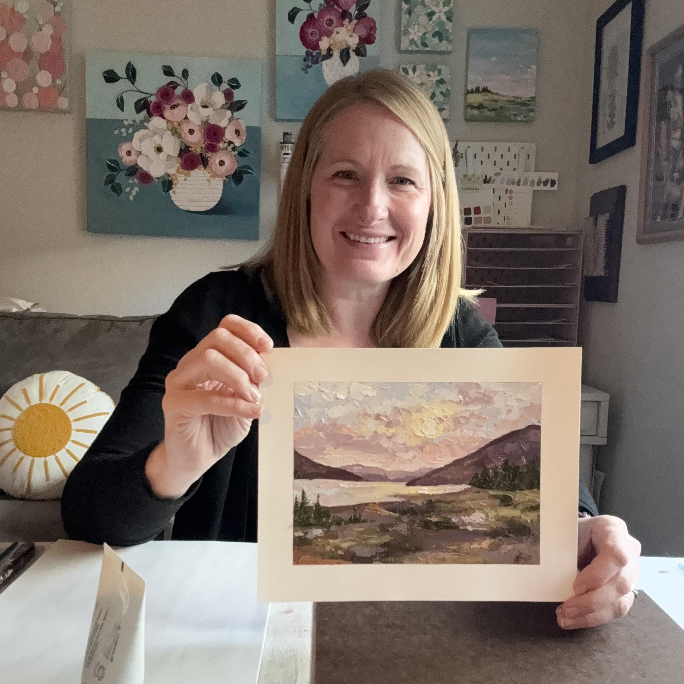
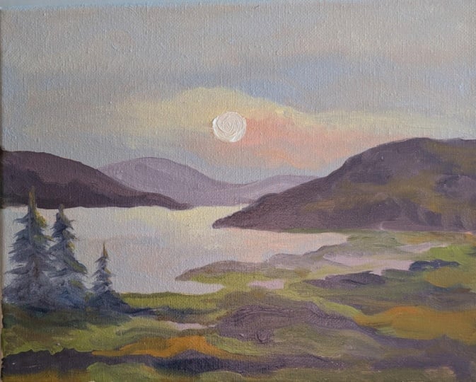
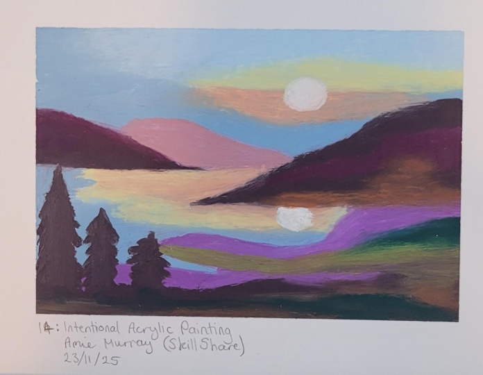
9. Final Thoughts: Okay, you finished the 30
paint stroke challenge, and hopefully you
enjoyed that process, and you're happy with
the finished product. Here is my finished painting. I love how it still
feels fresh and open and gives the
overall feel of a peaceful mountainscape without every single detail of
the reference photo. We stopped at 30 brushstrokes. And honestly, that restraint is really what gives this
painting its beauty. I'd love to see
what you painted. Please feel free to share
that in the project gallery, and let me know what surprised you most about this exercise. I hope that you had
fun with this project and that you're reminded
that less can be enough. Hopefully this inspires you to maybe create a
whole series of 30 brushstroke paintings and see how your art
evolves in the process. If you enjoyed this class, please feel free
to take a peek at some of my other
classes or visit my website at Amyynmurray murray.com for more ideas,
classes, and resources. I believe everyone is an artist, and I can't wait to
see what you painted.
 Amie Murray, Painter + Art Educator