Transcripts
1. Trailer: We look at drawings up Close, the lines and marks take
on a life of their own. Lines may seem simple, but even an individual line can evoke ideas and
emotions in a viewer. I want to teach you how
to activate your lines, how to use them to create a compelling experience
on the page. I want to teach you
how to draw lines that will truly connect
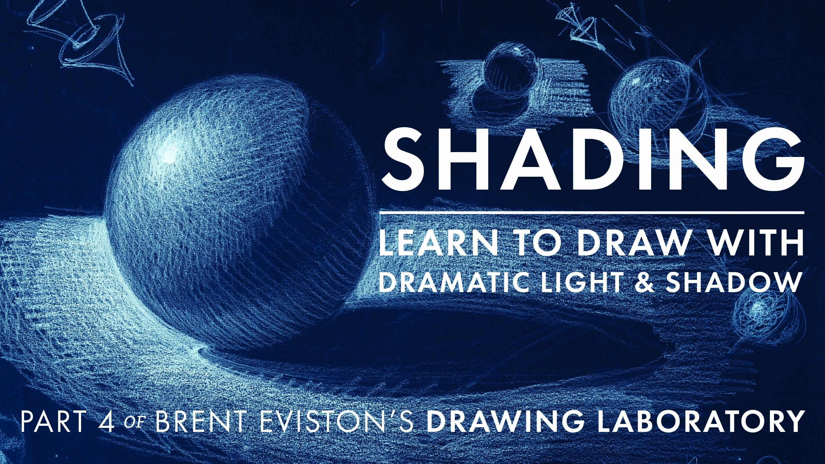
with your viewers. My name is Brent Eviston. Welcome to the third course in my drawing laboratory series, The Language of Wine. Every drawing you do will
be made up of hundreds if not thousands of
individual lines and marks. Each of these lines
serves two functions. First, each line will describe the physical properties of
whatever it is you're drawing. You'll use lines to
describe the contours of your subject and to show
its three dimensionality. But the second function
of each line is to express an idea
or an emotion. This aspect of line and mark
making is often overlooked. Every line you draw will perform these two functions whether
you intend them to or not. In this course, you're
going to learn how to draw descriptive and expressive lines that truly engage viewers. And in doing so, you're
going to start to develop your own
personal drawing style. You'll start by learning how to create all kinds of
different lines and strokes. You're going to explore what is truly possible with a pencil. Next, you'll learn how to use different kinds of
contours to more accurately describe the form of your subjects and to make them look more
three dimensional. You'll learn how to
draw different kinds of textures and tactile sensations. Soft objects will appear soft, heavy objects will appear heavy. This kind of drawing engages your fingertips as
well as your eyes. You'll also learn how to express emotions
through your drawings. Remember, your lines
are communicating emotions whether you
want them to or not. I'm going to teach you
how to be intentional with what your
lines communicate. You'll even learn how to create the illusion of time and
motion in your drawings. By the end of this
course, you will have a new understanding of just how powerful lines
and marks can be, what they communicate, and how to use them in your drawing. How you choose to draw
your lines and marks will determine your
unique individual style. Drawing is all about mine. So join me here in
the third course in my drawing laboratory series
The Language of Line, where you will learn just how powerful lines
and marks can be.
2. Introduction: Welcome to the third course in the drawing Laboratory
series, The Language of Line. All Be your instructor,
Brent Eviston. In this introductory video, I'll introduce the
essential ideas you need to understand before
beginning the lessons. I'll go over some of
what you're going to learn and why it's important. As the title suggests, this course focuses on line. To understand why
line is so important, we're going to begin by trying to define what it means to draw. What is drawing? The word draw literally means
to pull or drag something. We've all heard the
word draw used in common phrases like a
horse drawn carriage. This means that the horse
draws or pulls the carriage. When we draw, we are performing
a very similar action. We pull the pencil
across the page and as the pencil is drawn across
the surface of the page, it creates a visible path showing where the
pencil has been. This path is a line. When we draw, we almost
exclusively make lines. Lines are what differentiates drawing from other art forms. For example, when you paint, you focus mostly on
color and shape. Sculptors focus mostly on
three dimensional forms, but drawings require lines. Now, lines may seem simple, but you can draw lines in a
near infinite number of ways. When we look at
drawings up close, the lines and marks take
on a life of their own. At times, they appear to be
abstract expressionist art, and in a very real
sense, they are. Every line has a set of unique qualities that can evoke ideas and
emotions in the viewer. This is what abstract
art aims to do. Every drawing you do will
be made up of hundreds if not thousands of
individual lines and marks. Each one of these lines will serve two different functions. First, lines must describe the physical forms and properties of whatever it
is you're trying to draw. Now this is a rather practical
and even obvious idea. When we draw, we're trying to draw an image of the subject. But this brings me to the
second function of line. In addition to describing the
properties of your subject, each and every line also
communicates ideas and emotions. Now, this is less
obvious and it's very commonly overlooked
by people who draw. Every line you
create will perform both of these functions
at the same time. Now, as this course progresses, you're going to learn a lot more about how these two factors, description and expression
play out in drawings. But for now, I just want to get this idea into your
consciousness. Ine is the most fundamental
element of drawing. Our lines are always communicating
ideas to the viewer, whether we intend
them to or not. In this course, we're going to delve deep into lines and marks. We're going to explore
how to make them, things we can
communicate with them, and how we can use
them in our drawings. To do this, let's
begin by exploring how absolute beginners often
approach their drawings. If I were to ask a random
person to draw a picture, somebody who has little to no experience or
training in drawing, they would most likely
begin by drawing short nervous strokes around
the edge of their subject. These short lines usually overlap one another
and they move their pencil around the edge of the subject until they
define the outline. Now what are these lines and why do beginners so
frequently make them? There are two things
we can learn from this very common
approach to drawing. First, is that most
people assume that the primary function of drawing is to outline the
shape of an object, to establish the
boundary between their subject and
everything else. Often, the space inside the outer edge of the
object is left blank. Now, if you don't think
about it too hard, drawing the outline
of a subject and establishing its shape seems
like an obvious thing to do. But why does this seem
so natural and obvious? Well, I'd like you to
do something for me. Hold your hand out in front
of you and take a look at it. Do you see an outline
around your hand? Now, let your eyes fall on any other subject in
your environment. Are any of them outlined? Do you see a line that goes all the way around
the edge of objects? The answer, of course, is no, there are no outlines encasing
the objects that we see. What we tend to
see are shapes and colors butting up
against one another, but there's not a
line separating them. When we outline our subject, we are drawing something that
does not exist in reality. Now this is a bit of a
paradox because when we draw, we often feel like we
are drawing what we see, but this simply is not the case. Even the first lines in the drawing don't
exist in reality. When we draw, we are
communicating in a completely different
visual language. When we draw, we translate reality into the
language of line. Goal of drawing is not to copy reality in a realistic way. If that's what you want to do, get a camera, not a pencil, we draw to communicate something about our
subject to the viewer. Keeping this in mind, let's go back to the novice
attempting to draw. We've explored the
impulse to outline, but now let's take a look
at the lines themselves. So often we see
beginners draw with short overlapping strokes that move around the
edge of the object. What do these lines
tell us about the state of mind of
the person drawing? Do these lines appear confident
and free? Absolutely not. These lines appear timid
and unsure, almost fearful. These lines tell
us something about the mental state of the
person drawing them. I think you'll agree
that these lines are not beautiful or
inspiring to look at. They can actually make
viewers a little uneasy. They express the anxiousness
of the person drawing them. This is what I mean
when I say that lines express ideas
and emotions. The way we draw our lines communicates things to the
viewer, non verbal things. They do this whether we
intend them to or not. Now, there's a
metaphor that I find incredibly useful while
exploring line quality, and that is line quality is very similar
to tone of voice. Just as you can express ideas and emotions by how
you use your voice, you can do the same
thing using line. How you draw your lines is just as important as
what you're drawing. In this course, you're
going to learn how to use your lines
expressively in the same way an actor
or an orator might use their voice to be expressive
during a performance. Now, ultimately,
it's up to you what you want to communicate
with your lines and marks. But generally speaking,
we want to avoid lines that appear monotonous
and boring to viewers. We want to create lines
that engage the viewer. This is what you're going to
learn to do in this course. Of course, we're going to go far beyond expression
in this course. This course actually begins with much more practical
uses of line. You'll learn how to describe the physical properties
of your subject, express their three
dimensional characteristics, as well as describe their textures and
tactile sensations. But right away, I want to get
this idea in your head that in addition to describing the physical properties
of your subject, your lines are always
expressing ideas and emotions. They are always doing both. Before we get to the lessons, there are a few things
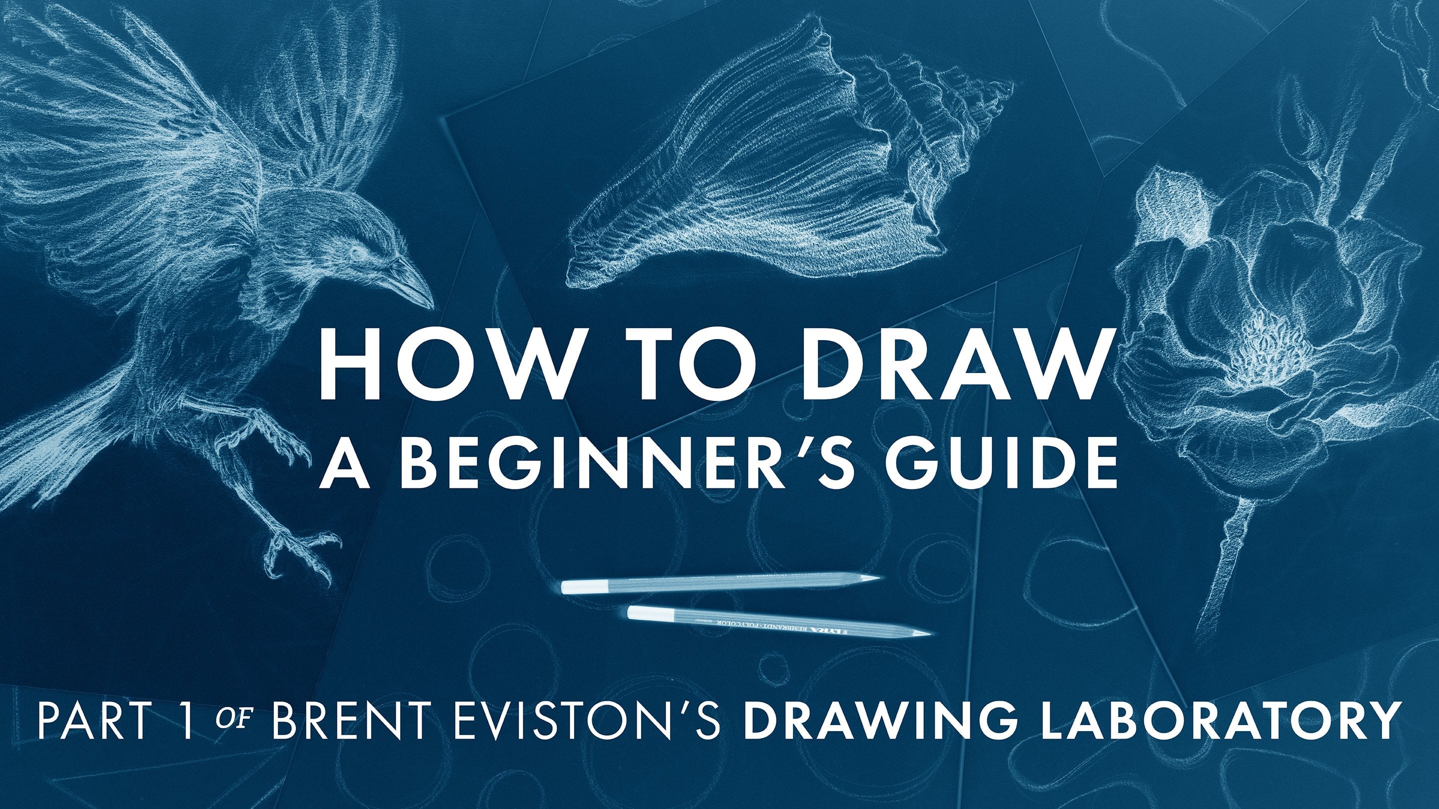
I want to cover. First, this is not a
beginning drawing course. If you're an absolute beginner, I highly recommend taking the first course in my
drawing laboratory series, how to draw a beginner's guide. That course will
teach you all of the basic skills you
need to start drawing. If for any reason you've come to this course as a beginner, I highly recommend going back and taking
that first course, how to draw a beginner's guide. In this course,
I'm assuming that you already have some
basic drawing skills and that you're
already familiar with materials and how to set
up your drawing station. You're welcome to use
whatever materials have worked for you so far. A pencil and paper are
all that is needed. Or, of course, you can
use a digital tablet. Now, in the previous courses in the drawing
laboratory series, I almost always have a reference image that
I'm drawing from. But in this course, some of the demos will not
include reference photos. There's a very simple
reason for this. In my previous courses, I was trying to teach
you how to observe a subject and how to get its basic forms and
proportions on the page. But assuming you already
know how to do that, we can move a little
beyond that skill. In this course, we are not merely trying to
replicate reality. So during many of these
drawing demonstrations, I am not going to show the reference photos from
which I was working. The reason is that
I don't want you to constantly compare my drawing to the reference photo and think that they don't
look similar enough. In this course, I am not
merely copying what I see. I am using the language of
line to go beyond reality, to communicate something
more to the viewer. I want you to be able to focus
on the beauty and power of line without
constantly comparing my drawing back to
a reference image. I want you to see what line can communicate all on its own. Many of the demos in this course do have reference photos. I just want you
to understand why sometimes I am not showing them. I will save you the suspense. Many of the drawings
that I do in this course do not look
like the reference photos. They are not intended to. Remember, the goal of a drawing
is not to copy reality, just like the goal
of a poem is not to provide a technically accurate
description of a subject. We want to go beyond that. In this course, we
are learning how to communicate using the
language of line. Ultimately, how you choose
to draw your lines and marks will determine your
unique individual style. This is one of the most
important elements of style. So once you're ready,
I will see you in lesson one of the
language of line.
3. Defining & Exploring Lines: Welcome to the first lesson
in the language of line. A line is the most fundamental
element in a drawing. Every single drawing you
do will be made up of hundreds if not thousands
of lines and marks. All of these lines will
work together to create the illusion of three
dimensional form on the flat surface of the page. Every single one of
these lines and marks is an opportunity to communicate
something to a viewer. In this first lesson, we're going to
explore what line is, how it works, and some of the possibilities
we have open to us. When we draw, it's so
easy to get stuck making the same kinds of lines and
marks over and over again. Many people don't even
realize the wide range of possible lines and marks we can make and what they
communicate to a viewer. The goal of this lesson
is to explore what line is and the different kinds of lines and marks
that the pencil can make. First, we need to
define what a line is. Now I have a very
practical definition of line that you may not
have heard, here it is. A line is any path
the eye can follow. I'll say that one more time. A line is any path
the eye can follow. Now I like this
definition because it opens up a wide range
of possibilities. This definition includes all
kinds of different lines, continuous lines, implied lines, broken lines, textured lines. This is a perfect practical
definition for drawing. But this definition
is also expansive. It allows for creative and
expressive experimentation. So now let's head to
the drawing board and explore this idea
a little further. In this demonstration,
we're going to explore what a line is, and I'm going to give
you some different ways to think about line. Here I've drawn four boxes. In each box, we're going to explore a different
way to make a line. The most common form of line, the line that most people are familiar with is called
the continuous line. Here I'm going to draw a
simple continuous line. But of course,
there are a number of different ways
we can make lines. Now as we go through
each variation, I want you to keep in mind
our definition of a line. A line is any path
the eye can follow. In this box, I'm going
to make a similar line, but instead of doing
one continuous line, I'm going to create it
from a number of dots. Now, individually, each of these is merely a
dot, not a line. But taken together,
they absolutely create a path for
our eye to follow. We might think about
this as a broken line. It's a line that's
been implied with a number of individual
components, but each dot almost operates like a stepping
stone of a path. Our eye easily hops from
one dot to the next in an obvious path that is very similar to our first
line. Let's keep going. For this next exploration, I'm going to lightly draw the line before I
start to fill it in. I'm going to use this very
light soft line as a guide. I'm going to draw a series
of vertical lines that go from our line to
the bottom of the box. Sofully you can see
that in this box, I'm drawing probably
a couple dozen individual straight
vertical lines. But when they're all
put together like this, they stop reading as individual lines and
tend to make a shape. I'm going to take my
kneaded eraser and get rid of my initial
guideline that I drew, so we are only left with
these vertical lines. The way our mind interprets
this is very interesting. I drew a series of
individual vertical lines, but because they're
so close together, our mind tends to group
them into a shape. This curved line is the most prominent path that
our eye easily follows. It's actually easier
for our eyes to follow this implied line than it is to follow any of the individual vertical lines that
I actually drew. These vertical lines group
together to imply an edge. Now, let's explore one more
way to think about line. For our final variation, I am once again going to draw
a very light curved line. Now for this line, I'm
actually going to fill in this bottom section with
a number of dark strokes. I'm slowly going to
fill in this shape with dark soft lines. I'm going to go right up to
the edge of our line here. I'm going to try and
draw this so that the individual strokes
all blend together. That's to do this.
I may need to go over and over the lines
that we've drawn. When we get up to
our curved line, what I want to do is
soften this edge. Up here, I'm also going to
add some value as well. I'm going to keep this
value very, very light. My goal here is to maintain this line but make
it as soft as I can. What we have here are
two areas of value, a darker area down below and
a lighter area at the top. Now, the boundary in between
them is very hazy and soft, but we can still see the implication of the same curved line
we've been working with. I want to soften this
line as much as I can while still
having it be visible. So here we have
four different ways to create the same path
the eye can follow. Here we have a very common and conventional
continuous line. Here we have a broken line
created from individual dots. Here we've implied our line by creating a series of vertical
lines of different heights. Together, these lines
imply our curved line. Finally, we've created
a very soft version of this line that's
barely visible, but despite its soft edge, we can still detect
the same curved line. So hopefully this is illustrated our definition of a line. A line is any path
the eye can follow. In each of these, our eye can follow a remarkably
similar path, despite the fact that
each of these lines has been created in a
vastly different way. Hopefully, we're starting to expand your idea of
what a line can be. Now let's take this
idea a little further. In my beginner's
guide to drawing, I introduced a few basic
ways we can make lines. Here's a quick
reminder of some of the most basic ways we can
vary our line quality. Lines can be dark or light. Lines can be thin or thick. Hard or soft, straight or
curved, short or long. You should already be familiar with these dimensions of line, but these basic variations
can be combined in an infinite number of ways to create all kinds of
effects on the page. Now I'm going to introduce a project that will
allow us to explore different ways of
making lines and combine your vocabulary of line. Our goal is to be able to create as many different kinds
of lines as possible. We want to create
drawings that have a wide range of lines and marks. We want to do
drawings that excite the viewer that pull them in and take every opportunity to communicate something to. Remember, every line you draw is communicating
something to the viewer, whether you intend it or not. Exploring the possibility
of line and expanding your vocabulary of line is the best way to take
control of this reality. This project is called
the ever changing Line. During this project, you're going to start drawing a line, but every few inches, the line is going to change. Now, you'll see me demonstrate this project on 18
by 24 inch paper, which is what I recommend. But as always, you are welcome to use whatever size
paper you like. Let's head to the drawing board. For this demonstration,
my goal is to create a single line that moves its way across the
surface of the page. But as this line moves
across the page, I want it to change
over and over again. I want to create a path
for my eye to follow, but I want this path
to be made up of as many different kinds of lines and marks
as I can imagine. I'll begin simply making
a simple curved line. But very quickly,
I'm going to thicken that line drawing it with
the side of my pencil. Next, I want this thick line to start to be more textured. From here, I want
this line to become more angular and I'm going to
switch to the tripod grip. So I want you to take note that the tip of my pencil
just snapped off. If you don't break the tip of your pencil at least once
while doing this project, then you are not pushing your pencil far
enough to its limits. Use my drafting
brush to sweep away any little bits of the
pencil lead and continue. So from these more
angular jagged lines, I'll draw some more
straight lines. I'll make them at right angles. From here, I'll try some softer lines that come together to create an
interesting texture or pattern. Now, it's important to note that your lines don't have
to be continuous. You can start to use individual marks to continue the path for the eye to follow. Maybe these smaller
marks start to become a little bigger. I'm going to switch
my pencil grip again. Switching pencil grips is
a really great strategy that will allow you to engage the pencil in different ways. From here, maybe I'll try out some different kinds of marks. I will make a dot, but make the edge a
little more textural, start to make them a
little bit bigger. Now I'll start to
change them once again. I'll switch back to
the tripod grip. Different line. From here, I will make a number of parallel horizontal lines that create a shape but also
continue our line. Next, I will come
back over this way, making some nice beautiful
soft edged curved marks. Maybe now we'll make some
very smoke like marks. Make these smoky marks thicken and then perhaps
get a little thinner again. I go over this one more time. Now remember, this is
all just an exploration. We are not trying to make any particular kinds
of lines or marks. We are simply exploring
what the pencil can do. Next, I'll change my grip again. I'm going to hold
the pencil far back. See what kind of lines
and marks this makes. Next, I will try holding
the pencil very close to the tip and grind
it into the paper. Next, I'll make some
tiny little marks. This is not planned out. I'm just making this
up as I go along. Next, I'll make
some heavy strokes. Then maybe I'll make
some very light, most rain like strokes. Hopefully, you can
see that we've created a path that our eye can follow all the
way around the page. For this next section, I'm going to combine some incredibly soft marks with a harder line that runs
through the middle of them. Next, I can create
some sharp marks. That are held together by some
very fluffy softer marks. Here I'm combining
different lines together to create
different effects. Here, maybe I will try a back and forth worrying
that starts to get sicker. At every step of the way, I'm trying to create
something unique, something I haven't
tried before. Here, maybe I'll try tapping
the tip of the pencil against the paper like
it's a drumstick. Next, maybe I'll hit
it a little harder to see what kind of lines and
marks it makes like this. Maybe I'll conclude
the line with a nice big spirally shape. So what we have here is an experiment in line
and mark making. Here, I have drawn
a single line, a single path for our eye to follow around the
surface of the page. But this path is made up of numerous different kinds
of lines and marks. I've tried to hold the
pencil in different ways. I've tried to move my
hand in different ways to see what kind of lines
and marks I can create. Remember, the goal
here is not to make a good drawing, but to explore, to experiment to see what our pencil can really do
and push it to its limits. Now, I don't know how these lines and marks may
be useful in a drawing. But what I do know is
that I never want to feel limited by my
vocabulary of line. I want to have a wide range
of lines and marks that I'm familiar with to use depending
on the circumstances. Doing this project
will allow you to increase your vocabulary
of lines and marks, that'll ensure that you have many different ways to communicate with and to
connect with your viewers. I've done this project more times than I can keep track of, and every time I
do this project, I try and come up with new ways of making
lines and marks. You'd be amazed at how many of these different
kinds of lines and marks have ended
up in my drawings. They often end up in drawings
in very unexpected ways. You never know when
a particular kind of line or mark is
going to be useful, but we'll talk more about this
as the course progresses. Now, as you're
doing this project, I'd like you to ask yourself, what do these lines
make you think about? What materials or textures
might they communicate? What ideas do they
bring to mind? What do they make you feel? What do they remind you of? Most importantly, how might these lines be
used in a drawing? Every line you
create should have a different and unique
character to it. We want to be able to draw as many different
kinds of lines as possible and to think about how they might be used in
our actual drawings. Our only goal with
this project is to expand your vocabulary
of lines and marks. But beyond that, there's no
right or wrong way to do this project as long as you're following our
definition of line, as long as you create a path
that your eye can follow. As long as you're doing that, you can explore any kind of mark making that
you can think. Okay. So here is your
project for today. I want you to draw a minimum of three ever changing lines, each one on its own
sheet of paper. Now, I recommend using
18 by 24 inch paper, but of course, you
are welcome to use whatever materials
you have on hand. If you are using
much smaller paper, you may want to do this
project more than three times. Once you've completed
your ever changing lines, I want you to take a look
at what you've drawn. I want you to look
for particular lines or marks that resonate with you. I want you to select 3-6 of these lines and practice replicating them on a
separate sheet of paper. Now, I recommend starting
off by drawing a series of light straight lines
and then covering those light straight lines with whatever lines you selected. Once you find a
line or a form of mark making that you
find interesting, we want to be able
to replicate that. As you're replicating
your lines, you still want to ask yourself, what does this line mean? What does it remind me of and how might it be
used in a drawing? Now you have your
projects for today. In the next lesson,
we're going to explore two different
kinds of contour drawing, outer contours and
inner contours. Now, this next lesson
will be a bit of a departure from what
you've learned about today, but I promise you as
the course progresses, we're going to pull all
of these ideas together. Go do your projects. Thank you so much
for joining me here, and I will see you
in the next lesson.
4. Inner & Outer Contours: Welcome to the second lesson
in the language of Line. In this lesson, I'm going
to introduce you to the most important
and fundamental kind of line you're going
to draw the contour. A contour is essentially
the boundary of something. A contour line describes
the edge of an object. Now, there are two
different kinds of contour lines
we're going to talk about in this lesson outer
contours and inner contours. An outer contour is essentially
the outline of an object. An outer contour creates a boundary around whatever
it is you're drawing. This boundary says
that everything inside the contour is
part of the object. Everything outside of
the contour is not. Inner contours are
any lines that occur within that
outer boundary. Outer contours and
inner contours work together to
describe the form. So to get a better sense
of how this works, let's head to the drawing board. So here we see the outer contour of our subject, an acorn squash. An outer contour is essentially just the outline of a subject. It describes the two
dimensional shape. Now there are a couple
of things I'd like to note about the outside contour. If you let your eyes follow the edge of this outer contour, you'll see that it's
incredibly detailed. Notice how many times it
undulates in and out. It contains many curved lines, but also a number of angles. But despite all
of these details, I want you to notice
that there is no indication of
three dimensionality. The outer contour
just establishes this two dimensional flat shape. So in order to give the illusion
of three dimensionality, we need inner contours. An inner contour is any line that is inside
the outer contour. For the next few minutes, I'm going to add
some inner contours. To do this, I'm going
to need to draw the stem of this acorn squash. First, I'll draw
it simply just as a conical shape or a
tapering cylinder. Once I've sketched in
the shape of the stem, I can start drawing
the inner contours. Just like anything else, I'll
start them lightly at first and then darken them once
I feel more comfortable. Notice that as soon as we start to add these
inner contours, the subject begins to appear
more three dimensional. I'm drawing the
inner contours using incredibly light and
also soft lines. I want to be able to correct
these forms if I need to. So now that I've drawn most of the inner contours lightly, I can start to darken them. But as I'm darkening them, I want you to notice something. Each inner contour of this
subject begins its life as an outer contour first before diving inside the form to
become an inner contour. Once again here, we have
an outer contour that dives inside the form to
become an inner contour. Now, when this happens, when an outer contour dives inside the form and
becomes an inner contour, we call it an overlap. This outer contour here dives inside and overlaps the
contour that's behind it. This gives the distinct
impression that this part of the subject
is in front of this part. In fact, we can establish a
hierarchy of overlaps that depict what parts of our subject are in front
and what parts are behind. All over this subject, we find overlap after overlap. Here, we can see this
line starting as an outer contour and then
diving inside the form, creating an overlap here. This line dives inside the form and overlaps
this part of the contour, which dives inside the form and overlaps this
part of the contour. Notice that the more
overlaps we create, the more three dimensional
the object begins to appear. Now, many of these outer
contours that dive inside and become inner contours go
all the way to the stem, but some of them
tend to disappear. Once this contour
dives inside the form, it quickly fades out. Once an outer contour dives inside and becomes
an inner contour, we want to follow it
to its conclusion. Inner contours and
overlaps are some of the most powerful
tools we have to create the illusion of
three dimensionality. I've taken a few minutes and detailed the contours
of this subject. I've darkened many of
the outer contours and I've added more detail
to the inner contours. Now, inner and outer
contours can be made up of any kind of lines
and marks we want. You'll notice that some of
the inner contours are dark, hard and heavy, while
others are light and soft. So here's what I want you to take away from this
demonstration. We've been working here
with two types of contours. We started with
the outer contour, which was just an
outline of the subject. It created a flat shape, almost like a silhouette. Next, we added inner contours. An inner contour is any line that is inside the outer edge. And finally, when
an outer contour dives inside the form and
becomes an inner contour, it often creates what
is called an overlap. This drawing has
numerous overlaps. So hopefully you now have a sense of how
contour lines work. Outer contours establish
the two dimensional shape of the subject while inner contours communicate
three dimensionality. Overlaps can show
that one part of the subject is in
front of another. At this point, you
should have a sense of how outer contours and inner contours work
together to describe a form. Now it's time to put these
ideas into practice. Today, you're going to be doing two classic drawing exercises. You'll be doing blind
contour drawings and partially blind
contour drawings. A blind contour drawing is
exactly what it sounds like. While you're drawing,
you only get to look at the subject
you are drawing. You do not get to look
at the drawing itself. Blind contour drawing focuses solely on the outer
edge of your subject. The goal of a blind
contour drawing is to move your eye around the outside edge of whatever
it is you're drawing and to record every
single little detail. Now, I recommend using
pen for this project. During today's
demonstration, you'll see me using a ballpoint pen. But you're welcome to use a pencil if that's what
works best for you. Now, there are only two rules when it comes to blind
contour drawing. The first rule is that
once you start drawing, the line must be continuous. You do not get to lift your pen. Rule number two is that once
your pen starts moving, you do not look at your drawing. You only get to look at the
subject you are drawing. Let's head to the drawing
board where I'm going to demonstrate blind
contour drawing. Mm hmm. So for this
demonstration, my goal is to create a single line that moves its way across the
surface of the page. First, I'm going
to place my hand down on the paper in a
position that I want to draw. The specific position of the
hand doesn't really matter. And remember, this
drawing is going to be one continuous line. I'm going to start that line here at my wrist
just above my watch. So to begin, I'm going to place
my pen down on the paper. I want to leave enough room on the paper to draw
my entire hand. So now my pen is placed
and I'm ready to draw. From here on out, I am not
going to look at my drawing. I'm only going to
look at my left hand. I'm going to slowly move my eye along the
contour of my hand, beginning at the left
side of my wrist. As I do this, I want to move my pen so that it mimics
the movement of my eye. I want to draw and record every tiny detail that I see
in the contour of my hand. Remember, I am not looking
at this drawing at all. Here I get to my ring going
up and over my ring finger. Now, when you do this project, you will be amazed how
many tiny little details you start to see in the contour of your hand and your fingers. Remember, the goal
of this drawing is not to make a good drawing. We are training our
eyes, our mind, and our hand to see all of the tiny little details
of the contour. I want you to note how
slowly my pen is moving. This is because I'm moving my eye very slowly
across my hand. As my eye travels around the edge of my hand
and my fingers, my pen is mimicking this motion. My pen is following the same
path my eye is following. Remember, the slower
you go, the better. Now, I cannot see my drawing. I am sure that it is
out of proportion and distorted and that
is completely fine. Once again, I want to remind you this project is not about
making good drawings. It is about training
your eye and your mind to see
detail in contour. Finally, I'm arriving
at my thumb. At this stage, I don't
even know that I have enough room left on the
paper for this drawing. I don't know how big or
small my drawing is. All of my attention is going to focusing on the tiny
details of the contour. I have not looked
at my drawing once, and of course, I have
not lifted my pen. All right, I am arriving
back at my wrist. As anticipated, the final
drawing looks distorted, out of proportion,
and a little silly. In fact, you never have
to look at the drawing in order to get the
benefits of this exercise. I tell you this because it's so important that when you
do this project today, you don't get caught up
in the final product. It is not going to be a good drawing and that
is completely fine. Hopefully you can see
how many tiny details I was able to find in my hand. Every little fold, bump, and divot of the
contour are recorded. In this drawing, they're
actually a little exaggerated. This is very common when you're doing blind
contour drawings. Remember, the goal is to accentuate all of these
details in the contour. Hopefully, this
gives you a sense of how this project works. You're drawing one
continuous line that mimics the path
your eye takes around your hand and you
are not looking at the drawing until you have gone from one side of the
hand to the other. The goal of doing
blind contour drawings is to sensitize our eyes and our mind to all of the details that we find
along the contour edge. I'd like to remind you again, this project is not about
making good drawings. In fact, you can
reap the benefits of this project without ever
looking at your drawing. Today's projects are all
about the experience, not about the final results. Now you'll see me demonstrate partially blind contour drawing. In a partially blind
contour drawing, we are not sticking
to the outside edge. We are looking for any reason
to dive inside the form. We want to look for lines
that start as outer contours and then dive inside and
become inner contours. Now, while you're drawing,
every outer contour line that you follow inside the
form will eventually end. Some of them fade out, some
of them run into other lines. But when that
happens, you can look at your drawing long
enough to place your pen back on the outer contour and start
following the next line. This project allows us to explore overlaps
and inner contours. Let's head to the drawing
board for a demonstration. Now it's time to do our
partially blind contour drawing. Just like before,
I'm going to place my hand in a position
that I want to draw. I want a position that's going
to show a lot of overlaps, and just like before, I'm going to place my pen
on my paper trying to leave enough room to complete the entire
rest of the drawing. I want to place
my hand carefully because once I start drawing, remember, I do not get to look. So now my pen is placed
and I'm ready to draw. I'm going to begin
this drawing at the left side of my wrist
just above my watch. Just like before,
I'm going to move my eye along the
edge of my hand. But instead of following
the outside contour, I'm going to follow the
contour inside the form, and almost immediately
this line dives in. Once I follow this line
until its conclusion, I can then look at
my drawing only to place my pen back on
the outer contour. Once again, I begin
moving my eye along the contour of my
hand very slowly, having my pen mimic that motion. Once again, the outer contour dives inside creating
an inner contour. That line slowly fades out. Now I get to look at
my drawing and place my pen once again back
on the outer contour. I'm at the fold
right at the pinky, there are a number
of overlaps here. I follow this line in. Now I get to place my pen on the contour again
while looking, but once my pen
starts moving again, I no longer get to look. Almost immediately, the line dives inside the
form once again. This line curves up and
around the pinky finger. I now get to look
at my drawing to place my pen back on
the outer contour, and I begin again. It doesn't take
long before my pen dives inside this time
for a very short line. I get to look, place
my pen back on the outer contour, and continue. Hopefully, you get the
idea at this point. I can continue this
process all the way around the edge of the form. So this line is the tip of
my pinky finger right here. But instead of the
line diving in, it actually runs in
to the fingernail. So I'm going to take
my pen and bring it inside the form to draw the fingernail and have it come back to the outer contour. And then it dives back inside, which point I can look, place my pen back
and continue on. Once again, I have a line
that comes and overlaps. I'm going to start on the
inside to record that line. So this is very
common where you'll run into lines that are overlapping the contour
you're drawing. When that happens, simply stop
drawing and you can place your pen inside the form
and follow the contour out. You should take any excuse
to dive inside the form. And remember, every
time you dive inside, that means you get to look
at your drawing in order to place your pen
back on the page. Now I'm drawing my ring finger and the contour goes up and over the ring finger all the way to the other side of the form. So once I complete that line, I'm going to place it back to record the contour of my ring. Now I'm not looking,
going up and over. Now I can look again and start back at my ring finger
just above my ring. Doing this project, you
will be amazed at how often your pen will
go inside the form. Overlaps are one of these things that if you haven't
thought about them, you don't think that they'd
be as common as they are. Once again, the goal here is
not to do a good drawing. It is to train our
eyes and our mind. Once I've completed this finger, I'm actually going to go
back to the space in between my ring finger and my middle
finger and start again. Remember, as my pen is moving, I am not looking at my drawing. I'm only looking at the
drawing when I pick my pen up and place it back
on the outer contour. Now at times you may need
to get creative on how to record all of the
overlaps. There are many. Remember, the only hard
rule you need to follow is that you don't get to look at your drawing while
your pen is moving. Once you follow a line to its conclusion to
where it stops, is overlap by another line or
whether it just disappears, you may need to be
clever about where to place your pen back
on the outer contour. As I mentioned, at times, you may need to place
your pen inside the form and follow an
inner contour back out. But as long as you
are not looking at your drawing as
your pen is moving, you should be able to get the
benefits of this exercise. Once again, here, this line
stopped and I'm going to begin inside the form and pull this inner
contour back out. This is especially common at the knuckles where you'll have a lot of folds in the skin. There's a nice
long inner contour that separates the
hand from the thumb. Place my pen back on the edge and continue on
drawing the thumb. Now, here is the fingernail. It starts inside the
form and then emerges back outside to create
the outer contour. Almost back to the wrist. With this drawing, we are still trying to record
every single detail, every tiny change in the
outer contour of the subject. You can see how textural
this drawing becomes. All of these little bumps
and divots are exaggerated. Now this exaggeration
was not intentional. At every moment while drawing, I felt that my pen was simply mimicking the path my
eye took around my hand. But it can be incredible to see how many little details
emerge in this drawing. This drawing also illustrates how common and
prominent overlaps are. There are dozens of overlaps
in this simple drawing. And of course, this drawing
doesn't even record all of the inner contours that
are on the back of the hand. Nor does it record all of the lines going up
and over the fingers. This drawing only captures outer contours that
become inner contours. But once you start to look around the hand you're drawing, you will see so many
additional opportunities for lines and marks. Hopefully, at this point, you
understand how to do blind contour drawings and partially
blind contour drawings. Before we get you
to your project, I want to leave you with
a few closing thoughts. As children, when
we start drawing, this impulse to outline
a subject is innate. Outlining our subject is one of the most fundamental
ways we start drawing. We don't even have
to think about it. It just makes sense to us. But as complex as
an outline can be, it does not address any sense of volume or
three dimensionality. In fact, the vast majority
of lines and marks you make in your drawing will occur
within that outside boundary. Beginners often focus way too
much on the outer contour and not nearly enough on the
overlaps and inner contours. But one of my goals
with this lesson is to get you to understand how outer contours and inner
contours work together. They are both essential. Okay, let's get you
to your project. For your project today, I want you to do three
blind contour drawings of your hand and three partially blind contour
drawings of your hand. Now remember the rules. With a blind contour drawing, once your pen starts moving, you do not get to look at your drawing or lift
your pen until you have gone all the way around the contour edge of whatever
subject you're drawing. With partially blind
contour drawings, you can follow an outer contour as it moves inside the form. But when that inner
contour ends, you can look at your drawing
to place your pen back on the outer contour edge and
then start drawing again. Once you've completed these
blind contour drawings and partially blind contour
drawings of your hands, I want you to select at
least one additional object. I want you to try these projects on something other
than your hand. Try and pick an object that has a lot of detail on
the outer contour, as well as a number of
overlaps and inner contours. Remember, your goal here
is to have an experience, not to create good drawings. In fact, I would
never recommend doing blind contour
drawing when you're working on a drawing that
you actually want to finish. The goal of today is
to train your eyes and your mind to see as many
details in the contours as possible and to open
yourself up to all of the overlaps and inner contours that you may have been missing. Resulting drawings
are going to look distorted and probably
pretty silly, but that is okay. Contour drawing is
a powerful tool. In this lesson, I
want to challenge you to go beyond
simple outlines. I want to challenge you
to start to see and draw all of the tiny details
that a subject contains. Now, beyond learning
about contours, this project will also dramatically improve your
handeye coordination, which is of course,
an essential skill for anybody who wants to draw. With all of this in mind, go do your project and I
will see you back here for the next lesson where
you're going to learn about cross
contour drawings. M
5. Cross Contours: Welcome to Lesson
three. In this lesson, we're going to explore
cross contour. Cross contour lines
are lines that travel across the
surface of an object. To help you understand
cross contour lines, imagine a grid drawn over
the surface of an object. This grid is very similar to latitude and longitude
lines on a globe. When applied to the
surface of an object, these grid lines will help
describe the topography of the surface as well as accentuate its three
dimensional qualities. In this lesson, we're also going to explore foreshortening. Foreshortening occurs
when an object goes into extreme perspective. For example, we can take a look at this pencil
going side to side. When the pencil starts to come toward us in a
very dramatic way, we refer to that
as foreshortening. Foreshortening is one of the most challenging three dimensional drawing
skills to master. But the strategies
you're going to learn today will help you understand what happens to
objects when they go into foreshortening and
help you draw them. Now, unlike outer contours
and inner contours, cross contour lines are not naturally occurring on the
surface of most objects. The first thing we're going
to learn to do is how to apply a cross contour grid
over the surface of an object. Next, we're going to draw
this object from observation. But before we get
to that, I want to remind you that in this course, I'm assuming that you
have already gone through the previous two courses
in the drawing laboratory. I'm going to assume
that you already have basic drawing skills and that you understand how to do three
dimensional drawings. If for some reason you've
made it to this course without having gone through the previous two courses
in the drawing laboratory, I highly recommend that
you go back and take them. In just a moment, you're
going to see me draw a cross contour grid
over two objects, an apple and a banana. These two objects have very
different shapes and we need different strategies to apply
the grid to each of them. I recommend using a permanent black marker
for this project. But of course, you're welcome to use whatever
you have on hand. You just need to make sure that whatever you're
using will make a mark across the surface of
whatever objects you select. Now, I recommend using
fruits and vegetables for this project because
they are readily available and they
are inexpensive. But as always, you are welcome to select whatever objects you. Just remember that the
project today requires you to draw a grid over the
surface of these objects. Now, if you do draw a grid
over anything that's edible, I do not recommend
eating it afterward. Now, let's head to the drawing board where
I'm going to show you how to draw a grid over
an apple and a banana. So you can see here that
I'm using a green apple. I recommend you'd use either a green apple
or a yellow apple. They are lighter in
color and the lines that you draw over them
will show up much better. Now, I'll be drawing
using a permanent marker. You can use whatever
marker you have on hand, although you may need to
experiment to make sure that the marker will actually draw on the surface
of the apple. I'm going to begin with
the longitude lines, the lines that run up and down over the surface
of the apple. I'll begin by slowly
drawing a line that comes out of this top section of
the apple where the stem is. I'm going to go
very, very slowly. Now these are hand drawn lines and they are not
going to be perfect. Now, I recommend plotting
your way down the apple. I'm going to put a series
of dots on the surface of the apple that I can follow as I travel toward the center of
the bottom of the apple. Once I've done this, I
can connect these dots. Again, I'm going to move very slowly as I draw a line down
the surface of the apple. You don't have to draw the
entire line in one stroke. Here is my first longitude line. Notice that when we view
the apple from above, it looks pretty straight. But as we turn the apple, we can start to
see the line curve revealing the three
dimensionality of the subject. Now I want to make it appear
that this line travels all the way around the apple
and comes up the other side. I'll set the apple down
and I want to draw a line that goes in the
exact same direction. I want this next line to appear to be a
continuation of the first. Once again, I'm going to plot my way down the surface of
the apple to the bottom. Once I know where
the line is going, I am going to slowly draw it down the surface
of the apple. Now, it should
appear that I have a continuous line that goes all the way around the
surface of the apple. Next, I want to draw a line that goes perpendicular to the
first longitude line. I'll set the apple
down and I'm going to start to plot a line that
travels out from the center, but then it appears to be at a right angle to the first line. We'll begin this line. Taking it straight out and
plot the rest of my way down. Next, I plotted my way down
this side of the apple. Now I'll slowly draw this line. Now, an apple is
an organic form, it will have many
irregularities. So it can be a bit of
a challenge to get the lines to appear
exactly the way we want. They don't need to be exact. Now you can see we have
our longitude lines emerging from the center
of the top of the apple. These sets of longitude lines are perpendicular
to one another. From this point of
view, it looks like our apple has been divided
into four segments. We want to divide each of
these segments in half again. Now I'll draw some
additional longitude lines. I'll use the exact same
technique of first plotting the lines down
and then drawing them. Now for these additional
longitude lines, we want them to
appear to be halfway in between our initial
longitude lines. Again, these lines are
not going to be perfect. Just do your best. Again, here I'm finding
the middle point between these two lines and I'm going to plot my way up and
down the surface of the apple and now I can draw. From this point of view, you can see that the right side of this particular apple is
larger than the left side. This does create some
strange asymmetries. Nevertheless, we want to try our best to send these
longitude lines directly down the center between our two existing
longitude lines. Now, while you're
doing this project, you may want to keep a couple
of extra apples on hand. Your first lines may not work
out as well as you hope. That is perfectly normal. Now you can see that
we have a number of longitude lines drawn up and over the surface
of our apple. Now while you're doing
this, you may want to make sure that you're
not smudging your lines. I've smudged in a few places. It's very common and
that's totally fine. We just want to make sure
that the lines remain clear. Next, I need to draw
my latitude lines. I'll be drawing a total
of three latitude lines. Remember, latitude lines
move side to side. To begin, I first want to find the halfway point between the top and bottom of the apple. It looks like it
will be about here. I want to do this for
each of these lines. Once I found the halfway point between the top and the bottom, for each of the eight lines, I can begin connecting
these dots. While you're doing this, you
may want to give your marker just a little bit of time
to dry in between lines. Now we have our
first latitude line traveling around the apple. Next, I want to draw two
more latitude lines, one up here and one down here. Once again, I will plot
my way around the apple. Now I can connect these dots and complete
the second latitude line. You can see that despite
my best efforts, these are not perfect. Again, this is to be expected. Even if the lines
aren't perfect, they will still be
very functional for the project we're
going to do today. Now I will plot out my
last latitude line. Once I'm ready, I can draw. Now we have completed the latitude and longitude
lines on our apple. Hopefully you can see what
a great job these lines do describing the three
dimensionality of the form. They really highlight
the roundness as well as the surface
characteristics. We can see the longitude
lines emerging out of this fur with the top and
traveling around the form. You can also see that each
latitude line is essentially an ellipse that highlights
the roundness of the object. So this is your
final goal to draw eight longitude lines emerging
from the top of the apple and moving down to the
bottom and then to draw three latitude lines that
travel all the way around. Once you've got this, you'll
be ready to draw the apple. Next, we're going to apply the same technique to a banana. Now, a banana does not have obvious latitude and
longitude lines, but let me show you how I
would handle this form. I'll start by making a mark halfway between the
ends of the banana. Next, I'll make an
additional mark halfway between the
first mark and this end, and then I'll find
a halfway mark between this mark and
this end of the banana. Next, I want to plot my lines. I'm going to move
around the banana first plotting the middle line. That appears to meet
up pretty well. Now I'm going to draw
this initial line. I'm essentially drawing a ring all the way around the banana. Now I want you to take a look at the curvature of this banana. On the concave side
of the banana, these two lines will
appear to get closer. On the convex side, they will appear to
be further apart. Just something to keep
in mind as you are drawing your lines on
this type of form. Once I've plotted my
path, I can draw. Once again, you can see
that on the concave side, the lines are closer
together and on the convex side, they
are further apart. Now I'll repeat the same
process on the other side. Once I plotted the lines, I can begin to draw. Now I have completed three lines traveling
around the banana. Now, one thing
that's interesting about bananas is they actually have natural cross contour lines running along their length. If you want to, you can follow
these lines with your pen. Now, you don't need to draw
over each of these lines. You can see here
I've skipped one. But the goal is to go
around the banana and to draw these additional lines
to highlight the curvature. Now in this banana, these
lines were not evenly spaced. I'm having to invent one here. This is very common. Remember, these are
natural objects and you will find
many irregularities. For this one, I can
follow the natural line that's already running down
the length of the banana. Hopefully, you can see
I now have a number of cross contour lines
drawn around this banana. I want you to note
how they change as we move the banana
through space. Again, we can see they really highlight the
three dimensionality. Now, of course, you're
welcome to draw these grid lines on any
fruit or vegetable you want. You don't have to use
an apple or a banana. But hopefully, this gives
you a sense of how to draw a grid on objects
that are different shapes. Now that you understand
how to apply a cross con to our grid to an
object, it's time to draw. Now, in just a moment, you're going to see me demonstrate how to draw an apple from a pretty
traditional point of view. But in your project today, you're going to be turning this apple in
numerous directions. You want to be able to draw cross contour lines over the surface of objects
from any point of view. So let's head to
the drawing board. M when doing a cross
contour drawing, I'll begin just like I would
with any other drawing. I'll start by drawing
the most basic shape, which is, of course, a circle. Once I've drawn this
simple light circle, I can use the blocking
technique to shape the apple. I can see that the right side of the apple is higher
than the left side, so I'll draw a line like this. I can also see that
the right side of the bottom is slightly
lower than the left. I can see this line
tilting upward here. I'll move around this basic
circle and shape the apple. I want to turn this
simple circle into a shape that reflects the
subject in front of me. As I do this, hopefully
you can start to see the specific apple that we're
trying to draw take shape. I'll even block in the
depression where the stem is. Once I have a basic block in, I can start crafting
the contour. Now, the contour lines will be a little more curved
than the block in. When crafting the contour, I can start to draw the smaller, more subtle changes
in the outer contour. My goal is to craft
an outer contour that captures the specifics of
this individual apple. It's important to craft
the outer contour before we add any
cross contour lines. Once I'm satisfied with
the outer contour, I can begin to slowly
draw the longitude lines. To start, I'm simply
going to block them in just like I did
for the outer contour. I want you to note that
these longitude lines curve right into the outer
contour of the apple. That's part of what makes
them look three dimensional. If we think of the outer
contour like a freeway, the longitude line is like an off ramp that
curves off of it. I also want to note how it
emerges from this depression the longitude line appears
to curve out of it before traveling down over
the surface of the apple. Next, I'll do the
longitude line here. Again, I want to carefully block it in first before I darken it. Here we see it
curving up and out of the outer contour before curving over the
surface of the apple. Also trying to pay attention to the distance between each
of these longitude lines. I think I can move this
one over just slightly. This is why we keep our
lines light to begin with. You'll see me go through
the same process for each of the longitude lines, paying close attention to how they emerge from
this depression at the center of the apple and how they interact with
the outer contour. As I'm crafting these
longitude lines, I start to see subtle changes in the outer contour
I can make as well. For example, I think this
outer contour needs to be moved out just a little
bit on the right side. Now we only see a
small portion of the longitude lines on the
backside of the apple. Nevertheless, I want to draw them with care
and attention. I have now lightly drawn in
all of the longitude lines, the lines that run up and down
the surface of the apple. Now that I've done
the longitude lines, I can move on to
the latitude lines. I find this to be the easiest and most straightforward way to draw cross contour lines. Start with the longitude lines, then move on to the
latitude lines. One thing that you may
have noticed is that these latitude lines are
essentially ellipses. They operate the exact same way. Notice that the axis for
this ellipse is tilted. This is because
the right side of the apple is larger
than the left. This causes the apple to sit in a particular tilt on the
surface it's resting upon. I want to pay close attention
to the distance between this latitude line and this depression at the center
of the top of the apple. Now we'll move down to
the second latitude line. While I'm drawing
these latitude lines, I'm paying close attention to
the square shapes created. I'm noticing that
this longitude line can be moved in just slightly. These kinds of corrections
are very common when drawing. You want to get in the habit of making changes when you
notice these things. Finally, I'll move down to
the lowest latitude line. Now that I've made
my first attempt at each of the latitude
and longitude lines, I want to take a
look at the result. I want to compare my drawing
against the subject. I don't merely want to darken
what I've already drawn. I want to take this
one last opportunity to make any changes. I think this latitude line can
be moved up just slightly. I think it needs to be closer to this depression at the center
of the top of the apple. I can use my eraser to knock
back any excess lines. I also feel like this
latitude line can be moved up just slightly. Before I darken any lines, I want to make sure that they are doing what I
want them to do. I want to make sure they
are properly placed and accurately reflecting
what I see on the subject. Now, of course, no drawing
is going to be perfect, but we want to make
a good faith attempt at capturing what we see. Now that I'm ready, I'm going to begin darkening these lines. I'll start with the outer
contour and then let my pencil dive inside the form as it follows the
longitude lines up. I'm looking back and forth from my drawing to the
reference subject, trying to capture any small details that
I may have missed. Here you can say I'm
moving the outer contour out just slightly again. I'm going to slightly move out this latitude line on the left. All of these lines
work together to create the illusion of
three dimensionality. We really feel each
longitude line coming out of this depression at
the top and then curving over the surface of
the apple as it travels down. We feel each of
these latitude lines coming from behind the apple, curving around front, and then disappearing behind the
other side of the apple. This is the power
of cross contour. It tends to depict aspects of three dimensionality that are simply not possible with inner
and outer contours alone. Now, technically, cross contour
lines are inner contours, but hopefully you can
see how different they operate from other
inner contours that we've worked with before. I'll finish this drawing
by adding the stem. Just a small extra
finishing touch. The stem is, of
course, cylindrical. We can see the
ellipse at the top. Hopefully, this has
given you a sense of how to craft a cross
contour drawing. We started with a basic
shape of the apple a circle. We then use the
blocking technique to craft the outer contour. Then added some curves to
the outer contour to make it start to capture the specifics
of this individual apple. Next, we drew the
longitude lines that run up and down over the surface
of the apple and finally, we concluded with
the latitude lines that run side to side
around the apple. I drew all of these
lines lightly first and then darken
them once I was ready. Hopefully, you can see what an excellent job this drawing does showing the three dimensionality
of this specific apple. Here we see a drawing of a
banana viewed from the side. Now one thing I'd like to
note is that there are very few indications of three dimensionality
in this drawing. In order to communicate three dimensionality
in a drawing, we often need to
select the right view. The reason this view does not show much three
dimensionality is because this part of the banana is the same distance from
our eyes as this part. Nothing in this object is
closer or further away from us. I also want you to note that the cross contour lines
appear very flat. Because we prepared these cross contour lines
on the banana, we know that these
lines travel all the way around the cylindrical
shaft of the banana. But from this point of view,
these lines appear straight. Now, this is a technically
correct drawing of this banana with
cross contour lines. But because it's viewed
directly from the side, there are not many opportunities to communicate three
dimensionality. Now I'm going to do three
additional drawings. In each drawing, I'm going
to turn the banana so you can see how it changes as
it goes into perspective. Now, when an object like banana goes into extreme perspective, we refer to it as
foreshortening. As we turn the banana and our drawings get more
and more foreshortened, I want you to keep
this drawing in mind. I want you to note the
changes the banana is going to go through as
we turn it in space. Here we are drawing a banana
that is starting to turn. The end of the banana
on our left is closer to us than the end
of the banana on our right. Here, you can see me simply blocking in the basic
shape of the banana. Hopefully, you can see that the basic shape of the
banana is a bending oval. I can begin to add more and more details as
the drawing progresses. Here's the stem, and here is the ellipse at
the end of the banana. Now, this ellipse at
the end is important. Notice how we actually start
to see the ellipse open up as this part of the banana
begins to turn toward us. Now, of course, my first
goal in this drawing is to simply construct
the outer contour. Remember, we want to
construct the outer contour before we add any
cross contour lines. Once we've got the basic
outer contour drawn in, we can begin to add the
cross contour lines. I'll start with the lines that run along the length
of the banana. Notice that as this bottom line travels down the
length of the banana, it gets closer and closer to the edge until it goes
behind the banana. I'm just going to draw
these lines in very, very lightly at first. I don't want to darken them until I have properly
placed them. We can see this
line here curve up and over the spherical
end of the banana. I want to pay close attention
to how far this cross contour line is away
from the outer contour, as well as the other line. Even though this view of the banana is only turned
toward us slightly, it still provides
more opportunities to communicate three
dimensionality. Now I want you to take a look at the lines traveling
around the banm. These lines now
appear as ellipses. Notice that we can see them
curving around the banana. Now they aren't curved much, but they don't need to be. Even these slight
curvatures begin to communicate the roundness
of the shaft of the banana. Now as we do these drawings, I really want you
to pay attention to the moment that they go from being flat to
being three dimensional. Hopefully, you can
start to see and feel the three dimensionality
of this object. Once I'm satisfied with the placement of the
cross contour lines, I can begin to
darken the drawing. One thing I like to do is to darken the parts of
the banana that are closer and to leave
the parts that are further away a little
lighter and a little softer. This is something
we'll talk much more about in the
upcoming lessons. I'm going to add a little detail here to the end of the banana. Next, I will darken the
cross contour lines. Again, I want this cross
contour line to begin to darken as it comes
toward us in space. This helps to enhance the illusion of three
dimensionality. These drawings do not need
to include a lot of detail. The goal of these drawings
is to communicate three dimensionality by focusing on the cross contour lines. I think this drawing
is starting to work. I'm going to move on to my next drawing where the banana is going to
turn a little more. So once again, you can
see that I have drawn the very simple shape for
this foreshortened banana. It appears once again to
be an oval that is bent. But I want you to take
note of something. As the banana begins to turn, the tilt of the line between
the two ends changes. Notice that on this more
foreshortened banana, this tilt is more
oblique than this tilt, which is closer to a horizontal. I'd also like you
to notice that the width changes as the banana
turns more toward us. Take a look at the entire
width of this first banana. Let's compare it to
our second banana. Hopefully, you can
see our second banana is much less wide. There are two more
things I'd like to point out that are
occurring in this strong. First, we have an overlap. If we follow this outer contour, we can see it dive inside the banana and then travel upward toward
the stem at the back. Once again, this outer
contour dives inside the form and travels up toward the back
end of the banana. To complete the outer contour, we need to begin a new line. The travels up and over. Now, could you feel that moment? As soon as we drew this overlap and this
single inner contour, suddenly, this drawing snapped
into three dimensions. This basic shape went from being a flat oval to a three
dimensional form. Finally, I want you to
note that the ellipses of the banana are beginning
to open even more. You really see the ellipses
starting to curve. Yes. Notice that the
ellipses in this drawing are curving much more than the ellipses in
our first drawing. Now I'll draw the lines that run down the length
of the banana. This one is the most prominent. I'm paying close
attention to where it lies in between the
contours of the banana, as well as its distance from this inner
contour that I drew. I want to start it off
very lightly and softly. Just want to map it out first. Now, do you remember
this line that disappeared behind the banana
at the very back of it? Now we can take a look
at this same line and see that it disappears behind
the banana much sooner, so much less of this line
is visible in this drawing. With the basic forms laid out, I'm now going to
complete this drawing. As I add some detail to
this end of the banana, I want you to note that
this elliptical end has opened up more in comparison
to the first drawing. Now with the cross
contour lines drawn in, I can add some of the details
like the stem at the end. Just like we did in
our first drawing, I'm going to draw the stem
in a pretty basic way. The reason is that
it doesn't have any cross contour lines applied to it and of
course, it's further away. By leaving it more simple
and drawing it with lighter, softer lines, it will
appear further away. Contrast, I can start to
darken and harden the lines at the front end of
the banana to make it appear as if it's
coming toward us. I can do the same thing with
the cross contour lines. I can darken them as they
come toward us and let them fade out as they
travel away from us. Now, I do want to
highlight this overlap, so I am going to draw
some darker lines where this overlap occurs as a way
to call attention to it. Hopefully, this
drawing is starting to feel more three dimensional. Hopefully we can really begin to feel this front
end of the banana turning toward us while the back end travels
away from us. In this final drawing, the banana is turning toward
us in a very dramatic way. I want you to take a
look at the width of this banana from this extremely foreshortened
point of view. It is only a fraction of the
width of our first drawing. Once again, the basic
shape is a curving oval, but the end of the banana
that's closest to us is much larger and it almost
appears spherical. The ellipse of the
very end of the banana has opened up almost
to an entire circle. Take a look at the tilt of the line between the
two ends of the banana. Whereas the tilt of this line in our first drawing was
closer to horizontal, this line is closer to vertical. I'll take a few minutes and
craft the outer contour. Once again, I want
the lines that are closest to us to appear darker and as they get further away,
they can get lighter. I want to put a lot of
emphasis on this overlap. So here you can see this top
outer contour dives inside the form before turning and traveling up the
length of the banana. To complete the outer contour, we need to start
another line that crashes in to the outer
contour of the first line. If you remember
back to this line, the overlap was very subtle. Both the outer contour and the inner contour curve
gently into this line. But here we see this outer
contour hitting this line, crashing into it in an almost
perpendicular direction. This is a very
different overlap. Once again, we can see dramatic
curves in the ellipses. These are the most curved
ellipses we have drawn yet. We really get a sense that
these ellipses are coming from behind the banana and then
traveling over its surface. I also want you to note that
as this banana has turned, the ellipses have gotten
much closer together. Want to use heavy line
quality to really communicate that this end of the banana is much closer to us. Now I'll draw the lines that travel down the
length of the banana. I want you to note that
this cross contour line begins very close to the
right edge of the banana, but then as it travels down, begins to get further
and further away from this edge until it becomes
closer to the opposite edge. This is one of the
things that makes cross contour
drawing so valuable. It really forces us
to understand what happens when objects go into
extreme foreshortening. Now I'd like to call
your attention to the cross contour
line at the bottom. Notice that we see
very little of it. It curves and disappears behind
the banana very quickly. In for the first time, we see just a hint of the cross contour line
on the other side. In this drawing, I am going to just barely suggest the stem. This will help it really
fade into the distance. Conversely, I'd like
to really darken the cross contour lines and the contour lines at the
front end of this banana. I really want you to feel this part of the
drawing coming forward. Each of the cross
contour lines get a little lighter as they
travel back in space. I'll complete this
last indication of this cross contour line and
I'll wrap this drawing. So hopefully, this
demonstration has given you a sense
of what happens to an object that is long and
curved as it turns in space. I really want you to note
how valuable it is to use cross contour lines when
studying objects like this. By creating this wire
frame around an object, it really forces us to grapple with the
three dimensionality. My hope is that when you look at these three
drawings together, you not only see but feel
this end of the banana getting closer to
you as the banana turns and this end
getting further away. Cross contour drawings are an
excellent way to challenge ourselves to fully understand the three dimensionality
of an object. But of course, when we do
more naturalistic drawings, we don't want a grid
drawn over their surface. Now let's take a look at some drawings of a bell
pepper and of some garlic. I want you to see how a
cross contour grid can inform the kind of lines and marks we use in a more
naturalistic drawing. Here you can see a bell
pepper on top of which I have drawn numerous
cross contour lines. I want you to note both
the longitude lines and the latitude lines. Now, it's easy to
assume that this cross contour grid is not useful
in an actual drawing. But now I want you
to take a look at a more naturalistic drawing. I want you to take a look at these textural inner contours. You can clearly see
numerous light, soft lines that follow the latitude lines from
the cross contour grid. The more we look,
the more we find. These light soft latitude lines help give the illusion
of three dimensionality. We can also see numerous
interior contours that follow the longitude lines. By understanding how
a cross contour grid works on this object, I'm able to draw light, soft naturalistic lines that communicate more
three dimensionality. This is an excellent
example of inner contours, outer contours, as well as cross contours all working together
to describe the form. Here I'm drawing a number of cross contour lines over garlic. Both the longitude lines and the latitude lines help to communicate the bulbous forms that the garlic is made up of. Now, this drawing, it's
very clear how these cross contour lines help to communicate the three
dimensionality of the form. But now let's take a look at a more finished and
naturalistic drawing. I want you to note how all of these small striations on the
skin of the garlic worked. I think that a successful
drawing of garlic brings to mind that papery
feeling of the garlic skin. Now in this drawing,
we don't see many latitude lines
running around the garlic, but you'll notice that all of these tiny light striations communicating the paperiness of the skin follow the
longitude lines. We see these longitude
lines over and over again, both in the inner
contours of the garlic, as well as in the overlaps. Hopefully this gives you
a sense of how we can use cross contour lines in actual
more naturalistic drawings. Having a good knowledge and understanding of how
a cross contour grid would appear on an object like this absolutely
informs our linework. We've covered a lot today. Now, let's get you
to your projects. For your project today,
you're going to draw a cross contour grid over
three different objects. Your objects should be
differently shaped. For example, today, you
saw me draw a grid over a round apple as well as
a cylindrical banana. These forms had very
different shapes. Next, we took a look at drawings of garlic
and a bell pepper. These two forms have completely different shapes from the fruit. I want you to draw each of these three objects from
three different viewpoints. That is nine drawings in total. Again, I think fruit and vegetables work great
for this project, but you are welcome to select
whatever objects you want. You just have to be okay with
covering them with a grid. So if you're feeling brave, here's an additional
challenge you can try. Start by drawing an object
as you normally would. But instead of actually drawing
a grid over its surface, try visualizing the
cross contour grid. See if you can work out
in your drawing where the grid would be if it
were drawn on the object. Now, you'll be drawing the actual object
from observation, but you'll be drawing the cross contour grid from imagination. You'll first need to visualize
it and then work out its placement over the surface of the object in your drawing. I did this drawing of a
mixer from observation. But of course, I did not draw a cross contour grid
over its surface. Instead, I'm visualizing
where the grid might be. I'm trying to work out
in the drawing where the cross contour lines would go if the object were
covered in a grid. This is an excellent way to test your three dimensional
drawing skills and to see where you may need some additional practice
and experience. I absolutely love
cross contour drawing. It is so much more descriptive than outer
and inner contours alone. Now, so far in each of the
three lessons in this course, we've explored line in
completely different ways. In lesson one, we tried
to define what line is. In lesson two, you learned
about inner contours, outer contours, and overlaps. Here in lesson three, you learned about cross
contour lines. In the remaining
lessons in this course, we are going to bring all
of these ideas together. You'll learn to use all
kinds of lines and marks to create drawings that are
truly compelling to viewers. You'll learn to do drawings
that are descriptive and accurate but also
expressive and captivating. I will see you back
here for Lesson four, where you're going to
learn how to draw textures and how to create tactile
sensations in your drawings.
6. Tactile & Textural Lines & Marks: Welcome to Lesson four
in the Language of line. To start, I'd like to
review what we've learned. In Lesson one, we learned
what a line is and we explore the different kinds of lines and marks
that are possible. In lesson two, we learned how inner and outer contours work together to describe form. We also learned about
overlaps where an outer contour dives inside the form
to become an inner contour. Overlaps help describe which parts of your subject
are in front of others. In lesson three, you learned
about cross contour lines. Cross contour lines
further describe the three dimensionality of an object as well as its
surface characteristics. This lesson, we're
going to pull all of these ideas together
and you're going to learn how to infuse every outer and inner contour with
meaning and purpose. In this lesson, you're going
to learn how to create the illusion of texture
and tactile sensations. For the duration of this course, you're going to hear me talk
a lot about line quality. I wanted to take
a few minutes to describe what line quality is. Each and every line you
draw is going to have a collection of particular
qualities or characteristics. As you learned earlier,
lines can be light or dark, thick or thin, hard or soft, or any number of
other qualities. In this lesson, you're
going to learn how to combine these different
characteristics into a single line. For example, a line
can be light thin, hard and straight all at once. A different line may be soft, dark, thick, and curved. Now, when we draw these
lines on their own, they tend to look abstract. But when they are used in the service of a more
finished drawing, they really start to communicate different
things to the viewer. In this lesson, you're going to learn how to harness
the power of line quality to create different textures and
tactile sensations. It's important that
you understand that the lines and marks
you're going to see me draw today are not necessarily observable
on the actual subjects. When we draw, we are not
merely copying reality. If your goal is to create
a facsimile of reality, get yourself a camera. We want to go beyond
what we can observe on the subject to communicate
something to the viewer. The line is unique to drawing. Remember, we don't see outlines around subjects in
reality and we can use the opportunity line affords us to really communicate
with our viewers. Now before we get to
the demonstrations, there are two more things
I want to talk about. First, I want you
to understand that today is not about
making good drawings. Today is about exploring
and experimenting. When we experiment,
we understand that not everything we
try is going to work out. In fact, most things we try are probably not
going to work out, and that is completely fine. When you're drawing today, I don't want you to
worry about whether or not a particular line may
work in your drawing. If it doesn't work,
it doesn't matter. Remember, we need to try a lot of things before we figure
out what will work. So when you're drawing today, don't worry about
making good drawings. The demonstrations
you're going to see me do are just explorations. Next, I want you to understand that what you'll see me draw today is not necessarily the right way or the
best way to do this. I'm exploring and
experimenting too. Your goal is to figure out what kind of lines and marks
are compelling to you. Drawings you'll see
me create today are just some of the plausible
things you can do with line. I'm just trying to
build a framework, a mental model for how line can be used to communicate
different things to the viewer. Your goal is to figure out what you want
to communicate with the viewer and what kind of
lines will best do that. With all of this in
mind, let's get into it. To begin, let's take a
look at two balloons. One balloon is going to
be filled with helium. The other balloon is going
to be filled with water. When we hold the string
of a helium balloon, we can feel it tugging upward. But when we hold the
top of a water balloon, we can feel it stretch
under the weight of the water and we can
see the water bulging. These two balloons feel
completely different. But in a drawing, we don't have the physical objects
to hold in our hands. We have to figure out other ways to communicate these sensations. This is where line
quality comes in. We are not merely
drawing what we observe. We are using lines and marks to communicate what
we know to be true. With that in mind, let's
head to the drawing board. The balloon on the left is going to be our helium balloon. We want this drawing
to communicate lightness and lifting. I'll begin, of course, with the basic shape
for the balloon, starting with a simple circle. I'll tilt the balloon slightly. Just to give it a
sense of motion, I'll complete the egg
shape of the balloon by rocking a line
back and forth. I want to make sure that
each half of the balloon is mirroring the other
along the central line. I've drawn these lines
incredibly lightly. They should be barely visible. I'll quickly sketch in the part of the balloon
that's tied off, as well as the string that
the balloon is attached to. As I bring this drawing to life, I want every line to
communicate lightness. I'll draw the lines
darkest at the bottom and have them get lighter
as they travel up. This may communicate
a lifting sensation. I also want you to note that these outer contour
lines are very thin. Thin lines tend to appear
lighter than thick lines. As I add some value and
dimension to the balloon, I want most of my lines to
travel up as I draw them. Note that these lines
are light and soft. The upward strokes once again give the
sensation of lifting. I want every part
of this drawing to communicate a light airiness. In the part of the
balloon that's tied off, I'm going to use quick
curvaceous strokes. I'm not going to put
a lot of detail down here because I don't want it
to draw the eye too much. For the string attached
to the balloon, I'm going to use a
slightly curved line. I want it to feel unattached. I want it to have a
floating sensation. Remember, the goal of
this drawing is to communicate lightness
and airiness. I don't want to darken
the drawing too much. I just want to darken it enough to give it
some dimension. The more I darken the drawing, the heavier it will appear. I'll add some additional value with some quick, soft lines. These lines are a little
darker at the bottom and get lighter as we
travel up the balloon. I'm not going to take this
drawing much farther. I want to keep it simple. I want the feeling of
lightness to persist. I want the outer contour of the balloon to get lighter
as it nears the top. This reinforces a
sensation of lifting. I'm going to use my eraser to lighten the lines at
the top even further. Notice that the darkest lines in this drawing are
used in the string. The string is being
pulled down by gravity while the balloon
lifts up and floats away. Nearly every line
in this drawing communicates lightness
in floating. I want this drawing to feel
as if it could float away. Next, let's contrast
this drawing with the drawing of
a water balloon. Just like before, we'll
begin with a simple circle. The center line for
this balloon is going to go straight up and down because the
balloon is being pulled straight down by gravity. Next, I'll draw the top of the balloon that's
stretching as it comes down. This drawing is all
about heaviness. I want this balloon
to appear heavy. I want to give the
sensation of it being pulled down by gravity. To do this, I'm going to
draw dark thick strokes. At the very bottom
of the balloon, I'm going to use dark, heavy strokes to really give
the sensation of weight. Most of the strokes in this
drawing are going to go down. I'm going to draw dark
thin lines to communicate the sensation that this part of the balloon is
stretched taut, that it would feel tight
if we were to touch it. This drawing is using
completely different kinds of lines than the
drawing on the left. Lines used to draw
the water balloon are thick, dark, and heavy. The darker I make this drawing, the heavier it appears. I'm going to continue
to add value. The more value we add, the more visual weight
the drawing contains. This concept of visual
weight is so important. We attach so much
meaning to lines. The thicker and
darker a line is, the heavier it appears. Even though the flat surface of the page doesn't have gravity, our minds infer gravity. We bring our psychology
to the page. Now, I can continue to add more and more value
to this drawing, but hopefully you can see that this drawing of a water balloon already appears much heavier than the helium
balloon on the left. Watch as I darken the bottom
edge of this balloon. Notice that you
can feel it become heavier and heavier
the more I darken. How we draw things really does communicate
with the viewer. For the helium
balloon, we use light, quick lines that lift and soar. We used upward strokes to
help give a sense of lifting. Every line in this
drawing is light. The helium balloon has
very little visual weight. It really does appear that it could float away at any moment. By contrast, the water
balloon appears heavy. It is created with dark,
thick heavy lines. We really feel the weight of the water sitting at the
bottom of the balloon. At the very top of the balloon, we use dark thin lines to communicate that the balloon
is pulled tight and taut. Remember, none of these lines were actually observed
on the subject. Hopefully, at this point, you now have an idea of
what I'm talking about when I say that lines can communicate
different sensations. Hopefully, you could really feel the lightness and heaviness
of these two balloons. Next, I'd like to push
this idea further. I'm going to be drawing
two different objects, a pillow and a rock. Let's head to the drawing
board where you'll see me employ very
different kinds of line quality to communicate very different sensations
in these drawings. To begin, I'll simplify the pillow into
a basic four sided shape. Once the basic shape
has been drawn, I can begin to block in
the more complex form. I'm paying particular attention to the corners of the pillow. Each corner seems to jut
out in a triangular shape. Once I have the basic shape
of the pillow blocked in, I can begin adding
my tactile lines. I want this drawing
to feel soft. I'll be using thick, soft edged lines for
the curves increases. There's nothing hard
about a pillow, this drawing doesn't
need any hard lines. These lines are thick, they're curved, they're soft edged. These qualities work together
to tell us something, not just about what
the pillow looks like, but what it would feel
like to the touch. Nearly every line I'm
drawing is curved, even if it's just a little bit. Now, the drawing will
darken as I continue, but I don't think many areas of this drawing will end
up being a dark black. Remember, darker lines tend to communicate weight
for this drawing, we want to communicate
softness and lightness. Even as I add value
to this drawing, I'm not going to
make it too dark. Remember, these kind of drawings today are just exercises. Now, if I were doing
a drawing like this for exhibition or display, there are a lot of things
I would do differently. This is just an exercise to see how much softness I can
communicate with my linework. This drawing has
a single purpose of communicating
something to the viewer. As I'm drawing, I'm trying to
push the idea of softness. I want you to note the overlaps here at the bottom
of the pillow. It overlaps this line, which is an outer contour
before it dives inside. Once these lines are inside, I can begin to soften
them even further. I can also start to use
cross contour lines, lines that start to move up and over the surface
of the pillow. These cross contour
inspired lines start to communicate how the
surface of the pillow curves. Remember, in the reference
photos for this pillow, we didn't see these soft
edge lines at the contours. They looked hard, but that doesn't mean we have
to draw them that way. Again, we are using the
language of drawing, the language of line to communicate something
about the subject. I'm working hard to make
sure that every line I draw has a softness
and thickness to it. Every line I draw is curved. Hopefully, you can
really start to feel the softness
in this drawing. Drawings that are crafted entirely out of
curved lines feel completely different
from drawings that are crafted primarily
from straight lines. Now, even though I
want this drawing to appear soft and light, I'm still darkening the outer
contours at the bottom. You can see that this
gives the sensation of the pillow resting its
weight on a surface. It may not be much weight, but it does ground the drawing. Hopefully, this
gives you a sense of how far you can
push these ideas. This is a drawing about making
the viewer feel something. I want the viewer to feel the
softness of these curves. Again, I'm not worried about crafting a
masterful drawing. I'm simply
experimenting with line to see how soft I can
make this pillow appear. Now, let's contrast the drawing of a pillow with the
drawing of a rock. As always, I will begin blocking in the simple
shape of the form. No matter what kind of lines I intend to use in
the final drawing, I can block in the
subject the same way. Once I have the basic shape, I can begin crafting
the contour. At this point, I'm still not drawing any lines I
want seen by of your. I'm simply giving the shape of the rock more character
and more specificity. I'll quickly block in just
a few more surface details. I'm paying particular
attention to the plane changes on the
surface of the rock. Now that I have the basic shapes and contours of the
rock blocked in, it's time to start
drawing lines that I actually want
seen by a viewer. There are three things I want to communicate
in this drawing, hardness, heaviness
and angularity. To communicate this,
I'm going to craft this drawing from
dark straight lines. I want these dark straight
lines to meet at angles. These angles will help communicate the sharpness
of the edges of the rock. I haven't drawn many lines, but already this drawing feels completely different
from the pillow. Even my hand moves differently
as I make these lines. The pencil moves in
sharp jagged strokes. My hand is no longer
flowing around the page as it did when we
drew curves on the pillow. Now, this drawing of
a rock is going to have large areas of dark value. This darkness is going to help
communicate the heaviness. Remember, the darker the line, the heavier it tends to appear, and areas of dark value tend to have a lot
of visual weight. As I darken the areas of the
rock that are in shadow, you may be surprised to see me using softer strokes with
the side of my pencil. So far, I've told you that softer lines
communicate softness. So why am I using soft
strokes in a rock? The first reason is
that I'm trying to cover large areas with value. It would take an incredibly
long time to use the tip of my pencil to
add value to these areas. But the second and most
important reason is that we can layer different kinds of
lines on top of one another. As I darken the shadow areas, I'm going to switch to
the tripod grip so I can bear down on the tip of the pencil
without breaking it. Over the soft value lines
you just saw me lay down, I can draw harder, darker lines. These hard straight lines drawn with the tip of the pencil take visual prominence over
the soft value I lay down. I'm layering different
kinds of lines and marks. So it's fine for me to use softer strokes when
laying down value as long as those
strokes are covered up by sharper, harder strokes. You'll see me go back and
forth in this drawing quite a bit from the overhand
grip to the tripod grip. Anytime I want to bear down on the tip of the pencil
without breaking it, I need to switch to
the tripod grip. I'm working hard to not draw any curve lines in this drawing. Even as I'm drawing
the small details and the texture of the rock, I'm still using dark,
straight lines. Now, of course, not every line in this drawing
needs to be dark. I will draw some
lighter lines in the areas of the rock that are
being hit with more light. But even these lighter
lines are straight. Again, I really hope you can see that this drawing appears completely different from the earlier
drawings in this lesson. Similar to the balloon, I want this drawing
to look heavy, but unlike the balloon, I want this drawing to look
as if it has hard edges. Again, I want to make
clear that I am not observing these lines
on the rock itself. I am using wine quality to communicate detail,
texture, and hardness. And as I keep saying, today is not about doing good drawings. If I were working on
a drawing that was going to be exhibited
or displayed, I would not necessarily
draw it like this, but I am attempting
to push the feeling of hardness and angularity
in this drawing. I'm trying to see how hard I
can get this rock to look. When you remove the
pressure of doing drawings that need to be
finished or displayed, you're more free to experiment. Not all of your line quality
experiments are going to work out the way you hope
and that is totally fine. Over here in the deepest
areas of shadow, I am using the darkest lines
that I put down so far. I am bearing all the
way down on the tip of the pencil to truly create
the darkest black I can. I'm also placing
these darkest blacks near the bottom of the rock. Again, this helps weigh
down the entire drawing. Even in the lightest
areas of the drawing, I'm still creating texture
with straight lines. I'm not worried whether or
not this is a good drawing. I am simply experimenting
with lines and marks. Hopefully you can really see that these kinds
of lines and marks really do start to give the
rock a hard heavy appearance. The more lines and marks I make, the more craggily
the rock appears. Now I could spend
quite a bit of time adding detail and
texture to this drawing, but I think this is enough
for you to get the idea. Straight, hard and dark lines create a sense of weight
and hardness in a drawing. If you have large
areas of value, you can use softer strokes. But if you want hardness
to come through, you need to cover
those soft strokes with dark hard lines. Whatever strokes take
visual prominence will define the drawing. I'm going to add a few
finishing touches just to bring out the
angularity of the edges. So hopefully you can see how you draw your lines really matters. You want to take the
opportunities you can to communicate
with your viewer. There are no hard rules with
line quality, but remember, you want to avoid using
boring, monotonous lines. Make a decision to say
something with your lines. Go beyond what you
see and try and communicate something
visceral to the viewer. So you've just seen me
really try and communicate the idea of heaviness and hardness in that
drawing of a rock. Next, I'd like to contrast
those kind of lines by pushing the idea of softness
and lightness even further. In this next demonstration, you're going to see
me draw feathers. Feathers are an excellent
subject to draw. They require all kinds of
different lines and marks. Feathers are pretty easy to get ahold of and they're
small and light enough that you can
place them right next to your drawing on
your paper if you want. So here we have a completely
different kind of drawing. Now these are drawings
of feathers and I happen to have the actual
feather right here. To do these drawings,
I've been picking up the feather and turning
it in different ways. Now, I've drawn these bigger
than the actual feather to make sure that you can see a lot of detail and texture. Now, when you're doing
these kinds of drawings, it's so important to have
the actual subject on hand. You want to see
what it feels like. Being able to pick up
and touch the subject is critical to figuring out what kind of lines
you want to use. This feather has a few
different kinds of textures. At the base of the feather, we find incredibly
soft downy fuzz. In my drawings, I'm using
incredibly soft light lines. These lines are
almost smoke like. They almost look as
if they dissolve as they get further from
the center of the feather. Of course, we have
the hard spine running up the center
of the feather. This is one of the few
areas in the drawing where I use darker,
harder lines. The spine tends
to get thinner as it moves toward the
top of the feather. Finally, we have the
top of the feather. This area tends to be a little
spikier in its appearance. It's not quite as downy soft
as the base of the feather. I'm showing you all
of this because it's important that
you understand that not all subjects require
the same lines throughout. To properly capture the different textures
of the feather, I need to use at least three
different kinds of lines, very hazy and almost
smoke like lines, very thin light lines for
the top of the feather, and darker hard thin
lines for the spine. But no matter what kinds
of lines I'm using, I still want to
communicate texture. I want to do a
drawing that captures how the feather might feel to the touch and different parts of the feather would
feel different. Now, each one of these
feathers began the same way. I picked the feather up and I tried to figure out which
way I wanted to draw it. Once I find a view that I like, I begin lightly sketching
the basic shapes. As always, I'm using
incredibly light, soft lines. Once I'm ready, I
lightly draw in the spine of the feather
running down the center, and I can quickly begin
crafting the textures. Paying very close attention to the directions of these lines
at the top of the feather, and I want to give the ends of the feather a little
bit more texture. This isn't quite contour, but it is defining the
basic edges of the shape. I want to draw the
end of the spine of the feather with
darker harder lines. And of course, I'll
use the side of my pencil to create the
very soft downy fuzz. Now, even though this feather is made from different
textures and lines, I still want to communicate softness and lightness
all the way through. In fact, my hope is that these
drawings of feathers are by far the softest and lightest subject
we've drawn so far. I want to give the impression
that if we breathe too hard on the paper
that the drawings themselves might blow away. These are incredibly fine
and delicate drawings. I want to capture the
moment that the texture of the feather shifts from the spikier lines to
the softer lines. In this drawing, I can
still layer lines as well. The soft downy parts of the feather cover some
of the spikier parts. As always, there is no
concrete right or wrong way to do these kinds of drawings. These are merely
experiments in line. But I want to make sure
you have examples of many different kinds of subjects before you try
this out on your own. Hopefully, you're
really starting to get a sense of how powerful
wine quality can be and how different
kinds of lines and strokes can be combined to
create incredible effects. These are lines that capt
your viewers attention. They don't simply tell us
what the subject looks like, they tell us what
it might feel like. When you're doing these
kinds of drawings, it can't be unclear sometimes
how far to take them. I'm not entirely sure when each of these drawings
will feel finished. But once again, I
want to remind you that today is not about
finishing drawings. Today is about exploring
and experimentation. It's okay if your drawings
don't appear finished. It's also okay if
they appear overdone. If you're going to push
a drawing too far, it should be in a practice
project like this. This is how you're
going to learn by exploring and experimenting. The goal with these drawings is to learn and to gain experience. For our final demonstration
in this lesson, I want to show you a drawing
that I've been working on. It is a drawing of a warthog. Now, before I did this drawing, I actually went to the zoo and observed warthogs first hand. Now, I didn't get to
touch any warthogs, but I got to observe all of the different kinds of textures
found on these creatures, the hardness and
smoothness of their tusks, the craggy and warty
quality of their skin, and the wiriness of their fur. When I see a subject like that, I have to draw it. Now, let's head to
the drawing board where I'm going to
show you how I use different kinds of
lines and marks to draw this astounding
collection of textures. So for this final demonstration, I wanted to show you a
drawing that was in progress. This is a drawing I've been
working on of a warthog. Drawing a warthog is fantastic practice for capturing texture and tactile sensations. Every part of this
drawing is trying to communicate something
tactile about the subject. I want to take you through some of the lines on this drawing. Now, you'll notice
that over here, I have a separate
sheet of paper. On this piece of paper, I'm going to show
you how to make these different kinds
of lines and marks. I'm also going to show you how
they're used in a drawing. Let's start with the tusks. For the tusks, you can see that I've used dark curved lines. I want to communicate
that these tusks are hard but smooth. You can see that on these tusks, I've drawn what are essentially latitude lines running up. These latitude lines
help shape the tusks. At the end of the tusks, I can draw harder,
sharper lines. These help to communicate that the ends of the tusks are sharp. So I want to show you
what these darker curve lines look
like on their own. Using the overhand grip, I am pressing down
with my pencil. I want you to note the speed at which I'm drawing
these lines. I'm not going particularly slow. You can see me making
these kinds of lines here, but I want you to notice
that I'm not using the same kind of line all
the way around the tusks. These lines are darker and
thicker at the bottom, and they get harder and
thinner near the tips. Notice that the lines
on the bottom of the tusks are darker than
the lines at the top. This is something I commonly
do to suggest gravity. Now, let's contrast
the hard lines of the tusks with the softer
lines of the nose. I want the nose of the
warthog to feel fleshy. So here, you'll see that I'm
using softer edged lines. There are a few harder
lines like here. Now, the nose of a warthog
is not as soft as a pll. You'll see these lines
are not quite as soft as the lines I used in
the pillow demonstration. Nevertheless, they have a completely different
tactile sensation than the lines of the tusks. For these lines of the nose, I'm using curved soft lines. You'll notice in
the drawing that these soft curved lines are often overlapping
one another. Next, let's go to
the warthog skin. On the skin of the warthog, we find all kinds of
warts and cracks. So for different
parts of the skin, I'm using different kinds
of lines and marks. I want to make sure that this
area looks somewhat fleshy, but that the skin also looks
somewhat dry and cracked. The skin around the eyes
also looks somewhat cracked. I'm using thin strokes to help
communicate that texture. These kinds of lines almost
look a little nervous. My hand is almost shaking
as I'm drawing them. When you look at these lines on their own, they
don't look like much. But when we start to add them in the context
of a drawing, they really start to
give a sense of texture. So much of line quality
is all about context. Lines that appear abstract
on their own take on a whole new meaning in
the context of a drawing. Now, this warthog has
large bags under its eyes. I want these bags to
feel somewhat flesh. You can see the contours of these bags overlapping
one another, but these bags are also
covered by cracking skin. For the warts, I'm drawing
small curved strokes. I'm making them many
different sizes. We can find these
warts and bumps all over the surface
of the warthogs skin. These lines are curved, soft, and a little bit shaky. Now to suggest the topography
of the face of the warthog, I can use cross contour lines. I can use these very subtly to suggest three dimensionality. This is a great way
to use layered lines. At the bridge of
the ward hogs nose, I want lines to go up
and over the form. Here in between the eyes, I want to suggest that the skull scoops in
just a little bit. These are cross contour
lines applied practically. They're subtle and they almost operate on a subconscious level. You'll note that I'm
also folding them into the textures of
the ward hog's face. This is such a great way
to combine techniques. These are lines that
serve multiple purposes. They're conveying texture but
also three dimensionality. Drawings like this
really challenge us to put everything we've
learned into practice. Since we're on the subject
of cross contour lines, I want you to note how
many places we find them. Take a look at these protrusions
on the warthogs face. Here we find ellipses
running around these forms. This helps to communicate
their roundness, but I can still add
texture to these ellipses. Again, these are lines that are doing multiple things at once. We can find the
same things here. Notice that these textural marks are built on top
of the ellipses. This helps to communicate that these forms are indeed round. These are cylindrical forms. Finally, I want to show you
the wiry hair of the warthog. The hair that's on a
warthog does not look soft. It looks incredibly
coarse and wiry. For these kinds of
lines and marks, I'm making them by rolling
my pencil just a little bit. Once again, when we
look at these lines on their own, they
don't look like much. But when I make them in
the context of a drawing, they take on new life. When we start to layer
them over one another, they really start to bring the drawing of the
warthog to life. The more we draw, the more full the warthogs hair appears. Just like the other
demonstrations in this lesson, I don't feel I need to
finish this drawing. I simply wanted you to
give a sense of how to activate your drawings using different kinds of
lines and marks. There are so many
different kinds of lines and marks in
a drawing like this. My hope is that a viewer can get lost in this
kind of drawing. I want to create a
drawing that you don't only see with your eyes. I want to create
drawings that you almost feel in your fingertips. Now, before I wrap up this demo, there's one more thing
that I want to discuss. I want you to note that there is no shading in this drawing. I am not relying on light and shadow to
create these effects. All of these textures are
created with wine alone. I wanted you to see how
many different kinds of effects you can create
with simple wines. Drawings like this really
do showcase wine at work. So hopefully you now see how many different kinds
of lines you can put in the same drawing and how these
lines and marks can work together to create a
compelling tactile experience. Remember, there's no concrete right or wrong way to do this. It's up to you to explore
and experiment with line to see what kinds of lines and sensations you can
bring to your drawings. This point, you've seen me demonstrate numerous
ways you can use line to communicate texture
and tactile sensations. Before you do your project, I want to remind
you that there is no single correct way to use lines and marks to
communicate texture. This is one of the creative
aspects of drawing where you get to explore what
you want to communicate. The only thing we
truly want to avoid in a drawing are bland
monotonous lines. We want to excite our viewers. We want to fascinate them. Want our lines and marks to
hit them on a visceral level. We not only want people
to see our drawings, we want them to almost feel our drawings in
their fingertips. As you know, I believe that the quality of a
drawing comes down to the quality of the questions you are asking yourself
while you draw. With that in mind,
while you're drawing, I want you to ask yourself, what do you want to communicate
through your drawings and what kind of lines and
marks will best do that? So here is your project
for this lesson. I want you to find and draw a minimum of three
different objects. Each object should
have a different set of textural and
tactile qualities. I want you to decide
what kind of textures or tactile sensations that you want to focus on
in your drawings. Next, I want you to
explore and experiment to discover how you can do
that using lines and marks. Remember, this project is not
about making good drawings. This is about exploring
and experimenting. Today's demonstrations, I was not concerned about
messing up a drawing. I wanted the freedom to make different kinds of lines and marks to see what
they communicate. I want you to experience
that freedom as well, so let go of any concern
about making good drawings. It's all just practice today. Now, go do your project and I will see you back here
for the next lesson when you're going
to learn how to use line quality to communicate
great distances.
7. Atmosphere & Focus: Welcome to Lesson five
in the Language of Line. In this lesson, you're going
to learn how to increase the illusion of depth in your drawings by using
atmosphere and focus. First, you'll learn how to
use atmospheric perspective, also known as
aerial perspective. Atmospheric perspective
occurs over great distances like when
you're viewing a landscape. Atmospheric perspective is when particles in the atmosphere begin to obscure the details and clarity of distant objects. Next, we're going to explore the idea of focus
in your drawings. In most drawings, the entire
picture plane is in focus, but that is not our only option. In this lesson,
we're going to learn how to think like
a photographer. Like a camera, we can create depth in our drawings by keeping some areas of our subject in crisp focus while other
areas are out of focus. In most of the drawings
you've seen me do, the background has
been left bare. I want to show you how
to use lines and marks to address the space
around the object. Let's begin by exploring
atmospheric perspective. Atmospheric perspective, also known as
aerial perspective, creates the illusion of
depth in a drawing by depicting distant objects
with less contrast, less detail, and a
little out of focus. Now let's take a look
at each of these in turn, starting with contrast. The best way to observe this phenomenon is
over long distances, like in a landscape. Now, I live in Central
Oregon where there are gorgeous views of
mountains and forests. Take a look at this image. First, I want you to take
a look at the foreground, the part of the image
that is closest to us. Notice that here near the
bottom of the picture plane, you can make out
individual trees. In this part of the image, we see vibrant colors and
a full range of values. In particular, we
see dark values. But as the landscape gets
further away from us, the color and darker
values diminish. Take a look at the trees just
underneath the mountains. Here, the trees appear
pale and nearly colorless. Instead of seeing
individual trees, the entire forested area blends
into one swath of value. The further back we
go in the landscape, the less contrast we see. In particular, we
lose the darks. Next, let's take a look
at the amount of detail. As I mentioned before,
in the foreground, we can see individual trees and we can see some detail
in these trees. We can make out the shapes of branches and clumps of needles. But once again, look at the trees just underneath
the mountains. Here we find very few details. The individual trees seem to
blur into a single shape. Finally, we can see that the foreground near the
bottom of the picture plane appears to be more in focus than the parts of the
landscape in the distance. This occurs because
the atmosphere, the air itself contains
particles that begin to obscure the distant
areas of the landscape. Particles can include
moisture, dust or smoke. Similar to fog, these particles begin to create a hazy effect. Now here in Central Oregon, we're at a higher elevation, there's not actually that
much moisture in the air. But in an area where
you have a lot of fog, this hazy out of focus effect
is much more dramatic. Now I'd like to demonstrate how to apply these
techniques in a drawing. In just a moment, you'll see a drawing that I've
done of a landscape. Now, drawing a landscape is just like drawing any other subject. You start with basic
shapes and light lines. I have already drawn
the basic shapes and I've started to lay
in most of the values. This landscape drawing
can be repetitive, I wanted to make sure that I showed you the important
parts of this process. Now let's head to the
drawing board where you can see atmospheric
perspective in action. So here we have a basic
drawing of a landscape. I want to focus on three different sections
of this landscape. First, we have this
lower row of trees. Next, further away, we have
a second row of trees, and in the very back we have
snow covered mountains. This lower section containing these trees is closest to us. So you can see that this
area is fully in focus. Remember, the things that
are closest to us are going to maintain a
complete range of values. Now, these trees
are dark in value, so we don't see a lot of lights, but this area is going to contain the darkest
darks in the drawing. This is the area where
I'm going to bear down on the pencil and create a
full range of values. Now, it's important to note that landscape drawing can
be very repetitive. This is why I finished most of this drawing before the demo. But I want you to see that I am drawing individual
triangular shapes. These indicate trees. The further away
these trees get, the smaller the triangles are. The closer they come
as they approach the bottom of the picture
plane, the larger they get. Now this is a great
example of layering. You can see that I first
laid down a wash of value. Over this wash, I'm creating
triangular shapes for trees. And then in the very front, I'm bearing down with a tip of my pencil and I'm drawing
more details in the trees. The trees in front, you can see individual branches
and clumps of needles. Remember, the closer things are, the more detailed they will be. Once I've put down
a wash of value and created these triangular
shapes for the trees, I can start to add more
value with my pencil. This is just for texture. Want to darken this area
of trees as well as draw more texture to really give the sense that there are hundreds of trees
grouped together. Next, I'd like to
call your attention to this second row of trees. This second row of
trees is, of course, further away from us, and I want you to notice two things. First is that we no longer
see individual trees. There's some texture
to this row, but the individual trees
blend into one another. In this second row, we see almost no detail of
individual trees. The second thing I'd
like you to note is that this row is
lighter in value. Now in reality, if
we were standing within these trees
on the second row, they would appear just as dark as the trees
in the first row, but they are further away. Remember, the further
things get from us, the less contrast they have, and in particular,
we lose the darks. To create this section, I've used the side
of my pencil to create some simple
textural washes. Have drawn some vertical strokes and made a few
triangular shapes, but really this is just
one area of value. The strokes I'm
using in this area are just meant to add
texture and value, but I'm no longer discerning
between individual trees. Now, you will note that
within this second row, there are some areas that
are slightly darker. You can make out these
slightly darker shapes here as well as here. Overall in this second row, there is very little detail
and there are no dark dogs. Finally, we come to
the third area of the landscape drawing,
these snowy mountains. Now at the base of
these mountains, we do see some trees. This area right
here is a grouping of trees and starts to
climb up the mountain. But because they are
further away than our second row of trees,
they become lighter. Now let's talk about these
snow covered mountains. These snow covered
mountains are, of course, mostly white. These darker areas
are shadows and areas where the rocks are
peeking through the snow. Because these mountains
are so far away, they hardly contain any darks. These areas of
shadow and rock are not as dark as our
second row of trees. Now, in reality, these
rocks are nearly black, but because we're seeing them
at such a great distance, they no longer appear dark. These white, snowy mountains still contain their
lighter values, but it's the dark values
that have disappeared. Mountain contains some of the lightest values
in the whole drawing. To create these values, I am just barely touching
the paper with my pencil. I'm drawing with incredibly
light soft lines. You can also see
that these mountains contain almost no detail. The jagged rocks peeking through the snow are made with
very soft light strokes. Hopefully, this gives
you a sense of how atmospheric perspective
can be used in a drawing. The bottom section of the
drawing that is closest to us contains the most detail
and the darkest darks. This middle row of trees does
contain some darker values, but not nearly as dark as the
row of trees closest to us. In the second row, we
can also see all of the trees blend into one
area of value and texture. Finally, the snowy
mountains contain the least amount of detail
and include almost no darks. All values in the snowy
mountains are extremely light. Now, this is a very
simple landscape drawing, but I'm hoping it gives
you a sense of how to apply atmospheric perspective
in your drawings. When used well, it can be an astounding effect that really gives a sense of great depth. Hopefully you can
see this illusion coming through in this drawing. Now, in reality, atmospheric perspective only
occurs over great distances, but we can create
the illusion of atmospheric perspective
in any drawing. Now, I've actually alluded to this technique earlier
in this course. Let's revisit my demonstration
on foreshortening. If you remember, I demonstrated
how to draw bananas. Now, of course, we would never actually see the effects of atmospheric perspective
when drawing a small object like a banana. But we can still
use this technique to create a greater
sense of depth. I'm using very dark lines to draw the parts of the banana
that are closest to us. Now as the banana
recedes in space, you can see that I've used
softer lighter lines. Hopefully you can really see the illusion of
depth this creates. When drawing on the flat
surface of the page, we want to use
whatever tools we can to create the illusion of
depth in our drawings, even if we don't
see it in reality. Now if you've gone through the first course in my
drawing laboratory series, this drawing should be familiar. The wing on our left
is closer to us. It's drawn with darker lines. It also appears
more in focus and contains more detail than
the wing on our right, which appears lighter,
less detailed, and a bit out of focus. Remember, you can use
this technique on any subject, not
just landscapes. Next, I'd like to further
explore the idea of focus. Now, when most people draw, they tend to draw everything in the picture plane in focus. Now there is absolutely nothing
wrong with this drawing. Drawing everything in focus is a completely respectable
way to draw, but it is not your only option. In photography, there is a concept known as
depth of field. Depth of field refers to how much of the picture is in focus. If the entire image is in
focus from the objects that are closest in the foreground to the objects
that are far away, we say that it has a
deep depth of field. But if we open the
aperture of the camera, then only certain areas of
the subject can be in focus. When we have one area of a photograph in focus with
the rest of it out of focus, it has a shallow depth of field. To say what I mean, let's take a look at a photograph
of an anvil. In the first photograph, we can see that the entire
anvil appears to be in focus. This is how most people tend
to draw their subjects. Watch what happens when we open the camera's aperture to
change the depth of field. Now, only the tip of
the anvil is in focus, the part of it closest to us, the anvil becomes
more and more out of focus the further away
in space it goes. Now, of course, both
of the photographs you've just seen are
on a flat screen, but this one appears much
more three dimensional. It has a greater sense of depth. Now I'm going to demonstrate how to apply this
technique in a drawing. Now for this first part
of the demonstration, I'll only be drawing
the contours. A quick note, this demo is done on a bluish sheet of paper. Let's head to the drawing board. So here you can see a very
simple drawing of an anvil. Here I've just worked out the three dimensional
shapes using light wines. Now, this kind of drawing
should be familiar to any of you who have taken my drawing in three
dimensions course. My goal in this drawing is to
make the parts of the anvil that are closest to us appear
to come forward in space, while making the parts of
the anvil that are further away appear to recede in space. Now in this demonstration, I'm going to do this
using wine on its own. At this stage, I'm not going
to be doing any shading. So in this drawing,
I'll be using dark hard lines to
make the parts of the anvil that are closest
to us come forward. Remember, the darker,
more robust the line is, the more it will come
forward in space. Now, these darker, harder
lines will appear to be more in focus than the lighter softer lines
I'll use in the back. Now the part of the
anvil that's closest to us is this tip right here. I want to draw this tip with the darkest lines in
the whole drawing. Hopefully you can already see this part of the anvil
coming forward in space. Other areas of the
anvil that are close to us are this front
corner of the block. So you'll see me using
dark lines here. You'll notice that as this edge of the block travels
away from us, I can make the line
get slightly lighter. So it is darker here and a little bit
lighter in the back. I can apply this principle
to any part of the anvil. Now in the previous lesson, we learned about
making things appear heavy and we can start to use all of these
principles together. By placing heavy dark
lines at the bottom, it will make the anvil appear
more heavy in the drawing. When doing this drawing, it's common to run
into conflicts. I have to make a choice. Do I want to use the darkest, heaviest lines at the bottom
of the anvil to make it appear heavy or do I
want to use the darkest, heaviest lines at the tip of the anvil to make
this appear closer? Now, there's no right or wrong
answer to these questions. You get to choose in your
drawing what you want to do. It's also important to note that these are not
strict systems. I can make the lines at
the base of the anvil heavy as well as the tip and
the drawing will still work. Here, once again, you'll
see me make this edge darker and get lighter as
it goes back in space. Hopefully you're really starting to feel these front sections of the anvil start to
pull forward in space. Remember, this is just
an illusion we're using, but it can be a
pretty effective one. In this drawing,
I'm trying to set up a system where the darkest, heaviest lines are near
the front of the object, and the lighter softer
lines are near the back. Now as your drawing,
you don't need to be this systematic
in your lines, but I wanted to
demonstrate this process. You can see what it
really looks like. Now that most of the lines of
the anvil have been drawn, I hope you're really starting
to see this illusion. I've darkened most of the
lines in the drawing, but I've left the furthest parts of the drawing very light. Now I'd like to push
this idea even further. At the front of the drawing, I'm going to add a little
more detail and texture. I really want this part of the drawing to pull
forward in space. I'll darken and thicken the lines at the
bottom of the anvil, as well as this tip of the anvil to further bring them
forward in space. Now, I'm going to
soften the lines at the back of the anvil even
further with my eraser. The lines at the very back, I'm going to erase
almost completely. Now, this enhances the effect of this part of the anvil coming
forward in space even more. Now once these lines at the back of the anvil
have been lightened, we can start to play with focus. Rather than keeping
these lines crisp, I can start to soften them. I can do this using
the side of my pencil. These are very soft lines. No longer do these areas
appear sharp and in focus, they start to appear hazy. Once again, I'd like to remind you that in this
part of the course, we're not worried about
making good drawings. We are exploring and
experimenting with line. So now we have the
front of the anvil appearing to be
in intense focus. It's drawn with dark, hard lines that come
forward in space. For the parts of the anvil that are furthest away from us, we have used incredibly
light soft lines, making it appear further
away and out of focus. Hopefully, in this
demonstration, you've seen how line
quality on its own can really help create the illusion of three
dimensionality. Lines and marks can
also be used to create dramatic almost cinematic
effects in our drawings, with some parts in
intense focus and other parts out of focus and appearing to disappear
into the background. Now, it is entirely up to you whether or not you want to use these effects
in your drawings. If you want everything in your drawings to be
perfectly in focus, that is completely fine. Many masterful
drawings are done. But I want you to understand that there are other options. You can play with
atmospheric perspective and focus in any drawing, not only drawings of landscapes where you
have great distances. Now, here is one more
idea I'd like to address. You just learned about
atmospheric perspective, but the word atmosphere actually has two
different meanings, both of which are
relevant to drawing. Now in atmospheric perspective, the word atmosphere refers to the atmosphere of the Earth, the collection of gases and other particles that surround
the surface of the Earth. But the word atmosphere
does have a second meaning. It can refer to the feeling, tone or mood of a
situation or a place. For example, we often talk about the atmosphere of a
restaurant or a room. Now, for the most
part, the air around our subject is going
to be invisible, but we can use lines and mark making to
activate this air, to draw it as if it
were an actual subject. To show you what I mean, let's head to the drawing board where we are going to revisit
our drawing of an anvil. So in this demonstration, I'm going to be adding some atmosphere to this
drawing of an anvil. I want to use lines and marks to create a feeling of
heaviness and darkness. We're trying to create
a very moody drawing. Remember, when we create mood
or atmosphere in a drawing, we're activating the
air around the subject. We're drawing the
air or space around the subject as if it were another subject
in and of itself. To me, this almost
gives a feeling as if our subject is underwater. We want the air and space around the subject to start
to feel texture. This is not merely empty space. It's space we can activate
with lines and strokes. Now, this is not
a shading course, but I am adding some
value to this strong. To create the shadows
on this subject, I'm using similar strokes to the ones that I've drawn
in the background. Underneath the anvil, I'll
draw the dark cast shadow. The more areas of
darkness I draw, the moodier the
drawing becomes. I do. I as the areas around
the anvil become darker, the space itself becomes
more of a subject. This flurry of wines and marks absolutely changes the
mood of the drank. As I continue to add value, I want to give the sense that the anvil is emerging
out of the darkness. This darkness can also start to obscure the surface that
the anvil is sitting in. This gives the distinct
impression that the space around the anvil is actually
consuming parts of it. Now, to add more
visual interest, I can start varying my lines and strokes while creating
this sense of darkness. This just gives it more
of a sense of texture. It gives more character to the space surrounding the anvil. I want to remind you
that what you're seeing here is just one
way of doing this. You can use nearly any
kind of lines or mark making to create a sense of texture or atmosphere
in your drawings. Remember, there is no right
or wrong way to do this. I'm going to continue
to experiment with different kinds of mark making to create different moods and textures in this drawing. Once again, I want
to remind you, I am not attempting to
make a good drawing here. I am merely experimenting
with different kinds of lines and marks to see
what I can do with them. This course is all about
experimentation to discover what can be done with different kinds
of lines and marks. The only way to figure that
out is to explore experiment. The best way to
explore experiment is when you don't care
about the outcome. We just want to see what happens when we use
different kinds of wines and marks to create a sense of atmosphere
in our drawings. And this kind of drawing
does take a while to do because we have a
lot of space to fill in. You'll notice that
I'm layering lines over and over one another. But very slowly, we do start to see a moody drawing emerge, a drawing where the
space around the subject becomes almost as interesting
as the subject itself. I'm going to continue to
explore and experiment with these lines to see what kind of moods and effects I can
create in this drawing. Here you can see I've added a lot of value to
the background. My goal with this drawing was
to create a different mood. I wanted to give this drawing some texture and atmosphere. Hopefully you can
see that by treating the background as a
subject in and of itself, it completely changes the
feeling of this drawing. This drawing now has
a whole new sense of drama and presence. Now you can still see
elements of focus at work. The very tip of the
anvil that's closest to us is still in sharp focus. It has dark crisp lines. The back of the anvil almost appears to be swallowed
up by the darkness. You can see that its
edges are barely there. It appears out of focus. It was important to me in this
demonstration to show you some different ways to
use lines and marks. Now, I could continue to refine this drawing and
add more detail. But hopefully, this
demonstration has gotten the point
across of how you can completely change the mood of a drawing to give it a
sense of atmosphere. This can be done by treating
the air around your subject, the space that it exists
within as its own subject. Creating this atmosphere in a drawing is something
I actually do a lot. Now my absolute favorite subject to draw is the human figure. Now, technically, this is
not a figure drawing course, but I want to show
you how you can use these techniques in a wide
range of different subjects. Now, this is not a
figure drawing course, but I did want to show you how these techniques can be applied to different
kinds of subjects. This drawing has
two areas of focus. We have the shoulder and the rib cage, as
well as the knee. These two areas have a
full range of values. We see very dark darks, as well as highlights. But you'll notice
that other areas of the drawing appear to fade away. Here, we can see this
leg losing detail, focus, and contrast. Now let's take a look at
this arm on the left. This arm is fading
into the background. You can see that I've used these atmospheric lines to send this arm into the distance. There's not very much
detail and it seems to be almost swallowed up by the
lines surrounding the figure. Now, speaking of atmosphere, I want you to take a look at the lines surrounding
the figure. I think they add a sense
of excitement and drum. They're drawn quickly
and prenetically. They give the figure
the appearance of emerging out of something. This isn't just a drawing of a figure on a flat
blank surface. These kinds of lines give the paper some life
and some depth. Now, as with all
drawings in this lesson, none of them are finished. I could continue to add small detail in texture
for quite some time. But I did want to
give you a sense of how all of these
tools and techniques can be combined to create a sense of atmosphere and drama. Hopefully, this gives you
a sense of what I mean by activating the air
around the figure. This drawing has areas that
appear very finished and resolved in other areas that
appear to just fade out. I've made some decisions on what I want to focus
on in this drawing. Drawings like this go
beyond what we can observe. They say something unique
about our subject. I'd like to take a look at
two more figure drawings. This drawing pulls
together all of the techniques we've talked
about in this lesson. Here, you can clearly see
that the arm on the left, which is closer
to us is drawn in crisp focus with a full range of values from light to dark. By contrast, the
arm on the right appears out of focus,
less detailed. It almost appears to be engulfed by the
depths of the page. I think that the lines
around this figure add a preneetic sense of
energy to the drawing. I think they make the
page begin to come alive. We can see something very
similar in this drawing. I had one viewer say that
it almost looked like this figure was in a
swirling sandstorm. Maybe you like to look of this technique and maybe you don't, but I wanted you to
see that you don't have to leave the background
of your drawings blank. We can activate the space
around our drawing and create some dramatic effects
using lines and marks. We don't have to simply
copy what we see. We can be creative with
our mark making and start to use it to create
all kinds of unique effects. Now, if you're
drawing a landscape, you want to be able to use
atmospheric perspective. But beyond that, you
were never required to use any of these techniques
in other drawings. We've covered a lot today. Now let's get you
to your projects. Today, you're going
to have two projects. First, I want you to
draw a landscape that shows the effects of
atmospheric perspective. At all possible, I want you
to get out into the world. Don't just sit in front
of a screen and draw, travel out to a
nearby landscape. Try to do this drawing
from observation. Drawing outside can be
a beautiful experience. Now, if you truly cannot get
outside to draw landscape, there are an immense number of landscape photographs
you can find online. But if at all possible, really try and get
outside so you can see this phenomenon
for yourself. Next, I want you to apply atmosphere and focus to
a drawing of an object. The parts of the object
closest to you should be in focus with a lot
of contrast and detail. Further away the object gets, it should have less contrast, less detail, and should
appear out of focus. Now, this next part of
the project is optional. Once you are done with
your drawing of an object, experiment with creating
a sense of atmosphere. You can do this by
activating the air around the subject with
lines and mark making. You can explore an experiment to see how different kinds of lines and marks dramatically change the mood of your drawing. Remember, there is no right
or wrong way to do this. Now I want to remind
you once again that this lesson is not about
making good drawings. Later on in this course, you'll learn how to
use these tools and techniques to actually
do finished work. But for now, I just want you
to explore and experiment. Now that you have your
projects, go draw. I will see you back here for the next lesson when
you're going to learn how to infuse your
lines and marks with emotion.
8. Emotional Lines & Marks: Welcome to Lesson six. In this lesson, you're
going to learn how to communicate ideas and emotions through lines and markmking. We as human beings tend to
connect with things around us. As we listen to music, we can feel our thoughts and emotions ride the waves of
notes as they go up and down. When we read books
or watch movies, we tend to merge with
the protagonists. We share their experiences and adventures as if
they were our own. We can even empathize with inanimate objects that have human or animal like qualities. It is as if under the
right conditions, we project our consciousness
onto other humans, animals, and even objects. We can even do this
with individual lines. Now I'd like you to
keep an open mind as we explore this idea. When we draw or even see a line, it is as if our mind
says that line is me. We tend to project
our consciousness onto each and every line
we make and even see. We interpret each line as a
representation of ourselves. Now, this is not something
we tend to do consciously. We don't know we're projecting ourselves onto lines and marks, but we do tend to respond to lines in surprisingly
predictable ways. Now, this has profound
implications in our drawings. Now, I was a bit skeptical of this idea the first
time I heard it, but I'd like you to bear with me for a few minutes
as I unpack it. To start, let's take a look
at a single vertical line. When I ask people if this line were you, what
would you be doing? Most people say standing. Vertical lines tend to
have an assertive quality. Their upright orientation
tends to project boldness. With this idea in mind, now let's take a look
at a horizontal line. If this line were you,
what are you doing now? There are no right or
wrong answers here, but most people say that if
this line represented them, they would now be lying down. Horizontal lines tend
to appear more calm. They seem relaxed. They can
even seem a bit vulnerable. Now, these are just
simple individual lines. But hopefully, you can already
get a sense that viewing a vertical line simply feels different than
viewing a horizontal line. One thing vertical
and horizontal lines tend to share is a
sense of stability. Whether they are
assertive or calm, both of these lines seem
balanced and predictable. When we put them together, they tend to suggest
order and structure. When we use horizontal and
vertical lines together, many people tend to
find it reassuring. It makes them feel
that the world is ordered and things make sense. Even when viewing simple
vertical and horizontal lines, some people tend to
get very specific about what these lines may
represent about themselves. We do not need
elaborate arshak shapes to get people to reveal
their internal states. Next, I'd like to take a
look at an oblique line. Now, here is where
things get interesting. If this line were you, what are you doing now? Remember, there are no right
or wrong answers here. What kind of answers
come to mind? Obliques are fascinating
because people have so many different
kinds of reactions to them. Now I'll describe
some common reactions people have to oblique lines. Hopefully, one of them will
be similar to your reaction. Some people say that if
this line represented them, they would be running,
leaping, or even flying. To these people, oblique lines
seem to suggest movement, dynamism, and even freedom. They're breaking free from the things that hold them back. But other people have a very different reaction
to oblique lines. Some people feel that if an oblique line
represented them, they would be stumbling,
falling, or fleeing. To these people, oblique lines represent instability
or even danger. So some people feel a sense of excitement when they
view oblique lines, while other people tend to feel uncomfortable,
almost unsettled. When we group oblique lines together, they feel
unpredictable. They tend to represent
disorder, even chaos. They tend to bring
to mind the unknown. What we've learned is
that most people share similar reactions to vertical
and horizontal lines. They tend to feel safe,
stable, and predictable. But people with different
temperaments tend to view oblique lines
very differently. Some people view them as
exciting, full of potential, while others view them as
dangerous or even disturbing. Again, I want to remind
you that there are no right or wrong answers here. I'm simply trying to get
this idea in your head that we respond to lines in
very specific ways. Even an individual line can elicit a strong
response from a viewer. Now, it's not as if we experience
these emotions acutely. They operate on an almost
subconscious level. But hopefully by focusing
on this specifically, you can start to
experience this yourself. Now, the lines we've
been looking at are simple straight lines. But of course, we can do
anything we want with lines. Regardless of direction, a straight line drawn
with a ruler has a very specific feeling to contrast this with a
curve line drawn by hand. Straight lines tend to
feel a bit rigid while curved lines tend to
feel fluid and graceful. Hopefully, at this point, you accept the idea
that we as humans tend to have emotional and even psychological
reactions to lines, even simple and abstract lines. Now, this comes with a
profound responsibility. This means that every line you draw has the potential to
connect with a viewer. Not only that, but
every line you draw is communicating
something to a viewer, whether you intend it to or not. My goal in this lesson is to give you the tools and
techniques you need to understand this principle how you make the
individual lines and marks in your drawing can have a dramatic impact on how
people view your work. We're going to do something
a little different today. I'm going to ask you
to participate in a little experiment right
now as the video is running. I call it the emotional
Line project. Here's how it works.
For this project, you will need five sheets
of paper and a pencil. You don't need big
paper for this project. 8.5 by 11 inch paper or a four
paper will work just fine. On each sheet of paper, you are going to draw a
line or a collection of lines that represent
a specific emotion. You will draw one emotion
per sheet of paper. In a few minutes, I will
prompt you with an emotion. I'll give you some time
to think about it, and then I want you
to draw a line or a collection of lines that
represent that emotion. For each emotion I give
you, before you draw, I want you to take a minute
to explore that emotion. I want you to try to feel it in your body before you draw. Although there are no right or wrong responses to
these emotions, I do want to ask you to keep
your drawings abstract. Here's what I mean by that. If I ask you to draw a happy line, I don't want you to
draw a happy face. If I ask you to draw a sad line, I don't want you to
draw a frown or a tear. We want it to appear
that the lines themselves are experiencing
these emotions. Remember, you can draw these
lines however you like. Your lines can be
drawn light or dark. They can be soft edged or hard. They can be straight
and angular or curved. Your lines can fill
the entire page or they can be placed
off in a small corner. I'd like you to take a moment
and gather your materials. Once you're ready,
we're going to go through the first
emotion together. Get set up to draw with
a single sheet of paper. Remember, we're only drawing one emotion per sheet of paper. First, we're going to
draw a nervous line. What does it feel like to
be nervous in your body? What adjectives would you use
to describe this emotion? What might your voice sound
like if you were nervous? How can you translate your feelings of
nervousness into line? Now, when I feel nervous, I tend to feel
jittery, ill at ease. I don't feel clear headed. I tend to feel a bit confused, I don't know quite what to do. There's a shaky
tension in my body. I don't feel bold or brave. I feel constrained and small. This is what my
nervous line looks. Not right or wrong, but this is what nervousness feels to me. Now my goal with this drawing is that I could show it to
somebody and ask them, does this line look
nervous or confident? They would be able to tell that this line appeared nervous. Take a moment and draw
your nervous line. You can let the video run. I do For each of the following
emotional lines, I'm going to give you
approximately 1 minute to draw. Now, you don't need to spend
the full minute drawing. In fact, I would
encourage you to spend the first 30 seconds or so just trying to experience
the emotion in your body. I want you to think about
how you might communicate your experience of these
emotions through line. Now, the time I'm giving
you is not important. If you feel like you need
more time Feel free to pause the video and then hit
play whenever you're ready. Now I'd like you to get
a fresh sheet of paper. We're going to go through
four additional emotions. Now, from here on out, I'm only going to give
you the emotion. I'm not going to talk
you through the process. Remember, for each emotion, I want you to take a moment and try to get into that
emotional state. Try to feel it in your body
and once you do, then draw. Let's begin with a calm line. I want you to try and
feel calm in your body. Once you're feeling calm, how might you translate that feeling into line on the page? Remember, your lines
can be hard or soft. They can go any
direction you want to. You can draw a single line or you can draw multiple lines. There are no right
or wrong answers. Whenever you're ready, take a moment and make
your calm mind. Next, I'd like you to
draw an angry line. I want you to think of
something that makes you angry. Feel it in your body. How will your angry line be different from your calm line? Whenever you're feeling ready, take a moment to draw your
angry rage filled line. Next, I'd like you
to draw a sad line. How would you describe the feeling of
sadness in your body? How can you translate
that into line? Whenever you're
ready, take a moment and make your sad line. I'd like to end this little experiment on a positive note. For your final line, you're going to create a joyous, ecstatic,
exuberant line. Think about times where you
felt a sense of excitement, where you felt a thrilling
sense of optimism. I want you to try
and feel a sense of joy and excitement
in your body. Whenever you're ready,
draw your joyous line. D Once you're done, I'd like you to spread out
your drawings in front of you. Ask yourself, if
you were to show these lines to somebody
and you told them, one line is nervous,
O line is calm, O line is angry,
one line is sad, and one line is joyous. Do you think they
would be able to pick out which line was which? I think the answer
is probably yes. Obviously, I'm not
there with you. I cannot see the
lines you just drew, but I'm about to
show you some lines made by other people who have gone through the exact same experience you
just went through. I'm willing to bet
that you will find some striking similarities
between their lines and yours. Just like you, these people were not shown emotional
lines beforehand. I tried not to influence them in any so let's take a look, starting with calm lines. When asked to draw calm lines, most people tend to draw their lines lightly
and horizontally. These lines tend to
curve gently like waves. Can you see any
similarities between your own calm lines and the
examples from other people? Now, if your calm
line looks different, that is completely fine. But I want you to start
to look for similarities between your lines and the
lines made by other people. Now let's move on
to angry lines. Most people draw their
angry lines with dark, hard, fast strokes. They almost always
appear at angles. They often remind me of either
sharp teeth or explosions. I want you to ask yourself how your angry lines are similar
to what you're seeing here. I also want you to ask
how they're different. Now let's move on to sad lines. Sad lines tend to move downward. They're often light and soft. They're often drawn slowly. They tend to be reminiscent
of rain or fog. How are your sad lines similar? How are they different?
Finally, let's take a look at joyous
ecstatic lines. These lines are usually
big with jubilant curves. They often appear to dance
and swirl around the page. Of course, I cannot
see your drawings, but I'm willing to bet
that you are finding many similarities between
the emotional lines you just drew and the lines
that I'm showing you. Now, even if you
are so unique that your lines are completely different from the lines
I just showed you, hopefully you can
still accept the idea that most people have
very similar reactions. I've done this project with
hundreds of students and the results tend to be pretty predictable. What
does this all mean? Of course, the
important question is, how can it improve
your drawings? Simply put, the lines
that you draw have the power to elicit
emotions from your viewers. Viewers can tell if a
line looks sad, angry, or joyous and your drawings can actually elicit these
emotions from viewers. With all of this
in mind, I'd like to take you through
a couple of demos. I want to show you
how you can use emotional lines in your
representational drawings. Now, upon first glance, this looks like a normal
drawing of a tree, but look a little closer. Nearly every line in
this drawing is very similar to the joyous lines
that we drew earlier. These lines are drawn
quickly and excitedly. These are not fussy renderings
of individual leaves. The entire tree seems to be
bubbling with excitement. We can see these lines curve
and curl around one another, just like we saw in the
emotional wine demonstrations. We can find similar
lines in the clouds. Although these lines in the
clouds are a little lighter, they are made with the
same joyous strokes. The lines in the
sky are drawn with soft quick strokes but still have some beautiful
curves to them. This is what it means to put
line quality into action. The lines and strokes
in this drawing are absolutely representing
the subject, in this case, a tree, but they are not
merely depicting the tree in a passive way. They aim to tell us something about the subject,
about the scene. The tree and clouds
in this drawing almost appear to be
bubbling with excitement. Now, of course, this drawing
is not yet complete, but hopefully this gives you a sense of how you
can immediately apply these kind of emotional lines in
representational drawings. These lines are serving
two purposes at once. First, these lines
are describing the subject representationally. We can see that this is a tree. We can feel the
texture of the leaves. We can discern the
sky and the clouds. We can also discern
light from shadow. But these lines are also telling us something about the scene. They connect with us
on an emotional level. This drawing
communicates a feeling. Nearly every aspect
of this drawing is created from
these joyous lines, and this absolutely has
an impact on the viewer, whether they are aware of
it consciously or not. Now, let's contrast
the drawing of the tree with this
drawing of a crow. The lines and marks in this
drawing are much closer to the angry lines from our
emotional line demonstrations. The lines in this
drawing are harsh, dark, angular, they
appear out of control. This gives them a
threatening appearance as if they might
hurt if we touch. There's little
about this drawing that appears calming or joyous. It is not simply the
subject matter itself. It is the way this
drawing was created, the lines that were used that give it this
threatening feeling. Now, of course, there are
places in this drawing where I have used softer strokes
to lay down the value. Remember, you can combine
different types of line quality to create different
effects in your drawing. But despite some of these
softer curve strokes, the predominant lines in this drawing are hard,
sharp, and dark. Really hope you can see
that a drawing like this simply feels different. It is a different
experience to look at a drawing made
with these lines. A drawing like this
becomes confrontational. It's not friendly, it's not
traditionally beautiful. My hope is that when viewers
look at a drawing like this, they can sense that the
lines are out of control. Drawing like this has a
completely different energy. As you've heard me say
many times in this course, in a drawing like this, I am
not merely copying reality. I am dramatically exaggerating
the types of lines and marks that I would see
on an actual crow or Raven. I am inventing for
dramatic effect. The most important
thing I want you to take away from these
demonstrations is that your lines are always communicating something
to the viewer. Before you do a drawing,
I want you to think about what kind of
emotions you may want your viewer to experience when looking at your
drawing and how can you push them
in that direction by using line quality. So hopefully you now
have a sense of how you can use emotional lines
in your drawings. The way you make your lines has a dramatic impact on how your
drawings will be received. Remember, you're
communicating with your lines and marks whether
you intend to or not, but now you have the
opportunity to make decisions about what you
want to communicate. This can be incredibly
powerful in your drawings. So now let's talk
about your project. You've already completed one by participating in the emotional line project in this video. So now that you have
some experience with emotional lines, I want you to do two
representational drawings of objects of your choice. In this lesson, you saw me
draw a tree and a crow. I want you to begin each
drawing as you normally would with light lines
and basic shapes. But once you're ready, I want you to select an emotion that you want to communicate
through line for each drawing. Just as you saw me
demonstrate in this lesson, I want you to finish each
drawing using emotional lines. Two objects, two emotions. Now, if you have found
this idea interesting, you can explore it
further by trying to draw emotions that we
didn't talk about today. What would a confident line
look like versus a shy line? Is it possible to draw an
envious line? I don't know. Remember, there are no right
or wrong answers here, but my hope is that
you have accepted the idea that the
lines and marks you draw can and do communicate emotions whether
you intend them to or not. Hopefully, this lesson
has been illuminated. I think this is such
an important idea, but it's one that I
rarely see addressed. My hope is that this opens up new avenues for
expression for you, go do your project. I will see you back here for the next lesson when
you're going to learn how to bring
a sense of time and motion into your drawings.
9. Time & Motion: Welcome to Lesson seven. In this lesson, we're going
to explore time and motion. Most drawings capture a
frozen moment in time. After all, drawings are
single static images. But what if we could
extend the moment on the page and give our drawings
a greater sense of time? In this lesson, you're going to learn how to use lines and mark making to imply the passage
of time on the page. And if we can extend the amount of time shown on the page, we can also imply motion. Learn how to show
the passage of time and how to imply
motion in a drawing, we're going to
explore photography. The subjects featured
in most drawings and most photographs appear
crisp and clear. These images aim to capture
a single moment in time, but we're going to
take a look at what happens when an object is moving too fast for the
camera to freeze in time. Let's take a look at a ball
rolling across a surface. This image appears just
as we would expect it to. We can see a ball rolling
across the surface. But watch what happens when
we freeze this movement. Do you see a crisp image of a ball frozen in time?
The answer is no. What you see is a blurred
and distorted shape. This is called motion blur. Notice here that the
ball has no hard edges. The edges of the ball appear
soft, almost transparent. You can also see that the shape of the ball has been distorted. It looks round on either side, but the entire shape is elongated showing the path
that the ball is traveling. Most people are familiar with the concept of motion
blur in photographs. We are surrounded
by photographs. But now we want to explore
some additional ways to show time and
motion in images. Next, we're going to
explore after images. One way we could
show a ball moving is by using a sequence
of three images. Here you can see this ball
moving from left to right. When we string them together, it creates an almost
stop motion like effect. But now we're going
to make each image transparent and layer
them over one another. The image containing the
ball on the right is on top. Underneath that is the image containing the center ball and underneath both of those is the image containing
the ball on the left. The ball on the right
is the most prominent. Our brain interprets this ball as being in the present moment. But we get the impression that as the balls travel
toward the left, they are getting
further back in time. The center ball and the ball on the left almost
appear as memories. They show where the ball
used to be in the past. Our minds tend to interpret images like this in
a very unique way. We tend to think of the present
moment as being concrete. But when you think back to
what happened yesterday, it is not as clear as
the present moment. If you think back
to what happened a week ago, it's
even less clear. This is the idea that's being depicted in layered
images like this. It's as if the ball fades from memory as it rolls
through the image. I'd like you to notice that in addition to seeing the ball
move from left to right, we also get a sense
that it is rolling. Look at the wood
grain. It changes position as the ball rolls. Using after images
is another way we can imply time and
motion in an image. Unlike the motion
blur technique, the after image technique keeps
each image crystal clear. Each of these techniques uses a very different way to show the passage of
time and movement. So now that we've
explored some of these ideas through
photographs and video, I'd like to show you how you can use these techniques
in your drawings. I'm going to begin
by demonstrating these techniques
using a rolling ball. Once I've shown you how to draw a rolling ball in a
few different ways, we're then going
to show you how to apply these techniques to
more complex subjects. Now, the first demonstration
I'm going to do is going to depict a technique that we did not explore in photographs. It's called motion lines. These motion lines are invented. We don't actually see them in photographs or in
the real world, but they depict the path
an object is moving. So once you're ready, let's
head to the drawing board. Here we have a simple drawing of a ball resting on a surface. I've done some basic
shading on this ball, including the cast shadow. I've also drawn some
of the wood green. Now in this state,
it appears that the ball is just resting
on a flat surface. Our goal is to make this ball appear as if it is
moving across the page. In this demonstration,
we're going to explore motion lines. Now, most people are
familiar with motion lines. They're used very
commonly in comic books. To start, we are simply going to extend the values of
the ball to the left. Here, we can see
the dark value of the cast shadow
underneath the ball. I want you to notice that I'm using very soft edge strokes. In comic books, motion lines are often drawn
with hard strokes, but to get the
effect that I want, I'm going to use softer strokes. Now, this is already giving the appearance that
the ball is moving. So now I want to see how far
we can push this effect. I want some of the individual
lines to stand out. I'd also like you to note
that as these lines get further away from the ball,
they tend to get lighter. You can see these motion lines fading out as they
move toward the left. Already, this illusion of
motion is starting to occur. Now, I've drawn this
ball on toned paper. I've addressed some
of the shadows, but I haven't yet drawn
any of the light. So in white pencil, I'm
going to add a highlight. I'm also going to draw some of the light hitting the
ball on the top left. So in addition to
extending the dark values, I can also extend
the lighter values. So you can see that the
most prominent motion lines are extending out
from that highlight. Now, to my eyes, this drawing
no longer appears static. We can almost feel
the ball rushing by. We can see the values
streak toward the left. I'm going to add some
shorter motion lines coming out from the wood grain, just to make sure they're
not quite so crisp. So hopefully you can see
that this effect really does make it look like the ball
is moving across the page. Now, although this drawing is starting to communicate motion, I'm not entirely sure it's communicating that
the ball is rolling. To create the illusion
that the ball is rolling, we need to use a
different effect. This drawing employs a
very different effect. In this drawing, we see a
sequence of three balls. The ball in the right
represents the present moment. The ball in the middle
represents where the ball was just a moment ago and the third ball represents
further back in time. Because the ball on the right represents the present moment, you can see it is the most detailed and has the most value. We can see that it has deep rich shadows and a
bright highlight. Want to accentuate the
details in the wood grain. This gives the ball in the
right a sense of realism. Each of these balls represents a different
moment in time. For the second ball,
the ball in the middle, I'm going to draw
the wood grain in the shadows lighter
and with less detail. I want this drawing to almost
have the sense that it's disappearing because that's
essentially what it's doing. This drawing of
the middle ball is going to have less
contrast as well. The darks won't be as dark and the lights
won't be as light. And the goal here is
to communicate that this middle ball is from the moment in time
before the present. I want to make sure
the difference between these balls
is noticeable. I'm going to bring
up the lights on the ball on the
right a little more. Now, how this starts
to communicate the rolling of the ball
is with the wood grain. Here we have this organic shape that we can see in
each of the balls. Hopefully you can start to see this organic shape as it turns. This turning of this shape is what gives the illusion that the ball is rolling in addition to moving
from left to right. This third ball on the left is going to be just ghosted in. I want it to have
very little detail. I really just want
it to be suggested. I'll add just the
slightest hint of light. I want the shadows
to be very subtle. I want this ball on
the left to appear as if it is disappearing
into the past. So hopefully you're
getting a sense of how this technique starts to
communicate time and motion. It's a sequence of images collapsed into a single drawing. Now, this technique has a completely different
look and feel. To me, this technique
communicates the concept of time, but it doesn't give me
that visceral sense of motion that the
motion line drawing did. Nevertheless, this is a
technique I use often, particularly in my
figure drawing. There is one
additional technique I want to demonstrate
using this ball. After that, I'm going to
show you how to apply all three of these techniques to
different kinds of subjects. Now here we see motion blur. You'll notice that this
drawing has no hard edges. It's as if the entire
ball was smeared. The values are extended similarly to the
motion line drawing, but this entire drawing
has a much fuzzier look. In the first demo with
the motion line drawing, we got a clear sense of
the roundness of the ball. But here, the shape of the
ball has been distorted. Even the wood grain
appears thick and smeared. To help give the illusion
of the ball rolling, I'm going to turn the ends
of the woodgran down. My hope is that
this communicates that the ball is rolling. I want the wood grain to appear to curve underneath the ball. Again, I want to keep
all of these edges soft. Now to help imply the
roundness of the ball, I'm going to give
just a couple of subtle hints of the left side. Similar to the
motion line drawing, the motion blur is going to fade out as it
moves toward the left. Once again, we see a completely
different technique. Despite the similarities between the motion blur and the
motion line technique, hopefully you can see
that this drawing looks and feels different. This illusion depends
on soft edges. We don't want to see any
hard edges in this drawing. The key to creating the
effect of motion voler is to make the drawing appear
as if it is out of focus. You want your darkest darks and your lightest lights in the area where the
ball currently is. Remember, as we move
left across the page, we are moving deeper
into the past. You can see the
contrast decrease as the ball moves
toward the right. In your own drawings today, I want you to
experiment with how far you can push
some of these ideas. Hopefully, this gives you
a sense of how you can apply time and motion
in your drawings. Now that you have an
idea of how to apply these techniques to a
simple object like a ball, let's draw some more
complex subjects. I'll be demonstrating
how to draw a buzzing bee as well
as a galloping horse. Now at this stage,
I'm assuming that you already know how to do
more traditional drawing. I'm assuming that you've
already gone through the first two courses in my
drawing laboratory series, how to draw a beginner's guide and drawing in three dimensions. I'm going to start
these demos with the more traditional aspects of the drawing already completed. If you need a refresher on
how to do that drawing, I highly recommend
going back and taking my first two courses in the
drawing laboratory series. Once you're ready, let's
head to the drawing board. Mm. In this demonstration, I'm going to show you how to use motion blur and motion lines. The subject of this demonstration
is, of course, a B. You can see that so far I have
drawn the body of the bee. Of course, this drawing started off just like any other drawing. First, I broke it down
into basic shapes. The head was ovular. This section of the
body was circular, and this section of
the body was ovular, although it tapered
near the end. Next, I figured out
the basic shapes for each section of the legs. Once I had the basic
shapes laid out, I began to add detail,
value, and texture. Now, because this is a
course about mark making, I really tried to push the textural qualities
of this bee. The fur and fuzziness
have been exaggerated. I wanted to show you an
incredibly textural experience. This is also a very
high contrast drawing. The entire drawing alternates between lighter strokes
and darker strokes, light, dark, light, dark. But so far this
drawing is static. It doesn't yet imply motion. First, I'm going to draw the
wings using motion blur. I want to give the sense
that the wings are flapping. Remember, one of the most
important attributes of motion blur is
using soft lines. I also don't want
to get too dark. I'm going to begin by drawing the basic shapes of
the wings of the bee, but I'm drawing them
much softer than I observed on the
actual subject. The range of motion
on the wing is going to be greater at the ends. Therefore, the further
away the wing gets, the more blurred
it's going to be. I'm going to begin by
using quick soft lines. The darkest part of the wing
is the spine at the top. I'll add a few darker
lines to imply that spine. Once again, I want
to remind you that the closer we get
to the bee's body, the less the wings
are going to move and the more in focus
they should be. But hopefully, you
can start to see how the wings blur as they get
further from the body. The wings also start to have
a look of transparency. Here this effect is
starting to work. Wing in the back, I'm going
to draw even more blurred. This is partially because
it's further away. In this case, we're
actually combining a motion blur technique with the idea that the
closer things are, the darker they get, and the further away things are,
the lighter they get. The wing on our left here is closer and is slightly darker. The wing on the right is further away and is slightly lighter. I want these lighter
lines to imply the full range of the
beating of the bees wings. Why I think this is
starting to work? The flapping wings have a
completely different look than the rest of the bee's body. Here we see a lot of
sharp detail in texture, but on the wings, we
see a flurry of motion. When you use this
technique on your own, you'll be tempted to
include more detail, but try and resist
that temptation. You can always go back and
add more detail later. But first, just see how hazy and soft you can
make these lines. Remember, they
should appear messy. This is not the time for
crisp controlled lines. This is the time for
quickly drawn wild strokes. Now that our motion blur and the wings is
starting to work, let's move on to motion lines. I want the bee to appear
as if it's flying. We need to draw our
motion lines in a way that implies the
path of the bee. When we drew the motion
lines on the rolling ball, they went in a straight line, but the bee does not have to
travel in a straight line. Now, the shape of the bee has this wonderful swooping
curving quality. I want to emphasize that
in the bee's motion. I wanted to look
as if the bee was coming up and then forward. I'm going to draw a series of lines that imply that motion. These are lines that swoop
around the bee's body. I can even extend these lines beyond the path of the bee to make it look as if the bee was almost careening
out of control. Again, I want to note these are not refined and
controlled lines. They're a little
wild. I can also add subtle hints of
after image lines. We'll talk more about
those in the next demo. The goal here is to
create a flurry of wild lines that start to
suggest the path of the bee. Hopefully you can start
to see that the use of motion blur and motion
lines is pretty subtle. These kinds of lines don't
take very long to create. They're soft and they're quick and they are
drawn quickly. This is such a critical idea. If you're trying to communicate fast motion in your
drawing, then draw fast. If you're trying to communicate slower motion, you
can draw more slowly. When a drawing like this,
I may come back and add some darker values to
the motion blur wings. But again, I think these are starting to
work pretty well. To me, these start to look like they are moving
and flapping. In this demonstration,
I'm going to show you how to use the after
image technique. Here you can see
that I've already drawn the body and some
of the legs of a horse. I've already drawn a
good amount of detail. At this stage, you
should already be pretty familiar with doing this
traditional drawing. Now, I want to make it appear that this horse is galloping. Now, of course, we already get that strong impression simply
from the horse's position. The legs in particular
are in a galloping pose. But as we've talked about,
this drawing appears static. It appears that this
galloping horse has been frozen in midair. To use the after
image technique, I'm going to draw a
second set of legs. Now the second set of legs is
going to be drawn lightly, but nevertheless, they
are going to be visible. I wanted to appear as if we are seeing slightly
back in time, a time when the
horse's legs were in a slightly different position. I'm not going to add a lot
of detail to these legs. But I do want them
to be visible. Already, you can start
to see this gives the drawing a completely
different feel. I'm using light soft strokes to draw the second set of legs. Of course, we see
little to no detail. Hopefully, you can see that
despite the lack of detail, the second set of legs does give the distinct impression of
the horse's legs moving. Again, these are
subtle techniques. They're very easy to
add to your drawing. Now, one thing I
want to point out is that throughout the
process of drawing, throughout the process
of just trying to figure out the basic shapes, I already have drawn a
number of ghostly contours. Now, these are
simply a byproduct of the process of drawing, but I like to leave these
contours in there because I feel that it enhances the
sense of motion in a drawing. This is why don't encourage you to erase your process lines. I think the process lines add an interesting layer
to the drawing. Now that we've drawn some light after images of
the horse's legs, let's finish the drawing by adding some
additional effects. The tail would be moving
and swishing a lot. I'm going to add a motion
blur technique to the tail. The base of the tail is going to be a little more in focus, but the rest of the tail, I want to appear wild. I want to draw a flurry of wild lines that appear
to swish back and forth. Again, I want these lines to be soft to start to
imply the motion. I can do something similar
with the horse's mane, where the hair is
close to the body, I can use slightly darker
and sharper lines. But the further away it gets, I can use softer, lighter lines to really imply
a sense of wild motion. To enhance the look of
movement in the legs, I can even add a
sense of motion blur. These kinds of lines bring a much more dynamic
look to the drawing. Again, these are lines
that are drawn quickly. Now, I want to note
that these kinds of techniques go well beyond
traditional drawing. These are not the things
we observe with our eyes. We are using unique
drawing techniques to communicate motion, but it's not that we
actually observe this. Now, it is entirely
up to you whether or not you want to use these kinds of techniques in your drawings. Some of you may
really appreciate the look and feel
of this drawing. Others of you may prefer more traditional
kind of drawing, but I want you to understand that these options are out there and that includes
bringing a sense of time and motion
to your drawings. In this lesson, I've shown
you three common ways to depict time and
motion in your drawings. But of course, these
are not the only ways and drawing is a creative act. When you're drawing, I encourage you to explore and experiment. It's always important to
remember that you can use these techniques in
very subtle ways or very aggressive ways. It is entirely up to you. Of course, if you don't
like these techniques, you never have to
use them at all, but I think it's very
important that you understand the possibilities
that come with drawing. If you want to, you
can go far beyond traditional drawing to explore all kinds of ideas and concepts. With all of this in mind, let's get you to your project. For your project today,
I want you to select a simple object and do three
different drawings of it. In each drawing, I want you to apply a different
motion technique. In one drawing, I want you
to apply motion lines. In one drawing, I
want you to apply motion blur and in
the final drawing, I want you to use after images. Now, if you're looking for
an additional challenge, once you've drawn
your simple objects, you can apply these
techniques to much more complex
moving subjects. You can even apply
these techniques to a still life subject if you want it to look
like it's moving. But I think these techniques
work best when you apply them to subjects
that actually move. In particular, living things. But you can also apply
these techniques to any inanimate
object that moves. Now in this lesson and in
the previous two lessons, I wanted to show you
ways that you can go beyond traditional drawing. We've explored how to create a sense of atmosphere
in your drawings, how to communicate
emotions in your drawings, and how to imply time and
motion in your drawings. In the next and final lesson, I'm going to pull all of
these ideas together. I'm going to give
you a summary of the entire drawing process and how you can use lines and marks to bring your
drawings to life.
10. The Power of Line: Welcome to the concluding
lesson of this course. In this lesson, I want to pull everything you've learned
together and give you a practical process for drawing with descriptive and
dynamic lines and marks. Now before we get
into the lesson, I want to remind you
that in this course, we are exploring what
lines and marks can do on their own
without any shading. There are two reasons for this. First, you need to understand how powerful line
can be on its own. Contours are not
merely something you have to get through so
you can get to shading. These kind of lines
and marks are powerful in and of themselves. The second reason is
that establishing contours is a
prerequisite to shading. Shading only makes
sense once you've worked out the contours
of your subject. Once you're ready to shade, all of the line quality and mark making that you're
learning about in this course will blend beautifully
with light and shadow. At the beginning of this course, I introduced the idea that every line serves two
different functions. Now that you're here at the
last lesson in this course, I want to revisit this idea. The first function
of a line is to describe the characteristics
of your subject. To do this, you'll use
outer contour lines, inner contour lines, and
cross contour lines. These lines describe the physical properties
of your subject. Is a more conventional
use of line, one that everybody understands. The outer contours establish the outer edge of your subject. The inner contours help to define the three
dimensionality of the form, and finally, the
cross contour lines help describe the
topography of your subject. All of these lines
work together to describe your subject in
a straightforward way. But this is only one
function of line. Second function of line is to communicate some kind of
an idea or an emotion. It is critical that you
remember that your lines are always communicating ideas and emotions whether you
intend them to or not. I'm encouraging
you to understand this reality and to take
control over your lines. In this course,
you've learned how to communicate all kinds of
things with lines and marks. You've learned how to draw physical properties and tactile textures like hardness,
heaviness, and softness. You've also learned how to
express emotions through line, emotions like joy,
sadness, calm or anger. You've even learned how to communicate the passing of time. So hopefully I've expanded your idea of what
lines can do and be. I think the idea of tone of voice is a perfect
metaphor for line. As we speak, the words we use serve the same two
functions that line does. The words we use can
help describe things, but the tone of voice we use
when we speak those words makes a dramatic impact on how they're going
to be received. There's a world of
difference between a sincere tone of voice and
a sarcastic tone of voice. Something we all
understand intuitively, but it applies to
your lines as well. It is essential that
from here on out, you are always thinking about these two functions of line. What are the physical
characteristics you want to describe about your subject and what ideas or emotions do you want
your lines to communicate? In this course, I'm
trying to give you the power to take control
of these two functions. They work together to
determine the look and feel of every drawing
you're going to do. Now I know that most of you
in this course are going through my drawing
laboratory series in order. At this point, I'm
sure you're realizing how many separate skills are
required to learn to draw. In today's demonstration,
I'm going to pull together the
entire drawing process. I want to make sure
that you understand how to start a drawing and then how to use dynamic lines and marks
to bring it to life. Fourth and final course in the drawing laboratory series
will focus on shading. I want to make sure you're
prepared for that course. To be ready for shading, you need to understand
all of the skills taught in this course as well as
the two previous courses. Let's head to the drawing board where I'm going to demonstrate the entire drawing process
up until this point. I'll do this by drawing a frog. The first stage of the
drawing process is to simplify your subject
into its basic shapes. I taught this
process in depth in the first course in my
drawing laboratory series, how to draw a beginner's guide. In this drawing, we can find
a number of basic shapes, including circles seen
here for the eyes. We can find ovals
both big and small. You can see a large oval
here for the frog's body and you can also see smaller
ovals for the legs. Also find more complex shapes. This shape here for the
head begins as a circle, but it transitions into a
curved triangular shape here. Rather than draw the individual digits of the frog's feet, I've simplified each foot into straight edge shapes using
the enveloping technique. You can also see that I've
enveloped the entire frog. This stage should be drawn incredibly lightly, if possible, with soft lines that can be easily changed or
erased if needed. All of the basic forms
and proportions of your subject should be
worked out in this stage. Once you've simplified
your subject and worked out all of the basic
forms and proportions, you can move on to the second phase of the
drawing process. Here we have phase two. The goal of phase two is to transition the flat forms that
you drew in phase one into these more
three dimensional forms. You can see that
I've added cross contour lines on the oval
for the frog's body. This transitions the flat oval into a more three
dimensional ovoid shape. You can also see that I've
started to use overlaps. Here, we see the
outer contour of the frog's face dive
inside at the mouth. You can then see
that this part of the contour dives
inside once again. The outer contour
is then taken up by this line which once
again dives inside. This creates a
hierarchy of overlaps. We can see that this
is in front of this, which is in front
of this and so on. Now at this stage,
none of these lines are yet intended to
be seen by a viewer. I'm still using
pretty light lines, although this phase is drawn a little darker than phase one. You can see that I've simplified the three dimensional
forms for the legs. For this upper portion
of the frog's leg, I've simplified it
into a cylinder. We have a more spherical form here at the joint and below it, we have another
cylindrical form. Goal of this phase
is to understand the subject in terms of
its three dimensionality. You can also see
that I've started to draw using quite a
bit more detail. Rather than just the simple straight edge shapes
of the block in, I am now drawing with more
specific curved lines. This allows me to draw
smaller and smaller details. This part of the
drawing process helps me transition from
lines that are just intended to work out the forms to lines that I
want to be seen by a view. As a drawing process continues, many of these lines will simply be left in the final drawing. I have taught this three
dimensional drawing in depth in the second course in my
drawing laboratory series, drawing in three dimensions. Once you've broken
down your subject into its more three
dimensional forms, you're ready to move on to the third phase of
the drawing process. In this third phase of
the drawing process, we are finally
starting to draw lines that we want to be
seen by a viewer. I've left all of the
previous process lines visible on the page. These process lines are often
referred to as pentimenti. Now, many people like to erase
all of these extra lines, but I think they
add some interest, some dimensions, some
history to the drawing. I tend to draw right over them. At this stage of the
drawing process, we want all of these lines
to be seen by a viewer. I can finally draw all of the small overlaps in
the frog's anatomy. The frog is resting some
weight here on his feet, so I'm going to
darken these lines. The frog is also resting
some weight on his belly. Once again, I'm going to
use some darker lines. I'm also making these lines
a little thick and heavy. Frog is also putting
weight on these back legs. Once again, I'm going to
draw them using heavy lines. You can see that these
simple additions alone already add a greater sense
of dimension to the drawing. Here at the frog's feet, I'm going to use thinner lines. There are a lot of small
little details here. They appear fragile. I want these lines
to contrast with these darker heavier lines where the frog is
putting weight. Here you can see a series
of overlaps where the outer contour dives inside and
turns into an ellipse. These lines help give the impression of the
roundness of these forms. Now in this drawing of a frog, I'm not that interested in communicating
specific emotions. I certainly don't want
you to feel that every drawing you do has to
communicate an emotion. But I do want you to see that these lines are drawn
with confidence. These are not timid lines. They're drawn with a bit
of speed and appear free. They move fluidly
around the page. These lines tend to communicate
a confidence in drawing. Now it's okay if you're still developing your
confidence drawing. But remember that confidence
comes with practice. The more you practice drawing, the more confident
you will become. Here you can see I'm
drawing small ellipses. Again, this communicates that the digits of this
frog are cylindrical. Remember, all of these forms
are three dimensional. We want to give a sense
of three dimensionality even in these smaller forms. Once we've drawn the
more basic forms, we can start to add texture. In a subject like this, we can find all kinds of small warts and bumps on
the surface of the subject. You'll notice here
on the frog's back, I'm taking the opportunity to create a series of overlaps. Each of these overlaps
starts as an outer contour, dives inside, and then
starts to imply an ellipse. These subtle implied ellipses give three dimensionality
to the frog's body. I'm not observing these
on the actual subject. I'm using the language of drawing to communicate
something about it. Of course, the
skin of a frog has all kinds of unique textures. I'm using soft lines to
add a textural quality. The soft lines
help to imply that the frog's skin is soft. All of these soft
small lines work together to really create
a sense of texture. The frog no longer
just appears smooth. Now I'd like to note
here that I'm doing all of this through line alone. At this stage, I am
not doing any shading. Remember, this entire
course is all about line. What can we do using line alone? The answer, of course,
is quite a bit. All over this drawing, we see simple lines and marks working together to communicate
contours, form, and texture. Everywhere we look
in this drawing, we can start to find subtle details that tell us
something about the frog. So many of these soft lines that I'm using to create texture are following the cross
contour of the frog's body. Here you can see all
of these lumps and bumps have been drawn
over the ellipses. There's a lot I'm liking
about this drawing, but I do want to erase some of the lines I
use for the envelope. I feel like these
straight lines take away from the organic
quality of the drawing. Now I can't get rid of them
completely, and that's fine. I just want to knock
them back a little bit. This process of
adding detail and texture can go on for as
long as you want it to. It is really up to you to decide how much detail and texture
you want in your drawing. In a drawing like
this, we could spend hours adding small
textures and details. Or depending on the type
of drawing I want to do, I could stop this drawing shortly after
finishing the eyes. There's no magic moment when
a drawing becomes finished. We want to get our drawings
to the point where we've said everything we want
to say about the subject. You're under no obligation to include every single
detail you observe. Goal is that the drawing
appears to be resolved. But just like leaving
pentimenti lines can make for more
interesting drawing, leaving some areas unfinished
can also be interesting. Remember, it is your drawing and you get to decide when
you're done with it. Hopefully, this has
given you a sense of the process behind drawing. And everything you need to do to get to the
point where you're ready to draw lines that are intended to be seen by a viewer. Hopefully, that demonstration
give you a strong sense of how the drawing process
works up until this point. Now I know that many of you
want to learn figure drawing. Now, of course, this is not
a figure drawing course, but I want to show you how important lines and marks are when you're
drawing the human figure. Mastering line quality is one of the most critical
figure drawing skills. Let's head to the
drawing board and take a look at some linear
figure drawings, figure drawings that
have been done using only line without any shading. Here we see a figure
drawing with no shading. This drawing is entirely
constructed from contours. This figure is seated, so we know that most of the weight is going to
be put on the glutes. Here you can see me
darkening and thickening these lines where the body comes into contact
with the ground plane. This immediately starts to give the figure a
sense of weight. I can also use the same
technique to add a sense of gravity and weight where the
hand is resting on the leg. Now I'd like to bring your
attention to the overlaps. All over this figure, we see lines starting off as outer contours and then
diving inside the form. As soon as these lines
dive inside the form, usually they get
lighter and softer. Now, this figure is
leaning away from us. We can use overlaps to
establish a hierarchy. This part of the body overlaps
this part of the body, which overlaps this
part of the body. Here we can see
the flesh compress as the torso bends to the right. We can capture this once
again by using overlaps. I'd also like you
to notice that once these lines dive inside,
they create ellipses. These ellipses show the three dimensional
quality of the rib cage. Now, these are subtle,
but you can see that they do make a difference. Overlaps are incredibly common and useful in figure drawing. In drawing the figure, we
use them nearly constantly. They really help provide a fleshy quality
to our drawings. I'd also like you to note that areas where bones
come to the surface, I can use sharp straight lines to imply their hardness
and angularity. Here we can see the
olecronon process of the elbow right
underneath the skin. These lines can then soften as they get further
away from the bone. Here we see the
bone of the wrist. Here we can see the
other bone of the elbow. All over this drawing, I'm using lines in mark making to tell the viewer
something about the figure. Everywhere the viewer looks, I want there to be something interesting to catch
their attention. Finally, I'd like you to note the use of atmospheric
perspective. The parts of the body
that are closest to us are drawn with darker
and harder lines. As parts of the body get
further away from us, they're drawn with
lighter, softer lines. You can see the lines
of the leg lighten and soften as they get further
away from us in space. We see something
similar with this leg. It starts off darker, but the further away
it gets from us, the lighter it becomes. Everywhere you look in
a drawing like this, I've used different
kinds of lines and marks to communicate something
about the figure. I've also tried to use lines that appear fluid and beautiful. I think these fluid, confident curving lines bring a sense of life to the drawing. So here we see a drawing of a male model who was in
his 70s at the time. It was important to him
that the people drawing him captured what he referred to
as the textures of his skin. I felt that the perfect way to do this was through
line quality. Here, I've tried to use harder more angular lines to capture the ribs
poking through the skin. I've used softer, lighter lines to capture the muscles
showing through the skin. I've used very thin
delicate lines to try and capture the paper like
quality of some of the areas. Many of these kinds of
lines start to follow the cross contour of the
surface of the body. My favorite part
of this drawing is the crinkled skin
around the elbow. I've tried to use fleshy lines, firm but not hard, a little
soft but not too soft. I've drawn them just
a little darker than many of the other lines to
bring attention to them. Really want these lines to
stand out to the viewer. Now, once again, I'd like
to note that there is no single right or wrong
way to use these lines. What you're seeing
here is my response to this particular figure. But one thing I really want you to take away from
this demonstration is how powerful and descriptive
line on its own can be. Remember, there is no
shading in this drawing. All of the effects
you're seeing are created using line alone. No matter what subject
you're drawing, line is going to be an
essential component. And hopefully, drawings
like this demonstrate just how beautiful and
descriptive line quality can be. We are now nearing the
end of this course and I'd like to leave you with
a few additional thoughts. Many beginners are in a
rush to get to shading. They feel that shading is what's really going to
define their work. But the reality is that how you use your lines
and marks will determine your individual style more than any other
aspect of drawing. It's important to remember
that once you get to shading, you will be drawing hundreds
if not thousands of individual lines to create the illusion of
light and shadow. This issue of how you
draw your lines and marks compounds exponentially
when you get to shading. Giving you the opportunity to figure out what
kind of lines and marks you want to use
now using contour alone. This is where you're
going to truly start to develop your own
personal style. I want you to remember,
you don't need to try and express an emotion through
every drawing you do. When I'm drawing, I'm
not concerned with the emotion that each and
every line is expressing. However, I do want my lines to appear confident and fluid. Confident and fluid lines
are a joy to look at. You don't want your lines to
appear timid or as if you're uncomfortable while
drawing unless it serves some creative purpose. I like to think
about every line I draw as being similar to a word. Words come together
to form sentences. Sentences come together
to form paragraphs and paragraphs come together to
form essays or even novels. Each line you draw just like
a word carries meaning. I'm encouraging you
to make decisions about what your lines
and marks mean. I'm also encouraging
you to go beyond mere physical descriptions
of your subject. Remember, we are not here
to simply copy reality. If you want to copy reality, get a camera, not a pencil. When we draw, we become poets. We're not only
giving a technical description of our subject, we are trying to communicate
an idea or an emotion. We want to give our
drawings meaning. Line quality and
mark making are some of the most powerful
ways we can do that. Your drawings, just
like the best fiction can show us something
deeply meaningful and true, even though it may not
be factually real. With all of this in mind today, let's get you to your project. Your project today is simple. I want you to put all of
these ideas into action. I want you to go out
into the world and draw as many unique
subjects as you can. Find subjects that have
unique tactile qualities, find subjects that carry
unique symbolic qualities. Create drawings that are
filled with texture, atmosphere, and that communicate with your viewer on
an emotional level. From here on out, I want
you to make a commitment to create drawings that
not only engage the eyes, but that engage the fingertips as well as the mind
and your emotions. This aspect of drawing is one of the most overlooked parts
of the drawing process, but I want to give you the
power and the experience to take control of this
essential drawing skill. How you use lines and marks
is going to determine your individual style more than any other aspect
of the drawing process. Go and discover how you as
an individual, want to draw. Go discover what your
lines and marks look like. Well, thank you so much for
joining me in this course. I really hope I've
opened your eyes to new possibilities in drawing. Once you've completed
this course, you will be ready for the
fourth and final course in the drawing laboratory series where you're going
to learn shading.