Transcripts
1. The Headless Horseman | A SPOOKY watercolor tutorial: Season greetings to all of you on Skillshare. My name is Susie, I'm late. I'm a watercolor is based in Arizona. Today we'll be doing a spooky scene of American folklore, which will be the headless horseman. If you'd like to paint this yourself and follow along on this tutorial, we'll be using four colors today. I'll be showing you step-by-step how to go from sketch to final piece. And then you'll be able to sign it and you'll be done. So let's get started on this Halloween painting, and I'll see you in the next step.
2. Art Supplies: Welcome.
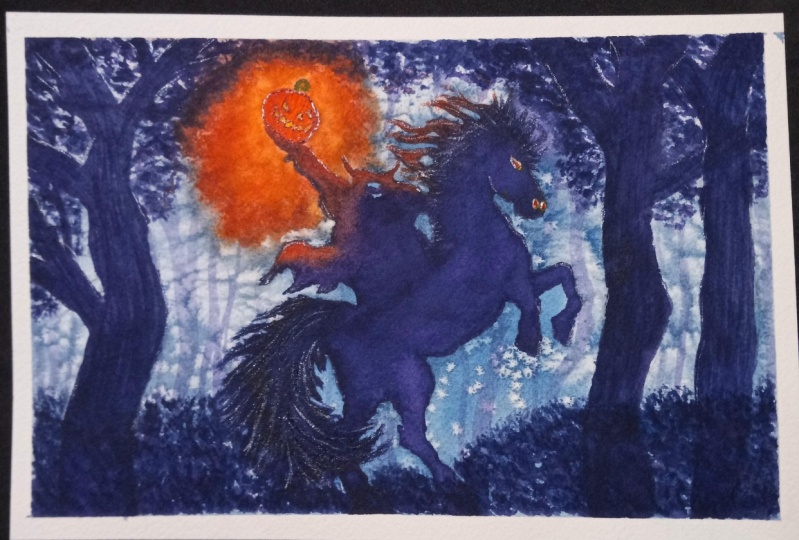
3. Sketch: First part you're going to be sketching in your rider and the horse. Which is the most important part to make sure that you make it a little bit smaller than you think because this does have to fit within your page. So erase what's needed if you think you may have made it too big. Now if you don't feel like sketching in your horse and rider from scratch and just showing the parts like IM, feel free to trace the outlines I have given you. I have that in the project description area should be able to find that image you can download on the right. So I generally just do a really basic, simple outline. Before I start painting. Here, I just use a rectangle to get the body of the horse. I like to start with the horse first before doing the writer just so I have somewhere at the rider can sit. So usually with the horse, it is split into three parts. There's the body, There's the shoulders, and then the, but it can also, if you measure the length of the horse from the spine to the belly, that's usually about the same length as its neck and also the same length of its head. So you'll see me measuring it there. So the length of the head is about the same length between the spine and the bottom of the belly. And it's also the length of the legs too. If you wanted to paint in the legs, the spine to the belly is the same distance between the belly and the floor where the hubs are. So also when your pay attention to sketching out the horse head, make sure that the ears are not too big. Because if you make the ears too large, it'll look like a donkey instead of a donkey or mule instead of a horse. Also note that the eyes are about 1 third the way through the face. It's not necessarily in the exact middle. It's more about a third because their faces are nice and long. They have big cheeks. Now this is the outline of the horse. I'm not actually going to be using any details for eyes or nostrils. This is because it's going to be backlit. The plan for this painting is for the figure, the horse and the rider, the headless horseman, to be back-lit. So even though I drew in the eyes, you don't really have to and just want the outline of this horse. And probably putting way too much detail. I tend to be very detail-oriented. It's my illustrator background coming through. And horse heads, again, they are much bigger than you think they are. And they are the same distance between the spine and the belly is so or roughly, roughly that distance. Now they also need big head so they can eat lots of food for their big bodies and they need big head so they can big noses so they can breathe as they run. So for the shoulder that's roughly a third of their body length. So go ahead and sketch that little rectangle into thirds for the different sections of their bodies. And then usually there's a small dip where the legs start. Now I'm just doing the tops of the legs because the rest of it's going to be hidden by a bush. And that way it's a little bit easier to avoid messing up their legs because I know a lot of people when they do horses, they get them wrong every time. So I wanted to make this as beginner friendly as possible. And also make sure they have a nice round, but because they have, they have to be able to run. So now that distance between the horse and the belly and the spine, the distance between the belly and the spine is sometimes the same distance between our button, our shoulders. So I put the top of the shoulders of the headless horseman about the same distance as the horse body. I'm also not going to bother withdrawing in the legs of the headless horseman because it's going to be, again back-lit. I'm just gonna do one symbol layer for entire horsemen and the steed, all one color. It's going to be a nice dark color. So again, you don't have to draw it in the legs. You don't have to do that because again, it's backlit. So you can see that I just stopped drawing it in because I realized, oh, that's right. I'm just going to do all one shape. Now here's where the distance r. So if you have your arms next to your hips, you can actually see that from the shoulder down to where the pelvic bone is, that's about the same distance as your arm. So from your shoulder to your wrist, that's that's the distance. So when you're measuring out the arms on a subject, on a figure, go ahead and use that as a measuring tool. And the halfway point is where the elbow would be. And then I just drew in a basic hand. I'm not even doing fingers. Again, it's going to be backlit and it's going to holding that pumpkin. Now for the pumpkin, I just circled in an oval. And it's just a couple of creases here and there. And for this particular pumpkin head, for the headless horseman, I am just going to do a very simple carved pumpkin. Kind of luck because I want him to have a little smile on him. Tiny nose, little triangle, basic and very simple smile. I'm not going to go for extreme detail here. I just wanted to be a kinda like a happy headless horseman, but also mysterious. And there you go. So just go ahead and add some ridges to that pumpkin. And you'll be good. Also remember to put the cutoff vine part on the top. And you'll have a complete pumpkin head. Okay, I'm also going to be framing the rider and the horse with some trees on the side. So feel free to do 345 trees on the sides. Don't forget the horse's tail. And that way, it'll kinda lead the viewer's eye to where the pumpkin is, where the headless horseman will be. So here's the trees. And I'm going to be going into more detail with those trees later. But really it's just a bunch of squiggles. So you knew it. You have to draw in where those trees are going to be if you don't want to. But I put the pencil marks down just as a guideline also so that you guys can see where I'm going to put them. Okay, so now I got the basic shape of the horse's body and the legs. The topsoil legs again is going to be hiding behind a bush so I don't have to worry about drawing in the legs. I'm pretty good at it. But if you don't feel like you're very confident with legs, this is the nice cheat that I sometimes use if I just want to get something done quickly. Also make sure that the horsemen has a saddle to write on and reigns for the horse. And there you go. There's your sketch to the next part, we'll be mixing up your colors. And we will only be using a few. The four colors we're going to be using is up next.
4. Background & Salt: So at this point in time, you've already mixed up your Prussian blue, your, your Alizarin crimson, your orange and yellow. And so now what we're gonna do is we're going to use a large brush. I recommend a one-inch flat or any other mop brush. I like a flat because I can get some nice corners in there without having to worry about missing any edges. So cover the first area around the horsemen and the pumpkin, all in water. So just use the water to fill that area in. Cut around the edges of the horse and everything. If you happen to touch the headless horseman or the horse with your brush, don't worry about it because the horsemen and the steed are both going to be a darker value at the end. So we're going to do the background first, and then we'll do the steed and the writer. So first just go ahead and cover the entire area with water. We're going to be doing a wet on wet technique. So once you get the whole area wet, then we'll go ahead and go in with that beautiful Prussian blue that you mixed up. And if you haven't mixed it already, you should probably do that before you put on the water because by the time you're done mixing a Prussian blue or any other color you are using. Well, it'll probably be dry by then. So mixed up your colors first always, and then you'll have them ready to go when you get to this stage. And then go ahead and grab your oranges and crimson. So here I am. I'm grabbing my orange and I'm going to be outlining the pumpkin. Now I'm not actually going to touch the pumpkin itself. I'm going on the outside of the pumpkin. This is the glow emanating from the candle that's inside the pumpkin. So orange first. Once you get all your areas done with orange, then you can go ahead and go in with your crimson. Okay, make sure to wash your brush off in between all the colors. Here's my crimson, I just dropped it in. This is going to be creating a beautiful glow effect. And you can see, because I put water onto the paper first, you're seeing it happen here where it's bleeding, it's letting the water do the work for you. I don't have to really switch my brush very much at all on the page, the water spreading the pigment for me. So that's what it means when I'm saying, let the water do the work. Because you can see this beautiful effect it's having. So now I have that beautiful glow and the reds kind of bouncing out from the pumpkin. Next, I actually recommend having a larger brush for the Persian blue, because see here I've got my bigger brush. Then you'll be able to cover a larger area over a shorter amount of time. Now if you were to use that small brush the whole time, some of that paper might actually start to dry before it's, you're done. So bigger the brush, the more area, more area that you can cover. So the bigger the brush, the more area you can cover. And you can see here I have a harsh line closer to the horse. Well, again, that's what the bigger brushes for us to help you cover that area really quickly. So get it all covered in. This is just the first layer, remember? So if you don't get it as dark as you want, That's okay. We're going to be going over it again with some trees and the trees are going to be nice and dark. So this, again, this is just the first layer. Don't worry about it if you don't get it as dark as you want. And so you can see I'm just kind of going along the edge of the body of the horse, putting in the legs, just getting the whole area covered. Some of you have gone over a little too much, but that's okay. Okay. In even here, I mixed up the blue just a little bit lighter than what I wanted when you're doing a wet on wet wash like this, a lot of times you want to make sure that the mixture of the blue is darker than you think you need because it will dry about 10 percent lighter them how you put it on when it's wet. So I'm using the edge of my brush here. This is very dexterous work. If you want to get those corners, you don't have the confidence to use a large brush to get into the corners, then I recommend using a smaller brush. It's okay to switch between brushes for details and bigger washes. So here I mixed up some of my crimson with my Prussian blue just because I wanted to darken it just a little bit. Everything that you see on the page that is colorful, That's all still wet. So it's okay to add those colors and while it's wet, now if it's halfway dry, don't put in more colors because at that point, it might be, you'll get some blooming effects and that may not be what you want. Also, you can see that I have some puddles towards the edges of my paper. If you want to get rid of that, feel free to use gravity to put your paper on an angle. And then you could just cleaned up with a damp brush that's clean. Or you can use a paper towel on the edges, the edges, I'm going to be using a, a darker dry brush technique on top of this blue. So I'm not really too worried about it pulling up too much paint. Because again, I'm gonna be putting those trees in and out. That glow effect around the pumpkin isn't quite as colorful as you'd like it to be. You can always add more pigment on top of it. Also get your salt out. If you have any salt that you can just use, table salt, sea salt, whether salt you like, this is going to be adding in some nice sparkles for guess what, stars, because this is happening at night. So I love to use salt as a way to put in stars in the sky. It's really simple. You don't have to use paint. And it's also just hasn't really neat effect. Now if you want to use salt for other effects such as sparkles on snow or a field of flowers. That's a great way to do that. So we'd salt can be used more than just one way.
5. Headless Horseman & Steed: Okay. What could that the salt did its thing. This is the beautiful effect of salt and I absolutely love it. It's turned out to be way more sparkly or frosty looking than I originally intended. But you never know with watercolors. So if you end up with something like this or even more extravagant, that's cool. And yeah, so now it's probably safe to remove the salt. Again, if you see any wetness around each grain of salt, that means it's still too wet. So don't don't do anything with it yet. But at this point I'm assuming that you already have your salt removed and then the paper is completely dry. If you feel like you need more paint, this is the time to add it and mix it. Before you start, what I'm going to do is I'm going to do a nice mixture of my Prussian blue mixed with my Alizarin crimson. And I'm going to mix up a very dark blue, almost a purple. So mixing just those two colors creates a really beautiful dark color. Now when you're mixing, make sure that you are mixing for at least 30 seconds. Now the reason I say that to mix for thirty-seconds is you can make sure there's no globs of paint stuck on your brush. There's no granules that are stuck to the bottom that you'll pull up later and end up striking the page later on. So always a good idea to mix for thirty-seconds. Here I'm adding even more crimson just because I want it to be a little bit more purple then the mixture I made up. So on the screen it looks like it's a black, almost a mess the point, but it actually will come down on the page is more like a purply blue. Now if you're wondering what the consistency of the paint is going to be, I recommend mixing it to a point where it almost looks like it's espresso. Not a syrup, but like water down syrup, I guess. Or you want to be a thicker consistency than whole milk, but you don't want it to be as thick as molasses. So somewhere in between that area is where you want that dark purple to be. So here I'm adding in my Alizarin crimson. It's going to be crimson because of the glow from the pumpkin is going to be creating a nice glow effect. The glow from the pumpkin is creating a nice lighting effect on the writer. So I'm going in first with some crimson just because the lighting. And then I'm going to be going in with my purply blue color mixture. So here you can see that I added it in and it does look like a purple when I put it down. Also note that the size brush is going in accordance to the size of the painting itself. So I started with the big brush right for the wash. Now I'm using a number 4 round. Now, if you want to use a different kind of brush for this, go right ahead. I like using a round because I'm more experienced with it. Now this also note that the horse and the rider, they are both dry. I'm putting wet paint on dry paper. Now when you're doing this, you have to work quickly, otherwise, the edges might dry on you. So make sure that you're adding paint as you go covering that whole area. You can actually see I left the rear end of the horse. I left that for too long. You'll be able to see a harsh edge later on in a second here. So using that crimson to create that light effect on the tops of the horse and the rider. And then I'm using more of that purply blue that I mixed up. The horse ears are smaller than you think. They're not donkey ears, they are not mutual ears. So make sure that you basically just have little triangles up there. And otherwise you might end up with a mule or a donkey, which, you know, they're cool. I like those animals. They're adorable. But we're trying to do a horse, so and again, makes sure to work kinda quick. Otherwise you might get some harsh edges. So here I'm putting in the face and you can see I have that harsh edge near the rear end. At this point, if you're working this quickly, you can erase that harsh edge if you add paint to it. This paper is 140 pound cold pressed, so it's able to withstand a little bit more harsh treatment. Then some other ones. It's a Bridgestone. It this is Stonehenge paper that I'm using, so it's a good Learning paper on which to paint. Okay, putting in the belly of the horse. I'm also putting in the legs. If you don't get the Billy quite right or the legs quite right. That is okay. Because again, we're going to be using a bush to hide the legs because not everyone's got legs. It's kinda hard. They're kinda funny. They look weird. Horse legs are some of the weirdest legs on the planet. But when you actually see a horse, they look fine. Learn to draw them though is difficult.
6. Spooky trees: And I am going to fix the nose of that horse in just a second here. But before I continue, I'm going to add in this bush because a horse that leg looks weird. So if I add in the bush that it might look a little less strange. Okay, and I'm just dabbing my brush. I'm just doing a bunch of dots at the top and then doing bigger strokes towards the bottom. That way it looks like there's leaves. Dab, dab, dab, dab. Doing some more doublings, getting those leaves in there. And I'm not doing too many. I'm just doing, you know, some big marks like this. And few dots here and there. Most bushes are kind of a blob with a bunch of dots on the outer edges. Most bushes tend to be more of like a big blob, a big shape. And then there's some dots towards the edges. And they can connect those edges with some little twigs and stuff. So cover your larger area first. Also note that the horse and the rider is actually still mostly dry because I was working pretty quickly. Here. I'm just going to fix the news of the horse just because it's not quite right. I didn't quite meet the edge. So I'm using a very fine brush. This is a number 2 pointed round. I'm using also putting those reigns in there. And it can't really see what I'm doing right here because my fingers covering it, I put in some horse hairs. The mane of the horse, the beautiful long hair. Also going to be doing a few more details on the horse tail. But as far as the rider and the horse goes, That's all I'm doing. I'm not going to be going in with extreme detail to add more shadows or lighting and everything. It's, again, this is going to be mostly backlit and this is going to be really simple. And here I'm using a number eight round brush and I'm doing a bunch of squiggles. Notice I'm holding it almost two-thirds up the brush that we can kind of get those nice squiggle lines. And that's your tree. You're spooky little tree is going to be a bunch of squiggles. So start at the bottom school, do your way up and you can always add some red in there. So it looks like some of the light is hitting the tree. And I'm not doing very many leaves on these trees. I'm going to keep most of them kind of barren. So that way it looks a little bit more spooky. And then these trees are bigger as they get closer to the camera. So I'm imagining that this tree trunk here is closer to the viewer, so there's going to be less purple on it. And more of the dark, purply blue that I mixed up. There will be a few leaves but not too many. So I'm just cast scraping my brush to create those leaves on there. Also, you want to make sure that your corners, that no, there's no tree leading to a corner. You always want to make sure that the corner is covered up or the tree trunk or branches are not pointing to a corner. It's just a composition idea where you don't want to lead the eye off the page. You always want to keep the viewer's eye entangled inside the painting so they have nowhere to go. This is the same purpley couple details. Now here I'm using a kind of a washed out purply blue and creating a couple trees. It looks like it's farther away. This is the same purply blue I used before, but I kinda washed it out a little bit with some water. So that way it's half as dark. So now that we have the forest complete and we have the olive tree limbs, the tree trunk sends some branches in there. We can get onto the pumpkin, which is the final detail. And then we'll be pretty much done with this. So I will see you in the next video for the pumpkin. And I'm excited, this is going to be fun.
7. Pumpkin: Okay. We're continuing on with the spooky headless horseman. This is going to be the head, the pumpkin itself. So first things first, yellow. So here I'm using a cadmium yellow, I'm just filling it in completely, including just filling in the pumpkin completely. And it's going to just going to be giving an underlying glow to the entire pumpkin. So when you add those oranges and maybe some chromosomes and top of that, on top of it. For the actual pumpkin shell, then that we had the whole pumpkin looks like it's glowing. So wait until that yellow dries. Then we're gonna go ahead and do the next layer. Okay, So at this point your pumpkin is completely dry. Make sure you wait till it dries before you add the orange because we want those eyes, the nose and the mouth of the pumpkin to glow. So we want to keep those parts, eyes, nose, and mouth, that yellow color. That way we can go in with this orange and we can kind of outline those features. So here I'm actually using too light of a wash of orange, but I can always go back in over it. One of the nice things about watercolor is that you can use its transparency to your advantage. Go ahead and add in those oranges wherever you need to. Avoid the mouth, avoid the nose and avoid the eyes, and that way it will pop more. So here I'm just doing the orange. And I'm actually going to do this in several layers just because it didn't have quite as dark of an orange as I originally intended. And it just kinda brought some of that orange down a little bit. But you don't have to do that part. So if you just want to do the orange, you don't have to. Yeah, you can see I kinda messed up a little bit there. I recommend not touching the horsemen at all when you're doing the pumpkin. That way you can just focus on finishing your piece. I also use Alizarin crimson for his little his head ponytail. I guess that little buying us take it up. And if you want to have more of a softer edge to the pumpkin itself, feel free to do the wet on wet where I added crimson on top of the orange near the edges of the pumpkin. That way he looks a little bit more 3D. So I put them on the tops and the edges of the pumpkin. I put them on under his chin. And I'm going to wait for this to dry a little bit more. And I'm going to do another layer of a orange color or some yellow mix with crimson if you don't have an orange, that will work too. Once that dries and get to the next part. Okay, So at this point, my pumpkin is still not quite as dark for the orange as I want. So I'm gonna go in, again. This time I'm going to be using in even darker orange. I'm except some more crimson into the cadmium orange that I had. That way it's more of a darker orange. So this way I can really see if I can get that pumpkin to have some nice contrast between the yellow and the yellow bits, eyes, nose, and mouth, compared to the orange of its main pumpkin head body. I guess. See my camera's trying to focus, but I promise you I'm missing those lines there. Yeah. And just go ahead and keep doing this process until you're happy with it. Try and make sure that you mix up enough paint because you don't want to have to go over it more than a few times. Also makes sure that you do not touch any of that blue to the orange because it'll turn green. Okay, so there's your pumpkin head. And we're going to be seeing the final result in just a second here. And don't forget that you want to sign in your piece at the bottom. You can do that with either a pen or you can use silica, a white or orange Squash to sign your name. I decided at the end, I felt like there still wasn't quite enough contrast between the orange of the pumpkin and everything else. Note, the pumpkin is word, the attention is going to be going. So you want to put a little bit more detail here than anywhere else. So it's okay to go in there with a nice fine brush and add in those pumpkin lines and the creases. And then when you're happy with it, you can go ahead and call it a day and then you'll be done.
8. Complete! -- Thanks :): And just like that, we finished our headless horseman. Thank you so much for joining me on this watercolor tutorial. I really enjoyed making it and I hope he didn't feel, feel free to share your painting in the project section, I would love to see what you guys worked on and I'll be happy to answer any questions you may have. Thanks again for joining me on this tutorial and I'll see you on the next one.
 Suzy Paint N Simple, Watercolorist