Transcripts
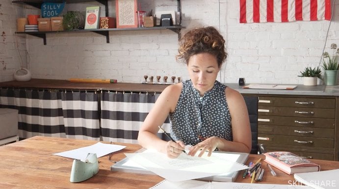
2. Introduction: I just wanted to personally welcome you all to class. This is the Art of Lettering Scripts. The reason behind teaching this class is, one, I love what I do, lettering is awesome, I enjoy every day practicing or client work, whatever it may be. But secondly, when I started out, I just jumped on the computer and never had a background in art and I never wanted to sketch, I didn't really believe in that. It caught up to me because what I was doing on the computer really had no connection with. I didn't know why these forms existed in script lettering. I didn't know basically anything about it. I was just like a machine producing it without understanding. So, I was like, "All right, I'm going to backtrack here. I'm going to start learning why these things exist." So, I started working with my hands using pencils and other various tools. It was rough at first, I admit that, but after months upon months of practicing, I got better and I started noticing that I was understanding things on the computer a lot better especially, the pen tool because I was understanding how things worked on pencil and with other tools as well. I really felt a connection with my work because everything I was creating started out by hand and it was personally from me and it was really inspiring to see how much I grew by just working with my hands. It's grown from there. Now I do calligraphy a lot and I'm not quite on the computer as much as I used to be and I really enjoy it. I wanted to share that with you guys, that working with your hands is really something special. It can really teach you a lot that the computer can't and I really hope that through this class you guys, maybe if you don't work with your hands right now or sketching or whatever it may be, that you guys, break out of that and maybe start sketching for some projects or whatever you do if you're a designer or maybe you just really want to learn scripts, that's cool. So, I just really hope that this class opens doors for you guys, not only in understanding why script forms exist but also just to start working with your hands and taking that to the computer, wherever it may be, if you finish it by hand, that's even better. So, I'll see you, guys, in the next video.
3. History: Hello everyone. Welcome to the class. This is the art of lettering scripts. On this first slide, you will notice we have a little inception going on. So, I'm lettering within lettering. But, let's get to it. I'll try and keep this brief, but I want to talk about the history of scripts. I felt that it was important that you guys had a base understanding of what we are about to begin working on. First and foremost, I want to discuss this quote I stumbled on when I was working out lettering paper back in college. Essentially this quote talks about how script is musical, that is it's rhythmic. When you watch someone speak, you will often notice as they talk their hands moving patterns, and this translates over the writing as well. The pen or brush movements are based upon this rhythm. Sometimes they're more repetitive and other times much more syncopated. The term script is quite general. So, I want to make it as easy as possible understand how it's broken down. There are two main categories, formal script and casual. Both of these scripts derive from a style of writing. English Roundhand began as early as the 14th or 15th century, but was quite popular in 18th century in England. This style was written with the square tipped quill nib. This is different in modern nibs as we'll see. But, the flat tip was used for shades in the corner edge for hair lines. With this the penman could not achieve perfection. So, they worked with engravers to correct those imperfections. The engraver would fix those imperfections while carving it into a piece of copper plate. The image to the right shows this perfected engraved version of Roundhand. These engravings were printed for teaching manual since learning this style was really in high demand at that time. This eventually led to the common term Copperplate as we know it today. This style script is actually correctly termed Engrosser's script or also Engraver script. The formation of the script was aided by the development of the oblique pen holder and the production of the pointed nib, in the mid to late 1800's. This allowed penman to reproduce the perfected forms of engraved Roundhand with the pen, which ultimately form the style penmanship. Formal script has a really steady rhythm, the letters are stable often, and the letter forms are repetitive as you will learn in future demonstrations. Note that while Roundhand and Engrosser's script may look alike, they are in fact different. In the 1950's, scripts were really at a golden age. New inventions such as photo composition in the 30's aided the release of revived and also brand new styles of script. Casual style mimic the forms of natural handwriting. The style was often produced with a wet brush, the rounded snappier, and quick movement of the brush help form the signature syncopated rhythm. Looking at the thank you note from Ken Barber, I had received within this last year shows that the style script has gone through a revival in the 2000's. Although more modern tools such as brush pens are typically used now. So, in a quick review, let's go over what we have learned. First, script is rhythmic, often either a steady or a syncopated rhythm. Secondly, there are two main styles of script formal and casual. These styles of script are determined often by the tools that are used to produce them such as an oblique pen holder, or a brush, but with a pencil you have the ability to mimic any of these styles as you will learn in future lectures. So, I will see you all in the next video.
4. Research: Welcome back, guys. In this video, I just want to go over some research tactics that I've found helpful in the past. As I've discussed before, all lettering is historical base. So, we're looking at items from the past and one of my favorite sites is imimpact.com which is an international organization for penmanship. So, a lot of the examples that you find on there are 19th century, earlier 20th century, penmanship and this is kind of the roots of it all. So, you're really getting back into the history when looking at these examples and I just love looking at these. They always inspire me, not only when I'm doing calligraphy on my own but also if I'm just using a pencil for creating artwork for a client. So, these are some examples from the site. If you just go to artwork on the site you'll find a whole bunch of examples. Looking at this, this is just engrosser's script from one of the Master Penman. Again, another example of engrosser's script from another Master Penman, just really beautiful stuff. One thing that I didn't talk about in the past lecture or in the history lecture is another style of penmanship that is really unique to America and that is ornamental penmanship, which evolved from Spencerian which is a form of handwriting that was taught in schools in the early 20th century. With this style, I'll show you an example, but artists have taken this, this is just to show you that this really is historical base because this was heavily flourished art or lettering. When you go more into the 50s when advertising was huge and Herb Lubalin was doing a lot of lettering artwork, he would hire different lettering artist and one of them was Tony. Their work was heavily based off of this really flourished style although they altered their lower case letters. They're more heavily weighted but this is just a perfect example of when you're looking at the past you can take things and put your own spin on them and they were doing these with a pencil. They weren't doing these with the pointed pen. So, they were taking artwork that was done with a pointed pen and evolving it with a pencil adding on their own little touches to that. A lot of this artwork was more formal based, also a really big artist that many of you probably know if you're in the lettering is Doyald Young and a lot of his work is also formal based off of this penmanship. Again, all of his stuff is done with a pencil but it's just really great stuff to look at and I'll link all his arts in resources below. Lastly, I wanted to talk about sign painting because this is an inspiration for a lot of artists now for more casual style script and just go on Flickr or search on Google sign painting or brush script, brush lettering, you'll find tons of stuff even on Pinterest too. Pinterest is really great. But looking at, this is Dusty Signs' work, he's a relevant artist, he's of this time even though sign painting quite isn't as popular just because of vinyl but now it's kind of coming back but looking at a lot of his art, you can see a lot of casual script from that brush style we talked about. This really just gives you a ton of resources, a ton of stuff to look at, they not only help you learn but also stuff to practice from and fuel you for creativity. So, just get out there, go on the Internet also, there's plenty of books out there, I'll link those and the resources as well and just study away. Look at as much as you can. That's really the best way to become better as a lettering artists is just to look at as much as you can and take it in and practice. So, I'll see you guys in the next video.
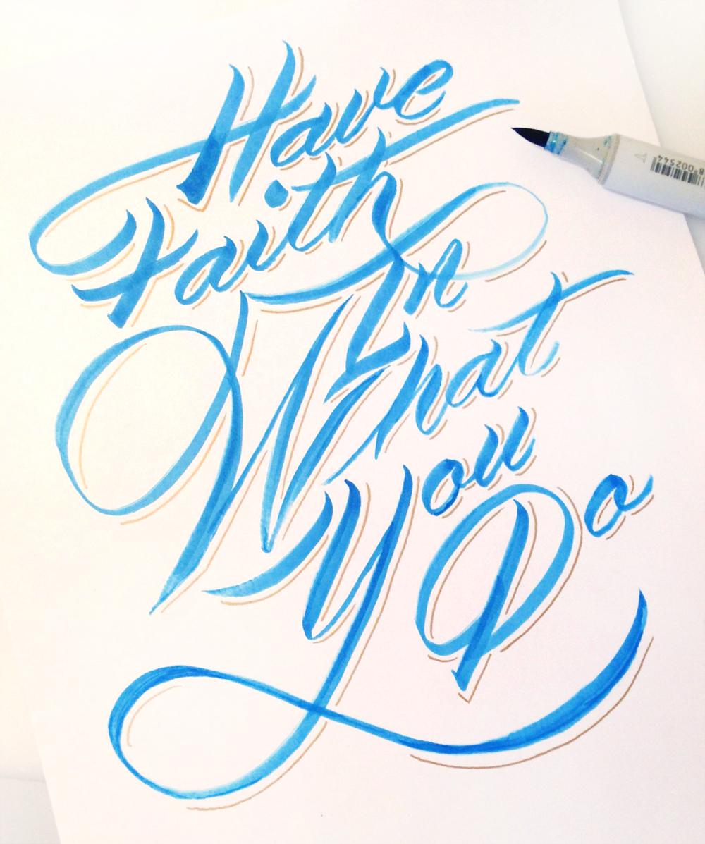
5. Tools: I wanted to quickly go over some of the tools I'll be using in this class, because I know some of you might want to purchase these, or maybe purchase things that are similar to these. So, you want to know what you're looking to get, and by no means do you have to get any of these. You can just use a regular pencil and there's also substitutes. I'll talk about that later on as well. But first, I have these Staedtler lead holder, really a glorified pencil, nothing too crazy about it, hold a stick of lead that can be sharpened to a fine point. So, it's really great for retouching, lettering, or just really delicate work. The downside to this pencil is you have to buy the sharpener because of the shape of it. It really only works with this. So, it's a little extra money. The second tool we'll be using is an oblique pen holder. This is used for calligraphy, and comes in three parts. The first part is the wooden holder itself. The second part is the nib, which you have to buy separately. The thing with nibs is there's quite a variety of them. As you can see from this catalog I have, it shows just some of the examples that they sell. I'll read an excerpt from here that states, "Pointed nibs vary greatly in their design, sharpness, finesse of line, and flexibility. Experiment with a variety to find the ones that you like best. So, what it's really all about is finding what suits not only your style, but also sometimes the certain style of lettering that you're working with because it can help with that produce, if you need thicker shades or maybe not such a fine hair line. It's really about playing around. So, it's hard for me to point you in an exact direction to what nib might work best for you, but I know a lot of people start out with the Nikko G, just because it doesn't catch much, and it's kind of easier to use for a beginner. What I like best is the Lehner pencil, just because it has such a fine hairline, and also thick shades, which works really great for penmanship. The third pen tool it is ink. I prefer McCaffery's Ink, just because it works pretty much perfect right out of the bottle, at least for me. I know other people who like Pagans Eternal. There's really so many different choices, and I'll put links to all of these items below so you can check them out. By no means do you have to have, again, any of these items. It's just kind of a basis of what I like to use. Especially, looking at brushes, there's so many different kinds. This right here is a Copic Sketch. I really like this because it has the pointed felt tip, and then it has the chiseled tip. So, you can get a lot out of it. But, secondly, the refiller. You can buy the separate refill cartridges that will refill this probably 12 times. So, it's really a big bang for your book if you're looking to have a pen that lasts a while. I know a lot of people also prefer Tombow brushes, Sharpies. Anything with a felt tip is going to work for this. Again, it's about testing out what you like, and just going with it. But the great thing with these brushes is, they can have a lot of snap to them, but also if you slow it down you can get more of that fine line work that you see with natural brushes. So, that's kind of why I prefer these, and I'll be demoing with these later on in the class. But, for now, that's the tools that I'm going to be using. I'll, again, post more links of many more tools than just these four, because I know, maybe, you guys want to experiment with different stuff. But, yes. I'll see you guys in the next video.
6. Guidelines: All right everyone. Before we get into actually drawing script, I wanted to actually look at the foundations of type design because, I really feel that this is going to help you guys understand how to lay out your script lettering, because so many people I think ignore this step. Expressive learning, when you're first starting out. This really helps you build not only the muscle memory, but just understand the foundations of how things work. I'm just going to go over this really quickly we're not going to get too in depth here but first, importantly we have the baseline, which is what all your letters are going to sit upon. Following that, you'll have your x-height which is right above there and this is where all your lowercase letters are going to sit, well, the tops of them will sit. This where they're all going to reach. Thirdly, you're going to have your cap height, which is where your caps sit, the top of your capital letters. This is important because with scripts it's about cohesiveness. Well, actually with all type design it's about cohesiveness, but when joining scripts you also need to adhere to these rules of trying to keep everything in form. I know some of you are probably saying right now, Neil, I've seen script lettering that doesn't adhere to the same exact baseline, it's bouncing around a little bit. Yes, that is possible because scripts unlike type design or some type faces, scripts are based upon hand movement. So, they do have some room for some more casual playfulness but just for learning's sake, I want you guys to at least understand that, A everything should sit near the same baseline, if not on it especially for formal script, it should sit on the same baseline. Your lowercase letters should all touch the same x-height. So, they should all rely on that same height, just to bring in the cohesiveness of it. C, this isn't quite as important but your cap height depending on, it really varies to what you're drawing but keep that in mind that your caps should all touch the same height. We'll look at this later especially when drawing formal script. Script lettering also has an added element to it and that is the axis angle or slant angle. This will really vary between different styles of lettering, script lettering that you're drawing out or whether you're working with an oblique penholder. So, any style penmanship is different than style of maybe brush lettering, but just to point that out with penmanship, the oblique penholder is set to a certain angle to match what you're writing on. So, the line of this will match obviously, the line of what you're writing on. So, that's more of a set angle between 50 and 60 degrees but really this angle can vary anywhere from straight 90 degrees to really I guess you can get really crazy going well over that. Really, the importance, let's draw this out really quick here. Let's just say this is our baseline. Let's say this is our x-height and let's just say this is our cap right here. So, we have the structure made but with script, the important part is that everything relies on the same slant line. What I've noticed while I'm drawing out this out really quickly is, a lot of people don't adhere to a grid system especially right when they're starting out. This really helps build muscle memory and also just overall cohesiveness of your lettering. It just brings it all together. What I've noticed is that, a lot of people won't work to the grid. You'll look at their work and first one letter will be on that slant, another letter will be on this slant and the third will be on this slant. Because, they don't really have anything to base it upon. They're just trusting their own instincts which have not been trained at all. Their hands had not been trained all to match these angles naturally. So, really importantly I want you guys to think about A, making your baseline, your x-height and your cap height. This is not going to be a strict thing just whatever feels natural at first. Obviously, type designers are really keen on matching certain measurements but really and I just want you guys to understand that really everything has to conform to this certain relationship between each other within your lettering style and really to draw out slant lines so that everything is on the same angle because that's really the icing on the cake, bring it together. We'll look at this in future demonstrations about different styles and different slant angles but I want to point out here's a sketch of mine. This is based off my penmanship, my engrossed script that I wrote out a while I was practicing and then I just drew this with a pencil but as you see everything is on the same baseline, as far as lowercase letters go. There's a little play with the capitals. Nothing too crazy though and everything also has the same height. So, the relationship between these lowercase letters and these are the same height-wise but really importantly, everything if you look is on the same slant angle. That really tops off, that really brings everything quite well together. I think that's something that most people might not understand is that everything really does have to be quite matched well together, at least right off the bat. You can play around as you learn the rules but really you have to learn the rules to break them. So, that's it for guidelines. I hope this helped you guys understand a little bit more about how to really begin to put a grid structure together for your lettering and I will see you guys in the next video.
7. Forms: Lesson 1: First, I want to get into the very basics of script lettering, and how things are formed because, really as you go along it's really about just building from a single line. To demonstrate what I mean by that is, I'll draw C here, a capital C quickly. There's the loop around it. So, here I will have the insight stroke what I call the foundation stroke of it. Everything is going to be built off of this. So, this makes this the essential form of the ladder. By that I mean, whenever you're adding weight to this, or any letter for that matter, it really all depends upon this inside stroke or foundation. Because no matter how much weight you add on or trying distribute it across areas, it's going to rely on this line. If I drew maybe something- that's even too correct, let's try something like this. If we compare these two, when I add weight to this, this one's never going to look like this no matter how much weight I add, because of that the foundation it has. So, really when looking at letters, I want you guys to consider that inside foundation of that insight stroke of it. Really, all these techniques here come from all tools, such as for old ideas from hopefully pen holders or partnership in Calligraphy, and really it's all about a process of learning that, how to create these forms. To point out just by maybe you guys to understand, what I'm saying adding weight or blood pressure is, when you take a point at dib which is where these forms are derived from, the nib has the possibility of having a single inclined here, single stroke. But when putting down, it will split, adding pressure to it. There's two metal times, and that's what enclosed between so. You can vary how thick your line is. So, when I say, adding weight to it, that would mean certain points of the letter I would be adding pressure to it. So, for example, on this, I'm just going to pencil on really quickly. This will be where we would thicken up a little bit. But you see, as I thicken it, it still has that shape that insight stroke shape to it. So, to relying completely on how these curves. I know you guys may be you wondering now how do I know how to curve things, what looks correct, what looks wrong, and how I learned this. It's really all about practice and building up muscle memory. I mean I hate to say it like that. There's no magical way to learn it, no one's going to be perfect at it the first day. But some good tips to follow is most subscript is based around oval shapes, or maybe a little bit more circular shapes. By that I mean, I'll drawn the slant lines right here, just to make them a little bit darker for you guys to see. I'll redraw this C. I'll try and fit it more in this lamp. Because I'd been accustomed to try on a more extreme slant line kind of more following this path. So, that's muscle memory to me but I'll try and adjust to this, but as I redraw this C here. If I continue this upstroke around, you have right there an oval. See it right here. So, there's one oval shape. This swash that's coming around. If I did that again continue to it, you would have another oval. So, really all of these forms you'll see, I'll demonstrate this as again the more getting into individual forms, you'll see this oval shape just keep on repeating throughout each letter. So, really to get correct letters, it's all about ovals and natural curves. If you've ever worked in Illustrator, and know all the pen tool, it works I'm busier curves, and this is where that idea comes from. Just to demonstrate really quickly, again with the oblique pen holder, when Penman work in a style script such as in grocery script which I work, and they follow the same principles on this oval. They would just add weight to where they wanted it. So, again I'm adding weight in certain areas. We discussed in this first lecture on forums. We first talked about how, as I drew this letter C, this central stroke is the most important part of a script ladder when you're drawing it because everything is built from inside out. So, if you don't have this, the central stroke correct when you're adding weight to it, it's really not going to be achieved correctly and maybe an easier way to see this is, this can be seen as the bone. Then, when you're adding weight that is essentially the meat being added on so really it completely relies on the structure of the bone. It's going to shape how the meat looks. Then secondly, we talked about the importance of how these curves and the relationship to the oval form, and we have drawn the C, and then looked that if we continued on, it forms an oval, and discussed how this oval form is really repetitive especially in formal script you'll see it in every letter. I'll point that out again in future lectures, but really these two key points I wanted to touch upon first. I hope that you guys understand that, first you need to understand that the central line, and the single weight line really is going to control how your script looks and secondly that all these forms have curves in them, and most of them relate to circular shapes or oval shapes. Really, that's the most natural way to get a curve, and much will allow that also comes from the past to when people were using pens for Calligraphy, allow these curves especially in flourishes and swashes are based upon whole hand movement. So, that movement over the hand replicates that oval form. So, that's how it all derived or where it all derived from. So, that's it for this lecture. I'll see you guys in the next one.
8. Forms: Lesson 2: In this second lecture, I want to talk about the general forms of script. I felt this was a really great transition from our first lecture on how the letter forms are really based upon ovals. Now, you're actually going to get to see it because when I demo out the sample forms, you're going to see that each one is really centered around an oval and not only that, but each letter is very rhythmic and the pattern that they have is repetitiveness with each other. Each letter mirrors each other or if you flip them, it's the same thing, as you'll notice. This really lends the script well because as I talked before, it is all about rhythm. It comes from the hand so it's a very natural flowing thing. I feel that this will be really important as you guys go on to understand this. So, we're actually going to start off with the oval form, which is the O, of course, the A, the E, the C. Secondly, we have a vertical line that would follow the slant, so depending on how extreme or what degree your slants at, it's going to follow that. Thirdly, we have the lowercase I. If you continue this up, you'd have the end to the T, the D. Third, if we take part of the I but mirror the top, we have this form which is the end to the H, the end to the N. It's in the M. And also, if you continue it up, you'd have the V and the W as well. If we take this vertical line and extend it over and curve it around, we have the H, and flipping that, we have the end to the Y and the G, any letter that dips down below the J. Lastly, we have this, which is the form to the beginning of the N, the beginning of the R. Just to point this out really quick, how I was talking how these forms can be combined to create others. We'll combine these two so if I draw that really quickly, draw this after it, you can see we have the letter N. Again, if I drew the oval shape with this, I'll do that down here. So we have the oval and then we follow with that, we have the letter A. So, a lot of this is combinations, combining letters together. I'm not going to show every single letter for one reason because there's already a really great lesson on iampeth.com and I'll post a link below that. It really goes through each individual letter and how to combine them and I figured why re-show that when it's already done so well. But what I do want to point out is how I talked about ovals. If you see even in the letter I, for this I form right here if you continue around, oval right here, again oval shape up here, oval shape, oval shape. The oval is so repetitive in all of these. You can really see that it is the key form playing across in script. Here's the I. Let's just draw the N right here. Let's curve it out. If I were to cover up the tops of these, if I did this exactly correct, these should mimic each other. So, a lot of the forms if you're looking at them, should be pretty close in mimicking, if you see flipping these two, they should be quite near exactly the same. Also, with the oval - I'm running out of room here - but if I were to continue it just halfway and then curve it around, you'd have the E. So they're pretty close in form. Just little tweaks to these letters can really create a whole new letter or also maybe change it up a little bit. As you get better, you can add little things to differentiate a form from one another and make your own style. Lastly, I wanted to talk about an important capital form and this is the compound curve. The idea behind this is that the entrance and exit of the letter matches the same, so it enters the same as it exits. I'll draw this again, trying to get it a little bit more exact. But this form is in a lot of the capitals. For this one, I'll just draw it there. I did it really quickly but we have a T. If I were to curl it around right here, we could have the P. If I continued it below with this part of this form, you can see we have the R. So even lowercase forms can be brought into capital forms. Really watch that video. I think that's going to be another key part of this class is watching that video and studying each letter that he goes through with you. That's why I learned and I really wanted to pass that on to you guys. To conclude this second lesson, I really want you guys to start practicing these general forms in preparation for the next lesson. There I'm going to really start to use different tools to show you guys how the final forms of these really come together and we'll start playing with whole words and from there just really taking off. But I know that this may seem a little bit boring, but it's really important that you understand this first before really trying to do crazy stuff because I've noticed a lot of people who just dive right into it knowing nothing get frustrated and quit. So this way, you're slowly building up to having a finished product rather than going right into it. So, again, watch that video, take some time out to really study those forms because I'll be showing them in the next video completed, maybe not every single one that's in that video but I'll try my best to show a lot of them and we'll work with different tools, how they work, and how they produce different qualities, each tool, and we'll start sketching
9. Forms: Lesson 3: In this third lecture on forms, I wanted to talk about adding weight to the general forms we talked about in the second lecture, and this will complete this three-part series The Forms. Before I get into it, I just want to talk about I'll be using this oblique penholder to demonstrate because all these ideas behind adding weight to these letterforms derive from this tool. I know I talked a little bit about this before but I'm just going to add to it a little bit. As I said before, with this tool, it has the possibility of varying pressure, so adding weight as you push down on it. Because when you apply pressure, you see right now the way it's constructed is it's sitting as one piece. But as I add pressure pushing down on it these two tines, that's what they're called, they split an equal flow between that creating the pressure. With letters, down strokes often have pressure to them. If you've ever noticed on script letters, the ends of them are always thin. This is because I physically can not apply pressure going up because I can't push down. So, make sure to note that when looking at adding weight to the scripts. There's some key components to it because of how this tool works, and I'll talk about that now. I like to call it there's an entrance and exit point. The entrance point is often either as a letter starts out. If you invert this with the I shape, you have an entrance point so it's starting out thick. But it's also often after an upstroke curves around. So, right at this point or this point, it's similar in each kind of these sample forms or these general forms I've shown you. Then, the exit point, so that's going from thick to thin, it's often before a letter curves around. So, it would be right here in this shape in the oval right there. An entrance point in the oval will be right there. So, let me begin demonstrating this with my weight pen. I'll start with this form. So, again, on upstroke, I can't apply pressure. But as soon as I come around, I got the pressure and again I'm letting off pressure. So, right here, my hand naturally starts pushing down, that's why the pressure is being added in that point. Then, when I'm coming around this curve, my hand naturally lets off pressure because even if I physically try to keep pressure going, at that point, it's not going to happen. I'm trying to push down full right there, it just automatically goes back. The two tines come back together. So, that's why you're going to see this shape constantly through script forms. That's because of how this tool works. So, again, to demonstrate with this second form here, I can't apply pressure on this upstroke. But as soon as it starts to curve around, my hand naturally wants to push pressure down. A third point to look at is, I'm just retouching this really quickly, but when a letter doesn't curve around again like this, it's often going to end in full shade or full weight because your hand naturally wants to keep applying pressure. Now, I'm sure there's examples where maybe weight is taken off a little bit, but you're not going to see that quite often. Another sample form is the I, so an invert of this. So, again, I'm starting off with full pressure, and as I curve around letting off pressure because my hand just naturally, or with the tool, you naturally have to do that, the oval shape. As I said, I'll start off with the entrance point and then began applying pressure as I move down. So, I'm applying full pressure as I curve around again. For the upstroke, it's going into no pressure. So, think about these exit points right before a curve begins as the letters naturally blending from thick to thin because you wouldn't want something to go straight from this thickness to thin right away because it just wouldn't look proper. I'll demonstrate now with the letter H. This one's a little bit different, but it has the same concept of this sort of going thick all the way to the bottom. So, this is a Y-shaped. You're beginning with no pressure, and as you go downwards in the motion, you're going into full thickness. Again, the complete the second half of it, it's going to start with an upstroke. So, there's going to be no pressure, I can't apply it. But as I curve around, you'll see I have my entrance point right there, and again thickness and then letting off as I go down. With the Y-shaped, which is just this flipped, I'm starting off with full pressure like the I-shaped. But as I move downwards and curve around, I'm going into no pressure. As I said before, I physically cannot add pressure at this point that's why you're getting this contrast from this thick gradually moving into that thin. It blends very nicely together, it looks very clean. Lastly, with the compound curve, you'll see, I'll draw a pencil really quick for demonstration, it will have an entrance point right there and an exit point before it goes back down from full shade to thin line. So, as I draw it out, I have no pressure starting out but I'm adding pressure as I move down and going back into no pressure again. So, it mirrors each other as I talked before. In the second demonstration, I just wanted to go over the brush pen really quickly with the same concepts that I did before with the oblique penholder. I want to do this because the brush acts a little bit differently than the pointed nib. The fact that with the brush, you use the tip of it for thin strokes and the side of it for your thicker strokes. What this means is with the brush, you can apply not only the downstroke thick, but also you can apply the same pressure going upwards. It doesn't have that limitation that the nib has. So, this changes what kind of variances you can apply the letters, but the same principles apply. If I demonstrate with the oval form, it's the same. I'm going with that entrance stroke going from thick and then turning round to go to thin. The difference with the brush is, I'll do this again more slowly, when I'm transitioning from thick to thin, so I'm going thinner here, I'm going back up to the tip as the brush turns. So, I'm turning the brush as I'm letting up. So, I'm going from using the side to slowly turning it to the tip. So, it's more of a turning motion while moving upwards rather than just the nib tines coming back together. With this, I can draw this all again and I can keep the same amount of pressure applied throughout. You're going to get a little bit of variance because it's coming a little bit back more towards the tip but not too crazy. If I drew the I-shaped here again, as I come around, I'm turning it and going back up on the tip. So, you get that thin stroke. But again, if I can keep the same amount of pressure to create that less of a variance look than this. One's not better than the other, they both look good. It's just how the tool works. Again, I'll just do one more demonstration with this as I talked before then with this shape, and then I'm entering into the thick stroke and then I'm exiting with the thin. So, again, just to really get on this concept, as I'm thick, I'm using the sides and then I'm turning the brush back on it's tip when I'm going around. But lastly, I can just apply the same amount of pressure throughout by just controlling that side of that tip, just using it throughout. I felt that it was important to understand this because if you're looking at casual script, you'll often see that the upstrokes are a little bit thicker. They're usually not so thin like this, and that's just the nature of the brush. In the next lecture, I'll be using the pencil, I'll use the brush, and I'll use the pointed pen again to actually start demoing out words for you guys just to see how it's all put together.
10. Putting the forms together: In this demonstration, I'm going to be taking the ideas from the past three lessons and really just showing you guys how they're put to use. I'll start out with the oblique pen, and we'll just write out the word, "Hey." So, first we're going to start out with the compound curve for the capital H, and curve it around to that. The second part is going to be the L, the first part of the L. Then, we're going to complete the second half curving around in center stoke and we'll add this little bit to it. Okay. Just to finish it off like that. Now, we'll do the E. So, the oval form going into the Y. Finish the E, and then we will finish the Y. Plotting pressure right off the beginning and curving around. It adds some pressure back in, some weight. Make it a little smoother. There we have the word Hey. Secondly, I'll use the brush pen and we'll just write the word Type. So, I'll start out with the letter T and I'll do this in a more casual style. So, a little bit snappier. Then, when I work with the lowercase letters, you're going to see those general forms I talked about before being put to use again. So, I'll start out with that then upstroke. Turn the brush around into that thick entrance, again, exiting with a little bit thinner by turning back out of the tip. For the end of it, I'll add a little bit more flourish to it. So, I'll curve this around like that. The P just a general down stroke, and for the top of it, a nice oval, and E as well oval, and just coin it back around the shape at the top of it. There we have the word Type. Lastly, I'll just demonstrate with the pencil, and I'll get more into detail as I go into the next lesson on sketching, but quickly just to show how I use the pencil. We'll write the word Hey again. So, I'll just start with that compound curve. We'll go with the L shape. We'll curve that top around and I'll add less little bit in, and then we can add the way we did to it. Again, adding where those entrance and exit points are. Again, I want this curves around thick, then going back into thin, into the E. So, an oval shape going into that Y, and we'll curve this around. Again, then create there, and entering and then exiting. Again, then add some thickness to that side, and also some thick where it curves around. The Y again, as we enter and thick back into thin, and end of the Y will carry down like that. Then, we'll end the thickness and again, gradually going back down to the exit where it's going to curve around. We quickly have the letter or the word Hey written now with pencil really quickly. We got one last part. That's fine. So, that's really quickly down with a pencil, and I'll get more into that as we go into the next lesson on sketching.
11. Formal ex. 1: - - Oh - !
12. Formal ex. 2: - way. - Oh, - way, - way.
13. Casual ex. 1: [MUSIC].
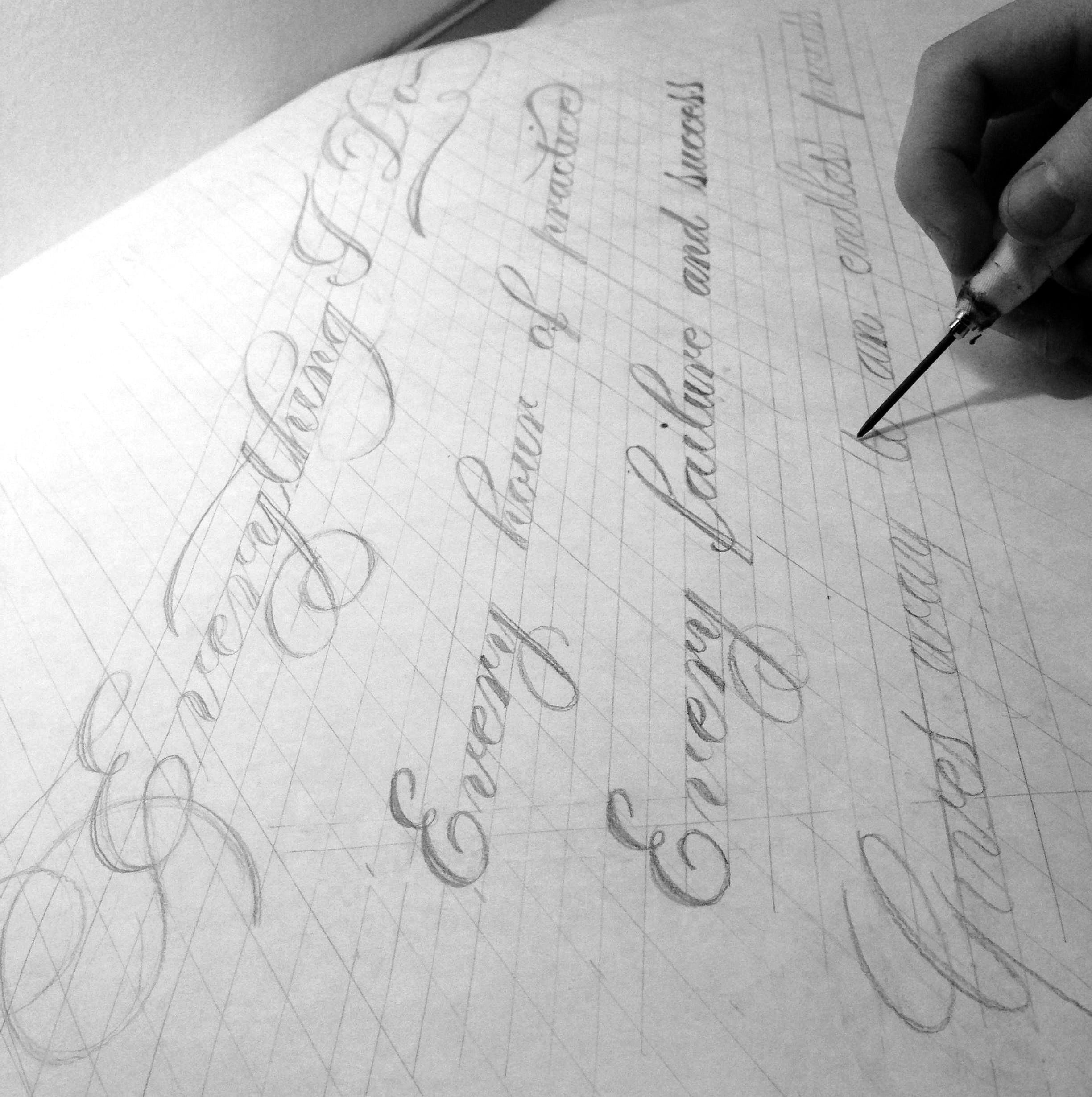
14. Sketching: Before I begin sketching, I just wanted to mention that by no means, do you have to follow my exact process. I know everybody has their own way of doing things and this is mine. So, maybe it's not fit for you, but maybe there's a takeaway from lists that you can add to your own style of how you do things. I also want to point out just a few things before I get into it. This is the different ways I sketch. As you see here, this is a pencil sketch, and I had a more rough version before this. What I did was, I built upon that with some vellum paper and just tighten it up a little bit. Because when you're presenting artwork, they always want things as close as possible the digital version, the final product when you're showing it to art directors or whoever is going to see it. So, this was more of a tight sketch that I had scanned in, showed it to a client, and this was just done in pencil, but I would do it in the same way I'm going to show you. I start off with just single lines and building it from there with the knowledge of how adding weight works to letters. Secondly, sometimes, I'll work with my oblique pen holder ink, and I'll just go through revisions of just doing one piece and finding the things I like and the things I don't like, and then re-working them. A lot of these tactics work really great if you have a light box, I have one below, and I highly recommend getting one if you're a practicing artist because it will save you a lot of time in doing revisions. As we'll see next, the third thing that I do sometimes is combine different things. So here, I'd use my blue cobalt marker, the same exact one, this is just blue, and I started by roughly just drawing in the forums with the marker. As you see, I just kept doing that kind of playing around with the composition. But then, what I did was, I took it to the light box. I put a piece over that, and with pencil, I kind of took most of the forums and kind of played with them, creating this composition that isn't exactly like this, but it definitely took most of the ideas from these original ones. From there, I again set this on top, and then finished it what the brush. So, I was mixing techniques to get with a pencil. I could really get perfected forms I was seeking. Then from there, I could finish it off again with this final piece. So, there are so many different ways you can sketch. It's really all about playing around and seeing what suits how you work best. So, I hope this helps for you guys to understand that you don't have to follow exactly what I do. I'm just trying to give you guys ideas and show you how some things can work. So, with that, I'll begin sketching. Here is my process how I sketch. Let's just choose a word scripts. I feel that it's quite fitting for this class. So, what I'll do is, I'll begin by roughly drawing this in, and I wanted S, and I curve around like that, maybe something that comes around. Sorry if I mumble, I'm trying to focus in on working on this. Rounded. Okay. So, what I'm doing now is I'm just lightly kind of penciling in just some of the general shapes I want. I have this curl around. Okay. I think I'll go a little bit farther. It's always good to have an eraser on hand. All right. Let it be thicker. Okay. That's kind of the rough basis that I'm looking for. So, now, that I have it kind of roughed out, I'm going to begin just going in and start tightening up things that need adjustments. So this T, I want it a little bit more straight, matching the angle the curve on this P. It is exactly how I want it. Still keeping things fairly loose though. Curve on this S. Erase some of the error. Okay, a little more curve there. Again, certainly, sorry if I'm mumbling. I'm just trying to focus in on doing this. The T, maybe I want something a little more flourish like that and maybe of the S. I don't want something, how do I want to do this? Maybe I want something quite like that, little bit more rounded there. This curve needs to be adjusted a bit. Okay. Not looking bad, but this isn't looking quite right right now. I'll come back to that in a little bit if. I'm just going to start adding in weight to this. I'm trying to move a little fast here because I don't want this video to be too long. So, obviously, when I'm working without video camera on me, I have unlimited amount of time to work on a sketch depending on the deadline of course, but it gives me a little bit more freedom to work at a slower pace. Again, when I'm adding weight, I'm thinking about how we talked earlier and demonstrating with my oblique pen holder how entering with an exits around curves and how that kind of worked on this, understand that really has helped me progress as a lettering artist, and then my pencil sketches as well.
15. Sketching: part two: Now, I'm just really loosely filling in some of the areas of the sketches. Bringing some of the letters to life. Still trying to keep it fairly simple, don't want to get too involved in them filling in letters at this point. All right. This isn't working exactly how I wanted, so I will take an eraser and just take that away in a little bit. This T is also looking a little wonky here. Too heavy. When drawing a scrip you want also the shades on each letter to have the same proportions. So, I'm trying to keep those things even right now. Okay. So, we're slowly progressing here. It's still loose but not bad. Another thing I like to do is just throw curves a few times just to darken it up a bit and then I'll go back and erase the lines that I don't like. Okay. My process is just slowly building up things and trying to get them where I like it. Oftentimes, I'll even retrace this with my light box if it gets a little too messy. I just want something a little bit neater-looking. But for time reasons, I can't quite do that right now. It will be like an hour of video. I don't think anybody would want to watch that. Let's see here, I want this to curve a little bit no, that's too. So, this needs to be more rounded here. So, I'm going to try and get a feel for this curve right here. Okay. I'll talk about flourishing in the final part of this class. It really does take some practice. Okay. The I. The down I. Right there. Okay. Let's see here. Can add some white right here. The great thing a pencil too is you can erase things as you go. So, you can really have a lot of trial and error as your sketch is progressing. There you go. It's a little off balance on the side, so maybe I'll take this away and try and continue this around. So, you move around. Come out like that. You can just loosely try and get a feel for how I want that curve to look. I'm just erasing away what it is that I don't need. Let's see. Okay. Also rotating the paper to help your wrist move in a natural direction is something that really helps you out. Because you don't want to contort your wrist in a way it doesn't want to move and either end up hurting yourself or having a curve that looks wonky, because it's not very natural to your hand movement. That's still not right how I want it. The curve's a little. Let's see here. Okay. Good. I wanted this to curve a little bit more here and then also add some weight. Let's see here. Okay. So, this isn't looking bad right here. It's still not quite perfect but it's getting there. Don't rush yourselves either, it's not a race. It's just all about slowly working to the final goal. Whatever that may be for you guys if you want to complete a version by hand or just have maybe a rough sketch that you're going to finish up in the computer. My pencil is losing its edge too but I'm not going to resharpen it for now, because I think this might be good enough just for an example of how that works. Okay. So, I think that's good enough for now but really this is how I work. I just slowly keep building things up till they start looking right to me. It's often more of a tedious process but the end outcome is usually something that you really find craft and take breaks as well. I think that's really great to step away from your work, because as you come back to it, you often notice things that you didn't see before, and it really just helps make that piece of artwork even better. So with that, that's just an example of how I sketch. I hope this helps you guys understand a little bit more about the process of lettering.
16. Flourishing: I want to end this course talking about flourishing because this is really the icing on the cake for lettering. It really ties everything together in one beautiful composition, and this really requires a good eye for seeing things. I want you guys to kind of understand it as the design part of lettering because it's all about composition and balancing the white space between each of these flourish forms and how each side correlates to each other. So, this isn't something that you guys are going to understand right after I tell you. It's going to take practice, and by practice, I mean just looking at past master's work and kind of taking it apart and just understanding each little bit of how these things work. I'll give you guys some tips to practice with, but that alone isn't going to make you the best, that you have the potential to be. This is a really great book. This is by Doyald Young, "Dangerous Curves". He's one of my favorite learning artist and he really knew what he was doing. This composition right here is so perfectly balanced and each flourish just is so well-curved, and the idea behind flourishes, as I'll talk about in a little bit, is it's based upon whole arm movements. So, again, each flourish is based upon that oval shape. I'll continue to talk about that in a minute but I just wanted you guys to understand before I demonstrated that it's really looking at things from a design standpoint, really trying to understand how this composition ties everything together, because that's really the great thing. These pieces of lettering can stand on their own. They don't have to be accompanied by an illustration, a piece of photography, whatever it may be. They can really work on their own because they're so well-balanced. So, what I see in a lot of beginners is they just go crazy. They throw flourishes or swatches everywhere on the piece. A, it's not balanced. B, the curves are off, and it's really a mess. So, a great tip is to start off lightly. Don't go crazy right off the bat. Just do practice flourishes on a few letters. Don't force it on every letter because once it's forced, the piece kind of falls apart. It has to be really natural feeling, like this piece, to generate those curves I want. So, for example, if I were just to do a quick flourishing piece. So, as you see here, all these curves rely on that oval shape I talked before. So, we have an oval shape here, you have an oval shape here, and we have an oval shape here. Some are a little bit more rounded but also an oval shape here as well. But it's all based upon that because that oval really is the most pleasing curve to the eye, the most natural curves. So, when thinking about adding flourish into your work, I want you to first realize that it's based upon that oval shape, and really try and mimic that with your curves. Secondly, an important part to this is try to not overlap two dark shades with each other. So, for example, right here, I have a thin overlapping a shade or a heavier weight line. Again, right here, right here, even right here, this line is still heavier than this one. So, there's still a contrast going down because if you have two thick lines together with equal weight, it's just going to look too heavy. There's going to be no contrast between them, and that really kind of takes off the balance to flourishing.
17. More Creative Classes on Skillshare:
 Neil Tasker, Calligraphy and Lettering