Transcripts
1. Welcome!: Hi, everybody. Welcome
to the Art of Illusion, painting, realistic
fabric and glass in oil. My name is Diane, and I've been teaching for about 21 years, painting and drawing,
fine art all the way. And I've been an artist my
entire life, and I love it, and I hope to inspire
you or help you along on your journey, whatever
stage you're at. This class is meant for
intermediate oil painters, people who've done at
least a few oil paintings and have had some success and want something a
little more challenging. Clear glass and fabric are
a little bit deceptive in that they're not
that difficult if you really focus and pay
attention to the process. So I'm going to be walking
you through it step by step from very beginning to very end, and we're going to
do this together. We're going to be painting
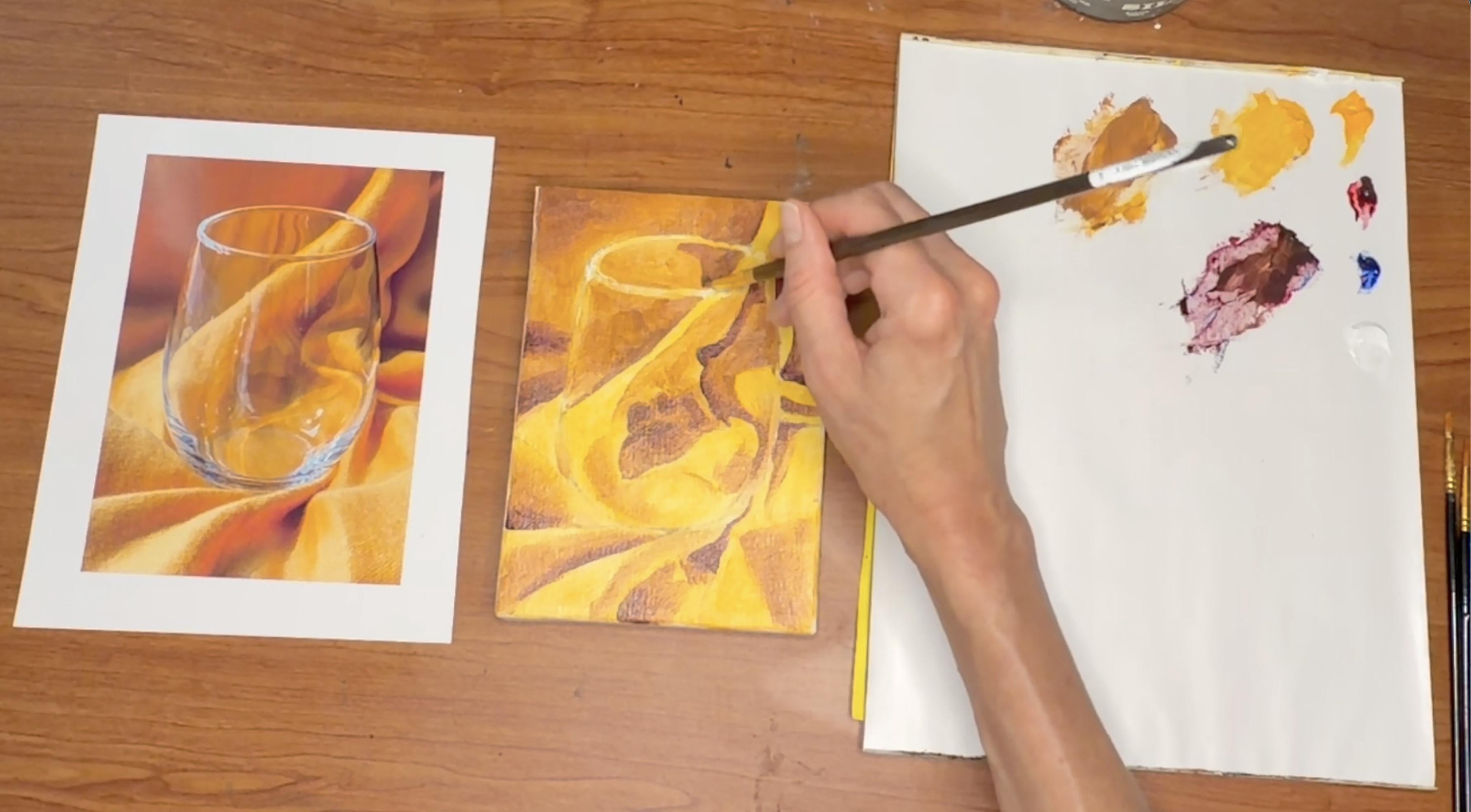
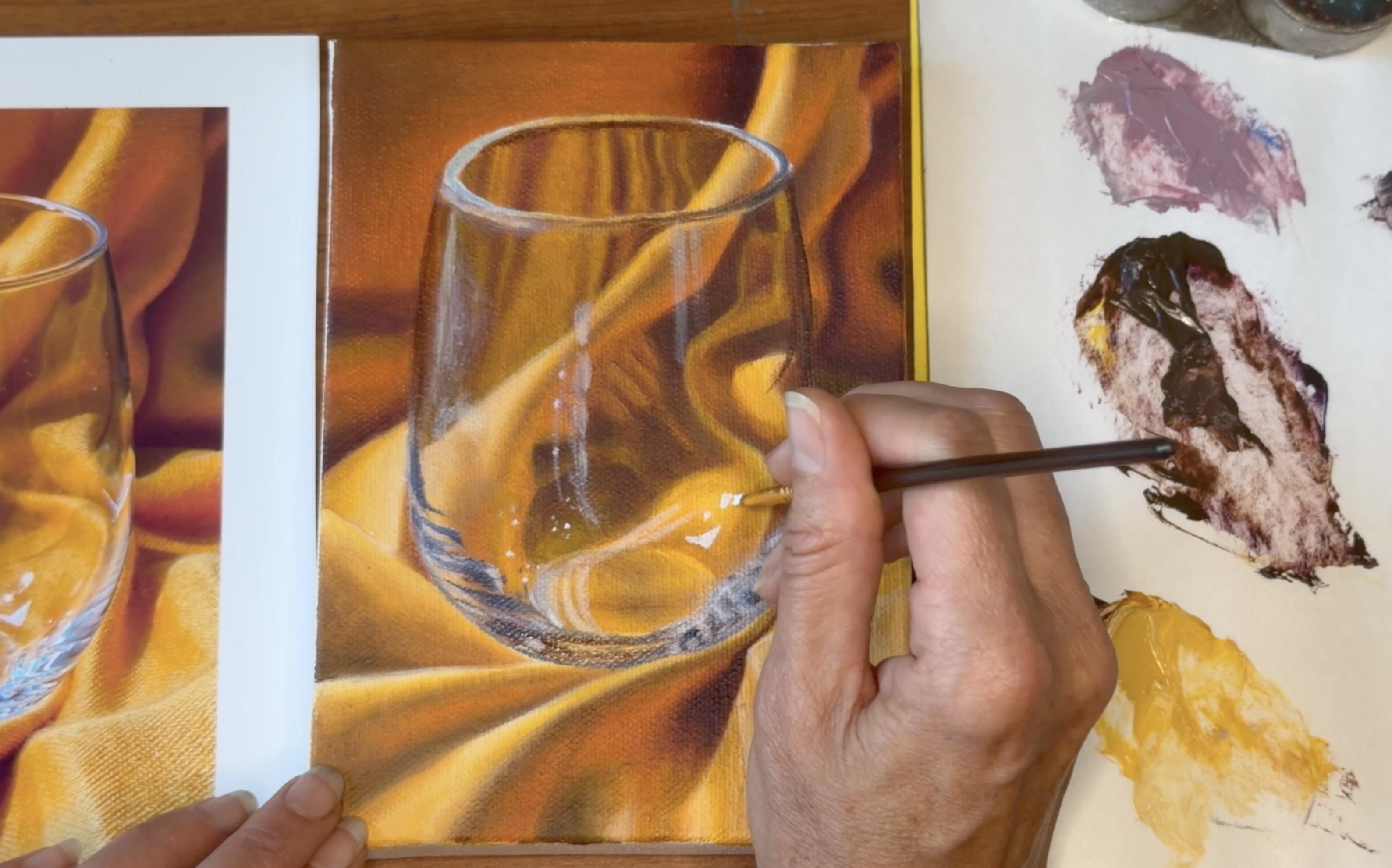
a picture of this image, this wineglass on gold cloth, and it's going to come out
looking something like this. So hopefully, pretty
similar to the image. And we're gonna have a
lot of fun doing it. In this class, you're going to learn some specific skills or practice them if
you've done them before, how to mix colors
to really match a photographic reference
or any reference, really, how to manipulate those colors
together on the canvas, not necessarily having every
single color you need, but being able to blend them together to create new colors. We're going to be creating believable shadows, highlights, textures, the smooth glass, the fabric, the soft,
silky satiny fabric. We're going to learn
how to control the oil to not get messy and
frustrated with it. If you've ever had that
experience with oil paint, we're going to work hard
on that in this class. Just doing multiple
layers of thin paint, letting them dry in between
mostly to really build up richness and texture without
feeling messy or goopy, and also to control the
paint on your palette for a clean palette and usable colors that don't
get all mixed up together. So, I hope you're ready to go. I'm definitely ready to go. Have your cup of
coffee or your cup of tea or whatever lights
your fire ready, and let's get started.
2. Materials: Now that we've
talked a little bit about what we're going
to do in class today, I'm going to
introduce you to the materials you're
going to be using. So first, you need a desk or table in a well
lit area that you don't mind getting paint on or that's covered with paper
or cloth to protect it. You should be in a
well ventilated area. I'm next to a window. Be next to a window,
be outside, ideally, if that's possible,
or have a fan going just so that you're
not breathing any fumes. I'm also going to talk about the toxicity of
these materials in terms of trying to use
less toxic materials because that's important
for our health. You're going to need
your reference photo printed out on
photopaper preferably. If you use photo
paper, the colors will be nice and vibrant. You use copy paper, they
will be much more dull. You can still do that, but
it's just going to be more of a challenge to match the colors and make it look really vibrant. You will need a five by seven
or similar sized canvas. You will need your
optional practice canvas, so just a little
canvas next to you. If you want to practice
some techniques before you put it
on your painting, a pencil with an eraser, you'll need a
variety of brushes. I have for this class, a detail or liner brush, which is just a few hairs. It's the pointiest tiniest
brush you can use, and we use it at the very end for signature and tiny details. Going to use these
a lot. These are the same size round brushes. They are 3/16 of an inch wide, and I have one that's shorter
and one that's longer. It really doesn't
matter. I just have two because I like to have
more than one available. So I don't have to
clean them as often, but you can absolutely
get away with one. I have a one quarter
inch wide Filbert brush, which is a flat brush, but
kind of rounded at the tip. And I have a larger
Filbert brush, a three eighth
inch wide Filbert, also flat and
rounded at the tip. You could get away with one
of these Filbert brushes, one small round brush, and you could even go
without the detail brush. You can really get away with
very little for this class. So if you happen
to have those or want to purchase them, go ahead. Otherwise, you can get away
with just two or three. We need turpentine or a
turpentine substitute. I have mine in
this silicoil jar, which is a jar specially
made for painters. It's full of this orangy
turpentine liquid with a coil, so you can rub your brush on the coil to get the color off. Turpentine fluid itself
is a natural well, somewhat natural
alternative to turpentine. It's like an orange based,
citrus based thing. It still stinks, but it's
not nearly as bad for you as regular turpentine
or mineral spirits. I highly encourage you to use a more natural substitute
just for your health. You'll need a palette
knife for mixing paint. I prefer a metal one, but
they also come in plastic. You will need your palette. I have one of the kind
that's disposable, so you just use your palette
and then when you're done, you rip off the top
sheet and throw it away. You could have a glass one,
a wooden one, a plastic one. There's all different sorts
of palettes and if you've been painting for a while,
or even a little bit, which hopefully you have if you're approaching
this class, you will have identified what type of palette
you like best. You'll need a cloth
or rag or paper towel to wipe brushes,
spills, and hands. You will need oil. This I'm using solvent
free fluid by gambling. You can use any solvent
free alkyd medium. It improves flow, increases transparency,
and speeds drying. Feel free to use this product or any similar alkyd
painting medium. And just, you know,
I like this medium because it thins the paint
without using solvents, which are bad for you to breathe like odorless mineral spirits, and it lets me create smooth, transparent layers while
creating a rich paint film. You will also need oil paint. For this class, I use very few. We have titanium white, which is essential for just
about anything you're ever going to do. And then we have primary colors. We have one yellow,
cadmium yellow hue. I'll talk about the
hue in a second. We have ultramarine blue, cerulean blue, and
olarin crimson. Hue on this means it's not as toxic as straight
cadmium yellow. Straight cadmium paints
are quite toxic, and I don't have any of them
in my collection at all. Many artists swear by them. It's a richer, deeper
color, more true. However, it's terrible
for your health. It's very toxic, so I advocate staying away from them and
going for hues instead. If you would like to augment
your supply of paints, some other common ones
that oil painters have, especially when starting out are cadmium yellow, pale hue, vermilion or cadmium red light, Palo blue, that's pretty
essential, actually. I just don't happen to use it in this class. Burnt Sienna. Yellow ochre, Van ****
brown or burnt umber, cadmium yellow medium,
cadmium orange hue, dioxyzine purple,
and viridian green. Those are just
some that are nice to have and you will
probably use them, but not necessary
for this class. That being said, let's get
into the next section.
3. Draw Glass Shape: Okay, so now that we have
gone through our materials, we are going to take our canvas
and draw our image on it. So hopefully, you have
your canvas unwrapped and your image printed out and a
sharp pencil with an eraser, and I'm going to show you
a measuring technique. So, if you've taken
my classes before, you've seen this before. This canvas is
exactly the same size as the reference photos, so we want everything on here to be the same
size as on here, assuming you want it to be a
very realistic reproduction. So I'm just gonna
move this aside a little bit to give
myself some space, and I'm going to use
my pencil and my thumb as my markers and my pencil
as my measuring tool. What I'm going to do
first is establish where the glass is on the page by measuring from
the corner of the glass, the right corner to
the side of the image. And I'm going to
get a measurement by putting my pencil tip there and my thumbnail here from
where I'm looking at it, so I can see exactly
how big that is, and then picking it up,
I'm going to move it over. And I don't know how high or low it should
be on the canvas. I'm just guessing here,
but I do know it should be exactly that far
in from the edge. So from there, I
can find out how far down it should be
and do the same thing, measure from the top edge. And now I know that
where these two lines meet is right where
that point is. And I'm going to do the same
thing on the other side. And the same thing
for the bottom. So what I'm doing
is establishing the very outside
edges of my object. And that's a very round base. There's no real point,
so I don't need to measure necessarily
from the side. But I am going to do
some other measurements. Just as many as I can do
will make it easier to draw. So kind of a halfway
point between those two. Halfway point between
those two approximately, I can go up further
and do more and more and go down lower
and do more and more. Eventually, what you end up with is connect the dots thing. So the more dots you draw, the easier it is to
make it accurate. Now I'm going into the curve
at the bottom of the glass. I'm going to guess not guess. I'm going to put my
mark right there. And here you can see the form of the glass
starting to happen. I also need to measure from the very top of the page to
the very top of the glass. And I'm pretty
satisfied with that, so I'm just going to draw, and I want to draw lightly
so I can erase if necessary. And this is a man made object, so it really unlike an apple
or something or a leaf, it really should be
very, very precise. So I'm going to do my best to make it perfectly
rounded on the bottom. I can always go back
and change it, though, which I probably will do, of course, because that's
why they invented erasers. And pretty straight from
this point to this point, and even this point to this point, but then
it's going to curve. And at the top, we
definitely want it to round from the side
to that top edge. And now I'm going to get
the bottom lip in there. That's where the
bottom edge should be. And I know I want this
to be very round, too, right into that point. And right up to that point. Now, just a couple common errors with this shape and
ellipse in particular, people tend to make
the ends pointy, like a lemon or too round, kind of like a vitamin pill. So you want sort of a
hybrid of those two. In my case, I can see the bottom edge is
flatter than the top. So that tells me I
need to kind of cut in here a little more to
make that look rounder. And I need to go out further here all the way to
my measuring point, which will give me a
little bit more space to make that round or two. And then I'm going
to go back and as and check it out
again and see if it looks a little
more symmetrical. So you do want the bottom to mirror the top and the
left to mirror the right. And you just kind of keep
messing with it until that happens. And there we go.
4. Draw Background Fabric Folds: So now that we have the
main shape down and we can go back and fix it a
little more after if we want, we can put the
background fold in. These do not have to be as
accurate at all as the glass, but we're going to
measure somewhat just for the exercise of
trying to make it look like that, like the image. So I measured how far
that was from the side. I'm going to do the same thing
for this little fold here. And I'm going to
figure out where this point ends
About right there. And then, as you can see,
it breaks in the glass. So here, I'm going to measure
how far down that goes. Oops. That's not right. I measured from the bottom of the white portion of the
page instead of the yellow. So it's going to jog up,
something like that, and then I'm going to
start from there and continue up and sort of just
lazily make my way up there. It does not have to
be exactly like this. It's just a good approximation. This, where this fold
ends up into the glass. I'm going to do that next,
see kind of how far down from the top of the canvas it
ends right about there. If you want, you can certainly
be as precise as you want. You can measure that crease, but I'm going to not
just for the sake of modeling more fluid
drawing, I guess. Not as precise but
still beautiful. Underneath there, that's pretty close, so I'm not
gonna measure it. I'm just going to
make a mark, and it definitely tilts
off to the right. So again, I'm not gonna measure
just visually guessing. We want to kind of do our
biggest shapes first because it makes it easier to
get the little ones in. So I'm going to
do this one next. Where does that hit the glass? And it happens to hit
right at that spot. And then I'm just
going to pick a point, either this one or this one, I'll do this one here. As long as you know
where you ended up, that's all that really matters. And then we're going to curve
around under the glass. I'm going to do this one next. That's a very
obvious, large shape. And it touches the glass or actually it
touches this other foldRund pretty much right
in the middle of the glass. So right here is where
it's going to dip down. So it's going to curve
up a little bit, touch the bottom of the glass, and then right at that
point, kind of fold down. Or actually, this line I
made was the bottom edge, so I need to I should have
made that top edge first. The top edge is going to go into the corner of the page
just a little to the right, and it's going to start
here and kind of do this. There we go. And I'm going to curve that
around a little bit. And then we have
another one here. Starts there. Ends here. So just draw that in. And then this one
here is going to start there on the right side and it ends up
blending out here, but I'm going to just follow this shadow because it's
a more definite line. That goes up this far before it curves over to meet this
point and this point, I'm going to measure both ways, horizontal and vertical just to make sure, it's
in the right place. Then I'm going to
connect those dots. It's going to curve over, round, curve down and
up, something like that. Then here, this one is very small and right next to the glass, so I'm
not going to measure that. It just comes right down. As you can see, I'm
just picking and choosing what I measure and
you can do the same thing. Whatever it makes sense for you to measure because you want it to be really in the right
place or it's hard to judge, go ahead and measure,
anything that you feel like you can eyeball
it, go ahead and eyeball it. That's going to start
there and curve over, and then right above it, there's this dip, and then right above that,
there's this other dip. And I feel like I want to
move this line up a little bit to make that shape bigger,
so I'm going to do that. And then up here, I
have this little tiny bit kind of going off
the edge of the page. And over here, I
have a single line going off. And there we go.
5. Draw Interior Fabric Folds: Section 1.3 0.2 drawing image on Canvas
folds inside glass. Now we're going to do
the other folds inside the glass that are
kind of funky. We'll measure a little bit, but it's mostly going
to be eyeballing. So we already have
this top edge here. We can start with this next bit, which seems to
touch the lip here. And then it goes
down to this point. So from the side of the glass, that appears to be there, but I'm also going to see how far it is from the lip
to make sure I made it. I made it way too low, so
it's going to be there. And then it's going to
curve into this other fold. So before I draw that, I'm
going to draw this other fold. I'm going to start right next
to the edge of the glass. And then it comes down
to this little point. Which is right
next to that fold. Actually, I'm going
to draw this line in because it's starting to
get a little confusing. So that is this line right here. This point is that
point right there. And then from
there, I'm going to measure down to the next point, which leans a little bit to
the left, right about there. I'm going to see
if I made it far enough away from the
edge of the glass. Not quite. Again, I'm
just kind of nitpicking. I don't have to be that
accurate, but I am. Then it's going to
fold out to the left, so I'm going to measure
the furthest out point. It's going to be right here and kind of the
center of that point, either measuring from
the bottom or the top of the glass, will be here. So where those two meet
will be that edge. And then it's going to curve
off the edge and down. So I think I'm just going
to eyeball that part. You are welcome to make any
measuring marks you want, of course, and then I'm
going to draw that shape in. Curve in and out and
then really immediately, it curves over to
the right and hugs the right side of
the glass and goes down and sort of disappears
into these reflections. Then from there, I can make
this end up touching that. I'm not going to draw
all of this, by the way. I should have mentioned that. A lot of this is reflections, and it's going to be very kind
of ephemeral and ghostly. But I am going to draw this
big pit in the middle. So from corner to corner, that corner is right
under the fold here, so that's going to
start about there and go to about here. And then from the bottom
edge of the glass to the bottom edge of that,
I'm calling it the pit. I just set that. I don't
know what we can call it. I guess it's kind of a pit. To the top corner will be there, and that's all the
measuring I'm going to do. I'm just going to
eyeball the shape. Doing sort of the largest,
easiest edge first, and then the one
that sort of seems a little more elusive after. Okay, now I'm just going to go around and complete anything, erase any measuring marks
that aren't really necessary. You can get rid of dots if
you want. You don't have to. We're going to paint over
them, but it can be helpful. Go ahead and make any
adjustments you want to make. And then we're going to get
on with the painting part. Don't worry about
these reflections. We'll put those in later. So this is just the drawing.
6. Mindset: So before we actually pick up the paint brush and
get into the class, I just want to talk
a little bit about a good mindset to have
while you're working. Relax and have fun. That's kind of what
we're here to do is enrich our experience in life. So let's keep the focus
on that and not stress about being perfect or
getting it exactly right. That's also true because oil
paint is pretty forgiving. It's opaque, so you can paint over it later if you really
don't like what you did. You can also wipe it
off in the moment. If it's just not going
the way you want, you can take a dry cloth and gently wipe it off
and start again. Um, it stays wet for days,
so that's not an issue. You could also if the layer
below it is extremely dry, you could take a little bit of turpentine on a dry
rag and wipe it off. If you have too much turpentine or if the layer below it
is even a little bit wet, it might kind of rub
off the lower layer, so just be aware that
that could happen. Best to try a dry cloth first, or you could just wait for
it to dry and paint over it next time. So many
different options. Try as much as you can to mix more paint than you think
you're going to need for each color because the oil paint will dry between sessions on
your palette a little bit. Each time a session happens, and each time you
wait a day or two, it's going to dry more. So you want to overestimate
the amount of paint you need. You don't want a ton of paint
because it will take you forever to mix the color
and it gets wasted, but just a little bit more
than you think you need, maybe 50% more is a
good rule of thumb. Um, we're going to be
refining as we go. So the first layer is going
to be pretty rudimentary. Don't worry if the edges aren't perfect or the blends
aren't perfect. We're going to be layering
and layering and layering, so we will refine as we
go and do more blends and more details the closer we get to the end
of the picture. Lastly, if you are
concerned about anything before you try a technique on your
actual painting, you could have a scrap canvas next to you to practice with. And for that, you can either use your mixed colors if you
have plenty of them, or if you're worried
you're going to run out, just use the colors straight
out of the tube to practice a technique or if you have a mess up section
in your palette where you tried to mix a color, but it just didn't work out, use those colors to practice. That being said, I'm
ready to get going. I hope you are too,
and let's get to it.
7. Palette Set-Up & Mixing First Colors: So now that we've
drawn our picture and talked about the
mindset for this class, we're going to set
up our palette. So you have the initial
colors set out. We have titanium
white, cadmium yellow, hue, lazarne crimson, and
ultramarine blue to start. And we're not going to try to
match these colors exactly. We are just making an approximation of kind
of a light and dark, a couple darks, maybe for
the background, yellows. So that we can get a
base on our canvas. So yellow being the
dominant color, go ahead and pour that first. So if you took my
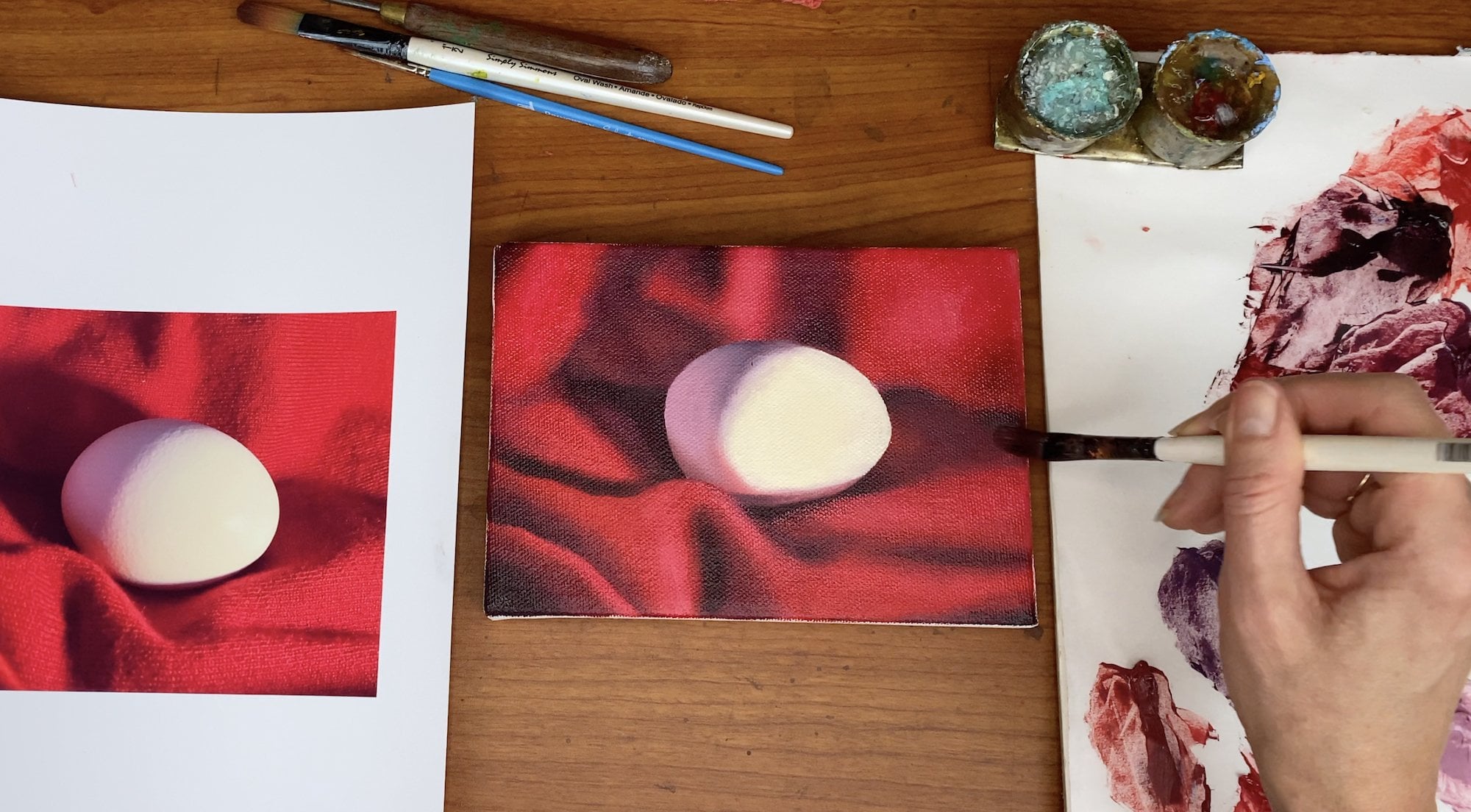
oil painting class where we painted the egg, you will know this already. Or maybe you've learned from other instructors how
to squeeze out paint. It's best to squeeze along
the edge of your palette, the long edge because
then you leave all this space for
mixing in the center. So we're going to squeeze
from the bottom of the tube, just like a tube of toothpaste,
a good amount of yellow. And then always screw
the cap back on all the way after you wipe
the top clean on the canvas. If you don't do those things, then your tubes eventually get kind of clogged
up and gross. And even I do that
and look at this. It's kind of clogged
up and gross anyway. So it just helps
to mitigate that. Keep your colors a good distance away from each
other so they don't get mixed up in their puriform and notice I'm squeezing far less blue and red than
I did the yellow. Oh, dear. This one's
really stuck. Mm. Maybe with a paper towel, I
can open it. Ah, there we go. I'm doing that because blue
and red are really strong, and they're not dominant
in this picture, so we don't need very much
of it, especially blue. I poured very little blue. And then I'm gonna pour
a little bit of white. Because we almost always need white in just about everything. But I'm not going
to use too much. Another thing is,
we're not mixing a ton of color right
now because we're just going to put a very thin layer on the canvas so we
don't need a lot. So we're going to start using your palett knife cut into that yellow, take a
good chunk of it. This is going to be
kind of our main color. And then I'm going to wipe before I dip into my next
color to keep it pure. I'm going to add a
little bit of white just to soften and lighten
it up a little bit. And then noticing
that that's too bright, even though it's, again, that doesn't have to be perfect, I'm going to mix a purple, mostly red, reddish purple. And the reason I'm doing that is purple being the
opposite of yellow is going to neutralize the
yellow in a very small chunk. So you can see from
the white showing through on the palette that
I still need more blue. It's still quite red. And every time I'm dipping in my paint, I'm wiping my palette knife. Naturally, some of it's going
to get mixed up anyway, but this is the best way
to conserve your colors. So that's probably pretty good, kind of a reddish
purple, but I'm going to take very little of it. I'm going to wipe most of
it off my palette knife and just use the residue to
mix into the yellow. And you see how much
that changes it. Just that little tiny bit kind of darkens the
yellow a little bit. And that's all I really wanted
to do for my main color. So I've got that, and now I'm
going to take part of that, move it over, and add some more purple to it to make
one of my dark colors. So now I added kind of
a good chunk of purple. And that's going
to make this sort of yellowy brown right here. Again, don't need a lot, or just putting kind
of a fine layer on. And then, lastly, I'm going to add a little bit of this to my purple to make the
really dark shadowy colors. For the glass rim, we're just going to use
plain titanium white and maybe a little bit of plain blue just to mark it off
when we see it. But other than that,
it's all gonna be yellows, browns, and purples. So now we can put
that aside and get on to putting down
our first layer, which is called
the underpainting.
8. Painting Lights: So we are going to start
with painting the lights, and I'm going to select my about three eighth
inch Filbert brush, which is a type that's got slightly rounded
edge, but it's flat. You can use really
whatever brush you want. Just avoid super tiny ones because that will take forever, and it kind of reinforces
our desire to be too detail oriented when we're just trying to get large
swaths of color on there. Have your turpentine or preferably turpentine
substitute nearby and always leave the
lid on when you're not actively using it so that
you're not breathing the fumes. You're going to dip
your brush in there just a little bit,
get some on there. And wipe it into the light color just to get a little taste
of it on your brush, and then just brush it in. And don't worry about getting it where it's not
supposed to be. Just try your best to put it approximately
where you see it. I'm going around the edge of the glass so that I'm
leaving a little space. See, I'm being pretty sloppy about it because this is
just an underpainting. It's just us trying to get
a color on the canvas. Unlike my egg class where I
did not do an underpainting, this is a more
traditional way of approaching a painting where you just kind of allow yourself the freedom of
sloshing it on there. That's not quite the
right word because this is not a sloshy medium, but just being real
loose with it. Don't worry if the pencil the pencil will bleed
into the paint. That's totally fine.
Underpainting. And we're just doing
the lights right now. We'll do the mediums and darks
next in the next section. And this is kind of mediums, lightish, so I'm going
to put my light in. Notice I'm going on very thin. And my paint's getting
a little thick, so I'm gonna dip in the
Turpentine again to loosen it, get it a little bit thinner, more fluid, easier to spread. Also, it's very good
idea to do this in a well ventilated area or
preferably even outside. I am not outside, but I have a window open right next to me, so I'm breathing nice fresh air, very important for our health, which is paramount, obviously. So just filling in more lights,
kind of scrubbing it in, like I'm coloring with a crayon, making it fun, 'cause it is fun. And when I do want a sharp edge, I'm using my brush
to point towards that edge and then
pulling down from there. Really getting all
the way to the edge. You want to cover up
all your white canvas. This is a valley of
all sorts of things. I'm gonna put a
little bit of light right here for that kind of goldie part and then just
go straight into this part. Actually, this
whole thing really could be just the light color. I can always put a little of the browner color over the top, and I probably will do that.
And come to think of it. Now that I'm saying
that, I'm going to go back into here and cover
this with light, too, a very thin layer because
I'm going to want that down as a ground before I put my mediums in since
it's so light there. But this part's very dark,
so I almost went into there. It would've been fine if I did, but better to leave it white, and that way, the dark
can kind of take over. This is all light That's pretty light. And I'm also noticing
there's a lot of red in here, and I
didn't really mix a red, so I may just use a little bit of the lizarin
crimson right out of the tube to add a redness
to some of these colors. I'm not going to
paint it on straight, but it'll help with that. I'm going to get some
light on the bottom edge here and right there. And this whole section I'm going to paint very
lightly with the light. Notice, I'm not trying to get the paint all
the way covered on the canvas in this
section because I'm going to be covering it with some
reds and purples and stuff. So it doesn't have
to be that thorough. But kind of the same
thing I'm going to do here and up here,
just as a base. So that's very different
than these more solid areas. And that looks
pretty good for now.
9. Painting Mediums: Now I'm going to go in with the brown and
do the same thing. Just get a little bit of
turpentine on my brush to loosen up the paint and go in
and add another layer. So now I'm going
over the yellow. So it's going on lighter,
which is what I wanted. And now I'm being a little more careful about kind of
keeping the edge of the wineglass because the brown might start to overtake
the pencil line, and I don't want to
lose my drawing. So I'm going right
up to the edge and then filling that in. Don't worry if you have
brushstrokes showing that's either part of the
charm or if it bothers you, you're going to go over
it again later anyway. So it really doesn't
matter. Let's see here, I'm going to paint in this
darker part with the brown. And into the center
of the cloth here. Going down, down, down,
filling all this in. And then when I get here, I'm going to actually, I
shouldn't have painted that. I was going to a
it for the purple, but I will paint a
little bit of the brown here and here for
that kind of crease. I'm going to paint
the pit. Solid. Just kind of using the
edge of my brush to keep that shape somewhat intact. And then there's
definitely some over here. Kind of the round disc shape
at the bottom of the cup. I'm going to start to carve
that out with the brush, but not get too
involved with it. Gonna pull some up on
the side a little bit, and then just fill in
the white, really. At least on this
shape, there isn't a whole lot of super dark
stuff on this shape, so I'm just going
to fill that in. So every piece of the
canvas has a color on it. And then sharpen that top edge. Kind to make this curve down. Go a little slower here so I can be a little
bit more precise. And then I'm just gonna
rub that into the gold. These are pretty dark.
I'm gonna leave those. I'll put some brown here. And some here. As I talked
about in the last section. And down here. And that's where it
gets really red. So I'll come back and get some lazarin crimson on that later. For right now, I'm just putting all the browns in where
I see the browns. One thing I didn't mention,
which you may have noticed, may have done yourself, may not, but is that I didn't
wash my brush between colors because I'm going
from a lighter color, the yellow to a darker
color, the brown. And actually, it works
in our favor to have a little bit of the residue
of the yellow on our brush since we're trying to make
these two colors really talk to each other and
marry on the canvas. And I'm painting into a
ton of yellow anyway, so it just there's no
reason to wash our brush. Let's see a little
bit right here. Oh, and then this
whole area is brown. And I just painted out one
pencil line, but that's okay. You may lose a line
here or there. If you do, it's
really no big deal. You will paint it or
draw it back in later. It's pretty important
to not lose your cup, your wineglass. So whatever you need to do, I'm just not quite
going up to the edge because I'm trying to maintain the integrity of that shape. But whatever you
need to do to not lose those lines is important. You get the brown right
down to that line there. And then all in here. And that looks pretty good.
10. Painting Darks: For this section, the darks, I'm going to select
a smaller brush because the darks
are more specific. So it'll just help me to
kind of zoom in on those. I'm not going to use turpentine substitute on this because, again, they're more
specific, so I kind of want them to show
up more intensely. So I'm just using the purple as a sort of all
around dark coverage. And I can come back
and blend these two, which I will, but for right now, I'm just blocking them in, putting them in in
big blocky shapes. Let's see that I accidentally cover with yellow, that's right. So let's get it back
with the purple. And my canvas in some places is a little
oily from the turpentine. So my purple isn't going
on as dark as I'd like. That's totally fine.
It's just a placeholder. I like to think of an
underpainting as a roadmap for getting us to
where we need to go. So you're kind of establishing directions and edges
and textures and layers and colors early so that when you're painting
more precisely later on, you just are kind of following your initial signposts,
which is your underpainting. And in my egg painting, for those of you who
took the egg class, which was the
precursor to this one, you will have done a sort of type of underpainting in
painting the lights first, but we did it much thicker,
really opaque paint, which was meant to be
kind of the final layer, but we did it in the beginning. So this is different. This is not meant to be a final layer. It's just a guide. So again, just
putting it where I see the absolute darkest darks. Come back and blend it in later. I'm going to anchor my
wrist here so I can get a finer line around that
little bit of cloth. And darks in the folds blend up by just
kind of pulling it. This is that pencil line I
accidentally kind of drowned out right there in my mediums
layer, which is fine. I'm just kind of making
up where it went, putting in a dark band. Darkening some areas a little bit in the corner
here where it just is barely darker than
the rest of that area. Kind of putting the darkest
initial brush stroke where I want it darkest and then fading it out the more I brush, the more the paint will
wear off the brush, and it naturally lends
itself to blending. This is sort of a triangle. And I'm not gonna try
to do those stripes, those reflections. I'm just putting the
basic color in right now. What pretty dark over
here, I guess. Yeah. And you should
feel pretty fluid, pretty free with this layer, not worrying about keeping
edges sharp too much. You can do a little bit
as much as you desire, but don't worry about
making it perfect us again, this is just your roadmap. I'm going to soften that edge. I think I got dark
everywhere I wanted it. So now we will pause for a second and
come back and blend.
11. Blending First Background Layer: So now that we've got
all the colors in, we're going to go
back and touch up. So I'm going to wipe my brush off and start with
my little brush. I may use the big one.
I'm not really sure. And I'm just going to
go back and see if anything needs to be softened, added to to find kind
of looking around. This could be softened
a little bit, this could be darkened
a little bit. And I'm just using the residue
on my brush to do that. This definitely needs to be blended quite a bit
into the yellow, so I'm very lightly kind of just rubbing the purple into the yellow to darken
it. Same thing here. Very, very lightly, barely
touching the canvas, cause if I really brush hard, I'm just going to smear
it all into one color. But what I'm trying to do
is encourage the purple to talk to the yellow to kind of get into
the yellow more. Here, I forgot this shadow. This one wants to
blend up a bit. And I'm really thinking in
terms of what, you know, week or however long I take for this to
dry, a couple of days. When I come back, what is
going to seem confusing? And how can I make it not confusing by giving myself
visual information, blending stuff, keeping edges
sharp, that kind of thing. So just a look at your painting through
that lens and decide, am I going to wonder
what this thing is or what it's
supposed to represent, even though you may have
it in your head now and then kind of use that to
inform what you should adjust. H. And just kind of go around the whole
thing and do that. Feeling pretty good about it. So now, as I said before, I'm going to get a little
bit of a lizard crimson, didn't wash my brush,
and just brush that into the yellow to mimic
this red glow. Here and here and a
little bit right here. A little more paint. And even a little back here. Why not? And there we go with that.
And then the last thing, I'm going to take
a little bit of titanium white on a
small round brush, dip it in the turp to get
it a little bit looser. There we go. And I'm going to put down a layer
for my edges. This isn't totally necessary, but it is kind of nice to just really establish those edges, and you will brush right through some of the wet
purple and yellow. That's fine. I'm not going to do it in
areas that don't it. Like, there's no white there whatsoever, so I'm
not going to do that. But I'm going to do it down here on the base of the glass. And now I'm pressing
a little harder. That makes the bristles
splay out to the sides. And that makes
your line thicker. And then I had said I was
going to put some blue in, but I don't think I'm going
to do that at this stage. So as you're seeing, just following my process, there's no one right
way to do this. I could put blue
in, but instead, I'm just going to focus on the form and put
in these kind of lines curving down towards the bottom edge of the glass
to mimic what I see here. And that's just your base. Just a reminder that, Hey, artist, in my
case, my name is Diane. Hey, Diane, this
is a round glass, and there's these round
reflections on the bottom, so I want to be able to
see those really well. And I'm going to stop there. Oh, no, I'm not.
I have this edge. I want it to soften
a little bit. So just look around, see if there's anything else
that you want to do before it dries and then leave
it alone until it's dry. It could be anywhere from
a day or two to a week, depending on your weather
situation and how hot or cold it is in your house and
the humidity in the air. So just kind of check
it in a couple of days, see if it's dry and
come back when it is.
12. Mix Colors for Upper Left Background Corner: Okay, so I hope you've waited long enough for this to be dry to the touch. You should be able to
kind of touch it around, not get anything
on your hands, and if that's the case, rub it. If it still feels good, then you can just
really make sure it's super dry
before you continue. We're going to start by mixing colors for this
upper left corner. And I'm going to mix much more
than I need because we're going to use some of those colors in the
rest of the painting. But we're just going to
start by focusing there. So I'm going to squeeze
out a lot more yellow. This is the cadmium yellow
hue we used the other day. A little tiny.
Well, actually, no, I'm not going to squeeze
out more blue yet because I don't know that
we're going to need it. We're going to just
start with the yellow, and I'm going to go
for this color here, this kind of orangy and
notice how much of it I'm using the yellow is much weaker compared to
these other colors. I'm going to use a
little bit of red, which is pretty strong and it's going to turn it
orange pretty quickly. Using the tip of my knife, as I talked about in my
beginning oil painting video, where we did the egg so that we prevent spreading the
paint too far around on the canvas and then just kind of holding it
up to look and compare. It's pretty good, actually. It's definitely a
little bit lighter, but we are going
to be blending it with this dark red color. Um, I could choose
to You know what I'm going to add a little bit more red and a tiny bit of blue, just to neutralize
it a little bit closer to what's actually there. I could not do
that and just rely on blending these darker
colors into it on the canvas. Either way is correct
or not wrong, anyway. It's just kind of which
path are we going to take? So I'm happy with the
amount of red there, wipe before I dip and get
the tiniest amount of blue because blue
is deadly strong, especially compared to yellow. And that might just be enough. Just dolled it
down a little bit. Yeah, I'm happy with that. So I'm going to leave that and then for the darkest color, I'm going to start with red, since that's pretty dominant. This is all dry here,
so I'm just going to mix right next to that space. There's no real
rhyme or reason for that. I just felt like it. And I'm going to get
a little bit more blue because it's
a purply color. So I want it to be pretty dark. The Alizarin crimson and the ultraen blue are very
transparent, though. So to combat that, first of all, we do
have the underpainting, which is part of
the reason we do an underpainting to
combat transparency. But the other thing
we can do is add a little bit of titanium white, which is very opaque. And we want it to be a
tiny bit lighter anyway. So checking that out. That looks good. Don't need a ton of it. I wish I'd mixed more,
but in this case, I'm just going to go with what I have because I can
always mix more later, and I've already got the color. And then, lastly, I'm going
to do just a little bit of kind of an olive green for
this little bit right here, which is going to
appear in other places. So I'm starting with
the orangy yellow naturally has a little
bit of red in it, of course, and then
I'm adding blue. Yellow and blue
obviously make green. But because it's
an orange yellow, it's going to naturally turn olive rather than if I
use a bright yellow, it would turn more
of a leafy green. And I didn't actually
mean to do it, but I think I came
pretty close to nailing it with the first try. But I'm going to just
look at it around. Yeah. So you may be
able to see it's a little bit greener than what's on the canvas,
but with oil paint, it's often a good idea
to exaggerate a color, whether it's a little brighter, a little more intense, a little lighter or a little darker than what you intend because they're all going
to blend together. So no matter what you
actually mix here, it's going to
change a little bit when it interacts with
these other colors. So kind of emphasizing the separation between these
colors rather than trying to mix exactly
what I see here is really going to work in
my favor as we paint. So those are the colors I
need for that first section, and with that, we can
get on to painting.
13. Painting Upper Left Corner: Now that I've got
my colors mixed, we are going to go in and paint. I'm going to use the same brush I used the other day for most of the background
painting this sort of three eighth
inch wide filbert. And just starting
in with the orange, I'm going to just paint the orange approximately
where I see it, being mindful to
keep the edge of the glass very sharp
by using the point of my brush towards the edge of the glass and just
filling it in, but not approaching the
areas that are dark. I'm just filling in where
I actually see the orange. And putting it on fairly thick. However, the color this orange color is
pretty transparent. So you will probably see some of your underpainting
brushstrokes through it, which is totally fine. I actually really
enjoy that quality. It makes it look more painterly, more artistic, less
of a photograph. But if it bothers you, if you want to cover it up, you are more than welcome too. Um, I'll talk about
that in a minute. After the orange,
switch to the green, and you can Oops, almost
painted the photograph. You can just put a little
bit of green where you see it at the top
edge of this fold, and then just a whisper
of it in the top corner. I barely have any
paint on the brush. I'm just trying to get a
presence of it up there. For opacity, you can always take a little bit
of titanium white, put it into your
transparent paint, let it dry, and then
later when it dries, put over another coat
of the actual color. So in this case, the orange. And that will make it opaque. The white will make it opaque. It'll make it too light at
first, but then it dries. And when you want
to re darken it, you just put the orange
back over the top. So it's a multi step process, but well worth it if
you want that effect. Um so now I'm going to get a
little bit of the dark red, kind of using the corner
my brush to get into that very specific corner. And then pointing
my brush towards the sharp edge,
painting that in. And I'm going to go over here and put a block of it over here. It's more blurry over here, so I'm not so worried about
keeping the edge sharp, but I do want to keep it
sharp against the wine glass. So I'm kind of
angling my brush in that direction to
keep it mostly sharp. And then same thing on
the bottom edge here. And I've used up most of the paint on my
brush at this point, so I can just start to blend. When blending, you don't want a lot of paint
on your brush, it'll just get really gloppy
and difficult to control. So my paint naturally wore off because I
used it on the canvas. So now I'm just going
to go back and blend edges by rubbing them
between the colors. I'm going to go up and
down a little bit here, I just want that edge to
stay sharp and the green and red to naturally match.
Excuse me, marry. And then I'm going to go
back and blend this edge. I have a little bit of
red residue on my brush, so I'm going to put
it in this corner. Again, this corner
is sort of unnamed. It's mostly orange, but it's got a little bit of a
mysterious darkness to it. So I'm just using
both the green and the red to add a presence there, and then just lightly
brushing it into the orange. Now, I'm going to
show you what I meant by adding titanium white. I'm wiping off my
brush, not washing it, just wiping it, getting just a little bit of white
on the tip of my brush. And I'm going to put
it into the orange. And you'll see it
lightens, obviously, because it's white, but it
also increases the opacity. And you can go
further if you want. You can put more white until it's as opaque as
you would like it. Don't be too worried if it gets too light because as I said, you can always adjust
down the color later by darkening
it after it's dry. For right now, if you want
it to be more opaque, you can just do that
in any areas you wish. Even the dark red, you could put a little bit of white into it, and that will make
it more opaque. So go ahead and noodle it
as much as you would like, and when you're done,
we'll move on to the next section. A
14. Painting Upper Right Dark Background: Now we're going to paint
this section in here, and we're choosing
this because it's kind of behind
these other things, and it's really nice in oil or acrylic or actually many
mediums to work background to foreground so that
you're constantly layering the light the foreground on top
of the background, and you don't have to worry
about smudging edges. Because if I did this first and then went back to do
the stuff behind it, I'm having to be very
manicured around the edges. So it's just a
little bit easier. We already have the colors
we need for this section. I think this dark may prove not we don't quite
have the right color, but I'm going to see
what happens if we put a little green
in with the red. And if it doesn't work, we
can always mix a new color. So I'm going to start with
the orange again because it's the lighter color and just
paint around this area, even though it's too bright, but you'll see we're going to do more of this where
we put the reds and greens in and really
blend into the orange here to dull and darken it. So I'm really just putting that where I see the lighter parts, and then I'm going to include
this little thing up here. A little bit more paint. Wipe off my brush,
switch to the green, put that in kind of around
this whole shape and actually into it because I said I
was going to experiment with mixing the green and
the red on the canvas here. And I'm going to paint
some of the green into the orange to give
it some dullness. That's working really nicely. In fact, I'm just going to go over all the orange
with the green. Yeah, that subdues it
really beautifully. Then white my brush. Oh, I'm sorry, I
forgot to mention, you may have noticed I'm
using a smaller brush because I have more
details in this section. Still a Filbert,
but you can also choose to use a flat
brush or a round brush. I find Filbert nice
because they're good for spreading larger areas of
color and also blending. Like I said before, if
you're a one brush person, that comes in really handy. But if you're just putting
in larger areas of color, a flat brush is really nice. If you're just doing details, a tiny round brush
is really nice. So I'm very carefully putting
in the red here I want to maintain the integrity
of that left edge. And then I'm going to put some
right in the center here. Now I don't have a
lot of paint left on my brush and I do want this
to blend really nicely, so I'm going to go ahead
and just start smearing it. Or I shouldn't say nicely. I should say widely.
I want to wide blend. Now I feel like I have
a little too much, so I'm going to
wipe some off and go back and continue blending. That'll be something
you encounter a lot as your oil painting, you'll just notice I
have too much paint or not enough paint on my brush, so you go and fix the
situation accordingly. I'm going to blend
this center thing out by following
the curve of it. And then up here,
I'm just going to anchor my hand on the
flat surface so I can be very controlled
about it and kind of blend these two
little fine edges, wipe my brush again, and I
still want that more blended, so I'm going to go
back and soften more. Rubbing between the two colors. Got a little red line
in there, wipe it off. And now I'm going
to look around. I kind of want this to
be a little softer. Yeah, and I'm happy with that. So on to the next bit.
15. Painting Upper Right Light Background: So next we're going to do this part because it is
in front of those two, and we've already done
those two, so that's kind of a next natural
step or one of many. It's just the one we're
picking for this class. I'm going to use the same
brush I used for this section, the quarter inch wide, Filbert. I did rinse it first in the
turpentine and wipe it off, so I have a fresh start because I'm going to go back
to a light color. So for this section,
you're going to need all the colors we just
use, all three of those, plus the same kind of
light yellow we used for the underpainting
or something very similar and
just plain white. So if you don't have
any of this left, go ahead and pause the
video and mix some more. And we're actually
going to start with the white because
that's going to establish that bright highlight
on the fold of the cloth. It's gonna be too
white to begin with, but then it's going to be
overtaken by the yellows. So we want that to be
established before we start. It's not wrong to put
it in after the yellow, but you may be fighting the yellow in order
to get it to show up. So that's why I put it
in first. I'm going to get some of the
bright yellow from the underpainting class and
I'm being very mindful of this edge because it's
obviously very wet with red. I'm just very carefully
going up and down. It's creating a
nice smooth edge. It even softens a little bit
between the yellow and red, but I don't want them blended. I just want them
smooth together. Once I've got that
edge established, I'm going to go back
for more yellow and paint it mostly over the white, but just really boxing
it in from both sides. And then I'm going to
wipe my brush off and do one or two last swipes of the white directly into the yellow,
and that'll brighten it. Now, on the other side, I'm going to put the orange in where it seems to
kind of glow orange. So I'm doing this because
it's the next lightest color. So I'm kind of skipping over
that dark edge right now. Painting in a big,
not sickly painted, but just a wide
area of orange and I'm going to do the same thing down here on these folds again. The red here is very wet, so I'm being very
careful and slow about trying to get my edge
right up next to the wet. If this is difficult or just unpleasant for you to
try to be that careful, you can always wait til it
dries and come back to it. A couple of days later or a week later or whenever it's dry, you don't have to
do this right away. But if you just feel like
plugging forth and it doesn't bother you that
much to be careful of the edge, then go for it. That's my orange there and
then down here a little bit. I'm going to wipe and
then switch to the green, use the green to establish
my darker color around the orange and right up next
to the edge on that fold, where the white is going on. That's not as dark
as I would like it, so I will probably go back
and darken that later. But for right now, it's
a nice placeholder. It's definitely green
enough and that's what we wanted also
is a darker green. So just putting that wherever I see that kind of
brownish green color. I'm going to use this also to re establish this edge
because as you can see, with my red, I kind of
cut into it too far. That likely didn't
happen to you, but if it did or
if it ever does, you can kind of
use the new color as sort of a bully color
to push the old color out. So I'm anchoring my fist, so I can be very careful of
this edge and just kind of mindfully wiping pushing the red back into its own territory. And then I'm going to wipe
that and get a little more green and go back in here
and try to create this fold, although the paint is very wet and the green
is not dark enough, so it's really not
being very successful, but I can do what I can
and then come back later. Wipe it off again, get a
little bit of the red, put that into the center here and pull that
out into the green. I'm also going to put a
little bit of it up here just to darken that fold. That dark place right there
is called the core shadow. Most objects that are very dramatically lit will
have a core shadow, which is the kind
of darkest shadow between the reflection
and the brightest lights. And then I'm going
to go back and just soften where
it needs softening, sharpen where it
needs sharpening, add more color where
it needs more color. I get a little bit more
of an edge up here. So I'm now going back
into the background just happened to
have the right color on my brush, and it needed it. And that is pretty
good for that section.
16. Painting Right Background Folds: Now we're going to focus
on this section here, the right background folds. Before we start painting, we
need to mix one more color, which is going to be
this dark grayish brown. I probably should have
mixed that for here, too, as you can see, and
as we talked about, the red and green
didn't work so well. But now I've learned from that, so I am going to mix a darker, grayer color, starting
with yellow and blue. Wipe, wipe, dip back into the blue because
I just need more. That's nice and dark.
That's what I wanted. And it's kind of greenish. Let's see how this looks.
Little too greenish. So we need some red
because red being the natural complement of
green will neutralize it. May have gone a little too far with the red
there, but let's see. Maybe not. I'm going to add a little bit of white because
we do need to lighten it. Just a hair. That'll also make it easier to see what color it actually is. That is pretty good, but I'm going to add
just a dot more blue. Overdid the red, a little
tiny bit too much. Nah, that did almost
nothing. Try that again. There we go. All right.
And I think we've got it. So we're just going for kind of a really dark brownish gray
a little on the purply side. And I'm going to use
my tiny round brush to get the yellow in here on this line just because
it's a little bit easier. And then over here, oh, I forgot about the
white, so I can just wipe the yellow off
my brush and do the white. I'm going to put a little
bit of white right on the edge of this fold, where it gets very bright. And I'm also going to put
a little bit over here. Ideally, I could
switch to the Filbert, but since I have the white
on this brush already, and it's such a small
section, I'm just not. You certainly can, if you want, but I'm just putting white kind of as a ground where I see it. Not painting thick.
If you paint thick, it will be very difficult to
make it look yellowy later. All we're trying to do is add
a brightness to the ground. So we got that. I'm going to switch back to my Filbert brush, rinse it off in the turpentine. Actually, Turpentine substitute. That's not quite as terrible
for us to breathe and wipe it off really well on the
towel because I really don't want any of that oily
residue if I can avoid it. Now I'm going to go back into
the light yellow and paint. Just kind of the edges here, getting the white
to subdue a bit. Something like that,
and also up here, get some yellow up there. I forgot this part right
here next to the glass. Then I'm going to
use the orange, fill that in along
the bottom edge. In this fold right here, wipe, move to the red, paint
that into this crevice, trying to establish a sharp
edge between the red and the orange and establish a
shape for this big shadow. Also putting the red on the bottom edge of
this shape right here, all the way up to the
edge of the wine glass. And then we're going to move
to our new color and fill in the darkest areas a little
bit right here and up here. And then we'll go back with
just a little residue on the brush and kind of blend
things out a little bit. Residue from that dark color because it's a little
grayish down there. I'm also going to just
establish this edge. And we're done.
17. Painting Bottom Center Foreground: Now we're going to skip to
this section here because that is kind of the next sort
of in the back part. These two folds are
more in front of it. So we're going to do that
skip this and come back to it. We're going to start. I'm going to use the
smaller Filbert brush again and just start
with the ridge here. I'll start from there, and we'll do this in another section. So I'm going to use
the green paint in this core shadow on top of the ridge of this
fold of fabric. And since I'm on green, I may as well go over here. And actually, I just
broke my own rule. I did not start with
the lightest color. But I guess this is
a good opportunity to explore what happens
when we do that. It is not a big deal. So I started with the green. I'm just going to continue, put that in where I
see it. I may as well. And then I'm going
to wipe it off. And in this case, I
don't really need to clean it because
there's nothing here that's really much lighter than green except for that
little tiny bit right there, but that's a dull color. So it doesn't matter if there's a little bit of
green in my brush. I'm going to get a little
bit of the yellow, the light yellow from
the underpainting, and put that in right there
where I just talked about, and kind of pull the green down off the canvas a little bit. And then I'm going to
wipe it again and put a very small thin amount of
yellow in this orangy bit. Oh, that's not even showing up. Just a little bit in order to create a nice light
ground for the orange, not because I want
it to look yellow, just because the orange
is very transparent, so that'll help it go on a little more solidly and opaque. So now I'm going to
put the orange in down here to the bottom and blend that into the
yellow I just put down. And over here to the mouth
of this kind of purply cave. I'm going to use some of the
red here because there's a definite red glow coming
from that little cave. So I'm not filling
in the darkest part, just kind of the
mouth of the opening. Since I have it on my brush, I'm also going to use
it to establish this little tiny line
that seems to be sort of coming from the bottom and the top and almost
connecting in the middle. But I have so little
paint on my brush and I'm barely touching the canvas that it kind of becomes a whisper, like they're trying to
connect, but not quite. And now I'm going to go and blend that red
before I get the dark. So I'm blending a lot on the bottom because
it's very soft there. And then on the left side, I'm just barely softening, pulling it up into
that little crease. Then lastly, I'm going to get the super dark color and
paint that into the center, just dabbing it in and
blending it with the red. I'm also going to
use the very edge of the brush to kind of darken
that little tiny crease. I have a little bit of
this dark on my brush, so I'm going to use
it and just dab it in a little bit at this
core shadow to darken. And that actually is working really nicely, so
I'm gonna continue. Yeah, it seems maybe
that's the money spot. The green first
with a little bit of this dark brownish
color on top. And then I'm gonna go back
and dab it into the orange. Since I can, I'm going
to wipe my brush off, get a little bit of yellow, the light yellow and put
it all along this ridge. Just to give the dark
something to blend into. We will be coming
back to this fold, but in the meantime,
this will give it a nice transition upfront. Lastly, I'm gonna
just look around. I feel like I want to put some of this dark in right here. Definitely wants to be a little
darker at that shadow at the base going up into that little whispery shadow
we talked about before. And I'm feeling pretty good about that, so
we'll leave it there.
18. Painting Right Bottom Corner: Okay, now we've got
these two sections painted, which are
behind this one. So we're going to go over to
this right bottom corner. I'm going to switch back
to my large Filbert brush, get a little bit of white, and paint that into the
brightest surface here, again, not thick paint, but a wide area of it. And a little bit as
it transitions into the valley area we just painted. And then across
the top edge here. And that will re
establish this top edge as the boundary between this front fold and the back area we painted
a little bit ago. So I'm kind of purposefully forcing the white
into that area. I can see my pencil line a
little bit through the paint. Don't worry about that
if that happens to you. We're going to go over
it anywhere you see pencil lines for that
reason, if nothing else. I also see a little bit
of shimmery white here, so I'm going to just put this
on really, really lightly. You can see the canvas
texture showing through. That's how light I'm putting on. Then I'm going to wipe go back
and get my original light yellow from the
underpainting and paint that in solid where
I see yellow. Again, using that color to re establish my boundary between the fold I'm currently
painting and the tunnel, what do I call it, the
cave that I just painted. And as you can see,
the red is kind of forcefully showing
through there. Don't worry about that. We
can go back and fix it. But I thought maybe I could use the yellow to bully
the red back, but I cannot it's okay. So I'm going to wipe it
off the canvas here and then smear it over to the left where I'm blending
it with the white, put a large forceful
swath of it right there, and then I'm going
to wipe the rest it off my brush in this area
where I put the white. And that will nicely blend
with the white to create that kind of gold color,
that chalky gold. And going almost all the way up to the
edge, but not quite. I'm going to leave a
little bit of white there. Now I'm going to go back
here. I wipe my brush off. I'm going to go
back to the edge of this yellow and just
kind of dab around it to encourage it into
the white a little bit. And I don't actually
want this to stay white, so I'm going to use the residue and just kind of
wipe the yellow into it so that this part still
stays the more dominant gold, but the area around it
reads as lighter gold. Same thing with this
crease up here, the edge, I'm going to just sort of
wipe the gold into it so that it is not pure
white anymore. And then on the edge
on the left here, I'm going to use a little bit of this darker color
and just at first, just experiment with
it, see how it behaves. And it's pretty dark. So I'm gonna
continue doing this, but with very, very
little paint on my brush, using the edge of my brush, the tip of it to kind
of establish that fold right there and then
pulling it over to the right. Now, I'm kind of at a point where I may not be able to
do this because it's so wet, but I'm going to try to
put some yellow over the top of this brown
to color correct. And let's see what happens. If it doesn't work, we can always do it later
when it's dry. It's definitely
having an effect, a good effect, which is making it more yellow, but
still staying dark. And that is the goal. So it's working. Yeah, sometimes it does, sometimes it doesn't
this case, it worked. And I'm going to
go back and just touch up a little
bit, soften edges. This edge, even though
it is pretty sharp, needs to be just whispered
at, softened a little bit. So I'm kind of using the side of the Filbert brush to do that. If I use the wide side, it blends more broadly, but I just want to
soften the edge there. And then down here,
I'm going to use it a little bit just
to create more of a transition between
the light part I just painted in the dark part. Lastly, I'm going to take
a little bit of white and put it right here to see if that will
come back the red. Nope. So I could do this later, but I
may as well do it now. I'm going to take a little
bit of the dark color and very carefully put
that line back in so that the reddish brown is no longer showing
through the yellow. Now, I've just got
an edge right there, and it looks like that's
it for that section.
19. Painting Lighter Left Folds: So now we're going to go paint in the two lightest folds
on the left and bottom. This one here and this one, we're going to skip
a little bit because these two have really
similar colors. Normally we go background to foreground to foreground
to foreground. But since those are the
same similar colors, it's just a little easier. And it's okay to
skip around a bit. So, oops, I'm using
the wrong brush. I would like to use
my smaller brush that back section is a smaller piece, and I used a dirty
brush. Oh, no. So I'm going to wipe
my brush off and then go back and get a clean area of white and paint in white where
I see the brightest areas. No real actual white,
but I'm again, using this as a base for the yellow to brighten
it quite a bit. And then up here at
the top of this fold, and I'm going to just
kind of carry that all the way up the upper
edge of this fold. And because my
paint is wet here, it will just naturally
blend right in. It doesn't show up as much
as I would like there, but again, we can go
back over it later. So right now, we're just
establishing a second layer. In some cases, this might be our last layer on
some of these areas, but in most cases, we're going
to go over them all again. Wipe that off and then get the yellow and go back up here. The yellow is quite strong
on the back of this fold. Remembering that background
color is very wet if you have not let this dry like I am just
keeping going. I'm using the edge
of my brush to very carefully keep that edge sharp. And then pulling the yellow down against the edge
of the next fold. And some of the red did
blend into that yellow, which is kind of
a lovely effect. It's not as yellow
as it is here, but we can always go
back and change that later or not, if you like it. Here, I'm going to
actually use the orange first and then probably add
a little brown over the top. 'cause it's darker.
Actually, no, now that I'm looking
at it on the canvas, I'm going to use yellow. I thought I would
need to darken it, so I thought I would
need to use the brown, but I don't think I do. So I'm going to use yellow to make it more of a gold color. And that worked pretty well. Now I'm going to go back and try to enhance the yellow back here. And then because I don't want
this actually to be white, now I'm going to smear the
yellow into the white. There we go. And down here, I'm going to get a little bit of that light yellow
painted into the corner. And pull it up into the white and onto the left
side of this core shadow. Then I'm going to blend it.
Sharpening edges where I need to and smoothing others where
I feel inspired to do that. Like on the top of
this core shadow, it feels a little too sharp. I'm just going to
go in with very little on my brush and
just mess with it a bit, blending it to get
it to look softer. And while I'm at that,
I'm going to go in with the brown and put
a little bit more on the right side to
get it to soften down into this darker
area a bit more. So just very little
paint on the brush and kind encouraging it
down to the right. And then lastly, I'll go back
and soften the top edge. And again, just like
all my classes, probably every art class
you've ever taken, whatever is going on with
the instructor's painting is probably not exactly
what you're experiencing, but just use it as
an opportunity to learn new skills for when you
do run into these things. And it looks like that's
about it for those two, so we'll now move on
to our last two folds.
20. Painting Darker Left Folds: So now we are going to finish the background fold second
layer by finishing these two. So I'm going to use the
smaller Filbert again, start with white again
and establish wherever I want a little bit of white to brighten up the yellow I'm
going to put on the top. Also using it to sharpen up that top edge all the way down
to the base of the glass, and I'm going to smear
it down a little bit. Kind of gives the yellow
something to grab onto. Same thing on this one. A much sharper, brighter highlight than the
one on the top fold. So I'm making it more solid. And then I'm going to
switch to the yellow, not wiping my brush because I don't have a lot
of white on it, and I want the residue on
there for the next bit. So putting yellow below the white blending, pointing my brush
towards the darker of the two colors makes it a
little easier to blend. Same thing here, put the
yellow in beneath the white. And into this fold
that I just painted. I'm also going to use a bit
of the orange to brighten. There is some of that
reflection right here. I'll get that nice warm glow
going in the cloth folds. Same down here, a
little bit of orange. Right. And then I'm going to use that dark brown
color for the shadowy parts. Going pretty dark in that bottom corner here, not so much. So I'm using the
residue from that. I'm not getting more
paint on my brush. I just have a little bit left because this part is
just not as dark. So I'm going to kind of use
it to just wipe around. There is a suggestion
of a core shadow here. Between the white
and the orange, so I'm going to use
the brown to create that brushing it up
underneath the white. I'm exaggerating it at first, making it darker
and more obvious, and then I'll go out
and go and blend it in. That's kind of a way of
establishing its presence nicely. And then up here, I'm going to just point down
towards the brown to blend. And kind of pull it up
into the lighter colors. This one is more of a gradual transition between
dark to mediums to lights. Was this one's more dramatic. Now I'm going to go back, white my brush and blend
out this top edge. Blended more on the left. And as you move right,
it's going to get less and less blended because it's becoming more and more sharp. So I'm going to be more
careful using just the tip of the brush on the right
here to soften and blend. And just looking around,
I'm going to go back. I see a lot of
brushstrokes here, which are all going in
the same direction. I would like to break that up
so that it doesn't distract from the kind of finished
look of the picture. Eventually, obviously, it's
not nowhere near finished. And then here, I've got a little bit of
the brown showing through the yellow on this fold, so I'm going to take the
brown and just go into the yellow with that to get
rid of that little shadow. It's much easier to do that and just give in to the fact that the dark is
showing through. Use it to your advantage
than it is to try to do multiple coats of light
over the dark later. You can do that. There's
nothing wrong with it. It's just easier
to do it this way. And I'm also going to
blend out that shadow more because there's too
much of an edge between the brown
and the orange. Then lastly, I see
a little bit of pencil right here and it's dark, so I'm just going to use
what's left on my brush to fill that in. And we're done.
21. Painting Left Upper Ellipse: Okay, so now that we
finished the background, I have actually let
my painting dry for a few days after I finished the background so
that I wouldn't make any smudges or get it on my hand while I'm
painting the glass. You're welcome to do the same. Or if you feel inspired, you can just keep going
and just be careful not to smudge anything
you've already painted. I also mixed some
more of my colors because I was running
can do that anytime, pause the video,
remix your colors. The only thing different from my original palette
is this color here I added to do these kind of darker greenish browns
inside the glass, and I'll use a little bit
up here in the ellipse. This is just this color, except it's got a little bit
more blue and red in it. So you can go ahead
and mix that one, go ahead and pause the video, mix this again and
add a little bit of blue and red to it until you get a brown or darker version. Now we can start painting
in this section here, the left side of the ellipse. So I'm going to start
with a little light yellow and just
approximate those stripes. So they're blurry, they're
fuzzy, they're very malleable. So you can just
approximate what you see. Don't feel you have
to make them exact. But I see kind of a
thin one, a wide one. And then they start getting
a little wiggly here. And the yellow is
too light for this. Don't be concerned about that. We want to put down a
more opaque light layer of yellow on this layer. And then later near
the end of the class, we'll come back with a darker yellow and what's
called glaze over it, which is putting a transparent coat of
a darker yellow over it to be able to still see the pattern underneath but
adjust the color down. If we tried to do
that dark yellow now, it would be too transparent
and it would show through. So I think that's all I
want to do with my yellow, so I'm going to
wipe my brush off, switch to the lighter green. And put a little bit right
next to it on the right side. I'm going to put a little
bit kind of on the sides of this stripe because it seems a little bit
greenish over there. Wipe it off, and then
I'm going to switch to a light brown and go over that green I just put here and just kind of putting
it about where I see it. Separating the stripes
gets redder over here, but I'm going to put a little
brown on top of the green between those two as a base, and then I'm going to
very conservatively use a little bit of dark red because
this is a very dark red. I do want it to show
up, but see how incredibly dark that is. Don't be concerned. We are going to blend it so it
will lighten up. And much like the yellow, we can always go over
it later if it turns out to be too dark or
too red or too anything. I'm going to put some
in the corner here, blend that into the green. So I barely have any paint
on my brush right now, which is why that
blend worked so well. If I have a ton of paint, it just the red would
have just dominated. I'm going to put a little
bit into the brown here. I barely have any on
my brush again because I've worn it off on the
darker red stripes. So I'm using that to
my advantage here. And now I've got
the basic stripes and so I'm going to
go back and blend. Oops, I didn't wipe
my brush well enough. Don't want to spread
that red too much. I just want to soften it. So now I'm using kind of
the side of my brush, the rounded edge to blend. And because my paintings dry, I'm able to anchor my wrist
on the bottom corner here. So if you let your painting
dry, you can do the same. If not, you kind
of are forced to hover above it or if you're
on an easel hover in front of Now I'm paying attention to the
quality of the blends. So on the left side
of this stripe, it's softer and on the
right side, it's harder. So I'm going to turn
my brush so that I get kind of the
edge of the brush, the sharper top edge to keep
that a little bit sharper. I have some residue
on my brush here, so I'm going to use that
to wipe through this red, wipe off the extra because
I have too much red. Same thing, wipe off the extra. Go over here, blend
a little bit. And then these reds are
just too strong, too hard. So I'm going to go
back and just kind of wipe the edges and try to soften them a bit. More. Sharpening the edges
at the top and bottom. And that looks pretty good.
22. Painting Right Upper Ellipse: Now I'm going to paint the
right side of the ellipse, which is very tiny
and very yellow. So I'm going to
use the same brush with a little bit of
the red residue on it, but I'm really
wiping it off well. I don't want to rinse
it because the rinsing does add an oily
residue to the brush. I still want to use my
little Filbert brush here. Again, you can just use
a totally clean brush. That's fine. I just prefer to have a little residue from my last color on my brush so that it has a relationship
with the new color. Um, so you're going to start with the yellow and just
put in an edge there. I'm trying to cover up a little mistake I made where I kind of went
into that fold, so I'm applying it
pretty thickly here. Looks like it's not
covering entirely, so I'm going to have
to go back over that. Or I can alternately bring the red further into that fold, which I might end up doing. And then on the right side here, I'm going to put a little
bit of this brown. And then wipe that off. And I'm going I should have
actually done this before. I'm going to put a little
bit more yellow here. I should have done
this when I had the yellow on my brush, but I didn't, so I do it now. Wipe and then get a
little bit of plain white and just wipe
that right into the center where I left
a teeny bit of canvas showing so that the white
would come on really bright. Wipe it and then go back
and do any blending. Like, I got a little
yellow smooth there, so I'm going
to blend that. And I do feel like this side needs to be a little bit darker, so I'm going to use
a little bit of my new dark brown color
into the wet paint. Because it's wet, my dark
brown will not go on as dark. Which is exactly what I want, and I'm going to kind of dab in a suggestion of a darker shadow, a core shadow right here, trying to leave a little bit of light at the
very base so that it appears to brighten
as it slopes down, and then I'll go back
and reblend that. It doesn't require a lot because it's such a small
little section. And then I'm going
to come back here with a smaller brush and try to cover up that edge with
a teeny bit of the red. So now I'm using kind
of a thin round brush, and I'm going to anchor my hand so I can
really control where it goes and dab in a
little bit of the red. Chances are you will
not be doing this because you didn't make the
exact same mistake I did, but if you happen to or if you did this in another
section, you know what to do. So it's just easier to
bring the dark color in and cover up a mistake than to try to fight it with
the light color. I could easily let the light dry and do
another coat next time. And then even another coat if the mistake still shows through. But I'm choosing to cover it
up with the dark instead. And now that I've done that, I'm going to go back
with my larger Filbert, get some yellow again
and try to yellow, enhance the yellow on this edge, although the paint
is very wet and I don't want to go into
the red I just painted. So it's not working very
well, but that's okay. It's worth a shot. And
we're gonna go over that with a brighter yellow
anyway when it dries. But I am going to spread the
white a little bit more, just kind of blend that out. I need to add a little more white it's getting
dominated by the brown, 'cause I want that highlight
to be whiter here, not whiter, but
wider, like, thicker. Although it's becoming
whiter as well. And then I'll re add
the yellow to try to get a little more of a
goldy glow right there. Well, that got more blended than I wanted, but that's okay. This is only the second coat, and we can always come back and refine later if
we're so inspired. And that's good enough for the
right side of our ellipse.
23. Painting Left Upper Corner: Alright, we are just going to keep working our
way down the glass. So we did the inside
of the ellipse. We're going to skip the
rim. We're going to skip all the exterior like
lines and reflections. We're just focusing on the yellow showing through
the glass, the cloth. I mean, showing
through the glass. So now we're going to do
this left triangle section, ignoring the highlights. See this kind of, like, bluish purply reflection on
the left side there. We're not going to try to do
that. What we're focusing on is the fabric
behind the reflection. So I'm going to start
on the left side there with my small
Filbert brush and some orange and paint a
big wide stripe of that. All the way to the bottom. Some of it is so obscured
by the reflection. You're kind of guessing.
You can't really tell what's there. So
that's also fine. Just do the best you can. I'm going to wipe the brush off, and it looks like
there's some light green there at the bottom, too. So I'm going to paint
that right into the orange and move over to the right
with the light green. And it looks like there's some
light green kind of around this area of darker,
reddish brown lines. So I'm going to just
sort of make it up, loosely copying what I see, but it's so obscure. Don't worry about
making it exact. What is important is
you want to try to match your line to what
you've done up here. So if there's a line here, you don't want it
going to nowhere, so make sure it continues. Um, in some way, I can wiggle, it can bend, but it should
have some sort of continuity. And then I'm going to wipe my brush and switch
to the yellow. And really, I should have started with the
yellow to follow my own rule of light
to dark, but I didn't. I started on the left,
and this is what happens. We have to just
wipe our brush more often, and that's okay. I'm going to bring the yellow
all the way to the bottom. Again, this yellow is very
much too light. We know that. We're doing it on purpose
so that we can create an opaque layer of
yellow beneath or, sorry, on this layer
so that we can put a more transparent
layer of brighter, darker yellow over later, and it will just glow. That's a magical
moment. So there's a big wide stripe of the
yellow, and then up here, I'm going to copy
pretty much what I see, but I'm also paying attention to the
stripes I have up here, which may differ from that a little bit because
this is a painting. It's not a photocopy. So it's going to be there are
going to be differences, and I want my painting
to look cohesive and, like, it has a sense
of continuity. So I'm paying more
attention to where those stripes are
than I am here. I'm done with the yellow. Now I'm going to go back and get some of that light
green again and fill in some stripes
between where I left. The yellow actually there I'm going to put
in some dark red. Again, the dark
red is very dark, so I'm going to be conservative
with how much I put on my brush a little bit. That's the most bold
red stripe there. Then here there isn't
one on the picture, but I'm making it
up because there is a red stripe on my painting, it looks like it's going
to just wiggle down a little bit to the
left, so I'm doing that. I'm going to add a bit of red right into that
green I just put there. Then I'm going to use the
residual on my brush to fill in these spaces over
here that I left showing between the greens. Making it up, creating
ghostly stripes. It reminds me a little
bit of the scream, Edvard Much scream for those
of you who are familiar with that painting where everything is just a swirl of madness, all these swirls of color going up into this screaming person. Okay, so I'm going
to wipe my brush and go back and do blends, and then I can always
adjust after if I need to. This is quite soft here between
the yellow and the green. That's a bit of a harder edge, but I'm just going to
wipe it a little bit to soften it. And same here. These are harder edges, but
I'm going to wipe them a little bit just so
they look cared for. And over here, I'm just
going to bring my orange. I don't have anything on my
brush now except residue, kind of pushing the orange out to the edge a
little bit more. So it's more sharp. And there we go. That is good for the left upper triangle.
24. Painting Darkest Crevice: Okay, so now we are going
to skip a little bit. We're gonna go to this area,
which is the darkest part. And we're doing that because
it's kind of behind. It's like the background of these lighter areas around it. So if we get that in, then everything else we
paint around it as we paint it will kind of
serve to soften that shadow, and it just kind of it's kind of a more organic way
of doing it back to front. So we're going to
do it that way. It's not wrong to do this first since you're kind of
moving down or even this. But if you're right
handed, like me, it makes sense to go generally from top to bottom
left to right, so you don't put your
hand in as much paint. But again, it's really
not that big a deal, whichever way you
choose to do it. Anyway, that's the
long explanation. We're going to do
this part. So I'm going to start with
the lightest color, which I believe is
the light green, and we're just going
to put in these funky little edges that we've already suggested with
our underpainting here and at the bottom. Okay. And even a little bit out at
the corner here. And then I'm going
to wipe and go for my light brown and fill in kind of beneath blending into the light
green beneath that edge, I mean, and a little bit right over
this yellow that I put in last time. I and actually, I'm going to use some
light brown up here, even though it's red, and obviously we're going
to use the dark red, but as we've seen, the dark red is very, very bold. So this will help to
soften it a little bit, since it's not that the red in this particular
piece isn't that bold. I'm going to leave
this for the darker red because that's the
boldest part of that shadow. But I put the light brown kind
of at the top edge there. Now I'm going to go
for my darker brown, the brownish green
that I mixed earlier and fill in pointing my brush towards that edge
because that's really one of the very few
sharper edges here. So that'll keep that sharp, and then I'm going
to kind of pull down some sections of dark brown into the greenish and put a
section of it up here, right under that
yellow twist part and right above the
yellow twist part. Again, even though
that's reddish, I'm using this as
a bit of a base. I'm also going to
put it up here in these two darker sections. White my brush. I'm going to do my blending on this now rather
than wait till the end, because I am going to
get red on my brush and I'm not sure I want
to put red here. I may want to. Let me see how it looks after I
put the red up here. But just in case I don't, then this will already be blended. Now I'm going to
switch to the red. And I'm going to start since I just put the
color on my brush, I'm going to start
in the boldest, darkest place, and
that'll wipe the boldest, darkest amount of
color off my brush. And then I'm going
to work my way into those slightly
lighter areas. And as the paint
wears off the brush, it naturally becomes lighter, so it works really well
if you do it that way. So I'm now blending it into
that light green area, blending it up into the
light brown area up here. That worked really well using
the brown and the green as kind of base layers so that the red doesn't become
too overpowering all the way through
this crevice. So just looking around, I think I will take
just a little bit of the red residue and kind of
dab it into this brown area. There does seem to
be a presence of it, and same thing here. I'm going to marry
those a little bit, just kind of bring
them together. And add a little red into
this crease and then very, very lightly with
barely anything on the brush and just
sort of rubbing it. And that will be good for our
darkest part of our folds.
25. Painting Left Upper Light Fold: Okay, so now we are
going to focus on this left upper
light fold and start with I really am enjoying this Filbert brush for the
entire wineglass, basically. So just wiping off
the residue from the last color and starting
with my light yellow, and I'm going to point it
towards my edge to try to keep it very sharp and
paint it in yellow. With every layer going a little slower because we want
to be more precise, bringing it closer to a level
of finish we're happy with. So this is going to be
entirely yellow up here. And then down here, I'm
going to put yellow just kind of along the bottom edge
and leave this for white. And I'm going to
go right through my lines I painted earlier. Those were just
suggestions anyway. But as you can see, you can
see them through the paint. They're just there to remind me that my roadmap says
there's lines there. Then I'm going to put some
yellow down here as well, being careful as much as I can, not to smear too much into
the green because that's wet, obviously, since I
just painted it. And it actually works well. I do not suggest
waiting days for this to dry because
it's going to work in your favor
if it's blendable, but you just have to be
careful around the edges. So I'm going to go
up over these folds. Up here, there's some
kind of yellow stripes, so I'm going to just put a few stripes in going
down to the right. Can't really see them because the whole
background's yellow, but when I put the red in you'll be able to
see them better. And then here,
where it's orange, I'm just going to kind of wipe any residual yellow off
my brush there as a base, and then I'm going to
go into the orange. Paint that in and it
should glow nicely. Yes. Love that. Right up to the edge of the red. And way down here. So I don't have a whole
lot of orange paint on my brush because I don't
want it to dominate. I just want it to nicely glow. Pulling that down. Oops, I mess that up a little
bit. I'll just fix it. And I'm going to add a little
bit more orange right down here into this little
dab of brownish orange. So I'm just kind
of putting blocks of color where I see them. In fact, that's kind of what I've been doing
the whole time. And then I go back
and refine later. You probably have started
to see that rhythm. In these stripes, I'm going to get a little bit
of the light green, put that kind of at the
end of each stripe. So those are starting
to get more defined. Dab it in there, and then I'm going to get just a
little tiny bit of red and put that
between the stripes. The lighter stripes made
of the greens and yellows. I guess I need a
little bit more. Better to be too conservative
and have to get more than end up with a big blop of
red on your canvas, though. So I'm not even counting
how many stripes there are. That's probably
about right, four or five, but it doesn't
really matter. It's all very much
an abstraction of what's behind it,
which is the cloth. At the top of these stripes, the red sort of comes together
and peels up to the right, so I'm going to take
the top edge of each stripe and just blend
it up into the orange. And then that's getting a
little smeary up there. I'm also going to
take some dark brown and put that in here
for my core shadow, where the yellow
meets the orange, and that's going to really
define it as cloth folds. And then that comes down around the outside
of the orange here. Blend that really well. Well, not that well, actually, just kind of soften
the edge all the way up and then grab some white
and put that in here. Oops, can't get quite enough. And blend that into the yellow and down and then
soften this edge because it's pretty hard. We're done.
26. Painting Right Curvy Folds: So now we're gonna paint
the right side section with all these curvy folds. So grabbing my small
filbert again, wiping off residue, and starting
in with a light yellow. There's quite a bit
of yellow this time. I'm going to paint this entire
section with the yellow, but I'm going to put the light yellow where I see
the lightest color. And I'm going to do something we almost never do oil paint, which is used paint
straight from the tube because first of all, I've already got
an underpainting. So any paint you put on, whether it's straight from
the tube or mixed, is going to be kind of a hybrid of what's beneath it and what
you're putting on. And secondly, it just seems like the appropriate
thing to do. This color right
out of the tube, this Cadmium Yellow Hue is nice and bright
and gold for here. So it's just going to
brighten it up a little bit. I'm putting it in the darker
areas of this yellow, and it's not going to
show up tremendously well right now, so
don't worry about that. We're kind of just using it as a placeholder for
the darker yellows, which we will do more of later. But that way, it's not just
a solid block of light. I'm also going to take
a little bit of white and enhance those
lights just to give it a little bit more of a
identity against the dark. And I'm going to take that
right up into this curve. Just kind of pull the
white up there and use a little bit
of white up here. Even though I haven't
put the yellow in yet, I should have
done that first, but I have a little bit of
yellow residual on my brush, and I'm just going to
go backwards and do the white first since I already had the
white on my brush. Then I'm going to put in
the light yellow wipe, then the dark yellow straight out of the
tube at the base. And actually, I could have used the dark yellow up here too. I just didn't think of it
till now, so that's okay. Oil painting, any painting
is always a journey, a work in progress, no
matter how much you've done, how much you know,
you're always going to be changing your
mind along the way. And that is part of the beauty and the fun of this practice. I'm going to put some dark
yellow in here and up here. Kind of where I see
that glow in the dark. Oh, glow in the dark. I mean, the yellow glowing in the dark. Now, I'm going to switch
to the light green, put in sort of an outline on this shape because it seems to be sort of outlined
by this color. Waving down into
this lower area. What else? About right here, there seems to be
a little green. Down here, I'm
going to put some. This is a section I
missed this dark section. I miss that with
the underpainting. So I'm gonna try
to just define it. It's probably not going
to get that dark, but I can at least define the shape so I can
go over it later. And a little bit of green right
here on the outside edge, simultaneously softening
into the dark red that is also very wet. I'm using it kind of a It has a double purpose
there. The green does. Now I'm going to go back
with some light brown, put that in just to
kind of darken a little bit on the green up here and I'm going to
put it down here. Even though it's
not dark enough, that will be a good
base for the red. I'm going to put it underneath this fold here, same thing. Good base for the
red and into here. A lot of good bases
for the red happening. And I'll use it to darken
this little section as well. Oh, and I guess I shouldn't
wipe my brush off. I need to kind of bring
it down into here. Again, painting over
those curved stripes I put in earlier, not
a problem at all. We will be putting those
back in later with whites and blues and
things like that, grays. So now just softening the edge. And now I'm gonna
go in with the red. Dark red, like a
little bit right here. At first, just kind of
putting it where I see it, not too concerned about blending it in yet. I'll go
back and do that. Big block of it up here,
a little bit more. And down into this section. And a little bit right here. Also going to refine
this little curve, which kind of forgot
about until now. Wipe my brush, go back
and do any blending. This kind of goes down and over one more little
tweak and done.
27. Painting Elliptical Base: So now we're going to
paint the last bit of the inside of the wineglass, which is the
elliptical base here. So grabbing my favorite
Philbert brush and I'm going to start
off with the yellow. It's really pretty basic. We're not going to do
any of those reflections as we haven't been
doing this whole time. So we're just painting
the main color colors. So I'm going to paint the left side with
the light yellow, which has a little
bit more red residue in it, not on purpose. That's just because
I didn't wipe my brush very well,
but that's also fine. And then I'm going
to grab some of the greenish color
for the right. Paint that in trying to really keep the definition of that
shape as much as I can, so I don't lose it in the paint. Wipe it off and then kind of soften them together
in the center, go around and sharpen edges, keep it really, really
elliptical, really round. Then over here on the left, there's some darkness there, which I'm going to define with this dark brown right
into the yellow, on the lower left side there, kind of blending up into this greenish
section a little bit with some waves of yellow in it, but we'll put those in later. Wipe and just kind of soften the outside edge a little
bit. It's too hard. I'm also going to get a
little bit of the dark brown. Paint it right into here
because there's this kind of ghostly dark shadow right down
at an angle in the center. And then my top edge got a
little bent out of shape, so I'm going to refine that. And I think we're good there.
I'm going to actually, I'm noticing this yellow is
a little bit too bright. Even though we can go
back and refine it later, I'm just going to
use the dark brown and go into here to do
this. I'm going rogue. I'm going back into a
section we've already done, which also happens all the time. I'm hoping you've done that at least a handful of
times during this class, 'cause that's what artists do. We meander. And that is too brown, but it's gonna make a
really nice base for a darker gold later we will glaze a darker
gold over the top. And I'll just touch up that
top edge to soften it a bit. Alright. And we are done
with the second layer. H.
28. Enhancing Upper Left Corner: Alright, so now that we have
finished the wineglass, I've let mine dry for
a couple of days. You are welcome to do the same. You can also go ahead and tackle the third layer on
the background, excuse me, while
the wine glass is wet as long as
you're very careful. It's very important, though, that the background is dry for
you to do the third layer. So just make sure
that's the case, and then you can proceed. For this section,
we're going to do this upper left
corner one more time. We're going to do a third layer. And I'm using my three
eighth inch filbert brush, three eighth inch wide. And I'm just going to
start in with my orange. Obviously, if you run out of colors, you can
remix your color. And the purpose of this layer
is to enrich and enhance. So kind of that third layer using a more transparent color like this orange is going to really create a richness
of color and kind of a thickness to eliminate any transparency that might
have still been remaining. So I'm just going in with solid
orange over most of this. Leaving the dark areas
dry for right now, I may put a little
more orange in them depending on
what I encounter. But I'm going to go into the dark red just
a little bit here, into the brownish corner
just a little bit. Same thing down
here, just to give the red something to grip onto. But mostly I'm just focusing on adding another layer of
orange where I see it. And then I'm going to wipe my brush and get into the green, which is barely present, but it is here a little
bit in the lower left. Wipe again and blend. And that's not
blending very well, so I'm going to get a
little more orange there. There we go. Much better. Right up to the
edge of the glass and down into that
red a little more. Wipe. I'm going to get that upper left corner
with some of the brown this is a
slightly lighter color than what I used before, just to kind of establish a
brownness in that corner. Actually, this is the
same brown I had used in the background or excuse
me, in the second layer. But now I'm using it
as a third layer here. And it is a little
bit lighter than I thought it was going
to be than I wanted. So I'm going to
get just a hint of the dark brown and
put that into there. Not a whole lot, as you can
see, it's pretty strong, but it'll just bring it
down a notch, much better. And then just kind of smearing
it out into the orange. There seems to be a
bit of brown up here, too, so I'm gonna just really,
really blend that out. And then I'm going
to get the red. Red being what it
is, very strong, go to put not too
much on my brush and just do a third layer. As I get close to the wineglass, being right handed, it's difficult to keep
that edge crisp. So one trick is to make it turn your canvas upside down so that you can get
the edge really crisp. You don't absolutely
have to do this, especially since we
haven't even approached the edge of the glass yet,
like, the glass part. So we are going to
go over that part with the blacks and
blues and whites, but may as well just as a way of showing you
that this is possible. It's a hack. And I'm going to soften that
bottom edge just a hair, and then carry over here to the right side,
darkening over here. I have too much, so I'm
gonna wipe my brush off on the cloth and then
go back and blend. I'm going to pull it out into the orange a little bit because I want it softer than what it's giving me by just
going up and down. Then I'm going to wipe my brush. Lastly, I got just a little
bit of red right here. Even though it's going to smear, I'm going to just
wipe it so that it appears to be part of that yellow edge instead
of infringing on it. Same thing here.
I'm going to point up towards that red and
just rub it a little bit. That's not really going away, but that's okay because I'm going to paint the edge later.
29. Enhancing Upper Right Dark Background: Okay, now we're going to
start in right here in the dark part behind
the light part of the fold using the
same filbert brush, you wipe off the residue, but not clean it because we want some of that residue
and start with the orange. Painting that in over
the entire orange part. And up here in that little fold, wipe the brush and then go into that whole
part with the green, which is too light,
but we're gonna go back over it with some
brown to darken it. Maybe even a little bit of red. Not sure yet. Let's see
how the brown behaves. The brown seems pretty dark, but I put too much, so I'm
going to wipe off the excess, go back and just soften around the outside edge by wiping
it into the orange. Not quite dark enough,
so that's okay. We'll go back with a
little bit of the red. Put that oops. It might help
if I got some on the brush. Put that in there, and I'm just going to continue with the red in these other areas. So up here at the top, being very careful to
keep that edge sharp, and then filling in below it. Right up to the edge
of that orange crease, but it is a soft
blend right there, and then I'm going to
keep going below that. Soften that a little bit. I'm anchoring my fist
on the table now so I can keep that edge sharp more effortlessly and just filling
in the rest of the rid. Now, on the right
side of this shadow, it appears a little sharper. So I'm going to get
some more red and paint in a harder edge right there. And then just kind of
pull this red down into the orange a bit more because
the orange is too bright, so I want to use
the remaining red on my brush to tint the orange, give or that's not the
right word to adjust the orange down darker. And then up here, the orange
is also a little bright, so I'm going to do
the same thing with just the teeniest hint
of red on my brush. And the fix the corner
I see down here. And that looks pretty
good for that section. So next we will do this lighter
fold in the next section.
30. Enhancing Upper Right Light Background: So for this next section, we're going to do this
bit of the yellow cloth that's between and in front
of both the dark sections. I'm going to switch
down to my quarter inch filbert because it's feeling a little the other one was
feeling a little bit big. And I'm actually
going to start with plain camium yellow hue right out of the tube
because I've already put in some lighter
yellows here. I'm going to anchor my fist so I can really keep a sharp edge, but make sure not to
put it in the wet paint you just painted if
you're doing the same. And look at how vibrant that is. It really makes
that left edge pop. And this is a great use of straight out of
the tube colors, if you ever do use them. As I mentioned earlier, I believe we don't use
them very often. We try to avoid painting
straight out of the tube, but there are situations which warrant it, and
that's one of them. I have a little bit of
yellow left in my brush, but it doesn't matter
at all, because I'm now switching to the orange. Orange being darker
than the yellow and the yellow being a component
of the orange won't show. And I'm just going to paint
at a second layer over this glowing orange
cloth on the right. It's just delicious, that
color. I just love it. So being mindful of trying
not to smear into the paint, I just did on the dark
background there, but at the same time, covering up the entire second layer. So I don't want to leave any
little light edges showing. So, if anything, I'm
rubbing into the red, the dark red here just very slightly to make sure that
I cover up everything. A little more orange up here, wipe and then switch to the light brown
for this next bit. Oops. A little more. Right along the core shadow. And in this area kind of down
into that pit a little bit. I'm putting the very lightest, thinnest layer over
that because I'm going to put a little
red in there, too, but I want the red to be much
lighter than it is here, so I'm putting the brown down as a base to neutralize
and lighten the red. I accidentally smeared some of the red from here into my cloth. I'm just going to
rub it in blend it in. A little more brown. Actually, I guess I'll
put that right here. I didn't actually need that. I should have used the darker brown because I was
going to go down here. I'm going to switch
to the darker brown now and put a little of the darker brown right
at the bottom of that orange fold and a
little bit right here. For that more pronounced
blend or excuse me, that more pronounced
fold right there. I'm also going to
use a little bit of dark brown right here at the very top of the core shadow and blend that down
into the lighter brown. That'll make that look
more realistic and pronounced and just
enhance the light. I'm also going to
use whatever's left on my brush to just soften this edge because we don't
want that to be a hard edge. And I'm going to kind of use
it to drag all these colors together and then go back and blend this
shadow a little bit. And very slightly
soften the outer edge, more on the bottom than
on the top of this shape, something like that, but a little bit on the
top edge as well. I'm going to wipe, go back
and get a little bit of red and put that into this
little valops I got too much. That's too strong, so I'm
gonna wipe it off and just smear around what I have, blend what I have
into the brown. Barely just tickling the canvas with the tips of
the bristles there. And then here seems like that edge needs
to be softened a bit, so I'm going to more aggressively
rub it with the brush. That looks good. Then lastly, I'm going to make sure I
wipe my brush really well, but still not cleaning it for the residue that
is so beneficial. I'm going to get a little
bit of plain white, put it into the highlight, just kind of dab it in there. Then wipe, go back and blend and trying to keep the
highlight very bright, but not solid white. So I am trying to get
the surrounding colors to infringe a bit on that white. And it looks like that's
pretty good for that section.
31. Enhancing Right Background Folds: For this next section,
we're going to do these lower right
background folds. So using my quarter inch
filbert brush again, I'm going to wipe it off, get all the residue off
and start with whites. This time, I'm going
to go back to the tried and true and
start light to dark. So I'm just going to
paint white where I see it where actually, it's not pure white, obviously, but where I see the
lightest lights, that's it. Wipe the brush, go back to the light yellows and paint that where I see it kind of on the right
side of the white, blending into the white there. And then this is all
really light yellow, so I'm just going to put
it right into the white. A little teeny bit of it
up here, it looks like. White my brush, go into the
straight out of the tube Cadmium Yellow Hue and really brighten the light
brightest yellow areas. Just a thin coat, but all those beautiful
colors beneath it will create a vibrancy and gradations where
you need them, and you can just use it to enhance the yellow, the
brighten the color. A little bit on the left
side of that fold there. And then into the orange, which will be on
the right side of the teeny fold on the left, into that little valley there. I'm going to blend
it with the white. And on the kind of next
section down here, I painted the yellow
a little bit too low, which means I need to get more orange on my brush
to combat that. Which is fine. Wipe the brush, switch to I think I'm gonna
go for the dark brown. Actually, I don't think we need any light brown in this section. And if I do, I'll put it in
after I I find that oops, that was too dark after all. Maybe it is a little too dark, but let's just see what happens. So I'm gonna pull that down put this bit in this
shadowy part up here. Kind of reshape that, too. Need more paint. Looks like that needs to kind of dip down right
there and then come up a little rounded. Where else? That looks pretty. Well, actually, I'm going
to put a little bit into the orange here to create
a bit of a core shadow. Not a lot and very, very thin. Blended into the orange. And right here, actually, I'm going to pull that
down over the yellow, and at the base of this shadow, kind of goes from
brown to red to brown. And then just use it to
soften the orange here. Now I'm going to go
back and get the red. Pretty conservative
though I'm just going to dab my brush off
to make sure I don't have too much and then
paint that into here, blend it down into the brown
and up into the brown here. And then at the base of this
shape up into the orange. I feel like I need a
little more red there. It's just a little too dull. And soften that into the orange. Then here I'm going to use it to just pull the brown
off the edge, very, very thin line. And I'm going to
white my brush and go back and make any
little changes. I'm going to soften the edge of the red against the yellow, flip my brush around so I
have the yellow on the top, and the red on the bottom, soften that edge, soften this edge and in pull
up a little line there. Wipe and go back and make any other blending
stuff you want to do? A sharpening, soften that a bit. And that's looking pretty good.
32. Enhancing Bottom Center Foreground: Okay, so now we're
gonna jump down to the darker area here for
the same reason we did this first and that first
because it's kind of behind these other
sections, and it's darker. So we'll get those darker
background sections in. So using my same
smaller filbert, I'm going to start with
the orange and just do another layer of orange over the orange I
already have in, and it's going to make
it super rich and yummy. We'll get that.
Wonderful. And then I'm going to put in a little
bit of the green around the outside of this darker part. Oops. My paint's getting kind of dry from multiple days of use. So I should remix that one soon, probably all of them, actually. If they start to form
skin and the skin gets in your paint or if it's
too goopy to paint with, then you definitely
want to mix new colors. I'm going to put a
little more green at the base of the red here. Um, and along the top
edge of the orange, just to give it a
presence of green, even though it really
reads more brown, but there's a
greenish ness to it. So I got that in there.
And now I'm going to do the dark brown
along that ridge. Not paying too much attention to the left side because I'm going to come back to that shortly in a different section. So I'm more focused
on the color and quality of blending on the right side down into
the orange section. Of that core shadow. That's gonna
disappear gradually. And then I'm going to blend the bottom edge of
it into the orange. And I guess actually
I will soften the top edge just because I really don't like
leaving it like that. But that's as far
as I'm going to go. I'm not going to do the
rest of that wrinkle. I'm going to get a little more
brown to darken the center of this bit and pull that up. There's this little
arm that's kind of reaching down from
the core shadow towards this part here. And then I'm just
going to soften those to blend out in the
center because they're reaching but not quite touching or maybe
they're touching a little bit, but it's
not that obvious. Then I'm going to wipe my
brush and get some red. And darken this hollow here. The top edge is sharper and then it blendens
quite a bit right here. And then it sort of almost disappears but
becomes a very thin line. So I'm just dabbing
it with the very side of my filbert brush and then pulling it up to disappear into the bottom
of the glass right there. Barely any paint and using
the very tip of my filbert, you could also switch to a
tiny little detail brush, something like this one
with just a fine point. If you're more comfortable
with that, that's fine. But I'm going to wipe
off the excess and then come back and do some
more blending down here. I'm also going to just soften the right edge against
this yellow wrinkle fold, which we'll do shortly also blend the red down
into the green more. And on the left side here, I want to soften the red up
into the orange a little bit. So I'm just using the tips of my bristles with no paint on them just to encourage the red to talk to the orange
more right there. And then one thing I
forgot was I need to put some plain yellow from
the tube right here. But I'm actually glad I
forgot it because now I have this lovely red
residue on my brush, so it will inform the yellow. It won't go on straight yellow. It'll just go on a
really dark yellow. Soften that edge. And then on the right,
excuse me, on the left, I'm going to put a little bit of white right there
just to lighten that little bit of
lightness showing through. Wipe off the excess and go back and soften. And there we go.
33. Enhancing Right Bottom Corner: Okay, now we are going to paint
this bottom right corner. Same brush, wipe off the
residue, start with white. Just a very thin coat. Nice reddish yellow
residue on the brush is tinting that to
a different color, like a slightly more warm white. Same thing up here. And I'm going to pull
that down just barely. This is one very rare instance where you can actually
see what I mean by just barely the paint is
just whispering on there. It's not going on
full strength at all. Then I'm going to wipe and
get some light yellow, paint that over the top. And down and over the white. Okay. To make that more yellowy
and over here on the left, blend that into a
wet, orange brownish, yellowy color I put on right at the very end
of the last section. And then, actually, I want to
get a little more white on that ridge just plain white, wiping the excess off my brush to emphasize
the light there, and then coming
around this corner, emphasize the light here. On the top right edge. And then I'll just soften that into the surrounding yellow on the left and a little
bit on the right. Now, I'm going to go in with a very small
amount of the light brown, so I'm going to get
some of my brush, dab it off because I don't
want a ton of paint, and just very lightly put
a coat here because I'm actually going to emphasize this corner with the dark brown, but I don't want the dark brown going on full strength, either. So I'm putting this
down as a ground to help absorb the shock
of the darkness. Doing this on canvas actually is quite nice you get a suggestion of the cloth texture
without even trying. Now I'll get the dark brown. Paint that over the
top of the light, particularly in this
bottom left corner here. And up here, I know
that's very yellow, but I'm going to
put a little bit of dark brown because I know
the yellow is gonna be too bright for that. So I'm going to put a little
hint of the dark brown there just to give the yellow
a boost when I put it in. And actually, now that I see it, I'm gonna put a little
more of the dark brown down here since I have
it on my brush, too. Wipe off the extra, get some of that bright yellow Cadmium
Yellow Hue out of the tube, and put that in right
at the top here, pulling into this flat section, and then also into the brown or that will
blend down off the canvas. And I'm going to wipe my brush. There's a slight separation between those two
yellows right there, so I'm going to get that
in there with the white. Put in a stripe of white, wipe off the excess, and blend over to the right. Then down here, I need to blend the yellow and
the white together. Then I'm going to go back
and make adjustments. Here, the whites too obvious. I'm going to smear it over
into the brown a little more. Same thing on the left
side, a little too obvious. White my brush and
then I'm going to get some more of that lovely cadmium yellow and add it to the brown because it's
just too dull over here. It needs to be brighter
and more yellow. And there we go.
34. Enhancing Lighter Left Fold: Now we are going to go back to this section right here,
that teeny little guy. So just wipe any
residue off your brush. And we're going to start with the tiniest amount of
white because again, there's no real white here, but we're going to use it to emphasize the very
brightest part, which seems to be right
there next to the glass. Wipe, get the light yellow, paint right next to it and into it and kind of just cover it up, but very, very lightly
on the right side there. Wipe. Go back and get some cadmium straight
out of the tube. Trying not to touch my wet paint there on
the bottom right. Paint that in against
that top edge. That's nice and wet now. Net a little more of
the cadmium to try to make that stand out
more on the left. And then here against the glass, I'm going to paint
that solid with the cadmium and then
go back into it. And my filbert's feeling
a little clumsy here, a little too big,
so I'm going to switch to a smaller brush. This kind of round
pointy brush I used very minimally so far. And I'm going to
use a little bit of the dark brown and
just kind of use my other hand to stabilize
my wrist so I can go straight down without getting my fist
in the wet paint. I'm kind of using it
as a wrist wrist. And then I'm just
putting the dark brown right into that yellow. And I'm going to
put a little bit here on the left side as well, because where that fold goes out into the distance,
it gets darker. And that'll do it for that part.
35. Enhancing Darker Left Folds: And now this is our last
background section. We're going to do these
last three folds. So start with your wiped
off Filbert brush. Get a little white, painted into the very brightest areas, pointing your brush towards the edge that you
want to keep sharp. Not a lot of white as usual, just enough to enhance
those really super brights. I'm not even going to put any on this fold because I want to
use the yellow for that. So I'm gonna now switch
to the light yellow, paint that in where I want
it at the lightest parts. And that's going to smear down a fair way, but not
a lot of paint. A little more light yellow for this next bit right up into the white here and
covering the white. Mostly, just kind of smearing the yellow into the white so that a suggestion of white
remains, but not a lot. And then here, I'm just going to fill this
bottom section in with the light yellow because that appears to be the
appropriate choice for this part. And blend that up into the
white pretty seamlessly. Now, I'm going to
utilize the fact that I have no paint on
my brush to blend this edge while I'm here
since the brown is wet. And then wipe and I'm going to go back and put the orange in the next two
sections. Right here. I'm making the section the area of orange bigger
than I think I want it because the brown will naturally take
over being darker, so I want the orange to
really have a personality, which means I need
to emphasize it. Oh, I skipped over the cadmium yellow straight from the tube, but I'll
go right back to that. Wipe, get a little cadmium straight from the tube
and put that here. So the light yellow uses the straight cadmium to kind
of blend into the orange. Then a little bit here. Beneath that white. And off to the left and then here where it kind of
blends into the brown. And that's very transparent, but I'm gonna put the
brown in in a minute, and that will take
care of that problem. A little bit of straight cadmium right over the ridge
of this fold, too. Blend into the white.
Wipe the brush, and now we're going to go
into do I want light brown? No, I'm going to
go straight into the dark brown. Dark
in this corner. Yeah, that's actually the
right choice it's not as dark as I would think because I put all
that orange in there. So I have to use even more
brown to make it show. And then I'm going
to blend kind of in circles going up
because I don't want there to be a diagonal
direction to this section. I'm going to come
back to that in a minute after I wipe some of this brown off my brush by putting it into
the next section. I could alternately wipe
it off on the cloth, blend, and then continue. But since I have it on my brush, I may as well use
it where I need it. This is going to
go right up over that ridge between the
yellow and the orange, blending into the orange here, all around and blending that
brown off the canvas here. I'm also going to use
the tip of my brush to really kind of create a sharp edge between the
white and the brown there. And then, now that I don't have much brown on my bro,
I still have too much. I'm gonna wipe it off
and go back and blend, pointing down towards
the darker color. Blending in circles, like I said earlier to get rid
of the horizontalness. Kind of sharpen and
fix that top edge. Get rid of that little
brown dab, and then here, soften the brown into
the yellow just at the very end where they
go off the canvas. That edge ceases to
be sharp right here. And there we go. We are
done with the background.
36. Enhancing Left Upper Ellipse: Okay, so now that we're
done with the background, we're gonna resume our
third layer on the glass, and starting with the
left side of the ellipse, like we did the first time, I have not waited two days now. So my background is wet, and I am going to be careful to not touch it or try not to. But if I do, then I'll fix it, and that's just what you do. Um, so now that I have my
light yellows in there, I'm going to use my
cadmium straight out of the tube and add dark yellows. So again, I'm kind
of stabilizing my right hand with my left hand, using my left fist
as a wrist rest for my right hand and putting those straight cadmiums
over the light yellows, you can see how much that
darkens and brightens them, which is exactly what
we're trying to do here. So it works really well. So I'm just doing a
second layer over those yellow stripes
and actually I can be a little
sloppy with it, too, because my stripes
are now defined. So I don't need to be so careful getting those in there.
You know, wipe the brush. I did remix, like, the green and the brown, so I have fresh piles of those. Obviously, as I mentioned, do the same for any
colors that seem to be drying up or getting goopy or that you've just run out of. Put a little green
in this stripe and a little over here into this yellow stripe and into the red as a base that red
is more dull than the one in the background. Uh, where else? Um I'll put it a little kind of dull the
stripe on the left here. And this one seems a
little too intense. Actually, they kind of all do, so I'm going to just use the green residue on my brush to soften those and quiet them. Wipe my brush off and go
into the red. Very little. So just dabbing it off on the palette to make sure
I don't have too much. Paint that in where I see it. And then we'll go
back and blend. Wipe. Go back and
soften quite a bit. So I'll pull it
over to the right, using the flat
side of the brush. Flip my brush over, pull
it over to the left. And I did that because I
have yellow on one side, right on the other, and I
don't want to mix them up. So I flip it over, so I keep that the colors kind of identity on the
correct side of the brush. And now I'm just pulling
it into the center because I want to dull that
yellow a little bit. I'm going to use this as an opportunity to
dull the yellows and blend the reds at the same time because the
yellows are still too bright. And that's working
really, really well. I'm also going to use
my small brush and wipe just a little bit of
red into it to get these very tiny suggestions of smaller red stripes in there. One there. Kind of one over here, I guess. Mm. It's a little stripier here. Just gives it a little
bit more detail, which will add to the
realistic effect. And it looks like we're
done with that section.
37. Enhancing Right Upper Ellipse: And now we're going to
do just this little bitty corner that
we did earlier. So I'm going to wipe the excess. I'm going to use my small brush this time, the
small round brush, wipe the excess paint off, get the dark yellow, use my left hand to
support my right hand and get that top edge very, very bright with that
Cadmium Yellow Hue. I'm also going to put a little
bit on the right side of the brightest white highlight because it seems to be there. There's a presence of it
as it goes into the brown. I'm going to put
the white in next. Of course, I should have started
with that, but I didn't. So now I'm putting it in. Wipe. And before I
go to the brown, I'm going to blend that white. Into the yellow. And actually, I see a teeny bit of orange, right at the very
right corner here, so I'm going to put that
into before I do the brown. Then I have so
much yellow brown, yellow and orange that I'm
going to use the dark brown here because I know
the light brown doesn't have enough oomph to combat those two
and actually show up. I put a big stripe
of dark brown, which is obviously too
dark and too bold, but that's because the orange and the yellow would just swallow it up if
I didn't do that. Now I go back and soften on the right side and
on the left side. And I'm going to add a little more orange here just because I see this shape of this glass
has become a bit angled. So just in case that ends up being white canvas showing
through at the end. I'm putting orange down so
that there's no white canvas. We don't want any white canvas
by accident or otherwise. I can always put the glass
color over the background, but if I miss it, then I have to go back and do it later and I don't
want to do that. All right. I feel like I need a little
more of the cadmium yellow up here at
the top because the white bullied
it out of the way. And over the white, too, because we don't actually
want it to be white. We just want a light yellow. And there we go with that part and onto the
body of the glass next.
38. Enhancing Left Upper Corner: Alright, now we
are going to move into this left upper corner, do the Arthur layer there, moving to the
filbert brush again, the smaller one, wiping it off. And again, I'm going to do it similarly to
how I did up here. I'm going to start
with the bright cadmium out of the tube, paint in where I see it, and that brightens and
darkens it right away. Do all the stripes,
the yellow stripes. And then here on the left,
it becomes very difficult to see what's going
on because there is a reflection on top of it, which we're still
ignoring until we get to the glass layer. So I'm just sort of putting a little
yellow here and there. Now I'm going to
switch to the green. I had nothing left on my brush, so I didn't end up wiping it. Put a lot of green in here
because it does seem to be kind of a green glow
beneath that reflection. Ooh, I have dead
paint on my brush. And then it sort of curves
down under the yellow here. Over the top here. And I'm going to use
it to dull the yellow. So I'm just smearing the
green all into the yellow. And after I do the
red, I will do the same thing like I did up
here where I put the red in, but I also use it as
an opportunity to blend the yellow and
darken it a little bit. I'm going to get
some dark brown. Put that down here just
to add a presence of darkness because it
does seem like there's some darker stripy stuff
going on over here. I'm sort of just making
it up at this point, like I said, I can't see what's underneath that reflection. But I do want some
dynamic color. I don't just want it to be
a solid block of one thing. Softening edges. Any more
brown? A little bit here. Up here, this one I missed
on the second layer, maybe the first one too.
I'm going to add it now. Wipe the brush off, get a little bit of red, and go in and put those in. It's a swirl of it
going to the side where it blends into
the lip of the glass there and add a little red to this part that new
stripe I just put in, and the brownie one right here. Then I'll put some random
bits of red over to the side into the wet green and then go back
and soften them. Try not to soften too
much because I do want them to represent
themselves as stripy, but not solid stripy. Now I'm going to take see the red on my
brush, the residue. I'm going to paint it
right into the yellow, again, to dull and darken. Make it look a little more like mustard and also blend
the red stripes. And I still feel like
since this is wet, I'm going to go back up here. That's just still too right. I'm gonna do that. All right. Looking good. Onto the next bit.
39. Enhancing Darkest Crevice: Now we are going to go back
into this darkest crevice. Once again, skipping
the light part. We'll go back to that. I'm going to use
my Filbert brush, wipe off any residue
from the last section and go into my green first. Oh, maybe I should have done a little yellow but that's okay. I've got green on my brush, so I'll go back to
that if I need to. And I'm going to put green
over this part and a little bit down here just
to green it up. On the corner there. And these fingers, I'm going to put green over the top of them. Those are not nearly dull
enough, and they're greenish. So that might just
be all I need to do. And notice I'm painting
over the red stripes, too, but the green
is so transparent. The red shows right through. This, I feel like I
kind of invented, but I'm going to subdue it. And then I'm gonna put some
green right over the course. Oh, whoops, that's the
wrong section. That's okay. I'll go back to that. I forgot I was just
doing the crevice. So, um, get the green
on these folds up here. Those are the most ghostly
parts of this picture, I think, is that upper
right corner of the glass. Can practically hear it howling. I find that if you
think of things that something reminds you
of when you're painting, it kind of takes on
that personality. Oh, and I just realized this
is not part of the crevice, either, so I'm
gonna wait on that. I'm going a little
green, happy here. So that will be part
of the next section. But now I've got
the green on there. So when I get there, I
won't have to do it. I'm going to get the brown and darken this bit
underneath those folds. Blend it down into the green. And up under here. I'm going to kind of cut
into that bit I invented. I go over it a little
bit with the brown. Barely I can kind of
see a whisper of it, what I was thinking
there last time. Brown up under here and under here and under those fingers. And then up here in
the darkest part, I'm going to put brown as a
base and curving down into the reddish section and then just sort of wiping
the residue of the brown around in
there to get a presence. Now I'm going to
switch to the red and go back to those sections and give
them their red quality. That will blend down here, put some red into the
brown pretty much everywhere because it is a reddish brown and the brown I have is a
little too brown. Yep. I'm just going to dab it in and then
go back and blend. I'm also going to
pull the red up into the finger creases and then I'm going to use it not only to darken the creases, but to darken the fingers themselves because
they're too light. I'm going to put red
over the top here, kind of blending one
side into the other. I know that's part
of the lighter fold. We'll get to that
in the next section or one of the next sections. But it is part of this, too, so that's why I'm
including it here. Now I'm going to
pull the red over those light yellow fingers
to make them subdue. And that's working
really nicely. And then I'm going
to go back and blend the red where I put it. So I'm just sort of working in little circles here to blend
the red into the green. This edge is too pronounced now, so I'm going to wipe
over those as well. Giving the whole area a
little bit of humility. That will be blended
into the light fold on the next bit or that
light section rather. So I'm just looking around
to see anything else. I guess I could
soften this edge a little bit. We're done.
40. Enhancing Left Upper Light Fold: So now we're going to go
into this light fold here. So wiping residue off from
the previous section, we're using this quarter
inch filbert again. And I'm going to
start with white over here on the far left. And that red is lovingly showing its little rosy face as I
put it put put the white in. Keeping the edge sharp, but
also going just a hair into this background
green section to get that edge soft against
the background. Those edges are so
important to make it look photographic
and realistic. We really want to not
leave dry space between two sections. Got
the white in there. Now I'm going to switch
to the light yellow, put that into the white. A and then switch to the cadmium yellow, put that into this
bright glowy area here, and that trails up into
the core shadow here and lives on the left side of the core shadow all the
way up until it gets to the top when it takes over
right before the lip. That's going to span the
whole section there, and then blend down on the left. And I'm going to make it
a little wider here so it can blend into that orange
section when I get to it. Then I'm going to
grab the orange and paint this whole underside here, the underbelly of this fold. And up over the red. And down into this bump and then blend it
into the yellow here and into that little
bit right there too. I'm going to force the red
to blend into the orange there and go up and down the crevices between the fingers a little bit to get
those to match more. We put a little bit
of orange right here. And blend with the yellow. Now, oops. This little tip needs
to be softened. So I'm actually going
to go into the brown here and force it to soften into the yellow
that tip doesn't want to show as much as I
have it. There we go. And coincidentally, I was going
to use brown next anyway, so I now have some of my brush, and I can put it right into
that dark core shadow. All the way down
into the orange, into the top edge of this round shape and kind of dabbing it into the
white a bit right there. Again, barely barely
any paint on my brush. Otherwise, it would
just take over. And here, the edge
is fairly sharp, but at the very top, it's a little softer,
so I'm going to soften it and then just kind of let
it be sharper down here. As it goes up, I'm
going to soften that top edge and soften the
bottom edge into the orange. Lastly, grab, I think, lastly, grab a little more brown
and just deepen and darken the core shadow right here because it seems
to really want that. Blend, top edge. Blend bottom edge into the orange quite
generously, actually. And there we go.
41. Enhancing Right Curvy Folds: Now we are going to jump over here to the right
and do these curves, which I already put the green
in from the last section. So I'm going to start
wiping my filbert brush. This one, I'm not going
to use any white. There really doesn't
seem to be much. So I'm going to
hit the white from the previous layer will be enough to make this
bright enough. So I'm going to start
by putting the light yellow where I see
the brightest colors. Excuse me, the lightest colors. In that little upside down boomerang shape and then
switch to the cadmium, paint that in the
brightest yellow parts. I think you're going to
be really amazed at how quickly this comes together
once we put the white, the glass colors on. The cloth, in my opinion, is just so delicious
and wonderful to paint. But the way the picture kind of comes together is when you put those finishing touches on. And in this case, the
finishing touches the object itself,
which is the glass. Let's see. Anywhere else over here
on the side a little bit, even though there's
white and blue there. From the glass reflection, I'm going to put
yellow down just to make sure there's
something there. Wipe it off, get the orange. Paint that there right
next to that curvy fold, and up under this one. A little bit at the top of this one, not a whole lot there. Then I'm going to put some here and here because it appears orangy kind at the base
around the ellipse. And now I'm just
blending the oranges. And I'll grab some dark brown. I'm gonna put that down here as a base the red is
pretty dull there, so I don't want to
just put red in. Same here. Same pretty much everywhere,
except up there. They're all put straight red. And just keeping my
brush pointed towards that light edge to
keep it fairly soft. Whoops. I accidentally smeared some light yellow
into the brown. That's okay. I'll just
blend it in. No big deal. And now switch to the red and get a little
bit into this bit. I have a little more on
my brush than I wanted, so I'm going to not
blend right away. I'm going to go
put it where I see it to wipe it off my brush, and then I'll go back and blend. And here my yellow got a little too precocious and
infringed on the red, so I'm putting the red back
into the previous section. Here I have a
little bit too much yellow going over into the red also, so I'm
going to wipe that. Now I'll go back and blend. Red into the green
and down here, This edge should be soft. Oh, I forgot this
part, but fortunately, I have a little red
residue on my brush, so I can just brush it right up. And I need more. That's okay. This is going to blend down. That's soft down there. And that is looking pretty good. Oops. I want to soften that
inner part too. There we go.
42. Enhancing Elliptical Base: So the last bit we're
going to do for a third layer on the glass is going to be the elliptical base, and that's pretty
straightforward. I'm going to use the filbert
again, wipe off the residue, start in with the light yellow, and just put that in kind of on the right here where it seems a little
more dull and light. And then on the left.
I'm also going to use this time to reclaim my shape because mine is sloping
over to the left. I kind of lost my lips, so I'm going to
reclaim that top edge. I really want it nice
and round, even. Not pointy, not too
rounded on the edges, a really nice anchored ellipse. Then I will use
my bright cadmium out of the tube to
brighten some areas. There seems to be a brighter
yellow right around here, where those kind of reflects
reflective stripes are. A little bit kind of it's even
hard to tell where it is. So I'm just putting it
kind of off to the right. Wipe my brush, get a little of the dark brown and
paint that kind of into this foreground section
in a horizontal ish way, and then up along the back where it kind of
comes down to a point, sort of, rounded point. And then over here on the left. Then I will wipe the brush
and go back and blend. All right. Looks like that's
the end of our third layer, and next we'll get
onto the glass.
43. Mixing Base Reflection Colors: Okay, so now we are
going to get on to the reflections on the glass. We're gonna start
by mixing colors for the base of the reflections. So for right now,
we're ignoring blues. We're going to do the
kind of light gray here. And then right on the
skinny edge there, there's kind of a really
dark grayish, brownish, bluish color, which would probably be easier to
just shoot for over here. That's a little bit of a bigger chunk of
something similar. And then we're also going to
do this dark brown color at the base and the main gold color that we see in the
cloth everywhere, just so we have
that because we're going to need it in
the reflections. So I often find it
best to start with the darker colors and then add white to make the
lighter colors. So I'm going to start
with the dark gray color, starting with blue,
red and yellow. Because anytime you mix
all three primaries, you get some sort of
gray or brown neutral. Using probably double
the amount of yellow and red as blue because
blue is so strong, and I probably still use too much blue, but
we'll find out. It's really hard to see
because it's so dark. But one trick is once
it's all mixed together, kind of scrape aside if you
have a white palette because you can see a better result
of what you've got there, and it's definitely
on the red side. So I'm going to add more blue. And that actually surprises me. I thought I had used too much
blue to start with because I want to I'm adding
the blue because I want to get it more neutral. More of a purple color and then more yellow to
balance that out. And the yellow
being the weakest, I can go pretty liberally
with that and not worry about tilting it too far in one
direction or the other. Now we're talking, it's
getting kind of brownish, silh reddish on
the reddish side. So I need a little
bit more blue, and notice I'm wiping
my palette knife every time I dip into my color. And I'll be honest,
as an artist, when I am not on film, I don't always do that. I have messier palette habits
than I'm exhibiting here, but I'm trying to be very good and show you the best
way to feel successful. And especially when you're
first starting to mix colors, having a clean palette
knife each time you dip is one of the best
ways to feel successful. So I'm just going to check that. I think I'm on the right track, but it is pretty dark, a little too dark, even though
that is a very dark color. So I'm gonna wipe my knife off and get a little
bit of white. I just want to give
it a little bit of a light lift. And that is good. And then I'm going to take
a little bit of that, wipe it over here,
just a smear of it, and add a bunch of white to
shoot for the light gray. And that's one reason it's
great to mix the dark first because if the light is just a lighter version of the dark, then all you have
to do is add white. Whereas if you mix
the light first, then you literally have to
remix the dark from scratch. That worked pretty darn well. I'm going to add a
little bit more. I feel like it could
be a little lighter, and I want to augment
the amount I have. Oops, that was
probably too much, but I can always add more dark. Kind of a purply gray. Oh, no, I think that is good. And I can always add
a little bit of dark into the light as I'm painting
if I need a darker spot. Now I'm going to go for
the brown, the dark brown. So for that, I'm going
to start with red. Since brown is a warmer color, it's dominated by
red and yellow. So orange. It's just like
a burnt orange color. And then I'm going to
add I'm definitely gonna need more yellow, but I'm going to
add the blue first. More blue. I'm going to add the rest of it 'cause I
don't have much left. And I got a purple,
and now I'm gonna add all my yellow because I know it's going to
need a lot of yellow. And that is good
for the dark brown. And then I'm going to
take a little smear of that and add the rest of the yellow to it for
the kind of dark gold. Oh, that was a little
too much, so I'm not going to mix
it in all the way. I'm just going to
add some white. And we're there.
44. Painting Base Reflection Body of Glass: Okay, now we're going to
crack into the painting. We're just going to use
these four colors we mix to do the base of
these reflections. So as much as we can, we're ignoring the blues, which is difficult to do the
blues are kind of dominant. But we're paying mostly
attention to the shape of the reflection and
the approximate color we think is underneath
those blues. I'm going to be using a
number two round brush, so a very pointy kind of
thin brush to do this. And I'm using oil, too. So I poured a little bit of
oil into my little cup there, and I'm going to dip
the brush in the oil first and then kind
of wipe it into the color I'm going to use to loosen it so that it's
not quite as thick. And that way, it kind of
creates a smoothness to it. It's more of a vehicle for
the paint to go on smoothly. I've also zoomed in here
so you can hopefully see a little better since this
is a very detailed section. Going to start on the left
because I'm right handed and I don't want to put
my fist in wet paint, and I'm just going to brush
this on the outside edge of the cup here where I see that kind of bluish
reflection starting, pointing my bristles
towards the edge of the cup to keep
it nice and sharp. And then as I move down, I'm going to pay attention
to approximately where these stripes start and start pulling out
some gray stripes. So here, I'm going to
quickly kind of put in a few gray stripes mimicking the roundness of
the bottom of the glass, so they're kind of slightly curving down and disappearing. Not trying to be exact
to the reference, but I am using it
as a close guide. You are welcome to be as exact or as not exact as you'd like. The key is just kind
of getting that roundness and getting
the stripy look. From there, I'm
going to go over to the right side since I have
the gray on my brush already, and I'm actually kind of ignoring the stripes
there because they're mostly light gray with just little bands of
dark between them. And I'm going to
paint a big section of light gray right here, getting larger as it
goes down to the base, kind of a long skinny
curved triangle. And then when I get down here, it becomes kind of
a wild mishmash, so I'm going to mimic this sort of outside line that curves
into the base of the glass, and I'm going to paint a
whole bunch of gray here, but I'm not being
very specific about it because it's just a base. After all, we're
going to put those skinny little blue
lines in later. And then I'm just going to put some gray kind of going over to the side of
the glass loosely. And that's good enough
for the light gray. Then I'm going to switch to the dark gray and go back
and go over those areas. So over here, I'm going to put
a little bit right next to the light and into these bands, I know it can be a little
scary because we've spent so much time doing this
gold cloth so well. That's actually a little bit of a bluer color than I
have, but that's okay. I'm going to go back over
it with a blue later. So if it's not the exact color you would
like, you can do the same. And here I'm going to go
further with the paint. Oh, I forgot to add the oil.
That's why it's so goopy. Do want oil on there.
I'm going to go further down towards the
base of the cup with this color because that's
where it kind of goes to. And then over to the right, I'm just adding sort
of made up lines, but I'm also looking
at the reference, adding some dots and
dabs here and there, just to get a sense for
what these colors do, the shapes they form,
something like that. And then I'm going to go
back over here and put these kind of really
thin lines in going up. I'm wiping my brush. I'm going to get the
darker brown color, which is actually
very similar to the dark grayish
purple I just put on, but it is a little bit warmer, so that's appropriate for
this very bottom edge. And wipe that off.
Whoops. I didn't mean to make that
big smudge there. Let me move that into
the glass a little bit. That's the beauty
of reflections. They seem very specific, but you can often mess
up and it really doesn't matter because you can just
turn it into something else. And then, lastly, I'm gonna
get a little bit of gold, paint it right into the
center where I left it blank and right over the top of this
darker purple line. And then just kind of blend it a little bit, so it's smooth. And that's our first pass.
45. Painting Base Colors on Rim: Now we're going to do
the rim of the cup, not the whole thing, but just the gold
and dark brown part. So start by getting
a little oil. That's probably too much. You'll notice if you
get too much oil, then it becomes really oily on your canvas and kind
of see through. So you'll know how much to get, just by practicing a little bit, you want it just a
little bit loose. And I'm going to use that gold to define the shape of the rim, as you can see,
I've gone into it quite a bit with the
fabric in the background. So I'm going to
recapture that shape by getting a really nice sharp
edge at the top here. N a little bit more. All the way to well, not all the way. Almost all the way to the right, where the blues will
eventually take over, but that will be another
section of the lecture. And then on the bottom edge, I'm going to do the same thing, kind of starting in that gold fold right there
and then pulling it over to the right to both wet
the surface and get that gold color in there along the bottom edge of the rim. Um, let's see. I think I'll save that
thin gold line for later. I'm going to put a
little bit over here on the left where the
blue turns into gold, and then a little bit
on the back edge of the rim where the rim kind of meets the top edge of the
rim meets the background. I wipe off my brush, go back and get the dark brown and get the brown
to meet the gold. That's really going to show
up because it's so dark. That's a lot of paint.
Didn't need that much. A. Oops, and I did put my fist in the wet
paint, but that's okay. I can clean that up later. Now it's kind of
rough on the bottom, so I'm gonna wipe my brush off, go back and just sort
of smooth it out. My hand is shaking a little bit because I'm trying
to keep my hand out of the camera's view so
you can see what I'm doing. So I'm holding my brush further away than I normally would. So I hope that's not inhibiting your understanding
of what's going on. Smooth that out, and then I'm going to do the dark
browns in the front. So that will be kind of
coming from the reddish part here in the background and
it swoops into the glass. It's kind of a cool effect right above that bottom
gold strip I put in. And then that just sort of
disappears right there. And then I'm going to
do one on top, too. It sort of just comes out
of nowhere. Turns dark. And then on the right side, it turns into dark
blue at some point. For right now, I'm brushing
through the yellow. Unfortunately, I put a
little too much yellow, so my brown isn't going
on as dark as I want, so I'm going to try
to get a little more brown and see
if that helps. If it doesn't does seem
to be helping, actually. But if it didn't could either
wipe it off and start over or just know that I
could come back to it later when it's dry and do
a second coat to darken it. I'm going to go make the
left a little pointier. Wipe off my brush and come back and just try to fix this bottom edge by pushing
it up a little bit. And any noodling you would
like to do, go right ahead. And that is the brown and
gold on the front of the Oh, I forgot this bottom edge here. That needs to be kind
of blended down, so I'm just going to rub it, rub that brown and yellow
into the glass, so it sort of disappears. And then we're good.
46. Mixing Rim Colors: Now we are going to go
into mixing the blues for the rim and this kind of not
the bright pink reflection, but the kind of purply color
between the blues there. We obviously don't need a lot
of that, but we do need it. I'm going to start with
the darker blue over here. Oops, I got both blues on
my palette knife there. So I've introduced another blue. This lighter one is called serlean and we'll use
that in a second. I just accidentally
got some of my knife. So we're going to
start with the darker blue for that gray color. And then I'm actually
going to just add a little bit of my
purple gray to it. That might just be sufficient for what
we're trying to do. We'll see. Very dark, but maybe right on the money. Let's see if I add white. If I have achieved
what I wanted, which is just a
dark grayish blue. Ah, got it. Ya, that was easy. So if you don't have
any gray left to add, you would add a
little bit of red to make it kind of
just a tad purply, and then yellow
to neutralize it. And then white. Um, so
there's the dark blue. The light blue is going
to be this kind of really if you look closely
here, there's two colors. There's a kind of main blue, and then the lighter,
brighter blue. We're actually going to mix
the lighter brighter one because the darker one
can be achieved by just putting a little bit of plain
serleian out of the tube right into the wet light
blue on the canvas. So I just start with white
and add a little bit of serleian to make a very, very light blue turquoise color. That's probably too light. Yeah, but not by much. I didn't leave myself
much mixing room there. I started very close to the edge of the palette,
but that's okay. I'm adding a little
bit more cerulan to give it more
of a personality. And I think that might
be it. Yep, that's good. So the reason we had
to use the Cerulean is because the ultramarine
blue is a purply blue, and the Cerulean is more
turquoise, yellow blue, and the purply blue just
will not make turquoise. So Cerulean is a great
way to achieve that. And then the purply gray. So for that, I'm going
to start with white and add some of this
gray since it is a purply gray and just
see where I get to. No, that's much too gray, but I think I've got
the right value, like the right
darkness. Pretty close. So it's definitely on the
redder side of purple, so I'm going to add red first. I'm just trying to
brighten the purple now, but not necessarily make
it lighter, brighter. So that's definitely redder. Ah. Ah. By gum? I think I got it. I didn't try. I thought that would be too red, but I'm sorry, I did try. I just mean I didn't
think that would work. I thought I would
have to add blue. But it does appear to
be a pretty red purple, so we'll leave it at that and get on to
the painting part.
47. Painting Rim Colors: Going to do the blues
and purple on the rim, I zoomed way in
because I think it's important for you to see
this really closely. So you won't be able to see
what colors I'm dipping into, but I will do my best to describe them to
you as I get them. So I'm going to start
with the light blue because it's kind of dominant
on the left side there. I'm getting a little
bit of oil on my brush, rubbing it into the light
blue to make it loose, and then I'm going to start
by just painting most of the left side of the rim because it's very dominant over here. I'm going to do my best
to leave space showing for those purple little lines. Chances are, I will need to
touch that up later because it's very hard to leave teeny little skinny lines showing. But we're just going
to do our best, especially when I'm trying
to go around wet paint. So I'm pulling the light blue
over to the right to try to meet the yellow
that I put in before. And then it's going
to curve around. I'm also using the light blue to reshape the
edge of the glass, since as everywhere else, the background color
gets into the glass and makes the shape
a little uneven. So I'm pulling the blue into the yellow on
the top edge there. And then on the left
edge of the rim, I'm going to put kind of a dab of light blue because
that's what I see there. Pull it over to the right. And another dab of
light blue below it, which you can't
really see because I'm putting it
into light yellow. The colors are very similar, but I'm just kind of
putting it in the shape. I see it approximately, and then another little dab of it right next to that big one. And then I'm going to leave
the light blue and get the plain cerulean
straight out of the tube and put that
into the light blue. Since it's wet, it
shouldn't go on super, super strong enough to
darken a little bit. It's actually going on stronger than I
would have thought, but that's a nice effect. I can always just spread it around, which is
what I'm gonna do. So I'm going to put that
at the top edge here, pulling it over to the right
and along the top edge here. And then here I'm
just realizing I went a little too far
down with that one, so I'll go back and fix that in a minute or later.
I'm not sure which. On the left side, I'm
going to actually, yeah, I'm going to put in the light blue on the left side, which isn't very much, just kind of a thin
strip from the yellow, which is still wet from
the previous section. So it should blend very nicely, and pulling a thin
little strip kind of into the bottom
edge of that rim, and it just sort of
disappears right there. And then I'm going to put
a whisper of it just on the outside edge to define
the shape of the rim. And allow myself space
to fill the rest in with the dark blue,
which I'll do now. So I'm going to
grab the dark blue. And that should come kind of organically from the
top edge of that light. Over to the right and get
thicker as it comes over here. That dominates the top
edge and then sort of disappears into a little point into the brown that
I put in earlier. And then there's also a
suggestion of it kind of below that separated
by a very light, little wispy stripe
of light color. And now that I'm looking at it, it's actually not very blue. It's more Well, it's blue ish. It's kind of a mix
between the blue I'm currently putting
in and the gray. So I'm going to go get
some of that dark gray, the same one that I use down here and just paint it right into that
blue. That's better. Now it shows up a little
more as it's supposed to. And I'm going to brush it into the line on the top
edge of the glass. And that is good for
right now for the blues. I'm gonna wipe my brush off, go get the purple, and that's the last thing
we'll do in this section. And like I said,
we'll just see if it shows up well enough. It
shows up pretty well. We'll see if I left
enough space for it. I'm going to kind of brush it in between the blue
lines that I had. Just put in. Don't worry at all about those bright
little highlights. We'll put those in later. Now
I'm just trying to smooth it out so it's not
lumpy or bumpy looking, and there we go.
48. Painting Reflections on Left Side of Glass: So now we're going to focus on the blue reflections
on the left side. But first, I'm going to take
a clean dry cloth and just wipe at that little
blue reflection here that I pulled down too far. I accidentally smeared
some of the purple. No big deal. We can
fix that later, but right now, I just wanted to get it off before it dried. So let's go down here. We're going to get
some light blue. And again, a little bit of oil if you need to loosen
it up a little bit. We're not putting very
much in this side. I'm going to get a
little bit at the top of the light purple
gray I put in earlier, kind of follow that line down, and then I'm going to add a few stripes so that we have reflections
of different colors going, but they're very
subtly different. Like the blue and the
purple kind of intermingle. They're both very similar
values, very light. Not a lot of difference there. I'm going to put in this sort of one that comes
down right here. And anymore? Not really. I'm
going to put in Oh, yeah, these kind of
bright ones at the base. They are darker blue, but I'm putting the light
blue down as a base. By the way, I'm painting
into wet paint right now. I did not wait for the
grays and purples to dry. You're welcome to do that, if you would like, but
it's not necessary. You can always go back and touch up later if it gets too smeary. Now I'm switching
to the darker blue, and I'm going to put that in. And this is going
to make more of an impression because it's
dark and shows up more. So I'm just putting
it about where I see it into a lot of these stripes. Trying to keep it somewhat
distinct from the light blue. And even though I'm
making stripes, I want them to not
look like stripes. Eventually, I'm going
to go back and add a little more character
to the shape. I'm just kind of putting
in stripes to keep me honest in terms of the shape. I want them to mimic the curve at the
bottom of the glass. So putting in stripes at first
is a good way to do that without getting carried away with detailing the
shape too much. So now I'm going to go back and add a little more shape to it. And I'm sort of making it up, sort of copying what I see because I don't want to get too caught
up in being exact. I'm not trying to
paint a photograph. I'm painting a painting, so
it's an interpretation of the photograph, which
is a lot of fun. And it's also very educational. It helps us to kind
of learn how to mimic something without
making it exact. So just adding a bunch of dark blue lines, dots, and dabs. I'm going to add a
little triangle bit to the end here of this stripe. This one has a little bit of
a head on it on the left. This area just
looks kind of like a mishmash of stripes
and lines and dabs. So I'm going to just
kind of mess it up a little bit without blending because I do want it
to these reflections to look very, very sharp. So I'm really not trying
to soften anything. I don't want to have
canvas texture, though. So if I see canvas texture, I am going to wipe through
that to get rid of it. There seems to be a little
bit of dark blue defining the bottom edge of the glass
into the cloth right here. I'm going to use it
to just wipe through this entire edge to get
it really nice and round. Since I don't have much
paint left on my brush, it's going to just sort of take the personality of all the
colors I'm wiping through and recommit the edge of this glass to being
very, very round. Lastly, I'm going
to go over here and pull this reflection
up a little bit, so it just disappears
more naturally. And then look around and
just mess with anything. I think I need to just soften
this edge just a bit more. And I'm going to
add a little bit of a wrinkle with
dark blue right here and a dab where that
reflection seems to go up. And that is pretty good
for the left bottom side.
49. Painting Reflections on Right Side of Glass: Okay, now we're going to
crack into the right side, and we're going to start
with the light blue because that is dominant
on the right side. So I've got the very light blue, the one I used for most of the left side of
the rim up there. And I'm going to put some into the light gray kind of randomly just to give it a
little bit of diversity, so it's not all one solid color. And I'm going to try
to start creating these little pointier shapes, but I am painting
into wet paint, so it's not going to show up as it would if I was
painting on dry paint. If you have waited a few days and you're painting
into dry paint, this will show up a
lot clearer for you, and I may or may not end up going back and doing
a second coat, depending on how it looks, especially putting the Cerulean
straight out of the tube right into this wet color that may not show up as
brightly as I'd like. But we'll just see. I
can always go over it. So I'm just as I have been,
mimicking the shapes. I'm not trying to be exact, but I am trying to
be diverse with the shapes because we don't want them to all look
exactly the same. Reflections are very abstract, which is both a challenge and
something fun to play with. So now I'm going
to go back and get the dark blue, the
very dark blue. The one I use dominantly
over here on the left side and use that to define
further if I can. But I don't want to
use a lot of it. There's not a lot of
darkness over here. So I'm just putting it where
I see the darkest areas, including on the very
right edge here, there's this very
thin little stripe, which I was going to do with the dark gray when I
first mix it and forgot. I'm using the dark blue instead. I'm just going to see
how I feel about that. If I don't like it, I can
always paint over it. But I have it on
my brush and I'm feeling frisky, so I
wanted to put it in. And I actually do
really like that. I think it looks pretty natural, but I need to make the stripes
that are already there, kind of merry with that by
pulling them in to that line. So that's what I'm doing now. I think that looks pretty good. I'm going to add a little
more dark blue kind of in some cavities in here just to
emphasize the darker areas. And then I'm going to wipe
my brush and go back and get some plain Cerulean
blue right out of the tube and try to get these
blues brighter. We'll see. Like I said, I'm painting
into very wet paint. Yeah, it's not really
behaving well. It's not showing up
bright. But that's okay. We'll see if we care later,
we can always go over it. For right now,
we're just creating the pattern as best we can. I'm going to use this also to kind of define the
edge here further. Go right into that blue line, dark blue line. Oh, that's nice. I'm also, since I'm here
and have the blues, I'm going to go back
to the light blue and fix this edge that I
wiped off earlier. So I'm going to put a little bit more blue in where
I wiped it off, but not as low this time, a dab below that rim. There we go. And anything
else we want to touch up? I'm going to just keep
wiping around here to try to get this edge
super smooth and sharp. Just disappearing very gradually as it creeps up the side
of the glass there. I'm pretty happy with
that. I'll stop there and move on to painting
the pale reflections in the body of the glass next.
50. Painting Reflections on Center of Glass: So this next section,
we're going to paint the reflections into
the body of the glass, not the bright ones, but these more pale
kind of ghostly ones. So you're going to need a
lot more oil than normal. So we're going to
dip into the oil. And we're going to
start over here on the left with a little
bit of the pale gray, just a little bit of paint. You can always get
more, but it's better to start with
less and add more. So I'm just going to paint
I'm ignoring the bright kind of line and just putting
the kind of purply gray, ghostly color right next to it, pointing my brush
towards that left edge and pulling the color
over to the right. It's got a bit of a
sharp edge on the top, so I'm going to try to get that. But the rest of it just
really kind of disappears. So the more I pull
over to the right and just sort of scrub into it, see how I'm laying my
brush down on the canvas. I'm not using the tip, the more it's going to blend
over to the right. And I can also put a little
bit right below and I need more paint for that,
whatever that is. I'm going to add a
little bit more into the reflection now
that I have more paint on my brush to get a brightness. I'm also going to
mix a little bit of the reddish purple in
there. There we go. I've got too much, so I'm
gonna wipe my brush off, go back and continue
spreading it, laying my brush very
far down on its side. And I'm going to
put another one, a very thin one right next to it between those two and
the edge of the glass. And then I will
get the same kind of light gray color and
move into the center. And put this reflection
in, whatever that is. We don't know, but I have a fair amount of oil still
on my brush to make it. So this reflection is
fairly transparent. Curves over the bottom. Because we don't
know what it is, we don't have to be
exact with the shape. We're just trying to
get an approximation of the brights and more pales. So I'm now putting more paint, less oil on to kind of emphasize the brighter parts
of that reflection. And I'm not going to do
these bright white lights, but I am going to do this skinny little line
right next to it, which we'll put the
bright whites into later. Then down, let's see what else. Down here at the bottom, there
seems to be a little bit coming up into the
base of the glass. Any more gray? Yeah, up here, there's a stripe
kind of coming down. And even more pale
one next to it, but I don't have as
much paint on my brush now that I've wiped
it all right there, so I'm just gonna
go right into it. Um I think that might
be it for the gray, but I'm gonna wipe
my brush off 'cause I'm feeling like these
are too intense. Go back and just brush through
them a little bit more, kind of wiping it off, really. And they're still too intense, so I'm going to take a towel
and wipe some of that off. There we go. And then
just even them out. Now. Anything? Oh, yeah, I'll go back down
here with the yellow. But I'm going to get a
little bit of plain white, mix it up right
next to the yellow, 'cause I want a much
lighter version of the yellow and then
add a little bit of oil to it for these lines right here
coming out of the base. It's going to kind
of wiggle over. It looks like there's
three of them, but you can do two or
one or whatever, five. Make it up. I'm going to
try to do about three. I did three, one right
next to the purple there. And they just disappear
off to the side here. And then I'm actually
going to take some of that color and go back
up to here some of that whitish color and put that in where that bright
area is next to this purple shadow I did first just to get
a presence of it. I'm going to take
a little bit of that and put it
into here as well. Just a few little lines to give it a little lift
where it's brightest. And then over here, kind
of this purple shadow kind of lends itself to going into
the one kind of next to it. And that's looking pretty solid.
51. Painting Brightest Highlights & Darkest Reflections: Okay, now we are going
to go in and put the darks on the sides of the glass and put in some of these bright
white reflections. But like I said, if
the paint's wet, it's not going to show up
as well as we would like, so it's probably
just a first pass, and we will do more later. So I'm going to start getting
a little oil on my brush and getting some of
this dark brown color, the one that we used at
the base to begin with, to darken the left side
of the glass here. So I'm going to put kind
of a big thick stripe of it with my brush
tip pointing out. It seems to get a
little thinner as it goes up towards the top rim. And then I'm going to
wipe my brush off, go back and blend it into the orange right next to it
just by rubbing a little bit. Pointing making sure my brush is pointing out towards that
edge so that I don't accidentally smear it into
the fabric behind the glass. I'm also going to use
it to find the shape of the rim itself by putting some underneath the rim because
it's very dark there. And then pull it down into the blues that are
right there on the left. I'm going to also pull
it up next to the rim itself to give that shape
back where it got lost. This is probably
another point where you may have very different
edits than I do. So just look at your own painting and go ahead
and start adding where you feel you need to and subtracting and
adjusting and all that. I'm going to actually
purposefully soften this outside
line because I feel I made it too hard even for a
glass and a little too dark. So I'm just kind of
wiping the center of my brush through
that edge to soften. And I'm going to also use the kind of
dampness of the brush to blend the left side of this bright light
shadow highlight. There we go. On the right side, I'm going to use the dark gray, again, the one I used
for down here and define the dark shadow here. So satisfying to do these
fine edges when we've spent all this time doing
the wrinkles and folds and all the stuff in the middle to get it
really, really tight. Such a lovely way to
culminate a piece. I'm going to put a
line right here. Kind of curves and another one next to the brown and
pull my gray line, my dark gray line all the way down need a little more paint to my start of my blue gray reflections right
here on the bottom edge. And then go back and blend, soften, sharpen a little more, whatever you feel you need
to do. White my brush. I'm gonna get a little
oil on my brush, and, um, or actually, I'm switching brushes I'm gonna go on to the bright
white highlights. So I've got a brand new
brush with bright white, and I'm going to
put I'm not worried about the blue parts
of the glass yet. I'm just putting in whites
where I think they will stick because I haven't had too
much paint wet paint there. So there's a bunch of little
dots right around here. Don't want to make it
look poka dotted, though, so you want them to
be very randomly, unevenly spread out. We've got three little
white dots here on this line and a big white
sort of boomerang shape here. A couple dots above it. Big spots, really. I'm skipping this because that's a crack in the glass, and I don't
want to add that. You can if you want to.
Brighten up that bottom edge. And it looks like that's good
for the whites on the body.
52. Touch-Ups on Glass: Okay, so I have let it
dry for a couple days. Hopefully, you have too, but if you want to
try to do this wet, you'll just find that the lights won't come out as bright, which is fine if that's
what you're looking for. Anyway, if you have a
dry surface like I do, we're going to go ahead
and put in the dark blue, kind of a little bit
darker blue shadow here on the back
edge of the glass. So just grab a little
bit of that dark blue. My paint's a little drier 'cause it's been sitting
around for a couple of days, so I may have to use a
little bit more oil, but I'm going to really work
it into the palette here. So I get a little bit of paint. I know you can't see
my pile of paint, so I'm going to do
it over here and kind of wipe it
around on the canvas, excuse me, on the
palette, a little bit of oil to loosen it up. And that looks pretty
good. So then I'm just going to go in here
and add a darker blue. It's very subtle, but
it seems warranted. Kind of a triangle
softening on the bottom, and then just pass
this whiter highlight, a little bit of dark
blue over here. And pulling it over to the right where it
sort of disappears. And then I'm just
going to continue kind of blending it
on the bottom edge. I'm going to wipe my brush off and then go back
and blend some more because I had just even with the very small
amount of pain I had, it was too much to blend. It was just going to keep finding its way
onto the canvas. There we go. Now, it's just
kind of evenly moving down. Same thing on the left here, paying really close attention to keeping that ellipse
nice and round. Okay, and then I'm
going to rinse my brush in the turpentine, wipe it on my towel and move
into the bright blues here. So I'm going to start
with white and go in and put just a few of these kind of little
pointy shapes in here, brightening up those highlights that we did the other day, but they were too wet
to really show up. And then I'm going
to put a whole bunch of kind of dabs and
dots around them. Just trying to copy
approximately what I see here. I'm also putting
white anywhere I see bright blue because I'm
going to add that next. There's a little bit on the
left, but not that much. The left is pretty well done. I guess I'll just add. A couple little
friendly suggestions. And then down here where
I see the bright blue, and I'm putting white
down as a base so that the blue shows up brighter
when I put it on. And I'm going to be using
that Cerulean blue, that kind of turquoise color. Actually, since I have
the white on my brush, I'm going to go ahead and put the white anywhere
else I see it. So brightening up those three, a little dab of it here and
here, and up at the top. And a little bit on the rim. A couple of little dots there
brighten up that light. So just anything else you see, yours will surely be
different than mine, but you can just use
this opportunity as a time to touch up. And then I'm going to go back
and get the Cerulean Blue, which looks like this one
and add a little bit of brightness kind of next to my whites here and
into them to some degree. Dabbing it around pretty
liberally on the right, and a little bit on the left, particularly where I put those two bottom whites
and up here a little bit. And I'm going to
rinse my brush again, get a little bit of the
kind of pinkish color we used for this highlight earlier, but I have a little turp
on my brush, turpentine, so it's making it
nice and fluid, and I'm going to
use that to just add a little bit of pink around those two white highlights at the top and a little bit
more on the side here. And looking around, I'm
thinking that might be all, but feel free to do it
to your heart's content.
53. Touch-Ups on Cloth: Okay. And now that we've done
the touch ups on the glass, we're going to do touch
ups on the cloth, which in my case, I'm just going to brighten
these three top edges of the folds because the glass seems to be sitting
over them now, which I want the
folds to look like they're kind of
going over the glass or nesting it a little
bit on the bottom. I'm also noticing that
this orange brown shadow and the glass are competing
with each other a little bit, and it almost makes the glass look like it has a corner there. So I'm going to brighten
that up a little bit, the left edge of the glass. And again, you probably don't
have the same issues I do. So just continue touching
up as you see fit. I'm going to use this color, which is kind of the
topi gray color I used in a lot of the glass and just wipe some on
the left edge here, and that will hopefully serve as more of a separation between the glass and the shadow
behind it on the cloth. And that worked pretty well,
but I'm also going to darken that cloth shadow just a hint by using some
of this dark brown, and I mean just a
tiny little bit, like really a whisper. To darken that and make it look like it's more
behind the glass. And that is pretty satisfying. So I've done that. I'm
going to rinse my brush. And now go in for
some plain white, which will be too
bright, but then I'm going to put some yellow
over it as needed. So I'm going to put white
over the top edge of the fold and just barely creeping into the glass just a little bit more
than it already was. It's a very, very small action, but it creates a huge effect because now it looks
like that cloth is more in front of the
glass than behind it. And that's exactly
what I want to look like want it to look like. So that's too bright. This is definitely going
to be too bright, but we are going
to use the yellow to neutralize and dull. First, putting on the
white, wiping my brush. I'm going to go back and blend this part just a little
bit because it's too dark. Okay. Now I'm going
to grab the yellow. Oop, dried a little bit
there. There's a wet spot. By the way, if you ever
have so much skin over your dried oil that
it's completely dried, just use your palette knife,
pierce the bottom and kind of pull the skin
off over the top. And that way, you won't
mix the skin into the paint and get little
lumps all over your painting. So now I'm going to go back with the yellow and paint
into the white. So it just makes it more golden and less
dark, chalky white. A little bit more yellow. And then I'm gonna wipe my brush off and come back and
soften the bottom edges. With no paint on my brush, I just want to get rid
of any canvas texture or chunky looking areas. I want it to be a nice soft transition from light to dark. And a little bit more
yellow right here. I went a little higher into
the cup than I had wanted to, so now I'm faced with kind
of covering that up so that the cup or the
cloth doesn't look transparent where you can
see the cup through it. I also got just a tiny dab of yellow right there
that I don't want, so I'm just going to
kind of wipe that off. And there we go. You can
just continue refining, adding, brightening, softening,
sharpening, as you wish. And when you're done,
I'll meet you in the next section where we will talk about
signing or painting.
54. Signing Our Paintings: So when you have arrived
at a place where you feel satisfied with your painting and you're ready to hang
it on the wall, the last thing we can do is
sign it if you choose to. Many artists don't sign
their work, many do, so it's really your call, what you'd like to have happen here. But I'm going to
show you how to do it in case you
decide you want to. First of all, we're going
to use a very tiny brush. This one is really pointy. I'm trying to get it in
focus for you there. Really, really tiny,
like, a few hairs on it. And we're going to
use that so that our name doesn't
stand out too much. And I'm just going to sign right here in the
bottom right corner, or the bottom left corner
is also a commonplace. Some artists may sign
along a fold or something. That's much less common, but
you will see that sometimes. The point is you
don't want your name to be the first
thing people see. You want them to
see the picture and then subtly notice your name. So the other part
of that is choosing an appropriate color to sign in. You want it to blend into
the background somewhat. So I'm going to use
some of my light yellow since that's the
dominant color in this corner. Add just a little bit of darker brown to
it so that I have a darker version of that
color so that it does show, but it doesn't pop out at you. And that's going to be
too similar to this. I'm going to add a little
bit more dark brown. And it's still too similar, so a little more. I may
have gone overboard. We'll see. No, actually, I'm surprised that's
just a little bit darker than this, so
that should be fine. The other thing to take into consideration
before you sign is, are you going to
frame your piece? Because if you are, your frame is naturally going to overlap the
edge a little bit, so you'll want to lift and get your name away from these two edges so that the
frame won't cover it up. In my case, I tend to
not frame my work. I may paint the edges to make it look nice
or just hang it raw on the wall depending
on what mood strikes me, but I don't typically frame, so I'm going to be signing
a little bit lower. So the first thing
you want to do is get a little bit of
oil on your brush. And just rub it on the palette I have a little bit of
blue color on there. That's not going to
matter in the slightest because I'm going
into a dark brown, which is going to nullify that. So I'm just going to get a little bit of
paint on the brush, wipe it around to make
sure it's nice and loose. And I'm just going
to use my initials because I have a very
small space here. So I'm going to write D, just using the very
tip of my brush with my fist anchored so
that I can really make it very even and controlled a little
more paint. F. Diane Flick. You
can do the same. You can write your entire name. You can write just your first
initial and your last name, your last name. You
can invent a name. You can write the
date. Well, probably not the date, but you
could write the year. I often sign mine Diane Flick and the year afterwards when
I have a larger canvas. So it's really up to
you. You can even invent a special signature
just for your paintings. Kind of sky's the limit, but just kind of follow the rules of not letting your
name stand out too much, keeping it away from the edge far enough if you're
going to frame it. And generally using one
of the two bottom corners or kind of artfully and creatively working it into
the base of the piece. And that's all I have
for you today, friends. So with that, we will talk about what we've learned
today and celebrate our painting and give ourselves
a pat on the back for persevering and hopefully
picking up a lot of new skills and enjoying
ourselves through this journey.
55. Congratulations!: Alright, friends, we did it. I hope you had as
great a time taking this class as I had painting
right along with you. Thank you so much for
joining me today. Just to recap some of the skills you gained or practiced are keeping palette colors neat and tidy so that they
don't mix together, mixing enough paint
so that you don't run out or remixing paint
as you do run out. Creating believable textures
on canvas with oil, such as the satiny silk cloth, the transparent
smoothness of the glass, creating believable
highlights and shadows, detailing things so
that at the very end, you're able to kind of really bring out the life in the
piece and in the image, and also applying
multiple layers, starting with a very
rudimentary layer and building up richness
and detail as we go. If you're interested in more, I have other classes in many
other mediums chalk pastel, oil pastel, colored
pencil, charcoal, mixed dry media, watercolor, acrylic, and, of course, oil. So feel free to explore. I hope you get to
take classes from other teachers because I really believe that the
more people you learn from, the richer and deeper
your toolbox will be, and the more engaging
your art journey will be. So thank you again
for joining me today, and I hope you have a
beautiful rest of your day.
 Diane Flick, Artist & Art Teacher