Transcripts
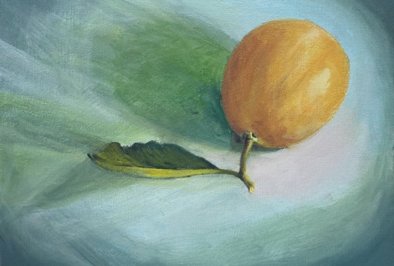
1. Welcome!: Hello, good morning, good afternoon, good evening. Good night. Welcome to acrylic painting for the eager beginner. My name is Diane. I've been painting my whole life and I've been teaching art for 16 years and I love it. I hope that you are learning to love it as well or will get some sparks and energy for it from this class, we're going to be taking a great journey together. We're going to be working on an acrylic painting of a lemon. We're going to end up with something that looks like this when we're through. And I hope you're going to have a great time. The things you're going to learn specifically in this class or how to do an underpainting what's called Brunei, which means we're going to be using Brown's shades of brown pointer. Learn how to mix accurate colors to match the photo reference that we're going to be copying. We're going to learn how to create realistic textures and acrylic, such as the soft cloth under the lemon. The kind of shiny, bumpy texture of the lemon skin itself, the crispy edges and stiffness of the leaf, and the kind of hard sharpness of the little stem in the photograph. We're going to walk through all that together. We're also going to learn how to create realistic shadows and highlights and acrylic. And I hope you're as excited as I am to join me on this journey. Before we get started, just a couple of caveats. One, I'd like to point out that I am going to be painting section by section, which is not a traditional way of approaching a painting. Usually artists kind of build the whole painting all at once. A little bit in the background, a little bit in the foreground, little on the lemon, and then back and forth and back and forth. But in the interest of not letting your hard earned colors dry up because acrylic those dry fairly quickly. We're going to try to be completing a section all at once. For example, we'll do the whole background and we'll pretty much complete it before moving on to the lemon, before moving on to the stem, and then finally the leaf. The other caveat is, please feel free to watch each section first before you try it and have a practice Canvas near you so that you can just play and experiment with the techniques before you commit it to Canvas. But if you don't wanna do that, if you just wanna go for it, That's also completely fine. And just know that acrylic is pretty opaque. So even if you make mistakes, you can always paint over it and you can mix your colors again, nothing is ever set in stone. So whether you choose to practice are not totally up to. You. Just know that that's an option and if it makes you feel happier and more comfortable and go for it. And on that note, let's get started.
2. Materials: So before we get started with the drawing part, I just want to walk you through the materials you're going to need today. You're going to need a desk in a well-lit area that you don't mind getting paint on or that's covered with a paper or cloth to protect it. You're going to need your six by eight inch canvas. I like to get the kind with a high profile just because I like to paint the edges and hanging on the wall as it is. I don't like to frame them. If you'd like to frame it, it doesn't really matter how high the profile is. You can even get a super thin line if you want. But six by eight is the size we're using in this class. You can have a spare Canvas or canvas board, which I have here. I just use the very thin profile. This is like really dense cardboard that the canvas is mounted on. In order to practice painting. I've even mixed colors on here before. You're not really supposed to do that, but, you know, I like to break the rules a little bit. Occasionally. Anyway, you can use something like this for practicing techniques before you try them on your painting if you wish, you can have your palette or palette pad. And palette pad is what I am using in this class is just these tear-off sheets. So you mix, It's like a waxy paper surface. You mix on here and then you tear it off the top sheet and throw it away when you're done. You could also use a kind of waxy surface paper plate or a piece of wax paper taped to a table. Or you can have a more permanent palette made of wood or metal that you might find in an art store. You will need a palette knife for mixing and just get one with a minimum of half inch width at the base. So it's a little bit easier to mix that way. It's not too skinny. You will need a pencil with an eraser for drawing your lemon on the Canvas. Before we start painting, you'll need a bucket of water or a jar of water, a soft rag or paper towels. Make sure you're wearing an apron or old clothes just in case you get paint on you. It is permanent, it doesn't wash out. You'll need a variety of soft bristle brushes. I have in this class, I'm only using 3.5 inch wide filbert, it says half-inch here. And then I have to round brushes, which is the name for this type of brush. It's long and thin with kind of a tapered tip. I have a size four and a size one. And you can see that there are different manufacturers and they numbered them differently. So this one is numbered just by the width of the ferrule here, and these two are just numbered more traditionally by size. So I can't really tell you what size to get, but you can see compared to the width of my finger here, how, why they are, but do have a very tiny tip, round brush or even a detail or liner brush for signing your name and for doing very small details on the stem and the lemon skin and that kind of thing. You will also need some matte medium for blending and glazing. And we'll talk about what that is in the class. Or you can have something called retard or a gel, which also functions, actually that's not really the main function of retard or gel, but you can use it in place a matte medium for that. But the main function of it is to add to your paints to keep it wet longer. So if you find yourself fighting drying time a lot, you could consider getting some retarded gel to add to your paints. It's clear. And you can also, as I mentioned, use it in place of that map medium as a blender. If you only want to buy one medium, you will need a float and actually you don't need a blow dryer. I recommend having a blow dryer. If you don't have one, you can just let your painting air dry and that's also perfectly fine. And you will need the printout of your lemon picture preferably on photo paper because it makes the colors much more vibrant if you have photo paper. But if you don't just print it out on regular copy paper and that will do fine. And the paints you will need are titanium white, phthalo blue. This is a green shade. If you can find green shade, that's fine. Regular phthalo blue is also fine. Just try not to get the red shade because that's going to be more of a purply version. You'll need cadmium yellow medium, crimson or alizarin crimson, cadmium red hue, and burnt umber. And as you can see, I don't have one brand or another. I have a variety of brands here and I don't have an allegiance to one brand or another. But I do recommend getting heavy body acrylics for this class because they're thicker and tend to be more opaque. And other types of acrylics you may find our fluid or flow or light bodied, anything like that is just going to be a thinner, more fluid paint. And it's just not the best choice for this particular class. So if you can get heavy bodied, if you can't or if you already have the light body paints and you just want to try it, Go for it. I'm either way anyway, it will be fine. So with that said, I think we've gotten all the materials listed and let's get going on the class.
3. Drawing the Lemon & Stem Base: Okay, so now that we've got all our materials ready, we are ready to start drawing. So you can take your canvas, which probably came enough clastic selfing wrap and just rip the cellophane off. And any labels or cardboard and you should just be left with a nice white canvas. And we're going to need our pencil sharpener and an eraser and your reference photo in your Canvas. So my canvas is exactly the same size as my reference photo. Hopefully you have the same situation which makes measuring easier, measuring and replicating because you're doing exactly the same size. We're going to start by just figuring out how far away from the edge the lemon is. So I'm going to use the tip of my pencil and my thumb now to see where the site of the pages now I have the exact distance and I can see it's a little closer to the top of the page. So I'm gonna come down here to my canvas and make a mark. Those of you who have taken classes of mine before have probably seen this measuring technique and you can just kinda blow through it if that's the case. Some of you may not care about being very exact when it comes to measuring. That's also fine. You don't have to do this. This is just for you to have a tool in your toolbox to be able to measure off a photo and replicated drawing pretty accurately. So I'm just seeing all the spaces around the lemon. And now that I have three of the four spaces, I'm just going to see if that matches up and it should. Yep, pretty good there. And then I'm going to measure across here. I could also measure this space. It really doesn't matter as long as you're measuring off an actual space in the photo. And I'm measuring east, west, north and south because those are the four most sort of outer points to the lemon. But I could also do other points if I want, like if I wanted to figure out where that point was, it's kind of on a slope so I could measure from the side of the page to see how far out that is. And I would just use my two points to see where it makes sense to put it like how high or how low. I wouldn't put it down here. It has to be somewhere near the center of those two points. You can do that to all four areas if you want, or just a couple. It, the more points you have, the easier it is to draw, because really you're just connecting the dots at this point. But you can certainly also do fewer. Just kinda make yourself happy. Once you've got that, you can draw it in. Try to draw very lightly. So it's not only easy to erase, but you're not creating any indentations in your Canvas. Doesn't really matter if you erase mistakes because you're going to paint over them, but you certainly can if you want to. So I've got a pretty decent circularly oval there and curious. It, it is actually a circle. It's just happens to be the way that was photographed. But lemons, all fruit are a little wonky. They're not perfect shape, so you do want to have some flat spots and some rounded spots. It's not going to be a perfect circle because it's a piece of fruit. So from there, we can start putting on the stem. So the stem has more points to it. So I'm going to measure from the edge of the page because that's a definitive point to this corner, because that's also a definitive point. And just see where it falls. It's very close to the edge of the lemon, so it must be about right there. And then from that point, I can measure to the other point of the base of the stem. And that's going to be really right on the line edge of the lemon. And then I'm going to just draw this first shape as its own thing. So the height of it is, whoops, that's the corners. So I'm gonna go into the middle. It's about that hi, and then I'm just going to draw approximately what I see. Again, it's kind of an organic shapes, so it does not have to be anything perfect. In fact, it's better if it's not. So I just kind of replicated what I saw there and then I can add these little whooped you lose. Not sure what to call them. Kinda sticking out the bottom edge. Something like that. So that's your lemon and the base of the stem. And in the next video, we'll do the actual stem. What we'll start with the actual stem and move on to the leaf.
4. Drawing the Stem & Leaf: Okay, Now that we've got the base of the stem in there, we can start on the stem itself. And I'm just going to see about how wide the stem is at the base and move it onto my picture. It looks like the stem actually touches right at that corner. And then it's going to be that wide. I'm going to go up to the first joint, which is kinda where that leaf comes out and see how long it is. And it's pointing more down. It's actually almost completely vertical. But it's going to be about that long. And I'm just going to use my pencil is a tool here and put it right through the stem just to see the direction it's pointing. So it is leaning a little bit. It's not going completely vertical. And that looks about right. So from there, actually one more thing, I'm just going to see how wide it is at the top. It's a little bit center at the top, which makes sense. So I'm going to make two marks, so I know kind of where I'm going to and then I'm going to just draw kind of a little bit of a curve on that line. Not too much. From there. I can measure up to the tip. I feel like I've probably said this a lot in former videos. So if you've seen my former videos, you might find this familiar if you've ever taken an online class, but feel free to pause the video at any point and just take your time if this is going too fast or if you just want to really kind of absorbed the process a little bit more, use that pause button, it's your friend, and go at your very own leisurely pace. So I've just figured out how tall that part is and how tall this part is. And then I'm going to draw the basic shape for that rounded outside edge. And this is just going to kind of go right into that stem. And then on the outside, there's this lovely 0, which is where the stem got cutoff of its tree. Feel like I want to make this a little bit more curved into yes. And on Canvas it won't your pencil lines won't erase all the way. But acrylic paint is fairly, very opaque if you layer it enough, especially so, don't worry if you have pencil lines that are still showing. So now we have the stem. Something else you can do to check if it's going in the right direction is measured against the lemon. So I can put my pencil and from my eyeline, line it up against the outside of the stem and the outside of the lemon. And just notice the direction that my pencils going. Notice the triangle that it's cutting out of the bottom of the page. Notice it's shorter on the right then and longer on the bottom. And then move it over to mine and see if it's going approximately in the same direction. Like if it was doing that or that I would know I was pretty off but it's pretty close. I've got a longer edge here and here. And the angle looks about the same, so I'm going to leave that. And you can do the same thing here. And in this case there's no triangles on the canvas to compare it to. So I'm just using the visual angle of the pencil and it looks about the same. So now I'm going to go to the leaf which starts at that knuckle. And let's see how long it is. Goes out pretty straight out to the side there. And I'm gonna move my canvas so I can measure from the bottom of the page to the bottom of the leaf to see how high up it is. And then from the bottom of the leaf to the top of the leaf is there. You can measure also this space, the little space that's lighter green little flap of the leaf. Make a mark for yourself there and you can stop there if you want. You could also measure how high is that bump, how far in is that corner? You can do all of those things. How far in this corner, anything that you find important for your drawing, go ahead and measure it. I am going to go ahead and crack into it though. I'm going to just draw approximately what I see kind of a wavy like bottom, little bit, very flat but not completely flat. Definitely an organic form. And then because the top of the leaf is growing off of this shape, I'm going to do this shape next. And that just kinda comes out pretty flat. Don't worry about drawing an IED little ripples on the edge of the leaf. You'll do that all in paint. It's a little bit too tedious to do that in pencil. Of course I won't stop you if you really feel strongly about it, that's also fine. So I'm going to eyeball that because I don't really care where my corner is. And just sloped that in a little bit more right there.
5. Starting to Mix for Underpainting: Now our canvas is already with our drawing and we are ready to start mixing paint. We're going to do something first called a Brunei underpainting. Brunei is spelled be RUN a LLC. And it's an age old technique of just getting the values on your Canvas before you apply color. Value is just the term that means lights and darks. So what we're doing essentially is putting the darks and the light colors on wherever we see them here. And I'm gonna guide you through it. So the only paints you're going to need for this part are titanium white and burnt umber. So you can just unscrew your white, squeeze out a pile. If you took my mixing class, you'll remember that. You want to just wipe it off so it's flush. And if you're really into carrying for your tubes, which I'm honestly not, I'm a little sloppy. You can wipe off the top just so when you put the cap back on, it doesn't it's not so hard to get off next time because the paint will dry in the threads and make it difficult to unscrew. But that's also why they invented pliers. So that's what I tend to use. Anyway. I'm squeezing out fairly large amounts of paint because I'm only using two colors and I'm going to need to mix a light, medium and dark. And I will guide you through how to do that as well. So have your palette knife handy. And we can start mixing. Start with just a nice big scoop of the dark brown. Actually more than that because this is going to be our dark color. Even though we could just paint brown straight out of the two. But acrylic is notoriously transparent unless you add a little bit of white. So the more white that's in a color, the more opaque it is. So we're just going to add a little bit of white to this dark. Even though we want to keep it very dark. It's just going to help with the opacity. That being said, that's pretty nitpicky. You really don't need to do that because it is an underpainting, which means we're just painting a coat of lights and darks on the Canvas first. And then we're going to put our colors over the top later. So if it's a little transparent, it really doesn't matter. So I wipe off my palette knife just to keep my color piles neat so I'm not mixing white into the brown or vice-versa. And then I'm gonna get far less brown and far more weight. And this is going to be our sort of medium value. So the main thing was this exercise is you want your values to be very, very different from one another. So I feel like this medium is already too light, but I'm not going to change it until I mix the light and see how that looks. So I'm going to use the rest of my white wipe off my palette knife, get just a little bit of brown, just a baby amount of brown, and mix that in. And then look at all three of them together. And what we want is a super light, super dark, and one right in the middle. I also don't feel like I have quite enough paint. So I'm going to pour out some more. And I do feel like the medium needs to get darker in order to be sort of a right between those two. More white. Make sure in screw your caps on all the way even if you think you're going to pour again soon because acrylic dries and you don't want wet paint to dry in the threads because you'll never get the cap back on and that's a bummer. So just try to get in the habit of always putting your cameras back on all the way.
6. Finishing Mixing for Underpainting: So I'm going to add a bunch more white to the light just to make sure I have enough paint. I'm not really I don't care about making it lighter so much, but I do want to make sure I have a nice big pile because I don't want to run out. And by the way, if you do run out, it's totally fine. You can always mix more and it does not even have to be an exact match because this is an underpainting again, so it can be very loose. And that's very light. I'm going to add just a little bit of brown to it. Yeah. About barely made any difference at all. But I'm going to leave that, that's okay. Now the medium needs more brown. So if you didn't take my mixing class, when you're mixing, you can kind of figure out what works best for you. Or maybe you've used the pellet night before, so you don't need this information, but you can kinda go up and down or a side to side. You can stir it a circle. You'll figure out what is most comfortable for your hand over time. And don't worry if it feels awkward at first, it's really supposed to be awkward. It's a very awkward thing to do if you've never done it before. So just take your time and be patient with yourself and enjoy the process. I'm adding more brown to the dark just to make more paint. Again, just like I did with the light added more white. So I want to make sure I have enough. And I'm gonna do is I'm still going to make more medium because I just don't want to run out and I want to try to avoid running out. In order. If you, if you're experiencing a thing where you're like spreading it around and you're scraping it and it's not, it's like spreading out everywhere, it's not coming together. Practice using the blade edge and pressing when you wipe, scrape and press to get all that extra paint out from under the knife. They are palette knives are made flexible for that reason so you can really wipe the extra paint off. And that way you keep your paint in a small pile, which is important in acrylic because it dries very quickly. Okay, so I think we have enough and good colors and we're ready to paint.
7. Mindset: So before we dip our brush into the paint for the first time, I just want to encourage you to relax and have fun with this class. Hopefully you're already really excited to get going. I know I am, but just know that if mistakes happen, which they probably will roll right through it. Just take a deep breath, smile, know you're learning and move on. Especially in the beginning. Just know that we're going to be layering and the first layers are going to be more rudimentary. And then we're going to build texture and color and light and dark and all that. So that the first layers especially don't be too perfectionistic about them. They're going to be a little bit rougher than the finished piece. If you want to practice. As I mentioned in the introduction before, you put your paint on your Canvas. Do you have your practice Canvas nearby? And you can use colors that you may have mixed and messed up on that you abandoned to practice with. That's a great use for mess up colors. Or you can practice with colors straight out of the tube if you don't want to use your wonderful, perfect lemon colors that you've mixed. Also, I want to encourage you to mix more paint than you think you need for each section just to make sure you don't run out. And if you do run out, don't panic. You can mix more paint, it's fine. But it is harder to mix a color, excuse me, to match a color that you've already painted in. So do your best to just have plenty of color on the front end so that you don't run out. And with that being said, I hope you're excited to get going. Grab your paintbrush and your cup of tea or a cup of Joe, whatever makes you happy. And let's get to it.
8. Starting Painting the Background: So now that we have our paints mix, we can tackle the background. It's easiest in acrylic to start with light and move your way too dark just because you have to wash your brush less because when you're going from a light color to a dark color, they'll naturally blend. Versus if you go the other way around, that dark color tends to dominate and take over the lights. You have to wash your brush a lot more. So let's start with a light color. Grab your larger brush. I have a kind of a round filbert brush. You can use a flat brush for this filbert, soft bristles are best. We already talked about that in the materials section, but just use one of your largest brushes because we're doing a large area and we're going to start with a light part of the background and don't be shy, get right in there. So get kinda of a sharp edge up to the edge of the lemon. I know this is a very light color, so it may be very difficult to see on camera, and perhaps you can see the shine. I'll tilt it a little bit. So you can kinda see the shine of the paint where I put it. But I'm going to go right in with some media mainly just so you can see. And I'm going to brush that right into the light there. And just I don't have a lot of paint on my brush. You saw how much light I got. I got, but now that I've got a lot of kind of wetness on the canvas and just interested in really spreading it around. And there isn't a whole lot of pure light in this background. So I'm going to use mostly medium down around here. And I'm doing kind of one area of the painting at a time because acrylic does dry, so I don't want to put on my lights and then go back and do all my mediums. Because by the time I do that it will have dried. So I'm getting my dark now and putting that into the bottom corner, spreading that around. And I'm putting I put it directly into wet paint there. So it went on very light and see how I'm getting these hard edges, that's fine. You can just leave them that way. But if you want to get rid of them, point your bristles in the direction of the hard edge and kind of just massage and push it away. And then you'll get rid of your hard edge. I'm going to try up here with just plain dark brown on the canvas so you can see the difference. So that goes on a lot darker when I put it on just plain and that's also fine. Underpinnings are remarkably liberating because you don't have to be very exact at all. Like if I left that the way it was, it would be totally fine. I'm going to push this color right up to the edge of my lemon and into my light color. I'm painting fairly fast because I don't want the paint to dry. But if your paint dries on, you don't worry about it. You can just re-wet it, re-wet the area you're trying to blend and keep going. It's also going to dry faster if it's a hot day where you are. If you have any heater or air conditioning on. If it's just a particularly dry day or dry climate, it'll dry faster. So it's just something you kinda have to learn to work with. This corner is still wet, but I'm going to put some more dark brown into it. And notice I'm pointing my brush towards the dark corner because I don't want it to spread up. If I do this, it's spreading up and I'm creating a hard edge. If I do this, spreading down towards the corner and I'm creating a soft edge.
9. Finishing Painting the Background: And you can turn your Canvas anyway, you need to, to be more comfortable. Let's see, I'm going to go into here with some more medium and just get that really wet. And there is that shadow that the lemon is casting onto the mat that I just accidentally painted into. No big deal. Actually, I can turn Turn your reference photo, you'll same way your painting is. And that will be less confusing. I'm going to kind of paint media around this area into the leaf. And I'm working my, I'm just wiggling my brush up to the edge of the leaf to keep that edge nice and sharp. And if you get paint into the leaf or ends of the lemons, totally fine. First off, we're going to paint those things anyway with these browns. And secondly, you can paint over it with your lemon colors. So no worries. I'm just filling up with some medium here. I've got a lot of extra medium line brush, so I'm just gonna kinda wipe it over here rather than wasted in my paper, in my cloth towel there. And then I'm going to wipe and I'm going to fill in with the other colors. So down here I want to put some light for that kind of light shining onto the mat. Why? And then grab some dark paint in the shadow. This is called the cast shadow. This portion because of the light that's shining on the lemon, is casting a shadow onto the cloth that it's sitting on. There's all these different names for shadows, which we'll talk a little bit about as we go. So that's not nearly dark enough, but who cares? It's an underpainting. So I'm going to turn this around this way. Wipe gets some more dark brown fill in my corner. Pointing my brush towards the dark, so I'm pushing the dark into the corner there. By the way, if you have any lumps of paint, wipe your brush off on your paper towel and go back and get rid of those. I have a hard edge here and my paints a little dry. So I'm gonna go back with some dark brown and just sort of get rid of that. But again, it's very loose. It's okay if you have a little hard edge going on. And then I'm gonna get this bottom corner here. Brush that. I'm going to rinse my brush because I have a little bit too much paint on my brush to be able to blend that effectively. And here I'm going to get some light because it looks like it's the light has mostly dried paint that in and then my mediums kinda drying so we can get some more medium and brush that in here. So those two blend and get right up next to the edge of my leaf right here. And then we're done.
10. Painting the Lemon: So now we're gonna go into painting a lemon. Before we start, I'd like you to take a really close look at this photograph and notice there's light over here and then medium sort of like a get the yellow gets darker as it goes to the left and then there's dark. But look carefully, really carefully if the dark, the darkest shadow is actually kind of through the middle here and on the very left edge. And then this part is actually just barely lighter than those two. This is the reflected light and it gets kinda creeps over to the edge here. So we're going to be doing light brown, medium brown, dark, medium dark. And we're going to blend these really well together so that it's not that obvious. But again, it's the underpainting. So if it's a little brighter, a little darker doesn't matter. But we'll start with a light color and put that in. Keep you as I'm going to turn my canvas so I can be pointing towards the edge comfortably, so just very carefully so that you don't lose your sharp edge paints right along that part. And then bringing your paint into the middle. By the way, I should show you, I had about that much paint on my brush. So not a huge amount, not a not a big glob, but not a very sparse amount either because I want it to be nice and wet to blend into the medium. So another trick is bring your light in further than you think you need to. Insert a lemon. And as you brush it into the lemon, you'll lose paint from your brush and it'll get thinner and thinner, which is what you want. But the reason we're bringing it in further is so that the medium has something to blend into. So when I put the medium down, I'm already painting into the light. And I'm going to point my brush toward that edge. You can turn your Canvas if you want. I'm, I'm just awkwardly turning my brush so that my brush bristles are pointing toward the edge. Same thing up here, although now it's not awkward because I'm painting right side up again. And I'm just going to brush the medium ends of the light a little bit and see I'm, I'm not really being shy about getting some light into the medium, medium and satellite. I just kinda keep playing with it. So it's going to do something like that. Then I'm going to wipe the excess off and get some dark and put that here. And I didn't really go into the dark with the medium because I want the dark to be pretty strong here. So I'm gonna do that. And I also made a pretty straight edge there, which is not a good idea because we have around lemon. So I'm going to use this time to try to add some roundness there. I'm gonna get the dark up to the edge, just a little bit of blending with the medium a little. And just going to soften this edge if it's not already, but don't over blend it. You want that edge to be kinda hard. I'm going to wipe off, get a little medium and paint that right next to the brown. Get up next to the contours of the stem. Or sorry, I meant the dark, not the proud. Get right up next to the brown. I'm going to get above the stem here on the outside edge of the lemon with the medium, just dab at it, so you get that in there. You could also use a smaller brush if you prefer, right there. And then wipe again, get some dark and paint that all the way over to the edge, keeping my brush pointed towards the edge to keep it very sharp. And then once I have that edge in there, I'm going to wipe because I have too much dark brown. I have a lump here and go back and just sort of wipe it away, wipe it into the medium. If you have any sort of lump on the edge, now's the time to get rid of it because it will just stay there and kind of build up layers and become a little three-dimensional as you go. So if you have a lump like I do just wipe your brush off and just sort of wipe that lump of paints so it flattens down and blends into the rest of the paint on the canvas. And then you can monkey with it as much as you want or you can leave it just like that. Again, it's an underpainting. It's just meant to be your roadmap for where darks and lights are gonna go in in your color version. So from there we can move on.
11. Painting the Stem: So now we're going to paint in the Brunei under painting on the stem. So again, start with light this time switch to a small brush with a round tip or a pointy tip, and start with your light color. Load up on the brush. And nice, kinda little bead there, but not, not a huge amount, not dripping. And start with the light on the right side. And in my case, it's exactly the same colors and backgrounds. You can't even see it. It just sort of disappeared. But that's okay. Well, we can, we're going to go over that with a color apart anyway. I'm going to dab it in where I see just the lightest parts of the stem. So kind of along the base there, these two little feet. And up on that curvy part. And then I'm going to wipe my brush and switch. Let's see. I'm just gonna do dark next because there isn't a whole lot of Medium going on here. There's a lot of contrast in that stem, so I'm going to put the dark end and then I'll put medium and if I need to. So that's going to go up the left edge. And notice I'm pointing my brush towards the dark part so that it is a soft edge in the center of the stem. And that's just naturally happening because I'm already pointing my brush that way. And I'm gonna go down here and sort of create these little pockets of darker color. Here's a little like a ridge there, something. And then I'm going to wipe and go back and get my medium and fill in these sort of parts in the dark that are just a little bit lighter. And really that's a technicality You could easily get away with just light and dark. For this part. I'm going to dab that in and white my brush get a little bit more dark and kinda come around the outside base of these little sayings, put a little shadow around them. By now, my lemon is definitely starting to drive it. It's still a little bit wet. And that's fine. I've got some lumps of paint on the dark, so I'm going to just go back and white those off. And you may be finding what I'm finding, which is that your dark isn't getting as dark as you feel it should. And that's partially because it's very transparent at this point. There's not a lot of white in it. And that's just the nature of it. But that's also fine. Now I'm just sort of noodling around the base of the stem. I'm going to dark in this little shadow here just to emphasize it a little bit. White. Go back and soften. And that's good enough for that part. And then for the very tip, I'm going to grab some light. Notice I'm not wiping my brush between colors. That's mainly because I don't have a lot of paint on my brush. And this is a very casual process. I take it back. I am wiping my brush somewhat, but not every single time I change colors. I'm going to pull a little bit of dark kind of up around the top of the stem. Just to define it a little more. I'm calling that good. So now we can move on to the leaf.
12. Painting the Leaf: So we're into our last portion of the show here with the Brunei underpainting. And we're going to paint the leaf. It's best in painting in general to do the things in the back first and then the front. That's why we did the background first and then the lemonade and explain that. But it's partially because if you accidentally get something from the background into the front, then you paint over it. So that's how I got rid of those little mistakes on the edge of my lemon. It's not that you can't ever do the background later and just be very careful around the edges. And if you get into the lemon, You just paint a little more over the lemon. But if you do back to front, it tends to save you some time. So for the leaf, I'm going to start with the medium and just put it where I see the lighter patches in that larger portion. And much like I did with the highlight on the lemon, I'm painting bigger areas of medium than I think I need to because I want the dark to be able to blend into them. So I'm doing something just putting patches in and noticing this sort of sharper edge next to a vein. And then I'm gonna go back with the dark and paint that in the rest of the area of the leaf. Something else you can add to your acrylic paint if you're struggling against drying time, if your paints drying on you too quickly, it's called retard or gel. It's a clear medium that you can get just about any art store or online. And you can add it to your paint to keep it wet longer. It's also useful for glazing, which we'll do later in this course. But we're going to use a product called matte medium. It's, I prefer it because it's not as slimy as retarded gel, but retard or gel can be used for glazing. And we'll talk about what glazing is when we get to it. But if you want to use retard or gel to keep your paint wet. A general good rule of thumb is about an eighth amount of tartar to the amount of paint you have. So you definitely have a lot more paint than than retard or gel. So I'm just kind of casually blending this together. Keeping my edge hard here. Painting it, blending it to the left to keep it soft on the left. Something like that. And that edge is a little too hard for my taste, so I'm just going to wipe over it to make it a little more subtle. Again, you're going to paint over it with color, but the more specific you are with the sensibility of your painting at this point, like how you want it to feel, then the color, the color you put over will be that much easier and more fun to apply because you will have already kind of done the brain work ahead of time to let yourself the foundation for how you want it to look. So now I'm putting mediums approximately in the medium places and I'm leaving a space for the light. And I kinda did that backwards. Like I said, I normally would do the light first, but I'm talking too much and I'm not paying attention. So I did that backwards. But as you can see, there's really no wrong way to do it. It's just slightly easier to start from light and go to dark, darker. So I'm going to blend those together. And then grab my dark and put that in on the tip over here. Whoops, try to really define that. I got some on the background, I'm going to wipe that off. You can also feel free to blow dry between shapes. Like I guess it's a little late to be saying that for the Brunei portion. But as we move on into the color version, if you don't want to risk anything getting smudged as you continue painting, just blow dry the section you've just finished before you continue. Or if you don't have a blow dryer, you can let it air dry. It will air dry pretty quickly. Even on a humid, rainy day when it's cold outside and it's not drying quickly. Acrylic usually dries within probably 15 minutes. Unless you have it on super sick, then it'll take longer. Okay? And I think that is good. You can see lots of transparent places where the canvas is showing through. That's totally fine. If you want to go over it again, you can. But this is just your roadmap, so it can be very rudimentary at this point and just noodle it until you're happy with it. And then we'll get on to the color portion.
13. Color Talk & Background Light Pink: Okay, So now we're ready to mix actual background colors with colors. And you can see I've already poured my colors just so you didn't have to sit here and watch me do it. But you can pause the video, pour your own colors as you need to. I poured everything out that I thought I could possibly use. I may not use all of these. We'll just kinda wait and see. But what I have here is besides the eye report some more white and I have my burnt umber from before. I poured out, say low blue. And this is the green shade of phthalo blue. And you can kinda see through the, the palate which is showing through it's a more turquoise blue. I have my cadmium yellow medium and my cadmium red hue. I have my crimson or alizarin crimson and ultramarine blue. And this one is a more purply blue. The difference between the Reds, this one, the cadmium red hue is more of an orangey red. And the crimson is just a slightly more cool or purply red. And I thought I might use that for this sort of very, very light pinkish gray I'm going to need here. I'm going to start by using what's left of my white and a little bit of brown. If you happen to have a big pile of that left, great. If not, just start with a big lump of white and add a little tiny, tiny dot of brown to it. And that's going to be the beginning of this color. So just to give you a roadmap, we're mixing this color right here, which is going to be a very light pinkish gray. We're mixing a lot, sort of a medium bluish-gray, which is going to be the bulk of what we do. And you'll see a lot of different colors in here. Don't worry about that. There's turquoise is greens, pinks. We're going to be glazing or putting kinda transparent layers of color over later. But for right now we're just going to mix it for colors. The light pinkish DRE, the main color of the cloth, which is the light bluish gray color for the cache shadow, which is kind of a greenish gray, and then the darkest color for the corners and this darkest shadow under the lemon. So we start with our white and a little bit of brown and I'm going to actually just add a little bit more. So I want to make sure I have enough color, more white that is. And then as I said, I'm going to use the crimson, just the teeniest DAB because and anything you add to white will be extremely strong at first. You don't need a whole lot to make any sort of impression. And I'm going to mix that up. And so far it looks pretty candy cane like it's very light pink, even that Brown, which I added in order to make it kinda dull, didn't really go into that much. So the way to check your color is hold it up to the color you have just to get a flat sample on one side of your palette knife or the other and check it out. What you should see is a slightly lighter shade of what you actually want. So that's the tricky thing about mixing with acrylic is everything you mix needs to be lighter than how you want it to look when it's dry because it does dry a little bit darker. And if anyone's ever painted a bathroom or a bedroom or any room in a house and come out with a room that's way brighter than they thought it was going to be. You know what I'm talking about, that acrylic just dries darker than you think it's going to look. So right now it is lighter, but I feel like it's a little bit too pink. So I'm going to add brown. A note on brown is that Brown is kind of a cheat in terms of grading things down. It's a good way. Gray things down if you just don't feel like mixing the compliment. It's also not a perfect science because brown is heavier on red and yellow than it is on blue. But it's a mix of really all three colors. So if you're trying to gray something down, that's kind of a good way to do it. The more direct ways to mix the complement. So in this case, I have a pinker color. I will have mixed a green if I wanted to really dial it down the proper way because green is the opposite of red. That being said, let's check this out. I feel happy with both the lightness and the greenness of that one. So we're going to keep that aside and move on to the next color in the next video.
14. Mixing Background Light Blue-Greys: So we're going to continue on by mixing the next color, which is going to be the light blue gray, which is the dominant one. It's going to be almost everywhere. So we're going to use a lot of white. In fact, I'm just going to scoop up my whole pile of white to start there because it's a very light color. So white is definitely a dominant color. We're just going to add little bits of the colors we need. So it's more of an aqua blue. So I'm going to use the phthalo and very small amount. Look at how little I have compared to the amount of white to begin with. And I'm just going to mix that in and see what affected house. And oh, that's so pretty. I just love blue, especially phthalo is one of my all-time favorites just to watch it. So I'm actually pretty happy with the lightness of this as it is, but it's way too bright and too blue. We need to gray it down quite a bit and make it just a tiny bit greener. Yeah. So to make it greener, let's do that first. Because it's usually better to get the color you want first and then deal with the amount of greenness. I'm going to add just the tiniest amount of yellow because yellow and blue make green. So we're just trying to green it down a little bit. I'm no, I don't actually want it to look green. I just don't want it to be that purely blue. And that's getting closer. I'm going to add a little bit more yellow, wiping my palette knife off each time so I don't contaminate my pure colors with each other. And that looks like a pretty good amount of green. I mean, excuse me, of yellow. Yeah. So now we just need to make it ever so slightly gray. And as I mentioned before, I could use brown for that. But in this case, I'm going to use a little bit of the orangey red because I've already added yellow to this. Yellow and red make orange, and orange is the opposite, blue. So in this way, I'm being a little bit more direct by adding the complement of blue. Even though I'm doing it in two different phases, I did yellow firstname doing read. So look how much red I have in my palette knife, like a pin head, because I want to be conservative. It's always, it's much easier to just add more red than it is to have to backtrack and kinda add more white and blue and yellow because I put too much red in. So that barely made any difference at all. But that gives me a feeling of how much more I want to put in. And this time I'm going to add a little bit more. So that will probably be okay. Let's see how that behaves. I'm liking what I'm seeing so far. Except in really well. And I think we're there. So that is the light blue than the main color that you want in the background. Now we'll move on to the cast shadow color, which we are also going to use white for. I need more white, so I'm going to pour that out. By the way, if you're caps get stuck on your tubes because the paint dried, it's also nice to have a pair of pliers handy. You can go for a little bit more. It's a darker color, so I don't need quite as much white. And I'm going to start again with the phthalo blue, but much more of it because it's a much darker color. So we'll start by kind of trying to get approximately the darkness, just like we did with the light blue color. And then we'll deal with the color itself, which needs to be greener. I like that darkness. And it's just an approximation. It's obviously not even close to that color. So I'm just kind of guessing on the darkness. And I'm going to add quite a bit of yellow because it's a quite, quite a green color and yellow is weaker than blue, so you need a little bit more of it to have an effect. That's looking nice. Yes. And now we're going to agree that down and how do we grade green down? We add the opposite. So I'm going to add red. In this case, I'm going to add the orangey red again because this is a very yellowy green color. So I don't want to add the cool bluish red. I want to add the warm yellow we read, at least to begin with. And that is already looking a little bit too cool, too blue. Yeah, so I I do need more yellow in that. And I will continue in the next video.
15. Mixing Background Dark Blue-Greys: So we left off with the blue shirt, bluey green shadow still need more yellow in there. Still not quite green and red was pretty strong. It got it seemed to have gotten a grant off, although now that I'm adding so much yellow, I may need to gray it down further and we'll see. So I'm kinda looking around to try to localize the main color is still feel like it needs more yellow. It's just a really yellowy, grayish green color. There we go. I'm happy with that and I feel like the lightness is good. Lightness slash darkness, the value is good. So we'll move on from there and we're gonna do the darkest color because that's so dark. I'm actually going to start with Brown and I'm going to use this brown because it has a little bit of white in it. And like I said before, we want to add white to just about every color because acrylics are pretty transparent without it. So we'll start with that caveat. Another caveat about Brown is it's a really good sing to darken and grade down blue at the same time, specifically, because you can think of brown as kind of a burnt diversion of orange, which is the compliment of blue. As I said before, Brown is just a mix of yellow, red, and blue, but it's heavier on red and yellow than it is on the blue. So if you're trying to grade down blue, you can use brown as its complement as sort of in-between. I hope that made sense, but if it didn't, don't worry about it too much, because it was kind of a lot of information. And things tend to click as you work in paint anyway, you sort of have revelations about colors and figure out new ways of doing things. So I'm adding blue and blue is very strong, so I don't need a lot. And I feel like that's probably a good amount of blue actually, but we can't tell because it's so dark. So I actually just need to add more white. I'm sure you've figured this out, but if you didn't happen to have any dark leftover from our Brunei painting, then you can always just make more ADH, start with dark brown and add a little bit of white. So I'm going to add a tiny bit of white here. See what effect that has. Just starting very conservatively. I can always add more. And let's just check out and see what that did. So now I'm feeling like it's too gray. It's still a little on the dark side, but I'm going to leave it because we're going to be blending it with a lighter color, which means it's naturally going to get lighter. So I'm going to add a little bit more blue to ungraded, brighten it up, give it some more of the dominant color. That didn't really do much. Let's add a little bit more white, little bit more salient. Or Solow, not exactly sure how you're supposed to pronounce that. That's better. Still not quite there. I'm going to add a little bit more. Okay. And I'm happy with that. So whenever you're happy with yours, we can get on to painting the background.
16. Painting Background - Right Side: So much like our first painting, The Brunei underpainting, we're going to use the larger brush, largest brush, for painting the background because it's a large shape. And really the larger brush you have for any shape, the better because it kind of forces you away from being too nit-picky and it lets you loosen up a little bit. So grab that brush again, make sure it's really dry. So that means squeeze out the water on your towel, grab your towel, squeeze that brush and get all the water out if there's if there was any water in it to begin with. And we're going to go from light to dark basically. But again, we'll flip flop back and forth a little bit as you find it. Helpful are necessary. So start with the light color, the lightest pink color, and we're going to just do this area right next to the lemon. So just go ahead and put that in there, get right up next to the lemon right here. This time we're going to leave a little bit of space because I want to try to get that darker shadow in their wall. This light pink is wet. But I'm just going to paint a nice big window of it right here, right up to the edge. And then actually I'm going to blend out a little bit so I'm not even wiping my brush because I don't have much pink left on and I'm just switching straight to the blue-gray. And I'm going to paint that in pointing towards the pink for right now just to fill it in and then I can turn to blend if I need to. So I'm going to go way out and I'm going to stop about kinda wherever, like right below the stem because I'm still going to be painting with a light blue over here. So it doesn't matter if that dries, I can just rewet it and I won't ruin any of my blends. So I'm going to focus now on blending What's wet, which is the blue-gray into the pink. And those two blend really well because they're so light. So the similar, similar colors are, the easier they are to blend. Then I'm going to, with a little bit of light left on my brush, just grab some of the dark and push that into the corner. And because I had the light on my brush, see how light the dark is going on. It's very, but it's also very opaque because the white in the light colors, It's kind of forcing it to be more opaque. So I'm just going to spread that around, pointing my brush towards the corner so that I can really control how far it spreads and I want to go darker. So I'm going to get a little bit more and do that again. And allowing it to be a little texture if you want it super smooth, you can certainly just blend until your content was it, I prefer a little bit of brush stroke Enos in my pain. I think it adds to the sort of painterly artistic feel of something. So I'm going to leave it a little stroke E, you can kinda see, so my strokes there. And then I have kind of a mix of the light blue and the darker greenish color, corner color in my brush, which is kinda perfect right here. So I'm just going to continue painting up. I know I said I left that to paint in the shadow under the stem and I will, but it's easy enough to just re-wet that area of light pink later and put the shadow in. Right now I want to focus on these areas that are very quickly drying on me, see how that's starting to dry. So I'm really wiggling my brush into the canvas. It's feeling a little gummy now because the paints drying. So I'm gonna get a little bit more light blue just to facilitate the blend here. And that actually works in my favor because there's a hint of darkness right underneath the lemon right there anyway. So I'm kind of it's sort of a happy accident that it's drying it a little bit more blue paint that so that it blends. And I'm just sort of wiggling my brush. With reckless abandon. My pink is now very dry, so I'm going to wipe my brush, go back, get a little bit more pink and just wet that area next to the light blue so I get a nice soft blend right there. Now I can keep moving up. I'm going to continue with the light blue even though it's too light for up here. Just because the light with the dark is going to create sort of a medium gray. So I'm being very careful around the edge of the lemon, pointing my brush towards the edge. Feel free to turn your Canvas as you need to. And leaving that corner showing I'm going to paint in the dark. And I'm going to blend this. And then we will continue in the next video.
17. Painting Background - Left Side: So I'm going to keep on just kinda spreading the dark into the medium here. Yeah, I guess it's the medium. It's just a very light color, so it's kinda hard to call it that. But I'm going to go right up to the edge of the lemon, make that whole area much darker. By doing so. If this is really off putting to you to blend so much, you can also mix a darker, medium color. You can have as many colors as you want. And the more colors you have, the less you rely on blending on the Canvas. But it's also fun to just sort of learn how to apply the colors and kind of make them work for you on the canvas this way. So I'm going to turn my board at my campus and my reference so I can kind of continue painting a little more comfortably and switched back to the light blue here are the medium. And kinda this time I'm going to try very hard not to paint into the cast shadow. So I'm just going to paint the upper edge and nice thick layer of paint. I really want this to stay wet long enough to be able to blend it. So first thing I'm going to focus on is this edge because this darker blue here is drying. So I'm going to blend that first. And then going over to here. I'm going to put some light blue in right above the leaf. Kind of pointing my brush towards the edge of the leaf so that it stays nice and sharp. And I have a little bit of light blue to my brush. I'm gonna go right into the cache shadow with just a faintest code just to give this greenish shadow color of vehicle to blend into. So I'm going to paint that in nice and thick and focus first on the outside edge because that is where the light blue is currently wet. And I want to take advantage of that while it's still wet so it doesn't dry on me. So pointing my brush towards the darker color, I'm just kind of laying my brush down, going back and forth. I'm going to turn it upside down, being right-handed now I'm pointing this way. If you're left-handed, you would do the opposite. You would be painting right side up now, it's just whatever direction so you can point your brush towards the darker color and really soften it. And the lower you lay your brush down on the canvas, the easier That's going to be. So try not to use the tip of the brush. Like, like try not to point the brush at the canvas, but kinda lay it down and really rub. And now that I've finished all that, I can focus on getting the color to go right up next to the lemon. So I'm going to do that. And you may notice, I've, I've noticed my green seems a little too green for those, but that's okay where this is a process of layering. So as you go, you will probably discover things like that. I go it's too dark to light to green to pink, whatever. But you'll go over it. So don't worry, just keep on painting. Have faith. I have pretty much gotten a greenish shadow in there, so I'm going to wipe my brush off, not rinse it just white because I want a hint of the green left on there. And then I'm going to put in some pink right here because that's the pink from here kinda goes underneath the stem and peaks out behind it to blend with the green and with the light blue right here. So I'm kind of blending all three together now, but still pointing towards the green because that's the darker color. So now I've gotten that area done. I'm gonna go back to being right side up and see or I need to go from here. Okay. I'm going to just finish off the left side. So I'm going to start by re-weighting my light-blue, being very careful not to get it into my blend, I just want to kind of pick up where I left off there. So light blue all the way to the edge, wiped my brush, get the dark paint in that corner. And really blend. Again, not I don't like I mentioned before, I don't like to over blend because I do like the quality of the brush strokes in the paint. But you can blend as much or as little as you wish to achieve the effect you want. Over here on the left, it's getting a little darker, so I'm just going to leave the combination of light and dark in my brush and fill in that part.
18. Painting Background - Finish Base: So going back to the bottom corner here, had just started putting light blue in. And I'm going to turn my board. I'm now pointing towards my leaf edge. And actually the green I used here is going to be very useful for the shadow under the leaf too. So I'm going to go a little further and I think I need to with the blue so that the green has a vehicle to blend into. But I'm not going to go all the way to the leaf. So I have a choice. I can blend the green or I can blend the dark blue. I think I'm gonna go with the green some already pointing in this direction. That's kinda the only reason. So I'll put the green in here. Nice shadow underneath the leaf. And lay my, really lay my brush down now and blend that, just soften it into the blue as much as I can. And then over here there's kind of a line going out to the side, a line of shadow. I'm just going to mimic that. Get a little bit more dark blue and paint in my corner. And I'm going to darken that shadow a little bit. And then there's one here which you can choose to leave out if you want. That's just because there's more than one light source. So there's more than one shadow being cast from the leaf. And I'm getting a little bit of my blue-green into the leaf. That's okay. We are going to paint over the leaf. I'm going to rinse my brush because it's starting to feel a little goofy with old paint. Just wipe it off really well, get all the water off. And then with absolutely nothing on my brush, I still have a little wet paint here. So I'm just going to go back and sort of wipe it because I don't want to add more color. I just wanted to blend more and the paint is still wet so I don't need more color in order to make that happen. And now looking around, I need to just put in the dark shadow that's immediately under the lemon. For that, I'm going to switch brushes. I'm going to use one of my smaller around tipped brushes and start by re-wetting the pink because that'll make it easier to blend. So I'm just putting another code of pink over what's already there so you can't even see it. It's just getting a wet again. Oops. And I've got a brush bristle in my paint. If that happens, just wipe it out. Wipe it onto your towel before it dries. You don't want it to dry in your paint because then when you pick it out, it'll leave an impression in your paint. So putting a little bit more pink over here on the left as well. And then I'm gonna rent sorry, wiped my brush, grab a little bit of the dark, dark blue and go right up next to the stem. And painting kind of a little triangle. Make it very pointy here, very sharp against the stem. White my brush again and go back and lay my brush down and really just kinda wiggle it to soften the dark blue into the pink right there. And that shadow is what really makes this lemon looks like. It's sitting on a solid surface. And then I'm going to do the same thing over here. I'm going to turn my canvas slightly so it's easier for me to get at that edge. And then kinda wiggling down. And I have too much blue on my brush, so I'm rinsing it and wiping it because I can't wipe it off only with the dark color. It won't come off enough. And then I'm gonna get some more light color, the light pink and blend the bottom edge. Kind of pulling the dark blue down into the pink a little bit. And then I'm going to get some green and blend the left edge, turning my canvas again so that I can point towards it and make that a little easier. And you may notice like, I keep creating all these extra hard edge and just keep on Blend and keep adding colors. You need to keep laying your brush down and wiggling it to get the effect you want. And I'm going to get a little bit more dark blue because my shadow got a little bit lighter than I wanted it here. So I'm going to put some more in WIP. Go back and blend pointing towards that edge. And whenever you feel done, you can be done.
19. Glazing the Background: So before we start this section, just make sure your painting is completely dry weather you blow dryer it or just let it air dry. So now that we've got the basic background painting in, we're gonna do a little glazing. I had mentioned this earlier when I was talking about adding retard or gel to your paints, we're going to use something called matte medium, which I mentioned in the materials section. This is Liquitex brand, but any brand will be fine. So it looks like white paint when you pour it out. You can just start by pouring. My bottle's almost empty. You could start by just pouring felt a quarter sized pile onto your palette. And We're going to hit it goes on clear. So it actually draw, excuse me, a dries clear, but when you put it on, It looks a little milky white. Don't want, don't be concerned about that. It's going to dry totally 100% clear. So you can brush it on pretty aggressively. Actually, it's fine if you get it into the lemon or the leaf for the same reason, it's going to dry clear so it doesn't really matter. But the reason to do this, we're putting this clear base down, which is going to wet your entire background. And then you can brush small amounts of color into areas of the background to adjust it. For example, around this part, I would want a little bit of yellow, which I'm just going to use straight out of the tube, kind of a no-no and painting. But in this case, it just seems like it's the perfect fit for this. I can also brush some more dark into the corners. I think I'll probably leave the pink alone. I like the way the pink looks, but you can just sort of start there or wherever it is you feel you need to adjust your colors and then add as you go. So start by just putting a clear coat, a nice even coat of matte medium over your entire background, and being very mindless about getting it into the lemon because I don't want to take up too much of your time being very careful with those edges. And since it doesn't matter at all, because it's clear, I don't care. So I'm just getting some into the lemon. And then once you feel you've got a pretty even coat, just tilt it in the light, look around, see if there's any lumps, any parts that got missed. And even it out. From there, we're going to start light is colored a darker. So as I mentioned, I'm gonna get a little bit of plain yellow and brush it into the shadow and just spread it around. And I'm going to get a little bit more matte medium because my It's already drying a little bit. So this will just help it kind of spread more. And I'm going to leave that for a second because I know it's going to stay wet for just a minute and brush it into the base of the leaf too because there's some yellow reflection there as well. And then just really spread it around a little bit more matte medium to help lubricate it. And just allow that to go into the blue. The thing about matte medium, It's not as slimy is retarded or as I mentioned before, which is why I prefer it. But it does dry faster than retard or so if you want to have a more leisurely experience where you're not fighting drying time. I would recommend using retard or Joe as the same way we're using the matte medium. Just brush it on and then paint your glaze colors into it. So I've got the yellow on there the way I wanted to even that out a little, I'm going to get some dark blue and darken the corners a bit. Using the map medium is my blending vehicle. And you'll notice the blending is different because I'm using matte medium instead of paint. It's not quite as easy to blend smoothly. But if you don't mind the brushstroke effect as I don't, then it's actually quite nice. Mechanism. Turn my canvas. I'm going to rinse because my brush is getting a little too dry. So just get all the excess off and then I'm gonna get some more matte medium to blend that corner. And same thing down here. And I'll do a little bit more in the next video.
20. Glazing the Background - Finishing: So from the last video, I have a little bit of dark left in my brush, and I want this part to be a little bit darker, so I'm just going to brush the dark color right into that lighter area and just sort of make a soup out of it with some matte medium and a little bit of the dark bluish color. I'm gonna get right up to the edge of my lemon. No, it's pretty important to get it right up to the edge here lemme with any color you're applying because otherwise you'll start to see a glow around the lemon of like either the canvas color or the previous color you painted that you just didn't quite cover up all the way. So out here there's a little bit of the greenish color. I'm going to just put a few dabs of that in here. And I can feel my matte medium drying, so I'm going to reapply some of that. And now it's starting to feel are really kind of layered and rich and painterly more so than it was before anyway. And I'm enjoying it a lot. There's also a bit of a rough edge here which is completely dry. So I'm just going to get a little bit of the pink color and put that on right there to soften it, force it the other way. And then just kinda rubbed my brush over it to make it a little bit softer. And looking around at the whole thing. Anywhere else you wanna go? I feel like I could put a little bit of dark blue right in the center of this shadow, kinda next to the lemon, In no particular pattern, just a little bit lumpy and half hazard, something like that just to darken it. And notice I'm pointing my bristles towards the lemon. I'm doing it awkwardly. But you can turn your Canvas if you need to. If you're even doing this. Kinda the further we get into this class, the more you'll probably see that I'm doing things that you may not want to do or you want to do things that you're not seeing me do. But hopefully the amount of skills you're gaining will allow you to perform whatever functions you want to. As we move on. And looking around again, just take a last look. I feel like I want to get a little bit more dark right underneath the leaf here. In fact, I didn't even notice that before, but that shadow, as I mentioned, under the lemon which is dark is there. We need one under the leaf too, because that'll help the leaf look like it's really sitting on the mat. Again, my brush is kinda grouped up with color, so I'm rinsing it and drying it. And then I'll get a little bit more matte medium and wipe across the bottom edge here to soften that. Matte medium is also great as a blending tool. If you don't happen to have the other color you need. The blend was like if I wanted to blend the green are what I just did. I wanted to blend that dark blue into this shadowy color, but that shadowy color is such a mix of other colors. I don't have it. So rather than try to match it or use the other colors to layer it on, I just use matte medium and it's clear so it's easier. And one more thing I'm going to take my little brush and just do another bit of dark right up here where it's darkest. Pointing my brush towards the edge of the lemon. And right here as well. Just kind of a cyclical line wipe it, gets a matte medium and soften that bottom edge. Same thing on the other side. Now let's take another last look around and blend that a little bit more. At this point, if there's anything else you wanna do in the background, It's a great time to do it because you have the colors. We can always go back and do more anytime. But since your colors or wet, It's great to get it done now so that you don't have to remix later if possible. So just take a moment and really look at your painting and see if there's anything else you'd like to do. And if not, let's move on to the lemon.
21. Mixing the First Lemon Yellows: Okay, so now we're going to get on to mixing colors for the lemon. We're going to mix four colors. We're going to mix the color for the highlights, the brightest part here, it'll very light yellow. This color, the main color of the lemon, that's also called local color on any subject, which is just sort of the main color. So it's gonna be like an orange, yellow. And we're making them x for the darkest part of the shadow, which we talked about a little bit when we did the Brunei painting, which is here and here. This part right here is called the core shadow. It's kind of the darkest shadow on any object and it tends to cut through kind of a center of a rounded object. And then this more dark orangey yellow, which is called the reflected light because that's the root of the light bouncing back off whatever object onto the dark surface of your object. So we're going to mix all four of those, starting with the light and moving to dark. So since we're starting with a light color, we're going to start with white. Usually want to just start with the main color. Even if, like in a light color, you would start with white infinite, it's too dark color. You start with a dominant color. And then yellow is obviously kind of a main thing we're shooting for us. I'm just adding some plain yellow to it. Now we're going to see where that leads us. Feel free to use a new sheet of your palette. By the way, if you feel like you're running out of room, you just want a little bit more room. That's pretty good, but there's just a hint, just the teeniest bit of an orangey yellow in there. So I'm going to add the world's teeniest, tiniest dot of red. And then I'll probably me out a little bit more yellow, we'll see. And I use the orangey red for that since we're working on a very warm yellow, a very orangey yellow. And I'm happy with that. So there's our light. And then for the local color, the medium sort of main yellow, we're going to start with yellow, since that's the main color. And we're going to add a little bit of white and a little bit of red since it's an orangey color. And this time I'm going more bold with the amount of red because I know it's more of a noticeable orangey yellow. And I'm just going to start by mixing that altogether and see where we end up. And just like if you took my color mixing class, you might remember the good philosophy when you're mixing colors. If you get lost or stuck, ask yourself two questions. Where am I and where do I want to go? So let's see, where are we? We are actually looking pretty good with this. But I'm gonna go a little bit darker. I'm going to add a little bit more yellow and a little bit more red just to make it a tiny bit more concentrated. And that's actually pretty difficult to do because there's not a lot of white in here. So we're already not fighting a lot of white. But just for the sake of saturating the color more or giving it more intensity, will add some more yellow and just adopt more red. And I'm happy with that. It looks like I have achieved a shade lighter than what I see in the photograph. And now we'll go to the core shadow. So we'll start with yellow. Actually, I'm gonna do the reflected light because I believe that'll take me less time and I'll probably do the core shadow in the next video. So I'm starting with just kind of a dark orange. To try to get proximately the right color, I need a little bit more red. And then we'll add some of oranges complement, which is blue in order to dull it down a bit. Yeah, nice reddish orange there. Okay. So I'm happy with the darkness. And now we're going to dull it down. And I'm going to use the fallow blue because they yellow-blue is more of a turquoise color. So it's got more yellow in it, which is going to help with graying down this color. Because we're working on a yellow lemon. And that's looking almost there. I just need a teeny bit more red. And then I think we're good. It's quite a lot. Yep. We're there.
22. Mixing the Lemon Core Shadow: Now we're gonna move on to the darkest color for the core shadow, which is actually similar to this, but it's darker and grittier. So because it's similar, we're going to use the same formula we used for that color. We're going to start with yellow. Add red to make it more orangey. And definitely want more red in there. Wipe off my palette knife on the paper towel, get some more red. Quite a bit more actually. Because I started with a bigger pile of yellow. So I'm kinda of needing more red in order to make it the reddish orange I'm after. And I'm pretty happy with that darkness, especially since I know it's going to get darker as I add, blue. Blue doesn't just gray it down. It also darkens the color. So I'm going to get a little bit of phthalo blue, very conservative again to start because blues are just really strong, so you just always want to approach those with caution. Definitely need more. I'm going to squeeze out some more because I'm out. Great. So it's getting nice and dark. It's also turning a little bit greenish. Which this is the perfect time to ask the question, where am I and where do I want to go? So I am at kind of a greenish brown. I like the darkness of it, but I want a warmer brown, more of a reddish brown. So what's the opposite of green? Red. So I'm going to add red. And not by coincidence, I am also going for a more reddish brown, so that will definitely get us in that direction. And it's getting closer. Little bit more red, I'm almost there. Oops, there was a bunch of my palette knife there. I'll mix that in. Grab the last of my cadmium red hue there. Mix that in. Oops, I got a little bit of my light blue into this color, which sometimes happens. But fortunately, the color I'm mixing is so dark and dominant that it seems to have 0 effect. So let's check out that color. Yes. Now I'm happy with it. So if I'm holding it above here, you can see how much darker this is than that. And I had said, obviously, you want acrylics to be a little bit lighter than what you see here. So you may be confused as to why I'm saying, oh, that's great. And it doesn't it's darker than that. The reason is all of these colors around it are lighter and we're going to be doing a ton of blending. So I actually exaggerated the darkness of this color on purpose because I want it to show great contrast when I painted onto the lemon. And that's my hope of what will happen. Let me mix that read in. And if it doesn't for some reason, you can always go right over it, which will probably do anyway, because we want to add texture and stuff. So we're done with mixing and we're ready to paint.
23. Painting Basic Lemon Colors: So now we're going to start painting the lemon going from light to dark. Much like the background, we're approaching this very kind of casually. You could start by just putting the light color right where you see that highlight. Don't worry at all about the texturing lemon skin. We're just blocking in main colors. So put a nice big oval right there, going almost all the way to the edge. In fact, on the top edge here do go all the way to the edge because there's a lot, a little bit of a lighter yellow around actually yet Let's just push it all the way to the edge or right on this part next to the highlight. I'm reloading my brush because it's a little bit sin. Now that I've spread on my paint around. And the reason I'm doing this is so that when we put the darker yellow on, it still stays a little bit lighter right there. So now we can switch to the darker yellow, the local color, and paint back kind of around the outside of the light yellow and start blending it in. So right away I'm going to just point my brush towards the darker yellow and sort of soften that outside edge. And then I'm going to put the paint directly into the lighter yellow against the edge of the lemon, where we wanted it, the paint to go on a little bit lighter than just the local color, something like that. And then I'm going to just sort of work my way in sort of pulling the local color towards the highlight, stabbing at it lightly and gently leaving it a little bit painterly brushstroke eat. And then I've got kind of a lot of light paint on my brush and wipe it off on my towel. And then keep going with the local color. So you'll probably notice your local colors more transparent. That's because there's not as much white in it, but that's okay. Just let it be transparent for right now and turning my picture so I can be pointing towards the darker color again. And we can always do another coat. We probably will because we're gonna wanna do some texturing and stuff. So I'm just pushing towards the core shadow now. And I'm gonna get like we did with the Brunei underpinning. I'm getting right up next to the core shadow, but I'm not going into it because core shadow color is so different from the local color. And I want them to best going to be the least obvious blend. It's the sharpest edge between those two colors, so I don't want to mix them too much. But I am going to pay careful attention to getting my edge nice and sharp with the local color along the outside edges, a lemon, even going into the background, just a hair if you need to in order to cover up any Canvas that might still be showing, definitely don't want canvas showing. And my highlight is still quite wet, so I'm just laying my brush down and sort of wiggling it into my local color. And then I'm going to wipe my brush on the towel, grab my core shadow color and paint that in and overlap it a little bit with the local color I just painted in, but not too much, just enough to get it soft. And then you can see it kind of undulates here. So I can do I can try to copy that if you don't want to, you don't have to. I'm just sort of replicating the natural texture. And that's a little bit scary, I admit. But just kinda do it quickly. Wipe your brush, go back, pointing your brush, really laying it down on the canvas, paint in little circles to try to sort of soften those edges. And you'll get this nice sort of wiggly, organic looking texture. Hopefully. Trickier is having your paint wet enough to blend but not so wet that it's blobby and difficult to work with. So we've got that blended in. And now I'm going to go for the orangey colored the reflected light. And I'm going to paint that next to the core shadow. And kind of pull it down almost to the edge of the lemon, but not quite. I'm going to then lay my brush in the core shadow and wiggle it a little bit to kinda push the core shadow into the reflection. And then here I'm noticing there's some lighter yellow. So I'm just going to grab a little bit of my local color. Paint that in. Again, a little bit scary because it's kind of bright, but don't worry, we're going to blend it, wipe your brush, go back and just kind of very gently wiggle the darker colors into the lighter color. So this is a situation where I'm pointing towards the lighter color on purpose because I want the dark color to dominate. Then I'm going to grab a little bit more of my core shadow color and put in this last little bit of shading right here and blend there. And then lastly, there's just this teeny bit of yellow right here at the bottom edge. Hopefully my core shadow isn't dry yet, but if it is, I would just re-wet it. Oh, no, it's not. It is wet. So I can just blend that in. And then we're done with the first layer.
24. Glazing & Adjusting Lemon Colors: So now that we've got our first coat down, we're going to go back and delays like we did on the background. So grab your mat medium or your retard or Joe, such as the case maybe makes certain just like the background that you have blow dried or that your paint is completely dry by air drying before you put the glaze on. And as we did in the background, feel free to go outside the boundaries of the lemon. It's clear so it doesn't matter once you've got that on or in my case anyway, I'm going to take a little bit of the orangey reflected light and brush it into the yellow because this yellow is more orange than the one I painted on. So in this way, I'm just adjusting the color a little bit. Wherever I have that yellow and just laying my brush way down onto the canvas so that I get nice wide brush strokes. And I'm just spreading it around. And I'm going to grab a little bit more matte medium right here and blend that in. Kinda take it up next to the highlight. And I want to put a little bit more of the yellow n and just kinda mix that with the orange. Because I feel like I overdid the orange just a little bit, plus the orange is more transparent. So I really like the opaque quality that the yellow and the orange make together. So I'm kind of mixing them together directly on the canvas actually. And now I'm happy with that color code, a little bit of an orange outline here. I want to try to lessen that affect. Just a wiggle up to it and pull it to one side and the other side. Then it'll create a blended edge. And that's fine. And then over here, I'm going to rinse, get all the water out, put a little more matte medium over here because mine is drying. And I'm going to go grab a little bit more of my reflected light color and just push it into the core shadow and the shadow on the edge there, those two darkest shadows just to soften and blend them a little bit more. And then conversely, get a little bit of my core shadow and do kinda the same thing. Re-wet the core shadow and push it into the reflected light just to get those all to marry a little bit more, they seemed a little too independent before pushing that glaze all the way up to the edge, I'm letting my original yellow peek through there, wipe off the line. And then down here, I want to add that little bump of yellow. So I'm going to take some yellow, paint it in right around the edge there. Wiped my brush, and then grab a little bit of the dark brown core shadow color and then soften and blend that edge. And that's a little bright, but I'm going to let it dry a bit and then go back and darken it. I can glaze over it with the dark brown or just put a little dark brown into it as it's drying more. The other thing we can do is right at the very base of the stem where it touches the lemon. We're going to be very conservative with those, but we can take a little bit of our dark bluish green that we had from the background and put in kind of a line underneath the stem. Just like this darkest shadow, that darker shadow, that's where the stem is touching the lemons. So that's where it needs to be anchored, was a darker color. And we want to be very careful with it because it's blue on your bluish in nature on yellow, so we don't actually want it to appear blue. So put very little on, make sure your brush is pointing towards that bottom edge and just kind of paint in little circles to soften and blend it into the matte medium. If you happen to have run out of that color, just re-mix a little bit and go ahead and brush matte medium on it and do it separately. Now I mentioned that was a little bit too bright, so I'm gonna go back and glaze a little bit of the darker brown over it. I'm putting some matte medium in and actually just putting them at medium in might be enough because my brown is still a little bit wet. Yeah, I think that's enough. I was going to put brown into it, but that happened to have worked out. So then I feel like I'm done with this layer.
25. Texturing the Lemon Skin: So again, make sure you blow dried or completely air dried your lemon so that there's no chance that when you put your matte medium honor your colors, you'll disturb previous layers and grab your large brush and put another layer of matte medium on over your entire lemon. Nice and wet, but no lumps. So brush out any I've got a lot of lumps for just too much paint, too much matte medium. There we go, nice and smooth. Now, grab your smaller pointy brush and we're going to do some texture. You can obviously practice this on a canvas if you want to you first, I mean on a practice Canvas, but start with your darker color. I'm going to hold this up so you can see a little bit better. Now we're just gonna do a bunch of teeny little circles. Start inside the core shadow. You won't be able to see it because it's the same color. But then as you move out, see what's happening. We're getting some, some texture in there. So start with little circles and then go back and disturb them. Just dab at them, mess with them. Some will disappear, Others will take other forms but see what's happening is we're getting texture on the lemon skin. And then once you get a little ways out of the core shadow, you can switch colors to the reddish one and kinda do the same thing. Just little tiny circles really, really fast. And then go back and dab at it, kinda disturb it a little bit. It shouldn't be that obvious when we're done. And this is kind of the area where it's going to be the most obvious because that's the closest part of the lemon to the camera lens. So that would be where it shows up the most that and the highlight because the highlight is very light. So I'm going to keep going with this. I have very little paint on my brush now, but that's working to my advantage because I want it to be less obvious as I move out. And as I'm going I'm just going back into the area I just did because it's feeling too noticeable. So the more I go back into it, the more blended out it will become. But you'll get this nice sort of lumpy lemony texture to a lemony surface. And you can do this with any citrus fruit. It also works really well if you want to add, if you're doing really close up of human's skin and you want to show like pores in the skin or wrinkles in the skin or anything like that. It's just a nice technique. I'm going to rinse touch because I don't want any more orange. I just want to get the local color now and I'm going to start doing the same thing right around the highlight. And into the highlight a little bit. I'm going to put a bunch of dots and then more circles out into the orange just to blend it a little bit. So it doesn't seem to stop abruptly between the yellow and the orange. Now I'm going to go in the other direction, started with the dark. I'm going to tilt my board and light, make sure my matte medium is still wet and it is. I'm gonna go with the dark core shadow into the reflected light. And again, you don't want this to show up to too much. It's just a little bit of texturing. And down here I'm going to add a little bit more shading since I have this color on my brush right underneath that yellow bump. If you feel you want to, you can certainly add a little bit more of a reddish color as well. Inside the core shadow. You don't necessarily need to, but I'm going to anyway, so I really like that color. And I'm having fun playing with this. Something else I'm noticing is my core shadow up here seems to be a little bit too abrupt. So I'm going to use this opportunity to take some core shadow color and do some circles up here. And that will kind of create the illusion that it blends out more gradually. My Matt mediums dry and you can see because my color isn't really blending that well. So I'm going to rinse and touch. I could either add more matte medium or more yellow. But since I have the yellow, I usually prefer to use the color to blend when I have the opportunity rather than the matte medium. So I'm going to do that. And I'm pretty happy with that. So I'm going to stop there. You can texture to your heart's content. And then we'll move on to the stem.
26. Mixing Basic Stem Colors: So now we can start working on mixing colors for the stem. As you can see, I kinda ran out of space my palette, so I transferred all my colors onto a new palette. Just scooped him up with a palette knife and put them on a new palette. You, in your case, you can just take your top sheet off, put it aside and use new palette. You don't need to have everything on your palette. I just wanted you to be able to see all the colors I have. Or if you're working on paper plate or whatever, just get a new paper plate. So stem colors, depending on what you have leftover, I have plenty of yellows and stuff, so I'm going to use them to make my stem color. First. I'm just going to take my local lemon color and see you know what, I'm actually going to use some of that street up just for the yellow on the stem. But I'm also going to use a little bit of this mixed with some of my lighter yellow color for the lightest color on the stem. That's probably a bit much but better than not having enough. Yep, I like that. So that's just this really, really light color right here on the top edge. And then I'm going to mix kind of a lime green for the middle. I've already got a green going, so I'm going to start with that and add a bunch of yellow to make it lime ear. And this is like the middle color on the stem between the dark, dark shadow and the light color. And I definitely need it even lighter than that so much so that I'm going to take just a little bit of this color off to the side and continue adding yellow to that. Because if I continue adding yellow to this larger pilots going to take me longer to mix and I don't need very much of it. So that made a much more dramatic effect than if I had added yellow to that whole pile. And I think that is slimy enough, but I'm going to add a little bit of red, because red is the opposite of green and it's going to gray it down a little bit. Make it more of an avocado II color. Yep, that's good. I'm happy with that. Don't have too much of it. I hope I don't have to remix, but I like the color, so I'm going to take the chance. And then for the dark color, it's very close in darkness, at least to this dark blue we used for the corners of the page. So I'm going to take some of that and it's blue. So I'm going to add some yellow to it. I'm just going to use this one. These two are similar enough and this color is dark enough to where it doesn't really matter which yellow I use. In fact, I think I used too much. Yeah, I made it way too light, so now I'm going to add some more blue. Darken it up again. Still too light. So I went overboard with the yellow. But that's okay. It happens and we just adjust still too light. So I'm going to do what I did over here and just take part of it and add my darker blue to just part of it. Yellow is more potent than I gave it credit for. And I am happy with that. I'm going to stick to that one. And now we can get going on mixing. Oh, I forgot about the very light part. Let me just check and see this light yellow. Yeah, we'll just use the lightest yellow that we use for the highlight on the lemon for that little light oval at the tip of the stem. That's perfect. And now we can get on to painting.
27. Painting the Stem: So now we're gonna move on to painting the stem. I have my pointy brush, It's called a round brush, if you might remember that from the materials section. But it's thin and perfectly adequate for painting in this tiny stem. So we're going to start with the lightest color, which is the light yellow for the very oval tip. And a paint that in. Let me see if I can zoom in a little bit here so you can see better. Here we go over a bit. And you don't really need to see my reference photo because you have your own, so we'll focus on the painting itself. So I just painted in this little tiny tip of the stem right there. And I'm going to wipe my brush and move on to the next lightest color, which is this yellow for kind of the top edge of the stem here on the next to that oval. And I'm going to brush it down into the green area so that my green has something to blend into my brush. Get the kinda avocado green color, which is the next one, and kinda the dominant color of the stem itself. And just brush that next to the light and blended into the light. Pointing my brush towards the green because that's the darker color. And I don't want it to take over the light. So I'm really just using the very tip of my brush and wiggling it around a bunch. Now I'm gonna get some of the avocado green color and paint in this larger chunk of stem. And put a couple little dots on these little shoes, feet, whatever. And then I'm going to move into oh, so you can do yeah. I guess we'll just move into the dark while the lighter is still wet and just try to get the initial colors blocked in very dark. So I'm painting that very sharply along the edge. And in so the darker portion right here, pulling some up to blend in with the light and around the base there. And I'm going to pause for a minute and just go back and blend what I've just painted in to make sure it doesn't dry on me. So I already drying a little bit right there. I'm going to get some more dark color. Here we go. Keep that wet. So again, have very little paint on your brush. If you're finding it frustrating or it's not blending well, you might just have too much paint and that just gets GloVe and out of control. So just little bits of paint at a time, you can always go back and get more. So I'm just blending this edge. Pretty happy with that. And now I'm going to put some of the avocado green into this dark part even though it's way too light. Because there's a little hints of a reflection right there. And we're going to use that as the reflection that mixed with the dark. So, whoops, I have too much paint on my brush. So I got some dark paint on my brush and painting right over the avocado green to create kind of a hybrid of the two. And that creates a reflect, reflection right there. And I just wanna make sure and cover up all of my canvas with that color. I'm going to use what's residual left in the bristles to put in these little separations between the I keep calling them shoes. I think I'm just going to keep calling them shoes, these two little buttons or shoes and the stem itself. And then I'm going to just sort of dab around and add a little bit of texture right there. And I'm feeling pretty happy with that. So we'll move on to the leaf.
28. Mixing Leaf Colors: So we're going to use a lot of the colors we use for the stem in the leaf, but we need a little bit more. We need a darker avocado green for this color, this kind of shadow on the end. So I'm going to start with actually I'll just use this green since that's the residual what I had for that one. And I'm going to add yellow to it. And then a little bit of red, but more red than I added to that one because I want it more of a shadowy, darker. Now, we still need it darker. So I need to squeeze out more yellow. Even though yellow is lighter, but yellow is an important part of the brain. So we need more yellow, lots more yellow, a little bit more blue, because we don't want to get too crazy with the blue, but we do need it darker. And clarity didn't get too crazy with the blue. I don't think so though the red will neutralize that really nicely. Yeah, I think that's a good darkness way to write. But that's where we have. The red may need to squeeze out more it to see. You will read o or in this case, I can go back to the cheater brown thing because I'm both trying to neutralize and darken it. And as you remember, Brown is heavier on the red and yellow. So that should be a nice substitute in this case, not that I couldn't just squeeze out more red, but I like to try to squeeze in as many tricks and tips as I can so that you can have them for your toolbox. And that looks pretty good to me. So I think we're going to stick with that. And now we're ready to paint.
29. Painting Inside of the Leaf: So now we're going to start with the back part of the leaf, the way we did with the Brunei underpainting. And we'll start with the darker avocado green. And just paint in the lighter areas actually where we see. I'm going to hold this up so you can see a little better what I'm doing. So I'm painting larger areas. Then I think I need to with the lighter green because those are the parts I'm going to be blending with the darker, something like that. So just the kind of patchy areas, a couple patchy areas. White, my brush get the darker green, the same one I used for the dark on the stem. And painting around the lighter green. I'm using my smaller brush this time because I want to try to be a little more precise than I was with the Brunei under painting. With things like veins and edges and textures. So I'm going to put in the darker green and just immediately start blending it. Not worried about the edge of the leaf right now I'll go back and do that. For right now. We're just trying to get the darker green kind of surrounding the lighter green and blended in where it needs to be blended. So I'm pointing my brush towards the darker color. Kinda just softening the whole thing together. Not worried about getting any inhibit. So I'm going to paint over that in a minute too. And then I'm just going to pull this dark into the corner here and make a little corner over here as well. If your pain is starting to dry and feel a little goopy, you can dip your brush in the matte medium or the retard or to loosen it a little bit and make it nice and wet again. In fact, I'm gonna do that because my, my pain is starting to feel a little bit goofy. It's a happens to be a hot day here today, so it's not helping my drawing time. Now I'm gonna go back since I've done the beanie parts and the blending and I'm going to do the edge. So I want to really make sure I've covered up all the Brunei underpinning. If I need to make my leaf stick out a little bit more, that's totally fine. In fact, that's what I'm doing because I'm a little bit so Brunei showing through, don't want that. And then I'm gonna go back and just add a little bit of a line right on that vein. My my light green is still wet, so the dark green just kind of barely shows up, which is exactly what I want. But if it wasn't still wet, I could go back and re-wet it. And I'm feeling pretty good about that. So we will stop there and in the next section we'll do this front part.
30. Painting Outside of the Leaf: So now we can go back to the outside part of the leaf and do something similar, will start with a lighter color again. So in this case it's actually going to be this lighter yellow, even though there doesn't appear to be any yellow there. We're just going to put a little bit down where we see the brightest light. Just kinda of a patch of it. Wipe your brush, then get the light avocado. You line a green color and paint right into it. And just sort of pull it out to the side. I've got a little too much paint on my brush. So that's why it's kind of just going in and big blocks right there, but that's okay. I'll go back and get rid of that in a second. First, I'm going to wipe the rest of the paint off my brush by using it over here on the left side. Now I'll wipe my brush, get the excess paint off, go back and point my brush towards the darker color and blend. Turn it upside down, do the same thing here. Pushing the light color out and I do feel like the highlights too bright. So I'm actually going to take what the residual painted left on my brush and just kinda brush over it. That was a little too ambitious. That's part of the beauty of painting and art. You just adjust as you go along and as you see things you want to change. Now as I move into the darker part, I'm going to grab the darker green color, the same one that I use for the light on the inside. And painting this bottom section, leaving a little, little tiny line of Brunei under painting showing at the top just so I can keep an eye on where that edge is. And then I will wipe my brush off, go back and blend. Actually, I guess I need to rinse. I have too much paint and it's getting a little goofy and dry. So I rinsed, touched my towel, and now I'm going back to wipe and I have just noticed I have a little bit of water in my brush, so I touched my towel again. Oops, and I've got lumps of paint right here. I'm going to wait that all didn't see that before. Just sort of agitate that area. So I had water on my brush and that's what created this light brown showing through. There's just like a splotch of water that was there. That's okay. I'm just going to brush right over it with my darker green color and kind of blended into the light. And now I will turn this upside down and do similar thing on the other side. In a turn my reference upside down too, so I'm seeing it the correct way and that way it doesn't confuse my brain as much. I'll wipe in the darker green here on the bottom, which is now kinda the lighter green. And I'm going to pull it into yellowy green here for that kind of sharp, sharper shadow. Wipe, get a little bit of the darkest green, the blackish green. Put that on the top and that'll blend right into the stem because that's the color that's on that side of the stem. And I'll pull that right into the top of the light part. Wipe off my brush, and then soften and blend right here. Wiping it the whole thing. I'm also noticing there's just a tiny hint of a reddish reflection at the bottom. So I'm going to get a little bit of this color that I used for the reflected light and the lemon. And put just a line of it right there on the bottom of the stem. Rinse, touch my paper towel really well, and just blend it into the light green. And that'll just make a really nice reflection right there. And I'm going to turn it right side up again and see where we're at. This part right here is a little bit vacant. Didn't quite get enough paint, so I'm going to get some more of the lighter avocado green and just paint that in. And my dark green is already dried, so I'm going to re-wet it so I have something to blended into. Keep in mind. I know I mentioned I'm holding my painting up so you can see it when you're painting, please do have it on a steady surface, whether it's an easel or a table, it's much easier to control what you're doing. I just really wanted you to be able to see close up. So that is it for the leaf. And now we'll move on to finishing touches.
31. Painting the Canvas Edges: So now we're going to do some finishing touches. If you plan to frame your painting, you don't need to do this next part, which is painting the edges of your canvas. But if you want to hang it on the wall so that it's just buy it by itself. You will want to paint the edges. It gives it a nice finished look. So I'm going to show you how to do that. First of all, you want to generally pick a color that's similar to a color in your painting. And the background is best if you pick the lemon color or the leaf, it makes the painting stand out so much, or excuse me, makes the edges standout so much it might overshadow your painting. So let's just shoot for kind of the local color in the background. But I do feel like this local color is a little bit too light, so I'm going to use this and combine it with the darker color. I also happen to have a nice large pile of each left. So that works to my advantage in terms of having enough. And you do want to have plenty of paint to do this because it's going to take a fair amount. At the arrest of that. I didn't want my palette knife because there is none left, so I'm not contaminating anything. And I am happy with that. So we can go ahead and paint. Use your large brush. And you're just going to load up with paint. This is a really important part of it when you're painting. You can slosh it on the side as kinda sloppily as you want. But when you get up near the edge, make sure you don't have a whole lot of paint on your brush. So you can kinda wipe off the excess on the edge itself, make sure you get well under also so that there's no canvas showing. When it's hanging on the wall. You really want to wrap it under the edge. And then to get a nice clean edge, make sure your brush is pointing up towards that top edge and just kind of wiggle the brush side to side around the Canvas. Something like that. And then you'll get a nice sharp, crisp edge around the outside. You can see here I left a little bit of my background showing, so I'm just going to use my finger to unofficially smear that color onto the canvas since it's so similar, no one will ever know. And then we flip it and do all the other sides. If you have a wrapped canvas like this, just make sure in kinda jam the color into those little crevices and do the same thing where you're just wiping the color on really liberally, getting it into all the areas. And then being very careful with that top edge so that you don't accidentally get any onto your painting. You could do this in the beginning of your painting, but then you have to be super careful not to get any paint on your edges. And if you look at my painting, I've got paint on all the edges. So it's very difficult. At this point. You can stop and blow dry the edges if you want, or you can just kinda carefully grip it from both sides the way I am to avoid getting your hand in it. Religious, trying to cover up all the white so that when it hangs on the wall, It's a nice, clean, single color aesthetic that doesn't compete with your painting. Will do the top edges. I've got too much paint on my brush, so I'm going to wipe them off. Oops. Unfortunately, I just wiped into a patch of what paint, so I put a streak of something else on there. But it's wet enough that it just kind of lifted right out. So I got lucky there. But if it hadn't, I could blow dry it and go over it again. Not the end of the world. So I'm going to not put this down because it's wet. I'm going to blow dry it off camera and you can do.
32. Signature: So the last little touches, signing your painting user teeniest little brush with your genius little point. And you can make some matte medium in with a color that's similar to your background. So I'm going to use the same color I used for my edges. You could use a lighter color or even a darker color if this isn't too dark and you can just sign very tiny. Your first name, your last name, your initials only. You could add the year if you want. However you like to sign your paintings is fine. And you can certainly practice this on a practice Canvas first if you prefer. You just want it to be innocuous out of sight, not competing with your beautiful lemon painting, but still marking your pride in your work.
33. Congratulations!: Congratulations friends, you did it. You made beautiful painting of a lemon in acrylic. Looks something like this. I hope you had a great time on this journey. I certainly had a great time taking it with you. Some skills you gained today or that you learned how to do a Brunei under painting with the various shades of brown. You learned how to do different textures and acrylic gloss such as the softness of the cloth, the bumpy skin of the lemon Christmas or the leaf and the hardness of that little stem. You learn different ways to hold the brush, turn the canvas, wiggle the brush around to create those textures. I do have other classes in graphite, charcoal, colored pencil, pesto, watercolor, just a variety of other media. So if you enjoyed this class and want to learn more, you can feel free to check those out. And I encourage you to take classes from as many instructors as you can. Because the more people you learned from, the greater your breadth of knowledge will be and hopefully the more joyful your journey. So thank you again for joining me and I'll see you next time.
 Diane Flick, Artist & Art Teacher