Transcripts
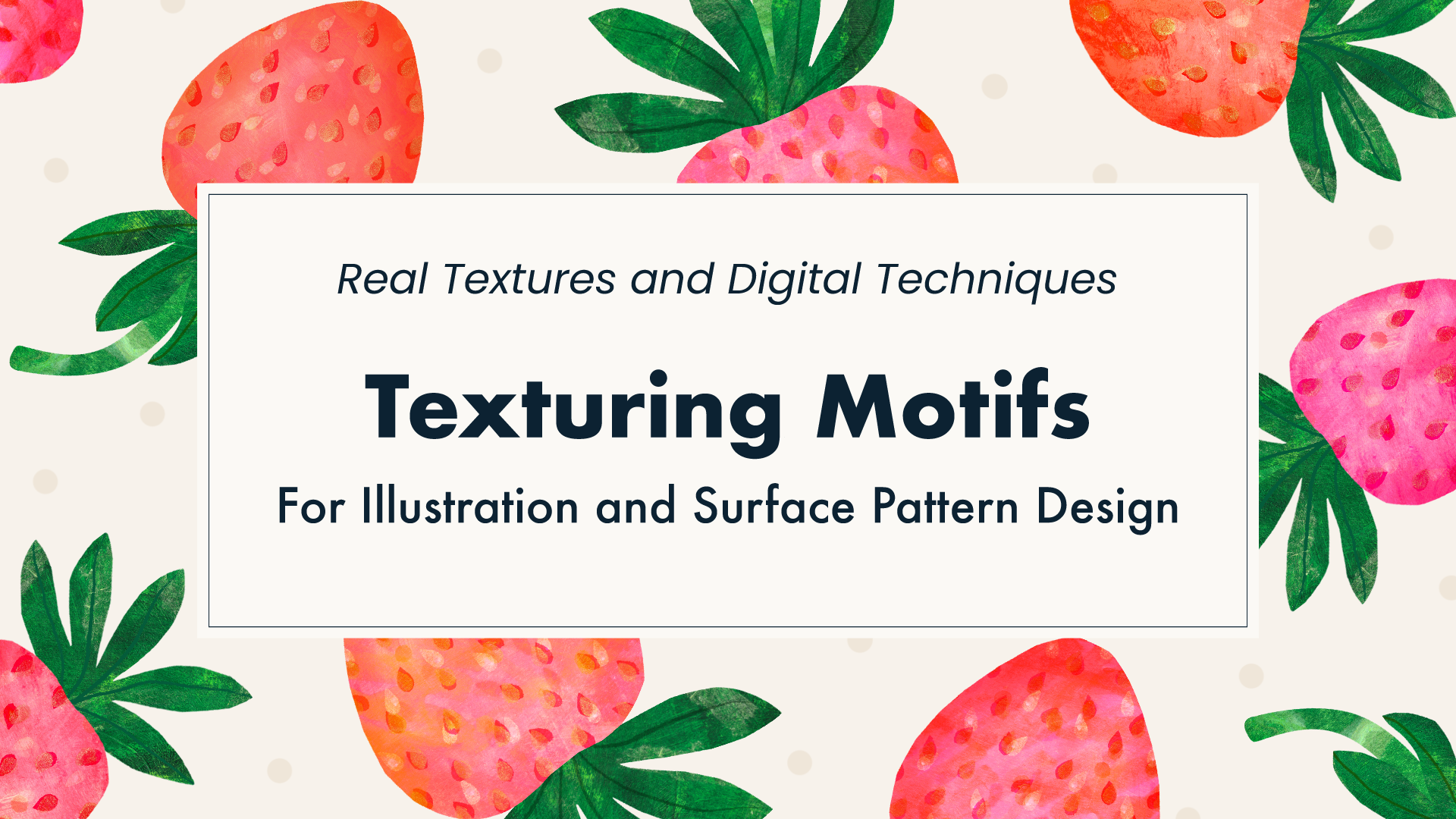
1. Welcome: Hello and welcome to texturing motifs for illustration and surface pattern design. I'm Sue Gibbons, also known as Rocket & Indigo. In this class, I'll share my process of combining real textures with digital techniques. Creating textures begins with layering traditional media on paper. It's a lot of fun and easy to do. Textures and shapes can then be brought together digitally to create eye-catching motifs. While this technique is possible to achieve a paper cutout style or alternatively add phone through shading in detail. Textures can be layered to achieve rich effects and it's easy to reposition them in the design. I've chosen strawberries for my motif demonstrations for the techniques can be applied to any subject. Textured motifs can be used as standalone icons in patterns or as part of illustrations. Items needed for the project, are paper and coloring media of your choice, plus a device with design app that has clipping mask capability. For example, Procreate or Adobe Photoshop. There were demonstrations using these during the class. This is an intermediate level class, but the key steps are relatively simple. So beginner should also be able to follow along. If you're excited about texturing motifs, let's get started.
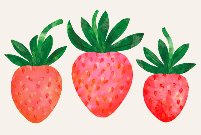
2. Project & Materials: Thank you for joining me. In this class, the main project is going to be to explore ways of texturing a simple shape such as a strawberry, to create a motif for illustration or pattern design. Although I stylize my motifs, I do like to begin with observation before moving to the design stage. To start with, I studied a few strawberries for their shape, color, and texture. There's a photo of the fruits in the resources section in case you want to use the same reference as me. Let's look at what you'll need for your project. We'll be creating real textured papers first. You will need some salted paper and one or more ways to have color and texture to it. These materials here are just examples of the options you could choose from, but use what you already have to hand. You might choose pencils, pens, paint and brushes, ink and stamps, crayons, pastels, layers of colored tissue paper, a mixture of media, or any other technique that you'd like to work with. You'll need a way to turn the texture papers you create into digital files such as JPEGs. But this, you could use a camera to take a good quality photo. But if you have the facility to do so, it is much better option to use a scanner to capture textures at high resolution. You will need a device such as an iPad, laptop, or desktop machine, and on it, you'll need some software that supports clipping masks. Many of the design softwares out there have this feature. I'll be demonstrating mainly using Adobe Photoshop on my iMac. Additionally, I will provide lessons on how to work with the iPad Photoshop interface and also with Procreate as well. The steps are actually very simple. If you're using different software that you are already familiar with and it has coping mass capability, then you should have no trouble following along. Ideally, you'll also want to have some plain black paper and a pair of scissors, but that is optional. Gather up your materials and meet me in the next lesson.
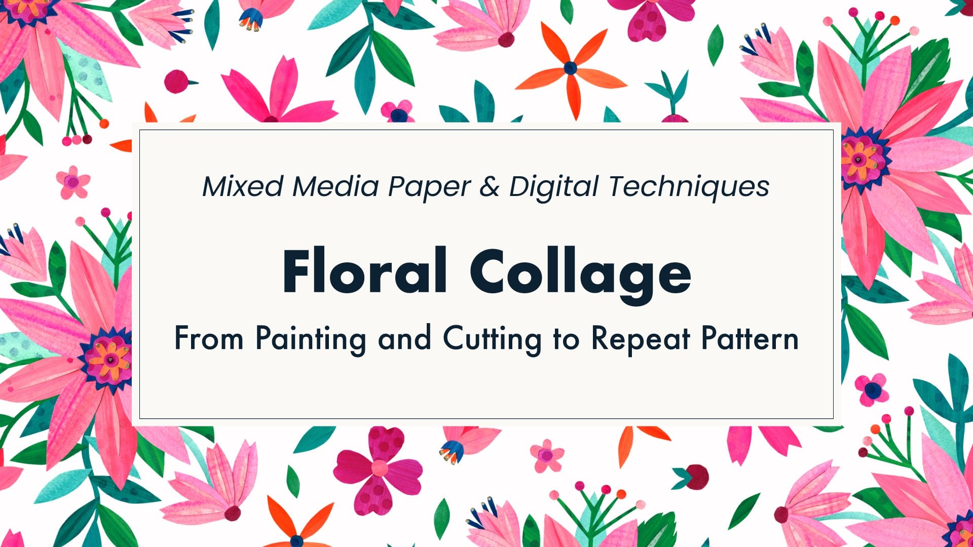
3. Process & Advantages: Welcome back. In this lesson, we'll look at some advantages of texturing motifs digitally and get an overview of the process. Previously, in my Floral Collage class, the focus was on cutting out texture papers with scissors and creating full motifs in paper before optionally digitizing design. Working this way does have some advantages. Cutting with scissors forces simplification often results in interesting shapes, and the shapes have a certain imperfect hand-cut charm. Later I'll show how you can bring this paper advantage into the digital workflow. Another benefit for me working with physical materials is that it often inspires my creativity. Furthermore, it results in a physical piece of art to keep, gift, or sell. However, I do find composing on paper much more time-consuming and it requires a significant amount of space to work. Let's now look at the digital advantages. Applying textures directly to digital shapes is quick and more efficient, especially if the motif is to be used in a design. It's possible to use scans of media that would not be ideal for paper collage. For example, oil pastels or wax crayons that will repel glue when layered. Digital scans of textures can also be re-used, unlike paper that can either be stomp down to one single artwork. Once textures are digitized, they can be applied to motifs anywhere with a laptop or iPad. Last but not least, software offers a number of handy tools such as transparency blending, that are difficult to achieve with paper collage. Of course, they come with the option to undo. My process for digitally textured motifs involves three main steps. One, making real textures and digitizing them. Two, making silhouette shapes. Three, using the shape to apply a clipping mask to the texture so that the texture looks like it was cut out. This step can often be done in one click or command in the software. So it's a very easy technique to learn. Now that we know why we want to apply textures digitally and that it involves just three simple steps, let's get creating.
4. Creating Textures: Hello again. In this lesson we'll make textured papers. They're very quick and fun to make. You'll find that you assembled up a bank for them to use in your work. Textures for digital use can be made with any media really. If you're using paints or inks, be creative with tools to apply them. Try different brushes, sponges, handmade stamps or found objects. Try different papers that are attached to those smooth, white or colored, thick or thin. Today I have this paper that I often use for making textures with wet media. I work with A4 size paper a lot, as you can see from this rather full box of textures. For projects where I'm texturing single motifs rather than large sections, I might work a bit smaller. This means the files are a bit leaner when scanned, which is helpful for storage and when importing them into the iPad. Here are some postcard size sheets I created while preparing for this class. For these two, I used inks with water and then stamped over the top but handmade foam stamps. These ones are made by layering tissue papers. Here I've used marker pens. This one is acrylic applied with a coarse dry brush and then pencil scribbles over the top. This one is water-soluble crayons blended a little with a fine brush. Then I experimented with an old toothbrush, here using it in a circular motion. But this one, I did loose marks with a round brush then dabs with a toothbrush on top. Finally, I went back to stamping and used some gold for the droplets plus a bit of white pen on top to add a tiny highlight. From these tests, I've chosen acrylic paints, ink stamps, and a little bit of tissue paper to use today. Now I'll demonstrate making a couple of textures. I have some cardboard to protect the desk, my paper taped down so it doesn't curl. I like to apply a base layer. Today I'm using acrylic paints for that. I can mix a few different paint colors right on the page so I'm already building texture. If you find you have extra paint on your brush, it's a good idea to wipe it on a spare page. That way you'll begin another texture to continue later. Try not to overthink or overwork the layers. I have a tendency to smooth out the paint too much. This first layer needs to fully dry. I'm ready to move on to the next layer. For the pink sheet, I want to add some stamped patterns. Let me show you how easy it is to make mini handmade stamps. Simply cutout craft foam with scissors. I'm cutting a little droplet here. Glue it on to the end of a pencil. For bigger shapes, use the end of a bottle cork or a piece of wood. I like to use superglue because it dries quickly and fixes firmly. I need to make sure not to stick my fingers down. I'll just give that glue a few minutes to dry. Meanwhile, I'm going to add a brushy texture to the green sheet with a coarse dry brush. I'll vary the color, but I'll brush it around freely with absolutely no water added at all. Let's go back and do some stamping on the pink sheet now. I'll create rows of strawberry fruit seeds. But I like some wankyness, so I'm going to turn the pencil side to side a bit. From all that, I can add a different color roughly on top, but offset a little bit. It'll be interesting to see how this gold ink scans in. Maybe I'll add some orange dots with this other stamp. I do love orange and pink together. Perhaps this needs more of the seeds, but that will do for now. Handmade stamps are a great way to add extra pattern and texture onto your colored sheets. More of this technique is shown in my floral collage class, if you want to take a look. My coarse brushstrokes on the green are now completely dry. I can do one more layer over it. Tissue paper has a nice fibrous texture, and I have some pieces of light green turn up into little strips. I'll use a wet brush to spread PVA glue over the area. It needs to be quite runny so it's evenly spread and will soak into the tissue paper. I'll grab each piece with the brush, position it and brush on top to smooth it down. For any wrinkles in the tissue paper, gently pressing with a spatula can help to smooth them out. There are a couple of examples with my favorite media. Remember, you can make your textures in any way you prefer. We'll return to these later. Meanwhile, the next lesson, we'll look at shapes.
5. Creating Shapes (paper method): Welcome back. This lesson will cover the pipe method for creating shapes. It's easy and a good method for achieving a handcart charm with interesting imperfections. However, if you know that you will prefer the efficiency of drawing your shapes directly into the software, then you can skip this method. I'll simply use scissors to cut out black paper silhouettes. Using a different color paper is certainly possible, but black and white gives the best contrast when it's time to digitize. This is quite a thin paper at a 110 GSM. I like to cook from smaller pieces of paper because large sheets can get a bit unwieldy. Try not to make the cutouts too smaller because that might limit how large they can be printed later. Cutting fast it will give them more choppy, imperfect look to the shapes. Is important to cut the different parts of the motif out separately to be able to color and texture them individually. For the strawberry, I need the fruit on the top to be two different cutouts. If you prefer, you could draw or paint these silhouettes in black ink or paint. Again, you'd need to keep the parts separated. When I make a design, I usually create multiple motifs to some variety. I'll probably cut a few more strawberries out later. Another method to make shapes is to draw directly into the software. We'll be getting to the Photoshop desktop, Photoshop iPad, and Procreate iPad lesson soon. You can watch them all to help you decide which is the best step for you to use for texturing motifs, or choose your favorite app and just watch the lessons for that. But first I need to digitize everything I have on paper, including the textures, which I'll show you in the next lesson.
6. Digitizing & Resolution: Hello again. At this stage, I need to digitize my textured papers and my strawberry cutouts. Scanning is definitely the most effective method of digitizing flat papers and that's what I'll be using. For the cutouts, I need to make sure they don't touch when I place them on the scanner bed. I'll open my scanner software and it will do an overview scan. Black and white setting will be fine for the cutout. With my scanner, I have a lot of choices when it comes to the resolution setting. I recommend at least 300 dpi, but higher may be better for some projects. I'm going to say more about resolution in a few minutes, but for now, let's choose 300 dpi for the black cutout scan. I'll select the scan area. Now, choose a location for the file to go and name. Then set the scanner off. We'll come back to this in a moment. If you don't have a scanner, use a digital camera such as the one on your device at the best resolution it offers. Make sure the whole image is in focus by having the lens parallel to the paper, making sure that the paper is laying flat and not curled. If you are photographing black paper cutouts, place them on a white background. If they weren't lay flat, then you may want to stick them down. Be sure the lighting is even with no visible shadows. My scan of the cutouts has finished. I'll remove those from the scanner and put one of the textured papers on the flatbed face down. This time, I want to scan in color. For my textures, I'm going to use the maximum resolution my scanner offers, which is 1,200 dpi, because this gives me more options with how I use them. However, files can be big. If you prefer smaller files or if your scanner or camera doesn't offer such a high resolution, just make sure it's at least 300 dpi. We'll get an overview first. I need to adjust the area to be scanned. I'll give it a name. Now set the scan to go. I'll be repeating this for the second sheet as well. While those scan, I wanted to point you in the direction of this document I put in the resources section called Resolution Explained. It's a good refresher for designers and artists working with digital files. It covers how choice of resolution when digitizing affects pixels and file size, how resolution works with printing, and considerations for striking a good balance between file size and quality. A key take-home message from this document is that digitizing artwork or setting up artwork files at higher resolutions will be advantageous if you may later want to enlarge them when printing or print a higher resolutions. However, the increase in file size is quite significant. When creating lots of large files, devices and hard drives can quickly fill up. Therefore, use higher resolutions when they would likely be most beneficial. Here, my texture is being scanned at a higher resolution of 1,200 dpi, so I have the option to enlarge them in this or other projects. Whereas I'll be using in most standard resolution setup when creating the actual motifs for this class, because I don't think they'll need enlarging from their original physical size or printing it especially high resolution. As I create the motif files, I'll be matching the settings to the scan resolution I used for the black cutouts, which was 300 dpi. The second texture has now finished scanning. Here are all the digitized files in the folder, including a couple of extra cutouts I made and the test postcards I showed you earlier. As you can see, there's lots of lovely texture to work with. I did decide that the pink droplets stamped earlier were too sparse, and so I stamped lots more in the same way as before with the fuchsia pink and gold offset on top. Well, I wasn't sure it would work out with the dense droplets. In the end, I was glad that I had continued. A tip for you; if you aren't sure whether or not to carry on adding to a paper, take a scan of photo of it before you continue so that if it doesn't work out, you still have the earlier version to use in your motifs. Here's everything now in the folder, including the new pink paper scan. If you have digitized the images to your computer like me, then later might want to work on your iPad, you can send the files across now. I have an iMac so I can use AirDrop to send to the iPad. Select one file or multiple files at once. I'll use Command A to select all the files in this folder, right-click and choose Share, AirDrop. If you don't have this facility, you can email the files to yourself and pick it up on your iPad. I've used the sent files a bit later on in the iPad lessons, but first, let's look at Photoshop on the desktop computer.
7. Clipping Masks - Photoshop Desktop: Welcome back. In this lesson, we'll cover clipping masks using the Photoshop desktop application. I'll begin by making a new file. Based on the physical size of my black paper cutouts, I'll make the canvas five by seven inches. I'm going to work with a resolution of 300 pixels per inch to match my cutouts scan, as mentioned in the digitizing lesson. If you scan black cutouts at different resolution for your project, then match your Photoshop file to whatever setting you use. I'm going to choose RGB Color mode. I will also set the background to be transparent then click on ''Create''. From the file menu, I'm going to use Place Embedded to add my black cutout strawberry to this document. I'll click the "Checkbox" to place it. Placing will bring the file in as a smart object as indicated by a little icon button right of the layer thumbnail. Smart objects are useful in many circumstances. However, for the technique we're going to use, the silhouette shape actually needs to be a regular pixel layer. To change it, go to Layer, Rasterize, Smart Object. Now the pixels are editable. Although not essential, it sometimes helps to increase the contrast at this stage, especially if the paper used isn't pure black or if you photographed rather than scanned. I'll go to Image, Adjustments, Brightness/Contrast, and I'll slide the contrast up to maximum. Now I want to select the unwanted white pixels and delete them so that these silhouettes are on a transparent background. One way to select just the light areas is to use the Select menu, Color Range, and choose the Highlights option. There are some sliders to make fine adjustments, but with black and white subjects like this, the default settings should work just fine. I'll click "Okay". You can see the selection with a moving dotted line known as marching ants. Delete the selected pixels with Cut from the Edit menu with command X, or just use delete on the keyboard. The checkerboard in the background indicates transparent areas with no pixels. I'll save this file with a suitable name. I now want to put the parts of the strawberry onto separate layers. I'll use the lasso tool, shortcut key L to select a section. Cut it with Edit menu and Cut or shortcut command X. Then paste it in front in the same position on a new layer with Edit menu, Paste Special, Paste in Place, which has the three key shortcut Shift command V. I'll go back to the original layer in the layers panel and do the same with the other sections. I'll rearrange which section is on top by dragging layers up or down in the stack of the layers panel. Name layers to keep things organized. I can move the elements around with the move tool shortcut key V. They can also be transformed with command T. For example, rotate it into position. I think this calyx is a bit too large for the fruit so I'm going to scale it down. As a general rule is okay to scale down but scaling up can cause fuzziness. Now, I'm not entirely happy with the shape of the stalk. I'll turn that layer off and I'm going to draw it again directly into the software. There's no need to use black when drawing directly. In fact, having a different color can help to distinguish the different layers when the sections overlap. The actual color isn't very important. I'll use a small hard brush at 100 percent opacity and draw the shape. I'm just using my mouse here, so my lines are a bit wobbly. Using a stylus gives smoother results. Now I can fill in the outline with the paint bucket tool. Sometimes the paint bucket leaves a halo of unfilled pixels, but usually clicking twice fixes that. Use the eraser tool if needed to clean up the shape. Drawing directly into the software is faster and more efficient than cutting out papers and scanning so feel free to use the direct drawing method for all your shapes if you prefer. Just make sure to draw each section of the motif on a separate layer, that's very important for this technique. By the way, if you love to use vector-based software such as Adobe Illustrator, you can simply copy shapes drawn in the Illustrator and then paste them into Photoshop. After pasting, this menu appears. Remember that the shape needs to be pixels for the clipping mask technique to work. I'll choose pixels to convert it from a vector shape. This could be a great option if you're already comfortable with directly drawing vectors or with using Illustrator's Image Trace feature. I'll keep this stalk and remove the layers I don't need. It's time to add texture. I'll first make sure I'm on the layer that I want to work with here in the layers panel. I'll fetch in one of my textured papers by placing it from the file menu. Placing will bring it in as a smart object so I can work with it non-destructively. There are a couple of options for placing files into documents, Place Embedded or Place Linked. Each has pros and cons that need weighing up depending on circumstances. I listed the considerations in a PDF download called Smart Object Basics in the resources section for you. I've decided to choose the linked option for my project. I'll select the texture file. It can be repositioned if it isn't completely over the shape to be textured. Click the checkmark to commit or press "Enter" on the keyboard. The texture is added on a layer above the shape, which is what we need. Notice the small icon in the bottom right of the thumbnail that indicates it's a linked smart object. Now for the exciting part, to apply a mask, simply go to Layer, Create Clipping Mask. The three key shortcut is option command G on Mac or Alt Control G in Windows. A downward arrow appears in the layers panel to indicate that the shape of the texture is now clipped to the pixels on the layer below. Any transparent areas will be hidden on the texture layer. The mask isn't permanent and can be released if needed. Textures can still be moved and transformed while the clipping mask is applied. I'll add texture to the other sections of the motif. For the stalk, I'll select a different texture, one of the test postcards I made. The clipping mask can also be added by right-clicking on the layer name and applying from this layer options menu instead, which is sometimes quicker. I'll add texture to the fruit as well. I'll choose the pink one where I added the extra droplet stamps. After applying clipping masks, it's still possible to make changes to the mask shape. Select the silhouette shape layer in the layers panel first, and then alter it with any of the tools. For example, I could take the eraser tool, shortcut key E, with a big brush and erase some circles to take a bite out of the fruit. This change is applied to the clip texture. I actually want the whole fruit for the time being so I'll just undo that bite with command Z. Be sure to save the file. Then we have a basic texture strawberry motif that is similar to the cut paper style. Next, we'll look at some optional extra techniques with blending layers, shading, and details that will add more depth and form to motifs.
8. Blending & Details - Photoshop Desktop: Hello, again. Now that we have a basic textured strawberry, I want to show you some optional extra techniques for layering and adding depth. In order to layer and blend textures, we need to have an additional one, so I'll place another linked texture. This time, I'll choose the tissue paper test sheet, I'll click the additional texture to the fruit as well. At the moment that new texture is totally covering up the original one with the stamp seeds, but I'm going to use this blending mode drop-down box to change the way this layer blends with the one below. I'll scroll the list and make a mental note of any that I like. The soft light one is quite nice. Since the effect depends very much on the textures and the colors used in the layers, I find it best to scroll through each time and try out different options. Yes, I think I'll use soft light in this case. That's two layers blended. To make the texture even richer, more layers can be added. I'll add another. I think this is upside down when I scanned it, so I'll rotate about 180 degrees, and I think I'd like it a bit smaller too. Now I can commit it with the checkbox. Again, I'll click back to the fruit silhouette shape. This time I'll try keeping the blending mode as normal, but reduce the opacity so that the little layers below can show through. By using the eye icon, I can turn off and on layer visibility and see how the different layers are working. By layering up textures using different blending modes and opacities, there really are endless possibilities. I like this layering so far, but I'd prefer those new golden seeds to pop a bit more. I can adjust that top layer with "Image", "Adjust Brightness and Contrast", and I'll increase the contrast right up. By previewing that I can see if I like the change, and I do. Because this texture is a smart object, the adjustment to contrast has been done in a non-destructive way with a smart filter, and I can turn that off anytime. I think I'd like a bit more of the layer below showing through. Is also a possible to apply adjustments non-destructively to the whole stack of layers or to specific silhouette shapes. There are a number of adjustment layer options via this icon at the bottom of the layers panel. For example, hue saturation. I'll adjust the hue slider and see that the whole motif is changing. Now if I click the adjustment just to the fruit section, the calyx and stalk aren't affected. But I like the top more bluish green, so I'll release the clipping mass to the hue image of splint applies to all the layers below. Now, I'll show you how to apply some shading to give a more rounded form to the fruit. I'll create a new layer above the fruit textures and name that shading. It will need to be clipped to the fruit shape. I'm going to select a mid gray color and I'll select the brush tool. I'd like a large soft brush and I'm going to have it to reduce the opacity so the effect is even softer. I probably need the brush much larger. I like to use the square brackets keys to change the size of the brush. I'll press right bracket on my keyboard until that brush looks large enough for shading. I'm going to go around the edge and add a bit extra at the bottom on one side, so that it's a bit more in shadow. Now we'll change the blending mode. I like to use Color Burn, but you can try the different blending modes for your own preference. If it's a bit strong, reduce the overall opacity of the shading layer. Use the eye icon to see how the shading layer is working. I might add a bit more on this side. Adding detail works in a similar way. This time, I'm going to work on the calyx section. Make a new layer above the calyx textures only in that line detail. Now I can clip it so that the details will stay inside the calyx shape. Pick a color and brush of your choice, then simply draw in the details. Use blending and opacity, if you wish. I'll save this file. Next, we'll look at how these textures can be achieved in Photoshop app for iPad. It's similar, but with a different interface and some tools aren't quite the same.
9. Clipping Masks - Photoshop iPad: Hello again. In this lesson we'll begin to cover clipping mask using an iPad, which is portable and many say offers a more natural drawing experience. Using the Photoshop app on iPad is similar to the desktop version, but there are a few differences in the tools and interface. I'll create a new file. Based on the physical size of my black paper cutouts, I'll make the canvas five by seven inches. I'm going to work with a resolution of 300 pixels per inch, as mentioned in the digitizing lesson. I'll select transparent for the background. RGB color mode will work well to retain the color vibrancy of my scanned textures. I'm going to add the scan of my cutout shapes first using this image icon on the left. I can get the file for my recent photos, then press "Done". We can get a view of the layers as compact thumbnails or as rows using these icons here on the right. The layer that is currently active has a blue halo around it. It sometimes helps to increase the contrast, especially if the paper used isn't pure black or if you photographed rather than scanned. These three little dots here at the bottom on the right will give us some options for the layer. I'll add a clipped adjustment for brightness and contrast, and that brings up the layer properties panel. Hop the contrast using this slider. I can now close that panel with the properties icon. We can see that adjustment is separate and above the cutout layer, but it can be applied permanently. First, make sure that the blue halo is around the sun icon in the layers list panel. Now open the layer options and choose "Merge Down". Now I want to separate the silhouette shapes from the background and put each on its own layer. On the left here we have the selection tools. Long press to get a variety of options. In the iPad version of Photoshop, I really like the quick select, which has this overlay icon. Drag roughly over a black area and wait a moment. If it doesn't capture all you want drag over again. You can see the selection with the merging ends. In the layer options on the right, choose "Cut". Create a new layer with the plus icon. In the layer options on the right choose "Paste". I can select the move tool and drag that into position. The transform icon below the move tool brings up the scale and rotate options for the object on the layer if any adjustments are needed. Go back to the original layer and repeat till parts are all on separate layers. Select the original layer and then delete it by the layer options menu once all the artwork has been pasted. I'll re-order by dragging layers up or down in the layers panel as needed. To rename layers and keep organized, double tap on the layer name type, then tap "Rename". Another option is to draw directly into the app. For example, I can have stoke. Use the plus icon to make a new layer. I'll select the brush tool from the left menu. Long pressing brings up the brushes list. I think I'll use a brush pen, but you can choose any you like. Do make sure that the opacity is 100 percent. Change the size of the brush as needed. I don't need to stick to black when drawing directly into the app so I'll choose a nice green from the color picker here. Color the shape in with the brush or for a smooth feel, I like to use the paint bucket tool. Just tap inside the outline of the shape to fill it. Sometimes the paint bucket leaves a halo of unfilled pixels, but usually tapping a second time in the shape will fix that. I often finesse the shape using the eraser tool with the same options as my brush. I'm happy with that shape now. I'll give that layer a name. I'll just reposition the parts of the stroke so they fit together nicely. It's time to add texture. I'll first make sure I'm on the layer that I want to work with here in the layers panel. Now I'll add one of my textured papers via the image icon. At the time of filming this class, the Photoshop iPad app doesn't have the kind of support for smart objects that the desktop version has. This means I'm best to do any scaling of the high resolution texture at this stage. I can also move it into position if needed. Once happy press "Done" to command. The texture is added on a layer above the shape, which is what we need. To apply a mask, simply press this clipping icon on the right with the little arrow. An arrow also appears in the layers panel to indicate that the texture is now clipped to the pixels on the silhouette layer below. Any transparent areas will be hidden on the texture layer. Clipping mask can be released using the same icon and that will reveal the whole texture again, so the mask isn't permanent. To move the texture after clipping, just select the move tool and drag the texture around. I'll do the same for the other parts of motif. After applying clipping masks, it's still possible to make changes to the mask silhouette shape. To do this, make sure you have the shape layer active. As an example, I'll take the eraser tool of the big brush size and erase pixels to take a bite out of the fruit. There's changes applied to the clip texture. I'll undo those bites with the undo arrow at the top. Tapping with two fingers can also be used to undo. That's how to texture the motif. Next, let's look at some optional extra techniques on the iPad for blending, shading and adding detail.
10. Blending & Details - Photoshop iPad: Welcome back. Now that we have a basic textured strawberry, I want to show you some extra techniques for layering and adding depth in Photoshop for iPad. In order to layer and blend the textures, we need to have an additional one. I'll go to the top layer and place in another texture from my photos. Here I have the water-soluble crayons test sheet. I'll click the additional texture to the fruit as well. At the moment, that new texture is totally covering up the original one with the stamp seeds. But I'm going to alter how the layers blend with each other. To use layer blending, open the Layer Properties panel. At this point it might be helpful to switch to the layer thumbnails so that the whole of the properties panel can be viewed. There is an opacity slider and a blend mode menu to select from. Since the effect depends very much on the textures and colors used in the layers, I like to scroll the list of blending modes and make a mental note of any of this I like. Color Burn works quite well I think. That's two layers blended. To make the texture even richer, more layers can be added. I'll add another. I'll just rotate that with the handle here and move it into position then say Done. Again, I'll click back to the fruit silhouette shape. This time I'll try reducing the opacity so that it will layers below can show through. I can even do both, so 50 percent opacity and mode like Overlay might work well here. By using the eye icon, I can turn off and on the layer visibility and see how the different layers are working. By layering up textures using different blending modes and opacities, there really are endless possibilities. Adobe is still developing this app and some features available in the desktop version haven't been added on iPad at the time of filming this class. But it is possible to add clipped adjustments via the layer options icon. There are a number of adjustments to choose from, such as brightness/contrast, color balance, hue saturation, and more. I'll try altering the hue of the fruit. The slide is appropriate to the adjustment will pop up. The adjustment will be applied to the shape in the same way as of the clipping masks. Now I'll show you how to apply some shading to give a more rounded form to the fruit. I'll create a new layer above the fruit textures, and I'll name that Shading. You will need to be clipped to the fruit shape. I'm going to select a mid gray color. I'll select the brush tool. I'd like a soft brush. Brush should be fairly large. I'm going to have it at a reduced the opacity so the effect is soft of a shading and I can build it up. That brush is a bit too large. I'm going to go around the edge and add a bit extra at the bottom on one side, so it's a bit more in shadow. Now I'll change the blending mode. I like to use Color Burn, but you can experiment. If it's a bit strong, reduce the opacity of the shading layer. Adding detail works in a similar way. This time I'm going to work on the calyx section. Make a new layer above the textures. These panels are all getting bit busy so I think I'll switch to the list view. I'll name that new layer Line detail. Now I can clip it so the details will stay inside the calyx shape. Pick a color and brush of your choice. I'm going for Old Brush Ink with the dark green. I think I'd like to zoom in a bit to draw the details, so use two fingers to pinch out. The drawing will be kept inside the shape by the clipping mask. Pinch in to see the whole motif again. I will go back to the gallery and I can rename that file. When I returned to Photoshop on my iMac, this file should be waiting for me. We'll be returning to Photoshop Desktop later to make a repeat pattern. But first, let's look at how this process works in Procreate.
11. Clipping Masks - Procreate iPad: Hello again. In this lesson, we'll cover clipping masks using Procreate for iPad. I'll go to the plus icon top right, to create a new file. Rather than choosing an existing size, I'll make a new Canvas size with this second plus icon. I'll choose inches and go for five by seven to roughly match the physical size of the black cutout strawberry. I'm going to use 300 for DPI setting as mentioned in the digitizing lesson. For color profile, I'll select RGB because that will allow me to retain the vibrancy of my scanned textures. I'm going to go to the wrench icon at the top and choose "Add," and then "Insert a photo." I'll choose a cutouts file. It sometimes helps to increase the contrast, especially if the paper used isn't pure black or if you photographed rather than scanned. I'll go to the adjustments icon, which is the sparkly wand and choose curves. I need to adjust for the layer rather than the pencil. On gamma setting, I can slide the bottom of the curve to the right and top to the left to maximize contrast. Go towards the middle with age without crossing them over. Tap on the Canvas to get the options. Preview the changes. When happy, tap "Apply." Now I want to isolate each silhouette shape and make sure it's on a transparent background. Go to the selection icon at the top, which is like a ribbon, and choose automatic. Tap on one of the shapes and it changes color. Go to the transform icon, which is the arrow, and the area selected gets a marquee around it. Use three fingers to swipe down and then copy and paste menu appears. Choose cut and paste. If you tap the layer icon at the top right, you'll see that the selection has been copied to its own layer. Now, tap back on the original cut-out layer so that it becomes highlighted in blue. Repeat selecting, cutting, and pasting for the remaining parts. Remove the original layer with the white background by swiping left on the layer and choosing delete. To name the layers and keep things organized, tap the layer, choose rename, and type. Layers can be reordered by dragging if needed. To make changes to the positioning, tap the transform icon. Drag to move. Use the blue circles to scale or the green handle to rotate. I'd like to add a stroke to this motif, which I'll draw directly onto the Canvas. It's important to start a new layer to draw around. Open up the layers panel and use the plus icon at the top. I'll select a brush and I think I'll use technical pen from the inking set that comes with Procreate. You can choose any brush you like. But I recommend to set the opacity to 100 percent. I don't need to stick to black when drawing directly into the app, so I'll choose a color. I've got some palettes already set up, but the color can be chosen in other ways such as using this disk. Either color and the shape with the brush off or smooth fell, use color drop. To color drop, drag the color dark from the top right and release inside the outline of the shape. Just make sure the outline is properly closed with no gaps. If you find that color dropping leaves some pixels unfilled, undo and then re-drop the color but hold until a threshold slide repairs at the top. Drag this slider to achieve the correct amount of color filling. I also like to use the eraser to refine shapes. I'll rename that new stock layer. Now put stock behind the calyx layer. It's time to add texture. I'll first make sure I'm on the layer I want to work with here in the layers panel. Now I'll add one of my textured papers by the wrench icon. Choose add, insert photo, and find the paper. I'm best to do any scaling or transformation of the high resolution texture at this stage before it is committed to the Canvas. The layers panel say that the texture is added on a layer above the shape, which is what we need. To apply a mask, simply tap the texture layer and choose clipping mask. An arrow also appears in the layers panel to indicate that the shape of the texture is now clipped to the pixels on the layer below. The transparent areas will be hidden on the texture layer. The clipping mass can be released in the same way. This will reveal the whole texture again. The mask isn't permanent. I'll do the same for the other parts of the motif. The texture can be moved inside the shape using the transform tools. After applying clipping masks, it's still possible to make changes to the mask shape. For example, I could select the fruit shape layer and select an eraser brush. If I raise pixels of the shape, the changes applied to the clip texture, and it looks like a bite out of the fruit. I don't want to keep that change, so I'll undo with the arrow on the left. I'll alternatively tap with two fingers. There's a simple textured strawberry. In the next lesson, we'll explore blending modes, opacity, shading, and adding details.
12. Blending & Details - Procreate iPad: Welcome back. Now that we have the basic textured strawberry I want to show you extra techniques for layering and adding depth in Procreate for iPad. In order to lay and blend the textures we need to have an additional one. I'll go to the top layer and place in another texture from my photos. This time I'll use the marker pen test sheet. Open the layers panel and click the additional texture to the fruit as well. At the moment that new texture is totally covering up the original one with the stamp seeds. Don't go to all to have the layers blend with each other. In Procreate, layer blending and opacity options are under the letter here on the layer. The letter starts out as an N for normal. Tap the letter and other options appear. Again, there is an opacity slider and a list of blending modes. I'll try out the modes in turn. I think I like Hard light best in this case. When a different blending mode is applied the letter changes on the layer row to indicate which mode is being used. The modes available are very similar to those in photoshop. By using the chat box to the right of the layer info I can turn off and on the layer visibility and see how the different layers are working. More layers can be added if desired. With this texture, I'll transform it and rotate 180 degrees. Click back to the fruit shape. I'll blend this one with overlay mode I think, and I can reduce the opacity if it's a bit strong. Adjustments can be made to individual layers in procreate. Make sure the right layer is selected. The sparkly one icon on top-left opens the adjustments menu. Hue, saturation, and brightness as well as color balance, and blur can be altered. Choose the type of adjustment. Tap layer rather than pencil, and slide as a pair at the bottom of the screen. I'll change the hue of the texture. Tap the screen to get this menu to appear and use preview to see the before and after. When happy, tap apply. By layering up textures using different blending modes and opacities, and making adjustments to colors, really are endless possibilities. Now I'll show you how to apply some shading to give a more rounded form to the fruit. I'll create a new layer above the fruit textures and I'll name that shading. It will need to be clipped to the fruit shape. I'm going to use a mid-gray color and I'll select the brush tool. A soft brush is good like this one from the airbrushing set. It needs to be quite large and I'm going to have it at a reduced opacity so the effect is even softer. Go around the edge and add a bit extra at the bottom on one side so it's a bit more of a shadow. Now I'll change the blending mode. I like to use color burn but you can try the different blending modes for your own preference. If it's a bit strong, reduce the opacity of the shading layer. Adding detail works in a similar way. This time I'm going to work on the calyx section, make a new layer above the textures. I'll name that line detail. Now I can clip it so the details will stay inside the calyx shape. Pick a color and brush of your choice. I'm going for ink bleed from the inking set with a rich green. I think I'd like to zoom in a bit to draw the details, so you use two fingers to pinch out. The drawing will be kept inside the shape by the clipping mask. Pinch in to see the whole motif again. When I return to my gallery I'll give this file a name. That's three strawberries created using three apps. Next, we'll look at finalizing them, and exporting.
13. Finalising Motifs & Exporting: Hello again. I've now created a few strawberries in the different apps. In this lesson, I'll show you how to finalize motifs. We'll also look at exploiting. The files I created in the three apps are all layered and fully editable. I could go back in to transform textures and easily change their colors individually. But for uses elements in patterns and illustrations, or to send clients for their graphic designers to work with, these many-layered files are unnecessarily complex and file sizes can be rather large. Therefore, I like to make a copy of the file, and then on the duplicate merge the clip textures down so that they become a permanent part of the shape. To do this in Photoshop desktop, remember to first make a duplicate of the file. I like to add something to the filename like dash merged. Hold Shift, and select all of the layers to be merged. I'll start just by merging the stoke texture to its shape. Go to Layer menu and choose Merge Layers or use the shortcut Command E. Right-clicking on the layer names is another way to bring up the Layer menu. Choose Merge Layers from that. Now, onto the calyx section. Depending on the circumstances you might like to merge the line details down as well, or you may prefer to keep those separate. I'm going to go ahead and merge them. If I change my mind about them, I do still have the original file. I've got quite a few more layers for the fruit. Notice that the merged artwork layer will take on the name of the top most item being merged. Renaming layers with helpful descriptions makes the file easy to use. Take the time to do that for yourself and especially for clients. I also like to make a group with all of the motif elements. Bring up the Layer menu and choose Group Layers or use a shortcut Command J. I'll give that a name too. That's nice and tidy now. The process is similar in Photoshop for iPad. From the Cloud documents screen, look for the three dots next to the filename. Tap that and choose duplicate. Rename the duplicate files so it has dash merged included in the name. Now go into the file, select the shape layer. In order to select multiple layers at once on the iPad, go to the layer actions menu and choose, Select Multiple. Use the check boxes to select the layers to be merged. Tap on layer actions again and choose Merge Layers. Do this for the other motif sections. Rename the layers to make the file easy to use. To make a group with the layers, first select them all. Now click on the folder icon. I'll give that group a name so everything's organized. Let's look at that in Procreate too. From the gallery, swipe left to duplicate the file and again, rename it with dash merged on the end. Go in to edit the duplicate file. In Procreate, layers are merged by pinching the layer rows together. This time the name of the lower layer is capped, so there's no need to rename the merged layer. To make a group with the layers, select one layer row and then swipe right on each of the other rows. With multiple layers selected, the option to group them appears at the top. Group the layers and then rename the group so the file is organized. I've demonstrated techniques in different apps and you might be wondering how I prefer to work. The iPad is great for drawing anywhere. I tend to begin either in the iPad or on paper. But because of the support for smart objects, I do prefer to finish in Photoshop desktop when using real textures. With that workflow in mind, let's take a quick look at exporting from the iPads. Using the PSD layered format makes it easy to work across different apps. I'll export the original fully editable strawberry from Procreate. From within the file, use the wrench icon and go to Share, then choose PSD. After export, a number of sharing options appear. I'll use AirDrop to push this over to my iMac. Procreate art work can also be shared from the gallery. I'll send the merged version over as well. Swipe left on the file and again choose share PSD. Once received, the AirDrop goes into my main downloads folder. I can open the files in Photoshop desktop and all the layers and clipping masks are there. In this file, the group layers are just the same as in Procreate. The sharing between Photoshop on the iPad and desktop is fairly seamless as you might expect. Adobe automatically saves Photoshop files made on the iPad as Cloud documents so that they're waiting for you on your other devices. In Photoshop desktop, the home screen has access to the list of your Cloud documents. Here are the ones I created on the iPad. Open them up and all the layers are just as I left them. Optionally, I can make a copy to store locally by going to File Menu, Save As, and choose on your computer. It can also work the other way round. If I open the file I was working on locally here in Photoshop desktop, I could make a Cloud copy to use on the iPad. From the File menu, you simply choose Save As and choose Cloud documents option. In case you want to export from Photoshop on the iPad to a different apple location, go into the file. The share icon is in the top right of the screen with the up-arrow. Choose Publish and Export. There are a number of file type options including PSD. Tap Export and wait for the file to be written. The sharing options then appear, including sharing directly with apps such as Procreate, emailing, AirDrop, save into a folder, and so on. This can be handy if Internet connectivity problems arise and files aren't sinking to the Cloud. It's possible to export the PSD to a folder and then use a cable to connect the iPad to the iMac and grab the file that way. There are a few finalizing and exporting tips. In the next lesson, I'll pull all of the strawberries I created together into one file and make a repeat pattern with them.
14. BONUS: Repeat Pattern: Welcome back. In this lesson we'll look at making a seamless repeating pattern using the textured strawberry motifs. In Photoshop 2021 for desktop, a new tool called Pattern Preview was released to make simple repeats easy. That's what I'll be using for this bonus demo. This is my motifs folder on my desktop machine where I saved the files locally. I'm thinking that this third motif might need some tweaks so it fits in with the others. I don't have to go back to Procreate to edit it though, I can open it in Photoshop and make the changes. I'd like the pink marker pen layer to be less strong. Bring the golden pips-out of mark as well. I think the line detail needs to be reduced a little. I'm going to save this locally. Now I'll make a merged version of it to use in the pattern. The Procreate file has a white background that I don't want, so I won't include in the motif group. Save the merged version with a new file name. Back in the folder, I can see the modified version is going to work much better. I'll open up the other two merge motif files as well. For the pattern, I'll create a new file, and this time I want a big square canvas. I'll go for 24 by 24 inches. That's rather large and will be suitable for something like bedding or wallpaper rather than for smaller-scale surfaces. But if I make the pattern at large scale, I have more choice of where to use it. I can shrink it down later if needed. My motif artwork is RGB and at 300 PPI, so I'll match the pattern file to those settings. I'll now gather all of my strawberries into this file, select the group and the layers panel, copy it with Command C, go to the square pattern file and paste Command V. I'll do that for the second model as well. To move that motif, select the Move tool and make sure Auto Select by group is checked. The whole group is moved. Paste the third one into to the pattern file too. To make the layers panel a bit tidier, I'll hide the layer info within the groups. The motif layers can still be editors. With this strawberry, I added a huge adjustment to the whole motif that is causing me some problems now because it's adjusting all the layers below, including the motifs. I decided I only want to adjust the flip section anyway so I can make a clipping mask to fix the issue. I'll be duplicating the strawberries. An easy way to do this is to drag the group down to the plus icon at the bottom of the layers panel. I like to make each one slightly different, but that's totally optional. I'd have some with stalks and some without, some reflected the other way. Plus make some small adjustments to the hair of the fruit so that there's some color variety. I'll carry on making some copies and altering them slightly, and I'll speed this part up. Remember to save the file. It's recommended to make the motifs into smart objects. Because if I scale a strawberry down, then later want to put it back to the original size having it in a smart object allows me to do that without loss of quality. Select the group, go to Layer menu, Smart Objects, Convert to Smart Object. Right-clicking on the layer name to get the menu is a bit quicker when there are a few motifs to do. Make sure to convert one motif at a time so they can be moved around separately. If you realize you need to make any edits after converting, double-click on the layer to go inside the smart object. For example, I could go in and change the stalk. The smart object needs to be saved separately to the main file if it is updated, close it, and the main file updates also. Before I lay out the pattern, I'll add a background color. I think cream would be nice with strawberries. I have something in my swatches panel already. You can also choose a color with the pecker hair. Fill the bottom layer using the paint bucket. I'll name that layer. Let's make a repeating scattered pattern. Pattern Preview can be opened via the view menu. This message just reminds me about using smart objects. The previous shows how the artwork will look when repeated like tiles. Zoom out to see more of the repeats. I use Command minus to zoom out and Command Plus to zoom in. To make the pattern move motifs around with the move tool. For a scattered pattern, I want to rotate motifs, which can be done by transforming the layer with Command T, grabbing the corner handles to rotate, then pressing Enter to commit by using the tick icon at the top. As motifs are moved and rotated, Pattern Preview immediately shows how that affects the pattern layout, making it easy to get the positioning right. I'll speed up the moving and rotating. Zooming right out is a great way to check for even distribution. Make adjustments to position as needed until it's how you want it. Pattern Preview isn't limited to transforming our work already on the canvas. I could make another layer and draw on it. I'll create a layer above the background, and I'm going to make some subtle dots for the brush. If I use the same color as the background or set the layer to multiply blending, it should give me a nice color for the background details. It's really handy to instantly see how it looks and repeat so I can space them out nicely. I'll name that dots layer. Now I'm ready to define the pattern tile. Go to edit, define pattern and give it a name. With the pattern defined, turn off Pattern Preview via the view menu. Now save the file. To test the pattern go to the topmost layer. Add a new fill layer from the icon at the bottom of the Layers panel and choose pattern. The pattern just defined will be at the end of the list. Choose it, and the layer is populated with a pattern at 100 percent. Change the scale of the pattern by double-clicking the thumbnail and editing the scale by typing a number by using the slider. This define pattern will be available in other Photoshop desktop files as well, so I could use the pattern elsewhere. For example, to make a mockup. Check out my all about mockups class, if that's of interest. In the next lesson, I'll show you how I use these strobe and motifs in an illustration.
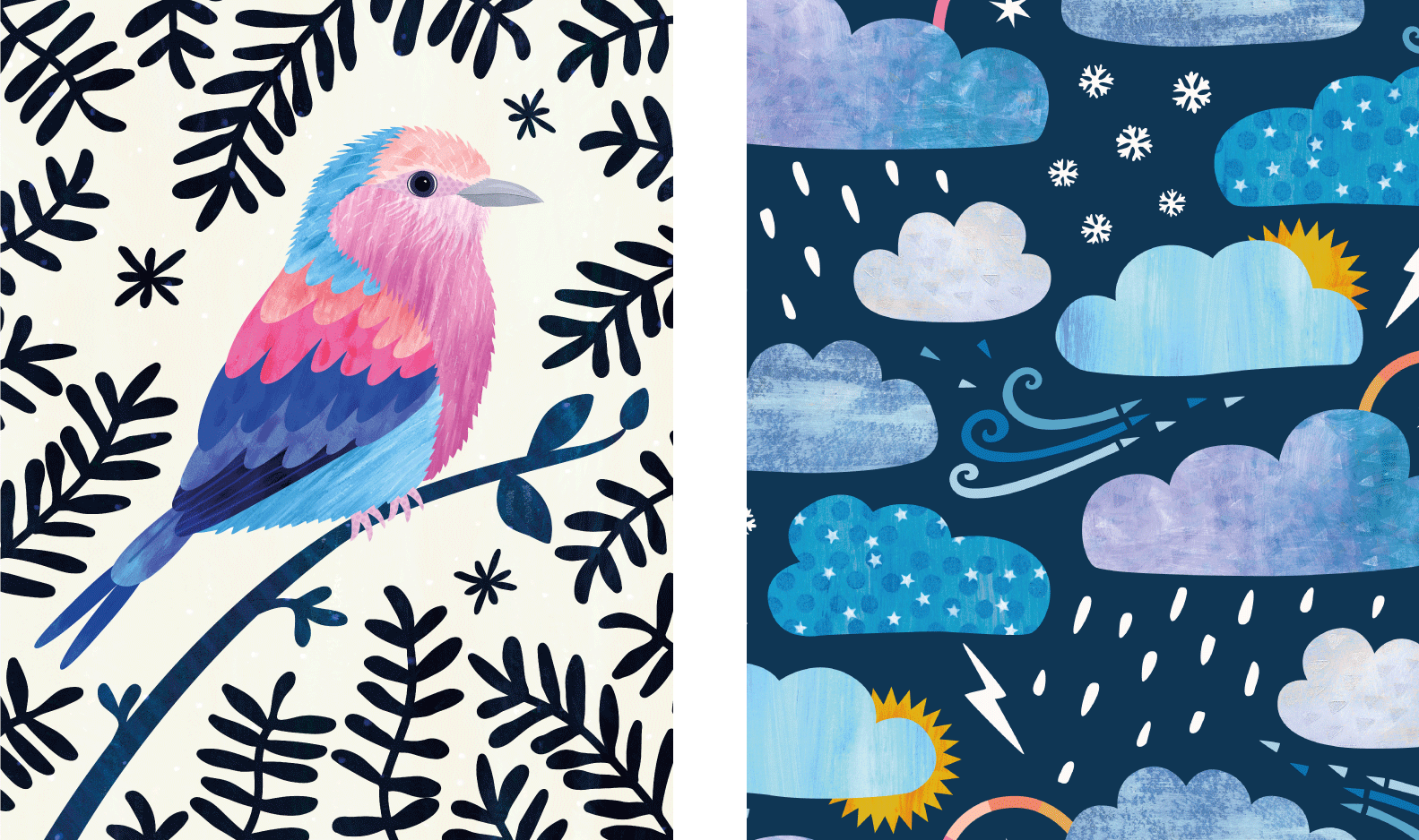
15. BONUS: Illustration Tips: Hello again. In this lesson, we'll look at using textured motifs in illustrations. I'll be giving an overview of how I put together this greeting card design. You may choose to work in a slightly different way or in a different app. The focus will be on providing general tips to help you get started with your own project. Firstly, I started with roughly sketching out some concept ideas. I then did some further work on the chosen concept to get the composition and spacing just right. My first tip for you is that a good layout drawing makes the illustration process go much more smoothly, so take the time to do that and start. Secondly, I prepared textures and shapes. Shapes can be made on paper or drawn digitally, or a mixture of both. I do like to start on paper, but where the motif needs to be a very particular shape to fill an area, I usually jump on the iPad to draw it there. I also like to add any line details while I'm on the iPad as well. Tip 2 is feel free to mix paper and digitally drawn shapes if you like to work that way. To get everything fitting together, it's helpful to use the layout sketch on a separate layer of the illustration file as a guide. Remember to put each shape on its own layer in the file, and the same for any details. Tip 3 is make use of layers to keep sketch, shapes, and details separated. After the shapes are prepared, it's time to texture the motifs. While I already have motifs in separate files, like with the strawberries, I just added them to the main document and positioned according to the layout sketch. I made the bird and ladybug in separate files too. In this case, I chose to place them in with embedded smart objects so the quality was protected when scaling them. If you're in a different app, then use copy and paste to import the motif. Sometimes, I texture all the motifs right in the main illustration document, particularly if I'm drawing everything digitally. The process of texturing is just the same, but it's more important to use groups for each motif, especially with a fairly complex illustration that can have many layers. Tip 4 is to have a well-organized file. Once all the motifs are finished and in position, it's time for final touches and adjustments. I drew in a shadow below the part and added a subtle background texture. At this point, I recommend to review the overall contrast and colors in the illustration, so that's tip 5. Tweak colors and contrast if needed. Ideally, using non-destructive adjustment layers, if the app you're using has that capability. With the beam quite a lot of green in this illustration, I had realized quite early on that it would be overpowering at full saturation, so I chose to turn down only the greens with an adjustment layer at the top. Adjusting colors very selectively is a useful feature available in Photoshop desktop. Let me show you how I did that. Create a hue saturation adjustment, and there is the option to apply this just to specific hue ranges. Where it says Master, open the drop-down menu and select greens, then reduce the saturation. That affects just the greens in the illustration. Another use of adjustment layers is to check the tonal variation. The black and white adjustment layer option can be used as a temporary layer to check how darks and lights are working together, and any focal points have enough contrast to pop. This helps to identify specific areas that might need some color tweaks. That's an overview of my illustration process and a few tips that I hope will get you started on your own design. Meet me in the next lesson to talk more about your project.
16. Your Project: Okay folks, it's time for your project. That will need to create one or more textured motifs, perhaps trying out different options for making the textures and shapes along the way. Your motif can be strawberries as well, or you can choose a different simple object. For your project, you can create just a motif or take it further to a pattern or illustration if you wish. Whatever you choose to create, I'd love to see your work up in the project gallery. I do look through and comment on the projects posted. Simply save a copy of your design as a JPEG and then add it to the project. Give your project a title, and add some text as well if you wish. Remember to upload a cover image too. Have fun with your textures, I'm very much looking forward to seeing what you create.
17. Thank you: Thank you very much for joining me in this class. I hope you've enjoyed it and been inspired to make your own motifs by combining real textures with digital techniques. If you have any questions, you're welcome to email me directly by hello@rocketandindigo.com, or you can post in the discussions tab and I'll get back to you there. Please do post your work in the project gallery, so that myself and classmates can see what you have created. If also posting your class project on social media, remember to tag me @rocketandindigo so I can see your fabulous artwork too. Feel free to use the #rocketskillshare. If you found this class useful, please do leave a review because it helps other Skillshare users to find content that they might like, and if you wish to be notified when my future classes launch, please be sure to follow me here on Skillshare. That's it for now. Many thanks and see you next time.
 Sue Gibbins, Designer at Rocket & Indigo