Transcripts
1. Class Introduction: Have you ever had
this feeling that your illustration come
out a tiny bit flat? Or perhaps you see that
something's lacking, but can't put your finger on it. Or you are here because
you like my art and would like to learn a few
more secrets and techniques from
me. I've got you. Hello, friends, and
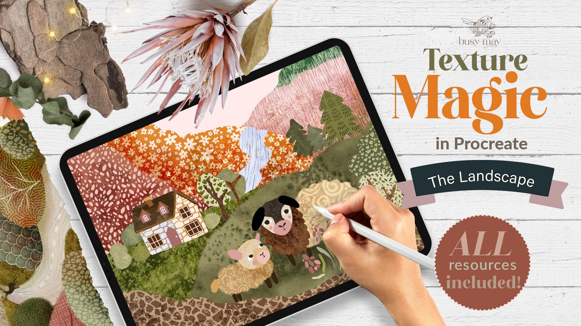
welcome to my new class. This is the third part of
my texture magic series. So hopefully you've
seen already, and you've done part
one and part two. In this class, we're going to
try and master composition, and we're not going
to draw a bird, which is good news
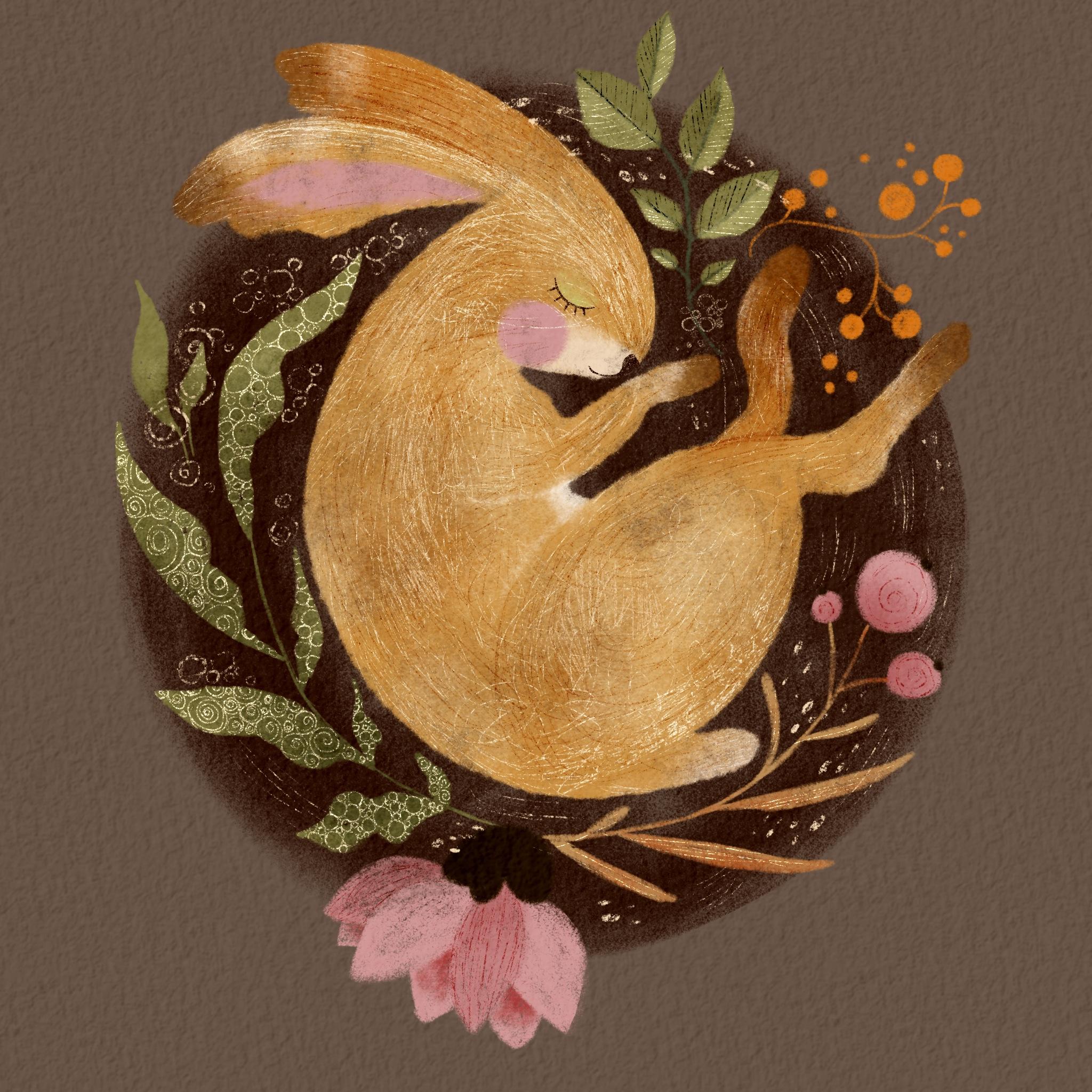
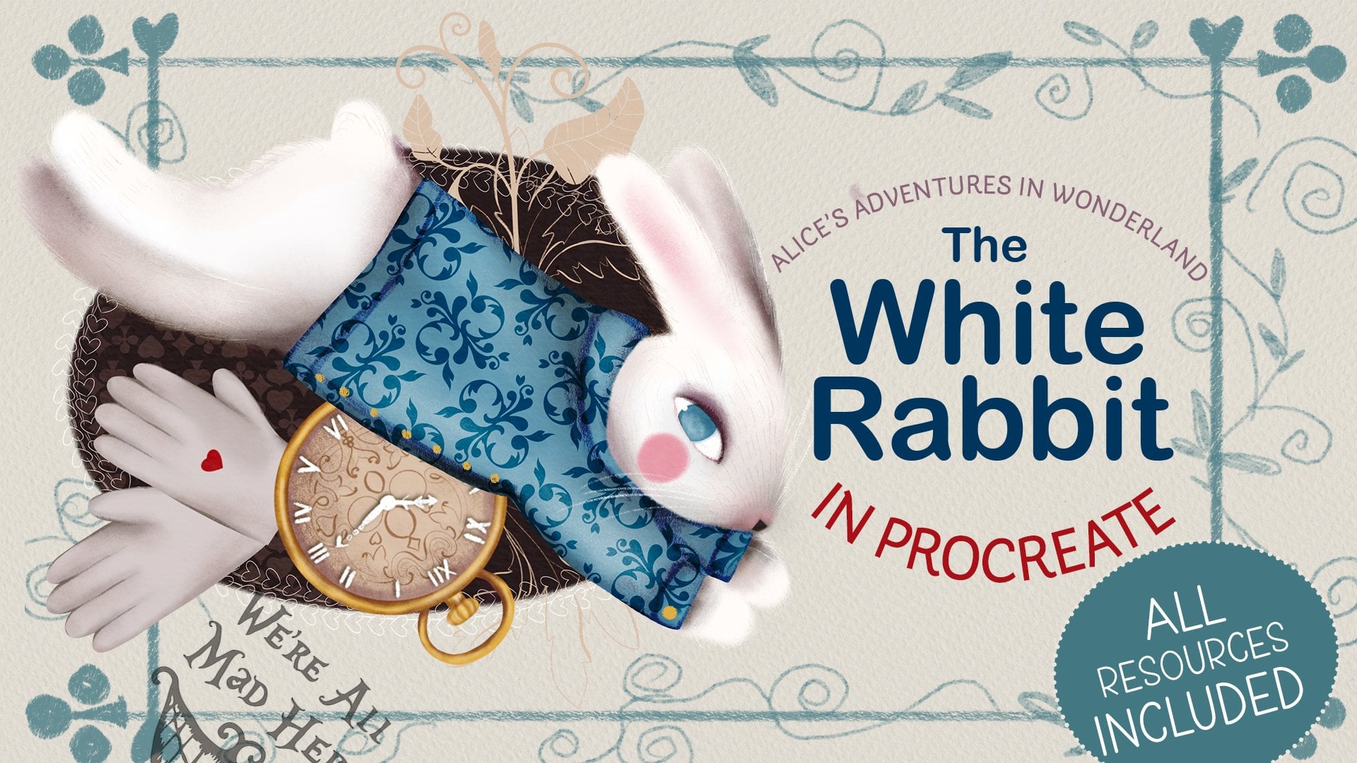
by itself already. Today, we're going to draw this lovely rabbit
composition in Procreate. I'm going to show you how I create a library of my
hand drawn texture, how I apply them on
my digital artwork, and hopefully will encourage
you to be more creative. Like always, I'll walk
you through every step of our creative way from
tools and setting up the canvas to applying finishing touches to make your illustration very
special and unique. I'll also share with you
my process of printing a little greeting card with
the artwork we've created. I'm making super cute
stickers with it. And, of course, you'll
get all the brushes, colors and textures used
in this class free. They can stay with you forever. So grab your iPad, grab your apple pencil,
and let's begin.
2. Why Use Texture?: Texture is everywhere. You find it in any picture of illustration, it's
naturally occurring. I can be hand drawn, no matter whether
the art is created using traditional
mediums or it's digital. This class will focus on the
hand drawn type of texture. So why use hand drawn texture? The very first reason is I give your illustration
a much more complex, elaborated look and feel. My art is very simple,
shapes and forms. That's why texture is something that makes it more complicated, more interesting, and there are so many things for a viewer
to look at and explore. Hand drawn texture can
be another way to refine your own artistic style to make your art instantly familiar
and easily recognizable. Finally, it's a great way to spend quality time
with yourself. Just light a candle,
pour a cup of tea, and switch on something
nice on the background, and hours of relaxed meditative
drawing are guaranteed. But where do you find ideas
for hand drawn textures? I'll share some
of mine with you. First, look back at
some art of the past. I personally draw
most inspiration from Asian and Ancient
Egyptian textiles, jewelry, objects
of everyday life. Medieval art. And, of course, a huge part of my illustrations
influence comes from various Eastern European forms
of culture like mythology, folk tales, and, of course,
art and illustration. If you can go to a museum
or an art gallery, I'd recommend to
make time for it. If you are a super busy
person, don't worry. There are plenty of museums
you can visit online. I recommend signing up to
Google Culture to gain access to a whole world
of art inspirations. Another endless source of
inspiration for me is nature. Always nature. Just
a short walk outside will give you tons of artistic ideas for your
hand drawn textures. You just need to slow
down and observe more. You can even find some
interesting objects and bring them home with you so they can be a source of your inspiration
whenever you need them. H Objects of your everyday life can be another source
of hand drawn texture. I put the simple collection
of things just to demonstrate how my creative
process goes sometimes. I even use my own creations for inspirations like this
embroidery, for example. Now, once you've
gathered your ideas, make sure you don't let them go. I personally prefer to keep
mine in my own library, which has grown rather
large in years. I just draw my textures in
the little sketchbooks, especially dedicated for
hand drawn textures. It ensures that I
never get stuck for ideas when I create
an illustration. And the side bonus for this, it's a great exercise to break through an
artistic blockage. There are days when I don't
feel particularly creative. I just grab my sketchbooks and start mindlessly scribble
some textures. Try it. It's truly magical. After a short time
of this activity, you'll start getting ideas
popping up in your head. Digital art is even
more versatile. You can experiment
with so many things like botanical textures
for leaves and flowers. Alternate your
brushes line weight to achieve hand drawn
texture variety. Play with layers, splending
modes to find the right way for your illustration
and many, many more. I hope this was helpful
and I've inspired you to create and use your
own hand drawn textures.
3. Tools and Materials: Welcome to the part when I'm
going to talk you through tools and materials you
need for our class. First of all, you need an iPad with procreate
installed on it. I'm using iPad Pro at 12.9 ". You will also need
an Apple Pencil compatible with your iPad. In my case, it's
Apple Pencil two, and of course, you
will need Procreate installed on your iPad. Additional materials
you will need. In the resources
section of this class, you can download the additional
materials I provide. First of all, you
will need the sketch. It's a rabbit sketch
I've created by again, you don't have to
use it as always. You can use whatever
works best for you because the tips and
tricks I'm going to show you, you can apply them to any of
your artwork illustrations, feel free to use whatever you
want, whatever floats bot. But in case you want
to use Maya sketch, this sketch is called
Sleeping Rabbit. It's a JPEG format. As I said, you can find it in the resources section
for this class. I provide a set of brushes
we'll be using for this class. Wherever you save the file, you need to open your iPad. Presumably, it's going
to be in your files in your Cloud drive
or your download. The overall Zip is called
Celshare Team three. You will see all the additional
resources I provide, you can see there
is overall texture I provide as a bonus. It's the sleeping rabbit sketch. It's the examples of the handrawn texture we're going to work on in this class. There is also a set
of essential brushes we're going to be
using in this class. The color palettes. To install the brushes, you just click on the
brush set file and they will be imported
in your brush library. Here you go, it's called
TM three Sleeping Rabbit. You will find six
essential brushes there. Let's see them liquid filler. Also install the
swatches same way. As you install the brushes, you just click on the
file and the watches will automatically
append to palettes. These watches are called
TM sleeping Rabbit and we're going to be
using this color palette. But again, feel free to use
your own palette if you feel like using something else and I'm going to quickly
show you the brushes. I'm just going to
grab this color. We've got liquid filler. We've got soft feller. You can see it's just
slightly textured. We've got dry pencil, we're going to be using as well. We've got felt shader. The self explanatory names, and we're going to use
two types of scratchers, thick scratcher, and we're going to be using
delicate scratcher. Barely noticed but I
hope you can see it. That's basically it.
You will also find the examples of hand drawn
texture just as an example, you can use one of those or you can use the ones I'm going
to use during the class. The last thing I would like to point at is the overall texture. If you go to the range
icon and insert a file and it will open the folder where you save the
files for this class, you can see this JPEG which
is called BlensOall texture. It's a square file. It's high resolution. And we will need
high resolution, especially if you intend
to make stickers or cards. I'm going to show you in
the end of this class, there will be two
additional bonus lessons. One about creating a
card and the other about creating stickers and for tools and materials
for those classes, I'll keep that
information separately for those parts in case
you don't need it at all, and you will prefer to keep
your artwork digitally. Once we start drawing our
rabbit, you'll see what I mean. So basically, that's about it. That's for the tools and
materials and see in the next lesson where we're going to start filling
the shapes with color.
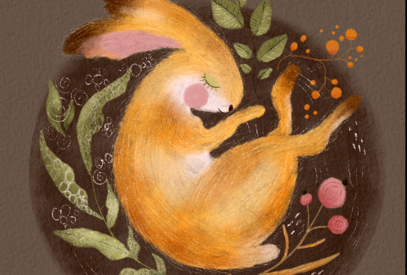
4. Colouring Rabbit Part 1: In this part, we're
going to fill our main objects with color
starting with a rabbit. This point, you need
to decide whether you intend to use your
artwork digitally, for example, for Instagram, for other social media, or you have an
intention to print it, to print it as a sticker or as a card or as an
artwork for the wall, basically print because based
on the characteristics, you're going to create
your canvas now. If you create your
artwork digitally, all you need to do is
to press this plus sign and to create a square
Canvas, just like that. For digital purposes,
this will be more than enough because the resolution
is going to be 132 DPI, as far as I remember,
procreate default setting for that size and
format of the canvas. On that set, if you have an intention to
print your artwork, the first step will
be exactly the same. You press plus icon and
you select square canvas. For the print option, we're going to do
certain manipulations with this canvas to make sure that our print quality is as
best as we can achieve it. For that, we're going to go to this range icon and you can
see in the Canvas menu, you have options, Canvas
information, crop and resize. Whichever you want to use, I suggest maybe use crop
and resize and you can see that here is your
crop boundaries. We don't need them.
We're going to open settings and you can see this is your
information basically. This is your dimensions
of the canvas and this is your DPI
resolutions dot peng. I'm going to change
this resolution to 300, at least, you might want to. Basically, the higher
the resolution is, the higher the DPI, the better
quality it's going to be. For my printer,
which is very basic, 300 is enough, there will not be much difference 300-500 DPI. However, if you
intend, for example, to send your artwork
to the printers like professional printers to
print a number of cards, ten, 20, et cetera, I do recommend maybe go for 500. Just to achieve better results. But for us for me for
my basic printer, as I said, 300 is
more than enough. Also, mind you, that the more resolution is
obviously the heavier your file is going to be the fewer number of layers
you're going to get from this. It's good to keep this
important information in mind in case you are like me and you love creating gazillion
of different layers, literally every stroke
is on a new layer. I'm not saying
it's a good thing, probably quite the opposite. I'm just trying to constantly merge layers together
while doing artwork, but this thinking of backing up something if I need
to change something, it's constantly
playing on my mind and I recommend that maybe you don't get
into that mindset. Fewer layers is a good
thing we just press done and our canvas
now is 300 DPI. For print, you've
prepared your canvas. From now on every
step doesn't matter, digital or print
just follow along. Now let's place our
sketch on the canvas. As I keep saying that if
you want to use my sketch, that's the steps
you need to follow. If you want to use
your own sketch, feel free to use your own. For that, I'm going to drop
my sketch on my canvas. I'm going to go to this
range icon, select ad. I'm going to select the file, and I'm going to choose my
sketch called Sleeping Rabbit. That's just like that, it dropped on my canvas. A little manipulation
we're going to do. It's a JPEG file, it's solid, which means that if I
switch the background off, it's still going to be
on the white background. That's not what we need because we're not going to
color on top of it, but we're going to
color underneath, which means that, I'm going to create a new layer and
drag it immediately between these two layers between the background and
the sketch itself. But you can see that if I start using the color,
you can see through. It's there, but it's not there because the
background is solid. For that, I'm going to change the blending mode
of my sketch to multiply, right away, I'm going to
reduce the opacity because I don't want it to interfere
too harshly with my colors. At this point, I can safely it and to make our artwork
particularly special, I'm going to add the
overall texture. It's arguable whether you
want to use it or not, especially given the
fact that in this class, we're going to be
using handraw texture. Do we need this overall
one imitating paper, craft or watercolor paper. However, I'm just going to
use it because I always like the overall look
of a nice texture, whether it's paper texture, whether it's some natural
material texture. I'm going to use it and you
decide if you want it or not. For that, I'm going to
select the range icon. Again, I'm going
to insert a file, and this is bonus overall
texture which you find in your resource section and I'm just going to
drop on top of it. It's solid, so it
covered the whole thing. However, I'm going to choose the blending mode to color
burn. We're going to go back. Let's clear this layer. This layer between
the background and the sketch and
overall texture on top, saying that I'm going
to a two just in case I want to draw
and that's it. This is our working area. From now on, we'll be
just coloring our rabbit on the layers located between the background
color and the sketch layer. Now let's start
coloring our rabbit. So the very first
thing I'm going to do, I'm going to change
the background color. I'm going to click on
this background layer, and the color I'm
going to choose is this first color from the left on the very bottom brow of your sleeping rabbit
palette, color palette. Now you see with the
background color change, the overall texture
is much more obvious. The brush I'm going
to use, first of all, is liquid filler for
the rabbit's body. The color I'm going to use
for the rabbit's body, the overall solid color is this very first from the
left on the top row. And with 100%
opacity and the size depending on smaller
or larger areas which you can constantly toggle. I'm going to fill the
rabbit's body with a color. Nothing too complicated here. The liquid filler brush
is quite versatile, quite easy to use, nothing difficult about it. You can see that when it's larger areas of
my rabbit's body, I'm going to use larger size
when it comes to smaller, more delicate area like
the spo for example, I might want to reduce the
size of my brush just to make sure that it feels nice. And there you go, our
first layer is completed. You can see that I covered all the rabbit ia with one layer of the
liquid filler brush. But I think despite the fact
that I like the texture, I'm going to
duplicate it to make it just slightly
more solid and I'm just going to pinch the
two layers together so you can still see the
texture through the brush. However, it brings
up more color, having the solid layer, and it will be
easier to build up more layers on top
of this one. But
5. Colouring Rabbit Part 2: Now, as always, let's enhance
the color a little bit. And for that, we're going
to add a little bit of darker shades and a little
bit of lighter shades. Let's create a new layer on top of our
rabbit's body layer, and let's create
a clipping mask. I think I'm going to immediately turn the blending mode to linear burn because I know that I'm going to try and achieve
some darker effect. The brush I'm going
to use is felt Shad. First of all, I'm not
going to change the color. I'm going to continue using same color I use for
my rabbit's body. However, because it's
line buurn mode, I know that it's
going to be darker, so it's going to create
some darker areas on our rabbit's body. Again, no rule about
opacity and the size. The only thing I find helpful
is that this failed shader, this texture, shade the brushes, they always, at least for me, they work best when
they are quite large in size because you
are not trying to achieve any finer details, you're going to try and make just smooth bigger
areas of the color. That's why I'm going to
probably keep the size to maybe around
tips odd percent, and I'm going to
keep the opacity to 100% and see how it works. I might reduce the
opacity a little bit. Yeah, you see that's a
little bit too bright. I'm going to reduce the opacity slightly with gentle
moves like that, maybe size a little bit bigger. I'm just going to add
randomly, by the way, because we are not trying
to achieve volume, no light and shades or
minimal lights and shades. What I'm trying to do is
color transition as always. Now, you can see that the
color is no longer that solid. Now, with the same brush, failed shader, I'm going to try and use a little bit
of a different color. So I'm going to use the
fifth color from the left on the very top row and see how
that one's going to work. You see, it's even darker. However, it's still
got this kind of orange reddish tone in it, which is fine, but
I feel like I want a little bit now more to add
a little bit more brown. Let's see how this
color is going to work. This bare brown color. Yeah, that's right. What I'm going to
do, I'm going to create one more new layer. I'm going to create a clipping
mask and I'm going to change the blending
mode to multiply. It tunes down the brightness
of the color. Let's see. Yes. I hope you can see on the
camera. Just going to add. Don't worry, the rabbit is not turning too dark
because we're going to add a little bit of
lighter elements too. And now on the same layer, I'll probably use something
more like grayish with greener undertone
rather than red undertone. I'm going to try and
use this color which is second from the left
in the middle row, going reduce the opacity a
little bit, quite like that. Here and there, not
trying to create volume. Just for the color transition. If you have a closer look, you see that we've got
this yellow ochre blending into orange brown and darker orange brown
and grayish brown, that's precisely the look
I'm trying to achieve. And I would also like to add some really dark areas on the
tips of my rabbit's paws, like back paws and a
little bit on the ears. For that, I'm going to use
this dark, deep brown color, which is the second
color swatch from the left on the bottom row
with the same felt shader. I might actually even increase
the size of it just to give the illustration
even more of its texture to make most of it. Now I'm going to complicate
the color even more, and for that, I'm
going to create lighter areas on top
of the darker areas. So for that, I'm going
to create a new layer. I'm going to add it
as a clipping mask, and I'm going to keep it
on normal blending mode. The brush I'm going to use is
the same felt shader brush, and the color I'm
going to try and use, first of all, I'm going to
use this lighter beige color, which is the very right color on the top row on the palette. And I'm going to try maybe
opacity 50 odd percent, and the size I'm
going to try quite large about maybe 50% or so. I'm just going to try and
add some lighter patches. I'm not going to complicate
the lighter patches. One more thing I would like to do is adding lighter colors. I'm going to increase
the opacity to 100%, and I'm going to
use this very light almost pink white color and I'm going to reduce the size
and what I'm going to do. I'm going to add a
little bit white outs on my rabbit's face, a little bit on the tail, and a little bit on the tammil Let's start with the tummy. Touching very, very lightly. Similar way we did with the
dark tips of our rabbit, but just with lighter. That's our white out
later parts done. And finally, to complete preparing our rabbit for
the hand drawn texture, I'm going to add details of the facial expression just a
tiny bit of the inner ear. For that, I'm going
to create a new layer and the brush I'm going to
use is the soft filler, and I'm going to start
with the blushy cheek, which I give most
of my characters. For that, I'm going to use
this darker pink color, which is the third swatch
on the very top row, third swatch from the left. I'm just going to gently draw the circle I'm also going to add a little bit
of the spink into the nare. Now, I'm going to add a
little bit of color on the eyelid and the color
I'm going to add the sliding color
with the same brush, which is the soft filler. And finally, the last
thing is to draw this eyelid with a little bit of eyelashes and a little nose. I can use the same layer
with the same soft brush. I'm going to reduce the
size of it and the color I'm going to use
this dark brown, deep brown color, which
is the second color from the left color
swatch in the bottom row. Third touch in the
middle of the lead, you press it down
a little bit more and closer to the end,
reduce the pressure. Little eyelashes, can make
them as long as you want, or you might opt not
to make them at all, but like my rabbit to have
a little bit of eyelashes. Show more that his
eyes are closed. And the little nose. I know that rabbits noses
are usually pink probably. But just to create a little bit more contrast with the pink we've
used already, especially we've
got only one shade of pink in our palette. I'm going to make my rabbit's nose dark with the same
color I used for the eyelid, I'm just going to
color in the nose. It's a little teardrop shape
and a little bit of a mouth. He has a slight faint smile, maybe dreaming about
something nice in his sleep. And let's switch there.
Sketch off and see. So that's our rabbit ready for filling with textures
handraw textures.
6. Colouring Botanicals: Our rabbit is now ready. Now let's quickly prepare the
botanicals around rabbit. First of all, I would like
to fill these leaves. The brush I'm going to use is the soft filler brush because it's quite sharper end
and for smaller details, it's the most suitable. Let's first of all, fill
the green leaves first. The color I'm going to use
is this olive green color, which is the second from the
right in the middle row. And I'm going to
reduce the size of it. Yeah, perfect. And
what I'm going to do, I'm just going to
fill these leaves here with this color
and these ones here. The process of filling
is straightforward. It's our usual
filling with color. Yeah, for these leaves, I would like to change the color to the
darker one because I want the metal veins to
come through, just like so. Let's switch the
schedule off. Yeah. Quite happy with that. Let's
do some color enhancement. First of all, let's see if
it's going to look better. If we duplicate lay, I think it's going to
look a little bit better. I'm going to
duplicate the layers and pinch them together
to make them more solid. I can see that I could just
do some of the cleaning up. Let's do some color enhancement. I'm going to create a new layer. I'm going to create
a clipping mask. And I'm going to change the blending mode
linear burn and with a felt shader using the same green color I
used for the base layer, I'm just going to add just going to reduce the opacity and
increase the size a little bit. I'm just going to randomly
same as we randomly added colors on our rabbit. I'm going to randomly add
some colors on the leaves. I'm going to try maybe do the tap tap tap motions and
going to do the same yeah. That's it. We've added darker
areas on our leaves. Now let's add a little
bit of highlights. We create a new
layer clipping mask and we'll change the
blending mode to scream. And let's choose the
feel shader again. Let's. I think we're
going to stay on this. We're going to choose the
slightest green color. I'm going to increase the size, opacity around maybe 60%, and I'm just going to add a little bit of highlights
here and there. I don't want to highlight it too much because
I'm obviously going to be adding hand drawn
texture on the leaves as well, not just on the rabbit. I'm just going to gently do
this color transitioning. On these leaves, I feel like
making half of them lighter, different color,
gives this nice feel. And that our green leaves are ready for
adding the texture. Now let's color in
the pink objects. The pink objects will be these
berries and this flower. So let's start with the berries as they're
more straightforward. For this, I'm going to
choose dry pencil brush, and I'm going to reduce
opacity to around maybe 15%, and I'm going to coloring our berries are going to
be a little bit fluffy. And on the same layer, I'm going to add I'm
going to color in this foreground I'm not worried about this part because obviously
it's going to be covered with a different object, but I'm going to
create a new layer. I'm going to drag it
underneath this pink layer, and with the same dry
pencil and same pink color, I'm going to add the
background layer of my petals of our
flowers petals. Why I'm doing it on
the separate layer because we're going to be adding color enhancements
separately on them. Let's right away,
enhance our colors here. What I'm going to
do on this layer, see like we've just created it. I'm going to create a
clipping mask for it, and I'm going to change it to
linear burn blending mode. And the color of the
brush I'm going to use is soft feller brush with the same color I
painted the petals. So let's increase the size, maybe reduce the
opacity a little bit, and just gently add. Let's try and experiment
with the top petals. I'm going to create a new layer, create a clipping
mask and this time, I'm going to change
the blending mode to multiply with the same color, I think I'm going
to use felt shader and I'm going to reduce the opacity and
increase the size, and I'm just going to cover
this candle side petal. And this one. See, they're just
slightly different color. I think I'm going to increase
now the opacity and just add a little bit more color
in the bottom of each petal. I think since our
berries here as well, I'm just going to
increase the size and just add a little bit of darker pink on the multiply
blending mode to our berries. Now, let's create
a new layer and add this part of our flour here. And for that, I'm going
to use soft filler, and the color I'm going
to use is this very, very dark color, which is the fourth color from the
left in the middle room. On the new layer, and I'm
just going to cover this part of our flower in this
dark brown color. It's going to
actually stay solid, but I'll explain to you later. I'm going to reduce the size a little bit and I'm
going to put a little bit of this darker parts
of the berries. So now we've almost
colored all the elements, so we only have this sort of twig belonging to the berries left and
these berries here. I'm going to put them
probably on the same layer. So I'm going to
create a new layer and I'm going to grab
the soft filler, and the color I'm going to use is this orange color
for these berries, and I'm just going to
fill them with color. This twig, I'm going to
use probably this color, see the second one
from the right. I'm going to do some minimal
enhancement of the leaves. I'm going to create a
clipping mask on a new layer, I'm going to change it to linear burn and using the felt shader, I'm going to choose
this orange color which I used for the berries, and I'm just going to add
a little bit of color. That's it. That's our
illustration ready. In the next part, we're going to do the most
important thing. The thing that this
class is dedicated for, we're going to add some
hand drawn texture.
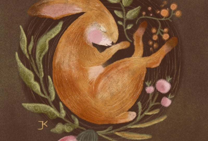
7. Rabbit Texture: Our objects are ready, they are filled with
color and they create a perfect base for our
hand drawn texture. First of all, what
I always recommend, I recommend so you don't get
lost in all these layers, I suggest that we stack
them or we flatten them. However, remember, if
you are working on a commission piece
or if you have any suspecion that you might have to go back to it
and change something. I strongly recommend
that you back it up. How I usually back
things up when I assume that I might go
back and change something, for example, change the
rabbit from brown to blue. So what I'm going to do.
So you go to the gallery, you click Select and you select your rabbit illustration and
you duplicate this artwork. Now you've got two of them. You leave one alone
with all the layers separated in case you want to change something
and on the new one, start flattening layers because most of them we won't need. First of all, I suggest
that we flatten our rabbit. For that, I'm going to select all the layers.
I'm going to group them. I'm going to talk
all the visibility to make sure that
this is my rabbit, and I'm going to click on
the stack and flatten. Now my rabbit is
all on one layer. The green leaves, I'm just
going to flatten separately. The green leaves, the
pink elements, yeah. Now we've got all these
elements separately. However, as far as I can see, you can safely flatten
these together as well. What also occurred to me is that despite my love for flat
illustration style, I thought it looked a
little bit too flat. So that's why I decided
that I would like to add some darker circle on the background of
my rabbit just to bring all the colors up. So I'm going to
create a new layer and I'm going to
drag it underneath, between the background
layer and our rabbit. The brush I'm going to choose is the dry pencil brush is this darkest
chocolate brown color. I'm going to reduce
opacity just a little bit, but I'm going to increase the
size of my pencil to 100%. Look what I'm going
to do. I'm just literally going
to draw a circle. A little trick for you,
if you don't feel that your hand is steady enough
to draw a perfect circle. For example, mine is not. I'm not even going to try it. There are multiple
ways to do it. One of the ways
is draw a circle. And hold the pencil down. You can see that
it says ellipse. If you press this arrow
down and choose circle, it's just going to create
a perfect circle for you. Grab the move too and adjust
it to wherever you want, and just literally coloring. I wouldn't make it particularly
solid solid background. I like to leave it a little
bit fluffy so you can see this nice texture
coming through. But you can see that it gives the illustration a nice feature. It brings all the colors up. It makes them more luminous, it makes them more
obvious and brighter, and I think that's the
effect that I really like. Now let's start adding
our hand drawn texture. Let's start with rabbit because he's the main character
of our illustration. Did you notice, by the way, I switched the sketch off because I don't
need it anymore. I can actually probably even
delete it. Don't need it. And the reason also, start with the
rabbit because it's the simpler way in this
illustration to add the texture. So I'm going to
create a new layer and I'm going to create
a clipping mask. With the animals, with
birds and animals, I tend to use same things over and over again and
all my illustrations, which is nice because I consider it a part of
my signature style. Like for example, I'll
explain to you what I mean. When it comes to animal fur, you can do so many things. You can make it
curly, for example, if you draw a sheep, the texture will probably be
more like circles. When it's something
like a fox or a rabbit, a hair in our case, it's probably more
straight here, like a little bit on
a more messy type. When it's a dog, for example, when I draw dogs, bears, I just use a complete mess
of different textures. What I mean is Wo rabbit in this particular
class, what are we going to do? I'm going to start with
a thick scratcher. I'm going to imitate the firm. On the new layer, the new layer, I'm going to change the
blending mot linear burn again because
I want it to be see through the color I'm going to use is this sandy brownish
color, second from the right. I'm going to slightly
reduce opacity. I can draw on it,
you can see that, I don't want to make
it too intense. I'm going to start filling my rabbit with that
kind of texture. You can make shorter strokes. If you feel like
it's barely visible, you like it more emphasize
you want it bolder. Just don't be afraid
to increase the size. Just try a little bit.
I'm going to try that. I prefer this because
for delicate scratches, we will use a small scratches. A brush and I'm just going to
continue using the strokes. I'm going to alternate between shorter strokes and
longer strokes. If you've done my
whimsical bird class, which is also available here, you can see that I've used
this technique already there. This technique is so
similar to this technique. I'm just going to literally
with the scratch motions The reason I call all
these brushes scratchy because I do feel like
I'm scratching with it. When I draw with
acrylics, for example, the traditional media acrylics, I usually mix the
colors together, I layer the foundation, and then I take a needle or some sharp object
and sometimes I even use this ink type of pen, but without ink and they just
start scratching through. This gives this acrylic
the nice effect. See, I'm just going to
randomly do the scratching. Here you see the leg again. You can just continue
scratching like this, which is a style
of illustration. Or for my animals, I prefer just to
follow the shape, the anatomical shape
of the body parts. You see this obviously
is quite rounded leg, part of leg, thigh. I'm just going to
see I'm circling, doing the circling motions
with my scratches on the legs, I'm just going to scratch. Already an absolutely
different feel to the illustration,
but that's not it. We're going to now add
some lighter scratches. I'm going to add another layer. I'm going to create a
clipping mask and then I'm going to change the
blending mild to scream. This time, I'm going to
use delicate scratcher and the color I'm going to use
is the slight sandy color. I'm going to probably
increase the size. The opacity will be
100%. Let's see. Yeah, quite happy. See what I really like
about digital art in this matter is
because this brush, for example, delicate scratch, it's already quite
a textured brush. So it already sort of
gives you a nice texture plus you're making
handdrawn texture so it's like double
texture effect. And as I mentioned
before previously, my illustrations
are quite simple. They're very, very
far from realistic. And that's why just to add a little bit
more charm to them, more interest, more
complication, more finishness. That's why I love using this hand drawn texture on
almost every object I draw. Another idea, see how you
can unclip this mask and let these scratchy
strokes go outside of your habit to create even more sort of
fluffy texture defect. You can do this kind of motion. See how you are loosely using. Imagine that you're
using a graphite pencil or a coloring pencil, but in quite a loose manner. You see, I'm just going to bring these little hairs outside of my rabbit's
shape to give it a little bit more cute,
this fluffy look. I like also the create
this messiness. Just follow the shape, and you can't go
wrong with that. Some scratches can be longer, some can be shorter. I'm not going to do it too
much because obviously I don't want my rabbit to turn
into a porcupine. I can go on and on for ages. But you can see that look, switch the texture off
and switch it back on. Look how much more interesting and finish
our illustration look.
8. Botanicals Texture: Now let's add some texture
to our botanicals. For that, I'm going
to add a new layer. See, this is our
botanicals layer. I'm going to clip the layer
as a clipping mask on top. I'm going to keep
it just to make it simple on the normal
blending mode. And the brush I'm going to use, I'm going to take
the thick scratcher. The color I'm going to use
is this pinkish color, and I'm going to start with
this part of the leaves. So in my opinion,
that's the fun part. Because now I'm
going to be covering these objects with different
types of textures. I encourage you to think
of your own textures. Maybe you even have
a similar library of textures similar to mine. Or if you feel stuck, just use the texture examples I've provided with this class. I'm going to add bubble texture, which is basically
what I'm going to do. I'm going to be drawing circles may reduce the
size a little bit, and I'm going to alternate
between different sizes. See some are smaller, some are bigger, and
just keep going. It's a very, very therapeutic
meditative process. I can guarantee you if you
switch a TV series on or a program or whatever you like watching or even if you put
some inspirational music on, depends on what drives
your creativity. You can go very, very far with that because it's quite you don't need to
think about this process. It's just more mechanical. It's great for your
muscle memory, it's great for your creativity
for creative ideas. Now, this leaf is covered
with this nice texture. I think I'm going to fill a few more leaves
with these bubbles. Just to add a little
bit more variations. I'm going to add
a different type of texture on different leaves. And I think this
time, I'm going to use the swirly motions, which I circle as well, but quite different
from the bubbles. I'm just going to, again, alternate between
the sizes of them. That's the bubble
texture of the leaves. As I can see that I would like my texture to stand
out a little bit more. That's why I'm just
going to do a little bit more of color
enhancement here. I'm going to create a layer between the base layer
and the texture layer. I'm going to change the
blending to multiply. And I'm going to
grab the felt shader and I'm going to use
this darker green color, which is the fourth from
the right in the middle. I'm going to increase
the size and I'm just going to add a little
bit more darker areas, you can see that it instantly
brings the texture up. Also to bring the texture up, I can try and use
different blending mode. Like for example, add mode. I almost makes it golden
which I quite like. I think I'm going to
change the blending mode to add on these leaves, because I just used the lighter color with
a delicate scratcher, I'm going to use this
lighter color and on the same layer as I
created this texture, I'm just going to add these little scratches on the one side of the leaf
on the lighter one. And I think I'm going
to create a new layer. I'm going to create
a clipping mask. I'm going to change
the blending Mtllineb and with the same
delicate scratcher, choosing this dark green color, I'm going to add
these scratches on the other side of my leaves, maybe making these veins a
little bit more obvious. I hope you can see that adding this texture makes a huge
difference to your piece. Now let's see what we can
do with this pink flower. I think I'm going to add some darker strokes on the
petals on the darker petals. Staying on the same
layer as I've just used for creating darker scratches
on my green leaves, I'm going to choose
my only pink color, and I'm just going to put the scratches like
this on the petals. Maybe use some even to separate some petals
from the others. That's not gonna
dwell too much on it. And let's see, maybe
some worlds here. And I also I'm
going to go back to the lighter layer with the blending mode where
I did this texture. I'm going to use the
lighter color again and with the same
delicate scratcher, I'm going to scratch these
leaves along like that. The very last thing
I would like to add is some hand drawn
texture overall, just to make the illustration particularly special
and complete. I'm going to create a new layer. And I'm going to keep
it on the normal mode. I'm not clipping this
layer to anything because it's going to
be overall texture. You see what I mean, it
will be overlapping. Yeah. With the same
delicate scratcher, what I'm going to do, I'm going to add the same
textures I add on the objects, but on top of everything else. For example, the bubbles, we started with the bubbles. I'm going to add
some bubbles here. You have the effect
that they are almost beyond going beyond our leaves no particular
place, just here and there. Same with the swirls. See we've added the swirls, but now I'm going to
add these swirls. I'm not going to apply
them to these leaves, but I'm just going to make them float in the air like this. Just just a little bit. I'm not doing a lot. I
don't want to overdo it. I'm going to just add an
odd scratch here and there. Overlapping the objects,
it's absolutely fine and maybe even
some lighter dots. Oh and that's it. That's our illustration ready. If you intend to
keep it digital, if you intend to upload
it on social media, that's your illustration adio. Congratulations. You can pat yourself on the back.
You've come so far. But if you want to go
even further, I said, I invite you to join me in the next bonus lessons where I'm going to tell
you how to print a card, create a printed card
out of your artwork and how to print the sticker
or a sheet of stickers.
9. BONUS: Printing a Card: In this lesson, we're going to create a cute card or a gift tag or whatever you feel like doing with a printed
version of your artwork. The tools and materials we
will need for this class, you will obviously
need your iPad with your artwork in it. You will need a printer. I use HPNV 6,000. It's a very basic printer and there is nothing
special about it. I don't print a lot of artwork. So if I need something printed
like wall art or cards, I usually order bulk printing
from a printing company. Uh, so my printer
is really basic, but make sure your
printer has ink in it. You will also need a card paper. For me, what works great
is this white card. I bought it from Amazon. So I'm just going to put
the specs here, Amazon UK. And also, if you are in UK, I quite like this
A for white card. It's from Sainsbury's. And it's just
slightly it's got a slightly glossier like
finish than this one. But essentially, it's
pretty much the same. They both work absolutely
fine for printing, you will need some
sort of cutting tool. You can use either
standard scissors, paper scissors to cut your
card out if you prefer. I sometimes use this tool. It's like a cutter, but I think lately it's become
a little bit bland so it leaves a little bit of
freed edge to my paper. I'm not sure if I'm going
to be using it today. Uh, but it's also
a standard too. You can order it from Amazon. I also find that fabric
cutter works great. You can combine the cutter
with the metal ruler. I also find that scalpel. For me, personally, these two tools work best
because I'm going to show you don't worry when it
comes to cutting that when you hold the ruler down and you just
cut with a scalpel, just be careful don't
chop your fingers off. For me, this works best. It leaves the cleanest
sleekest edge to the car also there's quite
interesting solutions. I sometimes use pinking shears. I use them for fabric
with a scallop edge, but they work just as
nice for cutting paper. If you want something nice, you can cut your card or
your gift tag with that. You might want to use some
additional tools like the corner rounder,
but not essential. Right. First of all, what we need to do we need to prepare our artwork for print. If you decided at the beginning of this
class as I mentioned, to make stickers or a
card out of your artwork, you probably have created it
on high resolution Canvas. But let's just make sure
that it's at least 300 DPI. We'll go to this range icon, we'll go to Canvas and we'll
go to Canvas information. And if you click on dimensions, you can see DPI 300. First thing what we need to do, we need to create a new canvas. I'll be using all the specs for my printer because
my printer only deals, as I said, it's very basic and it only deals with
a four prints. That's why I'm going to go to my gallery and I'm
going to click on the plus icon and choose
the option of A four paper. I'm going to use a
landscape layout. Again, to make sure that
it's high resolution, go to the range icon. It's a format in Procreate should be at
least 300 DPI, by default, but I always check just in case I go to Canvas information, I go to dimensions, and I can see that it's 300 DPI. Imagine this is going
to be our A four paper. Are we going to print
on and what I do next? Next, we need to put our
artwork on this paper. For that, we're
going to go back to our artwork and I'm going
to show you a couple of ways how to transfer our artwork
into our A four paper. First method is to export it as a JPEG to your camera
roll of your iPad. You click on the RNG icon, you choose share from the menu. You choose JPEG, and you save
image export successful. You've saved your image
in the camera roll. Next, you go to
your A four Canvas. We've prepared for the print. You click on the Range icon. You choose Add, and
you choose insert a photo and you insert your
photo from the camera roll. Another way of doing that, if you want to save space on your iPad and if
you don't want to, for whatever reason, to export your image to camera roll,
here's what you can do. This is our artwork. And you can see there
are multiple layers. So instead of flattening it, if you don't want
to flatten it all, as I previously
mentioned in case you want to go back and
edit something, alter something according to your client's request
with multiple reasons. What you can do if you select the very top of layer
of your layer stack, and you go to the range icon again and in the same
ad menu section, you choose ppi Canvas and immediate you choose paste.
Look what it's done. It's created a new layer out of all the stack of layers without
you having to flatten it. If you're a Photoshop user, you know that there is
a key combination of creating a new flattened layer
on top of all the layers. That's the way to do it and
procreate and just swipe with three fingers and select copy and now go to your
A four Canvas, swipe three fingers
and click Paste. Basically, we've inserted
our artwork into our blank A for Canvas
in two different ways. Use whatever you prefer. Next thing you need to do. You need to decide what
kind of card it's going to be depending on your
layout of your card, you're going to place your
artwork on this canvas. For example, if you want
your card to be like this, like opening if you want to
write something inside of it, you obviously need
to make sure that you print your card on a paper, what it means and procreate. We need to divide our piece of paper into two halves
and what I usually do. We just need to find
the center of it. For that, I'm going to
go to this range icon. I'm going to select Canvas and I'm going to
switch on drawing guide. You can see that it
created a grid but what we need is we need
to edit drawing guide. We need to select symmetry. You see, it's placed the
exact center of the page, and I'm just going
to click done. Now you've got the center. By the way, on the print, if you print it just like
that, there will be no line. This guideline is purely for
procreate for your guidance, so there will be no
line on the printer. Now we need to place our card. If you want to leave a sort of white frame around
your artwork, too. You need to grab your artwork and you need to
place it the way. See, that will be your
folding line if you want white border around
your card just like this. I would just place the
card just slightly away. I wouldn't necessarily place it like this because the
bleed different printers, my printer, for example, can just cut the card, so I'm going to leave plenty
of white areas that I can literally physically with the
scissors or with a scalpel, later on of some cutter. But from the folding line, I'm going to leave this a. However, if you would like to cut without any white borders, just make sure that you place your card on the
folding line like this. It's just then you just
fold it along the line. Another way, if
you want to print a lot of little
cards, for example, you want to create
gift tags or you just want little cards to write something on
the back of them, you obviously can
do the following. You can reduce the size. Remember this is
your A four paper. See how many you can duplicate that layer
and see how many you can make sure you don't
drop it like this because Procreate will
automatically cut this part. You can see that the size of this card needs reduced a little bit if you
want it to fit. Here, for convenience of
your cutting going forward, I would choose the snapping
tool and magnetic. What it does, it will place the duplicated layer card
aligned, you see with this one. And I can group these two and I'm going
to duplicate the group. I'm going to select the move to, and I'm going to move. Sometimes it's not
very intuitive. I'm just going to push it a little bit closer to the edge, and I'm going to try and fit
one more set of cards here. In this case, I'm going
to switch the snapping and magnetic back on
because I want the align It doesn't really matter that this gap is not the same
because you're going to cut it out unless obviously
you are aiming to create a wide border around
it, you need to make sure. You need to adjust it in accordance with your preference, what you would like to do. Once your card is placed and the whole
thing is ready for print, whether it's a lot of little
cards or it's one big card, or maybe you just want even
bigger card like that, and you want to be in one layer, not folded, but just
one piece of paper, make it as big as you want. Next thing where we're going to do, we're
going to print it. Assuming that our
printer is ready, full of nice fresh ink
for color and black, and we're going to
go to the RNG icon. We're going to choose share I usually do JPEG and it
gives you the menu. And I'm just going
to choose print. It's going to obviously give
me the printer settings. This is my printer here automatically selected presets,
black and white color. I think it's default already, print and color paper,
size, medium quality. Again, depends on what
you want it to be. Sometimes you want the best
quality, draft normal. Also, there is a little tip if you don't want to if you're not super confident
in printing. It. Print a little draft, use normal printer paper
so you don't waste your thick card and see print it out and
see how it looks. If you're happy with the colors, maybe you will need
going forward to adjust the colors
because sometimes, for example, on my printer, I get colors too dark. Basically, print a draft
on a normal printer paper. Once you're completely happy, use already the card to
make your final print. Here's what I've
printed for my card. Next thing I'm going to do, I'm just going to fold it in. See that if you want to leave the white sort of like
border around your card. But if you don't, obviously, your fold line will
be right here. And I'm just going to cut. There you go. Here's our card, and now I'm going to
use this corner round or you can see,
different corner sizes. So I'm just going
to use this one.
10. BONUS: Making Stickers Part 1: D. In this lesson, I'm going to show you how
to create stickers or a sticker as many as you want out of our artwork
using cricket. I'm using cricket because that's the only tool I'm familiar with. I'm sure that many
of you might be using some other tools
like silhouette. You will probably need to
adjust the techniques to your own machine if you want to print a sticker
on a different one. Another disclaimer, I'm
by no means an expert in printing stickers because when I need to print
bulk stickers, I usually outsource it. I usually order from
a printing company. But when I need a little bit, just for friends, family, I use Cricket machine, and I'm going to show you
basically the method, the way I find the
simplest for me, the one I use all the time. Let's go through tools and materials you will
need for this class. You, of course,
will need your iPad with your artwork we've
just created and Procreate. You will need a printer with
ink in it because we'll be printing in color
and we need to make sure that all our
cartridges are full. The printer I use
is HP NV 6,000. It's a very basic printer. It only prints a four paper. That's why I'm going
to be showing you the method I use
based on my printer. You will also need
the cricket machine. Mine is cricket Explorer three. You will need a cricket app
installed on your iPad. You will need sticking paper. I use a very, very basic
stick of paper Amazon. You will also need a cutting mat compatible with
your cricket machine. This tool is optional. You might need just
this little scraper. The stickers we're going
to be printing are these standard stickers with wide borders on
them. Let's begin. So first thing
we're going to do, we're going to create our
sticker and procreate. As you can see, we've
created our artwork on a dark background with a
paper texture applied to it, and obviously you can create a sticker just like that
or out of this one. But the way I'm
going to show you, I think it's just
slightly simpler. So what I would recommend, I would recommend creating a
duplicate of your artwork. So first thing
we're going to do. Let's open our layers. You can see these
are our layers. This is our rabbit, this is our botanicals
and textures, and we've got paper texture
applied on essentially we need this area flattened and we'll need to create
a white border around it. The very first thing
we're going to do, we're going to switch off
this dark background. We won't need it
because we will need a transparent background for our cricket machine as a PNG. The background is switched
off and you can see that the paper texture is still
applied on top of our artwork. For now, I'm going to
switch it off too, but we'll get back to
it, don't delete it. Next thing we're going to do, I'm going to go to the range
icon menu and I'm going to go to the ad section and
I'm going to copy canvas, when I click paste, pasted all the flattened layers
on top of my layer stack. Now I can switch on the paper texture and
using the clipping mask, I'm just going to apply it
exclusively on the stop layer. What I'm going to do next? These two, the paper texture and our flattened pasted canvas, these are the main ones we
will need for our stickers. What I'm going to
do, I'm going to select all these multiple
layers underneath. I'm going to combine
them in one group, and I'm going to
switch them off. Next thing I'm going to
do I'm going to create a new layer right underneath
my flattened rabbit layer. Next thing, I'm going to
grab a monoline brush. It's a default
brush that comes in procreate and calligraphy group, you grab the monoline brush
and that's exactly what we need to create this white
outline of our stacker. I would also go inside
the brush in the settings and there is stabilization
amount, I would increase it. What it does, you probably know that this is
without stabilization. And this is with it. So it's
make the line more even. Next thing we're going to do. You see this rabbit is
really close to the edges, so I'm going to reduce the
size of it a little bit so I have more room to put the
white border around it. I'm going to grab
both my rabbit layer and the paper layer. I'm going to grab the
select tool, the move to. I'm just going to reduce
the size a little bit. Now I'm going to go on my freshly created
new layer underneath. I'm going to grab
my monoline brush with adjusted stabilization and I'm just going to outline this whole
artwork with white color, creating a white
border around it. Is like so. S classic sticker. Now I'm going to switch
the rabbit layer off. You can see that
this layer is empty. I'm just going to drag and
drop the white color inside. And what I usually
do just to make sure that there is definitely
no gaps left anywhere, I'm just going to duplicate this white layer and
pinch it together just to create a solid solid white
layer under my rabbit, and I'm going to switch
my rabbit back on. And the very last
thing we need to do before we proceed
to the cricket app, we need to export it. We need to save it as a PNG. What I'm going to do, I'm going
to go to this range icon. I'm going to choose
share option and the image file type I'm
going to choose a PNG. PNG creates the transparent
background of an image, and I'm going to save it. It's saved in camera roll exactly like this
with a transparent
11. BONUS: Making Stickers Part 2: Next thing we're going to do, we're going to prepare our
artwork and the cricket app. For that, I'm going to open
the cricket app on my iPad, which I've had
downloaded previously. Make sure that your cricket
is connected to your iPad. I'm going to tap
this plus button, and it creates as empty canvas, and that's where we need
to add our artwork. So if you look at
the underneath menu, there is an upload option, and that's precisely
what I'm going to do. I'm going to tap Upload, and I'm going to select
from photo library because that's where I had
saved my rabbit sticker. So it's added and I'm
going to click Apply. Out of these options, app, my Cricket app is not paid. It's free because I don't need all the additional features. I can do them all
myself and procreate. That's why I'm just
going to choose flat graphic as an option. And I'm going to select
next image name required. I'm going to call
it sleeping Rabbit, and I'm going to upload it. Now the image is
added to our canvas. It's important to remember
the main two things. As I said, I'm going
to be operating with an A four format because that's the only format my
printer can print. I need to keep in mind that if I take the layout
of an A four paper, I need to decide how
big I want my stickers, how many of them I can fit on
one A four page, et cetera. We need to keep
that thing in mind. For example, see I printed
this draft on an A four paper. That's a massive
massive sticker. You can obviously nothing stops you from printing that size, but I opt for printing
multiple ones like this. I'm not going to give
you any measurements because I usually do guesswork. So it's like I show
you what I mean. I'm going to grab this artwork. I'm going to drag it
to the very bottom of my canvas and I'm going to reduce it because
obviously this canvas is massive. I'll show
you what I mean. If I reduce my
sticker like that, and if I choose make it, see, it's showing me paper,
what's also important, by default, in my
app for some reason, it puts letter format. That's why I always need to
change it instead of letter. If I click this
little icon here, instead of letter, I'm
going to choose A four. Now it's basically showing
me the representation of this A four paper
on the cricket mat and that's the size of the
sticker at the moment. I have, which is too big for me. If you need that size, keep it that size, and you can always
obviously duplicate and put one more here so you don't
waste your stick of paper. But I'm going to
probably put one, two, three, four, five, six stickers side by side. Going to start doing guesswork. I'm going to reduce the
size of the sticker. I'm going to select it. In this menu underneath, I'm going to choose
duplicate and I'm going to drag and place it next
to the other one. Again, I'm going to
select make it and C. You can see that I'll be able to fit four stickers probably
here and I want six. I will need to reduce the size. Of this again. I'm going to
delete that one I wound. I still need to
create a prototype. I'm going to reduce
the size a little bit. And I'm going to
duplicate it again. I'm going to press make it. Don't worry make it, it's not going to immediately make it. It's just going to show you how much space they will
take on your A four paper. See changed into letter again, I don't know why does that,
but I'm going to change it. I can see that I'll probably
be able to fit six here. What I'm going to do, I'm
quite happy with the size. I'm going to select
both of them, just dragging my finger
across the two of them. And I'm going to duplicate
them as a group and I'm just going to drag
them right underneath. Again, going to
press make it and see that they fit
together quite nicely. I don't know if two of them
will fit here. Let's try. I'm going to
duplicate this group again and I'm going to
place them underneath. Like make it and see. They won't fit. I
probably will need to select them all and just reduce their
size a little bit. Make it. Yeah. Now I can see that I've
managed to fit all six. Again, I'm going to
go here and change the material size into a four
instead of letter format. So that's showing me on a four. Now I'm ready to
print my stickers. I'm going to press Next and I'm going to
choose Explore three. That's my cricket
connected to my app, and it's ready to print. We double checking
that print in a four, printer of your choice. Next thing I'm going to do, I'm going to make
sure that I've got the sticker paper
put in the printer. Next thing I'm going to do, I'm going to select
sent to printer option. It's going to start showing
me the sensor marks. Next. Printer settings here is my printer and no
presets, one copy, print in color, don't need
double sided because it's on one side paper size
A four, median quality. You can always opt
for the best quality. I'm just going to try and I'm just going to select
print, verify print. I press done, and now I can hear my printer
working on it already. So here's my stickers are printed on this a
for sticker paper. And the only thing
that's left to do now is to cut them and cricket. Next thing I'm going to do, I'm going to grab my cricket, sticky mat, and I'm going to place my paper right
in the very corner. So I'm going to make sure that all the corners are
nicely aligned. Together. I'm just going to make sure that it's
all nice and flat. Next thing I'm going to do. I'm going to put this
mat in my cricket. But before that, I'm going to grab my iPad again because I will need to make sure
that I send it to cricket. I'm just going to use
printable sticker paper white. My cricket is getting
ready for me to feed the mattin Now, we're releasing the mat. And d A our stickers are ready. I'm just gonna take this off.
12. Final Thoughts: Thank you so very much for watching this
class to the end. I'm looking forward to
seeing your class projects. I'm looking forward to
seeing you applying your hand drawn texture
to your own designs, using your own color palettes, using your own texture. I really hope you'll
share with me either here on skill share or
on social media. Make sure you follow me
on Instagram, on YouTube, where I do a lot
of free tutorials, logs, and other things. I really, really hope you enjoy this class and thank
you very much, and I'll see you next time. Bye.
 Irina Young, Busy May Studio