Transcripts
1. About The Course: If you're looking for an easy to follow and learn tool to take your surface pattern design to the next level and
to master vectors, this course is for you. We'll be learning how to create a seamless repeat pattern, all 100% vector, and hand-drawn. Spoiler alert, no monthly
subscription fees. Hi, I'm Veronica and
I'll be your instructor. I'm an illustrator and surface
designer based in Berlin. My most favorite tool for
vector arts that I'll be teaching you today is
Affinity Designer. Affinity Designer is a
onetime payment software which works really great for me for a vector pattern design. It allows me to draw beautiful vector shapes
with a hand-drawn feeling, without me feeling totally intimidated that
it's all vector. It also enables me to
create this super handy, life pattern preview tool, which allows you to
see the results of your pattern adjustments
in real time. No more guesswork whenever you're trying to make sure that your repeat patterns are
perfectly aligned every time. In this course we will be drawing a full-drop
repeat pattern with vegetables to make your
portfolio really stand out. I will guide you step-by-step and show you how I'm
setting up my document, how I create the life pattern
preview from scratch, how I draw my
vector shapes using the pencil tool and
how I position them on the pattern tile so
that the pattern turns into an error-free,
seamless repeats. As a bonus task, I will show you how I upload my final pattern into my
print-on-demand shop. I hope you'll join me and
I'll see you in class.
2. Getting Started: To get started with the course, all that you will need is your Affinity Designer software
and your drawing pencil. I'm recording this
course in January 2023, and my Affinity Designer
version is 2.0.4. I'll be showing my
demonstration in affinity version 2 on my iPad. However, you can certainly follow along regardless
of your version. The steps that I'm demonstrating
in this course can be applied to both
version 1 and version 2, as well as to both the iPad
and the desktop version. This course is very
much well-suited for beginners as well as for
more intermediate students. If you're completely
new to Affinity, consider taking my beginner's
introduction course. If you'd like to proceed
with this course and at the same time work with vector assets when
building your pattern, then the checkout my vector assets course
for Affinity Designer. I also started an Affinity
Designer Facebook community for graphic design
and surface design. If you're on Facebook and
you would like to join us, we will be very
happy to have you. It's an extra space to share
your art, ask questions, get feedback, and see
Affinity-related updates fast. Your task in this
course is to create a standard repeat vector pattern in Affinity Designer
whichever version. For a strong pattern portfolio, I suggest that you create a pattern with fruit
or vegetables, preferably vegetables
because most of the pattern portfolios I see are filled with simple florals and I think they sometimes
lack some variety. I believe if you showcase a pattern with
something unexpected, like vegetables or
at least with fruit, your portfolio will
stand out much more. A bonus task is to upload this pattern into your POD shop, into your print on demand shop. I will be showing you
a short demonstration towards the end of this course on how I upload my designs
into my Redbubble shop. But you might have
another POD shop such as a Society6 or Spoonflower, or it might inspire you to
start the POD shop with me. Please upload a picture of your final pattern into the project gallery
on Skillshare. You can also simply screenshot your whole
affinity interface, or you can upload just
your pattern tile. Alternatively, once your pattern has been uploaded
to your POD shop, you can attach a few
screenshots of how beautifully I'm sure it looks on product
mockups from your shop. If you're active
on social media, you can for example share your beautiful
pattern on Instagram using the hashtag
magical vectors and tagging me in your caption. You can also look under
the hashtag to look for some inspiration and to see what other artists created so far. If you're on our Facebook
Affinity support group, you can post it there
and ask for a critique. Thank you so much for
taking my course. Let's start learning.
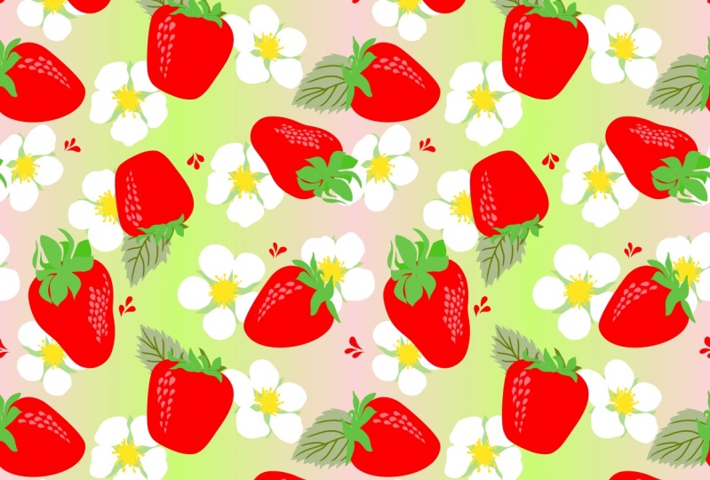
3. Full-Drop Pattern: FULL-DROP repeat patterns are a common type of repeats
in surface design, and this is what you
commonly start with. First, let's define what a
FULL-DROP repeat pattern is and why you should be including them in your creative portfolio. Another name for a
FULL-DROP repeat pattern is a block pattern or a basic
repeat or a standard repeat. You might have
heard of those two. In a FULL-DROP repeat pattern, you are stacking your pattern
tile in a grid format. That means that the elements
are repeated in one line, both horizontally
and vertically. It's usually square spots, rectangles are common too. They are relatively easy
to create and they make a good starting point for designers new to
surface pattern design. So I truly believe that they are really
great for beginners. On top of that,
they're very easy for print on demand
or POD shops. This type of repeat
can be used to create a variety of products
such as fabric, wallpaper, or wrapping paper. Let's have a look at
our first example. This is a very simple
pattern, very minimalistic. I created this pattern with a standard or a full
drop of repeat tile. I actually used only
one flower asset. Here on the next slide, you can see the grid
that I was talking about that makes the
FULL-DROP repeat. My elements are stacked
in both directions, up and down, and left to right, horizontally
and vertically. Here's another very
simple example. It's also a floral pattern. Maybe it's a little
bit more complex because there's more
than one flower type. But here also on the next slide, you can see that indeed it's a standard or a FULL-DROP
repeat pattern again. Let us briefly talk
about the pros and cons of creating
FULL-DROP repeats. As I've mentioned before, I think it's really great
for beginners because it's much easier to avoid any
mistakes in your repeat. It's also super fast
and efficient for PODs, for print on demand shops, where usually a good strategy is to be able to create
a lot of patterns on a regular basis and then
upload them to your shops so that you can make a
difference and you can rank better in
their search results. FULL-DROP repeats
are also perfect for creating simple
blender patterns. Now, on the cons side, we have the argument that a FULL-DROP repeat may look
a little bit repetitive. It can also look a
little bit too basic and maybe not even
professional enough. The reason for that is that the repeat is often
more difficult to hide. However, if you again have a
look at the simple pattern, you can see that this might actually be something
deliberate. You may want for example, to create something a
little bit more calm, simple and
minimalistic that will really be a good addition to
your new pattern collection. Moreover, you can still create a much more complex and more
interesting repeat pattern with a FULL-DROP where the
repeat is not that obvious, there are just a few tricks that you have to
take into account. Where would I recommend
using a FULL-DROP repeat? For starters, I really believed that the FULL-DROP
is really great for creating small ditsy
floral patterns as well as blenders or
secondary patterns. I would probably
not recommend it to create your hero pattern
in your collection. But maybe some more
secondary patterns where you can play around with some simple flower
shapes or maybe stars, dots or abstract shapes. I think it's really perfect if you would like
your pattern to look geometric or really
organized on purpose. Then a Block repeat
pattern is really ideal for a checker or a
checkerboard pattern type. If you have a look
at the pattern that I presented to
you on the right side, it's a checker boards
type of pattern that constitutes
only of squares, and each of those squares
has been also filled out with some interesting elements inside like flowers or fruit. I really believed
that It's a fun and easy pattern type
that you could add to your portfolio in a fast way. There's one more tip
that I can give you. If you are concerned about
your repeat showing, I do recommend that
you stick with a minimal color palette so that you can hide
your repeat better. As an exercise, you can try
out more monochrome patterns. You can basically pick just one color and you can
use variations of this color, you can increase or
decrease its brightness or saturation and you can stick just to this one single color. In this way, you will create an illusion that the
pattern is still merging together and perhaps the repeat will not
be that obvious. Overall, FULL-DROP
repeat patterns are an essential tool in any surface pattern
designers toolkit due to their versatility
and ease of creation. I believe that you should
include them in your portfolio.
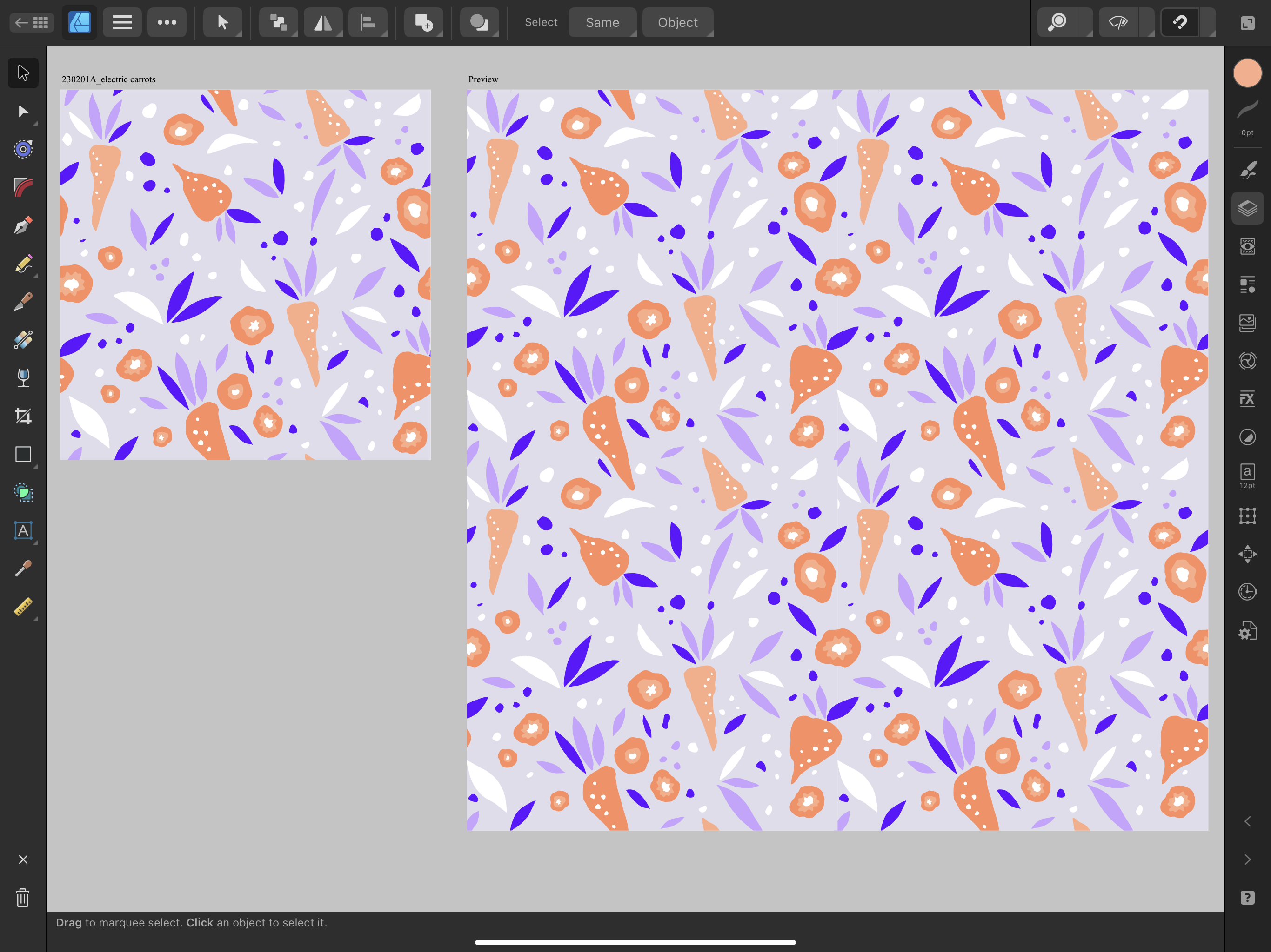
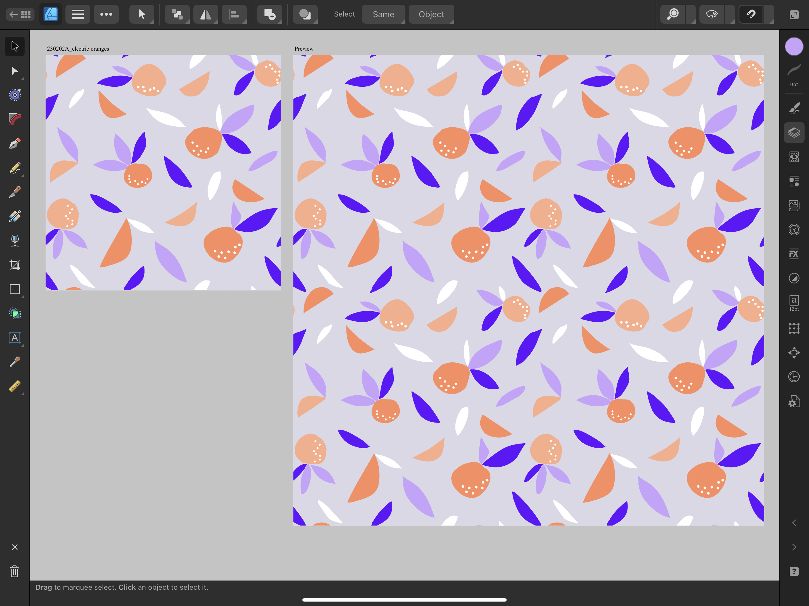
4. Draw Pattern Elements: I always recommend
starting the design of your repeat pattern
with sketching out the elements
of your pattern, this will make vectorizing
faster and easier. You can either do
your sketches in a physical sketchbook like
so and then you can just snap a photo of the page
from your sketchbook and import it to Affinity
Designer from your camera roll. Or you can also choose to sketch in another software digitally. I personally love
sketching in Procreate because that's where I have
all my favorite brushes, which behave just
like digital pencils. Then another advantage is that my sketch is already digitized. Once you're done
with your sketch, you can import it as a JPEG or a PNG file and you can export it and save it to your iPad
camera roll so that you can later on import it
into Affinity Designer. If you're sketching
in Procreate, you can do that by going
to the wrench tool here, then heading to Share, and here we have an
option to export your sketch either
as a JPEG or a PNG. I will go ahead and I
will save my sketch into the camera roll of my iPad
by selecting Save Image. For my repeat pattern, I first wanted to
draw some fruit, but then I thought
that I already have a few patterns with apples and with pears
and with bananas, and now it's time
for vegetables. You can either draw fruit or vegetables but I think
that vegetables are not that common and if you have a vegetable-themed pattern
in your portfolio, I think it will stand out more. I really encourage you
to go for vegetables. I chose carrots. Your task is to roughly
sketch either fruit or veggies that will build
your repeat pattern. Sketch between 3-5 variations of the same fruit or vegetable. Make sure that they are
different in scale. Some of them can be small, some of them can be
a little bit bigger, some of them will
be more narrow, and others will be
a little bit wider. Make sure that they
have different shapes. Here comes a hot tip. I do recommend that you include sketching your fruit or
veggies first of all as a whole shape and then draw its intersection as if it was
cuts through with a knife. I think that including this
view of your vegetable or your fruit will really make
your pattern stand out. Here, for example
in this sketch, I drew 1, 2, 3, 4 different carrots. Some of them are a
little bit longer, and I drew also one that looks a bit like a turnip [LAUGHTER]
it's a little bit thicker, but they all have
a different shape, even though maybe
those two are a little bit similar the
shape is different. They will also have a
different set of leaves. Some of the leaves will be
a little bit more pointy. Some of them will be
a little bit shorter. I definitely took care of including some
variation in my sketches. Also I had a look at my reference photos and I
made sure that I also include the intersection of the
carrot as if you cut a carrot in half and you saw what's in the
middle of the carrot. The advice that I
can give you here definitely is to
simplify your shapes. You don't have to,
you even shouldn't, sketch anything realistically
for your pattern. Because the simpler the better actually simplicity
is the best thing. Whenever you feel like
over complicating things, drop it, keep it simple. What do I mean by
simplifying my shapes? Do not focus on the details. Just sketch the rough outlines
of your vegetable and try to think in terms
of triangles or squares or circles and
ovals, and that's it. Once my sketch was complete, I have also prepared
a mini mood board, I can just keep it
in my camera roll and treat it as my
source of inspiration.
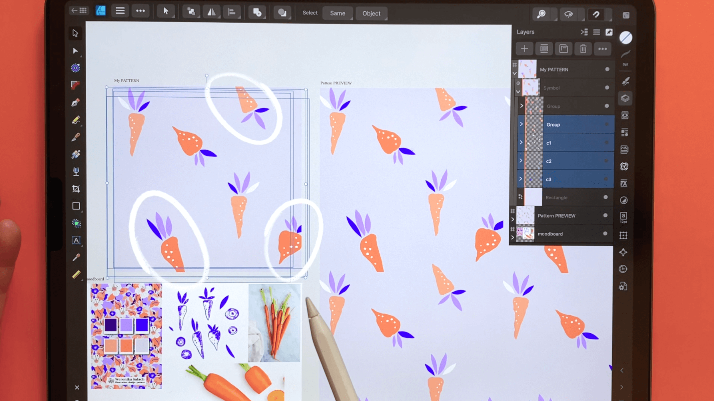
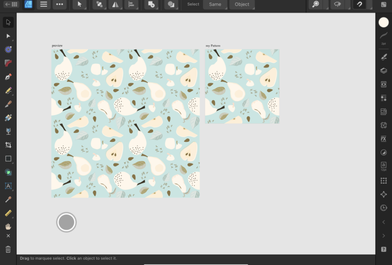
5. Affinity Pattern Preview: I would like to show
you how to create a pattern preview in Affinity
Designer on my iPad. You can definitely replicate this whole process on
the desktop version, the steps are the same. The process that I'm showing
you is applicable both to the newest Version 2
of Affinity Designer, as well as to the
older Version 1. Having a templates document with your pattern preview
will save you a lot of time along the way. Because next time you'd like
to create a new pattern, you will simply create a
copy of your template, so you won't have
to repeat the steps that I'll be showing you
in my demonstration. Let's do it, as you can
see in my interface, I already have some
templates waiting for me, but we will create a
new one from scratch, so that you can
repeat those steps with me on your own device. I have one template
for a standard or a full drop repeat pattern, and one template for a
half drop repeat pattern. In this tutorial, we will create a standard repeat
pattern preview. First, we need to
create a new document. You have the option to
create a new document in Affinity Version 2 on the
menu on the left side. We go ahead and we
select "New Document", I always work in pixels and I recommend
that you do the same. I tried working a
few times in inches, but my pattern
didn't repeat well, perhaps it was a glitch
or a bug that has been fixed in Affinity
Designer Version 2, and the thing is I
would rather stay on the safe side and
work in pixels. I always work on a 4,000
pixels square artboard. I already created such a preset. If you haven't created
such pixels presets yet, you just open any document and then you adjust
what you have here. You have to choose your document units
and whatever you have. If you had selected for something in
centimeters or inches, you got to change it to pixels. Then you change it to 4,000
and 4,000 pixels, 300 DPI. I always work with
multiple art-boards, make sure that you also have it ticked that you create
an artboard with your new document and then
the color format is RGB. That was the general section, and under Margins and Bleed, we don't have anything
selected here. We can go ahead and
we can create our new 4,000 pixels square
document by hitting "Okay". This is our first artboard, which by default is
named Artboard 1. We can change its name by
going to the Layers panel, this is the one and only artboard that we
have at the moment. Then we go to the
three dots menu, we click on the name Artboard 1, and now option pops out where we can change
the name of this artboard. I would like to change
it to my pattern, but you can change it
in any way you want. You can just write pattern
or main pattern tile, now it's renamed, and it also changed
here to my pattern. Next, we need to add the background of our pattern
with the rectangle tool. This is where we have
the rectangle tool. We select the first
option rectangle, and then we just
draw one rectangle. We go to the color
studio and we change its color to something bright
so that we can see better. Next, we make sure that
snapping is on which in Affinity Version 2 is
in the upper right corner. Now we have snapping on. Then to the move tool, we have to make sure that
this background really snaps into our 4,000
pixels square artboard. You will recognize
it that it snaps by seeing those guiding lines. When you're done from one
corner to the opposite corner, you will also see here
that the width is 4,000 pixels and the height
is also 4,000 pixels. But if you'd like to
double-check that, you can also go to
the Transform Studio, which you can find here. Here under Dimensions
you can double-check and reconfirm that indeed our background tile has 4,000
by 4,000 pixels square. Now we have created
also a new layer, which is called rectangle, which will be the
background of our pattern. Now comes the most important
part of the process, we will be creating a symbol. What is a symbol? A symbol as an
intelligent object that can be placed
repeatedly in your document. Any changes that we
make to that symbol, will be reflected across all
the copies of that symbol. To set up our symbol, we have to double-check
that we really have this background
layer selected. Next, we head to
the Symbols panel. We go to the hamburger menu, three horizontal lines, and we choose "Add
Symbol from Selection". Now this backgrounds tile
has been added as a symbol. To make sure that our
symbol gets updated, we will need to have
synchronization turned on. This is where we make sure
that this is checked. Then this way we make sure that the synchronization will be on. Now the most important
step is actually complete. Now we have to create an artboard for our
pattern preview. We can close the Symbol Studio, and we will create a preview next to our
main pattern tile. We go to the menu here in
the upper-left corner, the hamburger menu, and here we have an option
to create a new artboard. We click on it and we
start drawing our preview. I drew it roughly half as big
as our main pattern tile, but I will go now to
the Transform Studio to make sure that it really
has the right dimensions. I want it to be a double, which means if I'm using 4,000 pixels Canvas
for my pattern, the preview has to be
8,000 pixels square. Under Dimensions,
I changed it to 8,000 in the width and
8,000 in the height. I can also go to my Layers, I would like this artboard to be underneath my main pattern. I would like to also rename it, I click on this default
name Artboard 1, and I rename it to
Pattern PREVIEW. Now this is where
we have our symbol. We see that it's
synchronized because it has this glowing orange line beside it on the left
side, you see that? This means that the
symbol is working. Now this entire symbol folder, we will make a copy
of it and then we will shift it onto
our Pattern PREVIEW. To make a clean copy, let's go to the
menu, three dots. The first option is duplicate, so create a copy. Now we created a copy, we head to the Move tool, and then we shift it to
this adjacent artboard. You see it got shifted
from this folder here to the Pattern
PREVIEW artboard. I just wanted to remind you that I still have snapping on, so when I was moving it, you see I saw those
guiding lines, and it helped me
to make sure that it's really fitting
into this Canvas. Now we have to create 1, 2, 3 more copies so that we
complete our pattern preview. We have this symbol selected. We go again to the menu
and choose "Duplicate". Then from the Move tool, we move it to the right side, and we see that
those guiding lines helped us for those tiles
to snap together perfectly. Then we create another copy, we locate it in the
lower right corner, and one last copy which we position in the
lower-left corner. You see the guiding lines, we see them thanks to
the snapping option. I can deselect by tapping somewhere outside
of the artboards. Now everything is
placed perfectly. How to test it out, let's go to my Asset Studio. We will select one asset
and we will position it on our pattern tile to see if our Pattern
PREVIEW is working. I go to my Asset Studio
where I have a whole bunch of assets, start. I'm going to select this friendly leopard
by holding and just dropping it on my canvas to double-check if my pattern
preview is working. Right now this asset is
outside of our symbol. You will recognize it
because it doesn't have this orange line beside it. What we got to do is we
have to take this layer, and we have to drop
it into our symbol. This is how we know that
everything is working. Whatever changes I
will be doing now, it will be reflected
because each of those squares that make this bigger square is a
copy of this original. If I re-size it or move it, it will all be reflected and you will see it in
the Pattern PREVIEW. Let's remove it
because after all, we want to save it
as our templates. Let's clean it up, what we have left
is My PATTERN tile, this one, and my
Pattern PREVIEW tile. Then we go back to
our live dogs view, to our homepage, and we have to make
sure that it's saved. You can save your documents
either on your device, directly on the iPad, which I'm going to do, or you can save it to a Cloud
service such as Dropbox. To save this preview
right now you can see it's labeled as Untitled, I can go to the hamburger menu, and I can select "Save As." If this has previously
been saved then I would just choose Save
every now and then. But since we haven't saved
this template before, we select "Save As." Here, we have a
chance to rename it, maybe to something like
full-drop pattern template, and then we hit "Save". I will save this template
on my iPad because I have enough storage and I'm
not using Dropbox right now. I have a dedicated folder
Affinity Designer over here. We can also create a new folder, rename it to, for instance, Pattern tiles, and then we can select "Move"
to save our document. Now this document
this template we renamed it to full
drop pattern template. Next time you would like
to create a new pattern, all you got to do is on your
iPad swipe to the left. The very first icon will be a Copy icon or
a Duplicate icon. If I click on it, I
will create a copy, and in this way my template
will become intact. This is basically
how I'm working. I create one template, I do not touch it ever again, and then I just
create copies of it. Setting up such a template will really save you a lot
of time along the way. Now we have completed
all the steps to create and to backup our
standard pattern preview. Thank you for watching.
6. Limited Color Palette: It is always more
efficient to use a limited color palette
for your pattern. Your task is to select maximum six colors
for your pattern. My recommendation is to include white or some off-white
as your highlights, and also to avoid pure blacks unless it's really part
of your personal style. Instead of black, you can choose a dark indigo color or
a really dark purple. You can also use the color
palette that I am using, which I will make
available for download. Alternatively, you can
head to my Pinterest, where I have a dedicated board
for all my color palettes. You can screenshot any of those color palettes and save it to your camera
roll of your iPad, and then you can add it on a separate artboard
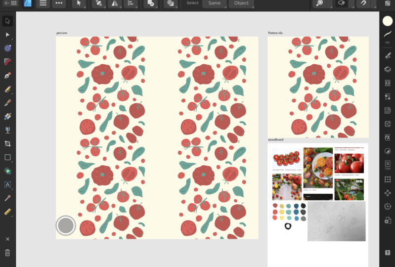
as your reference. Now let's go to our pattern
preview document and let's set up a dedicated artboard for our color palette
and our moodboard. We will be working on a
copy that we just created. Let's open it up. I will create an additional
artboard in this left lower corner here for my color palette and
for my moodboard. Hamburger menu, Artboards, and then your artboard is ready. I go to the Layers panel, I reposition it so
that it's at the end, and I will rename it
to say moodboard. Now I can go to the menu
and I can choose Place, and I can place my color palette on my
moodboard from my photos. I will also add in the moodboard that I
created in Procreate. I would like to
modify the shape of this artboard so that it fits
my images in a better way. I can do that again
from the Layers panel, making sure that I have the top layer of the
artboard selected. Making sure I'm
on the move tool, I can again change its shape. That looks good to me. Now we're all set to start
building our assets.
7. Building Vector Assets: Now we can draw
our assets out of which we will build
our repeat pattern. Let's start by importing our sketch again from
the camera roll. You can either use
your procreate sketch, saved as a JPEG or
you can simply take a photo from your
sketchbook with your iPad and then you can place it also here in the
Affinity from your camera roll. From the menu I head
the option to place my image and I go to my
photos to find my sketch. Then I position the sketch
on my main pattern tile. Switching to the move tool, I would like to reposition
it and resize it, so that it fits my canvas. Now I have placed this JPEG
sketch into my pattern tile. Having it selected, I can also reduce its opacity a little bit. Three dots menu and right underneath the name of this file I have
the opacity slider. Let's reduce the opacity
just a little bit. Step 1 is to draw our building blocks for the pattern before we
build our pattern. We will be focusing on
drawing shapes that have a different form and
that have a different scale. Like I've mentioned, when
I was creating my sketch, I would like to have some
items that are a little bit smaller and maybe also
a little bit bigger, so that they're not the same. We will be drawing those
building blocks with the Pencil tool and at
first in our layers panel, they will be grouped by color. The reason why I
absolutely love drawing my vector patterns with
the Pencil tool is that, it's actually part of
my personal style. I'm aiming at a
hand-drawn organic shape and I cannot achieve this style when I'm
using the Pen tool, that's why the Pencil tool is my most favorite
tool for drawing. We will be drawing those
carrots and those leaves by only using fill
and with no stroke. I have an entire course about creating hand
drawn assets in Affinity Designer
with a huge focus on getting to know
the Pencil tool. In this particular
basic pattern course, we won't be going into too much detail about
the Pencil tool. I would like to
refer you back to that other course of mine
about creating vector assets, if you would like to
master the Pencil tool. The focus of this course is building a simple
vector pattern. This is where you can
locate the Pencil tool, so let's select it. The important thing
before we choose our colors is to
deselect everything else and you can deselect either
by tapping outside of your art board or by
selecting this x symbol here. Now everything is
deselected and we can focus on this contextual
bar over here. The first icon is
referring to our stroke, which is the outline
of our shapes and we will be drawing in this course without any outline, so we have to select the option
to switch off our stroke. You will recognize
it by this icon white with a blue
line across it. Now our stroke is off. Next, we have to make sure over here that we use our fill. When you switch it off, you don't see any color icon
and when you switch it on, all of a sudden you
see the color icon. This is where you can
select your color. Another way is to go to the color studio and to
change your color here. Right now I have selected
the icon for fill, our stroke is empty. We are on our fill and I'm using this eyedropper tool to
select this orange color. I tap and hold and I drag it onto the color that
I want to select. You can see here that the
color has been selected, but we still have to
apply it to our fill, so we tap and now the
color has changed. The last important thing
is this option here, to have the auto-close on. Auto-close will make sure that our vector
shapes are closed. Let's test it out to
just a random shape, but this shows you precisely
how we set everything up. There is no stroke, so the stroke is empty. The fill is this orange color and you will also recognize
that this shape is closed, because the auto-close
function was on. I once got a question
in my forum, some student of mine asked me, how do we really make sure
that the shape is closed? You will recognize it by seeing this blue line that continues
throughout the shape. Let me give you an example
what it could look like if auto-close
function is off. Let's switch it
off. Now it's off. Let's create another shape. You see now this is broken, because the shape
here continues. There is this really
small tiny blue line and then it gets broken, the line as discontinued. The only way to fix
that would be to go to the Node Tool and then
to manually close it. See it now, this
blue line continues. We want to make our life easier, that's why on the
Pencil tool we want for our fill shapes to have
the auto-close on. Let's select those
two random shapes and let's remove them. Now to fun part, let's draw our carrots. You can follow your sketch
very roughly if you want to. Your sketch is only
a starting point. Now I would like to draw the other carrots with
a different color. Again to change the color, I have to make sure I deselect. I can for example tap outside of the canvas or just
choose the x symbol. Then I prefer to go to the Color Studio and from there to use the eyedropper
to select the new color. Making sure again that
I'm on the Pencil tool, we can now draw the
other two carrots. I would like to group
those shapes in colors, so those two darker
orange colors I would like to put
them in one group. The group symbol is over here in the middle and then you
have to select the group. Then by swiping to the right, I'm selecting the
other two carrots and I group them in
a separate group. Now let's draw our
carrots cut in half. This intersection pieces, I will just keep them in
the darker orange color. I will move my sketch on top, because I lost some of the
details that I wanted to draw. Then deselecting everything, I would like to
change my color to the other lighter orange and I will draw now the middle
details of those shapes. I'm going to switch off the
sketch for a second and I will add a few more details in the middle with
a white color. Just pure white and then one more detail here
in the middle and here. I think it's nice to use your white or off-white
color every now and then to add some highlights. Now I will group all of those
elements into one group, so that I can see
everything better. I can bring back
the sketch below because now I can
see anyway better. Let's start with
this blue color. By the way to group
everything much faster, I'm using a gesture where
I'm selecting the top layer. To select all of them
at the same time, I'm tapping with two fingers on the last one and then this way everything gets
selected very fast. Deselect, change the color
again to this purple one. Back to the Pencil tool and we can draw a
few more leaves. All those purple leaves, I'm grouping them again. Another way to select everything is just to
swipe to the right, but if you want to save time, you can again use the
two fingers tap gesture. I would also like to change
the color of my background, because it distracts
me a little bit. In the end, this is the color of the background that I want. I go to the Color Studio
and I select this color. With any background it's super important to change
not only the fill, but also the stroke which is the outline of this background. If you do not change it or
it has a different color, when you export your pattern
tile you will have a mistake and there will be those faint lines on the
edges of your pattern. Making sure that this
is the same color, now everything looks better. I would also like to add a few leaves in white and a
few more details in white. Deselecting everything,
I switch off stroke and I choose pure white. Again I'm grouping
them by color. I would also like to add some
white dots on my carrots. I already have white selected, only fill no stroke and I can start drawing some random
dots on my carrots. When I'm done with one carrot, I will group it because later on it will be much
more helpful for me to regroup everything that belongs to this
one particular carrot. Now this one, make sure to also zoom out to see if you're happy with
all the details. Select everything and group it because this belongs
to this one carrot. Now this one and again grouping all the elements that belong to this one carrot. One last one and
grouping them again. Your task is to draw at least 3-5 different
fruit or vegetable shapes in at least 2 different colors. Moreover, please draw
the intersection of your fruit or your vegetable. Now we can move on
to double checking and fixing the notes
of our vector shapes.
8. Cleaning Up Nodes: I truly believe that it's a very good habit
to go through your vector shapes one
more time and to double-check if the
nodes need fixing. I talk more about the anatomy of vector shapes in my introduction to Affinity Designer course, I have also made this
particular lesson available on my YouTube channel for free if you would like to
refresh this knowledge. As a reminder, nodes
are points located on our line or curve that allow
us to modify its shape. They also consist of
two control handles. Let's have a look at it.
We can modify the nodes of our vector shapes
using the Node tool. Focusing for example, on those two carrots, I can select the shapes
and from the Move tool, I can move to the Node tool. Those little points that you see along the line or the curve, all are exactly called nodes. Let's click on one
of those nodes. You will see that
this is the center of the node and those are the handles that I
was talking about. Let's maybe change
this shape like so, so that you can see
those two handles. They will help you to
modify your shape. We can also have a look
at the context toolbar. Here we can also change
the type of your node. You have an option
to change between sharp, smooth, and smart. The smart one, it's
a best fitting curve that will be created
for you without the need for those
control handles. But I actually refrain
from the smart one, I either switch to
sharp or to smooth. You can change the curve of your vector shape by dragging
those control handles. If you want to, you can also delete some
nodes, for example, if I wanted to delete this one, starting my selection
from the outside of this shape, I select it. You can recognize
that it's selected because instead of
having this white fill, it has a blue fill. Then here, you can delete
this node. Now it's deleted. You can also bring it
back or you can create extra nodes by
simply tapping onto the line and then an extra
node was created for you. It's very easy. At this point, I will go through
my layers panel one-by-one for each
of those shapes, and I will go and see if
anything needs fixing. For example, on this purple
leaf over here I can already tell that I don't
like this little detail. I can also tap to
head to this leaf, so the group where this
leaf is located will get open for me automatically. I can maybe remove it. Then maybe I can
add an extra node and play a little bit with
the shape of this leaf. Maybe I would like to remove this one and then fix my shape. You can either go one-by-one
for all those layers, one layer at a time and
one group at a time, or you can just deselect
everything and you can zoom in and if you see something that is calling for
your attention, for example here, you
can double tap it and it will open itself
for you automatically. Now I will go through
the entire art board, and I will fix my shapes, maybe I'll make them
a little bit bigger. Here, we can see a circle, and by that you can recognize that the node is a smooth type. If you would like to
make it more pointy over here in the
context toolbar, you can change the
type to sharp. You click on the node and then you can
change it to sharp. Then the icon from a circle changes to a square
and you can see that it became a sharp
instead of smooth. Now I will have a closer
look and speed up this video and I will meet you when I'm done with
cleaning up my nodes. The most common
things that I do is actually deleting
unnecessary nodes. For this process. I am also
switching off snapping. Let's do some cleaning. [MUSIC] Now I have cleaned up my vector
shapes and I'm ready to populate my Canvas with
more filler elements.
9. BONUS: Pencil Tool 2.6 fixes: H Hello, everybody. Welcome to this update
video for iPad users. Zarif rolled out their newest software updates
across Affinity Designer, Affinity Photo, and
affinity publisher. I'm under the
impression that there's a whole bunch of videos
about the desktop version, but only very few videos
for the iPad users. And if you've been
following with me, then, you know that
I'm an illustrator. I predominantly
illustrate now for children's publishing and
for my illustration work, I always use affinity
designer on the iPad, and I always use
the Pencil tool. So I will be skipping
the rest of the updates. This video will focus
only on the pencil tool because this is the most
important tool for my work, and the changes that were part
of the most recent update, the 2.6 0.0 update will
really make your work easier, and I would like to highlight what exactly changed
in this video. So heading back to
the Pencil tool, I'm also going to use this
older sketch of mine, where I created this
illustration just to demonstrate how the Pencil tool changed and what you need
to take into account. There's also some icons
that you will see here in the contextual menu that have changed, so do
not be confused. Everything is
actually quite easy. In essence, there's no
more forced smoothing. There's also better
control over the stroke. So there's basically better control over what
you're drawing. And there are some new
auto close options that can really improve
your efficiency. All right, so the very
first thing that changed, luckily, is that there is
no more forced smoothing. Previously, the pencil tool would always apply some
level of smoothing. So we really didn't
have full control. And when I was illustrating
projects for clients, I felt very frustrated after the previous update because what I was drawing
was unnatural. And what I wanted was a feeling that is more organic
and less vector like because all my artwork, even if I use some texture, this is all vector
brushes or vector shapes, and vectors tend to look
a little bit more rigid. So the previous update
really destroyed my workflow and caused
me some frustration. And I'm very, very happy that Serv got rid of this
obligatory smoothing. So right now, you can draw lines that are more kind of rugged. Do I have an example,
for example, if I wanted to draw the man of the pegasus
in a more rough way? Previously, this whole
line would be more smooth. What does it mean? I
would get more rounded. And the shape that
I drew would not be reflected in the line that
the software would draw. And on affinity forums, I found that a lot of artists, for example, who were drawing
maps, illustrated maps. They were in particular,
very frustrated because when they were
drawing the outlines of the countries for the maps, then they needed all those
tiny little details, they didn't want smoothing. And in my work, it
was exactly the same. Sometimes I really
wanted this more hand drawn feeling and the smoothing
would destroy everything. Right now, this is fixed, and the only way to get smoothing
would be if you opt in, for example, for some
form of stabilization. Right now, if I click in here, you see, nothing
has changed here. There's a rope stabilizer
or a window stabilizer. Which you can also set the force of the stabilizer
here on the left side. So if I wanted my line to be, you see, more smooth, then you can use stabilization, and you can be more intentional, about choosing whether you
want this smoothing or not. So with this regard, you
have full control over here. Now, another thing
that changed in the contextual menu
are the icons. I didn't take any screenshot
or I would have to find some old screenshots from my old work to show you
what exactly changed. But those two icons
are different. You can also click on the question mark to
see what is over there. The one on the left is about using line,
using an outline. And the circle that is more
full is about using fill. So if you want a
line, right now, it's selected, you will just, let's get rid of
this stabilization. You will just get an outline. So for example, I could use this Let's increase the
width of the stroke. I could use this when I'm drawing or creating a project for a coloring book if
I only want outlines. But for me, more
often than that, I draw without any outlines. So we can also start by going to the color studio and then just choosing color
from your swatches. U and then you will
have no outline. And if you want a line, you can select this
use line symbol so that you can also
draw with an outline. Right now, both of
them are selected. You will recognize that
something is selected by saying that this gray background of
the icon changed to black, that means that it's selected. If I don't want an outline, I just deselect seline. And then another important thing that changed is the auto close. There's a whole menu
of options here. The first one obviously
means that there is no Autoclose then
there's close near, close far, and close always, which can really make your
work very efficient sometimes. So auto close basically connects the start and end points of stroke automatically. And before this auto
close changed behavior and you really needed
to come very near. So this will be
the second option close near to close a shape. And oftentimes I failed
to close a shape, and it was again another
thing that frustrated me. Right now, you can, for
example, choose close near. And you will have to
again come quite close. You see there's a small red
selection that tells you, Okay, this auto close
will be recognized and the shape will be closed.
So now it's closed. But I don't think I'll
be using this option. I think I'll go straight
to Either close far that you have
more wiggle room. You don't have to go super duper close for the shape to close. Was a small mistake there. Let's do it again. You
don't have to go super super close and the shape
will be still closed. Or clothes always is very cool. For example, if I wanted to
draw the wing of the pegasus, I would just go like this. And here, I just let it go
at it closes automatically. This is exactly what we had
before the previous update. So if I was drawing this cloud, I would start somewhere
outside of my canvas. Sorry, that doesn't look pretty. But I would just draw
what is essential without wasting my time to go all the way up here because
this doesn't matter. The illustration will
be cut here anyway. And now that we finally
have this close always, I think I'll get
back to it and I'll just get outside of the canvas, draw my cloud, release it, and everything is
closed automatically. If I wanted to draw
this tail, the same. Sorry, this doesn't look great. Depending how you like to work, you can choose among
all those options. You also don't have
to close it off. You have to switch it
off if you're just drawing with the stroke,
so just with the line. Personally, I would
recommend that you either choose close
far or close always, and I think I'll stick to close always because this
will just snap. Look at this. This
will just snap so fast and have me save so much time. I just have to make sure that the whole film selection
is where I want it to be and everything snapped in a
very pretty and fast way. So those new auto close options
are much more intuitive. They will give you
the ability to create more natural linework despite the fact that you're
drawing with vectors. You will have
better control over your style after all those
pencil tool updates. And the new Auto close will give you basically better shape
building capability. And the fact that
smoothing is off, this is, I think the best
news will mean that your vector illustrations
will feel less mechanical and you
will be able to embrace some more imperfection in your perfect vector
art, so to say. So what do you guys think about those new changes and
about the update? Let me know in the comments
or in our Facebook groups, what you and if you found
this video helpful, please give it a like and make sure to
subscribe to stay updated about any affinity news or new affinity tutorials.
Thank you for watching.
10. Filler Elements: Before I build my pattern, I am having one more
look at my composition and I will include a few
more filler elements. The first step is
actually to zoom out to see better
what we're missing. I think I'm done with
drawing those leaves but I would like to make
a few more of them. To do that, I'm going to tap on the leaf
that I would like to copy, switch to the move tool, and then I will perform the
quick duplicate function. You probably remember
how to do that; two fingers on our canvas and now we can start making copies. I want to make copies that
will be filler elements. Once I create my duplicate, I rotate it a little bit and
I make it smaller or bigger. I would also like
to copy this one. From the Move tool, I can still modify its shape, maybe make it a
little bit thinner, so now it becomes a completely
unique filler element. This one also looks nice, but we could make
it a little bit bigger and a little bit thinner. Let's make that one but
let's make it a little bit more thick and also rotate it, and one more from here. Now, I would also like to create a half-moon shape and I
think I will stick to white. I go to the pencil tool, I make sure that
white is selected, I deselect everything else, and I start drawing some extra filler
elements that look more like a half-moon shape. I select those new
elements and I bring them into the white
elements folder. Now our building
blocks are ready, so now it's the time
to regroup them and to organize them
properly into layers.
11. Re-Grouping Assets: Our building blocks
are complete. We also agreed on the colors. Now it's the time to
organize them efficiently so that we can build our
vector pattern fast. We need to group
the main carrots together along
with their leaves. We need to group the
carrot slices together. Then to leave the filler leaves outside of
those main groups. Let's deactivate
our background for a while because it
will get easier for us to select everything
at the same time. Now, we can start re-grouping. We will be regrouping
from the Move tool. The first thing that we got
to do is we have to take out some of those elements
from their groups. We are keeping the dots together because
they were grouped to belong to this one
particular carrot. But we will also take out those filler elements
out of their groups. The carrot slices, we
also take them out, out of their groups. It literally takes
just one minute. Our main carrots, they also go out and our blue leaves. At this point, I can also delete entirely my sketch layer because
I don't need it anymore. In case I want to
refer back to it, it's in my mood board. Now, everything is
out of their groups. I can tap on any of them. I will change those
white elements just to some random colors so that
I can see them better and I will switch them back
to white later on. Now we can start grouping. In order to do that
from the Move tool, we have to start
selecting outside of the shape and then we need
to select everything. That means that in
that selection, which you can see with
this light blue fill, everything has to
be contained and if it's properly selected, then everything will have
this blue outline over here. You can also recognize it that everything has
been selected that when you switch off the
visibility then everything that belongs to this one
piece will disappear as well. If everything is selected, it's enough for me to
switch the visibility of only one layer and then
everything will be included. You see, everything is gone, which means that the
selection is correct. Now we can group it. I choose the group icon, group, and I will make
it invisible for now. Now, let's group this one. I start my selection
outside of the shape, and then I make sure
that everything is contained in this
blue fill group. Everything is grouped correctly
and I can switch it off. Now this one group and I switch it off so
that I do not include it. Now this carrot
slice is next group. See all of those layers are in this group and we switch it off. Now we can try to deal with
this carrot over here. I'll do my best to select everything that belongs
to this carrot. I think I was successful. Let's switch it off. Everything has been selected. Now we can group it
and make it invisible. Once we make it invisible, it gets easier [LAUGHTER]
to select everything else. Now let's deal with this one. Group, this carrot
is done as well, and now maybe this one. Now it was difficult for me to select everything that really
belongs to this carrot. I think I also selected
this leaf over here. To deselect it, I will hold one finger, press and hold onto the screen, and I will tap it so that it's removed
from the selection. Let me zoom in so that
you can see it better. I can tap on it again so that it's again included
in my selection or I can tap it again so that it gets kicked
out of the selection. Let's zoom out. Double check. We can group this carrot as
well, make it invisible. I can also show you another
way of selecting everything. It's the same method
with the one finger on the screen and then
tapping one by one. We have our last carrot. Now, the remaining
filler leaves I would like to group
them in accordance with their colors so
I'm going to keep this first blue leaf and
then tap and hold one finger on my screen and start tapping the remaining blue leaves and I will group the rest
of the leaves by color. Now we can do the purple one. We start with one leaf and
then tap and hold, tap, tap and hide it. Then the rest is
quite easy because all of those leaves that are actually
supposed to be white, I will bring back their
color in a minute. They're stacked
over here on top. We can just start with the first one and
then double tap to select everything at the
same time and group them. Perfect. Let's bring
back our background and let's bring back the
visibility of all the elements. Perfect. Let's first select
by swiping to the right our main carrots and
bring them to the top. Oops, they ran away [LAUGHTER]. Then we have our carrots slices. Fantastic. Then we have
our different leaves. Now because all those leaves are grouped in accordance
with their color, we are able also to
change their colors, not by selecting each of
those layers individually, but we can change their colors from the entire group level. For example here
for those leaves, I change their color from
white to something more standing out because
it was easier for me to work on
my re-grouping. But now I would like to
bring back the white color. I go to the color studio. I make sure I'm on the fill. No stroke, just fill and I select white and then from
the entire group level, the color has been modified for all the elements that are
contained in this group. Great. If you have taken my
Creating Vector Assets class, you know that now is
a great opportunity to save all those elements
as vector assets. Before you do that, in any case, to keep everything tidy, I would recommend that
you give them a name. Right now the group
is called Group. I'm on this fat little
carrot over here [LAUGHTER]. You can rename it by clicking on it and just naming it to carrot. I'll copy this name so that
for the remaining carrots, I can use the same name. I will just paste
it in one by one. Now this one we can name as
Carrot Slice, let's say. [LAUGHTER] Copy so
that we can also reuse this name for the
remaining carrot slices. Now I have sorted those
filler leaves by color so I will simply rename
this group as C1, which stands for Color Number 1. C1, because I could
name it white. But what if I'm
re-purposing this pattern and I want to change the color to
something else than white. It would be a bit
of a fuss to go and change the group name. That's why I just give
it a generic code. This one will be Color
2, which will be C2. But of course you
can come up with your own naming strategies, whatever makes your work easier. This lonely leaf
remains as green. Let's change it to white. Now our re-grouping is complete. Here are our carrots. Now if we go to the Move tool, we can move them and
we can basically work with them because they have
been bundled together. Now the real work starts. Here we have also started our filler elements in
accordance with their colors. This is for the white leaves, this group is for
the purple leaves, and this group is
for the blue leaves. Because in particular
filler elements can get very abundant. You can all of a sudden, if you want to fill
up your pattern, you can get a lot of
elements and then you have to manage this chaos and I know that chaos is very imminent when you're
working with your fillers. That's why over time
from my experience, I have developed a
strategy to sort, in particular my filler
elements into colors because then it's
much easier to manage them and to recolor them. All right, our basic
setup is complete, and now we're ready to
design our pattern.
12. Positioning Assets PART 1: Step number one is
to roughly position the elements of our pattern
on our pattern tile. We should take into
account the scale of our shapes and we should also take into account
their direction. Let's place our objects
on our pattern tile. Let's rotate a few
and let's make any other color adjustments that we would like to carry out. At this point, we can also
create a few more copies of those elements that we just
created and place them strategically in
our composition. To do that, I would
recommend that we select all those groups with
those secondary elements; the carrot slices and
our filler leaves, and if you have all of them selected it's enough
to switch off the transparency or
the visibility of only one group and the rest of them will become invisible too. I think it's best that we start with our hero elements which are the carrots and we will position them
onto our pattern tile, and deliberately we will do that before seeing anything
in the preview. Let's have a look at them. It's enough that you just
tap on one and group for that given a carrot
will be selected, so it's very easy. Here you have a handle where
you can rotate your shape. What I'm going to do now, they're all quite
straight right now. I want to rotate a
few and position them onto my canvas
in a few corners. Let's say I would like to put this one a
little bit upside down and position it also
outside of my canvas. Remember about scale,
maybe I would also like to make it a
little bit smaller so that they're not the same
size and then the fat one [LAUGHTER] I think I will also rotate it and position it here. I'm trying to move from the upper left corner to
the lower right corner. I tend to have it zoomed out quite a lot so that
I can see better. This one, I could
also position it. You see a little bit outside of my pattern tile and
maybe also rotate it a little bit and this is also the place where you
can make a copy of them. To make a copy of
the entire group, two fingers on the screen, tap and hold and when you move it you
have created a copy. Perfect. I will rotate
it the other way round. You also have an
opportunity here to go and to flip it
to the other side. There's another Transform panel here in the upper corner menu. Having the set of
carrots selected, you can for example here
flip it horizontally. It's flipped the other way round and it will trick the
eye a little bit, it will look as if it's like a completely different carrot. I'll make it a little
bit smaller or maybe a little bit wider like so and I will also position this one
outside of the canvas. I would also like
to copy this one. Maybe I'll make this
one a little bit smaller and this one
too and now copy. You can also make a copy by keeping your
selection and then go into the three dots menu
and hitting "Duplicate", but I find gestures much faster. I just created a copy. I go to the Transform menu and I again flip it horizontally so that it looks a
little bit different. Maybe I will position
this one here. Zoom out and see if you like the proportions of your
carrots. That looks good. That means that now one by one, we can bring back all the
other elements and also position them on my art board. Let's bring back for
example this carrot slice, maybe put it also
outside of the canvas. Later on when we're
building together the repeat pattern we will
mirror it to the other side, but for now let's just place everything onto our art board. You can also make your objects smaller and you can rotate them. This one may be
here and bring back the last one and perhaps I'm
going to position that here. All of them are activated, but I would like to
have more of them. I'm going to use
the gesture with two fingers on the screen
hold to create a few copies. For example, I would
like to copy this one, so two fingers and then as
I move I create a copy. I change the scale
and I rotate it, maybe this one too. Let's make a copy. Rotate it. You can also flip it, change the scale, make it
smaller, position that here. That starts to look good. Let's make a copy of this one. Make it a little bit bigger, rotate it, and position it here. Again, because we created
a few more duplicate our list in the layers panel is becoming a little bit longer. Now that I'm happy
with the main carrots I want to select all of them, and again I want to group them. Things will get easier. I believe that groups
are your best friends, especially when you're
building patterns later on that they're so complex that you're having so many
groups and I think it's a really good habit to
group everything as you go. I'm happy with my carrot slices. I'm also putting
them into one group. Now what shall we do? White? Let's bring the
white leaves for starters.
13. Positioning Assets PART 2: One by one, I'm
going to position them nicely on my art board. Sometimes I will again
change the scale, maybe rotate them a little bit. I also make sure that they are spread across my art
board in an even way. I would also like to
create another copy of this one and make it
a little bit smaller. See, for example
those two leaves, they go in a similar direction. This one, this
one, and this one. For a little bit more variety, I would like to
rotate one of them, so that they do not go
in the same direction, if this makes sense. Those two, this white
one and this white one, they also seem to be
heading in one direction, so I will take maybe this
one because this one also follows the direction of
the carrot in the same way. I think I will modify it, so that they don't go
in the same direction. Then zoom in, zoom
out and see if you're happy [LAUGHTER]
with your composition. I think the white colors
also spread very nicely. I have some white in every
corner of my pattern. Now, I can move to
the purple leaves, and I only have three
of those in here, so I can already anticipate that I will be creating some copies. Now, maybe it will be nice to create a cluster of leaves, so I'm making a copy. I'm going to make this
one a little bit bigger, and I will put them
together so that they look a little
bit like a fan. You see that? It's like a fan. This one is done.
This one is done. Now, this one went missing. Maybe here. Now, let's also
create a few copies. Change the scale. Pretty much the same drill. Let's make a copy of that one, and always try to rotate it
and try to change the shape. I'm missing some
of this purple in this part of my pattern. Again, let's create a copy, maybe let's make it longer. Of course, if you're
missing something and you're not happy
with your copies, you can always stay
within the same group. You can always go back
to your pencil tool, the settings that we had
previously have been preserved, and you can just draw a new one. Here, white has been selected, but we know we don't want white, we want this purple, so I'm just going to
change it manually. You can again freestyle so you don't have to just work with duplicates of what you had. You can create again something
completely different. We are moving in the area
of our filler elements. For my illustration, I chose those leaves to
be filler elements, but at this point, you can create any
shapes that will be good filler elements
for you, for example, dots or maybe some random
shapes like arches. This would be interesting. I think I might actually
add some of those dots. I'm staying in the C2 folder, which stands for color
Number 2 because if I want all those filler
elements to change color, all of them at the same time, then I will want to do it from the group level that's
why I stay here. I draw some of those little
dots as my filler elements. I can always go back to
this color, but for now, let's not forget we still
have the blue leaves, so I would like to position
those leaves first and then I can go back and
maybe draw a few more dots. Switching back to the move tool, and now let's reposition
those leaves. I will also put this one
outside of the Canvas. I think that will
look interesting. Again, making a few copies
and changing the scale. Now, I will draw a few more dots and I
want to draw them in blue that's why I stay somewhere
within the blue folder. If this remembers
our previous color, then I just manually change it. Oops back to the pencil tool, and I keep on drawing. I zoom out frequently to check if all the colors
are well balanced. I've noticed that first
of all those dots, we need to bring them to
the color Number 3 folder. They run away. I've also noticed that my background has moved
as I was working. Let's deselect everything. Switch on snapping. Let's make sure that our
background is repositioned. On one hand, I want to keep
the background because I think the background
with regard to choosing the rest of the colors, is the most important element. That's why I want to keep it. But sometimes when you are
drawing and moving things, you might shift the
background by accident, so I'm just urging you
to stay mindful of that and every now and
then to recheck your background if
it's really in place. Let's deselect, and go
back to our blue group and the pencil tool and
draw a few more dots. I would also like to
include some white dots, so I'm switching to the
white color folder. Now, the last step
is very important. We need to place all
those elements onto our symbol because right now if you have a
look at those groups, they don't have this orange
glowing line beside it, and we need to place it
in the symbol basically. You will learn that this
is where it's really handy to have everything grouped because you get a
better overview. Here I have my carrots groups, carrot slices, and
all the fillers. I can select all of those
groups at the same time, and then I can drag and drop
it [NOISE] onto my symbol. Now, what I have just created is reflected on this
pattern preview. The last step in the
process will be to fix any repeat mistakes to make sure that we're happy
with the composition, and to make this pattern
truly a repeat pattern by mirroring some of its elements from the edges to
the other side.
14. Building a Seamless Pattern Repeat: Let's improve the quality
of our pattern by transferring some elements half outside of our pattern tile. If we leave this step out, we might create some
obvious empty lines towards the edges
of our pattern. So for our pattern to
be truly seamless, we need to move some
shapes outside of the art board and
then we need to mirror them to the other side. We need to, for example, fill in those gaps over here, and the elements
that we have already see here shifted
outside of the canvas. Over here we need to make sure that they will be
mirrored also to the other side so that this
pattern looks seamless. Right now on the iPad, the only way to
do that is to use the maths of the
Transform Studio. As usual, it will
be easier if we switch off the visibility
of some of the groups. As always, we will start with the hero element of our
pattern, namely our carrots. By just looking at our carrots, we can identify
that we have 1, 2, 3 carrots that need
to be mirrored to the opposite side so that the
pattern is really seamless. I have also prepared a
little cheat sheet for you. Remember we talked about the anchor point when we were building our pattern preview. We will want to shift
some elements from the left side to the
right side on the x-axis, and we will want to shift
some elements from up to down on the y-axis. We have to remember
that the dimensions of our canvas is 4,000
pixels square. Regardless of the direction, if it's left or right
or right, left, up and down, down and up, we will have to always
move by 4,000 pixels. For instance, if we have
an element here that sticks out of our canvas
here on the left side, we will have to mirror
it to the right side. In order to do that, we will have to create
a copy and then add to the x axis plus 4,000 pixels. If we need to bring it
from right to left, we will have to minus 4,000
pixels on the x axis. If we want to bring
it from above, from up, down on the y-axis, we will have to add to
the y-axis 4,000 pixels, and then the opposite, if we want to bring
it up on the y-axis, we have to minus 4,000 pixels. This is just a cheat sheet. Remember that our anchor
point, our zero point, is in the upper left corner, and it will be super easy
when we see it in practice. Let's go back to
Affinity Designer. Just remember for now that
you are working with 4,000 pixels if you chose the same
dimensions for your canvas. This carrot over here, we first need to
create a copy of it. Making sure that this
carrot is selected, we go to the three dots
menu and we hit Duplicate. Now we have a copy. Then having this copy selected, we go to the Transform Studio. This is where we have the x-axis option and
the y-axis option. We just basically
have to do the maths. We would like to
move this carrot up, down, which means we will
be working on our y-axis. Since we're going down, we have to add
plus 4,000 pixels. Let's see this in practice. This is our y-axis. We click on it and
we have to select plus 4,000 pixels. Hit Okay. Now we selected a copy. Right away in order not to do any mistakes or to
prevent any mistakes, we should select both of them. They will be next to each other, this one and this one. Once you select it, you see this blue
selection line around it, and right away I group it so that I do not mess it up
[LAUGHTER] along the way. We're on the move tool now. Now we can see that
we can move it. Let's have a look at
our pattern preview. Now this shape has
been connected. Let's switch off snapping
because snapping makes the movement a little bit strange. [LAUGHTER]
Snapping is off. Now we can double-check
if this is the position that we
want for our carrot. For example this looks good, but now I can see
that I would like this carrot over here to
rotate it a little bit, maybe this way so that they do not go in the same direction. Tap outside of the art
board to de-select, and now let's have
a look what else. The fat little carrot over here, it's been cut here
on the right side, so we have to copy it
and duplicate one, we have to mirror [NOISE]
to the left side. First let's create a copy. This is selected, duplicate. Now we have a copy. Now remember we have to
shift it from right to left, which means we are working on the x-axis and another from 4,000 to go back
to the zero point, we have to minus 4,000. Let's see this in practice. Going to the Transform
Studio x minus 4,000. [NOISE] Right away so that
we do not even move it by one pixel because that will cause a mistake in
our repeat pattern, right away, you've got to group it so that you
prevent any mistakes. Zoom out. Now you can move it and see if
you like its position. Now we have this one
left, but before that, I think this one is a
little bit too close with the leaves to
the other carrot, so I would like to
first move it here. Now I like it better
in my composition. Then I create a copy. I have really zoomed
out this time so that I can see
everything properly. Now we're moving
from the bottom up, which is again the y axis. In order to go back
to the zero point, we have to minus 4,000 pixels. Y axis, minus 4,000 pixels, and then right away, select everything and group it. Now we bring back our carrot slices and because
we moved some elements, we have to reposition them. This one goes a little
bit to the sides, and this one I think I'll
change the scale down. Of course, we can also
switch off our carrots. This is again, the advantage
of grouping everything. Now I can see I need to transform this element
and this element. Let's start with this one, three dots menu. Make a copy. We are moving on
the x axis to go to the zero point x axis. If this happens that
the numbers disappear, go back to the Move tool and
you will bring them back. X minus 4,000 and right
away identify the twin, [LAUGHTER] [LAUGHTER] so
to say, and group it. This one will be dealt
with next, duplicate. Now from the zero point, we have to move it by
4,000 on the x-axis. We have to select plus 4,000. But I think it ran away. Wait. Where is it? Back to the Move tool? Then again, plus 4,000. We have to perform those
actions from the Move tool. Before we forget, select
both of them and group it. Bring back the carrots,
de-select everything, zoom out, [NOISE] [LAUGHTER]
starts to look great. Bringing back our white leaves. I open the group. I select anything in this group so that
it's easier for me to select any other elements
that might be in this group, and I'm just repositioning
some of them. For example, this dot over
here got a little bit lost. Zooming out. I'm happy with it. Color Number 1 done. Now Color Number 2 open it, click on any other layer in. Now we can see this
one, it's shifting. Maybe we also re-scale
it, make it smaller. This one and that one. Now this leaf over here, we need to transfer a copy of this leaf to the upper
side of our pattern. We create a copy. We're moving from the bottom up, which is the y-axis. To go back to the zero point, we have to on the y-axis, minus 4,000 and we can group it. Maybe I can also move
those dots a little bit as well because they're too
close to my carrot slice. I would also like to make
those a little bit bigger, and this one too. Color Number 2 is done. Let's also zoom out to have a look at our
pattern preview. Let's bring back our last color. This looks a little
bit more overwhelming, so we're switching
to the main tile. Over here we have to reposition
some of the elements. I would like to create
a copy of this leaf, and I would like to transfer
it to the other side, so let's make a copy. On the x axis we need
to add plus 4,000. Then select the twin and
group them together. Now I'm also feeling that this area is a little bit empty, so I would like to position
another carrot slice in here. Perhaps this one, two fingers on the screen, and I create a copy, I rotate it and maybe change
the scale a little bit. Let's also copy this one. Make it smaller and rotate it. Everything has been grouped
in this carrot slices group, so even if I create a copy, those copies will be created in this group so that
things are again, more easier to manage. Now is the time to
zoom out and to have a look at your
pattern preview. I can already tell that I'm missing some elements in
those gaps over here. What I'm going to do now is
I will populate those areas. If need be, I will mirror them properly so that the repeat
pattern is repeated in a correct way. I'll
see you in a minute. [MUSIC] Now our full
drop repeat pattern is pretty much complete. Let's discuss now what change options you still have once
your pattern is built.
15. Making Adjustments : When it comes to
making changes to a repeat pattern that
is already built, there are a few
minor limitations. With regards to the
elements that are in the middle of the pattern that are not touching the edges, you can of course
make any changes. For example this
carrot over here, you can make it smaller. You can rotate it as you like and the rest of the pattern will basically follow and
all those changes will be more
non-invasive so to say. Now it's a little bit different
with the elements that are outside of the pattern, which have their copy
mirrored to the other side. Let me show you that may be on this carrot slice over here. Have a look at our preview. This is the carrot slice
that we will want to change. The only thing that
you can do and this is where you have a
pretty big limitation, is that you can move it around, but you cannot rotate it
because you see what happens, it gets distorted and you cannot scale it up or down because again it
will get distorted. If you wanted also
to re-size it, there will be a mistake
in your pattern. The only option that you have
if for example you wanted to change the size of
this carrot slice, you would have to go. That's why it was handy that we again create a dedicated group. You will have to go to one of the twins and you would
have to remove them, then you would have only
this one element over here. You could perform your changes for example
you could make it smaller or super tiny. Then you would have
to again do the steps so create a duplicate
and mirror it to the other side in our case
the x-axis plus 4,000 pixels. Then the convenient
thing is it's already in the group and the only thing that you have left is to
move it around but again, if you want to change
the scale or if you want to rotate it you have to delete one twin and then you have to
make your changes. Then again you have to make
a copy and then you have to transfer it to the opposite
side of the pattern. Those are the limitations. Let's also discuss how we
can recolor your pattern.
16. Re-Coloring Options: Let's have a look at how you
can recolor your pattern. The easiest change that you
can make to your pattern is to simply change
the background color. You just have to be mindful of changing both stroke and
fill for the background. Let's go to our
background layer, this is our rectangle,
that's our background. You remember that
our background is the only element
in this case that has both fill and stroke. If you change this color, you have to make sure that the color is changed for both
the fill and the stroke. For instance, I might use those hue saturation luminance
sliders, HSL sliders, to maybe make this background
a little bit darker, a little bit more saturated, and to change it to something
a little bit more green. Now you will see that this color was
changed for the fill, but not for the stroke. In order to fix that, we go to the eyedropper tool and
we select this new color. We switch to the stroke, and then we apply
the same color. Option number one super easy is simply to change the background, and we have a
completely new pattern. Next, you can also change the colors of your
individual elements. You have either
grouped them or you need to go to the
respective layer, and you can change
the color from there. In our particular example, we're lucky because
we have some of the filler leaves
grouped by color. We have remember color Number 1, color Number 2, and color Number 3. I think for example,
this blue looks good, but this purple gets
a little bit lost. Good news we can perform our color changes on
the entire group level, by going to the color studio, making sure that the
fill is selected. We choose this original color, and we apply it across
the whole group. Now we can choose a completely
new color, for example, we can make something
a little bit brighter, and maybe also change
the color completely, maybe to something more yellow. That was the advantage of having those fillers
in a separate group. Because now for all
those elements, we can perform the color change on the entire group level. For those more complex items, it's a bit of a
trade-off because, well, it's much more
efficient to still have this one carrot in one group. But say if you wanted to change some of those
leaves, then yes, you would have to go to
this dedicated group, and you would have to
do it layer by layer. For instance, if you wanted to change the body of this carrot, maybe make it a
little bit darker, because those carrots have
their own dedicated groups. You would have to do with
one by one for each of them. On top of that, some of those carrots
have been mirrored and remember they have
those twins over here, this is this one carrot, but it was transferred from one side of the
pattern to the other. If you would like to change the color for this one carrot, which has this twin carrot. You have to open both
of the groups and you have to make sure
that you select both of them to
change their color. Those were the
easiest options to recolor you're a
beautiful pattern. Next, we will want to
test our pattern tile.
17. Re-Coloring: Same Fill: In this lesson, I
wanted to show you a very fast way to
recolor your patterns. This is another method that
I absolutely love using. You have to make sure that
you are on the Move tool. Then in the contextual menu, you see the Select Same option. When you click on it, you have a few more variations
to choose from. The ones that I am
using the most are fill color and stroke color. It's a very fast way to recolor everything by selecting
either your fill, which is the inside, or the stroke, which is
the outside of your shape. All you got to do is, you got to go to
the Layers panel, open your groups, and select one of the objects
that you have already drawn. For example, I am selecting
this blue leaf over here. It's enough that you select
just this one element, and then you got to to
select Same Fill Color and this blue color will be selected everywhere across
your entire document. When I make it invisible, you will see that indeed
everything has been selected properly with
this very handy tool. Now, you're ready to
make your color changes from the color studio in
the upper right corner. You can, for example, go
to your Swatches and you can choose a new color from
your pre saved swatches. I have a few color
palettes here. I can, for example, have a look at my
signature color palette, the electric metal, and find the color that I like for
this pattern variation. Then you can deselect by hitting the "X" symbol in the
lower left corner, and you're good to go. You have a slightly
different color variation of your vegetable pattern. Let's see again how this works. Let's select one of
the orange carrots. It's enough just to select
this one object and then you go to Same Fill Color and all the orange options here have been selected
as you can see. Now you can conduct all the color changes again
from the color studio. You can also go back
and use the sliders. For example, I like to use the hue saturation
luminance slider, so you can play around with
how bright your color is. You can reduce or
increase your saturation, or you can change the hue
entirely because it can really produce very
unexpected results. I love playing with
those HSL sliders. Now, I selected this
slightly greenish yellow. I like it a lot. I think
it looks very interesting. I'm going to go ahead and open a group with this other carrot. I would like to change
this orange as well. Same Fill Color. Everything has been
selected as you can see. Again, from the HSL sliders, I can choose something else. In this way, you can make
super-fast color changes, and it's very good to
know about this tool. Now it's your turn.
I would like to ask you to recolor your pattern. You can copy your current
pattern document. In this Copy document
you can experiment with another color variation
or a color version. Next, you want to go to the Layers panel and
you want to choose a few objects that you would
like to change colors for. Then from the Move tool
you use the option Select Same and, for example, colorful or color stroke, and then you simply change your color from
the color studio. I recommend that you
practice changing the colors from the
Swatches panel, but also from the section
with the sliders, for example, the hue saturation
and luminance sliders. That's it. That's how
easy it is to change colors with the same function.
18. Testing & Exporting Your Pattern: I highly recommend that you test your pattern tiles somewhere
outside of Affinity. This preview tile in
Affinity Designer, it can still contain some lines, especially when you
zoom in, zoom out, you might not be sure if
this is really correct. In my experience, it's really better to leave
the software that you were working in and with a fresh eye to test it out
in another environment. I will be using Procreate. In this lesson I
will also show you the options to export
your pattern tile, so we will be testing
and exporting. We go to the hamburger menu, and over here we have an
option to select Export. As you're exporting
your pattern tile, you can choose among
different file types. For our testing purposes, we will go either
with a JPEG or a PNG. If you'd like to give this
pattern tile to a client, they will most certainly
ask you either for a PDF, maybe a PSD format, EPS, or an SVG, those are the most popular
ones for vector art. As you export your pattern tile, you have to make sure
that you are exporting the pattern tile
because we have been working on multiple art boards. In this expert window here, you have an option to specify the area that you
would like to export. This is where again,
it's very handy that we have renamed our art boards so that everything is neat and tidy and now it's
much easier to work. As you remember, I have renamed the art board with my main
pattern tile to my pattern. I do not recommend exporting the pattern preview
because it's only for visually checking if we're happy with the composition and the balance of the pattern. But from my experience, this pattern preview
nearly all the time creates some
mistakes and errors, so I highly recommend
that you always export especially for clients only
the main pattern tile. We would like to
test our pattern. We select the area of
this one art board. We stay with the JPEG, and here this is
also cool thing. We can stick with
the 4,000 pixels, but, for example to reduce
the file size in Procreate, we can also remove 4,000 pixels and then we can
change it to say 2,000, and it will be
scaled down for us. Because those are vectors, the quality will
not be compromised. Next, we need to export
it to Procreate. The best option to do that is
to go to the share section, to click on it, and over here it already recognizes that
I've been using Procreate. We select it from here, and our pattern tile will travel all the way to Procreate and then we can
open it from there. Now we hit on "Cancel." Now let's head to Procreate. See the briefly imported. We can find it in our gallery. This is our tile, and now we can test it. I go to the layers, I make sure that the
background is switched off, and then from the move tool, I head to snapping, I make sure the distance is max, velocity is max, magnetics
is on and snapping is on. Now I resize my first tile and when it snaps in the
middle, I let it go. I swipe to the left,
I create a copy, and I move it down till
it snaps together, and then deselect, zoom in. This already looks very good. Since this is a full drop
pattern and not a half-drop, it's enough for me to pinch those two layers
together to merge them, and then to make a copy
of this layer here, and then to do those two
layers at the same time. Perfect, everything seems to be working really great,
it worked out. Of course, we can test
it one more time. I can make a copy, I can also save one
of those tiles here, make it invisible and
work on this copy. Snapping into the middle, copy, bring it down or
to the right side, pinch it together, make a copy and then move
it to the other side. Yeah, it's working,
there are no lines , everything looks great. Our pattern is working, we have tested it as well. Our work is done, as a bonus lesson, I would like to show
you how I upload my pattern into my
Red Bubble Shop, which is a print on demand shop.
19. Uploading to Redbubble: Uploading your patterns
into a POD shops such as Redbubble or Society6
is fast and easy. One big advantage of uploading your designs into
PODs is that you can test them out
and you can see how they might look
on real products. I already had some of my designs printed
out on fabrics as well as on mugs and on
notebooks, and pillowcases. If you're lucky to
get some traffic into your print-on-demand shop, you can also gain access to the information
which patterns are more popular than the others. Let's upload together our
pattern tile to Redbubble. In order to do that, I
have a big recommendation. I create a big pattern
tile for my POD shops. The reason is that such
a huge pattern tile fits all the products
and from my experience, it involves minimum
editing on my part. What I do is usually
in the same file, let me show you another
file that I have, I create a twin POD tile. It's essentially an
additional art board. This is my main pattern tile, this is my preview, which might contain
some mistakes, and then this is my
POD tile which is basically, let's have a look, is a JPEG of this main pattern tile
which contains no mistakes. We will do exactly that. We will go back to our
document. There you go. From our main menu, we will create a new
artboard over here. Doesn't matter which
size it has now, because now we can go to
the transform studio. As you already know, we can change its
dimensions here. I want the width to be 11,000. It's a pretty big file, I admit, but this will fit pretty
much all the products that you have in your print-on-demand shops and it will save you time. Eleven thousand height. We need to export this
main pattern tile, let's say as a JPEG. We already exported
it to Procreate, but we haven't saved
it into our iPad. First, from the area, we select our pattern and then we click on
"Share" and "Save Image". This will save this
main pattern tile into your camera roll. This is saved and now we can
go to this main art board, which we can also rename to POD. Now we can go to the main
menu and we can select "Place Image" and we can place it from our photos because
we have just exported it. There it is. Now we
can place it onto our canvas and we really have to make sure that
snapping is on. We activate snapping over here. Now from the Move tool, we can position our pattern. With the gesture, with the two fingers
on the screen, we can make copies of it, so copy number 1. The guiding lines will show us if it really snaps into place. Copy number 2. See, the guiding lines show
us it's snapped properly. Now with one finger
on the screen, we can select all the three. Two fingers on the screen, make a copy, shift it to the right, snap, and one more time, shift it to the right. Deselect very carefully. You don't want to move it because it might
create some mistakes. It might move one pixel
here, one pixel there, so you want to be
very careful with this process. That looks good. Now we can again export it. Go to Export. It can be either
a JPEG or a PNG. We choose our POD tile. That's why I have
renamed my art board so that I can keep
track what is what. POD, select it. It is generating our
export and it might take a little bit longer
because it's a bigger file. We can see here it has
nearly 14 megabytes. Share and then we save it to our device and we
click on "Cancel". Now you can see that
this pattern has been saved to our device over here. This is our 11,000
by 11,000 pixels. Switch off our carrots. I actually have two POD shops, I'm also on Society6, but I do believe that uploading your work is a little bit
easier over Redbubble. I think it's faster. For the purpose of
this demonstration, I'm going to assume
that you already have a Redbubble shop
or a Society6 shop. I will not be teaching you here how to start your own shop, but if you go online and you
want to start a POD shop, you will see that the process is very intuitive and you
will do it in no time. On Redbubble, I
will be uploading my pattern from my iPad. I have to go to the menu
here on the left side, click on my shop and here you can see an option, Add New Work. This is where Redbubble actually
makes your work easier. You can already copy
some existing setup. You can copy all the
settings that you had from a previous pattern and you just swap the files
to the new pattern. But for the purpose, again, of our demonstration, I will do everything
from scratch and I will select
"Upload New Work". Here we have an option to
select our pattern from the photo library or maybe you have saved it
somewhere in your files. I have mine in my photo
library. Let's find it. By the way, sometimes
there is a glitch and your pattern is not uploading
from your camera roll, then you have to save it
somewhere into your files on your iPad and then
import it from there. Now we need a title, for example, and be
mindful of keywords. Maybe not happy carrots, like carrots vegetable pattern. Include important
keywords in your title. Then I usually
after a hyphen add the main colors that you
can find in this pattern. There's definitely orange, indigo blue, and
lavender purple. I include both
lavender and purple because they count as
two keywords for me. Then as a tag, I always include my own name. Then such keywords
as vegetables, I will also include fruits, food, maybe kitchen. Again, my colors, orange, blue, indigo, aquamarine,
lavender, and purple. The description, I
will add it later. I usually have a
copy-paste where I just mentioned that if someone
wants a different color, they can contact me
via my email address. Now basically it's about
editing your products. I always disable clothes
because first of all, I don't like it that
it's polyester. I don't think this
material is sustainable and I don't think that those repeat patterns look
good in this constellation. I leave it on phone cases. For pillows, I think
if you edit on it, you can also scale it
to make it a little bit bigger and you can see in
real-time what it looks like. You can also disable
it if you want to. It looks really cool
on a shower curtain. I also disabled prints, cards, and posters. Any pet items, I also disable them. I definitely leave
them on the mugs because they look
very cool on mugs. That can stay. Definitely, notebooks
and journals. This clock could actually
be great for the kitchen, but I will make my pattern, and sometimes you have
this live preview, I'll make it a
little bit bigger. I think that looks better. No prints. The bottle can stay. Again, disabling the
prints, enabling masks. I think this looks weird too, so I'm going to disable that
and I'm going to definitely leave the apron because it would look cool for the kitchen. Maybe disable the
jigsaw puzzles, disable all the clothes. Socks can stay. I
think they look cool. I think the backpack
also looks cool. See even the duffle bag
which demands a higher file, it got covered by our
11,000 pixels tile. Then I choose Digital Art
and maybe also Drawing. If I have a collection saved, I could have also
selected a collection. Mature content, no. Anybody can view my work. Of course, this is my
intellectual property, so I have the rights to
sell products blah blah. [LAUGHTER] Then save work. It will take a little while
to process our pattern. But soon, I think within
the next 1-3 minutes, this pattern will
be available in our POD shops and we will
be able to admire it, at least on product mockups. They say here that this might take up to 15 minutes to appear. Clicking on my logo over here, my profile picture, I can also go to
Manage Portfolio. This will show all the
other patterns that I have. This I have uploaded recently and now you can see
that this pattern is here and it will have
all the statistics such as comments, sales or likes. You can also view it
directly from your shop tab. If you click on Explore Designs, this pattern very shortly should show up with the
rest of the designs. Here we have our
carrots pattern. You can click on it
and see the products. A big congratulations,
you've created a 100% vector pattern and perhaps you also uploaded it into your POD shop with me. Great work. [MUSIC]
20. Final Thoughts: Thank you so much for taking
my Affinity Designer course. I hope that it's really
accelerated your design skills. I can't wait to see your
gorgeous pattern and I'm very curious about what
you will decide to draw. Don't forget to hashtag
magical vectors. I also invite you to
leave a review for this class and comment how you liked it and
what you learned. It's very helpful for both me as a teacher as well as for other students who are
considering taking this course. Check out my other
Affinity Designer courses and consider signing up to my monthly newsletter
to stay in the loop for new tutorials and
artists resources. Perhaps I will see you on
Instagram or YouTube or on our Facebook affinity support
group until next time. Take care and happy creating.
 Weronika Salach, Art with MAGIC