Transcripts
1. Welcome To The Class!: Hello, everyone, my
name is Will Ellison, and today we'll be capturing the awe inspiring beauty
of a mountain landscape. Painting Mountains allows us
to explore the majesty of nature and how light interacts with vast
forms and reflections. Throughout this class, we'll dive into watercolor techniques, such as wet or wet
blending, laying, and controlled washes to bring our mountain scene
to life on paper. I've been a professional
artist for many years, exploring lots of
different subjects, from wild life and portraits to cityscapes and
countryside scenes. I've always been entranced by the possibilities of watercolor. But when I started, I had no idea where to begin
or how to improve. I didn't know what
supplies I needed, how to create the
effects I wanted, or which colors to mix. Now I've taken part in many
worldwide exhibitions, been featured in magazines, and been lucky enough to win awards from well
respected organizations, such as the International
Watercolor Society, the Masters of
Watercolor Alliance, Windsor and Newton, and the SAA. Watercolor can be overwhelming
for those starting out, which is why my goal is
to help you feel relaxed and enjoy this medium in
a step by step manner. Today, I'll be guiding you
through a complete painting, demonstrating a variety
of techniques and explaining how I use all
my supplies and materials. Whether you're just starting out or already have some experience, you'll be able to
follow along at your own pace and improve
your watercolor skills. If this class is too challenging
or too easy for you, I have a variety of classes available at different
skill levels. I like to start off with a free expressive
approach with no fear of making mistakes as we create exciting textures
for the underlayer. As the painting progresses, we'll add more details to bring it to life and
make it stand out. I strive to simplify
complex subjects into easier shapes that
encourage playfulness. Throughout this class, I'll be sharing plenty of
tips and tricks. I'll show you how to turn
mistakes into opportunities, taking the stress out of
painting in order to have fun. I'll also provide you with
my watercolor mixing charts, which are an invaluable tool when it comes to choosing
and mixing colors. If you have any questions, you can post them in the
discussion thread down below. I'll be sure to read and respond
to every think you post. Don't forget to follow
me on Skillshare by clicking the Follow
button at the top. This means you'll be the
first to know when I launch a new class
or post giveaways. You can also follow me on Instagram at Will Elliston
to see my latest works. So let's get started
with learning exciting watercolor
techniques and how we can use them to paint
your own serene and breathtaking
mountain landscape.
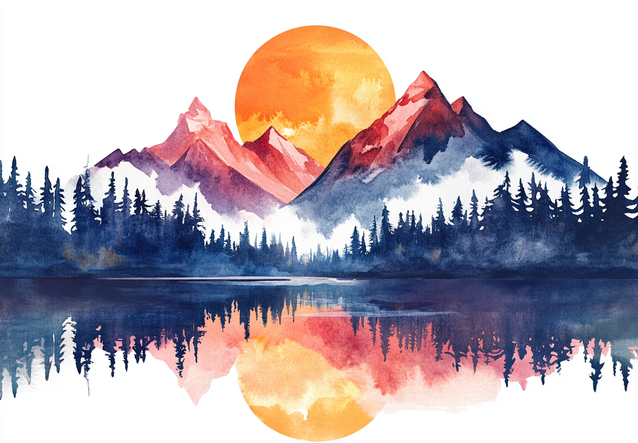
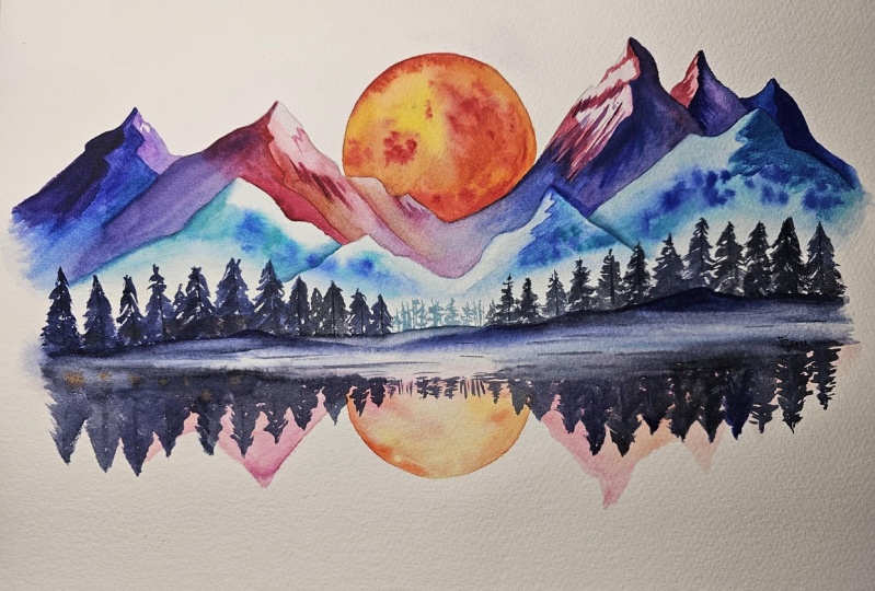
2. Your Project: First and foremost, thank you so much for
joining this class. I'm thrilled to have you here. Today, we're
exploring how to use watercolor to paint a
vibrant mountain scene, featuring the dramatic contrast
of warm and cool tones. What captivates me
about mountains is their sheer grandeur and the way light shifts
across peaks, casting shadows and
creating highlights. This is a great opportunity to experiment with the
interplay of colors from the bold oranges of the sun to the deep blues and purples of the mountains and their
reflections in the water. We'll focus on
creating depth and atmospheric perspective and capturing the
mood of the scene. In the resource section, I've added a high
resolution image of my finished painting
to help guide you. You're welcome to
follow my painting exactly or experiment with
your own composition. As we're going to be focusing on the painting aspect
of watercolor, I've provided templates
you can use to help transfer or trace the
sketch before you paint. It's fine to trace when using it as a guide for
learning how to paint. It's important to
have the underdrawing correct so that you can relax and have fun learning the
watercolor medium itself. Whichever direction
you take this class, it would be great
to see your results and the paintings you
create through it. I love giving my
students feedback. So please take a photo
afterwards and share it in the student project gallery under the project
and Resource tab. I'm always intrigued to
see how many students have different approaches and how they progress with each class. I'd love to hear
about your process and what you learned
along the way, or if you had any difficulties. I strongly recommend
that you take a look at each other's work in the
student project gallery. It's so inspiring to see
each other's work and extremely comforting to get the support of your
fellow students. So don't forget to like and
comment on each other's work.
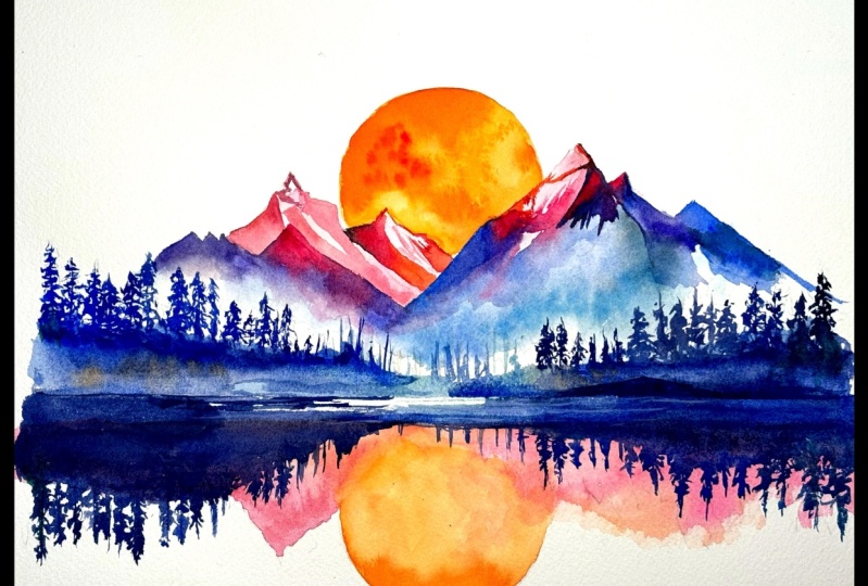
3. How to Sketch It Out: I'm just going to take
you through the sketch and I've darkened the
camera a bit so you can see the lines because I usually draw very lightly so that I can rub away the pencil later. Now, I've started off by roughly
marking out a circle and I've got a template
that I can use later on to fully
define that circle, but it's in the
middle horizontally, and it's in the top
half vertically. Because basically, we're
going to add a reflection. We're going to reflect this
image down like a mirror. For the peaks, I just do a few zigzags at various
heights and various angles, just trying to get a composition
that's quite organic, not necessarily so
precise and clean. It's well balanced,
so altogether, it fits well, but it's quite
uneven at the same time. It adds up together, but it's not symmetrical
horizontally. And then for the trees, I add a few more jagged zigzags, but on a smaller
scale for the trees, and then with this reflection, I try and mirror it
across, as you can see, and I'm doing it very roughly at this stage just to
map everything out. Then we can go back for
a finer pencil later, like I am now to just
confirm what we want to do, where I want those circles to be the sun and the
peaks and the trees, and I can take my
time with that. And then once I've done that, we'll be ready to
start the painting, but you can use the template to get perfectly onto your piece
of paper before we start.
4. Materials & Supplies: Before we get started,
let's go over all the materials and supplies you'll need to paint alarm. Having the right materials can greatly impact the
outcome of your artwork. So I'll go over all the supplies I use for
this class and beyond. They're very useful to have at your disposal and we'll make it easier for you
to follow along. L et's start with the
paints themselves. And like most of the materials
we'll be using today, it's a lot to do
with preference. I have 12 stable colors in my palette that I
fill up from tubes. They are cadmium
yellow, yellow cha, burnt sienna, Cadmium
red, sarin crimson, ultramarine blue, cobalt
blue, cerliu blue, lavender, purple, Vidu black, and at
the end of the painting, I often use white guash
for tiny highlights. I don't use any
particular brand. These colors you can
get from any brand. Although I personally
use Daniel Smith, Windsor Newton, or
Holbein paints. So let's move on to brushes. The brush I use the most is
a synthetic round brush like this skoda Purl brush
or this Van Gogh brush. They're very versatile, because
not only can you use them for detailed work
with their fine tip. But as they can hold
a lot of water, they are good for
washes as well. They're also quite affordable, so I have quite a few
in different sizes. Next are the mop brushes. Mop brushes are good for
broad brush strokes, filling in large areas and creating smooth
transitions or washes. They also have a nice tip that can be used for smaller details. But for really small details, highlights or anything
that needs more precision, I use a synthetic
size zero brush. All brands have them and
they're super cheap. Another useful brush to have is a Chinese calligraphy brush. They tend to have long bristles
and a very pointy tip. They're perfect for
adding texture or creating dynamic lines
in your paintings. You can even fan them
out like this to achieve fur or feather
textures as well. And that's it for
brushes, onto paper. The better quality
of your paper, the easier it will be to paint. Cheap paper crinkles easily
and is very unforgiving, not allowing you to
rework mistakes. It's harder to create
appealing effects and apply useful techniques
like rubbing away pigment. Good quality paper, however, such as cotton based paper, Not only allows you to rework
mistakes multiple times, but because the pigment
reacts much better on it, the chances of mistakes
are a lot lower, and you'll be more likely
to create better paintings. I use arches paper because that's what's available
in my local art shop. A water spray is
absolutely essential. By using this, it
gives you more time to paint the areas you
want before it dries. It also allows you to
reactivate the paint if you want to add a smooth
line or remove some paint. I also have an old
rag or t shirt, which I used to clean my brush. Cleaning off the paint
before divving it in the water will make the
water last a lot longer. It's always useful to
have a tissue at hand whilst painting to
lift off excess paint. Also, you never know
when an unwanted splash or drip might occur that
needs wiping away quickly. I also have a water dropper
to keep the paints wet. When you paint, it's
important to have them a similar consistency to what
they're like in the tubes. This way, it's easier to
pick up sufficient pigment. A hair dryer is useful
to have for speeding up the drying time and controlling the
dampness of the paper. And lastly, masking tape. And this, of course, is just to hold the paper down still onto the surface to stop it sliding
around whilst painting. Also, if you plan on
painting to the edge, it'll allow you to create
a very crisp clean border. And that's everything you
need to start the painting. I suggest you explore and experiment what
works best for you. Now let's get ready to start.
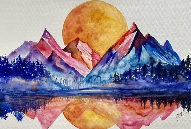
5. Starting The Painting: I'm going to do the majority of this painting with
the same brush, this number 12, Van goof brush, and you can see roughly what kind of size it is compared to
my piece of paper. So when it comes to choosing what size brush you want to use, you don't have to use exactly
the same size brush as me, something that is comparatively the same size depending
on your size of paper. I'm starting off with
painting the sun at the top, so I'm mixing a
cadmium yellow with a bit of cadmium red
to make a nice orange, a very yellowy orange rather
than a reddish orange. But it's completely your choice. You can edit your process as much as you want to fit
your desires and your tastes. You can experiment with both. You can start off with a bit of a yellowy orange and then add a bit more red to
fit your tastes. I will suggest going easy with the red to begin with because
it's a very potent pigment. So if you have a lot of
orange and a tiny bit of red, the red will still
overpower the yellow, so take it with caution and
bit by bit add that red. So I'm basically
blocking out this sun, using the tip of my brush to make sure I don't go
over the mountain peaks. Just to fill out this circle
behind the mountains. And one side, I'm using stronger pigment and
I'm using a bit of water to spread it out. So it's not so strong
on the other side. And I'm being very
careful not to go over that pencil line because
it's that bold sun, that circular sun that really is a powerful visual
impact for this painting. So you can rotate
the canvass around, rotate your paper
around if that helps. I would usually do
it just to make sure I'm making it easy as
possible for myself. But for the sake of recording, I'm not moving the canvas, so you can see a clear
view of what I'm painting. If you're right handed,
it's much easier to paint the left
side of this circle because the curve of the brush and the stroke of the brush can follow
it along the edge. But when it comes to painting
the right hand side, it's difficult to
find that curve, the angle, so you have to
be a bit more careful. So now you can see I'm
adding a bit more red, and I'm going to go into
that sun whilst it's still wet with that red so that it's easier
to control that way. And this is wet on wet
painting at the moment, so we can get a nice
smooth blending of colors. Again, I'm trying to keep it lighter on the right hand side than
the left hand side. We're making it a
bit more dynamic. Because if of course,
we can't see the sun, but we have an idea of what the sun looks like for photos, and it's not an even flat color. It's got some texture on it. Even a bit more red right
in the center there. Then I've got pure
water on my brush and I'm just splatting it
on there, tapping it out, trying to purposely create unevenness inside that to
create a bit of texture. This is one of the
ways we can manipulate the medium and create
these happy accidents.
6. Sun Reflection: While this is slowly
starting to dry, I'm going to start painting the reflection of this
sun down at the bottom. But I'm not forgetting
about that sun at the top because
I want to come back to it as it dries to
create a bit more texture. Whilst we're waiting for
that, that's why I'm painting this sun down below. Using pure yellow this time. At the moment, there's no
orange in there at all, and it is going to
be much lighter for the time being because
it's just the reflection. And as it's the reflection, we don't have to be
too careful about it. It can't be completely
messy or abstract, but as it's just the reflection, rather than the primary subject, we have more
forgiveness with it. So now it's been a few
seconds so we can start dab a bit more trying to feel what
the water color is like. Not just looking
at it, we're kind of seeing how it
interacts as it's drying and determining
what we want to do. I want it a bit
lighter at the bottom, so I'm scraping up some
water from one part and dropping it back off in
a different section. Now we can wait a bit more. And go back to the sun below. You can see on the sun below. I've actually gone
beyond the mountains. I've gone up towards the horizon line because
for this reflection, I don't mind it overlapping. And you can see in
the final image in the resource section, or we can scroll down below
into the description and see how this sun fades as it gets closer to the center
and how it's different from the sun at the
top where there's a clear line between the
mountains and the sun. So when it comes to
starting a painting, I take a good 10 minutes just to figure out the order of
everything I need to do and what's layered and
what needs to be done in a certain time period
and a specific order. We can now move on to the
bottom of the mountains, but we still haven't
forgot about the sun because it's
not completely dry yet, and we must never forget about what is drying until
it is completely dry. So I pre wetted
the paper because I want this pigment to blend out to the
white of the paper. So I pre wetted the paper, and now I'm adding the pigment so that it will
blend out into that white. When I wet the paper, I go far beyond where I
want the pigment to go just so that
it's not going to go to the very edge and
create a hard edge. So now I'm going
back to the sun, and you can see with me
splattering that water, the little circles,
the little dots. And it's a nice little texture. It's quite effective and almost realistic with the way that
the sun actually looks. And this is something that
we couldn't paint with a small brush and take
our time doing details. We're equating details
in an organic way. We're manipulating the
watercolor to do it for us. Trying to paint these
details and textures manually by ourselves
wouldn't be so effective. The magic would be lost
and we wouldn't capture the essence and the ethereal
beauty of watercolor.
7. The Mountain Mist: I'm now moving on wetting the rest of the bottom
of the mountains because I want the bottom
of the mountains to be white because we're
going to paint the trees on top of them and
we need a contrast. We can't have the bottom of the mountains
dark in pigment and then dark trees on top of that because they'd be two
similar in tones, we need to create that contrast. Also, it gives us
an opportunity to convey misty mountains at the bottom, foggy
little mountains. So You can see how I've added a bit more pigment
into where it's wet and how there's
no hard edges. It's just spreading
out nice and softly. We can take our time mixing the colors that we want
and gradually dabbing them in to create these
beautiful textures. And you can explore
whatever color you want. My general strategy
for this painting. What's going through
my mind is to have the sun glowing with warm colors with reds
and yellows and oranges. And the rest of the painting
is with cool colors. So you can experiment with whatever warm colors
you want with the sun, and then everything else can be cool colors
like I'm doing now, so cool colors can be any blue, any purple, and even
any green as well. I'm sticking with
blue and purple here. But as you can see, I've got four different blues in my palette that I might
want to choose from. And I'm sure you have plenty of blues that you can
experiment with too. You don't have to
follow my exact blues. It's always useful to have my final painting as a
reference whilst watching this video and certainly watching the video before
you attempt painting it yourself because
you'll understand why I'm doing certain things. You'll be able to see
which areas are covered up th layers and which
areas you can see in the final product.
8. Soft Vs Hard Edges: We're going to have a
lot of hard edges on the top half of these
mountains close to the peaks because there's going to be a bit of
contrast with where there could be possibly snow
or sharp rock formations. And that will
contrast nicely with the soft misty effects that we're going to
create at the bottom. I'm mixing a grade blue here. So I think I used turquoise blue and adding
a bit of black in there. And you can see by watching this the
consistency of the pigment. You can see how it
slowly blends out, and you go to try
and match that. If you're dabbing it on the paper and it's not
reacting the same, then you either have to add more pigment or you either
have to add more water. If it's not working the same, try not to continue until
you've worked it out. It can take trial and error. You can take some
time practicing on a separate piece of paper. Wetting the paper and testing
out the consistency of the pigment before
you actually put it onto your painting just to
make sure that it's right. And then through trial and error and a bit of
time and practice, you'll automatically feel what's right in your palette
when you mix it. You'll know that is the
consistency that you want, and you'll know how
that will react. You can't expect
yourself to do that as a beginner, and that's fine. I was there, and
it takes a lot of time to have it
automatic in your mind. But It's what these lessons
are about to have a bit of fun exploring different subjects and different teachers
have different techniques, and it's about combining
everything that you know to create your
own unique paintings. And that's why it's
so fun to look at the student gallery to see
the range of what people have learned and their own tastes and influences There are
different color choices or different texture decisions. One of the important
keys to watercolor is timing and it can be quite elusive and quite
counter intuitive. Especially when it comes
to wet on wet painting. We have to think about how the pigment will react with
the water as time goes on. So I'm just dabbing in, for example, pigment now, and even though it
looks like a line, for example, I know in
less than 5 minutes time, maybe 2 minutes time or even less it's going to blend
out like it is now already. And there can be an urge
to help it blend out. You might use the brush to
spread it out a bit more, but you have to use patience and remind yourself that
if the paper is wet, then the pigment will be drawn
out in a matter of time. And if you do force
it to spread out, then it'll probably spread
out a bit too much. It doesn't always need the encouragement that
it looks like it does. And of course, the wetter, the paper, the faster and
further it will spread out. It's more about preparing
the paper before you apply the pigment rather than moving the pigment once
it's on the paper. Of course, you can move the pigment want
this on the paper. But that's I think of
that more as a backup. The way I try and think about it and the way I try and plan my paintings is to put my paper in the state
I want it to so that the pigment
reacts the way I want it to when I
put that pigment on. I'm not sure if that's
simple thing that I'm overcomplicating or
a complicated thing that I'm trying to simplify. But Basically, it is at the
end of the day watercolor. So it's all about
controlling the water, not so much the pigment. And the paper is the way
we control that water. And that's why it's important to ideally get the best
quality paper you can because the level of control you can have on the paper
is that much easier with better quality paper.
9. Controlling The Water: So as you're watching me paint, try and see how rather than
trying to manage the pigment, I'm actually trying to manage
the water because it can be quite counterintuitive
to look at. It looks like I'm trying
to focus on the pigment, but I'm actually focusing
on the interaction of water because I know that's actually what manipulates
the pigment in the end. When I do mess around
with the pigment, it's because I'm trying to refine what the water
couldn't do for me, or any mistakes that
are not ideal for me. And by that, I mean that one of the main philosophies of watercolor is that it's
all happy accidents, and you're trying to
create the magic of the medium by allowing
watercolor to do its thing. So and every now and again, these happy accidents
aren't so happy. So you do have to interact
with them sometimes, but When I look at my favorite paintings from
other artists or even my own. It's always the one that
has the happy accidents in and has those watercolor effects that I didn't
directly do myself, but the watercolor somehow created through the mix of water and pigment and the
interaction that they have. So now we've pretty much finished with the bottom
of the mountains. I'm going back to
this sun reflection and building on a
bit more pigment there because it's
a bit too light. Here, I want to have a mixture of soft
edges and hard edges. So you can see how I'm
blending some areas out, and then other areas
have that hard edge. There's basically four
sections to this painting. We've got the top sun. We've got the mountains. Then we've got the reflection, and then we've got the trees that go on top at the very end. And there's a reason I
paint in this order because the sun is a lighter
color than the mountains. So it doesn't matter if we paint over the mountains because the mountains
will be a darker color, so we can go over
the top later on. Likewise, with the
reflection down below, we can paint that underneath
the trees because the trees are going to go on top at the end with
the darkest color. And that's also why I painted the misty effect on the
bottom of the mountains because it's lighter in
tone than the peaks. The peaks are going
to be a darker tone. So we're going to
paint over the top of that and create a smooth
transition into them. Now, going back to
this sun, originally, I said that I wanted a bit of
hard edges and soft edges. And I didn't like the way
the hard edges were looking, so I've softened them out a bit, and I think I'm going to
even it up a bit more.
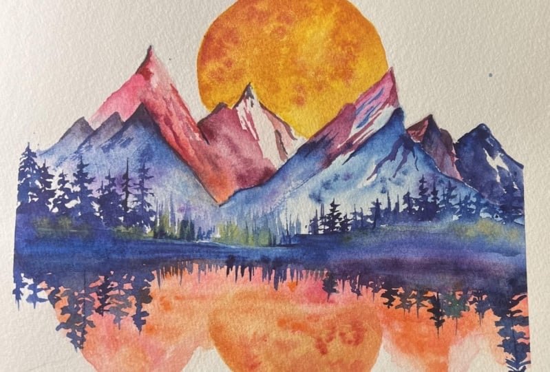
10. Mountain Reflections: Now I'm picking up a bit
of a lizard crimson. I think there's still
a bit of opera pink leftover in my palette, which I'm quite happy
with because I think that adds to the color
scheme quite nicely. And I'm painting the
reflections of the mountains. Keeping them quite abstract because the trees are going
to cover most of them. I just want a bit of
this pink or light red to come through
behind the trees. So I'm trying to mirror what the mountains
look like above, and I used the pencil lines, of course, to help guide me. I made sure the drawing
was pretty correct. And the good thing
about these reflections is that they don't have
many details on at, unlike the mountains at the top, where we're going to have to add a few highlights and shades. We don't have to do that here. We're just keeping it
one block of color, and mixing it into the orange
as it blends into the sun. A few dabs of thicker pigment, and it's going to blend
out quite nicely. Now, that looks
quite potent to me, so I can start
drawing it out and making it a bit weaker as
we draw it out a bit more. Using pure water just
to spread it out. We don't have to put too much
fort into this because it's just a subtle area. A area that doesn't have
that much attention. Just have fun experimenting with colors and exploring whatever
you want to explore. Because most of this will
be covered up by trees. So in that respect,
it's quite liberating. And it's in these moments that you can learn a
lot about water color because there's less risk in these moments because
we're going to cover it up, so you can really be extreme
of your textures here. As long as you keep the tones quite light and
not overpowering, you can be as free
as you want with these textures because
they're reflections. So maybe the water is turbulent, and that's what
creates the textures. So there's plenty of
freedom for being playful.
11. Mountain Underlayer: Reflections can be
tricky to paint, but with this painting, we're simplifying
them quite a lot. So they shouldn't
be too challenging. The key is getting
them to pretty much mirror the shapes and colors from above
the water line, but with some
subtle differences, and that's where we can
be a bit more playful. The reflections ideally have softer edges compared with
the objects being reflected. As water naturally blurs and distorts the image,
we've got this freedom. I'm using a tissue
just to lighten up and soften some
of these edges. And then going back
in again to smoothen out and blend some
more of that area. Now I'm going to wet
my brush and apply a few splats to create a
few speckled textures. And then I can use a hair dryer
to completely dry it out. But only if I know that the paint won't run
out onto the paper. I only use the hair dryer when I know that the water is stable. Now I'm taking that same
pink, light red color, and just doing the underlayer
for the mountain peaks. Now, this is pretty much
covering all of them, but the reason I'm not
painting everything is because I'll be going over
the other areas with a much darker
pigment anyway. So I don't need to paint
all of it in anyway. But basically every area
that I don't paint over later will have this
light pink hue to it. And you can see the final image to see what I'm
talking about there. I don't want there to be any white of the paper
on the mountains, so I'm just adding a little light under
layer at the moment. And then I can softly
blend out at the bottom. Being careful not to paint over into the
orange of the sun. Same again on the other side. You can see that I've
placed the sun centrally, which gives the
composition balance, and this placement draws the eye directly to the
middle of the painting, and it creates a
focal point that radiates throughout
the whole scene. And the strong verticals of these mountains and
their reflections lead the eye up and down, which helps reinforce
the balance of the composition and
makes it quite captivating. On this last peek, at the end, I've made it a bit darker because I'm going to come back with even darker
pigament there, so I want the
underlayer to be even darker so that it
matches its contrast. And we can dry that again. When that's completely dry, we can start painting the
details of the peaks, which play a central
role in the painting. It's important to
think about how light interacts with the rugged
surfaces of these peaks. I'm starting to use
sharper brush strokes and a more defined edge to capture the craggy uneven
nature of these mountain tops. I'm just using a
clean brush just to soften up this edge here
because it was a bit too dark. So going back to the peaks. The light source in this
painting, obviously, the setting sun has a nice
warm orange glow obviously. So the tops of the peak are going to be a warmer color
to the bottom of the peak. That's why it's redder
towards the top and more purple and
blue at the bottom. And in some areas, we're going to have a nice
smooth transition between this red and purple and blue.
12. Using Tones: And of course, the tones help convey the form of
these mountains. So the darker areas will be further away facing
away from the sun, and the lighter areas will imply that the
cliff faces or the mountain faces
will be reflecting more of the light of the sun
depending on their angle. If you want, you can experiment
with a bit of dry brush. I haven't really used dry
brush yet in the painting, but that could help create a sense of texture or
form if you wanted to. And that's achieved
by lightly dragging a brush over the paper to leave broken textured lines that could suggest a
rough rocky surface. And that again could
contrast well with the misty technique that we have used at the
bottom of the mountains. I haven't felt that necessary. But if you want to try that or add that
into your painting, if that's what you
like or prefer, then that will be
fantastic to see. If not, you can follow along
exactly as I'm painting. I like the contrast
of this pink against the purple because some areas
there's a soft transition, and then here, there's a very hard transition between
that pink and the purple. It's important to
use a brush that has a very fine tip for
these little details. And you have to hold the brush
vertical like I'm doing. And that unfortunately means that my hand is
obscuring the camera. At the moment, I'm
still basically painting the under layer
of these mountain peaks. I'm getting the lighter
tones in there. Well, actually, if you remember, we did these lighter
tones very first, and now we're doing mid tones, and then we'll come back after this with even darker tones. So it's important to get these shadowed
sides of these peaks. I'm using deeper colors
for these because they contrast and contrast
is everything, having the mix of hard
lines, soft lines, warm colors, cool colors, light tones, dark tones. It doesn't only enhance the free dimensionality
of the mountains, but it gives the impression
and the feeling of cool shaded areas areas where the sun's
light can't reach. And then there's some
areas that are warmer that give the feeling
of the sun's rays. I'm just drying this section now because we're going to go back and paint
these shadows next, and I want to control
my blending of them. Without having to interfere with paper that's already wet. Because if it's already wet, it's out of my control. But by drying it, I'm
back to a neutral state, and I can control it again. When applying the shadow colors, I try to focus on creating soft transitions between
the light and dark areas, and I'm of course using
a slightly damp brush to blend any edges or
avoid any harsh lines. Of course, I want the borders of these shadows to be defined. But as you can see now, I'm blending this red color with the dark to create a
nice, smooth transition. I've just wet my brush just
to help with that transition.
13. Brushstroke Variety: So whilst painting these peaks, let's consider the
variety of brushwork. At the moment, I'm using
smaller more precise brushwork, because, of course, there are ridges and crevices
of the mountains. And these details are crucial in conveying the scale and the
majesty of these peaks. And by adding
little tiny touches of these darker tones along
the edges of the ridges, you can suggest depth and
the play of light and shadow across this
rugged terrain. Of course, it's important
to remember that not every peak needs to be
the same level of detail. Some peaks closer to the viewer, should be more detailed and more subdued for the ones
that are further back. This also helps
maintain a sense of depth and keeps the
focus on the foreground. I'm deliberately
keeping some areas softer and less defined to let the viewer The viewer's
imagination fill the gaps. And this can be very effective than just painting everything
with detail explicitly. Allowing the viewer to
finish the painting in their own mind is
something that is very powerful and It's what actually makes a
captivating painting because it draws them in, and it's making it
more interactive. If you do every single detail
as perfect as possible, it takes out the
imagination and the fun. If you're painting it
exactly like the photo, then there's no point of painting it because
it's just like the photo. The whole point of
painting it is to capture some magic and something
beyond just the photo. That's why often
great photos aren't necessarily the best
things to paint because great photos are great
in their own way, and they have their
own strengths, and paintings have a
different spirit to them. They're more llive. Of course, there's a huge amount of talent in realistic
painting, realism. But even with the
realistic painters, they have this talent to capture emotion in their realism that
goes beyond a photo. You can see as I've
painted these details, a lot of them are following
the angle of the mountain. So you can see that the lines
are generally following the direction that the
mountain goes down by. But I have a few lines that
counteract those lines. They contrast with them, just to keep them interesting. Dry the painting off
completely again, because we've painted
the light tones, we've painted the mint tones, and now we're going back
with the darker tones. So I paint from left to right
because I'm right handed. I don't want to smudge what I've already painted when
the paper is wet. But if you happen
to be left handed, you can paint the
other way around. Now I'm going to try
and merge these tones with that misty mountain effect we've done in the valleys. To do that, we're
going to have to be careful and not have too much water on our brush.
I'm going to clean it off. And I'm just going
to roll my brush. You can see I'm rotating
it along, actually, twizzling it around
in my fingers, to have that soft edge. I can even draw some water out. You can see I've got
a sponge up there that I used to take
excess water off.
14. Layering: So these mountains are a good example of layering and how we can use them
for our benefit. It's allowed me to
introduce subtle variations of color and texture, and it adds a bit of complexity
to the painting or at least the ion of complexity
because really by laying, we're breaking things
down into simpler steps. You might notice
different hints of blues and purples in the
shadows of the mountains, which we're achieving now by glazing over this purple over the blue that's underneath. And this wash of
contrasting color adds a richness and
makes it quite dynamic. It doesn't have to be
these certain colors. Like I say, it's your
choice to experiment. You can see that I've
basically got colors. Fundamentally, I've
got four colors. I've got my orange, even though I mix my
orange from yellow and red, it's still orange. Then we've got this pink or this light red alizarin
crimson color. Then we've got purple,
and then we have blue. We've got these four colors that because we're implementing them everywhere, we're
mixing them around. They're all related to each
other one way or another. They had this nice harmony. But when it comes to painting
yourself, of course, you can follow as
closely as you want, but maybe you want to
mix the colors around. Maybe. Instead of blue, you want to use took aways
green or instead of pink, you want to have yellow cha. It's a nice opportunity to
explore your favorite colors. And in fact, if you
think about it closely, the colors that I'm using
are all primary colors. They're all mixed
from primary colors, so you've got the orange, which is red and yellow,
which, of course, are both primary colors,
and then you've got blue, which is a primary color. Purple is mixed
from red and blue. It's all a combination
of primary colors, just the three main colors. And there's so much you can
do with primary colors. If you look at my palette, I have four different blues, three different reds and three different yellows,
because of course, the primary colors are
blue, red, and yellow, and different types of red, different types of blue,
and different types of yellow can achieve
different colors. And once you can
mix all of those, you've pretty much got the whole spectrum in your palette. Introducing some blue
into this section now, Blending it into that pink. Then we can soften
it out so that it blends nicely into the bottom
part of the mountains. When painting sunsets, it's
important to think about the effects of atmosphere
on the colors we see. As the sun gets
lower in the sky, the atmosphere scatters light, and It does it in
a way that makes distant objects seem
bluer and less defined. This scattering of light also gives the sky its
warm glowing colors, especially near
the horizon where the light travels
through more atmosphere. One key aspect to focus on is the gradient of
colors in the sky. During a sunset, you often see a smooth transition from
deep blues to warm oranges, pinks, and reds closer
to the horizon. Of course, with this painting, we're not being so
natural with our colors. We're exaggerating
them quite a lot. We can have fun and we don't
need to follow the rules. But If we blend these
transitions carefully, we can achieve quite a
natural, convincing effect.
15. Dark Mountain Tones: L Right now, you can see I'm really
putting on dark tones. The darkest tones
on the mountains. These are going to
be a similar tone as the trees were
going to paint later. Notice that I haven't
put this dark tone on the left side just on this
major mountain on the right, because this is the
mountain closer to us, so it has more contrast. Like I was saying before, with the scattering of light, the closer objects
are more defined. So this has a higher
contrast to it. And what I was
touching on before, another element to consider is how warm colors of the sunset reflect onto the
objects in the landscape, like trees, or if you're including buildings
or even the water, this reflected light adds a cohesive warmth to
your entire scene, and it helps unify
the color scheme. While the colors
during a sunset can be very vibrant and
highly saturated. It's important to balance
this intensity with areas of low contrast and some
not so vibrant colors. At the moment we're painting
very vibrant colors. But when it comes to the trees, we're going to start
using grade out colors. I'm going to put a bit
of black into my blue. In fact, I think I will add
a bit of black into my blue when we paint the last peak
on the right hand side. The areas around the sun
might be the most vibrant, but as you move away from it, the colors should gradually
become less intense, and this helps
avoid overwhelming the viewer and maintains a sense of harmony
in the painting. These are general rules, but They don't have
to be overthought. O thinking can ruin a painting. It's just things to
possibly bear in mind. I can feel myself in painting,
sometimes overthinking, and I go through cycles
of overthinking, and then I have to react to that by being spontaneous
and playful again. Back to what we're talking
about with layering and how it helps create
depth in a landscape. Paintings can of course
be done without layering, but it does allow us to
build up the scene gradually and giving us more control over the intensity or texture
of each element. It makes the painting
more manageable because it gives us control
of the pace of the painting. It helps us reveal details
slowly, not all at once. Depending on the effect
that we want to achieve. I really enjoy painting scenes like this because
there's a real sense of freedom about them
and they're not strict and they offer
endless possibilities. Some things that are
a bit more technical, don't give you as much freedom. It's one of those paintings
that can really draw you in, and especially when it comes to the painting trees and the illusion of perspective
and atmosphere. You really want to
enter the scene. You want to walk
around these trees, girt the mountains,
see the view. Of course, it's just a painting, but it just gets your
imagination going and gets me excited to
paint these things.
16. Starting The Trees: And of course, I like
to mix up what I paint. I don't always paint
the same thing. One week I might be
painting a mountain scene, the next s painting an animal, then a flower or a portrait. I like to explore different
things all the time. Many people specialize in
one thing and focus on that, and I admire them for
that because they have commitment and
endless enthusiasm for painting certain subjects. I get very excited about certain things and then want to move on and paint
something else, and eventually, I do come
back to things a lot, but All different
things excite me, and that's why I
like to experiment with different techniques and different subjects all the time. And I don't really have
a signature style. We've finished with
the mountains now, and we're moving
on to the trees. I've mixed this slightly
grayed out blue. It's blue with a
tiny bit of black, and of course, it's your choice what kind
of blue you want. I'm Marne blue with a little
bit of purple in there. It's important to keep a few
white gaps in these trees. The more time you spend on them, the better they will look, but sometimes it is a challenge to have
patients in a painting. But then again, sometimes there is a time and a place
to rush things because that rushing adds
to the spontaneity and actually creates a lot of interesting effects because
it's less about thinking. It's more about doing. It's being impulsive. And that's kind of
what I'm doing here. I'm not thinking so
much about and I'm being quite impulsive
with my brushstrokes. I'm swiggling them around, trying to leave a
few white gaps. I'm basically painting a line at the top and then squiggling all the way
down to the bottom. Now, you could
take your time and individually paint each branch. It might look better doing that, but it would certainly
take a lot more time. The trees may lo better. But as a whole,
maybe ironically, they'd be too detailed
and they wouldn't fit in. They wouldn't be cohesive in the style of the
rest of the painting. They have to have some kind
of simplicity, nat to it. I add these lines just to
mark out where they are. At this stage, I'm
already losing a bit of patience
with these trees because it's quite a repetitive thing
adding all these lines. But it's worthwhile in the end. I'm trying to speed
things up now, so I'm just applying thick
pigment at the bottom. And then I can work
my way up from the bottom rather
than the top down. H
17. Tree Heights: Also, not all trees
have to be equal. You can paint four or
five accurate trees, good looking trees, and the rest go unnoticed and they have their
illusion of detail. Much like everything on a
bigger scale in the painting, you don't have to
paint everything with detail. In fact, you shouldn't. Painting a few
things with detail, give the illusion that the
rest of things are in detail. So you imply the detail
rather than paint the detail. That's what I've done here. Few of the trees are
nicely done or at least, better done than the
rest of the trees. Some of the trees
are very abstract. Just a simple line in squiggles. And try not to keep all
the trees the same height. In fact, I'm trying
my hardest to keep them all at
different length. And not only a different length, but a random length,
so to speak. They're not all gradually getting smaller or
gradually getting. They're all dotted around
at different heights. And we do this for two
reasons because in nature, in real life, no, no set of trees are perfect. They're not all the same height. There's a lot of
randomness in nature, so you've got to apply that
randomness to your painting. And the second reason is that we're going to paint
these reflections later. By having a few more trees
higher than other trees, we're going to paint their
reflections and it'll be easier to match them. And having the trees at different lengths will make the reflection look
that much better. Because if they're flat, it might not look
like a reflection, look like a bundle of trees. But having the mirrored effect and the different heights of those mirrored effects really improves the illusion of
a reflection on a lake. Now I skipped
painting the middle and I painted the trees on the right hand side and
now two thirds along. I'm adding a bit
of dry brush here. And now pure water. I'm going to speed
things up now. I've got the pigment that's
basically dry on the left, and now I'm painting thick pigment on
these trees and I'm going to blend it
into the water below. Still I've got the pencil line of where that water line is. And by water line, I mean the actual lake, not the water that we're using. I want there to be a clear line, horizontal line going
straight across the paper, where the reflection will start. And now I'm painting the
trees from the bottom up. You can see I'm zig
zagging my brush strokes, twirling them around,
gradually building them up. Maybe put the brush strokes
bit too large here. A, it's important to keep a few white gaps
underneath going through. Now you can see how the
white of the paper where the misty mountains of the
valleys create that contrast. If we paint those mountains
all the way down, then there wouldn't be
that strong contrast and the trees would
be harder to see.
18. The Distant Trees: So we've basically almost
done the trees on both sides, and in the middle, we're going to do them
slightly differently, because we've used very thick pigment for the trees so far. For the trees in the middle,
we're going to have to add some perspective,
add some depth. To do that, we have
to paint them a bit lighter because
the atmosphere in the air will make them
lighter because of the particles they build
up over a longer distance, so they look lighter, less
light travels through. And maybe possibly
some of the mist from the mountains going
through the trees. So that's why we paint
them a bit lighter. On the left hand side, the
pigment is completely dry. So I just sprayed
some water on there. It might have been
difficult to see because it was
slightly off camera, but I used my water spray
to reactivate that pigment. So now I'm painting the trees in the middle using a
lighter pigment. Painting down to
that pencil line. And actually, these trees
are a lot easier because I'm just literally single
stroke lines upwards. I'm not even painting
branches with those. Flicking my brush up. So I'm reactivating the left, really agitating that pigment, so there will be a
nice transition. And then we're gradually going
to connect the two sides. Going all the way up
to reach those trees. We don't want there
to be a hard line, so we have to scrub away
at the dry pigment a bit. Now I'm adding a bit
of green in here. A little bit of green and
transitioning those trees, these little single strokes, which give the ill of trees. Flicking and brush up. Just like that. Now, in the areas
that are wet on the sides and not so
much in the middle. I'm just flicking a bit
of orange because it's the complimentary color to blue. What these orange slats will do is neutralize some
of this color, make it slightly gray. And like I was saying before, having a bit of monotone, a bit of grayness
in the painting, makes the other
colors really pop. Because vibrant colors, of
course, they are vibrant, but what makes them more vibrant is having a
gray next to them. So quite subtle, but
they do do a bit. They add a bit of contrast and make those vibrant
colors pop even more. Now, I've painted to
the water line as a check mark to keep
it nice and even. But when it comes to
painting the reflection, we will blend it out a bit, and that will be clearer and
more obvious as we go along. So I've dried the paper now, and now we can start thinking
about the reflections. Some of these trees are making a bit and I'm matching them, and making them a bit more obvious down below
for the reflections. Using a single line
at the moment. Actually, before we go
on to the reflections, let me just add another layer
of tone in the middle here. I want to make it a
bit more dynamic. By that, I mean, I want there to
be dark on light. I'm adding a bit of
darkness onto the light, and then on the other side, a bit of light on dark. That again, helps add to
the illusion of depth. Then I want there to be a bit more of a transition between the detailed trees and
the single line trees.
19. Starting The Reflections: Now, in my palette, I'm going to mix
a lot of pigment, get a lot of water mixed and get a big pool of pigment because we're going
to paint the reflection. Now, I want the water
to run down evenly. I want it to run down into
the trees rather than run up. I'm just rolling a little towel
and placing it underneath my canvas at the top just so that the gravity helps
the water roll down. And what I would do if
I wasn't filming this, I would rotate my painting
to the side so that I can match I can make
it symmetrical. I can make the trees
symmetrical with their different heights.
You're welcome to do that. You can just look at
each individual tree and paint them the same length,
but on the different side. So now I've painted that
section by the water line, and now I'm going up from the trees from the
bottom to the top. And these trees that
I'm painting on the reflection are
much more abstract. I'm doing them much faster
and less deliberate and trying to fill in the spaces a bit
more because of course, the distortion from the water, the ripples on the waves will make them less clear anyway, so they don't need to be
as defined as the top. The important thing is
to match the heights. And you can see now
as we're painting over this pink underlay, why it wasn't important to put any details into that pink because so much of
it is covered up. But having that pink
underneath does add to the co, does affect the color, which is n. So we still had
to put it there. Also with the reflections, I'd like to add that they are darker than the
actual trees above. Something about the
reflections are just nicer when they're darker. If you want to keep
a nice water line, you can actually use a
bit of masking tape. I didn't use masking
tape, as you can see, but if you're less confident with keeping
a straight line, you can just to add a long strip of masking
tape along there to keep that horizontal line parallel with the
borders of the paper. Just like before, the
reflections should be much more liberating than how
we painted them up top, because they don't need to be
as detailed or as accurate. So we can paint them faster. And as these trees
are getting smaller, the reflections are
getting smaller. We're not going as far out. Again, we're trying to match the same height of the trees. Using the tissue just to
clean up any water marks. So look above at the trees and try and match
them, paint them down. That's why it might be easier to rotate the board to the side.
20. Mirroring The Reflections: I've left a few lines there
with the white of the paper. I might come back to them NATA, I might not. We'll see. As the water gets
closer to the middle. The ripples are
more concentrated. So the lines get a bit finer. The water is very
still on this lake, because there's hardly any
ripples at all, if not any. We will add a few ripples later. As the painting once we've
painted all the trees, then we'll start a plying a few horizontal strokes just to get the illusion
of some ripples. And that's the left side done, now we've just got to do exactly the same
on the other side. Starting with those single
stroke swipes of the brush. Picking out the most
obvious trees and then working either
side of them. That's how I do it. You don't necessarily have to
do it the same way. You can do whatever feels right. That's how you learn intuitively
what's right and wrong. You can test things
out yourself, and if things don't work
out, you now know that. You can work on trying things in your next painting and little by little,
everything comes together. You can see how the water just blends out into the
wet areas there. Now I'm trying to
agitate that pink line because it's a bit too
hard and it's dry, so really trying to agitate it and smooth it out and then
connecting it with the top. Smoothing that line on
the other side too. Now that we have painted
the trees on that side, we've got a reference
point for our reflection. We had to have that
water line before so that we knew where
the middle was, and we could use it to measure the reflections on both sides. But now we've got an idea
of where that line is, we can blend it out. I'm going to make it quite
a lot darker on this side. Mainly because the mountains above are a lot
darker, aren't they? So I'm adding a bit of a darker pigment on there
to mirror that mountain. Even though we're not actually
painting the mountains, the mountain reflections, we're just painting the
tree reflections. Compositionally the tones make more sense that way because
we're mirroring the tones. Flicking a bit of
water on there. Adding a bit of green actually, like we did on the other side. Just a touch of green on
the trees because after all, trees are green. Barely noticeable though. If we painted all these trees green, it wouldn't look right. But there's something
about adding a little of color such as green that
adds a bit of interest, but doesn't take
over the attention. And green is next to
blue in the color wheel, if we're going to
add green, it makes sense to put it with the blues.
21. Finishing The Painting: Again, not being shy to use
very thick pigment here. Because it's all elusive anyway. The reflections are
just suggestions. The viewer can fill
in the details or use their imagination. Even if it's subconscious, their eyes will be looking at it and imagining what it is. Maybe it's a river bank or a
island or a body of water. Is what keeps it mysterious and magical open for interpretation. After you've put in
too many details, all the questions
have been answered, and there's no mystery anymore. So it's about
finding the balance between abstract and detail, how far you can push
the abstract while still keeping the
painting cohesive. Sometimes it works,
sometimes it doesn't. For me, that is
definitely the case. There's so many paintings that I overdo it with the
abstract elements, or sometimes it's the other way. Sometimes I just overdo it with the details and the
magic has been lost. It's never somewhere that
you arrive at with painting. Sometimes you feel like you've mastered the
watercolor medium, and then the next
week, you've lost it. And then when you've lost, you think you're going
backwards, somehow, the watercolor shocks you and you end up with
somehow a masterpiece. Just the watercolor happen
to have a good day that day. So never take a
painting independently, I used to hear at
our school that you're only as good as
your last painting, but the more I paint, the more I realize that
that's not the truth. It's more of a journey, and
sometimes you have good days, sometimes you have bad days, and that's just the way it is. So I'm adding this
lavender watercolor now. It's very opaque,
as you can see. It's going straight
over the dark areas. But because my painting
is not so wet anymore, It's going to keep its form. It's not going to blend out, and these are the ripples
of the water now. There's a lot of atmosphere in those trees, a lot of mystery. A lot of adventures
going on in there. And the colors that I, I chose them because
they're not natural. I wasn't looking
for natural colors. There's something dream
like about the colors, and that's what I wanted to
convey with this painting. In these classes, I try my best to demonstrate my techniques, and you can see them and
practice them yourself. But successful painting
goes beyond technique, and it's about your own
vision and your own insight. That's what makes it
truly magical and unique. So you can take these things, you can practice them
as much as you want, and then try and adapt
them to your own vision. Because everyone has
their own experiences and their own insights, and it's those elements that will really take your
art to the next level. But of course, you need to
learn the techniques first. But as soon as you feel ready, encourage yourself to
explore your own intuitions.
22. Final Thoughts: Welcome back and
congratulations on completing this watercolor class on
painting a mountain landscape. I hope you enjoyed
the journey as much as I did guiding
you through it. From depicting the
towering peaks to capturing the gentle
reflection in the water, we explored what makes mountain
scenes so captivating. Throughout this class, we experimented with various
watercolor techniques, from blending warm
and cool colors to creating bold contrasts
of tone in the landscape. Each technique played
an important role in developing depth atmosphere and a sense of tranquility
in our painting. Remember, watercolor painting is not just about technical skills, but also about expressing your creativity and
personal style. I encourage you to continue
exploring, experimenting, and pushing your
boundaries to create your own unique
watercolor masterpieces. As we come to the
end of this class, I hope you feel
more confident and comfortable with your
watercolor painting abilities. Practice is key when it comes
to improving your skills, so keep on painting
and experimenting. I want to express my gratitude for each and every one of you. Your passion for watercolor
painting is so inspiring, and I'm honored to
be your teacher. If you would like feedback on your painting, I'd
love to give it. So please share your painting in the student projects
gallery down below, and I'll be sure to respond. If you prefer, you can
share it on Instagram, tagging me at Williston, as I would love to see it. Skillshare also love
seeing my students work, so tag them as well
at Skillshare. After putting so
much effort into it, why not share your creation? If you have any questions
or comments about today's class or want any specific advice
related to watercolor, please reach out to me in
the discussion section. You can also let me know about any subject wildlife or scene you'd like me
to do a class on. If you found this class useful, I'd really appreciate
getting your feedback on it. Reading your reviews
fills my heart with joy and helps me create the best
experience for my students. Lastly, please click
the follow button up top so you can follow
me on Skillshare. This means that you'll be
the first to know when I launch a new class
or post giveaways. I hope you feel
inspired to paint more beautiful landscapes
in this amazing medium. I look forward to
seeing you all in future classes until
then, happy painting.
 Will Elliston, Award-Winning Watercolour Artist