Transcripts
1. Intro: Summer's here. With its arrival comes abundance, plants, flowers, color, magic, inspiration. Maybe you've guessed that summer is my favorite season. I'm Anne Butera. I delight in my summer garden, and the endless inspiration it brings from my botanical watercolors. Summer also brings the lightness, and ease. Barefoot afternoons, picnics, play. Summer is the perfect time to pack up your art supplies and head outside. I invite you to come with me, come and connect with the natural world. Look around with curiosity, with wonder. Bring your sketch book, a journal, and slow down. Be present, and reconnect with your creativity. Let go of perfection, let go of judgment. Experiment, play. Each lesson in this class is another invitation to connect, and create, to loosen up, to have fun, to ask, what if? As one idea sparks another, we'll sketch and we'll paint, but we'll also explore other media, other ways of creating directly from, and with nature. I'll even invite you to take the simple practice of line drawing, off the page, in some unexpected ways. Our finished sketch book pages will be a nature journal. Yes, but there'll also be reminiscent of a vacation scrapbook, a record of travels, even if only is close as just step outside your window. Creative adventures awaits. Are you ready? Then let's get started.
2. Packing for Art Adventures: One of the things that will help us get into the mood for an adventure is packing our art supplies in a fun way. I am using an old picnic basket for my traveling studio, and I found this at a thrift store. I want you to look around your home and see if we have baskets or maybe you have old backpack, or tote bag, or cooled suitcase that you could use to take your supplies with you. You can fill your traveling studio with whatever supplies that you want. Also, it's fun to have things like a little sketch lap desk like this, a little board. This has a hinge to hold onto your paper, your sketch book, and a rubber band. You could just use your sketchbook itself to work in, you can use a table, use what you have don't worry about getting specific things, but if you have something like this, this is great. A sketchbook is the most important thing for you to have, I've got a couple here. One is better for drawing, the other one I'm going to use to attach little bits that we create outside of the sketchbook. It's nice to have a journal, I'll talk about that more in a little bit. Will be getting some prompts in the handouts too. The zipper pout is great for carrying your writing instruments, I've got some colored pencils in here. A tin is also nice because it keeps things safe like your paintbrush so the tip doesn't get smashed. A paintbrush alternative is this water brush, the water is built in so you don't have to carry a separate container of water. This jar is watertight, so you don't have to worry about it spilling. Paints are good to have as well. This is watercolors, and scissors, tape, photo corners, glue. Those are all great for attaching all your bits and your sketch book. We're going to be doing some sun prints later, so I've got my son print paper here. Those are a few things that I have in my basket. Fill up your traveling studio with whatever you have on hand and whatever is most inspiring to you. I hope you'll get some more ideas throughout this class, and maybe your imagination will be sparked and you'll include even more things. In the next lesson, we're going to be spending a little time communing with nature and talking about some sketchbook philosophy. I'll see you there.
3. Sketchbooks in Summer: What I love most about sketchbooks, and particularly sketchbooks in the summertime, is how they offer me almost a vacation from my more serious art-making. They're place to experiment, and play, and have fun. I hope more than anything else this class will spark your creativity, spark your imagination, and help you begin to play an experiment. Don't feel limited by any of the lessons in this class. In fact, I hope that they will give you a jumping off place for your own experimentation. The other really important thing that I hope you'll take away from this class is creating with and from nature. I'm going to be doing most of these lessons right out here in my garden. Sometimes it might get a little noisy. We'll have visitors like that bee and the robin that's been singing here in the garden with me, and that's wonderful. That's one of the things that I love so much about being in my garden that I get to connect with nature. In these lessons, we'll be connecting nature directly with our creating. Even if you don't feel like you are a good artist or you don't have confidence drawing or painting, we'll work up to that. We'll do some really fun things in our sketchbooks that will give you a chance to experiment and play and have some cool results too. Something else that I'd like to encourage you to do, is just to spend some time outdoors, sitting quietly, observing what's around you. If you can't get outside because of where you live or your situation, then you can sit by a window and look outside. Maybe you have a hummingbird feeder, something like that hanging outside of your window and you can watch nature that way. Maybe you have a plant in your window or a window box or hanging planter. Spend some time connecting with nature in whatever way you can, whatever way works for you, even if it's just through pictures or maybe watching some videos online. Then maybe spending some time with a journal and writing down your observations, be really present. In the handout, there are some prompts that you can use for your own journaling practice if that works for you. If that doesn't work for you, that's okay too. Now that we've got our bags packed, I hope you're ready to embark on some adventures. In the next lesson, we'll get started. I'll see you there.
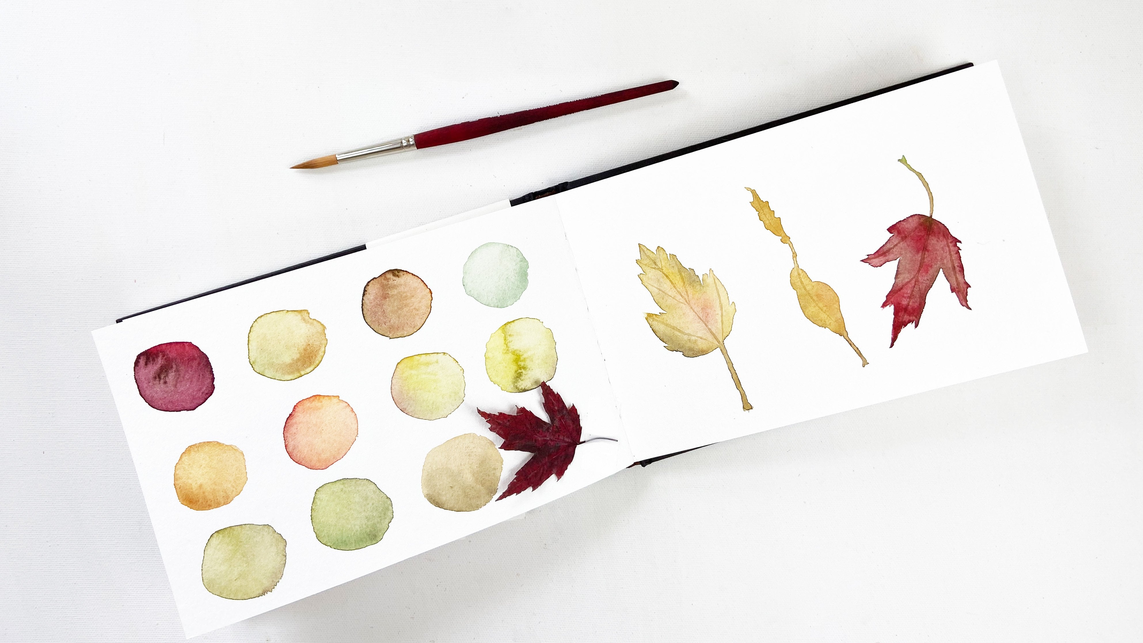
4. Leaf Rubbings: We're going to start out with some leaf rubbings. Leaf rubbings are really fun and easy way to create beautiful imagery for your sketch book. It's also really fun to experiment and study the different types of leaves. It's nice to use a really hard surface like a table when you are creating your rubbings and I'm going to be experimenting with lots of different types of papers and writing instruments so I'm going to go grab some leaves and then we'll get started. I have gathered a whole bunch of different leaves to use from around the garden. I have some different writing instruments, I have some different types of paper and I'm just going to experiment and see what works the best and what results I get. Starting off with this leaf from a bleeding heart, I'm using some tracing paper and this black onyx dark pencil. Hold down your paper, so it doesn't move and the leaf doesn't shift and then just rub your pencil against the page. We're trying to pick up an impression of the leaf and get the texture, get the shape. I can see that this leaf is pretty, did you see? The liquid is squeezing out. The stems are always a little hard, so be careful down at the stem. You just want to cover the whole shape of the leaf. Being careful along the edges, so you get a distinct line or you try to get a distinct line. Let's see how this turned out. Pulling up my paper. Look, it's stuck to the page and stuck to the leaf. The pigment of the leaf has released on both the paper underneath and on my tracing paper. Actually, it has a pretty cool impression on the paper underneath as well. Don't think that worked very well. I'm going to try this little leaf. This is a basil leaf and a piece of just cheap printer paper with the same pencil. Just moving my pencil along the paper to pick up the details of the leaf. This one seems to be working a lot better. Again, the stem is a little bit tricky. Hold it nice and tight. Am picking up the veins of the leaf, the edges of the leaf, made a really cool impression and it smells good too. That's on the back of the page too, very interesting, the pigments. This little amaranth leaf, I'm going to use some craft paper. This is the paper I use to wrap my art when I send it to my customers. Just a little scrap of it using the same pencil, rubbing the page again. It looks like another juicy leaf, releasing a lot of pigment and liquid. I think I'll stop here. Made a cool, colorful impression. Try one more with this craft paper and this time I think I'll use something white. I'm going to use this contact crayon. This is like chalk and I will just rub the page. This isn't looking like it's showing up very well but perhaps after I blow the dust away, it will look better so off the screen I blew the dust, it did not turn out so great. There's a very light impression on my page underneath. Let's try one more time with this craft paper. Just rearranged the pedal or the leaf, and use a colored pencil. Holding it gently. I don't think this is turning out very well either. I think this craft paper might just be too thick. I'm going to try the printer paper again, using my same colored pencil, rubbing the paper and picking up this marigold leaf. I can see the shape appearing on my page. A texture of the little leaflets along the stem, that made a really cool impression on the page and on the back of the paper. These impressions really remind me of flour pounding, which we're going to do in the next lesson. It's really fun. So far, I think I like the black pencils and the printer paper as my combination. Let's re-adjust here. Hold that down. I'm going to try a different black pencil and see how this one works. This seems to be working a lot better and I'm getting a nice impression, so nice veining coming through here. I think this might be our best yet. Looks really great. Now peeling this up, it's stuck, made a really cool impression on the page and then also on the back of this paper, that's really cool texture. That one might be my favorite yet so these are my two favorite pencils. I'm going to try another one. Now this leaf is pretty dimensional, It's pretty thick, so I'm not sure how well it's going to work but we'll try it. The problem I'm seeing here is that, I'm not getting a good impression of the edges just because the leaf is so thick. It's also hard to hold it down because it's so thick. It might help to pre-press the leaf, get it flat, put it in a book, press it for a little bit. The edges are kind of indistinct. I'm going to move to a different page and I'm speeding up the video, there goes an ant. I'm just going to experiment. I want you to experiment. I'm going to encourage you to experiment with different papers, different pencils, try some crayons. Try whatever writing instruments you have, see what works the best for you, what papers work the best. You can try colored paper, paper with different thickness, different leaves. I'm finding that if I put the veins side up, then I get a better impression on my page, my leaf rubbing and That looks so cool. I want you to experiment. I want you to have fun. I want you to be open to possibilities. This exercise is really great for learning the shape of the leaf and how the veins are arranged. It's a great pre-drawing exercise too but more than anything else, I hope you have fun with this. Then when you're finished, you can create some cool looking sketch book pages. Let's do this. I've got some of my rubbings here and I really want to preserve the impressions on this page. I created a little pocket, a little envelope that I'm going to attach this label two and I'm going to use some glue, just a glue stick and this cool copper washy tape. First, attach the glue with the glue stick to the back of my folded piece of card stock and then using the copper tape, I will tape down the sides, one side and then the other and then taking my label, I made this with rubber stamps, I'll glue this down. Now that's down, I'll take all my bits, put them in the pocket. These other rubbings, I'm going to attach to the page and use these fun photo corners. Here's the finished page. Looks really neat. I'll put some tracing paper down to protect the graphite. I think that looks great. I love this because it's reminiscent of a scrapbook from a vacation. Here are our pages. Our pocket with the cool washy tape, all of our little experiments in the pocket, these cool impressions and then our beautiful leaf rubbings. I hope now you're inspired to create some pages of your own.
5. Flower Pounding: Today we're going to be doing flower pounding, which is a really fun way to capture images in the pages of your sketchbook. We're going to be using a separate piece of watercolor paper. You'll also need some scrap paper. I've got my sketchbook here, which I'll basically be using for a surface. Got my hammer and in a minute, I'll gather some flowers. You can use flowers or leaves, any materials, and it's fun to experiment and see the different images you get from different types of flowers and different leaves. I'm going to go gather some flowers and I'll be back and we'll start pounding. I've experimented with lots of different flowers and the way the viola has turned out is my favorite. I just gathered a lot of violas and pansies. You can lay all of them out at once and do them altogether. But I find it easier to do them one at a time. Other problems that can happen is that your paper jumps around a lot. I'm going to set my flour down and then put my scrap piece of paper on top. Just push it there. I'm using the cover of my sketchbook as a surface between that and the concrete. Then I'm going to hold things together. You want to keep your paper from flying around. Just take the hammer and pound. Now then gently lift up. Some of the flower is still stuck on here and some is still on this paper. I have found that you can just gently roll it off. Look how beautiful that is. I'm going to try, let's see. I think I'm just going to line them up here. I'll do my next one. You can even just use the edge of the paper. You don't need to have it completely covering. Pull that one off. The flowers are flying. These are turning out really beautifully. Just take your time and go slowly. Watch your fingers. Don't aim at your fingers. I'm just going to leave that one for now and we'll come back and wipe them off. Now I can go back and rub the extra flower bits off. I've wiped off all the flower bits. Now you can see really how gorgeous these images and how much detail you get with the pounded flowers. You can do leaves as well as flowers and you also don't have to do a large sheet with lots of different bits. Here's an example of a leaf and wow, it's a juicy one. Such a cool result. I hope that now you're inspired to create your own pounded flower images. Play around with different flowers. Try out some leaves and see what you like the best. I can't wait to see and hear about your experience. Here are my finished pages. I made a label and they glued down and use page corners for all of my pounded flowers and leaves. Has a fun summer album feel to it, but it also reminds me of specimens in a nature notebook. I hope this gives you some more ideas for working on your own.
6. Cyanotypes: Cyanotypes are really fun and easy way to create beautiful imagery for your sketchbook pages. We're going to go inside for a minute and prepare them. I'm going to use this prepared Sunprint Nature Print Paper to make our cyanotypes. You'll want to do this first part inside so it doesn't get exposed prematurely. I'm just using this fern leaf and putting it inside a plastic sleeve and using mat board to hold it flat and to cover it so it doesn't get exposed. That one's ready to take outside. I'll make one more and then we'll take them both outside and expose them together. Doing the same thing, if you don't have mat board, you could use corrugated cardboard. Oh, here's the Queen Anne's lace flower. I had pre-pressed it a little bit so it'd be flatter. You can also use things that are more three-dimensional, that's fine too. If you don't have the mat board, you could use a piece of glass with your piece of cardboard so that your leave for flower doesn't fly away. I'm speeding up the video here so we don't have to sit here watching the color change. They say it takes about two minutes. In the really bright sunlight, I didn't think it took that long. I would say less than a minute. It's going to change from a medium blue to a very pale blue, and once it gets to that point, cover it back up and then we'll take it inside. I've got my other one all set to go here. Lift up the mat board and let it go so the sun is exposing this and where the flower is or where I had the piece of fern that is being shaded from the sun and that's where you're going to get your image. This is a form of photography in essence. Now that those are both exposed, I'll bring them back inside and put them in just plain water, and see the image goes from blue to white and the background goes from very pale to a darker blue. You won't get the full blue until it's entirely dry. After about a minute in the water, I'll pull them out and lay them flat to dry. Now that they're dry, I've attached them to my sketchbook with the page corners and some glue, such a fun project. In the next lesson though, I'll show you how to create some of these images if you don't have the special paper.
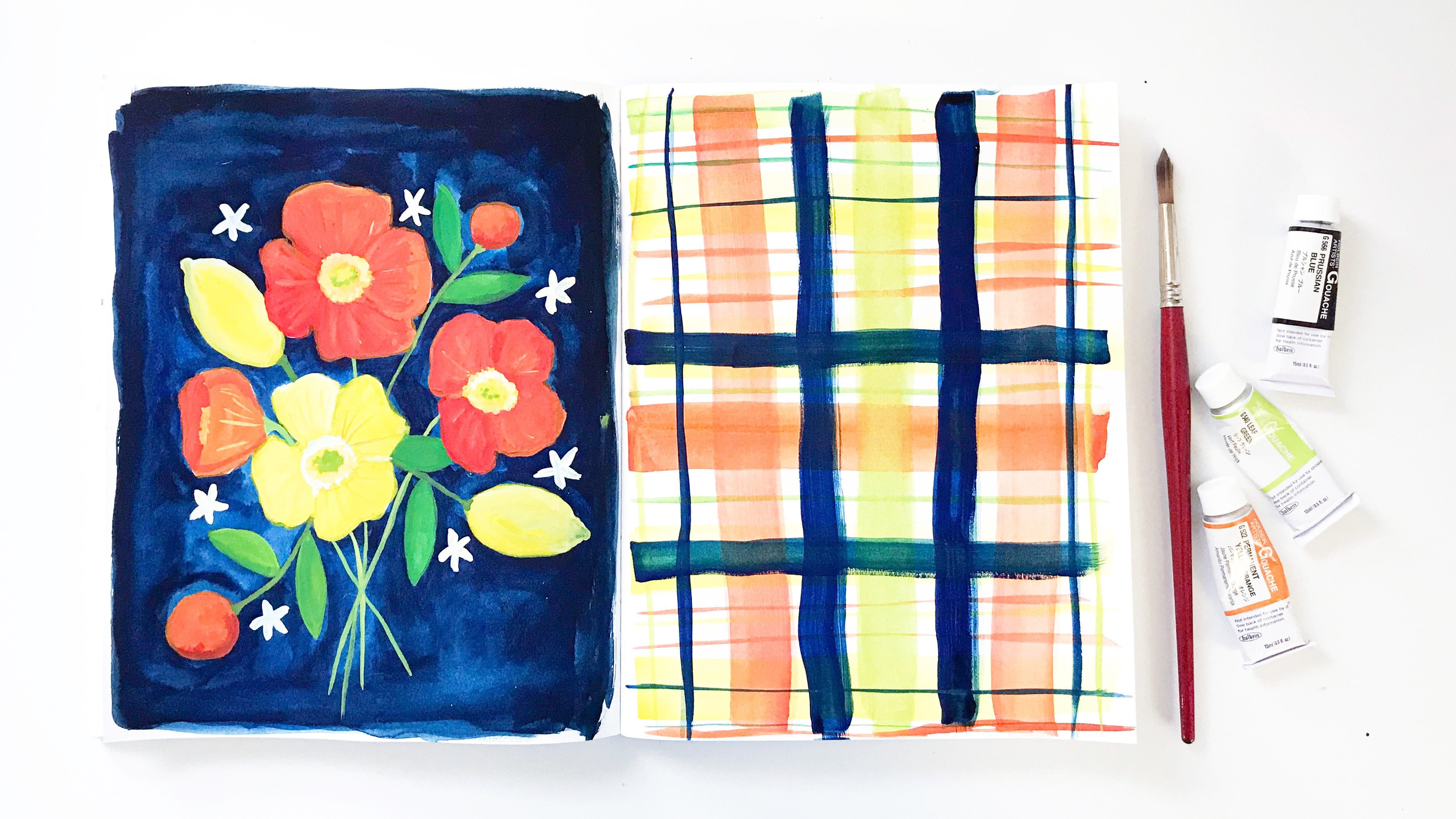
7. Imitating Cyanotypes: Let's create some fake cyanotypes. I'm using Prussian blue gouache to paint my backgrounds. This is such a gorgeous blue color. It's a little bit deeper than the Sun-print paper that I used, but it's a lot closer to what true cyanotypes made with chemicals added to your paper or cloths will look like. I'm just painting the gouache onto my little pieces of watercolor paper. I cut a bunch of different sizes to experiment. I'm leaving a little bit of white edge, you don't have to. You could tape these down if you want to have a clean edge. I'm also leaving some variations, and lights, and darks, because I think that makes it more interesting for the backgrounds. I've painted a bunch of them and now one other thing we can do is use masking fluid before painting the blue. This masking fluid has a very fine tip. I'm going to add that to the bottle and then just start sketching out our image. You don't need to have this type of masking fluid; if you have a different kind, use that. Remember to use an old brush or a brush you don't mind getting ruined when you're using a brush to apply masking fluid because that's going to ruin your brush for sure, or at least be very damaging and rough on the hairs. Using a tip like this is a lot more convenient. They also have masking fluid that comes in a pen, just like a paint marker. I really didn't like the one that I used because it was hard to remove from the paper. But experiment, play, see what you can find, see what works for you. Something else that you can use instead of masking fluid to mask out an image is rubber cement. It works the same way as masking fluid and you can lift it off the page by rubbing it off, just like masking fluid. You could also use a Caran to draw a resist and then paint over that. Experiment, and play, and have fun. I'm going to let this dry and we'll start with our own experiments here. I've got this Caran to start with, this Neocolor II, it's water-soluble. That's not really important. I guess I could try activating it with water. I think the blue and white would really bleed together if I did that. I'm sketching out a clover leaf here because it's a pretty simple image. It can't get too detailed with a Caran. That turned out okay. It's a bit transparent, which is okay. I'm going to use this Dr. Ph Martin's Bleedproof White next. This is a very concentrated, opaque form of gouache. It's nice for painting highlights on things, painting white over top of different kinds of paint, and let's see. This is blending a little bit with the paint underneath, but that's okay. I'm liking how this is turning out. I'm not sure why I'm doing another clover leaf here. I guess the first one was fun to do. This is looking more opaque than the Caran and more uniform, I think. I think I like this better than the way the Caran looks. That was fun. Next, I'm going to use some acrylic craft paint. Use whatever paints you have, think about other materials you can use, other media. I'm going to do a different plant here. This time I'm going to do a feverfew. I tried doing feverfews with some cyanotype paper and I used a couple of different flowers here, and what's interesting is that some of the petals are transparent, they let the light through. If your paint is turning up transparent, that's okay. It will be even more like a real cyanotype. But when you're doing your paintings, you can cheat. You can make your image flatter than it would be in reality. This feverfew stem, and leaf, and flower would not lay flat like this. A feverfew flower has thick center and even if you pressed it in a book, it would not quite work like this. That's one advantage to painting, you can make whatever image you'd like. Another plant that probably wouldn't work quite right doing an actual sun-print is an anemone, one of my very favorite flowers, and so I'm using the acrylic craft paint again to paint an anemone flower. It's a little bit streaky, a little bit transparent. I could come back after this is dry and paint more layers, and get a more uniform look to my paint if I wanted to. One problem is that the gouache underneath is getting reactivated by the paint, by the water on my brush. Even though I'm not using a lot of water, the gouache is quick to start mixing with the liquid. It makes it a little trickier to paint the white on top of the dark background. Another option which I'll show you in just a minute, we'll try it out, is to use acrylic paint for the background. That way you don't have to worry about the colors mixing like that. Painting in the stems, the little flower buds; these flower buds would be a little harder to do, I think, with an actual sun-print. I don't think they would lay quite so flat and the leaves definitely wouldn't. Think about different things you may want to paint. You don't have to do something as complex as this. As you can see, something simple like a clover leaf, that works great. Sometimes it's nice to leave the most complex things to actual sun-prints. For example, I did a fern and I did a Queen Anne's Lace, and both of those would be very tedious to paint or draw. Other experiments you can do, use markers, use gel pens, use paint pens, chalk markers; whatever white writing instruments you have, try them out. I'm going to experiment a little bit on this clover scrap and see how these different materials work, and that one didn't work that great. The gel pen worked nice for writing of the name. Sorry, my hand is in the way. The chalk marker is really mixing a lot with the blue paint underneath, which I was a bit surprised by. Just keep experimenting. Now that the masking fluid is dry, we can paint on the background. Using the Prussian blue gouache, I'm going to take my brush and paint the background right on top of the masking fluid. That's adhered really well to the paper, so you don't have to worry about leaving any space for the white. The masking fluid will do that for you. If you use a lot of water, that's okay. It's not going to seep underneath the masking fluid. You do want to be careful to let this completely dry before we remove the masking fluid, and here's one more experiment, using a background made with acrylic paint. I'm going to try this paint marker again. It's a little bit streaky. I do not like the color of the acrylic paint background quite as much. It doesn't seem quite as luminous either. It's a bit duller on the page. But it's an experiment. I want you to experiment, try cut paper maybe, try using markers and or drawing around your white image. There's so many options, and I'm sure once you start thinking about them, your creativity will be sparked. It's easiest to remove the masking fluid if you don't let it sit too long on your paper, don't let it sit more than about a day. You just rub and then you pull any bits that you can. Try not to ruin the paper, so be gentle. We don't need to paint on top of where we masked, so if the paint paper gets a little bit damaged, that's okay. But that turned out pretty well. I like that. Here are all of my experiments and I'm going to choose some of them to put in my sketchbook. A few of them I don't think I want to add. But these four, I think would make a nice spread. I'm going to lay them out on two pages and then I can attach them any way I want. I could use these corners again, I could use some Copper Washi tape or spend the white tape, or maybe this Washi tape with the gold polka dots. Touch these down. I like how the gold polka dots Washi tape looked to attach them and I use the gel pen to write Marigold. I wrote on the anemone as well. This is a really fun spread and I hope you'll have fun making your own as well.
8. Color Hunt: Let's take a color scavenger hunt around my garden. One of the things I love most about summertime is how colorful it is more so than any other time of year, at least where I live. Take your time and look around. We're in my garden right now, but I want you to take your own color scavenger hunt too either in your garden or a park or maybe just out your window or you can look in the pages of a book for colors too. When you're looking, be open and curious. What colors do you see? My guess is that once you begin to look for colors and nature or the garden, you're going to see how infinite the spectrum truly is. The same type of flower may appear in many different colors and the same color may appear in different plants and flowers and a whole range of different shade variations. In my garden, I love all the colors and I welcome a tangle of joyful abundance in plants and flowers. That means an abundance of color to keep looking. Do you see your favorite color, or maybe an unexpected color or there are colors you didn't notice at first because they're so subtle or a color that stands out from all the rest because it's not and what about vegetables and fruits, what color are they when they're not ripe yet? Look carefully, seek them out. Sometimes they're hiding beneath the leaves. What colors are they when they're ripening or when they're finally ripe and they beckon us to eat them right there in the garden if we can get there before the birds. Have you noticed all these colors before? When I look at colors, I often wonder how I'd recreate them with paint. I think it helps me to see subtle variations, to see what's really before my eyes instead of what I assume or imagine, I'll see. So first, just look, keep your eyes open, and when you're ready, start to choose colors you'd like to try to paint. Maybe you'll want to choose the brightest of the bright or clashing contrast or maybe you'll choose variations on one color and look for as many different shades and hues as you can find the wonderful thing about hunting for colors and then watching them in your sketch book is that you can do it again and again and again. I hope you're ready to hunt for your own colors. When you've done that, I'll meet you back in my studio and we'll get started on some pages. See you there.
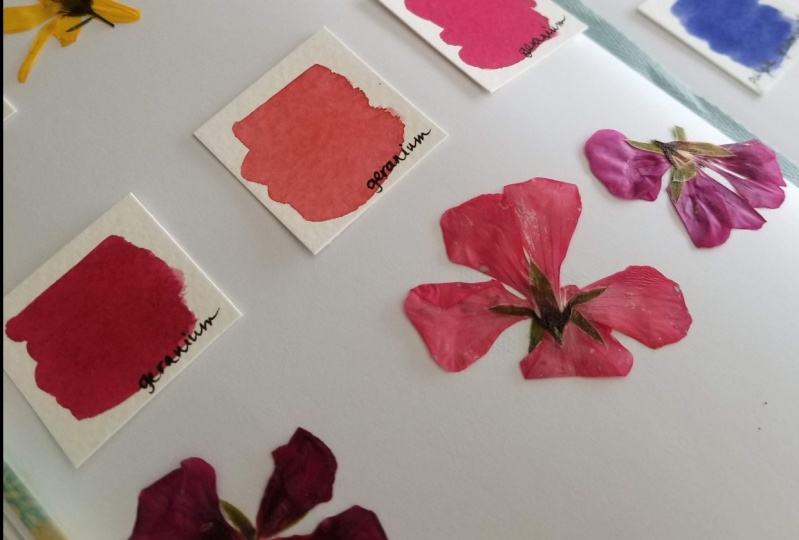
9. Color Swatching Inside: I've got some supplies lined up on my painting table. I've also got a collection of some flowers I brought in. They're purples and blues. Got some small scraps of watercolor paper. Then I'll glue them into my sketchbook later. Something else that's nice is using a piece of foam core as a white background. This is just a scrap of foam core and putting your flowers or leaves or whatever it is that you're using as color inspiration against a white background helps you see the true color. I'm setting up my supplies, I've got my brushes here, I've got my paint boxes. Something else that's really nice to have is a reference of your colors. I have this watercolor sketch book where I have swatched out my colors and I can use this to compare. I also have my color swatches in my paint boxes, so I'll know what they look like on paper. Also I have a small scrap of watercolor paper to test out my colors as I mix them, which is handy so I can know what I need to add. We're going to start with this bulge flower, this beautiful bulge blue flower. Laying it against the white background and looking at the color and then comparing my different blues. Of course you don't have to have this many colors. You don't have to have these colors but here looking, I see this cerulean blue, and that's a Yarka St. Petersburg color, and then this sennelier cobalt. So these two colors, that's going to be my starting point. I'm going to mix these together and see where I am with that. Now this is just my process. Looking at the colors and deciding which I want to mix together to recreate the colors that I see in my flowers. I wet my brush, I rub it against the pan of paint, and then I pull the color off on my palette. So started with it, cerulean, now the cobalt mixing them together, pulling the color off my brush with the edge of the palette. Then we'll test out the color. So there is my initial blue. Looking at it on the paper, and then looking back at my flower, I can decide what I want to add next to my mix because I don't think we're quite there yet. Then bulge flowers, especially this one I see there's a little pink dot on one of the petals, and bulge flowers, I've noticed they have a pinkness to them and sometimes their flowers even turn from blue to pink before they fall off the plant. So seeing that pink dot, the pink undertone in the blue, I think I need to add some pink to my mix. So going back to my reference of colors, this cobalt, violet is where I'm going to go for that pink. So that's a Winsor & Newton color. Coming to this paint box, rinsing my brush off, and then rubbing my brush against the paint and putting the paint onto my palette and mixing it with the other colors. Well, I think I need some more of the pink coming back, pulling up some more color, mixing them together, and then I will come back to my test card and try out the color there. So I like this. I'm going to add it to my little square for my swatch and then using my angle shader brush I will paint it onto the paper. Now when your mix is really wet and it's a pale color like this, you may need to keep adding paint to get a dark color. I'm just going over it again, dabbing some more color in. I'm going to let that dry and we'll mix our next color. If you need some help with color mixing, I have a whole class on that too. My next inspiration is this bachelor button. It's also called a corn flower. I see a lot of colors in this flower, but I'm going to start with some blue. Looking at my swatch page, this blue lake, which you can barely see here on the camera, it's at the top left of my page, I think that's a good starting point. It's a good, warmish blue. I'm going to take my mixing brush, rinse it off and then come to my paint box, pull up some of that color, wet brush, rubbed against the paint and then added to the palette. You can see how much deeper this color is with even a little bit of paint on that palette. I'm going to add some of this quinacridone rose to give a purpley undertone to this blue. Add a little bit more. I don't want to overwhelm it. We'll test this out. This might look a little bit too dark to my eye. I'm going to just lighten up that color by adding some water. That's one of the wonderful things about watercolor. These two colors are the exact same paint. One just is more saturated than the other because it has less water mixed in. I think I'm going to add some of the cerulean to make it more of a blue. It's looking a little too purple on that page for me. So that, let's mix it a little more fully on the palette and try again. That blue, even a little less saturated, that color looks pretty good to my eye. So I'm going to make another swatch. These are two inch by two inch squares that I cut, and you can see how this is so much darker than the other color. Because the paint colors were more pigmented. I think it really works with the darker color flower too. I think that is a lovely match for bachelor button. I'll let that dry. Now we have this beautiful salvia, this black and blue salvia. I'm going to mix the blue. It's another purpley sort of blue. Slightly different than the other color. I've sped up the video here because I think you understand the process now. This is always my color mixing process. I will take one color, try it out, add some more other different colors, see how it looks, then go back and forth. Now these edges on the swatches I used the shader brush. I think they're too harsh. So for the rest of the swatches, I'm going to use the round brush. Have it look a little more organic. This is a lavender flower. So we're going even more purple with our color. It's a pale purple. So for my purples, I'm mixing with purple paint and pink paint. If you don't have purples and pinks in your palette, then use blues and reds. Carmine is a wonderful color to mix. It's kind of a pinky red. If you're going to be creating your own color palette of different paints, I would say make sure to have at least one pink in there because it helps for mixing. Now, this is a beautiful sweet pea, a really rich reddish purple color. Again, I'm starting with some pinks mixing some purples in there. Quinacridone rose, rose, cobalt, violet. Those are some of the colors that I really like to use. Opera rose is another lovely color. It's hard to get a true pink just mixing from reds. So that's a lovely, lovely, rich color for this sweet pea swatch. My last flower here is a purple petunia. It's a warm purple, but not as rich and pink as the sweet pea. I'm going to start with that same color mix and then add some purple, this violet. Comparing that, I think we need a little more warmth, so I added some rose, and now I think it needs a little more purple to it, little bluer color. I think that looks great. So I'll paint my swatch, adding lots of saturated paint to there for my petunia. Dabbing the color in. Now I'll let that dry. Another thing I'm going to do using this Beatrix Potter book, I'm pressing my flowers. I'm going to glue them or tape them into my sketchbook with my swatches. So I just take the flowers, flatten them and close them in the book. It can be hard with the really three-dimensional flowers, but I'll close this up, put some other books on top and let them dry. Once I've finished pressing the flowers, I added them to my sketch book pages. I glued down the color swatches, and I taped the flowers. You can see their color has changed quite a bit, but it makes it really fun spread. To protect the fragile flowers, I've taped down some tracing paper so that can cover the flowers and keep the pages safe. In the next lesson, we will go outside to make some more swatches.
10. Color Swatching Outside: Another more fun and playful way to make swatches is to sit right in the garden with your paints, and your water, and your brush, and a scrap of paper, and just collect as many colors as you can find. You've probably guessed that swatching colors is one of my very favorite things to do. I've shared the process in just about every one of my Skillshare classes. This is my fourth seasonal sketchbook class, and in each of them, I encourage you to create swatches inspired by the season, and summer is wonderful for this. As you saw in my little scavenger hunt around my garden, I have lots of colors to choose from. Here, I've just planted myself on the blanket next to one of my garden beds. I'm looking around at all the colors I can see and just capturing them on paper with paint. I'm doing a little color mixing on the page, but I'm not using my paint palette. I'm not being super careful about mixing exact matches. This is about being present, this is about observing, this is about celebrating, and enjoying color. I encourage you to do something similar, if you can get outside, wonderful. Take your paints outside, or even if you don't have paints, use markers, use crayons, use colored pencils. Use whatever you have, and look around you and make a record of the colors that you see. This is a great daily practice. If you want to keep track of how the colors change throughout the season or what's new blooming in your garden? It's really fun to do something like this as a record. It's not something that takes a lot of time. It's not something that takes a lot of skill. Although of course, you can get better at mixing and matching colors the more you do it. It's not a practice that's about perfection, which I'm hoping all of these lessons show you that these practices shouldn't be about perfection. They're about the experience, they're about beauty, they're about joy. I think nothing is quite as joyful as color. This little scrap of watercolor paper is just getting filled with small swatches of color. You can go bigger, you can do a different kind of composition, make something look maybe like a quilt, work on stripes. They are so many options for your swatching. In the next lesson, we'll be doing some flower petals, which is another way of swatching. I'll show you how I use this little piece in my sketchbook.
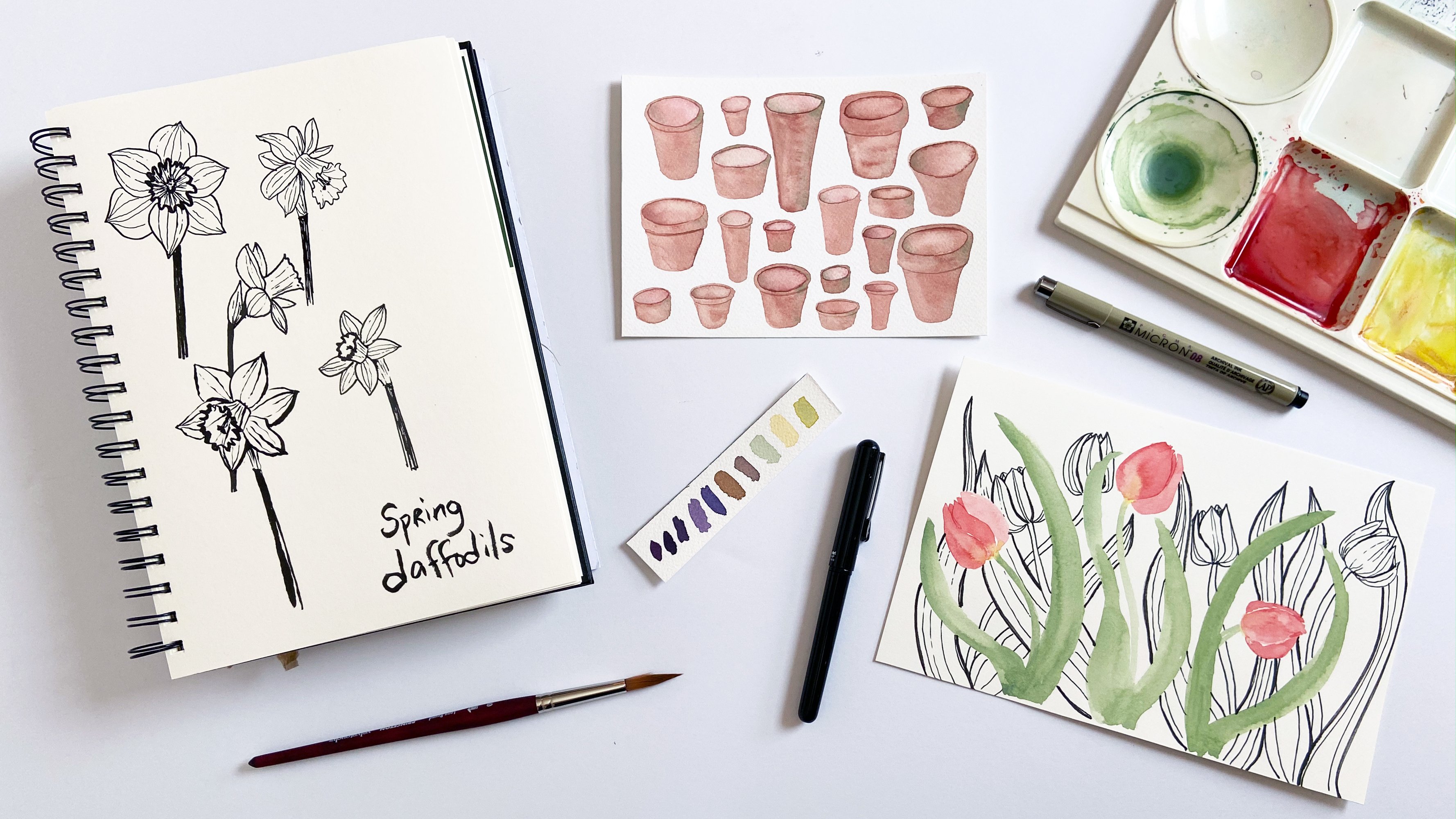
11. Watercolor Petals: I'm going to be working on watercolor paper. I cut this piece of cold press watercolor paper to fit on one of the pages of my sketchbook, and I've pre-mixed some colors that were inspired by some flowers that I picked. Here's my little color swatch card. I've got some flowers. Here is a viola flower, I also picked a poppy, beautiful colors there, little Marigold, a calendula, a Mexican hat, which is this flower, is really funny-looking, it's the beautiful deep-colored petals we'll be painting, and a cone flower. I've arranged the petals. I've pulled petals off of all the flowers and arranged them on the opposite page in my sketchbook to form a composition. Here, two cone flower petals, a few three calendula petals. You can arrange your composition however you like. I'm leaving some room to include the name of each type of flower. I may end up writing them on a separate paper and then gluing them down. We'll see how it goes. But figure out your composition first, where you want all of the petals to be, and then add them to your page, you can sketch them with pencil first, I'm not going to. But I've got my setup here, all ready to go. I've got two brushes. These are my favorite Princeton velvet touch long round brushes, a size 10 and a size six. Use what you have. I could probably just use one brush. I'm going to start here. I want to make sure that I'm not going to put my hand in wet paint, so I'm going to work from left to right because I'm right-handed. You work the way that you're most comfortable across the page. I'm going to start with the cone flowers. I'm going to reactivate the paint by adding some water. So wet my brush, rub the paint so that it wakes up. Now, I'm just going to sketch in the shape of these petals. Petals have a very simple shape for the most part, and that's why they're a really great way to dip your toes into watercolor. It's a great beginner exercise to step up from swatches. But even if you're not a beginner, it's fun to paint petals. I'm using the tip of my brush to move the paint around. I'm just going to make this petal slightly larger, and refine the shape. Just pushing it around using my brush. I'll paint the second petal now in the same manner. If you need more water, add more water. I'm using up most of this paint. I didn't mix a lot of it, but you don't need a lot for just a few small petals. I'm not too concerned with any details here. I'm looking mostly at the shape a little bit with lights and darks. Look at your petal, where is it lightest, have a less paint there, where is it darkest and put the most paint there. We'll come back in the next lesson and add some details. But for now, just keep things as simple as possible. I'm moving on to my poppy petal, and it's the largest one that we have here. Gorgeous burgundy color. I'm just painting the shape, just like with the other petals. This one is a little different than the cone flowers, it's not just in terms of size and shape, but there are two colors in this petal. There's a lighter color that makes up most of the petal, and then there's a darker color in the center where it attaches to the flower. So I mixed a couple different purpley colors and now adding the darker color, dabbing it in at the top. I'm going to let the colors bleed naturally together, but I don't want them to completely mix. So just being careful to add the darker color at the bottom of the petal here, which is showing up on the top of the page. The petal is upside down. Dabbing paint, pulling it with the tip, almost painting stripes. Poppy petals are somewhat roughly, they have a lot of veins. We'll worry about that with the next step where we paint the details. But you can get a sense of that with how you add the paint. Now we're going to move on to the Mexican hat flower. That, although it's deep rusty brown color, there's also some yellow. You could paint this a number of different ways. I'm choosing to paint the entire petal as yellow, and then we'll come back after it's dried a little bit and add that rusty brown color, and let the colors mix. You could let it dry all the way, or you could paint just the yellow and then add the brown where the brown only is. So I've moved on to paint my Marigold petal. This is also a two color petal. So once we got the yellow down, I'll let it dry a little bit before adding the red. The calendula petals are simpler. Just one color. You can see, that's really, really wet mix of color, probably too wet. I'm just dabbing the edge of my brush against the paper towel to dry it off, but not remove the paint. Here, this is a better mix of water and paint on my brush. Easier to work with. It'll dry quicker. These are pretty simple, small petals. I'll rinse my brush again. I'm going to come back to the Mexican hat flower, and I'm just going to dab in this deeper color and let it mix on the page. If the bottom part of the petal, which is really the top part of the petal, no, it's the bottom, because it comes down like a skirt. If that bottom part, if that yellow is covered up, that's okay. But at the top here, I want to show the yellow. So I'm going to just dab it a little to stop the paint from moving. So that top edge is drier and the paint's going to stop moving. Just add a little bit more color in there to deepen it. Rinsing my brush. Actually, I'm going to move onto another brush. We'll do the viola petal. It's a little pansy. I'm using a desaturated, very pale mix of this purple. I'm just painting the shape of the petal. One of the things I love about viola flowers is that the petals look like they are watercolored, so they make a really fun subject to paint. I have a whole class on it, if you're interested in learning to paint the whole flower and not just a petal. Here I'm dabbing the darker purple into the lighter purple and letting the color bleed. It just creates a beautiful effect. The lighter color bleeding into the darker or the darker color bleeding into the lighter. I'll let all of those dry. Oh, wait, we need a little bit of red for this Marigold. You got to be careful not to put your hand down on the wet paint from the orange petals. Using the tip of the brush, I'm painting tiny little lines of color for that red on the Marigold petal. It's still slightly wet. Just gently adding the color, then let all that dry and then we will paint the details in the next lesson.
12. Painting Petal Details: These petals are dry now and adding some details will help finish them off. I'm going to start with the cone flower again, and I'm just using the tip of my brush to paint some fine veins using the same color paint that I used for the background of the petal. These long round brushes have wonderful sharp points so you can paint very fine lines. I'm just painting a few veins on these petals to give some definition, some texture, and some dimensionality. Now, for the poppy, these veins will help give a sense of the ruffled nature of the petals. I'm putting some little zigzags in my veins and having them follow one after another, and that'll give a sense of faults and ruffles in the petal. You can do this as much or as little as you want, adding as few or as many veins as you want. I'm working from both directions. I can go back and refine any of my lines or make them darker if they're to light. This color I'm using is the base color for the petal. I don't want it to be too dark. Here I am going back to the other side. That was a little light. But I can go back and change it or I can have just variations in the light and darkness of my veins. Helps it look more organic and natural, I think, and not too uniform. These little curves, these little zigzags will give a sense of shape. Here I'll put one down the middle and then we'll go both directions, meet everything up. Just take your time. Don't worry about being too perfect. This is a sketchbook after all, so it doesn't need to look perfect. But by just adding a few lines like this to give texture and shape really helps finish off these petals. You can practice your lines on a separate page, if you need to. If you don't feel comfortable or confident doing paintings such fine lines. It's little squiggles. Let's move on to this Mexican hat. I'm just going to paint some yellow along the edge. If you look at the petal, the petal has yellow along the edge and the top, and our brownish, rust color spread out and cover the yellow, so I'm just adding it back in, and then just deepening the color on the top of the petal where it attaches to the rest of the flower. For the marigold, I'm just going to darken the red lines that I painted using the tip of my brush, and gently painting those lines. For the calendula, I'm just going to paint some veins like with the cone flower, just two simple lines following the curve of the petal. Now for the viola petal, I'm going to move my paper just so it's easier for me to paint. Feel free to move your page as much as you need to, when I'm filming, I often don't. I'm going to test this to make sure I have good color, a good saturation on my brush. If you have too much water, your line might be too wide, and I want these to be nice and thin. I'm just painting veins here. Just a few. These veins are forked. They're branching. Take a look at your petal and follow its example. It will be your guide. You don't have to be exact. You don't have to paint quite as many as are on the exact flower. But looking at it, observing, it will show you how the petal veins are arranged, and you can follow that example. The last thing I'm going to do is add some labels for my page. I just wrote the names on some small scraps of card stock that I cut out with my paper tremor. Another fun page that you might want to create is a page of leaves. I have a whole class on painting watercolor leaves, if you want to take that. Let's see. I'm going to try these labels in a different position. See how that looks. I think I like them on top better. Then finally, I have a label for the entire page, just a collection of petals and then my date stamp. To create a finished spread, I attach the watercolor swatch card experiments on one page and the flower petals on the other. I glued all of these down first with a glue stick, and then I used the page corners to make it look a little more fun, a little more festive, and a little more fancy. I hope you're inspired to make some fun pages of your own.
13. Warmup Sketching: Perhaps the first thing you think of when you think of a sketchbook is drawing and sketching. I think the idea of drawing a sketchbook can be intimidating to a lot of people, especially if you don't have confidence in your drawing ability. I know that was the case for me when I first started making art, and it turned me off from working in a sketchbook for a long time. I think sketchbooks should be a place to play and experiment and have fun. That's not to say that taking a pen and paper out to the garden or out in nature can't be fun, but if it's something that you don't like to do, by all means, don't do it. I hope this lesson well inspire and encourage you and help you to connect with nature in yet another way. One of the most important things for a sketchbook is that the paper that you're using work well with the medium you want to use. Here I'm showing you how different pens work with the paper we've been using throughout this class, and it kind of hesitation here, you can see. The paper sucks up the ink and you get a blob of color. I don't like how that looks in my drawings. I am going to use the sketchbook on the left in this class to do my drawings because I like how it works with pen a lot better. You may want to test out your pens in your own sketchbook and see how they work before you start creating your page. Sketching shadows is a really fun and easy way to warm up or build your confidence with sketching. I've got my sketchbook and a brush pen here. I'm going to find a sunny spot to sit down and start sketching. You can get a lot of different interesting layouts across your page depending on what sorts of shadows you're seeing. Here I'm taking my brush pen and filling in the shadows, following them along. I love using this brush pen because it creates such dynamic and interesting marks, you can create some really thick lines and some thinner lines. I'm moving pretty quickly. This is not, at all, about perfection. These marks are very gestural, and it's fun. You let loose. You loosen up, you lighten up. Shadows are so interesting too, and you can try this at different times of day. Experiment with the types of shadows you see. You can experiment with different types of media. You could even use paint, colored pencils, markers. Some of your shadows will be really light and indistinct and others will be darker and no two pages that you create, this way will be the same. Again, this is a great way to loosen up, to build some confidence, to create some interesting and dynamic sketchbook spreads. You can keep adding layers as long as you want, and when you're finished and like how it looks, you can stop. I really hope that you will go outside and sit in the sunshine and do some shadow sketching.
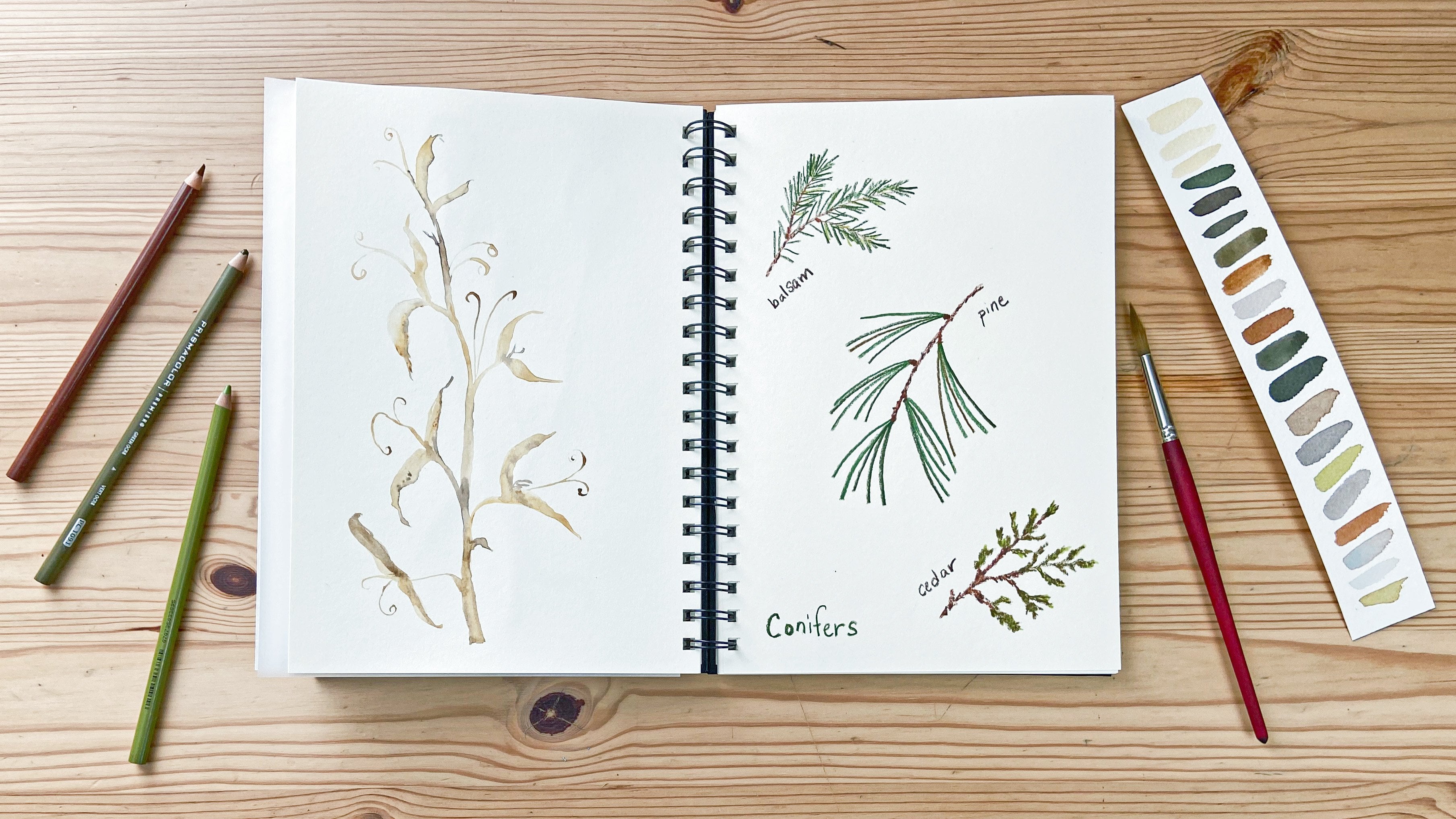
14. Line Drawing: Instead of showing you exactly how to draw any certain flower, I'm going to be showing you some different techniques and also talking about how I approach my drawings in my sketchbook. I'm using Micron pens, and for this Marigold flower, I just outlined the petals with simple lines/ now I'm using tiny little circles to fill in the center. The petals have some dark patterning on them. I'm just using some scribbling marks to create those dark patterns on the petals. One of the great things about your sketchbook and doing some drawings like this in your sketch book is that you can try out different techniques and see how they work to create your different botanical goals. For my Marigold, after I sketched the flower, I wrote the word Marigold. Now I've moved on to a couple other flowers. I love to fill up a single page with lots of different bits from the garden, whether it be flowers or flower buds, or leaves, or a combination of things. I try and fill the page without thinking too much about composition ahead of time. I arrange what I sketch almost like putting together a puzzle fitting, a smaller piece where there's a smaller space, fitting a larger piece in where there's a larger space, nestling things next to one another. It's a really fun way to explore the garden and also fill a page in your sketchbook. Observing what you see and copying it onto the page is a great way to learn flower anatomy and to learn how to draw. I'm right here in the garden observing and sketching when I do these sorts of pages. I want you to approach your sketchbook drawings in the same way with curiosity, with a sense of experimentation. These sketches are very simple, most of them are just simple outlines. But if you want to add some patterns with veins, and also some senses of light and dark. Using scribbling marks, using simple lines, using overlapping lines. I want you to experiment and see what those different techniques will do on the page. Here I'm sketching a cone flower, and I'm using simple sketchy, quick marks, overlapping them to make them darker. Then my pen just barely touches as I lift it off the page. Those marks in the center start out dark near the bottom and get lighter at the top, as I lift my pen. For the petals, I'm simply outlining the shapes and I'll come back and add some veins, some patterning, some texture after I have the outline of the petals. Sketching in the garden is such a joyful experience and it's a time that you can really connect to what is around you. If you're not in the garden, if you're in a park, if you're somewhere else, that's great too. But it's about being present, It's about observing. Definitely, not about making anything look perfect. It's really more about the experience than anything else, and it's a way to observe and connect. I think I need a couple more petals. You can make your sketches super realistic, or you can make them more stylized, or you can experiment with different techniques doing both. That's the great thing about a sketchbook, It's really up to you what goes on the page. It's a wonderful place to experiment and explore, to try new things, and just to be curious, to be a curious observer of the world around you, to be a curious observer of your art materials, to be a curious observer of how those materials work on the page. These sketchbook pages are great records for your garden too. You know what sorts of things are blooming when, just like how we captured the different colors, to capture what's in bloom by sketching the different flowers, you can also capture what's in bloom that way, so these pages are fun explorations. I used a number of techniques for these flowers; overlapping marks, simple sketchy marks, simple outlines, and they really want you to explore and experiment and play in your sketch book as well. If you make this into a daily practice, you're going to get better and better. At drawing your observation skills will get better, you'll learn your preferences, what your favorite materials are. It's a really great way to create and connect. Also your drawings can be a fun starting off point for other projects, which we'll see in the next lesson.
15. Off the Page: One of the fun things about doing line drawing is that once you have some basic skills and experience, you can take your line drawings out of the sketchbook in some really unexpected and interesting ways. Probably the most quintessentially summary type of drawing outside your sketchbook that I can think of is drawing with chalk on the sidewalk. I'm drawing a cone flower here, just like I did in the last lesson, this time with just some big Children's Crayola chalk and I started with this center just like with the pen on paper. Now I'm sketching out the petals. This is a little bit tricky to do on this really rough surface and this really fat piece of chalk, but I'm making it work. This is such a fun way to create. If you haven't done this since you were a child, I hope you'll think about giving it a try. Here is the leaf and a couple of veins on the leaf. Just using the same type of drawing technique, making a variety of marks with your chalk, think about the parts of a flower and how they all connect. Once you've done one flower, you can fill the whole space with flowers. Another fun thing to do is to sketch with thread on fabric. This is an embroidery that I'm working on of some marigolds flowers, and I just used the back stitch. If you're familiar with embroidery, the back stitch is very simple. Just one stitch after another. The first one forward, the second one back, and I used that to create the stem, the leaves, and now I'm outlining the petals, this is the last petal here. The base of the flower I used satin stitch, which is basically one stitch really close next to another, longer stitches to create a satin look, the center was French knots. I got a little tingle. All of the petals are outlined. I also want to do a little bit of what I called scribbling marks to create patterning. I'm just doing some little stitches, single stitches to create patterning on these petals. This is similar to the petal we painted in the petals lesson and the first flower I did in the last lesson. I've included some links in the handout if you want to learn more about embroidery. I've got all of those petals decorated with some sketchy marks, and now I think I need another French knot in the center and these are fun to do. Sometimes they're a little tricky. You put your needle up through the fabric, wrap the thread a couple times two or three times around the needle, put the needle down right next to where you were, pull those threads, and pull it all through. There is the center. Here is my finished embroidery. I have some practice stitches along the bottom, a bunch of flowers, some flower buds, lots of leaves. To create the overall image, I used a combination of free hand stitches and I also used a quilt marking pencil to draw in some of the lines. This was time-consuming but really fun to do. My last example of playing with your line drawings is to create some temporary tattoos. I'm going to take some sketches, one of these little Baldrige sketches that I just did and this older sketch of some few shapes, scan them, take them onto my computer and print them on some temporary tattoo paper. I'm scanning in a sketch changing it to 400 DPI in black and white, and I'm going to up the contrast so we have really dark black lines. Then I will select the area I want to scan and scan it. I'll take my scan into Photoshop and then I'll print on some temporary tattoo paper. If you need some help with it, I have a class on digitizing your watercolors that will help you do things like get rid of backgrounds and learn some simple Photoshop skills. Now I'll show you my finished temporary tattoos. I just follow the instructions on the temporary tattoo paper that I bought. You can find it online and in some stores, and it was really fun to do. Of course you could also draw directly on your skin or if you want a real tattoo, you can sketch your design for that too. I hope that these examples have you thinking of some other ways to play with your own line drawings.
16. On Your Own: I hope by now you are filled with ideas for adventuring in your own sketchbook. Enjoy the process, experiment, play, have fun, and go your own direction. I can't wait to see what you create, so be sure to upload a project here on Skillshare. Also, don't forget to follow me on Skillshare, and for even more inspiration, connect with me on my website, mygiantstrawberry.com, where you can download my free sketchbook guide. Until next time, wishing you joy and creativity. Here's my little helper. What are you doing? Working in sketchbooks because you feel like you need to have help. Here's my helper. You're going to lay down?
 Anne Butera, Artist. Instigating creativity and joy.