Transcripts
1. Intro: I know that for many people autumn is their favorite season, but for me it's always a little melancholy. My garden, my constant inspiration for my art, is dying. When I first started making art I was also really scared of sketchbooks. I felt a lot of pressure around creating perfect looking pages and mostly I avoided them. But then I began to be more comfortable playing and I looked at my sketchbook in a different way. Instead of pressure to create perfect pages, I looked at it as a place to play, to experiment, and to have fun. Hi, I'm Anne Butera. I'm the artist behind the website and blog, My Giant Strawberry. I'm primarily a botanical watercolor painter. In this class, I will show you how to look for beauty around you no matter what the season. I will encourage you to go out for a walk and look for different colors, and textures, and shapes that inspire you. Throughout this class, I'll encourage you to let go of any perfectionism. I'll be sharing my favorite materials and techniques and show you how to take your quick watercolor illustrations to the next level. Together, let's celebrate the beauty of autumn in our botanical sketchbook.
2. Inspiration Walk: Before we start painting and drawing, I want to invite you to go take a walk, look around your neighborhood for interesting colors and shapes and textures. I know that wherever you look, you'll be able to find something that catches your attention, that makes you curious, that makes you wonder, how would I paint this or how would I draw that or what colors might I mix to create this specific color I see in front of me? Either take some photographs while you're out on your walk, or pick up some leaves and seeds and when you come back from your walk, I know that you will be filled with inspiration.
3. Materials: I hope you have fun on your walk and that you find lots of inspiring bits of nature to bring back to work in your sketchbook. Before I start demonstrating some of the techniques, I just wanted to go over our materials. Of course, you'll have your own collection of bits of nature to work from. Yours will of course look different than mine. Choose whatever catches your eye, whether its color, or texture, or shape. Choose things that inspire you and you'll have more fun in your sketch book. You can work directly a sketch book for a couple of the exercises, I am working in this Strathmore watercolor sketchbook and it's hardbound. The paper is really nice. You also have the option of working on loose pieces of paper. You can either then glue those into your sketchbook, or just stuff the pages inside your sketch book, or keep them separate. I know an artist who likes to collect a bunch of pages outside of a sketchbook and then tie them up with a ribbon. I'm working with cold press watercolor paper that I've cut into five by seven pieces. It's also nice to have a little scrap of paper. I'll be showing you how I test my fine lines on a little scrap, just so you can test on the paper before you work on your painting. Because sketchbooks are supposed to be spontaneous and fun, I'm working with palette that already has colors on it. Throughout this class, you'll see sometimes I have certain colors mixed, sometimes I need to mix some more colors, so I have my paints. I like to work with pan watercolor paints from a variety of manufacturers. I have these handy so that I can mix in colors I don't already have. You'll need a brush. I like these long, pointed, round Princeton Velvetouch brushes because they have a very nice sharp point and they are really nice to hold, nice to work with. They're fairly inexpensive too. You'll need water. I like to have a paper towel or some blotting towel to dry off and clean off my brush. I think that's all we're going to need. In the next lesson, we will get started painting. I'll see you then.
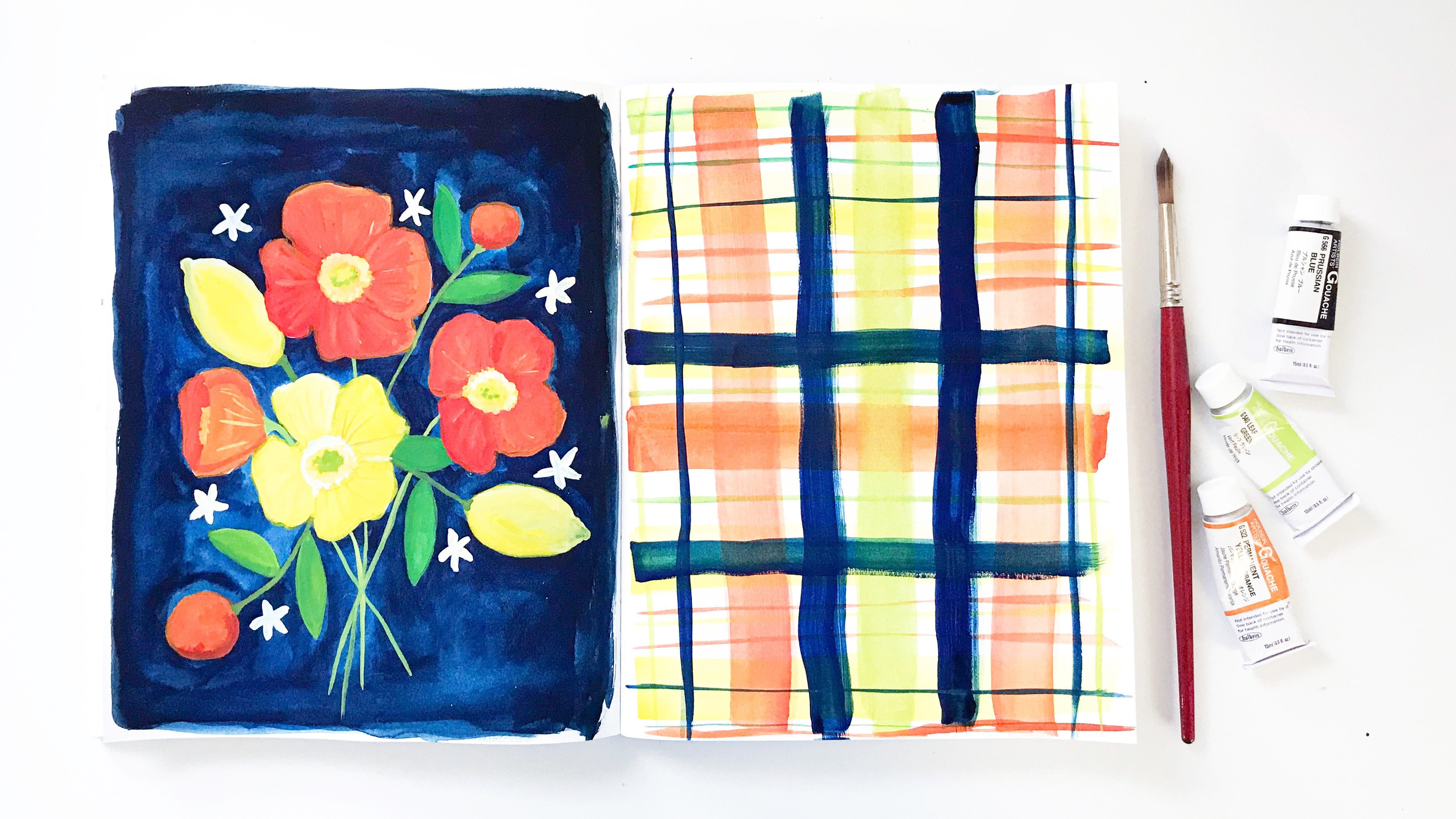
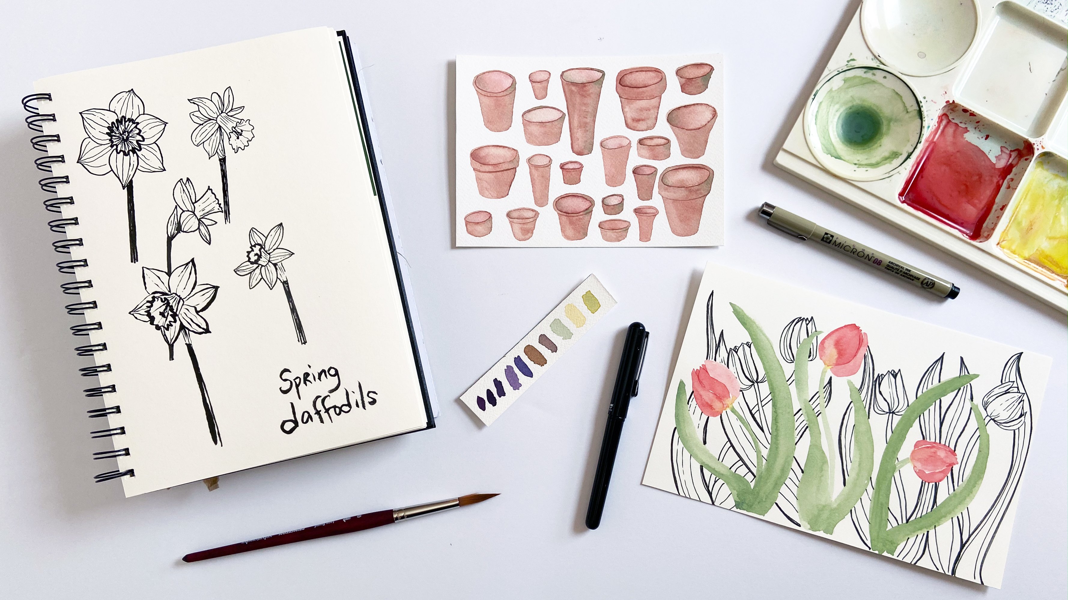
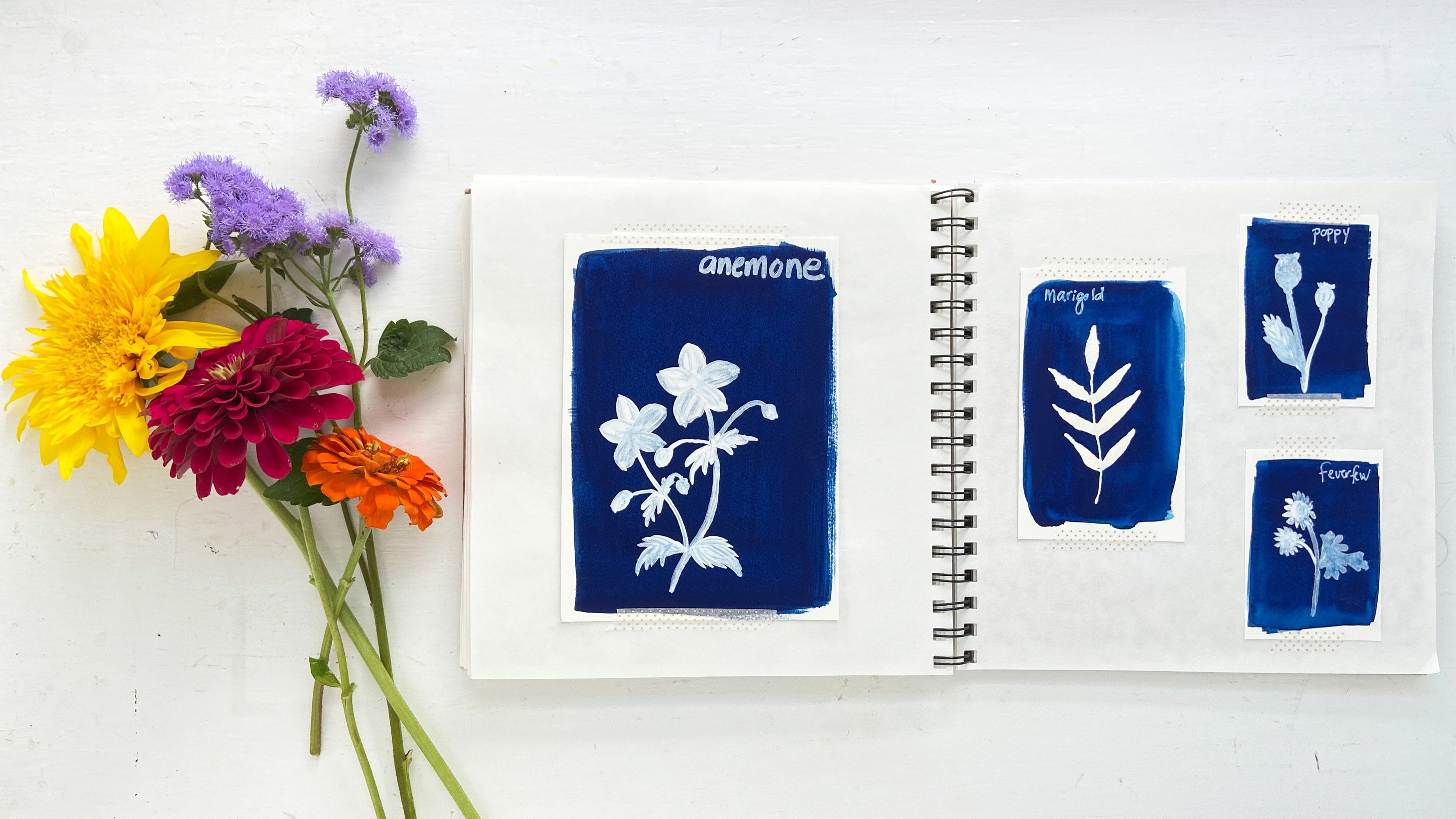
4. Nature Color Swatches: I'm going to start working in this watercolor sketch book filling a page with color swatches. I'm going to use things from my walk, like this little maple leaf. We're going to start with to fill the page with color swatches. I'm just using colors that are already on my palette. You can mix special colors or work directly from your paints, starting out with red and then refining the shape. I'm doing circles for my swatches. You could do whatever shapes you want. Now, here I'm taking another color, this brown and dropping it in to the red, not mixing it around, letting it do what it wants. For my second swatch, I'm going to do this maple leaf and I'm mixing a brownish light green. I've got green, I've got yellow and mix a little more yellow in there and a little bit of this tan brown until I get a color that I want. The nice thing about this is that you're mixing the colors before hand if you want to and you're letting the colors mix on the paper. Here I'm adding some green and a little bit of brown. I'm observing what I see and so it's not really important what exact colors I use for this little maple leaf. I'm going to start out with brown. You can choose whatever objects you want to use as your color inspiration. This maple leaf has a lot of colors, so brown and now some yellow. You can choose to do a lot of mixing on the page. Here, I'm going to add a little rust and dab it in. You can choose to do a lot of mixing in the page here adding some red or you can just leave things be and let the paint do its thing. You can try it both ways and see what the outcome is. Here's this little piece I like and I'm going to use as my inspiration, painting a little green circle. I know this green is a mixture that includes oxide of chromium, which is just a really fun paint name to say. Now, usually when you're painting watercolor, you're not supposed to use white, but I'm using white here. I like how it dulls the color, adds some grayish tones to it and makes it more opaque. Starting out with some brown for this cedar sprague, I'm speeding up the video here. You got the idea of how this works. Using whatever you want as your inspiration. You can use bits of nature. You can use a photograph of let's say a landscape. Maybe you're going for a walk and you see a beautiful scene in front of you and you want to capture that. One way without painting or drawing the specific scene, you can capture it is by painting with colors. You could use a photograph and take it back to your home or your art space. This exercise is a wonderful warm-up, and it also is almost a meditation. Well, here's my finer walnut. It's turning more brown than when I first picked it up and I love the colors in it. This warm, yellowish green and then some brown. If you're painting from a landscape, you can paint from a photograph or you can paint outside. You could even do that in your backyard or in a park. Just try to capture as many of the colors as you see. You can do single colors or you can do mixes like I'm doing here. I want this to just be a loose and fun activity that you can do in your sketch book when you're not really sure what to do. I often make swatches before I do a painting when I'm mixing the paint. Here, I'm using already mixed paint but there's so many different options. For this last little spot on the page, I'm going to just attach the leaf to the page. So go out and find some colorful inspiration and then capture it on paper with paint. Something else that is fun to use is colored pencils. Just this past year I've really gotten into playing with colored pencils in my sketchbooks. I created this page with the bits of nature that I found. I created it similarly to how we did the watercolor swatches, but I used colored pencils. My favorite color pencils are the Prismacolor Premier pencils. They are very waxy and they really blend beautifully. I especially like finishing off the colors with a colorless blender pencil. It just helps get rid of the lining look that you can sometimes have with colored pencils and to blend the colors together more beautifully. Don't feel limited by any different materials and remember to always have fun in your sketch book.
5. Single Simple Leaf: This time I'm going to be a little more conscious about the colors I use and I want you to see my pallets as I work. We'll work outside of the sketchbook on a little piece of watercolor paper and we'll paint and actual leaf. This is a little maple leaf. I'm going to observed the colors I see and first try to capture the colors with paint on my palate. I've got some yellow already here and some brown. Yes, this is brown here. I see yellow and brown, a little bit of red in the stem, and there's little details of brown around in the leaf. I need to mix, I think some more yellow. The yellow on my palette is little brighter than what I see in the leaf. I'm going to take some of this ocher color and mix it in this mostly empty well on my palette and mix it in with some of the brighter yellow. I'm not too concerned about being very neat here. I'm going to grab some of this brighter yellow here and mix it in. Now I've got some things to work with, some different yellows and some brown. I'll get started painting the shape. Now this leaf is more complicated than the circles we were painting but it's still a fairly simple shape and I'm going to simplify it more than what is in reality. My paint is nice and wet. I'll start without doing a pencil sketch first and just drop the paint on the paper and sketch out with my paintbrush the general shape of the leaf. Starting with this top long bit and then the other two parts at the bottom that stick out on the signs. Then a few jagged bits. I'm just going to paint a couple of the jagged edges with the tip of my brush. That's one of the nice things about this long pointed brush is that you can have some fine points. We've got the basic shape down. Just refine it a little and drop a little bit more color in here, add a couple of the pointy edges and just refine everything. There's paint everywhere, and then pull the paint down with the tip of the brush to create the stem. Now I'm going to drop in some of the brown and I'm going to lighten it up a bit on my palette by mixing it with some of the yellow and a little bit of orange. I wanted it to be nice and warm. Let's see, just drop it in at the top and let it mix on the paper. Just using the tip of the brush to add it to these tips where I see it on the leaf. I know it's going to spread more than what I see. I'll add a couple of dots here and these also are going to spread more than what I see on the leaf but I'm okay with that. I'm not trying to capture reality exactly. I don't want you to feel pressure to capture things exactly. Now, I'm going to mix a little bit of the red that I see. You can't see the maroon on my palette, but I added that to some orange. I'm just pulling down and adding color to the stem. That pops out a little bit more with that reddish color. Now, I'm going to paint some veins on the leaf. There are a few ways that you can do this with watercolor. You can paint the veins on after the leaf has dried completely and we'll do that with another exercise in this class. You could also use a pin to scratch out the shape of the veins on your paper when it's wet like this or what we're going to do here is to paint in a couple veins with a fairly dry mix of paint on top of this wet yellow paint. It's barely drive, and here we go. Just painting with the tip of the brush, almost like drawing the vein right down the center. Then I'm going to paint two on the sides here, just towards the tip of the leaf. Now when you move your paintbrush quickly, that was a little too dry. Add a little more paint. When you move it quickly, it's going to give you a distinct line and not have blocks of color. I'm just going to define this a little bit more, add a little bit more of the dark brown color for a hint of some veins. I'm not going to worry about all the other veins that are in the leaf. Just these three. You can see it's already starting to bleed out and blend and get fuzzy, so the colors are mixing but I'm okay with that. I'm not trying to be super detailed with this one. Our leaf on the paper looks different than my actual leaf, which is fine. Now this long pointed brush allows me to paint the fine details like these lines, and I'm going to add a little darker brown here in the stem, just with the tip of the brush. That helps that pop and then using this darker brown, just going to refine these edges where it's already brown on the tips of the leaf. Just helps darken the colors and smooth out the shape. Now rinse out my brush really well, dry it off, and then come back for some yellow. I'm going to try and get as dry a mix of yellow as I can so that it doesn't bleed too much and just refine these edges so you can see how that lets the leaf shape pop more and just makes it more distinct on the paper. I'm just going over all of these yellow bits to help smooth everything out. Now, it's just mixing on the page, the yellow and the brown, smoothing it all out, refining the shape. I'm just adding a little bit more. Doing this will help your final piece look a little more finished. Have the colors be brighter and it's still a simple leaf. I'm going to call this one done and we'll go on to the next exercise. See you there.
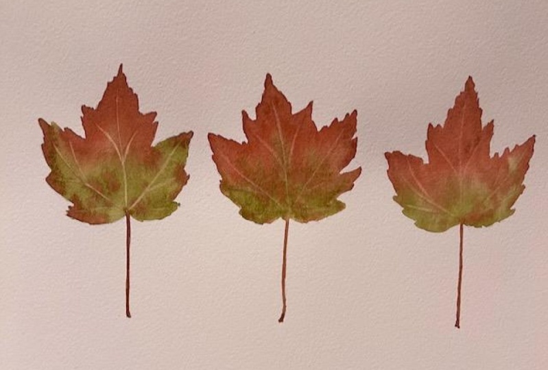
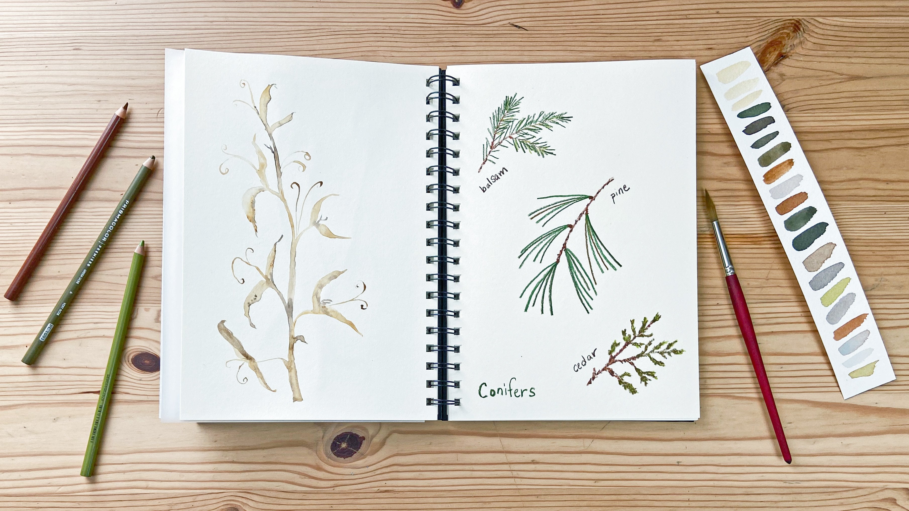
6. Three Leaves with Details: I'm coming back to the sketch book now and we're going to paint a page opposite the color swatches, and I'm going to use multiple leaves for this page. I've got a few leaves that I'm going to test out some compositions on this page. So grabbing a couple of different leaves, this one is so interesting, I think, so here's three leaves in a row, and I can play around with my composition, change the orientation of the leaves, change the arrangement. Still doesn't quite look right to me. Might remove this leaf, move, this one over here, and then this red one, I think it's pretty good and I'm going to start. I'm going to put these leaves right on the page and start painting. Remove the leaf that I'm going to paint. So mixing a bit of color on my palate, now I'm going to start adding color to the page and working just the same way. I worked with the yellow maple leaf that we already painted, using the tip of the brush to paint the jagged edges, and pulling the paint down the page to sketch out the basic shape of the leaf. This leaf is a little more complicated than the one that we already painted, but that's okay. If you're working with a more complicated subject, just go slow, take your time, and enjoy the process. I'm going to add some dark brown to the stem and dab in some color all over the leaf. This leaf that I'm using as my subject has a lot of colors, and so I'm going to just add more color as I go and let it blend and bleed on the page. I think I need some of this rust color and then just drop that into the wet paint, and I love the way this looks when the paint flows. That's one of the joys of creating these watercolor sketches. It's the process. The colors that will dry on the page don't look exactly like they do in process, and so that's why I often say it's about the process, not the product. I love this interesting broken leaf and I'm speeding up the video here and showing you this sketch. This broken leaf, just looking at the shape and not thinking about it as a leaf. Adding some more color, and then our last leaf for this page, this deep red color, really beautiful. Sketching it out here. Like we have for all of these leaves. Pulling the color down the page, while it's wet. The paint is so movable, and this brush holds a lot of paint. This is looking pretty good. I've just, refining the shape, pulling down those tips, adding some more depth of color here, and then painting out that stem, smoothing everything out, and then I think we need to drop in a little bit of green on this edge of the tip of the leaf stem and then drop in some brown and just watch that color spread. It's such a joyful thing. A bit more color here, and there just dabbing it in, and then I'll let it dry. But don't feel limited to using watercolors. There are so many different ways to explore in your sketch book with fun materials and to celebrate and capture the beauty of autumn. One fun exercise is to test out all the pens that you have and see the different line qualities you got with them. I'm going to show you three different pens that I like to use here. This is a pentel brush pen and it's refillable. I've already refilled it once with new ink. I love the brush. You can make all different size marks with it, which is fun. Microns are one of my favorites. They come in different sizes and you can do very nice fine lines with them. Then this tombow calligraphy pen, I really like. It gives you a little more options than the micron in terms of width of the line, but not quite as much as with this pentel. I've created this page with lots of little bits and bobs of nature. So here's a page that just celebrates what I've found in the fall, and you can write little notes in here talking about your day, your experience. You can put a date on here. One of my favorite things to do is use a date stamp. Take my date stamp, and stamp the page right there. To finish off this page, let's add a few details. It's dry now, and I'm going to take my brush and paint in some veins in the leaves. I'm getting some paint on my brush, and I've got my scrap paper to test it out. These lines are looking pretty good, and I'm going to add some darkness to the stem and then just take the color all the way up the center of the leaf, and then paint some lines for veins on these two other parts, and up here too. That's a few more veins. Lets paint these up here too. This is more veins, than we painted for that first yellow leaf, and then for this one I'm just going to right down the center of this broken leaf. Deepen up the color for this last red leaf. Now these are tiny little details and you don't even have to add them to your leaves, but I think having a little bit of a vein painted in, just we'll give it a more finished look. I have a little bit darker color at this end. Deepen up the color, it was a really dark pink color. You'll need a darker color on top for the veins to be able to show up. So I think that looks pretty good and I'll give you some more ideas in the next lesson. See you there.
7. Acorns with Layers and Details: I'm going to paint some acorns. I love acorns. They're so much fun to pick up when they fall and they are really fun to paint. They have fairly easy shapes and there's a great variety of different shapes and colors. I also think they have a lot of personality because it looks like they're wearing little hats. I'm starting with this first acorn, just painting the nut part. It's a fairly simple shape to paint. When I was first learning how to paint with watercolor, this was one of the botanical bits that I painted and had success with because it is really simple shape. It's really fun to paint I think. Add a little bit more yellow to the brown for this next nut. I'm using the acorns I found just as inspiration, I'm not sticking with what I see. I want there to be a lot of variety in colors and shapes. This year the acorns I picked up don't have a lot of variety. So we'll fake it on the page. Which is perfectly fine. One thing that is important to learn about watercolor is that first to paint the cap, right now on top of these nuts, the colors would all flow into one another, and there wouldn't be a defined distinct difference between the top and the bottom. I'm painting the nuts first. Then once they're dry, I'll go back and paint the caps. That little trick of watercolor that took me a while to learn. It was frustrating for awhile when I didn't realize that I needed to let everything dry first. Here I'm lifting up some color. I want there to be a variation in lights and darks on these nuts to give them shape. They don't look like a flat shape on the page. So that they're more three-dimensional. I'm going to let these dry and then we'll paint some caps. I'm mixing some colors on my palette. Just different tans and browns, mixing it up and seeing how things look on the page. You don't have to be too concerned about reality. Any brown I use is going to look good. I really want to contrast between the top and bottom. As long as there's a contrast between the top color and the bottom color, I'm happy. I'm just using the tip of my brush to sketch out the shape and these caps are really fun to paint. Now with a darker brown, I will paint the next cap. I like that there is such variety of different shapes and colors. Then by dabbing at the page, I'm helping to create some texture. Using cold press paper helps create texture as well. Onto cap number 3. Just pushing the paint on the page to create this shape. The caps are slightly wider than the nut part of the acorn. Dabbing for texture. It's going to dry differently of course, but we can encourage the texture. I'm going to paint the stems. These colors will flow together a bit on the page as they dry and I'm okay with that. We can refine it after it's dry. I always have fun with stems when I'm painting stems of acorns or leaves or things like tomatoes. You can infuse such personality by creating different stem shapes. This one is going to be a little bit bigger than the others. I'm going to let these dry entirely and we'll add some details. They're dry now and looking a little bit bland. I'm going to add a bit of color to the nuts, just another layer of color. That's going to help give more contour and make the acorn stand out more on the page. You can also change the color by adding another layer of paint. This one is turning more of a rusty red color. I'm going to mix a color to add a darker stem here. Define it a little bit more since they blended together. Then I'm going to add more texture to the cap. Here's my scrap testing the lines. I'll do this by creating overlapping U shapes. On the top of acorns, it's like overlapping scales, is what it looks like. I'm just painting these little U shapes across the acorn cap. I'm not really concerned with them being equal size or equal distance. Colors are flowing into each other a little bit and that's okay. Most of all I want there to be a hint of texture. That one is done. Add a little more depth to that stem. I've sped up the video using the same technique, darkening the stem, darkening the nut, and adding some details to the cap to create texture. Pushing the paint around you can create lights and darks. There's a contour of the nut. Again, overlapping U shapes like waves I guess, across the cap to create texture. Darkening the third stem and not adding more color here. These are standing out from the page a lot more than they did before I started adding these details. Now they're finished.
8. Maple Seeds: Maple seeds are one thing that I love painting in the spring. Most maples drop their seeds in the springtime, but some also drop them in the fall. I picked this up today. I liked how the three of them were attached. I'm not going to paint it that way. I'm going to pull apart one of these little twins, maybe I'll pull them all apart and we can take a look at them and decide how we want to paint it. I think I'm going to use them all for inspiration. We could even paint three of them. Now, I see a lot of colors in here. I see a light green, I see some yellow, some rust, and some brown. I'm going to start with the light green, then I'm just going to take some green here and mix it in this yellow, and then use plenty of water, and start painting out the basic shape. Again, I'm not going to sketch this out, because it's not important that these be perfect. We can refine the shape a little bit as we go. If you're more comfortable sketching, by all means do so. So I'm going to take some brown with a little bit of yellow and drop that in here. Make a line down the center, and then I'm going to make a line for the stem. Take some of this darker brown. This got a lot wider than the actual seed and that's okay. I'm not going to worry too much. Taking some of this see, some brown mixed with some yellow mixed with some orange, to make a rusty color. If you're mixing colors freshly, you can take the time to do that. Take a little yellow and drop that in. I don't want to go over this too much. I added some brown to my brush and now I'm just going to go along this edge. Then take some more brown with the dry, fairly dry brush. Just drop in some hints of color. I'm going to let that be for now and move on to another one. So mixing your green, your pale green, mix a green that has a lot of yellow. Here, I'm just going to start making this seed and going in with the shape one-half at a time. Here I have a little more yellow on my brush this time, that's okay. This stem goes straight up and I'm going to use the green this time for the stem. We might add a little more color in it later. I'm going to go in with some brown. I'm going to maybe mix the brown with this other later, orange and yellow, and just add color. Just using the tip of my brush and dipping it in the wet paint. I'm adding a darker brown and just letting that all bleed. We have the darker brown on my brush, and I'm going to paint up the center and into the stem to differentiate that. Rinsing off my brush. Some brown mix with orange, mix with yellow to make a rusty color. Another way I like to make rust, is to take a red or orange and mix it with green. I'm going to just dab a little bit of that in here, and in here, and then add some yellow. I'm taking some brown, that might be a little too much brown, but that's okay. We're not trying to have perfection. So I grabbed some more of that yellow green and just dabbed it in. I'm going to let this be for now, and we'll move on to a third seed. This greeny yellow is becoming more just yellow, so I'm going to add some more green. That's good. Now I know that when I use a lot of water with this, even though it looks dark on the palette, it will be lighter on paper. Again, sketching just out the shape gently. I know my angle, I'm not directly over the seeds, so my angle looking at it is slightly distorted. One of the benefits of doing a sketch first, is that you get to compose your page more carefully, which I didn't do here, but it's turning out okay. This time I think I'm going to take a warm golden yellow and use that as my stem, and then just drop in the color some more of that yellow in this CD area of the scene, and then come for a warm brown. Now the colors here do not really matter. I'm hoping that you'll paint something that you find out in the world and, of course, whatever you find will have different colors than what I find. But the main techniques, dropping in the light color on the page with a lot of water, and then taking other colors and adding them. Also, using the tip of your brush along the edge of color, that'll let it bleed a little bit but not all the way. The same is true when you drop in a color. You can use the tip of your brush and drop in a little color, it will bleed, but it won't cover everything. I'll let these dry and then we'll come back and add a little bit of detail to finish them off.
9. Details on Maple Seeds: Now that these maple seeds are completely dry, you can test if it's dry by touching the paper. If it feels cool to the touch, then it's still wet. Actually this does feel like it's still a little bit wet, so I'll let it completely dry before we start planning the details. Now it's dry and I'm going to start painting some fine lines. I've got my little scrap here to test the lines. I want my paint to be fairly dry, so it'll be nice and fine. No, that's not forming a very nice line, so I'm going to add some more water and try again. That's the nice thing about testing it out on a scrap first, you'll know what exactly you're getting and you won't make a mess of your sketchbook page. I'm just dabbing my brush in various areas of the pallet and then testing out the lines. I think this is good consistency now, it looks pretty good. I'm going to start by making a line down the center to differentiate the two sides of the maple seeds. Now that looks pretty good. The whole purpose of adding details is to take your watercolor sketch to the next level. It doesn't look so flat on the page, it looks more realistic. I'm adding this separation line and It's a nice brown. Next, I'm going to add some of the veins in the seed propeller part and test that green. Let's see how that is. I'd like my brush to be saturated because the wider part of the brush holds the paint and then it'll come down the tip from the wide part, and that's how you create your fine lines. That's why I like using these brushes, so here we go. We'll start just defining that seed. Already, just with these couple of details, the painting is looking more finished, more detailed, more realistic. I'm also painting along the top edge. Just to give a definition. Add a little bit of yellow to the screen, test it out and then start painting these veins. Just very lightly. That one was dark, so I'm going to blot it. That's a lot lighter. I'm going to lighten my color here. Just give it a little bit more green and yellow mixed together, testing it out. I think this'll work a little better. Then just lightly, very lightly, brush in with the tip of my brush, some very fine lines. I want them to be very faint and delicate. I can always go back and add more. I think turning out pretty nicely. Come back over here on the other half and just very gentle faint lines over the entire surface. Then may take a little more green. That was a yellowy green. Now I'm going to use a more green-green. That one was a little dark, so I'm going to dab that a little bit. Dab off my paint on my scrap of paper, and then paint in some more fine lines going over them lately. That gives a lot more texture, and some variation in line thickness, line color. Just gently going over the entire surface of the wings of the seed. Now, I'm going to use a rusty warm-brown to paint some texture on the seed. Just going over the seed part to give it some dimensionality and to divine the shape. Now that looks pretty good. I'm going to and move over to this next seed and speed up the video using the same techniques here to define the edges, to add some veining. Not worrying about being perfect, but adding these little details really helps take the piece from looking unfinished or amateurish to being more detailed and realistic. Adding a little more to that first one, you can always refine and add more, just using the tip of the brush to add some details. Smooth out the rough edges. I don't know what that was on the paper. I'm really liking how these are looking. I'm adding more and more. We've got the base colors that I painted, and that gives a lot of interest. Then the details give even more interest. These are looking great. If you compare the two that I have already added details to with the one that has no details, you can see how much different they look. Yes, these fine details take practice. You can practice on separate papers if you're a little nervous. They're just very simple lines and it makes such a difference. I'd encourage you, even if you're a little nervous to try it out. I think you'll surprise yourself by how easy it is to give your painting just a little more [inaudible]. To make it look a little more detailed, a little more realistic. You can refine as much as you want, add as much detail as you want or not. You can keep things simple and add different colors. It's one of the fun things about it. All of the colors that you see, that you can capture on paper. Now I'd say these are done.
10. Ginkgo Leaves: For this page, I'm going to be painting some ginkgo's and we're going to think a little bit about composition. I've laid out my leaves to give me an idea of how I want to paint them. One of the things I love about ginkgo's is they're different shapes, and so I'm going to celebrate those shapes on this page. I'm starting off just painting a basic shape, with my watercolor, sketching out the shape, with a fairly wet mix of yellow paint. I'm using yellow here, I love the way ginkgo's turn yellow in the fall, but the leaves that I found are not totally yellow yet. So this page is going to use a bit of artistic license, with the colors, and I encourage you to do that in your own paintings as well. You do not need to stick perfectly to reality. Be loose and have fun. So we've got this basic shape down, and now I'm going to add in a little bit of green. I love the way different colors of water color bleed together, and then a little bit of brown on the bottom and just dropping in a little bit of brown here and there, and letting it mix on the page. It's going to be really subtle, but it will provide a little more interest to the leaf. Now I'm drying off the brush and lifting up some color. Doing this will give the leaf a bit of contour. So lifting up some of the color, so that there will be some light spots and dark spots, and that will give the leaf more interest than just simple flat color. So this yellow is a little brighter than what I want. So I'm going to mix a little bit of a darker yellow with some ocher and I'm sorry you can't see on the pallet. Mixing up some color, and then I'll drop it in and use the tip of my brush almost as if I'm painting veins on the leaf. I'm going to wait until the leaves are dried to paint the veins, but I also like to drop in some color to hint at veins. That will just give more interest to the painting, with different tones and colors. Now I'm speeding up the video and I'll paint the other leaves here with the same technique. The second one is going to be more green, and, I really love the idea of a page with varying shapes and varying colors. One of the things that is so fun about ginkgo leaves to me is that there are so many different shapes. So this page is going to be a celebration of that. You can see I'm painting leaves that are inspired by what, I have found, but they're not sticking really closely to reality, and that's one of the fun things about ginkgo leaves. There are so many different shapes, so many variations of the basic fun shape, that whatever you paint will work. They are very forgiving leaves to paint. Because I want to stress again that you should be having fun when you're creating these pages. If you worry too much about being perfect, then all the fun is gone. Painting our third leaf here, this one is the most green so far, and angling the stem a bit, to fit it into the page. I love the way this dark green is bleeding into the lighter green, add a little bit of brown, and let things blend on their own, and drop in some more colors just to hint at shaping and veins contouring. With the tip of the brush, you can smooth out the edges and smooth out the colors, lifting up some of the paint, I'm dropping in more colors. Playing with color on the page is really what makes this fun. Lifting up a bit more to really give some contouring. So getting some more yellow here and, some ocher now you can see that mixing and painting this fourth leaf. Really with each of these leaves I'm creating the shape as I go, with both the side of the brush and the tip of it. I can adjust the edges with the tip of the brush, as well as adding color, and mixing colors, and blending, and lifting up color, pushing paint around on the page, and then our fifth leaf. Generally a good rule of thumb when you're painting multiple objects on a page is to use odd numbers of objects. But of course, it's up to you. Both can look beautiful and interesting depending on how you paint them. I love the variety of colors on this page. It's turning out to be a really fun celebration of the ginkgo leaf. Each of the leaves is unique in color and shape, and they'll need to be totally dry before I paint in the veins. Now lifting up a little color on this last leaf, before I let them dry so we can paint the veins in the next lesson. See you there.
11. Ginkgo Leaf Details: Now that these leaves are completely dry, I'm going to paint the veins. I'm going to start with a yellow, ocher, tan color, mixing it here on my palette, trying to keep it fairly dry, to keep the lines very fine. Mixing a little bit more color. The nice thing about these long pointed rounds, is that there are large, so they hold a lot of water, but they have such a fine point that you can paint the fine details with the same brush that you painted the larger details. Move your paper and set up your arrangement, however works best for you. You want to be comfortable painting these fine lines, because it is a little bit trickier than painting larger shapes. That's turning out a little bit dark, but that's okay. I'm just going to keep going. The nice thing about sketchbook pages is that they're places to experiment and try things out. I want you to ask yourself questions while you're painting and be curious. Things like, how would this look different if I paint fatter lines? How would it look different if I paint thinner lines? How would it look different if I go back and paint more lines or if I paint fewer lines? I'm working fairly quickly here and working mostly left to right. I don't want to smudge my wet paint, and I want to have the veins flow and look fairly natural on the page. Let me go back and just smooth things out here. You can do that, add some more detailed to the edges to smooth them out if they're a little bit rough. Add some finer veins in between your thicker veins and add more color to the stem. One thing that I didn't mention, these are fairly light looking leaves on my page. If I wanted to darken them, I could go back and paint over the entire leaf with more color. Instead, I'm just adding these veins and adding some more color to the stem. Oops that's in the way, let's move it out of the way. Want your space to be clear. So smoothing the vein colors into the stem to darken it. Now let's paint this other leafs, veins in a green color. I've sped up the video. I'm working with the same technique. These veins are a bit darker. Sometimes I'm working left to right, sometimes right to left. Having the veins overlap here or there, painting some thinner veins and thicker veins. The nice thing about painting multiples of an object, is that you can experiment with how changes in your technique will give you different results. Then you can decide which you like better or if you'd like having the variety. I think it's fun to have a variety. This page that I'm painting is really all about variety. Again, painting down into the stem. Then this third leaf painting some ocher veins. Instead of painting all of the veins directly from the stem, here, I'm painting some from the mid-line vein that I first painted. Painting these reminds me of painting the details, the veins on fins and tails of a goldfish. If you've taken my goldfish class, you may see the similarities too, which is so fun. If you haven't taken it, I hope you will, because goldfish are so joyful. Here I`m going to add some brown and see how that makes the stems pop, and I'll smooth it up the stem. Adding details like this, pop of brown and also the veins on the leaves that helps make your page look more finished, and it takes your paintings to the next level. Something that might look a little bit bland, once you add some details like veins or a little bit of a pop of extra color, it really gives it more oomph and makes it look more finished. It's also really fun, but again, I want you to be having fun. So if the thought of painting these little fine details makes you nervous, or if it makes you feel like you're under too much pressure, don't do it. Do what makes you feel good. You don't want to feel stressed out when you're working in your sketch book. But I also want you to have the openness to experiment. A little bit more brown. I love how that just really finishes off the leaf, adding some here and there too. Then this last leaf, ocher brown working quickly here to get all the veins on this last leaf. And I love the variety of the page, the variety of colors, the lights that darks, the shapes. Darkening the stem on this last one. Adding a little bit of brown, smoothing out your edges. I really like how this turned out. I hope you like your page too. Or another fun way to experiment, is with different pencils and see the different colors of lines that you can get with your pencils. I made this page all of ginkgo leaves. This page is created with just all different types of pencils, including some charcoal pencil. As you can see, there's a little bit of a smudge, but you could also do it all with one pencil. Were colored pencils, markers, whatever materials you have on hand. Don't feel limited to water color just because I've demonstrated watercolor. Now this sketch book is The Canson mixed media XL Sketchbook. It's really fun to use with marker or acrylic paint or quash. I hope you'll feel open to experimenting with all sorts of different materials, and have fun in the process in your own sketchbooks.
12. On Your Own: Because I love watercolor, all the demonstrations in the class are done with that medium, but don't feel limited to using watercolors. There are so many different ways to explore in your sketchbook with fun materials and to celebrate and capture the beauty of autumn. One of the things that I've been spoiled with watercolors is the way that the colors can blend and mix on the page. It's so much easier to do than other materials. Colored pencils or markers don't blend or mixed quite as beautifully. So that's one of the frustrations that I find. Unless you have a gigantic set of hundreds of colors, it's sometimes hard to match the colors. My colored pencil sketchbook is toned tan pages. I keep pieces of wax paper between the pages so that the colors will bleed on the paper instead of on the pages in my sketchbook. So it's fun to explore. This is also a Strathmore of sketchbook and it's the 400 series toned tan paper, which is fun to use. Don't feel limited by any different materials. I've also played around capturing nature with acrylic paints. These are just cheap acrylic craft paints, which are really fun to use. They come in so many colors, and they're really inexpensive. Also collaged this page of leaves using a map magazine with a crochet grainy square, and something from a catalog. Keep your eyes open for different materials that you can use and remember to always have fun in your sketchbook. For the project for this class, I would love for you to talk a little bit about your art nature walk and share some of the things that you found on it. I'd also love to see at least one page that you create. It can be really simple. It doesn't have to be complicated. It can be a simple painting of a single leaf. It doesn't have to be perfect. As I've said again and again through this class, our goal is never perfection. It's to explore, be curious, have fun, and find joy and beauty in the color and the magic of nature. Thank you so much for taking this class. I hope that it gave you lots of ideas for play and experimentation in your own sketchbook, wishing you much joy. Until next time.
 Anne Butera, Artist. Instigating creativity and joy.