Transcripts
1. Welcome :): What's up, guys is bouba here? I'm back again and my newest class and still-life drawing. In this class, you're
going to be diving deep into the fundamentals
of realism and how they can be applied to a still-life
drawing will begin with some warm-up exercises
designed to enhance our understanding of
value edge in line, as well as some pro
tips on creating elegant looking
still life drawings. So I still lives,
among other things, still-life drawing is one of the most accessible
forms of art-making. We're constantly surrounded
by objects in our daily life. Objects, by the way, which
on the whole are low, more corporative
than human beings. In addition, the simplicity
of most everyday objects exist as the perfect for
developing our skills. Whether that being composition, perspective, values, edges, etc. The rich history
of still-life are two dates all the way
back to ancient Egypt. It's growing in popularity
through the Middle Ages, into the Early Renaissance
and reaching one of its many averages in
the late 16th century. The Dutch and Flemish masters,
with all that in mind, much like you have
been passionate about art-making since childhood and getting to where
I'm at now until the third bits of
struggle and self-doubts. Nonetheless, I persevered in my efforts and the
improvements have followed. I see this do to encourage
you to go into this class, we can use the ASM
and the belief that if you put in the
work, it will pay off. Best of luck to you
all. See you soon.
2. Drawing Materials: In this video, I'll be giving
you a quick rundown of the materials I'll be
using for this class. If you have them, I'm
using quite a bit and the rest are
mostly ancillary. Over here I have my
graphite pencils. My favorite brand is to Faber Castile and thousands series. I like these fences are lots because they hold
really good taper, the very durable, and it
feels good in the hand. Generally speaking, you want to avoid answers that are brittle. But besides that, most
pencils can get the job done. In this short, I'm
going to be using my for-each to H, H B2B. And for B pencils, each one of these pencils corresponds to a
different value. And we'll assist
me in describing the form of the objects
will be drawing. Moving on to erasers
conceptually have come to view the eraser and not just as a tool to correct mistakes, but as an additive instruments. One that contributes
to the overall picture in a meaningful
way on the table. Currently, I have
irregular rubber eraser. It's useful for removing
broad areas of value. I think you're all
familiar with this is and how it functions. Next we have a clicker eraser
from Pentel relatives, that rubber eraser to more
precise erasing tool. It's easier to control. You also have the
option of modifying its shape by shaving up
parts of it with a blade. I don't use this a lot,
but I like to have it around just in case I do use it. Next, I have a kneaded
eraser Buffy record. So this is definitely
my favorite, the reason tool, one
that I use very often. It's incredibly malleable
as you can see. And great, not just
for erasing with dropping the value in
aspects of the drawing. Here we have an
elastic my eraser, in essence, smaller, more precise version of click Eraser. This one is by
Tombow Mono and it's really good for
specific erasers. And here's like the hair and the portraits when you're putting our highlights,
for example. And then the outlining
stage when you're erasing smaller pencil marks, erasers. I know it's a lot here. He says, I don't know
what I need so many, I'm just calling them at
this point. Nonetheless. We have the fabric,
Estelle perfection Raisa. But simply it's an eraser. Designs appear and feel
like a pencil in your hand. He really is interchangeable
with Yellowstone, my eraser. So if you're on a budget,
I would suggest just picking one of the
21 is a bit more flexible than the other races and they can
occasionally colored residue to try to be careful
the amount of pressure you apply when you use
it in front of us. Now is a mechanical pencil. This one is 0.7
millimeters by Staedtler. I really like having these
around because the absence of sharpening requirements makes it easier to be more efficient. It's kinda move to
the early stages of the drawing a little quicker. I also have my competence here, which enables me to get accurate measurements
when my grid. So the grid boxes I'm going
to use later on in the class, I'm going to use the con past, ensure that the highest and
the widths all accurate. All around. My choice of paper
for this class is the Master's Touch Bristol velum sketchpad,
Bristol element. The name refers to the finish of the paper and more importantly, the tooth contained within
vellum paper generally utilized between
the roughness you find in a typical
watercolor paper. Platelet finishing
the Bristol Smooth. Ultimately what you're
looking for in a paper as one with enough tooth
to enable you to build up successive layers of graphite without getting
glossy and maintain its integrity even after repeated attempts at
erasing the same areas. This is a pet
proportion dividers. I got this one off Amazon. It's excellent for making
comparisons and the accuracy of your shapes and distances between your drawing
and the reference. If you're someone
who struggles with getting a solid
outline on paper and starts to invaluable tool and one that I recommend
in previous classes, I've demonstrated how I use them just in case you need to, the instruments need
a bit of guidance. Going to put us in bristle
brush size two round. I know what she's thinking.
A bit of an old school, it's using a drawing, but
it has its merits. To me. It's a kind of subtler version,
probably blending stump, it helps in smoothing
out but passages of value in Detroit
and softening value transitions and generating facilities in the process
of achieving even tone, I find it's better to
use a stiffer brush than a softer one. And also more is less
with the pressure for sharpening my pencil is I
found using an exact knife. Sharpening blocked
the most effective exact tonight if you can find in a stationary store or aligned on the sharpening
blog, on lesions website. Alternatively, if you
can get your hands on a piece of fine sandpaper, that'll also work a bit
of a revelation for me finding these tools because prior at stromatolites
with sharpness, as you guys know that,
to break the often. So that's YouTube.
You might want to get this dynamic duo try it. So that's it for the
materials. It's pretty simple. That's the beauty
of pencil drawing is you can do so
much with so little. You gotta get paper, solid
pencil, lots of enthusiasm. There's nothing you can do with that said, let's get drawing.
3. Warm-up exercises: Value Control: Before immersing ourselves fully into the rigors of
the final drawing, it's nice to warm up our
bodies and our minds with some exercises that
will aid us in our ability to execute later on. So grab yourself a drink later music, let's kick things off. Our first exercise here is all about value control will be creating gradients or value Moreno from my lightest
values on the left. So our darkest
values on the right, the pencils will be using are two H pencil HP to be on for B pencils
moving right along, we will apply base value without sewage pencil illuminating the white of the paper and filling all the little holes
on a tooth from there, I'm continuing to build up
the value of my two H pencil. Apply my pencil strokes
vertically and horizontally, striving to maintain even
pressure and enlightened. From time to time, I also use a cotton bud and my
brush to smooth out the values of bits
and helping making those transitions
look more natural. I think a good way to think
about this exercise is we're basically creating transitions between
individual value segments. So looking at the
diagram on the left, you can see we have a
value 0 and value one, value two, value three, and so on and so forth. By softening the transitions
between each segments, we get closer to what we have
on the diagram on rights. And we soften these
transitions by putting in the intermediate value between each value segments,
between say, segments 23, there's
gonna be a 2.5 value and it's that
value we have to work on to make that
transition smooth. It's important at this point
not to push too hard with your pencil because that
will lead to graphite shine, which is essentially
a glossy look to your drawing that can make
it hard to photograph or just to look at as you
build up your values with your HB pencil and
it's on your TV pencil. Make sure to overlap the areas you've developed with the a to H pencil and doing nothing hockey
brush transition smooth. As you draw close to the
ground most portion of the scale switching our HB
Frazzini pencil will serve us well immediately you
will notice that to be significantly softer
and darker effect, which is consistent with
graphite pencils on the whole. As you move from left to right, our pencils are going
to become darker. And also software
applying value, my TV pencil with the principles remain the same very often direction of your strokes draw more from your arms
and your wrist. Keep a light hand,
squint your eyes to see the big picture and the
transition between things. In order for it to
maybe kinds of drawing, once we must learn to control our pencil and the tendencies of these tools that are inimical to the finished
that we're after. Pencils can be very grainy, so use your kneaded eraser and controlled pressure
to minimize this. Pencil points have a
small surface area and are very slow
and building up valley to use our stumps and
brushes, spread things out. If you can control the
expression of value and make soft subtle
transitions here, you will find it
much easier when you transition to more
complex forms. That concludes our
body control exercise. Mutual questions to ask yourself
in this moment include, do my values move from
light to dark and smooth, uneven steps happen instances of graininess or dark
spots on my lights, lights enough and I
my darks dark enough. If you can answer these
questions in the affirmative, has any measuring high fire
from me to you? Well done. And if you haven't taken
a break, watch the video, try your hand again
at the exercise and I'm sure you get it
eventually, but that's it. I'll see you next one.
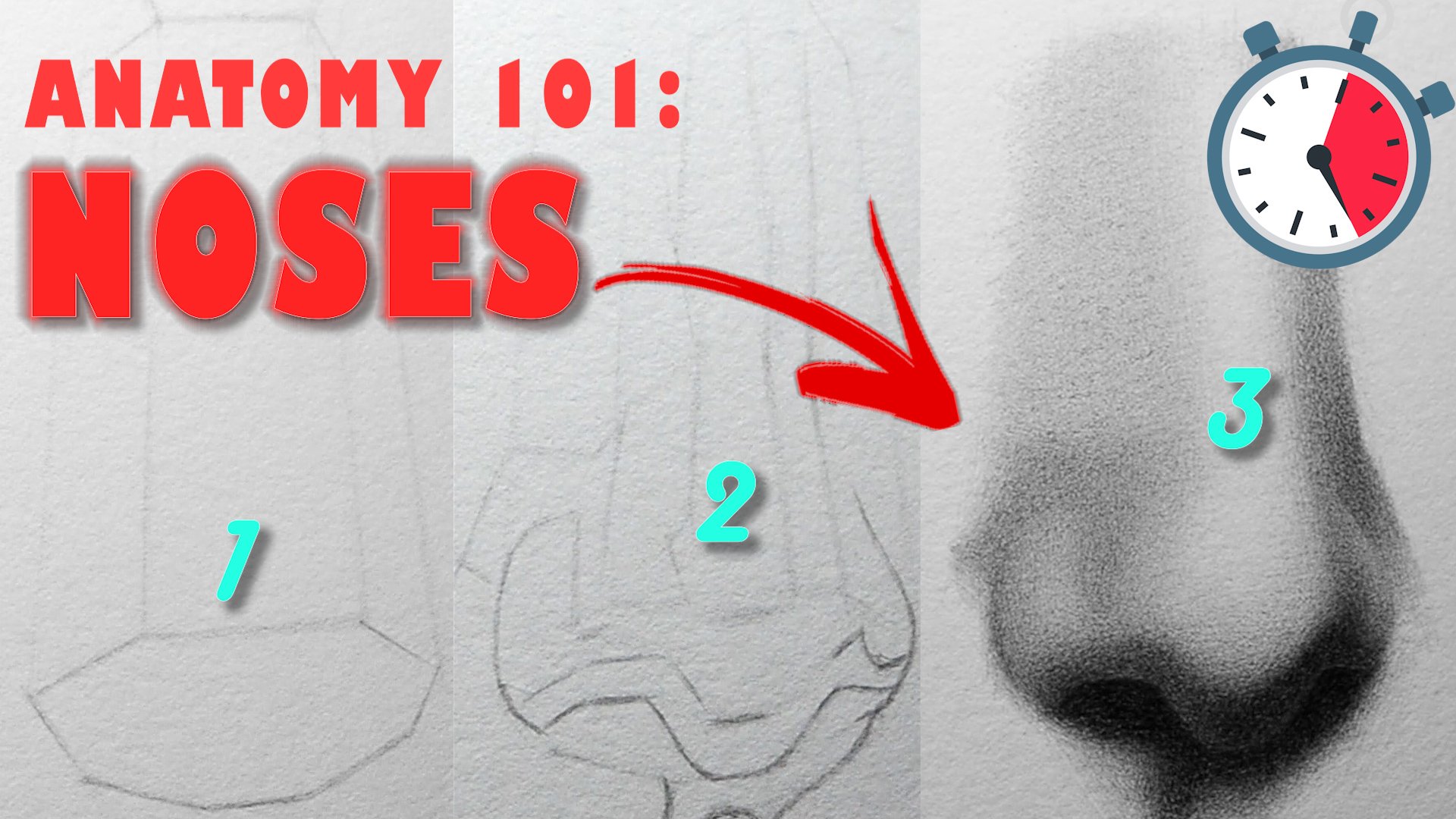
4. Warmup-exercises: Creating 3d objects: The first geometric shape
we're going to look at his acute variations of this can be seen in many
everyday objects. Thus, the ability to
draw and shade a Q well, will help us when you progress
to more complex subjects. When constructing a cube, I like to start off
with the square, making sure my
lines are parallel and as straight as
I can make them. From there, I add to the
corners straight lines perpendicular to my initial lines and connect them together. Alternatively, you can draw
overlapping squares and just connect the corners
widths in parents. Having done that, we must now choose the location
of our light source, in this case, the
left-hand corner. Based on that interval,
I'll begin by shading the front
plane of the cube, which is furthest away from the light source,
completely in shadow. Once that's completed,
our advantage to the next darkest plane, which is the top
plane of the cube. Lastly, the scoping of the cube, which is the most, Let's
parts of the objects. The cube, unlike the sphere and cylinder contains within it, mostly hard edges are
faster turning forms. In other words, the changes
in the plans are more abrupt and a light effect
changes most dramatically. Hopefully, this exercise will train your eyes to
look for those moments but abrupt plane changes and assigned to them
the correct edges. Onto the cylinder, I proceed by dark in an
ellipse at the top, followed by two
parallel lines and curved lines indicates
the bottom plane. The same light source in mind, we can deduce that our values
are going to move from light to dark in this direction. Next, our sketching the terminates with
my blending stump. I'd like to begin with
my shadows because their presence gives context to the light shape will eventually draw from the equity base
value for the shadow, for indicating the core shadow, which is darker because it's receiving less ambient lights, almost always the values in the shadow should be compressed. In other words, when
you squint your eyes, the entire value shapes you convergence
with one big value. As we transition to
the light shape, we'll begin with
our darker tones, moving along to Terminator and
softening the edges sheet. These dog has half-tones
should be lighter than the values in our
reflected lights. If we were to preserve a
sensible luminosity and the light shape and stay true to natural principles as
you build up our values, pass the dogs halftones
and then to centralize our transition will become
progressively more subtle. Reason being, values
change very slowly near the lightest lights
and dark and more dramatically as we
approached the terminator. This principle is known as
lambda to Michigan Law. Understanding this
will help you a lot in the still-life drawing, whatever else you decided
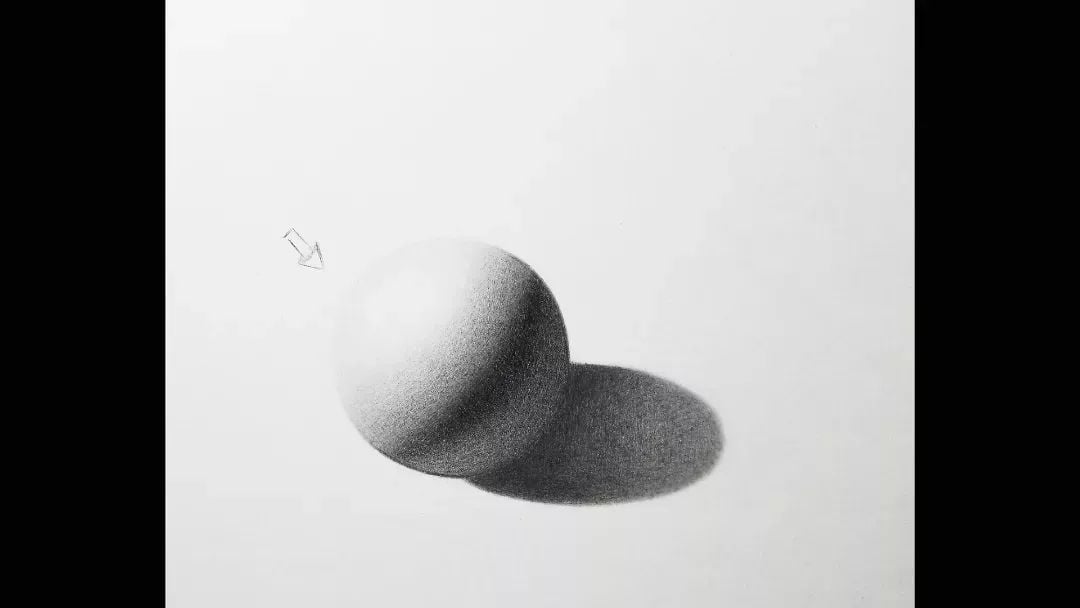
to join the future. In this sphere of light source, the situating are
compliant and Hornet. To begin with the drawing
and sketching rather roughly an approximation
of a circle. I would also advise making
five small lines in kind of a cross formation and connecting those lines because it's
probably a bit more efficient. Next I joined an ellipse to define the boundary
between shadow and light. Build up a base shadow
value from there, indicates by core shadow, the procedure is very
similar to the cylinder. Unlike the cylinder, we want to always keep adjusting the
outline of the shape. Let's make it look more natural. As I build up my
halftones in the sphere, I make sure to go around
the sphere completely, leaving my center lights in the middle of
the light shape. Remember that the
dark is halftones and the most contrast is going
to occur where light, meat shadow and the
changes in values become progressively
more gradual once we reach the center lights. All right guys, that wraps up
our exercise on drawing and shading simple 3D
geometric forms. The more you can visualize
the nuanced forms will be drawn later in this lesson
as what your practice here, the more convincing
the illusion of reality be able to
create in your artwork.
5. Warmup-exercises: Shading Techniques: In this exercise, we're going to transition from value control. So an exploration of
different shading techniques. Be crosshatching and
hatching primarily in the main drawing and
some scribbling. But it's up to you to decide what technique you want to use. My mind's they'd go
into this is not a striving for perfection, but an overview of some
of the ways we can introduce variety. And
so I'll mark making. The first shading technique
we're going to look at is pretty straightforward. It's hatching. So it
makes it an example as can be seen in the world are
some of the old masters. This technique consists of unidirectional marks typically
parallel to one another, although not necessarily greater lending structure to join. And you can vary up the
distances between the strokes to alter the perceived lightness
and darkness of an area. Moving onto crosshatching, you could consider
this a variance of patching by adding
overlapping strokes your existing hatch marks, you are effectively
cross hatching. I find that when you
make your overlapping hatch marks perpendicular to the previous ones in makes for a more
appealing appearance. Although not always, I especially like this
technique because I find it a very organic way
to build up your drawing. So if you're like me, you
probably like it Too. Movement from the
arm is key here. That's quite a bit
easier to make marks consistently that way.
But using your wrist. We're looking at
stifling or pointillism. I love this technique,
particularly when I'm working in pen and ink, but also in graphite to, it's a very bold, unique Chain technique and not one
that you see very often. The procedure is simple. You make secular dots with your pencil all around the form, gearing up the distance between the dots to change
the value smallest, drop the value larger
to lighten it. So here's some of
what I think are excellent examples of
pointillism in action. Onto scribbling. This
method of shading lends itself to more
tonal forms of drawing. And great, if you're looking for a softer, smoky aesthetic, SD Italians would say
sfumato to propose action. All that is required
is for you to make the lead two overlapping
circles around the box until all the holes and the whites of
the paper I failed. Different sizes of scribbles
to be smaller or larger, I will give you a different
visual impression. The smallest oligos
would lead to more even flatter value, and the larger circles in more whimsical or stylized. Look. Alright, that's a
wrap. For sure. This is just a
starting point for the many ways in which you can add value to your drawings. It's a call to action
to think creatively. I figure out what elements in your drawing you can
tweak to make your own. Varying up the way you shade or a ***** drawing is just
one of those ways. And hopefully it just
as starting points for your own artistic
exploration.
6. Warmup-exercises: Connecting the dots: Connecting the dots is the
name of this exercise. At first glance,
this might seem like a relatively trivial
things to do, but it has been a
tremendous benefit to me. These are be my hand-eye
coordination, dexterity, as well as my ability to make confidence pencil
strokes and brush marks. The process is simple. Create small circles,
randomized across the page and connect them with C curves, s-curves, and streets. Our aim here is to
connect them fluidly. Are they single stroke as opposed to multiple
connecting ones? By doing this, we
train our eyes and our hand to work in unison, produce lines that
in of themselves possess an appealing
rhythm and gesture. Look no further
than the works of great answers like rum
brands, Velazquez. So Roy, Yeah, just to name a
few to find examples of how confidence mark-making
can improve your artwork for the better. If you find yourself
struggling to connect the dots
in one fell swoop, I suggest moving your pencil from your shoulder
with your whole arm, like a choir master
conducting a chorus. Sometimes they make the motion in the air before I put it on paper just to get a feel for what the line should
actually be like. Likely in everything
practices key. And the more you do this, the more confidence
you will feel and the better your
mark making will be. Over the course of
the many paintings and drawings you will
make in your life, you will come to appreciate
the more subtle elements of gesture on line quality and the elegance they lend
to a work of art. That's all for this exercise. We can move on to the next one.
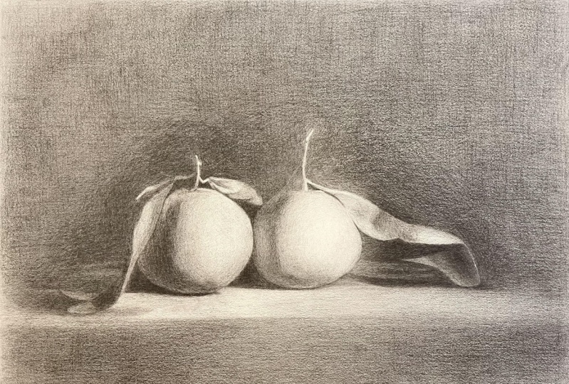
7. The Outline : Officially out of the stance
of the outline stage, a goal in this moment with the drawing is to define
the shapes that we see now reference as accurately as we can as our disposal
will be a grid drawn lightly on the
paper beforehand and I proportional dividers to help
her check on measurements. For convenience, I have my reference photographs
that's a black and white. I suggest doing the same, especially if you're
a beginner at struggled with seeing
values in full color. I also have the reference in full resolution in the projects
and resources section. So feel free to use that supplements which
you see on screen. I begin here in the
lower left-hand corner, drawn the leaf or
the left orange. My, I search for words, form of elite intersects
with the grid lines, and I connect those points
with straight lines. A lot of my attention
is directed towards identifying
and who breaks, connecting them to one another. A key advantage of using a grid was that he
makes the task of utilizing negative shapes to
verify accuracy lot easier. So when in doubt, look
for those shapes are on your drawing and assess if the proportions
are good on that. As you make your way
into the second orange, who will serve you well to utilize horizontal plumb lines. So ensure that the
alignments between the two oranges is
as it should be. There's a tendency that exists within all of us to
want to rush things, particularly at this
point in the drawing. It's so important to
take that step back mentally and
physically to look at the drawing as a
whole and search for those areas that look
misalign or incongruous. Lay down those plumb
lines once again, make those comparative
measurements and dads your eyes back and forth constantly to your
reference, a new drawing. It's always a good idea. Search on those
larger shapes first, progressing into
the Swallow ones from there, as you can see, the stalk of the rights orange, I initially identified
as extremities, top, bottom, left, right, into that overall
triangular shape. If I went into highlight
the negative shape within, we do this because accurate proportions are hard to achieve. Thus by focusing on
larger shapes first, you can ensure that time is
not wasted drawn in details, wanting to discover
to the wrong place. You've reached the end
of the outline stage. Now's a good time to
raise your grid lines. Search your drone
for places where you can improve the gesture and has the proportions and add any additional info that
can help you later on. So to wrap up in this video, we learned how to use a grid as a tool to develop an
outline of our subjects. The importance of
negative shapes and proportions and the value of plumb lines and keeping track of the accuracy of our shapes.
That's all for now. See you soon.
8. Values Block In: In this part of the lesson, we're going to be blocking in our shadow shapes
the background. And we elaborating on some of the contours we made
in the previous stage. Like earlier, I'm starting in
the lower left-hand corner. My only aim being to lay
down as much graphite as I can to form a base
value for the background. As I do, I pay careful attention to the
shapes in the foreground. I want these shapes
continuously improve, even if my focus, for the time being,
it's on the background. I like to use my
mechanical pencil for this part of the
process, really, because it's so
time-consuming already and any extra time spent shopping at pencil, then I can eliminate. I'm more than happy to do so. In addition to the background, we also apply any beast value to the shadows and
the foreground. Ideally try to minimize
the variations we see in our reference and have it all be one unified shadow value. If you find the values
you're laying down or uneven or splotchy, understand first that
is certain amounts of data is intrinsic to the medium, but also putting that your pen
to show to the lights hand in a consistent motion
will minimize this effect. When most of the
background blocked in, I'll soften those
initial marks with the blending stump and use
the residual graph five to indicate the core shadow
before we turn it back on my mechanical pencil
to revivify the area. Moving on to the
oranges themselves, I apply a layer of values. The shadow shape, lights
it on the core shadow, but darker than the
mean light shape. All these values, of course, significantly lighter than
they will be in the end. You do this to build the drawing as a whole gradually
with the understanding that is the relationship
between things and Redzepi thesis that matters more so than the
absolute values. At this juncture, I
like to go back and redefine some of the shapes
from my outline stage. No doubt some of our contours having lost and he's a value. So in order for us to preserve the integrity of our shapes, it's worth the effort to go back and make the adjustments. In your mind. Think of
this as a trial run. You're building up your drawing, steering deeper
into your subjects. Grasp more elements
of its capture your imagination on a
more practical level. Analyzing the
shapes, the values, and the edges that will make your drawing jump
out of the page. We're just about done with
broken in our values. In this video, we
learned some techniques and how to build up our
background efficiently. We delineate it, simply add
values into your lights and the shadow family have
redesigned some of the shapes. That's all for this lesson.
Catching the next one.
9. Refining the forms Pt.1: Finally, we're on
to the fun stuff. Over the next few
videos are going to be taking this join to finish. The steps are simple, but
the task is far from easy. More than anything, careful
observation and attention to detail will get us to
the results we desire. In order for our drawing
to look three-dimensional, the relationship
between the values must be true to all be
seen our reference. With that in mind,
we have the white of the paper seven as the highest
key value in the picture. So to keep things organized, I stopped by shooting in
the dark is values I see. To establish the upper
and lower limits of our value scale using my pencil, I'm putting down multiple
layers of graphite. You bring up the value slowly in the background and
shadows around the fruit. Periodically, you see me dabbing the surface of my paper lightly
with my kneaded eraser. Those moments I'm attempting
to even out to passage of value by removing the
little dog inconsistencies. You will also
encounter the reverse, which comprise a
tiny bright spots where the tooth of the
paper shines through. I find that going on
with the background and lights and harder pencil
like a to H or an HP can help you eliminate those bright spots and still preserve the
value of the area? No, no, no, no, no,
no, no, no, no, no. No, no, no, no, no, no, no. As I make my way into the
shadow of the left orange, I begin by establishing the
value of the core shadow, Keen it to the value
of the background. Once I'm happy with the
value in that area, I progressed to the parts
of the shadow receiving the most reflected light because of the ambient
lights in that area, it's going to be lighter than the core shadow,
but only slightly. If you squint your eyes, the difference should
be barely perceptible. So when in doubt,
err on the side of making the reflected
light to dark. I'm also adjusting the value and shape of the cast
shadow and softening the transition between it and the form shadow by shading
in an intermediate value. With all aspects of the drawing, I'd like to first work on
the shapes in an area, then the values, and
finally the edges. I do it in this order
because the shape is, in a sense, the environments that the other elements live in. The value gives us information how the light
interacts with the form. And the edges tell
us how slowly or sharp D these forms are turning. Transitioning into
the light shape. I'll begin with. My
dark is half-tones. Which are all along
the terminator, I'm going to gradually build
up to that dark is Halftone, starting firstly my Twitch
pencil and eventually my HB. All the while keeping at the
forefront of my mind that the darkest values
in my life family must be lighter than the
lightest value in the shadow, lighter shadow value being
the reflected light. At this stage of the drawing, parents dissimilarities
between our exercise when rendering 3D geometric objects
and what we're doing here. Visualize this orange as he's slightly more complex sphere and apply those same
principles of units here, value, lightened,
shadow separation, and soft with specific
radiations in value from your dog has
halftones to your lightest. I like to see my highlight for
last and this time around, I decided to use many
years Risa to dab the center of the light shape and reveal the
white of the paper. This is something you
can get creative with. You could also do this
with your pencil eraser with some cross hatching
of inspiring remarks. What we can do it like I
did. It's really up to you. The local value of the
leaf of the net orange is significantly darker
than the values in the light shape
of the orange. If you have your value
scale from white to black, the leaves would be
around the high dark and the light shape of
the orange alight. Having said that the
observable parts of the leaf are all in
the lights family. So he stopped. His
values should keep Clare of the shadow and
the body of the orange. The values in the leaf move from dark to light from top right, bottom left with a couple of upward facing planes touching more lines than the
forums surrounding it. No, no, no, no, no,
no, no, no, no, no. And the right leaf
of the left orange, we have to remain value shapes with the transitions
between them soft and the boundaries of the shapes comprised
of mostly hard edges. That's a wrap for part one of refining the forms
CAN to the next one.
10. Refining the forms Pt.2: As we make our final touches, and let's orange will serve
as well to pause and reflect. Now the values you've created so far related to one another. First, on the macro level, we can see three main
value groups before us. How do our lightest planes
relates to our midtones? Midtones relates to our shadows. Or you're trying to avoid a
situation where values in an area like this or as dark
as values in here like that. And vice versa. The light is coming from the
right-hand side. So the movement of value, she progressed from light
to dark in that direction. Right? The right orange would
be our focal points. Before anything else. Just
the design of the shape. Darken the back on value
and lights in the area of the background
forces to be orange to create the effect of increased luminosity will
achieve this effect, will get the values
in the background. So the orange in small steps
moving from dark to light. If the change in
value is too abrupt, the effects will be lost. So a smooth transition
from dark to light is watching for
v, for the background. Tv for intermediate value, an HB fertilize its
value in that section. Can also use your
pencil eraser to lighten up some of the
areas. If you have one. Beginning the right orange, I'm going to start by
establishing my shadow shapes, keeping in mind the
valley of the shadow. Now let's orange and trying
to keep them similar. Lighting parts of the shadow on the leaf or the right orange to maintain that sense of luminosity by vignettes
in the values. And the same way, bathroom. We spent our eyes to look
at this area are fully, we can see that this section comprises of two
main value groups. The dark band of value, sandwiched between
two shadow shapes. If some of that darkness, it's
important that we capture differences like this with just the right
amount of contrast, that area to be able to sit
back and space properly? No, no, no, no, no, no,
no, no, no, no, no. No, no, no, no, no, no,
no, no, no, no, no, no. I'm defining the form
shadows, the whites, orange. I stopped by building
up the value. The core shadow gets me to its correct value before transitioning into
the reflected light, making adjustments
to the cast shadow. In order for the form of this
orange to look realistic, or values must be even
and odd transitions, soft and subtle. Even values achieved through the application of
multiple layers of graphite and the removal of
spots of inconsistent values, they inevitably arise
soft transitions, on the other hand,
comparable and effective use of the white pencil
and the right area derives its immediate value to bridge the gap between
disparate tones. The last sheet with
the right orange is lighter than just about
everything else in the picture. With that in mind, must be measured with our
value application. Most of the transition between
light and shadow along the terminator will
be carried out in my HB pencil to
soften those edges. All the majority of the light
shape, the line the edge. Then for my two h
and forage pencils, beyond that, the whites
of the paper will serve as the center lights
in that area. Keep tweaking those
edges and values too, you can feel are distinct
sense of roundness. Imagine one of your
hand across the form. How does it occur?
Well, planes are facing towards or
away from the lights. These are the kind of
question that would accompany a keen observation of your reference, right?
11. Refining the forms Pt.3: Picking up right
where we left off. I'm continuing to build up
the shadow under I leave this particular section slightly lighter than values above it. Keep your eyes fixed as well on the sliver of lights
beside the shadow, moving from darker to lighter, from top to bottom. Good. The value of the
sponsor of the stock of the right orange is similar
to that of the core shadow, with most of its edges soft and diffuse because of the intensity
of the light around it. The planes on the right-hand
side of the stock is facing more towards the light and
it's considerably lighter, harder edges surrounding it. Over in this section
at decided to start with the dog is Plains, establishing that as
obese and great easing the values lighter towards the top and the
bottom of the leaf. As light as this portion of the leaf appears
when instead into, and he's still
noticeably lighter than the local value of this
part of the orange. For our values to
synchronize harmoniously, comparisons of this
nature must be recurrence through the
entire drawing process. Not just for our values, but for our edges as well. At this juncture, most of our efforts we devoted
to the background. Many, many layers. Deft use of our paintbrush and some tissue paper will help us in achieving a cohesive
and unified background. Disjoint is more or
less the sketch. So if you wanted to
give you a join as it was prior, that's totally fine. To be honest. I think I prefer the background with the
whites of the paper showing. If he had to grow as artists, we must learn to
enjoy and appreciate the more monotonous aspects
of creating a picture. Well, that's working on a
background such as this. When engaging in a rigorous
self boutique afterwards, it is only in those
moments of discomfort. Let me strengthen our weaknesses,
elevates our abilities. As we draw now to the
end of this project, advise you to give it a
day when you feel like you're done and come
back with fresh eyes, devoid of the angst of
whoring to the end in a fixed whatever calls
your attention as a need of improvement. With that said, congratulations
for making it this far. I've tried my best to
make this class as informative as I could
on my hope is that some of you who are
able to increase your understanding and leave it a bit more motivation
to try a little harder. I'd appreciate any
feedback and how can make these classes
better for you guys. But until then, take
care and much love.
12. Review/Self Critique: What's up, guys bouba
here in this video, I'm gonna be critiquing
the drawing I made for this class. If you were to continue to
grow in our ability to express ourselves and analysis of
what we've done is essential. Not just what you've done wrong, but what you've done
right will give you something to work towards
in your next project, I'm going to take this
self critiquing stages, beginning with the outline
into the value blocking, and finally the finished drawing without further ado,
let's get to it. Alright, so I have to draw
and to the right to me. So if you're wondering
why I'm looking down, that's why beginning
with the outline, I was pretty satisfied
overall with the outcome. I like the simplicity
of the shapes, the paucity of detail, and the overall proportions. I feel like everything
was relating well, what I disliked or could improve upon is the variety
in the line weights. Everything is very similar. So having some thinner
and thicker line, some harder and softer lines, lines that extend beyond
the form, darken accents. Things like that I think
would have made this stage of the drawing look a
bit more interesting. There's an idea out there that
you should aspire for your drawing to look attractive
every step of the way. Now this isn't always possible, but the idea is striving for that ideal makes you
a better artist. Moving on to the value blocking, I really liked the graphic
qualities of the shapes. I feel like I have a good
balance of C curves, S goes on streets. On the negative
side, I feel like my core shadows in the oranges, but two dark and the edges
too hard along those lines. If I made the core
shadow darker, I could have
indicated the rest of the form shadow and grouped
all of the largest half-tones into one big value
that we increasing the sense of roundness even
at this preliminary stage, last but not least, onto the finished drawing. I feel like I capture
the roundness of the form of the
oranges pretty well. It's evidenced what
the focal point is based on contrast and
the level of rendering. You've also got a good
balance of edges all around, which is something
I'm very sensitive to because I have a
tendency to make all images look the same
on to what I don't like. Where to begin. First
with the background, I'd like to do more
with the whites of the paper showing and the
vignette from dark to light. Also a few shapes
in the drawing onto well-designed as you can see
on the screen currently. So maybe going back
and tweaking some of those now that I can see them,
it's probably a good idea. Relative to my reference,
the core shadow, the right oranges too dark. It's quite a bit lighter
in the reference and something that I missed. Also, that section of
the leaf is too dark. The bottom of the leaf
of the rider oranges too low compared to
the rest of the fruit. And lastly, my cast shadows are too dark
relative to the form shadow. If you look at it closely,
you can see there's more contrast in my drawing
them there isn't a reference. Because of that, it draws attention away from
the light shape, which is the focal
points of the oranges. They probably a few
more things that I can improve upon that I missed. But I think you'll
get the points. This exercise is not
about hazing ourselves or feeling like a loser because
we don't draw like x artist. It really is all about
improving upon where we're ads, especially if you're
self-taught by applying yourself that this
process of self-analysis, you will unconsciously
hit upon new insights and ideas and overtime
mastery or come to you. So acknowledged the winds, take the losses in your stride, and come back with renewed
vigor and enthusiasm. Best of luck to you guys. Bye bye.
13. Preserving your drawing: Alright, with the
drawing behind us, we're going to want
to keep it in as Pristina condition as we can
unless you hit the drawing, in which case you can
just throw it out. But assuming you want
to keep the drawing, we're going to be going
over the tools you can use to make this happen. So the first step
for me is usually cropping the paper
with a paper cutter. This step is optional
because it's not always necessary and in this
case, it's not accidents. I get out my spirit fixative, which puts simply is
a liquid containing an aerosol container that
when sprayed on the paper, prevents smudging and yellowing. Some fixatives I workable, meaning you can still
work on the paper with your pencil even
after you've used it. While some others
and unworkable, meaning should you use them? So you're completely
done with the drawing. There are a bunch of
different brands out there, so I encourage you to try them all and see what works for you. Cry alone and a
Winsor and Newtons workable, fixative works great. The process is pretty simple. Ideally, you want to
do this outdoors. If not, you can just
open up your windows, leave Drawing Flats on a table, get out your fixative, shake it vigorously
for about 15 seconds with your bottle parallel to
the surface of your paper, keep the nozzle about 12 inches away from the
surface of the paper. Spree all the way
across the paper, going over the edges
on both sides, first horizontally
and then vertically. Do this in a single layer, give it a couple of minutes
for the liquid to settle, then rinse and repeat. Depending on whether
you're using graphite, charcoal pastel, usually two to five layers is good enough to
get the job done. You can always just
raise your hand on the surface of the
paper a little bit. And if you see you
aren't picking up any graphites in this case, then you know it's sufficiently fixed once you're
done with that, leaves the joint in
a well ventilated area for about half an hour. Beyond that point, you
free to handle it, move it around a storage
wherever you want to. It's a good practice as well. Once you're done
with all of this, to get this prefix to bottle, turn it upside down, spray
for a couple of seconds, and then clogged the nozzle that way when you're ready
to use the next, it works well,
hopefully you've got a portfolio or fully you
can put the drawing in. And beyond that
point, you get to go. Thanks for watching. Bye bye.
14. Class Project: What's up gets moved here. For this class
project, you're gonna be taking it in two phases. The first comprising of
a conceptual sphere. If you remember one of
the geometric forms you during the
warm up exercises, your goal for this phase of the project is to draw and shade a minimum of ten spheres
from start to finish. In this conceptual sphere, a light source would be coming
from the right-hand side, mimicking exactly the still-life
drawing for this lesson, I pick the sphere because it's the most basic form underlying
the shape while oranges. Thus through many iterations
of drawing the sphere, you are developing muscle memory and ingraining the concepts covered in the warm-up
exercises even deeper. Second phase of the
project will be for you to go through
the steps outlined in this lesson and complete
a finished drawing from the reference
photo provided and the projects and resources
section equipped with a better understanding of how
to render a spherical form. From phase one,
your focus should be on creating
well-designed shapes, Eclair movements of value
from light to shadow, and a good amount of variety in the edges of your picture. I understand that the
process of getting better at drawing is
one of trial and error. So be kind to
yourself if you find a success does not
come immediately. I'm more than happy to answer any questions you might
have about the projects. So feel free to drop a comment
and Discussions tab if you need a bit of help and best of luck to you all, Bye bye.
 Terence Zulu, Fine Artist & Teacher