Transcripts
1. What This Class Is About: Hello, I'm Mimi, and
a few years ago, I built a habit of
drawing every weekday that turned into a career as
a professional illustrator. And I've talked
about the business side of that journey before, but now I want to use
what I've learned to help you build a consistent
creative habit of your own. Sometimes just getting
started is the hardest part. So over the next seven days, I'm going to guide you through the first week of your art
habit to help you build up momentum and confidence and show you how much
creative potential you have. We're going to focus our
time together on creating. So we'll fill one
sketchbook page together each day
for seven days. And while the drawings are the physical project
of this class, the main outcome is investing time in yourself each
day to be creative. There's a project section
below this class, and if you feel comfortable, take a photo of each
sketchbook page and upload it there to help inspire other artists and so that we
can admire your lovely work. It's totally up to you whether you upload one page at a time, all of them in one post, or you could just pick your
favorite of the seven. I've also made an art habit
workbook exclusively for this class to give you some extra ideas
for each exercise, and at the end, there's
a plan for what to draw after the
first seven days, so be sure to
download that below. The tools you'll
need for this class are simply a sketchbook that isn't precious to you and your preferred art supplies. I'll be using mostly
colored pencils, but I also have some
watercolor paints, a couple of brush markers, and a regular graphite
pencil and eraser. You can use any
traditional medium to do the activities
in this class, though. Just use whatever
you have available. Any size sketchbook that
you have will be fine. But if the pages are really big, it can be hard to fill a page. So you might want to break large pages down
into smaller sizes or get a smaller sketchbook around a five size or even less. A small sketchbook means that you can fill a
page with your art quite easily and feel a real sense of progress
and accomplishment. I say a sketchbook that isn't precious to you because
you need to have a safe space where you can make art without pressure
or expectation. So if you have a fancy sketchbook that you're
scared to draw in, save that for another
time and find yourself something
more relaxed instead. So first, let's
chat about how to set yourself up for
building an art habit, and then I'll guide you through seven sketchbook drawings
one day at a time.
2. Art Habit Foundations: Building an art habit is
challenging because there are lots of things that stop
us from creating more often. And some of them are external, like life responsibilities
and busy schedules, and some of them are internal, like a lack of belief in ourselves or having
high expectations. If you want to
create more often, then you need to
make it easier to create by reducing
some of your barriers. So have a think about
what barriers you have that have held you back
from starting an art habit. Write them down so you can
see what you're up against. I've left a space for this in the workbook, if
that's helpful to you, and then start to think
about what you could do to relieve some
of those barriers. Some of them might be
totally out of your control, but others probably have
a bit of wiggle room. If they're external hurdles, things like not
having enough time in your schedule or not having
a nice space to draw in, is there anything
you can do to make more space for your art habit
within those restrictions? Can you spend 30 minutes
drawing on your lunch break or designate a small space in your house for
art once a day? If they're internal hurdles, things like pressures and
self limiting beliefs, then those are
definitely things you can overcome with practice. Because when we
practice making art, we're giving proof to ourselves that we're
creative people, that we can make nice things
and come up with nice ideas, and you might need a bit of support in that
in the beginning, but that's why I'm
here to help you show yourself that you have
so much creative potential. So I have a few reminders to share with you
that really helped me a lot whenever I'm trying to be more consistent
in making art. First, the outcome of building an art habit is doing the art. It doesn't matter what you make. If you've made something today, then you've successfully been consistent in your art practice, and that is something
to be celebrated. Secondly, make a safe
space to be creative in. Not just in a
physical environment, but I mean designate a sketchbook
to be messy in and make bad art in because perfection
is the enemy of creativity. And if you have any
expectation that the art you put in a sketchbook should turn out a certain way, then that leaves room for doubt. Remove any pressure
you have on yourself, and I really mean any
pressure or expectations. Third, there are no right
or wrong art techniques. There are just techniques. I'm going to be sharing
some of my techniques and why I'm doing certain things throughout these lessons. But that's not because they're
the right way to make art. They're just the techniques
that I'm using at the moment, and you might want
to use them as well. If you don't, that's cool, too. The aim of the game is to
put marks down on paper, and there is no right or
wrong way to do that. Number four, make it
easy for yourself. You don't need to draw
anything hard because just consistently showing up for your creativity is hard
enough in the beginning. Take time to draw simple
things and don't be afraid to repeat
similar subjects if you like drawing them. Your focus in the beginning is just showing up to
make something. So make all of the other
stuff as easy as possible. They don't give out
medals for diving in the deep end and making
things hard for yourself. And lastly, on a practical note, I have a small
technique for making it easier to fill
a sketchbook page, and we're going to be using that throughout these seven lessons. To make a blank page
less intimidating, I like to break it up into
frames to put artwork into. Really, a blank page
is a frame in itself. It's something you're
putting your art into. But the problem is that it
can literally be anything, and that's kind of overwhelming. So for each of our
sketchbook pages, we're going to first
create a new frame within the page to help us see the space in a new way and then use that as a starting
point for our art. A frame can be as
simple as a basic shape or as prescriptive as
a mug to decorate. Then to help guide us more, we can add a theme to the
artwork on each page. A theme can be something like a garden or fish
or spring colors, and it helps narrow
down the scope of ideas when it comes to thinking
of exactly what to draw. Themes don't have to
be followed strictly, and you might not need
one for every page, but we're going to
use them throughout these lessons just to
help with creative ideas. So get your sketchbook and
your art supplies ready, and let's start building
your art habit.
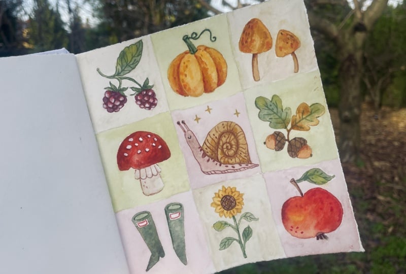
3. Day 1: Patchwork Page: Today is day one of our week of sketchbook drawing and the
start of a new creative habit. So let's make something
colorful today. In the last video,
I was saying that turning your blank page
into frames and giving a theme to the art
you'll put in them is a great way to make
an empty space feel less intimidating. So in today's session,
we're going to make a patchwork by turning the
page into an uneven grid, which will be our new frames. And then within each mole frame, we'll draw a really
simple illustration on our theme for today,
which will be garden. So basically anything we can think of that might
fit in a garden scene. I'll guide you through
the whole session. You're very welcome to draw exactly what I'm drawing in your own sketchbook,
if you like. Or if you're feeling creative, you can make your
own variation on this page or just use a
totally different theme. Use this exercise in any
way that inspires you. Let's get started.
So I quite like to choose a simple
color palette from my art supplies for each
sketchbook page before I begin, mostly to prevent me
from getting frazzled, trying to choose
colors later on, but also just to help
everything feel cohesive. I know I'm going to be drawing
garden related things, so I'm choosing a few colors that I know will be
useful for my theme, like pinks for flowers, some greens for plants, and then some other
flower friendly colors with a mix of lighter
tones and darker ones. It can always add to these
later if I need another color. So it's not set in
stone or anything. I just find it helpful
to have these colors set aside to be able
to pull from easily. So start with a light
to medium color, something that you could
go over in a darker color. So I'm choosing this lilac, and you want to draw
two or three lines vertically down your
sketchbook page, depending on how big
your sketchbook is, spacing them quite unevenly so that all of the columns
aren't exact same width. Then do the same
thing horizontally. I think I could comfortably
fit three lines on this page. And again, I'm going to
space them quite unevenly. So some of them have a big gap and some have a
much smaller gap. This has given us lots of
boxes of different sizes, and now we're going
to fill each one with a small drawing using the theme we've chosen
to help us with ideas. The theme today is garden. So think of something you
might find in a garden. I first think of a flower, and we can just draw
these really simply. I like to roughly match
the shape of the box. It's up to you how much
you feel each frame. I don't really go all
the way to the edges, but I will put rounder shapes in the squares and long skinny
things in the tool boxes. And to begin with,
I'm just going to draw them all in one color, kind of as a sketch that
I can color in later. There's no particular
order to doing this. I just tend to think of
something that belongs in a garden and pick a box that would be a
nice fit for that thing. Or for some of them, I'll look at the shape of the box and try to think of something in a garden that is
roughly the same shape. If you're a more
methodical person, you might like to fill them in from top to bottom
and left to right, but I'm too scattered to
do that for this exercise. And you can definitely choose a different theme if you like. I've included some ideas in the workbook to give
you some inspiration, but just choose
something that you're interested in drawing and that
feels comfortable for you. You could draw lots
of the same thing in different shapes and colors like lots of flowers
or stars or rainbows, or you could draw lots
of different things on a broad theme
like outer space, the beach, jungle critters, really anything
you can think of. I like drawing garden
things because they're comfortable to me and generally quite beginner
friendly, as well. Now, this short white box feels like the shape
of a ladybug to me, so let's draw her in here. Because I draw this
sort of thing a lot, it's not too hard for me
to come up with ideas, but that's just because
I've practiced a lot. If you're just getting started with growing your
creative muscle, it might be a bit
harder to think of ideas, and that's okay. You could look up
inspiration online. I like going to
Pinterest and typing in something related to my
theme like Garden ideas, Garden clipart or
Garden aesthetic. And that will give me lots of visual inspiration if I'm stuck. And the one next to it
has a similar shape, so I think a wide summer
hat would fit nicely. I'm keeping these
sketches really simple. I'm going to add color and some details to them afterwards, but you can also get away with simple things when you
have lots of them. If I just drew one of these
simple things on a page, it would feel a bit lonely, but put lots of things
on a theme together, and suddenly they form a pattern and tell a bit of a story. So you can draw them
simply like this, but the overall page will
still feel full and lively. Now, it can be fun to
draw sideways, as well. Not everything has to be
the same orientation. So a long bug fits
nicely in this box, even if it doesn't quite match the same orientation
as the others. This guy is sort of like a worm. Or maybe they're
actually a caterpillar, and I can do tiny little
legs down the side. Another way to get
ideas if you're running out is to ask yourself
questions about the art. Like, what would I see if I looked around my
garden right now? Maybe a bumblebee
buzzing around. Or you could ask, What
critters live in my garden? Or if I sat in the grass at
the park, what would I see? If you're having trouble
coming up with visual ideas, sometimes asking questions in words can help lead you
to that inspiration. And if you're really at a loss, you can just fill
in a space with a super simple symbol like a star or a heart or
something like that, because they go with everything. So we just have two more boxes to fill in down the bottom. I think in this
one, we should draw a very happy sunshine shining
brightly in this garden, bringing these sunbeams to the edge of the frame
to match that space. And then lastly, let's just
fill this final frame with another flower because you can never have too many
of those in a garden, and we shouldn't be
afraid to repeat things. There's no rule that says we can't if we're just
starting a new art habit. Now that we've
drawn a small image in each of these boxes, we can go back and
colour them in. Let's start with yellow, which is always a lovely
color for a star. And I'm just going to fill in the whole shape nice and simple. I think I'll actually just color in all of the yellow bits at once rather than color the
full illustrations one by one. But of course, you can
colour in as you prefer. The benefit of doing one
color at a time is that I can spread out where this
color goes across the page. So rather than ending up with lots of yellow things
all in one place, I can make sure that I have
a few yellow things up here and a few yellow
things further down. It helps create some balance, and it's not totally
necessary or anything. It just helps your
art feel nice. If you think of an artwork like a balance
board or a seesaw, having a lot of one color
on one side can put it off balance a little bit until you add some more of that
color on the other side. So doing it this way, I
just find it easier to spread colors out by layering
them up one at a time. Some colors might be obvious
like there's sunshine, but for anything
you're not sure of, you can always come
back to later. Next, I'll colour in
green because I'm sure I'll have lots of green things
in this garden patchwork. And let's start with
the caterpillar because although it
could be any color, really, we get lots of these bright green
caterpillars back home, and I think adding
a bit of green up here will help balance
out the greens that I'm likely going to have on the leaves and stems on
other parts of the page. This flower stem, I
definitely want to be green. I selected a few greens for
my palette, but generally, I like to start with lighter
colors and then build up to darker colors later
for shading and details. But also, this green is just
my favorite from my pencils, as you can tell by how short
it's gotten from overuse. It's probably less
than 2 " long, so I think I'll need to
get a new one pretty soon when I can't sharpen
it or hold it anymore. Let's next do this
leaf at the bottom. Leaves can be lots
of different colours from green through to yellow, orange, brown, red, and
even deep purple sometimes. I'm going for a spring vibe with this pastel
color palete though, so this is a springtime leaf. I think that's all the
green I need for now. Let's take the next color, and I want to use this pink for a few things like flowers. But I'll start with
this butterfly. And as I'm coloring,
I'm just leaving some gaps to create a bit
of a pattern on the wings. I'll also use this
pink for the ladybug, even though ladybugs are typically kind of a
bright red color. I'm gonna colour this one in pink because it's a bit softer, and it still shows
us what it is. Plus, I don't really want to use a bright red in my
pastel palette. And ladybugs can be a
few different colours like yellow or orange. So I don't think
it's too much of a stretch to draw this one pink. I'll color in the shovel handle pink as well for
a bit of palance. It could be any color, really, so why not
have a pink one? Now, I'll colour in a few things in this lilac color
that I started with. I thought about
leaving this flower up the top white like a
daisy, but actually, I think it would be nice
for it to be purple because I want lots of colour
on this sketchbook page. And let's add a bit of lilac
to this hat broom down here, too, because it'll just go
nicely with the yellow. So, now we've got these
drawings colored in. Let's do the backgrounds. And I want to colour in all
of these backgrounds in different colors to give
us that patchwork effect. I have a really light
pink from my palette, and I want to use this as a background for a
few of these frames, but only things
that aren't already colored in this pink
like the caterpillar. And I'm just going to
fill the full frame around the illustration
that I've drawn. I want these background colors to be different to the colors of the illustrations that
are in them so that the colors pop more and
don't get totally lost. Now to make this
a true patchwork, I'm going to use a
few different colors for these background panels, and I'm going to
try not to have any of the same colored backgrounds
touching each other, though I think matching
diagonally would be fine. So basically, not having two pink backgrounds next to each other or two
green ones touching. Now we've got three
pink backgrounds. Let's do a few in another color. Again, I'm going to
try not to have any of these yellow frames next to each other, so I'll
spread them out. It's actually a little
bit of a puzzle, so you might want to plan out
before you start coloring, but really, it doesn't
matter too much. I find my coloring in style is quite sketchy when I'm
coloring large areas. I quite like a scribbly
look almost like a cross hatch effect where the strokes go in
different directions. I think it's because I
like the texture of it. I really like texture in my art. So coloring in like this gives a little bit of that extra
texture to the illustration. You might be much neater
than I am, though. That's fine, too. Color,
however you like. There's definitely no
proper technique here. Now we need a
different color again. So let's do this teeny
diny light green pencil. Choosing my color palette in advance means that I've now got this nice mix and match effect where there are
only a handful of colors, so they feature
as backgrounds on some frames and in the actual
illustrations of others. You don't have to choose a
color palette in advance, and even if you do, you
can always add to it. But I really like the
simplicity of choosing from a smaller
selection of pencils. And then if I do really need or want a color that
isn't in there, I can go and find it from
my bigger pencil dash. It's just one less
thing to think of and a little less overwhelm. Okay, let's do these last few in the lilac
from the beginning. So I'll just go ahead and color in these
final backgrounds. No. So now I have the whole page colored
in and nicely filled. The thing that's lacking for
me now is a bit of contrast. So I'm going to go over things in some of the darker
colors that I have. That doesn't necessarily mean just going over the outlines. It could mean darkening some parts of the
backgrounds like this. And having a darker
edge next to the light yellow will give it more
contrast and make it pop. I can also use this
darker color to add some extra details like some petal features
on this flower. I often like to add some little details to
shapes that are simple. It's usually either
some line details, a tiny bit of shading, or sometimes you'll see me
adding little spots to things. It's really to break
up large spaces and add a tiny bit of depth or
sometimes some texture. Art feels a bit flat when
all of the colors have a similar value or
darkness to them. So far, I've used a lot
of quiet light colors, lots of pastels,
which are lovely, but can wash each other
out a bit unless I then add some darker bits to balance out those
really light bits. If you ever feel
like your drawing is a bit flat or a bit lack luster, it might be because there
isn't enough contrast. So you might need a
bigger difference between the lightest colors you have
and the darkest colors. If you have two colors next
to each other that have a really big difference in
how light or dark they are, you'll have lots of
contrast and they'll really pop like this white flower and the purple
outline around it. Or if you have two colors
next to each other that have a small difference in how
light or dark they are, like the yellow background
here and the green stem, they won't have much contrast and will blend together a bit. And sometimes that
might be what you want. But if it isn't can introduce more contrast like I am here by giving a bit of an outline in dark purple or just darkening
one of those colors. I left the middle bit
of this butterfly blank because I knew I
wanted it in a darker color. And then I'll just add a bit
of outline to the edges. I usually don't draw
an even outline. I make some places a bit thicker and maybe
blend them into shading and leave some of them quite thin or maybe
even leave some gaps. I think that quite often variety is what makes art
more interesting, maybe because things in nature
aren't usually uniform. So although sometimes we talk about balance and
being cohesive, it's also nice not
to be too strict and perfect and leave a bit
of room for imperfection, and that makes your
art feel more natural. But at the same time, if you
really like a very uniform, a very neat style,
then go for it. There aren't any rules in art, and anything I say or anyone else says is just a guide
or a starting point. Art advice never has to be followed if it
doesn't work for you. The main thing is that you
enjoy making this art. So do whatever is fun for you. Let yourself play with different techniques and different styles, and you'll learn over
time what you like. I'll keep sharing
throughout this class my own techniques or
general art tips, but feel free to ignore
all of it and go your own way if it brings you more joy
in your creative practice. So I'm just going to
go through and finish adding this darker layer
to the rest of the boxes. So there we have it. Our first sketchbook
page is completed, and if you've drawn
along with me, then you've officially
started your art habit, which is a wonderful step, and there'll be lots
more art to come. I'll see you tomorrow for
the next illustration.
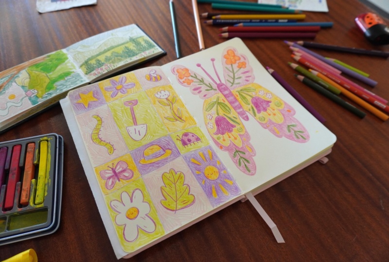
4. Day 2: Butterfly Pattern: It's day two of our week
of sketchbook drawings, and yesterday we did this
lovely patchwork page by making grids to frame
lots of little drawings. Today, I thought it would
be nice to do kind of the opposite and draw one large
frame to fill this full page. We'll start by
drawing the outline of a butterfly as our frame, trying to fill the
whole space with it, and then use the
wings as an area to play with our theme for
today, which is flowers. I know we drew a few
flowers yesterday, so you can choose a different
theme if you prefer, but it's okay to repeat imagery, especially if you're
just focusing on becoming comfortable
as an artist right now. Butterflies might
feel a bit childish, but a really lovely way to play with some
symmetry and patterns, and grown ups can draw
butterflies, too. So, let's get started. So I've got the
same color palette of pencils from yesterday. I think I'll just keep
them for today as well, because I like the palette, and it will help keep
this spread of two pages looking cohesive without
any effort on my part. So to start with,
we're going to draw a simple butterfly shape to roughly fill the shape
of this whole page. Let's start by drawing the middle body part
of the butterfly just roughly in the center as a
long sort of oval shape. Next, we'll draw the first
big wing on one side, trying to reach right up
into the corner of the page. Maybe I can give it a bit of a curved
shape to the side of the wing here as I bring it back down and then join
it back to the body. Then let's do the same thing on the other side
to be symmetrical. Don't worry if you've
drawn your butterfly a bit wonky or off
center like I have. One side will just have to be a bit bigger than the other. Then we need two big
wings on the bottom half. So again, I'm going
to shape them based on my sketchbook shape so that the wings can
reach right towards the edge of the page and
fills the space nicely. Not perfectly or anything because then we'd have a
very rectangular butterfly, but just so that we have a
nice big frame to draw in. And then we can draw
two long antenna coming from the top of the head, which helps use a bit of the
space in the middle here. So there's our frame drawn
for this exercise today. Now I want to make some
creative patterns on the wings because butterflies always have lovely intricate patterns. We have flowers as
our theme today. So let's start
filling these spaces with some really
simple flower shapes, just big round petals
joining together, really, and see if we can
make some patterns from them. For this exercise, anything
that I do on one side, I'm going to match to the
wing on the other side, not necessarily perfectly,
especially because I drew the wonky and one side of my butterfly is definitely
bigger than the other, but just so that
it feels mirred. Now, this is where having
a theme for your page comes in really handy
because without a theme, I'd probably be a bit
lost as to what to draw within this frame and what
patterns to make on the wings. But knowing that I
have the theme of flowers makes it
much easier because now I just need to decide how I can creatively fit
flowers into this shape. And also this combo
is quite classic. People have been
drawing flower patterns on butterflies for
a very long time. If you need some inspiration, you can go on Google or
Pinterest and search for folk art flower butterflies
or something similar, and you'll see lots of results. Now, if you want
to, you can follow exactly what I'm doing
in your sketchbook. Or if you're feeling creative, see if you can make up
your own flower patterns. It's totally up to you. The main thing is
that you're here today and you're
making art with me, and that's what's most important for building your art habit. The way I'm building
up these patterns is starting with some
big elements first, like the flowers that I started with and then their stems. And then I kind
of fill in spaces around that with shapes
that fit that area. So now let's do
the bottom wings. I think this time, I'll separate
them into two sections, so I'll draw some curves towards the bottom to break the
wing into two spaces, and that way I can have them
different colors later on. So maybe for these wings, I can have a big flower in
the middle as the main part. But let's do a different
shape this time. Sort of like a bell
shaped flower. Then some little dangly bits. And a stem as well
that I can draw. We have some nice big leaves. Now, I'll try and match
that on the other side, which is definitely
a smaller wing, but I think we can
squeeze it in. And then we can fill in some of these smaller spaces
around the main flower. I'm going to do some tiny cute flowers in this space here, as many as I need to to
fill in the big gaps, but at the same time, I don't want it to feel too crowded. There's lots of space
on this other side, though, so these ones
can be a bit bigger. Now, in this gap
below the flowers, I think I'll just draw a circle and then maybe the same on
the other side of the flower. I don't have too much space
on the opposite wing. I really didn't draw them
very evenly, but that's fine. Nobody's going to mind. I'll just draw a tinier circle, and you won't even
really notice. And let's just fill
these final few spots with some long organic shapes. Then we're just left with this separate section
down the bottom. And this time, let's draw some leafy shapes
rather than flowers. So really, it's just a long stem with some small leaves
coming off either side. And then, again,
let's just fill in these final few spaces
with small shapes. So we have the base
of our drawing here. The pattern is all laid out. We just need to color it all in. I have a nice light
pink color in my palette so I'm going
to start with that and color in the background of these top wings to give us
a base to work up from, coloring in everything around
the shapes we just drew. Yesterday, we colored in the illustrations first and then colored the
backgrounds after. Today we're doing the opposite, but really, you can do either. I don't have a specific
technical reason why I decided to colour the
background first today. It's just what came to
mind as the next step. I do really like
coloring in like this. It feels relaxing, especially
with these colors. You might choose to use
a different art medium, but I enjoy the feeling of pencils and the control
you get with them. Now that the top
wings are colored in, I'm going to do the bottom
two in a different color. So let's try the yellow. I think the yellow
will look extra nice when I color in
these flowers on top, and you could do the wings all the same color or
in similar colors, but it feels more fun to me to have multi colored patterns. I'd be really
curious to know what your sketchbook pages
look like and whether you choose the same colors and shapes or do something
totally different. There is a project space
below the class where you can share your sketchbook
pages with us if you like, and I would really
love to see them. Maybe you also like
soft colors like me or maybe you prefer bolder
colors or cool colors. Or maybe you're not sure
yet, and if that's the case, these exercises
are a great place to try different palettes. And when you build a
regular art habit, it doesn't matter if you
don't love the colors you use one day because
you're going to be making another piece
of art really soon and we have another opportunity
to try something else. And lastly, let's color in
these bottom bits that I had separated so that I could do them in
a different color. So I'm going to use
the medium pink from my palette to
color these in. Now, because I'm
using the same color that I use for the sketch, I do lose some of the
shapes a little bit, but I think I can still
see the original. I just have to be careful not to go over all of it completely. So we've got our
backgrounds all colored in. Now, I'm going to come back
to the middle body part later because the wings are the main focus for
me in this exercise. So next we can colour in the lovely floral pattern
details we sketched out before. I want these to stand out, so I'm going to use
a stronger green to colour in the stem and leaves of this main
flower element at the top of the wings. I've always loved drawing
flowers and plants, I think because they come in all sorts of shapes and colors, and you can make them
up as you go along. You don't need to
know any anatomy or have any special skills. As long as you have
some petals in a pretty color and some leafy shapes in
some kind of green, you've got yourself
something that's instantly recognizable as some
kind of flower, even if you've completely
made it up like I often do. And they're so flexible. You can form them
to fit pretty much any space like we have
with these wings. So since I have a
pink background, I think it would be nice to use a different color
for the flowers. We could just use a stronger
pink than the background, but it just seems like a
nice opportunity to use something different like this orange that I
haven't used yet. I'm still mirroring everything
that I do on one side onto the other side so
that our butterfly is symmetrical or at
least near enough. If you wanted to get
playful with this, you could definitely have
a symmetrical pattern, but different colors
on the two sides, or maybe you could
try some asymmetry and bring in some differences. But I'm going to keep it
simple and symmetrical today. Just like with the
drawing we did yesterday, I'd like to have a little
bit of balance with these colors spread out
across the illustration. So I'm choosing a few
other sections in the pattern to color
in orange as well. Now, for the other big flower, I'm coloring it a bright purple because we have yellow
in the background, and purple is a complimentary
color to yellow, so it'll contrast nicely. If you've never heard of
complimentary colors before, in basic color theory, there are a few color
combinations called harmonies that kind of act like a formula for colors that
look nice together. And one of those harmonies is called complimentary colors, which says that colors that
are opposite each other on the color wheel contrast
nicely and feel good together. If you look at the color wheel, yellow is opposite purple, so they often look
good together. Another combo is orange
and blue or red and green. So you'll often see those
combinations a lot as well. It's not a hard rule, but the harmonies can be useful starting points for
building color palettes. So if you have a yellow and have no idea
what to put with it, then purple is an easy bit. So like before, I'll spread this purple around other parts of our pattern because I'm going to fill these
spots in with something, so why not color them in with a color that I've used
elsewhere in the illustration? Let's now fill in
these other stems. I'll use the medium green from my palette for this so that it isn't too light and fighting with the
yellow background, but also a bit varied from the dark green that
I just used before. This green actually is fairly
similar to the yellow. So let's go over it with a
darker green just a little bit to strengthen and separate
it from the background. I won't outline it perfectly, but I'll just go over some of these edges to make
them a bit darker. I do still want some of the original green
poking through, so I can just softly layer up this green to blend them so
that we get a bit of both. There aren't too many
empty sections left now. Let's just fill in these
flower centers with yellow because I'm not really
a fan of the plain white. I think I'll fill in these
bottom spots as well. We definitely can leave some areas in this
pattern white, though. Let's leave the
little flowers white, but outline them just a bit so that we don't lose
them in the background. I was saying yesterday
as well that I don't always outline
things evenly. I usually just
suggest an outline, but leave a few soft bits or gaps to help it
feel more natural, and it's just not
so harsh that way. And finally, we
have these circles, and I think a green
would be nice here. So now things are
really starting to come together and we
have these lovely wings. Let's just make sure
that everything is as bold as we want
it to be by going over any areas that
are getting a bit lost and strengthening
them a little bit with some stronger colours. The great thing about
pencils and a lot of art mediums is that
you can layer them up. So if you start light and soft, you can always layer up to
get those darker colors, and you can put different
colors on top of one another so you can kind of
mix colors together that way. The tricky thing with pencils
is that you can't really go lighter unless maybe you have
a really good white pencil. With paint, you can add
white and go lighter, but with pencils and markers, it's more of a layering up
from light to dark process. So I've totally neglected
the body in the center. Let's give that a bit of color, but it's not the
style of the show, so I won't draw a
detailed pattern on it. It would be fun to see what some simple stripes look like, though, so let's try that. Mm, I don't love the stripes. Maybe they're just a bit strong, so I can fill in these bits in between with a little bit of purple as well to soften them. Then we can go over these
antenna at the top, coloring them in
nice and simple. And there is our second full sketchbook
page all finished. What a lovely thing to draw. I hope you enjoy drawing
along with this one, and I'll see you tomorrow
for day three. Think
5. Day 3: Mug Cabinet: It's day three of our week
of sketchbook drawing, and we have a brand new
page to make some art on. Yesterday, we filled the
page with one big butterfly. But today, we're going to
be drawing several frames across the page to fill
in with different ideas. We're going to start by drawing different mug shapes to act as our frames and then draw onto them any mug designs
you can think of. I'm going to very loosely use
the theme springtime today, but having a theme
for this is optional. You can just enjoy
doodling on them or you could even use your own
real mugs for reference. As always, you're very welcome
to follow exactly what I do or go your own
way with these ideas. So let's get started. I'm using colored pencils
again for this exercise. This time, I want to choose a different color to draw
my frames with those. So let's go with this
nice dark green. Now, we're drawing mugs today, and an easy way to
draw them is by starting with an oval
shape at the top. Then draw a line
down from one end, a curve along the bottom to
match the curve at the top, then a line back up to the
other end of the oval. Then, of course, we
need a little handle on the side, but that's it. That is how you
draw a simple mug. So I'm aiming to have about five or six mugs on this
page, I think. I don't want them to
be too small, really, so I'm just going to draw
a few different shapes and styles of mugs until I
fill this page with them. Some can be short and
wide like this one, which is kind of
more like a teacup. And maybe even with a
saucer at the bottom. We're not aiming
for perfection with these shapes and they don't need to have the
correct perspective. I think variety is more
important and much more fun. So play around with
making different shapes, some with curved sides, some really tall, really
anything you can think of. You could even look
in your kitchen cabinets and use
your own marks for inspiration if you start
running low on shape ideas. So now this page is filled with lovely mug shapes for us to
decorate, however we want. I'm using springtime
as my theme today, but I'm going to be
using it quite loosely, really, starting with
a simple rainbow as an excuse to use some
pretty spring colors. I'm not going to do
sketches on everything first this time like we did
with the last two activities. I'm just going to draw one
mug at a time in full. Rainbows are lovely
to draw because you can draw them in
all sorts of colors. You really don't need to
follow the classic idea of a rainbow that goes through
all of the colors in order. As long as you have some
stacked curves of color, it'll be recognizable
as a rainbow. That means that you can
really have fun with different color combinations and use it as a way to
play with color. Now, I won't do too much
shading with these mugs, but just adding a darker bit where the handle
meets the body of the mug makes a big difference and is really all I
need for these today. Then let's add some
coffee or tea inside. I don't really have a
lot of brown options in my colored pencils. This one is a little bit purply, but it'll work for today. It'll just have to
be a black coffee rather than a milky drink. And finally, I think this love heart could be a bit stronger, so I'll go over that some more. So there's one mug finished. Let's do something different
for the second one. And it's kind of teacup shaped, so we could try a classic
teacup floral design. Because it'll be quite detailed, we can fill in the
background first this time so that
we don't have to try and fill in a background around lots of dainty
flowers and leaves. As long as the background
is a light color, you can always
colour it in first and add your darker
colors on top. So let's start with some
little flower shape scattered along the front. I want it to sort of look like this pattern wraps all
the way around the cup, so I'll go right up
to the edges with it. Then I'll draw on some simple stems coming
from the base of these flowers and add a
few leafy details as well. I'm a big tea drinker, so I have a lot of mugs at home, and they're all different
shapes and sizes and colors, which is just the
way I like them. And I've always loved dainty little teacups with
pretty designs on them, so this activity is
right up my alley. Let's add a bit of shading
to the inside handle. And actually, let's do a bit around the edge of
the saucer, as well. And a bit at the bottom of
the cup while we're here. We should draw some tea in here. So let's just fill in
the bottom half of this oval opening at
the top of the cup. Now, for the next mug,
what should we do? Maybe we can do something
really basic in contrast to the more detailed
design of the teacup. So let's start by just giving the whole thing a solid color. Now I think we simply pick another color that's
nice and bold, like this orange and draw a couple of stripes along
the front simple as that. I like this activity because
it's so simple but just challenging enough
to come up with different ideas for
these different mugs, but it can be as creative
as you want it to be. You could just draw different
striped patterns on all of them if you don't have a
lot of creative energy today, but still want it to show up in your sketchbook for
your art habit. And that would still make for a lovely activity
with a cute outcome. Or you could go the other
way if you are feeling really creative and do intricate
designs on all of them, or maybe a seasonal
collection of mugs like autumn ones
or Christmas ones. It's super flexible, so make these activities
work for where you're at today and how you're feeling rather than
the other way around. Now let's pick another color
again for this next mug, like this purple that
we haven't used yet. And this time, I want to
draw a chicken for spring. And sometimes you
get mugs and teapots with sort of a circular
frame around a subject. So I'm going to try
and replicate that working to the shape of
the mug that I've drawn. I haven't drawn a
chicken in a while, but they sort of
have a round body and a wing on the
side like this, then a head and beak. This is a really tiny drawing. Maybe I've gone a
bit too detailed. And I think as long as I have these red bits that chickens have coming out of their heads, it'll look like a chicken
and not like a regular bird. So let's color this in now, I'll fill in the cute little purple frame around
the chicken first. It's not a perfect chicken, but it doesn't need to
be to look really cute. If you'd rather draw something else in this space,
then please do. Or if you give it a go in a light color first and
you really don't like it, then you can always colour over it knowing that you practiced. Maybe I can make
it a bit more of a scene with some grassy
green around the bottom. Like it's a hen painted mug. And my chicken is a bit light, so I'll go over them
a little bit darker. I think what would make
it even cuter is putting a little love heart above
them in this space. Really, I'm just using
this activity to design mugs that I would
personally really like to own. Now, I don't have too
many light colours, so I'll use the yellow again to fill in the rest of this mug. I hope these activities are starting to give you
some confidence with your art because whether you love what you've
drawn or not, you're proving to
yourself with each of these pages that you're able
to do what all artists do. And that's sit and spend
time making art regularly. With time, you'll improve
your technical skills, your understanding of
color, your creative ideas. But right now, just showing
up to make anything creative on this page is such a huge wind
to your art habit. The technical stuff can wait. To me, it feels like the least important part
of being an artist. The main thing is creation, and that's why I'm happy to be here creating lovely
things with you. We just have two mugs left now, and I'd like to do a pretty pink border around
the top of this one. So I'm drawing a
scalloped pattern with a few little circles in
the middle of these curves. If you want anything
to be white when you're drawing with
colored pencils, you really need to think
about it ahead of time so that you can leave it
blank because otherwise, once it has color,
it's kind of too late unless you have a white
pencil or pen to go over it, but I don't have
one of those, so I need to leave it blank. Since we're doing
a spring theme, let's colour the rest of the mug in this lime green color, and we can draw a flower
on top of it afterwards. I actually had my
bedroom painted in this exact color
palette when I was a kid. I was allowed to choose
my own wall color when I was about 9-years-old, and I went for bright
pink and lime green, and I just thought
it was fantastic. We moved a couple
of years later, and I can't remember if we
painted over it or not. So, for all I know, it could
still be like that now. Let's now do that
flower in the middle. And I'm gonna do
mine super simple with just a straight stem. Then a couple of leaves
off to the sides. And let's have a simple
orange flower at the top. I'd like the saucer to be a different color to
the mug this time. So I think pink would be lovely to match the
border at the top. So I'll just colour
the whole thing in. Like I was saying in
the other activity, I'm not usually very neat
with my coloring in. I prefer a scribbly
effect most of the time because I think
the texture of it is fun. Lastly, this mug just
needs a little bit of shading like the others,
nothing too difficult. And rather than
shading this top bit, I'll just fill it with
tea or coffee instead. I want some of these mugs to have drinks in them and some of them to be without or at least look like they're
already half drunk. You could definitely play with having different drinks in them, like some could be
hot chocolate with whipped cream or a
pumpkin spice latte, or you could have a tea bag hanging over the
side of one of them. You can follow as much of
what I'm doing as you like, but feel free to spice it up with your own creative ideas, too, if you want to add
to any of these drawings. So we're on to the last mug now, and I think we could do
another really simple one. So let's fill in this
background first. And we did stripes before, so let's try some spots for
this one in cute colors. To make it multi colored, we can just add a handful in
each color one at a time. And if we leave lots of
space in between them, then we can fill
those spaces with the next color until
we run out of space. I probably have room
for about three colors. So we have orange
as the first one, then there's purple
as the second one. And then I'm pretty
sure we'll have room for one more if I
leave a bit of space. Now let's go with green for the third color and just fill in a few of
the final spaces. These spots can go
right up to the edges. They don't need to be all neatly inside the front of the mug, because then it looks like
they're wrapped around. And maybe it would
be fun for this one, for the whole handle to
be a different color because that's fairly
common with mugs, and it gives a slight
difference to the others. Now we just need something
to drink in there. I'm using the same color again, but maybe you have
more browns than I do. So that's all of our lovely mugs colored in and
looking very cute. We could leave it like this, but sometimes when I have
a lot of white space, I like to use the opportunity to put some sparkly bits
in the background. I'm using yellow because I
don't want these sparkles to distract too much attention
away from the actual mugs, and I'm just going
to draw little stars and circles in some
of these bigger gaps. I do have a habit of drawing a few too many sparkles because
I can get carried away, but I think it's a crime that
I'm quite happy to commit. And don't worry about
drawing perfect stars. They can be wonky, and they can have as many
points as you like. So I'll just keep
drawing these until I fairly evenly filled
the background. Not fully, with a
few sparkly bits spread out in each big gap. And then I think I'd actually prefer if these stars
were filled in, so I'm gonna fully
color them all in. And that's it. Our third
sketchbook page is finished and full of cute mugs.
I hope you had fun. Feel free to share
your mugs with us in the project
section down below, and I'll see you
again tomorrow. The
6. Day 4: Outfit Ideas: Stay four of our week
of sketchbook drawings, and this time, we're
going to do something new and use a
character as a frame. First, I'll show you how to draw just a really
simple human shape, and then we can use them as our frame to design
an outfit onto. I'm going to draw a fun outfit that I would really
like to wear, but you could draw an
outfit that you own or something on a more
specific theme like going to the beach, being on holiday or
something wintry. The main thing is that
we have a simple person, and we use them as a base
for some fun clothes. So let's start drawing. Today, I'm going to start with a regular graphite pencil because I want to be able
to erase some lines. So let's start by drawing
a really basic character. And we're gonna draw
them quite large because they're the
feature of this page, and we want them to
take up a lot of space. First, we're just going to draw a rectangle for the torso, so it needs to sit mostly on
the top half of the page. Then for the legs, you can
simply draw straight down from the bottom corner until your line is about the
same height as the torso. Then from the middle of the
rectangle, draw another line, but this time at a bit of
an angle to form one leg. And a foot can really be as simple as a point
at the bottom of the leg because we're definitely not doing
proper anatomy today. And then the same thing
gets mirrored for the other side to
do the other leg. Now for the head, leave
a gap at the top of the torso and draw an oval shape or kind
of an upside down egg, really, and join it to the torso with a couple of
curved lines for shoulders. You don't need to
match the rectangular shape exactly for shoulders. I'm actually cutting through the corners a
little bit on mine. Then from those shoulders, draw a line down at
a diagonal to about the bottom of the torso
and then back up. I'm drawing the arms
like this because, A, it's a super simple
way to draw them. B, so that their arms don't get in the way
of the outfit we draw and C so that it looks like they're showing
off what they're wearing. Human characters can
feel a bit intimidating, but you can draw them
really crudely and simply, and they will still
look super cute. Now, this character
is obviously very boxy because they are
just a pox at the moment. But if you want,
you can add a waist by just bringing the
sides in a little bit. And I've drawn this leg,
probably a bit too thick, so let's just thin
that out a tiny bit. Now I can grab my eraser
and erase the parts that I don't need so that we can see
the full body a bit better. So there we have a simple human. Now let's give them a
nice outfit to wear. So I'm switching over to my colored pencils to do the final lines of
this illustration. Now, I want my character
to wear a vest. So using the
mannequin as a guide, I can draw over it to outline
where a vest would sit. I'm making it quite cropped
because I have a short torso, so I'm always wearing
cropped things. Then they need something
underneath it. So let's do it just a
really simple shirt collar. And then some short
sleeves out at an angle, kind of like an oversized T. And I think I'll crop it at the waist so that it looks tucked
into the pants. So then I want this outfit
to have big boxy pants, so I can use the mannequin
to guide where to draw them. And I'm not really
a shoe person, so let's just do
simple flat slippers. Cute. So now we have an
outfit in the making. I think we can erase these other pencil lines now
because ideally, we don't want to be able to
see through the clothes. I think I'm actually also
going to erase the parts of the mannequin without clothes that we haven't drawn over yet. But if I just rub
them out lightly, I should still be able to see them enough to
colour in the skin. If you're not confident,
you'll be able to see these lines
strongly enough, then you can leave
them there for longer. The only colored pencil
that I have that could pass as a skin tone
is probably this one. So let's go with
that and color in the body where we haven't
drawn any clothes yet. I don't think it really
needs an outline. I'm just going to color
it all in this one color. And can't forget the ankles because I haven't
given them any socks. And then let's
colour in the head. And since it's such
a light skin tone, I can just draw the
hair on afterwards. I can fill in this whole
space with skin tone. I Faces can be
really simple, too. Just take a darker color and start with a
nose in the middle. If you keep the top of the nose around the middle of the face, then you'll have room
for the hair still. Then the eyes can
just be a circle about halfway to the edge
of the face on each side, and a little smile underneath. The hairline usually starts about three quarters of
the way up the head, but I want to give this
character a fun fringe, so it'll hang a little
bit lower than that. And, of course, we aren't
going for realism, so their fringe can
just be a few lumps. Now we can just roughly
trace around the top of the head and style their
hair however you like. I'm going to do a
really straight bob, but with a bumpy bottom to
make it more interesting. You could give them ears here, but I'll just draw their
hair as if it's in front of their ears by coloring this whole area in
around the face. And my characters are never complete without
some rosy cheeks. It makes them feel more alive, and I think it just makes
characters so much sweeter. We can add a little bit of simple shadow below the
neck line while we're here, as well, which just separates
the head from the neck. And I find it looks
a bit odd otherwise. Now, let's finish
designing this outfit. I feel like the
colors and patterns are the most important part, and I want it to be a really
vibrant, creative outfit. So let's start with the
green I use for everything. I haven't planned this
activity out in advance, but my vision in my head
is to have a sort of detailed vest like those embroidered or quilted ones
maybe you've seen online. And so that's why
I feel like this shirt should be quite plain. Otherwise, the two might clash. It's still cute to have a
bright fun color, though. I don't want anything
in this outfit to be too plain because
where's the fun in that? So let's colour the vest in a different color
like this yellow, just as a base to
begin with so we can come up with some
kind of design on top. Now, I know I draw
a lot of flowers, but they fit so well
with everything, and I see these vests with
floral patterns a lot. And that's definitely
the style I'm going for. So I'm just drawing
a few flower shapes and maybe a few extra
embellishments in the gaps as well. Now, let's try adding a
thicker green border. Like I said, I haven't made
a plan for this or any of these activities really
beyond the basic concept. So we're making this
up as we go along, and that's half the
fun of a sketchbook. You don't know how
it'll turn out exactly, and it's okay if
it's not perfect because it's just a private
sketchbook to play in. You don't even have to show anybody these drawings
if you don't want to. A sketchbook should be a totally safe space to be created without pressure
or expectation. It doesn't matter
what you draw in it. The important thing
is that you drew. It's doing the art that's more important
than the outcome. It's the practicing and giving yourself time to be creative
for a little while, to let that be a priority for half an hour or for
however long you have. That is always so much more important than how well you
think you drew something. I quite like this vest now. Let's move on to the pants,
and for some reason, I have a real thing for drawing striped pants, like,
vertically striped. So that's what I'm
gonna do here. I've never owned striped pants. I just like drawing
them, but if I ever see a pair of
pants like this, you can bet that
I'll be buying them. They feel fun and
festive somehow. Or maybe I could
learn to sew and make myself a pair
of striped pants. But for now, this illustrated
pair will have to do. I'm really happy with how
this outfit is looking. I just need a color
of the shoes, but I think we should keep them simple and just
fill them in green. So now I'll add a
bit of shading, just to add a little more
depth and definition. Nothing crazy, just
a couple of layers of darkening the areas
underneath the clothes, like under the vest
where it meets the other clothes below
it, if that makes sense. And I'll do the same with the
rest of the body as well, using this darker color to
add a bit of darkness under the chin and also where the
arms poke out of the sleeves. And then maybe a tiny bit of
outlining around the arms, too, because they
are very light. The same goes for the ankles. I just want a bit
of shadow under the pants where they
hang over the leg. So I really like this character. She's very simple, but
I think she's sweet, and we could leave her
floating like this, but it would be really nice to frame her on a
background a little bit. I have a couple of
brush markers here, and this yellow one is nice
and bright and chunky, so it fills in big areas
really quickly and evenly. Now, I don't think
I want to just put a border around her. I think it would be much
more interesting visually if she kind of pokes out the
edges of the background. So I just need to shrink
the background a bit, so that it goes through
some of her extremities, and that leaves us with her
head and feet poking out. Then I can fill in all of
this yellow background space, which is quite quick if I
use the brush marker on an angle so that I get more
of the broad side of it. I'm actually going to leave a little gap around my character. You don't have to, but it
helps him stand out a bit, and it's just a style
choice, really. So I'll finish filling this in and then we'll see
what she looks like. So I'm really happy
with this character. I think she looks cute in her fun outfit and the background
fills the page nicely. Once the yellow ink dries,
I can put her away. I'm curious to know if you drew the same outfit or came up with something
totally different. If you're comfortable
with sharing, you can upload your art to the project section
of this class. I'll see you tomorrow
for day five.
7. Day 5: Pattern Garden: It is day five of our week
of sketchbook drawing. I'm having a lot of fun with
these sketchbook pages, so I hope you are, as well. Today, we're doing
something a bit different. I'm getting out the
watercolor paints, but you can, of course,
use any medium you like, and we'll start by filling
the page with organic shapes made from different
colored paints to act as our frames for today. And then we can use those as frames to fill with patterns. It's fun because you kind of end up with a
garden of patterns, even if you don't draw as
many leafy shapes as I do. So get your paints ready if you're using them, and
let's get started. So I'm using watercolour paints. They're actually in
the form of these ink tense blocks that are just what I have with me for paints. You can use them in
lots of different ways, but really I just use
them as watercolour. I should probably clean
them because they're getting a bit grubby
with different colours, but it'll wash off
with some water. Let's start by getting a bit of paint on the brush
with lots of water. And I'm going to make
a big blobby shape in the corner of the page. I don't really want it to touch the edges for some reason, but you can fill your page right to the corners
if you prefer. I also don't want these
shapes to be too dark because I want to add darker
details on top later. Then let's mix another color. I'm going to add some
green to the yellow. And then next to the first blob, I'm going to do another one with a slightly different shape. I'm not waiting for the
paint to dry between doing these shapes because I don't mind if they mix
together a little bit. I think the really nice
thing about watercolour is having less control over them than something
like pencils. Sometimes paint should
just do their own thing. Let's do an orange one next, and I'm just going
to keep layering up these shapes vertically, doing them in different
colours and making them all a bit unique until I
filled the page with them. There's not an exact
science to it, so have fun making unique
shapes, however you want them. So I've got a yellow,
green and orange blob. Let's mix yellow and orange together and do a taller
shape over to the side. I love doing mixed media art where you layer up
different mediums together. So I'm starting with
these painted blobs to have a nice colorful page. But then I'm going
to go back once it's dry and do my details in pencil because I have more control of them and they have a different
texture as well. Something I am being
mindful of is not making these blob shapes
too dark because I'm going to be adding
colored pencil on top. If you're using an
opaque art medium like acrylic paints or paint
pens or oil pastels, then you could add
light details on top. But with watercolour
and pencils, it's about layering
from light to dark because it's really hard to make them lighter after
you've drawn something. I've still got room
for a few more blobs. I've done quite a
few smooth ones, so let's make this one
more bumpy for variety. I really like how easy it is to make different
colours with paints, even if you only have
a few paint blocks. I have maybe a
dozen blocks here, and only a few of them are
vibrant colors that I want, and I can still make lots of different color
variations with them. There's also something
so satisfying about mixing paints and
putting them on paper. How the paint goes down will depend on the type of
paper you're using. If the paper is really thin,
it'll definitely buckle. Even if it isn't thin, it usually will still buckle a
little bit, which is fine. I find that it often smooths
out a bit after it dries, and the book has been
closed for a while. Traditional art is a
really tactile experience compared to digital art, and that's why it's
so nice to work in sketchbook sometimes even
if you're a digital artist. Both are great, but physical
art just feels nice. So now I'm going
to let this paint dry completely before I come back and draw some patterns on top with colored pencils. This is all totally dry now, so let's start making
some patterns. And for that, I'm
using colored pencils again so that I can
draw details easily. You can keep using
paints if you want. I just know that
I want fine lines and I don't have a
very fine brush. I'm filling this first blob with short lines in little groups going in different directions to sort of go for
a grassy effect. Like most things I do,
there's no exact science. I'm just roughly
filling the space. For the second shape, I'll change greens for
a bit of variety, and this time, maybe I'll
just repeat the same shape. So let's do these
little leafy bundles and just keep doing them until
the whole space is full. You can make a pattern
out of anything, really. It doesn't have to
be the classics like spots and stripes. Just repeat anything enough, and you've got
yourself a pattern. And we can go over the
edge of the shape, too, if we want some of these bits at the top to be poking out. Now we can do the third one. And for this one, I'll go with orange to match the shape color. And let's do something
really simple like lines, but I'll curve
them a little bit, and it'll feel like the lines are curving around the shape. That was a quick and easy one. Let's do the yellow next, and to get some contrast, I'll use purple for
the pattern details. And this time, let's do flowers. I probably draw on flowers somewhere on all of
these sketchbook pages. They're just so
versatile and sweet, and you don't need
to know how to draw them accurately to
make them look nice. I like that the effect
of this page is that it sort of turns
into a vertical garden, even though we haven't
set out to draw a realistic garden and we're
not using any references. Instead, we're just getting something more
vibrant and organic. So we have a larger shape
over here in the green. Maybe we can make a pattern
of bigger objects this time, like full flowers with their stems to make this
really feel like a garden. So let's draw a few stems. They don't need to be the same
shape or size or anything. I'll just draw a few along
the bottom to start with. And this time, we should chose a different color
for the flowers. I don't think I've used this
navy blue for anything yet, so let's give it a try. I really like it against
the light green background. It's a nice change to the pink and orange flowers
we've been doing. We still have some
space above them, so let's see if we can fit in a few more of the same shapes, starting again with the stems, and then once I've done those, I'll add the flowers to the top. Once I get in the groove
of a drawing like this, I find it really relaxing, especially when the
stakes are low. Nothing matters too much. Once I know what it is
that I'm drawing, I can just go with
the flow and enjoy the process. Don't get me wrong. Sometimes drawing can
be frustrating, too, but usually only if I'm trying to draw
something challenging. So if you're new to art and want to enjoy the process more, focus on things that are simple, remove your expectations
of already being able to draw and try
to enjoy the process. Okay, so what other patterns can we do in these other shapes? Maybe this one can
have some bumpy lines running across it
nice and simple. If I curve them to
roughly match the shape, then it feels a bit
more like it's three D. This green one over to the side can have
something simple, as well. This time, let's do some spots. I'm mixing up the sizes
of these spots and trying to draw some closer together
and some further apart. It can be quite difficult to
spread things out randomly. As humans, we tend to
spread things out evenly, but if you look at
the stars in the sky, they're often clustered together rather than being
evenly spread out. We just have two left. Let's do something different
in this yellow one. Maybe some leafy shapes, sort of long and pointy shapes. And if I overlap some of them, maybe it'll feel
sort of like a bush. I love having these painted
colored shapes as frames because it gives
me just a tiny bit of structure without
being rigid. If I had to come up
with these patterns without these
colored backgrounds, it would be hard to know where
to start and when to stop. But just having that
base of colour to draw over means that I don't
need to think about that. I'm free to focus
on the patterns. I like how organic that one is. Let's now do this last
one and follow on the leaf idea with a different leafy shape to fill
this space with. These shapes are really classic. It's just a long stem,
one leaf at the end, and then symmetrical
leaves coming off the base all the way
down, and then repeat. I'm curving them in slightly
different directions, making them different lengths, and just introducing
some variety to make it feel more organic. And just like with the others, I'm going to let some of
them stick out the top at. So now we finish filling in all of these lovely
painted shapes, and we have a lovely
vertical garden. You could definitely
leave it here, but I'm just going
to go over some of these sections and add
just a little bit of shading and some
extra outlines and contrast like I have on the other
illustrations we've done. I'm sure that some
artists like to fully finish each area
of their art as they go, but I prefer to build
everything up in layers, and I just always have, really. Like I said earlier, there are no right or wrong techniques. There are just techniques. And mine is to start
with some kind of sketch or very light
version of my drawing, then color it in
and then layer up from there any extra contrast
or shading that I want. Maybe that's because I don't usually have much of a
plan before I start. It just comes to life slowly as I build it up piece by piece. I think it would be nice to add a little more detail to
some of these simple ones. Nothing too crazy,
really just a few lines here and there to give
it some more texture. It's hard to know when
an illustration is done. I try not to overthink
it too much. My only strategy here is
to look over everything, and if I think I like
this part less now, it feels a bit sparse,
then I add a bit more. If I feel satisfied and there's nothing I really
desperately want to add, then I'll leave it
and goal it a day. Besides, there's
nothing that says that you can't add more
to your art later, even after it's finished. You might come back tomorrow
or in a month from now and see something
you want to change, and you can change it. It doesn't have to
be finished forever. So I'll just go through and finalize these little details, and then we can see
what it looks like. O So I think that's
finished for me now. We've built a lovely, unique patent garden full
of lots of colour, and I love the texture of it
with a painted base layer. I hope you had fun
with this one, and I'll see you
again tomorrow. So
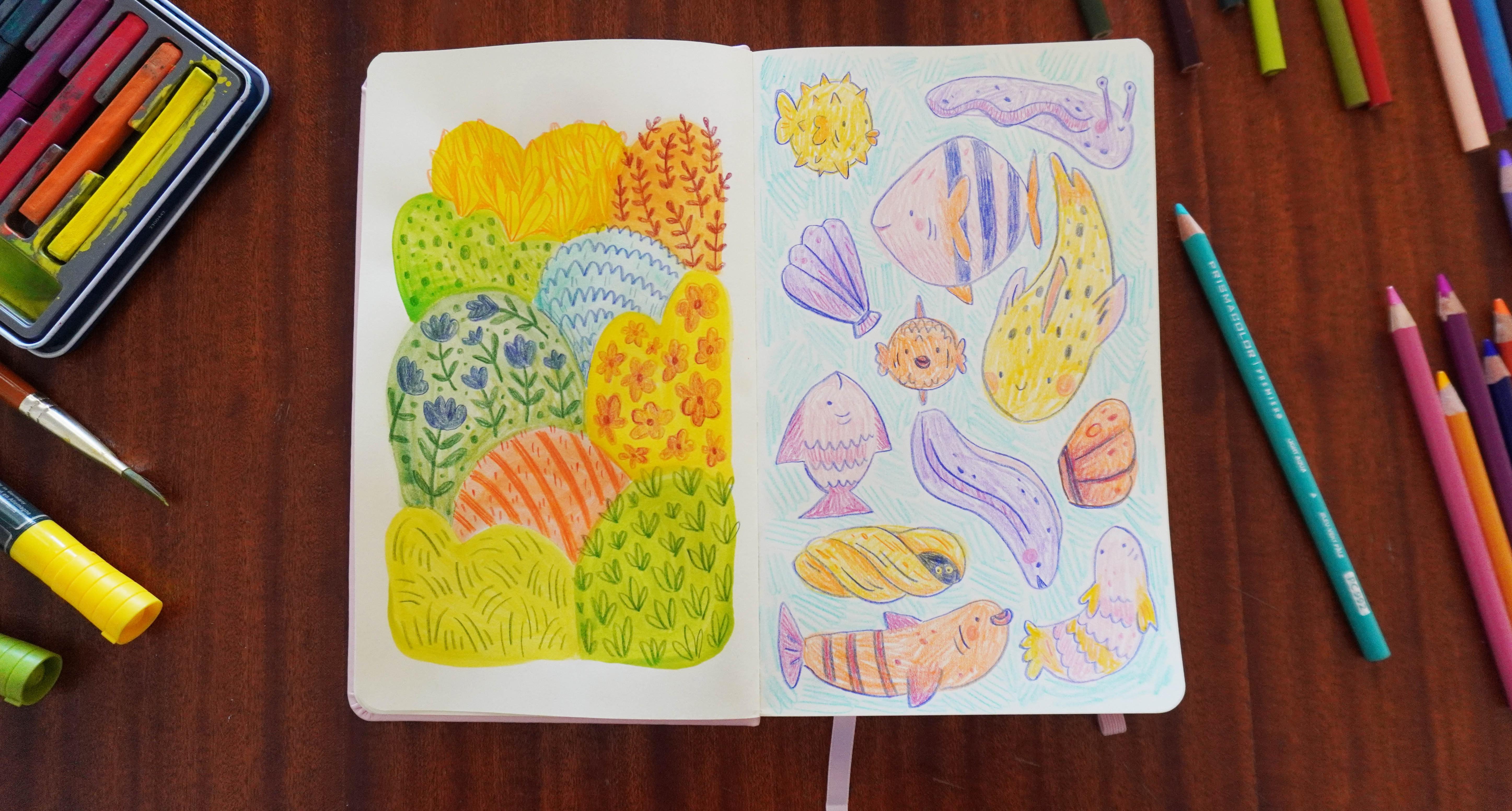
8. Day 6: Spotty Aquarium: It's day six of our week
of sketchbook drawing. We're so close to completing
a full week of art, so you should be really pleased with yourself for
making it this far. Today we're going to start
by filling our page with big multi colored spots
to use as our frames. And the theme we're
using is fish. So we're going to turn
those organic shapes into fish to make ourselves
a quirky aquarium. I'm going back to just
colored pencils today. As always, you can follow
along and draw the same thing I am or use different
art mediums and themes. Whatever gets you inspired. So let's start drawing. I think it's time I chose a new color palette
with these pencils. I still only have a limited amount of pencils
to choose from. It's just what I have right now. So a lot of the colors
will be similar, but I just want a few new ones. I've made sure to include a blue because I think
after drawing the fish, I should colour in the
background like the ocean. Okay, so let's start by drawing
lots of circles and round organic shapes on this page in different colors,
filling them in as we go. The reason we're
doing this and not just drawing fish
shapes from the get go is because this will force us to think outside
of the box a bit. I guarantee you if I fill this page with shapes that
I thought looked fishy, data will be really
similar and probably in profile with long
bodies and some fins. Was doing this separates these shapes from
being fish initially. So I'm not concerned right now with does this look like a fish? I'm just drawing
round shapes which will give me more
variety in the long run. I also think it's a much more fun exercise doing it this way. I'll probably aim for
about a dozen shapes on the page, a few
in each color. So I'll spread them out and slowly start to fill
in the gaps as I go. Some can be bigger,
some can be smaller, some can be long or curved. Variety is my main mission
for this part of the process. As long as they're all
quite round and blobby, I think we'll be able
to turn them into fish. And just like the
previous activities, I'm doing this first step in
quite light colors to act as the base so that I can add
the darker colors on top. If I started with the
stronger darker colors, I wouldn't be able to see the
details I add on top later. So with pencils, we go
from light to dark. So I'll go ahead and finish
making these blob shapes, using all of the space
on my page and using the gaps that are left to determine what shape
I draw in that gap. Now we have lots of lovely, colorful shapes that we're
gonna turn into fish or really anything you
might find in an aquarium. Let's start at the top,
and with a dark color, we can make this first
shape into a fish. I want to keep the
main shape as it is, but I'll add fins and
tails where I need to. I think a fish this round could definitely
be a puffer fish, so maybe it has all these
spiky bits around it, then some fishy lips and an eye. And I'll sort of trace
around the shape, adding any elements as I go. You can probably tell
I didn't look up a pufferfish reference
before drawing this, but I think as long as it has a fishy tail and a
fin and some spikes, you'll be able to recognize it. This neck shape feels to
me a lot like a sea slug. So let's have one of those
in our aquarium with a couple of antenna at the front of the
head for the eyes. And I'm pretty sure they have sort of wiggily sides to them, which I guess helps them
move through the water. And the rest of them I can outline around the purple shape. Maybe they can
have a nice smile. And I'll give them a
few sluggy spots, too. I like this activity
because if you had asked me to draw lots
of fish on a page, I would never have thought
of drawing a sea slug, so it's already helping me
with fresh creative ideas. Let's move on to
this neck shape, and it feels a bit
to me like one of those tropical fish that are sort of diamond shaped
like an angel fish. So let's outline this, but
add a tall fin on the back. They can have a little smile
at the front and an eye, maybe some gills and a side fin. This is definitely not going
to look like an angelfish. You can tell I don't
draw or think about fish very often.
But that's fine. I don't mind if my fish all look a little bit silly
and not quite right. It gives them character. And like I was saying
the other day, these drawings are just for you. Even if they turn out a bit silly or you think they're bad, you should never feel
embarrassed about any of the art you make
because the fact that you're sitting at
your sketchbook and making any kind of art
is what makes you an artist and is part of your
journey to learning to come up with creative ideas and develop the art
skills that you want. So try not to be afraid
of drawing bad things. It's a really important
part of the process. Now, this neck shape
is quite pointy, so I think it would make a
good shell rather than a fish. So let's turn it into one of those really typical shells you find at a beach with the ridges along the top and the
hinge at the bottom. I guess it's a clamshell. This little shape next to it
could be a cute tiny fish. This time, I want to try
drawing them facing us. So let's do the face first. Big fishy lips are a must. And then some fins on the side. Oh, I think I might have made them look like a sweet wrapper. Maybe if I keep
adding fish features, it'll get better, like
a top and bottom fin. I don't think that helped
too much, but never mind. The context of all
the other fish around it will help
tell us what it is. This neck shape is really big. It could probably be a
fish swimming towards us, but at more of an angle
than the last one. So let's start with
the face again and then outline the body shape with a smoother tail this time. That might have made
it a bit weird, but we'll soldier on. So at this angle, the side
fin would be about here. And this one over here. And let's give
them a fin on top. I think I've accidentally
drawn a fish at some other stage
of evolution. They're quite funny, but I
actually really like them. Again, I would never
have drawn the shape or character without having drawn
the colored spots first. They have a lot of skin showing, so let's give them a nice, spotty pattern down their sides. Okay, on to the next, maybe we could make this
one different by changing the orientation and drawing
them rotated 90 degrees. So their top and bottom
fins are actually at the sides like this and
their face is up here. This one probably looks the most like a normal fish so far. Maybe they can just have a nice, scaly sort of pattern
along the side. Next, let's do this purple one. It's really long and the
curve makes me think of eels. So let's outline the
whole thing first. And then I guess
instead of fins, they just have stripes
down the side. I've just realized that I don't really know what
an eel looks like. Maybe having an extra
bit at the top, like a mohawk will be better. Actually, that does look
a bit like an eel now. I'm quite happy with
that, especially with adding a few spots. We'll give them a
bit more texture. I haven't done a
shell for a while, so let's do another
one of those. It can be similar
to the first one, but because the orange
part is a different shape, it'll naturally be a bit different to the
other one we did. The only shell shapes I
can really think of are these clam style ones and the long spiral cone ones that you sometimes see crabs in. Actually, maybe we can make this yellow shape into
a spiral shell, which means that we'll
need some curves to make it look like
spirals going around. So let's do a few of
those and join them up. And then a rounded
bit for the top. And if I have an opening here, I could draw a couple of eyes inside so that we know
something's living in it. So let's keep a couple of circles blank and put
eyeballs in them. Okay, we just have
a couple left now. Let's do another fish. And this orange one
is a blockier shape, so they might be quite
a funny fish shape. But like with the
others, as long as they have fishy
features like the tail, fins, and a fishy face, they'll look like they
belong in our aquarium. And let's give them some nice big stripes to make them unique. Lastly, we have this pink shape. I'm not really sure what
to do with this one. Maybe they can be
facing to the top of the page and can have
little fins out the side. I'll follow the rest
of the shape around. Let's do a different
tail shape this time. Actually, maybe I've made them look a bit like a shrimp now, so maybe I should have
gone in that direction. I think we might be inventing
some new fish today. There are all sorts of weird and wonderful things living
in the ocean, though. So for all we know this guy could be living out
there somewhere. So now we have a beautifully
unique selection of fish. The next step is to finish
filling in the shapes where we've extended the outlines
beyond the original spots. So anywhere like this tail and these spikes where they're
outlined, but blank inside. While I'm here, I can
add new colors as well, because lots of fish
are multi colored, so I can add a bit of orange to make them
more interesting. Then we can do that
to all of our fish, filling in any blank spaces, giving them a bit of extra
colour and character, doing any shading we want. And because all of
these fish are made up, they can be any color you like. This little guy would look cute with a different
colour tail, I think. This is where having a
smaller selection of pre chosen colors comes
in really handy for me. It takes out a lot of
the overwhelm when I'm wanting to choose a
new color for something. And because I've
already selected colors that I thought
looked quite nice together, I don't have to stop and think about what will go with
the rest of this page. If it feels a bit
limiting to you, then you can add
more colors than I have or just not do that at all, but I personally find
it really helpful. If you have no idea where
to start with colors, you could find some
palettes online or I have some color palette resources available that I can share in the description
of this class, and you could try to
match your art supplies with color palettes that
someone else has made for you, at least while you focus on
building your art habit. There are so many resources
available out there. You don't have to come up
with everything on your own, especially if that's what's holding you back
from making art. Take all of the support
and guidance you need. This yellow fish is so funny
to me for some reason. Let's give them some
nice pink fins. And I think even fish
can have rosy cheeks, so I'm adding them to
all of these fishies. This one has a few blank spots, so let's give them different
colored fins, too. I'm having a lot of fun
designing new fish, mixing and matching
colors and patterns. This sort of activity reminds me of being a kid when we were encouraged to play
creative games and come up with
monsters and stories. But then, at some point,
that stopped being encouraged and it all
became essays and exams, and then eventually
work and jobs. So I don't know about you,
but doing this feels like a nice return to the creativity we had when we were younger. So I'm just gonna
finish coloring in these final few fish, and we can see what it all
looks like at the end. Well, I'm very pleased with how this aquarium is
coming together. The only thing
missing for me now is some water for
these guys to live in. So I'm just going to scribble in a nice blue background in all of this white
space in between them. I definitely wouldn't
have come up with half of these characters without
drawing the shapes first. So I find this to be a
really nice activity to practice creative ideas, but with just a little
bit of structure. And the stakes are so low, it doesn't matter if
these fish look silly. Your sketchbook
should be a place where you can draw silly things, bad things, good
things altogether. If you want a bit more support, you could definitely look
up some fish references while you draw to give you
a bit more confidence. Don't feel like you
have to know how to draw things off
the top of your head. Even though a lot of my
fish aren't quite right, I have drawn fish before, so I'm not starting from zero and then being able
to draw like this. I've been practicing
drawing for years. So if you're doing this
activity and thinking, Well, I don't even know how
to draw a fish at all, look up some pictures
for reference to help. Or you can just follow the
shapes that I'm doing. You can copy them
exactly if you want to, but your fish will then look as cute and silly as mine do. Okay, this aquarium is finished. What a lovely, colorful
addition to our sketchbook. I hope you enjoy this
creative challenge, and I'll see you tomorrow
for the final illustration of the week. O.
9. Day 7: Window Views: It's the seventh and final day of our week of
sketchbook drawings. I'm so happy that we've been drawing together
for a whole week. We've made so many
lovely things already. And even though this is the
last day of this class, it's just the first
week of your art habit. Today we're going to draw
a new type of frame, and this one is maybe
one of the most obvious. We're going to draw windows. We'll start by drawing a few different window
frames onto our page, and then inside each of those, we're going to draw
a small landscape or setting that you might
see out of a window. I'm going to be using
colored pencils again, but as always, you can use any medium you like
to follow along. So let's start drawing. So let's start with
a fairly light color like always, and first, we'll draw a really
simple rectangle or square up in the
corner of the page. Then draw that same thing,
but inset a little bit, so you have two rectangles inside one another
like a window frame. I'd really like to
fit about three window frames on this page. So I want to leave room next
to it for a smaller one. If you want to, though, you could fill the
whole page with one big window instead and just draw a larger scene inside. Then right down the middle, we want two vertical
lines close together, or it's okay if they
overlap completely. And the same thing horizontally will give us the cross bar of the window. So that's
our first one. Let's do a smaller
window next to it, and I really love
arched windows, so I want to draw one of those. It takes a surprising amount
of concentration to draw neat curved lines in one go and even more concentration
drawing long straight lines. So I think I'll need to
focus quite a lot today. This window follows the same
format as the first one with a smaller version of the shape sitting inside the bigger
one to make a frame. I think this time, I won't
do a crossbar, though. I want these windows to feel a bit different to one another. And for the third
one, let's have it fill the rest of this
space down the bottom. So just a big rectangle on
the bottom half of the page. I find it easier to draw long straight lines if you
keep your hand in one position and move your arm
from the shoulder or elbow rather than moving
the pencil in your hand. It's still tricky, so don't worry if your lines are wonky. You can always use a
ruler to help you. So for the cross bars
for this third window, let's do one horizontal
bar in the top third. And then two vertical
lines evenly spaced. I used to have a window
that was split like this, and I like the shape of it and the way it frames
the outside world. Now we have three
nice window frames. We just need to decide what
we can see out of them. I think it would
be nice to start simple with some rolling hills. So I'm using my
lightest green to draw a few curbs
across the window, one quite high, one quite low. And maybe a half
one in the middle so that it looks like
these hills overlap. Then let's draw half a sunshine so that it looks
like it's either rising or setting
and color that in. So I'm going to
color these hills in slightly different colors, starting with lightest at the back or the top
from our perspective, and getting darker with
each hill as we go down. Our landscape drawing can
really be as simple as this. We can add a few little
details as we go, but just some layers of
rolling hills and the sky is a great starting point for a simple
countryside setting. This small middle hill, I'll draw in another green. It's fairly similar in color, so I might go over it later with a darker green pencil to help them stand out
from one another. You could also outline
these hills if you wanted, then you wouldn't
need to make them different colors if that
feels easier to you. But I like the way
they look when they each have their own color. These hills also don't
need to be green. It feels like the
most obvious color, but you could play around with having colorful
fields of flowers, fields of sheep or cows or brown or orange
hills for autumn. Landscapes come in lots
of different colors. I know that we're starting
to lose the crossbars of the window frame that
I drew before in pink, but that's fine
because I'm going to draw over it later
in a darker color. I just wanted to do a
light version of it first, and then color in the landscape, and then I'll draw
a darker frame. You could draw a
dark frame first, but sometimes with pencils, if you draw over something
dark with a light pencil, like if we were coloring
in these heels here, sometimes it smudges
the dark color a bit, so generally, I
try to avoid that. So now let's color the sky. I'm going to use blue because I like this color, and first, I'm going to use it to outline
some puffy cloud shapes on the horizon that I'll keep white and just color
the area above it. The sun is setting
in this scene, so we could also use
sunset colors if we want. I just like how
bright this blue is. Now, let's add a few
details to these hills. Just simple things like
some lines is enough. It kind of gives the
effect of farm fields. And on this middle one, I'd like to draw some little
blades of grass. And what detail could we
give this bottom hill? Maybe just some bushy shapes, and we'll draw them
all over the hill. I'm quite happy with this
sweet little landscape. Let's move on to the next one. For this arch window, I'd
love to see the night sky, so it might not be
super realistic, but let's draw a big
crescent moon in the middle. And then let's have a few stars
in the rest of the space. Some of them can
have six points. Some of them can
have five points. I think I comfortably
have room for about four. So I'll do them all at slightly different angles
and sizes around the moon. And then we can do
a few circle stars dotted around as well. Then we can just
color in the sky. I'm using this nice
navy blue that I have. And as I come across
the yellow elements, I'll just carefully draw around them so that they
maintain their color. I love drawing stars. There's something so nice
and sparkly about them, and sometimes I make them
multi colored so some can be pink or orange or
blue instead of yellow. For today, I'll keep it simple, but think about what color
of star you'd like the most. So I'll just enjoy the
relaxing process of filling in the rest of this background now and we can check
back in when it's done. So that's two
window scenes done. Let's draw a nice big scene
for the third window, and after that, we can finalize
the actual window frames. So for this one, it might be nice to do something a bit more detailed with more of a foreground, midground,
and background. So I'll actually
start planning out my composition by
drawing some bushes in the foreground as if
they're part of a garden just outside and are
obscuring some of our view. So if this is a garden view, then we could probably
add a garden fence. And let's put a gate
centered nicely in our view. And then a few
stones for a path. And then what lies
beyond the garden? Maybe we're in the countryside and there's a distant
hill like this. And we could draw a
rough hedge line just outside of the fence to
break up that straight line. And if it's the countryside, we've probably got a
nice walking path. So I'm going to do a winding path from the top of the hill in an S shape and then match
that line again next to it, but making sure that
it's a lot thinner at the top to show that it's
going into the distance. Now, this part is a fence, so let's add a few fence posts. But this middle part is a gate, so let's draw it a
little bit differently. And I think it would be nice to see a few details of the garden. It can be a fairly
wild garden, I think. It's not manicured with
flower beds or anything, but there are a few
flowers growing naturally. Like for a bit of detail
in the foreground, I'm just going to add
these really simple lumpy details to show
that it's bushy. And I think that'll
do for a sketch. Let's get started
coloring it in. I'd love for there to
be a sun in the sky, and this window pane has
the perfect framing for it. And let's make the sky
this lovely bright blue again because it's a beautiful
sunny day in this scene, not a cloud in the sky, so I'll just fill in each of these panels right up to
the line of the hill. Now we can color in the hill. I'm going to use my
favorite green again. I probably need to stop choosing this pencil
for everything because it's gonna run out soon if I keep using it so much. I just like that
it's more vibrant than the other
greens that I have. And for a sunny scene like this, I want the grass to be inviting. The footpath, I've left blank so that it can be lighter
than the hill around it. But a bit of an outline
will help it stand out. It could be fun to
fill the hill with a grass pattern while I
have this dark green. The scale of this grass is probably a bit big for
how far away the hill is, but those are the kinds
of things we don't worry about when we're
drawing in our sketchbook. Now, I definitely want the
foreground to be darkest. So I'll color in this tree
shape with this dark green. Maybe I'll give it more of a squiggly texture
while I color it in. Usually, if you've
got a bright scene, the things that
are right up close to our view are darkest, and the things that are further away like the hill are lighter. So the foreground being the elements that
are closest to us, I'm coloring in quite dark. It's not a hard and fast rule, but it is a simple
place to start. This fence should
probably be quite dark, as well, so I'll color that in the other dark
green that I have. It's going to be a very
simply built fence, just a few posts and some
horizontal bars across it. Let's colour in the hedges, and I want them to
be a different color to the hill and the fence. This medium green doesn't
stand out very much. We kind of lose the shape
of the hedge a bit, but I can go over
it later if I want. The hedge isn't a very important part of this illustration, so it doesn't matter if
it doesn't stand out. Then we need some nice
green grass in the garden. I'm losing a bit of the original sketch as I colour this in, but I can still see enough, and I also don't need to
follow it exactly anyway, so it's not a big deal. And Now, I can outline and draw
over these garden details. They're just sort of
grassy bushy strokes with a few flower
stems in there. If you draw a pattern of lumpy
bits on a green surface, it usually looks like grass. On top of some of
these, I'll just scribble a bit of colour to
show that they're flowers. Because they're
small, they don't need any real detail in shape. I think they can definitely
just be a suggestion. And let's add a few little spots of colour around
in the grass to, like, their tiny flowers. Then there's just
this foreground bush. I'd like it to have some color so that it isn't all green. So we can fill it with berries or maybe their flowers.
It doesn't really matter. Now we can colour
the whole thing in. I'm using a dark green again and filling
in the whole space, just carefully coloring
around the berries. I enjoy drawing
simple landscapes. It's relaxing to draw, and you also end up
with a calm artwork, which is really nice, too. Maybe for this activity, you could draw a window from your house and what's
actually outside of it. It might not be a beautiful countryside landscape like this, or maybe it is, but either way, it'll still be interesting. Windows are such great
natural frames for art, and you could even
extend them to show a bit of the
inside, as well. Maybe there are some
hanging curtains. Maybe there's a
cat looking out at the view or an armchair
next to the window. There are lots of
things you could do. So this scene is
all colored in now. Let's colour the window
frames properly. And for this first
one, I'm going to make it this dark, reddy
brown that I have. I'm surprised I've managed to keep these lines so straight. Usually, I go quite wobbly, but maybe my technique has
gotten better with practice. A wobbly window would
have a lot of character, though, so don't worry if your lines aren't very straight. That's the first one done. I actually think
it would be nice if the second one stayed white, but I do just want to outline the frame again
in the navy blue. And maybe it would
be nice to darken some of these edges on
the inside as well. Then just for
something different, this third one can be purple. I'm not sure that I've ever seen a purple window frame before, but I'm sure somebody
out there has one. These straight lines take all
of my concentration to do. It's such an unnatural
thing to draw, but once I've done these,
I think we'll be finished. So that's our final sketchbook
page of the week finished. I'm really happy with
these little scenes. I hope you drew some nice
landscapes and are feeling accomplished and confident after finishing seven
whole illustrations. Let's chat about what to
do now in the next lesson.
10. What's Next?: We've completed seven lovely
illustrations together, and your sketchbook is
off to a great start. If you feel comfortable sharing what you've
drawn with us, then you can upload photos of your sketchbook pages to the project section
below this class. You can upload all of them
or just your favorites. It's totally up to you, but I would love to see
what you've made. Throughout this week, you've proven to
yourself that you have so much creative potential and that you can
make lovely things. Keep practicing and ideas
will come to you more easily, and you'll only become more and more comfortable
as an artist. If you have ideas
for what you want to draw next, then
that's wonderful. But if you want a
little more guidance, then be sure to
download your art, have it below,
where I've included suggestions and ideas
for the next few weeks. If you enjoy this class, then consider leaving
a review to share with potential students
what you liked about it. And for more drawing
inspiration and ideas, you can find me on YouTube,
Patron and Instagram. Thanks so much for
joining me this week. I had such a nice time
making up with you, and I hope to see
you again soon.
 Mimi Purnell, Illustrator & Content Creator