Transcripts
1. Introduction: Welcome to the beautiful
world of watercolor flowers. In this class, I
will show you how to paint simple yet
stun in pink tulips. Hi, my name is Alexandrina, and I am watercolor artist with over ten years of
painting experience. Painting with watercolor can help you to ease
your mind and find some peaceful activity
which allows you to relax and paint
something beautiful. You can create a hand
painted cards for your loved ones or paint these beautiful flowers
to decorate your home. We will start with color
mixes and art materials. Before we move to painting, I will show you a simple
exercise to practice some of the
watercolor techniques like wet on wet technique, lifting colors, and creating thin and straight lines
with any size of the brush. Then we will move
to draw in a sketch and finally painting
with watercolor. This class includes
two projects. The first one is with a simple flower that
every beginner can paint. The second one will
be more complex, but still quite simple. If you follow all the steps I mentioned in the
beginning of the class. In the end of the class, you can share your painting on Instagram and tag my account Art Card gave to be
featured on my stories. And remember your
feedback is invaluable. So please share your
thoughts in the review. It will help other
students to understand if this class is a
good fit for them and for me to improve
my future classes. Hope to see you in
the class. Okay.
2. Art Materials and Color Mixes: Hello, and welcome
to a new class. Let me show you art
materials I will use. So I'm using 100%
quotin paper by Pa Hon. It has grain fin texture. And you can use other
tin paper that you have. It's a glued pad, so you don't have
to fixate paper. I'm always using
ceramic palettes, and I have handmade palettes
and watercolor in tubes. So I place my watercolors
right on the palette. And if you have
watercolor in pants, it's also very good to mix on the ceramic plate
or ceramic palette. So if you don't
have the palette, you can use just ordinary plate. I will use brush number
four by coda reserva. It has very pointy end, and I need it for this painting. I use mechanic pencil by
pencil, 0.3 millimeters. It's very convenient for me, but you can use ordinary
pencil as well. And also have ordinary
eraser and needle eraser. Needle eraser has
this slimy texture, and it helps to remove
pencil lines from the sketch to make the
painting more airy and light. In watercolor, it's
pretty important to keep this pure watercolor
texture and lightness. I also have some paper towels next to me to clean
and dry my brush right away and a cup of
tea and two glasses of water that always is on
my table when I'm painting. And now we can move
to watercolors. For this painting, I will use five colors permanent
sub green by Jackson's As methine
green yellow by van goo. I like Vang watercolor
and I use it a lot. It's quite cheap, and
it's a good quality. But they have this
problem with the lead that when the lead
and watercolor dries, the lead sticks to the tube. So I had this issue
with this color, so I had to put the
tube into the hot water so the lead could be
removable, eventually. But let's get back to other
colors that I will use. It's Pains gray Biv and go, and I can say that I'm a brand ambassador
of Pains gray color just because I use it a lot
in almost every my painting. I will use also Ruby by white nights and I have
it here on my palette. And also, I will use some pink color di
genuine by Daniel Smith. If you don't have this
color, it's okay. You can just pick some
other red color with a cold hue from your palette, maybe like inotrose or
something like that. Let me show you some
of the swatches of these colors and color
mixes I will use. Basically, look
into the swatches, you can find some similar
colors in your palette, or you can also
check the pigments inside each color that I share in the description
to the class. So you see that I put Ruby on the paper and next
to this color, I will watch RodiniGenuin, and it's very
similar to the Ruby, but Ruby has a bit
more warm shade. And basically, I could paint without it
because I could mix my cold red like
RodiniGenin with a little bit of Ametin green yellow because
it's a warm shade, and I would get a
pretty warm red shade. Now, some of the color mixes I will use for painting
these two lips. So I will need some dark
mix of green because I don't use shadow
green or green color. Instead, I'm mix of permanent
sub green and paints gray, and also I will add a bit of honestly, there are no exact amounts that you need to use of these
colors to get this shade. It's more about
experimenting and trying different
amounts and trying to add more or less of each color until you will
get the shade that you need. The next mix is Ruby
and din genuine, and it's just other shade of red that I will
use for painting. If you have one red, you can mix it with paints gray, and you can mix it
with A or yellow color that you have and maybe even
add a little bit of green, and we will do all of that. While we are painting, just mixing all the colors just a little bit
on the palette. That's it. Now let's move to the next lesson and
prepare a sketch.
3. Exercise - Watercolor Techniques : Before we start painting, let me show you some basics of watercolor techniques
like lifting colors and wet on wet technique. I will show you on this
simple scrap paper. You can also use
some scrap paper to practice a little
bit before painting. When painting with wet on
wet technique, normally, I follow main steps, and first would be clean my brush and dab it
on the paper towel. Then load my brush
with lots of water. You see that value of
the brush has water. And I will cover
with clean water the object that I'm going
to cover with color. Repeat in the same direction
of the shape of the object. So it's if it's round shape, I'm trying to cover this shape with
these brush strokes that are going around. I will add some color repeating
the same brush strokes, and I will use less
water and more color. And still the first
layer is pretty light. So I'm not too dark
color because I will need this dark color for
creating shadow later. And now I want to create shadow, and I use almost pure
color from the tube. So ratio water to color
will be more color than water than in the first layer when
I just applied color. If I want to create a
highlight on the object, I can use lifting. It means that I have to clean my brush and remove some color. And if the surface
is already dry, I can apply some clean
water and then remove the color with the
and almost dry brush. But be careful, if the
surface is almost dry, it will leave the edges
of the water spots. So normally it is better to apply color while the
surface is still wet and lift the color
if you want to create highlight also
when the surface is wet. And let me show you on
the second example. Now, I will try to keep the white highlight
from the beginning. You can leave the color, but sometimes the
paper absorbs color and you cannot remove
it for the white. If you have this
white highlight, you can just keep this
area uncovered with color. And then we are doing the same. We're applying more
and more color creating intense shadows. And let me show you how to paint one object
behind another. It's a common practice
because for example, even when we are
painting the tulip, we have different petals that are going in front of another. So we have to keep this front petal lighter than
the background petal. And here you see how I'm moving the color towards
the darkest area, so I'm moving the brush from the lightest to darkest areas. And in the place where one
object will go behind another, we are trying to increase this contrast
between two objects. It means that I will try to make this front object lighter
and the back object darker. To create a highlight, I will clean my brush and
dab it on the paper towel, and I will lift the
color from the surface. Now, when the paper
is fully dry, I can apply some dark color straight to the
surface of the paper. Because if I would
apply water first, the color would be not
so intense and dark. Here, since we want to
create the contrast between two objects and to show that one is behind another, we need to create a
pretty dark color. And now, when a color just
right behind this object, I can some more watery mix
and cover the whole object, the rest of the object
with this more watery mix, moving also from the light
part towards the dark part. Let me show you another exercise that you will need
for this painting. I will make a very thin
lines with this brush, and you see that
it has pointy end. Basically, even
with a big brush, you can create this very
thin and straight lines. So I place my arm on the table and only my hand is
moving with the brush, something like chopsticks, and I place my wrist
as well on the table. So on my hand is moving and
it's moving in one direction, and the brush barely
touches the paper. So it helps me to create this very thin and
very straight lines because I move only
hand and brushing it. And when your hand
is in the air, it's not very steady position, and it's hard to control your
brush strokes and hard to control line and its direction. So it's better to create a very steady position
for your hand. And you can also experiment with the brush strokes
and observe how you can create very different
types of lines with one brush. When I hold my brush vertically, it creates very thin line, and when I press it, it creates shape of the leaf
and some more flat stroke. So I encourage you to try
this because sometimes it's even convenient
to use ah number four. For example, then
some small brush like number one or number
zero for creating these lines because the bigger
brush allows you to create more consistent brush
stroke and more long line. Okay.
4. Class Project 1 - Sketch: Now, let's draw a sketch. We will start by measuring the proportions of the
tulip on the paper, and I'm using citing
method to do it. It means that I use
units of my pencil to measure how many
units are in the object. For example, I take the unit
of the flower and I measure how many these shapes will appear in the stem
and in the leaves. I will have this
very abstract flower just to show you how
to paint tulips and to use different
watercolor techniques like lifting and wet
on wet technique. If you don't want to spend
your time making this sketch, you can download this kind of my sketch from the
materials attached to this. So basically, when I'm
painting the objects I'm trying to catch the
direction of the line, like with this stem and with this leave and also to analyze
where the object will end. So I see that it will end here and T line is just a bit curvy. And then I'm just trying to repeat the shape that
I see on the photo. And of course you can change the measurements if
you see like you want to make leaves bigger or more leaves or
something like that. So that's it. I will remove some pencil lines that I don't need from here. And sometimes I'm using needle
eraser to remove lines. Sometimes I'm using
ordinary eraser, and the rule is that if I
don't need that line at all, like I see that this line was made by a mistake
or something like that, and I have to remove it. So I'm using ordinary eraser if I need just to make
the lines not so dark, I need needle eraser. Okay. And with this leaf, it just more like
intuitive shape. It's not necessary to repeat the exact shape of the
leaves and objects. Now basically my sketch is done. It's a very simple sketch, and I already analyze where the light parts
and dark parts will be. In the beginning, you
can even mark with a very light pencil lines where you see the light
areas and the dark areas. For example, here on the stem, I see that on the left side, it will be the light area, and on the right side, it will be the shadow. Here, also, I see that here
this line in the middle, it will be very light and
this part will be darker. I have to create this contrast between this part and this part. And the same here, I see that the stem here
will be darker and here I will have to make the leave lighter to create
contrast between them. Here with the flower, I think that This one
will be lighter and these small petals that are going behind the main petal will be darker than
the middle one. Basically, we see
that, for example, here is the light part
and here is the shadow. It means that light goes from the left side
to the right side. I will repeat everywhere. Here we also have to leave this light from the left to the right and the same we
will do with the flower. Now, I will remove some pencil lines with
the needle eraser. You see that I can
see the lines. I can see the shape
of the object, but it's not so bright. And once I'm done it, I can move to the painting part, and I'll see you in
the next lesson.
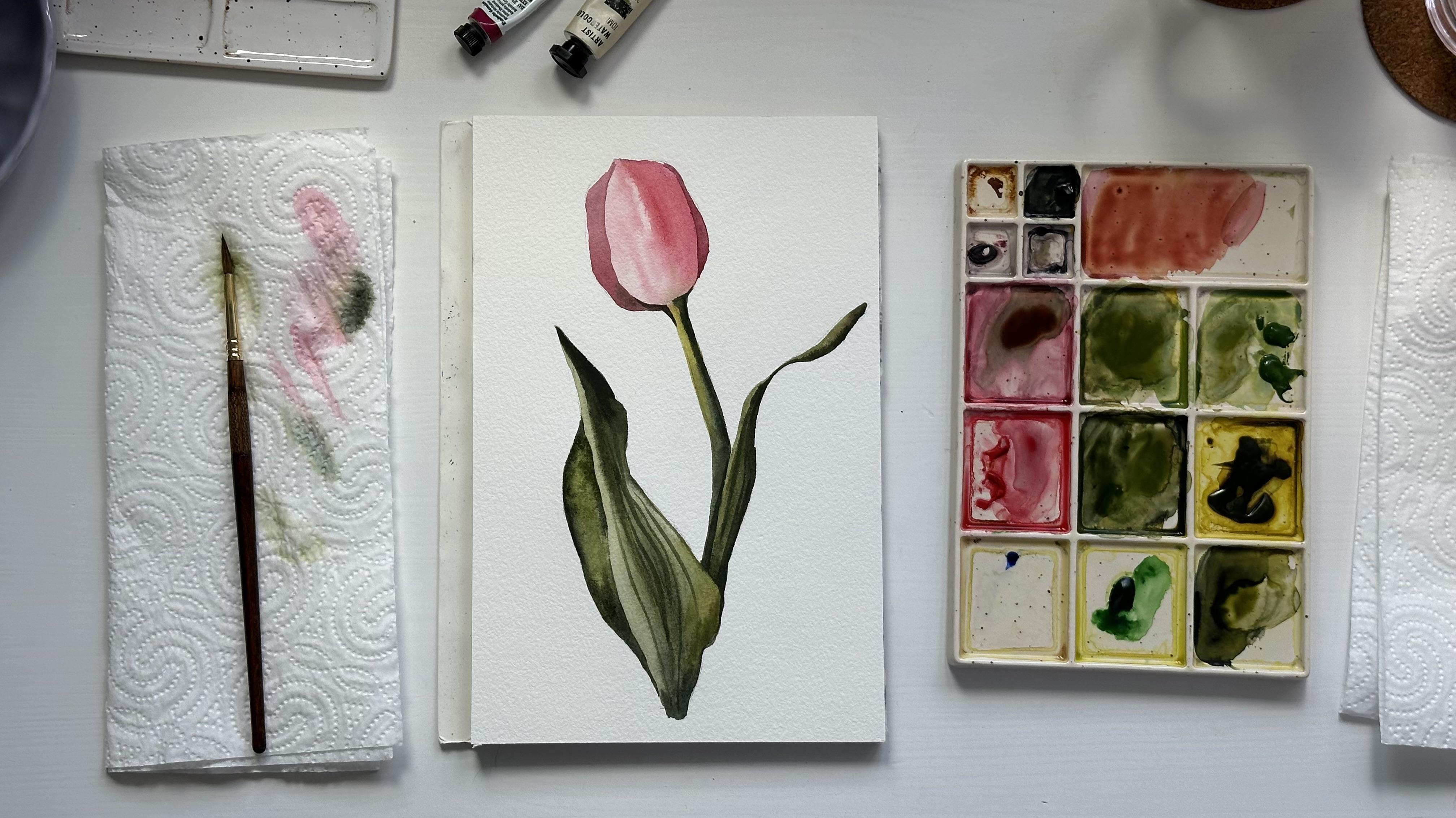
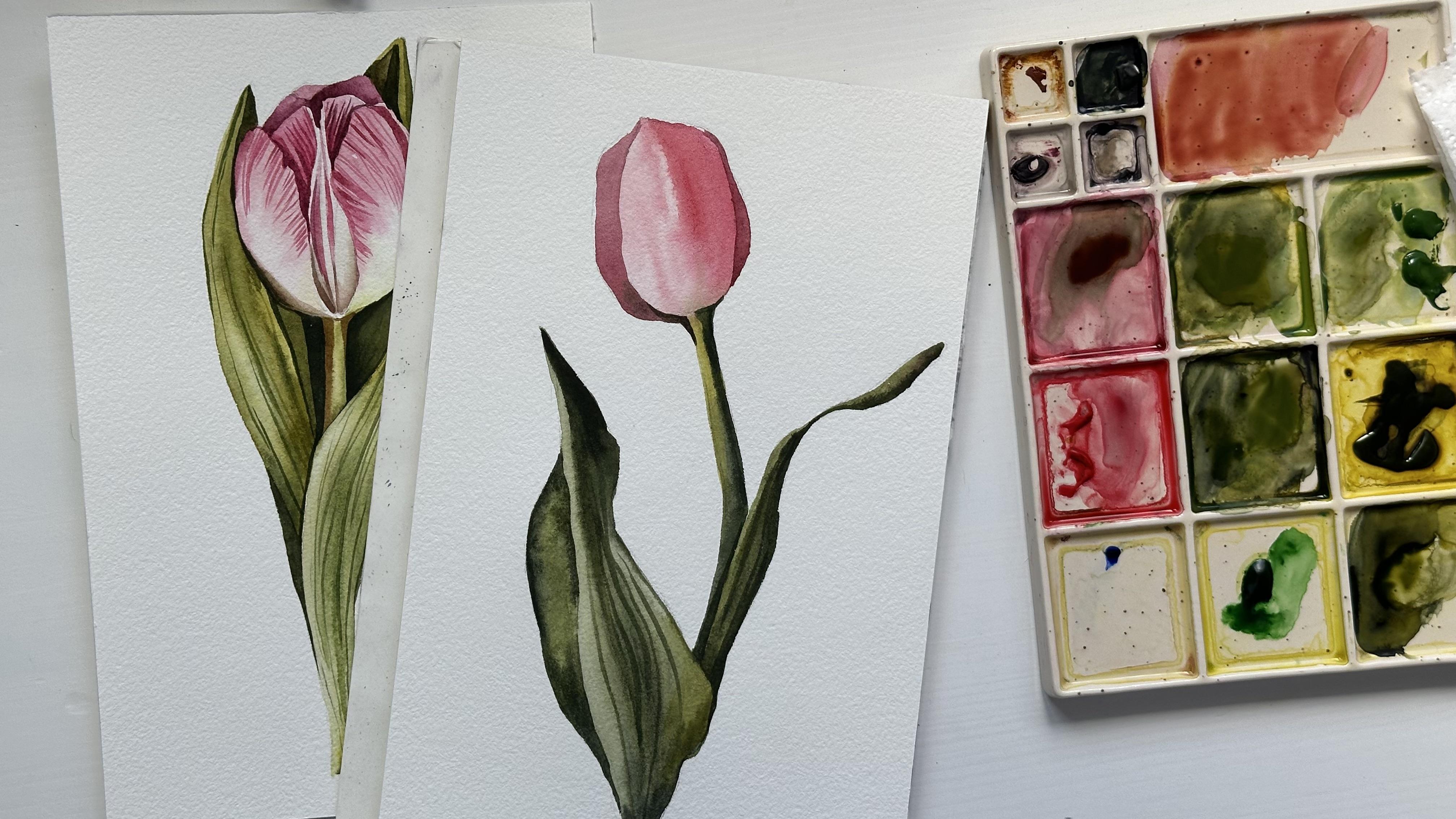
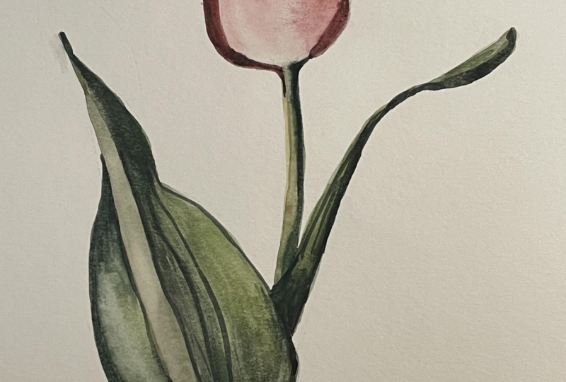
5. Class Project 1 - Painting the Flower: Let's start painting our
tulip with water column. I will prepare my color mixes. I have diniGenuin
and I have Ruby. I will also add a little bit
of Amtan green yellow to the Rhoden genuine shade to create a little bit
more warm red color. And I will start like I showed you in the exercise
with the middle petal, and I will cover it
with clean water. I start introducing color, moving from the left
side to the right side. And for now, I will add
some very light color, and then on the right side, I will add some
more intense color. Now, I will add some sub
green color at the bottom of the flower where it's connected to the stem that
also will be green. Now it's time to create the
highlight on the left side. I'm cleaning my brush, dubbing it on the paper towel, and I'm lifting the color
like I showed you in the exercise in the
beginning of the class. It will create this highlight
in the needle that we need to paint vivid and
picturesque flower. I won't even wait until the
flower will get fully dry. I will move to
painting the stem. Because I'm not
afraid that colors will mix with each
other a little bit. We already added
some green color to the bottom of the flower, and now it's okay if it
will mix with the stem. And for the stem,
I'm using also mix of green yellow and a
little bit of sub green. And for now, I will cover
it with a very light shade, and then I will add some
darker shade on this side. For the dark green shade, I will mix paints gray and sub green with a little bit
of Amite green yellow. I will apply this dark color on the right side of the stem. Make sure that the
surface is not too wet because otherwise, your colors will blend and
you won't be able to control this area of light color on the left side that as
you can see, I kept At the bottom of the stem, the color will be
the darkest because this part is go
behind both leaves, and that's why I
need to make it. I can use my clean brush to smudge the colors
to make this edge between the light area and
dark area more smooth. Now I can paint the side
parts of the flower, and I will mix my
both pink colors, Ruby and Dina Genuine
with paints gray, creating pretty dark pink color. And I will apply it on the right side and
on the left side. I'm moving color from up to the bottom and add the
bottom in this corner, I will add even darker
color with a little bit of green that I have on the palette because it's also
connecting to the stem. Later we will add
even more green. But now we are just connecting the flower and
the stem with this shade. And we are done
painting the flower. Let's paint the leaves
in the next lesson.
6. Class Project 1 - Painting the Leaves: Let's move to
painting the leaves. I will mix some
dark green color, use a mix of sub
green paints gray and a little bit of
Azmtin green yellow. You can also use some just yellow color if
you don't have Amtine. And we will start by painting the right part of the left leaf. Basically, I'm splitting
the leaf in two parts, and I will paint one part
lighter than another. I will try to make
this edge between these two parts light so I could create contrast
between these two parts, and I can add some dark shade
on the edges of this part. I repeat the shape
of the leaf with my brush strokes just like in the exercise in the
beginning of the class, like I showed you
with the round shape, and here is basically the same. So we have this
texture of the leaf and I can create this
lines while the surface. I can create these lines
that will blend and we will add more lines when
the paper will get dry. But now we can just create
this direction of the leaf. Now I can add some darker color in the corner of the leave, and it will help us to show the diversity of the
color value of the leaf. It looks diverse
in terms of color. That's why we're
mixed in few shades. We don't use just green color. And we can create different
color values as well and show that some parts of the leaf are some parts of the
leaf are lighter. Oh. I will leave it dry and I will move
to the right leaf. And basically, I
will do the same. Using the shades that
I have on the palette. I will create different colors and maybe even add
some red color. It will create some
warm green shade that you can also use. You see that I'm
mixing all the colors that I use for
painting the flower, for painting the stem. And all the colors are participating in the whole
painting in the whole picture. Here's the tricky
thing about this leaf. It should be different from the stem and from the
leaf on the left side. So I will add some dark color, but I will leave
a very thin line between the stem and this leaf. If you can see my dark color, it just going on the right
side of the leaf and I'm moving color towards the leaf that is light than this one. And now we can paint
this final part, the left part of the left leaf. And I start with a quite
light green color, and then I will add some darker shade while
the surface is wet. And now the only thing left
is to add some darker lines that show the texture of the leaves and direction
over the leaves. So I'm using the same
brush and I'm creating very thin lines and repeating
the shape of the leaf. You can switch to the smaller brush if it's
more convenient for you. Just try to create
a lot of lines. Just a few with a different shades of green
that you have on the palette. I also want to add some spots to highlight this contrast between the light flower and the stem. And if you see that you want
to add some more dark areas, you can also do it right now. Our painting is done, and I will see you
in the next lesson.
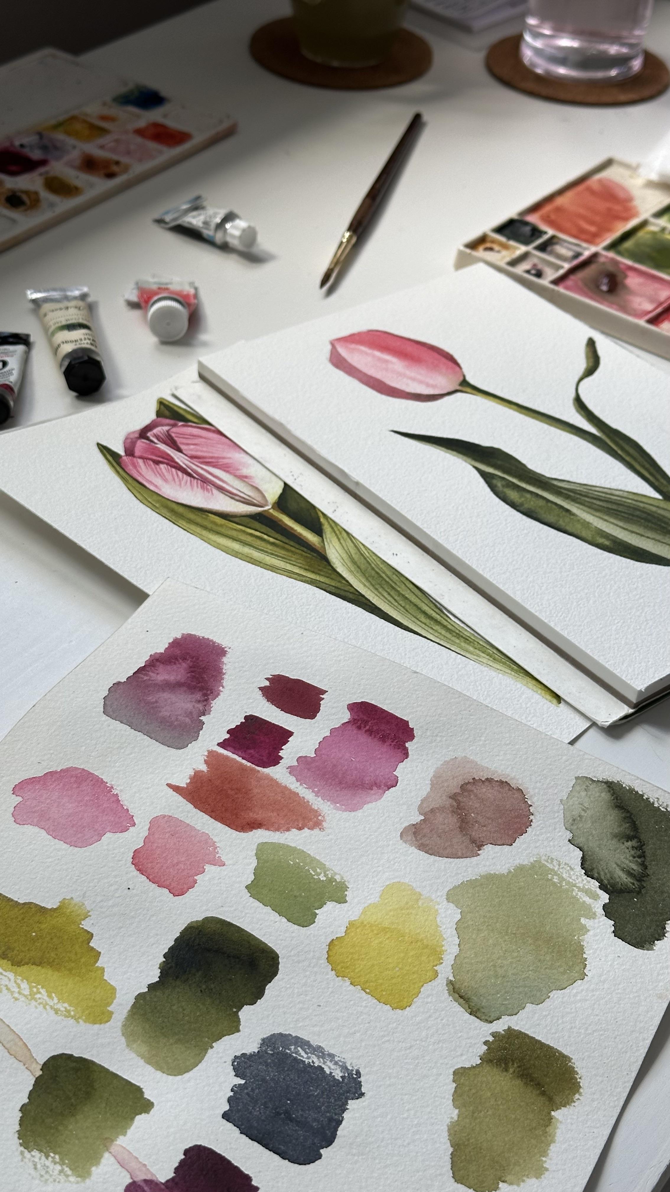
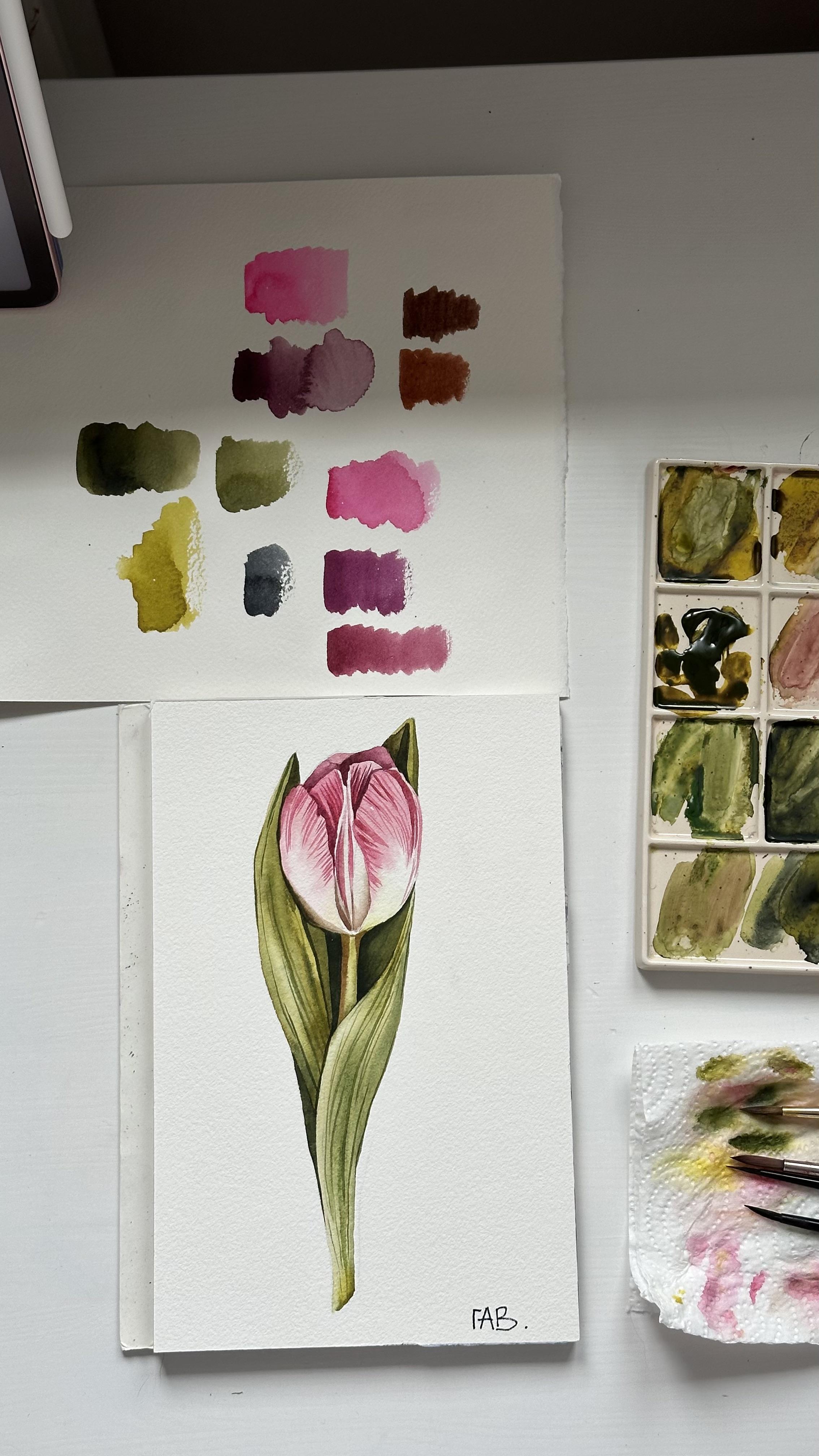
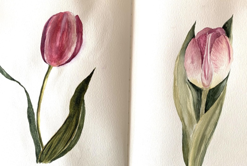
7. Class Project 2 - Sketch: Okay. Let's draw a sketch of this tulip. I suggest you to use, especially if you're
a beginner to use the citing method where you measure all the proportions of the object from the reference
before you draw it. Because I have a
lot of practice, I can draw it right away. But I would suggest to use ct method and to analyze the
measurements of the flower. In comparison with
the leaves and other objects in the painting. I have a simple lesson for the beginners in my class
with painting the goose, my first class one skill share. You can go to that
class and just watch the lesson about
creating a sketch. Track. When you paint a tulip, you see this shape
with the petals on the sides of the flower
that are frame in the sol, the middle of the flower that is behind these two
petals on the sides. You're. My sketch is done, and I remove the pencil
lines with the need, and I'm to see you in the next we will paint
with watercolor.
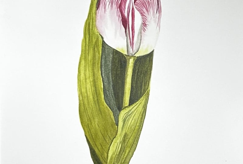
8. Class Project 2 - Painting Flower: Hello again, and welcome to the lesson where we will
paint with water color. And I already prepared some of the color
mixes on the palette, and I will start by
painting the flower. I will start by covering the right petal
with clean water. Just like I showed you
in the painting before, we will paint with
wet on wet technique, slightly adding the pink
color to the surface and lift the color from
one side to another. And the tulip has this very light green shade
of the pal next to the stem. So I will add this mix of
Amethin and sub green right away and we slightly lift
the color with clean brush. And I will start by applying the pinkish color on
the top of the petal, and I will left the color
into the wet surface, so the color will nicely
blend with the water. We need to keep this
white area of the petal, so that's why I need to stop and to not cover
it with the color. Also, you see that there is a small area on the
right side that I don't fully cover
because it will be darker than the main
part of the petal, and I will leave it right now. I will wait until the
color will get dry, and then I will apply
the darker color. Otherwise, the colors
will just blend on the wet surface and we will not get the result that we need. I'm doing pretty the same with the petal on the left side. Now I will mix a
bit of pink color using mix of Ruby and
a bit of paints gray. So I could paint this small
area on the right side. I will add this dark
area of pink on the left petal as well because it's behind the green
leaf and it will be. And now we can move to paint
in the middle of the flower. But just make sure that
your petals are dried. As always, I will cover it
first with clean water. My water has a little bit of pinkish shade, but it's okay. I will mix some muddy color by using ruby paints gray and a little bit of
asmetin green yellow. I will apply this color on the bottom part
of the middle petal, and I will use it to make the middle dark then the petals on the
right and left side. So if you can see, I'm just applying this color
next to the petal, and then I lift it
with the brush. So the color would nicely blend with the water
and wet surface that we have in the middle because we don't need to
make the whole petal, but we need to add this shadow
just behind these petals. I'm loading my brush with a dark pink color mix of
ruby and Rodin Janine, and I apply this
dark color Again, behind the light
petals that we have on both sides of the flower
to create these antras between the front petals and the middle of the flower and be careful because we need to
keep the middle area light, and we will just paint it later. For now, we need to apply darker color behind the
petals on the sides. I'm doing basically the
same with the right side, but I will just create the light area on the right
side of the middle part. It's hard to explain, but just look at the video
and I hope you will get it. Now I will apply
the clean water, a bit of clean water
on the right side. And I'm just lifting the color the water towards
the color and blending it. On the right side,
I will get color and next to the
middle of the flower. I will get pink color. Using this light pink color, I will create the
middle of the flower. I will create this very
light lines in the middle. Once the paper is fully dry, I will create this texture
on the petals of the tulip. I will use very tip of my
brush and not a lot of water just like in the exercise that I showed you in the
beginning of the class. Try to make these lines light and to add some lines
darker and lines lighter, so we can create the
diversity of these lines. You can use smaller brush if it's more convenient for you. For example, brush
number zero or number one because I'm using just one brush
for the whole painting. But it takes some
practice to use the tip of the brush
for these lines. And I'm doing the same
for the middle petals. I want to darken the
shadow behind the petal, and I add more dark color mix of ruby done and paints gray. Now, I'm mixing the dark
pink color using red, Ruby and Pinsray to paint the left petals
that we barely see. Okay. We need these dark petals to frame and to
highlight the qtrast between the petals in the
front that we already painted. So we are creating
background for these light petals that we
see in front of the flower. Y. Now, I can see the
flower in general and to analyze
where I want to add some dark shadows
and I want to add the darker shadow on the
middle part on the left side. I mix in Azmingenuin paints gray to create this muddy
color that we already used. But I will go again
on this area behind the petals to highlight this dark area at the
bottom of the flower.
9. Class Project 2 - Painting Leaves: Now we can move to
paint the leaves and I will mix permanent
sub green and as meting green yellow to create this nice very
natural green shade. If you don't have these colors, it's okay you can just mix
yellow and ultramarine or cobbled blue to get this
nice natural green shade. Or just take your green that you have in your palette
and mix with yellow. I will start with the left
leaf and pretty light color, and I will apply more
dark color later. I prepared the dark mix
on the palette as well. It's a mix of permanent
sub green and paints gray and a
little bit of amine. Basically, all three colors are mixing in different proportions, and I get lighter or darker
color warmer or cool I apply some dark color
to the wet surface and the place where one leaf
will go behind another, I decide which one will be dark and which one
will be lighter. It's time to make it's
and then to keep it in mind that the right leaf will be lighter than the leaf that
we are painting right now. Also, this leaf is going
right next to the flower, so we need to create
contrast between them. So I add some dark color into
the surface of the leaf. While the leaf is getting dry, I can finish the flower
with pink color, and I cover this small area, the last petal that we have
with the light pink color. Since I have this pink
color on my brush, I can add some dark shades, some lines, and
some final details, final strokes to the petals
that I already have. While I'm waiting for
this leaf getting dry, I can paint this
small little leaf in the right corner with
the Amting green yellow. I keep this area in the
middle not painted. I will paint it later with color when the flower
will get fly dry. Now, I will prepare
the color mix for the shadow on the
flower from the leaf. So I need to mix Asmat
in green yellow, maybe a little bit
of paints gray and a little bit of dine genuine. I have my brush very versatile
without a lot of water, it's more color, and I paint this very thin line with
the tip of the brush. When I paint these dark shadows, I paint this area, and then I clean my
brush and I just drag the color with a brush with clean water or just a very light color
to make this edge smooth. And I slowly move into
painting this stem. While the surface is wet, I can add some dark color on one side of the stem to
represent the shadow. But remember, it
shouldn't be too dark because the leaves that
are behind the stem, they are the darkest
part of the painting. So we have to keep it in mind that the stem should be lighter than the
leaves behind it. Now, we can paint
this middle part of the leaf in the right corner, and it will help us to
make the tulip the flower to up because we will create this dark contrast
behind the flower. And let's do the same
with the left one. Now, I will move to painting
the leaf on the right side, and I'm doing
basically the same. I start with a very
light green color, and then I will add
some dark areas. And the only thing
that I have to keep in mind that this leaf will be lighter than the stem and
the other leaf behind it. And in some places, I can add some more
amet in green yellow, which is more like warm shade. And I'm just lifting the
color with my brush, and I will add some
darker shades, maybe on the side of the leaf. While I'm waiting for
this leaf to get dry, I will prepare some
darker green color. I mix in sub green and as meting green yellow
and paints gray. And I will paint this little
area on the left side. And still it's not the area. It's just than the leaf on the
left side that we painted. And if you will take a
look at the reference, you will see that this area
is like middle value and the area closer
to the stem right behind the stem will be
pretty dark, almost black. But we don't use
pure black color, so we will just mix pens gray
and tips up green later. And also, while the
surface is still wet, we can add some
texture of the leaves, some brush strokes that will repeat the
shape of the leaf. I'm placing very dark and
dense color next to the stem, so it would create a
very bright contrast. And then I load my brush
with more water in, so it's basically
the same color, but just more water, and I'm lifting the color from the right side
to the left side. It helps to create a bit difference in the
color value between these two areas because if we will paint
with just one color, it will be too boring
and we need to create feeling of real flower. To do that, we need to
mix one more mixes. I'm using the same colors and
I'm mixing and paints gray, and using this dark color, I will apply it on
this dark area, lifting the color again. Our painting is almost done, and we can move to the final lesson where we
will paint some details.
10. Class Project 2 - Final Details: The painting is
fully dry right now, and I can add some second layer that will increase darkness
of the shadows. But first, let's mix some
dark color on the palette. And now I can highlight
this dark area behind the stem from right
side and on the left side. Quantrass are always helping to make picture look more
appealing and bright. And final details are always about making some
more intense shadows, more dark colors and areas. And now I'm using very dark
color and add some dark lines where I need to and where I want to separate the foreground
from the background. I want to add some light
green lines on the leaves of the tulip that will highlight
the texture of the leaves. And normally for
the final details, I'm using just colors that I
have already on my palette. Make sure that you don't
put a lot of lines. It should be just few and make sure that the lines
are not very dark. That's it. Our painting is done. Thank you for
joining this class, and I hope to see your paintings in the class project section. Also, you can share your
paintings on Instagram and tag my account Argo to be
featured on my stories. Thank you for painting with me. Please don't forget to
share your painting in the class project section
and lever review. I hope to see you in
my other classes.
 Aleksandryna Gromyko, Watercolor tutorials for everyone