Transcripts
1. Welcome To The Class!: Hello everyone. My name is Will Alston and I'm super
excited to be doing this class with you today
because we're not just doing one painting
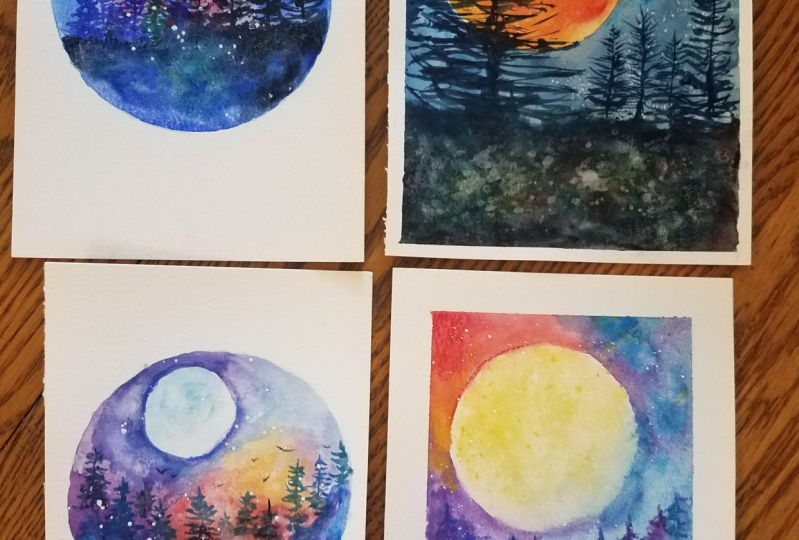
but four paintings. The subject is the
nighttime sky. There's something so captivating about looking up to the sky at night as seeing the glitter of stars and the vastness
of the cosmos, it brings a sense of wonder and mystery that conjures
up our imagination. Each painting is
designed to help you grasp a variety of essential
watercolor techniques. I'll keep things simple
and easy to follow, so don't worry if
you're new to this, you'll be amazed at
what you can create. I've been a professional
artist for many years, exploring lots of
different subjects, from wildlife and portraits to city scapes and
countryside scenes. I've always been entranced by the possibilities
of water color, but when I started, I had no idea where to begin
or how to improve. I didn't know what
supplies I needed, how to create the
effects I wanted, or which colors to mix. Now I've taken part in many
worldwide exhibitions, been featured in magazines, and been lucky enough
to win awards from well respected
organizations such as the International
Watercolor Society, the Masters of
Watercolor Alliance, Windsor and Newton, and the SAA. Watercolor can be overwhelming
for those starting out. Which is why my goal is
to help you feel relaxed and enjoy this medium in
a step by step manner. Today, I'll be
guiding you through four complete paintings
demonstrating a variety of techniques and explaining how I use all
my supplies and materials. Whether you're just starting out or already have
some experience, you'll be able to follow along at your own
pace and improve your watercolor skills if this class is too challenging
or too easy for you. I have a variety of classes available at different
skill levels. I'd like to start off with a
free, expressive approach, with no fear of
making mistakes as we create exciting textures
for the underlayer. As the painting progresses, we'll add more details to bring it to life and
make it stand out. I strive to simplify
complex subjects into easier shapes that
encourage playfulness. Throughout this class, I'll be sharing plenty of
tips and tricks. I'll show you how to turn
mistakes into opportunities, taking the stress out of
painting in order to have fun. I'll also provide you with
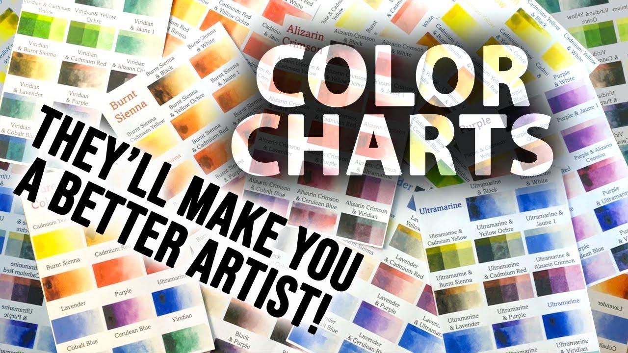
my watercolor mixing chart, which are an invaluable tool when it comes to choosing
and mixing colors. If you have any questions, you can post them in
the discussion thread. Down below, I'll be sure to read and respond to
ever think you post. Don't forget to follow
me on Skillshare by clicking the follow
button at the top. This means you'll be the
first to know when I launch a new class
or post giveaways. You can also follow me on Instagram at Will Elliston
to see my latest works. So are you ready to explore
the magical world of stars, moonlit landscapes and
the captivating hues of the night were
fantastic? Let's begin.
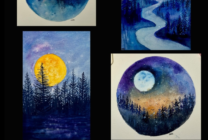
2. Your Project: Before we get started, let me just say how grateful I am for you joining
me in this class. I think it's going
to be a real fun one because these
paintings allow us to loosen up and experiment with lovely, vivid,
beautiful colors. Each painting varies
in difficulty, with the first one
being the easiest, but even the last one
isn't that difficult. And it's a great opportunity to explore what is possible
with the water color medium. The first painting is extremely easy and
perfect for beginners. It's aimed at helping you get comfortable
with the medium and the initial steps of creating
a beautiful light sky. In our second painting, we'll take it a step further by adding a moon to
the composition. This will introduce you to
some additional techniques, giving your night sky that
extra touch of magic. Moving on to the third painting, we'll explore a
wider color palette, allowing you to experiment with various shades and create
a more vibrant night sky. This will expand your
understanding of how water colors work and how colors can transform
your artwork. Finally, in our fourth
and last painting, we will combine all
the elements from the previous paintings into a final harmonized composition. I'll emphasize clear and easy
to understand instructions, making sure that
anyone can follow along and create their
own dreamy night sides. In the resource section, I've added a high
resolution image of my finished paintings
to help guide you. You're welcome to follow
my paintings Exactly. Or experiment with
your own composition. Whichever direction
you take this class, it would be great
to see your results and the paintings you
create through it. I love giving my
students feedback, so please take a photo
afterwards and share it in the Student Project Gallery under the Project
and Resource tab. I'm always intrigued to
see how many students have different approaches and how they progress with each class. I'd love to hear
about your process and what you learned
along the way, or if you had any difficulties. I strongly recommend
that you take a look at each other's work in the
student project gallery. It's so inspiring to see
each other's work and extremely comforting to get the support of your
fellow students, So don't forget to like and
comment on each other's work.
3. Materials & Supplies: Before we start painting, let's go over all the
materials and supplies I ate. Having the right materials can greatly impact the
outcome of your artwork. I'll go over all the supplies I use for
this class and beyond. They're very useful to have at your disposal and we'll make it easier for you
to follow along. Let's start with the
paints themselves. Like most of the materials
we'll be using today, it's a lot to do
with preference. I have 12 stable colors in my palette that I
fill up from tubes. They are cadmium
yellow, yellow ochre, burnt sienna, cadmium
red, alizarin crimson, ultramarine blue,
cobalt blue sill blue, lavender, purple, di, black. At the end of the
painting, I often use white guash for tiny highlights. I don't use any
particular brand. These colors you can
get from any brand, although I personally
use Daniel Smith, Windsor, Newton Halbeine paints. Let's move on to brushes. The brush I use the most is
a synthetic round brush, like this Escoda Perl brush
or this Van Gogh brush. They're very versatile because
not only can you use them for detailed work
with their fine tip, but as they can hold
a lot of water, they are good for
washes as well. They're also quite affordable, so I have quite a few
in different sizes. Next are the mop brushes. Mop brushes are good for
broad brush strokes, filling in large areas and creating smooth
transitions or washes. They also have a nice tip that can be used for smaller details, but for really small details, highlights, or anything
that needs more precision. I use a synthetic
size zero brush. All brands have them and
they're super cheap. Another useful brush to have is a Chinese calligraphy brush. They tend to have long bristles
and a very pointy tip. They're perfect for
adding texture or creating dynamic lines
in your paintings. You can even fan them
out like this to achieve fur or feather
textures as well. And that's it for
brushes onto paper. The better quality
of your paper, the easier it will be to paint cheap paper crinkles easily
and is very unforgiving. Not allowing you to
rework mistakes, it's harder to create
appealing effects and apply useful techniques
like rubbing away pigment. Good quality paper, however, such as cotton based paper, not only allows you to rework
mistakes multiple times, but because the pigment
reacts much better on it, the chances of
mistakes are a lot lower and you'll be more likely to create
better paintings. I use arches paper because that's what's available
in my local art shop. A water spray is
absolutely essential. By using this, it
gives you more time to paint the areas you
want before it dries. It also allows you to
reactivate the paint. You want to add a smooth
line or remove some paint. I also have an old
rag or T shirt which I used to clean my brush. Cleaning off the paint
before dipping it in the water will make the
water last a lot longer. It's always useful to
have a tissue at hand whilst painting to
lift off excess paint. Also, you never know when an unwanted splash or drip might occur that needs
wiping away quickly. I also have a water dropper
to keep the paints wet. When you paint, it's
important to have them a similar consistency to what
they're like in the tubes. This way it's easier to
pick up sufficient pigment. A hair dryer is useful
to have for speeding up the drying time and controlling the
dampness of the paper. Lastly, masking tape. And this of course, is just to hold the paper down still onto the surface to stop it sliding
around whilst painting. Also, if you plan on
painting to the edge, it'll allow you to create a
very crisp, clean border. That's everything you need
to paint long I suggest you experiment with
your own tools and supplies just to see
what works for you. But for now, let's get started.
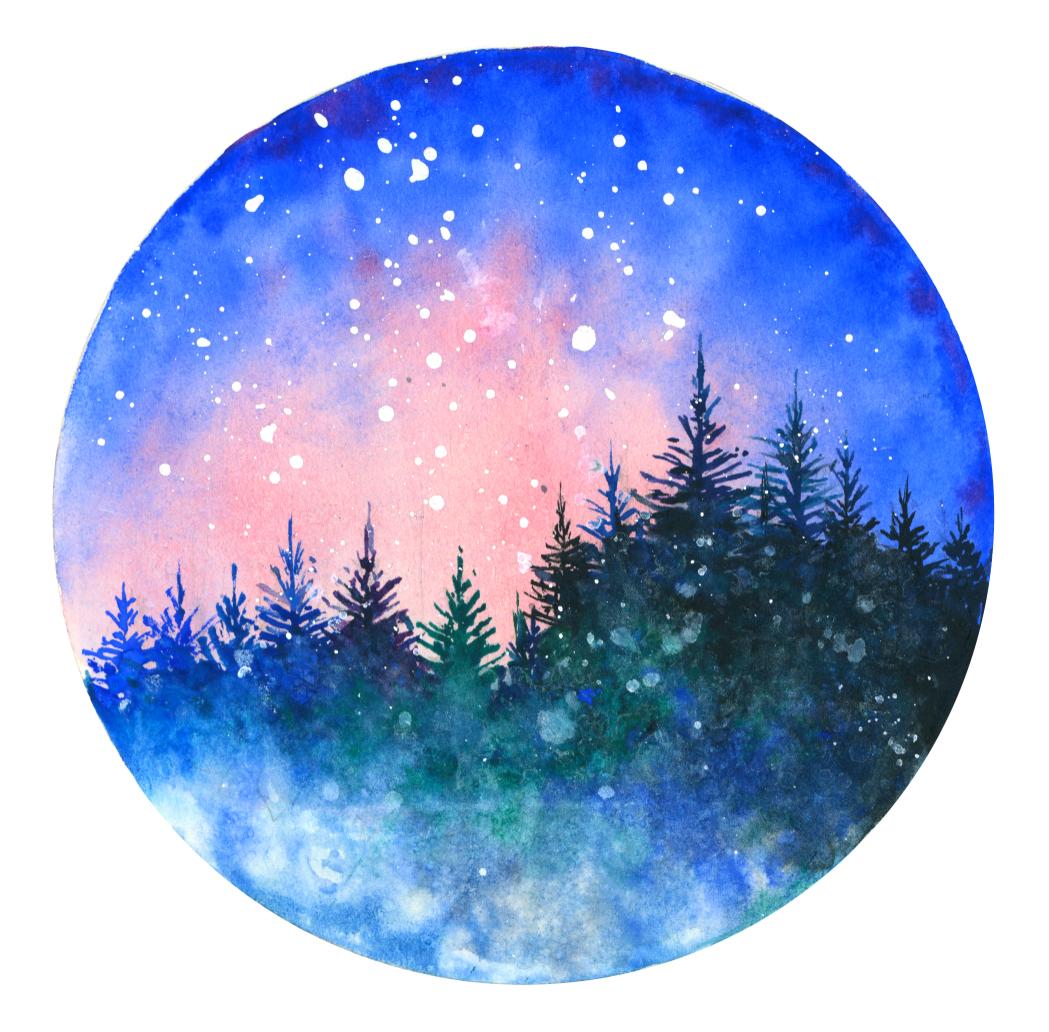
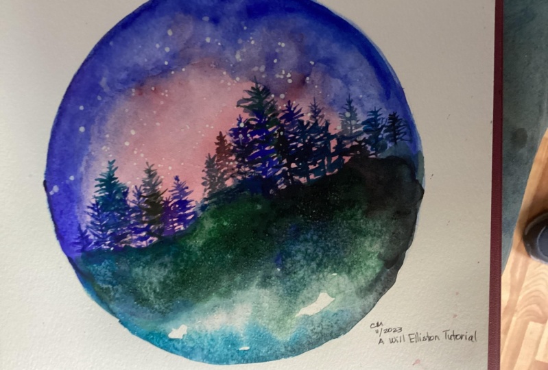
4. Project 1: The Sketch: This is the first painting
that we're going to do. To make it slightly
more interesting, I've chosen to have
a circular border rather than a rectangular one. But you're perfectly welcome to use tape and create
a nice clean border. I'm doing it in my sketchbook
because I view these as more like exercises
for a bit of fun. And it takes the pressure
off when you have it in that mindset, the
one I did before. I'm going to sketch it down here, and I'll do that with you. But before we start that, let me go over the colors
that I'm going to use. The primary color, as you
can see, is cobalt blue. And you can see I'm using cotton water color just because that's the one I happen
to have of cobalt blue. But you can use any. This is a student grade paint. It's quite cheap, but it
still has a good quality. I'm going to squeeze
some of that into the tube, into the pan. Now that's the primary color, you can see that is around most of the painting influencing
all the different colors. Now I have two secondary colors. That's a Lizarin crimson, which is another hue in the sky. For that, I've got Daniel Smith, but you can use any
brand you want for that. I'm going to squeeze
some of that into there. I always want to use
fresh wet paint. I don't want to work
from a dry paint like it is in my
palette at the moment. Then the second secondary color is a screen that mixes with
the cobalt in the trees. It's vidian green. I'm using
squeeze some of that in there if you want to. The darkest darks,
we can use black, but you can always use dark
green for that instead, or dark blue or mix the two. But just to save a bit of time, I'll put a bit of
black in there. Then at the very
end, if you want, you can add some
flickers for the stars. But I'll show you how to do
that when the time comes, and I use white for that. Alternatively, you could
also use masking fluid at the very beginning to save
the white of the paper. To create that circular border, I found a bowl that happens
to fit my paper here. I had to search the cupboards
just for a perfect size. And I'm just going to
use that as a template. And just with my pencil, just go around and mark
that circle out like that. And then using the same pencil, I'm just going to put a few vertical lines where
some trees might go. I'm going to have some dark trees right in the foreground, and then some more
colorful ones that are lighter in the distance. It's quite soft, but I'm just putting vertical lines in there. That's such a rough
guide at the moment, I'm not going to put
any details yet. So that's the first step now to paint the
background or the sky.
5. Project 1: The Sky: I'm going to use a mop brush for this, but you don't have to. You can use a synthetic
round brush too. It's not that important. As long as the brush is big enough to mix
all the paint in, then it should do
the job perfectly. Now to start off,
I'm just going to wet my brush completely, absorb it with water. I'm just going to very
carefully go round and pre wet the paper. Being careful not to
go over that line. It doesn't matter if you
go over a few millimeters. But try your best. This is actually a
very good exercise with brushwork and dexterity. Nothing can go wrong
because it's just water. At this stage. Just wear those lines, pencil line stars. I'm going to stop
applying the water, so I don't even paint
the bottom half of this. Okay, Now time to
mix the colors. There's not that many colors to mix because I'm just going to use that cobalt blue. Just get it full on my brush now. This is where you can add
your own personal choices. I've just mixed that blue there, but I want to add
a bit of purple. Maybe you want to
add a darker blue or a bit of Serilian blue. It's completely up to you.
You don't have to do that. You can stick with
the cobalt blue. For the time being, I will
stick with pure cobalt blue. I'm just going to put in one brush and then
the second one. And just brush by brush. We're filling that area in because we prewetted that area. The water won't have
any harsh lines, it will remain quite soft. I'm going to clean my brush. Just add more water on the inner edge where
it may fade out. There's quite a lot of
water on my paper now, and you can see it's
buckling and crinkling. But for this exercise, that
shouldn't really matter. You can turn this into
a bigger project, a bigger work of art, but I'm just having fun experimenting
with the medium here. Now that's mixed
in, I'm going to get some of my Alizarin Crimson. And you only need a
small little dab of that because it's a very
potent medium. And I'm just going to put
that into the middle there. Then as it's mixing,
swirl it along. Gradually lifting my brush, maybe in the center, putting
a bit of cadmium red. While it's wet like this, you
have a lot of freedom just to watch the pigment move around and we'll take it back
to the edge again. On this side, I'm going
to have it lighter a bit more cobalt blue. And then as we go across here, I'm going to make it darker, doing a few dabs
where it's a wet. So it naturally
blends into itself. Now I'm going to change to
a slightly smaller brush, this round brush on the outside. I'm just going to take
some ultra marine blue. I'll just drop it in the very edge because I want that border
to be nice and dark. You can't keep it like
that. You don't even need to use ultra marine glue flat. I was just showing
you what is possible. Maybe I can activate this purple here and
add a bit of that. Get some very thick pigment. Don't be afraid of
having thick pigment and just letting it drop
onto the wet paper. And after you're happy roughly with how the color is looking, I'm just adding a few more dabs of the red right in
the middle there. You can allow it to dry by
itself or with the hair dryer, You can even lift up the paper and just
move it around a bit, allowing all those
pigments to interact with themselves in a
natural organic way. You can even see the pigments. If you look very closely. I'm going to use a hair dryer to speed up the drying process.
6. Project 1: The Trees: I'm going to get a brush with
a nice tip, nice fine tip. And it's going to paint the
top half of the trees with very thick pigment starting
from left to right. In fact, if you can't quite
see your pencil lines, now's the time where you
can just add them back in. You can do a few guides for where the tree
pine trees should be. It starts off thin, quite vertical branches and then it
fans out the lower it gets to leave that bit blank, that little last
quarter, so again, picking up very
thick cobalt blue, using the tip of my brush, I'm just gonna first of all do a line down from
the top to the bottom, then gradually fan
out the branches. Even at this stage, I'm
finding the paint is too wet. I'm really going
to try and dry it out, make it very thick. Maybe even take a bit of ultra marine blue to
make it even thicker, almost like dry brush. With a dry brush,
you have to keep on picking up more
pigment because it's so Dr rubs off the
brush too easily. If you're not having to pick up more paint every three
or four strokes, it means your brush is too wet. This is where you
can really have fun exploring different colors, because cobalt blue
is the primary color. But that doesn't stop you from influencing
other colors into it. For example, now I'll take some green and add some
of that into it. Maybe I can take
some serilian blue starting off the
brushes very vertical. And then as you come lower, make them more horizontal. You don't need to
paint the base yet, just go down as far as that and we'll deal with that later. I feel I want a greener tree. I'm going to get better green and some serilian blue here. A bit more serilian. Back to the co, bolt. Let me just go back and forth thinking about what color
you want to achieve. I think even more green. There we go. That's okay. It's important to keep these
trees that I'm painting now on the left quite colorful. And not too big because they're going to be
in the distance. Because they're going
to be in the distance, they're going to
have more color. They're going to be
illuminated by the night sky, the moon, whereas the
larger trees on this side, I want them to have more
contrast with the skies. I'm gonna make
them a bit darker. Maybe I can mix some red into this
cobalt blue as well. To make a purple one I got, I had to go back, get some cobalt blue here and
mix it with some serilian. Pick up a lot of serilian here. Really. Paste it
on quite thickly. Right here at the bottom. At the bottom of all
that is. Paste it on and with the green as well. And do a similar thing, paste it on quite thickly even if you think
it's too thick. It's okay at this
stage. Just like that. I'll do one more tree here in the distance underneath
quite a small one. Now we can move on to
these bigot trees. These ones have a
bit more detail because they're
closer to the front. Go back to that cobalt blue. Again, really important to have a brush that has a
nice clean point on it.
7. Project 1: Textures: Now I'm going to use some black, which is quite potent. But I want it to be
very dark in this area. So going over it again
with a few dabs of black, don't be afraid to use
very thick pigment here, right here on the edge. I'm using pure black,
just like that. Now don't be worried
at this stage, if it's not looking
how you imagined, that's perfectly fine
because we haven't yet manipulated the water color to do interesting things yet. Once we've put down
this base color, then we'll go back to it with water and really
make it exciting. We're getting close
to that stage. More lumps of solid back here, just get pure pigment from
the tub, your palette. And just paste in pure,
undiluted pigment, bit of that cobalt blue. Again, a bit more idian right here. Okay, now before we
go to the next stage, let's talk about salt. I use a tiny bit of fine salt, the thinnest salt I can
find and subtly add a bit in the next stage
to create some texture. But your choice whether you
want to do that or not, it's easy to go
overboard with the salt. I just add a tiny little bit
in there with fine tens, nice texture, But
it's absolutely your choice if you don't
want to attempt that. Now I'm going to wet the bottom section where there's no paint going
right up to the line if you do want to use the salt. Get it prepared now before
you start adding the colors, in the next step, I've
wetted that section. And taking this little
bit of blue here, I'm just going to fill
in the bottom here. Just let it flow out of
your brush onto the paper, all the way up like that. We can do a few more
dabs like that. Now we work from
the bottom down. More water on my brush
and I just go over this line and brush it. Quite literally, I use
the side of my brush and just exfoliate it, so to speak. Really interact with it to loosen it and
soften that edge. Then I go back over
it again and again, soften and connect the paint to the wet area we just applied. You can just do a few swirls
just to help connect it. Now we go even further up, maybe even onto
some of the trees, and just keep on stabbing. It's like I'm just dabbing. I'm using the bristles
of the brushes to dig into the paper and reawaken the pigment that
we laid down before. This is where it gets exciting, where you really let the water color do
what it wants to do. You can go back up again, add more Brussels if you want
to bristles or branches, rather, if you feel some
of them need a bit more. This bit is extra dark on the
left hand, right hand side, rather fact, let's bring some of
the darkness further down on that side. We can even absorb
some of the color from this side and re drop it, Repurpose it over there. Now I'm going to see
how fine that is. I'm just going to few
little taps to there. While it's still very wet, it adds to the mysticism
of this mystical forest. If you use thick granules,
it'll be difficult. It won't really create
the nice textures that fine granules create
because it takes longer for the granules to melt and interfere
with the pigments. You can also in this
very thick pit, as it's starting to dry, Not when it's very wet, but
as it's starting to dry, just to flick spots
of water on there. Now I'm going to
get the hair dryer and start to dry it a bit. As it keeps on drying
while it's slightly moist, I'll splatter more water and just strong texture
you might dry. Exciting when you have areas of different stages of the
drying process here. It's much drier than
this section here. Somewhere in between where
it's very wet and quite dry, there's going to be a line that creates beautiful textures, tilting the paper every now and again to manipulate the pigment.
8. Project 1: The Stars: Now that it's all perfectly dry, we're going to move on to
the next and last step, which is adding the starry
sky, the stars in the sky. To do that, I'm
going to add a bit of white gash into my pan, but you can take it directly
from the tube if you desire to get a nice
clean splatter effect. I brush handle or a different item in one
hand and the brush in the other and I dilute slightly
the pigment on my brush. I find a flat brush
works better. But you can still do it with
the other brush if you wish. Just place the hard
edge down or the handle down, just tap on it. Then if it's too small, a a bit more liquid. No, I don't like
that big one there. So I'm just going to
rub that one out. Add a few more. Really keep your brush full as possible and aim your
brush downwards a bit. Feel the trees, I think. Don't hold your brush too tight. Keep it quite loose. I'm just going to use a
tissue just to pick up and blend out some of
the ones on the trees because I want to add a bit more texture there and I don't want there
to be stars there. Now, make sure the paint is completely dry before
taking the tape off. That's this step done.
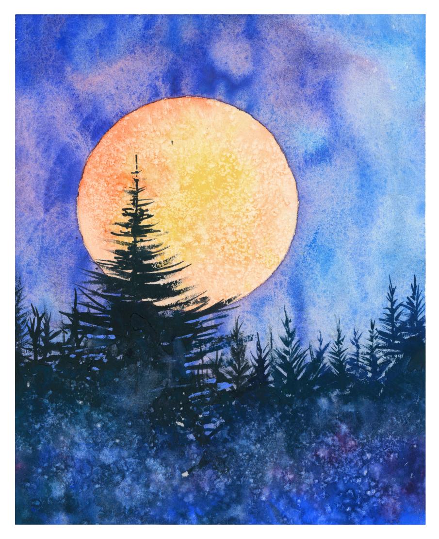
9. Project 2: The Moon: This is the second painting
we're going to do. It has a lot of
the same elements as the previous painting, but we're taking it a
step further by adding the moon or a setting sun or whatever you feel
like you want to add. It's a similar process
to the last one, except instead of having
a circular border, we're going to have
a rectangular one. I'm going to be
using masking tape to get nice clean border. We're going to start off by
painting this nice orange, yellow moon, and
then we're going to paint a layer on top of that. I'm going to use the inside
of this masking tape, put the outline of the moon. And I'm going to keep
it slightly off center, both vertically
and horizontally. I think that's right there. Fine. As always, I'm going to pre wet this circle for the moon
before I apply the pigment, so that the pigment just
naturally flows out where it's meant to without going
outside of the lines. I decided to paint the
moon first because it's lighter than the sky. It doesn't matter if
we go over the edge, we can paint over it a bit
and clean it up later on. A principle or a
fundamental rule of water color is to
paint light to dark. But of course, once you become comfortable with the medium, you can learn to
break the rules. And sometimes painting dark to light is an
interesting way to paint, but that can be explored
at your own pace. Today, we're just trying
to keep it simple. Again, this is good
practice for beginners to work on their brush skills. Their brush strokes,
that area is now wet. I'm going to go straight in cadmium yellow,
straight in the middle. Maybe I can dabble some edges, and some areas can be
stronger than others. I'm going to take some orange, or mix my own orange
by taking cadmium red and mixing it with
cadmium yellow. That's too vibrant
for my liking. So I'm just going to
use what's already on the paper and spread it out and it's as easy as that, maybe a bit more yellow. Now, I'd like to add a
bit of texture salt in this case because of course on the moon you
have little craters. This salt helps give
it that effect. And you can even
as it s a bit of pure water on there to increase the amount
of texture you have. With salt, I tend not
to use a hair dryer. I usually have
patience to try and let it dry out naturally. But if you don't have
the time, that's fine. It's not an important detail. If you'd rather get on with
as much painting as possible, let's use the hair dryer.
10. Project 2: The Sky: Now I'm doing exactly
the same but with the sky is wetting
the whole area. Be careful not to go
over on the moon. I don't even need to paint down to the bottom
because I know there's going to be trees
painting over the top. You can take your time with
this because it's only water. There's no pigment. You
can keep on going over it. If it starts to dry. I think I'm going to keep
the colors fairly similar to the first
one we painted. Okay, now I'm going to use
again, some cobalt blue. I might even use purple
in this to start off getting everything exciting, just applying some
strong cobalt blue, filling out the area to get rid of the fear
of the white paper. You can see I'm actually
using very cheap paper, so it's okay if you want to just experiment this crinkles a lot, I'm showing you that, it's fine. So that's the base and
it's all still wet. So let's experiment
with different colors. We can add, on this side, maybe I'll add more serilian, more turquoise shade
of blue on this side. Get that all mixed in. Then on this side, up at the
top there, I'll add purple. You can mix your own
purple like I have done here just using
ultramarine blue and Alizarin crimson or cadmium red. You can mix cadmium red instead
of a lizard and crimson. Any blue and red will
make that color. Just have fun
watching the pigments move around and dance
round on the paper. Maybe you can make it, add a bit more pigment around the edge just so it really brings
out the brightness. If you find pools of
water are created on your paper because of the
buckling like they are in mine. Then you can lift up your
paper and just roll it around a bit more cobalt blue. Instead of taking the purple, that'll show you how
I make my own purple. So that's exciting for me. I'm just going to
let it dry now. I think that's a good
balance of colors now. Because blue goes
well with orange, and purple goes well with yellow if you need a tissue, if it's too dark to
lighten it up there. But it's not that important and you'll see why
because like Conway, other painting here,
we paint over it. You see on here I've created buckles of water where
I just let it dry naturally and it adds quite
a nice effect like space, I'm going to use the hair dryer.
11. Project 2: The Trees: Now this is dry, I'm going to
start drawing in the trees, just lines actually, just to mark out where
I want the trees to go. I want that one to be the
main tree that's going to be down there that almost
reaches the top. Zig zagging, like
a curved zig zag. Actually, I don't need
to draw these bits. Down here you can see just a
spiky spikes within spikes. That'll make more sense
as we paint them, which we're about to do now. Like the other one, we're going
to use very dark pigment. In fact, I'm going to change to very small number one brush, I'm going to get pure black, mix it in all that green, even take a bit of blue in there just to make sure
it's not pure black. Give it some excitement. Starting off with this main one painting the branches,
trying to keep it organic. I'm using a bit of dry brush technique by having
the peg pigment so thick, without water that it rubs against the texture of
the paper and leaves gaps. So it might look
dark at the moment. And while it won't go any lighter once we paint
in the other tones, it'll look very well balanced, kind of doing
zigzags at an angle. I'm going to start
painting the trees here, one that's cut off
by the border. We can do these trees in a bit more of a shortcut fashion. By that I mean we can just
do vertical lines like this for the main branch, making sure they're
perfectly vertical. Then we can just add to them. I'm going to add a
bit more pigment because it's getting
a bit too dry. A bit of water of the
larger you paint this, the easier it will be. But this is fun to
do in a sketch book. If you've got watercolor
paper in the sketch book, you don't lose anything
by just giving it a go apart from the materials. But I think It's much more
worthwhile to give it, to go and learn.
It's a good payoff. You're not wasting anything by even a failed painting.
You learned a lot from. You don't lose anything at all, not even the materials supplies
that you spent money on. It all goes towards
your future paintings. A few abstract marks there because it doesn't
matter that bit, we'll fill that in later. Get this blue back. Maybe some serilian
blue in there too. Whatever color takes your fancy. You don't have to be so strict when you do your brushes. Dry brush marks, instead of
painting from the outside in, like that paint from the
inside out like that, you see the difference
inside out. It creates a hard edge if
you paint from the outside, but if you paint inside out, it has a sharper point to it, which is good when
mimicking these branches. Remember keeping the branches more vertical the
higher up they go. These are some
important techniques using dry brush strokes. Even though it's a
simple painting, you're learning a lot from it. Because you're learning
how to do washes and blending and layering
dry brush marks that you shouldn't
feel any pressure. There's no stress
involved in this. It doesn't matter if it doesn't
go the way you planned. That doesn't make it a
failure or a mistake. So don't worry about that. Don't let it hold you back
from having fun exploring. Now comes the very exciting bit.
12. Project 2: Bold Paint: We've painted the outline
of the trees there. Now, starting at the bottom, I'm just going to paint
pigment of cobalt blue. This is right here and here. Very thick, maybe
parts over there too. Take some more viridian
green here Again, mix that with some blue. You can paint that in there too. We're just laying down
thick pigment right now. Really pasting it on. This is where you'll see
where the magic happens, putting thick pigment on there. Then what other colors should we apply
with thick pigment? Let's put a few strong dabs
of this ultramarine blue too. Quite random, just dotting
it around the purple too. We are like that purple,
or at least died too. Now, I'm just going to
fill it all in with water. Now, once it's all wet, that's when you can start
manipulating it or guiding it, striking it with a brush, making it very mystical. And now, maybe very carefully, just at the bottom of the trees, I'm going to plod pure black. And it will just plead
out all by itself. A few flicks of water
and a bit of salt. If you watch the first painting, you'll know I only put a little bit on here and I leave it to
dry it by itself. As it dries, it'll
change and morph, and blend and merge. It's impossible to predict
what it looks like. Now, you just have to
cross your fingers and hope something magical
will come out of it. But it's outside of our hands. The more you fiddle with it, the more the magic gets lost. Let's just let it be and come back to it
when it's fully dry. Now you can see it's
dried and it's created some really lovely textures getting that salt and allowing the water to move
the pigment around.
13. Project 2: Finishing Touches: Now I'm going to, just to paint a
few more trees or at least extend the
trees that I've already painted can use cobalt blue. Going back to this
color, I already have on my palette some
ultra marine blue. It's going to be
like kind of an arc. An inverted arc is going
to go up and down, down in the middle
and up on the sides. Can it go back in here and interact and move it
around a bit more? Maybe add a bit more
darkness at the bottom now to dry it off again
with the hair dryer. So now let's take the tape off. Being very careful when
you take the tape off so that you don't pull
up any of the paper. I make sure it's completely dry. I pull it off at a slight
angle and keeping the tape low and you can see we haven't
done stars on this one. Like the other one, this is it. Compared to the other one I did. You can choose
whichever composition you want. Whichever you prefer. You can also, at the very end, if you want to
have a bit more of a splatter effect like
there is on here, you're going to see
some pure water. Do a few of your brush, wait a few seconds
so that the water really sinks into the
pigment and the paper. And then just rub that, it looks like there's magical
particles in the air. That's this one done. Time to move on to the next painting.
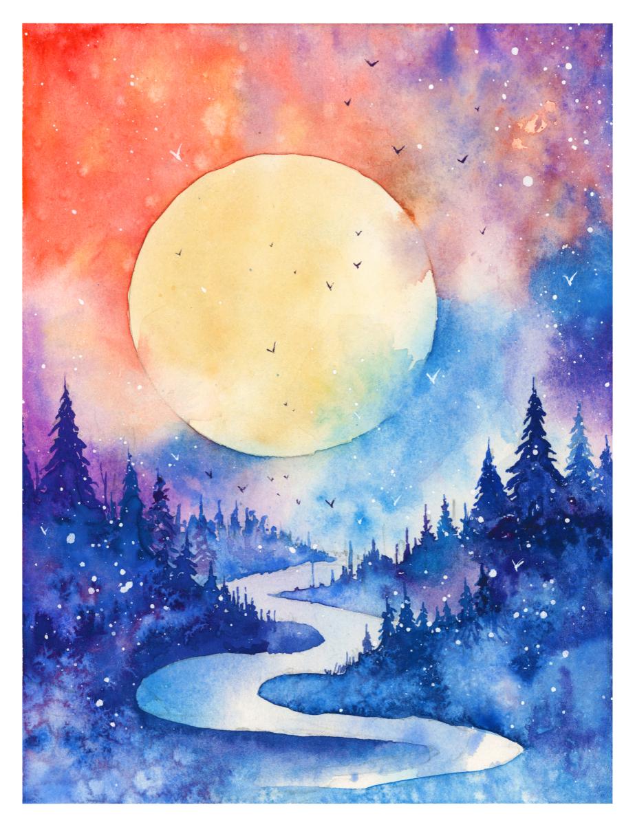
14. Project 3: The Moon: Welcome back and this is the
third painting in the class. With this one, we're
going to be more adventurous and explore
different colors, and that's what makes it
a bit more difficult. But it's still no reason
not to give it a go, because nothing can be
lost from giving a go, especially when you're learning. There's no such
thing as failure, because even if you do fail, you're learning
something from it. If it's just goes smooth sailing and you don't learn anything, then there's nothing that can improve your skills and
take it to the next level. Don't be worried about
failure with this one. Like the first one, we're
going to start off with a circle border for the moon. I've just found a hand cream. I'm going to use the lid
of some hand cream and just use that for my moon. But you can use, depending
on the size of your paper, you can use a coin, a
different lid pepper grinder. This is salt so you
can use anything that's the size
you want it to be. Can just mark in some trees very roughly in the foreground, some
in the distance. Again, to start off with, I hadn't cleaned my palette
from the last painting, because a lot of these
colors I'm going to use, it seems a bit silly to
rewash it all the time, and I actually never wash my palette personally
when I paint, it's only when I do
classes that I clean my palette because it just
looks visually nice and tidy. But now I'm mixing a few blues, cobalt blue and serilian blue. But you can mix whatever
blues you want. Whatever shade or tone of
blue takes your fancy, however you want
your moon to look. I'm just going to paint
that in with a light blue, taking it to the very edge. Now, different paints
have different pigments. Of course, this serilian blue that I'm using is
from Daniel Smith. And I like it because it
has very thick granules so the water really moves them
around and when it dries, you can see the granules and
it creates a lovely texture. That's what I'm going
to do for the moon. I'm just going to let
that dry and I'm going to use a hair dryer to help
speed along that process. Now I'm going to paint. Get a bit of a
lizard in Crimson. It's a bit too strong. I's take a bit of that away. A bit of this cadmium red. I'm just to cover out
some of the white. Just doing a very light
under air at this stage, not that perceivable, just trying to get rid
of the pure whites.
15. Project 3: Vibrant Sky : Now, while that's drying, let's mix some exciting
colors can use that. This blue that we used before, maybe we should get
some purple involved. Yeah, I like the
idea of some purple. Get some of the serilian again. Oh yeah, it's exciting. Some camm yellow. I'll use that when the
time comes as well. I'm gonna use a hair dryer
to clean, dry that house, to get camiing yellow. Yeah, like that. Put a bit down and then just
spread it out of bit, maybe a bit more
yellow at the top. Like that, working
very expressively, then it can start transitioning to purple
as we go up here. Going right to that edge, maybe taking a bit of that
red again and dubbing it in. Get some nice organic mixes O few splacks of water every now
and again just to keep the playful mood up. Some ultramarine blue here, I think mixed in the lizard crimson
to make it purple. And I'm just going
to paint very boldly now along the
outside of the moon, maybe take some blue to
interact with it there too. Just having fun
with thick pigment, diluted pigment
and everything in between spit like a color wheel moving around, exploring
different colors. Be cause of cobalt
blue in there. You can never
replicate this twice. I can explain the basic
idea of my mindset. There is no way will turn
out the same each time because the nature of water
color is unpredictable. You just have to literally
go with the flow, with the flow of the water. That's what I'm doing. I
just see what's around, what colors are next to it. You can see I started off red, then red can merge into
purple to make blue. And that's what I'm doing, now I'm focusing on the blues. Then next to red or the other way is
orange and then yellow, we lots of water. Now when you apply lots
of wet water like that, it's both scary and exciting because you don't
know how it's going to react. You're just literally allowing the watercolor to do what it's to do,
what it wants to do. They have this orange fade
out at the bottom as well. So I'm just going to
soften that edge again. Maybe turquoise, serilian blue at the bottom
merges into that gradually. The funny thing is,
the faster you move, the more likely it'll turn
out well and exciting. If you spend time fiddling
with the details, it's more likely
that the water will dry and it'll dry in a way
that's not very attractive, and then you'll reactivate it
during the drying process. And it's better just
to do a fast take. And if it doesn't work out
again, just try again later. It's better to spend, let's say, 2 hours doing three
fast paintings, than 2 hours doing one slow one. Depending on, of course, your style and what
subject you're painting. Some things naturally
take longer than others. Flicks of pure water, a few textures in there. Then I'll add a little bit more orange
into these bits here. But other than that, I think
I'm going to let this dry. I'm going to try my hardest just to leave it alone and come back when it's dry and then
edit it once it's dry, because I don't want
to overwork it.
16. Project 3: The Trees: Now I'm just going to mark out where I'm gonna fit the trees. The ain't gonna have a
bit coming over here like that kind of a valley like that, 23 for a few in that valley using this bluy purple or
whatever color you want, you can use green sticking with the colors I've
already got on my palette. It's going to paint in some trees. If you've done all
three of these by now, you should have good practice on how to paint
these pine trees. I'm painting the lighter
ones to begin with. Then I'll come back over and paint the
darker ones a bit later. The lighter ones will
be in the distance. Because of the atmospheric
perspective, the atmosphere, in the air, the particles, it creates a sense of depth. Now I'm going to
go a bit darker. Go back over painting
some darker trees, kind of squiggling the branches in trying to keep
them quite organic. Putting a dark one right
next to the orange there, just to make it glow a bit more on the other side. I think
I'll go a bit more blue again, I'm not painting to
the bottom of the trees, I just cut it off, but in the last quarter so that I can blend it out
a bit better next time. One more here. Quite
a big one, I think. Then connecting the trees up a bit with it smaller
in between trees.
17. Project 3: Atmosphere: Now it's time to get the
heavy pigment Again, I'm going to mix some ultramarine blue Sue, that's too wet, it
be even darker. I'm going to take pure
ultramarine blue from my palette, which is just like
taking it from the tube in, doing a few marks, leaving a few gaps
intentionally. Maybe I'll put a bit of
purple in there too, and get this serrilian
turquoise back into play to clean my
brush. Pure water. Brush down to Interact
that serilian. So it's got a nice soft edge. Now I'll go connect it all. Connect it to the
bottom of the trees. I'm really not concerned
about how much water. There's going to be a lot
of water on the paper now. I really want the
pigments to move around. I'm not brushing every area, I'm just connecting the edges
and softening the edges in the water and then letting
the water do the rest. Tilting it a bit to let
the water run down. Using a tissue to make
sure that smooth, I don't want any
hard edges there. I want it to fade into the
distance from the middle. And as it dries a
few thick pigments at the base of the trees to
make them merge in softly. I put a slight tilt on this by putting something
underneath the paper. If there's pools of water
like there is here, I just use empty brush
to draw up some of the water and drop it back
up at the top like that. Completely dry brush and just suck out that liquid at
the bottom bit here too, Maybe some here anywhere
you want to suck out that liquid and just
drop it somewhere else. Now another way to stop pools of liquid is just to put
a bit of salt on. So that's what I'm
going to do now. Again, I'm just
going to let it dry. I've finished messing
around with it. For the time being,
I'm just going to let it do what
it wants to do. Taking a small brush, I'm just gonna go over
some of these trees and a bit more definition
to some of them.
18. Project 3: Some Details: I'm going to add a few
lanky trees in there, like trees that have lost their leaves and in the sky just going to
paint a few birds. So back to painting
those leafless trees, now that it's completely
dry in the background. Using a very dark black or just a very dark pigment,
doesn't have to be black. Can be dark blue just enough when it
dries, it stays dark. Maybe a colored one here. I'm gonna paint another
tree, pine tree here. I'm just going to have it
fade out at the bottom. Good. Now I'm gonna get my
white gas and, uh, handle of another brush and I'm just going
to wet my brush. I call this brush
my splatting brush because it's a bit
thicker with a bristles. You can do it with
other brushes. I just find there's a bit
more control with this one. I'm just going to
tap the sky a bit. I'm not going to go overboard, do a few in the trees too. That was too much. And there we go. That's
number three, painting done.
19. Project 4: The Drawing: This is the final painting
that we'll be doing. It combines all the things and elements that we've done
in the previous classes, and we're taking it to the next level by
adding a little river. And putting more control into where we're
putting the trees. Now I'm going to start off as usual by
putting the moon in. You can use any
circle as a guide. I'm going to use this
lid that I found, this brush cleaning lid, and I'm going to pop it right there. But you
can use a glass. Just do a little hunt around
your drawers or cabinets to see what you can use as
a template to help you. And I'm going to try
and match it by putting it in the middle of center, but not too close to the side. At the same time, I think that
will be just right there, just to draw that out like that. Now, before I start
with the paint, I'm just going to think about where the trees
are going to go. I have one tree there, a tree of similar size
there on the other side. And a few smaller trees maybe
bringing it down like that, going to have a, the river. First of all, I'm
going to paint, draw S shape Some
distant mountains going up and disappearing
behind there. Then there's a curve
that comes around here. But I cut off that curve
with more trees there. Then there's a bit of
land coming around there and that joins
to those trees. Then the land loops around, coming around the
other way Like that, the loops are getting larger. And as they come, I'll draw these lines
as a guide to show you. You don't have to for yourself, but as you see, there's a
kind of perspective going in. So as we come close to
the edge of the paper, these loops are getting bigger. That one can fade out there. The bottom, the bottom
one is not so important. We'll fade that out. There
can be some trees there.
21. Project 4: Underlayer: Now I can bring this wash
down towards the river. I think I want the
river to have this kind of serilian blue feeling
to it or turquoise rather. So I'm just going to cover that area with some serilian
blue, just like that. Few flakes of water, pure water, few dabs of purple here. Just as it's drying, soak up some of this paint that's
gone into the valleys. A few debs of purple there. I'm going to suck out a bit
of liquid here in the middle. And I'm going to
go back again for a bit more dark
pigment at the corner of these rivers of this stream. Darker in the corner maybe know that one. Use a tissue just to bring up some of the
over spilled bits. We can even tidy up a couple of these splashes
that came on there. Now I'm going to use a
hair dryer and dry it. Now I'm going to try and
create a bit of interest. You can leave the sun
or the moon as it is, but I want to create
a bit of interest by roughing up
some of the edges. To do that I'm just going to wipe some area of the edge. She is a tissue to
help lighten it. And then the same again on
the other side, wetting area, then just letting it bleed in a bit just adds to
the atmosphere, softening the edges. And maybe another one up here, so writing the
whole general area and then the area inside and
then just connecting it. No, that's not bit done.
22. Project 4: Background Trees: We're going to have to
paint the distant trees to begin with to add the
sense of perspective. And I'm going to
use serilian blue or turquoise blue even as well. But to make it easier, I'm
just going to wet that area first and then just inject
it with some pigment. And we can bring, using
the point of our brush, we can point little
spiky bits up, marking trees in the distance at the bottom. I'll make
it slightly darker, leaving it a bit
lighter in the middle. And then we make it fade out. Just the curve of this tree, of this river will be obscured
by the foreground trees, so we don't have to worry
so much about that. I like jumping back
between purple and blue. We can do the same
on the other side. He lifting it up to create
some tree textures. And bottom darker at the edges, down at the bottom
and at the top again, that corner will
be obscured as well. So for the time being,
that's good enough. Now, I'm going to move up and paint some
bigger trees here. And I'm going to change
my brush actually to a smaller brush,
painting the tops. These trees. This is cobalt blue. I'm mixing all three blues. I've got ultramarine, cobalt
blue, and Serilian blue at the very top of this tree. I'll make it black. Another one. And then a slightly
more purple one. Yeah, soften that edge. Now, I'm going to dry it.
It's important to have quite a nice
silhouette and I think it's too dark the
background there, so I'm just going
to wet this area here and then just pull a bit off the
background like that. I can go back and tidy
the edges a bit more. Now it's time to paint
the trees on this side, which is a similar process, starting off with a
thick pigment as ever. Just starting off
in the middle and then swiping across downwards, gradually going further out. The further down
we go, never from the outside inwards was
from the inside outwards. Just for some reason it looks better that way I put a blue in there may be on the outside to a half a tree
fading into the border. There we go. Moving along, we
can do one here. I have bot blue, one of them, Cobot blue
is a lovely color.
23. Project 4: The River: Now moving to a bigger brush. I'm going to start painting from this side and then work to join the two sections
using a light pigment. Just filling in the
rough area like that. And going back to
my smaller brush, I can inject it with a
darker pigment like that. I use the lighter
pigment just to make sure I have everything
correct and where I want it. Now, merging these sections, and this can come all way around to a few dark blobs here of
whatever color you want. I'm gonna use mix of
cobalt blue and purple. I love this purple. And then just go
heavy with the water. We go heavy with the pigment first and then we go heavy
with the water afterwards. And I stab it in, so I agitate it quite a lot and soften it out. It'll fade out actually
a lot in there. I'm going to drop a few dabs of dark pigment in these areas. And also to help it out, oh, maybe a bit above, a tiny bit of a Lizarin crimson, which is visible now. But it will blend out
to make a purple, now droppling a bit
of salt in there. Just a little bit. If you overcrowd it, it'll be too much and you will
hardly see the effect. If you just add a few
particles of salt, then it gives it space. It gives it space to create
these swirly edge textures. But if you put too many, it all blocks it out and it
actually hides the effect. It's easy to go
overboard of the salt and make it a bit redundant. Clean a bit of the orange
here, spat it in there. Now we can work on the other
side and do a similar thing. Now that's just going
to put a few dabs of purple and ultra marine
blue right here, painting the edge with very
dark blue. And here too, a sul, thick pigment on there. Now, keeping of that
turquoise blue, I'm gonna paint some trees. Oh, oh.
24. Project 4: Foreground Trees: When the leaves are small, you can just put
lines like this. Then after they get
to a certain size, then you can start adding
a bit more definition. Using that light background to create a silhouette of trees. You can see them
taking the tips as far as they can
before they get dark, before they go to
the dark section. Now, I haven't actually
used any green in here. I've just used turquoise, which is the closest to green. But you can add that
if you want to. Just because I haven't
done it, doesn't mean you can't experiment with
different color palettes. The good thing about this scene, it's not based in
reality, imaginary. So there are literally no rules. Only your imagination
can limit you of this. If you want to make
red trees, so be it. It may be in your world, that's what you want the
trees to look like. We, we have a flick of red. See if I can give you a close
up of what's happening. So I'm just going
to dry that out. While it's drying, I just
noticed that I should maybe dab some indications of trees going up to there
following this path tree. It's not that important but I saw it and thought
I should do it. I'm going to splat some
pure water onto there. Wait for a few seconds until it fully absorbs
and then rub away.
25. Project 4: The Birds: Now I'm going to fill my
brush up with white paint. Hold it at an angle like
that that's not coming out. So I'm adding a bit more water. It's better to start thick and gradually add more water
than the other way around. I'm holding this very lightly, like it's got a lot
of flexibility. I'm not hitting it that hard a bit more. If you
hit it too hard, the paint will just go
absolutely everywhere. But if you lightly to drop it, then it's a bit tidier and more focused just letting it
drop by its own weight. I'm not forcing it down at all. Now, I'm gonna pick
up my small brush in the darkest areas. I'm just gonna paint a few
birds, some white birds. I'm not going to
do the same again, but with a few
ultramarine blue birds in the lighter areas, I've been careful not to smudge my little Vs, but
with bendy arms. Let's take the tape off. This one, the big reveal my favorite part
of the painting process. Taking that tape off there we
are very nice and dynamic. And if you've managed to follow the other
paintings and this one, even though it's more
controlled and led, it's a nice fun challenge to practice all the important elements of watercolor painting.
26. Final Thoughts: Welcome back and congratulations
on completing the class. But now is the time for
you to give it a go. It's up to you which
one you want to paint. Possibly you want to
give all them ago. Let's take a moment
to reflect on what we've learned in
each of the paintings. In our first painting, we loosened up and embraced
basic watercolor techniques, creating a beautifully
serene sky with a few glittering stars. In the second painting, the edition of the glowing moon added a touch of magic
to the night sky, capturing the essence of a serene night under
the moonlight. In the third painting, we embraced a fold
spectrum of colors, exploring a wider color palette, allowing us to showcase
our creativity, transforming the night
skies into cosmic wonders. And finally, our fourth painting brought together all the elements we've
learned throughout, combining stars, moonlight,
and a myriad of colors, turning it into a
harmonious composition of artistic expression. We're not just
painting night skies, but capturing the magic of the universe and
translating it onto paper. Each painting is a step
forward and a brush stroke closer to expressing yourself,
embrace the process. Remember, watercolor painting is not just about technical skills, but also about expressing your creativity and
personal style. I encourage you to continue
exploring, experimenting, and pushing your
boundaries to create your own unique
watercolor masterpieces. As we come to the
end of this class, I hope you feel
more confident and comfortable with your
watercolor painting abilities. Practice is key when it comes
to improving your skills. So keep on painting
and experimenting. I want to express my gratitude for each and every one of you. Your passion for
watercolor painting is so inspiring and I'm honored
to be your teacher. If you would like feedback on your painting, I'd
love to give it. So please share your painting in the Student Projects
Gallery down below. And I'll be sure to
respond if you prefer, you can share it on Instagram, tagging me at Will Elliston
as I would love to see it. Skillshare also loves
seeing my student's work, so tag them as well at Skillshare after putting
so much effort into it. Why not share your creation? If you have any questions
or comments about today's class or want any specific advice
related to watercolor, please reach out to me in
the discussion section. You can also let me
know about any subject, wildlife or scene you'd
like me to do a class on. If you found this class useful, I'd really appreciate
getting your feedback on it. Reading your reviews
fills my heart with joy and helps me create the best
experience for my students. Lastly, please click
the follow button up top so you can follow
me on Skillshare. This means that you'll be
the first to know when I launch a new class
or post giveaways. Thank you all so
much for being so enthusiastic and bold in
your watercolor journey. I hope you continue to find inspiration in painting
nighttime, skies, and that it allows
your creativity to soar until next time.
Happy painting.
 Will Elliston, Award-Winning Watercolour Artist