Transcripts
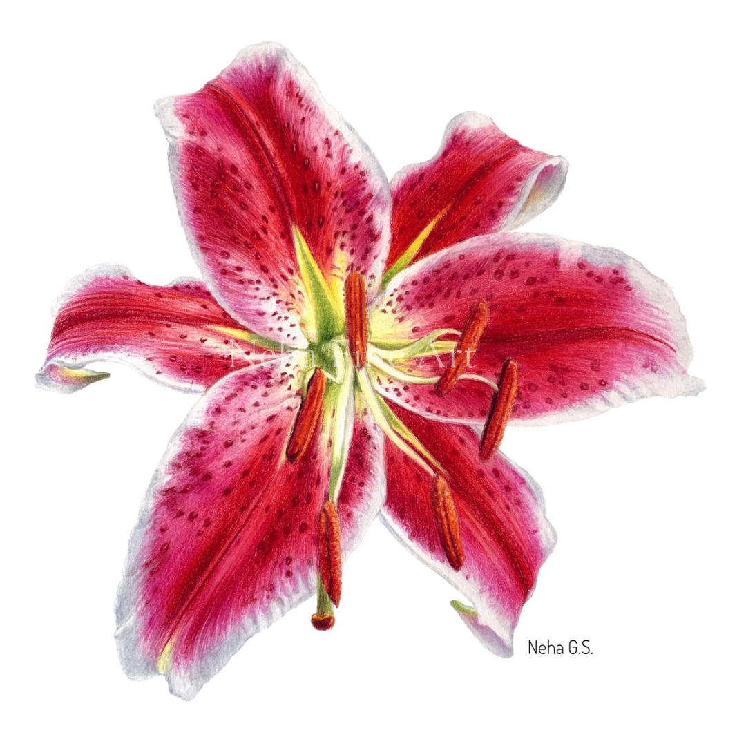
1. Introduction: Hey, guys, welcome to a new colored Mencil
tutorial in which I'll be showing you how I rendered this beautiful
stargazer lily flower. The entire tutorial
is in real time with me explaining the entire
process from start to finish and also sharing
a lot of tips along the way which I've learned and discovered in my art journey. I start working petal by petal and first secure the
lightest colors on the petals, such as the whites
and the yellows. After that, I start coloring all the darkest areas with
dark red from polychromos. This includes all
the dark shadows and also the spots
on the petals. Next comes deep scarlet red from polychromos for all
the vibrant red areas, which are on the
center of the flower. I follow it up with
mid tones using rose carmine for the
warmer pink tones and fusia for the cooler tones, both pencils from polychromos. I work in the direction of
the form and the veins thus establishing the
three D aspect of the flower right from
the initial stages. I fill up the lighter gaps with more lighter colors such as pink medal lg and
light magenta with every layer blending and
smoothening out the colors. As the drawing does not
have any background, I also color the
outermost edges with light grays and blues
to make it stand out. I use white luminu pencil for the final blending
of all layers. After the app, the first
application of all the colors, I come in with darker
aluminum pencils and thus saturate each tone, making the layers look more smoother and more
like a painting now. Every petal will
have different areas of lights and shadows. Observe the reference picture
closely and work around. After all the petals are done, I work on the center, and in the end, I once again
work on the entire flow, adjusting the tonal values, and also lifting and
erasing highlights with a battery operated eraser
and a slice knife tool. This tutorial will come
with a list of materials, including the pencils that I
have used for this project, and also alternatives to some brands in case
you don't have them. You will also find
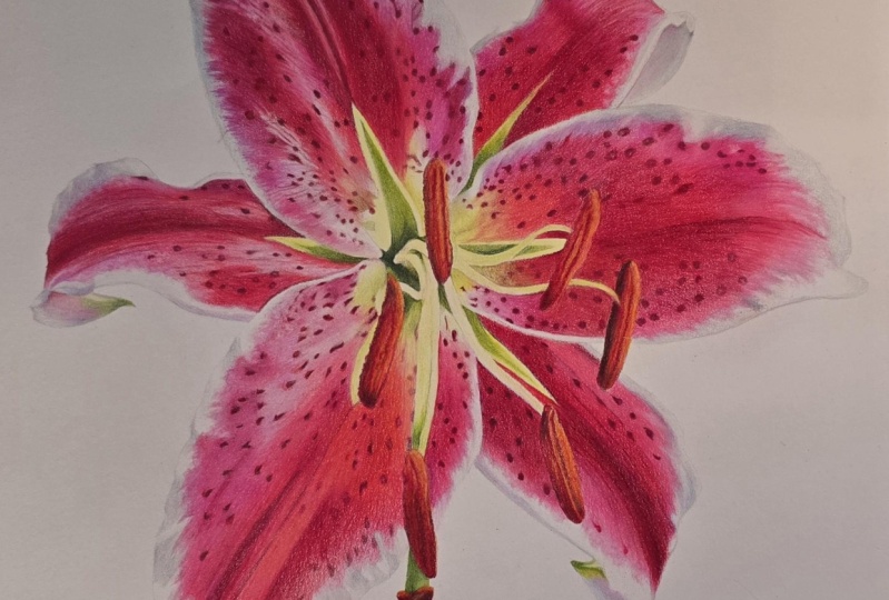
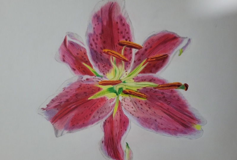
a line drawing, a copyright free
reference image, and my final drawing attached
with the video tutorial. I hope you enjoy
watching this tutorial and working on this
flower as much as I did. Colred pencils, as a
medium, is a bit slow. So enjoy and trust the process. And with patients, you
will be able to achieve beautiful results in
your journey as well. So do give it a try and then share it over here with us so that the others get encouraged
with your work as well. Till then by.
2. Materials: So let's quickly go through all the materials that we
require for this drawing. For the paper, I'll be using Stratmoor Bristol lem surface
paper size nine by 12 ". For the pencils, I'm majorly using fibocasle polychromos for this flow along with some
cada luminance pencils, and a very few can
Pablo pencils as well. Along with this, I'll be using a white prisma color and
a white luminan pencil. A needed eraser and a normal
pencil to draw, of course, tracing paper, and then a
battery operated eraser. This is a slice tool, or you can use an
exacto knife if you don't have this
and a pencil eraser, or you can even use
a tombo mono eraser.
3. Petal 1.a: Let's start with
the first petal. I'm just going to
take my needed eraser and lighten up the sketch. Just dab your needed eraser
onto the drawing to remove all the excess graphite
so that they don't mix with our lighter
colored pencils. So I'll go in first with
my prisma color white, Prisma color is a
wax based pencil. So I'll be freezing all the very lightest
white areas on this petal. I do this so that if we go over with other layers
with very dark colors, and if we miss out any
of the whitter areas, the lighter areas, we
can always lift them off with a pencil eraser or
with an exacto knife. So I always like to secure my whites with a
wax based pencil. You can use prisma color or a Derwin drawing,
whatever you have. Even illuminants will do. But polychroms white is a
very transparent color. So try to use a very
opaque white color. And with this pencil
and going over all the areas that I
feel that they are more lighter and also on the very edge of the petals
where it's completely white. I don't like to leave
any areas as the paper. I like to color it
with white color. And our next color I'm
taking is cream from Pablo. And this will go now on
all our pale yellow areas. Keep your hand pressure
very light at this stage. We are still in a very
initial layers stage. So we don't want to flatten out the tooth of the paper very soon because we'll be coming in and giving many, many more layers. So keep your pencil points sharp and your hand
pressure light. And I'm also following
the direction of the strokes of the
veins that I can see. And now this is cream
from polychromos, which is more of a
yellow, a pale yellow. And this will go in to all the yellow parts
of this flower. So I'm securing all the lightest part
of this flow so that I don't go accidentally with all my pinks and reds
into these areas. It's always better to secure your lighter colors
because in colored pencil, it is a little difficult to give your lighter colors on
your darker colors. Next is olive yellow
from Pablo again. To make these yellows
look more greener. Next is light yellow
glaze from polychromos, and I can see a bright yellow
patch below over here, which I'm going to
secure it, freeze it. And if your pencil
lines are too dark, then you should
just erase them off because they will be visible
under your lighter colors. So all of the lightest
colors are done, now we directly jump
into the darkest stone. We'll be working on half of the petal for now in this part. So this dark red
from polychromos. I'll start with the mid line. And though you're working
with very dark color, and in the reference picture, you can see it very dark, but don't push your pencil
into the paper too much. Don't use hard pressure. Go in with very light
pressure and go over that line two to three
times to make it more der. This way, You'll be ensuring that you can come in more with layers on
this particular area. And I'm leaving some lighter
gap for the lighter color. So just go with this
with this pencil, only on those areas, which are that dark. So now I will be coloring all
the markings on this petal. Observe the shape of every mark. It's not important to give
the exact number of markings. If your drawing is still intact, then you can just
follow the drawing. But observe the
shape of the mark, try to look it more natural and realistic by observing
your reference picture. For the lighter markings, I'm using very light pressure,
making it very light. I'm skipping some of the video
because it's repetitive. So the next color is
matter from polychromos. This is a little bit
lighter than the dark red. And I'm going over the dark so that all those
lighter gaps are filled, and you will see and of grain
texture in your drawing. So I'm giving a
very light base of this color and leaving the areas that are
lighter than this color. Think of these dots
as your guidelines. It's very easy to get
lost in so many details. So just these dots, these markings that
you have done, they will act as a good
guide for your coloring. And always move in the
direction of the veins of the, the form of the petal. This way you will create the three D form right
from your first stage. So now after this, I will take rose carmine from polychromos. This is more of a warmer red, which I can see more near
the center of the flower. As the center of the flow, which is more of
yellow and orange, it is reflecting that light. So the center of the flower
is more warm and then it becomes more
cooler as we go out. And whenever you are
selecting another color, always take that color and
go over the previous color. This way, you will start
blending all the colors. So this rose carmine, I'm also taking a little bit on the madder layer which we did. Now, this is deep scarlet
red from polychroms, which is more of a orange red, vermilion kind of red. Next is Ruby R from Palo. Again, this is
almost similar to e, which is more of a O bserve the direction of the strokes
on the reference picture, how it is turning. But every layer you're giving, you're smoothing out,
your previous layer, just making it more look like a painting
rather than a drawing. It is too early right
now at this stage. But slowly you will
see the difference. And keep on sharpening your
pencils in between and so that you're not just moving with your pencil on the very
top layer of the paper. Now I'll be coming in with
fucia from polychromos, and this is a
vibrant pink color, which is there on almost
the outside of this petal. You can work with lines with hatching or in a
circular motion. But for this particular draw, I can see more of lines. That is why I'm using lines
very next to each other. And in the end, you should
not be able to see of the texture unless you want
to create that texture. I This tutorial, every part is very repetitive, so you can just pause your
video at any stage and then just catch up with me because I will be
skipping a lot of parts, which is very repetitive. Otherwise, it will become
very boring and very long. So I'm leaving some areas which are lighter than this pink. And I'm taking those markings, which we did with dark red as a guide as to where I
have to apply this pink. Again, going over
the areas which are more darker pink
with the same fusia. Now, this is middle
purple pink from polychromos for a
more purply look. Here you can see I'm moving
in circular direction, so this is also creating
one kind of texture, a very soft, fuzzy
looking kind of texture. I'll darken some of
these spots as well. Now, this is light
magenta from polychromos, and this will go on the very outer periphery
of this petal, as of any pencil
line that I can see, which will not look good
if we put color on it. If you're not sure about
any of your colors, then just go very light. Just like watercolors,
even in colored pencils, it is very easy to make anything more darker
than lighter. I'm working around that bright yellow patch
that we have done. So this is the
reason I just freeze all the very lightest color so that we don't
miss it by accident. I'm also going over
the fucia layer just to fill in
all those blanks. And this is pink medal lake from polychromos again so that I can just fill in all those lighter gaps in
between the fucia layer. Using lighter colors over
darker colors will further blend your layers and
make it look very smooth, and you will get a good
gradient of color as well. This is still pink mater from pink mater from polychromos. We already have a layer
of white color as a base, which will further lighten
this pink pink tone. Observe the direction. This is middle
purple pink again. Oh. Futia from polychromas. Further darkening the
brightest pink areas, deep scarlet red
from polychromos, O. Now, I'm taking paints
th percent from Cards, and we will start giving the shadows on the white
areas of this petal, which is on the
outside of this petal. So I'm going in a
circular motion. I want it very soft. And since we are doing this flower without
any background, I will not be leaving the sides, the edges of the petals
completely white. Otherwise, they
will just vanish, and the petal will
look incomplete. So we'll be giving
a lot of grays and blues on the periphery
of this petal. If we were going to
give a background, then you can leave these
areas bright, white. But if you're not
giving a background, then you have to come in
with a lot of gray tones. So with this color, I'm only going in the
very dark shadow area, and this is silver gray
from candash luminance. And with this, I'll be filling up almost all the white areas, just leaving the very brightest
highlights on the petal. If you get confused
about your white areas, about the highlight areas, then always compare the
very brightest white with the rest of the white areas, and you will feel that not all your white areas are
completely white. As you can see, I'm
not completely gone over all the white areas
with this gray pencil, just leaving some very
brightest highlights. Next, I will come in with
white luminant spencil, and I will go over
all these gray areas. So this will further
blend both the grays, and I'm also going
in on the pink, which will also blend and
burnish these layers. But at the same
time, I'm not going with very hard pressure. This is still you can say
light to medium pressure because I want to give
more layers on the petal. Burnishing usually
means that you go over with your light pencil
with a very hard pressure, which further blends
all the layers. And now, whenever you go in with your white pencil into
the lighter areas, just see to it that
your pencil is clean. Otherwise, you'll be
depositing those pink colors onto your lighter white areas, and it will be a planter. So here, I'm blending all the layers with
this white pencil. Moving in circular motion in opposite direction
than the strokes, which we did with pink colors. Now, I again come in with cream, and I further further brighten
the lightest yellow areas. So first layer is done
on half of this petal. So now we need to
come in again with the same colors and make it
more dark and saturated. Because with the application
of lighter colors and white, your layers will look
much more lighter. So now we need to adjust
all the tonal values. And now with the
screen, I'm also going into some pink areas
just to warm it up. This is crimson aubergine
from luminance. And with this pencil now, I'll be further darkening all
the markings on the petal. Luminance is a mixture of
oil and wax based pencil. So And it's much
more very pigmented. So I like to come in
with this pencil in my very last stages
where it will just brighten up that color
and when you feel that you are not able to do
more layers with polychromos, then that time when I
bring in aluminum pencil, I'm able to give at least
a couple of layers more. It is that pigmented. For the base layers, I
like to use polychromos. They are very good
for base layers. But then for the last layers, I like to come in with luminans. But if you don't have luminans, and if you only own polychromos, then you can do the same thing with your polychromos as well. You don't have to think
that without the pencils, this drawing will not be done. And this is crimson zine
again from luminas, and this will go into all
our very dark red areas. You can complete this drawing with whatever pencils you have, even a limited number of
pencils that you have. Just try to use color theory, try to mix colors to
make it more darker, different colors to
make it more darker. For example, you can mix dark indigo with your dark red to
make it more darker. Don't go for black immediately. Black will just make your shadows and your
darks more dull, to keep it more bright, try to use blues and purples. So I'm coming in with more
details now at this stage. I'm observing the reference
picture now very closely. And there are a lot of more activity
around those markings. So the more time you spend on a particular
area of your drawing, there and more details
you will start observing. And the color changes and the tonal value
changes as well. Take your time. Colored
pencil is a slow process, but enjoy this lowness
of this medium. And once you know the technique, and if you're doing
it in a proper way, keeping your pressures light
and with a sharp pencil, then you will you
will be able to give as many layers that
I am able to give. And the process becomes very relaxing and very therapeutic. This is deep scarlet
red from polychrome. I want to further
This is a warm. This will give a nice glow
to the center of the petal. Always select a
reference picture which has a beautiful
combination of lights and shadows that will make your drawing also look
very interesting. And this is fui now. So I'm coming in with
the same pencils in the same order also to further darken our layers and then to further
give more details. And with so many layers, the surface of the flower of the petal has already
started to look so smooth, thus eliminating all the
white grainy texture, which is our goal. Rose carmine from polychromos. And pink medal lake
from polychroms. Middle purple pink
from polychromos. This color will go,
especially on the folds of this petal where you can
see some shadow areas. And I'm going in
circular motion. Just to create that
soft fuzzy texture. And this is light magenta. Just extending the pink areas into the lighter white areas. Now I'm going to take
light ultramarine. This is from polychromos, and I'll just give some of this color to the
gray white parts, just to create interest. And this will further deepen the gray tones without dull it. Just making it more brighter. I like to use blues with
grays and purples with grays just to make the shadows and the gray areas a little
bit more interesting. So This color you might not be able to see
on the reference picture, but I like to use this
whenever I give gray tones. Very light, I'm using this
with very light pressure. Light magenta from
polychromos again. And now with white, I'm just going to blend all the areas and
call this petal done, especially the half part. Of course, we'll
be coming in with more details when the
whole painting is done, and the whole drawing is done. In the final stage, we will be giving more details like lifting out some of the texture or lifting
out some of the highlights. But for this stage, this much is fine. In the next part, we'll
finish the other half of this petal. So see you there.
4. Petal 1.b: So Let's continue working on the other half of this petal. Here again, I have taken
Prisma color white pencil, and I'm going to give a
base of this color base of white color on all the areas that are lighter
and white color. Just lighten up your
sketch if you haven't. Oh Oh h. Now, this is scream from Pablo and this will go
on the top of the petal. Next is scream from polychromos. This is olive yellow from Pablo, and we'll start giving a light green base to all the greener
parts of this flower. And this is earth green
yellowish from polychrom working around the
light filament, going in with very light
pressure hand pressure. Now, taking oxide, a
very dark green from polychrome and I'm going to darken the darkest areas
on this green part. Taking dark indigo to further
darken the green areas. And this is olive from Pablo. I'm going to go
over the dark areas thus blending it with
the other layers, and with romoxide green, I'm just going to further
darken the darkest areas. Earth green yellowish again. Taking pains grade
30% from luminance, and I just want to create
more shadow in this area. O olive yellow from Pablo. This scream from Pablo is going
to fill up this filament. Earth green yellowish
from polychromos. Now we jump on to the
darkest part of the petal. We take dark red and start coloring
all the markings. Now this is matter
from polychromos. And this color will go into
all the darker red areas. In some places, I can see
a of diagonal strokes. Follow the direction that you can see on the
reference picture. Working around the anthers h. I also keep going to the areas that we have
already worked on This is rose carmine
from polychromos, and we'll start going over
the matter which we had done. So this will fill up all the lighter parts
of the red areas. And as we did in the
left half of this petal, the center of the petal is. Rose carmine is a pink Okay. Moving in the
direction of the vein, and this deep scarlet
red from polychrom this will go in all the
bright red areas. This will further deepen the red and will also
give a nice orange glove. And now, let's take from polychrome and fill up all the bright pink
areas of the petal. Leaving the areas
which are white. And I'm I'm coloring it in a circular motion to
create that texture. Still working with Futia. This is silver gray from us, I will color the white areas. Oh. Oh. Leaving some pockets of
very bright highlights. And I've also ignored
those polins, which have fallen on the petal, taking some artistic license. And now, this is pain's percent, and I'm just going to
some of the darkest parts of these gray white areas. And taking white and we'll
start blending all the layers. So I'm still going in
with light pressure. I'm not burnishing the layers. We still have to do
a lot on this metal. I'm just cleaning off
the white pencil on a paper so that I don't ruin the lighter
parts of the drawing. Taking silver gray
again from luminance and I'll finish this
part of the petal. Spain's great 30%. This area is quite
in the shadow. M and then with white again, I will blend the colors. White luminant pencil
is a great pencil to blend because it's not
very waxy at the same time. It's a little bit opaque, more opaque than poly. Now I'm taking light
ultramarine to just give a tint of blue into all
our gray shadow areas. C Okay. And stay tuned till the end, because in the end,
I will be coming in with my battery
operator eraser and the sliced knife tool to remove some highlights and
give more contrasts. So now, our first layer is done. So I come back again
with the darkest red, which is crimson
aubergine from luminans, and I start darkening
all the darkest spots. As we have gone on these dark
spots with so many layers, so they have become light. So once you finish
coloring all the areas, finish that layer, then
you have to come back again with more colors and
adjust all the tonal values. Next, we take crimson
and in from luminance. Keep on sharpening your pencils, especially at this stage, you need to come in with a very sharp pointed pencil because that will just
penetrate all the layers and make the layers
more smoother and make the drawing
look like a painting. Here, I'm further
darkening the red parts. I'm still going in with
very light pressure because after you've
given so many layers, if you go in with
very hard pressure, you will start seeing a wax
bloom, which we don't want. And this is purplish red from us again for our very
bright pink areas. I come in with scarlet
now from luminance. This is a very bright
orange red color, and will instantly just give a nice glow to
all the orange areas. As I told you, luminance is a very highly pigmented
brand pencil. So you don't need much, but it really gives
you that extra push, especially in your final layers. And using scarlet over pink will further brighten
your pink areas. This is fucia from polychromos. And I'm going into the
same pink areas again. So this will further fill up all the white part of the paper you are able to
see, the grainy areas. So more I have in my final
stage, the more closer, I'm holding the pencil
because I'm really now concentrating on very small
minute part of the drawing. Okay. Taking middle purple pink for this shadow
region over here. Avoid using browns and blacks
for your shadow areas. Try to use more brighter colors, and then maybe you
can add your black. So this is dark red
again from polychromos. And now with white, I will just blend all
the lighter parts of this side of the petal so that it just looks
more smoother. With this, I'm calling
this petal done. Of course, we are going
to come back to it when the entire drawing is finished. We will be coming in
with more adjustments. So I'll see you
in the next part.
5. Petal 2: Let's work on this petal. I have turned my board. Again, I'll go over
all the graphite lines with the needed eraser. I do this petal by
petal so that I don't lose the very
detailed drawing. And again, with a prisma
color white pencil, I start giving the
base color and go over all the areas that are white and which has got a
little bit light color. I'm not going in the very darkest areas
with my white pencil. Now, this is light yellow glaze, and we'll give the base for this very bright center
part of the petal. Always start with a very
brighter underlayer. This way, all your top layers will automatically brighten up, and we don't want a
dull looking painting. I like even the
shadows to shine. So giving an undertone
underlayer of bright colors and light colors will really
make all your layers shine, especially polychromos,
which are oil based pencils. They are transparent.
So these colors will definitely
shine throughout. Now, for the greener area, I'm using earth green
yellowish from polychromos. And taking olive
yellow from Pablos. I'm going to go over
both the colors to make them blend
with each other. And I can also see some green area on this
folded part of the petal. And this is earth
green yellowish. Oliive yellow from Pablo. Taking dark red and we'll start giving the very darkest
stones on the petal and even the vein. Next is murder. H Always start with your darkest color. In that way, you will achieve the darkest value very fast, instead of going with
all the light colors and then going over it with
your dark pencils. That way, you have
already laid down so many layers below
the darker pencil. And sometimes you
might not be able to achieve that darkest stone. That is why I always like to start with the darkest pencils, and then I go over it with
the all the lighter pencils. The technique is almost similar to oil painting where we
start with darker tones, and then we keep
on going over it with lighter top layers. So look out for
the darkest color which you see in that
particular area. And then on top of this, I'll be going in with deep s colored red in
the more reddish areas. So the matter that we
have used as a base will make this area
look dark red. And where it is pink, the matter that we use as a
base will make the pinker. I hope this all makes
sense, whatever I said. And this is also helpful. If we don't have a
particular shade of color because how many ever
pencils we have in our box, there is always going to be one shade that
you will not have. So if you don't have a very dark red in any of your
color pencil brands, then you have to mix
more layers below and then go over on top of it
with the reds that you have. So color mixing is done on the paper when you're using
color tensil as a medium. So we can make any color
darker or lighter, and then we can also change
the tone of the color. So if you want a very olive kind of green and you don't have
that particular shade, and you can always use
green with a warmer yellow or green with a
little bit of pink or red to make it more or yellow. This is from polychrome. And again, I will go into the areas that we
have already done and then extend that color into
the more warmer pink areas. So, for example, if you don't have Roskar mine in your box, you are using a limited
polychromos box, then you can just take
pink medal leg and mix it with cream or ivory to
make it a warmer pink. So a little bit of color
theory knowledge will help you in doing any drawing with a limited
amount of pencils. In fact, I really enjoy working with the limited
number of pencils. That way, I get to mix different colors and tones and make the drawing
look more interesting. So now I'm coming to Fuia, which is a brighter pink. Of course, some of the shades are irreplaceable like
this fute over here. It's the brightest
pink of all the sets. And it is very useful, especially in such pink flowers. But again, as I told you, to make a pink look brighter, I sometimes use orange, bright orange to mix with it. So that will definitely, give a nice glow to
your pink color. These are just some
of the tips that I have shared and I practice. So the more you practice, the more you draw,
the more shortcuts, you learn and more you learn about your
colored pencils and how they mix
with each other, which colors to use to make certain pencil
lighter or darker. This is p medal lake, and now I'll be just going over all these areas
that we have done. This will eliminate all the lighter white
grain of the paper. So not every time I use
white pencil to blend, you can just use
any lighter pencil, which is suitable for
that particular area. He again. Light magenta from polymers. Now I'm going to start working on the back side of this petal. I'm going in circular
motion to create that soft, blurry look and silver
gray from luminance, and I'll fill up
the lighter area, the white area of the petal. I'm not going to leave
anything bright white. Because if you compare that with the brightest white
of this petal, then you'll see that
it is quite gray. This is pains gray
30% of darker gray. And giving a very light
coat of the color and giving more darker
gray where the petal is touching and then going over
it again with light magenta. And then light ultramarine and with silver gray. This is earth green yellowish, And silver gray again. And I'll start working on
the edges of the main petal. I'm defining the edge over here so that it
doesn't get lost. And as it is, we can see a gray line pains great 30%. Oh Oh And then with white
luminan sencil, I just go over all the gray and the pink
areas to blend it. The process is exactly
same for all the petals. It's very repetitive. Take your time in
doing this drawing. I know it becomes a little bit more repetitive and boring, but then the end result is
so n, push yourself through. The challenger for this
drawing is of course, the pinks and the reds, like how they both are
mixing together to create the warm red
and the cooler pins, how they are coming together. So the challenge is how you blend these both
colors on the paper. Now, I take crimson
bigene and I start going all over all the spots
to make it more darker. We have given one complete
layer on this petal. Of course, it's just not
one layer, many layers. But then we have finished
covering the base completely. And after that, I just go in
with the dark tones again. Crimson lizarn from luminance. Try to create good contrast in your drawing
or your painting. Wherever you see very dark, very bright colors, apply those. And wherever you see very
light and highlights, leave those and make them as light as you see on
the reference picture. The more contrast you
have in your drawing, the more your drawing will
just pop out from the page. So don't be scared
of going too dark. And this is scarlet
again from luminance, which will further
brighten our warm reds. I'm also going over the fucia layers with this scarlet to brighten
it up furthermore. Taking mad now. This part of the petal
is quite in the shadow, and so it's very dark. No. Whenever you're giving any dark colors go and
go with multiple layers. Don't darken
everything in one go. That way, with different
colored pencils in that layer and
with more layers, you will make the petal
look more realistic. And as I told you,
all the layers, they shine through
whatever layers you have done in your
first or second layer, they will all be seen
in the final output. This is deep scarlet
red from polychromos. And Rose carmine
from polychromos. I'm also going to take
Ruby red from Pablo, a little bit more darker
than Rose Carmine. And pink madder lake
again from polychroms. For the very light
pink, and also, if I go over all
the darker areas, this will just eliminate
all the white of the paper. Taking white pencil. And now I'm just going to define the top part of the petal
which we have already done. Just give a nice edge. Keep your edges very
crisp and clean. Light ultramarine in the
darker shadow areas. This is silver gray again. And with white, I start blending and lightening
some of the areas. Taking crimson aubergine again. If you feel that your
darkest markings have gone a little bit lighter, you can again, again and again, come back and tweak them as long as you keep all
the layers I mean, do all the layers with
very light pressure of your hand. This is dark. And then Earth green yellowish. With this, we finish the this
petal and in the next part, we'll come on to the third
petal of this flower. This is olive yellow. O.
6. Petal 3: So Let's start with
petal number three. Again, I will lighten the
sketch with the needed eraser. And come in with white prisma
color pencil. Give a base. Cream from Pablo. Now, this one has
a lot of cream on the center part of the petal, which is getting all the light. So whenever you're
doing a flower, don't do all the petals
in the same way. Every petal will receive lights and shadows in
a different manner. So every petal has to be considered as an
individual thing. That was screened
from polychromos, and this is light yellow glaze. When I'm further brightening
this yellow part. And with earth green yellowish, I will be going in
on with the green. H olive yellow, and then we'll blend the yellow and the
green on this part. This is cream again
from polychrome, and I'll give the
brightest color which is shining,
that reflected light. And this is earth
green yellowish for the darker green area. Aiello from Pablo. Cromoxide green
from polychromos to further darken the green area. And this is pink madder lake. Unlike the last
petal which we did, the folded part of the petal
is much in the shadow. That is why we had
used light magenta. But this one is receiving light and it's
looking quite brighter pink. S. And always move in the direction of the strokes that you see
on the reference picture of the way the petal is bending and I'm taking light magenta for
the shadowy parts. Silver gray and will fill up the white
area of this petal. I also try to bring
that color into the pinker areas to just give a a shadow because after all, it is the behind side
of the petal and the top part of the petal is casting a shadow on top of that. Paints percent. Giving more shadow where
the petal is bending. This is white luminance, and I'll start blending
all the layers. Now, we come to dark red and start working
on the main petal. So as always, start
with the darkest color. And I'm going on the, the mid rib of the petal. Leaving some gap for
the lighter color. Oh Next is deep scarlet red from polychrom
I'll be going over the dark red and also into the areas that are
more orange red. M. Next is middle purple pink. We have good shadow where this petal is bending and cling. O. Next, we'll take dark red again. I want to give a
layer of dark red on this purple pink and
for our midtones. Also filling up the lighter
gaps that we have left. At the same time,
where it's very light, I'm just going over that area
with very light pressure. And of a bright future. Okay. H light magenta from Poly chronos And pink medal lake
from polychromos again. Filling up all the
lightest pink areas, fui I'm skipping a lot of repetitive parts
of the video, so kindly pause the video and just see how
much I have done. But whenever I'm
changing the pencil, I always will show it to you. It's only that all the pros A this process
takes so long time, and I don't want to make
the tutorial longer than. And I'm sure by this time you
already know the process, and I try to keep the
same pencils in order. Keep the same pencils
that I'm using. This is silver gray
from luminans. So by the time you're
on this third petal, I'm sure you'll be you have able to figure
out the process. Per and take frequent breaks whenever you're doing
such a big project, I finished this drawing
in two whole days. Because if you start
getting tired, then you will rush
through things, and I don't want you to do that. So take frequent breaks, maybe after every petal that w, you will keep the energy flowing and keep the energy fresh. And now I'm taking
cold gray three. This is from polychromos, for more darker grays. And observe the direction of
the strokes that I'm giving. The petal is having a nice bend. It is bending towards
the right side, it's falling towards
the right side. So all those, it's only possible to show it
through your strokes. That way you are giving a nice three D effect
to your two D drawing. Oh light ultramarine. And with um, just going
to blend all the layers. I'm cleaning my
pencil every time I go into the lighter areas. Oh. Oh. So I'll take crimson aubergine and make all the spots darker. Crimson zine from luminan I'll go over all the
darkest red areas. H. Now we take deep scarlet red. This this crimson z again. And scarlet from luminance. I'll be applying this color almost wherever I see
very bright colors. This colt will really instantly
brighten up your pinks. Ruby red from Pablo. Okay. And this is purplish
red from us, a more purply pink
kind of color. Next, I'm taking white
from luminan and blending the layers and this
is rose from polychrome and futia from polychromos. Cal grade three from polychroms. Wait again. When you're blending, you can go in opposite direction to blend the layers well, and his middle purple
pink from polychromas. And dark red again
from polychroms. And his fui Earth green yellowish. Oliive yellow from Pablo, back to earth green yellowish. This is oxide green from poly. Still darkening this
side with crimson zine. And with this, we finished
this third petal.
7. Petal 4.a: So let's start with
this big petal. And since it's a bigger one, I have divided it
into again two parts. So here, I'm lifting off the excess graphite
with a needed eraser. And then with prismacolor white, we will start giving
the base wherever it's light and even
white in color. The sequence is the same. For all the petals. Once you have figured
out the process and what pencils to use
and in which sequence, then the whole drawing
becomes really easy and the process becomes
simple and relaxing. It's only in the first
one or two petals that you have to figure it out. That there is a little bit
of anxiety and stress, but otherwise, then the whole
process becomes very easy. So this is cream
from polychromos, and I'm covering all the very pale
yellow areas with this. Don't forget to leave
all the filaments. Work in the direction of the veins and the
form of the petal. And that is why I like to
rotate my drawing board, and then also, of course,
the reference picture. Just be comfortable
so that you don't hurt your wrists
in the long run. And this is light yellow
glaze from polychromos, and I'm just going to
brighten up some of the light yellow parts. Earth green yellowish
from polygramos. Oliive yellow from Pablo. Now, let's start with dark red and tackle all
the darkest areas on the petal. It's just f. Um Uh Uh Now, this is deep scarlet
red from polychrome. It will be going over
the dark red as well. Rose carmine from polychromos. Taking it over the deep
scarlet red as well. Always try to incorporate
your previous color layer. That way you will be blending that layer
with your new one. Earth green yellowish. So here, I'm mixing green and red, which are complimentary
colors to make it a little bit dull gray, rose
carmine again. Because we have a lot
of shadows over here. So instead of using gray, you can also mix
these two colors. These are comment as
complimentary colors, they give you a
beautiful neutral color. Now taking and darkening
the red areas. And then with white luminans, just going to start blending, especially the lighter
areas. Fuca now. Pink medal lake
from polychromos. Leaving a thin white gap
between both the petals, rose B and deep scarlet red
from polychromos. We're tightening up
the drawing now. Trying to fill up the g of
the white green of the paper. Let's take dark red again. Mile purple pink
from polychroms? And white again. Oh. You can go over the spots. Also. We can always come
back and darken the spots. Light yellow glaze. I'm going over the red to
up the red color. This deep scarlet red. Fuca. And then pink medal
lake from polychroms. As it goes towards
the end of the petal, it's receiving more light and it's becoming
more lighter pink. Futia from polychromos. And this is deep scarlet
red from polychromos. Try to make the center
a orangish a possible. And this is silver gray us, a very light gray leaving some lighter
gaps wherever I can see the highlight on
the reference picture. And this is cold gray
three from polychromos. I'll go over the shadows where it's wrinkling
and the parts which are not getting light back to silver gray. And we are filling up
the brightest white also with this gray because these are the edges
of the petal. If we leave completely white, then they will just vanish of we will not be able to
see, and it will look. Taking u and
blending the layers. You can move in circular motion, you can move in
opposite direction than the previous
layer this way. All your smallest part of the paper will start
getting filled up, and the result will be a very
smooth paint like surface. Crimson gene for
our darkest reds. And this is crimson lizine. Further darkening the reds. It's all about adjusting
the total values. 00 published red from us. Scarlet again from luminance. Next, take from poly. And now you'll find that
the pinks are looking much lighter after
darkening all the reds. I'm darkening the
pinks over here. And with white, it's going to smoothen out the pink areas. Ppish red from luminans. Dark red from polychroms, We'll continue working on the other half of this
settle in the next part.
8. Petal 4.b: So I went ahead and colored
all the spots with dark red. And now I'm taking
deep scarlet red, and I'll start working
on the red areas. So you can pause the video
there and just finish up all your all the spots by
using dark red polychromos. This is middle purple pink. Moving in the direction of the strokes that I see on
the reference picture. Deep skit again. Rose carmine from polychromos. I'll go over the
deep scarlet red. And this color will go in
all the very pink colors. Going very lightly
over the yellow areas. Um, Observe the direction the strokes are changing
on the reference picture. Now coming in from poly Oh pink made from polychromos. H. Leaving some gaps in between and also filling up the spaces in between
the darker pinks. And now this is silver gray. A. So I'm leaving the gap where it's the brightest highlight. Otherwise, I'm going
over with this pencil over the entire edge of this. And this is pain's
gra 30% from u. And with this, we will work
over the shadow areas. And now with lumine
let's blend the layers. I'm still using light pressure, light to medium pressure. I've increased the sp bit. Taking coal grade three
from polychromos, back to normal speed. And this is light
ultramarine polychrom O silver gray from luminan Now, crimson and we'll start
darkening up the spots Next is Crimson Alize going over some of the spots, which I feel they are more this scarlet from luminance. Fui from polychromas. This is dark red
from polychromos, and then deep scarlet
red from polychromos. Let's take again. Deep scarlet red. Some of the petals are too red. Some of the petals
are too purply pink. Observe your reference
picture properly. This is again. Middle purple pink
from polychromos. Ruby red from Pablo published red from mins. Oh. And the scream from polychromas, going over the ruby red and
the gross carmine layers, making it more orange, more war, earth green yellowish from polychrom I will give a tinge of this color
on the petal as well. O This is light magenta
from polychromos. Light magenta will brighten
up your light shadow areas. And with this, we finish
this petal as well. T.
9. Petal 5: Let's start working on the
fifth petal of this flower. Taking my prismuc white pencil, and I'll again cover all the
lightest areas of the petal. And here I have
sped up the video. Oh. Next is light yellow glaze
from polychromos. Just a reminder
that don't forget to watch the last part
of this tutorial, which is the finishing touches, where I come in with an electric eraser
and my slice tool, and I'll be giving in more details and more
lifting techniques. I'll be showing you
more lifting techniques to reveal some of
the highlights. So this is earth green
yellowish from polychromas, and now olive yellow from Pablo, and I'll just blend
both the colors. Same technique for
all the petals. Dark red again from polychromas. Deep scarlet red
from polychromos. This petal is also quite
red in the center. Rose carmine from polychromos, which will also go over the deep scarlet red
that we have done, phi from polychromos. Middle purple ping
from polychromos. And light magenta
from polygromos. And this is cool gray
three from polygromos. Oh. Now, let's take silver
brad from luminance. And I'll go over both the colors that we have applied
in this area. Now, with white, let's
blend all the layers. L et's take crimson age from lumens and starting
the dark spots. This is crimson
serine from luminant. Let's start talking
the red areas. Let's take scarlet from us. And this is from Polygram. I'll go a little bit over
the scarlet as well. U U U published red from luminance, Pink from poly Let's start filling up the gaps
in between the pink layers. Cream from polychromos, a little bit of yellow
reflected light in this shadowy region
and then I'll take pain percent to
darken the shadows. Fuchia. I just want to give a little bit of
pink tinge to the shadow, the back side of the petal. And then with white, I'm just
going to blend everything. H. Deep scarlet red
from polychromos. Cream from polychromos. O olive yellow from
Pablo. And we are done. Oh.
10. Petal 6.a: So let's begin the last
petal on this flower. So as always, the first step is to give a layer of white with
prismacolor white pencil. So I'm going with this
all over the areas which are white and which are also having some highlights. Again, in this part,
I'll be working on one half of the petal. Breaking down a big
subject into smaller parts will keep you motivated. Small achievements,
small success will just keep you fresh. Taking cream from polychromos. I'm going over all the
pale yellow areas right in the middle of the petal,
middle of the flower. I mean. Of course, by now, you will be knowing
the process completely. This is light yellow
glaze from polychromos, and we'll brighten up the
brightest yellow areas. Let's take earth green
yellow she from polychromos. This is chromoxide
green from polychromas. I'm also going to take
permanent green olive. This is also from polychrome. With this green, I'm going
to darken all the areas on all the petals which are
this dark green and color. I'm also going to take
chromium green pee. This is more of a grayish green The rooxide green was
more of a bluish green. This is more of a grayish green, which we require for some
of the shadow areas. Next, we will take
Oliviero from Bablo. And here, I went ahead and colored the darkest red with
dark red from polychromos, as we have done on
all the petals. And now I'm taking the
deep scarlet red from polychrom and I'll go
over the dark red areas. Just going into areas which are this color and leaving the areas which are
lighter than this color. Rose from polychrom And next is from polychromos. Middle purple pink
from polychrome. And this will go into
all these shadowy areas. Per Again, taking from polychrom O. Next is pink medal from polychrome
and with this will color all the very
light pink areas. And now let's take
silver gray from lumin and start coloring
the edges of the petal. I coal grade three from polychromos,
for the shadows. I'm also taking this color underneath on the
top of this petal, which is going underneath
the overlapping petal. Now with white aluminu pencil, we'll start blending
all the layers. Let's come back to
the darkest color, which is crimson, age, and start coloring all
the darkest spots. Crimson Eliz from Lumens a deep scarlet red from polychromos. And this is scarlet from lumens. Oh. Back to deep scarlet
red from poly chromos rose carmine from polychromos, Let's take light yellow
glaze from polychromos. Cream from polychromos. I'll be going a little bit
over the pink areas as well. L et's take purpish
red from luminance. Oh. Fuca from Polygramos? Light ultramarine
from polychroms. Light magenta from polychromos. And then white lumens. U U U U U middle purple pink
from polychromos. Again, white, just lighten up this part which is
a little bit erased. Dark red again from polychroms. Deep scarlet red
from polygramos. Again, and we'll continue the other half in the next part.
11. Petal 6.b: So again, using re
from polygramos, I finished all the spots, and now I am taking deep scarlet red and going over the dark red that
I have already applied. So here, I leave
the lighter gaps where I can see lighter pins, and I continue with deep
scarlet red in the areas which are discolor and darker. Next is middle purple
pink from poly, and here I have turned my board
and my reference picture. A So this color will go in all the
shadowy areas. Following the direction
of the strokes, Next is from polychrom we'll start giving
all the pinker layers M a rose from polytue
over the pink layer. But this is more of a pink area. H Now let's take pink made from polychromos. And very lightly, I'm going
over the lightest areas. Taking silver gray, and let's color the white
part of the flower. A Next is pains grade 30%
from lubinans, for all the darker shadow areas. And then with white, let's
blend all the layers. Oh, let's take crimson, Ezerne. From luminance. H Deep scarlet red
from polychromos. Here I have just sped up
the video a little bit. By now, you know the
process very well. It's just repetitive
sequence of colors. Rose Carmine from polychromos, O pink made from Poly chromos Oh, Futi from polychromas. T purpish, red from luminans. This will go in all
the shadowy bits where we had done
middle purple pink. And with white lumin I will again blend the
very lightest area. Rosa mine from polychroms, and then green from polygromos. I'm using a little bit
hard pressure here. This is luminance white. Dark red from polychromos. Again, white aluminum pencil. With this, we finish
all the six petals on this flower and
in the next part, we'll work on the center
area. So see you there.
12. Center: After finishing all the petals, let's work on the
center of this flower. So we'll start with
all the anthers. So I'm taking dark red. I'll be using the
same pencils that we have used for the
petals just to create a harmony between all
the parts of the flower. And I will start with
the darkest areas, the darkest tone that I
can see on these anthers. I hope they are called anthers. Please correct me if I'm wrong. Now, these have a
lot of textures. So I'll be using more
of a circular motion, more of a scribbling kind
of movement with my pencil. As you can see in the
reference picture, it's not a very smooth object. So a wavy line, and I'm only going into the
areas which are these dark. Correcting the shape as I go. Keep a very sharp pointed pencil because it's a very tiny area, and we'll try to give
as much details as we can in this very
small tight space. The next color I'm
going to use is dum orange from polygromos, and I'll be going over
all the areas most Next is deep scarlet
red from polychromos, and this will go again on the dark red layers to make it a little
bit more orange red. Now to brighten
up our mid tones, I'm going to take
dark chrome yellow. M and go over the dark cadmium
orange we had applied. With light yellow glaze, I'm further going to lighten some of the lightest
and brightest areas. We work from dark to light. Now I take crimson bigene from luminance to darken
our darkest values. This will go on all
the areas that we have covered with the dark
red, making it darker. And instead of giving just
smooth straight lines as we did on the flower petals, try to give more scribbly
round circular motion kind of texture. And this is crimson
lysine again to further make the darker
colors more red. A lot of layers
on this tiny one. And this is deep scarlet red. And again, dark
cadmium orange on all the lighter areas
that we have left, giving a nice
texture on the edge. Similarly, we will go
on the second one. Again, I will start with
dark red on the des areas. So only look out
for areas that are this color and darker. Oh. Next, I'm going to take
light yellow glaze just to freeze the very
brightest areas. And then with dark cadum orange, I'm going to fill
up the mid tones. Little bit going over
the dark red as well. That light yellow glaze that
we have given will just brighten this dark cadmum
orange in some places. Dep scarlet red
from polychromos. A Crimson zine from ums. Let's darken the darkest value. Leave some pockets of light
to show that texture. And then dark chrome yellow
for the lighter areas. Take crimson bagine to further darken the
very darkest toes and then dark ium orange
from polychrome again. This is crimson lizine, and I'm just going over the
petal and even with dark red. Now let's start with the
third one in the same way. Now, this one has a very tone, which is almost
looking like black, but we directly use black. I'm giving a coat
of dark red first. Crimson bagin now I'm taking black polychromo, because we already have
nice red layers underneath, so this black will also
look very vibrant. If you directly use black, then it will look very dull. And now this is crimson from. F. So observe each and every anther because they are going
in a circular motion, they will be receiving light
in a different manner. So don't color all the
anthers in the same way. So here, I've given
a yellow base, and then I'm going in
with dark cadmium orange, which will brighten
up the midtones. And the light is coming
from the right hand side. So the top right is
nice and shining. This is deep scarlet
red from polychromos. M. The video is a bit spader because
we're just repeating the same steps on
all the anthers. Crimson. Try to make your darkest values so that your lightest colors
will just shine. Dark red. Now, I'll
start on this one. Creating that texture
by using dots. Light yellow glaze, and
then dark cadmium orange. Just fill up the whole ane. Dark grom yellow. Again, crimson bigen working
on the darkest values. And then crimson Eliz deep scarlet red. Again, Crimson and his rain. Dark rome yellow for
the lighter values. I'm taking black again. Ohh crimson aubergine. And then crimson lysin. Here, I'm also going
over the petal, which is surrounding that ana. I'm taking cadmium orange now and just going over the
petal with this color. This will be a good
addition to the petal. Now, let's work on another one. This one is quite in the shadow. H. And fill it up with the top right corner with light yellow glaze and
the dark cadmium orange. And fill up the whole anther deep scarlet red
from polychromos. Crimson aubergine.
And then black. Crimson ez taking dark, growing yellow. The last one, dark red, T Again, light yellow glaze,
dark adnum orange. Crimson aubergine. And then crimson z,
both from luminans. Oh. Deep scarlet red. And with black for the
very darkest area. Again, crimson at his
and with dum orange. I'm also going over the petal, just giving it a orange glow. M. Now all the anthers are done. Now this is chromium
green opaque. Let's work on the green
areas and the filaments. I'll start by darkening all the green areas which are
surrounding this filaments. I'll also use a little bit of black to darken it more further. Use it very lightly. Oh. Again, chromium green opaque. Go over the black now. So this will blend both the colors to
make a darker green. When you don't have
a green which is darker than the one
which we are using, just add other colors and then
just blend them together. Taking earth green yellowish. Now this is may green
again from polychromos. This color is a little
lighter and more yellowish than the
earth green yellowish. It's more brighter. Light yellow glaze Again, earth green yellowish and with light yellow glaze, and is going to blend
that into the background. Take olive yellow
now from Pablo. Next is cream from polychromos, and I will fill up the
filament with this color, and to blend all the colors, I'll use a luminous white. Now, I just want to give a
crisp edge to this filament, so I'm taking deep scarlet red. So with white, I'm just going to color the brightest areas. Again, Olive yellow from Pablo. Earth green yellowish, and again, white luminans. The filaments are very smooth, so try to smoothen
it out and blend it nicely with your white pencil. Green opaque, and olive yellow from Pablo. This is permanent green
olive from um, sorry, from poly Oliive yellow again. At any point you
feel I'm going fast, then just pause the video
and catch up and work along side my progress. I mean, my work. And now, the last bit of this drawing. So I'm again, starting
with dark red taking dark cadmium orange, fill up the very brightest
orange parts with this one. Taking crimson to darken it and crimson. No, sorry, this is purplish
red, from luminans. Now this is black. This to make it a
little bit more darker. Again, purplish red, I'll
just fill up that space. Let's work on the green part. This is permanent
green olive from polychrom I'll start
with the darkest green. Leaving some highlighted
area and taking may green for the lighter area and also going over
the other green. This is chromium green opaque, and with white, we will
blend all the layers. Dark rome yellow. With this, we finished the flower,
and in the next part, we will come with all the finishing touches to
the entire drawing.
13. Finishing touches: So now we have come
to a finishing stage. Our entire flower is done, the petals and the
center and everything. But now I need to do some
total value adjustments, and also by using these tools, I'll be removing
some highlights. This is the slice
tool, a knife tool, just like an exacto knife
and a battery operated as. So with this tool, I'm just going to scrape off some highlights
which we have missed when we were doing
the individual petals. So I always do this step in the very end when after taking a good amount
of break, this way, I understand where to give where to adjust
more of your I mean, where to lighten your
lightest value values and if you have to darken
your darkest values. So with this, I'm
just going to scrape off some of the brighter areas. I'm also going to use the pencil eraser to remove
a softer highlights. Clean your pencil eraser whenever you're going
into lighter areas. And now with a white
aluminum pencil, I will go over the areas
that we have scraped off. So this will just fill
up those areas with white pencil and make it look
soft and not very harsh. Even in between these spots When we are working on the
petals and the center, we are focusing only
on those areas. But then it's very important
to look at your drawing and the whole flower and compare the values on the whole drawing. Oh. I'm taking dark red, and I'm going to darken
this area furthermore. And this is crimson aubergine, again, if you want to
darken any of your spots. Now, this will differ
from drawing to drawing, whether you really
require that darkening. So just check your values. This is fusia, wherever I feel, I need a little bit
more of pink color, or any of the values
should be more lightened, or I smoothen out it more So this will be
done in this stage, and it's a very important step. So take a good amount of
break after you've finished the whole flower and come to
this stage with fresh eyes. Just don't abandon your
drawing before doing this. You have worked so hard and
you have come up to here. So another ten to
15 minutes more, and you will see what a world of difference
the step will make. I'll be using the same colors, but just enhancing some
colors, lightening some areas. Taking deep scarlet red. Again, on this petal, I will see if it requires any highlights to be lifted off. This is crimson and
then deep scarlet red. You can either use
a slice knife or a pencil eraser if you want to lift out more smoother
and softer highlights. So I'll just sharpen my pencil as with irregular sharpener. And then on the erased areas, I go over with white pencil. Oh Some petals may require a little bit more
attention than the others. Oh. Here, I come in with cadmium
dark cadmium orange, and I'm also going to
give a little bit of glazing of this color
on the petals as well. It will just give a nice
glow to the pink areas. I immediately brighten
up that area. Now I'm going to use this
battery operated eraser, the point of which
I have gone over a sand paper to make it a
nice fine pencil like point, and I'm just going
to lift up some of the very brightest
highlights on this flow. This is a very useful tool
in your colored pencil kit. If you don't have it, then
you have this eraser. With very less effort, you can just lift off the
brightest highlights. Again, I'm just going over
the anthers with this eraser, just lifting off more light. And again, taking
dark cadmium orange, and I'll go over this
petal with that color. So I'll continue giving
all these adjustments, and I'll see at the
end of the video. Oh. Oh H Oh, O O O With this, we finished this drawing. I could just go on and on adjusting all the colors and
giving more and more layers. But I think this looks good, and I'm going to stop
working on this. So I hope you enjoyed
watching this tutorial, and I just wish you
give this a try. It's a compilation of a lot of techniques of how to make your drawing more
like a painting, how to smoothen out layers. And here, I'm just going
with my needed eraser, just lifting off any
colored pencil dust that have fallen on the
white of the paper. So see you in the
next video then, bye.
 Neha Subramaniam, Neha Fine Art