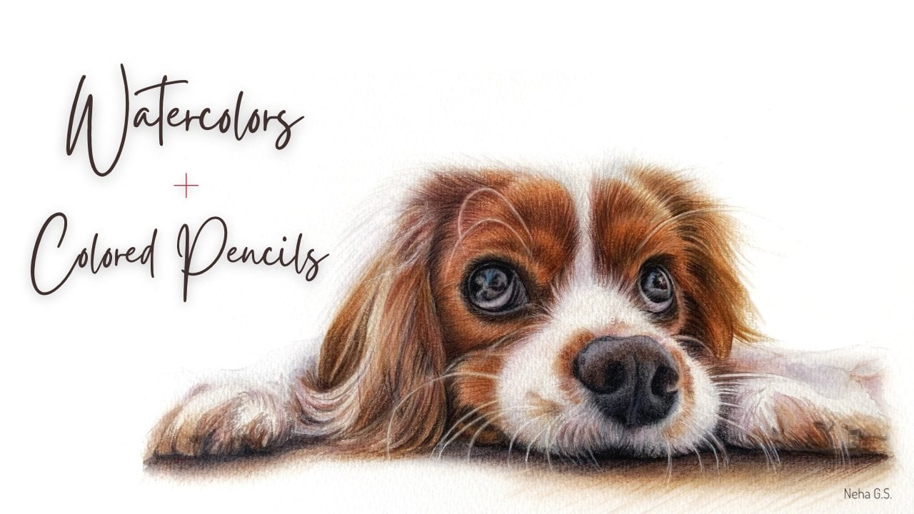
Transcripts
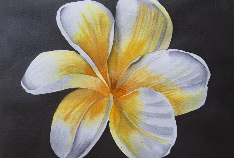
1. Introduction: Hi, everyone. A huge
welcome to you all. My name is Neha, and I'm a watercolor and
a colored pencil artist. In this class, we
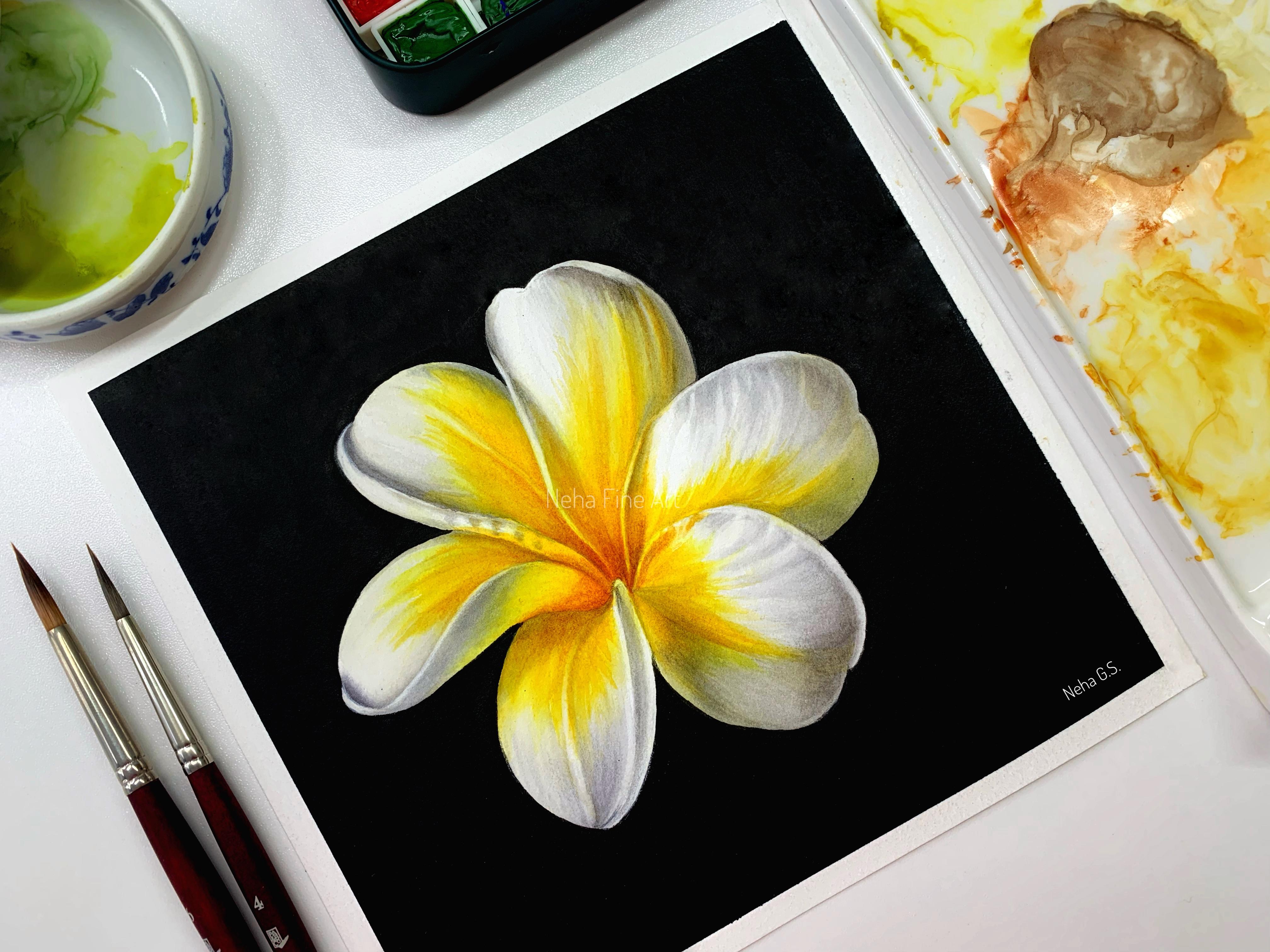
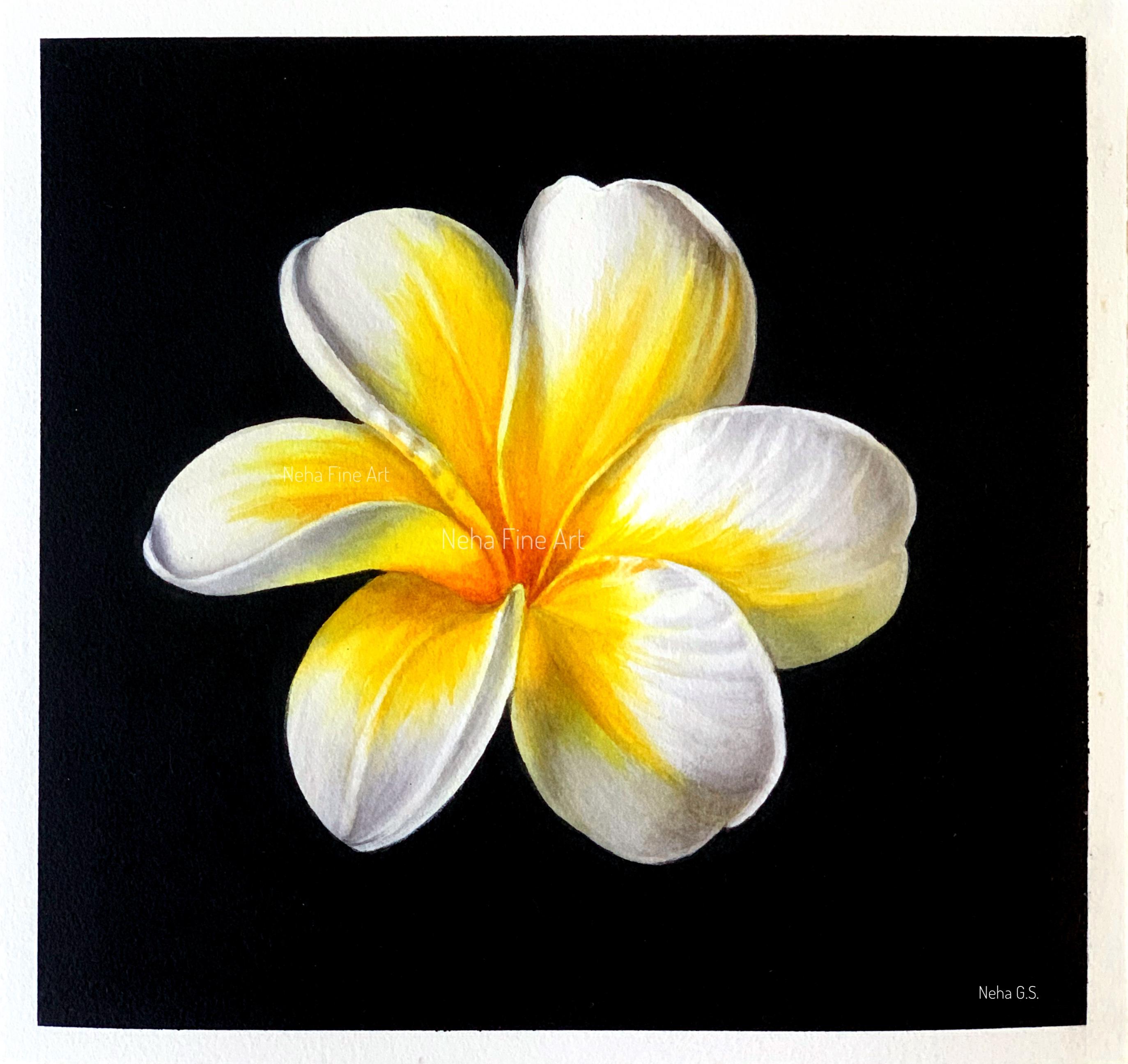
are going to paint this plumia with
watercolors, and this time, we are also going to give
a black background to it, which will just make the
flower pop off the paper. Now, whenever I'm
painting a background, I usually start by
painting that first. You can use various mediums to paint the black background, such as watercolors, gouache
or even waterproof markers. And in this case, I'm using a black ink to get a
jet black matte finish. After the background is done, I start by painting
all the gray shadows first as it's a white flower. In watercolors, we usually
don't use white paint. The white part of the
paper is considered to be the whitest and the brightest
highlight of the painting. So leaving those
brightest highlights, I concentrate on
the shadow areas to give the flower
a three D form. I do this in multiple
stages to maintain the brightness and not make
the flower look too gray. The grays will have
different tones depending upon the light, such as somewhere it can be
yellow for a warmer tone, and somewhere blue for
a more cooler tone. So a keen observation
is important to make your watercolor look
realistic and interesting. After the gray shadows, I start with the bright
yellows and oranges, thus giving life to this flower. Again, paint this with
multiple layers in thin transparent washes which will retain the transparency
of this medium. In watercolors, we always
start with lightest color. So in this case, I give a layer of bright
lemon yellow first, followed by deeper yellows and muted orange and brown
for the shadow areas. Again, with yellows,
we have to be careful so as not to
make the tones look too orange or brown and thus retaining the brightness
of the yellow center. After these layers,
I start working on the overall tonal adjustment
of the entire flower, meaning adjusting the
gray and the yellow tones on each petal by taking a step back from your
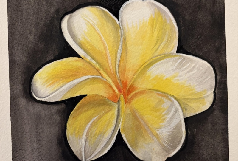
painting from time to time. After the painting is complete, I refine the black edges of the petal to achieve
a finss on the plum. Painting white flowers
with watercolors requires a bit of planning ahead in
terms of shadows and all, and that's why it becomes
a bit challenging. But you'll be easily able to
achieve this by following my step by step process
and simple color mixes. I hope you enjoy
watching this class, and if you do attempt
to paint this flower, then I would love to
see your creations.
2. Materials: Hi, again. So let's
quickly go through what all materials you will require for this
particular project. So I have used an arch hot
pressed paper seven by 7 ". This is in 140 pounds. That's why I have stretched my watercolor paper to a board. And for the black background, I've used Amsterdam acrylic Ink. Uh, the shade name
is Oxide black 735. All these details are there
in the list of documents. The brushes I'll be using
is this mop quill brush. Then Princeton long
round brushes, size four and six, an eradicator brush
by Billy Shawl and size zero brush
for fine details. And the pigments that
I'll be using are mostly from senilia
which is lemon yellow, sanela yellow deep,
KunacudenGld, burn sienna. And this is transparent
Pyl orange from core or golden paints and neutral tint from Windsor and Newton
professional artist paints. Apart from these, I'll be using the usual
ceramic palette, these washi tapes to maintain a clean edge
to your painting, then two bowls of water, a cotton rag, some
kitchen towels. Okay. So let's keep
the materials ready, and let's dive into the project.
3. Applying black background: So let's start by first
applying the black background. So here what I've done is I
applied washi tape all around to get a nice white border
to the black background. The paper I've used is
from arch, 100% cotton, hot pressed paper, and
the size is by 7 ". And for the black background, I'm going to use
uh, acrylic ink. This is Amsterdam oxide
black acrylic ink. And I'm using this ink
to get a really dark, you know, jet black background. And I'm going to use a
separate palette for this one. This already has some
neutral tint watercolor in the palette, but it's fine. I'm just going to remove
some ink into this palette. Just squeeze a few
drops of this ink. And the brush I'm
going to use is this mop brush or quill brush, which has a fine point. You can use any bigger
brush for your background, but it should have a fine point. So now to this, I'm going
to add some drops of water as I find this ink
a little bit too thick. So it's better to go with
two layers than, you know, one thick layer of black ink. So stir it nicely. Now there are various ways
of doing a black background. I I really love using this ink because first
of all, it's permanent. It will not bleed into
your white paper. And now before that, if you want to apply masking
fluid to your flour, then you can do so, let it dry, and then you can apply ink. But I'm directly going
in with the ink. I'm not because the edges
are not very they're like, plain and simple edges, so I'll be working around the flower and paint the
background with ink. So as I was saying
that there are various ways of putting a black background
to your painting. You can use if you want to keep it in the
watercolor family, then you can use
watercolor itself. Give two to three layers of
watercolor black watercolor, or you can make your
own dark gray or dark black by mixing all
the three primaries, give two to three
layers of that. The second option is
to use, black guash. Okay? Then the third
option is this ink, or you can even use black marker if you want
to keep it fun and light. If you want to gift this as a
car or something, you know, you can just use a black
permanent marker or even a posca black acrylic pen. There are various ways of
doing a black background. You don't need to stick
to watercolor itself. So use mixed media to make your painting experience
very enjoyable. Okay. So if you've
never used ink before, then I would suggest you
to do a patch test in your sketchbook because it is nerve wracking whenever
I use this black ink, especially, I always
get so nervous. So here I just started by applying ink all over the paper. And then I'm just fine tuning. I'm going very slowly. I'm going um, and painting
the edges of the flour, and be careful when
you are applying this because don't put your hands in the ink as I did over here, and keep on rotating your board so that you can
see the tip of the brush. Don't make mistakes because
this is a permanent ink. You cannot lift it or, you know, I'm not scaring you,
but just be careful. So in this way, I just
paint around the flour. If you don't have a fine point to your quill or mop brush, then you can even use
a smaller size brush to paint around the edges. So paint this with
a very steady hand. So again, there are two options. Either you can paint
a black background in the end after you finish the flower or you can
paint beforehand. I like to get the
background done first, if I'm painting a background
because that way, suppose if I make any mistakes, then, you know, I will not
continue with the painting. So that is one reason.
And the second is, especially with this
black background, if you have a nice black
color in front of your eyes, then you'll be able to
easily gauge how dark your shadows on your
flower will go. So that is also
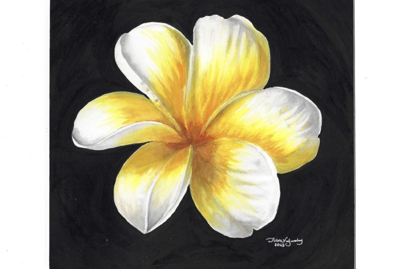
one more, reason. Of course, when I practiced
it in my sketchbook, I painted the flower
first because I was not sure that I'm going to
paint the background, and then I painted
the background. So here, I finished with
one coat of this black ink. I'm going to let it
dry completely, okay? So this is completely dry now, but I can see some
patches here and there. So let's paint one more layer. So always wait for your first
layer to dry completely. Stir your ink well. If it's too thick, then just
add few drops of water. And now when you're
painting the second layer, you don't need to go very
much near the petals. And as it is, in the end, after I finish the flour, I do fine tune the edges of these petals
with the black ink. So for now, I'm just
going around the flour, giving one more
layer, an even layer. An ink is not very
fussy like watercolors, so it'll not give you
any streaks or any, you know, blooms or
anything like that. It gives you a very fine matte
finish black background. It's a very fuzz
free kind of medium. So I'm trying to even
out if there are any, you know, thicker paint,
just evening it out. And now you have to let this
layer again dry completely. So after the background was dry, I removed the washi tape, and here I made a big blunder. I accidentally put
the washi tape on the brown paper tape, and I just lost a
beautiful edge. But somehow I'm able to remove this brown tape in the
end and I'm able to revive my the edges
of the paper. So I was quite
relieved in the end.
4. Color Mixing: I So first, we are going to paint the
shadows on the white flower, which is all your gray shadows. So for that, I'm going
to use neutral tint. This is from Windsor and Newton. It's a beautiful, very
neutral kind of gray color. You don't need to then
mix this with anything. I think it's a
perfect gray color. So this color will go almost
on all the shadow areas, the darker shadow areas
here and even here Okay. But then here, I can
see some brownish gray and then some warm
gray, especially here. So we'll mix some
other grays as well. Now I'm going to take
neutral tint again. If you don't have neutral tint, then you can just
mix your, again, three primaries and for
the warmer primary sorry, for the warmer gray, keep your red and yellow more than blue. So to this, I'm going
to add burned sienna. Again, if you don't want
to add burned sienna, you can add red and blue or orange as we're going
to use this in the plumeia. I'm keeping all the color mixes very simple
for this project. So burn sienna and neutral tint for very brownish
kind of shadow, which will come over here. Now, for here, I'll be making a very warm, yellowish gray. So for that, I'll be taking
some Kunakuden gold. This is from sennelier with
neutral tint, more gold. And to this, I will also
make some sanela yellow deep just to warm it
up a little bit more. So this will be our
yellowish gray. So try to keep a
variety of grays because the shadows also vary wherever there
is more light, you will have more warm. And in the more cooler shadows, you'll have more
blue in your grays. Okay? So this yellowish gray will come in all your
warmer, lighter gray areas. But for the very dark shadows, I'll be using just
neutral tint on its own.
5. Painting Grey shadows : So now, if you notice that I've only given in
the line drawing, I've only given lines for
all the gray shadows. I've not given any pattern for the yellows because that
I'll be doing it freehand, and I don't want
any pencil marks in those yellow, bright colors. As the yellow color, you know, it might make your
pencil lines permanent. And just ignore these
imperfect black borders. In the end, I will come back
again with a very thin brush and with ink and
rectify all the edges. But for now, let's
start with the flour. So before I start, I will just lighten
up the sketch. I'll just remove this line, the vein line which I
had drawn, not required. Again, this step is optional because the gray color
is very forgiving. You can easily erase off the pencil marks even after
you've applied your color. But I'm just lightening the
sketch because of a habit. Okay? So now for the brush, I'll be using size six brush. This is a long round brush
from Princeton velvet touch, and we will be
working wet on wet. So let's take clean water. And I'll be glazing
over the whole petal. I'm working wet on wet
so that it gives you a very nice soft
gray shadow colors. And at this stage, I want them very light because
it's just our first layer. If I go with wet on dry, I might make it
too dark too soon. So it's always in watercolors, it's always better to
work from light and go and work in layers
to make it more darker. So I'll take the water up
till the inside center part, even though we are not
going to come with too much of that gray color
towards the center. But don't leave any areas unfinished with
your water glaze. So advantage of using a black
permanent ink is, you know, that black color
will not bleed into your painting while you're
working with watercolors. If you're going to paint with
watercolors or black wash, then you do this black
background in the end. So now here, I also by mistake, I also included the
folded part of the petal, so you just ignore that and just glaze the
inside part of the petal. All the folded parts will
be painting it separately. So now let's take
our first color which is neutral tint neat. And I will start right
from this dark edge. Dropping in color seeing
how the glaze is reacting. If you have too much
color on your brush, just tap off the excess, and then with a
clean damp brush, I'm just controlling you
know, softening that edge, just controlling the paint to not to go too much
towards the center. I want to retain that
shape of the shadow. And also, as I had applied
water in that folded part, I'm just mopping paint
from there also. Now, here, I'm taking
that yellowish gray, and now here I'm taking brownish gray for
this folded part. Initially, just take
very light watery colors and then as you become
more confident, then you start darkening it. So I'm going to take
it up till that edge. Just try to see beyond
those yellow colors. I know it's a little
bit difficult. It requires a little
experienced eye, but then try to see it, you know, just closing
your eyes a bit, and then you might see
some of the shadow. And after every application, I see to it that all those
colors are contained. So with a clean damp brush, just keep on
softening the edges, just keep on stopping that color from
spreading it too wildly. Just going to flick
some of that color. Okay, taking gray again. First, keep it light. And then when you are confident, again, take more color. And this is our first
petal and first wash. So definitely, you
know, it is scary, even for me, though I have already practiced this
in my sketchbook, but then watercolor is such a medium that how
muchever you know, you practice, it's always
you're always on the edge. But that is what I like
about this medium. So here I'm just giving
some more strokes. And with this brownish gray, I'm adding more color. And as the glaze starts to dry, your color will not
spread too much, and you can come
and go on, like, you know, keep on coming
with more colors. And now take all
the water out of the brush and with
a clean damp brush, just clean your edges, see that they are not flowing. The color is not flowing into your other petals and
even in this area. And if I want to lift out any highlights from in
between those veins. So I keep on lifting and
keep on applying color till my glaze is
allowing me to do so. That means till my
glaze is still wet. And after every time you lift, clean your brush again
and then wipe it on your cloth and come with your damp brush and
start lifting again. Now, I'm taking this
eradicative brush by belly shovel and just
neatening this edge over here. So I'll again take
this brownish gray, make this area a little
bit more darker. And since we are
working wet on wet, this is still going
to become light after it dries,
because as we know, the watercolor dries,
sometimes it even dries 50% lighter after it
dries, but it's okay. It's better that way
because then we can add more colors in
more layers and that way not make any
unnecessary darkening or any accidents. Okay? So I'm just going to apply
more of that brown color. The glaze has already
started to dry. So the color is, you know, staying as it is, and it's not spreading too much. And then with a
clean damp brush, I just soften that edge, and now is the
time to just leave the painting to dry completely, not fidget with it too much. Otherwise, this is
the time where we all watercolor artists
make a mistake, okay? So if you feel that
the glaze is dry, then just leave it to dry. So let's skip these two ages and petals and we'll
work on this one. So I'm still continuing with size six brush.
Take clean water. So actually, I'll paint
the left side one, and we are going to ignore
the folded part of the petal. So I just come in with clean water glaze and just glaze the inside
part of the petal. Now, if you're a bigner artist and you are watching a water
tutorial for the first time, then a water glaze is
nothing but applying clean water within the
pencil boundaries. It's like, as if you're
applying paint, but with water. So apply a very even glaze of water with no puddles anywhere
or no dry areas anywhere, the surface should glisten and you should be able to see the texture of
the water. Okay? You can just keep on glancing sideways to ensure
that, you know, you're getting the
water everywhere in all the corners and
edges of all the petals. So this is your water glaze. You're preparing it for
the wet on wet technique. Next, take your gray color. And now I'm just going
to drop in here. Now, whenever I want
to a very dark color, I just drop color. I don't drag it much. Now I'm dropping in
more darker color. Okay. And then clean your brush and with
a clean damp brush, just mop off that excess water so that your color will
remain in that area only. And now I'm taking
while that is settling, I'll take this
lighter gray color. Very carefully within
the pencil boundaries. Try to keep your edges as
neat as possible right from your first layer because some colors you will not be able to lift them very easily. And always work in the direction of the veins or the petal or the form of the petal
because that will give you that three D effect. Just mopping off I mean lifting
off any extra highlight. Always keep an eye on all the colors that
you have applied. So here, I'm going in with more gray because that is
really a very dark shadow. And now see now
it's not going to spread much because
we have mopped up, you know, all the
excess water around it. I'll take very light gray. I mean, the same gray neutral
tint, but very watery. And if any of your edges, if any of the color is
going over the edge, then just lift them off with a clean damp
brush immediately. So here I'm going
with very watery gray working with very light and
transparent colors in your first layer. I'm applying that gray even over here in the inside corner. And then just spread that Again, with a clean damp brush, just keep the edges very
neat, soften the edge. So now we can work on
this petal as we have not as the folded petal is
dry, we've not worked on that. So same way. Applying
clean water. Again, that folded
part I'm going to ignore only the inside
part of the flour. Use an appropriate
size of brush. If you use very small brush, then glazing from point
A to B will take time, and, you know, in between
your water glaze will dryer. So use a proper size of brush for any
areas that you paint. So I'll start with
this lighter gray, which is yellow gray, and I'll start with the shadow just underneath that
overlapping petal. Now, here we have a very
definite shape of the shadow. So immediately, what I'll do is let it just settle for a bit. And for the shadow below, I'm using just neutral tint. A little bit more darker gray. Working in the
direction of the veins. I'll take this light gray again. Okay, and just flicking
some of that color. And now I'll add in some neutral tint for the
darker part of this shadow. Okay. Here the edge, I want to leave it lighter. So just lifting
off the highlight and even in between these veins. Dumbing in with more color. This is neutral tint again. And as your glaze starts
to dry a little bit, you are more in control of
the application of the color. The fall of the petal is, you know, very important. So keep your strokes
also in that manner, paint in that manner only as you can see the shape of the veins. So slowly, I'm increasing the intensity of
that gray color. And then just
softening that edge to reveal the shape of the
shadow over there on the top. And here also, slowly
I'm increasing just flicking some of the shadow lines towards
the center of the petal. And just lifting off
the highlight area. So let's work on this
huge petal as we have not painted the folded
side of the left petal. We can easily safely
work on this one. So here for applying
bottle glaze, I have increased the
speed of my video. It's the same thing. You apply water very carefully within
the pencil boundaries. So I'll take neutral tint first. Now, this petal is
quite in the shadow, and we have some
reflected light above, which I'm just
leaving it for now. So first just apply a
light layer of the color. Now, taking the yellowish gray, working in the direction
of the form of the petal. And then slowly you can increase the intensity of your color. The left side of the petal
is almost in the shadow. So here I'm taking neutral tint again, darkening the shadow. Especially here where it
is having slight bend. A little awkward angle for
me to work, but it's fine. I'm still working
with neutral tint. But still, I'm like, you know, dragging the strokes
in the direction of the veins and the wrinkles
that I see on the petal. So next color I'm taking is
our brownish gray color, especially here on the
bottom part of the petal. And then with a
clean damp brush, I start lifting
off the highlights in between some of the
folds and the wrinkles, and also maintaining the light where the petal is
bending a little bit. And even here the
reflected light. Taking neutral tint again, it's always better to keep
more of your highlights in your first layer just
to be on the safe side. Just going over all those areas with a damp crush
to create some, uh, you know, lighter veins or lighter
highlights in between. In this section, my color is
getting lifted because I'm working on a drying area and
went in with more water. So try to avoid that. So now let's work on the
topmost petal in the same way. I'll just remove some
more neutral tint. Now, again, I'm going to avoid the folded
part of that petal. Applying a clean water glaze. Always ensure that your
surrounding petals are completely dry before going
in with your water glaze. So we'll start with neutral tint in the darkest part
of the shadow. So first, just dropping some
colour and let the color, you know, spread as
much as it wants. We can always come in with a clean damp brush and
just control the flow. Now this is yellowish gray. I'm with a clean damp brush. I'm just lifting
off just softening the edge to stop that color
from flowing too much. Taking the lighter gray again. So apart from the
darker shadows, also observe whether the
petal has a little bit of, you know, lighter gray areas, also, the lighter
shadows as well. Again, taking neutral tint, just deepening this shadow area. A little bit here also. And also lifting off some
of the reflected light. And with very light gray, I'm just giving some veins
with the gray color. Whenever you're painting with white flowers and when we are
giving the shadows first, it's always advisable to work
with really light colours, work in multiple layers. You know, just let that layer dry and then wait and
see how it is drying, how light or how dark
so that we will not make it too dark, accidentally. Okay, so for this petal, I have turned my board. Applying a clean water glaze. And here we have a small
fold of the petal, which I'm going to leave. Let's take the first color. I'll start with this yellowish
gray on this corner. And then we'll
take neutral tint. Okay. Leaving a little band of light on the left
side, excuse me. And then I'll take this
brownish gray just below that little bend
part of the petal. Continuing with neutral tint. Also giving a little bit
of that brownish gray. And then you keep on increasing the
intensity of the color as you feel more confident now
after applying some color. And I'm lifting off
that highlight. It's not completely
white, but at this stage, I'm leaving it a little bit more lighter than it should be. It's always better to
be safe with highlights because we don't
have white paint. We do have white
paint in watercolors, but then we don't use it
because it looks very opaque. So it's best to leave the paper the white of the paper is always the lightest highlight
on your painting. So that's why you
always have to plan ahead whenever you're
painting with watercolors. So try to leave as
much highlights as you can with
your first layer. Because it's very
easy to, you know, fill in more colors if you
want to darken that space, but then little difficult by
retrieving those highlights. And here with a clean dam brush, I'm just lifting off
light in between those shadow areas and
also under this shadow. And now the glaze is a little
bit starting to dry up, so you can darken your colors. They will stay where it is. And at the same time, they will still look a little bit softer. Keep an eye on the
edges, always. So while our board is turned, let's work on this bend
part of this petal. So here I'm working
with wet on wet. But if you're not confident
about that technique, you can always go for wet
on dry it's a small petal, and then we do have a strong highlight on the left
and center left hand side. So I start leaving a
little bit of yap, and I didn't apply
too much of water, very less amount of water
in the water glaze. And then with a
clean damp brush, just ensure that that
highlight remains a little bit lighter even here. And then just soften that edge if it is not because I've applied
very less water. If it's not spreading
on its own, just help it spread it. Adding a little
bit more of gray. And once you're happy with it, just stop working on that. Okay. Now, let's quickly give these small wrinkles and
shadow on these petals. For that, I'll be switching
to size four brush. So what I'm doing here is
I'll just give some color directly wet on dry like this. And with another
brush, damp brush, I'll just soften around
that. Same thing. You have a little bit
shadow over here. So now let's finish this part. So here, again, I'm going
to work wet on wet. Start with neutral tint. Whenever you have a very small, very tiny space and a
controlled type of shadow, then just take colour on
the tip of your brush. Don't take too much colour and don't put too much
of water glaze. So that way, even
with wet on wet, you will still be in
control of the colours. Otherwise, you can directly
work with wet on dry and then just soften both the sides
with a clean damp brush. So we'll leave this first
wash to dry completely, and then we'll come back
again and give more shadows. M.
6. Intensifying Grey shadows : A So our painting is
completely dry now, so let's erase off
all the pencil lines. So before going on to the
yellow part of the painting, I still want to darken
some of the shadow areas, so we'll do that. Now, before painting, I also want to clean off
some of the edges and neat in some of the hard line that has formed and also some of the highlights
if they are not neat. So this is the time you do
this thing before, you know, you apply another layer
of paint and then make those mistakes permanent. So I'm just going to lift
a little bit more light from this petal and even
this hard line edge. So take an eradicator brush
or any lifting brush that you use and just go over that
hard line with a damp brush, not with a dry brush, not with a wet brush, but with a damp brush, and then keep a kitchen towel in one hand and just,
you know, dab away. This will instantly remove
that excess bit of color. And it also look very
neat and clean, okay? So I'll just go over my
entire painting and see where all this needs to be rectified. At this stage, if you
feel some places, if you have your
shadow too dark, then even those
you can lift off. So before going in
with more paint, just take a quick glance
at your painting up till now and then do this step. So now we'll work
with wet on dry. So I'll just take
my size four brush and size six brush to
just soften the edges. We'll work with size four brush, and we'll work clockwise. So just dilute all your
colors on the palette, add a little bit more water because whenever you're
working with wet on dry, it's better to have
very light colors. So let's darken
this shadow first. And then with another brush, it should be damp
brush, soften the edge. So this way, you know,
you'll not have to keep on washing the
brush in your hand. The process becomes a
little bit more easier. I'll darken this shadow
a little bit more. So now in the second layer, we get more confidence
about applying more darker colors
because there is already some color on the flour. The we all have that, you know, blank paper, blank
white paper, fire. So that goes little by little. Now it's over. So even on this corner, I'm taking the
same neutral tint, apply color, and
then just soften it. So I'm also going to
take this lighter gray, which is a yellowish gray. And if you observe the
reference picture closely, still we have a little bit of gray on most of the
part of the petal. Only some very strong white
highlights are there. After every application, just soften that paint
so that you don't get any hard edges.
Even this vein. Okay, same thing
now on this petal. Leave that highlight in
between the two petals. So now with Weeton dry,
we have more control. The colors will
not spread wildly. So at this stage,
it's more relaxing. And this step can be
repeated with many layers. You don't have to finish it off in two layers
or three layers. You know, let your layers dry. Work with very
transparent colors, and you can give as many
layers as you want. So, see, I'm keeping
all the colors. Literally, it's just like
some tinted water, okay? So here also I'm giving a light layer of
that yellowish gray. Then just soften the edge. Take neutral tint. And the top edge is not completely white,
the reflected light, as I said before, but
in your first wag, try to leave as much
light as possible. Work in the direction
of the veins. Don't work horizontally
or diagonally. And if you're not confident, then just soften that color. Keep it light. We can always come back again to
darken it more further. So I'm just darkening this
part with that brownish gray. And I'm just going to
clean up this edge always have a clean line of shadow between the
petals that will just lift, you know, the overlapping petal. It'll give a nice depth to
the petal which is below. So here I have sped up my video, and I'll be doing the same
thing on all the petals. So I'll see you at
the end of this part. Do So after finishing this layer, we'll leave this layer
to dry completely. And don't worry if
your saturation of the shadows is
not looking still, you know, up to the mark, we will definitely
come back to it again.
7. Centre details with Yellow tones: So this layer is
dried completely. So now let's start painting all the yellow
parts of the paint. So first, let's make some
space on the palette. You can even, you know, switch to another palette. I'm going to retain some of these gray colors
because in the end, we are going to
adjust all the uh, tonal values on
the entire flower. So let's leave
those grays there. Ensure that your mixing
brush is very clean. Now I can see some lemon allow and also a little
bit warmer yellow, which will be our
sanela yellow tep. So again, ensure that your
yellows are completely clean. They don't have any
neutral tint in it. So first, let's
take lemon yellow. This is from sennelia that I'm using and even this
el yellow teep. Okay, let's keep this as it is, knead both of them. Whatever mixing we'll be doing, we'll be doing on the paper. But then for the
very dark center, I need an orange. So let's take this ilia
yellow I'll be using this transparent pyl
orange from golden pins. You can use whatever
orange you have. Or if you don't have
any reddy orange, you can even go for any
reds that you have. Add more orange. And
I'm also going to add some burnt sienna since we have already used that
in our shadows. So this will mute
down the orange. Okay, so these three
colors for now. So before I start to paint, just going to look at
my line drawing and, you know, where I
have to apply color, just make my drawing very clear. Okay, so let's start. So I'll be using my
size four brush. Completely load your
brush with yellow. Whenever you're working
with lemon yellow, try to keep it a little
bit milky consistency, not very transparent because that will, you know, lighten up. We don't want too many
layers of that color, then. So I start from I start
with lemon yellow. Always start wherever you see, especially from the shadows, start where you see the shadows. And then I just work
from bottom and just flick the color towards
the top of the petal. And I'm working wet
on dry over here. And then you take
another brush and then just soften whatever
colors we have applied. Next, let's take
analia yellow deep. And while the lemon
yellow is wet, when you add that colour, it will nicely softly, you know, mix with that color. And that lemon yellow will give a very bright look to
the warmer yellow. After a few strokes, just come in with your
damp brush and just try to soften all
those applied colours. I'll take more of yellow. And more of sinevi yellow deep. And now we'll take this orange in the very deep shadow area. Use the very tip of
your brush to go into the deepest
part of the flour. I'm going to mix senilia
yellow and orange for this area and then just flick some of the color towards the
outer part of the petal. I'm also going to take
some unacuden gold Some of the shadows are
not very bright as orange, so this color can go. And at this stage,
you don't have to, you know, finalize the
whole entire yellow part. This is the first layer of
our yellow color application. So to make all the very deepest orange
colours more darker, well again come back
in the second layer. Try to keep everything
very smooth and blended. So keep on softening whatever
color you have applied. And lift off any
highlights that you see. Keep the edges very
neat, very clean. Okay? And for that very dark
part, we'll again come back. Let's work on the
left inside petal. Take a lot of lemon yellow, fully loaded in your brush. And again, I'll start with
from where the shadow is we don't have a drawing
for this yellow, so keep on observing
your reference picture. Just see where your
yellow colours are going and leave any highlights if you have any for the vein. And then immediately with another brush with a damp brush, just soften that color
into the background. Next, let's take Cinela yellow. And then just flick
color from down towards the outer
part of the petal. So that way you will get lighter
color on the outer part, and it look, you
know, very natural. And then with a clean
damp brush just soften or remove any highlights. And then let's take some orange. Actually, I'm going to take unacunen gold for this part. So we'll give this color
first to create more depth. And then on top of it, I'll add a little bit more
of orange to this mixture. Make it a little bit more darker and more of burnt sienna. Just drop that color and then just flick that color towards
the top of the petal. Lift of any color if it's gone in areas that you don't want. So let's finish this
petal in the same way. Take lemon yellow first. See in the reference picture where the slight
fold of the petal, where it is white and where it is yellow, and accordingly, leave some of the
white highlight and work in the direction of
these strokes that you see. And then with a clean damp
brush, just soften everything. Next, let's take Cinela yellow. Let's retain that bright yellow. So the procedure is same. First, you start with
the lightest yellow, then you go with
sennelia and then you go with all your
darker oranges. And after every application, just soften the color
with a damp brush. Next, let's take Kunacuon gold. Be careful of that
slight highlight. And since we're
working wet on dry, it should not spread. Also go a little bit
on that shadow also. I know it's a little bit dark, but I'll just soften
that in a while. Sometimes I just paint a
little bit more darker than you can see it on the
reference picture just to create some drama. I'm also going to take
some burnt sienna on side, mixed with neutral tin and make it a little
bit more darker brown. Take a little bit of this color. And even here and just leave that for a while. Now, I'm just going over this area with a
damp brush just to lighten it up a bit and then just go over
it with vanilla yellow. So I'll continue working in the same way on the
remaining part of the flour, so I'll see you at
the end of the video. So after you have applied
yellows to all the petals, then leave this layer
to dry completely, and we'll come back again with more tonal value adjustments.
8. Overall Adjustment of Tonal values: So in this part, we are going to look at the whole
flower, you know, together and start
adjusting all the tones, like the grays and the
yellows and et cetera. But first, I'll start
with the darkest shadow, which is this brown orangish
brown in the center. So taking that color, add a little bit more of orange. I'm taking very little
color in my brush. Darken the center going in directly with
paint wet on dry. And now I wash my brush, and with a clean damp brush, I'm just going to soften that
color into the background. Next, I take unaculinGld
for this petal. So we are now concentrating on all the very fine
details at this stage. Basically fine
tuning our painting. You can even do this with your size zero brush
or a smaller brush, and, um, um, you
know, just dry brush. On some petals, if you feel the shadow is too
has become too dark, then just take brush
with very little water, go over that particular
area like this, and then just dab a kitchen towel on it that will make it
a little bit lighter. You can keep on repeating
this step, let it dry. And now I'll also be adjusting the gray shadow tones
on every petal now. Because as soon as we
give the darkest part in the center and all the
yellows around it, you will definitely feel
that your grays need to be intensified a
little bit more. So whenever you're doing any flower with two
colors or in the end, you have to look at your flower at a
glance and, you know, consider that thing
as one whole, and it just the tonal
values together. Now I'll be going
in with very fine, minute details, looking at each and every color if it needs to be,
you know, enhanced. So I'll take this warm gray, which is of a yellowish gray, darken the grays, as well. So for doing this step, take a good amount of break from your painting and come
with it with fresh eyes. This always helps even turning the painting
upside down and looking at it from a different
perspective also helps in further refining
your painting. And I'm giving a
very light gray to that reflected light over there. And if you feel that some of the shapes of your shadows
are not up to the mark, you can just trim them off
with an eradicator brush, and I'll be darkening
that gray area as well. I'm just going to give some
very light gray veins, which I can see on the flour. It's not veins, basically, but some very light shadows. And sometimes what I do is I just take a wet
brush and go over the entire thing
just to smoothen things out if it's
looking very streaky. If any of your paint marks
are left on the painting, then just go over it
with a damp brush. So in this way,
I'll be adjusting every color on the flower, including the grays
and the yellows. You can even call this as
our dry brushing stage, the very final stage. It's always better to work in multiple layers like this and slowly and steadily bring
your painting to this level. I'm just going to of course, we are going to come
in with black ink later on to give a final, you know, finishing
to the petals. So I'll continue the same
way on the other petals, adjusting all the tones. We have the same colors, so you don't need to make
any extra additional mixes. So that is the reason
I had not, you know, wiped off my gray colors from the palette
because we are working. We will be working
with gray as well. Take very watery, dilute, transparent colors
on your brush, very little brush and slowly
and steadily increase the intensity of the color like this and then keep on softening it with a damp brush. After every few strokes just soften the application of color. At some places, I've
deliberately gone a little bit more darker just
to create an interest. Sometimes when
from a photograph, if you're if you
observe a photograph, you know, some of the
colors they get washed out. They look washed out, sorry, and just looks very flat. So if you copy that
exactly same thing, then your painting
will look flat. So later on, always
in my final stages, I don't try to look at the
reference picture too much, and sometimes I just give or enhance some of the colors or the
shadows a little bit more. So I'm going to use
a little bit of Kunakun gold in this
shadow area also. We can introduce that color. I'm taking this warm gray, further darkening this area. And then just soften it. Again, I'm just going over
it with a damp brush, just a wet brush, not with too much of water
to spread the colors evenly. Make all the layers
look very soft. So here I have turned my board, for the same reason I told you. Looking at your painting
from a different angle, from a different
perspective will, um, show you more areas of
where you can improve upon. And, of course, for
the convenience of bringing the stroke towards you. And, Okay, we forgot about that
petal, the folded part. So let's paint that as well. I'm going to further darken this shadow area,
then just soften it. I'll also take
some neutral tint. And some warm gray,
the lighter gray. Yeah. So paintings, I really love to do them
in a very painterly style, especially with such
dramatic backgrounds. So the style is up to you
whether you want to do it in a very painterly style or in a very realistic style because it's your painting.
You're the artist. So some paintings, you know, they really call out
that I want more drama. So it all depends what mood you have set for
that particular painting. So I keep on coming again
and again to the same areas because I work with
very light colors just to be on the
very safe side. And also, if you use
very thick color, then working with
multiple layers is a little bit difficult. So work with very watery washes so that you can come
again and again over it because your water color
paper will easily absorb the diluted, washes much better. And now I'm coming over this
folded part of the petal. I start with lemon yellow, and not the whole
thing is yellow, if you notice, most
of it is white. And then I take
annelia yellow tea. X. I'm going to darken these
markings on this flower. Now, if you're going to paint the background after
the flower is done, then after painting
the background, you will have to come again and adjust all the tonal values
on the entire flower. So please don't forget that. Since I've already painted
the background, you know, now I'm getting I'm able to gauge how much more darker I
need to go with my shadows. But when you're not
painting the background, then you will be judging all the values against
the white paper. Of course, if you have decided to play to paint the background, if you don't want
the background, then that's a different story. But then if you are going to paint the
background in the end, then come back again on the flower and it just
all the tonal values, just like how I'm
doing it over here. So that's a very important
step. Don't skip it. So I'm darkening this
part of the petal now. Darkening this shadow also. Going a little bit more darker than the
reference picture. On. With white flowers or any light colour flowers, you know, you get
to play around with shadows and reflected light. So you can, you know,
create more drama. So try to utilize that thing whenever you're
painting with white flowers. Try to play around with
different kinds of colors in the shadow areas and different kind of light in
the reflected light areas, which will make your
painting really interesting. I'm also going to darken
this shadow over here. Now, this petal is
quite in the shadow, so we'll have to
really darken this. So I'm giving a layer of
that warm gray color. And we also have to fix
that brownish gray, which somehow it's just not sticking on that
part of the paper, but I'll come back to it just using dry brush,
and I'll fix it. So I'm now going in
with neutral tint. Slowly and steadily, I'm increasing the intensity
of that shadow. Also, I'll be using
some caculon cold. Oh try to give a good amount of drying time in between the layers and
keep on jumping around. Don't work on the same
area for very long time. So now let's fix up our outer edges of the
petals with black ink.
9. Final Finishing touches: So let's remove our ink again. So I'll just put one
or two drops of ink. We just need very little. And now I'll be using my size zero brush
with a fine point. Uh, we require now to really fine tune the
edges of the petals. So keep your hand in a
very comfortable position, put your entire
wrist on the paper, and with a very steady
hand now just draw this outer edge with this ink or whatever
medium you have used, and then just neatly,
you know, paint out. This is actually a
very scary step with this ink because
you cannot go back. You cannot lift off or
anything. So be careful. Mm. I'm again taking
this neutral tint. I just feel that this shadow should be a little
bit more darker. Now, there's one more
idea you can do. You can just take your
black colored pencil, and even with that,
you can, you know, trim off your edges
or fix your edges if you don't want to use ink or any of your medium
that you have used. Even This is actually
a very safer option. So even this you can use, or you can even
use a fine liner. There are a lot of techniques which you can use if
you don't want to, you know, paint again. So and if you've lost
any of your white edges, then you can even use
your white pencil. I've not done that, but
you can even do that. All right. So with this, we come to end of this come
to the end of this tutorial. I hope you enjoyed and learned. And you also learn that what not to do is put a washi tape
right on the brown paper. So I'll be fixing that and you'll see that I
was able to fix that. What I did was I applied water
on the brown paper tape, let it rest for a few seconds, and then slowly with my palette knife or any
semi sharp or this thing, you can just, you know, slowly scrape off the brown paper. And finally, I was
able to revive my beautiful edges
to this painting. So in the end, everything is well, so thank you and see you
then in the next video. Bye.
 Neha Subramaniam, Neha Fine Art