Transcripts
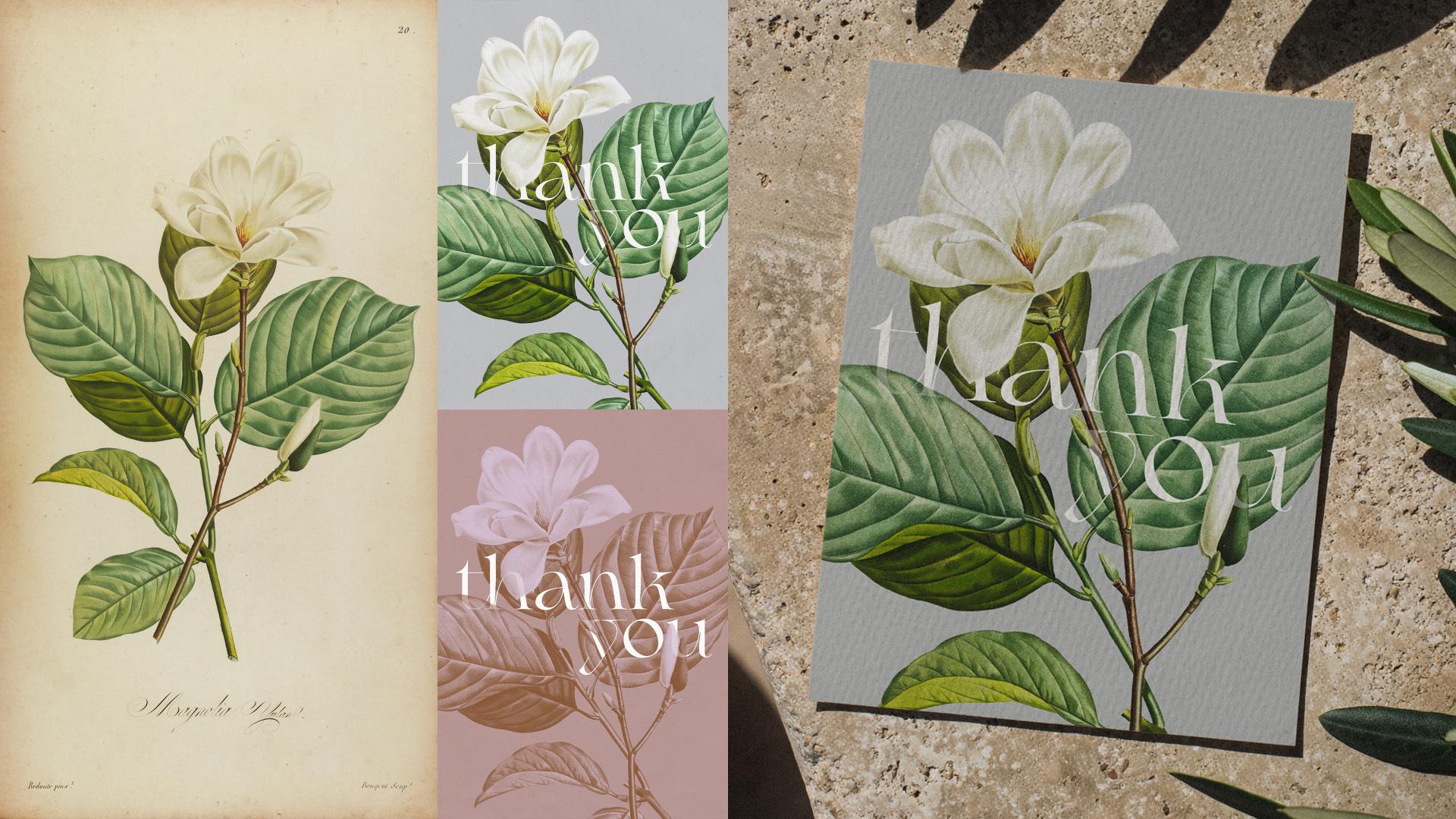
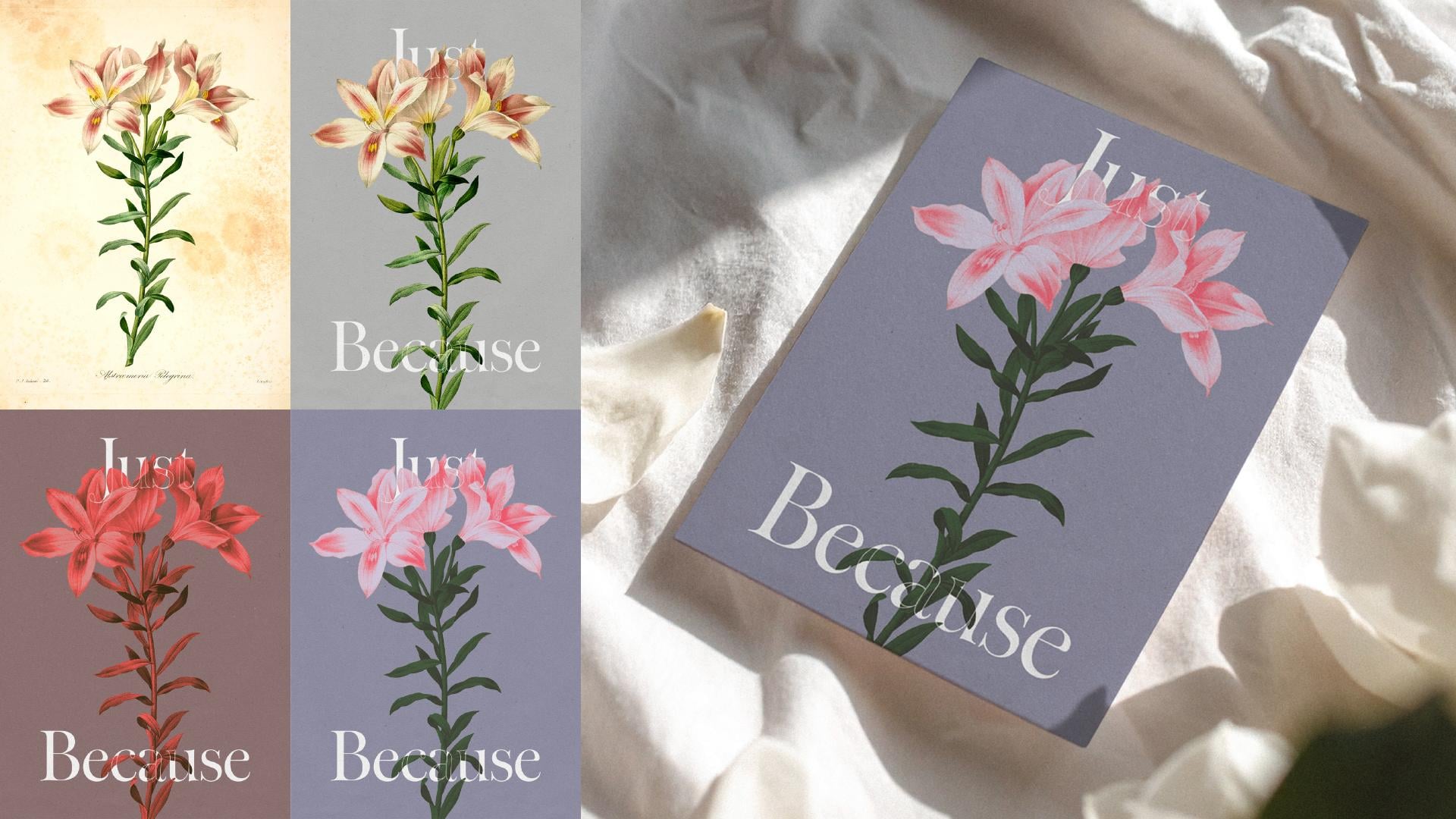
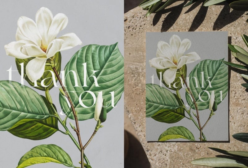
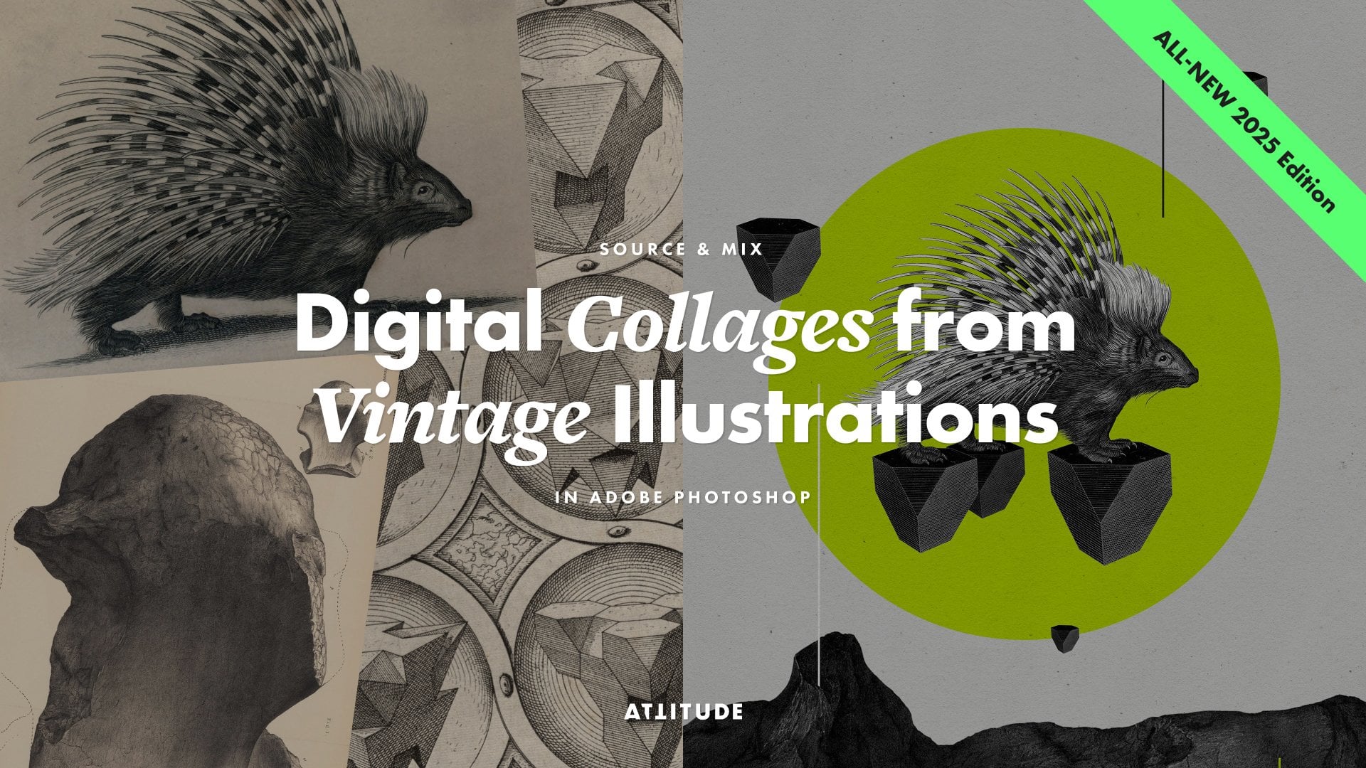
1. Introduction & Class Overview 2026: Elegant typography paired
with beautiful botanical artworks never go out of style! And whether it is
a vintage print or your own illustration, combining it with
thoughtfully set type can turn it into a polished
professional design, ready for sharing,
selling or printing. I'm Jenya from Attitude Creative, and as a graphic designer, I love using vintage imagery
in my collages and designs. And over the years,
I have taught a few popular classes
on this subject. And with this class, I invite you to explore
combining botanical illustrations with strong minimal typography
in Adobe Photoshop and creating striking
compositions that are perfect for
printed products, such as greeting cards
or posters, wedding stationery, packaging designs,
branding elements, playlist or podcast covers,
or social media graphics. In this class, I will start
by sharing tips for sourcing high quality,
free to use public domain vintage
botanical illustrations for your designs, and then step-by-step guide you through the complete
process of working with your sourced images
and combining them with digital type
in Adobe Photoshop. And along the way, I will also share tips, tricks,
ideas and resources that will help you easily get on with
experimenting with images, composition, typography,
colors, and even messaging. Whilst I will cover a complete
range of different techniques you might need to create refined work
and complex layered designs, you can easily adapt the process
and only use the techniques required for the design of your
desired level of complexity, time you want to invest
in your project and your skill level. Whether you're a
graphic designer looking to elevate
your work with well-crafted
vintage illustrations and stylish typography, illustrator or artist with
a botanical portfolio looking to transform
standalone artworks into complete designs, or a student exploring
composition, typesetting, and learning
Adobe Photoshop, this class is for you! I'm super excited to share with you this
process of turning botanical illustrations into
striking timeless designs, and I cannot wait to see what you will create
following this class! So join in and let's create
something awesome!
2. How to Approach This Class & Your Project: Hey, welcome to the 2026
edition of this class! Before we dive into
all of the techniques, here are a few tips
on how to best approach this class
and your project. First of all, our
main project and my demo will focus on
creating a greeting card. But you can easily adapt this project to your
own creative goals, whether that's creating
wedding stationery, packaging design, or anything else for print or digital use. But if you want to create
a greeting card or wedding stationery, in
the class resources, you'll find a couple
of downloads, which will help you tackle
this sort of projects with more ease, even if you haven't created
anything like this before. Secondly, in this class, I will be using
vintage illustrations and share resources
and tips for sourcing high quality public
domain images in the next lesson, so that you can use them in your
project if you want. But if you're an illustrator or artist with a
botanical portfolio, of course, you can use
your own work as well, regardless of whether it
has been created digitally, or you have high
quality digitised, preferably scanned, versions
of your traditional artwork. And finally, you can decide how complex you want your
design and process to be. Whilst this class is a complete guide to the tools and techniques
you might require to create professional
and polished designs that combine botanical
illustrations with digital type, you don't have to follow
the complete process and all of the lessons
and can skip some of the steps, depending on the
source material you're working with and how you want
to approach your project. I will be sharing tips about how to progress through the
class in the video lessons, but to make it easier
for you to follow along and learn or revisit
exactly what you need, be sure to reference the
PDF with a detailed table of contents that you can grab
from the class resources. Regardless of how you decide
to approach your design, be sure to post your project in the projects
and resources tab for this class and share your
final design or designs, the source material
you have used, any mock-ups you might create, as well as any variants or
work-in-progress images. I always love seeing and learning more
about your process, and it also makes it
easier to provide more detailed feedback and answer any questions
you might have. I cannot wait to see
how you're going to approach your
botanical designs, so without further ado, let's get started!
3. Vintage Resources & Tips for Sourcing Images: If you want to
create your design using vintage botanical
illustrations, then the first thing
you need to do is find some nice images! And these days,
there are a lot of various online archives of vintage free to use
public domain images, and my favorite resource when it comes to
anything botanical, is the Biodiversity
Heritage Library. It is a treasure trove of
beautiful vintage prints, and it is easy to get lost for hours exploring all of
the available albums. But to save you some
time and make it easier for you to find suitable
images for your designs, I have put together a PDF with a list of direct
links to the albums containing various
kinds of exciting, out of copyright and free
to use in any project high quality botanical
illustrations. And these include not just flowers, but also fruit, berries, and other plants, all of which will pair beautifully
with some type. But if you want to browse the whole archive and
select other images, just double-check that their copyright status says
either Public Domain or No Known Copyright Restrictions and avoid any damaged
images with stains, and generally images
in a poor quality. And here are a few tips
to help you source images in the best quality
and resolution possible. Start by browsing the Biodiversity Heritage
Library albums on Flickr to easily see what sort of images are in each publication and find some images you would
like to experiment with. Then open the page for
a specific image you like and check the available
download sizes here. More often than not, you
will be able to download images in decent size and
quality right from Flickr. But in some cases, for example, like here, the largest size
available isn't great. So instead of downloading
this image from Flickr, you can go and check whether it is available
in a better quality and size directly from the
Biodiversity Library website. You will find a direct link
to the page containing this image in the publication in the image
description on Flickr, or if not, you can
find the link to the whole publication in
the album details instead. So follow the link, inspect your chosen
illustration and quickly check out some other pages to see what's there and the
general quality. If the illustrations look better than what you have
just seen on Flickr, click on the Download Contents here and select the Download Book. And this will allow you to get your chosen image in the best
size and quality available. And since you will be
downloading the whole book, you'll get every page
as a separate image. So you'll get your hands on all other illustrations
at the same time, as well as on all other pages that you won't be able
to find on Flickr, like text, title pages, and some blank pages. And these can be used as well, for example, as textures, graphic elements,
or typographic references. So don't worry about downloading
more than you think you need! Make sure to select the JP2 format option here and ignore other options. And this is super important. Then wait for your download, open the archive, and you'll find the complete
book with all of the images and other pages. You can delete any pages
you don't need if you want, but don't rush because you
might want to use them later. If you download complete books, I would recommend keeping all
of the files for each book together so that it is easier to find images for your
new designs later on. And it is a good idea to rename your folders and the
individual files, either with the sequential
names featuring the book title and the plate
numbers or page numbers, or the plant names. And to create your design, it is a good idea to copy the source images
you want to use into a separate project folder, and I'll talk more about the effective project
organization in a moment. So find some exciting
botanical images you want to use in your project, download them in the best
size and quality available, and then join me in the next
lesson where I'll share my tips for organizing your project files for
a smooth workflow.
4. Organising Project Files: Before we start working with our images and
creating our designs, it is a good idea to set up a separate folder
for this project. In this folder, you
will need quite a few other subfolders for different kinds of files. First of all, you need to have a source folder where you can store your unmodified
original files. Then if you're going to be
cutting out your elements, you'll need a separate
folder for cut-outs. Then you'll need
a separate folder to store your Photoshop files. And then it's a
good idea to have a few other folders
for other types of files you'll be creating or using throughout the process. For example, I have a separate
folder for materials, which contains a
couple of textures, which you can also download
from the class resources. Then I have a separate
folder for references, which contains a title page from one of the vintage books which has some nice typography. But you can put any images
in the reference folder, which you might need to reference
throughout the process, whether for different
color treatments, or for inspiration for different typefaces
or compositions. It's always a good idea to export your work in a
few different formats, so here, I've got a
separate folder to export my design in high
resolution in RGB color mode. Then I have a folder for design previews that will contain smaller JPEGs
for sharing online. And because in this class I'll be sharing with
you how to prepare your card for print with
bleeds and crop marks, I also have a few
separate folders: one will contain
Photoshop documents where I'll be
preparing cards for print, and a couple of folders with files
exported for print, one in CMYK and one in RGB. I also have a folder
for mock-ups here just in case if I want to create some mock-ups of my cards. So set up a folder
for your project, create all of the
necessary subfolders, and collect all of the materials you'll need throughout
the process. And when you're ready, join
me in the next lesson, where we will start preparing our images for use
in the design.
5. Preparing Images for Use in the Design: With all of your files ready and organized in
the project folder, now you can start preparing your source images for
use in your design. So go to Adobe Photoshop and open the illustration
you want to use. If you have downloaded
your images in the JP2 format instead of the regular JPEG or TIFF formats, you need to make
sure that you open them through Adobe
Photoshop because by default JP2 format is usually opened
by some other apps. Regardless of whether you are
working with the image in the JP2 format
or in JPEG or TIFF, as soon as you open
your source image, hit Command+Shift+S or
Control+Shift+S in Windows to resave your
image in the Cut-outs folder. Set the format to Photoshop. Make sure that the file name
is clear and descriptive. Embed the color
profile, and hit Save. Now there are a few things
you need to do to prepare your image to be used
in a print project. First of all, press
Command+Option+I or Control+Alt+I in Windows to open the Image Size dialog and change the resolution of your file
to 300 pixels per inch. If you are starting with
a relatively small image in 72 DPI, make sure to set the
Resampling Method to Preserve Details 2.0. Check this box, and
play around with the Reduce Noise slider to avoid any
excessive pixelation. Also, if you're starting
with a small file in 72 DPI, pay attention to the
pixel dimensions of your file and make sure
that they are not too huge. Then set the units here
to either centimeters, millimeters or inches depending on what you're used to working with, and adjust the physical dimensions
of the image if required. In my case, the image
size is pretty decent. But if you see the size which is way too small for the card, you will need to increase
it, and if it is huge, do not hesitate to
make it a bit smaller. With the resolution and
size of your image changed, hit Okay, and be sure
to save your document. Next, if your source
image includes more elements than just the
illustration you want to use, switch to the Crop tool. In the Options Bar here, hit clear so that you
can crop it freely. Then check Delete
Cropped Pixels and resize the crop box to crop out any unnecessary
information. Don't go too close
to the edges of the illustration to avoid cropping out any of its details, and when ready
with the crop box, hit Enter. Then save changes
to your PSD document. And next, we can move on to cutting the illustration
out of the background.
6. Tips for Selecting Elements with the Quick Selection Tool: The next step in preparing
your illustration for use in the design is isolating
it from the background. You’ll need to cut your illustration
out of the background, either if you're planning to
have a different background, recolor your illustration
separately from the background, or use multiple copies of the
image or its elements. But if you want to keep
your background as it is, whether it is because you don't plan to do anything I
have just mentioned, or because you're working
with illustrations with soft edges and color
washes that interact and blend with the
background, or because you're working with digital
illustrations that already have
transparent backgrounds, you can skip this step and
simply work typography into your design composition
using masks and techniques that I will be sharing with you
later in the class. To cut your illustration
out of the background, you can use a number
of cutting tools. In this class, I'll
be sharing with you how to use the
Quick Selection tool, Select and Mask workspace, and manual adjustments to create clean and crisp cut-outs of
botanical illustrations. But if you want to learn how to use other selection tools, including the Object
Selection tool, Lasso tools, Pen tool and
Select and Mask workspace, be sure to check out my class about creating digital collages, where I cover all of these tools and
techniques in detail. So select the Quick Selection tool. In the Options Bar here,
check Enhance Edge, and make sure it is set to Add
to the Selection here. Then if you're working with
a complex illustration and only want to select
and use specific elements, go and select any element you want to add to
your selection. If you need to subtract
from your selection, you can simply hold down
the Option or Alt key and brush over the areas you want to remove from
the selection. Because this tool
is brush-based, you can change the
brush size using the square bracket
keys as you go to be able to quickly add or subtract elements
from your selection. This is a super useful tool for selecting specific
parts of the images, for example, separate buds
or leaves on the plant. But the Quick Selection tool
works best when there's a strong contrast between what you're trying to select
and the background. If you're trying to
select something which has a similar
color to the background, you might notice that it
will blend together with it and you won't be able to select what you
wanted to select. To create selections of
this sort of tricky areas, it is best to use the
Select Subject option here. But before you use
it, make sure you go to the drop down menu and select Cloud to create
better, detailed results. Then hit this button. In this case, you’ll
need to discard your previous selection and then proceed to creating a
selection based on the subject. Recently, Photoshop
has developed quite a bit when it comes
to the subject selection, so you will most
likely end up with pretty decent result with all of the tricky areas getting
selected properly. But if you've been using
the Quick Selection tool to select specific parts, now you’ll need to remove anything you don't want
from your selection. For this, you can simply again hold on the Option or Alt key in Windows and brush over the elements you want to
remove from your selection. And when you're doing this,
make sure you don't have any small edges and areas
selected like this. So select the elements you
want to use in your design. In my case, I want to use both the flower and the
branch with the leaves. So I'm going to discard this selection and then go and hit the Select
Subject button yet again. Regardless of whether
you're selecting your illustration overall or some specific elements when you're done with the
initial selection, next for the best results, you'll need to refine it using the Select and Mask workspace, and I'll share my
special tips for quickly refining the selection
in the next lesson. But if you don't want to spend time on any refinements just yet and want to quickly
move on to developing your design and playing around
with the composition, you can simply apply your
selection as a Layer Mask as it is, then skip the
next few lessons for now and move on straight to the retouching and
adjustments section, or even further to the Design
Document Setup lesson. And for the best results,
be sure to revisit the refinements, retouching and adjustments lessons later on.
7. Refining Selection Edges in the Select & Mask Workspace: With the whole illustration or the desired element selected using the Quick Selection tool, next, you need to quickly refine the selection before
applying it as a Layer Mask. So with the selection active, go to the Options bar and click on the Select and
Mask button here. And this will launch the
Select and Mask workspace. Here, first of all, go to the Properties panel and in the View Mode,
select Overlay. Then set the color to some bright color so you
can clearly see the edges. Make sure that Masked
Areas is selected here, and then you can slightly
reduce the opacity to be able to clearly see what is included in your selection
and what you're cutting out. Whilst the Select Subject
generally creates a pretty good selection along the outlines of the elements
in your illustration, if you zoom in, you will notice that the edges are
a little bit fuzzy. So to refine the edges and improve the quality
of your cut-out, go to the Global
Refinement section and play around with
all of these settings. Start by increasing
the Smooth value to about 10, and you'll immediately notice that
the edges become smoother. But at the same
time, you'll still notice a little bit
of transparency. So go to the Contrast settings
and start by setting it to about 50% to immediately make all of the edges
considerably crisper. This might already
work pretty well, but to make edges even cleaner, you can also go and increase the Feather amount to
about 1 to 2 pixels, which together with the Smooth
and Contrast refinements, will allow you to
create cleaner edges. These are the sort of
settings to get you started, but it is always a good
idea to go and inspect all of the edges after you have changed any of these settings. And then if necessary, go and play around with
them a bit further. For example, I'm going to
increase the Contrast a little bit more to make my edges
a little bit sharper. And then to eliminate
any fringing or differently colored pixels
around the edges of my cut-out, I'm going to play
around with the Shift Edge settings and use negative values to cut a little bit more around
the edges of the image. Shift Edge value is
set in percentages, so the value you’ll need to use will depend on the size of the
image you are working with. And it is best to play
around with changing this value and see how it affects the edges
throughout the image. And to avoid cutting
out a bit too much, you can go and lower the
Opacity a little bit more to better see what is
being cut out, and then increase the Opacity back to 100% and further
inspect the edges. These Global Refinements are a super quick way of refining
the edges of your cut-outs. But because of how all
these settings work, you'll notice that some of the sharp corners in your
cut-out have been rounded. This is mainly due to
the Smooth setting, and you'll need to refine
all these tiny bits outside of the Select
and Mask workspace. Whilst this can seem annoying, I find this process to be much faster because the majority of the edges are perfect and you won't need to manually
retouch them. So when you're ready with the
Global Refinement settings and the majority of the edges
in your cut-out look good, go to the Output settings here, select Output to Layer
Mask, and hit Okay. And here is your
isolated cut-out ready, and in the Layers panel, you will notice a Layer Mask
next to the image thumbnail. And now with your
Layer Mask added, next, you’ll need to make a few
final manual refinements, and I'll share with
you my special tips for perfecting the Layer Mask in the next lesson.
8. Refining the Layer Mask to Finalise Your Cut-out: With your illustration
successfully isolated from the
background, now, you’ll need to work
with the Layer Mask to finalize the edges of your cut-out by removing
any selection defects. If you're new to
using Layer Masks, they are used to
non-destructively hide parts of the layers or seamlessly
blend layers together. Basically, Layer Masks control the opacity of the
layer they are applied to and the areas you see as white on the Layer
Masks are fully opaque, areas which appear
as black are fully transparent, and if you have any shades of
gray in your mask, these will represent different
levels of transparency. To have hard edges and no semitransparent areas in
your cut-out illustration, you need to make sure
that you are using pure black and pure white colors whilst refining your mask. So to be on the safe side, press D on the keyboard to reset the colors in the Tools
panel to white and black. To be able to easily see what you're dealing with whilst
refining your mask, it is a good idea to add a background layer behind
your illustration. So go to the Layers panel, click on the Add New Fill or Adjustment Layer button,
and select Solid Color. In the Color Picker window, set the color to
some bright color that will have a
reasonable amount of contrast with your
illustration. And hit Okay. Now drag this layer
below your image layer, and now you are ready to
start refining your mask. To work with the Layer Mask, start by selecting its thumbnail in the Layers panel and make sure it has a border around it that indicates
that it is selected. To refine your mask, you can
use a few different tools. For example, to refine
corners like this, you can use the
regular Lasso tool, and go and draw a selection around the area
that you want to remove. When you release
the mouse button, Photoshop will
automatically close the selection. Now, to hide
this part of the image, you'll need to fill the
selection with black color. Because currently the
black color is assigned to the background,
to fill the selection with it, you need to press Command+Delete
or Control+Backspace in Windows, and you'll
see this area disappear. Now you can go and repeat
the process to refine all of the rounded corners in your illustration that still contain a little bit
of the background. When you get used to using the Lasso tool and this technique, this process won't take
much of your time. It is good to be zoomed in quite close to be able to
better see all of the details as you work,
and then simply go through your illustration
and concentrate on retouching all of
the similar problems. So if you notice any other
defects in your illustration, ignore them for now
and concentrate only on getting rid of
any rounded corners. And when you are
ready with those, you can turn your
attention to fixing any other issues you
have in your mask. When you have finished
with the last area you have selected
with the Lasso tool, be sure to press Command+D or Control+D in Windows
to deselect all and to be able to work
with the whole image. Now, if you have spotted any other areas you need
to refine, for example, like this tip of the leaf, which
doesn't look quite right, you can go and refine
any of these areas. To better see what
is happening here and what part of the illustration
got masked by mistake, with the Layer Mask thumbnail still selected in
the Layers panel, go to the Properties panel and turn down the Mask Density. And you will see what
you need to refine. For example, to refine
an area like this, again, you can make a selection
using the Lasso tool. And this time, press
Option+Delete or Alt+Backspace in Windows to fill the selection in with
the foreground color, which is set to white
in the Tools panel. And this will make this
area visible yet again. Now I'm going to hit
Command+D to deselect all, so I can work the
whole mask area. You can further refine your
selection by bringing back or hiding any other elements
using the Lasso tool, creating the selections and filling them with the
respective color. Or you might also want to use the Brush tool to
brush along some of the edges. To effectively use the brush
tool to refine your mask, go to the Options bar, select the Hard Round brush and keep the Hardness value set to either 100% or turn
it down to about 98% to have a touch of softness. Whilst refining the corners
in my illustration, I noticed this area on the stem, which is a great candidate for being refined
using the Brush tool. To remove bits from your illustration
using the Brush tool, you need to make sure to cover
them with the black color. If your foreground color in
the Tools panel is set to white, you need to switch these
colors either by pressing on these arrows or by simply
hitting X on the keyboard. And then go and paint over
any area you need to remove. Use the square bracket
keys to change the size of the brush
head in relation to the size of the area you need to refine and then go
and brush over it. If you're dealing with
straight edges like this, you can also hold
down the Shift key to draw in a straight line
and create a cleaner outline. So inspect your mask and refine any areas
which need refinement and use either the Lasso tool or the Brush tool depending
on what you are working with. Whilst refining your mask, concentrate on
removing any bits of the background or a different
color around the edges, which will look like
color fringing, and retouch any areas which haven't been properly selected to begin with. Unless you're dealing
with an illustration with a lot of small details and
a lot of tiny corners, this process won't
take a lot of time. When you feel like you're
done refining your mask, go back to the
Properties panel and increase the Mask
Density back to 100%, and then go and double-check
all of the edges once again. At this point, it
is also a good idea to go and change
the fill color to some other color to make it easier to spot anything
you might have missed. If necessary, go and
refine your mask further, and when everything looks good, be sure to save your document. Now, with your image
successfully isolated from the background, to finish preparing it for
use in your design, you might need to
retouch some defects, restore some of the elements, and make some color adjustments. I will be covering all of these techniques in
the next few lessons. But if you don't need to
retouch or adjust your image, feel free to skip ahead to the lesson about the
Design Document Setup.
9. Retouching & Restoring Your Images: Depending on the quality
of your source image, you might need to
do some retouching. And this retouching
process can include removing some dust or
stains from the images, restoring some damaged elements,
and if you're up for it, generating some new
fragments of the image or entirely new elements
of the illustration. To remove any dust or
stains from the image, you can simply use the
Spot Healing Brush. To retouch non-destructively, go to the Layers panel, add a new empty layer, place it above your image layer, rename it to Retouching, and then Option+click
or Alt+click in Windows between these two layers to
clip your retouching layer to your image layer to ensure
that anything you have on your retouching layer will be contained within the visible
area of your illustration. With the retouching layer
created and selected, and the Spot Healing Brush
selected in the Tools panel, go to the Options bar, make sure the Type is
set to Content-Aware, Sample All Layers is checked, and the Mode is set to Normal. Then go to the area of
the image you need to retouch, zoom in, then right-click with the Spot Healing Brush tool and set its Hardness to about 60%. You can also change
the brush size here or you can simply go
to the area you need to retouch and use the square bracket
keys to change the size of the brush in relation to the defect you will
be retouching. And then simply click or paint over any defect
you need to cover. Spot Healing Brush is really
fast and easy to use, and it will probably be
enough for retouching most of the small defects you might encounter in the illustrations. But if you want to learn about other manual retouching tools, such as the Healing Brush, the Patch tool, and
the Clone Stamp, be sure to check out our
class Beginner's Guide to Retouching Old Photographs
in Adobe Photoshop, where Dominic covers in
detail different tips and tricks for using all of these tools effectively
and non-destructively. But apart from using
the Spot Healing Brush and other manual retouching
tools and techniques, if your Photoshop version and Adobe plan include the
latest AI-based tools, you can try using
them to quickly retouch and restore your images. For example, if you
need to remove or retouch a large area
in your image, you can use the new Remove tool. When using this tool, again, make sure that you work non-destructively and sample
all of the layers below. Remove tool can help you to rebuild some of the elements
of the illustration. But as its name suggests, it is designed for
removing things. And if you need to restore or generate some new
areas in the image, instead, you’ll need to use the
new Generative Fill feature. Before you start generating
any new elements, go to the Layers panel and hide any background layers you
might have in your document. To use the Generative
Fill feature, first, you'll need to create
a selection within which you want to
generate something new. For this, again, you can
use the Lasso tool and draw a selection in the shape
which you want to generate. Make sure to include in your selection some of
the existing parts of the image to give Photoshop more context for what it
is going to be generating. With the selection ready,
make sure to select the thumbnail of the image layer that contains your illustration. Then click on the
Generative Fill button in the Contextual Task Bar. If it is not open,
you can open it through the Window menu.
When generating parts of the image, in most cases, you can keep
the prompt field empty, and Photoshop will guess
the context and what it is generating by what is included
in the original image. But if you need to generate some larger elements, for example, a large part of a leaf, you might want to specify
it in your prompt. For example, in my case, I can type Magnolia Leaf. Then make sure that
Photoshop is using the Firefly Image 3 model for better results, and hit Generate. Then compare the
generated variants, select the one which works best, or keep on generating more
to find better results. Because of how the
Generative Fill works, it’ll most likely generate a little bit of the background
around your element. So you’ll need to go and
carefully revisit its mask to remove
anything unnecessary. So retouch and restore your
images as required, and then join me in
the next lesson, where I'll share with you tips and tricks for retouching colors in your images.
10. Retouching Colours in Your Images: Apart from retouching
and removing any graphic defects
from your image, you will most likely need to do some minor color retouching to improve the visual quality
of your illustration. When dealing with
hand-painted illustrations or vintage color prints, you might notice
that some areas are colored differently to
the surrounding areas. For example, this leaf here on this side has a different
color from this area here, and this leaf here has a
different spot of color here. To rectify these issues and make the coloring
more consistent, you can do a little bit
of easy color retouching. Start by going to the
Layers panel and again create a new empty layer. Rename it to Color Retouching, clip it to the image layer below and set the Blending
Mode over this layer to Color. To retouch the colors, you will need to use the Brush tool. In the Options bar,
make sure that the Opacity is set to
100% to start with, flow is also set to 100%, Mode is set to Normal and set the Brush type
to Soft Round brush. Depending on the area
you want to retouch, you might want to
keep Hardness set to zero to better blend
the new color you'll be painting on with
the existing colors in the image, or make it a little bit harder if you want to have a harder border
between the colors. With your initial settings
ready, hit Enter, then go to the area
of the image you want to retouch, zoom in, then use the square bracket
keys to change the size of the brush in relation to the size of the area you're
going to be retouching. Then press and hold Option
or Alt key to activate the Eyedropper Tool, and sample
the color you want to be painting with from the correctly colored
part of the element. With the color sampled,
release the Option or Alt key, and go and paint over the area
you want to retouch. If this looks a little bit too strong in terms
of the color, undo the changes and turn
down the brush opacity. You can do it in the
Options bar here. Or simply use the number keys on the keyboard to change
the percentage. For example, I'm
going to change it to 30% by pressing number 3. Then when I go and paint
over this area again, the changes look a little bit softer. To create a
more organic coloring, it is a good idea to sample
slightly different hues from the image and work on
layering them over each other. When going from
retouching one area in the image to retouching
some other area, pay attention to the brush
hardness and brush opacity to ensure that everything
works predictably. For example, for this area, I'm going to reduce
the hardness to 0%, increase the brush size, increase the opacity to 60%, and quickly retouch this area. You probably won't
need to do a lot of color retouching, but
if you're up for it, be sure to pay attention
to small details and edges between the
different colors and retouch them if necessary. And remember that if you're
using the brush opacity, which is not 100%, you can build up the coloring
effect by painting over the same area a number of times whilst releasing the mouse
button between the strokes. And don't forget to
sample colors from different areas for a
more organic coloring. When you're done your
color retouching, make sure to reset the
brush opacity back to 100% to avoid any surprises when you start working
with the Brush doing some other task later. Even a little bit of
color retouching makes a huge difference to the
overall look of the images. So be sure to use this technique
when and if necessary. Next, let's have a look at a few essential
color adjustments that will help you further enhance the look
of your image.
11. Applying Non-Destructive Colour Adjustments: Even if your illustrations don't require any
color retouching, if you're working
with scanned images, whether your own or
sourced vintage ones, they will most likely benefit from a few color adjustments, including working with the
tonal and color contrast, adjusting the saturation
and vibrance of the image, and applying some
color correction. And let's start with the latter. Color correction is particularly important if you are working with vintage prints that had
yellowed over the years. For example, whilst this image actually looks quite
nice and natural, there is still a fair amount
of the yellowishness, which comes from
the paper color. So if you need to deal
with a similar problem, go to the Layers panel, click on the Add New Fill or Adjustment Layer button,
and select Levels. Make sure that the
new levels adjustment is above all other layers, and again, clip it to
the image layer below. Then select the icon for the Levels adjustment layer and go to the Properties panel. To apply color correction, you will need to go to this drop-down menu and work with the individual
color channels. If you have never done
any color correction or worked with color channels, it might seem daunting at first, but it is actually
pretty straightforward. For example, to deal
with the yellow tint which comes from
the paper color, go to the Blue channel and you'll notice that there is
no information on this side. So you can go and safely start
dragging this indicator to the left and you'll notice the yellowish disappear
from the highlights. But don't overdo it
because otherwise you'll start shifting
the colors in the image. With the Blue channel ready, go to the Green channel,
and repeat the process. If at this point the colors will start looking
slightly different, don't worry about it, and then go to the
final Red channel. Again, move the white point
indicator to the left. If you need to further
adjust the highlights, go between the channels and carry on tweaking
the values until the white and light colors in your image start
looking more neutral. Then go to the RGB channel, and if you want, go and play around with the midtone
indicator here to slightly boost the
contrast in the image. And this is your initial
color adjustments done, and in some cases, you might
even want to stop here. But if you want to
boost the contrast in the image a
little bit further, I recommend applying an additional adjustment
for this purpose. In this case, I would
recommend using the Curves adjustment
instead because it will give you
more precise control over different tonal
areas in your image. With the Curves
adjustment layer added, again, clip it to the
image layer below. Then go to the
Properties panel and start by adding a couple of
new points to your curve. One somewhere around here
and another around here. When working with the RGB
curves and histogram, white will be in the top right corner and
black will be in the bottom left corner. To gently boost
the contrast in your image, you need to drag this point
a little bit below the diagonal, and this point a
little bit above the diagonal. Whilst the Curves adjustment
might seem intimidating, it is all a visual process. So play around with the
position of the points, add any extra points to
the curve if required, and fine-tune the tonal
contrast in your image. The only thing to keep in mind
here is to make sure that your curve is smooth and you
don't do anything like this. Adjusting the Levels
and Curves will help you to boost the
colors in your image. But if your image still
doesn't look vibrant enough or looks a
little bit too vibrant, you can go and add a
Vibrance adjustment, clip it to the image layer below, and play around with the Vibrance and
Saturation sliders to create your desired
look. So apply any required adjustments
to enhance the look of your image, and then go and
hide your color fill layer, so you only see your cut-out against the
transparent background. Make sure that all
your retouching and adjustment layers, and any Generative Fill
layers you might have created are all clipped
to your image layer. Double-check that the Mask
Density is set to 100%, and Feather is set to 0, and go ahead and
save your document. And now your illustration is ready to be placed
in your design file, which we’ll be setting
up in the next lesson.
12. Design Document Setup: Now that we've got
our illustration ready, let's move on to setting
up a new document where we'll be creating our design. In the New Document
setup window, specify any size that works
for what you want to create. I'll be creating a greeting
card in an A6 format, but you can choose
any other size which makes sense
for your region. If you are not sure
what size to work in, do not hesitate to reference the PDF guide I have created
specifically for this class, which contains popular greeting
card sizes and wedding stationery sizes that are
used in different countries. With your size selected, make sure to set the resolution
to 300 pixels per inch, and then select your
desired Color Mode. You can set it to CMYK
straightaway if you really want, but I will be working in RGB
because on the one hand, I find looking at the dreary
CMYK colors on screen a little bit depressing and
also even more importantly, because most modern printers and print-on-demand
services accept RGB files for print
and convert them to CMYK on their
end if required. So I would always recommend
starting to work in RGB and convert your print files to CMYK later when preparing
them for print. Because we will be creating a separate background
layer for our design, you can set the
Background Contents to Transparent so you don't have any extra layers
in your document. With the general
document setup ready, give your file a
descriptive name here, for example, because
I'm planning to create a card with a
thank you message, I will include it
straightaway in my file name. But if you're not sure what
you're going to be creating, you can simply
include the name of the flower or a plant in your illustration and specify what design it is going to be. When you're ready with your document
settings, hit Create. And with your new
document created, straightaway, go and save it
in your Designs PSD folder. Make sure to set the
format to Photoshop here. Check Layers, embed Color
Profile, and hit Save. Next, let's quickly place the illustration
into this document. We won't be copying and pasting anything from this document with the original illustration. So you can now close this document. Now in the document
for your card design, go to the File menu and
select Place Embedded. Then locate your cut-out
illustration you want to use, and hit Place. You will see it pop up
on the canvas like this, and now you can simply hit
Enter to confirm placement. Working with Embedded
Smart Objects will allow you to do
anything you want with this illustration in this document, and in
the Layers panel, you'll only see one Smart
Object layer like this. But if you double-click
on the layer’s thumbnail, this will open the contents of this Smart Object
in a new tab, and you'll see all of the layers and adjustments you had in your
original cut-out document. If necessary, you can make any further changes
to your illustration. Then save this document, close this tab, and
the changes will be applied to illustration in
your main design document. But your original
cut-out document in your Cut-outs
folder will remain unmodified because the
Embedded Smart Object is stored within the
document it is used in. This is the main
benefit of using the Embedded Smart Objects instead of the Linked
Smart Objects, which work directly with
the external files. And because you'll be
working with a Smart Object, you'll be able to
easily fine-tune the scale of your illustration
in relation to the canvas. And this will give you a lot of flexibility when developing
your design composition. So set up your design
document in the desired size, place your illustration as
an Embedded Smart Object, and then let's get started with developing the
design composition.
13. Getting Started with Your Design Composition: Now that our design document is set up and the
illustration is embedded, we can start working on
the initial composition. First of all, let's go
to the Layers panel and add a new Solid Color
layer to act as a background. Set it to any color you
want to begin with, and drag this layer below
the illustration layer. We will be fine-tuning
all of the colors later, but if your initial
background color doesn't work with your
illustration at all, go and quickly change it to something you
have in mind for the feel of the overall design you're going to be creating. With the color
adjusted, hit Okay. Now let's quickly talk about
the general composition. Before you start scaling and moving your illustration
around the canvas, think about what kind of
relationship you want to create between the type
and the illustration. For example, if
you want to create a delicate and elegant design, you can pair a single
illustration with type which will complement
it and make both of them have a
similar visual weight, so neither of them will
dominate the composition, but will work
beautifully together. If you want to create
something more impactful, you can either scale
your illustration up so it covers the
majority of your canvas, or you can create
a few copies of your illustration and arrange them into a
non-repeating pattern that will cover
the whole canvas. Then you can contrast either
of these compositions with either very small and
delicate type, or go the opposite way with oversized type that entwines with
your illustration. And another direction you can
explore if you're working with some short text,
for example, initials, abbreviations or
numbers, is to use very large type so that the letterforms can be
perceived as graphic shapes, and the illustration
can live around it and interact with the type to create a dynamic composition. So decide on the approach
you want to take and then start playing around with the
scale of your illustration. Make sure that the
Smart Object with your illustration is selected
in the Layers panel, then hit Command+T or Control+T
in Windows to enter the Free Transform
mode, and start playing around with the scale of your illustration in
relation to the canvas. Make sure you constrain
proportions whilst scaling. And if you're scaling
your illustration up, pay attention to the
scale percentage here and avoid scaling it above 100%. Apart from scaling, be
sure to explore rotating your illustration to
make it sit better on the canvas and to create the
composition you're after. Whilst scaling and rotating
your illustration, consider how different
elements within it either make the composition look more dynamic if
that's what you're after, or make it more
focused and static. When you have finished scaling and
rotating your illustration, hit Enter to apply
transformations. And if you need to
further scale or rotate your illustration at any
point during the process, simply go back to the
Free Transform mode and make any changes you need. And because you're working
with a Smart Object, the quality of your
illustration won't be affected. I'm happy with how
this looks already. But for example, if you need to reflect
your illustration, you can go to the Edit menu, Transform, and use either Flip Horizontal or
Flip Vertical options. And if you want to create and use multiple copies
of your illustration, be sure to duplicate
your illustration using the Command+J or
Control+J shortcut, which will create a copy
of the Smart Object, which leads to the same
Smart Object content. And this will allow you to apply the same changes to all
of the instances of your illustration
without needing to apply them to individual
copies separately. I won't be needing
this separate copy, so I'm going to
quickly delete it. So scale and position
your illustration or multiple copies of
your illustration in relation to the canvas whilst keeping in
mind that you are yet to add your
typographic elements, but don't overthink it
and be prepared to adjust your composition later to make all of the elements
work better together. With your initial
composition ready, be sure to save your document. Next, let's move on to adding text and selecting a typeface.
14. Adding Text & Selecting Typeface: With your illustration or multiple illustrations
now in place, now it is time to add the text. If you have done color
retouching and have some random colors
in your Tools panel, now it's a good idea to reset them back to black and white. Then select the Type tool and go and click with
it somewhere on the canvas, and type in your desired message to
replace the default Lorem Ipsum. Since I'm creating a card
with a thank you message, this is what I will type, but you can use any
message you want. If you need some ideas for what you can write on
the greeting cards, be sure to reference the
PDF with the card message ideas included in the
class resources. With your message ready, next, you'll need to select a typeface, and there are a few different
approaches you can take. If you're going for a clean,
modern and minimal look, it is best to use some geometric
sans-serif typeface. If you're going for something more timeless and sophisticated, you can explore some
elegant serif typeface, and those with a strong stroke
contrast will work best. If you want to create something
more playful and quirky, you can explore various
decorative serif typeface that have been popular
in the recent years. To make it easier for you
to find typefaces that will definitely work with any
botanical illustrations, I have created a PDF guide with recommended typefaces that you can find in the class resources. And apart from
selecting fonts from scratch or from my
recommended list, you can also use the Match Font tool available
in Adobe Photoshop. To use the Match Font tool, you'll need to start
with a reference image. For example, I am going
to open this image, which is a title page from
one of the vintage books. But of course, you can
also match fonts from any modern designs with the
typefaces you like as well. Before you start using
the Match Font feature, decide on which
typeface you want to match from your
reference design and go and type the same word or words to make it easier to see
how close the match is. With your sample text ready, switch to the Move tool. Then quickly scale the
text up so it is easier to see, then select the
Rectangular Marquee tool, draw a selection around the
text you want to match, then make sure that your
type layer is selected in the Layers panel, and go to the Type menu and
select Match Font. Set the Type Option
to zero to make the matched fonts as similar as possible to your source font. And you'll see all of the
different options on the list. For example, here
are a few options which I have installed
from Adobe Fonts, and here are some
similar system fonts. And here are a few other options available on Adobe Fonts. When they're not installed, you won't be able to preview them the same way as these ones, but you can quickly go
and install them from here and then go and
preview them the same way. If you're matching font from
an all caps composition, it might be also a
good idea before you open the Match
Font window to set your sample type
composition to all caps here to make it easier
to compare the two fonts. But if you haven't done
that to begin with, you can simply apply the
selected typeface and then go and apply the upper case transformation
to compare the fonts. So use the Match Font feature if you're after some
specific typefaces. And when you have found
something that you like, note down the font name, close your reference image, and then go and change
the font in your design. You will see the
Character options in the Properties panel. Or if you want,
you can also open a separate Character panel and Paragraph panel that
contain all of the settings you'll need to typeset your text. So select the typeface you
want to use in your design either from your
favorite typefaces, my list of recommended typefaces or by using the Match Font tool, apply a chosen typeface to
your text in the design file, and then join me in the next lesson where
we'll work on typesetting the message and placing it in relation to other elements
in the composition.
15. Typesetting & Developing Your Design Composition: With the message typed in
and the typeface selected, now we can work on typesetting. First of all, if you cannot clearly see your text
because of its color, go to the Character options either in the
Properties panel or in the Character panel, and
change the font color here. Unless you have a
white background, white color for the text
will work in most cases. With the color
selected, hit Okay. Now let's have a look at a few different options
for typesetting. Because at the moment I have
the Move tool selected, and my type layer is
selected in a Layers panel, any changes I make to
the Character options or Paragraph options will be
applied to this whole text. If you want to apply changes to individual words or letters, you will need to use
the Type tool instead. And you’ll also need to
use the Type tool, if you want to switch between the horizontal type
and the vertical type, which you can do by
hitting this button here. This can be a fun
option to explore, but I will stick to
the horizontal type. I'll also switch
back to the Move tool because I want to make uniform
changes to the whole text. First thing to consider
after choosing your typeface is
your font size, and you can change it here
in the Character options. You can either select
the size from the list, or you can type in the value
manually here, or select the value and use
the arrow keys to change the font size and see all of the
changes as you go. Next thing to consider is the spacing in
between the letters, which is called tracking, and you can change it here. With some fonts, you
might want to go a little tighter, or if you want to go
for the all caps treatment, which you can select here, you can explore looser
tracking, and then change the font size to make your text work better
within the composition. Using all caps sets a very different mood
in comparison to using either a combination of
the uppercase letters and lowercase letters or
all lowercase letters, and it will also work very differently in
different typefaces. For example, if I go and change
to a sans serif typeface now, you will notice how the whole vibe changes and the text also becomes a little
bit more readable. So explore uppercase
typesetting if you want, and explore different
tracking values, but I'm going to quickly
undo the changes. And let's have a look at
other settings here. If you're working with
a single line of text, you won't need to worry
about line spacing, also known as leading,
which you can set here. But if you want to
break your text into a number of lines, you'll need to adjust both the leading and the
alignment settings here. There are a couple
of ways or breaking your text into multiple lines. One is to switch
to the Type tool, select the space between
the two words and hit Enter, or a better way is
to go to the Layers panel, right-click on your type layer and select Convert to
Paragraph Text here. Now when you click on
your text on the canvas, you will see a text box around it and you can
resize it like this. And one of the reasons why it is better is because
now you can work with the alignment
options available in the Paragraph settings in a
much more predictable way. For example, you
can select all of your text and change the
alignment consistently. Or if you're after a more
dynamic composition and don't want to split your
text into multiple layers, you can align one
line to the left, then select the space
after this letter and hit Enter to add
a hard line break, then select the next line and set its alignment
to the right. Now you can easily play with the placement of these two words in relation to each other by
simply scaling the text box. And then to change
the line height, you'll need to select all of the text and change
the value here. It will depend on
the typeface you're working with and whether you're working with
the lowercase, uppercase or both lowercase
and uppercase letters, but a good starting
point is to set it to the same value as the type
size and then go from there. So experiment with
typesetting your message, and if you need to
change the position of the text box with the
Type tool active, simply hold down Command
or Control key in Windows and drag it around
the canvas like this. If you feel like
the typeface you have chosen originally doesn't quite work with the illustration and doesn't create the
vibe you're after, do not hesitate to go and
try out other typefaces. For example, I want to
use this typeface that is included in the list of
my recommended typefaces. And apart from fine-tuning
your typeface choice, another thing you might
want to play around with is changing the
case of the letters. Apart from changing to all caps, like I have shown you earlier, you can also consider using
all lowercase letters, and that will also
change the feel of your design and will make it look more intimate or friendly. So go ahead and finalize your typesetting and work on the scale and placement
of your type, both in relation to
your illustration and to the overall canvas. And if you want to align your text centrally
to the canvas, switch to the Move tool, then go to the Options bar, in this menu here,
select Align to Canvas and use these buttons to centrally align your
text to the canvas. And this will be
particularly important if you're working with
either a single line of text which you want
to have aligned centrally, or if you're working with multiple lines
of text that are aligned centrally using
the Paragraph settings. If you're happy with the
arrangement of words in relation to each other
and with the line height, but want to quickly
change the scale of the whole typographic
composition, with the Move tool selected, activate the Free
Transform mode and scale your text as you would
scale any other layer. And if you want, you can even
rotate your text as well. But I think I'll keep
mine horizontal. So finalize your typesetting and the placement of the text in relation to the illustration, save your document, and next, it is time to add more visual
interest to your design.
16. Adding Depth with Easy Layering Techniques: Now that you have finished
typesetting your message, you need to decide
whether you want to keep your text layered on top
of the illustration or develop your design
further by hiding some parts of the letterforms behind the elements in
your illustration. If you're happy with keeping your text over the illustration, at this point, it is
a good idea to go and further play around
with the text color. If you're up for adding a little bit of depth
to your composition, there are a few ways
you can go about. If you're working with
cut-out illustrations, the quickest and
easiest way to add depth to your composition is by using two copies of
your type layer. And if you are not
working with the cut-outs, you will need to use
the masking technique, which I'll cover in
the next lesson. After duplicating
your type layer, select both type
players by Shift+clicking on them and then link them together by
clicking on this button. This will ensure that if you
move either of these layers, the other one will be
moved automatically. Now, to create a
layering effect, place one of the type players
below your illustration or illustrations, and then
go and play around with the Opacity value of the type layer above
your illustration. How well this works will depend on the complexity of
your illustration, the size of your text,
and its placement. And now, if you want
you can quickly explore other placements to
enhance the composition. Or if you want to keep your
composition as it was, to improve the readability
of your message, you can explore an alternative
graphic treatment. Go to the Layers panel, double-click on your
top type layer to open the Layer Style dialog. Then in the main
Blending Option section, increase the opacity
back to 100%, and instead, go and play around
with the Fill Opacity. Now with the Fill
Opacity reduced, you'll be able to go and add a Stroke effect
to your text, and it will be fully opaque. With the Stroke added,
play around with its size to create
your desired look, but make sure to keep
the position set to Inside, Blending Mode
to Normal and Opacity to 100%, and use the same color as the one
applied to your type layer. When you're happy with
how your Stroke looks, you can go back to the
main Blending Options and further play around
with the Fill Opacity, and you can even
reduce it to zero, so you'll only see a
fully opaque stroke and fully opaque parts of the letterforms
that are visible in the gaps between the elements
in your illustration. And when you're happy with
how everything looks, hit Okay to apply these changes. You’ll see Stroke applied as an
effect to your text layer, and you can revisit
its settings by simply double-clicking
on its name here. This effect will work best with geometric
sans serif typefaces. And if you are working with serif or decorative typefaces, it might make the composition
look a little bit fussy. And when working with serif
or decorative typefaces, the opacity treatment
might be a better option. For example, in this case, I'm going to turn the
Stroke effect off, then increase the
Fill back to 100%. And again, go and reduce
the Opacity instead. Whilst this technique of using two text layers is
super quick and easy, and can work
like a charm in some cases without any
further refinement, in some other ones, for example, like here, this treatment makes the message
just about visible. But there is an easy
way to fix this issue and at the same time add more
depth to the composition. And I'll show you how
in the next lesson.
17. Adding Depth with Layer Masks: Regardless of whether
you have reduced Opacity or added Stroke to your
additional text layer, you can further
develop your design, add more depth to it, and
make the message more readable with a
little bit of masking. And you’ll also need to use Layer
Masks if you're working with the illustration or artwork that is not isolated
from the background, and you want to hide parts of the letterforms behind the elements in
your illustration. To effectively mask your text, start by putting all of your text layers above
your illustration. Then you'll need to add a Layer Mask to your
fully opaque type layer. Next decide which parts of the letterforms you
want to bring above your illustration and which you want to hide behind
some of the elements. So analyze your illustration and work out which elements should be above your text to add a realistic depth to
your composition. For example, in my case, I can hide the letterforms
behind this petal, behind this stem, behind this bud, and behind
this part of the leaf. To create a mask out of
your chosen elements, select your illustration
layer in the Layers panel. Then select the Quick
Selection tool, make sure that Sample All Layers is not checked
in the Options bar, zoom in on the element
you want to select, change the brush size, and
add it to your selection. And then repeat the process by adding any other parts
of the illustration you want to appear above
your text to your selection. And be sure to
subtract any areas which were edited by
mistake in the process. Depending on the type of the
illustration you're working with and how defined the edges of the
different areas are, you might end up with a
pretty rough selection. But even if it is not great, it will be good enough
to get you started. When you're ready
with your selection, select the Layer Mask
applied to your text layer, make sure that the
foreground color in the Tools panel is set
to black, and then press Option+Delete or Alt+Backspace in Windows to fill the selection in with the black
color on the mask. And that will hide these parts
of the letterforms. Then press Command+D or Control+D
in Windows to deselect all, zoom into the areas
which you have just masked and inspect the edges. If necessary, switch
to the Brush tool. Double-check that it is set to the Hard Round brush and then go and refine any edges
in your mask if required. In most cases, you’ll need to remove some unwanted
transparency, so set the foreground color
to white and paint along the edges of the
elements to make them cleaner. And when you're done
with your mask, you can go and further
play around with the Opacity of your
second type layer. So explore different ways of layering your text with
your illustration, and this way, finalize
your composition. And when you're ready, remember
to save your document. And with your
composition ready, next, you can move on to
finalizing the colors, and if you want, playing around with recoloring
your designs.
18. Finalising Colours in Your Design: With your design
composition ready, now it is time to
finalize the colors. To set the desired mood, you might want to change the background color
in your design, tweak the colors or contrast
in your illustration, and change the text color to ensure that
everything is readable. Even small changes like slightly tweaking the hue of the
background color can dramatically affect how
the type, illustration and the background
work together. And at this stage,
I would recommend concentrating on fine-tuning
the look of your design as it is rather than drastically changing
all of the colors. And if you want
to explore making some more dramatic changes or to develop a few
color variants, it's best done separately, and I'll share the
tips, techniques, and workflow for
creating color variants and treatments in the
following lessons. With the illustration being really prominent in the design, I would suggest starting with making any further
adjustments to it. There are a couple of
ways you can do it. If you want to keep your design
document less cluttered, or if your design features multiple copies of
your illustration, go and open the contents
of the Smart Object containing your
illustration and make any desired further changes within this document by
modifying the settings of any of the adjustment
layers you have added during the stage
of editing your cut-out. Or add any new additional
adjustment layers on top of all other layers and use them to finalize the look
of your illustration. For example, I'm going to use the Hue/Saturation
adjustment layer and adjust the saturation in
this image ever so slightly. When you're done
adjusting your image, be sure to save the Smart
Object document contents. Then close this document and you'll see your illustration updated in your main
design document. If you have multiple
instances of the same Smart Object
containing your illustration, all of them will be
updated at the same time, so you won't need to make
any further changes to individual elements. And if you're using a single
illustration in your design, you can choose between
editing the colors within the Smart Object
document contents or editing them directly
in your design file. If you choose to do it directly
in your design file, it is best to select your Smart Object layer
containing your illustration in the Layers panel and then apply any adjustments to
it as Smart Filters. And to do this,
you’ll either need to apply the desired adjustments
to your layer via the Image menu, or by pressing the respective shortcuts with the layer selected
in the Layers panel. For example, I'm going to go and quickly tweak the contrast
in my illustration. And as you can see,
the main benefit of applying adjustments right in the design document
is the ability to see all of the changes
as you make them. And when you apply
your adjustment, you'll see it added
as a Smart Filter to the Smart Object layer
containing your illustration. And if you need to further
tweak your added adjustment, simply double-click on its name here and make any
desired changes. So finalize the look
of the colors and the contrast in your
illustration using adjustments and then go and fine-tune
the color of your background to make it work better with the colors in
the rest of your design. But be mindful not to
reduce the contrast too much that your text
becomes unreadable. When you are happy with your background
color, apply changes. And then if necessary, go and further adjust
the color of your text. I'm happy to keep it white
here for maximal contrast. But if you need to
change the color of your text and you're using
multiple type layers, remember to consistently change the color for each of them. And if you have applied
stroke to your text, do not forget to change
its color as well. So finalize the colors of all of the elements in your design and make sure that
they all work well together and set
your desired mode. Then save your document. And then if you're up
for a little color play, join me in the next few lessons to explore a few techniques for creating color variants and a different, more graphic
look of your design. Or if you're happy with your
full color design as it is, you can skip ahead to the
lesson about texturing.
19. Setting up Artboards for Creating Colour Iterations: If you want to push
your design further, you can experiment
with recoloring it, which will allow
you to completely transform the mood and
feel of your work. For this sort of project,
I recommend creating all your color iterations using artboards and keeping them
all inside one document, so that you can see all
your variants side by side and easily compare them. To create artboards in your
existing Photoshop document, start by selecting all of your layers and
group them together. Next, hit Command+A or Control+A
in Windows to select your entire canvas and add a mask to your group
based on this selection. This is a little trick which
will allow you to create an artboard in the exact
size of your canvas, even if you have
some design elements that go over the edges. With all of your layers grouped
and the mask added, right-click on the group in the Layers panel and select Artboard from Group. And now you can simply duplicate your group as many times as you want for the number of the color iterations
you want to start with. You'll see all of your artboards
side by side like this. With the artboards created, now you can switch back to the Move tool and
you'll notice that both the Artboard tool
and the Move tool have the same shortcut and are kept under the same button
in the Tools panel. And even if you switch
to the Move tool, when you select an artboard you want to work with
either by clicking on its name here or by selecting
it in the Layers panel, Photoshop will
automatically switch back to the Artboard tool. This is something
to get used to, but since we are not going to
be moving anything around, in this case, we
don't really need to worry about which
tool is selected. So create a desired number of
artboards in your document, and next, let's explore a
few different techniques for creating color iterations.
20. Creating Colour Variants Using Hue/Saturation Adjustments: With a few copies of your design ready on
separate artboards, now it is time for the fun part of playing with the colors. Colors can completely transform the mood and impact
of your design, and there are a few ways you can go about recoloring your work. And in this and in
the following lesson, I will share with you some of my favorite techniques and
special tips and tricks, which will help you
experiment with the colors in a number
of different ways. Keep your original
color variant on the first artboard and to create your first
color iteration, go to the Layers panel and open the contents of
your second artboard. Now, if you want, you can explore further modifying
the background color, saturation and contrast in your illustration
and the text color. Or you can explore altering
colors in your illustration. For this, you'll need to add your desired adjustment layer inside the group
for your artboard. For example, you can
change the colors in your illustration using the Hue/Saturation
adjustment, which is great if there are some specific hues in the
image that you want to change. With the flower in my
design here being white, this illustration doesn't
have the range of colors for the exciting
and effective hue adjustments. So I'm going to quickly
use a different example to share with you this
simple recoloring technique. To effectively use the
Hue/Saturation adjustment, add a new Hue/Saturation
adjustment layer above all of the layers you want it to affect
in your design, but keep it below
any other layers you want to remain unaffected, for example, your type layers. Then select your new adjustment layer in
the Layers panel, go to the Properties
panel and then either work with the default primary color
components to shift the specific colors in
your image, or go to the Preset dropdown here and
select Prominent Colors. This is a relatively new feature introduced in the
2025 version of Adobe Photoshop that
allows you to work with the specific colors
detected in your image. So simply select any color
you want to adjust from the available range here and
then go and shift the hue. To fine-tune the effect and which colors are affected
by the hue changes, play around with the range
slider here and adjust the range of colors that are affected by this
specific hue shift. And watch your illustration to see all of the changes you
make in real time. Adjust as many Prominent Colors in your illustration as you need to create your desired look and fine-tune your new colors. And if you like the
full color illustrations and simply want to
experiment with changing the hues in
the colorful flowers, this sort of hue adjustments
will allow you to easily create a few
different color variants. So play around with this
technique if you want and create as many new
colour variants as you like. But if you're after
a more graphic look and creating colour treatments using reduced color
palettes, or if like me, you're working with
a white flower, you will need to recolor
your illustration or the whole design using
Gradient Maps instead. And I will share a few
different approaches to using Gradient Maps and some
additional adjustments in the next lesson.
21. Creating Colour Variants Using Gradient Maps: Recoloring your images using Gradient Maps will allow you to reduce the
number of colors in your design and take full
creative control over color communication and create striking work regardless of whether you're going
for something playful, bold and modern, or something more subdued, elegant,
or sophisticated. And they are a fantastic and
versatile tool if you're keen on experimenting with
colors in a more graphic way. Gradient Maps are my
favorite technique for creating color treatments. And in this lesson, I
will share with you a few tricks for
using Gradient Maps and combining them with some additional adjustments to further develop the
look of your design. So let's create a Gradient
Map adjustment layer and then drag it below
the type layer or layers that sit above your image layers so that this Gradient
Map adjustment will only affect the colors in the illustration
and the background. With the Gradient Map
adjustment layer added, select its thumbnail
in the Layers panel, then go to the Properties
panel and click on the gradient here to open
the Gradient Editor. Gradient Maps work by
replacing the colors in your image with the
colors from the gradient you can set up here, and you
can change the colors here manually, or go and select some colors from the
available default presets. Or if you want, grab the set of the gradient presets from
the class resources, which are designed
specifically to create different moods
in this sort of designs. Or if you want to
get your hands on even more curated
gradient presets, check out my
Duotones Essentials collection that is available as a separate affordable
digital product. To make it easier for
you to follow along, for this demo, I will use the Gradient Map presets that are available in the
class resources. In this class to
keep it concise, I'm not going to go into how to effectively choose the colors and set up your Gradient Maps. But if you want to learn more, do not hesitate to check
out my class about Mastering Duotones
in Adobe Photoshop. If after applying a
gradient map preset, you want to slightly
tweak the colors, go to the gradient slider here, double-click on the color stop you would like to change, adjust the color using the Color Picker,
and apply changes. And when you're happy with the
look of your duotoned image, hit OK to apply the
gradient map adjustment. After applying your
gradient map adjustment, you might want to go
to the Layers panel and further tweak
the contrast in your illustration and
the background color. To adjust the contrast
in your illustration, and especially if you're working with a number of
illustration layers, it is a good idea to put all of your illustration
layers into a group, then add a new levels
adjustment above this group and then clip the levels
adjustment to the group. And then go and adjust the
tones and contrast in all of the illustration
layers contained within this group as required. When you're done
with the contrast in your illustration
or illustrations, go and further adjust
the background color to better work with
the tonal range in your duotoned illustration. Then apply changes. And this is your first color iteration done. So here we have applied the
gradient map adjustment to both the image and the background to keep the
hues in the design consistent. But if you want, you can also apply the gradient
map adjustment solely to your illustration layers and keep your background
colored differently. So let's go to our
next artboard. Again, if you have multiple
illustration layers, you need to group them together. But since I only have
one illustration, I will keep it as it is. Select your
illustration layer or the group containing
your illustrations in the Layers panel. Then go and click on the Add New Fill
or Adjustment Layer button, and again, add a Gradient
Map adjustment layer. Make sure it is added above
your illustration layer or above the group with
your illustrations and then clip it to. Now when you go and change the colors in your gradient map, you will see that it
only affects your image. Again, select your desired
gradient map preset or set up your gradient map
manually, and apply changes. And next to make
your recolored image work better against
the background, you'll need to go and further
tweak the background color. And if you want, you
can even explore using some contrasting colors to completely change the
look of your design. But in my case, I'm going to go for something a little
bit more subdued. With the background
color ready, again, you might need to go and further adjust the contrast
in your image, and the process will be
exactly the same as I have
shown you earlier. And this is another color
iteration done! But if you want, you
can also take it a step further by changing
the color of your text. Again, you can
change the color of your individual type layers and any stroke
applied to your type. Or if you have all your
multiple type layers above the gradient
map adjustment, you can experiment with
recoloring them simultaneously. In order to do so, start by
grouping your text layers, rename the group and then go and add a new Solid
Color fill layer, set it to any random
color to begin with. Hit Okay, and then clip this layer to the
group with your text. And when it's done, you can go and further tweak
the new color of your text to make it work better with the colors in the
rest of your design. And when ready, apply changes. Recoloring all of
your text layers using a single solid
color fill layer, makes it much easier and quicker to play around
with the colors. So if all of your text layers
sit next to each other in the Layers panel and are not mixed with any
illustration layers, be sure to explore
this technique. These two ways of
using Gradient Maps to recolor your design will be
enough to get you started. But if you want to take your
recoloring even further, you can also play
around with applying different gradient
map adjustments to separate parts of
your illustration. To do this, you simply need
to apply Layer Masks to your adjustment layers and mask the areas you want
each adjustment to affect in your image. For this, you’ll need to use the same selection and masking techniques I have shared in the lessons about
creating selections using the Quick Selection
tool and using Layer Masks to layer your
type with the illustration. Whilst the Gradient Maps
are great on their own, there is also a little trick, which will allow you to
easily and quickly fine-tune or change the look of
your recolored elements. So let's go to the contents of
the next artboards and again, add a new gradient
map adjustment layer above all of the image layers
and the background color. Then let's quickly change
the gradient map preset. And apply changes. Now, if you generally like the look of the tones
in your design, but want to quickly explore
slightly shifting the hues, apart from changing the
colors in the Gradient Editor, you can go and add a new
Hue/Saturation adjustment, place it above your
Gradient Map layer, and then go and play around
with the hue slider here. This is one of my favorite
tricks for fine-tuning the colors when working
with Gradient Maps. And apart from
changing the hues, you can also quickly play
around with the saturation and lightness sliders, and further develop the look of your design. Using the Hue/Saturation
adjustment on top of the Gradient Map adjustment
allows you to easily build upon any gradient
map treatments and fine-tune the look of
the colors to your liking. So be sure to explore
this technique, and then if necessary, add a new Levels adjustment and further adjust the contrast
and tones in your design. So play around with creating as many different color variants of your design as you want and be sure to save
your document from time to time to avoid
losing any changes. You can save your document
containing all of your color iterations over
your original design file, like I have done here, or save
it as a separate document. But in any case, when you have finished creating your
color iterations, you'll need to
export them all into individual PSD documents
for further development. And I'll walk you
through this process in the next lesson.
22. Exporting Colour Variants for Further Development: Apart from keeping all of your color iterations
within one document, it is a good idea
to export them all into separate files
to make it easier to develop each of them
further using texturing and then to prepare individual
files for print. Before you export your
individual artboards into separate documents, you need to go and rename your artboards in
the Layers panel, both to keep this document
better organized, and to be able to easily tell apart all of your
exported files. With the artboards renamed, again, save this document. Then go to the File menu, Export, and select
Artboards to Files. Here set your destination. In my case, I'm going
to be saving it to the same folder as
my original file. Then set your desired
descriptive filename prefix and to have a neater
names of your files, type in space dash space
after the prefix to have a clear separation
between the name of your design and
the artboard’s name, which will be included in your file name
automatically upon export. Here, select Artboard
Content Only, uncheck Export Selected Artboards to export all artboards
in your document. Make sure that Include Background in Export
isn't checked. Then set the file type
here to Photoshop. Keep these options
like this, and hit Run. Then wait for all of
your artboards to be exported into separate
Photoshop documents. And when it is done, hit OK, and now it is time for
the finishing touches and texturing your designs.
23. Texturing Your Design: Now that you have
finalized the colors in your design and developed
some color variants, it is time to take
your chosen design or designs further with a little
bit of subtle texturing. Even if you're creating
designs for print application, adding a little bit of
texture to them will add more character and make
them look more tactile. So start by opening the design that you
want to texture first. And at this point, you
can go ahead and close your file that contains all
of your color iterations. Now in your chosen
design document, start by ungrouping
all of your layers and then decide what texture you want to add to your design. You can texture design with
any realistic paper textures, or you can generate some
textures directly in Photoshop. If you want to learn how to texture your work using
Photoshop Filters, be sure to check out my
separate class on this subject. And in this lesson, I'm going to show you how you can easily texture your design using a couple of textures that I have shared with you in
the class resources. So be sure to download them. Then go to the File menu
and select Place Embedded. Locate the downloaded textures, and let's start with
the Old Paper texture. Hit Place. Then scale it up so it nicely covers the whole canvas
and goes over it, which will make the process
of preparing your design for print with bleeds a little
bit easier later on. But since we are placing this
texture as a Smart Object, you can always revisit its scale or position whenever necessary. So when ready with this texture, hit Enter, and make sure that it is placed above all other layers in
the Layers panel. Then set the Blending
Mode of this texture to Multiply and play around with its Opacity to make it a little bit more
subtle if desired. Because it is an old
uneven paper texture, which contains a lot of
imperfections and some stains, after multiplying it over you design and changing the opacity, you might also need to
desaturate it ever so slightly. In order to do so, select
the texture layer and press Command+U
or Control+U in Windows to open the
Hue/Saturation adjustment. And then reduce
the saturation to your desired value to make any colors and yellow stains in the texture a little
bit less obvious. Then apply changes and then finalize the placement of this texture over your design. Then if necessary, go and
further adjust its opacity. Adding just this one texture
will immediately make your design look more tactile
and a little bit vintage. But if you want to give your
design even more character, you can do it by adding
a few additional textures. Again, go to the File menu, Place Embedded, and select
the Dust and Specks texture. Hit Place, and as before, scale it up, position it over
your design, and hit Enter. Now there are a couple
of ways you can use this texture to add
imperfections to your design. One option is to place it
above the top text layer, but below the paper
texture layer, then set its blending mode to Screen and reduce its opacity
to your desired value. This will create tiny
lighter specks around your design that will
imitate the look of tiny areas in the
print where the ink hasn't been printed
properly or has flaked off. You can stop here, or if you want to add a bit more
variety to your texture, go and duplicate this
Dust and Specks texture, drag the copy just under the
Gradient Map layer if you are using any or just above all
your illustration layers. Then increase its
Opacity back to 100%, set its Blending
Mode to Difference. Then enter the Free
Transform mode and then rotate and reposition it so that this texture
looks different from the original Dust and Specks
texture we have added earlier. Then apply changes and check out how this texture
affects your design. Because we're using the
Difference Blending Mode, you should see some darker specs over the lighter areas in your illustration and
some lighter ones over some darker areas. And if the effect of this texture is too strong, in this case, you’ll need to reduce the
Fill value instead of the Opacity because when working with any layers
set to the Difference Mode, these settings affect the
look in a different way. I love how much character these three simple textures
add to my design. So be sure to experiment with textureing your
work the same way. And if your texture layers, particularly any paper textures affect the colors or tones
in your design too much, be sure to further tweak the Hue/Saturation
adjustment and if necessary, add another Levels
adjustment layer above all other layers and use it
to further tweak the contrast or tones in your design,
or to compensate for any contrast changes which
were caused by textures. And when you're
done with texturing your work and applying
any final adjustment, be sure to save your document. And if you want to
apply the same textures to any other design, there is a little trick which will help you do it faster. Start by opening any
other design variant you want to texture
the same way. Ungroup the layers, then
go back to the design you have just textured, select all of your texture layers
by clicking on them whilst holding the Command
key or Control key Windows, then move your
mouse over your canvas, make sure that the Auto-Select is not checked in
the Options bar, then hold down Shift and drag the texture layers that
are still selected in the Layers panel over to
the document you want to texture, and drop them onto
the canvas like this. And all these textures
will be placed in the exact same position on the canvas where they were
in the original document. Now you can rearrange
the order of the layers, change their Opacity
or Fill values, and you’ll have pretty much the same texture applied
to a different design. But of course, you
will probably want the textures in your different design variants to
look different. And if this is the case, simply go and move the
textures around the canvas, rotate or scale them to create a differently
looking texture. And when you're done, save
your document. And then repeat the same process to texture any other designs you
want to finalize. And when you are ready
with all of your designs, join me in the next lesson, where I will share tips for exporting your work
in RGB color mode.
24. Exporting Your Design: With your design or multiple
design variants ready, the next step is to
export your work for sharing online and
then, if required, prepare it for printing. Before you start saving
any other versions, make sure that your
Photoshop file with all of the layers is saved and
ready to be archived. Then hit Command+Shift+S or
Control+Shift+S in Windows, and first, save a high
resolution flattened version of your design
in RGB color mode. So select the destination
folder for your file. Set format to JPEG, embed color profile
here, and hit Save. Here set quality to maximum, select Baseline (“Standard”), and hit OK. And that's your full size
high resolution image version done. You can now use this file for print with services which do not require files in CMYK or
with bleeds or crop marks, or you can share it online. And if your design size
is a little bit too big and not optimal for
sharing online as it is, simply go and open the
file you have just saved. Open the Image Size dialog, change the size
here as required, set the Resampling Method to either Bilinear or Bicubic Sharper, Then hit OK, and go and save this version of your design in your
Designs Previews folder. Again set format to JPEG, Embed colour profile, Hit Save, again set quality
to maximum, and hit OK. And this is the version
of your design that you can share
online ready. Be sure to share it in your Skillshare
project because I would love to see what
you have created! Apart from saving a few versions
of your design as it is, you might also need to prepare
it for print with bleeds, crop marks, and in
CMYK color mode. And I'll cover all of this
in the next lesson.
25. Preparing Your Design for Print: If you're planning to print
your work professionally or even print your greeting cards yourself in a foldable format, for the best results,
you'll need to add bleeds and crop marks
to your design. And for this, you
need to go back to the original Photoshop
document with all of the design layers, and start by saving this document in your Prints PSD folder. And to be on the safe side and to make it easier to tell
all of your files apart, you can also add “Print”
to your file name. Then set format to Photoshop. Keep the layers
checked, and embed the color profile, and hit Save. Next, to start preparing
this document for print, start by going to
the Layers panel, select all of the layers
and group them together. Next, if you don't see the
rulers in your workspace, hit Command+R or
Control+R in Windows, then go to the rulers and
drag the guides out of them, and align them exactly with the
edges of your canvas. And if your guides
do not snap to the edges of the canvas,
go to the View menu, check snap here, and then everything should
work just fine. If you want to create a
foldable greetings card, now you’ll need to
add a back to it. And if not, skip this step. To add the back to your card, hit Command+Option+C
or Control+Alt+C in Windows to open
the Canvas Size dialog. Go to the width field
and multiply it by 2. Then set the anchor point
to the right and hit OK. Now with the back
of the card added, go and add another guide along
the left edge like this. Next, depending on how you
have textured your work, you might or might not have some textures covering
the back of your card. And if you want to have
a consistent background on the front and the
back of your card, now you can go and
further work with the textures to make them
cover the entire canvas. Or alternatively, you can keep your design
just on the front of the card and keep the back of the card colored
differently or white, which is the most common
look of the greeting cards. To keep your design only within the front
part of the card, again, you will need to mask it. So select the Rectangular Marquee tool and create a selection
over this side of the card snapping your selection
to your guides. With the selection ready,
select the group with your design in the
Layers panel and add a Layer Mask to it. Then go and add a new Solid
Color fill layer, set it to white or to any other color you want to have on the
back of your card. Hit OK, and place it below
the group with your design. Next, if you want, you can add any additional design elements
on the back of your card, for example, your logo
name, website address, or social media handles, but I'm not going to add
anything now to keep it simple. With the front and back
of your card ready, the next step is to add
the bleeds that are the areas added around the print to ensure that when
it is cut to size, all of the edges are perfect. In order to add bleeds, again, open the Canvas Size dialog, change the units here to
either millimeters or inches, depending on the print
units used in your country. And then you need to go and add the bleed size to both width
and height of your document. Choose the size based on
the country you're in. For example, to have
5 millimeter bleeds, I need to add 10 millimeters to both width and height
of my document. With the bleed size
added, in this case, set the anchor to
center, and hit OK. With the bleeds added, you’ll
need to go and extend your design so that it goes up to the new
edge of the canvas. So select the mask applied to
the group with your design. And again, using the
Rectangular Marquee tool, create a selection over
this part of the canvas. Press D to reset your foreground and background colors
in the Tools panel to white and black, and fill the selection in
with the white color. Then deselect all, and repeat
the process for the back of the card if it also features some elements which
cover the whole canvas. So these areas outside of
your guides will be trimmed. So don't worry if
your composition at this point starts
looking a little weird. But if you have some
design elements or textures that don't go all the way to the edge
like my texture here, you might want to go and
address these issues, for example, scale any
textures to ensure that if your design isn't cropped
properly along these guides, you won't end up with
some weird elements or something that can be
perceived as a graphic error. Now with the bleeds
added and adjusted, we are ready for exporting our files for print as they are, and then, if necessary, adding crop marks to
these exported files. So quickly save your print
prep file with all of the layers, and then go to the File menu and select
Save As. In the Save As dialog, select your Prints RGB folder, set format to TIFF,
uncheck layers here, embed the standard sRGB
profile, and hit Save. Next in the TIFF Options window, set Image Compression to None. Keep these options unchecked. Make sure that Discard
Layers is selected here, and hit OK. And this is your first
print file ready. Next, if you're printing
professionally, you might be required
to submit your files for print in CMYK Color Mode. To create a CMYK version
of your document, start by opening the TIFF file
you have just exported. Then go to the Image menu,
Mode, and select CMYK Color. At this point, you might notice colors in your document change, and this is absolutely normal. Next, if you're printing
professionally, apart from changing
the color mode of your document to CMYK, you might also need to
change the color profile, and you can do it by
going to the Edit menu, selecting Assign Profile, checking Profile here, and selecting a required
profile from the list. If you're printing
professionally, you’ll need to ask your print
shop which profile to use. And in most cases, the printshops will do the
prepress on their end and assign the required
profile themselves when preparing your
file for print. So it's good to know that
these options exist, but it's highly likely
that you won't need to worry about the color
profiles yourself. With your document
converted to CMYK ready, open the Save As dialog and save this file into
your Prints CMYK folder. Again, set format to TIFF, embed your assigned color
profile, and hit Save. In the TIFF Options
window, yet again, set the Image Compression
to None. And hit OK. And here is your CMYK document which you can send to the
professional printers ready. But if your printshop
requires you to submit your files
for print with crop marks, or if you're planning to print and
trim your cards yourself, here is how you can easily add crop marks to your document
in Adobe Photoshop. With either of your TIFF
documents you have just exported for print open
in Adobe Photoshop, go to the File menu
and select Print. Select your printer
from the list. Choose the appropriate
page orientation. Then if you're planning to print yourself, in Color Handling, select Printer Manages Colors, select Normal Printing and Relative Colorimetric
rendering intent. Then scroll down to the scale settings and make sure that the
scale is set to 100%. Then go to the Printing Marks section and check Corner Crop Marks. And you'll see them pop
up in the preview here. And by default they will be added around the edges
of your document. But to take into account
your bleed allowance, hit the Bleed button here and input the bleed size you
have added to your design. For example, in my case, I have added 5 millimeter
bleeds around my document. With the bleed value added, hit OK, and you will see your
crop marks shift in the preview. Apart from adding crop marks, for
professional printing you might also want to
add Registration Marks. And if you're printing yourself a card in a foldable format, you might want to add
Center Crop Marks, which you can use to help you
fold your card perfectly, especially if you
can't easily see the edge between the front
and the back of the card, for example, if they have
the same background color. Now with the crop marks added, double-check all other
settings here and make sure that
there is no border or background added
to your document, and then hit Print. Now, if you want, you can change all these settings to your requirements and
send your file to print. But because we are using
these print settings to prepare a print file with
crop marks for export, instead, you need to go
to this drop-down menu here and select Save as PDF. Save your PDF file to the appropriate folder
based on the color mode, remove the TIFF file
extension from the title. Double-check your
document’s name, and hit Save. And now you can print from
this PDF document yourself, or send it to your printers. And now you have your design exported in a number
of different ways. So repeat the same
process if you need to export and prepare other
design variants for print. Then if you want to print
your card yourself, print the version with
the crop marks and use the crop marks to neatly cut
your card to the final size. And that's it! So let's
wrap up this class!
26. Conclusion & What's Next: Thank you so much for
joining me in this class! I hope that you have enjoyed
it, learned something new, and will have a lot of fun mixing botanical
illustrations with typography to create
compositions for any projects, whether it is cards,
wedding stationery, packaging designs,
or anything else. And I cannot wait to see what you will create following this class! So be sure to share
your finished designs and source images you have used in the project and resources
tab for this class. And if you want some specific technical or creative feedback, please include some
work-in-progress images or screenshots, and ask any
questions you might have. If you're going to
share your work created in this
class on Instagram, please tag us @attitudecreative
in your posts so that we can easily discover them and share your work
with our followers. We share our favorite student
projects on Pinterest, Instagram, and on Facebook, so do not hesitate
to follow us there and join our broader
online community. Regardless of what you are creating your
botanical designs for, it is always a great idea
to bring your designs to life and visualize the potential
applications as mock-ups. If you want to
learn how to create your own captivating mock-ups
for showcasing your work, be sure to check out
my classes about creating unique mock-ups
using Adobe Firefly and Adobe Photoshop, and present your botanical designs in
any setting you desire. If you're interested
in exploring more complex digital collages
as a form of illustration, check out my class Source & Mix Digital Collages from Vintage Illustrations
in Adobe Photoshop. And if you're into a more minimal
and graphic collage look, be sure to join me
in my other class, Create Minimalist
Digital Collages from Vintage Graphics in Adobe
Photoshop to learn how to reimagine found
vintage graphics as timeless collages in
reduced color palettes with a hint of a risograph look, which will also work beautifully
for botanical designs! And if you want to learn a few super easy techniques
for texturing work, do not hesitate to check out my class Texturing
in Adobe Photoshop: 5 Easy Techniques
Using Filters. So that's it for this class! If you have found it helpful, please leave a review in the
Reviews tab for this class. It really means a lot to us and helps other students
discover our classes! If you have any
sort of questions, be sure to leave a comment in the Discussions tab
for this class, and I'll happily answer
and provide feedback. And be sure to follow us here on Skillshare
to be the first to know about our new
classes and updates. And also, do not hesitate to
subscribe to our newsletter, in which we regularly
share insights, tips and tricks, resources,
and exclusive offers. Thank you for watching
this class and I hope to see you in
our other classes!
 Evgeniya & Dominic Righini-Brand, Graphic Design & Photography