Transcripts
1. Introduction: Done is better than
perfect in art, as in most things. I mean, not air traffic control or surgery or building bridges, but this isn't any
of those things. Anyway, in art, done is better than perfect,
which is impossible. So how do you get art done
with Small Acts of Boldness? Hi. I'm Shelley Scale. I'm an artist and illustrator
in Edinburgh, Scotland. I'm a maker of tiny things
because they're precious. But also by making
art super small, we make it super accessible, and with less space to cover, we see results fast. In this short class, we're going to practice
courage on a small scale, creating a series
of mini landscapes in whatever colors you
find most delightful. First, we'll create limited colour palettes
you find appealing. Then we'll practice the
bold gestural marks you'll make and we'll pull these together with quick
and simple strokes to make bold little
landscapes that pop. So if you're looking to
develop your eye for color, your mark making skills, your ability to create depth, this is a great place to start. If you suffer from
art perfectionism, this is a structured, supportive activity to help
you gently challenge that. And if you just want
to draw tiny mountains and color them in alongside
me, I've got you. All of the lessons are
in unhurried real time. So let's get it done. Come join me in class.
2. Class Project: All right, you're in. So what exactly are we
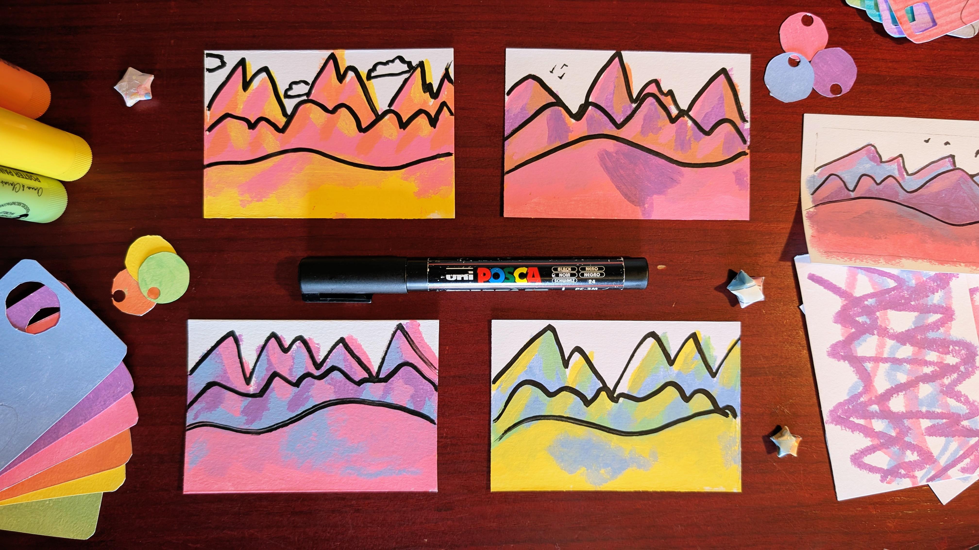
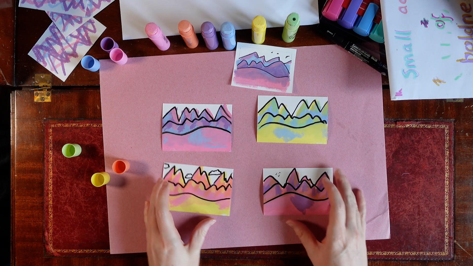
going to do in this class? We are going to create four bold miniature
landscapes that pop. How are we going to do
that through small acts? We're going to build up
to this step by step. We're going to create four, three color limited
palettes that appeal to us. We'll practice using the
kinds of lines that we need. We'll use our color combos
and draw these lines, coloring them in to create
hills, valleys, and mountains. We'll add light and shade to give these
landscapes dimension, and we'll bring
them to life with bold outlines and
finishing touches. What do we need to do this? We need something we
can color in with. This works best with opaque or semi opaque materials
that dry fast. Things like paint sticks, paint pens, crayons,
gouache, acrylic paints. I'm going to use
poster paint sticks, which are also called tempera
paint sticks, these guys. They're fast drying
and mostly opaque, and I love working with them. We also need a bold, dark outline pen that works on top of your fast
drying opaque colors. I'm going to use a
black Posca paint pen. And lastly, we need paper that works with
your other materials. It doesn't have to
be anything fancy. We're going to need seven
small rectangles of paper. You can cut or tear
these out or simply draw smaller rectangles on
a larger sheet of paper. I suggest you go ahead
and prepare these now. So that when it comes
time to make your art, you don't have to stop
and prepare your paper. So go ahead, hit pause and do
that prep work. I'll wait. Are you back? Good. To help you orient yourself
with the class, I've also provided
a written guide that takes you
through the steps. You can find this PDF in the
class resources section. It's an extract from
a larger guide. Be bold, Make Art, which is available for
free on my website. As you work through
these lessons, try to bear in mind our goal
Small Acts of Boldness. It's easy to get caught up trying to make things
perfect or right. But when we do that, we lose the spark in our work
and the fun of it. So stay with me and focus on getting things done rather
than getting them right. These exercises are quick to do, so you can always repeat
them if you want to try something differently
or have another go at them. If you've got any
questions along the way, please drop them in the
class discussion section and I can pick them
up from there. So with that said and
your paper prepared, your paper is prepared, right. Grab your colors,
and let's do this.
3. Creating Limited Color Palettes: So the first thing
we're going to do is try out color combinations. We're going to be
using three colors for each of our small
acts of boldness. Before we do that,
we're going to test out how well
they play together. I'm going to start with a trio that I quite like
pink, purple and blue, and I'm going to make
overlapping circles of each color and then
outline them with my black just to see how they look before I
go to the trouble of making my little
landscape. Let's do this. I'm going to make my blue circle purple and pink. Next, I'm going to
add the dark outline. And this lets me see how each of the colors
look with the outline, how they look overlapped, and how they all look together. And I quite like that. So that's a winning combo. I'm going to remember that. And now I'm going
to test a few more, pick out the ones
that I like best. I think I want to go
for a warm vibe here. I'm going to go for orange
for yellow and pink. I'm going to do the same thing. Circle circle circle. Do the outlines. Immediately, I can see that
this is a bit different. The yellow doesn't
go on as thickly over the top of the other colors as the pink does,
but that's okay. I know what to expect now. Let's try some other combos. Let's go for. Let's
get a green in here. Yeah, I'm going to
go for a green, a blue, and a yellow. Green. Yellow and blue. All right. This gives
me a different vibe again, and I like it. This one I'm happy with. Okay, let's try. Let's try a green a pink, and an orange. I'm not so sure that
I like this one. I don't think I like this
is personal preference, but I just don't think I want to use that particular combination,
so I'm going to skip it. I think I'm going to
swap out the green for the purple and see how
that looks together. I've got green, I've got
purple pink and orange. My posca is getting
a bit dried out, so I'm just going
to reactivate it. There we go. Nice and juicy. Yes, like that one. I like that one. I like
that, and I like that. I've got four color
combinations that I like. Next thing I'm going to do
is practice the kind of lines that we're going to
make in our landscapes.
4. Practicing Lines: I'm going to get a
scrap bit of paper. I will use the
other side of this. And I'm going to get three
pieces of paper to practice. Three different kinds of lines. First one's quite jaggy and
it's got a high amplitude. By amplitude, I mean
the difference between the highest point and
the lowest point. I've also got one that's really smooth with a low amplitude. The difference between
the high point and the lowest point
is pretty small. I've got something in
between the Goldilocks one. Let's practice making
these kinds of lines. I'm going to use my
favorite colors. I'm going to start
making jaggy lines. That's lines with a high
amplitude that are spiky. I'm going to practice
drawing them one way and the other they can
overlap, that's fine. I'm doing it just
a few times to get my hands familiar
with the motion. I'll set that to the side. I'm going to make a smooth
undulating one now. I'm going to do that with pink. Smooth undulating, not
much height difference. It's got a low amplitude, and I'm going back and
forth across the page. Now for the Goldilocks one. I'll do that with blue.
This is a bit jaggy, a bit smooth and
lower amplitude. I'm just going back and
forth across the page. Now, I'm going to continue making those kind of goldilocks marks on the
other pages as well. This gives me extra practice. It lets me know how these
lines look together. I've got all three
with them now. I'm going to go back
to my jaggy lines and layer them over the top. My jaggy lines with
their high amplitudes. And I'm starting going one
way and then going the other. And all I've got left to do
is add the smooth lines on. Back and forth, low
amplitude, smooth lines. Okay. Now I've got three
different practice pieces where we've practiced making these different kinds of lines together using the
different kinds of colors. Now we're ready to move on
to make our tiny landscape.
5. Making Tiny Landscapes: Again, I'm going to have some scrap paper to
protect my work surface, what I'm going to do is
I'm going to start with a jaggy line that starts in
the upper part of the paper. Just like we just practice,
except this time, I'm going to color
a bit down from it, not all the way to the
bottom, some of the way. I'm not being especially
precious about my coloring because
we're being bold. It's all right if
it's a bit messy. And now I'm going to get
my next bit of paper, and I'm going to pick
a different color to be making jaggy lines with
one of my other palettes. I started with this one. I'm
going to go into this one now and I'm going to make
bull jaggy orange lines, and I'm going to color
them down a little bit. The advantage of working on several pieces at once
the way we're doing right now is if your medium has a
little bit of a drying time, you give it a little
bit of time to dry. I'm going to go for four. I'm going to go on
to this next one, and I think I'll do
the jaggies in blue. You can see I'm not being
careful with my coloring. I think it actually adds charm to be a little bit chaotic
with your coloring. Okay, to my last one, let's see. I've done this color.
I've started this one, started this one,
started this one, and now I'm going
on to this one. I think I'll do purple again
as the background color. We've got four with
their jaggies. Now going to add the Goldilocks
ones in between ones. I'll go back to my original one. This is mostly dry. When I do this next line on it, I'm going to make sure
that I don't copy accidentally the shape
that I've drawn already. I want it to be
something different. I'm just going to
try and bear that in mind that I want it
to be its own thing. Okay. Now I'm going on to
my sunshiny one, and I'm going to make that
next set of lines in pink, which as you see,
it doesn't show up as well against the
orange, but that's okay. It's fine. This was my blue,
green and yellow one. I'm going to do my next
set of mountains in green. And my last one. I think
I'll do the next set. Orange. Why not? And you'll notice I'm not coloring all the way to
the bottom with either. Set I'll do that on the very last set of
hills, the third one. Now, back to the beginning. This is going to have pink. That was the third color I
picked and it's a smooth, undulating, low amplitude
hill right at the front. This next one was yellow. I think this one
was yellow as well. Yeah. And you'll see with most of them, the color at the front
is like a light color. That's on purpose. I'll come back to
that in a minute. This last one will give it a nice undulating pink
hill at the front. All right, now we've got four different little
mini landscapes. We're going to add a little bit of light and interest
into these piece.
6. Adding Dimension: Taking the color you've
used at the bottom, I am going to pick one side of each of the jaggies
to add some of this color as if
it's being kissed by sunlight of this
particular color. I'm even going to layer
it over the bottom color as well because I
know this medium, it actually does
stack a little bit. I'm going to take a dark color, I can't use the pink because
I've used that for light, so I'll use the blue on the jaggy hills to add
shade to the opposite side. You can see this is
just super rough. I'm not going to do
blue on top of blue, I'm going to do purple for the undulating hills, I'll go back to using the blue. That gives a bit of
depth to the picture. I'm going to do the
same thing to this one. I'll pick the color I
used at the bottom, yellow and I'm going to add that to one side of my jaggies and my goldilocks hills as if there is sunlight catching them. That means the other side of them is going to be in shadow. Which is a bit strange to
use pink as a shadow color, but we've got a
limited palette here, so we use what we have. And I'll use orange as the
shadow on the pink hills. Now, let's see, for this one, I'm going to mix it
up and have the light on the other side
because why not? Can you see how quick this is. We're not trying to make
it perfect and we're just trying to make it fun and bold. You can make art really
fast and make things that you can enjoy as
well as feel proud of. And last but not least, do this one, and I
think I'll do the same. I'll have the light
on the other side. So that's my pink color here. I think I'll layer this
a bit. There we go. I'll do orange
shadows on the hill. The joys of a
limited palette and then more reasonable purple
shadows on these guys. Okay, so now we've got four crazy little landscapes and just got one more thing
to do to finish them off, which is to give
them their outlines.
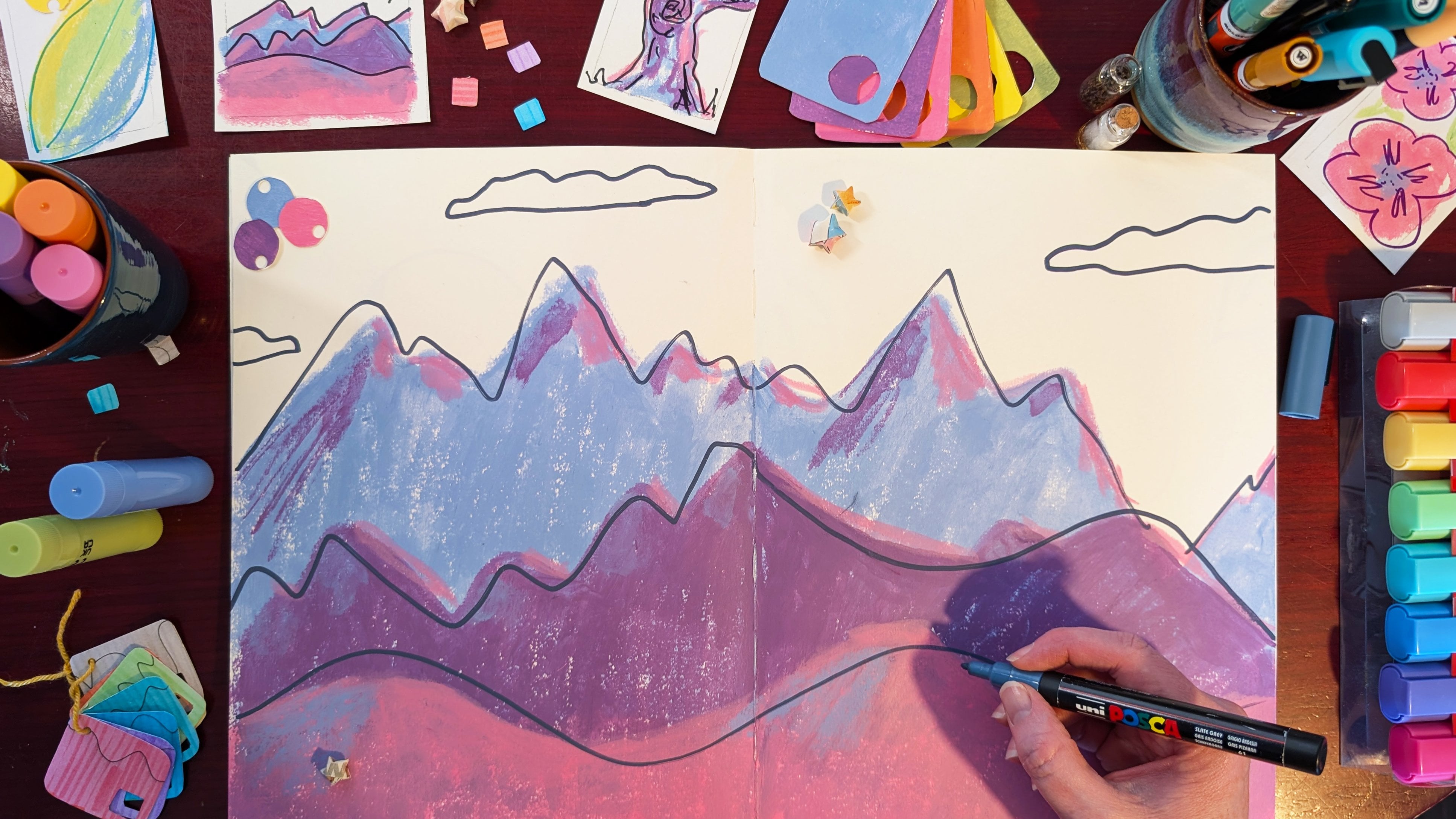
7. Outlines and Finishing Touches: Now, when you're
doing the outlines, how you do it matters. So much like when we were doing these lines
and we just went for it. One continuous mark,
one way or the other. That boldness of line is
what we're aiming for here. It gives the piece a feeling
that you don't get if you very carefully and tentatively
try and trace the outline. What it means is your
outline will miss. In some places, the outline in the shape doesn't
quite add up, and that's actually good. It gives a sense of
looseness and freedom. Don't be worried about that. Don't be upset if it happens. It's actually something
you want to happen. So let's do it. Making sure my pen is nice and juicy and then doing my zigzags. And then I'm going to come back. Try and remember where
those ones were and last my undulating
hill. And it's done. Do the same for this one. So I just added in an
extra hill there. Okay. Next one. And then my little
undulating guys. Okay, you getting
the hang of it now? And lastly, There we go. Now, you might want to add little finishing touches
like some little ticks, and upside down ticks for birds or I don't
know, maybe a cloud. Or you might just decide
to leave them as they are. But either way, you will have made a small
act of boldness.
8. Final Thoughts: Well done. You made it. Hurrah. Thank you for joining me as we performed Small
Acts of Boldness, creating a series of
courageous mini landscapes. We developed our own
limited colour palettes, practice different
styles of line, and then used these to
create tiny landscapes, adding shadow and light
to give them dimension, outlines to make them pop, and finishing touches
to bring them to life. If there's one thing
that I hope you take away from this
class, it's this. Done is better than perfect. And in art, perfect
doesn't exist anyway. So be bold and
focus on the done. If you want to
take this further, I have another class. Boldness is A, where
you can do just that. It's linked below. I also have a free workbook, Be Bold Make Art with ten different creative
exercises, including this one. The class resource is an
extract from this workbook, which is available
on my website. I'd love to see your
work, so please do consider sharing it in the
class projects gallery. And if you could take the
time to leave a review, that would be really helpful. It lets other potential
students know what to expect in this class and if it's the sort of thing that
they might enjoy too. You want to find out when
I release a new class, be sure to follow me here. And if you'd like to hear
about what else I get up to, see behind the scenes in
my sketchbook and more, please join my quarterly
newsletter, Scale Mail. Thanks again for
joining me here. I hope you've enjoyed
your time and I'll see you in another class soon. Bye.
9. Bloopers: Thanks again. No, noisy. Let's try that again with
enunciation. Voice, voice. Ice. Did that Did you catch
that weird noise? No, there might have
been fabric noise there, so I'm gonna try that again. I am so noisy. Let's
do that again. Waiting for noise to pass. Waiting for noise
to pass outside. Okay, let's do it again. Give my hair a flu. Yeah. I got long. Maybe I should
enunciate. Not whatever. Whatever. Must be
heard across the room. Dear me. I'm getting
a bit warm, Maria. Let's maybe not do the hands. Must be able to understand you. This is my new hope music. I looking over there and not
at you. That's annoying.
 Shelley Skail, Artist, Illustrator, friendly nerd