Transcripts
1. Class Intro: Welcome to the enchanting world
of watercolor landscapes. Where the sky is the
canvas of your dreams. Get ready to embark on a
mesmerizing journey through the ever changing
skies as we dive into the first part of this
ongoing watercolor course. In this beginner friendly class, I will take you by the hand and guide you through
the art of painting, breathtaking skies
that will elevate your landscape paintings
to new heights from the moment you dip your brush
into the shimmering palette of colors to the final
strokes of mastery. This class is designed to
be your trusted companion. I'll start at the
very beginning, ensuring that you
feel at ease as you learn foundational
sky painting techniques. As we progress together, I'll unveil more
advanced methods, empowering you to
create skies that are alive with depth,
drama, and emotion. But that's not all. I
believe that learning from the masters is a vital part
of your artistic growth. That's why this course
proudly presents a captivating look at
the work of the greats. Allowing you to witness firsthand how these
timeless techniques were wielded in their awe inspiring watercolor
landscape paintings. Fellow art adventurer,
are you ready to infuse your landscape paintings with the balanced
beauty of the sky? Join me and unleash your
creativity as we paint our way to confident captivating
watercolor landscapes together.
2. Materials: Before we dive in, let's
look at materials. As I mentioned in the
introduction video, you don't have to have
every single color I have. You don't have to have
the same brushes. I'm simply doing this to share
my thoughts on materials, the things I will be using. That way, if you
have questions about some of these colors
and brushes and paper, hopefully this video
will answer it. And then of course,
along the way, if you feel like some of the materials I'm
using may benefit you, then of course, you can always purchase them at your
own convenience, but you do not have to have all of these things
to get started. Okay, now let's
talk about paper. I'm going to be using 140
pound cold pressed paper. It's not as heavy as, let's say, a 300 pounds paper. 140 pounds is heavy
enough, however, to do all of the studies and paintings we'll be
doing in this class. It's also the same paper I use all the time for all of
my watercolor painting. Some artists prefer
a heavier paper, like a 300 pounds paper. But for me, that's just a
little bit of an overkill, and I just simply don't
need anything that thick. One advantage of
thicker, heavier paper, however, is that
it doesn't really buckle as much as thinner paper. But again, I will be using
140 pound cold pressed paper. I buy full sheets, 22 by 30. I then fold that in half to
get 215 by 22 inch pieces. And I fold those in half again, and I end up with pieces
that are about 11 by 15 ". So that's the size of
this paper right here. So that is 15 by 11 ". And I will use this size
for most of my work. As we get into the course, the ideas and lessons we'll start to combine and we'll
do more finished work. And that's the size
I will be using now. In the beginning,
I'm going to be covering skies and
different elements, smaller components
of the landscape. For that I'm using ten by 13 ". That's large enough
to do a good study, but not so big that
we're having to use a lot of paper
to get it done. Again, this is 13 by 10 ". I will use this for again, like the skies, maybe, elements like rocks and trees. When we're doing just
kind of individual stuff. And then when we start putting together more
complete landscapes, I will bump it up
to the 11 by 15. Okay, so cold press paper, I think works pretty
good for landscapes. It has a little bit
of texture to it, which is nice rough press, which is another
common paper and surface that has a
little more texture then the cold press. And that may work
for some of you, but I find the cold press
gives me that happy medium. So it's got some texture
but not too much. There is another surface is hot press and that's very,
very smooth typically. That's used for high
detail sort of work, portraits, things
of that nature, and I will not be using
that in this class. As far as watercolor paint, I use hole buying. That's the brand I prefer. Very soft and buttery,
very good selection. I've always been very satisfied
with it and I've used it since I've started watercolor
back in the year 2000. As far as my hues, I'm going to go over those. I don't use a lot of them. It's a limited palette and
it helps me pretty much get any sort of color I need
or ever could imagine. My palette consists of a
lizard and crimson cad, red light, burnt
sienna cad, yellow, pale yellow ochre,
cobalt turquoise, ultramarine blue, cerulean
blue, and then umber. Now not pictured here, which would normally
go in one of these pails or pans right
here is neutral tent, so that's sort of a gray. Some folks like panes gray. But I've always
liked neutral tent. I may use some of that
later on in the class, but for now I won't need it
for the first section or so. Now my palette is a
John Pike palette. It gives me a large mixing area. So as you can see, once
I remove the water, I've got all the surface to mix. I even had these smaller areas here that I don't have pain in. If I needed a small wash, I could use those as well. But a good large mixing area is beneficial because you
can mix up a large wash. Even if you need
two small washes, you can do those side by side and still have
plenty of room. The next thing I will
cover is brushes. I will first start with
my sort of go to brush. This is a number ten pointed
round, It's by silver. This is the golden
natural series. Again, a number ten, it gets to a pretty good
point, which is fine. So if I needed to do a
little bit of detail work, it can get the job done. I also have a few
specialty brushes. This is a sword brush, so as you can see by the tip, the bristles, it's got a distinct shape to it,
similar to a sword. This is my larger one.
This is a two inch And then I have a smaller one
which is by silver as well. This is a golden natural. This is a four inch. These are great for doing
line work, detail work. I'll use this a lot when
we get into grasses, trees, and rocks, so very
good brushes to have. This is my small number,
six pointed round, a little bit smaller
than the initial one plus it I showed you. Plus it gets to a little
bit finer point again. Princeton, Neptune number
six pointed round. I will know that these brushes
are very cost effective, so you don't have to spend
a fortune on a brush for ten or $15 You can
get a really good brush. Most of these are
natural and synthetic, so they're a blend. But I've had these for multiple years and
they're still brand new. They come to a really good
point and they work great. Just as good as the
more expensive brushes. The last brush I'll
show you is my quill. This is a number eight
Princeton Neptune. This can put down a
large wash. You know, it's got a large belly to it. I have one that's actually
bigger than this, but the number eight is fine. It works really well for the size art that we're going to
create in this class. If I were working
on a larger scale, then I would break
out my larger brush. Actually, I have
one more brush to show you and then I'm
going to show you a not so traditional brush that I'll use as
well in this class. This is a Motler, this
is a one, a two inch. As you can see,
it's very square. We've got more of a geometric end and
bristle to it shape. But this is really
good for putting out a large amount of wash and hue. It's really good for painting a lot of landscape
elements as well. But I really like this brush. I don't use it probably
as often as I should. I'm going to be using
it in this class. So again, that's
an inch and a half Princeton Neptune Motler brush. The last one is
an acrylic brush, so these are synthetic
bristles, very firm. If you have an oil
painting brush, something similar to this,
you can use that as well. But these really hard firm
bristles are good for adding texture and certain details and effects that are great
for landscape painting. I will be using this as well. This is a royal and laying
nickel acrylic brush. A flat or a square. And I think this is a number 12. That's pretty much
it for my brushes. The last thing is just a pencil. This is a two B pencil. So I will use that
for obvious reasons, and that's to put out my drawings and things
like that on my palette. I will keep my two
water reservoirs. I've got one to wash my
brush with to remove paint, and then I try to
keep one of them for just clean, pure water. Over the course of
three or four demos will start to get contaminated. So I will change both of them, but if this one starts
to get contaminated, be sure to change it. You want to have one
reservoir that's always very, very clean, pure water, that doesn't contaminate the
colors you're trying to mix. I do have some rags here. These are very important. I'm going to go over
this in the next lesson, but I keep a few of these rags. I get these a Home Depot, They're very cheap, but I can
take them and fold them up, and I, and I put that right by my water reservoir for reasons I will share
in the next lesson. The other things
I will share with you here will be paper towels. We'll be blotting out clouds
and different things. Plus you may want to have this just for a little
bit of clean up. And lastly, this is a board is actually a piece of Gator
board I've had forever, kind of thick, very sturdy. And I put this white
piece of paper over it, just so you guys don't have to stare at how gross this is. Again, I've had this
since the year 2010, since I started painting. But this gives me a really
firm surface to paint on. I can put my art on it. And the paper you don't
necessarily need, again, I just do
that for aesthetics. You guys, again, don't have
to look at that board, then I keep my
board at an angle. This angle keeps all the
water heading downhill. If you paint on a flat surface like this without
it being angled, then what happens is the
water will start to puddle up different areas of your paper that's undesirable because
that can create backwash, ballooning things that you
may not want in your artwork. Again, if you don't have
a little level like this, a little three foot level, you can get a two by four
roll of masking tape. Anything to keep it propped up? You definitely want to consider that a little Mr.
bottle we may use. Mainly use it to keep my paints from drying up under
the bright lights here. And lastly is some masking tape. You may want to tape your
paper down on the corners. Some artist will take the tape and tape around all the edges of the painting.
That's up to you. I don't use this a lot. If I use it, it's just to
tape the corners and to keep the paper relatively
flat while I'm painting. Okay, that's it
for my materials. And the next lesson I'm
going to go over my set up, why I have it this way, and then show you
a really good tip, a very important
tip I should say, about your water and
managing water. Okay.
3. Finger Test: Welcome back. Last lesson, before we get into our skies, I wanted to take a moment
to talk about mixing paint. And one of the common
issues we all deal with, with watercolor painting
and that's water. Okay, I've given you
the tip about having this towel here in
the previous lesson. Now let's look at the
two paint mixtures that we're going
to use the most. That's going to be thin
or watered down paint. I refer to that as T
then thicker paint, which is in between
milk and honey. There's a little finger
test you can do. Let's say I want to mix a
little bit of blue here. Actually I'll just
do a lizard and crimson and a little
bit of my brown. I want this to be fairly thin. A good test you can do is to run your finger
through the paint. What happens if you had
the right amount of water? Is this going to
automatically back run where you drag your
finger through the palette? I'm going to move
this over so you can get a little bit better
shot of that again. Let's say I want a very
thin mixture of paint here. I want it, okay,
Something like that. Now, the finger test is this. When I run my finger
through that paint, again, you're not going
to see the palette because there's so much water there that it runs
back into that groove. And that's going to give
me a fairly pale wash. Now, conversely, I'll leave this
over here so we can get a good angle at it. If I wanted a thicker paint, and this will be
style number two. I can mix a little bit
of paint in there. I'll go a little bit more. Okay, So we'll get something
like this going now. As I run my finger
through it, okay? It doesn't backfill as much. So where I rub my
finger on the palette, it tends to stay open like that. That finger test is a
really good test to do. If you're trying
to do a thin wash and you want to be
very transparent, then obviously, if you just
did a little finger test, then that would tell
you that's wrong. Now, you can use the
tip of your brush too, but that doesn't really
work as effectively. The little finger test is good. You can clean it off
if you want over time. You're not going to have to
do that because you want to start to get familiar
with the paint. You can tell the way it's
responding on the palette, if that's thin or if
that's really thick. Okay, as I put that
thicker paint down, that's going to be more
opaque, less transparent. Then I can say, okay, well
I need something a little bit thinner for the next round. Then I can start to see
how that is moving across the palette that's
going to be very thin and transparent and
maybe more of what I need. The two types of paint
we're going to be using, the two types of
mixes, I should say. One again is very water down
thin, the other is thicker. The little finger test is
something that may help you determine if you've got the right mix
on your palette. Obviously we can go thicker. You can go with a damp brush and very little water at all, and get these really very
opaque strokes down. I use that once in a while for highlights and details
and finishing touches, but I don't use it very often. It's either a very
thin, transparent wash, we start going a little bit
thicker into that milk and honey zone to get
either more color, or we simply just need to go
a little bit thicker so we get maybe a little more
intensity out of our wash. Okay, hopefully is
a good tip about your paint and that'll help
you as we move forward.
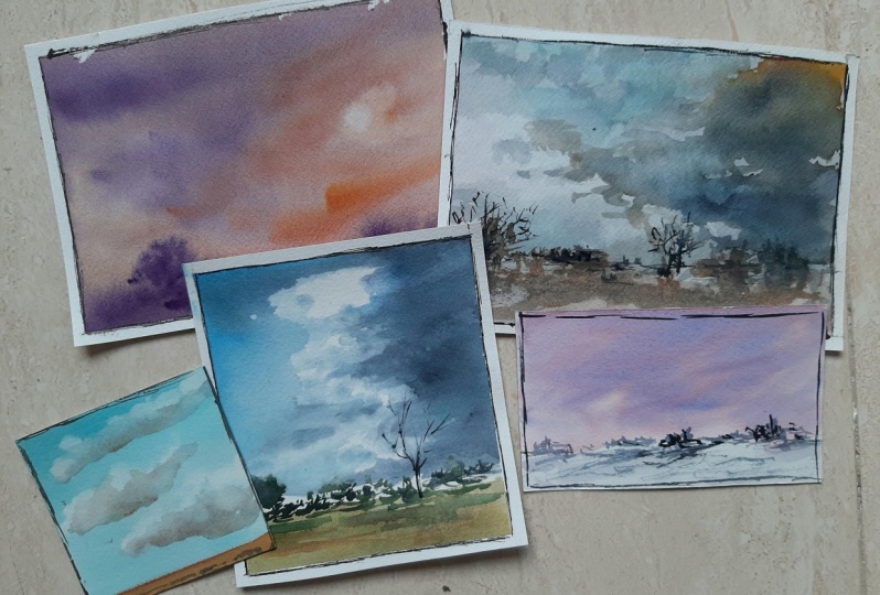
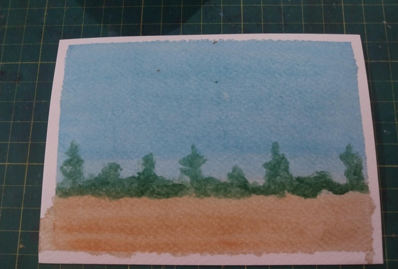
4. Simple Gradated Sky with Watercolors: All right, welcome
to the first sky, and I'm going to lay
out a rectangle here. I'll leave a little
space on the side over here just to test my
colors for the demo, because we're going
to focus on sky. I want the majority of it, sky. And I'm going to move this
horizon line way down here. Okay, for this one, I'll use my motlar brush for no other reason than it can
put a lot of pigment down. This will be a very
simple painting, we're going to build upon it, though things are going
to move pretty quick. But starting with
a very basic sky, very basic technique
is the way to go. And then of course,
each time we do a sky, it'll get a little
more challenging. A little bit of water there
just to soak the sky area. I left the land dry. Okay, so I didn't wet
all of this down here. Now, I'll clean my brush. Give it a tap. Tap, a little
bit of water down here. Just a little bit. Then I'll take a little bit of
my cerulean blue. I want this fairly weak. Okay, clean my brush. Get into the fresh water, maybe a little more water. And remember, you got to go a little bit darker
than what you want. Okay. So finger test
tells you there is water, but it's not real soupy. Okay? Because if it was real soupy, that would backfill
pretty quick. Now, I'll start at the top
and go nice and smooth. Don't go too fast or you may get the roughness
of the paper. Okay? If you go fast, it won't spread it as evenly. I can go up and down if
I want, for this one. It's not going to
hurt it a whole lot. Now, I'm going to go a
little bit more paint into this. No water though. Then I'll start at the
top and work my way down. Maybe once I get down
towards the bottom there, I'll back off of it. And a little more paint, I'll go a little bit darker
towards the top again, letting that stop towards
the middle of the sky area. And a little more
paint here that's a gradated wash. What we have
is a sky that's going to be a little bit towards the top
than it is at the bottom. We did that basically
with using less water. So we pre wet the paper. I use a little bit of
clean water to start with. Added some paint to it, got a pretty thin mixture
and then put it down, applied it to the whole space. Then added a little more paint, did just the top area, and then repeated that process. Okay? And that's going
to give you this result. It's not going to look the same. If I did the same gradated
wash on the same paper, with the same brush
and the same paint. It's not going to look
the same the next time. It'll be similar, but
it's not going to be a perfect match. That's water color.
You're dealing with a wet and wet surface. Okay, wet paint, wet
paper, wet brush. It's hard to get the exact same. Now, for the sake of just
finishing the piece here, I'm going to use a little
bit of yellow ochre. I'll apply that to
the ground area here. It's okay if it bleeds, so we can touch that blue area a little bit and that's fine. Now if I wanted to get a subtle gradation
like I did in the sky, I actually turn
this upside down, I can take a little bit
of this burnt sienna and just run it right along. The bottom there. Okay? And then I'll give it a subtle gradation. Now, I want to add just some small trees in there just so we
can the first demo. And every demo we do pretty
much has a painting to it. And then that way you can see your progress and have something to
show for your work. Again, the colors,
cerulean blue. And then I just simply added a little more paint
to the top of that. Okay, so just
something like that. And then I used a little bit of our yellow ochre and then a little bit of
burnt sienna into that. Now, I could have used
a little more ochre too. That's what we have. I'm going to take
a dryer to this, a hair dryer, and get this dry. And then I'll just finish
it off real quick with a few trees fairly dry. I didn't really dry it up here, just really where the
sky meets the land. I'm going to use my
small point around. This is my number six
Princeton, Neptune. I can just take what
colors are here is fine. It's basically a little
bit of brownish yellow, with a little bit of blue. Now I'm going to add a little
bit of turquoise to that. If you don't have
cobalt turquoise, you can use a little bit
of cerulean, that's fine. A little bit of yellow ochre, that'll give me a pale green. The finger test
says that's soupy. But it's still got
a little bit to it. It can go a little more water if I wanted to, but I don't. I want it to be a
little bit thicker, so I'm going to add a
little more paint to this. Maybe even a touch of
this Cad yellow pail. Get all that excess water
off. Okay, very important. Load the brush up, Then we
can come in here and then add a few strokes here just
to suggest some trees, a little bit of vertical
interest, Something like that. Now, I don't want the trees
to be very big, though. It knows how small all
of these trees are. That gives the sky
a sense of scale. It makes it look a
little bit bigger. This may be something in there. All right. Now I'll take a little bit of my
ultra marine into this. I can touch just dots. That's all I'm doing is just adding a few dots
into those trees. I can take a little bit of
my ochre now into this, so we get this brown color
and we'll do the same thing. We're just, again,
adding a little bit of interest to this. Maybe I'll put a slightly
bigger one back in there. I can even take a little bit
of my ultra blue into this. I'm just getting a little
bit darker color here. Maybe add a little
bit of sienna to it. Maybe we'll add a
few cast shadows. So some of these are taller and they're just
getting this thing here. I'll take some of
this burnt umber. This is umber rather, just raw umber. A
little bit of blue. A little bit of my yellow ochre. Again, just playing with a
few dots to finish it off. There you go. A lot of
those greens were just made with the blues and the
yellows I had on my palette. Okay, so we've got the greens. And then in that I just played with the same idea of
working wet into wet. I dropped some yellow ochres, some umber and burnt siennas, and to get that look of
just some distant trees. Okay, keep it simple. The goal here isn't to really
paint a finished piece, but it's just to
start small with this gradated sky and then
we'll build upon that.
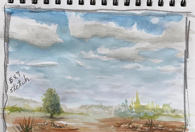
5. Gradated Sky with Cumulous Clouds: All right, we're going to build upon that simple gradated sky. Again, I'll leave a little
area here for my swatches. Again, a very low horizon. Okay. We're going
to focus on skies. I'm going to switch brushes, so I'll go with a quill, something bigger
and not so square. My number eight, I'll
clean it off really good. Give it a tap and
do it a few times. I haven't used this brush today. Then some fresh
water down there. I'll start with Sullan, very weak, and then I'm
going to do a gradation. But this time we're going
to do some other techniques there that are going to create
this cloudy day effect. Not too cloudy, maybe light fluffy cotton balls or something there
floating in the sky, maybe a little more water. You can go left to right
here, up and down. You can turn your paper, maybe towards a light source and see if you've got
everything covered. We don't want it uneven. You don't want to
puddle up anywhere, is try to smooth it out. If you have good paper, it shouldn't be a problem
to go back and forth. If it's cheaper paper, you may find that start to break your paper
apart a little bit, so the surface will get
a little bit fuzzy. Now, I'll use again, cerulean, little
more water here, and then a little more paint. The finger test tells you, yes, it's got water but it's not too soupy and
that's what I want. Okay, Something like this
will work just fine. All right. So I can
work left to right. I mentioned earlier that
you can go up and down too, but obviously if
you're doing a sky, you want it to be darker up top, then you want to
work horizontal, left to right to left is fine. I just said that just
because I knew I was doing a first wash. And then I would come over it and
do a second one. And then I would
work that second one left to right and that would give it a
gradation where it's darker up top and
lighter at the bottom. I just want to clarify that just to make sure there
was no confusion. Now you'll see that
sometimes it's streaky. So you can see these
horizontal streaks in there. That's normal because my
board is at an angle. Because it's all wet, it's going to smooth out, it'll even itself
out as it dries. Now I want to fairly dark
towards the top again. Instead of using the same color, I'll switch to ultramarine blue. Maybe a little more cerulean. A little bit thicker paint. A little bit thicker paint. I'm going to again, add that
darker blue towards the top, working left to right. As I get towards the bottom, I'll just let that
bleed into each other. Again, you'll see a distinct
line now, but again, gravity water fusing colors, bleeding, that's going
to look just fine. While this is drying, I'm going to just add a
little bit of land there. I'll just come over here on the right hand side
of my palette. A little bit of ochre. To start, I could do green too, but I think this will
be just fine now. I'll do the same colors for now. Because again, it's not really about the land at
this point anyway. But I just want to give you
guys nice complete painting here that you can have
for your studies, just a little more sienna
maybe at the bottom. I can streak that across the
land in a few places too. Okay? Paper towels. You can use tissues,
toilet paper. The main thing is, don't use a paper that
has lotion on it. Lotion sometimes
can be oil based. And that oil isn't going to mix very good with
your water color. Just make sure it's like non scented and that sort of thing. I'm going to make sure
it's clean so I've got a little bit of color there,
but it's not going to hurt. Then I'll ball it up and get
this roundish looking shape. Now what you don't want
to do is a bunch of dots, so they're all the
same size, same shape. The idea is you'll hit the
paper and then drag it a little bit and then do different sizes and
things like that. Hopefully, I will illustrate
that as I get into it. You see just dabbing, right? Maybe in the distance the clouds get a
little bit smaller. Okay, They're further
away from us. And then maybe I can do
a nice big one in here. Okay, So just a few
cumulus clouds there, and that's a nice look. Now what we can do is build
upon that a little bit, okay? Clouds are three dimensional, I think sometimes they get
thought of as they don't have any form to them. But let's say for example, our sun is up in the sky and we had these clouds that
are floating below it. Clouds are basically the
cubes, different shapes. They may be, they have
this, they may be small. If they're in the distance
they may be really tall. Okay. But as the sun hits the
top of them or the fronts, or the sides or whatever, they, they get, they're lighter. Okay. So they, they're
whiter up here. Then underneath,
they have sort of a shadow right like that. So underneath this, that
shadow is because again, the light source is hitting the top of the cloud
or the front of the cloud or whatever where
the sun is in the sky. Sometimes if you have a
low sun and it's a sunset, then the color is hitting
underneath the clouds. The shadows and all
that will be up top. But in this case, the
sun's high in the sky, our shadows are underneath. These things have volume. As the sun hits these
guys, this is our land. The clouds will actually
cast a shadow on the ground. Okay? Or the water or
whatever the surface may be. So that tells you
they have volume. That's sort of what we're
doing here with this exercise. I'm going to switch
to my small round here and I'm going to get
sort of a bluey gray here. I'll take a little
bit of my sienna into these blues and that'll be fun. That's like all the color. I mean, I'll create this grayish underbelly for the clouds now as
things go away from us. Okay? As clouds get in the distance there and they move further and
further away from us, they're going to get
lighter in value. Okay? Things that are closer to
us are darker in value. I'm just going to soften
some of these edges. I did is I applied the color, I went in, I clean my brush, get clean water, get all
that excess water off, and then you can soften
those edges a little bit. Now, I'm going to
take a little bit of this water and dilute this. We've got really soupy
water mixture here. Then the distance, this color is going to be a
little bit weaker. Okay? These are further
away from us in nature. That's going to make
it lighter in value. Okay? Now I can take a
little bit of my Umber, a little bit of blue, a
little bit of Sienna. Actually, that was a lizard
and Crimson, that was bad. Let me try that
again. Sienna Blumer. I'm going to mix something
that's a little bit thicker. We can do some of
this in here as well. Okay, Just on the clouds
that are closer to us. Okay, So that again,
gives an illusion of depth in the landscape. Connect those a little bit. That is a simple way to add those cumulus clouds
that gather in the sky. And what we'll do in the
next lesson is build upon that and we're going
to do this layered effect. Okay, But before we
break away here, let's talk about colors. For the gradated wash, I used a little bit of
this cerulean blue. Okay, that's probably
a little too strong, so I'll add a little
bit of water there. And then I added a little bit of ultramarine blue to that wash. Okay, we got that layered look. Then we use our
paper towel to lift. I added a little bit of
burnt sienna to those blues. That's going to gray it out. Okay, that will give us this
gray and created the clouds. Then for the land, we did a little bit of ochre. I added some sienna
for gradation. Then I went back into it with a little bit of umber, a little bit of sienna, a little bit darker, and enhance those shadows
a little bit. Now I'm going to take a drier this and just to finish it off, we'll add a few trees. I'll use my pointed round here. If you start to get these
hard edges like this, you can blot it
out a little bit. I just don't go
into it too much. There's another little
hard edge again. Take that napkin and blot it. If it's dry, you're not going to get it, but it's no big deal. It's still a nice cloud, it gets the point across. And what you're trying to say, a little bit of turquoise. If you don't have turquoise, again, you can use cerulean, a little bit of cad, yellow, pale, a little
bit of ochre in there. The ochre has a little
bit of red in it and it'll muddy up the
greens a little bit. I'll do a ultra marine
in there as well. Maybe a little more of
this yellow to punch The green finger test tells
you that's pretty thick. Probably the
thickest paint we've used so far for this demo. Again, we're going to
do just some trees in here just to cap it off. I'll mix a little bit of these reds in
there, that's fine. Maybe we got a taller tree
here, something like that. I'll touch some of those colors in just a few other areas, and then we'll get these
yellowy colors just to indicate a little
variety in there. I'll take some of these grays
that are on the palette, maybe add a little bit of blue
to it just to cool it off. Finger test tells you that's pretty weak and that's
what we're after, we can do again, the real simple shadows along the landscape there.
Something like that. Again, we're getting that a
little bit different feeling, a little bit fluffier
clouds there and it all started
with the gradation. A simple gradation. Cloth towel, whatever napkin, paper, towel, blot out your clouds, add a little bit of
gray underneath. We know why that happens now. Right, That's the deal. Make sure as you go back in space the color gets a
little bit weaker. Right? A little bit lighter in value. I'll just take a little bit
of water and dilute that. We can add just some grays
here and connect them, even there you go. A nice simple way to create this fluffy cloud
day. That's the best I got. This is the only description I can come up with right now. Hopefully it's something again we can build upon in
the next lesson and add a little bit more complex
complexity to our scene.
6. Layered Gradated Sky: Okay, so a multi
layered cloudy sky. Again, building upon
our previous lesson, we'll pre wet all of this. I'll actually just
take that water right down into the land here. Shouldn't hurt anything back
and forth, up and down. Okay, so with the
sky, a gradation, so we'll keep it the
same theme here. A little bit of
turquoise in this one. If I did the finger test, very weak and that's good. Start bringing this down, get to our land clean, my brush, get that excess of, maybe even touch, a little
bit of ultramarine. Now, a little gradation here, you can see it
starting to pull up a little bit in that corner. That's fine. I don't freak
out about stuff like that. Again, we're not perfect. Humans aren't perfect,
I should say. The medium is not perfect. And that's going to happen. Now while that's
setting up there, I'll add a little land, just a fairly weak ocher here. Just running that across there, obviously because I wet
it, everything here. That's going to do some bleeding and it's not going to hurt us. It's not a big deal. Now, I'll take a little
bit of Siena into this and just touch it in
a few places like that. Flip it back over and
get my brush clean. I'll remove some of this.
Take the paper towel here, we're going to dot out some
clouds. Same technique. Remember, don't do a bunch of clouds that are all the same. Don't do same sizes, try to keep the cloud formations interesting and maybe even
one in the distance there. That'll be good. I don't think it needs to be much
more than that. While it's wet, I'll go ahead and add a
little bit of gray. I'll mix that using Sienna, ultramarine, fairly weak, maybe a little more
blue into that. It's not too gray because we used a
paper towel on this. It's going to be dry
but just your brush, but remove that excess water. Very important that you do that or you're going to
be, sorry you didn't. A little more water on my brush just to make this gray
a little bit weaker. And maybe something like that. Again, just a few touch
of white in there. Something like that I
think will work good. Remove that hard edge. Now I've got to let things
set up a little bit. I want this to dry 100%
Then I'm going to come back with another layer of clouds moving in towards the
middle and distance. I'll take a hair dryer to
this and I'll be right back. All right, nice and dry, I will just use my quill
on this next set up here. Lots of blue, maybe even
some cerulean touch of a lizarin. I made a mistake last night
of leaving the lid off. My water colors, things have dried up a little bit
but they're not so dry that I have to completely
toss them in the trash bin. I'll just have to
keep softening them until they loosen up. All right. That's very violet. Before I forget, I always
forget to do this with the gradation in the sky that was a little bit of cerulean and a little bit of turquoise. Now blotted out some of those, We added some gray
for the clouds. The land mass was
a little bit of yellow ochre and a
little bit of sienna. Now the sky is going to
be this violet color. That's my main base, but I'm going to add a
little bit of umber to that just to remove
some of that intensity. I don't want it to be so violet
that it looks too happy. Okay. That's all I can
come up with there. What I mean by that
is it's basically gray clouds, stormy situation. Now, I'm going to wet
it right in here. Don't go too close. I'll come
back something like that. Now, I'm not going
to disturb it. I don't want to
get in the air and start moving that around because that could easily
agitate the wash underneath. I don't want to do that.
Let's just do it like this. We'll turn it in this angle just so we throw our vision off. Sometimes when we look at
things upright all the time, then we get this
predictable result. I don't want to do that. Finger test tells you
that's fairly thick now. Don't go too far up in the sky. Okay, we want to
keep this in here. Moving into the scene. Here we've got this cloudy, stormy situation that
creates some excitement. We don't really know. It's just mess it
up a little bit. Get a little wispy
action with your brush, but you don't go too far with it either.
That's pretty good. I'm going to remove
all that paint. Just a damp brush now. And just a little bit of this in here just to create a little more movement and a little more dimension
in the cloud. I'll take my small
pointed round again, can remove the excess and
soften a few of these edges. Okay, so that does a
pretty good job there. No, this is going
to dry a little bit lighter and what I will do is let it completely dry
and then I'll come back and do one more
layer for the land. I'll hit it with a hair dryer and then I'll be right
back. All right. I'm not sure if the camera
will pick up on it, but it's noticeably
dark, lighter in value. Now, that's what you have to
anticipate with water color. I think the mistake is to mix and put down a color
that you need. And you say, oh yeah,
that's perfect. Then by the time you put it down and it dries,
it's not perfect. It dries too light. Now, just a nice
thick mixture here. Of green and I'll do some. We'll just a little bit in here, we don't want to, again, do things that are too big, Keep it fairly small. I'll go a little
bit darker here, maybe I'll do a
little bit taller. Bush or tree or something there. Something like that is
good for that land. We did a lot of the violets
that were already there. I'll mix in a little
bit of these ochs, give it a little
variety in there. And maybe we'll throw a
little bit of blue in there. And we'll maybe do a few
shadows, something like that. Maybe do a little
splash in there, so I can get a really
dark green here, a little ocher,
something like that. Yeah, a really nice effect. I think multiple
layers, obviously. A little more challenging
than what we've done, but that's what we're
going to do in this class. The idea of whatever it is we're focusing on is going to
start out fairly simple. Then little by little, we make it more challenging, and that's what we want to do. I can even lift a
little bit of that. Maybe let's try something here. That's all. I don't
want to get too fancy. This is all about the sky, multiple layers, building
upon a simple gradation, blotting for white clouds, a little bit of gray underneath those bellies to give
it that dimension. Letting a little
squirt there just to make sure we don't go back
on a complete dry surface. That's going to give you areas
of the paper that are wet. Some areas will be dry
because this is not going to cover everything is going to splatter on the
paper. And that's fine. I didn't spread it though
because I didn't want to disrupt the wash underneath. Just because the
water color is dry, this paint was dry, doesn't mean you can't disturb it
because you certainly can. Then we put that down, we lifted some light
areas in there, let it dry, and then came back and added the illusion
of a landscape.
7. Negative Space Sky: All right, cracking
forward here again. Adding more and more techniques, different ideas to the sky. This one is going to involve some negative space painting. For those of you that
don't know what that is, let's say I tell you I have a
square that's on the paper. You'll say, well, I don't really see a square
on the paper. And I would say, well, yeah, I guess you're right. What I can do to help with
that idea is take my paint, brush and paint
around the square. Okay, so negative space
painting is painting around something versus
painting the interior of whatever the shape
or object that may be. That is negative space
painting for you. I will use my Quill
brush for this one. Again, we want to wet the paper. We don't want to over wet
it because then that's just going to slow down the process. We have to sit there,
twiddle our thumbs, or we have to break out a
hair dryer or something like that to get it going. And I'm not that patient. Just enough water to cover it, but we don't want
to puddling up now. For the sky, it's
going to be very, very pale. A little
bit of water. I'll use a little
bit of turquoise in the sky with a little
bit of my Cerulean, a little bit of water here. And that should be
pretty good right there. I will actually, I didn't want
to really do that at all. While that's wet, I can
just blot it like this. This is a good thing
for me to show you. Actually remove that because
I got ahead of myself, had no idea why I did that. I want to do some gray,
very subtle grays. I'm going to use these blues
a little bit of Umber. I can test that if I want. That's not bad. I want to
be a little bit cooler. I'll go blue into
that, clean my brush. And maybe even touch a
little bit of red in this. Sometimes a little bit of red, maybe even a little bit of yellow brings out a
really nice gray. This is wet as you know. We're just going to do a few of these little swirls in the sky. Again, don't try to
control it too much Now, I'll clean my brush and then
just lift a few places, just run it across a few of those strokes
that will soften the edges and it'll add
a little bit of water and diffuse some of that color. Now I'm going to take
a little bit of ochre. Just a little bit clean. My brush, fresh water
there, clean water. And I'll take a little bit
of this ochre into the sky. Okay, that's going to
create a little warmth. You can even take a
little bit of red. This is going to be
a beautiful day. Lots of fluffy little clouds in the sky. That's
what I'm after. I'm going to let that dry now. It may look a little bit dark in the beginning
and that's fine. But when that dries, I
think will be pretty good. All of these grays
that are blue gray, we had a bit of a yellow gray in a little bit of a
red gray in there. That's a mix of what I
did there in the sky. Now I'm going to get rid of that hard edge while I'm letting that set up
actually make this green. Let's go with a little bit
of these yellow turquoise, a little su, let's add some green across
the landscape here. While that's wet, I'll take a little bit
of a lizard and crimson, a little bit of
ultramarine blue mix in with those greens. We'll just do a little drag
across like that indicate maybe a few shadows or whatever is anything to break up
that green and give it a. A nice variation
versus flat color. Now I need this to be
completely dry. All right? So if this is not dry, then it's not going to
have to look after. All right. So I'm going to take a hair dryer to this
and dry it off. All right. So we're
good to go there. Still a little damp down here, but that's not going to
hurt us for that green before I forget some turquoise. A little bit of ultra, a bit of a Cerulean. And then took some of
these browns and whatnot and use for those
shadows. Big brush. Anytime you can use a big
brush, you want to use it. Okay. You don't
want to sit there needle with a small brush if you're doing a
decent size area. I'll take a little bit of ultra, quite a bit of cerulean here and I want this to
be fairly thick, but not too thick. Okay, there's your finger test. Maybe a little bit more water, something like that, I think
will work pretty good. Now, I'm going to do that negative space painting to achieve what I'm after now. Just to mix it up a little bit, I'm going to turn this this way. That gets me in a
different state of mind. Now, if I try to do this the way I envision and I
have the paper upright, a lot of times it gets
predictable and it gets stiff. What I want to do
is try to create something that is a
little less predictable. Okay, let me go with a little
bit darker color here. Let's see how this goes here. Something like that.
And then I think on this side I'll change it up and give a little
more turquoise and we'll do
something like that. Okay, now that's the
look I'm after here. And I can come in and
maybe add a little splash, splash here and there. Do some things in there to give it a little bit more
exciting, look clean. My brush off really good, that's damp but it's
not soaking wet. I can soften up a few of
these clouds that are in a distance may take
some of these edges. Soften them up, that's good. Now that brings you right
on to that landscape. Now I want to do some trees
coming up into this area, but I know that's wet. But over here it's not bad. But I want one tree at least
connecting to the clouds. I want to dry this off. All right, we're
good to go here. I'm going to take, actually I'll use my small
pointed round first. Let's get some umber, a little ultra,
something like this. Let's just play with it. Let that brush drag across
the surface a little bit, just in a few spots. Everything is nice and low. Nothing is big. Because
if you do that again, it's going to ruin
the scale of the sky. It's going to make
it look smaller. We want to look vast,
clean my brush, a little bit of ochres and
yellows into these blues, obviously that's going
to make some greens. We'll just do
something like that. Now, I'll take my pointed round, go into the Umbers blues, I'll get greens back on
here that I use some of these darker notes as
just a reminder for you guys of some of the
colors and stuff I used. Something like that will work
good and let's put maybe a little bit taller
tree in here and maybe something a little bit
weaker and smaller in there. Add a little dot
there for a shadow. Maybe I'll run some
shadows like this. That's good. It doesn't need
to be a lot more than that. That shows you a little bit
different technique we can use to create a
really nice effect. Something we see quite
a bit in the landscape, using that negative
space painting and then dry it off,
come back, hit it. Remember the technique
of just flipping things, your paper or stuff like that? Sometimes just to change it up. That's always a fun thing to
do if you've never tried it. I'm going to make
this into more of an evergreen tree
just for giggles are we'll give that a little bit bigger
shadow, give it a shot. I'm constantly
trying to just share some different
tips and ideas you can do just to get you to think
a little bit differently, do things a little
bit differently. That's the whole
purpose of teaching. If I were going to do
a very generic course and teach like everybody else, then I'm not really doing
you any good at all. There's no point in
you watching it, if I'm sitting here blurting out the same old stuff you've
probably heard 1 million times. So there you go.
8. Soft Sunrise Sky: All right, let's
see. The sunrise. Sunset. But the sun is gone. Okay? It's either
below the horizon, it hasn't come up
yet, or is below the horizon and it's
already gone down. Again, we'll do maybe something a little bit
different and maybe add maybe a lake or a water passage there. Again, this is about the sky. Okay, I'm just trying to
make it interesting here. I'm going to pre wet the paper. We can pre wet everything. I'm going to go over a
little bit about what makes this time of
day interesting and unique as that water soaks in. I'm going to go
over what happens here whenever the sun is set, organic, hasn't
quite come up yet, but there's still
light in the sky. Okay. So basically if I did this dome and this
is the ground level, this is high noon, let's say. This is down in here is
like that golden hour where it's just coming up and
this is where it's setting. Or either coming up here,
Sunrise, sunset here. The light is very low. It's illuminating the clouds, all the orange, yellows. And those beautiful colors are going to be on the
belly of the cloud. And then you'll have
shadows above it. Okay. Like that.
It's the opposite of some of the
things we've done. Now. Once it goes below, but it's still
illuminating the sky. What happens is you get this play of light
values and dark values. The light values
of the sky will be silhouetting what's
happening in the landscape. The landscape and any
shape that may be there is going to be fairly dark in value. That's
what we're doing. If it's dark in value and
it's not getting much light, then it only stands a reason that we don't put
a lot of detail into it. You don't get a lot of
detail and things like that. Unless there's
light, the subject or the object is getting
a good amount of light. Just an FY I there now, this time of day, mother. Nature is incredible. It's going to be different
every single day. I'm going to say there's
a little haze in the sky, not too many clouds, and it's casting this
yellowish violet color. I'll start with my yellow
and I'm going to go with this yellow mixed with
a little bit of ochre. I'll clean my brush and then
get some fresh water there. Now I know this is
going to get knocked back a little bit
because as it dries, it's going to be
lighter in value. Plus I'm putting it into
a wet surface there. The water is going to eat
into that pigment as well. The sky so far is
this pale yellow. Now, I don't want a lot of definition with this next layer. Once I start putting
these violets in there, I could care less
if they blob out into nothing. That's fine. Again, this is a more
of an atmosphere, less of heavy
clouds, that thing. I don't want to make the color any more saturated
then like that yellow. If I do that, it's going to
look a little bit too heavy. I'll just take some
of this Cerulean and there maybe a little
more of that blue. I think I'm losing that red. To losing that violet feel something like that
will work pretty good now. I want to just add that in. So I've got my brush loaded up. We've got maybe something
wisping in here, and then maybe like that, just a little bit of
atmosphere there. Again, try to refrain from
putting too much into it. The water is a
reflective surface. Water is going to receive
the light from the sky. In that case, we can let the water be a
mirror of the sky. Now I want to do,
the sky is done. We just have to let the
medium do its magic. Now as this dries pie, it's going to decrease
in value and intensity. It's going to bleed
a little bit more. These colors are going
to run into each other and create these lovely effects. So long as I don't fool with it. What I'll do is I'll
hit it with a dryer. But when I'm drying it, I don't want to hold the dryer too close to it and force
it to do anything. I'm going to hold it
probably 8 " back. Just dry it slowly and give
it more time to bleed. Then once it's dry, I'm going to add the
finishing touches. Okay, there we go. Now I just have to
finish this thing off. I'll use my half inch
Princeton Neptune sword. Remember what I said, The
light of the sky this time of day is going to make
all of the verticals, the landscape elements
a silhouette. That doesn't mean
they're black or so heavy that we get
this cut out look. I'm going to
basically mix colors. I'll start with
some umber there. A little bit of ultramarine. Something like that is good. The finger test tells you there's water there,
but it's not too much. Maybe even take a little
more umber into this. Just drag that like that. I don't want that distant rocks or whatever they
are to be too much. Just a little now I'll take a little more umber,
a little more blue. I can even add some
yellow into it. We'll go a little bit
darker for this one now. I'll go a little bit
darker for this one. This one is a little
bit closer now. Just rub like that. I can drop a few dots in there just to make
it into something, but the more you fool with it, probably the worse
is going to look. Just let those strokes go down
and just work their magic. I can soften an edge just by like touching that
brush to the top, but that's really all this
painting needs to be. That's a really nice look. It's got a nice glow to it. That is a, again, a time of day that's unique, interesting, peaceful, I think. Time of the day. Again, all of these colors here
are just some gray, a little bit of blues, a little bit of umbers, things like that. That's that.
9. Winter Sky: For this one. It's going
to be a wintry landscape. Not like snowy wintry, but very cool snow
on the ground. The palette will be
towards the cool side. You get the idea. We again have our little
ground plane in here. And still working with these wet and wet
techniques using my Motler. I do not want to go into
the ground plane here. I want to take that water
right up to that line and then stop. All right. I got some excess water here
so I can just tap my brush, which will remove any excess
that's on my brush and then go over this and remove
just a smidge of that water. I just mentioned a
cool palette, violets. And then some reds. The reds are going
to be very pinkish. This idea in painting, we're talking about hues
or colors where you have a warm and a cool,
we're looking at reds. The warm red on my palette
is this red, pale. All right, so you can
see that has more red than anything else. The cool red. I'll pull
that down a little bit, which is this Alizarin
Crimson comes across as a burgundy that has
a little more blue in it. When you compare these two, this one obviously
looks warmer because it has more yellow in it, and the other one looks
a little bit cooler. If you looked at my blues, this would be a cool blue. This is more of a cool blue. This is more of a warm
blue, ultramarine blue. It has a red bias to it, where these obviously look a little more like a true blue. These will be cool, this
will be warm, and so on. If you looked at my yellows, this cad yellow pie is
more of my cool yellow. This yellow, yellow ochre is my warm yellow because it has
a little bit of red in it. That's the idea with colors, what I'm going to do
is take a cool red, which will be the Alizarin. I'll only need a little dot of it to get this amazing pink. Alizarin is one of those
colors that is very intense. It doesn't take but a little
bit to get what you need. That's obviously very soupy
and that's what I need. It's going to be very pale. I don't want this color, this pink, to be too
heavy and saturated. I can start down
in here is fine, and then just work my way up. Not much of a
gradation in this one. I can even work it
up and down and left and right, so very smooth. Okay, now I'll take
a little bit of red, just a little bit there. A little bit of water because I think that's pretty strong. You can see that
little bit just made that much pinker than
what I had before. Then, maybe in a
few places here, I'll add a little shot of
that slightly darker color. This is what we have
so far in that sky. Now what I want to do is
put a violet in the sky. I wanted to blend. I don't want this
to be clouds or anything like heavy
or too defined, but I also have to acknowledge that
this is still very wet. I actually put two layers
of color in some places, some have one layer,
some have two. Okay, where I put two layers, it's going to be
a little bit wet. This is where
timing is critical, even like not waiting an
extra 30 seconds sometimes. Is all the difference between
nailing it and saying, okay, well, I guess
that'll work. It's not perfect, it's
not what I wanted, but we're going to
make that happen. I'll make good use of my time. As I wait here, I'll get a little bit of
these grays going. I just scoop or take my brush along the
bottom of my palette, sometimes down in here, and get a little bit of this excess paint that's like
dried up in the corners. Good way to clean
your palette too, that's a little bit too muddy. So I'm going to take
a little bit of this cerulean into it. Just make it blue.
To get rid of mud, you just add either
a warm or cool color to make it look
either more blue, or more yellow, or more red. And then immediately
the mud is gone. Now, I want this
to be very pale, so I'm going to put a lot
of water into it now. Just taking the side
of my brush here and just dragging it along the
surface in a few areas. Okay. That's pretty much
all I want to do there. I'll clean my brush and just do it in a few places
like that. That's it. That's going to give
that impression of some snow with a few
shadows. And that'll work. While I was doing that, this background, I
think, is ready to go. If it dries too much, then my wash is going
to be too stiff. Let's go ahead and
mix our color. I'm going to use for my violet, crimson and ultramarine blue. That's a little bit
too magenta to me. I'll just push that more towards
a violet by adding blue. You can see how strong that red is because
it's really holding on. I put quite a bit of
blue in there and it still was trying to hold
on to that red biased. It's obviously more of a purple
and that's where I'm at. I don't want it
to be too strong. I think I even need
some more water. There's your finger test. Okay. That's where we're at now. We're going to do these swirls. Okay? In there. And you
get one shot at it. I do those swirls
and then let it go. Notice that was upside down. Okay. I wasn't trying to control it and
manipulate it too much. Now I'm going to mix
up a little bit more. Again, I'm dealing
with the intensity of that Alizarin crimson. This is more of a true violet
there, very, very blue. I'll just streak a little
bit more and then maybe add a little bit at the top
there. Something like that. That gives you that wispy
cloud effect that I wanted. Again, we have to be
patient at this stage. What I'll do to
hurry things along a little bit is probably
take a dryer to it. I think that'll be fine. And then I can finish it off with just a little
bit of life there in, in the grass. Just adding a little
bit darker color there, again, keeping that
wispy look about it. Now, if you're letting
this dry on your own, you can turn your
paper upside down, that it runs a
little bit this way. We can mix it this way, we can turn it long ways. Whatever you feel is going to give you
the result you want. Like if it's invading
the horizon too much, then I can turn it this way. If I wanted to force it down,
then I can do it this way. If I want to force it this way, then you get the point. You got a little bit
of control there, but you don't go
into it too much and keep fudging with
it with your brush, because then it's going
to lose the freshness. You're never going to get
the perfect result. Okay? You're never going to get
exactly what you envision. Water color is not
that generous. The medium wants
to do some work, it's going to react a certain way because again,
you're dealing with water. But surface wet
paint, wet brush. All right, so I'll
be right back. All right, dry enough here for me to do
what I need to do. I'm going to add a bit of texture and just
detail in the foreground. I don't want to change
palette a whole lot. In other words, I don't
want to come in here and start adding green and yellow and all these colors that are going to confuse
the temperature. The temperature is
cool, violets and reds. I'm just going to add a little bit more pigment to all of this. Again, all of these
colors are these violets, pinks, all of that in there. And then all of these blue grays down in here. I can take a little bit
of these blue blues if I wanted to and drop in there. But let's just get in
here with some of these. I'll make it a little
more on the blue side. We can just add a
little bit of detail, different things that could be happening in this
landscape here. Again, not too much grass, it could be like a little
beachy area, things like that. And maybe even something
a little bit bigger, shrub or something like that. Again, keep it
simple, not too much. You feel like something's
a little bit too heavy, you can always blot
it out like that. I can soften that edge, just blot that color out just to push it in the
distance a little bit. Then conversely, we can take a little bit stronger color for something that is a
little bit closer to us. A little splash, Maybe
this is loosen it up. Now we have that lovely, cool feeling to the painting. A lot of that was done
through color choices, of course, just
giving that illusion of snow in the scene. Again, I know this
is about the sky. While I'm thinking
about the sky, that this is considered
a variegated wash, unlike the others
that we've done. I'll get this one
that we started with. That's a gradated wash, one color, dark to light. With a variegated wash, we're dealing with
multiple colors. Okay? We're dealing
with violet pink, and we're mixing wet into wet. And that is a variegated wash. That's the definition
of what that is. So as you can see, a
very limited palette to make that happen
and that's it. Okay, so hopefully enjoyed it. You got some more ideas. Again, remember to put
it down, leave it alone, and let the medium do a little
bit of work for you. Okay.
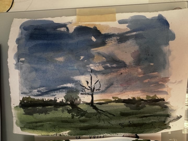
10. Approaching Storm Sky: All right, last sky here
and then we'll move on. I think this will give
you a good variety of what you can do here. Another large cumulus cloud. But I'm going to do is more of a gray,
thunderous, ominous cloud. Again, a low horizon
here down there. I'll just pre wet the paper. What I'm going to do
is a quick glaze. I had a little more color on
it than I thought it would. All right though, I'm
going to do a glaze first. This will be multiple layers. This one will have
a very light blue. I'll use turquoise
and cerulean first. I'm going to do that up in here, then maybe a little bit more, just down in here. Okay, now again, very wet. I overwet that a little bit. I didn't want to go
that wet, but I did. Now I'm just going
to let this bleed out or dry out rather, and then just let these colors
blend and do their thing. Now before I do, I'm going to take another clean
paper towel here. Just create a little, a white cloud coming in here. And then I'll do the same
thing right near the horizon, right in there. Okay? All right. So again, we'll
let this completely dry. This one started
out as an accident. I made a mistake of wetting
the paper a little too much, but I kept going
with the idea of painting the sky that has this
impending storm moving in. Once I got these washes in and remove some of
it to get these clouds, cumulus clouds floating
in the air there. I wanted it to dry because
I wanted this to mingle and get a layer where I can come back over
it and add another one. As I look at this, there's
tons of accidents. We've got these
water spots here, a little cole flowering, you can see it right there. And not exactly what I
envision in the beginning. And again, making
that mistake of overwetting it, set things up. But this is the nature
of watercolor painting. You're going to have situations
like this where things didn't quite start
out in the middle. There are certain things
that happen that, where the medium just got away
from you and that's fine. The key is to recognize it, back off of it and come back
and like I see this stuff, I mean, that's all
things we can work with, with watercolor painting. You're always going to
have situations like this. It's just par for the course. Don't throw things away or make a decision to disregard it
or put it in the trash bin, because a good watercolor
artist will work with mistakes. They know how to
not get flustered, when to back away, and how to make these
things into something. Because watercolor is
an imperfect medium. If you try to paint photo realistic stuff with
water color, in my opinion, it just doesn't capture what the medium is
really good at. I think it's a medium that is designed for quick painting, for imperfections, mingling with areas where
your subject is visible, and that's the charm of it. Okay, I just wanted
to point that out. So I've got my Mr. bottle here. And again this is
completely dry. So what I will do is just give it a little
squirt. Okay. Not much. Just a few there.
And that's going to reintroduce the
moisture on the paper. I've got my large mop brush here and what I'll do is a mix up what I have on
the palette already. It's pale gray. I'm going to do some clouds drifting along in
the horizon here. These clouds are really
far away from us to see. Hard to see so much
but they're very pale. I'm going to take
small round here, just feather the edges, blot these out a little
bit because typically that's what we would
see in distant clouds. Then I can drop a little bit, maybe in the bellies of them, just to get that three
dimensional look. Again, just some
clouds drifting there. And I can also take
and put a few of these up and here like
that, just a few, maybe even some that
straddle the white of the paper there or
the white cloud and the blue cloud that's not bad, can even blot out some of those and maybe do
one more like that. Okay, now I'll take the same
color and then we'll do this storm that's moving in from this area
very low in the sky. I don't want to put
it way up here, I'll keep it down in here. That's going to be
the lighter value. Again, just all using that same premix that
I did of the gray. Now I'll get something thicker. Okay. If we did that
finger test on this, it would be a lot thicker
than what I used. Now I've got that gone, but what I will do first is I'm going to put a little
touch of orange maybe is picking up a
little bit of light from the sun towards
the top of this cloud. Maybe a little more red. I can do maybe
something like this, Again, dropping some
color in there. I can even take an area and
go a little bit thicker, just adding a little
bit thicker color. And here now, taking my big brush into
these darker grays, maybe a little bit of
umber in there as well. I want this fairly thick. Now you get again,
one pass at this. I'm going to put a little
bit of red in it too. We don't want to mess around with a color
that's not going to work. Joining in the joining to this wet stuff
that I've already put down that's obviously bleed
and blend and all that stuff. I can take that.
I'll remove some of that paint now and we can just tap some of that into
these clouds in here. Had to find my pointed round. So I'll clean it
off really good. Remove that excess water
and now soften those edges. Okay, I think this is interesting technique,
multiple layers. Obviously a little more
advanced than what we've done, but what I love
about it is we had an opportunity to see what it's like to work
with those mistakes. Before I get into just adding a little
bit of land mass there, I'm just going to
clean my brush, remove the excess water, just some of the darker colors in here just to get a
little more dimension. To the clouds and then I can even take a
little bit of water here. Maybe just to soften
that edge a little bit. That's fine for the sky now, just a little bit
of land in here. Something to finish this off. I'll go with some of these
grays that I've already got. That's fine. I don't need
to mix a brand new color. If I did that, then
it'll get too colorful. It really just needs
to stay where it's at. In terms of palette, I've got all the colors
I need on there. I just need to hint and
suggests some detail. We'll do the same
thing, We'll just, let's see, I know
all of this is wet, but it's drying really fast. So I'll just do some trees, maybe a very rural landscape, we can touch it into
that wetness right now. It's not going to hurt
something like that. It's good to, I think, go over the trees because
it creates the clouds, Because it layers, you have that feeling that the land is in front
of the clouds, it looks really cool. Again, maybe a few little
sticks, tall trees, dead trees, whatever,
something like that. I think a really good
lesson here again, started out as a want want. But I think if you just take your time, well, first of all, you have to acknowledge that and accept that water color
is going to do this to you. Again, imperfect medium. You just have to
know when to say, okay, I can back away from that. I can back away from it now and let it dry
and do a thing, and then come back
and salvage it. That's totally within the
possibilities of water color. Now, you always going
to win at that game, but I think you can give
yourself a good chance. I can just add maybe a touch of a different gray in here just to mix it up. Something like that. Anyway, I didn't really
do a good job of giving you a clear
idea of my colors, but I think we got some really good other tips
for this one that'll do it.
11. Nocturnal Sky: All right, let's go sky
crazy one more time here and we'll do a nocturnal scene. Maybe a little bit
of a moon light or something like
that out there. Really interesting sky to do. You don't often
paint night scenes, but for some of you that
may be curious about it, I thought it'd be interesting
to put this in here. Let's go ahead and again, we'll just a hint at some hill bushes or trees,
something like that. The moon will be
in here somewhere. All right, so as
you can imagine, a night scene is going
to have dark values. Let's start there. I've got some
leftover paint here. Before I get ahead of myself, let me, I'll just wet
everything for now. Again, don't go too much here. If you go too much when you
start putting your wash down, you're going to be
so excited to do the next stage and it's
going to be too wet. If you're using 140
pounds cold press, usually one good pass with a decent size
brush will do it. Sometimes you may have to. I'll do one more just given that a second
just to soak in. If you wait too long, then it's not like thick paper. You don't have to wet it again, so it's not going
to hold too much because the paper
is not that thick. Now, I want to put
some color in this, but it doesn't need
to be a lot of color. Let's think about
maybe some orange, a little bit of this pinkish, Maybe some violets,
Something along those lines. I think I've got this
little moon here. I need to consider that. Maybe what I'll do first is just take some of these grays
that are on the palette. Just tent it so that I
don't have any issues with a bright white
circle in the piece. That's probably all
it needs to be. Again, knocks it
back a little bit. Now we can start to think
about the next stage. Typically you want to
work light to dark. There's going to be
multiple layers here. Everything is going to
be working wet into wet. I'm thinking with this
pinkish color first. As you know, this crimson
makes a lovely pink, but that's way too
much for a night sky. You go putting that
color down and it's going to be
way too intense. You're not going to get those
intense colors at night. Let's take a little
bit of violet. A little more of this, maybe. Let's even take some of this
red and go into it here. I'm going to even take
a little bit of Uber. We want that pinkish glow, but it has to be knocked back enough to
make it look okay. Something like that
I think will work. I'll go around the moon here, but you have to remember
things are going to bleed. Just give it enough space
there to allow it to bleed. I can even go right over this land mass here,
and that's fine. I'll take a little tissue here, ball it up, and just hollow
that moon out a little bit. It doesn't need to
be a tight circle. Okay, now let's go with
some orange into this. Again, we're starting with this color that's going
to draw a lot lighter, but we're going to start putting some darker values into it. Let's go with this
red, this yellow, to create the orange Now, because I already had
this color into it. It's not going to be intense because it's going
to mix with that. I can go ahead and take that right into the landscape
there. Just like that. I'll dry this off.
Clean it, dry it off. Now, I want some violet colors. I'll get into crimson. We'll get into our blues. And that's okay. I was a
little bit sloppy there, but it's not going
to hurt us too much. I'm going to take a little
bit of umber in that, just to gray it
out a little bit. I think something like that
should work pretty good. I'm going to go a little more blue though. Let's try that. We can start to put this right over into what we already have. Basically maybe working it again. I'll touch that color in there. I can go a little bit thicker, same colors, maybe getting a little bit too brown
and muddy there. I'll just go one more pass
and here now I'm going to wet my brush here that's a
little bit too white. I'll just put that
water in there. And what that water is
going to do is make a conduit for these other
colors to bleed into it. I've got some grays
down here as well, so I can take some of these
grays and just drop in there just to diffuse
that moon a little bit. That's looking pretty good now. I just really need to do this land mass,
whatever I put there. But I'm going to dry this off. And when it's dry,
I'll come right back. All right, so everything's
looking good. You see all that moon, as the paper doesn't
like jump out at you, I think that would
be like probably the most common mistake
an artist would make. The moon's white, so
they leave it white. Let's go with some violets here. Just a little bit
darker than what we've got down in here anyway, But not too dark. It's not going to you don't
want to stand out too much. I'll actually, I'll
just use this. I'm going to use the side
of my brush and just get in maybe a little tree shape
or something like that. We can drop a little bit more
color into a few places. But again, you're not
going to have a lot of definition this time of day. Don't try to force
it. There you go. I think something like
that is effective. I can remove even some of this just to give
it some variation, soften it up, and that'll do it really a
very limited palette here. Darker values, obviously, because of the
nature of the scene, you have another sky
there at your fingertips. Obviously you can
explore colors. Do that thing on your own. It's up to you to take
this idea and run with it. Just giving you some
of the general basics, the guidelines, the inspiration, maybe to do that. All right, that's that.
12. Master's Sky Examples: Congratulations on
making it this far, but we have a lot
more ground to cover. But before we get into other landscape elements
such as grass, rocks, water, and so on, I wanted
to pause right here and let's have a look at
some of the Master's works. We're going to explore Edward Sego and John
Singer Sargent, two very famous
watercolor artists that probably use very similar techniques that I've
shared with you. In this class, we will
look at their gradations, their variegated skies, and then also how they use
warm and cool colors. Then we'll explore
some techniques that are very unique
to their approach. Things that I haven't
shared with you, so you get a really good idea on the options and the
different techniques you can use to paint skies. It's really unlimited. If you take ten
different classes for painting
watercolor, landscapes, you'll probably have
a lot of ideas that each teacher has used
or uses in their work. And they're just simply
sharing those things with you. So it's important to get these different
ideas and to explore these different techniques
and to try them. And some of these will speak to you, you'll relate to them. And they'll start to make their way into your watercolor art
without any further ado. Let's have a look
at the Masters and I'll see you guys in
the next section. Enjoy. All right, I believe this is a John Singer Sergeant, We can appreciate his lovely
touch for water color. Just an amazing artist to, but let's not focus on
anything but the sky. We can see, it's pretty clear. There's just a simple
gradation going on. That gradation working
from top to bottom, probably just use a little
cerulean or co ball blue. I'm not sure even what
they had back in that day. It could possibly even have
gone in to a wet surface. Maybe pre wet the
paper, put it in. But you can tell in this area, the gradation or the
blue was applied. Maybe even where we see
this stuff in here here. Maybe went in with a damp
brush and just use it to just streak it in
there to break up the flatness of the wash. Yeah, that's just again, an
example of how some of the techniques we've talked
about were probably used. And let's go on to the next one. Another Sergeant here,
just his cloud study. Obviously a lot more
went into this one. Probably you could
easily say these blues, I'll go around these here. All of this stuff probably was some negative space
painting going on, I would say with
something like this. Because water color,
you can't really layer light over dark values like you can with acrylics and oils. We're dealing with
transparent color. Perhaps they're using the
white of the paper and here applied some grays in
this area, different areas. Look at these warm grays too. This is what I was
talking about earlier. Like when you look at the sky, it's not just the
flat grays like this, you're actually getting
these warm grays as well. Look at these really cool grays. All right. Good variety that's a little bit cooler
scot a little more blue in it. But a really good variety
of grays in that. Had he only used one color like this gray
here on the entire, for all of this
white cloud area, then it wouldn't have
had the same effects. That combination of
using the muted, just say just gray, then the warm grays in there, along with the cool grays. Then over top of that, we can see some of these blues that were probably applied. If I squint down or maybe
what we can do is take this, scale it here, I
don't want that. I'll try to add a. A layer over top of it. Let me see if I can make it
black and white. There we go. Looking at this at a
black and white scale, this blue, let me
get that layer. We can see this cool gray is, this is a darker value, this is a darker value. All of this right in there and here. So those are your darker
values that probably were, was used or applied later
in the game to sort of silhouette some of
those white clouds. Use some of these warm grays. And here some of
these cool gray, probably this is
roughly the same value. This color and this blue
are the same value. But anyway, just trying to
analyze a little bit of the techniques that were he
did some drawing in here too, We can see the curvy
strokes that were done with a really small brush to
indicate some clouds, the fluffiness we get and
feel and see what the clouds. But you added some
brush technique, brush strokes that
were very much as if he had a pencil in his hand and he was just
basically drawing the clouds. But anyhow, another
cloud study by Sergeant. Let's take the same
idea and let's gray scale that we turn that on. Just paying attention
to the clouds, we can see these darker
masses and here, look how this is. Then some of the
grays down here. Even though we have
that same idea of these grays and these darker
values, this trumps it. Things get a little bit
lighter as they go back, and that creates that
illusion of depth. Okay, let me turn this off. So if we look or analyze
this using again, the warm look at, you can really see
these curvy strokes where the artist is basically just sketching
with the brush here, just drawing clouds
in and trying to get the curvature nature of
some of the edge quality. But yeah, you can probably say this color
here, these white, these grays were
added in there first, reserving some even looks to me it's hard to say because
you just don't know. With these older images, the photo was taken. It was probably reproduced and
reproduced and reproduced. But when we look right in here, see the white of the paper. I would probably
gather to say that's probably the white of
the paper that was left. Maybe this is the white
of the paper again, that's just he could've taken a really light warm value or just barely
anything at all and toned it and then
came back over it and started adding these very
subtle warm and cool grays. Again, we've got, we've got some warmth over here
mixed with some cool. We got the reddish grays. I think this is
interesting to see those red grays in this, with the blue grays that a common issue I
see with artists. They tend to only use
one temperature of gray. They don't even
really think about if it's more of a blue, a cool gray or a warm gray. But having that mixture
in there really makes a big difference.
A combination. But yeah, I mean, I
would probably say maybe these clouds were
painted initially, these white clouds
with those warms and cools and came back in. This is all wet and wet in here. You can tell by
that edge quality. That's all you put
in, Wet and wet. We've got wet and
wet going in here. Probably mixing, some warm gray, some darker, cool gray, letting those blend and
bleed into each other. Then we've got some
hard edges too. You can see these
hard edges in here. Definitely some strokes were added to this that were
on dry paper as well. But technique mixed
with a little bit of dry got a lot of hard
edges down in here. Just using a
combination of the two. Again, just analyzing
this stuff and trying to pick out some things
we've talked about so far, and I think that's a pretty
good one there to work with. It's got a lot of nice qualities to it and
things we've talked about. Let's do one more here
and then we'll pause it, maybe go to video two. A very simple sky here,
gorgeous painting. This is Edward Sego, love it. Look at those beautiful, hard and soft edges. Such a great example to me of the essence of water color and really
what the medium is. So good at random painting. Just letting the colors
bleed and blend. A little splash here, a little splash there, And I know I'm getting
way ahead of myself here, but really to me, it just captures not
only the scene but just the medium in such a
charming way, beautiful piece. But if you look at the sky here, it's pretty easy to say. That's just a simple gradation Look how much blue
green is in that too. A lot of green blue in that sky. And again, as that
fades down in here, away from us and
distance it pales. That's just a simple
gradation really. I don't even see any
yellow in the sky as like just pre wet And then a
little gradation there. This really light blue, green, very weak to the sky. But obviously the
artist didn't want to put a lot of impact in the sky because this is where the artist wants
you to look, right there. Imagine if we had a bunch of
clouds in here everywhere, then it becomes very busy. You don't know what to look at, but we'll talk about
that stuff later on. But anyway, another thing I'd point out about this
would probably, I don't think I'm going
out on a limb here, but if you really look at these little white
specks in there, that's the texture of the paper. I would probably say the
artist mix the paint up for the sky and probably didn't
even pre wet the paper. Because if you pre
wet the paper, you're not going to get a lot
of these little freckles, you're not going to see a
lot of this texture at all. So probably just applied
it right to the paper. And then maybe once
it got down in here, maybe just used a brush
that was just wet, no color at all, just water, and just smoothed it
out a little bit. But I would probably say that's a technique
that was used on that. Let's pause it right here
and then we'll come back and look at a few more of
these masters examples. All right, in this example,
more sophisticated sky. Here we can see the gradation happening of
the very cool gray blues. Down to these subtle,
subtle yellows. You'd probably say that stage
one was a variegated sky, so we've got that
variegated sky. And two, it looks to me like the majority
of that was wet or dry. This stage one, stage one
was allowed to dry and then came back over it with
these grays to get that the lower level
of clouds in it. And then once this was
applied, stage two, which was just the gray
cumulus clouds here, this was worked wet and wet. It was applied over the
dry variegated sky. But then once these
grays were applied, you can see this
right through here, how he probably went back in there just with a damp
brush or something and just do it in there a little bit
just to loosen it up. Then back here is
the same thing, because look at all
these edge qualities, how tight and stiff
those edges are. They're not soft at all. Look at that hard
edge right there. A erase that so
you can see them. That tells you it was
put on a dry surface. You can't get that
result on a wet surface, painting wet and wet. But this was applied dry. And the same thing, probably
clean the brush really good and then just dropped it in here and maybe
ruffled up a few edges. The artists really used the texture of the
paper all in here, see all these little dots
to make the clouds look fuzzy as opposed
to like right in here where you get
that brush stroke that just probably
applied slow and heavy, maybe going, you don't
get that texture of the paper here was probably
put on a little bit quicker. So you're getting that texture, it really makes the edge quality
of the cloud less stiff. It makes it fuzzy, similar to a button wet. But all of this here is probably
him just going back into it with just a damp brush. Now, the last thing
I'll point out here is look at the value shift. Look at the value shift from dark to light, okay? These grays in here, look how much lighter
they are than that. That's pretty clear to see that this down here is probably
half the value of that. Had you put these really
dark clouds down here that were similar to this
value, it would throw it off. You wouldn't have
the same feeling of depth in the landscape. It's a simple cloud,
simple cloud formation. I think the techniques
are fairly simple, but the execution is brilliant. It's just real crisp. You put it down, you leave it
alone. That's water color. When you can have
that effortless look. I think it's just done, It's probably thought about
in advance like, okay, I'm going to
do a variegated sky. Let it wash, come
back over it, boom. Get my gray clouds in there, dark then to light, and then maybe loosen
it up a little bit. With a wet brush, you get in, you get out, and you
get on down the road. I think Sg is a master of that. Just some beautiful work. It's got detail to it,
but when you look at it, the detail is just
nothing more than just real loose, quick,
playful strokes. And it's just done. The
timing of everything and the control over the color and stuff like that is brilliant. But let's look at
another one here. Again, I picked Seg and Sergeant for this
first round here. I think both of them are just really good examples of some of the masters
watercolor art. And we can just
really take a lot from what these artists did, but for this round, that's
what we're sticking with here. Look at what we got. Very similar situation. This painting rather went
with more of these blues, very light in value. Again, these little
pigment at all down here, I would say same
thing, stage one, I'll just put a variegated
VAR, and just stop there. Then dry, right? Let it dry 100%
come back over it. I would even say we've
got three layers. Okay, layer two is probably
this layer right here. It's warm grade to it. We get a little more
yellows up here in it. We've got some
yellow here as well. It's like that
pattern of yellow is just hitting these fingers
of the clouds in here. Yeah, that's a
little bit darker. Stage two were these this cloud, say warm clouds and
then layer three. And that was allowed to dry. Same thing, that was allowed to dry and then
we came back over it. And you can tell by, again, look at the brush
stroke quality. Look at the edge quality
of all of this stuff. Those are brush edges that you wouldn't
be able to see if. It was painted wet into wet. All of that was allowed to dry. I don't really see
much evidence of the artist even going back in. And this is just
another warm but darker variety of the sky, the same color as this up here. Stage two is just a
little bit darker, maybe added a little
more gray to it. You almost see a hint of green in here, like
a earthy green. But when you have a few water
marks like this right here, this ballooning right in here, I think that's where this
was applied in here. And then maybe this stroke
was applied and they merged into each other and it
just bleeded down into it. But yeah, again, working with the
same idea, same techniques, but this particular version, there was just not much wet and wet other than when
a layer was applied. But as the layers were
stacked on top of each other, they were done over a dry layer. Anyway, Let's move
on to the next one. Looking at this, we've got a lot of negative space
painting happening here. Probably all of this stuff
in here, white of the paper. So you can imagine stage one, look how warm that is to really look at that
one color right there. Probably a little bit of red, maybe even a little burnt sienna mixed in with just
a lot of water. And that was probably
just stained a little bit towards the bottom because
this is all fairly white. But yeah, you just got the stage one is a light wash, right? Some warm notes in there that was probably
allowed to dry. Because when I look at this, all of these marks that are
sitting on top of that, that again, is dry. The artist tends to let a
layer will apply a layer, let it dry and then goes back over it
with this next layer. Probably did all of
this stuff in here. The cool violet looking
colors look how lovely that violet color sits on top of these
creamy warm whites. Just really great
contrast there. It would look totally different. If this initial wash here was a cool color or
just muted gray, it would look totally
different because that's sitting on top of that
warm, white fluffy cloud. Those violet grays
are singing to you, but this has a
little more blue to it, right down in here. Who knows? That
probably could have gone down in here
for the next layer. I'll just say some cool
light blue violets. Then again, let it dry. Then on this third layer, we get these darker values. This is wet and wet. This layer here, that's
almost more of a warm violet. It's got a little more red
in it right here, layer two. But yeah, I was put
over it dry, faded out, and then dropping the
more blue violets into it while it was wet. We can see that edge
quality is softer. I will say darker violets. And a little, I'll just put in right here just a, just a little bit of that. Wet and wet for
darker note there. That was a cooler note too. Then lastly, this is
all negative space. Look at that dry, dry edge. That's all created
just with the brush. Okay, That's all brush strokes. That's all texture of
the paper right there. That's all negative space. And who knows, that
could have been done before all of this down in here, who knows if that's exact
steps that were taken. But obviously all of
these notes were added, these warm whites in here, and then allowed to
dry and then came back over it and really shaped
that cumulus cloud. But another lovely
piece right there, another lovely sky to look at. We'll do one more
very similar scot to what we've already seen. But we got the gradation from blue to warm, allowed to dry. Then when we look
at these colors, even though we're just seeing these smoky grays
down to the browns, I would probably say that those browns on top
are a little bit darker. And they are, if I just did
a black and white there, we can see that up
here, it's darker. And then as stripes move down, they get lighter in value. Again, capturing depth
in the landscape. Even though those
notes are warmer, they almost like is that darker? But because these
are darker here, these are a little
bit lighter in value. That creates depth,
that creates distance. Everything that's happening
up here in the sky is to you as we get back
in here is farther away. Again, dry and dry, variegated wash allowed to dry. And these are just like quick horizontal
stripes going across to create that illusion of just some rows of cumulus
skies that are going across. But a very warm sky feels like it's the
middle of August there. It has that summer feel to
it. Anyway, that's that.
13. Recap & Projects: Congratulations on
finishing the class. Now you have a better
foundation for Butter Color Landscape
Skies, a reminder, this is just part one of what will be an
ongoing series for Butter Color Landscapes and part two which will
be coming soon. We will look at trees. Now be sure to
upload your project. There's a section for
the project where you can share any images, thoughts, things like that, that you have created and
perhaps have from the course. I would love to see your work. I will often check the
skill share projects, see what you're doing,
answer any questions. And even perhaps I give you some advice if in fact
you're asking for it. Okay, thanks again for
checking out the class. I appreciate your support and hopefully I'll
see you next one.
 ROBERT JOYNER, Make Art Fun