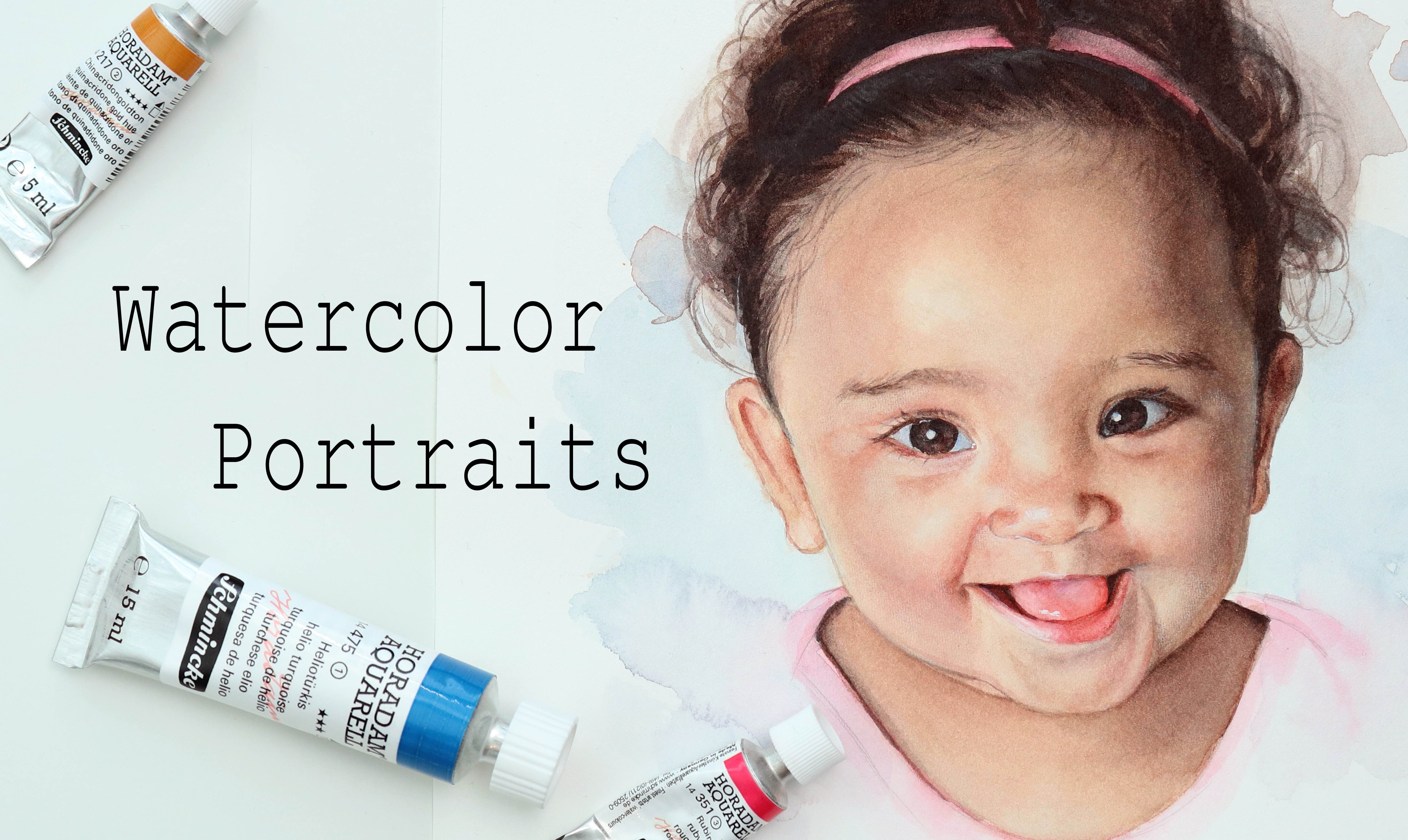
Transcripts
1. Intro: [MUSIC] Portraits have always been one of my favorite
subjects to draw and paint. Whether your goal is
to just create and keep them for yourself to enjoy, to do commissions, or to make beautiful
personalized gifts, the ability and the process that goes into taking a blank page, making your sketch and
rendering that into a fully formed face
is always exciting. The ability to draw
or paint what you see is such a great
fundamental skill to have, which can really help you
in your creative process. Hey there, my name is Tanya. I'm an artist based in Denmark. In this class, we're
going to practice sketching a portrait
from reference. I will briefly touch on some basics in
regards to anatomy. We'll be doing some
different exercises, and I'll take you through three different approaches to freehand drawing
from references. You can try out and practice different techniques
and find and combine one works for you. Even though where
we want to focus on and practice is the outline, which is going to
serve as a base for a watercolor portrait or for any other medium of
your choice, of course. We are also going to finish off with a more detailed study. What I want you to take
from this class, hopefully, some tools to help you
improve and be more confident when sketching
faces from a reference. This is a second class in my
watercolor portrait series. But whether you're interested in watercolor portraits
or just want to join me for
sketching some faces, let's jump right into
it and get started.
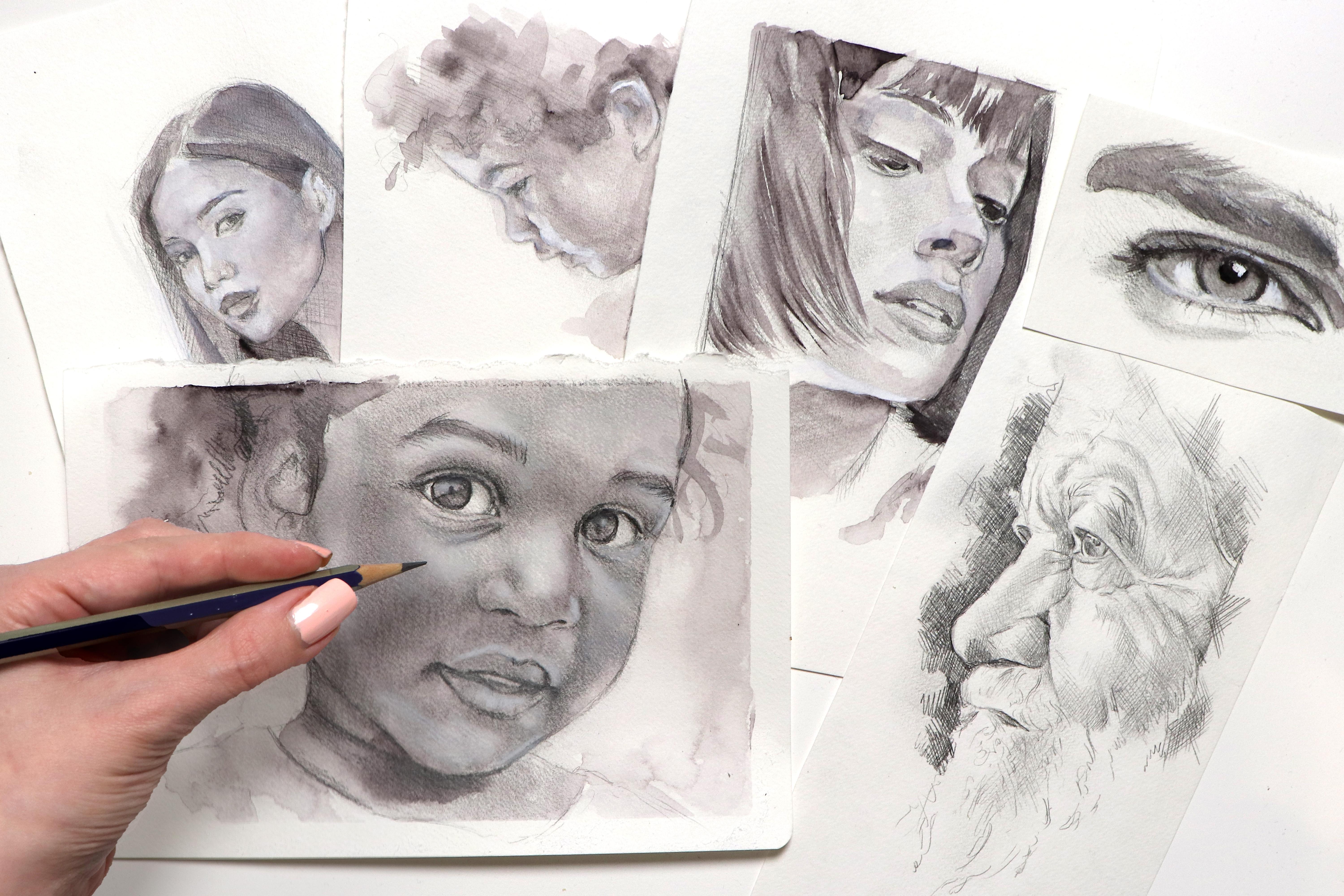
2. Supplies: We just going to
quickly take a look at the supplies of materials
we'll be using. [MUSIC]. The minimum you'll
want for this class is a pencil and eraser
and some paper. Anything else is optional. I'm using two pencils. I'm using a 0.2
mechanical pencil. This is just my favorite pencil for sketching and then I'm using a B pencil
from Faber-Castell. Nothing special
really but because the paper I'm going to be
sketching on is textured. For some of it, I am using this pencil instead because
it works down-weight. Tiny, tiny mechanical
pencil very quickly. As for erasers, I'm using this normal
standard eraser. I'm using the eraser on
my mechanical pencil. I'm also using a kneaded eraser. You can use any eraser you want, but if you do have
a kneaded eraser, I do recommend using that. As for the paper, I'm using a fairly cheap
watercolor sketchbook. When I say watercolor,
it means yes, it does have some
textured paper that can hold at least a tiny amount
of watercolor and water. But it's really not suited
for heavy loads of water. So again, nothing
special, fairly standard. Together with my sketchbook, I'm also using these clips to just help hold down
some of the pages. This is mostly
because I'm filming, so not a necessity. I'm also going to be
using some watercolor just when I'm adding
some of the shading. I'm not using a palette,
I'm just going straight in with a brush
into this half-pan. But if you do want to bring a mixing palette of some sort, it is going to make
your life a bit easier. As for the watercolor, it doesn't really
matter what color you are using, but in my case, I'm using one by Schmincke
and it's their neutral tint. The brush I'm using is by Escoda and it's their
parallel lines, so it's a synthetic brush
and this is size number 10. It's not necessarily
a great brush for shading or soft shading, especially not on the paper
I'm going to be using. It just happens to be my
go-to sketchbook brush. With this, you'll also need
a cloth or some tissue for wiping your brushes and
of course, some water. To help hold down my paper
for the final study, I'm using some masking tape. Then for adding a
few highlights, I'm using gouache and a pastel
pencil. Let's get into it.
3. Basic anatomy: We're going to go over some of the basic anatomy and
proportions of the face. I've made this quick
doodle of the skull, which may not be the best skull, but it'll be okay for this. If you have your human head, the eyes are going to be
halfway down the face. There's going to be the width of an eye between the eyes, and depending on who you ask, somewhere between
half an eye and 1.5 eye to the edge of the face. About halfway down
between the eyes and the chin is where you'll
find the bottom of the nose. Then about halfway
between the nose and the chin is where the
mouth is going to be. The ears are going
to hit somewhere around the bottom
of the nose and between the eyes and
the eyebrows, roughly. The width of the nose
is going to be about the same width of an eye or
the space between the eyes. Now, these are
averages or estimates, there are general
guidelines for the anatomy. Keeping these in mind when sketching even from a reference, can help you place all the
different features faster, but it's important to note
that they are just guidelines. Not every face is going to
fit into these parameters. What they are good
for is quickly getting a basic head
down on your paper, especially if you're sketching
without a reference. You can start out with
the basic skull shape, add a centerline as well as the lines for the
eyes, nose, and mouth. Then begin building your
facial structure from that. But we're not going to do
a deep dive into sketching the human head from
our imagination and knowledge of anatomy, we're going to be
sketching from reference. Don't get me wrong, knowing your basic anatomy
and understanding the structure of
the human head in detail is a great tool
to have in your belt. But I'll show you why I'm not focusing on it in this class. Here's a gummy candy, I'll just do a quick sketch
of this, stay with me. It's just going to
be a quick doodle. For what it is, that's a pretty decent
sketch of this gummy. At least we can see what it is. Let's do another one but
from a different angle. But I'm going to leave
that gummy there. I'm trying to illustrate
a point, no pun intended. I was able to draw
that first gummy and I was looking
at my reference. I was drawing what I could see, but I didn't have a
reference for my second one. I was able to draw that one
because I at least have somewhat of an understanding
of the structure of it. Not going to lie, I've had a fair few of these
in my lifetime, but that's the difference
I'm trying to show you. I'm not denying the fact
that knowing anatomy is going to help you become better at drawing or painting, but you can draw something from a reference
by just looking at it and copying what you see without knowing
that much about it. Let's move on to doing some small sketches from reference.
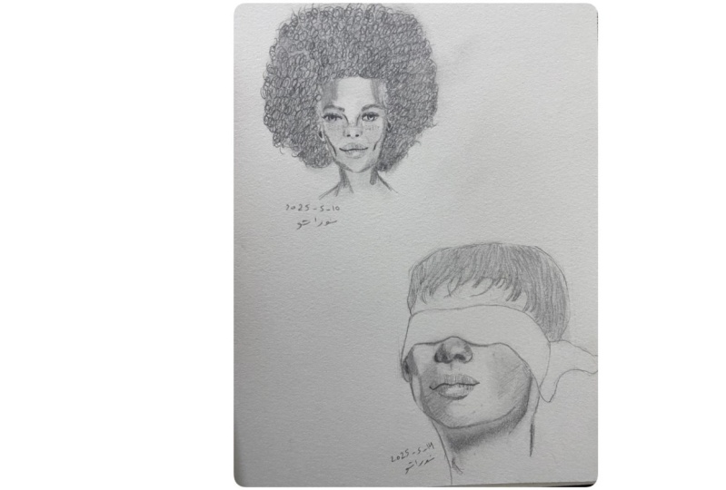
4. Sketching: Simple studies: We're going to do two quick sketch studies from reference. What I recommend is that you create the two sketches
following the references. If you are less confident when it comes to
sketching from reference, I recommend that you
come back after watching the class and sketch
them out again, but applying some
of the techniques I'll be talking about. The common thing no
matter the technique, is that you want to
simplify the subject. You want to look for those
larger shapes you see. For this one, what really
jumps out is the eyebrow. I'm going to start
out with that, which is a very boxy shape. Try and get down the
same curve and angles. [MUSIC] What I then see is that the eye
with the eyelid and the waterline is approximately the same thickness or height
as the eyebrow itself. I can also see that there's a small space between
the eyebrow and the eye. We going to roughly draw that
looking at the shape and the proportions of the eye and the eyebrow in
relation to each other. [MUSIC] If you're happy with the
sizes and rough shapes, you can then go back in
and define those lines. Try to really look at
your reference and follow along with those
curves and lines. [MUSIC] Sometimes it's helpful to just add some rough shading. As an example, I'm
doing some light scribbling near the corner
of the eyes to make that whitespace seamless
white because it doesn't really seem that big or bright
in the reference photo. Even though the white area may be the right size and shape, if you have that big white blob, it's going to dominate
your sketch a lot more than it's supposed to. Adding bad shading can
really help you better visualize where you need
to make some changes. [MUSIC] Because these lines aren't quite thick, I'm just going in with my kneaded eraser and lifting
off some of the graphite. [MUSIC] You've got the
main components in place. Now I can go in and
add some more detail. What we're focusing on in this class is the
outline which is just going to serve as the
base for our painting. You want to focus
in on every area. As an example,the waterline, you can see how right beneath the iris the waterline
is straight. Then as it moves to the left, it goes up near the corner
of the eye and on the right, it curves downward where
that tear duct is. [MUSIC] I'm still keeping
it fairly rough. These are just some
sketches to get started. But throughout the class, I'm hoping you'll learn
some new tips that'll help you improve
when drawing from reference. [MUSIC] Again, I'm just going
to clean up some of those lines and
then I'm going to go back in and enhance some
of the darkest areas. [MUSIC] We're going to be adding
some rough shading later, but for now, we're just
sticking to the outline. [MUSIC] [LAUGHTER] I'm just
adding some quick eyelashes here at the bottom because in the picture,
they're barely visible. You don't have to add them. If this was a sketch I was going to be using for
watercolor portrait, I most likely wouldn't. For this one, I'm really just doing it because
it looks pretty. [MUSIC] Next we're going to be making a sketch of
this cropped mouth and nose. Because it is cropped and having a floating tip of
a nose is awkward, I'm starting out by just
sketching out a square. Since the reference
is a square as well, we're just going to
try and approximately fit that into those parameters. I'm first adding a
vertical center line. This is just in order
to try and divide that reference into smaller
more manageable portions. Now we can also see that the mouth or that center
line of the mouth, is approximately at the
horizontal center lines. We're going to sketch that in, try to keep an eye on the
edges of the reference photo, as well as where that
line starts and ends. Then we're just going to add
a rough shape of the lips. I then added the very basic
shape for the nose again, looking at the distance from where the edges are to
where the nose begins, as well as down to the lips. Follow along more closely
with the curves you see. You want to really try and see it as simple lines and shapes rather than a finished
nose and lips, because all those details
can really throw you off. We're not trying to make
it look super realistic. We just want that outline. Just like I did with a
couple of areas for the eye, I decided to just go in with
some very rough shading. Just like with the eye, it's
just a better be able to see if what we've
drawn is correct. Do the same for the lips
following those curves. [MUSIC] Because it still
looks very empty at this point
compared to the eye, I just added that
shadow from under the bottom lip or at least
marked off where I wanted it, and gave him a few
stubbles as well. [MUSIC] I'm not at all being
accurate with these. I'm just trying to get them into approximately the right area. [MUSIC]
5. Sketching by blocking in: [MUSIC] For this first
method of sketching, we're going to simplify
the face similarly to what we did in the first
class in this series. The main difference is that
rather than starting out by following the angles and the
shape of the face itself, I'm starting out by
creating a circle and then building onto that to get the basic structure
for the head. Drawing that circle
first is going to give you a pretty accurate idea of where on your paper the head
or portrait is going to be. You can then add an
approximate placement for the ear, neck, and shoulders. This technique or
approach is also referred to as a block in. You're trying to block
in any major volume, shapes or things you
see on the face, and really simplifying it
to get the right angles and expression without
worrying about the details. You can then add the
shape for the hair and hairline which is going to complete the shape for the face. Even though we want to
try and draw what we see and follow along
those lines and angles, don't worry if it's not
completely accurate you can always go back and
forth and make adjustments. Next at three lines
which we're going to approximately
indicate where the eyes, nose, and mouth is going to be. No matter the angle of the
face you want to always keep these three lines
parallel to each other. Yet I want to be
careful about saying, because there's always going to be that one exception
where you have some skewed perspective
or something but usually these lines are
parallel to each other. At Arc the vertical line which is the center line for the face, I chose to give it
a slight curve to follow that shape of
the patch of the nose, but you don't have to do
this if you find it easier. Once you've broken
down the face into these more manageable sections, you can start placing
the features. Again, if you place them in the wrong spot or
they're slightly off, don't worry you can always go
ahead and make adjustments. You'll see that I
make adjustments to the eyes quite a few times. If you're having a hard
time placing the features, you may benefit from
combining this technique with some of the
other approaches I'm going to be showing you. I will be going more in depth
into stuff like angles. But one of the things
you can do is, imagine a straight line
going from certain places. Let's say the corner
of the eye and we're talking about the eye that
is closest to the camera. If you go in a straight
line from the corner of that eye down to
the tip of the chin, so you know that those two
are going to have to line up. If you then go in a
horizontal line from that same corner of
the eye and left. You'll get a better
understanding for where the other eye
is going to be. We can do the same with the nostril on that
same side of the face. If we go in a straight line up, you're going to hit just about the starting point
of her eyebrow. The more I do this and the
more you draw on sketch, the more this is
just going to become a natural habit for
your eye to look for these details and
angle points as I mentioned in the last class. [MUSIC] At this point I roughly put
in all my basic features, all on the main features, and all I'm doing from this
point on is just using my eyeballs to try and
see what I've done wrong or what I could improve. Just visually going
back and forth over each of the different
areas on the face, trying to see if they match up. Does she need her
jaw line to be more defined or does she need
a sharper cheekbone? I'm really just
continuing to make these adjustments until at some point I get to a place where I'm happy
with the lining work. [MUSIC] You can do this both vertically and horizontally or
different angles, and we're going to be
going more in depth with that in the next lesson. I'm going to speed up
the video some more just so that it's not as repetitive. Because we've got
to be honest here, there's really not
that much happening. Just because I'm not really
doing a lot to check that what I've put down
on my paper is accurate in regards
to the reference. The goal for these sketches in these next few lessons is not necessarily to make them look as close to the
references as we possibly can and you'll see that
mine in this case doesn't. Now, there's not technically
anything wrong with it, the features are on the
right places but I'm still leaving out a lot
of the information. I'm not adding the proper
shading near her eyelid or her cheekbones or her jaw
line or anywhere else. In this case, that's
not a bad thing because what we want
to get from this is an outline that we could then use to work on if we were
to paint a portrait. But it's important to note
that even if you have the most accurate
starting points. If you have the exact
outline of your reference, if you're not putting down the correct shading that
outline is not always enough to accurately portray the person you are
drawing or painting. But one step at a time, we're going to go into more details about that
later in the class. I've already said this
but it really is true. The more you sketch
and the more you draw, the better, faster and more
confident you'll become. You'll get not only
an eye for picking up or better picking up visual
detail and information, but you're also feeding and
training your muscle memory. [MUSIC] I'm going to let you
in on a secret out of all the techniques or approaches I'm going
to be showing you, this is the last one I filmed. Is that important? No, not necessarily, but I'm telling you this because what I'm going
to be saying next, I already said in what to you is going to be the
next part of the class. Please forgive me. But what I'm doing next is just adding in, a gouache of some watercolor. There's not really any right
or wrong way of doing this. I'm not focusing on the
details and I'm not trying to really make it look like
that preference necessarily. All I'm doing is just make the sketch look a
bit less naked. So it's not unnecessary step, it's just for aesthetic reasons. I think this looks a bit better. You'll see when we get to that, I'm adding watercolor and
gouache to all the sketches. The only reason why
I'm not explaining this in more detail at this stage is because we'll be practicing adding shading
later in the class. [MUSIC]
6. Sketching using angles: [MUSIC] I found this
striking image of a child. Even though we're not
going to do justice by getting into all the
details and shading, I chose this image
because it has some very clear angles here for the outer shape or
frame of the face, which will be perfect
for this exercise since this is about
lines and angles. Begin by drawing a line
for the front of the face. Throughout this
exercise, you want to really try and focus on getting not only the angles
you see in the reference, but also the length
of the lines, as well as the shapes
that are formed by these lines that we
put down on our paper. One simple way to check if
you've got the angle just right is to take your pencil and compare your sketch
to your reference. I won't be doing this
throughout the lesson, but you can do this as frequently as you want
or feel then need to. The next couple
of clear lines we see down here at the jaw line. Try to get those in as well. Again, you want to focus
not only on the angles, but also the length
of the lines in relation to each
other [LAUGHTER]. I am aware of that
at this point, it looks on cameras
if the jaw line I drew is not quite
at the right angle. The sketch book and
the tablet I was using fulfilling were at
slightly different angles. It doesn't really help
that in the reference, it has some shading
on the right side of that line near the neck, which makes it look more
slanted than it actually is. What you see may look slightly off in these first few clips, but I'll be comparing
the sketch to the reference at the
end of this lesson. Hopefully, you'll be able to
see that it does line up. Next, you can go across
the top and get some of those lines from the hair
and ear onto your paper. We're going to make adjustments. This is just to get an idea of the placement of everything. Another way you can use
lines and angles is to find the placement of
different features on what areas on the face. As an example here, if we go in a straight line from the tip of the chin and up, we'll hit this curl
right at the ear. We know that quantum
section of hair is going to be somewhere
around this area. You can also see that there's this shadow line, again going from that
same point on the chin, following parallel
to the jaw line and up towards the
back of the head. We can see that the ear needs to touch almost slightly
overlap that shadow line. Using that information, we're
just going to go in and make an approximate
placement of the ear. From here, we can
start sketching the hairline here on
the back of the head, which comes down from that
top corner of the ear. I'm still keeping an eye on the angles and the
length of those lines. This will give us
an idea of where the neck is going to be as well. Once again, you can
always make adjustments, so don't worry too much
if what you're putting down on the paper
is not quite right. This is just an exercise. As with everything, practicing will make you much
stronger at it. If we then go in a
straight line from the other corner of
the same section of hair that we were
looking at before, we can see that this
is going to hit the curve right below the
bottom lip and above the chin. The corner next to it just about lines up with the
corner of the mouth. For each of these
lines I'm drawing for the nose, lips, chin, etc, I'm trying to copy the angles and shapes I
see in the reference. Near the top of the
bridge of the nose, we can see that it curves in from that original
line we put down. We can see that the
forehead needs to curve out a bit more from that line
compared to the chin. At this point, we can
begin looking for shapes, lines, and angles
within the face. The light forms this triangular shaped near at
the top of the face where the eye is and then it curves down and hits the
tip of the chin. Then there's this
outline from the cheek, which starts at the chin, try to get the starting
point or placement to match the reference and then
follow the shape you see, which we can tell
needs to pass just about where the corner
of the mouth this and then go up to form
the side of the nose or nostril casing [LAUGHTER]. My anatomy turns on
point as you can tell. I know, I apologize. Now that we've got a lot
of the features in place, we can start looking at the eye and we can tell
that we need to go up in just about a straight line from
the tip of the nose. Then it should be in this area. I'm pretty happy with
the placement of everything on the
front of the face. Now it's just a matter of
making some role adjustments. We're going to use the
eyebrow to check the ear, which we've roughly
put in before. We're going to look
at the angle and we can tell that the ear
needs to be moved up. Now the hair is no longer lining up
with that shadow line, which we know it has to
touch or slightly overlap. You also need to move the
ear just a bit to the right. With that, we need to now also
move that hairline behind the ear to line up with new placement as well as
the line for the neck. You can make as many
adjustments as you want on it. But from here, we just going to go over everything and
clean it up a bit. I chose to also go in
with some rough shading, some watercolor and
quash just to have some base and to make the
sketch look less naked. This is just very
quick and rough. If you were to use this
sketch for a portrait, you'll only need that outline. That's also one not going in depth with explaining
what I'm doing here because we will be doing a closer study of one of the
sketches later in the class. Although this exercise
is really useful for getting everything
in the right places, it's also important to note that everyone has their
own preferences when drawing and sketching. This technique may
not be for you. You can take this
approach to sketching portraits and use it on its own, or you can use it in combination
with other techniques. These exercises are all about showing you and for you to
try out different techniques so you can find what works
or doesn't work for you [MUSIC]. If we quickly compare the
sketch to the reference, we can see that the outline is about where we'd like it to be.
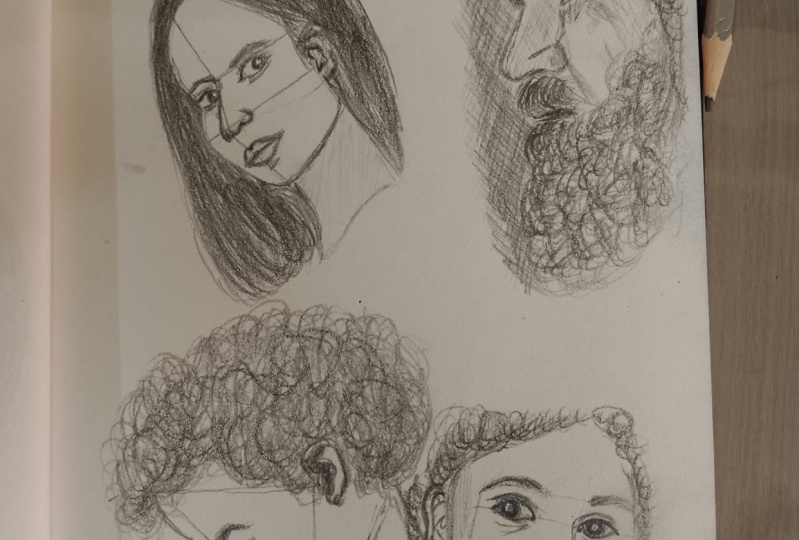
7. Sketching using shapes: [MUSIC] For this third
technique we'll be looking at, we're going to look
for smaller shapes within the face,
hair and background. I chose this
reference because of the crop framing of the
face which is going to work really well for demonstrating exactly
what we're doing. We're going to
start off by adding these lines on walls that resemble the outer shape and framing for our reference photo. [MUSIC] Once you have a frame, begin looking for and plopping
in the shapes you see. Of course we'll inevitably look at the lines
and ankles as well, but try to focus on
the individual shapes. Follow the curves
you see and look at the distance between
each of the shapes. As an example, at the very top, I can tell that the potting
where the site of the banks are is about at the central
line off our image. We can use that information
as a starting point. Then try to draw the
rough shape of the banks, followed by the shape
which is the space between the banks and
the rest of the hair. Then add in the hair
that's coming in from the side and crossing
over the face. [MUSIC] Sketch out the outer shape and contour of the face. When doing this, I'm not only
looking at the face itself, but I'm also focusing on the
negative space to the right. That would be the hair because that shape on the
right side is smaller, so it may be easier to
judge the size and shape of that one rather than judging the size and the shape
of the entire face, which is arguably the
largest shape in our image. You can divide each
section of your reference into as many shapes as
you want and you can sketch out these shapes to
really help you map out the face in as much detail
as you want as well. [MUSIC] I'm adding
those horizontal lines for the eyes and the nose using the shapes we've
already put down as a guide. That will be the corner where the two sections of hair meet, as well as her cheekbone. The mark I made at the bottom is just to roughly get an idea of the size and rounded shape of the chin and shading
in this area. [MUSIC] At this point, I could tell that
the left section of hair appear at a bit too long and skinny
so I shortened it, which meant that I then also had to shorten the face itself. [MUSIC] Near her jaw line
I decided to draw a triangle before
adding the line that separates her neck
into that highlight on one side and the
shadow on the other. That triangle is another one
of those small shapes I see. I'm adding that to help
better understand the size, ankles, and overall shape of
this area of the portrait. [MUSIC] Next, we can begin
working on the features. The main shape for the nose
or the tip of the nose is very visibly in this
image at triangle. When adding the
bridge of the nose, I'm again looking at not only
the line and angle up this, but I'm paying attention
to that smaller closed in area on the
right side of the face, which is going to help me see if what I'm drawing is accurate. As I mentioned, you can
divide the face into as many small
sections as you want. As an example, if you look at the reference on the screen, you could divide the face into
these much smaller shapes. Drawing a small
triangle for the bridge of the nose or the
side of the nose. On looking at the
shape of the cheek as an individual block comes
to make such a difference. Because you're taking a
fairly complex subject and really breaking it down
into bite-sized portions. For around the eyes and mouth, the shapes we see a really
created by the shading. Just like with all the
sketching techniques, it's okay if your first
lines are not accurate, you can always make adjustments. The whole idea of sketching is to practice and to be able to make and fix mistakes
before you move onto the next steps
in the process. Have fun with it, combine different techniques and
find out what works for you. [MUSIC] At this stage, we're going to start breaking these shapes into more detail. For the banks, we want
to look more closely at the shape and add in
the eyebrow as well. [MUSIC] I felt okay about
my proportions, so I lifted up some of
the pencil line and went back in starting at the top and working my way
through the portrait, defining the shapes,
adding more detail, and I also added some
shading to help get a better visual representation. I straightened out and added more width to the left
side of the frame because I needed
that extra room to really improve the
shape of that hair. The rectangle or framing I started with turned
out to just be a bit too narrow compared to
the size I ended up drawing. [MUSIC] I want to quickly
add that if you're working with a printed
version of the reference, you can actually try and
trace that outer rectangle. You're starting point is the
exact size of your reference and try to copy what you
see as closely as you can. This is a great exercise to really help you
practice your accuracy. I should not going to
only draw what you see, but also draw it in
the exact same size. Once you're done, you can
place the two images on top of each other
and use a light box or a window to see how close you were and which area
she needs to work on. You can use that
technique with any of your references and any of
the sketching techniques. But it's just a great
exercise to really help check not only your accuracy
at that current stage, but also to check your progress as you repeat that exercise. [MUSIC] You will also be able to
see that even for the eyes, instead of going
straight in with the fine line work
and fine details, I'm taking the shape
we already created and breaking that into
even smaller portions, just like with the
banks and the eyebrow. I'm looking at the shape
of the eye so eyelashes, eyeliner and everything else. Looking at that one
shape and from there, after deciding that I like
the placement and size, I'm going in and separating those into individual details. Once again, I'm just
going back and forth making adjustments
wherever it's needed. [MUSIC] I also want to add that when
sketching if you're seeing some shapes that are different
to the ones I'm seeing, even though we're looking at the same reference
photo, that's okay. That just means that we're
observing things slightly differently and looking at things in a different
way to each other. [MUSIC] [LAUGHTER] You probably
know the drill by now, but I'm just going to be
adding in some rough shading, watercolor and gouache
to help make the sketch look less naked and just
add some dimension. That pretty much
concludes this lesson. I highly encourage you to try out each of these
different techniques. Even if it turns out you
don't like some of them, you might find bits of them
that you do like and that you can incorporate into your
own sketching process. [MUSIC]
8. Exercise: Eye-hand coordination: [MUSIC] Although this
is a way of sketching, I'm hasting calling
it a technique. It's my favorite
way of sketching, and I'll get back
to that in a bit, but let me begin by telling
you what we're doing here. Now, on the right, I have my tablet with the
reference I'm using. I'm just going to add
in the reference on top instead just to make it look a bit more neat and
less pixelated. I do recommend having
your reference right next to your paper or where
you're sketching though, it tends to at least meet
be a bit easier that way. Consider this an exercise
in eye-hand coordination. What you want to do is pick
any reference of your choice, start at any point or
place on the face, and work your way out. Try avoiding or
at least limiting the amount of guidelines
you put down on your paper. Your goal with this
exercise is to really force your eyes and
hand to work together. Take your time. I'll be
speeding up the video in a bit, but right here you can see how slowly I'm actually going, and even so I ended up spending
about the same amount of time on it as I did on
all the other sketches, which was approximately
30 or 35 minutes a piece. I'm not particularly fast
at drawing or painting, I like to take my
time and listen to music or have movies
playing in the background, just allowing myself to relax so now and enjoy the process. Sometimes the process is much more important
than the end result, so make sure to have
fun and enjoy yourself. If it doesn't turn out
the way you'd like, that's okay, that's
why we're practicing. Even if the end
result is not up to par with what you'd
like it to be, you've still learned something. You know what? That's a great
thing about sketchbooks. We can close them.
No one has to know, no one has to see it. It's going to be
our little secret. [MUSIC] Even though you can pick
any reference you want, I chose this one because it's
ideal for this exercise. The face is in profile
so we don't have to make two eyes, two ears, etc. We just have to focus
on one side of a face. The face also fades into
darkness and it's cropped, so we don't have to worry about adding the rest of the head, neck, shoulders, or
anything like that. It's an elderly gentlemen, so he's got some awesome lines and wrinkles
throughout his face. Even though you might think this means it's going
to be difficult, it can actually be a huge help. Remember how in first class I
talked about anchor points. Something that tells you where
on the face you are well. This man has got an entire
road-map you can follow. All those lines are doing a
lot of the work for you by dividing that face into
smaller sections or shapes, just like we did in
the previous lesson. Look at each line, angle, and shape, and try
to follow them. You don't have to try
and make it perfect, it's still just a sketch, but try to get the right
proportions and angles. [MUSIC] If you want you can also do this
with something smaller. Take a cropped image of just
an eye, nose, or mouth, or any other feature or area on a face you think
looks interesting, and use it to practice
this technique. You can even start out with
something more simple, like a gummy bear, a pencil, your phone, anything
you've got lying around, then gradually move your way towards a more complex subject. [MUSIC] This is
another great exercise to practice every now and again. It's something I started doing at one point in my sketchbook, just when I had some
time to kill and I was sitting on the couch
doing nothing anyway. It's become my favorite
way of sketching. I'm sad to say [LAUGHTER]
though that for me, it's most likely
rooted in being lazy, trying to avoid spending time on adding lines that I'm
going to raise anyway. Or trying to avoid having
to trench foot sketch from one paper to another
before I can start painting. But no matter the reason, this really is a
good exercise to help improve on your accuracy. If you're not comfortable going in on a clean sheet of paper, you can also block in some of the very basic proportions
or shapes first, just to give you some idea
of where to begin and end. There are no rules, all sketching and
drawing practice is good sketching and
drawing practice. [MUSIC] The rough shading I'm adding actually serves two purposes. One is to just add a
tiny bit of depth, even though I'm not working on the values and really doing the shading and it just
makes it look a bit better. But also because I'm not really putting down
any guidelines, I'm using the shadows and the shading the same way
I would the wrinkles, or the lines, or any other
shapes I see on the face. As an example, on
the side of his nose there's really no
wrinkles and yes, if we were to go into all the tiniest
details of his skin, there are details we
could add to help map our way through the portrait
or through the nose spot. Because this still is a sketch and not a fully
rendered portrait, I'm looking at some of
the more basic details. Some of those larger
volumes we could use to block in the
details in the face, and in this case that is the shading that goes down
that side of the nose. I'm judging not
only the width of that shadow going down the nose or down the
side of the nose but, I'm also judging the width of that white or light
highlight at the left, and the mid-tone skin or shading on the right
side of that line. Really hope that makes sense. [MUSIC] I'm using a combination of all the techniques
I've shown you. I'm looking at the lines, angles, and shapes
within the face. I'm also judging the
difference between each feature line and wrinkle. For the outer
contour of his face, I'm not only looking
at the face itself, but also on the negative
space from the background. [MUSIC] As for his beard, I'm just adding enough detail for me to be able to
see that it's a beard, but I'm really not
worrying about adding in all the individual
strands of hair. [LAUGHTER] As for the
hair on his head, I'm just skipping that
completely because really the interesting
part is the face. [MUSIC] One tip I want to give you just in case it's something
you want practice, is I'd usually want to do
this in my sketchbook, I'll pick a celebrity. For the sake of this class, I can't really do that but the reason why I would typically do this is because if you pick
some well-known celebrity, you usually know what that person is
supposed to look like. When you're sketching
them, you'll also have an easier time picking up
on things that are off. Whereas on a random face of a person you've
never seen before, it can be more difficult to
pick out exactly what it is that makes it look like or
not look like that person. [MUSIC] I bet you that you're expecting me to add watercolor
now, aren't you? Well, I'm not going
to take that. Sorry, couldn't help it. Look if you want
to add watercolor, feel free to do so. I just decided not
to because his lines and wrinkles on his face are
just so beautiful to me, and we worked so hard
to try and follow them, so it's a shame
to cover them up. [MUSIC]
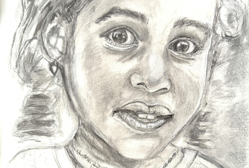
9. Portrait study: sketch: [MUSIC] We're going to do a portrait study to get a better understanding
of our subjects; the shapes or
volumes on the face, as well as the
shading and values. I've got my sketchbook, I've got my tablet next to me
with the reference picture, but of course I'm going
to be putting it up on the screen for you to see. For this one, I'm
going to be working at a larger scale than
the previous sketches. But I'll get back to
that in just a sec. The reference I chose
was this beautiful girl. I was immediately captured by her eyes and I loved the way
the sunlight hits his skin. I know that's going to work
really well for painting. But before we can
get to the shading and all that good stuff, we of course, need to
create the sketch. You can go ahead and use
any technique you want. I chose to use a
mix for this one. I'm creating an
outline for the face where I'm looking at
the lines and angles, but I'm also looking
at the larger shapes. I'm looking at the shape
of her head or face, but also at the shapes created by the
background around her. Looking at that negative space around her sometimes
makes it easier to spot mistakes and if you're focusing just on
the face itself. Once I've got some estimated
guidelines down on my paper, I'm adding this interline
for the face as well as those parallel
horizontal lines. Because her eyebrows have
such a nice angle to them, I'm giving those a line as well. [MUSIC] Then begin placing the features. You may notice how
similar this is to the sketch I made
in the first-class. But I'm hoping that
you will now have a better understanding
of why I'm doing things this way and how I'm figuring out where
to put my lines. I'm constantly looking
at and judging the different shapes I see either from different features, marks, or lines on the face or shapes that are created
by the soft shading. I'm looking at the distance between the eyes
and the contour of the face or the distance from her bottom lip down toward
the tip of her chin. Of course, I'm looking at the angles to help me
accurately line things up. [MUSIC] The first lines I put down were very loose even though I'm looking at and bearing in mind all those
things I mentioned, I wasn't being super
strict and I knew that I'd end up having to
make some adjustments. Once I had roughly put down all the main components
of my reference photo, I started adding in all the details going back
and forth between the eyes, nose, mouth, ear, and
the contour of the face. You'll also be able
to see that I kept the rest of the hair very loose. In the picture her
face is in focus while her hair is blurred out like the rest
of the background. I want to keep it that way. I don't want anything to take away from her face
because she's got such a sweet expression and it just draws you
into that scene. [MUSIC] When going in with the detail, I'm following the reference
much more closely. For this one specifically, we're still doing
a lot of the work using shading rather
than the outline. But if you are
prepping a sketch for a watercolor portrait and your goal is to
make it realistic, you do want your outline to be pretty accurate before
you start painting. Watercolor is a
transparent medium. So even though you can do
things to make adjustments, it is going to be
more challenging once you started adding
paint to your paper. Once you've added that
first layer of paint, you'll look in your pencil lines and you won't be able to erase them the same way as easily
as you would otherwise. [MUSIC] There are a couple
of reasons why I'm working in a larger
scale for this one. Now, first off, it does make it easier to get in all
those small details, and it means that even though you are still accurately
placing your pencil lines, when you're sketching
very small, having a line that is just a millimeter off is
going to make much more of an impact and a difference on the final result than if you are sketching
in a larger size. But another reason is that this is actually
going to be one of the portraits we'll
be finishing in the final class in the series. I'm going to be using
this sketch to create my final sketch
for that painting. We will be doing more
than one portrait though in that class, so I hope you're ready for that. Also in regards to the scale
I'm sketching in here, I'm sketching in
an A5 sketchbook, so it's not that big, although she is taking up a
good amount of the frame. You can do very small, intricate portraits
in watercolor. But we want to have some room to really play around with some of those flowing effects
you can get from the paint for the hair
and the background. [MUSIC] When you're transferring
your final sketch to your watercolor paper or when you're sketching it
directly on your paper, depending on your preference, something you can do if you're worried about not being
able to make adjustments, is to use watercolor
pencil to make the sketch. There are both pros
and cons to this. One of the absolute pros
is that once you're done, you can make that
line completely disappear, which is great. One of the cons is
that if you're adding wet paint on top or not
being careful enough, you may end up erasing
them before you were ready for it by just
washing them away. But then again, if you had your original sketch on a
separate piece of paper, it's not going to be
too much of an issue, you can always
retrace your sketch onto the watercolor paper you are creating
your painting on. For my paintings, I
prefer just using a pencil but it's up to your
own personal preference. For this sketch and
portrait study, it's up to you how
much detail you want to add to the sketch itself. As an example, for the eyebrows, I'm not really adding
individual strands of hair. You can definitely add those
details in if you want. But I'm saying that for the
second part of this lesson. On the other hand, I'm
also not being too careful about keeping
it neat and delicate. I still added some
rough scribbling in at that eyebrow area as well as this section of hair
between the face and the ear. You can always use your
needed eraser to just get rid of some of those
pencil lines or lift off some of the strengths from the pencil before we move
on to the next step. But it's just a
study, don't worry, it's not going to be a
fully rendered portrait. [MUSIC] I do, of course, encourage you to use your
own sketch for this study. But if you don't want to use
your sketch or you just want to have the same
starting point as I do, when we get to that next lesson, feel free to use my sketch. I've included it in
the Projects and Resources tab below
or next to the video. [MUSIC]
10. Basic shading: [MUSIC] Before adding shading
to your portrait study, you can practice using the
sketches we made previously. This is not going
to be in depth. We're just going to be
adding some more dimension. What I'm doing is
I'm first using the pencil to just
get in some of the initial shading
right here under the eyebrow as well as
under the eye itself. You're looking for
those changes in value on your reference photo. The value meaning how light
or how dark a color is. You can see how that shading and shadow under the
eye as well as to the left where that
corner of the eye is really helps bring
out the right shape. It just helps to make it look more like our reference photo. [MUSIC] Because the paper is textured most of that
pencil or graphite is going to sit on top of the
bumps of that texture. I'm just taking a tissue
to help blend it down into that paper or into the
valleys and crevices. Next, I'm using the
watercolor just to roughly add some
more defined shading. Instead of having to press
harder with the pencil, this is just a faster
and easier way to get those darker tones in. [MUSIC] If you want to add or bring
back some of the highlights, you can use some gouache, a color pencil or
a pastel pencil. In this case, I'm using gouache. The mouth is going to have less detail because
it doesn't have as many different
areas or parts to it and we're not trying
to fully render it. For this one, I'm just going straight in with the watercolor, adding a pale wash to the lips, and then getting
that shadow under the bottom lip in and dragging the shading onto the chin area. To darken the skin and make his mustache look
a bit more full or just noticeable in general because these doubles
I added are quite sad, I'm just adding a light
wash in this area as well. Then I'm enhancing some
of the darker areas and the shading on the
nostrils and the lips. You can keep it as loose
and simple as you want or add in as much
detail as you'd like. You just want to get a sense of the shapes and
forms on the face. [MUSIC]
11. Portrait study: shading & Class project: [MUSIC] Time to
add some shading. First I'm adding a
layer of water color, well, technically, I'm
adding two layers. I'm adding a thin layer but
with majority of the page, and then once dry, I went in with a bit
more water color. If you want to keep
it simple though, feel free to skip the
water color entirely. In the first layer, I kept everything very light and loose. The goal for the
watercolor is just to get some tone down on the paper so that we have to
cover this with the pencil. I kept the background
the lightest to help bring out that sense of
bright light and sun, and to make the face stand out. I added a still light, bought slightly darker
layer to her face, allowing the layer to
darken towards left side of the face where less light
is hitting the skin. I added the darkest layer
to her hair and eyes. If you haven't seen the
first class in this series, I do go through some basic
water color techniques, and I also show how to add
shading to facial features. But as you can see,
I'm in no way, shape or form trying
to keep it neat for this one and I'm not
worrying about the blending, so no need to worry. It's just a quick study. For the second layer
of watercolor, I focused in some
more on the shading, kept an eye on the reference to see which areas of the skin had visible highlights
on lighter areas and where the shadows fill. If you'd prefer, feel free to take your time
with this step and consider it an exercise in
shading with water color. In which case, I do
recommend watching that first class if you
haven't seen it already. However, if you've never done much shading using a
pencil in general, I do recommend trying
it this way as well. You get to feel and work with
the shading and the form in a different way when using a pencil compared
to a paintbrush, almost as if you are carving
something out of wood or clay and your
pencil is a knife. Using a pencil is very
stress free since you can always just grab your eraser and make any
corrections you want. I'm just picking
up the water color directly from the pen, not being able to
mix or thin out the paint with water
on a palette does mean that you will
need to make decisions faster and it can make it
look a bit more messy, as it's more difficult
to blend it out, especially on paper like this. Feel free to grab a
palette if you want. I still kept everything
fairly light and loose. You can blend out some of the hot edges if they're forming in places
where you really don't want them but
as you can tell my sketch is looking very
splotchy at this point. Don't worry, it's okay. The one thing you do
want to try and avoid is just getting too
much pigment down on your paper because using just a pencil to add the
rest of the shading, you're not really
going to be able to go back and lighten it, but you can also bring
out your gouache, just like I did with
the rougher sketches. For the next step we're going to grab and go in with our pencil. The goal here is to both
follow the lines and details, as well as adding in some
depth and form to the face. I'm starting with the eyes and surrounding area and
working my way down the nose and cheeks and finishing off with
the mouth and chin. Keep an eye on the changes
in value in your reference. As an example, the skin
near her brow bone, so just below and just above
her eyebrow is lighter than the skin close to her eyelid on the skin further
up her forehead. It's okay if it
doesn't look great, we're not trying to create
a fully rendered portrait. Creating a study is a good way to get to know your subject. Not only can it help you better understand the form
and make you more confident when
painting as you've already been through
the process once. You can test things
out before applying them to your actual
painting and you can play around with different effects or color schemes to see whether
or not what you've got in your mind is
going to as good on paper as it does in your head. I'm also not darkening the dark areas as much
as they should be. I find that if you
go back in and make these adjustments like darkening the darker values
around the eyes. Or if you care too much
about stuff like this, you end up nitpicking
every detail on what is supposed to
be a fairly loose study. In cases like this, I'll usually stuff myself and just allow things
to not be perfect. We can spend all the time we
want on the final painting, but I see no reason to
spend as much time on the sketch and with every statement
there's an exception, if you feel more comfortable going over everything
in more detail, just take your time. It's your sketch,
you make the rules. To help blend some of
the pencil graphite, I'm using my finger
and a tissue. Because the paper is textured, the tissue may help create
a smooth blend more easily and maybe this is also a good place to quickly
add that general, or you may not want to use
your finger to blend graphite if you're creating
something that's meant to be a finished drawing. Because you're transferring
oils from your skin. But for a sketchbook sketch, I feel we can be a bit more liberal and free now approach. The tissues also great, as you can crumble it up, twist it and shape it in order to create a tool
that can help you blend the more detailed areas where your fingers might
not quite do the trick. As we move down the
nose and cheeks, I'm making sure to keep the
center of the nose where that bright highlight
is free of graphite. This way I have a
constant reference for one of the lightest areas on our portrait that I can use to compare it to any other
area on the face. For the cheeks, you
want to especially keep an eye on the
changes in value. On the far left side of
her face below her ear, her skin has a
lighter value due to the sunlight reflecting
or bouncing off of it. As you move in towards
the center of the face, you'll notice how it changes to the darkest value on her cheek right next to
that first highlight. This is likely caused
by the peach fuzz, so that fine hair we've got on our faces more so
than the shadows. Then there's once again a
change in value from light reflecting off her skin
coming down in a streak, starting up near the
hairline or temporal area and going down along the cheek, fitting out as it gets
down to the bottom of the face, near the jaw line. Then yet again, we get
back to a darker value, which is just about the base
value of her skin tone, and then the cheek finishes
off with a highlight, which really brings out
that rounded shape. [MUSIC] You can use your
eraser to lift off graphite and bring up
some of the highlights. At the very end, I'll also go in with a white
pastel pencil, just to lighten the
highlights a tiny bit more. This is completely
optional though. If you want, you can
also go back in with the water color after adding
some graphite shading. I'm being cautious of the amount of water color I
use on this paper, even though this is advertised as a watercolor sketch book it's really best for quick studies without a large amount of water. But the watercolor will
fill out the shading and shadows much
faster than a pencil. There's no right or wrong. Whichever technique
and whichever supplies you feel like
using, go for it. [MUSIC] For her lips, I'm adding the most
prominent shading I see, but I'm not spending much time on them and I'm leaving them light on value than
they should be compared to the
rest of her face. This is another one of
those examples where I'm choosing to
leave it rather than ending up spending another
five or ten minutes on something that's in this case
not really benefiting me. For the project for this class, I'd like you to create at
least one portrait sketch. Feel free to make more than one, I'd love to see them. You can use one of the
techniques shown in the class or a combination. It's up to you.
You can use either one of the references provided
or use one of your own. But if you use one that
wasn't provided in the class, please do share it
together with your sketch. If that's not enough and
you want to do more, feel free to add shading as well to complete
the portrait study. [MUSIC] Final steps with a pencil and this exercise or study is
just to take a step back. Instead of focusing on one
area or feature at a time, you want to take a
look at the face as a whole and fill in any
missing bits that stand out. In my case, I'm going to darken the shading near the
eye and bridge of the nose and add the final
shading near the cheeks. I'm going back and forth, just adding a few final touches but also forcing
myself to hold back. I'm still leaving out a lot
of detail and information. As for example, her earring, just a way to see what
she'd look like without it. [MUSIC] For the final step
I'm going in with that white pastel pencil. You can also use a
white colored pencil, but I find that neither
of them do that well, on top of pencil sketches. At least not if you've added
a heavy amount of graphite. Another option if
you're not having much luck with these
dry mediums is to go into with some gouache or even acrylic paint.
Just be careful. Depending on the
pencil you're using, the water may affect the
graphite and smear your sketch. Adjusting these highlights isn't really an important step, but working on the
highlights this way also just helps
you really get a sense of her shape or really
focus on where they need to be and to which extent in order for the
face to look right. Although it's still
very rough looking, this sketch has
served its purpose. We've had a chance
to study and get to know our subject and we're ready to move on to
the next step in the process of creating
a finished portrait. [MUSIC]
 Tanja Jensen, Artist - Sculpting, drawing and painting