Transcripts
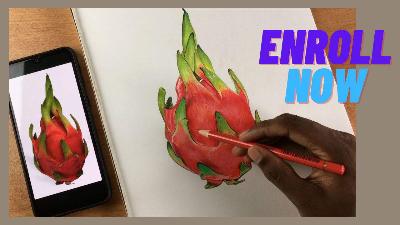
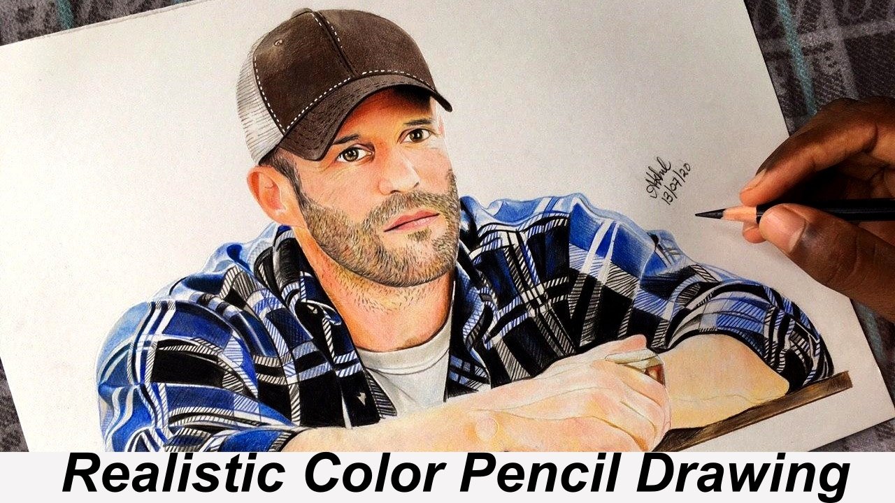
1. Introduction: Welcome to colored pencil drawing masterclass. In this class, you're going to learn how to color a dragon fruit using colored pencils. This is a hands-on class, so you're going to be learning some of my favorite coloring techniques as we go. You will pick up tips for sketching, selecting the right colors, and advanced coloring techniques like layering and blending. This class is for all levels. Whether you are an experienced artist or brand new to colored pencils, you will be able to follow along and grow your drawing skills. Since we are diving into a practical approach with colored pencils, you are going to learn how to simplify the entire drawing process to create drawings that look realistic and vibrant. My name is Akhil Bhuvaneswaran and this is my fourth Skillshare class. In addition to teaching here on Skillshare, I also run a freelance art business called Draw With Akhil. I actually started making pencil drawings way back in 2016 and by the past few years, I was able to learn a lot about the color pencil drawings. Ever since I have explored the various possibilities of this medium, I have fallen in love with it. No other medium is quite like color pencils. I like making realistic portrait drawings with fine details, and just like all my other classes, in this class I'll be breaking everything down into simple actionable steps so it's going to be easy to follow along and draw alongside me. By the end of this class, you are going to have a vibrant color pencil illustration that you colored yourself. In the process, you're going to be learning some pretty cool coloring techniques and my best advice for color pencil artist. Last but not least, please do not forget to follow me on Skillshare by clicking that Follow button up top. When you follow me, that means you'll be the first to know as soon as I publish my next class or have any sort of announcement to share with my students and you can get notified by hitting that follow button up top. Ready to dive in and create your own colored pencil illustration? Let's get started.
2. Selecting Your Pencils: Let's start by selecting the right color pencil set for our drawing. There are a lot of different varieties of color pencils that are available in the market, ranging from a T bigness pencil that costs $20 to an artist-grade pencil set which can cost up to $1,000. Each of them have their own unique set of characteristics and qualities. This should be clearly understood to make the complete use of it. These are the different color pencils that I have used in the past. For you to get a better understanding, I will demonstrate how each one of this performs on my drawing paper. I will explain how each of them are different in their own unique way. First, let's look at this triangular color you can see from Faber-Castell. These are beginners' color pencil. They're very cheap and easily available. Here in India, it sells at around $3 for a whole set of Tolkien colors. These pencils are ideal for students and beginners. Now let's see how they perform on paper. You can see there is a significant amount of white which is showing through it. This indicates the low quality of the color pencil. The pencils are not able to color the complete portion, and also there is unevenness in filling. The pencil also is resistance to freehand movement. Even on an extra smooth surface paper like this, the pencil is unable to fill in the colors completely, but I have to say it's performing quite well for its price range. These pencils are not so durable, they can break easily while sharpening or coloring. The next set of pencils that I used, was a set of Skin Colors by Mont Marte. I was looking for a good set of skin colors to complete my portrait drawings. Since I was lacking in some of the skin tones, I chose to buy this set. These are more thicker type of pencil than the usual types. They are very rigid and provide good grip. It's very comfortable to hold this, but you'll need a big sharpener to sharpen these. Let's try these out on paper. They give out excellent skin colors, but you might have noticed that I had to apply way too much pressure for any color to show up. This was one of the downside that I found in this pencil. Other than that, all the colors were excellent. It gave the right skin colors for portrait drawing. The next set I used was the Prismacolor Scholar pencil. This also was a very cheap type of pencil. These are wax-based pencils, and they provide excellent hand movement. They are very creamy and can be blended very easily. They're ideal for portrait drawing and for drawing landscapes where you want the colors to blend in very easily. The pencil that I'm currently working on is the Faber-Castell Polychromos color pencils. These are artists' grade color pencils. They are quite expensive, but they're worth it. These are oil-based pencils and are very resilient. They give out very bright colors and are ideal for giving fine details. Their pointer leads don't break very easily. So you can apply a high amount of pressure without breaking the leads. This will help you in coloring areas where high precision is required. These are the pencils that I use for all of my drawings nowadays. This is the pencil that I'll be using for the demo today. They are highly labeled and are recommended for anyone who is looking for a good set of artists grade color pencils. These are my personal experience with these pencils. I'm in no way forcing you to buy any particular brand of pencils. It's up to you to try and find out which one of these suits you. The only suggestion that I have is to buy one set of oil-based pencils and another set of wax-based pencils. A combination of them can be used to meet the varying requirement at your work.
3. Drawing Paper: Let's talk about the drawing paper. It is equally important as the color pencils. The choice of the paper will have a great impact on the results that you are going to produce. While selecting the right paper, you need to consider two important factors: the thickness of the paper and the surface finish. The thickness of the paper is measured in gsm or grams per square meter, which is the weight of a square meter of the given paper. The normal everyday paper that to use usually have a gsm value of 60-80. But for colored pencil drawings and for realistic drawings, particularly, you'll need a more thicker paper. It is advised to use at least a 120 gsm paper. The more thicker the paper is, the more resistant that it is from taking damage while drawing and coloring. You definitely don't want your paper to be torn in-between the coloring process. Now the next thing to consider is the surface finish of the paper. Some papers have a rough or textured surface. These are ideal for pastel, charcoal, and watercolor paintings. But for colored pencil drawings, I prefer to use a smooth surface paper. This helps me in achieving an even distribution of colors throughout the drawing. Also, a smooth finish will allow easy movement of the pencil. This will reduce the effort that you need to put in. Now, I'll show you the papers that I use. These two are the papers that I work on. They both are equally good with almost identical thickness and surface finish. Both of them have given me excellent results. This one is a local brand and provides very much value for the money. If there's any Indian students watching this, this one is a good option for you. For anyone in general, go for a smooth surface paper with an adequate amount of thickness.
4. Other Art Materials: Some important accessories that you will require are eraser, sharpener, and some blending stumps. Any regular eraser will do the job. Just make sure that it has pointed edges to do the fine job. Same goes with the sharpener. Select whichever ones you prefer. Just assure that the blades are sharp enough for smooth sharpening of the pencils. For blending purposes, I like to use ear swabs. You may also use a blending stump. Obviously, the most important thing that you will need is a reference to draw from. A reference could be anything. It can be an object, a person, an image, or even a figure that you hold in your imagination. I personally prefer to use an image as the reference.
5. Project : I am a big believer in learning through practice. After all, what's the point in learning all these theoretical knowledge if you don't know how to apply it in real life? I have included a project for you guys to have a better learning experience. I will attach this image in the project section. Before you move on to the next lesson, I want you to save that image and use it as a reference. Then as we move forward through the different lessons, be sure to practice the same things that I teach in each lesson. You can pause or skip forward whenever you want to take down some notes, and by the end of this class, you will complete the illustration on your own. Please share your artwork in the project section. I'll be happy to see that you have learned something from this class. You can do this by clicking create project down in the project's thread. Choose a cover image for your project, give it a title, and briefly describe it. Then go down here and upload the picture of your project by hitting the image button. Once you're done, press publish to share your project.
6. Sketching: Here's a reference that we are going to use for our drawing. First, let's make a nice sketch of this reference. This is a drawing paper that I usually use to make all of my colored pencil drawings. But rather than making the sketch directly on it, I prefer to use some rough papers to make the sketch and later transfer it to the original drawing paper. Let's keep this drawing book aside, and make the sketch on this rough paper. For making the sketch, I'm going to use a very light pencil. In this set, you're going to see the 2H is the lightest pencil available, so I'm going to pick this. First things first, I'm going to give an outline for my drawing. Giving an outline is an essential. It will help you improve the final quality of the drawing that you're going to produce. Also, if you're planning to laminate your final drawing, it will definitely help in improving the overall quality of your artwork. We have our outlines set. Now, let's start by sketching the reference. Now, before you start to sketch, take a good look at your reference image. What are the fine details that you need to give? What are the various important outlines, and other things that you need to mark in your sketch? Once you have an idea about your reference, keep the reference image side-by-side of your drawing paper. Now you can start with making the sketch. You can start with whichever portion of the image, I prefer to start from the top side. Always be gentle with sketching. While making the sketch, I prefer to outline the outer regions of the subject first. In this case, as you can see this is the outer line of the subject. I'm going to make the outer line first. This way, I'm going to get a proper idea of the dimensions, and the proper shape of the subject. Make sure that you contain your drawing inside the boundaries of your drawing space. See, now I have a rough idea of the dimensions. Now, let's give more precise details. For this, I'm going to rub the unnecessary regions of my sketch. I have created a rough sketch of my reference. Now, before you transfer this sketch onto the final drawing paper, rub the unnecessary portions such as these dark regions, which are not necessary for the outline of the drawing. Now, what you're going to do, you will darken those regions in the drawing, which are the outlines in the reference. See, here, there's an outline clearly [inaudible] , so we will darken those regions. Make sure that you're doing it very precisely. Make sure that all the details are included in this final outline that you're producing. Now that I have created this sketch, let me transfer it into the main drawing paper. Let me show you a very easy and neat way to do it. What I'm going to do is I'm going to darken the backside of my drawing. I'll use a darker pencil to do this job. If you have a graphite pencil, it will do very well. Darken all the regions which covers the outline of your sketch. To check if all the regions are darkened, just flip the paper and look through it. You can clearly see some regions are still needed to be darkened. Now, let's transfer this onto the main drawing paper, so let's put this reference aside for a while, and I will open the drawing paper, and put this rough paper on top of it. You can make use of either a sharp pencil or a pointed pen to draw on top of the sketch that you have already made. I prefer to use a pen since it won't break, it's lead. Hold the paper steady, and make sure that it's not moving here and there. Now, draw on top of the sketch that you already made. Don't push too hard onto the paper, just draw gently, enough pressure should be applied so that it leaves a marking on the other paper. Just take it slow and make a very precise sketch. Be sure to draw on top of all the regions and make sure that you don't miss any of it. Once you have completed drawing each and every detail, just remove the rough paper to see the final sketch which is ready to be colored. Here it is. A smooth, nice sketch of your reference. Now, you can draw both the extra darker regions on your sketch. This is a very effective method. It helps in reducing the unnecessary darker regions in your final sketch. Now that's how I prefer to make the sketch for my drawing.
7. Picking Right Colors: You have created a sketch for your drawing. Now let's pick some right colors to fill it. By simply looking at the reference, you can see that we are in need of some reds, some mid tones like the pink, yellow, and some higher grade tones like the green, and some extreme darker colors like black and brown. Let's look at the colors that are available for me. This is the color pencil set that I'm going to use to color this drawing. It has an adequate variety of colors to choose from. To achieve perfection in your art, it is very important that you choose the right colors. With the help of the reference, I'm going to pick some colors from this boat. I'm going to pick some reds first, some darker reds, and the mid tone like a pink. That will do for my red part. Then the yellows, green and some brown and black to give the shades. Most probably, these are all the colors that I'll be using for this particular drawing. Now from this set of colors, you'll have to choose the exact color that matches with the reference. For this, I'll suggest you to make use of a color chart. Usually, colors like this come with a pre-set color chart. As you can see here, all the colors are mentioned with their names. You can inspect these hues from the corresponding names. But since we are learning to draw, it's very important that you get familiar with the different colors that you already have. For this, there's an easy technique which is creating a custom color chart for yourself. What you want to do is to pick a paper, ideally the same paper that you wish to work upon. Now create a chart of the colors with the pencils that you already have with you. Pick your color pencil one-by-one, and start to make a small boats of color in it. Now start coloring in that small boats that you've made. Strong the pencil gently and fill the boats. Now you know exactly what type of color will come out of this particular pencil. Now look at the pencil for the name of the color. It is a Venetian red. Mark the name corresponding to that boats. This way, you get an exact idea of what to expect from a particular color pencil like this. Similarly, use the remaining colors and make a chart using them. Using all these different colors that I have, I have created a custom color chart. All the colors have been neatly labeled. Now I will use this chart as a reference in picking the colors for my drawing. Now I'll give a demo on how to select the right colors. Let's say you want to color this particular portion of the image. Now I will pick up my chart and compare it with those colors. By comparing with the chart, I identify these two colors suit the best for this portion. I'm going to pick these two colors, which are pale geranium lake and scarlet red. These are the two colors. Similarly, you can make use of this chart to pick the right color required for the different portions of the reference image. You can do it for the greens, yellows, and whatnot. That's how you pick the right colors for your drawing.
8. Basic Coloring Techniques: First things first, always keep your pencils properly sharpened. Working with a blunt pencil can seriously affect the quality and the finish of your artwork. Use any regular sharpener to keep your pencil's lead pointed. Be careful with the sharpener. The way you do it can even affect the life of your pencil and its performance. While drawing the fine details, it is very important that your pencils are properly sharpened. The next attention should be given to the way you hold your pencil. It can alter the output that it gives. If you hold the pencil is further away from its end, the lesser will be the pressure applied to its lead. This is useful for fine layering of colors. Whereas when you hold your hands near to the pencil tip, more will be the pressure applied to its lead. This will produce darker texture. You will exercise more control over the pencil's moment in this position. Another important technique is to learn the process of blending different colors. I'll demonstrate this with an example. Here, I have two different colors that I want to blend. Watch me do it. I'll take a color and start coloring from one side to the other. On the way, I'll gradually reduce the pressure that I apply to its lead by moving my hand further away from its tip. A variation in the intensity of color is created by this process. Then I pick the next color and start coloring. But with the pressure lowest at the starting point and reaching the maximum towards the end. In between these ends is a zone, where the gradual transition between the colors occur. The transition is so smooth that we cannot say where exactly the other colors starts. But when it comes to certain complex drawings, such as a portrait like this one, simple blending is not enough. You will have to use another method known as layering. As you can see here, the skin color is a mixture of two or more different tones. In these types of situation, we layer the different colors over one another. This is done by alternating the colors to create multiple fine layers over one another. Another important thing to keep in your mind is to not make your sketching lines too dark. If the sketch is made of dark lines, it will show up through the colors. I will demonstrate this with an example. I'll make a dark and a light sketch, then I'll color both of them. You can clearly notice how better the lighter one looks after the coloring is done. The final tip that I have for you is a very simple but effective method to prevent your drawing from getting shabby, which is to use a wide smooth paper to rest your hands while you're coloring. This will prevent the unnecessary spreading of the colors. It's especially important when you want to place your hands on an already colored portion of your drawing. This method will definitely make a significant difference in your work.
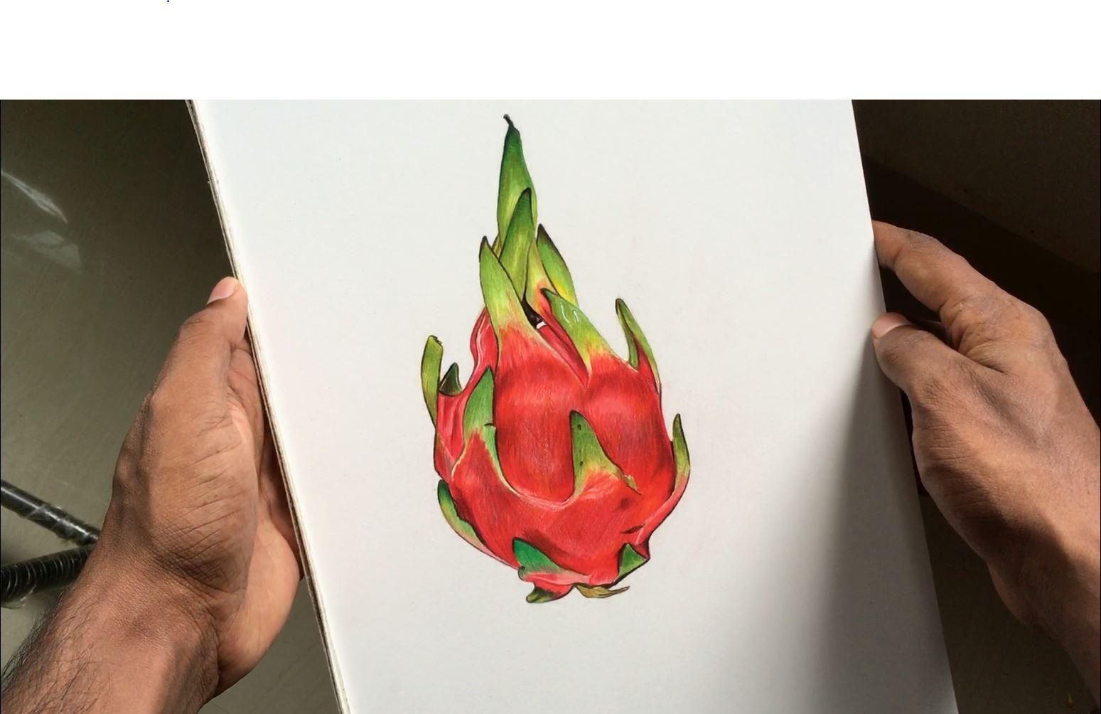
9. Coloring Dragon Fruit: Now, I will explain how I color my sketch. I start by giving a light outline using the same color. Here, green is used to outline the leaves. Then fill the greens inside using the method of layering. Alternate between the various hues to achieve the right combination. Use a blending stump to attain a smoother blend. Then, I use a darker color to mark the edges. The same process is repeated for all the green regions. For the red region, I start by highlighting the darker regions first, and then filling the rest of it using a lighter tone. Just give close attention to your hand movement. Be sure to apply an even pressure while shading such light regions. The boundaries of intersection of two different colors are distinctly marked and colored. The region between these two colors are smoothly blend. Every detail is important. Do not rush the process; take it slow. As you can see here, I'm layering different tones of pink and red. Just look at the way that I'm holding my color pencils. I hold my hands further away from its lead. This way, I'm able to achieve a very smooth pencil movement. While coloring the darker regions, I hold my hands near to the tip of the pencil. While making colored pencil drawings, you should carefully observed the reference image and study the different colors and hues present in it. It is very important that you create a good contrast in your outlook, which means having different values, some darker colors as well as your lighter tones. For the leaf portion of this drawing, I'm using the pressure of the pencils and layering the different colors together until I get the smooth result and I actually go in with my lighter pencil to smoothen everything out and get rid of that graininess by applying a bit more pressure to the pencil. Applying pressure to your pencils will help to fuse those colors together and to get into all of the dips and crevices of the paper, so it doesn't look grainy anymore. Then I went in afterwards with some darker colors just to create some light details and textures by shading and cross hatching. For the shadow, you can see that I'm changing the pressure of my pencil to go from the darkest where the shadow is closest to the end, and then get lighter towards the inner portion. Now, that's how I color my sketch. The next video lesson is a real-time video of this coloring process, which is uncut footage. I highly recommend that you go through it while practicing your illustration for the project.
10. Real Time 1: Hello. Hello. Again. Hello. These are the same. Okay. Let's see. Okay. Topic modeling. And I can modify this. Yes. Ok. Ok. Okay. Right. Hi. Okay, right. Hi. Good. Today we're going to add in for Chapter 3. So what that means. Okay. Okay. Okay. So there's an economic interest in mind anything about whether the perimeter I just wasn't alive. So we don't make any money. What would you tell me or recovery efforts? I'm sorry. Hello. I'm really excited. Okay. Hello. What is your findings? Wow. Okay. Yes. Okay. What? Hello. It was nice to see. Hi. Two questions. Hi. Hello. Okay. So okay, hi. Okay. Yeah. Hi, a very long time. Let's get started. This is resources are scarce. Resources. Sorry. Hello. Hello. Hi, hello. Hi. Hello. Hello. Class. Hello. Hello. Hello. Okay. Hi. Okay. And stuff like that, right? Yeah. Okay.
11. Real Time 2: Hi. Okay. Okay. Today. Hi. Hello. Right? I should say. Okay, feature construction. Hello. Which brings us to our tables. Hi. Okay. Hi. Hi. All right. Two. Okay. All right. Thank you so much. Hello. Right. Hi. Thank you. Okay. Okay. Here's the problem. Hello. Okay. Hello. Hi. Hi. Why? And you see our progress? Okay. Hi. Yes. In some cases. Good morning. The images that way. They carry the same. Yeah. So our shoulders. Let's talk about some of the other hey. Hello. Hello. Hi there. Hello. Good. I used to do that. Hello. Yes. Yes. Today. Courage. Hi. Hello. Good afternoon. Hi. Okay. No. Hi. Hi. Right. Hello. Hello students. We're doing all that stuff. Good.
12. Real Time 3: Frequency. Yes. Test, test, test, test, test, test, test, test, test. So first things. First. Hello. Cool. Hello. All right. Hi, Yesterday. And how is no matter what your mic and day out. Our molecular orbital. Hello. Okay. Okay. Hi. Hello. Okay. Hi. Okay. Hello. All right. Right. Hello. Okay. Right. Hi. Okay. Hello. Hello. Hi. Yeah. Okay. In this section. Hello. Hi. Hi. Right. So what we're doing here. Hi. All right. For instance, in concrete. Hello. We're finally ready for the pitch and I never saw the difference. Here is that everything underneath layer theory, we're going to be pretty spectacular. So it's just easier to just use this purpose. So in this case. Right in this screen. Hi. Hello. Again. Hi. Yeah. And in your mind. To work with. Thank you. Hello. This is interesting. Hi. This is a sphere.
13. Final Thoughts: I hope this class have been helpful to you and you have learned something from it. If yes, do share it with someone who will be benefited from it. Please give your valuable suggestions and review. Don't forget to follow me on Skillshare. This way, you will get notified whenever I publish my next class. Thanks for watching.
 Akhil B, Freelance Artist | Entrepreneur