Transcripts
1. Hello There!: everyone thank you for joining me for the slash on sketchbook explorations. Now this is sort of a continuation off what we did in my previous class, which was also about sketchbooks. But that was more about ink and watercolor. Jordan's This one's completely about watercolor packets. But even if you're a beginner who has never cried watercolors before, it's completely fine. We will be covering Paul the basics that I needed to get started with these patterns, including the basic techniques, the tips and tricks related to composition on some stuff about colors, which colors work and by etcetera kind of it already in toward the colors. Then this would be a nice, warm up exercise for you. Now we did. This is about building up a creative practice through sketchbooks in my last class, but in a march in It's about developing group in when it comes to our because I truly believe that daily practice, health and sketchbooks help you immensely with that. Now, when it comes to expensive piece of people, when you keep it down, there's something holding you back, the fear of ruining it, whereas with sketchbooks that there is not there you are feet explored whatever you like, because sketchbooks are personal. So even if a page goes bad, it really doesn't matter. You still have a bunch off beautiful artworks with you in that sketchbook. So I highly recommend starting a sketchbook practice if you're not on that rule already. Andi, I hope this class helps you in some be in that journey. So let's explore some beautiful watercolor patterns in this class.
2. Materials you need: for the materials of this class. You need a sketchbook because this is Kate book explorations. But on that note, you can go ahead with any use watercolor sheets that we have as well. It's all about enjoying these patterns, so there's no restriction on any brand, but I before using something which is $100 in accordance. I've got the wrist ruined your home state books here, which is 100% corden entry into cheese. And these are machine press people's on. The one that I'm going to be using for this class is this one. This is a hand meet sketchbook by bounty. It's what triple deeper inside, which is a hand meet people is with on its what a slight sexually active. So I really like it, and I've done mostly wash patterns in the sketchbook, so I thought I'd give some water color patterns cries with, so that's what I'm going to be using. But in go ahead and use any brand of people, preferably something which is suitable for water. Colonel and 100 was important so that your techniques can be a bit better on that on from brushes. I'm just going to be using one brush for the whole class, and that's this one. Bicycle pressure Its size six. Andi again brushes. You can use any round brush that you have. The size will just change the kind of patterns that you concrete's, but otherwise it doesn't really matter. Watercolors. I'm using the Dinos meth watercolors. They are highly pigmented and just pure joy to work with. But since we're not going toe, do any advanced watercolor techniques in this class and go ahead with any brand of watercolor. Just that if you're using a student read watercolor, there's a chance that it it's marched on the other side because it's got nor operatives. So try to go for something, which is our discreet. Any brand is fine. Just pick whatever you have. The audience won't be a block about this, so let's dive into some beautiful patterns
3. Brush with Basics: so, guys, before we start with our patterns, I thought I do a quick re pressure off all the basics that I needed to get started. Now, even if you're a beginner, even if you've never tried this medium before, it's all right. We'll be covering everything that you need to know to create beautiful patterns. Now this class is not really heavy on techniques because we you're not going to have any heavy washes. It's just about understanding the medium, knowing the basics and applying them correctly to create patterns. So with that, I'll be covering first the wet on wet and we don't dry techniques now, went on. It is when you have a wet clear on the paper, it could be plain water like this, or maybe another color, and you drop some big meant onto it while it's still with. So you can see that watercolor has a life of its own and just spreads in a crazy way. Sometimes it can be daunting toe understand how to control this, but I personally believe that this is worth the beauty of this medium is, you know, having this kind off a life of its own. So we'll be using wet on wet for all sorts of blending exercises on better cry ISS like when your people is try and you're putting being directly onto it. Now, in this case, like I said again, if you want to do blending like if you want to add another color on top of this, you'd still be going back to wet on wet. So if I have to see at a darker color over here, so I'm still doing this wet on wet. But anything that needs to be added like a D tailing off the central part or veins etcetera , will be doing this wet on dry. So in a nutshell, if I have to summarize, it would be like if you have to do blending because it is watercolors. You'll need both layers to be bread, so that will be wet on wet and any kind of retailing would be. We're on dry now. Let's get toe colors because I would like to discuss this in a bit of detail because choosing the right colors makes all the difference to the patterns. So, for example, if I have this yellow and something like, uh, crimson, I mean a pinkish red kind of color. Now this hardly a chance that this kind of combination would go wrong, because these are Anil August colors, so they're closer to each other on the color wheel so it helps and creating a harmonious kind of pattern. But you need to make sure that one of them is a slightly a little more powerful than the other, so that it doesn't go looking like a boring pattern. Similarly, if you have this blue green and maybe we'll add a bit of yellow again. So this this is another safe combination. I call them safe because, like I said, you cannot go wrong with these combinations. So and you won't be creating mud colors with ease. Whereas now, if I come to complementary colors, which are like colors that are on the opposite sides of the color wheel. So if I have ah, yellow and a purple now, if I makes thes colors in the right proportion, they create a very standing visual because they are complementary colors. So there hi own contrast. But if we mix them in the wrong proportion, they'll be creating mark colors. So if I added this one here, it will create a very muddy, kind off color. Now, this is not really looking, but it's actually great. Pretty. So maybe I'll try another color for this one. To show you how we can create mud colors, it comes naturally. He usually but this time, for some reason I have to try. So if I take this Dhaka purple or violet color and I makes a bit off yellow over here, so now you can see that it's creating that brown muddy kind of color. Even that looks beautiful to me, but okay, I I was just trying to explain that if you create a mix off, complementary colors in the wrong proportionate would create very muddy kind of color, which would not look good on your patterns. So essentially, you have to make sure that the colors that you're using for your pattern go well with each other Now, for example, if I have to show you this pattern So this is called bank Babu on, uh, bit of blue. So these are colors that are analog, so they're closer to each other on the color green, so they're creating a very harmonious kind of pattern on Similarly, if I were to shoot this one, so this is again pink, red and yellow, and we'll be doing something similar to this in one of our projects. So this second a safe combination so you can never go wrong with these combinations. So I think that's the reason I called them to safe combinations. But like I said, when when you're deciding on the colors, maybe if you're not too sure about what colors you should be using right out on the people like this. So maybe swatch them together, do a small time Neil and see how they look together before going on to the pattern. Because you really don't want to create a model that pattern. So that's about it now. In the next section, I'd become bring a bit about composition so that we can go ahead and create all our patterns. So see in the next bit
4. Composition Tips: So this section is about composition. Now there's something which I discussed in much more detail in my previous class. But I do a quick refresher here to share my process. So I have some off thes main elements which are like the biggest patterns within the peach . So these would be floated ALS or leaves etcetera, and then to fill up the gaps that out there between these main elements you have Phyllis Phyllis could be anything like thes this bunch, for example, all you could have circles or dots off leaves so it could be anything. It could also be a smaller version off the main element itself. But the idea is to fill up the gaps between the main elements and so that your composition looks good with a mix and match off bigger and smaller elements. So that's about elements. Now we'll discuss a bit about how toe place thes elements in a pattern on will also be sharing all the tips and techniques toe. Try all these elements and fillers individually for each of the projects will be doing that later on in our projects as well. But for now, uh, toe, please thes elements on paper. Ah, we can divide the people into braids like this. Then once you have this great, there are four points that are generated. So these are your focal points. So these are the points to rich. Your eye is naturally attracted. So if you place your main elements at any of these points, it's bound to give Thea viewer a nest Stickley pleasing kind of pattern. Also, another tip is toe vary the size off the patterns, your build both you mean elements and the fillers and the direction So you could have one pattern like this and the other like this. So it's all about creating ah variety within your patterns. And then if I want to share about the flu, I usually start my pattern somewhere here and then create a gradual flu so you can start your pardon from anywhere. But the idea is to create a natural flu within the pattern as well. And then, um, I do this small trick for continue t um, I just shared it over here. Maybe not there on and credo it over here. Okay, So for continuity, what I do is I place all my main elements like this. And then I create some half patterns at the edges half 1/4 Patton. So this gives a sense off. Continue t in a way that you feel that this pattern has life beyond the speech. So there's more to this pattern outside the speech. So it's it's just a fun way to maintain that. Continue t. So that's about it. In a nutshell. You need to have mics off patterns, mix off elements on Do you can have them in different directions, different sizes, please them on those focal points and create a bit of continuity. So right now it may seem like a lot, but don't worry. V will be taking this step by step in all our projects. So I have structured this in a way that we start with some simple projects, like from painting simple circles. And then we'll move on to detail florals and leaves etcetera. So, essentially you just need to keep in mind a few things when creating the composition and year old Otago. So let's go on and create some beautiful patterns together
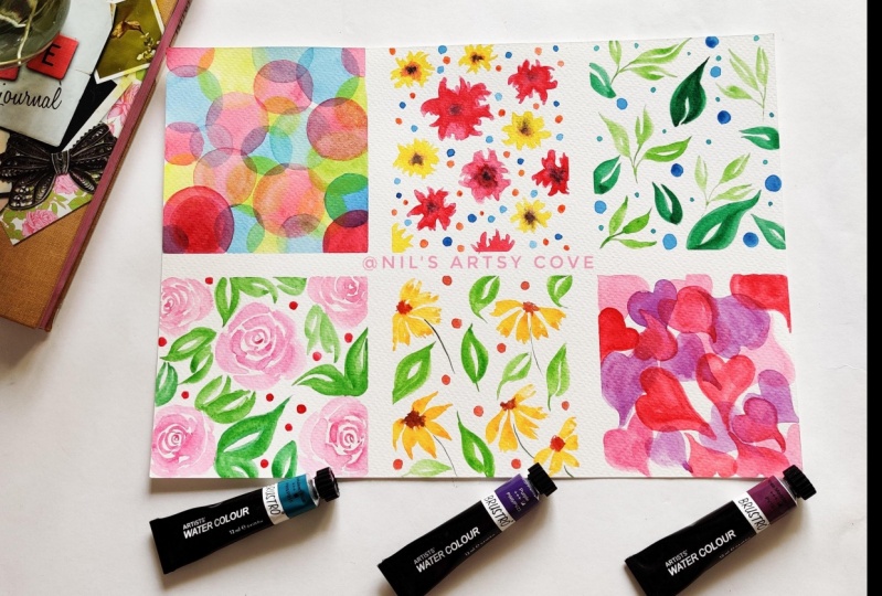
5. Project 1: Warm-up: so far our first project. We're going to take something really simple eso that anybody who is just starting out with water colors can also give this a cry. So we're going to be painting some circles now. They need not be circles. You can take any shape like a triangle or a square, whatever getting going. So take any shape, Andi. Well, just being them in three different colors. Now I'm taking a queen gross of turquoise, blue and light green. But once again, colors really are up to you. The kind of colors that you want to choose, just that they go well together. So just make sure that you choose colors that are looking good together. So maybe you could cry this honest I preach eat for us to see how the colors look together before going on into this project. And, uh, yeah, that's it. So all we have to do is to be in circles like thes and they'll be overlapping and we'll be doing it with on dry, which means that each of previous color will be tried before we start with an extra. So that's about it. Let's get started. So I'm starting with wind rose. Now don't worry too much about the size of the circle or any shape that you're trying out or, for that matter, whether it's turning out to be a circle or not. Just enjoy the process. Believe the different colors. It's so much fun when it comes to watercolors, all the beautiful colors, all the values that you can get a spy, you know, changing the ratio of water. It's so much fun to try out, so just enjoy the process. Don't worry too much about getting the shape right. I keep doing these half patterns or you know any shade that I'm taking any mean element that I'm taking. I tried toe add the's at the edges because it sort of gives continuity to the pattern. It looks like Okay, even after the speech, it's going to continue somehow. So that's the reason I, uh, I'm doing these half patterns or quarter batons at the edges, and I think I'm done with this color so I'll just wait for this to dry completely. So now that my people is completely dry, I'll start with the next color, which is turquoise blue. Now you could do circles in the same size as you've done previously. All you know, play it up a bit like you can change the size of the circles, overlap them here. They're toe. Just add a bit more to the pattern. Okay, I think I should stop at this one because it's getting a little too thick, so I'll start another one here. I'm trying toe overlap thes circles. Like with the once that I'd done previously with Quinn Rose. I'm trying toe overlap the blue ones with them once again half batons because I just don't be sketchbook a bit, so that can get to this area without smudging the others. Maybe at a bit over here. Okay, I should stop. So that's it. I'll stop at this spine for the turquoise blue color and wait for this to dry. So now that people is completely dry, I'm starting with my third color. I'm using a yellow green. I like the scholar because it's so y planned on. I like how it looks right now with the other two colors. Now you could do overlapping circles like thes, or you could try and fill up the remaining spaces. The empty spaces that you have left after the previous two layers. Also, since we're doing wet on dry, you really don't need to worry much about blending or getting a body color because as long as the color city of Jos and go well together, it should be looking nice. Where now I kind of like the we, uh these patterns are looking for me once again doing the half, uh, circles at the edges to maintain the continuity. - And that's our last look. So here it is our super fun, simple first project. I hope you enjoy it and see in the next lesson.
6. Project 2: Floral Pop: So for our next project, you're going to cry out some simple florals. All we need is a cease troop, kind of like this simple stroke like these, and we'll be making the floral I'm using when Rose again for the mean elementary included for the fillers will be trying out a smaller version of this floral along with a lot. Now, while the first layer still with I'm going to be adding some darker lighting. More big men did win rose at the center. Then, once a price well put in some black North's well over there and for the Phyllis, we'll be trying out some simple dogs like these off both wind Rose and the loca. So I'm going to be using the yellow color for smaller, florid, sexist. So that's what we're going to do. So let's get started. Mix enough color for one go so that you don't have to stop, will be through the pattern and makes the color again. I tend to do that often, and it's not that convenient, so try to fix enough color, start with a slightly lighter wash, like I said, so that we can add a darker pigmented Quinn Drew's at the center. Now I have a very detailed lesson about composition rules in general, which is there in the previous class for sketchbook therapy. It's more often Incan watercolor kind off class, but it has some nice, uh, affections for composition and all these elements. How they how you can build them up, the main elements and the pillows, etcetera. So if you haven't watched it, I would highly recommend you to cried out once on its It's a super fun class. It's just like this one. It's pretty Jew. No restriction on the kind of materials are that you use the kind of patterns that you do. It's it's all you. So do give it a try now, since my people is 100 wasn't gotten on. The weather is supporting me. You can see that my voters are still pretty red. So even the 1st 1 that I drew the painted it's still quite met so I can add that central pigmented when rose later on us. We're like, after I'm done with all the coolest but in your keys. If you feel that your poodles are drying up, cry toe, do it along the week cry adding that central portion while you before you start off with an explorer eso use attachment because the weather are the people that you're using may be different from what it is, what what I am doing. So, uh, uh make sure that it's still wet when you have glad that central pigmented quick rose. Like I said in my keys, it's quite still pretty bad. So I'm able to blend it with onwards like this, and that's it. I'm going to let this cry before the next set of floors of that I don't smudge it. So let's wait for this to cry now. My previously off florals has tried, so I'll start with the next one. I'm using the smaller version off the same fool for fellows, so I'm just using a nice, bright hansa yellow for my food. This is a combination that I really like the pink and yellow. It really goes well together, but once again, just just use whatever color you like, which, if you feel like a blue, are popular combination of blue or pink combination, you might as well try that out, cried a fill in the gaps that have been left between the mean elements. So we're going to add some more Phylis late Toronto this. But for now, since these two are kind of forming your mean pattern, make sure that you are filling up on the bigger gaps or species with these yellow ones. And then we'll be adding a slightly pigmented yellow or maybe an orange at the center. So we have to make sure that the flu rules are still bad by the time we add the central months. So if you're florals are getting cry by the time you're moving to the next one, start adding the central dropping the big medal dissenter right? - And once again, be weak for this to cry before we start with the accept our fellows Simple dots using these two colors seem colors, maybe a little more pigmented values. Okay, now that this is right, I'll start with my next round of pillows using a slightly smaller brush for this, - uh , I'm adding the slight orangish yellow as the next set of broads Take your time. Enjoy the crosses. Um, that's it. Now I think some dark. Or maybe you can take an indigo or being screened or even black Andi added, at the centers and where you could both the floaters, the dark center, some apologist. It makes the whole floor look so much better and you're done. That's, Ah, second happen on. I hope you had fun. Let's move onto the next one.
7. Project 3: Leaf Therapy: So for our next project, we're going to be in some fund leaves. I find them really therapeutic. So I decided to dedicate the whole project to just printed leaves. So I'm sure going to show you a simple technique for painting leaves. Start with a very thin line holding a brush like this, then president brush fully and lifted up slowly and then for the other side again. You press your brush and lifted up. You can leave that white space in between, or maybe much them. It's totally yokel. So this is size of brush I'm using. I'm using a number six silver brush, so that's the size off the leaf that I'm able to be with this brush. You can also do the same technique and try out differently pattern like this. So I'm going to be showing this Ah, bigger leaf pattern. Once again, start with a very thin line like this. Press your brush fully and lifted up, and then for the other side. Once again, press your brush and lift it up. I really find painting leaves therapeutic, so I thought me will have some fun painting different patterns with leaves, so let's get started using a SAB green for thes smaller pattern off leaves. So just get my color mixed up. Yeah, start with the smaller one for the bigger leaf. Later on, I'll use maybe a darker green and then for the Phyllis something some other color that will go well with these two. Take your time. Well, painting these leaves most of the times What happens is you see these videos on instagram? Are you two very in? The artists are painting these leaves in time labs anything that you can do it that first like it's something which has to be done in a very slow, steady manner to get the exact shape. So try to take your time. Try to explore this a bit and exquisite. It's therapy. So dry painting, thes rate, the different colors. It's sort of fun. I just did my sketchbook a bit so that I get a better angle. We're changing the direction off the elementos will against something that I cover inthe e compositions lesson in the previous class, which is about ink and watercolor sketch book patents. - And that's it. That's it. With these smaller leaves now, we'll get started with the bigger leaf. So I'm mixing. Ah, much darker green for the bigger leaves. Try to fill in the gaps that are there between b earlier pattern and as all these have some batons that are, like half turn near to the edge like this. Okay, I guess I'll stop with these and let this cry completely before we start with the other Phyllis. Now, I've mixed a nice blue for the fillers, so he could use a turquoise, blue or any light loose really in or any blue that you like. - Uh , and I'm just going to be painting these small circles over here. - Oh , and that's it. Okay, looks fun. So I highly recommend trying painting leaves as a therapy. So I hope you enjoyed this class and let's move on to the next Patton.
8. Project4: Roses: now for our next project, we're going to be painting some pretty roses Now this. These are some of the most sought after Florence whenever I take a workshop, so we're going to be trying out a very simple technique to draw rules. So I'm using this color or the center, so it's kind of a pigmented crimson. So start with a very pigmented center like this, that simple. See strokes, then dip your brush in water. Don't pick up any more pigment. Just dip your brush in water and try to do slightly broader strokes by pressing your brush a little bit. So for the center, we were not pressing a brush brush fully. We were just using the tip as you move outwards, use more water on less pigment and just precious here. Brush fully. So that's what we went through. In this pattern, we are going toe being some roses, along with some pretty floor leaves. So for Leaf again, we will be using the same technique that we did in the last project, and maybe we'll be adding the leaves and somewhat in this pattern. So let's start with about enough now . There are various ways off painting a rose so you could try any of them based on how you like your roast to look like. So if you want the outer Britain's to also have some pigment, what you could do is pick up pigment from the center and drop them. Once you're done with the whole truth, all you could can't near the way. I was doing that. You start with a very pigmented center and then as you move outwards, you used less pigment and just add water. Try living enough gap in between the roses for the fillers or leaves. I think I'll do one more and then we can stop, huh? Just one more, Andi that. So we will wait for this layer to dry completely before we start with the Leafs. Now that my people is completely fried, I'll start with the Leafs. I'm using a sap green again, - Right ? Change the angle off the leaves, beast on how you have left the gaps between the Florence. - I just Dude, my book up it. - I think I've done with the leaves. Uh, okay, one more here. So for the fillers, I'm just doing simple dots like thes using a pigmented crimson color. Uh huh. And we're done, like, how simple and pretty This looks. So I hope you enjoyed this project. See you in the next one.
9. Project 5: Summer Vibes: for our next project. We going toe try a simple yellow flower with battle like this. So that's the motion, or rather, the stroke that we're going to use for the pedals. This is how we're going to paint it, so it's going to be a five button kind of floral you could use. A yellow are an orange for this floral, and when this is still wet at the center, I'll be adding a bit off burnt sienna like this so that it spreads to the pedals. You see how beautifully it's spreading to the other pedals, So that's the kind of effect that we want to get on for. That we'll have to do this wet on wet, and then we'll be adding the leaves as Phyllis Sen stopped you. Now we have to make sure that the central portion that we add off the burnt Sienna it has to be done while the battles are still. Very so maybe after this floral ill get going with that burnt sienna, see for the first floral. It's not giving that kind off effect anymore, because the petals have tried hoops. I guess that's too much burnt sienna, so I just show you a trick off. What do If If something like this happens, just use a clean brush and lift the color up like this. I'm just using a clean fresh and damning it in the tissue and then using it to lift the color so that it doesn't look like a brown metal. And that looks good. I guess. So we can get started with the other pedals, - huh ? - Now I'm done with the mean floral. Now, I'll just add the stem You could read for this to dry completely or you could just a white , you know, painting over the petals. After this, we'll just add some leaves. I'm using a SAB green. If you're being thing, it's not. Try completely. Make sure that you avoid the petals. Or you could just wait for it to dry completely and then start with the Phyllis. And next time just adding some simple dots. Amusing the same blonde sienna and that's it. I like how summary this looks. So that's it for this project. Now see in the next one
10. Project 6: I heart you!: So our next project is super fun. We're going to be painting some cute hearts like this one. So I'm using a light grain rules over here, So we'll be doing thes the same pattern with different colors and different sizes and angles. So I'm using the screen dross. Ah, slightly darker crimson and an orange color for this project. So these are three colors that I'm going to be using, but be free to use different colors that go well together. It's and get started with my first clear, which is off Quinn rose a light of pigment. Uh, I'll wait for this to dry completely before I start with my next layer off crimson. Now that my people is completely try and start with my next instead of heart, you can overlap them. You can make them go in different directions so that the pattern looks like it's all connected. Oops, Okay, as always, try to fill up all the gaps that have left between the previous pattern at same time trying to get this kind of often overlapping view. And these half patterns, of course, because continuity, - huh ? Once again, we wait for this to dry before we start with an ex Leo. I kind flake. Hold this. Looks already, but And start with my next leader. Now that my people is dry, it's amusing. A nice orange over here. I'm overlapping them and using some smaller sizes as well. Do give this pattern some death. - Andi , that's it. I like how this is. Stand out. So Okay. I should stop so that that's Ah, pattern. See you in the next one.
11. Project 7: Blue Blooms: for an X pattern, you're going to pay in some pretty blue floral. So this the motion that we're going to use for the battle, it's like, Ah, raindrop in a way. So that's how we're going to be in the pedal and we're going to have the same seem motion for four petals in each floral on. Then we'll add some leaves to go with it. So I'm just mixing some nice turquoise blue for this, you could use any color once again. I keep repeating this because I really want to guys to try the colors that you like and not be restricted by a specific ballot that you see over here. This is what I feel is nice like or rather, what I enjoy doing. But it may not be the same for you. So go ahead and try different colors that you like putting them in a pattern. - I'm making these florals really big. The main elements. So the battle says he can see, is there quite bake as compared to the previous ones that we did? Uh, - now , when he's a little bit, I just add some darker blue at center. Maybe an indica, huh? and I need for this to dry. No. Now that my pattern is cry, I will start with the leaves. I'm doing the simple motion that that we right in the leaves projects Start with a thin line, press and leave. So I'm not going to be doing the other side. In this case, I'm just doing simple leaves like this. I've used a sap green, lighter green toe, go with the flow rules that we have done now, Father Meanings Piece. I'm going to be adding some simple dots. Maybe for the pink. Yeah, This looks good. That's it. Another project on I hope you're enjoying it so far. So we'd be moving on to at last project in the next section. See you there.
12. Project 8 : Feather Love: onto the last project. And for this one we're going to be in some fun feathers using this turquoise blue. So this is the motion that we're going to use toe in the feathers. You can leave that right in between. It adds a nice highlight. Or you can just makes it up on a wet on where we're going to add some violet. Just drop like this and that's it. So that's that's a mean element for this pattern. So get started with the Tokyo Is flu okay? In this one, I kind of mixed up that white speeds, but it's fine. One thing affluent is toe, not stuff when painting patterns, because I realize that sometimes one or one small element may seem like a little off to me . But once I'm done with the complete pattern as a whole, it really looks good. So this has happened to me quite a few times, so I've stopped stopping between patterns. I tend to just can't knew, even if something doesn't look right at the moment. I just tried to finish the pattern Onda Uh, most of the times it does end up looking good. Now again, this is wet on wet. The next level of planning that we're going to do is read on read, so make sure that your previous feathers are still bad while you're spending the next one. So in my case, I could see that the first for that, I mean, that is still pretty red, so I could continue painting the others. But if you feel that your previous pattern is trying, then go ahead and drop the violet before you move onto the next feather. Just add one more here because it looks toe white image for me last one here, knowing when to stop is in itself an art. I believe now as just, uh, take my while it color and start dropping in. Look at how beautifully it spreads. That's that's the beauty of watercolors and wet on wet. Now for the Phyllis, I think I'll add some simple circles. It's amusing a warm yellow over here. I think it's looking nice. The yellow and blue con trust. Be careful. If your feathers are still wet, notice much them. So just be careful when you're painting. Or you could wait for them to dry completely and not be impatient like me and then go ahead with the Phyllis. - Guess I add some more filters over here because the still looks kind of empties and use a bit off green dross and add some smaller doors to This looks much better now, - and that's it. That's a final project see in the next section.
13. Thank you and beyond!: e everyone, thank you for watching this class. I hope you enjoyed it on. I hope that we learn something new related toe watercolors off battles. But most importantly, I hope that these patterns help you invite on and some way be better at you created journey . So I would love to see all the beautiful patterns he creates. So please do upload them in the project section. Also, if you are social media, you can find me there as that crazy dude low on Instagram, Facebook and Pinterest. I'd love to hear from you and connect with you. I'd love to know the feedback that we have for this class because it helps me in creating better classes in future. So if you haven't issue that you like me to address or if you have a topic that you'd like me to cover in the future classes please do reach out to me. And I would love to hear from you, Adam. That note here's wishing you a beautiful creative journey ahead on the next time
 Vinita, That Crazy Doodler