Transcripts
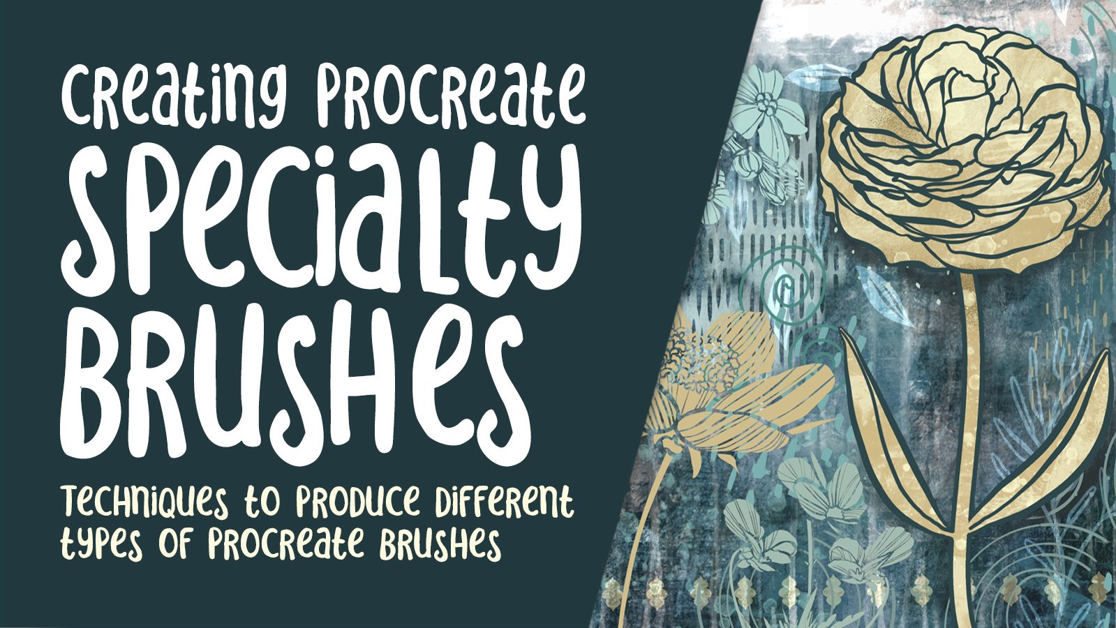
1. Intro to Simulated Laser Cut Paper in Procreate using Brushes : Hi guys and welcome. My
name is the largest now screened and I'm
coming to you from sunny Florida this time. Yes. I'm not at home
in sunny Manitoba. And I'm kinda glad about that. Right now the temperature
difference is 56 degrees from there to here. So I'd rather be on the
warm end of that scale. Today's the first class that I'm bringing you from this location. And there were a few
things to iron out to get a really good
video for yourself. Let's hope that
this all works out. And by the end of the class, you will have gone through
the entire project with me and you have something
beautiful to show for it. What inspired me for
this class was receiving a Christmas card that had a beautiful laser
cut graphic in it. And the more I looked at it, the more I thought,
you know what? I think this is something
we can do it in procreate. Of course it will be a
simulated laser cut. It won't be the real deal, but it's going to
look really good. I found a good reference
it I'm going to use. And so you'll see me go through the whole process
from start to finish, everything from creating
that initial graphic. And we're gonna do that with
some brushes, of course. And we'll create a couple
of brushes writing class. And we're going to have opposed
to a really nice layout out those flowers. And that's going to be the shape that we use kind
of as silhouette. So it'll end up
sitting a little bit above the background layer. And then we're going
to cast some shadows. And that's what's going to give that illusion of
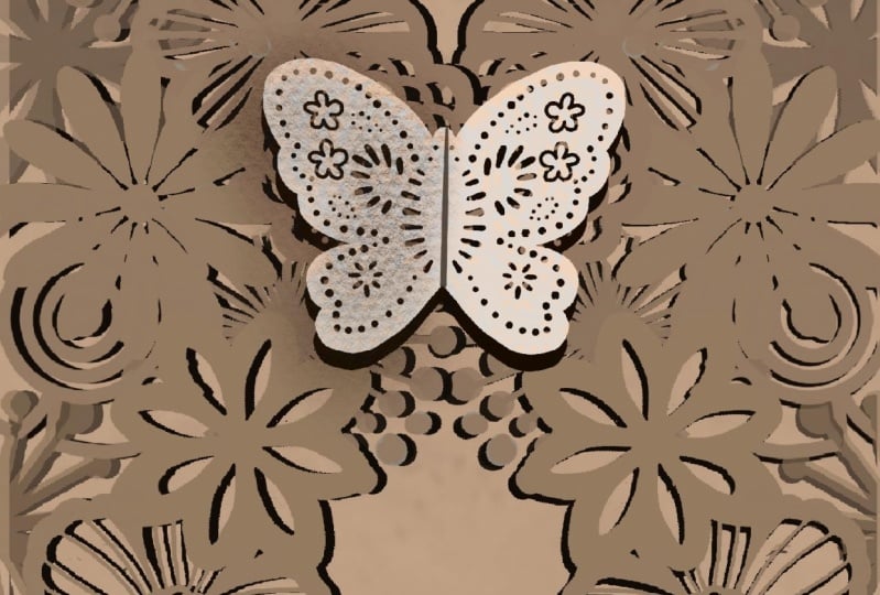
the laser cutting. We're going to do another layer with a little bit of a butterfly to act as a clasp or as a
closure for our little card. And we're going to add
a few textures and things to just make it
look really realistic. Like I said, this is my
first experiment with this. So we're going to be going
through this project together. Now if you haven't
done so already, make sure you hit that
follow button up there. That way you will be
informed of any of my new classes as I post them. And I'm still going
to try to keep up the schedule of one class a week if you haven't
done so already. Also go to my website at shop. Dog alerts are dot ca and get yourself on
the mailing list there. I've actually got
a few free assets that I'm going to be posting
there in this next week. So be sure you're on the
list so that you will get the announcement about
those right away. So without further ado, I'll meet you in the first lesson where
we're going to get started. See you there.
2. Lesson 1 Overview, Inspiration and Brush Making: Hi guys, welcome to lesson one. So we're gonna start with a
little bit of inspiration. We're going to look at a
couple of the pieces that I looked at when I was getting kind of excited
about this project. And we're also going to
create a brush or two that we can use for
our floral layout. Let's get started. So before we get started
in Procreate or wanted to show you a little bit
of my inspiration here. And I'm in Pinterest right now, there's a couple of
laser cuts items. You can see here. It's cards quite pretty. And I just kind of a
general search online. And I really like the look of this two pieces folding
over each other. I was looking for
some inspiration on, That's just basically
inspiration on what different sort of
motifs would work here. And from what I'm
seeing is kinda heavier looking motif seem
to work thicker lines. And we said, look that I like. So that's kinda how I got, I got inspired for this. And on Pinterest, I did find a really nice piece, one here. And I think that's
what I'm going to sort of model my project after had and created a bunch of these different sort
of flowers scouts. And that's what I'm going to
use to compose my pattern. You can hand draw it. You can really do
it anyway you want. But I'm going to use stamps
because I think it's going to go a little bit
faster for this class. Now, I am working in
a little corner in my spare bedroom at
our house in Florida, and I'm going to
call it a house, but it's a single wide
mobile in 55 plus community. And yeah, I'm doing
the best I can. So the setup isn't exactly
what like what I have at home. It's not comfortable yet. It feels kinda weird. I am sitting on an improper chair and my setup here is a
little bit weird, so bear with me for this class. I'll probably get
it set up a little bit better as time goes along depending on how long
we are going to be here. And I don't know if you noticed
my fancy new pen holder. I was forced to do this. I bought this pen because, or this holder
because I have now broken to yet not just one, but two apple
pencils, a $169 each. And I finally broke down and bought something
that will protect them. Style is so if I
were to drop it, this tip is protected here
and when I'm not using it, I can flip it close and
it's completely protected. So that's kinda of different. You probably haven't seen
that on camera here before. And yeah, Well, let's go into
Procreate and I'm going to get maybe kind of an overview
of what I have created. This was just kind of a fun. Let's figure out how
it's going to work, sort of an experiment. So I'm going to toss all
this stuff completely and we're going to
start from scratch to create something like this. And I'll show you the brush
set that I created here. So I've kept everything
really bold and you can see that I've got all kinds
of different looks here. You know, like I said,
I was kinda fashioning it after this one
that I saw here. So I've got a few graphics
kind of similar to some of the ones that you see in
this particular art piece. And I really just love the way
this looks like that depth that's created with the shadow in behind and that's from an, an actual natural paper cut. And what we're going
to be doing is trying to simulate that. So we're going to try
to create as close as possible amounts to this and we're gonna do
it all in Procreate. Now I'm gonna give you
this set of brushes here, because that'll give you
a good start and you can lay it out anyway
that you want. And maybe you just have
some fun practicing. You can easily create brushes. These were honestly very
quick to produce and just add a layer or create
a layer in a document. I put the drawing assist on, so I went into the drawing guide here to edit drawing guide. I've got symmetry, is
the vertical symmetry, but you can experiment
with any one of them like a radial symmetry I used on some of the
layers for the flowers. So you can see that that
layer is now going to be assisted and I'm going to
hold down on that one. So everything else is hidden except this one
that I'm working on. A nice thick black brush. Now as far as the brushes, I mainly use the
Posca paint marker. You can use the tapered
pen pressure brush, any of the brushes
that you like using. So the Posca pen is
kind of monoline brush. So even in the calligraphy
set, you can find that. So then I just use, use the power of the drawing assist to help me
create some quick flowers. This one could be longer. You can have them
solid like this, or you could create some
interior additional elements, sleep, lines or dots. Whatever works for the idea
that you have in your mind. Once you've got the brush
created, a little bit. Once you've got the brush
created to your liking, then just simply peel this
background with white. Here that it's
filled with white. We've fingers swipe
downwards and copy. And then we're gonna
go into the brushes. I'll put it in that
ket p percent. I'll just duplicate one of
the brushes verity have here, going to Shape, Edit,
Import and paste. And I've got a new brush here. So that's stab into the SAT, shows you how quick it
is to produce a brush. Once you've got a good selection of brushes or just use mine, like I said, then you are
ready to get started. So in the next lesson, what we'll do is we'll
start sending out that kind of and it'll point, you call it half-moon shape
on one of the sides here. Alright, so I'll see you
in that next lesson.
3. Lesson 2 Flower Arranging and Brushes: Hi guys, welcome to Lesson 2. So this whole lesson will be all about arranging those
flowers to create a really nice layout that
we're going to use for our laser cut.
Let's get started. What we can do to create the document is to hit that
plus sign in the gallery. I have a five by seven size that I use
for greeting cards, so I can just click into that. I've got this one currently. Landscape. The switch it to portrait mode
is by spinning it. And I like working in a five by seven sides
because that's the size that's necessary for sites like card aisle or
a greeting card universe. Even 1000 if you're
creating cards and selling them online,
has five by seven. Size will work great. And for now we can
just work with block. We can start putting
together our design. Now, you saw that I had the reference open
on that other image. So the way to do
that is just to go into your wrench icon. We're going to go to Canvas. We're going to go to reference
here and turn it on. And I'm going to import
an image which I have already saved into my
photos on my iPad here. So now we can keep this open
as we're working on it, and you can sample
colors from it. You can enlarge or reduce it. I'll just have it
here on the side to help me as I'm starting to place some of my different
motifs on the side here. And like I said, right
now we're just going to work in blocks so we can grab brushes and just
get started placing them. Now what I like here is that
all of the elements overlap, but they don't really
overlap into each other. I'm going to show
you how to work with the brushes to create that effect even if we
have to use layers. So for now I'm just going to just see the size of
my brush and I think that size is
actually a very good for this particular
document size. You can adjust the
size here, of course. So let's go a little bit bigger and let's just start
with this bottom corner. So I've got my first
motif position. Not exactly going
to be like this, but this at least
gives us kind of, I don't know, just
something to look at as we're working on it. I'm going to vary the
brush is quite a bit, so I'm going to be switching to different pressures
almost every time. So let's switch to a
more hollow brush here, and this one will go
a little bit bigger. And so I was talking about the overlapping and I don't want to have that sort
of thing happens. So in some cases, it'll be best to create a
new layer and then position. So I like that brush
to be overlapping, but I don't want that
inner bit there. So what I'll do is I
will erase fat off. Well, I have it on my
tapered pen pressure brush. I wanted it to be on my posca. I can just switch it here. And then that way my eraser doesn't vary in size like
the tapered brush would, would you go back to black here? Start adding a few
more flowers in here. So it's really up to you how you want this to look
in the long run. Now if you notice some of the flowers here are
completely solid. Some of them have
little openings. I didn't create too
many fully solid ones, so I might go back and do that because I think having
the variety is nice. So this one would be
a lot like the one that you see tuck in back here. And you can see the contrast
between the ones that have lots of openings and the
ones that have no openings. So I think that's one of the things I'm going
to strive to do. So I might end up
going in and doing, like I said, some
changes in my brushes. So what should I do next? The other thing I
really like doing is varying the size of the brush so you don't
want to keep them all the exact same size. And remember we're on
our second layer there. So we can also go
back and go on to that first layer if we are doing something
that's going to overlap. So let's say we try
one of these in here. And I think I would want to go big enough that it
kind of overlaps. I'm actually going to make a
new layer for this because then I can rotate
it, sort of rotated. Of course, you just
grab this little handle here and you can
enlarge it or reduce it and switch the
angle a little bit. And I think something like that would be really nice if it was touched well
behind another flower. So I'll use, I'll do it
kinda behind this one here. Because what I want to
show you is the use of a selection to
help me cut that out. So I'm going to grab my
automatic selection. And now I'm on the layer that has that original flower on it. I'm going to select, and you can see here that
I'm selecting that flower. And because I know that
there's nothing else on the layer that
I'm planning to cut out from this layer and do
the automatic selection. And the one thing
I forgot to do was to hit the invert button here. And then now I can
go to that layer, triple swipe down and cut, and you can see how it's
nicely cut out this motif. So let's just keep going
here and we can make a new layer if we want to or we can work on one
that's already there. I'm going to do one that
looks somewhat like this. So I'm going to, I've got it on a separate layer, as you can see here, you can always go a little bit
bigger and then resize it. Accordingly, now, I've created these brushes at 10
inches by 10 inches. And so even at their full size, they're going to be bigger than this card size that
we're working with. So that means that you've got a lot of room for
enlarging here. You don't have to worry
that you're going to diminish the quality at all. Overlapping. And now in this case, I want to cut out this flower a little bit so you can either grab the
eraser and go to that layer. That's when we can just
kinda reduce the opacity temporarily and
go to this layer, this layer here, and then just use the eraser to erase it back. And you only need to erase
it where there's white. Now, I want to go into
the stabilization here and reduce it right
down for any racer. So like I said, you only
need to erase where there is white because
the block from that other layer is going
to cover the block will go back and increase that opacity. And you can see here we're
making really good progress. And that's one of the
things I like about having the brushes is that it just makes everything go so fast when you're doing
something like this. Okay, What have I not used? Try this one here,
or add a new layer. We'll bigger and then just move that off a little
ways, maybe like this. In this case, I'm going to use that automatic selection again, invert, go to this layer and I'm going to use
the eraser tool. In this case, I don't
want to just simply cut because I don't want to cover these other things that
are on the layers. So just using the eraser tool in the selection area
works great as well. Now let's try. Now. I'm saving level of
butterfly here for this here. But you can see that the
artists who created the pattern for the laser-cut did incorporate some
butterflies in there. I haven't included that
in this brush set, but maybe before I
published a class, I'll have time to go
ahead and do that. And they can maybe this one
just like we have here. I'm going to put one over here, so I need to de-select. So I just went back
to the selection here and pressed on it
and it de-selected. Let's make a new layer
and that is large, so I can go smaller. I want to cut it out of here, which is on this layer and this, which is also on this
layer, go to this layer, automatic selection in birch, and go back to this one here. Three fingers swipe
down and cut. So that's cut it
out where it was showing through the
white of those two. And I'm liking it. It's going great. We're going really fast here, faster than I anticipated,
which is great. The class, I'm hoping this class will be a
little bit shorter because I am so not set
up here in Florida. I've got my laptop. I'm totally not
used to using it. I'm not used to working in this particular space
that I've got set up. So I'm hoping this class
will be a little bit faster. I had a class
completely prepared and just ready to edit on
my computer at home. I copied everything over onto my iCloud Drive and then
just forgot one part of it and the library for some
reason I'm trying to get my daughter extended to me and
I just can't make it work. So I'm kind of stuck with what I've got here
and I've got to produce another class where I had one almost ready would have
been really great for my initial project to
be able to just kinda rely on something that I've
already got almost finished. But nonetheless, here
I am working away. So now this little flower here, I want to cut out of this here. So let's do the selection again. I think that seems to be
the easiest way is to do the flowers initially
on separate layers. So I want to cut it
on this one here. So now I can do the three-finger
swipe down and cut. And now it's cut
it out of there. And then the same
thing with here, that one is not much, So let's just erase that one on. And that's just a little
teeny tiny bit there. And now I think I can fill in this area with smaller flowers. So I'll do that off camera just to save a
little bit of time. And then I'll come
back to you with this, ready to go for our first stage, alright, so I will see
you in that next lesson.
4. Lesson 3 Add Texture and Create Shadows: Hi guys, welcome to lesson 3. This lesson we'll add
some texture and we're also going to add
the shadow effects. That gives us that
three-dimensional laser cop luck. Let's get it started. So I'm pretty happy with this. I've kind of done a
little bit of fill in, as you can see, with
just some dots. And I created that
brush super easily. Just basically add the brush. And it's the basic
brush set up there and just increase that spacing and you'll have
just a single dot. Now this one, if
you press softly, will give you lighter colors. So I don't want that, I
want the solid blocks. So that property is
in the Apple pencil. Just bring that
right down to 0 and then all your dots will
be 100 percent blocked. So that's what I
did and a couple of other little flowers
here and there. And yeah, now I'm
ready to start working on what's going to
be the front layer. Now, I just did the one side
because it's so easy that I can just duplicate it and put it on the
other side here. So o do that later because I think right
now I sort of focus on showing you how to get this kinda craft paper looks of that color and also to start
working on the shadows. So to get that color, It's very simple to just
sample the color right here in your reference. So you can drag around
until you get that lightest The Craft color
and it'll come up here. Now what we can do with
the layer is just, well, that's actually swipe
to the right on all of these and group them and
just leaving it editable, I think is a good
idea at this point, I think I've got up to like 200 liters here with a
five by seven documents. So I'm going to swipe left and duplicate for that bottom
one off and this one, I'm going to flatten. So now we have this all as
one Lear as you can see here. So to change the color, the fastest way is to go into the layer
itself and select. So that selects
everything on the layer. Now, that little bit that's not selected there I think was an accidental white
that I stamped at 1. So I'll get that
off in a second. But now that I have
that selected, I can just go right back there
again and hit Fill layer. So now we've got basically
the color that we want here. Now you can see some slight
variations here in the tone. So I didn't realize
that was happening. So I'm going to backup to
when it was just black. I'm going to go into my adjustments here
and go to Curves. So I'm not sure
why that happened. Maybe I just didn't
stamp is hard. One of the things I can
go back and do is check all those brushes and make sure that in the Apple
pencil settings, the opacity is set
right back down to 0. It's no big deal though. I can easily adjust
here by dragging to the right on the bottom
left-hand corner dot. And that's going
to make everything really nice and black. And what should make
everything nice and black. So some of those thoughts
I had done before, I had taken that
opacity setting off. So that's why that's
happening there. I can go in with black
and drag it into those. Or I can race down
with a pure black. This is going to be
hidden by the butterfly. So I'm not super worried
about that particular one. And I'm going to
sample that color again because I just lost it. Real quick. Go into Select, and then back to fill layer and we're a 100 percent filled
there with that color. Now, in view of the fact that this is not working for me here, I'm just going to drag in fill and I'm going to be
adding a texture to this. So I think it's
going to disguise the fact that I've got some different tones
happening here. So the next step for me
is to add that texture. I'm going to add a layer here, and I'm going to go into my textures and the textures
I've created myself. These are made with the actual grain settings that you have here when
you're making a brush, I'm gonna give you this
one so that you don't have to worry about doing that. And I'm going to pick a
slightly darker tone. I'm on a layer above and I'm just painting
on that texture. So that kind of reminds
me of craft paper. You know, the envelopes you get that are just kinda that color. And now what we can do is
use linear burn to apply it. And let's reduce down the
opacity a little bit, but that gives us a
little bit more character in our color here. So now I'm going to go
back into this layer here. I'm going to hit Select, and then I'm going to
invert that selection. So it's selecting
the full background here and go back here. And so now the texture is
only on that floral layer. I can pinch the two together
and I'm happy with that. And I think what I'm
gonna do is also painting in a little
bit of highlights. So let me sample
this color again. And I'm going to grab a
really soft airbrush. And in some areas here can
be fairly hard to see. I'm not trying to make
it super noticeable. But I'm going to hit select on the layer, hit invert again. I'm going to add a
new layer just so that you can see
what's happening here. So you see I'm painting kind
of a lighter tone here. And I'm just putting
a little bit, I'm highlighting here
and there because I think that makes
the lighting just a little bit more natural
like when we go and apply the shadow effect
in the background. And you can see it's darker
down in this corner, which is kinda neat. And I'm having a little
bit brighter on this side. I'm going to kind of
work this as though the lightest coming
in from this angle. Now I can deselect
and I'm ready to work on adding a drop shadow
in behind there. The fastest way I know how to duplicate this layer selected. Then we're going to
fill it with black, circle back to that
layer and fill it. So I've got that one on top just like you can see what was happening and now I'll
drag it underneath. So the moment is
completely blocked out, of course by the cutoff floral. And now what I need to do is just go to my adjustments here. We're gonna go into
the Guassian blur, Gaussian, gaussian. Never sure how to
pronounce that. And as we slide our
stylus across the screen, you can see that we're getting a shadow behind
our graphic here. And that's pretty much it to
actually create the shadow. So that's creating the shadow. I'm going to show you in the
next lesson a few things to make this shadow look a
little bit more realistic. So when I was doing
that Gaussian blur, I pulled it to about, I usually find between
3, 5% is good. There's four, there's five. Bring it back down to vote for. And now we'll be ready to do some of the things
that I want to do to make some variety
in that shadow area. All right, So we'll do
that in the next lesson. I'll see you there.
5. Lesson 4 Distort the Shadow and Add the Clasp: Hi guys, welcome to lesson 4. In lesson 4 here
we're just going to finish up that shadow. So I'm going to use the liquify
filter to get that done. And I don't want to
add that closure, the butterfly kind of a class. And that's going to be a little bit three-dimensional as well. So let's get into
the US already. So I want to show
you how to make this shadow look a little
bit more realistic. I don't like how it's latches really bunching up
in these areas here. I want it to look
a little bit more offset like this one is here. Now, you could do that by just making the blur a lot bigger. So I could have done that. I really spreading that blur, but I don't like that either. I don't feel like that's
really what I want. And I think I want
it just kind of push the shadow here and there. So in that case, I find that the easiest
way is to, again, go back to your adjustments here and this time
go to liquefy. I'm going to use the push. Not sure exactly what size, but let's try this at about 69. For now, I've got the pressure, say at about 40.5 to 50%, then now I can
actually selectively go in and start
pulling the shadow. And I think that looks
a lot more realistic. What do you think? Remember that I
was saying I want the light source to
kinda be on this side. So I'm pulling downwards mostly. You can see that there. This is a tricky area
because of the fine lines. But I'm liking how this
really looks like. The light has permeated those little openings and is casting shadow on
that background. So I'm going to do that
a little bit more. It really doesn't take much to make it look a lot
more realistic. I'm really liking
that. So clinical, maybe a little bit smaller
here and then pull these over. Now you can see how
neat that looks because it's really as
if there's a light, this is lifted off and you're getting the shadow from all those little laser cuts, but it's showing
up quite nicely. Now in this area,
what I might do is actually use a selection. I'm going to freehand
draw that in. So I'm just kind of
drawing a bit of a selection kind of
in the middle there. And I'm going to feather it
a little bit to soften it. And let me just see
here what happens if we click off of that feathering and I'm just
going to cut that out. Now that doesn't look
very good at the moment. But what I wanted to do is
use a soft airbrush here, and I'm going to go in
quite a bit smaller. And now it can be a
little bit more selective with how that shadow is showing. And I think it looks a little
bit better because it's not completely filling in all
those dots and things. And besides, this area
would be a lot brighter. I can do is use the eraser
with the current brush, which would be the
soft airbrush. And I can go in and soften
some of that in there. Less light would go
in there just simply because those lines
are so much smaller. So I think that's worked
out pretty good there. I think I'll do the
same thing here. So I'm just kinda now going through and
selectively lightening some areas wherever there's
really tight lines. And I think that has turned out. Well. Now, if I'm lucky, yes, my colors are here from
my original selection. What I wanted to do here is
add a layer and let's drag in the lightest
color here for now, we can darken it up after. Now, I'm feeling
like it's really starting to look
a lot like this. Now, on the original sample, you do see a lot more
shadow in back here. So let's go back to
our shadow layer and let's just try a little
bit of blurring on that. Now, moved alert and I don't
know if I like that as much, so I'm not gonna do that. I'm putting it at 1%, but I'm gonna go back
to that soft airbrush, go in quite dark. I'm going to add a layer here. And let's just see
how that would be. Now I'm going to go quite
large was with my brush. And you see, I'm just
kinda brushing in a little bit of
additional shadow here. You can reduce the opacity just if you want to
build it up slowly. And I think that kinda
helps increasing that look of shadow. And remember, we're
also going to duplicate this and
put it on this side, as well as adding
that butterfly class. Why don't we add that
butterfly right now actually, let's go to the top layer here, add a new layer, and we'll get our pretty little butterfly, which I created in the
middle of the night. I couldn't sleep and will
stamp that in the middle. Let's go for a lighter
color actually first. So I'm going to the lightest
color that I had used, and then I'm going even
lighter with that. Now this one looks slightly
yellow, so let's do that. So I'm going to stamp it just doesn't really matter
too much where because we can enlarge it or move it around and
then put snapping on. There we go. Now we have it perfectly
in the middle there. And with this it's
exactly the same process. We duplicate that layer. Let's go to the bottom one. We're going to select it. Then we're going
to get our block. And you don't have to
always use a pure block. You can always go and go with
a dark brown or something. I've used the blog, I'm going to go to
the fill of layers. So you see, I've got it filled
in black here you can see, and we'll go back to the
Gaussian blur and blur it for 5% and then to liquefy
and start pushing it. So you can see that I'm pushing it away from this top corner. There would be a
lot of light there that would be
definitely glued down. And I'm really pulling these areas because on
something like this, this is glued on top of the other paper which is
already a ways from the beach. And so the bigger you
make that is the more it looks like It's
really lifted away. And we can go back
to this layer two. And now we can hit Liquify. And now we can kind of
pull that a little bit bigger as if this bottom half is lifted a little
bit further away. Now, if you've ever
worked with cut paper, stuff like this, a lot of times, something like this would
have it a little bit of a glue spot so that
you can lift it off. And what ends up
happening is a lot of times you'll get
increase in there. So if you're creating
these sort of things, you want to create
that crease so that it's easy to
fold it up and down. Notice simulate that
is a different thing. So we're going to grab
it, rectangle selection, and this is going to look
awful before it looks good, but we're going to make
a solid black rectangle. Let's put it above that layer. Drag that in. And like I
said, it looks terrible, but we're going to make it into a clipping mask so it's
clipped only to the one side. And what we want is to
soften that completely. What it's doing here is as if the light is coming
from over here. And then on this side
we're having shadow because this middle portion
has been pinch a little bit. So the fastest way
to now do that with that selection here is
to do another selection. So another rectangle. I've moved over a
little bit here. I'm going to go to
feather the selection. And it's hard to see here my dotted line, but it's moving. I've done it about 20 percent and now I'm just going to do cuts and you see what's happening here now this
is way too extreme, so I'm going to
actually do it again. So I've got the rectangle
which I feather. I'm feathering it almost up
to that center line there. Remember to click off
of that feathering, then you can drag
down and you can cut. Still really,
really, really dark. So what we can do here
is maybe just play with the opacity setting and
you see what I'm doing here. Hopefully you can
understand what I'm trying to achieve because it
does not look like now, the middle of the butterfly
is kinda coming up. It's still a bit dark. So what I'm also
going to do is take and reduce this completely
and my snapping off, I can reduce it could free-form. So I'm reducing the
size of a year and I think I can still
even lighten it more. So to me, something like that
really makes it look like that had an original fold
that way, bring it down. Now if you wanted
it, the foal to look like it's in the
opposite direction. You can take that and rotate it 90 degrees and then bring
it to this side so that it looks like it's sloping
upwards like this. So now we've really created
so much dimension here. Our last step is really going to be just finishing this off by duplicating or making
a new layer on this side. So let's do that in
the next lesson.
6. Lesson 5 Adding Finishing Touches: Hi guys, welcome to lesson 5. This lesson is all about
the finishing touches. By the end of this lesson, we should have a complete card. Okay, so now we've
got our class, we've got our one
flip over page. Let's do the other one. And we can decide
here whether we want to rotate it as we've clip it. I'll show you in a second. We might want to just
have a direct sort of our mirror repeat here. You'll see it's always
an experiment, right? I'm not going to copy over this particular part
of the shadow here, but I am going to copy
this one for now. We're going to have to
make changes to it. So I'm going to swipe
to the right on both of these in-group it so that I can swipe to the left
and duplicate the group. That's what we're going to
bring over to this side. So pretty much what you're
gonna do here is rotate it. I just this rotate
because I'm lazy. So I do for little
clips of that. And you can see right away
what's wrong with this, right? The shadow is now on this side, which it can't be
because there's a light source coming
in on this side, we're going to have to make
some changes to the shadow. So let's try first
just moving it. You know, essentially
that works. So let's just position
it now if you want to move just a pixel or
two at a time, you can tab. If you do it right
in the middle here, it brings it straight across. If you do it right in
the middle at the top, and brings us
straight up and down. So you can see what
my problem is here. I'm trying to have it just
a little bit in here, but then we're still
having that over here. We can maybe move it
this way a little bit. But I think I'm going to
have to go back to my liquefied and I don't
know about you guys, but I find, I use this liquefied for so
many little things, you know, oops, you see
what was happening there. I had both things moving
at the same time. I definitely wanted
just be on this layer. Whoops. And we're moving it just slightly doesn't
matter too much what's in here and here we
want to make sure it's definitely showing on
this side everywhere. So in a case like that, we've got to move some of
that over a little bit. Now, I'm going to also
make sure that this group, this whole group is moved
below the other one. So that, that looks
like it's on top. And I think that I could actually lighten
this one a little bit. So I'm reducing it in
opacity to about 80 percent. And I think that that's
giving us more of an impression of this one
being on top of this one. So go ahead and do any of the adjustments that you think are going to make this
look more realistic. And that's the beauty
of that Liquify tool. Now I want to also do a
little bit of work on this background because we
didn't add any texture to it. Let's go to that layer. Add a layer just above it, are going to brush in
some of that texture. So we're gonna go into
my texture sampler. And the one I use is big
texturize your fibers. I'm going to just quickly
show you that brush here. It is just a, just a giant brush that I've gone
into the green here, edit and gone into the
Source Library and chosen. And which one is it? This one here recycled, and that's the one
that gives you that fiber kind of background. This will be fun for
you to go in and actually experiment
with making brushes that have different textures because different ones can do different things or give
different sorts of effects. So I'm going through and
I know it's super dark. Actually, let's go
and sample the brown. And now you can see
the paths really added some nice
texture in there. And you know what, We're pretty much done. What I'd love to
see you guys do is experiment by going in
and taking a look at some other inspiration
here and seeing what else you can
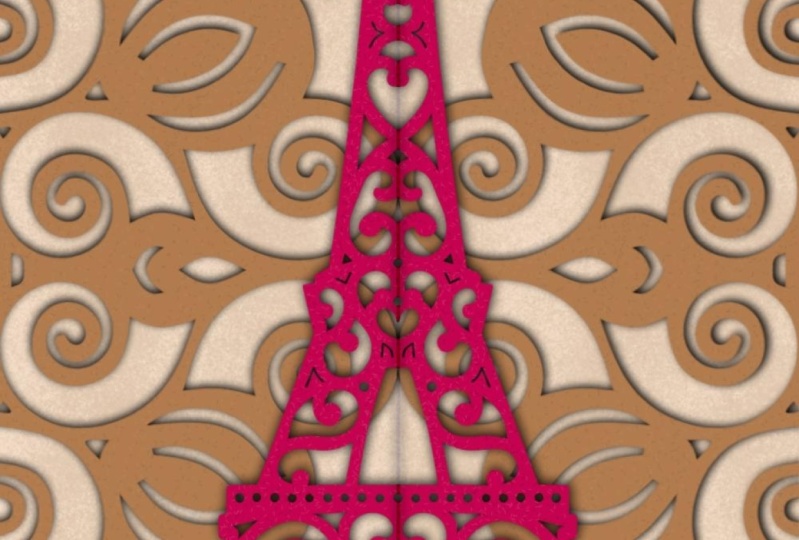
create like something full color like this
would be gorgeous. Lease would be a
beautiful cut paper, sort of an effect as torn paper is great
to add some depth. Here's kind of an effect with a butterfly that I was talking about where this could
be a flat artwork. Right now it's showing you
an example of a real one, but you could create
that sort of an effect easily by this shadow
method that I showed you. Here's another example that shows a really neat
clasp on the front. And that's basically
the technique that I just showed you. But I'd love to see you guys go in and create
something like this. Now, it would be super
easy at this point to go in and add all kinds of detail
or interesting effects. I really like the
way these sides are, kind of a reflection and a flip. If you know what I
mean, you could go in and take that second set, which is this one here. And you could now flip
it vertically if you wanted to have it an
exact mirror image. I personally like that. It's juxtaposed like this. And any of this, this entire design could
have been done with really pretty scrapbook
paper instead of with Kraft paper
and plain colors. So something like this one here. You can go to and add
an Alpha locked to it and then go in with
some kinda fun texture. Maybe these circles, same
kind of a light color. Let's go a little bit darker. And you see how you could add a really pretty design
just created with brushes. So that's something that
you could experiment with. And same with this one
in the background. This paper, it could be paper
that you have created with, like I said, a printing
scrapbook paper. So just go to the layer
that you want affects, put alpha lock on it, and then go in and add some
kind of a neat texture. I'm going to actually
get something like this. And you see how you could add a really cool pattern on top. You can take any of the other texture brushes that I've
given you in the past, I'll add a few here. You could also take mixed
media, kind of a brush. So I've got a mixed
media set that I've given you at some point
in another class. And let's just take one of
these of the color drip. Color changing drips
are kinda neat. And let's go with something
completely different. Let's go with something
kind of orangey. And that's really cool too. So you can have so, so much fun with this right now. I'm actually going to get
off this recording and go and play a little
bit more because now I'm even getting myself
excited about this. And yeah, I think that's done bedside short class
for you this week. And I can't wait to see
what you guys have done. And I thank you so
much for posting your projects and your comments
are always super-helpful. I know that sometimes
it's a little bit frustrating working
with somebody who knows what they're doing. And I feel like I'm
either going too fast for some people are
too slow for other people. So it's always kind of a balancing act and
appreciate your patience. I appreciate the fact
that you go through the efforts of actually
printing the project together. And I do hope that
you're enjoying the youth of my brushes. And yeah, I guess I'll
see you in that wrap-up.
7. Lesson 6 Wrap Up and Conclusion: Hey guys, welcome
to the wrap-up. So I wanted to show you this
finished card on a mockup. So I think that's a
really good way to visualize how that really will look and how you can use
that in your POD sales. The three sites
that I've mentioned throughout our car dial, reading card universe and
dazzle for selling cards. Those are the three that
I Amelie sell at and the best sales come from
the card aisle website. You can join the Cornell
site and you can upload your cards and
be selling to moral. It's as easy as that. It only makes up a
small percentage of my POD seals from the year by take even a for a $100 payment quarterly
is welcome right? Now if you haven't done
so already and you liked my class and you like
my teaching methods. And be sure you hit that
follow button up there. And like I said, add yourself to my mailing list on my website. I thank you guys so much for posting your beautiful projects. That gives me the
incentive to keep going. And I love when you send
me ideas for classes, I tried to cover as
much as I can to help you create other
revenue streams that could work for
you in creating some additional income
and satisfaction. I think for me the most
important thing about selling, it's that feeling that you've got something
that someone else wants and it is just
simply satisfying. That's all it is. I really enjoyed doing
this kind of work. And I'm hoping that that is reflected in the kind
of teaching that I do. Now remember, I have shown you that Pinterest pin board for
paper cutting inspiration. And I think that what
would be fun for you now that you've
got the basic idea of how this is done is
to go in and create something in color or with
other types of textures. You can really create something
completely unique to you. If you see something
that you like and you want to mimic it, definitely try it out. But if it looks exactly
like the original, then be sure you don't sell it because that that's a no-no. We don't want to be copying
other people's work. What you wanna do is learn
from it and then from that, create your own luck and of
course, experimental lot. In order to get to that point, make sure you check
out my other shops. I've got one at docile.com, I've got one on Creative Market. I've got my own website, shop dot dealers aren't dot
ca where I saw my brush sets. And thanks a lot you guys for buying those brush
sets over Christmas. That was really great. If there's anything in a wave of brush set that you'd
be interested in. Be sure you let me know
because I love creating brush sets and I would love to create something
that's useful for you. I'm going to try to
keep these classes coming once a week. That all depends on the kind of travel plans and things that we do now from this location. We're super-excited
because we brought our little camper
trailer with us so we can take
little short trips from this location and go. Anything else that
we're interested in seeing here in Florida, and I especially loved
Saint Augustine area. So I'm going to take
a look at that again. Maybe we'll go a little bit
further South African there before you have any ideas
for me to let me know. Otherwise, I might
say by for now and I will hopefully see
you next week.
 Delores Naskrent, Creative Explorer