Transcripts
1. Introduction: No Hi, I'm Liz Trapp, and welcome to my newest Skillshare class
simplified animals, painting woodland
creatures in gouache. I love painting in my sketchbook with gouache and all kinds of
other materials, and I frequently find that
my love for nature and nature based items often
leads me to painting animals. This is not a class that is
going to teach you how to paint a realistic
animal, but rather, we're going to break
animals down into simple shapes like rectangles, triangles and circles, and then we'll build
a body over them. Then we'll add movement, personality, and some
individual creative flair. Then we'll surround each animal with a fun festive background. I'm using leaves because
I'm filming this in autumn, but you can use any
elements that you wish. This class is all about having fun with animals
and breaking down the sometimes complex nature of drawing an animal into
a few simple steps. First, we'll draw a fox, then a squirrel, and
finally, an owl. After we draw each animal, we'll go in with gouache
paint and paint our animals. Then I offer the opportunity to add details with colored pencil, although you can make the
choice if you want to do that. This class is for everyone, from a complete beginner
to a seasoned artist who just wants something new
to put in their sketchbook. And in fact, if the drawing
part is too intimidating, I've provided you with pre made line drawings for each animal
in the class resources, plus the additional
elements so that you can download
them, print them out. And I do have a short
tutorial showing you how to transfer the drawing directly
onto your watercolor paper. So you can just get
started with painting. However, if you want to free hand the animals
along with me, I'll walk you
through in the way I approach it in a really
simplified manner. At the end of this class, you'll have three simple and
fun animal illustrations. I'm Liz Trapp. I'm an artist who
loves painting, working in surface design, drawing and fiber art, and I'm an art professor by day. My goal in life is to
encourage creativity and make art as accessible
as possible to everyone. I'm so happy you're here
and I hope you'll join me for a fun and relaxing class. Thank you.
2. Let's Go!: Hi, I'm so glad you decided
to join us in this class. We're going to have a lot
of fun getting started, and actually in the next lesson, we'll start drying animals. First of all, I want to
introduce you a little bit to the style that
we'll be working in, and I'm going to share some materials that I'll be using if you want to
follow along with those. This class is built
around gouache paint. In particular, I'm using acrylic gouache,
acrylic gouache. But please don't let
materials hinder your ability to work along
with us in this class. If you don't have
gouache, that's fine. If you have markers
and colored pencils, you can also follow
along that way, or maybe you have watercolor
and color pencils. But just use what you have. Try to get the colors
either whatever you feel like or if you want to follow along with me
as close as you can. But again, this is
built around gouache, but you don't have to work in gouache if it's not
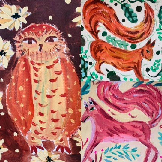
available to you. So let's look at a few
examples that I've painted both during this class and in preparation
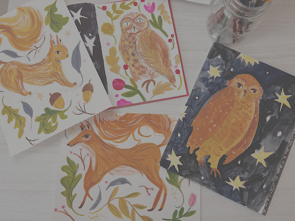
for this class. You'll see that the animals
are not super realistic. They're more illustrative and therefore a little
bit more simple. Net simplicity is actually just a great way to learn
how to draw animals. And if you want to dive
into a realistic approach and build your skills further over time, you certainly can. This is a great place to start, understanding the basic
shapes that are under all that fur and bone
structure in the animals. And then there are
many tutorials out there that will help you learn how to work in
a realistic style if that is your goal. That's not how I work. I
work much more simple. So that's what we'll
be doing today. One thing that you might notice
about these paintings and something I love is that
they're all based in movement, especially the fox
and the squirrel, which are the first
two tutorials I have. One of the things I did was
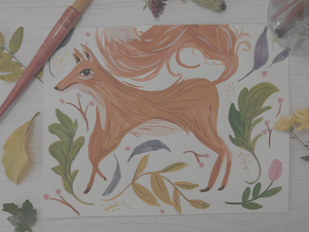
I focused on this bushy, flowing tail and then supported that movement
with the way I laid the elements of leaves
and flowers and berries out across
the rest of the page, making it feel as
though it's in motion. And then I supported that even more with some
directional lines that I applied at the end
of my paintings with sometimes squash and
sometimes colored pencil, but mostly both of them. So although I paint the base
of the animals with gouache, I love to add scribbly
detail and color pencil. I like the look of it. I think it adds a lot of
texture and depth. If you have color pencils
available to you, it's a super fun technique. It's fun to mix up
your mediums together. But you can certainly add
your details with gouache or whatever medium that
you're working in, and you'll have a
pretty similar effect. For your project, I
would love you to upload whatever you
produce in this class. I encourage you to try at least one animal illustration using gouache or whatever
material that you prefer. I really focus on thinking about movement within
the composition. The composition
refers to the way that you lay the elements
down on the page. How are you directing
the viewers I? How do you move
through the image? What feeling does it give you? Does it give you the
feeling of movement? Does it look really static? So think about the
balance between that. So if you emphasize movement and think
about the composition and use one of the animals or your own version of
one of the animals, I would really love to see it. And so go ahead and
upload your project. If you have one illustration
and if you have more, anything you have
is great because I really love to see
what students are doing, and I love to provide
feedback as well. So with that, I'm
going to show you the materials that I'm
using in this class, and then we'll go
ahead and get started.
3. Materials: Materials for this class. I want to start by showing
you this additional resource. If you did not want to
freehand draw your animals, or if you wanted to have a template right next
to you while you draw, I went ahead and did
some line drawings for each animal and put them into one PDF file and it's
in the class resources. You can download them and
you're welcome to use them. I also added some of the
leaves and you can use any of the photo transfer methods in order to get them
onto your paper. I do have a tutorial on
those methods coming up, which if you wanted to transfer these straight onto
your watercolor paper, you can go ahead and
watch that tutorial. If you do not and you just
want to draw along with me, then you can skip that tutorial. I did want to mention that I put some of the shapes
that we're going to use down in lighter
lines on these animals. If you just wanted
an overview of how I drew it or
need a reminder, I thought that maybe that would serve as a reminder as well. So that is available to you. If you're going to use them,
go ahead and print them off. The next thing you'll need is
a pretty heavy duty paper. I am using for this class
Arches watercolor paper, and I really like the
hot press for gouache, which is super smooth. The cold press has a
little tooth to it, but one of the
things I love about gouache paint is how
opaque and flat it is, and I think that a
really smooth paper emphasizes that well. You happen to use or get ahold of these arches
watercolor blocks and you have not
used them before, I just want to give you a tip. You'll find that all the
pages are stuck together. It's really great to work
just directly on the pad. Then once your piece is dry, you will need an zactoknife
or something similar. You'll see on the binding here, it's all black, all black, and then there's this
little gap of paper. What you do is you actually
stick your actoknife in and sometimes I struggle to get one
page, but that's okay. Yeah. Got one. And then you actually cut along
the binding there. And then you'll cut. You can cut all the
way down the edge or just play Russian roulette
and tear it like me, and then you've torn
off your paper. That actually keeps
it from curling up, which is really nice, especially if you're using a
lot of wet stuff. If you have the arches, that's a little pro tip for you. This is really high
quality paper. It's also a little
bit more expensive. There are certainly more
affordable options as well. One thing you want
to look for with your paper is that
it's pretty heavy. 140 pounds refers to the
thickness of the paper, and this is what I would look for if you're
using gouache or watercolor or any media
that has water in it. This will hold it better.
140 pound paper arches is definitely top of the line. And I find that this
Canson watercolor paper, also 140 pounds is an
excellent alternative. I use this the
majority of the time. It has the perfect
amount of texture to it, just a little bit more than the super smooth
arches hot pressed, but not as much as a
cold pressed paper, it works really well
with gouache and the Canson Excel line
is really affordable. This is a high quality paper. It's an excellent alternative. To something like arches
and I do recommend it. I use it all the
time. A size works, whatever size you want
your illustration to be. Then the gouache paint. In this class, I'm using
Holbein Acryla gouache, which is Acryla short
for acrylic gouache. That means that this squash has similar properties
to acrylic paint, which also means that
it is permanent. When you put it on a
palette, once it dries, it will not be revived by water like watercolor
or standard guash. That's something to keep in mind if you haven't used it before, just make sure you're treating it like acrylic paint
when you clean up. See, I have a little dot of gold and I can see
it on my camera. That's old acrylic wash paint that is going to live
there forever now. For this class, I'm using lots
of neutral earthy colors. And so I basically use a
couple shades of brown. Whatever you have that's close, this is a burnt sienna, which is a great medium brown. I always love to have
a yellowish brown. This is a raw sienna. Sometimes they use
a yellow ochre. To they're super similar colors. Then I put orange
tint to the squirrel, I think, and a little
bit to the fox. So if you want to
do that, you can. This is my favorite
color. I barely have any left, but
it's shell pink. I use this as a
nice light neutral. You don't need
these exact colors. Use whatever you
have that's close, but I would say a
range of browns and neutrals if you want
a little orange in there. One that's super
fun to use is gold. I just use it for accent like little background
accent marks. But if you are doing this in the autumn and you want
some autumn vibes, gold is a good way to do it. For the leaves, I use
a couple of greens. I love an olive green. The acryl gouache, this
holbin olive green is a beautiful one because it's got a real heavy yellow
undertone. I love it. If you don't have this,
but you want the effect, if you have a yellow
and a light green, try mixing them together, maybe add a little a
light brown to it. I also use a deep green. Basically, most of
the colors I use, I try to have a couple a
light shade and a dark shade. I can't remember exactly
what other colors I use for the backgrounds, but certainly some
reds and pinks, like a light magenta. I love to make some leaves blue. This ash blue is a nice, not too poppy, neutrally blue. Desaturated, I guess, is what you would say,
not super bright. Then I recommend a
really dark color for the eyes, especially. You can use black,
certainly you can. Sometimes it can feel a little harsh when you have
lots of neutral tones. A sepia, which is a
dark dark dark, dark, dark brown, it reads as black, but it's just a little warmer. I use this a lot. It's
a great alternative. That's the paint I'm using. Again, whatever you have
and want to use is good. Paint brushes. I would say, these are all Windsor and Newton Cotton rounds
watercolor brushes. You often as long as it's not the most flexible
thing on Earth, you can often use a watercolor
brush with gouache. They're similar in property. Watercolor is a
little more delicate, but the brushes you can
pretty much use the same. I am using the Windsor and
Newton Cotton brushes. These are an excellent
line of brushes. I believe they're student grade, which means they're
more affordable. But I found that they are
super versatile and I use them for all kinds of things and they hold
up really well. So I have the size six here, which I use the
most in this class. And then the size
eight, which is larger. I don't use it. You can get by without that one if
you don't have it. And the size three, which I use for finer details, a little bit smaller
but not so tiny. I recommend a little
range of brushes. Something to keep
in mind is that brush sizing is
not standardized. If you pick up a
different brand, size six round brush, it might look totally different. So good luck, I guess. No. I think a nice medium brush
is a good place to start. Aside from that, I like to
use a disposable palette. I tend to use it
until it's all filled up to squeeze my paint out on. You'll need something
to do that. You can use a old plate
or a plastic palette or ceramic palette or these disposable palettes
are really helpful. You'll need some water to rinse your brush in and
paper towel as well. And then I use an assortment
of color pencils. And really, I have all different brands and
all different colors. I tend to try to use
similar colors in my color pencils to the
gouache paints that I use. Just an assortment of browns and then some greens and
stuff for the leaves. That's what I have for
materials. Let's get started.
4. Transferring the Line Drawing to Your Paper : How to do a photo transfer. You have a couple options here. One and the probably
easiest one is if you have a window nearby
and it is a sunny day, you can simply put the drawing that you wish to trace under your
watercolor paper. And if you need a piece of tape to just hold it all together,
you can do that. Press it up against the window and trace using the
light of the window. Another option if you
have a light board or a light pad or a light table or light
box, any of those things. Same concept. It's
a big flat piece of material that
is a flat light. You can do the same thing, lay
your drawing on top of it, lay your blank paper
on top of that, turn it on, and you'll be able to see the drawing
enough to trace it. If you don't have those
options available to you, I will show you a slightly more tedious but
very effective way of transferring the
drawing onto your paper. For this, you will
need scissors to cut out the drawing and
a regular pencil. Graphite pencils. I'm
going to show you with a little example so
I'm going to well, I guess you don't need scissors. I'm cutting it out. I
don't really know why, but that's what I did.
I'm cutting out a leaf. I'm going to show
you with a leaf. This can be used for anything. What you're going
to do is basically, you're going to turn this
into a contact paper. I don't know if that's the
word, but the way to do that is you're going to
use your pencil. I switch it just
slightly to the side, at a little angle and
you're going to just shade a nice layer of pencil of graphite onto the
back of the image. The big thing is to make
sure that you have it under everywhere there's a line because you need this
to transfer the lines. You don't really
need it anywhere else except under the lines. If you're doing something
larger like the owl, I would just shade
around the lines, but you don't have to do the
whole middle of the belly. Once you've done that, you're going to lay your drawing down where you want it and then hold it still and
then with your pencil, you're just going to
trace over the lines. Now, I will say with a black line drawing
printed like this, it's a little hard to tell where you've traced from and
where you haven't. I would have a
system for yourself. I started here, I did this side, so I'm going to pick up
here and do the other side. That way, I know, I got
the whole leaf covered because sometimes it's hard to tell what you actually did. All right. I have the outside. I'm going to do these veins. Really, you don't have
to. You can just make up. You can make all of it
up. That's what I did. But you can make
up the veins too. They're a little easier
or you can trace them. That should have transferred and then hopefully the camera
has picked that up. Yes, I see that you can see it. It's a little light, but it's perfect for our use. That is a simple way to
do a photo transfer um, write onto your watercolor paper without having to
deal with the light. If it's a rainy day and you
don't have a light table. Again, graphite on the back
anywhere there's a line, lay it down wherever
you want it, and then just trace
over the lines. The side with all the
graphite touches the paper. Okay? All right. Have fun. Happy tracing.
5. Drawing the Squirrel: Alright, we will be
drawing the squirrel now. So I'm going to start with the paper that
I'll be painting on, which is my arches
watercolor paper. And I've got a
colored pencil here. And I've popped the
line drawing that I'm working from up on the screen. I'm starting with
these basic shapes. So two ovals, one for the
rear of the squirrel, which I'm working on right now, and then one for the
front part of the chest. Once I place those, I am just going to kind of move slowly and create a
really light sketch, building the body
around these shapes. Right now I'm going
ahead and adding in a really light
circle or oval under the head and then just pulling the nose area out just a
little bit from that circle. Now I'm creating these sort of thick triangles for the legs. I really want my squirrel to be, like, in motion.
Like, it's jumping. I really like that effect, so I'm imagining that
it's kind of moving through this woodland place, a forest or something. And then I'm also
going to go ahead and try to reflect that movement
in this big bushy tail. And as you can see, actually, through where I place
the squirrel on my page, I kind of ran out of
room for the tail. So consider that when you're
working on your composition. So now that I've got a kind of basis down for the
shape of the squirrel, I'm going to go back through and just make my lines a
little bit darker. I do that a lot to
help render them more. I'll fix things and
sort of go through and adjust different
curves or angles. I'm adding in a really
simple eye right now. Something that's
important is to make sure it kind of follows
the line of the head. If the head is looking down, then the eye is slightly
angled down as well. And the other reason why I'm darkening these
lines a little bit is so that you can see the process a little
more clearly as well. These lines are dark enough
that they will be slightly visible once I get
paint on the page. So that doesn't bother me. I use a color pencil
for that reason. It adds a little
excitement to the lines. I oftentimes use a color pencil of a color that's not
in the image as well. But if you do not want that, go ahead and just use
a regular pencil, and you can even slightly erase your lines once you're
done drawing them. So they're really light,
and you can still see them, but paint will cover them up. And so as I'm going
back through, I'm just kind of, like, adding in more curves for the tail, more directional lines. I find that this
really helps me with the painting process as well. So now that I think the
squirrel's pretty much done. That's about all I need to
work from with the painting. I'm going to go ahead
and just add in some extra details
around the squirrel. So I'm doing an
acorn right here. I'm going to go ahead and add another really simple acorn. And something you
can think about with these additional details is how it encourages movement
throughout the page. So how does your placement of, you know, whatever
details you're adding? I'm doing acorns and
leaves and little sticks. You can do whatever you want. You could put your
animal in a landscape. You can put flowers around it or other elements around
it or other animals. But whatever you choose, think about how it helps
you kind of move around the page and really
consider the composition. So I've put up the line
drawing of some leaves and one little acorn up there that I'm kind of
using as inspiration. You can totally improvise here. But something that I do keep
in mind while I'm adding these leaves and
little branches and stuff is this idea of movement. It's not a static leaf, but rather it's a leaf blowing in the wind or falling down. And so I try to curve everything just to
add a little motion. I made this one
particularly a little more whimsical by adding some stars
you probably caught there. But yeah, just go through as you're drawing and
planning this out and think about what you want that
composition to look like. Alright, I'm running
out of space here. So this is my last
little element. I've used pretty much all
the free space on this page, and I'm done drawing and
ready to move on to painting.
6. Painting the Squirrel: We are ready to
paint our squirrel. So go ahead and get
out your water, your paints, your palette, your paper towel,
and your brushes. And we'll be painting directly
on where our sketches. Maybe you sketched it
freehand along with me or you transferred the line
drawing onto the paper, but either way, we
are ready to go. So I'm squeezing out
some paint colors to get started with of the
Holbein acryl gouache. I'm using cream
yellow, shell pink. Raw sienna, which is that
light brown, some orange. And I'm also using burnt sienna. So basically, I have a good
assortment of some browns, a deeper brown, a lighter brown. And then what I just
squeeze out there is sepia, which is a very,
very dark brown. It can be mistaken for black, but it's a warmer, deeper, richer, I guess, brown color. So what I'm going to do is start with a nice mix of
water and guash. I like to work with it fairly
thin in order to layer on. I will say, when you work with it thinned out
with a little water, it can you can get
an uneven effect. That's something
that I like, but it's certainly something to play with before you get started if this is your
first time using guash. I always recommend having
at least a wet brush. So I dip my brush in water. I usually dry off a little
extra the excess water, and then I'll start
mixing up my paint. Um, for this one I'm
kind of going for is, like, a yellowish light brown. So I started with
the cream yellow. I also started with
my bigger brush and decided that both
of those things were not gonna work for me. So I moved to my
medium sized brush, which for me is the
size six round brush. And I'm just mixing in my
lighter brown, the raw sienna. I always get raw sienna
and burnt sienna mixed up. That's the raw
sienna. It's similar to a yellow ochre,
if you have it. And I'm mixing it in
with some yellow. I'm adding a little
orange, also. And basically, what I'm going
for for the first layer of the squirrel is a rather
inconsistent color. I don't want to paint
it one flat color. So I'm just sort of patchworking all of these
similar colors together. I'm making sure that I
also work directionally. So thinking about the direction that fur grows in or lays in, I guess, can help you just figure out how to lay
down the paint strokes. We're going to add some
details later that will emphasize this directional
line and movement, but sometimes it's
really nice just to work that way
from the beginning. So that's how I'm
approaching this. I'm working from the head
all the way down the body. And again, really thinking
directionally and also making sure I have
jillian colors mixed up. I'm mixing all
different shades of browns and oranges and yellows, and I know I'm going to
put another layer over it, not completely, but
enough that it will distract from kind of
what's going on down here. But it offers a nice variety, like when you see a squirrel
running by outside, you know it's not
one flat color. And so this is just
emphasizing that. It also can make
the illustration a little more interesting, although there's
nothing wrong with a really nice flat
color, a graphic look. That's just not the style
I'm working in today, but you are certainly
welcome to do that. You can see, I apologize. There's a little shine when the light above my overhead
light hits that wet paint. It does produce a
little glare and a little shine just
until it starts to dry. But as you can see, I continue just to move through, get those little feet claws and continue with this
patchworky sort of look. I'm also starting to think about adding little bits of fur, little tufts of fur that
might stick out under the belly or from the
tail, especially. And speaking of the tail, that's where I'm moving to next. That is something
I really want to emphasize because what I'm interested in with
this illustration is thinking about the movement, and it kind of
adds this magical, whimsical element to
the illustration. So the tail is a really
great place to do that. There's a reason
why in this class, I picked two of the
three animals have really bushy tails
because I think it allows for this emphasis
and movement that otherwise, you have to sort of
construct with other things. So as I'm pulling my brush strokes nice and long using the
belly of the brush, which means I'm pushing
down enough that I start to get some of the
thickness of the brush stroke. I'm also making sure that I work in lines that
aren't always blended in that might stick out a
little and might curl in a little quicker or might
stick out from the edge. And those little
wispy edge lines are what is going to make it look like there's a lot of movement happening
with the squirrel. As I move through this, I'm also starting to
look at deeper colors. So I worked on my tail, and now I'm transitioning back to the body
of the squirrel. And I've taken my kind of basic color mix that I'm doing that's like orange and light brown and a little yellow. And I added in burnt sienna, which for me is my
deeper color brown. And I went through I added
a little bit on the leg. Now I'm going back
into the tail. It's all still wet, so it's not This is like, you know, I'm just kind
of throwing it all on. But this is going
to help add depth and a little contrast
within the animal. And now I'm taking
that same color, and I'm starting to put it
on the squirrel being very tentative I put
that little patch on the back and I'm not
positive I like it. But I think what we'll
do is just kind of start to add these little fur lines. So I'm not using big
patches of paint with this. But I'm working in these
light wispy lines that I'm kind of laying
over the rest of the body in order to help make it look like not only highly
textured and furry, but also really encourage that sense of direction
and movement. So I'm going back through. I'm going to go ahead and
go over the whole body. This way. And again, just mixing more
of a deeper color. It doesn't really matter
exactly what it is, but a little bit deeper brown. What I chose to mix in this
time was that burnt sienna, and then I just mix
it with some orange. So I'm kind of constantly changing the color
that I'm working in and just moving
through this squirrel. Make sure you give your
brush a good rinse and blot on your paper towel
in between your colors. Now I'm going to grab
my lighter color. This is a shell pink. You can use any light color. You could use the
light yellow for this. You could use a white mixed with a little tiny bit of brown. But what I want to
do is kind of set a little highlight in
my squirrel color way. So I wanted something to
contrast with that inner ear, so I placed it there. And now I'm just adding a
couple little brush strokes throughout the fur
that are this light. They read as almost white, but they're not
they're light pink. But be sparing with this. Too much can make
it way too busy, but just a little bit, a little touch of this highlight is a really nice addition. So I've got to let the squirrel dry for a couple minutes, well, like, I want to put details on, but at this point, it really
needs to dry. It's too wet. So I'm squeezing out my olive
green and my deep green, and I've still got
my browns out, and I'm going to go
ahead and work on some of the background elements. So I'm just going to paint them in basically whatever colors
I think the image needs, they don't have to be realistic. So I'm going to start with
these little acorns and move my way through
these leaf shapes. And I will say, I don't
have them squeezed out now, but I will be
squeezing out gold, which is a really fun color. If you happen to have it, it's a little metalliy, and I'm going to do
the stars in gold. And then an ash blue. Which is a really beautiful
sort of desaturated blue, meaning it's not super bright. I often pair it with autumn like palettes or
winter palettes, 'cause it's really
beautiful color. So I'll do a couple of
leaves in that as well, and, um, yeah, have fun with
your background elements. You can see as I'm working
through these leaves, I am approaching them in a similar way to how I
approach the squirrel. Not sometimes putting down
one color and sticking to it. They can be much more simple. But in this particular case, I'm sort of being
patchy with the colors. I've got the deep green
and the olive green. For a lot of the leaf, they sort of mix
together and create this in between. Medium green. But yeah, just, again, adding variety and
thinking about the possibilities of color
mixing and sort of patching. It's not perfectly mixed, but just patching
together these colors. Make it perfectly imperfect. That's the goal. In this case, I chose to save those
little acorn hats or tops of the acorns until I
knew the bottom part was dry. Part of that is because
gouache will it will bleed. Not quite as much as watercolor. Depends how much
water you work with. Like I said, I tend to
have quite a bit of water. I like to use my
gouache fairly wet. And therefore, if I had put the acorn hat on when the
bottom was still wet, it would have bled a little bit. And it's not a big deal, but that's not I wanted
to try to avoid it, and so that's why I
made that decision. So I'm just going in and adding a couple
more elements here. I've got my blue,
ash blue leaves, and that one I went rogue for. I didn't have it drawn out, but it just felt like
I needed it there. Really simple way
to make a leaf. Is just to start with
your round brush and start light at
the top of the leaf. So it's just a very
little point and then press down with the
belly of your brush. So you get a nice thick, it will be rather diluted
center and then lift up again. And that's how I make some
leaves when I don't draw them, just little tiny ones. Switch to my smaller brush, the smallest one that I'm using, which is a size three round. If you have a size
three or size two, just a little tiny brush. It's great for details. So I'm going in and adding
these little twigs. I think I'm going to
put little berries on top of maybe some
or all of them. I think it's really nice to have a little berry branch
in your illustrations, especially if you're trying
to fill up a little space that's not quite big enough for a leaf or you need
some variety there. I'm also going to go ahead
and use the same color. I just mixed up a
dark brown sebia with a little bit of water. It is easier to use a thin brush when you use a little more
water with your guash. It will just flow more smoothly and the brush has
to work a little less. So I'm adding in the details
on my eyes, my nose, and I put a little
swipe at the center of the ear of the squirrel just to give it a
little interest there, add a little contrast. Don't forget little claws. And anywhere else you feel like you need a tiny
little bit of contrast. I'm just going to
sprinkle it very sparingly throughout the
rest of my squirrel, which is dry now. So it's nice time to
add those details. I would wait to put the eye down until everything around the
squirrel is fairly dry. So I added in little pink
berries on my branches, and I did the stars in gold, and I've let everything dry. So in reality, I kind
of walked away for maybe 40 minutes and did
something else and came back. And now I've got an assortment
of colored pencils. And this is the part like you
either don't have to do it. You can follow along with me
and do it in color pencil, or you can do it in gouache. But basically, what I've selected is an assortment
of colored pencils that's pretty similar to the
colors that I used in paint. And I'm going in, and
I know that this is, like, very subtle because these
colors match pretty well. So you may not be able to fully see the texture
effect I'm getting. But I'm basically
just drawing over parts of my acorn right now, but I'll touch many
things on this page. And I'm just adding a little
sort of deeper color that brown pencil is a
little more even and deeper than the way I
painted that dark brown. And so it adds a little depth, but it also adds texture, especially when you're covering something that has a
bigger surface area, like one of the leaves
or the squirrel. And you don't have to do
everything in color pencil. I like to just add some
details here and there. So I'm adding little
lines the bottom, little ridgi lines at
the bottom of the acorn. Those are not necessary. Actually, after I did them, I kind of thought
I wish I hadn't, but they're okay. I like them. And I'm adding in some veins
on some of the leaves. I'm just using a
darker color blue. It's called a Paine's gray. It's like, really great
versatle color to use. And I'm using that on top of these ash blue leaves in order to just add
a little something, a little extra detail. Going to do similar things
through the other leaves. I've picked up a
dark green pencil. That's going to show
up really nicely on top of the olive green, and I'm going to do
some veins that way. So you can make the choices. What do you want
to add details to? What do you want
to add texture to? And this is a really
good time to do that. So here I've picked up a
light green colour pencil. It's a similar color to
what I'm working on. And this is a good example. I'm just kind of scribbling
over some of the leaves in the same direction
that I kind of painted them in that
I want them to move. And that's just going to add a little texture and a little
depth to the color here. It's very subtle, but it's a really fun thing to play with. It's a great way to play with putting different
materials together. Gouache and color pencil
are fantastic partners. So go ahead and take a
minute to explore that. Now I'm just going to
take a little bit. I have this beautiful
color pencil. It's like a bright,
reddish pink, and I'm going to add
it to my berries. But I will say, I am finding
out as I'm working on this. My berries aren't totally dry, so I'm it's good to wait. I didn't realize
they were still wet. But so I'm not gonna do it on every single one all over it, but just just little
dots here and there. M and now I'm going to take a orange
brownie color pencil. I just kind of goes with
some of the colors I've been using and go through and add just a few directional
lines on top of the squirrel. It does add a nice
in between color between some of my darker and heavier brush strokes I laid
on top of the squirrel, and that base color
I had laid down. You can choose to do a
lot or a little of this. I did very little, and that's a fantastic
finishing touch. So I just decided in this final moment to grab
a light gray marker. Um, if you happen to have
light gray anything, that can add a nice little
shadow under your figure, and we finish the squirrel
painting. Thanks.
7. Drawing the Fox: Now it's time to draw the fox. Alright. I've got my paper. I'm going to go with a
horizontal composition here. And again, I know I'm
drawing these very it's very hard to get
these light lines to show up really
well on the camera. And so I've put my line
drawing just to the left. And I'm starting with
those basic shapes, three circles, a smaller
one for the head, a larger one for the chest, sort of ribcage area, and then one that's up just a little bit
higher for the rear end. And now what I'm going to do is start building the
body around it. I'm doing a kind of
rounded triangle shape for the nose or the muzzle
part. I'm not sure. Some triangles for the ears. Again, just thinking
about taking this animal and really
simplifying it. A fox is quite similar
in structure to a dog and shift the
proportions a little, and you can have a
horse or a deer or shift the proportions a little more, and
you can have a cat. And so, um, it's really fairly simple once you kind
of get the under structure. I'm doing a triangle
for the upper part of the leg and then just
a lean rectangle for the lower part of the leg. And I'm just going
to leave it at that. Not too much complexity
with the legs. Now, I'm kind of thinking about this little lighter
spot or white spot that foxes often have
in their bellies. And so that's why I've made the line one
line in the belly dip upward towards the back and another line actually be the
edge of the belly there. Those two circles
in the torso area connected with these curved
lines make a bean shape. That's also another really
nice way to start the animal. I'm approaching the back legs in a similar manner
as the front with a general triangle shape
as the upper leg and just a long lean rectangle
as the lower leg. And then now we approach my favorite
part, the bushy tail, which I again, have not
quite left enough room for, but I think it's
going to be okay. This is the part where you can kind of let
your imagination go and think about movement and kind of add this
magical, whimsical look. I like to use lots of
sketchy wispy lines, really let your arm be free, and don't think too hard about representing
something exactly. I think that's when you get the best lines with your drawings. Now I'm going back in.
I've added the eye. I always start with the eyelid and then dip the
eyeball down from that. Adding the nose, little
line for the mouth. And now I think that's
good for the fox. I've got a nice
light drawing there. I'm going to add some
background elements. And for the fox, I'm
choosing to do really similar elements that I
did for the squirrel. I'm using that leaf page that I included in the
line drawings packet. So I didn't pull
it up here again, but feel free to reference that. And I'm just doing
different leaf shapes, and I'm trying to kind of again, mimic that sense of
motion that I had with the tail and that I had with
the squirrel illustration. If you joined us for that one, I was all about trying to convey motion through the
elements that I could. So really through that tail, through the background elements. I'm adding a little
flower bud here. Just feel free to go wild. I'm not referencing anything
in the real world here. I'm not looking at a flower. Although I think that's
excellent practice. It's critical to a
good drawing practice. For this, I'm just
trying to keep it really simple and pretty direct. So I'm just going to work
my way around this drawing, fill in the rest of the
spaces as much as I can. I really like to use
pretty much all the space. Even if there's just
a tiny little element in certain areas, it just helps kind of
make it look complete. So I'm going to go
ahead and wrap this up and then we'll
move on to painting.
8. Painting the Fox: Alright, it's time
to paint the fox. Here we go. I have
my drying out. I have all my painting supplies, and I'm using the same colors that I used for the squirrel. So I'm using orange, shell pink, raw sienna
or yellow ochre, olive green, deep
green, burnt sienna, sibia, ash, blue and gold. So feel free. Again,
use what you have. That range includes a light
brown, a yellowy brown, and a medium brown, and then a dark contrasting
color with the sepia. That's kind of the
critical elements I consider for the animal. I do use a lot of orange in both the fox here
and the squirrel. And I'm starting out much the same way that I started
out in the squirrel, except I am not doing the
cream yellow base this time. I'm going straight into my two browns mixed
with a little orange. And again, I'm approaching this in the same way that
I approach the squirrel, which is to have
a not even base. I want it to be a
little patchworky. I do want to work in a
directional brush stroke. So I'm using my medium
size round brush for me. That's a size six. And I'm like, using these
sort of wispy brush strobe, excuse me, wispy brush strokes. And I'm making sure that I start with the
tip of my brush, and then I press down
a little bit to get a thicker portion of
the brush stroke, using the belly of the brush, that wide sort of
portion of the brush, and then lifting up again. That just gives you a
nice wide brush stroke, and that's helpful when
filling in these spaces. The reason why I'm not using my largest brush
is because I oh, especially on this
incredibly smooth paper, I feel as though I don't have quite as much control
over the brush strokes. So for this, I would
rather have lots of brush strokes that I'm doing but feel
completely in control. And especially
because I'm exploring some color variation in the little batch of
browns, I just mixed up. I added a little bit of
sepia in my very dark brown. And I did that so I could just get a little
bit deeper color. Now I'm going back to my kind of medium brown and light brown
and orange combination. And again, working directionally to fill in the base of this fox. I am just to note, I mentioned this in the
squirrel painting as well. You might be able to see
on the screen, of course, I know it's a bit
shiny when wet, and that's just due
to the overhead light reflecting on the wet paint. And that will dim as it dries. But you might also
notice that I have a rather uneven coverage
when I'm painting this fox. And the reason why
is because I'm using quite a bit of
water with my guash. Guash paint is especially
acrylic gouache, specifically. X is kind of an in
between between acrylic paint and gouache paint. And gouache paint itself is a little bit like watercolor,
but not totally. That means it has some of the same characteristics,
but not all of them. And one is that it can be
thinned out fairly beautifully. Especially with acrylic gouache, if you use a lot
of water with it, you will get an uneven coating. I really like that. If you don't and you
want a much flatter, more consistent coating, just
use a little less water. You need some water
on your brush so that the paint flows and you
don't get dry brush marks. And you'll see that sometimes I just don't have enough water, and that happens to me, too. In which case, I just dip my brush in the water
and kind of keep going. Um, and that's something
you'll just play with and find your own
personal preference, especially if you happen
to be new to the medium. And you'll find the
consistency that you like. I like it pretty thin, and that's why you have like 8,000 brushstrokes that you
can see in my base here. Now I'm on to the tail and approaching it very much in the same manner that I
approached the body. So I'm going to go ahead and fill in the rest
of the tail here, and I'll jump back in with some chatting when I get to adding more details
in a few minutes. Okay, I'm starting to add
a few more details here. Kind of ease into it with
some wispy lines that I like to shoot off of the edges of the tail that really
emphasize movement. I did not have those
lines drawn in before. This is something I just added as I was going
through with paint. And now I'm going to go back in and kind of hit
some of the spots that I miss the top parts of the ears and a few extra fur details. So I'm going to let the fox dry for a minute before I go
in with the next layer. Just as with the squirrel, I'm going to take this time to work on my background elements. And again, I'm using greens. This particular leaf actually have these in my
backyard. They fall. They're the first leaves
to fall in the autumn. And they're these
beautiful yellow uh leaves that are very tiny. And so I'm starting with that, and what I've done is I mixed an olive green with
my lightest brown, which is like a
yellow ochre color. So I've kind of mixed those together in order to
get a very earthy, yellowish, greenish,
brownish color. Mm. Now, I'm just going
to continue working through these background
elements very much with a similar approach to how
I approach the fox itself, thinking about mixing colors up, doing sort of patchworky colors. I'm not doing perfect blending. In this case, in particular, I'm just mixing the
colors directly on the page, these
different greens. And I think that it is a
really nice fun effect. It adds so much
texture and movement, and that's what I am going
for in this illustration. All right. So I'm continuing
to work on my fox. I finished my
background elements, and now my fox, the base is pretty much dry. So I'm going to start
by going in with just a slightly darker
brown paint, gouache paint. And I am adding a
little bit of depth, especially to the legs of the fox and to areas that
are a little bit darker. Also going to take
that same color, and just with the
very tip of my brush, I'm not pushing
down hard at all. In fact, I'm barely touching
the surface of the page. I'm just adding wispy
little fur marks to the surface of the fur there. And again, I'm moving
directionally. I'm thinking about the way
that the fur lays on the fox and just trying to sort of create these
wispy lines that way. They do offer a little contrast, so they're pretty visible
on the surface of the fox. That's what I would
recommend is just, like, make the color just dark
enough that it stands out. And I'm doing it over these
lighter portions of the fox, which I've left
like a shell pink, just a really light pink, where the fox has sort
of, like, white fur. And I'm just going over sort of all different parts
of the fox with this fur. To me, that's one of the moments this starts to come
together is when you can add those wispy elements and really start to get
this sense of movement. As I am painting this, I've decided that this color
would also make great twigs. So I love a twig. I'm going to add some
onto the background here and go ahead
and add details. In this illustration,
I've decided to use gold for more little twigs, but these ones are, like, not realistic at all. It's just a little stick
with some dots around it. And sometimes having this really simple like element
is a nice addition, a nice way to use up a little space and to
guide your eye through. I'm using a pink. This is actually, I didn't
put it in my color list, but it's a light magenta, which is just a light pink. If I didn't have it, I would use the shell pink, which is the same
pink light peachy, pinky color I used on the
light part of the fox. So either one would work or whatever you have a red would
be really beautiful there, too, or an orange or orangy red, you know, or a purple. All of that would be quite nice. So now I've switched to my small brush, my
smallest brush, which is the three,
and I'm using Sepia, which is my darkest color. And I'm going ahead
and working on some of the details
of the eyes here. That's where I'm
starting. I always again, start with the eyelid. And think about it almost like applying eyeliner or something, but to your illustration. And I try to leave a little white spot for a shine on the eye, and
it doesn't always work. But if you can manage it, it's a nice touch. I'm going to add just
a little breaststroke for the nose and mouth. Again, keep it really simple. Not much going on here. Oftentimes, the
simpler, the better. I'm going to add a little
contrast in the ears, little dark spot in
the middle there. And now for the very
bottom of the feet, the darkest little spot. So I've walked away in
reality and let this dry for, again, probably
half an hour or so. And now I've got
my color pencils, and I'm going to
do the same thing I did when I made my squirrel, which is just add some
texture to these elements. So I picked color
pencils that are super similar to the color
of paint that I use, and this one's kind of like a yellowish, muted olive green. And I'm just going to go over these elements
sometimes with a color that matches close enough that it's not super
visible here, but it adds a little
bit of texture when you look at the
actual illustration. So that's what I'm doing here. And then sometimes
I'll go through with more of a contrasting
color so that you can see, like, leaf veins and
elements like that. Like I'm doing here
with this deep green, as with the squirrel
illustration, I'm adding those veins and
help support movement, but also adding that little extra detail is
such a great touch. So I'm going to move through
and add those extra details to the background elements
of this illustration. H Something you can think about too as you're
adding color pencil or not. You don't have to do this step. You can also do it with gouache. But something I like to
think about is, like, with this leaf, I put
a little dark green on one side of it just to give
it a little more depth. I didn't like, shade
it or anything. I just put a couple
little brushstrokes or pencil strokes there. And sometimes that can
have a really nice effect, making it look a little
three dimensional or at least nodding
in that direction. Here, I'm adding
a little purple. That's actually the color I sketched this fox
out to begin with. But I thought it would
look really nice with the ash blue leaves. And it does. It creates this
really nice little effect. And now I'm adding in that dark brown that helps just make those
little stems pop anywhere. I kind of put a twig. I'm going back in and adding that little extra sense
of depth to those twigs. And oftentimes with a simple
illustration like this, any sort of extra
textural details like that are really
worth the effort because they become much more
apparent and it can really tidy up the image and make
it look really finished. Checking to see for some reason, that pink takes longer. I think I must put
it on thicker. But in the last illustration, my little rose buds didn't dry. And so I just like
to test it and see if they're dry before.
I draw on them. But again, I'm using
this rosy, pinkish, reddish pencil just to add a little extra a little something
extra to those berries. And I've decided I'm not going to add
anything to the fox. You can, but I love it the way it is with
guash. Thank you.
9. Drawing the Owl : It's time to draw the owl. First, I'm going to start out
with my color pencil again, and I'll be doing a very simple
understructure to this owl. I'm starting with an egg shape, sideways egg for the head, followed by a long oval or
egg shape for the body. And partial ovals for the wings. This is one of the animals in this class that is really not in motion in this particular pose, very simple and
nice quick drawing. So just like the other drawings, I'm starting out really light, doing triangles and
rectangles here for the legs and then a little three
pronged claw for the foot. And I'm just kind of going over my lines to
make them a little darker. I've got the little widow's peak shape around
the head there, and I'm putting in the eyelids. Again, just trying to keep
everything pretty simple, drawing the eye downward
from the eyelid. Adding in those pupils there, and then I'm going to
do a little kind of hooked triangle for the beak. You can make this as simple
or complex as you want. This is, as I said, a much more simple drawing than the other two
that we've done. Just adding some feathered
details around the face, think about texture and
where feathers might come out of the owl. And I think this is pretty much where I'm going
to go with it. Now I'm going to go ahead
and add background elements. I want kind of a fun,
whimsical night scene. So I'm just doing
these little crazy, really kind of brutal stars in the background here and
little dots, as well. And that's kind of how
I'm going to do it. I think I'm going to
paint this in, like, a dark blue for the background. But you can choose
whatever you want. This would also look
really lovely with leaves around it or if you like to draw trees
or landscape behind it, so go wherever you wish.
10. Painting the owl: It's time to paint the owl. For this, I'm using all the
same colors I've used before, especially the
browns and oranges. So just make sure you have
an assortment of those. I will say, I think the
owl would look really beautiful and shades of
gray and white, as well. So that's another option.
I didn't do that. I went with a very
similar color palette. To my other animals. I do have one addition,
two additions, and that is Prussian blue, which is a dark dark
blue and jet black, which is a black. And I'm going to use
those for the background. So if you want, you can follow along
with those colors. If not, of course, do whatever moves you
with your design. So I'm starting out with a very similar color palette to how I've started out
all the other animals. I'm using excuse me, I'm using a light brown. I've mixed my raw sienna with
which is my lightest brown, with a cream yellow to make it a little bit
lighter and more pastel. You can mix it with
white as well, of course, to get almost
the same exact effect. And I'm just moving through the head here and
leaving the eyes and beak blank for now and also the widow's peak
because I want it to be a slightly different color. And I'm just going to go through and kind of pull this
color down on the body. And again, I'm approaching
it in very much the same way that I approached the other
two animal illustrations. Which is by going for a
patchworky uneven effect. I have quite a bit of
water mixed in here and actually switched
to my larger brush. And I know I had just said in the Fox illustration that I felt kind of out of control with the big brush on
such smooth paper. But this is proving to
be a big area to cover. So I've made the switch. If you have drawn your owl
as large as I drew mine, you might also need your bigger brush to help cover some of
that surface area. I'm starting to mix in
some deeper browns. My medium brown, that burnt sienna there
is gonna act as my wing. It is nice to have a
little differentiation, and then sort of a
feathered rugged, I guess, edge to that wing. I am using, again, quite a bit of water
on this brush. It's a larger brush, so it holds even more water. So my paint is a
little more diluted, which is why you might notice it has a very watercolory effect. And I like to I like that, especially when covering
large spaces like this. So I will say, also, I am using paper as I
showed you in the materials that is completely
attached to this pad. It's not just glued
down on the top, it's on all sides, which is why my paper is not curling up. If you find that your
paper is curling, especially if you're
loading water on, you can always tape it down
to a drawing board if you have tape and a drawing board available or use a
little less water. So this particular illustration, I really do kind of
load up with wet paint, and I certainly identify that if this paper were a
free piece of paper, it would be curling. A bit. So if you're wondering, why is this not curling, that's why it's
the particular pad of paper that I'm
using, which is arches. Arches is known for
their watercolor blocks, attaching the paper on all
sides so it doesn't curl up. So now I'm going through with my darker color I used on
the wings and just adding a little U shape kind of relaxed U shapes to
the torso there. I'm going to do little
speckles in the wings, again, keeping it really simple. You can spend forever doing beautiful detailed
paintings of owls. They're so complex with their
feathers and patterning. And this is not
meant to be that. It is just to reflect an owl, but certainly take it to
the level that you wish. Now I'm squeezing out my darkest colors for
the background. I really envision this as, like, a nocturnal sort of
scene, a night scene. So that's why I'm
switching up my background here and using I wanted a
really, really dark blue. So I'm using a Prussian blue, which in itself is pretty dark, and I'm mixing a little
jet black with it. And the reason why
I am doing that is because I know that I can mix it fairly inconsistently
and therefore have a similar variation to the background that
I have when I'm painting the base of my
animal, if that makes sense. So basically, I want it to
still be kind of patchworky. I think that's interesting. For this, especially if you're covering a
large surface area, I find it's easiest to first, pick a part to work in. And then I outline the elements
I want to leave free of color and then kind of move
through a patchwory way, just working one area at a time, and then eventually
eventually you'll get there. So I'm going to go ahead and finish just painting
this background on, grabbing a mix of Prussian
blue and jet black and painting around the
star and circle elements and just getting a really nice, flowy yet inconsistent
background. I Alright, I've wrapped up the background, and now I'm going to go in with just a few more details
to wrap this up. I am grabbing the sepia, my dark dark brown, and again, starting
with the eyelid and then working down to
the pupil of the eye. And then, again, with the beak. Now I'm going to go in the
I took me so long to paint the background that the body
of my owl's pretty much dry. So I'm going back in
with color pencil, just adding a little bit of texture detail around the owl, around the portrait there. And moving down the wings. Mm And now I'm just taking a yellow
color pencil to go in and add color to
some of these stars. You could do this with
gouache, as well. I just happened to
choose color pencil. And again, I like the
variation in texture there. And I'm not being
precious about this. I'm not trying to
get every little corner covered with color, but I'm being pretty quick and just really trying to get
a little yellow in there. You could also go in with a dark colored pencil and work out the sky a
little bit more. If you're interested, I didn't choose to
do that this time, but certainly you could do that, and I would recommend it. And I think that's where
I'm going to leave this one nocturnal owl.
11. Thank you!: Thank you so much for
joining me in this class. I hope you had a good time doing some simplified animal
illustrations in gouache and focusing
on woodland creatures. And again, some
of the principles that you use today to simplify these animals and to
illustrate them can be used with so many
different animals. I just picked three, but the underlying basis is
similar for so many. So I hope that you
enjoyed this class if you did one or multiple
illustrations. With whatever media gush and color pencil like I
did or something else, please feel free to upload it to the project part
of this course. I would love to see
what you've done. It's so inspiring
to me and exciting. And I love to provide
feedback, as well. So it would make my day. So if you want to go ahead and upload
your project, do that. Otherwise, hopefully, I'll see you soon.
Thank you so much.
 Liz Trapp, artist