Transcripts
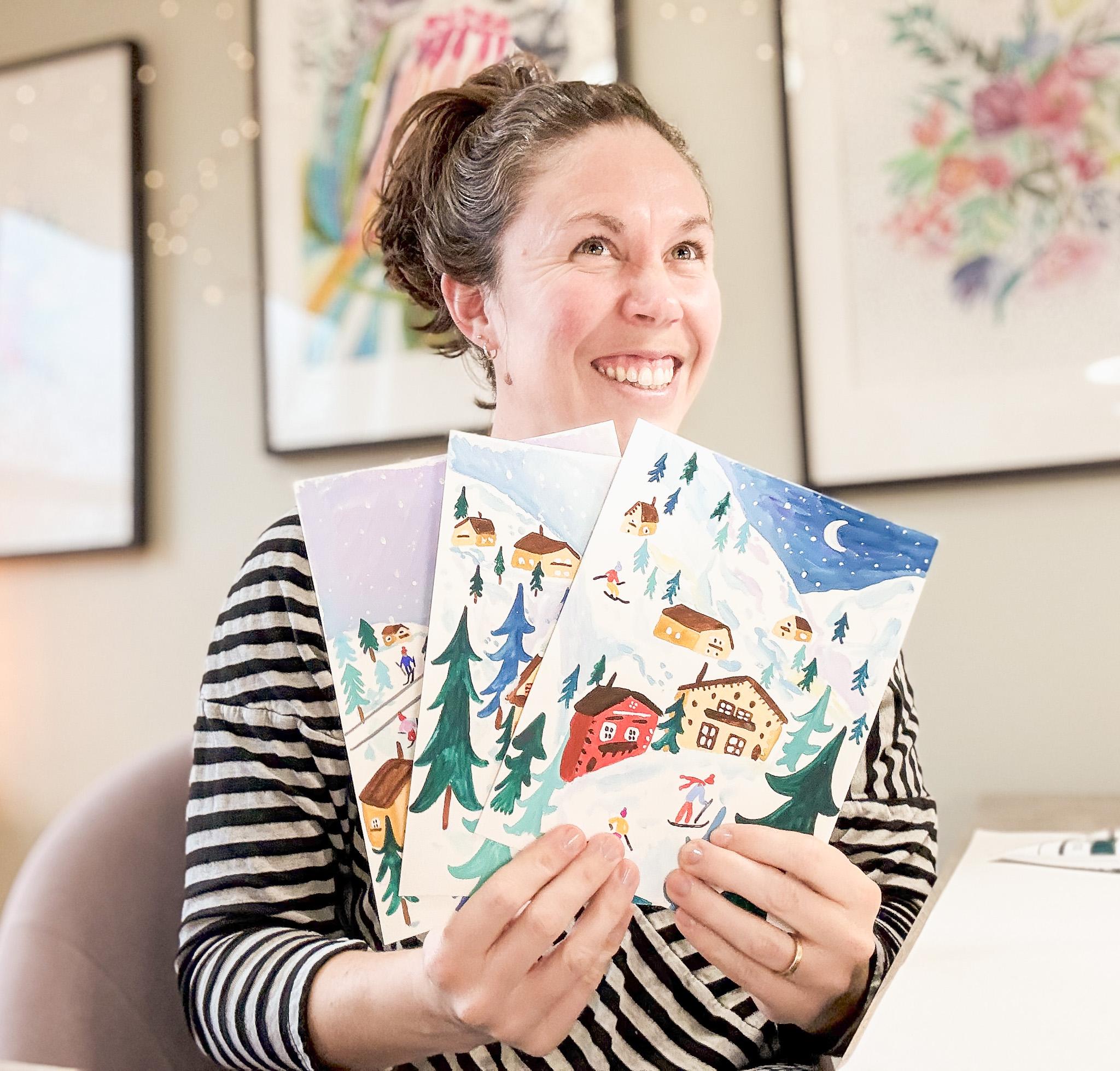
1. Introduction: That Hello. Today we are going to paint winter illustrations
using guash paint. This is such a fun project
to do to engage with the winter season and to escape to a beautiful,
snowy landscape. We're going to make a
small scale illustration that's fairly simplified. In this illustration, we're
going to use squash paint. If you've not used
squash before, it's a little bit of
a mixture sort of in between watercolor
and acrylic paint. If you don't have quash, but you have watercolor
or acrylic paint, you can use either one of those. In this class, we'll first
use reference images to build imagined landscape
that's based on real scenes and we'll learn how to simplify
this landscape as well. Then we'll start laying out
our image in gouache paint, and we'll explore using a fairly limited color
palette and really thinking about how we'll
strategically use color to help pull our eye
through the illustration. Then we'll paint
the final product. This is a short class. It's fun. And in the end, you'll have a small gouache illustration that you can do
whatever you want with. You could leave it
as an illustration or as a small painting. Or if you want, you could scan it into
your computer and make greeting cards or art prints or a calendar from
this illustration. I hope helps you
make some fun art in the winter season or
about the winter season. I'm Liz Trapp, and I look forward to seeing you
in there. Thank you.
2. Class project: The project for this
class is to make one small illustration based on the reference photos or whatever photos you
would like to use. I'm going to walk you through how to make this illustration. The process for this is first, we will look at our
reference photos and then we'll sketch out
some compositions, combining the
photos together and thinking about
simplifying them into this really nice clear and really simple
illustration style. Then we'll sketch it
out on our paper. This is a watercolor
or mixed media paper. It's just a little bit heavier than a typical drawing paper. After we sketch it out, then we'll start by laying down the mountain and we'll
work on the sky, the mountain. And the landscape. Then in the next step, we'll go ahead and we'll paint our houses and we'll add trees. Then we'll start to kind
of go back through and add details to the illustration. And then finally, we'll
add these little splash of red gondolas kind of running through the front
of the illustration, and we'll make it snow by
adding our snowflakes. So the project for
this class is to make one winter illustration that is simplified and if you
have quash, utilizes squash. If you don't just use
something similar. Okay. I look forward to it. I can't wait to see
all of your projects. If you have a chance and
you would like to share it, I would love to see them if you upload them to the
class projects. You can upload your
finished project or a process step if
you like, as well. Okay. Thank you.
3. Materials: I'm going to show
you the materials that I use for this class. You can screenshot this
material list if you want, or I'll upload it to
the class materials. Use whatever you
have that's close. I start with Holbein
acryl guash. It's an acrylic based guash, which means it has
more properties of acrylic paint than it
does of watercolor. So it's a little bit kind
of buttery and nice. The colors I have are
magenta, scarlet, viridian, which is like a
blue green, yellow ochre, titanium white, navy blue, there's navy blue, jet
black, and burnt umber. Throughout the
class, I also add in just a pure green and
ultramarine blue. I try to keep the color
palette fairly limited. I'm going to sketch
out my drawing in hot pink for this
class so you can see it. But if I weren't using
if I weren't filming, I would use that light gray, just a nice pencil
that's colored pencil. There's my palette. It's a stay wet palette, so it actually keeps those
acrylic gouache paints wet for a couple days.
I have my water there. A paper towel. For the palette, honestly, you can just
use a magazine page. Anything that doesn't
absorb paint. That's my brush that
I primarily use. It's a number four round brush. It's a soft brush, so it's good for
acrylic and watercolor. This is a number
six round brush. I'm going to use it less
often in this class, and that one's a number
eight round brush. And that one's super soft. And so I will say, I primarily use that number four.
It's just smaller. I have more control
over the image with it. So use whatever
you have on hand. This is my paper. I've cut it to a bunch of irregular sizes, but fairly small there. The largest size
is eight by ten, I'm using a Canson paper, which is a little bit heavier. It's a multimedia paper
or watercolor paper. You just want to look
for something that is like a watercolor
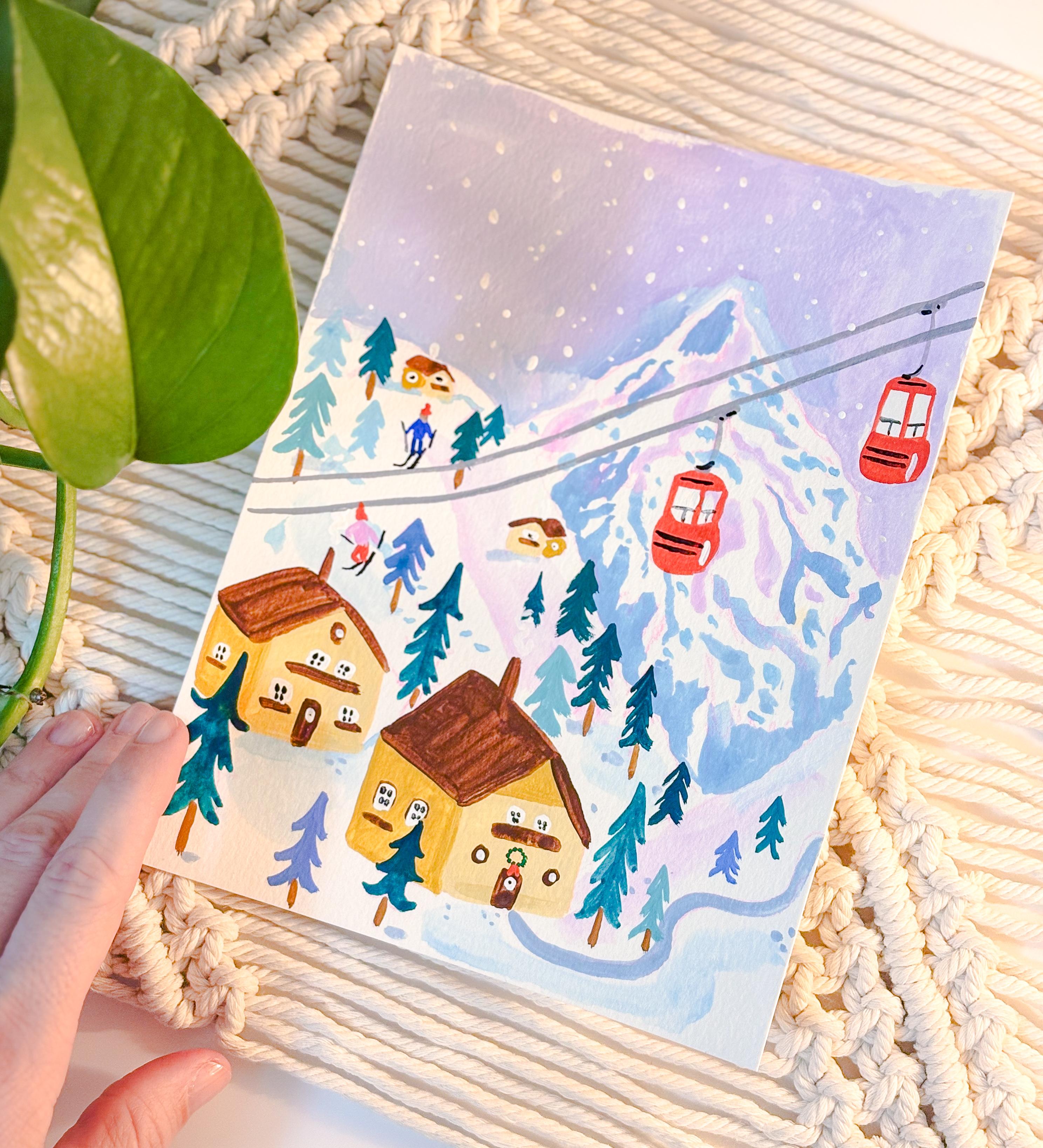
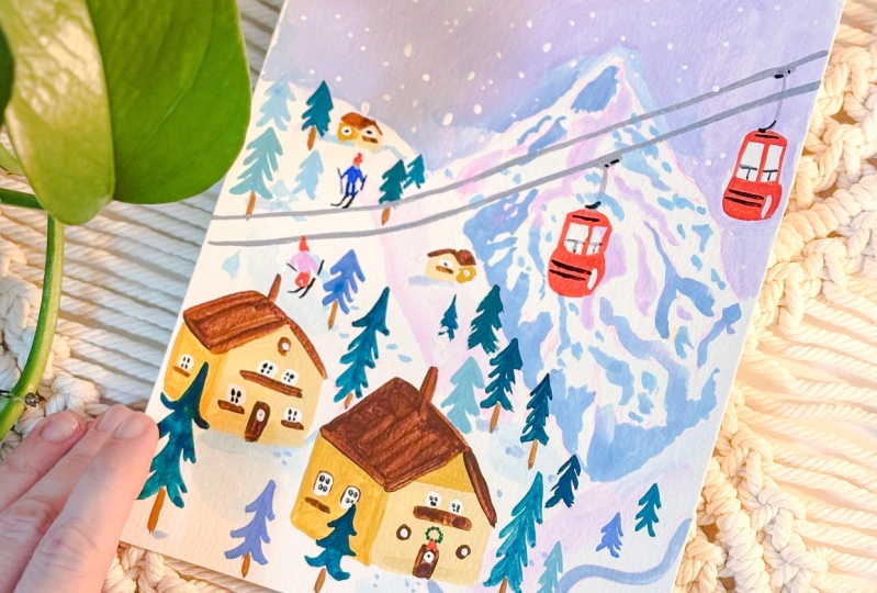
or multimedia paper. Then I have my reference photos there. You can download them. You can download that same sheet from the class materials. Here are some examples. We're going to make one
of these illustrations, the one with the gondolas, but just what we're
looking at as far as our class examples.
See you in there.
4. Step 1: Sketch from Reference Photos: Step one of our
process is to sketch. I have the reference photos. I've uploaded them as additional resources
for this class. And I'm just going to work on thinking about different
elements of these photos, not necessarily just working
from one in particular, and also really
simplifying what I see. This is a very
simple illustration. Anybody can do it, and we're just going to focus
on some basic shapes here. So I've got some scrap paper. This is not the
paper I'm going to paint on. I drew a square. Um to sketch out my what I think my illustration
might look like in gouache. And I'm just going to practice some elements over
on the side here. I'm working on a
mountain right now. This is, like, a craggy kind of mountain like that one
you see in the photo. And one of the best ways to
paint a snowy mountain is to, first of all, paint
the sky around it. And second of all, just focus on some different
values in the mountain, some darker spots, some
midtones, some different hues. And think about, like,
the different sort of pathways that you see in
some of these examples. Some of them have ski slopes. So just have pathways, some have tree lines, the different things that
define some of these mountains. So in this illustration, I'm going to do kind of
a craggier mountain, not like a ski mountain
in the background. And that's going to let me use some darker blues,
some purples, even. And then I'll work
on some other hills. So here I'm just
sketching it out. What might that feel
like in pencil? It's going to It's like
an exercise to warm up. It's just gonna give me
a little start here. I think I'm going
to layer the hills. So I have, like, a softer hill
in front of this mountain. Just go to pull out some
darker tones there. And on this softer hill, I'm looking at more
of the sweeping lines that I see in some of
these snowy banks. And it's very hard
to see, I realize. In the sketch here. But
I'm just laying out some really light tones
just to help remind myself, maybe to put just a
touch of color there. I've got some gray just again, help me warm up
and think a little bit about what this
hill might look like. Again, I'm not working
directly from one photo, but I'm just using all of
these photos as inspiration. I'm going to put another
hill in kind of behind here. It's got a little some
sort of little pathway. I see a lot of those, so
I'm going to go ahead and put a little pathway here. So I'm just lightly
sketching out, practicing different
parts of this drawing. Here I'm going to do a
little house really simple. It's like a rectangle
with a triangle on top. We're gonna push it back into
space a little bit here. It doesn't have to be perfect, and in fact, if it's not
perfect, it's even better. Makes it more special. Gonna put a little
door, some windows. You can decorate these
however you want. You can make a little wreath. If you're doing
some holiday theme, you could like decorate it
like a gingerbread house. You can make all the
houses different, really take it whatever
way you want it. I'm doing the most simple
version of everything here. So here I'm going to practice a tree line in the middle and then little loopy lines
that come out the side. In paint, it looks a little
bit more substantial, but still it's just a
really simplified tree, kind of quirky and definitely a fun addition
to the illustration. So here, I've got
my square drawn. I'm just going to
think about what I want my composition
to look like. So how do I want the elements
arranged on this page? I've got my craggy kind of
mountain in the background, my softer hills in the front. I'm going to start
to think about like, oh, I like that gondola. It's nice to have something
moving in the picture. Maybe it's a train, maybe it's a gondola, maybe
it's a ski lift, something. It's kind of fun to break it up. Also, when you paint
a lot of snow, it's a lot of blues and
purples, really cool colors. If you can put something
in that could pop, so I'm going to make these
red when I paint them, then that really can make
the picture seem finished. I'm going to draw a couple
houses in some up close, so they're a little
bit bigger here. My little pathway is going to go from the house up this hill. Just use this step to get lost in creating whatever
world you want to create. It's really fun exercise. I'm going to add a
couple more houses here. They don't actually all have to be pointing the same direction. You can flip flop them a little. And sometimes that can add nice movement to the
illustration too. Just going to draw on
some little trees. Again, this is just a
sketch. It's on scrap paper. It's just going to
give me a template to work from for my painting. So, something that
really is fun is to just fill the page with
trees and little details, little houses in the background. Just think about how you
can fill that space. I'm going to add a little
skier in really simple. Not much detail there at all. I'm just kind of drawing a body, some arms, legs and
skis and a hat. Usually even skip the face or any body parts because
it's so small anyway, it would adding too much detail
can really complicate it. So just keep it simple. I'm going to go ahead and fill
on the resume sketch here, and I'll meet up with
you in a minute.
5. Step 2: Paint Snowy Mountains: Step two, we are going to
first sketch on paper, and then we're going to work on defining our snowy mountains. So first, I'm going to
get out the paper that I'm actually going to paint on. This is just a little
bit heavier paper. It's 140 pound watercolor paper. I've drawn out my
sketch on here. Just use some pink pencils so you can hopefully
see it a little bit. Normally, I would do it
in a light light gray if I weren't on camera. Next, I'm getting
out my palette. This is a nice palette. It kind of keeps the paint wet. You can actually store
it for a little bit. And I'm using a cla
gouache by Home. So I'm going to lay
out my colors here. All the colors are listed
on the materials list, and I've got my brush. And for this landscape, I have a ton of white, and I'm going to put out a lot more. So the first thing I'm going
to do is mix up my navy blue and white and a little
magenta to try to make, like, a bluey, purply
color for the sky. When we're working on
this illustration, one of the easiest ways to
define a snowy landscape or snowy mountain is to paint in the sky and the space
around the landscape. That way you can
leave it pretty much white while adding
some tonal things in. So I'm just trying to
get the right color. You know, if you
want it lighter, you can have a lot of white, and then just add a little
blue or magenta to it. If you want it darker, add
more blue and more magenta. I always recommend
adding your color to white instead of adding
white to your color. Makes it go a lot
smoother. And here I am. I'm just painting in the
background, the sky. And I'm painting
around the mountains, and I've used some
water on my brush. If you find that your
paint is pulling too dry, just add a little water. I like to mix in kind of
a lot of water with Mah. And that's the thing I
really love about using this material is that you can really tailor
it to what you like. Acrylic gouache is kind of in between watercolor
and acrylic paint. It definitely has more of the same properties
as acrylic paint. It dries up if you leave it out, and if you don't
have enough water, it can get a little gummy
kind of depending on the brand and colors
that you're using. They're all a little
bit different. But here I'm just trying to get a nice opaque
coverage in the sky. And again, just going
all around my mountains. I'm painting right over my gondola that I drew.
Don't worry about it. Chances are your lines will
show through a little bit, and if not, you have
your initial sketch. You can see mine right behind. I'm actually working on
top of my scrap paper. So I can kind of remember
how I had things laid out. And you can keep
fiddling with the color. Sometimes after it dries, I decide I want a
lighter or darker, and I'll go back in and add
another layer of color. Now I'm going to go
into the mountain. And just like we practice with the sketch the initial sketches, I'm just using pretty
much the same color. I've added a little
more water to it, so it moves really
smoothly across the paper. But I'm just adding in some
more or less blobs and squiggles to help define some of the craggy
areas of the mountain. This is the mountain
that's really kind of rugged that I was
referencing from the photo. And I'm going to
kind of continue doing this throughout
the mountain. Trying to pay
special attention to the base of the mountain where I have the other
hills in front of it. Putting more darker tones down there will
help differentiate the two types of landscape
from each other. So that's what I'm working
on right now here. I'm using my slightly
bigger brush. It doesn't really matter. The brushes I've
suggested are all in a similar size range
86 and a four. Certainly, the
eight and the four are the ones that
I use the most, and they're pretty
different from each other. But I like to use the tip of my brush anyway to try to get
a little variation there. And again, I'm not doing anything really,
like, particular, just sort of making
some squiggles and feeling it out how I
want that mountain to look. Going to take my smaller
brush here and I tend to after I finish the sky, I tend to do the majority of the illustration in
the size four brush. It just feels a little bit
easier to control for me, especially on such
a small paper. So I think my paper,
I just cut it. It's not like a regulated size, but I think it's about 6 " on the longest or
on the top side. So six by eight
maybe is my guess. But you can work on any
size paper you want. So I mixed up the
same kind of color, but with more magenta. Just to add a little
visual interest, a little variation in some of those parts of the mountain. And I'm going in with
my smaller brush and certainly focusing
on adding some, like, dots and,
like, littler lines. I had these kind of
bigger blue ranges that I painted before, and now I want to make a
different kind of line. So you can think about, like, little boulders or rocks or some smaller area that you
would find on a mountain. Now I'm going in with
even lighter color. This is really just
magenta mixed with white, and I know I'm going to use it in another part of the image. I'm going to have it show up
again with one of my skiers. It's nice to think about
when you introduce a color, where you're going
to use it again. It's good to use it maybe a couple times
throughout the image. Now I finish At Mountain, I'm going to look at these
sloping hills and think about my use of color there because I already have other stuff
I'm going to use. Um, houses and trees and skiers. I'm not really This
isn't really detailed. I'm just adding in kind of a light magenta
puddle, essentially, thinking about maybe like
a reflection or the way, when you look at a really
smooth, snowy surface, you could see this sort of
blue or purply shadow on it. So that's what I'm
working on here. I'm just adding some
variations onto that color a little more white to lighten it
up a little bit. And I'm kind of dotting it
throughout the landscape. I'm going to mix
in a little bit of navy with that white. It's nice. If you've planned out where
your houses are going, it's nice to put, like, a little shadow of color
sort of around them, thinking about how snow
piles up around buildings, around your house, around
trees, things like that. And again, I'm mixing a
pretty good amount of water. Every time my hand
goes off screen there, I'm dipping it in water, just to help kind
of keep that paint moving slowly or nicely.
6. Step 3: Add Houses and Trees: So in step three,
we're going to add a little more
detail to our page. We're going to start working
on the houses and the trees. This is really going to make
everything come to life. Again, I have the
materials listed up there. And for this, I'm
going to start with yellow ochre mixed with white. So we're going to make
a light yellow ochre. And this is going to be for
the face of the houses. I tend to do all the
houses the same. Like I said, when
you were sketching, you're welcome to make them all different, all
different colors. Dress them up, make them look
like gingerbread houses. Whatever your heart desires. This is where you can really
let your imagination go. Again, I'm just keeping it
really simple for this image, but feel free to take
it wherever you want. So I'm just painting in
the face of the house, that front facing
part of the house. I'm not going to do
any sides right now. And I'm not adding much
water to my paint. So when I start working on the foreground or things
that are closer to the front or this upper
layer of the image, I tend to use a slightly thicker paint just
because it covers better. I want it to be just
a little bit thicker. I still want it to flow nicely, so my brush is still wet, but I'm not mixing it with
water like I was for the sky. I'm working on another
house, the face of it. I'm going to do all of them
kind of in one sweep here. And don't worry
about leaving spots for windows or
anything like that. You can add on top of that.
That's what I'm gonna do. Here, again, I keep it really simple with the decoration
of these houses. But even if you were to add some wreaths or if
you want, like, twinkly lights outside
or something like that, you can still just add it on
top. I would do that last. So here we're just working
on the base layer of the houses and just the
front of the houses. Even though I have these
tiny little houses, I'm not quite sure you
can see it super well. Because they're very
close in tone to the hill that they're on, but I have these tiny little
houses in the background, and I'm still painting them with the same color right just
on the face of the house, that light yellow ochre. I'm going to clean my
brush and I'm going to just dry it off a little bit. And you'll see me
drying my brush a lot. And that's because
sometimes as I paint, a little drip of
water will sort of make its way down the brush, and I know it will
mess up my painting. So I have to stop and dry it. Now I'm just picking up yellow ochre just
straight from the tube. I didn't mix it with anything. I did not lighten it, and I'm doing the other
side of the house. So that way it kind of puts
it in shadow a little bit. Again, this is not a technical
painting or illustration. But even just those details and thinking about the
difference in color between the front and the side
can really add a lot of excitement to
the illustration and really make
it look finished. So just like I did with the face of the houses and
the light yellow ochre, I'm just going to take
the regular yellow ochre and paint all the
sides of the houses. Okay. And now I'm pulling
up the burnt umber, which is a dark brown. If you don't have
the same colors, just pick whatever you have that you want to use or that's close. I'm just using a dark
brown for the roof. And I'm going to do
the same thing I did. I've been kind of
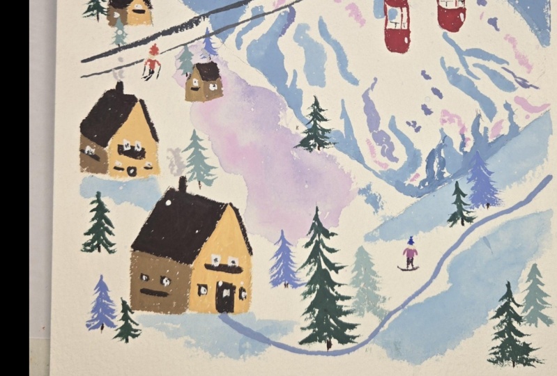
following the same formula and painting these houses. I'm going to go through
and do all the roofs. And something I like to do, I think it just really helps set it apart from the rest of the landscape is once I paint the side of the roof
that you can see the most of. So the side you see me
working on right now, I will add just a little line on the other side of the roof, just a little overhang. And that just helps it acts
as kind of a nice outline. It just helps set it off
from that landscape. Sometimes, when I'm painting anything or working on anything, there's a little chimney
there, by the way. Um, you have to
think about, like, how can you make the elements different enough
that they don't get sucked into the landscape
without just outlining them? How can you kind of do
it in a sneaky way? So this is one way using the roof as a really
dark contrasting color. To really define that house from the landscape. So
I'm going to go through. I'm going to do all the roofs. I'm putting little chimneys
on all of my roofs as well. And after that dries, we'll do the trees after this. And then after the house is dry, then we can go in
and add some of the windows and
doors and things. Okay, just kidding. Now I'm
going to add some doors. I'm just using that
same dark brown. When you can keep from
introducing a new color, that's typically
good, just so that you can it doesn't
get too overwhelming. So, I'm keeping the houses really similar in color palette and I'm using just
this dark burnt umber. To create, like,
a little balcony. I see those a lot
in these, like, European ski lodges and some
dark spots for windows. After that dries I'm
going to go in and add a little white on top of it. So doors, just some
way to kind of break up these these
houses, these walls. All right. Now I'm going to
go in and work on my trees. I'm going to let the houses
at this point just dry. I have taken some of
the Vidian green, which is a pretty dark green and it feels like it has a
little blue mixed in. I'm just going to work on these little trees
throughout the picture. And something I really
like to do is make the trees a variety of colors all kind of
in the same family. So I'll use the Vardian green and then just regular green, and then the navy blue. And then I have an
ultramarine blue, which is brighter and white. And I'll do some
combination of either white and one of those colors or just one of those colors
straight from the tube, or a couple of
those colors mixed together to make the trees. And I'll do one color and a couple trees kind
of throughout the image. So right now I'm with
that verdian green. And then I'll switch
colors and then I'll do some more trees
throughout the image. And then I'll switch colors
and I'll do more trees. And I'll just kind of fill
up the illustration here. And you'll start to see it
really kind of come to life. Once you start dotting
that landscape, you've got houses in now
you're adding trees, and now it's going
to start to really feel like a kind of
whimsical place to be. Now I've taken my white, and I'm just gonna go
back into the houses. I've got my trees all set, and I'm going to add
little blocks for windows, and I'm going to do this
all throughout my houses, just to help, again, add some contrast and add a little detail
to these places. So I'm gonna go through
the whole thing and add those little windows. Then we're going to let
everything dry just for a minute. And in real time, I'm moving pretty quickly from
one step to the next. By the time you finish one, it should pretty much be dry and you can go
on to the next step. That's why I'm working back
and forth a little bit. But after this, we're
going to go in and add our final details
to the image.
7. Step 4: Add Final Details: All right. And for
our last step here, we're going to add
details. Have fun. We're going to add skiers, gondolas, whatever
else you feel like, some snowflakes,
things like that. So I'm going to start
with some skiers. I've got my ultramarine blue, and I'm just making a
really simple shirt, rectangle, two noodly arms
coming out somewhere. You can look at some of the
reference photos which have skiers far away in them and kind of see
how they might stand. But honestly, I'm not too
worried about details. I'm just going to
add two little legs. I'm using black for this one, and then two skis. Don't forget your ski poles. And then it's about 50 50 if I put a little face in or
not. I'm going to do it. Today, I'm going to
take a little of that burnt umber that
we used for the roof, mix it with a little
bit of white, put a little dot there. And then we're going
to add a hat on top. Think about what people wear. This is a good time to include little bits of color
throughout your image. So I'm going to
put a red hat on. Forget what I said
earlier about like too much color being
too distracting. This would also be
fun if you like, added an orange or just some other color that could make the
little figures stand out. But overall, having a pretty
consistent palette is great. But with the skiers, it's kind of a fun spot
in the illustration. I'm going to make
another skier here. They have a light pink. It's just magenta and white mixed together shirt or jacket. That's the same color that's
in the background mountain. I said I was going to
repeat that color. It's nice to sprinkle the same color throughout the
background and foreground. If you can, it's just
a nice visual balance. I'm just making some
darker magenta pants for her or maybe red. I'm going to add in her skis
here some little poles. She won't get everything
in all the time. That's okay. Just suggest it. It already looks so fun
with the skiers added in. It's so delightful to populate little
worlds that you make. I think I'm going to put one
more little friend in here maybe a snowboarder over
on this other side. You could put a ton of people on your mountain
or just a few or nobody at all or a dog instead of a person
or a deer or something. It's just think about what
you want it to be like. Having some sort of presence and they're
an animal or a person, it really can liven
the illustration up, especially if you finish
it and you feel like there's something missing
that could be it, might be worth a try, but it's also okay not to do it too. I don't really know
what snowboarders look like, technically, so just put a little one line down instead of two
for the snowboard. Little hat there. Now, I'm going to mix my two kind of
brown colors together, my yellow ochre and burnt umber, and I'm just going to make some tree trunks on
some of the trees. Not all the trees need them, but I put them on a
lot of the trees. Part of it, again, from
a design perspective, it's just nice to
have that brown found in other parts
of the image as well. It's also a good
thing to do while you're waiting for
your skiers to dry. Alright, next, I'm going
to tackle these gondolas. I kind of forgot about them because I got lost in the image. But I think they're a really important part in
finishing it up. So I considered having black cords that
they're on or cables, whatever those are called,
but I think it might be a little drastic it already
cuts through the image. So I've mixed my jet black with some white and made a gray, and as I'm painting it here, I think, like, it's
maybe not dark enough. Like, it's starting to get
kind of lost in there. So I'm going to darken
it up a little, but I just don't want
it to be totally black. And I'm going to just going to go over that line one more time, make it stand out
a little bit more. Now I'm going to
do my second one. I had two next to each other. One for each gondola. Okay. And so now
we've got those down. It doesn't feel like it ruined
the image, so that's good. I always kind of
nerve wracking to put something right
through the middle of it, but you got to trust yourself. I'm going to start to make the little thing that
the gondola hangs on, and then I'm going to
switch over to my red. And actually make the gondla. And this is super rewarding
because it's really, really cool to have this pop of red kind of right in the
front of your image. It really is a nice. I think it's got a nice look. So I'm just making little roof, little sidebars, just
keeping it super simple. Don't worry about
the windows now. At some point, when the red
seems like it can handle it, I'm just going to put a
little white in the window. So Um, I think the mountain is a little even though you can
really see through a window, obviously, the mountain is a little distracting to
see behind the gondola. You can use your own judgment for if you're doing
something similar, if you want to be able to see
through the windows or not. But I've kind of taken the approach with this image that the simpler, the better. So I'm just going to block out the window to keep that part a little
bit more simple. So I'm going to finish up the
red part of these gondolas, and then I'll go back in as it's drying and blocking the
windows a little bit. Alright, I have mixed up. Well, I wait for those to drive. Mixed up are really
light gray to put a little smoke
in the chimneys. This is not super evident
in the illustration, so I would say do it
if you feel like it. It's kind of fun to do, but it's not something
that's really visible. And I'm just gonna take
pure white and put little dots all over the sky to make some
snowflakes here. Big dots, little dots
at random, all around. And now, I found that I think my red's dry enough
to not bleed. I certainly made the
paint pretty thick, so it shouldn't be an issue. And I'm just blocking in
my windows with white. You might find with gouache, something that's nice about it is that it's pretty opaque. And so even though it might
take a couple layers, you should be able
to paint over, you know, anything you've
painted underneath. If you can't, just
make sure you're not adding any water
to it at that point. You want to keep it as
opaque as possible. Okay, I'm gonna go back
in with the jet black and just add little dots
into my windows. Nothing real specific. I just felt like they look empty and, like,
they need something. So I'm going to add in
these little dots here. Kind of like window panes. Um I'm just going to add even less detail on
those little ones in the back. And then I think we've got
some sort of industrial stuff, like a little maybe like a little paint or a little
bar on the outside of the gondola and probably, like, some sort of little
guardrail or something inside. So I'm going to go
ahead and add those in. And at this point,
the illustrations pretty much come together. And you can kind of take
a minute and think, like, is there anything
I want to add? Do you know, is there
anything else that it needs? But I think for the most part, I feel like it's
pretty much set, and we have a cute little
winter illustration, and you can do all kinds
of things with it. You could give it to
someone as a holiday card. You can scan it and
make a print out of it, or have some cards printed
or just keep it as is. So enjoy enjoy your
illustration. Thank you.
8. Thank you: M. Thank you so much for joining me for this
winter Illustration class. I had so much fun
making these pieces, and I hope you did too. If you are interested in Guash and you want to
take some more classes, I have a few more
classes on skill share, which I have different
subject matters, but also cover using
Guash or also use Guash. I'd love to see you
in there as well. I would definitely love
to see your projects, feel free to post them on
the class project section. Um, it's always so fun to
see what students come up with and what you come up with a from your
own creative voice. So I look forward to it and thank you so
much for joining me, and I'll see you next time. Bye.
 Liz Trapp, artist