Transcripts
1. Welcome to the Class!: We live in a world
of busting colors, and all of these colors originate from just
three primary colors. Hi. I'm Swatiji Hagede, a watercolor artist by passion, and a product manager by profession based out
of Bangalore, India. I go by the handle tinted Totals on Instagram where you can see all my recent works. In this class, I'm
going to teach you to explore about how to paint with just three primary colors, that is red, blue, and yellow, and create a magical,
beautiful sunrise landscape. This class is perfect
for everyone, whether you're new to
watercolors or simply looking to explore and have
fun with a minimal palette. We'll start by covering
the basics of watercolors, all the techniques required, giving you confidence
to dive right in. I'll also share all the
advantages that are there when you start using just
three colors in your palette. In this process, I'll
be showing you how simplicity can unlock endless
creative possibilities. By the end of this class, you will not only have a
beautiful sunrise painting, but also depth knowledge
about color palette and how to use these
three primary colors in your future class projects. So pick up your brushes and
all the three primary colors, and let's get started
with the class.
2. All the supplies you need: Let's go through all
the materials that is required to paint
this class project. Starting with watercolor paper, I have used Saunders
Waterford C uberts mill. This is a cold press
watercolor paper and 300 GSM, 100% cotton. You can use any
100% cotton paper and you will get mostly
the same result. Now, coming to watercolors, I'll be using these
three primary colors. One is ultramarine blue. Then we have Azerin Crimson
and Nickel Azo yellow. These two are from
the brand Q R, and this is from Ban Sch Mickey. You can use any three
different primary colors from different brands or whichever is there
in your palette. Because this project
and this class is all about exploring
the primary colors in your palette and see
how you can create different shades and
also paintings with it. Coming to watercolor brushes, I'll be using silver brush, 3,000 S series bruh, round brushes, size
eight, and size four. I'll also be using
a al wash brush for applying water
onto the paper. If you do not have this
brush, not to worry, with just these two brushes, you'll be able to complete
the entire class project. As you can see, these
brushes have an amazing tip, and I have been
using these brushes from the past three years, and they still have
retained the tip. Whenever I paint, it just
holds a lot of water, a lot of paint, and
helps me with getting all those details that is
required in my paintings. I would also need a
palette mixing palette. I have used a ceramic one. You can use any that you
have of your choice. Just make sure it is
a big one so that you can add the three
different colors separately and they do not mix with each other
without you mixing it. Also, we would need
paper cloth to dab off excess of paint or excess
of water from your brushes. A jar of water. Currently, this is empty, but I would be changing water
and I'll be guiding you when you should also change your water during
the class project. Also a surface where you
can stick the paper. I'm also using a
masking tape in order to tape down the
paper to this board. Having a pencil for drawing the initial reference lines
would also be helpful. These are all the materials that are required
for this class. You can use all the
materials that are at your disposal and
make sure to post your work in the project section so that I can see
what all different shades you have used and what is the final outcome for
your class project. Now let's get started
with the class.
3. Swatch your primary colors: P. In this lesson, I'm going to swatch out all these three primary colors and also see what are
different shades we can get from these in order to differentiate between
water muddy colors and water bright colors. I'm going to start with Azoe yellow that I'll be
using the primary yellow. You can use any yellow that you have and swatch
with this and see how the difference is with
your pigments available. Also, I'm not going to show different primary
secondary tertiary colors. This is just an exercise to see what all
different shades are possible with my currently
chosen three pigments. I have Al za Crimson here as well as ultramarine blue finest. While I swatch in the back,
I would like to highlight the advantages of painting with just three primary colors. Any shades of red,
blue, or yellow. Starting with color harmony. Limiting your palette
to these three colors ensures that all the mixed
colors have a common base, leading to a naturally harmonious and cohesive
look in the painting. As we complete the painting, you will observe
that each of them seems to be working
very well with each other because we all are mixing it with the same shades
of red, blue and yellow. Sometimes what happens during different pigments
and different brands. The green which is used may have different blue
and different red, and it always differs from
brand to brand as well. So that's the reason
whichever three different primary
colors you choose, they will always work
harmoniously with each other. With just these three colors, you can create a
wide range of hues, shades and tones
by mixing them in different proportions
like I'm doing here, allowing for a full
spectrum of colors while maintaining all these three
colors also vibrantly. Using a limited palette can
make it easier to maintain consistent color relationships
throughout the painting as all the colors are derived from the same three sources. Especially for beginner artists, working with just three
primary colors can enhance your understanding
of color theory, understanding how mixing
techniques works, how much pigment is required while mixing for which color, et cetera, and the impact of different color combinations, which creates a muddy color, which creates a brighter
shade, et cetera. A minimal palette always reduces the number
of materials needed, and it is easier to paint on the go and simplify
the painting process. Be it plain air or you just
want to paint somewhere where you're traveling or just
as a quick exercise daily. Having these three colors
are more than sufficient for any color combination
of the painting. With few colors to
manage, it is easy, and you can focus more on mastering the
watercolor techniques, such as blending, layering and controlling the water flow. Here I'm taking and
experimenting on how different pigments of blue, yellow and red are mixing
to form different shades. Here I'm taking two
strokes of blue, two strokes of yellow, and one stroke of red. And this is also
giving me a tint of green because blue and
yellow are at a higher. You can see all the colors
that I have used in the blow part are mostly
mix of all these colors, and they are on a
muddy spectrum. That is because I have mixed
directly on the paper. When we paint, you
will be able to see. So I will be swatching
it now how it is done. So I'll start with
violet and now mixing a little bit more
of lazaran crimson tet. Moving towards yellow. This will form a shade of
brown, probably Canna side. Next, I'll add blue tot, so this will form a darker
shade probably like a sepia. Now, adding more blue to it, it will form the gray
tones that is required. Adding it with a
little bit more of crimson to get a
tone of pink in it. And I'm continuing with adding
these shades to see what all different colors
are possible for me while I paint in this class. This exercise will help
you understand how the colors are diffusing
along with each other. Once you start
with violet, next, what you can add directly into the current mix to
get the next color. So you don't have to follow the same colors I'm
using during my class. You can just use
whatever is mixing here, whichever combination you
like and make it work. Now let's try to get that black that we need for
the final touch. So I'm taking a lot
of ultramarine, and I'll also take a lot
of saran crimson and just a tad bit of yellow
and see how this turns out. Adding more yellow,
the shade that I have is creating
more of sepia. So in order to avoid that, I will first mix
these two colors, red and blue to
form a deep violet. And onto this, I
will start adding a little bit of yellow
and see how it works. I think it can take a
bit more of yellow. See now this formed a spa. I will add ultramarine onto it, and this is the grey
that I'm looking for. Adding a bit more crimson here to show you the difference, and we get a red
tint of spa here. But the final color
I'm going with is the one with more
of ultramarine in it. If your base of the
painting is different, you can choose the
different as well. Now, see you in the next lesson.
4. Basic Watercolor Techniques: Welcome to the
techniques lesson. In this lesson, I'm going to be telling about watercolor
ton wet techniques, its uses and also demonstrate
so that you can practice along with me of painting in watercolor wet
on wet technique. What is a watercolor
ton wet technique? It involves applying wet paint onto the wet surface
of the paper. Either a wet paper or a
previously applied paint. If you already have
a wash of paint and if you're applying
paint again onto it, even that is a wet
on wet technique. This method allows
colors to blend seamlessly and
create soft edges, diffuses any hard edges
that are getting created. Along with it, it gives you very unpredictable
effects based on how it is going to be dried off. It can also create some
blooms for abstraction, or it can also create a very smooth gradient texture for your background, et cetera. The key to this
technique is controlling water on your brush as
well as on your paper. Now let's see how
we can do that. I'm going to take the
brush of size eight itself and first apply
water onto the paper. Currently, we are using a
300 GSM watercolor paper. The thickness of
the paper is a bit heavy and it is
100% cotton paper. We have to make sure
that water seeps in completely into the
paper and it keeps it wet for a longer
duration of time so that as when we start
applying pains, it doesn't dry off and
gives us any blooms. I'll be applying two to
three layers of water first. Since this area of the
patch is very small, we can maintain easily. Now onto this, I'm going to take a color and apply
it in the back. Already there is good amount
of water on the paper, as well as the paint which I'm using is having
a diluted pigment. So if I take more of
water and, you know, try to paint, it will become
too much water on the paper, and once it dries, it will
be very diluted format. So what we have to do is
we have to keep a paper tall handy and remove excess of water from the brush whenever required and apply only
required amount of water. Now, say onto this, I wanted to mix a color directly on
paper. How would I do it? Here I have taken a
different color on this and I'm applying that
directly on the paper here. I can see it started with blue, but as soon as I have added red, it has mixed with each other and it is forming different sheets. You can also see that paper
is almost visible here. That's because there is a
lot of water in my brush. I have to remove that, take some of the blue again and apply it to
retain the color on paper. This water controlling
definitely helps a lot while you're painting to avoid
dull paintings or, you know, showing
the white paper once your painting is
dried off, et cetera. But it definitely
comes with practice. And I would highly
recommend you do this patch test every now and
then with your colors and your brushes as an exercise so that you can
get used to it of how much water is required and how much paint is required
with your available supplies. Now, let me add one dab of
one stroke of brush here, and we will observe how
vibrant this is going to be drying and how much vibrant
this is going to be drying. The next step is lifting. For that, I will
take another patch here and apply some paint. I'm applying a lot of
paint on this so that I can visibly show the
difference of lifting, and I'll also apply
another color here. Yes. Now, in order
to get a gradient, I'll just start from here and slowly bring it
to the other end. Remove that paint from my brush, da it on the paper, and remove all the
excess of water. Again, start from one end and slowly bring
it to the other. Okay. This way, we get a very smooth
gradient compared to how we will get the result here. Once it dries off, we'll
come back and observe that. Now in order to lift, you need to have a brush which
is completely almost dry. And what we will do is we
will apply some pressure on this part from here so that it lifts off
some of the paint. So let me show you once again. I'm going to be holding
the brush here and applying some pressure
like this and lifting off. Here I have color
and am lifting off. If you do not want this
harsh edge to be created, we can also do a limited
or controlled lifting. You can have some water
in your brush not to dab off and do not
apply too much pressure. Apply and dab it off. How this helps and
where it helps is, if you have added too much of paint suddenly on the paper, and you want to make
sure you can see that shade or the tint of
that color on the paper, you might have to do
this control lifting. And since the paper is wet, you can see the lifting has
almost been covered up again. So let me take it again. You might have to keep doing
this until the paper is dry, or else it might cover up again. Lifting also depends on
the color which is used. If any color is staining, like this ultramarine
is staining color. Many shades of blues
are staining colors. Even if I lift it off, I might not be able to get
the white of the paper. If I'm trying here to lift, how much over I lift, there will be a tent of
blue, that will be visible. Now that we have learned
what it is with on with technique and how to mix colors directly
on the paper. Let's try with a pine tree as well because that is what
we'll be using in the class. Here I'm going to start
with a blue pine tree. As I come down, I realize that I do want a
different color. So when the paper sorry, when the paint is still wet, I'm applying the
different shade so that the difference between these two shades are
not clearly visible. I'll do the same
with another shade. Because the paper is still wet with the paint and
not with the water. It still mixes with each other to form all these
beautiful gradients. And of course, all these
trees can be abstract, so we don't have to follow
a particular rigor. Once it dries off, we can
see a nice within this. This kind of gradient is
always visible when there is a sunrise or sunset seen
happening, so it will help. The trick for this is
keeping the paints ready. If you want to mix
a beautiful purple, then keep the purple mix ready before you start
painting the tree. Else we might use some time in mixing those colors on the go, and it might take some
time and the upper layer, which is there,
it might dry off. This is not completely dry, and you can see the
vibrancy in these two. Ultramarine here has since
it's a granulating pigment, it has dispersed and taken the form of
tooth of this paper. You can see there
is a texture on this paper and that's
what it has also taken. We can visibly see a small
strands of white on here. Whereas on this side, it's very smooth, very fine. In fact, the pigment that I'm using is ultramarine finest. And still we see some
of the granulation. If we take a ultramarine color, which is not at its finest form, we might be able to get a very visible granulation in this as well as in the other
shades that you mix it with. Also, now observing the
difference between these two. Here, we had done the
gradation technique. You can see there is
a smooth change of color from Alza crimson
to this yellow. Whereas here, we can see
there is some difference. There is a line for crimson, there is blue here, and
there is purple here. We see the difference in colors. Both of these are very good based on how you
want the paint to be showing up and you can use it accordingly
in your painting. Once now to see this, which we painted using you know, wet on wet with the paints,
being the wet part. You can see even
they have dried off, and we can see very clear gradation from
one color to other. Now for the last part, I want to show
splatters because it adds a kind of drama or
depth to your painting. So I'm going to take
some paints from here. Make sure you have some
water or the paint, which is there, it
is a bit watery, not too much dry. And now, all we have to do is hide the
place where we don't want this platter to be and
hit it on this part. If you want bigger splatters, you should have more water in
your brush and here you go. But note that bigger
splatters means more water means it is
going to dry a bit light. If you want a bigger
splatter with good amount of darker splatters, you will have to take
more paint in it, or you can also try with
a bigger size brush. Okay, so we are going to be using these platters as
well in the painting, as well as this wet on dry
for adding the final object, our foreground main object
bird in the painting. So this is all about techniques. Now, let's get started
with the lesson.
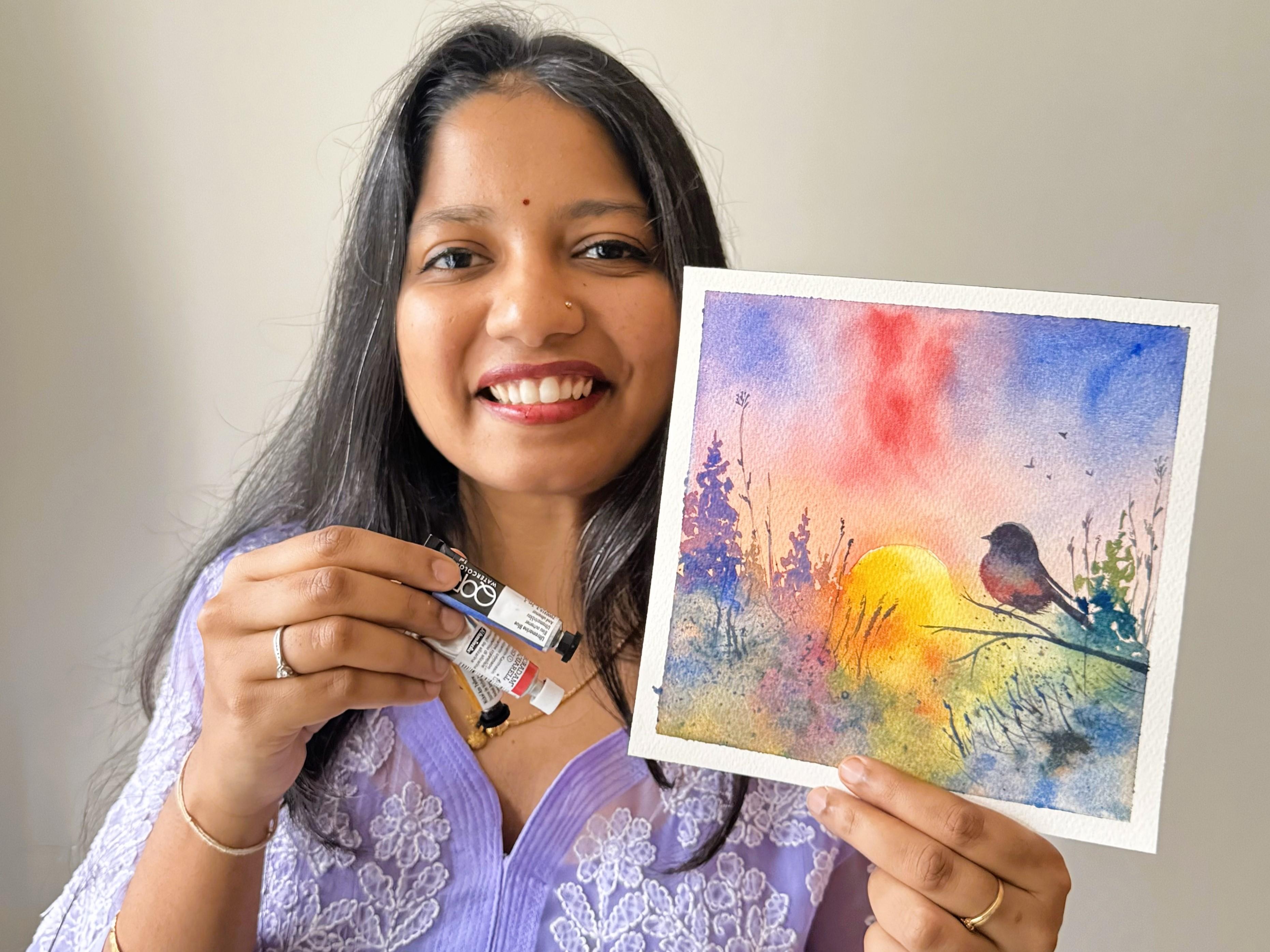
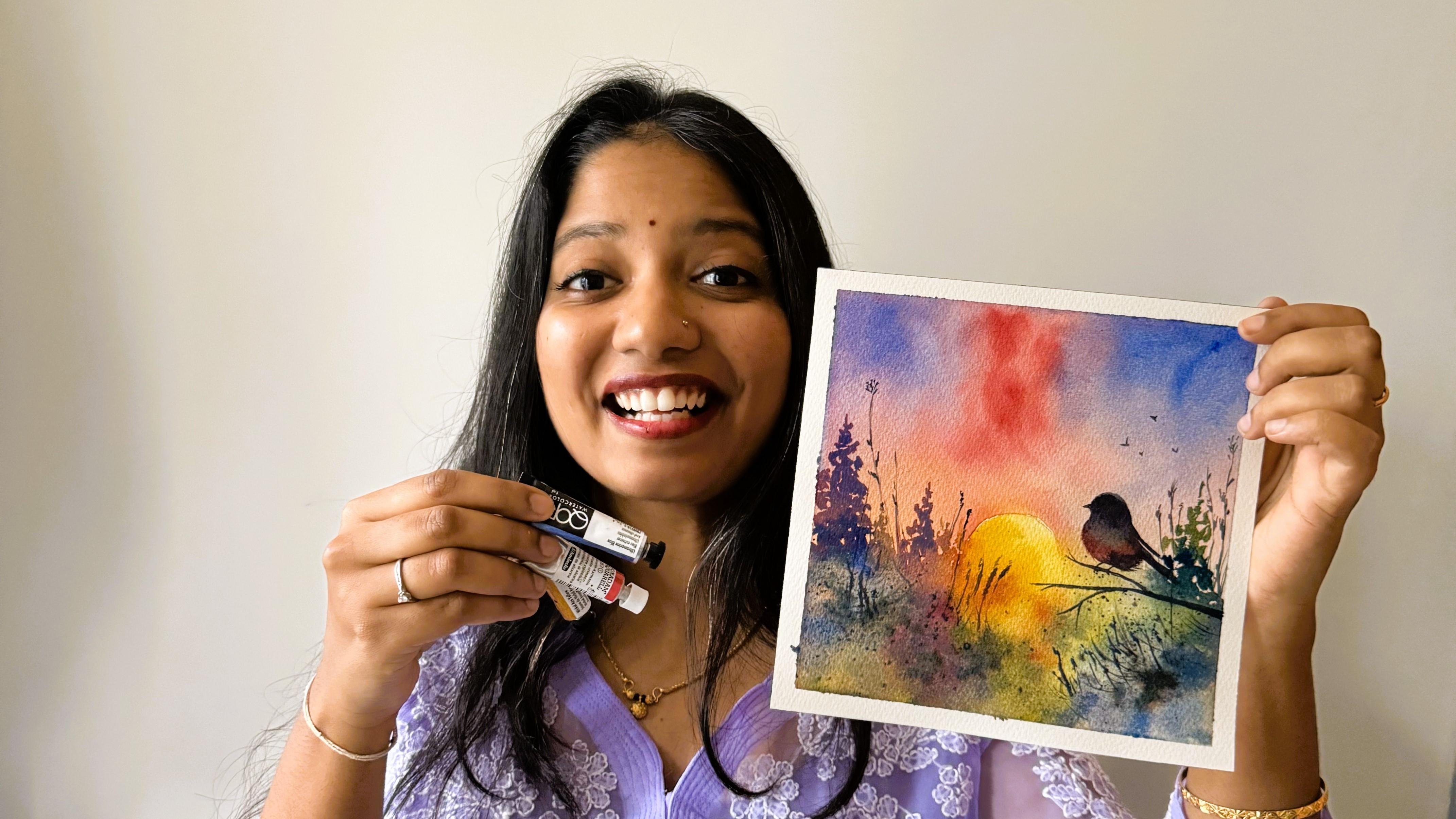
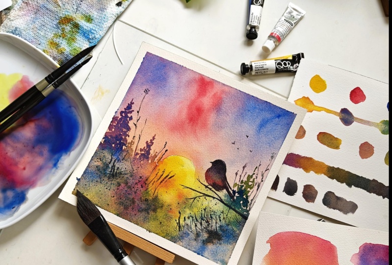
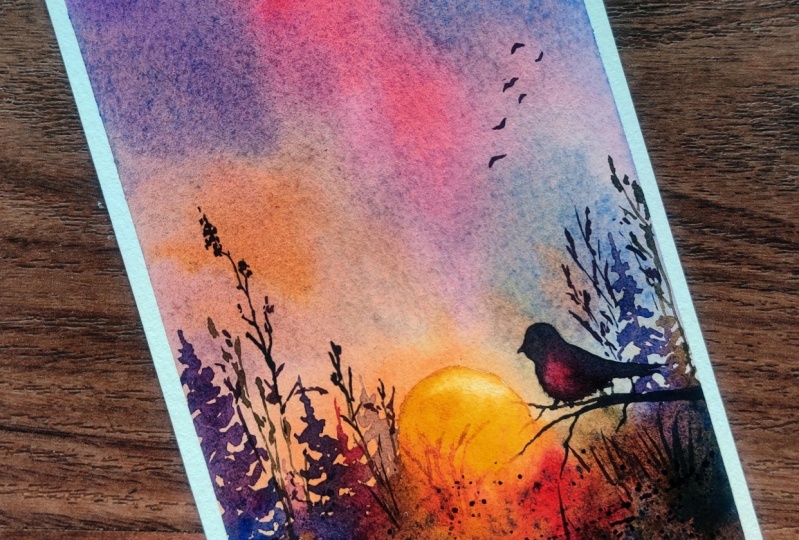
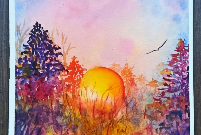
5. Final Project Background | Part 1: Welcome to the class project. So here I have a paper. I have cut it to 18
into 18 centimeters, and this is from Saunders paper like I had shown in
the materials class. So I'm going to tape it down. If you prefer using the paper
without taping it down, you can go ahead
with that as well. O. Okay. Now I'm going to just strengthen
these creases. We are ready to start painting. Before we start,
I'm going to pour in the paints from these tubes. You can also use from
the pants directly, but I have always
observed that it might take some time
to activate them, hence I will be squeezing
out a fresh set of paint. This is Alizarin crimson. This is ultramarine finest. And this would be Azoe yellow. I already have it here, so
I'll just take a few more. I think I might need
crimson a bit more. Yeah. Okay. I have a class of water here. So let me activate these paints. Just dropping in a drop of water so that it
keeps it hydrated. I'll be drawing a
very rough sketch. So we have a sun here. I'll be using this box
to make a clear circle. Okay. And here, we have a branch and
the board is sitting. The details and all, I
will be adding later. So this is just a very
rough sketch so that I can understand where all the
elements are going to be placed. This is done. I'll start by applying water
for the first layer. As I said, you can use just
two brushes for this class, eight and four size
round brushes, but I will be using another val wash brush for applying water for
the initial layer. We are going to be following completely wet on wet technique. Make sure we a good
amount of water so that the paper is hydrated for
a longer duration of time. It doesn't get dried up quickly and do not leave us the
patchy colors at the end. I will not be applying
water to the sun part. Now that I have applied
good amount of water. I'll get started with
applying all the colors. Let me first start
by adding yellow. We have the yellow
base happening here. Next to this, I'm going to
take some ultramarine and mix it directly over here so that we get the
beautiful green tint. Similarly, I'll take
zin crimson and start with mixing these
directly on the paper. You can also mix
it separately here and then start applying it. Both are almost same. Now that the paper is wet, I do have some time
and I do not have to rush through the
process of making sure all the paines are
applied as fast as possible. That's the reason
we need to apply water and keep the
paper hydrated. Now, I'll take more
of Azar and Crimson and apply it here. This can be completely your choice where to
please these colors. I have started
with yellow first, but you can start with red
and it can be anywhere. So just go with the flue. It doesn't have to be same
as how I am painting. In fact, I'll be showing some of the other paintings that I have done as part of the trial, and you can see that none of
them are with each other. I always depends, and I would highly recommend just go
with the flow and enjoy the complete process of painting this entire painting
with just three colors. I'll take some blue
and apply it here. I want to mix this with the blue to get a
beautiful you know, purple sheet, and I'll be applying that
on the other side. You feel that there is a lot of paint on it,
but once it dries, we know that it will be drying two to three
shades lighter. So make sure that you apply
a good amount of paint right now if you want a
darker background. Okay. Here, I will be just
lifting off this a little bit because I do want
a tint of this beautiful, diluted zar crimson shade here. So I'll be just, you
know, keeping that here. All the remaining
colors which are here, I'm going to just pour it, bring them down so
that they don't form any harsh edges
while drying away. This is my first layer. Keeping a paper
cloth or a tissue handy helps a lot like
you can see here. I'm just lifting
off and dabbing it on the tissue here so that it removes that excess of
paint or water from my brush and I can go
with the lifting again. Now, this looks good. I will keep it aside for drying completely and then come back with the second layer
that is the below part, as well as the other details. You can use to
fasten the process, or you can just
keep it aside and wait naturally it is completely.
6. Final Project Background | Part 2: Now, this is completely dry, and you can see how
lighter shade they all have dried into,
which is still good. Now I have changed
the water because I didn't want any muddy colors when we are painting
the second part of it. As well as here, I can see some muddy colors
which are getting created, so I'm going to
remove them away. If you like the painting to be a little bit on a moody side, you might as well
just go with it. Let me show that
version as well. So this is a moody version of this paint that we
are currently doing. You can see all these colors are higher tone of ultramarine. So each of the shade here is
having a mix of ultramarine, and we can see that it
is a bit moody painting, I would say, and
also the colors I have used here are
ultramarine, not the finest. So you can see a lot of
granulation happening more of it. Yellow orc and pyl red. There is another
painting as well. Here. The undertone for this one is yellow,
like you can see. The shades which I have
used here are all the same, but the undertone is yellow. But for this painting,
what we are following is the undertone of red. You can choose any of it and you can just
play along with it, have multiple things
created as well with a different foreground and see how three colors can help you create a
beautiful painting. Now, coming back to this, I have this completely dried off. Before getting started,
we'll squeeze out some of Azar and crimson. Now we will be applying
what we have learned in the techniques class for painting this type
of pine trees. So I want to keep the
colors ready for it. This is a shade of purple
that I will be using. Taking a tad here. This is the shade I would be
using to get started with. As in when we go, we'll be applying more water and
pigments onto the paper. Here. To get started with, I'll take this
beautiful shade of violet and start
with a pine tree. I have tilted the paper
because it is a bit. Till halfway, I will go
with the same color. Once I'm here, we'll take
more of blue and continue. I will stop here and
start applying the shade. I want this to be more of blue. Take some yellow as well
and start to add here. Here it's completely your
choice to go with the flow. Whatever colors are
getting created, you know, shades are
getting created. Just go with the flow and
explore how they are forming. L one more pine tree. Aa Take some yellow mix with this to get a beautiful orange and we'll
add one more tree here. Make sure there are
enough pigments, else, it will be drying
very light shade and we won't be able
to get anything. Yes, now, I'll be mixing
all these directly, and apply one layer of
water here for the sun. You see how I'm just
randomly dabbing all the colors everywhere and
it's beautifully forming. That's what I wanted
exactly for here. This side of it, it will
be more of yellow shades. So I'll be taking yellow here, adding a bit of green. And Oh. Take some more blue
on to this yellow. Start with another
pine tree here. As I'm halfway through, we'll take more of blue. Here, funs, this is meeting. This is where the sun is, and, of course, there'll
be more of yellow. So what I'm going to do is take a good amount of yellow
and add it here. Let it mi with the other colors, you know, at its own time. And move it along for the size for
the shape of sun. I'll take a smaller
brush of size four. Mix it with some of
yellow and add it here. Tabbing it on the corners to avoid any harsh
edges that may form. If there is a lot of
water getting settled, it's better to remove
it as they will go back and it will be creating
watercolor blooms. I'll take another good mix of all the three colors
to form a black. If you already
have a paints gray or a black that you usually
use in your colors, please feel free to
use that as well. I might need a bit more blue. If your paper is drying away, all you can do is just take
some water in the brush and add it onto the paper. Here, in order to
avoid harsh edges, I'm just rubbing off
the pains here and not to make it dry with that
green outline that we had. I'll also make sure to
add some yellow here because it's right next to sun. And when the paper is still wet, I'm going to add splatters. Okay. Before we go to the third layer, I want some violet. And I'll just add some branches like this from the existing
colors here and keep it. The tip of this
brush is very good, and that's the reason I'm able
to add those pointy lines. Wherever you see any harsh
edges getting created, dab it, and you can also
just form some of the formations because
there are so many plants in this region and with any color combination
of your choice. Here for the sun, I want
to add it more yellow. So you can lift off if
there is any other color and retain the colors
that you want. I'll wait for this
to completely dry and come back to add the bird. Meanwhile, also when
the paper is drying, I'll make sure to observe if there are any hedges
getting created, I will be smoothening them.
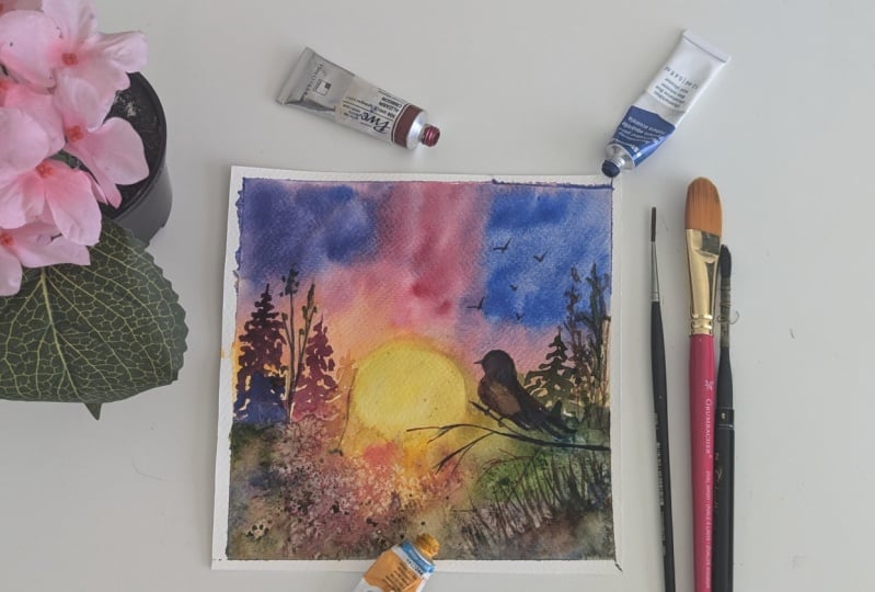
7. Final Project Foreground & Details: This is completely
dried off now, so we will start to add the four ground
object, which is our bird. I would need a black or
a shade of black for it. Mixing these three primary
colors would help me get it. So let me take some here. O, need more of ultramarine. Need a bit more of
crimson as well. I'll take this yellow
and add it here. This forms a brown. Here, like you can see, this forms a brown. In order to correct it, I'm going to take
more of blue here. This is still having
a tint of brown, more like a sepia color. Take more of blue and a bit of red for the black. Yes, this is the pints
gray I am looking for. Once this shade is done, I'm going to keep it here. I'll definitely keep
all these colors handy because it
would be required. Now, I will take some of
that onto my palette, add a tint of blue to it because I want
the base to be blue. And with this, I'll start
with adding the branch. Ohh take some more of blue here. And. Before I start with the bird, let's complete some of the other detailing for
the plans here. Taking this black and I'm
adding at just random places, not for the entire
branches of this. And here also, once
it is completely dry, I can add some of
the other branches. All this I'm doing with
size por brush itself because it is having a nice tip. This is adding just
random branches here and there and with different
sides of coors. Except with some
of the mi here for a brown and I will add The branches. Now keeping
it a bit of red heavy. I'm going to add one more branch here in middle of the sun. Playing with different
shades of color like this is what makes your painting
become a bit more live. B what you can understand
is near the sun, the shades of red and
yellow are prominent. Right. So that's what
we're following here. Oh. Now, I'm just randomly adding with very thin strokes here so that it seems to be bushy. I'll take a green tint
as well and do the same. Okay. This is done. Now, I will start
again with the bird. If you don't have
the outline visible, maybe it's because the paper, or the amount of water that
we have used. Not to worry. You can again draw it
over and start to paint. I'll come here and
for the mid part, I do want a nice shade of green. I'll be using this. T. And I will take a bit
of pink and blue. Sorry, the san crimson and
blue for body of the word. Let me mix a bit more here. O O Okay. And we do need a branch here on which
the bird is sitting, so I will draw a branch
from here and add the legs. For the last part,
we need the beak. Now with the same brush,
I'll continue and add some feathers just with
the strokes like this. H. Mixing of this black is what taking most
of my time here. If you have a black
or pines gray, you can continue to use it. I'll add some more birds
in the background. The same color I'll take again
for the final splattering. Now that the paper
is completely dry, the splatters won't merge
with the background. Wherever we have
these branches added, we can add the platters there. You can also add platters
from different colors. I'll take some of the blue
mix it with crimson here and add those platters
as well. Okay. Coming back to these branches. It is almost complete. Now, if you want to
add any more branches anywhere you can just
go ahead and do that. I'll take a shade of brown
and extend this here. I missing some
splatters here as well. Now, we can just take whatever is there on your
palette at this point. So I would say just explore, go crazy on these colors. Just make sure nothing is
going on onto our sun. So the colors that
I have here might be different from what is
there on your palette. So just make sure you can
follow the same colors which are there on your
palette and no need to mimic the colors
that I'm using here. This is now complete. Let me start by
taking off the tape. Working with primary colors will definitely help you
understand more on how each of these colors
mix with each other and how you can retain
the vibrancy of the paintings when you start painting big themes or objects. Oh. This is our final painting. You can see that the
different sides which we have used here has mixed with each other to form these
beautiful granulations. We see a smooth g radiation
from one color to other. And all these are cohesively
working and giving you a very bef sunrise painting. A
8. Thankyou & Final thoughts: Thank you for completing
the class project, and this is what we have
painted in the class. Using just three colors.
Does it look so? I'm sure you would
have understood what all different shades are possible with your three colors that you have in your palette. I had a lot of fun exploring
these concept with you all and hoping to bring more such concepts in
my future classes. Thanks for joining Shia.
 Swathi Hegde, Watercolor artist | Aqua | Night sky