Transcripts
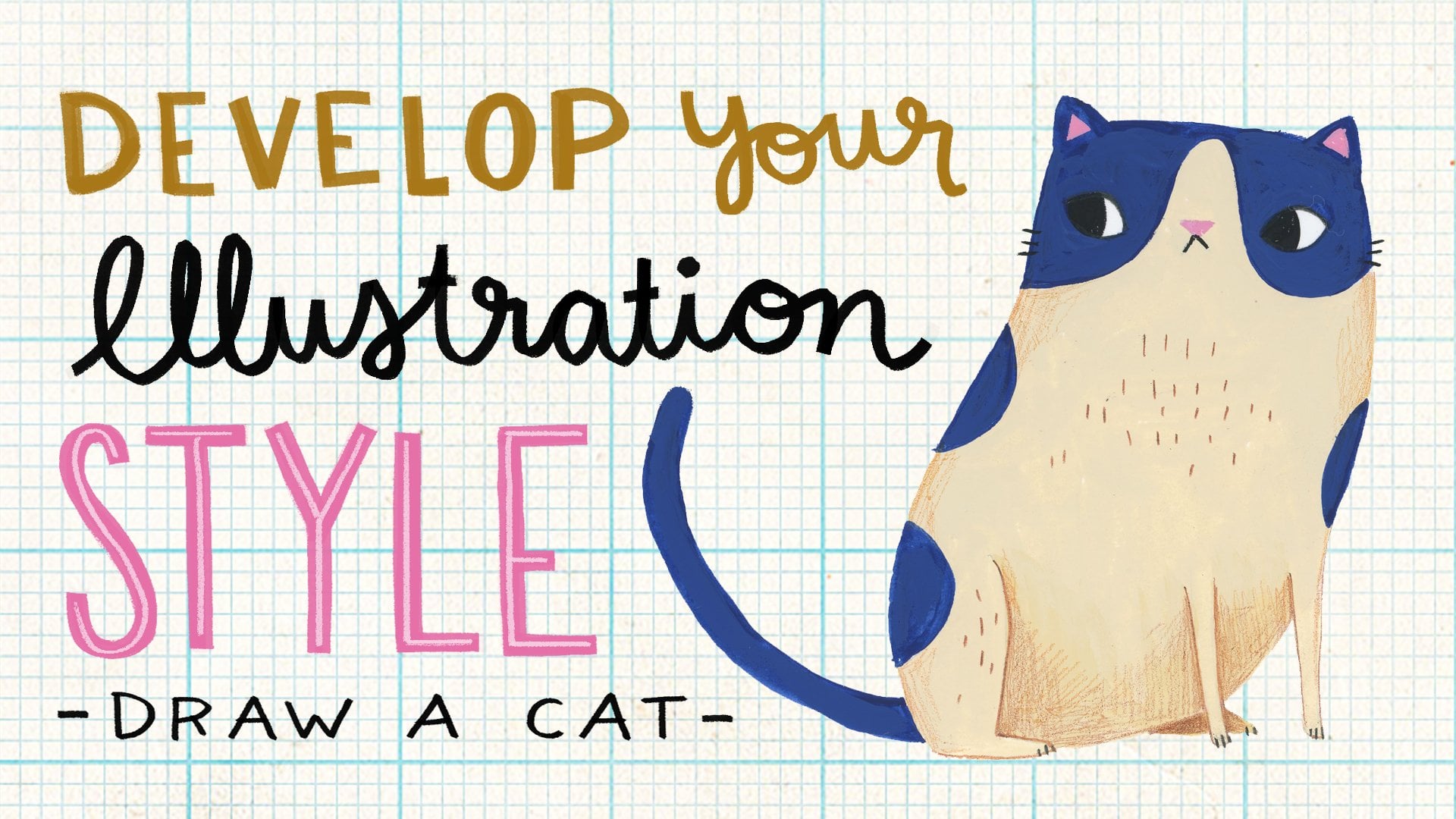
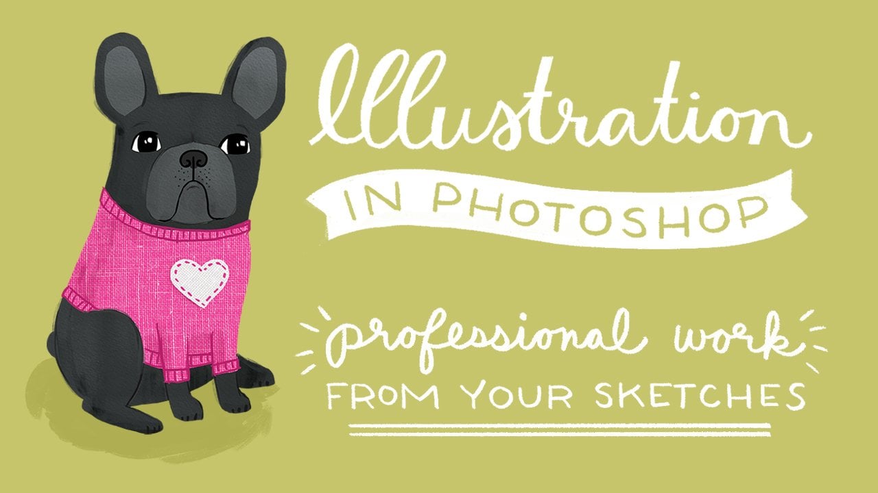
1. Shortcuts to Map Making for Illustrators: Hi, my name is Ann, and I'm an illustrator. I create artwork for products and publications. Maps are a really popular subject matter right now for both of those industries. Recently, a licensing partner had me create a series of 12 maps for a poster calendar. During the process of illustrating 12 maps, I developed a series of steps to streamline my process. In this class, I share those steps with you. This class is best for people who already know how to illustrate. I teach it in Photoshop, but these methods can be applied in Illustrator or even in traditional media like watercolor with some adjustments. If you are not comfortable illustrating in Photoshop, I recommend that you take a class on that before you take this class and then come back and join us. I have a class here on Skillshare, it's called illustration in Photoshop. I think after you take that class, you'd be comfortable taking this one. This class will help illustrators research, layout, and organize their maps quickly so they can get to the fun part, illustrating. Once you have an Illustrated map, the possibilities are endless. Here are a few of the products that I was able to license using the same 12 maps for that poster calendar project. I hope you're inspired to start making your map.
2. STEP 1: Select & Research the Location: The first step is to select your location. Maybe it's your home town, maybe it's your favorite city, just know what city you want to create a map for and then to research that location. If you don't already know exactly what's going to go on your map, a great place to do research is Google. I usually type in things to do in Los Angeles or top sites in Los Angeles, landmarks in Los Angeles, any of those will work. You'll see this box right here that Google puts together of some of the top sites in Los Angeles. If you click on the bottom where it says more Los Angeles sites, it takes you to a map of locations which is really helpful because you can see how the icon would be spread out on your map. On the left is a list where there's a picture and a description of each location. This is pretty zoomed out, it includes part of Orange County. I'm going to zoom in, so it's really just focused on Los Angeles. Next, what I do is go down the list and pick the locations that I want to include. If you want to do more research to figure out what truly are the most popular locations or mussel landmarks, I would do a little bit more research. I usually cross compare lists from US News and World Reports, Trip Advisor, Google and just figure out what the most important places to include in the city are. You may be familiar enough with your city or town but you don't need to do that. I'm just going to go down this list and pick the ones I want to include. There's a little gray star, if you click on that, it saves the location. So here you can see I've saved the Hollywood sign. I'm just going to go down this list and choose the locations that I want to save. Typically if there is a cluster of locations right here, unless two of them are extremely important to include I only pick one. You can pick two if it's something that is a must to include, but just know that your icons are going to have to be close together on the map. That's why it's good to see how things are spread out. Now, if there are additional locations that the Google suggestions haven't included, you can add those to your map as well. If you do a search, for instance, I want to add the Staples center, click on "Maps" and here it's pen the Staples Center. You can save it by going here to the blue star and clicking "Save." Now if you zoom out, you'll see that the other locations that you've already saved are still starred. Here I have the map of Los Angeles and it saved everything from the Google suggestions that I starred, which is cool. Then if you want to add other locations, you just can keep adding them. I want to add LAX Airport. I'm going to start that. We are building a new Ram Stadium in Los Angeles, so I'm going to include the Los Angeles Rams. This is the future location of that stadium, I'm going to include it. Once you have all your locations, you can zoom out. You can minimize this by clicking on the arrow. You want to make sure you're zoomed out enough that all of your starred locations are visible and you want some space above, below and on each side of your start locations. Also keep in mind the format that you're going to be working in. If your end result map is going to be vertical, a vertical 8.5 by 11, you need to make sure you have enough map above and below so that it's tall enough and if it's going to be horizontal, the same thing. The next thing you're going to want to do is center it and take a screenshot of as much of the map as you can. Great. Now we have our map layout all planned out with all of our locations. The next step is going to be to plan our icon.
3. STEP 2: Brainstorm Icon Imagery: Once you've got all your locations for your map determined, write a list of them, and start brainstorming what the icon could be for each item. You can either be consistent and do all buildings for example, or you can mix it up and do some buildings, some representative icons. I like to mix it up. Here are some I brainstormed for each location. Some locations might have several great options and then others it might be obvious what you should use. For instance, for the Los Angeles Stadium, that's coming. I saw that we could do a football, we could do the building, we could do the Rams logo. I easily eliminated the building because it hasn't been built yet and I'm not going to do the Rams logo. I don't want to mess with copyrights and branding. So I will do a football for that. Basically I went down the whole list and picked what icon I want to use for each location. Some of the obvious ones, Muscle Beach, which is Venice Beach here in Los Angeles. It's famous for a workout facility right on the beach outdoors, where you'll see a lot of really ripped guys and girls lifting weights. So to me it was obvious that the most interesting thing to do for that would be a muscle man. For Hollywood, you could do the Hollywood signs, the Hollywood Walk with the stars are red carpet, but I think the most iconic image would be a Hollywood sign. You can go through each location and research on Google images of that location. It's easy to pull up. You'll have images of the building, is that interesting enough or maybe there's a really popular ice cream shop in your town and you want to do an ice cream cone? After brainstorming and determining what icons you're going to use for each location, I wanted to list other things that are going to be on the map. So obviously the map title. You want to make sure the reason I'm writing all these down is so that I can see where everything goes and I have a place for everything. I want to have Los Angeles, California, on my map. Then I like including a compass rose somewhere too. Then other things that I brainstormed but we might not include everything, but I wanted to write them all down; palm trees, other types of trees, maybe whales or dolphins in the ocean, a surfer, a lady walking a dog, a guy riding a bike, a convertible car, and maybe a taxi. So now that we've brainstormed all of our icons and additional imagery, the next thing we're going to do is set up our file and set up the base map.
4. STEP 3: Create the Base Map: So now we should set up the Photoshop document. You need to know what your end use is going to be for your map to determine what size and format you want to create a depth. I'm going to do this one, a landscape, 8 by 10. So 10 inches wide, eight inches high, and I'm going to do 600 pixels per inch so that if I ever need the map for something larger than 8 by 10, I can really double it to 16 by 20. I set my color mode is CMYK because I want it to be printable. Next, you're going to want to bring in your screenshot. It's hard to see because the stars are pretty small, but you want to stretch it almost as big as it can go with all your stars included. I like to leave a little space around them as well. If it doesn't fit perfectly, another trick that I use sometimes is squishing or stretching the map because as illustrators, we're not cartographers, doesn't have to be exact. So if you stretching it an inch helps you with the layout, there's nothing wrong with doing that as long as it visually looks correct. For this one though it fits my 8 by 10 pretty nicely. I'm just going to center it more. Then something that I do so that I can see where my icons are going to go better, I add a new layer above the map and with a bright color like red, I do dots so I can see where my icons are going to go. Before we get started, I usually like to have a pre-determined color palette to work with. If you want to just create it as you build, that's fine too. It helps me to have something that I can draw from and then I'm not legalistic about it if I want to change colors here and there later I do, but it just helps me be a little more organized having a color palette to pull from. So I'm going to turn off the icon layer, the red dots I created for now. I'm going to start by building the base of the map. I'm actually going to do a solid color for my base map color and turn it off so I can see. Then I'm going to do a blue for the water. So here's my water and land for my map. Next I'm going to draw the highways. If you're doing a smaller city or town, it might just be roads, but because Los Angeles is so big, I'm just going to do highways. If you do too many, it starts to look really spidery. So I tried to do just the most important one. You can pick a contrasting color, but I tend to pick the base map color and just make it a little bit darker and then you want to pick a thickness depending on how much you want them to stand out. Actually I'm going to draw above the map and turn the opacity back up so that I can really see where I'm drawing. I'm going to turn off the screenshot. So now I have my water, my land, and my highways. The next thing you're going to want to do is turn your map back on, maybe take the opacity back down or up, and look at if there's any parks, bodies of water, or rivers that you want to include. Los Angeles isn't known for either of those things. We have the ocean, and Chicago has Lake Michigan. Other smaller cities might have a lake that's really important to show, or a big park. So we do have Griffith Park, which I'm going to represent with a green. You'll just want to decide what other parks, if any, you want to show on your map. I'm going to turn off the map layer and look at this and you can see that that green is pretty harsh on top of the base color. So I'm going to adjust it to something lighter because the parks aren't really the main feature of Los Angeles. Now Central Park in New York, you might want to make a brighter, more obvious color because that is a really important landmark in New York. So now I have my base map. It includes bodies of water, land, roads or freeways or highways and parks. The next thing I'm going to do is start sketching my icons.
5. STEP 4: Sketch the Layout: Now it's time to sketch the layout of our map. We've already got the red dots, which are holding places for our location icons. Now we want to roughly sketch where the additional imagery and icons are going to go. I'm going to go back to my map and with my icon locations and I'm going to look at my list at the same time of additional brainstormed icons. Just really roughly, I'm going to determine the places and what I want to include and where I'll put things. I'm going to do some quick placeholder text for where my map title's can go, and it may not end up looking like this in the end, but I just want to save a place for it. Then the next thing on my list is the compass rows. Then I have these, all of these other items that I wanted to include. Now I have a rough map of where my icons are going to go, what additional filler icons I'm going to use, my title, and my compass rows, and I can see that it all lays out okay. Obviously I don't, I move things around to make everything fit and look good, but this is a good place to start so you know how your maps going to fill out. Next will be working on the detailed sketches for our map.
6. STEP 5: Detailed Sketches: [MUSIC]. Next step is to sketch all of my icons in more detail. I'm going to start with Universal Studios Hollywood. What I do is I just do a Google Search and look at Images. I already decided that what I want to draw to represent Universal Studios Hollywood is the globe. You can see there's a lot of pictures of it here. I look at a lot of them. I'm not a fan of copying one image, so I like using Google thumbnails. If I want to have this be more images of just the globe, I might type in "Globe", and now I'm looking at a ton of thumbnails of the globe and I tend to not pick one to draw from so that I'm not ripping off a photographer. Even though my illustration is going to be very different, I just like to take all the images in and come up with my own version of it. Now I'm back to my Map. I am going to locate, which icon is Universal Studios, which is this one here. I'm going to zoom in there and lower the opacity on my location dot. I'm going to just start sketching with my Google Images thumbnails pulled up on the screen. I'm going to start sketching the globe. [ MUSIC ] Next we will go through and do this sketch of each of my icons so that I can get a true sense of scale and sizing for each one before I go in and do the final illustration. [ MUSIC ] Now that I have all my detailed sketches of my main icons, I can go in and sketch out my filler icons in more detail. As I do this, I might eliminate some, move them around. Just because as you're illustrating, you figure out what fits best or what looks best on your map. I'm going to turn down the opacity way down of these. Just so I can see the location. Then do the sketches on top of them. [ MUSIC ] I decided to do a row of palm trees because that's very typical Los Angeles, instead of just a single one. That eliminated some of my other icons. The woman walking a dog, and I decided to go without the compass rose. I'm going to add on the lettering for Los Angeles, California. Now I can see the full layout of my map. The next thing I want to do is add labels for the specific locations. [ MUSIC ] What I've done is kind of alternated my labeling style between a cursive and a capitalized, in just capital letters just to give a little bit more visual interest. The last thing I'm going to do is label the freeways. If you have a smaller town, yours [sic] maybe street names, and I usually just would write them along a stretch of the street. But because I'm doing freeways, I have freeway symbols. [ MUSIC ] Now I'm going to completely turn off my red dots, which the opacity faded out. But I'm going to turn them off completely. The additional icons sketches that I originally had and moved things around, I'm going to turn that off too. Now you can really look at your layout and make sure you're happy with it. A lot of times at this stage, I will move things around a little bit. You can use your creative liberty to scooch things up or down. They don't have to be exactly in the location. Obviously, the icons are bigger than the actual location itself, so as long as it's in the general area in between the right freeways or streets, you'll be good. Once you like your layout, the next step is going to be to start doing the illustrations. Basically I just go one by one and start doing my final and detailed illustrations of each item.[MUSIC]
7. STEP 6: Illustrate!: So now we're at the last and most fun part, illustrating the map. As I mentioned before, this is not a how to illustrate class. So I'm just going to show you a bit of my process here. If you need more direction or would like to see my illustration method, I have another skill share class called Illustration in Photoshop, where I teach photoshop illustrations step-by-step. Otherwise, it's time to illustrate. Now that I've shown you my entire process for map making, the next step is for you to create your own map. In the final video, I'll be talking about your class project.
8. Class Project: The project for this class is to use the steps that I've shared with you to research, lay out and illustrate a map of your hometown or favorite city. In case you need a reminder, here are the steps again. I have also included a reference sheet that you can download that have the steps on it. You can find it on Skillshare under Class Project, to the right. Step 1: select the location, research top sites and landmarks, create a google map with saved locations, take a screenshot of that map. Step 2: brainstorm the icons, write a list of your selected locations, write down icon ideas for each location, select one icon for each location, brainstorm additional icons and imagery. Step 3: set up your Photoshop file, place and size the map screenshot, highlight your starred locations, choose a color palette, create your base map; including land, water, parks and roads. Step 4: roughly sketch the layout, determine location of title, determine locations additional icons and imagery. Step 5: research reference imagery, do detailed sketches of location icons, detailed sketches of additional icons and imagery, sketch icon and road labels, make adjustments. Step 6: illustrate, do each icon, image and title, optional to add texture, to adjust the color palette, fix what you don't like, then finally, share your finished map with us in the class.
 Anne Bollman, Anne Was Here