Transcripts
1. Introduction : [MUSIC] Have you ever
wanted to create those stunning quote affix, but you have no clue about
lettering? I've got you. In this class, you
will learn how to craft and illustrate lettering, artworks from your handwriting, and some basic drawing skills. Hi, my name is Alexandra, aka the art mother,
I'm an artist, an illustrator, online
educator, and art enthusiast. I love functional arts, I love to surround myself
with beautiful artworks, and actually to be reminded of some everyday
things with them. For example, to take
my morning coffee. [LAUGHTER] This is how
my lettering journey started by designing
wall art for myself. Hand lettering is a cool
addition to any artwork, and it can even stand alone. Either way, it might
be overwhelming to navigate through
all the typefaces, forms, and rules, etc. I just wanted to
simplify it because I, myself struggled a lot with the procrastination
over illustrating my own favorite phrases. Everyone can draw lines
and write, right? [LAUGHTER] In this
class we are going to use these skills. We're going to choose a
simple phrase or quote, and utilize your unique
way of writing letters, and use your handwriting
as a path for building up an aesthetic composition of birds and other
decorative elements. Once more, I will teach you a super cool technique to
make your birds 3D and shiny. I'm so excited to have
you here and I'm so much looking forward to see what
you create in this class, so see you inside. [MUSIC]
2. The Class Project : [MUSIC] Your class project is going to be a lettering piece containing minimum two and
maximum of five words. It can be a short phrase
or a simple quote. Here's the list for
some inspiration. Chill out, leave love
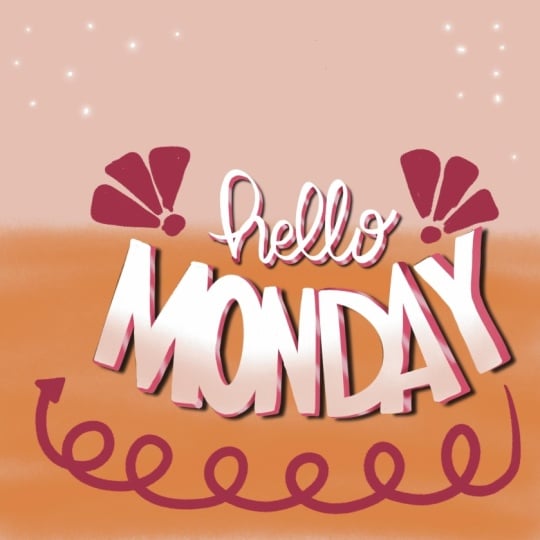
laugh, hello Monday, you can do it, dream big, no means no, find your fire. Now, you know approximately
what I have in mind. The point is, don't
over-complicate it. As for the beginning, really just choose
something where we use not too many
words are right. Also make sure that these
words means something to you. It will make the creation
process more joyful. The reason I started
lettering my illustrations is that I wanted to add
them more function. I love to surround myself with beautiful pieces of art
works and illustrations. But I really need to be reminded
of some values in life, for example I love to over
dramatize situations and it is good to see the chill
out [LAUGHTER] riding. I cannot tattoo everything on myself.This is what
I thought of to find a funny short phrases and just add them to my
illustration pieces, make pollsters for example
the one that you see here.This one says more
espresso, less depresso. This is one of my favorite
artworks that I have created. We're going to create
something like this. But remember that we are focusing on the lettering itself and not the illustration. We're going to add some
decorative elements so that old lettering can stand alone
or be a standalone piece. But if you wish to add
an illustration to it, for example as I did here, you are free to do so as well. But I want to warn you
that this class is not going to include this
part on the lettering part. You can learn to create illustrations like this
in my other classes. Take a look at the
description of the class I am putting there
some recommendation of classes that you can
take to be able to create an illustration like this
to complete your lettering. But now let's just
focus on the lettering. What will you need
for this class? You will need an iPad
with Procreate on it. At least I'm going
to use Procreate. The design process itself can be followed
along in any way, even traditionally or in any software because we
are going to sketch. In the painting part and the illustration
technique I'm going to show you is limited to your software so you need to adjust the steps for
yourself if you want to apply that effect
to your artwork. I have prepared some
resources for you.There is a PDF summarizing the
whole design process. There is a brush set,the art
winners ultimate brush set, that contains the best
brushes I've ever created and I'm going to use
those for my illustration. You can also download some color palettes that I
prepared for this class. Let me just map out for you very shortly the process that
we're going to go through. At first we are going
to meet or handwriting. Maybe you were not mindful how you are
writing letters by now. Now, we are going to just take a very short loop on how you write letters and how
you connect them. You will write a chosen
phrase several times and we will decide on the
size of the words, the ways that I've written and then we are going to
create a composition from these words and use your
handwriting as a path for building up the
shapes of these letters. During the painting process, we are going to make these
letters cool by the 3D effect. I think these shine
to it and also add some decorative elements to make it all an
aesthetic composition. After we are done watching the class and you
finish your artwork, make sure to upload it to
the project gallery below. In the project and resources tab that opens when
you're in a browser, include your image
and a few words about your experience into the
body of this class project. It is also good to create a cover photo as it
helps others to find your project more easily.You
can also share it on social media and
just make sure that you tag me as at the art mother. Now, the next step is
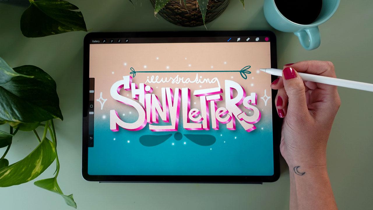
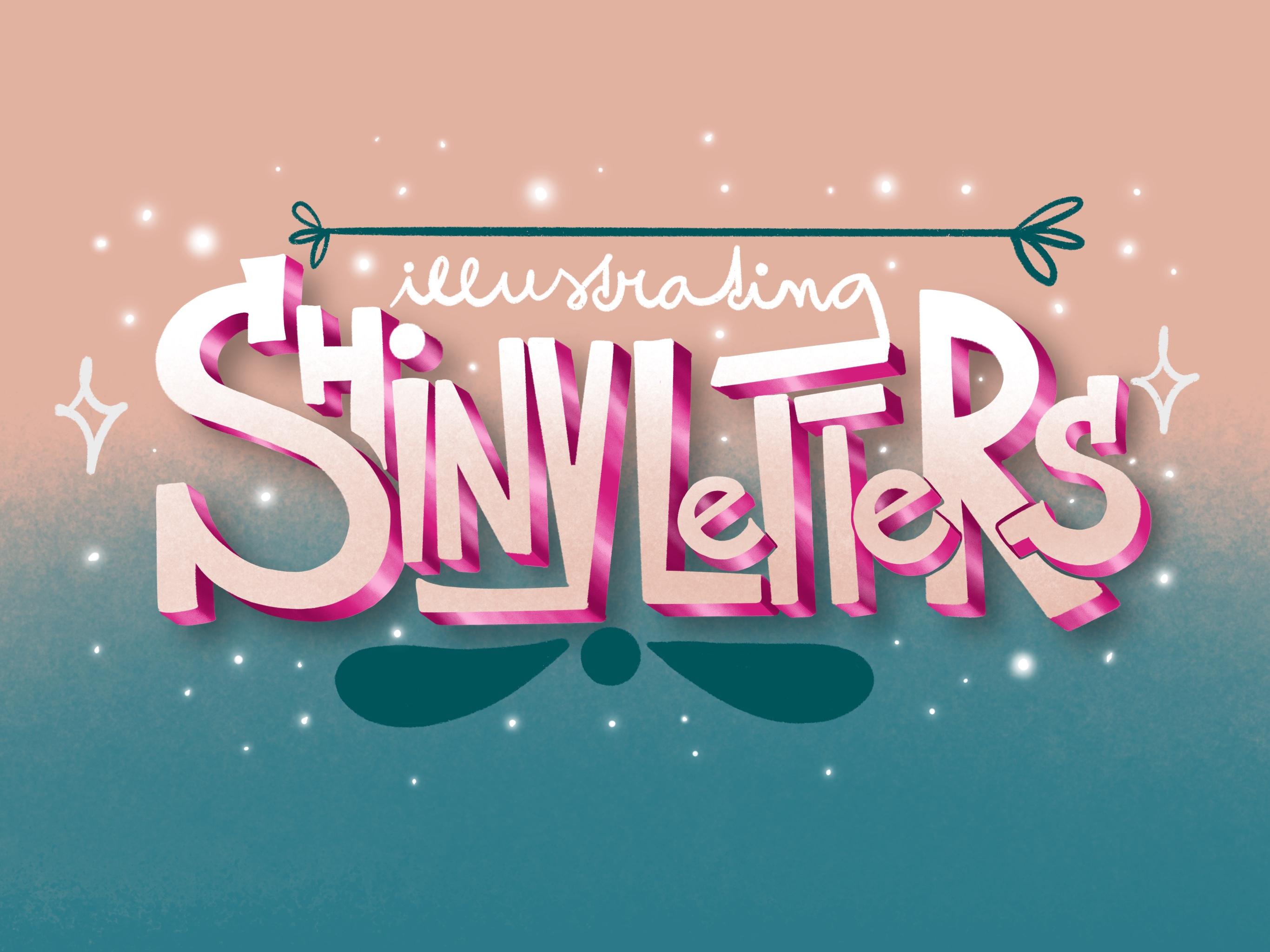
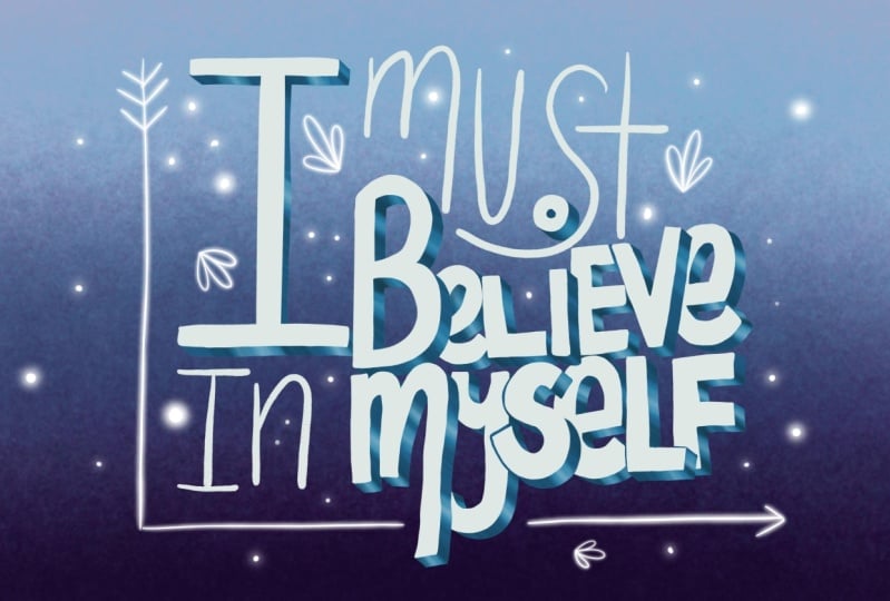
to choose your phrase. I decided to create the class thumbnail
as a class project. [MUSIC] My phrase we'll be
illustrating shiny letters. What's yours? [MUSIC]
3. Meet Your Handwriting : [MUSIC] Now that you
have your phrase, lets us create a new
canvas in Procreate. I will create a screen-sized
canvas right now. If you want to sketch on
pencil paper, or grab dose. We're going to start with
simply just writing down the phrase and we're going
to write it down two ways, in lowercase and in uppercase. Really use your handwriting, don't be too mindful of, I really need to draw
very nicely now. Just keep it loose, but also, don't write very
quickly when you are writing big pages because that will distort your handwriting. [MUSIC] When I was in school, I totally loved to create
these beautiful titles for my things in the exercise book that people were
supposed to write down. I was not the best student, [LAUGHTER] but I had really beautiful titles
in my exercise books. This is how I started to
write my titles in uppercase. Let's just take a
look on some things. We're not going to do any difficult analyses
of the words. What I want from
you basically is to find parts of your writing
that you really like. For example, I really
like how I use this Y here so that I make this, where we definite
going down in it. I really love how I connect
my S and the H. But I will also break rules and I invite you to
break rules as well. If you take a look on this image that I
have created here, depresso is in uppercase
and the e is in lowercase and the combination of these makes it
really interesting. So breaking the rules is a way to approach things
most of the times. This is the second thing
that I want from you now to break the rules. Think about where you
can put uppercase in a word written in lowercase
and the other way round. The third thing is, that I want you to define the placement and the
size of the words. Decide which words
are important. In this case, the important was the
espresso and depresso. As you can see this small, more, and less are written in small, but still in uppercase. But I would love to
combine it right now and I will choose the main words
and that is shiny letters. [MUSIC] I will write illustrating up
here in lowercase. When I realized
here that if I play this illustrating about is t, this j might be connected to it. It is sometimes wary of fun to connect and build
them together, so I will try to connect them. [MUSIC] I have a basic
sketch for my lettering. Let's just do a little recap
on what I want from you now. I want you to write down your phrase in lowercase
and in uppercase, look for interesting
connections between letters, and choose the parts that you
like in your handwriting. Yeah, I want you to
like your handwriting. Then experiment and break rules. Exchange lowercase and
uppercase only if you wish, this is optional part. Then define the placement
and size of the words. Choose which words
are more important, which has to be dominant, and maybe make the
dominance by writing them bigger and in uppercase and the less important
part with lowercase. Lastly, find interesting
connections within the placement where you can
build these two together. This will add this illustrative
feeling to the whole. After you have this
base simple sketch of your words I'll see you in the next video where
we're going to talk a little bit more about
composition. [MUSIC]
4. Composition Tips : [MUSIC] Another
thing you need to be mindful of when
you are creating lettering art works is to
think about the final piece. Don't just randomly
create letterings, think about the overall format that you are going to use it in. As you can see, I
already created a rectangular composition
for my sketch. This is because I'm going to
work on a thumbnail image. It is enough if you just keep in mind that
if you want a square, if you place your
letters too widely, you will have too much of negative space below and
above your lettering. That might be interesting. If you want to fill that area with decorative elements or
just leave that like that, it can be also an
interesting thing, but it requires solution. If you don't want extra
work, think ahead. If you are illustrating
this for Instagram, keep in mind to create a square composition and also a square canvas and
start working there. You can just grab your sketch and put it
into that new canvas. I'm going to stay here, and I'll work in this one. I will just erase everything
that I don't need here now, [NOISE] and talk a little
bit more about composition. There is another way to create
interesting compositions, and that is filling a shape. One thing is the size
of the final piece or the orientation of the final
piece if it is a landscape, a portrait, or a
square-sized canvas. But within these formats, you can use shapes. You can use geometric shapes
or organic shapes as well. It can be very interesting
to draw an organic shape. For example, I will use a shape like this and try to
write my letters into it. Let's say, I will
just try it out. Shiny. It can be this shape
itself. I don't know. Write letters here. It will not work with this
one when I bring that here, but let's just try. Illustrating [LAUGHTER] shiny letters. I hope you understand
what I have in mind. I don't want this, but this is a possible way of filling in an organic shape. You can do the same with all
different kinds of shapes. You can fill in a circle. You can create a circle, and just write shiny letters
there or your phrase. Come back to the circle, for example. It might be
very interesting to do this compositions within the
canvas size that you have. I will keep my sketch like this. I will just create
a rectangle and try to fix my letters into
that a little bit more. I will create a rectangle
and its shape rectangle. What I'm going to
do now is to fit my letters into this rectangle. This is good because I will
be able to transfer it into different
sizes of canvases. It will be rectangular, but it will fit all
different kinds of sizes. Because, for example,
a thumbnail is thinner than the screen-sized
canvas in Procreate. I will be ready to put this composition into
that canvas-sized, if that makes sense. I'm going to speed this up. [MUSIC] After a few experiments, I have my final sketch. I will just tell you in a few short words what
I have done here. I have played with these
letters what to write bigger, what to write smaller. It is very good to try
them out several ways. How you can connect
these letters in the most interesting
way, how it fit. At the end, I made this G
as the top of only one T, so that is more readable. For some reason, this
combination made me think or reminded me
of shape of a house. That feel quite not fit
the meaning of my phrase, so I let that go. I decided to end
these similarly, this Y and this G up here. After you have a quite finished
sketch of your letters, see you in the next video
where we are going to use your handwriting
as a path. [MUSIC]
5. Your Handwriting As A Path: [MUSIC] In this video,
we are going to build up shapes for all letters using these lines because we
yet only draw lines. I will just erase everything
that I have here, or turn them off. This is my main lettering
and I will just place into the middle of my Canvas. I will create a new layer
above it all and make this layer less opaque so
that I can draw above it. There are two ways
how you can create shapes from your letters. Most of the brushes
that you have in the digital programs,
or Procreate, or actually any real brush
is not creating thin lines, but I'm making a wider
lines, or basically shapes. There are two ways
you can build up shapes from your letters. One is that you choose a brush. Let me go to the artworks
ultimate brush set here. I will just take the
textured shaper, and let's say choose
a color and make it bigger and I just follow the shape of the
lines I have created, for example like this. I have shapes for my letters. This is one way. This is the easier way. If you don't have too much
time to draw like a very precisely and filling
in shapes this is one way you can go
with your letters. If you wish, you can just simply follow with this thick brush the lines you were drawing
and create shapes from it. Yes, they are overlapping, you can change the size
of your brush as well. Maybe if I go to
this smaller one, or smaller lettering, I
can just make it thinner. This is just an example case, is not my finished thing. This is one way and if you just do this with your
sketch, you can continue. But there is a more
complicated way, or a more complex
way of building up shapes and it
includes also sketching, drawing, and then filling in
those shapes with brushes. Let me just show you an
example how I combine this in my illustration here. This Espresso and
Depresso of arts here with the second way, I'm going to just create these letters that I'm
going to show you. As you can see these
other ones here, the less and the more up here are just simple
brush strokes. These shapes of these were
only used with a simple brush. It is totally okay to
combine these two, but I would love to show you
how I will do this here. When I will be illustrating, this illustrating word will
be just written in this way. Now, I'm going to just work on the shiny letters and
build their shapes up. The way I'm going to do this is, I will choose black and the
sketching pencil and actually draw edges around my shapes at approximately the
same size in both parts. Let me just show you
for example like this. My line is a path for the shape, or the middle of it. In a second you will see
that this is good because we can change things in the shapes and make these letters
more interesting. I'm just going to speed this up now and draw these shapes, [MUSIC] or the lines around
the path of my handwriting. [MUSIC] This is super cool. I hope you can see the
difference between the one line shapes and these buildup shapes and these layers of mine
will be still perfect, but while we are
going to paint them, we will make them
look really top. If you have overlaps
in your letters, that's not a problem. We are going to
solve them later, when we are painting them, or you might even think that
there are problems now, but yes they are a bit tricky, but not that much. If you have built these shapes
up from your handwriting, see you in the next
video where we are going to choose your shape
language. [MUSIC]
6. Choose Your Shape Language: [MUSIC] What is a
shape language? Shape language means
that certain shapes give certain moods to
a drawing or vibes. This is mostly used in character design but it
applies to your letters too. For example, rectangular edges make something strong and heavy. Lots of curves and curvy endings make your letters look cute. These pointy edges
make some points. They are poking so very harsh words might look
good with these pointy edges. Then spirals make things goofy. Let me just show you an example. For example, I have created
this artwork, Chillout. As you can see, there are lots of spirals
and curves in these letters. It is a cute, good feeling, positive
vibe to chill out. However, if you take
a look on this, Espresso Depresso, depressive things are pointy [LAUGHTER] if that makes sense. It is not an easy topic. Espresso coffee itself
is not that cute thing. It is soberly, it is goofy, it makes your
energies spiral out. [LAUGHTER] This is why
these very pointy, goofy edges here and
there in the words really fit what I'm
saying in this phrase. Think about what you want to say with a phrase
that you have chosen. Is it cute? Is it something heavy or
is it something goofy? Try to add those
things into letters. For example, if these shiny
letters were very cute, I would do this. I would maybe erase these edges and add
curves because why not? I can even remove this
whole thing here and just simply add a rounded edge. Now, what the feeling of my shiny letters is if
I take a look at it, I automatically added a lot of edges and rectangular things. It is heavy. Shiny letters, however, add for me positive
coffee vibes. I will now work on maybe removing some edges
and adding some curves and swirls and some more
positive shape language to the overall thing. If I want to be mindful
of what I'm drawing, I need to think through
what I want to say and communicate with the phrase
or illustration or my words. I'm going to again
speed this up and just revisit and think through some
things in my illustration. [MUSIC] What I want to
say with my letters is very simple, shiny letters. I removed some more complicated
things for me so it is really straightforward
what it is about. I also want this to be very easily readable because this
is going to be a thumbnail. I decided to remove some too-extreme curves and
I simplified the shapes. What your task in this stage is to think about the shape
language that you are using and what you want
to communicate with your letters apart from
what it is actually saying. Make your letters
easier and more straightforward if you don't
want to overcomplicate it. If you want to say something
very cute and positive, use more curves and end
your letters with curves. If you want something
very goofy, add some random shapes
here and there and make sure that you are happy
about your artwork. Let's continue to the next stage where we are going to add some illustrative elements to complete your design. [MUSIC]
7. Add Illustrative Elements: [MUSIC] In this video
we are going to add some illustrative
elements to your design. They can be as simple
as some simple shapes or more complicated elements, like illustrations and more
complex florals for example. The function of these
elements is to fill in the composition itself within the composition that
you have chosen. If you have a square, let me show you for
example this chill out. I have a very rectangular
composition of my words and I had to fill
in the square canvas. It really fits here, at this piece wonder I added
some stars and the moon, not too much because my focus is still on the
words themselves. I might add lines,
floral elements, simple geometric shapes
or if you wish you can add more complex florals
to your artwork, or even illustrations that
I have done right here. I'm going to again speed
this up and decorate it a little bit and
then we will continue. [MUSIC] I have added some
decorative elements. I really like them. They just complete
the illustration but don't take the tension
from the words themselves. Now, we're ready to
start illustrating. In the next video we
are going to choose our colors for the
illustration [MUSIC].
8. Choose Your Colors: [MUSIC] Choosing
colors is not easy. You need to make
sure that it also communicates your
message and you need to choose the right
colors to have a clear and readable
artwork and we need to prepare in advance what we are going to do in
our illustration. As we are going to do a 3D
effect and the shiny effect, I know in the other ones, what colors will you need. Basically, you will need
Freeman colors at first. You will need a color
for the background, for the lettering, and for the 3D effect. As for this composition, I thought that the
letters would be the brightest then the
background will be a major tone and the 3D
part will be the darkest. I could choose a midtone
for my background, and I will choose
a color for it. I want this shiny letters to be very girly [LAUGHTER]
illustration. I thought that
this color will be this peachy color
for my background. My letters will be white. I will create a new
palette for this. I will put it here. I will choose my whites for my letters and go for a magenta. I have now three colors. Let's just see how
they look together. I'll have just roughly create a layer below all the sketches and just choose the clean
shaper from my brush set. But any brush that is opaque and not too textured
would work pretty well. I will just feel in
roughly one letter. I will add below this magenta next to
it, just very roughly. I will create a,
"Value Check layer." I will create a new layer, fill it with gray, and change the blending
mode of this layer to color and I can see that
my letter is a readable. The shadow is pretty good, but the background
and the letter are pretty much blending into each other. I need to darken my
background color and I will just do that. Background color, classic and I will try
to make it a little bit in-between the shadow and the letter for
example like this. I will just put it here and
turn off the value check layer and I think this
looks pretty nice. My illustration
will be readable. The Value Check layer is a very good way to
check your values. Obviously, you can change that later and we can also play
with the colors later. But for the base, will work very nicely and it
will smoothen your workflow. I will turn off or delete these layers I have just created and in the
next [MUSIC] lesson, we are going to paint
those letters. [MUSIC]
9. Paint Those Letters: [MUSIC] In this video, we're
going to paint letters. What we are going
to do is to fill in the shapes with a solid brush. The best brush for this
is the clean shaper I have in the arbiters
ultimate brush set. But again, any brush
that is solid, all packed and not too
textured will work just fine. I will take my sketch, I will merge these
together and actually I will go a little bit
tidier on my file. I have my sketch, I have
my value check layer here. I will create a layer below it all and turn the opacity
of my sketch down. Now I have my brush, the clean shaper and
my color of white. I will just fill in the
shiny letters parts. I will again speed this up [MUSIC]. When you arrive to a part where your letters are overlapping, make sure to put
those letters that are at the top onto
a different layer. [MUSIC] I have my shapes filled. I will now create a new layer and choose my texture shaper, and with this little
textured line or line shape, [LAUGHTER] I will just
try the illustrating part [MUSIC] and connect
it to this top shape. I will not paint the
decorative elements now. That will be the last thing
that we're going to do. Right now, we are going
to add it a 3D effect. Let's do that in the
next video. [MUSIC]
10. 3D Effect: [MUSIC] This will be fun. Go to your layers and select both layers or as many layers that you have with
these overlapping ones. I suggest you have a main layer
with the main letters and a layer with the top letters
so duplicate them both. Now choose the ones
that are below. Hit the color that you
want this shadow to be. Go back to the layers and
these lower layer hit on it, hit "Select" and it
can go back and hit "Fill Layer" and do this
with the other ones as well. Hit "Select", hit "Fill Layer". Now select the
layer of this pink, hit the Move button
and place it a little bit lower like this. You can do the same with the second layer or the
other layer as well. Now you can decide how
thick your layers will be. If you place this shadow
just a little bit down, it will be very thin and if you want a very
deep thickness, all these letters
place them more apart. Now what I'm going to do is that I'm going to
select the clean shape again and connect this
shadow to the main shape. For example, here, many of these edges. This layer [LAUGHTER] Connect
the edges to these ones. You can adjust the shape of this shadow to make
it more smooth. Erase it where you think
that it does not go, that it is there
and just go through your letters and adjust this
shape to fit your letters. What you need to be
mindful of to keep the same angle during the whole. Don't do, for example, I'll just show you
here that one will be this angle and one
will be this angle. Try to keep the same angles. When you are at a rounded
shape for example, at this circle, take the
edges and just connect them. [MUSIC] Make sure to work on the layer of the shadow that you are at [LAUGHTER] if
that makes sense. Now I'm at the layer
of the main letters. I will work on
those and then move on to the letters
that are on the top. Don't mix it around because
adding the shiny effect, it might be tricky [MUSIC]. Now I'm going to go
to the shadows of the top letters and do
the same to them as well. I will feel, for example, this whole shape
because you wouldn't see that if the latter is 3D. Cool. Now we have a 3D effect. Let's just move on to
the shading part or making them shiny. [MUSIC]
11. Make'em Shine: [MUSIC] There are several ways you can make these
letters shiny. We're going to make the
shadow or the 3D part shiny. It will result in an
effect like this as if it was gold or golden. Now I'm working with a magenta and I can
make that shine too. The principle is the same. I'm going to choose
three levels of the same hue and make a
smooth gradation within them. Now, there is an
easy way to do this. I will just show it to you. I will create a new layer
about this 3D shadow. Choose a light pink, so our lighter
version of that hue. Choose the clean shaper and make this layer a clipping mask. Now add a line here and there, for example, where
I wanted to shine. For example like this. I will just do
this on some parts because I will show you a more
complex way of doing this. Let's say to here. Now I go to adjustments
and a Gaussian blur, and just blurr it. Voila! I have this
shiny parts on this, and it already makes it shiny. It looks totally cool. If you choose this way of making these letters
shine, it's all right. Now I'm going to show a
you a more complex way. I will just delete
this and again create a layer above this shadow
and hit "Clipping Mask". This will work pretty nicely. Again, this lighter version, I need my main color, and I will need a
darker version, of the same hue. A mid tone, the color
that I was working in, a highlight and a shadow. Now I'm going to use
my shader brush. Any brush that is textured and transparent would work
pretty fine with this. I will start with
the first letter. I will make this shining this
way a little bit more deep. I'll work with shadows as well. Where do these curves
meet or these edges meet? There. I will make this
a little bit smaller. The shadow comes from that. To make a smooth gradation
with this brush, you need to push harder and then smoothen
out a little bit. Every time this shadow is
showing below the lettering, at these parts, it's
getting darker, if that makes sense. Also, when you are shading
objects with edges, one side is lighter and
the other side is darker. For example at this part, I will make this brush
a little bit smaller. At this edge, it will be
darker as it goes up here. Also I will add a little
bit of shadow here. At this part again, it's
showing off at the edges. I will add a little
bit of shadow. Again, I will add a little
bit of shadow here, and the shadow here, like this. Again, it comes out like this, and by the edges, it adds a shadow. I will go through all of
these shadows like this. Let's do a little recap how. Every time there is a shape connection and
the 3D part is showing, you will go with a
shadow for each side. Where you have these
very edgy parts, one part is always going into the dark and one
part is all lighter. I will speed this up, but keep your eye on
what I'm doing to get a little bit more sense
of what I'm talking about. [MUSIC] All right so now I have the shadows and I
will add the highlights. How do I do that? I will choose this lightest version and go back to the parts where
there are no shadows, and I will add a
line to the middle. I will go back to the layer on the clipping mask
about these shadows. I will add the line
in the middle and go with a little
bit of gradation to each side, like this. Also at the edges where the
light can hit these parts. Can you see what
I'm talking about? What I'm going to
do now is to do the same to all of the letters. Find the parts that
I left out from the shadings and add
the middle line, create a little gradation
to make them shine. [MUSIC] What do you say? They are shining bright. Either way you've done the simple way or this
more complex way, it is totally fine. Now, if you have overlaps
between these letters, it is not a problem. Let's see what we can do with them in the next video. [MUSIC].
12. Overlap? No Problem!: [MUSIC] It is really
another problem. If it is not annoying here I get these letters
are overlapping. It is fine. I'm going to turn off the sketch to
see how it looks. For me, it is a little
bit bartering because these main colors are just
blending into each other. What I can do is to cut out these top letters from
the letters below. Let's just see how
we can do that. I will go to the main layer
and just grab my eraser. I will make sure that my eraser, I started a clean shaper or any other brand that you
use to create the letters. I will just start
here and this T, I will just simply erase a little bit off
the letter here. [MUSIC] We are not going to erase from
the shadows below, but we will try to as if continue the shadows
of the letters there. I will just grab my
main color here, go to the main shading layer and make sure that I
have the clean shape, and just add this
three-dimensional part here, as if. What I can do as well
is to darken it. Really where these letters meet, there will be shadows. I will just make sure
that it is there. I will actually try to make
it as real as possible by even erasing
from that shadow. [MUSIC] I think this is
looking pretty good. All letters are finished. Let's just add the final
touches in the next video.
13. Final Touches: [MUSIC] I will turn on
the sketch again and check out my
illustrative elements. What I can do, as well, is to add a little bit of drop
shadow below the letters, and it will be very easy again. I will just duplicate the
main layer of the shadow, select, choose black, and fill this layer
with this black. I will again select it and just place it a
little bit lower. Now, this is when the
trick will come in, I will hit ''Adjustments'', Gaussian blur, and just blur in. Now I can place it all around. I will do the same with the
top shadow, so duplicate, select, fill layer, Gaussian blur, and
Gaussian blurring. Now, this puts shadows
onto the letters, and I don't want that. I will just place
this layer below it all so that this
shadow is below here, I will just make it here. I will merge these two shadows, and actually lower its opacity so that it's not that harsh. Now our shiny letters
even have a drop shadow. Now let's fill in
these little elements. What color they will be? I will actually
choose this dark pink and the texture shaper, and just fill in
these things here, obviously onto the layer. [MUSIC] Cool. What I love to do is gradation. I will play a little bit with the background to add a little
bit of gradation into it, and also to the top letters. Let me show you what I mean. I will grab the
background color, go to my shader brush, I will make a new clipping
mask to these layers, on top. Clipping mask, and
another clipping mask. Now I will go into these layers, and just go through, and add a little
bit of gradation. This is not looking
good right now, but believe me, this will look good. I will choose a darker
version of this whole color, maybe a little bit more
saturated and more reddish. Let me see. I will create a
layer above the background, not the shadow, but
the background, and I will make a gradation
just to the middle. I can make it happen
with a bigger brush. This looks pretty cool. I can choose different
colors as well, or just go to the
adjustments and go through hue saturation brightness and just play with these colors. It looks good with the blue, and also with this teal. It looks pretty nice, or the pink, or the purple one? I love this teal one. I will make it a
little bit lower, so it actually starts as if it's at the middle
of this whole. I will turn off the sketch. [LAUGHTER] This is so cool, I love this so much. Nowadays I love to
make gradations, I don't know why, but it
looks pretty amazing. It makes the simple designs
so much more interesting. I will turn on the value check layer and see if
everything's fine. Yeah, everything is
readable, I love it. What I don't like is the
color of these elements, so I will just revisit them. [MUSIC] I think
that I'm finished. What do you say? One last thing that I'm going to do is that I'm going to add a little glowing effect with the light pen that you can find in the luminance
brush set in Procreate. Then choose white color, create a new layer, and start adding these
cute little stars. [MUSIC] This made it
look really cool, and it completed
the composition. Maybe I will need to
add some things to these coronaries,
but not necessarily. It will depend on
where I'm going to put this lettering into
a thumbnail image, or I will put it also onto social media to fit
a square canvas. We will see. This is the time when you
need to think about all these other elements
you might want to add to your illustration to
complete the whole artwork. I hope that you like
this technique, and I am so much looking
forward to see what you create. See you in the final video. Let's do a little recap on what we have done in
this class. [MUSIC]
14. Final Thoughts: [MUSIC] Congratulations, you
have finished the class. I'm so happy about it. Let's just do a little recap on what we have
learned in this class. In this class, we have
explored your handwriting, became mindful of how
you write letters, how you like to write letters, and how you connect
your letters. You have chosen a
phrase or a quote that you liked and experimented
out the best version, and then defined the placement
and size of the letters. Then we looked at the
composition more closely. We decided on the main shape that we fill with our letters. We find the sketch. Use your handwriting
to build the shapes of the letters and then added
some decorative elements. Then we painted the letters, a 3D and a shiny effect. Now you have a totally
cool lettering and I'm so excited to
see what you created. Make sure to post
your project to the project gallery below by clicking on the "Create
Project' button. I'm so excited to see what you create and to give you feedback. I invite you to see what others done in this class
so that you can also give feedback to
your fellow peers and support the community and to get some inspiration and motivation and also to see the creative
solutions of others. That is pretty exciting. I also invite you to share
your artwork on social media, but don't forget
to tag me there. Also follow me on social media, on Instagram, and Facebook. Make sure to follow me here on Skillshare as well
so that you get notified about the latest
classes and challenges. Also, leave me a review. It is very important to me
to know what you think about the class and for others to see if the class is a
great fit for them. It was so exciting to
have you in this class. I hope to see you in
my other classes too, and I really love to
see your progress, so make sure to keep posting
your class projects. It was a pleasure
to have you here and I wish you all the best
and happy creating. [MUSIC]
 The Artmother, Professional Art Teacher and Artist