Transcripts
1. Shading Trailer : When we draw something, we are not merely drawing
the subject itself, we are drawing the effects
of light on that subject. The same subject, lit
in different ways, will yield completely
different drawings. Light and shadow will determine what your drawings
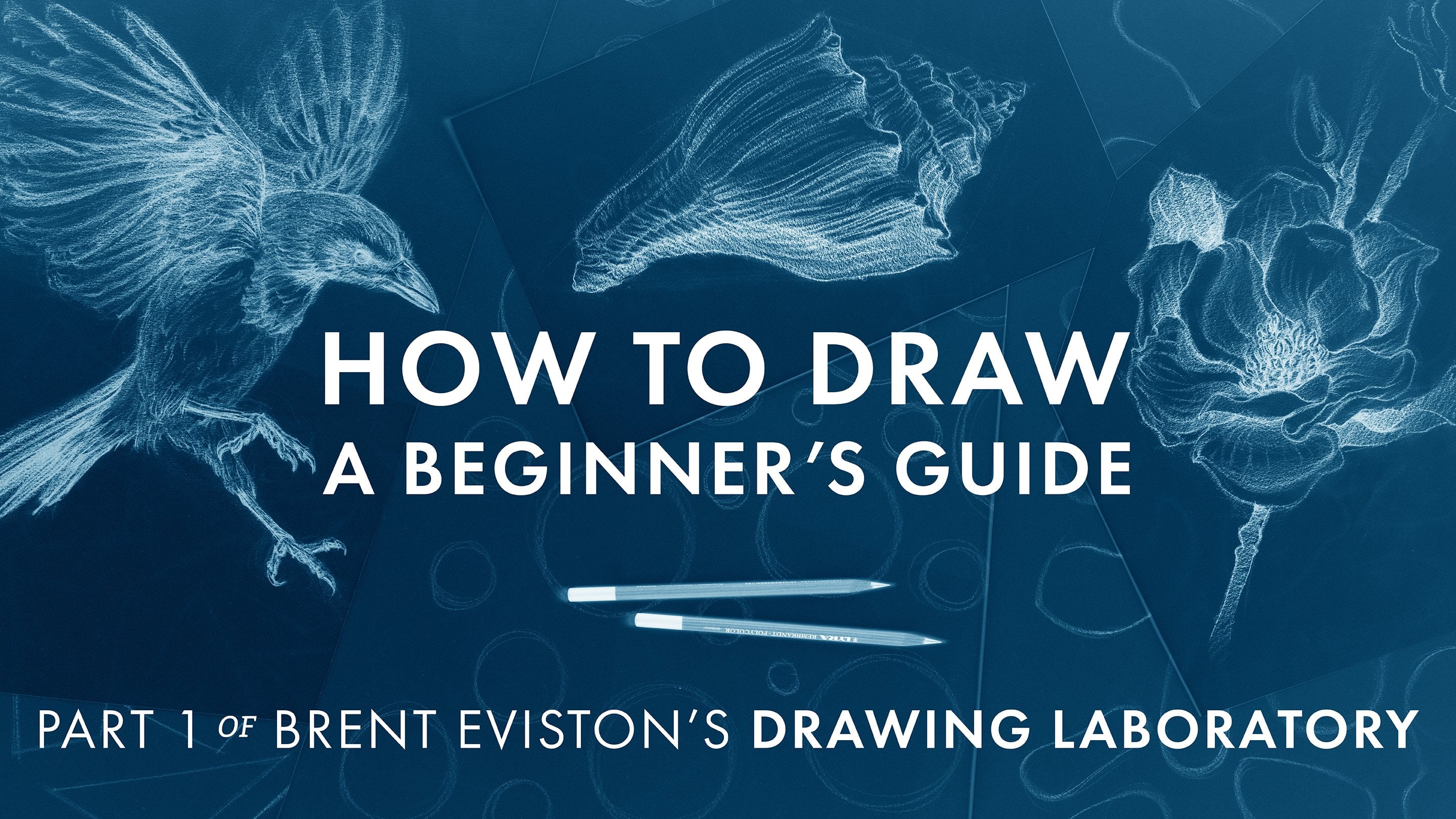
look and feel like. I'm Brent Eviston. Welcome to the fourth and final course in the drawing laboratory
series shading. In this course, you are
going to learn how to render three dimensional forms with
dramatic light and shadow. Shading is the most sought
after drawing skill. It's also an essential
skill for painting. A well shaded drawing has areas of beautiful bright light, as well as deep rich shadows. In this course, you'll start
by learning how to shade simple three dimensional objects like spheres, cubes,
and cylinders. You'll learn how to draw
with a full range of values with bright
white and dark shadows. You'll learn a
straightforward process for shading that you can
apply to any subject. You'll learn how to organize the values in your
drawings and how to keep a clear division
between light and shadow. You'll learn how to identify and draw different kinds of
shadows and areas of light. Finally, you'll learn how
to cross hatch and how to draw using colored
pencils on colored paper. By the end of this
course, you will have a deep understanding
of light and shadow. You'll also have a straightforward
shading process that you can apply to any subject,
no matter how complex. Understanding light
and shadow is the essential element that will pull all of your other
drawing skills together. Shading with beautiful
areas of bright lights and deep rich shadows will bring your drawings to life in
gorgeous and dramatic ways. So join me in this
course, shading. Learn to draw with
dramatic light and shadow here on Skill Share.
2. Introduction: Welcome to the fourth
and final course in the drawing
Laboratory series. For those of you who
have been taking the entire drawing
laboratory series in order, everything has been
heading to this moment. Shading is the most sought after skill in drawing and it's
one of the most important. In this course, you're going
to learn how to render three dimensional form with
dramatic light and shadow. To do this, you're first going
to learn how to draw with a complete range of values from bright lights
to rich darks. You're going to learn
how to properly light objects and how to reveal their three dimensionality
using light and shadow. Next, you're going to
learn how to shade simple three dimensional forms like spheres, cubes,
and cylinders. While doing this,
you're going to learn how to identify all of the different kinds of light and shadows you'll
find while drawing. You're also going to learn a straightforward
shading process that you can apply to any
subject no matter how complex. At the end of this course, you're even going to learn about cross hatching and how to
draw on colored paper. By the end of this
course, you will have a deep understanding of
light and shadow and you will have the skills
necessary to shade any subject. For those of you interested
in color and painting, you must learn shading. Shading is a prerequisite to
color theory in painting. Painting requires you to have a deep understanding
of light and shadow, and a course like this is exactly where you're going
to learn that skill. Here in the introduction, before we get to
the actual lessons, there are a few things
I'd like to address. First, this course
contains eight lessons. Each lesson focuses on a
specific shading skill. At the end of each lesson,
you'll have a project. Once you've watched a lesson
and completed the project, you'll be ready for
the next lesson. I recommend going through no
more than one lesson per day and it is critical that you do the project before you move
on to the next lesson. Remember, practice is key. Practice is the most
important ingredient you're going to bring
to this process. Now, if one lesson in project per day seems too much for you, you are welcome to adopt this
course to meet your needs, even if you only get to
one lesson per week. The most important thing is that you're watching
the lessons, doing the projects, and
continuing to move forward. It's also important to
note that in this course, I'm going to be giving you the minimum amount of practice. You should always
be looking for ways to practice more, not less. If you want to improve faster, I highly recommend increasing
the amount of practice. Do a practice project
two or three times. When you're learning
a new skill, this repetition is
exactly what you need. I always want you
to feel free to increase the amount of practice you're doing in
between each lesson. Next, you need to know that this is not a beginning
drawing course. Earlier on in the drawing
laboratory series, I introduced the
idea that all form, no matter how complex, can be simplified into basic three dimensional
forms like spheres, cubes, and cylinders and these are the forms you're
going to learn to shade. But in order to
shade these forms, you must already know how
to properly draw them. In this course, I am
assuming that you already know how to simplify
subjects into basic shapes, how to draw three dimensionally
in proper perspective, how to measure, and how to use descriptive line quality to
bring your drawings to life. If you don't already
have these skills, I highly recommend
going back and taking the other three courses in the drawing
laboratory series. In those three earlier courses, I teach all of the prerequisite skills necessary for
this shading course. Assuming that you already have these prerequisite skills and that you're ready for
the shading course, let's move on to materials. If you've already gone through the other courses in the
drawing laboratory series, you should already
have materials you're comfortable using, including a dark pencil
and white drawing paper. You're welcome to go through this course using
those same materials. But in addition to white
paper and dark pencil, you're also going to
see me do drawings on toned paper with black
pencil and white pencil. You'll even see me
do some drawings with colored pencil
on colored paper. Here's the basic materials
list for this course. You'll need white drawing paper, a dark drawing
pencil of any kind, a kneaded eraser,
and a vinyl eraser. You are welcome to go through this course using white
paper and dark pencil. But here is an optional
materials list if you want to explore drawing on toned
paper and colored paper. To fully participate in all of the projects
in this course, you'll need toned paper. Tone paper just
means gray paper. Now, if you're drawing
on toned paper, you'll need a white pencil. You'll need this white pencil
to create lighting effects. You'll use white
pencil to draw on the light and dark pencil
to draw on the shadows. If you're really looking
for a challenge, you can even draw on colored
paper with colored pencil. But again, this is not a
requirement for this course. Now, in addition to the paper, pencils and erasers you'll
need for this course, there are a couple more things
that I want you to get. In this course, I'm
going to ask you to keep a light logic sketchbook. The sketchbook can be any
size you want it to be, but you need a place
to explore and record what you're learning
about light and shadow. Your light logic
sketchbook is going to be an important part of your
practice and process. Finally, you're going
to need a lamp. In this course, I'm going to ask you to find your own objects to draw and I'm going
to teach you how to light them so you
can draw from life. Now I will be including
reference photos for you to draw from if
you absolutely need them. But if at all possible, I highly recommend
finding your own objects, lighting them, and
drawing from life. You don't need any specialized or expensive lighting
for this course. Even a simple desk
lamp will work. All you need is a
shade that will allow you to direct the
light onto an object. Now that we've gone through the prerequisites
and the materials, let me introduce the star
of this course, light. Imagine we have an object
that we want to draw, but this object has
no light on it. What does this object look like? Nothing, complete darkness. Without light, there
is no way to discern the object from its
surroundings or anything else, there is nothing to draw. But when we illuminate
the object, now we have something to draw. When we draw and
paint, we are not merely drawing
objects themselves. We are drawing the effects
of light on those objects. This is critical for you to understand because
the same object lit in different ways will
appear completely different. Every time we move the light, we have different light
and shadow patterns, which of course will yield
different kinds of drawings. How a subject is lit and how the resulting light and
shadow patterns are drawn will determine the look
and feel of the drawing. How a subject is lit is one of the most important
decisions you will make in your drawing
and it will happen before your pencil ever
touches the paper. In this course, you're going
to learn how to reveal the three dimensional forms of your subjects before
you draw them. Of course, you'll learn
how to properly capture those light and shadow
patterns in your drawings. Next, I'd like to talk about
the act of shading itself. In this course,
you're going to see me primarily shade using the overhand grip
and making contact with the paper with the
side of the pencil lead. This kind of shading
will create what I call a wash of value. The term wash actually
comes from watercolor. Now, most people don't think
about drawing this way, but both drawing and
watercolor painting are transparent mediums. This means that we can see through each layer we put down. With both watercolor
and drawing, we layer washes of value over one another to
build up values. In this course, you're
often going to hear me refer to laying down
washes of value. Is what I mean. We
are laying down a transparent layer of value. We can layer washes of value over one another
to darken values. Now, this kind of shading is sometimes referred
to as graining. It's called this because
shading with the side of the pencil will reveal the
texture or grain of the paper. Now in this course, you're
not required to use the overhand grip or to lay down this
kind of mark making. You're welcome to use whatever
grip and whatever kind of mark making work best
for you to create value. But I just wanted to explain what you're going to see me do. Next, I'd like to
talk about some of the reference images you're
going to be drawing from. In the earlier lessons
in this course, most of the images
we're going to be looking at will be
in black and white. This is because when you are learning about
light and shadow, color can be a
confusing distraction. So first, we just want
to explore light and shadow on their own without the added complications
of color. But once you have a better understanding
of light and shadow, we will add color
back into the mix. By the end of this
course, you will understand how color
relates to value. You'll be able to simulate color using the shading process. Near the end of this course, you're going to learn how to
pair colored pencils with colored paper to create the illusion of color
in your drawings, even though you'll be shading
using a simple value scale, not a full range of colors. Now for more information
on specific materials, I recommend visiting my
website at brndfston.com. There you'll find more
information about materials as well as numerous
other drawing resources. So once you've gathered
your materials, you'll be ready to
begin the lessons. I will see you in Lesson one, where you're going
to learn about value and how to light objects
using a single light source.
3. Light, Shadow and Value: Welcome to the first lesson in the final course in the
drawing Laboratory series. This course focuses on shading. In this lesson, I'm going to introduce the
fundamental ideas that you need to understand before you start learning
the shading process. In this lesson, we're going
to define light and shadow, and I'm going to
introduce you to the five step value scale
we'll be using in this course. First, we're going to begin by talking about light sources. One of the most
important decisions you're going to make
about your drawing is going to happen long before your pencil ever
touches the paper. I'm referring to how
your subject is lit. The way you light your
subject is going to determine the look and feel
of your final drawing. Most of the lines and
marks you make in a drawing are there for shading. Remember, when we draw
and when we paint, we are not merely drawing
the object itself. We are drawing the effect
of light on that object. The light itself is a
subject and it will determine what your drawing
looks like and feels like. So in this course,
we are going to focus on single source lighting. In this course, you're going
to learn how to draw and shade objects that have been lit with a single light source. Now, of course, the sun is the most obvious single
source of light. For hundreds of
thousands of years, our eyes and mind
have evolved to recognize objects and
people lit by the sun. Light from the sun comes down in straight lines and illuminates
anything in its path. Creates areas of bright
light and deep shadow. This combination of illumination
and shadow helps to describe three dimensional forms in a very clear and precise way. This type of lighting
seems right to our eyes. It feels very natural. We can create very
similar effects by using something as simple
as a single desk lamp. Helps tremendously if
that lamp has a shade that will allow you to direct
the light on an object. Lighting an object with a
single desk lamp will create light and shadow
patterns that are very similar to those
created by the sun. Now, the cast
shadows created with a desk lamp won't be quite as crisp as those
created by the sun. But again, lighting
something with a desk lamp will work very well for what we're
doing in this course. Now in this course,
you're going to see me light my objects
with a studio light. But remember, you
don't need to use any specialized or
expensive lighting. You are welcome to use a
simple cheap desk lamp. For whatever reason you
don't have access to that, experiment to see what kind of single light
sources you can find. Setting up a subject next to an open window in an otherwise darkened room will work great. Now, even if you
eventually want to draw from objects lit with
multiple light sources, then studying single
source lighting is still the best way to familiarize yourself with how light works. No matter what you want to do, starting by studying
single source lighting is absolutely the
place to begin. Next, I'd like to explore
how light actually operates. By studying how light works, you'll have a much
better understanding of why it creates the light and
shadow patterns it does. Now when we turn a
light on in a room, it's easy to assume that light is a still
and static thing, but that is not how light
actually works. Imagine this. When you turn on a lamp, I want you to envision
millions of photons spraying out from that lamp just like water would spray
out from a fire hose. Is what's actually happening
when we turn on a light. But unlike water, photons, the smallest particles of light, do not have any mass, so they're not
affected by gravity. To understand how light works, you must envision
photons leaving the light source and
traveling in straight paths. Whatever is in the
direct path of these photons is illuminated. It is bathed in light. We talk about light
in a drawing, this is what we are
referring to the parts of the subject that are hit with light directly from
the light source. But any part of our subject
that is not hit with light directly from the light
source is left in shadow. We can define a shadow
as any part of an object that is not in the direct path of light from the light source. Now, these definitions
may seem obvious, but there's a reason
that they really matter. Take a look at the lit
side of this sphere. You can see that the
part of the sphere nearest to the light
source is actually brighter than the lit area of the sphere that is further
away from the light source. The lit areas of our subject
are not all the same value. Now, just because one
part of a subject is darker than another does
not mean it's a shadow. This is such a common
mistake that beginners make. They assume, this part's darker. It must be a shadow,
not necessarily. I also want you to note
that in the shadows, we find a wide range
of values as well. But just because one part
of a shadow is brighter than another does not
mean that it is lit, at least not with light
directly from the light source. In this course, you're
going to learn to keep a clear division between
your lights and darks. Now, we're going
to go over this in much more depth later
on in this course. But for now, I just
want you to understand the difference between
light and shadow. So, single source
lighting creates a full range of values
from light to dark. We see bright highlights
and deep rich shadows. When we draw, we want to show the full spectrum
of light to dark. This brings us to
value in drawing, we refer to the spectrum
of light to dark as value. We can draw using lighter values and we can draw
using darker values. Now, these values can be
represented on a scale. In this course,
we're going to be using a five step value scale. Now, a value scale can have as many values as
you can tolerate, but I find that a
five step value scale makes by far the most sense. This is because each value on a five step scale corresponds to a very specific light
or shadow condition. Now, as the course progresses, you are going to
learn how to use these five values to
shade any subject. But for now, I just want to familiarize you with a
five step value scale. Now, in just a moment,
I'm going to demonstrate how to create a five
step value scale. But before we do, I want to talk about different
kinds of paper. Now, most of you are going to be drawing on white paper
with dark pencil. So during today's demo, I'll spend most of
that time showing you how to create a value
scale on white paper. But in this course, in addition to drawing on white paper, I'm also going to ask you
to draw on toned paper. The word toned simply
refers to the gray scale. Toned paper is gray paper. After you see me demonstrate a value scale on white paper, I'm going to demonstrate a value scale on
gray paper using black pencil for
the shadow values and white pencil for
the light values. Is an excellent way to
study light and shadow. Drawing on gray paper is not a requirement
for this course, but I highly
recommend you try it. Now let's head to the drawing
board where I'm going to demonstrate how to create
a five step value scale. The first step to creating our five step value scale is to create five boxes of equal size. Like any drawing,
I want to begin these boxes with
very light lines. I'll be using a ruler
to draw these boxes. I'll begin by drawing two
light horizontal lines. I'll make my boxes the
same height as this ruler. Remember, the exact size
and shape of the boxes is not important as long
as they are all the same. These lines represent the top and bottom of my value scale. Next, I need to draw
the individual boxes. Once again, I'm going
to use my ruler. Each box is going to
be about an inch wide, so I'm going to mark
5 " on this line, and I'll do the same
on the other line. Next, I will draw the
divisions between the boxes. Again, I want to keep
these lines very light. So here we have our five
boxes for our value scale. The first thing we want
to do is to establish our lightest and
our darkest values. Let's begin with value number
one over here on the left. This first value is going
to be our lightest value. Now, when you are drawing
on a white sheet of paper, the lightest value will be
the color of the white paper. You can't get any brighter than a clean white
sheet of paper. When you're drawing
on white paper, value number one is easy. For the brightest
value, you simply leave that area of
your drawing alone. You let the white of the
paper shine through. Next, let's go to the
other side of the scale. Let's look at value number five. Value number five is going to be the darkest value we can create with whatever
tool we're using. I'm using a black pencil. Using the tripod grip, I'm going to bear
down on the tip of the pencil to create the
darkest black I can. Now, one reason
you don't want to make the boxes in your value scale too big is they do
take some time to fill. Remember, when you're
drawing dark values, you need to bear
down on the pencil. The tripod grip works best
for this because it allows you to put the full weight
on the tip of the pencil. If you were to try this
using the overhand grip, the tip of the pencil
would likely break. Drawing dark values is one of the few times in my
drawings where I intentionally use
the tripod grip instead of the overhand grip. One thing I want you
to notice while making these values is that it's
a process of layering. I tend not to arrive at the
exact value the first time. This is perfectly normal
when you're learning. You should expect that you're
going to need to go over your values again and again until you arrive
at the right one. Now, in each value box, we want the value
to appear even. We don't want one
section of the box to appear darker or
lighter than any other. Now, creating a
value scale seems simple until you start
to actually make one. They can be a little more challenging than people realize. Now after many layers, our value number five
is starting to work. Our entire box is filled. It has nice crisp edges, and our value is even
from corner to corner. At this stage, we've established
our brightest value, value number one, and our darkest value,
value number five. These are the easiest
values to create. The remaining three values need to be drawn
with a lot of care. Now let's go over to
value number two. Value number two is our
second brightest value. Now, when you're creating
values two, three, and four, you want to draw them lighter than you
think they need to be. This is because we
know that it is very likely we are going
to make adjustments. It is much easier to darken a value than it is
to lighten a value. Other than value number five, you're going to see me
use the overhand grip to draw the remaining values. With value number two,
using the overhand grip, I'm going to very lightly
lay down a wash of value. Remember, this value is
going to be very light. After my first pass
using horizontal lines, I'm going to make a second
pass using vertical lines. Now, I think I will
likely need to make this value slightly
darker as we go on, but for now, I'm going
to leave it alone. It's much easier to adjust the values once we have
all five of them in place. Now let's go to
value number four. Value number four is going to be our second darkest value. Once again, using
the overhand grip, I am going to lay down
a darker wash of value, first using horizontal lines and next using vertical lines. Varying the direction
of the lines helps to make the value even. I want to pay close
attention that I'm keeping these values in their
respective boxes. I'm going to continue
to make this value a little darker but not too dark. Now, let's go to our
number three value. Our number three value
should appear to be directly in between
white and black. It should be a middle gray. Of course, our number three
value needs to be darker. The number two, but
lighter than value four. So here we have our first
pass at all five values. Our next goal is to adjust
the values so there appears to be an even jump
from one value to the next. We don't want any two values to appear too close in value, nor do we want any
of these two values to appear too far
apart in value. For example, take a look
at values one and two. Values one and two appear closer in value than
do four and five. I am going to darken value four. I don't want to go too dark, but I think value
four needs to be closer in value to
value number five. Now I'm doing this subtly. I'm not applying a
lot of pressure. Again, I want to carefully
layer each value. I think values four
and five are working, but now values two and three are looking too close in value. Next, I'm going to darken
value number three. Now these values are
starting to work. I'm going to darken value
number two just slightly. Remember, the goal here
is that each value appears to be right
in the middle of the two adjacent values. We want four to appear
that it is right in 3-5. I think four could go
even a little bit darker. I'm going to darken
it just slightly. Now, these adjustments
can take time. It's almost as if
you need to let your eyes adjust to each value. Many times you'll be making very minute adjustments
to each value. It can also help to get a little space from
your value scale to step back and then look
at it later with fresh eyes. I think this value scale
is starting to work. Each value appears to be occupying a distinct
place in the scale. The jump from each value to the next appears
to be pretty even with no two values too close to one another
or too far apart. Here we have a five
step value scale that is working reasonably well. So here we have a
gray piece of paper. You're going to
see me do a lot of drawings on gray
paper in this course. So I want to make
sure you understand the similarities and differences between
doing a value scale on gray paper
versus white paper. Now, the darkest values
are usually the same. To create our darkest black, we need to bear
down on the tip of the pencil using
the tripod grip. Now the blacks drawn on gray paper can look a little
bit darker than the blacks drawn on white paper
because we don't have the bright white paper
shining through underneath. Remember, drawing is
a transparent medium. We tend to see the color of the paper through our
individual strokes. Of course, we can see many layers of strokes
in each drawing. Drawing on toned or colored
paper can bring deeper, richer darks to your drawings. The biggest difference between
doing a value scale on gray paper versus white
paper is value number one. When drawing on white
paper, value number one, our brightest value
is created by simply leaving that part
of the paper blank. But when drawing on
toned or colored paper, we need to add our brightest
value with a white pencil. Just like our darkest value, I am bearing down on the tip of the white pencil to create the brightest white this
pencil can make. One of the reasons
I love drawing on toned or colored
paper is because these number one
values created with white pencil really tend
to shimmer and glow. It's a very beautiful look. Now we have our three
remaining values. So here's an important thing to consider whenever you're drawing on toned or colored paper. One of these values
is going to be very close to the
color of the paper. And oftentimes the color
of the paper will occupy its own square unadulterated
by light or dark pencil. Now, this paper is
not so dark where I think it's going to occupy
the number four value. So I'm going to draw the
number four value in. Just like with white
paper, I don't want to get too dark too quickly. I want to leave room
for adjustment. I think this paper might be pretty close to the
number three value. Whenever you try and draw on a new toned or colored
sheet of paper, you want to take
some time to figure out how the value scale
works on that paper. I think even our
number two value may need just a little
bit of light at it. Now that I'm seeing it, I
think I can add a little more of the white pencil
to our number two value, just to brighten
it a little bit. So to complete the value scale, I'm going to add
a small amount of value in our number three box. I'm going to darken
it just slightly. I think that was
the right decision, and I think this value scale is really starting to
pull together now. Here is our final value scale. To me, we appear to have even jumps from values five to four, four to three, three d
two, and two to one. I want you to notice
that value scales drawn on gray paper tend to have a completely different look and feel from value scales
drawn on white paper. Now, ultimately, what you choose to do is entirely up to you. It is completely
your preference. But I just want to make
sure you understand the difference between
value scales drawn on white paper and value scales
drawn on gray paper because you're going to see me use both kinds of paper
in this course. I highly recommend practicing
both kinds of value scales. So once you're able to draw a working five step value scale, the next skill you
need is to be able to replicate these
values on command. You need to be able
to draw any of these five values without
consulting your value scale. For each of the five values, you need to know what they look like and what they
feel like to make. Now, you're going to see me
demonstrate how you should practice creating any of
the five values on command. The goal is that if I ask you to draw a number five value, you know what that
looks and feels like. If I ask you to draw
number two or three value, you don't have to consult
your value scale. You simply know what it looks and feels like to
make those values. Values number one
and number five are the easiest,
white and black. But values two, three, and four may require some
additional practice. Let's head to the drawing board. I'm going to show
you how to practice this skill to make sure that you can draw any of
these five values on command. Once you begin shading
your drawings, you need to become
so familiar with these five values that you can
replicate them on command. The best way to do
this is to practice these values right next
to your value scale. On white paper, one
is the easiest. To create a bright
number one value, you simply need to leave
that part of the paper bare. Five is the next easiest. To replicate a
number five value, you simply need to bear down
with the tip of the pencil. Remember, this is one
of the only times I use the tripod grip. You want to see what
it feels like to create that number five value. The remaining three
values I tend to make using the overhand grip. I like to lay a light wash of value down with the
side of the pencil. You want to get a sense
of what kind of pressure you need to use to
get each value. Four is dark but not as
dark as number five. To make a number three value, we use slightly less pressure. Two, less pressure still. You want to practice these
values over and over again. So if I ask you to make
a number two value, you don't need to
consult a scale. You know what that feels like. You know what
it looks like. Here's a number
three. Each value should have a distinct feel. Now a number four,
you need to know how much pressure to use to
draw each value on command. And remember, it is okay
to layer your values. If you don't get it
on the first pass, you can come back
and do another pass. Remember, it is always easier to darken a value than
it is to lighten it. And finally, switching to the tripod grip
value number five. Bearing down on the
tip of the pencil to create the darkest value that
your drawing tool can make. You want to ingrain these
values into your mind and hand. You want to know what
they look like and you want to know what
they feel like to make. Remember, as we go on, each of these values
is going to correspond with a specific light
or shadow condition. You want to practice replicating these values so often that
they become second nature. With this stage, you
should understand how to create a five step
value scale and how to practice to make sure
you can create any of these values on command without always having to
consult your value scale. Now, my goal with this lesson has been to provide you with the fundamental skills
that you need to have before you begin shading. I've given you some
working definitions for light, shadow, and value. Now you're ready
for your project. For your project today,
I want you to create a five step value
scale on white paper, just as you saw me
demonstrate earlier. Remember, the goal is that no two adjacent values are too close in value
or too far apart. You want to make a value
scale that appears to step evenly from one
value to the next. Now remember, you may need to draw more than one value scale
before you get it right, and I highly recommend
as you're doing this, you refer back to my
completed value scale that you saw earlier
in this lesson. Once you have a
working value scale, I want you to practice replicating these values
just as you saw me do. I recommend spending
at least 15 minutes simply doing what
I demonstrated. Right underneath each
value of your scale, try making that value freehand. You want to train
your eyes, your mind, and your hand to know what these values look like and
what they feel like to make. You'll know when
you've practiced enough when you
can create any of the five values on command without having to consult
your value scale. Now, this may take more
practice than you realize, so give yourself some time. But I promise this is an
essential skill that will make shaving actual
objects so much easier. A bonus challenge, I want you to create a value scale
on toned paper. You want your tone paper
to be somewhere in the range of a number two
or number three value. You don't want
your tone paper to be too light or too dark. I'm going to be demonstrating on toned paper a lot
in this course, it'll be very helpful for you to understand how values
work on gray paper. Remember, whenever
you're drawing on toned or colored paper, you're going to be
using a dark pencil for the shadow values and a white pencil for
the light values. Once you've completed
today's projects, you'll be ready
to begin learning how to shade actual objects. Well, thank you so much for
joining me in this lesson. I am very excited to get into
the actual shading process. So I will see you
in the next lesson where you're going to learn how to keep a clear division
between light and shadow.
4. Dividing Light from Shadow: Welcome to Lesson
two. In this lesson, we're going to begin
exploring how light interacts with our
three primary solids, the sphere, the cube,
and the cylinder. You're going to
learn what happens when we change the position of the light and how that impacts the appearance
of these objects. You'll learn how to
create ideal lighting on most subjects, and finally, you're
going to learn the first step in
the shading process. You'll learn how to
divide light from shadow. Keeping your light values separated from your shadow
values is one of the most critical but also most overlooked skills
in the shading process. In the previous lesson,
you learned about the five step value skill
we'll be using in this course. You also learned about
single source lighting. Today, I'd like to begin by exploring single source
lighting further. The vast majority of the drawings that I
do and that you're going to do are going to be lit with a single light source, but the position of
that light is critical. Now let's take a look
at how the position of the single light source affects whatever it
is you're drawing. In just a moment, I'm
going to show you what I consider to be ideal lighting
for drawing and painting. But first, I want to
show you lighting that is not so good for
drawing and painting. Here we see our three
primary solids, the sphere, the cube, and the cylinder, lit with light coming
from the front. This is the lighting
we get when we take a photo with a flash
coming from the camera. With a light coming
from the front, we see no dark values on
the objects themselves. We also barely see
any cast shadows. The cast shadows are
hidden behind the objects only awkwardly peeping out
from behind the edges. Kind of lighting tends to make objects appear flat
and uninteresting. For example, it makes a round sphere appear to be nothing more
than a flat circle. Each plane of the cube is
pretty much the same value, making it two appear flat. We want to avoid this
kind of lighting. Now, of course, technically, the image you just saw was lit with a single light source, but again, the
positioning is critical. Now let's see what happens
when we move the light. It is coming from above, from the left and
from the front. Now, this is how we want to
light the subjects we draw. When we draw and paint,
we most often want to light our subjects with the
light coming from above, from the side, and
from the front. Generally, we want anywhere from two thirds to three quarters of our subject to
be hit with light, leaving one third to one
quarter of it in shadow. Generally, we want anywhere from two thirds
to three quarters of our subject to be hit with light directly
from the light source, leaving only one third to
one quarter of it in shadow. This is what I consider to be ideal lighting for
drawing and painting. Let's pause here to explore why this lighting works so well. First of all, most of our
subject is in the light. This is enough light
to feel we are really getting to
know the subject, but there is also
substantial shadow. The shadow provides
drama and mystery. It provides a beautiful
contrast to the light. The light appears
brighter due to the amount of deep
rich shadows present. Notice that the shadow of the sphere is crescent in shape. The curved shadow emphasizes
the spheres roundness. Now, let's take a
look at the cube. Each plane of the cube
is a different value, emphasizing each
individual plane facing a different direction. This enhances the appearance of three dimensionality.
Now the cylinder. This lighting emphasizes both
the flat plane at the top of the cylinder as well as
the roundness of the shaft. The cast shadows
are bold and dark. They project the shapes of the objects onto the surface
they are sitting upon. Everything about this
lighting reveals the three dimensionality of these objects in a
beautiful and dramatic way. Even the simple objects appear stunningly
striking and beautiful. This lighting helps describe our subject in beautiful detail. This lighting also
works well for more complex subjects,
even the human figure. This is the light you want
to draw from most often. When you light
your own subjects, this is how you should do it. Now, depending on the subject, you may need to move the light a little more up or down
or off to the side. You need to figure out what the best lighting is for
whatever it is you're drawing. The ability to do this
comes with experience. Now, I'm using the studio light, but you can create this effect by using a simple desk lamp. Let me show you how to do it. If your subject is sitting
on the surface of a table, place the desk lamp a
few feet away from it. You want the light to be
coming from the front of the object off to one side
and somewhat from above. Remember, the ideal position of the light source will depend on the object you are drawing. You'll need to experiment a bit. Feel free to move the light
to figure out what kind of lighting works best for
whatever it is you're drawing. Now you should understand
the importance of single source lighting
and you should understand how to create
these effects for yourself. Now let's explore
this idea further. There are two kinds of shadows we're going to talk
about in this course, form shadows and cast shadows. To understand the difference, let's take a look at a sphere. Form shadows occur on the object itself as it turns
away from the light. Cast shadows occur
when the object blocks light from hitting
an adjacent surface. In the next lesson,
you're going to learn all about cast shadows. But in this lesson, we are only going to focus on form shadows. In fact, we are focusing on a very specific part
of the form shadow, the boundary that divides
light from shadow. Now it's time to learn one of the most essential
shading skills, how to divide light from shadow. When we light an object
with a single light source, there is a specific
moment where the object turns away from the light
and goes into shadow. We can observe this
boundary between light and shadow on the
surface of the object. This boundary goes
by many names. Some people call
it the terminator, some people call it
the turning edge. Some people call it
the shadows edge, but they are all referring
to the same thing. The moment where the
object turns away from the light and
goes into shadow, the line that divides
light from shadow. I call this line
that divides light from shadow the line
of termination. This line is where light
terminates and shadow begins. This is the boundary
between light and shadow. Now, it doesn't really
matter what you call it, but you must understand what
it is and how it works. The first and most
fundamental step of the shading process is locating and drawing the
line of termination. To understand why let's take a look at how values
are distributed. So now let's revisit our five step value scale
from the previous lesson. We understand that
single source lighting creates a range of values, but these values are distributed
in a very specific way. Here we have an
ideally lit sphere. Let's take a look at only
the lit side of the sphere. Here, we only find values
number one and two. On the lit side of the
line of termination, there are no values darker
than a number two value. Now let's take a
look at the values on the shadow side of
the line of termination. Here, we only see values
three, four, and below. We see no values lighter
than a number three. Our darkest value, number five is generally reserved
for the cast shadow. You'll learn more about cast
shadows in the next lesson. But for now, let's keep our attention on
the form shadows. There is a clear
division between the lighter values on the scale and the darker
values on the scale. We never see values one or two in the shadows and we
never see values three, four or five in the light. Our first goal when drawing is to divide
light from shadow. Light has an entirely
different set of values than shadows. The line of termination
divides them. One of the biggest shading
mistakes that beginners make is to scatter their
values all over the drawing. They put shadow values in the lit area and bright
values in the shadow areas. We want to avoid this
scattershot shading. We want to keep a clear division between light and
shadow in our drawings. Now, let's explore the line of termination in more detail. It presents very differently depending on the object and
the position of the light. So here is an ideally lit cube. I wanted to start
with a cube because the line of termination
is crisp and obvious. We have two planes of the
cube being hit with light directly from the light source and one plane left in shadow. Here is the line of termination
dividing light from dark. It occurs where the planes meet. On an object where
flat planes meet, the line of termination
will be hard edged. Let's pause here to
explore what happens when we change the position
of the light source. Right now, the light
source is currently positioned more to the
side than from above, meaning that the plane on
the left side of the cube is being hit with light more
directly than the top plane. This means that the side plane appears brighter
than the top plane. But let's see what happens when we move the light source up. Now the top plane
is being hit with light more directly
than the side plane. The top plane is now
the brightest plane, but the plane on
the left is still receiving light directly
from the light source. Because the light source is
still coming from the left, the right plane of the cube
still remains in shadow. This is a good example
of lid areas of a subject being different
values from one another. But despite that, there is only one shadow plane on this cube, the
plane on the right. Values of individual planes may change depending on the
position of the light source, but the line of
termination on a cube is always going to occur
where the planes meet. It will always be hard edged. To locate the line
of termination, we must know which planes are in the direct path of the light and which are left in shadow. Here is an ideally lit sphere. On a cube, the line of
termination was hard edged, but the sphere is rounded, so the line of termination
is not hard edged, it's diffused, it's softened. Beginners often make one of two mistakes when drawing the edge of the
shadow on a sphere. Either they make it too
hard edged or they create a gradation of value that too slowly shifts
from light to dark. But I want you to
study the quality of the line of termination
on this sphere. The edge is diffused, but it still has a
definite location. When you draw the line of
termination on a sphere, you will use a soft edged
line, not a hard line. I'll demonstrate how to draw all of this in just
a few minutes. But for now, I want
you to get a sense of the quality of the
line of termination. It's not too hard and
it's not too soft. When shading rounded objects, we don't want to
make the line of termination too hard edged, but we don't want to
soften it too much either. The line of termination
on a sphere creates a crescent
shaped shadow. If we were to draw a line
from corner to corner of the crescent it would
divide the sphere in half. This geometry should be
familiar to you from the volumetric spheres you learned in drawing
in three dimensions. You'll notice that on a sphere, the line of termination
is half of an ellipse. The axis line for the
ellipse is perpendicular or at a 90 degree angle to the direction of
the light source. Watch what happens when we
move the light source upward. The axis of the curved line
of termination rotates along with the direction of the light source and remains
perpendicular to it. On a sphere, the line
of termination will always be perpendicular to the direction of
the light source. Now, let's return to
our ideally lit sphere. You should always be aware of where the light source is
coming from because this will determine the
axis of the line of termination on a sphere
as well as its curvature. When we move the light source more to the front of the sphere, we see more light on the
sphere and less shadow. The line of termination
becomes more curved and moves more toward
the edge of the sphere. Once again, the line of termination is half
of an ellipse. But now that the light is
coming more from the front, this ellipse is more open. This is one of the
reasons we study three dimensional drawings
before attempting shading. The ellipse of the line of
termination will open or close depending on how far in front of the sphere it is or how
far to the side it is. Now, watch what happens when
we pull the light so that it is coming directly from
the side of the sphere. Here, the line of
termination appears almost straight and divides the
sphere approximately in half. Now, generally, I
don't recommend drawing with this light as the straight line
of termination does not accentuate the
roundness of the sphere. But I think it's important
that you see this type of lighting and understand
the effect it has. Now let's see what
happens when we pull the light source so that it
is further behind the sphere. Here, we now see that most
of the sphere is in shadow. Now we see a crescent
shaped area of light. We see this lighting
often on the moon. Even though the
line of termination has swung the other direction, it still creates an ellipse with an axis perpendicular to
the direction of the light. Now, once again, let's return
to our ideally lit sphere. Hopefully, this has given you a sense of how the
location of the light impacts the line of termination and the shape of
the shadow on the sphere. Now in just a few minutes, I'm going to demonstrate
how to draw all of this. But for now, let's move
on to the cylinder. Here is an ideally lit cylinder. The cylinder has a diffused line of termination on its
rounded shaft and a hard edged line of
termination where the flat circular plane at
the top meets the shaft. Note that the line
of termination on the rounded shaft
of the cylinder is straight as opposed to the curved line of
termination of the sphere. If we move the light more toward the front
of the cylinder, we see more light
and less shadow. The line of termination
moves toward the side opposite to
the light source. If we position the light coming more from
behind the cylinder, now we see only a sliver of light with most of the
cylinder in shadow. Because the light is
coming more from above, the top plane is still lit. Unlike the Cuban sphere, the cylinder can
be laid down which can change the effect
light has on it. In this position, the
flat circular plane at the visible end of the
cylinder appears very bright, but the shadow edges
remain similar. The line of termination is hard edged where the
flat plane meets the rounded shaft and more diffused on the
rounded shaft itself. When drawing a cylinder, you will need to determine if the flat visible plane
is lit or in shadow. You will also need to
determine how much of the shaft of the cylinder is lit and how much is in shadow. Hopefully now you
have a good sense of how the position of the l impacts the appearance
of each of these solids. Regardless of what
you are drawing, you always need to be aware of the position of
the light source. You always need to know where
the light is coming from. This will determine how
much of your subject is in the light and how
much is left in shadow. Now it is finally
time to show you how to divide light from
shadow in your drawings. When you are ready
to shade a drawing, your first goal is to
divide light from shadow. You're going to do this by first drawing the
line of termination and then applying a light wash of value in the shadow areas. Once this has been accomplished, you are going to keep this
division between light and shadow throughout the
entire life of the drawing. Now before we start
today's demonstrations, I want to talk to you
about the projects you're going to be doing over
the next few lessons. In this lesson and
the next few lessons, we are going to be
creating three drawings, a drawing of a sphere, a drawing of a cube, and
a drawing of a cylinder. In each of the next few lessons, I'm going to introduce
you to a new step in the shading process that you're going to apply to each
of these drawings. At the end of these lessons, you're going to have three
finished reference drawings that show these effects
of light and shadow. In this lesson, you're going
to begin each drawing. You're going to
start by creating a simple linear drawing of each of the three
primary solids. Next, you're going
to find the line of termination and then shade in the shadow areas with a
simple light wash of value. That's it for today. Now, in the demonstration
you're about to see, I'm going to be
drawing on gray paper. I highly recommend
trying this out. Now, if you really don't have access to gray paper
and a white pencil, you can always draw
on white paper, but at some point you should try drawing on toned or gray paper. With all of this in mind, let's head to the drawing board. We're going to start
off with the cube. Now remember, over
the next few lessons, we're going to be working on three detailed
finished drawings. You'll be drawing
one image of a cube, one image of a sphere, and one image of a cylinder. In each of the next few lessons, we're going to be
focusing on one step of the shading process that you're going to apply to each
of these drawings. Each of these drawings, I want
you to place the object on the left side of
the page to make sure that we have room for
the cast shadow on the right. Now, in today's lesson, we are not going to be
dealing with the cast shadow, but I want you to leave room for the cast shadow on
the right side of the page because we will be addressing it in
the next lesson. You can see here that
I've already drawn my cube on the left
side of the page. Now, you should already
understand how to draw a cube. Now, I've already
taught cube drawing in depth in my drawing and
three dimensions course, the second course in the
drawing laboratory series. For any reason you are
struggling with cube drawing, I highly recommend going
back and taking that course. Assuming that you know how to
draw a cube and that you're ready to start the shading
process, let's get into it. For today's lesson,
once we've drawn a simple linear version
of our subject, we need to find the
line of termination. Our goal in this drawing is
to divide light from shadow. We're starting with
the cube because the cube is the
easiest to shade. All we need to do is figure out which planes are in the light and which planes are in shadow. Now, right next to this drawing, you should see a photograph
of an ideally lit cube. As you can clearly see, these two planes are being hit with light directly
from the light source, leaving this plane in shadow. So this becomes our line of termination where light
ends and shadow begins. So for this drawing,
all we need to do is shade this one plane. Now when you begin
the shading process, you never want to get
too dark too quickly. Remember, for today, we
are only using two values, the value of the paper and the value that we're going
to shade with our pencil. For today, we're
going to shade at about a number three value. Now, in a few lessons when we get to the
end of this drawing, this plane will get darker. But for now, our only goal is to divide light from shadow. We don't want to get
too dark too quickly, so we're only going to draw at about a number three value. Try to make the value of this
plane as even as you can. You don't want any
area of it to be darker or lighter
than any other area. It helps to change
the direction of the strokes so they
layer over one another. For the cube, this is it. We know these two
planes are being hit with light directly
from the source, so we're going to leave
those planes alone. This plane is left in shadow, so we're going to shade it
with a number three value. We have now divided
light from shadow. Remember, because the
planes of the cube are coming together and
meeting at hard edges, the line of termination
will be a hard edge. There are no soft
gradations here. For today's lesson, I only want you to take your
drawing about this far. Now let's move on to the sphere. So four hour drawing
of a sphere, I've already drawn
a simple circle. I've taught circle drawing in depth in my beginner's
guide to drawing, the first course in the
drawing laboratory series. I've also taught sphere
drawing in depth in the second course of my
drawing laboratory series, drawing in three dimensions. If you need a refresher
on any of these skills, I highly recommend going back and revisiting
those courses. Now in order to find
and draw the line of termination on a sphere
require some additional steps. We know that the
line of termination is going to be half
of an ellipse. We also know that that
ellipse has an axis. The first thing we
need to do is draw the axis of the ellipse for
the line of termination. I've used angle
citing to figure out the exact tilt of
this axis line. Now, I've drawn this
axis line a little darker than I normally would
have so you can see it. But when you are
drawing on your own, you may want to draw it
even lighter than this. Once we've drawn the axis line for the ellipse of the
line of termination, we need to figure out how open or closed the ellipse
is going to be. So I'm going to make a
mark right here that shows about where the ellipse for the line of termination
is going to go. Now remember, because
a sphere is curved, the line of termination
is going to be soft. It is not going to be hard
edged like on a cube. When we draw the
line of termination, we want to make sure to
use the broad side of our pencil lead to
create a soft line. First, I'll just make the
motion of the ellipse. Once I'm ready,
I'm going to draw. You'll note that I only apply pressure on one side
of the ellipse. This is, of course,
because we only need half of the ellipse for
our line of termination. Once I'm confident
of its placement, I'm going to darken this
line just slightly. Note that the corners
of this ellipse round very nicely into the
contours of the sphere. Once we have the
line of termination, dividing light from shadow, I'm going to apply a number three value
on the shadow side. Remember, our only goal with these drawings today is to
divide light from shadow. We're only going to be
drawing two values, and one of those values is
the value of the paper. Here you can see a nice
soft edged crescent shape. Once you've done this
simple two value drawing, you can go back and erase the
axis line for the ellipse. This is about as
far as I want you to take your sphere
drawing for today. Drawing has achieved
the first step of the shading process. We have divided
light from shadow by first finding the line
of termination where light ends and shadow
begins and then to add a wash of
our shadow value. This drawing achieves the first step of the
shading process. We first found the line of termination where light
ends and shadow begins. Next, we lay down a wash of
our lightest shadow value. We have successfully divided light from shadow
in this drawing. Remember, over the
next few days, this drawing is
going to go through the entire shading process, but this is all we need
to do for this lesson. So now let's move
on to the cylinder. Here, we have a drawing
of a simple cylinder. Once again, I am placing the cylinder on the
left side of the page to make sure I have room for the cast shadow I'm going
to add in a few lessons. And of course, you
should already be very familiar with cylinder. I've taught cylinder drawing in depth in my drawing in
three dimensions course. Assuming you know how to get
your drawing to this stage, let's move on to the first
step of the shading process. Now a cylinder has qualities of both the sphere and the cube. Like a sphere, we have a part of the cylinder
that is rounded. Remember, a rounded
form will have a soft edge to line
of termination. But like a cube, a cylinder
also has some flat planes. So where this flat
circular plane meets the rounded
shaft of the cylinder, we will find a hard edge. Once we've drawn the basic
geometry of our cylinder, we will already have drawn part of the
line of termination right here where
the flat plane at the top of the cylinder
meets the rounded shaft. Next, we need to draw the soft edged line of termination that runs down
the shaft of the cylinder. Now, because the shaft of the cylinder has straight edges, the line of termination
is going to be straight. We need to figure
out its location. Where exactly does the line of termination fall between
the edges of the cylinder? It appears to me that we
have about two thirds of this cylinder in light
and one third in shadow. I'll start by drawing a light, soft line of termination. I'm satisfied with its
placement, once again, I will add a number three
value on the shadow side. Remember, this is our
lightest shadow value. We know that no part of the shadow is going to be
lighter than a number three. You can see once again
I'm varying the direction of my strokes so that they
appear to blend together. Of course, I'm
making sure to keep the edge of the shadow soft. We have now divided light
from shadow on this cylinder. The top lane is being
hit with light and most of the shaft of the cylinder is being
hit with light. We have one third of the shaft
of the cylinder in shadow. Remember, dividing light
from shadow may seem simple, but this is one of the most critical steps of
the shading process. From here on out, we will
only use values three, four, and five in the
shadows and we will only use values one
and two in the light. This is how you're
going to begin nearly every single shaded
drawing you do by first finding the line of
termination and then separating light from shadow
by simplifying the values. Hopefully, you now
have a good idea of how single source
lighting works and how to divide light from
shadow in your drawings. Now, today, you saw me
draw on toned paper, but this step works exactly
the same on white paper. You draw the shape
of the object, draw the line of termination, and darken the shadow areas with about a number three value. Now, as important as
these drawings are, it is not the only way you're
going to practice shading. So now I'd like to
talk to you about the other project
you'll be working on. Of course, there's a lot
more to lighting than just the idealized lighting you're going to be drawing
from most of the time. To truly master shading, you must be able to draw objects that are lit with light
coming from any direction. In addition to the
sphere, cylinder, and cube drawings you
just saw me demonstrate, you are also going to keep
a light logic sketchbook. The term light logic refers
to the mechanics of light. Light operates in very
predictable and logical ways. To master shading, you must understand the logic
behind how light operates. The next few lessons, as you're introduced to different kinds of light and shadow conditions, you are going to do quick, simple sketches in
your light logic sketchbook exploring each idea. For this lesson, you're
going to create drawings that only have two values, the value of the
paper for the lights, and the number three
value for the shadows. In your light logic
sketchbook today, I only want you to do simple
two value drawings of the basic three
dimensional solids with light coming from
different directions. I recommend having
a page of spheres, a page of cubes, and
a page of cylinders. You can even include
arrows to show the direction the light is
coming from in each drawing. By working back
and forth between more detailed and
rendered drawings and these quick sketches, you will really get these
ideas into your consciousness. I want you to
repeat this process so many times that it
becomes second nature. In your light logic sketchbook, you're going to be
creating simple drawings over and over again, exploring how light
operates on basic objects. By the end of the
next few lessons, you will have drawn so
many simple objects that you will never be able to
forget how light works. My goal is to have you
repeat these skills over and over again until they are
truly embedded in your mind. That is the path to mastery. Now, when I draw in my
light logic sketchbook, I tend to use a ballpoint pen. I really like using ballpoint
pen because it's not precious and it helps me
keep the drawing simple. Now, of course, when
using a ballpoint pen, it's difficult to create a soft edged line of
termination, but that's okay. I simply draw it lightly and
hatch in the shadow areas. Of course, you are welcome
to use a pencil or whatever drawing material suits you for your light logic sketchbook. The goal here is to keep the
drawings quick and simple. These are not precious drawings. This sketchbook is a
place for you to learn and explore and you will
make some mistakes, and that is completely fine. We have covered a lot today, now let's get you
to your projects. Today, you have two projects. First, I want you to create your two value
drawings of a cube, a sphere, and a cylinder. Just as you saw me
demonstrate today, you're going to begin with a simple linear drawing
of each object. Next, you'll draw the
line of termination, paying close attention to
how hard or soft the edges. Finally, you'll fill
in the shadow area with about a number three value. Remember, over the
next few lessons, we're going to continue to
work on these three drawings. By the end of these lessons, you will have a fully
rendered and detailed set of drawings of these
three primary solids. Now for the second
part of your project, I want you to create a series of simple two value drawings in
your light logic sketchbook. I want you to light each solid in multiple
different ways. Some should have the light
coming more from the front, some more from behind, some
higher up, some lower down. You want to experiment with different kinds of lighting
on each of the solids. You can also make any notes that seem useful to you in your
light logic sketchbook. This sketchbook is just a
place to explore and to collect your ideas and thoughts about the
shading process. Is your own private place to
explore light and shadow. Now while you're doing this, I highly recommend finding
a spherical object, a cubicle object, any cylindrical object that
you can light on your own. I want you to see the
effects of light and shadow in person right
in front of you. Now, if you truly
cannot do this, I have included some reference
photos in this course, but it's so important for you to experience this first
hand, if possible. All you need is a
simple desk lamp and to keep the rest of
the room dimly lit. So you've got your projects. Get to it, and I will
see you back here for the next lesson
when you're going to learn about cast shadows.
5. Cast Shadows: Hey. Welcome to Lesson three. In the previous lesson, you learned how to divide
light from shadow. This simplifies the light and shadow
patterns in your drawing. Simplifying light and shadow is the first step of
the shading process. In this lesson, you're going
to learn about cast shadows. A cast shadow occurs when an object blocks light from
hitting an adjacent surface. Cast shadows will contain the darkest values
in your drawings. All too often, I
see beginners draw their cast shadows by just
scribbling some dark lines. Common cast shadow mistakes include not drawing
them dark enough or drawing them without
any specific shape without a shape that
relates to the subject. But cast shadows have
a specific shape and occupy a very specific
location of the value scale. This lesson, you're
going to learn to treat the cast shadow as a
subject in and of itself. A well drawn cast shadow will work with your form shadows to create a complete
range of values and to create a sense of
drama in your drawings. By the end of this lesson,
you will understand how cast shadows work
and how to draw them. Now let's begin by exploring the different elements
of a cast shadow. Every cast shadow has a shape. The shape of the cast shadow is determined by the object
that is casting it. Now this seems
obvious, but there are two other elements that help determine the shape
of a cast shadow, the position of the light, and the surface that the
shadow is casting over. Now for this lesson, we're only going to look
at objects that are casting their shadow over a flat surface that
they're resting upon. Now let's go into more detail about the shape of cast shadows. The cast shadow will mimic the shape of whatever
object is casting. The direction that cast
shadow travels and its length are determined by the position of
the light source. Remember, now that we're
learning about light and shadow, we always want to be aware of exactly where the
light is coming from. Even minute shifts in the light source will change the appearance of the shadows. If the light source is coming
more from above the object, the cast shadow will
appear shorter. If the light source is lower, the cast shadow will lengthen. Position of the
light source also determines the direction
of the cast shadow. If the light is coming
more from the front, the cast shadow will appear to angle upward and away from us. If the light is coming
more from behind, the cast shadow tends to
angle downward toward us. Now that you have a sense
of how the position of the light impacts the length and direction
of the cast shadow, let's talk about
the different parts within a cast shadow. We'll start with the
occlusion shadow. Occlusion shadow, also
known as the umbra occurs directly underneath
or immediately to the side of the
object casting it. The occlusion shadow is the darkest part of
the cast shadow. It occurs when light is completely blocked from
hitting an adjacent surface. The further away the cast shadow gets from the object casting it, the lighter it becomes until we get to what is
called the penumbra. The penumbra is the far
edge of the cast shadow. The penumbra tends
to be diffused as it blends with the light
surrounding the cast shadow. Now, even though the edge of the cast shadow at the
penumbra is diffused, we can still
determine its shape. It's not so diffused where it becomes completely amorphous. These are the elements
we want to look for when observing and
drawing cast shadows. We want to know its
shape and its length, as well as what direction it's traveling across
the ground plane. Also want to know where the cast shadow is darkest and how its edges change as it gets further away from the
object casting it. The edges of the cast shadow
will be most defined nearest the object and the further away the cast shadow
gets from the object, the more diffused the
edges will become. Now that you know
what to look for when observing a cast shadow, let's see how they manifest differently on our
three primary solids, the sphere, the cube,
and the cylinder. Here we see an
ideally lit sphere. The cast shadow of a
sphere appears ovular. The length of the cast shadow is determined by the location
of the light source. In fact, we can plot a line
from the light source to the edge of the sphere and then to the edge of
the cast shadow. If we move the light source up, the cast shadow appears shorter. Note that there is a
relationship between the cast shadow and the axis of the line of termination
on the spirit itself. Remember, on a sphere, the axis of the line
of termination is always perpendicular to the direction of
the light source. The line of termination and the cast shadow shift together with the
direction of the light. If we move the light
source back down, we can see the cast
shadow lengthen. The further down the
light source is, the longer the oval of the
cast shadow will become. We always want to pay
attention to the length of the cast shadow and its
relationship to the light source. When you learn how to draw
the shape of the cast shadow, the first step will be to use angle sighting to
determine the tilt of the line from the top of the object to the end
of the cast shadow. Now we know that
the cast shadow of a sphere will always
appear ovular. We know from our earlier studies that every oval has an axis. In addition to the shape and
length of the cast shadow, we must also know its axis. We can use angle sighting to
determine this when drawing. Watch now what
happens when we pull the light more around to
the front of the sphere. Note that the axis of
the cast shadow changes. With the light moved
more toward the front, the cast shadow travels
upward at a more acute angle. If we move the light so that it is coming
more from behind, we see the axis of the cast
shadow change so that it is now angling downward toward the bottom edge of
the picture plane. Once again, let's return
to our ideally lit sphere. Now let's talk about
the occlusion shadow, the darkest shadow value. No matter where the
light source is, we will always find
the occlusion shadow underneath the sphere where
light is blocked completely. Our darkest number five value should be reserved
for this area. As the cast shadow travels away from the sphere, it
lightens slightly. Now let's look at the
edges of the cast shadow. You can see that the
edges of the cast shadow closest to the sphere are more
defined and harder edged. But the further we get
from the light source, the more diffused
the edges become. The far edge of the cast
shadow is the penumbra. Just how diffused the
penumbra is will be determined by the type of light source you are using
to light your subject. For example, the penumbra of a cast shadow of
an object lit by the sun will not be as diffused as that of a
subject lit by a lamp. This is because the rays of
light from the sun travel in parallel lines and the rays of light from a lamp tend
to radiate outward. When you draw the edge
of a cast shadow, regardless of the light source, the edge nearest the object casting it should
be more defined, but you'll need to
pay attention to just how diffused the
penumbra appears. By studying the cast
shadow of a sphere, we've learned most
of what we need to know about how
cast shadows work. Remember, other than the
shape of the cast shadow, the other elements
will be remarkably similar regardless of
the object casting it. Nevertheless, let's
take a look at the cube and the
cylinder to see how their cast shadow shapes change and how this affects
the other elements. Here is an ideally lit cube. The biggest difference
between shadows cast by different objects
will be their shape. Whereas the cast shadow
of the sphere was round, the cast shadow of a cube will have straight edges
that meet at corners. Remember, the cast shadow is a projection of the shape
of the object itself. In fact, we can plot the shape of the cast
shadow of a cube by running lines from the
light source through the corners of the cube and then on down to
the ground plane. To properly draw the
cast shadow of a cube, we must properly locate its corners just as we would the corners
of the cube itself. When drawing, we can use angle sighting to help
us figure out where the corners of the
cast shadow are in relationship to the corners
of the cube itself. Just like the sphere, the
direction and length of the cast shadow changes if the position of the
light source changes. Here we see the light
source moved up, which shortens the length of the cast shadow and
changes its shape. Here, the light source has been moved more behind the cube, angling the cast shadow toward us and once again
altering its shape. But no matter where
the light source is, the cast shadow of
a cube will always have straight edges
meeting at angles. Now let's return to
our ideally lit cube. Just like the sphere, we see the darkest and most
defined part of the cast shadow right
next to the cube itself. The further away the cast
shadow gets from the cube, the more diffused
its edges become. But we can still make
out each side of the shape of the cast shadow and where they meet
at the corners. Even though the shape
of a cast shadow may appear diffused, it still has a
discernible shape. Finally, let's take a
look at the cylinder. Everything you've learned
about cast shadow so far applies equally
to the cylinder. Remember, the only
element that changes substantially is the
shape of the cast shadow. The cast shadow of a cylinder has straight edges
and a rounded top, just like the cylinder itself. Just like the
sphere in the cube, the length and shape
of the cast shadow of the cylinder will change Length and direction as the light source is moved
into different positions. If we move the light source
more toward the front, the cast shadow angles
upward more acutely. I'd like to take
a moment to call your attention to the
line of termination. Remember, when we move
the light source, it affects both the line of termination and the cast shadow. With the light coming
more from the front, in addition to the cast
shadow angling back, we also see more light and
less shadow on the cylinder. If we move the light source
more behind the cylinder, the cast shadow comes toward us, angling downward toward the
bottom of the picture plane. This also creates
more shadow and less light on the shaft
of the cylinder itself. Remember, each time we
move the light source, we are changing the
location of the line of termination as well
as the cast shadow. They are both in relationship to the direction of
the light source, especially when it comes
to spears and cylinders. Now let's return to our
ideally lit cylinder. Just like our other two solids, the cast shadow is darker with more defined edges nearest
to the cylinder itself. As the cast shadow gets further
away from the cylinder, we see it gets a bit lighter and its edges become more
diffused at the penumbra. The cube and the sphere tend to appear the same no matter
which way you turn them, but the cylinder looks different depending
on how it's viewed. Watch what happens
to the cast shadow when we turn the
cylinder on its side. The cast shadow
changes its shape, but is still in relationship to the object and the location
of the light source. Hopefully, at this point,
you have a good idea of how cast shadows work and the elements required to
draw them successfully. So now let's head to the drawing board
where I will show you how to put all of this into
action in your drawings. In the following demonstration, you're going to see me
add cast shadows to the three drawings that we
began in the previous lesson. In the previous lesson,
we took you through the process of
drawing the line of termination and then applying a light wash of value
into the shadow side. We divided the light part of the sphere from the shadow side. Now we're going to
draw the cast shadow. We know that the cast shadow of this sphere is
going to be ovular. We need to figure
out its length, its axis, and how open it. So first, we just
want to plot out the basic shape of the
oval for the cast shadow. This part of the cast shadow is very close to the location where the line of termination comes in contact with the
contour of the sphere. From there, it comes
down just slightly. I'm going to use a light line to just start the cast shadow. We can also see that it
comes out from behind the sphere not quite halfway up. Now, as with all drawing, our first goal is just to
get something on the page. We can always go
back and refine. First, we just need to
sketch out the basic shape. Now before we go any further, I want to know the axis
of the cast shadow. We can see in the reference
photograph that it is tilting upward as it travels
away from the sphere. We can use angle
siting to determine the exact axis of this shape. So we know that the axis
line for this cast shadow is traveling up as it travels
away from the sphere. Once I've made my first
attempt at the axis, I'll use angle sighting to
make sure it's correct. The angle is looking
pretty good. I can also use angle siting to figure out the exact tilt of the line from the top of the sphere to the far
end of the cast shadow. That puts the end of the cast
shadow right around here. Another way you can
figure out the length of the cast shadow is using
proportional measuring. It turns out that
the distance from one edge of the sphere
to the other is about the same as
the distance from the edge of the sphere to
the end of the cast shadow. I can mark the distance from one side of the
sphere to the other on my pencil and then
bring that distance over. Luckily, it matches up with
the angle site I took. Now I've plotted out
the basic dimensions of the oval for the cast shadow. I know the cast shadow emerges from the
sphere at the bottom, from the side, and I
know how long it is. I'll make my first light
attempt and then evaluate. Here we have the basic
shape for our cast shadow. I want to make sure
that I'm happy with the length
and the openness. Remember, at this stage, everything about this cast
shadow can be changed. But as soon as we add
dark values to it, it makes it much
harder to correct. I want to make any necessary
corrections to the shape of the cast shadow now before
I apply any dark values. So once I'm feeling confident about the shape of
the cast shadow, I can begin to shade it in. I'll begin with the darkest
part of the cast shadow, the occlusion shadow right
underneath the sphere. From there, the cast
shadow is going to lighten slightly as it travels
away from the sphere. Remember, at the penumbra, it's going to be lighter
and much softer edged. I'm going to begin by
defining the very edge of our sphere with a
nice dark line. Remember, our cast
shadow is going to be a number five value, so we need to bear down
on the tip of the pencil. I'm also going to draw a nice firm edge of the cast shadow right
underneath the sphere. Remember, right underneath
the sphere is where the cast shadow is going
to have its firmest edge. From here, the edge will soften
as it gets further away. Once I'm ready, I'm going to start shading in
the cast shadow. Now, right now, I'm not going all the way to a
number five value, but I'm drawing pretty dark. One thing you'll
notice with all of these values is that I
work my way up to them. I rarely try and get the
exact value on my first pass. Shading is a process
of layering. It's okay to go over
your shadows again and again until you arrive
at the right value. As I'm applying value
to the cast shadow, I want you to notice how
much it changes the drawing. It suddenly goes from a very simple drawing of a circle with a dark area to a more
three dimensional drawing. The presence of the cast shadow really allows the sphere
itself to stand out. Now, as I've mentioned,
shading is a process of layering and once we get
all of the values drawn, we're going to go
back and refine them all in relationship
to one another. But this is about as far as I want you to take your
drawing for now. For your project today,
you're going to draw the shape of the cast
shadow and then shade it. You want to keep the
edges closest to the sphere firmer and the
edges further away softer. Right next to the sphere, you want to bear
down on the tip of the pencil to create about
a number five value. But as you get further away, the value should travel
more toward a number four and you should expect to
layer your shading lines. You don't need to draw the exact value the first time around. This is about the level
I want you to bring your drawing to for
today's project. Now let's move on to the cube. The only significant difference between the cast shadow of a cube and the cast shadow
of a sphere is their shape. The cast shadow of a sphere
is, of course, ovular, but the cast shadow of a cube has straight lines
that meet at angles. To draw the shape of the
cast shadow of this cube, I'm going to start by
trying to draw the angles. I'll start with this lower edge. You can use angle
sighting to figure out the specific tilt of this line
first on the cube itself, and then you can transfer that
line over to the drawing. I've taught angle siting in depth in how to draw
a beginner's guide, the first course in the
drawing laboratory series. If you need a refresher
on angle siting, I highly recommend
revisiting that course. Next, I'll draw the top
line of the cast shadow. I want to figure out where along this edge of the
cube it comes out. It looks like it's a little
more than halfway up. Next, I'll construct the remaining edges of
the cast shadow. This edge of the
cast shadow appears to line up with this
edge of the cube. Now, this is something
particular to this drawing. Whenever you're drawing
the cast shadow of a cube, you will need to
measure and figure out the specific directions
of each line. So through a combination of angle sighting and observation, I will finish constructing the rest of this
cast shadow shape. Now, remember, we can make
adjustments later on. We just need to arrive
at a basic shape. Before you darken
it, you'll want to make any corrections necessary. Once we've got our basic shape, we can begin to darken it. I'll switch over to the tripod
grip so I can bear down on the tip of the pencil to
create a number five value. Next, I'll begin shading in
the rest of the cast shadow. Just like our sphere, the
edges of the cast shadow will be most defined right
next to the cube itself. As the cast shadow travels
further away from the cube, its value will slightly lighten and its
edges will soften. I want to remind
you once again that shading is a process
of layering. I can change the directions of my strokes to make sure that individual strokes fade away
and leave a shape of value. Once again, we'll have
plenty of time to refine the shape and value of
this cast shadow later on. For today we're just
doing a first pass. This is about as
far as I recommend you take your cast
shadow for this lesson. Now let's move on
to the cylinder. Finally, we have the cylinder. Once again, the only
significant difference here is going to be the
shape of the cast shadow. The two lines projecting out from the cylinder
will be straight. You'll want to pay
attention to the distance from the top of the cast
shadow to the bottom. We can use angle siting to capture the tilt of
each of these lines. Of course, we can use angle
siting to sit a line from the very top of the cylinder to the very end of the cast shadow. I'm finding the end of the cast shadow for this
cylinder over here. This cylinder is taller than both the cube and the sphere. Even though the light
source has been in the same place for
all three of these, this cast shadow
will appear longer. Once we're happy with the
shape of the cast shadow, we can start to darken it. Once again, you'll see me vary the direction of mice strokes. This is a great way to
hide individual strokes. Once again, just like before, the further we get away
from the cylinder itself, the edges of the cast
shadow will begin to soften and the
value will lighten. Right next to the cylinder, we have a number five value, the darkest value in the drank. But as we travel away
from the cylinder, the cast shadow lightens to closer to a number four value. The parts of the cast shadow right next to the
cylinder will have harder edges as the cast shadow travels away from the cylinder, the edges will
soften and diffuse. Once again, this is about
as far as I want you to take your cast shadow
in your drawings today. We will have plenty of time
to go back and refine them. Hopefully, these three
demos have given you a sense of how to
draw cast shadows. We put all of the elements
we've talked about so far in this lesson
into practice here. Remember, the only significant
difference between the cast shadows of different objects will be their shape. The values, the edges, and the process for drawing the cast shadows will
be remarkably similar. Now we know that some
of you are doing these three drawings
on white paper instead of toned paper. Just like the previous step, drawing the cast
shadow works the same regardless of the color
of paper you're using. First, you'll draw the
shape of the cast shadow. Next, you'll shade it in, starting with a number five
value at the occlusion shadow and lightning toward a number
four value at the penumbra. The edges of the cast shadow
nearest the object should be clearly defined and get more diffused toward
the penumbra. Now, in addition to
these three longer, more finished
drawings, you're also going to draw in your
light logic sketchbook. It is such great practice
to work back and forth from more finished rendered drawings to more simple quick studies. Remember, the
drawings you'll do in your light logic sketchbook
are not precious. This is a place
for you to explore and experiment with light. Your light logic sketchbook is not about making
good drawings, it is about learning. The process you'll go through in your light logic sketchbook is exactly the same as the
process I just demonstrated, except you're going to do it much more quickly and simply. You'll begin by drawing
the shape of the solid. Next, you'll determine the direction the
light is coming from. Then you'll find the line of termination on the
object itself and shade in the shadow side of the object using about
a number three value. Next, you'll draw the shape of the cast shadow in relationship
to the light source. Finally, you'll shade it in, starting with the number
five value right next to the object and lightening toward a number four
value at the Panumbra. For this lesson, you'll be
combining what you learned in the previous lesson with what you've just learned
about cast shadows. In your light logic sketchbook, I want you to do
all new drawings. Remember, the line
of termination and the cast shadow will always be in relationship
to the light source. When you change the
position of the light, it tends to change
both the line of termination and the shape and direction of
the cast shadow. On cubes, the line of
termination tends to be more fixed and always occurs
where the planes meet. But of course, you still
need to figure out which planes of the cube are
lit and which are in shadow. Now, I'll be providing some reference photos for
you to draw from. But if at all possible, I want you to find
your own objects and light them in real
life with a lamp. Go find a spherical object, a cubicle object, and
a cylindrical object. Set them up on a surface
in a dimly lit room, get a lamp and explore. See what happens when you change the position
of the light. See how it changes the
line of termination. See how it changes the shape and length
of the cast shadow. Observing this in real life, where you actually get to move the light and see
the effects for yourself is one of the best ways to start to understand
light and shadow. Of course, you'll
be drawing what you observe in your light
logic sketchbook. Doing these quick
studies is one of the best ways to truly embed
these ideas into your mind. Throughout the
course of my career, I have done thousands of these quick light
logic sketches. The more of these
quick sketches you do, the quicker they will
become second nature. You want to engage
in this process so many times that you no longer
have to think about it. Okay. With all of this in mind, let's get you to
today's project. For the first part of
your project today, I want you to add
cast shadows to the three drawings that you
began in the previous lesson. You'll go through the
exact same process that I demonstrated today. You'll begin by defining the
shape of the cast shadow. Start with a number
five value at the occlusion shadow and then get lighter as you move
toward the Penumbra. You'll also want to pay
attention to the edges. The cast shadow will be most defined right next to the object casting it and will become more diffused the further
away the shadow gets. Once you've added cast shadows to the three longer studies, it's then time to draw in
your light logic sketchbook. In your light logic sketchbook, I want you to do a minimum of three drawings of each
of our primary solids. Each of these drawings
should be lit with light coming from
a different direction. You'll begin by drawing the
shape of the object itself. Next, you'll determine what direction the
light is coming from. Next, you'll draw the line
of termination and shade in the form shadow at about a number three value, and finally, you'll draw the cast shadow, making it darker
nearest the object, and letting it get lighter
the further away it gets. I know you've heard
me repeat this many, many times, but this is
how learning occurs. You want to keep hearing
these ideas and keep practicing them until they
become second nature. Remember, if at all possible when you're drawing your
light logic sketchbook, you want to draw
from observation. Find actual objects, bring
them into a dimly lit room and put light on want to see
these effects in real life. You want to find actual objects
and light them yourself. You want to be able to
move the light source around and see its
effects in real time. This is how you
become an expert in light and shadow and
a master of shading. Okay, so you've got your
projects for today. I will see you back here for the next lesson when you're going to learn
about core shadows.
6. Core Shadows: Welcome to Lesson four. In this lesson, we're going
to return to form shadows. Remember, form shadows are
the shadows that occur on the objects themselves,
not cast shadows. And as you already know, form shadows are not
all the same value. On the surfaces of
curved objects, form shadows have
two distinct areas core shadows and
reflected light. The core shadow is
the dark band of shadow right next to the
line of termination. But as we move further away
from the line of termination, you'll notice that the shadow
actually becomes brighter. This lighter part of the shadow is called reflected light. In this lesson, we're
going to explore why core shadows and reflected light occur and of course,
how to draw them. But core shadows only occur on objects with curved surfaces
like cylinders and spears. In this lesson, we're
also going to learn more about the shadow
side of the cube. The cube has only flat planes
and no curved surfaces. So by the end of this lesson, you should have a good
understanding of how all shadows work and
how to draw them. This lesson will complete your fundamental knowledge
and skills regarding shadows. Let's begin by learning
about reflected light. In this lesson, we'll begin with the cylinder laying on its side. You can clearly see the dark
band of the core shadow. You can also see the lighter
area of reflected light. To understand why this happens, we need to learn more
about light itself. You should already understand that light travels
in straight lines. Photons spray out
from the light source and whatever they
hit is illuminated. Anything not directly in the path of the light
is left in shadow. But once light hits something, it does not end its journey. Light bounces off of
whatever surface it hits. The more reflective the surface, the more light
reflects off of it. Here we see light travel
down from the light source, bounce off of the surface the
cylinder is sitting upon, and then gently illuminating the underside of the cylinder. This is why the underside
of the cylinder appears brighter than the
rest of the form shadow. Reflected light is not as bright as light coming
directly from the source. This is because depending
on the surface it hits, some of the light is absorbed by the surface and some
of it is scattered, but some light travels on
to illuminate other things. In this case, the
underside of the cylinder. I'd like to take a
moment and remind you of our definitions
of light and shadow. Something to be
considered in the light, it must be hit with light
directly from the light source. Anything not hit with
light directly from the source is considered
to be in shadow. The key word here is directly. The underside of the cylinder is lit with reflected light, not with light coming directly
from the light source. The light illuminating
the underside of the cylinder is reflecting
off of another surface. This means that
despite the fact that the area of reflected
light is illuminated, it is still considered
part of the shadow. This cylinder is placed upon
a flat piece of fabric, which is not
particularly reflective. Even so we see light
reflecting off of it and lighting the
underside of the cylinder. The more reflective the surface the light reflects off of, the brighter the
reflected light will be. We'll explore this
idea more later on. Now that you have
an understanding of how reflected light works, let's look more closely
at the core shadow. Every core shadow has a shape. The shape of the core shadow is determined by the shape of the object in relationship to the direction the
light is coming from. Now, the cylinder only
curves in one direction, but the sides of the shaft of
the cylinder are straight. This creates a core shadow that appears as a straight
band of shadow. When drawing the core
shadow on a cylinder, you should always
pay attention to how thick it is in relationship
to the reflected light. For example, on this cylinder, the core shadow occupies a little less than half of
the total area of the forms. Now let's talk about the value of each of these
shadow conditions. The reflected light is generally around a number three value. The core shadow is generally
around a number four value, although both the reflected
light and the core shadow can appear brighter or darker
depending on the situation. Now let's take a
look at their edges. This core shadow has two edges. One edge of the core shadow is at the line of termination, where the cylinder turns away from the light and
goes into shadow. You should already
be familiar with the diffused edge of the core shadow at the
line of termination. We studied this in Lesson
two of this course. The other edge of
the core shadow is the boundary where it transitions
to the reflected light. The edge of the core shadow that meets the reflected
light appears quite a bit more diffused than the edge of the core shadow
at the line of termination. We'll revisit this idea during today's drawing
demonstration. But for now, I just want you to understand that these
edges are different. The edge of the core
shadow at the line of termination is diffused, but has a firmer edge than the edge between the core
shadow and the reflected light. The edge between
the core shadow and the reflected light appears
softer and more diffused. Now let's see what happens
to the core shadow and the reflected light when we
stand the cylinder upright. Now we see much less
reflected light. This means that the dark band of the core shadow is less visible. Most of the shadow side
of the cylinder is around a number four
value or darker. Near the base of the cylinder, we do see some reflected light bouncing up from the
surface the cylinder is resting upon and
making the bottom of the shadow side of the
cylinder a bit brighter. But the characteristic
dark band of the core shadow is not as obvious when the
cylinder is upright. This is because there is
nothing to the right of the cylinder to reflect light
back onto the shadow side. Remember, for reflected light to occur in the
shadow of an object, we need something
nearby to reflect it. We'll revisit this idea
when we begin drawing and shading multiple objects
in a single drawing. Now let's explore
the core shadow and reflected light
on the sphere. Unlike the cylinder,
the surface of the sphere curves in
more than one direction. This means that not only does the sphere have a core
shadow and reflected light, but the core shadow
appears curved. On a sphere, the reflected light is brightest at the
underside of the sphere. The reflected light that is
further away from the surface the sphere is resting upon is at about a number four value. The reflected light
gets brighter, approaching a number
three value as it gets closer to the surface the
sphere is resting upon. Now let's take a look
at the core shadow. We know that one edge of the core shadow is at
the line of termination. Because the boundary between the core shadow and the
reflected light is so diffused, nailing down the exact shape
can be a bit of a challenge. But here is how I see it. The shape of the core shadow on a sphere tends to have
two distinct areas. First, we find a crescent shape near the top of the sphere. This crescent shape is wider
at the top and narrows as it moves toward the
bottom of the sphere due to the increase
in reflected light. Underneath this crescent shape, we also see a tail of the
core shadow continuing on, following the line
of termination. Like the reflected light, the core shadow is
darkest near the top, approaching a number
five value and gets brighter as it travels toward
the bottom of the sphere. Now watch as I remove the
lines of the diagram. Can you see the shape
of the core shadow? Draw the core
shadow of a sphere, pay particular attention to its shape and values
as they can change depending on the position
of the light source as well as nearby surfaces
reflecting light. Of course, I'll be
demonstrating all of this in a drawing in
just a few minutes. Now let's see what
happens when we move the light more toward
the front of our sphere. The line of termination
shifts toward the right, making the lit
area of the sphere larger overall and the
shadow side smaller. As you learned in Lesson two, the line of termination
becomes more curved as it gets closer
to the edge of the sphere. The core shadow and
reflected light both appear more narrow but
are still both present. We still see a crescent
shape near the top of the core shadow and the tail
of the core shadow below it. Once again, watch as I
remove the diagram lines. Hopefully you can
still see the shape of the core shadow
with your eyes alone. Whenever you draw
the core shadow and the reflected light, you must always pay
attention to their shapes. They can change depending on
the position of the light. Finally, let's take
a look at the cube. You now know that we only find core shadows on objects
with curved surfaces. The cube has no curved
surfaces, only flat planes. Therefore, the cube
has no core shadows. But there are still two areas of shadow that we find on the
shadow plane of the cube. If we isolate the shadow plane, the changes in value
are easier to see. Now, we find a
triangular shape of darker value at the
bottom of this plane. This is known as a
reflected cast shadow. This reflected shadow is the darkest part of the
form shadow on a cube. In this scenario, it is
nearing a number five value, almost as dark as
the cast shadow. The rest of the shadow plane of the cube is around a
number four value. Now, it's up to you
whether or not you want to include the reflected
shadow in your drawings. When drawing, our
goal is to present a clean and concise set of values that make visual
sense to the viewer. When drawing the cube, I usually include the
reflected cast shadow. But let's return now
to our cylinder. If you look closely at the bottom of the straight
edge of the cylinder, you can actually see some
reflected cast shadow. Whether or not the
reflected shadow is visible near the
base of a sphere or cylinder depends on the exact lighting scenario
and your viewpoint. But when drawing
spheres and cylinders, I tend not to include the
reflected cast shadows, even if they are visible
on the actual objects. This is because they tend to obscure the edge
between the object and the cast shadow and can distort the shape of
the objects themselves. If you look closely
in this image, you can see that the
reflected cast shadow makes the straight bottom edge of the cylinder appear
slightly curved. Make sure I'm presenting clear patterns of light and shadow, I tend to edit out this reflected shadow except
when I'm drawing cubes. We have covered a
lot in this lesson, now it's time for
you to learn how to apply all of this
in your drawings. In just a moment,
we're going to head to the drawing board
for a demonstration. But before we do,
I just want to lay out the entire shading
process so far. You started by drawing the
basic shapes of your subject. Next, you drew the line
of termination and shaded in the shadow side
using a number three. Now the reason I
have you shade in the shadow area with the number
three value is because it is the lightest value
we are likely to find on the shadow side of
the line of termination. Remember, the number
three value is roughly the value of
the reflected light. In the demo you're about to see, I'm going to focus more on
the core shadow because we have already drawn the value
of the reflected light. After you divide light
from shadow using the line of termination
and a number three value, you then learned how
to draw a cast shadow. The cast shadow starts at
a number five value with the occlusion shadow
and then moves toward a number four
value at the Penumbra. Today, you're going to learn
how to draw the core shadow. First define the shape of
the core shadow and next, you'll shade it in at
approximately a number four value. Once you've drawn
all of this, I'm going to show you how to refine your values to get them closer to what you see
in the reference photo. This is the basic process you're about to see
me demonstrate. With all of this in mind, let's head to the drawing board. So far in this drawing, we have divided
light from shadow by first drawing the
line of termination and then shading the
entire shadow side of the sphere in at about
a number three value. Next, we define the shape of the cast shadow and
then shaded it in, starting with a
number five value and moving toward a
number four value. In this demonstration,
we're going to return to the form shadow on
the sphere itself. The reason we shade it
in the shadow side of the sphere using a
number three value is because the number
three value is the lightest value we are
likely to find in the shadows. Now I am ready to
draw the core shadow. First, we need to define the
shape of the core shadow. Now we have already
drawn one edge of the core shadow when we drew
the line of termination. Now I need to define
the other edge. I need to define the boundary between the core shadow
and the reflected light. I'm going to start by drawing the crescent shape near
the top of the sphere. I'll do this using
a very soft line. I'm using such a soft line
because the boundary between the core shadow and the reflected
light is very diffused. Now you can see that we
have the crescent shape that forms the top section
of the core shadow. Next, I want to
define the shape of the tail that curves around
the bottom of the sphere. Once again, I'll do this
using a very soft edged line. Once I've completed the
shape of the core shadow, I'm ready to shade it in. I'll begin by darkening the core shadow to about
a number four value. But remember, as the core shadow gets near the bottom
of the sphere, it tends to light as always, it's important for
you to remember that shading is a process
of layering. We don't expect to capture the exact right value
on the first pass. We expect to go over each
shadow a number of times. Now we see the core
shadow taking shape. Despite the soft edges, we can still make out
the crescent at the top, as well as the tail of the
core shadow near the bottom. Now I'd like to note
once the shape of the core shadow has been drawn
and it's been shaded in, it leaves the area
of reflected light. So in this shading process, the first shadow you're
going to lay down is the number three value on the shadow side of the
line of termination. With this already drawn, once you draw and shade
in the core shadow, it will leave the reflected
light at the proper value. Now, even though we've
shaded in the core shadow, leaving the area of
reflected light, we are not done yet. Just like we did with
the cast shadow, we're going to refine
the shape, value, and edges of the core shadow
and the reflected light. Now we've drawn
the core shadow as a number four value and left the reflected light as
a number three value. But these values are
just starting points. If we look at the actual sphere, we can see that the top of the core shadow is
actually darker. The very top of the core shadow is nearing a number five value. And it gets lighter
as we go down. Now in comparing my drawing
to the actual sphere, I'm also seeing that
the edge between the core shadow and reflected light needs to be more diffused. Not only that, the upper area of the reflected light needs
to be a little darker. Here you can see I'm darkening this upper area of the
reflected light and at the same time softening the edge between the core
shadow and the reflected light. This refinement is incredibly
common while shading. Remember, you are
unlikely to capture the exact value of any
shadow on your first pass. The last thing I'm
going to do in this demonstration of a sphere is refine the edge of the core shadow at the
line of termination. Using a soft line, I'm going to define that
edge just a little further. Now in the next lesson, we're going to shift to
the lit side of the sphere and we'll have
another opportunity to refine this edge further. But for now, I just want to make sure that the edge of the
core shadow at the line of termination is diffused but firmer than the edge between the core shadow
and the reflected light. Hopefully you can see how much the addition of the core shadow
transforms this drawing. It is now starting to appear
much more dimensional. Now remember, the
very final step of the shading process is to refine all of the values together once they're
all on the page. But this is about as far as I want you to take
your drawings today. So here we have our
drawing of the cylinder. Now, because this
cylinder is upright, we don't see as much
of the core shadow. We only see a small area of reflected light near the bottom right side
of this cylinder. But if you look closely
at the reference photo, you can see a small amount of
core shadow all the way up. It's most apparent down here where the reflected
light is brightest. So we'll begin by shading in the dark band of
the core shadow. Remember, the core shadow of the cylinder is going
to be straight. This is because the sides of the shaft of the
cylinder are straight. Once I've drawn this dark vertical band for
the core shadow, I'm going to begin shading in the upper section
of the form shadow, starting at around
number four value, but getting lighter as I approach the reflected light at the bottom of the cylinder. As always, I'll need to make a number of
different passes. I vary the direction
of my strokes to make sure that no individual
strokes stand out. Now here you can see that the dark band of the core shadow doesn't change value much from the top of the
cylinder to the bottom. What does change is the value
of the reflected light. Now, this upper area of the form shadow is
a little darker. But again, the most
dramatic value shift happens lower down near
the reflected light, where light is traveling
down from the light source, bouncing off of the surface
the cylinder is sitting upon and lighting the
bottom of the cylinder. The last thing I'm
going to do is soften the edge between the core
shadow and the reflected light. I think I'm going to
darken the value of this reflected light
just a little more. Remember, the core shadow being a number four value and the reflected light being
a number three value, these are just starting points. I'll define the edge of
the core shadow with the line of termination
just a little more. Once again, we'll have
plenty of time to refine these values once we
have them all on the page. But this is about as far as I want you to take your
cylinder drawing today. Now here we are at the cube. Now, of course, the cube
is made up of flat planes. This means that the cube
will not have a core shadow, but on the cube, we do see a triangular shape of
reflected cast shadow. Now, it's possible to see a reflected cast shadow on
any of our three solids, but it is usually most
visible on the cube. When drawing the
cube, we rarely see a number three value
on the shadow plane. The first thing I'm
going to do is drop this value down to about
a number four value. Although on this cube, it appears that the final value will be a little darker
than a number four, although not as dark
as a number five. Now, in most of
the shadow plane, you want to keep the
value pretty even. Because it's a flat plane, with the exception of
the reflected shadow, we don't want to see
any areas that stand out as brighter or
darker than any other. You'll see that I'm
varying the direction of my strokes so that no
individual strokes stand out. Once the shadow
point of the cube is at about a number four value, I can then shift to the
reflected cast shadow. Just like with the core shadow, I'll begin by
defining its shape. In this scenario, the
reflected cast shadow is a triangular shape that widens as it travels
toward the right. Finally, I will darken the reflected cast shadow to
nearly a number five value. It is just slightly lighter
than the cast shadow, and of course, I'll
diffuse the edge slightly. As I've mentioned twice already, we will have an
opportunity to refine all of these values once
they're all on the page. But this is about as
far as I want you to take this drawing
of your cube today. So at this point, you
should understand how core shadows and
reflected light work and, of course, how to draw them. So now it's time for you to put all of this into practice. So here are your
projects for today. First, I want you to add core shadows to each of the three drawings
you've been working on. Once you've added
the core shadows, I want you to refine the edges, shapes, and values of both the core shadow and
the reflected light. If you need any review,
please feel free to re watch any of the lessons
or demos in this video. Once you've added
the core shadows and the reflected light to
your three main drawings, it's time for you
to explore them further in your light
logic sketchbook. Once again, I want you to draw
each of the three solids, the sphere, the cylinder, and the cube three times each. Each solid should be lit
in three different ways. Start by drawing
the basic shapes. Next, divide light from
shadow using the line of termination and shade in the shadow side at a
number three value. Next, draw the shape of the
cast shadow and shade it in. Finally, add the core shadow
and refine the shape, value, and edges of the core shadow and
the reflected light. In your light logic sketchbook, I've been asking you to start three new drawings of each of your three solids at the
end of every lesson. Now, I know this may
seem repetitive, but that's the point. Repeating this process
over and over again is the best way to drill these ideas into
your consciousness. By the end of this course, I want you to have gone through this process so many times
that it becomes second nature. Doing these quick
sketches over and over will really help instill
these ideas in your mind. Remember, in your light
logic sketchbook, you're not simply doing the same drawing over
and over again. Each of your solids should
be lit in a different way. This will help keep
these drawings fresh, as well as give you
an opportunity to do your own experimentation
to see how light impacts objects when
we change its position. I want you to experiment on your own how the shapes of
the core shadow and the reflected light
may change if you pull the light source behind the
subject or put it side. Now, as we add more steps, the process becomes
more complex. I want you to feel free to take notes in your light
logic sketchbook. Write down any observations you make that you
want to remember. I'm giving you the fundamentals
of light and shadow, but it's up to you to do
further exploration to see how these conditions change when we change the position
of the light source. These kinds of
quick sketches and doing your own
experimentation with light is one of the best ways
to master light and shadow. Well, thank you so much for joining me here
in this lesson. It is an absolute
privilege to be able to share with you my
passion for shading. I will see you back here
for the next lesson when we're going to move out of the shadows and into the light.
7. Drawing Light: Welcome to Lesson five. In the previous view lessons, you learned how to recognize
and draw the core shadow, reflected light, and
the cast shadow. So far, everything
you've drawn has been on the shadow side of
the line of termination. In this lesson,
we're going to move out from the shadows
and into the light. You're going to learn
how to draw the areas of your subject that are being hit with light directly
from the light source. You'll learn how light operates differently on objects with flat planes versus objects
with curved surfaces. Once you've learned how
to draw light conditions, you'll then learn
how to refine all of the values in your drawing
and how to complete it. By the end of this lesson,
you will know how to complete a fully shaded
and rendered drawing. Now before we explore light, I want to talk about the five step value scale that
we've been using. As you know, each of
the five steps on this value scale correspond to a specific light
or shadow condition. Value number five
represents the cast shadow. Value number four
represents the core shadow. Value number three represents the reflected light and so on. But as our drawings advance, particularly as we
refine the values, we will need to deviate from
this five step value scale. For example, there are
areas of the core shadow which may appear darker
than a number four value. The five step value
scale allows us to think about light and shadow
in a straightforward way. But as you refine your values, you may need to deviate from
this five step scale to capture the full richness and variation in the
values that you see. With this in mind, let's begin
our explorations of light. We'll begin with our
ideally lit cube. In this lighting scenario, there are two lit planes being hit with light directly
from the light source. We have already explored the shadow plane in
the previous lesson. Now let's focus on
the lit planes. Both the left plane and the top plane of
the cube are lit. However, you will notice that they are not the same value. The plane on the left appears brighter than the top plane. This is because the light source is more to the side of the cube. The light is hitting the
left plane more directly. Now watch what
happens when we move the light source up so that the light is coming
more from above. With the light coming
more from above, the top plane now
appears brighter. In both cases, the shadow plane
remains mostly unchanged. Let's once again lower the light source so that it
is coming more from the side. When we draw the lit
planes of a cube, we need to figure out
what value each plane is. With our five value
scale now visible, ask yourself, what value
is each lit plane? Hopefully you can see that the plane on the
left is closer to a number one value and the top plane is closer
to a number two value. This is when it
can be helpful to deviate from our five
step value scale. We know that our
number one value should be reserved
for highlights, the brightest possible
values in our drawings. This lit left plane
is very bright, but it is not as
bright as a highlight. You'll learn more
about highlights a bit later in this lesson. But for now, let's just assume that the
plane on the left is nearly but not quite as
bright as a number one value. On a value scale, we might
represent it as a 1.5. The plane on the top is a bit brighter than a
number two value, but not quite as bright
as value number one. If we move the light
source back up so that the top plane is getting more direct light,
these values switch. The top plane is now closer
to a number one value and the plane on the left is closer to a number two value. Before we move on, there is just one more concept
I'd like to address. One common mistake I see
beginners make is to draw one part of a flat
plane darker than another. But let me ask you,
is that what you see? If we isolate only
the top plane, you can see that it is one
single value corner to corner. No area of this plane
is lighter or darker. We see the same thing if
we isolate the side plane. Each lit plane is a single flat value
from corner to corner. It's important that
you draw them that. So we now know that flat planes receiving light directly
from the light source are an even value all the
way across and that the brightness of
each plane will depend on the position
of the light source. The more direct the light
a plane is receiving, the brighter it will appear. With this understanding,
it's time to explore our next lighting condition,
the center light. Our next two light conditions, the center light
and the highlight, only occur on objects with rounded surfaces like the
sphere and the cylinder. To best observe a center light will begin with a cylinder. Take a look at the lit
area of the cylinder. You will quickly see that
just like the shadows, the lit area is
not all one value. It is a range of values. In this position,
the cylinder appears brightest all along
the left edge, the edge closest to
the light source. This bright area that receives
the most direct light from the light source is
called the center light. But as the surface of the cylinder curves away
from the light source, it gradually gets dimmer until we get to the
line of termination, where as you know, the surface of the
cylinder curves away from the light entirely
and goes into shadow. So the center light begins at almost but not quite a
number one value and transitions to a
number two value as it approaches the
line of termination. From there, the values
go into shadow. These darker areas on the
lit side of the line of termination are referred to
as mid tones or half tones. But these mid tone
values are not shadows and should not be drawn below a
number three value. So on a curved surface, the area facing
the light directly will be the brightest
and the object will become gradually dimmer as the surface curves away
from the light source, going down from almost
a number one value to approximately a number two value just before the line
of termination. From there, the surface
of the object curves away from the light entirely
and goes into shadow. Before we move on,
let's take a look at the flat circular plane at
the top of the cylinder. Because it is a flat plane, it will follow the same rules as the flat planes of the cube. When lit, it will be a
single value all the way across and will be somewhere in the number one or
two value range. The specific value will depend on its relationship
to the light source. The flat plane at the
top of this cylinder appears to be closer
to a number two value. Now let's take a look at the
center light on a sphere. For the moment, let's
ignore the highlight so we can focus solely
on the center light. We'll come back to the
highlight in just a moment. Just like the cylinder,
the sphere is brightest at the edge facing the
light source most directly. We know that the light source is coming from above
and from the left. Sure enough, we find
that the center light on the sphere is brightest
at the upper left edge, nearing a number one value. And once again, we see the
light gradually becomes dimmer as the surface of the sphere curves away
from the light source. As we get closer to the
line of termination, the light dims to a
mid tone value at approximately number two on
our five step value scale. Now that you understand
how center lights work on spheres and cylinders,
let's explore highlights. You will most often see
highlights on spherical objects. The highlight is the area
on a curved object where light from the light
source reflects directly into our eyes. On most spherical objects, the highlight appears as a bright round shape of
light with diffused edges. The more reflective the
surface of an object, the brighter and more defined
the highlight will appear. The highlight will be
the brightest area on any object and the only area in your drawing that will be a pure
number one value. The location of the
highlight moves in relationship to
the light source. Keep your eyes on the
highlight as we move the light source more toward
the front of the object. You can see that
the highlight moved toward the right along
with the form shadows. Now watch what
happens when we move the light more
behind the sphere. Now the highlight has moved toward the upper
left of the sphere. You'll also notice that
it has become elongated. When you draw a highlight, you always want to check
its position and its shape. Properly placing
the highlight is essential to the believability of your light and
shadow patterns. We began exploring highlights
on a sphere because as long as a spherical object is even moderately reflective, you will likely see a highlight. But additionally, you
will occasionally see highlights on
cylindrical objects, although they must be
quite reflective and the position of the cylinder and the light must
be just right. Here is a painted wood cylinder positioned and lit so that
a highlight is visible. When you do see a highlight
on a cylindrical object, it will appear as
a straight band of light running down the
length of the shaft. You will very rarely see
a highlight on a cube. If a cube is reflective enough and at just
the right angle, you can get it to flash
a highlight at you. But this is pretty rare and typically not something
you'd want to draw. If you did draw it, the entire highlighted plane would of course be at
a number one value. So hopefully you now understand the three lighting
conditions you will draw, highlights, center
lights, and mid tones. Now it's time for you to learn how to draw these
light conditions, but a couple of notes before
we get to the demonstration. First, all of the previous
steps of the shading process have been the same
whether you're drawing on white
paper or toned paper. But how we draw the
light on white paper is different from how we
draw it on toned paper. On toned paper, you'll see me draw the light using
a white pencil. On white paper, we will use our dark pencil to
shade in the mid tones. In fact, we need to add a
small amount of pigment to the entire lit side of the line of termination with the
exception of the highlight. On white paper, the highlight is the only area of your drawing that will be left pure white. On toned or colored paper, the highlight is created by bearing down on the tip
of the white pencil, bringing it to its brightest. You'll see me demonstrate both
of these in just a moment. Second, after adding
the light values that we've just explored, you'll need to refine all
values in your drawing. As I previously mentioned, the five step value scale
is a starting point. It helps us to organize
and simplify the values. But in order to capture the full range of values that
we observe on an object, we may need to deviate
from this five step scale. For example, your
core shadow may need to drop down to a 4.5 value. Your reflected light may need to drop down to a 3.5 value. But even when deviating from the simplified five
step value scale, you still want to
keep a clear division between light and shadow. No area on the lit
side of the line of termination should be drawn darker than a
number three value. Now, with all of this in mind, let's head to the drawing board. Mm hmm. We're going to begin
with our drawing of a cube. Now, the first thing
you want to do before you apply any white pencil to a drawing is to clean the area where that white
pencil is going to be applied. I'm going to be using
my kaded eraser to remove any dark pigment from
the lit planes of this cube. Even a small amount of dark pigment can muddy
the white pencil. There are a couple of areas that the kdt eraser isn't
quite getting, so I'm going to bring in my
vinyl eraser and carefully remove these excess lines. Now, I'm even going
to want to remove this line that separates the side plane from
the top plane. I don't want a dark edge there. Ultimately, I want
it to appear that these two planes of different values are
meeting at that edge. Having a dark line there
will obscure that illusion. Once I've cleaned up the areas where I'm going to
apply white pencil, I can begin to draw
the lit planes. In the reference image
we've been working from, the light is coming
more from the side, so the side plane is brighter. But the top plane is still receiving some light,
although not directly. In this top plane, we
will apply some white, but we don't want the top plane as bright as the side plane. I'll begin by very carefully
defining the edges. Next, I'm going to brighten
this plane of the cube. This is going to be the
brightest area in this drawing. It is nearly but not
quite a number one value. Now, just like our other values, I don't want to rush into brightening it all the
way up on the first pass. I find it works best
to layer passes, to build up values over time. Just like before, you can see me varying the direction
of my strokes. The ultimate effect
of this will be fewer individual
strokes visible. Remember, the goal here
is to make this appear as a flat plane that is lit evenly across the
entire surface. We don't want any one
area of this plane to appear brighter or dimmer
than any other part. So it can take some time
to build up these values. But hopefully, you can see
that with each new pass, the plane gets a little brighter and a little
more evenly lit. Now it is very likely I will come back to this plane
in just a few minutes. But before I bring this plane to its full level of brightness, I want to get some light
on the top plane as well. This top plane is being hit with light directly
from the light source, but because the light is
coming more from the side, it's not receiving
light as directly. Whereas the side plane is pretty close to a
number one value, this top plane is much closer
to a number two value. This is about as bright as I think I want to make
this top plane. I think we can go just a bit brighter with
the side plane. Again, I don't want to bring the side plane all the way
up to a number one value, but it's pretty close. Now, I think this drawing
is really starting to work. Hopefully, you can see
that by adding this light, it really transforms
the drawing. At this stage, I've addressed all of my light and
shadow conditions, but we are not yet finished. Once I've made my first pass at all of the light and shadow, I need to refine the drawing. At this stage, I'll be
looking back and forth from my drawing to the
reference photo to see how they're different, to see what values
need to be changed. Two things strike
me immediately. First, the cast
shadow can be much darker and the darkness of the cast shadow can
extend much further. When I compare my drawing
to the reference photo, I see that even closer
to the penumbra, it should be much darker. Now I find these
evaluations much easier to make once we have
all five values represented in the drawing. The second thing that
strikes me is that this entire shadow
plane could go darker. Now, initially, I drew it
as a number four value. But in looking at
the reference photo, it appears to me
to be closer to a 4.5 value or perhaps
a bit darker. Remember, the five
step value scale is merely a starting point. We use the five step value
scale to organize the values. To give us a reasonable
approximation, but the specifics
of light and shadow can change depending on
the color of the object. Even ambient light in
the room can affect how light or dark
any shadow appears. You see I'm also darkening
the reflected shadow. This darkening of both
the cast shadow and the form shadows is creating
a much more dramatic effect. I also want to pay
close attention to the edges of the cast shadow. Right underneath the cube, the edge of the cast
shadow appears hard edged. But remember, the further
away we get from the object, the more it begins to soften. By the time we get
to the penumbra, the edge of the cast
shadow is quite soft. That being said, it still has a definite and
discernible shape. Now it is very likely
that I will come back and make further
refinements to this drawing, but I think this is
starting to work. The values represented
in the drawing are starting to match what I'm
seeing in the reference photo. Now let's move on
to the cylinder. On this particular cylinder, we see a center light
but not a highlight. Nevertheless, the
first step is to clean up the area that I'm
going to apply white pencil. Remember, we don't want any
dark pigment in these areas. I'm even going to knock
back the edge where the flat circular plane at the top of the cylinder
meets the rounded shaft. I want the value of
the flat plane at the top and the
rounded shaft to meet. I don't want a dark
line between them. Once these areas have
been cleaned up, I'm ready to use
my white pencil. I'll begin with
the center light. The center light
will be brightest on this left edge because the
light is coming from the left. The center light is going to be nearly but not quite
a number one value. But remember, as the center
light gets further away from the light source and approaches the line
of termination, it is going to get dimmer. Once again, you'll see me
slowly build up these values. I'm making multiple passes to help obscure
individual strokes. Now, you'll notice an
area right here where I'm leaving the cylinder
the color of the paper. Remember, we want to
smooth gradation from the brightest value
of the center light to the line of termination. I'm going to brighten
the left edge of the cylinder
just a little more, just to make that center light stand out and really shine. But I'm being careful not to brighten it to a
number one value. Remember, the number
one value will be reserved for highlights only. Hopefully, you can already
start to see how much the addition of the center light makes the cylinder appear round. Next, I'll add some light on the top plane
of the cylinder. This top plane is receiving direct light
from the light source, but because the light is
coming more from the side, the center light will appear
brighter than the top plane. The top plane is receiving
light less directly. Now, once again, we have made our first pass at all values. Now it's time to
refine the drawing. Once again, I'm
immediately noticing that the cast shadow
could be darkened. And the number five value of the cast shadow can be
extended much further into it. When I draw, I rarely
darken the cast shadow all the way to its darkest
values on my first pass. I like to save this for
the refinement stage. This is because experience
has taught me that changes often need to be made to the shape
of the cast shadow. And remember, once something
has been darkened, it is very difficult
to lighten it. Here you see me sharpening the edge right at the
base of the cylinder. But the further we get out, the cast shadow
becomes more diffused. I feel like the cast shadow is now starting to work better. It's darker overall and its
edges are more refined. I also think that the form
shadows can be darkened. This edge right here where the right side of the shaft of the cylinder
meets the top plane, I think could be
quite a bit darker. It is nearly but not quite
a number five value. I also feel like the
whole form shadow could drop down in value
just a little bit, and I think the
core shadow could be darkened slightly
near the top. I'm also going to add just a little bit of value
in the midtone area. Remember, right now, the midtone is mostly just the
color of the paper, but by adding just a
little dark pigment, it helps to create a
more rounded effect. I also want to sharpen this edge of the cylinder
just a little bit. Once again, during the
process of refinement, you want to look back and
forth from your drawing to the reference photo
to see how they differ. You want to ask yourself
what changes you can make in your drawing so that
it better reflects the values you're observing
on the reference. You should be doing
this regardless of whether your reference
is a photograph or a real life setup with a real object and
a real light source. Once again, I think
it is very possible that I will come back and
refine this drawing further, but I really think this
drawing is starting to work. I'm going to add just a little more white value
at the top plane. Once again, I will brighten the center light just slightly, but I'm not yet bearing down
on the tip of the pencil, bringing it to its
full brightness. Now that I've done most of the refinement for the cylinder, let's move on to the sphere. Here we are back at the sphere. The first step is to
clean up any pigment that might be in the area you're going to draw
with white pencil. This includes the axis line that we drew at the
very beginning. You may not be able to remove
every tiny bit of pigment, but you want to
get pretty close. Now the sphere has both a
center light and a highlight. You can clearly see
in the reference that the center light is brightest
on this upper left edge. The center light dims as it gets closer to the
line of termination, and we can see a curved area of mid tone right next to
the line of termination. I'm going to begin
with the center light. If we were to draw a
line perpendicular to the axis line for the
line of termination, we would find that
the center light was brightest at the
end of that line. I'll begin by defining the
edge of the center light. And making sure it
gets gradually dimmer the closer we get to the
line of termination. Once again, I'm varying the
direction of my lines to make sure that no
individual lines stand out. I'm being very
careful not to apply any white pencil in the
curved area for the midtone. With each new pass, the center light
appears to get a little brighter and a
little more refined. Hopefully you can see that
even without the highlight, this makes the sphere
appear much more rounded. I will likely come back and brighten the center light more, but now it is time to
place the highlight. The highlight appears to be
approximately one third of the way from the edge of the sphere to the
line of termination. This is the one area
where I'm going to bear down on the
tip of the pencil. I want to bring the highlight
to a full number one value. This highlight appears circular
and has diffused edges. Now, I find it much easier to draw the highlight after
I've drawn the center light. Now with all five
values represented, I can begin to refine. First, I think the center light
needs to appear brighter. I think these values are really starting
to pull together. With the brightening
of the center light, the highlight doesn't
appear quite so intense. Remember, it can take a lot
of back and forth to get the values in your drawing to reflect what you see
in the reference. I want you to take note of how many passes of white
pencil I'm going through. Remember, shading is a
process of layering. I rarely attempt to nail the exact right value
the first time. Next, it's time to
refine the shadows. Just like before, I think the
cast shadow could go darker and I think the core shadow could drop down to a 4.5 value. I also think the reflected light could be a little darker. I'm also going to
add a small amount of value in the midtone area. I want to soften this
transition just a little bit. This refinement is incredibly
common and necessary. You should not expect to properly draw each and
every value the first time. As I've mentioned in previous
courses, when I draw, I will often take a
break for hours if not days and come back to the
drawing with fresh eyes. Well, I think this
refinement is paying off. I think this drawing is looking
more and more realistic. The illusion of a
volumetric sphere lit by a single light source is really starting
to come through. Once again, I'm going
to soften this area by adding a little more
value to the mid tone. I'm going to further darken the occlusion shadow right
underneath the sphere. As I stated before,
I think it is very likely I will come back and
refine this drawing further, but I really think
it's starting to work. The illusion of light and shadow is really starting
to come through. Now one thing you've
heard me say over and over in this course
is that drawing the shadows is the same whether you're using toned
paper or white paper, but drawing in the light is
different on white paper. Now let's head to a sphere
drawn on white paper. When you draw on white paper, instead of adding the
light with a white pencil, you actually need to
apply dark pigment to the mid tone as well as the dimmer areas of
the center light. To create a highlight, instead
of adding white pencil, you're just going to
leave the highlight area, the white of the paper. Just like before, we
do want to clean up any stray lines on the lit side of the
line of termination. Once this is done, I'm ready to start drawing
the center light. Now on white paper, drawing the center light
is a bit reversed. I'm actually going to start
at the midtone value and I'm going to progressively get lighter as I approach
the center light. Now, the process of
layering is very similar. Now, as you approach
the center light, you need to be aware of where the highlight
is going to be. You actually have two options
for drawing the highlight. You can draw around
the highlight, leaving the high
light area white, or you can do your best to draw the center light evenly and then come back and
erase the highlight. This is the approach
I'm going to take. Now remember, the
midtone area should not drop below about
a number two value. We want to keep a clear division between light and shadow, even though we're
using the same pencil to create all values. Once again, this
layering process is starting to take shape. The more passes I make the more even the center
light appears to become. Of course, just like before, I'll be refining these
values in just a little bit. Remember, even the brightest
area of the center light is still going to contain a
small amount of dark pigment. That is because it is not
quite a number one value. The only area that should be a pure white number one
value is the highlight. As you can see, I've tried to
draw an even center light. Now I need to erase the
highlight out of it. I'll begin with
the needed eraser. I'm going to shape it into a circular tip and I'm going to place it where the
highlight is going to be, I'm going to begin by
lifting out the pigment. Hopefully, you can see the
highlight coming through. I'm going to use the
kneaded eraser to soften this edge
just a little bit. Finally, I'm going to
use a vinyl eraser to really remove any remaining pigment from
the highlight area. We can now see the highlights
starting to come through. Now, just like with
the other drawings, it is time to refine the values. I think that both
the core shadow and the reflected
light could be darker. I'll drop the core shadow
down to about a 4.5 value. I'm also going to drop the
value of the reflected light. I'll also darken the mid tone. This will help accentuate
the center light. From this point
on the refinement process is very similar. Just need to remember that
to draw the center light, you will be drawing
the mid tone values and the dimmer areas of
value of the center light. Of course, for the highlight, you are simply going to leave that area of the drawing white. Now the white of the paper
shines through quite a bit. This means that you may
need to spend more time layering your dark pigment
to produce darker values. But nevertheless,
the shading process remains remarkably similar. Hopefully, this gives
you a sense of how to draw light values on a
white sheet of paper. This demo has completed your fundamental
knowledge of shading. Now it's time for you to apply these steps in
your own drawings. Here is your project for today. I want you to complete your three shaded drawings
of the primary solids, just as you saw me
demonstrate a moment ago. For each of these
three drawings, you will begin by
drawing the light. Once you have addressed the
highlight, the center light, and the midtones,
it will then be time to refine all
of the values. Whether you're working
from photo reference or from real life, you want to compare your drawing to the reference and try and capture all of the richness and variation in values
that you observe. You can even shade in some of the surface that the
objects are resting upon. Once you've completed
these three drawings, it will be time once again to draw in your light
logic sketchbook. So for the second
part of your project, you will do three quick sketches of each of the primary solids. Each solid should be lit
in three different ways. In these sketches,
you will go through the entire shading process. Once again, I want you to
start all new drawings, even if you end up repeating
similar lighting scenarios. Remember, this repetition
is purposeful. You need to familiarize
yourself with the shading process to the
point it becomes automatic. You do not want to
have to think about. Working back and forth
between these longer, more finished drawings and quick sketches is one of
the best ways to do that. Again, this process needs
to become second nature. Upon completing this
lesson and its projects, you will understand the
entire shading process. This process will form the foundation of
every drawing you do. Regardless of the subject, you will find that you can apply the same light and
shadow principles that you learned while
studying the sphere, the cube, and the cylinder. Once you know how to
shade the sphere, the cube, and the cylinder, you can extrapolate
that knowledge to any other subject no
matter how complex. It doesn't matter what you
want to draw and shade. You will be able to use the light and shadow patterns
you just learned about. They are fundamental. This is why I've been having you practice them over
and over again. For the rest of this course, I'm going to show
you how to apply these basic light and shadow
principles to any subject. In the next lesson, you're
going to learn how to apply this shading process to
more complex subjects. You'll also learn how
to apply this process to multiple subjects that
have been grouped together. This is where shading starts
to get very interesting. I look forward to
seeing you there.
8. Beyond the Basics: Welcome to Lesson six. So far, you have
learned how light operates on spheres,
cubes, and cylinders. But of course, you
want to go beyond these more basic three
dimensional forms. In this lesson, we're
going to explore how light operates on more
complex subjects. We're also going to
group objects together to see how that changes the
light and shadow conditions. You'll also see me demonstrate the entire shading
process start to finish. By the end of this
lesson, you should have a much more sophisticated
mental model for how light and
shadow operate. You'll also have
a shading process that you can apply
to any subject. Now, one quick note
before we begin. In this lesson, I'm
not going to outline every light and shadow condition like I have in the
previous lessons. You need to be able to look at these objects and figure out the shadow shapes and values on your own
without any aids. Today, I will be pointing out the areas that
we're looking at, but again, I'm not going to be outlining the specific shapes. Sometimes I'm going to
leave it to you to figure out what value the light
and shadow conditions are. Remember, when you
draw on your own, you're not going
to have any help. You need to be able to discern light and shadow shapes and
values all on your own. With that in mind, I'd
like to begin this lesson by introducing two
additional solids, the cone and the ovoid. I've already covered how to
draw the basic shapes of these solids in my drawing
and three dimensions course. Here we are going to
focus on shading them. First, let's take a
look at the ovoid. The ovoid is essentially
an elongated sphere. The light and shadow patterns on an ovoid are very similar
to those on a sphere. On the upper right, we still see a crescent shaped core shadow, and to the left of that, we see the more narrow tail
of the core shadow. The tail of the core shadow stretches along the
length of the ovoid, appearing straighter than
it would on a sphere. The reflected light also stretches along the
length of the ovoid. Now this lesson is
all about expanding your knowledge and understanding
of light and shadow. I also want to point out that this ovoid is made
of unfinished wood, so it's not as reflective as the plaster sphere we've been working with in
previous lessons. As such, the highlight is
not as bright or as defined, but it's still detectable. Now let's move on to the cone. Light and shadow
patterns on a cone are very similar to
those on a cylinder, both solids having round
shafts with straight edges. The difference is that the
cone tapers toward one end. As such, the light and shadow
patterns appear triangular. The form shadows taper to
a point as they approach the top of the cone and the
cast shadow is triangular. Other than this more
triangular geometry, cones and cylinders
light very similarly. Before we move on,
I want to take this opportunity to
explore what happens when we group two objects together
in close proximity and how this can impact the reflected light
in the cast shadows. Here, we see the
cone on its own. Take a look at the right
bottom edge of the cone. I want you to note that we see very little reflected light. The shaft of the cone angles away from the ground plane
the cone is resting upon, so very little light is
able to reflect up onto it. Keeping your eye on the
bottom right of the cone, watch what happens when we
place an ovoid next to it. Did you see the reflected light near the base of
the cone brighten? Watch again as I remove the ovoid and bring
it back once more. Light is traveling down
from the light source, hitting the surface
of the ovoid and reflecting onto the
right side of the cone. In this lesson, you're going to see many examples of light reflecting off nearby objects and brightening
anything in its path. Because these two objects
are made of unfinished wood, they are not
particularly reflective, so the reflected light
isn't very bright, but it is still observable. You'll see examples of brighter reflected light
in just a moment. I'm going to remove
the ovoid once again. Now I'd like to call your
attention to the cast shadow. Here we can clearly see
that the cast shadow of the cone is triangular
with straight edges, meaning at a point
on the far right. Now watch what happens to the cast shadow as I
bring the ovoid back. The cast shadow now curves up and over the
surface of the ovoid. In the previous lessons, you learn that the shape
of the cast shadow is determined by the shape of
the object, and this is true. But the surface
the shadow is cast upon also impacts its shape. Here, the cast shadow of the
cone is still triangular, but its edges are curved because it is cast
over a round object. Now let's take a look
at a cone paired with another solid,
an octagonal prism. Unlike the wood cone and ovoid, these two forms are made
from bright white plaster, so we see even more
light reflected from the octagonal prism onto
the right side of the cone. Because of this, we see a
clear core shadow on the cone. Now look at the cast
shadow of the cone. Can see its straight edges folding over the flat
planes of the prism. Hopefully, this gives you a sense of how much the shape of the cast shadow can be impacted by the shape of the
surface it's casting over. Before you start
shading any subject, you need to analyze
it to figure out what's going on with the
light and shadow patterns. Remember, the more
you understand about how light and shadow
operate on objects, the more likely you are to draw a much more nuanced
and accurate depiction of these light and
shadow patterns. Now let's take a look
at a composite object, an object made up of
two or more forms. Here we see a horizontal
cylinder intersecting a cone. On both the cone
and the cylinder, we find familiar light
and shadow patterns. But when these
solids are joined, we find some
fascinating variations. In addition to the
cast shadow we find on the surface the
object is resting upon, there are two areas where this form is casting
shadows over itself. On the right side
of the cylinder, we can clearly see this shadow cast by the triangular
top of the cone. Note that this triangular
shadow is slightly curved as it is cast over the curving shaft
of the cylinder. This cast shadow is nearly as dark as the shadow cast
on the ground plane. The reason it is not
quite as dark as the shadow cast on
the ground plane is because the ground plane is a darker value than the
white of the plaster. The takeaway here is that
the value of the cast shadow can be affected by the value of the surface
it is casting over. With this in mind, let's
take a look at the shadow the cylinder is casting over the bottom left
area of the cone. This shadow takes the shape
of the cylinder casting it with straight sides
and a rounded end. Just like before, we
see a subtle curve to the straighter sides of the cast shadow as it curves over the
surface of the cone. I'd like you to note
that this cast shadow is a brighter value than the other shadow this form
is casting over itself. This is primarily due
to reflected light. Light is bouncing off of the ground plane and
brightening this cast shadow. This same reflected
light is brightening the underside of the left
side of the cylinder. Compare the value
of the underside of the left side of the cylinder
to that of the right. Hopefully, you can see
that the underside of the right side of the
cylinder appears darker. This is because
the right side is receiving less reflected light. Directly below the right side of the cylinder is mostly shadow. But underneath the left side of the cylinder, everything is lit. In addition to light reflecting
off of the ground plane, there is also light
reflecting off of the side of the cone itself and lighting the underside
of the cylinder. So in order to properly
shade this form, we must make each cast shadow
a slightly different value. We also need each area of reflected light to
be a bit different. Now, this brings us to
an important decision. When you shade, you need to decide whether or not
you want to simplify your values or draw the entire range of values
that you actually observe. For most drawings, you can
keep the value simple. It should work in
most drawings to keep all reflected light
a number three value, to keep all core shadows
a number four value, and to keep all cast shadows
a number five value. Now, if you simplify your
light and shadow patterns, your drawings will
be believable. However, they won't capture
all of the sophistication in detail as a more nuanced
light and shadow pattern. Simplifying the light and shadow patterns is easier to shade, but it won't produce
drawings that are quite as believable
or accurate. Is entirely up to you. My job is to make sure you understand how light and shadow works so you can
make your drawings as nuanced and
sophisticated as you like. I just wanted to make
sure you understood that keeping your value
simple is an option. There are a few more
things I'd like to address before we get
to today's project. Now, let's return to
our composite form, the cylinder
intersecting the cone. Here I've made one
simple change. I have rotated the object so that it is facing a
different direction. Other than that, the
position has not changed, nor has the position
of the light source. The only thing that has changed is the rotation of the object. But hopefully, you can see that the light and shadow patterns appear completely different. My hope is that this
gives you a sense of how dramatically
different light and shadow present on objects
depending on their position. When you light your own subject, I recommend trying many
different positions for the object and
the light source. You need to decide what kind of light and shadow patterns
you want in your drawings. Now I'd like to look
at one more set of solids before we
get to the demo. Here, we have a
cone on the left, an octagonal prism on the right, and a dodecahedron
in the center. Dodecahedron may seem complex, but it follows the same
rules as the cube. Each plane has its own value and is evenly lit across
the entire surface. Once you draw the shape
of the dodecahedron, shading it is pretty
straightforward. You just need to figure out
which value on the scale each plane is closest to and adjust the
values accordingly. You'll see me demonstrate
this later on in this lesson. Now let's take a look
at the reflected light. We can see light coming
down from the source, bouncing off of the plane on the left side of
the dotecahedron, and reflecting onto the
right side of the cone. Because these forms are made
of bright white plaster, the reflected light
appears very bright. But even with the reflected
light being this bright, you can still see
a clear division between the light and
shadow values on this cone. We also see another
interesting example of reflected light
in this image. Look to the immediate
left of the dodecahedron. On the ground plane, we
see an area of brightness. This occurs because the
down facing plane of the dotecahedron is reflecting light onto the ground plane. When you're drawing, it
is very easy to miss these subtle shifts in light and shadow if you don't know
what you're looking for. There's one more thing
I'd like to explore. Now, take a look at
the shadow plane on the right side of
the octagonal prism. Ask yourself, is this plane
the same value all the way across or is one side of this plane brighter
than the other? To the uninitiated,
it seems obvious that the right side of this plane is brighter and the
left side is darker. But this is merely
an optical illusion. In reality, this plane is the same value all
the way across. It appears darker on
the left because of the bright white plane
immediately to its left. It appears brighter on
the right because of the nearly black plane
immediately to its right. But watch what happens when we isolate part of this plane. Hopefully now you
can see that it is approximately the same
value from side to side. Why is this important? If you properly capture the
values in your drawings, this optical illusion
will occur automatically. You should not try to
draw a plane like this so that one side is actually
brighter than the other. My goal in this lesson
is to teach you to think through more complex
light and shadow patterns. But hopefully, you've realized that everything you've learned today is merely an extension of what you've learned
in the previous lessons. I haven't introduced any new
light or shadow conditions. I've simply shown
you how they can present differently when we
increase the complexity. So now it's time
to show you how to apply all of this in
your own drawings. You're about to see me
go through a series of demos based on the images that we've analyzed
in this lesson. In the first demo, you'll see me shade a cone and an ovoid. In this demonstration,
I'm going to go through the entire shading
process so you can see how to apply it
to a complex subject. Now, this is the first
time I will have demonstrated the entire shading
process start to finish. Before we get to the demo, I want to lay out the entire
shading process phase by phase so you understand what it is you're about
to see phase one. Draw all basic shapes
that make up the subject, including cast shadow shapes. Phase two, divide light from shadow by first
drawing the line of termination and then darkening all shadow areas to approximately
a number three value. Phase three, darken
the core shadows and the cast shadows. Phase four, draw the midtones, center lights and highlights, and finally, phase five,
refine the values. This is the process that you're about to see me demonstrate. This is also the process
that I recommend you use throughout the
rest of this course and possibly after that. Whether I'm teaching or
not, the shading process I've just laid out is the same shading
process I tend to use in every single
drawing I do. I do occasionally
deviate to some degree, but this is the shading process that makes the most sense to me. I use it even when I'm doing
complex figure drawings. Now, after this
initial demonstration of the cone and the egg, I'm going to do a couple of other demonstrations to make
sure you understand how to handle some of the
variations you're likely to find when you practice
all of this on your own. With all of this in mind, let's head to the drawing
board for a demonstration. The first phase of
the shading process is to draw all of the
shapes necessary. I have already drawn
the basic shapes for the cone and the ovoid. I have also drawn the shapes
for the cast shadows, with the exception
of the shadow that curves up the surface
of the ovoid. I wanted to show you how to draw this cast shadow in the demo. Using a light soft line, I am going to first sketch in the basic shape
of the shadow. Remember, this is a
curving triangle. Make it a little
thicker at the bottom. The reason I wanted
to draw the shape of this cast shadow in the
demo is just because it can be a little confusing to see the object that's
casting the shadow, in this case, a cone
with straight edges and translate that onto the
surface of a curved object. You just need to pay a
little extra attention as you craft these kind
of cast shadow shapes. They can be a little
counterintuitive. Now we have all of the basic shapes
necessary for shading. We have the shapes of
the objects themselves, as well as the shapes
of the cast shadows. The cast shadow for the ovoid
is, of course, an oval. The cast shadow of the
cone begins as a triangle. But it's intersected
by the ovoid. Instead of the tip of the cast shadow being
on the ground plane, we see it climb up the
surface of the ovoid. I want to call your attention
to this area right here. Part of the cast shadow of the cone is
underneath the ovoid. This means that there's a bit of a distance from where we see the cast shadow disappear under the ovoid and where
we see it reappear. Again, these are the details you need to pay close attention
to in your drawings. With phase one handled, it's time to move
on to phase two. For phase two, we need to
divide light from shadow. To do this, we're
first going to draw the line of termination
on each object. In the previous lessons, we've been focusing
on single objects, but with multiple objects, we need to draw all of the lines of termination for all objects. Line of termination
on the cone is, of course, going to be straight. I want to pay close attention to how much of the
cone is in shadow. In this drawing,
about two thirds of the cone is going to be in the light and one third of the cone is going
to be in shadow. Now, this cone has a
slightly rounded top that's almost spherical. The line of termination cuts
over just a little bit. The bottom of the cone is
also rounded underneath. You can see that the base of
the cone is also rounded. This means that the line of termination travels
along the bottom. Next, I need to draw the line of termination on the ovoid. I can see it curving
around like this. Now with the ovoid in this particular position and the light source where it is, this line of termination
appears very spherical. We're not seeing
the core shadow as elongated as we saw
earlier in this lesson. Now that I've drawn the
lines of termination, to finish dividing
life from shadow, I'm going to shade all shadow areas at about
a number three value. Using the side of my pencil, I am going to lay a light wash of value in all shadow areas. Remember, the number three value is the lightest shadow value. So it's safe to assume that no shadow values are going
to be lighter than this. This is why we begin with
a number three value. Now, in addition to shading
in the form shadows, next, I'll lay down a number three value in the
form shadow area of the egg. Remember, you can always
make shadows darker, but it is difficult
to lighten them. This is why we want to
start our shading gently. We really want to make sure it's working before we
darken the values. Now, in addition to
darkening the form shadows, I'm also going to darken
the cast shadows. Now when I do this,
I'm actually going to darken them with
a number four value, and I'm going to have
them get a little lighter as they get
away from the objects. The number four value is the lightest value we are likely to find in a cast shadow. Remember, my goal here is
to simply start the values. I'm not trying to
capture the value that each shadow will be at
the end of the drawing. Remember, shading is a
process of layering. We're going to do a
lot of refinement as the drawing goes on. Laying our first
passive value at a number four in the
cast shadows also helps to differentiate the edges of the objects and the beginning
of the cast shadows. Of course, we don't
want to forget the cast shadow climbing up
the surface of the ovoid. At this point, we
have successfully divided light from shadow. I first drew the line
of termination and then shaded in all shadow areas. The form shadows I shaded in at roughly a number
three value and the cast shadows I shaded in at roughly a
number four value. I want you to take note of how rough the drawing
looks at this stage. Many beginners often assume that a drawing should look good at all stages and that could not be
further from the truth. Now, even though the
shading is rough, it's already starting to work. It already adds some
dimension to this drawing. Now we're ready to move
on to phase three. We're going to darken the core
shadows and cast shadows. I'm going to begin by darkening the core
shadow on the cone. I'm going to draw a
straight band of shadow. Now remember, the core shadow on the cone is also triangular. It's more narrow at the top and widens at the
base of the cone. I want to make sure there's a nice long gradation from the core shadow to
the reflected light. Now a quick note here, in order for there to
be a core shadow, we must have reflected
light. They come as a pair. But in this particular setup, we're seeing far
more reflected light near the base of the
cone than at the top. The entire top of the cone appears to be closer to
a number four value. It has very little
reflected light. We really start to see the reflected light at
the base of the cone. And this is where we
really start to see the separation from
the core shadow to the reflected light. I also want to make sure that I soften the edge at the
line of termination. Now remember, later on, we're going to go through
a process of refinement. At this point, we're
not attempting to capture the final values. I like to take it
slow in eyeshade. I like to make sure that the light and shadow
patterns are working at each step of the way
before I darken too much. This is about as far as I'm going to take the cone so far. Next, I'm going to
darken the cast shadow. I'll begin here at
the occlusion shadow at the base of the cone. Now is the time to
darken this shadow to its full number five value. Now I want you to note
that this cast shadow comes quite far below
the cone itself. I want to make sure
that I'm darkening the full length of the cast shadow seen
underneath the cone. I want to be very careful next
to the edge of the ovoid. I don't want to get
any dark pigment in the lit area of the ovoid. Next, I'll darken
the cast shadow. Now I'll shift to the
core shadow of the ovoid. First, I'll define the
shape of the core shadow. Here is that larger
crescent shape here, followed by the
more narrow tail. So here you'll see me darken the core shadow to about
a number four value, and I'll lighten it as it travels down to the
bottom of the ovoid, and I'll create a nice gradation from the core shadow to
the reflected light. Next, I'll darken the
cast shadow of the ovoid. Here I'm bearing down on
the tip of my pencil to bring the cast shadow to
a full number five value. At this stage, I also need to pay attention to shadow edges. Remember, the cast
shadow is going to be sharpest right underneath the objects casting
them and then become more diffuse the
further away they get. Now, of course, I'll
refine the shapes and values of these cast shadows further in just a little bit. Finally, I'm going to darken the cast shadow climbing up
the surface of the ovoid. At the base of it, I'll pull it down to a number five value. And get a little lighter
as it travels up. Once again, I'm going to make the edge a little
firmer near the base and it can get a little more diffused as it
gets further away. Now, there is a
lot of refinement that eventually needs to happen, but these values are
starting to work. With the core shadows and cast
shadows starting to work, it's time to move
on to phase four. In phase four, we're going
to draw in the light. Now, just like on toned paper, I am going to clean
the areas of light. You can see that I still have some construction lines from
earlier in the drawing. I'm going to knock those back. Now because we're
drawing on white paper, I'm going to need
to apply pigment in order to capture both the mid tones and the center lights. Now, because both of these forms are made
of unfinished wood, we don't see any really
bright highlights. Nevertheless, we can see a brighter area about
right here on the ovoid. I want to make sure
that there's little to no pigment in that area. First, I'll draw the
center light on the cone. You can see that the cone is
brightest on this left edge and it gets progressively dimmer as we approach the
line of termination. To draw this, I'm going
to start at the line of termination and add
small amounts of value, and I'm going to allow this
value to become lighter and lighter as I
approach the left edge. As always, shading is
a process of layering, so I'm going to make
multiple passes. I'm varying the direction
of my strokes to make sure that no individual
line is too prominent. Drawing the center light is a great way to start
to add subtlety. That I've made my first pass at the center light on the cone, I'll add the center
light to the ovoid. I'm planning on erasing out
any highlight later on. This allows me to more freely draw the center light
in the midtones. The center light is brightest
near this upper left edge. Just as a reminder,
the darkest areas on the lit side of the line of termination are going
to be the mid tones. The mid tones occur right next to the line of termination, but even these mid tones should never drop below a
number three value. Remember, we want to keep a clear division between
light and shadow. The only values
that should be in the shadows are three to five. Any value above a
three should only be found on the lit side of
the line of termination. We don't see any
highlight on the cone, but we do have
this brighter area on the ovoid right here. I'm going to use
my kneaded eraser to lift out some of that value. But because this isn't a
really bright highlight, I don't need to erase
the value entirely. To me, that's
looking about right. At this stage, all of our
values have been addressed. It is now time to enter
phase five refinement. Now, this phase can
take the longest. In this phase, we're going to compare the drawing
to the reference. We do this regardless of
whether you're drawing from a real still life setup
or a reference photo. Now, it is very likely in
phase five that we will need to deviate from the
five step value scale. For example, the top
of the core shadow of the ovoid appears darker
than a number four value. It's closer too, but not
quite a number five value. Now this is very common for these areas of the core shadow. I'm going to darken that value. We can also see that
the reflected light on the underside of the ovoid is much dimmer than
a number three. It appears closer
to a number four, so I'm going to darken this
reflected light as well. The reflected light
does get brighter at the very bottom of the ovoid, but up here, it's rather dark. But these refinements really start to add subtlety
to your drawings, makes them look much more
believable and sophisticated. Since I'm down here,
I'm going to darken the edge between the ovoid
and the cast shadows. Really want to make sure
this edge stands out. I'm also going to
refine the transition from the core shadow
to the midtones. Right now it's looking
a little rough. I want to smooth it
out just a little bit. One thing I'd like you
to note is that I am not smudging any of
my shading lines. It's very common for
people want to get their fingers in their
drawings and smudge the value, but this isn't something
I really recommend. By layering your line work, you should be able to achieve
a pretty smooth effect. I think this reflected
light could go even darker. Now we'll do the same thing on the core shadow of the cone. Once again, you're the
top of the core shadow, we find something closer to a number five value
than a number four. It's not quite as dark
as a number five, but it's definitely darker
than a number four. And this dark value continues on until we get closer to the
reflected light at the bottom. I'm going to darken
the entire shadow area at the top of the cone. In fact, I think the
entire core shadow on the cone could get
a little bit darker. Remember, the five
step value scale is merely a starting point. At this stage of the drawing, we are adjusting these values to make sure they reflect what we actually see on the
objects like on the egg, I think the reflected light on the cone should be
quite a bit darker. I am going to now darken
the reflected light area. Once again, this is
adding a lot of subtlety and sophistication to the
light and shadow patterns. For the most part,
the more subtlety and detail we can capture
in the shadows, the more believable the light and shadow
patterns will appear. I think these refinements are
really starting to pay off. Next, I'm going to
refine the values and the shape of the cast shadow
moving over the ovoid. I'm going to sharpen the
edges of this shadow at the base of the ovoid and
soften the edges near the top. The top of the shadow
is quite diffused. If you get any excess pigment in your drawing while shading, you can always clean up the
edges with a needed eraser. Now with the core shadows
and cast shadows darkened, I'm also going to darken the
mid tones just a little bit. Hopefully you can really start to see the
values coming out now. Now, this refinement process can go on for quite some time. Often in my drawings,
the refinement process can be just as long, if not longer as all of the
previous four steps combined. Now at this stage, it's
critical to note that the background
itself has a value. In fact, for the light and
shadow to appear correct, the background needs
to have some value. Once you've done a good
amount of refinement to the form shadows and cast
shadows of the objects, you can start to add
value in the background. Now, how far you really go with this process is
entirely up to you. But adding value in
the background is the final step that will truly bring your
drawing to life. Now immediately upon adding
value to the background, we can see the edge of the cone really stand out against
the darker value. Now, some of the darkest
values in the background are actually right
behind the ovoid. Now, just like the
rest of the drawing, these initial shading lines for the background will
appear pretty rough. Once again, this is
completely normal. I'm going to take a moment
to sharpen the right edge of the cone to make sure it really stands out
against the background. Again, this stage of refinement can go on for quite some time. At this point, I'm going to continue to fill
in the background. We'll check back in with this drawing later
on in this lesson. But for now, let's move
on to another demo. So here we have a
very similar drawing. But instead of an ovoid
next to the cone, we have an octagonal prism. Now, I've already gone through most of the shading process, but I wanted to focus on the
cast shadow of the cone. This section of the cast shadow appears trapezoidal
on this plane. The top of the cast shadow
is, of course, triangular. On the lowest plane
of the prism, the cast shadow
angles dramatically downward and meets the cast
shadow on the ground plane. We see the same thing here. This area of the cast shadow
is going to be very dark, nearly a number five value. It appears to merge with the cast shadow
on the ground plane. Now, this section of the cast shadow is
actually brighter. This is probably closer
to a number four value. The reason this part of the
cast shadow is brighter is because it's receiving some reflected light
from the ground plane. We have light traveling down, hitting the surface that these
objects are sitting upon, bouncing up and lighting
this cast shadow. So this part of the
cast shadow is dark, but it is not as dark as
the cast shadows below it. The triangular top area
of the cast shadow is darker at nearly
a number five value. The reason this area
of the cast shadow appears darker than this area is because this plane
is angled upward and is not receiving reflected
light off the ground plane. Hopefully, situations like
this give you a sense of how important it is to
understand how light works. By understanding
the logic of light, you'll be much more likely to pick up on these subtle details. Before we move on, there are two other things I'd
like to show you. First, each plane of the octagonal prism
has a different value. This plane here is
receiving the most light. It is nearly a number one value, but I am going to
add a tiny amount of value just so it's not at a high light value because of course, this is
not a highlight. This plane is the
next brightest. It's probably
around a 1.5 value. Plane on the top is still receiving light directly
from the source, but it is less direct light. This is closer to a
number two value. Of course, this
plane is in shadow. It is not receiving any direct light and
little reflected light. This plane underneath is
close to a number two value. Despite the fact that
the octagonal prism is more complex than a cube, it follows the same rules
of light and shadow. Now, of course, these cast shadow edges are a bit diffused, so I'm going to soften
them with my pencil. Right here, we can
see a subtle bit of value as the penumbra
slips over the top, subtle and interesting detail. The last thing I
want to show you is how much more reflected
light this cone is receiving than the cone
in the previous drawing. If you remember, the cone in the previous drawing barely
showed a core shadow. But here, because
these objects are made of plaster and are a
very bright white, this area of the
cone is receiving a lot more reflected light
from the octagonal prism. Of course, this drawing
has a long way to go. I have not yet begun the refinement process
for these values, but hopefully you can see that
they're starting to work. One of the challenges of
drawing on white paper is you are responsible
for all of the values, even the values that occur in the background
of the drawing. Drawing all of these values
can take a very long time. In the next demo, we are once again going to be
drawing on gray paper. So here we see a drawing
on dark gray paper. This paper is quite a bit darker than the paper
we've been working on. Whenever you use a new
value or color of paper, I recommend creating
a value scale before you do any shading. This sheet of paper is pretty close to a number three value. Remember, the number three value is our reflected light value. I've already done quite a
bit of work on this drawing, but I wanted to point
a few things out. Here, we have a dodecahedron, a 12 sided solid. Once again, despite
its complexity, it still follows the same
basic rules of a cube. Each plane has its own value. This plane is receiving
the most light, so it is pretty close
to a number one value. But of course, this plane is not as bright as a highlight, so I'm not bearing down
on the tip of the pencil. But this value is pretty
close to a number one, probably about 1.5
on our value scale. This top plane is pretty
close to a number two value. This top plane is still
receiving direct light, but the light it's
receiving is not as direct as the light this
plane is receiving. This plane is in shadow and is closer to a
number four value. Now to achieve a
number four value on this dark gray paper, I don't have to press nearly as hard as I do when I'm
drawing on white paper. This is one of the reasons I enjoy drawing on toned
and colored paper. I find it easier to
achieve the values I want. I also think that
adding light with white pencil makes
the lit areas glow. This down facing plane
is also in shadow, but it is receiving some reflected light from
the ground plane. I think it needs to go just a
tiny bit darker than it is. Here I'm adding a small amount
of value to this plane. I think this makes a subtle
but important difference. I'm doing my best to shade
in this plane evenly. But here, once again, we
have the illusion that this part of the plane is darker and this
part is brighter. But remember not to be fooled. This illusion is created because this plane
is very bright. By contrast, it makes this part of the
plane appear darker. Of course, this plane and
this plane are very dark. By contrast, they make this area of this down facing
plane appear brighter. I've also worked
hard to make sure that this plane
was evenly shaded. This plane is in
the light and needs a little more light added to it. Remember, if we capture
the values properly, these optical illusions
will be automatic. You don't want to go out of
your way to make this side of this plane darker
and this side lighter. If you properly
capture the values, this illusion will
occur automatically. Now, once again, this drawing needs quite a bit of refinement, but the values are
starting to work. Because the paper
itself is so dark, I don't need to draw all of
the value in the background. It is already taken
care of for me. The last thing I want to
show you is this area here. We can see just a sliver of
this lit down facing plane. We have light coming down from the light source,
hitting this plane, bouncing down, and adding a small amount of light
to the ground plane. I find this to be a
fascinating contrast to the dark cast shadow on the other side of
the dodecahedron. Once again, I want to reiterate, you are much more
likely to find and draw these subtleties if you understand how light
and shadow work. This is why we
spen
9. Shading Natural Forms: Welcome to Lesson seven. So far in this course, we've been studying the
fundamentals of light and shadow on simple solids like spheres,
cylinders, and cubes. But now it's time to move away from these more simple forms and start to apply the
shading process to more complex objects. In this lesson, I'm going
to show you how to apply the shading process to
natural organic forms. Natural objects are objects
that are formed by nature. They include things like plants, animals, minerals, and people. Natural objects deviate
gloriously from the more perfect machine forms that we've been studying so far. So in this lesson, we're
going to be focusing on simple natural objects like
fruits and vegetables. By studying these simple forms, you'll develop the
skills necessary to draw much more complex
natural objects like botanicals, animals,
and even people. But first, you need to
understand how to apply the shading process to these
more basic natural forms. Natural forms share many of the characteristics of the basic solids that we've
been working with, but they tend to have a
lot more irregularities. There are lumps,
bumps, and crevices, but these are the
things that make naturalistic objects so
beautiful to look at. To get a better sense
of what I mean, let's compare a
sphere and an apple. For all intents and purposes, a sphere is perfect. It has no irregularities that deviate from a perfectly
even and rounded surface. On the other hand, an
apple is spherical, but it is certainly
not a perfect sphere. This apple is taller than it
is wide and has many bulges. There is a depression
at the top, and of course, every
apple is different. We could continue to
look at Apple after apple and never find
two that are identical. Each apple would essentially be spherical but would deviate
from an ideal sphere. These irregularities are what give natural objects
their beauty. Apple, of course, has only
minor irregularities, but natural objects
can be wildly irregular with forms that are highly complex and
unpredictable. But with some additional
knowledge and practice, you will be able
to draw more and more complex naturalistic forms and understand how they
operate in light and shadow. Now in this lesson,
I'm going to be doing a series of
demonstrations to show you how to apply
the shading process to different kinds of
naturalistic forms. But before we do that, there are a few ideas I'd like to share. First, I want to
bring the idea of line quality back
into the discussion. In the third course in the
drawing laboratory series, I taught line quality, how to use different kinds of lines and marks to
describe objects. Now a core part of that course was exploring contour drawing. Now, if you need a
refresher on line quality, I highly recommend revisiting the language of line course. In that course, I talk about the different kinds of contours, outer contours, inner
contours and cross contours. Also talk about overlaps. You're going to see
me apply all of these lines to these
shaded objects. In this lesson, I'm going to be combining line quality
with the shading process. Drawings that successfully
combine light and shadow with dynamic and descriptive contours can be especially
beautiful and engaging. Next, I want to talk
about local values. Every object has a
color and a value. So far in this course,
we've been working exclusively with
very light objects. We've also been
working without color. But in this lesson, I'm
going to be drawing objects that have color
and darker values. It's important to
understand that every color has a value. We refer to how light or dark an object is as its local value. The local value is the
value of an object where it is unaffected by
extreme light or shadow. You can see the local value
best in the midtones. To get a better sense of this, let's take a look at
a sphere and a pair. This image is in full color. Here it is obvious that these two objects are
different colors, but they are also
different values. These values become more apparent when we
remove the color and just focus on how light
or dark the objects are. Local value refers to how
light or dark an object is when it is unaffected by
extreme light or shadow. If we ignore the form
shadows and the highlights, we can see that
the local value of the pair is darker than the
local value of the sphere. When drawing an object
with a darker local value, the values of the shadows
may appear darker but will be similar to those of objects
with lighter local values. Where we really see a
difference is in the midtones, which must be drawn
quite a bit darker when compared to objects
with lighter local values. Finally, we will be
exploring objects that operate with two or more
sets of geometries, a primary geometry
that describes the larger form and a secondary geometry that
describes the details. Objects even have a
tertiary geometry, but we'll get into that a little more during today's demos. To understand what I mean about primary and secondary
geometries, let's take a look at
a butternut squash. The primary forms that make up this object are spheres
and a cylinder. At the top, we see
a half sphere. Underneath that we see a cylindrical shaft
and at the base, we find a large spherical form. We can see that the light and shadow patterns on the squash follow the rules we would expect them to on spheres
and cylinders. But in addition to
these larger forms, we also find smaller
curved segments traveling up and over the
surface of the squash. If we were to draw
cross contour lines over the surface of the squash, they would curve up and over each of these
individual segments. The light and shadow patterns
we see on this object are responding to the larger
cylinder and spheres, but also these smaller segments. So when you are drawing
more naturalistic forms, it's important for
you to be aware of the primary geometry that's driving the overall light
and shadow patterns. But you should also be aware of any secondary or
tertiary geometries that change and enhance the overall light
and shadow patterns. So many natural objects will
have combinations of both. Again, you will see me
demonstrate all of this today. So with these three
ideas in mind, let's head to the drawing
board for some demos. Mm hmm. So here we have a
simple drawing of an apple. Now, I've already done phase
one of the shading process, which is to draw all
of the basic shapes. I've worked out the basic
shape of the apple itself. It's rather spherical. I've drawn the shape of the
cast shadow. It's ovular. I've drawn a subtle indication of the depression at the top, and I've drawn a very
light indication of where the stem will emerge. With all of this done,
I'm ready for phase two. In phase two, we divide
light from shadow. Now, when you're drawing
a simple sphere, this is a pretty
straightforward thing to do. Find the line of
termination where the object goes from
light into shadow. But on natural objects, the line of termination
can be more complex. If we look at the details on the line of termination
and the reference photo, we can see that it's
very complicated. We can see numerous
variations as it comes in and out all the
way along the apple. But despite all of
this complexity, when you're drawing
more complex forms, I highly recommend simplifying the line of termination first. To start, I'm going
to ignore all of those surface details that I see on the line
of termination. I'm going to begin with
a very simple, light, soft line that simply records the basic shape of
the line of termination. Now, this line should appear
very familiar to you. This is nearly identical to the line of termination we
would find on a sphere. Rather than trying to
capture all of the details in the line of termination
on my first pass, I've just simplified it. Now, on my second pass, I can start to record all
of these smaller details. But this first attempt gives
me a simple framework, a path to follow. On the second pass, you can see that I've drawn what appears to be a more serrated edge
to this line of termination. Now that the line of
termination has been drawn, I'm going to shade in the shadow side at about
a number three value. Next, I'm going to
darken the cast shadow. But before I do, I need to further define the
edge of the apple. Now, this is an excellent
opportunity to bring the idea of contours
back into the mix. In addition to
defining this edge of the apple where it
meets the cast shadow, I'm also going to define the
edge of the entire apple. Now, of course, I
already covered descriptive line quality in
my language of line course. If you need a refresher on that, I highly recommend
revisiting that course. But I'll describe
what I'm drawing. To make an object
appear heavier, we can use darker
lines at its base. These lines can get
lighter as they travel up and around the object. I also want to be
sensitive to overlaps. Right here, I can
see a line diving inside the contour of the apple just a bit and I can use a darker line to separate the
apple from the cast shadow. I'll do more to construct the contours of the
apple a little later, but I just wanted to
start this process. With the edges more defined, I can now darken
the cast shadow. Remember, the cast shadow
is an area where you should be bearing down on
the tip of the pencil, bringing it down to the
darkest possible value at the occlusion shadow. As always, I can go back and refine the cast shadow
shape a little later, but I just wanted to establish the darkest dark
values in the drawing. This will help me relate all of the other values back to it. With the cast shadow darkened, I will continue on
with phase three of the shading process and
darken the core shadow. We've already drawn one edge of the core shadow at the
line of termination. Now I need to draw
the other edge of the core shadow where it
meets the reflected light. It two has a more complex form than what we would
find on a sphere. With this shape more defined, I'll begin darkening
the core shadow to approximately a
number four value. I'm also going to define the edge of the apple
just a little more. Once again, you're seeing
the very mice strokes. Now you'll notice that some of these strokes are following the direction of
cross contour lines over the surface of the apple. We can see these lines implying that the surface of
the apple goes up and over. Now while darkening
the core shadow, I can also add
additional details. As we approach the
base of the apple, the value of the core
shadow gets lighter. This is due to the amount of
reflected light bouncing off of the surface the
apple is sitting on and lighting the bottom. I want to soften the transition between the core shadow
and the reflected light. With a darkened core shadow, the drawing is starting
to come to life. Of course, this is not the only area of shadow
we find on the apple. We also find a
second core shadow in reflected light here. Once again, I'm going to draw some contours to
define the edge. I want viewers to
be able to feel this depression and
from this edge, we see these lines
come up and out of that depression and over
the surface of the apple. Here we have some nice
opportunities for overlaps. We can see a line emerging
from the depression of the apple and traveling
to the outside contour. This bulge at the top of the
apple is rather spherical. Here we see a core shadow as this bulge turns
away from the light. We can also see reflected
light to its right. Just like before, I'll
use directional lines to reinforce the cross contour
of the surface of the apple. Before we go on, I wanted to find the stem just
a little more. Of course, here we see that
the stem is casting a shadow. This shadow travels up and
over the surface of the apple. This is what makes
natural objects so beautiful and
interesting to look at. Have far more variations on these common light
and shadow patterns. Of course, even
the stem itself is a three dimensional object that has areas of
light and shadow. The stem is essentially
cylindrical and we see a core shadow running down the stem with a small amount of reflected light to its right. Now that I've made
an attempt at all of the shadows on this form, it's time to move
on to phase four, where we will draw the midtones, the center light,
and the highlight. Now, the paper I'm drawing
on is not pure white. It is an off white cream color. First, I want to
keep the area where the highlight is going
to be value free. This is because this piece
of paper is so light, but because it's not
perfectly white, I'm also going to add a small amount of white
in the highlight. I'll begin with the mid tones. The mid tones are darkest right next to the
line of termination. As we move away from the
line of termination, we approach the center light on the upper left of the apple. Now, the apple is
a darker value, rather than leaving
this upper left edge just the color of the paper, I need to add some value there. I don't want to add a lot,
but there must be some. Now, because the apple
is a darker value, all of the mid tones
need to appear darker. Remember, this is the biggest
difference you'll find when drawing objects with
darker local values. The mid tones must
become darker. Finally, I'm going to lift out some pigment where the
highlight will eventually go. Adding the white pencil
for the highlight will be one of the final things
I do in this drawing. So now with the mid
tones, the center light, and the highlight addressed, it's time to refine the values. This drawing is already
starting to work. But remember, phase five of
the shading process can take as long as the entire rest of the drawing process
that came before it. The first thing I'm
noticing is that the core shadow should be
darker at the top right. It still gets lighter as it moves down the
surface of the apple, but even this lower section
can be darkened slightly. I'm also seeing that
the reflected light could be quite a bit darker, particularly at the upper right. Now I'd like to
call your attention to something very subtle. The surface of the
apple is reflective. So we can actually
see a good portion of the cast shadow reflected in
the right side of the apple. So you can darken that
area just slightly. In some areas, it's
actually difficult to tell where the apple ends and
the cast shadow begins. It's okay to have areas
in your drawing where these two shadow conditions appear to blend
into one another. That is often how they
appear in reality. Now I'll shift over
to the cast shadow. The entire cast shadow needs
to be refined and darkened, including both its
value and its shape. I also want to pay
attention to its edges. I want to keep the edge of the cast shadow right
underneath the apple harder and have it get more diffused the further away
from the apple it gets. By the time we get
to the penumbra, it's going to be
a very soft edge. As I continue to darken values, I'm seeing that I still need to darken the
reflected light more. Now, I think these values are
starting to come together. Another area that
needs to be darkened significantly are the mid tones, particularly on the
right side of the apple. At this point, I'm going
to start to pay attention to some of the more subtle
surface details on the apple. We can see some darker
areas coming up and out of the depression at the top and curving over
the surface of the apple. Now, these details are best ignored at the
beginning of the drawing, but we're no longer at the
beginning of the drawing. We are in the final phase of the drawing where all of these
details are permissible. It's amazing how many of
these subtle variations on the surface of the apple
follow cross contour lines. This is why we studied cross contour lines in the
language of line. As I mentioned before,
this process of refinement can go on
for a very long time. Often like to get distance
from my drawings. When I come back, I start to see new things that I
hadn't noticed before. Right now, what I'm
noticing are all of these subtle textural elements to the surface of the apple. They really help to define the three dimensional
shape of this apple. I'm noticing right at the
center of the depression, there is a very dark value where light is not able to get. One of the more
beautiful moments in this drawing happens
around the stem. We can see that the shadow
cast by the stem happens to be right over an area of the apple that is receiving a
lot of direct light. I'll use my eraser
to lift out some of the value next to
that cast shadow. This contrast really allows
the cast shadow to stand out. The dark cast shadow
actually appears darker when it is cast over an area
receiving a lot of direct light. The more I look, the more smaller details I'm
able to see and draw. Now, you don't want to go
overboard with detail, but you want to give
enough to make it a believable drawing of
a naturalistic apple. Right now, I think
I've hit some of these details a little too hard. Some of these dark areas
of value look splotchy, but I'm also seeing that the mid tones need to be
darkened here as well. As I darken the midtones, many of these darker splotches
are absorbed into it. They appear less extreme. At this stage, I
feel this drawing is about 90% of the way there. There are still refinements
that need to be made, but hopefully this gives
you a sense of how to apply the shading process
you've already learned to a more complex,
naturalistic object. The final thing I want to do in this drawing is
add the highlight. Now I'm going to use
my kneaded eraser to lift pigment from the area the highlight
is going to go, but also I'm going to dab around it just to slightly
lighten the value. I want the value of the
highlight to be very bright, but the areas around it to get subtly darker as they move
away from the highlight. Really clean the direct area where the highlight
is going to go, I'm going to move
to my vinyl eraser. I'm going to scrub with it. Should remove any
excess pigment. Remember, we don't
want any pigment at all where we
apply the highlight. Even small amounts of pigment
can muddy the white pencil. White is incredibly delicate. With that area cleaned, I'm going to add the white
pencil for the highlight. Now remember, this paper
is very light already, the white highlight isn't
going to stand out much. I'll just add a hint of
brightness to the area. Now there is
absolutely more work that can be done
in this drawing, but I think this is a good
representation of how to apply the shading process
to a naturalistic object. Now let's take this
idea further and apply the shading process to a more complex subject,
a butternut squash. I wanted to do something a little different for
this demonstration. Here, I have a drawing
of a butternut squash. However, I have
simplified it into its most basic geometric forms. At the top, we have
half of a sphere. The shaft of the
butternut squash is a cylinder and the
base is spherical. The sphere has been slightly
elongated into an ovoid. I have drawn each section of this butternut squash as if they were basic
geometric solids. Now, ignoring the
stem at the top, if I were to take a sheet
of paper and cover up everything but the spherical top of this butternut squash, the light and
shadow patterns are indistinguishable from
those on a basic sphere. If I cover up the top, And bottom sections, we see that this area is indistinguishable
from a simple cylinder. Finally, if I cover up everything but the bottom
section of this form, once again, we see
a form that is indistinguishable
from a basic sphere. The primary geometry of this butternut squash includes half of a sphere at the top, a cylindrical shaft,
and a spherical base. Now, what I find
fascinating about this is that I don't have
to erase any of this. I can simply draw right
over it to transition the simplified form into the much more complex forms
of the butternut squash. Once I have understood and drawn these basic light
and shadow patterns, all of the details
that make it more complex become so much easier. The most characteristic
details that are missing are the striations that run up and down the surface of
the butternut squash. I'll start right here. Going to pull this line down over the surface
of the sphere. Down the surface of the
shaft of the squash and then over the surface
of the spherical base. Finally, it curves underneath. I can actually see a second
line starting here and coming down and then
curving the other way. Now, because I've used
white pencil in this area, I'm actually going to
draw this with an eraser. I'll pull this line down and
have it curve just slightly. Once I remove the
eraser shavings, we can see that line
and make one more pass just to make sure it's visible and I'll add
a small amount of value. Remember, you don't
want to combine white pencil and dark pencil. You tend to want to
keep them separate. Of course, down
here at the bottom, we find the rest of this line. Now I'd like to focus
on this segment here. This segment is in and of
itself rather cylindrical. It even has its own core
shadow starting right here. So I'm going to begin by
darkening the core shadow here. Of course, we can
see this shadow curve up and over the
spherical section as well. This section of the
shadow thickens as it travels over the surface
of the spherical base. Of course, we can
see the mid tones darker here and getting lighter as they move
toward the light source. We can do something similar for each segment of this
butternut squash. I can also use line quality
to define the edges by simply adding the division between these segments at the
base of the squash, I can complete this illusion. This strategy of starting off
with the most basic shadows first and then adding
details works pretty well. But I really want to make
sure you understand how these primary geometries drive the light and shadow
patterns just as much, if not more than the
secondary geometries. These primary geometries inform the light and shadow patterns so much that we can
draw them as simply as possible and
then add to them. Now, this is not how
I normally draw, but I just wanted to show
you how this could work. Next, I'll start to
refine these shadows. Because a real butternut
squash is irregular, the shaft tends to narrow just slightly as it
travels up and down. This causes this core shadow in this core shadow to merge
and then separate again. I can apply this same
process all over. Here I have another small line traveling up and down the
surface of the squash. I can add some of the
texture in the shadows. Of course, I can find more
subtle striations all over. Here I'm adding some overlaps. The more these naturalistic
details we add, the more believable the
butternut squash becomes. But by simplifying the light
and shadow patterns first, I did about 75% of the hard work toward
creating this illusion. Adding the naturalistic details goes by pretty quick after that. While we're here, I
wanted to show you that the stem is essentially a cylinder at the top with a more ovoidal form at the base. Once again, we can draw this cylindrical form at
the top very basically, adding a core shadow, reflected light, and
darkening the top plane because this top plane is
not receiving direct light. It is in shadow. After adding
some subtle mid tones, I can come in with
a white pencil and add some of the details. Here's the highlight on
this more ovoidal form. It's almost like a
squashed sphere. Of course, we can see
this core shadow on the cylindrical part
of the stem transition into the curved core shadow on the ovoidal section and
here's the reflected light. Finally, I can
draw a cast shadow curving over the surface of the top of the squash and this cast shadow merges
with the core shadow. Now, once again,
I'd like to state, this is a simplified
drawing of these forms. But hopefully you can see
how easy it is to understand the light and shadow patterns
by first thinking about the primary geometries
driving the overall forms. Of course, we can also see that this section has
its own centerlight it's lit on the left side and even has just a
hint of a highlight. I would feel perfectly
comfortable continuing to add details to this drawing until it reached a more
naturalistic state. But hopefully, you can see
how far this simple strategy goes to creating a
naturalistic drawing. You can apply this
powerful technique to nearly any subject. Here we see a much
more extreme example of primary and
secondary geometries. If we simplify this
entire subject down, it's essentially
spherical. We can even trace the
path of how the line of termination would appear if this were just a simple sphere. Overlaid on top of that simple geometry
are these segments. Now, these segments
are much more bulbous than the ones we saw
on the butternut squash. Each of these segments has its own light and
shadow patterns. But at the same time, we can
see that the overall form follows similar light
and shadow patterns to the ones we would
find on a sphere. Now a case could be
made that we even have a tertiary geometry
at play here. In addition to the
overall sphere and the individual segments, we can also find
many small lumps and bumps on the surface
of each segment. These segments are not smooth. Each segment seems to be made up of a number of bulbous forms. We can see evidence of this
at the contours of each of these segments as well as in the light and
shadow patterns. To better understand this, let's go to some
simpler sketches. Here I have two simple sketches to show the basic light and shadow patterns
of the pumpkin. Here I've divided
light from shadow. Next, I'll add a
simple core shadow. I'll give just a hint
of the cast shadow, although I'm not going to draw the entire cast shadow
shape in this demo. Next, I'll add the midtones and finally, the center light. Here is a very simple sketch of the basic light and
shadow patterns on a sphere lit in a very
similar way to the pumpkin. I'll refine the values just
a little bit, but again, this is a very simple sketch, the sketches we've been doing in our light
logic sketchbook. This drawing, I have subdivided the basic spherical
shape into segments. It was a first step
to shading this form. I can draw the line
of termination as it would appear
on a simple sphere. I'll shade in the shadow side of the form and darken
the cast shadow. Now, of course,
instead of seeing a smooth contour on the
underside of this form, we see evidence of
individual segments. But you'll notice
they still follow a curved line very similar
to that of a sphere. Remember, the basic
geometry of a sphere is what is organizing all of
these more complex forms. In addition to this overall
light and shadow pattern that is very similar
to a sphere, each individual segment has its own light and
shadow patterns. We can see the core shadow on
this segment rise up here, but come down to meet where the line of termination would be on a more traditional sphere. This segment also has its own line of termination
that comes down and once again meets the line of termination for
the simpler sphere. Even this segment has just
a hint of shadow as it begins to turn away
from the light source. Next, I'll darken
the core shadows on each of these segments. You can also see that
some segments are casting shadows onto the
segments next to them. Here I am darkening the
cast shadow that is cast by this segment on
top of this segment. We can also see this segment
casting its shadow just slightly over the
segment to its right. Even in this simple sketch, the values are
starting to appear very intentional and organized. This is why I'm so
encouraging of you doing these simple sketches before you attempt more
complex drawings. Now, one of the
biggest differences between this more
complex form and the simple sphere is that each of these segments has
its own highlight. Additionally, each
of these segments has its own center light. But overall, hopefully
you can see how similar these light and shadow patterns are to our more simple sphere. These things are so easy to miss if you are not well versed in
the more basic geometries. You should always be looking for these more simple geometries whenever you're drawing
more complex forms. Remember, no matter
what you draw, it is very likely that underneath all of
the complexity is a very simple form that's organizing the
light and shadow patterns. Hopefully, these
demos have shown you how you can apply
the shading process you already know to much more
complex natural objects. My hope is that you can now see why we spent so much time at the beginning of
this course focusing on spheres,
cylinders, and cubes. All of those ideas are relevant when drawing much
more complex objects. Now it's time to get
you to your projects. For your first project, I want you to draw and shade a single simple natural object. Simple fruits and
vegetables will work best. Now, today, you saw me
demonstrate an apple, but you can use other kinds
of fruits or vegetables. Just remember to keep
them pretty simple. You don't want to get
too complex too quickly. For example, a banana will
work great for this project. A pineapple is probably
far too complex. For the next part
of your project, I want you to draw two
natural objects together. You want to pay close
attention to how the light and shadow
patterns change when you put two
objects close together. I also want you to pay close attention to the local
values of each object. Here, you see me
drawing two apples, but you are welcome to draw two different fruits or
vegetables if you like. While you're doing
these drawings today, I also want you to pay close attention to how
you're drawing the contours. Remember, we want to fold line quality into
the shading process. We want to do drawings that have both descriptive and
dynamic line quality combined with beautiful and
dramatic light and shadow. Finally, I recommend that before you do either
of these two drawings, do some sketches in your
light logic sketchbook. Do quick studies
where you can work out all of the light
and shadow patterns and how they may change
from what you're expecting on these
naturalistic forms. During today's demos, you saw me demonstrate some very simple
drawings of the pumpkin. Remember, those
kinds of drawings are fantastic for figuring out how light and shadow
works on objects before you start longer
more finished drawings. Remember, your light
logic sketchbook is there for you to use
however you see fit. It is a tool that will help you explore and experiment
with light and shadow. Once you've completed
your project, I will see you back here for the final lesson in this course. In this final lesson, I'm going to teach you how to manage light and shadow on much
more complex subjects. I'm also going to show
you how to draw using colored pencils
on colored paper, and how to cross hatch. Well, thank you so much for
spending this time with me, and I look forward to seeing
you in the final lesson.
10. Shading Complex Forms: Welcome to the final lesson. This is not only the final
lesson in this shading course. It is also the final lesson for the entire drawing
laboratory series. My goal in this lesson is to give you the
additional information you need to shade increasingly
complex subjects. Now that you know the
fundamentals of light and shadow, you now need to
learn how to manage more and more complex
light and shadow patterns. With this final skill in place, you will be ready to draw and shade any subject no
matter how complex. This final lesson, I'm
going to demonstrate how to shade a very complex
subject, a seashell. I'm also going to teach you how to pair colored pencils with colored paper to create dramatic light and
shadow effects with the illusion of color. Finally, I'm going to teach you how to cross hatch,
let's get into it. Once you've learned the
fundamentals of good shading, you can apply these fundamentals to more and more
complex subjects. But it's important
to remember that no matter how complex
your subjects get, the process of shading
will remain the same. In this demonstration,
you're going to see me apply the shading
process that you've already learned to an incredibly complex
subject, a seashell. This seashell contains
more detail and complexity than anything
we've drawn so far. Despite this complexity,
you'll see me follow the same shading process that you've seen me apply to
the more basic solids. Now for this demo, I'm
going to start with the basic shapes of the
subject already drawn. You should already be very
familiar with that process. If not, I highly recommend going back to earlier courses
in this series, in particular, how to
draw a beginner's guide. I'm going to start
this demo by applying the same familiar
process that you've already seen me use over
and over in this course. I'll begin by dividing
light from shadow. Next, I'll darken the
core and cast shadows. With the shadows drawn, I'll move into the light and draw the center light
and the highlight. Finally, I will refine
all of the values, adding more and more detail
until I'm satisfied with the overall light and
shadow patterns and the smaller details that
use light and shadow. You'll also see me deviate from this familiar process
from time to time. This is very common as you start to draw more and more
complex subjects. The reality is, when
I am not teaching, I don't follow the
shading process as rigidly as you've seen me
follow it in this course. But even though
you'll see me draw more freely in this next demo, I still keep all of the
same principles in mind. This will help ensure that the final drawing includes
beautiful details, but is still accurately lit with beautiful lights
and deep rich shadows. Now let's head to
the drawing board where you will see
me work through the shading process on a highly complex
subject, a seashell. So in this drawing, I
have already broken the shell down into
its most basic shapes. I've worked out
the basic edges of the contour and started to
add some subtletine details. Now, at this point,
you should already be pretty comfortable
with getting the basic shapes of your subject down and drawing
detailed contours. You should also be comfortable dividing light from shadow. Now, I've already divided much
of the light from shadow, but there are a few areas
I want to focus on. A subject like this has so
many details and it can be hard to figure out what is in light and
what is in shadow. One of the best things
you can do is let your eyes go softly
out of focus. This can help you
see the values more clearly because the details
tend to blur together. It becomes a little
more obvious that areas like this are in shadow. Also wanted to call your
attention to this area here. On the subject itself, we can see a number
of striations of shadow coming into
this area of light. But I'm going to simplify this into a much more basic shape. At this stage, I'm not going to include all of these
shadow striations. I can come back and
add those later. Remember, when we're drawing
hyper complex subjects, we want to simplify first. We can come back and
add details later. Even with subjects this complex, we want to strive for
simplicity first. I want you to take note of what this drawing
looks like right now. I always like to point out
drawings at this stage. I think it's important
as a student to note how rough this drawing is. Remember, your
drawings don't need to be beautiful throughout
their process. It is completely fine and
should be expected that they will look rough throughout much of the drawing process. A few other details. Even though these forms at the front
of the shell are very, very small, they still are
in either light or shadow. Here we can see this smallest form at the tip of the shell casting a shadow over the
cylindrical section below it. This cylindrical section
here is also casting a shadow over the part of
the shell right below it. So even though these
details are small, they still follow the same rules of light and shadow
we've been studying. Now at this stage, I've mostly simplified the light
and shadow patterns. I want to keep this
division between light and shadow throughout
the life of the drawing. Now I'm going to start darkening core shadows and cast shadows. Now, when you're dealing
with objects this complex, it's good to have a system. I'm going to start
on the left and try and find as many
core shadows as I can. Despite all of this complexity, we can still find
familiar forms. For example, this section
right here is a flat cylinder. Here is the flat plane of the cylinder and here
is the rounded shaft. So we find a core
shadow right here. You can see this part
of the shell curving. We see a core shadow right here that lightens into
reflected light below it. We see the same thing here, Core shadow lightning
to reflected light, and here, core shadow lightning
into reflected light. Remember, despite all
of this complexity, there are no new light
or shadow conditions. All of these light
and shadow conditions should be familiar to you. Once again, core shadow
moving into reflected light. You can see the same lightened
shadow pattern all over. Once again, here we see
a core shadow moving into reflected light as the
light shines on this area, but then the shell curves away from the light right
here at this edge. The more we look, the more we can find these core shadows. When I let my eyes
go out of focus, I can see a darkened core
shadow here as well. Now, I'm going to come
back later and put in all of these textural lines, but for now, I'm still
keeping it simple. Here we have a bit
of a core shadow. Here we have another
core shadow. Now this knob appears
to be casting its shadow over the back
rounded section of the shell. But here we have a
number of core shadows. I know this might be
getting a bit repetitive, but I want to encourage
you to take your time. It is so easy to feel a sense of overwhelmed when
you're dealing with a subject this complex, but you need to remind
yourself you know all of these light and
shadow conditions all ready. You just need to
take it slow and figure out what light and
shadow conditions they are. Right here, we see a
larger core shadow as the curved back section of the shell turns away
from the light. We have a very
interesting moment when we have this ridge of
the shell come up. This whole area of the
ridge is in shadow, but we can see immediately on the other side it's
receiving light. Next, I'm going to
darken the cast shadow. Now, in order to do this, I need to define
the outer contour of the shell a little more. This is a time where I can include all of these
small details. Now I'm going to switch
to the tripod grip so I can bear down on
the tip of the pencil. This is establishing the
darkest darks in the drawing. Now that I've established
the darkest darks, I can compare all of
the other values to it. Even though the drawing
is still very rough, it now has a full
range of values from bright number one values all the way to deep
number five values. Now, a drawing like this will require a lot of refinement. I just want to get all
of these values started. What we're trying to avoid
is rushing into detail without figuring out the overall light and
shadow patterns. Remember, every one of these
subtle details is either in light or shadow and you need to be able
to tell the difference. Now I'm going to go back
and I'm going to start to add more detail to
the core shadows. I'll start by darkening
these striations. Now, all of these values and shapes are likely
to get much darker, but I just need a
starting point. One of the things that makes a subject like this
so beautiful are all of these small lines that are moving over the
surface of the shell. Now I'm going to start
to record some of these. Starting at the tip,
I'm going to start to draw all of these
small lines and marks. I'm paying very close
attention to their values. Now, with all of
these small details, it can often be
difficult to tell which are midtones and
which are shadows. But this is why it's so helpful to be familiar
with the value scale. Remember, if you feel like a detail ever gets
a little too dark, you can bring your
kneaded eraser in and just lift
it out slightly. I can see here that I
missed a cast shadow where this cylindrical section is casting its shadow over
this part of the shell. This is pretty
common when you're dealing with subjects
this complex. It is very easy to miss things. But with careful observation
and taking your time, you are very likely to figure out anything you've
missed eventually. Here we have a
cylindrical shape. The cylindrical shape
has scalloped edges, but this is a rounded
shaft of a cylinder. Here's the core shadow. Here is the reflected
light underneath. All of the striations here
are dark and in shadow, but all of the striations
on the lit side of the line of termination
are mid tones. I'll be drawing those no darker
than a number 2.5 value. Now here we have some
very beautiful details. We have these forms
that come up and then over and travel over the
surface of the shell. I'm paying very
close attention to both the direction and value
of each of these lines. Here are some areas of
shadow that I missed. But wherever I find
these subtle areas of shadow that I
may have missed, I am always trying to
figure out what are they? Is it a core shadow? Is it reflected light?
Is it a mid tone? I'm not simply copying random lines on the
surface of the shell. I'm trying to be
very intentional. Here we have some
beautiful striations emerging from this shadow area. When doing drawings like this, you need to get into
the spirit of it. Drawings like this almost
become meditative. I think I've drawn this
a little too dark, so I'm going to come in with my kneaded eraser and lift
out some of that value. Now, there are no concrete, right or wrong ways to approach a complex
subject like this. But the goal is that you
have a strategy that allows you to figure out where you are and
what you need to do. In addition to the shading process that you've
learned so far, I am also, generally speaking, working from left to right. This helps me keep my bearings. One of the last things I'm going to do in this
drawing is come back and really focus on
all of these striations. But I want to draw just
enough to make sure that they are in response to the light and shadow
patterns I'm seeing. We have a series of these scalloped cylindrical
shapes in this shell. We have one here and one here. We even have a small
one right here and you can see they all
light in a similar way. About two thirds of each one of these cylindrical
shafts is in light, and then we hit a core
shadow on each one. From there, the rest
of it is in shadow. This is the logic
of light at work. It makes sense. Here's another area where I'm simplifying the edge
of this shadow. But now might be a good time to start to add some
complex details. All of these striations are
coming in and out of shadow. Now we can really see this
drawing start to come to life. To finish a drawing like this
takes a number of hours. You're not going to see
every stroke in this demo. But my goal here is to
incorporate enough strategy in detail so that
you have a sense of how to manage this
level of complexity. Take a look at this
area right here. It's so easy to get lost in
all of these little details and lose sight of the fact of what's going on on
the larger forms. We have this larger shape of
the shell that's curving. Here we have the
crest of a ridge. This side of the
ridge is in shadow, but this side of the ridge
is getting some light. We can see this ridge dive down and this area is
more of a midtone. Right here, it comes
back into the light. We can start to see this effect. Now if we only focus on these small lines running over
the contour of the curve, it's easy to miss these overall light and
shadow patterns. You also see the mid
tones starting darker here and getting lighter as
they curve toward the light. We see the same thing here, starting darker here and getting lighter as the curve of the
shell approaches the light. One thing I want
you to remember is that when you're
drawing shadows, you don't want to include as many details as
you do in the light. There's a good argument
to be made that you don't even want to include
all of the details you see. We want some details to
get lost in the shadows. That's part of what makes
shadows so beautiful. They obscure information. They give some mystery
to the drawing. So it is okay to keep your
shadow areas somewhat vague. I want to call your attention
once again to this area. Here we see all of these lines running over
the surface of the shell. But it can be very easy to miss the larger light and
shadow patterns. Again, here we see a
larger core shadow as this larger section of the shell curves
away from the light. This also means that we see
some mid tones here that get lighter as this area
curves into the light. Again, this is why
it is so helpful to understand these larger
light and shadow patterns. It's not the small details that bring the drawing to life. It is the consistency and accuracy of the light
and shadow that does it. I do want to include some
detail in the shadows just not enough to distract from what's going
on in the light. Here we find another core shadow and another area that
is mostly in mid tone. One strategy I'm using
while drawing is letting my eyes constantly go
in and out of focus. This allows me to
shift between seeing details and seeing the overall
light and shadow patterns. At this point, most of the light and shadow patterns
have been figured out. I'm going to spend the rest of this drawing adding all
of the subtle details. Now I'd like you to
take note of some. Take a look at this
area of the shell here. We can see that
the area down here overall is lighter
than the area up here. In fact, I'm going to add
a small amount of value, a mid tone value
that gets lighter as the shell travels
up and into the light. Now, even this subtle shift from mid tone to light adds
a lot to the drawing. Shifts in light and shadow
like that often add much more to the drawing
than any individual detail. Overall, you can see that
all of these striations down here are darker and as we
go further into the light, they start to get lighter. The details up here
are barely visible. They are drawn
incredibly lightly. Doing drawings like this
is not for everyone. Some people absolutely love to get into these
very small details. For other people,
it can be a little overwhelming and at
times infuriating. But it's very important to me in the shading course to at
least show you how to do it. All of this work we
did at the beginning, figuring out the overall
light and shadow patterns is paying off now that
I'm adding the details. To me, it feels so
much easier to handle these small details
in the context of the light and shadow patterns that we've already figured out. As I mentioned before, we could spend hours with a
demonstration like this. But the most important thing
I want to share with you in this demonstration is how to start to manage this
level of complexity. Remember, once you figured out the basic shapes of your subject and worked out some
of the contours, it's time to divide
light from shadow. Even in a drawing
as complex as this, the light and
shadow patterns are still going to be very simple. Something is either
indirect light or it's not. If it's not in direct
light, then it's a shadow. The more you understand about the light and shadow patterns at the beginning of
a drawing like this, the easier it is to
draw the details in relationship to those overall
light and shadow patterns. As you are drawing
these tiny details, always ask yourself,
what is its value? Is it in light or
is it in shadow? If it's in light,
is it a midtone, a center light, or a highlight? If it's in shadow,
is it a core shadow, reflected light,
or a cast shadow? Alternate between looking at the subject and
your drawing with your eyes focused so you can see the details and unfocused, so you can see the overall
light and shadow patterns. Finally, remember,
light is logical. Once you know what direction
the light is coming from, it becomes so much easier
to figure out which parts are in light and
which parts are in shadow. It becomes so much easier to
see that this curved area of the shell is in light
and this area is in shadow. Of course, there is so much
more to do on this drawing, but this should give
you a sense of how to manage this level
of complexity. You have seen this drawing go
from basic shapes and very simplified light and shadow patterns to a drawing
with a lot of detail. We will check back in with this drawing at the
end of this lesson, but hopefully you can see how
effective this process is. So hopefully, now that you've
seen me draw this seashell, you have an idea of how to
deal with complex subjects. My hope is that you also have an idea of what it
looks like to draw a little more freely and not simply apply a rigid
shading process. That being said, when
you're learning, I highly encourage
you to stick to the more rigid shading process
as long as you need to. But once these ideas and
principles become second nature, you can start to improvise
and draw more freely. So now let's take a look at the drawing of
the seashell with an additional hour or so of rendering and adding
detail and complexity. Every shape and detail, big and small has been
rendered in light and shadow. Even the most complex
objects can be understood in terms of the same rules of light and shadow
you already know. For the rest of this lesson, I want to explore some
variations on what you've learned so you can get the most out of your shading skills. Crosshatching is one of the most sought after
drawing skills, but it can be a bit of
a challenge to learn. Crosshatching is when you
lay two or more sets of parallel lines over one
another to create value. Crosshatching is a
classic technique used by many masters. Now let's head to the drawing
board where I'm going to demonstrate how you can use crosshatching
in your drawings. To learn how to cross hatch, you first need to
learn how to hatch. To hatch, you need to make
a series of parallel lines. These parallel lines should be approximately the
same distance apart. Now, in order to hatch, you need to do two
things at once. First, you need to
get good at drawing parallel lines or lines
going the same direction. So to practice this,
I recommend going over the same spot
over and over again. Let me do this again and
explain what I'm doing. I'm only marking
on the downstroke, so I'm making a mark, lifting my pencil
and bringing it back up to the top, over and over. You'll note that I'm using
the tripod grip for this. Once you get good at
making these kinds of marks that go in the
exact same direction, we need to add a second motion. While we're making this motion, we need to move either
our fingers or our hand. So here you'll see me start to pull my fingers back
toward my hand. With this method,
your hand is planted firmly on the page
and you were starting with your fingers
extended and then moving your fingers
back towards your hand. This method of
hatching is good for small spaces because you're
only moving your fingers. To hatch over larger spaces, you can make this motion, but then move your entire arm. This hatching is good
for larger spaces. Let me demonstrate
this one more time. I'm making the
hatching motion and then I'm moving my entire arm. Now, you will use hatching for both dark and light values. Here are a few notes on how to change values while
you're hatching. First, there's the distance
between the lines. The closer the
lines are together, the darker the
value will appear. The further away the lines
get from one another, the lighter the value will
appear. Watch this again. The closer the
lines are together, the darker the
value will appear. The more space in
between the lines, the lighter the value appears. To create a lighter value, you can also just
lighten the strokes. Here are some
lighter hatchmarks. Once again, here are some
hatchmrks of a lighter value. Of course, you can combine
these techniques together, starting off with dark lines
that are close together and then have light lines
that get further apart. This successfully creates
the illusion of a gradation. Hatching becomes cross
hatching when we layer two different sets of lines over one another
at different directions. This is hatching. And
this is crosshatching. Now, I think the directions
of the lines really matter. When I crosshatch,
I tend to want the lines to be at about
a 30 degree angle. What you tend to want to avoid are lines that are
perpendicular. This gives a grid effect
that can flatten drawings. So in your learning to hatch, I recommend just making abstract hatch marks just
as you see me doing here. You want to get comfortable with this technique before you
apply it to your drawings. I want you to take note of the speed of these hatch marks. These are not marks
that are slowly made. I think hatch marks
that are made quickly have a beauty
and dynamism to them. Now, one great skill to have is to be able
to hatch in shapes. Here is a triangle. You can practice filling
this shape with hatch marks. If you want a real challenge, you can try to do the
same thing making a shape like this
without the contour. Of course, you are
not limited to simply two sets of
parallel lines. You can create as many
sets as you like. The more lines you add, the darker the
value will become. For example, this area now appears to be the darkest
value on this page. Now that you have a sense
of how to cross hatch, let's learn how to apply
this to an actual subject. One of the best things you
can do to learn how to crosshatch is to
draw simple objects. Here we are once
again with a sphere. I'm going to shade this sphere. Of course, here I'm drawing the line of termination
very lightly and softly and now I'm going
to hatch in the shadows. Starting at about a
number three value, I am going to hatch in
the reflected light area. Of course, for this to
become cross hatching, I need to slightly change the
direction of the strokes. Go over them. Here you can see I have hatched in the core shadow. Of course, we can layer over
as many lines as we need to. Here's another set to darken
the value just a bit. We can also hatch
in the cast shadow. I'll start by darkening right underneath the
sphere with a line. But when the cast shadow
shape opens up a bit, I can shift to hatching. Now, these hatch marks are
dark and close together. I want this to be
a very dark value. Next, I'll make a second pass going a different direction. To refine the values, I can simply add more
and more hatch marks. Of course, in addition to
hatching in the shadows, we can also hatch in the light. Here you see me hatching
in the center light. I can change direction
to help soften it. I can even hatch
in the highlight. You can use hatching for any part of the light
or shadow conditions. But one thing to note
about hatching is that it does leave
visible lines, so you need to be okay with
that look in your drawings. But hopefully, this gives
you a sense of how to start to apply hatching to
an actual object. And of course, practicing on basic familiar geometric solids is one of the best
ways to do this. You can continue to layer on more and more hatch marks until the drawing
starts to smooth out. Crosshatching is a beautiful
and dynamic technique that is well worth learning. Now many students
feel uncertain about what kind of lines and marks they should
use while shading. The options are endless.
You can use cross hatching, expressive lines and marks, you can do soft lines and marks. But the reality is that as long as you follow the
rules of light logic, it really doesn't matter what kind of lines and
marks you use to shade. Even if you just scribble, as long as you're following the rules of light and shadow, you can still make
a drawing that appears to be lit and
three dimensional. Ultimately, the kind lines
and marks you choose to use will determine the
style of the drawing. Now that you understand
how light logic works, you can create the
illusion of light and shadow regardless of what kind of lines and marks you use. Now I want to shift gears and
talk about how you can use different colors of pencil and paper to simulate
the look of color. But by combining colored
pencils with colored paper, you can create the illusion of color in your
drawings while still following the same
basic rules that you've learned about using
black and white pencils. First, I'm going to teach
you some basic ideas on how to pair colored pencil
with colored paper. Then I'm going to
show you some of my favorite pairs of
pencil and paper. First, when you're
choosing a colored pencil, you want to make
sure that it is dark enough to read as value. Dark reds and browns and even deep blues are excellent
for drawing dark values. You want to avoid bright
colors like oranges or greens because those tend to read
as color and not as shadow. Next, you want the
color of the pencil to be appropriate to the
subject you're drawing. If you're drawing a bluebird, try using a deep blue pencil. If you're drawing
a human figure, often very warm deep reds do an excellent job at simulating
the warmth of skin. Finally, you want the color of pencil to work with
the color of paper. You want to choose
pairs that seem natural and seem to
complement one another. With these ideas in mind, let me show you some
of my favorite pairs of colored pencil
and colored paper. I absolutely love drawing
on colored paper. Color paper breaks up some of the bare blankness
of white paper. When selecting colored paper, there are a few things
you want to keep in mind. First, you don't want paper
that is too brightly colored. This paper is a bluish gray. It's blue, but it's
not too bright. It's in roughly a
mid tone value. This section, I'm
going to show you a couple of different
colors of paper, but I wanted to give you an
example of something unique. Now, of course, when you
draw on colored paper, you also have to find
the right pencil. This drawing was done with a dark brown pencil
and white pencil. Now, before you do a whole
drawing on colored paper, you want to first test
it out to make sure that the pair of pencil and
paper are going to work. Not all color combinations of pencil and paper work to give a sense of value and
three dimensionality. What I recommend is before
you draw on colored paper, try a simple sphere first. Here, I've started a simple
drawing of a sphere. The intention of this drawing
is simply to figure out, will the paper and the
color pencil read as value? This is something I
do every time before I start a drawing on a new
colored piece of paper. I need to know if the
form is going to read. Crafting a simple sphere
will tell you right away if the illusion of light
and shadow is going to work with the color pencil
and the color of paper. Hopefully, you can see
that this combination of dark brown with white pencil on this blue gray paper
works pretty well. Now, while we're here, I also want to talk to you
about another idea. Can see that this drawing has a huge amount of hatching in it. You can see many of the
individual lines and marks, particularly in the lit areas. But you'll notice that many
of the hatch marks are soft. This is a technique I use often. I call it soft hatching. Soft hatching involves
making hatch marks with the overhand grip using
the side of the pencil. Just like cross hatching, you can layer soft hatches. Now, soft hatches tend to
be a little more soft. They're not as harsh as cross hatching lines done
with a tip of the pencil. I think soft hatching works
very well on the figure. That being said, there
are many areas where I've used more traditional
forms of hatching. Once again, if we look
at the lit areas, you can see individual
hatch marks made with the tip of the pencil. Both of these techniques
can be combined together to create very
beautiful results, particularly when
drawing the figure. Here we see a drawing
done on a very creamy, almost orange sheet of paper. For this drawing, I have
used a dark red pencil, as well as a white pencil. Once you've selected
a colored paper and a pencil and you've
tested them by drawing a sphere or another
simple object to make sure that the
values will read, you want to create
a value scale. Before I do a drawing on any
new sheet of colored paper, I tend to create a
simple value scale. I want to know how
each value is going to operate before I draw
the actual image. Colored paper will bring your drawings to life
in a whole new way. This combination of this
dark red pencil and this creamy paper create a
luminous and vivid experience. It's important to note that I'm treating this subject
achromatically, just as I would drawing with black pencil and white
pencil on gray paper. But because the pencil is red and the paper
is creamy orange, it comes to life in
a whole new way. The flesh of this
figure seems to glow. Now, there is a near
infinite number of different combinations
of colored pencil and color paper you can use. So in this little
section, I just wanted to give you some pointers
on how to think about colored paper
and ways you can test it to make sure the
values are going to work. Drawing on colored
paper will bring a whole new sense of
life to your drawings. Once you have solid
fundamental shading skills, there is so much you
can do with them. Now it's finally
time to get you to your project for
this final lesson. Your project for this
lesson is simple. Go draw and shade the
subjects that you love. Throughout so much
of this course, I've been very specific about the kinds of objects
I want you to draw, but now it's your turn. You get to determine what
you want to draw and shade. Select whatever you are
most passionate about. There are just a few
ideas I want to leave you with before you get
to your own drawings. First, remember to work your way up to more complex subjects. You want to choose something
that's challenging, but don't overwhelm yourself. With each new drawing you do, try and challenge yourself
with a subject that is just a little more
complicated than the last. Also, no matter what
subject you're drawing, you can always apply the exact same shading process that you've learned
in this course. Once you've worked
out the basic shapes, next, divide light from shadow. Then you'll darken
the core shadows and the cast shadows
and finally, you'll draw the center
lights and the highlights. Same basic process can be used regardless of how
complex your subject is. Finally, I want to
encourage you to keep working in your
light logic sketchbook. This sketchbook is
your laboratory to explore different kinds of
light and shadow conditions. While you're learning, every time you start a new drawing, try and figure out the basic
light and shadow patterns first in your light
logic sketchbook. You'll be amazed at how much
this will help you figure out how to handle
complex subjects. I'm so excited for
you right now. Now that you have a complete
set of shading skills, you can apply them
to any subject. For those of you who
have gone through the entire drawing
laboratory series in order, you are now ready
for figure drawing. Figure drawing is
one of the most incredible drawing
experiences you can have. Drawing the human
form is beautiful and challenging and now
you are ready for it. One of the most compelling
reasons to start figure drawing is that if you
can draw the human figure, you can draw anything. Figure drawing is the
perfect training ground for any discipline or subject you might want to
draw in the future. But even if figure
drawing isn't for you, you now have the
skills to take on architectural illustration
or fashion design. The skills you've just learned
are also applicable in the entertainment
industry if you want to do concept design for
video games or movies. Now that you have these skills, I want you to put them to you. Want you to pursue the
disciplines that most interest you and to draw the subjects that you're
most passionate about. It's also important to remember that the type of
drawing I've been teaching in this course is pretty traditional
and technical, but this is not the
only way to draw. Drawing can also be
used as a tool for creative exploration as
well as self discovery. The fundamental drawing
skills you've now developed can take you
all kinds of places, from the technical to the wildly creative.
Don't limit yourself. I encourage you to explore all kinds of drawing and
creative experiences. If you want to continue to
learn more about drawing with please visit my
website at brentevston.com. There you'll find all kinds of drawing resources,
including other courses. At Brent eviston.com, you'll
find reference photos, figure drawing courses, and
even courses on creativity. I also encourage
you to check out my YouTube channel where
I'm going to be regularly posting all kinds
of drawing videos from drawing demos to more
creative explorations. If you want to make drawing
a regular part of your life, the exploring my YouTube channel is an excellent way to do that. Well, here we are at the end. There are just a few more
things I'd like to share. Like nearly every
human on the planet, I started drawing as a toddler. But unlike most people,
I never stopped. Drawing has been my way
of relating to the world. The lessons I've learned
from drawing have gone far beyond the page. Drawing has taught
me that I can keep correcting mistakes no
matter how many I make. Drawing has taught
me that focus and discipline can achieve
incredible results. Drawing has taught me
how to truly observe the world and not just make
assumptions about what I see. Drawing has taught me
how to investigate the world in a scientific way, but drawing has also revealed all of the beauty that
the world has to offer. Learning to draw has absolutely changed my life for the better, and I am so honored to have been able to share my
love of drawing with you. Once again, I want to give
you a heartfelt thank you. Thank you so much for
spending this time with me. Thank you for trusting me to lead you through
the world of drawing. It has been an
absolute honor and privilege to be part of
your drawing experience, and I hope to see you again.
 Brent Eviston, Master Artist & Instructor