Transcripts
1. Intro: In this class, we are going to create a shader in redshift to achieve a distressed would paint for a shabby xik look to apply to our furniture models. It will be an introduction to PBR materials. First, we are going to explore the basic nodes and how to apply the most common maps, such a diffused roughness and bump. Once our clean wood material will be created, we will start the process to distress the paint thanks to a series of nodes that will allow us to have a full control on the shader to reach the desired effect.
2. Scene Overview: Hello everyone. Let's have a quick overview of the file we are going to use for the class. This is the main model. It's a bedside table from ikea. I dropped all the elements and an object. And you can see also available to add some extra details to it. I said some cameras because you will be able to access to them directly from redshift picture viewer. Regarding the other elements, we have the knob and I applied a default redshift ion material. Under environment, there is an L-shaped stage with a simple gray material, and there is a sun and sky rig object to get some illumination to the scene. Let's have a look to the render settings. If you click here, you can see there are two Render Settings. One, it's called Redshift low. From the drop-down menu, I just selected redshift. And I activated the brute force under the GI tab. In the red shift, the high settings, I just tweaked a few parameters. I set to 512, the brute force race. And under the basic dub, I set to 512 that maximum samples. Also under the sampling override. I said reflection, ambient occlusion, and light to 512. And that's it for the Render Settings. Now I am going to set up one quick shortcut. Instead of using the menu to access to the redshift render view, you can right-click and select customize pallets. Undock the menu, Find, redshift, render view, and drag and drop it in there. So anytime we need to access to the render view, we can just click the button. And you want to save this layout as a startup layout. So next time you run cinema for D, you will find that button. Now, if you have a look to the render view and press play, you can see that you can access to the cameras directly from the drop-down menu, rather than going back and forward from the hierarchy.
3. Shader Graph 101: Let's now create our Redshift material under the Create menu. Redshift material, material. This is our standard default. Redshift material. Double-click and rename it into booed. And let's drag it into the null object. So basically this material is going to be applied to all the object inside the hierarchy. If you select it with a single click at the bottom right of the screen, you will have access to some of the parameters of the material. But what we want to do is to work with the shader graph. To open the shaded rough, you can either click here or you can just double-click on your material. Quick look to the shader graph. When you select the RS material node, you'd have had access to the same parameters that we were looking before at the bottom right of the screen. If you unfold, it may look confusing, but we are not going to use most of those parameters. So let's fold them and we can live the diffuse as our starting point. Very quick navigation shortcuts. If you press one, you can pan around, and if you press too, you can zoom in and out. And if you get lost, you just press age. And it's going to frame all the nodes into the available space. One option that I want to deactivate is auto optimized nodes. When this option is on, it will automatically delete any port when we disconnect the node. But I think while recording the tutorial is less confusing, not having this option. Okay, let's now import our first image. Inside our boot Material folder, we have the four images, color, displacement, normal, and roughness. Let's start with the first one, which will be our color image. You simply drag and drop from the File Explorer in today's shader graph. And if you select it, you can see a preview of the image on the right side. Now, there is a very important shortcut that we need to set up because we are going to use it a lot. I'd really recommend you to set it up to basically every time you select a node like this image. Or for resistance and noise. If you want a preview of what this node looks like, you always need to connect those nodes to the output surface. Let's have a look. If I open the rendered view, I press Play and I select a camera. Now I want to see how the image looks like. What I need to do is either connect the node to the output or from the menu, I need to select connect node two output. So we're going to create a shortcut to this menu command. So anytime we need to connect any node to the output, we will be able to do it with the keyboard. So let's again right-click and select customize palettes. The shortcut filter can help you to find a shortcut and that hasn't been assigned to anything. Otherwise, it could create some mass to your Cinema 4D. For instance, if you press control C, you can see obviously is assigned to many comments. And the one I found handy and available, it's Control Q and you can see is not assigned to anything. So if we now close the shortcut filter and we jump to the name filter type node. And you can see this is the one we are searching, the one from the redshift menu. And you can see there is no shortcut by default. So I click here and I press Control Q, and then I press assigned. You can see that the shortcut is now linked to the comment. Let's close. They're customized palettes. And now you can see that anytime we select a node, we can directly connect it to see how it looks. Here is the noise or activate back the material. This way is much quicker and will save us a lot of time. So now we are all set up. I can delete the example noise, and we can finally start to work on our shader.
4. Diffuse: Now that we set up all our shortcut, we can attach the shader graph to the left of the screen and render view to the right. Let's give some extra room to the shaded rough to maximize our working space. Let's start checking our diffuse color. This is basically the main starting color of any material. And in case you don't require any node, you can simply color peak. And this will give you the overall look to the material. Instead, we're going to use our texture as diffuse color. The way to do it is to simply click and connect to the blue area of the redshift material. And on the menu, the first one will be diffuse and diffuse color. And you can see that our texture has been assigned to the diffuse color. Also, as moral luck appeared and now the color peak is grayed out. This is because redshift is reading they're diffuse information from the node that we connected. Let's have a closer look to our model. In the render view. This is the ratio that we set up in our render settings. But when we work on the material, we can select Fill window and this will maximize the working space. Now, if you have a look, how do we know if the texture scale is correct? And if there are any unwanted repetitions. To do that, we're going to use our UV checker from our working files. Just drag and drop the UV Checker into the shader graph. The UV checker is one image like this one that make it simpler to check the scale and repetition of a texture. So let's warp their boot color with the UV checker. To realize that this model doesn't have a correct UV mapping. You can see that here and there is stretched in cinema for d in case your model doesn't have a correct UV map. The quickest way to try to fix it is to use a cubic projection. So if you go to their texture tag instead of UV mapping, you select cubic. And for simple models, most of the time it's going to fix the texture. We are not going to use the cubic because redshift has its own projection called the trip planner, which gives more options. Let's get back to UV mapping. Let's introduce our new node. Go to the top left n-type try planner. Now, I wanted their texture node to pass through the trip planner node and then they try planner node to the diffuse color. So let's drag the texture to texture image X, and then drag the output color into the diffuser. You can see straight away that the image has changed. Let's make some room and move the nodes a little bit to the left and select the trip planner node to have access to the parameters. Our goal now is to make sure that our texture fit nicely to our model. You can see right now the scale is quite big. Let's change our camera to top view. And now we are going to use their trip planner parameters to frame the texture to our model as much as possible. Under the coordinates. Let's start with the scale. I found those values almost a perfect match for what we need. You can see that the UV checker starts from five and ends with four. This means there won't be any horizontal repetitions. Now, we can tweak using the offset. If you press and hold Alt, You can increase by decimal numbers. Otherwise the value will increase by one. First, let's move horizontally to align the first square to the top left corner. And then move the Z position to make sure we start with the A1 square. I think this is okay because we don't have any repetition. Just a little bit there. Once we are happy with the coordinates, let's plug back our color texture to the trip planner node. You can see that the image perfectly fits with the top of the table. Let's change the camera. And now the Buddha has the same scale on every single elements inside how our hierarchy and normal random stretching.
5. Roughness: In this video, we are going to have a look to their reflection of our material. Let's unfold their reflection parameters. And you can see that by default, the material is very reflective. The amount of reflection is controlled by the width parameter. If you set to 0, the material has no reflection. And if you set to one, the material is very reflective. The parameter we need to use for the PBR material is the roughness. Let's change the view to camera for you can notice that the reflection of the sun is a perfect circle. The roughness is basically how sharp is the reflection of a material. So if you increase the value, you can see that the reflection will spread over the surface. We're going to take the information for the roughness from our second texture. Let's drag and drop into the shedder graph. And we're going to plug it into our roughness parameter. Before we carry on, there is something important that I want to point it out. Redshift has a two type of parameters, color values and the numeric values. When you plug our color texture into a numeric value, you will need to activate the gamma override in the diffuse because the texture is a color nodes and it's been plugged to a color value. It doesn't need a gamma override. While the roughness is going to be plugged into a numeric value. So in this case, we will need to take the gamma correction. Or otherwise, you may get some wrong results. Before plugging the roughness. Let's not forget that we need to apply the same trip planner projection as we did with the color texture in order to have the same scale and positioning as we did in the previous video. Let's duplicate with control C, control V there, try planner node. And let's move a bit the nodes to the left. So same as before. Let's plug their output color into the trip planner node. And then their trip planner node into reflection, reflection roughness. So now if you select the redshift material, you can see again that as more look appeared into the roughness value, to have a better visual of how the roughness that looks like. It's also useful if you temporarily detach the diffuse with Control click. And if you use a black color, you can see better how nicely the roughness blends the reflection within the details. Let's plug back the diffuse texture. And in the next video, we are going to introduce the bump map.
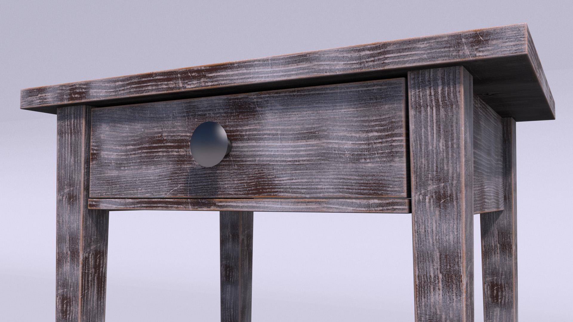
6. Bump: Okay, now let's import our third image, which is the normal map, and we're going to use it to create a bump effect. One more time. Let's take the gamma override. In redshifted, the bumper works slightly different than the other texture. We can connect the normal directly into a material parameter. That's why we are going to need a bump node. First, let's duplicate again the trip planner and connect the normal to it. And on the top-left, let's type bump, drag-and-drop the bump map into the shader graph. And basically we are going to tell it to this node what kind of texture we are going to use to create the effect. Let's plug their trip planner here and then select their texture input. And in the bump map node, we need to select the type of input we just plugged. The bump can be either a height field, which is a black and white image, or in our case, a tangent space normal. Once enabled, we need to connect to the bump map into overall and bump input. And you can see straight away that now the texture has a more 3D look. Let's switch to camera for and actually I want to change the camera focal length two. Have a much closer look. Let's close the render View. Select the camera for and change the focal length to 80. And do the same for camera two. Now, if I reopen the rendered view, you can see, thanks to the bumper, how many extra details we have now. Look up all the little scratches and how beautiful is the boot grain.
7. AO And Tweaks: We're nearly there to finish our basic setup for the wood material before we start there, distressing effect. One more node that I want to add is the ambient occlusion. So let's type in a row. You can drag the node over there. And you can plug these nodes and their overall and overall color. And you can see that now we got the ambient occlusion, which adds an extra contrast to our model. Okay, this was the last node for the basic PBR setup. There are a couple of tweaks that I want to do to the model. If you look at the legs, I want to change the orientation of the wood grain rather than horizontally. I would like them to go vertically. To do so, we are going to tweak the anchor point of the legs. Let's temporarily close the shutter graph and attach the render view next to our viewport so we can see them both at the same time. To have a better look at the model, let's they activate the camera. And in the render view, let's select Auto from the drop-down menu. Okay, now we got the same view left and right. If you select the leg, you can see that it has the standard default XY and Z anchor point. Let's select the anchor point button. Let's click R to rotate. And let's start to rotating the anchor point. If you hold shift, you have increments of five degrees. So now you can see that the x axis is pointing towards the bottom. And in the rendered view, you can see that the orientation of the wood grain has changed. Let's do the same to the other three legs. Another quicker way to do it is to type over there, make sure that the anchor point button is active. And if you type 90 and click apply, you'll get the same result. Okay, two more left to go. And here we go. I think it's more realistic because that's the way it should be if you look at any references like chairs or tables. Now, one last little tweak. You may notice that the top of the table and the lower part looks exactly the same because they are sharing the same projection. So just to add a little bit of variety, we can apply the same tweak. Let's select the lower part. And let's rotate 90 degrees, this time on the y-axis. Okay, we finally finish the setup of a plain version of the boot shader. And we can start having fun distressing it.
8. Mask: Okay, super quick recap of what we've done so far. We use the three texture and we apply it to all of them on the same trip planner knowns. And for the bump, we created the bump map node because we need to select which type of input we are using and we use them into the diffuse color, reflection, roughness, and bump input. We also add the ambient occlusion into the overall color. We can delete the UV checker node because we don't need it anymore. And we can also move their output node over there. Let's move a bit the nodes to create some room in here, because we are going to work mainly with a diffuse rest play and select camera two. Now, let's talk about the paint. Besides the diffuse color, lots of details comes from the reflection roughness, and from the bump input. Now, in order to create a painted effect without using the natural food texture, I can control. Click here to detach the knowns and the color picker will be available. Again. We are now left with our simple diffuse color and the wood grain comes from the other nodes. We can pick any color we like. And basically, this is going to be our painted version of the boot. Let's pick a white color. And here we go. We've got our white bedside table. Our goal is to remove a bit the white paint to reveal the natural wood underneath. To do so, we are going to use a node that will allow us to mix two different layers together. So let's type in color layer and drag the node over there. And this is basically a sort of tiny version of Photoshop layers. We have our base color, and then we can have several layers, layer masks and blending modes. By default, we have the layer one checked. So let's deactivate it for now. Instead of using their default color picker, we can use the scholar peaker from the base layer and attach it to their defuse nodes. So currently the look hasn't changed. The beaker is locked and is reading the white-collar from the base color of the node. If now we enable the layer one, you can see is overriding the base color. Why is that? Because the mask is controlling the capacity of the layer one with our numerical value that goes from 0 to one. And also by default, we have a blending mode set to normal. You can see that if I move the slider of the mask, we can control how much the layer one is affecting the base color. So now instead of the color black, we're going to assign to the layer one color, our natural booed. Once again, Color Picker locked. And we are going to use the mask to decide how much base color is going to be visible and how much food is going to be revealed. To do so, let's start creating our mask. We're going to create several layers. For the layer one, I used the displacement texture. Bear in mind that we are not using the displacement texture to create a real displacement, but to create a mask. This texture is a good starting point because is a black and white sharper version of the color texture. Usual stuff less drive into the shader graph, gamma override and copy and paste the trip planner. So let's work on the masking before we are going to attach it into the layer one mask, press Control Q to connect it to the output surface. So this is our starting point. Our goal is to create a high-contrast black and white image, where the white will reveal one layer and the black will reveal another one. Let's move their nodes a bit to the left. Very common node to use is the ramp. This note can be, either be used as our normal gradient or it can be used to add contrast to the images. You need to change the source as old and plug our texture into the ramp input. And then again the control q. As soon as you start to move, they're black and white, handles closer to each other. You can see that we can tweak the contrast. Let's round up the numbers. 27075. Okay, we got a good balance between black and white. Let's select our color layer and press Control Q. Let's connect the ramp into their Layer one mask. Now you can see that the white paint is revealing the wood underneath based on the mask that we just created. Let's select the material two, check the result. And in the next video, we are going to continue with the next mask.
9. Curvature: Now that the first layer mask is done, I want to add an extra distressing layer all around the ages of the bedside table. Let's introduce a very interesting Node which is called curvature. Let's drag and drop it here and move a bit to the left, our first mask. So let's have a look to the curvature. The curvature takes the information based on a radius from the ages of an object and automatically create a black and white mask. You can see that if I start to modify the radius, the mask expand or contract. You may notice that the curvature is very regular. So what we could do is to apply a noise to the radius to get a more irregular and natural result. First, let's increase the number of sample to remove the grain and have a brighter white color. What we can use as a noise is the same texture that we have used for the layer one. So I can apply the trip planner directly into the radius. But if you remember, the texture itself doesn't have enough contrast without playing around. I can't use the current ramp because if we start modifying the gradient is going to affect the first layer one mask, which we are already happy with. So let's duplicate the ramp and connected to the radius. And you can see that with a good contrast, it's already affecting our curvature. And now we can start modifying our gradient to, to get to the result we like. One thing I've noticed is the curvature. Respond better with a gray color instead of the black? The gray brings back the main curvature radius and the white adds small extra details. So let's expand a bit, moving the grade to the left. And let's start tweaking, moving the white to the right. So for instance, the value of 80 could give us a nice result. Let's have a closer look by changing the camera. And you can see that the distressing will follow the wood grain. So back to our color layer. The simplest way to do it is to enable another layer and plug the natural goods into their Layer two color. Activate the color layer node to check what we are doing and plug the curvature into their layer to mask. Now, you see we have two separate layers that we can activate or deactivate separately. But how about we want to simplify the color layer because we're kind of doing the same thing twice just to reveal one color. So we could actually combine the two masses together into a single node and use it as one mask. The way to do it is with another node. So let's activate their layer to color and the curvature from the layer to mask. And we're going to use the node called color composite. The way it works is more or less like the color layer. But in a simplified version, we have plenty of different nodes that allows to achieve the same result. Color mix, color layer, color composite. So that's our first mask, and that's our second mask. Let's plug the first into the base color and activate the node. And plug the second one into the Blend Mode. And simply change the Blending Mode to screen. So now the two nodes are one single mask. And we can plug directly the color composite into the layer one mask. So now we have the same result without doing the same operation twice. Plus we learned a new node. Okay, let's activate back their redshift material. And we got the result. We like the curvature mixed with the first distressing layer.
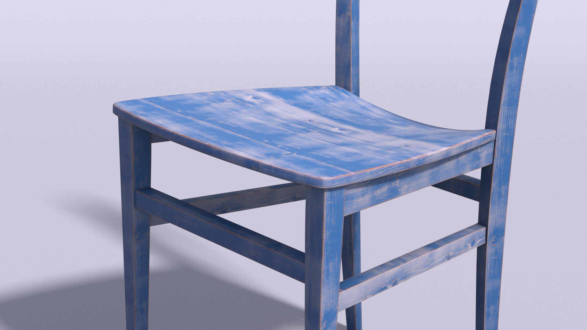
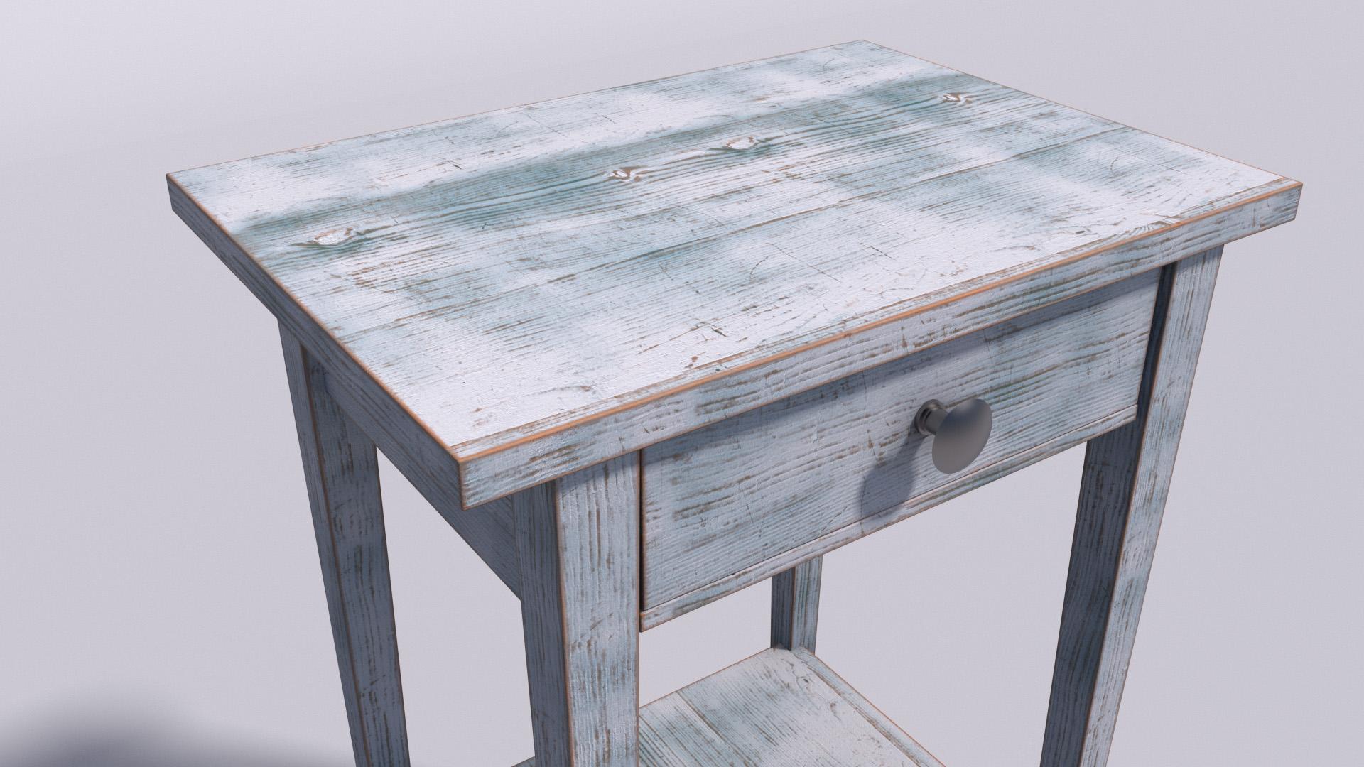
10. Extra Paint Layer: Let's now add a second layer of paint to get an even more interesting look. We are going to use again the color layer, and this time to get a different mask. We can use the roughness as a starting point. So if we isolate the node with control q, this is our roughness map that we used in the reflection. Let's use again a ramp node. And let's plug their trip planner into the input ramp node. Let's not forget that the source should be in. And again, let's start to move the two handles around here and run up the numbers two, fifty eight and sixty eight. Now let's enable the layer two and select the color layer. We need to plug the node into their layer to mask. And now we have our second layer of color. Let's change the color into our teal with those values, fifty, one, seventy, one, ninety. And we can also change the Blending Mode into multiply. To keep the details of the wood grain. Let's now connect to the material, to the output. And let's do a quick render. We are still using the low settings, but we can get an idea of the final Luke. In the shader graph. We can change the color of the rap nodes to highlight them. So next time you want to use the shader on another project, for instance, you will easily find the nodes needed to tweak the masks. Let's now set up our high-quality render. Let's close the shader graph and open the Render Settings and make the high-quality settings active. We can detach the rendered view and bring back our camera to, to our classic 36 millimeter. And we can click here. And it's going to do a render based on our Render Settings, high-quality, 1280 by 720. I'm going to fast-forward to skip the render time. And here we go. This is our final render with high settings. Let's now have a look to other combinations. In this example, there is a steel as our main color and an orange. The normal mode this time instead of multiply because I wanted more colorful effect. Here, another exemple used dark brown as our main color, and white as our second layer. So you can have fun and experiment has much as you like. If you search for inspiration, just Google distressed booed. And you can find several example with interesting color palettes. Here some more example, this time using a different model with the same technique. So I really hope you liked this class and please let me know if you have any questions. Thank you very much for watching.
 Davide Frusteri, Motion Graphics Designer