Transcripts
1. Introduction: If you want to see
your art on products, but you don't know where
to start with building your portfolio, this
class is for you. With only an iPad and the Procreate app
we'll show you how to create art that is not only enjoyable and fulfilling
free to create, but it's also appealing for
buyers to license as well. You'll walk away with
your own greeting card or licensing ready graphic, as well as a repeating pattern to kickstart your portfolio. But most importantly, you'll
gain the confidence and know how to continue making
sellable art on your own. I'm Alana Grifo, and I'm a lettering artist
and illustrator. I've been able to
license my work onto tons of different products
like water bottles, greeting cards, paper
plates, apparel, and more. And my business partner, Katie, is also a lettering artist, and she's licensed
more greeting cards than I think either
of us can count. We're both really excited
to teach you how to build your portfolio so
that you can do this, too. We met each other
through a DM after realizing we were both lettering artists that were
licensing our work. And after we saw
the potential of art licensing and how we
could get art under products, without being in
charge of marketing, manufacturing, shipping,
selling, we became really hooked on the possibility for passive income with
this revenue stream. So who is this
class actually for? This class is great for
letterers and illustrators who are looking to break
into art licensing or expand their portfolio. Whether you're a
totally new beginner to art licensing or you've already created your own product line, you'll learn tips within one of our favorite apps Procreate
right on your iPad, and you'll be able to experiment
with different forms of art to start creating a
portfolio for licensing. In this class, we'll
walk you through what art licensing
actually means, what makes sellable work
and how to create it, and you'll create
your first few pieces for your own art
licensing portfolio. We'll wrap up the
class by giving you tips for how to
present and pitch your art to potential clients so you can start seeing
your work come to life. Now grab your iPad and the Procreate app and
let's get started.
2. Introduction to Art Licensing: The first thing we need to do is cover what art
licensing actually is. Basically, art licensing
means renting out your art to companies to use on their
products like apparel, fabric, greeting cards,
and there are tons more. If you've ever done
any freelance work, you know that typically
clients are coming to you for work that they've
seen you do already. And they want to commission
you to do something completely custom for
their specific needs. Art licensing is
completely different. In art licensing portfolio, we like to think of as a menu. The items in your portfolio are available for purchase as is, just like the items on
a menu at a restaurant. But of course, we all
know someone who is either extra picky or has
some dietary restrictions, and they might want a substitution
or a special request. And this does happen in
the licensing world, but we found this is
much less common, especially for artists who
are just starting out. Now, the world of licensing
has been around for so long. I like to think of
our pal Mickey Mouse. Disney owns the rights
to Mickey Mouse, so you can't legally go around putting Mickey Mouse on T
shirts and selling them. You'd have to go to Disney and get a license to do that first. The cool thing is, it works the same way when you
create a piece of art. As the creator of the art, you own the rights and therefore you get to choose what you want to
do with those rights. You could keep them to yourself or you could sell them
to someone else and allow them to use that art temporarily or forever.
It's totally up to you. It's really important
to think about context when designing
for your portfolio. Let's talk about
some of the products that might work well
for your artwork. Greeting cards are
one of our favorites, especially because we
really love writing catchy phrases and then
illustrating them. But there's so much
beyond the world of greeting cards from fabric to tech accessories
to home decor, stationery and pet products, which is a huge category. List really goes on and on. Basically, any products that has a physical space where
artwork could fit, that's an opportunity for
you to license your artwork. This is the really fun
part. If you want to get some inspiration
for what types of products you could
create artwork for, you just have to go shopping. Check out big box stores like Target and
really start to pay attention to all
the products that you see that feature
beautiful artwork. See what strikes you and what
you get most excited about. There is a long list of reasons why we love
art licensing, but one of the biggest is the
passive income potential. When you license a design, you'll outline the
specific terms that tell the client exactly how
they can use your art. This is called usage rights. When you're defining
these usage rights, you'll decide several things. Number one, how long can the buyer use the
art on the product? Number two, where
can they use it? Which part of the world
does this license apply to? Number three, does the buyer have exclusive rights
during their license? Meaning, are they the only ones that can use the art
during that term, or is it non exclusive? Meaning you can then license
that same piece of art for multiple buyers and
products at the same time. When you're able to license multiple pieces of
artwork at the same time or even repurpose the artwork once a licensing term is up, that's when the magic of art
licensing really happens. Unlike freelancing,
where your work is used once and
you get paid once. With art licensing,
you might use the same piece of art
for water bottles, tea towels, stationery, and
there's plenty more options. That means you're
getting paid over and over again for the
same piece of art. Another reason we love art
licensing is that you get to be in the driver's seat calling all the shots about
what you create. You decide what categories
to focus on and there's so much creative freedom without the confines
of a client brief. However, we know that this can also be
really overwhelming. In the next lesson,
we'll walk you through how to give
yourself some boundaries to help you be really intentional about
what you're creating and set yourself up for success
by creating sellable art.
3. What Makes Sellable Work/How To Know What To Make: So what makes your
work sellable? And how do you
know what to make? The flexibility of getting to choose what art
you want to make for licensing is one of the coolest things
about this industry. But it's also one of the
most challenging parts. We know the feeling of sitting down in front of a blank page, ready to make something
for our portfolio. Heads are spinning
with 1 million ideas, and then we feel totally overwhelmed and
unsure of where to start. The first thing to do is to
narrow the playing field. Instead of allowing our heads to get filled with
every single option. Let's add some limitations. We want to find something
that you will really enjoy creating that suits your
strengths as an artist, but that's also
appealing to buyers. So let's talk about what
buyers are really looking for. First, let's go
over market trends. Art licensing is often
focused on the mass market, which basically means
that it needs to appeal to a broad
array of people. At the end of the day,
buyers choose art to put on their products that they
think will make them sell. It's about the end consumer. What are the people who are shopping the aisles
of target going to see on the shelf that makes
them go, I need to have this. That being said,
creating something that people want to buy doesn't mean that you should
lose your voice and stick to the confines
of a specific trend, especially if it
doesn't feel like you. So finding that balance
between what we'll sell and what feels good to
make can be pretty tricky. But when you nail it,
it is so satisfying. Now that you're in the
art licensing world, keep your eyes open and
your ear to the ground when it comes to trends or
consumer buying patterns. Maybe you've noticed a shift to less conventional colors when it comes to Christmas designs. You see an opportunity
to create maybe a neon holiday wrapping paper, or it could be that
you really shine in character design and you see that turtles are
having a moment. You take that as
a sign to create some really cute turtle
themed kids bedding. Versatility is another
really important key trait. Unless you're only focusing on one specific category like
fabric or greeting cards, it's a really good idea to design with versatility in mind. That means making
artwork that is flexible enough to be placed on a variety of
different products. We typically avoid
using hard borders around the edges of our
designs and try and create pieces that feel
almost as if they're floating in the canvas so that the size and layout
could be easily adjusted if the client
needs for their product. The most important thing
that buyers are searching for is just good art, which is not very helpful
because it's very subjective. Let's talk about a few
of the things that are more objective qualities
that most of us can agree make good
licensable art. Number one is hierarchy. Does your eye know
where to look first? Is the most important part
of the message clear? When customers are walking
quickly through the aisle, will this piece catch
their attention? Number two is legibility. Are the words or images
clear and understandable? We don't want customers to walk away because they don't
know what's going on, and we certainly don't want
them to read the message and think one thing that was
intended very differently. We find that script can be really hard to read
in some cases, so we're always extra
careful with our script. The third one is consistency. Does the whole piece feel like
it was made by one person? Sometimes the illustration
is incredible, but then the type feels
like an afterthought, or maybe one part of the illustration is done in a different style
than the rest. Making sure that
there's consistencies and harmony throughout the pieces will really
make it feel more intentional and
professionally finished. Number four is point of view. Is there a reason someone would buy this design over
another option? What is it about your art
that really stands out? Is it your funny
crappy writing style, or is it the way
you utilize color? Is it your vibrant
illustration style? There are plenty more things
we could talk about that really go into something that
we would call good design. But I think we've hit the
most important ones here. We want to help you be really
strategic about what you create and you'll learn a lot
of that by just doing it. Put these tips in
your back pocket and let's move on to making art.
4. Creating a Greeting Card or Spot Graphic in Procreate: Hi, I'm Katie, the other
co owner of Good Type, and I'm going to walk
you through the process of creating a greeting
card in Procreate. Greeting cards are my favorite art licensing products
to design for, and they are a great place to start if you're new
to the industry. We'll be looking at how I
created this greeting card, including tips and tricks for designing for the
licensing world, and then you'll make your
own card as a class project. Procreate is a
design app that you can download on your
iPad via the app store. You will also need an
Apple Pencil stylist so you can draw directly
onto your iPad screen. In this tutorial, I'm going to focus on some tips
and tricks for designing for greeting
cards and not so much on the basics
of how to use the app. If at any point this feels like I'm going way too fast
or you don't have a good enough
handle on Procreate to follow along, don't fret. Here are some other skill
share classes that we suggest to help you learn and get
more confident in Procreate. Then you can just come
on back and join us in this class once
you feel like you got your feet under you
a little bit better. Let's get into the tutorial. Shall? First thing you
need to do when creating a greeting card is to come up with the idea for what to make. Greeting cards are exchanged for events and occasions
such as birthdays, holidays, achievements,
and so forth. That is where we should start. Which occasion will
you be designing for? We chose Valentine's Day, but when you create your own card at the
end of this lesson, you can choose any
occasion you like. The next step is to decide what your card will say and
what the graphics will be. Of my favorite ways to
brainstorm for copy ideas is to use common phrases or
idioms as a jumping off place. I like to use idioms dot the free dictionary.com for this. Just search for a
word associated with your occasion for Valentine's, you could search for
Love, for example. Then it will give you a list of all the common
phrases that include the word love Love you
to pieces or puppy love. You can get inspired by
one of those phrases like, maybe Love you to pieces
could be your headline, and then you could pair it with an illustration of a puzzle. Or you could put your own twist on a traditional phrase to make it a little bit more
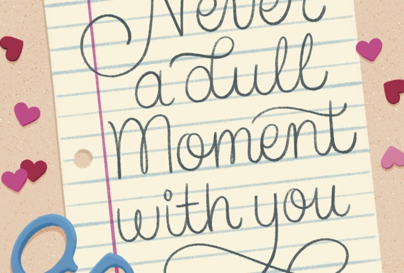
interesting or to create a pun. We chose the phrase
never a dull moment with you for our
Valentine's Day card. It's a common saying
between loved ones, but it becomes a little
bit more fun when we pair it with
illustrations of pencils. It's a cute pun now. Next, you'll want to create
several small scale sketches to ideate what the
visuals will look like. It helps to see your ideas on
paper and lets you workshop and plan without spending too much time refining
before you're ready. Then once you have your sketch, it's time to create your card. Let's create our
Canvas in Procreate. To create a new Canvas, just hit the plus button in
the upper right hand corner. Now, the obvious
first question is, what size should your
greeting card be? Greeting cards do vary in size, but five by 7 " in the
US is pretty standard, so that's the size I
always start with. I'll change the
measurement unit 2 " and enter 5 " wide by 7 " tall. Next, let's go ahead
and set the DPI, which means dots per inch. This refers to the
resolution of your image and 300 DPI is standard when you want to be able
to print your artwork out. I like to actually
double my DPI so that my Canvas is
two times the size. Setting your DPI to 600 means
that if a client came along and asked to put
the green card on a bigger product like
maybe a gift bag, your art would be big
enough to allow that. You never know exactly what will happen with your
art in licensing, consider this your
insurance policy. Once you set your size settings, it'll show you the maximum layers that you have
in your canvas. Essentially layers hold
individual elements in your design so
that you can move them around and
edit them without affecting the other
elements in your piece. In other words, layers
make it easier to make quick changes later on if a client were
to ask for them. Finally, set your color
profile to generic CMYK. This color profile is
optimized for print. If you want to create
a piece of art that will only live on
a digital screen, you'd choose an
RGB color profile. Don't worry about
the other settings. Simply click Create and boom, your Canvas is
ready for your art. After bringing my reference
sketch into my file, the next thing I did was
create a color palette. I wanted to make this a twist on the typical Valentine's
Day palette while still feeling very recognizably
Valentine's, so I added a little
pop of blue in there. Adding one slightly
unexpected color to a palette that's
more traditional for your chosen occasion is a great way to
modernize your card. With art licensing,
it is important to signal quickly what your
card is trying to say. Remember, customers are browsing fast through aisles of cards, your palette needs to give
them an instant vibe that tells them what it's for
and also pulls their eye. I like to create a palette with 5-7 core colors and
then I'll use tints and shades or lighter and
darker versions of those same colors if I need
to add contrast and depth. Creating your palette
in Procreate is easy. I already worked out the
colors on my canvas, so I'll just grab
each color simply by tapping and holding it. Then I tap into my new color palette to
drop the color inside. I like to add all
my colors here so I can easily grab
them as I draw. Brushes in Procreate
are so much fun. You can use the brushes
that come pre loaded into the app or buy
endless brushes on the web that mimic
everything from charcoal to half tone
dots to oil paints. Because brushes are so fun, it's easy to go a little overboard and use
too many at once. One of the best ways
to keep your work feeling unified and confident is actually to limit
the brushes you use to just a few that feel
like they all fit together. Perhaps they're all recreating the same medium like they're
all marker like brushes. My greeting card uses one brush. Almost exclusively, it's the six B pencil brush that comes pre loaded
and to procreate. The six B pencil brush
was perfect for this card because never a dull moment
with you is a pencil pun. A general reminder when
it comes to brushes, don't hide behind them. Focus on making the concept
and the layout really strong first and then let your brushes just complement those choices. As you create your
greeting card, you'll want to work in layers
like I mentioned earlier. I like to keep as
many elements on as many separate layers
as possible so that I can zero in on even just a shadow by itself and edit it without
disrupting anything else. Then if a client says, Hey, can you make that pencil
sharpener pink instead of blue? I can very easily
make that change without having to
redo any of my work. It's also best practice
to organize your layers into groups to keep them
tidy and easy to find. Or a card like this, I group my layers by item, for example. All the layers for the sharpener are in the sharpener group and all the layers that
make up the piece of paper are in the paper group. Speaking of the sharpener, this is a good time
to share another tip. When you move part
of your art off the canvas, it is deleted. This sharpener, I have
hanging off the edge, it no longer retains the rest of the shape
that I originally drew. But what if a client wants
the sharpener moved to a different spot or wants the greeting card
to be a different size? To save my future
self heartache, I like to create
an original copy of any of the elements
that I plan to move off the canvas edge so that I have a backup that's fully
intact just in case. Simply duplicate your
group before you move it off the edge
and then hide it. Now it's your turn.
Create a greeting card using the strategies
that I just shared in this lesson and
then head over to the projects and resources
tab to share it with us. Have fun and make it your own. We can't wait to see it. Then head into the
next lesson with Alana to learn how to
make a repeating pattern.
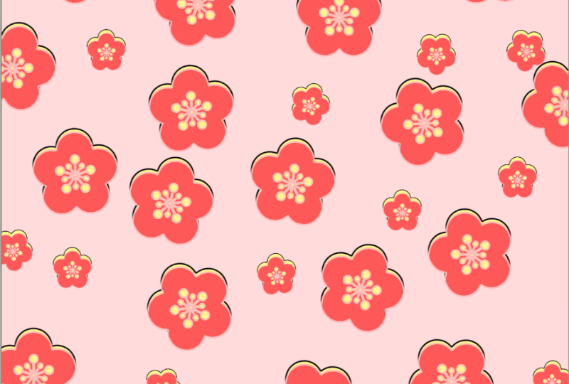
5. Designing a Pattern in Procreate: So now we're moving
over to creating a repeating pattern
in Procreate. You'll create your
own pattern to upload for your class project. These are some of
the elements that Katie used in her card design, and we're just
going to repurpose them into a repeating pattern. So to get started,
I'm going to create a new Canvas at 3,000 by 3,000 pixels
and with 300 DPI. Then I'm going to make
sure I'm using CMYK because we expect that because
we want to license this, this will probably be printed. So the first thing I did was
I created all the elements from Katie's graphic and put
them on their own layer. And then I created a
background color layer as well instead of using that option for
background color. Now, I'm doing this
because we want actually the shape of the background
to help us define our edges. So we're going to
need to move that around and make copies of it, and we can't do that if it's just on the background
color layer. So I've made it its own layer, which means it's also a shape. Now, for this pattern, I want
it to be a tossed pattern, and there's a lot
of different types of patterns like full drop, half drop, brick,
diamond, stripes. There's tons of
different options, but I really like
tossed patterns, and they're really popular
because the motifs are arranged in a little
bit of a scatter, but it's a lot more balanced. This is also a full drop
pattern because it's going to repeat seamlessly
in all directions. So we're going to create
a repeat on the left and right and on the top and bottom. So I've been using
the word motif, and so if you haven't heard of a motif as one of the terms
in pattern design before, a motif is really all of the elements that
make up your art. So this could be just
one shape that repeats. It could be a bunch of
images put together. And so everything
we're seeing on my artboard are the
motifs for my piece. Now, this process of rearranging everything is just
playing with scale, playing with rotation, color, and layout until I start to feel like the toss pattern
is coming together. I've also shrunk everything from its original size because I
really want everything to be on the artboard twice
so that I can play with the scale and
try and make it harder to find where the
pattern actually repeats. And I'll use this process of
adjusting and moving things around several times throughout while I'm making the pattern. I've sped up the process
so you can really see how much time I put into this part of
the pattern process. But it's really
just playing around until you feel like the
pattern is coming together. Something to remember
is that it's really important to
avoid the edges. You can get close to them,
but since we're in Procreate, this method is really
important for us to keep all the elements
inside the artboard, and we'll use this method of creating the edges and creating the repeat pattern to define those edges and
make sure things repeat. So for now, keep all your
artwork off the edges. So what you're going
to do now to create your left and right
edges is create two copies of your artwork. So that whole group,
which includes your background layer
and your artwork layer, you're going to create
two copies of it. One of the most
important things is to make sure snapping and magnetics is turned on and turn the velocity
all the way up, as well. So what you'll do is you'll take that first group and move it all the way to the left so that the edge becomes the middle. Make sure that you hit that
orange or yellow guide. And this shows you that
you are perfectly in line. If you don't hit that, then you're going to have
a problem at the end when your pattern isn't
repeating perfectly. So you have to be
really, really careful. And you'll do that on the
opposite side, as well. And then you'll have a
left and a right edge that will after
you've done that, you'll want to consolidate
your layers so that you have one full
piece of artwork. And then you can go ahead
and fill in any gaps. And this, again, is just
like that process we did before where we really
move things around, play with scale,
duplicate things, and have fun with this piece. So when you go to
create your top and bottom, you're going
to do that same thing. Create two more copies. And then move that
first one all the way up after you've turned on
snapping and magnetics. So you'll move it all
the way up so that the bottom edge is
now in the middle, and then you'll move
the top one down. Your top edge
becomes the middle. And then, again, we'll
do that same process. We'll consolidate our layers. So we have one nice
swatch for this, and then we'll make those
adjustments and fill in the gaps so that the artwork
feels really cohesive. We don't want any rivers or, like, weird areas where
there's not enough art. A So when you're ready to create the
actual pattern swatch, what you'll do is that
same process again, but now we're going to
create four copies. So again, you'll have five because you
want to keep one as your original in
case you've made a mistake somewhere, you
can check your work. So I'll create
those four copies, keep that original one, bonus points if you
name your layers. And then what I'll do is go
ahead and shrink each one to be in the quadrants
and make sure you've turned on
snapping and magnetics. So I've got this first
one in a quadrant, then I'll go to
the next one, and I'll do that for each quadrant. It also helps you turn off the other layers so that you can really
see where it lines up. Once that's done,
I'll consolidate my layers again so
I have one swatch. And again, this part where I'm going to adjust and
change any gaps, I also really like to
play around and see if I can make the pattern
less apparent. Because this already repeats, I want to make that
repeat much less obvious. So I might swap some things, make some color
adjustments, or even, like, shift the angle of an
element or even the scale. As long as you're
avoiding those edges, you'll be fine because
only the edges are where we're repeating. So this is your
swatch so you can play with anything that
isn't on the edges to really create a seamless and really fun and
interesting pattern. I also like to play
with the direction. I think that can be
a lot of fun, too. Once you finish, you can
actually put this on mockups. You can add it to
your portfolio. This is a ready file for you to deliver to a client
that will repeat on all four edges.
Now it's your turn. Create a pattern
using the process I shared in this
lesson and head to the projects and resources tab below to submit it
and share it with us. Have fun and make it your
own. We can't wait to see it.
6. Presenting Portfolio and Sending It to Clients : One of the questions
we get asked most frequently is how to
display your portfolio. Here's our top tip.
Don't overthink this. You've already done
the really hard work. The design is done. You've created all the pieces, so you don't need to overdesign the portfolio in the
way you present them. Let your art speak for
itself and don't get in your head trying to display
it in some crazy way. We use square space to display our portfolios because we love the premade templates and how easy it is to edit for
people who never want to code anything or will break the website every time
they touch the code. It's me. We've also separated them by category since
we primarily work with occasions for
greeting cards like Halloween, Valentine,
sympathy anniversary. This makes it really
easy for clients to sift through our site and find exactly what
they're looking for. If you aren't working
with occasions, you can group pieces into really cohesive little
mini collections by color, subject matter, or even style. This really comes down to
what type of work you're making to figure out how
to categorize it best. Now, creating mock ups can be really helpful for showcasing your work on social media or
in a traditional portfolio. But they aren't really necessary for your licensing
portfolio since a client is going
to be coming to you with a product in
mind most of the time. If you really love
to include them, you could keep a few mock ups or product shots at
the top or sprinkle them in other areas
of your site to really showcase past
and dream projects. Now, your portfolio
doesn't have to be gigantic to start sharing. We began our licensing journeys with only freelance
portfolios at first and slowly we grew our licensing portfolio
over several years. When you're ready to
start pitching your work, we recommend starting with about ten to 15 pieces
and growing from there. That means you have enough pieces for
clients to really see your work and have options
for their products. Now let's talk about
pitching to clients. Your job unfortunately doesn't end once your
portfolio is ready, as nice as that would be to
just post your portfolio on the Internet and then get
endless inquiries rolling in, it just doesn't work
that way for most of us. One of the most
important pieces of the process becomes outreach. That's actually where
you reach out to clients and potential
buyers and pitch your work, and that's how most of Katie and my relationships
with buyers have started. But don't panic. It's not nearly as
scary as it sounds. Even if you're introverted, the biggest thing to remember is to reach out to brands that match your vibe and feel like they would
actually be a good fit. Could you see your art next
to the work they already sell and do your values
align with theirs? We keep a very long
running list of clients we want to work with
so that whenever we're ready to do some outreach, we have a list to pull from. Then we send a really concise
and friendly email that shows we actually know the brand and took time to
do our research. We like to be concise
in our emails because we know how sacred
an inbox can be. We'll typically attach a
curated couple of pieces from our portfolio in a one
page PDF or L o Rz JPEGs, pieces that we really selected from our portfolio because we think the buyer
will like them and that they will fit
into their line best. Of course, we'll also
send them a link to our full portfolio.
Here's a tip. Keep any attached files very small and make sure to
check if the buyer you're contacting has any preferences for how they want to receive email submissions before
you send the email. Just check their website and see if they have
submission guidelines. Here's what the body of
the email might look like. First, address them by name, make sure you get the
spelling correct. Introduce yourself with
your name and tell them what type of art you do
and maybe where you live. Tell them that you've
seen their products around and mention where you've seen them or a specific product
that you've loved. And tell them why you really like them and why you've connected
with their product. This really establishes
a great connection. Then you could say
something like this. After lurking on the
Internet and pinning all of your products to
Pinterest for far too long, I finally decided
to reach out in hopes that we can collaborate
on something for your line. You can see a link to my
portfolio here and I've attached a few curated pieces
I thought would fit perfectly into one
of your collections. I'm always happy to whip
something up custom to if you've got another
direction in mind. Looking forward to connecting. Of course, sign your
name and you can again insert the link to your
portfolio right below your name. Always double check
your spelling, double check who you've sent it to and don't forget to attach either that one page
PDF or a very Los JPEG. Do not send something they need to download or that they need to go somewhere else because they're probably
not going to do that. Here's an example of Katie using this template and how
she customized it. Hi, Sarah. My name
is Katie Johnson and I'm a lettering artist
from Austin, Texas. I've been seeing your
gorgeous wood creations pop up on my feed for a while now and I'm completely obsessed. Your products are so
unique and intricate, which I totally appreciate as a fellow lover of
embellishments. After lurking on the
Internet and pinning all of your products to Pintas
for far too long, I decided to reach out in hopes that we can collaborate
on your line. You can see my portfolio
here and I've attached a few curated pieces
I thought would perfectly fit into one
of your collections. I'm always happy to whip up something custom too if you've got another
direction in mind. Looking forward to
connecting Katie, katimd.com app Katie MDE. You can also use a service like HubSpot to track
responses and follow up after a few weeks if you have new art or if you haven't
heard back from them. It's really important not to get discouraged here if you don't hear back, especially
right away. We've had clients come back
to us literally years later saying that they saved
our work and finally have a project that they think would be a
good fit for us. A lot of these art directors
or buyers are saving artists to keep in their file folders so that
when projects come up, they have a huge list of
people to look through. The most important thing
is that you keep going and that you keep sending outreach
to find the right clients. If you can do that heavy
lifting ahead of time to make sure you're reaching out to people you really
feel aligned with, then you'll be set
up for success.
7. Conclusion: Congratulations on taking steps towards licensing your artwork. We walked you through
what art licensing is a pretty important
place to start and how to make sure you're creating artwork
that's sellable. You've got new
tools for creating licensable graphics and patterns using just your iPad
and the Procreate app. Now you get to do the fun part, which is create a ton of
art for your portfolio. Art licensing is one of our
favorite income streams, especially if like us, you don't want to
manufacture your own line of products and spend so much
of your time shipping. Remember, the real growth
really comes and you're able to stack multiple licenses
on top of each other. Be sure you're creating
artwork with intention and clear context as you
build your portfolio. We have a ton of other resources surrounding art licensing, including a whole in depth course called the art
licensing Blueprint. If you're looking for more
guidance about contracts, setting terms,
pricing, negotiation, how payments and royalties work, our outreach strategies,
and so much more, you can sign up at the
link on your screen. Or if you don't need
the whole course, but you're looking for help getting out of your
creative block, we have the Portfolio Builder, which is a collection
of over 100 prompts for your licensing portfolio
featuring color palettes, copy suggestions, mood boards, all for each prompt. The portfolio is actually included in our course
art licensing blueprint, but it's also
available ala carte at the link on your screen. We really, really love
this income stream and we can't wait
to see what work you've created in this class. Don't forget to upload your
class projects here and share your future projects in our Slack channel using
the ink on screen. We've got other
classes on here too, so we hope you'll check
them out and we can't wait to see what you're
making. All good thing.
 Goodtype, Championing good type & good business