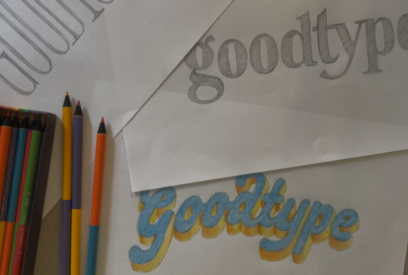
Transcripts
1. Introduction: Hi, I'm Katie from Goodtype. I'm a lettering artist, designer, and a total type nerd, who's passionate about
helping artists all over the world find joy and confidence in their
creative practice. In this class, we're
going to better your lettering through a
simple seven day challenge. You'll choose one word
that matters to you, makes you laugh or inspires you, and each day, you'll reletter
it in a totally new way. You'll explore different
techniques from experiments with line
weight to composition, color, and working with
fun, creative constraints. By the end, you'll have seven unique versions of your word and a fresh spark of inspiration for your own unique
voice as a letterer. This challenge isn't
about perfection. It's about exploration. Every day's prompt is designed
to stretch your skills, loosen your grip, and remind you how much fun lettering can be when you give yourself
permission to play. All you need is your
favorite pen or iPad, whatever you want to draw on. Whether you're a
seasoned letterer looking to shake things up or you're returning to the
basics after a creative rut, this class will help
you build consistency, confidence, and connection
with your own voice. So grab your tools, pick your word, and let's get started. I'll
see you in class.
2. Class Project, Materials, & Resources: Let's talk about
your class project. In this challenge, you'll be choosing one word
that's meaningful to you and then re lettering that same word in
seven different ways, one per day, following the
prompts from this class. Each day's lesson includes a short demo and a simple
prompt you can jump right into. By the end, you'll have
seven unique versions of your word that
show your growth, creativity, and evolving style.
Here's what you'll need. Your favorite drawing
tools, maybe pens, markers, brushes or
an iPad and stylus. Paper or a sketchbook or, again, a digital canvas if you prefer working in Procreate
or Illustrator, a timer, if you want to
keep yourself moving, and, of course,
your chosen word. Pick something personal,
a mantra, a goal, or just a word that feels good to letter and
makes you laugh. When you finish the challenge, I love for you to
share your project in the Skillshare
Project Gallery. You can upload
photos or scans of your artwork or even
just a single image. You can show all seven
versions together or just upload one image that you like the best. It's
totally up to you. Add a short description
about your experience, what surprised you,
what you discovered, or which day was your favorite. And don't forget to take a peek at your classmates
projects, too. Leave a comment,
cheer someone on. It just really helps keep
the creative momentum going. To get started, head over to the Projects and Resources tab. You're going to find the
full list of prompts and a place to submit your project when
you're ready to share. This class, I can only teach so much about lettering
and typography. So if you're interested
in more resources, I highly suggest this
book right here, the Lettering Manual
by Ken Barber. It is the go to Best Lettering guide out
there, absolutely incredible. And I don't want to
overwhelm you with books. But if you want to get one book that's lettering heavy,
I would get this one. And then if you want
one that's really typography heavy and focuses
on fonts and the Anatomy, of fonts, I would get this book. It's a really, really
great reference point if you're
wondering things like, where does the weight
go in the letter? How does this letter end? What kind of
terminals are there? How big is it relative to other letters,
those types of things. So this is a really good
resource for that as well. And this, again, is the Anatomy
of Type by Stephen Coles. And that's it.
You're ready to go. Gather your tools,
pick your word, and let's start bettering your lettering one
day at a time.
3. Prompt 1: Monoline Magic: Welcome to day one.
Today's prompt is all about monoline magic, keeping things simple,
steady and consistent. A monoline style means
all of your strokes are the same width and no pressure changes or
thick and thin contrast. So think of it as the clean
skeleton for your lettering. Starting with monoline is
a great way to warm up because it helps you
focus on the foundations, letter structure,
spacing, rhythm, and balance without getting
distracted by decoration. You can use any tool that
creates an even line, a pencil, a fine liner, a marker, or a digital brush set to
keep a consistent width. Let's jump into the demo so I can give you a sense of
what I'm talking about. Remember, this is just
my interpretation, and you can do
whatever you want. So all I have here to start
is just a big old stack of plain computer paper
and a paper made pencil. So you don't need any fancy
tools unless you want them, and you can also use your iPad or any kind
of digital tablet. Um, but this is really all
that you need to start. So let's dive into it. Anytime that I'm going to
start a piece of lettering, I've got to make a
couple of decisions. The first one is I
want to give myself a little bit of a
structure to start with. So what I am going to do is use my
handy dandy ruler here, who's been through some stuff. And I'm going to make a guide that my lettering
is going to sit on. And this is called
the baseline because it's the base that
the letters sit on. So this can be curvy. This can be anything
that you want it to be. It can be totally flat. But I'm going to make it a
little bit more dynamic today, so I'm going to keep this angle. And that's going
to be my baseline. And then I'm just going
to go up a little bit. I'm going to think about how big I want my letters to be today. And again, I'm not
overthinking this too much, and then I'm just going
to draw another line. This is going to be my X height, which is called X
height because it's the height of a lowercase
X. Imagine that. And then there's another
line that you can draw if you're going to have capital
or uppercase letters. That's going to be
your CAP height. So you can go ahead
and put that there. The next decision that I'm
going to need to make is what style am I going to
create my lettering in? So we already know that we want to create
monoline letters. So that's going to
be an even width throughout all of the letters. There are three main
categories for letters, and that is serif. It has those little
kind of prongs or feet that kind of span off
the edges of the letters. So that is a serif. San serif would be without
those little prongs. And then script, of course, I guess I can do an upper
case script letter, so it would be something that. Okay, so we've got Saraf, San Saraf, and script. So these are my
choices right now of which kind of category of
lettering I want to go for. And I really enjoy doing
script for monoline, so that's what I'm going
to go with to start. Let's go ahead and dive into the actual
lettering process. So right now, I just want
to be creating a skeleton using my guides of where
I want my letters. And let's see. I'm going
to make this uppercase G. Okay, so I'm kind of getting
an idea of where I want, and I'm being so, so loose and sketchy right now.
We are a good type. And what I'm doing as well
is I'm starting to see I inadvertently decided to add a little bit of a
slant to my lettering. So you can see it's starting to kind of slant
in this direction, like a little
italicized situation. And right now, I'm
thinking about, like, what size the letters are. I'm trying to keep them all, so they feel like they're
in the same family. I'm not adding the connections in the script just
yet because I'm kind of just getting
everything out here. And, you know, sometimes these A senders actually don't need to go to the
top of the cap height. There might be an extra
line here for my A senders. That's kind of advanced. So anything that I say
that feels a little bit, like, too much at this point, just put it in your
back pocket for later. Good TY. Oh, this is going to be
just about a perfect amount of space for me here. And we're going to go ahead
and add E and see how I'm trying to keep these
lines fairly consistent of, like, the angle that I am
arching at. Good type. Okay. We're starting to see
this come together now. And some things that I might
consider at this point, more advanced things that
I might consider is, like, these are
called descenders, and these are called Asenders. So the things that
come up are Asenders, things that come
down descenders. It makes a lot of sense, right? So what we're going
to do is think about, like, what are these descenders and Asenders gonna look like? Maybe there's some swashes, is what these are called? That kind of around and play. So I'm going to
think about that, and then I'm going to beef up the lettering to have
that monoweight width. I could leave it at, you know, this kind of width. I could leave it just nice
and skinny like this, but I want to give it a
little bit more weight. So let's actually look
at that first and start to define what that
weight is going to look like. Okay, so again, I'm
being so sketchy. I'm not worrying too
much, which is funny. It's something I've had to
really work on over time is to not be so precious
about this stage. Okay, so I have my basics here. I've got the skeleton
of my lettering, and I can already see some
places that are thicker than it should be or
thinner than it should be or maybe not quite
the right spacing, et cetera, et cetera. So I would typically push
this further and refine more. So I'm going to do that
for just a little bit. I don't want it to be perfect,
but I'm going to get it a little bit more
towards what I like. And a couple of tips as you're looking at
monoline lettering, because you do want the width to be pretty much the same
across the letters, you can find something
to measure with. If you are working digitally, it's really easy just
make a little shape and move it around the page
and test different parts. Here, it kind of looks like my my eraser is about the
width of these letters. So I'm going to just move
the eraser around and say, Okay, maybe it's a little
too thin right here. Maybe it's a little bit
too thick right here, and then I'm going to go ahead and make those adjustments. And I want to mention,
too, that you could use if you want
to be working analog, but you don't want
to keep erasing and moving things
around manually, you can work in layers. And during this time,
I'm going to be a little bit more confident now. With my lines, I'm going to make them a
little bit darker, and I'm going to say,
Okay, I'm committing. I'm committing to
where these lines and shapes are landing, so I can be a little bit more forceful with my
pencil at this point. But again, we're still not
going for perfection here. Just keeping it fun. Fancy free. Okay, so this is where I'm going to leave this
piece for today. I think this is this was really fun, and
that was the goal. I really enjoyed doing this. And if I wanted to, I could continue working
on this. I could ink it. I could bring it into my iPad or onto Illustrator,
and I could vectorize it. There's a lot of options if I wanted to continue to push this, but this exercise
is just about being free and trying some things
and just enjoying yourself. So I'm really excited to
see what you all create. Remember, this is just day one. Keep it light, keep it fun, and celebrate showing up. Tomorrow, we'll build on this with some
contrast and movement. But for now, give
your monoline word some love and call it done.
4. Prompt 2: Play with Weight: Welcome today too. Today's
prompt is play with weight, and this one's all about
playing with extremes. So instead of keeping all
the strokes that make up your word the same width,
like we did yesterday, let's give it a little more
Pizzaz and personality by changing up the thickness or
the thinness of the strokes. Contrast occurs when we include both thicks and thins in the
same piece of lettering, and it can be a really
fun way to add interest. It's important to note here that the placement of the thicks
and thins aren't just random. They're based on
the natural flow of where pressure is applied
when letters are written. Here's a quick example. In many traditional
calligraphic styles, the pin is held at an angle, often about 45 degrees. When I position my
writing tool this way and I also let my
hand flow naturally, it produces strokes
that are thinner as I move up and thicker
as I move down. We call these upstrokes
and downstrokes. There are always types styles
that break these rules, but many of them
follow this pattern, so it's very helpful to learn. When in doubt, you can always reference existing typefaces and lettering examples to see where the thicks and
thins tend to fall. Here's a glimpse into how I
might approach this prompt. But remember, this is just one example and
one way to tackle it. Yesterday, as a reminder we
did some monoline script, and today we are going to beef up our lettering
with some weight. So as a reminder, the very
first thing that I need to do, other than setting my guides, my baseline and my cap height and whatever other
guides I need, I'm going to make
the decision of what style of characters that
I'm going to be creating. So am I going to be
creating a serif, a Sanserif or a script face? And today I feel like I want to do a serif. So let's
get into this. You always take your
same monoweight script from yesterday and just redo
it with changing the weight. That's absolutely an option, but I'm just going to show you a different typographic
style today. And I feel like experimenting. So let's do it. Just like yesterday, I'm
going to create my baseline. So this is going to be
that's my baseline. Then I'm going to do my
X height. Here we are. We've got some rule
lines to start with. So I am going to write
my word, which, again, is good type and just
kind of rough it in here. So I'm going to make
I love a two story G, and you'll see what I
mean in just a second. And I know I'm going to want
this to be kind of, like, an exaggerated,
chunky type style. So I am just kind of thinking, imagining sort of what it's going to feel like in my head. But this is going to be
the two story G here, and I'm not yet
roughing in the weight. This is just kind
of my skeleton. Letting myself be loose, goosy, letting myself just draw. Nice and light, and I'm keeping the axis
of the lettering. So the angle of the lettering straight up and down
so you can see, as opposed to
yesterday when my axis was kind of off center. I'm not even really adding too much of the
seraps right now, just a little implication. And finally, we're not going to have this be totally
centered on the page, but fun's okay because we're
imperfectionists, right? Okay, so the weight is gonna be the fun part of this process. So we talked about
upstrokes and downstrokes, and the upstrokes are smaller and the
downstrokes are thicker. So that's how I decide where the thicks and the thins
are going to live, and I'm going to make the thicks pretty thick on this one, and make the thins extra thin. So I just want to really
exaggerate that weight since our whole prompt is
about playing with Wait. And if you're ever confused about where the thicks
versus the thins go, which it's very confusing,
especially in the beginning. You can look at references. You can look at real
existing typefaces. It's not cheating. It's saying, Okay, let me
learn the language, literally. Okay. So you can see I'm doing this a little
bit differently than I did for the last prompt
where at the last prompt, I was more kind of sketching in the weight
as I went, and this time, I'm outlining a little bit more 'cause it's
just a little bit easier to do that
when I'm having when I have different
weights to work with. Okay, so sometimes on, um on an O, I like to put these
little demarcations for myself so I can easily see where I'm going to draw the thicks and the thins and keep it
kind of somewhat even. I'm going to make this
A cender a little bit shorter here. Not
quite that short. And here's the This is
called the crossbar. I'm going to make
this nice and thin. And I think I'm gonna have this kind of
swing under the T. So it just does this nice little
kind of mirroring effect. You can come and beef that guy up a little
bit in a minute. Hm. And I'm kind of wondering about this section right here. This crossbar is
going to kind of run into this seraph right here. I wonder if I can just kind
of do something like that. So it feels a little bit more intentional than
how I had it before. And this, when you
combine two letters to kind of work into
each other like this, that's called a ligature. Okay. And let's see. Since we have this sort of kind of flared
situation over here, I'm going to maybe echo
that same thing down here, give it a little bit of a flare. You know what?
Let's just continue this connectivity we have
up here with the serifs. Okay. So this is starting
to feel like something, something we've got here. Okay, I'm going to exaggerate the thins a little bit more
on these os than what I had. And now I'm just
going to go ahead and fill some of this in, see how it's gonna look once
I add the shading to it. So here is our sketch
for prompt Day two. You can see the
differences in the thins here versus the thicks
here and throughout. So all the thins are always
just about the same size, and all the thicks throughout are always just
about the same size. And, of course, I
could, you know, make it a little bit more exact. But I like where we're landed. I think this is a really
good sketch that I'm happy with. I'm going
to call it a day. When you finish, step back and compare your piece
today to yesterday's. Notice how much personality a simple weight
change can bring. Tomorrow, we're going to take
that energy and move into composition with our next
prompt, fill the frame.
5. Prompt 3: Fill the Frame: It's day three. Today's prompt
is called Fill the frame, and this one is all
about composition. Making your word live inside a shape and feel
intentional and balanced. Composition is a huge
part of lettering design. Even a simple word
can look completely different based on how
it sits on the page. So today, you're going
to choose a shape. It could be a circle, a square, a wave,
a stretched oval, whatever feels fun, and
your challenge is to fit your word inside that shape in a way that feels satisfying. You can lightly sketch
your shape first, just as a guide or go free hand if you like
working loosely. A few things to think
about while you work. Touch the edges. Let your letters expand to fill the space instead of just
floating in the center. Adjust your
letterforms, stretch, curve or stack letters if
you need to make them fit. Embrace distortion. This
is a playful prompt, so it's okay if your letters bend a little to live
inside the shape. The goal here is not perfection. It's learning how constraint can actually spark creativity. As you draw, notice where the shape forces you
to make decisions. Maybe you have to
squash a letter. Maybe you curve your baseline. Little adjustments are how
your style starts to develop. Once you like what
you've got, clean it up or leave it sketchy. Both are valid.
Then take a photo or a screenshot so you can
add it to your class project. For my shape, I am going to grab something I
just have on hand, which is a little bucket
of pens and markers, and I'm just going to trace
the outside of the circle. So now I have my shape. It's pretty simple.
And now I'm going to try and fit my word,
good type inside. I might actually kind of split the circle in half
long ways like this and have good
beyond this part and type beyond this part because they have the same
amount of letters. So that might look kind of nice. So I'm just gonna I don't even know what letter style
I'm going to use yet, but I'm just going to go in and start kind of
sketching Let's see. What if I really exaggerate
these letters to, like, fill up the space. So even though the G
wouldn't normally be the shape and kind of come
out this way to the side, I could try that make these a little bit
more symmetrical. And then the D can just
come around like this. So there's the good.
And then the type, we could do the same thing. Maybe it's like a Y like
this so that I can use And the goal for this is to make it fill the shape
so well that you can delete the actual outline
of the shape after the fact and still get the
feeling of the circle. So now let me think about the letter style that I want to do. I think it could be fun to do something really
chunky and thick. So let me kind of start
roughing that in. Let's see. That's about as, like, thick as I'm
going to be able to go. Okay, so I can see
this G is a good bit chunkier than some of these, so I can just add a little bit of weight to these
as I kind of clean it up. Now let's do the bottom. And something I could
do here is, again, the T is going to kind of run
into the top of the Y here, so I could just
do what we did in one of the past demos and
kind of combine them. And that, again, is called Alicature when
you're combining two different characters
so that they flow better together and have less
awkward space in between. Cleaning up a
little bit as I go, really embracing these more
like angular kind of moments. I've got a pretty good structure here that I could
either leave like this or I could continue
to refine as I go. For the purposes of today, I'm just going to go ahead
and leave it like this and just clean up
around this circle. Okay, so the goal
here is to imply a circle just by using the characters themselves
and not having an outline. And I think we've done a
pretty good job at that. I think this E could still
use a little finssing. Maybe even I might flip
it and try a lower KC or something that could follow this curve maybe a
little bit better. It's a little tricky,
but I think this is a really good start and a really good finish because this is where
I'm going to stop today. Tomorrow, we're taking
a bit of a left turn. You're going to use
something weird and let go of a little bit of
control in the best way.
6. Prompt 4: Use Something Weird: Stay four. Today's prompt
is to use something weird, which means we're stepping
away from your go to tools and letting a little
chaos into the process. Creative ruts usually happen when our tools
become too familiar. So today I want you to letter your word using
anything other than your usual brush pen or digital pencil or whatever
it is you normally pick up. A piece of chalk, an
old tube of lipstick, a crayon from the junk drawer, a stick dipped in ink. Or if you're working digitally, maybe just grab a brush with a heavy texture or something
you'd never normally use. Let the tool lead the style instead of trying to
force your usual look. This is where
breakthroughs hide. Okay? For this demo, we're going
to ditch the pencil. Get out of here. And we're
bringing in something weird. So I dug through
my makeup drawer, and I found some
nice nail polish. So I'm going to see what
I can do with this. So let's see what kind of
marks that we can make. And let's try really
hard to not be too precious about this. We're going to see what fun
stuff comes out of this. Okay, so it's kind of I mean, it's like a flat brush. So I've used those before. Somewhat interesting. We're just learning, we're figuring things out. And, oh, yeah. Okay, I like when I can push down and make the
brush really flat, and it makes these
big broad strokes. But okay, I kind of like
the texture that comes too out of the ink
kind of running out. Let's just see what we can do. Let's take a few minutes to just play around with
whatever our tool is. I'm gonna mess around
with this G a little bit more and see what I like. Let me just try to make
this all around smaller. It's kind of fun. It just made me want
to, like, stack it. Okay. So I'm kind of
getting a hang of this now. It's definitely gonna
be hella sloppy, and I kind of like when
there's little dots, so maybe I can even, like, add some some dots. Some little splatters. Okay, so let's go on and make some final versions of this now that I have somewhat of
a hang of what's going on. Maybe I'll do one
or two. Again, I'm gonna be messy and I'm not gonna think about this
and I'm not gonna perfect it because that
is the goal of this, and I am just trying
to have a little fun. It's all we need in life, a little bit of fun. Okay. And now I'm noticing there's, like, a little hole right here. I kind of wish I would have
maybe curved this under, but that's part of the joy
of doing it on the fly. So now I'm just gonna make
some little droplets there. See if I can make it fall. Oh. Okay. And maybe when there Okay. Okay, you don't really
want to drip, huh? Drip. Drip, be spontaneous. Come on, let go. Okay, I'm gonna have to just fake
all the drips, huh? Maybe one more rice there. Okay, I think that's enough
trips. Okay, so that's fun. I enjoy that. Maybe
I'm gonna try just one more
because I'm blowing. I'm enjoying myself. Why not? There's no rules that
I can't make two. Okay. She's doing something. She's doing something. Let's
give her her little ear. Okay, I'm trying not to do so much that she
loses her charm. I do wish that that's a
little bit more round. Okay, well, it's got a
little fatness to it now, so let me try and
match it a little bit. Okay, and maybe I'll make
the letters collide, so it kind of uh, takes away from all of that
volume belonging to the G. Mmm. Nice and round. I'm just mimicking the shape
of the upper part of that G. Okay. It's turning into some
more monoline style here, and this is a little bit
more variation in weight, so I'm just going to adjust. Okay, so we have some
interesting explorations with nail polish, and it smells really
good in here, too. Smells like nail polish. Interesting. So I could just keep going and
pushing these letterforms. I'm really liking some of the strokes that are
coming out of this, some of the qualities
of the brush when it's running out of
ink a little bit, some of these splatters. So this is giving me a
good baseline to know how to start to manipulate this material and so I can keep going and
pushing it forward. Tomorrow, we're
dialing back in with structure in a fun
way as we play with shrink or stretch and explore how scale
changes personality. For now, go get weird. I can't wait to see
what you come up with.
7. Prompt 5: Shrink or Stretch: Welcome to Day five. Today's prompt is
shrink or stretch, and it's all about exaggerating proportions to change the
entire vibe of your word. Every letter form
has personality, and just by stretching it
tall or squashing it wide, you can totally shift the mood. So tall and narrow
might feel elegant and dramatic and
even mysterious. Short and wide might feel
more playful or bold. So today's challenge is take
your word and either stretch it or shrink it way more
than you normally would. More than feels comfortable. Here are some
approaches that you can try Super condensed, where the letters are
really tall and narrow, ultra wide, where the letters
are stretched horizontally, maybe even overlapping or
kind of hugging each other. Play with extremes.
Make one letter super oversized or shrink one
dramatically as a focal point. This exercise helps
you break out of default spacing mode and start making intentional
style choices. Don't worry if it feels strange. That's exactly what
we're aiming for today. Exaggeration to spark discovery. For today's demo, I
think I'm going to make my type really tight and
condensed and super tall. I'm really going to
stretch it out and really exaggerate
the look of this. So I'm bringing out
my handy dandy ruler, and I'm going to start as I
often do with some guides. So this is just
going to be straight across a light rule
for the baseline, and I'm going to really
extend this type, so I'm doing a really
tall cap height. There we go, and
they're all going to be uppercase letters. So I don't need to
do the middle line, which would be the X height. Okay. I'm going to go
ahead and start sketching the skeleton for my
serif lettering. And so I'm really going to
try to exaggerate here. Okay, so sketching
super light at first. And this is going to look
very silly, but pretty fun. So the seraps are
going to be really, really sharp and come
down really, really far. I'm going to do some contrast between the thicks
and the thins, but just let it
be really subtle. A lot of times in lettering, you can borrow shapes that
you've already created, which is so helpful. So the shape of the G is
almost an enclosed O, all I have to do is just add that extra bit of
line to enclose it. Not looking for
perfection in the stage, sketching out the basics, and this will have these
little seraps coming out here. So I do want to make sure that I allow enough room for those
seraps to kind of poke out. And one of my professors told me once when I was learning how to decide how the letters should look in the
space between them, which is called the kerning
or even the tracking, depending on the context, how to make all that
balance is to imagine that you're pouring water inside the letters and around the letters and to kind
of try and make sure that there's the same amount
of water that's going in every place, roughly. And that'll kind of start
to get your idea across. And some of the letters, when
they're tight like this, they're harder to get so close up to the other letters because they create a
little bit more space. Like, this part of the
T up here is gonna create some of this
negative space down here. So it's all about just
balancing and measuring. And I think I'm gonna need to even come down
more than that. I really want to
exaggerate these serifs. Okay, we're gonna end here. She is nice and tall and
skinny and condensed. She's got loads of personality. She's a little haughty. She's a little I'm
better than you. She's quite the vibe. What kind of vibe is
your type giving off? Tomorrow, we'll be bringing
in color and explore how palette and tone can add
emotion to your lettering. For now, have fun pushing
your word to the edge.
8. Prompt 6: Add Color: You made it today six. Today's
prompt is simply color. But we're not just adding
color for decoration. We're using it intentionally
to give your word a mood. Color has a huge
emotional impact. A word in soft pastel tones
feels totally different than the same word in high contrast
neons or muted neutrals. So instead of choosing
color randomly, think about the feeling of your word or the feeling
that you want to give it. Is it calming or energetic
or confident, gentle? Let that guide your palette. Here are a few fun ways
to approach today. You could choose a
limited palette, maybe two or three colors only limitation can
create harmony. Or you could try a
surprising color choice, something that you
wouldn't normally pick or gravitate to. Or maybe you might want to
try using color as emphasis. Maybe one letter pops while
the rest stay neutral. Color can lead your style just
as much as line and shape, so let it influence
your choices today. Okay, so somehow, I don't
know exactly how I did it, but my camera wasn't rolling, so I did a couple of things ahead of time, but that's okay. Let me just backtrack and
show you what I've done. First off, I am using the Tutti fruity colored
pencils by Louise Fili. She is a lettering legend. If you don't know her,
check her out immediately. So these are the
colored pencils. I went ahead and made some
marks to see what I liked, and I think I'm going to go with a blue for the main
part of the lettering. And then I'm going to do
yellow for a drop shade, which just means I'm going to be adding some dimension
to my lettering, so it looks like it's three D, and then I might use
the orange or the red to add the darker
part of the shading. So I'll show you what I
mean in just a minute. But I already started
sketching my lettering. So this time, I'm
doing a script. I'm doing it on this
curved baseline this time. And so I'm just sketching
the skeleton for that, and I'm gonna make her
a little bit chunkier. Okay, so let's get in there, adding a little bit of
structure to this letter. I'm going to start
with the big swoopy G. And I want to think about I'm going to add
that drop shade, as well. So I want to make sure
there's a little bit of room for that to show up. Okay, so this is a pretty good outline of
what I want to do. Since I'm gonna use these colored pencils
and I don't know how much they're gonna cover
up these pencil marks, let me just go and erase some of the things that I
definitely don't want to see. And another thing you
could do, by the way, is use this as your bottom page and then put another
page on top and maybe a light box underneath or use a piece of transparent
tracing paper. And that way, you don't even
have to use the version that has the marks
on it as your final. So what do we say? I'm gonna use this blue. And we're gonna see how
this coloring end goes. Let me. I guess let's
make this G a little fat. This G can be kind of fat. Okay, so here is my
colored in lettering. Now I need to add
the drop shade, which is going to give it
that depth and make it feel like it's three D. So imagine that I moved
this G down into the right. So all I'm going to do I
add to this dimension. I'm following the
same the same shape that this G is making, and then I'm just connecting
it at the corner. So it's so much easier
than you might think, or this might be a little bit
overwhelming. That's okay. But when you start
practicing with it, you'll see, Oh, okay. You can start wrapping
your head around it, and it gets way easier. And then these counters or the interior spaces that
are trapped like this, those are just going to be fully colored in that color that
I'm doing the drop shade in. And you can do this in
any size that you want, you can extrude
this part bigger or smaller to make it
look more epic. Now we have an option. If we want to add even
more depth to this piece, I can add some shading. So let me show you what
that could look like. So in this case, I'm
imagining that there's a light source that is coming maybe from
this direction, okay? So everything that the light touches up here is
going to be lighter and everything that is down here is going to
be more in shadow. So the further down and away it is from the light, the
darker it's going to be. So I'm going to use this deeper orange color to be the shadow. And I'm just pressing harder when I want
the shadows to be darker and then letting up as I want it to be
lighter, and that's it. Nothing crazy. Okay, so here it's got a little
bit more depth to it now. This was a bit of a
tricky one to shade, but you get the idea. And here is my final
piece in color. I chose colors that
are complimentary, the blue and the orange, so that they go
really nice together, and it's really
clear and legible. What kind of a mood do
you think this evokes? I'm curious to
hear your thoughts and to see your
own color choices. Tomorrow is our final prompt. Remix it, where you're
going to pull together all your favorite bits from the whole week and
create your final piece. For now, go paint, ink, swipe or scribble
some color into your word and see how it completely transforms
your lettering. I can't wait to see
your palette choice.
9. Prompt 7: Remix It: Congratulations. It's Day seven. Welcome to the final
prompt remix it. Today, you're going
to take everything that you explored this week, the textures, the color, the contrast, the shape play, all of it and create your
ultimate version of your word. But don't worry. Once again, this is not about perfection. It's about your personal voice. As artists, our voice isn't
something that we find. It's something we uncover by
following our curiosities. And this whole challenge
has been about testing those curiosities
one prompt at a time. So today, I want
you to look back at your previous versions and notice which day felt most you. Which technique lit
something up for you? Which version could be pushed or refined
a little bit more? Pick your favorite elements and combine them into a final piece. And that is going
to be your remix. When you're done, upload your final remix to
your class project. And if you want, you can
include a little collage or lineup of all seven versions
from each prompt day. It's incredibly satisfying to see your full journey
side by side. Tell us what you
discovered along the way. Maybe something
changed in how you draw or how you approach
your creativity. Okay, let's get into
the final demo. Let's go back and look through
what I've created so far. So this was the Mnine day. This was when I
played with weight, when I tried to fit good
type into a circle, when we played with
different materials, playing with adjusting
height and width. And then this was
messing with color. So I looked back through all of these and kind of
I thought this one could be really interesting
if I kind of combine it with this idea and made
it feel like it fit in like a rectangle,
a vertical rectangle. So if I stacked good and Type on top of each other, it could
be really interesting. And then I could play with maybe if Type is right under here, maybe the O becomes small, and the Y goes up in this space, and then I kind
of reverse those, so it kind of plays into the
other's space a little bit. So let me show you
what I'm thinking, and this is going
to be my remix. And then I'm also going
to add some extra flare of my own and just kind
of see what happens. So let's get into that. Looks like the cameras
actually picking that up better than I can see
it with my naked eye, we're just going to kind of get this lettering back on here. Let's see. Actually,
I need to think about if I want type to come
up into this space of good, then this G needs to either be bigger or smaller
than it currently is. So maybe because it's
the first letter, I'm going to make it bigger, so it's going to come
down and kind of take up some of this space. And then that means the O
will be a little bit smaller. So maybe we'll do, like, take up like two thirds
of the space that it did before, something like that. And then again,
this O is going to be bigger or longer rather. So I'm gonna loop it in here. Okay. Here is this version
of the type when I mix this with the fitting in a shape and kind of adjusting and squishing
different letters. And now I'm just going
to add a little bit of my own touch I feel like I
just want to wrap these in, like, vines or
flowers or something. So I'm gonna do that real quick. I like how it feels like
it's kind of coming out of the cheese.
I'm gonna keep that. Make it feel like
it's integrated, kind of living in or
sprouting from these bltters. I can do some things
like this to make it look like it's crossing over. So there's more
depth to it here. Okay. Here we go. Bum put dada I'm so proud you made it
through this challenge. Seven days, one word,
countless discoveries. I hope this unlocks a little
bit more freedom and play in your lettering practice and that you keep going beyond today. I'll meet you in
the wrap up video, and I'm so excited
to see your remix.
10. Wrapping Up: Wrap on the Bettering your
lettering seven day Challenge. If you completed even one
prompt, that's a win. If you made it through all
seven, that's incredible. You just created a mini series
of lettering experiments, explored new techniques,
and most importantly, you showed up for
your creativity. Take a moment to look at all
of your versions together. You might notice
patterns that you repeat naturally or wild variations
that you didn't expect. That is your artistic
voice taking shape. If one of your days
sparked a new idea, I highly encourage you
to keep exploring it. Sometimes one playful
experiment turns into a full lettering series or
even a new portfolio piece. If you haven't already, upload your final remix or your full lineup to
the Project Gallery. Seeing everyone's creativity in one spot is one of my favorite parts of
teaching on Skillshare. It builds such a cool sense
of community and inspiration. And don't forget to
leave a comment on at least one other
project if you can, because a little encouragement
goes such a long way. If you want to keep
the momentum going, you can do some
of the following. Maybe pick a new word and
repeat the challenge, expand one of your
favorite versions into a polished
artwork or choose one prompt like the color
prompt or shrink and stretch and do a whole
series exploring just that. And if you share your
work on Instagram, make sure to tag me at Goodtype I'd love to
see and cheer you on. Thank you for creating with me. I hope this challenge helped
you reconnect with play, loosen perfectionism's
grip just a little bit, and fall in love with lettering
as a creative practice. Keep drawing, keep exploring, and I'll see you
in the next class.
 Goodtype, Championing good type & good business