Transcripts
1. Introduction: Hello. Hello, I'm Chavani, your guide in this
watercolor journey. Have you ever noticed
that feeling of form, the optimism during summer, while during the winters we
usually feel a little bit gloomy and attack bit lazy. Well, nature seems to follow
the same vibe around us. Today we're going
to be diving into the world of painting,
watercolor, landscape, specifically focusing on a tree across the changing seasons. But before we jump
into the glass, let me share a bit about myself. I am a sales consultant by day and an art
enthusiast by heart. I'm not helping people find the right solutions
for their needs. You'll usually find me knee deep in soil tending to
my balcony garden. Or maybe experimenting in the
kitchen with my side kick. I've had the pleasure
of sharing my passion for art with others over
the last five years, really helping them discover
the joy of creating. With my private art classes, most of my work on
social media channels is also about love of creation. And today I'm thrilled to extend that passion to you through
this skillshare class. What can you expect
from our time together? Here we're going to embark on a journey of painting
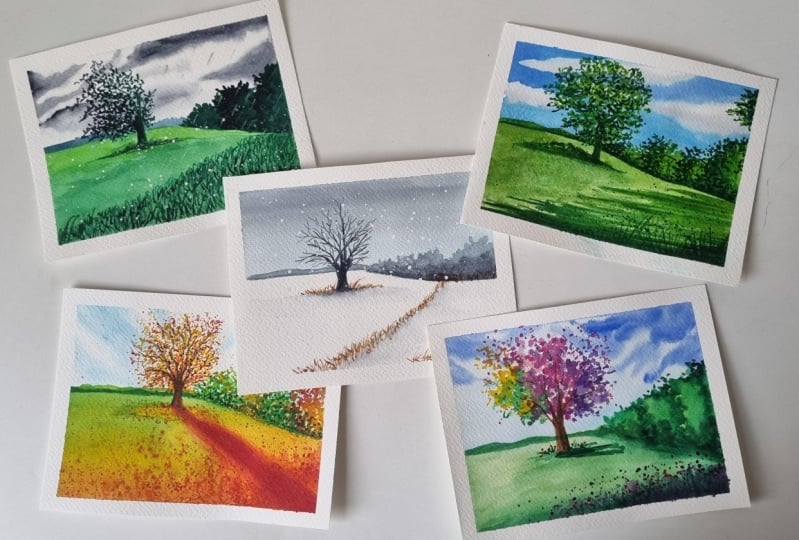
a tree landscape, exploring the magic of changing seasons
using watercolors. Whether you brand you
do painting or maybe you're looking a
brushing up your skills, this is the right class for you. Ever wondered how
artists capture the beauty of a tree
across changing seasons? Why does the tree and the nature around us
look so different during summer than in the rains or maybe in
the spring season. Well, today you're going to
unravel all those mysteries. But first, let me ask you, what is your favorite season? Mine being Winter, because
I really enjoy the cozy, cool feeling of
winter, the crisp air. And here, being in India where it's usually
more warm and humid, I really look forward
to the winter season. Let me know about your favorite season in the comments below. And also memory as to
why it's your favorite. I can't wait to read about it. Let's dive into the
Boulder watercolors and create something
truly magical. Are you ready?
Let's get started.
2. Tools and Materials: Starting with the materials
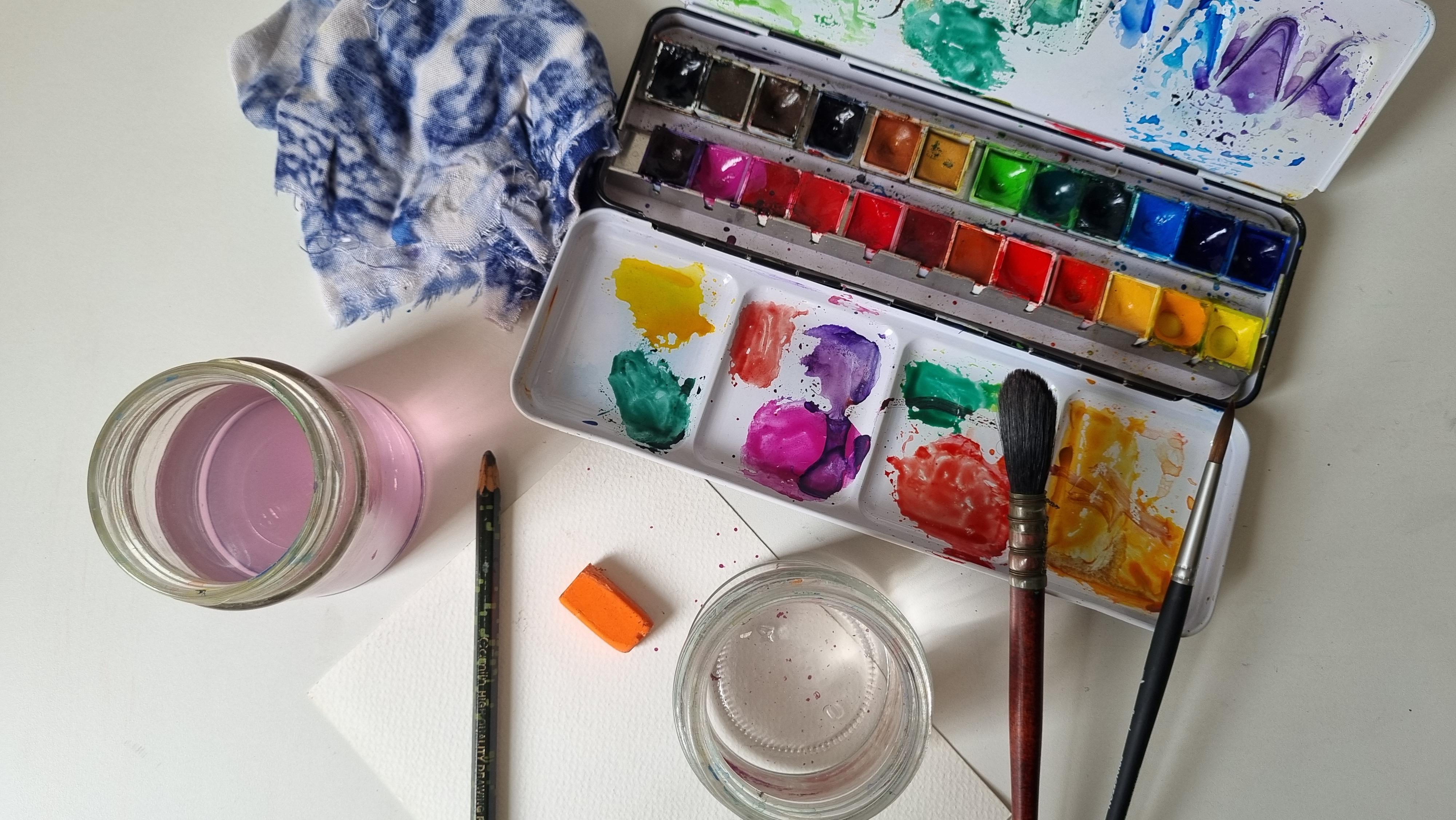
required for this class. Here I am taking two
jars of clean water. Then would be the water colors. I'm using this set by
the brand cellular. You can use any
brand that you have and it's not crucial to
have all these shades. You can use a minimum set
of six colors as well. The most important part, while with water
colors, is the paper. Make sure you have a 300
GSF acid free paper. I'm using this cold press. One with these ridges
which help to hold water. Well then a pencil eraser, or you can also use a needed
eraser, a masking tape. Two brushes, one
would be a bob brush and the other would be a
round brush with a fine tip. I'm showing you a close up of the brush by the
brand, Princeton. You can use whichever brand
you have, the round brush, fine tip in case you do not have a round
brush with the fine tip. You can also use any round brush and have a detailing brush. There would be white gosh
color or white poster color, a face tissue which is moved
to the touch a cloth rag. The next are some
optional materials that you can keep
handy for this class. The first I'm using is
this old acrylic brush with really spread out and
dry an old toothbrush. A coloring palette, a
Cue Tip kitchen paper. This is everything you
need for this class.
3. Watercolor Basics: Let's start by going through
some basics or water colors. Make sure that you swatch all
the colors in your palette so that you understand
the pigment and hue of every color. Here I am starting with this
ultramarine, deep color. And I have taken a lot of pigment on my brush
and very little water. Now I am going to keep
adding water to this color. And as you can see, the value of the color keeps
reducing on the paper. It keeps getting lighter, and lighter as I
add water to it. Let's try the same exercise with another hue like Indian Yellow. Again, the first box has a lot of pigment
and very little water, and then I keep adding
water to the pigment. This shows our versatile
watercolors are how each pigment can give us
such varying value of color. On the paper here is the gradation of all the colors and how they turned out. As I mentioned previously
that the most important part of watercolors is the paper
on the left hand side. The paper that I'm
using is a 300 GSM acid free, cold
pressed paper. On the right is a 170 GSM paper that is
mostly used for trim mediums. The amount of pigment
and water that I have used on both the papers
is very similar. The intention of this
exercise is to show you how watercolor looks so
different on both the papers. On this one you can see the
colors have blended pretty smoothly and the paper has
not lost its structure. Here, the paper has buckled
wherever I have mixed two, Thereby, it's important to use a 300 GS paper for this class. Now, starting with
some basic techniques or water colors that we will
be using in this class. The first one is a lifting up technique for which I am using this
ultramarine deep color. Going to add a little more
water and pigment to brush, so that the brush is working
pretty smooth on the paper. Then I am going to
take this space tissue and dab it on the color
pile. It still bit. As you can see, the tissue ends up picking up pigment
from the paper, creating this beautiful texture. The shapes aren't
going for our clouds, but you can create multiple
shapes with this technique. The next would be understanding
how to blend colors. For the first one, I've taken this forest screen color and I am going to try to
blend it just with water. Once it dries up, as you can see, the color
does not blend well. There is this line
that is still visible. Now when you try to blend the
color while it's still wet, you can see the blend
is pretty smooth. Let's try the blending technique with two different colors, starting with this
vermilion red color and then adding
Indian yellow to it. Again, I'm going to wait until the red color is dried
up to mix them both. And you can see the
difficulty I am facing to mix both the colors, doing the same exercise while
the colors are still wet. And the blend turns
out pretty smooth. Here you can see the final
desert and how drastically different they are next. Moving on to the
amount of water you should be using pile painting. In the first box, I
have added water. When I add my Opera
juice color to it, I am not able to control it well when I'm trying to blend it with
purple on the paper, the colors bleed out. Now make sure the next exercise, you wipe some of the excess water from the brush before you
put it on the paper, Thus having better control on and the way they
turn up on the paper. When I try to blend it
with the purple color, I'm going to make sure
to dap excess water on the cloth rag and the blend is much smoother and I have better control
on the colors. Here you can see
the difference in. Next, we'll do the
splatter effect with this old tooth brush and we'll add some pigment
on this brush. Make sure that you
add a decent amount of water as well on the pigment. The platters turn out well. We'll try the same technique
with just two brushes. Next here with just a brush, you can see how beautiful
the splatter turns out. This is usually used for ptable
textures in water colors. Next, I will show
you a couple of other techniques that we might necessarily not
use in this class. First would be wet
on dry technique. Here I have wet pigment on my brush and I am using it
pretty smoothly on the paper. The next would be
dry dry technique, wherein I am away the
excess water from my brush. And once my brush is
dry, but has pigment, I will be creating these textures on a
dry sheet of paper. Textures like these are
usually used to create effects on a tree bark or mountains and in
many other ways, some things to make
sure before we move on to the class by your creating the
sketch for the paint, make sure that you do not
add a lot of pressure on your pencil and you
use it pretty lightly. And do remember to erase the pencil after you're
done in the sketch, so that you just
have a light outline of the sketch before
we start painting. Here you can see one circle has a pencil and the
other one doesn't. You can, of course, see how better without
the border looks. The next would be
creating these grass like patterns with
a fine tip brush. For that, make
sure that you hold your brush 90 degrees or
perpendicular to the paper. And then I'm going to add this platter technique to
add more depth to the grass. Now moving on to the water, make sure that you always e, a clean jar of water when you use it to pick up pigment
from your palette. Or if you're using it to blend
two colors on the paper, Do not use dirty
water because that would end up adding some
pigment to your water color. And it would look
pretty dull parts, it dries off. As
you can see here. Now that we have covered all
the basics of water colors, let's move on to the essential
elements for this class.
4. Essential landscape elements: Now let's go through some
of the essential elements of the landscapes that
we will be learning to paint in this class,
starting with the tree. Now normally when
we sketch a tree, we start with
creating this bark, then these circular patterns in the tree to add the leaves. In the first catch,
I am considering the source of light to be
on the right hand side, because of which all
the shadows left. Similarly for the sketch below, the source of light is
coming from the left, due to which all the
shadows are on the right. This is a basic light
and shadow understanding that we need to keep in mind before we
start to understand the aspects of the tree
that we will be covering. Again, here I have
sketched the tree, then I am showing the sunlight is falling
from the right hand side, due to which all the
shadow is on the left. Again, as we already covered, Make sure that you erase your pencil sketches before
you start with the coloring. I'm starting with this light
green shade from my palette. I'm going to just give it a wash for the whole tree
as well as the bark. Make sure that you
use very little pigment so that you can add more depth by
adding multiple layers. Next, I have taken a
little more pigment of the same light green color and holding my brush
perpendicular to the paper. I just create these dot like or dab like patterns
to depict leaves. You don't necessarily need to worry about the shadow
and the light here. Just make sure that you create
those leaf like patterns. Then going with the yellow cer, color for the tree bark and the branches as
well as the shadow, Now I'm going to take some forest green color and start adding
shadows wherever, as we had discussed, while creating the sketch. Make sure that you hold
the brush in this way, so that the leaves are much more realistic and
easy to create. At the bottom part
of the leaves, a lot of shadow will be visible. Hence, I'm adding the forest
screen color there now. Taking a little bit of
burnt sienna on my brush, adding the shadow
for the tree bark, and then creating
these branches. Now I have increased
the pigment of forest green color on
my brush to again, a more layer of depth and
shadow within the leaves. Please note, there is no right or wrong way to add leaves, but this is what I personally find is easier to start
with when you are a big no now adding some burnt
sienna to the tree bark to add more depth in the branches
as well as the shadow. This adding a few more details, a little more pigment for
the shadow of the tree bark, and then just blending it well. Adding these small grass like patterns at the
bottom of the tree. The last step would be
adding this platter of forest green color just to make it look much
more realistic. And here we have
the main element of our landscape, the tree. Moving on to the clouds, I will be showing
two ways that you can paint clouds
with water colors. The first where I'm using
wet or wet technique, where I have added a little bit of water on the paper
with my Mob brush. And then taking the serenium
blue color on my brush and creating these free
hand cloud like patterns while the
paper is still wet. Make sure that you work fast on this step so that the
paper does not dry out. I have be using only the Laius blue color
throughout this exercise. Just by changing the amount
of water I have taken, you can see multiple
values of the color on the paper now, just adding a little
more shadow with more pigment on my brush to
create depth in the clouds. The next way we will be painting the clouds is by sketching
this free hand structure, erasing it, then coloring the background with
the scenus blue color. This is a wet on dry technique. I have not added any water on the paper before
adding the color. Now I'm going to take some
more pigment on my brush and just add more free hand details at the edges of the cloud. Now getting the paper where
we have not yet colored, I will again add those freehand cloud like structures with a
lighter pigment. You can use whatever shape you like to create these clouds. You don't necessarily need to create them just
the way as I am, as these are freehand. And it would make you feel more confident if you
do them your own way. Now just blending in the
edges with a little bit of on my fine tip round brush. Here are some simple ways to add back ground silhouettes
to your landscapes. The first one where I have taken this forest green pigment on my brush with a lot of water and created
this bush like. The next would be a little
hills with some grass. You can create these
with any round brush. The next, I would take a little more pigment
on my brush and create the same structures once the previous
patterns have dried up. This adds more depth, the same pattern we have
tried for the grass. The last technique that we will try is this dry brush technique, where once our paper is still a little damp
and we're going to damp my dry brush with
pigment on top of it to give this texture of a
lot of grass on the ground. Moving on to the
sketch for this class. We'll start with dividing
the paper roughly into half. Then I'm going to just
give this slope here from the center of the paper and
start adding these bushes. You can erase this line so
that the bushes are complete. Now, adding this tree bark here beside the bushes and then adding the structure of
the tree, the branches. I have added a slope
here as you can see. Then some mountains
in the background, a few clouds in the sky. At the bottom part of the paper, I'm going to add some grass, the shadow of the tree. This is our primary sketch. Now let's understand
the light and shadow that we will be
adding for all the seasons. If you consider your source
of light from the right, all the shadows will
be towards the left. Shadow of all the leaves as well as the whole tree
will be on the left. The shadow of all the
bushes towards the left. And on the bottom here, I'm adding some shadow of trees that might
be at the right. If the source of light
is from the left, all the shadow will
be towards the right. Just doing the same exercise as I did on the left
hand side paper, adding shadow at the bottom
of the bushes as well. Similarly, the shadow of the slope will fall
towards the right, you just adding the shadow
of the bark as well. Now, in case you're
trying to show that the source of light
is behind the tree, then the shadow of the
tree will fall like this. I hope you have a better
understanding of how we are going to
capture light and shadow in the landscapes.
5. Happy times and SUMMER sunshine!: Let's start with
the summer season. Summers usually depict
a lot of warm optimism. The golden sun is here, the sky is really clear, You can see a lot of
greenery around everywhere. The birds are chirping and
it's just a very warm, lovely feeling that you get. Let's see how you can capture all these emotions and these
moods in the painting today. Starting with this
watercolor sheet, I'm going to mask it on all
four sides to my table. Then starting with a sketch, as we discussed in the previous. Feel free to lower the speed of the video
to sketch along with me. Summer, you're going to
add a lot of greenery and a lot of bushiness in
all the foliage around. This is the shadow
of all the trees that might be on the right hand side of the paper that we can't really see, adding details for the clouds. Now I'll erase the sketch
and start with my mom rush. I just wet the paper for
the section of the sky. Make sure that you don't
add flowing water. It should only be
glistening wet, starting with the
Enis blue color, while the paper is still wet. With a light hand on my brush and a little
bit of pigment. Going to add these
battles of the clouds. During summer, the sky
is mostly very clear. We'll try to show that adding paints gray to add some shadow
to the clouds. As you can see,
the first coat of colors on the landscape
is usually with a little bit of
pigment just to give you a of what colors go where. Then we will add another layer
to the clouds to add more and make it look much
more treed in nature. Here I'm taking a round brush
to add these in the sky. Now I'm going to
add a little bit of ultra marine, deep color. The more number of layers
that you use in water color, the more natural and realistic
your painting looks. Now for the bottom
part of the paper, starting with this
light green shade, giving it a wash at the bottom. Adding a little bit of Indian yellow and
forest green to add color to these
shadows of the trees. Please note here the source of light is coming from the right. Hence, the shadow is
falling towards the left. Taking a little more pigment
on my brush and creating these Crete bushes here with the same dabbing method and holding the brush almost
perpendicular to the paper. Make sure at the edges you add these single abs to
create the illusion of, of leaves in the open. This is the tree bark as the tree is going to be very green and dark in
the summer season. I did not really
bother about leaving gap for the tree by
painting the sky, but you will see we will be
mindful of that by painting the other seasons just using the tap method
with my brush and creating these
leaf like patterns. This is the shadow of the tree. Here I'm feeding leaves of another tree that we are
not really able to see. Then taking forest green
color on my detailing brush. You can also use your fine
tip round brush for this, adding more shadows to
the bushes and the trees. A lot of times when I
am creating foliage, tree leaves in a landscape
similar to this, I someone who keeps listening
to podcasts or audio books. So that I don't feel bored by doing this
monotonous pattern, let me know in the comments. What do you like watching
or listening to? By painting with the
same forest screen color and the detailing brush, I'm adding shadow to the tree now I'm adding a little bit of Indian yellow to my
forest screen color. And again, adding it for the shadow of the
trees that might be on the right now. Giving the ground a wash of this color with a lot of water and a little
bit of pigment. Adding yellow ocker to it
with the forest green color, again, adding more details to the shadow as well
as the tree leaves. Adding more de, deals
to the shadow of the tree and giving it a wash in the
background as well. I have not used many
colors for this landscape. Just a few hues, but made sure to manage the amount of water
that I use to create multiple layers now with a lot of pigment on
my brush and using a detailing brush and adding
these grass like structures, holding the brush
perpendicular to the paper, the route brush will now add the splatter effect
on the grass. Here is the finished landscape, depicting the season of summer.
6. The rhythm of RAINS!: Rains usually accompany across palltimal seasons in
most parts of the world. But here in India, it's the period between
June to September, where it's usually
raining very heavily. I personally really
look forward to all the Paccoda and child that I enjoyed during the rains. And I think it also
captures a bit of romance for me because of
my love for Hindi movies. Let's see, how are we going
to capture this moody, stormy season in
our painting today? Just like summer, we'll start with the cold
pressed sheet of paper, masking it on all four
sides to my table. And starting with the sketch. The mood that I want to
create for the rains is more stormy and very gray. So we will keep these in mind
when we pat this landscape, starting with wetting the
paper at the top portion, where is the sky? Like I said, the mood is going to be very gloomy
and very stormy, Starting with this pigment of paint's gray color to create this pattern
of clouds in the sky, Make sure that the
amount of pigment on your brush for the
first layer is always low so that you
can built on top of it. Gradually. While I wait for
the sky to dry out, I am adding this layer of light green color at the
bottom part of the paper. Again, taking some paints, gray in my brush and adding
these details in the clouds. These are free hand clouds. Feel free to create any
shapes that you like. Again, for this landscape, the tree is going
to be really dark. So I have not bothered
to leave a gap for the tree in the section
in the area of the sky, for the background,
I'll start with mixing a little bit of blue in
my paints gray shade. And getting this beautiful, cool shade of blue for the background of the
mountains and the bushes. You can use your
round brush for this, using verdan green for the bottom part and giving
it a wash with my mop brush, taking the forest green color to add more layers and
depth in the bushes. Like I mentioned,
because it's a stormy, cloudy sky and there is not really a proper
source of light, most of our foliage
will be dark. The tree bark with the
same forest green color. And then adding
the branches here, I want to show that the tree is tilting towards the left because of how windy
the weather is, A lot of my branches
are towards the left, adding a little bit of shadow
to the tree at the bottom. And now taking for
a green color in my fine tip brush to add
these leaf like patterns. As you can see, a lot of the tree is still
taking towards the left, adding more details to the branches as well
as the tree bark. Now, taking the light green
shade at the bottom right of the paper and
to the shadow of the tree to show more
depth in the bushes, I will create a shadow with the panes gray color on the left hand side and
the bottom of the bushes covering the bottom ground
of the landscape with this light green color and just giving it a wash. At the bottom of the paper, I'll start adding
a lot of grass on the ground as the
season is rains, which causes a lot of growth of weeds and grass
on the ground. Using this detailing brush
to add these grass like patterns with the forest green
and Indian yellow shade. While I wait for it to dry, I'm going to add shadows and more depth to my tree leaves
with the pines gray color. Adding some grass at
the bottom of the tree. Now, taking forest green color
on my retailing brush and adding the next layer of grass at the bottom
right of the paper. Make sure that you put the
brush almost perpendicular to the paper to create these
spike like patterns. The rains are usually depicted with these drops in the sky. To depict that in the painting, I'm going to take this
white gauche color mix, a little bit of
paints, gray to it, and create these short
lines depicting the rain. I'm creating these
with a fine tip, making sure that I don't have
a lot of water on my brush. And just the pigment here is a close up
of how it would look to depict the rain drops, I'm going to take bite
color on my brush and create the spatter
effect onto the painting. Here is the landscape
for the season of rains.
7. AUTUMN gold!: Coming to the season where you start getting all your sweaters
out, your blankets out. And you're dearly looking forward to the landscape ad you, all the tree leaves
are falling down. It's mostly orange, yellow
and red around everywhere. Let's see, how are
we going to cover this color palette and all these moods
related to autumn in this particular painting, for the autumn season. Again, I am asking my cold dressed watercolor
people to the table, starting with the sketch. I'm sure by now you must have mastered the sketch
of this landscape. Here, the source of light
is behind the tree. My shadow is in
front of the tree, starting with wetting the sky. I'm going to take the
senerous blue color and create these wispy
clouds in the sky. Make sure that you use very
little pigment on your brush, because here the sky
is going to be lighter and the focal point is
going to be the tree. I'm not going to add
more pigment in the sky for the bottom
part of the paper, I am going to give it a wash
with Indian yellow color. The color palette, as
you know for autumn, is yellow, orange, red brown. Keeping that in mind,
giving it a wash with a little bit of
berman red color and light green bletting these
colors on the paper. Now starting with a
light green color and creating the shape for the mountain in the background
as well as the bushes. Taking my fine tip brush to add these leaf like
patterns in the bushes. For the bushes as
well, we are going to be using all the colors yellow, orange, red, and green. So I'm going to add a little details with
the Indian yellow color, followed again by the
light green color. Then taking on some
vermilion red on my brush, mixing it with a
little bit of Indian yellow to create this
gradation in the bushes. Similarly, adding
more color throughout the bushes with a little bit
of yellow, green, and red. Adding another layer of
very dean green color. I'm starting with the
bark of the tree, taking pomelian red and Indian yellow painting the tree branches. Make sure that you use
fine tip brush to do this. The pigment that I've
used is very light here. Next I'm going to take a
little bit of Indian yellow on my and create these leaf
like patterns for the tree. Now mixing the Indian
yellow and Vermilion red on my brush and giving
it a wash on the ground. Along with the
light green shade, the shadow of the tree
will be more yellow and orangish because a lot of the fault leaves end
up on the ground. I'm taking a light pigment of the vermilion red color along
with the Indian yellow. Adding these petals of leaves on the ground and outlining
the shadow of the tree. Adding a little bit more of vermillion red to
the tree leaves. You can see why it
was crucial to keep the sky light in terms of pigment so that the
tree is visible. If we would have taken a lot
of blue pigment for the sky, the tree would not
be visible properly. On top of the blue color line, burn sena to the branches. Now adding a higher pigment of Oman red color into the tree, it's important to increase
the number of layers that you paint with water colors to
add more depth and realism. Now taking some raw umber, adding another layer of
this to the branches. Please keep in mind the
branches are visible really well on a tree in autumn because most of
the leaves fall down. It's crucial that we add a lot of details
for the branches. I'm just wetting the
bottom part of the paper and then blending in this light green color in the background, blending it with Indian yellow. And then gradually
into 1 billion read darkening the
shadow of the tree. Again, the width of the shadow keeps increasing
as it moves away from the tree to make the blend more smoother. And adding these Dap
like textures with the Oman red color and then the splatter effect at the bottom part of the paper
with the Oman red color. This is to depict fallen
leaves as well as add, as well as add another
layer to the ground. When creating this
platter effect, it's important to cover
the other sections of the paper so that it does not spread out
the whole painting. Now at the top of the paper, now for the tree, again, I am going to use the
splatter effect to add another layer with Indian yellow as well
as Vermilion red. The last layer would
be the crimson. This is how the tree
has turned out. Now for the background, adding light color to the mountain layer as
well as the bushes, another layer of in green color to add a lot more shadow at the base of the bushes poll by Father Lee. Now similarly, adding
a splatter effect to the base of the tree where a
lot of leaves have fallen, Adding vermilion red as well as crimson color to the
bottom of the tree, the center of the shadow. Adding the crimson color
to add more depth. And then blending it with
the rest of the shadow with the wet brush to the crimson color,
creating these patterns. Now adding more depth to the tree branches with
the crimson color again, and a little bit of burn timber. Adding this platter of
Indian yellow on the ground. And then a little
bit of vermilion red again, splattering some crimson
bottom of the landscape. Adding a layer of splatter
to the bushes with some light and Varidian green
as well as Indian yellow. Here is the tree debating
the season of autumn.
8. WINTER is a celebration!: Coming to the winter season. Winter season is my
favorite season, as I already mentioned here, in India you usually have
a chilly, cool winter. It is also the season where, here in India, the
valley is celebrated. There are a lot of
weddings around. So I usually feel very happy and sometimes very lazy
during the season. So let's see how are we
going to capture that in this painting for the window landscape, again, starting with
the cold dressed watercolor paper masking it to my table on all four sides.
Starting with the sketch, after erasing the sketch. And start with adding a layer of water on the part
of the landscape. The moon fall, winter
would be cool and gray. I'm adding a very light
shade of salidas, blue color in the sky. There are not going
to be any clouds in the sky and it's just
going to be very clean. Then going to add
a layer of paints gray just to give it
a more gloomy feel. Adding multiple layers
to add more depth. Once the color is strike. Starting with the tree
bushes at the background. Taking paints. Great
with my round brush, you can see I've taken
pigment and a lot of water. I want to start with a
lower value of pages gray, creating the
background mountain. Now adding another
layer again to pages gray and a little more
pigment on my brush and just blending it together, this creates a good shadow
at the bottom of the bushes. Here is the tree bark. Keep in mind that
as it's winter, there is no sun. There is no direct source of
light for this landscape. The most crucial part of the tree for the as
would be the branches, there would be no leaves. So make sure that you add
as many netails as you can to the tree branches
with the panes gray color. Now blending in the
shadow of the tree with the background as I am
depicting snow on the ground. I will not be adding any pigment to the
ground in the landscape now adding yellow ocker to a
little bit of venicient red and raw umber to create this dry grass,
brownish red color. And add that at the
bottom of the tree. Similarly, adding dry grass
at the bottom of the bushes. Adding the same dry grasses at the right bottom
of the paper. When we sketched this
landscape, as you may collect, there is a slow, so adding dry grass here
with the same color. Now, adding shadow to the grass here and then blending
it into the paper. Don't let the pigment
dry before you lend it. Now, adding another
layer of paints with a lot more pigment
for the tree branches. You don't necessarily need to add this pigment
to all the branches. The bigger ones that it will
add more depth to your tree. Adding another layer of Indian yellow and yellow occur
to the dry grass. Now we'll take white
gas color and create the splatter effect on the whole landscape
to depict snowfall. I think this is my favorite
part of this landscape. Here is the tree depicting
the season of winter.
9. Live like its SPRING!: Coming to the Spring springs
are really colorful. You have trees blooming
everywhere around you. You feel really energized and you're really looking
forward to the day. Let's see, how are we going
to capture these moods in this particular landscape
for the sprint landscape, starting with masking
the watercolor paper to my table and sketching the landscape a sprint, I'm going to make the
tree much more bushier. Adding a lot of these patterns after erasing, I'm going to add a little bit of water at
the top part of the paper, making sure to avoid the area where I have
sketched the tree. Starting with the
scenarious blue color and giving it a
wash for the sky. I'm adding a little
bit of ultramarine, deep blue color to add these
wispy cloud like patterns, I ended up taking
a lot of pigment, so I washed it off
with my brush. These are free hand clouds. You can create them in
whatever shape that you like. Just make sure that you leave that space for
the tree in between, I want the feel and mood for Spring to be very
vibrant and colorful. I'm making sure that the
clouds are also very dramatic for the ground. I am giving it a wash with a
mix of light green and deep yellow as well as the tree now creating this sad green color with
mixing green and yellow, verdan, green and yellow, just giving it a wash at the
bottom of the landscape. Adding details for the
mountain in the background. After giving a wash of the light green
color to the bushes, I'm going to add shadows with
this varian green color. Please note, all the shadows for this landscape are
towards the right, which means the source of
light is from the left. Now adding another layer of shadow with the
forest green color, make sure that your
previous layer is slightly dry before
you add a new layer. Similarly, doing this
for the mountain in the background at the bottom right part of the paper where there will
be a lot of grass. Just giving this wash
of forest green and lending it into the
rest of the land. Starting with this burned
sena color for the tree bar. The trees are very colorful
during spring first, starting with this
Indian yellow view. Moving on to Opera Rose. Adding these dams of these
colors onto the tree. Then moving on to purple. Feel free to add
or change any of these colors when you are
recreating this landscape. Then adding Pidan green with
a little bit of yellow. Then comes the next
layer of a peda, rose and purple. Next would be the tree
park, the bushes. The shadow for the tree
park is towards the right, adding the branches
with a fine brush. You can also do this with a
detailing brush if you like. Adding the shadow of
the tree at the bottom. You usually see a lot of wild flowers everywhere
during spring. To capture that, I'm going to
add these dabs of opia rose color at the bottom
right part of the paper where I'll
be adding grass. Now, adding another layer of splatter effect for the tree, starting with the Opeda rose
color with the forest green. Adding another layer of shadow to the bottom of the tree
as well as the grass. Make sure that you hold your brush perpendicular
to the paper. Now, adding some flowers
of bright red color. The bottom of the
tree as well here in the white grass will do add a splatter effect of pink and red at the
bottom of the grass, it adds a beautiful
layer and adds more. Next would be the purple color. Here is the tree depicting
the season of spring.
10. Class Project: This is a project based class. I would advise you to go through all the techniques that I
have shown in this class. Before you try to attempt
the class project. Make sure that you understand
the color palette, the atmospheric changes, and the distinctive features or
elements in every season. Experiment with textures,
light and shadows to create more realism and a lot
of depth in your paintings. I can't wait to see
your stunning artwork. Make sure that you submit your project in the project gallery, so that we can all see
each other's creations.
11. Final Thoughts: I hope you learn something new today and most importantly, really enjoy doing it. I can't wait to see all the
art projects that you have created and make sure to
tag me at Shivani makes. In case you decide to share
your work on Instagram. Do consider sharing a review. It would help other students know what were your
takeaways from this class and encourage them to take up
this class as well. I would also love to hear in case you have any
suggestions for me, and I look forward to seeing you in the next class. Bye bye.
 Shivani Jadon, Gouache & watercolor artist