Transcripts
1. Introduction: Imagine receiving an e mail, asking you to create
illustrations with quick turnaround deadline. What steps would you follow when that amazing commission
lands in your hands? In this class, you'll create a stanning collection of
artwork for your portfolio. Showcasing your style across
different concepts and gain the confidence to handle illustration
assignments like a pro. If you're still exploring
your unique artistic voice, this is a fantastic
way to discover your style and get
inspired to create. You'll develop your
visual ideas efficiently, master illustration tips and techniques,
in Adobe Photoshop, and boost your creativity
with AI tools. My name is Yifat Fishman. I'm a North Texas based
artist and illustrator. I specialize in portraits and expressive compositions with a strong focus on storytelling. My experience with tight
turnaround projects come from creating large scale murals
displayed in Walmart stores. Working on such big assignments with tight deadlines
has taught me how to efficiently manage
my time while still delivering high quality
impactful artwork. Throughout this class, I'll show you how to work creatively from sketches in procreate to
finals in Adobe Photoshop. You'll learn rendering
techniques and master the fundamentals of working
with the pen tool in Photoshop. If you want to know
how to color and draw dimensions, add textures, illustrate and bring to
life irregular shapes, draw hands, and
stylized characters. We'll do all that and more
in the following lessons. Moreover, you’ll learn how to boost your creativity with
artificial intelligence, learning to integrate AI tools into your ideation process. This class is great for artists
with some experience in procreate and Adobe
photoshop who want to expand their knowledge and
use of these powerful tools. Feel free to follow along in any way you're comfortable
with to create your project. Whether you're looking to refine your skills or explore
new techniques, by the end of class, you'll have the confidence to handle illustration
assignments and a collection of artwork to build your portfolio.
Welcome to the class. Let's get started.
2. Your Project Brief : In this class, we follow
a real life scenario. You've been asked by a client to create five spot illustrations for an editorial assignment. Editorial work often
requires quick turnarounds, typically giving you a
week to complete the job. You may want to set yourself an imaginary deadline
and see through. You'll be surprised
at the amazing work that you can create
under these constraints. However, keep in
mind that you're here to learn and
practice new techniques. So take as much time as you need to see your project
through. All right. So the assignment
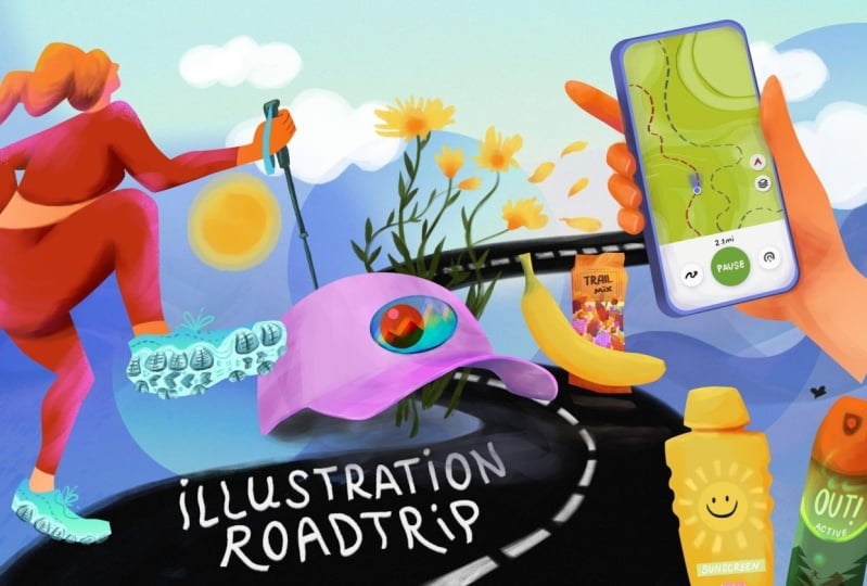
brief is traveling, summer vacation, and road trip. This theme is for an
upcoming magazine issue, and your illustrations
will accompany an article. Spot illustrations
are designed to float on the page
between blocks of text, Illuminating and
complementing the content. Now, with that in mind, I want to give you two
alternative brief options if you might feel that you
connect more to these. A friend asked you to create illustrations for the
wedding anniversary. Keep in mind that
we're talking about a few illustrations for
their wedding anniversary. The other one is your gym wants images for their
website and has asked you to take on this
creative job and create a series of
illustrations about fitness, workout, whatever
you do in a gym. Now, before moving on
to the creative work, a quick reminder to
upload your artwork to the class and share your
ideas and progress. I'd love to see your
take on this project.
3. Beyond The Brief: I What's in a brief? The brief is your
creative prompt. It's what should be showcased
in the final artwork. Your job is to interpret it in your own unique
approach and style. Typically, your brief would be in an e mail from a client, asking if you can take
on an assignment. It can be short like
the one I gave you, and it can be longer. If it's for a magazine, it might be the whole article
to accompany that e mail. So here's a e mail that I've got for this
imaginary assignment. Hi Yifat, would you be
available to create spot illustrations for the
Great Outdoors magazine? I need five illustrations, for an article about
traveling during the summer on vacation that
includes outdoor activities. We are able to offer
$1,600 for the job. The deadline for submission is next Tuesday at 10:00 A.M. EST. That's a week time from now. According to the e mail, you need to create five
illustrations for an article. It's an exciting opportunity, but it's also a bit daunting. Do you want the job? Absolutely you want
the job! And you’ll learn how to tackle it in
the following lessons. We're going to re and accept
the job and when you reply, be courteous, have
professional manners, be short and basically let your client know that you're
ready and you're going to provide the job
in the given time. I'm going to reply to the
e mail and I'll see you next when we move
right on to ideation.
4. Ideation: Getting in The Creative Flow: Okay, so we got this e mail. All we had is words where we had to come up with ideas
to develop those words. Now, the assignment
is very laconic. They want traveling
summer vacation spot illustrations that will show great outdoors activities. And the theme is for an
upcoming magazine issue. And we have about a week
to execute the assignment. For creating five
spot illustrations, we need to come up
with visual ideas. How do we expand this brief into ideas that
inspire visual art? For ideation, you can take
time to reflect on what all this means to
you and research your subject and maybe
create a moodboard. However, for fast
paced assignments, we need to be more efficient and really hit the
ground running. It's much quicker to use a wonderful tool
available for creatives, and I'm talking about AI and
specifically the chat GPT. I'm going to get into my
chat and type a query. I'm going to ask the
chat for a list of summer vacation ideas that
includes outdoors activities, maybe hiking and swimming. All right. I'm going to
hit enter and let it work. The next thing that I want to do is actually grab the iPad. And my glasses for
these old eyes. The next thing that I want to do is copy and paste the list into a document so that
I'll be able to keep it. I'm going to split the screen. And bring in a new document in Procreate and start
making this list my own. Let's see from this list,
what I want to take on. I really like the
idea of swimwear, so I'm going to write
swimsuit, maybe swim goggles. I'm going to write flip flops. Because they're
really fun to draw, so I might want to
do some of these. I like the idea of a hat. I'm not very good
at drawing hats, but I can show you
how to do that. We'll do it together. I'm just going to
find things that I really like in this list
and just make a note, sleeping bag. I
like sleeping bag. Towel sounds like great because towels can
be very colorful, so we can use it as
a coloring device. So I'm writing big
and colorful towel. I want to do some to take things from the list that
are a bit different. Maybe some items that we want
to bag for our road trip. How about sunscreen? Phone, yeah, we want
to bring technology. We all use our phones
everywhere, so phones, but the thing is that phones are also
navigational devices. We use the maps, and we
also use trail apps. So we can bring a
map on the phone. I like it. I'm starting
to feel exciting. I'm starting to feel excited
about this assignment. Now we want to mention
the activities and being active while we're on vacation because this is what the
brief asked us to do. Maybe we can get some
gear, sport shoes. If I don't know how they look, I'm just going to
go and research and find images that I like and use them for drawing because I'm not really sure what tracking
poles really look like. But I'm pretty sure
that tracking shoes are different than
regular sport shoes, I might want to
research that as well, but do it very quick
because we are on a time constraint. Okay. I've got my list and I
can put aside anything from the chat now and move
on to visualizing this list. While working on this list, the creative juices have
already started flowing, and I feel that I'm ready to
move on and start sketching.
5. Sketching: Creating Visual Concepts: I When we're sketching, We are not always familiar with the shapes that
we want to sketch. It's a good practice to use reference photos
and work with them to move over that hurdle and
just flow with your ideas. Let's not get stuck on things that we don't
know how to draw. It's perfectly okay to trace. Once again, I'm splitting the screen between an image that I found of a banana
and procreate. I'm going to grab the banana. This is a really neat
trick and move it on the onto my drawing board. You can also just
import an image. If your iPad can't do that. I don't know, maybe
it's a new feature. I'm not sure. And
What I'm going to do now is lower the opacity
of this banana image or whatever image you
chose to bring onto your Canvas and add a new layer and really
very quickly trace. While researching the banana, I was looking on what people actually eat when
they're going on a hike. Actually, they're packing
things in their backpack, so they need light snacks. I'm going to draw a trail mix, which is a packet that has all
sorts of nuts and raisins, sometimes little bits of chocolate and dried
food in that. That will give me the
opportunity to draw these little snacks in them
with a big yellow bananas. There are some
visual impact there. Also, I want to write down a trail mix because using text in your illustrations really helps connect with them. I want a mix of illustrations that have some text in them, and I'm going to use
the trail mix for that. Now let's do another one. This one, I want to do
the one with a heat, and I'm not very good
at drawing hats. I find them very,
very weird to draw. Some things I can do
from observations, some things I'm just not
able to, and it's okay. I'm going to bring in an image. The first thing
that I want to do is trace the heat
and then come up with some visual ideas
to use the sat in. Because we're not just going to be drawing hat, and that's it. We need to have some
kind of ideation, some kind of concept
in our illustration. When you have
trouble working with drawing just nice
curves in procreate, going to the brush studio, find stabilization and
pull it up to about 30%. This will make all your
curves very very smooth. And we don't need
the image anymore. Okay, so I've got the heat. Now, what do we do with the hat? So we're using the
hat when we're hiking and we all on the trails. Usually the hats have some
kind of logo or an image. So I think I'm going to work
with that and maybe create a little mini stylized image
of a landscape in the heat. Just to finish this, We can
always add some flowers, maybe something to
make it more pretty and talk about the vistas that we see while
we're on the trails. I'm going to keep on
working with the list, spend it and develop it into visual concepts that
you can later on color, whether it's in
procreate or pop. Up next, I'm going to show you how I take all
these sketches that I'm creating and color block them and render
them in photoshop. I want to talk a little bit
about my artistic choices and my sketching process
and the decisions that I've made throughout
creating some of the sketches. And so here I'm drawing the
iPhone with the trails. And I was looking for a reference photo with a
hand that holds the phone. I pulled up the option to
have a reference screen, and I placed the list
that I've created, so it's constantly there. And now I'm drawing
from observation, what I have in the reference photo and just
adding my own take on that. You'll see that when
you start sketching, ideas will come up
because as an artist, you get inspired
by what you do and you get inspired to create
through the art flow. So there's no use of sitting
and thinking so much. Just start drawing and your
ideas will start flowing. And so for instance, for me, I immediately know
that I want to grab that green color from
that button for the app, so I want to make
a quick reference for that in my sketch. And I like how the trails
are marked in the app. So this is something
that I definitely want to showcase in my
final illustrations. Something that I find
really interesting in this particular sketching
is drawing a hand holding the phone because I think that we connect better with
illustration that show some human
representation because it's something that we can sense
and imagine ourselves doing. And so adding a hand
or some reference to a person in this
illustration set would be a really smart move. The last thing that I want to do is maybe add index finger that's pointing towards the
direction of the trail, which I think is
really a fun detail. Things that were
important to me while drawing the sunscreen,
we're adding the sun. Important thing to remember
is not to draw the logos and the brands that you're
sketching because we're not creating an ad for
certain brands, we want to pull away from the real names and the real brands and
come up with our own. This is an interesting process. I was trying to draw
the trail shoes. My first idea was just to practice drawing the shoes,
and then I figured, hey, maybe I can draw a couple
of shoes together, but it didn't seem
interesting enough. I thought, what if
I'll add a figure because I don't have a
character in my set, and it's a good idea to add
characters in your set, and this is a very
simplified character that you can easily draw. I thought I'll draw a hiker
wearing the hiking shoes. The hiking shoes
inspired the hiker. So I started off
with a few marks just getting the character
in the composition. And then I go over my
very quick sketch with a more refined layer and getting all the details
that I want in the character. So to put the
character in context, I quickly marked the landscape
that she's treading in and maybe referencing some of the big skies
that are behind her, just to remind me of things that I want
to put in the final. Last thing that I created
was this trail sunglasses that has the view reflected
in the sunglasses. That's a very simple idea.
6. Start to Finish: Project Presentation : Okay, I want to take a
few moments to show you a real life project to
get you inspired to see where we're going
with our class project. This is how one of my
mural project starts. As far as the composition go, the character really
holds the composition, and then there are going
to be a lot of movement in the background and some elements that were required by the brief. The next phase in
this project was to take this sketch
into photoshop and start building the structure of the composition in photoshop. I had about eight total
days let's say nine, including a weekend, and I hit the ground running and
really really worked like eight, nine hours a day on it. It's a lot of work, and this is an image that has
a lot of impact. It's located at the entrance
to a Walmart store. People are going to walk by it when they do their shopping, and it should represent
their community, and I'm using what I have in the brief and
expanding it with a quick research about what I was asked to
get into the artwork. And so the artwork reads
from right to left. This is a direction that
people walk into the store. I know this because I have
an image of the wall. This is something that
we're going to do next. We're going to build
our basic shapes, and we're going to render them. This is the final that I sent to the agency that commissioned
the artwork from me. This image got a
round of revisions. So I actually had about four
more days to finalize it and get another layer of complexity and texture that really helped the artwork a lot. I think it really benefited
from the round of revision. I brought a lot of colors
and textures and more joyful and liveliness
into the final piece. And I want to show you
a few more details because this is what
we'll be doing next. These are the basic
shapes that I've created in photoshop
using the Pen tool, and we're going to do this next. And over these basic shapes, I used the brushes to add volume and textures and
really warm everything up. All right. So next, we're going to
take our work into photoshop and start bringing all the colors and life
into our concepts.
7. Essentials 01: Pen Tool Fundamentals: To start working in
photoshop and learn the basics of the Pen tool that we're going to
be covering next. You're welcome to download this worksheet from
the class resources. So let's start with pulling
onto the photoshop document, one of the sketches that we worked on in the
previous lesson. I'm going to pull up
the banana sketch. You can import an image, you can drag and drop it. It's the simplest way to work. The next thing that we want to do is pull up the pen tool. You can catch it by pressing
P on your keyboard. Now let's just click with the pen tool to create
anchor points. This line is called a path and the pen tool creates vector shapes. Vector shapes are shapes
that we can enlarge indefinitely without
losing any resolution. Now we're going to
create a curved line. We're going to click and
drag the anchor point. Click and drag the anchor point to create a curved
line, like so. Press the command key
anywhere on the Canvas, and that will bring up the selection tool and we'll
stop creating that path. And then we can go back to the Pen tool and
create a new path. This new path is going to be a mix of curved
and straight line. Once again, to stop
creating the path, I'm pressing the command key on the keyboard and pressing
anywhere on the artboard Stops making that path active. And now let's press
A on the keyboard. And this brings up
the selection tool. These tools works together, the Pen tool and
the selection tool, P and A on your keyboard. And with the selection tool, we can choose any anchor
point, drag it or twist it. To activate a path and alter
it with the selection tool, which is A shortcut
on your keyboard, all you need to do
is use that tool, press on the path. The anchor points become active, and then we can change
them and move them around. Now here's a fancy
thing that we can do. We can break an anchor point to create more complex curves. If we press the option while
using the selection tool, again, on your keyboard, pressing the option key
and dragging one of those handles will break
the curves, like so. I'm showing you that so that you learn that you have a lot of control over your lines while
working in this method. You can reconfigure
your work space to make it more
comfortable by dragging the path tab above the layers tab so that you'll be able
to see your work clearly. Now, the best way to learn
something is by practicing, so go ahead and practice this and get to know your pen tool and the direct selection tool. Now let's start
working for real. Let's trace the banana. We're going to find all
the places where our pencil line curves and drag the pen tool as
we work through there. We're going to
find the next peek and curvature in
the banana sketch. And again, click and drag
the pent tool there as well. When I want to change the
anchor points and alter them, the ones that I've already created while working
with the pent too, Yeah, you can always press command
and bring the selection tool and change the anchor points
that are already created. If you want to add more anchor points to a path
that already exists, all you have to do is hover
with a pen tool over the path. The pen tool changes to a plus, and that will allow you to click and create
another anchor point, or if it changes to a minus, it will delete an
existing anchor point. Hovering above your
last anchor point, you can see that the pen tool
changes into a slanted line, and that means that
you're going to continue creating the
path from that point on. Key thing to remember
when working in this method is not to click click your way
around the shape, but to try to find the Epix point of a
curvature and click there and drag your handles
nicely and then create another anchor
point farther away. The key to creating
nice curves is not to click your way around the shape that will
create a broken line. You want to let the software
do the work for you. Try to create as little
anchor points as you can. Just when you see that
the curve is changing, that's where you
want to click and pull up that anchor
point in your path. When we close the path, when we close the shape, you can see that the pen tool
tool is changing to a circle, and that means that by clicking, we're going to create a
complete and enclosed shape. Now let's take a look at our path tab and you
can see that we have a work path active there in the shape of the
banana that we've created.
8. Essentials 02: Color Blocking: The banana path lives
under the path panel. We're going to tap
to activate it, and then go to the bottom of
the layer panel and choose the half circle to bring up the action menu and
pick a solid color. And as simple as that we filled our shape
with solid color. The new shape lives
under the path panel, but it's also in the layer menu, and this is where
we're going to access this vector banana shape when we want to
change the color. I just want you to know
that it's there so that you'll understand all these
different menu that you see. All right, and now
we're going to repeat this action in our next shape. For now, I want to
trace the trail mix, and again, I'm
using the pen tool. So while we're in this phase
of blocking the shape, that gives us another
opportunity to revise our artistic
decisions and refine the shapes before we
move on to rendering. Yes, you can totally block
your shapes with a brush, but I love using
the pent tool for creating the defined
shapes because later on, I can just go crazy with free brushwork because
I already have the structure within
the blocked shape that I've created
using the pen tool. We're going to hit the
half circle again. This time around,
we're going to pick gradient to color fill our shape. Now we want to
edit the gradient. Let me show you how we do that. You can choose a color from the pre existing presets to
start off your gradients. Let's check out one and
see how we feel about it. I'm not super loving this color. Let's try another one, and maybe from the
orange color options. I like this one
better because it doesn't clash so much
with the banana. We're going to keep
the color scheme in the orange and yellows. Let's get to know our
tools a little bit. We can change the angle for
the gradient and we can go back and pick another
color instead of the presets. We can use the slider
to choose how much we want from the darker color and how much we want from
the lighter color, and we can just pick a
new color altogether. I'm just playing with this
option and seeing what clicks, what feels right, I can
always go back and change it. Let me show you another thing. In the gradient fill window, we can choose between
linear fill and radial, angled, reflected or diamond. Just play with these options
and see what they do. For me I'm just going to pick a very simple linear gradient to fill out the block shape. Now I have the foundation
for my illustration and I can change the order of the layers because I want the
banana to be in the front. Now, we were hitting the command T to bring up the transform tool and change the size of the packet because it
might be a little too big. I'm just messing with it and seeing how it sits right for me. All right, I think
we're ready to go. Up next, we're going
to start using our brushes and make
this even more fun. I'll see you in the next lesson.
9. Essentials 03: Fundamentals of Rendering: So I have all my
basic shapes ready, and now I've added
another layer above my banana and set it
up as a clipping mask. And I will use this layer to bring to
life the banana shape. We want to go over to the brush menu and pick
a brush that we like. I'm just going to try out a few until I find the
one that I love. I really like using
brushes that have the warm textures like
real art mediums. I'm using the brush
set by Kyle Webster. It's a megapec. It has beautiful brushes, and you can download them
from the Adobe Cloud. So here's the thing. This brush pack has
lots of great brushes. Right now, I really like
the big white softy. I've used it for my last job for Walmart. I really loved it. So I'm just going to go
ahead and pick this one up. But you're going to try out different brushes and see
which one works for you. You probably have
already installed different brushes that
you're used to working with, play with the brushes and see how you feel and
which one works for you. To clear the layer quickly, hitting command A to pick
everything on the layer, delete, and then
command D to deselect. Just a quick tip. All right. So let's add some character
to this very flat banana. I'll use some green for the top just to create some diversion from all the orange
and yellow that we have and make this
banana look very fresh. And then maybe pick
a darker color and add some more
dimension. I like it. So let's try this out in the rest of the shape
and see how it works. Too much green on the banana
makes it looks unappetizing. I'm trying it, but it
really doesn't work. So while it still gives
dimension to the shape, so I want to retain some of
my green, but not too much. So I'm going to clear some of my brushwork using
that special tilda key that you can find right under the Escape on your keyboard. It's super handy, and
we're going to use it a lot. I love it so much. It even helps bring
some highlights to the rendering without
adding another color. All right next,
maybe we'll choose a darker shade to add
dimension to the banana. And when we're
working with yellows, we want to bring in a darker
shade in the form of orange, not a darker yellow, a darker yellow is
going to be muddy. And I'm going to bring in some highlights with
a lighter yellow. To enlarger brush, use the square brackets and to
bring your brush size smaller, use the other square bracket. And I think our banana
looks really nice. Now I'm going to use
the same color but pick a different brush to add more texture and more
pronounced highlights. These are the brushes
that I'm going to use for creating all
my illustrations. So this brush has
a nice texture, you can see the
hairs on the brush, and it just gives it a
warmer feel when we have all these real
life textures in a digital illustration.
I really like it. Alright, so up next, we're going to do something similar for our trail mix pack. But I think we're
going to pop it to life with some more
fun shapes and gradients. I'll see you in the next lesson.
10. Essentials 04: Styling with Geometrical Shapes: Let's try to stay organized and group
our layers together. Hit that icon to group these layers
that you have together, or you just choose them
and then hit command G. Okay, so I want to add a
window in the trail mix, and I'm going to
use the shape tool, and that's U on your
keyboard, to draw a rectangle. I'll give it a gradient color. And let's see which one works. I'm just going to
start with some presets and then tweak them. I'm really motivated by colors, so I immediately
want to see them. Whatever color I choose, I can always change it, but this is something
that helps me work. I think I like
this one. But it's not really working
with my color scheme. Let's try to play with the colors a little
bit. Maybe change them. Maybe pick different colors for my gradients. I'm just playing. The thing is, we want
to create something fast, we don't want to
take too much time thinking about what we're doing. Just keep playing, keep
changing the colors, maybe change the
transparency of this window. Yeah, that really
helps it blend in. I like it, but I don't
really like the colors. Maybe we can approach
it in a different way. Maybe we can try to change
the settings of the opacity of this rectangular shape
and see how that works. Let's try changing
the blending modes and see what clicks. This really feels right to me. I like it. I had no idea I
wanted to use those colors, but by playing and changing
and experimenting, I found that this
combination really works. I set up my shape
as clipping mask. And now I'm using
another layer on top, setting up in a
multiply blending mode to render and add
dimension to the packet. Now pretty much in the same way that
we worked with the banana, adding some definition
to the blocked in shape, and I'm using these two
different brushes to create different set of
textures in my shading layer. And that's pretty much it. All I want to do next is get
into those fine details of the ingredients of
this trail mix packet and maybe write up "Trail Mix".
11. Dimensions and Definitions in Odd Shapes: In this lesson, I
would like to show you how to work with odd shapes and what approach I would take when rendering them
and adding dimension. So starting off with plotting the path and
following my sketch. The trouble is I
worked on one path, but the better approach would be to create two
different paths, one for the visor of the hat, and one for the main
shape of the hat. So I'm going to correct that. Now, right off the bat, I use two shades
of the same color because the visor of the
hat is going to be shaded. So I'm starting up
with a darker purple and I'm giving a lighter purple for the main shape of the hat. On top of that, I'll add all the textures
with my brushes. Now the next step would be to add a new layer on
top of the shape, set it up as a clipping mask and start bringing in
textures into this shape. My technique is just adding
textures and creating an interesting element
because the textures add movement and interest to the otherwise,
very flat shape. We can go even deeper
with the color and add more shading as much as you like to create the illusion
of dimension to the visor. And I would like to blend in my two different shading layers. So I'm going to add a new one. Other thing is,
I'd like to sample my original color
and work with it. Here's a tip. When working
in blending modes, it's a good idea not to
come up with new colors, but sample the ones that you already have and
then work with them. Whether you're adding
a darker blending mode like multiply or a lighter
blending mode like overlay. It will be wise
to use the colors that are already on the Canvas to create a cohesive
color palette at the final illustration. Now, I think it would
be a good idea to merge these two very different
visual elements together with a line that would
be an outline of the hat. And I will do this in
a different layer, set it up in a
lighter blending mode like maybe overlay
and possibly get it into clipping mask eventually so that it will
follow the shape closely. What I did here was first off, I drew the curve, and I used the smoothing of the brush to create
a smooth curve. And then trying it out as
an overlay really brings out all these
interesting highlights from the layers underneath. The thing is, I want to
work on both elements, both the big shape and all the complexity that I've created for the darker shape. So I brought all these layers together into one group
that is called hat. Now the new layer is above
them in a clipping mask. And so the new layer is applied to the group
that is now the hat, and that allows me to create a seamless rim to this ball cap. Let me check where
I am compared to my original design
in the sketch. All right. I really like
how the shading looks. But now I want to add more
definition to the hat. So let's find the layer
that is my main shape. I'm going to use a new
layer on top set up in a clipping mask and start adding more textures and shading
to define the shape. Now, let's see how this
looks without the sketch. I'll keep doing
that coming back to the sketch and checking my work in compared to the original plan
every once in a while. It's a good idea to
do that to see where you're at with
your illustration. And now I would like to enlarge
the brush and work with bold brush strokes to create some dynamic
textures on the hat. Pay attention that there
is some area that I don't touch because that
would be my highlight. Not everything needs to
be covered with textures. Let's experiment a bit
and check if setting up this layer in another blending mode
will work even better. Yeah, I think the purple comes out more saturated this way. Last thing that I want to do is bring in some highlights. We'll set the layer
blending modes in overlay and use the color that is already in the illustration to draw
in some highlights. Now pay attention how this
brings everything to life, how the heat pops, and how the highlights follow closely with
the shape of the hat. Okay, I really like
how this looks so far. So the last thing that
I want to do is define the shapes better with
adding some fine details. And I think it looks great when we add the
stitching on the hat. It's a tiny detail, but it makes a lot of difference with helping
us define the shape. All right, and up next, we're going to bring
more designed elements to the hat to help, bring it to life and
make it more fun element in our spot
illustration project. I'll see you in the next lesson.
12. Create a Narrative with Your Art: In this lesson, I
want to show you how adding details that tell a story create illustrations that are more meaningful
and more relatable. So I'm going to start by adding an ellipse
and in this ellipse, will create the
design of a logo or an embroidered image that is
at the top of the ball cap. Now, remembering that we're
on time constraints and we need to execute our
illustrations within a week. I'm just trying out
different colors and different ways of
blending this ellipse into the hat before moving on to designing the small elements
within that ellipse. In my pencil sketch, I drew mountain ridge
in a setting sun. I'm going to try to create them using the pencil
and just roll with it and see what kind
of ideas come to mind to execute my
initial concept. I'm going to look
for a darker color, maybe blue or dark green and start plotting the path
for the mountain ridge. Now, while setting it
as a clipping mask, I immediately takes
the attributes of the image that
it's clipped to. And I like actually
the darker tone. So I'm going to keep it, but maybe try different
blending mode just to be sure that
happy with the colors. And I am actually loving
the lighter blue as well. I might want to keep
it and duplicate this image so that I'll have the darker mountain
ridge as well. And this is a great device, creating something and
manipulating your designs. That's a great way of finding solutions to your
creative ideas. So I'm going to go
back and try to find my original blending
mode, the darker one. And it's actually a normal. Now moving forward, I did some brushwork over
this mountain range. And here I'm hitting some
technical difficulties. Since all these mountain layers are clipped to the ellipse. My texture layer needs an extra masking to clip
it to the mountain. So what I'm going to do
is choose the pixels of the layer that I want to
use as my clipping mask, and then go back to
the texture layer, hit a little icon
at the bottom of the layer panel to create a
mask over the texture layer. And that's a work around
this technical issue. I always love to incorporate
circles in my artwork, and here I'm following
my sketch that had a sun in it. So
that's pretty easy. We're going to use the ellipse
tool and create a circle by pressing shift while
plotting the ellipse. And dragging the circle under the mountains
affects the color of the circle because now it's automatically gets clipped
to the main element, which is the bigger leaves. But I do want to add
more definitions, so I'm going to add
a smaller circle. I'm not loving the
color of those. Let me show you how to
change the color of a shape. In the appearance panel, the little fill rectangle. If we press it, we can choose different
colors for the shape, and I think I'm going to
go with this lovely pink. All right now, pay
attention that all my designs are
within a group, and that's the ellipse group. And what I want to do now
is bring in more character because the ellipse is very well defined and I wanted to
blend in more with the head. And so in a different layer, I'm adding some rough brushwork that will help that
design blend in. I want to show you
some thing that we can do with filters. I want to add more characters
to the mountain range, so I'm going to hit filter, and under distort,
we can find ripple. And the ripple effect is
going to give more character to the very straight lines of the plotted pass. All right. Moving forward with my design, I actually duplicated
the mountain range a third time and clipped
it to the circle. I like the added complexity and the design that it creates. Next, I want to add context to the hat by
giving it a shadow, using my brush, and then erasing with my brush until I'm
happy with the result. All right. So here I really
want to inspire you by showing the complete process
for creating this spot. If you remember, in my sketch, I use flowers and we
talked about how telling a story with our work
helps connect with it. So here we have a story of CP, but it also has this design that shows where the person who
wears the hat goes. They go to see the
mountain range, and over there,
they see flowers. And so we're telling
a little story here with everything that
goes on with the hat. I'm really enjoying
drawing flowers. I used the bristol brush
to draw the stems. And I found this very cool
brush that I'm really loving. It's the acrylic glaze that's
part of the mega pack, and I'm using it to
draw the leaves. The colors here are two or
three shades of olive green, and the flower stems are
anchored to the shadows. They're not floating
in the background. And now, the next
thing that I love adding is the actual flowers. Since the end o is one
of my fair foot colors, I'm going to pick
yellow for the flowers. And using the same brush, but alternating the pressure on the stylus helps with
creating the flower petals. And I'm really working freely
here with the brushwork. Not overthinking the
flowers knowing that. Natural elements have some
weird and unexpected shapes. So it's okay to let our
brushwork be a little bit crazy and all over the
place when we draw flowers. I think it's really fun
to have petals flying. It inspires the notion
that there is a breeze. Then it gives direction and more movement to
the entire piece. I'm going to finish it
off with adding some darker shades in the flowers
to give them dimensions.
13. Illustrate Hands: Bringing Your Ideas to Life: So let's see how
we tackle the task of illustrating hands
using the pen tool. So you want to think in layers. You want to think what is going to be your
background layer, what's going to come on top. And in this instance, the fingers are folding, so we need to draw the
back of the hand first. And then we're going to the
points for each finger. So I'm using the pent tool
to closely follow my sketch, and I like to correct
the path while working, so I'll switch between the direct selection tool and the pent tool to
finalize this shape. Next, I want to fill
my shapes with color. And for this one, I think it will be a good idea
to create a gradient feel. Now, mine is transparent, but I'm going to change it later on because it doesn't necessarily
need to be transparent, but a lighter shade of orange. All right, and now
I'm going to plot the shape for each
finger individually. We're creating different
shapes for each finger, and that's going to be
important for the next stage. We're going to go into
details about how we create the phone and the
maps in the next lesson. Just for now, I want to
show you that it's there, but we're going to
skip this phase and move back to
rendering the hand. Next, I want to add a new
layer over one of the fingers. And I'm going to start
with the index finger because I know it's
important and it sticks out. And this is going to
be the texture layer. This is going to be
the layer where I add all my shading and
highlights to the finger. Think about fingers,
pretty much as you think about the bananas and the heats. You have the shaded parts and you have the
highlighted parts. Once you think about the
fingers not as fingers, but as shapes, it becomes much clearer how you need
to be rendering them. I want to repeat this process for each finger individually. I can use my shading to define details in each finger
like the nails, which I think add
definition to the shape. We don't want the fingers
to look like sausages. Adding shades and then deleting some helps with
defining the nails. I'm going to actually go back to the detail and redefine it
with some lighter lines, but that would be further
down the process. Now let's go back to the palm of the hand that's a large surface, so I want to work with a large brush and
using big gestures, redefine the shape, adding
dimension and shading. But also this process helps me construct
the shape of the h, maybe separate the
palm in the arm. It's a trial and error, so I'm trying some
brush work and I'm deleting some until
what I see feels right. But I do try to follow the
shape of hand closely, so I'm going to hint to
that with my brush work. Something to pay
attention to when drawing hands is you don't go too
much into the deep heads. We want to work with
colors that bring to life the hand without making
it looks like it bruised. So it really depends with what color schemes
you're working with. And the basic thing is to
see how the colors work together and what seems right
to your eye. All right. Last, he's adding
some highlights. It's really important
to find a balance between shading and highlight
in our illustration, and I think highlights
really makes everything. I'm kind of exaggerating them, but that's really intentional. The last thing that I'm
doing here is adding another layer that is not clipped to anything
that I've done before, this is an extra layer, and that one helped me go
beyond the plotted shapes and make the hand look like it's really
touching the phone. I'm adding more to the thumb. Then I might just go
beyond that because I like how those free brushwork
interact with the phone. I'm going to repeat that for
the rest of the fingers. If you think about the phone, a case is going to reflect some of the hand
that is holding it. So in that sense, this ex brushwork
helps everything blends in and looks
tighter together. Up next, we're going to
render the phone and draw maps and talk about how
we illustrate infographics. I'll see you in the next lesson.
14. Infographics: Basics, Tips & Techniques: To create the phone, we can choose the shape tool or press you on the keyboard. Now if you see the little
circles in the corners, if we pull them up, we get arcs, and this is how we create the
corners of the cell phone. Next, I want to stretch the shape so that it
will fit the sketch, and in the sketch, there is
a perspective to the phone. So I'm using the transform tool. I'm also using it
in the free form, and there's a short
key for that that helps me stretch it from
every corner and every side. While pressing command,
I can freely change the shape and really make the
dimensions fits my design. All right up next, I'm going to duplicate the shape and
pick a different color. Now the thing here
with the colors, all I want them is
to look differently. I don't really care about my
color choices at this stage. What we want to pay attention now is the outline of the phone, making sure that the
screen sits right between the body of the
phone and the case. So I'm eyeballing it. And I duplicated the
rectangular shape a third time, and that makes the screen sits nicely inside a phone case. There are basically
four shapes now, duplicating the screen one more time to start creating
the infographics. Let's look at the
reference photo. We can see how the app
is dividing the shape in two thirds for the
map and the lower third for the interface. And what I want to do
now is draw the map. It's really fun and interesting, and we really don't need to
complicate it very much. I'm asking the map
in the similar way that I did for the
embroidery on the heat, selecting the pixels and
creating layer mask. My next step is to add more definition and
details to the map, and I want to show
you how we can do it quickly and in
a really fun way. The map has all sorts of lines, and we don't really need
to draw each and every one of them to create the
illustration of a map. If you don't remember
where tools are, you can use the help and try to locate the filter
that you're looking for. And this is what liquefy
in photoshop looks like. We are actually
going to draw inside the filter until we feel like this is looking abstract enough to showcase the
landscape in a mat. It's really fun
and a playful way, and I'm enjoying it. I think this looks okay. All right. And I think
the lines can be even finer and we can
liquefy some more. We don't really need to go back into the filter
and draw again. All we need to do
is just re choose that same filter action
over this element, and it's going to get replicated until it
seems just right. Now I want to add a
bit more definition and interest to this map. This is how I'm working here, checking things up and whatever feels like it's
working, I'm going to keep it. If something seems
to be sitting well, I'm just going to roll with it. I will however try to change the blending mode to see if different color
scheme works better. Drawing the trails is a really
fun way of adding details. My problem here is figuring
out how to do that. Just drawing a dotted line
feels too sketchy for me. I think the better way to
do it would be to draw a line and then erase it to
create a dashed trail path. It just looks more
clean and professional. What I want to show
you here is how we use the layer effects
to create shadows. You can adjust the opacity. You can adjust the
blending mode for the shading and you
can adjust the angle. So testing it out,
seeing what works. Here's where your
layer effect live. They're right below the layer if you want to uncheck them, so they won't show
in the illustration, or if you want to
adjust what you did, you don't apply a new one, you just adjust the
existing layer effect. Next, we're going
to really draw in all the details that makes this map interface come to life. The trick to adding
this interface circles is to first align them
to each other and making sure that they're spacing in
right and then tilting them as a group to make sure they sit well within the
angle of the phone. And once everything is in place, we can change colors, we can add details, and adding hand
drawn script really helps making everything come
to life and look believable. I really like this finalized
details. It's really fun. Sometimes you want to draw
more and see if it works, and I was debating whether adding all the tiny little
numbers is going to help. And eventually, I settled
on just mentioning a few of the parameters that are showed in
this illustrated map. Adding some dimension
really helps connect all these different layers together and bring this
illustration to life.
15. Illustrating Stylized Characters: Color Blocking: In the following lessons, we'll work on illustrating
a stylized character. I've already plotted the path and set up gradients
for each of the shapes. Created separate shapes for
the body, arm, the leg, and the shoes, and I've used basic gradients to color
each of the shapes. It's a good idea to use your
sketch as your guidelines. So I'm setting the
opacity to very low just so that I'll have
a reference for my work. You can also set your
sketch layer in multiply, and it's a good idea to lock the layers so that it will
be unavailable for drawing. And I'm adding a new layer, setting it up as
a clipping mask, and that would be my texture
dimension, shading layer. And we're going to repeat this step for each
of the shapes. Now I'm going to head over to one of the illustrations
that are already finalized. And pick some of those
colors to create a palette to be used in
this new illustration. The reason for that is
that you want to keep tight and cohesive
palette throughout your illustration spots
because you're creating a set. Next, I'm going to pick
this beautiful red and start painting the
outfit for my hiker. And here I can see that
I've made a mistake. I didn't separate the
leg from the body. We'll see why we want
it separated up next. But for now, I'm just
going to correct my mistake and delete
this excess leg. I think I'm going to
switch up my brush. While I like the red color, I don't want it to
be transparent. I just want to
create the layout. First for the outfit, and then I'll add textures
in the transparent brush. When drawing the outfit, I love seeing the brushwork. I like that it's visible. We can use cleaner ways to block the shape,
the red shape, like using the Lasso tool and then the backet to
block this area. But I like the analog
feel of the brush work. So this is why I'm
using this technique. I'm just also enjoying
coloring in my shapes. Okay, this is looking
really good. I like it. So let's repeat this process. For the arm, the arm
is just very simple. We just want a
block of red color. And again, repeating this
process for the back leg. Want to pick a darker red now
and start adding dimension. Here's where the separate
layers come to play. It's very easy to
define shading this way and create dimension in the otherwise
very flat shapes. I think this part of the
process is really fun because I get to breathe life
into this illustration. By using different shadings, we can really make this hiker come to
life with dimension. Something that I want to mention is since I'm working
on one layer, this is a layer where
all my reds are. If I want to erase
some of the shading, I cannot erase that that
would erase the red. So what I'm doing here is sampling my base color and
drawing over my shading, you can just add
a separate layer for adding dimension
to those shapes, and that will allow you
to erase your shading. I just know that this hiker is going to be a bit
more complicated, so I'm more economical with the number of
layers that I'm using. I think it's just simpler to use one shading layer for its shape, but you can definitely
add more layers if you feel more comfortable
doing that in your process. My style of illustration, I don't use lines to define the shapes.
I use the shading. I want to make sure
that my shadings are very sharp and really follow the shape that I've
designed in my rough sketch. If your style calls
for adding lines like the way to separate the ankle from the thigh, go
ahead and do that. And I am trying to keep
my brush work a bit rough because I think
it's more interesting to see the texture
work in the shading. Last thing that I want to do
is add shading to the arm, and that really
helps with creating dimension and reinforce
the pose of the character. Alright, at next, I want
to add some textures and more vibrant colors
to this character. I'll see you in the next lesson.
16. Illustrating Stylized Characters: Textures and Shading: Okay, I'm going to
pick a noise brush, and this is a brush that
you can actually download. It's available to you
in the class resources. I'm going to add a new layer as a clipping mask and put it above all the layers that
we see on the screen. And so all the textures
that I'm going to add on this layer are going to get applied to the entire image. And now, it's just
a trial and error. I'm testing out
what texture works. What seems right,
what seems fun, and I'm keeping whatever I like. Fun thing to know
is that you can use the noise brush to clear some of the noise texture that
you add to your canvas. And this is what I'm doing. I'm adding the brushwork, and then I'm erasing
with the same brush. And so I have total control on the amount of texture
that I'm adding. Okay. Next, I'm going to go
back to this wide soft brush and use bigger gestures to add more highlights and
definition to the character. And I really want to
see the brushwork. I want to make it visible. So I make sure to work
sometimes in parallel lines, and I really want to
see those brushwork. I want to make the
brushwork visible. Now, how do you know where
to add those highlights? You need to imagine the power
source over the character. Everything that sticks out, basically going to get
highlights so the knees, the shoulders, sometimes I would just add color
where I feel it's right. For instance, I accidentally colored over the
character's chin. I'm not sure that in real life, it needs to be colored this way, but I like how it overall looks in the character,
so I'm keeping that. Sometimes you make
mistakes or you make some accidents or things that are not
in your control, and you assess what
you've done so far, and you might want to just keep them and use them
in your process. I'm going to add a
new layer again, above the hiker group. And this time around, I want to color the
character's hair. Now, why did I make
that color choice? Why did I took in the orange? I want the hair to not take all the attention
but to blend in somehow. And so using a lighter
color than the color of the outfit makes the character's
outfit stand out more. I'm also really
loving this orange. I think it's a fun
and vibrant color. I've picked some
colors again from my hand illustration because I've got a lot of
oranges going on there. I want to use that color
palette again in my character. Again, we want to keep a
cohesive color palette. That's the reason
for doing that and coming up with
absolutely new colors. I'm using the brush
to define the hair. I'm trying to work very loosely, not to overwork it and
keep it loose and fun. I can always go back and
add more shading and more definition to the
hair if I need to. Now, if you want to add even more definition and
create deeper shadows, you can always add
more layers and test out if some
extra shading works. Up next, I want to
move into details in the character's shoe and tell
the story of this hiker. I'll see you in the next lesson.
17. Illustrating Stylized Characters: Details and Scene: In this lesson, I want
to finish the character, add all the details and
draw the background and the landscape that
she's hiking through. Now, I put the hiking shoe
reference directly on the Canvas because I find
it easier to draw this way. I have the reference
right in front of me. That just makes life
easier drawing this way. Okay, now, when we,
from reference, we need to think how
we're going to bring in all these details in the style that we're using for
our illustration. So the way to go about it is to try out and see what works. The first thing that I
want to do is add a layer above the shoe and set it
up in a clipping mask, and let's get the
shape of the shoe in place before I
move on to details. I really like all the
interesting details that are in this shoe, and I picked it for
that particular reason. I think that getting
all those details of the hiking shoe is
really, really fun. I'm really enjoying figuring
out how to do it as I work. This shoe has so interesting
details like the stitchings, the different shades
of tel on the shoe. I think the sole of
the shoe is really expressive and interesting with all these different grips. There was some
interesting design behind this shoe that I want to
capture in the illustration. This is how this illustration looks in photoshop on the iPad. I want to break down the layers that I have for the landscape. The mountains are really
rectangles in gradients, and the hill is drawn
in the same way that the shadow of the hat
and the banana was created, just a different
color, basically. So I've already have the hiking
poles drawn in in pencil. And what I want to
do next is show you how adding some
landscape features helps with creating
interesting composition and sets the character
in this scene. So the brush that I'm using is the same white soft brush that I've used for the
textures throughout. I'm drawing a sun,
basically three layers of yellow the same way, I'm going to create clouds. Something that I really want
to mention as we wrap up this illustration series is using the same
brushes throughout. I've been using the noise brush, the bristol brush for showing the brushwork and
the soft white brush for adding the shading. I have also used the pencil brush for some
fine details. That's it. It's important to stick to your brush choices throughout
an illustration series in the same way that you create
a tight color palette for a series using the same
brushes throughout the series, create a tight and
cohesive look. To finalize this image, I want to add the fine
details of the grip for the king pole and some simple lines to
iterate the Hikers fingers. To recap, this illustration spot has a very clear concept. We have the hiker
in dynamic pose, hiking up a mountain. And in this way, we create
a narrative through the artwork using all
these fun details. I have my five
illustrations now ready. I'm going to send
it to the client. And using all these techniques, we were able to efficiently manage the time that
we were giving for this project and deliver high quality cf artwork
that we're proud of.
18. Final Thoughts: Congratulations. You've
finished this class, and thank you for joining in. You've learned to develop and execute visual
ideas efficiently. You've mastered advanced
illustration techniques in Procreate and
Adobe Photoshop. You've learned to
explore new ideas using AI tools to boost your creativity in
the ideation process. And now it's time to share
your project with a class. I can't wait to see your
take on this project. Please take a moment
to review the class. It helps me improve and lets
others know what to expect. Also, remember to follow
me here on Skillshare, as well as on Instagram to know when my next
class is available. Thank you for joining
in. Happy creating and I'll see you in the
next class by for now.
19. Bonus Art Process: Illustrating Sunscreen & Bugspray: H O oh O. O Oh. Oh. Oh.
 Yifat Fishman, Artist & Illustrator