Transcripts
1. Introduction: Hey, I'm Patrick. Water
Clad from Sydney, and in this class, I'm
going to paint rocks. If you like painting
landscapes as much as I do, then you know that
rocks are everywhere. They're featuring
the landscapes in seascapes in
different scenarios, big rocks, small rocks,
and rock formations. I'm going to show you three different approaches and how we can tackle different kind of scenarios that feature rocks. How am I to teach you
about watercolors? Well, I've been painting
for a very, very long time. And just like you, I've
learned everything I know from books and videos and some
workshops here and there. And I just love sharing
what I've learned with you because I truly
believe that if I can learn to paint, so can you. For your project, you
can choose one, two, all three of the examples that I provide or
even better find your own reference as long as you've got
some rocks in there. I hope you'll join me for this
class. Let's get painting.
2. Sketching Rocks: When I sketch rocks, I always emphasize
the straight lines, art, edges, and angles, even when the reference is rounded and the rocks,
you know, softer. I keep emphasis on
straight lines. Sharp angles because our brain wants to think that we're
looking at a hard surface, rock hard surface to
be quite precise. So we don't want to
draw things to round. We don't want to look like potatoes or anything
other than rocks. That's the first
thing to consider. The second one is light usually comes from the top from the sky. So your top surface is
generally speaking lighter. And then you can work
out your darkest sides, and now the light falls off. That gets darker
towards the bottom unless there is reflected
light bouncing back in. That's a video for another day. A mental trick to help
you picture how the rocks are constructed is to
imagine a box around them. It's as if the rocks were chiseled out of a
solid block of stone, and then you can construct the different sides
of the rocks. So picturing a
geometric shape around your rock will help you see where the
different sides are. Let's do another quick example. I'm drawing a cube this time
a different perspective. So this is kind of top down. Empty box, and then I fill in a rock shape and
then think about, you know, the three sides
that I can see right now. And then the other
thing to consider is, especially when you're
painting rocks in a landscape, and you've got your
horizon line and you might have two
vanishing points that rocks will also fall within
the perspective lines, just draw a basic
perspective grid, and we have a big rock in here, then you know, you will follow
those perspective lines. Let's to one more on the right side there a bit
further in the distance. But again, following
the perspective lines. Let's move on to that side to illustrate that even further. If you're new to
sketching and drawing, then this may be a bit advanced, and it's not
absolutely necessary. Think about perspective lines, but it does help you construct
your rocks, a bit better, a bit more three dimensionally, especially if there
is a group of rocks that is vanishing
into the distance.
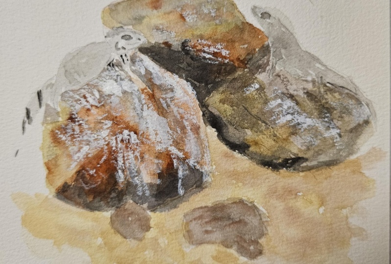
3. Demo 1 - Individual Rocks: The first example is based on the same photo with
the two rocks, just to show you how I
approach standalone rocks, such as big boulders, or maybe a single rock in the
foreground of your subject. Now, rocks are for me a
perfect opportunity to do them wet and wet and let the pigment nicely blend
and run into each other. So for that, I premix some of the colors
that I plan to use. A rosena for the lightest
part at the top. And then various degrees of browns going into a dark
gray for the shadow area. Most times the rocks will be lighter at the top because
of the sky above it, which means the top
surface will catch the most light and then get gradually darker
towards the bottom, and then often one side will
be darker than another, just like any other three
dimensional object. You can see that I've created this lovely blend between
three different colors, and I've just letting that pigment diffuse with each other. And then dropping
in different reds and browns into my rocks. It's a great opportunity to play with different colors in
pigments and textures. That's what makes painting
rocks so much fun for me. I'm just going to build up that shadow tone a little bit more. It is darker on that
side of the rock, at least in my imagination. The photo doesn't have
very strong light, but I'm using it
just as a guide. And I'm just building
up my value. With rocks, I often try and achieve as much in
the first wash as possible. There will be some
glazing later on. Then the next thing
is that I don't let them dry individually or try and separate rocks that are overlapping or
next to each other. I paint straight
into the next rock, and I actually want the two rocks to blend
into each other. I want the edges. To
be soft and we can separate them further
in a minute when we paint in the dark
shadows once it's dry. Same approach for the same rock, light on top and
then wet in wet, dropping in my different colors. I'm now mixing a much
stronger mix for the shadows because often I
like to paint the cast shadow while the object is
still wet so that there is a nice blending
happening between the bottom the rocks or whatever we're painting,
and the shadow. Again, there's a lot of
connection happening there between the different colors. And I keep building up my ducks for as long as I need
to while it's wet, because I can continue
to drop in more color. I've let the settle now for a few minutes and
now I'm going to add some table salt to it for
some additional textures. There's different
ways of how we can create textures in rocks. Salt is a great one. It will absorb some
of the pigments. Another way to
create texture is to use a palette knife
or a credit card, and this is one of
my favorite ways because when I was
saying we've got too many around edges
here or soft edges. They don't look sharp
enough for a rock. Well, we can get some straight and sharp edges with a palette knife
just like that. Maybe I'll carve out
this top bit here, which is essentially removing
paint and it's shifting it. But this has already created
some rock like texture. Here, I think I might
leave that to dry. This is now dry and
I'm using a dry brush, completely dry new
brush and then I'll gently wipe off the salt because there's
usually still a bit of moisture trapped inside
the salt crystals and I got to brush it off. You can see there's still a bit of wetness
underneath the salt. Probably if I let this
dry for another ten, 15 minutes, then it would
be completely ready. But I am a bit unpatient. Might just have to use my palette knife to gently
scratch off the salt. But because it's rocks, that's okay, if we add a
few more scratches into it. There we go. And then I'll
just blow right out the way. I'm going to just add a
little bit more value. Underneath the rocks, just to emphasize that
shadow bit more. Now, what we're going
to do is just to do some really
gentle dry brushing, a bit more of my burnt sienna, the bit of ultramarine. Want to get a darker brown, and this is really dry. You can see there's
no water in here. These flat brushes also hold no. It's perfect for
bruh straight lines onto a surface. The
rocks are finished. So I'm finished with the rocks, but I'm going to add a bit
of a background to it, just to turn it into a bit
more of a painting rather than just a little rock study, that's completely optional. You don't have to
do that. But we're painting, we're having fun. So I might as well
just finish it off. And then maybe just a couple
of trees in the background. And then I'd like to
add a field splatters. Here you can see that
beautiful texture the salt has created and the scratching
and the dry brushing. Now, let's move on to
painting a rock formation.
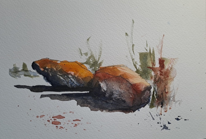
4. Demo 2 - Rock formations: For the second example,
we're going to paint a rock formation here
in a coastal scene. And what I'm looking for
foremost when I choose a subject like this is the actual shape that the overall rock
formation is making. So I'm just tracing
the outline here, and you can see that it is
a really interesting shape. A lot of variation in there. And when I look at the rock
sitting there in the water, over the counterpoint,
then we end up with a really nice negative
shape of the water. So the two main shapes and
balanced with the ocean shape. And the next thing
I'm looking for is an interesting shadow shape. As you know, it's all
about light and dark. But I don't want too many
disconnected shapes. So what attracted me to
this particular subject here is that we have this
really big shadow shape. And we're always looking
for connection and finding big shapes
that we can connect. It makes it easier to
look at and gives you a much stronger foundation
for a painting. So I've sketched out my
rock formation here on my watercolor paper
and made sure I paid attention to straight
lines and angles and creating those edges
that I need for rocks. And similar to painting
one or two rocks. I start with the light colors, Rac in this instance, and I'm going to
connect all the shapes. So I'm just going to paint
the whole thing in one go. And just vary my colors a
little bit as I go along, roughly staying in
the same value range. This is a light to medium value. I also vary the color
temperature though, where I have hatched
out my shadow areas. I make sure to use a bit more of the ultramarine blue
and burn sienna. Just to cool that down versus
the warmer Row sienna. And I'm speeding up
the video even further now because it's a
little bit repetitive. And you can see that I'm
just dry brushing a tiny bit of texture up there that's where the water
washes over that rock. But I'm going to follow
through, the same approach. It those background rocks, a warmer, lighter
tone on the top, and then dropping in my
cooler and darker values. While it's wet, I just
love the first h of rocks, but basically any subject I
paint is that first wash to really just be soft and have all the pigments medal
and mix with each other. But before it dries, I am going to go in with even stronger shadow values
just to create more of that blending and have some nice soft transitions and some variation in
the shadows as well. And I'm using a flat brush
here to have more chance of straight lines and flat surfaces that helps with the
illusion of rocks. I'm using the pallet
knife again to scratch out a few highlights, but also just to push the pigment around
while it's still wet, to create some harder lines. And this takes a bit of practice to find the right timing for it. It can't be too wet, but
it can't also be too dry. But you can always try. But look at how lovely I just created a rock there
without even having to paint it just by scraping
into the wet pigment. And it helped that
the darker pigment is quite thick and creamy
doesn't have a lot of water, so it's very malleable
at this point. In the first example, I
use salt for texture. For this one, I'm just
going to splatter in clean water has a
similar effect. Just at a bigger scale, than the little salt crystals, water droplets, as
you probably know, can be a mistake, but you can
also use it as an effect. It pushes out the pigment, and it's already
dried a little bit, as wether we have an
abrupt cut there, but I've moved on to painting in the ocean around the
rocks just for context. But if you look at that
foreground left bottom rock, how wonderful the water
has created this texture. So if you loose click of remarks to hint at the
surf and the waves, and then I've dropped
in a bit of a shadow behind that rock
there in the middle, right, the sun is coming
from the top left. In this picture, that's
why we get these lovely, strong shadows
underneath the rock. So I've mixed my
shadow color, again, a thick strong mix of ultra
around blue and burnt sienna. It is my all time favorite
go to dark and shadow color. And then sometimes I
mix in a bit of rose. Queen acon rose in my case. You can use alizarin
crimson or any other sort of magentish red just to
push it into the purple. And because the paint
is so lovely and thick, it's almost a dry brush
effect now because we're painting on top of a dry wash, and I'm using my
synthetic flat brush that doesn't hold
a lot of water. So it creates very dry marks, and because it's a flat brush, I have a fair amount of
control over straight lines, which is what we're
trying to achieve here. You can see that I'm using
just the edge. Just two. Make some of those
edges a bit sharper. Keeping in mind that
I want to create a connected shadow
shape so that we don't have too much disjointed
individual elements. It's really hard for
the brain to process. You'll hear a lot of artists
say connect connect, and that's what they mean. Create fewer shapes that
are all interlinked. And my shadow here is a shape that goes from the left side of the painting all
the way to the right. Once more, the palette knife, that thick dark paint is
still wet enough for me to go back in and make
some corrections or just scratch out
a few highlights, and strengthen some lines. And you can push things
around and back, so no problems if
you made a mistake. And here I'm adding also
some darker splatters to. Further create some texture
on those detailed rocks. Lastly, I'm going to
add a bit of qui, some splatters because we have a lot of waves
crashing on the rocks, and that adds just a little bit of movement to the painting. And this is how I approach a rock formation with few
shapes and connected shadows.
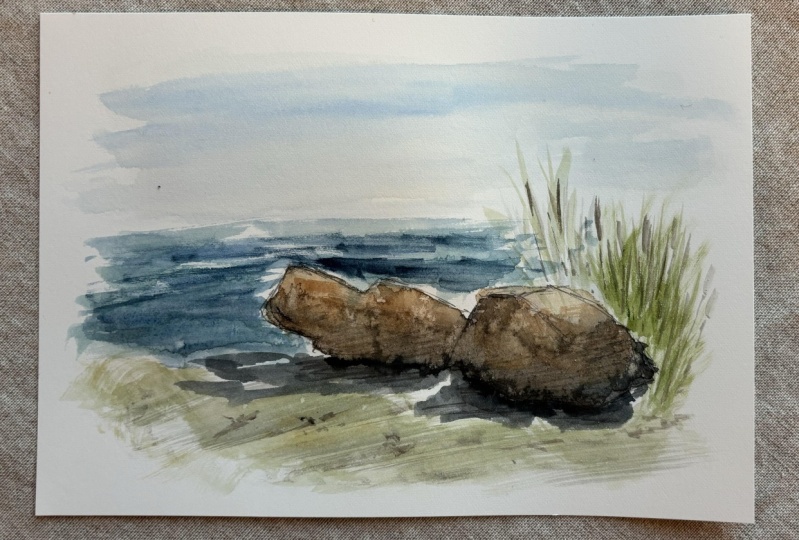
5. Demo 3 - We don't have to paint details: The third example, I'm
going to show you how to paint lots of rocks without
having to paint them, and I'm going to look for
the dominant shape again. It's a bit hard to spot here. Everything is colorize the same, but I'm going to draw
that line there. That's my foreground, and then the middle ground
and background, will have lots of smaller rocks, but we're not going to
paint all of that detail. I've finished my sketch and
I've also hatched in where my shadows are so that I can follow that connected
shape once I start painting. Then for the background rocks, I've only drawn the silhouette, the outline, against
the water there, and make sure I have quite sharp angles and
straight lines again. We're going to do pretty
similar approach than we did in the first example where I paint everything
at the same time. I don't paint individual rocks, I paint big shapes. You can see I've sped this
up quite significantly. You still get the idea
of what I'm doing. Foreground, a warmer
tone, raw sienna, with a bit of burn sienna, and then for the middle
and background rocks. I'm going to shift to a
little bit of a cooler color, a bit more gray, as you know, with perspective, things that are in the background are
usually a bit bluer, a bit cooler, a bit lighter. While my foreground is
still nice and wet, I'm going to again drop
in the darker colors. Here I've added a fair amount
of ultramarine blue and burn sienna again as my
default shadow color. That I love using so much and then filling in the areas that
I've sketched out before. I'm going to leave
this foreground rock white at the moment. I see what I'm going
to do with it, whether I paint it or not, but I will add a bit of
shadow underneath it. That's pretty much
the first wash done. While I let this dry, I'm going to add in a bit of a background to give those
rocks with more context, I'm not going to paint the ocean for now, just the headland. Using a blue green, just to create the illusion of trees and then just dropping
in a few darker box, and Let that naturally
create tree texture. Those foreground rocks
have settled a little bit. They're not completely dry. They're just at the right levels of wetness for me to come in again with
my palette knife and then scratch out
some highlights and shift some pigment around and
creating those hard lines. Now that these rocks are
dry in the foreground, we'll come to the main
objective of this lesson, and that is to paint
the middle ground with all of those hundreds
and hundreds of rocks without
actually painting them. All I'm going to
do for that really is to put in a pattern of random marks to indicate the shadows on the side
and underneath the rocks, and just separating
those foreground rocks from the middle ground. That's the trick. It's to create a detailed foreground that
tell us what we're looking at, which is rocks, so that in
the middle and the distance, we don't have to repeat everything and we don't have
to put in too much detail. It's enough to just hint at a texture to create the
illusion of lots of rocks. Now I'm strengthening those foreground rocks and just adding in more detail in and
adding darker shadows in so that they do read as rocks to pull this
magic trick off. So I'm just going to follow the same shadow pattern that I've already laid
in my first wash. Just with a d and thicker mix. There's hardly any
water in this. You can see there's a fair bit
of dry brushing happening. And then adding some
more cracks in there. Just to create more detail. We want the eye to really focus on that foreground and understanding that
these are rocks. The pallet knife
comes out again, scraping in some
final details and some hard lines for
some extra definition. The land in the
background is a little bit too disconnected
from a rock, so I decided to dry
brush in a bit of water. Just gently brushing
over the surface. I don't want the ocean
to be too dominating. That's how I paint
rocks in the distance without really adding too
much detail to it. A.
 Patrick Visser, Designer and Artist