Transcripts
1. Introduction to the class: Hi. I'm Patrick,
watercolor artists from Sydney, Australia. I moved here many,
many years ago, and I just fell in love with
Australia's natural beauty. And that's why I love to paint the landscape and its
wildlife, including the bird. I actually think the birds are the perfect subject
for watercolors, whether you're a beginner or
a more experienced artist. They allow me to experiment with colors, textures
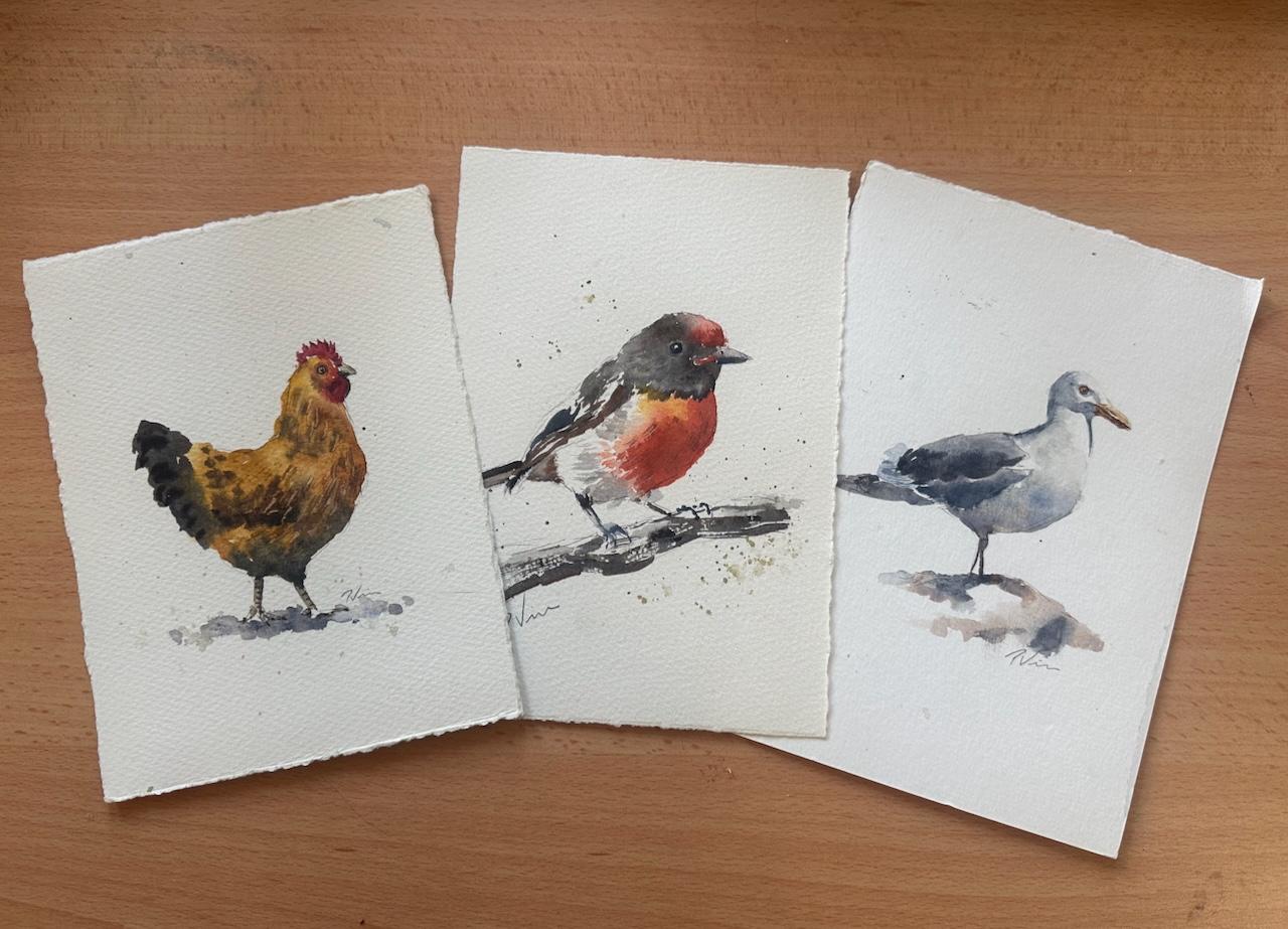
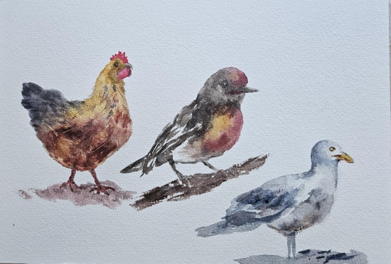
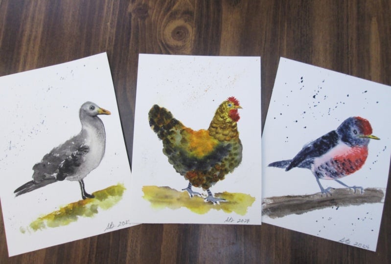
and composition. In this course, we'll paint three different types of birds. Chicken, a sea gull,
and the red robin. And if you're not a
confidence sketcher, I've even included
some templates that you can trace on your
paper to get started. During the demos,
we'll be using most of the foundational watercolor
skills such as wet and wet, wet on dry, glazing
and dry brush. And I'll share many tips to keep your paintings nice
and loose and dynamic. And these skills you can apply to any kind of subject later on. For your project, you can
choose to paint either one of the three birds that I'm providing a full demo for, or you can pick your
own reference and just use the skills that
you learn in this class. If you choose to
upload your paintings, I will be providing some
personal feedback as well. I hope you'll join my
class and learn how to paint these three little birds in a loose and dynamic style, and I look forward to
seeing your wonderful work.
2. Materials: All right. Let's quickly
talk about some of the materials I be
using in this class. If you were a
complete beginning to watercolors and this happened to be your first ever
video on watercolors, then I will probably
recommend you go and watch some beginner videos and other courses on this wonderful platform that
will teach you the basics. While what I'm teaching is not
particularly difficult and it can appeal to beginners and more intermediate
painters as well. This should probably not be your first watercolor
class that you're taking. With that out of the way. Let's quickly look at some
of the basic materials that we'll be using for
this particular class. For the sketching part, we will just use very basic
supplies piece of paper, or you can obviously use the sketchbook with
cartridge paper, if that's what you prefer. Then I use a mechanical pencil. I just like working with those or you can obviously use
just a basic pencil. I like to use two B because that'll give you a
bit nicer shading and HP. This is the perfect.
Thickness for me. Then an eraser, I like to use these needle erasers rather
than the white rubber ones. That's the pencil part. For the watercolors,
I would suggest you use 300 GSM 100% cotton. This one is a Chinese paper bag. There's different
versions of that. That's just a block, you
can use a block like that. I often actually use pieces of paper that are
cut out from larger pieces, coal press or hot press,
doesn't really matter. You can obviously choose either
of those or if you have, and if you like, you can also use a watercolor
sketchbook. Same again that is
good quality paper, 300 GSM 100% cotton,
very important. I like to use watercolor
pan like this. I always use tubes, but you can use whatever
you have, doesn't matter. If you've got a little
watercolor box, that's fine. You can see I'm using
different brands. I like to use Daniel Smith. I've got some Michael Harding. I've got some Windsor Newton. I've got some old Holland. I pick and choose
different brands. I'm not too fussy
about it as long as they're artist
quality paints. That's all you need
to get started. Let's get on with the lessons.
3. Basic Bird Anatomy: Before we start
sketching and painting, let me talk briefly
about anatomy. It's always good to
understand what sits underneath the surface
level when we draw and paint animals or humans. With birds, it's good
to understand how the different
feathers are arranged and also what the skeleton
looks underneath it. It just does help to understand
how the heads made up, how certain things line up, for example, One easy heuristic is that the eyes and the beaks, they usually line up
quite straight like this. That's always a good way to help you the position of
the eye and the beak. Then we have a big area here
that's the back of the bird. From the side view that we have things like
primary fetters, it's these ones, and then
underneath the primary fetters, which is what we
see as the wing, we have the secondary
feathers and then usually some tertiary or part of
the secondary feathers, they're sitting under the
main bulk of the feathers. Then we go into the ones
that cover the tail, and then usually we
have something that connects the belly
with the tail. And if we even go
a layer further and we look at the
skeleton of the bird. That also can help
you a little bit with when you draw them
how things are connected. That obviously depends
heavily on the type of bird. This is obviously a bird
with a pretty long neck. Not even sure what that is, but you can see
that there is one. Often we think that the head sit straight
on top of the rump, but there is obviously
a neck attached to it. Here you can see
how the eye socket and then the be how
that nicely lines up. When it comes to the wings, there is actually two
joints there as well. This is what we would
consider the elbow. This is the wrist. That helps with that
one and then why do birds have this
distinct belly shape? Well, there's actually
a bone in there. One of the key things I
want to point out here is the leg because we
again have two joints. This is where the hip is and then this technical
would be the knee, this is the thigh bone. Then here we have another joint. We don't often see
this top part. We only see this bit here, and that's why bird legs usually go backwards
and then come forward, which is opposite to
how our legs work, which is more like this. You don't have to be an
expert on bird anatomy, but I do encourage you to go and look online for
further resources, especially if you're
drawing any unusual birds or specific birds that the
basic shapes don't cover. In the next video,
I'll show you how easy it is to sketch your
basic bird shapes.
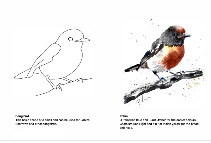
4. Sketching birds: Right. Now it's time to
do some basic sketching. Basic shape of a bird really
isn't all that difficult. It's two circles. And they are connected through
a straight line like that, and you can find the center of gravity by doing a right angle, and you can the
center of that one. Then you have the beak. As I said earlier, the eye usually lines up with the beak. Then we learned that
the legs are going from the center back like
that and then forward. That gives you a
pretty balanced bird and then we just have a tail. That really is the blueprint
of sketching a bird. From here on, you can then try some variations
depending on the bird, say you wanted to draw more
of a chicken type bird. Again, we do that. And then we'll have a bit of a longer neck for that one so you might
want to add a neck and then have a smaller
circle for the head because chickens have
relatively small heads compared to their body mass. Again, they go like that and we got the center and then
the little legs like that. Now chickens have got thighs, so you can draw the thigh, but that's it, and
then we just have a have a tail that
goes like that. Again, not precise,
but I'm just giving you the basic
templates for a bird. Now I would recommend you do lots of different
versions of that. You can also get more of a tear shape for the body
and then have a little head. Then you can put the
beak wherever you want, so you can have it look up. Again, we sort going
with the legs like that. Roughly there, you can start
putting in some wings. Now you can really play
on that variation. You can have pointing in
different directions. If we stick with
that tear shape, and you can have it
going like that. And then have the other one. Again, put the big
grave you want. Now we're looking
at it a bit more from seeing more of the sides. And we could also do a
front version like that, and then we have the
little head up there. Then you could say
look sideways. That's the little b there, and then it sits on the branch. Now the legs a bit
more like that, and then we have the
tail coming like that. But that's the basic construct
of how to draw a bird. Do some observations about the different size
and shapes of birds. So you wanted to go more of
a swan bird or something, then you obviously would
need a long neck, like this. Okay. And again, the legs
go back and forward. Then we need to add
the tail feathers, and this is an example of a long neck bird like
a swan, for example. As you can see,
it's pretty easy to sketch the basic
shapes of birds. I recommend go out
into the world with a sketchbook and a pencil and draw any kind of bird
that you come across, whether it's seagulls or ducks or pigeons or
sparrows and finches, anything we'll do and
draw from observation. I hope this will get you on your journey of sketching
birds more often. And now let's look at how we can turn that into a watercolor painting
in the next video.
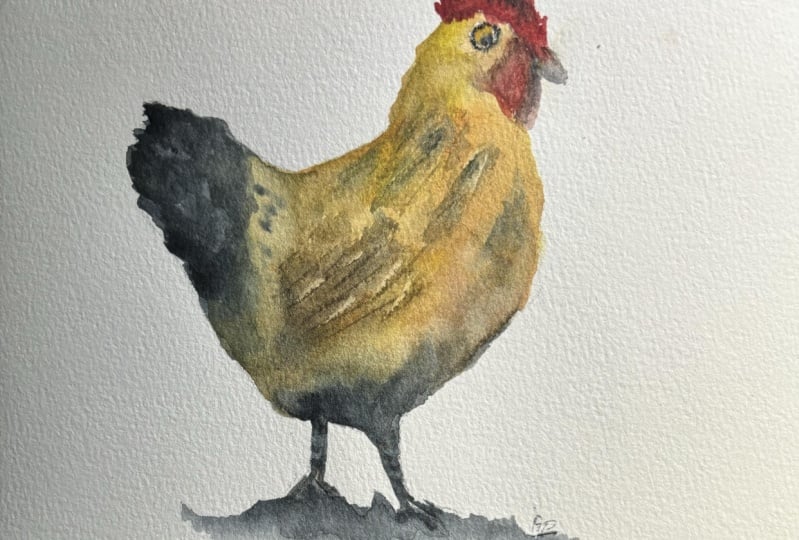
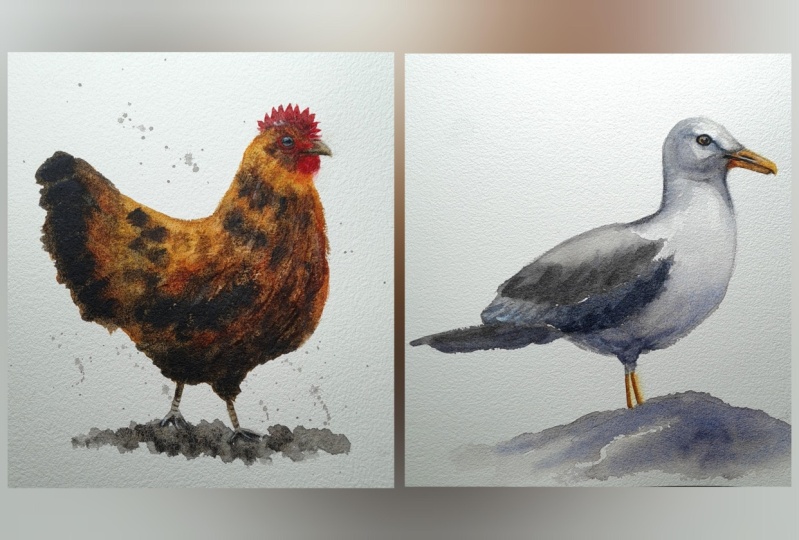
5. Demo - Chicken: I decided to go with a common brown chicken for this interpretation
of a chicken, and I start off
with a warm yellow. I mix that with some hands yellow medium and
some inc and gold, and I'm just adding a touch
of burned Sienna into this. I'm keeping a fairly
watery wash here. This is the t consistency. Because I want to create a
fair amount of variation in that first golden layer
that I'm putting down now. So I want the paint
to dry quite unevenly and have different values and
variations of this color. I don't have a obvious light
source for this painting, and when I paint
objects on their own, artists make up, where
the lights coming from, and in this instance, it's pretty vertical
above the chicken, so I'm trying to add a bit
of shadow at the belly and the legs and lighter on
top where the head is. And that's why I'm dropping
in more burn sienna in the chest and the belly area
and keeping it quite light. And the upside of my chicken. I'm using different techniques on my brush dragging the brush, pushing down the
brush like this. This creates different textures. I am aiming to create the illusion of
feathers and plumage, I think the technical term is. Just through putting the brush
down at different angles. It's still nice and wet, so I can easily go
in with a damp, clean brush, a thirsty brush and lift out some pigments if I wanted to create
some highlights. This chicken has a fairly
shimmery coat of feathers, so I want to create the illusion of light
bouncing off it. Strengthening a
few of the edges. I'm mixing in a
bit of train blue, just straight into
that same mix, which will turn it
into a warm gray, almost a black, and I'm adding
more burn sienna to it. This will work well
for the tail feathers. I'm just trying to
adjust my hand position. If I wasn't filming, I'd
be turning the paper, but it's taped down to my drawing board,
so it's a bit hard. I got to twist my arms to
get to the same effect. And then warming
that color up a bit, again with some burns here now. I picked up a smaller brush as I move from big shapes to
smaller shapes in detail. While the neck is still fairly wet damp at this
stage, I would say, I'm dropping in a few
blobs here and there, just to hint at some
textures for feathers. Always trying to
strike the balance between giving enough
detail but not too much. I'm adding a bit of reddish color to it to
pull that into the leaks. They are in shadow,
as I said earlier, I don't want them
to be too vibrant, but I still want the local
color to come through. Feet are always a bit tricky, no matter what species. I often hide the
feet of birds and other animals in the grass or going behind a
branch or something. But let's move on to the most distinct
parts of a chicken, which are those red little bits on the chin and top of the head, the wattles and comb. That's just a bit
more red in there. I'm just taking my time. To get it quite precise. I was covering it with my hand, so I skipped straight past it, but I'm sure you know
what I've done there. Now the chicken
has mostly dried, so I'm ready to add a little bit more texture where
I feel like I want to strengthen some shadows
and get some texture. And I'm starting on the eye now. I'm just going to outline it very carefully
with my finer brush. And you may notice that I've scratched in some texture with my fingernails into the
wings and onto the neck. That's just while the
pigment was still quite wet. I just scratched out
a few marks there. The eyes are always important, get them right so take a bit
of time and care and use a detailed brush depending on how obviously big or
small your painting is. But also don't overwork them. The most important
part is where you placed the pupil, the
little black dot, because that's where
the bird is looking, and I'm going to
finish off the beak, where the underside is
darker than the top. Again, taking my time
to get that right. Then with the same darker color, I'll paint the other wattle that's on the other
side of the head. That's a bit more in shadow. Then just few more details. Spot here on the screen. But it's just adding
that bit of shadow, adding that bit of
three dimensionality to some of the finer details. Then I'm going to use a
bit of dry brush to add some final feather
texture to the bird. I pick up some
darker pigment for some detail on the
legs and feet. I'm actually not unhappy
with those feet, but I'm still going to put
some ground shadow there. The light is coming from above, as I said earlier, so there
will be a cast shadow. It's nice to connect your object with the ground plane as well. Otherwise, it'll be floating
on the white background. Splatters, for a bit of texture and we're
taking a tape off. All that's left to do
is put a signature on. I hope you enjoyed this
little chicken painting and you'll try it for yourself as
well. Thanks for watching.
6. Demo - Seagull: We're going to
paint this Seagull, with a limited palette. The objective here is to
paint a white bird on a white background and
how we're doing that with shadows in contrast. You can download the
PDF from this post, which we have an
outline of the drawing, which you can trace
if you want to and then just quick instructions
on how I painted this bird. I hope you enjoy this
video. Let's get started. I've traced my CGL based on my sketch template that
you can download as well, or you can draw your own Segal obviously from a foto reference. As you know, Segels
predominantly white, and it's always interesting
to paint a white object. You can do that either by making a really dark background around the white object or animal
that you're painting. But if you're going to
leave the paper white, which are what I'm going
to do in this instance, we obviously need to
create some contrast. For white objects,
you have to focus on the shading You can use
cool or warm colors. It doesn't really
matter. That's up to the painting that
you want to create. Now I'm going to opt for a
very light gray to start with, and then we'll mix in a bit of burn sienna for a bit of warmth. My sll is standing on a rock. I'm imagining a
pretty sunny day with the sun being pretty
much overhead so that the bottom of the
belly is in shade the rock will actually reflect some light up back
into that belly. And that's why I'm adding a
bit of warm color in that. That's the rock
reflecting back up. I'm going to take my time
because I haven't got a lot of area to create
a lot of interest. I want to make sure
that pretty much every brush stroke counts and that every brush stroke has got a little bit
of variation in it. That will just create a much
more interesting texture. I'm going to add a bit more of my ultramarine blue
in there and then continue along the same idea of making everything
that's white, just a really light gray. Once we get to the wings,
which are quite dark, we'll create that contrast so that it still
appears to be white. Might also leave some
parts of the head white just to create the
impression of light. Okay. I'm taking my time. I want to make sure that I stick to the lines
in this instance. Especially with
animals and people, you've got to get the
proportions quite right. So if you have a pencil sketched and I might as well stick to it, it doesn't matter if you go a little bit in or
out as you know, I'm sure you already that
advanced yourself to know when to stick within the lines and when you
can break the rules. At this first stage, I'm going to keep the
edges quite soft. So you can see the breast
that are painted there. I soften that out. I don't
want any hard lines just yet. I leave that for the contrast, strong contrast areas and where the shadows
are really dominant. The legs are dark. The local color is
obviously quite strong. But in my setup, the legs are pretty
much in shade. The bird is casting the shadow onto its own legs so I
can go quite dark there. Feet are always a
bit tricky with birds and humans and
any kind of animals. I generally like to hide them. Either they're blending in with the ground or they're
hidden or in the grass, that kind of idea where
you don't have to be too worried about
the accuracy of feet, paws, claws, whatever they are. Moving on to the tail feathers. Again, there is some
white in the feathers, which in my instance will be it is really light blue gray. Now I'm mixing a warm orange for the beak because that is
a dry area at the moment. I can safely go into there, and I've just added a
bit of quin acon gold to my burned sienna give it a
lovely glowing orange color. I'll start with
the be underside. With a bit of stronger pigment, and then I take off
a bit of the paint. And then have it lighter at the top because the sunlight hitting it from above. I got a bit of three
dimension alergy in there to strengthen that bottom bit beaks strong identifier of a bird,
you've got to get beaks. The beak of a seglls
quite distinct in the shape and a lot of birds
have very distinct beaks. That's one area
where you can really make your bird like
whatever species it is. Now I'm going to paint a rock just because
I've got some paint there on my palette sitting in
looking for areas that I can paint while the rest
of it is still drying. Often, I don't actually
make brush strokes, but I deposit pigment
onto the paper and then just let the water mix and mingle with the paint. I'm continuing with the wings. Mixing my warm gray with t
Marin and burned sienna, which are pretty much used
for everything else already. It's a very classic mix. I'm sure you've already
familiar with it, but it's definitely one of
my favorites because it's making such a nice gray can go all the way to almost black. Just by changing the ratio
between the t Marin and the burniena I can make a warm gray or a cool
gray or a neutral gray. Now I'm adding a lot more
pigment to it because I'm getting to the black parts
of the wing feathers. And you can see that
I'm taking my time, even though it's a small bird and a relatively
simple painting, I want to use every opportunity to make every area as
interesting as possible. I just had a look at my reference photo just to
make sure that I know where to leave out a little bit of white to create
that wing texture. Then adding in the
tail feathers. Which are darker. Again,
because there's less light, but also because they
are darker feathers. I'm sticking to my drawing again because the proportions
have to be right. The bird needs to be nicely
balanced on its legs. It's the center
of gravity there. If it's too long or too short, it will feel unbalanced and
uncomfortable to look at. I want to paint feathers
without painting feathers, especially for the wings. Because once you start with detailed feathers in turns into a very different painting, I want it to be quite
impressionistic, a few more blobs to the rock. I'm going to use a bit
of that yellow color but also in the eye, Segal eyes a yellowy
orange color. I'm going to paint
that first and then also strengthen
the beak a bit. You can see I've moved on
to a very fine brush there. This is a large painting. I do need some finer details in there that I couldn't achieve with a big brush
or a normal brush. I've got a few really fine bruh, double zeros and triple zeros, which are good for those
tiny details like eyes and pointy bits like beaks. Back to my normal brush or
bigger brush, not normal. Still a relatively small brush, but not as tiny
as the other one. There's a shadow that the beak casts almost at the
edge of the bird, and that is quite a strong
element in the painting. So I painted that shadow, and then continued that underneath the head
there at the back, but I'm going to soften that out because there's no
hard shadows in the face. The only heart shadow
is that beak shadow. Again, I'm taking my time. This is a really crucial
design element of this particular bird painting
because it's the shadow of the beak and the shadow at the back of the
neck that really sculpts this bird
and shows where the lights coming from and how strong the light really is. You can now tell that the
sun's right above the bird. It's almost vertical
light falling down. Now it makes sense
where the shadow on the rock is off the bird, now it makes sense that the belly is quite dark
and the legs are in shade. It's probably what
I like most about this particular painting
is how the shadows are creating this impression of the bird standing in the
midday sun on the rock. Now using my super
fine brush again, very subtle outline of the eye. And I'm taking my time with the eyes because they
are the focal point. Of any living object
that's got eyes. We are magically drawn to
look things in the eye. I got to make sure
that I get that right. I put in the pupil now and the same care needs to
be taken there because where you put the pupil
within the circle of the eye is where
the birds going to look closely to the front. It's going to look forward,
closer to the back. It's going to look backwards. You've got to take
good care about where you exactly placed that pupil. I'm going to add a
couple of more marks on the beak with that same color on a few fine shadows
here and there. Then I'm just going to strengthen
that beak a little bit, making sure that the light
is adequately represented, and that's it by
Segal is finished. I hope you enjoyed this video and you used the
reference to paint your own.
7. Demo - Red Robin: I'm going to paint
this little Robin and the techniques I'll show we work for any kind
of bird painting. You can download the PDF with the outlines
that you can trace, if that makes it a bit
easier for you and please leave a comment if you have
any questions or feedback. Trace my bird and I have
a limited palette today. I'll start off with cadmium
red light for the forehead, where the red robins have
this beautiful patch of red feathers as so often, I will apply a dollp
of paint and then come in with a clean brush
to soften the edge. I continue in doing the
same for the breast area, which is really the
focus of this painting. That's what makes
Dispert special. Then I'm going to use a bit of my yellow to give the red a bit more warmth and also to have some color
variation in there. Clean brush, take the water out, and then soften the edges. At this point, I don't want
any hard edges just yet, except for the side of the bird, obviously, but not the
feathers on the bird itself. While the paint is wet, dropping a few darker
versions of that red, so I've just toned it down
with a bit of my burn number. I'm using a sable brush, which is natural hair, so I can create a bit
of feather texture. You can see there at the
bottom of that breast area. I've extended that red a le
bit with a bit of dry brush. And then I'm using my
ultimo blue and burnt umber to mix a gray or
sort of, you know, a very desaturated brown and start with some of the tail feathers that are
sitting under the wing. I'm using small brushes. This is a small
painting, small size. I when I come in with
too big of a brush, I need a little bit of
control, especially for birds. But landscapes, it's
a different thing. I can use big and bolt brushes. But when I paint
animals such as birds, I want to have good control. You can see I'm trying to create the same texture with my
synthetic round brush there, but it
doesn't quite work. Synthetic brushes spring
back to a point immediately. I gave up on that idea, and then I mixed
a darker version. Of my brown and then
come back to the head. That red top of the head is pretty much dry because it's
a small painting, we're not using a lot of water
that dries really quickly. I can work on different
parts of the bird, start with strong pigment and then come in with more water, either a clean brush or a weaker version
of the same color. Just to soften that out and create some variation
in the color. That indicates light. I've now switched over to a third brush. I couldn't really
make up my mind, which was the best brush. This is a goat hair brush, another natural hair
brush so that I can get a bit more feathery
texture into my brush stroke. That's something you can't really achieve with
synthetic brushes. Unfortunately, that's
one way I have to resort back to a
natural hair brush. This is what I'm talking
about. You can see there how the bristles separate and I can create fur or feather
texture quite easily. Time to move on to the
wing in similar fashion, creating a bit of a
texted brush there. Use a darker color now for
that bottom part of the wing. That's a bit of a shadow. I'm just going to hint
at feathers here. I don't paint feathers,
generally speaking. Just use different shades of my brown blue mix and leave some white gaps to hint
at some white feathers poking through as well and then finish off the
top of the tail. Back to my small
synthetic round brush that's got a really good point. Great for details like the legs and feet,
things like that. Moving on to the other leg. Okay, you can see the bird
is sitting on a branch. So part of the foot is hidden. Now it's time to move on to
the beak. Same colors again. This cool gray, don't we mixed. I'll start with the underside of the beak and then
clean my brush. Let's pick up a lighter version of that same color for the top. You can see in the corner of the ba I added the bit of red. Then I add the bronch. Much stronger version of
the same color again, load my calligraphy
brush because it's allowing me to create
these textures because the bristles they separate as
you could see earlier. And then I'm ready for the eye. I always like to preserve the
highlight where possible, with the white paper, but
sometimes like this time, I don't manage it
and I paint over it. I did manage to leave a tiny
bit of white in the eye, but I need to have that
highlight a bit bigger, so I'm dropping in a
bit of white quash. I'm mixing some of my brownish gray mix
into that white guash. The eyes of birds have
got a ring around them, which is a bit of skin really. That also helps increasing
the contrast of the eyeball. And then for final
touch on the beak, I have to add a little nostriil there so the bird can breathe. Now I'm coming back to add a bit more fettery
texture on the cheek. I'm also going to add a few
splatters around the bird. I always like adding
a bit of texture, especially when
there's no background, just to create a bit
more visual interest. Now, I decided that
my red breasted robin wasn't quite red
breasted enough, so I'm going to glaze
over a bit more of my mum light over it. But it's transparent enough for the underlying wash to come
through once it's dry. Just making sure matching
that edge there and then with a clean damp brush, pick up a bit of the color, but also soften the edge a bit. That's the bird finished. All that's left to do is
to pop on a signature. Now, if you are
using my template, you don't have to
paint a red robin. You can use the same
shape for a sparrow or any other song bird that you
can find a reference for. I hope you'll try it out in good luck, and
thanks for watching.
8. Wrap up: Well, you've made it to the end. Congratulations, hopefully
you enjoyed this class and managed to paint along with me and created some
beautiful artwork. I would love to see it so please share your
project with me, and I will give you some personal feedback on it if that's what
you would like. I would also be very
grateful if you could leave a review or give me some
feedback on my course, anything that I can
do better next time, that would really help me out. You can find me also on
YouTube and on Instagram. There should be
some links around here where you can
find me there, and I'm always sharing
tips and tricks and new demos for free as well. So thanks again. I hope
you enjoyed this one, and so you're in the next class.
 Patrick Visser, Designer and Artist