Transcripts
1. Welcome: If you create a video
content of any kind, chances are you've
needed to overlay graphics or text
onto your footage. Doing this manually for multiple different versions can be time consuming and tedious, especially if you have to
adjust the animation each time. That's where motion graphic
templates or Mgarts come in. Welcome to reusable
motion graphics per video from Adobe After
Effects to Premiere. I'm Mcenfres, and
I'm an explanator. I write, illustrate, and
animate educational animations, mostly focused on health
and environmental topics. I also teach motion design, and I use a lot of title cards, lower thirds, and pointers
in my classes and tutorials. By turning these motion
graphics into templates, I've saved myself
countless hours of work. In this class, I'll show you my exact work flow from creating animations and after effects to customizing them in premiere. You'll learn how to
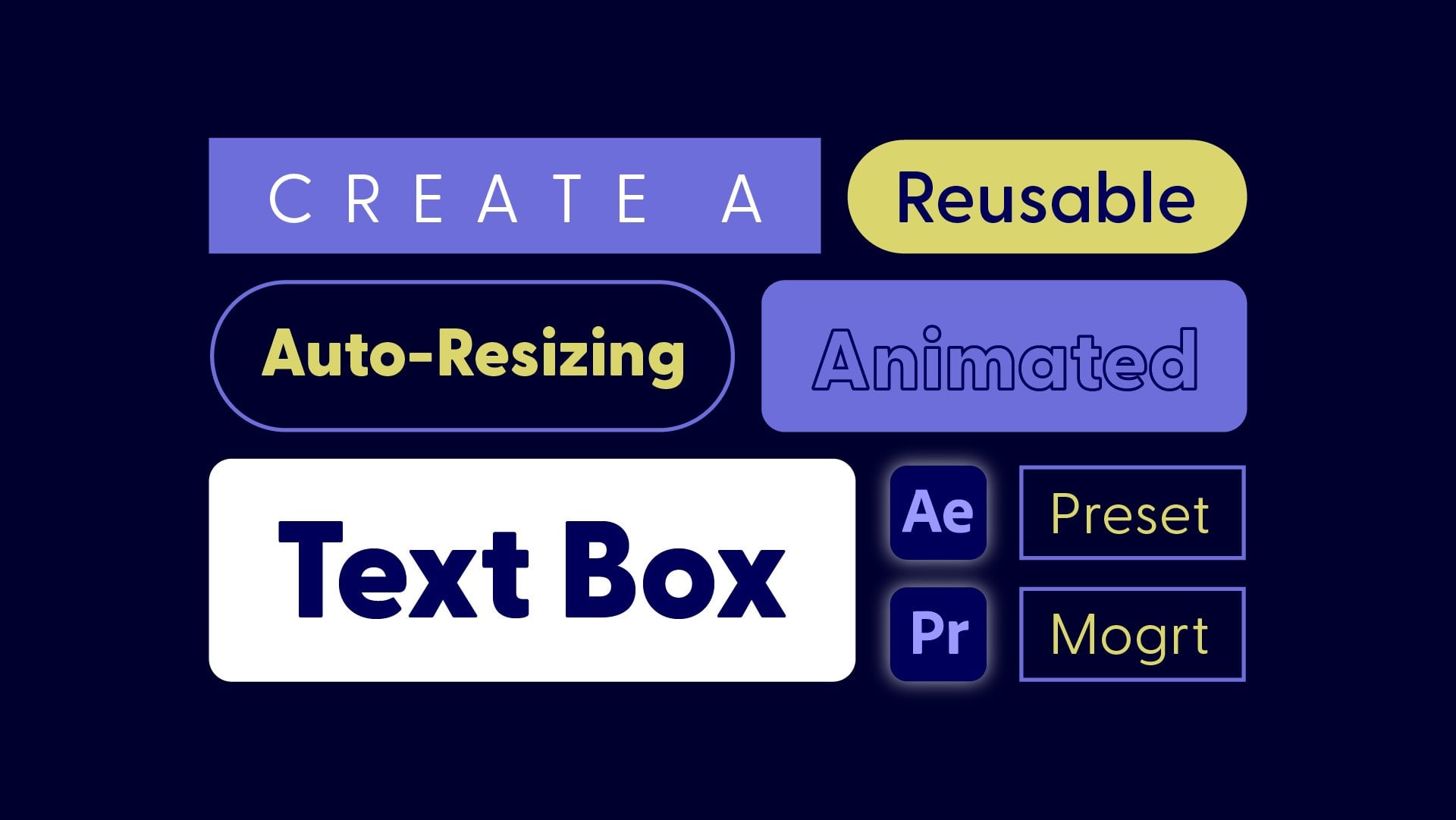
create a title card that automatically
centers the text, whether there's one line or two, and the lower third that
dynamically adjusts the size of its text boxes
based on the content. Plus, I've heard
three examples where you'll make a template
with selectable icons, a movable pointer, and more. Adding custom motion graphics
isn't just about asthetics. It's a way to add
additional information and make your content stand out. Well, it's easy to
buy pre made Mbards. Creating your own
allows you to add a personal touch or align
them with your branding. Plus, you can share or sell your motion graphic templates. This is designed for
video editors who want to add motion graphics to
their video projects, even if you've never opened
after effects before. Bob will explore
advanced topics like the essential graphics
panel and Expressions. I'll guide you
through every step so you can recreate
the examples. Expect to be
challenged, but guided. So if you're ready to create your own custom motion
graphic templates and streamline your workflow, then let's get started.
2. What to Expect + Class Project: In this class, I'll show you
how to animate and set up a template for five different motion graphics
using After Effects. I'm going to assume you know the basics of premiere,
but at the end of class, I'll show you how to use
the motion graphics we create in a video
project in Premiere. For the class project, post
one or more motion graphics. It can be exactly
like my examples, or you can use what you learn in class to create
something unique. For the title card
and Lower third, I'll show you how to
create every part of the motion graphic from scratch
inside of After Effects. For the Bloom timeie
indicator plant fax and pollinator pointer, I've provided you with a single after effects project file with comps containing all
the graphics you'll need. I'll show you how to animate these and then make
them into a template. Also welcome to create
your own graphics. If you want to create your
graphics in Illustrator and import them into
after effects to animate, I have a tutorial
explaining how to do that. But this is totally optional. For the videos I use in
the class project example, I've used stock
videos from Pexels. I've included links to
the videos that I used, but feel free to
take your own videos or use other stock videos
that you have access to. You'll find everything
you need in the resources section of class. If you have any
questions along the way, feel free to post them
in the discussions tab. One quick disclaimer. I've tried to be as
accurate as possible with my theme of
Colorado native flowers, but I know there are
some small inaccuracies. So if there's any botanist out there watching,
please forgive me.
3. Tour of After Effects: In this video, I'll give
you a tour of After Effects in case you've never used it
before or need a refresher. I have opened the After
Effects project file that I've provided you that
contains the graphics, I'll show you how to make
into templates in this class. You can download
this project file from the resources
section of class. Like other Adobe programs, you can customize
your workspace. If you go to Window workspace, you can see some of the
default workspaces. I'm on the workspace
that's called default. If your workspace
doesn't look like mine, you can set it to
default and it. Also under the window menu, you can see other panels. We're going to be
using essential graphics a lot in this class, but I'm not going
to open this yet because it takes a lot of space. I am going to go up to
character to open up that panel and it's docking
it over here, which is fine. The properties panel,
which is here is really useful and I'm going
to be using it a lot, so I'm going to move it to
a more convenient location. I'm just going to select where
the name of properties is, and then I'm just going
to drag it over here. Up into these tabs. I just find it easier to work
with when it's over here. Also over here is
the project panel, and this is where anything that you import into After Effects is going to be stored and where
all of your compositions, which is a sequence in premiere. That's where these
are going to live to. In the project file
that I've provided you, we have three compositions
for the different graphics, and I've opened all three
of these in the timeline. To open a composition, you just double click it from
the project panel. To create a new composition, you can click this little new composition button down here. In composition
settings, you can name your comp and then
change the dimensions, frame rate, duration,
and background color. Here's the new
empty composition, and let's practice adding
some things into it. If you go up to the top toolbar, there's a shape tool, which
if you click and hold, there's other shape
tools in here. I'm just going to grab the
rectangle tool and then just click and drag in your composition viewer
to drag out a rectangle. You can create a lot
of graphics right inside of after effects
with the shape tools. Once you create a shape,
make sure that you switch back to the selection
tool by going up here, or the keyboard shortcut is V. If you want to change
the color of your shape, you can do that up here
with the fill and stroke, or you can do that in
the properties panel, and you can even change
it in the timeline. If you click on the color box, it'll bring up the color picker where you can change the color. If you want to add a
stroke, an easy way to do that is in the
properties panel, and I already have a stroke, but I just need to
increase the stroke width. One thing to keep
in mind is that if your shape is selected and
you add another shape, it will add it to
the same layer. I'm just going to delete
this rectangle two. If you have nothing selected
when you create a new shape, it will create the
shape in its own layer. If you want to close
up the layers on the timeline or see all of
the keyframes on the layers, you can hit the U
key on the keyboard. There's also a pen tool, which is good for drawing lines. You can also use the pen
tool to draw unique shapes. If you click and
drag, it'll bring out handles to make curves. Then with the selection tool, you can adjust these points
on the path or the curves. I'm going to delete all of these shapes except for the first one. It's a good idea to
always label your layers. To do that, you want to select the layer and hit
return or enter, and then you can type the name. And then hit return or
enter to save that name. The last tool that you need to know about is the text tool. If you grab this and then click anywhere on the
composition viewer, you can start writing text. To get out of the text tool, you want to go back to
the selection tool. You can adjust the font and any of the character settings in the properties panel or
with the characters panel. Now let's move down
to the timeline. Wherever layers bar
is on the timeline, that's where it's
going to be visible. If you go to the beginning
or the end of a layer, you can get these double
arrows to drag the layer back. Now the text layer
won't be visible until it gets to here
on the timeline. To move an entire layer, just select it and you can
slide it along the timeline. I'm just going to
delete this text layer. On this box, notice this crosshair. This
is the anchor point. This is where the shape is
going to transform from. If you were to rotate it, it will rotate
around this point. If you want to center the
anchor point in a layer, make sure the layer is selected, then holding Commander control, double click the
pan behind tool. Also with the pan behind tool, you can move the anchor point anywhere you want without
moving the layer. If you hold down command,
it will snap it into place. I'm going to command Z to undo that and put that
back in the center. Then go back to my selection
tool with V on the keyboard. Let's toggle open the layer in the timeline and then
open up transform. Any property that has a
little stopwatch icon next to it is something
that you can animate. Let's animate the
position of this box. To start setting keyframes, first, you need to click
the Stopwatch icon. Then I'm going to
move my playhead, and there's a few ways to
set the next keyframe. You could drag the layer
in the composition viewer. And you can see the new
keyframe on the timeline. What key frames do is
they tell after effects where you want something to be at a specific point in time. Then in between keyframes, aftereffect figures out how to get from one keyframe
to the next. It's interpolating from
one value to the next. I'm going to move my
playhead again and show you another way to
create a new keyframe. That's by clicking and dragging
over these values here. Then I'll move my playhead again and show you one more
way is that you can type in values by clicking and then just
entering in a value. Now we have a really
simple animation and you can play it back
by hitting space bar. You can also layer animations
on top of each other so I could scale this at the
same time as it's moving. You'll get a lot more
practice setting and animating key frames
throughout the class, but this is just the basics. If you want to adjust
a key frames value, you can just go over it with your playhead and then
adjust that value. If you want to
delete a keyframe, just make sure that it's
selected and then hit delete. If you want to delete all
the keyframes on a layer, you can hit the stopwatch. I'm going to switch over to the pollinator
pointer composition, and then I'm going to switch
over to the project panel. You can import different types of files into after effects, including image files,
artwork from Illustrator, video files, and audio. I'll
show you how to do that. You can go up to file, import file, or use
the keyboard shortcut, which is Commander
Control I. I'm just going to grab one of my
flower videos and hit open. You can see that that's
imported in the project panel, and then let's bring
this into a composition. I'm just going to drag
it into the timeline. You can see that
the layer order in the timeline matters because this is on top of
everything else. I'm just going to drag this
video to the bottom of the layer stack so I can see
the graphic on top of it. We're not actually
going to import any of our videos into after
effects for this project. We're going to keep all of
the video stuff in premiere. I'm just showing you that
you can import files. This could also be useful
if you're designing your own graphics and
you want to see what they look like with
the video underneath. If you design your own graphics, then it's important to consider the video clips that you'll be using and what those graphics will look like on
top of the video. I'm using a lot of
white and thin lines, but I know that all
my video clips have nice blurry backgrounds with open areas where I can
put these graphics. Know there was a
lot of information. But if you ever
need to go back and quickly remember how to
do something in after effects or learn
a little bit more about something like how
to work with shape layers, I created a video series
exactly for that purpose. It's called AE fundamentals, and it's completely free. Definitely check that out
if you feel a little bit lost or you can always
refer back to this video. But also, don't worry because
throughout the class, I will explain every step
to complete the examples. You'll get much more
comfortable with after effects by practicing
throughout this class.
4. Create Title Card: First, we need to create
a new composition, so you can do that by clicking this new composition
button right here. I'm going to call
this title card, and I'm going to make it 1920 by 1080 and make sure that you
have square pixels selected. For the frame rate, I'm just going to use 30
frames per second because that's what
I normally use for animation and that's what
I'm comfortable with. But you want to
make sure that you match the frame
rate of your video. Then skipping down
to the duration, I'm just going to set
this to 6 seconds. I'm going to leave the
background as black because it'll be easier to see the
things that I'm working with. But it doesn't really
matter what color this is because it's not
going to show up in our final video project. But if you want to
change the color, you can just click
into this color box here and you have
the color picker. Once you have all
of these settings looking good, then just hit. The first thing I'm going to do is create a background color. To do that, I'm going
to use the shape tool, which is right up here. Now, if you click
and hold, there's actually multiple different
shape tools in here, so make sure that you
select the rectangle tool. Then to make a full screen shape that's the same size
as the composition, you can just double
click the shape tool. From here, I still have the
shape tool for my mouse. I'm going to go up here and
get the selection tool. The keyboard shortcut is V. The first thing I want to
change is the fill color. I could do that here or in the properties spanel.
It doesn't matter. I've just copied a Hex
code from my design where I was brainstorming what I wanted to look like
in illustrator. But you can use the color
picker or just paste in a Hex code or adjust
the numbers here, however you want to do it. Then once you have your
color, you can just hit. And make sure that you
don't have a stroke, either click on the word
stroke and say none. You could do the same thing
here in the properties panel or just make sure
that the stroke width is zero and that's
essentially the same thing. Now we have the
background collor, but one thing that's
really important to do is to label your layer so
that you know what's what. To rename a layer,
make sure it's selected and then
hit return or enter, and then you can
type your new name. I'm just going to call
this BG for background and then hit return or enter
to save that name. Now let's animate
this background color moving into and
off of the screen. I'm going to go
ahead to 1 second, and I'm going to toggle down the transform properties to
find the position property. I'll just set a
position keyframe here by clicking the stopwatch. That says that at 1 second, this background
color is going to be right here in the
center of my screen. Then I'm going to go
backwards to the start of the timeline and just
take this value, click and hold over it
to drag this layer up. You'll probably have to repeat that to get it all the
way off the screen. You could just move it in
the composition viewer, but I find this way
to be easy sometimes. From here, the shape is going
to move down into place. But this animation
is really boring. These diamond shaped keyframes
are linear keyframes. That means that it just moves at a constant speed the whole time. Let's make this animation a
little bit more interesting. What we need to do is click and drag over the keyframes
to select them both. Then you want to right click, go to keyframe
assistant and Easy Es. You can also use the
shortcut, which is F nine. Now what it's going to
do is start off slow, then move a little faster,
and then end slow. This is a little bit
more interesting, but we can push
this even further. If you select the
key firms again and then go into the graph
editor, which is right here. You can actually adjust this
graph to adjust the motion. What we're looking at
now is the speed graph. This is mapping the
speed over time. Time is on the x axis, speed is on the y axis. Then if you click on either of these points at the
edges of the graph, you will bring up
the yellow handles, and you can click and drag
these to adjust the curve. Now I'm also holding
down shift so that I don't accidentally move
the curve up or down. I want it to stay at zero, so it stops and
starts at zero speed, like it slows from zero all the way up and then all the
way back down to zero. That way, we don't have
a weird abrupt stop. I'm just pulling
these handles to make a more interesting
looking curve, that's going to
make this animation more snappy.
Something like that. Now I'm going to leave
the graph editor by clicking the
graph editor button again and let's animate
this shape off. Let's go over to 5 seconds. I'm going to click
this keyframe button over here by the position, and that'll set a
keyframe for this value, but at 5 seconds, where my playhead is at. In between these two keyframes, nothing is going
to happen because these keyframes have
the exact same value. Then I'm going to
move my playhead to the very end of the
timeline at 6 seconds, and I'm going to
move this layer off. I'll just show you a different way than I did it
at the beginning. I'm just going to
take the layer, hold down shift to make sure I'm only going in the y direction, and then just drag it all
the way off of the screen. Let's select these
keyframes and go into the graphitor and
adjust their motion. For the animation
out, let's change it up and make it go in
the opposite way. Instead of going
fast and then slow, I'm going to make it go
more slow and then fast. Once you're happy with the
motion of your animation, you can click out of
the graph editor. And now let's duplicate this background layer to
make some accent colors. To do that, just make sure
that the layer is selected and hit Commander Control D
to create a duplicate. Again, you can rename this. Then I'm going to go
into the fill color, and I'm just going to
use a darker fill color. Then let's bring
the accent below the original ay so that the original layer is
the one that shows up. Then let's drag
the original layer one frame to the right. I'm just selecting
the entire layer and moving it over one frame. Now you can see that
as this animates in, we have the accent color coming first and then the original
background on top of that. I'm going to do
this one more time. I'll go into the fill color
and change this color. Now let's select the background
and the first accent and bring those both over
one frame to the right. Here's what I have so far.
For the animation out, these keyframes are going
to be in the wrong order, so we won't actually
see the accent colors. To quickly bring up all
keyframes on all layers, I'm just going to make
sure no layers are selected and then hit
you that actually closes up that one layer
that was showing keyframes and then it'll hit you again to bring up all the keyframes. I need to reverse the
order of these keyframes, so this set of key frames will be the first one to happen, and then this one,
which is already in the right place,
and then these ones. Then since these keyframes are getting pushed
off of the timeline, I'm just going to click and
drag to select over them and then just bring them so that they don't fall
off the timeline. That way, all the shapes
will move fully off screen. Now let's create the title text. Go up to the text
tool and then just click anywhere in
the composition viewer and start typing. Then to get out
of the text tool, you just want to go back
up to the selection tool. If you need to change any of
the styling of your text, you can do that in
the properties panel or in the characters panel. I'm using an Adobe font. If you want to use
the same font as me, you can go to adobe
fonts to get that, and you can see all
of my settings here. One thing to note is that
I've added a stroke, so you probably don't have
a stroke to start with. Just check this button, and
then I've made it two points. When you're making any reusable
motion graphics template, you want to consider
other versions. In another version, I might have shorter text here
or longer text, but I'll always want the
text to be centered. To make this work
a little easier, you can go over to the
paragraph section in the properties panel and
just center align it. Then let's use the align tools. If you don't see any of
the panels that I'm using, they can all be found
underneath window. Then let's just center this
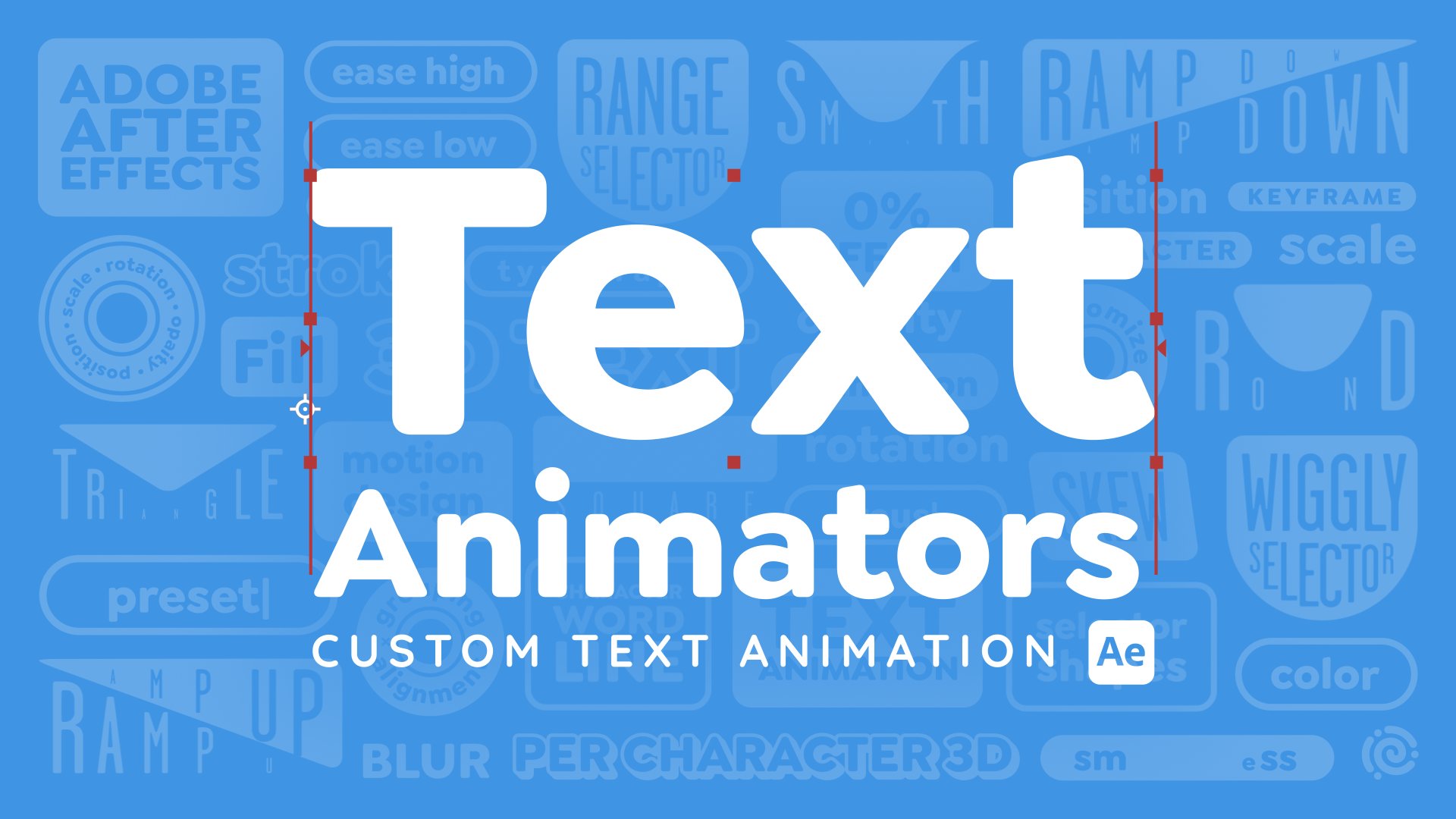
horizontally and vertically. To animate this text, I'm
going to use text animators. But instead of going into a long explanation of how to
set up this text animator, I'm just going to give
it to you as a precept, so you can install the preset and then just apply
it to your text. I have a whole class
on text animators and this is one of the examples. If you want to learn how to
animate with text animators, then check out that class. To download the text animator
preset that we'll be using, go to the resources
section of class. Once you have that
FFX file downloaded, you want to find
the presets folder, which is usually located under
documents and then Adobe. And then the version of after
effects that you're on. Then user presets. You can see I already have a
bunch of stuff in here and I've also created subfolders
to organize things. You can do the same thing
if you want or just bring that FFX file
into this folder. I'm going to put mine in
my text presets folder. Now we can go back
over into after effects and go to the
effects and presets panel. To make sure that the
new preset shows up, I'm going to go to this menu
and choose refresh list. And then toggle open
animation presets, user presets, and then it should be in here or in whatever
folder you saved it in. I'm going to move my
playhead to the beginning of this layer because when
I apply the preset, it's going to apply the keyframes starting at
wherever the playhead is. To apply the preset, I'm just going to drag it onto the layer. If I hit you on the keyboard, you can see that that sets some keyframes to
animate this text. The last element that I'm going to add is the
background text. To do that, I'm going to go to the text tool, type out my text. And then I'm going to go over to the settings and make
this really big. Let's make it all caps. Then I'm also going
to get rid of the fill and change the stroke. I want to use the background
accent color for the stroke. I'll just move my
playhead so I can use the color picker to
grab this color. Then once you've
clicked the color, sometimes you need to hit return to get rid of that eye dropper. Then I'm going to move
the Colorado text behind the title text. Then let's just move
this into place. Then I'm going to
duplicate this text by hitting commander Control D, and then I'll just drag the
duplicate to the bottom. To animate the background text, I'll have the top
layer slide in from the right and the bottom
layer, slide in from the left. I'm going to go to 1
second on the timeline. Select both of these
layers and hit P on the keyboard to bring up
both position properties. Then I'll just set a keyframe
by clicking the stopwatch. Then I'm going to
go to the beginning of the timeline and then just drag the bottom layer all
the way off to the left. Then I'll drag the top layer all the way off to the right. Then I'm going to click and drag over these keyframes to select them and then do F nine
to ease these keyframes. Then from here, I can go into the graph editor and
adjust this motion curve. If you have both sets of
position keyframes selected, you can adjust both of
the graphs at once. I'm just going to click
and drag over one of the ends to grab the handles, and then I'll just adjust this graph to make
it look similar to the graph of the
background layers coming in. That
looks pretty good. To get out of the graph editor, just click this button again. After the background
text animates in, I wanted to keep drifting
in the same direction it was going and then just
animate out more quickly. To do that, I'm going to
move over to 5 seconds, and then I'm going to go into the x value for the position property and just arrow over. Then for the bottom,
I'll do plus 300. Then for the top, I'll do -300. That way, I know that they're both moving the same amount. Then at 6 seconds, I'm going to animate
these all the way out in the same direction
that they've been going. Here's what this looks
like. This movement looks a little bit
awkward because when it reaches these keyframes, it reaches a speed of zero, so it stops moving, and then it starts again, which is weird. What I want to do is make this a continuous fluid movement. To do that, I'm going
to where it says position on both layers to
select all the keyframes, and then I'll go into
the graph editor. We need to move this point
on the graph that represents the keyframe up so that it doesn't reach all
the way to zero. But you can see that
when I do that, it splits the incoming and outgoing values of the keyframe. Instead of doing that, I'm going to click and drag to select both of those keyframes
because remember we have two different
properties here, and then I'm going to right click and go to
keyframe velocity. I'm going to continuous, which locks the outgoing
to the incoming. From here, you could
select okay and then just this up on
the graph editor. But this is small, and so what I'm
going to do to make this even easier is
to just enter in the speed and it's going to automatically change it for the incoming and the outgoing. Let's try 300 pixels per second. Then let's do the same thing here. Now let's play this back. You might have noticed
that right about here, the text slow to almost a stop. If you zoom in on the graph
by hitting the plus key, you can see that the line is
dipping all the way to zero. I'm going to zoom
back out again and then just select this key frame, and let's drag the handle
back towards the left. This will actually raise up
the center of the curve here. Let's do the same thing
for this key frame. I'm just shortening
those handles. Now if I zoom in, you can see that that curve is not reaching
the zero line anymore. Now if we play this back, it
should look a lot smoother. The last thing to do
to finish creating this title card is to adjust
when the layers come in. The only layer that
I think needs to be adjusted is really
this title text. It comes in a little
bit too soon. I'm just going to drag
the entire layer back to maybe about 20 frames. I
think that looks better. Then let's check
where the key frames are and let's check
the animation out. I think that looks good too. That's it for the title card. In the next video, I'll show you how to make this
into a template.
5. Template Title Card: Let's turn this title card into a reusable motion
graphics template or Mogart file that can
be used in premiere. This way, you or the
premiere editor can make versions of this template
with different colors, text or whatever you decide you want to make customizable. First, you'll need to open up the Essential Graphics panel. So the quickest way
to do this is to just right click
in an empty area in the timeline or
the composition viewer and choose open
and Essential Graphics. That way, it'll open
this exact comp in the Essential Graphics panel. So the first thing is
that you need to name it. This is important if you're
going to export it as a motion graphics template
to use in premiere. If you're just going to
use it in after effects, this name isn't as important. So I'll just name
this title card. This thumbnail here
is what you'll see in the preview in premiere when you're looking through
your templates. So to set that, just move your playhead to wherever
looks like a good frame. So here is fine, and
then just hit Set Poster The next step is to drag in any properties that you
want to be customizable. If you want to see all of the properties that
are supported, you can choose solo
supported properties, but this is going to give you
a lot of different things. So let's just close
this back up, and I'll show you which ones I'm going to make customizable. First, I want to
be able to change what the title text says. I'm not planning on making the Colorado text customizable
because that would add a little bit more complexity since we've animated
the position of it and longer text would make that position a
little bit different. So I'm just considering
that part of the template. To make this white title
text customizable, I'm going to toggle it
open in the timeline. Underneath text. I'm going to find the source text and
then just drag this in. Let's give this a
different name. We'll just call this title text. Then there's this edit
properties option here. You can allow people that
are using your template or maybe that's just you to be able to choose
a different font, a different font size, and you can even
allow people to do different styles like
all caps or Fo Bold. It's up to you if you
want to allow that, but keep in mind that if you enable custom font
or custom size, then people are
going to be able to adjust the size of the text, which you're going to need to accommodate with the template. You'll need to make sure that
if the text size changes, it doesn't look terrible.
I'll show you how to do that. Keep in mind that any of the
properties that you have in the Essential Graphics panel are going to be the defaults. Now that we have
the text in there, if you were to make
this text longer, so say we added to this text, now it's getting cut
off on the edges. There's different ways that you can accommodate for
things like this, but I'm going to show you
the simplest way first. And that's going to be to go
over to the Properties panel and find the paragraph section and then hit the Me button. This text right now
is called point text, which just means
that all the text is going to be on one line. You can also have box text, which is going to fit
the text into a box, and so it'll create new lines when it gets cut
off on the sides. So I'm going to
click this button to convert the text to box text. And then I'm just
going to double click on the text to
bring up that box. And let's resize this box. So that the text isn't
going to get cut off. Now I'm going to need to realign this with the align tools, and I'm going to
actually make this box just a little bit more narrow. You also might want to
adjust the letting, which is the space between
the lines of text. I think this looks a
little bit too far apart. So I think that looks
better for a title, and let's realign
this one more time. Now I want to make sure that the anchor point
is in the center. So a quick way to do that
is to have the layer selected and then double
click the Pan Behind tool, which is up here while
holding Command or Control. That should center
your anchor point. Now if I shorten this text, it stays horizontally aligned because it's center justified. But vertically, it's not aligned when I only have
one line of text, but it was when I had two. To fix this, I'm going to use an expression on
the anchor point. So with this layer selected, I'm just going to hit A to bring up the anchor
point property. I'm not going to go
super in depth right here about how this expression works. I'll cover that later. But for now, you
can copy and paste this expression from the
resources section of class. Then to enter the expression, you want to option or Alt
click on the stopwatch, and that'll bring up
this expressions field. So I have it copied and I'm
going to paste it in here. Then let me just expand
this so you can see it. So what this
expression is doing is using a function called
source rect at time. And what this function
does is figures out the size of the layer. And with that information,
we can grab the width, find out where the
left coordinates are, and find out the height and where the top coordinates are. And using that information, we can figure out where
the anchor point needs to be so that no matter the
size of the rectangle, when the size changes, the anchor point will always stay in the center of the shape. And that way, when we have
multiple lines of text, it will always stay
vertically aligned. So now if we add more text, it stays vertically aligned. Let's make the background and
accent colors customizable. I'll select these
layers and go into this search bar
here and search for color just to bring up
the color property. And we want the fill color, so I'll bring the
background fill color up into the essential
graphics panel. Let's just name this and then
we'll do the same thing for the accent and the
second accent. And I'll hit you on my keyboard two times to close
up all the layers. Now let's make the text
colors customizable. There's no color property
on the text layer, even though it
obviously has a color. So what we need to do
is add a text color. So first, I'll open up the title text and then come over to this animate button
and click that and find fill color and
just go to RGB. So this will add a fill color, and we can change
this back to white. That's also added a
new text animator, so I can just name this color just to be really organized. And then to add a color
property for the stroke, I'll just click
this ad button here and choose stroke color and RGB, and let's change this to white. And now I can drag these
two properties into the Essential Graphics
panel and rename them. Now let's add color controllers for the Colorado
background text. So for this, I'm going to
again go into the layer, click the anime but, go
to Stroke Color RGB. I want this color to always be the same as
this accent color. So I'm going to open up
the color on the accent. I'm going to take
the spiral icon, which is called the
pick whip and drag it onto the color of the
background accent. In this way, these properties
will always be linked. So whatever this color is, this color will be the same. I'll undo that.
Since I've already brought this color into the
Essential Graphics panel, if I change this accent color, then it will also update
the color of the text. To quickly apply this to
the other Colorado text, I'll just select
the stroke color, copy it, and then paste it onto the second
Colorado layer. Now just to double check that this is all going
to work correctly. I can change this
color, and it works. If you want to, you can
make your template a little bit more organized
by adding formatting. So in the bottom corner of
the Essential Graphics panel, underneath Ad
formatting, there's an option for adding
comments or groups. I'm going to do a group, and let's name this text. And then I'm just going to drag this all the way up to the top. And let's drag this text
layer into that group. And somehow I lost the
name that I had here. And then let's also drag the text colors up into this group. In premiere, the user will
be able to collapse this, so it kind of keeps everything nice and organized and together. Let's also add a group
for the background. And let's just add all of
these colors to that group. Once you have all
the properties that you want to make customizable in the Essential Graphics panel and you've done any formatting
that you'd like to do, then you're ready to export
the motion graphics template. To do that, you just want to click this button right here. It's first going to want
you to save the project. And then it's going to
ask you, where you want to save this motion
graphics template? I don't like to save it in
the default location because that folder is a really hard folder to
find on your computer. So if you wanted to share the template with somebody else, you have to go digging for it. So instead, let's save
it in a better place. So I'm just going
to hit Browse here, and you could save this dot Mogort file anywhere
on your computer. I'm just going to save
it in this Adobe folder. This is where After
Effects saves its preset. So this makes sense to me. But I'll find Premiere and
then the current version, and then you can make
subfolders in here. So I've already done that, but I'll make a new
one for this class. And then I'll just save this Mogart file into that folder. If you want to, you
can add keywords. In premiere, you can do a
search through your templates, and if you put in keywords here, it will come up when you search those keywords in premiere.
And then just hit Okay. I'll show you how to use this title card in premiere
so you can get a feel for how the
entire workflow goes from Adobe After
Effects to premiere. But I won't cover the
premiere part for the other examples until the end of class
because otherwise, this would get too repetitive. I'll show you how to
put together all of the examples of motion
graphic templates we create in a video project in the putting it ATgether
video at the end of class. In premiere, I'm going
to create a new project. And then to get my Mgritz, I need the Graphics
Templates panel. That's going to be under Window and then graphics templates. The Graphics templates
panel used to be called Essential Graphics in case you're using an older
version of Premiere. From this panel,
you want to go to local templates and
hit this plus button. This is going to allow
you to find the folder that you created and
have Premier always watch that folder so that
any new Mgartz that you put in that folder
will automatically be imported into Premiere, this will be the case
for any project. Every time you open Premiere, it'll have all of your Mgurtz
already ready for you. Once you find that
folder, hit choose. Now if I open up the
local templates, here's the motion
graphics class. If you want to sort by
those, you can just check this and here's
the title card. I'll create a new sequence to show you how you can
use the title card. I'll create new sequence. And then all you
have to do is drag the template into your sequence. So here's the title card, and now if I want to
edit the title card, I can go to the
Properties panel, which you can find underneath
window and then Properties. Let's dock this over here. And now I can change any of these settings
that I've set up. So let's change the text and maybe the font and
even the colors. And all the animation is
going to be the same. You can have as many
of these title cards in the sequence as you want. I could go back to
graphics templates, drag this in again, this will have all of the
default settings. If I go back to properties, I can adjust all of
these settings again.
6. Create Lower Third: To create a lower third, first
to lead a new composition. I'm just going to
make this 1920 by 1080 again, square pixels. 6 seconds is good, and the background
will be black. First, let's create the text. I'm going to go off
to the text tool, and first, let's show our
title action safeguides. You're going to do
this by hitting the quotes key on the keyboard. And I'll line up the text
with this outer guide. To get out of the text, remember to go back up to
the selection tool. I want this text to
be left justified, so I'm going to change that
in the properties panel. Then let's also make this
a little bit smaller. Now let's add the subtext. I'll grab the text to
again and then I'm just going to paste in the
scientific name of this flower. Let's change the style of this. I'm going to change
this to medium, and let's make it all caps. Let's make the
font size smaller. Let's give the letters a
bit of space in between them. Something like that. Now, let's create
the text boxes. To do this, I'm going to
use the rectangle tool. Just click the tool
and then click and drag in the composition viewer
to drag out a rectangle. Now I need to change
the layer order so that it's below the text. Let's rename the layer by
hitting Enter or return. Then I'm going to grab
my selection tool again. Now instead of having a fill, I want this to just
have a stroke. You can do this up here or
in the properties panel. Instead of solid color, I'm just going to do
none for the fill. Then for the stroke, I'm going to do a solid color, and I do want it to be white, and then let's increase
this to five points. And then you can adjust the
positioning if you need to. Now I'll close this layer up and let's create the second box. I'm just going to grab
the rectangle tool and drag out another shape
around this text. This time, I want
it to have a fill, but no stroke. Let's
make that white. Let's bring this layer below
the subtext and rename it. Then let's also change the
text color so that it's black. I don't want a
stroke on this text. So I'm going to take that off. Let's just double
check. I don't need a stroke on this text either,
so I'll take that off. Then I need to grab
my selection tool. Let's line this box up
better with a text, and I'm going to just nudge
it with my arrow keys, and then let's move the
text down a little bit. I don't really need the title
action safe area anymore, so I'm just going to hit the quotes key to
get rid of that. Now let's animate this in. I'm going to start
with the bottom box. Let's have this scale
in from the left side. The first thing that
I need to do is move my anchor point over
to the left side, so I scales from the left. To do that, you want to
grab the pan behind tool, which the keyboard
shortcut is y, and then grab this anchor point and bring it over
to the left side. If you hold down command, it will snap into place. Then I'm just going to hit V on the keyboard to go back
to my selection tool. Then I'll hit S on the keyboard to bring
up the scale property, and let's key frame this. I'm going to bring my
playhead over to 1 second and then set a keyframe for
the scale to be at 100%. Then I'll go back to zero, and I'm going to unlock the constrained
proportions and then just set the x scale to zero. Now it'll scale up
from the left side. There's a couple of
things we can do to make this animation
more interesting. I'm going to add an
overshoe to this. At 20 frames, I'm going to
make the scale value 105%. It's going to extend past its final point and
then come back. But these keyframes
are linear and boring, so let's select them and then do F nine to easy ease them. Let's go into the graph editor and adjust this motion curve. I'm going to select this point and bring the
handle to the left. Maybe bring this
one to the right. Just making this a little
bit faster in the middle. Then this part is
for the overshoot. Let's make it come
to a slow stop. Maybe something like that.
For the bottom text, I'm just going to have it
animate in from the bottom. I'm going to move over
to 1 second again, and I'm going to hit P on the keyboard to bring up
the position property, and then I'll set a key frame. Then let's go to zero on
the timeline and just drag this so that it's all
the way off the layer. Let's add an overshoot
to this animation too. I'm going to move my
playhead to 20 frames and then just copy and
paste this last keyframe, and then I'll use
my arrow keys to bump this text up
just a little bit. Now it'll do an overshoot
as it comes into the box. Let's select these keyframes, add Easy Ease, and then
go into the graph editor. I'm going to adjust this in a similar way to the
other graph for the box. Now, you'll notice that where the box graph went below zero, this one is going
above zero and that's just because of the coordinate
system of after effects. But remember, this
is the speed graph. You can just look at
how far the graph is from zero to be able to
tell how fast it's moving. Something like that is
looking pretty good, Let's move on to the top text. For the top text, I'm
also going to have it move up and do
that overshoot. Starting at 1 second, let's hit P on the keyboard, set a position key frame, and then go back to zero and bring this down
outside of the box. Then I'll go to 20 frames
and copy and paste this last keyframe and
then just the text up. Again, let's select
these keyframes, easy ease them and go into the graph editor
and adjust the graph. On the bottom text, you
can't tell when the text is outside of the box because it's the same color as
the background. But if you click
this button here, it shows you the
transparent areas, so you can see that the text is going to be visible
outside of the box. What we can do to fix
this for both the top and the bottom text
is to create mats. If you don't already
see the matt options on your timeline, you want to click where it says Toggle Switches, slash modes. You'll see this track
Mt option here. If you still don't see this, click on these toggles
until you see it, or you can also right click here and find the
columns like this. For this scientific name, all I need to do is take
the pick whip next to this track mat and drag it
onto the bottom textbox. That's going to automatically
hide the bottom textbox, but I still want that
box to be visible. I'm just going to turn
the eyeball back on. Now if I turn on the
transparency again, you can see that
when the text is not inside of that
box, it's not visible. I'm going to end
up doing the same thing for the top text, but how it is now, this box only has a stroke and no fill, so the mat won't work. First, I'm going to
animate this box and then I'll show you
how to make the mat work. To animate the top box, if we were to animate
the scale property that's underneath transform. For one, the anchor point
is in the wrong place, but you can also see
that it squishes the stroke on this
box in a weird way. I'll show you a way to
animate this to avoid that. These transform properties
affect the entire layer. But if you toggle
up open contents and then rectangle one, there's going to be another
set of transform properties, and these ones only
affect this rectangle. You can have multiple shapes
within the same shape layer, and these transform
properties are specific to individual shapes. But even if we
animate this scale, how it is now, it's still
going to squash the stroke. What we need to do is take
this stroke and make it be applied after the
transforms have taken place. I'm going to move
this stroke out and below these transform
rectangle one properties. The easiest way to do that
is actually just to bring it up to contents and then
it will place it below. Now if I change
this scale value, it doesn't affect the
stroke width at all. Now let's set keyframes for the transform rectangle
one scale value. But you'll notice
that that's going to scale from the center, even though the anchor point for the layer is in the center
of the composition. Even if we change where
this anchor point is, the scale is still going to be scaling from the
center of that shape. That's because
this is scaling on the transform rectangle
ones transform properties, and this anchor point
is in the center. You can see if I zoom in here, there's a really
small anchor point right in the middle
of this shape. We can adjust this
anchor point to make the scale scale from
where we want it to. With the pan behind tool, I'm going to take
this anchor point and drag it over to the left. Now this text box is going
to scale from the left. But actually, let's change
this up a little bit, so it doesn't animate in the exact same way as
the bottom box. I'm going to click
where it says, transform rectangle one and then go up and grab
the pan behind tool, and then I'm going to take
this anchor point and drag it up to the
top left corner. I'm going to delete
this first key frame and then go back to about ten frames and set
the y scale to be zero. Then at zero frames, I'm going to set the
x scale to be zero. Now it's going to animate
out as just a single line. And then the box will open
up from the top down. You could also add
an overset to this. I'll go back five frames and
set the y value to be 105. Then maybe I'll just move the last keyframe
over five frames. Something like this.
Then let's easy ease these keyframes and adjust
them in the graph editor. Maybe something like this. Then I'm going to hit
you on the keyboard, D slog the layers
and hit you again, and then hit you
one more time to bring up all of the layers
that have keyframes. From here, let's
stagger these layers so that they don't all
come in at the same time. I want the top box
to come in first, but the text to come
in a little bit later. I think it would make
sense to line up these keyframes and maybe
even line up this keyframe. Then just to make
my timeline neat, I'm going to hover over the start of this
layer and then just get those arrows and drag
that back to the key frame. Then let's move the
bottom layers back. Maybe they'll start about here. The last thing to
do is to create the mat for this top text. To do that, select
the top text box, go up to edit, and then copy with relative
property links. Then hit paste by doing
Commander Control V, and that's going to create a duplicate version of this box with all of the properties
linked to the original box. Let's rename this. And
let's give it a fill color. Here I'm going to
choose solid color, and it doesn't matter
what color it is. Then I'm going to take
the text and drag the pick whip next to the
track mat to that mat. That should automatically hide that text box, the mat version. Now if we play this back, you can see that that
text is going to be only visible inside of that mat. Again, the reason why
we needed to create the duplicate mat for the top box is because the original top box
only has a stroke. It doesn't have a fill.
This one has a fill. That way, the text is only visible inside of
that filled in shape. The last thing to do is
to animate this out. I'm going to move
over to 5 seconds, and let's animate the top
and the bottom boxes. I'll just hit you on the
keyboard to see those keyframes, and let's animate it out with
the same scale properties. I'll just select both
of these buttons to create a new keyframe
with these exact values. Then I'm going to
move to ten frames, and I'm just going to copy and paste this keyframe
for the bottom box. Then for the top box, I'll need to set
this keyframe to 105 to make it stick
out more to the right. Then at 6 seconds, I'm just going to
set both of these to zero in the x value. It'll animate out like this. It has a little bit
of anticipation with these first key
frames that I've set. But let's go into
the graph editor and adjust the motion curve. I'm going to hit the
plus key to zoom in and then slide over to see
this graph better. Since these graphs
are all weird, I'm just going to select
like this to grab all of those key frames and
then just reapply easy, that'll just make
them all nice and together so that I can
adjust them all at once. I'm adjusting both of these
different scale properties. Let's have it start out slow. And then animate off pretty
quickly here at the end. Something like this. So once you're happy with
your lower thirds, in the next video, we can
make this into a template.
7. Template Lower Third: Let's make this lower
third into a template. First, let's open the essential graphics panel and I
like to do this by right clicking in
an empty area in the timeline and choosing
open and essential graphics. I'm just going to name
this lower third. Then I already have
my playhead at a pretty good time in the timeline to show
what this looks like. I'm just going to
hit set poster time to generate that thumbnail. Obviously, I want to be able to change the text in the
lower third template. I'm going to open up each
different text layer and drag in the source text. I'll name this one text. Then for the scientific name, I'm just going to name
this one subtext. Now, if I go in and
pretend that I'm using this template by typing
in a different word. If the word is longer, it's going to get cut off. I want to make this box
automatically resize to fit the size of the word and then same thing
for the subtext. I'm just going to
undo that for now. Let me show you how to
use expressions to make the boxes automatically resize to fit the size of the text. Let's start with the top text. I'm going to go into the top box and toggle open to find
the size property. To start writing an expression, just option or I'll
click on the Stopwatch. The first thing
that I need to do is define a couple of variables. A variable is just a name for something that you're
going to use later. To write a variable is just VAR, and then you create
your own name. I'm just going to
name this text layer. I'm using camel
case just because this is standard
in writing code, but you don't have to do that. You just need to make sure
that you choose a unique name. If you choose
something and it turns yellow or a color
other than white, that means that you've
chosen a word that is already assigned
a task in coding, so you need to choose
something else. Then from here equals, and then let's define
what this text layer is. I'm going to take
the pick whip icon, which is a spiral right here, and I'm going to drag it
up to that top text layer, that will grab basically
the address of this layer. I don't have to type
it out. Then at the end of every line of code, you need to put a
semicle in just like you'd put a period at
the end of the sentence. Then let's go to
the next line just to keep things clean
and organized, and I'm going to create
another variable. I'm going to call
this text width. This one is going to be
equal to the text layer. I'm using that name that I
created in the first line. Dot. Now I'm going to be using a function called
source ret at time. If after effect guess
is what you want, then you can just hit Enter. Then inside of the parentheses, I just want the default, so I don't need to put
anything in there. Then after that, source
ret at time is going to grab different information
about the size of a layer. I want the width of it
so I can do dot width. Then again at a semicolon. Then I'm just going
to go down two lines. Again, this is just for clarity, and I'm going to define
the x and y values. One thing that's
really important with expressions is that
you always give the expression the number of values at the
end that it wants. The size property has two
different values, x and y. We need to give this
two different values. The way that you define
a list of values, which is called an
array is in brackets. I'm just going to
type in a bracket and then for the x value I
want the text width, This is going to make the box
the same size as the text, and then I need to
define the y value. There's a couple ways
that you could do this. You could just pick whip to the y value like this and it
will write out that address. You could also create a variable for this and then
put in the variable, or another short way to write this is just
to write value. That will grab the value
that's entered in here, but I need to specify
if I want x or y. To do that, I'm going to put a bracket and then
the number one. Number zero is x and
number one is y. This grabs the y value. Now if I click out of this, now you can see that the box has re size to the
size of the text, but it's not quite aligned. That's because the size property is always sizing from
the center of the box, no matter where the anchor
point is for the layer. You can see that the
anchor point for the layer is over
here on the left, and the anchor point for the shape is also over
here on the left. But no matter what, if I just disable this expression
for a second to show you, the box sizes from the center, regardless of where
the anchor point is. What we need to do to counteract that I'm just going
to turn back on the expression is to set up expression in the position
property that's here. There's other
position properties. Remember underneath transform or underneath this transform, but we're going to set
the position expression here right underneath
the size property. To do that option, I'll
click the stopwatch, and then let's define
a variable for x. Then with the pickup, just
grab the x size here. And then semicon, then I'm just going to do brackets to define x and y, so it's going to be x. And then remember that
this position at zero, zero is in the
center of the shape. If I just put in x, x is set to the x size, so it will push the shape over by the entire width
of the shape. Since I only want to push the shape over half the
width of the shape, so it changes size
from the left, I need to put in
x divided by two. Then for y, I can just do the
same thing as I did here, just grab the y
value, which is zero, that works. Value brackets one. That's again, move the box over. Now if I manually move the box, you can see that it's
perfectly fitting my text, and I I type in longer text, it's also still working. But this doesn't look
like my original design. What I need to do
is go back into the expression on the size
property and just add some pixels to the text width so that I have that padding
that I originally had. Let's just go in and
right next to text width. I'm just going to add
plus, and let's try 150. Then again, I need to move
this back into place. Then let's try making this word longer and
see if it works. Looks good. Also, if we made it shorter, that's working too. Let's just double check that
the animation is working. Perfect. Now what we
need to do is apply the same expressions
to the bottom box. To do this a little bit faster, you can copy and
paste the expression, so I'll copy this go
up to the bottom box, find the size property. Then I'll paste it.
But this first line defines the text layer that
it's getting the size for. Instead of this layer,
I need to make sure that it's the right
layer, so this one here. I'll just highlight
that and then pick whip to rewrite that, and now that's looking good. Then let's grab the
position expression. And then paste that in here. Then we'll need to put
this back in its place. That looks good, and let's
try making this longer. Looks pretty good,
and let's see if it works shorter. Looks good. When I set up the
rectangles to be resizing, the anchor points
for these layers has gotten bumped a little
too far to the left. I'm just going to use
the pan behind tool, which is y on the keyboard
to move this back into place because the placement of
the anchor point affects the scale animation that
we have on this box. Then for the top box, remember the anchor point for the layer doesn't really
make a difference, but the one for
rectangle one does. Let's just grab that one and
move it back into place. Now, that way, the animation should all still be the same. Let's put in like
a shorter word and a longer word and just try it and make sure the animation
still looks good. Cool. I think that
still looks good. I'm just going to undo just because remember that
whatever text you have in here is going to be the default values
in your template. The last thing that I want to do is just add the colors to the essential graphics
panel so that they can be customized
in the template. To quickly bring up
the color properties, I'm just going to type in color in the s bar and the timeline. The bottom box has a fill
color, so I'll bring that in. The color for the
mat doesn't actually matter because the mat
is not showing up. Then the top box,
the stroke color is, what matters, and
so I'll name that. Notice that a color property didn't come up for
the text layer, so we need to go
and add that in. On the bottom text,
I'll toggle this open. Go to the animate button, choose fill color and then RGB, and then I'll drag this property up and name this subtext color. Let's recolor this to black and then do the same
thing on the top text. Animate fill color
RGB. Bring this in. Name this text color, and let's change it to white. I also want to organize
this a little bit. I'm going to go to add formatting and add a
group and let's just stay in this top and
bring it to the top. Then let's put the
top text in there. The top box color and
the top text color. Then let's add formatting
a group for the bottom. And then add in the subtext, the bottom box color
and the subtext color. For this particular lower third, I'm not going to go in and do edit properties and
then enable any of these options because
that's going to make the resizing function
a little bit more tricky. It's definitely possible,
but I'm just going to save that for a more
advanced tutorial. There's one more optional
thing that you can set up. This lower third animates in And then it waits on screen for a while and then
it animates out. But what if we want it
to wait on screen for a longer or shorter amount of
time in our actual project? We don't know that amount
of time right now, but let's say that we need to make that amount
of time adjustable. What we can do is go to the start of the timeline
and first I'm just going to hit you on the keyboard to bring up all the
key frame so I can see exactly how long that
starting animation takes. It looks like it finishes
at 1 second 25 frames. I'm going to go to the start
of the timeline and do Control eight to make a marker? You can also drag out
markers from here. Then once you have that marker at the
start of the timeline, just double click
on it, and then you want to enter the duration
of that starting animation. That's going to be 1
second and 25 frames. Then underneath
responsive design, time, you want to make sure you check protected region,
and then hit okay. That should give you this blue shaded area on the timeline. That's going to be what's
called a protected region, which means that we can resize the length of this composition, but this region won't
be affected because resizing the length of the composition actually time
stretches it or shrinks it, and this region won't
be affected by that. The timing will stay the same. So Let's also do the same thing at the end
of the timeline. From 5 seconds to 6 seconds, I'll do control eight to create that marker, and then for this, the duration will be 1 second, and then it's a protected
region and hit okay. Now I have these two blue protected regions
on the composition. I'm just going to take this
composition and drag it onto the new composition button just to show you how this works. You can see here those blue
regions on the composition. If I go to the end
of this layer, make sure you see
the double arrows, then you can drag to
shorten this composition. If I play this
back, the animation at the beginning
still looks the same, and the animation at
the end looks the same, but it just holds on
screen for less time. You could do the same thing
if you want to extend the composition We could
do the same thing, make this longer, and then
it's going to stay on screen for a really long
time before animating out. I'm just going to
go back over into the original
composition and let's save this as a motion
graphics template. Hit this button. I'll need
to save the project first. Then make sure
you're saving this template in the same place that I showed you in the title
card template video. For me, that's going to be
right here and then hit. Then in Premiere, if you follow the steps in the title
card template video, you should see this new template automatically imported if you saved it in the same folder. You can drag this lower
third into the timeline. Then you can customize any of these properties
that we've set up. Although you can't see
those blue regions, the responsive design
time is still working. You can stretch or shrink this, and it will update the amount of time that the lower
third stays on screen. It animates in, stays on screen a little shorter
and then animates out.
8. Animate Bloom Time Indicator: For this example, as well as the plant fats and
pollinator pointer, I've provided you
with the graphics. We can start animating
them right away. First, let's make the
text curve in a circle. Starting with the
bloom time text, I'm going to make
sure the text is selected and then go up
and grab the ellipse tool, which is underneath
the rectangle tool. Just click and hold
to get this menu. Then make sure that the icon for your mouse looks like mine. This means that it's
going to draw a mask. I'm going to click
and drag holding down shift to create a circle. Then I'm going to switch back to my regular selection tool and put this in the right place. Then in the timeline,
toggle down next to text and then path options, and then next to path, choose the mask that you just drew. I want this to be on the
other side of the circle, so I'll just reverse the path, and then you can use
the first margin to align this where you want it. If your circle isn't
quite the right size, you can always double
click on it to get this bounding box and
then you can resize it, and you can also reposition it. Then just do the same exact
thing for the bottom text. This time, you don't
need to reverse the path because it looks
better on the inside, and then I'm just
going to resize this a little bit and adjust
the positioning. Now let's animate
this graphic in. First, I'm going to
take all the layers except for the
background shape and then grab one of
the pick whips and drag it onto the
background shape. What this does is parents all of these layers to the
background shape. Now, whatever adjustments I
make to the background shape, the rest of the layers
are going to go with it. I'm going to animate
the background shape in from this pointed corner. First, I need to make sure
that the anchor point is in that corner so that it
scales from that corner. You can see the anchor point
is in the center right now. I'm going to grab the pan behind tool and then just drag
that up to the corner. If you hold down command, it'll snap into place. Then just go back to
the selection tool with V on the keyboard. I'll animate the background
shape scaling in. I'm going to press
S on the keyboard to bring up the scale property, and then go to 1 second and
set the scale to be 100%, and then go back to zero
and set this to be 0%. Let's add a little bit of
an overshoot animation. At 20 frames, I'm going
to set this to be 105%. That way, it'll go 0-105 and then back down to 100 to
create an overshoot animation. Let's add easy to
these key frames by selecting them
and doing F nine. That looks pretty
good, but you could select these and go
into the graph editor and customize this
motion curve to make it look even
more interesting. This is the Swede graph. I'm just going to maybe make this a little
bit more exaggerated, so it goes a little bit faster. Then after reaching 105, let's make it go a little bit
faster and then ease into that final value a bit more.
Maybe something like this. To exit the graph editor, just click this button again. Let's also animate the
flower scaling in. I can actually just copy these keyframes by clicking
and dragging to select them. Command C to copy, and then I'm going to go
over to the flower icon, go to the start of the timeline, hit S on the keyboard, and then hit command V to
paste those keyframes. Let's also stagger
this animation, so maybe this layer should
come in at ten frames. We could also make this a
little bit more interesting by adding a little bit of
rotation to the flower. I'm going to hit shift R on
the keyboard to bring up the rotation property as well as keep the scale
keyframes visible, and then I'll set a rotation
key frame for zero. Then back at the start, let's animate this
to negative 30. Then I'll just easy
ease these keyframes. To animate this circle in, I'm going to use trim paths, which is a good way to
animate lines drawing in. Let's just close up
the other layers, open up the circle layer, and then I'm going to
click this Add button and choose trim paths. Okay Then let's open that up. I'm going to hide this
bloom time indicator line, that's the darker line
that's on top just so I can see fully what I'm
doing with this circle. First, let's go to 1 second on the timeline and set the
end value to be 100%. That'll be when the circle
is all the way drawn in. Then I'll go back to zero, and I'll set the
end value to 0%. Let's also stagger this layer
so that maybe it doesn't come in until about
here, 15 frames. Right now, the circle just
starts drawing on from the bottom and then comes
all the way around. But I think it will be
more interesting if the start point of the
line is also moving. To do that, we can
animate the offset value. I'm just going to
move my playhead just here so I can see the
start of the line. I'm just going to slide
this offset value, and I think it would look
better if it started more at 90 degrees and I'll set a key frame a of this
layer to be 90 degrees. Then as it reaches the end, let's have that start
point of the line have moved maybe that much around. Then tase these key frames
and see what it looks like. To animate the text, I'm
going to use text animators. Let's start on the
Bloom Time text. First, I'm just going
to move it over to start at 15 frames. This way, this shape
is mostly scaled in, so it'll be easier to
see what I'm doing. I'm going to toggle
open the layer and then go to the animate button
and choose position. This is going to create
a new text animator with a position property in it. I'm going to click this ad
button here and choose scale, and then click it one more
time and choose opacity. I'm going to animate
all three of these properties to
animate the text in. If you use text animators. You want to set the
properties here and then animate them on and off
with the range selector. Again, I have a whole
class on text animators. If you want a more in depth explanation of how to
use text animators, definitely check out that class. For this, I want the letters to come up from the
inside of the circle. By moving the position
down, it'll look like that. Maybe like 30, and then I
want the scale to be zero, and the opacity to be zero. Then I'm going to use
the range selector. I'll toggle this open, and I'm going to also
go into advanced and set this from square to ramp up. And Again, all of this is explained in more detail in
my text animators class. Now I'm going to animate
the offset value. First, I need to make sure that none of my text is visible. So I'm going to take this
offset value all the way to negative 100 and
then set a key frame. This is at the start
of that layer. Then let's go forward
1 second, so to 115, and then I'll bring this
offset value all the way up to 100%. You can see how that
animates the text on. Instead of easing
the key frames, to add easing to
a text animator, you want to adjust the
ese high and es low. I'm going to set both to 50%. Let's animate the spring summer fall text in a similar way. What I'm going to
do to save time is just select where it
says Animator one on the Bloom Time text and
hit command C to copy this. We can close up this layer, and then on the spring
summer fall layer, I'm going to hit
command V to paste it. But first, I need
to make sure that my keyframe is where
I want it pasted. Then if I togo open this layer, you can see that it's added that animator with the key frames. I'm going to drag
this layer over. Maybe let's have it
start at 1 second, just so that all of the
different things that come in aren't coming in
all at the same time. They're all staggered.
Now instead of having this come
from the outside in, I want it to come
from the inside out. What I'm going to do
to change that is just to set the
position to negative. That doesn't move all that much. Maybe let's do a little
bit more like negative 40. Also, instead of
having each letter animate in like it does
for the Bloom text, this is quite a lot of texts. Instead of having
each letter animate, I'm going to have them
animate word by word. To do that underneath advanced
under the range sector, I'm going to change this
from characters to words. Now it'll animate in
one word at a time. I'm going to hit
you on the keyboard twice to close up
all the keyframes. Here's what we have so far. Now let's animate
this graphic out. I'm going to go
over to 7 seconds, and let's see the keyframes
on the background shape, and let's actually
just reverse them. I'll copy them first,
copy and paste. Then with these three
keyframes still selected, I'm going to right
click on one of them, go to keyframe assistant,
T reverse keyframes. Now this will play
that animation that we had at the beginning,
just in reverse. Let's also fade out all of
the other layers just because I don't like when
they get really small and it's hard to read. What I'm going to do is just
select all of these layers, hit t on the keyboard to bring
up the opacity property, and then I can click
the stopwatch to set all the key frames
for each layer at once, and then let's move
over ten frames and then set all of these
values down to 0%. Now it'll just fade out
as it's scaling down.
9. Template Bloom Time Indicator: For the customizable
component of this template, I want this bloom time
indicator line to be able to be customized so that the user can mark if the flower
blooms in the spring, summer, fall, or combination. Let's set that part up.
First, I'm going to open up essential graphics by right
clicking in an empty area, and going to open and
essential graphics. Let's just name this. Let's also set the poster time. This time on the
timeline looks good, so I'll just hit this button. Then let's toggle open the
bloom time indicator line and then click the Add button
and choose trim paths. Now, just like you saw on the circle that's
behind this line, this is a way to animate the start and end
values of the line. If I adjust the
starter end values, it can show that
this flower blooms just in the spring or
whatever we need to show. If I just drag in the
start and the end values into the essential graphics panel and
then rename them. Then this is now
customizable for the user. But everything else is
going to animate in, and this line is just
going to be there. We need a way to
animate this line in, but use the values that the
user has set in the template. To do that, we can
use an expression. I'm going to start
on the end values, just option or I'll
click the Stopwatch, and then I'm going to
use the ease expression. This is a function that's very similar to the
linear function, if you're familiar
with that one. But basically what it
does is that it maps a set of values onto
another set of values. It'll make more sense
when we actually input some stuff into it
and then I'll explain more. The first thing that
it's asking for in this function is what's
driving this expression? In this case, it's
just going to be time and then put a
comma after that. Over time, I'm going
to map the end value from zero to whatever
the user sets, starting at a minimum amount of time to a maximum
amount of time. That's how we can
make this animate. The minimum amount of time is the next thing that
the expression wants. Let's set that to be
wherever the layer starts, and that's called the
endpoint of the layer. To do that, you just put
point and then a coma, and then we need the
maximum amount of time. If we want this
animation to last like 15 frames or half a second, then you can just put
in point plus 0.5, and then a comma, and then the minimum value
for the end value, that's just going to be zero, and then whatever
the user sets here. To grab the value
that the user set, we just need to put in value, and then click out
of the expression. I'm going to click
this layer and drag it back to let's say 125, and then let's see
how this looks. The n value is animating in, but the start value is not. That's why it does this
little flip flop right here. Let's just copy
this expression and then option click the
stopwatch and paste it in. This is going to work as is. Now let's see what we have. Now the start and n values are animating to the values
that we set here. If I change these values, You can see that the
animation still works. One thing about this
template that's a little bit finicky
is that if you move your playhead before
the animation plays, these numbers are going
to reset themselves to zero because that's what the expression is
telling it to do. Even though this does work, it's not the most user
friendly design, because if you pass this
off to somebody else, they might not know that you
need to move your playhead after the animation happens in order to adjust
these numbers. There's a better way we can set this up to make it
more user friendly. Let's do that. Let's use a controller layer,
which will be a null. To create a null, go up to
layer, new null object. If you've never used a
null before, basically, it's just an invisible
layer that you can use to parent other layers
to or to control things. First, let's just name this. Then we need to add an
expression control to this null. An Expression control is
a property that you can add to a layer that doesn't
do anything on its own, but you can connect
things to it often with expressions to control
other properties. Expression controls can
be especially useful for controlling multiple layers
or properties at once. We'll use more expression
controllers in upcoming videos. For this example, we need to add a slider control to
this null layer. To do that, right click it, go to effect,
expression controls, and then slider control. Then that should open up
the effect controls panel. If you double click here, it'll automatically open
that in the timeline, or you could also just toggle
down until you find it. I'm just going to
select where it says, slider Control it
return to rename this, start bloom, and then
hit return again. Then let's just duplicate
this and rename this one end. I'll to pen the end bloom
and then I'm just going to bring up the timeline a little bit so we
can see everything. From here, what we need to do
is go into the expression. Instead of having the expression choose the value
that's set here, we needed to choose the
value that's set here. I'm just going to go in, double click where it says
value and then take the pick whip and drag it up to the start bloom value. And then we can click
out of the expression. I'll do the same
thing for the end. Grab, grab that pick with and drag it up
to the end bloom. Now in the essential
graphics panel, we can delete the start
and end blooms that were these trim path values and then bring in
the new sliders. Now I'm able to set
those numbers no matter where my playhead
is, and they stay. The last thing to do is just stagger where this layer starts, at 1:25, let's have
this layer start. That way we'll be able
to see the animation and let's preview it. One more thing to
do on this layer, I had those opacity keyframes
to animate everything off. I'm going to hit
T on the keyboard to see those opacity keyframes. I can see that
keyframes have been set because the
stopwatch is activated, but the keyframes
have been pushed off of the layer when I
staggered the layer. I'm just going to
drag my layer back. Grab these keyframes,
just move them over, bring the layer back
to where I want it. Then let's hit T
on another layer, so we can line up
these keyframes with the other keyframes. All right. Now our
whole animation should be complete and
the template is set up. If you want to, you can set
up color controllers for the different elements
in this template and or responsive design time. If you don't remember
how to do this, you can go back to the lower
thirds template video. From here, we can export the
motion graphics template, and make sure to save
it in that folder that we set up at the
beginning of class. I'm not going to go over
how to use this template in premier right now since
this could get repetitive. Instead, I'll cover
the premier part for all the examples in the putting it together video at
the end of class.
10. Animate Plant Facts: Starting with the graphics
that I've provided you, let's animate this
plant fax graphic. First, let's animate the box in. I'm going to use the size
property to scale this box in, and I'm using the size property because if I use
the scale property, it will affect the
stroke weight, and I don't want to do that. I'm just going to
set a key frame at 1 second for the size
to be this size. Then let's change
the vertical size. I'm going to constrain
the proportions and set the y value
down to zero. And then I'm going to
go to the start of the timeline and
just set x to zero. I'm also going to just slow this just so we can just
focus on the box. It will start out
by expanding into a horizontal line and then
expand into the fool box. Let's add easy Es
to these keyframes. Then let's go into the
graph editor and just make these graphs a little
bit more exaggerated. I'm just pulling the handles in to make the graph steeper, which will make it go
slower and then faster and then slower more
dramatically than it was before. Something like that looks good. Next, let's animate these
two lines with trim paths. I'll just start
with the top one. Open it up and then
click the Add button and choose trim paths. I'm going to go to ten
frames and just set the start and end values
to be zero and 100. I want this line to animate
in from the center. I'm going to set the start
to 50 and the end to fit. That way it'll animate
from the middle out. I'm going to click and drag
to select these key frames, add easy, and then go into the graph editor and just make this a little bit more dramatic. Then I'm going to select
where it says trim paths one. Command C to copy that, and then go onto the bottom
line and just make sure that my playhead is at the start of the layer and then hit
command V to paste. Then if you hit U
on the keyboard, you can see that it's pasted
those trim path keyframes. Now let's stagger these
layers so they don't come in at the same time as
the box is opening up. Let's bring it back to maybe
start around 20 frames. I think that's
going to look good, and then I'll hit you to
close up all those layers. Next, let's animate the suns. There's three of them all
on top of each other. Let's just sol one of
them to focus on that, and then I'll do the same
animation on all the rest. I want to animate
this scaling in, but if I just use the
regular scale property, it'll affect the stroke weight. Instead of doing that, I'm going to toggle en
the layer and then under content sun transform sun, I'm going to animate
this scale property, but if I do that right now, it still affects
the stroke weight. What we need to do to fix this
is to take the stroke and make it be applied after
the scale property happens. The easiest way I find
to do that is just to drag the stroke
up to where it says contents and that'll move it
below the transform values. That way, this stroke is
applied after the transforms. Now if I set a scale key frame for 100 and then back to zero, Now the stroke weight
is not affected because the stroke is being applied
after the scale property, based on the layer order here. Another thing we can add
to make this a little bit more interesting is to
animate the rotation. It doesn't really
matter if you animate this rotation or the rotation
on the entire layer. I'm just going to set a keyframe
for this to be at zero, and let's rotate it
backwards, maybe 30 degrees. And then I'm going to hit you to see both of those keyframes, select them, and
then easy ease them. And then rotation, let's just
leave those at easy ease, but make the scale a bit more
dramatic at the beginning. So it'll scale in
faster and then slowly ease into its final
100% scale value. That looks good.
Now I'm going to do the same thing on the
other two sun icons. Let's stagger these sun layers
so that they don't come in until maybe starting
about here at 25 frames. Now let's animate
the water droplets. I want to animate
this scaling in, but I don't want to
adjust the stroke weight. So I'm going to do something
very similar to the suns, and I'm going to toggle
this layer open, find this stroke and bring it below the
transform properties, and then I'll animate
the scale value underneath transform water one. Let's make this take
about 15 frames, set a key frame and then go back to the start and set
a key frame for zero. Then I also want
this to scale from the top point instead
of the center. To do that, I need to
move this anchor point, that's the one that's
specific to the shape. It's this lighter
anchor point here. I'm going to grab
the pan behind tool and then just move this
up to the top point. And now this will
scale from that point. Instead of easing these values right now, I'm
going to save that, tele I animate all the other
waters in the same way, and then I'll adjust all of
the easing at the same time. So I'm going to repeat
those same steps on the other water droplets. Now I'm going to hit
you and the keyboard to see all the key frames
on the water droplets, and then just select all of
them at once, easy ease them, and then go into the
graph editor and make this a little bit more
dramatic at the beginning. It'll scale in faster
at the beginning and then ease into
that final 100% scale. Now let's stagger these layers. The first water maybe
could start at 20 frames. Then I'll just make
the second one come in two frames later, and then the third 12
frames after that. Something like this. L et's animate the size
icon scaling in, but again, without adjusting
the stroke weight. I'm going toggle open the icon, and then take this
stroke and bring it below the
transform size icon, and then let's animate
the scale property. Let's easy ease the key frames and then adjust in
the graph editor. Then let's stagger this
layer so it starts maybe at 1 second. To animate the text
in, I'm going to use one of Aftereffects
default presets. I'm going to go into
effects and presets, and I know what it's called, so I'm just going
to search for it. It's called opacity flicker in. It's going to be
under text animate in opacity flicker in, and then make sure you move your playhead to where you want the key frames to start
and then apply the preset. I'm going to move
this layer back, so it starts maybe at 1 second. Then let's see what
it looks like. I'm going to hit
you on the keyboard to see all the key frames, and I'm going to delete the second set of keyframes
here where it flickers again. All of this and that one. Then let's do the same exact
thing on the size text. This time I'm going
to stagger it, so it starts maybe at 1:05. Now that everything
is animating in, the last step is
to animate it out. I'm going to move over
to let's say 9 seconds, and let's start
animating this out. I'm going to animate the lines out in the same way
that they animated in. An easy way to do
that is just to copy and paste the keyframes. If copying and pasting keyframes across multiple layers
doesn't work for you, you're probably on an older
version of aftereffects and you'll just need to copy and paste one layer at a time. Then from here, I need to
reverse these keyframes. With them all selected, I'm going to right click
on any one of them. Then go to keyframe assistant
T reverse keyframes. Now this will animate
out in the opposite way. I'm going to do basically the
same thing with this box. I'll hit you on the keyboard
to see those size keyframes, then I'm just going to
copy and paste them. Right click, keyframe
assistant T reverse keyframes. Now the box is going to scale down and then into a
line and then out. Instead of animating
everything out individually, I'm just going to mat
them out with this box. But since this box only
has a stroke and no fill, I need to duplicate the box. Command D. Let's rename this Mt. Then I'm going to
toggle open this layer. There already is a fill in here, and I'm just going to turn
on the eyeball for that. If you didn't
already have a fill, you could always add
that by going to the Add button and
choosing fill. I'm going to hit you to
close up all the layers. Then I'm going to
hit Toggle Switches slash modes to see
the track Mt options, and I'm going to
select all the layers except for the box
and the lines, and I'm going to make the
track mat, this box Mt. Now, as this box
is animating out, all of those other
layers will be hidden when they're not
inside of the box anymore. One nit picky thing that I
don't like is how this box closes and there's one frame where the lines are
outside of the box. I'm going to go into
those two lines and then just move
this key frame, one frame to the left. In the next video, we'll
make this into a template.
11. Template Plant Facts: For this template, I
want the user to be able to decide if the
plant needs full sun, part shade, or full shade. That should update the
icon and the text. I also want the
user to be able to determine how much
water the plant needs, whether it's one, droplet, two droplets, or three droplets. Then I'm also going to let them update this text
for the plant size. First, let's create
a controller to hold some of those expression
controls that we'll need. I'm going to go to layer, new, null object, and let's just
rename this controller. Then I'm going to right click on the Controller, go to effect, expression controls, and
then drop down menu control. I'm going to use this for
the Sun icon and text. Let's rename it Sun. Then to update the different
items in the list, I'll hit edit, and then you can double click on these
items to rename them. If you need to add
or takeaway options, then use these plus and
minus buttons here. Then once you've got the
options that you need, hit. I'm going to write
an expression on the opacity of the sun icons in order to turn them
on or off based on what's selected in
this dropdown menu. Before I do that,
I'm going to hit the lock icon here to
make this stay in place, even when I click away
from the controller. Then I'm going to find
the opacity property on the first icon and hit Option or all to start
writing the expression. Then let's set up a variable
for this dropdown menu. I'm going to just
call this selection. Then pick whip up to this menu. Then semicolon, then
we're going to use an FL statement to figure
out what's selected. I'm going to do if and then
in parentheses, selection. Using that variable
that I just created. Then we need two equal
signs to check if this is equal to the
items in this menu. Item number one is
going to be number one. Just type one here, and then outside of the parentheses,
create a bracket. Then inside of the brackets, we want to set the opacity
if the selection is one. If the selection is full
sun on this full sun icon, I want the opacity to be 100%. I'll just type 100
and then semicolon. Then after the second bracket, we need to define what happens
if this is not the case. First write, and then
another set of brackets. Then in these brackets, we need to put what the
opacity is going to be if the selection is not
one, so it'll be zero. This layer will not be visible. Then make sure you've
got that other bracket and then you can click
out of the expression. I'm just going to slo this layer so we can test if
this is working. Right now, the menu is set to full sun, so this is visible. If I change it to part shade, then the opacity is zero, so this layer goes away. Now I just need to repeat
this on the other sun icons. First, I'm just going to
copy this expression. Find the opacity property
on the second icon, and then paste in
the expression. But instead of the
selection equal to one, I want it to be equal to two. Then the same thing on this one. But this time, the selection
should be equal to three. Now let's check if
this menu is working. Right now, full sun, now part shade and full shade. Next, let's make
this text update automatically based on what the drop down menu selection is. I'm going to go into
the text layer and find the source text and
write an expression. First, we need to define a
variable for the selection, and then pick whip
up to the menu. Then semicolon, we can use
an IL statement again. We'll just need an
extra if and else. It's going to be if and then in parentheses selection.
Equal equal. The selection is
equal to number one. Then in brackets, we need to define what
the source text is. To do that, it's going
to be text source text, and then equals,
and then in quotes, we can write what we
want this text to say. It's going to be full sun.
Then to get to a new line, you want to do backslash. Make sure it's the
backwards one, n, that gets to a new line, and then we can do
six plus hours. Then after the quotes,
you need a semicolon. Then after the bracket,
I'm going to do else if. I'm defining another situation. This is going to
be in parentheses, selection, equal equal two. If the selection is equal
to two, in other words, part shade, then we need to define what we want the
text to say in brackets. Text source text
equals, and then e Part shade, and then backslash n four to 6 hours.
Then semicolon. Then after this bracket,
I'm going to do else. Since the selection
only has three options, we already define what's going to happen if
it's one or two. For this one, we can
just put nothing and assume that that's
going to be option three. I'm going to do brackets, and then this is going
to be text source text, equals quotes, full shade, backslash and less than 4 hours. Then semicolon and
then make sure you have that last bracket
there and then click out. Now if I change the
menu selection, it should also update the text. It looks like I
missed the dash here, so let me go back and add that. Let's work on the
water droplets. If the plant doesn't
need a lot of water, I just want one of
the droplets to be full opacity and the other
two to be partial opacity. Then if it needs a
little more water, then both of these
will be full opacity, and the third one will
just be lighter and so on. To do that, I'm going to first right click on the Controller, go to effect
expression controls, and grab a slider control. Let's name this water. I'm going to right
click where it says zero and choose edit value. By default, sliders go 0-100, but I only want zero to three. I'm going to change this
to three and then hit. That'll just make the
slider easier to work with. We don't need to
change the opacity for the first water droplet
because I don't have any plants that
don't need any water. Then we just need to go into the second and third
water droplet. Hit T on the keyboard and then start writing
an expression. First we need a variable
for that slider. Then I'll pick whip
up to the slider, and then semicolon, then we
can use an if statement. I and then in parentheses, water is greater than
or equal to two. Then I want the opacity of the
second water droplet to be 100%. And then else. That would mean that the water
slider is less than two. I want this to be 20% opacity. That way, it's still visible, but not at a full opacity. Here's what the full
expression looks like. Let's copy and paste this
onto the third water droplet. But this time, I want to put if water is greater than
or equal to three. Now if you adjust the slighter, it goes in decimal places, but as soon as you get above
two, but less than three, then you have two
water droplets, and when you get all
the way up to three or higher than all three are
going to be full opacity. You could also just type in numbers here and that
might make it easier. Now let's open up the
essential graphics panel. We'll give this a name. Let's set the poster time. Then I need to bring
in these controllers. I'm going to double click to
open them in the timeline so I can drag them into the
essential graphics panel. Then for this size text, I'm just going to find the source text property
and drag that in. If you want to, you can set
up color controllers for the different elements
in this template and or responsive design time. If you don't remember
how to do this, you can go back to the lower
thirds template video. The last thing to do is export the motion graphics template, and just make sure to save it in that folder that we set up
at the beginning of class. I'll cover how to use this
template in premier in the putting it together
video at the end of class.
12. Animate Pollinator Pointer: Starting with this composition
that I provided you, let's first animate
everything in. Then we'll make this into
a customizable template where the user can adjust the text and select one of these three different icons for Bs, butterflies, or moths. And the user will
also be able to move the position of this dot to update the look
of the pointer. Let's start by
animating in the dot. I'm going to hit
S on the keyboard to bring up the scale property. I'll go to 15 frames, set the scale to be 100%, and then at the start
of the timeline, set this down to zero. Let's also animate the
circle scaling in. But if we use the
scale property, it will actually
change the size of the stroke weight, which
I don't want to do. Instead of doing that, I'm going to toggle open the layer, find contents, circle, and
then ellipse path one, and let's animate
the size property. This way, you can size it
to whatever size you want, but the stroke weight will
always stay the same. I'm going to go to 17
frames because this layer starts at two frames and
this will last 15 frames, the same as the dot, and I'll just animate
the size property to be that value and then zero
at the start of the layer. And then I'll hit
you on the keyboard to just show those keyframes. Let's select them hit F
nine to easy ease them, and then go into the
graph editor and just make these motion curves a
little bit more interesting. I want this animation
to be faster at the beginning and then
slower towards the end. To do this, I'm
going to click and drag over these handles here and then drag them holding
shift to the left. This will be a more steep curve. That looks pretty good. Now
let's animate this line. There's two segments
of this line, this part, and then
the horizontal part. The reason these two lines
are separated is because the horizontal line will need to update based on the
size of the text. For the line connection, I'm going to toggle open the layer, click the Add button and choose trim paths. Then
let's open that up. I'm going to set the end value
to be 100% at 20 frames. Then at the start of the layer, I'll set this back to zero. Now that part will animate in. Let's easy ease these keyframes, go into the graph editor, and let's make a similar looking graph that
we did on the dot. Something like
that. I'll animate the horizontal line
in the same way. A shortcut to do that is just
to copy the trim pass from this line and then paste
them onto this line. Then I'm going to
open this up and just adjust the key frames. Let's have it start at the
start of this layer in last 20 frames. Here's
what we have so far. Let's animate the text
in with text animators. For the attracts text, I'm going to use a preset that's a default
of after effects. I'm going to go into the
effects and presets panel. Toggle open animation
presets, go to presets, and then text, and
then animate in, and I'm looking for
opacity flicker in. Make sure that your playhead is where you want the
keyframes to be pasted and then you can
just drag or double click this effect to apply it. I'm going to hit you on the keyboard to show
those keyframes, and let's just see
what it looks like. I like how this animates
in and then flickers, but I don't think
I need this part here. That's a bit too much. I'm just going to
click and drag over all of these key frames
and delete them. That's looking good and I can
just close up this layer. Then for the name
of the pollinator, I'm going toggle open the layer, click the animate button
and choose position. Then I'm going to adjust
the y position so that the layer is
below that line. Then I'm going to animate
this with the range selector. But first, I'm going
to go into advanced, and for the shape, I'm
going to choose ramp up. Then I'm going to animate
the offset value. Starting at the beginning
of the timeline, I'm going to drag this
offset value all the way down to negative
100 that way, all of the text is going
to be below the line. Then I'll keyframe the
offset from negative 100, and then 20 frames later to 100. Now each letter will
come up in a waterfall. Instead of easing
these keyframes, because this is a text animator, I'm going to adjust the
ease high and ease low, I'll set each of those to 50%. Again, if you want more details on how text animators work, that's all covered in my
text animators class. One more thing to do for
this text is to make a mat so that the text is not visible
when it's below the line. To do that, I'm going
to grab the shape tool, the rectangle tool,
and then I'm going to click and drag to
create a rectangle. And Let's name this.
Then I'm going to click Toggle Switches slash mode so that I can see the
track mat options. If clicking toggle switches and modes doesn't
show that for you, then toggle these icons
until you see it. Then I'm going to take
the pick whip next to the track map for
the pollinator text and drag it up to that map. Now the text will only
be visible in that area. Later, we're going
to need to come back to this met
to make sure that it's resizing properly based
on the size of the text. But for now, let's just
work on the animation. Now let's animate the B,
butterfly, and moth icons. Don't worry about the
fact that all three of these icons are
overlapping right now. In the template, we're
going to make it so that the user can
select one of these. You'll only ever
see one at a time. I'm going to make
this animation take about 15 frames, right here, and then I'm going to
select all three of these layers and hit P on
the keyboard to bring up the position property
and click one of the stopwatches to set all
three key frames at once, and then I'll go to the start of the timeline and just drag all of these down so that they're
going to be below the line. I don't want these icons to be visible when they're
not above the line. I'm going to go to my toggle
switches slash modes to find the track matt options
and then drag one of the pick whips to the text matt, and that way, they won't
be visible below the line. Let's also select
these keyframes, easy ease them and then go
into the graph editor and adjust this graph similar to how we animated
the.in the circle. Something like that. You may have noticed that
on this text layer, the preset that we applied, had some hold keyframes
on the opacity property. This just gives it a
little bit of a flicker, I like how that looks,
and I think that could be a little bit of a theme that's
applied to other layers. These key frames are called hold keyframes and
they're square shaped. What they do is just jump from a value to another value with no interpolation
in between. In this case, it's just
turning the layer off and on. I'm going to select
these keyframes, command C to copy them. Then on the dot, let's see where the key frames are and
also on the circle. After the dot animates in, I'm going to paste those
opacity keyframes. And then same thing
for the circle. This is going to give
both of those layers just a little bit of a flicker. Now let's animate
everything out. I'm going to move my
playhead over to about 4:20, and then I'm going to select
the.in the circle and hit you on the keyboard
to show those keyframes. I'm going to animate these out in the reverse of the
way they came in. I'll just set a size and
a scale property and then go to the end of the layers
and bring these down to zero. And let's stagger these ones so that they end at
the end of the layer. Then right before
these animate out, let's have the opacity, do that flicker thing again. I'll copy and paste these
keyframes. Something like this. Let's also animate out the lines in the same
way they came in. I'm going to show
those key frames, and then I'll set
another keyframe for this to be at 100%, and then at the
end of the layer, I'll set it back to zero. And then same thing for
the line connection, 100% down to zero. For these icons, let's
animate them back down. I'm just going to hit
you on the keyboard, then let's go over to
about four oh five. I'm going to hit this
keyframe button to set a keyframe at the
exact value here. Then I'll go to the end of
the layer and then just copy these first keyframes and paste them onto the
end of the layer. If you're using an older
version of after effects and copying and pasting
duplicates the layers, then you'll just need to copy and these keyframes
one at a time. I'm just going to hit you
on the keyboard to close everything up and let's
animate the text out. I'm going to select the
pollinator name text and hit you on the keyboard. Then let's go over to
about four oh five and just animate this
out in the reverse way. I want to make sure
that the text is animating out before the line. I think I need to just make this happen a little bit faster. This will change when we make the line responsive to
the size of the text. But for now, this is
going to be good. Then for this top text, I'm going to toggle open the range selector and
animate the end value. Starting about here, let's
set the end value to be 100% and then move over
and set this to zero. Let's also add a little bit
flicker before that happens. I'll just copy and
paste these key frames. Maybe drag them
over just a little. So something like that. Now that we have this
animating in and out, let's make this
into a customizable template in the next video.
13. Template Pollinator Pointer: The first thing to
do to make this into a template is to
create a controller. I'm going to go up to
layer, new null object. And let's rename
this controller. I want the user of this
template to be able to select between the B butterfly and
moth. Let's set that up. I'm going to select
the controller and then right click and choose effect
Expression Controls, and then drop down menu control. In the Effect Controls panel, you can see this is
added this drop down menu where you can select
different items from the list. Eventually, we'll
bring this into essential graphics, but for now, let's set it up to show the B butterfly and moth
based on the selection. I'm going to hit
the edit button. You can just double
click on these items to rename them according
to your layers. If you need to add new layers, you can just click
the add button or the minus button
to delete layers. Then once you've got
that set up, hit. Now in this drop down menu, you have your
customizable options. We need to connect these
options to these layers. To do that, I'm
just going to use the opacity property to turn on or off the opacity based on the selection the
user has made here. In the effect controls panel, I'm going to click this
lock button right here, which will keep the
controller visible even if I click over
to another layer. Then I'm going to click
over to the B layer and hit T on the keyboard to bring
up the opacity property. In order to turn this
layer on and off, based on this dropdown menu, we're going to use
an expression. Option or I'll click
the stopwatch, and then let's set up a variable
for this dropdown menu. It'll be V and then you can
name this whatever you want. I'm just going to
name it selection. And then equals,
and then I'll take the pick whip and drag
it up to this menu. Make sure you're dragging
right here where it says menu. Then that will grab that menu and then semicolon for
the end of the line. Then I'm going to do if
and then parentheses. Then inside of the parentheses, I'm going to use that
variable selection. And then two equal signs. This is going to check if the selection is equal to something. To do that, you need
two equal signs. If it's equal to one, which is going to be the first thing in the selection, the B, then I'm going to go over out
of the parentheses and do a bracket and then
tell it what I want it to do if the
selection is equal to one. What I want it to do is
set the opacity to 100%. I'll just type in 100
and then a semicolon. And then I'm going
to arrow down, and then we need to say
what to do if it's not 100. To do that, put else,
and then a bracket. Then if the selection is not equal to one,
in other words, a butterfly or moth is
selected in the dropdown menu, then I want the opacity
of this layer to be zero. I'll type in zero
and a semicolon. Then it should already
have filled in that last bracket, so
we can just click out. Then just so we can
see what's going on. I'm going to hide the
butterfly and moth. You can see that because
the dropdown menu is selecting the
B, it's visible. But if I select the butterfly, the B is no longer visible.
Same for the moth. This is working, I'm going to turn back on
the butterfly and moth. Let's apply this expression
to those layers. To save some time typing, I'm just going to
copy this expression and then go into the butterfly, hit t on the keyboard, Option, click the stopwatch, and then
paste that expression in. Then I'm going to go back
into the expression and just change the
selection number to two. This way, if the
selection is two, which is the butterfly, then
this layer will be visible. Then let's do the same
thing for the moth. This time, if this selection
is equal to three, then this layer will be visible. Now let's test to make
sure this is working. The selection is on B
and that's working. Now showing the butterfly, and now showing the moth. Now let's set this up in the
essential graphics panel. I'm just going to close
up all these layers by hitting u and
the keyboard twice, and then I'm going to
go in an empty area and choose open and
essential graphics. Let's name this. Let's
set the poster time. I also forgot to name the
drop down menu control. I'm just going to hit
return and name this. Now we need to drag this menu into the essential
graphics panel, but you can't actually drag
things from the effect controls panel into the E
central graphics panel. We need to open this
in the timeline. An easy way to do that
is just to double click it and that'll open
it in the timeline. Then from the timeline, select next to where it says menu. You can drag this into the
essential graphics panel, and everything should
still be working. Next, let's make the
pollinator text customizable. I'm going to toggle
en the layer, go down to text
and then just drag the source text into the
essential graphics panel, and I'll name this
pollinator name. Now let's make this
horizontal line automatically update based
on the size of the text. I'm going to close
up the text layer, and then I'm going to use this
controller for another use besides just adding these
expression controllers to. I'm going to use its position. Let's position it in the point of this line.
Right about there. That way we can grab
the left position Of the line by grabbing the
position of the controller. Then we can just add whatever length we need based
on the length of the text. This will all make more
sense when we actually write the expression.
Let's do that next. I'm going to go into
the horizontal line, toggle open until you find path. Then we're also going
to need the position of the controller and the
position of this text layer. I'm just going to
open those up on the timeline so I can see them. I'm also just going
to bring my timeline up so we have a little bit
more room to work with. Then option or I'll click on the stopwatch to start
writing an expression. First, we need to
define a few variables. We need to know
which layer we're looking at for getting the size, so that's going to
be the text layer. I'll grab the pick whip
and just drag it up to this text layer,
and then semicoln. Then we need to know the
text layers position. An easy way to get this position is just to pick whip up to the position property
here, and then semicolon. We need to know the
text layer size, so text size makes sense. Then we can use that
variable text layer. Then dot and then we'll use the function source ect at time,
which we've used before. This is a function that gets information about a layer size. Source ect at time, and then we don't need to put
anything in the parentheses because the defaults are
fine and then arrow over dot width because we need the
width of that text layer. Then another variable for the left most position
of this line, and that's going to
be the controller's position, and then semicolon. Then we need to
create two points for the start and
end of our line, and then we can
use a function to draw a line between
those two points. To make those points,
they're actually a variable, so we can just call this points. This is going to be
a list of values, so we need to define
them in brackets. The first point is going to be the left most point
where the controller is, so we're going to
just use that left position that we've
already defined. And then put a comma
between points. For the next point,
we need to define the x and y value separately. For the left position point, this includes both the
x and y coordinates, so we don't need to specify. We can just put
in that variable. But for this one, we need
to use brackets and then define x and y with
a comma in between. First, we need the
text position. This text position variable
gets the x and y value. We need to specify that
we just want the x value. To do that, you put brackets
with a zero in the middle. One is for y, zero is for x. Then let's add to
that the text size. That'll be the x
coordinate and then put a comma and then
let's define y. We can use the left
positions y coordinate because this is going to
be a flat horizontal line. I'm just going to do
left position and then brackets and specify
that we want the y value. Then I'm going to arrow
over at a semicoln. Then let's use a function
called create path. First, this function
wants to know what the points are
to create this path, so I'll use our points variable. Next, I want to
know the tangents of those different points, but we don't need any tangents because this is
just a flat line. We're going to just
put empty brackets for the tangents and there's
in and out tangents. You need two sets of brackets. The last thing that this
function wants to know is whether or not this
is a closed shape. Since this is just a line, it's not a closed shape, so
we're going to put false. Now, if you click out
of the expression now, the line is not appearing
where it should be. If I zoom out, it's
actually way down here. The reason for that is because
I skip something that's really important for the
positioning of this line, but it's the most
confusing part of this, so I wanted to save it for last. What that is is that there's two different spaces for
positioning in after effects. There's the comp space and
then there's the layer space. You can think of
it as relative to the composition and
relative to the layer. We need to take the
text position and the left position
and take this from the comp space into the layer space in order to get this line to be
in the right spot. To do that, click back
into the expression. And then next to text position, we're going to write from comp. Then that's going to
put two parentheses, but we need all of this text
to be in the parentheses. I'm just going to
delete that second one and move it to the end here, and then the same thing for
the left position from comp, and then move that parentheses
to the end of this text. Now if you click out, the line should be in the
correct position. Now if I go in and change what the text says, to
make it shorter, the line is updating, or if I add more text, the line also updates. But you can see that some of these letters that I just
added are getting cut off and that's because this mat layer is not updating based on
the size of the text. Let's go in and fix that.
First, I'm going to copy some variables from
the expression on the line. I'll just copy these
first three variables to save me some typing. Then let's go into the Mt and toggle open until you
find the size property. Then option, I'll
click the stopwatch and paste in those variables. Then I'm going to define x. This is going to be
the text position. But this text position
variable gets both the x and y positions. We need to specify that we
just need the x position, so in brackets, zero. Then let's add to
that the text size. Then you're going to want a little bit of
extra padding just so that the box doesn't end
right where the tex ends, that might cause something to
look a little bit cut off. I'm just going to
add plus 20 just for some extra padding.
Then let's define y. For this, we can just pick
whip up to the y value, and then semicon, and
then in brackets, just define x and y. That's resize the box, but it's also messed
up the position. I'm just going to drag it
over back where I had it, but it's still not getting
the full length of the text. That's because of the way
rectangles change size. If I disable this expression
and then unconstrain, you can see that when
I resize this box, it sizes from the middle, no matter where the anchor
point is on the layer. To fix this, you can write an expression on this
position property, the one that's right underneath size that will
compensate for this. Option, I'll click
the stopwatch, and then let's define x, and that's just going to
be the x size, and then y. And pick with up to the y size. Then in brackets, I'm
going to do x divided by two because I just
want half of that so that it changes size
from the left side, and then and then y is going to be negative y divided by two, because I want it to size
from the bottom left corner. That's going to move the
position of the box again. We can just move it
back into place. If it bothers you that the
anchor point is over here, you can move it back into place, and now the box is resizing to fit the length of the text. Now if I add to this text, the line and the mat
are updating size. Same thing if I were to
make the text smaller. I want the user of this
template to be able to adjust the position of this dot to point out different
things in the video. To do that, I'm going to find
the position property of this dot and just drag it up to the essential
graphics panel. Let's just name
this dot position. I want this circle
to follow the dot, so I'll parent the
circle to the dot. Now the dots position
can be adjusted, but this line needs to stay connected between the dot
and the horizontal line. To do that, we can
write an expression on this line's path property. We're going to need to set
up some variables and one of them is going to be the
position of the controller, and the other one is the
position of the dot. I'm going to go into
the line connection and find the path property. Then let's start
writing the expression and set up some variables. Left position, just like we used before is going to be the
position of this controller. And then another variable
for the dot position, and this is going to be
equal to this dots position. Then we need to create a
variable for the points on this line and define them in brackets because
this is a list of values. It's going to be
the left position, and then the dot position. And then semicolon
after those brackets, and then we can use the
create path function again. First, we need to
define the points. Then it wants the tangents, but we don't have
any because it's just a straight line,
empty brackets, two sets of them, and this
is not a closed shape, so we can put false for that,
and then just click out. Now we're having that same
issue that we had before that the line is not exactly
where you'd expect it to be. That's because of
that comp space versus layer space thing. We need to go back in here, and this is going to be from Cp and then move this
parenthese to the end. Then again, from Cp, move this parenthese to the end, and make sure that you have the semicolon at the
very end of the line. And now that line is
in the right position. I know that comp space and
layer space can be confusing. If you're ever unsure if you
need to switch from one to the other by using the from
comp or two comp function. What you can do is
just what I just did right there, is
do nothing at first, see what happens and then
go back in and try to add from comp or two comp
and see if that helps. Now, one more nit picky
thing that I want to do is that this line reaches
all the way to the dot, but in my design, I wanted this line to just
reach that circle. To fix this instead of trying to update the expression
or something like that, that could be
pretty complicated. I'm just going to
duplicate this circle. Toggle it open underneath
contents, and then circle. I can see that this
just has a stroke. I'm going to click the Ad
button and add a fill. It's going to add
probably a red fill. It doesn't matter what color. Then I'm going to
rename this Mt. Then I'm going to click
toggle switches and modes, and then take the
line connection and make the mat this circle. That's going to make
the line only visible within the circle and
I want the opposite. I'm just going to click this
button to invert the mat. That way, it'll only be
visible outside of the circle. Let's just double check
that this is still working. We can update the dots position and everything is looking good. If you want to, you can set
up color controllers for the different elements
in this template and or responsive design time. If you don't remember
how to do this, you can go back to the lower
thirds template video. The last thing to do is export the motion graphics template. As always, make sure
that you save it in that folder that we set up
at the beginning of class. I'll cover how to use this
template in premiere in the putting it together
video at the end of class.
14. Putting it All Together: Now that we've created five different motion
graphic templates, let's use them in
a video project. Hopefully, you've been saving the dot Mgart in a folder on your computer and
setup premiere to watch that folder for
any new templates added. If you haven't set
that up, go back to the title card template
video to learn how. If you've already done all that, all of your mogrit should be showing up in the Graphics Templates panel in premiere. I'm going to continue with
this premiere project file that I started in the
title card template video. Since then, I've imported the flower videos that
I'm going to need. I'm going to delete
these two title cards and then just drag
in my flower videos. Some of these were
shot in four K, so I have a little bit of
extra room to work with. So I'm going to go
through and resize these to get the
look that I like. Now let's add in the
Motion Graphics templates. So I'm going to drag
in the title card. And I want the title card to come in, starting with black. So I don't want the
video to be there, so I'm going to select all the videos and
just drag them back. So I'll start with
a black screen and then play the title card and then reveal that
video behind it. Now let's drag in
the lower third. I want to change
what the text says, I'm going to go over
to the Properties panel and make those changes. I'm going to leave all
of the white white, but for the bottom
text color here, I want to take a dark
green from the video. I'm going to grab the eyedropper and then just sample
from the video. I also want to move
this lower third, so it's not really lower third. It's more of an upper third into this area because this is just a better space
where we'd be able to read the text a
little bit more easily. In the properties
panel or also in effect controls, you
can move the template, just make sure that
it's selected, and then you can
use the position controllers to drag it up. So that's looking
good. Then moving on to the next video clip, let's go back to
Graphics Templates and add in the
bloom time overlay. Let's move this
into this corner. With it selected,
I'm going to go to properties and just use these position controllers
to move it over. Then I'm going to make
sure that I go to the middle of the clip
so this is already animated in and then just adjust these sliders to
adjust the bloom times. And then moving on,
let's go back to the Graphics TemplsPanel
and add the plant facts. I want the plant fats
to be on the right, and I want to flip
the video so that this open area here
is on the right. So to do that, I'm going
to go into effects. And then just search for flip, and then I'm going to
drag this horizontal flip effect onto
this video clip, and then I can reposition
it a little bit, and then also select the
template and move this over. And then with the
template selected, you can either adjust
the parameters that you set up in after effects in effect controls or in
the properties panel. So this is going to be full sun, and then one water
droplet is good, and then I'll adjust
the size text. And now for the last clip, let's add the
pollinator pointer. I'm going to go to properties and you can change
the pollinator. This is actually a B and
then I'll change the text. I don't actually know
if that's accurate, and then let's move
this into place. Now let's move this pointer. I set that part up
after effect so I can use this position controller
to move the pointer. Something like that looks good. Now if I zoom out, we
have all the clips in here and you can go
through and maybe trim some of the video clips
so they're not so long. And then I don't want this audio that goes
with the video clip, so I'm going to
select all the clips, right click and
then go to Unlink, and then I can just
delete the audio. If you set up
responsive design time on your templates
in After effects, which is the blue area at the beginning and end of the composition
that you see here, then in premiere, you can update the length
of this template, and the animation will
update automatically. So if I just drag
this to be shorter, now it's just going to animate
out a little bit earlier. So it animates in and then animates out just
before the end of the clip. The same thing works if you wanted to make the clip longer. From here, feel free to add anything else that you
like, including music. If you want to share your motion graphic template with others, you need to share
the dot MogatFle. You can find that
MogatFle wherever you saved it when you were
saving from After Effects. So mine is saved under
Adobe Premiere Pro, and then the latest version, and I saved it in
this subfolder. So these are the MoGrat files that I need to share
with somebody else. For somebody else to install your motion graphic templates, they just need to find a place on their computer to store them. And then in premiere,
they would need to go to the Graphics
Templates panel. Again, this used to be
called Essential Graphics in case they're on
an older version, and then they would need
to hit the plus button to find the folder on their computer where they save your template and
then hit Choose.
15. What's Next: S. If you've followed along
and made it this far, you've accomplished a lot. I hope you feel much
more comfortable in after effects
and are excited to work more efficiently by making templates for all your
motion graphic needs. I'd love to see what
you've come up with. So whether you've
created something unique or recreated my
examples from class, please post a class project. If there's anything in particular that you
want feedback on, please include a
note to let me know. To keep learning, check out the other classes
that I'm teaching. If you like to this class, you may also like these. And make sure you're following me on Skillshare, Instagram, and sign up for my
e mail newsletter to hear when I have
a new class for you. Thanks so much for watching and tell next time happy Animating.
 Megan Friesth, Motion Designer