Transcripts
1. Introduction: Responsive Web Design Essentials - HTML5 CSS3 Bootstrap: Hi there, my name is Daniel Scott... and together, we are going to learn
how to build responsive websites. You'll build modern
professional websites... that look good on mobile, on tablet,
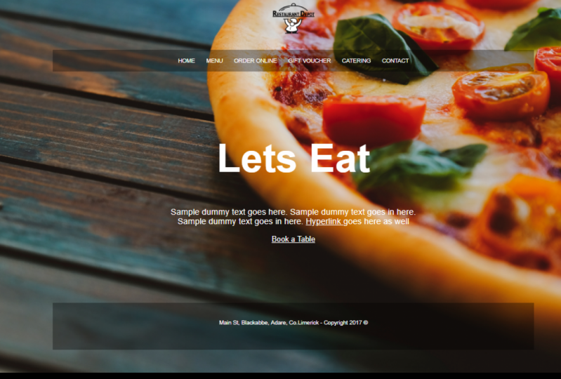
and on desktop. We'll build four sites together. This simple restaurant website. This slightly more advanced
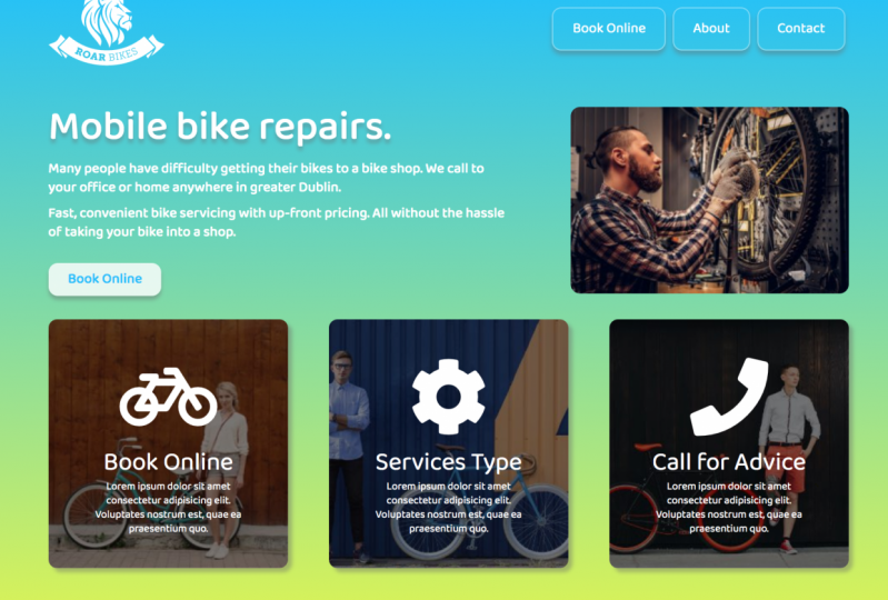
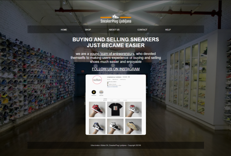
bike repair website. This responsive portfolio site. And this Bootstrap website
for my prototype yogurt company. You're going to learn everything
you need to create a website. Starting at your very first page... all the way through to
uploading it to the internet. We're going to use the world's most
popular, and surprisingly free... Web Design Tool called Visual Studio Code. There are downloadable exercise files... so that you can follow along
with me in every video. At the end of each video as well,
I'll save where I'm up to... so that in case you get lost,
or something's not quite right... you can compare your files with my files. It's a nice easy way to make
sure you don't get lost. We'll cover all of the good stuff... like how to create your very own
Burger menu from scratch... using some basic JavaScript and jQuery. We'll learn how to work with
responsive images and icons. Plus fancy full screen background images. And probably one-too-many gradients. You'll learn how to create forms, and how
to choose great fonts for your website. We'll learn how to work with
Bootstrap 4. You'll actually set up your own
domain name and hosting. We'll upload it live to the internet
so other people can see your site. Throughout the course I set
some fun class projects... so that you can practice everything
you're learning in the course. By the end of this course
you're going to have... a really good understanding of
the important web design topics... like HTML5, CSS3, Flexbox,
Responsive Design, Bootstrap. If that all sounds a bit scary
and a little bit fancy... don't worry, this course is aimed
at complete beginners. So you don't need any experience
in Web Design. You don't need to have coded
a single line in your whole life. We're going to start right at the beginning and work our way through step-by-step. So who am I?
My name is Daniel Scott... and I've been a Web Designer
for about 15 years now. I'm also an award winning instructor. For the last two years in a row... I've won a Max Masters award
at the massive Adobe MAX Conference. I also have great glasses
and a cool t-shirt. I'm pretty sure, just this combination
on its own... should make me qualify, maybe. If you're finally ready
to upgrade yourself... sign up for the course, and let's build
responsive websites together.
2. How is this web design course structured: Hi there, welcome to the course. This video, I want to talk about
how this course is structured. So it's broken into five parts. We'll start at the beginning with just a
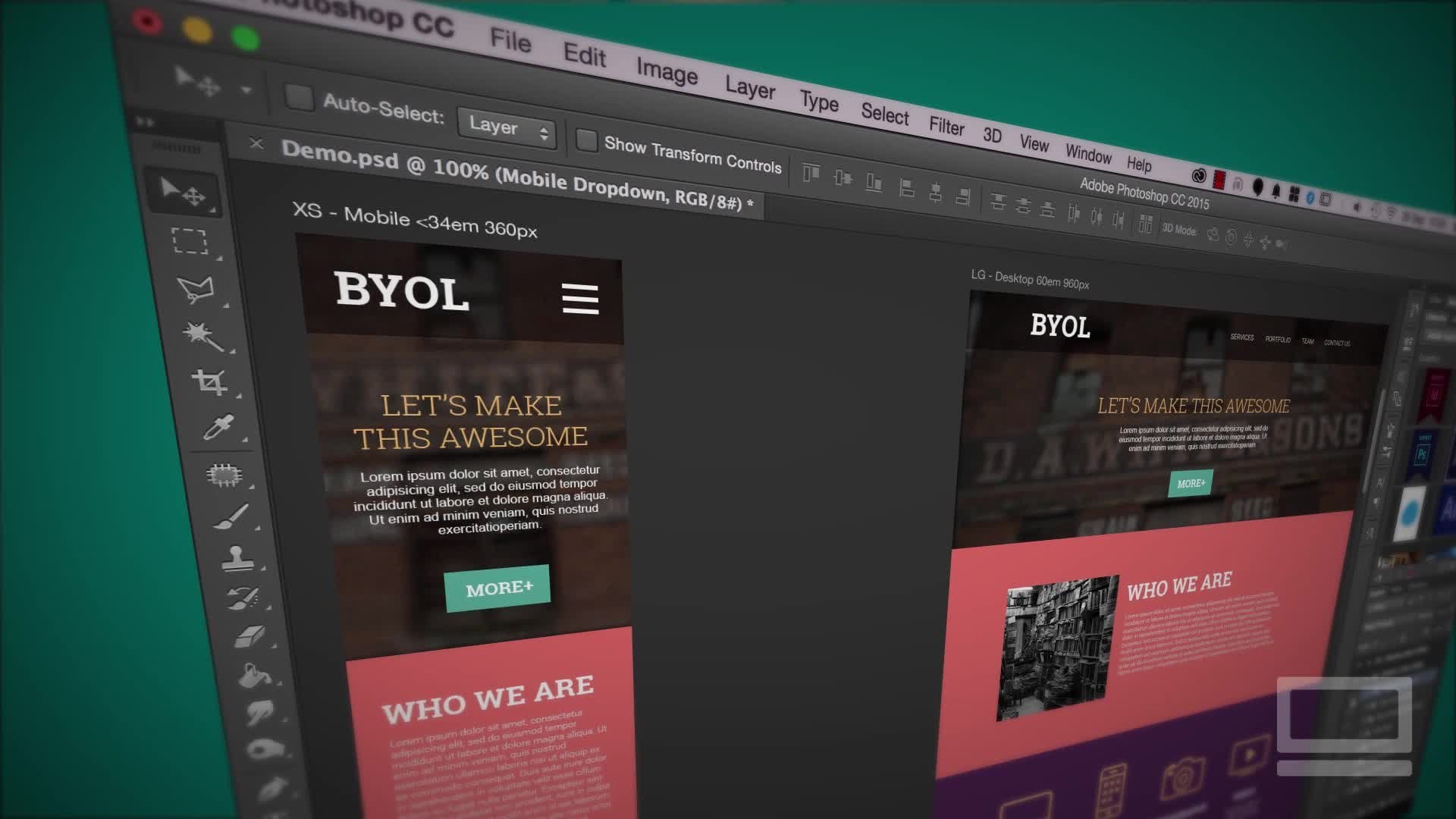
real basic introduction to HTML and CSS. Then we'll start our very first project. So Phase 1, quick introduction. Phase 2, we'll build this website. So we'll take out kind of
basic HTML and CSS introduction... and turn it into this website here.
Nice simple one to get started. The third thing we'll do is we'll create
this Roar Cycles website. Now this website is just a little bit
more advanced. Let's say it's intermediate HTML and CSS. We cover the basics in the first one... and then we get into a little bit
more detail here. Third part is, we'll make
our site responsive. Just means it's going to adjust
for the different browsers... so mobile phones, tablets, and websites. It's this one here, it's a portfolio site,
nice, simple one. You can see here, it adjusts
for different browser widths. And then the finale for the course,
is looking at a framework. The framework that we're going to be using
in this course is called Bootstrap. It's super popular... and it just means, we can take all
our knowledge that we know so far... and kind of condense it down
and use it really quickly to build sites. And we're going to introduce things
like this jQuery slider here. And we just slide across, there's these
cards down the bottom. There's an easy Mobile Nav. It's a really great addition
to anybody that's building websites. A framework like Bootstrap is
going to make you go super fast... make you look super professional... without you having to do
all the heavy lifting. All right, I hope you're ready. It's time to get started
and actually start building websites. I will see you in the course.
3. What to download for the web design course: All right, let's talk about what you need
to download, and what you need to install. So downloading is simple,
there are some exercise files. There'll be a link on the page
here somewhere to download those. And they will be everything
that we'll use... like images and text that we'll
use throughout the course. So download those. Inside that exact same file
that you download... there'll be something in there
called the Completed Files. There'll be a folder inside of it. And what they are is... at the end of every video what I do is
I kind of save where I'm up to. So that if you're following along
and you're not getting the same results... you can just look at the video number... and then have a look at
the completed files... and just match my version
with your version, and go, "Hmm." Often it's just maybe
a spelling or syntax error... but you can compare yours,
that's working... or mine that's working,
maybe yours that maybe not. So they're inside Exercise Files
and Completed Files, all together. Other thing to talk about
is what to download. So we will be testing our websites
in Google Chrome. So make sure you download that. Google Chrome is by far the most
popular browser at the moment. So download that and we'll do
all of our testing inside of that. It's like Firefox or Safari,
Microsoft Edge, or Internet Explorer... but it's the most popular one. Go to Google Chrome's website
and they'll show you how to install it. The other thing to install
is a Code Editor. So we're going to be using
Visual Studio Code. Now, why? There's a lots of different code editors,
so you don't need specifically this one... but you'll need it for
this particular course. Basically a website is a group... mixture of HTML, CSS,
and JavaScript, right? You can use any code editor to make that. We're going to be using Visual Studio Code. Not Visual Studio,
that's a bigger product... you need the specific Visual Studio Code,
it's free. It's made by Microsoft. And just so you know though, it's-- I'm using that mainly because
it's the most popular at the moment. So if you're looking to get
work after this course... you're probably going to end up in... a studio where they are
using Visual Studio Code... you might as well be
learning the same one... but if you-- the techniques and tools
you're going to learn in this course... are going to apply the same to,
if you're using a different code editor. Let's say you're using Atom, Sublime,
Notepad++. They're all really good editors... but they end up making the same thing.
The shortcuts are different... they've got different ways of working
but the output is the same So don't sweat it... if you learn all this stuff
in Visual Studio Code... and then you have to go
and use another editor. It will all apply lovely,
but yeah, install Chrome... install Visual Studio Code,
both of them are free. And I will see you in the next video.
4. Creating & testing our first HTML web page: Hi everyone, this video we're going
to make out very first web page. It's not going to be really exciting. It's going to say,
"Hello World," and in a browser... it's going to show you 'Hello World!" The course gets lot more exciting,
but you need to get the basics done. And that includes how to set up
a folder for our website... how to create our first HTML page... and how to test it in a browser.
Let's do it. So we have installed Visual Studio Code,
and we have it open in front of us. Now yours will look slightly different
than mine, you might have-- we got this 'Welcome' tab
open along the top. You might have another tab open saying... 'New Release Documents',
or something similar. Also yours might look slightly different... because I'm using a Mac
throughout this course. You might be using a PC. Don't worry, they work the same. Just some of the shortcuts
are slightly different... but we'll cover those during the course. It can be a little intimidating... this welcome screen and all
the other tabs on the top. So just to make everything
crystal clear and easy... close down any tabs along the top
by hitting this little 'X' here. Click it once on all of them
until you end up... with this nice clean, clear application. The other difference you
might have as well... is along the side here is a bunch of tabs. They're going to be helpful. For the moment, if you click
the top one once, twice... it disappears, it's all nice and clean. Let's go and create our first file. To create our very first web page
it needs to go into a folder. It can't just be lying around in your
documents folder or on your desktop. It has to go inside a folder... and everything for that website
needs to go in that same folder. So to create that folder... let's go to 'File', and let's go
to 'Open', which is weird. Go to 'File', 'Open'. It says "What folder do
you want it to open?" We haven't created it yet, hold on. So what we do is, on a Mac
there's a 'New Folder' button. On a PC it's slightly different. You're looking for that,
it's a little 'New Folder' icon. Think it's the little yellow one with
the little exclamation mark in the corner. And decide where you're going to put it. For this course I'm going
to put it on my 'Desktop'. Look how clean my desktop is. I totally cleaned this up for this course,
but anyway. 'Desktop', 'New Folder'. What are we going to call it?
We're going to call it 'Project 0'. Click 'Create'. And that is my folder. I'm inside Project 0,
I'm going to click 'Open'. Sometimes you have to kind of like
select it and then click 'Open'. You know it's right when
you're on the top... and it says 'Welcome to Project 0'
along the top. On the side here it should have
this option, 'Project 0'. There's nothing inside of it yet... but this welcome screen's come back,
go away. So we've got the folder, and all it is... on my desktop I have a folder
with nothing in it. So we're just making a folder that way. Doesn't really matter how
you create that folder... as long as it exists,
and you've pointed VS code to it. Now we need to create our page. We're going to create our
very first HTML page. Let's go to 'File', 'New File'. We're going to save it; 'File', 'Save'. We're going to put it, well it should
automatically know where to go. It's going into Project 0. This one's going to be
called 'helloworld.html'. Don't give it any spaces. One word, and it has to be .html,
let's click 'Save'. And just in here, in our editor,
let's type 'hello world'. Let's go to 'File', 'Save'. I'm going to stop showing you the long way. So on my Mac it's 'Command S',
on a PC it's 'Ctrl S'. I'm just going to say save from now on. Now we need to work out how
to preview this thing... because we've made it,
you've made a website, tiny one... but how do we check it?
We need to use that Google Chrome. So go and open Google Chrome. So I've opened Google Chrome, and we're
going to go to 'File', 'Open File'. Then we're going to find our Project 0. It's on my desktop, there it is there,
Project 0. Inside of there, 'hello world'. Before you click open,
remember this moment. If you've made a website
before it's not as exciting... but if this is your very first... get ready for those moments,
moment of glory; ready? That's it. That's your Hello World website. But look around, remember this moment. This is the first
thing you've ever made. I remember when I made
my first website... it was a little bit more exciting
than Hello World, yours will be too. And I'll show you the website that I made,
my very first one a little while later. I think, maybe if I show it to you here,
you might turn the course off. Anyway, it was bad,
but it was 20 years ago. So let's recap the process,
back into VS code. And in here we're going
to put exclamation mark '!'. Then hit 'File', 'Save'. I promised not to show you the long way. I did, and I go back to Google Chrome... and it hasn't updated. So whenever you make a Save
or make a change in VS code... hit this little 'Refresh' button,
or 'Reload' button. If you can't see it up there,
it will be somewhere. Where is Reload, don't even know the
long way for Reload, there it is there. So 'View', 'Reload', there it is there. Exclamation mark, '!',
so that's the process. Do the coding in VS code... check your website in Chrome
to make sure it's working okay... it's not broken,
and you do a little dance... because you made a website. If yours broke during this process
it's a bad start; it's okay. What probably happens is you forget
to add the .html If that happens you've just got
something called hello world, not the html This will happen to you... you're like, "Of course, I did,
I followed you, Dan." Later on in this course if you're new,
that will happen to you. So all you do, is over here
in either one of them-- this can be a little confusing,
this 'Explore'. This tells you all the pages
you have open over here. This tells you every possible file
in your folder. Now the trouble with that is that
you've only got one in each. So they just repeat each other, anyway. You can double click it over here. No, you can right-click it and go
to the one that says 'Rename'. And just say-- actually it's missing
.html, or you spelt it wrong. You just type it in, hit 'Return'. Then go and test that file in Chrome,
you should be fine. All right, that's not really Web Design,
it's the start. Let's get on to the next video... where we actually start doing some
proper HTML and some proper CSS.
5. What is HTML5 & CSS3 in web design: Hi there, this video is
all about learning... the absolute fundamentals
of what HTML is... versus what CSS is. You can skip this if you've
got a basic understanding. We're going to do some
real simple stuff here. We're going to add some HTML tags,
it would look like that. And then we'll style them using CSS. And it will look like, oh, here we go. Ah, that. Better, or worse? But you get the idea. Okay, we're going to do HTML,
and then make it look pretty using CSS. Let's jump into the video
and learn out how. To get started we're going to
type our HTML first. So this word 'Hello World', is not HTML. It's just some plain old text
we typed in; delete that. So when we write HTML
we need to follow some syntax. So we're going to put in
something called a Heading. And in this case, Heading1,
the most important heading on our website. And in HTML it uses the abbreviation of H1. Now we can't just type H1, we need
to wrap it up in angle brackets '< >' So open angle brackets, H1,
and then close angle brackets. '<H1>' So you can see it there,
it did a couple of things. We typed in our H1,
we put the brackets either side... and you'll notice that VS code... automatically put in this
extra closing tag. So that's how HTML works.
It's a wrapper tag. It's a tag that goes around
the beginning and the end... and everything in the middle,
this is my heading. 'Heading1'. So as long as there's
H1 on one side... on the other side,
the wrapped in angle brackets. The closing, you'll notice has this,
that forward slash, '/' And that tells the browser
that this is my heading. All right, let's save it.
Let's check it in Google Chrome. And you can see there. 'Refresh'. I've got my Heading1, it's big, it's bold,
it is Times New Roman, it's black. That is a default setting for our Heading1. Let's add a couple of other HTML tags. So in here we're going to
put a 'Return' in. I'm going to type angle brackets, H2,
close them. You'll see it puts in the extra syntax. If it doesn't, for whatever reason,
you can just type it in. So I'm going to start typing.
Oh, it really wants to help out. Thanks, VS code. This, let's just write 'Heading2'. So those are a couple
of real basic HTML tags. Another really common one is a P-tag. So angle bracket, P, close it off, '<P>' And this is, like a body text. Often you'll have a lot-- you'll have
probably just one H1 on your page... but you'll have lots of
different paragraph text... because it's the body text. Save it, check it in our browser. You can see, these are the default
styling for those three tags. To override the styling,
that's where CSS comes in. So what we need to do is... our HTML is kind of like
things on the page... and our CSS is the styling
of those things in the page. To make this work, let's put a
couple of returns at the top here... and type a tag called 'Style'. Close it off, and again it
puts in the closing tag. And what I just did there is,
I put in a few returns. Returns don't mean anything in code,
you can have a million of them. It won't display on the page. I just use a lot of returns
when I'm styling things. Just gives some sort of visual... breaking up of different parts... rather than trying to
cram them all together. Because what you'll notice down here,
is if I delete this... I'm just bringing it up,
so all in the same line. If I save it you'll notice... back here in Chrome, it's exactly the same. So it doesn't matter whether you
put returns in here or not... except that it looks hard to work on. So in this Style tag, this is
where our CSS is going to go. And CSS has a different type of syntax. Whereas HTML had an opening, closing
angle brackets and a forward slash there... the CSS, you do things like this. You say, I want the H1,
this is called the selector. I'm selecting the H1. Then you put it in a space, and then
put in the curly brackets... rather than the angle brackets. I'm going to put a return
in my curly brackets... just to separate it out,
not for any good reason... other than it looks a little bit
more easier to communicate to you. And in here I'm going
to do some H1 styling. We'll start with color. We've got to spell it
the American way, 'color'. And after this, this is the property. So Selector, I'm selecting H1,
I want to add the property color to it. It needs to end with a colon, ' : ' And then you pick a color,
there's lots of default ones in there. I'm just going to put a space
in, and type 'red'. And at the end of CSS,
you have to have a semicolon, ' ; ' So curly braces, colon, semicolon. That is the syntax, pretty much
for all our CSS; pretty simple. Save it, and let's see if it works. Let's jump into the browser. 'Refresh'. And look at that. H1 is styled. Now I know this is not a huge amount
we're doing here, but I'm excited. I'm excited for you. I remember learning this stuff,
and it was, I don't know, a revelation. So let's do something else.
I'm going to put a return in here. And so if you want--
we're going to group CSS. We want to do a few things to the H1. So as long as it's within
these curly braces... we can type in something, like font,
I'm going to put in 'Font Style'. You can see, VS code really wants
to help you kind of suggest things. Like, Size, Style, Display. I'm going to use 'Style'. I'm using my mouse now
instead of typing it in. That's just one of the little helpful
things you can do with VS code... or you can use your arrow
keys on your keyboard. Can you see that little
blue line moving around? Go there and hit 'Return' on my keyboard. We've got almost all of it. So we've got our Property,
there's the colon. We've got our actual value,
which is italics, and what goes at the end? You got it; semicolon. Let's hit 'Save',
let's see what it does. Let's hit 'Refresh'. Ah! It's italics, and it's red,
and it's an H1; brilliant! So I'm going to set a class exercise now. I want you to change this H1 to be
a font size of 100 pixels, or px. I'd like you to pause it right now. Go, hit the button, and I want you
to see if you can do that. Font size at 100
pixels, give it a go. I'll give you a hand in a second.
Pause, go. All right, you may or may not have paused. You may or may not have made it work. Let's see if you followed me.
So 'Font Size', here we go. Got a colon, then put in 100. And what people often forget,
is you need the px. And we use pixels when we're dealing
with fonts at the moment. And what goes at the end? Semicolon. Save it,
back into here, refresh. Oh, look at that; giant H1. All right, let's style the H2 together. And then I'll set another little exercise. So 'H1'. I put a couple of returns in here. Curly braces. You can kind of separate them up
using these kind of, the selector. Then the curly brackets. And everything goes
in the middle... that you want to do to
that particular selector. So in this case we're going to do
a color of blue. Semicolon. And we'll do a font size of 50 pixels. So give that a go now, and I'm going
to set a verbal exercise. I want you to try and do the P-tag. All by yourself, I want
you to make it green. And I like to have a
font size of 20 pixels. Give it a pause now, see how you go,
and pause. All right, how did that go? I hope you did well. Let's follow it together,
P-tag, curly braces. Color of green; there's
a few different greens. Yellow green, green yellow, that's my one. Semicolon, and we're going to
put in a font size of 20 pixels. Semicolon, 'Save'. Back into here, 'Refresh'.
Look at all that good stuff. So it's just an introduction to what
HTML is, and what the syntax looks like. These are these guys down here. And the styling of them. We talked about selectors. I use the kind of nerdy words here so
that becomes a bit more natural for you. So, selector, this is the attribute,
no, that's the property. And that's the value of that property. And that's the basics of websites. We're just going to expand on that... and we'll build some boxes
to put this stuff in. We'll start doing some interactive
bits and pieces... but yeah, that's the fundamentals
of HTML in CSS. Let's jump into the next video.
6. What is the head vs body vs html tag in a web design page: All right, it is time to make
an actual proper website. At the moment we've put in
some html tags and some basic CSS... but that's not all we need. We need some bits and pieces... like the doc Type,
the Head Tag, the Body Tag. So in this video we'll work out how to
add those quickly, and what they all do. All right, let's jump in. First thing is, is that this page that
we've made, this helloworld.html... it's got the basics in it... but it's missing a chunk of elements,
to make it an official web page. So let's close it down and look at those,
so close it down. Let's make a new page.
So 'File', 'New'. Let's 'Save' it. This one's going to be
called 'understanding... let's put in a hyphen, and let's
put in 'bodyhtmlhead'. Make sure, at the end you add html,
.html... at the end, otherwise it
doesn't know what you're doing. The other thing to notice at this point
is that you can't use spaces... or you shouldn't use spaces. You need to use hyphens or underscores,
it doesn't matter which. I use hyphens; let's hit 'Save'. When you are naming things
try not to use things... like dollar signs or ampersands,
or any kind of-- just use numbers and letters. To make this an official web page
it needs a couple of things. It needs to know that we're
dealing with an html page. So it's something called the Doc type. So it's a Doc type of html. Then we need to establish
that it is an html document... that is set in the language of English. I'm going to close that off. There is probably another
five or six lines... that we need to add to
make this thing official. We don't type that out. There is an easy shortcut,
because it's such a consistent... repeatable thing that everyone needs to do. VS code uses something called Emit,
don't worry, Emit's the word... but it's a little bit of code hinting. That really helps you go fast. So instead of typing all the things we
need to make an official web page... we type an exclamation mark and
we hit return on the keyboard. That's all the official stuff we need... to make this a legitimate html page. Here's our Doc type,
there's the English language. Then it has something
called the Head and the Body. Then it's all wrapped up in this html tag. Now what are all these things? So the Doc type just tells us
that it's html. This one here, if you see,
if I click in here... html, you'll see there's a
corresponding wrapper at the end here. And all of the website
is inside that html tag. Like we had the H1 earlier,
remember we had H1... and there was a beginning
and a closing, and everything inside... was the H1. It's the same with all of the html tags. This one just says, all of this is html;
thank you, very much. Not very exciting html tag, you're
not going to deal with it much at all... these other two tags
inside of here, you will. There's the Head, there's the Body. So the Head Tag--
I'm going to put a couple of 'Return's in. Remember, Returns don't mean anything... just so that we can segment
them when we're learning. So the Head has an opening and a closing... and everything inside of here
is stuff that the browser needs to work. So Chrome needs this stuff,
but the user doesn't see it. So if we save this file,
'Save', we jump out to Chrome... we'll go to 'File',
we'll go to 'Open File'. Let's find this new one,
understanding-bodyhtmlhead. You'll notice that there's
nothing on the page. So this is the Body, that white square
down the bottom, that's the Body. The Head is stuff that the browser absorbs
but doesn't show you. You can see, there's lots of
stuff that just doesn't show. I'm going to deal with all of
this sort of stuff later on... but the basics here, that you-- this one here, the Character Set... just telling it we're using
kind of a Latin keyboard. A, B, C, 1, 2, 3. We'll talk about these things later on. Responsive design needs this. There's some problems with Microsoft Edge,
that it needs to be compatible with things. The document title, we'll do
in the very next video... but it's all stuff that the browser needs,
that we don't really need to-- that the user, our audience
doesn't need to see. What the audience needs to see
is everything in the Body. So I put a couple of
'Return's in here. Loads, too many Returns, Dan. But in the Body, this is where
we add stuff, so let's add an H1. So we're going to type in, angle brackets,
h1, close it off, '<h1>'. And in here is 'Hello Dan', or your name. We're going to save it. So everything in the
Head, browser didn't see. Everything in the Body
actually gets seen by the user. So let's have a look in our browser. Let's 'Refresh', there it is there. Cool. So html, everything's
inside of there. Head, stuff that the browser needs to work. Body is the stuff that the user sees,
those are our three main tags. Now let's do a couple of things,
let's look at the Head tag. Remember, we want to style this H1. Where does the style go?
We don't put it in the Body. We don't put it in between
the Head and the Body... it goes inside the Head. So after the title, put in a 'Return'. Then we can put it in our Style. Remember, open square brackets,
close it off. 'Return', between the two. Everything in between
these two tags is the CSS. The CSS can go in the Head. We don't really want this code
appearing on the page. We want it just to affect
the stuff that's in the Body. So we say, remember our syntax,
h1, curly braces. And we say we'll make it the color of... random color from this list. Dark orchid, here we go. What goes at the end?
semicolon, save it. Let's have a little look in the browser. Browser, refresh, awesome.
Dark orchid, orchard? Orchid. So Head, stuff that goes on the page. I kind of said this 20 times now,
but you get the idea. Things like this can go in the Head,
but the things people see are in the Body. Now a couple of things I want to
explain before we move on is-- I'm jumping between these two,
and you're like, "How did he do that?" So on a Mac, you can hold down
the 'Command key' and hit 'Tab'. And these little things open up. You can keep hitting Tab
to move through them. On a PC, it's 'Ctrl Tab'. You can flick between them too
by just tapping them. So 'Ctrl Tab, 'Ctrl Tab'. You don't have to do that,
what you might do is... just have it over here,
do some Window resizing. So you can kind of see,
one on one side, one on the other. It's a lot easier to work that way,
up to you. Another thing I want to do before
we move on - totally wrecked that. - is that-- I don't want you, at this point to go... "How am I going to remember all
of these things," because... let's say that I want to make
this 'Hello Dan' underlined. The cool thing about the internet... especially html,
there's a load of resources. So I want to make this underlined,
oh, 'Help', what is it? So do I go in here and just
start typing 'underlined'? Doesn't seem to work. Let's say I go to Chrome. I'll put that up again. I'm going to make a new search box. I'm going to say, html,
or CSS code for underline. We're going to do this
throughout the course because... I'm not here to teach you
every single bit of syntax. I want you-- I'm teaching you to fish. Let's have a look, so I've asked
for the code for underline. There's going to be kind of three
main places that you'll use in your-- that most Web Designers use. There is something called w3schools.com,
that's a really good resource. CSS Tricks, that is an amazing website
by Chris Coyier. There's another one that appears
quite often, and it is... it's not appearing in that list,
but it's called Stack Overflow. Those are your three main
ones to write down... and say, "Yep, those are the go-to places."
Let's have a look. CSS Text Decoration. You can see here, using an H1. There's overline,
that's not what I want, underline. So instead of kind of remembering them,
you can either copy this... just copying it with my keyboard. 'Command C' on a Mac, or 'Ctrl C' on a PC. Go back into VS code,
and I'm just going to paste it in. Save it, and then jump to our browser. Preview it, and it's underlined. There's going to be a lot of that. If you're like, "Man, do I need
to write all this down?... there's lots of times
when you’re just like... "I can't remember what that syntax is." So you can go and find it. Because text decoration is a
weird way of discussing underline... but after a while you will learn some
stuff that you're doing quite regularly. Text, decoration, overline. Never use that one in my life. Refresh. Look at that, you can do it. That's going to be it for this video. Let's jump into the next one... where we start talking about Meta Title,
that we've been ignoring.
7. What is the title and description for in the head of a web page: Hey there, this video we're going to learn
what the Title is, in your Head Tag... and we're going to look at
what a Description is. The very short version is,
in Google search results... that is the title... that is the description. We need to add it to every page. Let's jump in now,
I'll show you how to add it... what the pros and cons,
what you should do, shouldn't do. Let's get started. All right, so let's start
with the Title Tag. So this gets added to the top
of every page, in the head. Ours got added there automatically
by VS code. So what is it? It is a way to describe
what's on the page. So this word 'document' here
is just a placeholder. You can type anything in here. You'll notice though,
it's not really code language... you can write ampersands,
and you can write... brackets, and all sorts of things. Could be anything you
want to write in here. You don't want it to just be anything. Let's say, this is one of, kind of thought
that really describes this page. It's 'Learning HTML description
and title tags'. That's going to really describe
the page I'm trying to build here. Now if I save it and I go out to Chrome
let's see where it appears. So, Chrome... there's the document that I'm working on. You can see the word 'document' there. That was from earlier on,
before we've replaced it. If we hit 'Refresh'... you can see, that's where it kind of
ends up, that's your Title Tag. It ends up in the tab... but that's not that exciting, right?
What's really important is... where that gets used by Google,
and its search results. Remember, we did this search
earlier on for underlining in HTML. We did that search. See these chunks of blue text here. These chunks of blue text
are the Title Tags. So whatever you write in there
will appear in this little list. So you can imagine,
if you lift it as document... first of all the word, document... Google's just not going
to list your page... because it's too vague... and there's probably a million pages
online with the heading Document. So you need to make it unique for
every page, which is a bit of a pain. So if you've got 20 pages
on your website... you need 20 different
Title Tags for each page. And it needs to really describe
what's in that page. It's about 50 characters. You can see, some of them get a little
bit longer, some of them are shorter... but be really concise and exact
about what's in the page. Don't call it, like Home page. If it was me, for my site... mine is called 'Web Design
Tutorials by Daniel Scott'. Would be a good Home page Title Tag for me. So that's the Title Tag. The other tag you should add,
and it's not there by default... and very common, just underneath,
is adding the description. So what is the description,
before we make it, it's this chunk. That there is the title, that there
is just your website address. This thing here, you have control over. You can tell Google what
to put in this description. Sometimes it ignores it but most of
the time it won't, it will list it here. This is a bit more marketing
than it is-- like this one here... be really concise, really good keywords
that really describe what you're doing. Down here is kind of like,
we all know it, right... when we're doing a result,
that we search... we check that to make sure you're
kind of in the right ballpark. Then you use this just
to confirm that you are... you know, you get more into the
details, and just kind of-- just checking you're in
the right sort of zone. This is where it's more marketing
than it is, let's say, coding. So down in here let's add
the Meta Description. By default it's not in there, because
you can't survive without a title... but you can survive
without a description... but in my opinion you
should definitely add it. This is where it's kind
of some ugly syntax... but you type it up once with me now... and later on you can just come back
and copy and paste this one. So it's called a Meta name. You need to add all that syntax. I'm just using the shortcuts that appear,
via VS code... but you need name, equals,
and you need the quote marks. And inside of here,
this one's called Description. It needs to be spelled exactly like that. And we need the name as description. The content is going to be what
you want that description to be. So this is where you get to put-- So in here you want about 100,
between 120 characters, or 150 characters. So 120 is what generally will appear
in mobile results. And 150 on desktop. You can see here, this one here
got given quite a big chunk... whereas this one got cut off quite small,
so this one is going to go really small. Meta Description, sometimes as well,
doesn't matter how long you make it... Google will cut it off. So make sure all your good stuff
is at the beginning of that paragraph. Just make it one, and make it
about 120 characters. Now the one thing for this is,
it kind of brings up a good point. Can you see this little--
this guy's gone red. If I save this, and let's view the page,
let's refresh it. It's gone a bit crazy,
it's like, hmm, what? That was in the Head tag, why is it
displaying down here in the body? It's because we forgot to close out
this Meta description tag. I say we, me. So it has an opening there, and can you
see, all of them have this closing... angle brackets. So at the end here, closing angle brackets,
you'll see the red disappears... and back here, 'Refresh'. Oh, it's back to normal. So if you ever have red stuff, bad. Often you'll notice the difference
when you get into... previewing in Chrome, it will kind of
show you, everything will go haywire. All right, that is the Meta Title. Meta description, copy and paste that
into a notepad... so you've got it handy for
when you're doing it next time. So you don't have to
type it out every time. Really essential to pages. Let's get on to the next video.
8. What code editor should I be using VS Code Sublime Dreamweaver Atom Brackets: All right, let's talk Code Editors. We've been using VS code so far... and we're going to
continue for this course. Why? Because it's the most popular. Mainly because it's the most fashionable. There's some quirks to it
that make it awesome... but there are people
out there that argue... that Sublime Text is the best,
or Brackets is, or Dreamweaver is. Or Atom, or Notepad++,
there's lots of different editors. Let's jump into this video and just give
you a quick run through a few of them. Just to kind of show you what you
should look for, and what's important. All right, let's get in there. So we've been using Visual Studio Code
for our text editor. Now we could have done this course
in any of the editing programs. We only use VS code
in this case because... VS code is the most popular. So, my previous courses
I've used Dreamweaver... because I often spend my
life in the Adobe world... but I guess what I wanted
to show you real quick was... first of all, how these editors
are really helpful... but often can be very,
what do you call, fashionable. So if I'd done this course
a year ago or two years ago... it probably would have been in
this one called Sublime Text... because it was the most popular then. Before that there was things like Komodo,
and before that there was Notepad++. There's lots of different editors... but we all end up in the same
place doing the same thing. They're just, people get used to
some of the quirks to them. So I've downloaded and installed
Sublime Text... just to show you, like, if you're
getting started in Sublime... it's a lot cleaner... and if I want to put in all my
kind of document stuff for HTML... in this case, instead of
exclamation mark and tab... it's 'HTML', and hit 'Tab'. You can see, we get to
a very similar place. It doesn't have as much in the
document type, just the real basics... but we end up at the same place.
We go down here, we type 'h1'. And we start typing. Same with, let's look at brackets;
brackets is another popular one. Exclamation mark, tab, works the same
as it did in VS code. They don't have all the bits and pieces
that we want in VS code. They decide on a real kind
of minimum option. Dreamweaver as well, great code editor. If we go to 'File', 'New',
they do it automatically. If you say you want an HTML page... you say 'html5', click 'Create'. You can see, puts in all the bits
and pieces you need to get started. The reason I show you this,
if you're looking for work after this... so you start working with
different developers... and using different editors... there's not really-- they have their own perks and quirks,
but we are creating the same thing. The way I do it,
like when I was designing this course... was trying to work out
which one to use... Stack Overflow, I mentioned that earlier... they do a developer survey
at the end of the year. So it's 2019 now, and this
is last year's survey. I just kind of went through, and... you can see down here, way down the page... the result's back for Visual Studio Code... is by far the most popular. You can see, Visual Studio
is the big version of this. Notepad++, Sublime Text, Atom,
I thought was a lot higher. There's just, people love
their own editors... but unlike something like Photoshop
where there's, only cover one product... and one or two competing,
there's a lot of different code editors. Some of them quite general,
like the one we're using. Some of them a lot more specific
for, let's say PHP or Xcode... but anyway, I thought a little short video
explaining different editors... in case you want to move to something else,
or expected to use something else... you can use what you learn in
this course in a different editor. All right, let's go on to the next video.
9. How to add structure to your website using Div Tags: Hi there, this video we're going to build
a yellow box, and then a pink box... we'll try to, at least. We're going to learn to do it
using something called a Div Tag. It's a division of space,
and it gives us the kind of boxes... that we get to put a website inside of. All right, let's jump in, and learn. To get started let's close down the
other documents we've been working on. We're not going to use those again. I'm going to create a new one... just to kind of separate everything,
and allow different bits of learning. So, 'File', 'New File'. Let's 'Save' it. Let's call this one 'divtags.html'. Don't forget the HTML. We're going to add all of
that Head Tag goodness... by putting exclamation mark '!' Hitting 'Return'. Puts all that junk in. We make sure we update the title. 'Div Tags'. We put in the description,
but not at the moment because... it's kind of like a throw-away project,
just to learn... what a Div Tag is. So, the Div Tag goes on the body
because I want people to see it. And what do we want it to look like? In your Exercise Files,
there's a folder called Wireframes... and this one here called HTML Div 1. I'm going to open that. For no reason, we just, I don't know... I drew it out on my notebook,
so I figured I'd show it to you. This is what I do when I'm wireframing. So it's not a particularly good
or exciting wireframe, right? We want a yellow box and we want
a kind of a pinky box underneath. So first box, second box,
that's what we're going to make. To add it, we add a tag called Div. I'm going to make some space
in here in my Body. I'm going to 'Tab' across for
no good reason, other than it looks nice. We're going to put in a Div Tag. So Div Tag starts with the angle bracket,
Div, close angle bracket, '<Div>' And it's very clever,
puts in our closing of that tag. And everything inside of this
is going to be in my square. Let's preview what we've made so far,
so let's save it. Go to Google Chrome,
let's go 'File', let's go to 'Open'. Where is this? 'New', 'Open File',
that's what I want. There's my new Div Tag,
click 'Open', and... I've got a title but there's nothing
appearing on the page. So a Div Tag without any CSS is invisible. It's there, but we haven't styled it. So what we need to do is
tell it to do some stuff... like the yellow, and give it a size. So we do that with our CSS,
we do it in the Head Tag. Remember, before the head closes,
I'm going to type in... do you remember what goes up the top here? You remember, Style. And close it off. Put a 'Return' in. I'm going to put
all my Styles in here. I'm going to 'Tab' in,
just because it looks nice. I'm just using my Tab key. And what we'll do?
So we need to style for the Div. Remember we had H1 before,
so we're going to style this Div. And what goes next?
Curly braces, '{ }', perfect. Then let's style it, let's give it a color. Now when you're styling text
it's always just referred to as color. When you're trying to do a background
color you have to go the full background. There it is there, you can see,
background color. What color we're going to use?
I'm going to put in yellow. Remember what goes at the end
semicolon, save it. Let's preview it in the browser, and... Nothing appears because at the
moment this Div Tag is yellow... but it has no dimensions. It either needs a height ,
or it needs some stuff in it. So inside this Div, I'm going to
'Tab' across, stuff in it If I do that, save it,
go back to my browser now. At least now, with some text in it... kind of forces that Div Tag open a
little smudgy bit, so I can see it. Now it doesn't know how big it is... it's just showing me enough
to squeeze the text in. And it's kind of spilling across,
so let's give it a height and a width. In here let's just put in a P-tag,
rather than just plain old text. So we're going to put in some
Body Text, remember, paragraph for P. Let's just put in 'First Box'. 'Save' it. And let's style it. So up here, the Div Tag is yellow. I'm going to put a 'Return' afterwards,
and let's give it a width and a height. So width, I'm going to give it - what did
our little style sheet say - 600 x 400. So we're going to go 600 pixels
for the width. Remember, has to have px,
and you have to have the semicolon. And the height, the same,
it was 400, right? 400, I wrote it, Dan, come on. Now, I've saved this,
let's jump into my Google Chrome. Hit 'Refresh', and hey... So that is my structure,
that could be your navigation. Pretty big navigation, but it could be
the middle of your website, or your footer. It's a nice big cube that we can start
putting things like H1s or P-tags in. Cool, huh. Basically your site’s made up
of structural bits, these Div Tags... and text elements, and images
that go into it, and videos... but the Div Tags are the structure. Now what we want to do is... I want to put in this second box
down the bottom here. So in VS code, I'll go to down here,
make a second Div. Let's just copy the first one,
let's just save some time, 'Copy'. Whenever copying, make sure
you grab the opening and the close. It's easy to know where the closing is. If you click on it,
kind of highlights it here. Just have your cursor flashing in,
like the head here. There is the closing.
I've got to make sure I've got all of that. Copy it, so I'm just using 'Edit', 'Copy',
I'm going to 'Paste' it in. The tabbing is a bit weird,
and because I'm a bit OCD about this. I'm going to make it all look nice. So first box, and second box, save it. Let's preview it in a browser. Preview, got a second box; hey. The last thing we want to do
is we want to make it a color. We want to make it this pink. So, in VS code, I'm going to go up here... and this is where we run
into our first problem. We're styling this thing called Tag,
an HTML tag, that's Div. The problem with it is that... this Div appears twice
but we can only color it once. So we're going to learn in the next video
what something called a CSS Class is. It allows us to individually attack this
first box rather than the second box... and style them differently... but for the moment we've put
in our Div Tag, it's awesome... now we need two different
kinds of Div Tags... that have different sizes
and different colors... and we'll learn how to do that with
a CSS Class in the very next video.
10. What is a CSS Class how do we color a background with it: Hi there, this video is all
about a Class Selector. It's going to allow us to do this... where we style the yellow box
differently from the pink box. We'll do the same thing with this P-tag. We'll make one P-tag
different from the other one. That is the job of a CSS Class Selector. Let's jump in now,
and learn how to make it work. So here's our CSS. This thing here is called a Type Selector. So it's selecting all the Div types. The problem is, it's quite generic, because
every Type that happens to be a Div... do this stuff to it. And that's why we have a Class Selector. So what we want to do is,
let's bin all of this. Put my 'Return's back in,
I 'Tab' in. So instead of deciding all Divs
on every page are the same thing... let's create what's called
a Class Selector. So all it means is, I get to be unique... I get to say,
"I'm going to create a class"... to know it's a class, and not like
that Type Selector we just did. You put a full stop
in front of it in your CSS. Okay, that says, "I'm a Class." What kind of Class?
I'm going to give it a name. You can call it anything you like.
This one I'll call 'Box 1'. Then like the rest of the CSS
we've been doing, it's the same. So Curly braces, Return,
and then we style it. So that little full stop at the beginning
means I'm a Class. What are we going to do to that Class? We're going to say it's a background color. Background color of yellow. Semicolon. We're going to have a width and height. Width, 600 px... by a height of 400 px. So we've got Box 1. Now there's no way of kind
of connecting these two yet. So it says, "Hey, Box 1, be yellow"... but down here it's like, "Well, I don't
know what you're applying it to." So what you do is you leave the Div... and what you do is, afterwards,
put a space and type in the word 'class'. You can see,
VS code really wants to help out. If you're typing it out make sure you
put in the equals and the quotation marks. So we have a Div Class. And what we want to do is apply Box 1. So now that is attached. The differences are,
just to make sure that... when you're styling it
up here in your CSS... you have to use the full stop
to say, "I'm a class." Down here you have to be
a bit more long-winded. So you say, 'class =', and you don't
put that dot in there, it won't work. So Class, long version, short version. Now hopefully if we save,
and we go test in a browser... we reset, and the first box
now knows it's yellow... and it knows that it's 600 x 400. This box down here has no idea
what it needs to be, so let's tell it. It's the same as before,
let's make a second Class, you ready? So 'Dot Box 2'. Put in curly braces, and we'll tell it
to steal this, because we're lazy. But we want this one to not be yellow,
we want it to be that pink color. Oh, that's not the color. Has to be pink. Save it. It's the wrong size and weight,
size and height. 400 x 250. I just made up these sizes,
you can type anything you like. 400 x 250. Save it, and now, it's not going to work.
Why is it not going to work? Let's check. 'Refresh' just to confirm it's not working. It's because we haven't applied it to it. So we've styled it, now we need
to apply it down here. So after the word Div, type in 'Class'. You can see there, the way I work... I'm going to work a little bit
more shorthand as we work through. You can start writing in
all the syntax if you like... but you'll notice that I hit 'space',
hit 'C'. That's all I've done, and I'm going to hit
Return on my keyboard, or the Enter key. And it fills in all that lovely syntax. I type in 'Box 2', hit 'Save',
and now, hopefully... 'Refresh'. Hey there, we've got a first box,
and a second box... and it vaguely resembles this. Cool, huh. So we learnt what a Type Selector was. You don't need to remember that name,
but a Class Selector for CSS... is something we're going to do
a zillion of in this class. And it's a way of individually
targeting this. So instead of Box 1, this might be Header,
this might be Navigation... and this might be Main Content. And we get to style them,
color them, and size them. Let's go a little bit further and add
a little bit of styling to it... and look at a Class Selector,
but in a different kind of context. So back in VS code here
I've got two P-tags... and they look exactly
the same in the browser. Let's say I want to make this one
a different color, and a different size. So instead of styling the P-tag
like we did earlier... remember we made all the H1s... but problem is that,
every H1 on every page... whereas this one... I just want this little unique guy
in the first box to do something. So up here, underneath Box 1, my Box 2,
I'm going to put in another class. Remember, it has a full stop. And I'm going to call this one 'Highlight'. Highlight... Highlight Text. You have to put a space in,
then you have to put in your curly braces. Curly braces, next to your P key. Then we're going to say,
I'd like you to be a color. And the Background Color,
for the background color. It does Regular Rule Color
if you want to style text. And let's say I want to make this--
what are the crazy colors down here? I'm going to make this dimgray. They spell it both ways,
look at that; cool. All right, let's put in our semicolon. Let's make the font size, so 'Font Size'. Just something really big so we
can kind of just easily see it. So I've saved it, now we need to apply it,
and it's the same thing. I can say, you, there's a P-tag,
but also a class of... dot, not dot. with a text. 'Highlight-text'. Let's save it, let's check it. Refresh. Hey, it is bigger, and it's the gray. So you style the Type Selectors... to do kind of big general broad strokes. Then you do little specific things
using Classes. You apply them to individual
little bits and pieces. You can use it twice,
there's no reason why we can't say... you my friend, also have a Class
of Highlight Text. And it will apply
to both of them, hopefully. It didn't, and you're like,
can you see why? I have no idea why. Because... now I pretend like I put that on there
on purpose but that is always my problem. You might not be as
grammatically challenged as I am... but I find it very hard
to type the stuff in. So, like when I'm not doing tutorials... and trying to impress you
with my typing speed... I copy and paste everything;
'Copy', and 'Paste', it's painfully slow... but it gets around my problem
of typing the wrong word in... and then trying to fix it, not working out
what it was, it's just because of typos. Let's delete this, and I'll show you some
other tricks for kind of just making sure-- yeah, you can keep up, or fix any errors. So the easiest way is to compare
against the file that I'm making. So say, it looks like
you've done the same thing... but it's not actually
working for some reason. Is, in your Exercise Files
that you've downloaded... you will find, in that folder, there's
something called the Completed Files. And in here, I've zipped up,
that was the fifth video that I made... this is the sixth video... so if you're watching this video,
it's probably, what am I up to? I think video 10. You will find I haven't finished
this video yet... so you'll find a folder in here called 010. I know, there'd be no 010,
maybe 10, and you can open that up. And open up-- let's just do one. I double clicked it, opened it up,
and there's the stuff we're working on. You can just open this in VS code. So go to 'File', 'Open',
and compare yours versus mine. And I'll do that throughout the course. That's one of the ways
you can check your code. The other things to note,
or I guess, to check... and these are the things that
I find my students run into... when I'm teaching live classes. Is people forget the full stop,
to identify a Class... or they start adding the class dot,
'class.' down here... which you're not meant to. One that always catches people out... is they'll accidentally delete one
of these, with the curly braces. And because that one opens, and then
doesn't close, kind of freaks out a bit. You can see it's changed
the highlighting color a little bit... but it's just kind of missing,
so, often you can go through... click on this, find your--
click on that first bracket... and you can see,
it's highlighted the closing one. If I click on this one... it won't click on it because it doesn't
know where the ending is. So it won't highlight its buddy;
let's put his buddy back in. There he is. Now if you click on them... they kind of just connect to each other,
there we go. The other things are... people forgetting to put colons in,
and semicolons in. Just basic syntax problems. Basic spelling mistakes,
like I do all the time. We'll do a bit more
error checking later on. We'll install some plugins for VS code... to help us with that syntax errors,
but for the moment... those are the basic ones,
and that will be it for this video. Let's get on to the next one.
11. How to nested divs inside of each other in HTML & CSS: Hi there, this video we're going
to talk about Nesting Div Tags. What that means is we're
going to end up doing this... where we have our original
yellow and pink box... and we put other boxes inside of it. It's called Nesting. It's not that fancy. You can see here, boxes inside of boxes. They end up looking like this,
in the end we're going to put... text inside boxes,
which are inside of boxes. Yeah, let's do that now, I'll show you
in VS code; let's go. All right, what we're doing is,
in your Wireframes folder... in your Exercise Files, we're looking
to make this one here, HTML Div 2. So, same boxes. We'll use the same thing
we've created so far. I'm going to put two boxes inside,
a gray box and a purple box. Those are the heights,
let's work out how to do it. So in VS code, we're going to do
what's called Nesting. Just means we can put Divs inside of Divs. So we have one Div here, and a second Div. Let's work on that first one, which is
going to be our gray, 100 x 300. So where does it go? It depends on where you want it, I guess. We've got this text in here,
we don't really want anymore. That was just, I guess--
I put that P-tags in there... to show you how we could highlight... and just so the box will
have some content in it. Let's delete that for the moment,
just to make it nice, and clean, and clear. So what we're going to do is put a Div,
say just where that P-tag was. So if we go, angle brackets, div, '<div... Now we're not going to make a Div,
then create a Class up here... then come back and name it,
we're going to do it all in one go. So instead of just closing it off
here now - I'm going to undo that... - I'm going to put in 'class',
before I finish it. Now I'm going to call this one 'box3'... then I'm going to close it off. Just to save some time, rather than
coming back and doing it later. I'm going to put --
do I put anything in it? No, just going to leave it empty... but remember, this is where it
would go inside of that Div. Let's leave it empty. Let's save it, and it's not
going to appear yet. 'Refresh', the text has gone... and there are Div tags in there,
but I can't see it. So we need to style it. We do not need this anymore,
because I got rid of it. I'm going to call this one
'.box3', curly braces. And we're going to steal all of that. We're going to pick gray,
which is spelt both ways. Wow, I get caught up with that every time. Gray, gray, and gray,
I don't know why I find that amazing. It's the same gray,
just spelt in different ways. This one was a width of 100,
and a height of 300. Here we go. Well, 3000. That's not going to work. Let's save it, and let's check it out,
let's see if we made it work. 'Refresh', look at that. So often when you're making a website... you'll make kind of like an overall
website background, a big container... and inside of that container
you'll nest lots of different Div tags. Like the Header, the Navigation... the images, and carousel,
and all those things; that's Nesting. Let's do it with the second box... and I want to show you
just a couple of things... like if you don't get it in the right spot,
so let's delete that P-tag from here. That's where it should go a bit,
let's say we do it just outside of here. So let's go... angle brackets, Div, space, Class, Return. This one's going to be called 'Box 4'. Close it off with the angle bracket.
'Save'. At the top here I'm going to copy
and paste the whole thing; real lazy. 'Box 4', this one was purple. Purple. And it was 120 x 350. Well, it's actually 350 x 120. Height at 120. Let's give it a look, and preview
in the browser; awesome. Well, not awesome, it's in the wrong place. So if you get it in the wrong place,
it's really simple... in the code to go, actually you,
'Cut', and you, 'Paste'. I'm going to line it up,
so it looks nice and all aligned. Hit 'Save', and now... 'Refresh', it should be in there; awesome. Now if I want say an H2
inside of that purple text... I could just put it here, there's nothing
wrong with typing H2... closing it off, and typing it in here. 'Heading 2'. That's perfectly,
grammatically... and syntactically - if that's
a word - correct. Let's give it a preview, it's in there. What ends up people--
what ends up people doing?! What I like to do to make
everything look nice... is put Returns in between all of this... to really expose the nesting,
so I know that there's a Body tag. Inside of that is Box 1. Inside of that is Box 3,
you can kind of see the indentation. Same with this, Box 2,
and inside of that is Box 4... and inside of Box 4 is H2. Does that make sense? All right, so we're getting a hang of
this Div tag division of space thing... and putting boxes inside of boxes. Let's get on to the next video
where we set our class project. Homework time.
12. Class Project 01 – Div Tags: Did he say, "Homework, in the last video?"
I did. I think of it more of it like an awesome
way of getting your skills better. So I'll set projects throughout the course. You'll find the details of them, I'll make
a little video like this to explain it... but also, in your Exercise Files
there'll be a folder called Class Projects. There'll be a Word document in there,
and that's what it looks like. We're upto Class Project 01. So we're going to work through
what you need to do... and I'll keep adding to this
as we go through the course. If you don't have Microsoft Word... you can open this document
in lots of other programs. If you get really stuck, try Google Docs. You can use that to open a Word doc. So what do you have to do?
You have to create two separate websites. So what I do is, in VS code
close down everything... and make - I'll save it -
and make a new document. So we're going to
make a new one. The first one's going to
be called Class Project 1A. There's two parts to this, 1A and 1B. The first one is this. I want you to make this.
I've given you a bit of the details. So the name of it, these are the boxes... and you can kind of see
in this visual here... the nesting I want you to do. Green box is inside the blue box,
etc., etc. The sizes are down here
because my handwriting is not great. There are larger versions of this, you can
either make it bigger here in Word... or in your Exercise files,
I'll put a copy of them in Wireframes... and it is Div3, here it is, there,
and Div4. So those are the two things
you’re going to be making. This one's pretty easy, we've done
it before, this one's a bit of a curveball. Because I want you thinking
about Div tags, and how they work. So this one, let's look at the second one. The difference is we've got two boxes
inside of each other... that's easy, yellow box, gray box... but then I want you to put it in two H1s,
there's one inside this yellow box... and put some text in it. Doesn't have to be what I've written here,
but some text in this one... and then another H1 out here. How do you get it out there?
So it's kind of like... it's outside the yellow box
but inside the gray box. So I want you to play around with that. Once you've done it, say you
build it all in Visual Studio Code... which we'll preview it in Chrome,
and take a screenshot. Now on a Mac you hold down
'Command-Shift-4'. and you can drag a box around it.
Click, hold, and drag. And that gives you a screenshot,
you should put it on your desktop. Kind of see mine down here. And I want you to share that with me. On a PC it's different, you've got a
Print Screen button on your keyboard. You might have to double check that,
how to do... on your version of Windows. It's different on lots of different
versions of Microsoft Windows. I'm not up to date with them all,
so just check out how you do a screenshot. I think it's just Print Screen
on your keyboard, then you can paste it... but the reason is,
I want you to share it for me... because I want to hold you
accountable to these things. I want you to prove to me you've done it. All you need to do is share it
in the comments here... to say, "Look, I did it." And if you run into any problems,
drop it in the Comments. What I'd like to do-- because we're at
a reasonably simple stage. If you do run into a problem,
and you're like... "I can't make this one work"... post your questions in the Comments,
and ask for help. And for the people that are doing
this course, that do do it successfully... I want to kind of instill a bit of,
helping everybody else out. So if you're in there,
and you're posting yours... and you did it, and you're like,
"Yeah, I did it"... go in there,
and if somebody has a problem... like, "Mine's not working
because of this X, Y, & Z"... you can help them, just explain
what you did to make it work. "Get this, like bit of text
outside of this tag." I want to kind of instill this
in the group so that... we're not just all relying
on me to kind of go in... and start working on everybody's code. I'd like you kind of to help other people
so that you learn it better. You get what I mean. So where do you post these things?
You've taken two screenshots... and your Microsoft Doc explains it. It says, depending on what
website you're viewing this on... you might have an Assignments section. There might be a place
to actually put it... or there might just be a place
in the Comments... so just stick it in the Comments. Also, like this, this,
all of this, or do them all... in social media. So stick it on Instagram, tag me, Twitter,
tag me, Facebook group, here, tag me. Just so I can see that you've done it... and what you should do on all
of these is add a hash tag. I thought about this earlier. Add a hash tag when you are-- so tag me, and add the hashtag BYOLweb. Just so that I can group them
all together, and all them. So that when I'm reviewing it I can look at
web stuff different from my other courses. So Instagram, Twitter are good places
to post visual stuff. And in Facebook there's a group here. It's got a terrible name
so I've added a link. It's called the, what's it called? Bring your own laptop online group. It's a group, hello me,
where we share lots of-- at the moment there's
not a lot of web stuff... lot of UI stuff, lot of Illustrator... Photoshop, InDesign, bit of UX/UI... and now we're going to introduce
the web stuff with this course. So post it in here, add that hashtag... and say, "Yes, I did it'... or 'It's broken." Hopefully somebody will
jump in and help you. I'll try my best to get in there as well,
and help out. That is your homework. Don't think of it as homework. Think of it as getting
more awesome at Web Design. Is that it? That's it. Class project over.
I will see you in the next video
13. How to create a separate cascading style sheet in HTML & CSS: Hi there, this video is all about
separating our Style sheet... by taking it all out of the html,
and we put it up here in the Head. I'm going to remove it and put it
in its own document... and connect the two; it's pretty simple. Let's jump in and do it. It's pretty simple to create
a separate or external CSS Style sheet. We're going to work with-- close down anything you got open
from previous part of the course. So it's nice and open, or empty. If you can't see this, click on
that first tab here. If you can't see anything in here,
go to 'File', 'Open', and find 'Project 0'. It's a folder that we made,
click it open. You should see all the files. We're going to work on the divtags.html Doesn't really matter which one. So, we put this one here. What we've been doing is we've been
half cheating, it's not even cheating. We've got the Style, all the CSS
in the Header of the html. And that works,
there's nothing wrong with it... except it's a bit painful
if we have 20 pages. Say we have 2,000 pages,
each page has a Box1. We'd have to write Box1
on all of our separate 2000 pages. And if we wanted to change it,
it just wouldn't. If the client came back and said,
"Can you make it red"... you're like, "No, there's 2,000 pages
that I need to open and go and change." So what we want to do is
put it in a separate sheet... and our 2,000 pages can
reference that one CSS sheet. So we can change it
once on the CSS sheet... and the html will go looking for that
one sheet and update all nicely in one go. It's hard to explain,
let's just actually do it. So first of all what we need
is a CSS document. So let's go 'File', let's save. No, not save, let's go to 'File',
go to 'New File'. All right, let's 'Save' it now. The difference here is,
we're going to call it... we can call it anything we like... as long as there's no spaces. So we're going to call it 'Style'... but we could call a 'Style',
'Styles', plural... What else does it get called? What else?
Just don't think of other generic names... You can call it anything,
I can't think of any other. We'll call it Style. Style, and it's going to be .css Let's click 'Save'. Basically what I want to
do is copy and paste... the style from this
document to this document. So we got two tabs open. So from this document
what do we need? We need-- We don't need the Style tag,
this Style tag is in here... just to tell the browser,
"Hey, this is not html." Inside the Style tag everything in here
is CSS, so let's grab everything. And when you're copying and pasting stuff,
happens to me all the time... always forget the closing brackets,
make sure you grab all of them... and let's go to 'Edit', and go to 'Cut'. We don't need this Style tag now. It was just there to tell it was CSS. It's a lot cleaner, first of all. And here in style.css
just go 'Edit', 'Paste'. 'Paste'; cool. That's all you need to do in a Style sheet. Is you just, like we've learnt before,
it's just in a separate sheet. Now it's not going to work; let's test it. We're going to learn a new function
as well, 'File', 'Save All'. Why that's useful is that, because we'll
be doing changes to the html in CSS... and they're separate documents, right?
Let's have a look. On my desktop, in Project0,
there's Div Tags... and there's style.css,
these two guys are separate. So it's easier just to go 'Save All'. I learned the shortcut,
on my Mac it's 'Command-Shift-3'. What is it on a PC? If you're looking at a PC, go to 'File',
it should have it right there. I'm guessing it, 'Ctrl-Alt-S'. So let's save it all,
and let's check it in a browser. So back in here, into Chrome... I've already got Div tags open... you might have to go to
'File', 'Open File'. I'm going to refresh it,
and it's going to go all bad. So we've moved all the styling. That there, the Div tags are there
but they're all collapsed... because we've got no height
for them anymore. So what we need to do,
the second part is... we've copied all of it
from there to there... but this html document
doesn't know this guy exists yet. He doesn't automatically go and find it,
so we need to tell it. So let's do that. So underneath the title
let's push 'Return'. Now the long way is, bracket, link,
'<link', and we're going to... have it relative to the Style Sheet. 'Style Sheet', you can tell
I never typed this in. And you've got to do--
you got to reference it... and you type in the style. So what do we call ours? We called ours
Styles, plural, I can't remember. You're going to make
sure it closes off... and you're like, "Man, I'm not going
to remember that." And you don't have to. So the long way is the bad way. Let's close it. And we'll use VS code to help us out,
so we can type 'Link'... and then just kind of scroll down here
and click on this one... because you can link different things,
you can link to a favorite icon... you can link to JavaScript,
we're linking to CSS... and it puts in all that stuff for us. It even puts the name in there. So that did not automatically go
and figure out what I called it. That's just the default thing in there. So if you have called yours Styles... you're going to have to go through
and add the 'S' there. If you called it, I can't think of
another name, but let's call-- you called it Theme,
you'll have to go and change it... because it puts Style in there
just automatically. It's probably a good habit just
to call it Style. Let's hit 'Save', let's do 'Save All';
shortcut time. Let's check in a browser now,
there we go, 'Refresh', it all works. You're like, "That's a lot of work,
why don't we just leave it?" You can tell the main reason is that
all the html documents now... that I create will link
to this one Style sheet. When I make a change in
here it will flow through... an entire ginormous
website easily... because they all look for that file.
It also keeps it nice and clean. So we can keep our html
separate from our CSS... and it means that this is kind of nice
and tidy, and then this is nice and tidy. You can see how CSS,
without all the html... is a really clean looking language;
I love it. Before we move on I just want
to show you - oops, close that down. - a couple little things to do with CSS,
in a Style sheet. If you hover above, let's say--
so it's telling me that's an element... if I hover above this one, can you see,
it just tells me... it's just the background color
of the element. This one here specifies the width. You can hover above these things
if you're unsure what they do... or you open up somebody else's website,
you're like, "What does that thing do?" You can give your brief explanation
within VS code... and also something that's built into CSS,
but not html by default, is... if you have errors, say I delete
the opening bracket by accident... you'll see down here there's like,
"Hey, you've got an error." If I click on it, it says that
in your CSS sheet... there's an unexpected error. The problem is that
that's not that helpful. I've never found these errors
to actually be helpful. I can kind of decode it because I broke it. So it says it's expecting a curly brace
at the beginning there. You can see, there's lots of errors... there's four of them,
and I thought there's only one. It's because it's like this trickle
of errors, so that one breaks... it can't understand the rest of it... but if I put it back, curly brace,
don't need the second one... all the problems gone. We don't have that functionality built
in to VS code for html at the moment. If earlier on you're like,
"Hey, didn't go red, like yours did."... it's an option that we're going
to add a little bit later on... when we start looking at Extensions... but we need to do that a little
bit later in the course. Now if you do see errors... it's probably your brackets, your colon,
or your semicolon, they're missing. Do that, it breaks it,
put it in, unbreak it. So we get a lot of students kind of like... "Hey, mine's not working
in classes and in videos."... it's normally always just
a syntax error, normally. The other thing people
always forget to do... is that they forget to
connect it in their html. They make it and they
separate it all out... and then they forget to come back,
double back, and connect it up. And they'll use-- it will be
just something like this... there's people, loads of people like me... who are like, "It's not working"... and I can see very clearly
it's a spelling mistake. So maybe some copying and pasting just
to make sure the syntax is all spelt right. Now I'm going to set a little project. It's not going to be
a separate class project... because there's no point
sending it to me... because it's going to look
exactly the same. So what I'd like you to do is... you created two documents in the
previous tutorial, previous homework... if you didn't do it, go back and do them... but you've got these
two html documents. I'd like you to separate them out... and have separate Style sheets
for both of these. Now when you are separating them out
one can be called Styles... but because they're going
into the same folder... you can't have two of them called Styles. So have two separate Style sheets,
just to go through the motions... of copying it out and making sure
you get it right. So maybe call this one style1.css... and call this one style2.css,
and see if you can make it work. All right, that is it for
separate Style sheets. I will see you in the next video.
14. How to create an index html & style css: All right, we're on to Project no. 1.
So Project 0 is finished. That was our like, getting used to things
and just learning the basics. Now we're going to actually
start making some stuff. So we're going to build our structure,
that’s our Project 1 structure. I've written it at the top there. We're going to make some basic kind
of Div tag structure to it. Then we'll add some details to it.
These are my Wireframes. We'll add a logo, some headings,
some buttons, maps, and some cool stuff. Eventually, hopefully it'll look like this,
this will be our final... kind of looking thing. I know exactly, it will look exactly
like that, because I already made it. But first of all,
in this video we need to work out... how to create an index.html page,
and how to connect our CSS together. We'll also show you how to... kind of separate the documents,
like this, side by side. All right, you're ready?
Project 1 about to begin. So it's time for our new site. So let's clean things up
and get our new site started. So let's close down everything in VS codes,
with nothing open. And we've been working in a folder
called Project 0, we're upto Project1. 0 was like our throw away projects. So those are things that
we just used to test... understand what a few of the basic
things we've had to learn so far. So what we need to do is
create a new local folder. We call it the Local folder, because it's
on your computer, not on the internet. So it's local, local to you at least. So we need to create a new folder
and create our html. And CSS, give them names
and link them together. So first up let's go to 'File',
and we're going to create a new folder. Now it doesn't matter if you-- if you find it a little bit
difficult to go-- because we're to go to open a folder... then create a new folder,
it's kind of weird. You can do it through
your operating system. So if you're on Windows it's different,
but on a Mac it's in Finder. Go to your 'Desktop', and in here
I can right click and say 'New Folder'. It doesn't really matter
how you get this new folder... but we need a Project1. If you're on a PC it's very similar. Open up your 'My Documents',
find your 'Desktop'... right-click, make a new folder. So either way we want to have
a new folder, I'm going to open it... and on my desktop there's my new folder,
Project1, click 'Open'. Nothing really happens... just kind of flashes and you
get the Welcome screen back again. I remember, when I first started
using VS code, and I was like... "Man, it's confusing." So get rid of that.
Let's make a new document. 'File', 'New File',
we're going to create two of them. We'll create our html, so 'File', 'Save'. Now this html document,
we've given it random names so far... like divtags.html, or helloworld.html Now for a website you need
at least one page... you need your Home page to be called
this exact thing. So it needs to be called index.html If you called it homepage.html,
put it up on the internet... the browser would go to your site,
dansawesomewebsite.com... and go looking for Index... and couldn't find it,
and will load up a big error on your page. So you need at least one page
called index.html Use lower case rather than upper case. No spaces, has to be exactly that. And the browser goes and looks for
this page as its initial first page. So call it Index, click it, save it. Let's add some basic html. All of our metadata, so remember,
exclamation mark, '!', 'Return'. Let's give it a title,
this one here is called the... 'Adare Restaurants'. I can't spell restaurant, is that close? There's no spell check in here. And I'm cheating as well,
looking at my notes... like I've written it in there. I don't even know if that's
spelt right, anyway. So Adare Restaurant
is going to be my title. And we need to create
and connect a CSS sheet. So let's do that by going to 'File', 'New'. Let's go to 'File', 'Save'. We can give it any name we like. I was thinking about it before,
in between videos... it was like, there was Style, what is-- I used to call it Main all the time,
main.css It doesn't matter what you call it. The only problem is,
if you call it Style... and you're a Web Developer or Designer,
and you're making like loads of websites... you're going to have lots of common files
on your desktop called Style. So it makes it a little bit hard to find
them when you want, but not that hard. Let's just call it 'Style'. Remember, .css,if you forget
like I do all the time, hit 'Style'... doesn't work, but over here you
can right click it, rename it... just put a .css afterwards, so it knows. Now we're going to connect the two,
so back to html... and just under here, under Title,
we're going to put 'Link'. I'm going to click on 'css',
and it gets the right name... because I gave it the right name. I'm going to hit 'Save', and that
should work; let's test it works. Let's just put, in the Body here,
let's put in an 'h1'. Now I'm going to show you
a slightly different way of working. We're going to add shortcuts
as we go around. If you're like,
"Man, I'm not ready for shortcuts"... just type in the long way,
angle brackets, h1, close, '<h1>. It already does a little shortcut there... but I'll show you a
shorter, shorter shortcut. So I'm just going to type 'h1'
and hit 'Return'. You can see there, don't even have to put
the angle brackets at the front. So I'm going to do that probably
for the rest of the course... only because I do it out of habit... and you might be wondering why, but anyway. Let's call this one "Do I Work?" 'Save', let's go to our Styles,
let's add a Style for h1. h1, curly braces, we'll make it just
change the color, is it not columns. 'Color', and we're going
to give this one Brown. Let's get our semicolon in,
we're going to save it. And let's go test it in a browser. So that's our old page
that we're working on. I'm going to go to 'Open File'. Let's go and find it. So we're looking not for Project0 now,
go to my 'Desktop'... 'Project1'. And there's my index.html Hey, there's my h1, and he's brown. Now a couple of other things I want
to show you in VS code... is this thing, the Explorer. It's cool once you use it for a while,
but at the beginning you're like... "It's a little bit confusing,"
so there's two sections to it, right? I'm going to have these little chevrons
here to kind of tidy it all up. So open editors, I never have open,
just shows me... what it means, open editors,
that's an editor, that's an editor. It's showing me I've got
these two documents open. I don't find that useful
because I can see there. Project though, it's really helpful. That will be the name of your website. So we've called it Project1,
but if you're working on this website... you might call it Adare website,
and that will be the name there. And in here is all the
different pages you have. So in here if you end up in Project1,
creating a bunch of other pages... let's say we call this one 'Contact Us'... and we make a bunch of other pages,
let's make one more. Just kind of cheating, right? You'll notice that, can you see in here,
it's adding it to that project. It's going, "Okay, I've looked
in that folder... and I'm seeing everything in there." And Open it, it is, it's just showing me
the two that I have open. Not sure if that's useful for you,
I found it quite difficult... getting made around that
weird little Explorer there. Open these guys, they're not anything,
you see it updates. So instead of going 'File', 'Open'... you can just double click these
and we'll open them up... if they're not already open, look at that. The other thing I want to do is... I've got Index and Style,
and I'll toggle between the two. You'd spend forever
toggling between the two. I'm going to show you a little trick. Not too many tricks earlier on... we're going to get trickier as we go,
but this one is just... it's good for teaching, and handy
for what we're doing. If you click and hold the tab at the top. So I'm going to grab the word 'Style'... hold it, hold it, hold it,
so dragging it around... you can see these boxes appears,
it's a bit weird... and I'm like, "Is it that one,
is it that one?" Move it around vaguely over here. Not too high, not too low, about there. You can kind of see it's taking up half. It's got about like, that gray,
it's kind of half of it, there we go. So the cool thing about it now is
I can see my Index and my Style... and I don't have to toggle between the two. So I can go over here and say,
actually I'm going to change this. I'm going to add an h1, h2. h2, tab, what about this? And over here, you can see... look, I don't have to leave
or toggle between two tabs... and I'll make this one a color of red. Now, in a browser, 'Refresh'. It's not working at all.
Why is it not working? You've noticed, you're like, "A-ha,"
I can't see it. Red, do I work? 'Save', I didn't do 'Save All',
there you go. Now I said before, I ran into problems. 'File' 'Save All ', because I saved
this side, but not this side. Ah, I'll pretend like I did
that on purpose... but I didn't. All right. So that's a nice little helper thing
to work through. If you want to get rid of that
you can click on this little icon here. You cannot, just splits it again. 'Close', 'Close All'. 'Close Saved'. I don't know what button to click there. You can drag it to be down
here as well; where is it? There you go, so it can be underneath. All right, last the little thing
I want to show you is that... you spend your life going from html... putting stuff in, then styling in the CSS. So a nice way to kind of just split
these up is you can be on any of these... and click on this little icon
in the far right here, give it a click. And it will separate them up. Does a weird thing. I find that button,
although it looks amazing... I find the easier way to do it
is actually just drag it. So, I got these two. So style.css, if you click,
hold, and drag the name there... just drag it over here... you can kind of see it makes
this big gray box that appears... and it's a little bit random
in terms of where it ends up... but what we're looking for is
vaguely in the top right here... because we want that half. You can see, so html on that side,
CSS down on that side. You can close it down
if you don't like that. I'll save it. Open it up so it's two separate tabs,
but I'm going to drag it. You can have it down here as well,
depending on your laptop. I find my screen works really well for-- Oh, just mixed them up. You can-- man I find that hard.
You can put html above CSS. I never do it that way,
always have it over here. There we go, side by side, up to you. So now I can go into here and say,
actually, I want an h2 tab. How about his one? And over here I can type in--
oops, leave my bracket there. I could type in h2,
you can see, it's handy. Color, blue. 'Save', check in the browser. Browser check. Blue, nice. One thing you need to do as well
is you need to go 'File', 'Save All'. I find I accidentally hit Save. My cursor's flashing over here,
so if I hit-- watch this, if I add an h3... 'h3'... and stuff. And over here I start working,
and I add, style my h3... color again, whatever. I save it and I'm like, "Hmm.' Refresh, refresh, refresh, I've saved it... but because I've only saved
the CSS it didn't save my h3. So I can spend ages trying
to fix this problem, like... "Hmm, what is wrong with the code?" And I spend ages trying to fix
a problem that doesn't exist. It's just me being silly and not
going Save All as the shortcut. So if you're in a habit
of Command-S or Ctrl-S... you need to learn the Command-Alt-S
as your default save. Or on a PC it is Ctrl-Alt-S to Save All. Now, let's have a look; 'Refresh'. Yeah, easy. All right, let's get into the next video. Actually no, I'm going home for the day. I've been recording all day
and it is time for a break. And that will-- like tomorrow you'll hear
either a more excited Dan... depending on how well
his baby sleeps... or a less excited Dan,
depending on how much coffee I've had. In between videos,
but for you it won't matter... because I'll be right here in
a second with the next video... where we start looking
at Plugins in VS code. I will see you then.
15. Test your website live using a Visual Studio Code extension: Hey there, this video is going
to do dual purpose. It's going to show us how to install
what's called an Extension in VS code. And that extension is going
to show us how to do... live updates in a browser rather than
going and hitting Refresh every time. So I've installed the extension. I'm going to change
the color here to green. It's going to be green yellow... and watch it change over here
when I hit Save. I'm not hitting Refresh; ready? Just updates naturally. I'll show you how I use this,
how I set up my work space... my physical space with my desktop
and my laptop... and we'll learn all about
Extensions in VS code. To get started open up any file.
I've got our index.HTML open. You can have anything open. We're going to go to
the Extensions tab over here. So there's a bunch of icons,
it's this last one... or at least this one with the square. Don't know how to describe that one,
click on that. The other thing that you might-- it might look different to mine slightly
because of the width of it. See this, like see my cursor,
when I get close to this edge here... I can click, hold, drag it out. And eventually if I drag it big enough... let's just drag it big enough
so we can see the icons. It might be a bit big for you... but it will make it easier
for us to work out... which extension we're actually looking at. So let's do a search at the top here. I'm going to put in Live Preview,
let's pretend-- like I know exactly what we're going
to install, but let's pretend you don't... you're like, "I want to do live previewing
of my HTML." So you do a kind of a search in here... and you might have to keep
typing a few different things... to get the extension you want. Now the one we're going to use
is this one here called Live Server. Now this is, I guess to be clear,
how extensions are made. So Microsoft, amazing people,
made VS code... and share that free with us,
you're like, "Thank you, Microsoft." What they also did is said,
"Hey, rest of the world... we will allow other people to
build extensions for the software." We won't do it, not Microsoft,
but we'll let other people do it. So it's a big thing to remember.
We're using a live server... and it feels like it's part of the product
but it's not, if I click on it... it is something made by Ritwick Dey. And one day he decided, "I'm going to build
this plugin to help me use VS code"... because it's not built-in by default. So he did it, he made it, and other people
started downloading it. Now the trouble is... is that there might be
a better live server out there. There might be another person
who've made one, and it might... here, Live Server Preview,
that looks pretty good... but it's got lower stars, 3.5.
This one here, it's got 5 stars. And it's got a zillion downloads,
that's how I judge it. So when I'm looking for an extension,
just solve my solution... solve my solution? Solve my problem... I type it in, and then I go
through and say... how many times has it being downloaded... versus how many stars it's got,
and then it's like... it's like X-Factor,
I kind of just compare them all... and see who's got the most stars,
who's got the most downloads. And then I just pick that one. And I guess I want to show you that... because you might be watching
this in that distant future... and it might be Live Server is not
that good now, it's got like two stars... because Ritwick Dey got hit by a bus... and nobody's been looking
after this application. So you have to make your own choices
here about which one you might use... and these will change over time. We're going to use this one,
and I'll show you how to install it. It's pretty easy, I'm going to click on it. Should appear over here
in another little tab. This is my website, hasn't gone,
but this is extension. It tells me a little bit about it,
and I generally read through it... to make sure it kind of
does what I need it to do. And it tells you
how to install it... and, "I'm sorry, I'm busybee now,
if you want to maintain the project-- This is a good one, there's a note
in here from Ritwick saying... "I'm not going to support this product,
this extension anymore." I know it works perfectly
because I was using it today... but there's going to be a time where
it's probably not going to work... and the stars will drop off. And he says, "Sorry, I'm busy,
does anybody else want to look after it?" And that is true of lots of programs now. A lot of software, XD is doing it,
they're allowing extensions to be added... rather than the software makers,
they just do the core... and they let other people make
all the interesting extras. So to install it is easy,
click the install button. Come on, Dan, should have
done it at the beginning. You can kind of see it over here. That's your only visual cue
that it's doing something... until it says, 'Installed'. And you can uninstall
if you don't like it. You can run through a couple of them,
turn them on and off. Now for this particular one I don't
think we need to restart VS code... but a lot of them will,
they'll say it's somewhere in here... and if it's not working that's
a pretty good way to do it. So if it's not working--
let's just do it anyway. Let's go to 'Code',
'Quit Visual Studio Code'. Now I'm going to reopen it. And it's probably going to work. So how this particular plugin works... have you read the documentation? Basically it says, have a document open
and click this button down here. So click on 'Go Live',
it launches Google Chrome. It doesn't look much different
than we were before... except this one is, it will update live. We'll show you what I mean
by making it a bit smaller. I'm going to push it over here. This over here, so you can see it. It basically stops you hitting
the Refresh button. And you might be like, "I don't mind
hitting the Refresh button"... then don't install this plugin. We don't need it,
it's just handy, I like it... but if you were like, "Man, there's just
too much work, and too much hassle"... yeah, you can just do it
by hitting Refresh... but I guess what I want to do is... mainly in this video,
show you how to install other extensions. We'll do another one in the next video. So what ends up happening? Watch this, before, I had to hit Refresh,
now it does do our work. Yes, I do, and I hit 'Save',
can you see, it just-- I saved over the site,
it just automatically refreshes. I'll show you in a second how I use this,
but let's just quickly recap. Find extension, type in
what you want to do. We're going to use FTP later on,
and we're going to use some code hinting. Find it, go through and say... oh, they've got about,
not about the same-- this one's got twice as many,
but these both got really bad reviews. This one's got less,
but it's got higher stars. So you kind of make a decision
based on stars versus downloads This one looks good,
that's the one we're going to use. That's got 2.3 million downloads. It will be different when you look at it,
with a higher star rating And you can close the extensions
by clicking back on to your Explorer. All right, so we're going to preview here. What I've been doing is either
having it side by side like this... which is going to work
for my really big screen. I'll show you how I normally work though. I'm going to jump out to my cell phone
now, and I'll show you. Hi everyone, that's me, real me,
not just the computer screen me. I want to show you how I kind of work. So laptop, big screen. I plug them in so they're connected. When I'm working on the big screen here,
I have that, using VS code. And VS code, I'll launch
the cool live server thing. So I launch it, it goes big. And what I do is I just
click, hold, and I drag it. And I drag it to over this screen. And I leave it on there all the time. That's how I kind of do my editing. So, over here in VS code... I'll try and do something so
you can see a change live. So h1, I'm going to go and set font size. Font size is going to be
like 400 pixels, massive. Hit 'Save', and watch it update
over there; ready? Did it update? It updated, hey. So I'm always hacking away
over here and watching it... to make sure the results
are good over here... so I don't have to kind of toggle
between screens or switch between them. You're going to have an extra problem
while you're learning... because you're going to try and do this,
but you'll also... need to watch the video that I'm making. So, maybe yeah, some people use an iPad
down here to watch the video on... and then do these things here. You might not have, you might have
a tiny laptop that you're working on... and you just, it's just going to be fun. You have to toggle
between all three videos... but that's it, extensions,
make sure you check... the star rating versus how many
times it's been downloaded... and make your own choice. The live server at the moment
is pretty good... but it might not be in a year,
because nobody's looking after it. That is it, we'll install our extension,
life savers are helpful. I'm babbling, it's hard when
you're on live camera. It's easy when you can edit... when you're doing the screencast,
I sound a lot more sensible. All right, more rambling,
I'll see you in the next video, bye...
16. How to check your code for errors in HTML using VS Code: Hey there, wouldn't it be
nice if you made a typo... or you forgot to do something,
or left the brackets off. That there was actually
errors that appeared... and told you which line they were on,
and how to fix them. There is such a thing,
it's not installed by default. It's an Extension. I'm going to show you
how to work with that... plus other ways of checking
your code and asking for help. Let's get going. By default, you've got
error checking in CSS. For some reason, but not in HTML... you might have noticed that already. So when I do something wrong in here,
and I forget to put a colon in... or-- yeah, put a colon in. Kind of like,
some weird things come up... and it says it doesn't know--
it's not expecting things, and... how to quick fix. These never seem to work,
none of the quick fixes work. It's going to be down to you to fix. You just have to go through and say,
where does the problem start? The problem starts here,
so something just before that is wrong. But that's helpful just to know
kind of where it starts. Actually this cleared it as well,
I'll show you where else it starts. Down here, can you see, there's like little
errors right down the bottom left here. I click on this,
and it says 'colon expected'. That's actually helpful,
expecting a colon, didn't get one. So on line 3... and it's affecting down line 15
as well, that's what I was saying. But line on character 15,
so line 3, there it is there. Now when you have a
really big CSS sheet... it becomes more useful when there's
like, on line 1000. So on line 3,
there's a problem... and all the rest of these, don't worry
about, until you fix the first one... because if you fix the first one... they will all go away. There's a cascade of errors
that is fixed by the first one. Now this doesn't work in HTML by default. So if I put something in here
that's not meant to be in there... and the thing doesn't know what to do. It doesn't tell me there's nothing to do... if I miss the beginning tag,
and I do parts of that. It's gone red but there's no
kind of like problem error. I'm not even sure if
it goes red by default. I'm pretty sure that's because
of the plugin I installed earlier on. So let's turn on this error checking. We're going to do the
exact same thing as before. It's the same as installing an extension;
click on this icon here. I'm going to make it bigger so you can see. And this, top here, I'm going to delete
what's there, and I'm going to say... I'd like HTML error. So this is where it gets a little bit hard,
because you're like, "What do I call it?" There is no like good rule, you just
got to start typing and seeing... what results appear,
you might do some Google searches. In terms of error checking,
sometimes it's called Hinting... or Linting, with an L; L-I-N-T. You can lint things. I searched around trying to find one... and the one that I use
is called HTML hint... but even then it's really hard
to find in this list. Did some Google searches,
and I found the one I want. It's actually just one word, HTML hint. See, you got like no chance of finding it. So know that this extension search bar... is okay to get started
and try and find things... but just jump out to Google
and figure out, just ask the question... what is a good plugin for this thing
that I'm trying to do. You can see here, a really popular one,
4-stars, works for me. And it's got half a million downloads. I'm going to click on it, have a look. You read through what it
does and how it works... and I'm going to click 'Install'. I'm going to wait. That works. This one doesn't say Restart, does it? No. Some of them say Restart, a lot of them
don't anymore, they used to... but if it's not working you can
turn it off and restart it. So let's make it work.
Let's close down this little tab. That was just showing me,
like a little preview to the product. Let's get all three set,
let's go back to our Explorer... and let's make this a bit smaller. Now if I do some errors, put in some
random codes where it shouldn't be... look. A little thing, and it tells me... there's a special character
in the wrong place. Doesn't really tell me much again,
but at least I know where the error is. It's on line 13, I can go find it. So in terms of error checking
that's a good place to get started. Turn on the extension; I'm going
to close it down for the moment. Just keep an eye on this.
If you're like, "Hmm, it's not working"... and before you email me and say,
"Hey, it's not working"... check your errors down here,
you might be able to self diagnose. Now another thing to do before you
reach to say if there's a problem... because sometimes it's
not actually a problem. You might do something in
here and change the code... and check it in your browser,
and the browser's not showing it. You're like, "Ah, something's wrong." Sometimes, probably one out
of every 50 times for me... it's not actually broken;
your code's perfect in here... the browser, where you've been previewing
is just holding on to old data. You can do something
called caching... and it caches your previous
version of your website... so when you're saying Update... it's going, "I'll use this
other cached version... of your website to
be fast and smart." And you're like, "No,
don't be fast and smart... I want you to reload it every time," And the way to make it do that,
Refresh can work... but there's like a real, like a
definite way of making it reload... because sometimes Refresh still-- like if you've downloaded images here
often the browser goes... "Well, if it's the same name
of the same image I will not update it"... because it's the same image
with the same name... but you know you've
physically changed the image. So sometimes things don't update
even though they should. Talking too long. Show them how to do it, Dan.
It's under 'View'... and turn on this scary set of tools. So 'View', 'Developer',
and click on 'Developer Tools'. Click on that. And this opens up a panel down the bottom. Yours won't look like mine. Can't remember what
it looks like by default. I'm going to turn that off. I can't remember, but let's
talk about the main things. So don't worry about what appears here,
what you want to do is the 'Option'... So now when you hit 'Reload'
you can right click it... and it gives you these two new
options that weren't there before... because now you are like, looking under
the hood using the Chrome Developer Tools. You have this option,
'Empty Cache and Hard Reload'. That's the, you forget everything you know
about my website and reload it exactly... the way I'm displaying it here in VS code. And that can sometimes, you know,
if I'm doing problems I'm like... "Sure, it should be right, why is it
not working? Everything's perfect." I go in there, check that, do it,
and sometimes it fixes... and you're like, "Phew." Instead of spending time trying to reach
out and figure out how it's broken... it's not actually broken,
just the browser didn't update. What else can you do? Now you can totally ask questions
of this course, like there's Comments... I use the Comment section,
use social media... like you'll see all the social media
in the Class Exercise Files... reach out that way, but often
it's just me for this course... it's a new course, I try my best
to answer questions. Sometimes I get a bit backlogged,
or it's the weekend, on holiday. So definitely use that as an option,
but you will also find Google searches... I know it's a lame thing to say,
go and search on Google... but what you'll find is there's
a couple of main places. Actually one main place,
it's called Stack Overflow. Stack Overflow will appear
in lots your search results... but searching in this site,
it's just amazing. I listened to a podcast,
that guy started this, like it's... it's for Designers and Developers,
anything Web, ask a question in here... you will find lots and lots
of really useful answers... and they're curated answers
from other users. What you'll probably find is you
don't actually have to ask a question... you can log in, sign up,
and ask a question... but you'll find it's
probably already been asked. Especially at kind of our level here
where we're just getting started. So Stack Overflow is
an amazing site to get... and you get a response straight away,
is I guess, what I'm saying. If you're still having problems,
drop me a line. All the different ways that
this site gets viewed... this video course gets viewed... yeah, use the Comments
or the Ask a Question button. Often, to kind of fix your problem
I need to see the code. So zip it up, so compress it
into like a little folder... and send that along, like a link,
maybe using Dropbox. So I need the files, you'll have to
work out a way that works for you. Sometimes you send it. As a system to sending things,
Dropbox is a really good one... because obviously screenshots
are really hard to kind of-- I can kind of see what's going on but
it's a little bit hard to edit your code. Otherwise I got to start
retyping the whole thing... and try work out what went wrong. Now my only thing is, if you're asking
questions, say you post a question... have a look through the other
comments and see all questions... and see if there's one that you can answer. Say you are just, you know you're
finding this, not easy but you're like... you got that concept, you're like,
"Man, Div tags, got it locked in." And you see a question,
somebody asking about Div tags. I'd love to try and start
that sort of momentum where... if you're asking a question you have
to answer somebody else's as well... or at least give your best opinion,
or try and do it. So that we can, I guess,
get answers quickly. And for you, you'll find it super valuable. If you are able to answer
somebody else's questions... it's pretty amazing, like being able
to articulate that to someone else. Really drives it home in your
own mind about that topic... plus, if I'm on holidays in Pina coladas
somebody needs to help... but don't worry, I've got a baby,
and a five-year-old... there's no Pina coladas in my near future. So to recap, do your own error checking
using the HTML hint... that we just installed
in Visual Studio Code. Check that it's not actually a problem... by refreshing your browser,
but remember, you've got to do that... by going into 'View', and going into
'Developer', and 'Inspect Tools'... in our 'Developer Tools', and then
right clicking the 'Refresh' button. Stack Skills is an amazing place,
try it with me as well... using the Comments,
or hit me up on social media. One last thing before we go is... there might be a,
say-- it happens a bit, like... I'll go into my Extensions, and I'll
be like, "Ah great, this one works." It looks like it works... I install it, and I just can't
make it work, or it's broken... so sometimes you need
to uninstall Extensions. So to do that, click on this little
weird 'Clear Extension Inputs'. With that cleared, your search disappears,
and it tells you things like... the ones what--
tells exactly what's enabled. What's recommended,
I never find that useful... but over here it tells me
the ones I've enabled. So I can click on them and say... "Actually HTML doesn't work,"
I'm going to uninstall it... and try a different one. You can disable it temporarily. Say that you're like,
"Actually is it working... is it breaking something else?"... let's just disable it... and then test something... and then enable it again to see
if that thing goes away. I've never had to do that. Often the star rating kind of fixes that... or at least guarantees
a half-decent plugin or extension. And that's it, that is HTML checking. It's on by default for your CSS. Let's move on now and actually
start building the structure for... our project 1, The Restaurant. I'll see you in the next video.
17. What is HTML5 tag header nav section article main footer: Hey there, this video is all about
learning what The HTML5 Structure Tags are. They are things like Header,
Main, Footer, and Nav... and you can come and see... they're pretty simple, they're just
containers that we put stuff in. Exactly like a Div,
except we give them special names... because they do special things. Pretty easy to do,
let's jump in now and learn what they are. All right, so what are these
HTML5 structural elements? Basically HTML4, what we used to do
is what we've done until now. We just make a Div tag,
division of space, kind of a box. We give it a Class Name... then style it over here,
in our CSS, and that works fine. We'd have a box at the top
for our Heading... a box for our Navigation, a box for
the main parts, box for the Footer. We just create all these Divs
with all these names over here. So what they decided in HTML5 is like... "Hey, whoever is using these things... wouldn't it be nice to have an actual tag?" Instead of writing Div equals,
blah, blah, blah... you just write Nav, okay. And at the end we're going
to close the Nav. Same with this one here. Maybe this is the main part of
our content, we'll just call it 'Main'. And over here call it 'Main',
spelled it right. And over here, style the word Main. So that's what it is. They're just replacing
some commonly used Div tags... with some pre-existing names. Now other than that there's
not a lot of difference... between Divs and these
kind of predefined names. They're just ready to go. There must be some accessibility options... for like screen readers that
might use these types of tags. I have to do a bit more research in that,
it's never come up in my work. I'm going to undo this because
I'm wrecking this document. So what are these tags?
There are some main ones. They're all kind of suggestions. So I'm at w3schools.com... and here's a bunch of their
kind of new structural tags. There's basically just a couple
of them that get used. You should, if you're going to be like
the best HTML5 implementer in the world... go through and research them all,
and use them all perfectly. What you'll find is that
most people pick the good ones... and there's a lot of confusion about
where you should use some of these. And because the-- like pros and cons... well, the pros aren't huge
for adding them... other than it's just a bit clearer,
people don't use them. So I guess I want to be honest
about that so that we're not-- so I'm not telling you
have to use these tags. Now I made a little handy... in your Exercise Files, a little drawing. Why am I drawing these?
I don't know, I could use Illustrator. I feel like it's proper,
if I go into Wireframes-- If you go into Wireframes in your
Exercise Files, I've made these two. So there's HTML Structure A and B. I'll show you two really
common kind of uses of them. So instead of putting Div, Header,
we're just going to use the Header tag. The Nav, this is what I normally do. I throw in a website, this outside box,
the kind of green one... doesn't have a name, they should
have just put one in called Container... that everybody uses in Web Design,
but they didn't. So there's no name for this outside one,
you have to give it a Div name... but inside of here I often put my Header. Inside of that Header,
I put my logo over here. There's no specific HTML tag for logo... so you'll put that in
as a separate element... but there is a Nav, so I put the Nav
in there, often in the top right. This big section in the middle,
I call it the Main. Well, I call it Main,
it's actually a pre-defined... you can kind of see it over here,
it's actually a pre-defined HTML5 tag. What we think about Main is that,
that one doesn't get used very often... I'm like, "Why wouldn't you?" Such a good explanation of
what this area is, but anyway. And Footer is a really easy one. So that's what I do. I want to show another way
of working that-- I see a lot of other sites done... I guess I don't want you to
all follow me perfectly... because there's different ways of doing it. So again, the big blue thing
around the outside is-- doesn't have a specific name,
we'll give it a name in a second... but Header, so I wanted to
show you this one as well... because Header-- the Nav doesn't have
to be inside the Header to work. You can have the Header,
and you can have your logo... and some graphics going up there... but you can have your
navigation separately. Your navigation could
be down the side... though nobody does that anymore. Then you've got your Footer,
we've already talked about. You got these three,
these are common enough. An Aside is pretty easy. If you've got a Web Design where you've
got a Sidebar, or something... often it's like related articles
or latest Twitter feeds. You can have this, you can put
it inside a Div tag called Aside. And it's clear, great. These two are
the ones that are real confusing. So this is how I interpret
how it was set out. So you have an article,
and it's unique to that page... it might be a blog post, it might be--
you're writing about a topic... and then within that article
you have sections. So you might have a main kind of article
but you might have some bullet points... or like little FAQs, or kind of
pull quotey extra bits. And you might have ten sections
or two sections... but you have a main article. There is arguments on sites where that
can be completely the other way around. You have a section, and you have
articles within the section... and you have multiple articles on the page. The documentation is not super clear. I guess I wanted to share
the uncleariness... because you might get to one website where
they're being very, very deliberate... about using articles,
and then sections within the articles... and then you get to another site
and they've done something... they've implemented this article
section thing completely different. You'd be like, "Hey." If that happens, if you get
to that "Hey" moment... it's not you, it's the internet. Clear, clear, clear, clear, weird. But a lot of people don't use Main,
that's why I didn't include it here. So we've learned what
these kind of tags are. Just replacements for
Divs with special names. We are going to go start building our
actual project structure in the next video. See you in a sec.
18. How to add html5 structure elements to your html website: All right, let's start
actually making the websites. Our first project is going
to be this restaurant. So we're going to put in
the structure for it... the Header, the Main, and the Nav. It's going to look something like this. This is going to be the
kind of main structure... that we're building in this video. So, Header, Nav, Main, Footer,
easy; let's make it and-- This is what it looks like,
and we'll center it as well. That's the job of this video. Let's start our coding. Depending on how well
you've been following along-- I'm going to close down everything
in here except for-- I'm going to open up my 'Explorer',
and in Project1... I've got Index and Style open. So make sure those are open. Now in the Style CSS, let's delete... all the code we've got so far,
and clean it out. Same in here, get rid of all of the body. So that's nice and clean,
but if you're changing, because, crazy... And we need lots of space. Make sure that your
Style sheet is linked... and the Title, you've got a title,
any kind of title. What I also want to do before I move on -
I'm going to close down the Explorer. - is, I keep meaning to do it in
every video, but let's do it now. Let's go to 'View'. Now I'm probably just going to do this. We're going to go to 'View Appearance',
and see, 'Zoom In'... you'll see if you want
to do it in a sec, watch. Can you see, all the text got a bit bigger. It's probably to help, mainly to help
the editor from zooming around. You're probably getting dizzy as well,
going side to side checking CSS in HTML. So made the text a bit bigger. You might be the same, you might be like... "I wear glasses, and I need
to make this stuff bigger." So 'View Appearance',
and you can zoom in. So you're reset, we're ready to go,
I want you to get in the frame of mind. Let's say we've woken up... we've got two ideas, we've got a coffee... and we're like, "Okay, we need to make a
website for this Adare Restaurant company. We've created our local folder,
which is called Project1... and we've created two files,
Index and CSS. We've added our title,
and that's all we've done. Actually we've connected the style.css,
you ready? Next thing I want to do is
start adding my html5 Structure Tags. Now we're going to work off a diagram
that I've hand drawn for you. It is in Project1, in your Exercise Files. Let's call this one 'Wireframe P1 A'. So if you want to have that open
on your other screen, like I am... I'm going to put it over there... just to kind of work out the sizes
and the colors, and stuff. You don't need it, I drew it anyway. So we're going to need our first one,
and the first one is Header. So instead of writing div=header,
we're going to just write-- We don't even need the
angle brackets anymore. Remember, we're using new tricks,
so we're going to type 'Header'... there it is there. Put a Return in so there's a bit of space. I like space between the tags. Now we're going to style it,
so over here in my CSS... the difference between what we're
doing now and what we did before is... we put-- when we write a class... we have to put--what's the thing
that goes into the front? it's that period or full stop,
then we write Header... but this isn't a class.
You know it's a class because... remember, we write over here
div=class, it's very clear. When it's not a class it's
just a plain old tag... there's no class in front of it. We don't have to put that period,
so you only put that dot if it's a class. This one, you don't have to.
Header, awesome. Then we put in our curly braces,
and we're going to style it. Now like before we're going to kind of
open ours out to be a clear box... but often you wouldn't give it a background
color and a height like we are... in that kind of diagram
that I showed you because... you let the logo and all that text
kind of fill the gap... but we'll put the
structure in first... then we'll delete things like the
height and the background color. So first up, Header, you my friend get... a background-color, there you are. We're going to use blue for this one.
I'm going to hit 'Save'. We're going to go and launch our cool
little live preview thing. Actually mine's still going from last time.
Go live. Start it back up, there it is there. And, great. Blue background; why can't
we see it? Because it has no height. So we either put content in it,
which you'd normally do... but because we're
not doing content... we're kind of separating this all out
into separate videos that we can... get our kind of knowledge going first. So we're going to have
a height of 118 pixels. Just that's what I decided
for no good reason. Now let's go and preview, there we go. Now I'd like to give it a width,
because stretching all the way across... it might be what you want... but for the moment we want it
to be a nice physical width. So how wide should you make your website? So this part of our course
will give it a physical width. So we'll say, you need to be
a certain width. Later on we'll get it
to adapt or respond... so when we get into a section
about responsive design... we'll get it to respond
to different sizes... but at the moment we're
just going to target-- like a standard laptop size. Basically your width can be anything,
it's up to you, what you think. You know what the width should be... but you're new so you need
some sort of guidance. Often I'll make mine 1024 pixels wide. That is a really kind of
common generic web width. It fits on-- like laptops by default
are about 1300 across. So 1300. So as long as it's less than that
it will fit on most screens. Other really common sizes are 960. Gets used quite a
bit because it's... we'll look at this later on but
it's easily divisible by 12... which doesn't make any sense now
but it will later on. It's the columns that we're going
to use later on. Bootstrap, which we'll look at
later on as well uses 992. It's a framework that we'll look at... but don't worry too much. It can be mesh keyboard. It's going to be pretty small website,
that one... but if I made it 987 nobody would care. Wouldn't break the browser... as long as it's smaller
than a laptop screen. We're going to use 1024. The other thing as well,
you've got to say 10 24. If you're at a Web Design group meeting,
and you start talking about 1024... they're going to know you're
a newbie, so say 10 24. All right, let's save it
and let's check it out. Browser, cool. 1024, fits on my giant screen. They will fit on smaller screens. It's got a height,
and it's background blue. The main important thing
is we used Header... instead of naming it a Div,
giving it a class... and styling it over here. So the next one, a couple of spaces,
I'm going to type in Nav. So Nav, hit Return,
Space, here we go. I'm going to do the same over here. Remember, leaving that curly brace there,
I'm going to type in Nav... doesn't need a full stop in front of it. And we're going to add a background color,
we're going to cheat... because that's already
typed up the top there. Background colors are--
you will get used to that. It's a really long one to type
to get the right suggestion. I hate that one, it's a long
group of characters, anyway. So let's check our diagram. My little diagram, he's going to
be 40 high, we'll use the same width... but we use the height of 40. Now this happens quite a bit. I do it, and I forget
to put the px back in. What happens in the browser? Let's just check; didn't appear. Okay, save. Still didn't appear; why?
You can see it... because it's blue.
Come on, Dan. It's meant to be red. It was there the whole time. Still not there. Come on, browser. So it's meant to do automatic updating;
why is it not? Oh, you know why. It's because I didn't save this site. I'm hitting Command S,
it's Ctrl S on a PC... I'm hitting Save but I'm only
in this document. Out of the habit this morning
of hitting Command-Alt-S... which saves both sides, then it appears. All right, I pretend it's a lesson that I'm
teaching you but really I just messed up. So there's a Nav, what else we got to do?
We have got... this section here,
which is going to be my Main... and this is going to be my Footer. 400, 100. Let's check it out.
So over here I'm going to bulk them in. So I'm going to put in--
no, I'm going to put in Main. Return. Put some spaces between them
so you can see. And down the bottom here
we're going to put in Footer. Now notice that I was kind of
messing around with my cursor... so it's all kind of-- I just put my cursor in front of it,
I hit 'Tab'... so it all lines up,
you don't have to do that. I'll put a Return in it
to look like all the rest of them. All right, so there's my sections.
Over here, I'm going to cheat. Paste that in, that in. This one's going to be Main,
this one's going to be Footer. So we're doing lots of
things one at a time... but often when you're working
you're going to start... kind of doing this a little bit more
bulk kind of doing things. So orange, it doesn't
have to be the colors... like this, random colors in here. We'll look at kind of more
code based colors later on... but I'm just using the ones
that are pre filled in. It was 400 and 100, I can't remember. 400 and 100 it is, so height... 400, this is 100. In the right spot, Dan. 'Save All', then go to your browser. There we go, it's the kind
of core structure. Now the big thing, you're like... "I want it centered,
why isn't he centering it?" Let's do that one next. What we can do is we
could try and center... every single one of these boxes,
and that would work... but what's really common is to wrap
it all up in a div or in a container... and make that centered
so that these guys come along. Actually it's easier just to show you,
so in VS code... we are going to go in here
and say, the Header-- So to center something it's kind of weird. To center kind of a structural
element like this... there's no like make me centered... so it's kind of a trick,
it's the way it gets done anyway. So you can put in a margin... which is the space around the outside... but you can put a margin on the left,
I'm going to click on that one... and instead of putting in
an actual measurement... you can just type in 'auto'. Make sure a semicolon goes at the end. So syntax has to be like that.
I'm going to hit 'Save'. And what that does is - let's have
a little look at the website. - can you see, I've done it to
the Header, and it's-- because the margin is automatic... it just tries to be automatically
as much as it can be. So it just says, "Why can't it be as big?
I can be massive." So it goes massive. To counteract that you say,
"I want a margin on the right"... to do the exact same thing. And they battle it out, and somehow
magically end up in the middle. So that's how you center things. So we could do it for this, and we
could do it for this one as well. You could slowly work
your way through it... and there wouldn't be any
technical problem with that... except it would just be a bit weird. So I'm going to grab all of this,
get rid of it. Save it, so we're back to here. I'm going to put all of
that stuff into a container. Now there is no container... like pre-defined tags, we have
to use our old-school Div tag. So up the top here... I want it to be before the Header... and I want it to close
just after the Footer. Here, I'm going to Tab out once,
and I'm going to say, I would like a Div... with a class of container. Now I'm calling it container,
you could call it banana. You can call it anything you like... some people call it--
nobody calls it banana. Just in case. People call it wrapper, it might be box. We're going to call it container for--
that be a really common one, is container. So styled that, the problem is
it opens here and closes just here. So it opens and closes straight away,
I need the ending of this-- we did this kind of playing with
our Div tag box thing earlier on. That's the reason we did it. It's because I need this,
I need to cut it... grab all little bits and pieces, and after
Footer finishes I'm going to paste it in. So now if I click on this top one here... it opens there, closes this,
they're all wrapped up. Let's tidy it up because
it's looking a bit weird. We're going to do this. I've selected all of this, there is a
sneaky shortcut to tidying it all up... rather than tabbing it all yourself... is to right click it and go to this one
that says Format Selection. It just kind of indents everything nicely. The other thing I might do to kind
of make this seem a bit nicer is... I know I put Returns in,
I'm getting rid of them. Trying to clear this up
so it looks nice for you. Editor, can you speed this up a little bit,
and I'll see you guys in a sec. All right, you're back. Now you might go, "That looks painful,"
and it is... but it's kind of how I work. I liked everything to try
and be as nice as I can... especially during the tutorials
because it's nice to... for you to be clear about where
everything is and what it does. It's nice and clear now that that's inside
of a container because it's indented. So all we need to do down here is
we need to say Style a Container... and you're like, "He's doing it wrong." I'm like, "Definitely." That was an actual test that I set up. So you have to-- if you're signing a Class,
remember, the Period goes in front. And then we can say--
do we paste that? We don't. So I got to do it again, so Margin... I'll do 'Margin Left'. We're going to make it
auto, semicolon, 'auto;' Same thing, 'Margin Right'. 'auto;', save it. And because all of these fellas are inside
of the container they should... not work. 'Save All'. Not a test. Why is it not working? Div Class, container. Right, left. There are no errors down here,
I've saved it all, what's going wrong? I know what it is. So I've added a width. Because I'm doing this a bit backwards
I added the width to these internal guys... the container needs a width. We need to swap them. So you need a width, oh, not Windows. We need a width; all flustered. 1024. And these guys can come off, well actually
they can stay on, watch, let's have a look. So the container now is its width,
so now the margins know... to push out from the sides there. So we could leave these here... but because by nature Div tags will try
and stretch to fill the space provided... and we've said, the space
provided is container... these guys don't need be told twice.
Here we go. Looks exactly the same.
Now in terms of the flow here... I want the container to be at the top... just because later on when I come back
into here I'm looking for kind of... when the CSS sheet gets quite long,
I'm like-- All right, the stuff at the top are
the most kind of overriding things. So container, and then Header,
that these are, I guess... lower in the pecking order in terms
of the structure for the site. So that's applying the HTML tags. Now in a previous-- where is it? This one here I showed
you in wireframes. I made this one called Structure A,
and I put the Nav inside the Header. So we'll do that one first,
that would just mean cutting that out. Oops. wrong side. Grab this, cutting it out... and putting the Header inside of this one. That would be a way of structuring
that kind of design. Let's say the other design didn't
use Main, they used Section instead. So Section open and close, they'd use that,
and style section over here... but nothing would really change. I'm using Main because that's
just the way that I like to do it. And I get confused by
sections and articles. All right, buddies, we've got our kind
of basic structure for our site... with some ugly colors. Let's start adding extra things... because we've only done simple text
and boxes, we'll start adding... proper background colors... and we'll start adding
images and texts... and all sorts of stuff
in the upcoming videos. I will see you in a little bit,
after lunch.
19. How to color the background of a webpage using the body html tag: Hi there, in this video we're
going to go from this... plain old white background
to this toxic green color. Basically all I'm going to show you... how to color the background
using your HTML Body Tag. And then I go off in a bit of a tangent... to discuss RGB colors
and Hexadecimal colors... and how to use this little
Color Slider picker thing. It's all ahead of you in this next class. So now we need to color this
background part here, so this white... we can't color just the container... because the container's just
sitting here in the middle. So we need another,
I imagine if there was a tag... that wrapped around right
around everything on a page. Look at that, Body Tag, it's already there. And this is the tag that you style,
to change the complete background color. Now we could put the
body down the end here... but it's very common to have it at the top. So body, remember, it doesn't need
a period of a full stop in front of it. Just type 'body'. And we're going to add our background,
I've used this loads of times now. Background color, there he is. Now we're going to pick one of
these random colors for the moment. Coral. Let's check out what coral is. And it's, yeah, kind of like it,
I kind of do. It's not working
with these colors... but that is how to change
your background color. We'll do background images
later on in the course... but for the moment I want to
focus a little bit on color... because using coral and red,
and Indian red and ruby red... there's lots of different kind of naming. I don't know who's in charge
of naming those colors... but hey, that's what they are. Often what we want to do is,
just hover above it with your mouse... I'm not doing anything, I'm not clicking
on it, I'm just hovering above it. It's kind of weird in VS code. Sometimes it turns on, and you're like... sometimes you just can't make it turn on
even though you really want to. So just hover above it,
see, what we turned on. And then down here
we can do a couple of things. This, kind of far right slider is the Hue. So drag it to get it roughly in the zone.
So say we want to change this to... I'm going to say bright green,
just because. So we get it in the bright green range
and we go- do we want a bit more yellow? Yellowy green or a bit
more of the bluey green. That's got the bluey green. Then over here is the opacity. So how see-through it is. For a background color you can't
really have see-throughness... or opacity... because there's nothing
to see-through to... but later on that will be useful. And in here, it's wherever
this dot ends up. So you click, hold it, and move it around. So if I go up here, it doesn't matter what
the Hue is, I'm going to have white... which is RGB 255 across all of them. So what I want to do is get back
into it by hovering above it... and going back into here,
grabbing the green. Getting the kind of bluey green. and then clicking in here,
I'm just kind of getting it... to where I feel it should look nice,
and that's what I want to do. I'm picking a random color for the moment. Now if you just click off in the
background or move your mouse away... you'll notice the colors
change from being RGB... sorry, from a name to this
red, green, and blue mixture... and those, red mixed with green,
mixed with blue... makes our kind of
crazy green color. Let's save it and let's test it
in the browser. That's the wrong place.
There it is, it's my green. Another way to do colors is
to use Hexadecimal colors. So I'm going to delete all of that. Now this is for the people
that know already. So let's say that you do know
what a Hexadecimal number is. It starts with hash, '♪', and often people
will use a three or six digit code. I'm just going to fake one. So it turns out, if I hit those keys
randomly on my keyboard I get a green. So it's either three or six digits,
mainly six digits. And where do we get these colors from? They're actually made up of
red, green, and blue. So the first two digits red,
second two digits green... last two digits blue,
you don't need to know that... but let's say that you're
working with brand guidelines. Say you're working
for a corporate client... they might give you this Hexadecimal
number or the RGB number... and you can type in
whichever works for you. For me, I'm working from
this mock-up here in XD. We'll look at XD later on... but this code--
this color in the background. I've clicked on my name up here,
don't worry if you've never used XD. We'll talk about it later on in the course. I click on this, and you can see... gives me my Hexadecimal number... or I could go RGB,
and I could type those in. All this different kinds of web... like creation-- like design products... like you could use Photoshop,
Illustrator, XD, or Sketch... to design your website... but you build it in VS code... and then just figure out what
the color codes you want to use. That's the code I want, I'm going
to copy it and go into VS code. And that my friend is the
kind of dark gray that I want. Save it. Browser, that's the dark gray. The first bit was easy, we talked
about adding the Body Tag... and then I went on a little bit
too long about colors. Felt like it was the time to do
it, but maybe it wasn't... maybe it's for later. We'll cover it again as we go through
if that felt a bit fast. I'm back for lunch, I've had a coffee. Racing through the stuff.
Slow down, Dan, take breaths. And I will see you
in the next video... where I've taken away.
20. How to add an images to a website using HTML what is alt: All right, this video is all about
adding images to your HTML. It's pretty easy, let's jump in now
and learn how to do it. To add our image, we're going
to put it inside the Header. So, clicking in between the Header,
angle brackets, put a 'Return' in. We're going to use IMG... that's the kind of shortened version
of the tag that describes an image. I hit 'Return', and it puts in
all the junk we need. So the image source, just where it is. It's nowhere at the moment... so we need to put it in a place
inside of our local folder. So let's do that first. So what we're going to do is
we're going to jump out to our Finder. On a Mac, it's called Finder,
on your PC it's called Window-- So, find your My Documents panel,
get this up. And on your desktop,
inside of your Project 1... we've got Index and Style,
but we need to put our image in here. And it's really common not to just dump it
sitting kind of in with these guys. You put them in a group,
in it's own little folder called Images. So we're going to right click,
I'm going to make a new folder. That's basically the same on Mac or PC. You either call it IMG or images. I call it images. Half the world calls it IMG, the other
half of the world calls it images. I call it images. It's not good or bad but yeah,
you have to take sides. So we've got a folder in there
called Images, there's nothing in it. So let's go into our Exercise Files. Let's go to Project1, and inside of here... there's a PNG called logo-adare-restaurant. I'm going to right-click it,
I'm going to copy it, just copy. My shortcuts you can tell.
Can I copy? There you go, Copy... or Command C, or Ctrl C on a PC. Let's go back to our Desktop
and paste it in. 'Desktop', 'Project1', 'Images'. Right click, paste item, and there he is. So hasn't really done much. I guess it brings up a really good point;
everything in this website... needs to be in this folder
called Project1. Remember, doesn't have
to be called Project1... but everything has to be inside of here. It's called the root of the website. So it needs to know that
this is Home base... and it doesn't need to know
the rest of your computer exists. Just needs to know this, like little
folder, is its own little world. So under 'Image Source',
so I just typed in 'im'... I just started typing 'im',
you can see it goes... "Hey, I've looked into your root folder
and I've seen this folder called images... would you like to use that?"
and you're like, "I would." If it doesn't appear it's probably broken. You need to go make sure that
Images folder is in the right place... but if it's still not working
just type it in. IMG, and then you need a forward slash... to say, I'm inside that folder... and what's inside that folder?
There's only one thing. It's pretty clever. Now let's save it, 'Save All',
and let's preview in a browser. There it is. It's Left Aligned,
we're going to move it into the middle... but that's how you add an image. Pretty easy. The Alt Text is super important
when you're adding images. Basically Alt Text is short
for alternative... and it just means,
if this image didn't load... what text would best describe this image? And this is going to be the logo
for Adare Restaurant. Is that what I called it? It is. Adare Restaurant, that's my restaurant. So that describes that image. And why we do it is,
for a couple of reasons. The visually impaired will
have a screen reader... that will read them the website. So obviously if you can't see the logo
you need to be described what it is. So it needs to be a very good descriptor
for people getting read out your website. The other thing is
that Google uses it... to help kind of work out
what your site's about. So if you just put logo, that's fine... but you might as well put in,
for Adare Restaurant... because if somebody's searching
for Adare Restaurants... and your website is very clearly,
for Adare Restaurants... it helps your rankings. So make sure Alt Text
is really clear what it is... but also, is very specific
to your kind of target. In our case we want people looking for
restaurants in this town called Adare... where I'm moving to in a couple of weeks,
can't wait, anyway. That's going to be it for this video,
we've put in an image... we'll do how to create images out
of programs later on in the course. We'll separate that out, we'll do
Photoshop, Illustrator, and XD... how to make images. The one thing all of you need to know
if you are creating them now is... that they shouldn't have any spaces. If I have a space there, or at least
in the file that I've made... in my Images folder,
that shouldn't have any spaces. Same rules as naming these. Should have underscores or hyphens,
or, doesn't matter if it has no spaces. So just make sure, no spaces. All right, now the next video; let's go.
21. How to center an image img in HTML using CSS: Hi there, this video we're
going to take our image... that's default,
sliding to the left... and change it to, into the middle,
yay, it's easy, let's jump in and do it. So we want to center this image
inside the Header. The easiest way to do it in this case is... the Header, let's have a look
at our design. We'll center everything
that's inside of it... because that's the only thing in
this Header, there's nothing in this-- the Navigation's outside
of the Header box... it's just an image, so it's nice and easy. So let's find the Header, Style, over here. Let's align it to the center,
and we'll use... Text Align, and you're like, "Hey, why are
you using Text Align, Center." That's just the way it is. Text Align Center works
really good for, horizontally? I get this wrong all the time,
horizontal, vertical... you know what I mean,
in the middle, that way. Text Align Center works really well.
Let's test it, preview in the browser. And inside of my Header
everything is Text Align:Center. All right, that is how to get
our little image in the middle. Let's move on to the-- let's start working
with some of the text in this document. Next video, please.
22. How to change the font style size & color of h1 p in HTML CSS: Hello there, fellow web designers. This video we're going
to go from this to this. We're moving some background,
adding some text... styling the text, looking at font families. We're going to look at padding
from the outsides and the top. We're going to look at the
difference between padding and margin. Whoa, loads to do in this video,
let's jump in and get started. So we want to put in our text,
and get it kind of looking like this. So there's an h1, and then there's a P-tag. So let's grab the copy,
I've put it in your Exercise Files. So find your Exercise Files... and in Project1,
there's one cold Project1-Text. Open it up in something. And yeah, got some stuff in here. So what we want is, 'let's meat'. And let's bring in that first. All lower case, just for looks. You can add the upper case if you like. And then we'll bring that in, in a sec. Let's jump into VS code. Where do we want it?
I want it to be-- we're skipping the Nav, you'd be
like, "Hey, let's do the Nav." We'll do the easy bits first
and we'll move into-- we're building on our skills, let's say. So 'h1', tab, hit 'Return',
and paste in that text. Save, let's have a little look
in the browser. There it is, 'let's meat'. Let's add the P-tag. P-tag. And let's grab the text. Copy, and paste it in. Now this brings up a good point. So let's save it and preview,
make sure it works. There you go, it's in there. Now in Code view this can--
whether you like it or not... I'll show you something that I do. So the text kind of goes off,
and see down the bottom here... there's lots of text,
so you have to kind of scroll across. It's up to you whether you
want to leave it like that... because I feel like this is--
there's pros and cons for both. I'm going to delete that, so the P-tag... I'm hitting my 'Delete' key... because there you go, it's all on one line. There you go, nice, like the h1,
it's a P-tag, all on one line. You might like that. A lot of people, me included,
I flip and flop, so I'll show you both. Is I want there to wrap around. One thing I want you to notice is that
every new line starts with a new number... and that makes it quite clear. So on line 22, even though
it's quite long... it's all on line 22, but if I go to 'View',
and I do this one here... 'Toggle Word Wrap'... can you see, it opens up
a gap in numbering... because that's technically
still that next line... but it's just kind of
wrapping it around... because it depends on
how wide the spacing is. You get what I mean? It's up to you, I'm going to wrap mine
but you might not like that. It's easier to turn it off
by clicking that exact same button. All right, so now we need to style both
of these guys and then add some padding... because that one's Bold, and it's White... and it's not Times New Roman,
we're using Arial in this case. You can see, there's some
padding in from the edges... whereas at the moment,
you see it's running all the way along,
plus we need to center it. So let's do all those things. So over here, in my CSS, h1. I'm going to put in curly braces. We're going to do--
we'll start with font size. When you're building it you're going
to spend a lot more time going... "Oh, is it 40, or maybe 60?"... and just testing... because I've made this class for you guys
already, I already know it's 84 exactly. So let's test in the browser. You'll get into the habit
and then out of the habit... of just trying to do all of the styling... you'll go in here, you'll go,
"Now, it needs some color of white." And then you do the next thing,
and then the next thing without checking. Then you'll check and something
will be totally wrong... and you will have no idea what part
of your code you actually broke. So my advice, especially at the beginning
is to do one thing, go check it... then come back in here
and do another thing. In this case,
kind of a big fun with this... that we haven't done
yet is the Font family. So think of it as changing the Font
or the Type from these default ones. We're going to use the default ones
for the moment, there's not very many... but we'll look at expanding that
as we go through. So what I'm going to use is, with Arial. I'm going for Times New Roman
to Arial, Helvetica, Sans Serif. Let's hit semicolon, save it,
let's preview it, cool. So instead of it being Times New Roman-- Let me turn that off. I'll show you how I do that in a second. So Times New Roman with
all the little feet... this is called a serifed font. So it has the little bits
that hang out the side... and if I changed to Arial,
see, no little feet. It's a Sans serifed, so without the feet. I did a couple of things here, one was,
we'll do commenting in a second... this one, this is kind of weird,
why is there three fonts? Say you want Helvetica. Now what we're doing here is
we're using what's called a default font. So what's happening is, you're not
like putting Arial into this website... what's happening is,
let's say I built this site... and our friend, Bob... Bob loads your web site. What happens is, his browser
goes in and checks his system... so checks Bob's computer to see
if he has Arial, and loads it. If he doesn't have Arial,
it will check for Helvetica... and if it can't find Helvetica,
it will look for this. Every computer has at least Sans Serif,
it's like the default font... for the core of the machine. So that's the-- you're suggesting-- I suggest Arial,
but if you don't have it... I suggest Helvetica, if you don't have it
I suggest Sans Serif. That's why, when you see
some of these longer ones... we picked Arial because it's easy... but let's-- we'll delete all that,
Type family, colon. Family, space, hit return. Now yours might not have done that,
I guess I skipped over that as well. Let's go back. So when I'm typing in a family... instead of hitting the colon
I click on this... because it gives me all
these cool suggestions. So looking at these guys, can you see,
Gill Sans, Gill Sans MT, Calibri. Trebuchet, there's lots
in that list there, right? So it's saying, check Bob's computer
for Gill Sans. If he doesn't have it, have Gills MT,
if he doesn't have that put in Calibri... doesn't have that, Trebuchet,
doesn't have that... I give up and use the
default font, Sans Serif. You'll notice that some of these
are white and some of them aren't. Some of them have these little marks
around them, some of them don't. Single words don't need them. Words, or fonts that have two, like a space
in between need these apostrophes. I'm going with apostrophes,
little tricky things. I'm going to go back to Arial You could write in here. Say you're a designer and you're like,
"Man, I would love some... I was going to say Lust,
that's a font I was using today. Out of context is not a--
you get what I mean. Let's pick a more, less suggestive font
what have we got? Comic Sans, you're like a Comic Sans lover. You could type that in there, and it
will probably load on most computers... because most computers have Comic Sans... but if it doesn't, it will have Gill Sans,
and then Calibri. You get what I mean now, right? So I'm going to get rid of all of that,
and start typing in Arial. Make sure the semicolon goes at the end. And that's what it's going to do. The other thing I snuck in there... and I didn't mean to, I feel like
this should be later in the course... but we've kind of opened that box... is that I highlighted this and
I wanted to turn it all off... because at the moment it's working,
it's Arial. So if I want to disable this
I can do a sneaky trick. Rather than deleting it and then
saving it, and then checking it... you can kind of disable it momentarily. Basically you need this syntax. You need to put a forward slash
in front of it... this is for CSS only,
you need to put a forward slash... then you need to put
your asterisks... which is tied up with your 8,
number 8 key on your keyboard. And kind of the reverse of that at the end. So if you put that around anything... so forward slash, apostrophe... and at the end of it, apostrophe. That's not apostrophe. That is your asterix, sorry. Asterix, forward slash, can you see? As long as it's inside of that
little group of characters... it will turn it off. Goes green, and the browser
doesn't know it exists anymore. It's just a handy trick. You would have also noticed that
it's super quick, there's a shortcut. So it's a bit early for these shortcuts,
but we're already there, right? So what we do is you highlight
the bit we want to turn off... and we hold down the Command key
on a Mac or the Ctrl key on a PC... and hit the ford slash button. On my keyboard it's down,
down the bottom right of my keyboard. Yours might be somewhere else,
basically you're looking for this key. So hold the Command key, and click it,
and it would automatically do it. It's really handy. Command, forward slash, ' Command / '
Ctrl forward slash, 'Ctrl / ' So let's move on and do the P-tag.
So, P... this one here,
what do we did with this one? We did font size; I want all of this. My lazy brain says just copy it... but the size is going to be different,
we want the size to be 18 pixels. We'll leave the color and the font. Let's check it. It is now 18 pixels, it is Arial,
and it is white. Now the next thing I want to show you is,
we could now go through and say... because we want it
centered to match this... we want it all in the middle. So what I could do, so I can go
into my VS code and I could say... we did this one, and this one makes
a lot more sense, text-align:center. Perfect, and we've done it
for the h1, and it's done... but it's not done for this bottom one,
so it's not centered. So what we'll do to be-- because it's all
about being economical with your code. Do it once rather than
doing it like 10 times. So the same thing, remember
earlier on we did the container... we did Auto left and right on
the thing that wraps everything up. We'll do the same thing for this. So what wraps all of this up?
It's that main tag. So what is it? Main. So if I do the same
thing for there... I'd say, you, my friend, everything
inside of you be text-align:center. It will do the same thing,
it doesn't really matter... but we're looking for, like style points
as a Front-end Designer. So that's working,
that centered, that centered. Let's work with the padding
because I want a big chunk at the top... and a big chunk on the sides. Now we could do it to the
specific type again... but we'll do it to the container. So we'll use, we'll add some margin
to that Main tag. So we'll do Main, we'll do Padding. We're going to use padding to the top. What I want it to be? I've already
worked this out, it's 80 pixels. And let's check it. Awesome. So there's 80 pixels
padding at the top. Let's do it for the left and right,
so Padding... Left. In this case it is 240 pixels. Make sure it's semicolon at the end. Do the same for right. Nice. Let's give it a test,
see if we've broken it; no. Padding at the top,
padding on the sides; nice. Now throughout this course
we're going to be looking... there's kind of two ways
of putting spaces in. There's padding and margin. This is a really good, I guess,
way to show it... the difference between the two. So what we'll do now is Main,
we've done Padding... let's do the difference, so instead
of Padding Top we'll do Margin Top... because it can get confusing,
like which one do I use? Sometimes it doesn't matter... so let's show at the moment,
because it makes it really clear. So I've done Margin Top
instead of Padding Top. Look what happens. It works, the text is just as far down
from that red box as it was for padding... except, margin is the outside
of this box... because we said, main, be orange. Margin top pushes it away
from the top of the box. The whole orange-ness comes down... whereas padding is the inside
of the box, the internal parts. So the text will end up
at the same place... but padding is the inside of the box,
so the orange, do you get what I mean? Let's have a look. So it takes the same place
but the box reaches to the outside. Margin pushes the box down
till it's a little bit more... it's at Margin Top and Padding Top
to hopefully clarify it. If you're like, I've almost
explained this right... we'll do this like a few times,
so let's do another 80 pixels. Just hopefully solidify this idea,
can you see? There is 80 pixels there on the margin... and then there's another 80 pixels here
just afterwards for this. There's a little bit more here... because this font here has a
little bit on it by default. So there's probably padding on
the top of this h1, by default... which we'll turn off later... but do you get what I mean? Margin on the outside,
padding on the inside. And then, I also said,
sometimes it doesn't matter... and it doesn't matter when you
get rid of this background color... because we only use this
background color, right? Just to kind of identify these boxes,
I don't want a big orange box or blue box. So what we'll do is, in your margin,
let's delete this, goodbye. Save it, have a look, that's what I want. Now if I had added
margin or padding you can see... it wouldn't make a lick of difference... because the text would
end up in the same spot... and because there's
no background color... you get what I mean. "Dan, you've said it 10 times now,
all right, we got it." If you haven't, we'll do it again later on. While we're here we'll get rid
of the logo background. So, was it Header,
the background color of blue. Delete it, here we go. All right, last thing before I go,
when I teach this thing live... there's always one in the class,
you might be that person... people forget to put the px in; save it. And you're like, "Hey, it's not working... I'm changing in the numbers, I'm making
up and down, and it's not working." It's just because you forgot the px,
because it's not something natural. So there we go, don't forget that. All right, that is it for this video. I'll see you in a second, in the next one.
23. How to make a clickable link in html & change the color: Good afternoon, it is time
to talk about Hyperlinks. Sometimes that are called hrefs or h-tags. They are clickable links. Like this 'Make a Reservation'... we're going to add it,
and when you click it... in this case it's going
to open up a new tab. It's going to go to Google... because I haven't got a good place
for it to go to... but that's what we're going to do. We're going to do one both by itself and
in line with the text at the top here. Let's jump in and work out
the ways of the hyperlink. To add a link it's going to be
this fella here, called Make Reservation. It's called a hyperlink,
so let's add it to VS code. It's actually referred to as href. So where do we want it?
I want it after my P-tag. And you notice, my wrapping's turned off. It turns off every time
you close the program down. So in between videos,
I was going to go home, and I was like... "No, I'll do one more video
tonight before I head home." So I closed down VS code,
opened a backup, and the wrapping's gone. And it's, I guess a good thing to show. It's got a pretty easy shortcut,
if you can bother remembering it. So I'm going to put mine
just under the P-tag here. And what is it? It's an A-tag. So if I type in As and hit 'Return',
it puts in all the stuff we need. So it needs a h-reference. And in between the quote marks... like most of the things in here,
is where we put the link we want it to go. So in this case we'll get it to go to a-- I'm going to use something in Yup... so I'll pause it here and I'll be back
in a second with a link. All right, I'm back, just with a random
restaurant account in Adare. Random, I went there once, I really
liked the food, Neville's Cross. Anyway, so I've grabbed
a link for us to go to. So we're going to go back
into Visual Studio Code. So when somebody clicks this button... it's going to go weird.
You could type in http: We should have just done that www, you need all the junk. It's best to have all the junk,
so http://www. and the URL. That's where this button's going to go. Because I went through all that hassle
and found a link.... I'm going to type it in
even though it's really big. Now at the moment it's not
going to really do anything. So I'm going to save it, preview. Let's have a look. So it doesn't work. It needs some text, and the text goes
in this A-tag, so there's an opening... and you can see the
two little curly braces. Like between the two H1 tags... we're going to go between these A tags and we're going to have Make Reservation. That will work. So I just typed in, it can be anything,
just text, like the P-tag... but because you've wrapped that up
in this href tag nothing happens. Let's save. Nothing happens. Ooh, this brings up a good point. Remember I said I closed down VS code? So I closed down VS code but I didn't
close down this, like preview window. Remember the-- what was
it called, Live Server. So this brings up a good point. I just assumed it was still connected,
I know it doesn't, but I forget. So I closed down Visual Studio Code,
opened a backup... and that connection broke
between those two. I'll leave this in the video
because it's a good point, right? So what I'm going to do is go live again. It's going to start up a new page. There's my old one that's
no longer connected. I'm going to close it down.
There's my Trip Advisor. And now it's connected, there it is. Cool. Now it could be blue, mine's purple
because I've been to that link before... but give it a click. Loads it up and there's
that lovely Trip Advisor. So that is how you add a URL. We'll do some styling in a second as well. One thing you might want to do though is... when you click on it,
at the moment it clicks on it... and it's actually going to... it's replacing that page with this
so you can't really go back easily. So what you do is
there's an option in your href. What we might do is
get rid of that hole. I feel like it's made it look ugly. It's more about making
it look nice for you. So let's just put in Google. google.com So all you need to do is, after the href... so A-tag is the thing we're using. href is just a part of it, so after this... we're going to add something called... target equals blank. Actually I think it needs
to be underscore blank. You double check that. Let's give it a preview,
try to guess here, remember. Save it all, preview it in a browser. Let's give it a click, and it does work. Cool. So if you add that underscore blank,
can you see what it did? It left that tab there
and launched this link in an own tab. Sometimes the zone window,
you can't really control that... but if you just add target blank,
can do that. In this case it's
not what I want... but it's going to be something
that I'll tie into this video... so you can come back to it. I'll leave it in there,
let's leave it there. The other thing to note
is that when you are doing URLs... let's say this wants to go to
another page on this website. Often you don't know what that is yet... you're like,
"Is it going to be the About Us page?" .html, but you don't have that yet... so what people tend to do as developers,
is you put in a hash, '♪'. Up near the 3 key. The pound symbol, hash,
whatever you want to call it. What that does is that's
a really good place holder. It's kind of clear that
that's a placeholder. If you leave it blank
often what can happen is... it can throw an error so if you leave it-- not sure if Chrome does that anymore.
Let's check. Just kind of launches it
in its own window, that's fine. So we're going to write... but some browsers freak out if there's
no link in there, so you put in hash. I show you that because
that's really common to have. You might get a template website
from someone else... and they've left hashes in there... and you're like, "What are those?"
That's just placeholders so that... when the button is clicked
it doesn't throw an error. So we'll leave hash in there,
now let's go back to Google. Now let's style this. I want you to pause right now
and do a little pop quiz. How would I style it? Just think it through,
you don't actually have to do it... you could do it, that would be cool... but I want you to see if you
can style this thing. The first thing I want you to do
is make it white... because it's purple
at the moment. Sometimes it's blue if it hasn't
been clicked yet, I want you to do that. Did you have a think?
Don't worry, it's early for thinking... or late in the afternoon for me. So it's the A-tag. So A over here, I'm going to say,
color please, is going to be white. It's going to change the color of it. Also we'll say, I want the font family
to be the same as the rest of it. So I'm going to type in all of that.
You can see... now that I'm not going as slow as I did
in the beginning of the class... you can actually add code quite fast
using all those helpful little hints. If I'm going a little fast, sorry... but we've done that a few times now.
Let's have a look. Yeah, it's the right color,
it's the right... font. We're going to leave that
underline because I want it here... because I feel like... sometimes if it's not very
clearly a clickable button... you need to leave
the underline... but let's say it's not,
and you want to get rid of it. It's a weird thing,
it's called Text Decoration. Kind of makes sense
but it's also kind of weird... and you want to set it to 'None'. So 'Text Decoration', 'None'
will get rid of the underline. I want the underline.
I'll leave this in the code here for you. I'll just comment it out. I'm going to do that a little
bit more in this course so that... the things that I've shown you
will be in the saved Completed Files... but even though I don't
want to use them myself. Now the other thing to know
about this hyperlink... we did it as its own
kind of separate tags... so it's ended up kind of
hanging down the bottom here. Let's say you want to make this word,
like the word satisfying, a link. Let's use the word Adare. So people can click on it
and it goes to a map of Adare. So, where's Adare? I'm just going to put some spaces
just to clear a hole. I don't want there to be spaces
but I want to make it clear for you. Remember, the same thing, A-tag... which is an A, when I hit 'Return',
puts it in there. Where's it going to go to?
Don't know yet, it's going to go to hash... and inside the brackets here
what do I want to appear? I'm going to grab this, come here, Adare. It's going to go inside there.
Let's save it, let's check it. You can see, it's underlined. It's being told what to
do in terms of the A-tag. So the A-tag still refers to
both this one and this one... and it's adding the underline,
and it's in the text. So this one is called Inline. This is an Inline href,
or an A-tag, or a hyperlink. All the names for the same thing. A, what does A stand for?
I think it's active link. Maybe we should check. But because it's placed in the flow of
this P-tag it would just flow along. This, because it's placed by itself
outside of the P-tag... it hangs out by itself, so you don't
have to actually do anything. Do you notice, see all those spaces?
Didn't change anything. You see I just added in there
to make it look tidy, but put back. All right, that is the crash course
on hyperlinks. Let's get into the next video.
24. How to add a stretching background image to a website: Hi everyone, it's time to replace
our boring gray background... with our exciting background image. It's cool, kind of stretchy, fits in there,
covers all the background, looks neat. Not sure whatever we're eating
but it kind of looks tasty. The irony, it's a vegetarian... but meat looks so good, especially in these
kind of photographs. Anyway, let's get in and work out
how to do the background. All right, to add our background image... it's a little bit strange... the previous video, or one of the
previous videos we added our image. We added it to the HTML, and it appeared
at the top of that document here... and it's great. The only trouble with
adding it to your HTML... is that you can't have
things over the top... or at least not very easily. So, we want it in the kind of background... and we want it to be more of an effect... rather than something you can interact
with, just kind of hiding at the back. It's more like a style. So we add it in the CSS styles. We do it here in styles.css... and we add it to,
which one should we add it to? Remember our tag that covers
the whole background, that we made gray? It's the same tag. So the Body tag here, we made gray,
we can leave gray there. I leave the background color
there normally... because sometimes it takes a
little while for the image to load. So at least there's something
in the background until it loads. The way to do it, it's well named,
it's called background-image; nice. The one thing that isn't very clear
is what to do next, and it's URL. It's one of those options in there. So URL, so background image, URL,
inside of that bracket... sorry, yeah, the brackets... you type where it goes. So it's going to be in images,
forward slash, '/' And as soon as you have the
forward slash in the CSS... it says, "Hey, do you mean
this image, the logo?" and you're like, "No, not the logo." I want another image that
I've used for the background. So I've saved it for you,
it's in your Exercise Files. So you need to come out to your finder. Find your Exercise Files, find Project1. There's one in here called Background. I'm going to copy it, I'm using
Command C on a Mac, Ctrl C on a PC. Desktop, I'm going to paste it
into this Images folder... along with the logo. Now hopefully I can delete
the forward slash, there you go. Type it back in, and it says,
"Do you mean this guy?" You're like, "I do, that's the guy,"
or girl. Let's put in our semicolon,
let's save, and let's see if it worked. And that might be enough,
you might be like, "Done, move on"... but if you're like me and you-- so at the moment, kind of doesn't do
exactly what I want, you might like it... but at the moment I want it
to kind of move. So if somebody's looking
on a smaller screen... that image is still kind of centered. There's a really nice easy
CSS class that we can use. Well, not class, attribute. So it is called background,
another good one, background size. And there's one here called Cover. So background size cover will allow
us to do that; let's give it a go. Resize. Oh, nice. See down the bottom there, it repeats... because the ratio of this thing
is a bit weird. The image that we've got
doesn't quite fit in there... so it has to do something,
and at the moment it's repeating it. So let's have a look at
getting rid of the repeat. It's going to be half our problem fixed,
so we say 'background repeat'. So background repeat, I'd like
to set it to no repeat, please. Awesome. Let's give it a go, and it's gone. This great box is there, you got
to decide how much that annoys you... because the next thing we need to do
is a little bit kind of strange. So to make this work... what you do is, the body's the tag
we've been working with, right? but there is an overarching tag
over everything, called HTML. And to make that go away... you've got to put in
another tag just above it... and say,
"I'd like the HTML tag... to have a height of 100." Height of 100%. And that fixes that, I'm not even sure why. But that's what we do.
Depends, like I said... sometimes in Web Design I can explain
it to you and sometimes I can't. So there you go. It's covering, it fits, it's nice. One more thing if you're
getting picky is that... it's kind of centered and stays in there,
but it's not quite centered... you're like,
"Why aren't you quite centered?" You can mess around with the background,
what is it called, background align. Have I spelled it all right,
background alignment, no it's background... man, can't-- position, that's it. So background position,
and we type in center, semicolon, ';' And that should fix that. So now instead of--
it will go from the center... rather than kind of left and right. Yeah, I like it. Now one thing, if you are following
along on a really small screen... you're like, "I can't even
make it do it that, Dan." It's true, I just thought
of it then, I'm like... if you have a really small screen
it's going to be... very hard to like drag it out big enough... to make it do all the kind of resize bits. That's something to know. I guess what you're doing then, for like-- you probably can get away with
pretty much all of that gone. The trouble will be, is when somebody
like me with a giant screen opens it up... and goes, "Hey it's looking,
not looking nice." So if you are working on
a really small laptop... and you're like,
"I can't even test this stuff"... later on in the course
I'm going to show you... how to fake being a really big screen... but yeah, I just thought
I'd add that there... just in case you're like,
"Can't make that work." But it is potentially necessary. All right, background images,
done and dusted.
25. How make a div tag transparent using HTML & CSS in VS Code: Hi everybody, we're going to look at
making things see-through. Normally referred to in code as
alpha transparency, opaqueness. You get what I mean,
we're going to go from this to this... where it's a little bit see-through
or a lot see-through. I'm going to show you now
how to do it in CSS. All right, to do the transparency
we're going to do it to this Nav. Currently it is red, let's first change it
to a color, we'll change it to black. So let's go to VS code. Let's find our Nav, there he is there,
color, we're going to type in black. We didn't really need to do that first
but make sure you save it all. Preview it, there it is, it's black. Now we want to make it
a little bit transparent. I kind of mentioned this earlier on
but if you highlight the word Black... or just click in here, it's a little bit
hard to get this thing activated, I find. Man, here we go. Eventually you can get this thing going. Now it doesn't really matter,
you can make a black in here, on the fly. What ends up happening is, if you pick
a solid color you get three options. Red, green, and blue. At the moment,
if they're all set to zero... that means you get black. You set them all to 255, you get
them all, it creates a white color. There's nothing that I'm going to say,
except that you can add a fourth dimension. So over here if I drag
the slider down to say-- I'm kind of looking up here. That one there, see, 000,
and there's this new extra edit option. Think of them as percentages. If I go higher, like,
whenever I select 1, it disappears... but if I come down, 0.975, is like 97%. That's 50% see-through. And getting right down here,
it's like 10% opaque. 10% opaque's a better explanation,
so 10% color in it... 50% of color, 90% means
it's almost completely black again. Did I explain that okay? Drag it up, in time you'll work it out. All right. so I'm going to have
mine about 30%-ish. You'll see, there it is there,
so 0.3 means it is 33% black. They're not very,
let's save it, let's test it. So look, there you go. Now if you're old-school Web Design... and you're using those Hexadecimal
numbers, remember the hash... we did them earlier on, hash... hash, come on, Dan, hash,
and I pick some random colors. You can't do alpha transparency with that,
you have to use this thing called RGB-A... which is red, green, blue, and alpha,
which is the see-through bit. All right, that is how to
make something see-through. Now we've done it for the background
color here in our Nav... but you could do it with Type. You can make any color that you've
applied to things slightly opaque... or lots opaque. All right, that is it.
I'll see you in the next video.
26. How to create a simple website text navigation in HTML & CSS: Hi there, this video we're going to
make this simple text navigation. We're actually going to build this,
the mock-up. We're actually going to build, we're going
to get this far in this video, anyway. So it's just kind of lumped
to the top here. The alignment's not perfect yet,
but it's in there, it's all linking. And we're going to learn some sweet
new shortcuts along the way. So let's get going. First up, let's put in our links. So, in here, inside of our Nav,
I'm going to put a 'Return' in. I want to put in-- how many options
do we have? We have... one, two, three, four, five, six. Cool, so I want six A-tags. This one's got a
pretty simple menu. We're going to build probably
four in this entire course. Simple text one,
we'll make buttons in the next project... then we'll do drop down, and... cool jQuery Burger
menus for mobile. We'll get fancier and fancier
as we go along... but, nice simple one to start with. So what I want to do is add my six links. So in Visual Studio Code
I want to type in A-tag. 'Return', I'm going to put in hash, '♪'. So it doesn't go anywhere,
and the first one is Home. Now we can do that six times,
and that's totally fine... you can copy and paste it,
and change the text. I'm going to let you in
on a little shortcut. I'll try and introduce little shortcuts
as we move through. They're just fun, and they're good,
and they're useful... and I use them, so I know they're good. So what we can do in VS code
is we can do... say I want an A-tag,
oops, lower case 'a'... but I want three of them;
we can use the '♪6' then. So times in this is the asterisk key. It's underneath-- often combined
with the number 8. So hold down 'Shift', and pick '8'. So 'a♪6' means I want these,
I want six of them. Hit 'Return'. Look at that, cool, huh? You're a Web Designer,
and you're a hard core... and you're coding, I don't know,
coding fast. Cool, huh? So what I want to do is I want
to put a hash in all of these. I imagine if there's
a shortcut to do all of that. There is, that's a bit of a slow process. So a lot of the time you end up
working on these kind of... like multiple groups,
doing multiple things, all the same. So what we can do is, we'll do one more,
one more shortcut. You can just obviously type them in,
but if you're on a Mac... it's under this one here,
that's the shortcut you're looking for. So it's under View,
no, it's under Selection. It's this one here, Add Cursor Below. On a Mac it's Option... Command... yeah, 'Option Command',
and the down arrow. So they're cursors, you know,
the up-down, left-right. On a PC it's Ctrl-Alt-down arrow. So here where I'm flashing, so make sure
your cursor's flashing there... on my Mac I'm going
to hold 'Command Alt-- 'Command Option' and hit down,
down, down, down, down. And then I'm going to type hash, '♪'. If you're on a PC, it's 'Ctrl-Alt',
down, down, down, type hash, '♪'. I want to get rid of it now because
I don't want Home in all of them. So I'm just going to
click once anywhere else. I can click on the first one... and in your text... somewhere in the Exercise Files
there's a file called Project1-txt. I'm just going to copy and paste it all in. 'Copy', 'Paste', you can do the same. If you can type you can
just type it all in. You don't have to put anything in. I'll speed this up. All right, thank you, editor. It's Jason by the way,
I call him editor all the time... but his name's Jason, he's awesome.
Thanks, Jason. We'll do a 'Save All',
and we'll preview it in the browser. Does this update? It does,
there it is there. Cool. So I've got all my text in there... it's not quite right because remember,
it's, because there's an A-tag... and we styled the A-tag down here... these guys, "Hey, we're the same,
let's do the same thing." So we're going to have to do
some specific styling for this... to get it to look like my mock-up here... but we can do that. First thing we'll do though
is we want to center it. So what we're going to do is,
we've done this before... we want to go through and center
using Text Center. We'll do it to the Nav, we'll say,
all the text inside of me... is going to be Text-align:center. Semicolon. 'Save', 'Save All', click in a browser,
look at us. Padding to mess with,
underlines to mess with... but that is going to be it
for this video, at least. We put the Navs in,
we learned some shortcuts. All right, I've kind of doubled back... I finished the video and I was
like, "Oh, I should mention this." We started doing shortcuts now. I felt like it was the time to
start doing some basic ones... and if you're like, "How am I
going to remember these things?"... or maybe you've started
writing them down already... I've created a folder
in your Exercise Files. So Exercise Files, Shortcut Sheets,
open that up... and we've got-- ignore that one for
the moment, we'll look at it later on... but these two will be handy. So VS code, we'll look at first. So there's a Mac or PC,
depending on what you're using. I'm going to open up my Mac one... and let's say-- it's a nice one page,
you can print it off... stick it next to your computer... Highlight the ones that you find useful,
you're not going to remember them all... but the one we just used, can you see,
Multi Cursor Selection... that's the one, I use
the Insert Cursor below. So you might just highlight that one now.
Print it off, highlight it and say... "That was a useful one, Dan,
I'm going to try and remember that one." You might have a read through,
maybe further on in the course... you might read through and go,
"Oh, didn't realize that was the shortcut." Can be really handy. Well this one here, Save All, one you can
never remember, highlight that one. All right, so that's VS code,
the other one in there is called Emmet. So Emmet, we didn't really talk about,
it's got a separate name... these shortcuts, they're called
Emmet shortcuts... but for you it's these ones,
it's when we say... all the Emmet ones
are things like... "All right, A-tag, if I type A,
and hit Return"... Emmet is kind of doing that... but it doesn't really matter
what it's called. Emmet is what it's called. The same thing before,
we did 'a♪6', remember? That is an Emmet, well you can
see it there, Emmet Abbreviation. There you go, you probably have seen it. So they call it Emmet, and I've made
a little shortcut. Well, I haven't made it,
I've collected this for you. The problem with this one,
it's like 24 pages. It's got every single thing you might do. I find just useful printing off
the first two pages... because the rest of them,
yeah, it's quite hard. They've highlighted
the really important ones... the ones that you're likely to use... but yeah, maybe just print
the first two off. I find it really interesting to look at
these kind of structures that you can do. We'll get into these further on... but it's probably a good time
to print these off now... so that you can start scribbling
your sweet new shortcuts on it. All right, now is the end of the video. See you in the next one.
27. How to css style more than one class tag at a time compound classes: Hi everyone, we're going to
take our menu in this video... that looks currently like this to... this, padding either sides, some space
between them, font sizes. To do all this we're going to have
to learn what a Compound Selector is. It's pretty cool, and nice and simple. It's going to allow us to be
fancier Web Designers. Let's jump in and learn what it does. Okay, Compound Selector,
What is a Compound Class? It's just more than one,
we've got a problem now because... what I want to do is
I want to style these A-tags. I want to turn off the underline,
because I don't want it here... but I've already styled the A-tags. Remember, earlier on, we said,
A-tags, we want to leave... we turned that off because we're like... actually we don't want--
we want to leave the underline. So we got one A-tag
controlling a couple of things. So what we can do is use
something cold Specificity. Just means the more specific you are... the more-- it will override
if you're more specific. So if I say, generally all the A-tags
do this... but if I say,
the A-tags specifically in the Nav... do this other thing, that will win,
because it's more specific. Generic, a little bit more specific... because we're saying the A-tags
inside of the Nav. All right, let's just do it, Dan. In Visual Studio Code,
the way you structure... a Compound Class or a Compound Selector... compound, just because
there's two parts to it. You can have more than one,
we're just going to do one. So what we want to say is... we want to say, if there's a Nav
with an A inside of it... you just put spaces between it... because we're dealing with Tag selectors,
the Nav and the A... it's not a Class,
we don't need the full stop. So that's all by themselves, with spaces
in between them, and that's it. So if there's an A-tag inside
of a Nav do this other thing. And what we want to say is
Text Decoration is set to no deco-- Text Decoration set to none. There's none. Okay, cool. Semicolon, done, save. Let's have a little look; is that right? Does work; cool. So that one's left fine,
but because that one says... the A-tag inside the Nav, you've got it. Compound Selectors, super useful.
Now we did this way because... it's the most simple way,
and it's nice, clean and clear. You could have got rid of this. I'm going to wrap it up in my 'Command /'
to comment it out. What I could have done is created
a Class called No Underline. I'd like to show you both ways... because there's nothing
really wrong with this way. And over here I'm going to say... Text Decoration is going
to be set to 'none'... and over here we could say,
actually I would like, after the little... after the href thing, I'm going to
put in a Class called... what was it called, No Underline. Save it... and hopefully just one of them
will be working now. There you go. Now the trouble with that is that... I have to apply that class
to all of these tags... and that's fine, and if I make another
one I have to go and add another class... and there's no real problem with it... but you can see the elegance of this
first one; is elegance the word? I feel like it is. Awesome, we've learnt like what
Compound Selector is... and the kind of syntax for it, spaces. Next thing I want to do is
I want to tidy up the padding here. So centering in a box,
centering horizontally is perfect... vertically is very hard, surprisingly hard. Don't ask me why, but it is. So later on in the course when we
look at something called Flexbox... it will get easier, but for the moment
at our current skill level... it's super hard. So what we're going to do
is kind of fake it. We're just going to put some padding
in the top and the bottom... until it looks like it's in the middle. The easiest way to do this... there's a couple of ways, but the way
that we're going to do it is... let's add, we'll add some padding
to this Nav... because at the moment
it's right at the top... so we'll add a little bit to the top... a little bit to the bottom,
and maybe get rid of the height. Let's give that a try,
I'll show what I mean. So first of all let's
get rid of the height. That will make it a bit
clearer, so it's my Nav, height. We can either comment it out,
or just delete it because I don't want it. See, it's kind of collapsed... but if I add some padding
to the outside of the Nav... or I could add it the actual A-tags
themselves, it doesn't really matter. We're going to do it to the Nav
just because I feel like it. We're going to say 'padding',
and we'll do 'padding top'. I'm going to make it 14 pixels at the top,
and the same for the bottom. I'm just going to copy and paste it. Bottom. Awesome. Let's save it,
let's preview in a browser. You can kind of see,
we get to the same point... so it was collapsed,
now this padding, pushing it out. If we did it with margins
it wouldn't work, right? I just kind of drum this into you...
the difference between margins and padding. Can you can see, there is some padding... there is 14 pixels above them, below there
because if I crank it up to 140... you can see,
there's lots of space there... but because it's the outside of the box
it doesn't really do what we needed to do. So undo, undo, save, preview; nice. All right, let's fix up a couple
of other things that are bugging me. Like the font size is a bit big... and the space between the menu, our buttons
are tiny, so we need to adjust that. Let's jump into VS code. What should we do? We'll do it to the 'Nav A's... because I want to make this
a font size of... what are we using?
Font size of 12 pixels. I want it quite small to kind of
match my design. Let's have a look, save,
that's a bit better. Now let's do the space between them all. What we'll do is a little bit of padding... and it won't matter if it's padding
or margin in this case... Padding Left. I'm going to put in 10 pixels. I'll do the same for the right,
Padding Right. 10 pixels. Have a look; awesome. Why don't I do both? Because if I do that it's going
to be slightly lopsided. It's going to look fine but
it's going to push one side... and I guess it doesn't--
you can't really notice it on this. So imagine we've got a bit
of padding to one side... but not the other on each of these. So it really, visually doesn't
look any different... but you got padding either side now. I just kind of often do that... I just grab my cursor,
and click over it, and drag... to try and highlight it,
and gives me kind of... a vague, just an idea of what's happening. So that's our basic kind of navigation. Don't go anywhere yet,
we've got an Index page... we'd have to create a Menu page,
and an Order Online page... but we've only made one so far, so just
using those hashes or pound symbols... just to kind of make them active, but not
actually make them go anywhere yet. All right, that is it for
our really simple navigation. Let's get on to the next video.
28. Class Project 02 – Footer: Surprise, it's homework time. You've got all the skills now
to recreate this Footer. At the moment it looks like this
in the browser, this green thing. Don't worry about this
big map in the middle. We're going to do that in a little bit... but I want you to focus on,
from the map down. So you're going to be focusing
on kind of this part. So what I want you to do is
I'd like you to make it look like that. There's a padding, there's a margin,
how do we get it in the center? How do I make the font smaller? I want you to wrap it in a P tag... and I want the background to be black,
but transparent... but not as transparent as that. So that's a bit darker. Those are the rules.
Let me check your-- remember, in your Exercise Files... way back at the beginning
of the Exercise Files... there's one called Class Projects,
and there's a Word doc in here. That's it here. This is Class Project2,
so run through this. There's the mock up I just explained. It doesn't have to be pixel perfect. Anything else? Ignore the map. The spacing up above and below the footer. There's the text for it. Just make sure it's in a P-tag,
you could skip that, but this be proper. Let's put it in a Paragraph tag
and then style that. A little hint, you're probably
going to need a Compound Selector. It's kind of what I'm trying to hint
and get you to do in this one. Background colors transparent,
and that's it. Once you've done it, take a screenshot... and share it with me on these,
so in the Assignments Panel... just take a screenshot, stick it in there. If you've-- yeah, depending on
where you're watching this... in the Comments, in the Assignments... and send it to me on Instagram,
keep you honest. Send it to me and say... "Look I got this far,
and I did it without cheating." What I mean by cheating is,
opening the completed files... or watching the next video
where I go through it... and show you how to do it. Prove to yourself you can do it,
and share it with me. Make sure you use this hashtag,
#byolweb And that is it. Go do your homework,
and I'll see you in the next video.
29. Class Project 02 - Footer COMPLETE: Welcome back, how did the homework go? You're either sitting there smug,
thinking... "Yeah, I did it, I'm a Web Designer"... "I smashed out that Footer,
and it looks great." Or you're sitting there going... "You're not as good a teacher
as you think you are, Dan." "It went badly, and this site
doesn't work in my computer profile." Which, either way I'm really happy with... because this is the beginning, you're new. If you skipped it, this is where
I'm touching, I'm shaking my finger. You can't see it, but I'm touching,
shaking my finger. You should have done your homework... but if you haven't, that's all right,
we're all here now. Let's go through how I would do it,
there's a couple of ways of doing this. Let's do the way I did it, if you
got to a good solution, that's perfect... but let's just see.
Let's head over to VS code. And where do we start?
I wonder where you started. I'm going to start with-- I feel like... I want to color the background first,
for some reason. So let's go to Footer,
it's an easy one, get rid of this. We could just type in black, but we could
actually just hover above this. Drag it down to this bottom corner. I'm just dragging it past where
it needs to go, let him go. Then coming back and just dragging it down. Now I kind of set it at about 80% but... how about that? Save it,
preview in the browser. It's kind of see-through, maybe,
how dark, that doesn't really matter... but you got the idea, right?
There is some black, and it's transparent. Let's add the Text Sum outside of here. So let's find the Footer,
let's add our P-tag. Let's go and find the text. There it's there. Paste it. Awesome. Save it,
let's see what it looks like. That's where we're at. Cool. Let's do a couple of things,
let's maybe make it smaller... and center it horizontally
because that's the easy one to do. So this is where I wanted to--
you could actually just style a Footer. You could say, I want it
to be a font size, here... like, say 10 pixels, whatever
you picked, and it would work. The reason I kind of suggested
doing a Compound Selector... so something like Footer... has a P-tag in it... so that if you've got like
an image inside of there as well... or say some links,
or lots of different things... you can be really specific about it. You can say, I want the Paragraph Text
inside the Footer. It doesn't really matter how
you did it as long as it worked. We'll do Font Size, and I did 10 pixels. I'm going to test every single time
to make sure it's working. Let's do Text Align, Center. How are you going so far? If you're like, is there like,
"Ah" moments... or is it like, "Yep, did that, nailed it." Let's have a look, looks perfect. I made mine slightly darker,
it wasn't white. You didn't know that. Color, I'm just doing this because... I want it to be a slightly different color. Like, he's changing the rules. Want it to be a slightly
muted kind of gray. Goes too bright down there. Next thing I want to do
is get the spacing right. And how did you do it? Did you leave the bottom, play with
the heights, play with the margins? That's what I'm going to do. I'm going to get rid of
the height off the Footer. Remember at the beginning
we added loads of heights... and we're slowly removing it all... because they were just useful
at the beginning... so that while we're learning
we can see things, but now... it's fine to leave it like that
because I know later on... while I'm building it I can say,
do I do it for the P... or to the Footer, you can do it to either. I wonder what you did, leave in
the comments what you did. If you're like, "Hey I did this
other thing, and it still worked"... do that because then
other people might say... "Yeah, me too. I did this other way... there's a better way,
Dan's writing it badly." I'm happy for that. So for the moment I'm going to
do some padding, off the top. 50 pixels, and same for the bottom. Bottom. 50 pixels. Let's check it. It's kind of where I wanted to get to. Now if you're following my brief... ignore what the map did,
spacing above and below. Perfect. Footer, the P-tag, background color. You did it. If yours didn't work I'm going
to save this file now... and put it into the Completed Files. Just to recap the Completed Files
because they're super handy. Under your Exercise Files there'll be
a folder in here called Completed Files. I'm keeping them separate while
I'm working in this course... but I'll dump this whole folder
in there when I'm finished... and you'll find this one,
and you can see... these are all the different videos
that we've made. Open them up, and you should see
the code that I've got here... and you can compare. All right, that was
our Footer project, over. Well done you, let's get on
to some new fancy stuff.
30. How to add a simple email button to a website using mailto in HTML: Hi there, this video is all about adding
a really simple email button to a website. We had this link that we made earlier,
and when we clicked it, it went to Google. That wasn't that helpful, what we
want to do now is, when we click it... it opens up our email campaign... and since there's a website, pre-fills in. And the Subject Line's done. It's a nice little handy quick,
super easy, quick trick... to add that sort of functionality
to your website. Let's jump in and make it happen. All right, to make it work
we're going to do it... to the button that we've got here. At the moment, it doesn't--
goes to Google... or it will go to another web page. I want
to get it so that when you click it-- So I'm the user, I'm at this website
at Adare, and I want to click it... and send an email about a reservation. Doing a form, we'll do
later on in the course... because it's pretty hard to do,
not pretty hard, yeah it is pretty hard. We'll do it later on... but for the moment
a little 'mail to' thing... is going to be nice and simple,
and quick and easy to do. So all we need to do is,
we did this href earlier on. If you haven't done this one, look for
making a hyperlink video, earlier on. And all we need to do
is switch out this part. So instead of going to google.com... we're going to get it to go to 'mail to:' So it has to look exactly like this. Then you put in the email address,
no spaces. So if you wanted to email me,
you'd email daniel@ my website. mywebsite com So when somebody clicks that... they're going to-- we'll show it,
target = blank. Yeah, why not? Doesn't really matter in this case... because it will load up
in its own blank thing. And that is it, that should make it work. All right, let's save it,
let's give it a preview. Where are you? Cool. Let's click it, oh, look at that. It opened up my email system on my machine. I'm pretending I'm the client now. So I'm just searching the internet
for a restaurant. I'm like, "Oh, let's make a reservation." Click the button, this opens up. So it's opening up Mail, and wants to-- I can write a subject and I could say,
"Could I get a booking?" It's a nice cheap, easy quick way,
so there's five seconds to implement... and seems easier than a form. A couple of things that might be handy... is to add a subject line,
like pre-filling it in. So what you can do, you can add
a little bit of extra to the end of this. So 'mail to' is cool, but at the end
of the .com put in a question mark. You got to put a question mark... and it has to be spelt, like a capital S,
and it has to be subject. So question mark, capital S for subject... and then you can put it in equals, '=' So it all has to look exactly like that. Then you can just add the subject line,
so you could say... 'Reservation'. Let's hit 'Save'. Let's preview it, let's close it down. Let's preview it in the browser. Let's click on it. You can see, it loaded my email
and put the subject in; cool, huh? You can do some other things
like adding the CC... and can you put Body Copy in?
I think you can as well. I don't know them off by heart... but you can go and have
a look at that yourself. Now all you need to really look for is... search for 'mail to' in HTML. And you'll find a page on
what you can, and can't add. Just be different things like this. I imagine it will be
question mark, cc equals... and you put in another email address,
but that's a guess. Just a nice little cheap trick
for adding an email. All right, that's it for this one. Let's get into the next one. If you're thinking,
"That will be the last one for tonight"... or, "I'll do some
more tomorrow"... do the next one,
the next one's awesome. Embed Codes, it's going to make us
look awesome, it's that map. It's not going to take too long. All right, I'll either see
you in a few seconds... or I'll see you tomorrow
when you wake up. All right, bye now.
31. How to add Google Maps to your website using embed codes: Hello, good looking people. This video, we're going to look
at something called an Embed Code. We're going to start with this one here,
see this, it's a map. It's on our website, it's interactive,
it shows us where our restaurant is. It's super easy to do. Google does all the work,
all those copy and paste stuff. Later on, we'll add a video as well... from YouTube to our website... and we'll add this thing called 'Booking',
where somebody can make a reservation. We're not doing it, we're not coding it,
we're not styling it. We're just going to
these websites... like YouTube, Google
Maps, and Open Table... and they are giving us
all the things we need. We just copy and paste it,
and we look awesome. All right, let's jump in now,
and work out how. So this is what we want to add, right? It's just a kind of a screenshot
at the moment, it's not actually working. We want to add it to our website. The cool thing about things like this,
we're going to do Google Maps... but you could have a calendar
from Google Maps here... a spreadsheet from Google. What else? You can have Ticketing
from Ticketmaster or Eventbrite. You could have Facebook feeds
or Twitter feeds. They all use the same sort of method,
it's called an Embed Code. It's generally in something
called an iframe. So first of all let's go get the code. We're going to do, we'll use Google Maps. I've just loaded up New Zealand version... but go to google.com/maps... I've gone to .co.nz,
but anyway, doesn't matter. Then type in the business that you
want to list, so type it in, find it. So this is where I'm going to move to,
I'm pretty excited. It's Adare, and Adare Manor... is like some fancy big state
manor house thing there. The Carriage House at Adare Manor... seems like a really cool place
to add to my fictional map. So what I'm going to do is
I'm going to click on it... so that I'm just kind of like
isolating it over here... because I don't want all of
these things over here as well. So I'm just going to find
The Carriage House at Adare Manor... because whatever you see over here
is going to be what's in your map. Actually, where are the other restaurants? Where are the restaurants?
Oh, it has gone away. So a couple of things you need to do when
you're doing a map, is zoom in and out... because this is the kind of size. If you want to show it in relation to
like Dublin, which is miles away... I live in Ireland, I'm from New Zealand... my wife's Irish, anyway. So you could decide the kind of scale.
Do you want it to be-- so you can see the kind of
driving distance between Dublin... there somewhere... or do you want it to be really
kind of localized map... so people can see the street,
that's all very close. To get that right, click and drag it
till you get the right position... and then what you're looking for-- now I'm
going to show you as it is at the moment. Every time I teach this class
and I make a video... they go and move where this button is. You know what I complain?
Google changes it on me... you just got to dig it out and find it.
If it is in a different place... write it in the comments so that
other students know where it's gone. So what I'm looking for is an Embed Code. So where is it at the moment?
It's under this one called Share. Gives you options for sharing... and you're looking for
this one called Embed. So embedded a map, click on that. Then what I want to do is... you've got the different sizes... I'm going to pick a custom size,
you could just pick one of these. Custom size. Now how wide do we want it to be? I want it to be, like I know
the width of my site is 1024... so I might make it full width, 24 even. And how high, I'm just guessing, 500. So let's preview at actual size,
that's what it's going to look like... once it loads eventually; awesome. So all I need to do now
is go to copy Embed a Map. Copy HTML, and paste this on my site.
It's too easy, so good. Cool thing about it is it's going to
make us look real good if this works. So where am I going to put it?
I'll put it inside the Main. So just before it, and I put
a couple of 'Return's in. I'm going to tab across and paste it there. Cool. So that's going to be my iframe. Let's see if it works
straight without any-- Sometimes they need adjustments,
let's check, I can't remember. Let's preview in the browser,
let's see how this goes. You ready? Which one is it? Yeah, all's great. It's kind of pushed over to the side
but it's there, look at it. You can zoom in, zoom out,
people can check it out, find directions... and it looks good on your website... and we don't have to do any of this
kind of like hardcore stuff. Google does all the hard work for us. Now why is it all messed up,
it's mainly because we put it-- a couple of things... one is we put it inside this Main tag,
which I forgot, we added Padding to. I'll leave this in the course because
these are the things that happen... you're like, "What happened, Dan? I know because, remember our Main... we said, earlier or later on we said
we added giant padding. So what I'm going to do is I'm going
to say let's not have it in Main... let's have it afterwards in our tag. What tag? Let's use a section. Yeah, section. Section is a nice thing to use,
and what we'll do is... you could just use a Div. Just exploring using sections. And put it in there. It's going to solve some of our problems
because it's in a different-- the padding's not going
to be affected hopefully. Cool. That's fixed all of our problems, nice. So there's our map, we've got some
padding issues that we need to fix... but that's cool, huh. Just dump it in and it looks awesome. Let's fix the padding and then I'll
show you a quick little run through... some other Embed Codes. So what I'm going to do,
is here, in my Section... I'm going to give it a Class name. I'm going to call this one,
what am I going to call this one? Maps. Over here what I want to do... is I'm going to say,
if there's dot maps, '.maps'... I'd like it to have... what do I want, padding or margin?
Let's have a look. Padding or margin, let's do padding. Padding bottom. And how many? let's put in 100 pixels
to see what it looks like. There we go, bit of a space there. My image is getting,
it's not big enough to carry it. If you're working on a smaller screen... you're probably not going to run
into image issues, but here we go. Let's look at a couple
of other Embed Codes... because the process is the same. We'll do two more,
real common one is YouTube. So go to YouTube,
find a video that you'd like. Oh, I know a good video. I'm waiting for actually this to launch. It's going to show you
all my search history... what does Dan like to watch? And it's not too bad, lots of car shows
and home renovation, buildings stuff. You're like, "Why aren't there
lots of Web Design shows?" Because I like to make Web Design videos,
not watch them, anyway. So let's add a video, let's find,
oh, Bring Your Own Laptop. It's bound to be a good video there. Look at this guy, Grid in,
let's grab this one. It's one of my old videos, my other videos. So what you're doing is,
you find the video that you want... make sure it's got a handsome Kiwi in it. Once you've found that you're
looking for the Share button. Now again this might change, YouTube
change things around all the time as well. So you're looking for Share,
it will be there somewhere. And go to Share Link Embed,
see that one there, click on this. There's an iframe like before. You can get it to start
at different position... do you want the Player Controls,
so do you want the Play button or not? I'm just going to copy all of this. Let's just hit 'Copy', there you go. I'm going to jump into my Studio Code;
where am I going to put it? I'll put it just underneath this iframe. Just put underneath here. We're going to get rid of it. I'm just kind of showing you,
for instance... paste it in, let's see if there's
any issues. Let's have a look, it's the old one. The new one looks like this,
there's a map... and there's a video underneath it.
Cool, huh. Now you can do things
like making it 100% width. What else can you do?
Let's have a little look at the code. Because we've set the height and width... I'm going to make it a width of 124. What does that equal? I'm not even sure.
Can I delete the height? I think you can just delete the height,
and let it do it for you. Nope, you have to work out what
the ratio is and make it bigger. It's a really skinny video. Not sure what it is,
so I'm going to leave it for the moment. It's Maths, that my brain can't do now. It's 10 o'clock at night,
it's too late for Maths. Let's have a little look. Yeah, adding videos. I'm just going to mention a couple of
other ones now that you can go off and do. Twitter does the same thing,
so if you want to add your Twitter feed... to add a little bit of life to
your website, go to Twitter... and they have an Embed Code,
so you can embed a stream of your tweets. You can go to Facebook... and put your Facebook group on
here as well, in different posts. What else can you do? MailChimp have one, say you
want to add an email signup... real quick and easy,
go to MailChimp, signup... and they will give you
a little Embed Code... that you can just paste on your site,
and they'll do all the heavy lifting. They'll grab the emails,
they'll confirm them for you... they'll add them to a list
that you can send them emails. One other one I wanted
to show you was Open Table. So Open Table,
it's not really big here in Ireland... but I know it's big around the world. Anyway, let's say that you want
to add a reservation... because at the moment we've just
got this reasonably lame thing... where is it, there we are there,
we just got a button... but let's say, if they actually
want to book a time and a place... and you don't want to
have to code all that... because it can be,
it's really complicated, can be. You can go to Open Table, and if you've,
like been accepted into that... say you're the restaurant owner... or the Web Designer for the restaurant... you're going to have to get them to
make sure they add their restaurant... and they have to jump
through some hoops to say... yes, I'm a restaurant,
it's an open table. And what you can do then is,
they've got a widget creator. I found just a brand new restaurant... Philadelphia, I've never been there... but this restaurant,
because it's on Open Table... allows you to create a really
quick and easy widget. So you can pick the size,
do all this, copy the code... dump it into your site,
and hope it doesn't break it. So where am I going to put mine? I'll put it just in there, paste,
see what it does, let's have a look. There it is there; cool, huh. So it goes through, and somebody can go,
"I want to make a reservation for now... for two people at 7p.m,"
and click 'Find a Table'. It will send a booking request
to Open Table. I guess I'll show you this all,
I've said it a few times... but I want to see this Embed Code stuff... because not everything
has to be done by you. You can stand on the shoulders of giants...
that have made cool little Embed Codes... and you can just yank them out
and stick them on here. Have we talked about other ones? A couple of more other ones
that I use is Eventbrite. I created my kind of sit down classroom
business based around Eventbrite's. Embed Codes allowed me to do some--
people to take tickets... book into my courses without
me actually having to do much. I'm going to go through now and delete it,
I will save it for this video... but I'll delete it for the next one. So when I wake up tomorrow
and we start our next video... these guys are going to be gone... because the map stays... the rest of the stuff is just
stuff we've thrown in for learning. All right, Haere Ra, good people.
I'll see you in the next video.
32. How to put your website live on the internet with your own domain: Hey buddy, it's live me, and you. I felt like, this morning,
I'm going to start the day... we're going to do a live video so that-- because I feel like we're being
stuck behind the screen too long. Today's a very exciting day, or at least
this video is a very exciting video... because we get to stick our internet,
not internet, our website online. So we're going to do two things. We're going to buy a domain name,
and get some hosting... then we're going to stick it up,
and other people will be able to see it. So the domain name is something like
www.adarerestaurant.com We'll check to see if that
one's available, and we'll buy that. Then we need something called Hosting... and that's just a service
where they're going to say... "We will look after
your website for you... your images, your
HTML, your CSS... and we'll look after it, and we'll
make sure it's available to everybody." That's the hosting part... and the name, the domain name,
it's just the name. All right, exciting times. Let's jump in behind the computer again
and see if we can get it all set up. Before we get started though I want to
show you what we do at the end, this is it. It's our site, and you're like,
"I've seen it before, we've done it."... but look, it's now at adarerestaurant.com It's actually live on the internet,
people can see it... people start making reservations
and checking us on our map. All right, that's what we're going to do;
let's jump in now. So let's get this started,
it's going to be two parts. We need to sign up for our domain name,
and our hosting. We kind of do that together... then we need to work out a way
of connecting our kind of VS code... with that hosting, to upload it. So where are we going to buy our
domain name and hosting, it's up to you. There are lots of sites that do it. My recommendation is a place
called Bluehost... and that's what we'll do in this video,
but there are lots of other alternatives. And why do I choose Bluehost? If you want to go to Bluehost,
go to bringyourownlaptop.com/blue... and it will redirect you there. I like Bluehost because
it's the one I use. I also like it because,
two reasons, we both win. I've got an affiliate deal with them
where I get a small cut of your sign up. So when you sign up I get a little bit. You can go around me
if you don't want to... you can go to
bluehost.com, that's okay... but if you use bringyourownlaptop.com/blue... two things happen,
I get a little bit extra... and you get a big discount on your sign up. So if you use this, look, it's Bluehost,
and it's got my face on there. We do some stuff together with Bluehost,
so it's a nice little-- They've made a little website for me,
which I can't believe. The cool thing about it is you get
your domain name free as part of it... and it has all the things
we're going to need for this... and kind of future classes that I have
planned, where we're going to do WordPress. We're not doing that right now,
so if you do-- If you are looking for other
alternatives for hosting... there's a couple of things
you just need to watch out for... not watch out for,
just make sure it's included. You need a domain and hosting,
those are the basics. After that it would be really cool if they
had really simple WordPress installation. You don't have to, for this entire course,
because we're not doing it... but if you plan on following along
to later courses, it would be super handy. The other little things to look out for... is something called an SSL certificate,
make sure they have that. Most of them have it now, and it should
be free as part of your hosting... this Bluehost one does. Other nerdy stuff is to make sure
that it's an Apache server... and that you can run PHP on it, because
later on in this particular course... we're going to run some basic PHP
to do some cool form validation stuff. If that went all over you and you're like,
"What is he talking about?'... just use Bluehost and follow me. All right, let's get started,
let's click 'Get Started Now'. I'm going to choose our plan. There's always three,
why is it always three? For you, for this class,
all we need is the Basic plan... you can do the Plus or the Choice Plus. It's not that much more expensive... but the reason you would is... if I'm just designing one website,
say I am the owner of Adare restaurant... and I do not need to have
10 other websites, I'll just use Basic... because that's the big
thing that's different. Down here, Parked Domains, Sub Domains... just means, this one here I can be more
of a Web Designer, and go... "All right, I've got 10 clients,"
and they're all using the same host... I have to buy 10 domain names... so adarerestaurants.com, and then
I'm doing something for Dan's Dentist.. and then Dan's Web Design,
and then Dan's Auto Mechanics... So I'm doing lots of sites for people. That's where you might decide
to use this Plus or Choice Plus... so that you get to
do, like lots of-- lots of websites using the same
monthly cost rather than-- imagine, like I bought one and then
I had to buy a second one... I'm already at a flat $5 a month... so I might as well go for
something like this. You can switch later on, so for
the moment we're going to use 'Select'... then we're going to pick a new domain name. Now at this stage you've got three,
two option, three options actually... New Domain Name, where you get
to pick your dot com, ' .com '... or whatever one you want. If you already have a domain name,
type it in here and Bluehost will help you. Basically they're two
separate things, right? The domain name gets pointed
towards the hosting... and if you already have a domain name,
type it in here... Bluehost will help you point it to the
hosting that we're about to sign up for. If you don't have one put it in here,
if you try and leave... because sometimes you're like,
actually I'm not too sure, there you go. If you kind of-- I didn't even know
how to activate this but it seems... when you try and leave this, it says... "Hey, can't decide on domain name,
you can do it later." You just get a credit,
and you can add it later. So if you've spent, like already an hour
trying to figure out a domain name... come back later and do it. How to activate that little pop-up,
no idea, just wiggle your mouse around. I think if you go towards this,
crossing it out, it seems to launch it. Now we're going to check
if Adare restaurant is available. Let's click 'Next'. I think Adare, it's a weird word anyway. So nobody has it,
it's available, which is awesome. Next thing to do, is obviously you know
what to do there, Package details. So the price we got,
I think it's 2.95 for U.S... it's a little bit less in Euros... but that is based on 36 months, so 3 years. You might be like, "Wow, big commitment." You can go down to 12, it just cost
you more per month, it's up to you. The other thing to think about is these. Now this is up to you,
have a little read through. The main one that I'll
kind of talk about... is the Domain Privacy Protection. So when you fill out the details
for a domain name, like this stuff... it's actually public domain knowledge. People can go in and find out who owns
a domain name and find out the address. So what people do, not me, is some people
just put in a fake address. Never heard of that before. Another way is to do this
Domain Privacy Protection. I have no idea how... like how they do a monthly cost,
that blocks it from people, but it does. You've got to then kind of reach out
to Bluehost to get the information... it's just not easily available. Have a little read of this,
I don't use any of these. They're just optional extras,
have a read through them. I get a little bit blase
about some of these things. So have a little read through yourself
and decide whether they're right for you. What else?
I don't need it to be my hosting. Credit card details, sign your life away. Fill in all that details,
and I will see you in a second... after you've kind of gone past this page,
we'll do the rest. All right, this is the page you end up at. Remember, if you're watching
this in the future... everything might be slightly different... but we should end up
in a similar sort of place. So we're going to set
our password for the account. I'll do that without you looking. You look away, promise,
and I'll see you in a second. Password complete, let's go to 'Login'. I'm going to go to my hosting login... and I'm going to sign-in,
I'll see you in a sec. It's trying to get us
to install WordPress... which is just a different way
of building a website. You're not actually,
well you're building it, yes... but using kind of templates. So what we're going to do
is skip the step down the bottom. Yours might be a little different,
they change this onboarding all the time. They're telling us here, they're going to
kind of put the WordPress installation... on a kind of temporary domain,
we're not going to use it. So let's skip Start Building, because it
will start building a WordPress website... we're just going to go
to our hosting account. And this is your kind of dashboard. Getting Started,there's lots of--
I do not want to buy now, no, thank you. I'm sure I don't want it,
thank you very much. So what I want to do now is upload my site. Next thing we want to do is... I'm going to show you two ways of
uploading your website to your new domain. We'll use the caveman way, which is
super simple and can't be broken... then there's the way of
automatically doing it... straight from VS code, which is helpful... but a little bit harder to set up.
So we're looking for the File Manager. It might not be here when you go to here... they might have moved this
around a little bit... but you're looking for
the File Manager somewhere. File Manager is going to load up... and this big thing opens up. This is looking at, remember before,
we had something called the local site... so let me show you. So on our desktop we created
this local folder called Project1... and inside of that is our website. The only problem is,
we've got an Index page... and we can see it but the rest
of the world can't... and all hosting is, is that
there's a company, like Bluehost... that says, "We'll take these files,
and we'll share them with the world... and we'll make sure it's live
and connected to your domain name." So when people go to adarerestaurant.com,
they're going to be shown this index... and they promise to always have 100% uptime
so that everyone can see it all the time. So what happens is, this is the kind
of folder structure that you get. Your website's kept in this one
called public_html. So double-click 'public_html'
to go inside of it... and this is currently
what's in your website. It's not what we need just... it's got kind of a placeholder website
in here for us. We're going to select it all and delete it. So 'Select All',
and along the top here, 'Delete'. We're going to add all that to delete. Leave in the trash, you can
bin the trash, it's up to you. Now I've got an empty file,
so now I want to upload some stuff. Remember, we're in the public_html,
so let's go to 'Upload'. In here we can drag files in
or click them one at a time. Select a file, let's do Index, Open. It's not going to work unless we
have all the rest of the files... a little half work,
so we need to do both CSS and the HTML... or you can just drag it, it's up to you. You can't drag folders into
this thing for some reason. That's why it's a bit caveman-ish
doing it this way... but I've got my Index
and my HTML uploaded. Now what I want to do is... I want to add an Images folder
and upload them separately. So let's go 'Back'. So I've got those two,
and we just need to rebuild this, right? So, Index, we need this folder
called Images. Make sure it's spelt exactly the same. I'm going to make a new folder,
put them in, okay, folder. Open it up by double clicking it... upload some stuff to it. Find all my images, don't have much too. I'm going to drag them across. Images will take a little
bit longer to upload. I'm on some terrible internet here,
so it's not pretty fast. I'm the Web Designer who's working
out of a shed next to a sheep... with terrible internet,
anyway it's fast enough. All right, let's go back. And we're inside the-- so go back
to public.html just to see... you've got all them in there. Let's go check it out. Hey, ready, this is a pretty big moment;
I'm going to go 'New Window'... we're going to type in
adarerestaurant.com Are you ready, hold, steady. Even like, this is just like a,
"Do it, Dan, then talk later, go." Make it load. Hey, there's a map. The cool thing about it is,
you right now as a student... can go to adarerestaurant.com,
and it will probably be here. Let me know if it's not,
because I haven't paid my hosting fees. It might come down at some stage,
because as much as I like this website... it doesn't serve any real purpose
other than learning... but that's the cool thing about it,
is that... now anybody can go and see it. You can send it to your mum,
you can send it to your friends... and say, "Go, check out my website." Start posting it on social media,
"I made a website." Anyway, I get excited because even if it's
just my-- like I've made a zillion sites... and it's just that moment, it's like
the birthing of your website. It's alive, all that hard work,
other people can see it. The trouble is nobody's
really going to see it. Nobody's going to find this website
unless I start sharing around... and telling people, and adding it
to lists, and that sort of stuff... but it's alive, it's exciting. One thing you might find when
you get started is that... surprisingly I assumed during
this course we were going to go and... we were going to upload it here,
buy our domain name... and the domain names take
a long time to populate... So often you need to wait
for a day or a few hours... for adarerestaurant.com to work. I'm really surprised at how
fast Bluehost got that up. I don't know if it's just like,
because they're awesome or it's because... like it's taking me between recording this
and actually doing that launch there... I don't know, about 15 minutes,
so it's pretty amazing. If you go to your host, your domain... and it's like,
you've got danswebdesign.com... and it's still not loading,
it's coming up with... not recognized or can't find it... give it at least,
give it the maximum of a day... if it's still not working after a day... contact Bluehost; Bluehost are awesome
at like, just customer service. Like that's the reason I'm real happy,
they're like, same people that way... because Bluehost's 24-hour support
is really amazing. So where are we, these guys... you can call them, you can use Live Chat,
you can email them... like they're crazy fast
at getting back to you. It's not a pitch,
I guess it's just more of... I don't know, not all businesses
are as good as this... I wish more were, but anyway. So the domain name came through,
you might have to wait a little while. I just want to jump in here real quick,
because I said just wait a little while. Actually you don't have to... you do have to wait a while for
the domain name to get populated... but there is a temporary domain name
that you will get. So they'll send you an email saying--
they'll send you probably three emails. Your account signup, some details like
this one, so check through them all. You'll find one of them that has
this important account information... and this is the one that
you can use temporarily... because if you're like, a bit deflated... because you're like, "I've got
a domain name, and it doesn't work"... use this, copy and paste this
into the browser... and this is like a temporary
holding for your domain name... that will later on become live,
so just use that. Yours won't be adareres, yours will be
whatever domain name you're using... so this will be different for you,
but anyway let's jump back into the video. Again ,if you run into any problems
with this, with the hosting... you can contact me,
and I'll help you as best I can... but because this is kind
of more Bluehost's thing... and they change things
and move things around... It can get a little bit-- It would be easier for them,
and quicker probably for them to help you. So Home is where we kind of started,
let's just recap. What Bluehost wants you to do
is sign up for WordPress. So we ignored that and deleted
kind of templated stuff from the site. What you want is File Manager... and just kind of recreate the folders
and upload it manually. Other interesting parts about your host
is under this Advanced one. Click on that, you'll see
all of these again... but there's some other
useful things in here. It depends on how nerdy you want to go. You can set up your email address
from in here... you can set up kind of tracking,
how many people have been to your site... all sorts of cool stuff. The other thing is something
called an SSL certificate... will get created and applied
to it later on. At the moment if we go to
adarerestaurant.com... you'll see that it says, 'Not secure'. That's just because it hasn't been,
like made and done yet... that will become secure later on. So if you go to your site, and it says,
"Hey, this is a dodgy looking website"... it's because the security
hasn't been put on it yet... and it's fine for you to look at... it's fine for anybody to look at
because it's not malicious... but it will need to be there eventually... because Google doesn't
like unsecured sites... but that will happen automatically for you. If it doesn't, reach out to Bluehost
and ask them to help out... but it seems to be an automated
process with them. Now I promised you
we'd do the long way... which is kind of using
cPanel and File Manager... and manually updating it,
now would be nice... just to kind of be in VS code
and just kind of automatically send it. So let's do that now-- this video
is epic, right, it's pretty long. Let's do it in the next video,
I'll separate it out. All right, I'll see you in a sec.
33. How to connect Visual Studio VS Code via sftp to host bluehost: Hey there, in this video we
are going to use VS code... to connect directly to our host... rather than using kind of anything else,
or using their website. They're all done within VS code. We're going to install
this plugin called SFTP. It's going to show me
everything on my site, nicely... and when I want to upload stuff
I just right-click it... and say 'Upload',
and it ends up on my website, simples. So in this video we're going to connect
directly from VS code. We're going to use something called SFTP. It's one of the extensions,
like we did earlier... remember, we did the extensions
for HTML Hint and Live Server... like the other ones, there is-- So SFTP is the most
common one at the moment. It's the one that I use,
and it seems to work real good. It has 4.5 stars,
and has a chunk of downloads. So you will check when you are doing it. There's other ones in here,
that one's got less stars... that's the one we're going
to use for the moment. Have a little read through how it works,
I'm going to show you how to do it. The main one for this one is Usage,
it says, you need to do this thing. You need to open the Command Line,
sorry, the Command Palette... and run this thing, and I'll show
you how to do that in a second... but basically, there you go, that's what
we need to put in, that kind of details. So let's install it first, give it a sec. It's installed, nothing really happens. You might have noticed,
there's a new little icon over here... which doesn't quite work yet,
we've got to set it up. And that's what they say in here,
they say... do this, run the shortcut
on Windows or on Mac... and then type this in, so we'll do that. The long way is under View
and Command Palette. So Command Palette is... you're able to tell-- give kind
of commands to these plugins. It's kind of a crude way
of doing it, depends... you might be happy with Terminal
or Command Line, some people aren't. So what I want to do is I want to
type in SFTP, it should pre-fill it in... and to configure this, bit of software,
this is what we need to type in. Let's go. What ends up happening is--
let's close it all down to make-- I'm going to close down my HTML and my CSS. I'll even close down this by double
clicking it, so it's nice and clean. So this little JSON file is the kind of... details that you need to
populate for this thing to work. Now you're like, "Where do I get
all of these details?" So they are the things that
came through in an email. So they either come through
from an email from Bluehost... or if you go to your Bluehost account
you'll find them from 'Home'... go down to 'Advanced'... go to 'FTP Accounts', and you'll
find them at the bottom of this. This top one here is the one
that is automatically generated... and that's got all of our details in it,
you click on 'Configure FTP Account'... in here are the basics that you need. So the User Name, the server that
it's going to, and the port. Alternatively, if you don't want
to use this plugin... that we're using in VS code you can use... if you're more familiar with FileZilla
or Cyberduck for Mac you can use those. Cool instructions of how to use it,
it's just another way. So let's copy and paste them across,
so what have we got? The name of the server,
it's called Bluehost. This doesn't matter,
you can type in anything there. This next one, the Host Address
is really important. At the moment it's Local Hosting,
so on my machine it's not what I want. So I'm going to grab this one here, 'FTP'. Now if you're using something
other than Bluehost... sometimes it cannot have the FTP in
front of it, and sometimes it does. So if you're using some other
hosting company you can just-- Sometimes it's FTP, sometimes it's not. In this case it is,
now I think in this case... we're just using FTP,
not SFTP, let's check. So you can use either in this case. I put in my password,
so where's my password? Weirdly it doesn't have it as an option. I remember this when
I was setting it up first. So this needs a password to get in. So you just type it in inside
of the quotation marks, colon. Your password goes in quotation marks
as well and ends with a comma. So we've got our name, we've got our host,
we got a password, we've got FTP. The port number, often it's 22,
in case of Bluehost, they are 21. Your user name, where is my user name,
there it is there, adareres... and the Remote Path. In this case they say my Remote Path is... now that's not it. Generally, for pretty much all hosting
companies that I've ever dealt with it's-- remember, when we were in--
let me have a little look. File Manager, remember, public_html,
that's the one we want. Remember this one, that's the folder. At the moment we're logging
into this kind of like... this big directory with all
the stuff we don't need. We want to find this public_html
to get to our website. So in here we go to public_html. And this one is up to you. Upload on Save, I turn it to False
just because. The problem with having it as True,
it means, every time I hit Save... remember, File, Save All... it's going to then try and push my
website live to adarerestaurant.com... and if I'm messing about with it,
and it's all broken and half working... the website is going to be half working
on the site, so I set mine as False. Anyway that's what that guy needs. We're going to save it
and we're going to close it... and we're going to go to this option here,
for our SFTP. You can see our little host there,
you got to drop it down. This little blue bar is going
to run across for a while... until it connects to your server,
and fingers crossed it does. There you go, so it has found
my Index, my Style, and my Images. The thing is,
this is not on my computer... this is actually looking at
this folder here on Bluehost... which is connected to my URL,
which is this. So, that's what that is. If I go in here now and I click this,
and I right click it, and I say 'Delete'... be very careful,
you see down the bottom here, it says... "Are you sure you want to
delete your Index Page?" I'm okay with it, because I'm going
to stick it back up in a sec. but because I've deleted it here,
my website's going to freak out... because it doesn't have an Index Page. I'm going to hit 'Refresh',
let's have a little look. Down here as well you can see
it kind of humming away. It's thinking about it, it's checking
the server, it's never a fast process. This thing's gone. Do the delete, delete,
are you sure? Delete. File doesn't exist; cool. This thing could take a little bit
to update, even though I clicked Update... it still was listing it,
there it is, it's gone. So now if I go to adarerestaurant... goes "Hey, you're freaking out,
got no Index Page." That's the reason we need index.html... and it's showing me other stuff in here... I've got a CSS sheet, and some images,
but it's not very helpful. So how to get stuff back up? Let's say that I'm in my File Explorer,
so this top one... and in here I'm going to open up
Index Page, and I'm working on it. This is my local, Explorer is my local
stuff, this down here is the Remote. So Remote's considered
Bluehost's hard drive. That's where your site is,
for other people this is you. So you do your work locally
and then you push it live. To push it live you right click it,
and say 'Upload'... and off it goes,
and it should be uploading... and hopefully in a second I can
go to adarerestaurant.com... and it should be back. Nice. Now that is going to work fine
for like half of you... and the rest of you who have got hosting
at other places are going to be like... "Man, it's not working, we're so close." So how do we fix it? A couple of things, is you need
to open up-- same thing as before... to get back in to do the settings,
and that's really weird because like... anyway it's just the way
plugins work in VS code. I can go to 'View',
go to 'Command Palette'... and it's the last thing I did,
and I can open up this JSON file. You can't remember how to do it,
you go to the Extension... and then you find--
I'm going to close these out... and it shows me the ones I have enabled,
I can click on it... and then kind of read through
the documentation again on how to do it. You can see, we've just done
some basic stuff... there's a lot more that can go in there. You can do Watch Folders, which is cool. There is lots of stuff that you
might need to do to make it work... maybe your school,
your University, or your work. So what are we doing?
Oh yeah, problems. So we wanted to open up-- I'm going
to close all the extensions down. I want to go to 'View',
'Command Palette' and open up this again. So if it doesn't work, a couple of things
you can try easily yourself... is sometimes, that your user name
has an email address... so it could be
this@adarerestaurant.com... that sometimes can get, you know,
some hosts do that. Sometimes you don't need the
public slash underscore, 'public/_'... can just be left by itself... just leave the slash, '/' there. Sometimes that works,
sometimes it needs to be SFTP. Sometimes you might have got
your password wrong. We talked about the host, sometimes it
doesn't need the FTP at the front... you can delete that sometimes. The Host Name doesn't do anything... just what gets listed
in this little folder here... and if that still doesn't work, copy this. I'll actually copy and paste this
into a Word doc right now... and stick it in your Exercise Files... and what you do is you contact your host... say you're with GoDaddy,
or HostGator, or somebody else... just send the support ticket and say... "Hey, I've got an account with you,
and I can't connect it... can you tell me what to put in this"... and they might go, "Oh, yeah,
you're doing it wrong... you've got to put in port 23 or 22,
or something else"... or they'll tell you how to kind of
change it around, and the way to test it... is once you've done it, save it. There might be a thing that
you've done wrong as well... let's go 'File', 'Save', click on this,
and click on 'Bluehost'... and hopefully this eventually
will populate with the things on your site. Now what else can you try
if it's still not working? FTP can be blocked
by your internet provider... not interpret provider
but you're, say you're at a... I don't know, coffee shop or a hotel
that you're trying to do this in... sometimes the infrastructure there,
the Wi-Fi network... will block kind of weird stuff like this... because you're trying to
connect with a server online... and they freak out sometimes. So if that's happening,
or at least yours is broken... try connecting to a different Wi-Fi. Say you're at work, try it at home... if you're at home, try it at a friend's,
and try the exact same thing... because sometimes it's your internet
that's wrong... it's not the details, it's not the VS code. I've got around it sometimes
by doing a hotspot on my phone... what do you call it... tethering on an iPhone,
or mobile hotspot on my Android phone. I connect my laptop to that
and go and try it, and it works fine... and if it still is not working
contact your host. They're real quick... Bluehost are really good at getting
back to you and helping you out. Same thing,
I'll put this in a Word doc now... try and remember, come on, Dan. I'll put it in your Exercise Files
in a second... and it will be under Project1,
and I'll call it FTP code. And that's it, I've connected it,
it's online. It's exciting, people can see it,
we can update it... and if we need to make any amends... or upload it to our site,
is all we need to do now... is click on it,
you can actually grab a chunk of stuff... you can say, I want images and all of this,
right click all of them and say Upload... and it will upload to your host. That is it for Project1, we're done. That's as far as we're going
to get with this one. We are going to move into
another project, Project2, even. This Bike Repair Shop, we're going
to add loads more details to it. We're going to add Forms, it's going
to be exciting, it's going to be Lions. Take a break, shake it off. I'm going to, and we'll prepare
ourselves for the next project. See you in a sec.
34. Setting up our new web design project & discussing our topics: Hi everyone, this video is going
to have two parts. We'll talk about the things that
we're going to actually do... in this kind of next section
of the course... and also we'll get the kind
of course stuff set up... like the Remote Folder,
and connecting the CSS, that type of stuff. So we'll do it first, we'll tidy
everything up and get ready... then we'll go through everything
we're going to do. At the moment I'm on my Explorer here. We are currently using
the local folder called Project1. I do not want to put
a second website in here... because we don't want two index files,
because we can't. So we're going to go to 'File',
and we're going to go to 'Open'. Depends on how you like to do this,
I'm going to go to my Desktop... and make a new folder,
I'll call it Project2. Exciting. Click 'Open'. Nothing really happens,
I've got an empty kind of folder. Back to the Welcome Screen. Outline, I'm going to close down
by clicking on it. I'm going to create an Index file
and Styles, and connect them both up. So 'File', 'New File',
this one's going to be saved. It's going into the right place, nice. index.html, all spelt right,
all has to be lower case. Let's create a second file. This one is going to be saved,
it's going to be called Style. style.css, or Main, or Styles. We'll connect the two of them up. Actually let's just move them across
by grabbing the Tab. It's getting nice and looking pretty
before we get started. Let's connect the two, so remember,
exclamation mark, '!', hit 'Return'. Puts it all in there underneath this. It doesn't have to be underneath this. I don't know why I feel like the
title needs to be down below... but it doesn't have to be. There are some order issues
later on, but at the moment... doesn't really matter what Styles are... as long as it's before
the closing of the Head. So we're going to do a Link,
and we'll do a linking of CSS... and let's pick Style, remember,
just guessed it but that's what we got. And is that it? I think that is it. I like twirling it up, open as it is,
because I find that confusing. That's me. Now let's talk about the things
we're going to cover in this course. So let's have this up, this is what
the designer did in Adobe XD. If you feel like,
"What is this program XD?" It's a different bit of software,
and it's just the design. It's not coding, it's not an actual
website, it's just like a mock-up. It's a really good program,
I've got a course on it. If you want to go check it out,
look for my XD course... but what are we going to cover in this one? We are going to do things like
Gradients in the background... there's a slight one there. We're going to build these kind of cards... where we're going to look at icons... we're going to look at
creating like little modules. Probably the biggest thing we're going
to cover in this course... is something called Flexbox. We've been styling Divs at the moment,
and kind of moving them around... we're going to have to kind
of do some cool stuff... where they all stack next to each other... and bits on the left,
and bits on the right... in the last project to
keep it quite simple... so we can stage this stuff out. So I'm going to look through my list here.
We're going to start off with CSS Reset. What else we're going to do? We're going to look at
commenting in the code... we kind of looked at that already. Minimum height, Flexbox is the big one. We're going to do fonts, because at
the moment we've just got Arial... we're going to do fancy Google fonts... and we're going to look at
different font sizing... things like Themes and Rims. We'll look at images properly,
how to create them... the differences between JPEGs and PNGs. We'll make these buttons
instead of just text. There's one there,
we'll add some Drop Shadows. Well there's a Drop Shadow
on this fella here. Here he is. Rounded corners. Another couple of big ones,
is we'll do a drop down menu... so when you book online
that will drop down... and we'll actually have
a proper navigation. We'll look at creating a form... rather than just that really simple
'mail to' we did in the last one. That's going to be it for this project,
lots to cover. Project3, remember, is going
to be a responsive website. So at the moment this one's not
going to adjust for mobile... we'll get into that in the third project... and the fourth is going to be Bootstrap. All right, ready, set,
go on to this new project. See you in the next video.
35. What is a CSS reset zeroing eric meyers vs normalize: Hi there, in this video
we're going to discuss... things like Normalize, Reboot, HTML5... Dr. Eric Meyers' Reset. Basically they're all the same thing,
they're called CSS Reset. What do they do? The real quick version
is that, by default... lots of our tags like H1s, H2s... some of our Lists and P-tags,
they all have styling applied to them. A CSS reset, you add to your CSS
to get them all looking the same. These are still H1s, still H2s,
and still unordered lists... but they all look the same,
and we as Designers get to go through... and decide what the size is,
what the font is, what the weight is... without letting any the defaults,
or fighting against them. So CSS Reset, also note
in this video coming up... I say Eric Ries a lot
instead of Eric Meyers... because I'm reading the Eric Ries book,
Lean Startup, for like the third time... and he's in my brain... so I will toggle between those
two names throughout this video. Sorry, Eric Meyer, let's jump in. I know we just created these files
but let's close them down. we're going to create
like a throwaway file first... just to kind of prove the points... and then we'll get back into
applying it to our actual project. So we're going to create two files,
two new files. Let's save it, this one's going
to be called 'deleteme1'... or just call it 'deleteme.html'. I use the word delete me... so I give permission to my future self
to bin this without even checking it. You know, you make these files,
and you've got them on your machine... and you're like,
"Is that important?" If I call it 'delete me'
I give myself permission... to leave it without even checking it. So I'm going to save this
and have 'deleteme.css'. So I've got two,
deleteme.html, deleteme.css Let's connect them up,
separate them out like the last one... and put in your... your Meta data, and connect them up. It's good practice. Link. CSS, it's not called style in this case,
it's called delete.css So what is this CSS reset
stuff you talk about? So basically whenever we make a document
in HTML there was predefined stuff. So if I make an H1,
and I call this one my Heading... and I hit Save,
and I preview it... it will note that wasn't working
for me a second ago. I couldn't find that little button,
if you can't find that little button... just right click your page here and say,
Open with Live Server. The joys of plugins. So I've got it open here. We know, if we put it in our Heading... it makes a big bold,
black, Times New Roman. There's padding above it,
there's some spacing on the left... there's definitely some
spacing underneath... it's just, those are the defaults. Somewhere, in like the days
of yore of internet... somebody decided that's what
an H1 should look like, all the time. First thing I do as the Designer
is I want to change it. That's where this CSS reset comes in. I want to actually-- I want the Heading
to look exactly the same as Heading2... exactly the same as a paragraph,
and I will decide what size they are... not kind of fighting against the defaults. So let's look at doing it
to see what it does first. So over here we've got our Heading1,
let's put in Heading2. Heading is just going to be-- now
putting in place holder text is a chore... because you have to think of something
to put in, like I do this all the time. So we put in some fake text,
it's called Lorem Ipsum. You probably might have come across
that again in different places... but basically if I type in Lorem,
with an 'e', and hit 'Return'... it puts in a bunch of mixed up Latin words. They're all words but they're
all kind of jumbled up... but there's a kind of a cool,
like-- I'm going to save it. Can you see, it's just a nice
little place holder. That one's a bit long so I'm going
to do a couple of things... one is I'm going to turn
my wrapping back on. So if you toggle Word Wrap... and what I'll do is,
I don't want that many words... so it gets even better, Lorem... this is using Emmet, remember we talked
about it before, so abbreviation... and let's say I just want five. So Emmet, no spaces, 5,
hit Return, five words; cool, huh. Let's put in some other kind
of default tags, I'll put a P-tag... and I want this one to be
Lorem of say 20, hit Return. I'll put in a couple of other tags that
you don't know about yet, let's go ul... inside that ul put an li. It's an unordered list
with a list item inside of it. If you're like, "What is that?"
we'll deal with that later on. So an ul and an ol,
with 'li's in the inside. If you can't make those happen,
don't worry, it's not really important. They look like, oh, have to write
'something in the middle' here. So I'm going to... 'something in the middle'. You're watching me,
sometimes I get a bit non flowy. So unordered list is a bullet point,
ordered list and ol has a number... but they would have
their own kind of like... things, there's spaces between these,
this is indented. This one here has a big gap,
that one has an even bigger gap. This one's Bold, this one's not. So let's clear all the defaults
by doing a CSS Reset. Now is there a specific one you can use? No, there's a zillion of them,
you can make your own one. The one that I use the most, and it's
quite popular around the internet... if you look in your Exercise Files,
there's one called Project2. Let's open up this one here,
CSS Reset - Eric Meyer. He was kind of like the most famous -
this guy here... - Web Developer, he made a CSS Reset,
everyone used it. It's been updated a couple of times,
I still use it, I love it... but there are other ones. There's things like Normalize,
we'll discuss in this one... but there are other ones
that we won't cover... they're just kind of alternatives for it. There's one called Nor, would be
Normalize, we're doing that one. Reboot, HTML5 Doctor. What else? Those are the ones that
comes to the top of my mind... but there are lots of ones. And if you're like me, you end up starting
with something like Eric Meyers one... and then adjusting it as you want. So I'm going to open it up, I'm going
to copy all of this stuff out of it. I'm just selecting it all, copying it,
and I am going back to Visual Studio Code. Now where will you put it? What we'll do is we'll put it in
this delete.css, we'll paste it in... and that is it, that's all we have to do. I'm going to save all, both sides. Now let's look at the document. So it just clears everything. It just says, we're all the same,
we're all equals here. You can now go through
as a Designer, and say... now down the bottom here, after all of
this I can say, I want my H1... to be Arial, no I want to put
a different font. Family of Arial, semicolon, ';'. So now I get to the site,
and I kind of build it up from there. Can you see the kind of logic in it
at least, you might not like it... you might like to start with all
the defaults, and that's totally fine. What else am I doing? I'm going to talk and code,
there we go, I made it bigger. I do this whenever I'm
starting a new site... I will go through, grab Eric Meyers one... and just paste it in the beginning,
and work from the bottom down. Let's look at this one
versus say Normalize. So I'm going to delete all of this,
delete it. Look at the Normalize one,
it does, like a different flavor of it. So what Normalize does, instead of
kind of resetting its defaults... what it does is, I'm going to copy
all of this, paste it in, save it... and have a look, you're like... "Hey, that looks really
similar to what it was." And it kind of is. What I'll try
and do is I'll open that one... I'll be back in a second to compare them. Set them up side-by-side, and you're like,
"They look the same"... but look, the padding's
different in the side there. I guess the big difference between it is,
Normalize adds consistency across browsers. So we know that we're using Chrome
in this case, it's our browser... but you might be using Microsoft Edge,
or Microsoft Internet Explorer... or Mozilla Firefox, Safari,
there's lots of different browsers. The problem with all
these different browsers... they've all decided to interpret it,
our H1s, our H2s, our P tags... all of these things slightly differently. It's a little hard to show the extreme
so I'm showing you in Safari. It just looks different, Firefox, it looks
different, the spacings a little different. Now what Normalize does is that it will
make it consistent across all of them. All of them have the same
Padding on the side... all of them have the exact
same spaces between them. That is the job of Normalize,
there it is there. Instead of trying to do things
and testing on one browser... and it's like,
"Why is it different on this?"... Normalize is a way, it's really
quite beefy bit of CSS... that just tries to, I guess make
everything look consistent. You can see in here,
there's lots of commenting. You can see, this little option here,
this weird little hack... will make the font sizes of H1s,
when they're in a section... an article, be consistent across
all of these different browsers. That's its job, consistency,
it's still a CSS reset... but it's doing something
slightly different. It's just making
everything look the same... whereas the one for Eric Ries
makes everything nothing. So go away everything,
this one just says... let's everybody be the same;
does that make sense? Maybe the first time, not the second one,
that's bad teaching, Dan. So what I'm going to do
now is go and apply it... we'll do it in a second actually,
we'll apply it to our Project2 site... but a couple of things to think about
when you are doing it... is never put this in
halfway through a job... because it's like a house of cards, right? When you start building stuff
everything relies on everything else... you style a Body Tag to be a font... but then you change the H1
to pick a different font... and it's kind of built on top
of that original Body Tag... and it's a teetering Tower... so you can't just go and throw it
at the top of your document... and hope to fix some problems... Doesn't work, just leave it out, if you
have got a site that doesn't have it... I show it to you because you'll have
sites that already have it in there... and you'd be like, "What's all this stuff,
I don't even know what it does"... and you start deleting stuff,
and you'd be like... "Yeah, it's not doing anything." It's because somebody has
used a CSS reset like this. The other thing to note is that
it is very opinionated. People don't like Eric Ries' one
because of x, y, and z... and another person thinks it's good... but, "They should change this,"
and, "He should have done that." There's a lot of these different resets,
I've only just given you a couple... but there are loads of them out there... and you will find the
times when you're like... "Actually, that CSS reset's
not working for me"... so you'll create
like a Eric Ries'... Eric Ries, modified by Dan.
I keep saying Eric Ries... he's a different person, he's Eric Meyers. Eric Ries is,
you've seen The Lean Startup guy? Anyway, you get what I mean, right? So let's go and implement this,
I'm going to not save it... because I don't-- it was just like
a little throwaway test page... and what I'll do is
I'll delete it over here... to make it nice and clean
for our notes, let's go and delete, gone. Let's open up both of these,
double click them... they'll open up two tabs,
rather than just one. And we're back. So to apply them you can
just dump them in the CSS... most people, me people included
like to keep it in its own separate sheet. So what we'll do is we'll create
another file... save it, and I'm going to call it
css-reset, no spaces. That's rest. Hit 'Reset', let's click 'Save'. So we've got two Style Sheets,
only one of them is connected... and we need to add two of them,
and this is really important where it goes. Cool thing about CSS is you
can have as many as you like. You can have two of them,
just to separate everything else out. For small websites you don't
really need to do this... unless you've got something like this,
like a CSS reset. And what do we call it?
We call it css-reset. And the big thing is this order. Your reset needs to be in front
of your Style Sheet... otherwise it will do really weird stuff... because you're going to say, be H1... and your own one, let's say,
it's back the other way. The page loads from the top to the bottom. The very first thing the browser sees
is like, "Hey, I'm HTML"... and it goes thumbs up,
and then it says... "Hey, I'm written in the English
language," and it goes thumbs up. So it's reading it down from the top. Gets to here, gets to here, gets to here... then it will get to your style,
and you say... "I want my Heading1
to be white"... and in the reset it says,
"Hey, everybody be black"... and then it carries on. So you can see how the problem
would be, right? The things that you carry keep
getting reset back to normal. So make sure the reset is above your CSS... and my style, there's nothing in this one. In my CSS reset I'm going to paste
the Eric Ries one, not Normalize. Copy. I'll show you this now because
you're like, "It's a bit weird". You're going to find websites
that have it... and when we later on do
things like Bootstrap... that is going to do it for us,
so it's kind of nice to introduce it now. You can kind of see what it's doing,
it says, all of these tags... be margin 0, 0, 0, 0,
just get rid of everything, please. Remember the 'ol's we had, where are they? They're in there somewhere,
there they are there. Ordered List, Unordered List,
say List Style, none. Get rid of the bullet point
and the little number at the beginning... just clear it all off, please. And that's going to be, we're going to
close them down now, we'll save them first. Now nothing's going to look changed... but I've got this little Style Set reset
in the background, doing its thing. So when I add an H1... practicing our little shortcut there,
save it, I'm going to open it in a browser. Turn it off, turn it on. There it is there, our little H1, but he's
nice and small, and he's not unstyled. We're going to get rid of the H1,
he was just a little placeholder... and we'll do commenting just to
make it really clear for ourselves. We did commenting over here,
remember, we did, stuff... and then we wrapped
it up in those tags. Remember, it is ' Command / '
on my keyboard... or you just have to type
the forward slash, asterix, ' /♪ '. For HTML it's a different bit of code. So what I want to do is, say that
'This is Eric Meyer's CSS reset'... just to help me later on, my future self
to go, "Yep, that's what that is"... but I can't just leave it like this,
I need to wrap it in my tag. You can use the same shortcut... ' Command / ' on my Mac,
' Ctrl / ' on a PC. You can see, HTML commenting
is a lot bigger, you need to put in... square brackets, exclamation mark,
two hyphens, ' <!-- '... and the other side is just two
hyphens and angle brackets, ' --> '. So once you've got it in there,
this is really handy. So I can be just a little bit
more specific with my labeling. 'This is my own Style Sheet'. Let's separate them out with the 'Return's,
because that's the way Daniel rolls... and Document Title we almost forgot about. It's called 'Roar Cycles'... and it is 'Bike repairs in Dublin'. Nice juicy keyword rich title there,
let's do a 'Save All'... and I will see you in the next video.
36. What is a min-height compared to height for a div tag: This video has two parts, the main part
is learning what Min-height is... instead of height. Then we're going to do some... just some housekeeping, we're going
to add some structure to our page. We'll add a container and float
in the middle... Header and Main,
and these cards down the bottom here. It's stuff you've done before... but we need to do it before
we move on to the next video. So let's learn what Min-height is in code. First up we need something to give
some height or Min-height to. So first of all let's create
a Div called Container. Hit space or hit return on your keyboard,
div class=container. We're going to leave-- I'll put
a Return in just to separate it out. Over here let's style it,
remember, full stop in front of it... and container, curly braces. And then we'll do, we'll give it
a width first, we'll do a width of... we'll do the same as before, 1024 pixels. Don't forget the pixels,
and don't forget the semicolon. Let's give it a background color. I'm going to pick anything. I'm not going to use the named ones,
I'm going to do variations of green. So I'm going to start with... dark green, to start with. Make sure the semicolon goes on the end. Let's check it out,
it's not going to be able to be visible... because we haven't given it a height yet,
but let's just kick this into gear. Wake up, it's on my other screen,
come over here, buddy. So we need to give it a height,
and this is where Min-height comes in... because if we give it a regular height... and I say I want it to be, I'm just
going to say 300 pixels because... it makes my example a little easier. Let's have a look; hey. We ran into this problem before,
if we start adding stuff to this... say I add a P-tag and I put in
lots of content... got a lots of,
got a big long article or a blog post... so I want to put in 500 words,
which is not massive, right? Hit 'Save', jump into here now. You can see, it spills out,
so instead of using a height... it's very simple, we just
use a minimum height. So we're just saying,
the minimum you can go is 300... but you can go any size bigger than that
if the content needs it. So we'll save that,
let's preview it here, there you go. So it says, be at 300 unless you need more,
so it will go bigger. Whenever you're thinking height now,
pretty much for everything... think Min-height, and I want to center it. Pause it here, type in the centering... remember, centering, I want you
to pause it, see if you can do it, go. All right, you're back. Remember what it was?
It was Margin Left. Margin. Left. And what was it? It was Auto;
you got it, nice work. And then Margin Right. Auto. Let's check it out, it's in the center. So we're going to throw in some other
chunks now, let's look at the mock-up. It's in your files,
under Exercise Files, Project2. There's one in there called,
was it called Mock-up? Example. So we look at the Home Page first,
you can open that up. I'm using the XD file just because
it's interactive, but same thing. So we're going to have a container. We are going to have a Header at the top,
we're going to have a Main section. Then we're going to add some cards. So the Main is going to be this Title,
this text here... then separately we're going to do these
three little guys here. That could be-- some people refer
to them as tiles or cards... we're going to refer to them as cards... but tiles, it doesn't matter. Little boxes, you call them what you want. Just put those in,
we'll discuss this later on in the course. So let's throw in those bits. I'm going to my wrapping back on,
toggle Word Wrap... which, I was clicking the wrong one... it was clicked over here, so it's Word
wrapping on CSS, which is separate. Now it does it here. And I want to get rid
of that giant bit of... P-tag, which is there as an example. So what do we need?
We need a Header. Predefined one, lovely. What else do we need?
We need a main part, Main. Then we need, do we even
have a Footer on this one? There's no Footer,
you don't have to have a Footer. I didn't design this one with one,
so we've not got one. What I'd like to do is put in three cards. So it's going to be outside
of this Main just because. I wanted it to kind of not be
part of this Main content... I want it to be on all pages, there you go. So it's on this other page
as a separate little box. So we're going to, there's no
such thing as a predefined-- like the container, there's no name
for cards, we have to give it. We're saying, call it cards, plural,
put a Return in, and... not going to do this... we'll do the separate three
little cards in a second... just going to do like a box that
they're all going to go into. So we're going to design... like a wrapper tag that goes around
all of these guys, so Main... this one here, and then we're going to
put the little individual bits inside. Same with the Header, we've made this
kind of like big chunky Header the top... inside of it, it's going to go
to the Logo... inside of it is going to be these
little tags, sorry, little buttons. So we got cards, let's style cards. So we've got a container, we've got Header. Going to have a background color... of what? We're going to put in
versions of that green. So background color, it's going to go
lighter and lighter as I go along. I'm going to put in a min-height. Now, can you see this? It's not working,
it's not pre filling it out. If yours ever starts doing that... it's because we've forgotten to close out
that property at the top there. Now if we start typing, she's back,
this one's going to be 100 pixels... until I want to redo it, now we're going
to check it before we go to further along. What did I do? I didn't hit 'Save All',
there they are there. So I've got a container, which is the
dark green, there's a Header in it there. Let's have a little look. Now the colors are here just for
your kind of viewing pleasure... So you can see where the things are,
let's style the Main. Let's cheat. This one here is going to be even lighter. Nice. this one here has a height of... 300. And we do the same thing for the cards. Getting really lazy now; awesome. This one's called dot cards, '.cards'. This one here is going
to be even lighter again. Save it, let's see what we got. So there's a container hiding at
the background, it's kind of covered now. Then there's a Header,
then there's a Main... and then there's my cards,
and the cards are too big, are they? We might have to change that
in a sec, that's all right. So that gives us our kind
of basic structure in. Next video we're going to
look at adding our cards in... and kind of working with
something called Flexbox. All right, I'll see you there.
37. Getting div tags onto one line using Flexbox in HTML & CSS: Hey there, in this video we're going to... talk about stacking
boxes next to each other. Seems kind of simple. In the previous kind of project... I kind of stacked everything all
on top of each other, for a reason... just to make that part of the course
nice and easy to get us started... but you're very quickly going to want
to put things next to each other... which is quite natural... but by default if you start stacking
things--I made these little boxes... and I stick them in my HTML... and by default they really want
to be on top of each other... and you're like, just go there. So we're going to use
something called Flexbox... to get them to stack next to each other,
like we want. All right, you're ready,
I'm ready, let's go. Before we can add our Flex we need
to create a couple of containers. So I'm going to create inside this
Class of cards, our Div tag here... we're going to create three
new Divs inside of it. We're going to call it 'Card1'. I have another one,
actually I'm just going to cheat. Copy, paste, paste. So I want three of them,
I'm going to call them Card1, 2, and 3. Now I'm giving them specific names,
because later on in the course... I'm kind of forward thinking a little bit. I want, they're actually
to do different stuff... because this one has a background
of that image... this one has a different image,
that one has a different image. They do different things. So I'm going to give them specific names. If your cards were generic you wouldn't
have to give them separate names. Well, at least they could
be all called Card1. Now let's style all these cards,
so we'll start with Card1. Then we'll copy and paste it a few times. So we'll give it a background color,
and a minimum height, the same as this. We'll change the color to be
something even lighter. Actually we're going to
switch color schemes... because my green plan is
not working out perfect. I'm going to go for the... I'm not even sure,
I want to say watermelon... no, grape fruit, anyway, pink. So we're going to go to this one. Taking far too long picking a color. We're going to use the same height... but minimum height,
in case it needs to get bigger. We're going to give it a width... because I want three of
them in there, right? So I want-- you could
give it a pixel width... it's quite an absolute width,
you could work out... all right, I want to go... was it 1024 divided by 3? Add some heading for it,
and you can do that... or a nice easy trick is,
it doesn't matter whether you use pixels... or in this case we can do a width of-- you do this for everything
not just for these cards... so we can do width of percentages. So if we did 33.3% it's going to
kind of-- other than-- we lost a little bit there
but it will fit 3 across easy. So let's have a little look at what we got. 'Save All'. There we go, there's my first one. So I'm going to duplicate
that a few times, twice. Not sure what shortcut I had there. All right, so I've got three of them,
you, I got you, and you. I got these three... and I'll change the colors. Lighter. Not enough changed, Dan. This one here is going to go super light. So I've got three different
shades of my pink. By default they always line up
on top of each other... which is just the way it works in code. If you don't do anything else
they will all try and stack... nicely on top of each other... and that's where Flexbox
is going to come into this. This particular video we're going
to stack them nicely together. The way Flexbox works is... it's kind of new for, like if you've
done a previous course of mine... we were floating left and
right, that still works... but it's just harder to implement... because you've got a clear
float and those types of things. If you've never heard of floats,
don't worry... Flexbox just makes things easier... and it's new for html5, and it works on
all browsers at the moment, which is cool. So all you need to do is,
there needs to be a parent tag. That's why, with this group, these cards... have their own like little gang,
or own little parent. So the parent tag,
these are the children... because they're inside the parent... this parent needs to be told to flex... and everybody inside of it
will nicely line up together. It's just a lot easier to do. So, find cards... and we're going to say 'display'. Thank you, we're going to say 'flex'. Make sure the semicolon goes at the end... and hopefully all the work's
done for us; look at that. Now if you're new to Web Design,
you're like... "Yeah, that's cool, nice work, let's go." If you've done it before and
you're like me, I'm like... "Stop, no, that is amazing, I love it." The floating before, clearing floats
was such a drama, now it's not... but I won't go on because
you're probably new... and you probably don't care that much,
as much as I do... but the thing to recap is that... because I could have got away
with not having this wrapper here... because there's no real reason... because the main finish is
when these guys start... but I wanted this wrapper,
because of this parent... because I want to apply flex to it. You can't apply them individually
to the dudes or dudettes... you have to do it to the parent. So that's all we're going to do
with Flexbox at the moment. You can rush off and learn
more about Flexbox. I've kind of folded into
this course to try and... I don't know,
not throw it all into one video. So there is more coming about Flexbox... but for the moment,
most of the time I'm using it... is just to get things to
stack on its own line. That's it for this video,
I'll see you in the next one.
38. Add even space between div tags using flexbox with no outside margins: All right, you're back, I'm back. This video, we're going
to talk about spacing... in between our little boxes down here. Super easy, using Flexbox. The cheat is, just add that,
and you're all right to the parent... but let's talk about it a little bit more
in the video... so that we would really understand it... plus hang around,
there's a shortcut sheet at the end. All right, see you in a sec. You might have seen this
in the last video... but before we can get started we need
to fix a little syntax problem. You might have noticed, I forgot
to put these, the semicolons at the end. And why didn't it break it?
Still working fine. It's because it's the last thing
in this list. I said background, it needs the semicolon
to know that's finished. Then the same with minimum height,
needs to know it. Then this, one to get started...
but there's nothing after it so it's fine. It's not until you go, "All right
I want to do something with the... I don't know, display... but it just doesn't work. It's the wrong color,
and doesn't pre-fill in. It's because I forgot these fellas. That's fine, got that out of the way. So what we want to do
is we want to add some spacing. I'll show you the bad way
and then the really easy way... because we could just go through-- we need to make the boxes
a little bit smaller... because there's no room
at the moment for spacing. So we could just go in here now,
and say, actually let's make this-- let's just make it 30% for all of these. Now I'm going to use my multi cursor;
have I done multi cursor yet? I think I have, I did... anyway, if we haven't,
you can hold down the... on a Mac it's the Option key... on a PC it's the Alt key. And you can click once, twice, three times. See my cursor is flashing on all of them,
I think we did it a slightly different way. If you are not sure of the shortcut,
or it's not working for you... it's this one here, it is,
there it is, there. You can switch between Command click
for a multi cursor... or there's another option,
which is Alt click. You can toggle between those two,
just work out which one works for you. Then we'll go to your handy-dandy shortcut
PDF that we gave you, remember that? Let's type in '30', nice,
'Save All', preview. Now we've got some space,
it's all over here... so we want to put it in between... and we could do this,
we could go 'Margin'... so the first one's going to have
a bit of margin on the right... and it's so we want it to be 20 pixels,
awesome. So that's there, and in this one I want
20 pixels on the right of this one as well. Come here, you, you. Awesome, and then on this one,
you're like, "Ah, it's too much"... so it's increased this one
up a little bit... we get it to the edge and you end up-- the biggest problem is we're mixing
percentages with physical sizes. So the real easy thing to do
is delete this... and another one of the perks of Flexbox... we've been learning lots
of perks of Flexbox... get rid of-- we need the widths. All we need to do to the parent
is say, actually I'd like you to... justify, justify content... and I want it to be-- there's lots of
different ones, we're going to use space. Now there's two that you'll use,
space around, and between. I'm going to do-- let's do around,
I'm going to put in a semicolon. So all the children are going to space
out nicely, let's have a little look. Cool. So it's put space either side. So there's this, they both have
equal amounts either side... they kind of double up in the middle... because he's being-- they're both
kind of connecting together. The other way you can do it is
the other one, so we did space around ... and the other one is called space between. Save it, and that's the one I want,
I think, there you go. So it just separates them out nicely.
Thanks, Flexbox. And if you're like,
"Oh, there's Flexbox stuff"... I'm never going to remember that
as well because I do that, I'm like... "Is it Justify Content?" There's another one called Justify Items,
I think, anyway. What I've done is I've given you... in your Exercise Files,
in your Shortcuts Sheet... this thing called Flexbox Sheet
by Joni Trythall. That will do. This is really cool, really pretty
as well, good work. It's quite long, you might
want to print it off. You might want to just
look at it like this... and it just gives me kind of
some basic understanding of them. You can see here, to activate
the powers of Flexbox... the container needs to have
Display Flex on it... and then the children,
let's say this one here. The one we wanted was,
what did we do? We did... Justify content space around. Space between. Go right to the edges,
so it's got nice little visuals of it... which I find super useful,
you can just go through and just kind of-- we're going to cover lots more
of this in the course... but we'll refer back to this one,
thanks for this, Joni. All right, that's it for this one,
we've done our spacing. Let's get into the next video.
39. How to have 2 div tags of different sizes in the same row html css flexbox: Hi there, in this video we are going
to make Div Tags that are different sizes. We've done kind of evenly spaced things,
nice and easy... but in this case I want
this one to be like 2/3... and this to be 1/3 of this
top main part of my website. It might not look this pretty... our versions kind of look like this,
it's the same principle... 2/3, 1/3, using Flexbox,
and display flicks. To get started we need to add two boxes. This box here, that's going to have
my H1, the P-tag, and this button in it... and this other box over here,
to have the image in it... so there's going to be
like two big boxes here. So let's put them into our HTML. Where are they going to go?
They're going to go inside Main. Put a 'Return' in,
and I'm going to put in-- What am I going to call them? I could call them Sections,
I'm just going to call them Div Tags. Sections, articles, I get confused with.
This one's going to be a Div of Hero Box1. Often this kind of area--
let's put that in first... often this kind of area,
the main Masthead... can be called a Hero Box,
or the Hero Image... or the main kind of Lead Image. Hero, gets used a bit, I use it a bit. So we're going to have two boxes. We're going to have that one, copy it,
paste it, so we've got two... and I give them different names
because we want them to be different sizes. Nice. Let's separate these
out a little bit... just so that-- I say I'm doing it for you,
but really it's for me. I'm a visual person doing code. So in the Hero Box I want to add
a couple of things, I want to add an H1... and I want to add, maybe Lorem,
maybe four words for the Heading. I'm going to add a P-tag, and that P-tag
is going to have maybe 30 words. Awesome. Save it, let's check it in the browser,
there we go. So I want to do the same
for the next box. I'm going to grab that, steal it, and just
put the same stuff inside Hero Box2. Those are my two boxes that have
got the exact same content... they've got names. A couple of things we need to do... first up we need to kind of basically
do what we did in the last video... is get them stacking next to each other. They'll only stack next to each other
if they have a width. So we need to say, you guys have
a width, so let's do that first. So we'll do one called Hero Box1. I'm going to give this
a width of, let's say, 50%. It sounds like a good number
because it's half. We'll do the same with the second box,
this one's going to be Hero Box2. We'll give them both
different background colors. Background color. This one is going to be-- we're going
to get rid of these colors but... corn flake, flower blue,
nice, this one's going to be... background color. This one's going to be random color,
next one, mint cream. Let's check him up. Make sure they're all working,
yep, so they've got a width... they don't stack next to each other,
so how do we do that first of all? We're not worried about
the height at the moment... because there's text and it's
kind of keeping these boxes open. If you're doing it without
this H1 and P-tags... put some content in there,
or give them some heights. So stacking them next to each other,
do you remember? Pop quiz; ready, steady,
what did you do? Pause it. Go give it a try,
stacking it next to each other. That's right, the Parent needs
to be called Display Flex. So in this case the Parent is Main,
so Main, we'll say Display... and we'll say Flex, please.
That's what we need to do. All the children,
which is these two fellas will go in. All right, stack next to each other. The other thing to know
about Flexbox is that... what it wants to do is kind of... you know, before, they were really short... so they only came to the
bottom of the text... now they've filled
the whole space provided. That's like a feature of Flexbox,
you can turn that off. I'm not going to cover it right now... but you can go to your shortcut sheet
and you can make it... so that they just line up at the bottom
of the text, it's up to you. Works fine for me like this. So what I want to do is... this guy here, remember,
this guy takes over about 2/3... and this is about 1/3,
it was easy with these guys... because Flexbox will stack them
kind of next to each other. I want them to be separated out. I could use percentages, there's nothing
wrong with doing that, I could make... Flexbox1, 70%, and this one here, 30,
that would work... but I want to show you how Flexbox does it,
it's another method of doing it. You'll see it loads online,
so you need to know how to do it... especially when we start using, later on
in the course when we do Bootstrap... and some other things, other frameworks,
they'll use this method. It's what they'll say is,
I want to be Flex of... so it's flex, colon, 'flex:'... and you decide how big you want
this one to be, I want it to be 2... and I want this one to be a Flex of 1. It's kind of a ratio,
just I want you to take up... two parts, and this one, one part. Let's save it, let's check it.
Don't forget the semicolons, Dan. Let's have a little look, there you go. This is two parts, that is one part. Now I don't need Gutters
at the moment on this one. I've got colors here now,
but we're going to get rid of them. I'm happy for this to kind of
butt up right next to it... and we'll add some padding to the inside
to get the text to pop back. So to recap, if you want irregular shapes
you can either give it-- later on,
we're doing-- you could use pixels. Pixels are bad because when we try
to resize for a tablet... which we'll get into in the next project... it's better to use percentages,
or use this option where it says Flex... because Flex, one or the other,
it doesn't matter. I just want to show you both methods... because Flex is awesome,
and you'll see it loads online... or on other people's websites,
or websites you inherit. It's up to you which way you want to work. The way it works is,
this Flex will only work... if the parent has Display Flex turned on. It kind of raises a question,
like why don't it, like grab the body... and say, actually I want the
whole body to become Flex... just put it on Flex and then
everything will work. The reason you don't want to do that,
there's a couple of reasons... one is that it won't work. What ends up happening is,
the Parent has to be the direct parent. Can't be the grandparent,
on this parent-child thing... I've got a bit far away but... you have to be, like,
see this Hero Box here? Display Flex has to be on this fella. It can't be on the container,
which is outside the body... these are all nested inside of each other. Has to be the direct descendant. Sorry, you get the idea, right? So it won't work, also Flex does stuff,
messes things up. Let's say I want to
right align everything. I could use Display Flex on the body,
and say, everybody, right align... but then everything is right aligned,
the whole site. So in this case we get
to be very specific. We get to say, just the Main,
just do this one thing. In our case, like the last one was space
between the cards, that's why. I asked that question,
that's why I'm telling you the answer. You might go, like let's just turn it on
for the whole thing; you can't. All right, that is it for having
irregular sizes in HTML.
40. How to vertically center content in a html div tag using flexbox css: Hi there, this video is
about centering vertically. Super easy using Flexbox. This text here is inside
this larger purple color here... and it's centered vertically,
same with this image... it's kind of hovering here in the middle. Let's jump in now
and work out how to do it. Remember, in the last video
we kind of got this centered... we put padding at the top and the bottom
to kind of fake it. So what we're going to do now is use
Flexbox because it's super easy to do. So what we want to do--
where's our other mockup? We want the content - I want to
delete these little boxes I added. - to be kind of centered
in this kind of Main Div here. Now there's a couple of things
you need to do. First of all, the Main Div
that it's going inside of... so these two little guys who are inside... this Main Div needs a height, Min-height. It's got a Min-height of 300,
which is going to work perfectly... and then what we need to do is
we need to tell it to do something. We want to use the Align items,
Align items to the center. Let's save it, let's check it out,
cool, huh. By default-- we saw in the last video,
if you don't... if you just turn the Flexbox on
it kind of stretches to fit its parent. Remember that, let me just
comment that out. I'll save it actually. Remember, our content is only
that big but it stretches out. So you can kind of override
it by doing different things. So we're saying, actually go center... so it assumes, all right,
I will give up all the extra stuff... and will just be right
in the middle here. Now this is the one to bookmark... this is by far the one
I get emailed the most about. It's like, "Hey, how did you center
in the middle again, vertically?" Yeah, it's hard to remember to do,
but anyway. How would you remember? Either bookmark this video,
or in your cheat sheet... you kind of just go through this... and you have a look, and you're
like, "Is this what I want?" Justify Content to the End,
that's not what I want. Justify Content Center,
it's an interesting one... because it centers all your content. Most people don't use that,
they'll just do text-align:center. We did that earlier for our image,
that works just as good, but anyway. Space in between, we did that, no. So you just kind of scroll through,
and I love that this is all visual... because I'm like, "No, oh, look at that." See, we could do align, flex-end.
but we're doing center, this test flex-end. Just because. So our parent tag, let's do flex-end. I can do flex-start,
flex start is by default. Cool, flex-end. Flex-start would be useful if you didn't
want it to stretch out, let's have a look. You see, it goes to the top without kind
of filling up the rest of this space. I'm going to undo that. There's a couple of things we want to
do before we go, just to tidy up... because we just got placeholder text. Before we do that let's just recap,
and for this to work it needs a parent. So these two girls in the middle here,
or guys... they are my little children... and I want to do the effect to them,
so you apply it to the parent. So you don't have a parent... and say you're watching this video
later on, and you're like... "My website doesn't have a parent tag,"
just put one around. Just wrap it around and say,
call it Wrapper tag... and all you're going to do
is apply a height to it... and you're going to apply, where is he?
Display Flex has to be on. We turned ours on by default
in the last video... so if you're just watching this video... that has to be on as well. So it needs a height, display flex,
and then align items to the center... and everything inside of it will do that. What do I want to do now?
I want to start removing some of my colors. So, where is it? I want to
get rid of the main color. Save it, we just keep testing this
as we go along... and see the background, that's the color
that we used for the container. I'm going to get rid of that now as well. If you're finding them not
very useful anymore... we're going to start
getting rid of bits. What else?
We'll get rid of the blue and-- It's a very high color to see that one.
Corn flower blue and mint green... cream; applying the cream. Cool, because that's what I want. We're going to fill in the background
in a little bit... with this big background gradient
and this image. Next I want to replace out
the text here and the image. So the text is easy,
it's in your Exercise Files. There's one in there, Project2,
and there's one called Text; where is it? Project2 - Text. And in here, Nav - Mobile Bike Repairs. You could equally type that in. Save it, and this is the Body copy,
kind of a bit underneath the P-tag. Make sure, when you are doing this,
I often will accidentally lose... see that last angle brackets, and I
do this, and then it all goes wrong. Just be careful. You can see, it's put in
this weird brake in here... because I copied and pasted it from this--
because there's a soft return in there. It won't matter when it goes through
to the other side, just kind of ignores it. You might not like that though,
you can just tidy it up if you want. And if you want to be on two lines,
that's a good point. We've never covered that, so if we
want to be on two separate lines... because it won't,
it will just be on one big line... even if you put a Return in,
or ten Returns, it doesn't matter. So what you need to do is put it
into two individual P-tags. So I'm going to cut that out,
let's try and make it nice and clear. There's that guy. All right, we have to stop. So I need another P-tag in here,
so P, I'm going to paste it in this. There you go, two separate tags. We're going to replace this text
with an image; so where are we? I don't want any of that in there. We're going to put in an image tag,
so 'img'. And where is it coming from? We haven't
actually put it in our local folder yet... so you remember, in our
Exercise Files there's one called... I have no idea what it's called.
Wait there. There it is there. We're going to
use this one here, the Service-A. Leave this one for the moment,
we're going to look at that later on. Just use this one, Image Bike Repair
- Service A. I'm going to copy it. Oh, A... actually no, use the one without the A. It doesn't really matter but... humor me for the moment, use this one. We're going to look at these when we do
Responsive Images in a little bit. I'm going to put it in my Desktop,
in my Project2. I want to put it in the Images folder. So a new folder in here, click Images,
open it, paste it in. Don't worry about that,
I'll remove that in a sec... he's not meant to be there, hang on. There you go, it's gone. And now, in VS code, we should be able
to start images/, and there it is there. Don't forget to put in some Alt text. Remember the Alt text is what gets loaded,
and what-- if the image doesn't load,
but mainly is what Google likes to see. And I put in a person
servicing a bike in Dublin... because it really does
explain the photograph... but really I'm stuffing good keywords
into my website... so that I can potentially rank better. So that's it, let's have
a little look at it now. We got an image and we've got some text
that we need to format... which we'll do in a little bit. It's looking terrible, Dan, let's-- It's going to get better, I promise... but for now that's it,
I will see you in the next video.
41. Class Project 3 - Flexbox Header: All right, it is Class Project time again. I'm going to set some tasks now,
and yeah... you can do them on your own... and in the next video I'll
show you how I did it... but make sure, pause... well, when this video finishes,
go off, do your work... and then send me a screenshot... and submit it as your assignment
so that I know you've done it. So what we're doing is
the structure at the top here. So image and the text. Now the text is just going
to be plain old text. I'll show you the finished examples. This is what yours is going to look like. Not really nice, but compared
to what you had, better. This Header here,
I want you to put an image on one side... so there's going to be a Div Tag going
on this side with your image in it. There's going to be a Nav Div
over this side with some text in it. Now the text is just plain old text. There's no Hyperlinks, or-- because we'll
turn it into buttons in a future video. So no P-tags, just plain old text
sitting in there. And the rules are, I want it
to have a bit of padding. Either top and bottom. So we're going to remove the height. Once you get the logo in,
remove the height of the Header... because it's superfluous... because we'll add a little bit of padding
to the header, top and bottom. The big ones are getting this to be left,
and this to be right... that is a tricky one, we've done it before. I'll give you a hint,
it's kind of doing stuff. The same kind of thing we did to
this to get these to separate out. We also want it to be centered in this Div. So the Header is, it's hard to just
show but the Header is about this high. So these are sitting in the center,
so is the image, kind of same as this. Let's have a quick look
at the requirements here. So remember,
in your Exercise Files... in your Class Projects,
there's the Word doc. I've also got in your Project2 file,
Class Project3. It's just like a screenshot of what
you need to head towards. So change the background color as well... you would have noticed, a big change,
that's the color there. Remove the color from the Header
whenever you're ready. Add the Logo and Nav box. The image is in your Exercise Files. You'll have to copy it
across to your local folder. This is the text to put in,
remember don't style it. The Nav needs to be right aligned. Remove the background color and height
from the Header, Padding to the top. Make sure they're both centered vertically. When you're done either
post it in the Assignments... just take a screenshot,
doesn't have to be all the code... just show me that you've done it. Either post it here in the Assignments,
or you can post it... in the Comments on this page,
or Social Media, and tag me. So remember, Instagram,
I'm @bringyourownlaptop... Twitter, I am danlovesadobe... and on Facebook group there's
a Facebook group, go check that out. Just tag it with this, so that it's easy
to find the web stuff for me. All right, enjoy the class project,
we'll see how you get on. Right aligning, it's going
to be the toughest one... if you find that frustrating, it's okay. We'll do it together in the next video. Good luck, I'll see you in a bit.
42. Class Project 3 - Flexbox Header COMPLETE: All right, remember this is what it's
going to look like when we're finished. There's the logo on the left,
the Nav on the right... it's not really doing much Nav-ey
stuff, but you get what I mean. Just placeholder text for the moment. All right, let's get started. Let's see how this goes. It would be interesting to see... if you did do the homework and you
were comparing yours with mine... let's just see how yours differed. If you got to the same, the right place... and it looks like we described it,
it doesn't matter... there's no right or wrong, but it's broken,
that's wrong... but if it looks fine, that's great. First of all, inside of the Header
we're going to put in two Divs. Now the first one,
there's no predefined logo. So we're going to actually create one,
called Logo... and we'll put our image in there... and we'll create another one called Nav,
but there is a Nav. If you went and called that div class=nav,
that's fine too, don't worry about it. So inside the logo here
I'm going to put in my image. I need to copy and paste it over... because it's in my Exercise Files,
Project2. It is called Logo, we're using the PNG.
Don't worry if you use the SVG but... we'll look with SVGs
later on in the course... but for the moment I'm going to copy it
on my Desktop, find my local folder... and go to Project2, my images, I'm going
to paste it in here, I've already done it. Replace. Next thing I want to do
is add it in, so Images... slash, and there's the logo there. Make sure you add your Alt text,
so this is the logo for Bike Repair Shop. Roar Bikes. Let's check it in the browser. Awesome, our logo's in. Next, let's add the Nav. Now I just said, add the text,
this might've been a little confusing. It's going to copy it out of the
Project file, I'm going to paste it in... and I'm going to get rid of that. Save it. Let's have a little look,
so I've got some text. Now I need it to be over here
on the right. How did you do it?
There's a couple of ways. The way I'm going to do it is I'm going
to say, the Parent, which is the Header... I'm going to say, I would
like you to display... and I'd like you to display Flex, please. There you go, they're side by side. Next thing I want to do is I want to
get it pushed over to the right... and get it in the center,
let's do the going over the right. I'd be interested to know if you
got it going differently to me. So in VS code here
I'm going to say, Header... and I want you to just
divide them up for me. So I want to go to Header,
and I want to say Justify... and I want to Justify the Content,
and I want to say... was it start around?
Space Around. So I want the space between,
separates them out. That might be the one, and if you're,
"Ah, I didn't even think of that"... you can kind of see, it spaces them out... and put space in between them nice
and evenly, and no gaps on the side. You could have done it a different way;
trying to think of another way. You might have right aligned the Nav. Write in the comments if you
did come up with another way. Oh, I know the other way, you might
have done it, you might have done Flex. Flex1, and then Flex2,
it might have got it across... and then Right Align the text in it
with a Compound Selector. Oh, I'm interested now;
let me know what you did. Next thing I want to do is
get it in the middle here. So we're going to use something similar. We're going to go, we did it before,
Align Items, and we're going to go Center. Let's give it a look, there it is there. You do get confused sometimes. Can you see there's an Align content,
and items, and self? Basically items are single line,
contents is groups of lines. It's probably easy to show you in the-- there he's here,
let me zoom out a little bit. I'll zoom out so that
the editor can zoom in. So Align Content to the Center,
can you see... there's more than one row of content. It's like groups of stuff in there... and it's still aligned center in the Div,
whereas if I scroll up... things are a bit jumpy. There it's there,
Align items to the Center. Can you see, it is just one row,
they're all squeezed on to one line. Items, individual;
content, groups of stuff. Don't worry, I forget, you'll forget. Try both, and we will update later;
thank You, Microsoft. What else did I say to do, I said,
let's get rid of the minimum height... and add some Padding top and bottom. How much Padding, can't remember,
I'm just going to add-- And what did you do? I did Padding... Padding Top. Padding; come on, Dan. Padding Top, and we'll say 20 pixels,
we might change this. Top, and same for the bottom. The height could probably stay there,
but I want to kind of-- yeah, we don't need the height,
so why have it there? So I've got a bit of Padding either side.
Did I say anything else? I said Colors. So I said, Background Color, now how
did you do your Background Color? Hopefully, we did this, to the Body. It sets everything on the page,
we went Background Color. There we go. We got to put in that, there we go. You'll notice there's a couple extra
spaces in there, it doesn't matter. There you go. Let's get rid of the Header color, goodbye. Tidying it up. And that is it,
we've got everything we need. Let's have a little look;
cool, that was our task. I wonder how you got there
if it's slightly different. Leave me a message, send me a comment,
send me a screenshot. And yeah, that's it,
I'll see you in the next video.
43. How to make a full background gradient on a website CSS: Hi there, this video
we're going to learn... how to add a Gradient to
the background of a website. We're going to make sure
it goes all the way along. We're going to play with the direction. We're going to look at-- we're going to end
up like this with a nice subtle gradient... but we're going to look at bad ones... we're going to show you where to
get inspiration for gradients... different cool places, how to pick them
from a website using a cool little plugin. If you think gradients are naff you
can totally skip this whole video. It's like 10 minutes of life
you can have back. If you are interested in gradients,
listen on. To add a gradient it's pretty easy.
We're going to do it to the Body tag... because that covers the whole background. We've got an existing color
at the moment, let's delete that. So background color... imagine if we could just type in
background-gradi-- oh, doesn't exist. Weirdly you use Background Image
to do this. So Background Image, then you
start typing in either Linear... so 'L', you can see at the top there,
Linear Gradient... or 'R' for Radial Gradient. It's up to you whether you want
a circle or a straight line. We're going to use a Linear Gradient. In the brackets here we type in
two colors separated by a comma. It's going to do red and yellow... because you'll notice that
when I start typing... it's not pre-filling in
the colors like normal... just because it's a weird use case. I put it in, put in your
closing semicolon, 'Save All'. Preview in the browser,
and there it is, fiery. Don't worry that it stops here... we're going to talk
about that in a second... but for the moment, that's it... Linear Gradient,
by default it goes top to bottom. You can mess around with that by putting
in a value just in front of red. You can either use like 90 deg, comma,
so 90 degrees. Save it, and now it's going
left to right... or there's some weird syntax,
where you can do... it's kind of weird, it's kind of good. You can say 'to right'. Some of it is really weird, like... "Hey, you have to use this random
background image to do a gradient"... but then we're going to
use this really sensible... like, I don't know,
phonetically correct code. So that will do the same thing,
so 'to right', 'to left'... Let's have a look, it goes the other
way around, it doesn't matter. You can use degrees, or that,
whatever works for you. I'm going to leave it off,
hardest one to go straight up and down. You can add more than one stop. So at the moment
goes red to yellow... but we could say red to yellow to blue,
but this kind of looks good. Boom. If you've used something
like Adobe Illustrator... I feel like this is where they
get ideas for default gradients... they're terrible in there. Anyway, there is more things you can do. I can never remember all the syntax for it. I've put a link in your text document,
it's in your Project2 file, called Text. There's all the content that we've been
using so far, I put that link in here... for w3schools.com This has a really good
explanation of all you can do. It gets lovely, look at it. Look, you can put in loads of colors. Just separate them, you can see here,
just separate them from a color... sorry, with a comma. You can put transparency,
you can do repeating stuff. I'm not going to cover it all because-- You might be looking for, I don't know-- Wow, some good ones. So there are lots of different
things you can do in here. Just have a read through
to get what you need. Stop scrolling, Dan,
you're making people dizzy. The other things I want to show you are... we're kind of getting my
ideas for gradients... there's a couple of places, right? Grabient is a really good one, actually
before we go into this-- because this-- you might not care
about gradients... but you might care about
where this thing stops. So a couple of things. This one stops here because
our container finishes here... because it's quite a small
website at the moment. It kind of just finishes there,
and it's actually repeating. It's repeating down the background. We could try and add a no-repeat... but then you just have a
different colored box down here. So the way to get around this is... I know, as I'm building the site it's going
to get longer, and this will disappear. It's only there because
my screen is really big. If I make it smaller,
if you're using a smaller screen... you're probably not even
going to have this problem. During this course, you're like,
"Where is that problem?"... but on some people's screens,
like this one, it is a problem. So if I was building the site
I just leave it... knowing that my website's
going to get bigger... and it's not going to be a problem,
because like, look... this is where we're going, right? This is the kind of that
test version that I made... and because it's so big it goes
all the way off the screen... and there's no point
doing this next thing... but you might run into this problem,
and all you need to do to fix it... is Visual Studio Code... and at the top here we're going
to target our HTML tag. Remember, our HTML
is the whole document... and then the body is
everything the user sees. You can do stuff to the HTML. And this thing here,
if I make the height 100%... I don't really know why this works,
I just know that it fixes our problem. I see it loads when people
are kind of like... "Hey, put a gradient on, put hide-in,"
nobody ever explains why... and I still don't know why, so, hey ho. Let's have a look. Back to our original. There we go, my spectacular gradient,
the whole way along. So let's get away from naff colors... and let's look at where I get
my kind of gradient ideas from. So a really nice place is called Grabient. grabient.com, and they just
have really cool colors. You've got a bunch of pages, and you'll-- If you've done any of my courses,
you'll probably see some of these... because I just use them as an idea,
as a guide. I like this one here. So the way I get it into VS code... is, can you see down here, if I hover
above this color, gives me that. I can click on it, say, you my friend,
you come over with me. I'll grab the hash and everything... and all I need to do is
replace red with that. This one here, copy and paste,
so it's just pretty easy, right? Paste, and then I'll get rid
of our blue; thank you, blue. Here you go, we got that gradient applied. So that's an easy way... They're fine, it's nice
to see them in situ-- I'll show you a couple
of places that I get... my inspiration in general for design,
for Web Design... but also for colors. Two places I use, I use Dribbble;
Dribbble, with three Bs... and Behance, which is Adobe's one. I go into here, either one of these,
they're very different. For some reason, they're doing a similar
job but they have a very different look... or type of users. So they have different
kind of types of content. I've done a search on this for gradient. Just bring up some gradients,
but you don't have to... but let's say-- you can kind of see... my feelings of gradients have come
from just this type of work. This will change if you're watching
in the future, and you 're like... "Gradients are so 2019, Dan,"
get out of here. That's fine as well,
skip this whole video... but let's say you do like some of this,
and you're like... "Oh, I really want to do something with
a color," I'm just scrolling, scrolling... where are we, just picking what I like. Say you like some of this stuff in-- I'm just going to pick one in, go. I pick this one, see this orange
to this other orange? I want to get those two colors,
and it's hard to get out. If you know Photoshop and Illustrator
you can do it easy. Do a screenshot, bring it in,
use the Eyedropper tool. Not everyone's going to have
those skills though, so in Chrome... Chrome has some cool stuff,
where, in the browser... you can install something
called an Extension. A really cool one is this,
called FileZilla... but if you go to Chrome's Extensions... so just do a search for
Chrome Extensions... and then while you're in there,
search for Color Picker. A Color Picker is the general word
for all of this. Find one that's got high values,
high reviews, lots of downloads... and then say 'Install', and it just
appears in the top right here. You can see my Color Picker,
then I'll just go, 'Color Picker'... pick color from page... and then I just move around until I-- Can you see here? It's hard to do because
my mouse is down here... but you, with your eyes, look up here. So look, there you go,
I'm going to pick it. Awesome. And it just gets added up
the top here to my Color Picker... and it also gets automatically
copied to my clipboard. So all I need to do now
is go into here and say... delete, paste, oops, everything, paste. So that's that orange. I'm going to pick a random color because
if I pick something close to that pink... it's not going to be a good example... I'm just going to pick this
dark kind of green in here. Click on it, let's copy
to my clipboard, paste. 'Save', let's check out our site. Hey, cool. Undecided... but you get the idea, right?
So Behance, just good for-- While you're in here, in terms of my,
where I get ideas for Web Design... like building the topics for this class,
I had to build a fake bicycle shop. Where do I get the ideas from? It's often UI Kit or UI Design
User Interface... is often a good place to get ideas,
colors, and schemes, structure. And yeah, use it for inspiration. Do the same thing on Dribbble. You might have your own place for
getting cool ideas, but those are mine. So before we go we're going to add
the proper gradients from our mock-up. Remember, it's this kind of, these colors. They are in your... they're in your text here, it's this
one here, I copy and paste those in. And we'll move on, you can move on now. I paste them in, paste, save. Test document. If you are still like... "Hey, how does he do that jumping
thing from one program to another?"... I told you earlier on,
but you might have forgotten. On a Mac, it's 'Command Tab'... so hold down the Command key,
just tap the Tab key... until you get to the right one... or you can point to it with your mouse
and just let go of the keys. On a PC it's very similar,
it's 'Ctrl Tab'... or is it Alt-Tab, oh, PC, not sure,
try both of them. Let's have a look, have we got
our lovely rich color? We do. Just a subtle gradient, not too much. All right, that is going to be it,
I will see you in the next video.
44. How to change the default font type color size on a website using HTML & CSS: Hi there, this video we're going to talk
about the default font, and changing it... because by default it is black,
and it's Times New Roman. We want to change that for
every tag that's on the site... rather than doing it individually. Up until now we've been doing it per tags. So H1 is now Arial,
and then the P-tag is now Arial. Let's just do it once for the whole site. It's pretty easy, the short version is,
just add it... Font family to the Body Tag, job done . Now why is this video so long? Because I want to talk about Specificity
as well, so hang around for that. Yeah, let's get going. So we've got our default font,
it is Times New Roman, and black... and it is 16 points, that's the default.
We want to change that... because what we did in the last project... is every H1 we made Arial,
then we made the P-tag Arial. So we individually did it... but it'd be great just to change them
all by default, and it's really easy. We use the body Tag.
Body Tag is the whole thing on the page. So in this tag here, we need to say,
the font is family... and it's going to be Arial, in this case. We'll do fancy fonts in the next video,
but that now will be this, the Heading... so we got an H1 over here, where is he? There it is, an H1, the P-tag,
they're all Arial... plus I want the default for the site
to be a color of white. Not wheat. So that's what you need to do,
kind of the beginning of everything... or beginning of a website... it's just throwing some of that
kind of overall default stuff... and then later on you can kind
of override it, so let's say that-- I want to kind of talk about
Specificity again in CSS... because this is quite generic,
it's at the top, the Body tag... everything's in the Body tag,
so this is kind of very generic. So all you need to do is put something
very specific, so, like an H1... to say, actually I want the H1
to be a different size. So we're going to go, font... font size, even... and we're going to pick
like 80 pixels just because... because at the top, actually we
didn't set a size up here, did we? Let's say we want to change the color
of it, instead of the font size. We're going to say, we're going to use a
font, oh, we're going to use a color... of... color of, let's say, just,
I'm going to use-- The cool thing about VS code is that... because I've used these in
the code earlier on... it suggested them to me. So I'm going to use, oh, not any one
of them, but you get what I mean. So I'm going to make it black now.
So at the top it said be white... but down here it said, be black... and because this is more specific,
body generic... H1 is a little bit more specific
it's going to override it. Now when there's not a really
clear specificness to it... say you've got two H1s,
this ends up happening... it seems dumb now when they're
right next to each other... but when you've got
a really long CSS document... or that you're using somebody else's site,
and you don't know where... if somewhere in this code
the H1s been turned... made white, or black, or purple. You just can't work out where,
all you need to do is... further down the cascade,
so it's a cascading style sheet.... the browser reads it from
the top to the bottom... and if there's things that
are equally specific... then the last one wins,
so down here if I say, be red... this one will win because it's after this. So the top, it's being white,
like it's going through some... I don't know,
it's been told lots of things... at the top it says, be
white, everyone be white... and it says, be black, and then be red... and the red will win because
it's further down the list. The H1 will win over the Body Tag
every time, doesn't matter where it is... because it's more specific.
Let's test that out, let's grab the H1... let's cut it, so it's not down there
anymore, it's just above everything. Here we go, paste it in, wrong way pasting. Paste it in, save it,
and it should still be red. So it's a mixture of the flow,
the cascade... and it can be troubling
sometimes, because you're like... you're throwing things in everywhere,
and you're like... "Why is it this? I've told it to be white." It's because it's the last thing
in the cascade. So it's a mixture of the flow,
the cascade, the waterfall... coming down to more--
and then a mixture of specificity. It's a hard word to say, that one. So I'm going to get
rid of this red... and I'm going to change
the color back to white... and just leave the font size there. Let's get into the next video... where we start adding some fancier fonts,
because we're all tired of you, Arial. It's time to go, and I'll see you
in the next video.
45. How to choose & install google fonts on your HTML CSS website: All right, it's time to go from boring
old Arial to Playfair and Roboto. You may not be as excited as I am,
but it's painful, this class. Still in with the real basic fonts
for a long time... now we get to do pretty fonts. We're going to use something
called Google Fonts. I'm going to show you how to pick them,
how to embed them... and get the code going, as well as kind of
ways of how to pick fonts... and how to style them,
where to get some inspiration. All right, enough chatter, more doing. I'll see you in the video. To get started with Google Fonts... first of all, why are we using
Google Fonts? So fonts.google.com... there are competitors, Font Squirrel,
1001 Fonts, DaFont... there is competitors to it. All you need to do is make
sure that it's a font... that is hosted for you to use on a website. It's different from fonts that you
download to use on your machine. If you go to Dafont,
and download a free font... it's not something you can
use on your website. It has to be something that is,
kind of lives in the internet... and a good place to find them
is something like fonts.google.com They're free, and I'll go through kind
of how I pick the styles... font pairing, and a few other things
after we do the real basics... of how to put it in encode because
that might be all you're here for. So I'm going to use a couple of fonts. So up here in the Search I'm
going to type in 'Roboto'... I'm not, it's right there. You might have to type it in,
and click on '+', that gets added to... down here is the little Font Selector,
my little group of fonts... that I'm going to use on my website. The other one I want is up here, it's going
to be Play Fair, is it two words? No, I've got to spell play right. Brain working, so it's Playfair,
it's one word. You can see there, I'm using just the
Playfair display, I'm going to add it. Cool. So it's added down here,
that doesn't do much. Let's hit this little button to open it up. And what we want to do now
is we want to customize. So at the moment, let's say Playfair,
there it is there, and Roboto... at the moment it's only going to load
one version of that font. Now you've got to decide,
based on your design... and that's really important
when you are like... using a program to design your website... say it's like this XD, or Sketch... or Illustrator or Photoshop,
using loads of different fonts... is going to be a bit painful
when your site has to load. So at the moment I've only got
one size, it is the regular size... that I've used in my design. Down here where it gets to the Body Copy
I've used Roboto... and I've used the light version,
and I haven't used anything else... but you'd probably be fine,
you might need to use a Bold as well... maybe an Italic,
and the only trouble with that... or the thing to be concerned about is... say I do need the Bold version
and the Regular Italic. You can see, this thing here,
it's saying... "Hey, your website's going to be... take a moderate time to load,"
that's why you're orange... but down here you say,
"Actually I want Regular... and I've got Light,
and I want Medium as well... and I've used Bold,
you can see here, bad. It's gone red and said, "Your website's
going to take forever to load." And why is that bad? It's bad for the user in general... so the person goes to your site,
and it takes ages to load... because of the fonts, and that's
probably not going to be worth it... or at least, the consideration
you need to keep in mind. The other thing is that
Google uses page speed... or load speed is one of
its search algorithm ticks. It's not the only thing but it's one
of the things to consider... if you're building a site that really needs
to rank well in Google results... which most sites do. You just need to make sure
you're not killing yourself... by putting too many fonts on there. So I've got, at the moment,
just the Regular... and I just need the light version. I probably would need Bold at some stage... because my site's not
very big at the moment... it's not really got to that point... but let's just keep it light. So we've customized it, we want it,
now we need to add it to our site... A cool thing you can do,
just while we're here is... no, cover that in a little bit,
let's add to the site. Click on 'Embed'. So like we did when we
imported that Google Map... it's really easy, they do
all the work for you. You grab this bit, and you copy it. I'm using 'Command C' on my
Mac, 'Ctrl C' on a PC... and it says, "Put this in your head." I can do that, so let's copy it
over here in Visual Studio Code... but here's our Head Tag, opens, closes. Where is it going to go? I'm going
to paste it into the bottom there. They didn't say where to put it,
I'm just going to paste it there. You can kind of see where it's added... it said, "Hey, when this page loads
go get the fonts." These fonts, I want to get
Roboto and Playfair... and the weights, I want
you to download this one. That must be for both of them. So, oh, and the other one
is called Display. So you can change these,
say later on you're like... "Actually, I don't want to use that,
I want to use the 500"... which is the heavier font... you'll notice that they don't use,
like, they say Bold... but the code refers to it as 700,
so if I wanted 700 now, not the 300... I can just add it there rather than
going back to Google... and trying to customize it again. So it's half added,
so you add it to the HTML... and then you've got to add it
to where you want it to apply. So in our case we've got... my Body copy,
I would like it all to be Roboto. At the moment I've got it set to Arial... so it's going to go in here
and grab the Embed... and we're going to find--
so, that in the Head, this in the CSS. And I'm going to grab the Roboto one,
copy all of that... and just replace all of this. Nice. Save now,
and hopefully in my browser... that is now Roboto and you're like,
"Doesn't look much different from Arial." It is, it's so good, Roberto is a,
it's like the most generic. Open Sans, Source Sans, and Roboto
are the Body copy for online. It's the most commonly used one. Let's apply a little bit more--
one that is a little bit more specific... or at least a bit more visually different,
so is this Playfair. Click 'Copy',
and I'm going to add it to my site. I'm going to do my H1. So down here, I'm going to do,
paste it in, save it, preview. Look at that, Playfair. The margin's all messed up,
we'll play around with those soon... but that's how to implement it. Dump it into the head and then
add it to the CSS. Now I said I'll show you how I pick fonts,
this is a bit more like just creative... like how I go and pick my fonts. So nothing technical you're
going to learn here... so you can speed off to the next video
if you're hurrying... but if not, hang around, let's talk about-- because I'm doing this design process,
so I'm using Adobe XD... you could be using something like... I don't know, PowerPoint,
if that's where your skills are... or Photoshop to do Web Design,
Illustrator to do Web Design. I've got courses on all of these, if you
want to, go check those out... but let's say that you're using XD. You're not going to have
Roboto or Playfair on your computer... to actually start using... but you want to mock it up
on your actual design... before you go and implement it
to the website. So what you do is, in the same place... in Google Fonts,
you get to the exact same bit... you go, "All right, I want
to download all of these"... and you add them to the group,
like we did, and up the top here... at the top of this little,
see this little arrow here... that was the thing I was going to try and
show you earlier on but we separated out. Click on this. The cool thing about it
is that will download those fonts... on to your computer, and you can
double click them, open them up... and they will install,
and they're free to use. They're real cool,
it's a good way of getting free fonts. What you might do if you're downloading
them for your own computer... is actually go into Customize,
and go through and just tick them all. The cool thing about them... is you can use them for Graphic design
as well as Web design. So yeah, just a great resource for fonts. So you know how to download them... let's talk about how to pick them,
and what kind of, how to pick styles. So we're going to go back to Google Fonts.
I'm just clicking on the logo here. Google itself has some nice features,
whereas, say we're doing some headings... I don't want to find some Heading fonts. Display is the general term... for like a little bit more
creative headings, you know, fonts. So you can go through this -
oh, April, I like him. - and find the thing
that's going to work for you. Same with Body copy, you're either
going to do a Serif or a Sans Serif. The difference is,
a Serif font is like Times New Roman... it has all the extra little feet
on the ends, those are called Serifs... and Sans Serif is without feet. So it's kind of a more common one... and a really easy thing to do,
like a real-- this is not going to be Font101, but a real
basic way to pick fonts for your site... is to always pick an opposite,
so if your headings are a Serif font... pick a Sans Serif Body copy,
that kind of... there's enough of a visual change
in them to-- it's a really good starting point. It's very hard to get two Serif fonts
to be the Heading and the Body copy font... because often the changes aren't
big enough to have a nice visual... kind of distinction between the two. So a nice easy way is to pick one for
the title, and then one for the Body copy. Another rule is, just pick two fonts... or one font can work if
there's enough of a-- so a Sans Serif font like Roboto,
you could use for the whole site. Why? Because there is a bunch
of different sizes for it. So the black's really heavy
and very distinctive. So you could use that for the headings,
and then use the Medium... or the Regular for the Body copy,
that will work fine too. Some of these fonts just don't
have a lot of variety. They might only have a couple of sizes. Another thing you can do in here... is that the placeholder text in here,
you can actually click on it... you can type in my name,
say you're doing a design for somebody... and you need to apply to all fonts... because sometimes you download a font,
and you're like, "That looks awesome"... and then you download it
and actually type in your letters... and you're like, "Man, it looks lame." Looked good on the line,
but when you downloaded it... doesn't look good, so you
can do it all here... play with the sizes and the weights,
and that's kind of fun. Other things you can do
when you are picking... say, especially a Heading font... for our design here it's not too bad,
we've got... can you see we've got three words
across the top... but our site is quite small. Let's say you're doing a site... and it's full of blog posts, or articles,
or recipes, or, I don't know... but you're going to have lots
of varying sizes or lengths of titles. Some might be just 20 characters
and some might be 40 characters. It's really handy--
you don't have to... but it's a consideration I definitely take
into account... is to do with the width. If I drag this, I turn width on,
and I drag it down... I'm going to give myself access to--
let's turn these all on. I'm going to give myself access to fonts
that are just thinner. You can just get more on a line.
So say this one here or this one here... they're not all great
but let's say we do like-- let's go up one more to get
a bit more variety. It doesn't really matter Dan,
just pick one. See this one here, instead of using
the one we're using, Playfair... this one here has a potential
of fitting more characters on a line... and not breaking into two. So width is something to look at,
but let's say you're... it's like, "I still don't know what
to pick," use the term font pairings. Font pairings is a really useful term,
I just put in 'Google font pairings'... and I put in today's, this year's date... because there's some old stuff around,
and I just want contemporary stuff. Do a search for that, I clicked on
the top two results. Don't worry about these websites... do the same sort of thing and just see
where you're at, 2020... and you can see, the cool thing
about font pairings... is that somebody... in this case it is Debbie Morgan... she's gone through and picked fonts
that go nicely together... and put them in Situ,
which I really like... because, yeah, you can get
some cool design ideas. And she's picked, you can see... Serifed, Sans Serifed,
Serifed, Sans Serifed. It's not always true, but it's kind of a,
you can see, Sans Serifed, Serifed. And font pairings, you can just go... "All right, I'm going to use
Raleway with Lato." And more of these two,
or combinations of them all. You pick your own, but it's just
handy to find other people-- I like this one,
I've never seen that before. So font pairing is handy,
Google Fonts is a place... it's the main place,
there are other options for this. Adobe do it,
Font Squirrel does it... there's a few other places that do
free fonts or even paid fonts... but to implement them is super easy. Just add their code to the Head tag... and then add it to your CSS of
the thing you want to style. All right buddies, that was it for fonts. Our website's going to
look a little nicer now... with our gradient and our fonts. I'll see you in the next video.
46. What is the difference between PX & EM & REM font sizes: Hi everyone, this video
we're going to talk about... why you can't use pixels
for font sizes anymore. We're going to use rems and ems. And yeah, we'll look at the differences
between them, how to calculate them... and in this video I get real
self conscious about my accent. I feel like I have a really neutral accent
until I start talking about rems and ems. You're like, "You don't have a neutral
accent, Dan." I feel like I do. International man, side note, you know,
if I introduced myself in Ireland... and I say, "My name is Dan,"
they always say, "Hi, Dean." Yep, I get text messages... "Hey, Dean, I'll see you on a weekend,"
My name's Dan, Dan. So I'm Daniel in Ireland, mainly. Stuff you don't need to know about,
let's get in, rems, ems, pixels. First up let's close down
what we're up to now... just we're going to move this
in its own little document... because we're going to do a little
bit of an experiment. So let's go to 'File', 'New'... I'm going to save this one, and I'm going
to call this one 'Font Craziness'... by HTML. Now we're going to be dealing with fonts... because it gets used quite a bit for those
but it's a measurement in general. You can use it to size boxes. Let's add all of our
regular doc type stuff... and down the bottom here
let's throw in a couple of things. Let's throw in two P-tags. Put your name in them, duplicate them.
Now, have we done duplicating before? If not, we'll cover it again. You hold down the 'Shift' key... then you hold down,
on a Mac it's the 'Option' key... and on a PC it's the 'Alt' key... then hit the 'down arrow',
that duplicates the line you're on. So we've got two of them,
let's call this one... what shall we call this one?
Let's give this one a Class... and let's call this one... 'Bad size'. And this one here is going to
have a class of 'Good Size'. So up the top here we're going to style it. You should use an external Style Sheet
but we're going back to old-school. We're just going to style it
in the Head here... just to make it easy. So let's style both of them. Up until now we've been doing... we've been styling them,
saying Bad Style, bed size? is... font size is, let's say we want it
to be, I don't know, 30 pixels. Unfortunately that's a bad size.
Pixels are what's called absolute fonts. They're the same on all the computers... and they can't be changed. They're like, you have to be 30,
pixels is an absolute font... can't mess around with them. What we need is something
called a Relative Font... and that's where ems and rems come in. So let's just check what's going on first,
let's preview in a browser. Close it, make it open again. So we've made him 30 pixels. So instead of using pixels,
let's do another font... let's do, this one's the good size... and this one here is going
to have the font size of... we're going to use, let's say 3 rems. Those are the used rems,
there's ems and rems. We'll talk about the
difference of the two... but rems is what we're going to be using... and probably the most common,
contemporary common thing to use. Now let's see what they look like first,
then we'll talk about what they are. So saving it, preview in the browser. What I might do for this video
is just have it here... so that we can all see everything. Nice. 3 rems is bigger than 30 pixels. What is that?
A rem or an em, they have... they're very common,
they're very similar at least. So 3 em or 3 rem, doesn't matter... they are three of whatever the default
font size is on the browser.. So the browser,
if I put in a P-tag with nothing in it. So a P-tag,
and I put in 'Daniel Scott'... down the bottom here,
that is the default font size. I didn't style it,
I haven't done anything to it. That is just a size, and it is 16 pixels,
generally, about that. Different browsers have slightly
different looks to their font... but Google Chrome, which we're using is... 16 pixels as its default font size,
okay, 16. What a rem, or an em does is it says... I'm three times whatever the default is,
so 3 times 16 is... all right, I can't do Math
about as well as I can spell. It is 48, so 3 rems at the moment,
that is 48 pixels high. Why do we do that rather than that? Because we could just type in 48,
and it should be the same, right? 48 pixels, same size,
just type 48, heaps easier. Now the reason we do this
is for people that are... that have a hard time seeing the site. So say that I am visually impaired
and I just find that too small. The default font size is way too small. I can go into Chrome
and say, Preferences... and I can say, actually in here,
I'm going to say... I'm going to make it bigger,
I'm going to make it very large... because that's what I need,
just what I need to see things. What you'll notice is, very large,
let's go and check out our document. Now what ends up happening is,
this guy got bigger... this guy didn't, remember,
they were the same size. Let's check that, Settings,
let's put it back down. Medium. So they're exactly the same size,
I've said, you be 48... and you end up being 48, but actually
it's more just times in the default... or as I make it bigger... it gets bigger for me. You can see, if I'm visually impaired
that is not good, this is great, okay? So that's what happens... that's the reason that Google
really wants to encourage it. So we'll use this so that people
can use our site better... and one of the other reasons is that... Google will base your site
on how accessible it is... for people that need kind of some,
you know, this extra help. So, again back to rankings,
if you're building your site... you want Google to love it so that it
ranks you, and one of its measurements... along with a million others is,
is your site accessible to the people... that need kind of
these changes made. So that's why we use rems or ems. Watch this, if I change this 3... actually, let's go back to
our regular size, Normal... and in here, the same size... if I change this through from rems or ems,
it's not going to change. We'll talk about that next,
the difference between rems and ems... before then,
you need to get over my accent... because rems and ems
probably sounds real bad. I know, it's my accent, and I know,
rems and ems sounds weird. Rems, ems, there we go. All right, this is going to
be a bit of a brain bender. So let's get started. So let's-- we got those two,
let's just get rid of this P-tag here. Save it, that's gone. So let's say that I have got a P-tag
down the bottom here... tap across. It's going to have a
different word in here... it's going to have pickle, just because. So this pickle, I would like
to give it a Class of... I've already got some classes,
I'm going to use... let's say, bad size, no, good size,
we don't want to use bad sizes. So I've got a good size. Looks exactly the same
as the rest of these... but we know that on a website
we have Body tags... but we never just have P-tags
hanging out by themselves, right? They're also inside containers,
which are inside main tags... which are inside sections. So let's say this guy is inside a tag. So I'm going to put a tag
around the outside of him. I'm going to call this tag 'My Box'... and I'm going to grab the Div tag,
so it opens there... and it closes on the other side. Tab him in, make it all look pretty. Cool. We're okay with that, so I've got-- this guy is inside a Div called My Box,
looks the same. Now let's style this My Box,
so, My Box... My Box, here we go. And let's say that-- good size, bad size,
let's say we're using ems. So we're using ems, looks exactly the same. This is where the difference comes.
I want my box though to do some stuff. It's going to do some things for me,
it's going to say I am going to do 2 ems. So what ends up happening is... they end up compounding,
so my box is 2 ems... and then good size applies itself as well. So we end up with 5 ems,
like, compounds up. The difference is, if I just use rems. So good size now, if it's a rem,
it ignores the wrapper tags size... and just goes, it says,
"I don't care what you do... or what the rest of the
world is telling me to do... I am going to go right back to the source,"
so R is root, so root em. It goes all the way back to
the beginning and says... "All right, the default's still 16,
so I'm 3 times 16"... whereas if you use ems you can end up
with this weird, like... it's not so complicated at
the level we're at now ... because we don't have a lot going on... especially in this video
but even in our other websites... it's just not that big, but when you get
to Frameworks and WordPress... and big huge things that you're using
or trying to edit... sometimes you're just like,
"Why are you so big or small?" There's all these things going on.
If you make it a rem it just says... forget all the other things
you're being told... I'm just going to be
three times the default. Can you just use pixels?
You totally can. If you're like, "Man, that was like Narnia,
I went," what was that, Inception. It's too much information,
things inside things, rems, ems... his crazy accent,
you could just use pixels... though your website's
not going to explode... but we're just trying to be,
we're trying to do two things. One is, you need to be a good Web Designer
for the visually impaired... and also you're going to run into
these rems and ems later on... when you're working with
other sites and templates. Another useful thing is to know,
is it useful? It's weird what sticks in my head. So what is 3 em? Say I want to pick
a Body copy size for this one here... and I want it to be, I don't know... I want it to be 20 pixels because
that's what I designed it in. What is it in rems? There are calculators online,
you can do ems to pixels calculators... or rems to pixel calculators... but weirdly my little calculator here,
I can say, if I want it to be 20 pixels... I can times it up by 0.0625. 0.0625, write it down, post-it, note it. It will give you the rems or ems,
same thing. So that is what it's going to be. We use the proper ones, rems,
that is 20 points. So if I want it to be 48... I type in 48 x 0.0625 Again, 3 rems, but that's probably... not going to stick in your
head like it has in mine. So there are calculators, just Google them. They're easy to do.
Know that 1 is about 16. When I say about 16,
different browsers kind of treat... the default font size
a little differently. You notice how Google didn't say
16 pixels, it said medium. You should say 16 p, pixels,
notice it says medium. So I'm going to save and close this... and we're going to go through
and edit our big site now. So close this down, make this bigger,
open it all up... my Explorer we need,
Index, Style... because we need to go back now
and fix the things we did. So we did our font sizes. So what I'm going to do... is I'm going to change my default font
size from 16 to be a font size of... we'd already looked at it,
it was 1.125... rems. You could just put 1.1, like the 0.25... the extra 25, is it really changing much,
it's up to you. It's how cool you are
about that type of stuff. Let's have a little look. So all my default font size
has gone up a little bit. Let's look at this one here. In my XD document it is 52,
so in here I'm going to find my H1... and I say, you-- 80 is not what I want. I'm going to do,
what was it? 52? I can't remember, 52, it was, so 52... x 0.0625. So it's a little bit bigger than 3 rems. How much do I care
about that 0.25? Probably not enough to worry about,
but let's put it all in. Rems, let's have a little look now,
and it is... the right size. 'Save All', yeah, it's looking nice. At least it matches my mock-up here. Now one of the other things I'll just
mention at the end of this is that... when I'm looking at this design here,
this font feels really light. It's displayed differently
than it is on my website. Where is my mockup? Disappeared, no, it's over here. Here you are, so it just
renders differently. So that is the right weight
because I have said up the top here... in Visual Studio Code... remember, up here I've said Roboto is 300. So it is displaying the right weight. The trouble is that XD will use Roboto 300
differently than your website will... and the weird thing is that
if I looked at this on Safari... and then on Firefox,
they'll all do it slightly differently. It's kind of, it bothers me
as a designer... that fonts aren't looking exactly
the same across lots of things. I guess that's the big kind of
thing you need to let go of... if you are coming from more of a
traditional design background... that fonts sometimes just,
you just have to let things go... because you can't force
the aliasing of fonts. One thing that kind of reminded me of
is that we've only had one size in here. Let's say that you do have two... there's 300, and,
what is it, 300... and 500, and 700. So you got different sizes. We didn't implement them
because we didn't have to... but let's say you do have different sizes
that you picked in Google Fonts. In here you can go through and say... actually, I want the body
to use-- its this one here... it's Font Weight. And you say, actually I want
this to be 600. That's it, 600, it will be a 600 font
if you've got multiple options. I didn't have to because I've only got 1,
but reminds me. All right, let's move on,
let's fix up all of this stuff. We're being ignoring the gaps
and spaces between. We'll do some padding,
space after paragraphs... all that fun stuff in the very next video.
47. Line height space between paragraphs aka space after: Hi everyone, we're going to go
from terrible line spacing... and all kind of bunched up to... ha, nice and breathable, and readable
to match our mock-up. So we're going to learn
something called Line Height. Then we're going to look at the space
between paragraphs, the space after... but really it's just called Margin Bottom. Let's jump in now and work out
how to do it. So Line Spacing and Line Height. We're going to do Line Spacing first,
it's the space between. So this is one paragraph, there,
it's one P-tag. Just breaks on to two lines,
so that's the Line Spacing. The space between paragraphs is
between these two separate P-tags... and they're different. So you always start
with Line Height first... because Line Height affects everything... and then we can look at doing
the space between paragraphs. Line Spacing is pretty easy,
we're going to go to Visual Studio Code. We don't have a styling
for your P-tag yet... so we're going to say, the P-tag is-- What are we going to do? We're going
to do-- it's called Line Height. The Line Height depends on measurements. It depends if you were using Rems
like we are, use Rems for Line Height... because you want them
to kind of correspond. If you're using pixels
for font sizes use pixels. Now how big is the line height,
there's a lot of guessing... one is going to be, nothing... well, whatever the Body Copy size is,
so we've decided, everything in here... which means the P-tag is 1.125,
so that's kind of where we start. So anything above that,
it's going to show a gap. So if we go about 1.5rem,
it's going to be a tiny little gap. Let's check it, so there's a tiny
little space that's opened up. Let's have a look at 2.5,
just to kind of show you. Big gap, so you decide. I always find-- oh, it was fine. So whatever your size is,
about half a gain bigger. That's always a good
starting point in my head... and works for me... but I want this paragraph
to kind of space out a bit. So, to do the spacing between paragraphs
there's no real special one... you just do Margin or Padding Bottom,
it doesn't matter. Margin-bottom or Padding-bottom. Why? Because there's no kind of--
it's going to visually look the same. We know it does different things,
it pushes from the inside or the outside... but it doesn't matter. Now this, basically anything above 0,
is going to show something. The default is 0, from our CSS reset. So let's look at 0.5rem. That's probably what I want,
just a bigger gap in here. You can put a really big gap in there,
it's up to you. There you go. You notice I left-- you should
put a 0 in front of it. I find that if I leave the 0 off the front
it always works... but I bet you there's a case
where it doesn't... so just let's be synthetically correct. The next thing I want to do
is the H tag, the H1 at least... I want to push a bit of gap underneath it. So I'm going to find my H1, I'm going
to do the same thing, we're going to do... now my H1 doesn't break on to two lines... if it did we would have to
start looking at Line Height... but it doesn't so I'm just going
to use Margin-bottom. And how big should it be?
No idea. 0.5rem. Too big, I closed something there. Here we go, it's got real big,
do the square one. That was too big, what should we do? 0.125, a bit too big, Dan.
Let's have a look. Maybe still a bit big, let's do 1rem. Feels nice. So that space underneath
the H1 works for me. And what we might do here
just to tidy everything out... you can see, this Div tag goes
all the way to the edge here. What is that Div tag called?
Can't remember, Hero Box1, 2. It's Hero Box1, we might add some padding
to it, so Hero Box1... let's add some padding... and we'll add it to the right. And I'm going to guess, for some pixels. Yeah, that kind of works me. Line Height; the space between lines
is called Line Height. Oh, I called it Line Spacing before. Line Height, and there is no
such thing as the space after... or space between paragraphs, like in
something like Word or InDesign... you see, it's Margin or Padding-bottom... and then just make sure the measurement
you're using is the same as... or at least the measurement
unit is the same... as the unit you're using for the font size. So pixels, this would be pixels too.
All right, on to the next video.
48. When would you use an svg image instead of jpg or png in web design: Hey there, this video is going to
be talking about the differences... between JPEGs, PNGs, and SVGs.
We'll even mention GIFs at the end. If you know all that you can skip on. We're not going to actually
do anything in this class... a lot of me, talking and explaining... but if you've maybe never heard of an SVG,
Scalable Vector Graphics... hang out, because this one is awesome. I'll show you an example, see, blurry PNG. Ah, really nice SVG, and it scales forever,
watch, keep scaling in. Look how good he is.
Let's jump in and figure all this out. Let's talk about the main image types,
so JPEG, PNG, and SVG. So JPEG and PNG been around for a while.
JPEG is probably the most common. So JPG, JPEG, whatever you want to call it. It is amazing for images like this;
hi, Dan. Photographs do really well as JPEGs. Why? Because the file size is very small... in relation to the quality
that you can get from it. So you can get something
that looks really good... loads of colors,
there's millions of colors in a jpg... but the file size in comparison
is very, very small, so we use that. Where do JPEGs stop?
And you're like... "So we would just use
JPEGs for everything." The big trouble with JPEGs is that
there's no transparency... you can't see through a JPEG. There's no way of having a hole in it
to show things through... and that's where PNG starts. Now we'll look at our logo that we did. So this logo here, can you see,
of Roar Bikes? It's actually an image, can you
kind of see when I drag it around... it actually is see through. So I can change the color behind it
and the color changes there. If this is a JPEG,
pick a color for the background... and that would be it forever. So PNG is awesome,
they have loads of colors as well. You can use millions of colors in a PNG... but it also has transparency. You might be saying,
"Why don't we just use those?" Because the file sizes are huge for PNGs
in comparison to a JPEG. So you got to do a trade-off,
do I need transparency... if you do, then you have
to leave JPEG behind. If you don't, like this image here,
definitely a JPEG... because there's no transparency... so I might as well have all the goodness
of the colors with the low file size. Now the third option,
the SVG, is quite new. So if you haven't heard of this
it's a Scalable Vector Graphic... and vector is the cool bit. So if you know about vector graphics
you're going to go, "Really?" You can do vector online,
you're just like, "You totally can." If you've never heard of vector before... you might search the term,
it's vector, V-E-C-T-O-R. Because we won't cover
it too much in here... but the benefit of it,
as long as it's a really simple shape... like an icon or a logo... an SVG would be terrible for this,
even if you wanted transparency... it will be terrible because
there's just so much detail... but for simple shapes SVGs are brilliant. So logos here, we're going to switch this
out for an SVG and look at the perks. So let's switch it out first
and see the difference... and then we'll explain
the perks for an SVG. So in your graphics,
sorry, in your graphics? In your exercise files, so if you
go to 'Exercise Files', 'Project2'... There is our line, PNG,
that we used earlier on. We're going to use this one
called SVG, copy it... go to your Desktop, put it in your
Project2 folder, in your images... and paste it in. Now in your code, go to Visual Studio Code. Here, under your Image tag, in your
Logo div, switch out PNG for SVG. Let's have a little look at the difference. So this is the original one, and get ready,
look at the second one, ready... ooh, crisp and clear. So if you're working, you're obviously
watching this video... sometimes, depending on your internet... sometimes people will write comments
in the bottom, like, "It looks the same." You might be looking at a really
low resolution of the video. Often if you check in the bottom right
of your video you can like... raise or lower the quality of the video
that you're watching... just so that you can see these details
but let's make it a bit more obvious. So I can zoom in, so if I zoom in on
this one, I'm holding 'Command +'... hitting it a couple of times,
that's on a Mac, 'Ctrl +' on a PC. I'm just zooming into my website... so that you can kind of see
the real big difference. So a PNG uses pixels... to make its graphic, and while
it was really small it was fine... had a slightly blurry edge,
but vector, this SVG... it scales to infinity. You can scale it as big as you like,
and the cool thing about it... is that it will always be crisp
and clear on the outside... and still have a very small file size. You could get a PNG looking
really good at this size... you could make it bigger
and make it great... but the file size is going to get
really, really big. So you'll find lots of websites
now using SVGs. Browser compatibility is really good now,
so if it's an icon or a logo... use an SVG, that's a good
kind of blanket rule. If it's say an image,
I'll show you a good example. So this one here, this is a graphic
I made for a later part of the class... and let's say I want it
to look exactly like this. My giant weird Meat Yoghurt
that I made for you guys... but it's got a background color. This would work best as a JPEG. I'll show you how to export
all these in a second... but let's understand them first. So this would work great as a JPEG
because it's got lots of colors in here... and it's reasonably photographic... and the file size will be nice and small... but let's say I need it to have
empty background... this little checker board things. The computer's way of saying
there's nothing behind it. So this would have to be a PNG. Why wouldn't it be an SVG? An SVG needs that really simple details,
if this was an SVG it just... file size would be huge
and it would look terrible... and it just wouldn't work,
I can't make this an SVG. So an SVG, perfect for this type of thing
when there is like really simple lines. So anything done in Illustrator
can be exported as an SVG... because that's really basic. Basic shapes, simple colors, easy. JPEGs for images, PNGs for images
that need transparency... and anything that is really simple lines,
like icons and small little graphics... arrows, that sort of thing,
would be perfect for an SVG. You're like, "Has he mentioned GIFs?" GIFs, the only reason you use GIFs these
days, if you need to animate them. GIFs have a real big drawback as in the--
they only have 256 colors, which is a pain. So you only can do small things,
and the colors can't be too broad... and just there's no reason to use it
unless you want to animate it. And even then, animating GIFs,
a really niche kind of use case. You can animate in CSS
and lots of other better ways. So I'm not going to cover GIFs here. I do cover it a lot more in my other,
say Photoshop and Illustrator classes. We make all sorts of animated GIFs there... but we're not going to use a kind
of traditional Web Design now. What I'll do is, now you
understand the stuff... I might actually shift the next part
of this video to another video... so that you can just watch
that nice and by itself. So later on you can come back,
just show you how to... kind of export these SVGs,
PNGs, and JPEGs easily. So let's do that in the next video.
49. How to export svg png jpg from XD Photoshop Illustrator for website design: Hi there, everyone, this video is
going to show you how to export graphics... from a bunch of Adobe software products. We're going to look at Illustrator,
Adobe Photoshop, and Adobe XD. Now I know not everyone's
going to have this software... but it is really common in,
as a Web Designer... to have access to these, you don't have to,
they are paid products. There are free trials for them. There's going to be probably times... where you're going to have
to encounter these software... or at least to grab the graphics
out of them. I'm going to show you how
to do all of that in this video. So this is going to be
just a quick run-through. I just want to give you
some basic skills... as a Web Designer you're going
to need to know... often, say you are working
with a more kind of Graphic Designer... that's doing the kind of
layout or design of it... and you're actually
just doing the coding. Often they'll just hand you over
a Photoshop document, and say... "Here you go, do that,"
or an XD document, and say... "Fix that through Illustrator"... or you might be doing
the whole thing like me. I like doing the kind of design part
as well as the coding. So we're going to run through
the programs that I use. It's not going to be all of them... but they are really
common for the industry. So let's start with XD. So Adobe XD is it's kind of
like UX design program. It's kind of new, it's gaining popularity. It's kind of a really
big competitor to Sketch. So exporting from this is real easy. Click on the graphic that
you've designed in XD... and you hit 'Command E' on a Mac,
or 'Ctrl E' on a PC... or 'File', 'Export, and we're going
to use 'Export Selected'. Just make sure it's selected,
and it should come out. In this case we're going to give it a name.
I'm going to call this one 'Bike Man'. So use underscores or hyphens. You can't use spaces, it's bad practice
to use spaces... because some older browsers don't like it. And then I was going to put mine
straight onto the desktop just to show you. And down here,
you can decide on your format... easy peasy, PDFs aren't going
to work for our website. So we want PNG, SVG, or JPEG... and in this case, because of this one,
we've already talked about it... which one do we want? Yes, JPEG. And then there's the quality.
For a website, never, a 100%. So this is like a suggestion. Between 40 and 80,
it really depends on the graphic. This one's a stock image,
it's really nice... can't move that other way,
but you remember it. It is really good so can go quite low. If you've got some footage
from the clients... and it's shot on a cell phone... often the quality can't go down as low. Basically what it means is the file size
is going to get smaller... and that's what you want. We've talked about Page Load Speed being
an important part of ranking in Google. So in my case, like-- because this is quite a lead image
I'd probably go 80%... and for these guys down here... that are just kind of like
supportive graphics behind... I'd probably go down to, between 40 or 60. You can just type it in,
you might go, "Actually, just make it 70." Now we're not going to cover
like 2x and 3x at the moment. We're going to look at responsive images
a little bit later in the course... but for the moment this
is how I get my JPEG. Here we go. We'll do a couple more from XD, then we'll
move on to another program, here we go. And I'll fill in on my desktop now,
I have got... JPEG, just hanging out doing nothing. He's 36 Kilobytes, it's good quality-ish... and yeah, that's how to get JPEGs out. This one here, now what should this be? JPEG, PNG, or an SVG? SVG, right? So right click it. You can right click them sometimes,
it depends. This one's been marked for export
so we're going to use a shortcut. 'Command E', going to use the long way. And this one here is going to work
really good as an SVG. Leave all the defaults,
let's click 'Export'... and hopefully on my desktop,
I have an SVG. There we go. Hello, SVG. They don't preview very well,
but just like this-- this one,
I forgot to change the name of it. I can do it afterwards,
I can get iPhones into it. That will do now. Just remember to do it. Now there probably is no reason
to actually export a PNG in this case... but you know how to do it, right?
It's in that same little drop-down... and there's no real adjustments for PNGs,
just like, here you go, and export it. These ones here are for weird sizings... when we get to doing kind of,
like mobile apps... when we explore the Android iOS,
we don't need it for the moment. It's the basics for XD. Now there's a lot more to it, like if
you do my full XD course... there's like a whole chapter on it,
we're not going to do that all here. It's giving you the kind of get-by stuff.
Let's look at using Photoshop. Really common to use Photoshop, even
though it's like a photo editing program... it's really common to use this
in Web Design still. So I want to export this thing as--
do we want the full background? That would be perfect as a JPEG... because I want transparency
it's going to be a PNG. The reason this is not an SVG is because
it's not really simple graphics... there's too much
going on in here. To export from Photoshop
there's a couple of ways. The best way is 'File Export', and this,
like insignificant name here... it's called Export As, it's brilliant.
If you're using Save for Web... it's fine, it's just not as good as this. Some people out there might be fighting me
on that but this is the new thing. In my experience it's the better thing. So the cool thing about it is... you don't need to resize it
before you come in here. A lot of people will go,
"All right, I've got this big image... now I need to go 'Image', 'Image Size',
make it smaller," then they export it... and then they undo the image size,
so it gets big again... whereas Export As means you
can do it all in one big go. Format up here, JPEG, GIF, SVG. We're going to-- so this is
all you really need, right? I'll show you a couple
of other little perks. You might say,
"Okay, it needs to be a PNG... but I need it to be 500 pixels wide"... and you can kind of do that
at this stage, which is quite nice... but let's say you need a smaller
version as well for some things. So you can hit the little '+' there,
so you can have one that is... half the size, so 0.5, or maybe
one that's twice the size. This is more kind of responsive design... you can add different
versions of the graphic. Different kind of versions,
yeah, different sizes of it. Anything else? No. I click 'Export'. I'm going to stick mine onto my Desktop. I'm going to have a bunch of SVGs
at the right size. Now we don't really need to cover it
but let's do it real quickly. Export as JPEG, it's just there... and the Quality Slider
is just along the top here... and you're like, like we said before... same rules apply, in this case,
because it has a full background now... you see the transparency disappeared
because it's a JPEG. Let's say that's okay, that's what we need. I'm going to go 60%,
and the close is going to be just fine... because it's a good image,
it was modeled in Adobe Dimension... which is a cool little 3D program
they've got. And I'm just going to have one size. Thank you very much. And hit 'Export'. Now SVG will work, kind of. This one here is not really in---
it's not a vector graphic. It means be something drawn with vector,
now in Illust-- sorry, in Photoshop... it will need to be something
drawn with these tools. You've got a bunch of these. These are all vector shapes, and you
can see, they're just really simple. These are export, great as an SVG,
this is not. Now there's lots more you can do for
Photoshop for Web Design. I've got a full course on that as well... if you want to look for my
Photoshop for Web Design course... but the one last thing
I want to show you... is you can actually just find
'Layer', right click it, and say... 'Export As', or use the 'Quick Export'. Yours is probably going to say
Quick Export for PNG. That's fine, I changed mine
on my preferences too... because I export mainly as a JPEG,
but you can go to here... and you just export that one layer. Just another way to get to it. There's lots of other cool things
I want to show you... but again it's like a whole another
chapter in that larger course. Let's look at the last one
of our little gang... it's going to be Adobe Illustrator. So this little logo here, I want to
export this, I just want this graphic here. Now in Illustrator there's this
cool panel called Window... and it's under Asset, Export. This little panel opens up. There he is there,
he's already in there for some reason. So looks like this,
and all you need to do is... group the thing you want
to kind of stick together. If it's not grouped it ends up doing
weird stuff, so this is a group. I just drag it in here, and there he is. If it's ungrouped I'll show you
what happens, in case you do it. So here, because there's
all little pieces... if I grab it all and drag it in,
can you see, it will be a zillion... like little graphics getting exported. So let's undo that. So I can drag this in, let's say I've done
a full website design in Illustrator.... it's totally perfect for doing it. You should group those, Dan, group them. So I've grouped a couple of bits,
thrown them all in here... then as a big group, which is cool... I can say, actually I would like them
all to be PNGs or SVGs... and I'm going to export them,
and stick them on to my Desktop. It's getting a bit messy there,
it's going to export it. Now what's really cool about this--
where's my SVGs? There they are. I'll show you, like to put them
in a nice little group. There's one,
actually that was a good point. Can you see,
this one's got a blue line around it. So it only exported that one,
that will catch you out. So select both of them, click one,
hold 'Shift', click the next one... or I think if you have nothing selected... no, you got to stick them all, cool. I hold 'Shift' on my keyboard,
click them both. Hit 'Export',
and we should get both of them now. Replace it, there it is on my desktop.
Cool. I said two, I said three. The other cool thing
you can do in here... what's nice about this Asset Panel,
is watch this. If I change this to another color... instead of having the gradient
I just pick another color... can you see, it updated in here,
I don't need to drag it in and do it. I can give it a name in here as well,
so I can call it 'Rocket'... and I can hit 'Export' again, and it... just saves me time, I don't have to
drag it back in and identify it again. It just updates instantly, and I can
just click 'Export', and there's my rocket. Same things if you need PNGs or JPEGs,
it's up to you. So three bits of software,
they're all Adobe. It's really common to use Adobe products. The only other one that gets
used quite commonly... is something called Sketch,
I don't have a course on Sketch yet... but if you-- Illustrator, I've got kind of
like generic Illustrator courses... like Essentials and Advanced... but I've got a really
specific one for Web Design... that might be useful for you,
it's called Illustrator for Web Design. I think it's called
Illustrator for UI and Web Design. Same for Photoshop,
there's generic classes... there's a Photoshop Essentials
and Advanced... but there's one specifically
for Web Design. In XD I've got a--
XD's only used for Web Design... so there's only one course on that,
nice big one... but I hope there was enough
in this video... to kind of show you how to get them... at least the basics out
of those bits of software. It wasn't too much of a cross-sell,
trying to sell my other courses. You don't have to do them,
because often you just... instead of doing a lot of the design
you might be just doing... the coding and the creation. All right, buddies,
I will see you in the next video.
50. Block level images verses background images in HTML & CSS: Hey there, in this video we are going
to put in the card background images. Similar to the backgrounds
that we did in Project1. We're going to add a little bit of extra
fanciness with background position. We're going to talk about the difference
between Block Level Images... and these images that are
set as CSS backgrounds. Let's jump in and work it out. So first up we want to put
these background graphics in. Now I want to bring up a point... because there are times where
we just put in the image in the HTML. So we've done that so far
with this one here. It's Image Source, and we've put
it into the actual HTML side... and we've done it when we've
put it as a background image. Remember we did it in the last project,
we had that giant background graphic. So why would you do both? Now what will happen is
you'll have a mixture of both. So the reason you have it over here
in the HTML is because... if it's in the HTML it's called
what's called a Block Level Image. It means that it gets seen by the browser
or at least the search engine. The search engine comes along,
like Google or Bing... and comes here and says,
"Hey look, there's a website." "It's all about bike repairs,"
because we've got it in our title there. And all this, they say, "Oh, there's
lots of text about bike repairs... there's even an image..." "It's got Alt text, with a guy about
doing stuff with bikes"... and it all kind of adds to the search
engine's ability to understand you... and what your website's like,
and what you should rank for... whereas over here in the CSS
it ignores it, it goes... " I don't care if you've spent ages
playing with the top padding"... because it doesn't add any value
to the search, right? Whether your padding is that,
or whether your line spacing. The same problem as the images
and background gradients. They all get ignored so it's best to have
as many images as you can in the HTML... because you want it counted
against your website... not against it,
towards your website, let's say... whereas the reason you put
images in the background... like we're going to, in this case,
is because of two things. One is, they're only supporting graphics,
they're not really that useful. They're not like key parts of the website,
they are just style... and the other reason is,
we want to put stuff over the top... and it makes it super easy
when it's a CSS background graphic. Just do it, and you can put
stuff over the top... whereas if you deal with an image... it's really hard to put
things over the top of it. Let's have a quick little look,
there's my image here. So here's my image,
I want to put a P-tag just above it. So I'm going to put in a P-tag
and I'm going to put text... but because these both
are block level things... so block level text, block level images,
they would try and fight with each other You can see here, the text has pushed
this guy off into the next line... and it doesn't really matter
if this text is... in front of it or behind it,
they really don't want to mix. They're like oil and water. There are ways of making that happen. You've got to start playing with
things like positioning and Z index... and there's a lot of hassle,
so to get away from that hassle... we are just going to use background image. So to do it we need to copy
the graphics over. So let's find our Exercise Files,
let's go to Project2. I want these three,
Image Background 1, 2, & 3 Let's copy it, let's go to my Desktop,
find Project2. Put it in our images folder, and look,
they're already in there. Yours won't be, mine are,
so paste yours in here. Mine's already here because I've already
had a couple of goes at this video... and it's gone badly, trying to explain
Block Level versus CSS background. It's taken me a couple of goes,
but I feel like I've nailed it this time. It's the last time I'm going
to do it anyway. So our images are there, let's add them,
so we're going to go to Card1... and we might get rid of the--
let's do a couple of things... let's get rid of the background
color of all of these. So you, you, you. Don't need them anymore. So Card1, let's put in our background... Remember what it was? Background Image. Nice easy one. The next part of this
is kind of weird, it's URL. URL, a couple of brackets... and inside of here you need
to type the path to the image. In our case it's images, and then I can
click on Image Background Card1. And at the end here, put in a semicolon. Save it, let's go and check, and it works. You can kind of see it repeating there,
the image is not tall enough to fit. So you're never going to get
the image to fit perfectly. You can, you can force it... but because we're using a
percentage, 30, what are we? 30%... it's going to be very hard
to get it perfect, right? So the way to get it to perfectly
fit the background... is, do you remember what the thing was?
It was called background-- do I remember? Background Size. remember this one, Cover? It's a really handy CSS property that
just kind of fits the box that it's in. So if the box gets smaller,
let's say it's 250... and I should make it-- I'll make it substantially smaller just
so that you can see, and a width of-- Let's leave it at that. Has a minimum height, why is it
still tall? Ah, so cards here. So originally we added a height to cards... and this is,
it really kind of illustrates... why it's a bit of a pain adding Heights in. We do it in this class just because
it makes it easy for me to show you... "Hey, we made a Div tag,"
and we know it's in the right place... because we gave it a height and a color... but whenever I'm working,
never adding heights. Heights come from the content, so I'm
going to delete cards, you do the same. Hopefully now... is it still working?
No, all of these guys are fighting. So these guys are keeping
that box nice and tall. It's not what I want. So what I'm going to do is get rid of the
minimum height on you, you, and let's see. There we go. The cool thing about it is... if I make this 100 pixels wide now,
and make it 50 across... can you see, the image tries
to stretch to fill the gap. If I make this 10% across,
cover still tries to fit the box in there. Dan, that was a terrible explanation. What I want you to do though is... I'd like you to have a minimum height
of let's say 250 for the moment... for all three of these. I think it was set to 300,
let's change it here... I'd like you to have
no height on the cards. There's no color on any of these,
let's have a little look. We've got to save it, let's have
a little look. We're going to do it... I want to show you one little extra bit. Now our image,
her feet's being chopped off... because what happens is,
this cover by default will... it chose to kind of center everything... no it doesn't, it uses the top left... because if I make this-- no, I'm not
going to mess with a height anymore... but if I make-- its using the top left... and if I make the box shorter
you'll only see her head... but there is a way of forcing it
to do what you want. So instead of it being top left... you can get it to be the bottom, so you'd
use something called Background Position... and I want to say, bottom, please,
and now hopefully we should see her feet. I'm using bottom because this stuff at the
top here, I don't mind getting cut off. You can use Center, let's say
you want to cut the difference... because your image just has a bit of both. You can use Center, and that means
it will kind of... yeah, cut a bit of the top off
and a bit of the bottom off. Let's have a little look. I'm going to go back to
bottom, it's going to undo... and I'd like that to be on all of them. So I'm going to grab this,
maybe the same here... and the same for 3... but I need to go through
and change you to 2, you to 3. Let's see how well it did. That one worked, that one didn't work,
oh, because I put 12; you saw it. That guy might be different... you might decide to go
center for that one... or-- no, they're all okay. So I guess the big takeaway from this... is that we half know what a Block Level
image is versus a CSS Background image... and we learned a few extra tricks... like playing around with the background
position, this might be good now. Remember our first project,
the big background image... you could go through now... and change the position to say, center,
instead of being in the top. We'll leave it there for this one. We'll kind of wrap it up as being
specifically to background images... and in the next video we'll finish up the--
or at least get started... or at least do a bit more of the cards,
we'll put in the text, get at styling... or do some fun things
with full clickable cards. I'll see you in the next one.
51. Finishing up our cards: In all honesty, this video
is not super exciting. We're going to add the H2s down here... we're going to add our P-tags,
and do a bit of styling. It is the meat and potatoes of the course,
the doing... we know how to do it, I'm going
to throw in some tips and tricks. We'll do some fun stuff with margins,
but when I say fun... I mean, worth watching is what I mean. So we're going to add these,
let's jump into it. I haven't really sold it
but it's the truth. There's no Eureka moments in this one,
it's just getting stuff done video. So in this video we're going to add
an H2 and a P-tag to all of our boxes. And why an H2?
Couple of reasons. One is that it's visually,
going to be smaller... like Heading1 is our most important... and these aren't as important to the kind
of overall importance of the website... because it's not essential,
but it is more important... to give your H1 all the power it can
by not diluting it. If you end up having like
10 H1s on your Home page... it becomes hard for the search engines
to know what your site is all about. So keep it to one or two. And these guys are going to be H2s,
you've got H2s, 3, 4, 5, 6s. So you can kind of spread it all out. So let's add them. I haven't got a copy
because it's just Book Online. We could type that, so let's stick it in,
let's go to Card1... I'll put a Return in,
I'm going to do an H2... and this one is going to be Book Online. Save it, let's have a little look.
Always test as we go through. And this is just going to be a P-tag. We're going to put in
some basic Lorem Ipsum... and 15 words, it's kind of what
I worked out, it's going to be nice. Let's have a look,
that will work fine. So let's style this H2, so in my CSS--
I just keep them together... there's no reason why the H2
has to be above the P-tag... but it's just nice when you're searching
through it to find all the Hs together. Lets cheat, I'll grab all the H1 stuff... and just play around with the size. Now I've already worked out my sizes Remember my crazy ratio,
the times 0.0625, 'x0.0625'. It's going to be two rems
for the size that I want. I want it to be Playfair,
and margin, I haven't decided on. So I'm going to delete that. Let's have a little look.
So there's my H2, my P-tag. At the moment it's using everything
I've done currently for the P... but in my case I want them
to actually be smaller. Can you see my design here,
this text is a lot smaller than this P-tag. So I start with the generic P-tag. I want to change this one,
we're going to use a Compound Selector. So we've looked at these before,
so what I want to say is... if there is-- we could--
depends on how specific you want to be. You could say, I want it to be in Card1... if there's a P-tag, do this thing... but because it's going to be in all
of the cards what I'm going to say is... I'm going to use this one,
so I'm going to say... that kind of wrapper that
I used around the outside.. So I can say, if there's a P-tag anywhere
inside of all of that giant Div tag... which opens there and closes there... which includes Cards 1, 2 ,& 3,
it should work. So what I want to, I worked out that
I want the font size to be about 0.85. Save it, let's have a little look. Not working, save it,
check it, still not working. Do you know why?
I don't know why. I'm going to pause it and figure it out,
and I'll be back. A-ha. You all saw it, okay. Ah, learning. So I forgot to put in rem,
and the semicolon... like, just left half this syntax off. Phew, easy one. Now we're going to have to
fight with the Line Height... because we set it up here to be perfect
but now it's not quite working. So we're going to use Line Height... of just anything bigger than 0.85. I've already worked mine out, at 1.2. Now I want to center this and this. So what I could do is I could say,
I want you to be Text-align:center... but I'd have to do it twice. I'd have to do it for you to work,
oh, for you to work. Copy it, Daniel, you can do it... and then paste it here,
and that would work fine, totally... but let's just be clever
and not have it on these... and have it on the wrapper,
on the outside. So we're going to say, everything in the
cards is going to be Text-align:center. Let's have a look now, does the same job. The cool thing about it is
it's going to do it for this, this... and in the upcoming video, when we
add the icon it will be center as well. So just a bit more clever. Couple of other things I want to do,
is I need-- It's going too close to the edges,
plus the Padding above it... and all that sort of stuff. So let's add some Padding, and I want
to show you a cool little shortcut thing. So up until now we've been doing this. So we want some padding above,
below, left and right So you can see, I want some Padding above,
left and right, and below. And that can be painful
when you're doing... "Okay, I want some Padding or Margin,"
in this case it doesn't matter. So I'm going to do Margin Top... and then you do that,
and you do the bottom, left, right... and you've got lots of lines. So what you normally do, now that we're
all getting a bit further in this... is we just type in 'Margin',
and there's some shorthand. So basically it starts at the top. Let's say we want it to be 10 at the top,
I use 10 pixels, no comma... that's the top, you just put a space in,
and you want 30 on the right. I'd like it to be 20 at the bottom,
and then 30 on the left. So it always works that way around,
so top, and then it goes around clockwise. So the top, right, bottom, left,
that makes sense? Clockwise.
Let's save it, let's have a look. And it's added the 10 at the top,
30 there, 20 at the bottom, and 30 there. 20 at the bottom doesn't make
any sense at the moment. Later on in the course when we add
the icon above it, it kind of pushes. It's just some space
underneath it... so that it doesn't kind of sit
right down the bottom here. So that's some cool little shorthand,
let's say that-- lets say we want 20... because at the moment we have 10
on the top, and 20 on the bottom. Let's just say... we didn't care, like it's really
common to do just the same at the top. So I want 20 at the top, and the bottom,
and I want 30 on the left and the right. So you can get even more shorthand-ry. If I do 20 and 30,
and only have two measurements... it assumes you mean top and bottom,
left and right. Does that make sense, kind of? You can just type in Margin bottom,
top, left, and have four lines... but this is the super shorthand version.
I couldn't use that... because I wanted the top
different from the bottom. 20px, and then 30 again. We're going to add a little bit
of Padding on the H2 as well... because I want it,
not just to be off the top of this box... but it's going to be of the icon
that we're going to add later on. So we're going to go-- so, this case,
it's perfect for Margin Top... because we don't have any other
measurements that we want to add. We're at 20 pixels. Why am I using pixels and not rems,
that's a good question... because sometimes people can-- you can
use rems for sizes like this as well... but I find, like I can't see the reason
to have rems... that if somebody scales up their font,
the spacing from the top needs to change. I don't think it needs to. Doesn't really matter if
this font gets bigger... it can still stay 20 pixels from the top. So I find things like spacing, I'll leave
as pixels, absolute font sizes... and for things like font,
actual font measurements... it's what's called a relative size. So it is, one rem is relative to whatever
the default size is set to the browser. Relative, absolute. Let's add it to these other boxes,
and then we'll move on. So I am going to grab all of this. You guys, copy... paste it in there.
I'm going to paste it in here. And I was going to change,
what have we got? Service types, thank you very much. The last one, oh geez, come on. I'll use shortcuts, 'Call for Advice'. It's going to be the last one,
so you just have to type these in. Here we go in our H2s. So it should be in all three of them,
let's have a little look. Nice. All right, that will be it
for this video... The next video, we're going to
make the whole thing clickable... which is kind of cool. All right, cards coming along.
I'll see you in the next video.
52. How to add icons to your website using font awesome VS Code: Hi there, this video we are going
to put in icons... and you're like, "Hey, that just looks
like the logo, or the image... how hard can this be,
why is the video so long, Dan?" It's because we're going
to use fonts to do icons. We're going to look at something
called Font Awesome... we'll look at Google's Material for icons. It's a clever way of implementing icons
on your site without using images. There's pros and cons,
and it's just another way from... instead of using things like
PNGs or images for icons. Also note that at the end
I have a false end... I'm like, "Yeah, thanks,
and you're all done"... and then carry on for a little bit,
showing you some extra Padding at the top. So hang around for the last bit. All right, jump in, Dan. So what would have we done in the past?
We would have added an image... a PNG or an SVG to our graphic,
or to our code... and then in my Live View here,
there is the icon here... and that's loading a JPEG, a PNG,
or an SVG, so it's being downloaded. They're not very big, so you
can just use images, that's fine... but we're going to look at using fonts
or icon fonts in this particular video. I want to show it to you because there
are lots of frameworks later on... that you might run into that use them. The other cool thing about them is that... there's just lots of cool-- you know,
you don't have to design them yourself... they're all in nice little groups,
they're free... there's all sorts of good reasons
to use fonts... but for me personally, I end up-- the first thing I want to do when
I download one of these fonts... is open up in Illustrator, and change it,
and mess around with it. I'll show you that too... but let's use these font icons,
they're really easy to use. So let's look at the two
main players in this. Well, the main one is Font Awesome. Font Awesome works the same way
as our Google Fonts. Remember, earlier on in the course
when we were like... "I wish I had some great
new fonts on my website." We added this bit of CSS... to go to Google Fonts, and we downloaded
Playfair and Roboto. It's the same, exact same principle here
for using Font Awesome... except, the font, they've changed out
the ABC to Bacon, cake, burger. So that's all that's really happening. So let's go into it, let's do a search,
so there's a Pro version... and basically the Pro version
gets you different weights. I'll show you what I mean in a sec,
let's get going, using for free. I'm going to search for fonts,
I'm going to say, "bike"... Sorry, I've already prepared. So I found a cool one, that's bike,
I actually ignored these ones in here. I tried to find some ones, I just
picked random, they were not good. Good icons, I'm picking you ones, bikes. The difference between Pro and paid,
that is a free font, that is a paid font... you'd be like, "What's the difference?" They're just different weights, you can
see, that one's got a nice thin one... that one's a thinner one,
that one's kind of full up. So you got to decide, like,
whether you can live with that... or whether you really want this one. So that's the difference,
and then you see... the price isn't huge,
it's a subscription... You get a lot more icons... all the grayed out ones are
the ones you can't use... but there is a free version of them. Now to use them, click on one. This page loads, seems to change
color every time I reload this page. It's pink at the moment,
yours will be different. So what we need is the stuff
along the top here, mainly. Actually there's a-- it's kind
of showing me some cool stuff. I can see it as a solid color... it's white on black,
different sizes, all very cool. So let's start using this icon. There's two parts we need,
we need this part... and we need-- where is it? Don't have a project setup,
it's a little bit hidden. Click on-- let's do this bit first,
so get started here. Basically this is the CDN,
it's a Content Delivery Network. It's exactly the same as we did
for Google Fonts. What we need to do is copy it,
and go into our code. Put it here,
or put it just underneath. What it really needs to do is
just be underneath the style.css Doesn't really matter which way
Google Fonts and this Font Awesome goes... but it just needs to be in the top there. Next thing I need to do,
is I'm going to go back. So once that's in,
you need to do that once per page. So that needs to be on every page
that you have an icon on. It doesn't need pages that don't use icons. So it doesn't need to be on every page,
but often you just throw them on there all. So what we need is this thing here. This bit of code, this goes into our HTML,
I'm going to copy it. Doesn't really matter if you get it
from there, or from here, same thing. Copy it, and let's go into our code
and put it where you want it. So I'm going to get rid of that image icon,
I'm going to paste it here. I'm going to line it up nicely, hit 'Save',
and we're going to see how it works. There you are there,
here's my teeny tiny icon. So by default it's very small,
actually it's the-- the weird thing is... you've got to think of this as a font,
which is really hard to do. You're like, "I want to size this, I'm
going to make it a width of 100 pixels." It won't work. You need to make it a font size
of 100 pixels... because it's a font that's why
it's so small, yours might be bigger... because it's using whatever
the default size is. Remember, ours is 16. What did we change our default to?
I think it's 18 pixels. Whatever it was,
it's the default font size. So to go and style this... let's have a look at our HTML.
So we can style this. We have an I-tag,
that's what's used for icon. Remember, P for paragraph,
H2 for heading2... I is used for icons. And it's got a couple of Classes
applied to it. We'll talk about it in a second,
so you can target any of these. Because I only have one group of icons
on this whole page. they're just one, two, three.
I'm just going to target all of the icons. You might have to be a little
bit more specific. So I'm going to say,
all the icons have a font size of... I'm going to use 100 pixels. Why am I using pixels even though
we did rems earlier? Mainly because, if I have a look,
there is no... it's not going to help
the visually impaired... if this gets bigger and smaller, it's not
going to make it more readable. It's a picture of a really
stylized simple motorbike. You might argue that it does
need to get bigger and smaller... Maybe you're using it a smaller size,
so it could really be rems... or you're using it inline with text,
say it gets to the end... you're using this little motorbike
at the end of a sentence... then it would be a good idea to be a rem,
and that's how to start using them. So the cool thing about them,
we'll do a little bit more detail... but basically you--... yeah it's loading a font that
happens to be instead of letters... they are icons, there are loads
to pick from Font Awesome. And it means that they're scalable as well,
like vector. You know we talked about being--
where's all my stuff? We talked about being scalable. If I zoom in on this, you'll see
my motorbike gets scaled, like an SVG... but it's loaded as a font... and if somebody's been to a
site that uses Font Awesome... which loads of site do use, it means
when they get to your site, they might-- it might just load even faster because
they're already pre-loaded... but if you're thinking, "Hey, why don't
we just load it as an image?"... seems like a easier thing to do... rather than calling the CDN at the top... and in all honesty that's what I do. I show you this because you're
going to find sites with this in... and this little I-tag implemented. The reason I wouldn't do it this way... is because the first thing
I want to do is... download the motorcycle from
Font Awesome as an SVG. I think you can download it
from here as SVG. Where is it?
Here it is, at the top here. 'Download SVG', I agree and download... and you'll get just a regular old graphic
because what I want to do is... download it, open it up in Illustrator... start messing about with it,
and changing it. So there's no right or wrong way of
doing that but we've learned how to do it. Let's go into a tiny bit more detail. Let's look at the structure of it.
So FAS, so it's given itself two classes... well, it suggested to.
FAS and FA-Motorcycles. FAS is Font Awesome,
so it's written twice there. Font Awesome, this is a solid version... there is a regular version
and a lite version. So if I'd paid for this, I could get
the FAR version or the FAL version. And the thing is, I don't have
to go off and change it. I don't have to kind of use the website
to do it, I can go in here and say... actually I've paid for it now,
and I'm using-- They'll give you a different CDN
at the top here for the paid ones... and you can go in here
and change it to R or light... but we're using the solid version for free. This other bit here, the FA,
so it's Font Awesome... and motorcycle, it's very clear
what that does. Let's go and have a look.
I'm going to add it to these two other-- I'm doing it badly.
Two other cards. There we go. Man, having a bad morning,
come on, you can do it. Now what we can do is go through and say,
actually I want, I was looking for a cog. Which one is going to be the cog? And what have we got?
We've got Service Types, Call for Advice. So we'll do Service, would be cogs.
I found some cogs, and I like this one... and instead of having to copy and paste
the code, I can just say... look at this, FA cog. So that's what's written there,
I'm just going to go over here... I'm going to say, "You are a cog." I'm guessing this,
I'm totally guessing phone... I haven't prepared this one. Did it work? Did I save it?
Save. Hey look, there was a phone. You can hope for the best
and try and guess it... because they're pretty well named. What did I actually pick?
Ha, I did use phone. My prepared example, he's in here.
Not so clever, Dan. So that's how to use them
and how to implement them. If you need to color them,
how would you color them? Have a think, stop, pause,
pause the video, have a think. Did you pause?
What do you think? I'd do it this way.
Remember, it is just a regular old font. So you'd style it using
all the things you can for fonts. So we'd have now, blue ones, yay. The only reason mine are white
is because I, up in my Head tag up here... said, all fonts that are
in the Body tag are white... unless I say otherwise. So that's why it's coming through white.
I don't need to say it again here. That little color box,
I kind of ignored him, right? I've got used to him,
you're probably not, you're like... you start deleting stuff, and that little
white box is kind of like, "Go away." It just is there for a little while
and disappears. If you find it annoying, so why? Knowing colored box that doesn't seem to... gets in the way, the cursor,
it's cool, but it's also a pain. Another thing I just want to
kind of briefly mention... is that Font Awesome is one option... and it might not be in the future,
you might go through... and there might be this other really thing. It might be something more awesome,
awesomer Font Awesome. Another one that's quite common
is Material. So material.io is,
it is more than just icons. Font Awesome is just fonts, well, icons,
and Material is a lot of things. We've talked about it in other courses
like our UI/UX course... but it has really good icons as well.
So if you go to material.io... and go through and have a look at, Tools?
I'm trying to guess where it is. I normally just Google 'material io icons',
there it is there, proper. This will change as well, I bet you,
by the time you get over here... but if you Google 'material icons'
feeling that, here... or something that looks
reasonably like this. Why would I use this over Font Awesome? This one here is really--
you'd use this for a lot more kind of... like if I was doing a bank's website
or an app for... something accounting-wise, something
that needs more institutional icons... there is a lot more
institutional icons here... plus, Font Awesome is fun, but some of
the icons are a little bit ambiguous... whereas this Material design seems,
it tends to kind of have a bit more. They match all the stuff
being used in Android application. So often these icons are
being taught to the world... via Google's apps. Gmail, Chrome, it's kind of
a universal thing that Google uses. So it's quite useful, it's free to use. There's no paid version of this,
but there's not as many, like weird fonts. You're not going to find... a dig or-- would there be
an Instagram icon? I doubt there is. So it's really kind of,
there's probably an Instagram one... but there's not going to be
a clown on a motorbike... whereas it's probably a clown
and a motorbike in Font Awesome. Over here you can do similar to
what you did in Font Awesome. There's different styles, so there's
a Filled version, you can see it there. I'll scroll up. So Filled is a rounded version,
which doesn't look too much different. Two-Tone, ooh, sharp version,
so you can pick one of these. Do a search at the top here. So say I need a picture of a cog. It's not going to have one. Nope, no cogs, but there is wallet. That is not a wallet. It's credit card, cool. So I click on it,
and it's a very similar type of thing. You can either download it
as an SVG over here. So you can say, SVG please, download... 'Download'. or you can click on that little arrow here,
see this little chevron? And you can embed it.
So you need to do two things... Go to the instructions, it will open up,
kind of a 'How to do it." And you just scroll, scroll, scroll... because you're like, "I'm hardcore,
don't need all this stuff, I just need you." So just grab it. So it's the same kind of Google Fonts
as we did before... but the font family is Material icons. So copy that,
stick it in the head of your document. So up here, you could probably
combine it with this one. Yes, you definitely could, or you
could have it separate, doesn't matter. Load twice. Then you paste the HTML in
just like we did before. So there it is there. So that's just two of them, there are lots
of different options... but two of the most popular ones
at the moment. All right, enough about icons and fonts. Yeah, let's get onto the next video, Dan.
Hurry up. Hold up, hold up, hold up... look at the icons there,
they're touching the top. Can't leave them like that,
so we're going to go through now... and just push some Padding on,
it's not very fun or exciting. How we're going to do it? I plan to do it with my--
oh, how do we have to do it? I might do it to--
if I do it to the card... if I say, card,
I want some Padding in there... I have to do it one, two, three times,
because we've got Card1, 2, and 3. So I'm going to do it the icon. I'm only doing it to this because... I have the luxury of only having
those Is or the icons once on a page... and that's all I'm using it for.
If you're using a very icon-heavy site... this seems like, this feels like
a really bad idea... because then,
later on in your website design... you'd be like,
"Oh, I'm going to add icon"... and it will be the shoot padding on it. So we're going to do,
what we might do is... Padding Top... and we will say, the Padding
at the top of this, I have no idea. Pixels. Let's have a little look. You go there, nope, too much, 30. Yeah, I'm there, I'm there, cool. One thing we might do though is, there's no
harm in now making a Compound Selector... So I want I-tags, but only
if they're inside a card. It's going to do the same thing,
it's going to work... but later on, if you use the icon
outside of these cards... this is not going to apply. So you might just be
future proofing yourself... and that's the kind of things
I think about, when I'm like... "Hmm, that's a really easy thing,
that works right now?"... that's going to cause me a big
old headache later on. All right, now this is the end,
I will see you in the next video.
53. How to make an entire DIV container box a clickable link: Hi there, this video we
are going to go through... and make every part of
this card clickable. All in one go, rather than adding A-tags
to every single separate element... the whole thing. It's going to be nice and clickable
going into one place. All right, let's jump in and work out
how to do it now. So I want this entire thing clickable. I want the icon clickable,
the text clickable. All of the clickable at once
go into the same place. So I could go through
and slowly but surely go... I could wrap my H2 in an A-tag. So at the beginning there
I'll type in an A. You need a space for this... like all the printing to work, so I need
a space between my H2 and my A. Then the wrapper goes from you... and put the A-tags,
opens before it and afterwards. Doesn't need the spaces.
just there for making it clear. And where is it going to go? It's going to go to this random place
I haven't decided yet. That works, it's gone purple... because it's a visited link,
which is not cool, but we'll fix that... but I can keep doing that
for this font, for this P-tag... I could do that forever... but it's easier to wrap
the entire card in an A-tag. So I'm undoing, all back. So, problematic way, so at
the beginning there's A-tag. I'm going to say--
oh, beginning of this Card1... I'm going to wrap this entire thing,
so the Div... clicking the Div, and it should highlight. So there's a beginning and an ending,
so I want to start as A-tag here. It's going to go to hash, '♪'... and if you've forgotten what
the hash does, or the pound sign... remember, it's just a placeholder link... because I don't have any other pages. This particular project, we'll make
other pages, because, we will... but that is now going to make it
an entire link, kind of, watch. That would normally work,
it is working, like... everything has gone purple... because it's a visited link,
we'll make it white... but it's actually working. I can click on them all,
it's all activated. The trouble is, it wrecked my boxes,
you're like, "What happened here?" Remember, when we were
talking about Flexbox... because these cards use Flexbox, right? Where's cards, plural,
at the top here, cards. We said, 'Display Flex',
we made these guys 30%... and the cool thing about Flexbox is... it just jam them all on one line,
and then we space them evenly. So we're using lots of Flexbox attributes. Remember, one of the rules was that
your cards have to be direct... children of the parent. So the parent says, you're Flex... and then these guys have
to be directly underneath. What we've gone and done is we've jammed
A-tag in between the happy family. So cards needs to-- Cards1 needs to be
directly the next descendant from cards. I've taken the family thing too far, right? I've got a dysfunctional family,
jeez, therapy... therapy for our Div tags. So what we're going to do is
we're going to undo all of that. How do we get around that?
In this case what we're going to do... is we're going to say, we only need
to add a tag to wrap around these three. Doesn't need to be around this,
it would be cool... because I'd love the whole thing
to be clickable but at the moment... it's going to be all the ingredients,
all the stuff inside. Now I'm happy enough with that.
So our A-tag, so let's go to hash, '♪'. I'll grab all of that. I'll paste it there,
get it in the right place. Where are we going to do? So you... there, I'll tab this out a little bit.
I'm doing nothing now but tabbing. So it all looks nice, so cards,
Cards1 inside of it... then in my A-tag,
and then all this stuff. These are all equally important,
they're not inside each other. So they're all on the same kind
of margin on the side here. Let's give it a preview, and a check.
Cool, and it works. You're like, "It's all purple,
it's not working." The default color for links that
have been visited are purple... we're going to change that. So let's go and change it. This is a pop quiz as well, you ready? Pop quiz, you're going to
pause it in a second... and try and work it
out on your own... and then come back
and see if you've got close. I want you to make it white,
I want you to get rid of the underline. How would you do it?
Pause it now, and I'll see in a sec. All right, you're back, there's a couple
of ways you could do it. What you can do, you can say... if there's cards, plural... and there's an A-tag with an H2 in it... you could do it like
a multi combination one. If there's H2s, they're inside an A-tag,
that are cards... I want to say the color
is going to be white. This is our way. This one, can you see there?
If it's an H2, it's in there, it's white... and I can say, Text Decoration... this one might be,
if you've got yours right... you're like,
"How do you get rid of the underline?" Text Decoration, okay, none. So the line's gone underneath it. It is not because
I've done something wrong. What did I do wrong there? Text Decoration. Often I need
the code helping... to make sure my syntax is right,
my spelling is right. Underline's gone. So that doesn't work,
we still got an underline. Even though that was-- seems good... but then I have to go through
and do one for the A-tag... and then the icon,
and then that's a drama way. So you might have gone
down that route... you might have a couple
of different Classes. You could actually just say... actually it doesn't need
to be that specific. Just A-tags inside of Classes. Let's give that a go; jackpot. What you also might do is you go,
"I'm going to run into that problems lots." "I never want it to be purple,
and I never want it to be underlined." What you might start deciding is that... remember our CSS reset at the top here,
we made our own CSS reset... the Eric Myers one, we might call it
the ericmyers/danscott one... because we might go into this CSS reset -
where is he? - and start making our own version. So we might go in here and say,
actually I want all of the A-tags to be... to be white please, and have no underline. You can add it to this,
then I don't need it in here. I don't need to say it. So you might find that, "Every time
I do a website I never want the underline." So you can start making
your own CSS reset. I'm not going to say that.
Did I say reset Myers this time? I'm not even sure. Sorry, Eric Myers. If you did it a different way I'd love
to see it in the comments. Let me know how you did it,
take a screenshot of how you made it work. That's the way I made it work,
you might find even a better way... and a good reason for it... but all that really matters to me
at the moment is that it's clickable... and it's all white with no underlines. So the rest of this video
is not going to be very exciting. We're going to go through and do it all. One thing I want to do though
while we're here... we're starting to get to a point where,
I don't know... it depends, you might be like... "This is still really hard,
and I don't know what I'm doing"... but if you're feeling just
a little less nervous about it... and looking at your site,
and you're like... and you've made this part,
I want you to be proud. I want you to go through and go,
"Actually, look... Google's code, there's code going on,
I'm coding a website"... there's lots of things still to learn... you can see there's lots of videos
still covered in this course... but hopefully you can get a sense
of scrolling up and down... kick back, and go, "Look at me... I understand how most of that works"... at the moment, you might not, next week... but at the moment you're like... "Actually, I can go through
and start adjusting stuff"... or at least make another site
of equal complexity of this one... I don't want you to forget that,
I want you to be proud... because there's always stuff to learn,
like I'm okay as a Web Designer... but there are many people way better
than me, but I-- it doesn't matter... like even if I finish a website
and it's quite simple... I always look back, and go like... "Look at me doing the coding,"
feels good, I hope you feel good. That's enough now, let's go and finish
the last bits off. I'm going to wrap all the
rest of these guys in tags. So I'm going to copy that... I'm going to put in multiple cursors,
where? Just here, and one just there. Holding down, on my Mac it's Alt,
sorry, on my Mac it's Option key. Click twice. On your PC it's probably Alt... but remember, you can do multi cursors,
you can go and check what it is in here. Put a space in, I'll paste that in. I'm going to... tab it back so it's kind
of where I want it to be. I'm going to tab all of this.
Multi cursors are handy, right? About there, and then I close off my A-tag. So I will do it multi cursors,
and I'm going to put it in my A-tag. Closing at the A. Here we go. Nice. All right, you, you, you, you... Check it in the browser,
haven't broken it, it's all clickable. Doesn't go anywhere. If you're like, "Man, that's--... the hash tag thing doesn't work,
just type in http://www. go to byol.me, that's my site. And if you're not already,
it will redirect you to my site at least. Let's have a little look, click,
make sure you hit 'Save', click. Card2, Dan. Ah, Card2. All right, that's enough for this video,
and the shenanigans. I will see you in the next video. Hello, me.
54. How to use box-sizing border-box from Flexbox in VS Code & web design: Hi everyone, this video is about
Box Sizing and Border Box... and its magical-ness. We've got these boxes here, I want
to add some padding to the inside... to just align all this stuff up,
but when I do that... padding added, and the boxes got bigger. You just add padding, and it seems
to make the boxes bigger; weird. So we're going to add Box Sizing
and Border Box... and magically we've got Padding... but they didn't get bigger. No more minusing the padding from
the size and width of the boxes. It's magic, let's work out how
to do it now in VS code. So what is this magic box sizing
border box goodness? It relates to a Flexbox again. It's one of its nice
little add-ons for HTML5. It's got great browser compatibility... and what it means is we can add
padding without breaking our boxes. You'll notice that we've danced around... like we've put padding at the bottom
of the P-tag to push the bottom down. We added padding to the top of our icon. We added padding to the P-tag
here on the left and the right... to keep it away from the edges. Why didn't we just add it
to the card itself... just put a border around the outside,
that's easier, right? Because it breaks it. So what we're going to do is,
let's prove the point. Let's go to our card, actually let's add
a couple of Classes, do it in one big go. So let's do Card1, Card2... and then Card3. So you can do them all in one big go,
as long as there's a comma there. You'll notice, before, we did a Compound--
where is it? This one here. This means these guys have a relationship
to each other... A-tags inside of cards,
whereas this thing we're making now is... this comma, and this, and that,
they're all like separate little things. So commas separate them out,
if it was without the commas... it would be looking for a Card3... that is inside of a Card2, that is inside
of a Card1, which doesn't exist. So we're going to add Padding. We're going to do it all the way around,
just do 20 pixels. Save it, let's have a little look. It kind of blew out the edges here. It went too far,
so it didn't add it to the inside... weirdly it adds it to the overall size. If we make it even bigger,
say we get it up to 50... you'll notice that just goes bananas,
they all start pushing into each other. Ours is not breaking too badly. So the Padding's there, 50 pixels,
but it adds it to the size... and that's where Border Box works. So what we can say is,
actually add that Padding... but we're going to do Box Size. Box sizing, and we're going
to use Border Box. Hit 'Save', and the cool thing about it
is it removes it off the widths now. It's just a nice easy way to do it. We're going to remove the stuff
off the Padding that we've done... also off the P-tag,
so we've cleaned it all up... because we just,
I danced around it for a long time... because I feel like you're ready now,
ready for Border Box... Yeah, it just-- because what you could do is you
could go through here and say... actually okay, so we're going to do that... and then we're going to
start minusing off the width. So we're going to say width equals,
'width='... minus, and you can start trying to
minus off what you add the Padding to... and it just does you hidden. So that's what you had to do. So let's fix this, so we've got Border Box,
come back, Border Box. Let's first of all get rid of all
of the other things we did. So we did, under the P-tag,
we did Margin Bottom, which... we do need that,
it's Cards Bottom we did. So we did margin
around this thing. We still need the margin just above it... so we'll do Margin Top,
definitely, Margin-Top... but we don't need all of the rest of this. What do we use? We used... 30, left and right, and 20 at the bottom. You were like, "Why wouldn't we just
keep doing that way?" Because we don't get to learn Border Box
if we do it, just leave it this way. And you're going to run into it in code... and you're going to run
into that problem of it... just like, "Hey, let's just put padding
around it, why is it adding to it?" Same with the margin,
it just adds it to it... but if you want to... magically minus the margin or the padding
off the overall width of the box... use Border Box. So let's go and do that, let's find-- I'm getting a bit lost now,
you might be the same. Okay, Border Box... So the padding in this case
is going to be... at the moment if you just
put in one attribute... it goes all the way around, remember. So the top in this case-- what have we put over the I-tag,
so Padding Top 30... because that's what we put kind of
in this top bit here. So we're going to do this fella,
and say, top is going to be-- What did I just say? 30. Okay, 30 pixels, or G pixels. The left and right, it's going to be 30. Don't use semicolons at the end of them. So top, right, bottom... can't even remember now, 20? We'll have a look at it. Don't put that in there,
and the last one is 30; awesome. So that should work. Let's have a look, here we go,
if I saved it, I have... Nice. Kind of a backwards way to do it, right? I just kind of kept this a little
bit later on in the course. So now, probably when I first put
my cards in I'd add the padding... before I dumped all this stuff into it... and just make sure I use
Border Box on those cards. You can use them in individually... so this could be in-- I could cut that
and put it inside all of the cards... and I have it in there three times. I've just kind of kept it
separate for this video. Is that better, I'm not sure
it's saving much Type, but anyway. Does that make sense?
I hope it did. Without it, turn it off, let's have a look. The boxes just get it's original 30%
plus this padding... and I could minus that off the 30%... but minusing 30 pixels off percentages
is mind blowing... for me at least,
so it's better just to add it to it... and then turn Border Box on. All right, job done, high five. I will see you in the next video.
55. How to make a colored button in VS Code using HTML CSS: Hi there, we're going to make a button,
not an ugly old button like this one... a good looking button like this. Ignore the top padding,
we'll fix that in the next video... but we've got a button, it's clickable... and it's got a nice background. Let's jump in and work out how to do it. Spoiler alert,
it's just an A-tag with some padding... but let's do it together anyway. To make our button,
what you might be really inclined to do... is figure out where we're going to put it. I want to put it just after
this P-tag here. So there it is there,
Hero Box1, here's my P-tag. So just afterwards I'm going to put in... what sounds sensible, there's a button. I'm going to click here. Let's 'Save', I'm going to preview it... and we get that thing,
that is the kind of form button... and it's not what we want here... because we want it to look
like a mock-up over here... and it's just too hard to do,
using that button. You can format it quite a bit
to make it look like this... but it's easier just
starting with an A-tag... to give it some Padding
and Background color. So we're not going to use button. Let's go and click button, goodbye, button. All we want is an A-tag. We've used that loads of times;
where is it going to go? Let's actually get it to go somewhere. I'm sure you're sick of
like just putting in hash... so let's make a
'File', 'New Page'. I'm going to save this one,
this is going to be called my Test Page. You can link to it from our links now. Remember, this could be .html I'm going to put in an H1 saying... you be... we made it, new page. I'm going to close it down. So I made it, closed it,
and I'm going to link to it now. So what do we call it?
Test Page. So it's actually going somewhere.
What is this button going to do? It's meant to go to our Book Online,
so in between the A-tags... we're going to say 'Book Online'.
Do I want it upper case? No. So we're using title case, and that's what
it looks like in the browser. You're like, "How is that much better
than the actual ugly button?" It's easy to style this one. Let's go and do those basics,
it depends on whether you went and-- remember, earlier on we styled our A-tag
potentially in the Head or in the CSS... and we called it the CSS Reset. That would have been handy,
but I didn't, so I'm going to say... actually I'm not going to be really
specific, I'm going to be quite broad. I'm going to say, all A-tags up here-- Why is it at the top? Because I feel like it's a really
broad stroke, so it should be at the top. I'm going to say, all A-tags now
need to have a color of white. This is probably going to come back
and bite us in the bum. Always seems to happen when
I do freestyle like this. Color, and we're going to say... the Text Decoration is set to 'none'. So that's going to get us started,
hopefully, there you go. Nothing's really going on. Let's give it a background color,
and color the text. So in here we're going to... well actually what we might do
is we'll start creating our own Class... because I'm going to-- we're not going
to style all A-tags to be buttons, right? So what I'm going to do is,
just after the quotation marks here.... I'm going to give it a
Class name of 'My Button'. Over here I'm going to say,
My Button does a few things. That is totally useless now, right?
Can we get rid of it? We can... because I said, all A-tags be
white with no Text Decoration. Let's have a quick little check
and make sure we haven't wrecked anything. Yep, perfect. So My Button needs a... period in front of it, and we are
going to say to this button... I want a background color. Background color of,
I'm going to use white. It's going to kind of wreck it, right? Make sure it's semicolon at the end... make sure you save it all, there you go. Kind of wrecked, right?
If you can't see anything... it's either haven't saved at all,
or there's no text in your button. If you've just left this off thinking
you'll come back to that later on... because it can't be seen
or there's no things to wrap around... it needs some sort of text in the A-tag. The other thing, it might be, depending
on where you're watching this... we'll not actually deal with it
in the next video... but if yours still won't appear,
and you're kind of stuck there... you might have to do a Display:Inline-block
or Display:block. We're going to talk about this
in the next one, but... that might be causing you problems as well.
So do that, that might fix yours. Ours is working fine... the problem with ours is the Text color
is white as well. So we're going to do Text color of,
we'll use this top one here... from our Gradient, and that's the
cool thing about VS code... is it looks through your CSS and says,
"Hey, you've used these before... want to use them again?
You might be, "Yep." Save me some time,
let's have a little look. I would also like to
make it to be Playfair. So Font family, we want Family,
we're going to be Playfair. Actually I can't remember
all the syntax for it. So I'm going to go steal it. I'm going to use this search function... which is 'Command F' on a Mac,
or 'Ctrl F' on a PC... and I'm going to type in 'play',
lots of play, there it is, Playfair. The reason I can't remember,
like I could probably guess Playfair... but I can never remember
if it's in two words or one word... and remember... if it's in two words it gets
these quotations around it. If the font you're using
doesn't have two words... it won't have those quotes around it. So I'm just going to grab you.
Let's have a look now. It's looking nice,
let's add some Padding around it. So we'll do Padding. Now we're going to do our shortcut stuff. So we're going to use
regular old Padding... and we're going to do
the top and the bottom. I think we've covered this before, right?
So if you put in all four it goes... Top, and we're using 11 and 25 pixels
for the top, 25 for the right. So it goes clockwise starting at the top. We can go all the way around... but because it's really common
to have the same X and Y-axis... so the tops and the bottoms are the same
and the left and the rights the same... you don't need to write all of
the extra repeat that's in there. It will assume if there's two,
you mean x and y for the first one... sorry,
up and down for the first one... and left and right for the second one;
that should work. Here we go. Now we need a little
bit of margin above it... but this is not going to work, and we'll
talk about it more in the next video. So Margin-top is going to have 10 pixels. I know you're going to try it,
and it's not going to work. Drove me made as well when I first,
when I was working, what that did. So don't worry about that for the moment,
we're going to come back to him. There's something to do with
Display:Inline-block goodness. Actually I'm going to separate it
for another video... but if you just want to fix it... add the margin and just type in display... because I know everyone's
going to go on to the next video. So Display, go Inline-block. If you set that, and now do the margin,
it will work... but we'll talk about it in more detail
in the next video. So we've got Padding,
we've got you, we've got that. That's all we're going to do for this one,
because we've got a button... you click it, and it works,
because, yippy new page. Oh, disappeared, weird. So yes, what are we going to do? That's it for this one, you could just add
some margin to the bottom of the P-tag... but it won't work to the top. We're going to talk about Inline
and Block Elements in the next video... to kind of actually know what we were doing
when we're typing in display:inline-block. Let's do it in the next video.
56. Why can’t I add margin or padding to the top bottom of my a tag Inline vs block elements: Hello frustrated people, we can't
add margin to the top of our button. We've installed an A-tag
and we want to push it... either from the top margin
or the bottom margin... but it's not working. Why is it not working? It's because
the display property is set to Inline. So the quick version of this video is just
put Display:Inline-block on your button... and make sure you save it,
and then you can do it. Hang around for this whole video
because we're going to talk about... the different display properties,
Block, Inline block, Inline... and we're going to do some fancy CSS... where we connect a couple of Classes
in a tag together. You ready? Let's add Top margin
to a button. So remember, in the last video
we had problems... putting padding, sorry, margin above this. It's something to do with
its display property. So I created this like little
throwaway bit of HTML. You don't have to do this,
you can play along if you want... but it's just a plain old text,
a HTML document. We're going to talk about that main,
there's lots of display properties. We're going to talk about the main ones... that will affect you as a kind
of a beginning Web Designer... which is Inline and Block. So there are some things that
are displayed by Block by default. What that means is, let's look
at a P-tag with some text. Actually let's add a chunk of text,
so Lorem, I'll put in 50. Another one is H1, that's by default
what's called our Block Level... and all this really means is--
let's add a couple more... I'm going to put in an Unordered List... which is a Bullet Point List with some
List Items, but I want like 10 of them. And inside of this... I'm going to put in items. So these are all Block Level,
what that means is... if I look at this, can you see... that guy pushes that guy
down on to his own line. It's his own block of stuff. This guy is a big block as well, all of
these guys have their own little block. They push each other over,
the opposite for these guys are Inline... and they're useful for things like,
let's say an A-tag. So I'm going to put in A-tag,
and this one's going to hash, '♪'... and it's going to be my Link... and it's an Inline,
which is giving us our problem. The difference between Inline is,
can you can see... it didn't push everybody else away. It plays well with others,
it works in line... whereas Block says you have
to be in your own line, own line, Inline. Same with an image,
if I need to add an image here... so IMG, the source is images/,
put that one in. I'm going to give it a size, give it
a height, at least it's not too big. You can do heights kind of
in the HTML, which is kind of weird. It's in line, so you can
change them around. You can say, actually, I would like
up here in my Style-- I'm not using a CSS sheet for this
particular one just to save some time. So I'm going to say I want the
images to be... image, please, to be Display property
of, let's be Inline Block. Actually no, to be Block. You block things out, you are now
all by it, doing his own thing; cool. So one of the properties
for say an A-tag here... because it's Inline by default... is that you can't put a height,
you can do left and right. I can say, actually I want an A-tag... that has-- I want a big old margin
on the right. So Margin Right, that works perfectly,
200 pixels. Let's have a look.
So it's got a big margin to the right... but I can't do a big old margin to the top,
which we already know from our last video. Let's go 100 pixels to the top please. "It doesn't do anything, you're like,
doesn't push it 100 pixels down." What you can do though
is you can say... actually, A-tag,
I'd like you to stop being Inline... and I want you to be a display of... I don't want it to be Block because Block
in this case... would kind of not do what I want it to do. Ah man, having trouble.
Come on, there we go. Because it's kind of pushing
down to its own line... you're like, "Actually it's kind of
what I want... I want a bit of the in between." And the in between is,
I want you to stay Inline... Inline, but also be a bit blocky,
that does a bit of both. Basically what it's going to do for us
is it's going to stay in line. So it's still on that same line
as our paragraph. Let's get rid of the Image tag. He's making everything
look a bit confusing. So stay in this paragraph... but allow me to do things
like Heading or Margin top. So they all have their natural ability,
say these List items here... remember these guys really want
to be on their own lines. They're called Block Level. They're actually called--
what are they called? I've got a special one for them,
so List items... we're going to say Display, please. They've got this one called... there he is there, List item, which does
the same as Block with a few extra perks. So instead of being Block
I want you to be Inline... and let's have a little look
at what it does. See the little List items,
all stacked on the same line now. So there'd be lots of times where you
need to leave it as the default... occasionally though you're like,
actually just be part of the gang... I want an H1 with the P-tag
right next to it... because I've done some cool design stuff,
and I need to implement that.. whereas Headings really want
to be on their own line... because they are Block elements.
Does that kind of help to recap? A-tags by default are Inline... which means they stay on the same line
as everybody else. P-tags, H1s, Block,
there are display block property... so they'd all be on their own line... but if you want a bit of both
Inline-block is a great bit of both... bit of Inline, bit of Block... and mainly what it's going
to allow us to do now... is we're going to go
back to this page... click you, click you, drag them around,
you go here. Is I'm going to say to my -
where are you? - my button... I'd like you to be-- now I'm not
going to do it for all of them... because I could say at the top here,
I want all A-tags to be Inline Block... but I'm not committed to, you know,
I don't want to do that for all of them. I'm just going to do it for this one,
and you're going to be Inline... Block, Inline Block. Now I get to do a margin at the top. Margin top. And where am I going to put in?
I have no idea. 20 pixels, let's have a look. Not this one, it's a genius. This one's not working.
'Save All', let's have a little look. Still not working, my button. So it's not working for
the Class applied to my A-tag. So what I'm going to have to do is say... actually, I want there to be an A-tag
with My Button applied... this is still not going to work. Oh, this is a good juicy
bit of information. So if I grab these two, and I say,
you, I'd like you to do that... it's probably still not going to work,
still not... because what's happening is... what it's looking for in terms of
the selector that I just made... is it's saying, I want to find a My Button
inside of an A-tag... but it's not inside, I've got an A-tag
that is my button. It's not inside of it like we've done
in the past, we've got... an H1 that's inside Hero Box,
that is inside my Main... they're not inside of it... it's actually just an A-tag
with a label of my button. So how do you fix that? It's weird, spaces means,
kind of shows you... like this kind of bread crumbs of like,
My Button is inside of the A-tag... whereas if I join them up,
so there's no space between them... it says, an A-tag that is a My Button,
apply this stuff. Let's save it, see if it works,
still not working. Come on, it's still not working. What else do we do?
All right, I had a brain bender there... and I'm leaving it in the course
because it's really usable brain bender. I thought I knew what
I was doing, I was like... "Yeah, so just do this, and we can
join them up"... and that's why it was broken,
and it still wasn't working. The reason it wasn't working,
like I was adjusting this... I'm like, "Man, that works,
I was checking syntax." The reason it wasn't working,
code was perfect... it was because we did this
little throw down course... I opened this up,
remember the little tester one... I opened it up, and kind of
tested it in the browser... and I'd made a connection between
VS code and this page. Then I just closed it down
and went on my business... and went on with this one
and closed it down... and then I started, and then
what I didn't realize... well, what I forgot is that,
that connection, that live connection... got broken between my original page
here in VS code... because I kind of went off
and did something else. You can only kind of tether
to one at a time. So now I'm hacking away at this, going... scratching my head, going,
"Tell me how this works." It's because I, yeah,
went to this other page... previewed it, now I'm going
to have to close it down... open it back up, so that the tether
and connection between my new... well, the existing site... now show it to me.
A bit flustered, I am. So now it works. So we learnt a few things,
I want to wrap it up... and I want to leave in
the badness in there... just, you'll run into that problem... and it's one of those things
where you're like... "Oh, it's just not working,
I'm going to bed"... and you wake up in the morning,
and it will start working... you're like, "It wasn't working
last night, I promise." It's because you've closed down
and reopened that up. So we learnt a couple of things,
we learnt about displays... and we displayed block, which is our
kind of Block Level stuff. That's why we said Block level tag
selectors when I've been talking. You got Inline, which is things like
our Image tags and our A-tags. There's lots of Inline
attributes elements... but there's some of them do a bit of both. That's what we wanted in this case. I want my button to allow me
to do some margin on the top. The other nice thing we worked out
was this other bit of way of writing CSS. So we've done commas, we did it here ,
where are we, commas, we said... I'd like you to target Card1, and Card2,
and Card3. So commas do the ends,
if you put a space between things... I'm trying to find one that has
a space now, there's got to be one. Do we even have one? We do. So I want P-tags inside of cards,
and apply this stuff... but only if there's a P-tag inside of it. This one here is, I would like an
A-tag with this Class applied to it... and you can kind of use that,
like it's applied to it literally... like it's stuck right next to it, it's
applied to the side, no space, space bad. And we also learned,
you need to reset your browser... preview, if you jump
between different projects. Go back, Dan, get lost in front of people. Hope it's-- well, you will use
it as a learning experience... that's what I'll call it. All right, on to the next video.
57. How to add rounded corners to a button or div tag in HTML & CSS: Hi everyone,
this video is going to be all about... radiuses around the corners of buttons... but we'll do it to images
and we'll do it to Div tags as well. We'll do big ugly radiuses, like this... and nice simple ones like this.
Ooh, nice and small... plus we'll do random ones like this,
or this, or this. You get the idea, rounded corners. This video is like four minutes long,
but really... just add border radius to your buttons,
and you'll be done... but if you want the full load down,
let's watch to the end. To add little rounded corners
to the edges of our button... or Div tags, or any sort of box,
it's super easy. In VS code we're going to find my button. I'm going to say,
you have a border radius... of whatever you want. I'm going to use pixels,
and I'm going to say... I want it to be 2 pixels... and that will do all four corners. So let's have a little look,
and look, got little rounded corners. Let's make them a bit more obvious
just so you can see. 12, giant rounded corners. So you can do individual corners. I'll show you a couple of things
to do with border radius while we're here. First of all it doesn't matter
what you apply it to... as long as it's a box and it's got edges. Let's have a look at-- what have we got? These cards, Cards 1, 2, and 3,
they will work, Cards 1, 2, and 3. You, paste. So Card1, rounded corners,
this image, a little bit weirder. It's in a box... but it is, like if I do it to Hero Box2,
which is the box he sits in... where is Hero Box2? If I do it to this... it's not going to work. The box is, but then there's
this image inside of the box. So what we need to do is say... if there's an image,
if it's inside of Hero Box2... then-- so you actually
apply it to the image. The only reason I'm making it
a Compound Class is... just because I don't want to
do it to all images on the document. You might like that. Image, inside of Hero Box2. Did it to all images. Hero Box2, is he? In Hero Box2,
am I just making up names to stuff? Oh yeah, it's going to work, Hero2. Let's go to Hero Box2. Here we go. So that is it, could be anything.
You get the idea, right ? The other thing you can do
with border radius... is we've just done it
for all four corners... like we did with Padding, you can use
either 1, which does them all... 2, which does top and bottom,
left and right. So I could do 12, and let's say, 3... or 0, let's do 0... for the top and bottom. So you've got the first one,
you get what I mean. Hard to explain. Top left is the first,
then this one gets skipped. So you get it. I'm like, explaining,
that's what that does. And if you want to do 4,
it's going to go... start on the top left, go around... and the next one's going to be 3, or 6,
then the next one's going to be 100. It's going to go through all of these. Now what ends up happening for 100,
is that's not actually 100 pixels. It goes as far as it can. So that's as far as it can.
It could be 1,000, it wouldn't matter. So you can use that to your advantage... I can just make them all 1000 pixels... and it gives you that kind
of pill shaped box... because it just tries to fit it out
until it goes into a circle... and then it can't go any further. You can do kind of neat tricks with it,
you might go 0 pixels.... 1000, and... 1000, and then 0. It's all right, here you go. You can do interesting
little shapes with it. You get the idea. I'm going to put in two pixels... because I just want this,
like real subtle little edge on it. And that is Border Radius, my friends,
nice and easy... but I stretched it out for a few minutes. Let's get on to the next video.
58. How to add a css drop shadow to a website button div tags and text fonts headings: Hi everyone,
this video is all about Drop Shadows. Drop shadows off, drop shadows on. Off, on, off, on. Problem with me is,
they're like nice subtle drop shadows... so it's a little bit
harder to see on screen... so I'm going to toggle between them,
make it go crazy, but you get it, right? Drop shadow on text,
we'll do it on buttons... we'll do it on big old Div-tags. It's a Drop shadow extravaganza. Let's jump in now and work out
how to do it in CSS. We'll start by adding at 12 button. So we've got our button, there he is there,
he's not there, where is he? He's this one here. So there's our A-tag wrapped in our Class,
called My Button, there's my button. And all we need to do is add box shadow,
which is weird, right? Box shadow. The syntax works,
there's X, Y, blur, and then color. So you can just put in X and Y. So you can say, actually I want it
to be 5 pixels to the right... and then I want it 5 pixels down,
don't put commas in, just put in spaces. It just assumes that,
and you can leave it there. So you can just put, drop shadow,
kind of down bit, and right bit. Let's have a little look. You can kind of see it in there,
basically what it's using is... it's really hard,
I'll get the editor to zoom in. You can see the little
pink thing in there... it's because it's using
the same color as my text. So in this case I'm going
to need to add a color... which is the third one,
so I'm going to say Black. There we go. I can add another one because
that's just like a drop shadow, ugly. What we want is to blur it a little bit. So X, Y, and then the third one
is going to be blur. So I'm going to say,
I like to blur it by 5 pixels as well... and it just puts a kind
of a fuzziness to it. What you can also do with drop shadows is,
we've used black, right? So black's cool, but if I click in black... and wait for that weird
Color Picker to appear... I want to play around with the opacity. So I'm going to use an RGB-A color
just to get the opacity down. So that it's just not as, like violent. And then again,
I think that's a big giant button. You might like it,
I prefer like real simple. So I don't like anything on X,
this is what I do normally. You don't have to do, but something
like this gives me a nice, like... so 0 across, so it only
comes out the bottom. It's got a very short little blur... and the opacity is down low,
kind of like 22%. Let's give that a test
and see what it looks like. Can you see,
just like a little subtle button. Sometimes you need it, like, I think this
is pretty clear that it's a button... but often I'll design something
that just doesn't look like a button. So you got to give it
some, like drop shadow... just to kind of make it
feel like it's clickable. Now we've done it for this button here... well, actually not for a button,
we've really just done it for an A-tag. So you can do it for any tag,
let's say, H1. Let's grab all of this,
copy it, find our H1. Where are you, buddy?
There he is there. And paste, and we've got the same thing. Kind of, and by kind of, not kind of,
it's done it to the block. So we've done Box Shadow. So Box Shadow is going
to work good for boxes... text is going to work good for Text Shadow,
look at that, there you go. Now I got that subtle little gradient,
I'll put it up real high... So if you're watching,
and that quality's not great... now put it up to 90%,
you can see a real strong Drop Shadow. So box for boxes, text for text shadows. I'm going to go back to
my nice little subtle Drop Shadow. Save it. What else we want to do?
We can do it for-- We've done it for our A-tag,
we've done it for our H1... we'll do it for our cards as well. So I'm going to do the same thing. Card1, 2, and 3, where are you, boys?
There you are; cool. There's 1... and 2. I don't want to apply it to the cards,
plural, or the wrapper... because it will be right
around the outside. You can see, these guys all have
a Drop Shadow... and it's not probably
strong enough even for me. So I'm going to go through and actually
push this down, left and right. So I'm going to go, maybe,
I don't even know. Let's go crazy 10,
and let's have a blur of 10. And hopefully if the opacity
is low enough for Card1... probably the distance for this is too high. Remember, with a blur, 5 and 5,
you can move on now. I'm just going to go back and forth
until I'm happy with the card. So that white strip down the outside,
you're like... "That's annoying,"
I've been ignoring it too. It's actually from the image
that I made, yeah, I just made a bad image. So it can't be getting rid of,
I have to go in and edit that JPEG. I like that one, let's do it for
all of them. Copy. Cool, Drop Shadows on all these guys;
looks nice. Now one thing I will show you though is,
we've done the basics... and there are more. You need to prepare yourself for
the amount of Drop Shadows you can do. So I've gone to w3schools.com/css... you can see the URL there,
I'll put it in the text for your project. It's under Drop Shadows,
if you want to have a look. There is some terrible stuff you can do. So it just goes through
all the different syntax. You can do Drop Shadow,
there's like a blur around it. Can you see, if we put 0, 0,
it's kind of a blur around the outside... if you need that, might be good if
you got text above an image. What else have we got?
Multiple shadows. Look at that, you can put a comma in,
and put in two shadows. They look very similar, those two colors,
but anyway, you get the idea. Look at this,
there's a shadow plus another shadow. You can kind of put a border
around the outside. There is lots, does it get worse?
I feel like it did. I remember looking at this, going--
I don't know, they're bad. So know that we've covered bits
of it but not the whole thing. I like that Box Shadow. Not so much of a fan of that one.
We'll do the Hover in a little bit. We're going to look at Pseudo Classes
in an upcoming video. Not quite next
though, very soon. All right, that's it,
Text Shadows, Box Shadows. It goes X, Y, blur, color. That's it,
I will see you in the next video.
59. How to backup your website while you’re building: Hey everyone, we're going to
look at backing up your website... in case it all goes horribly wrong,
you need to reset it, or you get hacked... or you hack it yourself by breaking it. There is an official way... where it gets done
automatically every day... if you're using Bluehost,
it's called CodeGuard. It is a fee, every month... but they handle everything. They send it to you as a zip file,
you can reinstall it... roll back to a different date... and you can-- I'll show you the
kind of caveman way to do it... you just back up yourself. Basically just rolling it into a zip,
give it a good date... and you have two ways of backing it up. Let's check out how to do both of those. So there's two ways
of backing up your site. There is the caveman way,
and then there's the automatic way. You'd probably just do both. My caveman way is just doing it
locally yourself manually... every time you touch your website. So that's what I do, my process is this.
I'll find out Desktop... I'll go, okay, I'm about
to mess around with the sites... just in case I break everything.
What I do is I select it all... so I click on the top one, hold 'Shift',
click on the last one. Right click it, and on a Mac
it is 'Compress'... on a PC, I think it's 'Send To',
then there's like a zip folder. If you can't work it out, check out
how to zip a file on your platform. So I've got the zip here on my Mac. What I do is I call it, the date. So 'Archive', and it's
going to be the date, backwards. So today is the 19th,
what is the date today? It is June, and it is,
I don't know, what date it is today? I'm guessing, the 19th,
20th, I think, it's today. Now I know Americans do it the other
way around, but you need to do it this way. So the 20th, of the 6th, 2019. It means that when I do another day,
say it's next week... it's end of the month,
and I can press it... I do the same thing,
and I just set the date then... so it's still this month,
but it's the 30th. It means they stack alpha numerically,
so if I do another one... you get it, right? I'm going to
make it super clear what I'm doing here. '19, so let's say it's later in the year,
it's nearly the end of the year. It means that the bottom one
is always the latest. So I know, when I'm looking at backups,
I can see them in chronological order. So newest, second newest, oldest. I'll show you a bit more in practice. Where's my 'My Files',
I want my websites. Yeah, this one here. So, I also put in a Zold folder,
which I'll talk about in a sec as well. You can see, this is an old website. Just trying to figure one
out of memory, that I've got. You can see there,
that's a really old backup... this is a newer one, a newer one. So this is really handy, because
it's 2019 now, and I can say... "Ah look, there's an old one." There's one from earlier on.
It just means I can go back in case I've... you know, sometimes you just jump in,
do a quick little change... and then upload the site,
and then you go away... and later on you realize
you've kind of wrecked one... some other page, you know... and you can roll back. Zold, I'll show you what I do with Zold.
So, 'Desktop', 'Project2'... I always put the backup. So instead of under Archive,
I put them in something called Zold. Zold is just Old, with a Z in the front... so it ends up at the bottom
of your alphanumeric list. So it's always at the bottom. Then I do my little archive thing... and then throw them into there,
when I'm done. Put a date on them,
they're all just-- just keep them in Zold. Yeah, I get a bit organizational freak
about stuff like that. Weird, you're a weirdo, Dan. So that's the caveman way,
the automatic way, which is-- you should do both, like I never
rely on either of them. So Bluehost has got a pretty cool service,
where are you, Bluehost? There you are. So you log in to your-- this is your
Dashboard when you log in to Bluehost. Now if you're using a different
hosting company... they all have something similar. Bluehost calls theirs-- they've got
a couple of names for it for some reason... but if you go to Market Place,
it's a paid solution. So theirs is called,
we're going to go to their add-ons. Yeah, add-ons. And there's this called Bluehost CodeGuard. I've seen it referred to as, what else
do they used to call it? Backup Pro. So it's a cost as well.
It's almost as much as my hosting. So you've got to decide
whether this is right for you. At your stage, you might just be happy
doing caveman style... but you might want this extra bit,
and it just adds to your monthly account. Thank you, Bluehost. Remember, if you haven't
signed up for Bluehost... you can go to
bringyourownlaptop.com/blue... and that will get you there,
and get a discount on it... and I get a small percentage
of your first sign up. Doesn't cost, actually costs you less,
but just a reminder. All right, that is it, I'll just wait for
my picture to load, quite proud of that. I'm on their site, look at me. All right, that's it,
I'll see you in the next video.
60. Reusing a button class in the navigation: Hey buddy, nice simple one.
We've made this lovely Button Style... that we want to reuse for our navigation,
to change it from this to this. So we're going to reuse it
and we're going... to add a little bit of extra
just to space it out. It's pretty simple,
let's jump in and do it. So we want to repeat our fancy work
we did down here... along these little buttons down here... plus do a little bit of extra
to kind of separate them out. So to reuse our Style we're going
to open up VS code. We are going to just, up the top here... we just put in this basic stuff
to get started. Remember, we're going to type in--
we need three links. So we need A-tags, we need-- Now I could start typing them all out.
I'm going to show you a cool little thing. So I want A-tags with my button
applied to them. So as long as they're joined together,
that will say... "I'm going to have an A-tag
with my button adjoined"... and also want three of them. Cool, three of them, please.
Hit 'Return'. Cool, huh. I'm going to have my multiple cursor. Now on my PC it is,
I don't have a PC, I have a Mac. On my Mac it's 'Command Option'. And I just use my down arrow,
and it made multiple cursors. Yours will be 'Ctrl Alt' on a PC. I'm just going to add hash, '♪'
to all these guys. Now any text, can't remember what it was,
what was it? We had-- zoom out.
It was Book Online, About, and Contact. So I can do that, 'Book Online'. 'About'. 'About'. I'd be a really fast typist
if I could spell. 'Contact'. Ah, I closed it down. I don't impress you will all my shortcuts.
It did not work, that was a big failure. It's like, I'm typing pretty fast. Let's check it in the browser. Now because I've gone and had lunch
between this video and the last one... I'm just going to turn it off
and turn it back on... just to make sure I don't run
into the same problem again... and not updating. Cool, huh. So we just reused
the same class over here... but I want to do something
slightly different. I want there to be a bit
more gap between them. So what I'm going to do, over here... is I'm going to say... actually, I'd like, if that A,
my button appears... if it's inside of a Nav,
so remember, space means this... inside of this,
I want you to do something... and maybe a bit of margin. Margin to the left, I want left, yeah. Left, how many pixels? 30 pixels. Let's have a little look, cool. So don't want it both sides, obviously
that's the right, that's the left... so it's a bit there, bit there,
and it's actually stuff hanging over here. There's a margin out that side... but it's not making any difference
to my design, so I'm happy. That's how to reuse it. What we're going to do in the next one
is we're going to customize it a bit. Well, we're going to customize it hugely,
coming up... we're going to do drop down menus
and all sorts of cool stuff... but yeah, that's how to reuse
a class that you've made... plus add a little bit of extra. All right, next video.
61. Class Project 04 - Custom Button: All right,
you can tell by the name. You're like,
"Oh no," it's another class project. Don't worry, this is fun. Me saying it doesn't make it true... but it's learning, we're going to learn. So Class Project4, if you're
looking for the notes for this... it's in your Class Projects folder. There's a Word doc in there. Now couple of things you want to do.
The main thing is, make it look like that. Currently it looks like this,
with these buttons that were used. I want you to make it look like this. There's a line around the
outside, there's no fill... using Playfair in the middle there... white text, there's no underlines,
just make it look like that. Keep this one down here,
so leave my button alone. And you create a new one.
I've suggested one called Nav Button... you can call it what you want,
but those are the things. Now one of the big things is that... you don't know how to do borders yet,
we haven't done it. I purposely left it off for the moment... because I want you to--
teaching you how to fish, that thing. where, either just Google it,
or look for Stack Overflow... and a way to kind of put
a line around the outside. I'm avoiding the language
that actually gets found... because I want you to be able to find it,
and implement it yourself. There's a couple of ways of doing it. We'll export all those in the next one. Anything else that needs to go in? They're all going to be A-tags,
which they already are. We're going to create Button Nav,
put a white border, Playfair. Text is white, no underline. Background. No background color. When you are finished,
before you move on to the next video... I want you to take a screenshot of it... and just share it with on social media,
to say, "Yep, did it." If it goes horribly wrong,
you can share that picture too. I guess I just want you
to be held accountable. We got no way really to assign it,
you're not just taking a photo of that... It's just a way of us all kind of,
you know... it's a bit virtual,
this video stuff... but you can kind of
connect by social media. Just remember to use the hashtag byolweb,
bringyourownlaptop web. And the Facebook group here,
don't forget about this... I'll mention it again because... it's all handy, it's grown very well,
and there's lots of people replying. I love that latest project from
Steven Butler, he's one of the moderators. He turned his kid's drawing, or I think
it's his nephew's drawing into that. Look how cool it is. Anyway, his video stuff,
you can see here... that is some of the UX stuff from XD. There is all sorts of cool stuff in here... but I want some more Web things on here,
at the moment it's very graphic... for our other courses. So check it out,
it's bringyourownlaptoponline. It's a group, you have to ask to join. Yeah, post your little screenshot there. All right, I will see you
in the next video.
62. Class Project 04 - Custom Button COMPLETE: All right, how did it go?
Did you do it, first of all... second of all, did it go well?
Thumbs up. Did it go badly? Thumbs down, it's okay. We're going to work through
how to do it now. Let's have a little look at VS code. So what we're going to do is,
we are going to remove My Button... from all of these, and apply
our own Class. So a cool little shortcut is, I've got my-- it doesn't really matter if
you've got it selected... or just your cursor inside
of something like a Class... can be inside anything, but if you want
something further around down the page... you can hit 'Command D' on a Mac,
'Ctrl D' on a PC... and watch this, come on,
D, D, grabs that one. Even if you want one down here again, D. Can you see, it just kind of jumps
down to all versions of that... and that could be super handy. In our case, because they're
stacked on top of each other... you could use multiple cursors... but D, D, D, okay, it's 'Ctrl D'
on a PC, 'Command D' on a Mac. So this one's going to be called
Nav Button. Nice. Down here I'm going to create
our Nav Button. So put a full stop or a period. Nav Button. Curly braces, what do we need to do? Now there's kind of two ways
you can do this... depending on how old-school
the solution you found. There's like a new way and an old way. They're both perfectly as good as the next. So Border-style, and you set it to 'solid'. That's one half of it,
and then you say 'border'... Border weight, no Border size;
is it size? Let's check, no, it is Border width,
yeah, Border width. I'm going to set mine to 1 pixel. That should get us close,
let's have a little look. It's going to look a bit
weird, but here you go... that's the kind of basics in it. Now we need to add Padding to it,
and all the rest of it... but let's just talk about the other way. So instead of doing that you can
actually just type in border... Border, colon, 'border:',
and then you can put it in an order. So it goes for the weight
around the outside, the style. So I'm just using spaces between them all. I'm going to use white;
do I need to write white? Can't remember... but that will do the exact same thing. That's just a shorter syntax
than doing them separately... as Border weight,
and-- sorry, Border size... Border style, Border color... I think by default it takes the color
of the text inside of it, not 100%. So that's one way of doing it. We're going to add Padding,
we're going to use our fancy Padding. Did you use the fancy Padding... or the Padding top,
Padding left, Padding right? Doesn't matter, you get to the same place,
but remember, like margins... you start at the top, so I want
the top to be 11 pixels... space, then we're going
to use the right... and I'm going to do 25 pixels,
and if I leave it just as 2... remember, that will end up being top
and bottom, there'll be left and right. Save it, let's have a little look;
cool. I want it to be Playfair,
so Font style, no, not size, style... and I want it-- oh, come on, Dan,
Font family. I pretend like it's a test. Actually just get to steal it. There you go, you probably did that
as well, I bet you did. There you go, because I always
forget like... is it two words, is it one word, anyway. Save that, let's have a little look. I think we've done it all, it's an A-tag. Let's have a little look at our list. It is an A-tag, we've created
our own class called Nav Button. We've got a white border
around the outside, it's Playfair. It's white, there's no underline,
and there's no background color. Now the text is white and underlined... might depend on how you've
implemented your site. Yours was purple and it was underlined,
or blue and underlined. It's because-- mine's not because
earlier on in the course... I took care of it, remember I said... let's just add an A-tag,
and all A-tags on our whole website... are white, and have no underline. Text Decoration:none,
if you haven't done that... you'd have to add it in here,
but hopefully that worked for you. And if that still didn't work,
and still bl-- I'm just thinking... if it's still underlined and blue,
you might... well, you have to do this,
you'd have to go an A-tag... that is joined to the Nav Button... and style it to be white,
you know, color, white... and I'll do it the whole thing. You just go, we've gone this far,
Text Decoration... and, what is it?
Text Decoration, none. I'm blaming some of my spelling on--
I can't see my keyboard. When you're video-ing these courses,
well you're not, I am... there's a big microphone
right in front of my face. So you can hear me in my great sound... because if I'm too far away
you hear me over here... and it's not as cool. So I got to sit nice and close... which means it's right
in front of my keyboard. So I'm either looking around it,
like this... or I just can't see what I'm typing,
and I'm not a good enough typer... to not be able to see, anyway. Now I do find that later on
in these courses I get... well, I get video bazillion, right? And I feel like we've
crossed past the dentist... to be a super professional
in the beginning... and we're into the sharing too much. So you can say, sharing too much, Dan... and I'll straighten it up
for a little while, at least. And we're talking about families,
and my problems with my mic. Let's jump in now and get
on to the next video... before I go off on another tangent.
Bye now.
63. How to add a horizontal rule using HTML5 & CSS3 in VS Code: Hey everyone, nice simple one.
We got no line, now we've got a line. Super simple, we're going to add
a border to the box of the heading... we'll talk about the HR tag as well. Let's jump into VS code
and make it happen. First up let's talk about,
the line we need is this one here, right? So on my mock-up I've got this line
that runs across the document... up the top here, kind of like... between the Header and
this Main Hero box here. It's kind of like a light gray.
I've picked that color there, 'CCCCC'. Let's show you how to do it. So the bad way, well it's not a bad way... just doesn't seem to be
used that much very often... and it has some drawbacks,
so between the Header and the Main... I'm just going to stick it
right here in the middle... and we're going to use this tag. If you've done any of my previous courses,
this HR tag is what we use... the Horizontal Rule,
and it appears on the page... it's perfect,
it's got a lot of styling on it... which is probably the biggest
problem with it. Weirdly about an HR tag as well... it doesn't have a closing HR,
doesn't need it. I don't know why, just magic,
doesn't need to do that whole thing. There's a couple of tags that do that. So the reason we don't do that is... I don't know,
in the HTML5 documentation it says... "Hey, we're not using
this anymore as a ruler... we're using it as,
like a content break... and we're going to hide it." You should make it so it's styled,
so you can't see it... and it's used to break up content. It still works but let's
just not use it anymore... and I'll show you the easiest way
to get around it; super easy. In our case-- because the other
drawback with HR... it's something on your page... and I'm going to have to have
this on every single page... underneath every Header. So a nice way to get around it is
either we're going to add a border... like we did for the buttons here... on the bottom of either the Header
or the top of the Main. Either way will get us to the right place,
let's find the Header. Oh, it's kind of weird. You'll notice how the bracket was there,
it's not broken, it's just, it annoys me. I like it to be separated out like that. So we're going to use Border. I spelled it right today, Border-bottom. And just like we did before
we can put a kind of a row. So the first one is how white it is,
and then it's going to be solid... and then it's going to be gray. I love this, you can use gray with
an A or an E, same color. I don't think there's even American
or English versions of the spelling. I think just there's two
spellings of the same word. I'm probably wrong about that,
but anyway, there you go. I've got this-- oh there is a light gray
for both of those. Both spelled the same, you can have
both the spellings. You can see, it's doing
the exact same job... and it's just a more simple thing... whereas the other one had all this
kind of really weird depth to it. The HR has some weird styling
to it, kind of old-school. We've got solid, you've got dotted.
There's lots of different stylings for it. It's turned pretty small, make it nice
and big so you can see it... in case you want giant dots... but that's it, nice short video.
Easy to do lines, don't use the HR anymore. Just find one of the boxes that applies. Now there are going to be
times when you're like... "Actually I want a small
little line across"... and you might use the HR. You might just style it
to get rid of all the extra bits. I'm not going to cover how to remove
all the kind of built on styling for it. You might find that
yours is actually nice... a straight line using the HR... because the CSS reset you're using
might have cleared it up... but the one we're using
from Chris Mayer is not. All right, that's it,
I'll see you in the next video.
64. How to make div tags wrap onto separate lines using HTML5 CSS3 Flexbox: Hey everyone, this video you'll notice
that we have all these testimonials here. They're here because I want
to show you how Flex Wrap works. So we've got these guys
all in one Parent tag. They're not in individual rows,
they're all in their own one tag... and there's a cool little feature
called Text Wrap or at least Flex Wrap... that will break them
on to their own lines. So let's learn how to do that
and add some testimonials. In my mock-up I've mocked
up three different... sorry, four different
testimonials here. What I'd like to do is I like
this site to kind of just grow... as I keep adding testimonials
to get longer and longer. So instead of making a row... so I could make a Div tag, like a parent,
and put these two in it... and split them using Flexbox,
and then do a second one. Trouble with that though is that I have
to make a parent for every single one... and what I want to do is I want to show
you the Flexbox attribute called Text Wrap. It means we're going to make one giant
or one parent for them all to go inside of. And what we're going to say is,
guys just wrap on the next line... if there's too many of you,
and you don't fit, go to the next line... because by default what it tries to do... like these fellas here, just tries
to squeeze them all on the same line. Now it's going to take us
a little while to build this up. So if you just want to cut
to the shortcut sheet... in your Exercise Files, under Flexbox,
this is the attribute here. So you can kind of see
what it's doing there. It's going to the Parent tag,
just add that wrap condition... but I want you to-- if you're
working along with me... I want you to-- let's go through
the rest of this tutorial... because I want to add a
few bits and pieces... because there's some things
later on in this course... if you're thinking,
"I'll just skip this one"... it's going to come back around
because I want to do Pseudo classes... and all sorts of other fun stuff later on. So where to add them?
It gets confusing down here, right? You're like, "Ah, where is all this?" And I find just clicking in them,
you can see... it's kind of married up
his buddy up the top there. So cards in there, after cards finish
I want my testimonials to start. I'm going to put a nice big break in it
to make it easier for everyone. Mainly for me. So I'm going to create a Class
called 'Testimonials'... it's close enough for me. Inside of there I'm going to make,
how many, we need three of them. So I'm going to create all the classes now. There's one going to-- I'm going to
call it test box-- tbox. And unlike our cards, where we've got
Card1, 2, and 3... because these are exactly
the same all the way along... I'm just going to use the same Class
to control them all. Inside of these tboxes are going to be
some text that I've got in your... Project2 folder. Look for Project2 Text,
I got my testimonials. I'll show you this... testimonial-generator.com,
I do not use this on myself... but I was looking for
something for this Class... and I just needed to go through
and I found testimonial-generator.com You put in your Projects Service... Dan's Back Massage. Nobody wants one of those. And there you go, 'Generate'. Since I've invested in Daniel's
Back Massage, I've made over... wow, 100,000 profit. I'd be lost--
you get the idea, right? You can generate all of these things. I did for these ones but I don't
for my own particular ones. So I put in Roar Cycles,
and what I'd like to do is... I'd like this, so the name
separated from the Body Copy... into two separate P-tags. I'm going to copy this first bit
and I'm going to go to here... and I'll put in a P-tag. I'm going to paste it in,
and I'm going to tidy it up. That's the kind of guy I am,
there we go. We'll do another P-tag with,
I could just make up the name, right? Another P-tag, and I'm going
to put this one in there. So I want that for three of them. So I'm just going to
duplicate them, copy... paste, paste. My tabs are all getting messed up,
do you remember what we did earlier? I'm going to select, where is it,
all of this, I'm going to right click it... and I'm going to go to 'Format Selection'. You see the shortcut there,
if you're finding... you know,
don't want to do it all the time. Now it's nice and spaced. It's going to switch out the text.
I'll get the editor to speed it up. Now the editor is Jason;
thanks, Jason. For some reason I decided
we needed three... clearly we needed four. There we go. Paste them in,
and put the last one in... and I'll see you in a second. All right, you're back.
What you might have noticed is... when I did my clean up, cleaning up
my code, did some weird stuff... by putting this in there. I'm not sure why,
maybe it's the apostrophe, I'm not sure. Didn't really clean it up. Got my tabs right but did some
weird stuff with the P-tag. Now remember,
if yours is flowing off the page... go to 'View' and toggle the 'Word Wrap'... if it's going all the way off there,
it might be, how do you like it? So I've got my four things in,
let's have a look at it in my page. Is that the one? There it is there. So I've got these four testimonials. I haven't styled them at all,
so let's go and do that. So let's go-- I'll style the tbox first... because the other ones,
they have like the width and height. So .tbox, you do a couple of things to it. I want to give it a width. In this case I'm going to
use percentages... and I'm going to do--
I've already tested this. I'm going to make it 37%,
let's have a little look. Actually that's a little small,
yeah, good work, Dan, testing it. So that's it there, perfect. And I would like to put
some Padding around it. So Padding all the way around,
I'll do 50 pixels... and I want to get them
up on the same line. Actually, put the line
around the outside first... just so that we can get that bit done.
So we do Border... I spell it wrong for like
the millionth time. Border, and we are going to do
the same as we did for the buttons. It's going to have a width of 1,
it's going to be a solid border. It's going to be white.
Let's have a little look. And how close is that?
That's pretty good. Now I want to get them
up on their own line. It's never going to happen at the moment
because we've got ours a little bit big. You can kind of see, I made it be 47%... but it's way past that,
it's way past 50, why is that? You know why,
because we added the Padding. Remember, the Padding added to
the total width, you're like, "Okay." So I could-- that's why
I have 37 in my head... because 37 plus my Padding... it makes it less than half, where is it?
Less than half. And there was just
being a sneaky trick... but we don't want to do that,
we want to be all official. Remember how to do it?
We do it to the Box or the Wrapper box. I think we can do it to,
oh, I'm not even sure. Mine's gone blank, let's check.
Let's add our testimonials. And let's-- remember what it was,
remember, Border Box. No, it's Box size, Box sizing. Border box, there you go. No, you have to actually do
it to the things themselves... of course you do,
that makes sense. There you go. So by doing that, that minuses off that,
and we're good to go. Next thing we want to do
is get them up on the same line. How do we do that? I want you to
pause it and just have a little think. It's a sudden exam. It's kind of like a pop quiz. And what we did before... is remember we set the display to Flex... and by default they'll all try and squeeze
on the same line, which is cool. The next thing we're going to look at... is the bit we half,
well we didn't half mention... I totally pointed at it from
your Flexbox cheat sheet... from the Exercise Files... and we set the Flex Wrap to Wrap,
because that's what we want to do. Let's have a look, let's go to here. Let's set the Flex Wrap to Wrap. Here we go. See if it works. Nice. Awesome, huh?
Now I want to separate them up. I could start adding Padding
between them. I could do-- be a little bit hard. Do you remember the Class
we add from Flexbox... just to separate them all out,
we did it for this one. You can cheat and go check that one. Where is my cards? There it is up here. Remember this one,
Justify Content, space between. All right, cards. You're like, "He was just stalling because
he couldn't remember," a little bit. But that's what it is,
Justify Content, space between. And it should separate them all out. Now I want to add a little bit
of margin to the top. So, of these little tboxes here,
I'm going to say Margin... Margin, we'll do Top. And how much?
We will do 50 pixels. Here we go, there's our little borders. We've got this weird thing
going on with the height here... with our Gradient going
random in the background. Let's fix that, and what's controlling him,
up the top here. So we added this before to fix
our problem when our website was too small. It's made that initial view, like 100%... which kind of gets us down
to the bottom of my screen. Yours might not have
this problem because... your screen might be smaller or bigger... but we don't need the height
to be 100% anymore. There you go there, because my website
is nice and long... I'm doing some Padding underneath
of these guys, or actually... where do you add the Padding now? We don't have a Footer in this site,
weirdly I just didn't design one with one. I decided I don't have to have one,
so where should I do it? I might put it at the bottom
of the testimonials. I'm reluctant to add Padding to the bottom
of the Body... only because I'm gun shy... like messing with the Body tag
can do weird stuff... especially if you're working with
things like Bootstrap, Flexbox. They all got their mitts in for--
wanted to do stuff with body. I'm going to just be super careful,
and just use the one that I made. I know that they're not
going to mess with it... and I'm going to say Margin-bottom... and I'm going to say 50, maybe 100,
let's double it up. Let's have a look, that's my mock-up. Here we go, some Padding at the bottom,
or at least Margin at the bottom. So we learned what Flex Wrap does. So it means that these guys
are all full guys, all in one box... and the cool thing about it is that
if I made these guys smaller... or I added more of them... so let's go copy, I'm going to add
a few more; paste, paste, paste. I'm adding loads more. The cool thing about them is... check it out, they can just
keep wrapping on to the next line. I just, I don't want all those guys,
go away. Nice and clean, back to where we started. Oh, CPU, you, over there,
I'll whack the mic, and we're done. All right, I will see you
in the next video.
65. How to change hover color & animate my button in HTML & CSS: Hey there, up until now our button
has just set there... not doing very much, but now watch
when I move my mouse over... it's faded in green, that is called
a Pseudo Class. We're going to use the Pseudo Hover. I'll show you how to do it now in VS code. Currently my button has no hover. When I mouse over it I get the
kind of Mickey Mouse hand... but I don't get that hover
like you saw in the intro. The way to get that
is something called a Pseudo Class... because this A-tag here
has more than one kind of state. It has a 'not being touched' state... it has a 'hover' state,
it has a 'when I click it' state... and it has 'I've been there before' state. Those are not the technical words
but you get what I mean. There's a kind of-- it does
a few different things... and you can attack them
by creating a Pseudo Class. The Pseudo Class works like this. I'm going to do it to my button... because that's what I've
got applied to this thing. So you create another Class,
and you say, my button... okay, I spelled it right. You need-- I would like
to attack the hover... and the way a Pseudo Class works
is that it all needs to be joined up... and it needs to say that,
so I'm going to be attacking the hover... the hover state of this button,
and what are we going to do? I'm going to change
the background color... and I'm going to pick something. Put my semicolon. Select it, I'm going to pick probably
something a little bit warmer up in here. And hopefully now when I preview it,
I can hover above it, there you go. That has a pseudo state of hover
that I've found and changed. Cool, huh. You might have noticed in the intro,
I made it fade, let's do that. So in css3 we can do a transition... transition duration, so it's going to do,
how long? We'll do 1 second. So it's going to take 1 second
for this thing to activate. Let's give it a preview, ready?
Ooh! Cool, huh! Now we've looked at the Hover state,
there are other ones. I'm just showing you w3schools.com
for the different Pseudo classes. That's the one we've talked about,
let's have a look at their-- so there's Down hover, it's the main one
you're going to do. I never touch Visited link or Active... but let's have a little look
just so you know what they are. So at the moment-- it's red
if you haven't clicked it. I've already clicked it so it's green. So I've visited this, so it's green,
when I mouse over, it's hot pink. There you go, that's what we've done,
the hover... and this one here,
when it's active it goes blue. Watch this, when I click it,
it goes blue for a second. I never color that,
because who is going to see... because I click it like this,
like a normal person. Super fast, and you never see
the color change. It's up to you though, you might be
loving changing the active color... you can see, just the syntax,
it's a colon, 'a:'... and then these are predefined. It's going to make sure that
it's the colon in between. There's lots of other Pseudo classes,
down the bottom of this w3schools... there's a bunch of different ones. We're going to cover a few more
of them in the next video. So yeah, we'll cover the ones
that I use anyway. Lots of them in here I've
never had a chance to use... but yeah, there are lots of Pseudo classes
outside of just hover. Let's jump into the next video
and check a few of them out.
66. How to target specific tags in HTML to apply css to using Pseudo Classes : Hi there, we're going to take
Pseudo Classes to a next level. We're going to target this
second P-tag in our testimonials. We're going to make it smaller,
we're going to tab it in... and you'll notice, in our HTML
we haven't applied a Class to it... because that's what we would
have done up until now. We would have gone,
"All right, P-tag, get a class"... but look, they're just plain old P-tags,
but somehow in our CSS... magically, we're being able to
isolate this using a Pseudo Class. We do it with our testimonial,
we do it with this good looking thing. Every third list item is read. Pseudo Classes, they are the place to be.
It's where it's happening. Join me in this video, and you too
can be cool with Pseudo Classes. So we learned the real basic
Pseudo Class Hover in the last video... but there's lots of other cool things
you can do with Pseudo Classes. And the w3schools version
of explaining it all... can be very dry, and that sometimes
is really what I want... but sometimes it's good to go
and check out something like CSS tricks. Chris Coyer is really good at just
giving things a practical application... and sometimes it will say... "You have to do something,
according to the manual"... but then you're like, "Really?"... and then you come in here... and sometimes Chris is like,
"Yeah, that's what you're meant to do"... but it's not what people do. Not what regular designers do,
or developers. So anyway, this one's pretty good,
css-tricks.com/pseudo-class-selectors. Just do a search on his site,
it gives you more practical explanations. Now I'm going to go through them myself
because there's lots in this... but just know that there's more
that we can cover in this particular video. It's got a really common one. So we've done those ones,
let's look at these ones. The position and numbering
are really useful... because what I'd like to do
for our testimonials is... this last thing here, this last P tag... I would like to make it smaller,
and dented a little bit. Where's my mock-up?
I want it-- oh, that's not, I didn't even
do that in my mock-up... but I want the smaller push to the right... and maybe italicized, so we can target
things like that using Pseudo selectors. So let's have a little look. So we're going to use this one
called first child first... and then we'll look at last
of type, maybe. So let's jump into our Visual Studio Code. So start working with these slightly
more complicated Pseudo Classes. Let's look at the first child one
because what I'd like to do is... I'd like to say,
style the H1 inside of this Hero box. So what we can do is we can say,
inside Hero box1... I'd like to do the... I'd like to style the first child. Remember, we talked about
parents and children... kind of makes a little
bit more sense now, right? So I want to find the first child,
and now what you do with it is... up here, can you see?--
let's look at an earlier one. So when we want to find a P-tag inside
of cards, we put a space. It's the same with these Pseudo Classes. I don't want to attach it straight
to this, and do first child... because it's not what I want... what I want to do is find
the first child inside of. So just having that space in here... like we've done earlier for
earlier kind of Compound Classes... I want to find the first child
inside of Hero box. I'd like to make the color of blue. It's weird, huh? Weird syntax.
Don't worry, I find it weird too. So I found the first child inside of there,
you could say, the last child... and it's going to look at Hero box
and find the last thing in there... and the last thing in there
is this button here... and it's applied the
blue color to the text. So that's going to work for us. What we want to do is, not Hero box,
we want to find our cards, here we are. And we're going to say,
I would like, inside of tbox... I would like to find the last child... because it's the last thing in there,
last child, that's what I want. Is that what I want? Some bit of syntax, less curly braces. And let's do Font size,
just make sure it works. So Font size, I'm going to turn down
to maybe 0.8 ems, no, rems. Let's save it, let's have a little look.
Did that work? There you go. So I've set the last child
of this box here to do this to it. What I could do as well
is if there's more--... ours is quite simple boxes... you can do-- let's comment that out,
so it's there... and we look at a slightly different way... because your box that-- your Div Tag
might be more complicated than that. So there's other ones in here,
let's have a little look. We'll do nth of type, or type,
this is a good one. So child is just dealing with whoever's
inside the parent... and of-type, let's say we want
to find the last of type. And what kind of type? So we're going
to say inside of the tbox... space, because I want it to be inside tbox,
I want to find the last... not last child, we'll find
the last of type. And what kind of type?
I want it to be the P-tag. These two get joined. So the last kind of P-tag
inside of tbox is going to... do the same sort of thing. I'm going to do Font size;
Font size of 0.8 rems. And we'll do a bit of Padding on the--
which side is that? That side is left. Just going to push it over a little bit.
How far? I'm going to guess that for the moment. Let's have a little look,
and our guy is there. So it is the last of the P type... we end up at the same place,
but you can imagine... if you have lots of things afterwards,
after this P-tag... maybe there's an image,
our last child is not going to work... because that's the last child now. So you can be a little bit
more specific with it. Now again, I'm not going
to cover them all... because it will have a,
I guess, their our own kind of place. Let's look at maybe just a few more... but what we might do is we might
leave that because that's working. I'll leave that there, you can decide
which one you want to use. I'm just going to close this down
and create a new document. What did I do there?
I just created like a throwaway document. So there's an Unordered list,
which is a bullet pointed list... and there's 10 little items inside of it,
and it looks like this. You can play along, you can create this
if you want... and I'm going to do my styling
up in the Head tag for the moment. So let's look at some other things. Let's say that I want to target
the third guy down, just this fella. So what I can do is I can say... inside of the ul, put a space,
because, something inside of it... I would like to target the nth child... and in the brackets you
type the number you want. So I want to target the third child
inside of this fella. I'm going to put in my curly braces,
I'm going to say... make you a color of red. We've used too much blue. So let's give it a test in the browser,
there you go. The cool thing about it is, if I start
putting stuff in here, apples... I'll speed this up. That will do, let's save it,
let's have a look. So the orange is red
but the thing about it is... if I move the order of this,
I'll make the oranges the top... it doesn't really matter actually,
you can see, banana has now become red. So it's a great way of targeting it... and you can kind of dump
stuff on to the page... and it doesn't matter,
the third person will become red. Now you can also do,
instead of just the third child... you can actually say,
I want the second, the letter N afterwards. It will do the second version of him,
and just kind of repeat. Same, you could put in third. There's lots of other things you can do... in terms of kind trying to find specific... you know, you might be dumping
loads of data on to a page... and you need to style every 20th row... but only if. And that's where you might jump
into something like... Chris Coyer's kind of bit more... they all kind of dive into
nice little examples... but I think that's it,
gives you a good explanation. The big thing to know though is that,
different from our Hover class... often there's a space in between... because I want to find the nth child
inside of this thing.. but if you want to get real specific,
if I want to find the li... I want to find the nth child only
targeting the lis inside of the ul... this gets joined up. Weird, but true.
All right, do we actually do 'l'? We did, we tab those in,
that's what I really wanted to do... and that’s why we created
our testimonials... so we can learn a bit
more about Pseudo classes. And if you're like, "Man, that seemed like
a big-- what are we doing this for?"... because later on in the course
we're going to need to know... a little bit more about Pseudo classes. So it's good kind of foundation for us,
it will make it real easy later on. All right, that is it for this video. I will see you in the next one.
67. How to create a simple dropdown navigation menu button HTML CSS: Hello you, are you ready for... the trickiest bit of web-design
we're going to do so far? It's a Drop Down menu,
seems easy, and it is easy. Step by step, real easy, all together
kind of a, that's that thing. A little bit of CSS that
we need to make it work... but we'll do it step by step, together. Not as scary as I am threatening,
that's what I'm doing. I need to be a little bit nonchalant
about this so that... "Yeah, no, it's fine, it's easy,
let's just do it real quick"... and then you look at the length
of the video, and you're like... "That's 20 minutes." Is it 20 minutes?
Probably about that now... but anyway, Drop Down menu
in a navigation, all by itself... that's why we're doing it over here... so that we could just look at
in it's pure self... and you can keep it separate... then we'll fold it into the actual website
we're building in the very next video. All right, let's get started. We're going to do this one
in isolation first... and then in the next video
we'll integrate it... into our Roar Bikes video, website, sorry. So close down the website,
and let's make a brand new one. So we can go 'File', 'New',
we're going to create two files. One's going to be HTML,
and one's going to be CSS. We'll keep this separate... it would be handy for you to
keep for yourself as well... is that you've got a working
Drop Down menu all by yourself. So let's save it, and let's call this one
'Drop Down CSS Menu'. There's lots of ways of doing menus. We're doing it in CSS
because it's something... some of the skills we already know. We'll show you how to do it
later on using jQuery... but this one's a really good, easy,
well, easy-ish, easy to understand. And this is going to be .html I'm going to make a second document,
it's going to be the CSS of the same name. Actually I'm going to call you--
give it the same name to keep it clear. Connect the two,
so in here, exclamation mark, return. Up here, under Title, I'm going to
say Style, no, we're going to say 'Link'. We'll link the CSS. We're going to call ours something else,
not Style, we're going to call it-- it's kind of doing some weird stuff,
that's all right. I want Drop down menu, css; nice. So I've connected these two,
drag the tab over to the side. So I can see them side by side. In our HTML, let's first put in
our crazy Nav-- crazy returns. Let's put in a Nav, just
the Nav container to put it all inside. We're not going to do it in
super isolation, just a little isolation. Now in the last video what we did is
we put an A-tag in... and then we gave it a Class name
called My Button... and we styled it to look like a button.
We're going to do something similar here. We're going to, instead of
making an A-tag, and kind of like... faking a box around it,
we're actually going to do a Div tag... and color it in,
and put the A-tag inside of it. I'll show you what I mean. It will just make our Drop Down menu
a chunk easier. So we're going to make a Div tag... and we're going to call
this one Nav Button... and inside of that Div tag
we're going to create an A-tag. It's going to go to nowhere, hash, '♪',
and this one is going to be called Home. So we're putting the A-tag--
that's what we did--... in the last kind of way
we did our navigation... we made an A-tag and then put
some padding around it... and a background color, in this case
we're going to do... like a little rectangle,
a little Div tag... and we're going to fill it with
a background color, very similar principle. So let's style that,
actually let's see what we've got so far. So I'm going to save it,
I'm going to go Live. Where did it go, on my other screen,
we have this pretty thing. So let's make it look like a button first. So over here we're going to say--...
can have a, got to target the Class first. So we're going to say Nav Button,
it's going to be two... we'll do a background color. Background color. And we're going to pick anything;
scroll down. Pick your favorite color, lawn green
looks good to me, semicolon at the end. So it's going to slowly build it up.
We're going to give it some Padding. So we do Padding all the way around... and we'll do what
we've done before... so 11 pixels and 25
at the top and bottom... left and right, there we go,
so it's got Padding. Let's give it a width,
I'm going to make mine a width of... I guess this is one of the big differences
between doing with the A-tag The A-tag was just the width
of whatever it was. In this case we actually had a Div tag,
where we had to give it a size... because it really wants to be
100% all the way across. Also I want to make sure
the Text-align is in the center. We're going to style the color later on. We're going to leave it just so we can
actually start building this thing. Let's create our three buttons,
so we've got this little group here. A Home button, I'm going to make
another one, then I'll make a third one. So what I've got, Home, this one here
is going to be called Products. This one here is going to be Contact Us. So, evenly spaced, we should
now have three little buttons. And because-- remember A-tags
are in line... they will stack next to each other,
these are opposite. These are Block level, these are Div tags,
they stack on top of each other. So I want to stack them next to each other. I want to say, you my friend,
we'd like to display... Display inline-block. So it's a bit of both. Stacks next to each other,
awesome, but pushes each other out. Next thing I want to do
is I want to build the little Drop down. So what we're going to do is... we are going to put it here,
so we can see it all the time... then we're going to turn it off by default
until we get a Pseudo class of Hover... on this Products button,
which is going to turn it back on again. That's the kind of real fundamentals
of what we're doing. So first of all we need to put some stuff
inside products, so after the A-tag... but before the closing of the Div. That means it's going
to be inside this box... and kind of, we're going to get it
to drop down out of that box... after the word Products. So I'm just going to put a couple of
Returns in to make it a little easier. So what's going to go in here? We're going to put a new Container,
so a new Div tag... and we're going to give it a name,
I'm going to call this one... what are we going to call this one?
The Drop down. Drop down-- let's call it Box just to try
and be clear about what we're doing. Inside of this box,
just like we did before... I want a bunch of these buttons. You can see how we're kind
of getting into Narnia now... I say Narnia, I meant inception,
we were going into different levels. So Navigation, there's one button,
second button... this middle one has the link... but it has another container
just after that link. We're calling it Drop down box,
I'm going to style it. I'm going to pick a different color for it. We're going to have, how many
Drop down menus in here? All right, three. So inside of our button,
our product button... we've got the little link that finishes... and then before the whole button closes... we've got this other
little group nested inside. We've called it Drop down box... and we've got one, two,
three buttons inside. You with me so far? Maybe, yes maybe?
I'm trying to make it look clean. Let's have a little look at how
it is appearing; Ah! You can kind of see what it's doing, right?
It's putting these buttons... inside this Product button,
and it's kind of jammed in there. So what we'll do next
is we'll just turn it off by default. So we've got this thing
called Drop down box... so let's target him, so we'll say... Drop down. Drop down box. What do we want to do with him?
We want to display... and we're going to go Display:none. So you've gone forever, well done, bro. So we've done Display, Display Flex,
Display Block, Display Inline-block. We've done none yet.
What does it do to it? Just turns it off, it's gone,
and this is the trick, right? We're going to turn it back on
using a Hover Pseudo-class. So what we spent so long,
learning Pseudo-classes... it's going to come handier and handier
as the class goes on. If the word Product's gone, you're like,
"Yeah, the text's gone." It's probably because you accidentally had
that kind of inside of three, it will go. It needs to be outside of that
Drop down box that you turn off. Just above it or just below it,
it won't really matter... and what we might do is add
some commenting, because it will be--- just to explain to ourselves,
what does this thing do. So remember, on my Mac it's 'Command /'... gives me my '/♪'... and then ends with an '♪/'. On a PC it's the same, or similar. It's 'Ctrl /',
and my / is down by my question mark. And in here I'm going to be
really literal to my future self. Turns it off when the drop down's
not used, that's his job. So now we want to turn it back on. So I'm going to add a bit of CSS
to say, this turns it back on. What I want to do is, the drop down
box now, what I'd like to do is... I'd like to turn it back on, so display... put under Block, so you can appear, please. Block and None have a very similar
kind of feel to the word, don't they... but we kind of understand Block now... because of earlier classes, Inline-block,
it's just a chunk of stuff. So at the moment these guys
are fighting it out. So what we can do is, say,
this guy is only turned on... when I hover above my Nav button. So my Nav button,
there it is there, .navbutton with a Pseudo class of hover. So when this thing is hovered
I'd like to then activate this... which is Display block... and it has to be this way around,
this one can't be below this... because remember, it runs from the top,
so first of all, gets turned off... then, if this condition is met,
it's the Hover state... It's going to trigger this class
to do something else... override that one to say,
now display Block. Does that make sense?
Let's have a little look. It's not going to be pretty.
Well, what am I--... really guys, I left him over there,
just messing about, there we go. He's not, where is he? I just forgot to save it,
that's what I forgot to do. Come on, Dan. All right, now test it, ready, hover. Hey, it appears, in the wrong spot,
but it appears. He's doing some weird things.
So what it's doing is... by default all of these boxes here
have a position of... something called Relative,
they're all relative to each other. so when these guys appears they all
kind of unfold, and they're kind of like... well, I'm relative to you,
and you're at the top... so I'm going to come down the bottom... and then I'm going to push
everything else around. That might not explain it very well,
but it's relative to his buddy. To turn that off you can say,
do your Drop down box... I don't want you to be
a position of Relative, which is that one. I want you to be a different one,
something called Absolute. That's the opposite,
it's the nemesis for Relative. It goes, I don't care
where my buddies are... I'm just going to go where I'm told. Let's have a look, there it is. It's kind of working, right? At least it's not messing with my top menu,
I need to stack them, but that's okay. So we told the Drop down menu,
that Drop down class... remember, Drop down box, we said... actually, Drop down box,
be position of Absolute... but what I'd like to do is
I'd like to set the Nav button... I'd like to set you to Relative. So, position to Relative, I want
these guys to be relative to each other... and it means these little guys are
going to know where each other are... and stack above each other,
so the Drop down itself, the container... is set to Absolute, but the actual
Nav buttons themselves... know where each other are,
and they stack after each other. That my friends is a pretty crude
Drop down menu on hover. We'll fancy it up a little bit
but those are the mechanics for it. Basically you turn it off... unless you have a Pseudo class,
it says, hover, activate me... and then there's a bunch of playing
around, getting everything to line up. And if you're like me,
basically you're looking at this, going... "Mmm, what does this all do?" You can copy and paste this,
keep it separate. So when you do start building a site
just grab that whole chunk. Actually grab the whole Nav,
and grab this CSS... and just start from that, if I'm honest,
it's at a lot of the time what I do. One of the things
you might have to do is... because ours is in isolation... this menu is appearing above
this white background... because there's nothing down here. Sometimes what can happen is... this appears, and the Home, Home, Home
ends up being underneath the content. So you got a big image here,
the Drop down menu appears underneath. An easy fix for that
is something called the Z-index. And the Z-index, think of,
you got X and Y on your page... we've talked about that, Z is kind
of coming towards you. So you can say, actually I want
it to be a Z-index of... as long as it's 1 or above,
if it's still not working... you can go up to 100,
it just has to be pi. Basically everything is set to 0, and as
long as you make it above 1 it should work. Occasionally there's times where you
just need it to be 99 or something higher. As long as it's higher than 0. So I'm going to change
my one at the moment... but I thought I'd throw that in there... because I always have problems with
Drop down menus diving behind things. Next thing I want to do is,
they're kind of overlapping that... so these buttons are kind of overlapping,
so let's switch out the word Home... because it's confusing, and we'll
position the Drop down menu a little bit. So over here, instead of the word
Home, Home, Home... we're going to put in 'Item1'. 'Command D', grab both of those ones,
'Item2'. And I'll sort this last one out, '3'. Same thing, just with bit of numbers
in there, and let's do the positioning. So the Drop down box,
I don't want it to be kind of like... it depends,
I want it to be down a little bit. So if I use margin,
Margin Top... and I say, just go down like 10 pixels. We're going to probably run into
a problem actually, let's have a look. You, 10 pixels did it,
kind of lined up at the bottom there. It's hard because they're
all the same color. I'm not going to, but what you could
do is, they all use Nav button... so they're all being that lawn green.
You might create a second Nav button... make the cool Drop down button,
and just give it a different color... so that it's maybe a little clearer,
and apply it over here. Still needs all of this stuff, but you
might have two different colors... or you could be fancy,
oh, Dan, don't be fancy. Be a little fancy?
All right, let's be a little bit fancy. If there's a Nav button... that happens to appear
inside a drop-down box... but only if it's inside of a drop-down
box, change the background color. And this one's going to be cadet blue. All right, looks teal to me. Don't put in random characters;
let's have a little look. Cool, all right, fixed it. Now, we put in 10 pixels, let's say
we put in 20, let's see what happens. There's this weird bit where, if I hover
above it, if I go fast I can get to it... but if I go slow there's
this empty gap that goes... "Ah!"... which is a bit annoying. So to get a round that is,
because the drop-down box... is-- we can use margin on that... because the box is around the outside... the drop-down box is not
giving it this color. This green color is coming from the
button itself, not the wrapper box. The box doesn't have any sort of color. So I can use Padding
and nobody will notice... that it's like an internal thing
because it already doesn't have any color. So what I might do is, instead of doing
Margin Top, I'll do Padding Top. That's one of the things with Padding,
it's the insider, right? Margin is the outside,
Padding is the inside. So hopefully it will look the same,
but see this area here? It's actually part of that Div tag. I hope that kind of made sense. If we were using the drop-down menu
to add the background color... it's not going to work, because it'd be
some weird pushing out from that. So we use Padding instead of Margin. Now I want to push it that way
a little bit, to the left. So you can use negative Margins
or negative Padding. In our case it will-- Can you do negative padding?
I don't think you actually can. Let's try Padding Left,
and let's do negative. Let's go to -30, just to make a point. Nope, but you can do negative margin... negative margin... Left, -30, save that. Let's give it a test. There you go, move it across. I haven't quite got mine there yet... but depending on where you
want it to sit. The other thing we might do
is do like a little rollover. We've done that before,
when we learnt Pseudo Classes. So the Nav buttons that are
inside this drop-down box... we've changed the background color,
but let's also... actually let's change--
we're kind of there. I want all of this,
but I want to add a Hover. So inside a drop-down box when
there's a Nav button that's been hovered... I would like it to do something else. I'll pick a different random color in here. I'm going to pick my own random color. Magenta-ish, save it, let's give it a go;
doesn't work. Hey! Let's make it fade as well,
remember, transition. Delay, actually duration is what
we want, isn't it? Transition duration, I'll put it in
for 1 second. Once it gets kind of long,
it's a beautiful mix of colors. You can use milliseconds,
is that-- yeah, milliseconds. So one millisecond is probably too short. Where is it, is it thousands?
I think it's thousand. So 500 is half a second,
a thousand is a second. I think it's how milliseconds work. You can see, just... twice as fast as one second... and if you make it-- I don't know,
something small like one millisecond... 0.1 of a second, yeah super quick,
you won't even see it. So I guess I just wanted
to show you milliseconds... because, no real good reason. All right, that's going to be it,
we've got the foundations in. So for this one to work we used
Div tag as a box with an A-tag inside... instead of just--
earlier on I kept the A-tag... we just styled that to keep things easier. It looks a little bit more complicated
over here, right? Wish I could just deal with all the A-tags
but Div classes are needed... and you put the A-tag inside of it. Then there's this nested group... that we gave its own little name,
and we turned it off. We said, Display:none, there it is there,
and then later on we said... actually if that drop-down menu
has a Nav button inside of it... that gets hovered over, change it
from Display:none to Display:block... it turns it on. Then we had to play around
with some of the positioning. So Absolute to get them to kind of
push down from the bottom... and then we use this
Relative positioning... to get them to stack on top,
relative to each other... but you know that,
you just finished the video. All right, it's a recap,
that's what that was. We're going to save this. So 'File', 'Save All',
and let's close it all down. I'm going to close it down
after the video starts. We'll do another one, basically... but we'll fold it into the existing website
because there are some little tricks... to make sure that works. So yeah, let's do that in the next video.
68. Adding our CSS dropdown menu to the roar bikes website: Hello, good-looking Web Designer. We are going to basically take the
techniques from the last video... instead of doing it in isolation. We're going to do it to our own site,
where we've got a drop-down menu... and kind of integrating into it
in an existing site. It's going to help reinforce
what we've learned... but also pick up a couple of quirks... that happens when you're kind of--
you're working in a bigger example. Let's jump in and work out
how to get it going. So we've closed down our last project,
let's open up 'Index'. We'll kind of reset everything because
sometimes it's good to just remember... how it all gets going. So open up Index, you can double
click to open up a second file. So double click them both,
they open up separately. In styles.css, this tab, drag it over here. HTML, I like to turn my wrapping back on,
sort of wraps around. I'm going to drag you over there, cool. We're going to do it again but we're
going to show you some shortcuts as well... because what we do is, we created a Nav... and then we created just
A-tags with these Classes on... but remember, in the last video,
we can't just use the A-tags. We need to wrap them up in a Div tag,
to wrap things. You can just start typing it in here,
and you can say... "Actually, I want to put a Div
in here called Nav Button." That would work, but then the Divs there,
I can cut it... and I can put it after my A there... and you can kind of see,
the slow process there. So you ready for the shortcut? So what we do is you highlight this fella,
we're going to wrap around Selection. I'll show you the long way, you go
to 'View', and go to 'Command Palette'. We've used him before once, this guy
does everything, it's like the do it all. What we're looking for is... there should be this,
is it greater than symbol there... or the closing square brackets? And in here is a bunch of stuff. Mine's got recently used, that's the one
I want, Wrap with Abbreviation. That's the one I want, but you won't
have that there, you start typing 'wrap'... and it cuts it down to the things you
can do that have the word wrap in it... and we want this armed with abbreviation. I'll show you the long way. Now this is the abbreviation,
now I think abbreviation is-- I want to-- what do I want
to name this tag? And I'd like to wrap it up in a Div tag
called Nav Button. You can kind of see what
it's doing down there. Look, how handsome that is. 'Enter' to confirm, done; nice, huh! So it's just a real handy thing. Let's look at doing it one
more time with a slightly-- with a little bit of extra shortcuts. So highlight it, then on my Mac
I go 'Command-Shift-P'. I'm assuming on a PC it's 'Ctrl-Shift-P'. If you're not sure, go to 'View',
it's whatever shortcut is there on your PC. So I'll go back,
try and get the flow going, Dan. So I've wrapped it up,
feeling good, 'Command-Shift-P'. Then I go-- because it's already there
I don't have to do anything. You could type 'wrap',
I'm making it slow... but I can just hit 'Return'
on my keyboard... and then go, "I want to wrap
this up in Nav Button." Nav Button. Smooth, Dan. Totally destroyed that, I wasn't watching. All right, ready for the flow,
flowing, highlighting it. 'Command-Shift-P', Rapid abbreviation,
put in 'Nav Button', hit 'Return'. Oh, look at that, that was better. I like this guy, 'Command-Shift-P',
'Return' and let's put in a dot. Let's put in Nav Button, and we're
doing some cool wrapping. You can see, it indented it.
See, when I talk slowly... did that help for anybody, maybe not. All right, so I'm separating it out... just to kind of be very clear
what we're doing. So we got three buttons,
we've wrapped them all up in a Div tag. Let's have a little look at what
we've ended up with. So I'm going to open my port, and because
I'm kind of working on something else... I'm going to basically close it
and then open it back up again. It's going to open up
on this video over here. And I've broken everything. So we've totally broken lots
of things with our code... so we're going to go through... and I guess that's why I wanted to
do it as its own separate window. So if you're doing at the beginning
it can be easier... but when you're adding
things in later on... there is this pecking going on
to try and repurpose or refix it. Actually we've used Nav Button already,
let's just get rid of it off here. So these A-tags--
because it's applying twice, right? We've got-- trying to do it twice,
so we don't need it on these A-tags... because we're using it on a Div Class. So I will get rid of all of this,
and hit 'Command D'... to get rid of that one, or we've done it,
almost, I'll use my multi cursor. Holding down 'Option' key on a Mac,
'Alt' key on a PC. So now just got plain old Classes
wrapped in these Div tags... with that same style on it. Let's have a look now; better. Next thing, let's get them
to stack side by side. So we're going to say,
you my friend-- who was that? Nav Button,
can we have a Class with Nav Button? So Nav Button is going to be--
what are we going to call him? We're going to say, he is Display... and he's blocking at the moment
so he's stacking on top of it. So the other one is Inline block,
there he is there. They should line up next to each other. Now we're going to do the drop-down menu. It's going to be inside this Book Online. We're going to hover above it,
else it's going to fall out. So let's look at the code,
let's find Book Online. It's inside this Div tag called Nav Button. So the beginning, the opening. So just after the A-tag is where
I'm going to put everything. I'm going to put in a few returns
to make it look nice. We can now just do that, grab that one,
copy it and put three buttons in. That actually works... there's nothing wrong with that. The tags open and they close,
but the tabbing is all weird. So I could right click it and say,
let's 'Format Selection'... but I want to try and be fancy... and hone your skills to try and--
this is like... I only do this stuff when people
are walking past behind you... and you're trying to impress them,
that's what I do... because it takes me a little while
to work out that I want... I would like a Div tag called Nav Button... inside of that, I'd like some A-tags... and then how many do you want?
You want three. I know that's not going to work,
but let's just say, let's do it... you're like, "Huh," kind of did
what I said. It said, do Nav Button, then just
times the A by 3. So what you can do is you can
wrap this all up, you can say... open brackets, close brackets,
so do all of this... and then times them all by 3,
not just the A, all of them. Sometimes we delete that last bit 3,
tap it back in... so the abbreviation pops back up,
hit 'Return', hey, we're doing stuff. Okay, multi cursors,
we're going to put in hash, '♪'. We're going to put in
the three little bits... so I'm going to grab it from my... the Text, I've got in your Exercise Files,
and inside the A-tag, I'll paste that. Parts Delivery, and the last one
is going to be Request Callback. I got all of them mostly
in the right place. Let's have a look what ended up happening. So you're inside, I thought, okay... but I know that this needed
to go inside the A-tag there. Now the cool thing about it is that
this Div has an A-tag inside of it... and it's exactly the same
as doing it this way... where we've got a Div
with an A-tag inside of it. Exactly the same,
just looks a little different here. Especially when I've broken it. I didn't break it,
I just fold it on to two lines. Let's make this a little wider
so it all fits. So we've got these guys,
what do you want to do with them? We want to turn them off because
at the moment they're appearing but-- Oh, have I broken something? A Div. Good old VS code help me putting
a closing Div just there... which is not what I wanted, there we go. So it all looks nice now.
Let's turn these guys off. So these guys need to be inside something
I can turn off, because it's not. We're going to use our super handy dandy... remember, the long way,
'View', 'Command Palette'... but we're going to use a shortcut,
ready? I'm trying to impress you. 'Command-Shift-P', look at that,
just hanging out. Last thing recently used was Emmet, great. I'm going to type it in,
going to call this one 'Drop-down'. Oh, look at that, hit 'Return' again,
how casual, look at us. Wrapping tags, looking good,
indenting, and let's turn it off. So we're going to say, drop-down is
what I called it? Was it? Yeah. We'll say display:none, go away, buddy. So now if I save it all... it's gone. Now I want to turn it back on... so I would like, drop-down,
turn back on, please... I want display:block. It turns into a block that we can see
but only if... only if this Nav Button's being
hovered over, this Nav Button. So if the Nav Button has
a Pseudo Class of Hover... then do this thing, and it will override
the display from none, to become a block. Hey, does it work? Well, it works... but the format's a bit weird,
let's try and fix that. He guesses how that was done... that's a hard thing,
because like, this is a-- I only really remember it
because I'm a teacher of it. What I end up doing is, end up doing
it once, working through a tutorial... and then copying and pasting it over
and over in lots of my projects. I understand how it works, but typing
it out every time, that's pretty long. I'm not even sure how long
we are at this video yet. That's probably what, I'm guessing
10 minutes maybe, maybe not that long. So to get it to position right,
we're going to say, the position... instead of being Relative to each other,
and all of his friends... we go to position is Absolute... and hopefully now, kind of... he's distanced himself,
he's not relative to his buddies. And that's kind of working. And to get these little
guys that pop out... to fix them, we need to find
our Nav Button. There he is there,
remember we did this before... we said, now you're a position, Relative... you're going to work down; nice. We need to be a little wider,
we need to do some centering... but that's the basics of it, right? And my Z index doesn't need to
be adjusted... because this stuff is appearing afterwards. So it was on top, but we might
have to go and say... just in case, you might have to say... your drop-down menu has
a Z index of 1... just to get them--
or 99, just above 0. What we want to do now
is we want it to push down a bit. So we're going to say,
this drop-down menu-- Now we're not going to use
margin, remember... because margin left a
gap that this enclosed. So we're going to use Padding,
we'll do Padding Top. And we'll add a bit; how much? 20 pixels, let's see how that goes. Getting there, and we want to
center all these Nav buttons. So all of you guys-- can I do it
just to the drop-down box? So these guys are all fine because
they fit within their little boxes... but this guy here, we might have to say-- We'll try it together. So Text Align, we'll do Center. Yeah, did it for all the little
internal guys as well. So that's nice,
we might make those boxes wider. So the drop-down menu is going to be... can we do it to the drop-down menu?
I doubt we can, if we say width... we're learning together, width of let's
say 200 pixels just to see if we can do it. It is, kind of,
yeah, it's totally working... but it's not forcing them to be a size,
it's giving the box nice and big... and it's allowing them to be
whatever size they like. That could work if it's just text... but it's kind of making
the boxes weirdly sized. So, yes and no, it worked. So we're going to need
a Compound Selector... to say, I would like the... I want to style these Nav buttons... but not all of them, just the ones
that are inside of the drop-down. So we use a space to say,
this thing, inside of this thing. You're getting the hang of it, right? So I would like to say
that there's a width of... 100 pixels, I thought it was big enough to
fit all these guys, not big enough. 200 pixels, probably too big,
I'll lift the two off. Going too fast. Here we go. I totally did it the wrong way around. So it's not drop-downs that
are inside Nav buttons... it is the Nav buttons
that are inside the drop-downs. Happens to the best of us, here we go. Now the 200 pixels are too big. So maybe 90. It's not big enough. 20, all right, that's perfect,
maybe a little bit bigger. I'm going to leave that on two lines,
and if we wanted to... because those lines are joining... I could use margin but it's going to open
up a little gap, so I might just say... Background color of these guys are
going to be-- Background color. It's going to be slightly different,
we're going to use white. So they're all white, color of the text. So color by itself, remember,
changes the color of the text. I'm going to use this. Not working, so it has to be... not you. I should have left it there,
but let's learn it. So if there is a drop-down inside--
I'll put the color down here... and I'm going to say, I'd like this... but I want there to be an A-tag... that's inside of a Nav Button,
that's inside of a drop-down. I want you to do a color of that green,
oh sorry, that magenta. There you go.
We're getting there. Get rid of me now, I'm just kind of
playing around trying to make it look nice. You can add your Hover Transition... you can play with your margin, kind of
moving it over to the left if you want. I'm going to stop there though... because this video's getting along,
and I'm just kind of mucking about... and it is 10 minutes to 11:00 at night... and I'll probably just start waffling. So let's finish up there,
and I will see you in the morning.
69. Useful shortcuts tips tricks to speed workflow in VS Code: Good morning, everyone. This video is
going to be like a tips and tricks video. We're going to look at cool shortcuts
that we haven't covered before... plus at the end of this video I'll throw in
the ones we have covered... just so this is like one video
with all the things in one little place. Our first little shortcut is going to be
the way to select kind of Parent tag. I'm going to click in the drop-down menu,
I've clicked in the word 'On Site'. So on a Mac it's 'Command-Ctrl-Shift'... it's kind of like a weird shortcut
but worth learning. So 'Command-Ctrl-Shift', on a Mac,
if you're on a PC it's 'Ctrl Alt'... hold both of those down. So hold them down,
and you use the right arrow... and you can see it expanded... before, my selection was flashing
in the inside here... it expands out to grab the word. Hit the right arrow again, this is like
keyboard arrows that are on your keyboard. So it again grabs everything
inside of that tag... go one more, it grabs the parent
of that whole tag, which is my A... go right again, grabs a Div, grabs
the whole line, grabs the-- all the way there, grabs the drop-down.
So it's just a good expanding-- You can use the left arrow to come back in. Often if you want to grab
the whole drop-down... you just kind of click in there,
and smash away... until you grab the whole thing
and then you can either delete it... or wrap it with another tag. So 'Command-Ctrl-Shift' on a Mac... and on a PC it is just 'Shift Alt'... and then use that little
arrow key to the right... and then left, if you need to go back in. Helpful tip number one, helpful tip
number 2 is Collapsible Line. So if you hover over there,
can you see, these things appear. It means that I can say-- actually, let's
just close down the Head... hover above it, see this line here,
you can see it kind of opens there... and kind of closes at the Head. If I click on the little minus,
it just kind of collapses it. I can close the body, and I just get
a nice little simple HTML page. So really handy if you're like... "I'm not working on the Head so
I'm going to close that down." "I'm not working on the Main,
I'm just working on these cards." Not the testimonials,
just keep everything tidy. They're all there,
you'll see the code doesn't disappear... goes from 58 to 68,
just kind of collapses it. You can do the same for this if you've
got some really long stuff. I never really do it on my CSS,
but yeah, code collapsing, helpful. Tip number three is updating
all occurrences of something. Let's say that-- I'm going to
twirl all this down. is let's say Nav Button, I've spelled
it wrong, or I want to change it. So over here in Nav Button I'm going
to do a Find, so 'Command F' on a Mac. 'Control F' on a PC, and Nav Button. So that's not really the shortcut,
'Command F' is just under 'Edit', 'Find'. So I found my Nav Button,
and let's say that I've spelled it wrong. So upper and lower case is very important. You can't use upper over here and then
lower in your HTML, they won't match up. Sometimes people would like
to use this stuff called Camel Case... where it kind of starts low
and then gets big in the middle. I love Camel Case, great word. Let's say I've changed it here,
it needs to update over here. So what I can do is just find one of them,
and I know it's throughout this page... so I'm going to right click it,
and say, let's just change all occurrences. Then I'm going to delete it, then I'm
going to take the proper version. So a quick way of updating them all... I'm going to undo that because
I don't want to wreck it. The other thing we might do is... it's tied to this,
we've learned it before... is to click one and hit 'Command D',
or 'Ctrl D' on a PC... and just jumps down, remember,
and grabs the next occurrence of that... because sometimes you don't want to change
the whole document all at once... you want to go, "All right,
I'm just going to change this hash tag... but for these three, not for all of them." It's not a hash tag, just the pound sign
the Command D, D. Just a quick easy way to
grab them all and say... "Okay, now it's going to
go to the 'Contact Us' page." That's a quick easy way... but we've done that before, that is
tip number three, let's get on to fourth. This next trick is a way to kind of save
all the hassle, we forget... I forget all the time to actually save
these two documents. So the 'File', 'Save All ',and you go in,
you're testing, your like, "Oh, it's not working," and then
you forget you haven't saved. So let's say that we want to
update this Nav Link here. So what we can do is we can turn
File on and turn on... actually be in VS Chrome,
and go to Autosave. Now if I change this, watch this,
I'm going to make it all upper case. Make it upper case, even, Book Online. You can see it's just slowly
but surely, always auto saving. Same when I go and change this H1 here. Where is my H1?
I'm going to make him a color of... I'm going to make him black. Putting my semicolon,
it's automatically saving and updating. Auto saving, I'll leave on
for the rest of this course. I'm going to turn off the changes
I've done, so I'm undoing. Undo is 'Edit', 'Undo'. And it's already saved,
I didn't have to do anything. Let's make this full screen again
and get on to the next. The next one's called Zen Mode. You're coding, you don't need
all this junk, and everything else. What you can do is, you can go to 'View',
and you can go to 'Appearance'... and you can go to 'Zen Mode'... and then remember that shortcut,
it's one worth writing down. On a Mac it's 'Command K', then 'Z',
on a PC it's 'Ctrl-K-Z'. So this, ah, feel the zen. Full screen get lots
more space for my code... and I've removed all the
kind of panels on the side. To get out of it you
got to hit 'Esc' key... in the top left of your keyboard
twice, weirdly. Double tap that and you come back out. Now that shortcut, 'Command-K-Z'
is a weird one. We don't see too many programs
that use shortcuts that way. So the way it works is... it's not 'Command K',
and then continue holding 'Command Z'. You've got to let go of the 'Command',
so watch this. Same for a PC, you hold down either... your 'Command' on a Mac,
'Ctrl' on a PC, tap 'K'. It kind of starts all the shortcuts going,
and it's waiting for the second thing. There's a few different ones... 'Command K' is for a lots of
shortcuts, gets you going. Then you've got to let go the
'Command key' and hit 'Z'. You can't wait for so long
while you're chatting... 'Command K', and then hit 'Z'. So you can't hold the Command key,
and tap both of those keys. Same with the Ctrl key on a PC,
you get what I mean? How do we get out, 'Esc', 'Esc',
no more Zen. Next one is going to be Breadcrumbs. So let's click inside of
my Nav Button drop-down. I'm going to go to 'View',
and I want to turn on 'Breadcrumbs'. Where are you?
Down the bottom there. Breadcrumbs appear on the top... and it's really handy when you are trying
to build like Compound Selectors... to kind of know where you are in the world. I'm going to close this down, so I can
see my complete Breadcrumbs. My text is quite zoomed in. So 'Command -', on my keyboard,
that's probably how yours is looking. So it's 'Ctrl -' on a PC,
'Ctrl +' to zoom in... to make your code bigger and smaller,
depending on what you need. I'm going to leave mine about that big. So it tells me I'm inside of an A-tag,
which is inside a Div called Nav Button... which is inside a Div called drop-down. We've made it quite clear in here,
but often... A, you are not as funny about making
everything spaced out nicely... so it's not as easy to see. So if I wanted to style this thing here,
I could say I want a Compound Selector... that's styling the Div drop-down,
and the Div button that's inside the A-tag. That's Breadcrumbs, we'll leave it on
or off for the rest of it, I'm not sure. I use it sometimes, it depends,
if it's my own site, often don't. Either a site I haven't
worked on for a long time... I'm like, "I don't even know I've built
this thing, how it's constructed."... or it's just really messy down here. So that's Breadcrumbs. Another cool one for longer documents
is under 'View'... and it's this one called Mini Map. I'm going to split my screen again,
so I put the styles over here. I've got my HTML over here,
you get a Mini Map for both panels. That's all it is, is the Mini Map,
it's very clear what it does. You can see, for this CSS,
it's quite a long page. So it means I can jump to the bottom... instead of scrolling, like,
ours is not too big... seriously, ours is pretty small. You can, like you'll get into huge
websites with loads and loads of code. So you can just use the Mini Map
to kind of scroll through. Same with here, when I get down
to the Footer. I don't need it for the moment,
because my website is not big enough. So I'll turn the Mini Map off. So that's it for like the ones
you haven't seen before. I'm going to cover the ones that you have,
just so that they're all in one place. Wrapping tags, we've done this
with varying success throughout the course. So this drop-down here,
I want to wrap this entire Tag. I'm going to start with
one of my shortcuts. 'Ctrl-Command-Shift', and the right arrow
till I grab the whole drop-down. So we learned that one already... remember, that's 'Ctrl-Alt',
'right arrow' on a PC. So I'll grab the whole thing and then
I'm like, "I want to wrap it all up"... and on a Mac it's 'Command-Shift-P'... and you get our command line. Actually it's called the
Command Palette here. So that's the shortcut there.
On a PC, 'Command Palette'... I'm assuming it's 'Control-Shift-P'
on a PC... but have a little look,
under 'View, 'Command Palette'. And we want Wrap... click on it, and then I can
wrap it up in something. So I'm going to put it in a new Div tag. You can use your Emmet code in here,
so you don't have to write div class= You can do some of the wrap it up
in my new box. You can see it down here,
it's all inserting it, it's lovely. Now there are other things you can
get that Command Palette to do. I just use the Wrap tag very often. Let's have a look,
open up 'Command Palette'... you can have a little look in here. There's lots of stuff in here that you
might decide that it's easier... instead of trying to figure out
what the drop-down menu... sorry, shortcut from this menu is... you can actually go... all right, what do I want in here?
Let's say I want to... Save All, because I can't think of
a good one off the top my head. So you want to do Save All,
and you don't want to use the shortcuts... what you can do is you can say,
'Command-Shift-P'... and then do Save All'... and that's-- it's running the same
command as clicking on this. So a lot of developers will like
doing that method. The cool thing about it is,
if I go back into it... you can see, it's the last,
recently used stuff. It means that I don't have to go
and type it in and find it again. I can just go 'Command P'
and hit 'Save All', and that's working. Multi cursors, we've covered. In my Mac, at the moment it is set to--
you can toggle this... but under Selection you've got... it will either be 'Command' click
on a Mac... or in my case, it's 'Option' click
for multi cursor. On a PC it's the Alt key,
so Option on a Mac, Alt on a PC... and it means that I can put in
lots of different ones. So I'm going to add a Class here,
so I want the cursor flashing there. I also want to add it to this one
for no good reason... then I'll add it for this one,
and I'm going to type in 'Class'... and you can see,
it's applying it to all of these things. So multi cursor, helpful. Another really handy one,
and instead of doing multi cursor... where you've got to kind of like... oh, hold down the Option key,
and click, click, click... you got to be very specific
with your mouse. You actually have to be using your mouse. All the time when I'm coding I don't
want to touch the mouse... I just want to kind of use
all my keyboard shortcuts. So let's say that I want to add--
change this hash tag... so I'm going to click on it... and I'm going to, on a Mac,
hold down 'Command Option'... and hit my down arrow twice. So now I can go through and do Contact Us. We've done that a few times
but there's times where you need this... maybe the Command D, or Ctrl D on a PC. On a PC it's a very similar thing. You click where you want to start... hold down the 'Alt' key and 'Ctrl' key,
and hit the down arrow. I've done it twice,
and you get multi cursors. The last two, cleaning everything up. If you've got bits all over the place,
and indentation's not quite working... and you're like, "I wish I had this
all kind of cleaned up"... you can easily grab it all
and go to, 'right click'... and either go-- you can
format the whole document... but it's probably more common
just to format the selection. And it just tidies everything up,
makes it all look indented. It doesn't match everything... you can see, it kind of pushed it
along to the edge here. So when you are doing the whole thing
you might select the whole chunk... and do that Format Selection. Does change it a little bit from what
you might have naturally wanted it to be. You can see, it's done some--
it's all indented nicely. I find, when I'm opening up, maybe it's
a document somebody else is working on... or it's a template, and it's a big mess. First thing I do,
select it all, format it... so I can at least see
some sort of structure. And the last one is Word Wrap. Turns off every time, get it back on... just so that the lines
break on the edge here... not kind of towards the end of the line... but you end up with these
funny gaps over here, it's up to you. That's it for our speeding things up
tips and tricks cheat sheet. I stuffed the keywords into that title... but I hope you found some useful stuff,
and like all good shortcuts... they only work if you practice them
for a little while. So maybe pick one or two of those a day... and go, "Okay, today I'm going
to do the multi cursor day"... and just do it, do it, do it... and at the end of a couple
of days if you're like... "Man, that's still just painful,"
then it was never meant to be. It's a shortcut you were never
meant to remember. And just pick another one, and go... "All right, I'm going to do that one
today because it's going to... incrementally save me a little bit
of time each and every day I'm coding"... and "I can use that extra time to do
another one of Dan's courses." That's what you'll do. All right, I'll see you in the next video.
70. How to add a large background image to a website design: Hi there, this video we're going to put
the giant lion in the background. So no lion, big lion. Why would you hang about? Because we've done background images. We're going to do something
slightly different. we'll do Positioning and No Repeat... and if you're interested we'll
do the kind of VS code... coding website stuff for
about the first three minutes. You'll notice there's lots more time
in this video. So for the last few minutes we'll
actually show you how to build it... in Photoshop with this kind
of Transparency and Drop Shadow. It's not really that essential
so watch the first three minutes... and then skip over if you don't
care about Photoshop... but if you do, we're going
to do a little field trip. So you'll need a note from your parents. The bus arrives at three
minutes into this video. Be ready, I'll see you there. So I've got my Index Page open,
and my styles.css open. I want to add my background image. Now weirdly, well not weirdly,
but I can't add two background images... and you're like,
"We don't have a background image"... but remember, strangely, we have to
use Gradient as a background image... so we can't do two on the Body tag. So what we're going to do is... I'm going to grab this background image,
which is my gradient. We're going to add it to the HTML tag. We weren't using that currently because
we-- I think we were doing 100%. So if you don't have it you have
to add the HTML tag... and it works just fine. Let's have a little look, still works.
Got my background gradient, nice. So over here I get to do my
other background gradient. Background, not gradient,
background image. Remember it's URL, and I need to go
and add the image to my local folder. So in your Exercise Files,
under Project2... there's one in there called
image-lion-background. It's a little hard to see,
and can you see, in the video... it's like I made this, I'll show you
how to make this in the end of the video... but it's just kind of like
transparent background thing. I'm going to copy it, put it on my Desktop,
in Project2, inside of Images. Paste in here. I'll go over here,
and we'll go to images/... Where is it?
image-lion-background. Make sure the semi colon goes in,
and let's just see how it looks. So kind of how you want it. You might decide that that's awesome,
and that's how you want to do it. I wanted just one in the middle. So you can do Background Image
or Background Position. Background Position... and you can do Background Position Top,
and set it. I'm just going to go,
make it Top and Center. So it's top, it's centered,
I want it to not repeat. Actually let's disable that... because it will make more sense
with this off. So we'll do background-repeat. I'm going to go to None. No, it's No Repeat. Thank goodness for suggestions.
So without Repeat it just ends up... kind of wherever your website is,
just ends up in the left hand side. So now I want to turn this back on. Oh, short cut, I didn't add the last
shortcut sheet, or the shortcut video. It was our 'Command\',
so you select it... hold 'Ctrl' on a PC, 'Command' on a Mac,
and hit forward slash. My forward slash, '/' is down
by the question mark, '?'. And now it's kind of where
I want it to be; nice. Actually what I want to do
is to turn it around. We'll do that now when we show
you actually how to make it... because you can see,
it's kind of cool... it's the shadow-- the Drop Shadow
around the back... but you can see through
the background gradient. Now if you don't have Photoshop skills,
no worries. I've already got the image
obviously ready for you. You can skip on to the next video... but if you want to check out how it's
done in Photoshop, it's worth a look. I'll show you in a sec, be right back. So I've got Photoshop open,
I'm using CC 2019. It will work in pretty much
every version of Photoshop... Why are we in Photoshop? I feel
like we needed like a school trip... get away from VS code just
for like half a video... at least I needed to anyway. I know that, I do videos like this... and if I use stuff like our
kind of half invisible line... people will ask, "How did you do it?" Some of them are just like,
"Answer that question right here." If you're like,
"I don't care about Photoshop... I want to get back to my Web project"... you can totally skip on now... we're not going to do anything code
or web based, we're just making an image. If you want to do it, let's do it,
let's go to 'File', 'New'. Over here switch it to pixels,
and pick a size. I'm making my line quite big. Remember, my website's about
1024 across, I'm making this 1000. Big square. Resolution doesn't really matter,
the thing that really matters is RGB. So click on that, let's click 'Create'. We've got a big white box. We're going to go 'File',
we're going to go to 'Place Embedded'. I'm going to bring in something
from your Exercise Files... under Project2,
and it's called icon-lion-black. Click 'Place, and the cool thing
about it is it's an SVG... which means Scalable Vector Graphic,
means I can do this. It doesn't really matter how big it is,
I can make it bigger. So if you're using 2019 and above
you'll probably know by now... you just grab the corners and drag,
you don't have to hold any keys down. You might hold down the
'Option' key on a Mac... 'Alt' key on a PC to get it
go from the center. If you're using CS6 or a really old
version you have to hold down 'Shift'... to make sure that it scales
without doing that distortion. Mine's going to kind of fill it in there,
I'm going to make mine a little smaller... because I need the Drop Shadow
to go around the outside. I've hit 'Return' and what I might do
before I go any further... is I'm going to go to 'Edit',
and I'm going to go to, sorry, yeah, Edit. We're going to go to 'Transform',
and we're going to 'Flip Horizontal'ly... because in my current one
I feel like he's facing the wrong way. He's facing the same as the logo... but it's kind of hidden
behind all that stuff. So I flipped him across. We're going to add a Drop Shadow to him. So with it selected in your Layers Panel... go to 'Effects', we're going to go
to 'Drop Shadow'. So Drop Shadows, let's crank it right up
so we can all see the opacity... and then the main two you're going
to play around with is distance... kind of how far does that Drop Shadow
feel like it is away from the subject... and then the size is how blurry it is. If I have the size down to 0, you can see,
it's a very strong crisper edge one. So in my case I've already
kind of messed around with it. I want it to be both quite low. So the distance is quite low,
the size quite low... and it's this kind of
like little Drop Shadow. Maybe a little bit bigger in terms
of the size, but fluffier. I'm going to have the opacity quite low... which is going to make it quite
hard to follow in this tutorial... because it's going to be super low. You can barely see it there now,
but it's definitely there. Let's click 'OK'. Now the magic trick
is somehow turning on-- because if we lower the opacity
of this layer everything turns off. That's where this one comes on,
everyone in Photoshop is like... "What's the difference
between these two?"... and you're like, "They do the same thing,"
except when you have a layer... that you'd like to turn the opacity
down on, but not the effect. So check this out, if we turn the
Fill down to 0, can you see... the actual layer itself turned down... but the effect is still there,
you can kind of see him now. Next thing I want to do before I export it
is I don't want this white background. So with it selected I'm going
to hit my trash can... and that is ready to go. All I need to do is make sure
I pick the right file format. So we're going to go to 'File',
I'm going to go to 'Export', 'Export As'. And, remember... JPEGs, no transparency, bad. It puts the white back in, like, "Go away."
So the one I want is PNG. Why aren't I using SVG?
Because SVG is good for vector graphics. All those hard edged things... when I start getting into this,
like blurry background stuff... it's just not going to work, so PNG. Now, also what I might do
for this PNG is that... this PNG has very little information in it
in terms of, it's got a few grays... that's it, and some transparent blocks,
so I can use the smaller file... which is just 8-bit PNG, it's going
to make the file sizes, have a look. So it goes from 83 down to 46. And there's no visual difference. If you are dealing with a real
super high quality image... you want to turn it off... and the default is, what is it? 16-bit. Sorry about it, just turn on 8-bit,
you'll be fine. PNG, where am I going to stick it? I'm going to stick it on my Desktop,
in my Project2 file, in my Images... and I'm going to rename it
image-lion-background. That's the one we had earlier. This guy is the same but
he's facing the other way. Let's click 'Save',
I'm going to replace it. Give it a sec,
let's have a little look at our version. Look at that, there's our guy. He's in the background, and he's facing
the right way, or our way. That's how to do that type of thing. The cool thing about it is that it shows
through the gradient in the background. Of course, if you didn't have a gradient,
just a solid color... you could actually just put that
solid color in, in Photoshop. So I made a new layer, put it underneath. You can go to image,
sorry, 'Edit', 'Fill'... and just with that layer selected... you can pick a color, and in my case
I pick color... you can go through and maybe type in
the Hexadecimal number that you're using. I can't remember what our one is,
but that's what you could do. I could drag it around,
and you could put that in there. Then it could go as a JPEG
because there's no transparency. All right, field trip over,
back on the bus. Let's get on to the next video.
71. How to connect link 2 pages in HTML web design: All right, it's time for a Contact Us page,
and we'll link it up with the Home Page. They jump across using our navigation. I need-- in fact I've deleted one of
the letters from the Contact button... but basically we're going to
duplicate the Home Page... and I'm going to show you what
you need to look out for... when you are duplicating pages,
then I'll show you how to link them... together, in this little video;
let's jump in. So let's create our Contact Us page. Now I wouldn't go to File, New,
and start making a new HTML page... because there's no point
typing all this out again... and because our Contact Us page
uses the same logo... and the same Nav along the top,
and our sweet drop-down menu. So there's lots of bits
that I want to reuse. Basically I'm only going to switch out
this chunk in the middle. These Hero divs. Index page, make sure it's selected,
'File', 'Save As'. Give it a new name, I'm going
to call mine Contact, or Contact Us. Make sure there are no spaces,
hyphens, or underscores. The only page you have to explicitly
call something is Index. Has to be called Index,
everything else is up to you. The first thing you need to do whenever
you duplicate a page is change the title. You don't want two pages with
the same title. It's really hard to know what
to put in a Contact Us page. Just put in address details,
phone number, that type of thing. So if people are searching for
Roar Cycle's phone number... they might get to the right page... without having to go to,
like the Home page, and back out again. We should be adding our Meta description. We haven't done it to this whole website,
that's a real big oversight from me. It's one of those things you need... well it's really good to have
but not essential. Meta descriptions doesn't have
a really good shortcut. There's no like, "All right, I'm just
going to type in meta, and hit tab." At the moment at least,
or I can't work out a way. So the Meta description, you just steal it
from an old site, that's what I do... but it has the same structure as viewport--
as this, kind of one up the top here. So, that often is a good kind
of way for me to cheat. So Meta name, this one
is called Description... and it has the same thing,
it says Content. And that's where the
Meta description goes... and it should be about 150 characters. So we'd start talking about
the contact details of-- I don't know how you'd write
150 characters. What I might do is I'll speed this up
and I'll show you what I put. I'm back, make sure at the end
of your Meta description... there is a closing angle brackets. I'm going to turn my Wrapping on.
So I added this stuff... so that if there was a search result,
remember, our search results... the Meta description is this thing. This kind of gray stuff here. You know when you're
working on a website... often you don't need
to go into the site, you're like... "Oh, okay," you can find out all
the information from the description. That's what we've done for our people. I need to go back and add it
to the Index page... which I'm not going to do,
which I should. Now an interesting thing is
who's responsible for this. So let's say you're
the owner of Roar Cycles. You are responsible for writing
all the Meta descriptions... and I find it's easy to do it on the fly,
don't go, "I'll do that later on." You'll never do it,
that's been my experience. If you're working with a client,
ask them, or tell them they have to... say it's critical, "I need the title
of every page"... and tell them the kind of... you know, "It needs to be short,
it needs to be this many characters"... "It needs to have this
good descriptions in it." And you need a corresponding
description for every page. Can be a little hard to get
Meta descriptions out of clients... but your page can live
without a description... but it can't live without a title... or at least, if you want it to
actually rank in any search engine. Let's actually connect the pages. So we're going to need two of them open,
I'm going to close down my CSS... and I'm going to have the Index page
and the Contact Us page. So I'm going to separate
them kind of over here. So I got one, and the other. So let's connect the, say the Home page. Let's connect it when somebody
uses this drop-down... well, actually uses this,
the Contact Us page... because at the moment it goes nowhere,
goes to hash, '♪'. We only use that pound symbol because... it means, some browsers if you click
on a button, and there's nothing in here... it will come up with an error,
and that's not really what you want. You want to be testing
just with no errors. So let's find our Contact Us,
there it is there. So instead of hash,
we're going to say, delete you. I'm going to start typing in
'Contact' and hopefully it goes... "Do you mean this page?"
you're like, "Yeah, I do." Let's save, let's preview this
in the browser. We're going to click on it,
and look at that... we've gone to the Contact Us page. Nothing's changed, you see at
the top here, that changed. So let's make some obvious difference,
so let's go to Contact Us... and over here let's say, instead of-- So these two Hero boxes,
I don't want anymore. So there is one - I'm going to get rid
of everything in the Main; goodbye. Let's save it, that's a big difference. Let's have a little look now. So let's go back,
so I've got my Index page... we're going to click on 'Contact',
and it jumps to the Contact Us page. Now we want to get back to the Home page. Some pages have Home, and that's fine,
you can have a Home button. Most websites though,
you just click on the logo. You might have experienced that,
so to add a link to our logo... we're going to wrap this image in an A-tag. We're going to wrap it up,
we're going to use our sweet new shortcut. So I'm going to select,
I'm going to turn wrapping on. Word Wrap, so I'm going
to select all of that. I'm going to use 'Command-Shift-P',
or 'Ctrl-Shift-P' on a PC. I'm going to wrap with abbreviation,
so you might have to type in 'wrap'. We're going to wrap it up in an A-tag... and I'm not going to give it anything else. I'm just going to call it A-tag,
hit 'Enter' on my keyboard. So you can see now, this fella... I'm going to separate it out,
so it makes it easy for you to see. So this image now
is wrapped up in an A-tag. Where is it going to go?
It's going to go to Index. Let's save it, let's have
a quick little check. The logo still-- actually let's go back
to the Home page, it's not working. It should have auto saved, H-ref, you. The image has a lot in it. The image has an A-tag wrapped around it. Click on it, does work; cool. We want it to be on both sites. So at the moment you click on the logo,
on the Index page. It goes back to the logo,
which is not quite what we want. So we're going to grab that whole thing. Where is it? logo starts--
no, logo starts there, ends there. I'm going to copy and
paste it to both pages. So where is he?
Logo, there it is there. It's going to replace that whole thing,
so it's on both of them. So now let's give it a go. Let's go to our testing. So if I click on 'Contact'... not connect, I don't even know
how I'll go about that. Let's go back to the Home page,
Contact, Home page. There is a bit of a drama of like,
okay, you do it on one... then you got to copy and paste
it on both, with the navigation. It's easy enough, you can select
the whole kind of navigation... or this whole chunk, or the whole Header. Create that whole Header,
and copy and paste it on both. It's not going to be a huge Java
for our site... because it's only, what, six buttons. We potentially only have six,
seven, or eight pages. The next thing I want to do is actually
add some content to our kind of website. We're going to put it in the Main. Now this is going to run into a problem,
like, I got a bit-- I did this on purpose, I promise. We have a problem where
Main does some stuff. We said, Main, be a height... which is perfectly fine for what I want,
minimum height... but we said, do some stuff
like Flexbox and center items... because we wanted to do some
fun stuff on our Home page... where we wanted these guys
to sit side by side... and so we did some
specific stuff to Main. So problem is that I don't
want to do those to Main now... but I want to keep using Main, so we
could either call this one Section now... and Style Section over here... or we do what every good Web Designer
who gets lost... any sort of person anywhere
on a computer does... we end up doing things like-- "Let's just call it Main2', and we have
another one called Main2 over here. You've done it,
you called your thing Final... you'd be like, "All right,
this is my final document." You call it Final, it's like
the curse of death right? You laugh, because you've done it,
you called it Final2 even... and you've got Final Final on your
computer somewhere, I bet. So yeah, sometimes you end up with Main2. Now the thing is we
can't call this Main2... because Main is an actual HTML tag,
like Header. It's predefined, so we need to call it... you'd need to do this, you need
to say, this one is called Main2. So it needs to be a Div class
called Main2. There's a few other ways of doing this. This is what we're going
to do for the moment. It's like realism... also known as bad coding. So Main2, what do we want
to do for Main2? So over here we're going to style it. The other thing I really want for Main2
is to give it a minimum height. So it doesn't crush itself. That will do fine. And I think, we need some--
Contact Us. We need some,
probably some padding at the top... but we'll see how it goes. Let's add in here an H1,
and underneath that a P-tag. Let's copy some text from
our Project2 text file. The H1's called Contact Us. Kind of just typed that in there. I can't see my fingers when I'm typing. All right, you guys, you, you, you. Looking nice and tidy. Let's check it in the browser. Too close to the top, so I might
just add Main2. Can I have some padding
at the top please, buddy. Padding, yeah, Padding Top. 150, probably too much, way too much. 50, there we go. So actually before we go, let's just,
like, I guess give you the, for instance. Let's ignore this, so let's pretend
Main2 doesn't exist... and we're just using Main,
the Main tag again. So Main, this one here
needs to end with Main. Pre defined, pre made. And it worked on page 1, the Home page,
but let's see what it does on this page. You see, it's flexing, so it means
it sticks it side by side... and you're like, "Hmm, what do I want?" So that's why we got a separate box,
I just kind of explained why... without actually showing you
that kind of bad results. All right, Main2,
let's get on to the next video... where we start looking at Forms,
it's going to be a good one, good long one. It's a good hearty part of the class. We don't even have to save,
it's auto saving for us. Let's get on to the next video.
72. How to make a simple php form work on your HTML website: All right, to get started,
there are two parts... to creating a form that sends you,
the website owner, an email. The HTML side of stuff,
which is reasonably easy... we'll learn that pretty quick. The harder part is, what to do
with that information. So somebody comes
to your website... they fill in the form,
they hit 'Submit', what happens. We've got a little--
it's kind of a workaround... it's a reasonably common workaround. We're going to send the form data
that we clicked to a bit of PHP... that is hosted on our server,
and that is going to send us... the website owner, an email,
with all the data... but it is a little bit of a hack. Mainly because it is quite tough to set up
a proper email kind of services. You need a database, you need to
click the data, you need to make sure... that you don't break any of the
sending email rules... but it's out of the scope of this course... but I didn't want to
kind of get to the end... and just, either don't do forms... you're like,
just kind of whistle over here... and hopefully they don't ask about forms... and if they do do forms we just don't
do anything with them, that's no fun. So we-- just know that it's
a little bit of a hack... and at the beginning, what will
end up happening is... things like Gmail and Hotmail will receive
an email from you... and they'll go,
"Hey, this is a bit suspicious"... and they'll stick it in spam. So you as a website owner... for the first couple of emails you get from
your website you're going to have to... go into your spam folder,
say, not spam, not spam... and then eventually it learns. All right, so let's get started. Actually before we get started... the other thing to kind of asterix
at the beginning of this one... is that it has to be done on a Host,
you can't test this locally... because it needs the, yeah, the PHP needs
to live on your host, like Bluehost... for it to actually send the email. So we can get it all going here,
and if you don't have hosting setup... you can't test it yet. All asterix's, all done, let's get started. First things first,
where we're going to put it? We're going to put it here,
just underneath here. So let's find that. In your code, where is he,
so there's my H1, there's my P-tag. So just after it closes
we're going to stick in a form. Here we're going to use the Form Post. We'll talk about action a little bit
later on, that's when we put our PHP... but we'll do that second,
and everything inside of the form... is what will get sent to the email. So if you've got input fields like name
and email outside of the form, it won't go. So the things that go into it, they're
called Input Fields, or most of them. You can see, there's a bunch of them. We'll cover a few of them
in this video, and the next one... but we're not going to cover
every single one of them. Do a little search for HTML form inputs... and you can have a little look
at each and every one of them. The main ones are, we'll start with Text. It's a real-- we're going to use this one
for gathering the people's name. So you've got name and ID. Name, whatever you put in
between these quote marks... will be what comes to you in an email. So if I asked for their address... and the person fills it out, I'm going
to get an email, as the website owner... to say, the address equals
whatever they've filled in. So this is more--
you don't have to really... you know, you could write A,
you could write this. You're just going to get an email
from your website saying... "This data came through," and it equals
whatever they typed in. Now first one's going to be our name,
so I want the name. So we're going to use name and email,
and Submit button. Real simple form to get started. Now the ID is a bit more special. It can be anything you like, make sure
you don't use underscores or hyphens. Your ID is a unique identifier that... you use it for like, over here in your CSS,
if I want to style this form... or-- let's have a little preview,
that's what it is, that's the field. The ID is-- over here I would
style this thing called Name. We use a hash, '♪' when we're styling it,
and we'll say... the name, I would like to
make it a bigger box... and make it have a
background color of pink. So IDs get used to identify
this particular input field. It gets used later on as well... if you're going to use kind of
validation for a JavaScript... the ID is quite important. This is the thing that comes to you,
this is the nerdy background stuff. Next thing we do is we do the email. So with an input of email,
where are we, email... I've gone past, haven't I, there it is,
same with the name. So you're going to get an email
from this form saying... "The email is dan@sample.com"... and the ID, very often they're the same,
make them the same thing. Let's have a little look at our form,
they're side by side. Let's throw in our Button, and fix it up. We'll just get it going really crudely
to start with, okay? So next input we want
is the Submit button. So input, submit, where are you, submit? There we go; awesome. Now the value in this case is what's
going to appear on the button. So if I put in 'Fire Away'... let's have a little look, that's the text,
so it's not that important. It's structurally different
from these input fields. So I'm going to leave Fire Away,
and we need to double back to-- Let's have a quick little look,
see what we got. We got name, email, and this. We'll talk about labels
and stuff in a second. I click the button, doesn't know
what to do with the button. Basically what the button does... Submit says, let's post this thing,
and do this action. We don't have anything in there. So now we're going to talk
about the PHP required. So what we're going to do is
create a PHP file. We're not going to go through
the syntax of how to write PHP... like we have for HTML and CSS... because we're just going to copy
and paste this one... because that's a whole another course... learning PHP,
it's just a different language. It's very different,
it's a Programming language... whereas this is more of a,
what's called a Markup language. An H1 exists, and it doesn't do anything,
just kind of sits there and shows... does just things, and shows the client.
Same with the CSS... it doesn't really do anything... there's no dynamic calculations going on,
it's just very descriptive. So PHP, let's make one,
let's go 'File', 'New', and let's save it. You can call it anything as long as
it doesn't have spaces or hyphens... but we're going to call this one PHP.
Hit 'Save'. We got a PHP document, you kind of
see a little icon changes up there... to the PHP icon, the little elephant. And we're going to cheat,
I've already got some code for you. In your Exercise Files, under Project2... there is one called 'Form1-Simple'. So we got this guy,
I'm going to copy it and paste it. I'll go through the basics. Basically it's looking in my document
for an ID of name... and then it's going to send me the name,
whatever the input result is. It's also looking for an ID of an email... and then it's going to send me the email.
You're going to have to keep adding these. So say I make another one in,
it's address. I'll paste this one in here,
and type 'address'... as long as the eem of the ID matches-- All right, don't break it yet. So it's going to grab from... from this name here,
it is going to recipient. So this one's
going to send me... this is where you'd put
in your email address. I put in dan@example so that nobody
sends me zillions of test emails. If you've got your address, so yours
might be bob@gmail.com. Who has that email address, I wish... but put in your email address
as the site owner, and that's it; cool. So now we need to connect it,
so we're going to save it. Close it down, and that's where
it goes in here, under Action. You say, "I'd like it to go
to mail.php, please." Hit 'Save', and it's not going to work. Why? Like I said at the beginning,
it needs to be on your server. So I'll show you how I'm going to do it. If you've got Bluehost set up,
you're ready to go. The one thing you do need to check, that... say if you have hosting,
and it's not working... just make sure PHP is set up
on the server. It's pretty common,
it's really very uncommon not to. I say it because I had some cheap
hosting that didn't have PHP set up... or at least, I didn't activate it. Anyway, if it doesn't work,
reach out to your host and say... "Is PHP enabled on my server?" They'll say, "Of course, it is," and it's
probably more of a syntactical problem. So let's upload it to our host. To connect to your host--
we connected it to our last project... remember Project1, we uploaded it
to Bluehost, it was all very exciting. This one here, you notice the icon's
not there anymore. It's because we haven't
set it up for this new local folder... that's on our desktop called Project2. You might just go and use
the caveman way... and go into your Bluehost
hosting account... and on their website,
find that File Manager... and just upload the files; you want
to upload Contact Us and Main... plus probably all the images
and everything else... but I'm going to kick mine back up. We'll do it together
because you'll need to know. So what we're going to do is
we're going to close down all of this... and we're going to switch from
Project2 to our other earlier project. So going to 'File', I'm going to 'Open'... and on our Desktop, there's that other
project we were working on, Project1. Flashes, it opens. The thing we're looking for is this
thing called sftp.json That had all the details that we set up
for connecting to our FTP, or our host. So I'm going to click on this... and the editor's going
to blur out my details. Select everything that's in here, copy it. If you are at here, and you're like,
"Hey, I didn't do that video"... jump back earlier in the course,
we worked out-- there was a video on how
to upload to our host. Copy it, close it down,
let's switch back to... our other one, our other Project2. So open 'Recent', 'Project2's in there. Go back to our regular files. And what we want to do is
we want to go to our extensions. Let's find SFTP. It says it's enabled,
but I can't see that little icon. Let's just turn it disabled... let's enable it. Then, like we did before,
we have to go through and run this. 'Command-Shift-P' we've been using... remember we used it
earlier on to wrap a tag... the same thing we want
to configure our SFTP. So basically doing that same thing again. So we're going to go the long way,
'Command Palette'. And in here you might have
to start typing SFTP... but mine's already in there. So I'm going to grab all this,
delete it, and paste in my other one. Ready for blurry stuff? Blurry. I'm going to save it,
I'm going to close it. I click back on my server here,
I want that little icon to appear back out. Disable. Reload required , oh, I want to find
it again, come back, SFTP. And let's enable it. Smooth, Dan. It's not appearing over here,
and it's okay. Sometimes these extensions drive me mad. Looks like it's working though,
except for the icons are not there. So over here, in Explorer,
I'm going to see if I can upload it. We'll try the Contact Us page. We're going to right click it,
and this appears down the bottom. If this doesn't appear you're going to
have to disable it, or enable it again... you might have to restart VS code. I'm going to upload it, just going to
do that one just to test. Stick it down the bottom, it's connecting. Gone, done. Awesome! What else do we need?
We need this, that's really important. I might as well stick the images up. So what else do I need? I'm going to hold down the 'Command' key
on my Mac, 'Ctrl' key on a PC. So I want you, I've already got that,
I'll chuck all the images up. What else needs to go up,
was it at the Index page... that style.css, everything else was
just kind of like little things we did. Oh, the Style Reset we need. And I've already done that one.
Right click any of them... upload, off it goes to our server.
I'll come back in a second. I'm back, it's uploaded. The images
take forever, FTP is super slow... but it's done, so let's go
and check out our website. So remember, we've been testing locally... you can tell it's local,
that's your local IP address... but we want to find adarerestaurant.com And I kind of half-- loaded it while
I was halfway uploading... just in case you do the same thing,
you're like... "Ah, it's half the old site,
half the new site." I'm going to hit 'Refresh' and see if it's
all uploaded now, it is not. It actually is uploaded, the trouble is
that it's cached a bunch of stuff. We talked about caching a little bit earlier
but it's really good to cover it again. So it's, like the browser
gets here and goes... "Hey, I've been to
Adare Restaurant before... I'm not going to look for
the background image again... because I already got that,
how often will it change?" We as Web Designers change it all
the time while we're learning... but regularly the website
just stays the same. So what we need to do is
do one of those hard Refreshes... and we do it by going to 'View'... we go to 'Developer',
we go to 'Inspect Elements'... and we say, right click this,
and we say, hard reload. We'll do empty cache hard reload,
so it's going to go through... and ditch everything it knew before... and it's back, now I'm going to close
this little cross down the bottom right... to go back to my website; cool. So the Contact Us page, all the connect... there's our really basic form,
and we are going to test it. The one thing I'm going to do before
I go and check it works, is that... in here, remember, this can't be used... because that's where
the email's going to go. So this is where I put in
dan@my email address... and you put in your email address. So I will see you in a second,
once I've typed in my secret details. So there, I've done it,
I have updated the mail.php... and then I right clicked
it and I uploaded it. So now it should come to me. Let's go give it a test. So I'm working on the actual live site now. So this PHP is on my server,
I'm going to put in Daniel Scott, the name. I'm going to put in my email address,
but if I click in here... I've already tested it, it lists all the
different email addresses that I have. Now, not that I don't trust you,
is, I don't trust you. Any way social media is the best way
to get in contact with me... because I get too many emails. So I'm going to put in my email address,
the editor, can you blur it a bit. I click 'Fire Away', and it comes up,
'email sent'. And that's the PHP form loading. Now we wait. I'm going to go through
my email in a second. What you might find is that
it's in your spam folder. That might happen for
the first couple of times... and then something like Gmail or Outlook
go in and just say, this is not spam... and after a little bit it will
start remembering... and going, the stuff that comes from
adarerestaurant.com server is not spam. And I got this email address from myself,
from my website. So came from Adare Restaurant,
that was the email address that I typed in. It's a fake one, and yeah, came from me. No subject, I kind of kept that code
in the PHP nice and clean. We'll go through and add
a bit more details to it... once we work out a few more
of those input fields... but yeah, that's how to send an email. Mine didn't go to spam,
it sometimes does, didn't in my case. It just come straight through,
Gmail said, there you go. Our email just had 'From', and that
name that I typed in, which is my name... but you could have lots and lots
of different text fields. As long as they all have
their own name and ID... you could have lots of data
coming through. All right, success, but remember,
there's a couple of caveats. You need to be testing live
on your actual server. Ours is actually, the PHP is actually on
our server, and if you run into problems... very often people forget to actually upload
mail.php from VS code. Make sure you actually upload him. The other thing people forget is,
on the Contact Us page... here on the form, what else does he do? So this here, has to be form action,
method post... and the action has to be
what-- not just mail.php... it has to be whatever you've called... if you've called it mymail.php
then put in mymail.php. Also make sure that name is separate. If it's got two names or two emails
on two separate inputs... it's going to have problems,
and there has to be a button... because nobody can submit
the form without a button. That is it for the moment,
oh, one last thing though. Sometimes it could take forever,
mine came through straight away... but I have had it,
depending on the server... depending on my spam filter, I've had it
not appear for half an hour, an hour. So I wouldn't be jumping on right now,
going, "It's not working." I'd give it a little bit of time,
depending on where your... where you host your emails,
if you use Outlook... or using maybe 365 from Microsoft. Give it a bit of time to come through... but if after a couple of hours
that hasn't come through... it's probably broken, and what you can do
is you can download... the completed files for
this particular one... and it should have everything in here,
as it's going right now, if it still doesn't work,
you might have to reach out to your host. Bluehost seems to work perfectly. If you're using a different host,
maybe reach out to them and say... "Hey, this is what I'm trying to do,
it's not working, can you help me?" It's a little bit out of the scope
of probably their normal kind of help... but you might get some
helpful support person... that might point you in
the right direction... because it might be something
to do with the server. That's why this is kind of
a yucky solution. It works but, it's kind of
not meant to do it this way... but I use it all the time, it's lovely. Let's get into the next video... where we start talking about
lots more of these input fields.
73. Adding placeholder text and labels to website form text fields in HTML: All right, we'll start with placeholder,
and we'll do labels in a sec... because placeholder is super easy. So if I want this field here
to have placeholder text... just write, 'placeholder=',
and you put in your quotation marks... and then just put in whatever you want. Now this can be anything in here. Hit 'Save', and because we are
opening and closing files... just make sure you close
and then reopen your testing page. Make sure you're not
working on the live one... because that's not going to adjust,
or change... unless you right-click it in your Explorer,
and send it online. I'm just going to close it down to make
it clear, so I don't get confused. You can see there, placeholder text.
When you click on it... it goes over the top,
but yeah, just fills in there. So you can do it on any of these,
so placeholder... I'll put in, maybe... Dan@sample.com 'Save', and you can see there; cool, eh! Now a label is different, it is text
that goes above it. So what we'll do is--
let's do it for the name here... so let's remove placeholder... you can have both, let's have both. Putting some spaces between it,
just to make it clear, for me, mainly. So the label can go anywhere on the page. It can be just in front of it... sometimes just after
it's more appropriate... and all it is, is label... and 'for', this is where, because these
are totally separate things... the fact they were over
top of each other... because we could just
write a P-tag and say... actually this is a P-tag of your name. That would work, there he is there,
and he kind of describes that thing... but we want this label because this
has labeled this other thing. So, label for, and make sure
you use the ID. So the label for name, because it's
associated with this now, linked... and this is where you put
the text for it, so this is first name. We're going to do styling
a little bit later on... but you say, first name is for this. Why is this different? It's because, mainly for screen readers
and accessibility. Because I can click on
the first name now... and it actually, can you see,
it highlighted the first name box. So it's actually connected to it,
so I could have it anywhere I like. So I'm going to cut it and put it
after my Submit button. So it's still there, but watch,
when I click it, it lights up. You can never have it back here but
I just wanted to show you the connection. As long as the ID matches for,
then that is associated with it. We want some good practice for forms,
because those can be... probably one of the hardest things for
somebody that is visually impaired... that's using a screen reader,
needs help with. Again we could do one for this,
you, there... but this one just needs to make sure that--
two things... the 'for' is going to the ID of email,
and this one's going to be email. So that's placeholders and labels. Before we go, they're all on one line,
I've been ignoring. So at the moment, by default these
form inputs are a type of display. What kind of display are they? They're not Block because they're
all on the same line. They're Inline elements. So we want to change that. Basically what we're going to do,
instead of saying label... label an input or all kind
of separate things... what we're going to do
is create a wrapper Div tag. Div tags by default are block level. So what we're going to do is,
what should we do? I'm going to wrap it
around both of these... and use 'Command-Shift-P',
or 'Ctrl-Shift-P'. I'll use the Wrap,
and I'm going to wrap it around... I'm going to create a new
Class called Input Wrapper... and because it's a Block level and it's
inside of it, watch, save it. It ends up on its own line,
so we don't have to do anything... and I'm going to do this
because I want to style it Inline. I plan to style this later on to style
the things inside of it. I could say, make all the text
inside of here smaller or bigger. So I'm just going to reuse
that a few times. So these two guys are going to
go together in their own little-- 'Command-Shift-P', 'Ctrl-Shift-P', wrap. We're going to call this one,
what was it called? Man, taking way too long,
I'm going to copy and paste it. Same with the Submit button. Actually, because he's at the end here
he doesn't need to be in his own Div... because this Div here pushes him away. All right, it's going to make it
a little nicer. Actually, let's separate them out
because, just because. They're too close together. We're going to do styling
properly a little bit later on... but just for the moment,
just for my sanity, as a Designer... I'm going to open in my CCS,
not Reset, I'm going to look for styles.css Move it over here,
and I'm going to style... the input, wrapper,
and I'm going to say... let's just have some margin. We'll do margin at the top,
Margin Top. I start doing this, I get real lazy,
you can see... I just put in 'ma top', and it got it. Don't know how, it's magic. I'll put in maybe 20 pixels, just. I want 'ma bottom' even, as well,
not 'ma top'. Margin bottom; syntax is wrong,
I guess it's right... it's all right, no,
it's got a squiggly line... There you go. But, umm... So bad. All right, here we go. So I've got some margins
underneath them... just to make it a little easier
for the rest of the next videos... where we look at some
of the other input ones. So we've got Text ones done,
all the Submit buttons done. Let's look at the other common ones... but we'll do it in another video,
I'll see you there in a sec.
74. How to add a large multi line text box in a HTML form: Hi there, this video is going
to show you... how to put in a big Text box with
multiple lines and placeholder text. If for the life of you,
you can't find it... it's because it's not an input
like these other ones. It's just called plain old Text Area... but let's work out how to do
it together now in the video. First thing, let's put it
inside its own little Div... like we have here, the input wrapper... just to keep it on its own line. Here we go. How do we find it? The weird thing
is that it's not an input type. So there's lots of inputs
but weirdly it's not one of those. It's just called Text Area. Strange. There's a lot of the same functionality,
just weird name. Now name and idea is the same. This is going to be our message,
we can do the same for message. Columns and rows is interesting,
I'm going to turn Wrapping back on. Every time I restart this thing,
wrapping... wrap, wrap, wrap, you,
toggle Word Wrap. So columns and rows,
rows are easy, it's just how tall it is... and columns aren't columns like
we've been talking about in this class. It's just how many
characters wide. So it's 30, yeah 30 letters wide. Let's have a little look by default,
let's go and have a look. I haven't launched it today,
there we go, go live. There it is, that's my Text Area. So let's adjust rows down to 5,
just so you can see. And we'll go columns,
let's go 100. Crazy times, there you go. You can do other things to it as well,
like before, so this is where... actually nothing goes inside of this... because that's where
the actual people type... but just before it closes there,
after rows of five... I'm going to put in space,
I'm going to put in placeholder. This is a... this is just the placeholder text
like before. There it is there, nice. Nothing else I can really tell you
about that one, yeah, that's it. We're going to style it,
and the text inside of it later on... after we've kind of gone
through a few of them. I'll keep these all separate
so that you can find them easy. That is the big box that you
can type multiple lines into. Also known as Text Area. All right, next video.
75. How to add check mark tick box to a HTML form: Okay, it's time to make a Tick box,
Check Mark box, Check box... whatever you want to call it. It's this thing, and the spoiler is,
it's input Check box... but there are a few extra things
to do for this one, like a value... and I'll show you how
to that now in this video. We're going to put it underneath
this here, which is our Text Area box... we're going to put in our Check box. Now we're wrapping everything up
in this one... just so that they break on
to their own line. If you're like jumping back
into this video in the future... not doing the whole course... this wrapper doesn't really do anything
except break up in its own line. What you're really looking for is an input
called Check box, there he is there. We'll give it a name,
so this one's going to be... "Would you like to sign up
for my email subscription?" Just the name and ID,
like all the rest we've done. Often it's really just the same. One that this needs, that's not
pre-filled in there, is the value... because we're going to say-- at the moment this name
is the question, right? Because you need to know whether
it's being checked or not... and that's the value. So the value in this case is going to be,
"Yes, sign me up." "Sign me up." So, when I get my email from my PHP... it's going to say,
there's a name called 'email sign up'... and it's going to have this value,
"Yes, sign me up." Cool, let's check it. Let's have a little look,
there's my little Check mark. There it goes. So a Check mark is one of those things
that really needs a label. Some of these other ones, we're going to
put in place holders, to help explain it. So we don't need a label, potentially... this one does. Now the label can go before or after. It's a bit strange having the label
before it, in this case. So my label, and the big thing
with a label, remember... the 'for' and the ID need to match. In my case, the name and ID are the same,
sorry, I copied the wrong one... but as long as these two match up
they will correspond. The label for this one is
"Sign up for email newsletter." Let's have a little look. Now remember, this label
doesn't have to be at the beginning. It can be just afterwards, as long as... cut... afterwards. So as long as this 'for', this is the same
as the ID for the actual thing. Tickety tick. Last thing you can do
is you can pre-tick it. So yes, you're already signed up
to my email newsletter. So it is in VS code, where is it?
Yes, sign me up, input type, check box. Not the label, separate that out,
make it look nice. So after this end, just write 'checked'. By default, it will be checked. Save it, let's have a little look,
I'm going to refresh the page. Look at that, it's already checked.
I turned it off... there you go. All right, that is it for Check marks. There's some design stuff I want to do,
like lining things up, and font sizes... but don't worry, we'll do that
in a future video coming up really soon. At the moment, on to Radio Buttons. See you in the next video.
76. How to add a radio button round button with dot in middle to HTML form website: Hi there, we're going
to make a Radio button. It's this, like weird little dot thing
that you can click one... but you can't click both
of them the same time. It's an OR, one or the other,
it's an input of radio, there it is there. There's a few little quirks
to make it work. So let's jump in now and learn
how to do it in VS code. Let's put our Radio button. Like the rest of them we're going
to put it inside just our wrapper... so it's on its own line. And inside of this we will do
our input of Radio. Nice simple one.
Radio, radio, radio. Already has some quirks to it though. So the name, this one's going to be,
let's say. Contact... you saw at the beginning there,
Contact Preference. So this is a generic for both options. The ID is specific for
this particular little button. So let's call this one Phone. Let's save it and have a little look. We're missing bits, let's have a look. So we've got our Radio button,
I click it. Problem with it is that if you only have
one Radio button it can't be unclicked. It's what's called an OR button. So a check box is an AND, so if you
have more than one check box-- Let's quickly do that. Here's my check box, I have two of these. Space, space, space. Check boxes are cool, you can have, I want
this and that, and that, bit of that. You can have them all,
they're all ANDs, A-N-D... whereas a Radio button needs to be OR. I am this, or something else, so you need
at least another one button in there. So got this one,
I copy it, paste it... and the big thing you need,
these need to be the same. The name needs to be the same, but the ID
needs to be different to make them unique. They also need values so that
when you get any emails... it's going to say-- let's put in value. It's going to say, email.
So I'm going to do an email saying... Contact preference equals email,
or depending what the user puts. Contact preference equals phone. That comes from this value here,
so they both need it. So this one needs a value of-- What are we doing? Phone for this one. So we're almost there, now the big thing
is, these need to be the same. Name and name, because they toggle,
they're OR. This one or this one,
you can't have them on. That's why they're
called Radio buttons. You might not be too old to remember
these styled ones. Radios used to-- even like maybe a little
bit before my time, I was born in 1980. These were in some cars but,
on their way out... but basically you picked a station,
and if you picked another one... if you push that one in, this button
popped out, was very mechanical. So that's why that kind of Radio button
language kind of continues on. Pop this one in, this one has to pop out,
so either this or that. You can have loads more of these
as long as they use the same name. You need to give them different IDs
otherwise you won't know what... Smoke signal. Putting in hyphens here,
I should use lowercase as well... but it's a stupid one, Dan, come on. One thing we're going to do to tidy it up
is it needs labels... because it's like mystery buttons. So labels, we're going to put them just
afterwards like we did our check box. We're going to put in label, label for,
it needs to be the same as the ID. This is the label for the phone,
and what is it going to say? It's going to say Phone. I should use lowercase, just,
you don't have to.. but later on if I'm trying to control this
with some other code... you've got to be consistent with things
because otherwise you'd be like... "Hey, what isn't it working?" It's because you randomly used uppercase... when you haven't for the
rest of the course... because people don't see
what's in this stuff. They see in between the label here,
so you can use uppers and lowers. So the label again, for the button
that's just above it... it's going to be for email, matches up. It's going to be email. All right, phone or email. Now in terms of, like a grander label,
there's no, like master label. So what we're going to have to do is,
just above it put in a P-tag that says... "How would you like to be contacted?" It's just a P-tag sitting above it
to help explain this. My button's all jammed in there,
doesn't go anywhere at the moment. And that is Radio buttons, our little OR. You, or you. Big thing to remember, the big takeaway,
to set into your mind... is that these need to be the same. Let's actually check what,
if you don't call them so. Say you call that something else, two. What ends up happening is you've got
two things that can be turned on... and can't be turned off, ever,
because there's no toggle. Oh, one more thing before we go. I actually finished the video,
and I have to double back around... because about half an hour later
I realized this happened. Can you see a little squiggly green line? That's coming from a plug-in that
we've got running called HTML Hint. Basically if I click on it,
kind of hover above it... it's got-- the email must be unique,
the IDs need to be unique. So this ID, email is unique for this,
like little group we made... because the other one's called Phone,
but remember earlier on... we used the ID, email already. So it needs to be unique, you can kind
of see this little warning down here... telling me it must be unique,
telling me it's online. 95, and it's character 60,
so 95, and the little squiggly line. So this could be called 'email2'... as long as it's unique,
and your label needs to match it as well. The value do not have to match up. All right, save it, now we're finished
with Radio buttons. Let's get on to the next one.
77. How to you make a drop down form menu for a website in HTML: Hey buddy, this video is going
to be about drop-down menus. We're going to pick one, get started
with one, it's very exciting. The short version is,
basically it's a tag called Select... and you have these option values,
and that's what builds your drop-down menu. At the end of this we'll throw in
a couple of input types... because we're not going to go through
every single one ever created... because, would be very long videos... but we'll quickly look at the
Date picker and Color picker... because that's kind of exciting... and get it to work. You go pick a nice color, there you go. Let's work out how to do
the drop-down menu, it's not hard. Let's jump in now
and work out how to do it. I'm going to put it inside my Rapid div,
Input wrapper. Made it way too long. Type it in every time. So it is called Select, it's weird. Not drop-down, it's not an input value
like most of the rest of them. It's called Select, give it
a name and ID, this is like... a generic name for the whole thing. Mine's going to be the county
that you're in. Different counties in Ireland. And I'm going to use
the same name for the ID. Now inside of this are the values
for the drop-down menu. These are called Options. Options, give it a value this is what's
going to come to you in the email. So the value for this one is going
to be Limerick, that's where I'm moving. And the little space here
is what the user is going to see. We're going to have a couple of them. Jump there, because I was
trying to use my shortcut. I got the wrong one. So I'm duplicating the line that
I have my cursor selected on... by holding down the 'Shift'
and 'Option' key on a Mac... and using the down arrow. On a PC it is 'Shift Alt',
and use the down arrow. So I got these two,
'Command D' to get both of them... because I'm going to use the same name,
I'm going to put in... go away, I'm just randomly picking in
places that our Roar Bikes can go. Probably need one for Dublin as well. County Dublin. Those are all drop downs,
let's have a little look, there we go. So very often-- so these are
the ones, right? That's cool. Very often though you won't have
like the first one prefilled in. You'll have an option here... you can duplicate up as well. We're using the same two shortcuts
but using the up arrow... and that's 'Shift Option' on a Mac... 'Ctrl-Shift-Alt' on a PC. I'm going to give this one
a value of 'not chosen'. choosen, chosen? 'chosen'. And over here I'm going to use
this one as 'choose county'. The reason I've got 'not chosen'
is because... that one, because it's the first one
it's going to be the default... and if they don't pick anything... it's going to-- well, close it down
instead of saving. Let's open it back up, having a good day. Let's preview in the browser,
might have to close this. Open it back up again,
let's have a little look. Can you see, it's the first one,
so it's chosen to choose county. And if they leave it on this, I don't want
the value coming back of 'choose county'. I want a value, to me, to come back in,
of, they didn't pick anything. So nothing selected,
or something like that... if I can find it, where are you? You can pre-fill things in... say you want it to
start with 'go away'... you don't want to use this option here,
just kind of have a default one. You can, in here after the quotation marks,
just say selected. That can be the one that
gets picked first... and they can go and change it from that. Check it out, reset it,
it's picked 'go away'. I love 'go away'. All right, drop-down menus. Now I could go forever with all
the different options. What you can do though is,
like there's loads more... I'm just going to quickly skim them. So the ones that I use,
whether like a date, real quick. I'm not going to fill in
all the data because... some of them don't need much,
you just use them without doing anything... but I guess I just want to give you
a quick idea of the ones... that you're likely to run into. Date one's handy, where is date, time? Let's save it, let's have a little look. So date, time, they can pick
a date and time thing... they can pick a color. I'm not sure when
they'll be picking a color... and I have no idea whether it's even is,
what field is that one? Date, time. Oh, I use date. Don't know what that one is.
It must need more values... but there are lots more.
The best place to go and have a look is... that w3schools place, so w3schools form. So navigating this site
in terms of forms... I find I start with
clicking this button here... say, "I want stuff about HTML." And then having a look
down the side here... there's a bunch of different
kind of, like sub groups. In this case, forms,
you can start at the top. It kind of gives you
general form structure... then it gives you the different elements
that go inside of it. Input types, you can see there... and I'll go through and explain them,
and how the syntax works. Not in my lovely Kiwi accent,
just all written plain text... but we can't go through
every single one of them... but you get the idea of most of it, right? Things like names, values, ids
are all important. We've worked on labels, I think you
have enough now to go off... and be able to kind of implement
all these other input types. All right, buddy, that is it for forms. We're going to get into styling the forms,
because our form is hideous. Look at our form, where is he? That him, that him? they're all the same. Not beautiful, we need to style these
and make the form part look a bit nicer. I'll see you in the next video,
where we're going to do that.
78. How to style form text boxes & check boxes in a website HTML: Hi, there. Fun fact, web design makes
you better looking. Totally does. It's not
really working for me personally but it's definitely
working for this form. Ugly form, good-looking form. Exact same form just
going to change the CSS. There's some fun targeting
that we need to do to attach ourselves to these
guys and style them. We'll put some spacing
between things, labels with gaps in them. We'll make our button
look a little prettier. We'll update the
sample text in here. Let's get better looking. We'll start with the
text boxes here, the input text. What
does is it called? Is beginning of my form, so we're going to
start all the things inside of this down to. It's getting quite
big. Here's the form. This is my first
one, not the label, we're going to talk
about the input text. To do this in our CSS, we need to add some
special syntax. It's input but then you've got to put it in square brackets, not curly brackets,
square brackets. You decide on what kind
of type it is and in our case it's the type of text. You can see it here. Basically we're just
typing this at the input of these two, the
type equals text. Just different
format here in CSS, then we add our curly braces, and that's how we style it. First of all I'm going to
add some padding around the outside just to make
the text box a bit bigger. I want it to be
12 on the top and the bottom and I'll have 20 and [LAUGHTER] top and
the bottom, left and right. Save it. Let's have
a little look, and there you go, it's that one. Now you're like, "I
got to do this one as well because this one has a
slightly different name." This has input of type email. We might do is just copy
that and put a comma in. I'll do both of these. Just got to make sure
this one is email. Also, do textarea
while we're here. Now it's not quite
the same thing. It's structured differently. Remember, these input
types were different from this width than
we did textarea which is just its own tag. The same thing goes over here. We just do textarea and it's there. What
do we need to do? I want to style the textarea.
To have a little look. Looking good, got my padding.
It's going to be nicer. You can give these boxes widths. All of these guys
could have a width of, you could use
percentages or pixels, let's say 40 percent. There we go. They're
are all 40 percent of the available space. The texts inside of it. It's quite small and it's the wrong font. We
can do that as well. We've targeted them. We're
going to say font family, and we'll use the one we've already used.
What are we using? We're using Roboto, doesn't pre-fill it in, I'm
going to steal it. The body is Roboto.
Thank you very much. Let's check it out. Now it's
Roboto just needs to be a bit bigger, font-size. Let's just look at 1rem, see how it looks. It's the same as
the rest of them. Actually I might make this. Do I make it a bit smaller? I feel like if I do, it feels good as a
designer having this like a little bit
of hierarchy for, big text is the most important. This is the next thing
and then these guys step down another font size. But forms are notoriously problematic for people that
are visually impaired. I'm making it smaller and
it's quite a light gray, we're skirting some accessibility
issues. We've got that. One of the things that
might be driving you mad is this is on the
same line as this. That's up to you. There's a
couple of ways to fix it. We using this wrapper, I could say actually the label could be in its own wrapper. We'll do it together. Just to show you
the different ways because there's different
times you need both of them. This label can just come
out of that wrapper. There is there and have his own. You go up here. I'm
going to wrap them in my, what we call it? It's called input wrapper. Copy it there. We've
got to wrap with abbreviation first,
then put it in. Now he's on his own line. That's on the second
one. We suddenly get messy in terms of the HTML. that's our way. I'll just show you a different
way. What we could do, but it's probably not
going to work, is we could attack these labels. We could say,
"Label I would like you to be on its own line." This is like I pop quiz. Pause it after I ask
the question and see if you can work it out. I want to be on its own line, at the moment it's in
line with this guy. How would I get them
to go on its own line? Give it a go. If
you have no idea. Remember that I'll display. By default it's inline, we could say display block. All labels are displayed block. That's going to
work, but you get down here and you're, "Actually, I wanted these guys next to
it," not quite what I wanted. What I might do is I might say, I'll leave that there,
but instead of using the label I'm going
to create my own one. We're going to say newline. I'm going to use this
and just apply it as a class to the
labels specifically. This particular one just
before the little tagging, I'm going to say class of
newline. A little look. This guy has got his own line. What I might say is he's
newline with some margin at the bottom of 20 pixels. Too much. Let's say 10 pixels. Yeah, that works for me.
Make sure you close it off. The other thing I might
do is just looks better I think with more
spacing between them, and it probably needs some
space after this p tag. We'll look at that in a
second, but let's do this one. I get to reuse this one and because I've kept it
reasonably generic. I could use newline
throughout my whole website, doesn't have to be for
this particular form. I can say you I want
it on email as well. Before this little label closes, you're going to have a class
of newline. What next? Could center the more lab, there's a few other
styling I want to do. Forty percent is it big enough? You can make it 100 percent. Where is it? VS Code? We set out to a width, all these fields to have
a width of, there you go. They go across and it's 100
percent plus the padding. Remember we've added
20 either side or 30. We've added that plus
the 100 percent. It ends up going too far. Another pop quiz.
How do we get it? We could just stop minusing
it. We could minus. I can take off, we can make
it's 97 percent or fake it. Remember, there was a property that magically did it for us. It takes the overall size and minuses off margins and padding. Had a weird name, I'll introduce it again.
Do you remember? Pause it, think,
give it a test even. It's really hard to
remember. I always forget, it's called box-sizing,
go border-box. Hopefully, it'll do the work
for us and there you go. Sliced off the padding. That's a nicely, I need to
add a label to this one here, which I haven't done
yet, it's okay. One of the things I want to do. All of this looks okay. We'll do some font
stuff in a second, but the spacing
between these two, I'm happy that they're
on their own line. Let's get them pushed
apart a little bit. We could cheat. My instant
lazy brain says cheat. In this course, we are like we shouldn't
show you how to cheat, but I'm going to show you the cheat because you
will come across it. Some other lazy person will
it and you'll tutor them. You'll say, "I can't
believe they did that." You put an ampersand and you put a non-breaking space, semicolon. We know if we put in
spaces, I'll delete this. If I put it in a space like this it gets ignored by the code. It doesn't give you
spaces it returns. It's still the same, let's
undo that, undo it even. I could go non-breaking space and I can paste a
few of these in, and it will push across. The only problem
with that is you're doing it in the HTML and the styles it is
nasty but it works. [LAUGHTER] I put it in there because my brain went,
"This just look better." Then I thought, I'll show it to you because
you're going to run into our websites that
people have done it. Lazy people like me,
do it for spacing. We should do it in
code. In this case, we're going to
create a new class. I have a few helper
classes that I use. I'm going to call
this very generic. This is going to
be called margin. I want margin on
the right or left? I'm not even sure.
I want margin, I'm going to apply
it to the label. Margin on the right
to push over across. It's going to be
called margin-right. I'm going to call this one a because I'll do a few of them. This one here is going to be, as you can imagine,
margin-right. I'm going to put in 20 pixels, just check out what this one is. I'm going to use it
because I don't trust my spelling or my
typing at least. Copy that and I'm going to go over here and apply
it to this label. Just before it closes, I'm going to say you have
a class of this one. When you are copying
and pasting, be sure not to
grab the full stop because the full stop it's
not needed over here. You leave it in to
have a little look, didn't appear, it's not working. Sometimes it can
appear in the HTML. Anyway there's my little class there, I've added
targeted to it. If you want to target,
say already events, you've got lots
of radio buttons. You want to say push the
spacing away from here. Remember input and then
it's square brackets. Then you work out the type
you're trying to target. We're going to do
the radio ones at the moment as type radio. That's how you target
those fellows. Then I'm going to say I
want a little bit of margin to the right as well, my right. You can see you can get
really lazy with the helpers. You just type in mar
to get it close and then I just started typing r and then that's all I needed. We got make close enough to it. I want just maybe 10 pixels
to the right of them. Just to open them up a little bit because we just
didn't already simple form. You might have a big giant form. Last thing we'll do is style
this fire away button. Our Submit button. This should be mail, not mail2. I don't have a mail. Submit button. Now
you can start styling the input type submit over
here, that would work. We're going to not be lazy. We're going to be resourceful. We're going to add a class
of is it called mybutton? It's a little while ago now, can't remember. There you go. Now, you'll notice that
it's not quite exactly like the button we had on our homepage. It's very similar. We've got close, but there are some styles that we're
going to have to turn off inn particular
for this button. For me, it's close enough. But you might make another
style and start applying it. But the Submit button
has this weird outline, you're going to have
to turn off and the rounded corners you're
going to have to turn off. You might create another class. Start with mybutton and then add some border styles of none, rounded corners of zero. I'm
just going to leave mine. I do need some space
underneath it. What I might do the
form in general, I need some stuff at
the top and the bottom. I might just style the form. I might say form please, can you have some margin? We'll use max resolution, we'll type margin, and
we'll use a shorthand. Top and bottom are going to be 40 pixels and the left and right are going to be
zero. See how that goes? A bit of the top, a
bit of the bottom. I'm happy enough with it. Are you happy? I'm
happy. We've got a form. I'm missing a label?
It's okay we styled it. We've got a sweet
drop-down menu. You can style that as well. Again, just input. Actually, it's different it's called
select, not an input. That's going to be
all about forms. We just scratched service
in terms of forms. We did a little hack for some
PHP to send us an email. But there are lots more as bit of a rabbit
warren all forms. But good overview I hope. We'll leave the
forms there for now and I will see you
in the next video.
79. What does responsive website design mean: Hey there, buddy. This video is the beginning
of our next project. This is Project3,
we're going to build a real quick... really just kind of
simple portfolio site... and the big overarching
thing for this one... is going to be about this
thing called Responsive Design. We'll talk about that in a second. So the overarching thing
for our first one was... this was just getting us started,
it was real simple. I made it real simple so that we could
kind of just get the basics in. Then we learned a real ton
in this second project. We learned loads, and the overarching
thing for this first one was introduction. The second one was really,
the big chunk of it was Flexbox. So getting you used to that,
and we threw in so many different parts. That kind of the nitty gritty
of foundation HTML and CSS. This next tutorial, well,
the next project at least... is going to be all about responsive. What does it mean to be Responsive Design? Quite literally, it means your website's
going to respond to different device sizes. So on a desktop screen
it's going to look like this... but when it's loaded up on a tablet... it's going to make best use
of the screen real estate. Yes, that's the word we use. Screen real estate, this is probably
better for a tablet portrait... and the changes are, we're going to go
from 3 Across and 3 Down... to this one here,
which is 2 Across and 4 Down. You'll notice we're missing one,
because we had uneven numbers there. So we're going to turn one off to make
best use of the screen real estate. We'll also do this, this is what
you're waiting for, you're like... "How come we have not done
the Burger menu yet?" Okay, Nav sandwich is coming up
in this video chunk, Project3... a little bit later on, and we're going to
design this one for mobile... and it's just going to
go into a stream of one. We'll turn that guy we turned off back on,
we have nine of them. And it's going to scroll down the screen. So that is Responsive Design,
let me show you one in practice. Let's look at my website. So bringyourownlaptop.com, this is
what it looks like on a giant screen. I got loads of room to play around with,
so I can fit loads of these... like little thumbnail, what do you
call them? I call them cards. And down the bottom here
lots of testimonials... but when it gets down to a smaller size... let's go down, down, down, down,
see what happens. So there was a break there,
so check out these cards. I can fit six across on a big screen,
but when you get down to smaller screen... oh, only four, then you get down
even further, three, two... and eventually if you go to mobile... I can't drag it to mobile, I need
to right click it, go to 'Inspect'... up the top here, I'm going to go--
can you see, there's our word. I'm going to pick iPhone 6,
and you see... I've cut it down to one,
one of the little cards. You can cycle through and one of
the little testimonial's in here. We've changed lots of the font sizing... just to make best use
of our screen real estate. Close it down, that is responsive design,
just changes. Now to make this happen
the two key things... we're going to learn in this little
section is something called a Media Query. We're going to use Flexbox again,
a little bit more... yeah, add to our knowledge of Flexbox,
and to a lesser degree responsive images... that are just sizes,
but really the big ones... are Media Queries and then Flexbox... adjusting the structure, really. So we kind of know what Flexbox is... and a Media Query is just where
the website asks... the browser to say, how big are you... because it needs to ask every time,
it needs to say... "How big are you?" and it says,
"I am, let's say, 700 pixels across"... and then launches some CSS
based on how wide it is. And that's called a Media Query. If that wasn't a great explanation... it's a little bit easier
actually just to do it. And that's what we'll do, we'll jump in
the beginning of this tutorial... I need to make a better image,
it's cut off from this one. Good work, Dan. Great web design. So we're going to go build this one... this handsome portfolio website
for a Logo Designer. We'll do some other cool stuff,
you can see background repeats. Really it's about adjusting
for different device sizes. I felt like I'm just rambling now,
I hope you are excited... I'm excited,
it's nice to get into a new website... I'm sick of the pink one. Let's get in and build ourselves
a logo portfolio website.
80. How to change a website layout size color when at different sizes using media queries: All right, so let's get things
set up first. We need to tidy up from our last project. We're no longer doing Project2,
we're doing Project 3. So I'm going to go to 'File', 'Open',
I'm going to make a folder on my Desktop. 'Project 3'. Click 'Open'. It's the way to get started,
we're going to create-- I'm going to close down Welcome. I'll close down the outline,
I'm going to make two files. 'File', 'New', let's save this one. You're getting used to this, right?
You're like, "I know how to do this." Let's go to 'File', 'Save'. Let's create another one,
'File', 'New', save it. Let's call it 'style.css'. Connect the two, so in here let's put
our exclamation mark '!', hit 'Return'. Underneath the title
we're going to write 'link'. CSS, style,
make sure it's the same name. I'll drag this over here,
we're ready to go... except we haven't changed the title... I know we need to,
let's do this real quick. There's my title,
everything's ready to roll... oh, except for you, Word Wrap. That looks nicer. First thing is we need to add
something to style. So in your Body tag here I'm going
to add just a plain old H1... and inside that H1 just add a bit of text. Over here we're going to style it,
so we're going to style our H1. We're going to say,
you are a really simple color of... fine crazy color, lime green works. Semicolon. So we've done this loads,
let's test in the browser. What ends up happening normally is... this doesn't appear if
you start a new project. You can just get that going again by
right clicking anywhere in your HTML... and go 'Open with Live Server',
does the same thing. Where's mine, where is he gone?
There he is there. So I've got a big chunk of H1
that is lime green. What I'd like to do now is
set up a trigger that says... if the browser is about
this big change the color. To do that you add something called
a Media Query. So a Media Query at least goes into
your CSS, and it looks like this. It says, that sort of Media Query-- Now the weird thing
about VS code is... normally it's really helpful
with suggesting lots of code. Like I rely on it so much now. It doesn't for Media Queries. It's just something that's not in
their feature list at the moment. Hopefully, by the time you get here... it's been updated and it does
have lots of helpful stuff... because the syntax is a bit weird,
it's not something like we've done before. So this thing triggers it, the Media... and then it's looking for a max width,
it's what we're going to use... colon, ':', and then a size,
so it's looking for a max width of... we're going to use 768 pixels. It's just a really common tablet size. Tablet and portrait. And then put in curly braces,
and put a return in. So that's it, it's going to say... I'm looking out. I'm looking out and
checking the browser size... from 0 up unto a max width of this. Now we've picked 768, you can use any size
you like, whatever you're targeting. If you're watching this in 10 years
there is probably no chance... a tablet is still this size,
it's probably not even tablets... flying cars hopefully, anyway. So what we're going to say is
once this is triggered... so basically this says,
when this is all being matched... it's from 0 to 768,
trigger all the CSS in here... and the CSS we're going to write
is an H1 of color. We're going to pick a color. Dark green, dark orange, look at that. Let's give it a test first,
let's check in our browser. There he is, this, he's green... but if he gets below 768, you ready? Ready, ready. Hey, cool, huh! That is all a Media Query is. That's the real kind of like structure
that we're going to build... the rest of our responsive website on. We're going to turn things on and off,
shuffle the sizes around... turn navigations on and off,
all based on these Media Queries. If yours is working be very proud
of yourself. I mean, when I first worked this out,
I was like... "Holy smoke, look at me." Let's go and do a couple of things,
one is, let's add some commenting... just so we kind of know what we're doing,
and get rid of all your... returns and stuff,
I was going to use a bad word. Let's not use bad words, Dan,
it's a family show. So above this Media Query,
I'm going to add some comments. So remember, it's 'Command /' on a PC,
on a Mac, sorry... 'Ctrl /' on a PC,
gives you the commenting... and this is going to be my Tablet view. Now one thing you don't,
or make sure you have... if you're like, "Still not working,
why isn't it working?"... make sure the syntax is all right. Sometimes my students type
worth instead of width... it needs the colon there. The size, you need double brackets
as well, can you see, curly braces there. They end there. This little H1 has his
own little curly braces. You might just do this. All my returns might be just
weird-ing you out. Kind of looks a little bit nicer like that. Still works, cool. So we're going to do that,
we'll do the Mobile view next. Mobile. So if that's mobile, and that's tablet,
what does that make this? This is considered the global view.
Oh, what shortcut did I have? I think that one, anyway. This is called the Global view,
and in our case... a.k.a, the Desktop view. We'll talk about mobile first
versus desktop first in a little while... but everything in here
is like the generic stuff... unless it happens to be this, or smaller. 768 is small, do this. Same thing for a mobile,
let's cheat and be... Let's call it efficient-ness. And I'm going to say this... but instead of using - I'm going
to get all my tabs nicely - instead of saying 768 we're going to use
a really common mobile and portrait size. 400 is what I use, a lot of people use 360. 320, 380, it's hard, because mobile phones
are all very different sizes. I use 400, in this video though
we can't use 400... because of this problem. I can't actually drag my browser shorter... you know, skinny enough to be
400 pixels, it just won't let me anymore. It used to, used to go right in here,
but the new Chrome won't. Yours might, and you might be fine... but for the moment we
have to just kind of go... I was just going to fake it, and be 500
so that we can test here locally. The other thing is that if-- I'll show
you in a video coming up in a sec... how to test on mobile devices,
but for the moment just make it 500. Pick a new color, something contrasting
everything else, what have we got? Let's put in black, there you go,
that's very contrasty. Are you ready, ready to do
our responsive awesomeness? It's already too small,
I pretend you didn't see that. So green, green, green, green,
orange, and black. So this is a really simple
kind of setup of it. We're going to turn Div tags on and off,
we're going to play with the size... but I hope you're proud
of your cool little setup. Really simple, not terribly complicated
on this side... and we're doing three Media Queries,
it's up to you. When I'm lazy and I'm just making a site
real quickly I'll just do these two. I'll say I don't care about tablet
I'll just do global and mobile. That's bad though,
that's bad practice, Dan. Good practice, if you're
working in a really big... like say a larger company,
as a Developer or Designer... you might be expected to do five
or seven different sizes... for different-- kind of getting the most
out of every single view... but if you're making a quick website
for a friend who is... paying you in high fives, he's just
getting a mobile and a global... and I'm not doing anything else. One last thing before I go is,
this, will really needs this. See this thing, it says Metaname Viewport,
this comes in for us by default... when we're using that fancy
exclamation mark, '!', and then Return. There's other ways of doing
image shortcuts. You can do html5 and hit 'tab'.
Does that work in this? No, html:5 That will do the same thing, and it gets
the Viewport, it's slightly different. Not that I can see what... but sometimes this Viewport
doesn't get put in by default... where you might be doing in
somebody else's tutorial. I'm undoing so it all comes back,
there we are. Just make sure this is in there. We need to just tell the browser
what the initial view is. So that all this responsiveness will work. All right, that's it, I want to
explain it just one more time. So the CSS flow goes,
all right, everybody's an H1... actually let's do just
one last little bit... just to really drive it home.
So let's say I said H1 is... going to have a font of - font family... of let's say courier, oh geez, courier New. So what ends happening is, it gets,
all right, starts here guys... goes, H1, you're a color of lime green,
you're a font of courier. Gets to here and says, hey-- So let's say we move the browser
down to html5. That was pulling it up from here. I'll leave this in the Class because
you're like, "Hey, doesn't say html5." Turn it off, turn it on again. Hey, that works. So we're saying, be green and courier... unless the browser's change... and what happens is, it gets to here, says,
the browser is less than 768. So it says, I contradict you so
I'm going to override you... because I am more specific,
and I'm further down the CSS... but gets to H1 and it says,
all right, a font family... I am not-- like there's nothing
contradicting in here... so it flows through it. So that's not being touched because there's
nothing else in here that says font family. It gets down to here and says,
"Hey, should I be a different font here?" It says, "No,
I'm not going to tell you anything." So if it goes at the top... it will flow all the way through ,
if I had the font family down here... it will do something very different--
need to put my bracket down... squeeze them in there. So having it down here is very different,
it's going to start... and this is only going to get triggered
when it's at that size, let's have a look. So here, gets to here,
and it hasn't been activated yet... because that trigger, that Media Query
hasn't been activated. Same with here, but down here,
can you see... you can do some really big changes. So if you want it to be global
on everything, unless told otherwise... do it at this top chunk here. It doesn't need a Media Query. I just added that there to make
it a little easier explained. All right, how are we doing?
Media Queries, I'm happy, you're happy. If your syntax isn't working have a check
of the completed files. They'll be in Exercise Files,
just check for the name of this video. There'll be a corresponding bit of code
in there that looks exactly like this. All right, on to the next video.
81. How to test your website on a tablet or mobile phone from Visual Studio Code: All right, so we need to test this thing. So while we're working often it's
just easier to test in a browser... like we've been doing... but we need to fake it a little bit more. We're going to emulate an iPhone and
a tablet, and desktop through Chrome. We'll do that in a second. Another way you can do it is
actually just have like a... throw-away domain name and hosting account. So go to Bluehost,
use that same account that you set up. Buy a new domain name,
called Dans testing website. Something professional if you're
going to show it to potential clients... and Bluehost will divide your
hosting account into two parts... so that you can use it. You'll get different login FTP details. Talk to them about it,
tell them what you want to do to. Two domain names, same hosting,
and then you just upload it... like we have earlier on in this course. We just upload it using our little FTP. You'll have different details for it,
then you can just test it on anything. You can just load up that website on
your phone, your old iPad, your new iPad... and just check it out that way. Another way, the more official way
is to use a local testing service. We're not going to go through
how to set it up in this course... it's a little bit out of the scope. So if you're on a Mac it's really
common to use MAMP. It is Microsoft Apache
MySQL and PHP. I totally read that from down there. MAMP, it's a really weird word,
there's XAMPP, there's WAMP. So on a Mac, MAMP would be
the most common one. On a PC it's either WAMP or XAMPP,
probably XAMPP. Basically it's software that gets
installed on your computer... and it allows you to fake a server
on your machine... as if it was, say Bluehost, but nobody
else in the world can see it... so you can keep it nice and close... but there is a bit of a hassle
getting it set up... but in terms of testing most people
will just test locally in the browser... and emulate while they're building... and only do kind of more official testing
a little bit later on. So at the moment we were just doing this. We're doing the old drag option,
and that works. I'm pretending I'm a desktop,
I'm vaguely pretending I'm a tablet... and now I'm kind of
almost a mobile phone. So to get around that, or emulate it
properly, right click anywhere... and go to 'Inspect',
or go to 'View', 'Developer'... and go to 'Developer Tools',
or 'Inspect Elements'... either of these ones. Get it going, these two... and what we're looking for
is something like this. So this little slide bar's probably
all the way out here for you... I'm not too sure. What you might have to do is,
because there's... I can't like get it
back to absolute zero... I've tried to reset it for this course... but I'm not exactly sure
what the default is. So up in the top here set it
to 'Responsive', if it's not already... and you can drag this little
double line over here... and you can see, I dragged it past,
I can drag it teeny tiny. So I don't have to use that 500 anymore... I can actually get it to something a bit
better for testing, and it is 400. Cool things you can turn on
that might be helpful... is up here, see these little dots,
these are real helpful. Let's turn on 'Show Media Queries'. So showing me my Media Queries,
those are ones I added. Can you see, if I hover above them,
it's the 768, and it's 400. So you can drag it, at least you know
exactly when this thing gets triggered. I find this really useful when
I've opened up somebody else's website... and you're like, "How many
Media Queries are there?" You can kind of see them all,
you can click on them as well... to kind of jump it out, to have a little
look through the different options. Other useful things is this,
kind of half looked at this. Let's look at what it looks
like in an iPad Pro. It kind of zooms it out a bit because
it wants to show you this whole thing... but it's the right width in
relation to the outside, 400, 600. iPad Pro is about a thousand
pixels across, 1024. What else we got? Let's look at... they don't have them all in here,
you can edit them and add your own. I know that this is reasonably old. It's got all the new iPhones but not
the new Pixels and not the new Galaxies. So let's go and find X,
you get the idea, right? And because it's trying to fit it all in
it's scaled it down a bit. So you might just keep it at 100%. So you're not kind of that,
that's what I pay a Pro, looks a bit weird. Zoomed out 41%, you might say... "Actually, just want to see it
at actual size on an iPad Pro. Throttling, yeah, you might get into that. If you put in 'Low end mobile',
and hit 'Reset' now... what it's going to do,
it's going to try and mimic... how long it would take on a
really bad internet connection. We can flip our iPad Pro around. What else can we do? Other useful things,
Device Frame... here we go, ready? Going to look like, actually do they have,
don't even know if they have. So Device Frame, where is it,
Show Device Frame... they don't have it for the iPad Pro,
let's go to iPhone 4. Seem to have that one,
maybe have to turn it back on again. Add High Device Frame,
Show Device Frame. That works every other time I'm doing it. It will have the picture of
an iPhone around the outside. Zoom out,
maybe they need to zoom out a bit. It will work for you, I promise,
works for me every other time. What else? It's not that important though,
it would just look like an iPhone. We can do Screenshots,
Picture Ratio, we'll talk about later on. Device Type, don't need that. That is it, I'm just kind of reading
through, you know how to do that. That is the super easy way to kind of mimic
what it's going to look like... and that's what we'll be
using more and more... especially when we start
doing things like mobile. Now the other thing is... this might not look exactly
the same when you're doing it. You might be doing it in the future,
with your flying cars. So it's not-- it might not
be in the right places... but it will probably be turned on
in a similar place, under View... and some of these buttons might have
changed and be updated... but the core of it will be there... you might just have to Google
where it's all moved to. Google do like to move things around. All right, that's it for this video,
let's get on to the next one.
82. How to change the layout of a responsive website for mobile vs desktop: Hi there, in this video we are going to
take our sweet new Media Query skills... along with some of our
past Flexbox skills... to do this, go from Desktop view,
where it's 3-across... you're ready for tablet,
tablet, tablet to mobile1. Now this is proper responsiveness... where we start changing
the structure of a site... to make best use of the
screen real estate available. Let's jump into VS code
and work out how to do it. First up let's get rid of this stuff. Don't need the H1, don't need the styling,
we'll leave our Media Queries. So when you are deleting the H1,
adding Media Query... don't delete the second brackets... because it will half work, the browser's
pretty clever, and says... "Well, I'm missing this,
but I'll still work, kind of." So just make sure we don't delete that. We're going to add a container,
remember, container is a weird one... where it feels like this should be... like a specifically named html5 tag... like Div and Header, is not, we have
to call it a class called Container. So this is where everything's going
to go, let's style this container. So we're going to do all of it in global. We're going to say, container,
I would like you to be-- we'll put a background color in first... to make sure it's actually
appearing; background color. I'm sick of these colors, I'm going
to pick my own by clicking on it... and then dealing with
the Color Picker. Background color, let's preview,
make sure it's working. Nothing is working. Why not? Because it doesn't have a
height, I knew that. So we need a height, and we're not
going to use just regular height... remember,
we're going to use min height. Min height, even. I'm going to throw in 500 pixels... just so that there's some kind
of guts to it, there it is there. That is not a-- it can be any size. Actually I probably leave it off
and just start building... knowing that it will
appear at some stage... but it's a bit weird for Classes. We're going to add a width like
we did before, we're going to say... a width of 1024 pixels wide. Now the problem with doing that... a width by itself like that
is an absolute size. So it's going to always be 124. I don't care if you're a mobile tablet,
so what we're going to do... is we're going to say, you can be
a maximum of up to that... because that's what I've decided my like-- Oh, a bit weird, there you go, delete him. Having computer issues. So a max width is just going to say... you go up to there, but no further,
but you can go smaller... because it's just the maximum width. Last thing we'll do is
we'll get it to centered. Do you remember what this was?
Remember, it was margin left and right. Set to Auto, we're going
to use our shortcut. So we're going to do margin... so the top and the bottom
are going to be 0... but the left and the right
are going to be Auto. So just the space between them,
that should work, nice. So that's my container. Now inside of this container,
I'm going to add... a bunch of those kind of
blocks you saw in there. So up until now we've been calling
them cards, in some instances, boxes. In this case we're going to start calling
them Cols, short for column. For no good reason, it's not like
a predefined tag in here. It's just very common to use it, and when
we start looking at things later on... something called Bootstrap... they use the word Col as a box
instead of box, or card, tile. So we might as well
just get in a habit of doing that. So I want 10 of them, and I want,
inside of those boxes I want H1. I'm going to try and impress you
with some Emmet. So what do we want? We want a Col... and inside of that Col,
so the greater than bracket... so inside of it, it's going to have an H1,
and I'll show you another fancy thing. If you put in curly braces here,
and say-- say I want a box in there. The curly braces is going to put... inside of that H1 it's
going to put some text. Just plain old text called Box. So that's kind of half
of what I want, right? The curly braces, return. So that's kind of what I want,
but if I do times 10, 'x10'... it's not going to quite work
because it's going to give me a Col... one Col, and then 10 H1s. So remember, we kind of did this before,
you put it in brackets. Coding helps, tries to put two in them,
so I want all of this to be... working... and you're like, "That wasn't worth it,"
and it totally wasn't. I guess I'm getting you
used to the syntax... showing you cool helpful things,
like putting in curly braces. Now the other weird thing
about it is that... well not weird, it's giving me
kind of some nice structure... but it actually looks a little bit nicer... if I just do it the long way,
so I'm going to do Col... I'm going to use the right case. I'll just duplicate it, it's heaps easier,
in this case. So Col inside of here is an H1... inside of this is going to be Box. That's what I wanted, right? Cool. To duplicate it you hold down the 'Option'
key on a Mac, and the 'Shift' key... and hit down arrow, so that's
'Option-Shift-down arrow'. If you're on a Mac,
sorry, that was for a Mac. If you're on a PC it's
'Alt-Shift-down arrow'. And you should count, I didn't count,
we need 10 of them. I'm going to add numbering to them,
that will help me. No fancy way that I know of... for doing this, except for,
ah, look at that, that went well. Guessed the right number as well,
that was just down arrow, and start typing. Let's have a little look at
what we got, bunch of boxes. Now let's style those boxes.
So they're called Col... over here, my global, I'm going to say... '.col', you're going to be a color... no, you need to be a background color. Background color. I'm going to pick any old color. So I can click in it
and pick a color that I like. Makes no real purpose. Here we go. Pick some nice colors, Dan. So we'll start with the Col,
let's have a little look. Let's give it a width and a height,
sorry, going a bit fast. So yeah, it's just doing that
because I've not given it any dimensions. So let's give it minimum height of,
I don't know, 200 pixels. Nice, let's give it a width because
they're taking up the whole thing. Let's see if the width will fix it. So instead of doing a max width
or a min width... we could do absolute sizes
and start playing with max width... but we're going to use percentages
which is basically the same thing... because it's not a fixed size... and what I want in this case is,
let's look at our mock-up. So this is the Desktop view,
so I want it to be about that. So 3-across, then 2-across,
and 1-across, so get 100% width. This one's going to be 50% width,
this one's going to be 33.3 I'll leave a little bit of
space in between them... so it might just make this 30% across. Let's have a look, it's not going to work. The reason it's not going to work is... why are they stacking
on top of each other... and not beside themselves, or in line? You got it. So it is-- we could say columns are... Display-inline. And you'd be totally right,
Inline block... and that would work,
but what we're going to use is... go back to our Flexbox,
remember what we could do with Flexbox? Remember, Display,
and we're going to use Flex. It's going to do part of the thing for us. No, it's not, Display-flex 30%,
yes, why are you displaying flex? Oh, I've done to the wrong one. It has to be the parent,
you remember that, Dan. A good test for you, pretend it was a test. So the container,
you apply it to the container... so it applies to all the children,
which are these Cols. Let's have a look now. That kind of works. It squeezed them all in, by default it
squeezed all 10 of them into the same row. It made it 100% of that parent. What I'd like to do is,
actually do here, do Flex, Flex Wrap. What kind of wrap?
Just the regular old wrap. Save it, awesome. So 30%, they're wrapping. 30-30-30,
we get to 90, leaving our gap. So a couple of things, actually before
we go, wrap, you can, you saw it there. I can't remember if I rep-reverse,
so Box10 is at the top. Never used that but it seemed,
I felt like I wanted to share that there. Now what I want to do
is put the spacing in. We could play with margins... but remember that fancy thing
we learned earlier on. We can justify the content,
and we're going to use... which one? Space around, Space between,
there you go. Save it, there you go,
Space around might be a good... you'll see it here, I had to kind
of like point it to you before... but we had a white background. So the Space around is evenly either side. And I never want that,
I always want Space between. Let's go add a bit of Padding
to the bottom of them. So the Cols,
let's have a little bit of Padding. Margin bottom. 40 pixels. All right, it's looking good. The cool thing about them,
because they're 30%... they're responsive by themselves,
they get to a max width... but they're allowed to go smaller,
the container can get smaller... but they can't go past that, and that's
going to work for us at the moment. You could design for a heaps larger size... and it depends on your audience,
but they might not have... you might be designing
a whole big website for all... for people that are just
never going to see it. It might not be that many people
who have this ginormous desktop view. That is it for that. Now I'm ready to adjust them
for the different Media Queries. So down here I'm going to
use the same thing, so Col... add our curly braces,
I'm going to say... 'Col', we're only going to do the width. So the width down here is going
to be a different percentage. So remember, 50, it's kind of 50%
for our tablet view... but a little bit less for this,
so maybe 45%. I don't have to reiterate things
like Justify or Flexwrap... because it's already globally
applied to everything. Let's have a little look. So Desktop view, let's use our proper
fancy one, right click. 'Inspect'. Let's go to 'Show Media Queries',
they're not on by default. Show, show, show. Oh yeah, right there in blue. Let's go to this bigger size,
it's not adjusting. It's because of this, I left it set
to iPhone4, and it will not change. click it to 'Responsive',
and it will change. So let's go. Big version, three boxes,
go to the smaller one. Hey, it's only 45, there's a gap in this,
a bit big in the middle there. So maybe 47 might be a better percentage,
but you get the idea, right? We did it with plain old H1s before. Now we're doing with actually
the structure of the site... which is, kind of tends to be
more of what you're doing. We've done it for tablet... tablet, desktop. Tablet, mobile, let's do that next. So let's look at our Media Query here. Steal you, going to put in 100%,
so don't have any of the gaps. It's going to kind of fill it up probably. There you go. Let's get it a little bit
smaller, bigger... three, two, one,
how cool are we! That is the kind of really big takeaway
for this video... is we're using the exact same thing. We had to do some styling to make
it kind of look like a website. We've made some boxes but to do it with
structure all we really need to do is... we need to add these two bits. Really, we just need these two... to get them in line, and then to
wrap on to the next line... then we decide at this different size,
I want to change that... I don't want to be width anymore of 30%,
it's going to be 45. So we don't really say two rows or two
on a row, we just kind of make it... so that that happens by giving it a size,
that only allows for two to fit. A couple of little things,
one that I ignored is down here at mobile. You'll notice it is still
a white line around the outside. That's one of the first things I do,
I'm like, "Man, that's annoying." So by default, you know how... like the default, the H1 is black,
and it's Times New Roman... and it's nice and big and bold. Same with the body,
the body has a global... of margin,
I don't even know what it is... but I always go through
and set margin to 0. So that there's none around
the outside at any view. I didn't want it for any of them... Making sure, from the top, from the sides,
and for the mobile... gets it right around the outside,
it's nice and kind of joined up... because on mobile you
want every pixel counts... to get as much detail as
you can into that width. Now we did it here,
and we're fighting with the defaults. So that is a really good opportunity
to say... "Actually I'm doing this, I'm about
to build out some CSS resets myself... how about I just use that CSS reset
we already have?" We've already got one,
remember, we've got one... so I'm going to delete that,
so it will come back. I've got one, remember the
Rhys Meyers one? So I'm just going to copy and paste that
and use that. So I'll show you what I do now... is I dig around in my files
for an old folder. I'd go into here and say,
remember Project 2 on my desktop? There was that CSS reset,
I'm just going to copy it... find my Project3,
mine's on my desktop. I add some shortcuts to speed things up,
I'm just going to paste it in here. I'm going to add it to my CSS,
so link... so link... and the CSS one, and it's not
called Style, so it's called CSS. If you delete the text in here it should
hopefully suggest it, CSS reset... and I've totally done it wrong,
and you're like, "He's done it wrong." If you haven't, we'll discuss
what I've done... because it's actually
done what we wanted. Got rid of the margin around
the outside for all the views. It also got rid of the giant text,
it's now just a regular old size. Now what it didn't do or what's going
to run into problems later on... is, let's say that I want to style the H1,
so I go, all right, H1 now.. you are going to be a font size of,
let's say something big, 100 pixels. Good, awesome, Check it, hmmm. Check it, check it, not working. Why is it not working? Pause it, have a think about it,
unpause it, you're on pause now. You didn't pause it, I know you didn't. It's this thing,
they're in the wrong order. So my style is being applied,
remember the flow kind of goes on... and it says, be an H1 of font size 100,
then this one loads... and if we have a look at
that, take it over here... it says, H1 is a font size of 100%. Any other things that
are telling it what to do? No, that thing is making us just
go to 100% of the one em. We're just going to make sure the order
is the right way around, so you... is there, now that shortcut,
you can just cut it... and paste it above it... but if you click in it anywhere... and hold down the 'Option' key on a Mac,
'Alt' key on a PC... no, highlight the whole line,
and hold down the 'Option' key on a Mac... 'Alt' key on a PC, can you see I can
kind of just tap my arrow key... as long as I hold down my
'Option', or 'Alt' on a PC... I can just kind of move this thing along. So make sure the CSS is reset first,
then do that. Now my font size, nice and big. I don't want that. You get the idea; save it. So that's the kind of real foundation
for our responsive website. There's lot more to do
but that's the core of it. We're using Flexbox which we kind of know
a little bit about already... and we're using Media Queries to kind
of turn bits of CSS on and off. I hope you're feeling good
about Responsive Web Design. I'll see you in the next video.
83. How to turn things on and off for mobile tablet & desktop responsive websites: Hi there, I can tell from your face
that you wish this was a video... about tuning things on and off
depending on... if it was mobile or tablet. You're in luck my friend, on tablet view,
we've got box one, two... all the way through to 10, all of them... but on desktop, because we've
got three columns across... I only want nine. I want to
turn 10 off, and it's gone, look. Then on mobile we want it to,
box one, two, three, four... and then I turn the chunk of them off,
and just turn 10 back on, just for kicks. So this video is going to show you
how to turn things on and off... using CSS and Media Queries ... depending if you're on mobile or tablet ,
the short version is... basically just apply a special class
with display:none. Apply it to the things you want
to turn off, and it will turn off... but for the long version,
and all the good stuff... hang about, let's jump in and work out
how to do it. To add it we need to create a Class
in our CSS that turns it off... and then apply that Class towards
the thing you want to turn off. So the style in our case is,
remember, on Desktop view - let's zoom out - is I want nine of them
showing, so it's nice and even. I don't want that extra one
hanging out which it currently does... there's this guy, don't want you there. These, and then-- so when
we get to this view... we can turn our 10 back on,
even though I've only got 8 here. 10 will fill it up still nicely... but in our mobile,
I want to turn them all back on... because it doesn't really matter
how many I have. So let's have a look at doing that. We're going to create a Class. We're going to call this one
'Hide Desktop only'. It's a bit long, I wouldn't call it this,
I'd probably call it... H or Hide D. Just to make it smaller, but we'll
try and make it really explicit... so it's really easy to
work out in this Class. And all we're going
to do is say 'display'... we've done Block, we've done Inline Block,
we've done Flex... we're going to do None, goodbye. So it's in my kind of global stuff... which means I'm targeting Desktop. If you want to turn it off for tablet... you'd probably change the name of it
and have it in here. Actually we might do that
in this video... just to really kind of explain
what we're doing. So now I need to-- because it's
really long, I'm just going to copy it... apply it to something, so box 10 here,
we're going to add two Classes. So make sure there's a space
between the two separate Classes. Make sure it's inside
your quotation marks... and hopefully now, on this view here,
it's going to turn off. It's gone, on Desktop view,
but it's gone on this view as well... tablet and mobile. It's because of that kind of flow. It flows through here, and there's
nothing else telling it to come back on. So what we have to do is grab all of this,
including the curly brace... and make sure, when you are pasting this,
we leave that guy there. He needs to be there, the kind of
closing of this Media Query... and I paste this in,
and I want to turn it... Display to Block, to show it up again. I don't need to tell it for this... because it will flow through
on to mobile hopefully. So on Desktop, I've got nine,
I can't scroll down any further. On tablet though, here we go,
box 10 appeared. Then on mobile it should
be there as well. Let's just say, on mobile we need
to turn a bunch of them off... because it's just,
maybe it's scrolling really long... maybe you've got like 50,
and on tablet you've got 40... but on mobile you just want 10. Let's just pretend that
that's what we want to do. So in VS code we need
to create another Class... and I only want to activate it at mobile. So before the last curly brace there,
I'm going to say... I want one called 'Hide mobile only'. I'm not sure why I put mobile only,
just call that, seems simpler. Same thing, display:none. And because it's linked into this CSS
it's only to what you apply it to... but it's going to take effect,
kind of make sense? So what am I going to do?
I'm going to do some multiple cursors... which is 'Command Option' on my Mac,
or 'Control Option' on a PC. You’re sick of me telling shortcuts,
aren't you? Space, and I'm going to call this,
well I'm not going to call it... I'm going to grab 'Hide mobile'... hopefully all of these
are going to turn off. 10's not, it's going to be there,
because I left that off this little group. Let's have a look. So, Desktop view, I've got nine. Teleview, I've got all 10,
and then on mobile I've got... we've got one, two, three, four, and ten. All right, we're making responsive stuff. It's not very pretty but we know
how to add text and images. We're going to do it for this site... because responsive images
are quite important... we'll get on to that next... but I hope you're getting
used to using Media queries... both to do text changes but also to
do things like structural changes... and turn things on and off. Now we've just done simple things
like turning boxes on and off. You could completely change
your website for mobile. It might be important that... when people are searching for your site,
like I do it for my New Zealand business... it's more of like a sit down
classroom business, right? So people come do Adobe courses
or Web Design courses... but actually physically turn up. So what we do is, when they're viewing
it on desktop we show them information... because we know that likelihood is... they're looking to buy a course,
we give them information about that... but when they're on the mobile... we've changed the Home Page
to be very clear... our address and phone number... because that's more useful for
somebody on their mobile... when they're normally rushing to try and... they're late for the class
or they can't find the building. So you could turn on a huge-- you can turn Divs completely on and off,
that have a nice cool map in it... or directions, or make the phone number
really clear on the Home Page. It's not really useful on the Desktop view
but be really cool to have on mobile. All right, you get the idea. We're turning things on and off
using display:none, that one. All right, I'll see you in the next video.
84. What is pixel density responsive images pixel ratio dppx in webdesign: Hi there, this video is all
about responsive images. The reason it's so long is because
there are a few different methods. This video is just going
to be an overview... showing you the pros and cons
of each of them. It's a little bit of a murky world... so if you're finding it
hard up until this point... don't worry, it's not you,
it's the Internet. Responsive images are a little bit tough. We're going to talk about SVGs... we're going to find all the tricks... like setting the image to 100%,
we're using the CSS Cover method. We'll also look at the Source Set method,
where we switch our images... depending on browser size,
and to understand it all... we need to talk about
something called Pixel Density... or the pixel ratio,
or the dots per pixels, DPPX. There's lots of words for it. Basically it's how good a quality... the device that your audience
is viewing your images on. Let's talk about all that now
in the video. So first let's describe why we
need responsive images... and then we'll cover the different
ways of doing that. So basically we want, when everybody--
when our audience comes to our website... we want to give them the very
best quality image we can... for the size of their device. So if you're on a really old cell phone... they only need this little
itty-bitty version... because the screen can't display
any better quality than this. So you just give it exactly what it needs. And why do you bother doing that? Because, file sizes, this thing here is,
you can see, is huge. There's no point forcing this person... who's on a mobile phone that's
using maybe slow internet... to download this giant file when
they're only going to be able to see... the kind of quality from
something this size. So we need to work out a way of saying,
small budget devices, crappy screens... you get this one, but super sexy,
really high pixel density devices... you get this really big nice one. So it looks beautiful on the screen that
you've spent amazing amounts of money on. So responsive just means
it changes for the images. We kind of got that,
that's easy enough, right? Now how do we decide?
This is where it gets a bit murky. Physical size is one thing... we all know that physical size
doesn't mean amazing quality, right? We've all got our phone sitting in that
second drawer down in our bedroom... that has got tape on it,
and it's old, and it's budget... and you turn it on and you're
surprised how bad it looks. When you first bought it many
moons ago it looked great... you're like, "Man, that's iPhone 3,
look at the quality"... but now you kind of compare
it to newer models... and you're like, "Wow, that is..."
you can count the pixels. So it's not just about physical size... because your old phone
and your new phone... are physically, like in your hand
are about the same sort of size. It depends on how old you go... if you got an One Touch XL,
or an old Nokia, that's different... but just kind of any old smart phone versus
new smart phone, they're the same size. So why-- what's different then?
It's about pixel density. So we're going to
talk about that. So it's a mixture of pixel density
and physical size. It's a combination of both to decide
what image gets loaded up. So physical size is easy, we don't
really need to discuss that one. If you've got a really big iPad Pro
it needs a bigger image... because it's just bigger... whereas the physical size
of a cell phone is a lot smaller. So you can use the smaller image, kind of. Pixel density is the oddball,
so let's discuss that. So I'm going to discuss pixel density. It's also gets referred to
as the pixel ratio. Some people call it
dots per pixels, or DPPX. That's the shortened version
of dots per pixel... we're all talking about the same thing. We're talking about how good quality
this thing is on different displays. Now I'm going to give you my good overview,
well, as best as I can do it. If you want to go down this rabbit hole
a little bit more... this is probably a really good article... Peter Nowell, I've left a link for it
in your notes... in your Exercise Files,
under Project3, there it is there. It's on Medium, and you can
kind of see what it's doing, right? So this is a reasonably good example. So this is an inch, let's say,
and it is one big colored block... but if I divide that colored block into
four parts I get a bit more detailed. I can do some things, I can color this one,
not this one, this one. So I'll give it a little bit more detail
with this pixel density. This is twice as much as this... then I can do three times as much
by cutting into 3 pixels. You can imagine, if I cut this up into
like 1000 little lines and cubes... I can actually start drawing pictures. Gives me a lot more squares so I can
actually get some details in there. That's a reasonably good picture. This one, I like the best though,
if I scroll down... this kind of shows it, this is your
old phone, this is your new phone. This is just showing the display
for one, and then two. It goes up to three,
some phones go four. So you can imagine, they keep
cutting these little squares up... you can just get really, really,
really amazing detail. So we talked about pixel ratio,
sometimes it's called Retina. So Mac, I think owns the word Retina. Nobody else seems to use it. Google seems to use
something called High DPI. We're all talking about the same
thing again, Pixel Ratio, Pixel Density... and Retina is the way Mac deal with it,
so Pre-Retina... they're like my Macbook Pro that I've got
in front of me here, has a Retina screen. So it kind of took the old-style Mac
to this new beautiful one. These little squares are oversized
obviously, for examples. Now why is it important?
Here's my little example. This little image here
we talked about earlier on. We can have something that's
physically this size... say cell phone - I'm going to zoom in - but it actually needs a lot larger image,
twice the size that I can shrink down... because if I zoom in on this image... if I zoom in close enough,
you start to see... actually it's made up of little cubes,
like we saw over here, little cubes... but from far enough away our human brains
can't tell the difference... between, like real life
and a bunch of dots. So what we need to do is,
if I want an image... so this is my really crappy phone... this is my, let's say now,
it's my beautiful phone... I need to give it a different image,
I can't give it that, sorry. I need to give it this image
that is squished down to about that size... because I need all those extra pixels,
and sometimes that doesn't work. I'll try my explanation over here. So let's say this is my bad phone... and I need an image for it
that is high DPI... or Retina, or has a Pixel Ratio
of 2 instead of 1. I'm going to copy it and paste it,
and line it up. So I need double the pixels.
So what I do is I have to squish it down... and then I need to copy and paste it
so I've got this. So you can see, the ratio--
the image is still the same size... but I've got a lot more dots
that I can play around with. Does that help with Pixel Density? So although this image over here
is the same size as the original... where is it? Oh, can't do... but let's say I've got two images,
the small one... and the bigger one that
I've squished down... this one's physically the same size... but it has a higher Pixel Density. So the file size is a lot huger. So when I load my bad mobile phone... I give it this image,
that has a Pixel Density of 1... but my fancy phone get something
that's physically the same size... but it has a Pixel Density of
2, or 3, or 4. You can imagine, we keep grabbing these,
and we copy and paste it... and we make a smaller version,
and we keep making it smaller until... the phone gets the image it wants. It just means that I
can do better detail. Do better detail? Hope you get what I mean? So same physical size but Pixel Density
is a lot tighter... so that the file size is a lot bigger. So two things to consider... the physical size of the device
just might be bigger... but also, that same device might have
a pixel density of 2, or 3, or 4... and the crazy part is,
you can have 1.5, 1.75. Oh man, it gets messy in terms of
what image is perfect for which device... because there's so many devices... but let's move on and actually just
show you how to implement them... rather than just talking about what it is. I guess we needed to cover this... so that we can decide which
method at the moment is best. Let's talk about method number one... for exporting really
good responsive images. The best one is an SVG, so that's why
these little meat icons are here. Problem with SVG, it needs to be
a really certain look. So you can tell these are really
kind of icons, kind of Clipart style logos. Work really good for SVG, and they scale. You don't have to make different sizes... like we're going to have to do with
images, though they scale for infinity. They'll get bigger and bigger... they'll go in the size of a mountain,
if you want them to... and the file size will still be teeny-tiny,
mainly because these are... more of a mathematical equation... than they are actual a group
of colored pixels. These are just, lots of anchor points,
and XY coordinates... and they do really well as an SVG,
like a JPEG or a PNG... it's just a way of exporting these guys. I've done it in an earlier video
in this course... how to export them from
all the different programs. So we're going to leave SVG there. The next method and the one that I use
the most is the 100% width method. Just stretching it to fit the device. It's not the best method... the only reason I use this so often... is that there is no really good way
of doing it at the moment. There will be, it's just a-- nobody's
figured out the absolute amazing rule yet. Just when I feel like, "Ah, this will
solve all the problems"... it either doesn't have good browser
support, or it's really hard to implement. So in all honesty I'll fall back on
this method a lot. It has some perks because
it's super easy to do... it has some big drawbacks. The main one is, this is my website... see this handsome man
in the background here. I'm a big screen, it shows me a reasonably
good quality version of it... but if I get down to a small screen... I'm going to right click,
go to 'Inspect'... if yours hasn't turned on at this little
device preview to kind of go from... not viewing it to viewing it... where's our-- my phone,
I'm going to use iPhone4. So see this image here... it's exactly the same as that
large image that was there. This is it here, I've kind of put it
in another window. So this ginormous image, unfortunately
loads on a really small screen. So if this person's on a really
slow internet connection... and they have to download it,
they have to download the giant version... even though they can't display it
on their device. So that is just the image set to 100%. So whatever container that it's in
goes kind of fills it up to 100%. The other thing we've done in this course
is very similar. 100% is very similar to the cover,
remember, in the CSS we said... in this image here we said... all right, this image we want
you to cover as a CSS property... so that when I adjust the size... can you see it adjusts,
gets smaller and bigger. So same sort of thing,
the cover does do 100%... but it does some fancy things when it... we can move it in the middle
and center it, and stuff. So that is method number two, easy... but you can tell it has some drawbacks
mainly to do with... just loading one image for everybody,
it's not really good for Page Load Speed. So Google's not going to like
your page as much as it would if it got... kind of really, as small as file sizes
as it can get. All right, next method. The next method is similar to the one
I just talked about, the 100% width. You can just force a size. This is the project we're working on,
I'm just going to throw in an image. It's case sensitive so we're going
to add an image. I've got some images in my folder,
I've got the Pug, he's back. And what you can do is,
let's have a little look at him. Where is he? The bottom here-- I'm going
to turn this off actually... turn off my device preview,
there's my pug; hello, pug... and he's displaying at his giant self,
as big as he can. Unfortunately he's at a pixel density of 1,
and it's a little hard to see on screen... probably on your video, but I can tell
he's not a good quality image. So what you can do is you can squish him,
like we did here in Illustrator. Remember, we grabbed this,
we said, let's just make this smaller... and we squished him up
to get a better Pixel Density... but the trade-off is the physical size
gets smaller. That's something to consider, so when
you are exporting your image... you're probably going to have to export
bigger than you need, twice the size... if you plan on squishing it by half. So let's have a look. You can, in your HTML do
something interesting... you can say, "I can add a style... and I can add a width,"
normally do this in CSS... but this is this kind of hack
to get this going... and let's say I want to make it--
what size is it? I think it's 500 pixels across,
I've already checked. If you're not sure how to check... on a Mac, under Project3, I've copied an
image across, right-click it, 'Get info'. On a PC it's something similar. There must be some sort
of 'Get properties'. You can tell him, he's 500 pixels. So what I'm going to say is,
actually you're 250 now. So I'm just going to, like force
him to be half the size as he was... and hopefully now... there he is. He's our dude, he is half the size
but twice the quality... and my screen that I'm looking at
physically in the real world... has a Pixel Density of 2. It's a high DPI or Retina screen,
so this looks magical. If I squished him down again,
come on, Math, 1 to 5, that will do. That is a quarter, but the quality
is no better. There's no extra, like depth to the pug. So there's no need for me
to go that low in this screen. So that's a nice easy fix,
very similar to the last one. I've just given mine a width,
and the browser has guessed the height. Now the next method is this one here
called the Source Set. So we've done the source for images... we're going to look at this
thing called Source Set... and this is, in my opinion the best way
to implement images that changes sizes... depending on the width of the browser. It has good browser support... and in terms of being a Designer
it's not hugely impactful... in terms of the amount
of work you need to do. There are other methods that we're
not going to cover in this course. I've left them out mainly because of bad
browser support, or super complicated... or requires coding, that's kind
of outside of the scope of this course. Now what we'll do, instead of this video
getting epically long... I'll cover the Source Set
in the next video in better detail. The crux of it is that
these different images... will load on a different width
of the browser size. So 500, 1000, 1500, if this kind
of Source Set doesn't be... can't be used by the browser
because it's an old browser... it will just use the regular
old image we've got... and we're going to give it
this small version because... if you've got a really old browser you've
probably got a really old screen... but let's carve this out into its own video
and talk about Source Set.
85. How to export responsive images for website from XD Photoshop Illustrator: All right, I wanted to double back
in this video to images. We've done images in an earlier video... but I want to kind of really
highlight responsive images. Now that we understand
what responsive is... we're going to need some different images. Now for our kind of 100% stretching
method that we'll do next... we just need a very big image... and we're going to scale it down,
it's easy enough. The method after that,
called the srcset method, the source set... it's going to require physical different
images at different sizes... and we're going to turn them on and off... depending on the physical width
and the pixel density. So first up we're going
to work with Photoshop. Make sure the image you want
to resize is open within it. Now Photoshop is not the absolute best
Web Design image program... but it gets used so commonly
for doing Web Design... so we'll cover that first. Let's to 'File', let's go to 'Export',
we're going to use 'Export As'. You might have to reset yours,
your quality is probably at 100. It will remove the last thing you've done. You might just hit your scale
back to 100... you might have to bend some
of these if you've got it. So what I want to do is... I want it to be a JPEG
because it's an image... that looks like it needs to be a JPEG. I'm going to have the quality maybe
down at 60 so it looks fine. Now the smaller size,
we'll start with the smallest. Let's say I want it to be a width of-- so you need your overall dimensions,
so mine is, by default 300 pixels wide. As long as it's bigger than
what you need it... because I want it to be,
the small size to be 400. It's going to be quite small, the ratio
kind of works out of our favor. So you got to make sure--
don't worry if it gets a little bit off. So we're going to target
our mobile phone on a bad screen... and that's going to be
our kind of times 1, 'x1'. Then what I do is I add one more... and this one is going to be
the times 2, 'x2' for high DPI. You can see, you can do 'x3'. I'm going to say, that's what
I'm going to do, and hit 'Export'. On my desktop I'm going to put them,
just lump them there. I haven't given them a very good name,
but hopefully, here they are. So there's that first image,
and there's my second one. Now I'm going to open them
back up in Photoshop... just to show you the size difference. So that is the small one there,
and that is the big one at twice the size. So that's how to get kind of
two versions out of Photoshop. XD is very similar. Let's say I've got this image
in my mock-up here, I select it. I double click it so I've got the image
part of it, and I go 'File', 'Export'. I'm going to export the selected one... and down here this is the changing. So down here instead of just Design
we're going to go to Web. It's going to give me,
you can kind of see my teeny tiny writing. The editor will zoom in,
so you'd be able to see it fine... but you can see, you'll get a 2x and a 1x. If you're doing stuff for iOS,
so that is iPhones or iPads... they will require a x3. Android requires, oh geez, Android,
so many... but we're going to do just
one and two times. I'm going to export it
to my Desktop as well. Give it a name, that's a bad name. It's going to fly to this... because we've kind of done it already,
just wanted to show you that-- that's why you end up with this one
with that 2x at the end. It's just twice the size of the original. I'm going to open them up in Photoshop... just to show you,
big version, small version. So for a 100% method we're just
going to use this one and scale it down... and when we do our source set method we're
going to switch between these two images... depending on the browser size
and the pixel density. The last one is Illustrator,
that gets used commonly. So this one here, if it didn't
have a Gradient and wasn't-- call this Drop shadow... I'd probably just use our SVG. So what we need to do is, 'Window',
you need to open up 'Assets Export'. Select the thing you want to export,
drag it into this panel. Give it a better name then I've got. Then down here is where you decide. So SVG is not going to work in this case,
so I'm going to have to pick JPEG. I'm picking a 50% JPEG, doesn't give me 60,
so I want to take 50. Let's add a suffix to it, that is,
I don't need that. You can have it, it's just like adding
to the file name. So I'm going to have a version 1... I'm going to have a version,
you can see, you can go real high. So I'm going to have just a version 2. It's going to add that suffix to the end
to match the rest of them. I'll also make it that one,
it's adding the minus. When it says -50, really just says,
I'm a 50% quality JPEG. I'm going to do those two,
I am going to, what am I going to do? I'm going to click on
him so he goes blue... then I'm going to click 'Export', and we
end up at the same place, so 'Desktop'... 'Export.' I should have two, called backgrounds. Oh, even put it into little groups;
thank you, Illustrator. Not sure if that's thank you, but anyway... I got two of them, 1, 2,
I'll open them both up in Photoshop... so I can see the size difference. I don't know why. I don't believe you trust me. Anyway, small version, gigantic version,
I'll show you. That is the small version, at 100%,
and that's the other version. Double the size; massive. So we've got our images... let's work through the rest of
this responsive image section... and we'll start implementing them.
See you in a sec.
86. How to add responsive images to website using 100% width in HTML & CSS: Hey there, this video is
about responsive images. This particular one is working
with the 100% width. We've kind of done it in
the course and I thought... "Oh, we don't need to cover again,"
but I feel like we should. Just to really, A,
get it in a good place... so you can find it later
on in this course... and also just to confirm what we know... because we're kind of attacking it
from a slightly different method here. So now I've got these images,
you can see... they change, they're different
sizes on different browsers... because of what I'm
doing with my columns. You can kind of really see now
how 100% kind of works. As long as the column changes,
the image will just adjust to fit it. So we need to put in a nice big image,
scale it to fit the column... and it's a real quick and easy way
to make responsive images. Let's jump into VS code and work it out. To get started let's delete the Box1
and its H1 tag, so the whole thing... because I don't want that Heading anymore,
I'm going to put in an image. Now we don't have the images over
in our Exercise Files. So let's go to 'Exercise Files',
find your 'Project3' file. Let's use the images large... because we're going to put them
in large and just scale them down. So we're going to grab all of these,
copy them, and let's go to our 'Desktop'. Let's go to 'Project3',
and put in our 'Images' folder... and inside of that images folder
we're going to paste all of our images. So let's go and load at least
the first one, so IMG... and the SRCs, the source, this one's going
to be an images folder. I'm going to use images1, image1.png,. You should always add your Alt text,
I'm not because I'm just not, you should. Let's save it, let's have a little
look at it in the browser. So turn you off, turn you back on again. So the giant image, it's way too big. It's even twice the size as it needs to be. So to cut it down we are going
to use a bit of CSS. So the bottom, not the bottom--
so we've got our Global view... and before Desktop view starts
I'm going to put a... bit of that in there so that
I can add it here. So what I want to do is
I want to make all images half the size. I know that I want to make the ones
inside of the col half the size... not the com, the col. So images, only if they're
inside this Div called 'col'... I would like you to be a width. A width of 100%. Semicolon, now that will mostly work,
you need to put it in a height as well. So we need a height,
and I don't want the height... I just want the height to be automatic. 100% is going to try and stretch it... whereas I'm just going
to leave it as Auto... and that's not working,
why aren't you working? Reset. It's kind of working,
it's a nice big image. It was kind of made to life
as one pixel density... but because I've scaled it down,
it's now pixel density of 2... or it's double the resolution, or high DPI,
whatever you want to call it. The trouble is, you can kind of see
that pink poking at the bottom there... and when I resize it, can you see... it's not quite doing what I want,
it's kind of like shrinking in there... and the box is not getting smaller... because I set a physical height
to this box. So let's get rid of the pink background
and the height off that column. We did it earlier, background color,
minimum height, goodbye. Save it, let's have a look now. It's kind of working,
the boxes have collapsed... and there's no color in them. Awesome. So that is the easy way
to implement responsive images. It is bigger than it needs to be,
and it's squished down... so on different devices... it's going to load
the right physical size... but there is more scale for it to
become a higher DPI image or PPI image. What do they call it? Dots per pixel,
the pixel ratio can be higher. All those words are really
meaning the same thing. We're just trying to get
the right image quality... for the different device screen. Now you can skip ahead because I'm just
going to add all the images in here... up to you. You can hang about if you want,
it's going to be pretty boring. I get that shortcut wrong all the time,
it's 'Command Alt'... sorry, 'Command Option' on a Mac,
'Ctrl Alt' on a PC... and we're going to delete all
of that including the H1... and I'm going to
grab this image. Cheat. Do the same thing, my shortcut,
paste it in. I'm just going to switch out the images,
image 1, 2, oh 1, perfect. No; come on, Dan. That's 1, that is going to be 2. This next one's going to be 3. That one's going to be 4. It's painful to watch,
it's painful doing it. All right, let's do image. 'images/', I'll put in him, all of them. Because they're the widest
we can do it nice and easy. Let's get rid of all of the numbers
and start typing them in one at a time. So what are we up to?
1, 2, 3, 4, and 5... 6, 7, 8, 9. Forgot about this guy down here,
he's just not only, oh yeah. So I'm just going to grab all of that. Copy. We can use our selection or our tags,
remember, it's under View. It's this one here, Expand Selection,
it's a bunch of shortcuts. 'Command-Shift-Ctrl' on my Mac,
I'm going to paste in that fella. This one's going to be 10. All my images in. Would be heaps easier to do it
before I started editing these... but hey, it's not the flow of the course. Just check and make sure
they're all in there. The cool thing about them is,
look at them respond. I have to switch it out
to a mobile device, inspect... and I got to turn the device
toggle back on. And that's what it looks like
on a mobile phone. It's not many of them,
but at least it's 100%... and it go to responsive, and go... hey, cool, huh. Here we are. So that's 100%
scaling, we'll look... in the next one we'll look
at the other method... the other main method
is using the source set. I'll see you in a sec.
87. How to use srcset to change images in HTML for responsive website: Hi there, this video is going
to cover Source Set. It is a way of dealing
with responsive images... like this small guy here... watch what happens when
I get to a bigger device. Hey, it becomes a medium sized version,
and what's happening is... we're actually switching the image
rather than just resizing it... because he had a pink hat, now he has
a green hat, ready for orange hat? Giant orange hat,
so the image is actually... getting switched out depending
on the browser width. It's pretty easy to implement in HTML,
a little bit harder to test in Chrome... but we'll figure both of those out now
in the video. To get started with this we're going
to close down all the other documents... and we're going to create
kind of a throw-away file... just to keep this nice and isolated. So we're going to save it,
give it a name, call it 'Image Source Set'. Doesn't matter what it's called,
it's going to be an HTML file. Weirdly we don't need a CSS
for this to work... for this particular part of the Source Set. We do need all the kind of hidden data... doc type, the English language, all that,
the main one is this. You can't live without
the Viewport being set. So make sure that is in your document. Next thing we're going to do is just
put in a real simple image tag... and I'll go copy some images across. So in your Exercise Files,
under Project3... under your Pug, okay pugs in here... I've made three of them
that we're going to use. Here's the original, this is from Charles,
from Unsplash. If you need, oh, pick me up,
go check out Unsplash... and look for Charles' work with his pug. Man, there's some good one, that's pug. The thing I want is
small, medium, and large. So I'm going copy those, put on to my
local folder, in the Images folder. So let's look at those images just so
you know what's coming up. There's a small version,
here's a medium version, and a big version. I added some text and changed
the color of the hat. You wouldn't normally do that, you'd just
leave it the same kind of image... but I wanted to make it very clear
when these things change. VS code, what do we do?
So let's first of all put in the image. So Images folder, and I'm going to use
stuff with pugs more. You put in your Alt text,
let's give it a preview... and have a look in the browser. Haven't got the right file going... turned it off, turned it back on again,
there he is there. Cool. So we're starting with this,
this is just... this is what we've done so far,
so we've done nothing fancy yet. Now comes for the next part. So after our Alt text we're going to
put in SRC, set... and in here is where we put in
all the different sizes. Weirdly it doesn't do very helpful
predictive text in here. So I'm going to cheat and go grab that,
copy, and put it inside of here. Now when you give it a width... so we're going to say, you,
activate at a width of 500 pixels wide. There's lots of different measurements. We've done ems and rems,
pixels, and percents. That's another one, W for width,
it's going to work for this case. All I need to do now is
put in the different sizes. It doesn't do all the
predictive stuff again... so we're going to copy it,
and you separate them out by commas. So paste it in. Comma, paste it in, so I've got
three versions, my three images... just going to change two things. So we've got medium,
and this one's going to be ... 1000 pixels, oh, not 10,000,
and this one here let's go big. I better check, this one's going
to be 1500. Let's have a look what I called them;
big, medium, small, great. So let's give it a test,
it's going to kind of work. Check in the browser. So it's
kind of technically working... but it's hard to preview
in a browser because... what ends up happening is the browser
downloads the HTML and says, great, got it. There's no point going and checking
the screen with, it does this on load. The page needs to be loaded,
and then it will check it So if I get it down quite small
and I hit 'Reload'... it still doesn't work because it's cached. Caching just means that once the browser
has downloaded an image... it doesn't download it again, it goes,
"Already got that image"... It's called the same name,
I'm not going to bother doing it. So we're going to force it to do it. There's a couple of ways,
we've looked at it before. If you right click it, go to 'Inspect'... depending, your device preview might
not be on, it's a little button down here. So you can keep hitting,
right clicking this and going... 'Empty Cache and Hard Reload'
to save some time. Go to 'Network' and turn this on,
'Disable Cache'. So we're going to reset it now,
right-click it, 'Reset Cache'... so that it's going to not save it. So every time we reload it
or resize the page... it's going to try and look for
the image again. So what we're going to do is we're going
to turn on our 'Device Preview'. We'll go to 'Responsive' at the top here,
and we'll start dragging it. So if you start big, it's not going
to get smaller, weirdly. You got to start small,
something roughly mobile size... I'm looking up here, it's about 300-ish. I'm going to refresh the page and it works
just fine, so the page loads... It doesn't have an image already
so it goes and looks... it checks, does some calculations
and says... this is the width that I need,
so I'm going to use this particular image. So starting small,
I can drag it bigger, watch. See, I got past a certain point
and it got bigger. I go a bit further... and eventually it goes to the big image. So that's how to switch them out. One thing you might have noticed
up here in terms of the pixels... if I go down again to something small,
hit 'Refresh', back to the small one... remember, we set ours at 500, we said,
go all the way up to 500... but look at this when I'm dragging. See, watch when it switches, got there,
it's kind of half where we had it. Oh, wonder what's happening. It's our Pixel Density
or our Pixel Ratio... or the Dots Per Pixel, DPPX,
High DPI Retina screens. There is lots of words for the same. Well, sure they're not identical... but they do refer to doing
the same thing with our images. It's because this screen that
I'm looking on has a Pixel Density of 2. You can fake it in here,
say you want to put it back to 1... you know, that's the kind of basic one... you can go into these three little dots,
not that one, this one. and go, I want to show
the 'Device Pixel Ratio'... and over here the default is 2,
I'm going to set it to 1... and do the exact same thing,
so start small, hit 'Refresh'. You can see, now it starts small
until I get to 500. Now it's never perfect because
it's doing a kind of a calculation... and looking at which it should be... but there you go, switch out to 100. So I get out to 1000, and watch it change,
there you go, the big one. Giant pug. Sometimes it helps,
I find in class sometimes the-- seeing it in this case, where you can
see the pixels versus the pixel ratio... and you can kind of mimic, say you're
testing on say... like I know I had an LG phone
there for a little while... it was a Pixel Density of 4. It was like, it was pretty mad
to look at as well, it was like ultra life. So 3 would be really common for say
your iPhone, if you've got an iPhone 10. I'm going to click on this one,
I'm going to go down small... and what you'll notice is,
if I hit 'Refresh'... it's medium already at
this teeny tiny size... but look when I get up to just,
just a regular old, see how big it goes... can you see there, your iPhone X,
what does it go up to? I don't know the width of it... but it's already a big, at this really
small file size... because it is jamming in
so many little pixels... because the Device Pixel Ratio - man, people have got lots of names
for this stuff. - is really high and it can get higher. That's why, if you're previewing on say
a MacBook Pro, its DPI is 2... but if preview on an iPhone X, it's 3... and you're like,
"How can that MacBook Pro be less than 3?" I always, I kind of thought that as well,
but, turns out it's because... your phone you hold really
close to your face... so you really notice the extra quality... whereas an iPad is designed
to kind of sit in your lap... or at least at arm's length. So it can get away with looking amazing
with a less Pixel Ratio... plus I'm sure there's all
sorts of considerations... for battery life and cost,
all sorts of things. All right, was this helpful?
A little bit of a rabbit hole. Now there is more to this Source Set. I wanted to give you like-- is this 90%? I wanted to say, I've given you 90%
of the rules for it. There are other things you can do,
you can ignore them all as well, and work. I haven't like left you with
something that doesn't work... but you might just run into instances
where you need to learn a bit more. And this article here was probably
the best that I read about it. It's another one from
Chris Coyier at CSS-Tricks. Definitely a man to follow... and this goes through the image set
with a bit more... gets into a bit more of the nuts and bolts. The other cool thing you can do with it... is, because responsive images
are so like... they keep changing, every time
I kind of redo a course I'm like... "Okay, now we're doing at times 2, '@x2'" Now we're doing this other thing,
now we're doing this new thing. You can kind of, instead of just
going back to this article... you can go to this thing
called Responsive Images... and it's like a tract of his, so he tags
articles based on responsive images. So when you're watching
this course, this is 2019... it will be 2020 by the time
you're watching this, probably. So go and read this,
just see what the latest things are. We can-- I don't know what that is... have a look for what FUIF is,
and just go through and just see... because they might say--
you might find an article... called 'Set Source is Dead',
why you should never use it. This thing evolves, keeps changing... but I hope you gave you a kind
of a good understanding... well a good general understanding
of that Set Source. It's pretty handy, requires you
to create multiple images... and it makes us look at things like... Pixel Density in a little bit
more detail... and hopefully shed some light on it, maybe. It is a hard one to kind of get across. All right, that is going to be it
for images. We are going to leave our site,
we're not going to this... I've saved this one... it will be in your Completed Files. I'm going to leave this method
where we just scaled it up and down... and we're going to continue on. All right, I'll see you in the next video.
88. How to add a css style to the first line of a p tag on a website : Hey there, this video we're going
to look at adding a CSS class... to make things bold
for the first line only. Doesn't matter what's in the line,
everything will become bold... you can do it for the first
later, or the first line. It's a funny little bit of CSS. Let's work out how to
do it now in VS code. So looking at my mock-up,
that's what I want to do. I want to make the first line bold... and then the second,
or all the rest of the lines not bold. So we are going to look at our
weird little CSS class. So Visual Studio code, first thing
we need to do is add a bit of text. So we're going to add it to all
of our little boxes. At the moment we've got nothing. So to clean everything up
let's get rid of the background color. I'm going to use it for in here,
not in the background. So I'm going to go to VS code... my container has a color, I want to steal,
and add back to the columns. Before, I wanted to get rid of it,
now I want to add it. It's kind of peeking
out the bottom there... but it's all right, I'm going to add text
and make it really big. You could-- what we're going to do,
actually let's just do it, Dan. So the column here is going to
have some text inside of it. At the moment it has an image,
after the image-- because my image kind of finishes there,
I'm going to put it in a P-tag... and I'll put in some Lorem Ipsum,
I want about, keywords... and I want at the beginning here... I'll put in the word 'Branding'. Cool. So that's what I want to style,
I want to target this. Let's have a look at it in here. You can see how-- what I've done here,
I've made the column... it doesn't have a height so it
expands for the stuff to fit it in. There's an image in it,
and because they can't fit together... they squish out and the column
gets a little bit bigger. I could make a second Div underneath it,
Col, and then, I don't know... col name, and style that green
and background... but this way is a bit simpler. I want to go and style it,
all looking really good... but let's just put in the bold first,
because that's what you came for. The way to attack it is we're going
to put it in our Global styles. It's not crazy different syntax
except we use two colons to join them up. I want to style the first line,
you can do the first letter. The line, I really want the first word,
that's not an option. So I'm going to do first line,
and I'm going to make the font weight. Font weight. I'm going to make it bold... only because I don't have a... I should put in like 700,
is a very normal bold size... but I haven't picked a font yet... which is using Times New Roman. You can put any style you like
as long as it's text styling... and it's going to kind of work,
let's have a look, looks perfect. The reason I said kind of is that I'm
kind of attacking all P-tags first lines... and in our mock-up here we're going
to have more than one bit of text. So there's going to be text
here, here, here. I'm bound to have another page with... like, I only actually have
one P-tag on this website... but if I go to the Contact Us page,
and I build that out... I'm going to use lots of P-tags. So I don't want them all to be bold
so we're going to be very specific. We're going to say, only the first line
of P-tags that are inside columns. So a space between those two... two colons to join those two
up, and it's how to do that one. Let's go through and install a font,
we will get it looking like this... Are we going to cover anything new? No. We're just going to put some padding in,
make it wide to make it the right font. You can skip along if that
all sounds easy to you... but if it doesn't, carry on,
we'll do it together. First up, a font, so I'm going
to go to Google Fonts. google.com/fonts The font that I've decided - type it
in properly - is something called ASP. Just a really good free all-rounder. Comes in condensed as well,
which is really cool. I'm just going to use the regular,
I'm going to hit '+'. We've done this before... but it's good to kind of recover
these things, little minus, '-'. You can download them now
to start using them on your computer... but to use them on your website
you use the embed. I want to customize it because
I decided to use regular and bold... and none of the other ones. So I'm going to embed it,
I'm going to grab you... copy that, goes into our Head tag. So as long as it's before the closing
of the head, there you go. You'll notice in this website, I'm only--
guess it's kind of a simple website... but I've decided to, instead of using
like a Display font or a Serif font... I'm just using the bold
and the light version... to get away with kind of like... trying to organize the hierarchy
of information. So I got the font, let's apply it. So what I'm going to do is
I'm going to apply it to everything. Do you remember how to do that? Everything in this document,
I want to be ASAP. That's right, you do it to the body. So the Body tag here is going
to be font family... and I'm going to grab this, font family. Save it, let's have a little look
in our preview, there you go. It's the right font, at least. Let's pick a size and a color,
and some padding. I'm going to check my mock-up. You are a font size of 14. Now I'm going to create my own one... because I don't want to do all P-tags. This, I want the P-tags that are
inside the columns to do this thing. Actually I could probably
do it to the column... everything inside of them,
but we'll do it this way. Let's go 'color'. It's going to be white. And let's do our font size. Remember, calculator. It is going to be 14x0.0625, random. And, where is he? That's going to be it,
and it's going to be rems. We're going to do some padding,
and we'll do our fancy all the way around. So top is going to be, no idea... and side to side is going to be, no idea. Just good at guesses, let's have a look. Yeah, it's all right, it's not
looking as kind of defined as that. So let's add a bit more. I guess I show you this because I could
go through before the class... and I guess write this out, a little note
for myself to make it seem smoother... but this is the kind of
stuff that I end up doing. I'm like, "No, back here, no, back here." Testing, trialing,
so maybe 25 for the height. That will do for me. You'll notice that our bold went away. You might have noticed already,
I just noticed there. Is, why? Because we're trying to apply a... a font weight that doesn't exist. This one uses 700, not the word bold. Some fonts use bold, I assume that was it,
just make sure I refresh. Right click. Why are you not loading now? So p first line col, that is all
still true, that is all still true. All right, confession time,
I was gone for a big five minutes there... trying to work out what happened,
you might have already noticed it. It's a syntax problem, the problem is
this guy, was missing his little... I am a Class, full stop in front of him,
took me a little while though... I guess I want to leave this in
because it happens to everybody. And I'll kind of go, I'll kind
of give you the skinny version... of what I tried to do, and it effects it,
and how I eventually did it. Basically it worked backwards and you go,
"Ah, what was the last thing I did?"... and I was like,
"That was the last thing I did." So let's just turn that off. So remember, 'Command /' on a Mac,
'Ctrl /' on a PC, it adds it to commenting. It means it turns it off so it's not
read by the browser anymore. So it's as good as deleting it,
except it's still there. You guys are ruing, I'm like, "Great."
Actually, we'll add that fix problem. So that was the problem, right?
We'll ignore that. So I turned it off and it
was still not doing it. I was like, "Okay,"so with it on... it doesn't work, with it off,
doesn't work, so it's not you. It sounds like, maybe I need to go,
and I keep turning things off... and then I'm like, up here maybe
I need to set the font weight... up here to be 400 first... okay, 400, then later on turn it to 700.
That didn't work either. So I was just kind of messing about... and eventually I get to
the point where I'm like... "No idea," nothing visually,
so I just started typing it out. So turn that on and off, didn't work,
then I'm like, "Okay, let's retype it" So I just went through
and I started typing... and instantly you can start to see... it's one character out already,
and I was like, "Geez," that was it. Don't lose your full stops, sorry periods. All right, are we back, we are back,
and I turn this back on. You can see, it's nice,
just turn this stuff on and off... you're back, you're back,
we're looking good. Another thing we'll do, is it's jammed
together because we're using a CSS reset. So this col p is going to have
a line height as well. As long as it's above 1, line height,
it's a good place to get started; 1.5 rem. Too big, 1.25, awesome. Actually, in this case as long
as it's above that, not 1... as long as it's above whatever
the font size is being set. So as long as it's above
0.8 it will get bigger. Anything less than that, and it will
get smaller, negative line height. Hmm, not something that I've done. Now I'm going to go through
and just keep adding to these boxes. So you can skip along,
I'm just going to copy and paste... but you can hang around if you like. You never know what we'll dig up
in terms of shortcuts... or getting lost, in fixing it. So I'm going to go to 'View'. I actually might close this down now,
go to 'Full View', make it a little easier. I'm going to use this P-tag repetitively. So I'm going to copy it, I'm going to
use my multi cursor to go, you... you, holding down 'Option' key on a Mac,
'Alt' key on a PC. Grabbing all these guys, that go there,
and pasting them in. Hopefully it should all still work
if I paste it in the right place; nice. The benefit of the first line class
rather than wrapping this first P-tag... and maybe having two P-tags in here... and just putting a style
on the first one... is that if the text gets longer,
or changes, so one's branding-- Let's actually make this. If you put on more than one Lorem Ipsum... we're doing a test together... if I put in eight words again
you get different Lorem Ipsum. Nope, exactly the same every time. All right, my high school typing class,
you impressed? It's hard, can't see my fingers... but we've got this third one,
and there we go. Because it is doing the first line,
doesn't matter what you type in there... it's going to be bold, which is handy. Be sweet if you could do... kind of a Grep style style where
you can kind of get the first word. Hey-ho, that's all we wanted to do. A little production video though, we kind
of started off learning some cool CSS... and then we went on
a little bit of a journey... but we're here, we made it,
get on to the next video.
89. How to make the header footer full width but the inside centered: Hi there, this video we're going to make
a navigation along the top here that... part of it stretches all
the way to the outside... but part of it is lined up,
the logo in the navigation here... line up with the structure
of the rest of this website. The coding is not particularly hard,
we've just got a wrapper container... that goes 100%, inside of it,
nested inside is its child... and it's just a fixed width box. Seems simple, but when I first
kind of tried to do it... it's a weird old inception type thing... where, "Who goes where?"
"Where's what?" "Inside of what?" All that craziness is explained in
this simple video, I'll see you in a sec. So you can see my dilemma... I have two things, I want this
to go all the way to the edges... but the inside part is to stay here,
so basically it's just two nested Divs. Nothing to do with this guy down here... this guy could not exist
and it would still work. So we're going to forget
about the container... we're going to move him down... and we're going to grab it all
and make it look pretty, just because. Format Selection, there we go,
so it's now indented nicely. So that's the beginning of the page. I'm going to add another
container called... Header container. And that guy's going to, all he's
going to do is stretch 100% width... which is exactly
what he does anyway. I'm just going to put it about there,
the beginning. So this guy is, what is it called?
Header Container. I consistently spell that one wrong. We don't have to do width, right?... because by default it
should reach left and right. So let's put a background color... Background color, I was going to pick gray. Click black, I'm going to drag this around. Yeah, that will do. So got a gray in there,
and we need a little bit of a height... so we'll just put in a min height for
the moment, just so we can see it. Put it in 100 pixels. Let's have a look in the browser,
there we go. By default it will stretch all the way
along, it's a Block level element... because it's a Div, so it pushes it down,
and it's got a background color. Let's put a little bit of margin
on it while we're here. So we'll go Margin, 'Margin bottom'. I'm going to put in, not even sure,
40 pixels, let's have a look. Get over to the wrong one,
yeah, 40 pixels is fine. Now we need to put this internal container. So we just need... inside of our container we're
going to put another Div called-- actually not, I'm going to use the Header,
so we can use the pre-made tag. He can go in here and we'll style him. So what do we need to do for this fella? Let's just get a background color
for him first. Header. Doesn't need the full stop, remember,
because it's a regular old html5 tag... and I am going to do two things. I'm going to give it a width. So we're going to match whatever
we've got our container for. So let's just steal that. So I've got max-width, let's give it a
background color not for any good reason... just because I want to show
you where it kind of finishes. We'll use blue violet,
it's going to be exciting. Let's have a little look. Not sure even, it won't,
so it needs a minimum height. I'm going to get rid of these minimum
heights, both of them in a second... because I don't need them,
and it's almost there. So it's the right width, it's inside this
but it needs to be centered. Remember how to do that? So this Header needs to be margin... the left needs to be Auto,
and the right needs to be Auto... but the top and the bottom have to be 0. So '0', 'Auto', should do it. Here we go, now we put stuff in here
and it would be in the center... but if we get rid of the background color
it's not going to be visually see-able. It's not a word, I know but-- So what we're going to do now
for the rest of the video... is you do the same for the Footer,
just needs to be outside of the container. Don't want it inside of there because that
container is forcing it to be a width. So just make sure it's outside this guy,
and put in a Footer instead of Header... and do the exact same thing... where you need a Footer container,
and then your Footer inside of it. What I want to do now though
is edit some basic elements... so that I can set some tasks for you
to do on your own in the next video. So let's put in some core parts. So at the moment we have a Header
with a big purple background... which we don't need anymore; goodbye. Actually I'll leave that in there
and comment it out... so that in case yours isn't working
you can check mine. And inside the Header I want two tags. Remember, there's no such thing as a logo,
like predefined one like Header. So we have to add our own Class... and inside of this is
going to be some text. It's just my name, I paste it in there. And also in there, just afterwards
is going to be another Div tag... called Nav button, remember there is
a specific name for that called Nav. What if you did dot nav, '.nav',
it wouldn't matter. It would work just as good... but we should try and use the
correct semantic markup... and there is some text about
Pricing, Contact, you just type those in. What does it look like now? Not very good, but it's enough to
get us going for our next project. Get ready, homework time in the
next video, I'll see you in a sec.
90. Class Project 05 – Header design: All right, it is class project time again. We're going to take our
ugly looking Heading to... ah, look at that. The background color changed... we've got a different Heading up here,
we just styled it. So the requirements are, like always,
in our Exercise Files... in a folder called Class Projects,
and open up that Word doc. These are the requirements,
so this is what we're making. The text should be white,
at the moment it's black. This thing here is our research project. So we haven't covered Span Tags
or Span Classes before... but I want you to have a look online,
see what you can find out about it... and see if you can implement this,
so basically at the top here... can you see, part of it is bold
and part of it is not bold. And it's going to be really helpful
learning Span Tags to do things like this. The term Span Tag and Span Class are
kind of the same, look at both of those. The big thing is that
they're on the same line... whereas I could do CSS, two different tags,
and they'll be on separate lines... and then I could kind of fudge them
to get them to line up together... but Span Tags or Span Classes
are really helpful for this. That's all the help you're getting. I want to see if you can
find it out and implement it. Next thing you're going to do
is stuff we have done before. The logo should be left, and the navigation
over here on the right hand side. So left and right. What else we're going to do? I want you to Center these two,
center in the Header... not along the top, vertically,
centered nicely So do that for both of them. Style the buttons like we did... we've done that a couple of times now,
so you can see... these are A-tags
that are workable. I've got to hover over them,
I can click on them... and they have a line around the outside,
I want you to do that. The last one is to set the entire
background to this color here. It's just a kind of a, you see
the difference; before, white. This one just kind of a light gray
to separate these things out. When you've done it
send me a screenshot... your proof of, "I've done it,"
and it's looking okay. Before you move on to the next video... remember, you can put them in the
Assignment section of this website... depending if it has it or not,
or the Comments on this page. Send me a little screenshot,
thumbs up, smiley face... or angry face if it's not working. Also send that same image, tag me
on Instagram, tag me on Twitter. Use these hashtags, so #byol,
that's what I used to kind of... separate the different groups
of courses that I'm doing... and join the Facebook group. It's an Invite only, so request to be
accepted, and you will be accepted... and then post your screenshot. Don't do it if you don't want to... we'll do it all together in
the next video like we do... but I know the people that
bother taking this extra time... and messing around with it,
and getting lost and finding their way... are the people that really
will find Web Design... kind of, it will stick a lot better when
you have to actually go and implement it... rather than following me step by step. I'm trying to guilt you into doing it
this time, I've tried threatening... disappointment,
I've done my disappointing face... I've stuttered a few times. This one, I'm going for straight up guilt. All right, off, do your work,
and I will see you in the next video.
91. Class Project 05 – Header design COMPLETE: So how did it go?
I wonder whether you got stuck... which bits were easy, how you went
with your little research project. Yeah, I'll do it together with you now,
and you can compare notes. Now my way is not going to be
the best way of doing it. It's going to be our way to do it. So let's see, we'll start with
the easy one, make the text white. So what I'm going to do is make-- because at the moment that text
is white, but that one's white. What I might do is be clever and say... actually instead of trying to
tell them all to be white... I'm going to find this guy, get rid of him,
now they all go black... and I was going to say, up here... my Body Tag,
actually you can all be white, please. Nice, easy one. Now we need to get these guys
kind of separated out... because they are regular old tags,
they sit on top of each other. We want to split them across. Which way did you use? Which way am
I going to do, we'll use Flexbox. So it needs to go on the Parent... and the Parent in this case
is Header Container. We're going to say, display - lower case
- display, and we'll use flex. See how it does, what is it doing? That didn't work, you might have started
the same way, let's have a little look. That's why. I put it as a Parent. So I added Flexbox to this guy,
Header Container. Actually that will affect everything
inside of it, or the direct children. And in this case it's the Header. I want these guys attacked, not this fella. So we need to put it on the header,
not this outside wrapper. Sorry, buddy, you're the wrong one. It needs to be Header, it needs to be Flex.
Let's see how it works. Better, they're side-by-side, now we
want the spacing to work... and we'll use the same one as here,
Justify Content. You should split everything up,
'justify content : space-between'. Let's have a look,
look at that, left and right. We'll now get them to center in the middle,
so we'll do 'align-items'... and we'll do 'center'. See how that goes, nice. We're going to leave the Span tag
to the end... mainly because I want to separate it off
in its own video, right at the end. So that we can-- for kind
of memorable sake. So when you are searching back through
this video course on how to do them... they'll be their own separate video. So what we're going to
do now is style these. We could have done it before... and if you cheated and went to your
old assignment, and grabbed them... I am proud of you. That is efficiency, we're going
to do it together though. Before we can actually style them
we need to separate them out... because at the moment, in the Nav tag here
there are just bits of text. So what we'll do is put a few Returns in,
clear them away. I want three A-tags. I'll use my little shortcut,
'Command-Option-down arrow' on a Mac... and it is 'Alt-Ctrl-down
arrow' on a PC. I'll put in my hash tags. Actually just going to work
on these one at a time. I just copy and paste them. You... you, and you. Get my Nav tag back up again,
come up here, buddy. Lining up finally, so that's looking nice. Now I can attack them over here. So the bottom here, before my
Tablet view I'm going to style them. Now I'm not going to style
all the A-tags, so I, in my case-- you could do Nav A, so you could say... I want all the A-tags that are inside Nav,
and we could do that. So you might have gone that way,
it's perfectly fine. You could go up here and say,
I'm going to create a Class... because maybe you're going
to reuse this button. So you call this one 'My Button'. And you actually do it for
all three at the same time. So Class is going to be My Button. We're going to style that over here,
either way it doesn't matter. It really depends on if you plan on
using these buttons anywhere else... then this particular method
might be a bit better. Let's look at them first. What have we got over here? Purple. So I'm going to first of all
make the color white. And what I might do
is do some kind of... like make all active links
color of white... and turn the underline off. You might not have done it this way... you can do it in the Class
that we're just working on... but this way means I'd only
have to do it once... because I bet you I'll have
to do this a few times. So all the A-tags are going
to have a color of white... and the text
decoration of none... which gets you the underline,
there you go. You could have done it down here,
and it worked. Padding, in this case it doesn't
really matter what you guessed. I think I did 10 top and bottom,
and 25 left and right. Let's have a look. Search, doesn't really work
until you add the border. In this case the Border Style
is going to be... sorry, Border Style is going to be solid... and we'll have a border size. Gets me every time, it's border width. And we're going to just have 1 pixel. Let's have a little look. It's pretty much what I want,
what it will look like in my mock-up... had a bit more spacing, so I'm just going
to put some margin to the left of them all. Let's put in some--
margin to the left? Yeah. Margin left, margin left. And how much did I have?
Are you at 20 pixels? Let's have a look, save it,
yeah, it's looking good. They're all clickable,
don't go anywhere at the moment. Anything else in our list? So Span tag, we'll do in a second,
logo should be left aligned. They should be centered vertically... and the Header,
Nav button should be working. Entire background, let's do that,
so that's the color I want it to be. And all we need to do is say,
Body, you are a background color of that. Don't forget your semicolons at the end... and hopefully it's that
kind of light gray color. Why is it not working?
Because I forgot my hash, '♪'. There you go.
All right, is that it? Now it's time for our Span tag. I'll see you in a sec in the next video... where we explain Span tags and
its own little tasty video. See you in a sec.
92. How to use a span tag or span class in HTML to change text: Hi there, this video we are going to make
this part of the single line bold... by leaving this not bold,
using something called a Span Tag. Looks like that, we're using
a Span Class in this case. It just wraps around, just the words
we want to change... and it doesn't break on to two lines... and you style it in your CSS. Let's jump in, work out how to do it... and then, why we'd want to do it... plus, if you've already done
a Span Tag you're like... "Don't need this one," flip to the
end of this video... I've got like a secret extra little bit
that we're going to do... in terms of changing our preferences. A little tasty treat at the end.
All right, let's get started. So let's talk about Word Wrap, I want
to wrap just around this line here... well, just these words here. So let's figure out how to do it,
there's kind of two ways. So depending on your research project... depends if you've got,
yeah, depends who you got. I'm going to show you both ways. So first of all find the text. We need to wrap it up in a Span Tag. So I'm going to use my sweet
'Command-Shift-P', or 'Ctrl-Shift-P'... and I'm going to type in 'wrap',
wrap even. So I'm going to wrap with our abbreviation,
and we're going to type in 'span'. So either side of it needs span. S-P-A-N, in my accent. You don't have to wrap it,
you can just type it on either side. Now you've got two
ways of implementing it. You've got kind of
straight up inline CSS... or you can do what's called a Span Class. We'll do the straight-up CSS
straight in here. What you do is you style it... and you start doing, what is it?
Font weight, you do. It's called an Inline CSS ,
we're going to go to our bold... and that hopefully should do it.
Let's have a little look. 'Refresh'. If it's not working, go 'Live'. Now it's working, awesome. So old version, wonder why that died... but anyway we're back,
and that has made it bold. And that is perfectly fine, job done,
if you did it that way we're in business. The only trouble with this way is... let's say we also want to color it,
so we want to change the color. So you got to put in semicolon,
you type in color like we normally do... colon, and I'm going to pick
a random color. Forest green, save it, let's have
a little look, and it's Forest green. Let's say we also want to do
something else, and you can see how... ugly is not the word, it's,
yeah, ugly is the word. It just gets long, and... there's so much going on here,
this should be over here in our CSS. So the other problem is it's not reusable. Say I want to do this again,
I want to wrap something else... I'm going to have to grab that bit... and let's say I want to do it
to this last word in our first tab here. So I wrap the beginning there,
and it's giving me automatically my Span... at the end... closing other spans, so opens up. This is all our stuff, there's our word... closes with a '/span', and it works... but I've got it twice and it's nothing
to get big and heavy. So essentially nothing wrong
with that but... let's show you a classier way to do it. That's a good word, classy,
because it's class; see what I did there? We're going to give this Class a name,
we're going to call this one 'Bold'... and over here let's style it there. Maybe just before the tablet starts. So the end of my Global, so this one's
going to be called 'Bold'. You kind of see the nicer-ness of this.
So what is it? Font Weight... and we're going to pick 700. That's just a classier way, you can't
use the joke twice, Dan, come on. Just a nicer way of applying it. Instead of Inline it is this, and the
cool thing about it is it's reusable. Because we could call this bold, we could
call this one, like, 'Highlight'. Then we get to add a bunch
of stuff to it, 'highlight'. Here we could say,
it's going to be a color of... random color, what's today?
Medium purple. And we can do Font Size. You get what I mean, right? 20 pixels, just for giggles. So this is quite nice,
it's bit heavier over here. Let's have a look how it's doing,
but I can reuse that as well. So I can say down here, you are also
going to be a Span Tag of, you. Cool. Random shortcut. What do I do, there we go. You are going to have
my 'Command-Shift-P', 'Ctrl-Shift-P'. You're going to have a Span Tag,
and you're going to have a Span Class of... what was it called? Highlight. All right, let's have a little look,
there we go. I'm going to switch it back to bold,
and one thing we'll do before we go. A little tasty treat
at the end of this video. I'm going to show you something cool,
so let me just get this back to... I'm going to leave it as Highlight... and just get rid of this. How does it look now? Perfect. The last one's bold, I'm okay with that,
but that was the thing I wanted to do. One thing before we go is... explain why we're not
doing it in like, say... two separate Div Classes or P-tags. Let's just have a little look. I'm going to close down
the Style for the moment... just to show you what it looks like. So I'm going to duplicate it,
I'm clicking anywhere in the Div... and I'm using,
it's 'Option-Shift-down arrow' on a Mac... and that will be 'Alt-Shift-down arrow'
on a PC. And I'll look at doing it this way. Let's separate them out so you can see. So let's say we get rid
of our Span Class... we're going to do it a
slightly different way. I'll pretend that I only want
to write the word Daniel. Make it bold, just Daniel. So what I could do is I could create-- so I've got Div tag for logo,
I can make two P-tags, right? I'm going to wrap that in a P-tag,
no, wrong one. Let's go 'Command-Shift-P',
wrap with abbreviation, P-tag. Great. That's kind of nice-ish. I'm going to wrap that up.
The first big problem is... even though it's on the same line,
because a P-tag is a Block Level tag... even though it's on its own line,
let's wrap this in a different P tag... P, let's go wrap and tag, previous,
previous, let's tidy that up. Now when I'm moving around in these
big chunks some-- on a Mac I need to-- I don't know if this
is true on a PC, it probably is. I hit down the 'Option' key,
and use my left and right arrow. That's how I kind of jump
across these lines. On a PC give it a try, it might be
'Alt', left and right arrow... and if I hold down the 'Shift'
key at the same time... so on my Mac it's 'Option-Shift'. It kind of selects that big jump... so I can kind of hold 'Option Shift',
and click my left arrow... you can see, it just kind of
highlights all of that. That wasn't what I was telling,
but these are two separate P-tags... so now I get to style this
with a Class of 'Highlight'. 'Highlight'... and it will work, kind of,
except, now in here... oh there's my second one there,
it is on two separate lines. So I wanted to be on one line,
and the Span Tag does that. It is Inline, not Block. So I could now go and find my P-tag,
and say... if it's a P-tag inside of logo,
display Inline, or Inline block... so that it doesn't drop on
to its own lines... and that would work,
my problem with it though is that... Google, its search engine will see that
as a separate bit of content from this. So let's say we did it for logo,
so logo was bold but this wasn't. They'd end up on two separate lines... and Google would not
connect the two easily. It doesn't know you're
all about logo design, it knows you're all about
logo, design. So they're two separate kind of parts
to the page. So I like to make sure, especially for
things like H1s and Headings... very often I want them on two lines... and I want to do some different
styling to those two lines... just because I'm a Designer... and unfortunately separating
with P-tags or two H1s.. it's going to break up the content... so that it might not string together
for the search engine... and this is just a little nicer, right? All right, goodbye, you,
let's tidy it all up. Oh, I promised a little treat at the end. Cool, so I'm going to open up
my 'Styles', double click it... drag it over here. Every time I close down VS code
to go have lunch or go to sleep... I wake back up and I have to do this,
you've noticed it before. We have to go to 'View', well I can't
Word Wrap again, there's a shortcut... but imagine if we just turn it on forever. So I'm going to show you some
parts of going through... and editing this thing,
and changing the preferences. It's kind of weird compared
to other programs. So what you do is you go to
'View', 'Command Palette'. We've been using our shortcut... 'Command-Shift-P' on a Mac,
'Ctrl-Shift-P' on a PC. You end up at this, and we've
been using it to do Emmit Wrap. What we want to do is go to Settings... and out of all of these, we want to go
to this one that says User Settings. So open that up... and in here it's worth taking some time
to go have a little look through. Things that you were like,
"Oh, I would like to change this"... the one that I want is Word Wrap. So this little search box up here
is searching the settings... and I can say 'wrap'... and there's Word Wrap, and the controls,
it's off by default. We're going to turn it on by default... and we can turn it off if we don't need to. There's all sorts other
fun stuff in there... but that's the one I want at the moment,
it's, close down Settings... and now every time I open it up,
for the rest of this course... it's going to Word Wrap, hopefully. All right, that is it, Span Tags.
We did Span Inline CSS... so just a Span Tag, and now
we've done a Span Class. If you did it something slightly different,
how else could you have done it? If you did something else
different and it works... send me a screenshot of the
code that you made it work. Put it in the comments,
or tag me on social media. I'd be interested to see what other ways
you-- creative ways you made it work. All right, that is it for Span Tags.
93. How to pin the navigation to the top of a website fixed nav: Hi there, we are going to
make our navigation fix to the top. So we're going to start with this
where it scrolls up and disappears... and then we're going to do this... where it stays fixed,
and stuff slides up underneath it. It's super easy to do, let's jump in
and do it now in CSS. First of all we need to identify
our thing that we're going to pin. So we don't want to pin
just this little chunk here. We want the whole big gray box. So let's have a look at how to do it. So the big gray box is, we called
Header Container, that's this fellow. So Header Container has some
styling over here, already... and all we're going to do is add two bits,
the main bit is position, and fixed. Super simple, let's give it a preview. It kind of works, and you're like,
"Wow, that didn't work at all." It needs a width as well,
so we just need to say-- because by default it was a width of 100%,
but obviously position... does some strange things to it. Not widows, we need width. We'll do width, and we'll say 100%. Now it should work, and when I scroll... there's not much scrolling going on. You need to fake the scrolling
to go up and down... and you're like, "Yeah, it works"... it's ignoring me,
it's all slipped underneath. By putting it fixed it means
it's come out of the flow... and there's no longer blocking. It's not blocking the rest of the guys,
and pushing them down. So we're going to have to fake
the gap in there. I want you to pause the video now,
and just have a... just a short little think. Maybe test out a few ideas of how
you might solve this... because that's what I love
most about Web Design... is that it is a big old puzzle. There's a solution for it all... if you've seen it on another
web person's website... it means it exists,
so we all know that it can happen... that you can have a Header at the top... and stuff that doesn't slide underneath. You've just got to kind of think and try
and work out how to do it anyway. That's what I love about Web Design,
it's a solvable Rubik's Cube. So have a pause, have a think,
and I'll do it with you in a second. Did you pause it,
did you have a think? Did you make it work or you just got some
good guesses, let's have a little look. So the way I thought about doing it,
is the container, it's underneath. It just needs to be pushed down a bit. So if I find the container
and add some stuff to the top. Padding or margin? I think both will work,
we'll try both just in case. Put some padding to the top. They should both work. Let's put in like,
let's try 150 pixels, have a look. Here we go, worked just fine.
Is that enough? Yeah. 150 pixels, great. So it slides up underneath,
but starts off with a bit of a gap. Basically we're putting in
however high that was. How high was the Header container? So it had a min height of 100,
plus some padding at the bottom. So let's say 140 should match
exactly what we used to have. So those two together. Now how much do we need for margin bottom? We do not need that at all
anymore, do we? No. Always, when you are kind
of fixing one thing... try and delete the other things,
because later on you'll be like... "Oh, is there a reason I put in
the margin bottom, is that essential?" While you're in the midst of that
you're like, "Actually I don't need that." All right, that's how we do
a fixed navigation to the top. Pretty easy, don't forget the width. On to the next video.
94. How to make a simple responsive mobile menu using CSS only: All right, we are going to make
a Responsive Menu. It's not going to be the
Burger drop-down menu. We'll do that in the next video. We're going to look at, like a nice,
easy, simple simplistic CSS. No extra skills, based on
what we've learnt so far. Just kind of reshuffling of things... because at the moment, does this,
goes down, and you go, "Yeah, cool"... and it gets to here and goes,
"Ah, all so bad." So we're going to change it in this video
so that it changes format from this... when it gets down to a certain level, boom. Looks good on mobile,
we've kind of changed it... so it's not fixed to the top,
the buttons are easy to click. It's just a simple reshuffling of CSS
based on a Media Query. Let's jump in now
and work out how to do it. So our menu, you've seen,
we're doing it because of this. Gets down to kind of a tablet size... or mobile size, and just falls apart. Cool. So we need to decide
when this falls apart. So let's preview it on an iPad
and then on a phone. So we're going to right click it,
go to 'Inspect'. We're going to turn on,
down here, our little Device Preview. At the top we're going to look at iPad... and on an iPad, it's looking at 50%,
let's go to 100. It's actually fine on an iPad. I might push that logo over a little bit,
but it's totally usable. So let's have a look at my iPhone 10. It's totally not usable, it's all
collapsing and falling to pieces. So that's what we'll target,
our mobile phone. So that is about 375. Let's have a look at our Media Query,
where is he? So our tablet Media Query... so it's going to be this one, right?
Our mobile view. So we're going to be working
inside of these curly braces. So just after our little Hide Mobile,
we're going to start chipping away at it. The first thing we're going
to do is we need to override-- Earlier on we said Display Flex,
so our Container... no, not a Container, our Header,
no, not that one. This one here, we said, our Header... which has our logo,
and our navigation in it... I want to display Flex, and that
made it line up next to each other. What we might do for this video is... I'm not going to be touching the HTML,
so I'm going to shut it down. I'm just going to drag this in,
and I move this across. The luxury of working on mobile
means we can just see it over here. I'll move it to a 100%. I might make it closer for you so we can... so the Editor doesn't
have to zoom out too far. Let's try that. So first thing we want to do is,
we don't want it side by side. There's lots of things to do,
it doesn't have to be this first one but... so this fella, Header is displaying Flex,
let's override that down in my mobile. So down here I'm going to say, Header... no, it's not a Class,
it's a predefined HTML tag. So Header is going to display... instead of Flex we're going
to go back to good old Block. So they stack on top of each other. So the Logo is there,
now the Nav's underneath. Now these little Nav guys
aren't displaying Block either. Even though the Header said... Nav items, see these little
A-tags that were used... they seem to be doing their own thing,
so we'll say-- what do we want? So the A-tags that are inside the Nav,
can you display Block too? Display Block. Now they're all on top
of each other; perfect. This first one, we'll make
that all centered. So I could do it for the Nav
and the Header... but we might as well do it for
every thing, or the Logo... so we do it for the Header... because that will do both the Logo text... and hopefully all the text
inside of the buttons. So let's go Text, Text Align. Text Align, and we'll chunk it
to the center. They all go; nice. The logo, so we'll say... dot logo , '.logo',
remember it's not a predefined HTML tag... even though it feels like it should be. We're going to give it some,
say a min height... min height of 50 pixels. We want a little bit of Padding
at the top as well. Actually we could do Padding top and
bottom rather than a minimum height. Let's do that. So we'll do Padding, and we will do top
and bottom, we're going to do 40 pixels. Left and right is going to be 0,
you don't actually have to put px. You just put in 0. 0 is whatever measurement you're
going to be using, semicolon, ';' So 40, top and bottom,
and 0, left and right. That's giving us some space. The only real other thing is that
this needs to shift over a bit. There's some weird margin on these guys. I figured it would be margin
on these fellas. So margin, yeah, margin, what is it, left? So margin left, I'll set it to 0. Didn't work, I was like, "Hmm." So I tried, because I had a look
at the HTML, where is it, there. Both, it's a Nav-- it's an
A-tag inside of a Nav... but we've also got this Class applied. So that's what I'll try next. Instead of being on that one I'll say,
in our Class called Nav button... Nav Button. We'll try it, the same thing here,
we'll say, margin left... it's 0, does it work? Does not work. Have I called it the right thing?
Button Nav... it's called My Button; come on, Dan. My Button. And that stretched it out. And that, my friends, is a nice simple way
of redefining it just for mobile. It's not a Burger menu,
we'll do that in the next video... but it is pretty easy to implement,
let's have a look. iPad, I'm typing away, I can click
on all these things, make this 100%. I can tap on them,
but when I get down to my phone... it just switches out the layout,
still looks good. Oh, one thing that doesn't look good... it's kind of hiding lots of chunks,
we need to push that down... or in this case I probably want
to turn the Fix Menu off... because it's occupying such a huge
amount of the real estate on my phone. So let's have a look at doing that. What controls it at the top here? So it was called Position Fix,
there it is there. So my main Container had position fixed. Down here, on my Header container,
do I have a Header container? I don't. So we'll do this one, Header container,
I don't want to reiterate all of that. I want to get rid of that. Instead of Position Fixed,
we're going to make them Relative. Relative means, I'm relative
to all the other people on the page. So I'm aware of what they're doing... and at the moment,
can you see this big gap? This is coming from earlier on, we said... remember, we said, Container,
put a huge big Padding at the top. So now I need to say, Container,
padding at the top please, go away. So down here... not putting any sort of real order,
just kind of... trying to put some sort
of hierarchy in it. So we'll do Padding Top. I think it probably can be 0,
let's set it to 0. Let's have a look. Probably a little-- oh, yeah. So it scrolls up, which is cool... but I want a little bit of Padding,
maybe just 40 pixels... to kind of match the gap underneath. And that is a real simple,
let's have a look, in responsive... mobile. Oh, there's a bit of a weird gap
going on here. So what I might have to do... is actually implement this all
a lot earlier than I thought. So iPad, but there's no man's land
of probably horizontal phone. So let's fix that. All I need to do is say,
I want you to come in earlier... and this is the things that we've made.
I'm going to say, come off. You're actually better before the closing
curly braces of this one. Probably going to be better doing it there.
So, comes down, comes down. Poof, and it gets into
a nice big giant button... and then, looks fine,
right up into teeny tiny land. Awesome. Nice, simple, CSS only. Changing the layout of the CSS... but that's not what you came here for. You want to do the little Burger menu... where you click on it, and does a little
cool drop-down thing on a mobile phone. Remember you don't have to have that,
but it is pretty cool. To do that we're going to
learn a little bit of jQuery... and we'll do it in the next video.
95. What is Javascript vs Jquery in website web design: Hello you, haven't seen you for
a little while, face-to-face. I've been stuck behind that screen
for a very long time. So this video is going to be
talking about a few things. We'll talk about what JavaScript does... the difference between JavaScript,
and then jQuery. We'll look at why we can't use CSS,
like we have been doing so far... Then we'll look at alternatives for jQuery. There are different competing libraries.
So let's jump in and talk about those. First up, what is JavaScript. So it's easy to understand when we
compare it to what we already know. So we've got HTML, CSS,
we're kind of okay with those, right? So HTML are the things. They're the headings that are on the page,
the div tags, the boxes... the nav items, the footer,
they're the things that are on the page... and they don't do much,
they're very static. CSS is the styling of those things, right?
We make them blue, or 100 pixels are wide. So we style those HTML blocks. Now where JavaScript fits in... it is the interaction between the website
and me, as a human being... because at the moment our site doesn't
really do much. You can click on links and jump around,
but it's not very exciting. Exciting stuff is what Javascript does. So when I-- in this particular case... we're going to be looking
at creating a Mobile menu... and clicking on that,
and getting it to drop-down. That's one interactive-- interaction,
we did that in CSS though... and I'll discuss why we
can't do it in this case... but that is a bit of human interaction. It might be an image slider, so when
you click left and right... you scroll through images,
we'll do that later in the course as well. That's a JavaScript, making those clicks,
pulling in images... and then sliding them off,
bit of human interaction. Tabbed menus, what else?
Pop-up modals, on screens. There's all JavaScript
so that's what JavaScript is. Now what is jQuery, in relation to it... because you see it online lots,
they kind of get folded together. JavaScript is the hard core,
behind the scenes... big boy version of this
programming language... and that's what people used for a long time
to make all those interactive things... the image sliders and the pop-up modals... and some clever designers,
our Web Developers decided... actually to write, let's say,
a Mobile menu. So, a drop-down here... to toggle that on and off,
we had to write maybe, I don't know... five, six lines of code
to get that to work... and the thing is they--
what they saw was, like... "We're doing this every single time,
why do we have to type all this out?" So what they decided is,
"Let's make this other thing... well, happened to call jQuery... and it's a library of, we'll take
the six lines, we'll squish them all up... and we'll put them into a little
kind of function or a little class... and it's-- let's just call it toggle. So for me as a Web Designer
I just have to say... the little icon for the menu,
I want you to toggle. What the browser sees,
is it sees toggles... and then unpacks all of the code
that's being crammed into toggle... and it reads the six lines of code. So it's just an abbreviation of the bigger
programming language, which is JavaScript. I hope that explained it. I finished that video and I figured
that was an average explanation. Let's just quickly show you
what the code looks like. I also want to show you
the jquery.com website. So this is kind of home base for it... and you can go into the
API documentation... and I'm going to scroll. These are all
the different things it can do. I'm telling it to scroll down to toggle,
let's find the regular old toggle... and inside of toggle, which we're
going to use for our menu... it's going to be--
where's the long version? So that is the long version of it. So what I'd say is, I want this Div tag
called Foo to toggle the display. That's easy to write. This is what actually is happening
in the JavaScript. You can see this, the syntax is easier,
makes more sense. It's not as many equals, and the language
is just easier to understand. So jQuery is just packaging this... and tying it into slightly smaller,
easier to understand syntax. You got it now, right? All right, back to the unshaven dude
in his red glasses. One of the other things
I wanted to discuss is... why can't we just use CSS, because we made
a drop-down menu earlier, remember? and we-- it's for our Roar Bikes,
our bike repair shop... and we just hovered above it,
and a drop-down came... why can't I just do that for mobile? Now the main reason, well one of
the reasons is that it can't hover... like-- I can hover with a mouse,
I can get my mouse and hover... but I can't hover with my mouse,
oh, with my phone, right? It doesn't know your finger's hovering,
so we can't use that simple function. So we have to actually click on it,
and CSS doesn't like to do it. It is a styling code,
we can access it to pieces... to try and get it to do
the things we want... but there is, like that's what
JavaScript's built for. There's kind of human interaction.
So we're going to use that... but if you're using Javascript... we're going to cheat a little bit
and use one of the libraries. We're going to use jQuery in this case. That's why we can't use our
sweet CSS hover, or rollover. All right, next point. Last thing I want to cover is,
jQuery is just one option. So Javascript is always there
at the bottom... and on top of that is being built jQuery,
it's been around a long time. Does exactly what I needed to do
as a Web Designer... but other smart people went... "I like jQuery but I want to do
something slightly different." So something like React is newer,
and it does different things for jQuery. So it's just a,
competitor's probably not the right word... but it's just a different way of
interacting with the JavaScript. There are frameworks
like Angular, and View as well. They're all using JavaScript
and making it kind of... easier to build other things like... it's amazing what you can do
with JavaScript in terms of... SAS kind of products,
or in-browser software... but yeah, that's what jQuery is... it's one option that you can use
to interact with JavaScript. And that is it. Yes I need to shave, yes I wear shorts
while I'm training, what about it? Let's jump back behind the screen
and build the actual menu, all right.
96. How to make a burger menu 3 line mobile navigation for a website: Hi there, in this video we are
going to create a Mobile Nav Sandwich... that when you click it a mobile pops out... clicks back in when you click it again. We're going to use jQuery
to do it all in VS code. Let's jump in now and work out
how to do it. For this one we're going to
close down our current website... and we're going to stick
it in its own pages... just so that you've got a version of this,
like a vanilla version that doesn't-- because like, if you start
implementing it now into our site... there are lots of this CSS. There's resets that we
might have to deal with... and lots of things that you might not. So I was going to do a nice,
like pure version of it... and then in the next video
we'll integrate it back into our big site. So let's make a new document,
'File', 'New'. This one's going to save it. I'm going to call this one,
what are we going to call it? We're going to call this one jQuery nav. 'jquery-nav.html'. We're going to save it. We're going to put in
our normal Head tag stuff. I'm going to link two files to it. We're going to have some CSS,
let's go 'File', 'New file'... and we're going to go,
I'm going to save this.. and we'll call it jQuery. nav.css Nice, and we'll have one more file... that we haven't had before,
is a JavaScript file. I'm going to call this dot js, '.js'. It's probably more common to call
it maybe script, or scripts, plural. .js, it doesn't really matter
what you call it. We've got three files, let's link them
all together to the HTML. So up the top here, before the closing of
the Head we're going to link our CSS... so link css. Ours is not called style, it is called... jquery.css Now we want to link our JavaScript. So in this case it's not linked,
it's called Script. We want this one called Script Source,
and the source is going to be... it's in our root folder, and it is called
jquery.js; nice. So we've connected these three pages,
let's separate them out a little bit. This is a cool little option,
now that we've got three files... I can drag this one and say
I want it over here... then grab JS, and have it over here,
we're going to have three up, look at that. So first thing we need to do is we're
going to put in the little Nav icon. You can have anything, it can be
a button, it can be text. We are just going to have
in our body here... we'll have an image, so we're
going to use an image... and it is going to-- I've got this one for you
in your Exercise Files... there's one in here, Project3. There's an icon in here called
Icon Burger Menu, looks like that. Now I got that from Font Awesome,
and I just downloaded the SVG. You might decide to use the icon version. Remember, we learned how
to do icons on a page... where we put it in the Head tag,
and link to it, using the I-tag. Don't worry, we're just using an image. You can use anything you like,
so I'm going to copy it... find my local folder. I'm going to paste it in my Images,
wrong one. Desktop, Project3, put it in images,
and paste it, there it is there. So let's go and find that one. So it is under Images,
images/icon burger menu. And this is going to be
my mobile menu icon. Getting into a habit of writing Alt text.
Now let's preview it in a browser. Turn it off, turn it on again. All right, giant icon. Because this is an SVG you can scale
to the bounds of the document... and our document happens to be that wide,
so it goes all the way. So what we're going to do is
we're going to say actually... before this closes the Image tag
we're going to add a Style of width... and we'll say, you're a width of 20 pixels. Save it, let's have a
look, 20 pixels. I'm going to make mine a bit bigger... just so that,
because we're doing a tutorial... it might be a little easier to see... rather than Jason, the Editor having
to zoom in and back out again. It probably won't help out at all... but anyway, so we've got our icon. It could just be a text with
an A-tag around it, doesn't matter. Now we need, separately from that... we need the actual menu items,
so I'm going to put them in a Nav tag. I don't have to go into a Nav tag
but it's good html5 practice... and I want, how many A-tags?
I'm going to have maybe three A-tags. We'll match what we're kind of doing in
the next one, with my shortcuts there. It's going to go to hash, '♪', and inside
of this we're going to have... we'll match what we were doing
before in the last project. So we're going to About Pricing... and Contact Us; cool. Let's have a look what we got. We're not going to style,
it's going to just be ugly blue things... but we know how to style those
into good looking buttons-ish. Man, I got fog with my throat,
I can't get rid of it... so I'm going to sound a little husky
in this video. What do we want to do? We want to turn this off because
I don't want them appearing. I only want them appearing
when we click on the button... and that is what JavaScript's going to do,
it says, when this button is toggled... this is going to pop out
and then close again. So what we'll do is turn it off
with some CSS. I need to control it,
so this is going to have Nav Class of... and I call this one my Mobile Nav. What I'd like to, is I'd like
to style that Mobile Nav. mobile-nav, just to be off. We've done this kind of before,
we did display:none to turn things off... and we turned it on with Media Queries. Now we're going to turn it
on and off using JavaScript. So it should not appear now, awesome.
Nothing's working now... like nothing is connected, right? It's the JavaScript that's
going to connect the two. So at the moment we just have
an icon sitting by itself... we have a Nav underneath it... that has turned off by default,
not connected. So next part we need to call our
JavaScript library, or jQuery library... because JavaScript is understood
by default in the browser... but jQuery needs a little bit
of library added at the top here. So just like we have loaded,
remember Google Fonts at the top... because the browser doesn't know
what Google Fonts is to start with... it has to be loaded at the top here. Same with our CSS reset,
we kind of load it at the top. So we need to go and find it. code.jquery.com is a good place. There are other CDNs,
so Content Delivery Network... but jQuery is a great one,
that's what most people use. We need to load it into the page. At the moment we're at jQuery 3,
well, 3.4.1 You'll be in the future,
it will be 3.5.1... or whatever it is, get the latest version,
but you don't have to keep upgrading it. The stuff that we're going to do right now
is stuff that's been in it for ages. So we can use basically any of these... we're going to use
the uncompressed version. In here it says, "This is the script
to put into your website." We're going to click this
little 'Copy Clipboard'. Now if you haven't got all this
I've tried to make it easier. So in your Exercise Files, Project3... I've got, what is it called?
jQuery Mobile Nav, open that up... and that's the CDN there,
that's the link that we're at... and this is what I've just copied out,
you can go grab that if you like. + is the code we're going to write
if you want to cheat. Actually, that's there twice,
yours will look nicer. So we need to paste that into
the tag of our document. I might just make this a little bit bigger. What we're going to do is,
underneath here we're going to paste it in. No, we're not, grabbed the wrong thing. Copy to clipboard, copied,
let's put it into VS code. It's not copying, you lie,
I'm going to grab this version... and it goes in, in the Script tag,
just like, this script's getting called. This script gets called next,
now this is a big problem... because this is getting called afterwards,
so this is the library, right? This is telling the browser everything
it needs to know about jQuery... so that it can run it... but it's loading it the wrong way around. It needs to learn everything
before it can run yours. So this needs to be above,
and then this goes underneath. I'm going to close down this CSS panel
here because we don't need that anymore... and let's look at the JavaScript
that's required. First up we want to start
writing our JavaScript... and we want to tell it first of all
that we're dealing with jQuery... and for this to work properly
we need to make sure that... before it starts doing any other things
that I wanted to do, like the toggle... I need to make sure that the page
is loaded. So we need to say, the document
needs to be ready... before you run, in brackets, a function,
or the function that I'm going to write. So function is just a placeholder
for the thing I want it to do. You give it some parameters
by putting in a couple of brackets... and inside of here you can run parameters. We're not going to,
we're going to leave it blank. Just after that,
but before the last bracket... is where we put in our curly braces... and inside these curly braces was where
all of the magic needs to go. At the end you put in a semicolon,
like CSS, to say I'm done. So at the moment all it's doing is saying,
yes I'm using jQuery... and what I'd like you to do is... don't run all of the stuff in those
curly braces until the page is loaded. So like CSS we're going to put in a return
just to separate them out. You can have it all together,
and what I'd like to do is... again, I want to make sure it knows
that we're running jQuery... but the shorthand for jQuery
is just a dollar sign. So nobody writes jQuery,
they just write dollar sign... and what we'd like to do is,
inside of brackets we would like it to-- so brackets, and then inside
of parentheses, do you want to say that? Quotation marks, single little dots. I want to now attach myself to the icon. So at the moment we've got an image,
there's an icon, an SVG. I've got no kind of like
way of connecting to it. So we're going to give it a Class name... we're going to say, you have a class of,
we'll call it Burger Menu. So up here I want to say,
when the document's ready... I want you to look for the Burger menu,
and when it is being on click... I would like you to run this function. Same again, we put in the brackets,
then just after, in between the last two... we put in our curly braces,
put a return in. So, we are saying wait for the document
to load, then run this function. This is the function because
it's just inside the curly braces. So when it's ready do this,
and what is it doing? It's saying look for the Burger menu... and wait for a click, and then do this
other thing, this other function. This function, same sort of syntax. Dollar sign, say, this jQuery, inside of
our inverted commas... I need to work out what
the name of that is. What I'd like you to do is... find, on my page, my Mobile Nav,
and turn it on. So let's make sure it's Mobile Nav. I would like you to toggle it,
toggle, brackets... and then finish that off,
don't want to do anything else. Now toggle doesn't really do anything... other than it's going to look
for that CSS we've got... and turn it to its opposite,
so at the moment it says-- where is our proper CSS? There it is. At the moment it says, display:none. It's going to toggle that
and become display:block. Awesome. That should work,
let's save it, let's have a little look. Where are you, toggling, toggle, toggle. And that my friends, is a super simple... but super effective mobile navigation
using JavaScript, really just jQuery. Now a couple of other important things
to know about using JavaScript... is, in Visual Studio Code here,
it's very common to have the Script tags. So anything that's JavaScript,
so what we've got, two parts... we've got my one that we made,
then we've got this, which is the CDN... that's been delivered by code.jquery.com.
This is all JavaScript. It's better to have it at
the bottom of the page... just before the closing of the body. It's kind of a weird one, like... do you think you'll see it on the page,
let's have a look. Nothing changes, it still works... and it can't be seen because
it's inside those Script tags. It's just really common practice,
you can have it at the top. It's just common practice to have it
at the bottom for a couple of-- the main reason is Page Load Speed. So this is actually quite
a big library to download. So what can happen is the browser can load
all the things on the page super quick. So the user can see them, and then
later on when it gets to it... finally loaded the pages,
it can load the Scripts... and can take its time to do that... but we're talking like seconds here,
milliseconds. So it's fine to have it at the top... but if you've got people racing through
your site, like click, click, click... what might happen is
they'll get to a page... try and click on something,
and nothing will appear... because it's still trying to work
its way through this. The other big thing is just
make sure this... the order is right. So you need to load the Library first,
then your Script. Cool, so we've got the basics in. A couple of little things
you can do to tweak the jQuery... this toggle value here, we can actually
add some attributes to it. We can say, in quote marks,
we can say, "Go slow." Save it, and preview it,
let's click on it, goes very slow. You can imagine, you could type in fast. It's true, you can make it go fast. Click on that one, nice and fast. If you're really particular
you can type in milliseconds. So you get rid of the quotes,
and just type in straight-up. That is one second, 1000 milliseconds. So I could put it in for three seconds,
let's have a look. Extremely slow. There you go. What else? I'm going to go back to just
leaving it default, look nice. So we've just used plain old toggle. There are some other kind of similar ways
of turning it on and off, toggling. Let's look under--
so I'm just at w3schools com It's really nice and clearly
described place. So the tutorials, we'll look
at JavaScript, jQuery... and we're looking at these effects here. I think Hide Show is just our
regular old toggle, he's in here... but there are, like you can do
a jQuery Fade, let's have a look. So you can kind of see,
it says jQuery fade toggle. It needs to be this kind of Camel Case... which is kind of strange,
we haven't done that yet. You can kind of understand
why it's Camel, right? It's got a big hump in the middle... or it's got uppers in there, so it has
to be exactly written that way. So I can say, Fade, uppercase T,
for toggle, and let's have a little look. Go back to my menu, there he is there,
Fade Toggle. There is a Slide Toggle. Slide Toggle, capital T. Exciting. So we're not going to go through
and start styling those menus... because we've got the structure
kind of working... but now we need to implement it
into our big site... because at the moment
we only have a Mobile Nav. We want to do the whole
switch from Desktop to Mobile. We'll do it in the next video
but basically this whole group... we're just going to delete. Don't want to delete,
we're going to disable it... and only turn it all on for Mobile... and we're going to have a completely
separate menu for Desktop. Easy to say, let's go and actually
implement it in the next video.
97. How to switch a menu nav from desktop to mobile phone: Hi there, this video we are going to
implement our really simple Mobile Nav... that we built in a last video,
into our full site... where it goes from this to Desktop... to Mobile, with a sweet
little drop-down. Now we kept this one separate... so that we could really kind of focus
on implementing jQuery... but now we're going to fold it
into our largest site. And, like this site here, this is what
we currently got, we've got Buttons... and what we do is adjust the spacing
on Tablet and Mobile... and I like this because it's
going to really show us... what ends up happening
in the real world... when you are trying to implement stuff... and it's never this simple,
where you've just got this clean clear. You've got to do battle with
existing bits of code... like in our case we've got this
weird little drop-down thing here. We're going to have to unpick that
to try and make this work. It's more of a real-world
practical example... of the things that you might run into
when you are trying to implement it. It's a really long intro, Dan,
let's get started. So we're going to open up
our existing site. I'm going to open up index.html,
double-clicking it, open up style.css Drag style over here,
and let's get started. So first thing I want to do is... we're going to turn, let's turn Nav off
when it gets to the Tablet screen. My mock-up, I've decided to go to this
Mobile menu even at Tablet... so it's going to be on for both of these. So let's go and turn what
we currently have off... and actually let's preview it,
what have we got? It appears on the wrong page. So it gets down to here
and it switches out. That's what we did previously, right?
That is definitely an easy way to do it. We're going to do it
with our JavaScript now. So what I want to do is,
instead of flicking around... I want to just turn all those buttons off. We're going to turn our Mobile version on. So in VS code we are going to find our Nav. So this Nav here is going to
turn off when it gets to Tablet. So I go to Tablet view. I'm going to double check
I don't have anything else. Trying to control Nav, this here... no, so I'm just going to say,
just above here I'm going to say... Nav, when you get
to Tablet mode, display... none. Now you are like,
"Hey, what about this one?" Like we did all that styling
in the last kind of few videos... to make it do all that kind of weird
display changes for mobile. So this thing here is redundant,
there's lots of stuff that is redundant... and I'm kind of half leaving this
in the course... because it's not as easy, it's never
as easy as like just... doing what I did in that first video,
and just kind of adding it in. There's always like,
"Ah, this bit controls it all... this bit's messing with it". So this one's going to be a little
bit messy, but for good reason... so we can learn how to fix it. All right, so we're going
to ignore all that. Let's just make sure
it actually turns off... for, ready? Here you go. So when it gets down to Tablet mode,
and down to Mobile, it turns off. So what we want to do now is have something
else turn on, a little stripy line. So let's go back to VS code. So underneath Nav what we'll do
is we'll create another Div tag... and we'll call this one dot, '.'... let's call this one mob-wrapper. We're going to put everything
inside of this. So inside my mob wrapper
we're going to add our icon... of those little three stripy lines
for our Mobile Nav... plus another set of these. So let's cheat, let's grab our image,
so open up jQuery Nav... and this is the chunk we want. That's the icon that we brought in,
the image, in SVG. We add a small text, we added a width,
and we gave it a Class of Burger menu. So we're just going to cheat,
because we're like, "Already done that." So we've got him in, just happens
to be the wrong-- there we go, nice. Let's just check he actually appears,
clean it all up. There he is. He's on the page but I want
to turn him off... because he's appearing all the time. I only want him to appear
when we get down to Mobile. So what we do is we,
we've got three kind of parts. Remember, Global - then we -
which is in our case, Desktop... then we get down to Tablet view,
then we've got Mobile view... and because we're turning him on for--
we'll turn him on in Tablet. So let's find the bottom of here,
remember, avoid the last curly brace. The whole Media Class is all
wrapped up in opening curly brace... and it closes all the way down here. So always have two at the end,
if you don't, things will go wrong. So we're going to say-- who do we want?
.mob wrapper... I would like you, my friend,
and everything inside of you... to turn, actually we don't want
to do anything for him yet. I want to cut him out and I want him
in Desktop view to turn off. So just before the closing
or opening of the Tablet... I'm going to say, mob wrapper,
you are a display of none, please. So he's off on Desktop, which is perfect... but he never turns back on. So now we need to say,
so he's off on Desktop... and then as it goes through,
it's going to say... on Tablet though, I'd like to turn him on. So down the bottom here,
before our curly brace... we're going to say, display:block. He's back on. So off on Desktop,
and then on, on Mobile... or at least Tablet in this case,
and because we don't say turn off again... it just flows through to Mobile. So we don't have to say
that again in Mobile. Next thing is I want all the bits
off the side, that we're going to turn off. Remember, all the buttons
that are going to drop off... that we want activated
by this little click. So what we need is--
we could just go and steal all of this. So all these buttons here... actually we'll grab every--
no, we'll grab these buttons... so there's my image, underneath
my image, before our wrapper closes... so there's my wrapper, ends there. Just after the image
I'm going to put in these guys. These guys need to be in their own Div tag. Why? Because they're kind of just
floating around a bit. At the moment they've got no kind of--
no grouping, this guy's by himself... these guys, these three guys
need to be tied together. So 'Command-Shift-P',
'Ctrl-Shift-P', start typing wrap... and we're going to use
wrap with abbreviation. I'm going to wrap them up
in something called... something I'm going to make up
right now called... mob nav. Nav, come on, Dan. Can't see the keys, all right, mob nav. And it has to have a period in front of it. So wrap with abbreviation, .mob nav. Nice. So these guys here,
let's have a little look. They should be off on Desktop... because they're all wrapped up
in this thing... called mob wrapper,
that we're turning on and off. If you still see them it means you've
probably got these guys... after this closing Div,
it needs to be inside. Nice. So, off on Desktop... and Tablet, they both turn on. The structure is all weird... we'll fix that for the last thing. What we want to do is just get
this thing to click on and off first. So let's turn it off by default. So this little mob nav,
that's why it's good in a wrapper... because we didn't,
all off on one little go. So I'm going to say,
on Tablet view, mob nav... .mob nav I would like you... to just be off, display:none Can't see them, I'd like to
turn them on with JavaScript... when this thing is clicked. So to implement our JavaScript,
or our jQuery in this case... we need to do two things,
remember, we need to load the library... which is the kind of all the rules
around JavaScript or jQuery... and then we need to actually put it
on Custom Coding. So just like we did before, we're going
to go to our Exercise Files. In your Exercise Files,
there is Project3... there's one in here called... jQuery Mobile Nav.
Open that up, and that's the CDN... that is linking the library to tell
our browser how this all works. And remember where we put it,
we can put it up here in the Head... but it's more common to put it
down here in the Body. We talked about the reasons why before. One of the things that happens is... like when I paste it, can you see,
my file turns green up here... and a bunch of errors appear
down the bottom here. It's because we're using
a helper little extension... to give us kind of error checking
for HTML... and it just doesn't recognize this.
It's totally fine and legitimate. It's looking for a closing angle bracket
after the script... but we're kind of implementing it slightly
differently, and it works just fine... so we're just going to have to ignore that. So the extensions are great,
they're built by other people. It's a bug in this particular one. Will this person who runs
this extension go and fix it? Mike? I'm not sure. Maybe it's something that
can't be fixed because of... he just needs to check
for these different things. So I guess there's just,
a couple of things, one is... you'll see it go green in here... and it has three errors,
which you should go and check. In our case, in my case this
is working just fine. So we loaded the library, now we want
to load the custom JavaScript. So we're going to create our own file,
'File', 'New File'. I'm going to save it,
I'm going to call this one Scripts. scripts.js And I'm going to paste in my text. This is what we typed out in the last one,
we're not going to do it again. The things you will have to work out is... I don't like this Slide toggle,
going to get rid of the toggle. You'll notice that the toggle by itself
is not upper case, it's Camel case. So the first one is always lower,
and the middle ones are upper case. The other thing I want to do is make sure
that these match up. So remember, when the document is loaded,
I would like you to look for a click on... this thing,
this Class called Burger menu... which in our case is going
to be that little stripy icon... and when it does see that click
on the stripy icon, toggle the Mobile Nav. So you need to make sure
this and this match up. So let's do, let's add it first and then
make sure they match up. So in index.HTML we're going
to load our script. So we're going to go to Script Source. You're going to get a bunch more errors,
and we're going to say... it is sitting in--
it's just called Scripts. scripts.js, there it is. That's all we need to do, so it's loaded. Next thing I want to do is make sure
that this Burger menu matches up... with the wrapper that I've got. I mean, the Class that I've got
applied to my icons. Here's my icon, and I'll apply
that Class called Burger menu. Perfect. So that matches that. Next one is called Mobile Nav. So I want to turn this on and off. I haven't called it mob nav,
I've called it mobile nav. So I've mixed up the name. So it's got to make sure
that mob nav is in here. This is going to toggle
that Div tag on and off. All right, let's see if it works. I have high hopes, let's go. Where are we?
Here we are, toggle. So it turns it on and off,
the layers all broken... but it's okay, the mechanics work... and that's what, I guess,
most important for now. Now the reason this is happening... if you're following along with
me exactly in this course... you probably have the same problem,
you might not. You might-- because I want
this guy up next to it... and it kind of is in this implementation. Can you see, these guys are stacked
next to each other... but when they're down
they kind of fall apart. So the only reason they're
doing that is because... I figured that out,
and I'll show you my process. So something's making that not stick,
it should, because earlier on I said... remember, I said that,
Header, I said, display flex... and if there's two objects in it,
in this case, mob wrapper... where is it? A logo... they should by default sit
next to each other... but earlier on when we were messing around
trying to do, remember this guy? When we did a slightly
different implementation... where we just changed it based on Tablet... so in Tablet, we said... here's my Tablet, and I just
read through anything... that could be messing with it. So in my case anything
inside a Header container. So in tablet I'm going,
in Header container, or below... so col, nothing to do with it. Hide Desktop only, doesn't seem to have
anything in here, with the same name. Header could be, and this is
where the problem is. We said earlier on
we want it to be Header... everything inside a Header
to display Block. That means they stack
on top of each other. We could actually get
rid of this whole thing. We use that just to build
that other style of menu. And that's where the problems come in... it seems weird that I've kind
of included in the Class. I guess I know fully well
when I'm working on a site... that there's so many things
that relate to other things... and you do one thing to fix a problem... and it destroys something else. So if I have a Class that
always works perfectly... I feel like it's untruthful. So here's our thing, now gets down to this. Turn it off, turn it on. So they're displaying next to each other,
which is cool. So this one, it's kind of doing
what I want, right? Now what I want to do is, when this clicks
it's not kind of leaping out... and we'll do a bit more style,
but the basics are there. Who remembers what we did for this?
We did it in an earlier menu... our drop-down menu, remember it was kind
of like just pushing each other around. So let's first of all stack
these buttons... and actually let's not use the My Button. Well, because what I want to
change the styling of these... and I want to leave them
looking like that... on the desktop I don't want
to be changing the My Button. So let's call this one Nav Button. 'Command D', 'Ctrl D' on a PC,
select them all. Let's have a look at them now. So they're kind of just
looking like plain old text. So let's stack them on top of each other... because at the moment they
are Inline block. So we need to get them to stack
on top of each other. So these guys, on Tablet view... before the ending, closing curly bracket,
I'm going to say... Mobile, uh, Nav Button,
I would like you to display... block, thank you very much, hopefully. There you go, now they're on top
of each other. The other weird thing they're doing,
is when they are stacking... they're pushing the mobile button,
we want to leave that as it was. So what we want to do is
we want to make the position Absolute. So this guy here, instead of like
being relative to all his friends... so whenever he appears he goes... "Hey guys, we're relatives,
I'm relative to you"... so I'm going to push you around so I fit. So what we say, over here we say,
mob nav, actually... I want to be a positioning,
not a relative... Absolute means I ignore everybody else,
all my friends all my relatives... and I only acknowledge my parent,
which in this case is... who's the parent? Mob wrapper. So it ignores all the rest of the things. In our case there's only one
other thing, this image. So it ignores him and just kind of goes... back to square one,
which is this wrapper. All right, let's have a look. Can you see he ignores it, he acknowledges
the wrapper, the parent around it... but ignores all of his friends inside. So it's kind of working,
we need to push it around and over. One of the other things is that Nav... has jammed up on the side there,
which is annoying. So let's find that guy,
so mob wrapper includes the icon. So we might as well push him all over. So mob wrapper, we'll say,
let's have a little bit of Padding. A little bit of Padding on the--
I've typed in path... which is nothing close to it... but got me really close to Padding right. Bit of Padding on the right,
I'm going to say 30 pixels. That's good, 30 pixels. Have a look, it's pushed it over enough,
let's actually start previewing it. Right click, 'Inspect',
let's look at it on... in my case I'm going to iPhone X. Remember, if you can't see that... click this little icon
down the bottom here... and we're going to use this one. What else we want to do?
So it's kind of across, which is cool. Maybe over a bit far, but let's
style the buttons, so my Nav Button... let's do a few things to it,
let's give it a background color. Background color. Will do. Pick a color, I'll pick Coral. Kind of works with what I'm doing.
Let's have a look. Let's put some Padding around it... and because this is Mobile, you want
to make sure they're really easy to click. So Padding, I'm going to top and bottom. Bit higher than what we did
for the rest of them. So 15 pixels top and bottom,
and we'll do maybe 30, left and right. When I say maybe, I practiced this. I did this run-through before the class,
and I was like... "Yeah, that's big enough,"
now it's kind of working... but I want to move it across,
so we're editing all our Padding first... because we know how far
to move it across. So we'll add some negative margin. So we do margin... left... and we're going to do,
margin right doesn't work... just because we've set the position
to Absolute. So we're going to use negative left
rather than some positive right. In this case, I'm going to say,
negative, maybe 60 pixels. Putting it across, kind of close,
maybe go a little bit further. 70, looks nice. Toggles nicely, and the text,
let's make it center. So text aligned, let's make it center. All right, centered in there. Nice. I want to push it maybe down
from this guy a little bit. So the whole wrapper,
I might add some Padding to the top. So whole wrapper in my case is called Nav. So mob nav is going to have some Padding. Top. 10 pixels, probably too much. Yeah, looks all right. All right, it is working okay. iPad, works. Now iPad's previewing at 50%,
because that looks a bit weird... buttons are maybe a bit big... on an iPad, and same with this. We can change the size of this
obviously down here... to be something smaller... and the buttons maybe don't need
as much Padding as I thought they did. One thing that is annoying me
is that it's a black stripy line... so you got a couple of options. You can open them up, so we used it
earlier on, remember, we had our... Exercise Files, we had Project3... we had this SVG Burger menu. It's a black stripy line,
I could just open this in say, Illustrator. Would be the easy one, or XD,
and just change it to white, and save it. That's one way, I'll show you a kind
of a weird thing. It will be our last thing
before in this videos... is SVGs are a weird strange thing. They're not an image file as we know it. The code is actually web enabled... and you can actually see
how an SVG is constructed. Let's have a little look, let's go
to 'File', and let's go to 'Open'. Let's find, in our Images folder... so Project3, Images folder... I'm in my local folder,
not in the Exercise File. Here's the SVG that I'm working with. I right click 'Open', it opens in
an actual script, there it is here. Let's close down these guys just
so you can see, not too confusing. It actually shows you
all the kind of styles... just wrapped up in this,
like it's, yeah... it's a little bit different from a JPEG. Because you can start to see
how it's built... and it's built on top
of kind of web syntax... so you can actually understand it. So the one we want, so this is the past. If you are from the Vector path world... these are actually the XY coordinates
of everything. It's got some-- this, can you see these?
These all come from, where? From these guys here,
it's added Classes to it... which is weird, right?
Inside of a file... and it is, this is Font Awesome. Remember those classes, FA Banners? What we want is we're looking
for the color, can't see it there. Fill with current color, we're going
to switch this out to just white. Okay, hit 'Save'. Have a look, oh, yeah, now it's white. You could use regular hashes,
so white is FFF FFF... or pick any sort of random color
you want, Coral. We'll tie him with the Nav, there you go. Nice. So we've got our Mobile Nav working,
we'll be turning the desktop off... and then turning the Mobile menu on,
and that's the easy part, right? Just turning on and off,
and getting the JavaScript to work. Then there's a lot of hassle,
we're trying to work out... what styles can stack them,
how do we push them across... and that is the real kind of... I don't know, the fiddly parts
of setting up a Mobile Nav. That's why testing is really important... because what I'll do is I'll do
that right at the beginning... and then, great,
go start working with stuff... then start adjusting things
like the Head tags... to do different stuff
for different reasons... and then later on, like a day later... I'm checking in, like the Mobile Nav's
not working, I'm like, "Oh, geez!" You got to go back and figure out
what happened, and problem solve that way. If you find yourself in this,
and you're like... "Man, I'm a terrible Web Designer."... no, you're just a regular Web Designer. There's a lot of chasing your tail... especially when you're new and you
can't kind of predict problems. I find my biggest problem is
when I try and reuse stuff, I'm like... "Oh, I can," instead of creating like
a separate class or a compound class... I'll just try and layer stuff together
to try and be clever, and ruin things. All right, that will be it.
I will see you in the next video.
98. Overview of what Bootstrap 4 is in website design: Hey buddies, it is time for Project4,
this kind of next chunk. It is devoted to understanding Bootstrap. So this video is going to explain
what Bootstrap is, hopefully. So Bootstrap is, think of it,
the big word is Framework... and I'll tell you a story. So imagine, because we just spent a lot
of time, building that last website, right? Our portfolio site... but there was some, lots of stuff that
you did repetitively. We styled buttons, the navigation,
remember that? There was lots of like display block,
turning off for Media Queries. Getting Media Queries going,
loading JavaScript. Now if you built another site... you’re probably going to run
into all of those things again. If you build 100 sites or 1000 sites... you're going to run into
pretty much all of them. They're all going to have buttons... they're all going to have images... they're all going to need
to do a very similar thing. Instead of starting every single time
from like your CSS reset... where everything is just blank,
and adding everything to it... you can get good at it,
but you get bored at it... or at least you struggle
with the repetitiveness... of stuff that already just needs
to get done for every site. So that's where Bootstrap came in. So clever people at Twitter decided... "All right, we're making
all of these sites... and what we'll do is we'll add some
consistency across them all... but also make it really easy to use,"
and they kind of broke it into three parts. There's the structure,
there's the components... and then there's the styles. So basically the structure says... "All right, we're always going
to have Media Queries"... "We're always going to have them kind
of break down in different ways... on mobile, tablet, and desktop"... "and we'll make that into
like CSS sheet that already exists." You just start with that one. There's mobile devices,
there's tablets all looked after... and they're all in there, so that's
your kind of like core structure. Then they went, "All right, let's have
some components that are reusable." So we built the little jQuery
drop-down menu from mobile. They went, "Let's just make that,"
so all you have to do as a Designer... is put a snippet of HTML in your website,
and that Nav will work. It will be dropped down,
it will be good on all browsers... and you won't have to do all
the Media queries, where we block it... and display:none, and all that
sort of fun stuff. They just say, "We'll do that,"
and that's a component. Also, like an Image slider,
if you want to add an Image slider... you can definitely do it in jQuery,
it's not crazy hard... but there was a lot of fiddling,
what we had to do. What they've done is, say, "Here you go... ready to go, add Carousel." "Add the word Carousel to your HTML... and we'll do all the CSS
and all the jQuery, ready to go." That's why it's a framework. It's just like something to kind of
get yourself going. You can change all the styling... but they'll do all
the hard heavy lifting... in terms of HTML, CSS, and JavaScript. So grid, components like navigation
and image sliders... and the next one is styling.
We've done it loads where we're like... "I want the links to not look
so terrible, blue and underlined." So they've already done
those styling for you... and you can override it easily... but they've done lots of the styling,
so that things don't look... suck to start with, they look,
like they're pretty good. Bootstrap has a very specific look to it... so I can go to our website
and go, Bootstrap... because the Designer or Developer
has been really lazy... and just used all the styles from it... and the good thing about it is that... you can be lazy, and you can have
very little design knowledge... and have a good looking site... but they do have a certain look to them. You can override those. So Bootstrap helps us with the kind
of grid, or the structure of the website. Then they help us with components,
and then they do all the styling. All of it can be overridden... but it's there to go, and it's
a good place to start for a website. Your next question might be... "Why don't we do this at the beginning,
and skip earlier stuff?" A couple of reasons, one is that,
to actually use Bootstrap you need... you need foundation in HTML and CSS... and understand that before you can
actually do any changes to Bootstrap. You can't just jump into Bootstrap
really, and start trying to mess with it. It's for people that already
have that skills to go fast. So you need to have those skills
to be able to use Bootstrap. The other question might be... "Do we have to use Bootstrap?"
and the answer is "No." Bootstrap is just an option
for people that... you might get to this point, and go... "Actually, I like all that stuff... and I'm going to practice that stuff... for a lot longer before I start
using Bootstrap"... "And I can come back to this part
of Dan's course." The reason, I guess, I use it sometimes,
and sometimes not. The times I wouldn't use it is... I'm looking at one of my designs,
and I'm really kind of... I like to customize quite a lot,
I want to change everything. So I look at it, I'm like, "Actually,
I'm just going to end up... changing every single thing
that I put in via Bootstrap." So it's not going to save me any time. So I'm just going to ignore Bootstrap
in this particular web build... but then I might look at a site and go... "Actually, I need to do this quickly,
it needs to look pretty good." So I'm going to rely on Bootstrap just
to kind of build the front end real quick. It might be a prototype,
or it might be something... where I'm doing it for love, or cuddles... where I'm not getting any time
or any money to spend on it. I just need it done quickly,
and it to look pretty good. That's where Bootstrap might come in. Do you have to use it? No.
Why didn't we start it already? It's because we need that foundation
kind of knowledge in HTML and CSS... before we start using Bootstrap. Another good reason to use Bootstrap is,
or at least learn Bootstrap... is that there are going to be lots of
other things that use it. So we're building our own custom site
using Bootstrap... but let's say you start using WordPress
later on, or Shopify, or Drupal... or Joomla, or, I think of other CMS'. They will kind of do all the
heavy lifting in terms of website creation. They'll take that away from you... but what they'll do is they'll say,
"I'm using a Bootstrap theme." The cool thing about that is that
because you understand Bootstrap... you can go through and adjust WordPress... and move it around, and change it,
and kind of make it your own. So there are lots of other things
like CMS' that use Bootstrap. We're using in this case,
or the rest of this course... to style our own sites... but it's used to style lots
of other CMS sites as well. Another thing to mention is that
Bootstrap is just an option. There are alternatives of Bootstrap... something like Foundation would
be a good alternative for it. Bootstrap would be, in my opinion
the most common option. So yeah, there are other
games on the block. That's not the saying, is it? There's other things you can-- competitors
to Bootstrap, so it's not the only one. So what else are we going to do?
What we'll do is... remember, Bootstrap is kind
of three big parts. It is the grid system, which is
the structure, there's components... which is things like the Nav,
and the Image Sliders, and Footers... does those for you. Then there's the styling part of it,
so those three. What we're going to do
in the next kind of few videos... we'll install Bootstrap
to get started with... then I'll do a brief overview
of those three aspects... before we dive into building
a full website... because I feel like, I try to explain
it all in this first video... but I know it's a little hard
and abstract sometimes. So let's cover those three with like... there will three overview videos
of those three components. Let's jump in, start doing them now,
and I'll see you in the next video.
99. How to install Bootstrap 4 on a website using Visual Studio Code: Hi there, in this video we are going
to install Bootstrap4 on our website... using VS code, it's super simple,
let's jump in now, and work it out. First up let's create our
own new local folder. So we're done with Project3,
thank you very much... now it's Bootstrap time. So we're going to go to 'File',
we're going to go to 'Open'... and we are going to, on our Desktop
create a new local folder. In this case we're going to call it
Project4, unsurprisingly. Let's click open, and let's close down
the Welcome tab that opens up. Let's just tidy this up,
let's get rid of that line... and let's create our first file. So we're going to create Index... we have been going 'File', 'New',
that works fine. I'm going to show you, just right clicking
in this area down here... you can go to 'New File', and this is
a different way, I like it, nicer. So created my Index, it's open here,
I'm going to twirl that open. I don't like that open
whenever this thing opens... just while we're learning at least. HTML file needs all the basic stuff. So we need exclamation mark, '!',
hit 'Return'. It will give us most of the doc type
and all the bits we need. Now I'm going to introduce you
to the Bootstrap website. It is called getbootstrap.com, this is the
official kind of page and documentation. All sorts of goodness that
will help us with Bootstrap. Now we're using Bootstrap4
at the moment. If you're watching this
in the distance way future... and it's up to Bootstrap5
it's going to look completely different... but the essentials will probably
be the same. So what we want is we want to get started. You can download it locally
on your machine. We're going to do it a different way. We're going to go to 'Get Started'... and basically it's going to say,
you need to, well... kind of two groups of things. You need the CSS and the JavaScript. If you just plan on using say
the framework, like the grid... remember, we talked about the grid,
the structure? All you need is the CSS. If you don't plan on doing any of the
cool drop down menus or Image sliders... you don't need this stuff
down the bottom... but let's install it all together just
in case we're going to use this later on. If you don't plan to use it
don't put it in... because it's just going to add
to the Load Time. So we're going to copy the CSS,
and it tells you where to put it. Put it in a link in your Head.
They've given you the code, ready to go. So I've copied it, in here it says,
put it at the Head... and there it is there. So we've done this a few times
with different CSS'. We've done it with Google Fonts,
last we did was, that's all I can remember. The other thing to remember is that
if you create your own Style sheet... which we'll do in a second... it needs to be above that,
so this is at the top. Bootstrap, always at the top,
and your style, just underneath. We don't have that just yet. Next chunk is this JavaScript here,
there's three parts to it. Let's copy all three and let's paste it in. If you read through
the documentation it says... or there's a good,
like start a template example... you can just copy all this out and paste it
into VS code as well... but it says, make sure it goes
at the bottom... like JavaScript,
like we discussed earlier on. So I'm just going to paste it
down the bottom... just before the closing of the body. I'll put mine here, there we go. In here I'm going to put in some comments. So remember, 'Command /',
or 'Control /' on a PC... and just add some notes. Just to double check
the CSS is actually working... let's preview the page. Remember that stopped working down there. So just going to right click it and say,
'Open with Live Server'. It's going to open
on the right screen today. Nothing there, so it's not working,
but it's, let's see-- the way to check if it's working
is just to throw in an H1... and type in 'Hello World'. And just check,
you'll know the CSS is working... because it looks nothing
like our regular old H1. Our old H1, looks like--
comment that out, that stuff. So with it in, looks like that; pretty. Now the one thing that
VS code doesn't put in... in our kind of-- remember,
we used the exclamation mark... to put in most of the information
for the page... there's one thing that it suggests here... that's not part of that initial VS code. Remember, it's different,
we looked at the different code editors... and how they implemented
all this kind of Head tag. This is one here, the 'shrink-to-fit=no'
is missing, so we've got all that... but we need a comma,
and 'shrink-to-fit=no'. What does it do?
Put it in first, it goes here... before the closing of the quotation marks. I think it disabled something,
there's a weird setting in Safari... that messes with Bootstrap,
so you can turn it off. It just means you're going to have
consistency across different browsers. And that is it installed. Now the crazy thing is,
if we look on our Desktop... is that in Project4 we have
just the Index page. So remember, these are being loaded
from our Content Delivery Network. So Bootstrap are controlling this,
they have it on their server. Same with all of these... and they're just getting
loaded as the page loads. You can download them
from 'Get Bootstrap'. The only trouble is that the browser
will have to load them from your site... when probably the person visiting
your site has probably... already downloaded the CDN version
from another website... so won't have to again, and it will
make the page load nice and fast. So what are these ones? jQuery, we've talked about that. So this is loading it from jQuery,
we've done this before. It's a slightly different slim
minimized version, same thing. This one here, proper. It's a really useful bit of JavaScript
that gets used for positioning... things like Tool tips and Pop-up modals,
and all that sort of like... notifications that appear inside websites. This one here is
Bootstrap specific JavaScript. There's a bit getting used. And you my friends,
have installed Bootstrap. Now we're going to carry on
with the course. A couple of notes, is that... make sure the CSS for Bootstrap
is above yours... so you'd put in now, link CSS. So you put yours underneath,
and if you start making... we don't have that yet,
so I'm going to get rid of it. You're going to make your own JavaScript. You need to make sure that the Script tag
ends up underneath theirs. So theirs goes in first,
then yours, afterwards... otherwise yours can start conflicting
with theirs, and our business. Let's save it and move on
to the next video.
100. Quick overview of how the Bootstrap Grid Layout works in VS Code: Hello there, welcome to the overview
for the Bootstrap Layout system. Also known as the Grid system,
or maybe the structure. It is the boxes that make up our website. And a cool thing about it is, we're going
to write just a tiny bit of code. A Container with some Div tags in it,
basically no CSS at all. Just a background color,
and look what we're able to do. We've got boxes that adjust sizes... they're centered, we haven't done
any of this. Media Queries are all in there already. I'm going to try and amaze you with
Bootstrap and its amazing layout system. Let's get started. First up we're going to close down
our Index page. We're going to save him for like
our main website that we'll build... kind of towards the end of this
kind of section. We're going to create a couple
of throwaway files. So we're going to right click, 'New File'. We're going to say,
this one is 'Overview'... and this one's going to be-- Now grid is a really clear word
of what we're doing. Structure's another good word.
Bootstrap refers to it as the layout. So we're going to call it that,
so layout.html. So let's add our stuff,
exclamation mark, '!'. Make sure that in here we add our comma. Shrink to fit, no. There's a couple other parts we want. We want, what do we want?
We want this, the CSS. Pop it in just under the title. We don't need the JavaScript
for the moment... because we're not using it. You can use all of the amazing
Media Queries and Grid system... without touching any of the JavaScript. It's only if you want the kind of fancy
thumbnail pop-up things. So let's first of all, down here
in our Body put in a Container. Now let's put in .container It's a nice Class, let's add
some styling to it. Now because we're doing a pretty
throwaway document... I'm not going to bother putting
the style in its own sheet. I'm just going to put it up here
in the Head. It's the same thing,
but not a separate sheet. I'm going to say,
let's give the container - get rid of the full stop.
- container is going to be... what are we going to do?
Just a background color. So background col is going to be random. Today's one is Thistle, it's not
good enough to see on screen. Need something darker, please,
random, spinning. Activated again, go back to start
typing in color. It should pre-fill it in,
hey, you got Magenta. Lovely pink color.
Let's have a little look in the browser. There it is there, that is not it... because that's my Index page.
Let's turn it off, turn it back on again. Nothing happens,
I need to put something in the container. So over here let's put in our H1. H1, put something in there. And, ooh, you amazed? What are you amazed about?
You're like, "It's just the container"... but it's also a width,
it has a width on it. We didn't give it a width,
it also has centered... it's centered, and the H1's been
kind of styled. You've already kind of worked that out. So that's a real big benefit of
using Bootstrap, you're like... "Even if you just use it for this Grid
Layout system, that's just brilliant." The other cool thing is,
watch what happens when I shrink it down. Let's go to, right-click, 'Inspect'. Let's switch it to-- make sure this is on,
the device... what is it called?
Device Toggle Toolbar. Turn that on, and make sure it's
set to Responsive at the top... because we want to go like this, watch. I've kind of given it away,
but watch, it adjusts already... for lots of Media Queries,
you can see them along the top there. They're already ready to go,
and even Mobile. You can see, there's some Padding
already inside of the Container... that's Bootstrap saying, "Nobody ever
wants their text jammed against the side... and you're like, "That's true." Thank you, Bootstrap.
The other thing it says, is like... let's put that Container right to the
edges on mobile devices, but out here... we'll give you a little bit of room
around the outside. So you can do some kind of proper design
rather than trying to stretch it all out. There's just some nice things
that Bootstrap does. Now to use Bootstrap you really
need to make sure that... you are using the right language... and that's what we're going to
do in this kind of section... is get you used to using
the right language. I've tried to prep you
for the rest of the course. That's why we called it
Container earlier on... and not Wrapper,
like some people call it... because in here-- let's go to our Layout. We're going to use the
documentation more and more... but under Layout it says... you can see, a Container is the word
they use for this thing. Fluid containers, we'll look at later on. So we're going to go back and
forth through the documentations... just till you get you used to it. Next thing I want to show you is what
you can do inside of here. Let's get rid of this H1. Inside of the Container
let's put in a dot row, '.row' Rows are what they use as
the kind of Wrapper Containers... that go around anything. The container has a really specific use... gets centered every time... whereas this is like a Container... but gets used inside of the main Container. Man, I'm spelling it wrong.
Let's just do it, and I'll understand it. So you never have a row by itself,
it always has things inside of it... and those things inside of it are normally
always called cols, for columns... rows and columns. How many do we want?
We'll have three. Remember, it is 'Shift-Option-down arrow'
on my Mac... and that's 'Alt-Shift-down arrow'
on a PC. So that's 3 cols. Let's type some stuff inside of it,
this one's going to be 1... this one's going to be 2... and you guessed it, 3. Now what is fancy? We've got to
make sure rows are the wrapper... and these columns are the things
that go inside of it. Let's save it, let's have a little look. And in our document here, can you see? I've got rid of the H1,
there's a Container... which has still got my Magenta,
but you see what it did? It's separated these into... well it put them into kind
of a nice little group. So what it's doing here... remember before, every Parent wrapper
we had to add display Flex. Bootstrap by itself, without asking,
assumes, if you use row inside a row... all the children are going to flex.
So that's something handy, right? That's just another thing
it's cut down... and you'll notice that our Style sheet
at the moment just has Container... and it doesn't even need
this Container background. You can see how far we've got
without having touched CSS. This background here is just,
so you could see it in the middle. Now that was cool, so separating them
into three even groups... they have other things
that make it really cool. Let's say we want the first box
to be 8-across. So we've got the same 12-column grid. You can break your website into
12 little groups, or 12 columns. So I could say hyphen 8, under this col,
so 'col-8', let's have a look. You see it updated, that is 8... and these guys,
because they don't have a number... they assumed they fit the rest of it. So 8, 19, so these are two rows,
and 11, 12 here. Cool, eh! We didn't have to do anything. Remember before, we had to kind of
percentages, and stuff like that. It was hard going... and you're like, "This is amazing,
can it get any better?" It does. So let's not use just the plain old 8. We can use a bit more Media Query specific. What do I mean by that? I mean that in--
let's look in our preview here. We looked at the Media Queries before. So these are all in here by default. So what we can do is easily say,
this, from here, outwards, is called XL. This here is called Large,
this little space here. This little space here is called Medium. This one's called Small... and anywhere below, I think it's,
what was it, 576... is considered extra small. So we can use that language
to kind of identify this... because at the moment they do
the same thing on all of them, right? Nothing really changes. So let's say that I want to... I'm going to put in multiple cursor,
no, let's do it. So we'll do, this first one here
we'll do hyphen lg, '-lg'... and we'll say, let's make it 10. So that first column is going to try
and occupy 10 columns. Nice and simple, but you have to
use that syntax, LG is for large... and these other two fellas--
oops, wrong shortcut... 'Command', and hold down the 'Option' key,
and use the down arrow... to do multiple cursors. On a PC it's 'Ctrl-Alt-down arrow'. So in this case I'm going to say... large is going to fill these other two,
no, has to fit one. Well, has to equal 12.
Let's check in the browser. You can see here,
so I'm at Small at the moment... and there's this one here,
no that's Medium... and Large, look at that,
it goes 11, no, 10, then 11, 12. So I can target more than one.
So at Large, it's doing that... but I would like to, let's say,
putting in multiple cursors... On my Mac, I'm holding down the 'Option',
key and clicking, PC it is 'Alt'... and I'm going to say, on this one,
so there's just a space... you have to use lower case... and we're going to say, the col for,
let's say the small one is going to be 6... and then these two are going
to be 3 and 3, all equal 12. Let's have a little look.
So up here it's still doing my 10, 1, 1. Now down here, you can see it there. It goes 6, then 3 and 3,
and you can see, by default... just Bootstrap really wants it
to stack on top of each... when it's down at extra small. You'll notice that something
we tried to do lots... when we were building our website. Everything was kind of
stacked horizontally... until it got to here and we
stacked that on top of each other. You can override that. The weird thing about it, and I guess
a good thing to mention... is that there's no XS as a--
you never put an XS here. XS even. It assumes, if you don't
write anything you mean-- So if I did col, and this is going to be 4,
it assumes XS. It's what's called Mobile First. We built our last website saying... we assume everything is Desktop
unless told otherwise. Bootstrap has built the other way around.
It assumes everything is mobile... so if I just put col without
any sort of indication... it assumes mobile phone. So here we go there, 3--
ah, 4, 4, 4. How was that?
That was a brief introduction. There's lots more to it... but I hope you can
see the power of it... especially because our
styling is like this... and the cool thing about it is that
everyone's got the same styling. So if you take on somebody else's theme
or somebody else's CMS... or somebody else's website... and it's built on Bootstrap,
you'd be like, "Yes!" Because you know what these things do,
and they're written the same way... plus a lot of the fiddly stuff
is done, like this Container. The Media Queries are already in there,
they do nice things by default. You can override them all,
but for the most part... they do exactly what
you want it to do. So that is the quick overview
for the Grid, we're going to do more... but I feel like we should go
through all three parts... before we get into, like the nuts
and bolts of building our site. All right, I'll see you in the next video.
101. Quick overview of how Bootstrap Components works in VS Code: Hi there, in this video
we are going to look... at an overview of Bootstrap's components. The most exciting parts of Bootstrap,
watch, sliders move... look at this, we've got really easy
Jumbotron drop-down menus. The menu changes to mobile
when it's small. Got these cards going,
and literally we do this in this video. Look at the length of it, it's kind
of about 12 minutes, I'm guessing. And we've done all of this real quick. Components are amazing,
let's jump in and get working. We are finished with our overview
of layout. Let's close it down,
let's go back to the Index page. What we're going to do is
we're going to throw in everything. We're going to get rid of our H1... and we're going to throw in
all the components... that we are going to use
to build out our Project4. First thing I want to do though
is add our Container. So let's go dot container,
'.container'. Remember, has to be spelled
exactly right... so that it matches Bootstrap's
kind of use to the Container... and inside of this we're going
to throw in our components. Now we're talking about
components briefly... there are things like Image sliders
and Navigations. Let's have a look at where
to get them from. So in Bootstrap, we're going
to go to documentation... where we're going to spend a lot of this
kind of section of the course. We kind of looked at Layout, we looked
at Components next, so click on that. There is lots in here,
exciting cool stuff... We're not going to go
through each of them. Right now we're just throwing in
the stuff that we're going to use. We're going to start with the Nav Bar,
not Navs, Nav Bar. In here, basically you can scroll down
and just look for the one you want. That one has, I think it's
the kitchen sink version... it's got every single thing. Lots of different options, just with Text,
just with Navigation. We'll grab the kitchen sink version
right at the top here. So it's the first one,
so just underneath here... let's grab this, click 'Copy'. There's a bit of code that goes on
in the HTML, but watch this. Let's go to VS code,
inside of our Container... let's paste it, let's save it,
let's preview it in a browser. I'm going to turn it off, turn it back
on again, let's have a little look. And look at that, we have
got a Navigation and a Drop-down. Remember, we had to make a navigation? There's a search bar that doesn't work... button with hovers,
all the stuff that's just ready to go. Now in your HTML, we're not
going to do it exactly all now... but you can go through and say... instead of the word Home we can
call this one the Dan button. You can see, we've got a Dan button. We're going to have to stop messing
with the layout... or moving and adding things later on,
but I guess I want to... excite you with what Bootstrap
can do very quickly. Now the next thing we want to add is,
we want to add something that... does the drop-down work in this one?
It does. Because we haven't added... in our Index page, we did,
that's why it's working. Remember we added this JS code here,
sorry... yes, JavaScript code. In our little throwaway overview layout
we only added the CSS... and we didn't put in the JavaScript,
this Index page... if you are just following along
with a throwaway file... you've got to make sure
the CSS is in the Head... and all the JavaScript is
in the bottom part here. That's why all these components
are working. So that is my Container,
that is going to be my Nav. I'm going to add a little bit of comment,
"This is the Navigation." Next thing I want to add is going to
be my carousel. Carousel, is that close? Anyway. Let's go and find the carousel. So if we want a carousel, we look under
'Components', and we find 'Carousel'. Same sort of thing, have a look through
some of the examples. That one's just a plain old slider... this one has some arrows,
we can click through it... and decide which one you want.
Oh, it's got little buttons on here... someone's got text, and all. So decide on which one you want,
I'm going to go for this first one... because it matches my design. I'm going to click copy of the code
underneath, then just paste into VS code... and you're like, "It can't be
that easy again." Yes it is, friends, well, kind of,
it's looking for images... a bunch of images that aren't there. So we're going to grab some images from
our Exercise Files and throw them in. We're going to go to 'Exercise Files'... we're going to look at the 'Project4' now,
our little Yogurt project. And images, instead of copying
them all over one by one... as we've been working... you're like, "Why doesn't he just
copy them all over at a single go?" That's what I'm going to do now. I'm going to grab the Images folder
and copy that. Go to my 'Desktop', find my 'Project4'. I'm going to paste it in here,
the whole thing. All images for the project. So, now what we can say... instead of loading this image called
dot dot dot, we're going to say Images... and Product1. Can't remember which one
we were meant to be using. Nope, Yogurt1. So Yogurt1, perfect. And let's do this, actually we do
both at the same time. Holding 'Option' on a Mac, ooh... here we go. Holding 'Option' on a Mac,
and clicking twice. On a PC it is 'Alt' to
get the multiple cursor. Let's type in 'Images',
I'm going to put Yogurt in, twice. I'll change this one to 3. Now definitely go through and change
your Alt text to describe the image... and let's have a little look now,
now it's that easy. Wait for it,
does it have automatic scroll? Wait for it, we're all waiting, Dan.
There it is. There are little errors there
but they're white, you can't see them. We'll have to change the color of those,
can you see them flashing there? But you get what I mean. Look how cool that is,
and easy it was to implement. There's an auto timer going. It's jQuery goodness
without us doing any jQuery. So basically it's a snippet of code
we paste in, and we can edit later on... with our mad CSS and HTML skills,
making us look super good, super quickly. All right, next one. Above the carousel, I forgot,
I want the Jumbotron. So just above it I'm
going to put in my CSS... and you're like,
"The what?" The Jumbotron. Not being from America, I had to Google
what the Jumbotron was... and makes perfect sense now. That's a big giant billboard
that goes in the middle. So let's have a look for Jumbotron,
it's your like Hero image. It's your, it's, "Welcome to the world,
here's what we do, buy our stuff." So find the one that works for you,
this top one is. So I'm going to copy it and paste it. Jumbotrons in, you can see,
H1, I know how to do that. There's some Classes that are special for
Bootstrap, which we'll learn as we go... but the cool thing about them is
when they've been implemented - Let's have a little look. - you can see, it is nice,
buttons are nice... there's a nice little hover there. And when I break it down
to get smaller it breaks down nicely. And the most exciting bit I almost missed.
Watch the navigation, ready? You're like, "Oh, that is way more easy
than Dan's jQuery course video he did." It's like 25 minutes long,
but we need to know... so that we can make adjustments,
and fix it if it's broke. And for the people, there are lots
of people who won't use Bootstrap... and you're like, "Why wouldn't you? It's because I want to
customize everything... but I do get excited at this stage... when it's nice and easy,
and we start throwing things up... and I'm like, "Yeah, I should
use Bootstrap more." All right, next project,
definitely Bootstrap. Let's jump back into VS code. Let's add one more thing for
this kind of like introduction. We're kind of half building a site. So I'm going to add something called
a card, it's cards, plural in this case. Let's have a look. Bootstrap, I'm going to make it bigger
so we can see all the bits. I want to add one of these cards. You may think of them as tiles,
just nice and easy... reusable thing, I'm going to copy them
and I'm going to throw three of them in. 'Return' between them all, they were
doing something weird for my Returns. I'm going to make sure they all line up,
by selecting them. Go to 'Format Selection'. Nice, let's have a look at the cards. In our document, down the bottom here,
they're stacking on top of each other. The images are a little bit broken,
we might as well switch them out right now. So in here, while we're here, I'm going
to use my multiple cursor. You're sick of me giving the shortcut now?
It is 'Option' on a Mac, 'Alt' on a PC. Kind of like it,
make a dream of the shortcuts. Then we change this one to 2. 3. Let's have a look at it. You can start to see,
like our Mock-up is here. So Navigation and some Drop-down,
we're going to make it simple. It's easy to remove things,
starting with the kitchen sink menu... and kind of going, tearing it back. This is going to be my Jumbotron. So I'm going to have to
style this quite heavily. This, I'm going to make custom. This thing here is my little slider thing,
goes left and right... but you can see how quickly
we implemented that... and these little cards down the bottom... we got them pretty close to start with. So Bootstrap's just a nice quick way
of throwing together a site. So all of the kind of functionality
is built in, ready to go... and you can just change it. Components is probably the most
exciting part of Bootstrap. We're not going to go
through all of them now... but you can start having
a little look through... all the different things
that you can implement. The cool thing about it,
is because they do the hard work... you can kind of sell it on
to your client as a feature... knowing that you can use
Bootstrap to do a lot of the hard work. So that's the brief overview
of Bootstrap's components. Let's look at the last bit, so we've
done an overview of the layout... then we looked at this overview
of the components. We got one more to go,
we'll look at the Styles.
102. Quick overview of how Bootstrap CSS Styles works in VS Code: Hi there, this video we are
going to look at an overview... of Bootstraps styles. So we've looked at its layout,
we've looked at its components... now we're going to look at
this third option for its styles... and all it is, is pre-made styles that
Bootstrap have made for us... that we get to apply with simple Classes... that's going to do tedious things
for us quickly. Like a giant button that has rounded
corners, and a line around the outside... and a hover, we can apply it quickly. There are lots of different options
and styles to pick from. Bootstrap's done all the hard work,
we just got to work out which Class to add. Let me show you how it all works
now in VS code. For this video we're going
to close down everything... and work on a kind of a throwaway file. What we might do is go to 'Index',
and actually just grab all of this. Copy it, so we don't have to
do the shrink-to-fit: no... and add the JavaScript back in. So we're going to steal it all,
make a new file over here. We're going to call this one 'Overview'. We'll call this one styles.html Paste it in. We'll go and delete everything
that's inside this Container. So all of you guys come with me,
you're right here. All we've got is a Container in here,
let's just throw in some basic HTML tags. So let's throw in an H1, underneath--
let's put some stuff inside of it. That will do. Okay, a P-tag. Let's put in some Lorem Ipsum,
maybe just 10 words. Nice. Let's put in a Button. Let's call it 'Submit', submit even. Let's put in an A-tag, that's going
nowhere, we'll put some text in it. It's going to the Contact Us page. Just some generic stuff, and let's just
see what Bootstrap does have by default. So I'm going to have to close that,
open it back up. Cool. So you can see, it's got a kind
of a look to it, very Bootstrap look. The nice thing about it is... especially if you're new to design,
or that's not really what you love doing... you're like the build,
but not so much the picking fonts... or at least you're
not good at it... Bootstrap can really help out,
just like, instantly make it look nice. The other cool thing is that
it's not just left like that. What you can do is you can go
into your getbootstrap.com... and start looking through
the documentation. It does take a little while
to get used to everything... but there is some super
handy stuff in here. So let's have a look at-- So Styles, we talked about Layout,
it's got its own bit... Component's has got its own bit... but then when it comes to
the styles that Bootstrap uses... it's kind of smeared across lots of them. Lots of them are inside utilities... but some of them are
their own components... and I'll show you what I mean
as we go through. Now if you talk to other people
they'll be able to tell you exactly... when they say-- when you say,
"Hey, tell me about Bootstrap Layout'... they'll know exactly what
you're talking about. Same with components. When it comes to styles
it's something that I've made up... to kind of encompass all of
the other things that it does. All of the utilities and extra bits,
all the styles that adds pre-done for you. Those just mean you are in the know. So utilities starts with borders, you can
see you can add borders real quickly... by adding just these classes. We're not going to go through them all... but let's have a look at Text,
nice easy one. So Text Alignment is super easy, you can
do it for Media Queries as well by using-- If I want it to apply text
on small devices, left... but then again, on right, for larger
devices you can just add this Class... rather than trying to
add it to different Media Queries. Let's actually just do something,
let's have a look. Let's say we want it all uppercase,
so you can see here... my P-class can be a Class of uppercase,
and that's all I need to do. Let's go, let's grab this... and in VS code I'm going to say,
my P-tag has a Class... of text uppercase.
Let's have a look in the browser. You can see, hopefully, there it is there. All uppercase, don't have to do anything. Let's say that I want it
to be something else. Let's have a look, I've got
text for weight. So let's say we look at P-class,
we don't have to create a Bold Class... and then apply it to it,
it's ready to go, already in there. So you can see, Bold, Italic, I'm going
to copy that, I'm going to go into here... I'm going to say, I also want it to be--
so uppercase... and let's say that I'm going
to put a space in it... and I say, I want it to be... a Font Weight of bold as well. Now it's going to be uppercase and bold. Cool, uh! You can see, Text Decoration by
default is off, with the underline... just sits there nicely. Buttons have some nice things,
so let's look under here. This is where it gets,
not messy, but, I'm like... "Oh great," all that sort of
styling stuff is on utilities... but then Buttons is under Components,
okay, Components, Buttons... you can see, if I add a class
of BTN Primary... it's going to look like that,
pre-done with colors, and all. Let's have a look, Button and Primary. So where is my Button?
He's going to have a Class of... Button and Primary, let's have a look. Look, he's ready to go, he's got
rounded corners, he's got a hover. Ah, it's all very cool. Not as exciting as the Grid, definitely
not as exciting as the Components... but the nice thing about it is that
lots of the stuff is ready to go... it's very clear what it does... and often they're all kind
of like ready to go... in terms of making sure they're ready... for different Media Queries
and different devices. Look at this one, there's a Button
Primary outline as well. There's a large Button, so let's have
a look, let's just add some more. I'm trying to make it more exciting. Does that work? Maybe not, but you can kind of see... it's just, you don't have to
work out what the weird... Border Style solid, and then 1 pixel... and then just add that to it,
it's got some defaults... And when we start building our site,
I'll show you how to override it. You can see there,
I can make a Button large... I can make a Button large,
or Button small... by just adding another one. Let's add it. This last one,
and you'll be like, "We get it, Dan." This is the last one,
I'll make it the large Button. I don't have to go pick sizes,
just a giant Button... with a Primary color,
with line around the outside. The third, but not as exciting
part of Bootstrap... lots of stuff, pre-made, ready to go. So quickly wrap up before we go. The overview for the grid was the
actual structure of the website... the boxes that we put stuff in... and it included all the things
like Media Queries... then we did the super sexy one,
when we had Components. We had a Carousel slider that
slid across the screen... then the Navigation that broke
down for mobile... then back into our Main Navigation
for desktop... and then this guy, where it's
just lots and lots of pre-made Classes... to help you build a site quickly. The trouble is, trying to
remember them all. So the cool thing about
Bootstrap's website... the getbootstrap.com,
the search thing works reasonably well. So if I need to find my carousel... because you can't find it anywhere... you can see, if I type it in,
it takes me to examples of carousels... and I can jump there, and go there. Sometimes you got to try and
guess the word, you're like... "Where's the thing that has
the bit with the Bold Type?" And you can kind of just type it in,
and just see where you can get. In this case, failed, borders I know, there it is there,
Font weights, Boldness. And what it will often do,
and can be a little confusing... when you first start using this site... is that it's come to here,
and you're like... "Oh, there's a whole page on Font weights." It's actually just come to this page,
about text, that we were at before... and slid down the page
to this marker for Font weights. They actually had that page
where we had it before. So sometimes you click on it
and it takes you to an overall page... and then slide you down... and you kind of get
a little bit lost, sometimes. The other thing to do is actually just go,
"Actually, how do I do Bootstrap?" Make sure you're using Bootstrap4,
the latest version. "How do I left align?" So Bootstrap's search engine
within its site is okay... but often it's easy just to go here... and Google will find it in
the Bootstrap site for you... or good old Stack Overflow. That is it for the overviews,
let's get into start building our site.
103. How to customize the default Bootstrap 4 css styles: Good morning, everyone. Today we are going to look at
how to override Bootstrap styles. It looks very Bootstrap-ey to start with. We're going to customize it a bit
to change it to look like this. There we go, a lot less Bootstrap-ey. We're going to do a couple of things. We are going to show you how to
completely override the styles... but also how to just work within
the styles that Bootstrap have created. Often there are styles that have
been applied, that we want to change... and Bootstrap's pretty helpful and have
actually created alternatives for them. So we do a mixture of overriding,
and just finding alternatives. All in this morning's video where
I have the croakiest voice... that I can't get rid of,
because it's real early. See you in the video. To override our styles
we're going to close down... our kind of like throw-away
HTML we were using. We're going to open up our Index page
by double clicking it. So let's have a look at the CSS. You can actually click on this link here,
if you hover above it... on my Mac it's 'Command' and click,
I'm sure on a PC it's 'Ctrl' and click. I'm going to click it, open it up,
and that my friends, is the CSS Bootstrap. Holy smoke. It's a minified version, which looks
more complicated than it is, just... but it's all in there, just cut down
to the smallest possible size. So if I go 'Find', I'm just using my... 'Find', 'Find'. Let's look for our H1 and you can see,
there's five occurrences; 1, 2, 3, 4, 5. And this first one is kind of more
of a zeroing code Lots of stuff gets its margin set... I know, just a little bit. So the Margin top of 0,
Margin Bottom gets overridden. Over here, the H1 size gets it to 2.5 So there's some stuff going on that I can
figure out and then start to override. Now what you don't want to do
is actually start adjusting this file... because you can download bootstrap.min.css,
and actually start editing it. getbootstrap actually has a non-minified
version that you can start adjusting... but it's best to just leave Bootstrap
do its own thing and override it. It gets way too complicated to start
adjusting the specific files. So what we do is, in Visual Studio Code,
is you create your own CSS sheet. Let's create it first over here,
right click, 'New File'. Let's call it 'Styles',
just call it 'style.css'. And in my - I'm going to
drag it over here.. - in HTML I'm going to,
underneath my Bootstrap CSS... I'm going to add my own link,
so link css... and it's happily called it style.css Not by default, just by luck. So the thing is, the big thing is it
needs to be underneath Bootstrap... for it to work properly. Let's go and change something. So at the moment, let's have a look,
I'll start our browser. It is set to a specific font, let's go
and change the Body Copy font. So in here we can say, 'body'... we're going to pick a Font Style
at the moment. I'm just going to pick one of the,
no, not Font Style, Font Family. We're going to pick one of the defaults. This one is going to be something strange,
we use 'impact'. I'm going to preview in the browser,
you'll see everything is gone and changed. So we're going to leave their CSS
all the way alone... and just work on the top of it... but what we're going to have to do is... sometimes figure out what Bootstrap has
called things, to override it properly. I'll show you how to do that
a little bit later on. Let me show you what will happen,
and what you'll have to fight with... if you get this below your style.css Can you see, back to the way it was,
and you're like... "Hey, but I said, be Body,
be Impact," or that word. So just got to make sure
that that's around that way. So that's overriding a style... very often though you won't
actually have to override a style... you'll just find another
appropriate Bootstrap style... because they're giving you loads.
So what you end up doing is... let's say, let's look at this fella,
I'm just going to get it here. That sliding thing down
the bottom is annoying me... but let's say-- that's the H1... this thing here, let's figure out
what that is first of all. So there's a little trick
you can do in Chrome. You can right-click it,
and go to 'Inspect'... and whatever thing you had
kind of highlighted... it will show you in the HTML
what it actually is. You can see it's a P-class with P,
with a Class of Lead on it. So it's going to have a look at our HTML. Where is it? So Navigation,
it's underneath 'Navigation', 'Jumbotron'. So P-class with Lead on it. You're like,"Actually I just want it
to be a regular P-class." So instead of trying to style
the Lead Class... and you want to make it look like this,
just a regular old P-tag... just go and remove this,
or find out what it does... and see if there's an alternative
that you like. So grab it, copy it, and let's have
a look at the getbootstrap site. Documentation, and let's see
if we can search for the Lead. A little bit faster, there it is there,
so it is on their Typography. So it's under 'Content', 'Typography'... and there's a bunch of different options
in terms of styling. So these are the H1s by default... and this is weirdly a P-class
with a Style of H1 applied. So you don't actually have to have it
the Heading1 to be a nice big bit of type. Other things, there is a Class here,
but muted text. You can see here, it's made it
all kind of faded out. This is where you start
kind of exploring Bootstrap... and finding things you like. A display option, so an H1
with a display of 1 gets huge. Lead makes a pair of standing out, by Lead. You can adjust it, you can go now
and style this Class... because you want all the Leads
on all the pages to be slightly different. Bits italicized, or something... or you can go through and actually
just say, "I want to remove it." Let's go and, in our case
just remove the Class. So everything... except for the square brackets... now it should just be a regular old... bit of text, like the top one... or we can say, let's use one
of the other ones we found. What have we found? Let's use display 1. I'm not sure if you-- what happens
when you put display 1 on a P-tag. It's exciting, let's do it, in here... my P-tag is going to have a Class. Class of... not Lead, what was it called?
'display-1', I think. 'display-1'. Let's check it. Checking in the browser,
whoa, it's a big first paragraph... and then that font that we picked... don't worry, we're not sticking with that
font, it was just a for-instance impact. There's going to be a bit of time
at the beginning where you're like... "Oh man, how much time do I want
to spend going and learning this stuff?"... versus just overriding it. There's nothing wrong with overriding it. I'm just saying,
I'm going to add my own Class and do it... but it is handy to start understanding
what these things do... figuring out if some of the hard work
is being done for you... but in our case, like Lead
isn't super exciting. You can just override it
or make your own one... but have a little look through
the rest of this typography one. You can see there's lots of
cool stuff here, bold, italicize. You can see all the shortcuts for it all,
you can see there's a highlight one. You could add that as a little Span tag,
wraps around the outside... and it will highlight it ; oh, fancy. We're not going to go through them all. What I really wanted to
point out was that... sometimes you override it by actually
just going and doing it over the top... and then sometimes you
actually just figure out... what the Class that currently is applied,
and then go and change it. There's lots of stuff that we're going
to cover later on in the course... that are just like... this is kind of a weird cool one,
really like it. This is adding a margin of
4 rems to the Y-axis. So up and down,
so there's a horizontal ruler... which is this fellow here. Where is my ruler?
Had it a moment ago, there it is there. See this line, this line
running through the center there? You have to zoom in there
because it's pretty small and thin... but there is Padding of 4 rems,
top and bottom. Not left and right, top and bottom. So it uses the Y-axis,
so there's some kind of like... naming conventions that we're
going to get used to as we go along. So for the rest of this video I'm just
going to do stuff we've done before... just to tidy this thing up. First of all I'm going to
get rid of my Display Class... and add back my Lead. I'm going to bring in some fonts,
we've done this before... but if you want to practice,
follow along with me. So google.com/fonts... and you end up at fonts.google.com I'm looking for two fonts
for this particular website. So ones I want is this one here
called Abril Fatface... and the rest of the text is going
to be Open Sans Light. Probably Open Sans Light,
plus with a bit of Open Sans Bold. I think that's the only two that I used. So let's do this, let's do Abril Fatface,
I'm going to add him... and I'm going to do Open Sans. Cool. Let's have a look down here. Let's say, Open Sans, let's customize it. I want-- I don't think I used Regular,
I just use that in Bold... and when I get to Abril Fat Face... oh, I get lost, that's Open Sans
and underneath it is Abril. Yeah, just there's only
one size for that font... so we're just going
to use the Regular. And what we're going to do
is we're going to embed it. We're going to grab this at the top,
copy it. Make sure it goes above our CSS sheet.
Hint there, you remember? Does it go above Bootstrap
or below Bootstrap? Works either way. Let's save it, and what else we need? We need to actually
apply that to our Styles. So let's grab both of these
because we will use both of them. So over here I want my-- I'm just going
to dump them in here, willy-nilly... because I want all of my Font Family
to be a default of... Open Sans... and I'll make it a default of,
I need to change it to white... but probably a little later on
once I start coloring my site. How does that look at the moment? If I do white too early, I'm not going
to be able to see all this text. Yeah, we'll change it
a little bit later on... but I want it to be a Font Weight
of the Light that I was using... and over here it's described as 300,
that's the Light for that one; cool. Another font that I want to do,
I want to do an H1... and that's what I want
to use my Abril for. Actually I deleted the wrong one.
Go back, Dan. Remember, fonts, it just says,
I want you to be Abril... If you can't find it go and find
the default cursor font. It's the one that's going to be
the fanciest one on your machine. This one says, Open Sans,
if you can't find it... whatever the default Sans Serif is... which is probably going
to be Arial or Helvetica... but it should load
because we've told it up here... load from Google,
and Google is pretty consistent. So we've overridden some bits,
let's have a little look. Where's the document?
There it is there. So everything that's not our H1
is now Open Sans Light... and our Heading here is Abril. One last thing I want to do
is add a Background Gradient. We're going to jump in here, and I'm going
to say, you pause it now... and see if you can do it. Remember,
our Background Gradient... it's going to be a--
I got the colors in your... where are they?
Your 'Exercise Files', in 'Project 4'... there's a document in there
called 'Project4 Text', open that up. Those are the two I want you to go for. See if you can do it without checking... and just see how you go,
if you can remember it. So go on, pause it now. How did it go? Do you remember where to put it?
It went on the Body. Do you remember what it was called,
because it's a weird one, right? It's 'background-image',
then you decide where it's going. We're going to use Linear Gradient... and inside these brackets here
we decide the direction. I love this, normally it's
all abbreviated short stuff... but, to bottom right. Means it's going to go from top left
to bottom right, comma... then we're going to put it
in our two colors. So at these two, can't use the hyphen,
just added that in there. I should take it out of the text, actually. It's confusing, and just
a comma between them. So don't need that little hyphen there. Those are the two colors. Just going to make sure I close it off,
can't see the side. Let's move it over here. Run the edge there. Now that one's doing it by default,
why isn't it wrapping on this side? I'm sure I turned it on. It's just at the edge
of where it should wrap. There we go, turn it back on. Let's save it, let's have a little look,
and there we go. Look at that; beautiful. So we've customized our Style Sheet
a little bit, overriding things... and also, you're going to spend a lot
more time probably figuring out... what these Classes, what is this BG Light,
and what does it do... and can I-- is there a BG Dark?
I bet you, there is. And kind of having a look
at the documentation, and either... finding something already exists,
or at least close to what you want... and then doing a slight
adjustment over the top. That my friends, is Bootstrap life. All right, on to the next video.
104. How to use Bootstrap Layout Grid Experiment 1: Hi there, in this video
we are going to look... at Bootstraps layout a little bit more. We're going to mock up this one here,
it's going to turn into this, over here. There's going to be some key
takeaways that we need to learn... before we start building
our big old website. All right, let's jump in
and learn how to do it. To get going with our first Bootstrap
layout kind of experiment... we're going to close down our main site
and create a bit of a throw-away file. So we're going to call this one
'layout-a.html'. Let's add in our HTML stuff at the top... and remember, we need to update
this one here. You can always go back
to the previous stuff we've done. In your 'Exercise Files', in 'Project4',
in your text document that I've made... there's a bunch of stuff in here
to help us out. So this is the updated Viewport. So up here, it just has that extra
'shrink-to-fit=no' for Safari... and I've also put in there--
what else have I put in here? The CSS, now you should get this
from getbootstrap in case things change... but I've got one in here for you. Remember, going at the top... we're not going to put in all
the JavaScript at the moment... because we don't need it for the grid. It's just all those fancy
kind of sliders and stuff. We are going to put in our own CSS. Actually, we might just
be lazy in this case... and just style it in this document
instead of an external sheet. It still needs to be underneath this CSS. So we can still do it,
but needs to be underneath it. Let's put in our Container. So in here we're going
to put in '.container'... and inside of it we're
just going to put stuff... because I want to have
a quick little preview. Make sure it's all working,
Bootstrap's connected. So I'm going to turn it off,
turn it on again. It's going to load under for document,
on different screen. You can kind of see,
it's working because I know it's centered. It's centered on the slide screen,
there's a big gap over here. That's one of the perks of using Bootstrap
but we've already learnt that one. So let's delete the text in there,
we've proved it works. We're going to put in our top part. So our mock-up here,
you would have seen at the beginning. It is in your Project4. It is called Wireframe. That's what we're going to be building
in this case, this Bootstrap layer A. We're going to put 50:50 split
of the Logo and Nav. There's going to be a box at 100%... then there's going to be
three boxes down here. So let's put in this first two,
the Logo and the Nav. The way it works is rows and containers,
you can't ever skip the row. So '.row', and inside of it
you put your two columns. Remember, the row name
is the thing that gives... the columns their Flexbox power... and it's a nice wrapper for them... so that they don't break into other parts,
or other rows, or connect up. So I want a column, but I want
times two of them. Awesome.
So now we put our text in. This one's going to be the Logo,
and this one's going to be the Nav. Awesome; let's have a little look. And it split them off nicely. Now let's say I want to add
some color to these boxes. This is going to bring up
a really good point... and a really good explanation
of how to use Bootstrap... is we shouldn't just rely on the col. The col, you should use as a wrapper,
and you shouldn't start styling it. If I start adding Padding to the col,
and doing background colors... probably won't hurt it... but there are lots of things that will,
this little thing here... don't try and override, just let Bootstrap
control that one... and inside of these fellas
add your own Class. So you're going to have
like a triple nested thing. So inside of col here we're going
to put in our own Class. I'm going to give it a name of 'Mybox'. You'll see now-- actually, I'll put
that down on its own line... and we'll do it for two of them in a row.
'Command-Option-down arrow'... or 'Ctrl-Alt-down arrow'
to get two of them... and I'm going to put in, actually put
in a 'Return, then I'll put in Mybox. I call things 'Mybox', 'My anything'
when I'm dealing with Bootstrap... because there are, like if I wanted to
add a column I'd call it 'My col'... just in case... because Bootstrap has a bunch
of stuff that's already named... a whole lot of Classes, and you're like... if you start being clever,
like calling something Bold... you're liable to override... or start messing with one
of Bootstrap's Classes. So I always put mine in the front of it... so I know which ones are mine,
and which ones are theirs. They've got no Class that starts
with 'My' in Bootstrap. So just means that I'm safe... because I've been styling things... and it's not working, you're like,
"Why aren't you working?"... and then you find out Bootstrap got
something called exactly the same... trying to do a different thing. Now inside of these,
this is where I can start doing my stuff. So multi cursors, I'm using
the 'Alt' key, or 'Option' key on a Mac... 'Alt' key on a PC, to click twice... and-- I don't want to do that, do I? I don't want Logo and Nav,
so Logo, Nav. Let's have a little look now,
it's going to look the same... but now I can go off
and start styling Mybox. So up here in my little Styles thing here,
I'm going to say '.mybox'... it's going to-- let's just add
some basic stuff to it. Let's add a background color
so we can see. Has to be lower case, 'background col'. You can smash in any one that is there,
and it's pretty good. I'm going to use Hot pink
to match our little mock-up there. We'll add some Padding to it, just,
we'll add some minimum height as well. minimum height of 20 pixels. I still got my croaky voice,
started way too early this morning... and coffee's not even helping. So we're going to do Margin, we'll do
top and bottom of about 20 pixels... just to push them apart, so there's
a bit of white gap between them... and we'll do top and bottom of 10 pixels.
Let's have a little look. How are we going? Looking good, maybe
some Padding on the inside of these guys. So a little bit of Padding all the way
around of about 20 pixels. I only add it in this stuff here,
it doesn't need to be there at all. I just want to, A, show you what to do
if you do want to style the columns. Don't actually style the columns... you could put '.col' up here and start
messing with it, and it will fall apart. And we're adding it so that
we can actually see it... rather than just kind of like... me say, "Don't worry, it's there,
trust me." Next thing I want to do is--
where's my mock-up? I want this big Hero box in the middle. This brings up another
good Bootstrap strangeness. What I'm going to do is
put a few 'Return's here... just so that I'm really clear about... kind of the outside wrapper,
and all these internal ones. So I want one line, I can't just put it
in a col, and start styling that. It needs to go inside of a row
even if you just need one of them... because the row wrapper gives the col
its super powers... with it's Flexbox-ey goodness,
plus otherwise, these guys... if I put another col underneath
they're going to start rolling together... and all try and squeeze onto the same line. So our row's kind of like
a line break as well. So in this case, is going
to be my Hero box. Let's have a little look. It's not going to work,
well, it's kind of going to work. I want to put in that Div on the inside. So in here I'm going to have
one called 'Mybox'... and in here I'll call this one 'Hero box'. Nice. The last part of our mock-up is,
let's have a look at them. It's one, two, three,
kind of all cross evenly-spaced. This is a nice easy one to get
a start in Bootstrap. So we're going to do a row,
but let's do something fancy. Let's do some image stuff,
a row, inside of it... that little less, greater than, ''< >''... and inside of there I want a child of col. How many do I want?
I want three of them. One row, three columns,
and this is going to be... Feature1, 2, and 3. Let's have a little look
at what we got going. Kind of, I forget every time. Let's delete, let's get rid of that stuff. Let's say I want to put in my '.mybox'. Then I want to times that by 3. It's not what I want to do.
I'm just not thinking, it's early.. Let's say I want to do it all in one go,
you're like... "Show me how you do it
all in one go?" Can do. Let's get rid of that as well. So we want a row with--
inside of that row... we want to put col. Inside of that col
we want to put in mybox... but I want three of them... but if I just do it like that, it's going
to kind of give me kind of what. So what I want to do is wrap
this part in brackets. So that it predicts it, and tries to
put in their closing bracket as well. So I want all of this wrapped up together,
and then times it up by 3. Sometimes you got to kind of
start again, there you go; fancy. I'm going to put my flashing cursor here,
and we're going to do Feature. I'm going to do Feature1, 2, and 3. Let's have a little look, nailed it. There you go, there's our mock-up,
that's it in Bootstrap. Super easy, but the takeaways
for this one is making sure... you use rows even if you want
to use just lines by itself... just one old column, all stretching
all the way across. The other takeaway is to
make sure you don't style... the row, the column,
or the container. It's best to add your own Classes to it,
and let it do its thing. I could style the Container here,
but it might be nicer... to add a second Class
called 'my container'... or something else, whatever you want
to call it, so there's two things applying. You're not trying to mess with that one,
they're all kind of... it's just a good general rule
for Bootstrap. And why do we like it? A, it's done the Flexbox stuff for us,
and it's added Media Queries for us... and it breaks down nicely
to smaller devices. Let's go right click, 'Inspect,
see what it does at mobile by default. Let's make sure your Device Preview
little toggle switch is on... and I'm going to go down to iPhone X,
and it breaks down nicely. All right, that is our first
experiment done. Let's move on to the next one.
105. How to make 100% header & uneven widths in Bootstrap 4: Hello there, we are going to
build this other random group of boxes. Why? So we can learn various parts
of Bootstrap's layout. The first part in this video's topic
is going to be... can you see how this gray border goes
all the way to the edge of the browser... but then, this internal box... are nested, and they're all in the center. This is the end result, goes all the way
to the outside, and when it gets smaller... it kind of-- the nice little boxes
react to the Media Queries... but they're all trapped inside this
kind of like internal container. The shortcut for this one, if you are
coming back to this video, is basically... the External wrapper needs Container Fluid,
and a Container on the inside. Let's talk about it a little bit more
in the video, let's get started. First up, close down anything
you've got open. We're going to create-- we were
working on Layout A before... let's make a second version. Just another kind of
like a throw-away file... just to learn stuff, and keep it nice
and tidy, so you can find it later on. This one's going to be called 'Layout B'. And we're going to add all the text,
we're going to just steal it from Layout A. Select all, copy it, go to the Layout,
close it down, Layout B, paste it in. And let's delete the stuff we don't need. So let's get rid of,
first of all, we're going... to do our styling in the Head, perfect. Probably going to use a lot
of the same stuff. The main things, let's get rid of
everything in the body for the moment. To know you've got everything,
click on the top one... you can see, there he is down there. It kind of gets partially highlighted. So we've got everything gone in the Body. We're going to create a couple of Styles. This one's going to have
more than one style. So we're going to have Mybox 1 and 2. I'm going to use everything from before... the same minimum height,
the margins, the padding. We'll just pick different colors
to match our-- Where is our-- Wireframe Layout B? So 'Exercise Files', 'Project4'. There's one called 'Layout B'. Cool, so that's what we're doing. We're going to need a couple of colors. We're going to need this kind of red,
we need a green, and a gray. All right, this first one I've used tomato. We'll do a second one, copy, paste. This is going to be Mybox 2. And this one's going to be Lime green. No, Spring green, I like Spring green. So two boxes, and I just need this,
just because. I'm going to put a
background color on... that, where is he? There. See this background color here,
on the gray... I'm going to add a background color of gray
to this whole kind of like big... full width heading,
and I'm going to call this... instead of calling it Heading,
I'm going to just call it bg1... dot bg1, '.bg1', or 'mybg 1'. If I can type it, bg1. And that is just going
to be my background... because I might use it at
some other places... I'm reluctant to call it like,
Header gray background... because it might be used for
something other than the Header... and it might not be gray. So mybg1, in case I need a background 2. And this is going to have
a background col of... we're going to use, I'm going to
use the Slate gray. Is there a dark Slate gray?
There is, dark Slate gray. Cool. We're going to use those
to do our sliding. So first up we've done a Container,
and our Container sits in the middle. Let's have a look at the Bootstrap
kind of documentation. So click on the 'Documentation' tab... and click on 'Layout',
and it will give you a brief introduction. That's what I'm here for. We've used '.container',
and it centers it in the website. This Container Fluid is what gets it
going all the way to the edges. So let's have a little look. Actually, let's quickly
look at the structure. So we're going to have initially
this Fluid Container... and inside of it we're
going to put the Container. We did something similar earlier on... nesting inside of things... but we're going to, instead of using
our Margin Auto on both sides... to kind of get things to center... we're going to use our Container
and our Fluid Container. So let's create a Div in here called
'container-fluid'. Awesome, that's applied
more than one Class. So just after this Container Fluid,
we're going to add our 'mybg1'. And let's just put in some text
just so that we can see it. Just make sure it's actually working. Let's have a look, go 'Live'. Awesome, so we got a Fluid Container
that goes all the way over. There's some text in there, just holding
it open for the moment. I'm not going to add a height to it... I'm going to let the Header
inside of it do that. So inside of this one we're going
to put another Div Tag... but this one's going
to be called Container. Awesome. And hopefully we can put in
some text in here. What I might do for-- actually I won't.
Let's have a look, make sure it's centered. Preview in the browser.
The text is a little hard to see, right? You can kind of see there,
so it is trimmed up to the outside. So there's an external Fluid Container
going to the edge... and inside of that,
is one that kind of operates... on those Media Queries
that Bootstrap has. Lovely. Next up, inside of this Container
we're going to give it some text... and we're going to put in our row. And inside of that row I'm going to have--
let's have a look at our mock-up. Got two columns, so put those in first. So I'm going to have a col,
going to times it by 2. And this one, we're just
going to put some text. Actually we're not going to put
some text straight into this one. We're going to put another
Style inside of it... because remember, I want to make
them this color, want to make them red. I don't want to add it to
this outside Wrapper col... because it ends up messing things out... so we're going to put it
as another nested thing. So we're going to put in
a Div which has our Mybox. We're going to use
Mybox1 in this case. We need two of them. Beautiful; you need a container. In our case we needed two, because we
wanted to do two very different things. We wanted to say, stretch to the edges... but also a Container that is nested inside. So that's what we've got,
we got this Container... regular old one that has a width... inside of this stretchy one,
which is the Fluid... and inside of that, I wanted my two boxes. these two columns here
can't exist without a row. So these two columns have to be
inside this one row... because remember, the row
gives it all its power. Then I want to do some fancy styling... as in, mess with the margins
and the Padding. If I didn't need to, I could just throw
my logo inside of this col here... but because I want to do something... with the margins, the padding,
and the height... it's best not to mess
with the col too much. So I'm going to do it inside of this one. This is where it gets kind of, I guess,
there's a lot going on there... but I hope you understand it. Let's have a look in the browser. How's it doing? Great. And because of Bootstrap's magic... we should be able to right click,
'Inspect'. If you haven't got it on,
turn the 'Device Preview' icon toggle on. And it go responsive, and it should
jump up and down in terms of sizings. Mine's set to 100%. You can see, the Media Query's breaking. Nice work, Bootstrap. All right, let's get on to the next video.
106. How to create uneven col widths in Bootstrap 4: Hi guys, the goal for this class
is to fill out this top Navigation... or finish it off at least, at the moment
they are evenly spaced. I want the Logo to be smaller
than the Nav. My drawing's not great there,
but this one here is the width. It's just shorter than this one... so I'm going to show you how to
kind of have different size boxes... and then I'll show you just an example
of where these things are nested... inside of things that are nested,
inside of things that are nested. Just to have a really good understanding
of that before we move on. I hope you're ready, I'm ready, let's go. So what we're going to do is build in
this kind of middle part as well... and we'll make uneven boxes here. My drawing here has been-- that's meant
to say this is smaller than this box. I'm not sure I exaggerated it enough. So we're going to do uneven box widths... and we'll also do nesting
inside of nesting... just to show you what it all
kind of does and looks like. So first up, into VS code... they're uneven boxes,
so we've got two of them here, right? We've got my first row,
which is going to be my Logo... and let's put some text in it
so we know which, who's is who. It's going to be Logo,
and this one is going to be the Navigation. So my drawing here shows about four... so the rest will be six. So up here, we looked at it
a little earlier... but I want to put this in its
own little video... and show you a couple of different ways. So if I say this first one
is a col of '-4'... it has to be written exactly like that. It will do amazing Flexbox stuff,
and before. And this will just guess
and fill the rest of it... because it's in the same row... which is inside the Container,
which is inside the Container Fluid. So all this nesting is useful, although
it looks a little messy in the HTML. So you don't need to write explicitly
that this is the width of 6. You just need to say that this is 4. Other thing you can do is you don't have
to use the columns, just so you know. You'll run into websites that do this. Instead of col4, you can say
it's a width of, let's say 25%. So W for width, hyphen 25,
'W-25', hit 'Save'... and we'll get a similar sort of result. Width 75. Shifts it across the other side. So it doesn't matter whether you want
to use percentages, all those columns. I use columns, some people use percentages,
no problem with the percentages... is they only have some real basic defaults. So in the 'Documentation',
under 'Utilities', under 'Spacing'... you can do width of 25%, 50, 75, or 100. There's no like in-betweens, so if you
try and type in 52, it will freak out. There is an option for the height as well. So you can do H 25%,
height of 50%, 75, it's of the Parent. So if you did it inside of our Header,
or inside of, which part? Inside of this, we've given it
a height of 200. So it will use that as its,
like 25% of this Container that's it in. So I've put it back to column 4... and I want to show you
a couple other things. So we're going to put
in this big Hero div... and we're going to put
these two guys inside... to show you how that
kind of nesting works. It's not terribly complicated, but it's
sometimes good to just to see it. So we've got our Fluid Container,
and it opens there... and remember, if you click inside of it,
highlights it down here... which is kind of where
I want that one to end. I don't want to start putting my next part
inside of that Fluid Container... otherwise it will get gray down here... and I want to leave that gray box
finished just there. So we're going to start
a new Container afterwards. I don't need this to be fluid... I don't need a color going to the outside,
stretching across. Even if I did I probably would
just color the Body Copy... uh, the Body Tag,
which is underneath it all. I'd just probably color that
if you did want to do that. So got a Container,
and there's only one box in it. We'll do this in a second. So we have one row,
remember you've got to have a row... and inside of it we're
going to have a column. So you always have a row even
if you only want one column. Inside of this we're going
to put some Lorem Ipsum. We'll put in 100 words. Let's have a quick little--
they need to go inside the P-tag. So what I might do is do that first,
P-tag, then do Lorem 100. Let's have a look in the browser. Perfect, it's kind of matching
my design at least. Also what I want to do is
I want to make it red... because I'm going to wrap
it all up in this Mybox1. All of you, I'm going to go inside that. Remember, 'Command-Shift-P'
on a Mac, 'Ctrl-Shift-P' on a PC. I'm going to wrap with abbreviation,
and this one's going to be '.mybox1' Let's have a little look now. There we go. Hey, you're like,
"Man, there's a lot of nesting going on"... but it's not too bad, right? Where it gets even more complicated... is we want to split Mybox
into a couple of extra parts. We want to get these two green guys inside. They're going to be equally split,
even though my bad drawing... looks like this one's
bigger than the other... you can do what you want. So nesting again, so where does this go? It needs to go inside my Mybox... because I want it inside, because
that guy will make some red, right? Mybox up here, says, be this tomato color. So I want it inside of that,
so I'm going to click on the 'Div'. It tells me that's where it ends. So it needs to be inside that. I'm going to put a 'Return' in... and I'm going to put in
another row and two columns. You're like, "But we've got a row." Every column needs to be the direct
descendant of a row for this to work. Like we did in Flexbox, that's why
we kind of spend a bit of time here... learning Flexbox, so we need a row,
we're going to try to be fancy here... and inside of that row I need two cols... but we'll have two of them; nice. I'll actually apply a Class to this. 'Command-Option- down arrow'
to get your cursor doubling up... or 'Ctrl-Alt-down arrow'. You're getting sick of the shortcuts,
you're going to dream of these shortcuts... but you're not going to forget them. This one's going to use
the other green Class. So this one is going to be
called 'Mybox2'. Inside of them I'm going
to type in 'Feature'... no, what is that one? Nested one, it's called Nest1. I'm looking at my little drawing here
that I hand drew for you fellas. This one, Nest2, let's have a look
in the browser, there we go. So that's kind of strange,
nesting inside of other existing columns. You need the second row,
that's what these guys need. So that they get their power, and so that
you can later on, maybe on mobile... stack these guys on top of each other... and it's really easy to do
when hose columns are inside a row. So the big takeaways for this video,
is uneven sizes... because if you leave it by default
they will sit side by side, 50%... occupying the space,
unless you put 3 in... then they'll occupy kind of just three
spaces, all being about 33% each. They'll just divide it up amongst them. If you want to force them, you only
really need to force the first one. In our case we did the col4... but you could do 'w-25'
to get something similar. All right, friends,
I will see you in the next video.
107. How to add padding & margins using Bootstrap 4 in VS Code: Hi there, this video we're going
to talk about spacing in Bootstrap. It is similar to what we've done before
when we did margin top equals 16 pixels... margin bottom equals 16 pixels,
that type of thing... except the syntax is a lot simplified,
M for Margin, P for Padding... T for Top, B for Bottom,
ah, it's very good. Let's work out how to apply
it now in Bootstrap. In this video I want to start
working with Padding and Margin... in the Bootstrap way, the way it does it. Let's say I want to add
a nice big white gap... between the Grey fluid container
and this red box underneath. So the old-school way,
all the way we've done previously... is, in your CSS styles... you could say, I want to attack
the container, container fluid... and I want to give it a
margin at the bottom... of XYZ, maybe 20 pixels. So that's that way, it still works,
totally works... but what we're going to do
is use the Bootstrap way... and let me show you the documentation.
So at getbootstrap.com... under 'Documentation', under 'Utilities',
there's this one called 'Spacing'... and the spacing works like this,
they've just done some shorthand. So they said, instead of writing margin,
you just type in 'M'... and for padding is 'P'. Then for the different size
you've got top, bottom, left, and right... shortened to TBLR. If you want to do X, which is
left and right at the same time... or top and bottom is y at the same time. Now in terms of the sizings, you've got
kind of five options, six options. 0, 1, 2, 3, 4, 5. Let's have a little look
at how they're applied. So the syntax is important. So what I want to do is,
let's say this Fluid Container... I want to add some Margin to the bottom. So what I do is, another Class,
it's a pre-defined one. So Margin, we're going
to do bottom, so B... hyphen, and then the size.
We're going to do the maximum of 5. We're going to go preview it
in the browser, hopefully... and you can see, Margin Bottom
has been extended out by 5... and you're like, "What is 5?" Basically they use the spacing of ems. So we know that by default
the em is about 16 pixels. So if you use 3, that's using one whole em. So remember, the default
font size is 16 pixels. If somebody goes into Chrome,
in their browser, and adjusts it... these sizes are going to adjust as well.
5 is the biggest... and some of these smaller ones
sets to 0 obviously... but you will find some of the components. Remember, our kind of carousels
and cards we made earlier? They will have some by default.
The default will always be 3 in Bootstrap. So if you find a component that's got
Margins or Padding already added, it's 3. So if I put in 1 on top of something
that already exists in Bootstrap... it's actually going to cut
it down by 25%... or 25% of that kind of default spacer... which is the 16 pixels; makes sense? If you're adding it by yourself,
anything above 0 is going to be bigger... but if you find something
that already has Margin applied... and you add 3, actually nothing's going
to happen, just going to be the same. If I go 2,
it's going to be slightly smaller. 4 is going to be slightly bigger. One of the troubles though,
troubles for me, I guess... doesn't happen very often,
but there's no 6... and you're like, "How about
6, 7, 8, 9, 10?" You can adjust the spacings
to add more measurements... but you need to get into the SAS file
that is used in Bootstrap. It's way out of the scope of this class. If you do like-- if this is imperative,
and you really want to go into it... you can look at the SAS styling,
it's what's called a CSS Pre-processor... and it's a bit of,
it's a way of kind of taking... instead of just our plain old CSS... this stuff here, just real basic mark-up... into actual programmable CSS. So gets a bit more nerdy, but if you
want to get down that rabbit hole... you can go check out, I've got a course... well, not a course,
a video that I did for Adobe. They commissioned me to make one. If you go to their helpx.adobe.com... and search for my name, and pre-processor,
this will turn up... and I spend some time going
through it here if you want to catch up. I've put a link to it in your
Exercise Files as well... under 'Project4 Text'... but again, out of the scope of this course,
you don't need them. They are handy when you're dealing
with really big sites mainly. Let's now add our free feature boxes... and add some Padding and Margins to them. So I want it to be inside the Container. So my Fluid Container ends there. This Container,
I want to be inside of it... because I want it to kind of be centered. So I'm going to have a row... and inside of that row
I'm going to have a column. Inside of that column
I'm going to have my Mybox. I need three of them, actually I need... to put these in... brackets. Thank you, code helping,
and I want three of them. Inside of these people I'm going
to say I would like Feature1... 2... and 3. Let's have a little look, how did that go? So I've got them here, it's not
called Mybox, it's Mybox1. So these will match up, let's say I
want some Padding to the bottom... of this Feature,
all these Feature boxes. I can do it for one of them. I might as well do it to
the row that it's in. So the row, I'm going to say,
I want to Padding or Margin... it's not going to matter in this case... because there's no color on the row. So I could use Padding Bottom
or Margin Bottom... and I'm going to use a nice big 5,
let's have a look. I've got a nice big chunk at the bottom. What I might do for this
one up here as well... is I want the sides to get a bit bigger... because, just a bit too small either side. So these Nest boxes are called MyBox2. So what we're going to do is
we'll put a margin of X... which is going to do the left
and the right, of maybe 3... and I'll do for both of them. MX, MX. 3. Surprisingly hard to type
when you can't see the keyboard. I should show you,
my big microphone's in the way. Let's have a look, there you go. 3 is not enough,
it's the same as the default. Come on, Dan, 5. There you go, way too big, 4. One of the other things I want to show you
is let's say that you want to... so this one here, we'll work on--
because there is a negative margin. I'm not sure when I need negative margin... but we'll show it to you anyway. Let's say we want to have negative
margin on this Nest box here. So Nest1,
I’m going to get rid the mx-5. I'm going to say I would like a margin,
let's say it's a margin of 5... which is going to make it a lot smaller. Can you see, there's a margin on
the outside, pushing it in... and negative margin is going
to grab that same green box... instead of pushing it in it's going to
push it out, which is kind of strange. All you need to do is put in 'N'
in front of the 5... which means it's a negative. That's the kind of basic syntax
for spacing, let's have a look. m and p, t, b, l, r, x, y
for the different sizes... sizings, and there's some other stuff
to read through here... but that's it for the moment. All right, I lied, there are two more
things I want to cover. One is the Media Queries, so at the
moment we'll be doing the Property... which is either of the Margin
or the Padding, then you add the sides... which is top, bottom, left, or right. Then the break point, then the size. So we're going to add this break point
which we haven't before. So it just means our Media Queries... remember, working with our document here,
I'm going to go to 'Inspect'... I'm going to turn on the Device Preview... and remember, these are the break points. That's Extra Large, Large, Medium, Small. There is no Media Query for Extra Small... it just assumes,
in something called Mobile First... it just assumes everything that
doesn't get specified assumes... it is this XS, or this Extra Small,
but we never actually write it. So let's make that happen, let's play
around with the Padding for this P-tag... just for giggles, let's have a look. So my P-tag here, I'm going
to add a Class of... let's say for-- one thing I didn't cover,
is if I put an m-5 with no, like... top or bottom, or X and Y,
it assumes all four corners. So that's the other thing
I wanted to cover. So let's say I want a Margin of 5
around it, let's have a little look. So it's a Margin of 5 at all breakpoints. It assumes you're using Small,
and because nothing contradicts... it flows through them all... but let's say-- let's put a space in... let's say I want a Margin of,
let's say, 0... but I don't want to put the 0... I want to say, when it gets to Medium
I want to get to 0. So you just add this internal extra bit. So I'm going go to set
the margins to, down here... it's set to 5, but when I get up
to Medium, not that one, that one... it goes back to its kind
of standardized size. Then what I want to do,
is when it gets to Large, maybe there... is to do something crazy. So margins on Large,
I want to do negative 5. Crazy Dan, living life on the edge,
there you go. So Small, or Extra Small,
Small's the same... then it gets to Medium,
and Medium changes back to 0... and when it gets to Large, boom. And because I haven't
specified Extra Large... it flows through the Extra Large,
starts from the center, Mobile First, out. Does that make sense? I hope it
reiterates the whole Extra Small. It is that one,
and then because I didn't change Small... it flows into this, there's no difference
between these two Media Queries. I only changed it when it got to Medium,
which is that guy there. Make this to 0. So two extra little bits is, if you leave-- if you don't put, like a-- you put the
Property but don't put the sides... it assumes all four corners... and then you can kind of target
for different Media Queries. Now the last thing I want
to do before I move on is... I've been using row and column... in these Div Classes. Earlier on in the course
we've worked out... remember, Header is really useful,
Nav is really useful... Main section, Article, not so useful... but those are the specific HTML5 tags... that we should be using
to mark up our documents... to make them good for screen readers,
and the visually impaired... and so Google knows kind of what's what. So let's say I want to
make this my Header... because this is,
all the Header stuff goes in this. It has my Logo in it, has my Navigation. It's normally what we put in the Header,
but we've called it Container Fluid. What we can do is,
we called it Div Container Fluid. Let's just not call it Div,
let's call it Header... and down here you need
to change the slash, '/'... from Div to Header, so both the opening
and the closing to Header. Nothing's really going to change
on our site, let's have a look. Looks exactly the same as it did before,
let me go back to 100%... but now it's kind of marked up correctly. Same with our Navigation... Navigation's in here, instead of calling
it Div, I'm going to call it Nav. I've got to make sure I change
the closing Nav. So this is how-- I kept it separate for
this class just to make it nice and easy... but now that we're getting used to it... we're going to put in
our right Containers... and everything specific for HTML5. So I need a Main Tag,
I'm actually going to leave the Main Tag. The Header, the Navigation,
the Footer, really clear and useful. There's Main1 in here, it's kind of useful,
but you get the idea, right? You can just make sure
you're using Nav Classes... so Header Class with the Container Fluid,
or Div Class, it doesn't really matter... but we should be using
our specific HTML5 markup. All right, that is it for this video,
I'll see you in the next one.
108. How to change layout of Bootstrap depending on mobile or desktop: Hey there, in this video
we are going to look at... adjusting the Bootstrap Layout
or the Grid... depending on the different device size. At the moment we are on
a really nice big large screen. We've got four Feature boxes
down the bottom... and two-- the Logo and Nav side-by-side. We want to get down a bit lower. Can you see,
it breaks into three Feature boxes. These guys are still side-by-side but when
it gets to the really small screen... they all just go full width. So Logo, Nav, and all the features
stack on top of each other. That is the goal of this video. Let's jump in and work out
how to do Feature boxes. If you're following along,
let's close down our last little project... and make a new one. This is going to be called 'layoutc.html' In this case we're going to make
a LayoutC CSS file as well... because we're going to get a little bit
further into things like Media Queries. So we're going to do 'layout-c.css'. I'll link the two together in a sec. So I'm going to separate them out
so they're side-by-side. We're going to work on the HTML,
we're going to add... actually, let's go and cheat, and grab
most of this stuff from LayoutB. Copy it all, move it across, paste it. We're going to delete out the styles. Actually we might keep a Box1,
or we'll use him... but everything else in the Style Tag,
we're going to delete... and everything in the Body Tag
is going to go as well. Thank you, very much.. Just down to a nice simple page
that includes a link to our CSS. They're Bootstrap CSS, now we want
to link to our own CSS. So we're going to link to the one
we just made there... and this one is called, not Style,
it is called-- Predictive can be useful,
and sometimes painful. Was trying to add the quotation,
the kind of opening and closing... which is kind of cool,
but not really what I wanted then. 'layoutc.css' Just check it's working before you go off,
we want to-- let's call this one H1 with Mybox applied. So H1 with a Class of Mybox1. We'll put some text in here. It's best to do this, especially when
you're learning, because you're like... you might get quite far through it,
and you're like... "Hey, I'm pretty good at this"... and then something's broken, you're like,
"Where did I break that?" It would stage, just that unpicking it. So here we go. I know it's working because I got an H1
with a big tomato background. So it's working,
that's what I wanted him for. Let's look at our mock-up,
it is in your Project4 Exercise Files... and it's this last one here, you'd be like,
"You didn't draw it"... and I started drawing it, and I was like... "Actually, it's easy just
to show like this." Mainly because of the weird spacings
and stuff in here... and show them in kind of,
in comparison to each other. My page is too small. So we're going to have a Large, Medium,
and Mobile version. And this is kind of really
important when it comes to... it's a little-- gets easier... I know that-- so I did my design in XD,
or let's say Photoshop... Adobe Illustrator, whatever you did it in. You're going to have to consider... like what happens on this
mobile device especially. And you can see what we've done,
on Desktop, Logo, Logo, side-by-side. On Tablet we decided,
actually it's fine still... but on Mobile we're going to split it... so that the Logo is on top
of the Navigation. That's really important because I
want these to be in a row here... but not in a row over here. I'm going to show you how to split that. Yeah, that's the reason, like... this one, this one,
and this third one aren't in a row. They need to be separate... because at no stage through
all these different designs... does the Hero Box join up with these three. That's what you got
to kind of think, like... can I put a rubber band around all three
of these, at any stage, on one line? None of them, they're all separate... whereas the Feature boxes,
all of these guys... even though they're
separate here... they're all together on this one. So they need to be in one row. I'm just going to make
them 12 columns wide... so they fill up the whole thing on Mobile. Don't worry if you don't
get it right first time... but you do start need to-- you kind of
start looking at it and going... "Okay, so these were all
going to be on this side"... so I'm going to wrap
them in a row... and stick little columns,
and separate them out later on. So let's do this first chunk first.
It's kind of reiterating what we've done. We'll do a few little shortcuts
as we go along. So we're going to start with '.container',
because we don't need it to be Fluid. Inside of here we're going to put a row. Inside of that row is going to have two... times two columns... and inside of that we're going
to add the Mybox. So we're going to do another Container
called 'Mybox1'. So, 'Enter'. If that's syntax, and you're like... "Man, I can never get that,
it takes forever"... it does, like I'm not even that good at it.
I know that it saves me a lot... so it's worth kind of getting used to it. And that works,
I've got a Container with one row. There's two cols inside of it... with Mybox Div inside of those. Let's have a look in the browser,
turn it off, turn it on again. There it is. We'll go from tomato to random other color. Actually you just click in tomato,
and I'm going to pick-- We haven't used yellow yet,
let's use a kind of a warm, or... yeah, sunshine, let's call that color. So we've got that first part,
what else we need to do? We need to do the Hero Box... so this can be in its own row,
on its own column. So let's say, underneath,
so Container before that closes... I'm going to put in a good few spaces
just so I know where everything is. Same with you, cool. I'm going to show you
a little bit of coding syntax. So I'm going to make,
we've done this... okay, row, I want just
one column inside of it... but I want some text inside of it,
instead of having to write it... and you put it in curly braces--
have we covered this before? I don't know, can't remember if I did. Curly braces at the end of this means
it's going to put in some Placeholder text. I'm going to say, Hero box... at the end of this
we're going to hit 'Return'. No, we're going to put in
a curly brace again. You need this, you need to kind of
like this to activate every time... which is a little annoying. So I kind of just deleted it
and started again, it kind of went... "Ah, you mean Emmet shortcuts?"
You're like, "Yep." You can see it's put in text,
just Placeholder text... if you've got brackets at the end. Let's have a look in our browser,
we've got another box. Actually I forgot, and you're like,
"That didn't work, Dan." I know. So now we're going to put in 'Mybox1'... with the curly braces inside,
called 'Hero box'. Not much of a shortcut now,
but you get what I mean. I've got a pop quiz for you,
I want you to pause it... and I want to see if you
can make these four... all in the same row, there's going
to be a row, four columns. Inside of these four columns
is going to be our Mybox Div... and inside of the Mybox Div,
I want text, all same feature. Don't put the 1, 2, and 3, it will just
put the same thing in every one. Just put the word 'Feature', and you can
add 1, 2, and 3 afterwards. So pause it now, and get frustrated... and try and see if you can make
it work with the sweet syntax. You can just type it in, I'll show you
in a second, you go do it. Did you do it? If you've not,
I'm going to try and do it with you. This is where it is,
like a bit of a mind bender. So I want a row, inside of that row
I want a column. I want four columns,
that's where most people get wrong. They add the times 4, 'x4'
kind of further on, after the Mybox. So I want four of them. times four, even. Inside of that though I want a '.mybox'. Inside of those Mybox
I want the word 'Feature'. I'm going to hit 'Return' on my keyboard
because it's really... you can see the little--
I'm pointing at the screen... you can't see me pointing... but you can see the little predictive,
I'll move my mouse, there it is there. It's ready to go. Did that work? Kind of. I'm going to leave it,
it's the-- I don't know... exotic sounding feature. Let's have a little look,
didn't work at all. I called it Mybox, and not Mybox1. That's okay. It is hosing down outside, I'm not sure
if you can actually hear that. That's quite cool, little bit of rain. So what we want to do is, let's actually
just add the text to our logo. We're going to add it to our Nav,
let's have a quick look. We want to do a couple of things,
we want to... let's look at our example. Desktop, it's split in two... but here, it's not, it is 100% width,
so they split on top of their own lines. So you always start working
with Mobile First in mind... when you're working with Bootstrap. So let's just say I want
these two cols to be 12. I don't actually need to tell
this one to be 12... but we'll do anyway, just to be consistent. And why am I not putting in, say XS? Because I want it to be a real small one,
remember, you know... they assume that if you don't
give it a measurement... they assume you mean
the smallest possible size... which is XS, or the Mobile view.
Let's have a little look... and let's right click it, go to 'Inspect'. Make sure the Device Preview is on. Let's go to Responsive,
let's go down to the smallest one. And it's true, it's made it 12,
goes all the way across... but because we've done 12
on the bottom one and it flows upwards... they're all 12, so what we need to do
at some stage, when you decide... actually it needs to be bigger. What we're going to do is
we're going to leave it as 100% there... but once we get to this view, which is... remember, XS, SM,
MD for Medium... that's what I wanted to change,
a Tablet size. So I'm going to say, you're going to be 12
right up until you get to 'col-md'... and I want you to be 6,
which is kind of half of the 12... and here the weird thing is
you don't need to do... I don't need actually anything in this. I can leave this just as col... because-- we'll have a look first. Let's have a little look,
so at Small version it's 12-across... then I get to this Medium... and it splits into two. The reason I don't have to do
anything with the Nav... is the Nav just goes, I'll do whatever
I'm told, based on the guy in front of me. So this guy or girl says, I am... so it actually goes along,
and I'll fill the rest of the row. If this one says 12, he goes,
well, I'll go down to the next row... because there's no room;
very obedient, second child. It's not true my family, but, hey ho. Next thing I want to do is I want to
mess around with these Feature boxes. The Hero box doesn't need anything doing,
it's 12, 12, 12. It's these feature guys, so by default
I want them to be 12-across. So they fill up on my mobile device... but then later on I want them to be
three in a row, and then four in a row... and there's one missing from this,
which we'll turn off a little bit later. So we need to go in, and we
need to say, Feature boxes... we need to say, I would like you--
let's just see what it does by default. Sometimes-- let's have a look,
let's go down. Can you see, when it gets down
to a really tiny size... it actually goes, "I can't hack it." Your Feature boxes need to go 100%... because there's just not enough room
for the text to fit, the text goes... can you see,
it's just when the text goes... if you had a bigger bit of text in here,
along the word, it would break earlier... and you're like,
"Oh, I can leave it like that." You're like, "No, let's be really
specific with it, let's tell it... when it is at XS." So I don't need to write XS,
I want it to be 12. Actually let's do it for all of them. So multi cursor, holding down 'Option' key
on a Mac, 'Alt' key on a PC. We're going to say,
"I'd like the col to be 12." So all of these guys are
going to be 12 by default. Let's check in the browser, all the way up. That is not true, what is it doing?
I've done something wrong. Mybox, there's col,
oh, I did it on the wrong thing. So I did it in here,
inside my little internal box. You need to do it to this guy. I'm going to do 'Command D'
just to throw in more shortcuts. So 'Command D' on a Mac, 'Ctrl D' on a PC,
because I got col, col, col. I'm going to say, actually it is 'col-12'. Let's have a look at the preview. You can see there, it is,
Feature is all the way across. 12 on all of them. So now what I want to say, I'm going
to flow upstream, I'm going to say... actually, when I get to MD, so 'col-md'... I would like to do,
what are we doing with that one? We need to divide 12 by 3. That's 4, I think.
Let's have a little look. There we go, so at Small,
it is 12-across... but when I get to this Medium there,
they divide into three units... because I've divided the 12 rows
by 3, which equals 4... and we're going to turn
that one off in a sec. Let's do the last one, when it gets
up to Large, which is this one... I want to switch it out to 4 rows across. So let's go 'col-lg'... and it needs to be 3, 3, 3, 3 equals 12. So that should work. 12 across... 4 across, 3 across. I'm talking about columns here,
we're getting confused... but you get what I mean, right? All we need to do is just
make sure we use this syntax. The other thing-- a couple things I want
to do, let's turn it off first... and let's turn this fella off. Actually we'll do it in the next video. So what I want to recap
before we leave this... is that, "Hey Dan, you're only
designing for these three." "Why haven't you done one for XL, or SM?" Because it's five Media Queries. There's Extra Small, Small,
Medium, Large, Extra Large. "Why have you not mocked
those up in your mock-up here?" And I find that I can't make really
good design decisions... without actually seeing it
being responsive. So I do kind of like big stops,
so I'll do Small, Medium, Large... and then, only once I've kind of add this--
so I'll sell the client on this... and then I will adjust for
the other ones only if I need to. I won't make really big
conscious decisions... because there's so many different sizes. So I kind of mock it up for this... and then only now
or when I start getting... some of the images and
some of the text in... will I start going,
actually it's doing weird stuff... between this one and this one... and I'm just going to, on the fly, instead
of going back to my mock-up tools... like XD or Sketch, I'm just going to
actually just do it on the fly in code... and go, that image look
like it would have fit... but it doesn't,
or that text break's weird. So I'm going to add,
for this particular Feature box... I'm going to say,
I'm going to do the, maybe the XL... so I can fit five of them across. That's why I'm ignoring
the other Media Queries. You can ignore all of them
and just use cols... and just assume Mobile is going
to be for your site. You probably need a minimum of... dealing with the Extra Small,
the tiniest size, and the Large. Those are the two, like minimums,
do big version, small version... and then anything in between,
that's up to you whether you want to... like how much time you want to spend
on the different in-betweens... but probably the really common one
is Small or Extra Small... Medium for Tablet, and then
Large for kind of Desktop stuff... Then, not worry about the giant screens... or the kind of weird
landscape mobile phone... which is SM, the small one. Now these are just Dan's rules,
don't think... like if you're working
at a bigger company... they will so use all Media Queries... and they might actually
add some of their own ones. They might add seven of them, ten of them.. just to make sure that their browser
works the best... you know, Amazon are
going to worry about it... they want full screen,
best usage of the screen. For me and my clients, I'm doing
small jobs for smaller companies. So I end up just kind of doing enough,
and not making exact best usage... of all the different screen sizes,
just because I don't have... either the capacity or the budget
to do so, that is my rent. Rent over, let's get onto the next video.
109. How to turn things on & off on your website using Bootstrap 4: Hey there, in this video we are going to
show you how to turn boxes on and off... using Bootstrap4, you've got four
feature boxes down the bottom here. We're going to make it smaller,
it's still four. The tablet is only three
because that's what fits best. When we get down to mobile
the fourth one's back again. So we're going to show you... how to turn the display on and off
for different boxes using Bootstrap. So we want to disable one
of these feature boxes... on the Tablet view, on our MD... because at the moment
you can see it here, on MD. I've got this kind of fourth guy
that needs to disappear. It's super simple,
the documentation is... 'getbootstrap.com', 'Documentation',
'Utilities', and it's under 'Display'. And scrolling down you end up
with this one called Hiding Elements. That's it, it's simple, and then
brain bending at the same time. So what they've done, happily... is that they've given you
like all these use cases. So just ask yourself
what do you want to do... read through them,
pick which one, apply these. So basically D is short for display,
we've done that in previous courses. Remember, we display:none,
and display:block. So we're going to be
switching between these two. And if I don't write
Media Query extension... like small, I just write d:none,
it's going to assume all of them are none. So it starts, so d:none is basically
the mobile phone version... and because it flows, mobile first... it will flow through the
Small, Medium, Large, and XL. So that's if you turn them all off. You can see here,
hidden only on the Extra Small. So it's turned off for all of them
including Extra Small... but then the very next Media Code
you turn them back on by saying... on the small one, Block, and because
it's MD and larger afterwards... they all become Block, and all are visible. It does get a little confusing, let's just
do it for our example in VS code. So it's this fourth one,
I'm going to add numbers to them. Let's make it a little easier. Two, three, four... and we just add another Class to this
to say, on-- what are we going to do?
D for display. We're going to do on which one?
We're going to do it for Medium. We're going to do 'none'.
Save it, let's have a little look. In my example here, he's gone,
so at Small he's there... or Extra Small is there, then it's Small... which is this Media Query here,
it's there... but then at Medium, it's gone... but at Large he's also gone because
it flows downstream... and because it starts at mobile first... you get the idea, we're going to
turn it back on after Medium... because we've turned it off at Medium,
let's turn it back on at Large. So let's say at, the display at LG
is back to Block... and hopefully, boom. So it's on down here,
turns off at Medium... and then back on at Large,
and then again at Extra Large... he's still there because
of that nice flow. One last thing I want to mention
just while we're here is that... some of the links I've had, or some
of the searches you do on Google... you might end up at... getbootstrap.com,
and the docs... and it actually has
the version number in here. So this is the very first version
of when it went to 4.0. Took forever to get there,
but went from 3 to 4. We're actually up to-- if you go to Home--
well when I made this video... we're at, where are we? 4.3.1, you're probably going to be at a
lot higher, probably you're still at 4. It's 2019, if you're watching
within the next couple of years... I have no idea, really... but you'll check this, and I bet
it's still at 4, but this will change. So the document, when they change it... they actually have to
update the documentation. So you might end up at an old bit
of documentation like that one. That link that I found, sent me to 4. If I go, instead of using a Google search
to find it, I go to Bootstrap... and I go to documentation,
I go the long way... instead of using Google to find it... and I go into 'Utilities', 'Display',
and then further down here... it is-- where is it? Hiding Elements. It looks exactly the same
but you can see we're at 4.3... because one of those changes from
maybe 4.2 to 3 might be-- we're going to change this display thing
because it's not working... and it might, this next might
be completely different... or you might be working on an older site. Say you're working on
somebody else's site... and they've built their site on
an old version of Bootstrap... you can see here,
our version of Bootstrap is... we're referencing the CSS
from their website, called 4.3.1 If I'm dealing with just 0... some of the new things that
have updated since then... might not work, or have problems. So basically the rule is, it's,
I guess it's just a... it's just something to be aware of... it's not going to catch you
out, probably... because what you do is,
when you are building the site... you're going to build it
on whatever version... and you've written it up here explicitly. What happens is, it goes to Bootstrap
looking for that version... and uses your website based on all
the rules that applied when that was made. So this might be 10 years from now ... as long as Bootstrap's
website is still going... they'll have the 4.3.1 up there... that will reference to use this website
so it will keep working. Even though they might be up to
version 20 by then, does that make sense? All I want to do is just make sure... go through the long way, just to
make sure, click on 'Documentation'... figure out where it is,
or at least just keep an eye up here... to see what version you're
actually interacting with. All right, that's enough for this video.
Let's jump into the next one.
110. How to re-create the Bootstrap media queries in your own CSS: Hello there, in this video
we're going to recreate... all the Media Queries that Bootstrap use... in our own CSS, that we can do
our own little tweaks... because Bootstrap has
some pre-defined ones. We've seen the Media Queries
at the top here. We want to recreate them because
we want to make this text here... change from pink to blue, to red. All right, let's recreate
the Media Queries... and get our song struck in our head
for the rest of the day. For this video we want to recreate
the Media Queries... so that we can override them,
we want to match the Bootstrap ones. You don't have to,
you can make your own Media Queries... but it would be weird and hard... because you'd have Bootstrap
fighting against you. Then you'd be-- if you still want
to do it, you might consider like... "Is Bootstrap the right thing
to be using... or should I just do in my own thing?" So let's say we do, we love the MD... and we love the SM, the LG,
and they all were good... but there's just things that
Bootstrap can't do, or won't do... we can't work out how to do it. So we need to recreate the CSS,
our Media Queries, over here. It's pretty easy to do,
go to getbootstrap,com... and under 'Documentation', it is under,
can't remember. 'Contents', no, it is under 'Layout'. Just scroll down a little bit,
and here are all the break points. You can just grab all of this, copy it,
let's paste it into VS code. We're going to paste it in,
couple of weird things we're going to do... is it's using the commenting that is... this '//' is a single line comment,
and doesn't work for what we're doing. We're going to grab it all,
and just wrap it up in our... like proper CSS commenting. So I'm using the shortcut, 'Command /'... and just need to make sure'/♪' goes
either side of it. Do the same for, you my friend,
for you my friend. I think this is for the SAS Final. I never use that kind of commenting anyway. The other thing that needs to happen... is that this really
needs to be at the top... because this is like the Global,
remember, we did Global before. So Extra Small, considered Global,
we did Desktop earlier on... but Bootstrap likes to do Mobile first. The other things, is these dotted dots,
just kind of place holders. I'm going to 'Command D' them. So I've got all of them... or 'Ctrl D' on a PC, I'm going to
delete them, put a 'Return' in... so that I've got all my separate
Media devices ready to go. To prove they all work,
let's go into our Logo Nav Hero Box. The Hero Box, let's put in an H1
inside of that box. A classic Header... and I'm going to say that the default
for it is going to be... so my H1 is going to be,
let's say, color of red. I'm always going to work
our way through our Media Queries. You know how this works,
so that's default. If I don't change it anywhere else,
it's going to float at the document... and that's going to be-- doesn't matter what device size
it's on, it's going to be red... unless I say, on Small... I'm going to make you blue. Let's do on a few of them,
let's skip Medium, let's do this one. Let's pick a... more exotic color, we got pink. And Extra Large, we'll ignore as well. So it should work,
let's have a little look. Should start at red, and get over ridden... to blue, then goes to pink, on my Large. You can have this here,
it matches Bootstrap perfectly. So it's going to change with the,
say, like in this case, our... I will try with the structure changes... and as such you might have to
make the H1 a smaller size... or a different color. There are some default sizes
you can use for text. So we can look at that
a little bit later on... but there'll be times we just want to,
like, "Just do what I say, please." Couple of things to tidy up before we go,
we should really call this one... this Container, we should call this,
instead of a Div, we should call it Header. And this one here should be '/header'. And where's my Nav, so there's Nav box
inside of the Header. Should be this, it should be that. My Hero box here, I should
call this one 'Main'... and the closing of the Main. I don't have a Footer at the moment. I want to get used to it... because we've done rows and
columns keeping it separate... but you will find, this Class applied
to all sorts of different tags in HTML. All right, that is going to be it. Thank you for watching,
thank you, Bette Midler... I'll see you in the next video.
111. How to use Google Chrome Inspect - Removing Overriding Bootstrap styles: Hey there, this video is all about... "How the hang do I know what's
making this background gray... and this button blue,
and the text this size, in Bootstrap... when I didn't create it." So I'm going to show you how
to use Chrome's Inspect... to dig around, find out what CSS it is,
and then decide... whether to override or not to override,
that is the question. So the main part is using
Chrome's Extension... or Chrome's Developer Tools... but we are actually going
to remove the background... and change the size and the color
of the H1, while we're here. Let's get stuck in. Before we get started we're going to
talk about the battle in front of us. This is going to be our biggest test yet... and going to be the last thing
for this course... is Project4, our meaty Yogurt goodness. Now this is going to put our,
all of what we've known to the test... because we're doing, not just building
it ourselves, with things we know. We're actually going to start
interacting with Bootstrap. We started off building,
just throwing in all the bits and pieces. Remember, Jumbotron, and drop-down Nav. So we threw it all in there,
it was super quick. Now we're going to do
battle with Bootstrap... using all of the knowledge that
we learned earlier in the course. Maybe you don't think of it as a battle,
think of it as a puzzle. Everything can be solved,
and I'm going to give you... tricks in this next kind
of section of the course... to figure them out, and we'll work
out a bit more Bootstrapyness. All right, so let's get busy. Let's jump back into VS Code. So I've closed down what we
were working on before... and reopened our Index and style.css Kind of looks like this at the moment. Just in case, because we jumped in and out
of this file a little bit... getting kind of body going,
and messing about with it. So if yours-- if you find a little bit
through this course... or at least through this video... you're like, "Hmm, it's not
doing the same"... you might want to go to the
completed files and open up mine. I've made a special one. Instead of saving it at
the end of the video... I've made this one that says, "Begin". So the completed files will be
in a folder, in your 'Exercise Files'. Look for the one that says, "Begin"... if you want to kind of just, like,
"Let's just start with Dan's version... so that I'm following along
if anything goes wrong." So the first thing I want to do is... we're going to skip the Nav because
it is a little bit more complicated... and if we learn some of the easier parts,
like this Jumbotron and these cards... then we can come back to the Nav bar,
and it will be a lot easier. So we're going to start with the
Jumbotron, which is this big thing here. So let's go to VS Code... and what I want to do is I want to get
rid of the gray background first... because, let's have a look at it. It's not what I want on my design,
so I'm checking-- You have got a mock-up in your
Exercise Files to see what we're doing. So 'Exercise Files', 'Project4-Yogurt',
and there is a mock up. There's a PDF in there with both... kind of Mobile version
and the Desktop version. I'm going to open the actual file in XD. So there is no background color. I'm going to see through
to the background... we've already added the
gradient earlier on. So now we need to remove
the background color. And this is going to--
this brings up a really good point. Like, how do I know what controls
the background color of a Jumbotron? We're going to use Google Chrome,
and we're going to use this Inspect. Now this thing here is going
to drive me mad. It's going to keep flicking
the whole way through, isn't it? It is, oh well, we'll live with it. So up here we're going to right click
anywhere kind of in the gray background. We're going to go to this one
that says Inspect. Now what I'm going to do is I'm going
to turn off my 'Device Preview'... so it just shows me the whole thing. I'm going to have to move mine up
a little bit, and hide that slidy thing... because it annoys me. So we're going to click this button here. This thing here is like an interactive,
moving around button... that will start kind
of highlighting things. Can you see the HTML,
keep an eye down here. It just kind of jumps and opens up... depending on what I've got hovered above. So I'm going to kind of
click where I feel like... I've got the background of the Jumbotron. It tells you what Classes
are applied to the Div. So something called Jumbotron. And over here it says... the Jumbotron Class,
using the small size... is giving it some Padding. Also Jumbotron in general
without a Media Query... is telling it to have a margin
at the bottom of 2 rems... and a background color of this gray,
and that's what I want to tackle. So I want to tackle the Jumbotron,
the background color, and change that. That's kind of the way of kind
of digging into the Bootstrap... and working out what you need to change. You could go through the documentation,
try and figure it out... but often easier is just
to right click 'Inspect'... and then turn this one on,
then click on it. Let's go find it, let's make
a Class called Jumbotron. So in our CSS, I'm going to say... '.jumbotron' is going
to have a background color... 'background col' of,
I'm just going to pick any old color... and then put in my closing semicolon. Now I'm going to hover above it,
and get this random thing that pops out... and it's going to go straight down
to completely see-through. Doesn't really matter what color it is
as long as it's completely transparent. So this last one needs to be 0.
Let's check it in the browser. There we go, we've removed
that background... that little guy's still sliding,
but we removed that background color. All right, next thing is this H1. Let's mess around with the size. We'll do size and color, it's not
quite matching my mock-up. My mock-up, I want it
to be about 70 pixels... and in here what I can do... again, I can click on this
little 'Inspect' element... then click on it,
actually I can just hover above it. It did, it says, it's font,
can you see just above it? I can't really click on it... but it says, the font is 56 pixels,
which is weird... you're like, "Hey, I thought
it was being-- You can see it over here,
I've clicked on it... it's says, being display 4,
which is making it 1.5 rems. And you're like,
"Why is it 50 over here, or 54?" It's because, actually this
is like telling the browser... it should be 3.5 times the default size. The browser does the calculation,
and that ends up being 54. So that's what the CSS is saying,
the browser kind of sees the end result. So I want it to be exactly 70,
and this would be a good case... of going over and say, "Actually I'm
just going to override the H1." I'm going to say,
"Your H1 are a specific font size of 70." Font size, 70 pixels is what, equals... it is 70 times... was it 0.0625? You remember that yet?
You've written it down somewhere? So 4.3, so wanted a bit higher. So I could say that now,
I want that to be '4.'... I could just say, 4.3 rems,
and would that work? Probably not... because what's in-- let's have a look. I can right click it, 'Inspect',
you can see over here, it's still 3.5 And it's telling me down here,
your H1's trying to tell it to be 4.3... but it's been crossed out
and overridden by this one, why? Back to this thing called Specificity. So in here-- H1 is very vague... you can see, H1 is what
is applying to this... but then there's a Class on top of it... that's a lot more specific,
to say, do this other thing. So it's overriding it,
so if we want that to take effect... we need to delete this Class of it,
and it will work. Let's have a look. Now,
you can see it is 4.3 rems... and right clicking it up here, 'Inspect'... actually, use this option,
and you can see, it is 68.8 pixels... because I left off some of that--
should have put in 3.75 to get it exact. So that might be a case
where you're like... "Actually, that's a good idea,
I'm going to get rid of all that"... but to override or not to override,
that just totally works. Let's say I don't want to do that,
I want to kind of keep it nice and clean... because we worked out over here--
I'm going to undo it. That fall was close,
wonder if I could go up to 5. 5. What is Display 5? We'll check in a sec,
but let's just have a go. It's a lot smaller,
so is there any other way we want to go? 3, gets a bit bigger. You can see there,
it's actually at 72 pixels now... which is like, "Eh." As good as 68 was,
in terms of being off a little bit. So there are lots of Classes
to control things like font sizes. Let's have a little look. So on Bootstrap, go to 'Documentation'. Knowing where it is, is troublesome,
in the documentation. So you can start with the search... maybe do a Google search,
but you'll end up... under 'Content', and 'Typography'. And in here these are all H1s, 2s and 3s,
that's what they look like by default... and then, underneath it,
a bit further down are displays. We kind of touched on these earlier. You can see, 1, 2, 3, 4, there is no 5. Maybe it just defaulted
back to none, when I put on 5. So you can work with these,
if these work, perfect. You're away, they don't, then you're
going to have to start overriding it... with your own custom styles. Same with the font color,
let's say that I want to go through. I could style this and give it a color. So I could go 'font color-white',
but is there a Class? And in here, under 'Typography'... I think it mentions that down
the bottom; color, color, color, color. Somewhere in here, where is it? I think it's actually under 'Utilities',
'Colors', there it is there. Primary text colors,
you can see there's a bunch of them. There's primary, secondary, success. We're going to use,
we're looking for white. So 'text-white' is going to work. So let's go and grab that. So instead of creating a Class over here,
making it white, we can just say... actually, you were that,
and you are text; what does it say? '.text-white', let's have a look. Hit our browser, and it's white... and this is a very good point,
you're like... "Why did I do-- is it-- which one?"
It doesn't matter. You got to get half used to this
if you're going to embrace Bootstrap... because you're going to
work on other sites... potentially that has Bootstrap... and while making the text white
is not that important... what tends to happen is... these get baked in with other things
they do, not just making it white... or in this case it does,
but let's look at... remember we're using 'col' for the columns. We know that that's got
lots of other stuff going on... where it breaks down on
different Media Queries... and all sorts of other cool things. So as a kind of a blanket rule... I would try and do it, in your HTML,
using pre-made Classes. You're going to run into less problems
unless you're-- until-- because if you start trying
to override lots of things... it can cause like knock-on effects. So we've removed the background color
of the Jumbotron. We have changed the H1 over here
using Bootstrap stuff... I guess the big reason we did this video... is showing you how to use
Google Chrome's Inspect. So let's show you one other cool little
thing you can do, is... let's say that this, moving like--
what are these? What controls these? We're going to right click them,
go to 'Inspect'... and it's going to highlight it
and say that it is... What did it say down here?
It's highlighted at blue... and it says it is the Class called
'carousel-control-next-icon'. And that's what that does,
and you're like, "How do I?-- Now you can go off and find that Class,
and make... either Override Amends, or find other
options using Bootstrap's documentation. What would we do if we typed in--... I happen to know it's 'prev',
not previous.... and I click somewhere else,
can you see here? It's moved to be the other way around. And it's just a good example of... I can actually edit the code over here,
and over here... while I'm in Chrome,
just to kind of like test things... rather than going back to here... doing it here in my, like working copy,
and then testing it and undoing it. You can actually do it in the browser
using Google Chrome's Inspect. Let's say we want to
change the color of this... or the color of this blue thing. So I'm going to right click it, inspect it. Instead of going back and figuring out
what button primary is... I can go in here and say,
there's a color called this. I'm going to turn it off to make sure
I'm attacking the right thing. Doesn't seem to change it at all,
Border color, 'off'. Where is it getting its color from now,
because that was the Hover... you see down here, there it is. So I don't want to mess with the Hover,
I want to mess with this one... because that's where it's getting
its kind of, like initial color from... and I can change it in here,
I can say, actually you're FFF FFF, white. White takes on a white background;
good work, Dan. But I guess I want to show
you how you can just... mess about with things in here,
and just kind of test them... using Google's Inspect, before going
and working on your own document. That's it for this video. Google Chrome Inspect,
the Developer Tools, super helpful. Let's get on to the next video.
112. How to add shadows to text & boxes in Bootstrap 4: Hi there, this video we are going to
add text to the H1 along the top here. Nice little subtle one. We're also going to change the text here... to be this Lead text,
to be bigger and white. We're going to move the button up... delete a chunk of stuff we don't need
from our current site... but really what we want to do in this
video is show you how to work out... "Is it in Bootstrap, do I need
to do my own custom style?" The processes of that, at least
the ones that I use; let's get going. This video is a really good
example of what happens... when Bootstrap doesn't do it all,
and you have to do your own stuff. So this is the process I go through... where I get bootstrap.com,
you're like, "Okay." I want Drop shadows, I'm going to get
a documentation, I'm going to type in... drop, waiting for it to-- no drop shadows,
I'm going to try drop shadow. There we go, we got shadows, examples,
utilities, let's try one of these. You're like, "Awesome." Some pre-made shadows,
you're like, "Excellent." So in this case there are examples,
you can kind of see down here. Shadow, small. Shadow must be the regular one,
and then the Show Large. Let's put in the large one just to see. Let's grab it and let's put in here... you're like, "Easy, man.
Good work, Bootstrap." You know there's a punch line, right? I'm going to delete that,
ah, it does break in two lines. Cool, let's have a little look, and... boom, you're like, "Yeah." It's not what I want,
I want it around the text... not around the block, the H1 block. And searches, am I?
I can't find the version of text. I did a Google search,
and nobody had an answer. So you eventually kind of
get to the point, you're like, "Huh." Feels like something it should have,
but it doesn't have at the moment. At least at 4.3, at least
that I can follow, or find. So this is where, in a good cases like ours
we're going to do our own thing. So we're going to create a reusable Class. We're going to say-- we're going to
create something called Drop Shadow. 'drop-shadow'. Doesn't exist at the moment,
so we're going to create it over here. We're going to call it 'drop-shadow'. And we are going to do,
because we've done Drop Shadows before... so now we can use Bootstrap to go fast... but we can use our own
sweet Web Design skills... to kind of extend Bootstrap. Have you any idea what it was called? You do what I do,
is you go back to the old document... that you had Drop Shadow in it... and go and find the Class
that makes it work. We do a Google search. I only remember Text Shadow
because of teaching... and because we use lots of Drop Shadows. And remember it is, how blurry
it is first, remember it is... XY, then blurry, and then color. So for the X, I don't want it
to go anywhere, I'm going to use 0. For the Y, I want it go down
just a couple of pixels... and how blurry do we want
the kind of Drop Shadow? I'm going to have it
like two pixels blurry. I've practiced this already. I'm going to type in the color for black... only because I want to come
straight back in, click on it, and go... down here somewhere. there-ish. I've used 15%, so 0.153
is going to work for me. So let's see if that all worked. In here, look at that. Bootstrap and yourself working
together to make a better website. A couple of other things I want to do
before we leave is, remember this? This was called the,
I think, Lead, made it a bit bigger. So I want to change it, I want to make
it white, and maybe a bit bigger... because I want it to match
my mock-up here... with real meaty chunks, I haven't
acknowledged the meat yogurt. I thought it was-- I didn't
think it was a great idea... I thought it was a funny idea... and you are now stuck with
it as a course project. I spent way too much time
designing logos and products. Best yet is, I'm totally vegetarian,
but it seemed funny at the time. Anyway, we want to make this
kind of white, and bigger. So what you do is,
I'll show you the process. We've seen this, what can we do with it? Remember, we right click it,
then we go to 'Inspect'. We're going to check it out,
and it's using this thing called Lead. So we go to 'Bootstrap,
we go into here, and we say, 'lead'... tell me more about Bootstrap. Let me say, that sounds good,
Typography Lead. And it says, Lead, does all of this... and then there's nothing else,
and you're like, "Huh." So there's no words like
Lead1, Lead2... so I know, I'm going to
have to do a custom thing. So I'm going to go into here... I'm going to say,
I'm going to say, '.lead'... I'm going to use you mostly... but I would like you
to be a color of white... not wheat. White even. And I want to change the size. I've worked out the font size
using my crazy calculation... is about 2.2 rems... and now hopefully... let's have a look. Hey-ho, we need to change
the text out, we'll do that... and we'll get rid of some
of the lines down here. So in your text document
that I gave you... you can type this in, 'Thick & Creamy'. It's going to go in
instead of Hello World. 'Thick & Creamy'. And with real meat chunks. Let's get rid of all this P-text. Make sure you don't lose
any of the brackets. There we go, save it,
now let's have a little look. All right, it's getting close
to our mock-up. Where's our mock-up? There it is. We're getting there. Other thing I want to do is,
I want the button... because that's in my mock-up there. There's the button,
we're going to change it... but there is no line, and no text,
so I want to get rid of these. So first up... pop quiz, what is this? Pause it, have a little look at it.
What is the HR, and my-4 is? I'm waiting. Paused it, you back?
All right, you're back. So HR, remember is a Horizontal Ruler... goes all the way across. Even though I said in
a previous kind of tutorial... that it doesn't get used much
as an HR anymore as a ruler... in Bootstrap they kind of ignore
that role, and use it again. And what does the 'my' stand for,
do you remember? You got it, it is margin,
and it's the up and the down, the Y-axis... and 4 is just the size of it, right?
So if we make it bigger... it's going to have more space. If we do a smaller one,
it's going to have smaller space... but we don't want any of it,
we don't want you, or you. Goodbye, we'll leave the button in there... but instead of saying,
Learn More, it says... what does it say?
It says Pricing. Pricing. That is going to be it for this video... and it's less of showing you everything
that Bootstrap does... and more about, like how you work out
what Bootstrap does... what you might have to do yourself,
like Drop Shadow, and our Lead... and you can start to see
why our kind of skills... pre-Bootstrap, are really useful now. Adding Classes ain't no thing now... creating our own custom
Classes not much of a drama. We're getting good at this, mean you... and we'll get even better
in the next video. I'll see you in a sec.
113. How to change the default Bootstrap 4 buttons size & color: Hello there, we are going
to tackle this button here. We're going to go from blue and solid,
to white and outlined... and bigger and better. It's going to have a cool
little Hover as well. We're going to do all that now... using a mixture of our own CSS
and Bootstrap's goodness. So what do we want to do to this button? First of all I want to
push it down a bit... because on my mock-up here
it is down a bit further. So I want to go and do that, nice easy one. So the button here, where is he? Jumbotron, he's inside of it,
there's the button. We're going to add a class of... remember, it was Margin,
and I want to add it to the top... and I want it to be, not sure, I'll try 4. Let's give it a go, definitely a nice
bigger gap, that will do for me. Next thing I want to do is outline it,
because it's a solid blue color. I want to make it a white outline,
like my mock-up here. Instantly I was like... "No way Bootstrap does that,
they don't do an outline button." So I started making my own Class
only to discover later on... making this tutorial,
I'm like, "They do do one." Sometimes you could be like,
"They don't do that"... and sometimes you just
actually need to check. So in here I typed in 'buttons',
and what do we get? Buttons, Button tags,
oh look, there's an Outline Button. Going to click on 'Button/Buttons'... and get to the right page,
and there's lots of them. There he is there, he's Outline Buttons. So I just need to use the Outline Class of,
I want this one. So I want the Button Outline
of probably white. They've got a light one... do they have white there? They don't seem to have it there,
let's test it. Maybe they couldn't have it
because you couldn't see it. Let's give it a roll. So we're going to say 'btn'. Actually not there, and I want a
separate Class, I've already got one. There's already something applied to it,
called BTN primary. So BTN outline. We're going to guess for white,
to see if they do it, let's check it. Does not do white
because it's freaked out. It does a light version... and now you're going to decide how much,
the light one... how much do I really want it to be white? Why don't they have a white one? So let's have a look now, light. Blue, you're like,
"No, has to be white, Dan." How do we go and change it? Now we're going to go through
and say, actually-- so it's this kind of like think it through. So there's a few things
applying to this button... There's something called,
there's an A-tag... something called a BTN, there's something
called BTN Outline. Then there's a Button Large,
by the looks of it. So I imagine I could put in SM
to get a small one... and we added the margin to the top, of 4. So over here we could say,
"Let's just do all buttons," let's do BTN. Well, '.btn', come on, Daniel, btn. Let's say I want the color... we don't want the color,
we'll do a background. Let's have a little look, background color. I know what it is, but I'm trying to,
like tell a story here. Background color, white, is that right? You're like, "It's not what I want,
I want the outline to be white." The other problem is that,
that btn, background white... let's change it to red, just to show you. I think it's too generic, because it's
getting used there and over here. So we need to make sure that... maybe attacking the button is
not quite what we want to do. So instead of just the button,
we'll do this, a slightly more specific... BTN Outline Light. So this guy, it's going to be this... and it's not going to be
the background color. So we're going to delete that.
It's going to be the border. Color of white, thank you very much. Nice. So it's kind of there,
you're like, "Awesome, I've got it." Then you're like, "Ah, not the
right color," so a bit of both. It's me and Bootstrap, high-five,
we're doing stuff. One of the other things
we might include here is the Hover. That's I guess one of the perks
of using Bootstrap, is that... you might have decided in your head... like, "Why you're bothering
using this Class... when it doesn't do anything,"
or really what you want, it did the line... but the other thing that
this kind of invokes is that... it pulls through, like the Hover Class... because remember,
when I first started using it... it was blue, with a dark blue background. So when I called on this one,
the light version... it kind of switched out the Hover Classes,
all those Pseudo Classes as well. So Bootstrap is doing lots of things. What else we want to do? We want to do a Pseudo Class,
so we are going to grab all of this... and you remember Pseudo Classes, don't you? So you smash on a colon at the end
with no space, and type in 'hover'. So I want this particular Class
to be attacked. So I want this particular
Class to be looked at... and I want the Hover Pseudo Class
to work with it. So I don't want this, what I want to do
is maybe the background color now. So background color,
I want it to be white... but I want it to be--
I'm going to click on it. I'm going to say,
white, but quite transparent. Somewhere like that. 20%. Let's have a little look. Now my Hover, can you see,
just kind of hinting there. Good hinting, Dan. Let's look at some of the
other button-ey things. So sizes, ours is already a Button Large. Seems to be only Button Large and Small.
I want mine to be extra big. There's no extra big here... so we're going to have to kind
of style it a little bit more. So let's jump back in,
and you're like, "Okay." I'm just going to add it to this
one here, add some Padding... you're like, "No way, we've got Classes
for that, for Bootstrap," don't we? We've got Margin Top. Remember we can add some Padding... and the left and the right,
you remember, is X... and I want that to be 5... and I would like the up and the down to
be something that's a little smaller of Y. So Padding, left and right, 5... top and bottom, 3. We can make a giant button. Again teamwork, me and Bootstrap
doing stuff together, being quick... doing all the hard yards,
but then Dan, the Designer... spending ages trying
to fight with Bootstrap... to get him to do what he wants... but with all the checks and balances... for what I've been able
to throw in real quick... especially with the Navigation
and all the Media Queries... I think we're still on to a winner,
with Bootstrap. Thank You, Bootstrap.
114. How to make images responsive stretchy in Bootstrap 4: Hello there,we are going to
work with responsive images. We've done it before earlier on. So we're going to use those sweet
new skills to work it with Bootstrap. We're going to add this image here,
and we're going to get it... so that it's stretchy,
you see, changes sizes... and at different Media Queries, watch,
kind of stacks down underneath. Going to work through all
of the different options... with Bootstrap4 in VS Code, right now. So we want-- we're looking
at the mock-up now. So we've got our text, I want to actually
put this image in over on this side. There's a couple of ways of doing it... and there'll be, we'll cover them
in this video. It really depends on the implementation. What I really want to do is... this image to break down onto
its own line, after it goes down to mobile. You can see, I want it kind of underneath. Same sort of thing with
the Founder message. Starts up there, moves down... but these little slider guys,
I'm just going to turn off. So there's lots of
different implementations... depending on what you want to do. So let's add the image to VS Code,
I want it to be inside my Jumbotron... which finishes there, which is
not quite lined up, there we go. So I want it just afterwards. And I'm going to type it in here,
I'm going to say... let's line it up with
everything else in there. Image, image source,
this one's going to 'images/'... and this one is called 'hero1.png'... because it needs a transparent background. I'm going to make sure I put
my Alt text in there, 'Dan's... Meat Yogurts'. You can spell that a couple of ways. I'm destined to fail on that word... but there's my Alt text. So got an image, let's see what
it looks like, by naturally. By naturally! That's a habit, naturally. It's massive, by default, and Bootstrap
images try and stretch all the way out... you're like, "It's not what I want,
I want a small one over here." So there's a couple of things we can do. Let's look at the
Bootstrap documentation... and let's look under 'Content'. I know it's under Content, and Images. You're going to have to click around
for a long time, or do a search. So in Images, all we need
to do is we need to make... yeah, kind of tells you
what you need to do. So in our case if we want to
make a responsive image... we need to add this tag called
'image', or 'img-fluid'. So that it kind of moves around. There's other ways, we can turn
into thumbnails by calling it-- Let's just have a look at this
just because it's interesting. So we add the Class 'img-thumbnail'
to this thing. So we've got you, you, you. Before the closing of the Image tag
we have put in Class... and it's 'thumbnail', so look at it now. There you go, he's in a big white box... with white background,
with rounded corners. Still too big, but just so you know,
there are some, not strange Classes, but... just other use cases,
we don't want for this. So this might be interesting. I want it to be-- I want the Class
of maybe 'float:right'. So I can push it over
to that right-hand side. Let's see how that works,
so let's do that one. Let's see what happens. Still not working, because it's too big. So what a lot of people do with Bootstrap
is they'll just give it a width in here. So they say,
it's a width of let's say 500 pixels. So it fits up at the side,
and I'll give it a height of 'Auto'. So that's-- yeah,
the width you define... and it will just be whatever
equivalent ratio is for the height. And that's a way of kind of doing it,
you're like, "Okay, we're getting there." Now I know,
in this case I want it to be up... so we're going to have to
add like negative margins... and trying to pull it up this way,
maybe some absolute positioning. So I'm going to show you a different way... because you might be exactly
where you need to be. You've got an image,
it responds to different sizes. Let's have a look,
let's get it down. Doesn't get down small enough to fit. And I haven't actually
added the image responsive. So let's go in there and do that. So I've floated it to the right,
what I also want is IMG Fluid. So it actually changes size. You can see, they're kind
of getting bigger and smaller. Let's actually turn on the 'Inspect',
so go to our 'Device Preview'. And now we're going to slide it in
and out, and you can see the image. Move that down a bit. It gets bigger and smaller because
I've added that image responsive. It's kind of working for us, right? Gets to here and I just want
to pop it up that way... and you could chase the
negative margin to pull it up. Maybe absolutely position it so
it kind of forgets about this... and kind of moves up to the top... but I know that it's going
to cause me problems... when I want to, on mobile, remember... break it down into its own line
to kind of separate it here. So what I want to do is
actually just put it into two... like interval row,
like we've done lots of things, right? Put it into a row, then have two columns
that I can break on these two parts... and we can just like... this one seems a little bit wider
than this one, so this maybe can be... I don't know, 7, and this one can
be 5 columns, and then I can just... on mobile devices make it 12 and 12,
so let's give that a go. So let's have a look. Often you only get to this point... where you're like,
"Actually, it'd be better in two columns." After you've had a fight with
Float Right and Negative Margins... and you're like,
"I give up," and you're like, "Actually... So let's get rid of height,
width of that stuff. We're going to keep the Image Fluid,
we're going to get rid of Float right... so we're back to kind of
just having it sitting there. No height, no width, we're going to let
the column width decide how big it is. So let's first of all---
we're going to need this. So I'm going to cut it into my Clipboard. So I've gone to 'Edit', 'Cut',
so I've got it somewhere. You can paste it in another document
if you're worried about losing it. I always do, worry about it at least. And inside of here I want a row... inside of that I want two columns, please. And these columns are going to have my-- this first column is going to
have all that stuff that I pasted. It's going to have my H1 and my P-tag... and my A-tag, and all that sort of stuff,
except the image. He's going to go in this other column here. Now one question you might have is like,
"Hey, you didn't put that internal Div." We made the col, and then normally
we put in, remember Mybox? We only edit that Mybox if we needed
to change the column some way. We've been adding lots of color
to the background, and changing it a lot. We're not going to do any of that,
we're just using it as... a simple old container,
and we're doing stuff with this within it. I don't need to mess with the column. Does that make sense? If I wanted to add margins to the column,
to the top or the bottom... I would actually put an internal Div
in here called Mybox... and do it to that, because remember,
we don't like to mess with the col. The col knows where you live,
and will find you. So it's going to kind of work,
let's have a-- Well, I hope it's going to work,
let’s have a little look. So it's there, it's doing half and half
so they're kind of 50:50. It's not quite what I need, so I need
it to be, actually I want it to be... not 50:50, about 7 and 5. We get to 12 columns, which is cool. And that's going to kind of work,
well, it's going to work perfectly... except now we want to work out the mobile,
so that was great for this view... but when I get down to kind
of this sort of size... see this Media Query here... guesses what this was, think in your head. Which Media Query is that, is that the LG? No, it's not, the SM, so Small,
you know that, you got it. So I want to-- so both this one... and this one, I probably want
them to be stacked on top... because the image gets small,
it's wrecking this... and it's got enough room here,
and looks good, so let's attack that. So what I want to do is,
instead of saying... this one here's going to
be my Medium and above. Probably you hear the thunder
in the background . Very exciting here today. Not so good because I'm in a tin shed,
but exciting enough. So we are going to-- I'm
distracted by the thunder... and the realization that I'm in a
tin, big meadow shed. Anyway, so what are we doing? We've decided that, at Large
it's going to do it, but down here... it's not doing anything, it's going to--
we're going to force it to be 12. So flustered; so we are going to say
at 'col=12', which assumes... "You mean Extra Small?" And because I don't say Small it's going
to assume it's 12 on Small as well... and then finally when it gets to
the Medium, it's going to say... "Actually, I'm going to override you,"
and now we go 5. Mobile first, you get it. Let's have a look. I know it does it by default,
but sometimes... it's only because the content forces
it to, you're not really doing it. So it looks good,
it's all stacked on top of each other... and then when it gets to there... kind of moves this, that's why I
went for the 2-column approach... because it makes this nice and easy. So a few other things I want to do,
maybe lower the font size... when I get down to this one, because
it's kind of breaking in weird places. And we need to play with Padding,
and we need to center it... because my kind of mock-up here
has the text centered on mobile. So we'll do that in the next video. That's of course if
I'm here in the next video.. and not struck by lightning.
115. How to center text & div tags in a Bootstrap 4 website: Hello you, in this video we're going
to show you how to go... from Left Aligned by default... down to our mobile device,
where it's nice and centered. We're going to add some Padding
to the Button... because at the moment
it's jammed up real close. This is what we're going to make.
All right, let's get started. So it's looking fine at our
larger Desktops sizes... it looks fine at Medium as well. We want to get down to
the smaller sizes... where I try and stack it
on top of each other. It's doing-- we need some spacing here,
we want the text to be centered... because that's what I've done
in my little mock-up here. It's nice and centered. And yeah, let's do those
things in this video. Let's go into VS Code. So I'll show you my kind of process. I went through and had a look
through Bootstrap, the documentation. I found utilities, and the same
good spacing. I was like, "Okay, cool, that's good." So down the bottom here,
there's one called 'mx'... so Margins left and right are Auto. Remember, we've done it before... Margin left, Margin right, auto,
centers things... and I tried that on the Parent Div. So it's you, awesome, job done,
and you're like... "Uh, you didn't work." So, okay, that's not going to work. So dug around, and I found something else. So there's a little bit
of that in Bootstrap. We're trying to figure out
what's going to work... and in this case, under 'Text'... if you scroll down, that one looks
pretty good to me. So I'm trying to find in here
what makes it work. So Text Center. I'm going to go 'Text Center'
and add that to it. Let's see if that works. Let's have a little look,
and it's made the text centered. This guy's gone a bit weird,
what are you doing over there? Oh no, so it's working perfect,
working fine on this one... it's working great on this, but when
I get out to setting it side-by-side... it's still Text Centered, so I need to-- remember, if we don't add any sort
of Media kind of acknowledgment... it assumes the smallest version. So next I want to do, is do... let's say text for Medium and above
are going to be left. So it's at center, up until,
so I go center for the Small... then through to the-- sorry, center for
the Extra Small, by default... then through to the Small, which I want... and then I'm switching it when it actually
finally gets to MD, for Medium. So X, S, SM, and then Medium, nice. That's going to work for me. Now that image seems to
be centered nicely as well. I might be inclined to put it
on the Jumbotron... just so that everything
inside here gone centered... but it actually looks all right. Everything seems to be centered fine. One thing I want to do though is--
is that close? So I want to add some Margin Bottom
to the Button. So where's my Button?
There he is there. I'm going to say, you my friend,
Margin Bottom... is going to be, let's just check out 5. Can work, Margin Bottom 5 on the button. Margin Top seems to be working,
Margin Bottom, why aren't you working? Save it, let's have a look, magic. What I saved normally works,
didn't in that stage. I did nothing, just fixed itself. So that works perfect,
now I should probably turn it off... when I get to this stage... but it's adding some Padding here
that nobody can ever see... but let's be official about it,
and let's say, when I get up to... so Margin Bottom, when I get to
the Medium size, set it back to 0. Changed the structure of this one,
you can't really see it... So it's on for Extra Small and Small... and then turns off for these
other ones which we can't see. So that is going to be it for
centering text on a mobile device. I hope you're feeling a little bit
more comfortable with Bootstrap... and just HTML and CSS in general. Are you feeling like, it's pretty cool
when you kind of look at that stuff... and go, "Actually, I kind of know
what that does." And I'm pretty sure I know what that does. And it does pretty amazingly good stuff... without us having to do
lots of the hard work... like we did at the beginning... but that hard work,
you can see is paying off when we start... kind of fixing things, adjusting things,
looking at the right kinds of language. I hope you're finding it useful, Bootstrap. Let's get on to the next video.
116. How to customize the website navbar in bootstrap 4: Hello you, this video we are
going to take our Navigation... which currently has everything in it. Lots of stuff, we're going to
cut it down to just simply like this. We're going to float the Nav
to the right-hand side as well... and when it all collapses down... it's going to turn still,
into a nice little Mobile menu. Let's work out how to do it now in VS Code
and Bootstrap4. It is Nav Bar customization time. We got loads of Bootstrap skills,
and we're going to... use it to make this thing work. So first of all let's have a look
at the documentation. I want to go to 'Utilities'... I don't want to go to utilities,
I want to go to 'Components'... and I want to go down,
close to the bottom... there's two, there's Navs and Nav Bars. Let's talk about the difference
between the two. Nav Bars are the one you're looking for,
just so you know... and Navs is like a cut-down version. It's kind of, it's a navigation,
but it's not the, like top navigation. It kind of looks like it. So it's kind of a navigation
but it also has... like tabbed versions for navigation. You can have drop-down kind
of vertical Nav. They're not like the Header navigation,
like you're talking about... or at least they're a part of it. You can see, there's a different kind
of like linked tabbed navigation. Okay, what else? You've got little boxes,
there's all sorts of things in here... that aren't what we're looking for. You might use them but
they're like internal... like you get to a page... and then you drop down for categories... or kind of redefine your searches. The one you're looking for is Nav Bar. It includes parts of the Nav... but the Nav Bar is like the whole chunk. Let's have a look,
we looked at it earlier, right? This is the everything one... it's got a search box,
it's got a drop-down. It's got lots of different kind of ways. Now what you want to do is find
the one that's closest to what you want. You can see here, just the brand one. It's not very exciting, just got Nav Bar. You can switch it out for an image,
you can have image and text... and it kind of shows you
all the things that are needed. You don't want to kind of... I guess, work out every single Class
that's been applied here. You want to find one that looks closest... and work out what you need to adjust. This is kind of close to what we want,
except I want the one with a drop-down. I don't want to have to like
try and incorporate drop-down menu. I'm going to find one, this is like
a really good starting point, right? We've got this thing called the Brand... which we'll look at in
a little bit more detail. Then I've got a bunch of links. For some reason,
by default they're floated to the left. Nobody even wants them floated
to the left... but hey ho, there's this already
in the code. So probably I'm going to
start with this one... because we've got quite
a complex one... I'd like to leave the one we've got... because I want to show you
how to kind of modify it... and work out deleting the bits you want,
removing the bits you don't. It's the same thing said twice,
good work, Dan. So what have we got?
We've got all of this stuff. There's the Brand.
What else is in there? Let's have a look. What I want to get rid off first?
Let's have a little look... and use 'Inspect',
I'm going to right click this... go to 'Inspect' and hit
my little arrow down here... and just kind of work around
and figure out what that is. There is some sort of -
make this bigger... - there is Input Class Form control
it's inside something called Form Class. That looks kind of like what I want. What else is outside of there? Can you see, if I go higher,
I get into this stuff here, that I want... this thing called Navbar Nav,
where this Form thing seems to wrap up. It's hard to point it over here,
and also point it over here. You get what I mean, right? So I'm hoping, if I can tell you
everything in this Form Class... I might get rid of that big chunk. So let's go and look in VS Code. Let's find my Form,
where are you, Form? There he is there,
and kind of wraps it up. I can kind of toggle it on and off
to see where it closes... and when it's toggled you can
actually grab it all, and delete it. You can see, the numbers go from 48,
and it skips a few, to 51... because I've got some stuff
selected in there. It's a nice way of deleting
like big chunks in one go. Same with like a Nav,
we can grab this Nav here... and toggle it down
if we need to delete it... or at least just minimize the Jumbotron. Just so everything's like,
maybe a little bit easier to work with. I'm going to unpick that,
let's check it, see how we did. Awesome, he's gone. It's cool, and we haven't broken up,
let's check. Seems to still trigger. That's a big thing with working with
a Nav, is like... try and fix it, or, you know,
try and amend it... but always try and check it,
see if this still works... because you can end up
breaking it pretty easily. Next thing we want to do is
I want this to go to the right... which is surprisingly tough. Let's have a little look here. So I'm going to grab my
'Inspect' button here. I'm going to kind of hover,
I'm trying to find where it kind of... because, you see,
I don't want just this Dan thing... I want the entire bit,
and that looks like it. It's called the Navbar Collapse,
is that what I want? Kind of moving my mouse around,
seems to be it, right? Navbar Collapse,
and inside of that it seems to be... yeah, that seems to work. So it seems-- let's go check that out. Navbar Collapse, there it is there. It kind of runs to, where does it go to?
All the way down to... line 48, so all of that stuff,
what do I want to do? Let's have a little look at it. Margin-right:auto,
it seems like an easy fix. Too easy, no way. No, didn't work. Oh, did it? It did, look at that. So my first inkling would be to,
like not look for those... because I'm kind of, I don't use
Bootstrap for every Build. So I'm like, okay, so I'm going to go find,
I might be looking to add... don't know, Text, remember we looked
at this, Text Right... and I know that doesn't work... because I tried that already, when I was
kind of prepping for this course. I could start using Flexbox. Remember we used Flex End,
and I played with that first... and I was just, stumble across,
I was like... "Hmm, how about you, you look good." So have a little look at what's in there
first before we start kind of... trying to rearrange things. Good old Bootstrap have
made this super easy. I got to get out of the habit... of trying to like force it to do stuff
with my custom CSS. All right, so that's it for this video.
We went through, picked Navigation... at least a Navbar, that works for us. The Navbar includes Nav parts,
little Nav chunks inside of it... but in your documentation,
if you're looking in here and going... "This seems really confusing,"
because there's lots to it, watch. Lots of stuff. It can-- you kind of read through it,
of course you should... but I guess we're kind of
using Bootstrap to skip... trying to read and do
a lot of this ourselves. So throw one in that is close,
and do some adjustments. We'll look at color themes
and a few other bits in a bit... but yeah, Navigations, not terribly hard... and actually super easy when you consider
how long it took us... to make that little Mobile Nav up here. Look at that drop down, this works,
and it's got a nice little box around it... and there's a drop-down inside of here. Thank you, Bootstrap. Oh, one more thing before we go. Make sure you change it
back to Margin Right. I left it as Margin--
oh, Margin Left, even. So it's Auto Left, so it's pushing it
all the way, that way. All the way over to the right,
so ML is what we need in this case. All right, next video.
117. Add your own logo to the bootstrap 4 website navigation menu 1: Hello there, we are going to
take our boring Navbar text... and turn it into... a little bit gross logo. So we work out how to do
that now in Bootstrap4... using our Nav and something
called Nav Brand. At the moment it's just
some plain old text... that we copied over when we first
kind of lumped in this site. So we want to go and find
something cold the Brand. So under 'Documentation',
under 'Components', 'Navbar'... we want to try and scroll down
until we find Brand. There's different ways of implementing it.
It's up to you. You might just have text,
and all you need to do now is... go in VS code, go and change
the word Navbar to Dan's Yogurt. You'll see that little change. That might be great for you,
you might pick a different font. So you might stylize Name Brand. Probably style this one here,
Navbar Brand, and pick a new font. We'll probably use the Abril Fatface
that we've been using. You might be happy enough with that. That's especially useful if the client
hasn't got a logo yet. Say it's a new Build and they
just don't have a brand yet... you can just give them some
stylized text from Google Fonts... but what we want to do is
we want to do it as an image... you get an image with some text,
we just want plain old image. We're going to grab all of that, copy it,
and we're going to replace what we have. So we've got Navbar,
just really simple Navbar Brand. It seems to end there. This toggler is our turning on
and off thing for our mobile menu. So I'm just going to put in there. Nice. So what do we need to change?
Let's have a little look. It's going to load up
probably the Bootstrap logo, eventually. Doesn't want to--
oh, we don't have that on our system. That's looking at the hard drive from,
or at least the website from Bootstrap. So what we want to do is
switch it out for our own SVG. I'm going to delete all this and
I'm going to say inside of images... inside of there is our logo,
Dans Meat Yogurt.svg Gross. All right, let's have a little look. It's kind of in there. It's been forced to be a size from
the thing we copied and pasted. Now you will get some graphics... some SVGs that don't have
size information in them. And you will have to give them
a width and a height. My ones do because it came from XD,
or Illustrator, or Photoshop. In the core they kind of
give the size inside of them. That's not true of say like an icon. Remember our font awesomes,
they don't have it... we need to give it a physical size... but for this one we don't have to.
Let's have a little look. It's the size I wanted it to be from-- it's probably a bit big,
looking at it now... but it's the size I made
and now I'm sticking to it. Other things you need to
do, especially for a logo... is you need to really put in some... Alt text that really describes
what this is. This is, is it Dan's? Dan's, I want to do that. Dan's Meat Yogurt Company. Logo. Good SEO search engine stuff. And we've got our image,
we've got our size. At the moment it's going to href. Now once we get this going
it will be index.html So it comes back to Home. We've only got one page at the moment,
but that's it, well, that's kind of it. I want to set a little bit of homework. This padding at the top,
seems to work nicely as is. What I want to do though is I would like
to go through and remove the background. And I'm going to set it as
a little project for you. Just not a full-blown class project,
with a Word doc. Just want to see if you can
get rid of the background. And in the next video before we get
started I'll show you how to do it... but in the meantime, after this video,
see if you can get rid of the background. I just want it to be see-through so I can
see through to the background. Give it a go,
and I'll see you in the next video.
118. Add your own logo to the bootstrap 4 website navigation menu: Hello there, we are going to
take our boring Navbar text... and turn it into... a little bit gross logo. So we work out how to do
that now in Bootstrap4... using our Nav and something
called Nav Brand. At the moment it's just
some plain old text... that we copied over when we first
kind of lumped in this site. So we want to go and find
something cold the Brand. So under 'Documentation',
under 'Components', 'Navbar'... we want to try and scroll down
until we find Brand. There's different ways of implementing it.
It's up to you. You might just have text,
and all you need to do now is... go in VS code, go and change
the word Navbar to Dan's Yogurt. You'll see that little change. That might be great for you,
you might pick a different font. So you might stylize Name Brand. Probably style this one here,
Navbar Brand, and pick a new font. We'll probably use the Abril Fatface
that we've been using. You might be happy enough with that. That's especially useful if the client
hasn't got a logo yet. Say it's a new Build and they
just don't have a brand yet... you can just give them some
stylized text from Google Fonts... but what we want to do is
we want to do it as an image... you get an image with some text,
we just want plain old image. We're going to grab all of that, copy it,
and we're going to replace what we have. So we've got Navbar,
just really simple Navbar Brand. It seems to end there. This toggler is our turning on
and off thing for our mobile menu. So I'm just going to put in there. Nice. So what do we need to change?
Let's have a little look. It's going to load up
probably the Bootstrap logo, eventually. Doesn't want to--
oh, we don't have that on our system. That's looking at the hard drive from,
or at least the website from Bootstrap. So what we want to do is
switch it out for our own SVG. I'm going to delete all this and
I'm going to say inside of images... inside of there is our logo,
Dans Meat Yogurt.svg Gross. All right, let's have a little look. It's kind of in there. It's been forced to be a size from
the thing we copied and pasted. Now you will get some graphics... some SVGs that don't have
size information in them. And you will have to give them
a width and a height. My ones do because it came from XD,
or Illustrator, or Photoshop. In the core they kind of
give the size inside of them. That's not true of say like an icon. Remember our font awesomes,
they don't have it... we need to give it a physical size... but for this one we don't have to.
Let's have a little look. It's the size I wanted it to be from-- it's probably a bit big,
looking at it now... but it's the size I made
and now I'm sticking to it. Other things you need to
do, especially for a logo... is you need to really put in some... Alt text that really describes
what this is. This is, is it Dan's? Dan's, I want to do that. Dan's Meat Yogurt Company. Logo. Good SEO search engine stuff. And we've got our image,
we've got our size. At the moment it's going to href. Now once we get this going
it will be index.html So it comes back to Home. We've only got one page at the moment,
but that's it, well, that's kind of it. I want to set a little bit of homework. This padding at the top,
seems to work nicely as is. What I want to do though is I would like
to go through and remove the background. And I'm going to set it as
a little project for you. Just not a full-blown class project,
with a Word doc. Just want to see if you can
get rid of the background. And in the next video before we get
started I'll show you how to do it... but in the meantime, after this video,
see if you can get rid of the background. I just want it to be see-through so I can
see through to the background. Give it a go,
and I'll see you in the next video.
119. How to change the default styles for Bootstrap 4 nav: Hi there, in this video we're going to go,
from me, that looks like this, to... eee, like this. It's going to match our mock-up nicely. We're going to go through our homework... where we remove
the background color as well. You ready? I'm ready.
Let's do it. Before we get started
we are going to work out... what happened to the background. How do we get rid of it?
How did you do it? As long as it's gone,
that's all that really matters. I'm going to show you
the way that I did it. Now I'm going to right click it,
go to 'Inspect', and have a little look. Okay, over here. Remember, using my little
kind of select element. I can click on what I think
is the whole Nav... which feels like this thing. You can see there, is something here
called Background Light... giving it its background color. I can turn it on and off,
that's just a trick. Once you get used to using
the Google Chrome tools... it can be really handy
just to figure stuff out. And what does it say? It's not
very good at telling me where it is. It's referencing the SCSS file... which is not what we are kind of using,
we're just using standard CSS... but I should be able to
just search for that. So BG Light, let's have a little look. So clicking in here,
I can go to 'Edit', 'Find'... and type in 'bg-light'. There's two occasions of it there,
and there, not sure which one it is. Now you could go into the documentation... and figure out if there's like
an alpha 0 version of it... which is not, or maybe create a Class,
grab 'bg-light'. Copy it over here. Right out of Class,
it says the alpha is 0 for BG light... but that doesn't really work either. The easiest way, it's quite simple,
I can delete BG light off this top one. Do I need to delete the second one?
Let's check it out. No. So there you go-- oh, I do... because there's a white background
behind this logo here. So both BG Lights need to go;
there was a BG dark. Just so I can show you. There's that primary and all sorts
of other colors that you can use... but no transparent, you just get rid of it. Nice work; now if you've got
some other way of doing it... I'd love you to share in the comments,
just to figure out... just to say, "Hey, I did it
this other way, and it worked." Just so there's other people,
if they find that way... a different way, you can kind
of compare notes, plus, so I can see. You might find a better way
of doing it than me. Now next thing I want to do is
customize these buttons, right? So I want to keep some of them,
like my mock-up here... says I've got a drop-down menu,
let's have a little look. Zoom right in, a bit too far. So you can see, I got a drop-down menu,
and just a simple button. I'm going to get rid of everything except
for drop-down, and maybe this one here. We won't keep disabled,
we'll keep the regular link... and this drop down one, maybe these two
because they match colors. So let's go and find them in the code. I'm going to make this a bit bigger now. And we are going to say-- where are we? So the first one I don't want,
so let's separate everything out. So that's my brand, that's my first--
this is the toggler button. This is the, like drop-down menu,
when it gets to Mobile. So we don't want to get rid of him,
and all the rest of this... is the navigation, so this one here,
we're looking for... so there's a list, list items,
and all these 'li's are the buttons. So that is a button, Li, that is a button,
that is a really big button. The Li starts there,
you can see it kind of finishes... all the way down here,
and that's our drop-down menu. I want to keep him,
and the one just in front of it. Let's get rid of this first one. So that Li we've got, that Li we'll keep,
and that Li we'll get rid of. Just showing you for instances. We just want ones that are
just regular old buttons... not activated ones,
or hidden or disabled ones. Hopefully now, it's still working,
drop-down's kind of work. Down here it's the wrong colors. Navigation is doing weird stuff over here,
we'll fix that... but kind of working okay. Next part. I'm going to close down my 'Search',
and I want to... can you see, I noticed I've used
the kind of same style... as on this one, as on this one. So I'm going to go and steal that style,
and apply it to it. So I've made a Class earlier on called--
what was it called? Button Outline Light. That was the thing that we used for
making it white around the outside. Let's go and find that and reuse it. So it was in the Jumbotron... It was this, a Class button here,
and we added this thing. I know if I grab just this part
of the style... often it doesn't work,
it needs to be called Button... and the kind of style that goes around. I'm going to copy it,
and let's go and have a little look. Because the button part of that Class... gives it its kind of fullness
and its click-ability... and this is just the line
around the outside. So let's grab it,
let's find our drop-down button. Now where does it go?
There's a ul, which is all the navigation. There's these list items,
like little parts to it. And where does it go? It's either
going to go on the Li or the A-tag... one or the other, I can put it in here. See how that goes there, check it out. Worked perfect. So it's that one, and let's do it
to the other Li. This one here, Button Light. Nice. Got to change the text in these,
they're actually the wrong way around. So I want the Li for
the drop-down menu, all of that. I want it above this. I might separate them out just
because it gets a little confusing. It might just be me,
I need these visual gaps. So drop-down first,
and then this other one. And the two words are
Flavors and Contact. So in here we're going to change it from
Drop-down, that's the word, to Flavors. Where's this one, Contact?
And in the drop-down menu... these are the options for the drop-down. So we're going to put in different flavors. So there is our Ham flavor. Gross. There is our Beef flavor. You get the idea, right?
Oh, that's interesting. So this divider Class, let's have
a little look at the drop-down. Do we need the divider? You see this thing here,
you might have like a... you can obviously see
the use of the divider, right? Kind of like segregates these guys
to maybe, this one here is... I don't know, other. So I'm going to get rid of this divider
drop-down, it's cool though. And just have these,
we're going to have Chicken. We're going to have one more meat,
I was trying to think of one there. Chicken, what are the other meat groups?
Oh, we'll do Fish. Green could be the worst one.
Old fish flavor. So let's have a look at the menu. Oh, looking good. So a couple of things I want to do. I want to make the text white
and put some gaps in between them. So making the text white. Weirdly, before it was
just fine being white. Remember, over here, you're like,
"Why didn't that go white?" It's because the navigation
is trying to do... lots of other things to it
at the same time. So let's click on this. Actually let's click
the 'Inspect Element'... on the far left here. And let's hover above this,
let's try and get the-- can you see,
I don't want to click on the... oh, I do, you want to click
on the text on the inside... because I want to figure out
what's maybe controlling him. So what is controlling him? Nothing here in the CSS... something called Nav Bar Light. I'm just looking for keywords like-- because Nav Bar Nav is probably
not going to do it... Nav Bar Light seems pretty good. Cool. So let's go and try
and turn off Nav Bar Light. Nav Bar, where is he?
At the top. Nav Bar Light. let's try dark. And that kind of works, right?
You're like, "I can live with that." And the other cool thing about
Nav Bar Dark is that it changes... not enough, it's too light still,
there's no Nav Bar White... which would be really helpful,
just give me Nav Bar black and white... not this kind of half in between,
you can see, when it goes blue it says... "I can't find this crazy Class
that you're making." So we're going to use Nav Bar,
we'll put in Dark. And we'll adjust it a little bit. So we want to adjust the text on
the inside, the outside seems fine. So, is it working now? Nav Bar Dark, there it is. So we're going to make the text white,
and how do we do that? We need to add... we did this earlier on,
remember, we found a Text White option. Can't remember what we used it for,
but let's go through and apply it. So there's my Li for the drop-down menu. Let's try sticking it in here
like we did before... and let's go to text, inside of this Li
is going to be white. Let's give it a go. Check it out; didn't work. So that exact same Class... there is sometimes, you're just like,
"That doesn't make sense"... and try it on a different Class... you're like, "Ah, okay,"
what's it on the A-tag? In this case that's exactly what it wanted. We do the same thing for this
other list item, this one here. In the A-tag,
I'm going to say... there is a Class applied,
so it's got to be Text white. Nice. The next thing is probably
adding Padding between these two... well, Margin between them,
and maybe making them the same size. So Margin, easy enough. Let's look at our code,
and let's have a look for the-- Are you getting the same as me?
You're like, "Man, that's looking... the Nav Bar's so big... and because I didn't build it,
becomes like... I don't know, gets them visible. So maybe this might be a really good
chance to go, well, actually this... because I work it out eventually,
but I'm going to add some commenting. Remember, 'Command /',
or 'Ctrl /' on a PC... and let's put in 'Button'.
I'm going to put in 'Button Dropdown'. And here, I'm going to put in... 'Button... This one's 'Button Normal'. Is that helpful? It's helpful for me. So what we want to do is,
let's add, where do we add it? Maybe to this list item, let's try that,
let's go 'margin right'. 'mr', and we'll do '4', let's have a look. It did not work, 'margin right 4'. Feel like it should, it did,
wow, 'Refresh'. You normally don't have to refresh
because they're VS code... but don't be afraid to click
the Refresh button. Worked for me just then. So we've got our drop-down. You'll notice that I had this
up like this... because they're things that drive me mad. I don't know why, while I'm teaching
and that keeps going, very distracting. So we're kind of there,
I want to make them the same width. So we're just going to force in a width,
we try it on here for the Li. We'll say, you, Li, are a-- not in
this Class, we're going to use a Style. And Style is going to be a width.. And you're like,
"Why are you doing this over here, Dan?" And I'm like, "That is totally true." I should just create a Style over here,
that is a width... but I guess I want to get you
used to it over here as well... because Bootstrap seems to like
putting a lot of the styles in line... or actually on the actual graphic itself... It doesn't really matter. So this width of maybe 200 pixels,
let's have a look. Maybe a bit too much. 150, that works good for me,
no it's too big. Let's go 110. Ah, 120. Stuff I should organize
before I start recording, right? Come on, Dan. We'll do the same thing
for this button down here. Grab it all,
and where's that second button? Ah look, handy comment. Here we go, 'style',
now they're the same width. So it's looking good,
gets down to mobile... got a drop-down menu. It's appearing on the wrong side,
we'll work out that in the next video... and we'll also get our Header to be sticky. That's it for the moment,
let's get on to the next video.
120. How to add a sticky fixed bootstrap 4 navigation to your website design: Hi there, in this video we're going
to get our Navigation to be sticky. So when we scroll
it still stays at the top... and also we'll fix our little problem
where we're on mobile... and it's over on this
left-hand side here. We're going to move it so it
lines up nicely on the right. Remember, earlier in the course
we went and fixed our Header to the top. We made a Class that said,
Position Fixed on the Nav... and that will work, but there are some
fancy stuff that Bootstrap have got. Finding it is always the fun part,
you're like.. "All right,
so where's your fixed Heading?" Position Fixed looks good. This one here, Navbar fixed, look at that,
let's click on this one. You end up at this Examples page,
and you're like... "Ah, it's not quite what I wanted." Go back to 'Documentation',
let's look up 'Fixed' again. And this is the, I don't know,
I guess I want to make sure... that when you are doing yourself,
you're like, "Am I doing this right? You're like, "Yep." Is just working out
what Bootstrap have done. Fixed Top, you're like, "Perfect."
Just add that to the Div. Which Div? Probably the first one,
this kind of wraps everything up. My Navigation, let's add it here. Paste it, you're like, "Bingo, job done." Kind of works, it's fixed to the top,
but it's broken my navigation. So probably Bootstrap, being great. They've got something else. Sticky is the word, so let's have a look.. So Sticky Position, Sticky Top... it's actually just underneath
where we were. There's Fixed Top, and just a little bit
below is Sticky Top. So here we go, 'Copy', and let's try
Sticky Top instead of Fixed Top. Let's give that a whirl. Ah, there we go. You decide whether you like our Fixed Top,
especially because it's see-through... and kind of covering things,
up to you... but that is how you fix a Top Navigation
in Bootstrap4. The last thing I want to do before
we go is, this has been annoying me. There's this drop-down, and it appears
all the way over here on the left... and you're like, "Why is that,
have I broken it?" I was looking at it,
I was like, "Did I break that?" Then I had to look back at our old... when we just got it first installed,
and got it started. Let's inspect this one. Actually, it's a default from Bootstrap. So this is how it came out of the box. You can see,
it just kind of pushes it over here... with some background color,
which we removed. So that's the default.
How to fix it? I spent a good chunk trying to fix that. I tried to work out,
I tried to use Margin... because we did Margin Left... remember, we overrode that
to make it go all the way this side... but turns out it only works for... remember, we did it here,
we said, on the UL, where are you, UL? Drop-down menu, we said it was on Margin... was on right, and means that
it looked like this. Remember, it was kind of
jammed up against this side. So we just did that... and you'd assume it would have
fixed the buttons as well... but nope, they still appear, when it's
down on Mobile, all the way over here. I tried a couple of things,
I tried Text Left... I tried applying the ML Auto
to a couple of different items in here. Still couldn't work it out,
eventually I found this. So there is an option to float items,
we looked at... Float is kind of like an old,
not old-school, but a different way... of aligning left and right. So I'm going to do 'Float'... and I'm going to have a look under,
where is it? It's under 'Utilities', under 'Float'. So you can kind of see,
Float Left, Float Right, Float None. And it kind of moves them left or right. You can do it for different Media Queries. So I want it to float
to the right, please. Let's give this a go,
and let's put it in our code. Where does it go?
Very good point. Let's have a little look at
inspecting inside of Chrome. So let's pop this down, let's use this
little option to inspect the element... and we're looking for, like the Container. We don't want the actual
buttons themselves. We're kind of just moving
our mouse around... till we find something that
feels like the Container. I'm going to click on it... then down here I'm just going to stick it
to this and see what goes. So the same UL,
so where is it? The UL Class. We're going to add this as well,
and see how that goes. Drop-down, hey, nice. It's been pushed down a bit too far,
my Logo's too big. I need to make that smaller... so this Nav has got this
big gap between here... but that's something I can let you fix.
Make the Logo smaller. All right, Drop-downs work,
everything works. It's lovely.
All right, on to the next video.
121. Adding a full col image in bootstrap 4 & color the background of col: Hi there, in this video we're
going to make this Founder Message. On the left hand side here we've got
an image, which is going to help us... kind of recapture our knowledge
of responsive images... which we did quite a while ago,
I'm going to recap that. We're going to build out this kind
of one row, two columns layout here. It's going to break down on mobile,
onto like two lines. Giant me, Founder Message. We're going to add Padding,
what else we're going to do? We are going to get it to center within
the box, and it's another recap of... Flexbox getting items to center
in the middle like we did... way, way, way back ago in the course. Let's go and put in this
very cryptic message... from our good looking Founder here.
Let's go do it. So this is the part we want to add,
this kind of like Founder's Message... and the unique parts of it is that... I've got rounded corners
for no good reason... other than I want to show you
how to do that. We'll do two kind of
separate columns... because I want it to
break down on mobile... to be kind of on top of each other. So let's look at doing that.. So on VS Code, it's going to go
underneath my Jumbotron... but before the Carousel. I'm going to put this in. This is going to be my
'Founder's Message'... and what do I want?
I want at least a row... and inside of that I want a column,
but I want two of them. I want the first column, so, because
it's Mobile first we need to say... I want it to break on to its own lines... so I want it to be a full
12-columns wide for mobile... but then later on when it gets to Medium... I want it to be, not sure, what is it? About that, let's say 4 and 8. So let's say 4, and this one here
is going to be a col of MD. It's going to go up to 8. Now let's just put some
basic text in here... just so that we can... see what's going on, to keep
testing while we're working. Where is it? there it is, Test... Right down on mobile. Weird sample. 'Refresh'. Weird. I'll leave it into the course,
but normally that refreshes fine. I don't have to click refresh.
Maybe because I've got the testing open. Maybe having the Developer Tools,
and the Inspect thing going on... kind of like freezes the code. So that looks like it's working.
It's on 4, now I get down to mobile... and it should jump down to be
on top of each other, 12 columns wide. Next thing I want to do,
let's add some of this text. Then we'll add the image,
actually do the image first. So in this one here... we're going to do our
sweet responsive images. So I'm going to get rid of that. This one here, this first box... we're going to put in IMG. It's going to be in our Images folder,
and it's the head shot of Dan. We want to add some Classes to it. Remember the one that
says 'img responsive'. It was actually called 'IMG Fluid'. And Alt text, this is going to be... 'Daniel Walter Scott'. 'Meat Yogurt Founder'. Kind of keyword stuffing now, but hey ho. Let's have a little look at it,
let's check it out. It is filling the column just fine. And fills the column over here just fine. When I get down to mobile, gets down
to kind of a responsive mobile size-ish. A little bit big,
but let's make it full width. So let's add the text to this part. There's going to be an H2 and some P-text. So in H2, because I've already got an H1... this is just going to say,
'Message from our Founder'. Weird case going on there. And I want some P-text, and a P--
I would like to have some Lorem... of just about 60. Nice, let's have a little look. It's in there, mobile,
and it's in there at... our Desktop view. Now what I want to do is, I don't
want it to have this clear background. I want to put in a background color,
because I want it to be white. And also want to show you
how to add a background color. So we could-- Like we haven't put in
our own Class in here. We've actually just stuck
to our Class, where is it? So there's a row, and here's a column. And it's this column here that
I want to make a white background. Now if I was going to add some styling
to col, or col 12 in this case... I would go here, make a style for it. Now the problem is, remember, I don't
like styling the existing Bootstrap stuff. So what I probably do is make
its own Wrapper tag inside of here. So I'd wrap with abbreviation,
which is that first one there for me. And I'd say, let's make a,
I don't know, a Founder Class. It would go and style that Founder Class
to have a background of white... but I know that Bootstrap
probably has a Background Class... and in this case it's going
to be 'bg' of 'white'. And that should be all I need to do. They have a bg, a background of
white black, light dark, primary, danger. There's a few other colors you can use. Let's add some Padding
all the way around as well... so let's go into here and let's say... this thing here is background of white,
but also has a Padding... and remember, if I don't put
a top, bottom, left, or right... it assumed all sides, I'm going to
put the maximum in, and there we go. It's kind of got a nice Padding around it. Actually what we might do... is try and get it to line in the center
of the actual column itself. And how do we do that?
We did it with Flex, remember, last time. If I do a center, like look for align... different kinds of alignments,
vertical is what we want. Let's have a look at that. This is not going to work... so Align Middle works
perfect for inline objects. So it says it up here, it says... great for in Inline, Inline Block... but not our Block elements,
which is our H2 and P-tag. So we have to go to
the Flex option of doing it. And in here, there's a bunch of them,
I just scroll down to the little icon. Well, the little example
matches what I want. That's the one I want. And I'm assuming it's this, so 'd-flex... align-items-center', nice. So we don't have to do the
Display Flex because that is... all kind of like wrapped up in
this Class here called D Flex. And we remember that
Align Item Center from earlier on. It's going to partially work.
Let's have a look. They're all centered but
these guys get squished... because Flex, remember,
tries to line them up side by side. Way to get around that is put
them on their own little wrapper. So these guys here, remember,
Flexbox wants to put them side by side. So if we put them into one Div... we wrap them up in a single Div,
it's kind of protected from the parent... because it will be two stages deep. So wrapping these all up
in their own P-tag. So 'Command- Shift-P' on a Mac,
'Ctrl-Shift-P' on a PC. We're going to type 'wrap',
and find 'wrap with abbreviation'... and we're going to put-- we could make a Class, but we're
just going to use that Section tag... because I don't need
to style it at all. I'm just going to use Section,
it's a nice kind of like throwaway. You got to actually hit 'Enter' on that,
otherwise it doesn't work. Let's try it one more time,
I'll get the editor to speed this bit up. Actually, hit center, oh, I hit 'Return'. Now because they're in a nice little
protective wrapper this should work. All right, let's get on to the next video.
122. How to add a border & rounded corners to a box in Bootstrap: Hi there, in this video we are
going to look at adding borders. We're going to put
a black border around it... but no border on this. We're going to add rounded corners
on one side... square corners on the other. It's a border and rounded
corner extravaganza. So we want to do a couple of things. I added a black border
around the outside of this... just so that I could make
this into the tutorial... because you need to work out
the borders. I also added rounded corners
that I didn't really want... just to add them to the tutorial. And we did it-- kind of cool thing
about the borders... is that it's rounded on one side,
but not on this kind of internal gaps. So let's work out how to do that now. Check out the documentation. So 'Documentation' it's called 'Borders'. And let's look at what we got.
That looks good to me. So it's under 'Utilities', 'Borders',
there's a bunch of stuff. You can say, Border, just the top,
or put a Border around the whole thing. There's also Border colors. So I want to put a Border,
and then a Border... let's go to Border dark. So both of these are going
to go on my Text box. So let's go to VS Code,
let's add it to this Class here... or this Div, got lots of things
going on here now. Let's see if that works. Success, we've got a black one
around the outside. Let's look at the rounded parts,
should be in the same... same bit, if we scroll down,
there we go, Border radius. You've got kind of two options. You've either got just a little bit
of rounded, or a full circle. So you can decide whether
you want Rounded... which is just our rounded corners... or you can do rounded circle. Actually that turns it into a full circle. There's another one called Pill... which kind of does the big ends,
but leaves the long end. And Rounded zero, you’d only use if... say one of the components
has a default round. You can turn it off by
making it Rounded zero... and you've got two sizes
for these rounded corners. They look exactly the same. Large and small, not very big differences. The other thing is that I want to do,
remember, we did Rounded right, and left. So we'll start with the first box,
would be Rounded left. So we're going to apply it to... now we applied the other one
to the whole kind of column... for this second one here. It doesn't work in this case
because we've got this image. We want to apply it around the Image,
not the actual Class. I'll show what I mean. So we need to first of all
tell it it's a border. Don't forget that part,
and we need to say... Rounded right, uh, Rounded left. And that is only going to partially work,
let's have a look. Because it puts around the edge
of the column, that's not what I want. I want to put it around this image. So the exact same things
can go on the image itself. So Image Source,
we've got a class of Fluid. Put them both on there,
and there we go. We've got Rounded left... but it's square on the right,
it's used a white border... but let's make it the Border large
as well... which doesn't make a significant change,
but there it is. Lastly, it's given it a white line
around the outside, it's not what I want. So let's get rid of that default. So here, let's have a look
at Border color... not Border color, because I don't want
to add a color, I want to try and... you can see there, we can
add a Border of 0, nice. Good little examples up there.
So let's say, Border... so on my image here,
Border large, let's make it Border 0. There you go, it's got little
rounded corners on the edges... and there is no Stroke around it.
Let's do the Borders on the right here. So instead of left, we're going
to do it to this column here. Lots of stuff going on, after Border dark,
it's going to be Rounded left. It didn't work, who needs you,
Rounded right. Oh, lovely rounded corners. The other thing I want to do is make
sure that it is Border large. There you go. All right, that's it for
our exciting Border video. We did some rounded corners,
we added some lines around the outside. Let's get on to the next video.
123. How to edit Bootstrap carousel off for mobile timing fade: Hello there, in this video we are
going to mess around with our Carousel. Obviously we're messing with
the timing because it is flying. We're also messing around
with the transition. So you can see it kind of fading,
rather than sliding. So let's jump in and work out
what we're doing. All right, Carousel, me and you,
you've been annoying me all this course. I love Carousels, just not when
I'm teaching, they're distracting... but we want to do a couple of things. The first one's going to be,
is turning it off when it gets to mobile. Just too small, and it's not what
I want on mobile devices. So let's go and disable it. We did this earlier, so it's a good recap. How do I disable, we know
it's like, display:none. Remember, from our earlier days. In here, under 'Utilities',
there's one called 'Display'. You can have a little look through,
I find this little list really helpful. It gives you an explanation,
and then what to do. So 'Hidden only on XS',
which is what I want. I'm going to turn it off for all of them,
and turn it back on for Small. In my case I'm only going to
turn it back on for Medium. So I'm going to grab all of that,
actually I don't want all the full stop. So I'm just going to probably--
we'll paste it in. So where is my Carousel?
There you are, buddy. So what I'd like to do is... I've got some Classes, I got
Carousel Slide at the moment. I'm going to put in these
without the colons. Sorry, without the full stops, or periods. So you, you,
and I want this one to turn on... when it gets to the bigger device,
like an iPad. Let's have a little look. So it's off... on there, there's the big slider. And then it turns off at some stage,
still there, still there. Gone. Yep, gone. So we've turned it off, and turned
it back on at this slightly bigger size. Next thing I want to do is
I want to do the Fade. So let's have a little look at the
different options that are available. It's under 'Components'. And where is our Carousel? So it's interesting to have
a look through all of this... explaining what it does,
the different controls. What we want to do is, I want to find
the one with Captions Crossfade. Oh, Carousel Fade,
that's what I want to do. What does that look like? Yep, that works for me.
Come here, buddy. We're going to add it... and just add it after this,
there we go. Hopefully I'll have a nice fading one. See how it goes, let's get up to
our bigger size. And wait for it, hey. My one's not perfect
because the Fade is... not like-- it's because I've got
transparency on the background of mine... I've used P & G's as these little images. So that I could see through
to the Background Gradient. If you've got a full image... Fade looks a lot nicer,
it's a little bit jumpy... because I've got transparent background... but nice work. Last thing I want to do with
the Carousel, and, like I... I guess we're at a point now,
where actually we know how to go in... work with the documentation, figure out
things on our own now. And I guess that's the
whole point of this... like we could go through
every feature of Carousel... and then Cards, and all of them. I'm just getting us to a point where
our mock-up looks kind of good... and hopefully I'm kind of beating
into you the different kind of... well the techniques for finding
what you need in Bootstrap... and applying to your website in VS Code. And I'm getting kind of close to the end
of this course, it's pretty exciting. I hope you are getting used
to this kind of finding it... and a little bit of problem solving. Let's say I want to work with the timing. Like this one here, Interval looks
pretty good, and there is... Data Interval looks pretty good. Now remember, this is milliseconds.
So that's 10 seconds, 2 seconds. So it looks like it has to go on
something called the Carousel Item Active. Let's grab that part,
and see if we can add it... because by default
I have no idea what it is. Let's see what it is here. Maybe it doesn't have a default. All right, there's my Carousel Item Active,
there is no default. So let's say I put in this one... and let's say we put it down
to something real quick. We'll do it to all of them actually... and just to prove a point, half a second. I've actually put it in the wrong place. We'll put it inside of the Class. Let's just have a little look
at the documentation. So it's outside of the Class,
it's actually just another property. And I'll do the same on
this one here as well, and this one. I paste these guys in,
and let's see how it works. Let's look at our example, there we go. Took a little while to get going,
I was like, "Hmm, why aren't you working?" You can see it's flicking
through them real quick now. So obviously you can
change and be individual... you might have testimonials. Some of them are longer than others. So one could be like a min and a half... whereas the other guys
could be nice and fast. You don't need to watch this, do you?
You get what I mean. So again, we are getting close
to the end of the course... and we're not covering every single part
of Bootstrap or Web Design in general. I'm hoping though you're
getting a good sense... of how to find and tackle... and where things need to go,
what you need to do yourself... and what you can rely on
for things like Bootstrap. All right, let's get on
to one of the last parts... where we start looking at the Cards,
and finishing those off. See you in the next video.
124. How to put Bootstrap cards on one line using card groups decks & columns: Hello there,
we're going to take our cards... that are all kind of stacked
on top of each other... and make them side by side using
Card Groups, Card Decks, and Card Columns. All right, let's do it. So our mock-up here has
our cards side by side... but in our current version,
when we dumped them all in earlier on... look, they're all kind of
just on top of each other. So we could spend some time kind of
messing about trying to float them... or we could probably do... D-Flex, remember, Display Flex,
we used just in the last video... but let's have a little dig around in
the documentation to see what we can do. And cards, under 'Components', 'Cards'... have a lots of, like this is probably
the longest one here on Bootstrap. Look, scrolling, scrolling, scrolling... So I can understand when you're like,
"Man, that's a lot to read through." Just read through it, there's lots
of browsing that comes along... and in my case what
I'm looking for is... I want to show you these
kind of Card Layouts. So we'll look at Card Groups first. Basically if you add a card group... it's just applying the Display Flex,
but in a particular kind of way... which is kind of grouping them
all together, all on the same line. Let's give that a go. So it says wrap them all,
there's our individual cards. Wrap them all up in this thing
called a Card Group. So let's do that in VS code. Here's my cards, I'm going
to grab them all; here we go. I'm going to go 'Command-Shift-P',
start typing 'wrap'. Wrap with abbreviation... and I'm going to put in our dot, '.'
then I'm going to put in 'card group'. You see, wraps it all up
in this card group. Let's check to see what it does, and... jackpot, well kind of,
they're all in the same line at least. So Card Groups seem to work... but if I go down a little bit further,
there is different Card Groups. Look at this, it is a Card Deck. Now it has been pointed out in the
past that the word deck for a Kiwi... is probably misunderstood. So deck is what I'm trying to say... but if you're laughing,
you're probably not the first. And just because it's funny, Google... or go to YouTube and check
out New Zealand advert. Dick, spelt that way. It is PG, if you're an adult you'll think
it's funny, it's not crude, not too crude. Anyway go check that out,
pause it, come back. So if you've got it out of your system... so we're going to use the deck,
and we're going to say Card Deck. I know. Let's have a look, look at that. The deck is what we want. It has got spaces next to it,
there's a nice one. Let's have a look at what else you can do. So let's have a look, some other things. There's Card Columns, we're not going
to do columns but you could see... this is kind of cool, right? They're all kind of stacked on top
of each other, different sizes. That would have been good for--
remember this one we did earlier? At the moment they're
all the same size... but let's say my design was all
kind of like jagged and up and down. I can see how that would be super cool... using the kind of, what is it?
Card Columns. All right, so that's Card Groups,
Card D-E-C-Ks, and Card Columns. Let's get into the next video.
125. How to add a drop shadow to a box or card in Bootstrap 4: Hi there, in this video we are going
to add Drop Shadows to our Cards. You can kind of see it
pointing out the back there. We're going to add some Padding
to the top and the bottom. We're going to try to ignore this Carousel
which is going way too fast at the top. So here in my mock-up I've added
some shadows to the Card. So I want to see if I can
do that in Bootstrap. We've kind of stumbled across
this earlier, remember. So we were looking to add Drop Shadow
to the text. We typed in shadows,
and got the wrong one... but it's the one we want now. So it's under 'Utilities', under 'Shadows',
there you go, some nice examples. So you can kind of see,
Shadow Small, it's this one. Shadow Regular is, I think
just without anything... and this is the Large one.
So let's just use Shadow. Let's go into Visual Studio Code,
and you're like, "Where do I put it?" Let's give it a go,
let's put it under the... this one here, the Card Deck. It's pasted in, I'm ignoring that now. Let's add Shadow,
and let's see how it goes. It's kind of working, right? It's adding a Drop Shadow to the outside
of everything, it's not what I want. I need some spacing down the bottom.
So let's do both of those things. Let's get rid of that, and maybe here
we can add the Margin to the X and Y. I'm drawing like in the air. Does anybody else do that?
I can never remember X and Y. So I have to kind of like,
go horizontal, vertical, X&Y. I kind of draw it in the air, anyway. So that's the up and the down. So the Margin up and the down
of this is going to be 5. Let's give it a go. Just add some spacing
between there and the bottom. Let's see if we can put
the shadow somewhere. Now, didn't work on our Card Deck,
it's going to go on... probably the Card here. So let's add Shadow, actually,
let's do it to all in one go... because I'm reasonably confident
this is going to work. I've already done this. Let's save it, let's have a look. Hey, you've got Drop Shadows
all the way through. Nice work, high-five, everyone. We're getting close to the end,
I'm like kind of nervous. Kind of excited as well. It's a long course,
looking forward to finishing up... and getting it out there to you. Do you know who is probably more
excited than anybody? It's the Editor. Jason is probably more excited than
anybody that this is coming to an end. Let's do one of the last videos,
let's jump in there now.
126. How to make a div tag a giant clickable link in Bootstrap 4: All right, you might have been asking
for the last, like 30 videos... are we there yet? We are there finally. Got one more little thing to do. We are going to style these blue
Primary buttons down the bottom. We're going to make them
this nice green color. Let's jump in and work out how to
do it now in Bootstrap and VS Code. So at the moment, my Card here,
the only thing you can click is the button. That's totally fine, but I want
to make the entire Card clickable. And Bootstrap has a special Class for that. So under 'Utilities',
there's one called Stretched Link. Basically all we need to do is add this... this nice little Class, to the A-tag. It will make the Parent
all clickable, apparently. Let's give it a go, so let's grab that. Let's go into our Visual Studio Code. Let's find the A-tag,
there it is there, inside my Card. And we'll add it to this. Let's change the link to go somewhere. So just, I don't know. Not going anywhere, it feels like it--
feels like it shouldn't be. Let's go to any old website,
let's save it, and let's give it a go. First up, we've got the Mickey Mouse hand,
this one doesn't. See, the Mickey Mouse hand
only appears over there. If you don't have the Mickey Mouse hand... different operating systems
have different cursors... but there you go, and if I click on it,
hey presto... hey, it's me. So really easy, I love that.
Seems like such a nice easy thing to do. Let's do it for the other links. Let's probably style the Button,
and then that's going to be us. Where are we adding it to?
This link here, I'm going to go to Primary. We're going to do both these.
Let's make sure they work first. Let's get back one. That one works, this one doesn't. Why not, 'Refresh'.
Oh, Refresh on that one worked. So sometimes you do need to hit Refresh. We've learned that
through the course, right? So it's all clickable,
let's change this Button... because this Button at the moment
has a Hover, which we don't like... and the color is wrong. So we're going to actually... we kind of created our own kind
of styles for Primary Outline. We're going to do the same thing
for this one here. Just Button Primary,
don't want the outline version. So let's make a Class over here, together.. A finale, Finale Class, we'll call it. We're going to make the background,
so the 'bg'... actually we'll make the background,
'background-color'. 'background-color', we're going to use,
it's color we used before, somewhere. OOBBC9. It's going to give us the green.
Let's check it, perfect. We need to change the Hover... because it's still going blue,
so we'll make a Pseudo Class. Actually we'll make a Compound
and Pseudo Class. Let's go out in a blaze of CSS glory. So comma, I want to do this one again... but I want this one to be the ':hover' So remember, comma separates,
so we're doing two separate things... and the separate things
happen to be the regular old Primary... plus the Pseudo version of it,
where we hover above. Let's check it out, and now... Hover is the same color,
waiting for it to change. I didn't pick a different color,
I just want it to be the same. Let's also work on the Border color here. So 'border-color'... we're going to make it
the same color as-- Can you set it to 'none'?
Let's have a little look. Nope, you've got to set it to a color. We could probably turn
the size down on it... but we're actually just going to set
it to the same color as everything else. There we go, look at us. And that is going to be it
for our coding together. Hang around for the next video,
where we'll discuss your next steps... and of course I'll take
your payment details... for the Yogurt that you want to order. See you in a sec.
127. What next in our web design essentials course: Hello and welcome to the end. Holy smoke. It has been a big, long course. Congratulations. While your friends have being sitting at home watching Netflix, you have been upskilling, getting to know web design and I hope you've enjoyed the course, but what to do next? There's two options you might go, you might do both of them. We've created this website here, but the design was done for us, already made it for us. You might go down that route and learn how to do more the design side, before you start building a website. We'll talk about Adobe XD for that. Or you might go where we are now, how do I push this web design further and start looking at web development? That would be something like looking at PHP or MySQL, where you actually start interacting with the user on your website by taking names and e-mail addresses, and signing up, all those types of things. We'll talk about both of those. The next logical step is probably going to be how do you get further down this path of web design? We've built a very static website. It's quite visually appealing, like an interactive. It does menus and this carousels, and it looks interactive, but there's no actual user interaction in terms of pulling in data, and doing stuff with that. It might be things like, we're talking about, signing up to website, registering for things, taking e-mails for e-mail newsletter, and payments cuts, that sort of stuff. To get into that, you need to look at more web development. I'm definitely a web designer and web development is where my skills don't get started. What I've done is I've teamed up with another instructor called Malcolm Knott, and he takes it from here. The cool thing about his course, it takes the Meet Yoga website that we've already built, and actually adds a simple database. It just takes names and e-mail addresses for an e-mailer, but it will take you through the basics of how to set up a database using MySQL. It'll take you through the basic language that you'll use, PHP. That'll get you started into adding a bit more dynamic and database-driven parts to your website. Check that out. His name is Malcolm Knott. I put a little link there, his websites or his course is called, Creating a simple e-mail newsletter using MySQL and PHP, something like that. It's written there. I've read it wrong, haven't I? Check that out. Next, let's talk about XD. Databases is what you can do following on from this course. What you might do and/or do is actually go back to the beginning part, where for this course, I've actually put in lots of the design work already and we just built it. Remember, I designed them all and we've just coded them in this site. You might be looking at that set of things, like how do I get into understanding how to actually take a brief? Look at what goes in this brief, and how to get client sign-off, how to get design ideas, and actually prototype, before I actually start building it. For you, that would be Adobe XD. I've got a course called User experience, design essentials using Adobe XD. Check that out. That's the way to get started, like the precursor to coding the website. It might be useful for you. The next thing to discuss is how you practice. It depends on where you going. If I'm working on my own projects, too hard, because the scope, you haven't really decided on what you want anyway, and you end up spending days picking fonts and colors. So going out to your really close circle of people, and asking whether people want a website. You have an uncle, you have a sports team, parent, somebody who could use a website potentially, and engaging with them in a project. Try to do it for free. Free always tends to lead to bad blood. If I say to Uncle John, hey, you should get a website, because this one is terrible, and he says, sure, and this is like, there's this free deal going on. He's put zero commitment to it. You've committed lots of time. You're going to spend lots of your effort trying to do this thing, but because there's no real value from him, well, commitment for him, he's not going to reply to e-mails. He's not going to even get the job finished, and then ends up this awkward family reunion where Uncle John never got back to me. He never finished this project. So I find a small fee. You can discount it heavily. Say things like, hey, Uncle John, I'm looking to do this website. I need a project. It's normally $2,000. Would you mind covering some of my hours? I'll do it for 500 or do it for a 100. Just to cover some of the tiny bits of expenses that you are going to cover to do it. If he says no, then that was never going to be a good job. It's just bidded to end it there and go find somebody else who has that tiny bit of commitment, that will give you a little bit of money, because then, their commitment, we'd switch, where people say, even if it's $5, there is a commitment and people change their minds about how they see the job. They'll respond to e-mails a lot more and you're more likely to get the job going. Do things like, hey, it's normally 2,000, but for you, I just want a couple of hours covered, if that's okay. Maybe 500 or 100, just so you can get a project going. I find that's the easiest way, just to find people in your close circle. Start building a project, and that's a good way to get going. Lastly, follow me on social media. They'll all be appearing here in a second. Facebook is probably the best one. Most interactive. Post questions that you've got about the course. Post your projects. Bring your own laptop dot com, slash fb will take you to the group. Also on Instagram, I am Bring your own laptop, and on Twitter I am Dan loves Adobe, so sign up for those ones and that's going to be the end. I'm going to wave for a while and I'll get the editor to put in a fade to black, but actually, let's try fade to tomato. Remember those colors? It's probably, actually, a bit murdery. Let's try fade to spring green. That was a good one. Bye now.
 Daniel Scott, Adobe Certified Trainer