Transcripts
1. Introduction: Hi there, my name is Dan. And in this video series
we're going to make... this Responsive Portfolio Website
using Dreamweaver. Now we're going to go
through this course step by step... learning everything we need to know
to make a website. We'll also use some of Dreamweaver's
templating tools... so that we can make sitewide changes... to our large websites,
super quick and easy. We'll also make this responsive
drop down menu here, from scratch. So we'll have to learn a little bit
of JavaScript and JQuery. Now I am an Adobe Certified Instructor. I also get to help Adobe make... a lot of their Dreamweaver tutorials
for their website. I'm also a Dreamweaver speaker at
the Adobe Max Conference in Las Vegas. And even better still, I'm inside
your copy of Dreamweaver right now. Go and open it. Open up Dreamweaver,
go to Help, and go to Quick Tutorial. And there I am, inside the machine. This course is for beginners. You don't need any
previous knowledge... of Dreamweaver
or Web Designer experience. We'll use Dreamweaver's Split View... so that you can use all
the good visual tools. As well as doing some simpler mends
down here, in the code as well. In this series, we'll take
this static design here... that we'll start with from Illustrator. And together, step by step, build
everything in HTML, CSS, and JavaScript. We'll make our own navigation
using JQuery. We'll make adjustments to the site... so that everything looks good
on all the different devices. We'll work with
beautiful fonts and colors. And even add Google
Analytics to our site. So we can get some amazing information
on who visits our site. Now Web Design can be pretty tricky... so if you ever get lost,
I'm around to help. Just use any of the comments
on any of the pages. Also, you get exercise files, you can
play along with me in the video series. I also save something
called the completed files... so at the end of every video,
I save about two... so that you can compare yours with mine,
just in case yours get a little lost. So, check out the link here for the
website we're going to build together. I want you to get super excited about
building a website like a professional. See you in class. Wow! Thank you, guys.
And a wink. We're going to build a website awesomely. Sorry about that.
2. Exercise files: Hi, so what are we going
to be making in this course... and what are the resources? We're going to be taking
a design that we've made... in a previous completely different class. It was for Web & UI Design
using Illustrator. You don't have to have done that course. It's quite handy if you do want to do
the Design process as well as the Build. So you can go do that. But we’ll be taking that design... and turning it into a fully
Responsive Website using Dreamweaver. We're going to be using Live view
a lot in this course. In our previous tutorial,
I've used Code view. And that's fine, using Code view,
but we're going to use... the more live, tactile,
WYSIWYG version of Dreamweaver. And I guess that's what makes Dreamweaver
quite unique from other Code Editors. It's kind of drag, and drop,
and click, and play type stuff. So we're going to focus on that
in this course, a little bit of Code. The other thing is... there's exercise files,
and resources, that type of things. So there's exercise files
you can download. There'll be a link on the screen
that makes a little pop noise here. Go download those, and you can play along. There's also something
called completed files. So at the end of every single video,
I save the website to where I'm up to. Just so that, if you're getting lost,
or can't work it out... you can download my version,
and just check the code... and just see where
you might have gone wrong. Also, for this video
we're going to talk about... reviews and comments, there'll be
a comments section on every page. So if you are having problems,
and it's just not working for you... drop me an email, or better yet,
there's the on-page comments, so do that. Also, if you get to a point
in this course where you're like... "This is pretty good"... leave me a review. Those sorts of reviews are the things
that really help my courses do well... and helps me be a full time,
online trainer type person. So yes, you like the course,
leave a review. I think that's it, yes, that's it. Let's go off and start the course proper.
3. Setting up Websites: Hi there, in this video we're going to
set up our Work Space... so that we can design
amazing websites. Now this particular course is going to
focus mainly on the Live view... or the kind of more design visual side
of using Dreamweaver. You can totally do this course
in the Code side if you prefer... but if you want to follow along exactly... we are going to do this
in the Visual view. To do it, first of all you need to
make sure you're not on Developer. Developer is fine, but we're
going to be working in 'Standard'. And in Standard, we're going to open
up a 'New Document' just temporarily. So 'File', 'New', 'New Document',
'HTML', 'None'. Click 'Create'. We're going to close this down
in a second. Really all we want to do
is to be able to see this. So you can work in Code view in here... or Split, or Live. We're going to work in Split. Which means it's part Live view,
and part Code. And the other thing is,
I split mine horizontally. Some people prefer vertically,
I'm not sure what yours is set to. So go up to 'View', there's 'View Mode'. And then there's this one in here,
called 'Split'. And you can either split vertically... so you can see your website that side,
and the code on that side. Either which way you like,
but if you're going to follow me... let's work on the 'Split Horizontally'. The other thing is that we're going to
switch to CSS Designer Panel. We're going to spend
a lot of time in here. The only trouble with it
is it's quite small by default. So we're going to do two things. See the DOM panel down here... and the Assets panel,
and the Snippets panel, they're cool... but they take up a lot of
Screen Real Estate. So we're going to double click
the word 'DOM' to make it-- It's still down there if you need it... but it's nice and small as it
expanded out the CSS Designer view. Another thing we're going to do is... if I grab my mouse, and just
kind of hover over it, just there... see these little arrows,
I'm going to click, and drag them out. And watch this, it will
go from one column to... two columns. I find this is the best way to learn,
it's got everything nice and open. And even when you're not learning,
when I'm doing stuff in Live view... this is the way I prefer to work. Now if you've got a really small screen,
like a 13" laptop... or 11"... you might have to have it
tucked back in here... because it's just not going to work. But I'm going to have mine just out here,
I've got a 15" MacBook Pro. And it works just fine like this. So you've kind of made some settings,
we got it working perfect. What we're going to do
is save this. So that if we mess it up later on... we can reset it... or if you plug it into different
monitors, that type of thing. To do it, up here where it says Standard,
drop that down, say... I'd like to have a 'New Workspace'. I'm going to call this the
'Dan is awesome' Workspace. Call yours whatever you like. And it just means,
if later on, you're like... "I drag this, and it
joins up over there... and it ends up connecting to this"... and you accidentally close this,
and this bit's all gone weird. What you can do is,
go up to 'Dan is awesome'. And click 'Reset Dan is awesome',
and it kind of resets it. Everything except this. It turns out, I thought it would. But at least gets
everything back to normal. Gets expanded out from the side,
the same width. So that my friends is how to get
your Work Space looking super sweet... and how to save it. And later on, reset it if you need to. All right, let's go and actually start
making a website. Hurry up, Dan.
4. How to create a new website in Dreamweaver: Hey there, in this video we are
going to create our Site Definition. We need to do this for every
single brand new site... we're going to make in Dreamweaver. It's super easy. You can see out over here,
I've got a folder... and inside, it's got an Images folder. It's all we need to do.
Let's go and do that now. If you're following on
from the last tutorial... we're just going to close down
that thing we made. And we're going to set up our Site. You need to do this at the
beginning of every new site. If you're a Web Designer
and you've got 10 different clients... you're going to have to do this
10 different times. If you are working on your own website,
and you've only got one of them... you'll just have to do this once. So let's go up to 'Site', 'New Site'. Give your Site a name. I'm going to call ours
'Dan's Awesome Portfolio'. Where are we going to put it? The site name doesn't actually have
any repercussions... other than what you use in Dreamweaver
to find all your files. And that's what I thought, forever. I thought there's
no repercussions for this... you can call it anything you like. Now I'm coming back from the future. I'm Dan from Video22, you're Video4. And I've come back to tell you,
"Don't put the apostrophe in." Because it worked fine the whole life
putting anything in here, I thought. But I don't think I've ever put
an apostrophe in this little site name. I'm not sure if it's the site name
that has the problem... or it's the folder name. One of them is the problem. Now instead of going back
and re-recording... the 2 days' worth of video which
I've got with the apostrophe in here... I've just come back in time to say,
"Don't do it, don't put it in." And then, for the next 22 videos... you're going to see that apostrophe,
and look at it, and go... "Knock knock, Dan, don't put
apostrophes in there." So stick away from any foreign keys
like asterisks and ampersands. Just have real uppers and lowers. And that will not cause any problem
later on when we make a template. So carry on and do everything
except put apostrophes... in the local site folder,
in the site name. So back into your regular videos... and I hope I don't run
into my past self. Nobody seen 'Back to the Future?' Hopefully you're not that young. Surely everybody's seen
'Back to the Future'. All right, enough, back into it. Local site folder, this is where
on your laptop this is going to be kept. I'm going to put mine on my 'Desktop'. I'm going to put mine
in a new folder here... and I'm going to call it
'Dan's Awesome Portfolio'. Awesome! Also, that physical name for the folder
doesn't have any repercussions. Some things do obviously,
but that doesn't, click 'Choose'. The last thing we want to do in here,
is go to 'Advanced Settings'... and let's go to
'Default Images Folder'. Click on that little 'Browse'. You can see it's put it inside
that new folder that I just made. Let's make a new folder in here,
and call it lower case 'images'. This is something specific. Call it 'images' with a lowercase 'i',
no spaces, let's click 'Create'. Click 'Choose'. What that does is just
help ourselves later on... when we're dragging in images
from all over our computer... Dreamweaver knows where to put them. That's it, click 'Save'. And that my friend is all we need to do. If you can't see it, let's switch
to 'Files' along the top here. If you can't see 'Files',
go to 'Window', 'Files'. You'll see, there's my little folder. And also, on my 'Desktop',
there it is there... 'Dan's Awesome Portfolio'. And there's nothing in here,
except for... this one folder that has images,
and there is nothing in it. But just so you know... you design your site locally
on your own computer first. And when you're finished,
you push it up to your host. Somebody like GoDaddy, or Bluehost. And they will serve it to the world. All right, so that is it
for setting up our site. You need to do that
for every single site. You'll see on my one here,
I've got lots of sites that I work on. If you've done it wrong, you can
go to 'Site', go to 'Manage Sites'. And you'll see them in here,
there's 'Dan's Awesome Portfolio'. Double click it, and you can
get back to that same screen. All right, let's get
into the next tutorial.
5. How to create a new HTML page in Dreamweaver: In this tutorial we're going
to create a brand new page. We're going to call it Index. We're going to bring in a Logo. We're going to link it to our Home Page. We're going to add some Alt Text. All the good stuff
to start any good website. Let's go and do that now. So five videos in,
and we still don't have anything... so let's actually make a Page. Either go to 'File', 'New',
or I'll use this one here, 'New'. Now the essential part of any website
is an HTML document. So go to 'New Document',
we're going to use 'HTML'. And when it comes to 'Bootstrap'
or 'None', we're going to use 'None'. If you are keen on Bootstrap... I've got another full course
on how to use Bootstrap... but this one here, we're going to
create our own responsiveness... rather than using the Bootstrap template. So 'None', make sure it's 'HTML5'. We're going to give
our document a title. Title is really important,
you can use any text you like. So I'm going to use... 'Daniel Walter Scott
Web Design Portfolio'. Why am I putting all that test in there? It's because whatever you put
in this Title here... appears in here in Google. So if I do a search
for my handsome self... you'll see that--
see all that stuff in blue here? This is actually pulled from
the Page Title, so here in Dreamweaver... see this here, that is where
the blue writing comes from. So it's really important,
don't leave it as untitled... because you'll never ever rank
on any sort of search. So you can see here, that's where
it appears, it also appears... if I click on bringyourownlaptop.com... can you see at the top here,
that's where it appears also. This little name in here. You can see here, I've thrown in
lots of good keywords... Adobe Tutorials by Daniel Walter Scott,
bringyourownlaptop.com, blah, blah... So that is also where it appears. So both the blue in Google,
and on that little tab up the top there. So don't forget. It needs to be unique
for every single page you make. So if you've got 100
pages in your website... you need 100 separate titles. Which is not fun to go and try
and create, but it has to be done. Once you've done that,
let's click 'Create'. And you'll have your first page. Now we're going to save this first page,
so we're going to go to 'File', 'Save'. We're going to give this one a name. And this is one of the few pages... where we got to give it
a really specific name. We're going to call it 'index.html'. If anybody goes to your website,
they go to danisawesome.com... it will come up,
"Website not found." It needs at least this one page. This is considered your Home Page,
and has to start exactly like this... all lower case, 'index.html'. Other pages, we have
a little bit more freedom with... but this one definitely, 'index.html',
hit 'Save'. You'll see over here,
in my 'Files' panel... there it is, I got my
first bit of html sitting there... and this gets generated for us,
you can see the tag for title. So you can update this here now,
in Code view. And don't break anything else
by deleting it, leave it all there. First thing we'll do before we go... we'll actually add
something to our page. So, we're going to click up here
in the 'Live' view at the top here. And we're going to go to 'Insert',
and up the top here, pick 'html'. And we're going to click on this one
called 'Image', and bring in our Logo. Now if you haven't yet,
go to the link on the screen... and download the Exercise Files,
they're free to download. I've already downloaded mine,
they're on my 'Desktop'. And I'm going to open up
my 'Images' folder... and in here I want the one called 'Logo'. I'm going to use the 'png'.
So, 'logo-daniel-walter-scott'. Let's click 'Open'. And that my friends,
is our Logo on our Page. It's slightly off-white... but we're going to put that on
a darker background later on. And that's nearly it,
whenever you put in an Image... you can see down here, that's what
it looks like in Code view. What we need to do is add something
called Alt Text, or Alternate Text... for every single image. It's used by Google to help
reference the site. And a website that has
lots of good Alt Texts... will help with its rankings. A website that has no Alt Text... is likely to do pretty poorly
in the search results. To update the Alt Text,
click on the Logo here. Click on the little burger menu. And where it says Alt Text here,
give it a good keyword name. So I'm going to put in my name.
This can have spaces. It doesn't need any sort of real
special syntax, just good keywords. I'm going to call it
'Web Design Portfolio Logo'. I could just call it Logo... but the only trouble with that is
that it's not a good keyword... and I'd be competing with
every other person... who has a website with
the keyword Logo. I want to compete with a really
specific kind of niche. My name, web design, logo. What we'll also do before
we leave here as well... and this is specific just for
the Home Page Logo... it's really common to click the Logo
to go back to the Home Page. People, less and less have a button
in their navigation that says Home... will just assume you can
click on the Logo... and it will take you back to Home. Now this is already our Home,
which is weird... but we're going to use this page
as a template to make other pages. So what we're going to do,
and where it says Link here... we're going to click 'Browse for File'... we're going to say, this when clicked
goes back to index.html... which means, something
kind of weird at the moment... because it just goes back to itself. But later on when we
copy and paste this page... that becomes the About Us page. And it will become more useful. You can see up here,
see this little asterisk... that means this page is not saved. 'File', 'Save' to make sure
it's all nice and clean. So we've made a Page,
we've stuck a Logo on it. We've added some Alt Text,
we've added a Link to it... and we are getting started. All right, let's get
into the next tutorial.
6. How best to preview your website in Adobe Dreamweaver: Hey there, we're at
super extreme close-up version. So I can show you how to
best preview your website... using Dreamweaver
and real time browser preview. Let's go check it out. So while you're working... you've got, on Split View,
we can see the Code... and we can see the Live View
at the top here. And this is totally fine
to preview your website. The only trouble is,
there's blue lines everywhere. You can drag this edge here,
to re-size it. To see what it looks like
on different views. My only trouble is - double click
to make it fit back out again. - is that it doesn't always
update perfectly here. And it's better than it's ever been... but I always like
to preview in the browser. First thing you need to do is make sure
you've got Google Chrome installed. If you're working on a Mac, and got Safari
but not Google Chrome... you need to go and download that,
and install it. Why? Because everybody uses
Google Chrome... and if it works in Google Chrome... it's more than likely it's going
to work in lots of the other browsers. So test in that one. It's amazing, the percentage of people... that actually use Chrome
versus any other browser. Including Internet Explorer, or Safari,
or Firefox... so whatever you use,
you can also test in there... but make sure you've
got Google Chrome installed. Once you've installed it
it should just appear in... under 'File', 'Real Time
Browser Preview'. It should just appear in here,
like mine does. If it doesn't, you can go to
'Edit', 'Browser List', and find it. So once it's installed, you go back
up to exactly where we just were... or more easily, there's a little
icon down the bottom here. And you can see here,
'Preview in Chrome'. And the browser appears, and you can see
it here, there's my Logo... and I can click it, and it's all good. The cool thing about the new version
of Dreamweaver... is this is what's called
a real time browser preview. And all that really means is that... when I update the code here in-- I'm going to move this
so you can see both of it. When I update this, and say,
actually I want... my logo to be 131 pixels wide... you can see, it just updated perfectly... without me having to go off
and reset it, or save it. It's dynamic, it just means that-- I'm not sure I want that size... when I delete it, it just
updates while I'm working. Now during this course we are
limited to the screen that you can see... but I've actually got two monitors
here on my computer. So I have this one up on another screen,
which you can't see now. And I have this at full noise here. And it just means that
when I update this... on this monitor over here
that you can't see... it's updating visually so I can see it. So if I am hiding away in Code view,
doing some stuff... I can see the adjustments happen
in case I'm making a mistake... or just to preview it as it's going. I hand it over to real life
talking Dan to show you. So while I'm working,
I've got two screens up. I've got Dreamweaver on this one... and I've got my big screen
showing Google Chrome... with the real time browser preview,
so I click on this. And then I click, show in real time
browser preview, watching it over there. Let me just make a big change so you
can see easily on the camera. So I'll grab here, Image,
just turn you off. Watch this, good, gone. So I make a change here,
and it instantly shows over here. It's really just handy if I'm
working in here, and it looks all fine... but then, it changed over here. It's a really common way of working
as a Web Designer. Two screens, it looks awesome. So thank you, real Dan. That is how you preview
on your browser. You can check in here, but make sure
you double check in the actual browser. We'll look at checking on
mobiles and tablets later on... when we actually have
something to check on them. So that is it, let's go
into the next tutorial. See you there.
7. Moving tags around in Dreamweaver: In this video we're going to
put Tags inside other Tags... and introduce you to this DOM panel. Let's go and do that now. So the first thing we need to do
is we're going to put in our Header Tag. Now, over here,
under 'Insert', in 'HTML'... your website's going to have
three major chunks to it. It's going to have a Header,
a Main Section, a Footer. So the top, middle, and bottom. The Header and Footer are generally
going to be the same on every page. We'll turn that into a Template later on. And the Main is where everything's
going to change for your actual page. So we'll put the Logo in first,
which is kind of bit weird. You probably put your Header in first,
and then the Logo inside of it. I've done it because I want
to be able to show you... how to re-order Tags if you
get it in the wrong place. So what we're going to do... it doesn't really matter where you
clicked over here in the Live view. Click on the 'Insert', 'HTML',
click on the 'Header'. And it will appear somewhere... doesn't really matter if it's
below or above the Logo here. Now what Dreamweaver does as well... is that it adds some
pre-existing Text here. Just place holder Text, because if this
Text does not appear here-- You can't actually see it, because it has
no height, no width, no dimensions. The Header kind of goes in, and you
can't see it, so it's a bit dumb. So that adds some Text in here
to be helpful. This Text gets deleted
pretty much straightaway... once you've started using it. First thing I want to do is, I want
to put my Logo inside of my Header. You can kind of see down here
in my Code view, there's my Header. Beginning and ending. Here is the Logo with the Hyperlinks... and you can see the Alt Text,
and the size of it. This thing I would like to go
inside Header. There's kind of two main ways
of doing it, it's actually a few. It's up to you whether you prefer
sticking to the tools... or you like working in Code view,
it's totally up to you. Let's use the official way
that Adobe recommends. I work in my DOM panel here. If you can't see it,
it's under 'Window', 'DOM'. And here is the Head of my site. That's all the stuff
that the computer sees. You can see, here's my Title in here... tells me what kind of
keyboard I'm using... but the user doesn't see any of that Head. It's easier to stuff it in the Body. So the Body contains my Header,
contains my Image. And that's about it at the moment. So over here, in my DOM panel... you can see, there's my Body.
I'll twirl this down. There's my Header,
separate from my a-tag... which is this Link with my Image in it. You can just click and drag the 'a'
inside the Header... and it goes inside, and they
become one happy family. Then I can go through and delete
this Text, place holder Text. You can do it from up here. Actually we'll stick to doing it here
in Live view. Click off. And now, that's it, we've got a Header... that has my Image inside of it,
with my a-tag. That is how to kind of--
if you get things in the wrong place... you're going to either have to
drag them in the DOM... just drag them into the right Tag... or do what I tend to do,
is I'm going to undo all of that. Here's my Header Text,
I'm going to delete the Text here. Grab all of that, so, from
a-tag to a-tag, cut it. Put my cursor in there, and paste it. It doesn't really matter
how you like doing it. Dragging it by the DOM, or just
copying and pasting down here. Just lots of times where it's
easier to do one, and the other. So I'm giving you both techniques,
so you can work through this course. All right, let's hit Save,
'File', 'Save'. Let's move on to start
styling our Header.
8. How to create edit style your first CSS style sheet in using Dreamweaver: Hi there, in this tutorial we’re going to
create our very first css sheet. You can see in there. We're actually going to
Style our Header. Don't worry, it's not going to
always stay this awful green. And we're going to add some Padding
and some awesome css-ness. So get ready to make
your very first css sheet. So far we've created a HTML page. It's 'index.html'.
Got a bit of html going, not much. Now we need to go and Style this Header. And we Style it using css,
with cascading Style sheets. To create a Style sheet, we go to
our 'CSS Designer' panel. I'll close down the DOM
from the last tutorial. And in here... if you can't see your CSS Designer,
there he is there. If yours doesn't look like mine,
you've got to drag it out. And what we want to do is... under 'Sources', we're going
to click the '+' button. And we're going to go to
'Create New CSS File'. You can give it any name you like... but everyone calls it 'styles.css'. I'm going to click 'OK'. And a couple of things happen. First of all, on my 'Desktop'... in my 'Dan's Awesome Portfolio'... that got created. It's just a separate Style sheet. There's the index.html file made,
and there's this other guy. There's nothing in there. It's just where we put all our Styles,
and keep them separated. So back into Dreamweaver. The other thing you'll notice
is that my html updated a little bit. Can you see, Dreamweaver has
linked the two. So that's how that index file knows
that styles.css exists. Because at the moment
they're separate files... and in here, in the Head... Dreamweaver says,
"Link to the Style sheet please"... and that's what it does. Also handy thing for Dreamweaver is this
thing called the Related Documents Bar. You can see at the top here,
it links to it... because this is a separate sheet,
watch this, I can click on it. And there it is there, there's that
styles.css, this down the bottom. It's showing you at the top, my Index... but down the bottom it's
showing you this separate sheet. That's what Source Code is. They should just call that html. So think, when you see Source Code,
think html. And this here is another document. Back to the html. So that is how you create and link
a Style sheet, super easy. Now we're going to go
and Style our Header. To do it, you got to make sure that-- You might be set to 'Current'. Current is awesome when you
know what you're doing. We'll do it a little bit
later in the course... but stick to 'All'.
'All' makes life easier. So what we're going to do is,
we're going to click in here. It doesn't really matter
where you click actually... but we're going to create
our very first Style. So we kind of work through
these procedures here... we work through all these boxes. So first of all we say, "I want the
Style to go inside styles.css" It's really uncommon to have
more than one Style sheet. Occasionally we can to have two... if you're using like a
Template, like Bootstrap. But we're just going to have
one css for this whole document. Media Queries, we're going
to get into later on... when we look at mobiles and tablets. You can skip that for now, we're going to
stick it inside and call Global. And we're going to create
this thing called Selector. We're going to be doing
lots of Selectors. And this selects the thing we want
to Style, so I'm going to hit '+'. And in here, it's defaulted to
whatever I've selected. But all I really want,
is I'm going to-- I don't want the Image that's inside
the a-tag, that's inside the Header. I just want to Style my Header. You can just type it in. It's up to you whether
you get it by default... or whether you just
want to type in Header. So I'm styling this thing here
called Header. So, what do I want to do to this Header? So, I'm going to click
on Header over here. And what I would like to do is... first of all, just change the
background color, nice simple one. Got this really big long line of things
that we can style in css. What Dreamweaver does,
is along the top here... it puts it into little groups. This one here is Layout,
you can see it there. Then there's 'Type', Type starts there. So what I do is I just click on these
to jump through that list. You can slide up and down,
totally up to you. I'm going to jump to this one,
called Background... because it is background color,
we're going to pick big naff green. To pick colors, you just slide
this thing up and down... until you get the Hue right. And then click, hold, and drag
the little circle around... till you find the color you like. There is the dark and light version. Or just move it around in here,
and that's how transparent it is. We're going to pick a big
naff green for the moment... I'm going to change it in a minute. Then I click 'return' on my keyboard. Now, we have a Header that has some css. And that my friends is all css is. It's a separate sheet,
that you add some Styles to. You just make sure
you use the right naming. We've matched the word
Header here in my html... with the Style here in my Selectors. And yes, it's gone and colored it. Now let's have a look at our css sheet. Let's go to styles.css, there he is. That's what a css sheet looks like. In terms of coding for the internet... css sheets are the most simple to look at. There's the word Header,
that matches completely... the word and the syntax here in my html. And, it says background-color:
♪ equals, and that's the color. If we hover above it,
that's the color there. And it always ends in a semi-colon. It's all wrapped up in these curly braces. So those are the syntax things. So you can type css, perfectly fine. A lot of web designers do. But what we're doing in Dreamweaver... is we're using this CSS Designer panel
to do the heavy lifting. This character set at the top here
just says I'm using an English keyboard. Let's jump back to Source Code. And what I want to do is... put a little space at the top
and left of this Logo... so that it's not just jammed up
against the side. I'll make sure I'm working
on my styles.css... on the Global version,
I'm on my Header. You can see here, we got
Padding and Margin. Padding and Margin is a good one
to explain now. Padding is the inside of this box. If I click, hold, and drag
that to the right... it gives me Padding. So it moves a little bit down,
at the moment, 36 pixels. I'll undo that. Margin does a similar thing,
it pushes down from the top... but it pushes from the outside of the box. If I didn't have a colored box in here,
if it wasn't green... you wouldn't notice the difference,
the Logo still moves down... that certain amount of pixels. So sometimes it doesn't really matter
whether you're using Margins or Padding. Sometimes, obviously
in our case it does... because I want the Padding
inside the green box. Now where do I get
my measurements from? Now, if you're working with a designer
they should have sent you some specs. How detailed are these specs? It's probably not going to have
how far the Logo was from the top. But you will get a visual. And we can measure it. Now, if you are the designer of both
the visual, and doing the Coding side... it's going to be even easier... because you're going to be able to
just jump out to your file. Now it doesn't really matter
whether you've designed this... in Photoshop or Adobe Illustrator. They both have very good web design tools. I've got courses on both of those. If you want to do the design stage,
go check out those. In this case, we're designing something... we designed in another
video tutorial series in Illustrator. We're going to open up
the finished design from that. It's in your 'Exercise Files',
open up 'Illustrator Layout'... and open up this one called
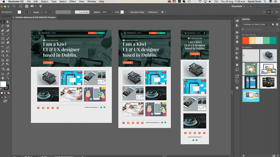
'Portfolio Website.ai'. So where have we ended up?
Here it is, this is my design. Now I want to start pulling
measurements from it. So I'm going to zoom in,
have a little look at this guy. I want the height and the sides here. Now the official way is,
there is a Ruler tool. So Eyedropper tool, Measurement tool. And you click once there,
and click once there. And it gives you the width,
so it's 19 from the side. And you can click once here,
click once there. You can see, it's 10, the height,
so about 20 and 10, it's never exact. So just stick the whole pixels,
they're tiny measurements anyway... so just stick the whole pixels. And so that's the official way. What I tend to do is grab the
Rectangle tool, and use this. Why? Because it snaps,
which is really cool. Can you see, it just
kind of joins up... and really wants to snap
to the edge of things. If yours doesn't, go to 'View',
make sure 'Smart Guides' is turned on. That one there, that will
stick to the edges. The other nice thing is, watch this... I can click here, and it snaps
right to the corner. You can see there, there's my height. You can see, this is
kind of intersecting... so I know my height
and width in one go. You can see, it's 19 from the side,
and it's a height of 10 pixels. So that's what I'm going to use
to translate into Dreamweaver. So when I'm building a site,
and I've got my design here... in either Photoshop or Illustrator,
it doesn't really matter. I pull my measurements from-- I'm going back and forth
between these two programs... so Dreamweaver and Illustrator,
in our case. So what I want to do is I'd like
to have a height of 10. And I would like
this left hand side of 19. And you can see, it pushed it,
10 down, 19 across. And what I'll do is, I'll do on
the right hand side as well... because we'll have some
navigation on it eventually. The same for the bottom,
I want 10 at the bottom... just so that there's a gap
that matches the top. All right my friends, so that is how
to create a css sheet, styles.css And we've done some basic styling
using our CSS Designer panel. If you're using a version of Dreamweaver
like CS6 or earlier... you're not going to have
the Designer panel. That sucks... because this course is all based
around the CSS Designer panel... and it's awesome. So you might have to look at upgrading. Can you get on in this course
without it? Probably not. You might want to check out my
Coding version of Dreamweaver course. So go check that out. All right, let's get into
the next tutorial... where we look at editing css rules.
9. How to change or adjust the CSS styles in your Dreamweaver website: Hey, awesome people. In this video we're going to
transform this ugly green box... and edit our css into this
lovely gray box. So now we're going to go
and adjust our css sheet. So let's say we've got nothing selected,
let's click on some random stuff. Why can I make this not work? There's going to be lots
of times in this course... where we're going to make a
Style, and you're like... "Huh, I need to change this." So what we're going to do is-- To go and adjust it, the easiest way... it doesn't matter what you've
got selected over here. Just click on 'CSS Styles', 'Global'. Then click on the Style you want. Later on in this course, it's going
to get longer and longer for Styles. At the moment it's super easy because
we've got only one, one Selector. A Header, and now we're going to
go and make an adjustment. Now there is lots of
adjustments in here. So what you can do to make
life a little easier... see this option that says 'Show Set'?
I love it. It can also be a real pain
when you're brand new to this. That it's only showing you the things
you have set, and you're like... "Oh, where's the other things,
where's the font sizes and stuff." So you got to remember, you control
with this on and off during this course. And what it does is really... the only things it shows you
is the things you've actually done. So we've done the Padding
and the Background color. So what I want to do is
change the Background color to black. And in our case, we're going to choose-- By default, most of the time
we're going to use... hexadecimal numbers,
it's hash numbering. You move it around, you can see,
these numbers correspond with the color. Now, what we want to do is, I want
to lower the Opacity of this background. So we have to use this RGBa,
it's the newer format. There's no real right or wrong. Hex is the slightly older version. RGBa is the newer version. And the reason it's cool is because
it has this 'a' at the end... which means Alpha,
which means Transparency. Which means this, and those
hex numbers don't have it. You can see, I can make it
slightly transparent. So I'm going to drag it to black. And we can see now,
it's kind of looking gray... but later on when we get
some images behind it... it's going to be slightly transparent. It's up to you whether you want to
do this now, or a bit later. How dark? It's going to be hard to know
until we get our images behind it. And we can adjust it later. Another thing you can do is... say that this panel here
is just driving you mad... you can just go to CSS Styles,
you can see it there. There's my Styles. You can see, say the Padding
needs to change... I can just change this to 12 at the top... and 12 at the bottom. It doesn't really matter whether
you want to use Code view... or you want to use
the CSS Designer panel. In this course, we're going to be
sticking mainly to the CSS Designer. Back to 'Source Code'. One last thing before we do
is the 'Save All'. So whenever I make
an adjustment to my css - I'm going to drag this around,
hit 'Enter'. - you'll notice that this styles.css
gets this little asterisk in here. And I want to hit 'Save'... but because I'm kind of in Source Code,
viewing my HTML... if I go 'File', 'Save'... nothing happens, and I'm like, "Ugh." So I need to go and do this
something called 'File', 'Save All'. The only problem with Save All
is that it's a long way... and yours won't have a shortcut. I've made a shortcut for mine... because it's something you should do... before you preview anything in
your Real Time Browser Preview... or over in Chrome. So you go to 'Save All'. That means it saves this,
plus the css sheet... and maybe some JavaScript we've got open. So 'Save All'. To do the shortcut... on a Mac, you go to 'Dreamweaver',
go to 'Keyboard Shortcuts'. On a PC, it's under 'Edit'... and right down the bottom there is one... in here somewhere,
that says 'Keyboard Shortcuts'. You might have to find it. So the first thing is,
we're going to go to 'Menu Commands'. We're going to find 'File',
find 'Save All'. And in here, we're going to add
a '+' to the shortcut. It's going to say, "You cannot
modify the default set". Click 'OK', we're going
to create our own one. And you can call this anything you like. 'Dan's Dreamweaver Shortcuts'. I only half finished that. Okay, so go to 'File'... and let's click 'Save All' now,
and now hit '+'. And we can pick anything we like. I'm using 'Command Shift A'. On a PC, it's 'Control Shift A'. And that's going to-- You can use anything you like,
it doesn't matter. Whatever you think you remember lots. That's how we're going to do it. Click 'Change', click 'OK'. And now, whenever I go... I can just say 'Command Shift A',
and it saves all. If ever you go and preview
in your browser... do 'Command Shift A' first, or go to
'File', 'Save All', the long way. Just so that everything is up to date... because you can sometimes
be previewing something in Chrome... and going, "It's not working,
I thought I just changed that"... and it's just because you haven't
saved the documents. That is how to edit css... and how to create little shortcuts,
'Save All'. On to the next tutorial.
10. How to center your website in Dreamweaver using a container: Hey, in this video we're going to
take our website... which currently stretches on to infinity... we are going to do this to it... where it's now all centered in... and only has a maximum width
of about 1200 pixels. And when I re-size it,
it's always in the center. So let's go and do that now
using Adobe Dreamweaver. So currently, if I preview
in the browser... this thing, my Header goes on forever. What I'd like it do is kind of
stick here in the middle... when it gets to a certain width,
a max width of about 1200 pixels... otherwise, it looks fine
on my laptop here... but if you're on a really big screen,
like an iMac... one of those 27" guys... you're going to have your Logo
on this side... and your navigation
is going to be like... a kilometer to the right of this side. So we need some sort
of maximum boundaries... and we want it to be centered
left and right. So we're going to do it in Dreamweaver
using a Container. It's pretty easy,
so back to Dreamweaver. So, here in Dreamweaver... I need to wrap everything I can see
on my page in a Container. This includes my Header at the moment,
and that's about it. So the Body is everything
I see on the page. So I want the Header down here. So I want all of this to be inside
a Container that I can center. Then the Header will come along
for a ride. I'll put the whole website
inside this Container. To do it, over here, in my Live view... just click on your Header,
I want to see this Header here. If you find you're clicking on the image,
and you can't really find it... what you can do, see down here,
this is called Tag Selector... so I've got my Image selected,
there it is there. There's an a-tag around it,
and there's a Header around that... and there's a Body around that. So this is good way to select
on these things. Click on the Header, or just
click over here in the side. And we're going to go to 'Insert'... and under 'HTML', we're going to
do this thing called a 'Div'. Divs are super common
in Web Design. They are divisions of space. What we're going to do is click on this... and we're going to get these options here. What it's asking me is... do I want this Div to be closed before... that thing I've got selected,
which is the Header? Do I want it after it? Do I want to wrap it around? So wrap it around the outside... or do I want it nested, which means,
do I want it inside the Header? Like our Images. In our case, it's Wrap. I've got the Header selected... I would like this Container
to Wrap around the outside... so that the Header is inside,
just click 'Wrap'. And it's probably best to see
down here in Code view. You can see, this Div is wrapped
around the Header. Awesome! Div is a really generic name
for a Container. I'm not going to use those
div tags throughout this site. So we need to give it a name, so we
can tell it to do a specific thing... because if I say, "Div, I
want you to be centered"... every single Div in this whole website
is going to be centered. And that's not going to be
what we want. So what we do, is two parts. We define the name over here,
and what it does... and then we're going to apply
it here in Live view. So to define the name... we do over here, in my CSS Designer panel... we click on 'Styles'. We say I'd like it in 'Global'. And I'm going to give it a name.
See this Selector? Click the '+' button. Up until now we've defined things
that already exist in our HTML. You can see here, we defined Header... you can see here, it wants to
define the Body. Things that already exist. What I'd like to do is give this
a brand new name. One that doesn't exist on this
page now, a really unique name... because if I started styling
the Div... remember, it's going to apply
to all of them. And the way we make these unique,
is we add a name to them. And these are called Classes. A Class Selector is just
a name that I'm giving it. And the way you define Classes... is you put a full stop '.' to appear
at the beginning of your name. That tells the internet this is something
specific that I've made up. And they are called Container. You can call them anything. You can call it banana sandwich,
and it will still work. We're just calling ours Container. If you're going to use 'banana sandwich',
you can't use spaces. You need to make sure, if you're
going to use 'banana sandwich'... you have to use a space. And then you'll have to explain
to whoever looks at your website... why you called your Container
'banana sandwich'. But anyway... So we're giving it a name, make sure
it's got a full stop '.' at the beginning. Give it a name, use the upper case. Most of the time it will work
with upper and lowers, but don't. And now over here... where it says 'Show Set',
we're going to turn that off. We had that around in an earlier tutorial. It showed you everything that's applied... to this Container so far,
and there's nothing. So we're going to 'untick' it,
so we can see them all. The first thing we're going to do
to center our website... is we're going to give ours
a maximum width. We're going to say... instead of getting as big as you
like forever, we're going to say... I'd like a maximum width,
and we're going to use-- We're actually going to match
what we did here in Illustrator. In Illustrator, we decided,
what did we decide? Where's my Layers? Artboards? We decided that our biggest width
we've designed for is 1200 pixels. Now this is not an absolute specific size
it needs to be. You might be working to 1024... which was a really common size. 1200 is more common now. This keeps changing, it really depends on
what you want the bigger size to be. Follow me, do 1200, works fine. Smallest to the biggest size
you need to be is probably... 1024, don't go any smaller than that. So, jump back into Dreamweaver. What I want to say is,
you can get to a max width of pixels... and you can only be 1200 wide. For some reason,
Dreamweaver at the moment... double types lots of my letters,
you'll see this throughout this course. I can't make it stop. So 1200 pixels is how wide
it's going to be. I'm going to preview in a browser. I want to stretch it out,
move it over here... and stretch it out to be full. It doesn't work. Why? It's because we created it
in Dreamweaver... but we haven't applied it yet,
so let's go into Dreamweaver. What I mean by that is,
we've created it down here... we've styled it, and said,
be a 'max width'... but over here, we haven't
actually applied it to my Div... so we need to add it to it. So what you need to do is,
select a Div. If you can't select it, and say
you've got this clipped... remember, the Tag selected
down here is real handy. I'm going to grab the Div. And here, you can add a Class from ID. And we're going to type in our Class. Now what goes at the
beginning of the Class? That's right, a period or a full stop. And you can see there, because,
generally this is super helpful... it's actually added the word
Container for me. I can type it in. But it's pre-selected it for me.
Hit 'Return'. And now I'm going to go
and preview it in a browser. What I'm first going to do
is do the 'Save All'. Cool little shortcut, remember. Otherwise, 'File', 'Save All'. Now we're going to check it
in the browser. Hey, so now that Div,
called Container says... don't be anything bigger than 1200. The reason I said don't be
anything bigger... is because I actually
want it to be smaller. Because we're going to get down
to Tablet and Mobile stuff. So instead of just Width,
use Max Width. So, go no more than that, but I'm
going to add, do what you want. Our next problem is, it's not centered. So it's doing the right width,
but it's not centering on my page. And, we've been through our
transformation Web Design... where everyone want it to the left,
nobody want it at right. And then, everyone wants it centered now,
so let's go and do that. To do it, it's pretty easy. Make sure, 'styles.css', 'Global'... make sure your 'Container' is selected,
and all you do, under 'Margin'... where it says, these little pixels,
switch that to 'Auto', 'pixels'. We'll also make
left and right margins 'Auto'. Hit 'Save All', check in the browser. And hey, we have got a centered website. So as long as everything goes inside
that Container Div... it will get centered like this. So, let's jump back in. That's going to be it
for centering our website. We are now going to go off and
create some Media Queries... because at the moment,
we have a Max Width for a Desktop view... I would like to do some changes... and add some Media Queries
for Tablets and Mobiles. This is what we consider
Responsive Web Design. Let's go and do that in the next video.
11. How to a website that changes for mobile cell phones tablets using Dreamweaver: Hey there, in this tutorial we're going
to look at adjusting our site... for the different tablet sizes,
and mobile phone sizes. They're called Media Queries,
you can kind of seem them up the top here. So our website's a desktop,
the Header there is gray. And if I get down to Tablet size... hey presto, it's red, and I get
down again to Mobile, and it's green. I know those are ugly colors. They're just there as place holders
to test our Media Queries. Let's go and do that now
in Dreamweaver. So it's time to get all responsive
and mobile friendly. And it's actually really easy. So what we need to do is,
look at something called a Media Query. First thing we need to do is look at
these Media Queries Bar. If you can't see yours, there's a little
icon here, you can turn on and off. If you don't have that bar,
or that icon... it might mean that you're using
an earlier version of Dreamweaver. Maybe CS6, that doesn't
have this option. Now unfortunately you can't
follow this particular tutorial. You can still do Media Queries,
but you have to hand code them. You can't use this nice little
interactive thing at the top here. So we're going to use this thing. And it kind of tells us what to do it says, click on this Icon
to add a Media Query. And that Icon is over here,
and that's in there. So, we're just going to click on it. And we're going to say, our first
one is going to be Tablet... because we've kind of already
done Desktop. Desktop is considered Global in our case. Some people design their websites
around Mobile first. That term, Mobile first means
I'm going to design it for the Mobile. And then I'm going to make a Media Query
that overrides the Mobile with Tablet... and then over the top of that, in Desktop. I design my websites the other way around. And I always find that my
students find this easier. We design the Desktop version mostly. So often there's more on that side... and it's kind of how most
people view a website. It depends on your kind of website... but definitely my stuff, 80% of views
are from Desktop. So I'm using a Desktop first approach. So, we're going to click this
little '+' button again. And we're going to work on Tablet first,
so we're going to say... Tablet is going to be between these two... so it's going to have a
minimum of a certain size... and a maximum of another size, and that's
going to be considered Tablet. Now it's a little hard to get the
exact measurement... because there's so many Tablets up there,
and so many different sizes. So what we say is, it's a minimum
of about 401. It's the smallest. Anything smaller than that,
we'll consider a Mobile phone. And we do a Media Query
separate for that. How big should it get is... 768 is the width of an iPad,
where it's in Portrait. So we'll use that size. There's no reason why
you couldn't use 770, or... say this is in the distant future
when there's lots of different sizes... you might decide that it's too small,
or different sizes. Kind of just a generalized sizing for now. But it would be a really
typical size to use. Where is it going to go? It's going to go inside my styles.css I'm going to click 'OK',
and you can see here... there's my little blue bar,
that's our min-max. It's got a minimum, and a maximum. And we're going to have things trigger
when it gets to that size there. Let's have a little look at our styles.css Click on the related documents bar here. You can see, that is what a Media Query
looks like, that's the syntax. Again, if you're using
a version of Dreamweaver... that doesn't have this
nice little handy bar... you can just type it in here. So, that is considered my Tablet. And what we'll do is put a
few returns in just above it... and we'll add some comments,
just so that... later on we know what we're
talking about, and what we're doing. To add comments in Dreamweaver... there's this option here,
it says Apply Comment... css comments look like this. It's a slash '/', and then,
an asterisk '♪'. And it needs to go between here,
we can say, this might be my Tablet view. Now this is ignored by the browser,
it's just here for humans. So you don't need to write
this, it just means... later on, I can say, go to Tablet view,
and you know where to go. So next thing we’re going to do,
is we're going to put in our Mobile view. So we're going to click
on this little '+' again. And we're going to use a max. So a max width of 400. It's going to go into style.css,
let's click 'OK'. You can kind of see up here,
so, anywhere... up until a maximum of 400... will be my Mobile view, and then,
the Tablet view takes over. And it's just one pixel more
than my Mobile view. If things were both 400... I've no idea about what will happen. They'll probably just fight it out,
and there'd be blood and css everywhere. So just make sure, 400, and then,
401 is where the next one starts. Now in this tutorial, we're just doing
Mobile, Tablet, and Desktop. You'll find lots of other sites that have
five views, or four, or seven views. We're just going to do three... and professionally that's normally
all I attack. Small for Mobile, kind of
medium size for Tablets... and a big size for all Desktops. You can see down here, in my css,
I'm going to add that comment again. I'm actually just going to copy this one... and paste it here on top, and this is
going to be my Mobile view. What I'll also do to make things
a little easier... is we'll put in, at the top here,
underneath that... we'll put in this, it's going to be
my Global view. 'Global/Desktop View'. Just so that when you're working,
you kind of know these. Now nothing much happens other than
we've got colored boxes up here. Now we need to do some slight adjustments. So what we're going to do is,
go back to Source Code... and we'll go to CSS Designer,
and we'll say... in my Styles menu, we've got these guys. Before, we just skipped on clicking
on Global, and these two didn't exist. Now we can say, I like a Global. I'd say, Global's got my two Styles
that we've got... the Header and the Container. So what I'd like to do is... I want to adjust the background color
of this Header. And I want to do it for Tablet first,
which is this min-max one... which is 401 to 768. And you can see,
there's no Selectors here. So nothing specific for Tablet,
I'm going to say, yes there is... so it's going to be now, Header. So, we've got one for Header. You'll notice we've got one
for Global Header now... and one for Tablet. Now this one here in Tablet
does nothing yet. I'm just going to go to
'Background', 'Background color'. Pick a big obvious color like red,
hit 'return'. And I'm going to drag this in. And what you'll notice is,
nothing happens. I'm going to hit 'Save All',
still doesn't change. That's why I don't like using
this Live view at the top here... it's just the few little things
that don't update... but if I check it in my browser... here it is, and I drag it down... and I get to my 768,
somewhere around here... hey, that my friends,
is all Media Queries are. You're just saying,
between these two pixels... do something different,
and we're saying... override the heading, and
make it red instead of green. We'll do the same for Mobile,
just jump in here. And I'm going to say, 'styles.css'
in my maximum of 400. Remember, that's my Mobile view,
I'm going to say, you, Header... toggling it in, hit 'return' again. I'm going to say,
be background color of green. We're not going to keep this,
this is more of an example. I'm going to hit 'Save All',
I'm going to check it in my browser. So, big, Tablet, Mobile. Awesome! That's what Media Queries are. So we're going to go through
and do things... like, I'd like the font to be bigger... I'd like this box to stack differently. That's how we're going to achieve
all these different things. You can see, the font becomes centered
when it's Mobile. I want to select the line,
and a bit of some Tablet. It's smaller when it's in Mobile... and that's what we're going to do... we're going to say, I want this
heading to be smaller, please. Just within this Media Query. And that's all Responsive Web Design is. Let's jump back into Dreamweaver. You can see here, that one's updated,
that one quite hasn't yet. 'Save All'. You can, if you want to
keep using this, you can go to 'View'... and go to 'Refresh View' or 'F5'. That should get it going. I'm going to double click this gray area
to go fully back out. We're going to look at the next video... we're going to look at previewing it
through your phone or tablet. There's a really cool feature
using Live Preview. Let's do that in the next tutorial.
12. How to test your Dreamweaver website on a mobile phone or tablet: Hi there, in this tutorial we're going to
look at previewing our website... from Dreamweaver directly
on to our mobile phone. And it's going to appear here. See that green background,
and then watch this. It's red background. The nice thing about it is
we don't have to host it on a website... and we can just... make adjustments on Dreamweaver directly... and it automatically updates
on a mobile phone, it's really cool. Why am I holding across my face? It's because my camera won't zoom when
I get it close to the camera like that. See, so I hold it here. All right, let's get into the tutorial. The first thing we need to do if
we're going to test on a mobile phone... is we need an actual website that has
some differences when it's on mobile. So, the Desktop view, it's gray. If I get down to Tablet, goes red. And down to cell phone, it's green. We did this in a previous tutorial. Now what I want to do is... down the bottom here, go to
Real Time Browser Preview. Clicked on this, and before,
we used Chrome... now we're going to use this one.
I'm going to have to twirl that up... because for some reason my screen
drops off that bottom. So you need to be able to see this. And we're going to do two things
we do in real life. You can either use a QR code... just scan that, or you can... type in that URL, or email that
to yourself. So I switch to real life human Dan,
and he will show you the rest. Okay, demonstration time. What you do is you download
a QR Code Reader. There's loads of free ones online... or through the App Store,
I've got mine on an Android here. And pretty much it is pointed
at the QR code that we generated. And hopefully-- I'll get close enough. Makes a little beepy noise,
and it takes you to the website. Now you're going to have to put in
your password for your Adobe ID. And eventually, hopefully,
it's going to load. There it is, it's the green version. We have the camera focused on it. And watch this, horizontal,
it's the red version for Tablet. Green version for Mobile. It's because it does screen width
rather than the actual device. It's too hard to try and pick devices
that change too much. So you end up just doing screen widths. The nice thing about this though is that... you get to then stick this
up next to your computer... and plug it into the power,
and just be developing on Dreamweaver... and it instantly updates all the time... on your mobile device,
you can have a tablet there. Impress the heck out of people,
you'll look like a pro. All right, let's jump back into
the screen capture version of myself. So before we go, what we want to do is... we added these crazy colors to prove
that Media Queries work... it's not what we want
for the long term website. So we're going to go
and just remove those. So 'Styles', we're going to find-- We'll do it for Tablet first, 'Header'. Actually we're just going to delete
the whole Selector. You can just remove the background color... but actually I don't think I need
the Header for anything else. But I'm going to hit minus '-', goodbye. Go to one that's similar,
find Header, minus '-', goodbye. Now the responsiveness doesn't
really do anything... but at least our Media Queries
are still there for our future work. Tablet, and Mobile view. All right, onwards and upwards.
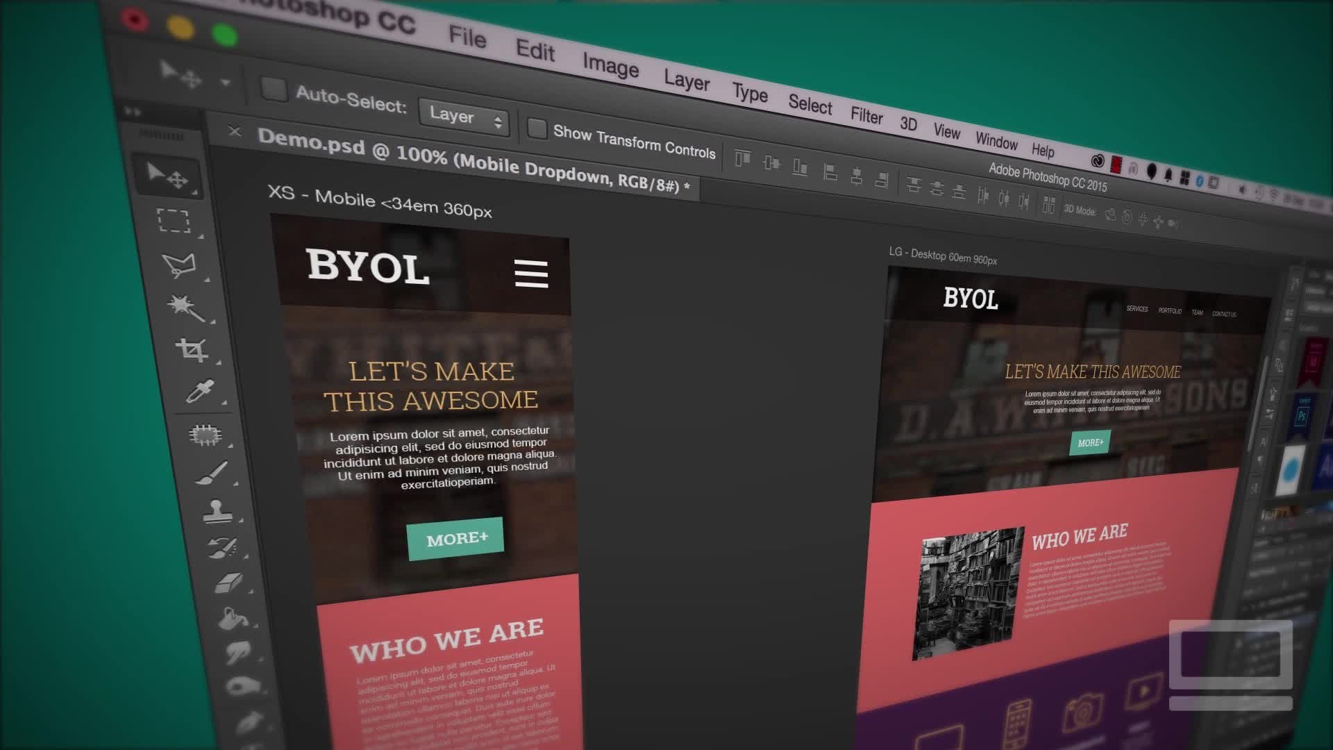
13. How to create a hamburger mobile drop down menu in Dreamweaver Part1: In this video we're going to create
an ugly looking desktop menu... which we'll Style in the next video... but when it gets down to Tablet,
and Mobile, it turns into a Nav Sandwich. So let's go and do that now
in Dreamweaver. First thing we're going to do is,
we're going to... in this video, put in
the core components... and turn them on and off
for the different views. After that, in the next video,
we'll look at doing the JavaScript... that makes the click action happens,
when you click it, the menu drops down. And in the last video, or at least
the third of this little chunk here... we'll be styling it
to make it look pretty. The first thing we need to do
is add our Navigation. And it's this Navigation tag here,
I want it to be just after this image... so I'm going to click on this image... and remember, there's an image,
but that image is inside this a-tag. That is the link that we put around it. So, click it up here, click the image. And we're going to click
down here and say... the a-tag that's actually around
the outside of this image... we want it just after you, please. And say, 'Navigation', click on him. So I would like it after the thing
I've selected, there it is there. First thing I want to
do with Navigation... is add a Style to it, to get it
to float to the right... because I don't want it underneath here,
I want it in the top right here. So go to 'CSS Designer'... Under 'styles.css',
I would like it in 'Global'... I would like a Selector called 'Nav'. And I'm going to use the 'up' arrow. Remember, specificity just means that... it's saying, the Nav tag... which is inside the Header,
which is inside the Container. I don't need a way around that... because I only got one Nav tag
for this whole document. So I don't need to be that specific. I'm not going to say specificity
any more in this course... because it's very hard to say. So, I want the Nav tag to
float to the right. Float is this one here, I'm going to say
'Float to the right'. And it kind of just jumps on to
the right side of the page. Awesome! Next thing I want to do is put
two Div tags inside of this Navigation. One Div tag is going to be
for my Mobile menu... which is going to be my Burger menu,
the strappy line thing. And the Desktop view is going to be... those colored buttons that say
'About Us' and 'Contact Us'. So basically what happens is
you have two separate Div tags. One with the Mobile menu in it,
and one with the Desktop menu in it. And we just say, turn one off
when we're in Mobile view... and turn the other one on. And switch it around when
we're on Desktop. So, let's go and set those Div tags. So I've got Nav selected, I'm going
to go to 'Insert', click on 'Div'. I want this on the inside, please. And we've got a new Div tag,
you can see, there is my Nav... and there is the guy
that's inside. Do we need this text anymore, we don't. I like to delete the text here
in Code view. Deleting it in Live view works
most of the time... but I find it's a little bit easier
to do it in Code view. So you can see, there's my Nav tag
opening and closing... and there's the Div tag inside of it,
only two of these. What I can do is, over here
I can select on the 'Div tag'... and say, another one please,
just after him, here he is. So now I have two. Let's put in different components. So in this first one here,
I'd like to insert an 'Image'... which is going to nest inside. And I'd like it to be my Burger menu,
which is under 'Exercise Files', 'images'. And we're going to use the svg version
Burger menu. You can use png, svg is the newer scalable
vector graphic version. Let's click 'Open'. And it's going to say... "You've selected something outside, would
you like to put it in there for you?" And you say, "Yes please, put it in
with my images." There, please. Because I've practiced this one already
to make it super slick for this video... I've already got my Nav, so you
won't have to click 'Replace'. You'll notice it's very big, so with it
selected, I can say-- Hit the little menu here, and say,
"Actually I just want it to be 25 pixels." You decide how big you want
yours to be. Next thing I want to do is
get rid of our text. And like I said, I like to delete
the text here in Code view. I don't need that text anymore. So I've got a Div tag, and it has
my images inside. Let's put in the Desktop version. So inside this guy... I click on him, there he is there,
a red Div tag... I'm going to put in something
called an Unordered List. This is how we describe Lists. And Navigation is just a list of options
you can go to on a page. To select on this Div, I'm going to say... insert 'HTML', I'm going to find this one
called Unordered List. An Ordered List is a numbered list... and an Unordered List is
a bullet pointed list. So you can see, bullet points. We're going to remove those
from the Styling a little bit later on. So, what I want to do is
change this text. I want to say, this one is
going to be the 'About Us'. I've used capitals, you don't have to. 'Return', and 'Contact Us'. I mean, 'Me', 'Contact Me'. 'About Me', because this is just
my Portfolio. So I'm going to click out, you can see
I got two bullet points. Let's have a look at how these are
constructed, there's the Div tag... and inside of that is my Unordered List. There you see, the beginning and ending. And inside this Unordered List
are the List Items. So these are the different bullet points. That's just how it's constructed. It's going to be important for when
we later on go and start styling. What I'd like to do while we're here
is to give them Hyperlinks. So I'm going to double click 'About Me'. And click on this one here, see,
it goes orange, click on the 'Hyperlink''. And where is this going to go?
It's going to go to hash '♪'. Hash is just-- I don't know yet... what that icon means,
or that pound '♪' sign. You could put 'About Us'. 'aboutus.html', in lower case. But I don't really know
what it's going to be called... so if you don't know,
just put in hash '♪'. And that allows it to be a link,
but it doesn't cause an error. You can change this later on. Same with 'Contact Me', both of them
are going to hash '♪' at the moment. Next thing I'd like to do is turn them
on and off at different views... because at the moment, you can
see them all the way through. Mobile, Tablet, Desktop. So, what I'm going to do is
do the Mobile one first. I double click this, there we go. I want you to turn off,
when you're in Desktop view. So, what I'd like to do is
go to my CSS Designer panel... in styles.css, in my Desktop view,
which is Global. I want to say-- I'm going to create a new Selector,
this one's going to be '.mobile'. So this is going to be
a Class, mobile view. And what I'd like to do is,
when it's in Mobile view - So this is that thing,
it's going to control this. - so at Mobile view, I would like you
to display 'none'. None, just means, we can't see. So nothing happens, because what I
need to do is find the Div tag. It's wrapping around the
outside of this image, and apply it. Where do I do it? I can do it down here. So I have my Image selected,
now I've got my Div tag selected. And Div means, the .mobile, you're there. He's gone. Cool, huh? So, this Div tag now is called
Mobile view Div tag. And what we're saying is, when it's
in Global, which is Desktop... I would like you to display 'none'. And the problem is, it displays 'none'
all the time. That's why they call it Global, and not
specifically Desktop. Because what it means is,
it means everything. Global means everything... unless Tablet view says,
do something different. But at the moment, if I go to my css,
I look at my Tablet view. My Tablet view doesn't save anything. So it doesn't override Mobile view. It's a cascading Style Sheet,
so it flows down... and flows over all of these
unless they say something different. And they don't, they say, Mobile view,
we don't say anything. So that's what we're going to do,
we're going to say... under 'styles.css', when
I get to Tablet view... just select a name.mobile-view. Hit 'return' again, it's gone. Instead of saying 'none' now,
we're going to say, apply 'block'. Block is a weird one,
it sounds like 'none'. I think block of wood, block of concrete,
something solid, I can see it now. Works for me anyway. So, I can see it. So let's go and check it in a browser,
Live view is not great, remember. 'Save All', check in a browser. So, my Mobile menu in Desktop view
can't be seen, it's 'none'. Now when it gets down to Tablet view... it's blocked, it's a block of wood. And when it gets down to Mobile view,
it disappears again. So what we need to say is,
styles.css, when it's at Mobile view... which is my maximum of 400 pixels... I can make another Selector
called '.mobile-view'. I'd like to say, display 'block' as well,
so I can see both of them. 'Save All', test, there he is. It's not lined up, that's okay,
we'll do the styling later on. It's mechanics here at the moment. So, you can't see him, you can see him,
you can see him, awesome. So what I want to do now is
create a new Class called Desktop view... and I want to apply it
to these buttons here... and I want to turn it on and off,
depending on the view. So, let's create a new Styles. I don't want to make it Global, I could,
I could say, I'd like you to be 'block'. But it's audience block, we can
only see it at Desktop view. So I don't need to restate that,
what I need to say is, Tablet, turn off. So I'm going to go to my 'Tablet' view,
I'm going to click 'Selector'. I'll call this one 'desktop-view'. I did not call it Desktop view at all. 'Return' a couple of times, it's working. So Desktop view, and I'm going to say,
display 'none'. Now I need to apply it to it,
so I select on it. Let's click on that Div tag
that's wrapped around the outside. I'll click here, click full stop '.',
click 'Desktop'. It's not appearing. This happens a bit.
You need to hit 'Save All'. And then go back and undo this,
and hopefully it's there. 'Save All'. 'Desktop', still not doing it. I'm going to leave this in the video
just because it happens to everybody. So I'm going to just type
it in physically, hit 'return'. It's going to say, "Would you
like to create something new?" Keep hitting return on your keyboard
until it goes away. And it is applied, if I click on this guy,
you can kind of see... there's my Div tag, and it's got
that Class applied. That happens to me a bit in Dreamweaver.
Just the way it is. 'Save All', let's preview in a browser. You can see, Desktop view, I can see him... but when it gets down to Tablet,
goodbye, he is 'none'... but it is back when it is in Mobile. So let's do the same thing,
'styles.css'... in Mobile view, I'd like to create
a Selector called '.desktop'. Awesome! And I'd like to say, I'd like
to display 'none', please. 'Save All', preview in a browser, gone. Gone there, nice. So that's all we're doing. We have two Div tags,
one's called Mobile, one's called Desktop. And we're just turning them on
using display at different Media Queries. Problem now is, this doesn't work yet. So we're going to go through now
and use some JavaScript... to make this a little drop down button
to make that work. You're ready for your
first bit of JavaScript? Let's go and do that in the next video.
14. Using Javascript jQuery to make a mobile dropdown burger menu in Dreamweaver: Hi there. In this video, we're going to look at adding some JavaScript to take this ugly-looking desktop menu. When it switches to mobile and then when you click the mobile, it shows you the ugly desktop version. This little toggle click on and off. I realize the styling is not great and there's a few little problems with layout, we'll do that in the video after this one. What you really need to do is pay attention to the magic clicking showing thing we're going to do in JavaScript. Let's go and do that now. First thing before we get on and start making it, is what is JavaScript? There's three components to a website, there's HTML, CSS, and JavaScript. HTML is an easy one, think of it as the noun. It is the things that appear on the page, it's the objects, it's this button here, it's this image, it's this text. Those are all in my HTML, and those are things. Then you've got your CSS, and this CSS just describes the styling of things. This is my background color, this is how much padding it's got, it's the pretty stuff, it's the adjective. I consider them, HTML as nouns, CSS as adjectives, the describing words, and then you've got the verb, which is JavaScript. What happens when the user clicks this? It's the doing of things. It might be that the user clicks a button, like in our case here, this menu drops down, or maybe when a user clicks the "Play" button on the video, or drags a slider, or realigns things on a page, so it's generally the user interacting somehow with your website, JavaScript happens. When I say we're going to be learning JavaScript, we're actually going to be using something called jQuery. JavaScript is a lot more complicated. What some clever people did is they created this thing called jQuery, and what it does is it's a library build on top of JavaScript to make it easy for people like us. Instead of having to write lots and lots of syntax out, we can use lots of simple language that makes things better for humans, and it does pretty much everything we need to do in terms of front-end web design. We're not learning essential JavaScript, we're learning something called jQuery, which is just easier language used on top of JavaScript. Let's go and do that now. This little snippet here is going to help explain what we're doing. I wasn't sure if I should leave it in the tutorial series or not. I'm going to leave it and probably just to hopefully explain instead of just following me blindly. We're going to figure out what we're doing here. Basically, what we're doing is I'm previewing this in Chrome, and I've just got some nerdy stuff over here to help show you. Basically, what I would like to do is this little navigation here, when the user clicks it on their cell phone, I would like to use JavaScript. When the user does something, I'd like the JavaScript to add a class to this little stripe menu called Expand, and that'll expand the menu out. Because at the moment, there it is there desktop menu, got one class I'll probably call desktop menu, no other classes. What I'd like to say is when it's clicked to magically use JavaScript to inject a class into here to make it expand. Watch this. Keep an eye on this thing here. When I click it, I'm a user, using my mobile phone, I click it, and magically, this extra class, there get away that gets added. Then that little class there we're going to define in our CSS to say, make it nice and big and show us the menu there. That's what we need the JavaScript do. Let's go learn how to do that using JavaScript and jQuery. The first thing we're going to do is we're going to create that Expand class. We're going to put it in our styles.css. We're going to put it in Global, and we're going to say, and I'll select this, we're going to create it. It's going to look all dot. Remember, it's a class we're making up. It's going to be called Expand. What we would like this thing to do is display, and we're going to say display block. Your little job as a class is when you're applied to anything is to show things up. But what we're going to do is get that to apply with JavaScript, not hard-coded like we have for everything else. The next thing we need to do is create our JavaScript file and connect it to our index page. Now when we did it with, remember, our styles.css it happened automatically because we've got this cool little CSS designer panel. To do it with JavaScript, we do it a little bit the long way. Let's go to File, New, and let's go to New Document, let's click "JavaScript", and let's click "Create". It's called untitled. Let's save it. Where are we going to save it? We'll put it inside of our Desktop, inside my files here called Dan's Awesome Portfolio. I could save it in with the rest of the files, but it's really common to create a folder called js. Inside of that folder, I'm going to put in this file called, it's really common to call it Scripts. You can call anything you'd like, but most people call it script.js. Let's click "Save". Now let's go and close it down. We just made it. We closed it down because now we need to link it to this index.html file. You can set up here my index and Source Code. You can see here, remember the styles.css, this was done automatically for us. We need to do this manually, so we need to put a return in, and we need to go to Insert and we need to go down to Scripts. Call it Scripts again. It knows it's going to the js file. Find Scripts, click "Open" and there you go. Those are linked together. Hit "Save", and you can see there's my styles.css and now my new little scripts file. This burger menu up here is because it's an SVG. If you use the PNG version of our little menu before, this won't appear there. Just ignore them for the rest of the course. Go to script.js, and now we get to add the JavaScript, or in our case, jQuery that controls that turning on and off. I totally lied. We're not ready to write JavaScript yet. What happens is your computer, or at least the browser that people watch your website on, will understand JavaScript just fine, but it'll get to the jQuery, which is basically shorthand for JavaScript and go, "The hang are you talking about? This is not JavaScript." What we need to do in our source code is we need to up the top here tell it where to look for, for the definitions of jQuery, and you do it using something called a CDN or a content delivery network. There's a few of them online. We're going to go to Google, and I'm going to type in jQuery CDN. There's a bunch of places you can link to. You can go to jQuery.com. I use the Google one. Where is it? Down here. Where's Google? developers.google.com. Here it says this is that little link for jQuery. I'm going to grab it all snippet. Actually, starts up there, grab all of that chunk. What I've done for you is I've put it in your exercise files and that code is something called jQuery CDN. You don't have to come here. You can just copy and paste my one. I'm going to copy it, and all we do is dump it in here. Hi everyone. My name's Taylor and I work for Daniel. I just want to jump in here and let you guys know that Daniel made a little bit of a mistake when he imported the jQuery library into this file. It's actually going to be around the other way from what Daniel has it. Currently, he calls the scripts file first and then the jQuery. The scripts file actually relies on the jQuery for it to run correctly. If you don't have this around the right way, your navigation may not work. It's important that you just switch it around. You grab the jQuery and you put it in above the scripts. This should eliminate most of the problems that you might have with your nav bar, with it maybe not working. Also the completed files of this tutorial will contain the correct file order for this code. That just tells us where the library is. Why do we just not have it locally like we've got script.js and our CSS on my machine? The reason is because this is a really big library, and the benefit of using, say, the one hosted by Google, it means that, say, a user is surfing the net and they go to 10 sites that all use jQuery because loads of sites use it. When they get to your site and the browser goes, "We're going to have to load jQuery," and goes, "Don't worry about it. I won't load it because I've already loaded it from this other website that I was at last." That's why we use a CDN and a link to a website rather than having it actually on your machine. It just means that Google is going to have it online all the time. Loads of people use it and that you don't have to download it like a millionth time when they get to your site because it's just that same old one that's been linking to there again, so the browser of the user doesn't bother going and learning all this new language again. It's already there. It already knows it. Long story short, just copy and paste that, stick it in the top, and it will help. Let's go to script.js. In here, we're going to learn a little bit of jQuery. Just so you know, when you are designing websites, nine times out of 10 you're going to be using jQuery rather than pure JavaScript. The first thing we need to do is tell it we're using jQuery. You can see the little coding hint helping there. What we're going to say is we're going to put in lots of brackets and lots of curly braces. Let's get ready for them. First bit is we're going to put it in our brackets. Inside this bracket we are going to write the word document. Thank you code helping. After the brackets we're going to type in ready. All this just means is that jQuery and don't load until the document is ready. Because what can happen is jQuery can start doing its thing before the document is even loaded or the whole page is loaded, and it just causes lots of errors. What we did say is wait for the document to load and then do your thing, and you'll find you don't get any errors. The next thing we need to do is tell it to do something. In brackets we say, "Do something please." But we don't call it, do something please. We call it a function. Just think, I would like you to do something, but code language it's called a function. Now we put in a set of brackets, set of curly braces, and at the end we put in a semicolon. These things here, I never really do anything with these first set of brackets. These are attributes that normally are just left empty. These curly braces are the really important parts. We're going to put all the things we want to do inside of this. This last little semicolon just means finished here. I'm done. I've finished writing my jQuery. Don't go on any further. All of the good stuff goes inside these curly braces. I could type them out here, but it's going to look a little messy. I'm going to undo, and what we'll do is put a return in between, and we'll just type them in here. Now I want to say again, I'd like to say I'm using jQuery. But instead of saying that jQuery is a long word and what the shorthand is $. So $ just think is the shorthand for the word jQuery. We're going to replace this one up here, because you'd be weird if you are using the word jQuery if one uses $. We're saying, "jQuery, I would like to do something." In this case, we're going to use brackets again. Inside of these brackets, I would like to add apostrophes. Not quotes, apostrophes. Because what I'd like to do is I'd like you to do something with the class, remember period for class, something with the mobile view. What would we like to do with them? I'd like to look out for a click. When you're clicked, I'd like you to brackets, do something. Remember, we don't use the word do something, we use the word function. Same but a crazy syntax. Brackets with nothing in it, semi-colons where the good stuff goes and at the end, we put in a semi-colon to say don't go on and post please. In with the good stuff goes put a return. Same as above, $ for jQuery. Same thing with the class. We're going to put an apostrophe, a dot, desktop view. What would we like to do to this desktop view? I'd like to add this thing. Instead of a click, this one's going to have a toggle class. That toggle class is going to toggle this thing called apostrophe expand. Remember that class we made earlier. Weirdly, we don't write in the full stop for this particular one. Just leave it off. Otherwise, it doesn't work. Get to the end here and say don't read anymore. That is going to hopefully make our menu work. Let's backdate it. We're going to say there's an expand class that I have. I'd like to toggle it on and off, desktop view when mobile view is clicked. If that was a mind bender and there's commas and apostrophes flying all over the place, I've created a code. You can copy and paste in your exercise files. You can go download those they're free. That is writing some jQuery. Let's go see if it works is the main thing. Remember, save all, jump into our browser shrink it down, click the button, and it doesn't work. I have to pause this and figure out why it's not working. I'll be right back. I'm back and I figured it out. Happens to the best of us. I really want to re-record the video and make me look super awesome, but I also want to let you know that it always happens. It happens to everybody. What I did was under the styles.css, it's actually working, I tested it, and the expand class is getting added. There's nothing wrong with the jQuery, it's the styles.css. What's happening, I put this in, I wanted to expand in desktop, but I didn't actually need this thing because it's in Global. I need this to be in tablet and in mobile view. I'm going to grab this, you're in the wrong place, cut them. I want you to be in. You can see my media query here. This is for my maxmin for tablet. So just before the ending of the close bracket see there's the opening, and there's the closing there. I'm going to put them in. I need a copy in there and down to mobile view. I needed a copy in there. Now, let's go and test. Now, click on it. It's still not working, hit refresh. Now, it's working. Click our jQuery works. It's still looks ugly, I know, and there's some layout to be done, but we'll turn that into another video because this one, dang, could be the longest video I've made in my video career history. Yeah. That is our jQuery, clicky, mobile and desktop drop-down menu thing. Now let's make this menu look nice.
15. Styling our hamburger menu getting our ul menu to stack side by side: Hello, lovely Dreamweaver people. In this tutorial we're
going to transform... these ugly bullet point
navigation buttons... into these good looking
red and green ones. Ignore the font, the fonts were ugly. We'll do that in the following video. But let's do the buttons now. So first thing we're going to do
is get rid of these ugly bullet points. We do that by styling this thing here. What thing do we style? We're going to style the Li, which is
in the ul, which is in my Desktop view. So let's go and do that now,
'CSS Designer' panel. Do it in my styles.css,
I'd like this to appear Globally. And let's click on 'Selectors'. Now because I had this thing selected,
it's going to pre-fill bits within... and it's kind of what I want. But if I go up and down... makes it more specific. I said I wouldn't say specificity
anymore, but here we go. So down means, we get more specific,
up, gets less specific. What I'd like to do--
because if I left it there... and said I just want to style the 'li's
inside 'ul's... that would apply across
the whole website... anytime there's an Unordered List. And I might have bullet points just
a little more on my Body Copy... so what I want to say is, I want - Using the down arrow on my keyboard,
I just say I want the 'li's... that appear inside 'ul's, that appear
inside this Class called Desktop view. Do I need this a-tag here? I do not. Why? Because I'm just playing
around with the 'li's... not worried about the a-tag. It's the Li that gives it
the bullet point, click 'return'. So this is my first Style,
and I'd like to say... under 'Text', I'd like to go down,
and try and find 'text-decoration'. I'd like to find 'list-style-type'. 'Undefined', I want to set it to 'none'. We see, the dots disappeared. We're just going to slowly work
through something different... what's called Compound Selectors. So remember, Selectors,
we've dealt with Classes before... it had the dots in front of them. And these ones are called Compound,
because they are bits. There's a bit of Class there, and there's
bits of these regular Tags here. So they're Compound, bits of everything
compounded together. You don't need to remember
the word compounded. So what we're going to do now is,
I'd like to-- At the moment these are stacked
on top of each other. This is their default state for 'li's. And that stack on top of each other
is called Block. So by default, these are
in a display called Block... which means they're stack
on top of each other. We want to change that. We would like to go up to the
top here, to 'Layout'... and we would like to find 'Display'. And instead of Block,
we're going to pick 'inline-block'... and that stacks them side by side, easy. Now, if we were styling these,
all the same color... I can go into my background color,
and change the background color. My problem is that I want them
to be different. So let's check out my Illustrator file. You can see, in Illustrator, I want them... to be two different colors,
so if I style the 'Li'... it means that they're both going to
become red, or green. And that's not what I want,
I want them to be different colors. So let's jump back into Dreamweaver. Let's create two Classes,
we'll create one called 'Red Button'... and 'Green Button', and apply
them to them. The reason we're doing that... is that we can re-use that
green button, or red button... because there are going to be
other buttons on our side... that we are going to use this for. So, down here, doesn't matter
what you've got selected... but it's going to go
to 'style.css', 'Global'. And in 'Selectors', I'm going to click '+'. Forget what's in there, we're going to
create our own Class. And they're called 'btn'... then hyphen '-', and we're going to
call the first one 'red'. Why do we call btn red, and not red btn? It just means that they're going to be... stacked next to each other
in the css here. Button green, button red,
we got a button blue... it's just easier to find them that way. So I click on 'btn-red', and I'm
going to go to 'Background'... and I'm going to pick a color. Now, if you've done
my Illustrator course... you would have known
how to export the css. We're going to quickly look at this now. So, in Illustrator here, I'm going to
click on this 'background' here... I'm going to go to 'Window',
we are going to go to 'CSS Properties'. And it's going to tell me
what the background color is. And that's the thing here I want. I'm going to double click it,
or right click it, click 'Copy'. And if you did do
the Illustrator course... you might have exported this
as a text document. But because we're both the designer,
and the front end web developer... we are going to just copy and paste
straight from the Illustrator file. So, I've copied it,
jump back into Dreamweaver. And in here, I'm going to
click on 'background-color'. And we're going to go back
to our hexadecimal numbers. You can see, in Illustrator,
there was actually both options. I just find these easier... just because they are simpler,
close to copy and paste. So, in 'background-color' here,
we're going to go back to 'Hex'. And we got to make sure that
we got the hash '♪' in front of that. I didn’t copy that from Illustrator. Hit 'return', that's my
little background color. Now I'm going to apply it. So what do we apply it to?
Do we apply it to the a-tag? I don't think it matters, we'd probably
run into problems later on. Let's hope we don't, so we're going to
go into here, and go 'btn'. And there it is there, red. Lovely. And it's got a background color of red. Not the padding we need,
but we'll do that in a sec. So we'll do this guy next. So, create a new 'Selector',
everything selected correctly. I'll call this one '.btn-green'. Same thing, and I jump into Illustrator. Here in Illustrator, I'm going to click
on this guy, grab that guy. Copy-- for some reason
I can't do 'Command C'... for copy, or 'Control C' on a PC,
I don't know why. You might be able to. But in here, I'm going to go, this one. I'm going to go to my hexadecimal numbers. A little passion there, that's quite me. I'll apply it to this one. Here we go, '.btn'. That's the other reason I call it btn... because they're all grouped there
when we type in 'b'. Lovely. So now we want to add some Padding
to the top and bottom of these buttons. This is where it's a bit
of trial and error. I promise you, I didn't know off by heart,
I just kind of... tried both options of styling
both, this one here. We're like, "I can Style the Li... and add some Padding to this." And I did it, and I went,
"Hmm, that didn't work." So, we have to go for a different method,
so let's go for the broken method. Always a great one to start with. So, where these 'li's
are inside my 'ul's... which is specifically
inside my Desktop view... which is great, they're really specific. And I'm going to say I'd like
some Padding, I'm going to drag it up. You can see, it's not
really adding Padding... it's just pushing it from the top. So that's when I went, "Hmm, not that,"
see this trash can here, turn that off. So what I decided was,
is I clicked on this guy... and I went, 'New Style'... and I'm going to make it
more specific. So I press my down arrow. So it needs to be
the 'Desktop' view, 'li's. And what I need it to do is this a-tag. That's down the bottom here,
you can see... there's an a-tag,
inside a li, inside an ul. Now I'll leave this in here as well... because I'd love to just
tell you the answer... but trust me, these things, we think... "Definitely, I'm 100% sure
that's going to work." And then it doesn't,
and you're like, "Hmm." You have to kind of look at the tags,
and go, "What else could I try?" So in our case, the active link. The hyperlink, which is inside the Li... which is inside the ul,
which is inside the Desktop view. This one's going to work,
well, I hope it's going to work. And I'm going to go to
the top one, 'Layout'... I'm going to add some Padding,
let's just drag it up. There you go, so that one's working. And what is it? It is 13
at the top, and bottom. 13, and it is 43 at the left and right. 43, again. My keyboard seems to be
typing in double 4s. 13 at the bottom, and 43 on the inside. You see, there's all my
little buttons working. Next thing I want to do is I need to
kind of like move that up a little bit. And you can use minuses. We're like, "Cool, so we just
did the Padding on this one... we just used minus margins." And it doesn't work. Hit the trash can. So, it's a bit weird sometimes
trying to work out... is it the a-tag inside the Li,
which is inside the ul? And if you get frustrated, don't worry. It's general frustration
all industry around. So, maybe I can do it to this one. The li ul. I go minus in here,
and that doesn't work either. And so, I work out that I need to
go up to the actual Desktop view. Let's go 'Selector', there's one I've
already got, it's called 'desktop-view'. If I do it to this one, you can see,
it starts working. I'm going to click and drag,
because I'm not sure, about there. Cool, one eye closed for that one. So -5 pixels, it goes up. So sometimes you're like,
"Well, this one is, and this one is not." And you end up having quite a lot
of Classes, and delete them... just to figure out which
one's controlling it. We're going to do a 'Save All'. Next thing I want to do is
remove the underlines. The underlines are controlled by-- You can play around with all of these,
but it's actually a-tag... because that's specific for hyperlinks. So we're going to go to that one,
go to Type. And we're going to go down here
to 'text-decoration', and pick 'none'. By default, it's on underline. So that's gone. Choose the font color, probably end up
with the same one, hopefully. And the font color comes from Illustrator. I'm going to click on this text here. And there is the font and the color. I'm going to right click it, click 'Copy',
back into Dreamweaver. Back into Dreamweaver. And we're going to go 'font-color'. Hash '♪', leave that there. It's kind of like just an off-white. The next thing I want to do
to make these buttons work... is I want to play with the fonts. At the moment, they're Times New Roman. It's not going to work for me,
so I want to take a look at using fonts. Something a bit different from Arial... and Times New Roman,
and the built in fonts. So we're going to look at that
in the separate tutorial... which is right after this one.
16. How to add different fonts to a website in Dreamweaver: Hi there, in this video
we're going to change... this ugly Times New Roman font... to this lovely Open Sans Condensed font. And we're also going to have
to change the spelling of this. I've just noticed that. You've probably been in this
whole course, going, "Wow, change it." I'll change it before the end
of this course, I promise. So let's go and add fonts
using Dreamweaver. So what I want to do now is change
the font that's in here. Now I could find, say, my Desktop view... and you can see, ul, li, and the a tag. So that's the thing I want to change. How do I know it's that one I want
to change? I go to 'Type' here. And I say 'Font Family', and I
just pick another one. So I know, it does change. I don't want any of these fonts
that are in the defaults. So I'm going to delete them... but that's how I figured out
which one needs to be changed. But I could change this one,
and it would work... I get to install my new font... which is going to be Open Sans Condensed. But the problem with doing that
is that I have to do it for this... and every bit of text
in my whole document... is going to have to go through... and then I have to find
the Font Family for them. So what designers do,
especially at the beginning... is they'll define the font Globally. So they'll say,
everything in this document... everything be Open Sans Condensed. So you pick whatever
your Body Copy font is. So I'm going to look at
my Illustrator file. That is a special use case,
it's for the top, what I use... the Condensed font here, for the Type,
and down the bottom here... and I use it on preceding pages here. That's the Open Sans Condensed. I've decided that that's my main font. So, I'm now going to go through
and set that as my default. You do it in Dreamweaver. So in Dreamweaver, what we need to do
is we need to start the Body Tag. The Body Tag is, remember, if I
click inside, anywhere here... the Nav, I'm inside the Header,
which is inside the Container... which is all inside the Body, the Body
is everything I see on my page. Remember, the Head is everything
that the computer sees... and the Body is everything
that the user sees. So if I Style this, everything in here
may be Open Sans. So to do it, I'm going to be in--
no I'm not going to be in 'All Sources'. I'm going to be in 'styles.css',
I'm going to go 'Globally'. And I'm going to click--
we don't have a Body Tag yet. We go to Selectors, and we pick Body. Now Body is one of those tags
that already exist... and doesn't need a full stop
in front of it. Just the ones we create. The Classes that need it. So 'Body', I'm going to go to
'Type', or 'Text'. And we're going to go 'Font Family',
and we could pick one of these. The only trouble with using-- say you
do like Gill Sans, and you're like... "Yes, Gill Sans is good." You can see, he comes on for the ride... because everything's been changed
to Gill Sans. But what's actually happening
is, it's saying... "Hey, person that's visiting my website... do you have Gill Sans on your machine?" "No? Well, do you have Gill Sans MT?" "No? Well then, do you have Myriad Pro?" And it kind of works its way down
unless it finds one. It generally ends up at Arial. So you don't want that. You want more control,
you want to actually say... "Use the font I mean,
not just a few of these." It's very uncommon to use these now. So what we're going to do... is we're going to go,
we're going to bin Gill Sans, goodbye. And we're going to put in a new font. So let's go up to 'Font Family'... and we're going to go to this one
called 'Manage Fonts'. Now, this loads something called
Adobe Edge Web Fonts. All these are, is that,
are fonts from Adobe... that they've given away for us
to use commercially for free. It's got some helpful search options
at the top there. We're going to use stuff that we've
designed out of Illustrator. You can see in here, in Illustrator... I've mainly tried to pick Web Fonts
when I'm in designing. So if you're in Illustrator... don't go off and pick random font
from your machine. Make sure you're using Web Fonts. So I've done it, so both of these fonts
are available as Web Fonts. But if I haven't, I can
go through here... and say, I want to look at
some Heading Fonts. It gives me more Heading Fonts.
Say you want some Body Copy fonts... that's this one here, it's more kind of
standardized fonts. I'm going to turn them both off,
you can pick Script fonts... you can pick Sans Serifs. So you can decide, just to
help you pick a Style. I'm going to turn these all off, and I'm
going to search for a font. We're using Open Sans, and we're
using the Condensed version. Why? Just because it's really good
for headings especially... because it's a Body Copy font,
because it's kind of skinny... you can fit a lot of characters on. So really long headings are more likely
to finish on one line... rather than breaking into two. But that's totally a Style,
design choice as well. So what I'm going to do is,
I've picked this... hit that little tick in the corner... and you click 'Done', nothing happens. So you kind of activate it,
then go to 'Font Family'. And it will appear down here. Now click it on, and then it will appear. A little warning will appear, probably. Mine's been disactivated. Disactivated is not a word, deactivated. And it just says we've added a couple
of things as well, as a warning. It just says we've had to
activate the 'Normal'... and the font-weight is '300'. Normally those wouldn't
come on by default... but it's just done it for you
to make this font work. The other thing that's happened is-- That's it, we've got a font going,
we don't have to worry about any more... but just to let you know,
you've got this thing that appeared. So, in my 'Index', 'Source Code',
at the top here... remember, we put in the link
to JavaScript... and the link to ??,
and then our Style Sheet. This thing here is just being injected
by Dreamweaver for us, to make it work. And basically what it's doing is,
it's going off to download the font. You can see, edgefonts,
Open Sans Condensed is being loaded for us. So, we don't need to do anything with it,
we just have to leave it there. Let's do a 'Save All', let's just check
if it works in a browser. Awesome! Here he is. Go down to ??. The Layer's not quite right,
well it's totally not right. But don't worry if yours is
still working like this. We've got to fix that
in the next video as well. There's a few other things
we need to do to make it work. All right, let's get on
to the next video.
17. Fixing the style of the mobile burger drop down menu in Dreamweaver: So the first thing we're going to do is... a Desktop, it looks kind of fine. At Tablet, needs some work. But it has some real problems
down here at Mobile. The biggest one is that, you can see,
there's not enough physical room to fit. Kind of okay at the 400, but you can see,
when it gets close to here... ended up just trying to
occupy the same space. So what I'm going to do is try
and shrink this Logo. So to do it, I'm going to
click on the Logo. I'm going to my Sources, now, you will
notice that these things just appeared. They weren't in there before. That is from the font that we added
from the Adobe Web Edge fonts. So we just ignore these
for the rest of the class. So what I want is, in styles.css... I'm going to put it in our Mobile,
we're going to create our Selector. And it's kind of guessed
exactly what I want. I want to Style this image
that is inside an a-tag. The a-tag gives it its link
back to Home Page... and inside the Header... which is specifically here. If you've got more than one image
in this Header, it's not going to work. You might have to add a Class to it,
a very specific one. Maybe the Logo Class,
and then Style that. But because I've only got one image
inside the Header, this is going to work. Hit 'return'. What I'm going to say is, 'Width',
I'm going to set it to percentage '%'. I'm going to set it to maybe, 80-- It keeps putting double digits in for me. And I complained about that
the whole course. So, 83%. Why do I say it's going to be 83? Because I've tested it already. And what that means is that... one of the entire width is going to be 80%
of its original size. The cool thing about
that is, you can see... when it gets down here,
it's going to keep scaling. Now, most mobile phones aren't going to be
smaller than about 320. If you do have mobile phones
that are smaller than that... it's going to get really small. Am I going to develop a special
work around for them? I'm not. I'm just going to say that... kind of 300 and above will work, that's
most of the cell phones in the world. Next thing to do is,
we'll do it at Tablet first... is that, when I click this, they're not
stacking on top of each other. Side by side, you could delete it
if you like them side by side... but I want to stack mine on top
of each other. So what we do is, under 'styles.css',
in our Tablet, we say... probably this site in here,
'desktop-view ul li'. We can say, I'd like you to display-- Remember, we set the inline block,
which got it side by side, block. We'll just put it on top of each other. And we'll add a bit of Padding. Just so that it sits straight
on top of each other. Nice! That's it, done for Tablet,
what we'll do is, we'll-- You can see, we don't have
that Class here in Mobile view... so we'll just duplicate it. You can duplicate it,
go 'Duplicate into Media Query'... and we'll put in the Mobile one as well,
so it's in both of them. Nice! Next thing is, the Burger Menu
ends up pushing to the left here. And I played around with floating rights,
and aligning rights... it just didn't work, what I
worked out is that... these two are inside this Nav. So, Mobile view and Desktop view
Classes inside this Nav... and they can't be inside the same Nav.
They just can't occupy the same space. So what we need to do
is grab the Mobile. We're doing it in Code view here. We're just going to grab the Mobile Div,
or this whole line. Cut it. And above Nav, I'm going to paste it. There it is there, I'm going to delete it. Few empty spaces, so it lines up. It's lost a bit of its styling,
it's lost its flavor. So what we're going to do is
we'll go to styles.css... and we'll say, under Tablet view we'll make one, this Mobile view,
and we'll say, flip to the right, please. Give it a second. And that made it work. So, buttons pop out, what I might do,
in the Mobile view here... I might get all the text to
align to the right as well. What I also might do is... it's annoying me that these guys
aren't aligning on the right... so I want that Desktop view. So, in Tablet, in Desktop view,
I would like you to align to the right. Looks a bit better. So we've done Tablet view,
now we've got to do it for Mobile view. So down here, all those things
don't work anymore. So let's do the same things in Mobile. So I'd like the Mobile view
to align right. Well actually, float to the right... and the Desktop view, I'd like you
to get the text to align to the right. Nice! So we're getting there, right? One of the last things
I might do is that... the Padding at the top of this
is driving me a little mad. So what is it? This thing here is the Image
that's inside my Mobile view. So under 'Tablet'... do I have something that will work? Mobile view. It will probably work, let's give it a go. And it just add some margins to
the top, drag him out, it does line up. And I'll drag him back and forth. About 8 pixels, so down at Mobile,
I'll probably get to do the same thing. Occasionally, these Styles float
through the Tablet. On to the Mobile, I'm going to 'Save All'. Preview it in the browser to make
sure that's actually true... so looks good there. Looks good there. Awesome! I'd say, we are there,
and that is a win. That is how we create a jQuery
drop down menu... all by our lonesome In the next video we'll show you
how to copy and paste it... and do a little bit of cheating. But aren't you proud of yourself?
Did you make it work? If you didn't, remember that at the
end of every video... I save a version of where I'm at. So depending on where you got stuck... you can look on the screen
here somewhere... either in the bottom left,
or in the comments... there'd be a link to the
completed file for that video. So you can compare yours with this one,
just see what might have gone wrong. But if you have done it, and you have
fixed it, and you have got it working... I am very impressed,
because it is very hard. The great thing is, next time you do it... you can copy and paste the code
you've made yourself. Well my friends, let's move on
to the next tutorial... where we just copy and paste it
for the people that love cheating.
18. Planning for our Dreamweaver template: Hi there, in this video
we're going to talk about Templates. So we're not going to actually design
the Template in this particular video... we're going to do it
a little bit later on... but it's about this time that we
really need to consider... what is going to be part of
the Template, and what is not. So let's look at
our design in Illustrator. And looking at the design, there are... some bits that are going
to be part of the Template. Generally, it's always going to be
the Header and the Footer. And it's true in our case, this is
going to be the same on every page. It is the center part here that's going
to be unique for every page. So there's my Home Page. You can see down here,
same Header, same Footer... but it's this middle part
that's different. So, I'm going to make sure
that's part of the Template... make sure the Footer is
part of the Template. So I'll design those now
in Dreamweaver first... and then, turn it into a Template... and it's not until then, before I start
designing these inside parts. We design these inside parts... first, we're going to have to
pull them out, make a Template... and try and put them back in,
it just makes extra work for us. The other things that are to
be part of the Template... is this little green box here. So I don't want this Image to change. It's going to be like this on all pages... so I'm going to make that
part of the Template. If you did want that
to change on every page... you're going to have to
make that part of... what's called the editable area,
like these guys. So just identify, from your design... what's part of the Template,
design it first. And then later on
we'll make editable areas. The other thing to consider is,
do I actually need a template? So templates add a little bit
of complexity to a site. The bonus is that, when I make
a change to my Template... say I add an extra menu item... it goes through every single page,
and updates it automatically. Super good if you've got a site
that's say 50 pages or more... but if you've got like a 10 page website... I might think twice
about adding a template. Why? Because it adds that complexity
for a tiny bit more speed. So, more complexity, little bit faster. Maybe not worth it
for a really small website. But we're going to do it for this one... because we want to be
all efficient, and official. So let's have a little look at what's
going to be created in this Template. So this is one we're doing,
we're going to be working towards this. Let's go to Full Live view. That's what's it's going to look like,
so it's going to have... our Header that we've done... it's going to have this
big background image. There's going to be nothing,
and then our Footer at the bottom. Let's go and create that before
turning it into a Template.
19. Add a background image that is outside our main container in Dreamweaver: In this video, we're going to add
this background image. And it gets all stretchy,
and has a specific height... and then gets a bit smaller
when it gets down to Mobile. All right, let's go and do that
in this video. First thing, let's change the
background color. It's currently white, in Illustrator,
it should be-- with it selected, go to
'CSS Properties'. And it's going to be... Back into Dreamweaver. And what we'll do is,
we need to change everything. Remember, the everything tag
is the Body tag. Body is everything we see, so
we go and change that... we can change all the background color. So in 'Styles', under 'Global'... we actually have a Body
that we made earlier. We did it with the font
for everything. So now we go to the background
for everything. So, jump to 'background',
'background color'. Leave the hash '♪' there,
put in the color. Hit 'return', and now everything
is kind of gray color. Next thing I want to do is... I want to do this big Image
in the background here. So, how high is it? It is this high here, you can see,
in my CSS... it's given the height
of the actual Image... but it's actually clipped
inside of there... so that's the actual height that I want,
so I'm going to grab that. So where does this go? Now, in the Design here, you can see,
it's actually wrapping around my Header. So technically I should
have done this first... right at the beginning of the course. And then put my Navigation in there. I find that if we start with the
real background stuff for the course... we're getting into too much
complex css too early... so we're going to do that later on... and it's going to show us
how to kind of retrofit... a Div tag that we should
have done earlier. It's pretty easy.
We just need to wrap it around this guy. So, let's go and have a look. And it goes to the edges,
I want this thing... to go on for the entire background... depending on how big
the size of the screen is. So let's do that in Dreamweaver. Let's click on my Header. Make sure you got the Header selected. And actually, if I put it
wrapped around the Header... it's still going to be
inside this Container. And this Container says, be, I think,
1200 pixels wide. So I don't want it to be contained
in there either. That's pretty much what holds
the Header in place. What I want to do is put it
just outside this Container... so we need to click the Container. So, the Container selected, click here. Click in the Container. And I want to go to 'Insert' a 'Div'. And I want to wrap it around
the Container. So now, you can see down here,
this is the Div... it's got no name yet, so let's
go and create a CSS Class... and then we'll add it to it afterwards. So, 'CSS Designer', 'Styles',
we'll make it in 'Global'. We'll create a Selector,
we'll call this one 'hero-image'. And let's give it some basic styling... so we can see it, so, first of all
it needs a height... because at the moment, this wraps
around the outside of this Header... because there's nothing
much going on here. Just give it a height,
so we can see it. And the height we got
from Illustrator was that, 653. And we'll add a Background Image. So down at Images here, this is
where we just did background color. Just underneath, there is a path. Click on 'Browse' for the Image. Go to our 'Exercise Files', find 'Images'. There's this one here
called 'hero-background'. Nothing's happening over here... because we just created the Style,
and we haven't applied it. There it is there, the Div,
if you've clicked out of it... you click back on this 'Div'
that's right at the beginning here... and apply that Class to it. So, you, 'hero-image'... Awesome! Let's preview in a browser,
remember, 'Save All' first. Check in the browser,
and, it kind of works. So it's wrapping around the outside,
it's the right height. It's just repeating. So if you have a smaller screen,
you might not see the repeat... but if you have a really big screen... eventually it will repeat
over and over again. That's what background images
do by default. So let's go and turn that off first,
and check it. So back into Dreamweaver,
and let's find our background image. 'Hero-image', 'Background', and there's
this option here that says 'Repeat'. Back in Repeat, click on 'None',
no Repeat. 'Save All', test in the browser,
awesome, so it's not repeating. The other thing I'd like you do to
is to stretch to cover the edges here... so I want to keep it the same height,
but I want to kind of stretch it out. There's a cool feature
in here called Cover... that will help you, when it adjusts... it will stretch to whatever size
the screen is. So let's go and look at that
in Dreamweaver. So in here, it's an option
that says 'background-size'... click on 'auto', and pick 'cover'. And if I hit 'Save All', jump back
into my browser, awesome. So what it's going to do now,
you can see... it kind of stretches to fit... and when it gets to
its maximum height... it stays there. So it's always going to be nice
proportionately in the background. The only trouble with this,
you can see... some of that gets cropped off... when it gets a bit bigger,
see at the top there. Cool, so that's our Cover,
what I'd also like to do is... you can see, I'd like the Image
to be centered. At the moment, it's kind of
choosing the left as the default. And I'd like to give it
a Padding at the top. First of all, let's get it to center,
so in Dreamweaver... we go to one called
'background-position'... click on the '%' sign,
and click 'Center'. 'Save All', check, now it should be... you can see, it actually
works from the center now... rather than sticking to the left. Let's get rid of-- can you see,
there's a border around the outside... that's true of every website,
it gets created by default... because the Body tag-- Remember, we've styled the
background color, and added a font to it. By default, it comes with some Padding. Actually some margin,
that goes around the outside. That's just there by default... so we just need to override that
in Dreamweaver. So I find out Body tag,
there he is there. Hit 'Global', 'body', and just say... up here, under 'Layouts',
say 'Margins'. it has that all the way around,
so we're going to link this together... and just say, just manually
type in '0 pixels'. And you can see, it all disappeared. Because it says 0 there,
you'll think it's set to 0, but it's not. It just means, like,
you haven't done anything... so I'm just starting it somewhere,
and it's starting at 0. You have to actually type
in '0' and hit 'Enter'. Now we'll be part of the css. 'Save All', check in the browser. You can see, now it abuts up
next to the edges. One last thing I'll do is, I wanted that
to be a little bit off the top. So what we're going to do is... there's a couple of type,
we can do to the Header... to have Padding at the top... or because we've got
this hero image already selected... we can put some Padding on that. So let's do that one,
let's go to 'hero image'... and let's have a little bit of Padding,
I'm just dragging it up. How much? I'm not sure. Check it, it's kind of okay. My only problem is that
the background image is a bit dark. I might go and lighten
that up later on... but, hey ho, it's working, looks good. One last thing I need to do is... if I look at my example file,
you can see here... this one was actually just--
so my Tablet version is same height... but my Mobile, I'll actually
shorten it down a little bit... because the fonts got a lot smaller... and the layers are
a little bit different. So this one is
this height. So, 526, let's go and put that in. So, our Hero Image is in Global... what I want to do is make another one
in the Mobile. So max-height, '400',
'Selectors' 'hero-image'... you might have to type it in. And my height of this one,
it's going to override... what we've currently got, and put in... Nice! 'Save All', check in the browser. Down, and then, gets a bit smaller. Nice! You might have to adjust these like--
you design this in Illustrator... and, like, best intentions... you're like, "That's going
to be awesome"... and you might have to do
some height adjustments... but ours is working all right
at the moment. So next thing we need to do
is add our main Content Box. We're going to do that
in the next video.
20. How to use the HTML5 main tag in Dreamweaver: Hi there, in this tutorial we're going to
add this main HTML5 tag here. It's where most of the copy
goes for the website. We're going to make it nice and big,
we're going to give it a minimum height. And we're going to make it green,
just so that you can see it. I don't like that green,
it's not going to stay around. All right, let's get on and make it. So there are three main chunks
to our website... there's a Header, which we've done... then there is a Main tag
that goes in the middle... that's kind of all about Main Content. And there's a Footer. We've done Header,
we need to put in Main now. And we're just going to put in
an empty Main Box... because we're going to make that
box the editable thing on our website. So I can generate new pages... and put unique content
inside that Main Box. But we need the Container first. So, we're going to put it after Header,
so I'm going to click on my Header. Make sure it's selected down there,
and we're going to go to Insert. You can see, here's all my main
structure to my website. Header and Navigation, we've done. We're going to do Main and Footer
in a second. So let's put in Main, it's going to be
after my Header. And there is my Main Box. We're going to leave that text in there... just going to help me
identify where that box actually is. Now I should go through
and add my Footer... because it's meant to
be directly underneath. The only trouble is, if I look at my
design here in Illustrator... my Footer is way down the bottom here... and it's designed against
a white background. It's going to be a bit hard
for me in Dreamweaver... to design this thing against
this green background. So what I could do is add
some height to the Main Box. I could see, ?? pixels high,
just so that it kind of... pushes down and allows me
to design out the bottom here. The only trouble with height is that
it's an absolute figure. So if I say, be 800 pixels high... and my design later tries to go bigger,
so, say 800... it incorporates this just fine... but then on another page
that I'm designing... 800 only comes to about here... but this Image wants to go heaps bigger,
and that causes loads of problems. It goes, "Well, I want to go 800"... and the Image goes,
"Why do you want me bigger?" And there's a big fight, and things
start spilling all over the place. The way to get around that is
to use something called Minimum Height. So what you say is,
"I want you to be a minimum of 800... but you can be a bit bigger if you like." Be as big as you like, actually. So it's going to set a minimum of 800,
but a maximum of infinity. So that's a really good
way of setting heights... when you're designing Templates. So you're not too sure
how big a box it needs to be... but it definitely doesn't need
to be this small. It needs to be a bit bigger than this. So, I'm going to do that
under the CSS Designer panel. I'm going to click 'Styles', 'Global',
and nothing is actually clicking. Why is that happening? It's because, in between
making these videos... I was doing some other work... and I switched mine to 'Current'. I like Current, it means, all it's
how we've been working in this course. Current means that, if I switch it
to Current, and I click on, say that... it switches to the Style
that I have currently selected. But we're going to shift back to 'All'. Current is great when you've actually
got a site, and it's finished... and you're actually getting
pretty good at this... but we're going to click back
to 'All' for the moment. So 'styles.css', we're going to
put it in 'Global'. We're going to create a Style for 'main'. It didn't pre-fill it in. Remember, we've got full stops in front
of the stuff that we make... the stuff that already exists,
like this tag 'main'. We didn't name it, it just
existed already, we added it. So you don't put the period in
the front there, just straight old Main. We're going to say, "Main, I'd like you
to have a height, not that one... I want a minimum height of 800 pixels." And this means it's going to be
nice and big... all the way down to the bottom here... so my Footer afterwards is going
to have space to go in there. What I might do just to make it
obvious for you in this tutorial... is give it a background color... of naff green. Well, I'm going to use actually the RGBa... so I can use a bit of transparency. Why am I doing this? It's just so that you can see it
when I preview it in a browser... and you can see where the Main goes. Let's preview in new browser. That's my Main Box, and it goes
all the way down to here. We will move that in a second. I said I'll do this for you... but often I do this when
I'm constructing a website... it's really hard to know
where tags start and finish. You add a background color,
sometimes you're like... "Oh, that's where that guy goes." So, we will move them in a sec. Next thing I want to do
is add the Footer. And we'll do that in the very next video.
21. How to add the HTML5 footer tag to a website using Adobe Dreamweaver: Hi there. In this tutorial, we're going to add our footer. This is our top, this is our nice little footer. It's going to have two little divs inside of it to float our social icons to the side. We're going to get our copyright to go to the right-hand side. We're also going to add links to all of these, and this one's going to be cool, when you click it, it's going to open up your e-mail account. Seeing this on e-mail. Let's go do that now in Dreamweaver. First thing is, is where am I going to put my photo. I'll put it just, I've clicked "My Main Tag", and I'll put it just after that. Let's click on "Insert", and under here there's one called footer, and I'll put it after, and there it is at the bottom here. You can see, there's my main tag, and then there's the footer there as well. Let's give it a height and remove this text. Let's go to "CSS Designer" panel, "Styles.css", "Global", let's create a "Selector", and just for the footer, please. I'm going to get you to have a height. Now, when I say don't put heights, because we want the content to stretch bigger and smaller, that does not exactly, it's not the same for the footer. You can see here it's this height. It's always this height. I could put a minimum height, but I'm actually just, won't matter, because I'm going to put it in a regular height. Force it to be. I've already checked it is, 120 pixels. Cool. That's him, I'm going to grab this text, select it all delete it, save all. One of the trouble, when you are deleting it from this option, is often it'll leave this non-breaking space in here. Basically that's like a space bar. That's fine. They leave it there because otherwise, you can see the tag closes, and you can't really click on it. They leave that in there. I'm going to delete it from my co-view. I don't need it. My footer is made up of two parts. There's a, let's have a look, there is a social icons pot, and there's a pot on the right here with this copyright. I'm going to make two div tags, get one to float to the left, and one to float to the right. Let's go and do that. Let's chuck them in. In footer we're going to go "Insert", we'll insert a div tag, and we'll stick it, got my footer selected, so we going to nest it. Now with this one selected, we going to put in another div tag and it will be just after the one I've selected. I've got two of them. You going to see, they're inside the footer. I have two div tags. Let's create two classes. I'm going to float one to the left, and one to the right. CSS Designer panel, Styles. CSS, Global, Selector. I'm going to name these ones, okay? So I'm going to call this one, the social icons. I'm going to get it to float to the left, and I'm going to make another one called, and by period to the front, I'm going to call this one copyright. Copyright, even. I'm going to give them a slant, a float to the right. Now, nothing's happening because I need to apply them. This first div tag selected. I am going to make you the social icons. This one here, it's weird. This one floats to the left, social icon, and this guy slipped up behind them. The text gets squeezed out to the side. That's why when I click in here, I've got the div selected but it selects everything. Floating does some weird things to div tag, so. We got this one. We going to put in copyright, and there we go. Awesome. Floats left, floats right. Now we're going to put in some of our content. Let's do this one first. I'm going to have this div tag selected. I'm going to go to Insert. I'm going to insert an image. I'm going to insert a nested inside, and I'm going to go out to my exercise files, images, and I got social icons. I've got all of these to add. Add them in the order which you prefer. I'm just going to put them in alphabetically. Cool. Let's add stuff to our image. Click the "Hamburger Menu". Alt-text is what you put around every image, and it's a way of describing the image, and Google loves it when you describe it using good keywords. Bring your own laptop. Facebook. Every image needs an old text. It tells search engines what your page is all about and where the link goes to. What we're going to do is, I've got a page built in already for all my social stuff. Go sign-up, follow me in all these things. If you're a Facebook person, LinkedIn person, Twitter person, go check me out. I'm going to grab this one, into the link and this bit up here, set its target. We're going to say blank. What this means is, by default if I click this image, let's save it actually [inaudible] browser. By default, if I lift that, the target is none. By default, if I lifted the target itself and it just means when I click it, it replaces this page with Facebook. But because I've changed it to blank, if I click it and you can see it changes it out to our actual Facebook page. We're going to go put in the rest of these. What we might do to save going to, Insert and Image, every time, just right-click it and go to duplicate. When it's selected, drop that down. Let's pick a new source. Which is just our image. Back to our exercise files. Where are you? Images, social icon. I will do LinkedIn next. Switch this out. All these, alt text, needs to be unique. Linkedin, go check us out there as well. It's going to, remain doing blank, but I want to change the URL, to this one, "Bring your laptop". Cool. I'm going to get the editor table rotation to flip ahead a little bit. Till we get to the last one. Hang about for that one because the e-mail one's a little bit interesting. You're back. The reason the e-mail one's a little different is that it's not a link. There's not a website you can go to for e-mail. What you do in the link here is switch this out to, mail to, and then a colon, it needs to be spelled that way. Lowercase and then put in your e-mail address. Mine is Daniel at B-Y-O-L dot IE. If you want to send me an e-mail send it there. it's going to [inaudible] in blank. What will happen now is I'm going to click "Off" and I'm going to go click in Browser, save all. Look, when I click on this, what happens, is it loads your default e-mail browser. Mine is using Mac mail. Just make sure you got the, mail to, in front of that and that will work. Back into Dreamweaver. There's a little bit of housekeeping. You get rid of this text here. Goodbye text, don't need you anymore. Next thing we'll do is this one over here. It's pretty easy. This is mainly just text. I'm going to steal it from Illustrator. Dense portfolio, keep clicking on the wrong thing. There it is there. Grab you, and you. Do I want to style this? I'm actually happy with the default text. What you could do, you could create a class special for this. Style it the font that you want and the size that you want. I'm happy with the way it is. The next thing I'd like to do is that it needs a bit of pushing away from the edges here. The height, and the sides. To do it, I'm going to go to CSS Designer, Styles.css, Global, Footer. I can use margin or padding in this case because there's no colored box to footer. It's just empty. What I need to do is, I'm going to push it down about that much. The only trouble with that is, that the box actually got higher, by that much. It started at 120, now it's 120 plus 33. When you add margins to things that have heights, they actually just combine. Now it's like a 153. What I need to do is minus that of this height. My maths is terrible. Can I do it? Is it 97. Oh, I'm going to guess it's 97. That's how bad my math is. I would have pulled out the calculator, but I don't know. I felt stunned and I felt like I should do it. The margins from the left and the right. Because we haven't set our width from that, we haven't set a width, so we don't need to minus it. We can just add them to it. What's it going to be? It's going to be about 20 pixels that side, 20 pixels that side. Awesome. Now you might be like, whoa, can I get it to center horizontally? No, you can't. Centering horizontally is surprisingly really hard. What you need to do is just fake it. This guy here. Say you want the height and you can add a bit of height to this one. What is he? His social icon. I might find social icon. Where are you? There and add a bit of padding to it, because these have to be different. That's why I'm not doing it to the footer. I'm going to add a bit of margin to the top and just get it to look like it's in the center. There is ways of doing it, but it's super complicated. Copyrights. Same one. I'm going to add height to him. Get him to look like he's in the center. The next thing I want to do is, add spacing between all of these guys. Matching roughly. This, okay, it doesn't have to be exact but I'm not going to do it on screen. Going to do it secretly in the background. What I want you to do is see if you can space these guys out, without pushing it off from the side here and everything falling to pieces. But see if you can put a bit of spacing. Up to you, how much. But I'd like to see if you can create a class or just a class or work on something to get these to space out a little bit. Very good luck. I know you can do it, and if you don't do it and you break it, just undo it and leave it. They look fine by themselves. But I'd like you to stop with me, and see if you can add some padding. Let's go off to the next video where we start actually adding our template. Actually, one last thing before we go is this big green box. Let's get rid of the big green box. Let's find main and that big green background here. This little trash can. Save all. See in the browser. Awesome there's my footer down the bottom. There's this and now go off, get these guys spaced out. You can do it.
22. How do I make a template in Adobe Dreamweaver: Hello, lovely Dreamweaver people,
it's time to make a Template. In this video we're going to
make this thing here. It looks exactly the same
as the last video... but now it's called a '.dwt'... and we have this thing
called an editable region. What that means is
I can make loads of pages... and update the Template, which has
got my Header and Footer... and it will spill through, and update
all the pages in one big fell swoop. Okay, let's learn how to do that
in Dreamweaver. First thing I want to do
before I make my Template... is actually, there's a bit of text
in here I want to get rid of. You can do it in Code view or Live view,
doesn't matter, I prefer it in Code view. So Text gone. Now we're going to save it
as a Template. Now if I've got anything selected
up here in my Live view... and I go 'File', 'Save as Template',
it's grayed out for some reason. But if I click down here, in Code view,
and go to the exact same option... comes to life, not sure why. Okay, 'description', I never
give it a description... but in terms of 'Save As',
this is quite important. So 'index' is a bad name for it. We're going to call ours
'portfolio-template'. No spaces, don't use
any crazy characters. And click 'Save'. 'Update Links?', click 'Yes'. One of the problems I had
when I was making this course is... back in video 4, I, under 'Site',
'Manage Sites'... under my site name, when we named this... I put in 'apostrophe s'
both in the site name... and in the folder that's on my Desktop. That caused problems for nothing
except for this Template. So it was a bit of an eye opener for me. So just make sure, if you are
having problems with your Template... that you don't have any
funny characters... in either the site name,
or the local folder name. I'm pretty sure it was the local folder
name that was causing the issues. Cancel all that, done, it all saved
to Template, awesome. Now what's actually happened... couple of things, a bit of code that's
been added, that wasn't there before. You can see, 'TemplateBeginEditable'
doctitle... there's a bunch of these
that have been added. The other thing is, you can see up here,
the extension 'dwt' is been added. That is Dreamweaver Template. We've also noticed, in our site files... you can see here, that's a
new folder that's been made. Inside of it, there's my portfolio. Also, when you're working
with Templates... you'll notice that Live view
doesn't work as well as it used to. Still functioning, and works kind off... but it's a little bit harder to use
than it was when it was not a Template. That's no problem, and I also find that
when I first generate it... if I close it down and reopen it... it's going to say, "Warning : You don't
have any editable areas"... and I'm like, "Cool, I need to fix that." Let's close it, reopen it back up. Generally works a whole lot better. Quirks for Dreamweaver, lovely,
we love them. So now what I want to do is I
need that editable region... because at the moment, everything's
part of the Template... and if I make new pages
based on this Template... there's going to be nothing I can
do to it, they're all locked. So what I want to do is, click where our-- remember, our main Content Box was here. You'll notice, it didn't highlight
like it used to, it's one of the quirks. It has highlighted down here. But if I go to 'Insert', 'Template',
'Editable Region'... remember, it doesn't really work
for working in this Live view anymore... so we have to use a little bit
more Code view. So I'm going to highlight these guys. 'Main', because that's the bit
that I want to be editable. Go to 'Insert'. Go to 'Template', and I'm going to
make this my 'Editable Region'. What am I going to call it?
'Editable Region 3'? Let's call this one 'main-content'. Click 'OK'. You'll see, it gets
wrapped up in this tag... and that's going to allow it
to be editable. Let's hit 'Save'. And that is how you create a Template. In the next video we'll show you how to
generate a page from this Template. All right, let's go and do that now.
23. How to create new pages based on a Dreamweaver template: Hey there, in this tutorial
we're going to create a new page... based on our Template
we've made... and when we go and
make a change like this... look, it's going to update
all the other pages... connected to the Template,
and, voilà... our Template awesomeness
is complete. So to make a page
from a Template... we're going to close down
the dwt we had open. Then we're going to 'File', 'New',
we'll click this button here. We're going to 'Site Templates'... and we're going to pick
'Portfolio Template'. And, yes, we want to update it,
that's the reason we created you. And you can see here, we got
an untitled document... and you can see, all the codes
kind of hidden... except for our main one,
you can see, it's a bit of color there. There's a few other things,
titles should be editable for every page... it's automatically done that for us. You can see up here,
this has come back to life. But these guys are grayed out,
only the main content is editable. So, now we need to save it. This is where it gets
a bit mind bending. We're going to look at our files. So, we created this Index file. That's what we've done for this
whole tutorial, we've done our Home Page. Then we said, we'll turn him
into a Template. The problem is that Template
is not connected to this Index page. This guy here is kind of useless now. We used him, he generated this,
but they're not connected. So, we need to delete him... because he's not connected
to our Template. So, what we're going to do is,
I don't want to delete him... I want to make a folder called 'Zold'... which is 'old' with a 'z',
and I'm just going to... click, hold, and drag him in there. I don't want to delete him in
case things go horribly wrong. So he's in my 'Zold' folder. What we need to do now is save
this new file we've called... and call him 'Index'. And, save him. Kind of weird, right? We generated it
with an index file to start with... then we need to delete him,
and remake him. Just so that he is connected
to the Template... and any new file now,
that we need to make... the Contact Us page, the About Us page... all need to go, 'File', 'New'... and we need to generate it from
our Template so they're all connected. So now in the rest of the tutorial,
we're going to go through and add stuff... mainly we're going to build out this... we're going to add the Text,
all the Buttons, and all the Images... but what I really want to do before we go,
is give you a little heads up... about how to work with Templates... and how to make sure
you don't get into any trouble. And the easiest one is to make sure... say I need to update these buttons here... add a third one, or play
around with something... of course we need to update the Template,
which is a good idea... so 'File', 'Open', need to
find that Templates folder. There's my Template. So whenever you're updating a Template,
make sure you close any other page. I found in my experience,
if I've got Index open... and I try to make changes
to the Template... it does update it most of the time... but I've had a few problems... so I just make sure nothing else
is open, just the Template... then I go in here, and I say,
"You, my friend... this Image here, I want to make it... I'm not sure why I'm doing this,
just for, for instance. 'File', 'Save', it's going to say,
"I'm going to update these pages"... because they are based
on the Template. This is the cool bit,
this is where you're like... "Oh man, this is going
to save loads of time." Especially when this is a long list. It's got like 500 pages, and you say,
"Update them all, please." Click 'Close', and it's
gone and updated them... so I'm going to close the Template... and open up my Index. You'll see, hopefully, it's updated. Awesome! I'm going to turn it back,
close this down, open up the Template. So just have him open all by himself. Down here, he was 803. 'Save', update all these guys,
close it down. You know what's going to happen,
it's updated. All right, so we've made a Template. Let's go fill it up with awesomeness. See you in the next video.
24. How to create a responsive hero box for our website in Dreameaver: Hi there, in this video we're going to
start our Responsive Hero Box. That's inside of our Template. You might be looking, and going,
"I can only see two things." And yes, we only create two things
in this one... but there's a bit of underlined structure
that we need to create... we need to create
a Hero Content Box. And we're going to create some
re-usable floating Classes. All sorts of other awesomeness. So, let's go and do that now. So, I've got my index.html open. So I'm going to start
filling out my page. This is connected to the Template,
so you can see... all the stuff's grayed out. And I can work inside this
Main Tag here. It's really easy, just click
inside anywhere. And that's the only editable box
on this page. So I'm going to put in-- we're going to be working
on this part here. It's going to be called
the Hero Content. We've got this Hero Image
in the background... so we don't need to worry about him. We've done him in an earlier tutorial. We just need to worry about
this stuff in here. And it's going to be universal. So it's going to be on this page here. And it's going to update the text
depending on what kind of page it is. So we're going to start by putting in
our Hero Content Div Tag. And then we'll start putting in
the Images and Text... so let's get started. So with this selected,
I'm going to go to 'Insert'... we're going to insert a Div. I want to Nest it inside. And I'm going to leave it for the moment. I'm going to create a CSS Style. It's going to be in 'styles.css',
it's going to be a 'Global' one. And the 'Selector' is
going to be a 'Class'... remember the full stop '.'
at the beginning. This one's going to be called
'hero-content'. And what is it going to do?
It's not going to do a whole lot. It's going to, you can see here... it's kind of pushed off from the top,
and away from the left. I've already measured it. So I'm going to do
a Margin at the top here of... 83 pixels, and on this
left hand side here, 100 pixels. And hopefully, if I save all--
nothing happens. Why has it not happened?
It's because I haven't applied it yet. So, I created it... so I've created the Class, and the Div,
but I haven't connected them up. I'm going to do that here. This one's actually called 'hero-content'. Nice! I push this down,
and push this off. Lovely! Next thing I want to do is,
with my 'hero-content' selected... I'm going to insert that Image. I'm going to Nest it inside. Thank you, I'm going to go
to my 'Exercise Files', 'Images'... and find, down the bottom here,
called 'tick'. It's not in the right place.
"Copy it across?" "Yes, please." Let's go to 'Images', thank you very much. Hit 'Save'. Nice! Whenever you put in an Image... make sure that you put in the Alt Text,
which is going to be... something keyword friendly... without stuffing your website
full of keywords, I guess. So this is going to be... 'freelance web design available'. Running out of good keyword
thinking things. Anyway, the link, this one's
not going to have a link... this is not going to go anywhere. So, click off, click the 'Hamburger Menu'. The next thing we're going to do
is put in some Text. Now you're kind of... you could start using this
place holder text that's in here... but it's going to give us some drama. It's better to use p-tags, rather than-- see this text here has
no kind of tag around it. So it's better to work with a p-tag. So, click on this Image, I'm going to
insert 'HTML'. Now I'm to go down here to find p-tag. I'm not going to go down there,
there it is there. And I'll get it to be just after. So inside this p-tag, click it... goes on around the outside... and actually just kind of copy and paste
the text from here. Now this text down here
is no longer that useful. So I'm going to select
all of that, and delete it. It was the place holder text
for that original Div. Delete all the text. Now remember, there's a non-breaking
space that gets selected there... to keep the Tag open, I don't need that. So, they are stacking
underneath each other. So we'll Style the color in a second... because it's black
and it gets hard to see. But you can see, by default, they
want to stack on top of each other. That happens all the time. Now we're going to fix that... like we did down the bottom
here for the Footer. Our Footer, remember,
we float it left and right. Now we did do down the bottom there... is we had some specific Tags to use... so we had like Social Icons
and our Copyright... and we floated those Tags
to the left and right. Problem is that we have to do
that again now, and you're like, "Ugh." Wouldn't it be nice to create... like an universal tag that we
could apply to this p-tag? Because you can add more than one Class. So this Image here, I'd like
to apply a float left Class... and this one, a float right one. So we're going to create that
as a re-usable thing... rather than coding it hard
into these Classes. Which was fine, but not very re-usable. So, let's create a Class first,
so we're going to go to 'CSS Designer'. Make sure, we're on 'All', 'css styles'... make sure you're in 'Global'. 'Selector', I'm going to
call this one '.float-left'. And his job is going to be, floating left. And then we're going to create
another one called... 'float-right'. And he's going to float right,
that's going to be his job. So now we just need to apply it,
so I'm going to grab the 'tick' here... we're going to say, you, my friend-- Where is he? That one there. You, my friend, we're going to
click on '+'... and we're going to say 'float'. You can see, it's just
a little easier now... we get to re-use this thing to the left. This thing kind of squidges up
underneath it... but it's kind of a bit trapped,
so we need to say-- Now, if you're watching,
you might be like... "Why would he float it right?
I have no idea. I don't want it floating right,
I want that universal tag. So I'm going to leave it there,
but that is totally my fault. What I actually want is
for them both to float left. The nice thing about that is,
if they float left... they'll bang up next to each other,
side by side... and you can see, what happens
is, if you float them both left... they sit side by side... if you just float one, the other one
just tries to sneak in underneath... and it causes lots of problems. So make sure you float them
both left and right. Next thing I want to do is
I want to Style this Text here. Now I could probably make
a Compound Selector... and say, p-tags that are
inside Hero Box-- Let's look at the design. I might use p-tags again,
definitely on this one here. This is where you run into problems,
you'll be all clever, and you'd be like... "Oh, I won't make a new Class with this... because there was only
one p-tag here." But then later in the design, you go... "There's going to be
two different p-tags"... and we need a bit more specificity. So what we're going to do is... we're going to create a Class. Let's click 'Styles',
'Global', 'Selector'. And let's put in a full stop '.',
let's put in 'availability'. And we're going to do
a couple of things. We're going to steal the color
from Illustrator. So, with the text selected... we could use our
'Window', 'CSS Properties'. I don't know why I've gone this way.
It's another way to look at. Let's double click the color. Copy it. Back into Dreamweaver,
and I want my 'Text', 'color'... for this one here to be 'Hex',
'♪', and that, hit 'return'. And let's apply it. So, over here in my p-tag,
it's just going to have 'float-left'. But we're also going to have... we're going to add another
one called '.availability'. You can have another one tag applied. Next thing I'm going to do
is play around with the Margins... because it's not really
sitting correctly. So what we're going to do is
go to this first one... go to 'Margins' now... and this one here is going to be 7. You'll notice it kind of went up. 7 from the top, by default,
it's aligning down on the baseline there. Sometimes you'll play around,
and you'll go... "Yes, 7 from the top makes sense." But then it kind of goes up
like it did there, don't worry about it. Left on this side,
we’re going to do 15. I measured these from Illustrator as well. So, we're getting there. Save it, let's just preview
in the browser. Double check, it's all working,
and looking nice. Let's go and put in this 'H1'... which is this big chunk here... so I'm just going to grab
the Text while I'm here. And let's put that in. And actually before we go on,
we'll just cut this video here... because we're going to look at
clearing the float... and I want to turn that
into a separate video... because you'll probably have to
come back to that one to do it later on... because clearing the float
is easy to understand... but hard to remember the syntax. So we'll keep that as a nice little
bundled video in the next one. Let's go do that.
25. Fix problems with div tags when you float left in Dreamweaver aka clearing the float: Hi there, this video is here
to save the day. Now you've got a website
where you've used Float... and it's applied to something... and now the object underneath
is trying to sneak underneath it... and generally just behave badly. So we're going to fix this using
something called 'Clearing the Float'. And it will magically push
the H1 down, like this. Awesome! Let's go and learn how to do that
now in Dreamweaver. So first thing is, let's put in
that offending H1. I'm going to click on my p-tag here. I really like to click these Tag
Selectors down the bottom here... so it grabs the beginning and ending. I find it's always easy when
you start inserting stuff... using the design kind of Live view. So, 'Insert' panel, let's go
to 'Heading : H1'. Click on it again. And I want it just afterwards, please. You can see, this is the problem. The H1 really wants to sneak up... underneath these two elements
that we've put in there. The reason is, because we
floated these two guys. The way I think of it, is the Float-- Think of Float, pulling it kind of
off the page, towards us. And the H1 kind of
sneaks in underneath... because it's not aware
of those guys anymore... because they've been floated. To fix it, we do something called
'Clearing the Float'. It just means, "I want you to look up... and there's some guys
floating above you." "I don't want you to ignore them
like you currently are." Great example? No. I couldn't think of a better
way of explaining it. So let's add a Class to this H1 to say... "Hey, there's some Float going on,
and be normal." So first thing is, let's make the Class. So let's go to 'CSS Designer'. 'styles.cc', nothing's working,
go to 'All'. 'styles.css', 'Global'. And we're going to create a 'Selector'. Call it anything you like,
we're going to call ours 'clearfloat'. And its main job is clearing
the Float on both of these. So now we need to apply it to our H1. We go in here, '.clearfloat'. Awesome! So, whenever you have Float... just underneath it, you need
to clear the Float. Now this is a re-usable Tag,
we can use this over and over again. Now, if I put something underneath the H1,
I don't need to clear the Float. This is kind of like a one-hit. So whenever there's a Clear Float... just underneath it, we need to clear it. And then we don't need to do it again... until we start floating again. You'll know when you need to do it... because things start acting weird
like our H1 did. Let's get on to some other details. The next thing is we're going
to put this text in here... and we'll Style it. I like putting the text, for some reason,
in Code view, better. You'll also notice that we're
using ampersand '&' here. Ampersand in code, normally is fine. You can see, it's displaying fine,
but some older browsers... it's not going to have a good day. And you can see that, Dreamweaver,
if I type it in there... it's saying, like it's red, bad. So the code version of ampersand... the & symbol is actually '&'. So 'amp', and then a semicolon ';'. I know it's weird. But in Live view,
you still get your ampersand... but it's not going to break
anybody's web browser. But if you've got a website, and you're
putting in lots and lots of text... I've done it before, and I've
never run into any trouble. But that's why it was red, anyway. One of the things I want to do though is... here in Illustrator, I've broken
it into three lines. Now I've got two ways of doing this. The good way, and the bad way. The bad way... is if I go to there, what did I
break into? I broke across Kiwi. So if I go to there... 'double click', I'm going to hit 'return'. The difference in the other one
is designer based. I'm going to put 'return' here. Where are you? Over there. So that works, but you can
kind of see here, in my Code... actually I have now three H1s. And that's not a good plan... because I'm now going to have to
go and Style these all separately... which is not a big deal. But also, when it comes
to Search Engines... it sees-- so say Google Search Engine
comes to me and says... "Hey, there's a title called
'I'm a Kiwi'". And it says, you are a UX designer. They see them as separate blocks. So it's nice and easy to put in,
instead of return-- I'm going to undo to get
all these together. Go back into here. And, just in front of the UI,
I'm going to hold down 'Shift'... and hit 'return' on my keyboard. And what you'll see is--
I'll do it there. I'll do it there. Now I click down here, and you see,
you get these Break 'br' characters. I'll show you them
for a couple of reasons. It's that you will copy and paste things
from bits and pieces... and you'll be like,
"What the hell is a 'br'?" And it's just like a-- If you're a Graphic Designer,
it's a 'Shift return'... or a 'soft return', or-- They call them all sorts
of different things. In webland, it's called 'br' or a 'break'. And it just means it's still red,
as one complete H1. Just with a couple of
line breaks in there. The next thing I'm going to do is
I want to Style this H1 here. So I'm going to go to 'Styles',
'Global', 'Selector'. And I'm just going to type in 'H1'. Remember, pre-existing Tags
that we didn't write... like the H1 and the Image tag, or the br... don't have full stops '.' in front of them
when you are styling them. So, H1, I would like to do
a couple of things. Probably this one, it's going to be,
the color is going to be white. Always white. And what I'd also like to do
is update the Font now. Actually let's do the sides first,
because that's a nice, easy one. And then we'll look at some of
the issues when it comes to-- I think it's about 80. It keeps putting in double digits. So, grab the right size,
I want to use this Font here. And it's something called Playfair. So I'm going to go and use that. Now, I can go through--
we've done this earlier in the course... remember, we went up to
'Type', 'Font Family'... and we went to 'Manage Fonts',
and we did that. Now, that won't work in this case... because it has to deal with so much
of the Head Tag, remember, up here... it needs to add all this stuff in here... where it says, where's
the Web Edge Fonts?... So that means, we have to edit this stuff. So we're going to close down
our Index page, and open up the Template. 'Save?', say 'Yes', and I'm going to
open up my Template... and do it in here. There are just a few things
that's going to happen... throughout your Web Build,
now that you've got a Template. You don't have to go back
to the Template, so do it... and if you run into trouble,
and you're like, "Hmm!"... Maybe if I do it on the Template,
go back to the Template, try it in there... you might find the fixes for
the problem that you've got. So, Template, I'm going to insert,
actually CC Libraries. No, I'm going to head
to CSS Designer panel. And do I have an H1, I don't yet... so I'm going to-- I do have an H1,
there he is there, I lied. And 'Type', we just made him. 'Font Family', let's go to 'Manage Fonts'. This one here is called Playfair. Playfair Display. I'm going to tick him on, click 'Done'. Remember, nothing really happens. Then I'm going to go off,
and click on 'Playfair'. Awesome! It adds a few properties
for you, to make it work. It's coming up here, it's added those,
go away. Then hit 'Save All'. It's going to update.
'Index', 'Update please', 'Yes, please'. You may change the Code. "Mark it as non-editable?"
You say, "Yes". Click 'Close'. Close down our Template,
and hopefully now... when we open up our Index... hey ho, it's our Playfair. So, remember, if something
is not working... you might have to go and do it
in the Template. The reason I know that
particular problem... is because when I was
designing this course... I tried to do it here in my Index page,
and it didn't work. So I jumped back into the Template,
and it did. The last thing I'll do before we go... I'm just going to play around
with these Line Spacing. It shouldn't worry me, but there
is a big gap in between these. Remember, earlier we put in - if I click on here... - we put in Break characters. So it's Line Spacing that's
going to work in this case. If there were separate H1s,
I'll have to use... the Margin between those H1s. So I'm going to go to my-- We're going to kind of use
the Current thing now... because I want to kind of, I guess,
get you to use that... because as you get better... this is going to become more and more
useful from Dreamweaver. I've got this selected here,
and if I click on 'Current'... down here it cuts it down
to the computed ones. Just means that everything that is
affecting what you've got selected... is available, so it cuts down,
unless it's quite a bit... or after a while,
you end up with a really-- I've got websites, and just this
Selectors list, it's generally enormous. So, Current becomes super useful. You're like, actually click on this... and it just gives you stuff
that's applying to it. In my case, clearfix is applying,
it's not the one I want. H1's applying. Awesome! And what I want to do
is go down to 'Type'... and I want to play around
with 'line-height'. And I'm going to use 'pixels'. '0 pixels', and I'm just going to
click, hold, and drag. Just one of the nice things
about Dreamweaver is that... instead of having to type it every time,
you can click and drag stuff. Kind of, little bit more
of a designer in here. Yes, now I'm happy with that. All right, 'Save All'. And that will be it for this video,
it's a pretty epically long one. Let's get on to building
the rest of this page. See you in the next video.
26. How to add and change the styling of a horizontal rule HR in Dreamweaver: Hi there, in this tutorial
we're going to make this white line. It's got a horizontal
rule, it's not hard... but there are some default styling... that we want to go and change afterwards. So let's go do that now in Dreamweaver. First of all, let's put in
the Horizontal Rule. It's called HR tag,
that's what they call it. So, I'm going to select my H1,
which is my Heading1... because I want it just after this,
and I'm going to go to 'Insert', 'HTML'... and all the way down the bottom... right down the bottom is one
called Horizontal Rule. Let's click on that. And, slide down, there he is there. Actually mine ended up right
in the middle of my text. I'm going to undo.
If that happens to you, click on it... click on the 'H1'... make sure it's selected down here
in your Tag Selector... and then go and click Horizontal Rule. I want to go after, please,
and then, there he is there. There's my Horizontal Rule. Now I'm going to preview this
in a browser... because by default the Horizontal Rule
comes with some ugliness. So let's go check it in a browser. Now, it's a little hard to see, but it's
actually what's called Inset... or Bevel and Emboss for
the Photoshop people. If I zoom in loads... you will start to see the styling on it. So down here, there he is there. You can see, it's kind of half white
and half gray... and kind of got this little
chiseled end here. I don't like it, you might be like,
"You can't even see that." So you can save time, and just
move on to the next tutorial. I don't like it, and I want to Style it. So, we're going to Style this HR... that's what's considered
the Horizontal Rule. It's one of the few tags that doesn't
have a beginning and an ending... like an H1 has an open and a close... an HR doesn't, like this BR tag,
there are few that don't. So, let's go and Style it,
under CSS Designer... 'Styles', 'Global', 'Selectors'. It's going to be called 'HR'. And because it's my pre-existing ones... where we didn’t write it, like the H1... kind of something already
pre-existing in HTML... we don't have to put the period in front. Something to do with Border. So Border, we're going to say, Style... by default, it's inset, we're going
to say, 'Solid', please. Color, I think it's like off-white
by default, I'm going to make it white. And then I'm going to 'Save All',
preview in my browser. And see what I like. Is it thin enough?
You can play around with the width here. And put it down to 1 point... or play with the pixels,
I'm happy with the way it is. All right, that is how to create a Line. It's a long tutorial for just a line... but we want it to be a pretty line. And there we go. All right, on to the next tutorial.
27. How to create a button in Adobe Dreamweaver CC: Hi there, in this tutorial
we're going to make this Red Button. We're going to do cool things... where we borrow existing CSS
from other Classes... and we re-use some Classes,
get more fancy. All right, let's go and do that now. So first thing is, let's put in a Button. Now I want it to be just after this
Horizontal Rule, so click on that. There's no Insert button. It's just the Hyperlink that we Style... with some Paddings and Background colors
that look like a button. The Button is this guy here. It's a lot like this one at the top here... that we used for our Nav. So we're going to actually borrow CSS
from that to save some time. So, Horizontal Rule, selected up here
in my Live view. I'm going to go to 'Insert', 'Hyperlink'. It's going to say 'After'. And then I'm going to call
this one 'Let's Talk'. Cool, linking, remember, we don't
have the name for the page yet... so we're just going to use hash '♪'. 'Target', I want it to be Self,
so we'll leave it blank... puts itself as the default. And the Title, this is good
for Search Engines. It sees this button, and... 'Let's Talk' is not particularly useful
to know what's happening... so we give it some more information. We'll make sure it's keyword friendly. So this is going to be
'Daniel Walter Scott'... because I'm going to be
the UX/UI Designer... that I'm trying to rank for, in Google. 'Contact Us'. Why is it all capitals?
Because I left the Caps lock on. It should probably just be title case,
but I'm okay with that. Nobody sees that in the background,
but the Search Engines. Now we're going to go and Style it. And the cool thing about it
is that, we, if you remember... made a Class called Red Button
and Green Button. So we need to release that,
so, we get to styles a-tag. This is where we get to start
reusing things. And this is nice when you get
to that point in the website... and you're like, "Lot of
the hard work's done... we get to start reusing things... instead of always trying
to create new Classes." So now we get to go dot '.'... and this one, remember, we called it ... 'btn' at the beginning,
to make it easy to find. Button Red, cool. So it's got a red background. Now that Button Red didn’t come along
with all the Padding. We did that separately, if you remember. So I want to steal the CSS
from this button. Now, we can't do it here in Index Page... because it's part of the Template,
and it just doesn't let you. If I click on it... go to 'CSS Designer' panel - I'm going to turn all that off. - click on this, and it just
doesn't really work. So we have to go
open the 'Template'. And in here, I'm going to switch
to 'Current'. Remember, Current allows me
to click on something... and it actually gives me the Classes
that might be applied... and it happens to be this top one. I know, because if I click 'Show Set'... it's going to show me
the things that are... applied to that particular Class,
not everything. And we can see the Padding,
the Text Color, and moving the Underline. So that's all the stuff we need. There's a cool feature,
we can right click this... and say, 'Copy All Styles'. There is an option in here also
that says just the Text Styles... just allow it depending on what you want,
but I want All Styles. Thank you, Template. Now I'm going to apply it to this. Now I could go into here,
and create another Class. And Style it with this. I'm going to be a little bit more
resourceful, and use a Compound Selector. So what I'm going to say is,
if there's a Red Button... inside this Hero Box... then apply this Text. So, maybe go from 'Current' to 'All'. 'Styles', 'Global', make a 'Selector'. It's picked bits of it. So, what do I want? You'll notice it hasn't put in the a-tag. It's just put in button-red,
and hero-content, but not the a-tag. Let's just check if it works, sometimes
they do, sometimes they don't. So with it selected, I'm going to
right click it, and say 'Paste Styles'. Hey, magic. So it is working. So now it's time to put some space
between this Horizontal Rule... because it's butted up next to it. So I would like you to go
for the Pause button now. Hit 'Pause', and I want you
to think of how you do it. You can go and try. Go "Okay, this is what I do,"
and see if you can give it a go. You can undo if it doesn't work. 'Edit', 'Undo'. And you can watch
the rest of this video... but come down here,
wherever it is, 'Pause'. Pause is the button,
and have a think. Go now. You're not pausing, are you? What I would do, there's actually
a couple of things you could do. We could do... this Class here, put some
Margin at the top. Or we could use this Horizontal Rule here. I'm remembering the Horizontal Rule
mainly because I'm looking at it to go-- Actually I want to do the space
between there, and underneath. Instead of trying to
do them separately... I might as well just do
the Horizontal Rule here. Go to 'Current'. There's my 'hr',
I'm going to turn off 'Show Set'. So I see them all, and I'm
going to go to 'Layout'. And I want to add-- I want to maybe
minus the Margin off the top. I'm just clicking, holding, and dragging. And put a load at the bottom there. Either way would have worked,
that Compound Class that we used... you could have created a new Class
that did spacing... that be kind of weird,
but it would work. But what I did was... I did the Horizontal Rule
to play with both sides. All right, cool. Let's 'Save All' and get on
to the next tutorial.
28. Change fonts spacing of a website for Tablet Mobile sizes using Dreamweaver: In this video, we want to take
our Desktop view, which we've got here... but when it gets down to Tablet... we're going to adjust
this Hero Content here. So we're going to play with the Padding,
change the Font size... down on Mobile, even more. We'll change the Font size even smaller. Adjust the Line Height,
and we'll make everything centered. So centered, not centered. Big text. So now we want to go and do
some updates... to our Responsive Design. We've designed this
Hero Box for Desktop... but when it gets down to Tablet,
there's a couple of changes. One of them is Padding from the side here,
changes, it becomes kind of flat. And the Font size gets smaller. Font size gets even smaller than a Mobile,
and becomes centered. And I've disabled this line here,
on Mobile. Just I didn't like the look of it when
it got down to Mobile... because all of this was centered. So, let's go and do that now
in Dreamweaver. First up, we'll tackle the Padding. So, we've got this thing
called Hero Content... that wraps up all my Hero Content. So we're going to add
the Padding to this. So, Desktop, it's fine. Now we're going to go down to Tablet. We're going to click on that
little Code Line there to jump... where you can just drag this, remember. So, we're in Tablet, I want
to get this to the edge now. In my design, in Illustrator, had a kind
of flash against this Black Box... but when I'm here in Dreamweaver, and I
was practicing this for you guys... it's kind of, "I want to kind of have
it roughly about 25 pixels." Or kind of aligns up with this Logo more. That is one of the creative freedom
of being the Designer and the Developer. If I was following-- If I was designing this
for somebody else... and they gave me a Photoshop
or Illustrator mock-up... I'd do it exactly how they'd liked it. So, what we'll do is... 'styles.css', we'll do it for Tablet... and we'll create-- there's no Selector
at the moment for Hero Content... so we'll say, '.hero-content'. I would like you to have
a margin of '25 pixels'. So better get that side, and I want it
again on the other side, '25 pixels'. Nice! Let's do the spacing for
the Mobile as well. So down here, it's back to 100
pixels, which was my Desktop. So I'm going to say... 'Styles'... 'Mobile'... 'Selector'... 'hero-content'. And I'm going to say, you my friend-- You can always say 0 here, remember,
we've got to kind of type it in again... because 0 just means, actually we've
left it at the default. And the default is under pixels,
because the-- it's for the Desktop set. So 0 that side, 0 that side. Nice! Awesome! So the Font obviously
is the big problem next... especially the Desktop, so we'll
do with Tablet first. And what we'll do is, under Tablet view... we're going to Style the H1. So the H1, when it's in Tablet view,
I would like you... to be a Font size--
so 'Fonts', 'Size'. Now I should go and check in Illustrator. But I'm going to guess. That seems okay, maybe a little small. So the other thing I need to do is... play with my Line Spacing,
or my Line Height. 'pixels', '0', and I'm going to get this
to be something. All right, let's do it for Mobile.
There's a couple of things we need to do. One is, make it a lot smaller. So, 'Styles', 'Mobile'. 'Selector', 'h1'. And we will do a couple of things. We will do, first of all, 'font-size'. Actually I'll check what I've got in here,
I should check this. So you at '46'. So 'font-size', 'pixels'. '46'. '406'. '446'? Remember, that's my keyboard,
for some reason types in two digits there. All right, so that's the size. And I'm going to overwrite it
as soon as I do it. Yes, well I do. And we're going to do,
setting the center. Now it's aligning all the text to center,
you can see in here. But you can see down here, it's not
done these other attributes. So what we're going to do is,
instead of styling the H1 for centered-- I will go and bin that. Because It did do the Text, everything that
was text in there was centered... but I actually want other parts
in there to be selected as well... because that was just the H1. So, what we're going to say is-- back to this 'hero-content'... and say I want everything
inside you to be centered. Now, the Line, this Image here-- This guy here is not, and you're like,
"Hey, you just said so." It's because this one is Floated. So what we'll do in this case
is we'll create a special Class... just to push him over a little bit. We'll do [how much do we hate him,
stuck to there.] I kind of hate him, so we'll do that next,
just go and Style him out. But before we do that, let's 'Save All',
and preview in the browser. So Desktop... Tablet's smaller, and the Padding
is different, which is awesome. And then down to Mobile, "boom" Gets smaller, and we're
going to have to do... the Line Spacing, which we didn't do. So it was the H1. So, 'Mobile', 'H1',
'Line Spacing', 'Text'. 'Line Height', 'pixels', bigger. That's about nice. 'Save All', test in browser. Better. Maybe it need to be
a little bit higher. So, if you don't have any Floated things,
like we did here... that's going to be all you need to do. So next part-- we'll save it
for the next video. We'll disable this Line here... and we'll get some special Classes
to push him out. And it's nothing fancy, we're just
going to apply Class to it... and say, have Padding on Mobile... that kind of gets it centered. It can be really hard to actually
properly center stuff when it's Floated... so we're going to cheat. All right, on to the next video.
29. How to turn off parts of a website in different views like mobile or desktop: In this video we're going to
disable this Ruler here... when it gets down to Mobile... because that's what I've done
in my design, so let's go and do that. So what we're going to do is
we're going to make a Compound Selector. But we're going to do it inside Mobile... because that's the only time
I want this thing to activate. So in 'styles.css', when I'm at Mobile,
I'd like-- I don't have anything that
controls the Ruler yet. So I'm going to say, if there's a--
I could just have HR... and turn it to disable... but if I use a Ruler anywhere else,
it's going to turn off as well. So I'll be a little bit more specific,
so I'm going to say... 'hero-content'. So if there's a Horizontal Rule
inside hero-content then I want
to disable it. So sometimes... I'd probably get away with just HR. Am I going to use another Horizontal Rule
anywhere else in this site? I think I do, so yes,
I don't want to turn it off. So, this specific Ruler that's inside
this Content Box here... is going to be disabled when-- Make sure Show Set's off. So you can see everything,
I want to go to 'display'... and go to 'none'. Hit 'Save All', check in the browser. You can see here, in Tablet,
hopefully, Mobile-- sorry, Tablet's still there,
and then Mobile, gone. Easy. Couple of things I want to tidy up is... maybe there's some Padding down here. In the earlier tutorial,
I was looking very clever... and I said, "Let's use the
Horizontal Rule for the Padding." So we use that Style to give this gap
between this in the Button... but because we turned the Ruler off,
that styling disappears. So I want to add a bit more to it... plus I want to push this off
from this side. So let's go and do that now
in Dreamweaver. Let's go down to--
let's view, so I can see it. So 'Mobile', there he is there. And he gets disabled. Now-- is he disabled? For some reason he's not disabling
here in Live view. That's why I prefer to
test in the browser. There's just some little quirky things... that don't happen in Live view. It's handy for selecting stuff... but don't use it as your absolute,
100%, finished work view. Use the browser for that. So what I'll do is,
I'm going to make a Compound Selector... so when I am at-- When there's an H1,
and it's down in Mobile... I would like to add a bit
of Padding to the bottom. So I do have an H1,
that's in Mobile already... so I can sneakily use
this Selector already... because I'm in 'style.css',
I'm in my 'Mobile Styles'... and there's already an H1,
so I can say... "Hey, when I get down to H1, can you
add a bit of Margin down the bottom?" Now I'm guessing at the moment,
because that line-- Hey, there he goes. He's disappeared. This could be just my program,
I end up having like... early testing versions of Dreamweaver... to help bug effects, and to
make videos for Adobe... but sometimes mine goes
a little bit bunk. So, let's test that in a browser. Yes, looks good. So, you, you , you... And what I'm hoping is,
just little things like that... that kind of like little-- I love those, those little
tweaks happening, and you're like... "Oh, I wish I could."
"There's already a Tag." "I can adjust that one." You stop creating Classes to do
everything, and start re-using Classes. Another thing I want to do is,
this guy at the top here... I need to push a bit of
Padding to the left... to fake it to center.
Because these are floated to the left... it's really hard to naturally
get them to center... like we did with this Text and the Button. So we're going to actually just say-- This thing here called
'image float-left'... that is inside the Hero Content. So, let's select on him, let's create
'CSS Designer' panel... 'css styles', 'styles.css'. We'll do it Globally, actually no,
we'll do it in Mobile. Just check we don't have anything. Do we have anything that
says HeaderA image? No. So there's nothing in here. Let's go and create one,
so it's, add 'Selector'. Now that's not good enough. Anything that's got Float Left
applied to it... inside our Hero Content is
going to add this Padding. And at the moment,
it's only this Image. Actually both of these Images,
so it's not going to work. Because they both get some Padding
on the left hand side. So we're going to have to be
a bit more specific. Now, weirdly-- Welcome to the weirdly world of web. If I do, say 'img' here,
that's not going to work. It's not the way that this is constructed. So let's add it, let's go over here
and add some Margin. Just clear some Margin for the moment,
but obviously nothing's changing. That has Float Left,
that's inside our Content Box. So maybe it's the other way around. So maybe it's the Image, 'img'... that has Clear Float
applied to it. But it still doesn't work. It's because these things
are kind of stuck together. This Clear Float is attached
to this Image... so there can't be a space between here. This will catch you out,
catches me out. It's one of the fun things where Image... and then a dot '.',
that means those two... are actually joined and connected
to each other. Now it's going to apply it. So, with that, I'm going to draw it. Nice! We've learnt a couple of things... and I have a tendency
when I'm making a course... just to keep nice and simple... and make sure there's not
anything too difficult... like these kind of weird things where... there's one instance where
we've joined these two... and we've not been able to center it... because they're Floated... but I'm leaving this particular one in... because it's just times where things
that are meant to work don't work... and you find little workarounds
to get them going. Happens to every Web Designer. What I should do is potentially
go back to the beginning... and kind of restructure
how I make this site... so that I don't particularly
have this one problem... but nobody does that, it's kind of... you get to a point where you're like... "Ah, do I double back
just to fix that one thing... or, do I make a little hacky thing
to fix it up?" This is not particularly hacky,
but just to let you know... there are times you're like-- Actually I'm just going to add a Class
to kind of fudge it... because often there are no repercussions. Looks good for the user,
the user experience is great... the UI looks good, everybody is happy... but if somebody looked at your code,
they might look at it and go... "Dan, that's an ugly way of doing that." And I'd definitely say that,
if you're a developer... and you're looking at my code... you'd be horrified to see the word
'Hero Content'... all written down with hyphens,
they probably just put 'HC'. Keep it nice and simple,
keep the code really light weight. I like to write little notes to myself
with my Classes, like 'Hero Image'... and 'Mobile View'... but that's just my style... and I guess, coming from more
of a visual background... I need to see those things,
and the code to help me out. All right, so that's it for this video. Let's get on to the next one where
we start looking at Image Columns.
30. How to create a responsive image grid in Dreamweaver: Hi there, in this tutorial we're going to
take our design from Illustrator here... where we've got 3 columns,
about 6 images... and this one's only got 2 columns,
when it gets down to Tablet... and then down to Mobile,
it's got 1 column... and we turn a couple of the Images off. So 6, down to only 4 of them. It will end up looking something like this. So here's my Desktop view,
down to Tablet... and then, down to Mobile,
where it is just 4. Plus it will do the cool
stretchy thing where... they kind of take most use of this space. So let's go and learn how to do that now
in Dreamweaver. We're actually back in Illustrator... because I want to explain
how the structure works. So what we're going to do is
we're going to create these Columns here. And our design has some changing,
you can see... it has 3 columns, then down to 2,
then down to 1. So what I need to do, or need to
explain to you... is we're going to create a Box,
so 1 column here. And we're going to make it
33% of the width. And that's going to stack
after each other... and because we've said,
"You, Image, or Column, be 33%"... the next image is going to fit,
the next image is going to fit... but the next one is now in the front. It's only 100% to pick from. So it's going to push down
to the next row. The reason this is useful, is that
when you're in Tablet... is you can say, that exact same Image... you now occupy 50% of the space. So, 50%, and then tries to
fit in the next one... but there's not enough room
so he breaks down. Same when we get down to Mobile. Same Image, but we're going to say... "When you're in Mobile,
you're 100%, buddy." So, another 100% can't fit,
so it fits underneath... and they just keep stacking. So essentially, these guys
are stacked one on top of each other... but we just give it different percentages. And that's how responsive kind
of tiling like this works. Let's go and actually do
that now in Dreamweaver. I promise, this time, Dreamweaver. So before we put in those Columns,
we need a Container to put around it. At the top here we've got a Container
called Hero Content. And remember, that's this Text
at the top, that little Tick, the H1. We've kept that in a nice little box. We'll do the same for our Images so that... mainly so we can put some Padding
in between this and the Hero Content... because if I have Hero Content selected,
so click in here, somewhere... click on 'Hero Content'. And go to 'Insert', 'HTML', 'Div'. I'm going to put it afterwards.
You can see down the bottom here... It's actually banged up right underneath
the 'Let's Talk' button... not this Image in the background. Mainly because this is a Background Image,
and we said... "You be in the background,
and nobody can really affect you." That's why we put all that
Text on the top. So we need to add some Padding to it,
so let's create a Class to do that. So, 'CSS Designer'... we're going to do it Globally,
and we're going to say-- we're going to make one up
called 'image-grid'. Call it anything you like. And we're going to add
some Margin to the top. Nothing's applying, so over here
let's apply our Class first. 'image'. There's a bit of Padding there,
let's add a bit more... till I'm roughly happy with that. There he is there. Now we're going to put in our Columns. So, with our Div, 'image-grid' selected... we're going to go 'Insert', we're going
to insert another division in space. We're going to say, "Inside of here,
I would like a column." I'm going to call it-- It's a little bit hard when you
start having this now. I'll put in a Div, and another Div
inside of it... and you're like, "Which one
am I messing with?" Let's quickly go and add a Class to it. So what we'll do is, 'CSS Designer'... And let's make a Class. We're going to call this one
'col' instead of column. That's just kind of an industry standard. You can call it 'column',
and often I do it... because it's easier for me to understand. But I want to get used to some of
these syntax or commonly used names... so that when you start working
on somebody else's project... or another site... you might recognize these. So, this Column here, let's first of all
give him a background color. We don't really need
the background color... I just want it here so that
I can describe what I'm doing. And I'm going to apply it here, say '.col'. Sometimes it's easier, look down
in Code view, you can see I've got... Div called 'image-grid'. And inside of this, is the beginning
and the opening. Inside of that is my 'col'. And there's also this random text,
which I'm going to delete from Code view. Don't need you anymore. Slightly more useful. So we could now go in
and click on this one. Can we right click it? Yes.
And go to 'Duplicate'. And have six of them, 'Command D'
on a Mac is the shortcut... or 'Control D' on a PC. So we got six of them now. But before we do that, you can see,
they're stacked after each other. Then I undo... which is 'Command Z' on a Mac,
or 'Control Z' on a PC. What I want to do is
add a Class specific for Desktop... because if we look at Illustrator... you can see, Desktop is 33%. This is 50%, and this is 100%. So we're going to create three Classes... and just trigger them at
different Media Queries. We can say, "When you're Desktop,
be 33%"... "50%, 100%'" So create the Desktop version first. So, first up we're going to
create a Selector. We're going to call it--
put in 'Styles', 'Global'. And we're going to call this one '.col'. And we're going to use 'lg'. Now 'lg' is just another common way
of calling Desktop view. You could call it 'column-desktop'
to make it easier for yourself... But you'll see in other sites,
people using 'col-lg' instead. So we're going to call ours that,
and we're going to say... "I'd like you to be a width of... percentage, make sure
it's percentage, and 33%. Often it will switch back to pixels. So if you are having trouble, and you
are like, "Why is it not working?"... it's probably-- by default it
really wants to be pixels... you got to kind of force
percentages in there. So, that's working, we need
to apply it now. So, you, 'col-lg' is only 33%. Awesome, huh! So now we're going to create--
let's just duplicate it. So, let's 'Duplicate'. And they kind of stack
on top of each other. They're not stacking next to each other
like we need just yet... but that's going to be
the kind of basics. We're going to have
lots of these in total. Let's go back and fix the first one,
I'm going to undo a few times. There it is. So, what I want to do is
get him to Float left. So what I'm going to do is,
my re-usable Class, 'float-left'. Now I'm going to Duplicate them,
so 'Command D'. Hey, now we're talking. And I got 6, and if you need another one... just hit 'Command D' on a Mac,
or 'Control D' on a PC. And it keeps duplicating them. Let's have a little look in the browser,
so 'Save All'. So I'm into the browser. You can see here, they're nice and
responsive as well, because they're 33%. Remember, they don't get
bigger than our max-width... that we set for our Desktop, but... they get nice and squidgy down here.
Awesome! One of the things that I want though
from my design... is a bit of space in between... so we're going to go into Dreamweaver. And what we're going to do is... for the 'Column Large', we don't
want to do it for 'col'. I'll do it for the Column. So every single column
on every single view... not just the Large, is
going to have a bit of Padding... which is true of my design. So what I'm going to do is, 'col'... I'm going to say, I like a little bit--
I'm going to use percentages. So I want to put 1% this side,
1% this side. And 1% this side. You'll notice that my design there
has gone and broken. It's because this adds to my 33.3%
that I added to my box... so 33.3% plus times 3... plus the Padding either side
wrecks everything... so what we're going to have to do... is jump into my 'lg'. So 'col-lg', and our 33% is
going to now be 31.3%. That's not what it is,
jump back to pixels... remember I said it twice to do it. Does it to me to. So now they all fit. So whatever you add in terms of Padding... you're going to have to minus off
the width that you're using. And the last thing is, I actually
want Padding at the bottom as well. So, Margin, we're going to do it
back to our Column. And you go to 'col', and '1%'. Awesome! Need to see mine, the actual
spacing is a little different... because this is 1%, but it's either side,
so I've got 1% plus 1%. It's actually 2% in here. So at the bottom here I'm going to do 2%. Nice! Now it's even. We'll leave that tutorial here. In the next one we'll add Images to them... and there's a couple of little
things we need to do... to make them responsive,
but the guts of it is in there. Let's get on to the next tutorial.
31. How to make your images responsive in Dreamweaver to match the page size: Hi there, in this tutorial we're going to
take our empty Div Tags... and fill them with Responsive Images. Hey presto, like this. The cool thing about them is that
they re-size as well. Responsiveness. Let's go and do that now
in Dreamweaver. So first up I want to add an Image
to this first Div Tag here. I'm going to go to 'Insert',
'HTML' 'Image'. I want it to be Nested inside the Div Tag. I'm going to go to
my 'Exercise Files', 'Images'. If you don't have the exercise files,
there'll be a link on the page somewhere. If not, message me, and I'll
hook you up with those. So, let's check in the browser. You'll notice that it's in there,
but it's not responsive... you can see, it's just kind of like... just being itself. The other thing to know is that
it's a little bit bigger than I need it. Why? Because actually at Desktop view--
let's look at my example here. It's actually this size, but when
it gets out to the Mobile size... it's a little bit bigger. So I've kind of allowed
for the biggest size... to be exported out of here
for Illustrator. Don't make it too big, because page load
speeds is really important... for Google and its rankings. So just something little bit bigger
than you need is fine. So to make it responsive
we're going to create a Class. We're going to create in 'CSS Designer'... 'styles.css', 'Global',
I'm going to create a 'Selector'. This one is going to be called
'responsive-image'. You might call it something a bit smaller,
and less descriptive. But there's three things you need to do. We need to say, the width
is a percentage... and it has to be 100%. Just make sure, if you're having problems,
it's 100%, and not pixels. CSS Designer panel uses
pixels as a default... and ends up being that quite a bit. So that's one bit, we need to make sure
that the height is set to 'Auto'. And we need the Display
selected to 'block'. And we need to apply it,
so I've got my Image selected. So I've got the 'img' thing here. I'm going to say, my image
is now '.responsive-image'. Nice! Let's check it in the browser now.
'Save All'. 'Save All'. Let's check in the browser. You'll hopefully see,
this guy here re-sizes. Awesome! So basically now, just duplicating
this original Div here. We'll delete these ones,
we'll also delete this text down here. You can see, this is the Text
that was originally... before we got the Image in here. Just kind of squidges down the bottom. Delete these, delete these columns. Let's go and do that now. So let's get rid of the Text first
down the bottom here. I've got my Div Tag here,
beginning and ending... and there's this Text squidged in here. I don't need him anymore. I find it's always easier
to do in Code view. Gone. Also, I don't need any of these guys. I'm just going to delete them down
in Code view. That's why we love Split view
in Dreamweaver. Next thing I want to do is
duplicate this thing here. I don't want to duplicate just the Image... I want to duplicate everything... because at the moment
it's just the Image selected. Same there. I want the surrounding Div Class,
so, that is my Column. So that's it there,
so 'col-lg', 'float-left'. I'm going to hit 'Command D',
or right click it, and go to Duplicate. Or 'Control D' on a PC. And look at us flying now. So we've got six of them. Obviously, you can make nine,
it will keep going. What we want to do now is go through
and just switch out these Images here. It's not going to be a particularly
sexy process. And we're not going to do
anything else than this... so you can skip along if you like. But if you want to follow me,
let's click on this Image... click on the little Stroke Lines. And in here, we're going to go and grab-- 'Browse for Files',
'Exercise Files', 'Images'. Go down, 'thumbnail2', great. Now you definitely should
be adding Alt Text. So this is the project... give your project a name,
it's the project... a UI project... and add all the details you can,
because you want to be good... and Search Engine friendly. I'm not going to, because I'm lazy now. But if this is my own site,
I'd 100% go and do it... but this tutorial, I'm just
trying to speed things up. What also I'm going to do
to speed things up is... I'm actually just going to go to
my 'Exercise Files', 'Images'... and grab all of these guys. Actually I've got these first two,
so I'm going to copy them... put them on my 'Desktop',
inside my 'Images' folder. Just so that now, I can go into here... I don't have to copy
and paste every time. I can go into here, and I can just
change the name to 'thumbnail3'. Change the Alt Text, don't forget. This one here. You. You. You. Exciting stuff. Other things that I could do... is, when I click these,
where are they going to go to? Because that's actually going to
happen later on. I can do it now,
I can just put in hash '♪'. It's up to me, if I want
to do it now or later on. Done that one. We'll go and do that later on when we
actually build those set of pages. Still test this in a browser to see
how good it looks. 'Save All', check in a browser. And, hey, look at that.
I love it! Especially when they're all
in new colored images in here... starts looking like a fuller website now. So the next thing we're
going to have to do is... just to figure out what happens
when it gets down to Tablet, like this... because at the moment, just keeps
going down in those three rows. So I want to change it when it gets
to Tablet and Mobile. And we'll do that in the next video.
32. How to make different columns for desktop tablet mobile websites in Dreamweaver: Hi there, in this tutorial we're
going to take our Desktop view... which just has 3 columns... and when we get it down
to 2 columns... when it gets down to Tablet,
and then, when it gets down to Mobile... hey, just 1 column. Super easy to do,
let's do it in this tutorial. So currently we have one Class
kind of telling it to be this third, 33%. So I'm going to click on it. This guy here, it's not the Image,
it's the Div that's around the outside. Remember, Column just
gets him to float left... but this Column Large, or lg
is the one saying, be 33%. So we need two more applied to it,
so let's make the first one. So, 'CSS Designer, 'styles.css',
I'm going to put this one in 'Tablet'. And make a new Class called 'col'. We're going to do 'md', for median. And this one's going to have
a width of percentage. And this percentage is going to be-- Now it should be 50% to go equal... but I'm going to put Padding
around it, so it will be 48%... because I want the percentage margins
on each side. I'm going to switch it to percentages '%'. And actually I might do
this all the way around. So pick percentages with
that little Locking Icon on. It means they go all the way around. So, all the way around. Nothing happens, because... we're looking at a Desktop view, and we
haven't applied a Class, so let's add it. So I'm going to click on this. And add this one called 'col-md'. And if it still doesn't recognize it,
like it hasn't been made... I'm going to click off. I'm going to do a 'Save All',
then try and apply it, to you. Grab the [external] Class. Turn it off, turn it on... and hopefully now, '.col-md',
there it is there. I'm going to just save it all. So that's applied, so it's
going to kind of work. So let's have a look in a browser. So instead of my Desktop size,
we're going to get down to Tablet. You can see, he wants to occupy this. We need to do the Padding as well,
so we might-- Well, we can play around
with him in a little bit... let's just get the Images going. You can see, he is about half. So we need to do it for all of them. So, we could go through,
select the outside Tag, add them all. I'm going to show you
a little trick here. So, I want them-- Can you see, how Classes are applied
down here in Code view? So it goes-- Div has a 'class=',
and inside these quote marks... all the Classes, 'col', 'col-lg'... 'float-left', and 'col-md' get added. I'm going to show you a cool little trick,
something specifically Dreamweaver. If I click in here, and then
hold down the 'Command' key... and click in there as well... you can see, getting multiple cursors. This is really handy when you
want to add a Class. 'col-md'. Don't add the period '.'
at the beginning... because we don't need it, because
it says 'class' over here. Mix of all different Code view. And that's why we're adding
them all at the same time. 'Save All', now check in the browser. Look at us, how good are we! So, Desktop view... and Mobile view. I find these types of steps in the course
quite satisfying. Probably, you'll do too. Let's go and do the Mobile version,
and we'll do Padding in a little bit. So, we want to create a new Class. So 'Styles', we're going
to stick it in Mobile. We're going to create a new Class
in here called-- Now, we should call it
probably 'small', right? We're going to call it
extra small. Why? Because I'm trying to get used
to some of the styling language... that goes on in big wide world
of Web Design. And 'sn' is often used for Phablets... that kind of big phone size,
like the iPhone Plus. We do have the plus sized phones. We could call it small,
and that's fine, but... normally people call it extra small... for that kind of smaller mobiles
that are about 300 pixels wide. Like a standard phone. And what we want to say is,
we want you to be 100. So we're going to go... not quite 100, we're going to
add a bit of Padding around the outside. I'll do 98, make sure it's percentage. These guys, I'm going to lock it
all the way around, and say... "I'd like you all to be... a percentage of 1." Puts in a little. So now, 'Save All', test in the browser. Let's go down. Ready... That did not work. I did not apply it. So you've got to make sure-- You're probably looking at me,
watching this video, going... "That's not going to work, Dan." You need to do a bit more
of your cursor tricks... we could add, remember, manually... but we're just going to be quick
and go 'small'. It's not even small,
it's extra small. 'Save All', check it in here,
now we're working. Desktop. Tablet. Then down, Mobile. They're all stacked up, there's a bit
of a gap around the outside. Looking pretty cool. There's a few little things to work on. But I think, a success. We've learnt how to do Responsive Columns
in Dreamweaver. Let's go and tidy up a few
things in the next video... but, well done, everyone... we're getting close to having
all the techniques we need... to go and build, in your website. All right, on to the next video.
33. How to create a clearfix pseudo after class in Adobe Dreamweaver: Hello, and welcome
to this scary title video. It's all about Clearfixes
and Pseudo Classes. It sounds scary, it's not that hard. We are doing it, for what reason? It's because I want to add
a little bit of Padding... between this Box here,
which is called.... Image Group, this Div
Tag, and my Footer... but I can't, because these guys
are all Floated left... and it causes problems when there is
Boxes underneath Float... like this Footer here. But if we use a Pseudo Class... I can add Padding to the bottom
of my Image group... and it actually starts moving. So if you're following along
in the tutorial, you can't do that. Let's learn how to do that
in this tutorial. We have to do it because these
guys are floating to the left. And, we know from an earlier tutorial,
that if we float anything to the left... the very next Div Tag needs
to have Clear Float applied. And we did that with
our special little Class. The only trouble here is the structure. This is my last Div, my last little Column. The Div Tag underneath
should have Clear Float. But I don't have a Div Tag underneath,
I close out Image Group... then I close out Main, and then
Footer starts way down here. Problem with adding Clear Float
to a Footer... it just doesn't work, it's too far
out of the stream here. So, the trick is, I could
click in here, in this Insert... a Div Tag, give it no name. Remove the place holder text,
and just give a Clear Float... and it will totally work. And that's what I did for years,
and that's what lots of people still do. That's totally fine, you can go do that,
because that's easy... but we're kind of further on in
this course, and you came here to learn. And it's time to learn some cool stuff. Set of Classes are particularly
hard to make, or use. So I'm going to do that. So what we need do to is... we're going to do it over here,
in our CSS Designer. Click somewhere in here,
'css.styles', we'll do it Globally. And we've got one in here called Image... where are you? Find him. Image Group. What we need is another one
that still says Image Grid... but before you close it out... we're going to add a colon ':' in there. That colon indicates that it's
a Pseudo Class. It's kind of like that Class,
but a little bit different. And our Pseudo Class is
going to say 'after'. So we're going to add some attributes
that only get applied after Image Grid. That is a Pseudo Class, super easy. And the main ones are,
the main one is Clear Float. Some of the time you can get away
just with Clear Float... but we're going to do
something called Clearfix. It's a name given to a slightly
more complicated... not complicated, but a slightly more
robust way of Clearing the Float. Clearing Float by itself
works most of the time... but not on all browsers all of the time. So, to make it more robust
all we need to do... is click 'display', change it to 'block'. And we need to add something
called Content. There is actually no content here
in the CSS Designer panel... but the helpful people
at Dreamweaver said... there is a little extra kind of more
[adjoining] one down the bottom here. So I'm going to add Content, there it is. And pretty much I want
nothing for the Content... so it's two quotation marks
with nothing in the middle. Don't ask why, but that
helps us across lots of browsers. So that is replacement for just
putting in an empty Div... underneath, with that
Clear Float applied... and if I'm all honest, it's not that hard. We'll do this, a colon,
and an after ':after'... and it makes us feel like
super-duper developers... when we're doing Clearfix Pseudo classes. Sounds like we're talking
in another language. At least I feel like that
when I'm talking about it. So let's go and do the thing
we wanted to do, which was... where was it? It was Image Grid,
I wanted to add... some Padding afterwards. Kind of jumps around, but there you go,
Padding Image, nice! Before we go, just a little bit
of housekeeping. When I go from Desktop... down to Tablet... the Padding at the top here isn't good. So it's nice at Desktop,
and okay at Mobile. We'll do that one as well. But it's pretty bad at Tablet. So, to do that, what we're going
to do is, we're going to make... our styles.css in Tablet. And we want to call that Image Grid. We don't have Image
Grid in here currently. So we're going to say, when Image Grid... appears in Tablet... it has-- I'm going to click on this. Scroll down. Just needs more.
Margin up. This thing keeps jumping around. Because we're overriding it now,
you can see how it jumped up. Remember, we had it lower, so we're... not adding it on top of Desktop,
we're replacing it. So we're saying, instead of that, do this. Now there's just a little bit
of testing between here, looks good. Also looks good here, so a little
bit of playing around. One thing we might have to do is... can you see here, this word
breaks onto these different lines... and it kind of messes with this. It is just really hard to work with
so many different sizes. Say there's a point, when you're
a Web Designer... you're going to have to live with
some views that aren't perfect. I guess it doesn't have to be perfect. It has to be usable, but doesn't
have to be perfect. What you do, you aim
for the main devices... and if somebody comes up
with a crazy size... you might have to go back and adjust it. You don't want to be caught in creating
like 10 different Media Queries. Just so you know, three is the minimum... so Desktop, Tablet, and Mobile,
that's what we've got. But a lot of more sophisticated sites
will have five. So they'll have like a really
small one, like we've got... that have a Phablet size... that kind of iPhone Plus size. They'll also look at landscape
and horizontal Tablets. And then the bigger Desktop,
so I have five. I've seen sites with seven. So you can keep making these
Media queries, and making adjustments. Depends on how much control
you want over every single view. But know that, the more
Media Queries you have... the more work that needs to be done. You might be okay with that. For this site here, I'm keeping it simple,
mainly for Class size. And if I'm honest, I need to do three
Media Queries for my sites personally. All right, so should we do Mobile? You can create one for Mobile... actually when it gets down to Mobile,
I'm happy with the Padding... but you just go to
max-width here for Mobile... and add our Class for Image Grid,
and change the Padding... but you could do that, I think. All right, next tutorial.
34. How to create & link new pages in Dreamweaver using templates: Hi there, in this video we're
going to go through... and start building our second page... which is our Portfolio page. And this will be indicative of how
to create any new pages. We're going to go and change out
the Heading here... and these image chunk down the bottom. Let's go and do that now in Dreamweaver. First up, there's two ways of doing it. We can go to 'File', 'New',
like we did earlier... and we said, 'Sites from Templates'... and this is the Template
we created earlier in the series. Hit 'Create'. The only trouble is
we get kind of a blank page. So what I do typically -
I'm going to hit 'Cancel' - is I just do a 'Save As' of this page,
so 'Save As'. Now we had to call our first page
index.html... that's the Home page,
no way around that one. Now every other page
we get to name on our own. The only rules are, don't use upper case,
and don't use any spaces... or any of the crazy characters like this. So we're going to call ours
'portfolio-ui-design'. And the client name for this one,
let's just say it's 'byol'. So we want good keywords
in our URLs as well. And this is really good
for Search Engines. I'm going to hit 'Save',
I'll drag him up, hit 'Save'. It's still connected to the template. One thing that I've had problems
with using templates in the past... is that sometimes you make
an update to the template... and this guy doesn't update... if that ever happens, it happens
like once in a blue moon... but you can go up to here,
go to 'Tools', 'Templates'. If it's ever grayed out, just click
in the Code version down the bottom here. For some reason, clicking in Live view
makes that not work. And in 'Templates', this one here
you can say... 'Apply Template to Page'. You can just click on your Template again. I don't have to do it now
because it's working just fine... but if that ever happens, try that. The other thing you can try,
if later down the road, yours breaks... you can say 'Update Current Page'... and it will just go back and check
the Template again just to make sure... in case it didn't get connected. So I'm going to match this design in here. There's a few things I need to get rid of. I'm going to delete them in Live view. So there was this Tag, you're gone. Clicking on this, I like to click
down here to make sure... because I don't want Hero Content,
it's just the big box. But this 'image float left'
is everything I want to get rid of. I'm going to reuse this text... but I'm going to change the text
to what I had in here, UI Design. UI Design. So stick around, we're
going to just do some... obviously entering in some details... but there are going to be some
extra tricks we'll learn as we build. So this is going to be
my UI Design for BYOL. I'll delete you. Delete you. So I'm going to win it, orange. I want to insert it as a p-tag. And this is going to represent
this Text here. What I don't want to do -
I'm copying and pasting it - is, when you're in this kind
of orange mode... doesn't let you do lots of other stuff... so you've got to
click off and click on it. And it's kind of Tag view, the blue view. Orange is the editing,
kind of text only thing. So with that selected,
I'm going to go to 'Insert'... I'm going to go down to 'p-tag'. Where are you? There, 'Paragraph'. I'm going to go after my 'H1'. I'm going to replace this text. I don't know why, I do like doing it
down here in Code view better. Paste. There we go. We're going to have to do
some styling for it. Now I could create a Compound Selector... to say, p-tags that are
inside Hero content-- the problem with that is that I might
use another p-tag to do something else. So I'm going to be
a bit more specific here. So I'm going to create a Class
specifically for styling. This text, just here... rather than all p-tags that are
inside of this Top box... because, maybe on the Contact Us page,
or the About Us page... we want to do different things
with the p-tag. So, let's create a Class, 'CSS Designer'. Mine is not locking so I'm going to
reset 'Dan is awesome'. So, 'styles.css', I'll do it Globally. I'm going to create a Class in here... and I'm going to call it
'text' at the beginning. So whenever you start doing text,
just call it text at the beginning... so that it's easy to find later on. So this is going to be
'text-white-description'. What am I going to do to it?
I'm going to make it-- I'm going to go to 'Text',
make it a font color of 'white'. And I'm going to make it
a font size of '30'... which I've pulled from my-- Man, it's getting annoying with double 3s. I don't know why it does that,
I put in three 1s, and it puts in 2. Now we're going to apply that over here. So this one's going to be called 'text'. You can start to see why
using text at the beginning is useful. You can go through
all your different text options. Next thing I want to do is,
this is the kind of new unique thing. The rest of the stuff we've done so far,
we've done in this course... but this bit here now, I want orange. The problem is, we can only apply
Classes to this entire p-tag. The problem is I want this little part
of the p-tag to be red. Now what I could do is
create two p-tags... and then float them next to each other... and that's a lot of drama. So we're going to look at
something called a Span tag. So a Span tag is-- if you are from the world
of say InDesign... it's a Character Style. So it's a little bit-- I can use it
as part of my paragraph... just updating a little bit. If you've never heard of Character Style,
no worries. A Span tag, watch this,
you have to do it here in Code view. So it's a way of applying a Class. Instead of using the Parent tag,
which normally happens... we can have it applied to our
little bit inside of the p-tag. And it's just called a Span tag. So first of all let's create this tag. So 'styles.css', 'Global'... go to this one here, and I'm going
to call this one '.text-red'. I'm going to call it red,
just because it's reusable. I should just call this
'text-white' as well. That 'text-red', I'm going to say,
you are red. I'm going to pull it from,
the 'Text', 'color'. You should go and find the proper
color from Illustrator... or use the Eyedropper tool here,
and steal the color. And I am going to make it--
I'm not going to do anything else... because the font size comes from... the underlying text whitener
applied to the whole tag. So, to apply a Span tag, we highlight
it down here in Code view. And then we hit 'Command T' on a Mac,
or 'Control T' on a PC. And this kind of Wrap tag appears. Top and span, that's what we want. But we want to add a Class as well. So, 'span', 'space', and then type in 'cl',
'span cl', and you can see... handy Dreamweaver,
it's put a Class in there. And it's added all the
syntax for us as well... which is the equals and the quote marks. And in here, we're going to type in,
without the full stop... often when you're working in Code view,
don't put the full stops in. So this one is 'text-red'. Hit return again, and
helpful Dreamweaver... has wrapped Client in this Span tag. It's called a Span Class,
which has a red text. And there you go. It's kind of Inline styling. Next thing I want to do is this chunk
of text underneath here, under BRIEF. It's pretty much exactly
the same as this... so make sure you're clicking on the
Parent tag, which is the p-tag. Hit 'Command D' on a Mac,
or 'Control D' on a PC. Duplicates that tag. Awesome! Let's change this to 'Brief'. And now the text here, Lorem Ipsum... I could copy and paste
it from Illustrator... but I want to show you a cool trick. Now, this only works
down here in Code view. And that mixed up Latin words,
it's called Lorem Ipsum. Just place holder text. So what we can type down here
in Code view... is 'lorem', and then put in
how many words you want. And then hit 'Tab', not 'Enter',
'Tab' on your keyboard. Look at that, I've got 20 words.
Awesome, huh! That's something called Emmet. If you're not using Emmet, and you
want to get more into Code view... I've got another course
that's kind of more designed... for doing a lot of what we've
done here, but in Code view... so that might be the next step for you. But Emmet's pretty cool,
you want to Google that, have a look... or look at some of my other videos. Let's do 'Save All'. Now let's look at getting rid of-- I'm going to leave the Let's Talk
stuff in there... do I leave the Let's Talk
stuff in there? I do. So it's still on my design,
I'm going to leave that in there. Next thing I need to do is,
this big image here. It's one big image that's going to
represent the designs that I have done. So when I click on say,
one of these icons here... it loads up this page. I need to go through
and delete all these columns. Where are you?
Click on these guys. Now, we're going to leave
the Image Grid box. I probably shouldn’t call it Image Grid. I probably should have just called it
Secondary Main... or something lame like that. Because it's just going to have one image
in it now, not a grid, confusing. So I need everything gone out of here. It's easier to do in Code view, you can
totally do it in Live view if you prefer... but I'm going to grab all of you guys. Make sure you grab
the beginning and the end. How do you know if it's
the beginning or end in Code view? Click on 'Image Grid', you can see,
it highlighted down here. That's the closing, that's the opening. So everything in between here,
I get rid of, good bye. Now with my cursor still flashing
in there, let's put in our Image. So we're going to go to 'Insert', 'Image'. And we're going to bring in,
from our Exercise Files... 'Images', and I've got 'Portfolio1'. It's this big guy, cool. A little bit different from other design. And let's save it all,
test it in a browser. And, look. The image is way too big, and
it's just not responsive... but don't worry, remember, we created
a cool tag called Responsive. So we're going to add it to this image
called '.responsive-image'. And we 'Save All', open in the browser. And now, when we shrink it down... hey, look at it all being responsive. You can decide whether you want
Padding around it as well. I haven't done that. So you might add some Padding
to the Image Grid... or you might connect to
this special Padding Class. But I'm happy for it to butt up
next to the edges here... I kind of added fake padding
with the actual image itself. What else do I need to do? Looking at this, when it
gets down to Mobile view... this is just too big a text. So I can go through now and adjust,
maybe the Compound Selector... to say, p-tags that are inside image... make it smaller, they're at
30 pixels at the moment. So, let's try that, let's go to
'CSS Designer', 'Styles', 'Mobile'. Let's create a Compound Selector
that says-- Nothing's actually in there,
I'm going to go off... and actually click on it
here to hopefully... save some time, so I'm going to
click on him, then, click on 'Selector'. So, Hero tag I want,
I don't need this Text Image description. Hasn't helped me much at all. So p-tags that are inside Hero Content
will work, hopefully. And we're going to grab
till it's loaded on. And let's go to 'Text', and say... let's go to 'Font Size',
and let's make it pixels of '20'. '220'. And, yes, we're getting there. Awesome! One thing I did do is I didn't
have any Padding on the side... when it got down to Mobile... because it didn't really matter when I
had those original text out here... but now I'm thinking I probably need it... so here, this one called Hero Content. And down at Mobile, does it say anything?
I'm going to go to 'Show Set'. It's set to 0, so I'm actually
going to turn it up to '10' pixels. And '10' pixels on that side. Just give myself a little
breathing room on the sides. Whenever you do stuff like that... you're going to have to go
back and just double check... did I wreck the Index page?
I feel like it didn't... but we're going to go
and test it anyway. So with this open, in my browser... he looks fine there, cool. Nothing's gone wrong... except, remember that Padding
we put on that side there? We kind of faked it being in the middle... we've broken it by adding
an extra 10 pixels. So we're going to have to go and adjust
that Compound Selector. Everything else looks fine. Trying to remember what
Compound Selector we used. So I might go to 'Index', 'Mobile'... go to this thing here, and it was
Image inside Hero Content. So let's check it. Header A image. Is that it? No. It was... I'm going to work out which one it is. It was this guy here. Hero Content Image Float Left. And we're going to just
lower it down a little bit. So this type of thing
happens all the time. You get further in the course,
you make a little adjustment... you need to go and double check... it doesn't have any ramifications. If it does, you might have
to create its own special Class. But you don't want to get into the habit
of getting too many of them... because your CSS Style sheet
can get crazy looking. At the moment ours is nice and clean... and we wouldn't win
any development awards... mainly because of my really long names,
Desktop view. But it's doing pretty good. Last thing we're going to do is
we need to connect these two pages. So in my Index page here, I'm
going to go up to Full view. Double click in here. And I'm going to say,
when this button is clicked... so it's this first one, this Image... we're going to go to Strappy lines,
and say, link... and if you had a hash in here,
like we looked at earlier... we can delete hash, and actually click
on our 'Browse for Files'... and say, 'portfolio-ui', click 'Open'. Now it's defaulting to 'Self',
which is Target 'none'. Alt Text, this is going to be my
'UI Design for BYOL website'. It's not-- this is the stuff
that I've got... kind of this templated
place holder stuff. So this is not my work,
this is Stock Library work. So let's click off in the background,
and let's go test it in a browser. Hello, browser. Now, this image here,
hopefully we can click it. And it jumps to my page. Awesome! And to get back, we're going
to click on the image. Here is the logo, this goes back
to the Home page. We did this in an earlier tutorial... but it's exactly the same here
that we just did for this image... except, instead of linking to the UI page,
it links back to Index. All right, so now you go through... duplicate that page,
and do it for all of these. The cool thing about it is, you'll notice
that as we get through this course... the production gets faster and faster... because we get to rely on things
we've done in the past. And this duplication's going to
be super easy. A, because it's part of a Template... and B, it's because we've done
the layout for this page already. We'll just do a 'Save As',
and just go switch it all out. All right, that's it for this tutorial. Let's get on to the next one.
35. How to upload your website to the internet hosting via Dreamweaver: In this video we're going to
sign up for our Host. In our case we're going to use
Bluehost, because they're awesome... but you could sign up for any hosting,
whichever you prefer... and then jump to the next video
after this... where we actually
connect our FTP details... to Dreamweaver, and upload our site. So, if you're looking to host,
go to bluehost/track/byol. Couple of things happen,
is that you get a discount... and I get a commission on the sale. Doesn't cost you anything,
actually you save money... but if you don't want to do that way,
you can go straight to bluehost.com... and go around my little link. Regardless of how you do it,
you end up here. You click on 'Get Started'. And what you want is this first option. Have a read through, have a little look... but for the majority of small
and medium businesses... you only need a simple basic plan. And it said $3.95, but actually
ends up being about $5.95... after you've put all the things you need. If you have a domain name already,
type it in there. If you don't have one,
I'm going to sign up for one now. bringyourownlaptopisawesome.com So fill in the fields here,
and this part here is really important. Your price for $3.95 is for 3 years. If you want to keep the cost down,
and do 12 months, you pay more... but you only have to cough up one year. Things you don't need, Domain Privacy,
doesn't really keep you private. Only keeps you private from people
that don't know what they're doing. Site Backup, if you're just looking to do
your own site, you don't need this... because you'll always have
a copy on your laptop... but if you're working with multiple people,
this can be really helpful... because, they wreck your site,
you don't have a copy of that new site... you want to go to this backup. I don't need it, for this case,
because it's just me working. This Search Engine jump starts,
never works. SiteLock, this doesn't work either. Just allows you to put
a badge on your site... to say we've secured it from nowhere. We're not going to use it,
so we're not going to add it. And SSLs, little bit complicated
for what we're doing now... but it's definitely something
in your future. Make sure, your website, from http... www.bringyourownlaptopisawesome... to https, which is more secure... but there are some
other hosts to jump around. So we're going to turn that off,
and keep it simple. So, enter your payment details,
and I'll see you in the next screen. Congratulations! We've signed up. Do I want PaySphere, and something else,
WebPress, no thanks. It will ask you to sign up
for a password, I've done that. Log in. So this is where we end up. And what we're looking for,
what we really need is the FTP details. They are little button here,
or you can email, like I did. Welcome you to Bluehost, and they'll
send you the FTP information. So have a look in your email. And this stuff here is quite important,
so write it down... somewhere where you keep all,
that notebook... you keep all your files,
or that Google Doc. Put them all in there,
because these FTP details... you'll use once, and forget,
and then in a couple of years... when you need to update stuff,
you'll forget... especially your password. If you do forget, you can actually
find this stuff here in Bluehost. Click on 'FTP', and right down the bottom
will be that same information. I don't want to click on it now... just because it has some
personal details in there... that I don't want you to see. So let's jump into Dreamweaver now
and put in this FTP details. It doesn't matter really
what page you have open... it doesn't matter at all. Let's go to 'Site', and 'Manage Sites'. And this is the one we're
working on this whole course... Dan's Awesome Portfolio. We're going to double click it. And this is the details
we started off putting in... but now we need to insert
something called the Server. That's what Bluehost is giving us. They're allowing us to use their servers. So, let's hit '+'. Give it a name at the top here,
doesn't matter, 'Bluehost'. If you're using GoDaddy, or any
other domain hosting company... you can just type in the FTP details here. It's pretty much exactly the same. So, in that email, you saw
I had the Host Name... which is actually the FTP address. Let's actually pull this up, next to it. So, you... So that's that one, the User Name. That's there. What else have we got? We've got
the Password, which I'll cut out. Password. Awesome! And the Root Directory needs to be put in. And in our case, it's 'public_html',
that's a super common one. Nice! Now the moment of truth,
we're going to hit 'Test'. Hit 'Test', and fingers crossed, it works. Awesome! If it doesn't work... sometimes when you are setting up
a new hosting account... it can take a little time to populate,
so give it an hour, maybe two... before you start yelling
at Bluehost, or me. Sometimes it can just take a little while
to get working. The other thing you can do... is that your domain name might not
be registered, and working yet... so byolisawesome.com... might not have populated yet... and what I've done is I've given you
a temporary password. See this temporary URL... this is one that you might use
in the interim... until your actual domain name
starts working. Let's click 'OK'. Now if you are having
problems with the FTP... some of the things that can happen is... you can switch this off and on,
'Passive FTP'. That can sometimes fix things. The other thing that might happen
if you're using a different host... it might not be called public_html,
it might have a different URL. So reach out to your hosting company
if you're having problems. Before you hassle them, check their FAQs... often they'll have like how
to set up in Dreamweaver... and they'll tell you
which bit goes where. If you're still having troubles,
reach out to the hosting company... that's what you pay them for. Often their online chat is
an easy way to do it... or drop a comment, here on this page... and I'll see what I can do to help. Let's hit 'Save'. Let's hit 'Save'. Is it done? And you ready? So you upload pages individually generally. So I've got index.html open. And over here, we're in our 'Files' panel. So this is the site that's on
my Local Drive, you can see, 'Local View'. So it's just my machine. Now what I want to do is put it,
so 'Site', 'Put'. And this is going to connect it
to your host. Takes a long time. Connecting to server. "Would you like to put dependent files?"
This is important. For some reason there's
a timer around this, not sure why. But I've got 22 seconds to explain it. Dependent files, at the moment
we're just putting our HTML... but we've build a CSS sheet,
and some JavaScript... and some other things, and some images. They're all not part of that. So, dependent files
are all those extra bits. So if you just want to
pull up the Index File... you click on 'No'. If you're one like me, put the Index File
plus the images... plus all the JavaScript,
and all the CSS... that's what we need to do. The reason they keep that separate
is that, say it's a lots of images... and they're big long images,
see, the images take the longest... HTML takes seconds to update,
whereas JPEGs can be quite big. So what you do is, say you're
just making a text change here... you change the text and just
upload the HTML. So you say, dependent files, no... because all the images haven't changed,
they're all the same. So that loaded it all. So now we're going to check
bringyourownlaptopisawesome. Let's go have a look in the browser. All right, here we are,
www.byolisawesome.com Hey ho, we have a website,
and the rest of the planet can see it. No longer testing locally
or testing on our remote. It all looks awesome, and it all works. If you've got to this point, you are
probably super happy with yourself. I have done this a million times... and I'm only doing this for a test,
and I'm still pretty excited. I don't know why, feels different
when the world can see it. Let's go and have a look at
what else we need to do... just to make sure it's all up. So back into Dreamweaver. What we need to do now is
make sure all the pages are updated. So, we could now-- Because we've only got one of the page,
the Portfolio page... we can just open it, and go
to 'Site', and go to 'Put'. And that will upload it to the hosting. If you've got lots of pages, say you've
updated, and you've got 20 pages... you can have that closed,
it doesn't matter. You can select on all the different pages
in here, or select the whole site. Actually there's no need
for those two to go up... the Template is just for you, locally. All the rest of these can go up. So you could click this one,
hold down 'Command' on a PC... sorry, 'Command' on a Mac, or 'Control'
on a PC, and click two of them. Then up here, there's
another way of putting. Can you see, 'Put', and that will
ask you about the dependent files again. Do I want dependent files?
I'm going to have to say 'Yes'... because that Portfolio UI
has some extra images. The trouble is, it's that it's going to go
and upload the ones from Index again. So it can be a bit of a long process. Let's go check it now. Hey ho, and let's click on our button. And there it is, and there's
our big Portfolio Image. And it says, can you see
over here, it says... "Hey, there's bits in here written
in Latin, would you like to translate?" That's because I got this
place holder text in here. So that will go away when I actually
put proper text in there. Thank you, Google Chrome. All right, my friends, that is the end
of putting stuff online. Now, that I know for a fact... gives a lot of my students
a lot of hassles... so drop me a line,
leave a message to say... "I couldn't make it work, what's wrong?" Make sure you send me screenshots. I don't necessarily need your password... but it's good to see what your
FTP name is, your user name is... so that I can diagnose the problem. So, that is the end of this one. Let's get on to the next tutorial.
36. How to adding Google Analytics to your Dreamweaver website: In this video we're going to
sign up for Google Analytics. Why? Because it gives you... all of this information about
who comes to your site... it's free, you can see, in my case... how many people have paid for courses ... on bringyourownlaptop.com
in the last seven days... how many people are currently
on the site, six of you... what times of the day they are,
what countries they're from... all sorts of goodness. So we are going to go through
and show you how to install it. It's pretty much copy and paste,
super easy, great value, let's do it now. So to sign up to Google Analytics
go to analytics.google.com You'll need to sign in with
a gmail account. If you don't have one,
they're free to get. But you're going to have to use
one of these for this process. So create a gmail account
if you don't already have one. And you go through the process
of signing up, it's free. You'll end up somewhere like here. This changes quite often, so if
your screen looks a little different... don't worry, it's pretty easy, just follow
the steps that Google gives you. Eventually, what you want to get to... is having the Tracking Code. So let's follow me, just because... we're trying to get it to work. We're going to go to 'BYOL
is Awesome' website. My account name,
and my website name is the same. The url is www.byolisawesome.com Industry, pick one. Now I'm in the 'education',
'Jobs and Education' will do. And 'Reporting Zones',
these can't be changed later on... so make sure it is in the country
that you want the reporting from. So I live in Ireland, but if I'm starting
a site for the US, I want it to be US... because I want their day and night... because it will be weird to be
checking on them, and you're like... "Hey, why are they so active at 4 a.m.?" When actually, there, it's 7 p.m,
depending on where you are in the world. Pick the Reporting Zone,
not where you are... but where the website, or most of
the people of the website are going to be. So I'm going to leave mine
in the United States. Do I want to tick all these? I do. 'Get Tracking ID'; 'I agree'. Because what I want is this here,
this is that main bit that I want. We click in here, we copy it,
and then we jump into Dreamweaver. So here in Dreamweaver,
I'm not going to open up these pages... because I want it to be
as part of a Template... so I'm going to open up my Template... now, I'm in this 'Files' tab here... you can open up your Template
from within here... because what I want to do,
is I want it on every page. Now the user doesn't see it... and the stuff that the user doesn't see
is in this Head tag. Body tag is our page
that everybody sees... and the Head tag is
just the code in the background. And put it where it tells us,
in our case it tells us to put it... just on every page. It used to have a specific space
that it needed to go into. Where am I going to put mine?
I'm going to put mine inside maybe... I want it to load just
after these scripts here. Hit 'Paste', and you get this
ugly bit of JavaScript. The nice thing about it though is,
if I save it, and 'update' these pages... Awesome! Close that list,
let's double check. It is in those pages. So I'm going to open up Index. Double check it's in the Head somewhere. It will be grayed out,
there it is there, nice. Portfolio Page, there it is there,
great, they're all updating. So, now all I need to do is
upload these two pages. So I'm going to close him down,
and just upload them at the same time... holding 'Command' to select them both,
or 'Control' on a PC. And go to 'Put'. Would you like to put dependent files?
I don't need to in this case... because nothing's really changed
except for the HTML pages... No CSS changes, no Images,
so it's going to be super quick. Now, the disappointing bit,
let's go have a little look. It's that the Tracking Code
can take a little while to go. "No data received in the past 24 hours."
That's fine. Let's see if we've got any Tracking Code
straight away. Where you want to go to now,
is go back to this Home button. And just make sure you're in your
byolisawesome... or whatever one you're using. And down here, are there
any people on my site? It's the only Tracking Code
actually working, it's tested. Let's go to byolisawesome. Nice! Get back to Analytics, and... nothing is working. Come on, Google Analytics. Now, we're all disappointed, that's okay. The Analytics can take a little while
to get going, give it a day... if it's still not working by then,
you've got a problem. You reach out to me, and say,
"Hey Dan, it's not working." We'll check through the Analytics FAQs
to see if we can fix it. But I've never had it failed, really,
it's a pretty solid, easy thing to do... as long as you put it in the Head tag. Now let's look at some
of the other Analytics. Let's look at one of my other sites,
let's see what I get. bringyourownlaptop.com I've got it called BYOL - Online. You can have multiple sites, free. And at the moment,
there are five people on this site... looking at different pages, and-- We're not going to get too deep
into these details... because, I don't know, I feel they're
like personal details, kind of. So I mind sharing. You can start to see, all the details
that I'm getting from people... where people are coming from,
the pages that they're on the most. This is the last seven days. So I can see things like the time of
the day that most users are online. All sorts of goodness. Now this is not going to be
Analytics course... We'll stick to it, just getting
Analytics going. And yes, that's going to be us,
Analytics, super easy to do... super cool information
about who's on your site. Don't be disappointed at the beginning. This might look impressive, it's not. Five people on the site's pretty cool,
one of the bigger sites I've ever made... but when you first go to the site... you're going to be the
only person visiting. Then you're mum, and then your nanna... and then your brother's friend... and you might have,
over the first few months... you might have only a couple of people... but as you grow your business,
or your portfolio site... you start ranking better... all that sort of goodness will start
getting detailed in here. All right, I'm muffling. Let's move on to the next video.
37. Dreamweaver class exercise: All right, it is Class Exercise time. So, there are two options. The first one is to continue on
with this course... and build us a Contact Us
and About Us page. So, put content in there,
link it to the Home page. And then either upload it to our host,
so I can see it... or test it locally and
send me a screenshot. I'd like to see what you've done with it. The next thing to do,
and the bigger option... is to actually build your own Portfolio. Totally happy for you to use
the structure we built in this course. I just want you to go off,
and switch it out for your-- You can pick a different font,
you can use the same font. You can use your own Portfolio images. I'd love to see that, that is
a pretty big exercise, I know... but if you are like most people... and you've been avoiding
doing your Portfolio... this could be the perfect time. I'd love to see it, scrutinize it... if you ask for advice,
I will give you some. It will be constructive, I promise. All right, let's get on to the next video.
 Daniel Scott, Designer & Teacher