Transcripts
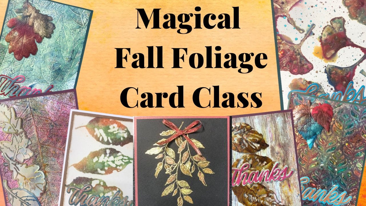
1. Resist Background Techniques for Paper Crafting Introduction: Welcome to resist background techniques
for paper crafting. I'm Cheryl and I'm
teaching this class. In this class we're
going to show you six different ways to use resist backgrounds or resist techniques to
create backgrounds. Let's go take a look at
what we're gonna be doing. These are the cards
that were going to be creating in this class. Now I've turned these
backgrounds into cards. You could absolutely turn them into art journaling,
mixed media, scrapbook pages, different paper crafting, that sort of thing. This was just a smaller
project and an easy way to show you how those backgrounds
could look in use. We go over six
different techniques. The supplies and pictures
of this final samples are on the supply list that's
included in this class. And that supply list is linked to the supplies
where you could buy the supplies and have them delivered to you if you choose. I'm using a variety of
different papers for those techniques and
they will be listed on that supply list as well. Now let's go start creating
some resist backgrounds.
2. RBT1b Let's Talk about what Papers & Inks to use: So before we get
into the techniques, let's talk about the papers and the inks that we're going to use it because they matter. So for the first emboss
resist technique, as well as the gel and
sculpture medium techniques. I'm using distress
white heavy stock, the stamping and embossing one. The very first
technique you could use a different type of paper. I like the way this
one takes ink. For the gel ones, you definitely want something
that's been heavier. You want something that
can take the weight of the gel as well as the moisture. For the batik technique. I'm using watercolor paper. I happen to be using some
Stonehenge from legion. You could use other
watercolor paper that would work totally fine, but you definitely want to
use a watercolor paper. If you don't use a
watercolor paper, the ink, when we spray it, it is going to start
leaching under, it's going to soak
into the paper and certain leaching under
the embossing powder, and it ruins the
effect basically. So you definitely want to
have a watercolor card stock. I have cold press for
this and it creates some little funky lines in
there that I quite like. And that's because it's
got some texture to it. If you want it to be
completely smooth, you would want to
choose some hot press watercolor card stock. And finally, for both of
our wax paper resists, I'm using alcohol
ink card stock, which is a glossy card stock. It is a clay coated paper, so it is porous. A lot of people think
that because it's glossy, It's got a coating on it
that makes it non porous, but it is absolutely poorest. You could also use photo paper for this technique that
would work as well. I just don't have
any, so I'm using my alcohol ink
card stock for it. For the inks for
the entire class, the inks that I'm using for the resist techniques
or the distressing. You could use the
distress oxide. Both of them are water
reactive and would not be permanent on the
different mediums that we're using to
create the resist. You do not want to use
anything that's permanent. It's not going to wipe off
to create that resist. And I'll show you here. So I'm going to put some
of the distress and one corner trying to
press down to create a dark area so that you
get a lot of the resist. Look. Now, if I need if there's any on the embossing powder
and I need to wipe it off. It comes right off without
any trouble at all. Let's do the oxide here. So oxide is a dye pigment blend, but it's water reactive. So it's not going to be permanent on that
embossing powder either. Super easy to wipe, write-off, stays
on is a solvent. Ink is good for non
porous surfaces. Are embossing or gel medium or wax paper would be considered
a non porous surface. So once we've got it on there, while it's wet, you can
take some of it off. Once it's dry, you're not
gonna be able to take it off. And then when it
comes to archival, who funny thing is, I haven't actually
tested this one out, but I'm going to guess
it's going to be very similar to stays on. While it's wet, you
can take it off. But once we give it a
few seconds to dry, it's going to be on the embossing permanently and we're not gonna be able
to take it off. So see how well this one
actually did stay up. This one tends to stay spray. This one tends to stay
damped a little bit longer than the stays on
the stays on dries quicker. So I would definitely choose something that has
a diabase to it. Now let's go make some cards.
3. Emboss Resist: Background: So for this card we are going to do and Emboss resist background. So we're going to embossing powder onto the
background and then we're going to use some inks and it will resist wherever
the embossing is. And then we're also
going to create the elements, the
butterfly elements. So very first step, we need
to ink our stamp here. I have a background stamp. It's just slightly
narrower, narrower, and narrower than my card piece of the park card piece is
four and a quarter by 5.5. It's bigger than what I need. It will be cut down. But by leaving it bigger, I give myself options. If by chance I don't necessarily stamp and
emboss it straight, I can adjust that when
I go to cut it down. I'm just pressing to make sure that ink is all over the place. They've got a tub here with
some clear embossing powder. Clear embossing powder is
a powder that I use a lot. So I tend to keep it in
a big tub so that I can just scoop it and it falls
right back into the container. Just ends up being a
little bit hand here. That way. You don't have to, you can keep it in the
container that it comes in and then do it
the way that I do, typically the other
type of embossing? Well, it's the same embossing. It's just I do it with a
scrap paper underneath, but I just find this as a
little bit more convenient. So you probably can't see the stamp damage and the powder too well, but let's emboss it. There's a couple of
little red marks here. I must have had something
still on my mat from before that's going to get hit and when I go
and blend the ink. Alright. So if you have an emboss before, I forgot to mention
I had to time. This is what I'm using. I'm using reverse numeric pad. It's a watermark stamp pad, but the ink stays
wet for awhile. So it's going to hold that
embossing powder while you emboss. Get
rid of the excess. There. I've got a few ink pads here that I'm going to use. I wanted to keep it
all nice and bright. I'm going to blend them
in with blending brushes. So as with any ink blending, start with a light hand. And then as you get a feel for how much ink is on your brush, then you can increase
the pressure. You can always add more ink, but you can't take it away. So better to be light handed. And then once you kind of have a feel for how much
ink is on your brush, you can just increase
the pressure. Depending on how I should use different pads and
stuff like that. There can be different
amounts of ink on each one. So just easier to err
on the side of caution and go with a light hand and then increase
the pressure as you feel how much
you've got on there. There's no rhyme or reason
to how I'm blending. I just want to get a
little bit of each of the color of ink
that I've got here. Now that I say that
I want to make sure I've got room for the pink and this is going to
end up being cut. So I just want to make
sure that you can see it. Definitely when you're
choosing colors, choose ones that are going
to blend nicely together. I've got basically
rainbow colors. So I know when I go with
the pink over the blue, I'm going to get a
bit of a purple. When I go with the
pink over the yellow, I'm gonna give a
bit of an orange. Just be mindful if
you're going to use different colors and you could
do this all in one color. You could have inked with just one color over
the whole thing. I just liked the color or the bright colors altogether and thought it would
look really pretty. And it especially looks
nice with butterflies, which I wanted to use. There we go. So anywhere that
the embossing was, it completely resisted
the ink that I used. So now I'm going
to take my tremor. I'm going to turn that down to the size I want for the card. I want to have a
mat to frame this. So this piece and I'm
cutting down is going to be 33 quarters by five inches. I'll have the measurements
in your supply list as well. For each of the cards. There we go. And as
you're cutting it down, you can choose where you
want the edges to be, what? To make sure that you have the colors that
you want in there. Now I'm going to die cut
some butterflies here. This one, this guy here has got a solid piece plus
a cut-out piece. So we're going to cut
both of them now. I'm going to leave the
detailed Cut Piece white and then the solid piece. We're gonna do some ink
blending just to blend or a coordinate those in
with the background. I just have a piece
of first start from the last time
I die, cut it. So I want to put that out there. You can die cut these
all at the same time. I've got two smaller pieces of card stock might as
well use up the scraps. You could cut them
out of one big piece if you didn't have
scraps though. But most of us tend to
have a lot of scraps. They accumulate quite
quickly, right? So the solid ones are all cut. They don't necessarily need a second pass
through the machine, but I find the detail
once sometimes do. I'm going to take this outline
here. The outside part. I'm just going to turn
them on my machine. I'm going to run them through again just because I can see some spots where there's
not a 100% cut through. When you have a die
cutting machine, often there's different
pressures in different areas. So it's a good idea to move them and die cut them
again. That is cut. Now, our solid ones just
pop right out of the die. They're super easy to get out. So what I'm going to do here, little piece of hair here,
I'm trying to get off. I'm going to take my pink
and yellow for this one. I'm going to do the
yellow in the center. Now I didn't clean my mat
off, but keep in mind, when you're blending
things off the edges, you're getting some
color on your mat. So even if you can't see it, sometimes it can pick it up. So if you're
concerned about that, definitely clean off your mat between the different
stages of this card. Just so you don't accidentally
pick up a color that you don't necessarily want
on that specific area. That is done. Next one I'm going to
in green and blue. Let me go. And once again start
with a light hand. Increase the pressure
as you're getting used to how much is
going on your paper. Always better safe than sorry. And then to get these
guys out of the die, I like to use It's called a
spell binders tool and one, a little brushes,
different Humbert, couple of different
companies that make this. I leave my die cut in the die and I use my brush and it takes a lot
of those little pieces out. There may still be a couple
that are left in your dicot, but it's the easiest
way to get most of them out to start with. And it makes it so much easier. When it's done. What I'll often do
when I'm crafting, when myself, I'll do this rate over top of the garbage can. Then I don't have to worry
about cleaning my surface up. That one, they all came up. Those dyes to the side. Get this off here. The last step to these butterflies is I'm going to glue just the body. Because I want those wings, wing tips or
whatever to flap up. So I'm only adding glue to
the body of the butterfly. I'm going to glue them
flat for right now. And then once the
glue has dried, I'm going to raise them. There we go. So I'm going
to let that dry a second. I'll see you in
the next video and we'll start assembling our card.
4. Emboss Resist: Card Assembly: Alright, so now we're going
to start assembling our card. So I've got my mat here. I chose blue. You can choose whatever color you want to
tie in with your background. And you can see on my back
and my piece of paper, I've got a little bit
of the barcode on here. It doesn't show on the piece
that I'm using for the card. So as long as you make sure you put the
glue on the right side, there's no reason you can't use that tiny edge of the card
stock that's got the barcode. Now I'm going to put my piece here that's got the background. The glue that I'm using is
distress collage medium. It's a nice liquid glue. It dries completely
clear and Matt. So if you get it a little
bit of glue on your project, like for instance, there's actually a little
bit right there. Once it dries, it'll be completely clear
and it'll be mat. You'll never notice
it was there. Which is quite handy. So my butterflies here, I'm just gonna put
a little bend. Were the wings attached to the body and then
glue them down. And I'm gluing just the body
down here as well because I want even that solid part to lift up just a tiny little bit. And then same with this one. Just a little bend. It just adds some dimension
to your card. But the nice part about it is you can just put them flat so it goes into a regular envelope. So you don't need an envelope that allows for extra dimension. Very last step, let's
do our sentiment. I've got this little
hello friend stamp, and I thought it would be
cute to do it in two colors. Only because this
is nice and bright. So y-naught. So I'm gonna start at
one end with the blue. And I'm kinda slowly
working my way in. And I can see exactly where
it is inked on the stamps, so I don't need to worry about what's inked and what's not. Then I'm working from the
other end with the pink. You don't have to do
it in two colors. You can absolutely do it in one color. I just
thought it'd be fun. Then I'm going to use my mini
tremor to trim this down. Typically I would let it dry
for a few seconds first, this ink dries fairly quickly. But sometimes even if
you think it's dry, it's not quite yet
so it can smudge. So typically I'd wait a
little bit for it to dry. There we go now, leaving the tremor here because
I'm going to glue this to a yellow Matt just to
frame it a little bit. You can put it like
this, but I just kinda thought a
matter around it, framed it a little bit nicely. I'm just leaving a little
tiny bit of that yellow. Yellow is actually my
least favorite color. But sometimes you just need to use and I just think it
totally brightens up. This card. I don't typically do things
with a ton of bright colors, but this week I
just felt like it. You can glue that on their flat or you can use some
foam pad dots. I like to use the phone pop
ducks, just because, again, it adds some dimension
very easily and quickly with very little effort. Let's take the backing off and then glue it
right onto our card. So there we go. Very cute and boss resist technique will see you
in the next video.
5. Emboss Resist Batik: Background: So for this current,
we're going to take the emboss resist technique and we're going
to just tweak a few things. Firstly, I'm using some
watercolor card stock. And then once we're done
embossing or server, we, once we're done
adding the ink after we've embossed and whatnot, we're going to add
some shimmer spray. Now, I made my own
shimmer spray. This is just a little mister
has got some water in it. And all you do is add just a little bit of
mica powder to your water. I'm using perfect pearls. I like it for this
because it's got a binding agent
that makes it work with water that's
activated with water. If you have Micah powders that don't have a
binding agent in them, you'd need to add. I think it's called gum Arabic in order to make
this work for you. Or you could use an already
pre-made shimmer spray. You just want something that is transparent because
you want to be able to see the colors
underneath there. So let's start with
embossing our background. So once again, this
background is a little bit bigger than the one that we're gonna be
using on the card. The reason for that is
once it is all dried, I can cut it down to the
size that I am wanting. I'm going to take my
watercolor paper. I'm going to choose
the side that's got the least amount of texture. This is cold press
watercolor paper, so it's got a texture
to it anyways, if you use hot press that apparently doesn't have
any texture to it. I don't have any and I didn't want to buy any
just for this project. But what I like about
using the texture of watercolor paper is that
it adds just a little, little cracks in there that are created with
this watercolor paper. And to me it just adds to the
batik effect on this card. So I've got some stamping Inc.
versus dark ink on there. Let's add our clear powder. Tap the excess off and then
put it on the other side. Once again, you can
be liberal with the powder because
anything that comes off is going right back or
anything that doesn't stick to ink is coming right
back into the container. So we're not wasting anything. And now we heat it
and melt the powder. Gets old boss. Alright, so now we're
going to blend our ink. I'm using the same
colors as the last one, except I didn't use
the green for this one because really when
you go from the yellow to the blue and
you cover, you go over, it turns into green anyway, so you can put your colors
wherever you want them to go. There's no rhyme or reason. You see how you
get green in there by blending the two
colors together. Then when the pink
goes over the blue, you get a little bit
of a purple in there. Pretty much a rainbow card. And really you could
even do stripes to create a rainbow
card if you wanted. All right. If you wanted, you can make
the colors a lot darker. I don't mind it like this. So what I'm gonna do now is I'm going to take my
shimmer spray and make sure that none of that Micah has settled to the bottom if it has, just shake it
around a little bit and I'm going to
spray liberally. And that's going to
rehydrate all those inks. It's going to help the
colors flow together. Now I need to set this
aside to completely dry. We can't do the next step
until that is 100% dry. Just going to wipe
the excess spray off. Those little mini mysteries are great for creating
your own sprays. The only thing is if you
have a very large project, It's very hard to get
consistent batches. So they're appropriate
for smaller projects or something that you didn't
really care whether you had the same amount of
mica in it or not. Now we're going to
blend the bird. Well, we've got our
inks rate here. But the one thing
I wanted to do, I'm going to use a
little bit of tape. I want to keep the
birds feet white. I'm going to take some taping and put
it a little bit under that tail because I want to
get some color on the tail. The nice thing
about the blending brushes as you get a nice grip, radiation from late to
or from dark to light. And it just happens naturally. There we go, we can tuck
our bird to the side. The last step, I'm going to
stamp the little sentiment. I've got a little
birdie told me here. We're going to do a similar
thing to the last one. I'm starting with one
end with the pink, starting at the other
end with a blue. And I do go over
each other to kind of have a little bit
of a blend in there. Again, you don't necessarily
have to do that. I just thought the color
blend was really cute, nice and playful because the
cards are fairly playful. And then trim this down. Again on the other side. I'm just using the
guides on my ruler here to try to keep it
as straight as possible. There we go. You could
leave it like this, but I decided to use the
ink pad to frame it. So all you do to frame
it with an ink pad? I'm just rubbing it along
the edge of the ink pad and just inks the edge of it in
whatever color you're inking. In this case blue. There we go. So now that is ready. I'll see you once all of this
dries and we'll continue.
6. Emboss Resist Batik: Card Assembly: Alright, so now it's time for the rest of the
batik background. So what you may or may not
be able to tell is there's no more embossing
on the sample card. So what we're going to do, I've got some newsprint here. I've got an iron set to
cotton with no steam. That's already pre warmed up. I'm going to put my background here between the newsprint. You could also use copy paper. I would use a couple of
sheets because it is going to go seep into
the paper and you don't necessarily
want it on your iron and you're going to heat it up. So this is going to remelt
that embossing powder. And it's going to absorb
into the newsprint. When you see batik fabric, the resist is done
with some wax. They do, they're drawing
or their pattern or whatever with a wax. And then they iron it to
get the wax back out. So you can see that
the embossing has gone into my newsprint here. I'm
just going to move it over. I'm going to do it again
just to see if there's any remaining embossing there. You don't necessarily
have to do this step. You could leave it as
is, but it's just a fun, different twist on
this technique. There we go. Note there was no
more embossing left, so I'm going to
turn my iron off. Instead it to the side
while it cools down. And we can get rid of this
newsprint, this piece here. You can still use it
for doing ink blending, doing sprays or whatever. So you don't necessarily
have to throw that away just because it's got some
embossing on it. I'm going to take my background here and cut it down to size. So for this card I want it
to be 33 quarters by five. I'm actually going
to cut from all of the edges. Just a little bit. There we go. Now let's glue or pieces,
short guard together. I've got my card base, this one here I did
attempt card base. You could do the regular one where the fold is on the side to that is going
to work just fine. 1 second. Make sure my blue pieces sometimes we're a
little bit long, so I forgot to check this one
down. Actually, it's fine. These are all ones that I
pre-cut. A long time ago. I had a ton of this
blue card stock, so I just got a bunch of them. And it wasn't full
sheets of card stock it with stuff that was cut down. Sometimes I forget to check the measurements to make sure
they are what I'm wanting. Alright, so that piece is down. I'm gonna do this
on the bottom just because it kinda makes it look like grounds
since we're doing a little birdie sitting on it? Like I'm pretty sure I
probably said before, you could do the blending and just one color or two colors. You don't have to necessarily use a bunch of different colors. But for the batik look, typically there's a
few different colors blended together and I just thought it would
suit it very well. Now let's glue or bird down. This bird die doesn't
actually have an i2 it, but if you wanted, you
could absolutely do that. Just get a gel pen or
whatever and draw one in. I don't mind that
it's missing one. Then last but
certainly not least, let's put some foam pop
dots on our sentiment. Take the back hangs off of them. Because sometimes that's
the hardest part is taking the backing off the tape. There we go. Alright, and then I put it so that it's little
bit covering the bird. I mean, the sentiment is so
long that you'd have to, but you could turn the card around if you didn't
want it to cover, you can put your sentiment there and then your bird beside it. But there we go. Batik emboss resist background. And that shimmer is so
pretty with those colors, just really catches the light.
7. Gel Medium Resist: Background: So for this card
here, we're going to do a gel medium resist. So I've got a stencil here. It can be any stencil you want. It'll work the same
with any stencils so it doesn't have to
have any requirements. So we're doing backgrounds here. So I like something that
has an all over background. But you absolutely could do something that say
has some flowers or, or butterflies or whatever, whatever your heart desires. So I'm gonna take my pencil down just so that it
doesn't move on me. I've got some gloss gel medium. I liked the gloss because
then when it's dry, it's going to have a
nice glossy finish. If you use matte medium, it's going to be matte
and a little bit dull. And what we're gonna do later is going to have a
dull finish anyway. So I like the contrast of
the two different finishes. So I've got some gel
medium here that I put on my surface. Just going
to move that up. I want to make sure that I have the whole piece of paper within the openings of the stencil. I'm going to start at the top and move my way to the bottom. I'm scraping my palette knife
right along this tensile. As I'm doing it, I don't necessarily need a
super thick coach. The thickness of the stencil
is thick enough for me. This here I must have had
I was doing something with pigment powders last week and I must have had
one sitting there. So if you don't want
anything to transfer onto your stencil or onto your paste. It make sure that your
surface is very clean. I thought I had cleaned mine, but clearly not well enough. Alright, I need a little
bit more gentle medium. The main thing is
once you're done with the stencil
and you lift it up, you wanna get it either into
a tub of water right away or you want to wash it
under attack right away. It washes super, super, well, very easily with a little
bit of soap and warm water, but you don't want to
leave the stuff on here to draw you can't get
it off after it's dry. I'm just going to
carefully lift this up. And there we go. I'm going to tuck that to
the side so that it can dry. And I'll clean this up and be back to continue to
clean it off my stencil. But I wanted to just show you
it's super easy to get off of your surface with
just a baby wipe, you could use a wet cloth. What I would suggest if
you use a wet cloth is to go and rent it out under the tap as
soon as you're done. Simply because Jeremy, I'm
kind of acts like glue. If some of it is in
a cloth that dries, it's going to harden. And you can't get
it out after that. So much easier to go. Rinse it under a tap and you
don't necessarily need to have a baby wipes just for that. I'm only using it for the
convenience right now. So we've got our
gel medium drying. I'm just going to
do the next part. That is stamping and
embossing are seahorses. And then stamping and embossing our sentiment at the same time. So that, that is ready
for us when we're ready to move on
to the next step. So I've got some red pearl
embossing powder here. And I've got a verse
of Mark pad or smart pad is just
a watermark pad. It's a sticky ink that's
perfect for embossing because it stays wet while
you heat emboss your images. I'm actually going to do both
of them at the same time because that ink will stay
wet enough to do that. And I can kind of see it probably probably can't
see it on the camera, but I can see where
my other image wise. So I know that I'm not stamping it in the same spot or
overlapping it in any way. Alright. You can be generous
with the powder over top. Anything that goes onto
my scrap piece of paper, it's going to go right back into that container so we're
not wasting anything. There's a little bit of powder sticking to something on here. If you want, you can fix it. But we're going to
hand cut this out. So there's really no need because whatever is
on there is going to be cut out. Anyways. I'm going to use a heat gun. You can see that powder
is kinda granular. As I use the heat gun, it's going to melt and
then it's gonna go shiny. Once you're done, you
can kinda see if there's areas that aren't
totally finished. And if we're finished by
by being finished, I mean, there aren't totally
melted and if there are, you can just reheat
them and melt them. It dries very quick. So what I'm gonna do to
change the color of one, because I'm going to take my
blending brush and wonder if the blue ink pads, I'm
just going to ink it. This ink is transparent, so you're going to see some
of that pink going through, so it makes it look
like it's purple. You can be a light or
as heavy as you want. I tend to start light and then
get a little bit heavier. Then I stopped when I see the amount of
contrast that I like. You could do the other one as well if you wanted them both to be inked and have
a little bit more contrast from the embossing. But I wanted them to be
two different colors. Alright, so that one is done. Now I'm going to step in
and boss the sentiment. I'm doing it with white to
tie in the background there. We're going to use that
same verse of Mark ink pad. My stamp doesn't want
to stick to the block. We're using the same ink pad, but we're just going
to use some white embossing powder for this. Now this because it's gonna
be cut in a rectangle shape. If there's something on there that you don't want
to be on there, then you would definitely get a fine brush
and brush it off. There we go. Alright, so I'm going
to talk. I've got my embossed or my gel
medium piece tuck decide I'm going to hand cut these off camera
because watching someone cut something is
like watching paint dry. I'm just going to
use a fine detail scissors in order to do that. And once we're back, it's gonna be when my gel
medium is completely dry and I've got this stuff
prepped and we can create or we can
assemble the card.
8. Gel Medium Resist: Card Assembly: Alright, so our gel
medium is completely dry. And now what we're gonna
do is we're gonna take some ink and we're going to
apply it to the background. Actually, I meant to do
that lighter color on top. I'm using a fairly heavy
pressure with this. That gel mediums is raised. So I'm making sure to
get my bristles of my brush down onto the paper that the
gel medium is on. And I'm using three
different greens for this. You could use one color
or you could use any. I mean, it can be any color. It doesn't have to be green. But I just thought it
would look neat having a little bit of an
ombre effect on there. So I got a little bit of the ink onto the front
of the gel medium. All you're going
to do to get that off is a dry paper towel. If you find that
you're not getting enough off after a little bit, change to a clean part
of your paper towel. There we go. If
you've got a pick a section that's a
little bit stubborn, you can use a baby wipe
to reactivate that ink. But often you don't even
need to use the baby wipe. So there we go. This piece
is too big for our cards, so we're going to cut it down. Let's move the ink
pads another way. For the front of the car. I want it to be four
by five and a quarter. By doing this a little bit big, if I happen to touch the gel medium while I'm
getting it off to my mat. Or if I happen to mess up
the ink and a certain area, I can cut that off. It just gives you a little
bit of flexibility. I didn't cut that
with the tremor typically cuts through the
gel medium very easily. So now all that's left is
a gluing or car together. I'm going to use that same
distress collage medium that I typically use. The lid off. I'll be using it
again in a second. Center that on the front
of your card while that is sitting because I'm gonna be putting glue
on the seahorses. I'm just going to put an
acrylic block just to hold that down so that I don't
have to hold it down myself. It's like it gives you an
extra handle that it stuck to my shell block there or my
child, my acrylic block. There we go. Let's
try this again. Then for the sentiment, I like to put foam pop dots on the back just to give that a tiny little bit of dimension. Once again, this technique
works with any stencil. The only thing I would suggest, like I said before, is
I'm using gloss medium. I would suggest using the gloss medium
rather than the mat. Because the mat just
the different texture. Sometimes it catches
the ink little bit. There we go. Gel medium
resist, background.
9. Structure Gel Resist: Background: So for this card, we're
going to take the concept from the gel medium resist, but we're going to
tweak it a few ways. First way is I'm going to
ink the background first, so beneath the gel is colored. Second way I'm going to use some mother of pearl
structure gel. This has got an opalescent
teeth look to it. So when you're
looking at the card, it's got a bit of a
iridescence to it. I turned the stencil
over because I kinda thought it looked
a little bit like waves. So I decided to go for it. So I'm going to
use some ink here. Now. I've gotta distress ink, it's called Broken China. An oxide ink would cover a
lot easier and a lot quicker. However, the oxide
inks have pigment to them that I found when I did the next
part of the technique, once the gel was dry, it didn't really take as well. So by using the dye ink, using dye ink over it, afterwards, it just
works so much better. The technique work better. I've got some smears in here, some circles, some lines. It's not really going
to matter a lot because some of it's going to be covered with
the texture gel. Like I said, I kinda thought
this looked like waves. So variation in color
is totally fine. I'm not going for a
completely even coverage. If I wanted it completely
even coverage, I would've just use blue
card stock to begin with. You'll notice I'm moving
my hand a little bit. Sometimes when you put
your finger on here, you get a little
bit more pressure and a little bit darker color. That's what I'm trying
to do in some areas. The other thing I
could have done was ranked my pad ahead of time, so there was a lot
more ink in it. But when you've got a
really, really juicy pads, sometimes you have a
little bit of trouble controlling how dark it goes. I always say you can always add more color, but
you can't take it away. And this especially
applies when it comes to card stock and ink. So by doing it this way and
just adding more color, you have a little bit more
control over how dark it goes. And I do want there to be some
contrast in color between this color and the
color that I'm going to use when it comes
to the next part. Once you have as much
color as you want on there, you are done. Now I'm going to put my pencil while my paper is
going the other way. My sense was going
the other way. We change that. My paper is going
in the same way, but my sense was
going the other way. And then I'm going to
tape it down again. I can't take the paper
down beneath it because I want the whole paper
covered with the gel. I can only taped
down the central. So you'll notice,
especially when I started I hold the
paper so that it doesn't shift on me while I'm doing the same
thing as before. I'm scraping the
palette knife radon, this tensile does
work a little bit easier going this way flowing with this
pattern on this tensile. Definitely going
to run out of Joe. For this, you could take the regular gloss gel medium that I had used in the section before and add some Micah
powders to it in order to get a little harder
part in there. There we go. And get the iridescence,
the iridescent look. So if you're unable to find the mother of pearl
structure jail, That's always an option. And by doing Micah powders, you can choose what Micah
powder color you want. You can choose any
color if you want. It's always nice to have just the different ways
to get a similar look. So this is going on blue. You don't necessarily see a
whole lot of color change. But let me show you
this drill on black. This is the exact same gel, but on a black surface and
it takes on a purply tone, which is really cool
how it does that? Alright, this can be lifted. I just tossed those
pieces and F students those tapes have Joe
meeting them on them. I just tossed them. So I'm going to stick this to the side. I did get a little
bit of lift with my stencil coming
off that paper. It might have been
a little bit wet still from cleaning it off. But that's okay for what
we're gonna do next. It's going to work just
fine. So I'm going to clean this up and I will be back
and we'll go for this card. I'm going to stamp
and Emboss an octopus with that same red
parole embossing powder. And I'm gonna do it onto
some red card stock. Again, you could choose a different color
embossing powder, a different color of card stock. I just like the contrast between the red and
the blue there. I kinda thought,
How old are you? It was cute with an octopus
with eight tentacles. So I'm not worried about this part here because
it's gonna be cut off. And unfortunately, yes, I
do cut out this octopus. So I'll be doing that offscreen. It's not the funniest
one to cut out, but it definitely looks a lot better when you take
the time to cut it out. There we go. I just flick that paper just to
get that excess powder off. And did not mean to do that. Still not wasted. I'm going to heat emboss this heat done. Heat gun does get
hot so you want to make sure you're doing
it away from your fingers? There we go. So like I said, I will cut it out. There is an opening there between two tentacles that
you will need to use. An exacto knife and a
mat to cut that part. You could leave it
in there and then just put the How old are we or how you're how old or whatever up a little bit if you
wanted to just hide it. Now I'm using a dark blue. I'm just stamping your
how old stamp? This one. I'm not bothering to emboss. I'm just going to stamp it and it'll tie into
the card later. So I'm just going to
use my mini tremor to trim that one down. What I do is I use my ruler. There's lines on the ruler here. I use that to gauge how
straight and even it is. And go from there. It is a little bit challenging at times to do it that way, but it's easiest way to get
it as straight as possible. There we go. So I'll see
you in the next video and we will have everything ready and we'll continue our background technique
and we'll assemble.
10. Structure Gel Resist: Card Assembly: Alright, so our
opalescent mother of pearl structure medium
is completely dry. I'm going to take a
darker blue ink pad and I'm going to use a
fairly heavy pressure. I want to make sure to get
that ink onto that background. And remember these white bits
here that I must have had, some must have been
wet or there must have been some gel medium from the technique before
on my stencil. The blue ink is
going to color that. You get a little bit of rough
edges on there from that. But what I'm gonna do is I'm going to put that at the bottom. And I'm going to have my
octopus on on that part. So it is something
to keep in mind. Make sure that your
stencil is completely dry. And I probably rest
when I was taking off the gel medium and just
didn't get it clean enough. So that is something to work or to pay attention to as well. Now some of the ink
is on the front here. I'm just going to use a wet
wipe to rub some of that off and then I can use just
a dry paper towel to dry it. Now this piece is bigger
than my background, so I'm going to trim it down. Actually the parts
that I would trim down or actually in the
middle of the card. So there's not really anything. Any way of getting rid of that. This here was when some gel medium went
underneath my stencil, probably when I was trying
to pick up that dry it off glue tip thing. I'm going to take
it from this side. I want this to be four inches
by five and a quarter. Once again, I'll have
those measurements on your supply list. Let's glue this to the card. Now, I'm just going
to this one here. My sample is a little
bit more off the card. I'm going to leave
this with where I have it cut right now just because it does cover
up some of that area that I don't particularly like. That's part of the fun of making handmade cards is
creative problem-solving. So if you have an area you
don't particularly love, sometimes it works
better than others, but we're going to go with it. Just going to line up that edge there with the edge of my card. I don't mind that it
goes off the blue piece. I actually think that
looks more interesting. And then I'm going to
add some foam pop dots. Let's put this on here, hold
that down for a minute, put some foam pock
dots on the back of my sentiment and phone popped out. You can get them in a bunch
of different thicknesses. This particular
one that I'm using right now is a thinner one. But sometimes if you want something to stick out
a little bit more, you can use a thicker one. There. There we go. Structure gel,
opalescent, resist. And I love how the opalescent
they could just turns in the reflection of the light, just makes it so much
more interesting.
11. Wax Paper Resist: Background: So for this card, we are going
to do a wax paper resist. So I've got my newsprint here that I'm going
to do my ironing on. We need an iron. I've got
it hot set to cotton. And I've got a piece of wax
paper here that's a little bit bigger than my piece
of glossy card stock. I'm going to trim it down
before I use the iron. I've got two pieces of glossy
card stock actually here. So this is just alcohol
ink card stock. It is a clay coded card stock, so it is still even though
it's got a shiny surface, it is a porous surface, so it's going to
let the ink soak in and our wax paper is going
to create a resist and the wax or the ink will not soak in where the wax
paper resist is. You're going to need two pieces
of the glossy card stock. You could also use photo paper. I don't have any, so I'm
using the glossy card stock. So you're going to take your wax paper and you're
going to crumple it up and then open it back up. I've got my glossy card
stock, shiny side up. And then this one here, I'm gonna put shiny side down. So you want both sides of
the glossy card stock, shiny side against
the wax paper. I'm just putting
it on my desk too. Make everything even layers. And I'm just going to trim the rest out here
because I don't want to get melted
wax onto my iron. Because you are going
to put the iron rate along your card stock. You're not using any
paper to protect it. I'm putting it down. I'm going to hold one side
while they are in the other just because I found
that if I didn't do that, the paper sometimes did move. And I'm going to
put the iron on it for I want to say
thirty-seconds, Forty-five seconds,
maybe a minute. What you can do after doing it for a little
while is you can, while still holding one
end down as you can lift it up to just see if you're starting to see the wax paper resist and
I am seeing it on that side. And because we're using two
pieces of glossy card stock, you actually get two pieces
of paper to work with here. Which is pretty cool. So I'm just assuming
that second one. There we go. It's perfect. Both of them worked. Not sure you can see
it in the camera, but we've got a glossy
or a wax paper resistor. I'm just going to move my iron, turn it off before you move it. I am using it again in a moment, so I've just got
it somewhere safe. I'm going to use three
different colors here. I liked just doing
stripes with it. I did try one where I kinda
color blocked it or whatever. But in the end I
liked this better. It was just a bit more
of a more striking look. You could also do just one color that would work just fine. I'm going to start
with my yellow just because it's the lightest of the colors and best to put
the pad rate on the paper. I tried this with the
blending brushes, but there just
wasn't enough ink. Now I'm gonna do the pink one. And I am going to go a
little bit over that yellow. Then I'm going to do the blue
one and I'm gonna get some yellow on my hand by doing this. These colors, they're all while the yellow is
a little bit later, so I could contaminate
it, which is why I started with that 1 first. The yellow and pink
are kind of around the same tone like one isn't necessarily lighter
or darker than the other. I'm not worried about contaminant
contaminating my pad. I let that sit for
a few minutes. My piece of card stock
here came out of the package and it's four
and a quarter by 5.5. To make my card, I'm going to cut it down a
little bit anyways. So it was not a big deal
that I had to touch it because I need
to move it anyways. So I'm going to just
rub the excess ink off and I'm doing it
in the same motion that I rubbed my pad on. I didn't get a whole lot of the pink and the blue
and that section. So I'm just gonna do it again. No reason why you can't. I'm not gonna do the yellow. The yellow is pretty
much even throughout. It still came off in that
same spot. That's okay. I had that with this one here. There was one spot here. It just didn't want to take ain't no matter how many times I tried putting it on,
that's totally fine. But it's a fun random
luck by just crumpling up that wax paper and
using it in this way. So I'm going to trim
this down and probably going to trim this side
and then a little bit, actually I'm going to dilute
it a little bit off the top because there's a
bit of a line there. And then I'll see you
in the next video and we'll put our car together.
12. Wax Paper Resist: Card Assembly: Alright, so for this
card, I decided to keep it super, super simple. I simply stamped and
embossed the image in white. You could put dye cuts on here
or whatever if you wanted. But again, stamping and
embossing is also an option. You can absolutely
stamping and boss on glossy card stock
on photo paper. I would test something before
you go into your main card. I've had some that
worked and some that really did not like the
heat of a heat gun. So better to test it then have a masterpiece and
accidentally ruin it because it didn't like the
heat of your heat gun. I'm going to position
this where I want it, stamp it down firmly. And one thing I realized after
the fact that I forgot to mention was my gel cards, as well as the first
emboss resist card was done on distress
heavy stock. The first emboss resist card, you could just do it
on regular card stock. It doesn't necessarily need
to be heavy card stock. The gel resist though, I would definitely recommend
doing it on heavy stock in order to accommodate the wetness of the gel and
the heaviness of the gel. You want a card stock
that can handle it. And some thinner card
stocks definitely can't handle that weight.
Were the moisture. There we go. Now I stamped this or I embossed this one and white
embossing powder because it went with the
colors of the background. You could absolutely,
if you preferred, say do it in like a silver or even gold or whatever
color you want it. If you wanted it to stick
out a little bit more. Then I left the rest of
the cards super simple, just simply glued
onto a card-based. I'm actually going
to use my acrylic block here to hold that in place for while it's gluing. Sometimes when you're
heating, that, when your heat embossing, your card stock works a little
bit and it just did that. So by having something heavy on there that's going to
glue it or hold it down, it's gonna glue ladder. But that there is
the final result. This would also like really,
really pretty with and sparkly or glitter
embossing powder as well.
13. Embossed Wax Paper Resist: Background: So now we're going to
take that wax paper resist and we're going
to take it up a notch. First thing we're gonna
do is we're going to emboss our wax paper so that we get a different
texture and you can use any embossing
folder for this. Obviously some patterns will
look nicer than others. But I have chosen this
3D embossing folder. It's a newer one. I
think it's called woven or something like that. So I'm going to put my
wax paper in the folder. And in order to
emboss a 3D folder, we only need one of
the plates and the tab two needs to be open
and your big shot. For any other machine,
you'll have to look up what this stacking
is for your machine. I'm only familiar with this one. So we're going to
run it through. Typically with card stock, I run it through a few times. Wax paper is so thin that one time is plenty
and you can even see that it actually
shredded it. It's going to be fine. I may get a little bit of those
streaks in there. I'm totally okay with that. I probably should have
only put it through once, but I've got stuff
on that side of my desk and I didn't
want it to hit. So I'm just going to set up with the iron
and I'll be right back. Alright, so same as before. We're going to use two
pieces of glossy card stock. The glossy side on both of
them is facing the wax paper. And just like last time, I'm going to trim off the excess trying not to turn my card
stock, but I just did. Here we go. You could probably just do
one piece on the wax paper, on the background or
on the newsprint here. But why not do two
for one if you can get two things at the
same time as one. Why not? So once again, I'm going
to put my iron on it. Thirty-seconds. 45. I'm just putting the iron on one side holding the other so that my card
stock doesn't move. That wax paper and the glossy
side of the card stock is fairly slippery is good. I don't want it to move on me. I'm not putting any extra
pressure on the iron. It's just the
weight of the iron. Only thing I'm doing is
moving it around in circles. And the reason I'm
moving it around the circles is because it's
actually a close iron, so it's got those holes there. And I don't want to
have dots of spots that don't have the
resist on there. There we go. We're good. Let's move this out of the way. I'm going to turn it off because
I don't need it anymore. And there we go. We've got the pattern on both sides and I actually don't see
those ribs in there, but let's just see what happens. Once again, I'm gonna put my pad directly the paper for the
sample I use the pink. I also tried it with the
blue and just thought, why not go with the
pink because it's something different
and unexpected. Get a nice amount
of ink on there. This is where it's perfect
to work on a piece of newsprint so that you don't have to worry about
getting anything else. Messy. Reuse my paper towel from before because it's still
not use left out of it. And then rub it off. Love how it just adds a
different texture to it. This would be really cool
in the width green folder, I just didn't want to introduce brown when all the other color, all the other cards head
brighter colors to it. But very, very cool. You see any excess ink
you might want to wipe it off because otherwise
it's just going to go onto your fingers. So I'll see you in
the next video and we will assemble our card.
14. Embossed Wax Paper Resist: Card Assembly: Okay, so the very first
step is we're going to glue our wax paper resist
piece onto our backing. Between videos. I
did cut it down, so it's now four inches
by five and a quarter. But remember the cut list with the measurements for each
card is on your supply list. I already have my
flowers die cut. They're from two
different datasets, but I really liked these
two daisies together. I like seeing an open
one and a closed one. So I tend to use them
together because I think it's more interesting
than different flowers. I'm putting the stem of that flower just to the
bottom of the card. This one here, I'm going
to put it lower so that the flowers are two
different levels and then just cut
off the excess. So this one, this
background would be really fun to go through. I've got tons of
embossing folder, go through them and just
play with them and see all the different backgrounds
that can be created. Once again, it's
always fun having a new use for the
supplies we already have. Alright, I'm gonna just going to snip that bottom
of that one there. Then with the extra paper
from those daisies. I'm just going to
put my one flower or the petals of the DZ
want to keep coming up. So I'm just going to put a block there to hold it down
while I'm stamping. This, made this one a
simple hello friend card stamped in the same pink so
that everything coordinates. There we go, and couple
of pop dots to pop it up. This would also be looked
really cute to stamp and emboss the hello friend and white right on
the background. Because I think
white would pop out just like the daisies. But I chose to put it on a
different piece of paper. This one. Here we go, Very
simple, elegant card, but a fun technique for that background gives us lots of texture with
very little work really. Before I forget. For this one, I just added a little bit of
a stickler in the center of that flower just so that the center of it
kind of popped out. Otherwise it kinda blends in. You could do it around, say the flower petals
or whatnot to, but it just adds a little
pop of sparkle in there.
15. Resist Background Techniques for Paper Crafting Thank You: Thank you so much
for joining me for resist background techniques
for paper crafting. Remember, I made these, are turn these into cards, but you can absolutely use them in art journaling, mixed media, scrapbooking, all sorts of different paper crafting things. So let your mind go wild. I'll see you in the next class.
 Artsy. Island Girl, Teacher