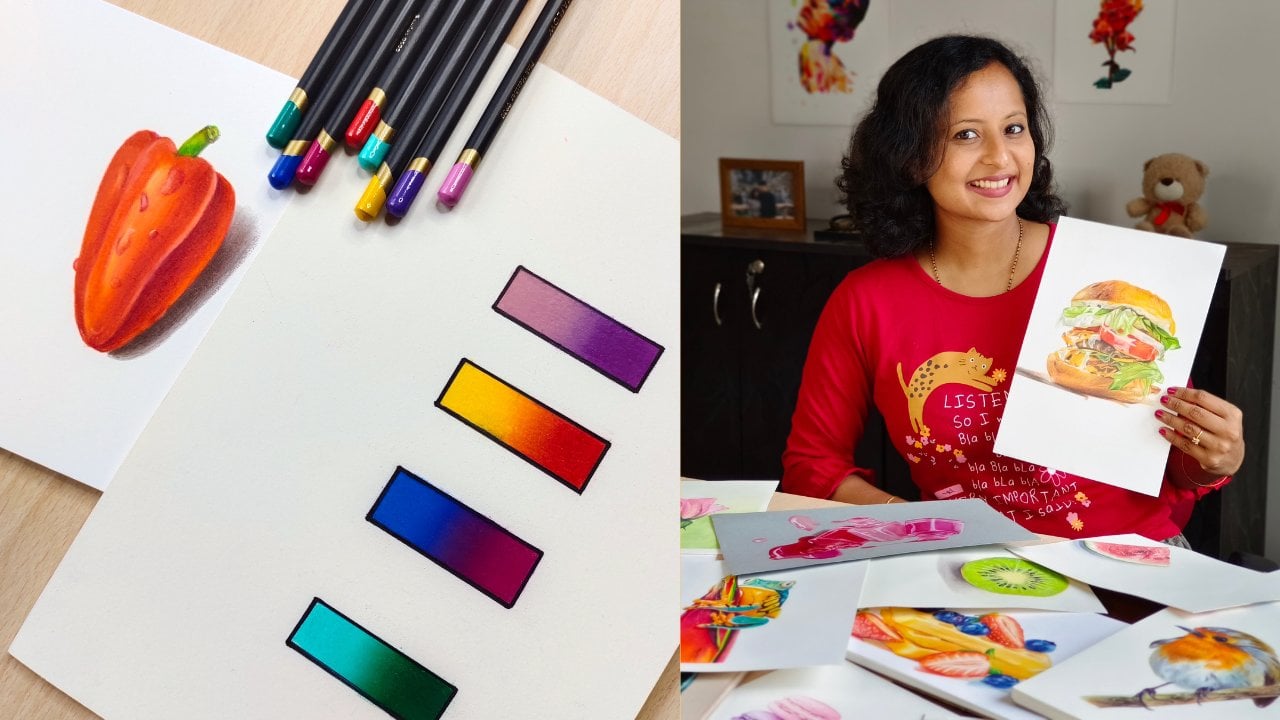
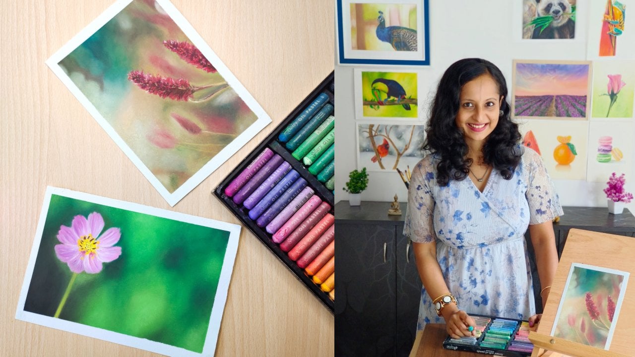
Transcripts
1. Introduction: Watching a time lapse
video and following along is great to learn
and improve your skills. But at some point
you would want to draw from a reference
photo of your liking. It could be a beautiful photograph that you
found somewhere, a photograph of your daughter
or your pet, and so on. But do you find it
hard to analyze a reference photo and
choose the right colors? Being a self taught artist, I do struggle with this
initially when I just started out with colored pencils,
but not anymore. How did I simplify this process? Let's understand in this class. Hi, I'm Smitha, an artist and an art instructor based
out of bungalow India. You can find me on Instagram and Youtube as art underscore
by underscore Smitha. In this class, I will
try my best to simplify colored pencil drawings and
reference photos for you. I will explain what I learned through years of experience, from my own experiments, and a lot of trial and error. These steps work for me and I'm sure they
will help you too. I will explain to you
everything in detail, starting from where to get high quality reference
photos that are free to use. What makes a good
reference photo and how to break it down to
identify the colors. We will go through
several examples of my colored pencil drawings. To understand this, we will then apply these learnings and draw
these realistic macarons, which will be our class project. Although you don't have to be a pro et colored pencils
for taking this class. If you have tried colored
pencils before and would like to use them for
photo realistic drawings, then this class is a
perfect fit for you. If you are completely
new to this medium, I suggest you watch my previous beginner friendly
colored pencils class before taking this class and understand the medium and
basic techniques first, by the end of this class, along with having improved
your colored pencil skills, you will also be
able to approach any reference photo with
a new found confidence. If all this sounds good, then grab your pencils and
join me in this class.
2. Class Structure and Project: Before we begin, let me explain to you how the class
is structured, what to expect for
your class project, and of course, the materials
required for this class. I will start by explaining
the importance of reference photos and
we'll let you know where to find references
that are free to use. After that, I will
show you examples of good reference photos
and we'll explain to you the steps that I follow
to break them down and understand what color pencils
to use just by observation. I will then show you a couple of tools that you could use
for your assistance. Once you feel confident enough, after watching these lessons, you can move on to
the class project. For the class
project, we will be drawing these colorful macarons. I will provide you
with the reference picture and the line drawing. You can keep the initial
sketch ready by drawing it freehand or with the help
of grids if you can, or else if you want to
get an accurate sketch, which is quite important for realistic colored
pencil drawings, then please download
the line drawing, print it out, and trace it
using a transfer paper. Drawing is a separate
skill and you can always learn
it side by side. Don't hesitate to use tools
like grids or pressing paper. Our class will focus
on the coloring part. So we will start by observing
the reference photo. And we will make our own
color chart by identifying the colors in case you don't have the exact shades
that I'll be using, I will suggest alternatives. After that, we will bring
these macarons to life. I will guide you through each
step and will also explain color pencil tips
and techniques that I learned through
years of experience. Once your project is done, you can upload it
in the projects and resources section so that I can give you feedback as for the materials
you will need. Colored pencils, any decent
brand of your choice, preferably a set
of 48. At least. I will be using a
mixed media paper, but you can use any paper that is suitable for
colored pencils. You will also need
basic stationery and also a white gel pen. Other than that, you
might find me using these tools in the class.
They are optional. Skip them if you
don't have them. Alright, then let's get started. In the next lesson, I'll let you know where to get free
reference photos from.
3. Finding the right Reference Image: A good reference image is very important if you want to
draw a realistic drawing. Not all of us can draw from real life or from memory
due to various reasons. In my case, I find great joy in adding the
minutest details with colored pencils and make my drawings as
realistic as possible. It is like therapy to me. I am a new mom and
I try my best to draw and teach in the
limited time that I get. It is indeed difficult for
me to find the time to relax and imagine something to draw or to even draw
from real life. I use reference images
for all my drawings. These are just tools to
speed up the process. Don't hesitate to use them from. Where does one get high
quality reference pictures? I hope your answer is not Pinterest or random
Google images. Most photos you find there
are not copyright free, and hence it is not right to use them unless you have the
photographer's permission. I use the following websites
For my reference images, you can find high quality
and free to use photographs. Here, my favorite is unsplash. Here you will find
a wide range of photos belonging to
different categories. The images that have unsplash plus written on them
are not free to use. Just skip them and check others. You can make your own
collection on the website. You can download the
photos if you wish. In the resolution
of your choice, you can use the unsplash
application as well. Pexels is another similar
website that I use. I have made my own
collection here so that I can download the
images when required. Later on, you can use the
Pexels application as well. Unsplash and Pexels provide images that are free to use for commercial purposes
without having to credit them or
the photographer. Pixebe is another website that provides you free
reference images. Even here, you don't have
to credit the photographer, I sometimes use free pick here. It is important that you filter out only free images first. It is required to
attribute the source here. Even if the license
says free to use, The website has instructions
on how to attribute. Before we end this lesson, here is an important tip. While you're at the
learning stage, please don't stress over replicating each and
everything from the reference, be it the colors or the details. Although I try to make my drawings as
realistic as possible, I don't try to blindly
copy the reference. Sometimes I find it difficult to get the exact shade
as in the reference, and I'm okay with it. I try to capture the
essence of the picture. For example, have a
look at this drawing. It is a portrait of my daughter. I'm quite confident drawing
still life animals and birds, but not very experienced when it comes to human portraits
or skin tones. I took this drawing
as a challenge and focused on the
learning the drawing. This resemble my daughter but not 100% replica of the reference photo of
hers that I clicked. I will talk about this drawing
in future lessons too. Now that we know
from where to get good reference pictures,
let's get started. In the next lesson, I'll
show you examples of good reference pictures and how to pick colors by
observing them.
4. Choosing Colors by observing a Reference : Let's go through a few examples
now and also understand how to observe a
reference picture and pick the right colors. Always ensure that
the reference photo that you choose is well lit. And if your aim is realism, then you must be able to view the details even if you
zoom the reference image. So use high resolution
images and not blurry ones. I also think you need
to have some sort of personal connection
with the image so that you get better results. I sometimes spend hours browsing for the
perfect reference. I have a huge collection
of photos on my ipad. I have organized
them for future use. This is an example of a
good reference picture. The lighting is good. There is a clear
highlight and shadow. The details are visible even
when you zoom the photo. This is also an excellent
reference picture. The subject, that is the bird, is clearly in focus here, it stands out from
the background. Whereas, this reference is
not so great for drawing, the lighting isn't great and
the details are not clear. What do you do once you have
chosen a good reference? Whenever you download
a reference picture, spend a few minutes
just observing it, zoom in the details. Just think what
colors could be used. Let me explain the process
that I follow to pick colors, carefully observe,
and if needed, you can practice on a
rough sheet of paper. You will be able to understand better when you do
the class project. This lesson is just to give you an idea before jumping
into the project. On your left hand side
is the reference image and on your right hand side
is the drawing that I made. I find it easy to go from light to dark with
colored pencils. So first I try to find the lightest area
in the reference. In this case, it's the
squamish region at the center. And here at the outer edge, that will be your base
layer or the first layer, I will add a pale yellow
or a creamish shade. If you're using a smaller
set of colored pencils, then this exact shade
may not be available. You can add a layer of primary yellow that you have
with very light pressure. For the mid tones, I
have added yellow, golden, yellow, and orange. Again, if your set doesn't
contain golden yellow, then mix orange and yellow. This way for the dark tones, use orange, scarlet,
and red in this region. Don't just use orange, the drawing will look flat. Instead, use colors that fall around orange in the
color wheel layer, scarlet or red on top of orange. Between each segment, where
there is the darkest tone, I have used a magenta
and a reddish brown. Don't use them directly. First, add layers of
orange and reds and then add reddish brown
on top. To create depth for the extreme white
highlights or the glossy areas, I have used a white El pen. I have used almost the same set of colors for this drawing too. For these tomato slices, I have used a salmon ping
along with cream here. And then for the
remaining areas, again, the same set
of golden, yellow, orange, scarlet, red, magenta, and raisin, or reddish brown. I know this might look a bit overwhelming if you're totally
new to colored pencils, but I guarantee that it gets
easier with practice if you have noticed I have used almost the same set of colors
for all three drawings. Whenever I see a red subject, I automatically pick these
yellows, oranges, and reds. Having said that, don't blindly start with a yellow
or orange base layer. Every time you see
something red, observe the highlight area and note what color you
can see around it. For example, I have used a salmon pink as a base
layer for these raspberries, followed by a blush pink, and a bright pink,
and then reds. I have totally skipped
the yellows and oranges. The earlier citrus
fruits that we saw were more orangish reds. The raspberries are more on the pinkish side.
Note the difference. Now let me explain
the process that I follow for blues for
the blueberries. This is the highlight area and I have used this
glacier blue here. For the light tone, I
have used a light blue. You can skip the glacier blue
and use only a light blue with less pressure and mix it with white
for the highlight. And then for the light tone, use the same blue with
slightly more pressure. I have also used a periwinkle
blue for the light tone. You can use a lilac or a light purple instead
for the mid tone. A darker shade of blue
for the darkest tone. Indigo or deep blue. In case you don't have the appropriate blue
for the midtone, use the darkest blue that
you have with light pressure and then use it with heavy
pressure for the duct tone. It is just an added advantage
if you have a bigger set, but you can manage with a set of 24 as long as it
is decent enough. And you're able to
blend the colors well, if you're drawing something
green like this avocado, then start with a
pale yellow and a lemon yellow for the midtones. You can use a grass green
with light pressure, and then the same green
with heavy pressure. You can use a dark green
for the darkest stone. I use a similar color
palette for leaves as well, lemon yellow, light
green, and dark green. If you want to get a
deeper shade of green, you can mix a dark blue in case you're
drawing dry leaves, then use a duller
green or olives. Or you can also mix yellow
occur with grass green. Let me talk a bit
about what colors to layer for pinks
in this portrait. The pinks on the bow and the lower half of her dress
are on the cooler side. I used light pinks along with orchid pink and light purples. We will be using a
similar color palette for one of the macarons in a class project for pins that you can see on the
upper half of the dress. I have used oranges and
reddish browns along with light pinks whenever you want
to draw something black. For example, the seeds
here in the watermelon. Try to layer dark colors
like indigo, deep volets, dark browns, et cetera, on top of each other To
create a natural deep black. Avoid using black directly, else you will get a flat look. Similarly for the shadows, you can use a couple of grays
or dark browns instead of black in this portrait. For the hair, I have
used a lot of browns. Like brown, ochre,
raw umber sepia, and also violets and indigos. I haven't used a black pencil, although she has dark hair. That's because I was
happy with the dark tones that I achieve layering
these dark colors. Of course, you can use a black pencil If you
want a very deep black, just use it along with other
dark colors to create depth. Here are a couple of tools that you could use if
you are a beginner, if you're not sure
about the values, then you could always convert your reference picture to black and white and check the same. You can use a color
picker tool or an eye dropper tool to
understand the colors better. But I'm sure with practice, you will be able to trust your judgment and
be able to pick the colors and understand the values by just observing
the reference picture. You don't have to
rely on these tools. Once you're confident enough, in the next lesson, we'll get started with the class project.
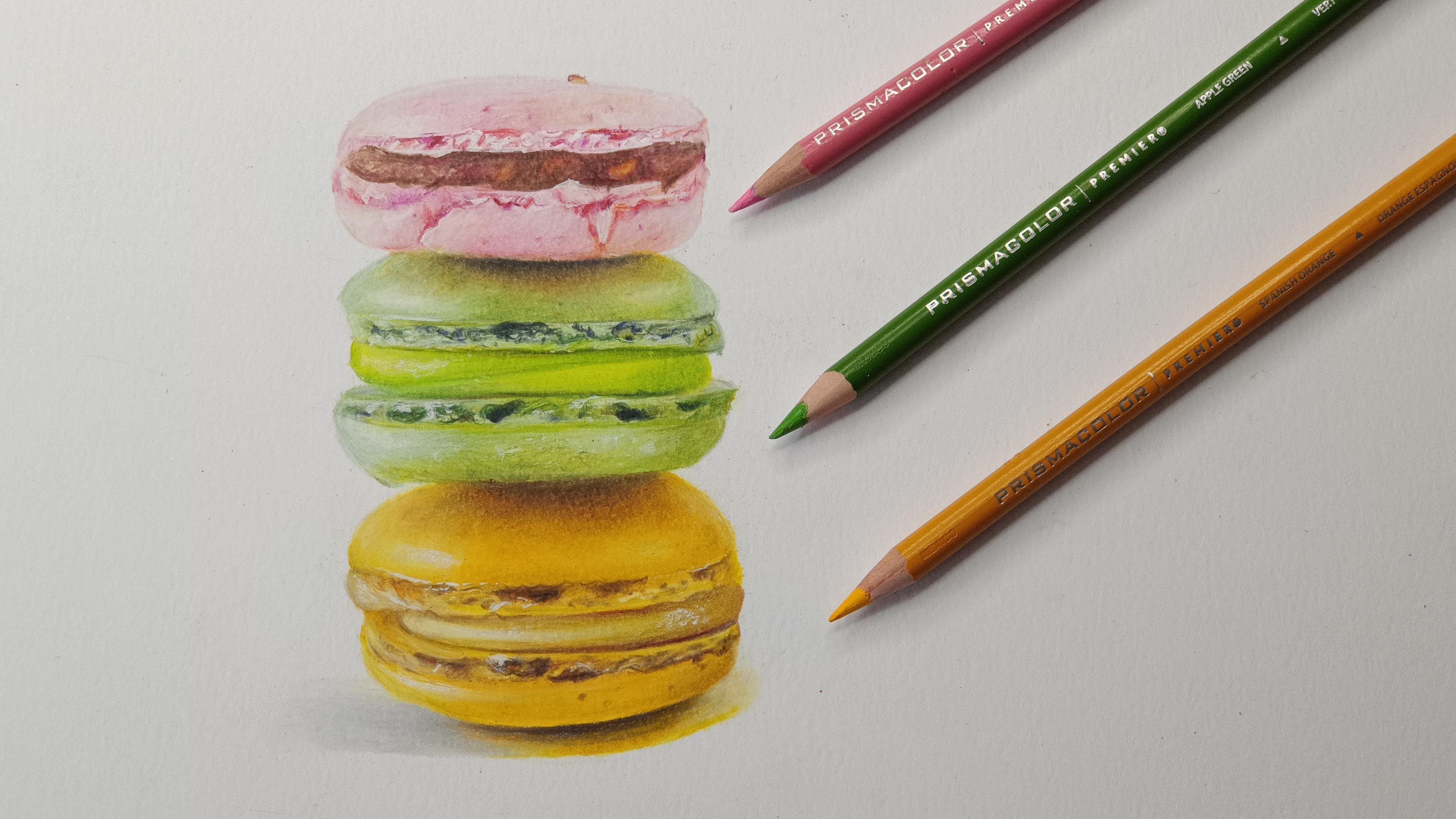
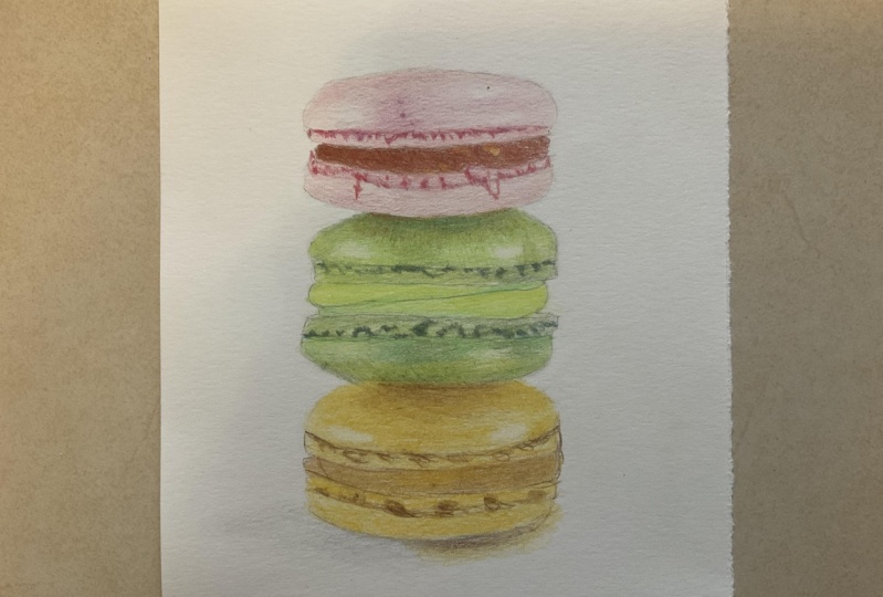
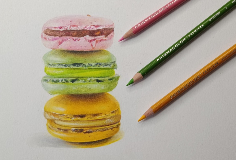
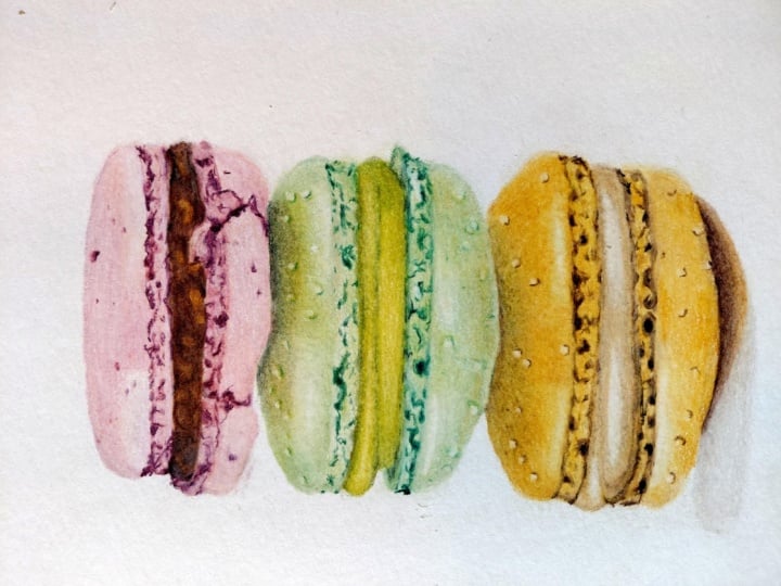
5. Macaron Drawing Color Chart: For our class project, we'll be drawing these
colorful macarons. The reference picture
is from free pick. It has a free license, but you need to
attribute the source. We'll be drawing the three
macarons on the left. Observe the photo and you will notice that the highlights
are on the left. And as you move towards the center and then
towards the right, you have the shadow and tones. Here is the line drawing. You can download this and also the reference picture from the projects and
resources section. Let's begin by making
a color chart. First, I will first show you the colors that we'll be using, and we'll also explain the
reason for choosing them. And in case you don't
have those exact shades, I will suggest alternatives. Please keep the
reference picture on your device and observe
as I explained. Let's start with a pink macaron. The highlight area on the left, on the upper shell looks white, and around it you have a
very light pastal ping. My base layer will be
with this salmon pink. Next, I will use a light ping. I will also mix it
with purplish pinks. Remember what I told in the earlier lesson
regarding cooler pinks? For dark tones, I
will use a crimson. I will use these set of colors
for the lower shell too. For the macaron filling, again, the base layer will be with a salmon pink or
a creamish shade. Zoom the reference
image towards the left, and you will notice these
shades on the highlights. I can see certain
nuts in the filling, and hence using a golden yellow. For the same for the mid tones, you can use a burnt sienna or a reddish brown for
the darkest tone. Use a very dark brown for
extreme white highlights, you can use a white gel pen. Moving on to the green macaron, once again, observe the
highlight area on the left. For the base layer, I will use this pastoral min shade
along with an apple green. As I have these
shades in my set, I know that most sets may not contain this pastor min shade. I will suggest an
alternative soon. Observe the top of
the macaron shell where the pink macaron
is resting over. You can see a golden
or an ochre shade, so I will use a golden, yellow, olive green along with
a light green for the darkest stone where the pink macaron shell is
touching the green one, you can use a very dark brown. Now if you don't have the
minty shade that I used, you can mix lemon
yellow and a pale blue. You can also use a light
gray to dull it down. If you don't have olive green
or duller shades of green, then you can mix yellow
ochre with a light green. You may not get
the exact shade as in the reference, but
that's all right. The macaron filling has
a fresh green color. You can use such
bright greens or even a lemon yellow
and a grass green. For the darkest stones
that you can see on the shelf where
there are cracks, you can use the
darkest green that you have and mix it with
an indigo blue. I have explained this concept
in the earlier lesson. You will get a deep shade of green when you mix
it with a blue. Now let's move on
to the last macron. I'm sure you know
the drill by now. For the base layer, I
will be using a yellow. You can use any lighter shades
of yellow that you have. For mid tones, use
golden yellows or occurs for dark tones, that is where the green
macaron is resting over. Use reddish browns and a
dark brown for the filling. You can use creamish shades occur and also yellowish
green like this one. Observe the right side
of the filling and you will notice hints
of greens there. For the shadow, you can
use grays and dark browns. In this case, I'm also using a couple of
yellows that are used on the macarons because you can see hints of yellows
on the shadow as well. For all the three macrons, I will be using a white pencil for blending and for highlights, you can make a
similar color chart. Or you can also make a
quick thumbnail sketch, or a rough sketch and see if the colors that you
have picked make sense. Use a color picker tool. If you feel stuck,
remember not to stress too much on using the exact sheets as in the reference picture. It's enough if you pick similar colors and get
the values right now, that you have an idea
of what colors to pick. Let's start coloring
in our next lesson.
6. Coloring Pink and Green Macarons: Finally the exciting part.
Let's start coloring. I hope after watching
the previous lesson, you have prepared your
own color chart or at least have decided
on what colors to pick. I have uploaded this chart in the project San
Reser section and show that you erase any harsh graphite lines
before adding colored pencils. As explained in the
previous lesson, I will start with
a salmon pink as that is the color that I
see around the highlight. In other words, this
will be my base layer. After that, let's add a
layer of this light pink. Better to keep your
pencils sharp as it becomes easier to cover
the tooth of the paper. After that, you can add a
layer of purplish pink. As the macaron has a
cooler shade of pink, remember to use a
very light pressure. Initially. You need to
hold the pencil this way, much above the tip, in order to get light pressure. Next, repeat the same set of colors with slightly
more pressure. You can now hold the pencil a bit lower than previous time. You can also use a white
pencil in between to blend for the dark tones that you can see on the
cracks on the shell. Use a crimson. Make
the cracks quite dark at certain places
for a more natural look. As I have already explained why I'm using these shades
in the previous lesson, I will not repeat it again. Here I will try to explain other concepts and
techniques. In this lesson, it's quite difficult to use a white gel pen over
colored pencils. As the pen can get cloggy, you need to shake it well, scribble it over a rough
sheet of paper repeatedly. Now I want you to draw
the lower shell of the macaron in a similar
manner for the filling. Start with a base layer
of salmon, pink or cream. Since this is a chocolatey
filling with nuts, use golden yellows and reddish browns for
the darkest stones, especially at the
center of the filling, use a very dark brown. You can leave some
spots here and there exposing the first layers of
salmon and golden yellows. This will give it
a nutty texture. I accidentally covered
the entire filling with browns and hence, I'm using a battery
operated eraser here to remove some pigment
and create highlights. This is just for your
information and you need not do so if you
don't have the tool, I haven't added too many
layers for this macaron as it has a very light
pastal pink shade. Now let's start with
the green macaron. I'm using these colors that I've already demonstrated
in the earlier lesson. Starting with a base
layer of pastel mint. As explained earlier, you
can use a combination of lemon yellow and
pale blue instead also adding a layer of
yellow ochre on top, as the upper shell has
a golden glow on top. Then adding light green or apple green and also a duller green. You can also use a green
or an olive green and show that you use a very
light hand and also follow the curvy
shape of the macaron. While shading, don't shade vertically or horizontally
and make it look flat, shade it at an angle. Use circular motion
while shading and create overlap between
consecutive colors. Use a white pencil to
lighten up the color. And also for blending, There is some scope
to fix your mistakes. If you use a light pressure, you can gradually increase the pressure as you
build up the layers. Also, it's recommended
that you go from light to dark
with colored pencils. Unlike pastels in pastal
pencils or oil pastels, you can add a darker
tone and then you can add lighter
tones on top of them. It's quite difficult to
do so in colored pencils. For the darkest tones where the two macarons
intersect at the top, use a very dark green. You can also mix it with indigo blue to get
a deeper green. I'm still not happy with the
dark tone that I created. I'm adding a dark
brown on top of this. Now that I have the lights
and darks in place, I will just add few more layers by observing the reference. If you feel the drawing
needs more mid tones, go ahead and add them. If you feel the
macaron can be lighter than add white or
light tones and so on. That's why it's important
that you keep on looking back to the reference and
make changes in your drawing for these dark areas here. I think they are air pockets, not sure what to call them, but you can use dark
green and dark brown for the filling.
Use bright greens to give it a fresh look. Your task now is to independently complete
the lower shell, and then join me in
the next lesson, where we will start
with the third macaron.
7. Coloring the Golden Macaron : For the last macron, we will use yellows
and golden yellows, or yellow ochre for the
light and mid tones. Browns for the dark tones, the process is pretty
much the same as before. Start with your
lightest color first, and then you can move towards the mid tones and
the dark tones. This area where the
green macron is touching the golden
one, is extremely dark. That's directly added a
couple of browns here. After that, I will add some
mid tones, and then again, light tones, because we want a smooth transition
from dark to mid. And then to light tones. Oh, for the filling. Add very light colors like cream and then hints
of golden yellow. You can also add this kind
of green towards the right. Observe the reference
carefully in this area and you will be
able to see hints of green. Add highlights with a
white pen in the end. Are we done yet? No, we have
an important part left, that is the shadow. We have already
added the highlights where the light is falling
directly on the macaron. Now let's add the shadow as
well towards the bottom. Generally, the shadow
will be extremely dark, where the object is
resting on the ground. I will be using a
very dark brown here. If you've noticed, I've directly started
with a dark tone. That's all right, because
there's not much here. You can also start with a gray and then move
towards Brown's. That's also All right. I can see a bit of golden
tones here in the reference, so I'll be adding a
couple of golden yellows. And after that I
will add a gray. It looks a bit abrupt
here in this region. I want the shadow to just
to the white of the paper. That's why I will use
a white here towards the end and try to blend it
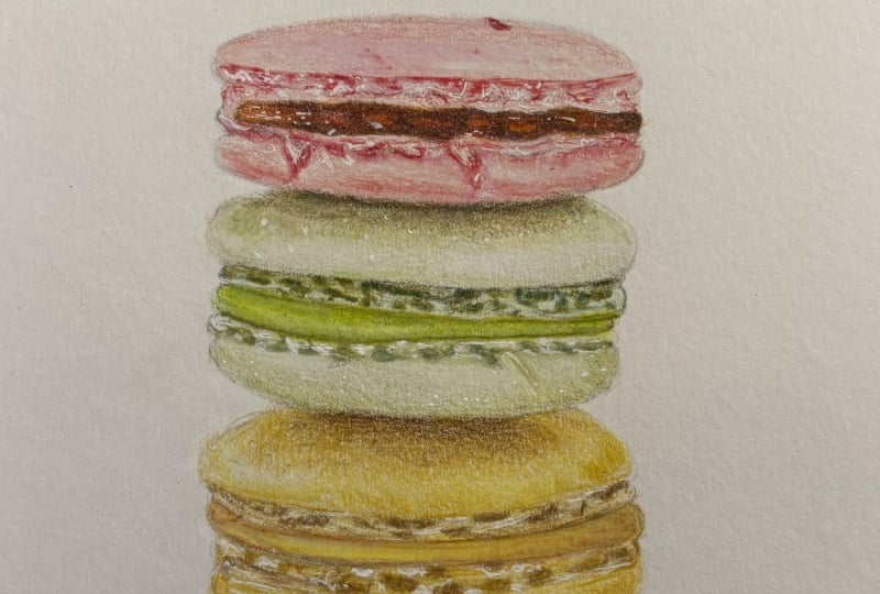
into the white of the paper. Here is the completed drawing. I'm looking forward
to seeing yours in the projects and
resources section. Don't be in a hurry to finish. I would suggest you to spend at least an hour
on each macaron. Remember all the
tips and techniques that I've explained
throughout these lessons? And let me know in
case you're stuck at any point or you
have any queries, you can post your questions in the discussion section and
I'll be glad to guide.
8. Final Thoughts : Thank you for joining
me in this class. I hope you enjoyed it along
with learning something new. Now you know what makes a good reference photo and way to find free to use
reference photos. You also know how to observe a reference photo and how to choose the right colors
for your drawing. I hope you were able to apply the techniques learned and
complete the class project. I can't wait to
see your drawings. Please upload them in the
projects and resources section. I will have a look
and provide feedback. Also, if you share your
drawings on Instagram, you can tag me there in case you have any
questions or need assistance. Please feel free to start a
discussion In this class. It took me constant practice and a lot of self learning to reach to this point where I'm able to choose any
reference photo, to be able to draw from
it by observation, and yet add my touch to it. The tips and
techniques provided in this class will
definitely help you improve your skill
level and confidence and might help you get
there faster than I did. But you will still
need to practice regularly and patiently and
learn from your mistakes. Most importantly, don't
forget to enjoy the process. Use tools that will help you learn and do what
makes you happy. It would mean a lot to me. If you could spare a minute and leave a review
for this class. Your feedback will not only help this class reach
a wider audience, but it will also motivate me to do better in my
future classes. Thank you again and hope to
see you in my next class.
 Smitha Rao, Pencil and Pastel Artist