Transcripts
1. Welcome and Getting Started: - hi and welcome to designing professional documents or, - as I like to call it, - making boring documents. - Beautiful. - I'm an dittmeyer, - and many of you may know me better is probably a J, - but the name of my blawg as well as my Twitter handle. - I'm an American graphic designer and editor based in Paris, - France, - and this is my third skill share cost that I've taught. - My first class was Matt making, - which was so much fun, - and I also teach uninjured in design class. - The inspiration for this class came from a friend. - She was not a designer and asked me to look over her resume. - As soon as I saw it. - I didn't have any desire to read the content on the page I hosted. - Didn't feel like it was really a good reflection of her work or her personality. - I'll be showing you that example in the next video, - but I think the idea of redesigning your resume is something everyone can benefit from. - I'll be showing you tons of other examples from professional designers as well, - and I think you'll be surprised how under designed they are rather focusing on streamlining - in the information and giving it room to breathe. - I also be walking you through my own resume and design decisions. - And yes, - while you can hire someone else to design your resume for you or even by a template on etc - . - That's not the idea of this class. - The goal for this class is that you'll gain skills that can apply to any documents or stuff - where you're working on the concepts will discuss in resume design of type selection - hierarchy, - alignment, - margins, - etcetera will all translate to any project you're working on, - such as a cover letter letterhead proposal, - estimate, - invoice, - remediate kit. - And this class will also be considering how relevant resumes are today and creative - solutions to help make yourself stand out by taking the time to create a professional - looking proposal. - Clients take me more seriously. - Not only they're more likely to hire me. - Chances are they're more likely to find the budget and value me properly because I - presented myself in a professional way. - I have one client who hired me to create new production documents for him in that industry - . - Crews typically work using boring Excel files, - but we were able to use the software pages to make subtle changes that not only helped - better communicate the information to the crew, - but the documents also made him more memorable to clients and more likely to get hired - again. - This class is designed to help you build skills and in design, - but if structured it in a way so you can use any software you choose. - The first lecture in the design units will present concepts, - and the later videos will work through the content and in design, - even if you're not using in design. - Still watch all the lectures. - Adobe has a free trial. - If you're interested in giving in design a test drive, - I've also included a discount code below to buy entered in design class on skill share. - If you want to start at the very beginning to make the most out of this class, - you'll need to do more than just watch the videos. - While I mentioned several resource is in the class lectures, - be sure to take advantage of those resource is and click and explore the links. - I also like to make you said the Q and A discussion area. - Have you all contribute to the conversation? - Look for the threads on inspiration to share great examples of any documents you find, - and one to discuss different kinds of resumes and how to approach the content. - Finally, - you are all each other's best resource is. - So be sure to check out your classmates work. - Leaving comments for each other will help you develop a critical eye and make your own work - stronger. - Also, - it's really important to have other people look over your professional documents for typos - and to make sure everything makes sense. - Never be afraid to ask questions. - And remember, - this is a really supportive community. - Once again, - the project for this class is to redesign your resume. - Your final products shouldn't look exactly like my resume example that'll be sharing in - class but rather pull from the very examples in the inspiration you find to make it your - own. - The first step is to start your own project board in the skill share classroom. - Even if it's just a screenshot, - upload a copy of your existing resume for privacy reasons, - note that it's up to you if you want to change your contact information or cover it up. - Some help. - Part of the fun is going to be seeing the transformation between the before and after have - fun, - and I can't wait to see what everyone comes up with.
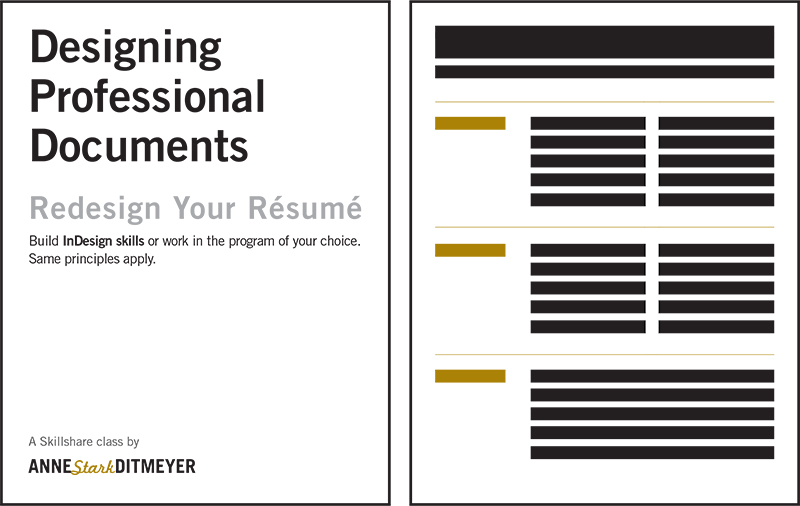
2. Case Study: Résumé: - Welcome to the next lecture, - this lecture. - I wanted to talk about what makes a professional document with an actual case study. - And it's the same case study of my friend Zoe that I mentioned in the opening welcome video - . - So this is still a resume that Zoe first asked me to help her with advice on. - I know I didn't have time to redesign it for her, - so I started coaching her in how to work through it. - I wanted to also use this is an example, - because she did everything inward. - So if she could do this in word, - you can use any program to make a document beautiful. - It's about thinking about how to rearrange the information. - Another thing to realize is that this is a resume of an American, - but she's working in France, - so they're a few differences in this resume that you wouldn't necessarily have in all - resumes. - So it's just a word of warning that wherever you're from or whatever industry you're - working in, - make sure you take those considerations into play. - I'm one who likes to rebel. - In this case. - I encourage Chloe to take off her photo just because I feel like it's very old school, - but it sometimes you do need to adhere to the requirements and guidelines. - The other things that resume is required to do in France or curriculum. - The Thai they're called here are to include your age. - I also find that a little bit strange anyway, - so that so we had sent me the word document of her resume here, - and actually I exported it for a pdf in order to show it here. - And it didn't export quite right. - This gray is supposed to go all the way to the edge, - which is a little bit nicer. - But of course, - when you're printing it out, - a printer cannot print a full bleed from your house unless you're going to trim it later. - Anyway, - this is a PdF from a word document. - As you can see the page just just just full of information, - there's You don't know where your I should go. - There's no room for it to breathe. - There's no white space. - You have all the headings and information, - um, - in the sidebar here. - But there's just so much that could be stronger. - And as I said an intra video, - I just didn't feel like this felt like so we at all. - And they knew that she wanted to get from a corporate job to a more creative job. - So this is the next version, - she said. - After I sent a few comments about contents burst to point out this Pont, - um, - she she saw on my resume that I used the simple type treatment of my name, - and she decided just to use the simple Microsoft funds on it to make it her name, - although this is not at all the font she intended. - So you have to realize that whatever fought is in your computer installed in your computer - , - the recipient needs to have that fought as well. - Hence, - it's very important to send a potential employer a pdf rather than a lack active word - documents. - The other thing is, - something got funky here with the text. - This is hidden, - and it actually pushed some of the information on to a second page. - You could tell it wasn't an intentional second page because there wasn't enough text on it - , - so I asked her to send me re sent me this file as a PdF, - and this is what it looked like, - which is already a huge improvement. - So she asked me on my resume as well why I had I didn't have even margins on both sides. - Now, - if somebody is not a designer, - this is a very valid questions that I never thought about. - So I'm trying to make this space a little bit more dynamic and a little bit less - traditional. - We're not designing a book here. - We're designing a resume and wants to catch the eye. - The other thing about having the wider margin it means the text isn't too long. - So it's easier to read when the lines of text or shorter. - And it also gives a convenient area for the person interviewing you to write notes during - your interview or ask questions, - I find more and more people giving interviews have less time to prep. - So there's a good chance that many people, - especially on further out team members, - are only senior resume for the first time. - So this is really important. - So a few things that we looked at where the content So in the previous version, - this had been a little bit too much information. - A lot of it was repetitive, - so on the content side. - We edited it down here. - You can see this long line about her current position, - and it goes to the second line here, - which you can be more distinct and text. - So we're gonna be working in the next unit about being a better editor. - Also, - the years the month here with the year more and more you really don't need that level of - information. - And, - um, - down here you have another orphan, - which that could easily be worked to fit in the one line. - So if you clear up that space here, - you give a little bit more room for these areas down here to breathe. - So those air, - some initial changes that we did just again over email and she worked through the versions - . - So little by little, - we got to a place that we're much happier with, - And so he felt more confidence. - Um, - she chose the color. - And, - um, - you know, - you could also have a black and white one, - but always start in black and white, - like said, - And so you have we had she added a few subtle dotted lines here, - so nothing too distracting. - But it's a nice separation of the content in the type of information being presented. - Um, - you know, - some of the information is a italicized, - but not all of it, - um, - have indented the bullet points here added a different color. - Just so there's a little bit of a stepping stone and rhythm to the information. - So overall, - much stronger, - nicer version of what she started with and also, - like I said, - reflects her personality. - So here's the before, - and here's the after so on your project boards. - The really The idea is to include the before and after of your documents so you can see how - the same information can be prevented, - presented in so many different ways. - So here's some initial tips for great design that will be covering over and over, - and the upcoming units simplify and streamline. - You know, - it happens in both the content side and the design side, - so you know you have to cut cut, - cut White space is a good thing. - You want to let your designs breathe. - This is that same issue of the margins. - They don't have to be Even You can not be crazy, - but you can be a little bit unique and help it work with the information, - so you can tell when it's a more of a novice designer. - There tends to be less white space. - But the more design work you do, - the more you realize that white space is a really good thing. - Um, - maintaining proportions. - You never want to stretch a font. - You never want to stretch images. - Also, - very novice thing I can tell right away. - It just makes me cringe. - When that happens, - you want to look at the content with a critical eye. - A lot of times it's really personal information. - It's hard to cut. - That's what you also wanna have. - Other people look at your work so they can help you be better at editor. - And also all these elements need to work together. - Um, - design really is a puzzle, - and when you change one thing, - it's gonna affect the information around it. - So even feedback I may give you, - you know, - I might say one thing, - but once you see an action, - it might be a different. - But you have to. - You have to try a few different things to make sure it works in the elements, - work together, - create hierarchy of informations. - The I knows where to go. - This is why resumes are great. - They already have these divisions of education experience, - employment on skills. - So you already have a natural hierarchy, - and then you want to think of different levels of hierarchy. - It's easier on the eye as well, - and it will make people want to read your resume or whatever is on your document. - Contrast is super key for viewing both on different screens and for print. - Sometimes colors can be a little bit off my marry golden saffron, - yellow gold. - Sometimes I've seen it look like puke green on one screen. - I was like, - That is not what I'm going for, - Um, - and also for Prince. - When you're working with gray, - make sure you're working with a dark enough shade that it's gonna print. - Chances are the person reading your resume is has older eyes or stares at the screen all - day. - So you want to make sure there's enough contrast, - Um, - both between elements and just of the shades of color you're using type. - It can probably be smaller than you think. - Um, - if you're working inward, - um, - the cursor defaults to 12 points. - Um, - that's fine. - When you're looking at a website and looking on the screen. - But when you print it out, - it feels very different. - So you can fit a lot more information on the page than you realize. - And we'll be working with column widths and different ways of laying it out to make the - content fit even better, - but realize that the type can probably be a little bit smaller than you think. - But don't go too small. - You don't you don't want toe the reader of your document toe have to squint and hurt their - eyes and then always spell. - Check your work for maximum professionalism. - So toe end this lesson. - I want you to go ahead and print a physical copy of your resume. - Uh, - we live in a digital world, - but it's really important when you're working on design work to print it, - print it throughout the process because you might you're going to see different edits and - see different typos. - But it's also gonna look and feel different. - So some of these beautiful examples I'm showing you they will actually look even better if - you were to print them out the dotted line on Zoey's. - It looks a little bit squished, - an awkward on the screen, - especially when I'm making it the proportions of the screen instead of viewing at full size - and a little bit larger, - and we'll zoom in later. - But you want Thio Thio view it at different sizes. - And so, - um, - the print version is always gonna look better for a document like a resume, - where you have a lot of content on it. - So go ahead and print a fitness physical copy. - And don't be afraid to take notes on it and sketch because next up we're gonna look a ton - of beautiful examples from professional designers.
3. Inspiration: Résumés + CVs: - So now we're getting explore what makes a professional document for anybody who's taken my - other skill share classes. - You know, - I love inspiration. - Examples. - When I started to research for this class, - I Googled things like good design resume, - and I was actually surprised the results that came up well, - some of them were definitely designed. - I thought they were over designed and just too much information going on. - So instead I decided to reach out to a bunch of my creative and designer friends and ask if - they would mind sharing some documents with us. - They're more than happy to oblige, - and I'm really excited to share the examples with you. - The first videos are gonna be all about resumes and CVS, - and then the second video is going to be all about anything from invoices and proposals to - other uses of these documents. - And then we'll be able to look at how the basic concepts are applied to both. - So here's what's to watch for first off text size. - Try to see how much information's on the page and how big the information is into the same - respect, - the amount of information on each page and how many pages. - Each document is the use of white space margins, - which also includes things like alignment and justification sections and headers, - and how the overall information is organized and divided, - as well as types, - styles and treatments. - Look how Maney fonts and typefaces are being used in the document. - It's probably less than you think. - So first stop is Jessica Carl Hertzel head SOLs. - Um, - resume. - And Jessica told me she threw this together pretty last minute when she needed it for - something. - But Jessica is a professional designer, - so Jessica has this big white space to the left. - Everything does not need to be centered. - Everything is nicely aligned through this margin here she has, - ah, - bold all caps. - Um Teoh, - say the title of the place she was working and she says her role the year and the location - Underneath it. - She is 3 to 4 lines about the position and what she did, - as well as the website. - Link notice is not necessarily necessary to add http before everything. - People understand how the Web works these days, - and just having the website name works with the dot com or whatever the ending ISS down - here, - she has her education and her skills and interests, - but it's a very clean document. - Um and the thing to realize is Jessica is also going to have ah website. - And so I look at her J k a g t h E l tze l dot com website to see how this relates to the - website, - and she's also going to have her design performing portfolio, - probably on the website as well. - So this document is going to be used in context with others. - If you don't know her. - Kernan Burn Project looked that up as well. - This is the French Resume, - or CV, - of Julie. - Sir Peary. - She is an art director here, - and she has a wonderful travel blood called Leg. - Karnei did crevice. - This document does not look like that fun site, - which is a little bit collage and everything but this document once again being in this in - the context of something else, - and she's not trying to over explain everything. - She does a lot of freelance work and works independently, - so she's not necessarily going for a specific job with this document. - But I really like how she uses thes dash lines as horizontal divisions for each space, - and then it's creative to use it on this vertical way as well to tie the information. - That way you can see how she's just using the year and deport you mean sense, - Um, - and once again, - just not too much information. - She's definitely pared it down to share the most important pieces of information in her - mind. - This is Angelo Al Kasab is's resume and remember this one because we're gonna look in the - next video at us. - Very special cover letters that he's designed. - But Angelo is a graphic designer based in New York, - and it's nice how he gives himself a title here. - And another club row thing he does is he helps the reader know how to pronounce his last - name. - There's nothing worse than begin interview and really not even knowing how to pronounce the - first or last name of the person you're talking to. - So in terms of his layout, - he's doing something a little bit unique and dividing it into two columns left and a right - he's visually did divided it through this dotted line, - which cleverly ends in an arrow pointing to a second page on the top. - It says Page one off, - too, - and the next page two of two. - So he's using centered information some low upper lower case, - a Tallix and all caps here. - And then all the information is flush left. - And here he is, - um, - just having information fit really nicely. - And then over on the right page, - it's continued. - So once again, - it's good for the reader to know their two documents, - especially when working in a printed context where it can get lost. - Once again, - he's got this, - um, - justified type that he's not forcing it in the bottom. - His his text lines are long enough to have this justification. - He has centred information here. - The skills. - It's really easy to read that list. - And then he has this clever just for fun list, - including cooking spring rolls by hand. - So he's really encouraging you to contact him and visit his information. - So those are that's Angeles to Page resume. - That really works because he has enough information to fill out both pages of information. - This is actually the CV of Angelo, - sister in law, - and and it is another two page document, - so it's one of two, - and to have to over here Civil, - zoom in and look at how an is dividing the information. - She is not starting halfway through the page, - but almost there. - So she is this nice wide margin in all over contact information is hanging out here, - and the type treatment for her name is nothing that anybody in this class can't dio. - She's a professional designer, - but there's nothing that isn't just using basic type treatments. - We'll be looking at more later lectures at specifically at some of the ways she's handling - the type here. - But for now, - look at the different divisions and the way the title of the the Job or post waas as well. - She's handling the descriptions, - so and then we'll go over to Page two. - This is her CV in an academic context, - so it's starting with education. - But it's also important in a C V is more where you're sharing every level of information - and all the projects you've completed. - Another interesting thing to consider is whether you want references to be something that's - always on your resume receiving or something that you add later. - So this is the two page resume, - my friend Entree liver, - who is a Canadian designer based in France. - And something interesting that Andre pointed out to me is that he feels very self conscious - as a designer having to design a document like a resume. - Its there's more pressure as a designer to do something. - Quote creative. - So for any of you in this class who are not at all designers, - think of it as your expectations are Lillard by others because they don't expect you to - design your resume. - So when you are able to design it, - you're able to stand out. - But anyway, - Andre still is able to divide the information and make an interesting document. - He has a little information overview and the focus information for himself. - Education, - work, - experience. - Um, - something he's doing that's a little bit different. - Is using Navy blue instead of black, - so super simple. - Overall, - I really recommend starting black designing and black and white, - and then add one, - maybe two colors, - max. - But keep it simple, - and it's really a good design challenge to start in black and white and make color your - last step. - So we'll go ahead and look at Page two, - um ah, - whole bunch of different experience, - but also sharing the activities and interest. - So think about what levels of more personal information you want to include. - A lot of it's going to depend on which industry you're working in or applying for. - So keeping them. - Obert is an awesome illustrator and designer and for interview who know her work from - obsessive consumption. - You know that this document looks nothing like her work, - which is a lot of pen drawing and handwork. - You know, - she started by illustrates. - She started out as an illustrator by drawing every single one of her credit card statements - until she paid off her bills. - And then she started drawing everything she but she bought anyway. - Kate isn't educator, - so this is an academic CB. - This is actually a 30 page documents because Kate has so much experience and has done all - sorts of different shows on the side. - So she's presuming, - you know, - multiple past, - while she is also a professor. - So the first page is actually a table of contents for everything, - and this is page two and three of the document. - So in education, - she's putting education at the top, - her employment experience. - But then we get more and more into her actual experience. - So looking at her type treatments, - she has bold type and the vertical line. - I'm so you don't know the official word for that. - So, - you know, - we do our best explain, - um, - what she did specifically for this client's other radical line the dates vertical line and - then the website. - Once again, - you don't have to write, - http, - but you do need to include that any time you are using a hyper link. - So this goes on and on. - And by keeping an in design, - it's really easy for her to add the information and all the text boxes would be linked. - So, - you know, - the information is just moving on to the next page. - So this is Cates CB. - This is me Nicolle, - who is a designer based in Richmond, - Virginia, - and she has two different documents. - So this is her resume, - and then the next screen we're gonna look at is her CV because she is also an educator. - So Amina has actually created a more visual logo. - Type just m. - For her name, - she says. - Design and illustration. - She has some visual red lines, - so she's just adding a touch of red without adding too much. - If you are printing this from a home printer, - just be warned that the red is not going to print all the way to the edge the once again. - The printer ink would not work, - so I doubt she's having a resume professionally printed. - But let's people are looking at these documents on the screen as well. - So she has a nice little gutter going through the center with all the information and the - time line to the left, - the dates and then the actual job she did on the right on this one. - Her education is at the bottom, - but she's also included awards and affiliations and references. - Meanwhile, - this is whore part of her six page academics TV. - So I swing all the levels of information. - I just wanted to start by pointing out the top, - um, - information here, - which is all her contact information. - This shows up on every page, - so what she's done is created a master page, - so it shows up on every page. - And when documents get separated, - it's good to know that everything fits together. - So as an academic CTV, - she's starting with education. - You can see she has implemented similar design techniques with the way she's aligning a - text in the space and like the columns she's got Flush left ragged, - right? - Um, - and everything is more recent on the top and older information on the bottom and - international teaching experience, - teaching experience, - just breaking down the different levels of information. - This is a resume Farina. - Tom and I love this resume cause it jumps out because it doesn't look like the other - examples. - And the main reason is there's so much white space. - This is not because Arena is inexperienced. - It's just she's shifting her focus. - So if you look down here, - Rina has really amazing professional experience, - if you think in the traditional sense. - But she's really using this document to focus her energies to the kind of project she wants - as an independent worker. - So she's behind makeshift society in San Francisco and Brooklyn and focusing on things like - anthology magazines. - So she's highlighting the kind of work she wants to be doing moving forward. - The other thing. - I love that she uses a profile. - Now this is only five lines of text here, - but trust me, - finessing a description about yourself is a lot of work but she does a really good job of - capturing the kind of work she does I love. - So like that she's titled at profile instead of something like career objectives. - It's all up to you and will kind of work you're doing. - But this is arenas. - Black and white resume with a touch of red to point out those different aspects. - Once again, - in the Internet age, - you can connect to all her websites and see what other work she is doing. - This is now the resume of my friend Alexandra Pappas, - and Alex is a lighting designer in New York. - And when I worked for architects in Baltimore, - I learned that any time we submitted a proposal, - the designer working on all the designers working on the project needed to be included in - the proposals. - So this could be a fairly simple text document because something like lighting design or - visual design architectural design, - you have to have visuals as well. - So you have to think this is a resume in the context of a larger project. - But you never know. - People could connect and say, - Oh, - I worked on this project in Rhode Island as well, - so this is why documents are important like this. - So all this other experience where I met Alexa Center stage, - This is not as important. - So it doesn't need a full description. - But she also is academic positions and education. - So depending on your industry, - you're going to have slightly different information. - And she also has a version of this resume adapted specifically for the lighting firm she - works for.
4. Inspiration: general documents: - now that we've looked at resumes and CVS of how to make a professional document now I'm - going to share a few other examples of how the same principles are applied to other - documents. - So this is a simple letterhead that I used the exact same header that I used on my resume. - I add the date to the left column and then I have, - um, - my letter that fits in here and I follow the same alignment all the way through. - And then I just add my signature as an image here. - So simple letter, - simple letterhead, - Same kind of document, - same typefaces used in my resume. - We also looked at an Al Kassab Is's CV Now. - Her cover letter doesn't use the exact same margin, - but it's OK. - She's still using the same type, - and it has the same feel. - I just wanted to point out a couple of things. - How she is using her, - um, - her title here in the letter, - but something I really love. - It's down at the bottom with her contact information. - She has a career objective. - This is a letter specifically designed as a cover letter to apply for a specific job. - I think this is a nice touch and it fits everything in her letter. - Really nice. - Now. - We also looked at Angela's two page, - um resume, - and this is a CV Sorry, - a cover letter we came up with because I was talking to him last fall and he was really - struggling, - does applying to design positions and is a creative designer. - He's not necessarily writing, - so writing a cover letter just didn't seem fitting for him. - So we were talking and decided, - like, - Why not design an Infographic? - So this is an infographic, - but it's still really clean and not too busy, - and the text stands out. - So he's just doing a fun job here, - using some of the same elements that he applies in his cover in his resume. - And he's pulling it together to point out creative skills and things. - He loves doing what kind of experience he has and once again adding that touch of fun. - So depending on the job he was applying for, - he could customize this to highlight different clients and different experiences. - But once again, - this document is meant to accompany this resume of Hiss. - I was really honored when I reached out to Ellen Lupton, - and she agreed to share this book proposal. - So I've you'll hear me say a 1,000,000 times over in this cost to take her free, - um, - typography class. - And anyway, - she has this wonderful website and book called Thinking With Type. - And this is the actual book proposal she sent. - And once again, - you can see she's not using the page in a traditional way. - She has white space here. - She's using the touch of red as different elements, - and she's just breaking it down. - You can see how she's treated paragraphs with an in dense no space between she's labeled - Proposal One down here and then this page shows Page three of her proposal with the - proposed table contents and specifications. - So this is a book that actually happened. - On the right side is a separate document for indie publishing, - but it was just designed as a one pager. - So these two pages are separate documents, - but I just wanted to show them to you as how Ellen Lepton, - a professional, - a graphic designer and educator and book author, - is treating a book proposal so you could apply the same skills toe any kind of proposal and - back to my friend Joanna Windemere has a company called One Fridge Proposal, - where she says, - instead of having a resume, - you should submit a proposal to accompany so interesting concepts. - So thinking about your reservation potentially as a proposal. - This is Kourtney Elise, - EOS. - It is a creative brief, - and it's actually pulled from her skill share class that I took in the last lecture. - I share a link, - and it will be in the resource is here as well, - but definitely recommend this class, - particularly for designing up at the top your logo treatment if you want to do something - more than just typography. - So Creative Brief is part of an overall logo design, - but you can see she's using just the simple color green and this element. - It looks great on screen. - Just know if you're putting at home once again, - you would have to trim the bullied or just expect there'd be some white space around it. - So that's a creative brief once again with the date and the project information. - So I recommend her class very much so we're looking at invoices here and once again looking - at an Alka sevice who's becoming a little star of our are examples here after seeing her - cover letter and her C V. - This is an invoice lines. - It's a simple graphic element. - The dates always there, - numbering of invoices, - contact information, - saying where to make the cheques payable. - She's using a very faint grey box. - So it's There's a subtle change, - but not too much, - but it's a really just pleasing document. - Here is another example from Brianna Rose. - She has a wonderful Britain, - be Freeland Siris on her blogged. - I am Brianna Rose, - um, - and so this is a sample in voice she uses, - and you can see her logo type treatment. - You can see the box is Aziz color just a little bit of visual fund, - and I love when you zoom in this little touch shoes, - using mass strict and aligned to buy, - divide information and saying thank you to the client. - So it's not using boiler plate text. - It's customizing these traditional documents on making them have a touch of you. - This is Eleanor Grow sh her. - She's an illustrator based in Philly. - She's using a little bit more color and fun, - and if you've seen her work, - this definitely feel spinning for it. - So you would list all your items? - Um, - you know, - using gray to divide the columns. - All the information is clearly marked and saying thank you. - And then up on the right, - it's, - um marked which invoice it? - ISS. - And then finally, - this is Michael Sina's invoice, - very untraditional. - And I actually got this tip from Tina, - who writes for who's behind the Great Discontent, - and she is a nice interview, - and they're more examples of this shared their. - But every few months he'll change out his quotes at the top, - and you can see the information down here with the invoices much more subtle. - So you're making yourself memorable to the client. - You're making more interesting for you. - I find that invoices are very boring dry documents, - so you might as well make it interesting for you on a little bit different. - So all it's contact information is still there, - but it's just something a little bit fresh. - And finally, - this is a document I want to show you. - That studio practices a side project I've been working on for a long time with designer - Lauren O Neill, - and it's a curated library of tips and tools for creative business. - So while it's a website, - we wanted to create a one page pdf that we could use in terms of promotion and helping to - get word out or potentially sponsors. - So we still might want to edit this, - and there's quite a bit of text on the page. - But Lauren took the design lead on this, - and we can see how there's philosophy. - We have hyperlinks, - goals, - a little bit of subtle color change. - Um, - sharing some information are vision and a little bit about us. - We also have a hashtag up on the top rights, - and I'll just zoom in a little bit, - says a little bit clearer. - You can see we have our contact information. - So this is just a on alternative to, - ah long likely proposal, - the idea of putting everything onto one page. - So finally, - given all these inspiration in the past two videos, - I want you to find your own inspiration and share these examples of resume Stevie's or - professional documents that you found and share them in the discussion board. - Ah, - you might want to check by looking at B. - Hance has a ton of great examples. - Maybe cargo collective. - There a lot of illustrators, - and I find that people who use that service tend to check their about page, - and they tend to link to their resumes and CVS. - Not always, - but look for real life examples. - Sometimes I see things on instagram you never know, - but just share the lengths and share a little description of why you think it's interesting - or caught your eye or stands out. - So the classroom is gonna become this amazing resource, - thanks to all of your contributions as well says thanks so much, - I'll see you in the next unit.
5. Think Like an Editor: - welcome to unit to thinking critically about content or otherwise known as thinking like an - editor. - One of the things I find most fascinating when I collaborate with other designers is seeing - their ability to look at content in a critical way, - and this does not mean a negative way. - But it looks, - makes it. - It means looking at it in a constructive way. - So many times, - if you've ever worked with the client, - she's provided text with for you for something like a brochure. - There's so much information. - Everybody thinks they have to say everything in ST 1,000,000 ways. - But if you can think about streamlining the information and really finessing it, - massaging it and making it work together, - you could have such a better product. - And a design will be more beautiful if the content works with it. - So there's to consider in the content Rome What an industry are you in and what discipline - . - So different industries are gonna call for different kinds of documents. - So first off, - what's a resume versus what's a CV or curriculum vitae? - I living in Europe, - I often just used the term CV and is the same associations resume, - but technically a Stevie is more of a long form document. - It's what you see in academia, - and keeping a Lamberts CV is 30 pages and Nina's, - who we looked at in the examples as well, - with six pages. - So you have every level of information and pretty much everything you've ever done in life - . - So a CB would also be very appropriate for an artist who's trying to showcase all the shows - they've been in or trying to grab it grants or something like that. - A resume really is a short form. - Another thing to consider is linked in which I think is a wonderful way to organize all - your content. - But linked in is very much a profile. - So often times you use the word I. - You explain a lot of the information in a way that you don't necessarily on a resume. - So I think using LinkedIn is a fantastic start, - but they think how you can re edit the information to be a resume. - The next thing to consider is your country of origin. - This is going to impact the required information on your CV as we looked at Zoey's example - , - she needs to do to include her photo and her age and technically, - in France. - It's up to you if you don't want to include information, - but definitely consider it because you don't want to be ignored for a job just because your - resume didn't have the proper information. - Another thing to think about this if you want to include an objective or a summary. - I didn't like this idea for a long time, - but I think it's really helpful to think of it as a Twitter bio, - something short and sweet into the points. - Another really good example, - like that we looked at was Rina Tom's resume. - Another thing is the level of specificity. - How much information do you really need to include for the dates? - For instance, - do you want to have the month and the year? - Or maybe you could just have the year. - In a way, - it's a great way to make it seem like you've been at a job longer potentially, - Um, - but also, - at the end of the day, - it really doesn't matter, - and an employer is not gonna count the number of months. - In most cases, - I would think next up is the order of information. - So when you're first out of school, - high school or university education is probably gonna be the top thing on your resume. - But as soon as you have your first job, - that's probably gonna move down to the bottom of your resume. - It just in temple. - Your priority is obviously, - if you work in academia, - education is gonna be top. - We need to think about and consider the information in the order. - It's going to appear. - Another thing is, - how many pages is your document? - I challenge as many as you. - It is possible to create a one page resume. - It's a really interesting challenge and puzzle to try to fit all the information on one - page. - If you're gonna have multiple pages, - make sure you have enough information, - so it's significant if you just have a couple in from a couple inches of information on - Page two, - it's going to make you look in experienced. - But you also don't want to fill it with fluff, - so find a way that makes it work. - Next up, - think about the relationship of your resume to your website, - your portfolio or any other documents or case studies you might have to include For me. - I have my resume, - and it also that logo letterhead, - um, - matches my website and dittmeyer dot com, - and I use this information on everything else. - But I also do have a full design portfolio, - so my resume doesn't need to be visual. - The last thing I want to point out our touches of fun. - I remember when I was first applying for jobs at IDEO, - a global design consultancy. - I rent somewhere that they always read their resumes from the bottom up. - That really gives you a sense of the personality. - So you'll notice that my resume talks about a hip hop class and being an extra in a TV show - and a movie and these little quirky things to make you stand out and Angelo's resume. - He talked about salsa dancing and making 200 egg rolls. - So depending on what kind of job you're applying for, - don't be afraid to have fun. - So this is kind of all content. - But I also wanted to remind you that schools and universities are fantastic. - Resource in the resource is in the Skill share classroom have included the link to the - University of Virginia's Career Services page. - I really love all the information they have about resumes. - They break down the difference between resumes and CVS, - also for different industries with lots of links. - And another thing to look at our. - They have action verbs. - It's, - you know, - finessing your texts, - especially in your summaries. - But it's great, - so you can use it the saurus, - or look at these lists for different ways. - I'm sure I say that we're managed to many times or developed, - but think about how word choice can really impact, - um, - and strengthen your resume and dear writing. - So I wanted to take a closer look at my resume, - just kind of break down some of the information. - So up here, - I'm talking about that creative summary or profile. - This is the only part of my resume that I change on a regular brick basis. - I know a lot of times people are tempted to adapt and change the resume for each job - they're applying for. - All I have to say is, - that's completely exhausting, - so you can find one little area recon, - adapt and change and kind of grow with your resume, - I recommend some kind of area where you can change your title. - Um, - depending on the position because I'm a little bit between the design world and the writing - world. - I'm constantly changing. - And literally every month I would have something different. - But right now I call myself a communications designer and editor. - So then I have this little arrow connecting to the idea of connecting creatives across - continents. - This is a phrase. - I came up when I was developing my Twitter profile. - I really like it and it stuck. - So then I have experiences my top hit. - So I have the the company. - I work for the website and my job title above it. - And then the years there. - So I tried to create very assisting text limited to two or three or 23 to 4 lines in most - cases to explain what I was doing in really highlights. - Um, - I like my expertise. - Another thing I wanted to point out turns the contact content is a lot of times people - aren't gonna know these companies and never assume that the recipient of your documents - knows what you're talking about. - So instead of just saying Tobin hold back and associates, - I wanted to point out that was an architecture firm Same a center stage. - A lot of people think it's a ballet because of the movie, - but no, - it's the leading the leading regional theater in Baltimore, - So those were just subtle little touches. - So I keep everything in chronological order. - But think about the ordering of your information with your content. - Do not have my education section, - and for me it was really important to add another level of information. - Some people just have the school they went to in the year they graduated. - But for me, - I really loved the unique experiences I had at each place, - particularly on semester at sea when I visited 10 countries around the world. - Something like this makes for a great conversation in an interview. - So make sure you so some of the things you want to talk about really like highlight those - these concepts. - I also like to include workshops and conferences. - Even though I wasn't exactly working on most of these, - I like to say that I participated in them, - and it makes me kind of shows me the kind of designers I want to associate myself with, - and then I also have skills. - This is something that you know, - don't don't lie here, - but make sure you kind of state the obvious. - Blogging is a huge skill. - Did so many employers are looking for? - So stating the obvious is a really important aspect of working through your content. - And then down here I have activities. - I've used a little bit of a carrot down here. - I could may probably make this section stronger. - At one point, - I had right designed, - speak, - collaborate, - but athletics and extra not all the words in the the same tense. - So right now it's working for me. - But here you can see hip hop on the extras, - my experiences and extra, - so just giving a little bit of personality there. - Another thing we'll talk about later is how I like to date my resume. - This is mainly for me, - helps the employer to, - but I have so many different copies floating around this way. - I know it's the most up to date, - and I'm also happy to provide references upon request so moving forward before you get too - into the design process. - Haven't least two people read over your resume and then think about their feedback with a - critical eye. - It's really hard to hear some information especially if you think you're almost done with - the project. - But hearing feedback is really critical. - And also, - you know, - you need to have think about the perspective of an employer. - So it's good to ask somebody who maybe appear. - But also somebody is older than you or somebody in the industry, - Um, - but definitely get feedback. - And don't be afraid. - If it's not all positive, - you're trying to grow and get better.
6. Thinking about layouts + InDesign: - this unit is all about structuring your document. - Working with layouts, - I really recommend you watch the next few units straight in a row and then rewatch them as - you work with your documents for your new day. - In design, - the information could be a little bit overwhelming, - but practice makes perfect. - But remember, - before diving into any computer program, - it's a really good idea to take out pen or pencil and paper and sketch some ideas and - layouts. - This could be completely rough. - And don't worry if you don't use any of the ideas. - It's just a really good way to get your thought process working well and good habits. - And that's gonna help make your design stronger in the end. - And it's always a good idea to refer back to your notes in case you forgot something in the - process. - So here's what we're gonna cover in this unit, - working with pages, - rulers and guides, - text boxes and link text and master pages. - So without further do, - we're gonna go ahead and jump into in design. - If this is your first time seeing in design, - it might be a little bit overwhelming. - I'm working inversion CS six so if you're working in an older version, - it's gonna look pretty much the same. - But a few features might be different. - Don't worry. - Anything we're doing in this lecture you're gonna be able to do in your version the other - alternatives that I mentioned our pages, - which is the name of the Macintosh program of available in the APP store. - If you search for that, - Microsoft's version of a desktop publishing software is called Publisher, - and both of those air much more affordable than in design. - But in design is what any professional is going to use and a lot of times you'll find in - marketing departments. - So once again, - all these ideas can be applied to whatever software you are using. - So I'm gonna go ahead and open a new documents. - So to do that and to say, - file new and school to new document, - the same command is as command. - And so it's gonna open with these defaults. - The first thing going to check is the paper size is defaulting toe letter because of - American software, - but I know I want to create a document for Europe, - so I know go ahead and change that to a four once again think about what kind of printer - and paper you're using to choose your paper size. - I'm to go ahead and uncheck, - facing pages, - facing pages, - really working with layout spreads and like something like a magazine. - But these air single page documents that will be one after another. - So I don't want facing pages. - You can always change this later, - and then in terms of orientation, - it defaults to portrait. - And that's what a typical resume is. - If I was doing the media kit, - maybe I'd consider landscape, - but I mystic with the orientation in portrait mode and then columns. - If you're working with layouts once again, - especially in a magazine format, - you're probably gonna want to set your columns and grid. - But I'm gonna ignore this for now. - Just so you know, - the gutter is the space between columns. - You never want tux text to be touching right next to each other, - and then, - if you want, - you can set your margins here, - or you can do it with guides and rulers in the next step. - So I tend not to touch this stuff because I find it distracting. - But it's up to you and how you work there. - More options that you can explore here as well. - So I must say, - Okay. - And here we are in our new documents. - The first thing you always want to do is save your document. - This is untitled 12. - Gonna go ahead file, - save as and say, - um, - CV test tried to name it. - Something normal. - Everything. - You can recognize it later. - Um, - the next thing we're gonna look at are these rulers. - If you don't see the rulers right away under window, - you can have you have a ton of information and toolboxes, - but this actually is hidden under view. - So if you go down to hide rulers, - they're gonna disappear soon. - See, - it looks a little bit naked here, - or you can go ahead and back to show rulers. - And once again, - the command is command are so here the rulers and I see 06 12 18. - I have no idea what that means. - So while my cursor is over the ruler I hit the control button and you can see these. - The little bar showed up right next to it, - and I'm gonna click. - And it opened this menu and I'm holding down the cursor and ah, - it's in Pike is that's why I'm not familiar with it. - Doesn't really matter if you're using exact measurements, - but for me, - because I'm used to working in inches. - I didn't change it two inches. - Ah, - lot of Europeans will probably be more familiar with millimeters and centimeters, - but I just like to have something that I'm familiar with and you'll end up ignoring the - rulers most of the time. - But I'm gonna go ahead and do it over here. - So in a click or control, - click and scroll down two inches. - You can also check your system preferences, - uh, - which are under in design and work on the units and grids and guides and paste board here. - The other thing to know about this naked document we have here is over to the right. - We have our pages palette. - If you don't see this, - it might be hidden. - So with that arrow, - I toggled it back in. - But I just click on it here and pops out pages tends to be the most familiar, - or one of the the items will probably is the most. - You'll also go under window. - If I click on it here, - it's going to disappear. - If I click on it, - scroll down. - It is going to reappear. - So the last the pages and, - um, - the next time I'm gonna look at our guides, - so I'm gonna click. - Look, - toolbar, - I'm sorry in the ruler and scroll down, - and we have these nice guides happening, - so I'm gonna go ahead and put one at tap two inches down, - and I know I want a larger left margin, - so I'm gonna go and click and drag over here so you can pick it up and move it. - Um, - if you want to duplicate it, - I just hit the cult and option button cult options on the same on the map and the air - applied. - And so it brings the 2nd 1 I am to do command, - see toe undo. - That's not necessary. - So you could always move these guides later, - but they're gonna be really helpful when we talk about alignment. - So right now we are in the normal view, - So I'm over on the left palette. - And just so you know, - I like to expand mine. - Ah, - and CS six. - It tends to be long and narrow. - I'm you. - Still, - the older versions I think it's easier to see. - So I used to use toggle buttons. - So once again, - there's all sorts of information hidden there. - So if you cook over to the other button on the right to preview, - this is what the document would look like if it were to be printed. - So those guides are gonna disappear. - So if I had text, - the text is gonna show on. - And here if I switch over normal, - you can see the text box, - and I can change the size of that. - So going back to preview this blue text boxes on Lee highlighted because, - um, - it's active. - If I click anywhere else on the document, - you're not gonna see it. - So in scrolling over, - it is going to make it appear as well, - so we're going to get into text boxes next.
7. Working with text boxes + linked text in InDesign: - So before we move forward too fast, - I want to go ahead and show you my existing resume. - So here we are, - in the normal mode or preview mode, - where we see how it would look when it's printed. - Do command zero. - And that full page you can't read it Going to go ahead and command plus plus plus to zoom - in on. - So here's my resume. - Um, - I'm gonna go ahead and switch over to normal view. - I usually just toggle hit w to toggle between the two and here you can see that I haven't - really done too much to set it up. - In fact, - I copied this into a fresh documents, - so you can't see my guides, - but I can go ahead and drag some in. - But as you can see, - I have a bunch of different text boxes. - Now, - this is a little area of concern, - this plus, - and as soon as we start making our own text boxes that will become clearer. - Basically, - a Redd plus is an arrow to show that there's more text hidden. - I know my name is is showing here, - and there's nothing missing. - So every now and then you're gonna have flukes. - I have a different text box for my address and the rest of the contact information. - Then also a text box for my little profile, - another text box for the category of experience. - And then look, - the next section. - I have two text boxes, - one on the left and another column on the right. - Now, - if I click on the one on the left, - you can see this blue play arrow. - Play it, - play head. - I click on the one on the right. - You can see that it's here. - So essentially, - there is an invisible line connecting from here. - Teoh here connecting the text. - I'm just gonna move this box up to show you what happens. - That text for Prada voyage a my blogged. - That was down on the bottom. - Left column. - It's moved here. - And now there's a red plus here because we've moved the text off. - They're still. - If I were to drag quick on this text box and I used these toggles and that black arrow - appears, - you can see there's information here, - so I can control command Z toe change that. - But I'm just gonna move these boxes up and down where they were so it's kind of awkward to - have that cut off here and have that one line of text. - So I had to just my text a lot. - And the more I added new features and new experiences. - I adjusted the text and there is still text that could be adjusted fixed. - So the plus is still here, - so I'm gonna move this box down. - It turns out there's just an extra hidden space there, - so I can click. - T are You have to be careful, - cause sometimes it'll accidentally type of teeth. - But over on the left toolbar, - I'm in the type tool, - so I double click there and there's extra space. - So hopefully if I drop this up yes, - now we just have empty hole there and I'll be club much more clearer. - So here we have a line, - another text box, - and then I decided to divide my information. - Instead of having one giant, - unwieldy text box to work with. - I did it all separately, - educationist separate activities, - and you can see the type. - Treatment is a little bit different, - but as a zoom and you can see on the full page, - you can see all the different levels of information. - W So we're looking at that preview mode. - I scroll over and you can see all these separate text boxes. - So let's go ahead and move into our test documents. - And let's talk about adding text. - So there's several things you can dio first. - This is Ah, - you can drop boxes, - but I'm gonna go to the text tool, - the type, - tool or tea. - Um, - And when you have her over things, - it tells you what is behind it, - so and t is a little bit short cut. - But I'm gonna go ahead and draw a box here. - So, - um, - the Texas Blue, - because if you're working layers, - I'm on a blue layer so you could use this toggle and create a new layer and have a separate - layer for text and a separate layer for images. - Um, - if you're familiar Photoshopped, - that's a good option for you. - I tend not Sorkin layers and in design myself. - But just so you know, - exist so you can change the text size. - You know, - a lot of times will be it will default to big, - but I'm gonna go ahead and make it within this framed area that we have created for - ourselves with those margins. - So I'm gonna go to file place text. - So if you're new to in design, - the idea of placing might be a new concept. - I'm so familiar with it. - I do command D. - But just so you know, - if you're used to working an illustrator, - command D does a different future. - So there are few things is few ways you can import text first. - Um, - I like using rich text a rich text file in text at it down in the bottom a lot of times - because a lot of times you are dealing with simple text, - but I'm gonna go ahead and open, - which means placing text and this dialog box came up. - I honestly ignore most dialogue boxes. - If there's something that's really wrong, - I'll go back and look at it later. - So here you can see the text magically appeared. - First thing to notice is the Red Arrow are the red plus sign there. - It means they're still text below it, - which makes sense. - We know that there's a lot of information. - My resume ends right now. - If I double click on it and highlight the text, - I can click on all of it. - Um, - it's I go up to the top and I can see it's 12 point. - If I wanted, - I could go ahead and make it 10. - I could type in the different mount. - So on this top horizontal toolbar, - I'm in the character formatting controls. - If you happen to be on the paragraph formatting controls, - the text is over on the right, - so don't feel like you're getting too lost. - So here we are. - And this is the text. - So I'm gonna go ahead and command Plus to zoom in and what is going on. - I know I have some symbols, - but there's some weird stuff happening. - So another thing you can dio is whatever you're using is go ahead and just highlights and - file copy. - I'm just gonna do command, - see for the shortcut. - Click back in design. - I'm gonna make sure my type cursor is in their side of stable to double clicks inside the - text box. - And I need to command eight. - Highlight all the text on, - then command free for file paste, - a taste. - And there we are. - And everything came through. - OK, - so I'm gonna delete this here, - and I'm gonna go ahead and delete this toolbox of this text box. - I know it's highlighted because I can see these toggles and boxes on the end. - So now we're back to our basic paste board with no text boxes sign ago file place. - And I also have a word document with all my text. - So I must say, - open and hold on. - I'm gonna go back one second. - Say file place and I have show import options checked. - This is important, - especially if you're inserting pdf sit or multiple pages to make sure all your information - is coming through. - Not that you're inserting a pdf in a resume, - but just so you know, - but also, - um, - for a word, - documents. - Ah, - lot of times it's going to default toe have preserved styles and formatting and texting - tables. - Sometimes things can go wrong, - So I just like to have clean, - plain text come into my file. - So I say okay. - And this time you can see that the the cursor is loaded with the text and you can even read - the beginning of the text, - which is my first item. - So if I just click and let go, - it created its own text box and it went to those natural margins. - I wanna go to file your at it undo place so you can see I'm back to just where Iwas and I'm - gonna go ahead and click in this area and draw a box. - So here we are and the plus Sinus here. - So these are a couple ways of dealing with text. - But next I want to show you I'm gonna go ahead. - I've liked to work in smaller chunks of text as we looked at in my actual resume, - I've treated all the information in each section separately. - So I'm in too. - Delete this. - I'm going to create a new text box and just start by adding in the information so things - aren't perfect and do that. - So I just work at the text little by little, - um, - opening the box so it's big enough off. - If so, - it's so much text. - So I'm gonna go ahead and highlight at all. - I'm going Teoh, - just change it down to 10 point. - You can already see it's changed a little bit. - The next thing into dio Actually, - sometimes when you go off the page is make this smaller. - Now that we see it all, - you can just move it around. - And as you know, - in my actual resume, - I have two columns for text. - So I'm gonna make this, - you know, - typical column, - and I'm going to go ahead and hit this plus sign. - Now my cursor is loaded and we want the text to continue. - So here we go. - Now, - it's not fitting perfectly. - If I pulled down and adjust the the text boxes, - it all fits. - But we're going to deal with the text and finessing that later. - But we're just trying to get the basic information in so we know all that's in and we'll - fix it and we'll know that we need to make sure to include all the text later and you go - back to the word document. - Then I'm going to get my education information. - Copy that. - And instead of placing it, - I'm just going to copy and paste it in in a drawl, - a new text box and paste it there once again. - The text is too big. - I'm going to commit a tow, - highlight it all and make that down to 10 point. - So there's still some information being cut off. - So you can work in the pace boards and put information here, - but for me it's really important just to work with that key text, - and then we'll fix it. - Massage it later, - as we work through the other lessons sewing to go ahead and save my documents, - and next up we'll look at master pages.
8. Master Pages: - So right now we're gonna look at master pages. - If your brand new did in design and working with layouts, - you might want to skip this lecture and return to it later. - But because it's about layouts and your text boxes, - I wanted to go ahead and show it to you now. - So what we're concerned with now is my contact information here at the top will look at it - in terms of text and nuance later in another lecture about type. - But right now, - we're gonna think of it as information to include in our master pages. - So on a master page, - it's the same information shows up on every page. - So we're gonna go into our test document that we're practicing, - and I'm gonna go ahead and start a plane page, - and actually, - I'm gonna go ahead and go into the toggle and save duplicates spread just to show you how - it works and know what? - Actually, - our guides didn't copy onto these pages because they weren't in the master page. - So I'm gonna go ahead and shift shift and you saw there change covered colors. - So holding shift in clicking selects all the items, - and I'm gonna go ahead and click on the master here and say Control. - Click. - Because I don't want to just paste I want to paste in place. - This is a secret tool that works really well on so many professional documents. - So I once it didn't did control Click. - And here's the shortcut for pasting in place. - So here are guides and now they're not showing up here. - But we'll see in the second when they do so, - I'm gonna go ahead and highlight all this information and click on it. - So here, - I mean, - I just clicked overall the information, - and sometimes you actually get too much information. - This text box is actually bigger than we need TB. - Oops, - unq lick. - Going to go ahead and just drag this up and make it smaller. - Highlight all that. - I could also click. - I'm holding shift and shift. - So all three boxes in a command shift or sorry, - command Cito, - edit Copy. - Go into here and I want to make sure I'm in my master page. - So rather than looking at individual document pages, - I want to be in a master. - If I hit command view to paste you see, - the information goes They're so good at it. - Undo or command Z. - And I'm gonna go ahead and under edit this time go to paste in place. - This is a thing. - Same thing I did with control paste in place. - So here we are. - So is you. - See and see we already have my existing documents, - but that header isn't showing up anywhere. - That's because a master is not applied to these other pages. - The easiest way to get it to apply its just drag it on top of it. - So there we go hit w to view in the other mode And here we have this perfect letterhead. - So as many documents as you want Another way it could Dio is an oops. - One second I'm gonna go ahead and click on page three. - Anything you say apply to master pages. - Right now there's nothing applying, - but I can scroll down to a master and I want to apply pages. - Page three. - You could also do Page three comma five common nine or 3-9 or just choose your individual - page. - So there we go. - We have master A but what if you have a letterhead that you don't want all your contact - information on every page. - You just want toe, - have your name. - So I'm gonna go to master a and click on it. - So it's highlighted. - Blue Say New Master, - you girls a duplicate master A But I must say, - new master and they want it's gonna be called master be And I want it to be based on Master - A So all the information is still on the same page. - The other work around, - of course, - is saying paste in place each time. - Say Okay, - so now I know this is highlighted here, - so I know where Master beat, - So I'm clicking on it and we have these dotted lines and I can't access it. - The thing about master pages locks the information because of information that's supposed - to go on every page and not, - um, - you know, - not get messed up. - So any time you're working with a master page, - even if it's on your main page is there's a way to unlock it. - The way you do that is hit command shift and click. - So I'm gonna go ahead and highly that delete and then sewing in a command shift click and - elite. - So master bees there. - So here we're looking Master a here. - Wokingham Master A and now in a drag Master B. - So if I was doing letterhead in a zoom out, - I have my I could put my letter right here. - And actually, - maybe I actually want to move my guides, - but oops. - Remember, - the guides are in the master page, - so I'm gonna go ahead and just command shift, - unlock it here and move it over. - So I'm actually changing my margin as they go, - and then look at page be and you know, - actually probably want to go into the master page and change the change. - The guide there. - So look, - it automatically changed on B, - so master pages are a really nice touch. - Sometimes you might be working on your resume and you don't realize you're in master a and - you have all your text here. - All you want to do is copy the body of the text and delete it from the master. - And make sure you're working here in this body of text eso Do you want to keep those - organized? - But the master pages here, - um, - are going to appear on all these other sub pages. - So that is, - that covers master pages
9. Design terms + concepts: - and this unit. - We're gonna look at key design concepts and these air concepts that can apply to any - document you're working on. - You show you overall presentation where we'll relook at some of the examples in the - Inspiration lecture. - And then in the next video, - I'll break down How to actually do this, - use these tools and in design. - But forget to into it too much, - I also wanted to point out to Fantastic Resource is that are going to be found over and - over in the classroom. - The first is thinking with type. - Dot com is a website based on the book by Ellen Lupton with the same title. - The book's been recently updated, - and this is a fantastic resource. - The website has so much free information as well, - but I love looking at the book as a resource, - and additionally, - Ellen has a free class, - all about type and redesigning type on business cards on skill share. - The other site is practical typography by Matthew Broderick, - and this is a very straightforward site. - But there's all these concepts that you can look that and explore and super sneaky down - here. - Don't miss the resumes. - Sample documents as well as letterhead and research paper. - So all of these air fantastic, - fantastic tools, - and he talks about page layout in a very clear and direct fashion. - So the first concept I wanted to talk about is alignment. - Alignment sounds straightforward, - but I can't tell you how many documents I see where it's a little bit off. - And sometimes just being a little bit off looks like a bigger mistake than something that - could potentially be intentional. - But alignment talks about refers to how the elements on the page fit together. - So if you're working in one big text box, - like from Cape Ingham, - birds resume that you have one text box, - so everything is gonna align to the left. - But pretend these were all separate text boxes for each item. - If you're just casually putting them together, - you might accidentally have one here and one here and just a little bit off. - But in design, - you'll see on the top toolbar, - and we'll explore in in design and next video. - You have these tools where if you highlight all the text boxes and then click here, - it's going to move to the left most point. - So alignment is really important, - especially when you're working with separate text boxes. - So you want your differences in spacing and tabs to be significant enough. - Um, - Teoh look like an intentional design decision. - The alignment continues with text, - and we're also gonna look a justification. - I apologize for the next in design video because there's a couple bits of text about - justification that I tweaked anyway. - The most common kind of text you're gonna find this is flush left ragged, - right flush left, - refers to this left alignment and ragged right is just what it looks like. - It's this uneven edge on the right. - So it's something you want to keep an eye on where you don't want spacing to be off too - much. - You can add hyphenation in certain cases to help it out. - This is centered text center texture. - Definitely used. - Be too sparingly. - Sometimes you see in invitations, - but you don't want to read a book in centered text. - Then we have flush right and ragged left. - Flush right refers to this alignment on the right edge, - which you really want to be. - Pay attention to these periods. - It's more awkward when it ends in a period than when it doesn't and then this ragged left - edge. - So a lot of times you'll see on somebody's letterhead the contact information Is this flush - right for something a little bit different on the top, - But usually you typically don't see it in on an entire body of text, - but you can always get creative. - You never know and then justification. - So technically full justification when is when every single line goes all the way from left - to right. - This is Onley used in very artsy context and replaces. - Or you really know what you're doing with type because the thing you have to worry about - our something called rivers, - so rivers are holes in your text. - So right now I just have holes, - and technically, - a river kind of goes in between them. - But as you can see, - the space can be really awkward, - so this is not full justification, - but it's still justified text, - and then you have the flush left on the bottom. - So the way you want to handle justified text is really pay attention to first of all the - line length. - The longer the line of Texas, - the easier it is to be to fit all the text in the line. - Another thing you could do is make the typeface a little bit smaller. - But of course you want. - It's still to be ledge a ble, - and so you can read it. - And then the other option is to use a condensed bunt. - A condensed want is just what it sounds like. - It's a tighter version off the fonts do not create your own condensed version of a thought - by pushing it together. - Rather, - use a font that has something called a condensed version. - So we'll look in the next video of how this paragraph can be altered. - But that's just what you need to be aware of. - So all these alignment tools with text are found in the paragraph tool, - and you can see left center right and then the justified versions on the bottom. - So here we are with Angelos, - uh, - resume again, - and he's working with a few different kinds of type. - So up here we have this centered text, - and on his skills, - he's using center textiles. - Well, - so one of the type crime, - said Ellen Lupton, - points out in her thinking, - What type is creating shapes? - So this has a nice flow to it you could do. - It's where it's descending order or something like that. - You have to test it out. - But realize unless you're a professional designer and they're still kind of starting out, - that kind of forcing things toe look like shapes is something you probably want to avoid. - Just let the type take its natural form. - And then over here on his type lines, - he has justified type, - and it's not going full justified on the last line. - And the way this is working on his page is that he's using longer lines of text than, - say, - the columns I was using. - So the between the size of the type and the line length it's really working. - The next thing is letting and so letting refers to the days of letter press when lead would - literally go between the lines of text. - So it's line spacing. - It's amount of space between each line, - so the amount of space between your lines also is impacted by the size of your text. - So and in designing of a tool on the bottom right, - you can see where you have the text size and then on the below it you have the leading size - or line spacing, - so this will automatically go to something called Auto. - But it's nice of you congested, - adjusted of it, - so you would highlight all the text, - and then you could adjust and move the arrows. - Or you can type in the amount. - So this amount of space right here is a little bit much. - This is too tight, - especially with the big text, - So find something that's comfortable for your eyes to things. - To really consider our readability and ledge ability, - you want to make sure the person receiving your documents is going to actually be able to - digest and read the information. - So think about the audience who's reading it and don't go to creative or too artsy, - so you're gonna have to practice a little bit. - Something that I had to do in grad school is take um, - text in a bunch of different sizes and paragraphs in different fonts and put them next to - each other, - and is a really great way to compare, - compare, - um, - the different options. - And then we had to print it out. - Because, - of course, - when you print something out, - it can look different than in screen so that's a good exercise if you want some more - practice and seeing how text works and fits on the page. - And, - of course, - always look to something like a magazine or a book or these other resumes for examples of - how letting is being used. - So this was, - um, - from Jessica's resume, - and so here she has her Kernan Burn project, - and I wanted to show you the leading here. - It's very much normal, - letting she's not going extreme. - It's not too tight. - She's not trying to create extra space. - We have her resume down here and you can see it. - Another thing I wanted to point out that's a little bit more advanced when it comes to - design is from this line to this line. - Sometimes it's a full return, - so a space in between. - But there's also a tool in in design in the paragraph bar called Space Below, - and you can add and remove space there. - But you couldn't make things a little bit more than a return or a little bit less, - so it gives you a lot more control than just a return. - So the next concept is tracking, - so tracking refers to the space between all the letters of a word. - So in the first version of welcome, - tracking is zero. - So it's the default, - and the next line you have the word welcome, - and this is spread out. - Something to note is, - you never want to use space poor as a design tool. - So this is not W space e space l space never do that. - Instead, - highlight the word. - And then in the tracking change, - it changes basing between the letters by just sorry about that by pressing up. - So this is adding tracking. - And then down here you can see negative tracking and very few instances would you want to - go really negative. - But if you're working in a paragraph and you need to just by a little bit more real estate - , - you could highlight the paragraph of text and take it down to nine is 10 or minus 20 and - see if that helps your your text bit a little bit better. - But welcome here You're losing well, - a ledge ability, - and it's it's not really doing anything for you. - So tracking is definitely something to keep in mind with section headers, - and here we see an Alka Services resume and that top line freelance design. - This is where the tracking is happening, - so you can see it's just a little bit more space in breathing room, - and it's a really nice way. - Teoh either create categories or text that you want to stand out. - You don't want to use increased tracking throughout your entire document, - but just use it sparingly, - and it will really make that information stand out, - even if it's not bold. - This is basic texts, - but she's used all caps. - Soak earning is a little bit like tracking, - but it refers to the space between two letters. - Instead of the entire word soak. - Earning issues happen a lot more. - The bigger type gets. - So if you're working with display type for a title or perhaps your name on the resume for - the title page, - Um, - or if you're working with free fonts and this was a free thought and free, - you get what you pay for sometimes, - but you can see there's some extra spaces here that are could be adjusted. - So what you do is put your cursor between the letters, - and then you are able to adjust up and down and in design looking at the cheat sheet icon - on the bottom right, - and you can change it there. - So anywhere you need to adjust the space thing, - you'd put the cursor and then you would, - um, - decrease or ad space where you need it.
10. Key design concepts applied in InDesign: - So here we are again exploring key design concepts. - But this time I wanted to approach the same concepts, - but in in design. - So here we are in my presentation document and go ahead and click to our first concept, - which is alignment. - So a lineman is essentially just making everything a line and be in the same line. - So here you can see my resume on almost final form. - But I accidentally click something and this box got off. - You really want to make sure this top line of text aligns horizontally when it's a little - bit off? - It looks bad, - too, - so you can do it manually and try to eyeball it. - But there's no need to do that when you have a great align tool. - So I'm the click. - Um, - the box is highlighted cause the toggles have appeared. - Hold down, - shift and click the other box so this light blue line shows up to show alignment. - But if I were to move it now, - they're both gonna move Control Z. - So what I want are the allying tools and they show up in this top toolbar and they are toe - align edges. - Another thing you can do is often look under the window palate because you might find the - align. - Ah, - line used to be listed in older versions of in design, - but they renamed it here. - So I like to go the help menu type in a line. - I can see it's under object layout a line, - and on the top you can see it's window object and lay out a line. - So here you have the palette that has popped out. - You converse. - Oops, - There we go. - Just move these around the page so you can see them a little better. - So I'm gonna go ahead and say I want Thies to align top edges so I can go ahead and click - this because you have to have two items clicked because that needs to know what is aligned - to what? - So it's going to align to the top. - The top most edge. - So there we go. - Now, - if I want this to go left, - if I click left a line edges, - they're gonna line up on top of each other, - which is not what we want. - Something to control. - Command See, - undo. - Click outside toe, - click the box. - I'm gonna click on the box again. - This is just me hovering over it. - But when I click the handles show up and I'm gonna hold shift and click this other box on - the bottom of the my education so I could use this pop up box or I can collapse the icons - and or close it, - and I'm going to use on the top toolbar. - I'm going to go ahead and use the exact same buttons and say a line left And there we go. - Everything is back in place, - and something that was nice is when we aligned it where it's supposed to be. - We have this nice gutter of space for the text to breathe. - You never want it to be to close something like this is really unprofessional, - and it's just hard to read. - So you want to make sure you uses the line tools and you can click is many boxes that you - want in order to make everything align. - So if all these items were separate boxes, - you could highlight them all and aligned in the same place. - So next up, - looking at justification, - some of this is still alignment, - and some of it is justification. - So, - uh, - I'm gonna go ahead and copy a bit of text and to go ahead and click to another page blank - page. - It might be easier for you to start working at this with your text levels, - azi individual bits of information. - Get it. - So you how you like it and it looks good on. - Then take it from there. - So this bottom text gonna highlight it and you could go the top toolbar and see it's - aligned left. - You can also quick on paragraph style, - and it just moves that same information to the left and the text information moved over to - the right so you can see what happens when I align. - Right? - Everything moved to the right and center, - so center, - it looks kind of funky. - It's really hard to make something centered. - Look great. - So I'm gonna go ahead. - And in this case, - I was just able to have my cursor in the box, - and it moved all the text instead of individual text. - So I'm also gonna show you what happens when I have this text and I say justify text. - Um, - this is moving everything. - So I think I need to put a return in there and let's see what happens here. - There we go. - Um, - so you have this information here, - So this actually isn't too bad because the textile works here. - If I was going to do full justify all lines, - awkward spaces do not do this. - This looks really unprofessional. - So it depends on how the along the line like this. - So what happens here? - So the fund, - I think it's small enough here that it's working, - but you can see this justified. - You have these gaps, - so you might want to click on this and highlight that text, - go into the caramel character formatting controls and adjust the tracking toe. - Add a little bit of space between each letter, - so you have to tweak it a little bit. - But really, - I would highlight all this. - Take the tracking 20 and in the paragraph, - formatting just go left, - um, - left just gets justify and ragged, - right. - If you want to move text to the next line, - you can hit shift return to to a softer turn to move it to the next line. - Another thing to know is if you highlight the text, - if you go up in your top, - you're still in the paragraph Formatting controls you have hyphenate. - So nothing happened there. - The check boxes there. - But when you see when I change the text box, - let's there we go in design, - um hyphen hyphenated. - And that's definitely a word we don't want to hyphenate. - I could do shift return here. - If I change the box, - it might adjust later. - But really, - I'm gonna highlight the text and turn hyphenate off by un checking this box in the middle - of the top horizontal toolbar. - So hyphenation is something you want to consider. - You probably don't definitely don't want your headlines hyphenated, - but for body text and these descriptions, - it can definitely work. - So heading back down to our examples, - looking at letting. - So this is why it's good Teoh practice with just one smaller paragraph. - So I'm gonna highlight the text click back up to A for the character formatting you can see - my fault is trade gothic, - and my weight is medium. - They're a bunch of different weights. - I could choose from, - um and the sizes 8.5 point. - Just so you know, - my computer is set to French setting so set up decimals. - We use commas um, - but it really would be 8.5 pixels, - and then the letting is 11. - I'm going to go ahead and say auto, - which is what's gonna happen most of the time. - So I did typography, - professor once, - who said, - uh, - never do auto. - So I always kind of adjusted manually. - Get up and down. - If you want, - you can say what is 20 20 point look like which, - if you really don't have much experience and you can definitely feel the page like this, - but uses wisely, - I think, - really, - For most of the text, - you want it just to be a A couple points larger than your your font size, - so that is the leading and tracking. - I looked at a little bit, - but I'm gonna go ahead and I'll just add a new box experience. - Click on it and change it to my funds. - So this is already condensed font. - How it defaulted. - It defaulted to tendons 18. - So I'm going to go up to the top toolbar tracking, - and I can go up or down with the arrows, - and it's already condensed, - so I don't need it to go any smaller. - But this is taking a while so I could type in, - highlight and type in and say 200 or something like that. - Or it could hit the right scroll down and say 200 keep going up. - It can try 400. - I can change the fonts or different information. - So if you go back to an inspiration Bill video, - go and look at these details and see how the different treatments are handling it. - So this is the tracking. - So I do believe our next concept is Kern Ing. - Yes. - So turning is gonna be what happens most often in display type. - So I'm gonna go ahead and change into the master because this is where you would want it. - You don't want to just have changed in one page. - It probably be a bigger I don't like your name. - So I have my name, - which is just two fonts. - And so wherever you put the cursor is where the tracking is There the cunning soon be - adjusted. - So it's right above tracking and turning is just between two letters, - rather between all between. - Also all letters of the word all words. - So this is trade Gothic font, - which is what you pay for and have a license for. - So this pond is has a little bit more polished, - and it's a little bit cleaner than a free flight you would buy. - They don't have time to work through all the details. - So maybe I would want to put the cursor here and then change the turning and just move it a - little bit closer. - So, - actually, - you know, - moving forward. - Maybe I don't want that space. - Um, - it's very, - very subtle details, - but it's something when you're working on your name is the place you would be most likely - to use it. - So I'm sure I've for gotten things in this video, - Um, - in terms of design concepts. - But please, - please don't hesitate to ask questions in the, - um, - skill share classroom. - And also keep checking back to resource is I love to add more tools throughout the class as - people have questions, - and as I can help you
11. Tips for working with fonts + type: - this unit is all about type selection and mixing type. - The secret to type is keeping its clean minimal and letting it work for your content and - enhance the message you're trying to communicate. - So here's some tips for strong typography. - Go for a clean, - simple font if you want to go fancy, - maybe by a fancy font for a poster design but a resume. - You're trying to be professional, - so you want to make sure you cook. - Select a fun that communicates that second, - choose a thought, - which comes in a variety of waits. - The more variety you have within a font, - the mortar chance we're gonna have to make your content stand out. - And you know that the font works with each other because it was designed by the same - designer. - Next, - you want to decide if you're a Sarah font or a sensor font or a sense of person. - Cervantes Tradition are a bit more traditional, - have historical quality because that's what typography was grown out of, - and Sarah fonts have the little feet sensor false tend to be a little bit more modern, - and they're often what are used on websites. - Using a serif font does not mean you're old school are outdated, - but it just can help reflect a different personality. - So a law firm is probably going to be more likely to use a serif fonts. - And a graphic designer in 2014 is more likely to be using a sensor I really recommend in - investing a quality font. - Free buns can be great, - but when it comes to body copy, - they just don't quite live up to a professionally designed font that you pay for nothing. - Refunds aren't by done by professionals, - but, - um, - the the fonts that you purchase from fount foundries. - There is so much attention to detail, - and it will also make you stand out from the competition. - Next, - you want to limit yourself to two typefaces. - Maximum three per page. - You can use the variety of weights within your document, - but you really don't want to detract from your content. - You want your content to shine, - and you just want. - The typeface is to be used as a tool for communication. - When you're mixing fonts, - you want to make sure you have enough contrast. - Something that could be nice is using a Sarah for one of your headers. - and the sensor for your body copy and descriptions something you want to avoid doing is - using something like to San Sarah funds in your document that are very similar. - It kind of looks like a mistake, - and it's going to be awkward to read. - So you want to make sure that the two fonts that you're using are different enough. - But once again, - you can stick entirely within the same thought family if you wish. - Don't use type that's too big. - This is going to be a big issue in creating this professional document. - As I've said before, - work tends to default to 12 points. - I would say Start with 10 points, - but you probably can go to nine point or eight point for most of your text in these - documents, - depending on your fault choice. - So you need to test out different funds because each fought behaves a little bit - differently, - and you don't know until you test it out. - So don't be afraid to try a few variations in your experimentation as you work through your - document. - Finally, - don't forget to print your work to see how it feels. - Intangible form. - We're so used to the screen but the resume is going to be a printed document as your final - , - very final version. - So you want to make sure you're testing that along the way? - I wanted to create this list of Serra fonts and san Serif fonts, - thes air just bonds that happen to be installed on my computer. - You're not gonna have all of them in yours cause some of them are license sponsored. - I've purchased or gained from projects over the years. - So San Serif, - you've aerial, - which everybody has Helvetica, - which most people have. - But I found this Helvetica light form, - which I thought was a little bit more pleasing on the eye in a little bit fresher and looks - different than what you normally see with Helvetica. - Helvetica New is another alternative for Helvetica, - a grotesque fruit, - bigger news Gothic trade Gothic Brendan Grotesque, - which is definitely more of an investment and universe in terms of serif font times New - Roman. - But everybody knows this fun, - and it's such a default. - Maybe try ago Adobe Gary Mondor, - Georgia and there's also Baskerville in Castle On, - and that's you can see here. - The funds have little feet on them in this era, - so if you haven't noticed already. - Trade Gothic is the thought that I've used in my resume. - The reason I use this Pont is a little bit convoluted, - that convoluted, - but the honestly, - the reason I use it is my first professional full time job is a graphic designer is working - for an architecture firm and in their marketing department. - They had Brandon themselves and used this font in all of their marketing documents, - and they bought the license for the office. - So I got so used to designing with it. - I really loved it. - I loved the variation of the fonts. - There is enough different versions without being too many. - So I became really familiar with it and became part of my identity as well. - So that's how I chose trade Gothic. - So a few things to note here are there. - You have trade Gothic medium and then look to lines down to trade Gothic light. - Both of those phones are very similar. - You probably don't want to use trade Gothic medium and trade Gothic light next to each - other. - It just looks like a mistake. - You want to go for contrast. - So trade Gothic, - medium plus trade, - Gothic, - bold number two. - That's a nice combination. - They're different enough. - Or throwing trade Gothic, - bold condensed 20 or trade Gothic condensed 18. - So have enough variation in your choice, - and you don't want to use every single version of this font family in your document. - Try to limit it to 33 variations here, - so I would love to teach you everything I know about type. - But honestly, - everything I've learned about type is through from Ellen Lupton, - and she is a type guru, - and she is a graduate professor or a professor at Males Institute College of Art. - And her first book is thinking with type. - And that's really where I got to know Ellen, - and she has a website with the same name thinking with type dot com. - There's so much free information you have to dig a little bit and keep clicking on the - length but explore that site. - But I really recommend that everybody take a little pause in this class to go and enjoy her - skill share class typography that works typography, - composition and bonds. - Not only is it a skill share class, - it is a free skill share class, - so you'll learn a lot more about Sarah and San Serif fonts, - a little bit of history behind everything and the project for that classes to redesign your - business card. - So it's another redesign project, - and it's looking at text and type specifically, - and you could create something in that class that will work very well for your type - treatment and your contact information of the letterhead of your resume. - So finally, - your other homework for this unit right now is to try out various sponsor with small - sections of your text. - You want to print out these examples and see how they look in paper. - So one of my graduate school classes and typography, - we had to create an entire binder that was the same body. - Copy the same text on every page, - but a different fought for each, - and we were checking the size. - We're trying it with different variations of letting and seeing how it works. - But we kind of created this cheat sheet for how text looks when printed, - and we could see it on the screen, - obviously. - So what I would do in this case is just a copy one or two paragraphs or, - you know, - items from your resume and look at it just is an individual piece. - Looking at the whole document at once can be overwhelming, - but just choose that one item from your resume. - Copy and paste that text a dozen times and try a different thought for each text block and - trench. - The letting change the font size printed out and look at it. - You just have to do these tests and the more familiar get with design, - the less you'll need to do this in the future. - But this is really to help. - Familiarize yourself with type and text and see what's on your computer and see what you - Maybe you want to buy in terms of fonts, - but check the resource. - Is there a lot of font foundries there? - A lot of information, - as well as the links toe Ellen's class and some other resource, - is that you'll benefit from regarding text and type.
12. Working with type in InDesign: - So why don't you use the second video of the type selection mixing type section to talk - about, - type within in design and see how we're actually putting it to use. - So one of the things I had suggested was to go ahead and test out a bunch of different - fonts, - test out different sizes and see what kind of type treatments you want. - So here, - in this document, - I've got ahead and tested a few different fonts from my computer. - It imported into Minion, - and it just came like this that the spaces, - and I kind of decided right away I knew I didn't want to start off. - But this is definitely think, - something I could explore. - And sometimes it's just a matter of changing the spacing and shift return for the soft - return or making it a little bigger. - They can make it more legible. - So I tried a bunch of different fonts and sometimes ah, - font that I really like. - It just isn't working for me for this document, - and sometimes that you need to see it in a larger format, - and you definitely contest it that way as well. - But for me, - I just wanted to try what happened if I tried these different bonds, - different sizes in a very basic way. - And I'm not going crazy here, - but I really could have tested a lot more variations. - But actually, - down here at Ariel, - I started to like more. - And then I played with bold and then I got to trade Gothic. - And as we know, - that is the fun in treatment that I ended up with. - And so you can see I did italics for my title for the year. - Ended up taking it to a shade of black would your great I bowled ID the name and I put the - website in brackets just so would stand apart in the brackets would be abused. - Visual clue. - And then I had the body text. - So this is what I decided. - I wanted to use the model and then from here and build out the rest of my text. - So I wanted to go ahead and show you have character and paragraph styles work. - So I had to take the next bit of text, - and I could take a lot more, - but I'm gonna start with a small chunk. - Gonna go ahead and draw a box and pasted in. - So here I have a bunch of text that is just coming in straight from the word document is - definitely ugly and needs to be finessed in our layouts. - Right now, - we're hanging out with text toe looking like this instead of like this. - So what? - It could do our paragraph and character styles, - So I'm gonna close my palate so you can see how you open it. - So a lot of times it will be hanging out over on the right, - depending on your settings. - But you want to go down to styles, - or sometimes it's listed as character styles or paragraph styles. - So I know use character styles but can't Paragraph styles are definitely something for a - book or long form, - and it's the basic undergoing ground underlying hierarchy, - earth underlying base for for type but character styles. - Because I'm using so many variations and these air smaller groups of text, - I did choose character styles, - but in the resource is, - I've shared to adobe TV videos for really mastering character and paragraph styles. - So what I'm gonna dio is in the highlight the text of each section, - and as you can see over here move my character styles closer. - There's already something called job title. - So what I did, - I hit the toggle, - said new character style I typed in job title. - It would have been based on none, - because it would have been a fresh style and automatically it set thes settings. - Now this is something I can change manually, - and we'll do that in the second. - But I did that for each section, - and I just gave it a name that I'd recognize. - And this one, - I believe, - is gray. - I think I've highlighted a little bit too much. - That one's great, - but it could double click here, - and I could actually say date would be a better way to say it. - So it's using the same treatment as the other phones. - But I could go ahead and try synthesis, - trade Gothic, - change your character color and here you go. - Something else to point out is in the basic character of format. - Something can change. - Here is you can change too small caps. - This is a true way to make small caps instead of faking it later, - so there's a lot of simple information here. - You can also change something toe all caps. - And so it will change universally. - So you don't have to re type all the information. - So I'm gonna go ahead and say, - OK, - that change dates. - And I did that for each section. - So gonna go ahead and click down here on the new paragraph. - And as I highlight this text, - you can see there's nothing there. - Um, - there is no character style cause I'm about to set the character style. - So here I have my total and I'm gonna go ahead and hit job title. - And there it changed to the exact same style as it is here. - You go through the whole document and I know this is the date this we didn't go through an - example, - but it makes sense. - We'll show you what happens. - It's date, - and it's gonna look like the date. - But I want it to look like the company that's it has the same treatment they're and the - rest of the text is all the same. - So I've gone ahead and name this description. - So there we have it. - So everything matches in its consistent Now here's the cool thing. - So if I decide to go in and change my accent color Too hot pink. - It's changed here. - Gonna highlight it again so you can see it. - But look, - there's a plus sign here. - So it's telling you how you want to override it. - So they're different ways. - You go into it and to go in double click and here it didn't override. - But if I want to go click on this hit, - OK is changed in all the locations. - So you're going to have to manually set all the text into these character styles. - But you can change anything you want so I can go into the description. - I could change this to Times New Roman, - and voila! - It's changed automatically. - So this is a great way to streamline the information, - make it easier to find and fix later on. - Another thing, - I wanted to talk about waas the title treatment. - Think about having your name. - You really could have one front one color whatever you want, - but think about something will make you stand out and make your name kind of pop on the - page. - You obviously don't want it to be too big, - and actually, - I believe mine is bigger than most of the name treatments we saw in the examples and - Inspiration video. - But I like this, - and I liked that I had two very contrast ing funds. - So this is where you can have a script, - bond or display fonts or something different. - But you also want it to be illegible, - so you don't necessarily want a wedding style flaunt. - So it's a tricky balance, - so still go with a very basic down to earth bunt, - if that makes sense. - Also think about what level of information you wanna have. - How much of your address if you need your phone number. - I have a lot more contact information, - a lot of people, - but I really do use all these modes of come, - um, - of communication. - So it's very important. - So another thing I wanted to show you here is that when you highlight this, - I can. - It's still active text. - I can delete it. - I can change it. - This is nothing fancy aided an illustrator. - I just adjusted the current ing and I put the type places next to each other and voila! - It's done. - But I'm not gonna have this middle font or this funds installed on every computer. - So just to be sure, - because I'm essentially creating. - This is a logo type I wanna go up to type. - Well, - First off, - I haven't clicked the box quick, - so it's highlighted and create outlines. - And what creating outlines does is essentially creates an image. - So in this mode you just see the dotted line, - which essentially looks like it's. - Group the items and zoom in and then hit W, - and I'm not sure if you can tell, - but there's this really thin line around the letters, - so I'm going to unclipped everything. - Try to put the cursor, - and the curse is just creating a new text box. - And this. - These are all essentially separate images. - But if I save this like this, - I can copy and paste it into any document, - uh, - email to somebody else's to include in a document or a poster. - If it's your logo, - who is the sponsor? - Something like that. - This way, - I know all the type is going to translate. - It's the same idea of not wanting to send a potential employee or a word document. - Some of the fonts might get a little bit wonky, - or if they don't have the correct plus installed in their computer, - it's not going to read correctly. - This is why we want to send a pdf file, - which essentially flattens everything and makes it, - um, - an image for just for explanation purposes. - But basically what it's doing is protecting your work and making sure that everything looks - like it's supposed Teoh.
13. Adding the details in InDesign: - So we're getting into the final stretch and this is all about details and finishing touches - . - Do you saw the bits of your resume that are really going to make it your own and stand out - and also be a little bit of fun for you? - So I'm gonna go ahead and show you some sample text I've been working on, - so it's totally normal in the design process to think you know what you're doing and then - change your mind in the midst. - So let's pretend that I'm excited to cut a ton of content. - I really only wanted to focus on my freelance projects is my experience. - So I've decided to create a bulleted list. - So this is very similar to the treatment we created with the paragraph start or the - character styles. - But now I've added another bullet point, - and so I three different things, - and so in the highlight that text and add bullets. - So up in the middle of the horizontal toolbar, - you have the option for the bull to list. - But look at that big space. - Those air kind of boring, - typical bullets. - I want something a little bit different, - so they're definitely ways that you can customize that. - So all the way to the right and the horizontal toolbar. - There's this downward toggle with three lines next to it. - It's very hidden, - and you can always use the help bar to search bullets as, - um, - a work around. - But bullets and numbering is an option, - and you have this list so there are a few different options that come up. - But to add some more, - you can search here and add bullets so I could go into wing dings. - It's one second playing. - Let's look in here and you can see they're all these options pointing figures I like Adobe - would cut. - Let's see. - I like the wood type ornaments, - these air kind of nice embellishments. - This is showing up smaller than the cliffs palette that will show you in a second. - But if you wanted a star across or something a little bit different so you could choose - what you want and then say add, - we'll see. - Okay, - And there when he said OK, - it shows up here, - but I think that might be a little bit too heavy, - so I actually like this double carrots, - so I'm going to click here and I have this bottom left preview box checked so you can see - what it looked like before and after. - So this is nice, - but I still don't really love the spacing. - So here you can change the first the alignment, - which that's not gonna do anything in this particular example and first line in Dent. - So I want this to in Dent just a little bit. - So you can once again type in the amounts, - or you can just use these arrows to talk, - go up and down. - So I'm gonna say OK, - so I'm actually pretty happy with that. - We'll have to see on the full page if I still like these double arrows. - Or if it's something that becomes busy, - I under high like this and then hit that old option key just to duplicate it. - And I'm gonna clear these bullets. - I don't want them and show you a couple other things. - So there is in that when you're in the paragraph formatting controls up on the top. - You have these other futures for a left in dent. - First line left in dense, - a write in debt, - which I've never used. - Last line right in dense and a space before. - But I really recommend using space after and that's really for something like here. - I'd put the cursor and add a touch of space. - There you go. - Just to help separate the information. - It really be even better after a line item. - So you don't need a full return but maybe want a return and 1/2 or something like that. - You would put the cursor after it and do this and you can also build this into a character - , - Styler Paragraph style. - So I know. - Go ahead and highlight this and hit up to in Dent. - Just so you know, - when you're working with the blocks of text, - sometimes the whole paragraph is gonna move. - What I do is hit a full return, - and then I go ahead and do the in dense. - And then once I get it to work, - I'm able to delete or shift return for a soft return and to get it to work. - So sometimes you have to you have toe play with it a little bit. - But all this could be integrated into the styles as well. - Just, - you know, - under window under type and tables, - you have the character formatting if you'd rather see it as a pop up and, - uh, - there is a glimpse palette. - So one other thing I was going to show you is text trap. - If you're working with an image this way, - it wraps around and the other thing I want is actually called the tab. - So this is something that moves all the time. - So tabs is under type and tabs, - So this is a little bit finicky and not my favorite feature, - but I just want to show you how the sliders move and you really have to grab a couple of - times. - So you have this top and bottom. - And so it's the the first line of the text and the second line. - So essentially the bottom is an in dense and this is acting like a magnet over the document - . - So move that back. - So it's another way of handling the in dense, - and I just find it Oh, - more challenging than it needs to be. - And you can type in a lot of the times, - but I find these buttons quite small, - and I'm gonna just know what I would do here is closest and control Z to get back to where - Iwas open and again try again. - You know, - it's part of the lessons of design and it's totally normal. - So I'm gonna go ahead, - open text tool and say, - um, - skills. - I just wanted to show you one other thing into going to other type change case. - If you want, - tell all your headers to be lower case you can do this. - Um, - sentence case would be the first letter upper case and then the rest Lower case title case - is if you have two words, - both works would be capitalized. - But I'm gonna go ahead and changes back to upper case. - And I also just want to use this as an excuse to open the gifts palette where you can see - all these extras. - This little mountain lets you think you see things bigger and smaller, - and you can see I used the glass palace to access some of these fun things. - So all these wind ings, - web dings, - um, - at the end. - This is where some of the fun arrows and triangles and things live. - So these could definitely be integrated into your design or a bullet point, - but use them sparingly as you saw none of the professional designers were using these - keeping. - Remember, - just used the vertical i r. - Slash in order to divide information. - But definitely explore these. - Have fun, - be creative. - Um, - less is more so use them in a minimal way, - but definitely feel free to experiment. - So each one obviously corresponds with the letter. - But instead of typing the fun up here and then guessing which letter opening the cliffs - pallet under type is going to be much, - much more efficient. - So let's see. - Here's experience. - Let me going to close out Experience is one of my headers. - I've already decided I want bold number two. - I've changed the tracking to 200 so spread out, - but I want to change the color. - So color is something we've avoided, - and I like to add it at the very end. - So really, - what you want to do is open the swatches palette lined if my in design default, - so it's always on the right. - But once again you go under window and you can find color and swatches, - uh, - under color. - Here you're able to toggle, - and you can create a CME like a color or color drop and change it, - but the swatches air gonna come with basic colors, - but I have decided to do a new color Swatch. - I was able to type in the formula, - or you can move the sliders here as well. - I said, - Okay, - and it added in New Swatch. - So here I'm going to click on my gold color. - That's my accent color, - and that's how we handled color. - Another thing to think about is really basic information you can do just with type. - Here's the phone number, - but there's so many different ways you can handle it. - So think about these really simple elements of type and how you want to do the treatment - and just make sure you're consistent throughout. - Another thing is with the address. - This could be at the bottom of your document, - and this just has a line between the information. - You could also have different shades of color or some kind of rhythm or variation. - Another thing you could dio is something actually. - Let me do this with another bit of text. - Um, - my text tends to default big, - so I'm gonna go trade gothic type that in. - I want this to be quite small, - gonna say references upon request. - That's still a little bit bigger than I want. - I'm going to go ahead in the swatches and say that tints want 75. - I have a lot of designer friends who won't design at 100% black, - so if you want to make it 99% that's fine, - too. - So I'm gonna go ahead. - The boxes clicked. - I'm gonna hit our or click over to the left to the Rotate tool, - and I can hold shift to go 90 degrees. - And this is how I added the information to the right. - Remember, - in the final pages phases. - You might also want to add, - uh, - the date. - So I like to use the date for myself. - And I know I've spared myself from sending a potential employer clients the wrong document - just because it was on the document instead of being saved. - One other thing is inserting images, - so you would want to use this rectangular frame tool. - Inserting an image would be great for inserting your signature. - So this is how I sign all my tax forms is that I am able to just import my signature really - quickly, - and it's you can see, - I'm gonna make the image blocks bigger. - My signatures there it looks blurry, - but don't worry. - So first thing I'm gonna do is hit control and click scroll down to display the performance - and change it too high. - So that also is up here under view. - Displayed performance. - So typical is to make it saves speed and energy. - The other thing that's happening is it's being crops, - so I can move the box. - Or I can go control right quick and say fitting, - um fit content proportionately. - So there pops in sowing the hold shift and command to get it. - Teoh downsize proportionally doing it. - Just changing the box is fine, - and I can hit a for the white arrow and change this a bit. - Oh, - definitely recommend signing up for my other skill share in design class if you really are - interested in working with images. - But I wanted to make sure I showed you this because I do think it's important to be able to - add an image. - And while this isn't a photograph, - a signature is still an image, - and you might be importing a logo that has been designed by somebody else to be part of - your letterhead. - The next thing I wanted to show you, - let's go back to our experience. - Tab is adding a line. - So over in the left toolbar, - there's a line tool and you can draw the line and you can see it's a little bit all over - the place. - But as soon as I hit shift, - it goes straight across so you can draw the line as faras you want, - and you can always take the black arrow key, - click on it and extend it or shorten it. - However you see fit. - So right now, - when I click off of it, - there's no lying. - So I kind of just click around and click on it there. - And this is because this is the field color and this is a stroke. - Ah, - line is the stroke so you can click on the arrow. - You can click between it X. - Actually, - it's a short cut to get between it, - and I just want a black line so black happens to be below there. - Otherwise I can go into my swatches palette. - I wanted to choose gold, - but I do want the black, - and then what you can do is hear, - clicked off of it. - It must be highlighted to adjust. - Click on stroke, - and I like to do 0.25 a lot for a nice, - subtle hairline lime. - But if you want something thicker, - that's definitely possible to you also can take the rectangle tool and draw a box, - and then you can switch so Phil is on top and you can feel a box, - so drawing a box is another option. - But im to duplicate this line show use what happens so we can have a triple line or we can - have straight hash or a dotted line is nice. - So this is way too big. - So I want to make this subtle and so you can see at one point wait. - This is much nicer touch and less distracting to your documents. - When Angela's resume, - we saw that there was the line with the arrow. - So at the end we want tohave, - this simple, - curved arrow Villella. - And then once again, - what he did we see took the rotate tool holding shift to go around the center and it's - rotated down. - So there we have that one other thing to consider our typography. - So if you are saying you worked from 2003 to 2013. - This right here is Ah, - hyphen. - So anybody working copyright should definitely be using the proper type tools. - So I've created I've included two great resource is in the costume, - so make sure you check those but under type, - you have insert special characters and these air considered symbols. - Um, - I'm sorry, - markers, - but this is where the copyright symbol lives and paragraphs, - symbol and trademark symbol, - if you need them. - But hyphens and dashes and actually in dates, - use an en dash and then for ideas, - use an em dash. - So it's good to know when you use thes and few years, - right? - Dashes. - Ah, - lot of people reading resumes have this very fine attention to detail and stuff like this - actually will get noticed. - So once again, - in treating the dates are the phone numbers and specific way also, - how you use typographic characters if you use smart quotes versus what an inch symbol looks - like there are all these subtle nuances. - So don't be afraid to google something you have a question about and to get it right in - your resume, - cause this document is meant to make you shine
14. Pulling it all together: - So now that we've looked at a lot of ways to add finishing touches and details to your - resume, - I wanted to go ahead and go through my resume one more time to point out where these tools - have been used. - It's a lot of information to digest, - so remember, - you can won't re watch any of these videos at any time. - So here we have the resume. - And first off, - pretend you wanted to change something about the header. - As you can see, - I can't click on it. - The reason why is because the header is in the master page. - I could override it here by holding shift and command to click on it. - But I want the master page to be changed everywhere. - Pretend I decided to change my email address to something with the domain name. - I would change it here and would change everywhere in this document. - Remember, - you would have to change your master page in every document, - but you could copy and paste in place into those documents then. - So I have a separate text box for all this information. - Then I have a text box for my profile information. - If I highlight this I could go under type change case and I could make it lower case toe - title case sentence case. - So that's an option there. - I'm clicking between the type tool and the black selection tool Black Arrow. - This arrow, - once again, - is from the stroke pallet over on the right. - You can also go under window and scroll down to stroke. - So it is a solid line versus one of these other options, - and you can see at the end there is an arrow. - Then I have a different condensed funds for the second part of this line, - so just highlighted the text and changed it in the top Here, - As you can see, - I'm working until 12 point texts and there's the leading, - but it doesn't really matter when there's only one line of text. - I've also created the section headers as separate lines of text below it unattached. - I have another line, - and this line I have gone for a 1.5 point wait. - Once again, - the column of the common there is just because my computer system is set to, - um, - French standards in order to do my accounting. - These two, - uh, - columns of text there's a nice gutter in between. - The gutter could be as big as you want, - but it's nice you want to have a relationship between the two sets of text boxes so you - know they're connected and let's see, - you want to make sure once again that they are lined on the top so you can select them both - and choose the align top edges. - And I've created different treatments for all the different tethers on and types of - information. - And once again you can use paragraph and character styles to do that. - I personally default to character styles and honestly, - sometimes I'm always working through this document that I don't even use that. - So it's more of an advanced level. - If you want to save yourself time and you're really organized over on the right, - I have a small text which when I highlight DoubleClick and highlight it, - it is 7.5 points, - and for this it was just a horizontal text box. - I hit our or the rotate tool, - and I hold held downshift to move at 90 degrees. - I have this other section in here on education. - Something I could do is move the inside lines. - I could invent them. - You can see it's all moving. - Sewing. - Undo. - I'm going to just add a return here and see what happens when I highlight the text. - And there you can see the intent is happening. - You don't want to just do one teeny bit. - That just looks like mistake. - Once again, - you want to make it significant enough. - And then I just kind of cheat and fix the spacing on. - You might have to adjust it a few times to get it to work. - Um, - anyway, - so the thing to to realize is you want to always check to make sure the text isn't going - over the edge. - I'm just gonna go ahead and say Undo, - because this is not fitting right now down here, - I've included the date. - This is really helpful for me. - When I'm exporting PDS in my activities, - I'm using smaller text. - This is seven points, - and you can see you can still read it in order to do the bullet points here. - I went over to the very right on the horizontal toolbar down to bullets and numbering. - And you can see I've selected a special character and you can see that I've also adjusted - the first line in debts. - So all my text is flush, - left and ragged, - right? - So I'm not doing any full, - justified or justified text. - But it is the flush left over here, - and everything is aligning on the left. - So once again you could highlight everything and choose this align. - Left edges can always undo have anything if it's not looking right, - so that covers just about everything. - If you have any questions, - ask in the classroom. - Ask your classmates, - make sure you're reviewing other people's work as well, - so you can see what people are doing and how everybody is handling, - um, - various bits of text and always ask questions. - And there's so many things I've forgotten to consider in these lessons. - So I love learning from you as well. - So everybody's opinion is fair game.
15. Finalizing Your Document: - So here we are at the very last step, - which is exporting your final file. - So this is how you're gonna should ensure that all your hard work all along is received by - the the recipient and we don't see any wonky funds or text. - So here's what we dio all along. - You should be in the habit of saving your document. - You never know if the power is gonna go off. - Your battery is going to die. - So save, - save, - save as you go along. - So the next thing we also want to make sure we always do is spell check in a resume More - than any other documents, - your resume may get thrown out if the reader of it finds a typo, - they know that you don't have an attention to detail. - You lack a little bit of professionalism. - Even if your resume is beautiful. - Ah, - lot of industries are just gonna throw it straight in the trash. - So you go under edit spelling and check spelling. - Of course, - they're going to be words that aren't registered like your name or your email, - so you can skip those. - You can add them to your dictionary, - but just one by one go through. - Sometimes I do find I need to zoom out or view to fit page in window in order for to - realize I wanted to check all of the text. - So the next thing we're gonna dio is export the file. - So there ate. - There are adobe pdf presets already here. - Or you could just hit export because we're not saving or printing as a PdF, - as you often would inward, - we're exporting as a pdf from in design. - So something very important in resumes is also the naming of your file. - Resume Draft could be anybody's resume. - It also looks unpolished because it says draft and you just don't know who it is until you - open it. - So first things first. - I always start with my last name. - If I know I'm applying for a specific job, - I would put their name in the file. - It also helps me find the document later if I know need to know what I sent. - And I'll usually put the year or sometimes January 2014. - You also start with the date, - but in terms of the resume, - you're trying to identify yourself. - So I use the name down here. - We have formats. - We want Pdf interactive. - If you have a lot of hyperlinks, - you can make sure that's happening there. - So go ahead and say, - Save high quality prints. - If you have a very image heavy document, - you definitely want a high quality prints. - Ah, - lot of times you can do smallest file size. - So a lot of the times I'll choose high quality print, - then go over to the left and the compression. - And I'll change this down to medium or low and here as well. - But I think because it's all text, - smallest size will work. - You can also go ahead and say hi and high just to add a little bit more quality. - We don't want to crop marks like you would have for other documents unless you manually - need to trim your documents and the rest of the information I pretty much ignore. - You can save presets on the bottom left. - If you you get really comfortable and find a setting, - you really like. - You also might want to look at this bottom information under the general settings and - include hyperlinks if you have any, - so we'll look at that next, - and I'm gonna go ahead and say export, - and sometimes they're warning messages. - I get these a lot. - You can double check the paste board by clicking W and choosing between the preview and - normal of you. - But sometimes it just means one of these blue text boxes is hanging off the edge. - I'll go ahead and say OK, - and then I can view full screen by hitting commands L on the Mac and see the whole resume - So everything is looking great. - I know that there knows typos. - I had caught an air over here in the last version where I thought I was done. - But then I wasn't so. - You have to look for things, - cause a lot of things will accidentally happen and then you don't know to catch him. - That's why you still want to have a couple other people reviewed your resume. - It's definitely a process, - but this is a document that's worth paying attention to. - So that's our pdf and make sure you save it in a folder that you confined later on. - Access it. - So another thing I wanted to point out is, - if you want to make sure you're hyper laid, - a hyper linking your information, - you go ahead and highlight it and they hit control, - which is like a right click. - And I want to go ahead and go down to interactive, - sometimes an older versions of in design. - This is Ah, - hyperlink. - ITT's called something different in different versions. - So that's where the help menu will help you again. - And I don't want anchor text. - I want you are l And any time I'm not sure what this 59 is. - So let's delete that anytime you have a u. - R l make sure in the code here it starts with H T T. - P colon slash slash. - Otherwise, - the information is not going to direct to the correct site, - and it will probably go to an unknown page, - which is a little bit embarrassing. - So if you're gonna include hyperlinks, - which is a good idea in a resume, - make sure that you test them, - test them out. - There we go. - I guess I needed the 59 just for, - um for to make sure So then I would go ahead and save again and file export. - I'm gonna go ahead and save over it, - but I'm gonna have to go into adobe acrobat. - Close this file to make sure, - um, - you can't have the same. - It can't save over another open file. - So it's a nice way to protect. - You can also say, - you know, - version 1.1 or name it in a specific way is still I'm always trying to master a naming - system. - But I do find that any time I put the word final in a file, - it's never a final document. - So I'm gonna go ahead and save Do I want to replace it? - Yes. - And all the settings are going to same. - The hyperlinks are actually gonna work this time. - And here you can see when I hover over it, - it goes to Prada. - Voyage A. - I'm gonna click on it to make sure that opens. - So I'm not sure if that's gonna open right now, - because I didn't test that, - But here we go. - I want to go ahead and show you one other thing. - I dio I like to load my resume to Dropbox. - You never know when out of the blue, - somebody's gonna ask you for a resume. - And so I like to host it on Dropbox so I can access it from any computer and something else - I dio is I kind of cheat my website because I didn't have an FTP site when I opened ended - meyer dot com. - So I have a public folder in Dropbox where I host my resume, - which embarrassing enough you can see. - I have not uploaded recently, - but if you go to my website, - you can see that I have an old version of French version in English version. - Something for my website is I personally like to take my contact information off just - because it's public. - You can see this is sold. - I haven't even updated to my new domain name, - so you can see how I've handled information in an older version of my resume. - It's very similar, - but you can see how the bullets change down here, - and it's just become stronger. - Since I've had more experience, - I've also changed the my little call to action here. - So what I like to do is use Click this link button for sharing the documents, - and I just say get link so it's copied to the paste board and you can also share, - and you can download it from here. - But a lot of times, - I'll send a potential employer or Clapton's The link to my Dropbox resume because I know or - might have another version that is specific for this job, - because I know if I actually catch a typo, - if there's something brilliant, - I realized later I can secretly change it in my pdf and upload the same name of the file to - the same location. - And the recipient on the other end will never know. - So that's kind of a nice work around in a digital world were always feeling really rushed. - But it's another way that you can use these PdF documents, - and you're also not clogging the person's inbox. - Finally, - the thing to know about these files is they really should not be more than 100 kilobytes. - Ah, - file. - It's one megabyte for a resume. - You're doing something wrong with the exporting, - and it's too big. - So make sure you're testing out those settings. - Make sure your text looks clear and clean. - But because this is not an image Hemi document, - there's no reason you should have a few huge file. - So it really should be quite a small documents that you are sharing so that covers - everything. - Go ahead and check. - The resource is as I hope you're doing with every unit. - And if you have any questions, - go ahead and ask.
16. Closing Words: - Can you believe it? - Here we are at the very final lecture. - I want to say, - Say thank you all for your hard work and watching this video, - these videos all the way through. - Um, - I hope you've been taking the time to share your work and update your project boards. - I wanted to say, - First of all, - if you have any questions, - suggestions, - speed backs or way to make this class better, - definitely leave it in the Q and a discussion board. - I loved it. - Online learning is on the Web and very easy to update. - And so I'm happy to make updates whenever I can and add New resource is. - Secondly, - please leave an official skill share review. - This is a fantastic way for me to help spread the word and get people interested in the - class and to know what people are interested in learning more about. - So without further do, - I wanted to leave you with some parting final words of wisdom that will apply to your - resume design project but also toe any design project. - Think about being consistent but also being simple. - You want your document to have the same full until the way through the size. - Make it think about it, - your document having a rhythm. - Also, - make sure your design decisions are intentional. - You don't want to add all these dingbats and cliffs and symbols and funky things without - having a reason behind it. - So you're gonna use bullet points, - think about maybe how they can translate elsewhere on your document. - You really want to tie it together. - Design is a puzzle, - so when you change one thing in one place, - it's going to affect the information around it. - So work with all the pieces. - Design is definitely like a massage process where you're working within the design and - moving it around. - But then you might have to go back and edit the content a little bit. - But work back and forth and you'll get there. - Bisa sink and state the obvious. - This is a major rule when it comes to the resume design. - It's so easy to forget things that you're good at. - But make sure you include things like I had mentioned before, - like blogging. - But you're here taking the skill share classes. - What skills have you learned in those classes that you can add to your resume? - State the obviously, - because you want to get hired in this job. - Embrace feedback as a designer even is a professional. - The feedback you received is sometimes a little bit upsetting. - Or, - you know it's just not what you want to hear. - You want everybody to tell you your work is perfect. - But the way design gets better is by embracing the feedback and absorbing the information. - And if somebody has said something that you disagree with, - you can ask them why and help them explain it. - And you don't have to do every change that somebody suggests you. - But just embrace it and listen. - Print your work. - It's really important to step away from the screen, - sometimes, - really process it. - It's going to be attempting to work on your resume all the way through. - But it's okay to take breaks, - step away with it from it, - and then come back and look at it with fresh eyes. - Finally, - don't be afraid to ask questions. - Being inquisitive is gonna get you so much further in all of your projects. - So there's myself. - There's a skill share classroom. - There is the help icon on in design or whatever program you're using, - and there's Google, - so be inquisitive and always keep learning. - So I wanted to leave you with some final skill share tips. - I'm interdict. - I'm addicted to the platform myself, - and I've taken over 30 classes. - But these are some of my favorites that I caught thought could relate to your final - projects. - Topography that works is the free Ellen Lupton costs that I've already raped about then - there's also beginning infographics with Liz Mayer and Gavin Potenza, - and this is nice if you want to do kind of a crazy little cover letter like Angelo did. - But on Lee, - if you're into that, - then there's beyond the logo crafting a brand identity. - And this courses with Courtney Elise Eo. - I loved this course, - even though I'm a professional graphic designer. - I loved seeing the process of another professional, - and the coolest thing about this class, - in my opinion, - was the project brief she put together. - And actually, - it's a professional document she designed and in design that doesn't look too much - different than a resume. - Or, - you know, - my proposal that I showed in the introduction or something like that and it also is could - be interesting for you to take that class in order to design the letterhead portion of your - resume and your name and contact. - Then there's contract writing for freelancers with Margo Harrington so contracts are dry - and boring documents. - But who says they have toe look dry and boring? - So whenever I provide my proposal or estimate for a potential clients, - I always design it in the same template that I use for my letterhead and cover letters and - just on to a second page. - And I still do those type treatments that I'm doing my resume so you can still make a - contract look professional. - And Margo's class is great if you need to develop a contract from scratch. - Brad Woodard has a class on the art of self promotion, - and he walks through step by step of so many things you can do to make your business - stronger. - So it's kind of in that mentality of how these professional documents can all feed into the - bigger picture. - As you know, - I also teach another in design class, - which is very starting you from the first step, - very beginning. - Looking at layouts, - multiple pages, - type and images. - The projects for that class are to design a photo essay portfolio or a look book. - So if you're interested, - check the resource is for the discount code. - Meg Lewis teaches an introduction to photo shop class, - and Brad Woodard teaches another class on the ins and outs of illustrator. - Photoshopped and Illustrator are all part of the Adobe creative suite with in Design, - so those three programs work hand in hand with each other. - So now that you're more familiar with in design, - you might want to learn more about those other programs as well. - So those were just to have some more fun, - and I want you all just to enjoy your projects, - keep learning, - keep challenging each other, - give feedback to each other, - and I cannot wait to see with everything that you've come up with. - So thanks again mercy.
 Anne Ditmeyer, designer + creative coach